Monthly ArchiveAugust 2009
Articles on Animation 11 Aug 2009 07:24 am
Jules Engel on Teaching / 1976
- Here’s an article from the Feb. 1976 issue of Millimeter. It’s part of an article written by three separate Animation instructors: Yvonee Anderson (Yellow Ball Workshop), Greg Shelton (J.Marshall High School, Ind.), and Jules Engel (CalArts).
This is the piece written by Mr. Engel:

________________________________ by Jules Engel
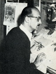 When the Polish animator Jan Lenica toured America last year, he ended up in Los Angeles and came to visit California Institute of the Arts. After seeing a program of films made by the animation students at the Institute, he exclaimed in astonishment, “But these are not student films; they are films by artists! And here in Hollywood! Who would have thought?”
Lenica is not the only one to have said this about Cal Arts and its animated “student” films, but the comments of so great an artist are particularly gratifying—and particularly revealing.
I began working with animation at the Disney Studios in the 40′s when FANTASIA was under production. I was one of about I200 people employed in the Disney
________ Jules Engel ___________ Studio—many of whose names are never recorded, though their contributions to the artistry of the films was considerable. I was hired as a choreography consultant for the Chinese and Russian dancers in the “Nutcracker Suite,” but
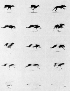 I drew out exacting choreography sketches for both sequences—up to 50 pictures for a one-minute movement—which were then passed on through countless hands (background artists, character animators, in-betweeners, eel painters, etc., etc.) before the finished film was able to be seen. Miraculously, many of my original conceptions—for example, the pure black backgrounds for the low-angle perspectives on the twirling Russian flowers—and the choreography on the Chinese and Russian dance actually survived into the final product!
Later we founded UPA and opened up other possibilities of this much-maligned medium. With only about a handful of people, we were able to produce artistically integrated works. As a measure of our success, people quickly came to regard American animation in terms of two poles — ________ Engels “Accidents”
the Disney style, and the UPA style (always different,
with a range of subject matter and visual technique as broad as Modern Art itself). And “Disney” soon enough came under the influence of UPA by introducing more stylized elements into their previously realism-oriented product.
After UPA, I produced animation films independently with my own Format Films, including, in addition to Popeye cartoons and various commercials, a film based on a Ray Bradbury story, Icarus, which won an Academy Award nomination and a Gold Medal at the Atlanta Film Festival.
I had been offered jobs teaching painting and sculpture many times, but I had always refused, because I don’t really believe you can teach “art.” The ideas, feelings and meanings of artwork must come from inside the artist. You learn concepts and attitudes, techniques and materials of production. It is always better for the artist to learn about his art by trial and error. We learn through experience and experiencing.
But Cal Arts is different. When Anais Nin recommended me to Herb Blau, and then Robert Corrigan asked me to develop an animation program there, I accepted because I knew I wouldn’t be expected to teach “how” or “what” since the school is conceived as an artists’ conglomerate, as a co-operative workshop where painters and dancers, musicians and actors, philosophers and filmmakers could share their talents and experiences with each other. If one learns by a “how to do” method, one does not reveal one’s self, one only reveals the skill for doing.
Don’t take—search!
I don’t call myself a teacher, and I don’t consider the people I work with as students. They are “talents” or “artists” or “friends.” I hate to hear people say, “I taught him everything he knows.” That’s not education. In the first place, if “everything he knows” can be measured and categorized so easily, “it” must not be too much or too complex, and in the second place, education should be a process of opening and broadening horizons, so if “everything” has supposedly already been “taught,” the process must have been one of closing off possibilities rather than opening them up. Furthermore, a “student” must always have the feeling that he is working for and by himself, developing his own potentials, his own initiatives, his own ideas—not being obliged to or dependent on a “teacher.”
At Cal Arts I have something of an ideal situation. The working environment is not classroom oriented—but more like a working artist’s studio. It is an environment in which experiencing can take place. Studio is open 24 hours and seven days a week. An artist has no limits of working hours! Almost all of the exchange between me and my “talents” is on a one-to-one basis, since out of the 30-or-so talents I work with each year, there are maybe 20 different directions they want to go in.
I never discourage people, and I never force them. Work with the talent where he is, and not where you think he should be. I like to take chances on people and let them find out how they feel about animation. I encourage them to play around with the medium, and some fall in love with it while others learn that it’s not really a vehicle they find satisfying or profitable for their ideas or capabilities. In addition to my 30 full-time talents, I usually have I0 or I5 other talents who come in from other schools (dance, music, design, art) to try out animation. I never say no to anyone, because, after all, with young talent who can say which one is going to develop into something great? I end up working with a Jot of talents. I’m looking for the innovators, (as well as for the craftsman), the dreamers, the leaders. The great artists of animation—the Lenicas, the Fischingers, the Kuris, McLarrens, Hublys, Disney, undoubtedly weren’t model students (and maybe weren’t even pleasant people) because their genius was too eccentric. They broke all the rules, and invented new ones, and that’s precisely why we admire them.
The talents I have come to me from widely varying backgrounds, too. Dennis Pies, for example, had four years of art school behind him and wanted to explore film as a means of adding a controlled time dimension to his paintings, which he did beautifully in films like Aura Corona. Kathy Rose, with a background of a dancer, came on as one of the most intuitive creative artists, winner of the Gold Hugo—at Chicago International (Mirror People). Jane Kirkwood had no experience at all with drawing, yet she produced a superb, award-winning film, drawing for An Exhibition, proof once again that animation is far from synonymous with drawing. Disney himself couldn’t draw all that well. So what!? He was an entertainer. He had the instinct of an actor—and an inspired director. He needed the craftsmen to complete his dreams.
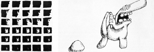
Films produced by students at California Institute of the Arts
Each talent has his own rhythm as well. It takes some people months to get acclimatized to the kind of freedom that I offer in order to find themselves on all levels: intellectual, spiritual, and intuitive. The artist has to discover for himself his own road. Then some talents work very slowly or irregularly, while others like the prodigious Adam Beckett have spent hundreds of hours laboring every day on the drawing board, the Oxberry and the optical printer for each of his five films. The most important part of teaching is not in reading and lecturing or even looking at films, but the actual “doing” of the film.
There is no competition in our classes, either. Competition creates a false sense of artificial tension which might be all right in sports where competitive performance is the only way to demonstrate your skill, but not in art where individuality and individual expression is supremely important. I don’t bother pointing up the talents’ bad points, since they stumble over those soon enough by themselves; I prefer to point up the good points and build on them—to give the talent a confidence in-themselves.
We have excellent equipment and I put together a fine collection of animation films which I show to the talents, and later they can study them for themselves, frame by frame, if they want, on the viewer in the library. We also have guest animators—Americans Mary Ellen Bute and Elfriede Fishcinger, Dragich and Matko from Yugoslavia, Richard Williams and Bob Godfriend from England, Yoji Kuri from Japan, and Dale (Further Adventures of Uncle Sam) Case, Leo Salkin, Herb Klynn, from right here in Hollywood.
Is our program successful? I think our films attest to that. And our talents have had no trouble finding jobs. Joyce Borenstein, for example, is already working for the National Film Board of Canada. If she had tried to learn animation through the studios, she would have spent five years as an in-betweener and five more years as an assistant animator before getting that precious director’s status-symbol, the stopwatch, which they can get the first day in my class and learn to use it at their own pace and in their own way. One day a beginning talent came to me and said, “Oh, I’m sorry about this; look at the mistakes I’ve made!” “No,” I told him, “you can’t make mistakes at this early stage. Mistakes you make later when you know better.” But strange to say, they don’t seem to get around to making too many mistakes later either.
Animation Artifacts &Bill Peckmann &Disney &Models 10 Aug 2009 07:16 am
A Symphony of Models
- The illustrious NY animation designer/director, Bill Peckmann, is sharing a very large archive of material with this site, so I’ll be posting forever to get it up.
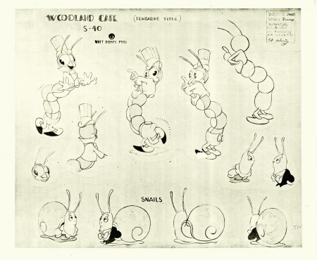
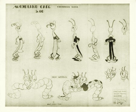
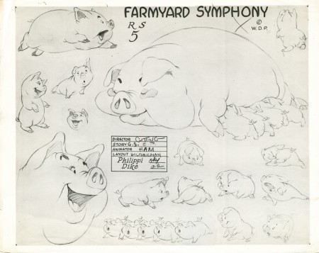
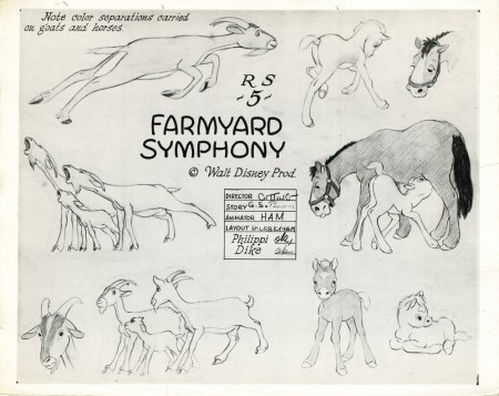
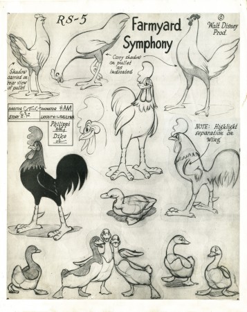
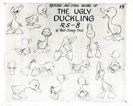
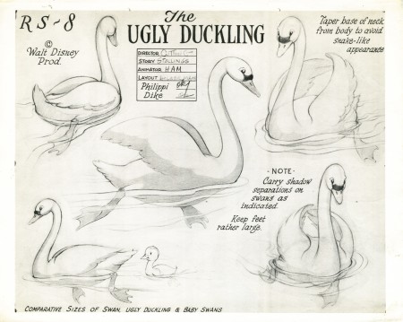
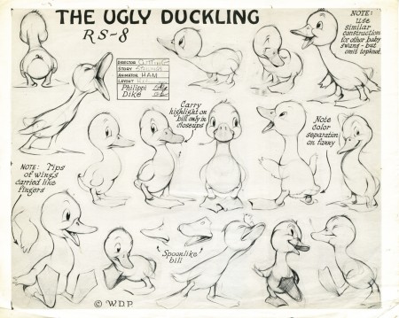
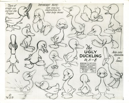
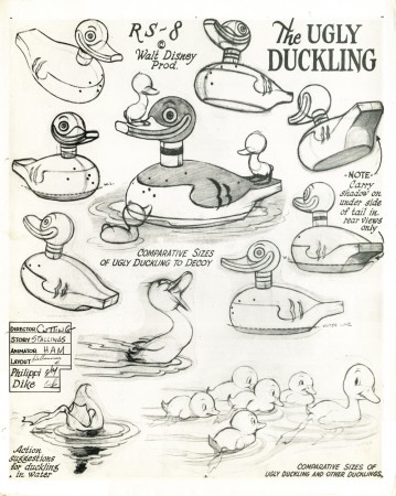
Let’s start with model sheets from some of the Disney Silly Symphonies. You’ve possibly seen some of these, but I like gathering them all in one post.
These are from three gems of films. Among the very best of the shorts.
Woodland Cafe is a beauty released March 1937. these three model sheets are signed by Director Wilfred Jackson, animators Paul Allen, Johnny Cannon, Bob Stokes, Leonard Sebring, and storyman Dick Rickard. Other animators include: Cy Young, Izzy Klein, Dick Lundy, Charles Byrne, Jack Hannah and Ward Kimball. (Story supervision was actually done by Bianca Majolie and I’m not really sure the Sebring animated on this film.) Layout was by Terrell Stapp and John Walbridge.
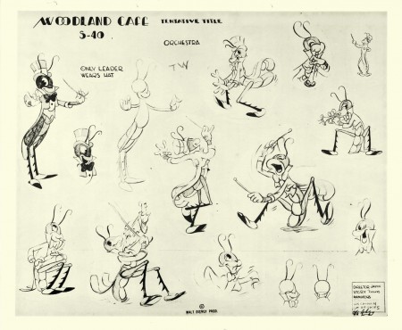
(Click any image to enlarge.)
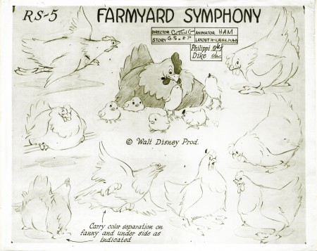
Farmyard Symphony was directed by Jack Cutting. George Stallings was the story supervisor. Ham Luske signed the sheets for the animators; he was probably the animation director. Animation was done by Eric Larson, Fred madison, John Bradbury, Ken Hultgren, Milt Kahl, Bernard Garbutt, Don Lusk, Paul Satterfield, Lynn Karp, John Sewall, and Paul Busch. Layout was by Dave Hilberman and Art Heinemann.
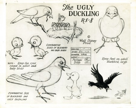
Rel;eased April 1939, The Ugly Duckling won the Oscar and stands out from a lot of the Symphonies of the period. Direction was by Jack Cutting and animation direction went to Ham Luske (which may explain why Luske signed the sheets for Farmyard Symphony as well. Layout was by Dave Hilberman and animation was by Eric Larson, Stan Quakenbush, Riley Thompson, Archie Robin, Milt Kahl and Paul Satterfield. George Stallings was the story director.
Many thanks to Bill Peckmann. More to come later this week.
.
Commentary &Photos &Richard Williams &SpornFilms 09 Aug 2009 08:22 am
My Space – photoSunday recap
- I’ve had a number of different spaces over the years, and I’ve loved them all. Here’s a recap of a post I did back in Feb. 2007 which showcases a couple of those spaces.
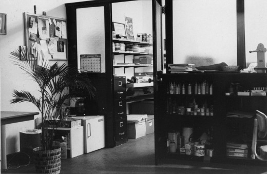
Thes are the only pictures I have of my very first studio. Originally I set up in an apartment leased by Richard Williams. I took care of his apartment while he was out of town (most of the time), and we did Woman of the Year out of that space. (You can see photos of that space here.) Once it became clear that I needed my own space, I found one in a building at One West 30th Street.
It was an historic building and a very interesting site. Every floor was decorated differently, and except for the second floor it was completely housing. The second floor had about half dozen office spaces. Two of them were Persian rug dealers with whom we spent time drinking a lot of Turkish coffee. (This area of NY features quite a few rug sellers.)
My office looked like something out of Sam Spade. All these steel and glass partitions broke the space up into two parts. In the photo above, I’m standing in the larger space (maybe 20 foot squared) which leads into the back area, my space. This was possibly 10×20. I loved it.
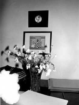
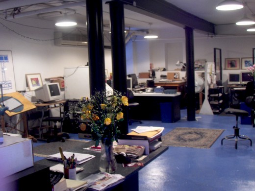
The B&W photo above left is the only other picture I have from that space. The framed cels are from Woman of the Year; it sits above the end title image from Morris’ Disappearing Bag. Both of these were done in 1981-82. Hence this photo dates back to 1982. The color image above was taken this morning from the vantage of our current studio’s front door. The flowers are on the front desk.
Last week we saw a day of heavy snow/rain/sleet which left the City covered with 3-4 inches of iced snow. A week later it still covers most of the town. Garbage is piling up a bit more than usual and construction has slowed down – just a bit.
This is the front of my building. A gypsy fortune teller sits just atop the entrace to my space – down a dozen steps. There’s a knitting shop (red for Valentine’s Day) next door. They have a cafe wherein many women seem to gather to knit. (I’ve only been in the store once, but it’s usually filled into the late hours.)
This is the actual entrace down some icy steps.
Once you go down these steps you have to walk down an icy, outdoor corridor. On the left you can see this corridor from the street side. On the right it’s from the studio side.
Finally. from the front door of this studio you see this space. (I’m literally standing in the doorway.) This room has four stations equipped with drawing tables and computers as well as two other computer setups. The editing station is all the way in the back right. Matt Clinton, our principal animator on staff, works to the back left with Katrina Gregorius working just to his front. Christine O’Neill, my assistant, sits behind the flowers, up-front.
My room is in another room to the right.
Daily post 08 Aug 2009 07:28 am
Ponyo & Laura & Amid
– Miyazaki‘s Ponyo is about to arrive on our shores. Delight of delight, I even saw a tv ad for it last night. Maybe, this time, Disney will support it; there have been rumors.
This week’s New York Magazine has a review that was heaven sent. The reviewer, David Edelstein, goes beyond the kiddie-fare surface to talk about animation itself:
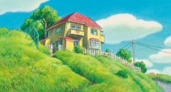 Nothing in Miyazaki’s universe ever stops transforming: There are spirits tucked away, ready to turn what you think you see—the visible world—into something else. Miyazaki proves why two-dimensional hand-drawn animation will always be more thrilling than 3-D: It doesn’t need to pretend to be bound by the laws of physics. The borders between flesh and spirit are infinitely porous.
Wha! Somebody gets it?! Let me repeat Edelstein’s last sentence: It doesn’t need to pretend to be bound by the laws of physics. The borders between flesh and spirit are infinitely porous.
All the cgi supporters should take note. There’s nothing wrong with your medium. It’s just that the limited imaginations displayed so far have styled the medium to little more than viewmaster puppets acting in a puppet universe. The sense of caricature is limited to the mundane in that view. Wall E trying to create his own universe out of the junk of the past. It has to go beyond that to be more. There have been hints of the glory, but so far things haven’t gone far beyond Toy Story.
The key word, to me, in Miyazaki’s universe is “Spirituality.”
Here’s more of the review:
Even with its radiant colors and Joe Hisaishi’s score, a lush mixture of Snow White, Wagner, and Shostakovich, Ponyo could be insipid. Its magic comes from someplace deeper. We constantly see movies that contradict their own messages—celebrations of mavericks that are slavishly formulaic, testaments to selfless love suffused with snobbery and narcissism. But when Miyazaki makes films that decry the threat to the natural world, every molecule onscreen resonates with that belief—a belief that dissolves the boundaries between form and content.
 - Today in an article in the Daily News, there’s a wonderful quote from Miyazaki:
- “The world might be going toward high tech, but I would like to have [my animation company] Studio Ghibli to be like a wooden boat that journeys with sails,” he told The News through a translator.
“Of course, we can sink. I don’t know if we’re very strong, and we’re not confident about the future.”
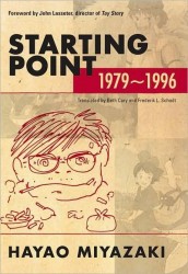
I guess I’m happy to be in a rowboat not far from his sailboat still perplexed by the use of the tool that is cgi but content to have enough to do, myself. I will have to buy the new book by the Mr. Miyazaki, Starting Point. The man, obviously, has something to say.
- Laura‘s all over the place.
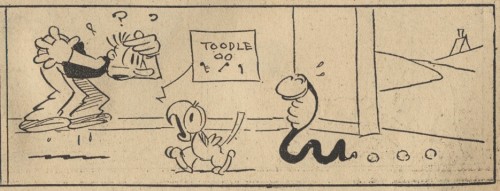
Over at Comicrazys, they’ve posted a handful of comic strips by Pat Sullivan.
That is to say that, like Felix the Cat, this strip, Laura, was actually done by the well disguised Otto Messmer in 1931.
Back then, a principal strip would have a short strip either at the top of the bottom of the page. Laura was the strip that ran just above the Felix the cat strip. The two, together, would fill a color Sunday page.
found via Mike Lynch Cartoons
.
Additionally, Comicrazys posted some 22 color copies of the strip in August 2008.
There are also more strips to be found at the ASIFA Hollywood Animation Archives which were posted in 2007. These include the Felix the cat strips; the entire pages are posted.
Amid Amidi has outdone himself writing an extraordinary post which celebrates the life of designer Victor Haboush. It’s one of the best recent posts on Cartoon Brew, and I’d encourage you to take the read if you haven’t yet had the opportunity.
Haboush was a remarkable designer and his contribution to animation – not to mention Disney animation – was enormous. He knew how to create a piece of art for animation without placing it in your face or calling attention to itself.
Animation Artifacts &Disney &Models 07 Aug 2009 08:47 am
How to Draw Mickey
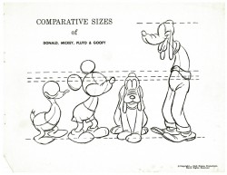
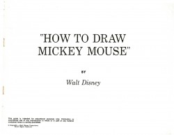
- When last we left off with the Disney lecture series on the principal characters – Mickey, Donald, Goofy, Pluto – I promised to conclude by posting the How To Draw series that were sold at Disneyland (late Fifties/early Sixties).
Go here to see the lecture series posts:
Mickey / Donald / Goofy / Pluto
So to continue with these How to Draw Books, I naturally start with Mickey. I’m not crazy about some of the drawings, but I guess it’s classic. This is actually a copy of the book that they gave out at the Disney/Lincoln Center event in 1973. They’re identical to the Disneyland books, though they lack the colored pages. (See Jenny Lerew‘s great site Blackwing Diaries for the original How to Draw Goofy book.
 1
1 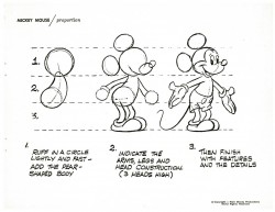 2
2(Click any image to enlarge.)
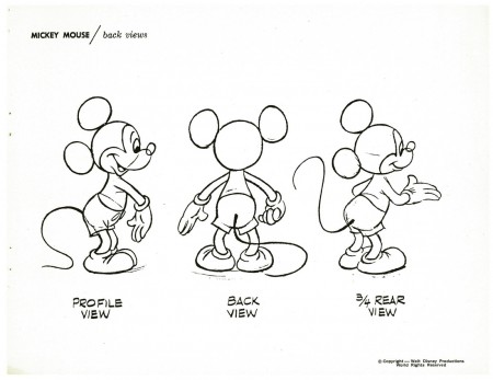
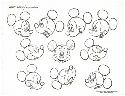
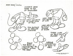
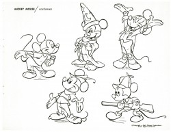
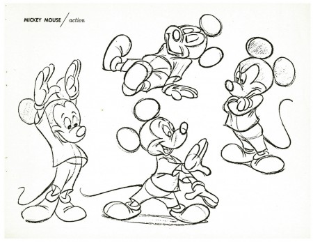
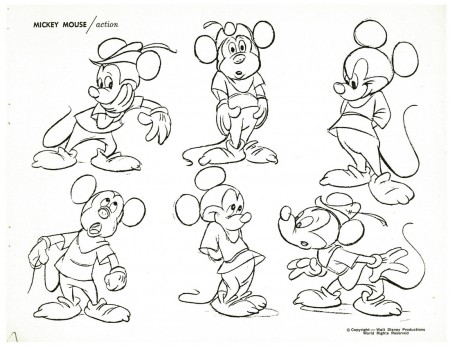
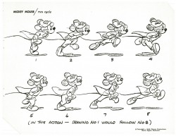
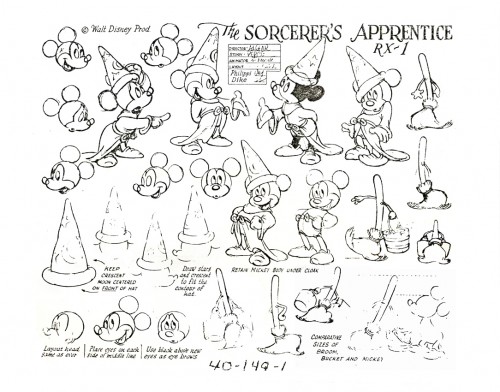
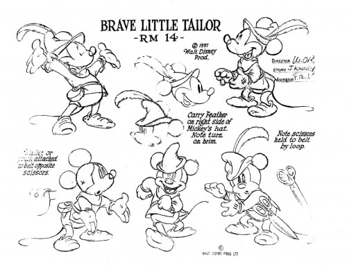
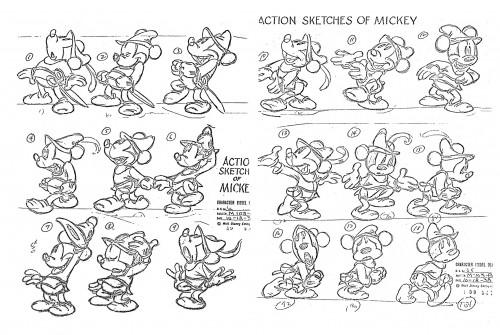
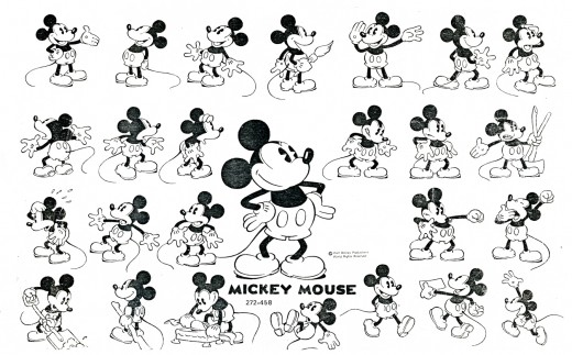
To put a little more zest into this post, here are a couple of Mickey model sheets I have. (copies of copies)
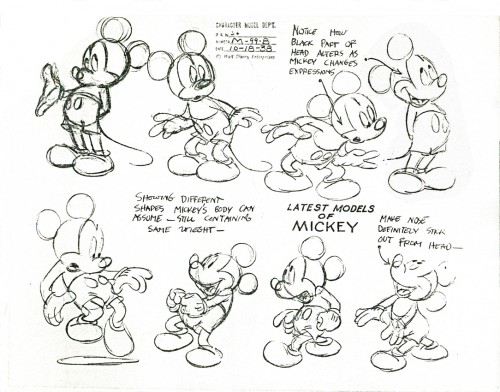
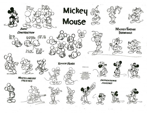
A mixed model with bits from a lot of other sheets.
This was probably put together in the Fifties.
Articles on Animation &Disney 06 Aug 2009 07:10 am
Gilbert Seldes meets Walt Disney
- As a young boy growing up in the far upper reaches of Manhattan I lived for animation. I watched the limited fare offered on television (usually B&W Warner Bros cartoons, the Disneyland TV show on Wednesday nights, early Saturday morning cartoons – Mighty Mouse show being the best of the lot) or I went to the library and to borrow any book I could locate that mentioned the medium.
There were half a dozen books back then, and I probably memorized the lot of them in short time. (I suspect I was the only one borrowing those treasured books.) I remember when I came across a book of collected essays by the film critic, Gilbert Seldes. In this book, The 7 Lively Arts, there was a chapter on Walt Disney. I read and reread it carefully and thoroughly, and I enjoyed it immensely. I’ve recently run into it again (in a different form – he reworked it for the book since that version covers quite a bit more than the very earliest years) in the New Yorker Magazine’s archives. Not bad reading on this rainy day in New York, so I thought I’d share it.
Remember this was written in 1931 when the studio really was just in its earliest phases. Mickey Mouse was barely two years old.
From the Dec. 19, 1931 issue of the magazine:

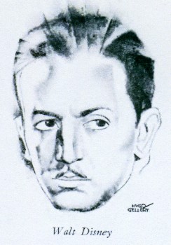 - IN the current American mythology, Mickey Mouse is the imp, the benevolent dwarf of older fables, and like them lie is far more popular than the important gods, heroes, and ogres. Over a hundred prints of each of his adventures are made, and of the fifteen thousand movie houses wired for sound in America, twelve thousand show his pictures. So far he has been deathless, as the demand for the early Mickey Mouses continues although they are nearly four years old; they are used at children’s matinees, for request programs, and as acceptable fillers in programs of short subjects. It is estimated that over a million separate audiences see him every year.
Thirteen Mickey Mouses are made each year. Tin- same workmen produce also thirteen pictures in another series, the Silly Symphonies, so that exactly fourteen days is the working time for each of these masterpieces which Serge Eisenstein, the great Russian director, called, with professional extravagance, America’s most original contribution to culture. The creative, power behind them is a single individual, Walt Disney, who happens to be such a mediocre draughtsman, in comparison with the artists he employs, that he never actually draws Mickey Mouse. He has, however, a drop personal relation to the creature: the speaking voice of Mickey Mouse is the voice of Walt Disney.
HE is a slender, sharp-faced, quietly happy, frequently smiling young man, thirty this month. He is married to Lillian Marie Hounds, whom he met in Hollywood, where she was probably unique, as she had nothing to do with pictures. She has enough to do with them now, because she is the first receiver of her husband’s ideas. Mickey Mouse pictures are talked into being before they are drawn, talked and cackled and groaned and boomed and squeaked and roared and barked and meowed, with ever}- variation of animal sound, with appropriate gesture, and with music. If strange outcries anil queer noises waken Mrs. Disney at night, it is only Walt working on a new story. He never stops; he swims and rides and lie plays baseball with his stall, but all the time he is inventing. He is one of the lucky ones who can make a fortune out of the work the) love and he does not love Mickey for his wealth alone. He was just as keen when exhibitors refused to look at the Mouse, and just as keen over earlier efforts which were, as he now says, “pretty awful.”
He is fortunate also in having as his chief co-worker his elder brother, who is the businessman of the firm. Roy Disney and five assistants attend to finance; Walt and about a hundred others—a quarter of them are artists, the rest are gagmen, story-men, and technical experts— make the picture’. ‘The distribution and sales are in other hands.
When a Mouse or a Silly Symphony is finished, the business side and most of the artists watch it carefully for commercial value, for those mysterious qualities which they think, or guess, will make it popular. They find their congratulations to Walt Disney accepted without enthusiasm. He is not putting on artistic side; he is not indifferent to profits. What he is frequently doing is referring each finished picture back to the clear idea with which it started, the thing he saw and heard in his mind before it ever came to India ink and sound tracks. In the process of making the picture, something often escapes, and Disney wanders moodily away from the projection-room grumbling: “Where did it go to?” and often will begin outlining the original idea again, with gestures and sound effects, to prove that he is right.
THE mechanics of creating Mickey Mouse are complicated and, to the workers, tedious. Six or seven drawings are required for every movement, and the first and last, the position of thr Mouse at the beginning and at the end of any motion, are drawn by the principal artists, or “animators.” After them, the “in-betweeners” fill the intervening space, with minute changes in the figure. The final step in preparing for tin camera is the photographic transfer of these drawings to celluloid. As the background changes less frequently, dozens of celluloid drawings ma)’ be placed over a single background scene.
The drawings are now ready for the camera, which photographs each separately. The tracing of the moving figure is placed on its background, the photograph is taken, and the next drawing is moved into position. About eight hundred photographs can can be taken in one day —- some fifty feet of film.
The sound track is made after the picture has been completed. A short section of the film is projected; the music, which has been selected in advance, is rehearsed by musicians, who watch the screen as they play; and when the timing has been perfected, the music is recorded.
The two advantages of the animated cartoon over the feature picture are only implied in the above description: there are no stars and only *as much film is taken as will be used, A few feet arc allowed for adjustments, but the filming of a hundred and fifty thousand feet for a six-thousand-foot picture does not occur.
WALT DISNEY is, as I have said, thirty, and that means that he is too young to have had a history, too young to have developed oddities and idiosyncrasies. He is a simple person in the sense that everything about him harmonizes with everything else; his work reflects the way he lives, and vice versa. Mickey Mouse appears on the screen with features and Super-specials, but Mickey Mouse is far removed from the usual Hollywood product, with its sex appeal, current interests, personalities, studio intrigue, and the like. And Disney, living” in Hollywood, shares hardly at all in Hollywood’s life. He has not only made a lot of money (between forty and fifty per cent of the return on each film is net profit) better than that, his potential income is enormous: he has the surest bet in filmdom; experts think that he is only at the beginning of his great success. In these circumstances, Hollywood builds itself a palace and a pool; Disney lives in the house he built five years ago when he and his brother were too poor to buy a lot for each, and combined on a corner that both the houses they built would have, sufficient light and air. His house is a six-room bungalow, the commmoner type of middle-class construction in Hollywood; the car he drives is a medium-priced domestic one; his clothes are ordinary. He goes to pictures, but rarely to the flash openings; he neither gives nor attends great parties. Outside of the people who work with him, he has few friends in the industry. The only large sum of money he ever spent was one hundred and twenty-five thousand dollars; it was the cost of his new studio. Everything he earns and everything his brother earns, on the fifty-fifty basis they established years ago, is reinvested in the business.
Walt Disney’s life before he went into movie-making divides into two almost equal and almost entirely un-distinguished section. He was born in Chicago In 1901, his father .was an Irish-Catholic builder and. contractor, his mother a German-American. He went to the Chicago Public. schools and studied drawing for a few months at the Art Institute. Arguing, perhaps, from his present enthusiasms, friends of the Chicago days now say that he was exceptionally fond going to the Zoo. The second period a little shorter in time, is more varied. The family moved to Kansas City; from there Disney, too young for service in the trenches went to the war with a Red Cross unit; fo Kansas City he returned and. tried to become a newspaper cartoonist. He found no job. He went to work as a commercial artist and saved up enough money to make his first animated cartoons.
There were animations of well known fairy tales and children’s classics. In competition with the highly developed product of the experts, they were crude and uninteresting, and they failed. Disney felt that if he wanted to make pictures, he would have to go where pictures were made and, in 1923, departed for Hollywood. His brother, who had come out of the war in shattered health, expected to live only a short time, and thought that California would be an agreeable place for his few remaining months of life. Walt had forty dollars when he arrived in Los Angeles Roy contributed about two hundred and fifty; they borrowed enough to make: a total of five hundred dollars and made their first picture. It was done in a bastard medium, using human beings and drawn figures simultaneously, ordinary movie photography and pen and ink; the inspiration comes from “‘Alice m Wonderland” and the series was called after the heroine which is interesting because – since the success of Mickey Mouse, Disney is continually receiving requests to make the original Alice in his own medium.
The first picture brought in fifteen hundred dollars; half of this was profit, if you figure that the brothers were not entitled to salary. During the making of the picture they had lived skimpily, on one full (cafeteria) meal a day, Roy ordering: the most filling vegetable, Walt the most filling meat, and then sharing, as they shared everything in those days, including their bank account. The lean time was soon over; the pictures were moderately successful, and after about four years, Disney went, in 1927 to Universal, where he created Oswald the Rabbit, the true forerunner of Mickey Mouse. Oswald was left behind when, in the middle of 1928, the Disneys, with fifteen thousand dollars saved, started out again on their own.
Sound was just coming in and Disney’s still-silent cartoons were unacceptable. Instantly he adapted his idea to the new medium. Unlike the producers of feature pictures he had nothing to scrap, no equipment to save, and hardly any public to worry about. He made a drawn comic and took it to New York for synchronisation, When he was finished he took it to the great producers and distributors — the men who had a few months earlier turned down the whole talking mechanism and were now furiously witnessing the success of the Vitaphone, Unanimously they informed Disney that no one would care for animated cartoons with sound. After several weeks, he found an independent backer, and on the nineteenth of September, 1928, the audience at the Colony Theatre in New York was “panicked” by “Steamboat Willie,” the first adventure of Mickey Mouse. A few days later Mickey was the hit at Roxy’s. Almost at once England all-hoiled him. The rest has been roses, roses all the way.
Roses and children. Leaving the distribution of the films to others, the Walt Disney Corporation concentrates commercially on the creation of movie audiences. Disney’s own connection with the vast enterprise which now enrolls three-quarters of a million children in Mickey Mouse clubs is not close. The clubs are the invention of an enterprising member of the business staff, and Disney’s only interest in them is as a source of knowledge; he learns from them what children like. The club members attend morning or early-afternoon performances at movie houses, led by a Chief Mickey Mouse and Chief Minnie Mouse; they have a club yell, and official greeting, a theme song, and a creed. As I find myself a little unsympathetic to this actiity, I sall limit myself to an exact quotation of the creed:
“I will be a square-shooter in my home, in school, on the playground, wherever I may be. I will be truthful and honorable and strive always to make myself a better and more useful little citizen. I will respect my elders and help the aged, the helpless, and children smaller than myself. In short, I will be a good American.”
For the good Americans there are commercial tie-ups with local businessmen, such as druggists who may feature a Mickey Mouse sundae, florists with Mickey Mouse bouquets, and so on; Parent-Teacher Associations are enlisted; the films at the matinees are swift-moving Westerns and other clean films, with a rather elaborate ritual of patriotism and good-fellowhip before and after.
It was reported that at the great Leipzig Trade Fair this year, forty percent of all the novelties offered were inspired by Mickey Mouse. One American company lists a velvet doll, a wood-jointed figure, a mechanical drummer, a metal sparkler, and half-a-dozen oter toys; there is a “Mickey Mouse Coloring Book” and another book of the adventures of Mickey Mouse; you can have Mickey Mouse on your writing paper; you can have him as a radiator cap. He appears in a comic strip in twenty-seven languages. From all of these exploitations, the originators receive royalties, since the own both the name and the design of the figure. (Infringements have been successfully prosecuted.) On the screen, Mickey Mouse appears in every country to which equipment for projecting sound films has penetrated. His name in Japan is Miki Kuchi.
Neither at homr nor abroad has Mickey’s career been without accidents. In Germany the appearance of an army of animals in Uhlan helmets was considered an affront, and the film was censored. In more dainty Ohio a cartoon was barred because a cow was discovered reading “Three Weeks.” Cows seem to have given more offence than any other beast in the Disney jungle, for many State Boards of Censorship protested against the grotesque and emotionally expressive udders which Nature and Disney gave them, and hereafter udders are to be at least partially concealed under a small provocative skirt. Disney himself is amused by the fuss; quite justifiably he takes it as a tribute to the remarkable reality of his totally unreal figure.
The process of creating this unreality begins in Disney’s mind. By this time it is only necessary for him to think of Mickey running to a fire, or Mickey skating; the rest is worked out in discussions with the artists and the gagmen. The automatic thing, the formula of the present, is the creative work of years ago, when Disney saw a series of pictures, saw moving forms across landscapes, rhythmic dances, compositions in black and white. These are still the essence of his pictures; his imagination is still largely visual. Only now that his assistants know the kind of picture he wants, his work has to he selecting the general idea, thinking out the tiny plot (even if it be only a modern version of “Little Red Riding Hood’* or a burlesque of some popular feature film), leaving the rest to experts.
I HAVE kept Mickey Mouse in the foreground because in general it is with Mickey that Disney is identified; but I belong to the heretical sect which considers the Silly Symphonies by far the greater of Disney’s products. Although there is a theme in each one, DISNEY’S IMAGINATION is freer to roam than it is in the more formal Mouse series. The Symphonies, moreover, are true sound pictures, without dialogue; the Mouse series has a tendency, lately, to run to verbal fun which is a little out of place.
Unlike the Mouse pictures, the Symphonies have no central character and no clearly defined plot. In them the animals and vegetation, purely incidental to Mickey Mouse, are brought into the foreground, and go through a wide range of activity — dances, skating contests, and so on — to the accompaniment of a reiterated musical theme.
The Symphonies reinforce what the Mouse tells us about Disney’s character: his delight in quick surprises, his uncomplicated sense of fun, his keen observation (Mickey Mouse has, correctly, four fingers, (not five). In addition they suggest his passion for all animals—he dropped his work and ran all over the vacant lot near his studio when he heard that a gopher snake had been seen there; he watched some sparrows for hours while they bent off a hawk and set up their nest. And he likes enormously the kind of laughter he himself creates; laughter at absurdities and impossibilities. Out of these natural, simple interests, backed by enormous files of pictures, cross-sections, and data on every animal extant, he creates the Silly Symphonies.
Like the first Mouse, the first Silly Symphony was long rejected by exhibitors; once shown, it ran six weeks at one house, an exceptional occurrence for a short subject. It was the Skeleton Dance, a theme naturally macabre, but treated with such humor and fantasy that no child has ever been frightened by it. Soon after followed a masterly series on the four seasons.
In one of these occurs a moment typical of Disney’s method. A frog dances on a log, its shadow following in the pool below. Presntly the frog moves to the opposite end of the picture, the shadow stays where it is, but continues to reflect the dance; then it joins its owner. Perhaps fifteen seconds cover the incident; it is a gracenote of wit over the broad humorous symphony of the whole picture.
With a picture to make every two weeks, both Disney and his associates have to use certain formulas, like the dancing of animals and chairs, chases and the sudden elongations of necks and legs. But the freshness of picture after picture proves that the creative force behind the formula is still powerful, and the combination of ingenuity and innocence (which was typical of prewar America) can still give pleasure. At the end of three and a half years, Disney’s ingenuity seems more fertile than ever. And his innocence is attested by the fact that he can think of nothing better to do with his time, his talent, and the five thousand a week (or thereabouts) which he earns, tan to put all of them back into the work he enjoys.
- Gilbert Seldes
Books &Disney &Illustration 05 Aug 2009 07:18 am
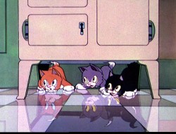
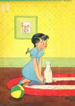
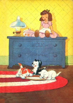
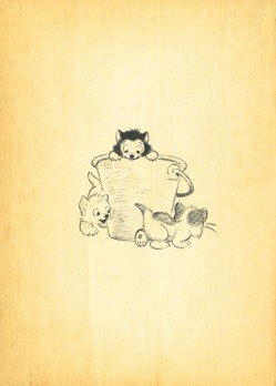
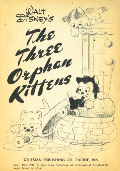
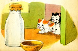
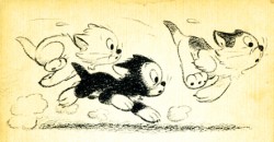
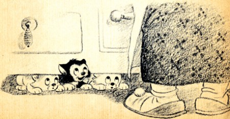
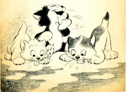
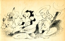
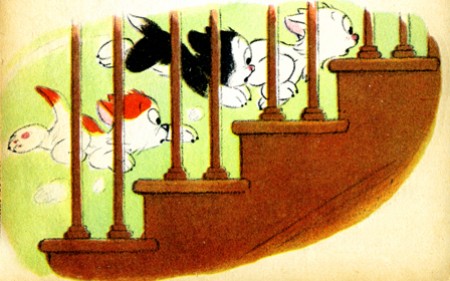
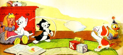
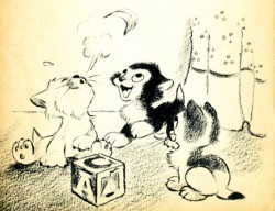
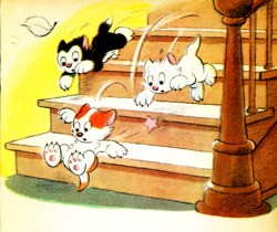
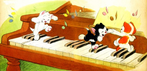
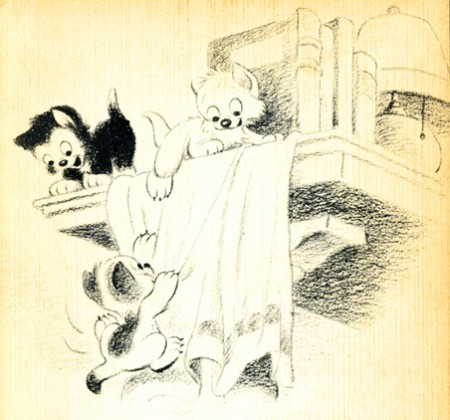
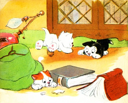
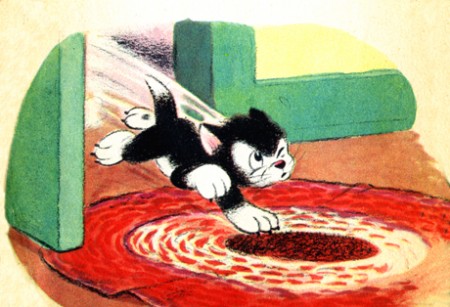
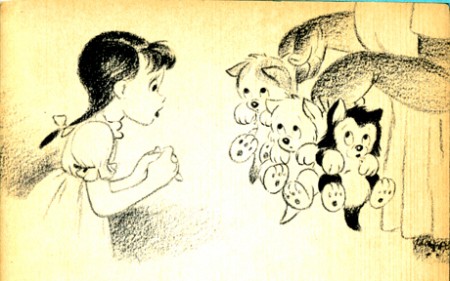
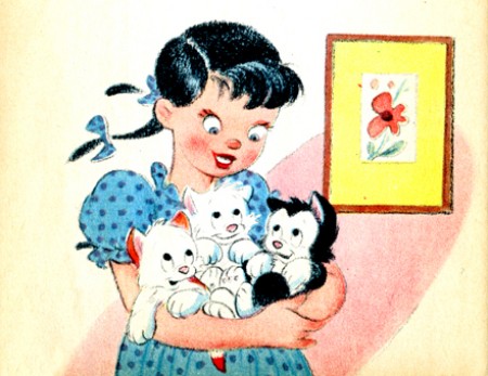
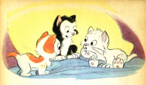
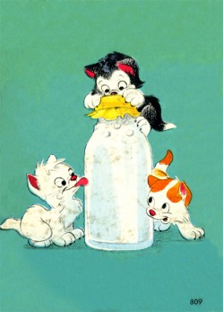
Three Little Kittens book
- I’ve often been curious about the generation that lived through the late 30′s early 40′s. The animated cartoons that were made during this roughly six year period often feature enormously cute characters going through cute storylines. The audiences must have loved it considering the fact that there are so many of these films, including Oscar nominees and winners.
Lend A Paw, The Milky Way, Merbabies, Wynken Blynken and Nod, Two Little Pups, and any of the Sniffles cartoons all featured good animation and high prduction values but terminally cute material.
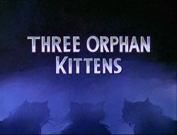
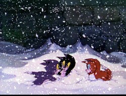
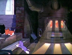
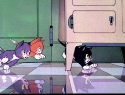
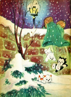
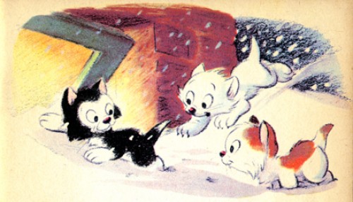
The Three Orphan Kittens of 1935 was an Oscar winner and as cute as all getout. Not only are these mischievous kittens, but they’re also orphans. The film was directed by David Hand and featured a seuquence by Ken Anderson in which floorboards were animated to try to capture the illusion of 3D.
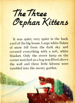
A number of children’s books were produced from this material, and I offer here the illustrations from one smaller-sized book. It was originally published in 1935 and was obviously such a success that it was reprinted in 1949.
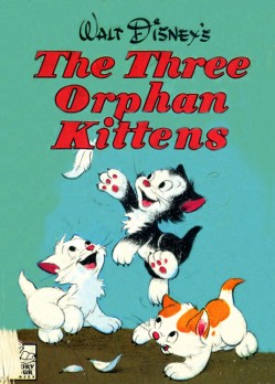
(Click any image to enlarge.)
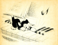
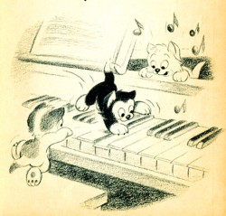
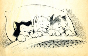
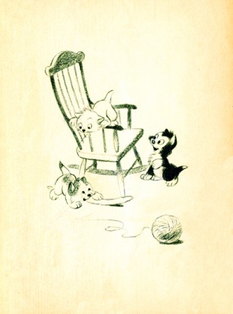
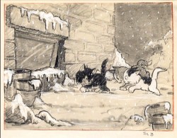
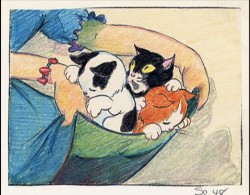
Here are a couple of preproduction drawings done for the film.
It’s interesting to compare this material with the excellent shorts by Simon Tofield featuring Simon’s Cat. Both utilize pet cats as the featured star; both are lightyears apart from each other. They’re both representative of their time. Two different kinds of cuteness. One works today.
Daily post 04 Aug 2009 07:42 am
Beckett, Babbitt, Kentridge & Puppies
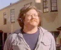 - On Monday, August 17, at 8 p.m, the West Coast branch of the Motion Picture Academy will present a salute to Adam Beckett at the Linwood Dunn Theater in Hollywood.
Beckett died in 1979 at the age of 29. He had already done a number of independent and surreal animated films prior to working in the industry as a Special Effects artist. His theatrical work includes films such as Star Wars and Piranha.
Hosted by effects artist Richard Winn Taylor and Beckett biographer Pamela Turner it will include screenings of six Beckett films, in addition to an onstage panel discussion with his colleagues and friends. Scheduled guests include Oscar-winning visual effects artists David Berry and Richard Edlund, animator Chris Cassady, and filmmakers Beth Block, Roberta Friedman and Pat O’Neill. The films to be shown include: The Beckett films to be screened are Dear Janice (1972, top photo), Heavy-Light (1973), Evolution of the Red Star (1973), Flesh Flows (1974), Sausage City (1974) and Kitsch in Synch (1975).
My only real contact with Adam, personally, came back in 1976 while working for the Hubleys on Everybody Rides the Carousel. John Hubley was keen on using a couple of young firebrands in the film for a couple of short sequences. Adam was one of these artists who did, I think, four scenes. I inked and colored his animation – all surreal scenes of desks and other office equipment floating about in a long complex cycle. I spoke with Adam on the phone once about the fielding of the scene; it was a short conversation though I do count it as a sort-of meeting.
I was a bigger fan of the the other Independent artist who worked on the film. Fred Burns, whose work was unfamiliar to me, did a knockout seqeunce on the roller coaster of relationships. An animated POV shot of a roller coaster ride. Great stuff.
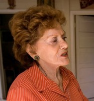 This past weekend, Dina Babbitt, the former wife of Art Babbitt passed away.
She was a holocaust survivor and was actively trying to push the Auschwitz-Birkenau Memorial and State Museum to return some of the paintings she did in the concentration camp.
There was a 2007 interview with Ms. Babbitt which has been posted on YouTube. I’ve linked to her obituary in the NYTimes.
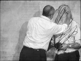
Karl Cohen has an extensive article in AWN about the William Kentridge exhibit currently touring. The show which opened at the The San Francisco Museum of Modern Art will move to NY at the The Museum of Modern Art, Feb. 28 -May 17, 2010.
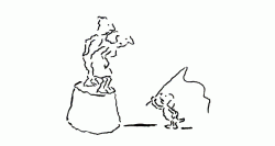 There’s a recent weekly piece in the NYTimes that Bob Blechman is illustrating, Ed Smith is animating and my studio has been compositing.
The Puppy Diaries by Jill Abramson is the series and
part 1 is here,
part 2 is here.
Animated illustrations: how can the newsprint issue compete with that?
Animation &Animation Artifacts &Hubley 03 Aug 2009 07:55 am
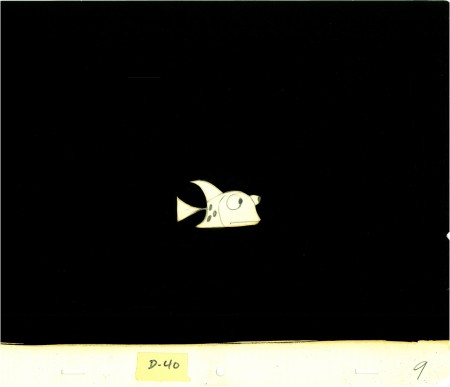
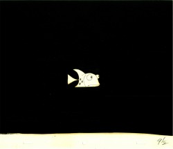
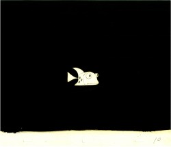
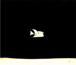
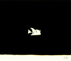
Hats & Fish
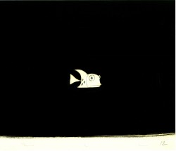
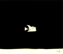
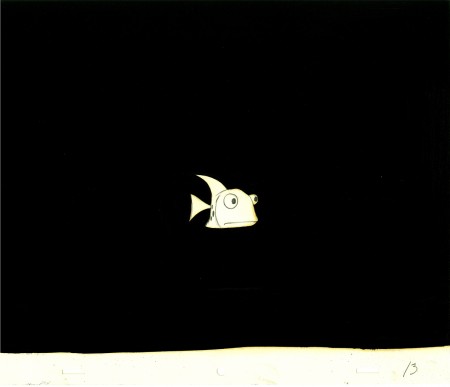
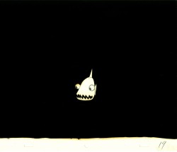
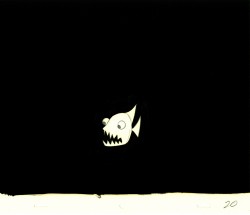
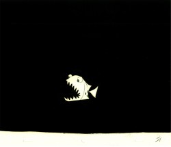
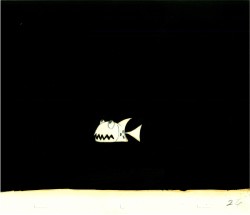
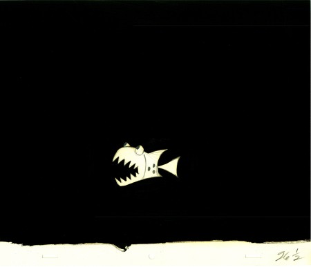
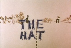 - Here are some drawings from the Hubley short, The Hat.
I first became aware of this short about the absurdity of border lines from a pre-PBS “educational TV” show on NY’s WNDT channel 13. Film critic Stanley Kaufman used to host a show called, “The Art of Film” in which he would have guests explaining their individual craft.
I can remember well a segment which featured composer, Elmer Bernstein, breaking down his music for The Magnificent 7. It was very informative and remains with me in memory to this day when I see the film.
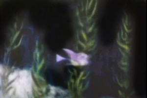 - John and Faith Hubley were on this show with drawings and storyboard and cels and Bgs from The Hat, then in production. I couldn’t have been more impressed and waited impatiently for about a year to see the film at the Beekman theater in NYC playing with Of Stars and Men.
The style was one that John had been developing which had been successful for him. They would take the relatively clean animation drawings (done primarily here by Bill Littlejohn) and would paint them black. By that I mean, they would paint all the free space, outside the borders of the character, with black oil paint. (The oil paint didn’t stretch or buckle or shrink the paper. It just took forever to dry and destroyed the cells of the painters’ brains.)
The cameraman, Jack Buehre, would shoot the Background, then roll back the film and shoot the blackened characters as a double exposure. If there were more than one character it could mean several overlapping exposures.
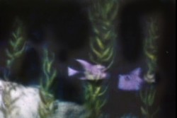
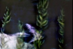
Here are examples of the animation in the final scene.
The exposure of the white drawings was shot at about 70%.
This allowed the characters to pick up some color from the dark violet
backgrounds. A ripple glass was also used over the drawings and bgs.
Photos 02 Aug 2009 07:55 am
More Psychics
- I have something of an obsession with Psychic storefront shops. For some reason they stand out for me. I did a post a while back and thought it time for an update. There are so many of these shops in my sightline. So, I’ve decided to add some more.

(Click any image to enlarge.)

This is a closer view of the window display for the Psychic above.

This Psychic just advertises her phone number.
Call her cel.

An awning is all you really need.
You can set up a waiting room outside (as long as it’s not raining.)
Steve Fisher checked in with these psychic shops in Queens:

Not too confusing. Psychic? Realtor? Entrance?

An upscale establishment in Middle Village?
It’s the same Psychic as the one above.
Just some work on the storefront.

The Psychic who operates out of the home (as opposed to
the Psychic business operating as a home.)

Hi-tech. The electric Psychic.
The future of the Psychic revealed.
