Monthly ArchiveAugust 2009
Animation Artifacts &Bill Peckmann &Disney &Models 21 Aug 2009 07:53 am
How To Draw Donald
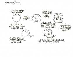
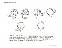
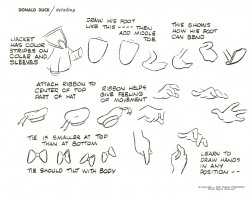
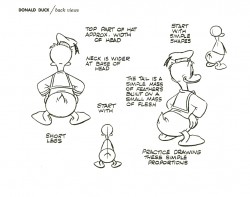
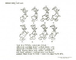
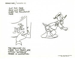
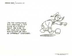
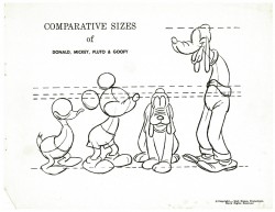
- I continue with the Art Corner books from Disneyland with the How To Draw Donald classic. I’d received a full set of these books (How to draw Mickey, Donald, Goofy, Pluto and Chip & Dale) when I bought an Animation Kit from them. I’ve started posting these booklets after posting the lecture series that was given to the staff in the 1930′s.
Go here to see the lecture series posts:
Mickey / Donald / Goofy / Pluto
Here to see How To Draw Mickey.
Here to see How To Draw Pluto.
Here to see How To Draw Goofy (Jenny Lerew‘s Blackwing Diaries.)
Here’s the booklet:
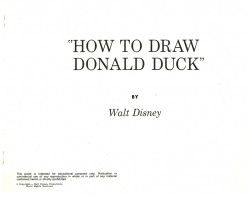 1
1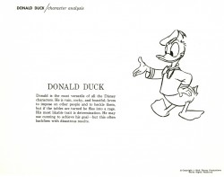 2
2(Click any image to enlarge.)
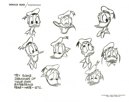
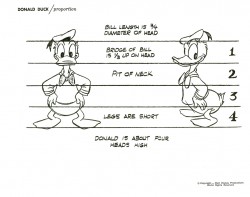
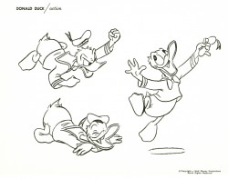
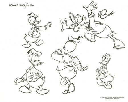
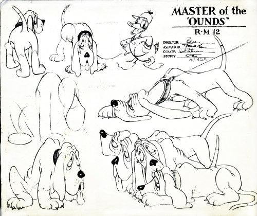
I don’t have a lot of Donald model sheets to add to this, but these three are interesting.
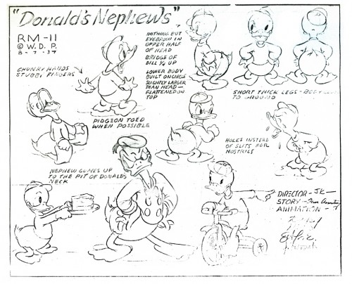
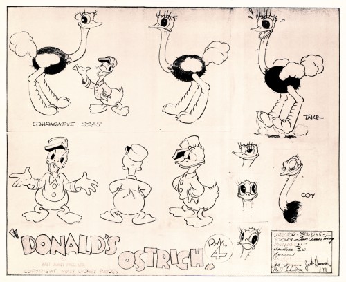
This last model comes courtesy of Bill Peckmann‘s collection. Many thanks.
Articles on Animation &Bill Peckmann &Comic Art &Disney &Illustration 20 Aug 2009 07:20 am
Good Housekeeping 1
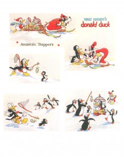
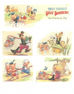
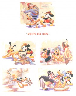
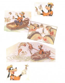
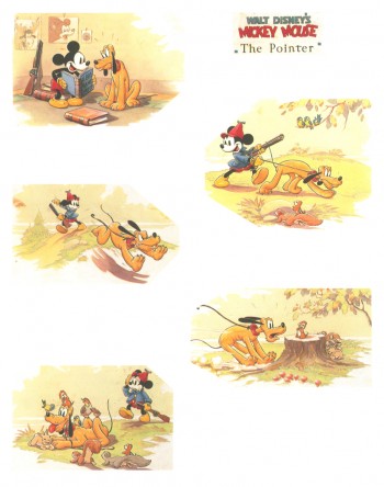
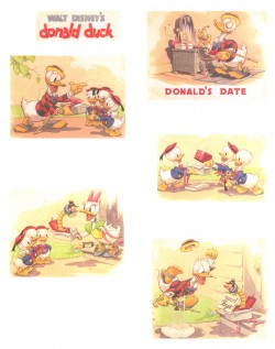
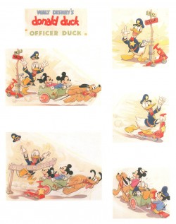
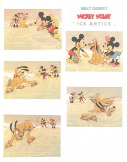
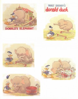
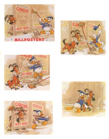
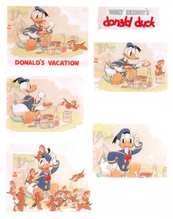
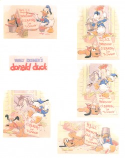
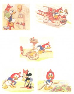
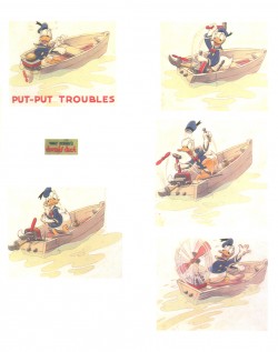
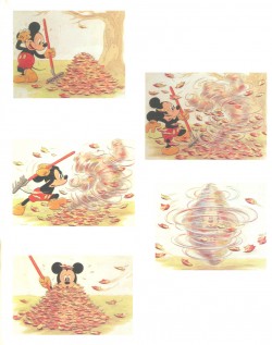
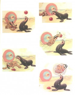
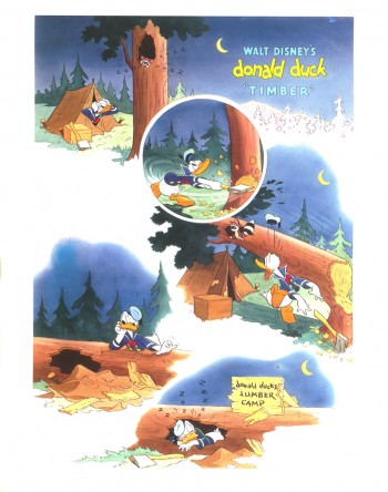
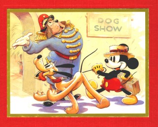 - From 1934 continuing into the late 1940′s, Good Houskeeping Magazine printed four-color full page previews of newly-released Disney shorts. These illustrations were, at first, painted by Tom Wood, and later by Hank Porter.
Here’s information from the book on Wood and Porter:
- Tom Wood came to Disney Studios in 1932 from his position as a Los Angeles daily newspaper artist. A quiet, hardworking individualist, he was well liked and highly regarded by those who knew him both personally and professionally. He worked at the Studio until his untimely death in 1940 and, as publicity artist, assumed primary responsibility for the monthly Good Housekeeping page as well as the creation of publicity stills for the theater. Since Good Housekeeping was the only magazine for which Disney produced these monthly watercolor sequences, we recognize their scarcity.
Wood typically worked on each of these pages for a full week. Beginning with sketchy, pencilled drawings which he would then ink himself, he also created the final watercolors which represented a 7-minutc Disney film short. Assisted by an “idea man” and a third person who wrote the story or dialogue, the publicity artist had the final approval on the finished version. After Wood’s death Hank Porter would continue working with the magazine well into the late 1940′s. Thereafter, production of these shorts was discontinued as costs became prohibitive and the Studio refused to compromise on quality.
The Alexander Gallery collected these illustrations in 1987 for an exhibition, and they published a book of them. Bill Peckmann has kindly loaned me his copy of the book, so I’ll post the illustrations over a number of posts.
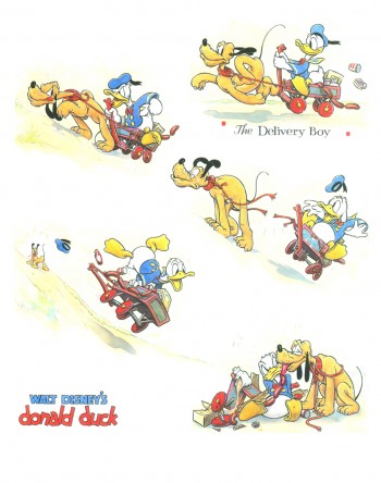
Here are the first group of pages:
 1
1
Donald Duck in “The Delivery Boy” 1938
(L) Donald Duck – Antarctic Troopers 1938
(R) Silly Symphony – The Practical Pig 1938
(L) Mickey Mouse – Society Dog Show 19389
(R) Goofy and Wilbur – Goofy and Wilbur 1939
Mickey Mouse – The Pointer 1939
(L) Donald Duck – Donald’s Date 1939
(R) Donald Duck – Officer Duck 1940
(L) Mickey Mouse – Ice Antics 1940
(R) Donald Duck – Donald’s Elephant 1940
Donald Duck – Billposters 1940
(L) Donald Duck – Donald’s Vacation 1940
(R) Donald Duck – Window Cleaners 1940
(L) Donald Duck – Fire Chief 1940
(R) Donald Duck – Put-Put Troubles 1940
(L) Mickey Mouse – The Little Whirlwind 1941
(R) Mickey Mouse – Big-Hearted Pluto 1941
Donald Duck – Timber 1941
Articles on Animation &Bill Peckmann &Disney &Illustration &Mary Blair 19 Aug 2009 07:33 am
El Groupo & Mary Blair’s Peter Pan
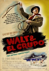 - Yesterday I saw a preview screening of Walt and El Groupo. This is a documentary exploration of the Disney trip to South America to bring back material for Saludos Amigos and Three Caballeros. If you have any interest in Walt Disney or the history of his studio or Mary Blair, you’ll have to see this film. It features interviews with a number of the children of those who went to South America with Disney. Interviews with those who hosted Disney talk about the visit.
The film is shot in a beautifully lush color that is almost reminiscent of IB Technicolor. One would expect the home movies to be grainy and unattractive, but instead they’re gorgeous.
The film is worth the visit. It’ll open in NY & LA on Sept. 11th. I’ll write more about it as the event gets closer.
There’s also upcoming a screening for MOCCA, the Museum of Comic and Cartoon Art featuring a Q&A with writer/director Ted Thomas and producer Kuniko Okubo, moderated by John Canemaker. This will take place on Thursday, August 27th, 7:30 PM at the Brooklyn Academy of Music, BAM Cinema 4, (30 Lafayette Avenue, Brooklyn, NY).
Admission is free for Members of MoCCA. To rsvp, call (212) 254-3511.
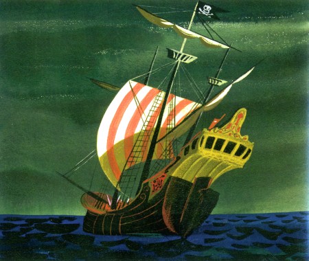
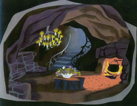
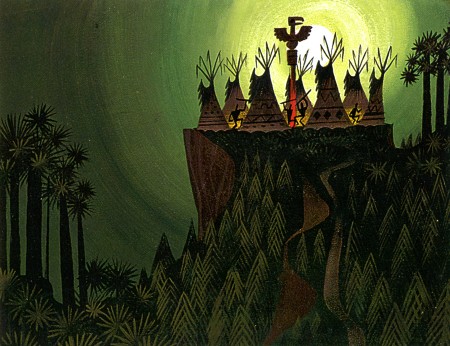
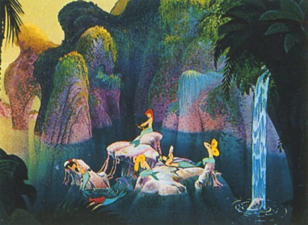
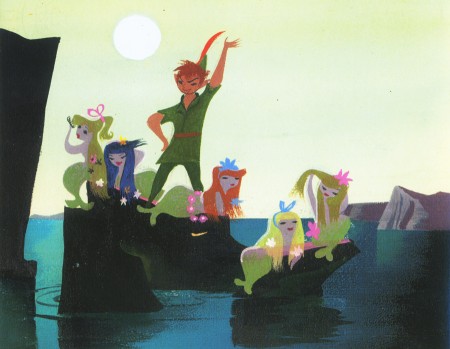
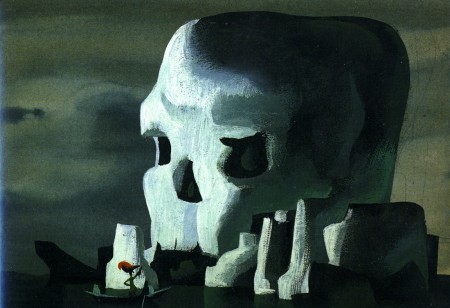
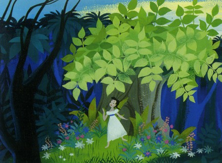
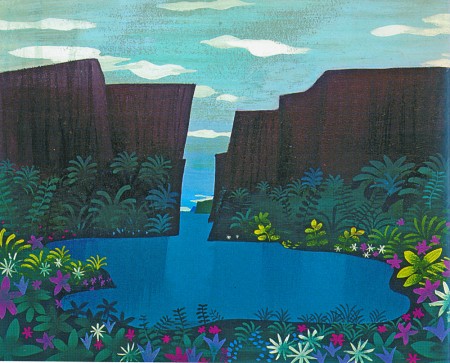
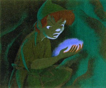 - In tune with the above comments and having posted, this past week, the wonderful 1940 model sheets from Disney’s Peter Pan (thanks to Bill Peckmann and his fine collection), I thought about the Mary Blair art for this film. Neither those model sheets nor Mary Blair’s art made it to the film.
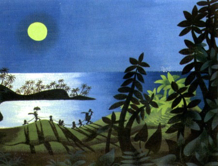
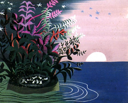
I thought, as a companion piece to those early model sheets, I’d post the Peter Pan illustrations in John Canemaker‘s fine book: The Art and Flair of Mary Blair. A number of these have been used to illustrate the new book, Walt Disney’s Peter Pan. They’re all attractive and modern in style. I think the film took the colors without the style and came up with a picture postcard look.
Here are Mary Blair‘s paintings:
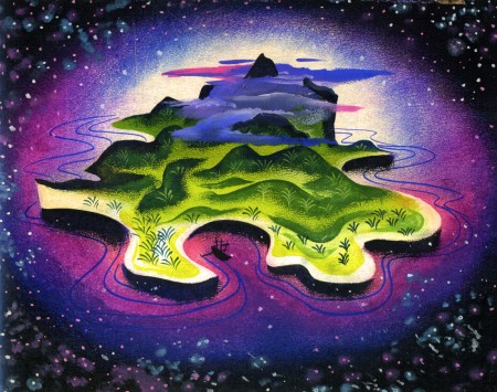
(Click any image to enlarge.)
Commentary 18 Aug 2009 07:55 am
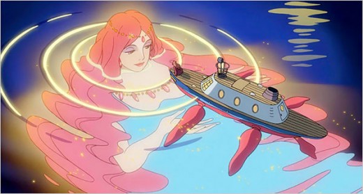
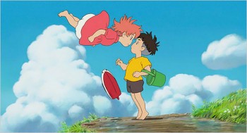
Go See Ponyo
 - So let me spill some thoughts on Miyazaki‘s Ponyo.
I’ve already stated that I think this is the Best Picture of 2009 – to date. Nothing else has stirred my imagination, my sense of hope or my belief in the medium as this film has.
There were no lackluster set pieces in the way of most Western animation. The story was built from the respect for the human spirit and its intermingling with the earth and sea around it.
There were no traditional filmmaking formulas; this film created its own rules. We’re in the hands of a master who knows all the rules and knows when and how to break them.
There was no irony, cynicism or sarcasm in the way of telling the story (as we find in most of the other children’s films these days.) Ponyo is glorious, life affirming, a real treat as a moviegoing experience. Before the film was over, I was making plans to see it again.
Yes, the story is dense and sometimes confusing. There’s a lot of back story we’re not privy to. And like all other Miyazaki films, there’s a lot we don’t get as Westerners. He has a cultural separation that he honors and places high in his order of business. Gods and spirits and magic, all incomprehensible to us, abound in his films, and we are forced to accept it and ride with it or be left behind.
We saw this in Princess Mononoke with at least half of the characters – white wolves, dying deteriorating swine, a supreme god of a deer with blazing antlers.
We saw this in Spirited Away (just that title) with all of those curous subsidiary characters that walk or float their way through the film guiding its heroine.
In My Neighbor Totoro, there’s Totoro, itself.
Ponyo takes its spirits to the sea. It’ll be hard to look at the ocean again without thinking of Miyazaki’s interpretation of the living, breathing water. It hasn’t been animated like this before, and we haven’t seen such a screen incarnation of it. All those undersea creatures: from the prehistoric fish to the dark minions riding the waves to the dozens of guppy-like sisters of Ponyo. They’re all wondrous.
The film is a 2D experience, and it was purposefully crafted as such. Elements that would have so easily been done in cgi were drawn and animated by hand. Ripples and underwater movement were all done in the animation rather than with an effect.
The backgrounds are attractive watercolor paintings, very distinct and different from other recent stylizations. The gorgeous backgrounds of Lilo and Stitch used watercolors in a very open and clean style. In Ponyo there’s a busy-ness that’s also attractive; it’s certainly preferable to me over the style of other recent Miyazaki films – much more tactile. The change from the usual opaque flat colors to aqueous translucent ones works well with this story.
The animation is, I think, better than recent Miyazaki films. Yes, some of it’s on three’s but other parts are on ones. None of this matters since it’s what the animation is saying and feeling that counts, and it’s doing a lot of both. There are no tics and cliches to be found; everything is new to us. The animation here is completely subservient to the film’s broader themes, and it’s a real treat.
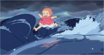
The sequence where Ponyo runs on top of the waves of water in a race with the auto on the shore could not be any greater. I just sat there with my mouth open totally in tune with the film and completely enchanted with the graphics themselves. Animation, Background, effects and cutting all played harmoniously and together. It was an absolute delight.
The English voiceover dubbing was hit and miss. I have the suspicion that the actors were directed to underplay their emotions so that they’d sound more “Japanese” – in tune with the original. When you’re working with Liam Neeson or Cate Blanchett (who gives an interesting lilting accent – slightly Eastern European), their interpretations make this strategy work. 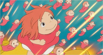 However, Tina Fey (who is a better comedian and writer than actress) comes up with what seems a careless, non-caring mother who just is not very likeable. The kids are kids and their voices are totally in-sync with the film. Betty White and Lily Tomlin are superb.
I also suspect that the dialogue was altered to try to explain or weaken some of the cultural differences in the story. It’s the only place where cuteness intervenes in the film. I’ll search out a subtitled version of the film on DVD to compare.
The score by Joe Hisaishi was superb. A beautiful orchestral score with full melodies and strong backing of the film. Only the final credit song was horrendous – it literally pushed people out of the theater. Too bad because there was a unique feel in the credits. The title read something akin to “Those who made the film:” and listed everyone’s name bunched together in alphabetical order. Composer, director, producer, animator, colorist; they were all mashed together without categorizing their service to the film.
I’m glad the film was so brilliantly 2D; I’m also glad there was no attempt to add 3D illusions so that I’d have had to gray-down the experience with those wretched glasses. I will see it again before it leaves theaters. The visuals are so dense, this is should be seen on a big screen. The audience attending my screening also loved it.
If you have any interest in animation, you owe it to yourself and the medium to see this film.
Prior to the screening there were a rash of ads for coming animated features and children’s films. They all – ALL – looked weak. Maybe they were just bad trailers.
Planet 51 and Cloudy with a Chance of Meatballs lead the way and sort of blended together in the mash of trailers.
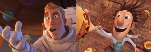
Planet 51 with Meatballs
The Princess and the Frog looked better, but the animation displayed revealed no character animation, just attitude.
I want to see this film and support it; I hope to be delighted by it but my guard will be up. I’d like Disney to be doing more 2D animation, and the success of this film will have some say in that. The future of properly trained animators is dependent on it.
The Fantastic Mr. Fox looked charming. The clunky stop-motion animation will be a bother for me – I’ll be watching the self-moving fur. I have a feeling they’re using Starewicz as their model. George Clooney’s voice was excellent.
Then of course there’s The Christmas Carol (which couldn’t look uglier – Jim Carrey’s – I mean Scrooge’s arms look like exorbitantly long sticks – very unattractive) with its motion capture problems. I won’t go to the theater for this.
I think I’ll go see Ponyo again.
Animation Artifacts &Bill Peckmann &Disney &Models &Story & Storyboards 17 Aug 2009 07:38 am
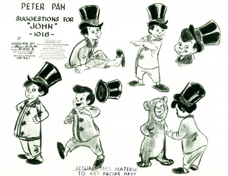
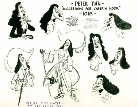
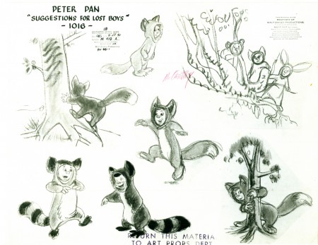
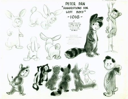
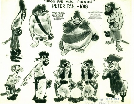
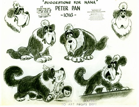
Peter Pan models à la 1940
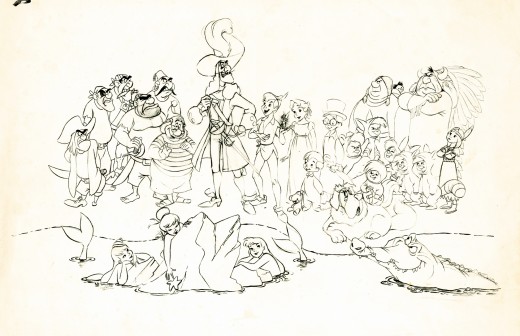
- Peter Pan was floating around production in 1940. I was reminded of this when I went through the magnificent grab-bag of model sheets that Bill Peckmann has loaned me for this blog. Here are some stunning model sheets which showcase a completely different take on the story before the influence of Mary Blair and the animators
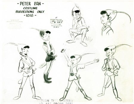
(Click any image to enlarge.)
.
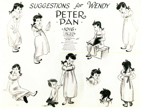
.
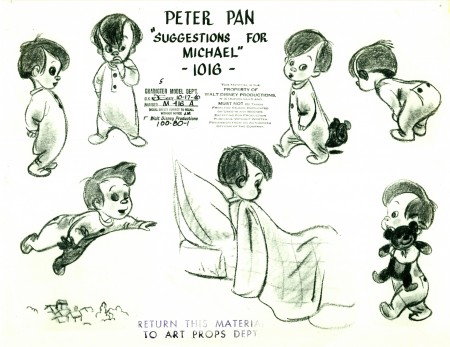
.
.
.
.
.
.
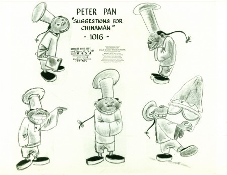
Surprise! A new character which was, fortunately, deleted.
.
.
Here’s a short bit of 1940 storyboard.
.
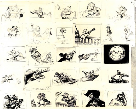
These drawings of Smee are loving and beautiful.
I’d like to know who did them.
And, in case you’ve forgotten, here’s how the final cast looked.
.Many thanks, again, to Bill Peckmann for the loan of these model sheets.
.
Commentary &Photos 16 Aug 2009 07:56 am
Summerstreets SundayPhoto
 - Before getting into the photopost today, I have to say that I saw Ponyo last night. Pleased to report that the theater was sold out (though I know the prediction at this point is for the film to make $4.3 million over the weekend.)
I have to say that this was far and away the most enjoyable film experience I had this year. The movie kept me on the edge of my seat absolutely enrapt by Miyazaki‘s brilliant presentation. The mid section where the girl returns has to be one of the greatest animated sequences of all time. I will see this film again, and I can’t encourage you enough to take it in. It’s great. Best film of the year so far.
I’ll have a ore detailed review later this week when my brain settles down.

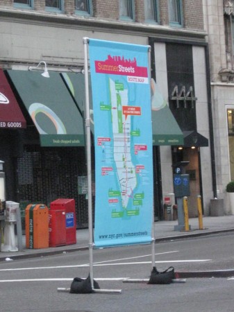
- Here with another gripe, I have the Sunday photo bit. Last Saturday I woke up to Police preparing Park Avenue for the 2nd annual Summerstreets program/festival/whatever. I don’t know what they’re actually calling it.
This is the latest attempt by Mayor Bloomberg to turn all of Manhattan into a suburban mall. He’s taken Times Square/Madison Square and Herald Square and closed them off to traffic. People can sit in the middle of these large thoroughfares and picnic. Excuse me, but Broadway is the major street in New York, and there’s no driving on it. Traffic is what there is now. It’s absurd!
Walking across Broadway and 29th Street, I found the street cut in half. There’s one lane for traffic (this is BROADWAY!) and one lane for pedestrians. What’s to say?
So, I found Park Avenue shutting down to traffic at 6AM last Saturday. The same this week.

Signs were placed in the middle of the street to tell pedestrians
what to do. .
The area that’s closed for these pedestrian malls is quite long.
Maps were set up to show people where they could go
without being run over.

All of Park Avenue from 42nd Street
(photo shot at 30th St looking downtown) down to . . .

. . . Houston Street in the Village. (shot from Bleecker looking uptown)
I haven’t been near the street during the mid-day hours, so I can’t vouch for how crowded it gets. But I’ve been told it’s pretty congested.
At 2pm the program shuts down and traffic can move again.
I wonder how much this costs the city to hire police officers to watch the traffic, set up and pick up the stantions, people to produce the signs and posters, and oversee the whole magilla. I’m not sure, but it seems whacko to me.
Articles on Animation 15 Aug 2009 07:03 am
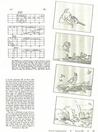
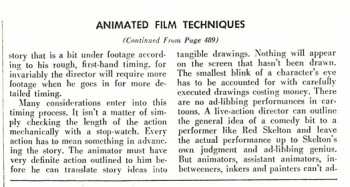
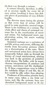
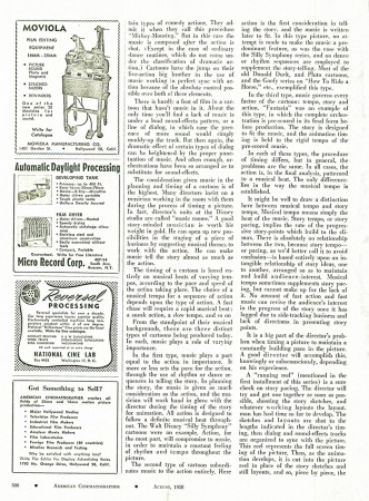
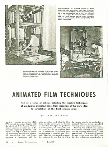
Animated Film Techniques
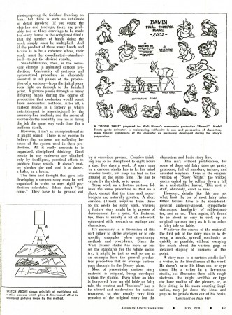
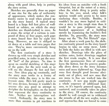
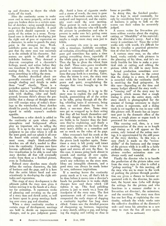
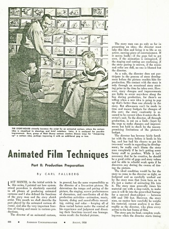
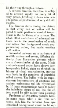
Here’s an old article from American Cinematographer Magazine. Published in 1958, it continued through four separate issues of the magazine. Written by Carl Fallberg, the article tries to detail the methods of animation production. Animated Film Techniques
This is a very old xerox copy, so I apologize for any quality problems. Here’s the first two parts of the article. The next two will come next Saturday.
 1
1(Click any image to enlarge to a legible size. ___
 3
3
Commentary 14 Aug 2009 07:04 am
Bits
 - When in doubt work it out in court.
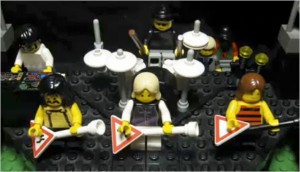
A 14 year old boy, Coleman Hickey, in 2007, made a stop-motion animated music video to the song “Tonight I’m Gonna Rock You Tonight,†by Spinal Tap. The film featured a cast completely made of Lego pieces. This includes a large audience of Lego characters, all animated.
The piece became an overnight sensation on YouTube. Among those that enjoyed the video were members of Spinal Tap who showed the video during their recent “Unwigged and Unplugged†tour. A concert DVD of the tour is in the works, and the video was to have been included, but the Lego people decided to throw an injunction against them. Rather than fight, Spinal Tap has decided to give in and excise the video from the DVD. They don’t have the money to fight the case, even though they’re sure they would probably win in court. This was all featured in an article in the NYTimes on Thursday.
This action comes on the back of the recent announcement in The Hollywood Reporter that the producer, Dan Lin, maker of Lara Croft, Tomb Raider, has acquired rights to Lego products to make a live action/cgi animated feature “a movie set in the world of Lego that centers on the subject of childlike imaginations and examines themes of creativity and teamwork in the manner of ‘Toy Story.’†Lego said yes to this offer because it and the producers shared a similiar vision that includes “a fun factor, creativity and that imagination has no boundaries,” Lin told Daily Variety.
They’re not even using actual Lego products to make the film (as Coleman Hickey had done, successfully). This goes to show that justice is not always kind in the real world. Producing hacks can pay for the rights to a children’s toy, but children aren’t allowed to play. This is tantamount to the current rash of car commercials on tv that feature cg drawn cars substituting for the real thing. It’s getting annoying. Another victory for cg filmmaking.
 - I’m not sure if the above story is any more newsworthy than the one that appeared in yesterday’s Daily News. In a Playboy inteverview Seth McFarlane reveals some insights about his characters. Apparently, Stewie is gay. (Some of us may have guessed.) McFarlane says: “. . . we decided it’s better to keep it vague, which makes more sense because he’s a 1-year-old. Ultimately, Stewie will be gay or a very unhappy repressed heterosexual. It also explains why he’s so hellbent on killing [his mother, Lois] and taking over the world: He has a lot of aggression, which comes from confusion and uncertainty about his orientation.” (Excuse me, did you say he wants to kill his mother because he’s GAY ?
He also reveals, in this interview, that Stewie’s mother, Lois, finds out during the upcoming season that she’s not the Protestant she thought she was; she’s actually Jewish. (No wonder she speaks the way she does!)
The Family Guy has to be one of the ugliest animated shows ever on TV, but the jokes and the stories are often well done. I particularly like the overlong segments wherein the characters barely move yet have these inane commentaries. The show is currently nominated for an EMMY as Best Comedy Show on television. This is a feat that The Simpson‘s fought to win years ago, but they didn’t succeed. Of course, it’s doubtful that the show will win, but it’s got to be “an honor just to have been nominated.”
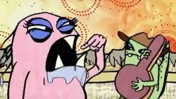 - The Sundance Channel is introducing a new series. Animation Bizarro is a collection of short new animated films (all Canadian) which can be viewed online at the Sundance Channel site. Animation Bizarro collection demonstrates a variety of styles: cel, paper cut outs, stop motion and CGI. It also touches on a variety of moods (funny, ironic and sardonic).
While visiting the site, I noticed that Bill Plympton’s Guard Dog was scheduled to run last night at 9:50. Too bad I wasn’t home to see it again. I assume it’ll have other air times in the month.
 - Manohla Dargis is quickly becoming my favorite reviewer. Her review in today’s NYTimes of Ponyo brilliantly captures the feel of Miyazaki in her opening lines. The respect to this filmmaker and the appreciation of his poetry seems to be in all of the reviews I’ve read today. From the very short Daily News review to the graceful review in the Times, they’re all enormously positive. However, Tasha Robinson in The Onion seems to have best captured the film I expect to see this weekend.
Tasha Robinson/The Onion:
“It’s aimed at particularly young audiences—in the Miyazaki oeuvre, it’s much closer to My Neighbor Totoro than Spirited Away or Princess Mononoke—and it barely has conflict, let alone a sense of menace or threat. It’s essentially a stroll through a fantastically detailed pastel world, in which the plot is little more than an excuse for Miyazaki to dive into a world teeming with colorful (and sometimes prehistoric) life.
. . . the story operates on a fluid dream-logic, or the storytelling logic of a very small child: Events melt into each other without urgency, and a simple act like making and drinking tea is treated with the same complacent, wondrous gravity as magic that calls wave-monsters into being. Even so, older kids and even adults are unlikely to get bored, thanks to the story’s unforced sweetness, giddy highs, and stunningly beautiful visuals. Even in the unspoiled Devonian, real life never looked this good.”
Manohla Dargis/NYTimes:
“As in the original Andersen fairy tale, which turns on a mermaid who dies because she falls in love with a landlocked prince, humanity has its costs. Not to worry: no one dies in “Ponyo†or even coughs. Its sting is so gentle you might miss it. But when the ocean rises in this wonderful movie, each leaping wave stares out at us with a baleful eye as if in watchful and worried wait. ”
Lou Leminick/NYPost:
“This exquisite pastel-colored, eye-popping example of hand-drawn animation is still very Japanese, aimed most specifically at children around the world — but with a storytelling sophistication that adults will savor.”
Joe Neumaier/NYDaily News:
“For all the magic of the Pixar era, the poetry of beautiful hand-drawn animation never wavers. When not done assembly line-style, it can still be transporting, and “Ponyo” — from Hayao Miyazaki (“Spirited Away,” “Howl’s Moving Castle”), known as the Japanese Walt Disney — is exactly that.”
Animation Artifacts &Bill Peckmann &Disney &Models 13 Aug 2009 07:50 am
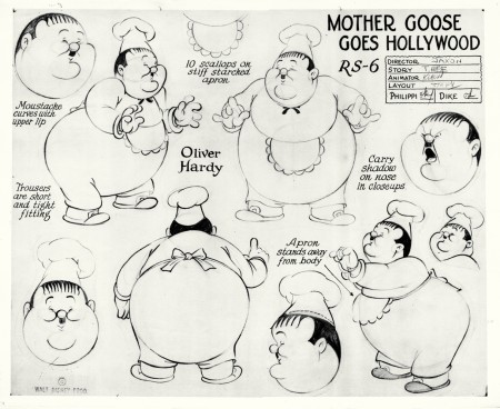
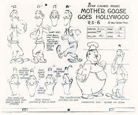
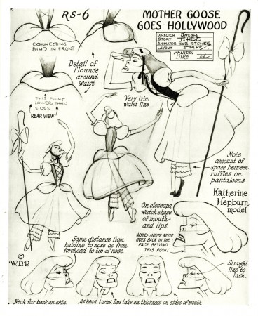
Mother Goose Models
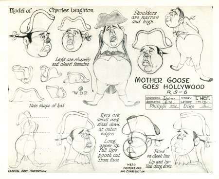
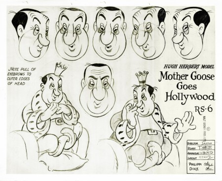
 - Here are more of the models from Bill Peckmann‘s collection. I’ve chosen to just focus on the one Silly Symphony, Mother Goose Goes Hollywood. The film showcases the genius of caricature that was possible in animation. (The closest we have today is the flash photo montages of JibJab. No beautiful drawing is involved.)
Joe Morgan was a major part of the models and design for these characters. The model sheets were signed by director Wilfred Jackson, storyman T. Hee, Animation Director Bob Stokes, and layout director Terrell Stapp. Other anmators include: Izzy Klein, Ward Kimball, Grim Natwick, Jack Campbell, and Don Patterson. Actual credit for story direction went to George Stallings,with T. Hee, Dick RIckard, Leo Ellis, Peeter O’Crotty, Ed Penner, Webb Smith, and Izzy Klein working under him.
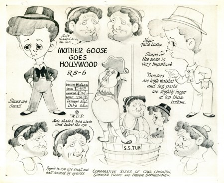
(Click any image to enlarge.)
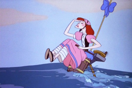
To give an idea of the color in this film, here are some frame grabs:
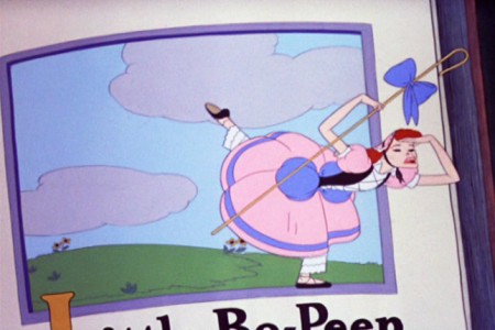
Katherine Hepburn

Hugh Herbert and the Marx Brothers

Hugh Herbert, Donald Duck and Charles Laughton, Spencer Tracy & Freddie Bartholomew

Spencer Tracy & Freddie Bartholomew and Katherine Hepburn

W.C.Fields and Charlie McCarthy

Edward G. Robinson, Greta Garbo and Eddie Cantor

Wallace Beery, Fats Waller and Cab Calloway

Edna Mae Olvier, Mae West, and Zasu Pitts

Edna Mae Olvier, Joan Blondell, & Zasu Pitts and Clark Gable & George Arliss
For other caricature ID’s you can look at the blog, Random Semiconscious Musings.
Articles on Animation 12 Aug 2009 07:40 am
Wartoons
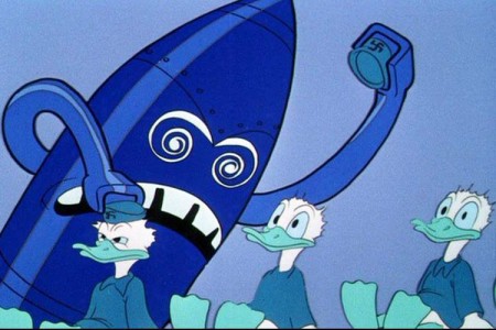
I wish that the article were a bit more of a commentary from the German viewpoint. I’d like to hear their opinion of some of this obviously biased material. There were also some well chronicled animated propaganda that came from the German side.
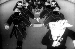
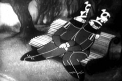
Two stills from Trnka’s The Springman and the SS
This film includes the horrific image of 2 GAY Nazis !
The DVD Cartoons for Victory! (from Thunderbean Animation) includes a number of these films from both sides. There are a number of Private Snafu shorts, Jiri Trnka’s The Springman and the SS, Hans Fischerkosen’s Der Schneeman and Nimbus Libere (another Nazi propaganda short).
Thanks to Kathy Ryan for pointing me in the right direction for the Der Spiegel article.
Much more has been written about this subject at David Lesjack‘s excellent blog, Toons at War blog. This is a site I’d encourage you to view often. Material like the image below are frequently featured there.
______________________
Congratulations to those New Yorkers who got films in competition in the upcoming Ottawa Animation Festival. They include:
- Fran & Will Krause
Jake Armstrong
Jennifer Oxley
Mike & Tim Rauch
Signe Bauman
