Monthly ArchiveAugust 2009
Animation Artifacts &Bill Peckmann &Disney &Models 31 Aug 2009 07:39 am
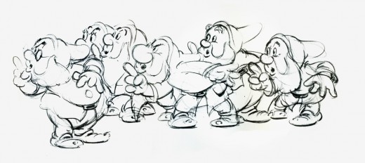
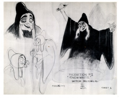
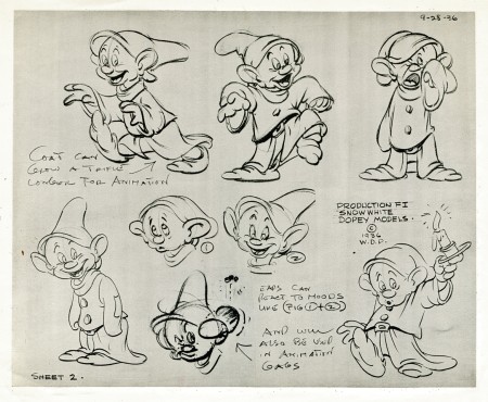
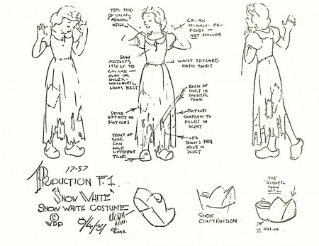
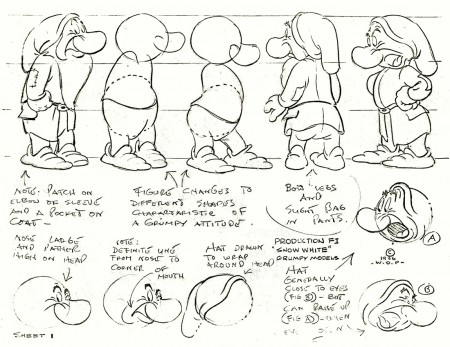
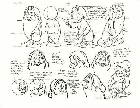
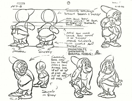
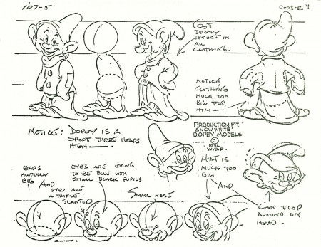
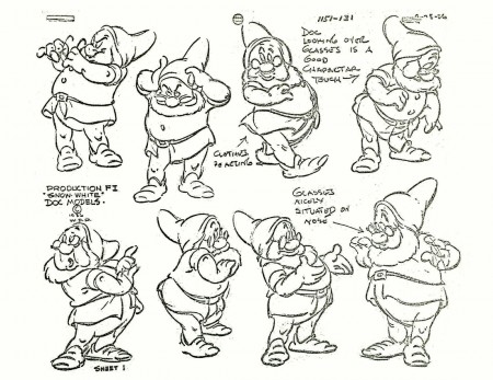
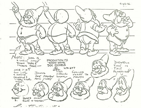
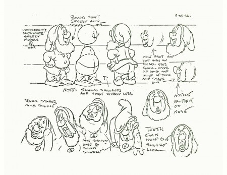
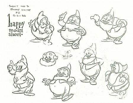
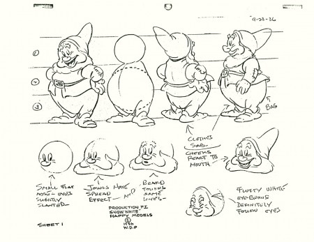
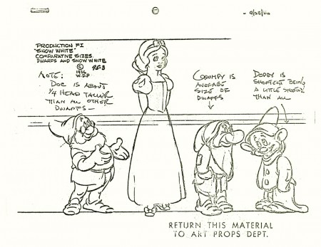
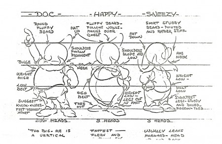
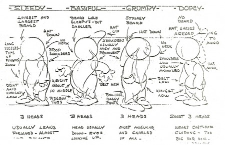
Snow White models
- Here, I continue with the recent outburst of model sheets. The following is a collection of Snow White and all seven dwarfs. I assume some of these can be found in print in one of the many collections of art from the film. I found two of the models in an old, expensive book I have which came via American Express.
The first two beautiful, original models come courtesy of Bill Peckmann‘s collection. The remainder of the group were Xerox copies I made years back. I’ve tried to clean them up a bit (lots of old grit from the ancient copies on glossy paper.)
Photos 30 Aug 2009 07:36 am
Up on the Rooftops – SundayPhotoRecap
- Here’s a recap of one of my favorite SundayPhoto posts. It came from May 2007. I’m posting it anew since I plan to upadate it in the next week or two. Enjoy your Sunday.
I’ve always had something of a fascination with the rooftops in New York. There are lots of pipes and chimneys, and other paraphernalia on tar paper covered roofs. My curiosity should have pulled me off my bum to do a bit of research and find out what those bits & pieces and unidentifiable objects are.
For this reason, I often look up while walking down the street. I decided to photograph some of these things while out and about this past week. For better or worse here they are:
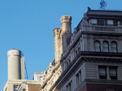 a
a 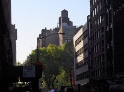 b
b
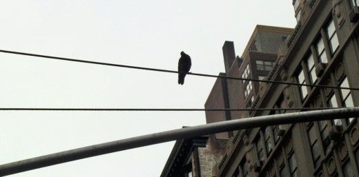
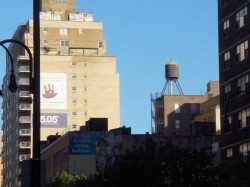
Most buildings look like these three. There are the older buildings constructed in the early 20th Century (as in “a”) with a fancy ediface. They’ve been cleaned of any gargoyles or protrusions that might’ve once leaned off the face of the building – landlords didn’t want to be sued as these objects started to come loose and fall off.
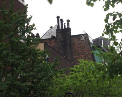 There are the sleeker, newer, less interesting buildings (as seen in “b” above) which are boring to the eye. The flat top in the foreground is not as attractive as the turreted red building in back of it.
My favorites are the smaller, more interesting buildings built (to the left) with odd pipes and chimneys peeping out.
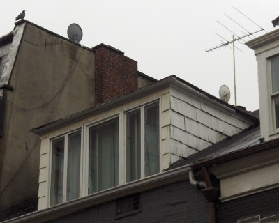
In the not-too-distant past, rooftops were covered with TV antennae.
This has been replaced with satellite dishes. I’m not sure which is more attractive.
I know illustrators still enjoy putting an occasional antenna on a city rooftop
or even a pair of rabbit ears atop a television set.
After all, what says TV more than an antenna? A cable box?
 d
d 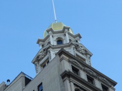 e
e
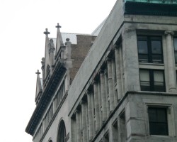
I only photographed the one building, but I found that many of the early 20th Century constructions had crosses on the top. These aren’t churches, either. Perhaps in an earlier time they had some connection to a Christian organization, but today they’re very commercial. However golden globes are definitely big on the tops of many of the buildings in the City.
 e
e 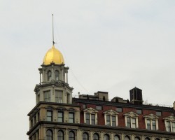 f
f
Many are under maintenance; many just stand out shining.
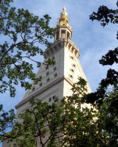 There are also those, such as the building on the left, which have a beautifully sculpted golden top that merely crowns the steeple of the building.
A lot of care went into these rooftop pieces that shone over a pre-neon city. This building, on 23rd Street and Madison Avenue, was at one time the governmental center of the city. It was a very rich area until the downtown low-lifes started encroaching, and the rich moved further uptown. The Mayor’s home, Gracie Mansion, is on 88th Street, the far East side of Manhattan.
Where does such a building keep its air conditioning equipment and water towers so prevalent on other buildings of the period? That might be asked of a lot of buildings, today, in this modern era.
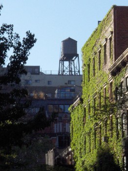
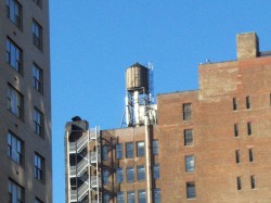
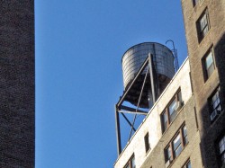
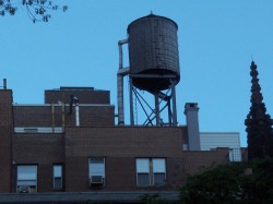
Speaking of water towers, there are plenty of them. They cover the rooftops and range in sizes and shapes. Some look more industrial than others, and I’m not sure what purpose they serve.
Years ago I took my father to a show at Lincoln Center. He was an air conditioning engineer, and as we passed the large fountain in the square, he remarked that the water of the attractive fountain also served the air conditioning of the entire center. That bit of information has stuck with me for many years.
Do the water towers of the city also serve the air conditioning? Are they the remnant of an architectural solution of the past? The newer, less attractive buildings don’t seem to have these structures. I guess I have more homework to do.
 m
m 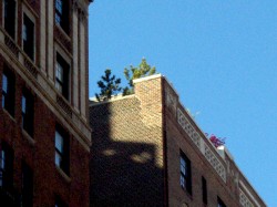 n
n
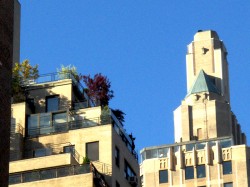
Plants, of course, proliferate on the City’s rooftops. Any way to add green to the tans and greys of Midtown is obviously optimistic.
 o
o 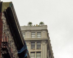 p
p
However, one isn’t always prepared for the variey of plants and trees one sees in the distant sky. Many fir trees abound, but obviously a homesick Californian would plant palm trees on his roof. (see “p”)
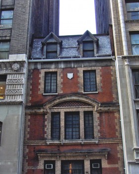 I couldn’t help but finish with one of my favorite little buildings in town.
It’s not so much the rooftop that’s interesting, here, but the building, itself.
You see the entire structure in this photo to the left.
.
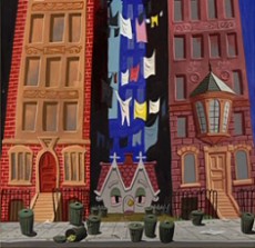
It sits on 28th Street squeezed between two larger buildings. In a way it reminds me of the “Little House” in the Disney film as designed by Mary Blair. I doubt laundry would ever have hung out of a midtown Manhattan window. They used to dry it on clotheslines on the rooftops (a bit I used in my film, The Red Shoes.)
One wonders what the story of this building can be told and what interesting landlord didn’t sell out to the money grubbers to the left and right of him. There’s a lotta history in this City.
Articles on Animation &Independent Animation &Tissa David 29 Aug 2009 07:45 am
Sightlines – Women
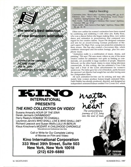
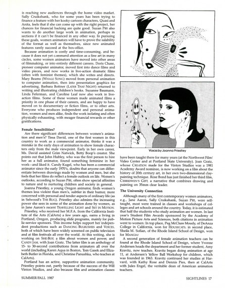
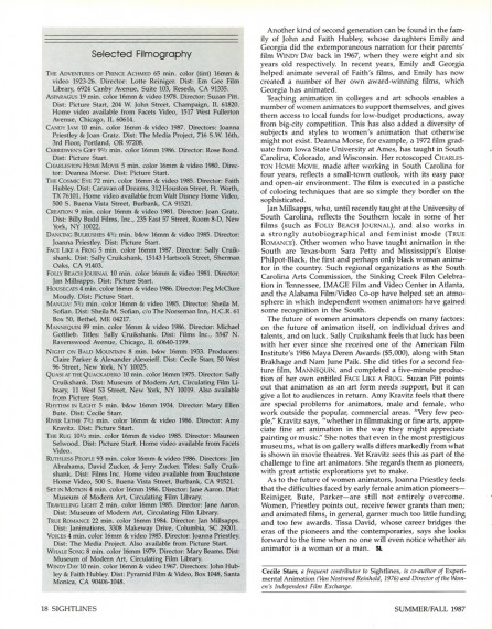
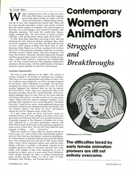
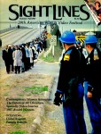 - The Summer/Fall 1987 issue of Sightlines magazine had an article about women in animation. The article is by Cecile Starr who wrote frequently about Independent Animation. This feature was a companion piece to one the magazine offered about Snow White’s 50th anniversary.
Back from the 70′s through the 80′s there were a number of articles and features about women animators, and it was welcome. However since then the notice has been limited. Rarely are there articles about women animation artists (other than the infrequent Mary Blair article).
I’d like to see more of them, and it’s not a bad start by posting this article. (I’ve decided to show ads and all.)
 1
1(Click any image to enlarge.)
Animation &Animation Artifacts &Richard Williams &walk cycle 28 Aug 2009 07:34 am
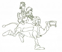
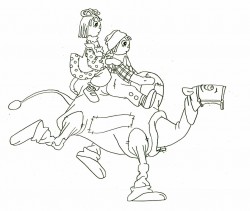
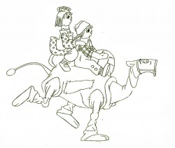
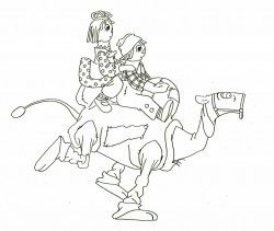
Babbitt Camel Run
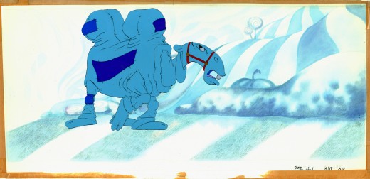
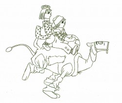
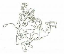
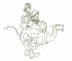
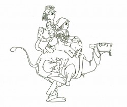
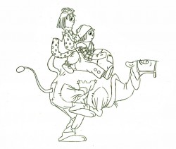
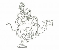
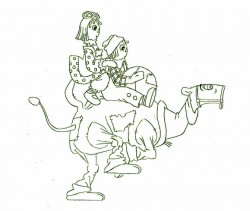
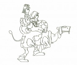
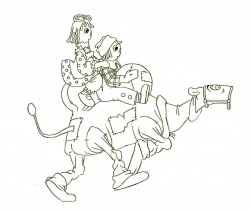
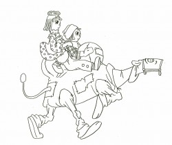
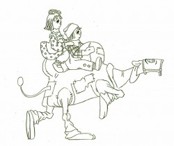
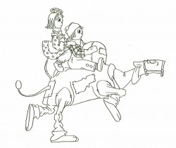
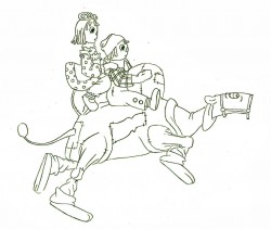
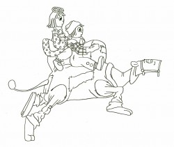
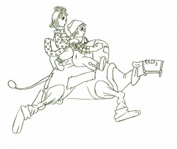
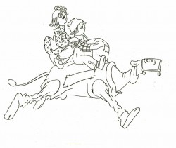
- Art Babbitt supervised and animated large sections of Raggedy Ann & Andy featuring the Camel with the Wrinked Knees. He developed the character and gave it the form it finally took in the film. Other animators followed his directions throughout the film.
It was his idea to work the Camel as if there were two people within its body so that the front half didn’t always do what the back half did. As a result, runs and walks were usually peculiar. Often the front would move and the back half would have to catch up. Art never quite understood (nor did he try to understand) what other animators were doing with Ann and Andy. Consequently his version of these characters stood out like unconscious orbs floating around his camel.
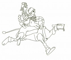
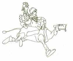
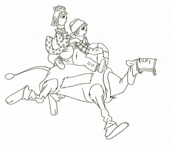
Here’s a run cycle he did. The camel’s hind front leg is on another level as is his talking mouth.
The tight tight tight style is Art’s; the assisting is by David Block.
 1
1 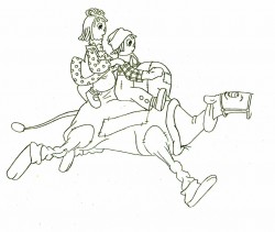 2
2(Click any image to enlarge.)
Here’s the final QT of it all together:
Babbitt’s Camel Run
Click left side of the black bar to play.
Right side to watch single frame.
Articles on Animation &Bill Peckmann &Books &Disney &Illustration 27 Aug 2009 07:26 am
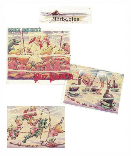
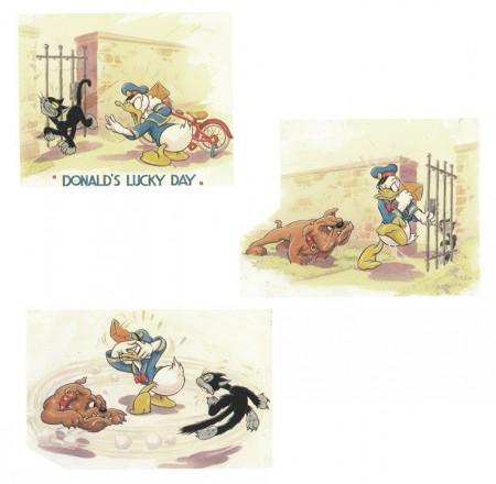
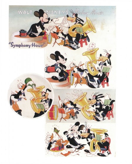
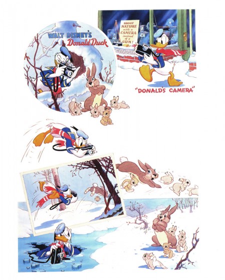
Good Housekeeping 2
- Before getting into today’s post, I want to make sure you’ve all seen the notation on Tom Sito‘s great blog today. (An amazing and unique blog if there was one.)
- 1968- Former master animator Bill Tytla’s request to return to Disney was turned down. The artist who animated Grumpy the Dwarf, Dumbo and the Devil on Bald Mountain even offered to do a free “trial animation test” to show he still had it. Disney exec W.H. Anderson wrote him:” We really have only enough animation for our present staff.”
Tytla died later that year.
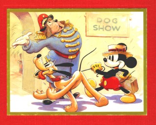 - This is the second part of my posting of the illustrations from Good Houskeeping Magazine.
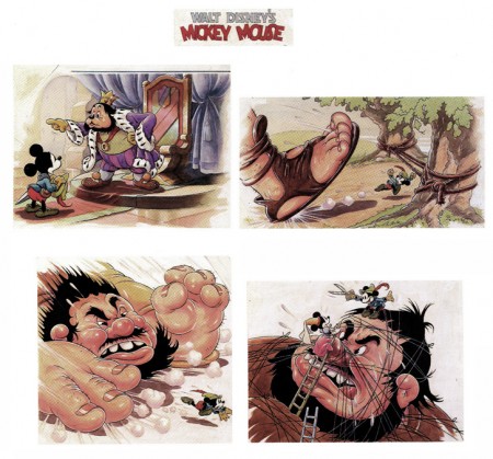
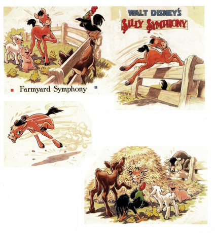
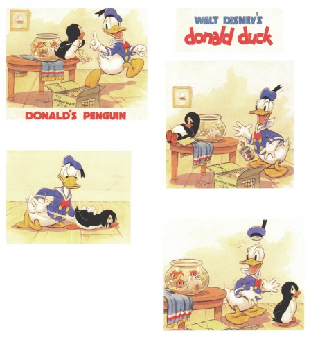
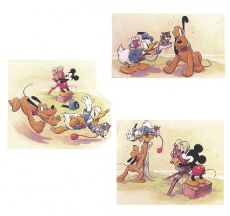
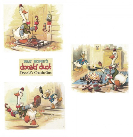
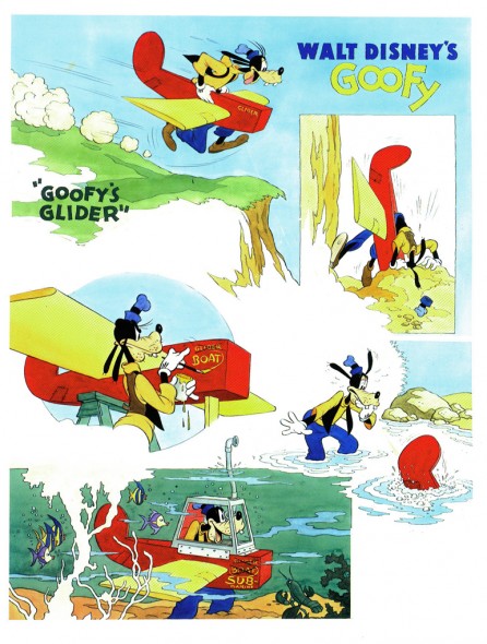
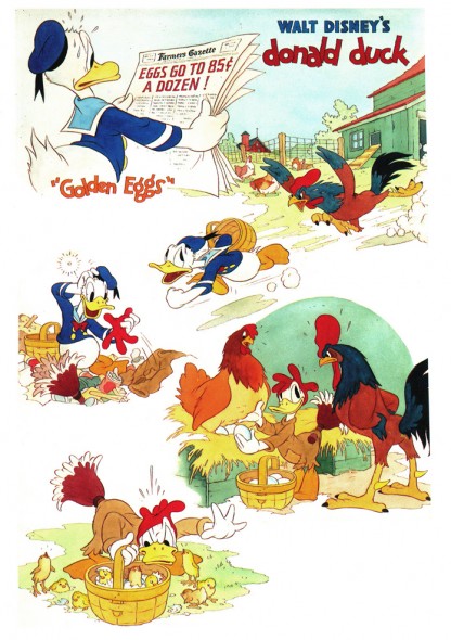
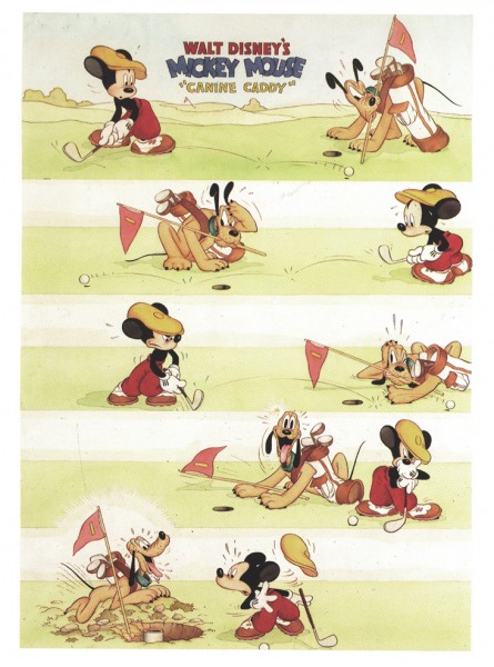
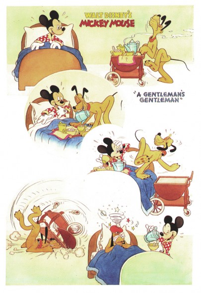
From 1934 continuing into the late 1940′s, they printed four-color full page previews of newly-released Disney shorts. These illustrations were, at first, painted by Tom Wood, and later by Hank Porter.
The Alexander Gallery collected these illustrations in 1987 for an exhibition, and they published a book of them. Bill Peckmann has kindly loaned me his copy of the book.
These illustrations were published recently in the book, Walt Disney’s Mickey and the Gang. It’s a good book which publishes more art than the Alexander Gallery collector’s item. However, the printing in this book feels more glossy and contrasty. The delicacy of the watercolors is sacrificed. That’s why I’m intent on posting them in the better form. However, this book also includes a lot of other info on the animated films and it includes the text originally published in Good Housekeeping.
Here is the second group of pages:
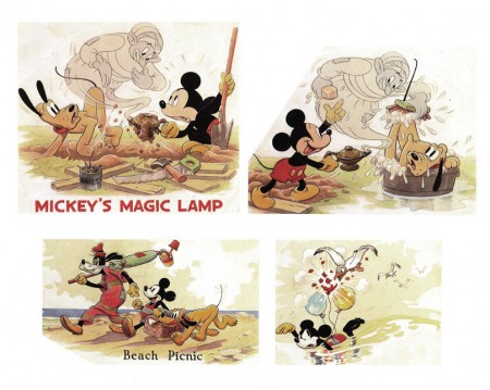
Mickey’s Magic Lamp 1940 | Beach Picnic 1938
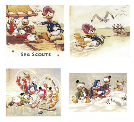
The Sea Scouts 1939 | The Hockey Champ 1939
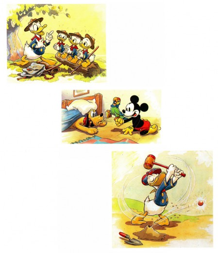
The Good Scouts 1938 | Mickey’s Parrot 1938 | Donald’s Golf Game 1938
Interesting to note the play with Mickey’s ears. These are the ears
with three dimensions used in only a couple of shorts.
Another play on Mickey’s ears – very different.
.
Daily post 26 Aug 2009 07:49 am
Teddy/First Run/El Grupo

I’m surprised. I can’t get Teddy Kennedy out of my head today.
I don’t know how the Senate goes on without him.
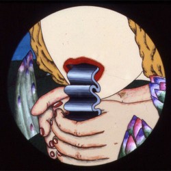 - Suzan Pitt’s World – As part of the celebration for the 30 Years of First Run Features at Lincoln Center there will be a program of the collected works of Suzan Pitt. Three of her finest shorts will be screened: Asparagus (1979), Joy Street (1995) and El doctor (2006). This is a pretty strong program which shows a unique vision in the world of animation, and I encourage anyone who isn’t familiar with her work to take the time to see these films on a big screen. (Everyone who is familiar with her work will probably want to return for another look.)
Asparagus was a natural for those late night screenings in the late 70′s early 80′s – at least across New York’s cinemas. It was as much a part of the scene as David Lynch’s Eraserhead or Alejandro Jodorowsky’s El Topo at midnight showings.
Performances will take place: Sun Aug 30: 1pm and Wed Sep 2: 2:50pm.
 Also included in this retrospective is Jan Svankmajer‘s Alice. This, of course, is the inventive stop-motion animator’s unsettling version of Lewis Carroll’s classic Alice in Wonderland. (You can watch a clip from this film here.)
Screening times are: Sat Aug 29: 1pm & Wed Sep 2: 9pm.
You might also want to look over the list of other films in the series of First Run Features. They’re my DVD distributor for a good reason (and it isn’t money); they have enormous respect for the Independent film maker and take great care with the films they distribute. Likewise I’m a fan of many of the filmmakers they do handle. Ross McElwee’s work is enormously important to me. His Sherman’s March (Thu Aug 27: 4pm & Sat Aug 29: 8:30pm) and Bright Leaves (Tue Sep 1: 4:15pm & 8:45pm) are both part of this mini-retrospective.
Many of the films’ directors will be present for Q&As.
- This a reminder that there’s a screening of the documentary, Walt and El Grupo, tomorrow night at BAM. The screening is for MOCCA, the Museum of Comic and Cartoon Art, and it features a Q&A with writer/director Ted Thomas and producer Kuniko Okubo, moderated by John Canemaker.
Again, this will take place on tomorrow, Thursday, August 27th, 7:30 PM at the Brooklyn Academy of Music, BAM Cinema 4, (30 Lafayette Avenue, Brooklyn, NY).
Admission is free for Members of MoCCA. To rsvp, call (212) 254-3511.
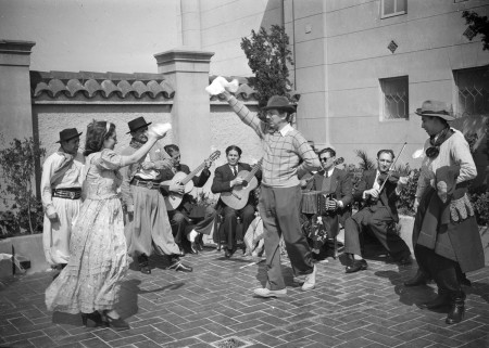
The film will open theatrically in NY & LA on Sept. 11th.
Marco de Blois has created a new blog. In response to the stir over Theodore Ushev’s poster for the 09 Ottawa Animation Festival, he’s posting any Animation Festival poster he can locate. The new blog is already overrun with a wide variety of posters.
Commentary 25 Aug 2009 07:30 am
Notes
First the positive:
- There are a couple of good comments about Ponyo on a number of those blogs I often frequent, and I’d like to call attention to a couple of them. Mark Mayerson, as usual, articulates some of the finest insight into the story of the film. David Levy has some fine comments worth checking out on his blog. As expected Daniel Thomas MacInnes’The Ghibli Blog offers many views and comments over many posts about the film.
This is a film that has remained very much alive in my mind since seeing it two weeks ago. Any animator or anyone interested in animation should see it.
Then the dumb:
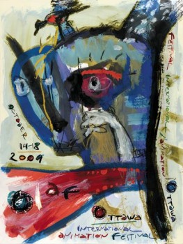 - There seems to be some nasty commentary brewing on some blogs about the current poster for the 09 Ottawa Animation Festival.
I’m made to think back to the world of the forties. Some animation artists wanted to move the world of the cartoon out of the Nineteenth Century and into the Twentieth. When these artists did break from the tradition, creating UPA, ultimately dragging the medium into the art world of the present, there was a backlash by those who didn’t seem to understand what was going on.
Picasso, Matisse and Klee (not to mention Pollock, Kline and Dubuffet) had successfully brought the artworld around, but the cartoon world was stuck on Arthur Rackham and Walter Crane. The new wouldn’t do for these animators, and they rebelled against the different. The public loved the new shorts.
The world’s not too different today. Some people are denying Obama’s naturalized birth, and others are denying modern art. (Even though it isn’t all that modern.)
When I first saw the OIAF 09 poster I liked it but didn’t think much beyond that initial response. Now I see all these absurd comments attacking the artwork on the poster, and I wonder what the fuss is all about. Pete Emslie, on his blog The Cartoon Cave (indeed), in a post childishly labelled “Blecchh!”, veers from his usual presentation of celebrity caricature to rail against this artwork. “. . .it’s not to my more discerning tastes, art wise. Rather than be on a poster for an international event, I’d suggest the proper place for this image would be taped to a fridge door by some loving mom.” The comment looks down its nose with a childish and ludicrous tone; as if Pete Emslie had decided his taste in art was “more discerning” and better educated. And he doesn’t just have to tell you he doesn’t like the poster, he has to try to find the nastiest invective: “My best guess is that it’s supposed to be a cat vomiting. Yes, a vomiting cat, I’m almost sure of it.”
Naturally, others comment trying to outdo the viciousness on this blog attacking the Festival poster. It’s disturbing that this “better-than-thou” attitude exists. I find it odd to have to defend abstraction or modern art at all.
This poster is a fine work, and it deserves a little respect from those who’d like to call themselves artists. Perhaps it’s time to revisit your art history books and art galleries; you might find that this doesn’t work as a gag cartoon because it isn’t one. It isn’t very comfortable, and it’s not supposed to be.
Kudos to Chris Robinson for selecting such a poster to represent this Festival and for selecting more daring films (that would never find the way into super-commercial Fests like Annecy) within the programming, itself.
Richard O’Connor has similar musings on the Asterisk blogsite.
Animation Artifacts &Bill Peckmann &Disney &Models 24 Aug 2009 07:45 am
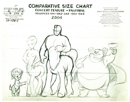
Pastoral Models
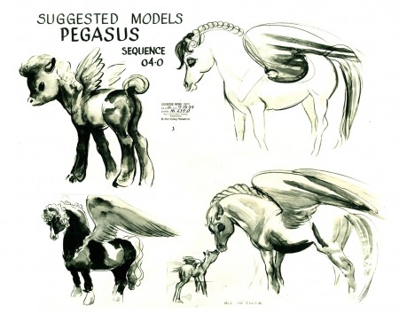
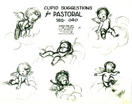
- The Pastoral sequence of Fantasia is probably the lowest point during the feature. An overly cute sequence in cartoon color glory does the least to support the original score (which has been severely cut by Stokowski from 40 mins down to its 20 min running time.)
The entire sequence can be wrapped up by that one scene where the cupie-doll cupids close out a scene with their fannies forming hearts.
I posted a group of illustrations from this sequence that appeared in the Fantasia book in Sept 2007. You can check that post here if you’d like to compare.
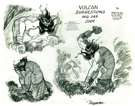
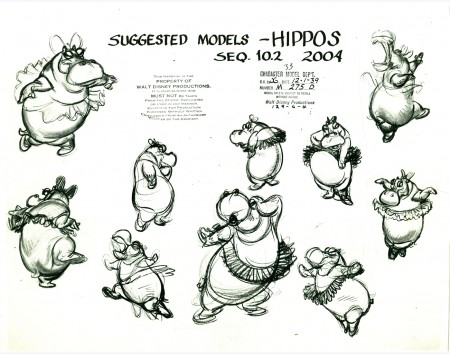
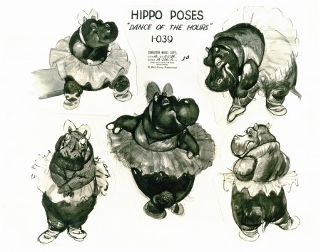
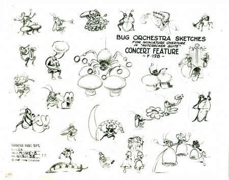
I’ve recently been posting some beautiful model sheets loaned to me by designer/director Bill Peckmann. He has a number of sheets form this sequence of the film, and I thought to post them all together. Here they are:
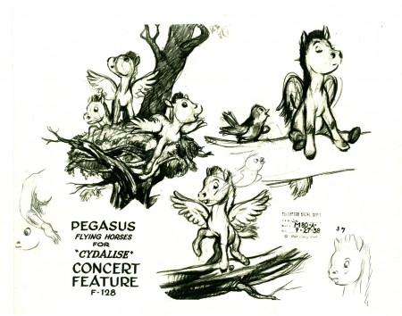
(Click any image to enlarge.)
.
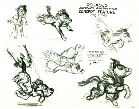
The models start by calling the film “The Concert Feature.”
.
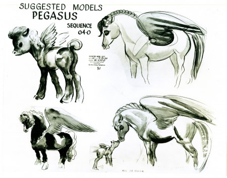
.
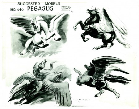
.
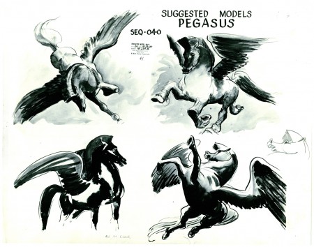
.
.
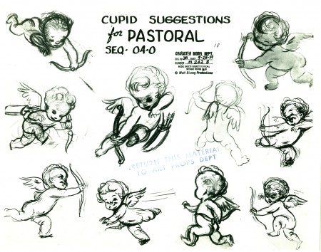
.They soon call the film the “Pastoral.”
.
.
.
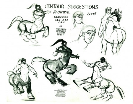
.
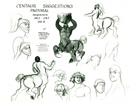
.
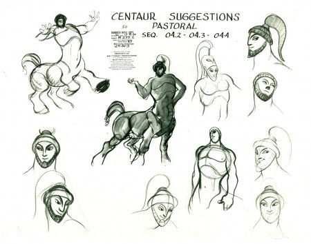
.
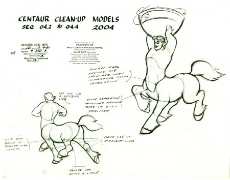
.
It’s interesting to see how loose these clean up models are
in comparison to those of the Xerox/digital era.
.
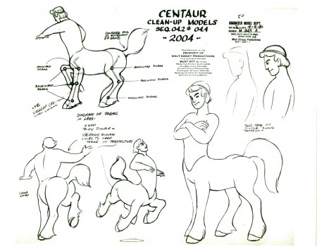
.
They’re probably tight compared to most of today’s assisting.
.
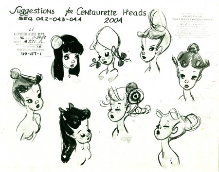
.
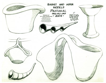
These are the first prop models I’ve seen from this sequence.
.
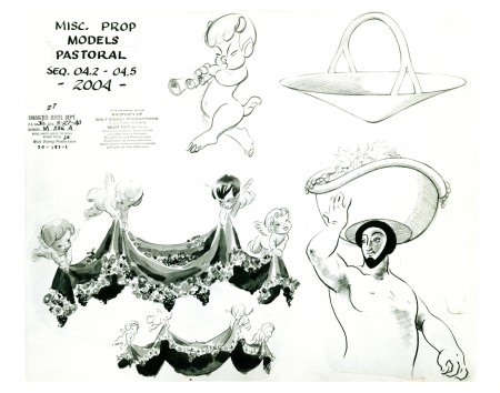
.
.
Here are two models of hippos from the Dance of the Hours sequence:
.
.
And finally, something to cleanse the pallette, a model for a sequence cut from the Nutcracker Suite:
.
.
Again, many thanks to Bill Peckmann for the loan of these great models.
Bob Cowan, has just started posting some material from Fantasia on his site. His collection is enormous and distinguished. Take a look.
.
Commentary 23 Aug 2009 07:59 am
Toe Tactic DVD
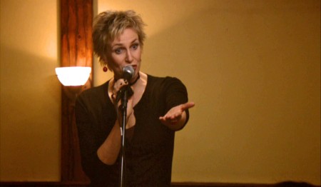
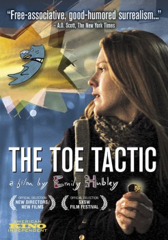 - Now in release on DVD is Emily Hubley‘s live action/animation feature, The Toe Tactic. Kino is releasing this film as of Sept. 1 and can be bought through Amazon here.
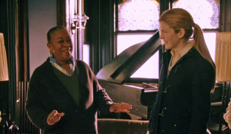
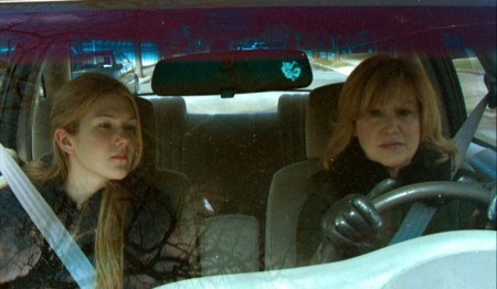
The movie follows Mona Peek (Lily Rabe) on an opening trip back to her suburban childhood home. She grieves her late father where nostalgia for their past overwhelms her. A number of other eccentric characters are interwoven with animated characters who comment on the action as Mona tries to come to terms with her reality.
In her review in the NYTimes, Jeannette Catsoulis wrote: “Mixing mischievous animation with quirky live action, the writer and director, Emily Hubley, transforms a conventional drama of loss and healing into an experimental jaunt through a surreal weekend in New York.”
The DVD includes a number of extras including scenes cut from the film, other shorts by Emily Hubley as well as storyboards from the film.
Co-stars include Eli Wallach, David Cross and Mary Kay Place (just about my favorite actress)
The music is by Yo Lo Tengo.
I enjoyed the film immensely when I saw it on the big screen at MOMA and then found myself equally and completely pulled in when I turned on the DVD, planning to watch only a few moments of the show, but caught pleasantly rewatching it all anew. It’s really enjoyably goofy, and you’ll get pleasure from it. Try renting it; once you have, you’ll want to buy a copy.
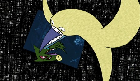
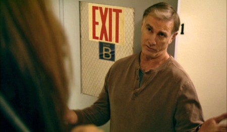
Some stills:
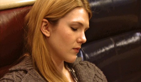
Lily Rabe
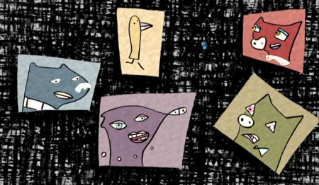
Voices of: David Cross, Andrea Martin,
Eli Wallach, Marian Seldes, Don Byron
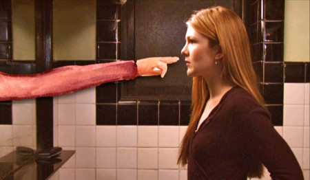
Lily Rabe confronted by her animated alter ego.
Screen credit goes to the following people for the animation:
- Mario Camacho …. ink and paint artist
Jeremiah Dickey …. animator & ink and paint artist
Emily Hubley …. animation director, animator & ink and paint artist
Tara Knight …. animation compositor
Biljana Labovic …. ink and paint artist
Lisa LaBracio …. ink and paint artist
Joy Marie Smith …. animation intern
Jeff Scher ….. animator – “Mirror Mona”
Animation Artifacts &Articles on Animation &Disney 22 Aug 2009 07:46 am
Animated Film Techniques 2
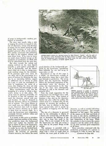
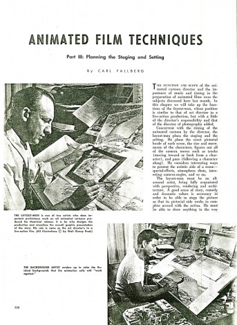
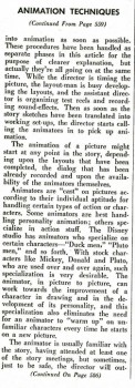
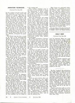
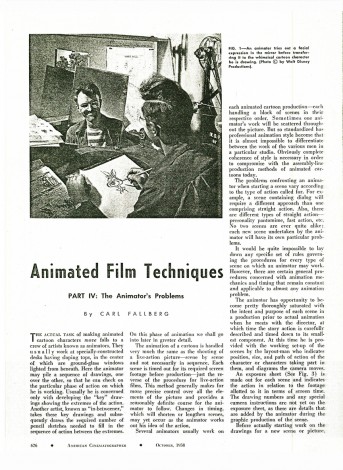
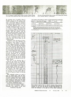
Here’s the completion of a series of articles from American Cinematographer Magazine as published in 1958. It was split in four parts. Written by Carl Fallberg, the article illuminates about the process of animation production.
Animated Film Techniques
This is an old xerox copy, so I apologize for any quality problems. Here’s the last of two parts of the article.
 21
21
(Click any image to enlarge to a legible size.
 23____
 24
24___
 25
25___
 26
26 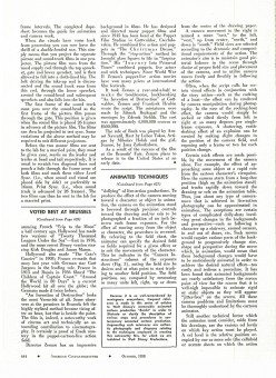 27
27___
 28
28 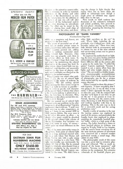 29
29
