Monthly ArchiveJune 2009
Animation &Animation Artifacts &Disney 10 Jun 2009 07:34 am
Tytla’s Stromboli 2
This note arrived from Borge Ring after my first post Bill Tytla’s scene featuring Stromboli’s mood swing:
- The Arch devotees of Milt Kahl have tearfull misgivings about Wladimir Tytla’s magnificent language of distortions. ‘”Yes, he IS good. But he has made SO many ugly drawings”
Musicologists will know that Beethoven abhorred the music of Johan Sebastian Bach.
yukyuk
Børge
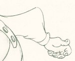
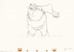
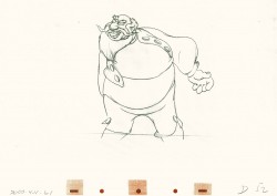
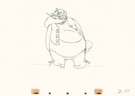
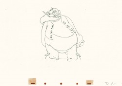
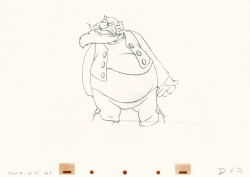
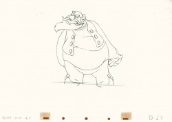
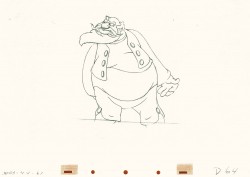
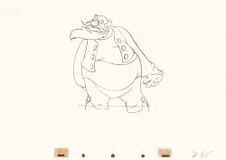
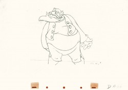
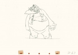
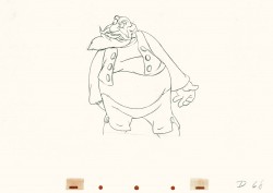
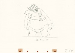
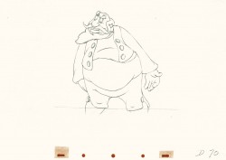
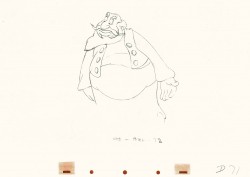
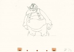
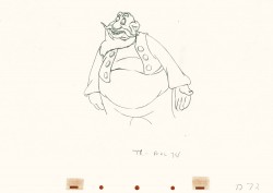
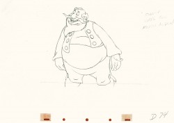
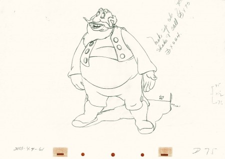
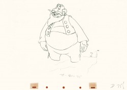
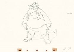
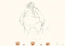
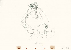
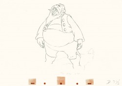
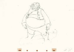
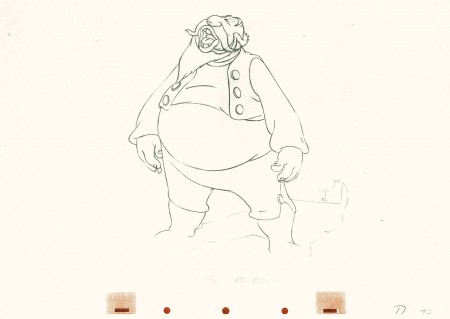
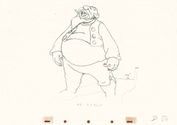
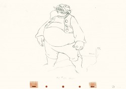
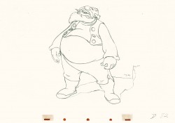
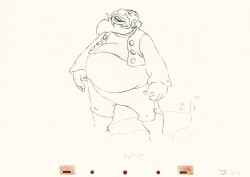
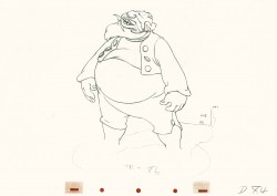
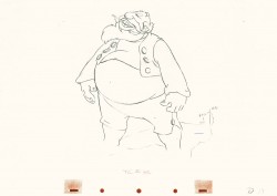
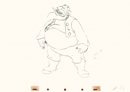
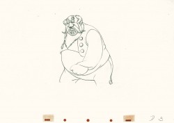
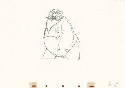
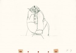
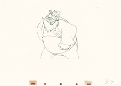
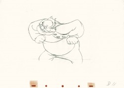
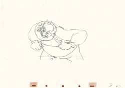
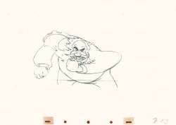
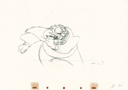
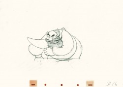
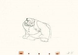
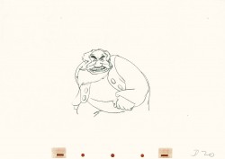
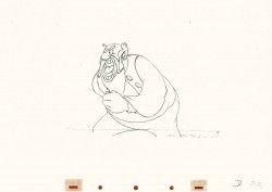
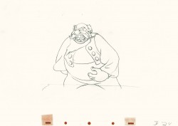
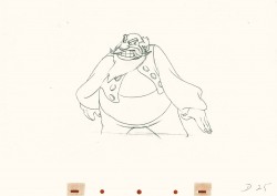
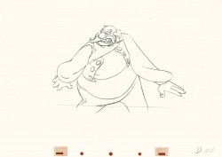
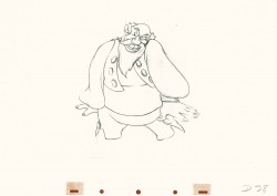
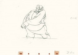
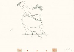
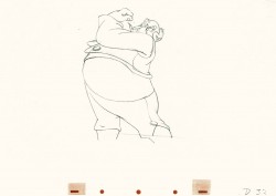
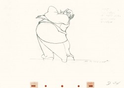
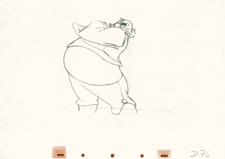
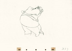
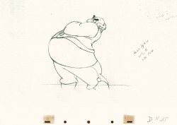
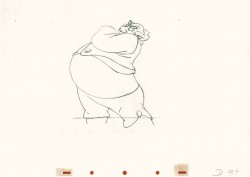
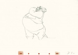
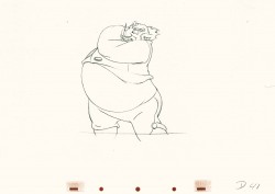
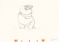
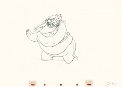
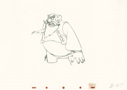
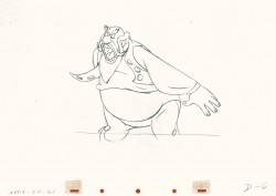
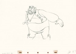
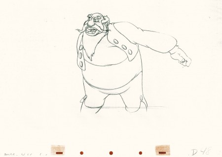
My first post spoke a bit about the distortion Tytla would use to his advantage to get an emotional gesture across. It’s part of the “animating forces instead of forms†method that Tytla used. This is found in Stromboli’s face in the first post. In this one look for this arm in drawing #50. It barely registers but gives strength to the arm move before it as his blouse follows through in extreme.
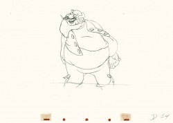
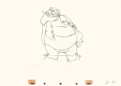
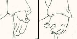 There’s also some beautiful and simple drawing throughout this piece. Stromboli is, basically, a cartoon character that caricatures reality beautifully. A predecessor to Cruella de Vil. In drawings 76 to 80 there’s a simple turn of the hand that is nicely done by some assistant. A little thing among so much bravura animation.
Many people don’t like the exaggerated motion of Stromboli. However, I think it’s perfectly right for the character. He’s Italian – prone to big movements. He’s a performer who, like many actors in real life, goes for the big gesture. In short his character is all there – garlic breath and all. It’s not cliched and it’s well felt and thought out. Think of the Devil in “Night on Bald Mountain” that would follow, then the simply wonderful and understated Dumbo who would follow that. Tytla was a versatile master.
Here’s part 2 of the scene:
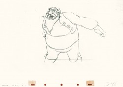 48
48 49
49(Click any image to enlarge.) The full scene with all drawings.
Click left side of the black bar to play.
Right side to watch single frame.
Articles on Animation 09 Jun 2009 06:45 am
Working for Lantz in the ’30s
- 22 years ago, “The Walter Lantz Conference on Animation” was held in LA. There were numerous gatherings and talks about animation on a few sunny days in LA. I got to meet a number of fine people there, but, in my usual shy manner, stayed a bit to myself. I did enjoy the event. I can’t remember going out specifically for that, but I was there just the same. My memory is a bit shaky about it. I know there were other conferences that I didn’t make.
A publication, The Art of the Animated Image was an Anthology that was published by AFI and edited by Charles Solomon. Writers such as John Canemaker, Cecile Starr and Donald Crafton wrote for it. The late, great Leo Salkin wrote this short piece which I thought might be interesting to some folks who haven’t seen it.
in the 30′s
A Reminiscence
BY LEO SALKIN
I went to work for Walter Lantz on March 3,1932. At that time he was producing Oswald The Lucky Rabbit cartoons for Universal Pictures. It was my first job. I had had an interview with Walter a couple of weeks earlier; he reviewed my portfolio of cartoons, drawn while I was at Hollywood High, and on the basis of that interview he hired me. It was the era of Prohibition, bathtub ginjohn Held, Jr. drawings, and the Great Depression. I was to be paid $17.50 a week, which seemed to me an enormous sum.
My duties were to wash cels, help in camera, learn to ink and paint, practice inbetweening on my own time. There was no training program: You picked up what you could as .you went along. During that time economic conditions were bad and getting worse, and while you were trying to learn how to ink and paint and flip animation drawings, you were never free of the fear that this job couldn’t last and that at any moment Universal might decide that they didn’t want any more cartoons and the animation department would be closed down. They were scary times but fortunately Walter managed well and we kept going.
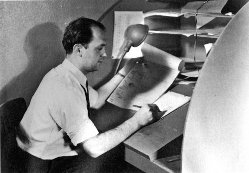
Walter Lantz at his drawing table, Universal Pictures, 1928.
In time, I learned how to animate a walk cycle, a run, a squash and stretch action, and something about the mystique of the exposure sheet and animation timing. After awhile I became a pretty good animator. And somewhere along in there I learned about gags. As a matter of fact, there was no way you could have avoided learning about gags: They were the life blood of the place.
What I value most about having worked for Walter in those years is what I learned about gags. The work days in the studio consisted of two major activities: one was making animated cartoons; it was the primary reason we were there, and it was the basis of our livlihood. The second activity, only slightly less important than the first, was drawing cartoon gags of each other. That; was a big thing. And it took place simultaneously with the production of the films. What was remarkable about the situation is that Walter not only tolerated and accepted it, he, at times, contributed and took part in it. And despite the horseplay, production schedules were met and budgets were contained.
It would be absurd to describe the atmosphere of the place as playful—that’s too refined—it was a funny place. It was a place of gags. The physical environment in which we worked influenced the kind of gags that were played. The animation building was a one-story structure. One side had windows running the length of the building. The interior was divided down the middle by a seven-foot high partition. The ink and paint girls were on the side by the windows—they provided a big part of the audience— and the animation department on the other side was in semi-darkness. It was the semi-darkness that seemed to have nurtured the particular kind of nuttiness that took place.
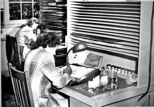
Inking and painting tables, Universal Pictures.
There were the physical gags like filling a small paper envelope-type of cup with water then pinning it to the bottom side of your animation board so that it slowly dripped on to the crotch of your pants as you were sitting there drawing. Tnere were the eraser gags in which someone would place a piece of rubber eraser on top of the hot light bulb under your animation disc and then wait eagerly for you to become aware of the stench that was enveloping you: There were the hot-foot gags—in fact that was the era of the hot-foot. Most of the guys smoked. Everybody carried matches. The room was in semi-darkness. The entire under-structure of the desks was open: four legs and a cross-piece to put your feet on. Perfect set-up.
And the imbecility went on endlessly. Then there were the belching gags—a standard after-lunch performance: A very loud belch. Voice in the darkness, “Are you okay?” Second voice, “Yeah, I think so.” “You didn’t tear anything, did you?” “No, I’m okay.” “You want some water or something?” “No thanks, but thanks anyway.” “Okay.” Finally, there were the so-called practical jokes which were plentiful, at times painful, embarrassing, humiliating and stupid.
Now we come to a special category which 1 treasure: the personal cartoon gags and caricatures. They were indigenous to the animated cartoon studio. Everybody in the place could draw. The ability to draw was almost a cheap commodity. The personal cartoon gag was the dominant form of communication; people expressed what they felt and observed in cartoons. Anything that happened during the course of the day, however trivial, was potentially the basis of a cartoon. The event could be blown up out of all proportion to what had actually occurred; it could be seen as ridiculous, absurd, pathetic, idiotic, or whatever. The gags were sometimes tasteless, crude, vulgar and obscene,but they generally got laughs.
To analyze why this provided so much pleasure—at least to everyone but the butt of the joke—would require another reading in the psychopathology of humor, and I’d rather avoid that. I think the guys wanted to have fun, to find relief from the boredom of flipping animation paper all day long.
The ability of the artists to create a strikingly recognizable likeness of whoever they were cartooning was extraordinary. Whatever was characteristic and unique about any given person
would be pounced upon, exaggerated and burlesqued, and combined with some personal incident, made a continuing source of cartoon gags and caricatures. Sometimes the way they drew you
would be embarrassing, “My God! I don’t look like that, do I?” And the only person youieould turn to for consolation was Robert Burns:
“O wad some power the giftie give us
To see oursel’s as ithers see us!”
We were granted that.
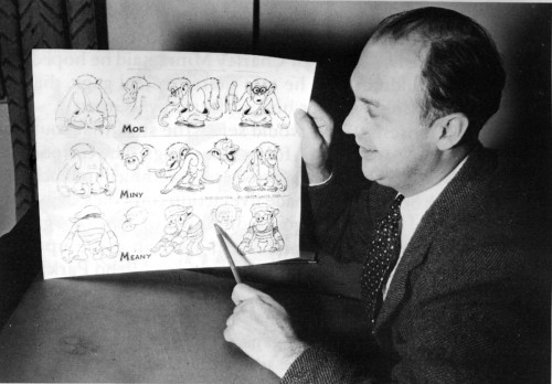
Walter Lantz with a model chart.
This brings me to that stage of development in which I began to learn something about the nature of gags, their structure and function in film. In the early ’30′s Walter Lantz didn’t have a story department. Walt essentially put the stories together with the contributions of a number of people who had shown an ability to think funny and to come up with gags for the films. The way it worked was this: first a subject was chosen: Oswald Camping Out or Oswald at the North Pole or a take-off on King Kong; then a notice was put up on the bulletin board asking those interested to turn in gags; this was followed by a story meeting. The guys called into the meeting were people who had turned in gags—at that time I remember there was Tex Avery, Cal Howard, Jack Carr, me, a few of the key animators, and Walt.
A story meeting, for those who have never attended one, was an extraordinary experience. The prevailing atmosphere was a mood of What the hell, it’s okay to say anything that comes to mind, what’s important is getting laughs. The out-going, extroverted, comic naturals had a hilarious time. For some of us to whom this was unfamiliar territory, the uninhibited, right-off- the-top-of-their-head-shouters were a bit intimidating. There was a lot of talking and laughing and making jokes. Sample joke: in one story meeting I remember Jack Carr, an inveterate punster, who had previously worked for Charley Mintz, said he hoped the Lantz group wouldn’t think he was there to steal gags, that he hoped they wouldn’t consider him a Mintz spy. (Groan).
Out of the nonsense Walt would select the stuff that could be made into a film: comedy bits, funny lines, gags. The cartoons of that period were still being concocted and assembled in much the same way Mack Sennett had made live-action comedies: “Charlie, there’s some kid auto races going on down in Venice—grab a cameraman, go down there and see if you can come up with something funny.” Or, “Hey! They just drained Echo Park Lake, it’s all mud, that oughta be funny as hell!” That’s what we did. We took a locale, an occupation, a situation, or the basic premise of a popular feature and did a lot of gags, strung them together, built in a chase, and got out in under seven minutes.
There was no market testing, or who is our target audience, or will a sponsor buy this? Come on, fellas, it’s just comedy. Get some laughs. Walter was the judge. What he thought was funny was what got up on the screen.
Story meetings despite all the laughter and kidding around had a lot of emotional tension running through them and you had to enjoy doing story to be able to cope with them. Bill Nolan, who co-directed with Walt, was one of the great innovative animators of the late 1920′s period, and he disliked working on story. In fact he hated it, and most of all he hated puns.
We were having a meeting with Bill on a story that Tex Avery, who was then the key animator on the Nolan unit, wanted to develop. It was to be based on a popular song of the period. “I Found a Million Dollar Baby in the Five and Ten Cent Store.” There was the usual amount of banter and gossip and making jokes and Bill was getting increasingly restless, irritated and annoyed. Then someone made a casual remark about how you could sure get some good buys in the dime store, and at that point Jack Carr, the pun man, said, “Right! I mean everybody knows that whatever you get at the five and dime is Woolworth every cent you pay for it!” That did it. The last straw. Bill Nolan jumped up, lunged at Carr and had to be forcefully restrained from punching him out.
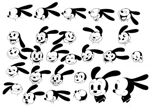
Model chart for Oswald The Lucky Rabbit, 1928.
The dynamics of a story meeting were instructive: You were in a competition to be funny, to get laughs. Your mind was totally involved—the right hemisphere, the left hemisphere, the conscious, the pre-conscious, and the unconscious—all trying to come up with that funny bit that would get a laugh. And suddenly you got it. “Wow! Wouldn’t it be funny,” you’d say to yourself, “if Oswald did this and then he did that and then he…” And then you’d stop. “Damn! That’s a gag I saw Chaplin do. I can’t suggest that. I didn’t think it up. That’s stealing.” And right at that moment, somebody else would jump up, say exactly what you were going to say and everybody would laugh and say, “Terrific! Hey, that’s funny!” And you’d be sitting there thinking, “I can’t believe it. Don’t they know that gag was already done by Chaplin or Keaton, or by Harry Langdon or Harold Lloyd?” It was but that was totally irrelevant.
What you had to learn was that it didn’t matter a damn that a piece of business, a comedy bit, a gag, had been done before, and who had done it. Those gags were like common currency, coin of the realm. They belonged to whomever thought of them. And a good memory for gags could be a valuable asset. What made a gag yours was the way you did it. Talented comics made the old stuff look new, mediocrities made it a bore.
You learned your craft as a gag man by doing gags, getting them in a picture, then going to a preview—imagine previewing a cartoon—at the Alexander Theater in Glendale and seeing if they got laughs. There was something ludicrous about the experience, in that the intensity of your emotional involvement didn’t seem justified by the actual event: screening a cartoon. Nobody went to the theater to see a cartoon. At best it was an amusing filler till the feature came on. Big deal. But here you are, sitting there in a cold sweat waiting for the film to unwind, waiting to see if your gag got a laugh. All you’ve got is one gag in the picture. Nobody in that entire theater knows you did it, or even gives a damn. You wait. The gag comes on. If it got a laugh you were ecstatic. Exhilarated. You just sat there in the dark and beamed. If it didn’t get a laugh the failure was personal and embarrassing. “Damn! How could I ever have thought that gag was funny?”
That’s the way it was. A gag got a laugh or it didn’t. The audience was live, there were no laugh tracks to fall back on. There was Walter Lantz and the studio, and you went back to the drawing board and tried again. And again and again.
That was my initiation into the world of cartoons. Walter made that possible. I felt privileged to be there. I used to be delighted when someone I had just met asked me what I did, and I could say,
“I’m in animation—you know, animated cartoons.” Then I would hand them my card which said, “Oswald Cartoons, Universal Pictures,” and there in bright orange, black and white was a smiling Oswald pointing directly to my name.
Animation &Fleischer &Frame Grabs &walk cycle 08 Jun 2009 08:12 am
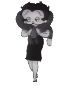
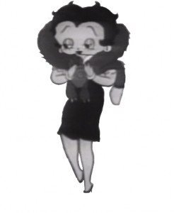
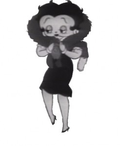
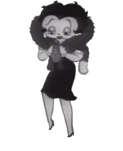
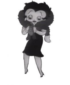
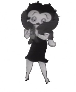
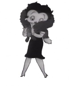
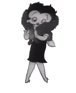
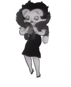
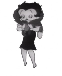
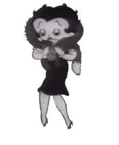
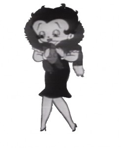
Betty with Fur walk
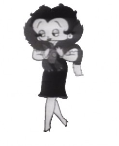
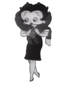
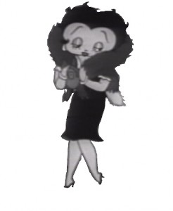
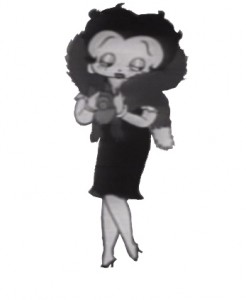
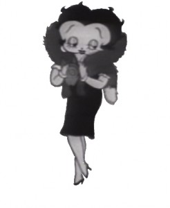
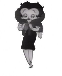
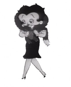
- I haven’t posted a Betty Boop walk cycle in some time, so I thought I’d pick on this one. Betty’s walking with a new fur stole, caressing it as she walks. Sweetly animated by Myron Waldman for the film Pudgy Picks a Fight in 1937.
 1
1 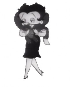 2
2(Click any image to enlarge.)
Betty wears her new fur.
on ones
Click left side of the black bar to play.
Right side to watch single frame.
Guest writer &Photos 07 Jun 2009 08:02 am
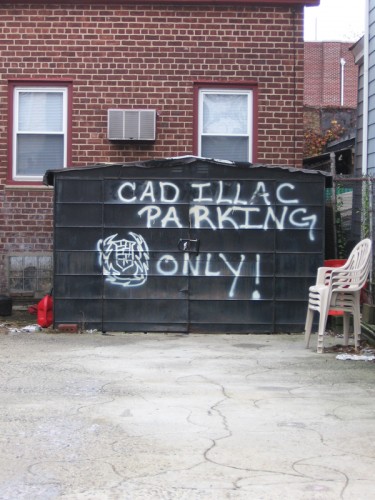
Signage PhotoSunday
Commentary &Daily post 06 Jun 2009 08:20 am
Spare Change
 - Having just posted lots of frame grabs from Bruno Bozzetto’s marvelous film, Allegro Non Troppo, I should have linked to his website. You can find there a page devoted specifically to this feature, as well as to his other two animated features: West and Soda and The VIP: My Brother Superman.
You can also find there many hilarious Flash films that Bruno has done. This is some of the best use of Flash that I’ve seen – all for a great laugh. If you’re looking for on-line entertainment – this is it.
- Jeremiah Dickey (who has assisted Emily Hubley on many of her hits) sent this note:
 Salutations friends & colleagues in the NYC area,
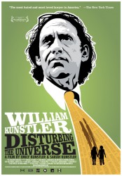
Two really superb documentaries for which Emily Hubley & I created animation last year are making their official NY premieres at the Brooklyn Academy of Music this month – come check them out if you can.
William Kunstler: Disturbing The Universe is a film about the life of the radical lawyer, made by his amazing daughters Sarah and Emily Kunstler. Part of BAMcinemaFEST, it will be screening on Saturday June 20th at 12:30pm, followed by a Q&A with the filmmakers (moderated by DemocracyNOW!’s Amy Goodman).
It will also be screened outdoors the following Thursday June 25th at 9pm in the parking lot across the street from BAM – links to tickets below.
_____6/20 _____6/25
What’s On Your Plate?, directed by Catherine Gund, daughter Sadie Hope-Gund & her friend Safiyah Riddle, follows the 11-year olds as they learn about the politics of food and its various impacts on urban sustainability, among other things. I should add that this film is also alot of fun. It will be screening for FREE in Fort Greene Park Saturday June 27th at 9pm, and screening again Tues July 2nd at 6pm as part of BAM’s Afro-Punk Film Fest.
Hope this finds everyone well -
cheers
Jeremiah
- Nina Paley sends the following message:
 Dear friend of “Sita Sings the Blues,”
The Sita Sings the Blues Merchandise Empire is finally live and open
for business: http://www.sitasingstheblues.com/store
(redirects to http://questioncopyright.com/sita.html )
At last we have DVDs and T-shirts for sale. Thanks for your support –
I won’t spam you again!
Love,
–Nina
From Patrick Smith:
 “ANIMATION FROM HELL!”
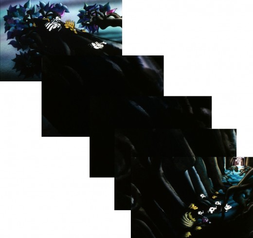
I’m curating a program for MOCCA Arts Festival this year called “Animation From HELL.” It’s a program of dark and twisted animation that will scare the fluffy bunnies out of any animation fan. This collection of disturbing shorts, past and present, has been hand picked by Satan himself.
Sunday, June 7, 2009
5:00pm – 6:00pm
at the Armory
68 Lexington Avenue, between 25th and 26th Streets
New York, NY
Frame Grabs &Independent Animation 05 Jun 2009 07:28 am
Bruno’s Allegro 2
 - Ravel’s “Bolero” continues in Allegro Non Troppo, and Bruno Bozzetto‘s extraordinary musical sequence moves on. Prior to seeing this film for the first time, I knew Bozzetto’s work well. I had seen many of his shorts and was a big fan. He never failed to have a big comment on society while making incredibly funny films. They were extraordinarily rich gems.
This film, however, was a surprise. The writing, as usual, was brilliant. The animation was more fluid, the styles were more varied and the calibre of each piece was very high. Of course, I should have expected masterful work from a master. It still holds up well on the little TV screen – and I’m sure it’s as strong in a theater (having seen it projected no too long ago.)
Here are the remainder of the frame grabs for that sequence.
 52
52(Click any image to enlarge.)
return to live action
Animation Artifacts &Frame Grabs 04 Jun 2009 07:31 am
Bruno’s Bolero I
 - Every once in a while, there’s a screening that you happen to attend that turns out to be monumental and stays in your memory the rest of your life. The Ottawa Animation Festival in 1978 had such a screening. It was a midnight premiere of Bruno Bozzetto’s new feature, Allegro Non Troppo. Everyone who was anyone attending the particular festival had to attend that screening.
The film screened to lots of laughs, rapt attention, and spontaneous bursts of applause. It ended with an overwhelming ovation that told Bruno he had created a gem.
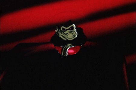
The movie was a parody of Disney’s Fantasia. There was some innocuous live action holding animated segments together. The animation was closely tied to classical music pieces. The highlight of that film was the Bolero sequence.
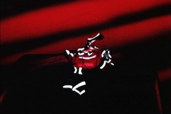
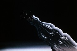
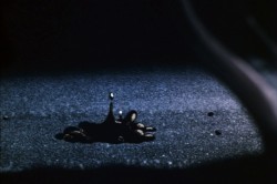
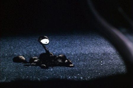
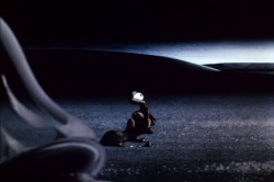
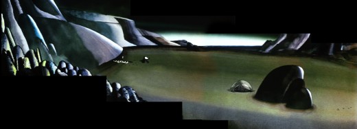
Here is the first of a couple of posts that give you frame grabs from Bolero. It all starts with a discarded Coke bottle in outer space.
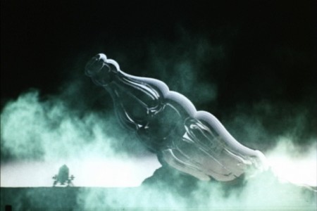 1
1(Click any image to enlarge.)
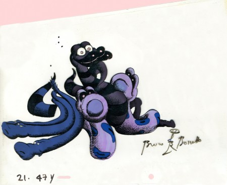
The first time I met Bruno was in New York, about six months after that showing. We had lunch, and he gave me a souvenir cel. One from this sequence.
Animation &Animation Artifacts &Disney 03 Jun 2009 07:25 am
Tytla’s Stromboli
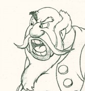 - Bill Tytla‘s work has to be studied and studied and studied for any student of animation. He was the best, and it’s pretty doubtful his work will be superceded. He brought beautiful distortion to many of the drawings he did, using it as a way to hammer home some of the emotions in the elasticity he was creating. Yet, the casual observer watching this sequence in motion doesn’t ever notice that distortion yet can feel it in the strength of the motion.
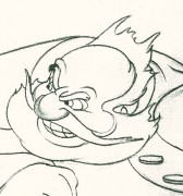
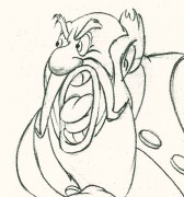
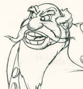
Four drawings (#1, 11, 22, & 48) that shift so enormously but call no attention to itself.
Brilliant draftsmanship and use of the forms.
Here we have the beginning: drawings 1-48. More will come in the future.
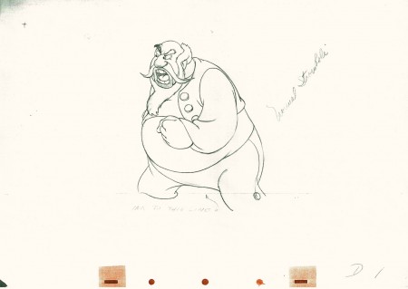 1
1(Click any image to enlarge.) The full scene with all drawings.
Click left side of the black bar to play.
Right side to watch single frame.
Commentary &Daily post 02 Jun 2009 08:25 am
MOMA and other shorts
Howard Weinberg, President of the New York Film/Video Council, will introduce a series of short films at MOMA on June 3 at 7pm. The films will screen again on June 4 at 4pm.
The Museum offers this bit of information:
- “Cosponsored with the New York Film/Video Council, MoMA’s annual showcase of recent narrative, documentary, animated, and experimental short films provides a glimpse into cinema’s future. Most short films are produced by young filmmakers at the start of their careers; at their best, these works are characterized by youthful vigor and a daring willingness to break with cinematic convention. The results can be funny, romantic, instructive, otherworldly, and insightful, and they frequently serve as bellwethers of future developments in the art of filmmaking.”
The program includes:
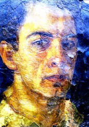 The Glass Trap (2008) Poland – Pawel Ferdek 15min.
The Portrait (2008) USA – Irra Verbitsky 4min.
Steel Homes (2008) Scotland – Eva Weber 10min.
Ten (2008) France – Bif 7 min.
Second Hand Pepe (2007) USA/Haiti/Can – Hanna Rose
______Shell, Vanessa Bertozzi 24min.
Left Behind (2008) Germany – Andreas Graefenstein, Fabian Daub 13min.
Eclipse (2007) Ind/Aus/New Z’land – Mark Lapwood 9 m
Lies (2008) Sweden – Jonas Odell 13 min.
Photograph of Jesus (2008) Grt Brit – Laurie Hill 7 min.
I’ve highlighted the one film because it’s the work of NY animator/artist, Irra Verbitsky (pictured right). Hopefully, a large audience will attend to cheer her film on.
I might take exception with MOMA’s statement that “Most short films are produced by young filmmakers at the start of their careers.” This somehow debases the work of most animation Independents. We can’t afford, for the most part, to do features. Shorts are expensive as well, but making them is obviously more manageable. Perhaps the same isn’t true of live action filmmakers. Perhaps once they’ve put their foot into the short film exercise, they can jump into producing feature films. Or maybe they give up.
Regardless, there are plenty of us out there making short films, animated, doc or live. We don’t need to feel diminished by an organization like MOMA that, I know, is supportive. Just bad copywriting.
- I must say that I enjoyed Mike Barrier‘s review of Up (in fact, I waited for it.) My only spark of contention is that I’m not a fan of Monsters, Inc. and he is. Regardless, he has a lot to say – even if you were a fan of the film – and is worth the read.
Over the years, as a film maker who has gotten a lot of very positive reviews, I’ve noticed that general film reviewers look at animated films in a different way than they do 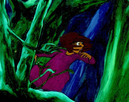 live action films. Animation gets a pass on lots of faults and is not treated as harshly. A film like Up gets praised to the hilt and generally good critics ignore significant problems that stare them in the face.
After I’d finished The Red Shoes, I thought that the story was just not well told. The film seem too compressed, and I felt I needed another 15 minutes to get it out logically and properly. No, the reviewers were all aglow, yet I know that if I had done the exact same film in live action, I would have been castigated for my sins. Or, at least, that’s how I felt.
Now, I think the same can be said for the last two Pixar efforts. They’ve been blessed by critics who miss the trees and the forest for a pretty drawing of the same.
Coraline, the theatrical production, has just opened in NYC ath the Lucille Lortel (a beautiful little gem of a theater in the West Village.)
The review in the NYTimes can be found here.
Commentary 01 Jun 2009 07:31 am
Up
Everyone’s giving a review of Up, so how can I resist after promising as much last week.
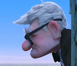 - I have to hand it to Pete Docter and Pixar; UP is a very good film. However, there are challenges for this viewer.
The first ten minutes are nicely flawless and set up the story well. Then, after Carl is widowed, the film settles down to earth and gets a bit mundane. Once Carl goes to court, the film shifts, turning into a cartoon and losing its lyricism increasingly as the film moves on. More and more, the imaginiative and unlikely ideas are thrown at us, and the story becomes less and less believable.
There’s a nice, expedient and acceptable way for Docter to cut short the flight and get them to their South American desitination. It’s smart, but it left a big, “Huh?” for me before I moved on. That’s when the dogs enter wearing their jokey voice collars. I wonder if it might have been better for them to keep the dogs without voices. That would probably have offered fewer gags but a bit more logic.
Michael Giacchino‘s score is excellent. The main themes sound a bit like music from a Doris Day film. Light, bubbly and “50s”. It brings the airiness the film tries hard to maintain.
There are several refernces to King Kong (the 1933 version). It occurs when they’re entering a terrain that seems a bit remniscent of the native village in Kong. Lots of repetitive drums right out of Max Steiner’s original score. The most obvious reference, of course, is those dogs in bi-planes trying to shoot down Russell. A couple of the jungle terrains also seem to be pulled from the earlier film.
But then, the film includes dozens of references to other live action films: the opening seems right out of Citizen Kane, the villain is named Charles Muntz (sounds like Mintz) and looks like Kirk Douglas, Carl looks like Spencer Tracey. There are many more, but I’m not sure if they’re there for any purpose other than “fun”.
There’s some animation in the film that’s quite fine , but there’s also some not-so-good animation there. Lots of slipping and sliding in walk cycles; lots of weightless characters (an old cgi bugaboo.) However, it’s miles above most of what I’ve recently seen and does give me a bit of hope.
Up‘s credibililty, for me, roams far from reality with a number of points including: a super humongous zeppelin (where do they get the petrol to run this thing?), talking voiceboxes on the dog collars (not only is the villain a great adventurer, he’s also a brilliant inventor able to read dog-thoughts and build this eccentric machinery in the wild), dogs flying bi-planes with dart-shooting machine guns, and many other bits of business just turn the film into a not-very-believable cartoon.
Of course, all this is a byproduct of the principal idea – a house being lifted by hundreds of balloons. It’s certainly impossible, but we all came into the theater knowing this to be a basic premise, and we agreed to accept it before sitting down. However, I’m not sure we were buying into a lot of other cartoony ideas after sitting through that excellent opening that ultimately seems to be from a different film. It’s as though Bambi had Bugs Bunny as a friend, not Thumper, and the film kept trying to squeeze them together for us.
I’d hoped to accept the entire premise as a conceptual metaphor. Though, I don’t think Docter, in his unspooling of the story, allows us to take this approach to the imaginative but cartoony ideas, so I had to ride with it at face value.
Perhaps this is all irrelevant to most viewers; the film is quite enjoyable while watching it. I did find myself stepping in and out of the story as it progressed, thanks to lapses in credible moments. I also found the film a bit tiresome at about the 2/3 point. Like Wall-E when they’re chasing around in space, inside and outside the spaceship, this film has a dangerous chase inside and outside a zeppelin, on and off the balloon house. They came to the precipice at least four times too many and escaped every time.
I’m glad for what they gave me in this film, but I guess I’m the curmudgeon who hopes the “Action” scenes will be a tad more plausible in screen stories. And I guess I also wish for a little less “Action” in those films. All that running about over and over again get tedious.
But make no mistake, I do think UP is a very good film . . . just not the great one it might have been.
By the way, you have to check out Lou Romano‘s site which is filled with brilliant pre-production art for this film.
