Monthly ArchiveJune 2009
Articles on Animation 30 Jun 2009 07:30 am
Terry TV
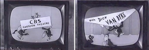
Images from Toon Tracker
- I can remember somewhat clearly the show on CBS television, Wednesday nights at 7;30 pm, 1956. Dick Van Dyke (a relatively new-on-the-scene comic/dancer whose face was already familiar to the young me) appearing in a cramped living room set talking with Terrytoon characters on B&W TV.
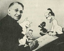 CBS Cartoon Theatre – It wasn’t something worth rushing to see, but for a cartoon crazed youth who maneuvered the television set to anything approaching animation, it would certainly do. They screened a lot of late-thirties/early-forties shorts. Li’l Roquefort and Sourpuss, the Terry Bears and Gandy Goose were the stars of these animated “gems.” Mind you this was before The Mighty Mouse Show (pre-Ralph Bakshi and John K version) on Saturday morning. This was Terry trying to do what Disney had done at ABC on Wednesday nights at 7:30.
You can watch the opening of an episode of this show here.
Sorry, it wasn’t good enough, and the show disappeared quickly. It ended up only a Summer replacement.
here’s a NYTimes announcement of the upcoming program.
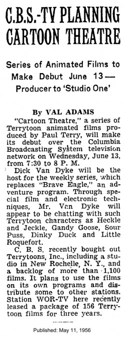
(Click any image to enlarge to read.)
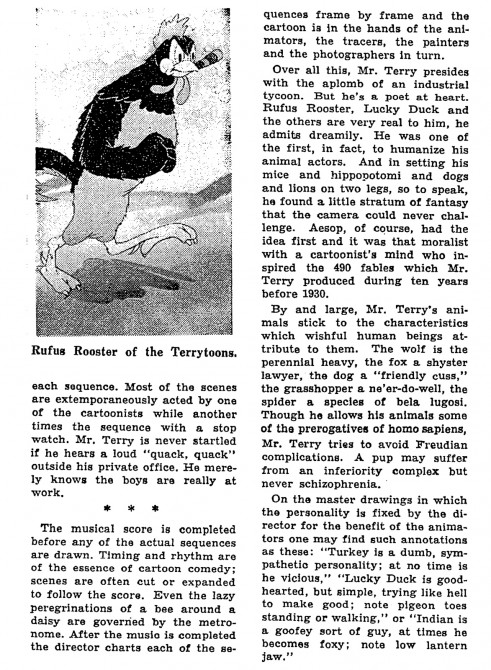
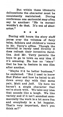
Here’s a more elaborate NYTimes article from 1941 about Terry’s barnyard stable of characters:
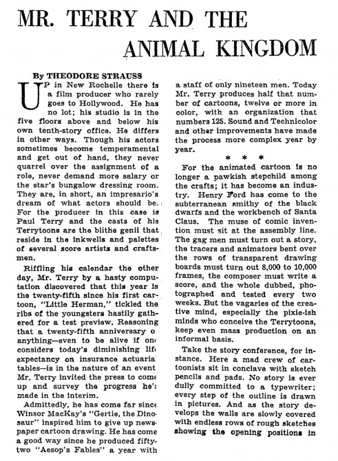 pt 1
pt 1
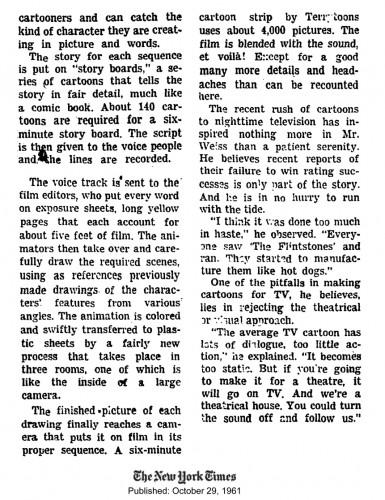
And here’s an article from the Times in the waning years of the Terrytoon studio, 1961
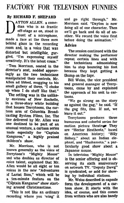 pt 1
pt 1
Animation Artifacts &Hubley &Models 29 Jun 2009 07:47 am
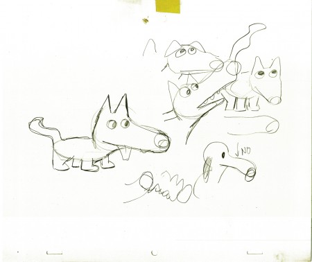
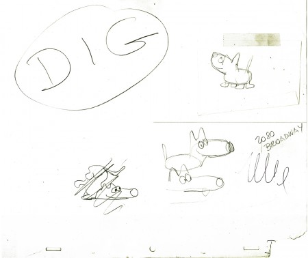
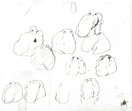
Dig models
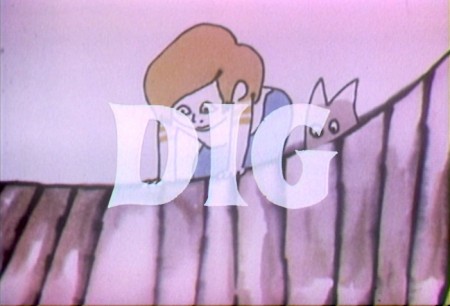
- Dig was a half-hour Special that was produced by John and Faith Hubley for CBS Saturday morning fare. It was supposed to be one of three programs on the earth around us, but it ended up as the only one of the three to have been completed.
The lion’s share of the animation was done by Tissa David and Johnny Gentilella. Phil Duncan, Vinny Bell and Chuck Harriton also did their share of the work.
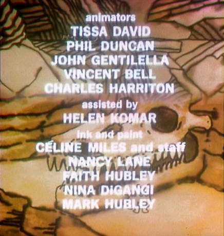
The story was about a boy and his dog that accidentally get into a construction site and soon find themselves talking with a rock.
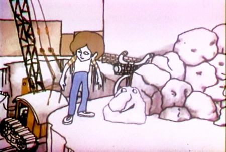
The rock takes them underground to a musical journey through the geology of the earth. The music and songs were by Quincy Jones. Jack Warden plays the lead rock, Ray Hubley was the boy, and plenty of others from the Group theater (such as Morris Carnovsky and Maureen Stpleton) did other voices underground.
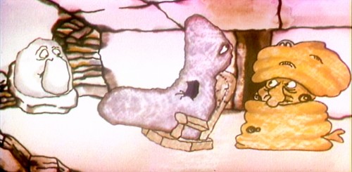
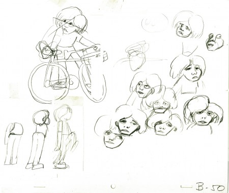
Tissa handled most of the boy and a couple of the rock songs and conversations. She also helped construct some of the characters doing models. Here are some of the rough models she put together and worked from.
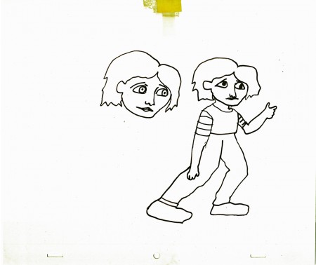
This was one of John’s earliest drawings (post storyboard). It was
probably done while in conversation about the character with Tissa.
Photos &repeated posts 28 Jun 2009 08:31 am
Recap – PhotoSunday Gypsies
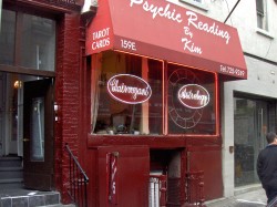
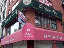
Last year, I offered a showcase of some of the local color, the Fortune Tellers, Crystal Readers and “Gypsies” in the area. I’m planning to have a follow-up post to this (so many more have opened in town), so I thought it’d be enterprising to recap the original. Here that post from April 2008:
 - The thing about New York is that there are an awfully large number of Gypsy fortune tellers. They seem to be nicely hidden, part of the fabric of their street front locations. Oftentimes, they occupy store front locations, but sometimes they take up space on the second floor of buildings.
It’s hard to tell how they make enough cash to pay the somewhat high rents they have to cover. I’d always assumed that it had something to do with illegitimate betting or drugs or something. Then I read a New Yorker article several years ago which revealed the answer – crystals.
I decided to photograph all that I saw on my walk from home to the studio. The first thing I came upon, on Park Avenue and 29th Street, was this posterboard for an out-of-sight store. I looked, somewhat cursorily but couldn’t immediately locate it.
_______(Click any image to enlarge.)
_____________________________.__________They turned out to be hidden behind
some construction. The shop was on the second floor of a small building undergoing a face lift. No wonder they felt the need for a _street placard, half a block away.
_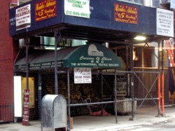 __
__
_They were forced to use the construction work to advertise their business. This has to be _hard for them.
_
_ __
__
_This space is located between Lexington & Third Avenues on 29th Street. It sits adjacent _to an excellent Thai restaurant.
_
_ __
__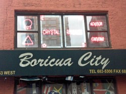
_Farther west, on the corner of 29th Street and Sixth Avenue, there’s one on the third floor.
_A business with plenty of neon advertising; you could mistake it for a nail salon if you
_weren’t looking for it.
_
_ __
__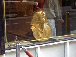
_This space was on 21st Street between 5th and 6th Avenues. The pharoah head seems
_to be a familiar that appears in seveal of the windows. It obviously means something I _don’t understand. “Mummies welcome.”
_
_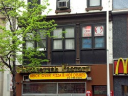 __
__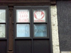
On Sixth Avenue just off 14th Street there’s this second floor shop. They’re closed this morning, consequently it’s hard to tell if they have neon lighting as well. The windows, this morning seem to be closed off; they’re probably still asleep. (Of course, the “fortune tellers” usually live in these spaces.)
_
_ __
__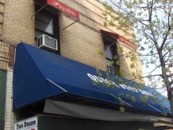
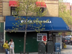
_A block away from the studio, on Houston and Bedford Streets, there’s this
_space just above the “Quick Deli.” The awnings are the only announcement of their _location. It’s a one-floor walkup.
_
_____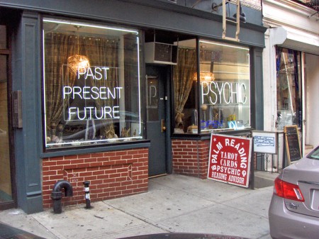
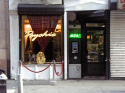
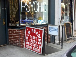
____This storefront sits just above my studio. It helps me identify where the studio is.
____I just tell people to walk down the stairs just beneath the “Psychic.”
_
_ __
__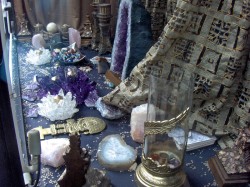
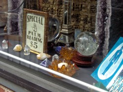
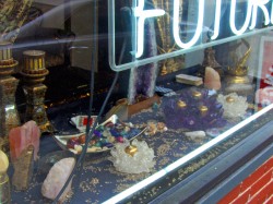
_These are the artifacts to be found in the window of the “Psychic” storefront above me.
_As I said, the New Yorker article suggested that they sold crstals. If they found two or
_three customers a year who would come back regularly for new and more helpful crystals,
_it would cover the year’s rent. It’s an alien world to me. I can’t imagine even walking
_into the stores.
_
_ __
__
_I’ve also noticed three or four used cars irregularly parked on the street. They all have the
_“For Sale” signed painted on the rear windows. The seller is this store’s operator.
_When I moved in, four years ago, my landlord told me that he was paid every month, on
_time, in cash. Those crystals must be selling.
_
_____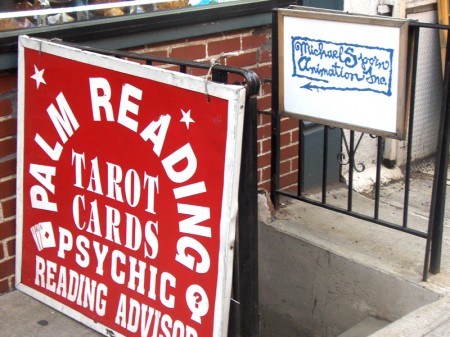
_____This, of course, is the entrance to the walkway to my studio. Très discrete.
_____I’m supposed to have exclusive use of the wrought iron fence for signage, but
_____as soon as I put something up, their placard arrived. Why argue? For some
_____reason everyone notices my sign, and some curious visitors have turned into
_____clients. Usually it’s someone wanting to know what an animation studio does
_____ or they’re looking to buy a cel. (Maybe I should sell them.)
These were the shops most obvious to me. I’m sure I walked past others without noticing. There are many, many more of these store front places. I don’t think they wander much beyond the second floor, since they have to be there for the curious person looking to have their fortune told, tarot done, or buy those crystals.
Daily post 27 Jun 2009 08:16 am
Return of the Dope Sheets
 - Back in March, I posted some thoughts about exposure sheets and the seeming loss of this tool in animation production. I posted a letter from Kayvon Darabi-Fard in England and tried to respond with some information about the X-sheets and their purpose. The post brought a lot of attention and many comments, and I was pleased with myself for writing about what was becoming a disappearing artifact in animation production.
Then this weekend I’d received another letter from Kayvon:
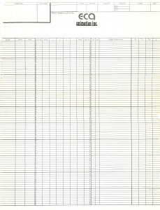
- After your initial post, my lecturer began reminiscing with the dope sheet’s he’d experienced during his time at the Don Bluth Studios in Ireland. Soon after, he then ran an extended class for the first year students of the degree to re-establish and emphasize the ________ECA Prods had probably the
importance of the dope sheet, even in such an _________biggest sheets I’ve seen.
educative environment. ______________________ECA was George Cannata’s company.
So under the over head projector he went,
going from keys, to timing charts, to a fully doped and annotated X-sheet, complimented by a lifting exercise!
Contrary to a tutors reaction to the letter I sent to you;- “You cannot ‘make’ a student use a dope sheet.”
Only now our course leader insists that the Dope sheet is mandatory within the production process’ expected of us as directors during our final year before graduating.
Needless to say, my ego’s gone our of whack with such a pleasant letter to receive. It’s great to see that some small tool of our industry is being taught even to this small sample. I’m delighted, naturally, to have had a small part in it.
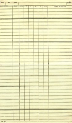
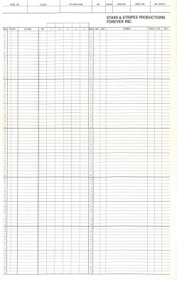
exposure sheets from:
(L) UPA NY in the 50′s
(No dial numbers! Extra work for the cameraman)
(R) Stars & Stripes Productions Forever Inc.
a high profile company headed by Vincent Cafferelli in the 60-70′s.
Daily post 26 Jun 2009 07:38 am
JulesEngelFilms/AnimalFarmFigurines
- Janeann Dill has assembled and released through the Iota Center a DVD collection of the works of Jules Engel vol I.
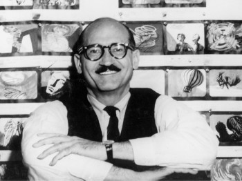 This first volume of Engel’s selected animation work offers fifteen of his films ranging from one of his earliest experimental works (Carnival, 1963) to one of his last (The Toy Shop, 1998). Arranged chronologically, the collection offers one view of the artist’s progression over almost four decades. Also included is an excerpt from Jules Engel: An Artist For All Seasons, a documentary from Janeann Dill, Ph.D, containing rare footage of his artwork and interviews.
 You can view a sample of Engle’s work on the dvd here.
You can view a small clip from Janeann Dill’s documentary included as an extra on the dvd here.
Here’s the Facebook page devoted to Engel.
Here’s another web page devoted to Engel’s work.
- Chris Rushworth is an avid fan of halas & Batchelor’s Animal Farm. His collection of cels and artwork and other materials for this film is astounding, and he displays them all on his site, Animalfarmworld. As a fan of the film, myself, I can’t help but salivate over some of his materials. Currently, he’s posting some beautiful statuettes that were made at the time of the film. He posts many of these Goebel figurines on a special page. Take a look, if you have any interest.
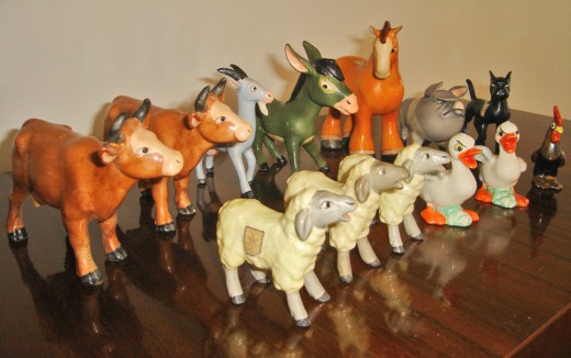
This is one of the many stills Chris Rushworth posts from his collection.
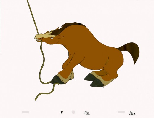
This is a cel I have in my collection. I also have the drawing for the scene.
I’d love to know who did the animation for it.
Does anyone have the drafts for the film?
 - Stuart Bury, an animation student at the Kansas City Art Institute, wrote me and asked that I look at a five min. puppet animated film, Dried Up, a short he made with two other students, Isaiah Powers and Jeremy Casper.
“’Dried Up’ is the story of a quiet old man who, surrounded by desolation and apathy, perseveres to remain true to the nature of his own beliefs and character. He toils daily to forge a last ditch effort to bring hope and life to a faithless, drought ridden old town. ”
The film is quite professional and deserves a look. I’m pleased to see that there’s gold in Kansas City.
_____Stuart Bury
Take a look for yourself. It’s worth the five minutes.
 - There’s the opportunity for New Yorkers to see the feature, The Secret of Kells, upcoming to the IFC Center.
There will be two shows:
Sat July 18 at 11:00am
Sun July 19 at 11:00am.
You can reserve your tickets here.
Commentary 25 Jun 2009 08:14 am
Nijinsky – “He’s ALIVE !”
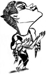 - The New Yorker magazine, this week, has a short article by Joan Acocella about some YouTube videos that have appeared recently showing Nijinski dancing. They’re all short clips (10-15 secs) in, what looks like, early film footage as Nijinsky goes through bits of his most famous dances from 1910-1912.
The only problem, of course, is that Nijinsky was never filmed dancing. These pieces are animated bits by Christian Comte, a French animator working out of Cannes. He’s taken the famed series of stills of the great dancer and maneuvered them in his computer to make it look as though they are actual moving. I watched them all and only one move looks artificial, as though Nijinsky were on wires as he glides up and over.
In Acocella’s interview with Comte, he describes his work:
- Comte acknowledged his authorship. “These films are animations of photographs, achieved thanks to a process that I invented,†he said. “I work as an alchemist in animated cinema.†He uses still photographs and, by employing a computer to alter them—tilt a head, move an arm—fills in the gaps between successive shots. That’s why his “Faun†footage is so much longer than his other footage. He had all those de Meyer stills. This is basically no different from the way Steven Spielberg got the dinosaurs to run around the jungle in “Jurassic Park.â€
Comte insists that he is not trying to pass off his Nijinsky clips as authentic films. His YouTube profile page opens with a statement that it is a “mad legend†that any film of Nijinsky dancing survives. Yet he goes on to call his postings “film fragments.†All of them display the date of each ballet’s première—1910, 1911, or 1912—but they do not explain that this is not also the date of the video.
Here is one extended YouTube piece that I believe shows some tests and dailies strung together. All of the others are cut into shorter snippets and black-outs, hence feel more like actual fragments. When strung together like this, you can feel the manipulation.
We’ve undoubtedly entered a new era of artificiality. Animation has moved closer to reality (except for the inexperience of the animators, themselves.) The first 20 mins of Wall-E set a tone of reality that matches the effects in Dark Knight. The mix of live action footage with the animation made it feel more real. (Of course the last 60-70 mins of the film felt artificially devised and spoiled those opening 20.)
It’s hard to go back to Snow White anymore now that the apple has been tasted.
Animation &Animation Artifacts &Disney 24 Jun 2009 08:19 am
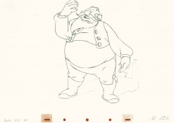
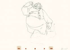
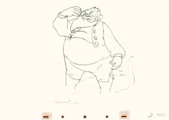
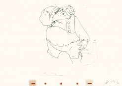
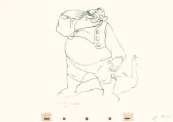
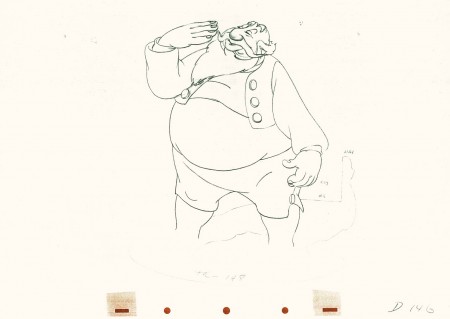
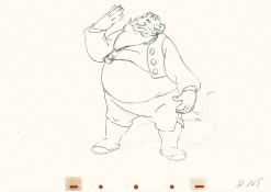
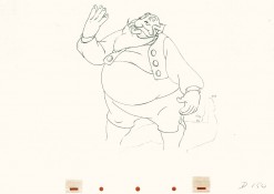
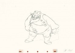
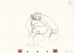
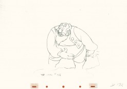
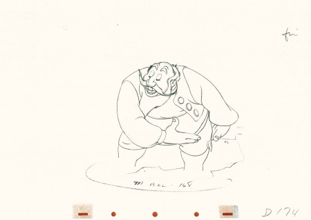
Tytla’s Stromboli – 4
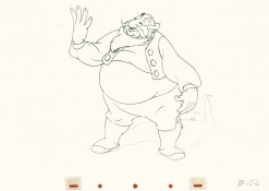
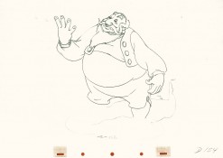
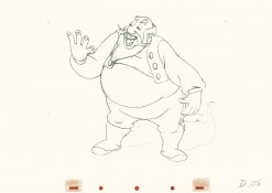
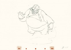
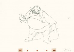
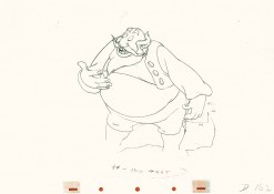
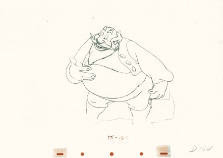
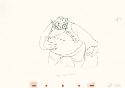
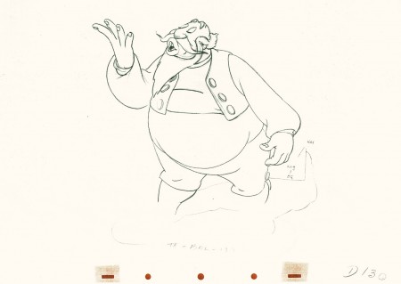
- This is Part 4 of this large scene by Bill Tytla of Stromboli.
Part 1 saw a frenetic anger from Stromboli; Part 2 he caught himself to get a hold on his emotions. Part 3 he slowed down and prepared for the kiss (a break) and the bow upcoming in this, Part 4. Much of this part is on twos, as opposed to part 3 all on ones.
This is animation tour de force and there’s one part left to go next week.
 130
130(Click any image to enlarge.) The full scene with all drawings.
Click left side of the black bar to play.
Right side to watch single frame.
Books &Illustration 23 Jun 2009 08:08 am
High in the Clouds
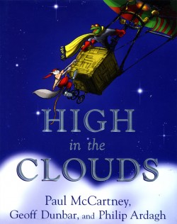 - A bit of news broke; when it was reported in Variety that Paul McCartney would be the force behind a new animated feature, High in the Clouds.
This work was a book he wrote with Geoff Dunbar and Philip Ardagh, and it was published in 2005 by Dutton. All three are given equal credit. Dunbar is an extraordinarily gifted animator/director in London. His animated short, Lautrec, as well as the animated version of the Alfred Jarry play, Ubu, helped to lead Britain to the animation renaissance of the 70′s. He also made the film, Rupert and the Frog Song, with McCartney. Ardagh is a children’s book writer with some 60 titles to his credit.
There can be no doubt that Ardgh did most of the writing, and Dunbar did the illustrations to the book.
The surprise to me is that Rob Minkoff was hired to direct the feature. He’s talented, but Dunbar had an obvious connection, and I’m surprised he did not get the job. Some obvious behind the scenes mechanics must obviously have been in play.
Caroline Thompson who wrote Edward Scissorhands, The Corpse Bride and The Secret Garden is a wonderful choice to write the script. It’s also interesting that Bob Shaye and Michael Lynne, formerly of the studio New Line Features, are producing this film with their newly devised Unique Pictures.
My hope and my fear is that Minkoff will make it look more like The Lion King and less like Stuart Little.
I bought the book a while back. Let me share some of Dunbar’s illustrations with you.
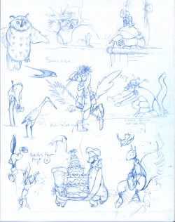
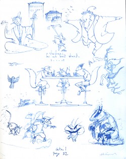
Inner covers
Some of these are exquisite, some not so. The character desing is pure Geoff Dunbar. (Not too distant from Paul Vester’s work.) I’m not a big fan of the stretched out characters. I like the roundness of the earlier years and think this project might’ve profited with that look.
It feels a bit like a modern take on the Wind in the Willows territory.
(More to come.)
Animation Artifacts &Disney &Models 22 Jun 2009 07:16 am
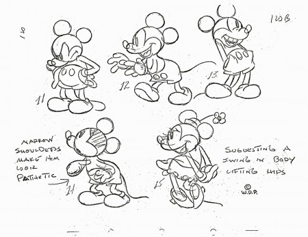
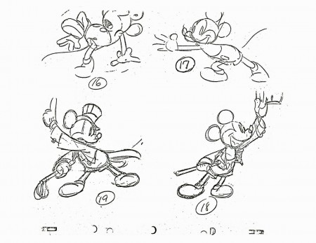
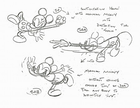
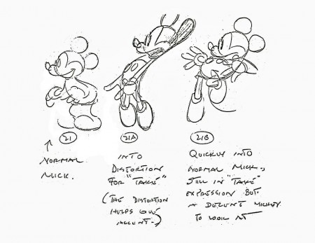
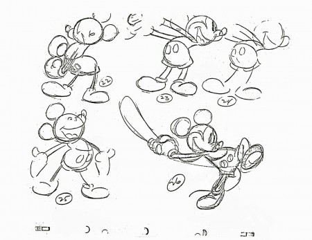
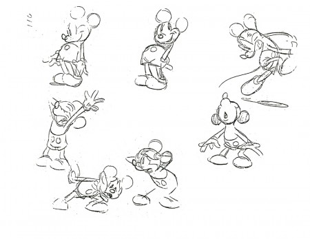
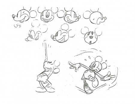
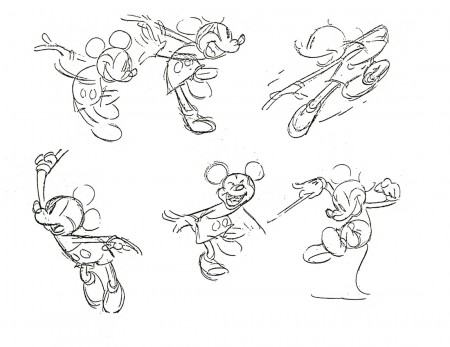
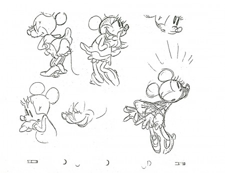
Mickey Class
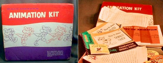
- Back in March 2007, Jenny Lerew, on her excellent site, Blackwing Diaries, posted a couple of the booklets that came in the Disney Animation Kits sold at Disneyland’s Art Corner. Aside from the Tips on Animation booklet and the How to Draw Goofy booklet, there was one on How to Draw Donald and another on How to Draw Mickey.
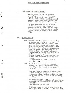
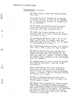
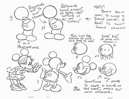
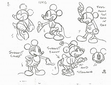
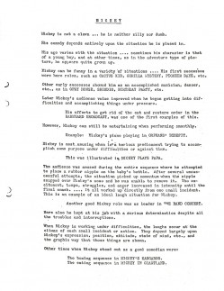
I’ll try to post these last two books in the next few days. However, for now, I’m interested in posting a professional analysis of Mickey, Goofy and Donald that was done as part of the process in the Disney studios in 1935.
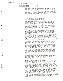
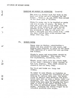
The following is an analysis of Mickey given as a handout to all animators. There’s almost as much writing in it as there is drawing. The piece is introduced by Ted Sears and completes with analysis and drawings by Fred Moore.
 1
1 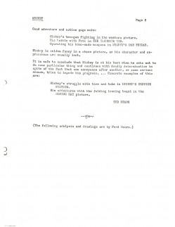 2
2(Click any image to enlarge.)
Photos 21 Jun 2009 08:23 am
PhotoSunday – Patterns
- The world is made of patterns. When man touches them the patterns become eccentric. Steve Fisher’s been sending me pics for so long that I found some patterns in the patterns.
I asked for more and he complied. I love this stuff.
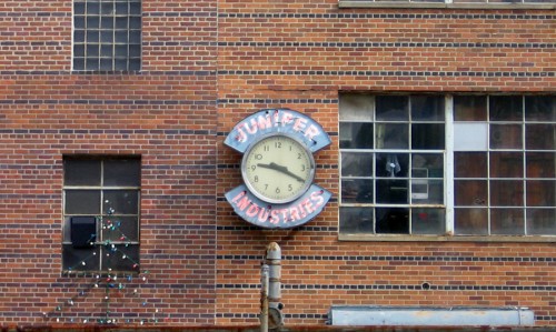
In amongst the clocks from last week was this brick wall,
and the patterns of the bricks just struck me as odd.
The same could be said of most brick walls, but this hit me harder.
.

So here are some more brick patterns. The gray of the rainy day didn’t quite
articulate the raised brick, but there’s enough to see here. The placement of the
windows creates enough of a crazy pattern.
.
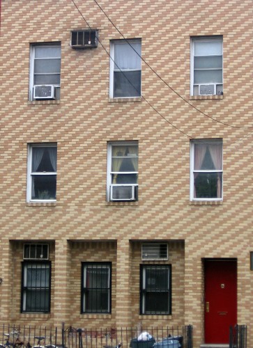
A unique pattern doesn’t seem to have occurred
to the brick layer until he was about half done.
.
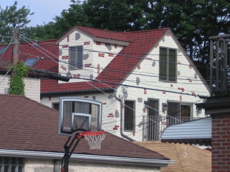
I guess someone designy lives here. I’m not sure it’s purposeful design.
.
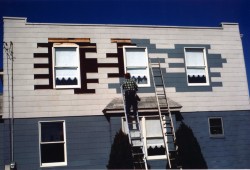
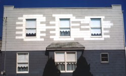
Then there’s this house. They repaired the siding to create
this eccentric pattern.
.
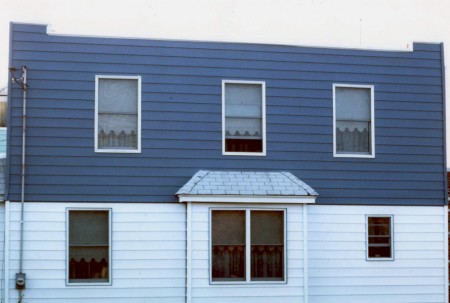
Ultimately they got to this beauty.
.
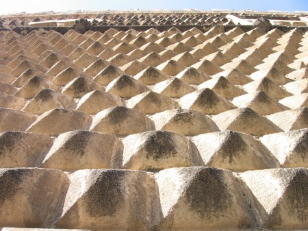
This stone construction could only exist in Europe.
.
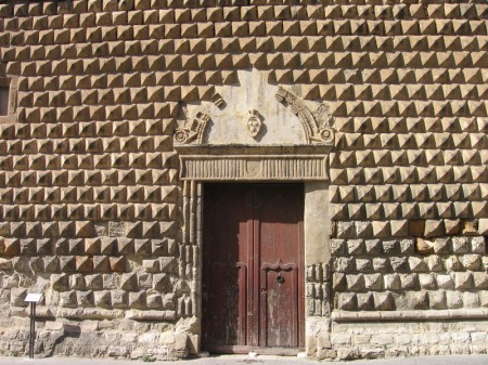
The Palazzo Steripinto, famous in Sciacca, Sicily.
.
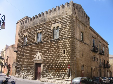
.
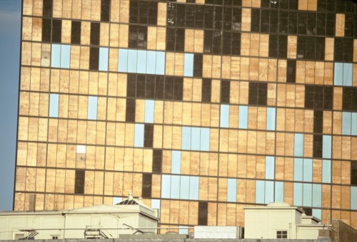
In 1975 the John Hancock Building had suffered a terrible curtain wall
failure, with many of its glass panels blowing out. For a long time after,
until a fix could be incorporated, most of the glass panels were replaced
temporarily with plywood and plywood painted black (the building was
even jokingly referred to as the US Plywood building back then).
The photo was taken with a telephoto lens, which further flattened the
building surface, although its articulation was already quite minimal, and
tended to abstract it to an almost graph-paper look.
One appreciates the scale of the thing only with the help of the
roof-top appurtenances a building in the foreground.
.
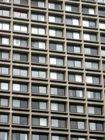
I couldn’t help but add a couple of my own photos.
This is a closeup of several NYU buildings not far from me.
The sameness of these casement windows is just what one looks
for in a futuristic movie of the 70′s. Multiply it by several buildings
of the same, and they almost become invisible.
.
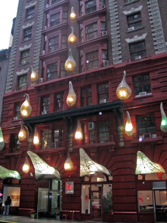
I often walk pass this building, I assume it’s a hotel. (I haven’t bothered
to check it out, to be honest.) The light sculptures that are attached
to the front entrance are nothing if not attention getters, yet the
building is hidden in amongst others on a side-street.
.
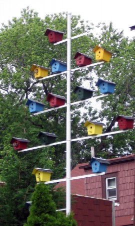
Why quit at human housing? Birds need design, too.
Steve found this construction in Queens. Very Bauhaus.
.
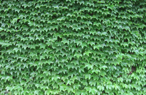
Finally, the truest and finest designer.
Nature.
