Monthly ArchiveMay 2009
Animation &Animation Artifacts &Richard Williams 11 May 2009 08:01 am
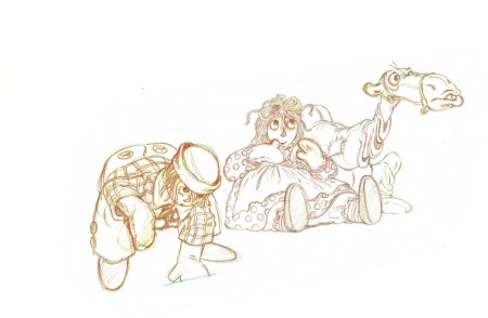
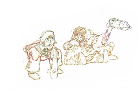
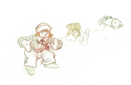
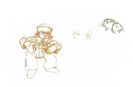
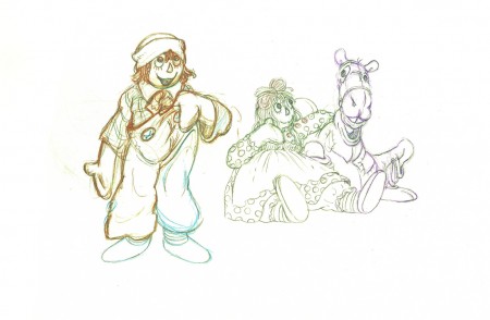
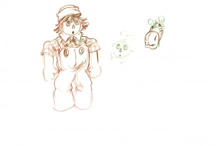
Corny’s Raggedy Andy
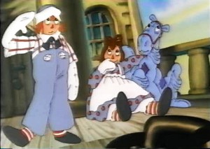 - Every once in a while it pays for me to go back to 1976 and look at Corny Cole‘s magnificent work on Raggedy Ann & Andy.
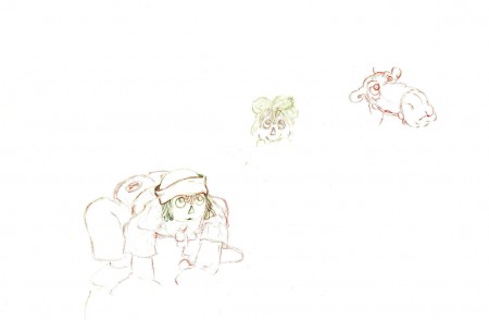
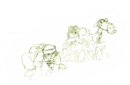
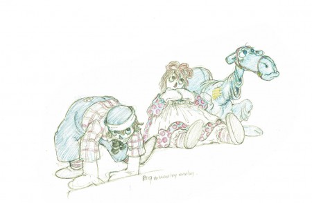
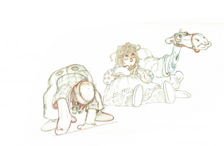
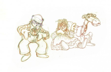
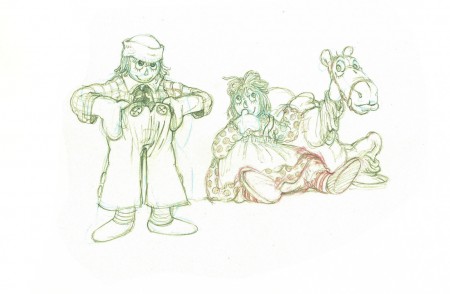
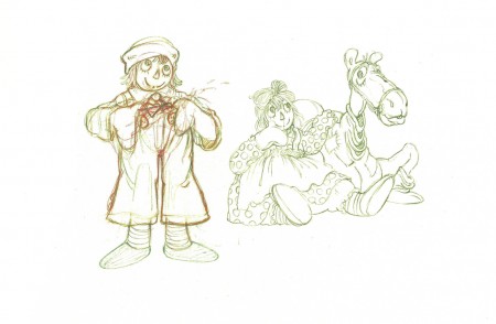
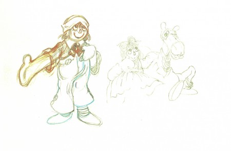
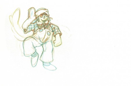
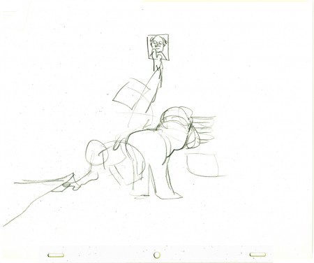
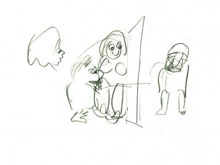
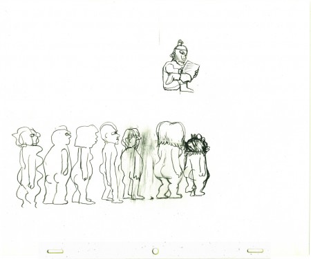
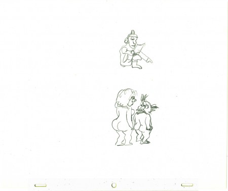
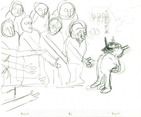
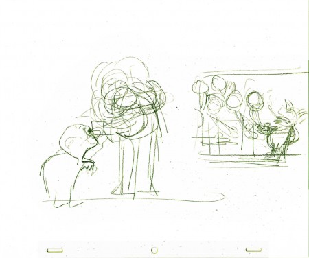
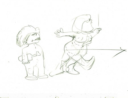
Here’s one of the scenes I have – or at least the first half of the scene – in which Corny animated Andy standing and saluting. Ann and the Camel with the wrinkled knees sort of mull about in the background.
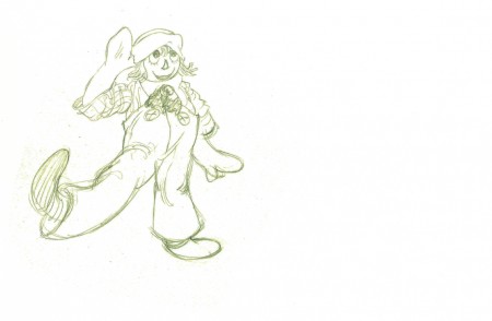
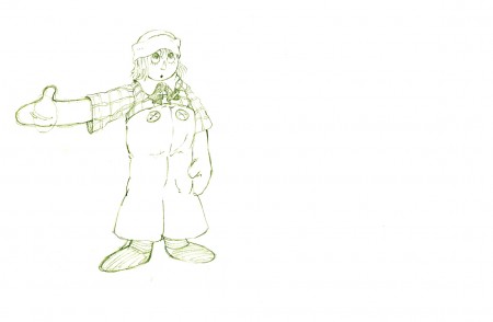
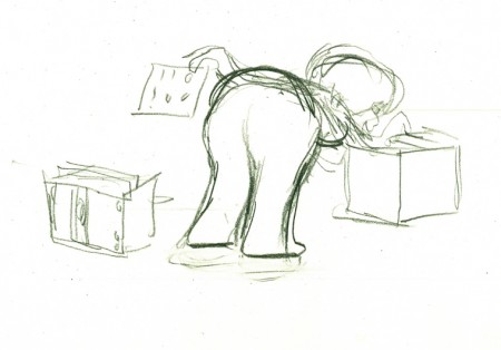
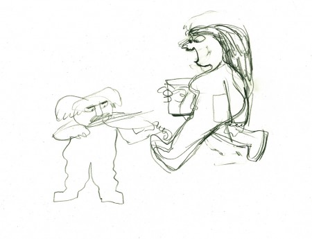
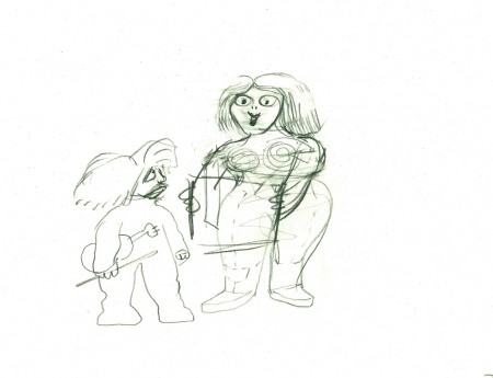
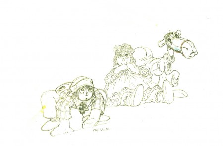
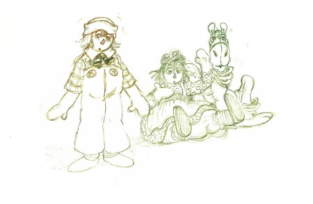
The drawings are incredibly light. I darkened them a bit in photoshop so that they’d be legible. They’re also done in a number of colored pencils. To top that off the paper is oversized (20×10.5) and difficult to flip. Since the art’s all the way to one side, I eliminated some of the blank side in the scans,
But the drawings are beautiful. Too bad the film, which was shot in Scope with Panavision lenses, was put on video in a cropped TV format with no regard to what was being cut off on the edges. (Not even pan & scan.) There’s been no DVD release of the film.
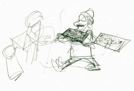
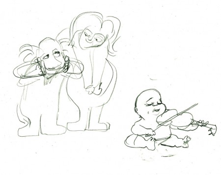
Here are most of the extremes all done by Corny Cole.
 1
1(Click any drawing to enlarge it to the original size.)
 53
53
Corny Cole is certainly a one-of-a-kind in the animation community.
It was my pure good fortune to have worked with him this once.
Perhaps next time, I’ll put up some of his elaborate drawings.
On twos at 24FPS
Click left side of the black bar to play.
Right side to watch single frame.
Commentary &Photos 10 May 2009 08:24 am
Cherry Blossom Festival

Photographed by Steven Fisher.
Where do all the cherry blossoms go when Mother Nature is tired of them? You guessed it.
We’ve had about ten days of drenching rain and thuderstorms that has brought New York into a soggy depression. It’s exhausting. The NYYankees had to leave town to be able to play a dry game. Oddly enough, they went to humid Baltimore which was, at least, less damp.
We’re looking forward to a day of sunshine and dryness, as was predicted by the weatherguys for today.
How do you depict the contemptuous disregard for the beauty of cherry blossoms in animation? It sounds like it might be a complicated effect scene. There’s something about animation that doesn’t allow you to have the layers of subtlety that a live, still photo can offer. Perhaps the only way would be to use painting to get the point across, abstract painting. It would probably have to be an expressionist image.
If you wanted to do it in cgi, you’d have to do a photorealistic version which would be pointless and souless. You’d have to find some abstract way to represent things other than with little doll images. Perhaps that could be a challenge that no one would take up.
I know, my vision is biased and limited. It’s all those molting cherry blossoms.

Another great picture by Steven Fisher.
Daily post 09 May 2009 08:56 am
Bridget Thorne – recap
- The key to my studio in the first dozen or so years was the brilliant artist, Bridget Thorne. She was every bit my partner in creating some of the greatest of my films, and I can’t attribute more to her work. With this post, back in March 2006, I gave some small attention to some of the excellent art she’d done for my films. Time to show it off again.
Bridget Thorne has been an extraordinary Art Director and Background painter on quite a few of my favorite films produced within the studio. Here is some of that art.
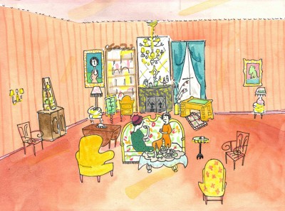 This painting is a key transition point in Lyle, Lyle Crocodile. The film had a looseness that Bernard Waber‘s original book art had featured. I felt very much at home in Waber’s style, and I think Bridget did as well.
She worked out a color scheme for the film, and we both agreed to
______ (Click image to enlarge) Lyle, Lyle Crocodile (1987) _____.__follow it closely
___________________________________________________________throughout the half hour film for HBO. Liz Seidman lead the character coloring. Bridget, of course, had a strong hand in all those character models, as well.
The scene pictured above follows the introduction of Autumn on “East 88th Street”, and the background brings us full force into it as we get “the girl’s first song” – Mrs. Primm’s report on what it’s like to have a crocodile living in your house.
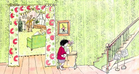 – Ira Sleeps Over was the second children’s book by Bernard Waber that we adapted. This is a very sweet story which involves a sibling rivalry; it focusses on a teddy bear and a sleep-over party. I pulled composer, William Finn, into the film and he wrote some great tunes for it. Prior to doing the script, I gave him the book and asked him to figure out where he would like the songs. In a week he had already written all the songs for the film, and they were brilliant. It turned out he used all the words of the book in his songs, and now I had to find a way of telling the same story using past, present and future tenses, as he did in the songs. It was a good challenge that worked out well and created a fabulous construction for the story.
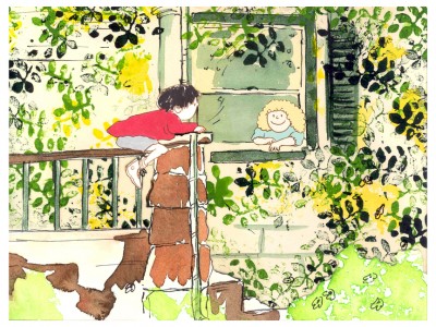 The style in this book was, if anything, looser than in Lyle. Waber did a lot of his illustration featuring duplicating printing techniques. Lino cut enabled him to repeat decorations throughout the settings. Bridget played with the lino cuts and was able to succesffully duplicate the technique in the backgrounds. In this one bg, at the beginning of the film, the foliage is a good example of this technique, printed over watercolors. The characters are markered paper drawings cut out and pasted to the cel overlays.
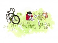
The book, like Lyle, featured a lot of white space, so we followed suit. When a book’s been in circulation for over 25 years, you have to realize there’s been a reason for it; find the reason and the heart, and take advantage of it. This use of white space made the actual backgrounds oftentimes little more than abstract shapes of color with a solid object on the screen. Here, for example, we see Ira and his friend, Reggie, playing against a blast of green and a bicycle.
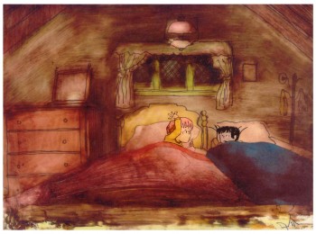 – At the end of the film, Ira and Reggie talk in the dark at the sleep-over. To get the look of the dark Bridget had to come up with something clever. The book resorted to B&W washes of gray and wasn’t very helpful. She came up with some dyes that were used for photo retouching. By quickly painting these lightly onto cel levels with a wide brush, she was able to get translucent cels with the brush strokes imbedded in the color overlays. By placing these overlays over the characters and backgrounds, we got the desired effect that let it feel connected to the very loose style of the film.
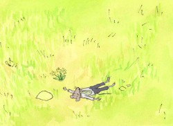
 -Abel’s Island is one of the few films we did that I treasure for its artwork. Bridget’s work on the backgrounds was, to me, extraordinary. The looseness I love was developed into enormously lush backgrounds using shades of green that I didn’t know could be captured in the delicate watercolors.
This film was a complicated problem that seemed to resolve itself easily and flow onto the screen without much struggle. The book had won a Newberry Award as best children’s writing of its year. It was not a picture book but a novel. The more than 120 pages
(Click image to enlarge) Lyle, Lyle Crocodile (1987) featured fewer than 20 B&W spot drawings by author/illustrator, William Steig. We were on our own with the color.
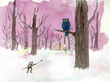
 However, we had adapted Doctor DeSoto and The Amazing Bone as shorter films and could use what we’d learned from Steig on Abel. Bridget topped herself.
Several of the animators gave us more than I could have expected. Doug Compton‘s animation of Abel sculpting his statuary and living in his log was heart rending; Lisa Craft‘s animation of the big pocket watch, the big book and the leaf flying sequences was nothing short of inspired; and John Dilworth‘s animation of the owl fight was harrowing. This was all set up and completed by Tissa David‘s brilliant animation of Abel in the real world with wife, Amanda. She established our character.
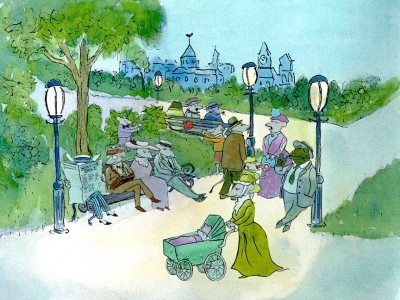 – At the end of the film, Abel, who has been separated from his new bride, trapped on an island for over a year, finally gets to come home. He sees Amanda in a park at twilight but decides to hold back. He races on ahead of her to greet her, privately, at home. The park sequence has a busyness as an acute counter to the lonliness we’ve watched for the previous 90% of the half-hour program. Setting it at early evening gave an opportunity for rich, royal colors. Bridget took full advantage of the opening, and underscored it all with a regal green not seen earlier. It was stunning and is one of my favorite backgrounds in the film.
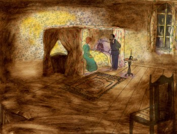 A Child’s Garden of Verses presented new and different problems to explore.
It was a project generated by HBO. Charles Strouse and Thomas Meehan were going to write the book and song score. We met several times trying to discover a way into the book of poems. I’d suggested we use the verses in Robert Louis Stevenson‘s book to illustrate the author’s early childhood.
Stevenson was a sickly boy who was always confined to his dark room. He was not
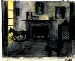 expected to live long. The only visitor for days on end was his overprotective mother.
For much of the film, we had only the dark, child’s bedroom to explore. Artistically, I asked Bridget to delve deeper into the photgraphic dyes that she had discovered and used so well in Ira Sleeps Over. These dyes would allow us to keep the style, once again, loose while exploring dark areas and brush strokes to simulate the darkness “Robbie” lived in.
For the wallpaper throughout the house, Bridget used real wallpaper which was photostated; scaled down and reshaped to fit the backgrounds. Then watercolor washes colored these backgrounds and overlays were mixed and matched to get the desired results.
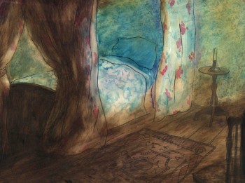 I was never quite pleased with this film. The elements that worked well worked really well. Bridget’s work was a highlight. The acting was extraordinarily good. Heidi Stallings performed with an enormous amount of emotion yet barely raised her voice above a whisper. Jonathan Pryce was brilliant as Robert Louis Stevenson, the narrator and even sang a song when asked at the last minute. Gregory Grant as the young “Robbie” was vulnerable, sweet and all we could have hoped for.
However, there was too much of a rush given the delicacy of the piece, and the exterior backrounds done by me for the end of the film are poor. The animation is also hit and miss. Oddly enough, my favorite sequence used little actual animation but intense camera work. Ray Kosarin was the animator in charge of it, and it’s an impressive sequence.
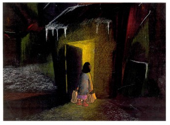
- The Talking Eggs was done for a PBS series called Long Ago & Far Away. It was an adaptation of a Creole Folk Tale which Maxine Fisher updated for me. (Lots of discussion between WGBH, Maxine & me about what distinguishes a Folk Tale from a Fairy Tale. It seriously impacted the story we were telling and I wanted what I wanted and got.)
Bridget chose to use pastels and we searched for a paper that would bring out the most grain. I loved the end result. The characters, to match the look of the Bgs, were xeroxed onto brown kraft paper and colored up from there with prismacolor pencils. This was cut out and pasted to cel.
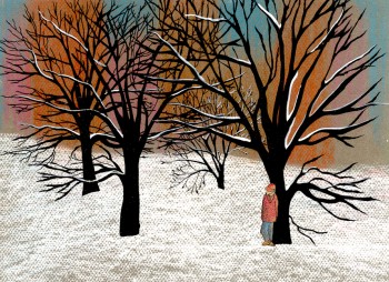 Danny Glover was the narrator, and we chose to make him an on-screen character appearing intermitently in the film. His narration was recorded on a rush as he stopped off in LA from SF on his way to direct a film in Africa.
There’s a focus in these backgrounds that matches the content and mood of the piece, and it worked wonderfully for my purposes. I always like it when the medium is front and center; I want audiences to know that they’re watching animated drawings, and texture usually helps to do this. Of course, I also want the films to have a strong enough story that the audience gets past the point of knowing, to enter the film. It works some of the time, and I’m in heaven when it does.
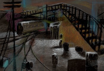 Bridget altered the color of the paper on which she was coloring with the chalks, and the different colored papers represented varied moods from sequence to sequence.
Naturally, there were some problems with the chalks under camera. All the fixative in the world didn’t stop the chalks from bleeding onto the cels or platen on the camera. (Lots more cleaning involved than usual.) We heard constantly from our cameraman, Gary Becker. The extra effort was worth it; the look was unique and successful.
Articles on Animation &Disney 08 May 2009 08:04 am
Into the Future, Past
- Back in the 80s things were starting to perk up in animated features. After a long stretch of nothing but garbage, the people at Disney started taking the form seriously, and others followed suit.
I love posting old articles that have no relevance to anything anymore, but they’re worth viewing to see how seriously we take ourselves. This is an article written by the excellent LA writer, Charles Solomon, for The Hollywood Reporter‘s animation issue: Jan. 25, 1989.
.
.
Animation Features Thrive
BY CHARLES SOLOMON
Since his death in 1966, various artists have tried to assume Walt Disney’s technical and aesthetic leadership of animation. Although no one has matched the breadth of Disney’s vision, the art form is thriving at the studio he founded nearly 70 years ago. With almost 400 artists at work, including 41 full-fledged animators, the animation division of Walt Disney Pictures is larger now than it ever was during his lifetime.
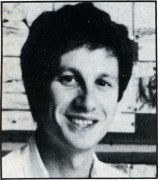 When the new management team took over the company in 1984, they announced plans for an ambitious rogram that in cluded production of a new, fully animated feature every 12 to 18 months. Disney had hoped to institute a similar schedule during the late ’30s, but the box-office failures of “Fantasia” and “Pinocchio” and the outbreak of World War II disrupted his plans.
“I’m confident that we’ll be able to continue producing one new animated feature a year,” says Peter Schneider, vice president of feature animation at Walt Disney Pictures. “Quality versus speed is an issue we always wrestle with, and a sensitive one with the artists and myself. We continually struggle to find that balance.”
The first feature made entirely under the new leadership was “The Great Mouse Detective” (1986), an unpretentious and entertaining film that chronicled the adventures of Basil of Baker Street, a Sherlock Holmesian mouse. (Most of the work on “The Black Cauldron,” 1985, had been done under the previous administration.)
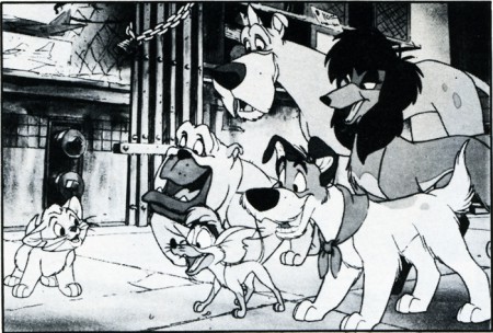
“Oliver & Co.”
The climactic confrontation between Basil and the archvil-lain, Ratigan, took place inside the clockwork mechanism of Big Ben. Computer graphics were used to create a three-dimensional world of gears and cogs, while the characters were animated by hand, an exciting example of the possibilities offered by mixing media. “Oliver & Company” (1988) included 11 minutes of computer animation of backgrounds and objects.
‘Rabbit’ Sets a Standard
The most innovative and imaginative animated film of the ’80s was the Touchstone/Amblin co-production, “Who Framed Roger Rabbit.” Directed by Bob Zemeckis, the film set a new standard for combining animation with live action and became the most successful film of 1988, grossing more than $150 million in its domestic release.
The popularity of the film led to a spate of character merchandise, and Roger appeared at the Disney theme parks and at many of the events celebrating the 60th birthday of Mickey Mouse. In the fall of 1988, the studio announced it would produce at least one “Maroon Cartoon” short starring Roger Rabbit and Baby Herman, and there were widespread rumors that a sequel was in the works.
“As it was in the past, the goal of the animation department is to create characters that live beyond their movies,” says Schneider. “With Roger, we’ve certainly created a character who’s entered the American lexicon: For the first time we’ve created a new character that has the potential to become a Mickey Mouse. I think you’re going to see a lot activity over the next five years for Roger: Over time, we hope to build him into a character as big as Mickey.”
“Obviously there’s been talk about a sequel to ‘Roger Rabbit,’ but the project really is in the talking phase right now,” adds animation producer Don Hahn. “A lot of people would like to do a sequel, but we’re still trying to recuperate and evaluate the plans for Roger. Sure, it’d be great to do another one, but it’s just too early to say.”
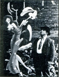 The success of “Roger Rabbit” has tended to overshadow “Oliver & Company,” a feature based loosely on Dickens’ “Oliver Twist.” The title character became an orphan kitten in contemporary New York City, and Fagin’s gang of pickpockets was transformed into a pack of stray dogs led by the super-cool Dodger. The upbeat tone, broader, cartoon-style animation and celebrity vocal cast (including Billy Joel, Bette Midler and Cheech Marin) placed the film in the tradition of “The Jungle Book” (1967) rather than “Pinocchio.”
“Oliver & Company” opened in November 1988 to favorable reviews (in Time, Richard Corliss called it “the snazziest Disney cartoon since Walt died”) and good business. The film earned a very respectable $20 million in the first four weeks of its domestic release.
Disney’s next feature will be “The Little Mermaid” in late 1989. The writers have lightened the melancholy tone of the original Hans Christian Andersen story, and added seven songs by Howard Ashman and Alan Menken (“Little Shop of Horrors”). Previewed animation from the film looks impressive, and the animators are excited about their work.
” ‘Little Mermaid’ is definitely on track for Christmas of ’89,” says Schneider. “I think the quality of animation is up sub stantially from anything we’ve done before. You have to realize that we have a very young staff — most of the people real ly started animating on ‘The Great Mouse Detective.’ They got through that experience, then jammed through ‘Oliver’ learned some more in the process, and have now hit their stride as artists.”
Many of the top artists from the international crew who animated “Roger Rabbit” in London joined the Disney staff in Glendale and went to work on “Little Mermaid” when the production ended. This influx of artists helped to bring the animation staff to its current record level.
Building the Animation Staff
“It takes a long while to pick uf the particular subtleties that define a Disney animator,” observes Schneider. “The artists from London are extremely good animators, but they’re a little more accustomed to working in a more Warner Bros./Tex Avery style. Animators like Tom Sito, Chuck Harvey and Nik ‘ Ranieri are really starting to come along and I think they’ll hit their stride on the next picture. But for now, it’s our older artists — Glen Keane, Mark Henn, Reuben Aquino — who are really pulling this picture through.”
Slated to follow “Mermaid” in 1990 is “The Rescuers Down Under,” starring Bernard and Bianca, the mice from the popular comedy-adventure “The Rescuers” (1977). Although the Disney artists sometimes reused characters from the features (e.g. Jimiiny Cricket), “Down Under” represents the studio’s first sequel to an animated feature.
“We’ve never done a sequel before, but I think the appeal of the Bernard and Bianca characters justifies the departure,” says Schneider. “I think the film is going tosurprise a lot of peo pie with its warmth, its heart and its comedy. We’ve found a new setting and added some new characters: Jake, the kangaroo mouse; a really great Disney villain, McLeach; and his sidekick, Fenton.”
“Down Under” will be directed by two supervising animators from “Oliver &, Company,” Hendel Butoy and Mike Gabriel. (Butoy did the key animation of Tito, the hyperactive Chihuahua; Gabriel designed the characters and did animation of both Dodger and Oliver.) The decision to promote two of the studio’s best animators to director indicates that the pool of well-trained young artists remains small.
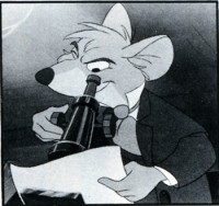 “I would say the biggest difficulty we face in the industry is finding experienced, qualified directors for our animated projects,” says Schneider. “We don’t see the kind of talent we’d like on the outside, so we’ve been taking staff artists who understand the Disney way and giving them the opportunity to fcdirect Disney pictures.
“Promoting from within does ^nean we’re robbing our core animation group to get directors,” he continues. “But I think having an artist like Hendel directing helps the animators improve: Everyone he worked with on ‘Oliver’ took a leap forward. I hope the same thing will happen as he and Mike direct ‘Down Under/ that they’ll bring the staff a notch further, and more than replace the animation they might otherwise do.”
“The Rescuers Down Under” will be followed by “Beauty and the Beast,” tentatively scheduled for 1991. The film is currently in preproduction, and experimental animation will begin in early 1989. Studio veteran Mel Shaw has done inspirational artwork for the film, and Schneider and Hahn agree that his handsome pastel drawings have set the style for the film and excited the animators about it.
To supplement the new features, Disney will continue to reissue its early classics. A special rerelease is planned for “Fantasia” in 1990 to mark the 50th anniversary of its premiere. For the occasion, the original Sto-kowski soundtrack is being restored with digital audio technology to replace the new soundtrack that film conductor Irwin Kostel and a pickup orchestra recorded in 1982.
“I think a lot of people have forgotten that ‘Fantasia’ really was a creative collaboration be tween Leopold Stokowski and Walt Disney,” says Hahn. “While the Kostel score was a great effort, you can’t retrofit something that was so tightly put together at that time. We’ve gone back to the original camera negatives, and when you see the film again, it will be in all its original splendor.”
A Force in TV
Disney has also become a force in the television cartoon market: The studio began producing Saturday morning animation in Japan with “The Wuzzles” and “Gummi Bears” in 1985. “The New Adventures of Winnie the Pooh” debuted on ABC in 1988. “DuckTales” (1987) remains the most successful cartoon show in syndication, and another syndicated series, “Chip and Dale’s Rescue Rangers,” is scheduled to debut in fall 1989. (The generally high quality of the Disney TV cartoons is balanced against the egregious live action/animation specials made for the studio by Joie Albrecht and Scot Garen.)
In April, Disney will open a second animation facility in Orlando, Fla., as part of the Disney/MGM Studios. A staff of approximately 90 artists will animate the classic Disney characters — Mickey Mouse, Donald Duck, Goofy, et al. — in a series of featurettes. The first film in the series will be either “Mickey’s Arabian Adventure” or “Mickey and the Emperor’s New Clothes.”
“The Florida studio is both exciting and extremely difficult,” says Schneider. “Six of our top artists are going there to head the staff; we’ll fill the rest of the positions with people from various schools and professionals from around the country. We’re hoping to expand both the need and the opportunities for young animators, which will only help us in California.”
The artists’ offices in the new building have glass walls that will enable visitors on the studio tour to see how an animated film is made. Jerry Rees (“The Brave Little Toaster”) is directing a series of short live-action/ animation films that explain the animation process. Robin Williams, Walter Cronkite, Walt Disney Co. chairman Michael Eisner, Roger Rabbit and Mickey Mouse provide the narration.
As he considers the possibilities of the expanded production facilities and schedule, Schneider grows thoughtful. “It’s my goal that each time we do a picture we get better at the craft of making movies,” he concludes. “I think the group of people that includes myself, Jeffrey (Katzenberg), Roy (Disney) and the animators really has the opportunity to set the agenda for animation for the next 50 years, as the older group of artists set it for Walt’s generation.” -k
Charles Solomon’s next book, Enchanted Drawings: A History of Animation in America, will be published by Alfred A. Knopf in fall 1989.
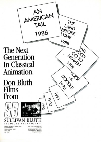
As a followup sometime, I’m planning to post an extremely long article from the NY TImes Magazine about the Bluth rebellion away from the Disney mainstream. It’ll take a while to put together.
For now, here’s an attractive ad from that very same issue of The Hollywood Reporter.
Animation Artifacts &Books &Disney 07 May 2009 07:54 am
Kinney Writes about Moore
- Since I posted a piece about Jack Kinney yesterday, I thought I’d add this to the mix. In an early version of his book, Walt Disney and Other Characters, Jack Kinney wrote this:
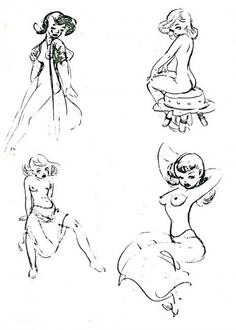
The little gentleman, Freddie Moore, also took a poke at Roy during a friendly game of volley ball. Fred was a very co-ordinated guy. He drew as easily as breathing, and as the saying goes “He could draw his ass”. A very high compliment.
I saved a few of his originals:
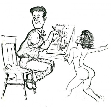
(Click any image to enlarge.)
- Fred and Fergie did all of the animation on the “THREE LITTLE PIGS”. Fred did the three pigs and Fergie drew the big bad wolf.
It was a sensation and introduced “Whose Afraid of the Big Bad Wolf” written by Ted Sears and Frank Churchill,
It was the song hit of the Depression. Burt Gillett directed.
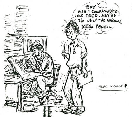
Art Babbitt, among others, might have argued with Jack Kinney’s allotment of all the animation to Fred Moore & Norm Ferguson.
By the way, these pages are xeroxes of xeroxes. Excuse the quality but enjoy the drawing.
Disney 06 May 2009 07:40 am
Art Babbitt & Jack Kinney
I received another delightful note from Borge Ring. It concerns Art Babbit and Jack Kinney:
- Jack Kinney as a strategist
You mention Art Babbitt in your comment on Mike Barrier’s keen review of the Milt Kahl Celebration. Here is a Babbitt experience you may not have heard about.
Art was inducted into the Marines during the Second World War.
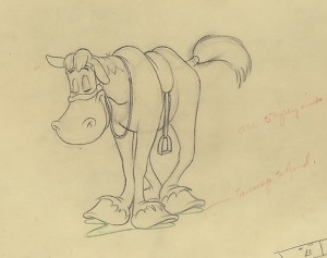 During his absence Disney had developed a brand new Goofy series written and directed by Jack Kinney and his brother Dick. These funny films starting with “How to Ride a Horse.” The CHAPLINESQUE animation was done by the much maligned Woolie Reitherman and the brilliant John Sibley. The familiar character of Goofy was drastically changed, His actionline was reversed to point up an optimistic chest instead of the hunched shoulders
Jack Kinney wrote:
”Art had won the courtcase with Disney. He came back to the studio and was assigned to work on my new Goofys. He demanded [a Goofy with] shoulders and five fingers, because otherwise he could not use the live action he always shot of Pinto Colvig, I gave him a whole Goofy to do as his very own “The Baggage Buster” That would keep him peaceful for awhile. And in the meantime I could make two, three or four Goofys without having him fuck them up”
writes
Børge
After a slightly strange “Baggage Buster” Jack Kinney (or whoever) relented and Babbitt animated some excellent “oldfashioned” Goofy sequences in the new series such as “Goofy’s Glider.”
Babbitt was a top “oarsman” onboard the good ship Hyperion and developed way up into Rooty Toot Toot. Art and Tissa David were John Hubley’s favourite animators. Hubley used to phone him from NY and beg: ‘”Thirty feet, Art. Juat thirty feet. ..please”
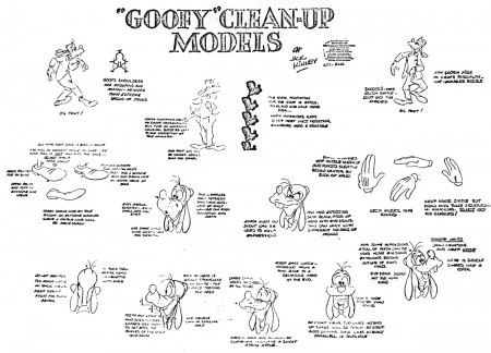
Copy of a copy of a copy.
In 2006, I wrote about Art Babbitt’s work with Hubley on the Carousel feature here.
The beautiful horse, from How To Ride A Horse, comes from Jenny Lerew’s collection.
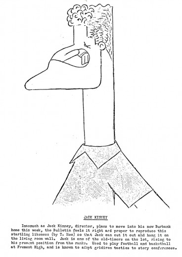
The Jack Kinney drawing is from the Disney Bulletin.
Animation &Animation Artifacts &Hubley &Layout & Design &Models 05 May 2009 07:36 am
More EGGS
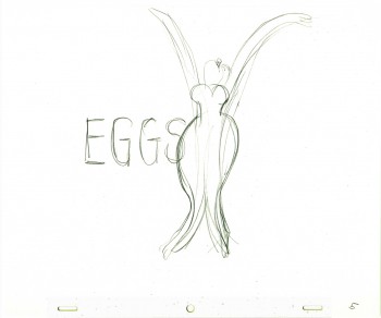 - In the past, I’ve posted some of John Hubley and Tissa David‘s preliminary drawings for the picture, Eggs. I’ve got plenty of this artwork and I love it, so here’s some more.
Eggs was a short film which was rushed out at a low budget for a PBS show called The Great American Dream Machine, which was produced by designer, Elinor Bunin.
The film follows the political thoughts of John and Faith; they were concerned about overpopulation (there are at least four shorts they made about the subject) and were able to blatantly make a political short for this TV series.
Past posts of my can be seen here, and here.
There’s currently a copy of this short on YouTube.
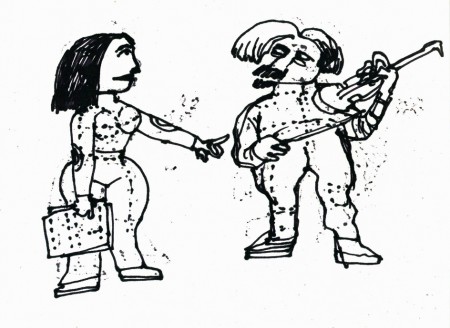
These three drawings are character Layouts by John Hubley.
(Click any image to enlarge to animation-sized artwork.
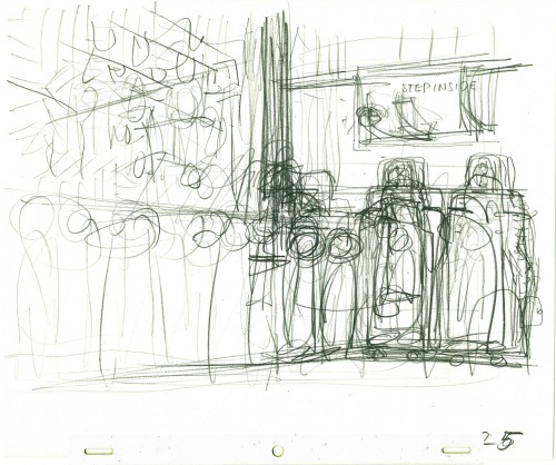
This is a BG Layout John gave Tissa.
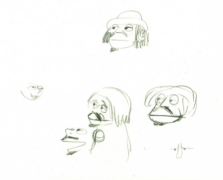
This drawing and all the remaining are Tissa David’s drawings.
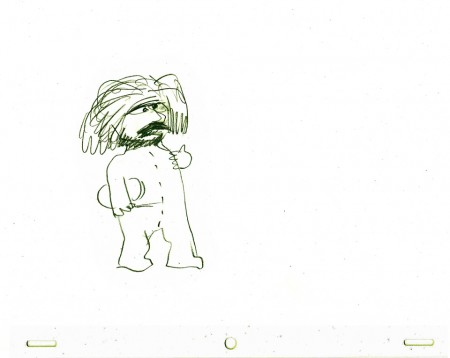
She would block out her own rough Layout
before jumping in in to animate.
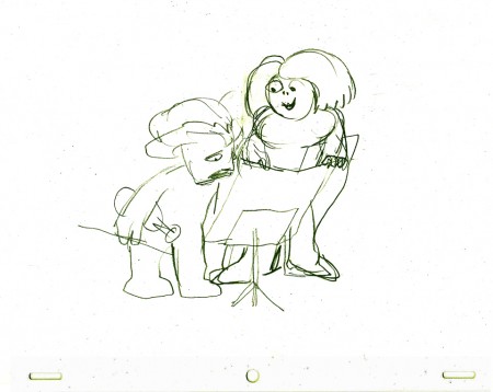
It gave her the chance to thoroughly think out what
little information John had given her. Usually just a
conversation with some very rough sketches.
Festivals &Photos 04 May 2009 09:07 am
ASIFAEast Party
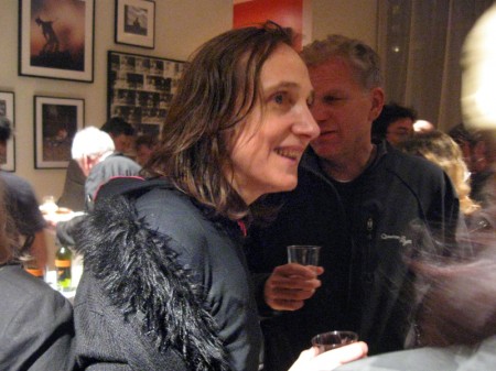
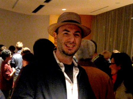
- Last night the 40th annual ASIFA East Festival took place in a rainy NYC at the New School auditorium. There were about 2 hours of award winners to be screened after which everyone moved to the fifth floor to attend an after-party.
The place was packed. I wasn’t able to get anywhere near the food table so I had a few glasses of wine and raced about snapping pictures. Unfortunately, I’m a horrible photographer, so I apologize to all those here for the bad representation I’m giving you. for all the rest of you, these are just some of those I bumped into or who bumped into me. It was fun.
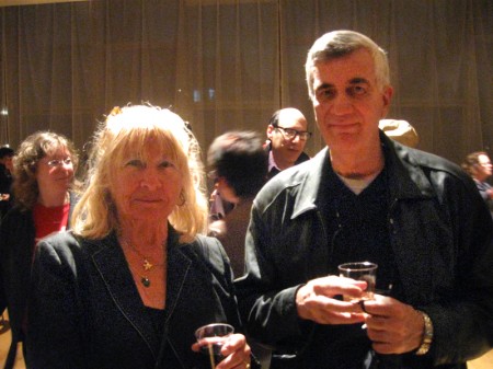
John Canemaker and Irra Verbitsky at the beginning of the night.
.
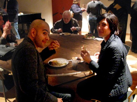
Amid Amidi and Celia Bullwinkle got to the food pretty quickly.
You can see what I mean about the bad photography. Sorry guys.
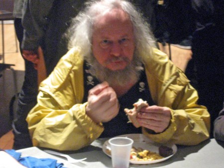
Michael Sullivan is in the thick of it.
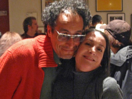
John Dilworth with Heidi Stallings.
John’s just back from Spain in time for the party.
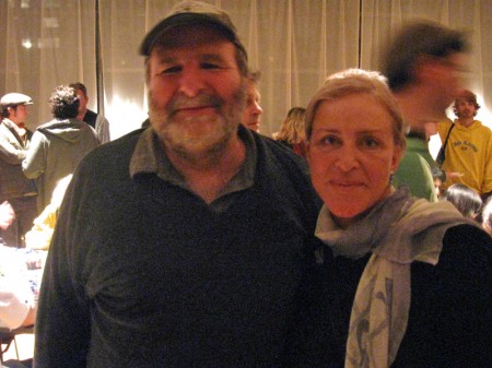
Irina Margolina and Adam Snyder. She just arrived
from Russia hours before the Festival.
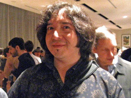
Adrian Urquidez looks like he’s having too much fun.
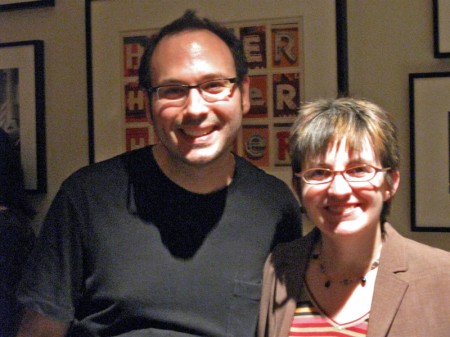
Dave Levy (ASIFA East Pres) and Nancy Keegan tend the wine
while getting caught by me in a hot spot.
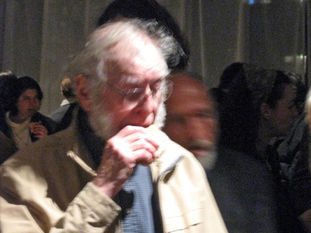
Howard Beckerman tries a sandwich. Sorry, Howard,
this was shot from the other side of the room.
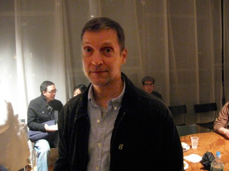
It’s been a while since I’ve seen Michael Zodorozny.
Glad to be able to catch up a bit.
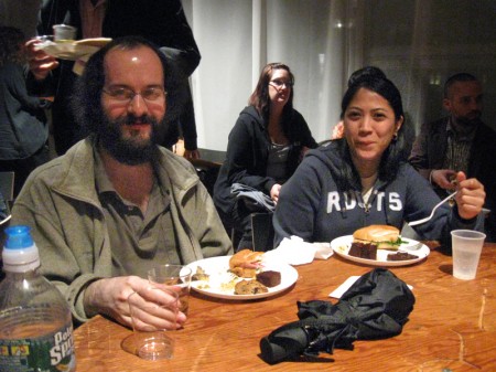
Matt Clinton and Katrina Gregorius from the Sporn Studio
enjoy the food after the long wait on line.
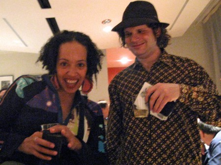
Pilar Newton and Ivan Katz stop by our table and bring
that glowing enthusiasm always there with her.
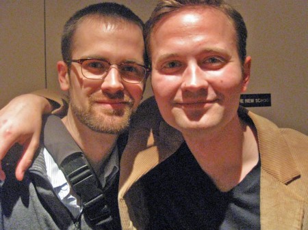
The Rauch brothers, Mike and Tim, were the stars of the night.
Their film Q&A won the grand prize at the Festival.
Look for the film; it’s brilliant.
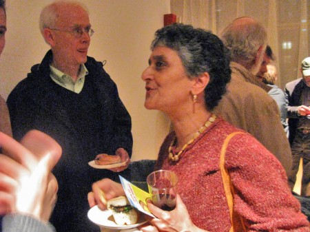
Candy Kugel chats while Mr. Rauch, the father of the brothers,
watches in the background. He’s thrilled for his sons’ success.

Debra Solomon in the thick of the party.
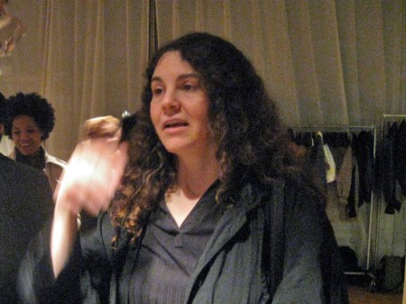
Linda Simensky, former ASIFA East Pres.,
came in for the event, as she always does.
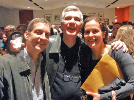
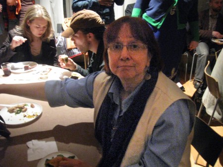
Finally, the trio, Michael Zodorozny, John Canemaker and Jennifer Oxley,
who won a prize. Sorry for the overexposed, badly lit shot. But I’m glad
to have it. the party was a success.
It was just about this time that the battery in my camera died.
Time for me to leave, anyway. I had a busy morning to face on Monday.
Photos 03 May 2009 07:36 am
Sundayphoto – Foodcarts
- Paddy Doyle’s novel, “The Van,” made me realize that we had a lot in common with our British and Irish friends. The travelling food sellers are a common dressing though the cuisine sold, I’m sure, is different.
 A major part of the look and feel of New York is in the food carts that are standing everywhere. In the past, my childhood, the carts were basically hot dog vendors. Then they added the salted pretzel, and things started to develop.
With the new immigrant class in the city, lots of new foods entered the picture, and in fact, I believe, they’ve taken over. Today it’s almost impossible to find a hot dog vendor. I’ve searched for one in the last week and was coming up empty-handed until I saw one late last night. A vendor was wheeling his cart home after what was, obviously, a long and tiring day. Unfortunately, I didn’t have my camera.
They still sell the hot dog and the pretzel, but you can add “Halal” foods to that menu. Shish-ke-bob, sausages, and so much more have been added.

This is what carts look like today. They come in larger sizes and smaller
sizes. They sell everything from shish-ke-bob to hot dogs to pretzels.
Their prices are usually a good deal, if you trust the sanitation.

Many of these carts sell sandwiches, bagels and breakfast pastries in
the morning. Sandwiches in the afternoon. They usually are established
locations and the same people occupy a space for many years.
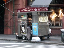

Here’s that very same cart as the vendor sets up in the morning –
I shot this at 6am. This same cart has been here for at least 12 years.

In the wee hours of the morning, carts are delivered to the requisite areas.
Oftentimes, if the cart is small, you’ll see the vendor pushing it himself.
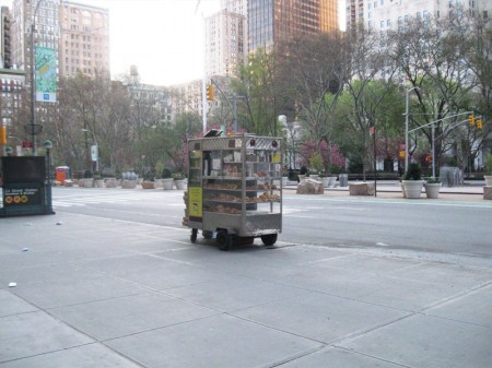
This one is setting up early morning across from
Madison Square Park on 23rd Street and Broadway.

Stocking the shelves with pastries, preparing coffee and icing juices.
Getting ready for the morning rush about to start.

Another similar cart, in the Village, all ready for the crowds. This one has an
overhang, to protect patrons from the rain, and a external cooler with drinks.

This guy is parked outside the IFC center downtown.
As you can see his menu is quite varied and ethnic.
Quite tempting.

You can also find fruit vendors around town. The prices of various fruits is about
half what the local supermarkets charge, and the quality is generally good.

Here’s a virtual travelling store. This truck is set up daily on 28th Street
off Madison Avenue to serve breakfast. They’ll cook the eggs for you.
Later in the day they move around the corner to Madison off 28th St. to serve dinner.
They’re open all night with lines of taxi drivers waiting to buy food from them.
I have to admit, I’m always tempted but haven’t tried it yet. After all,
can all those taxi drivers be wrong? The vendor must be doing
something right.

I also caught this truck downtown and wondered if they were
establishing a spot on Bleecker Street. But they never set up.
On the move.
Articles on Animation &Festivals 02 May 2009 07:48 am
ASIFA East Fest
- Tomorrow, Sunday May 3rd marks the 40th anniversary of ASIFA East’s annual festival.
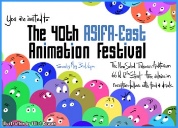
A couple of hours worth of films will be screened in the New School’s auditorium at 66 West 12th Street. Immediately thereafter a party will be celebrated in an adjoining room of the school.
This has always been the big event of the New York animation community, and everyone’s encouraged to attend. The only admission requirement is a pleasant demeanor.
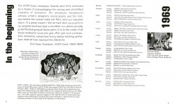
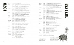
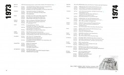
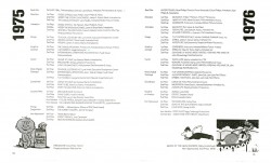
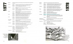
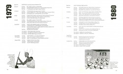
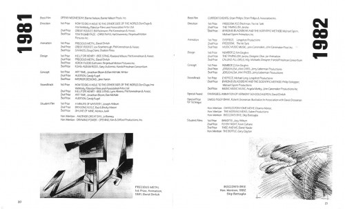
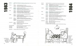
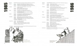
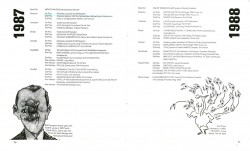
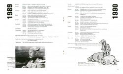
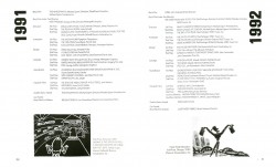
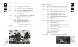
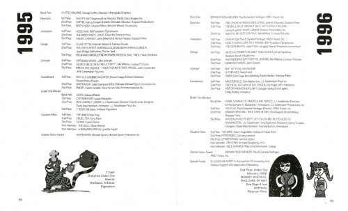
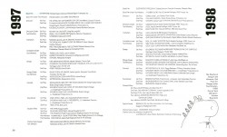
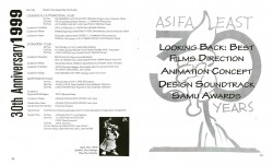
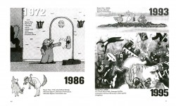
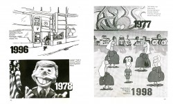
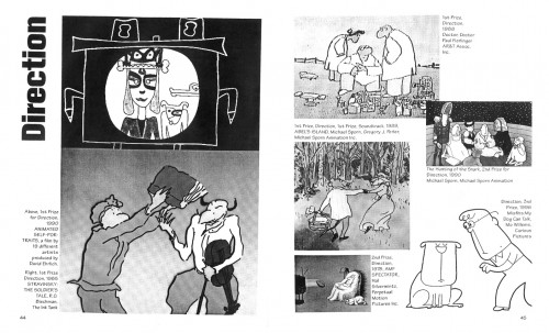
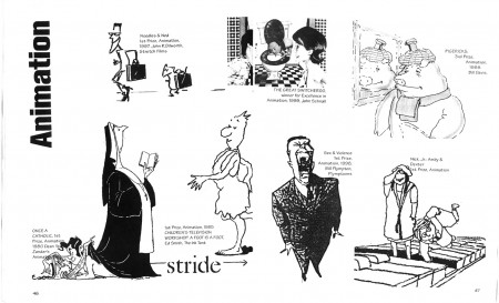
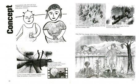
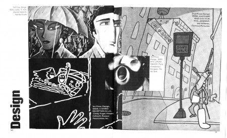
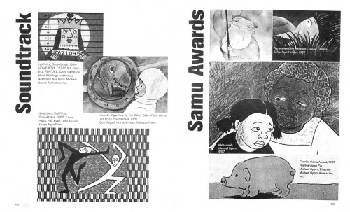
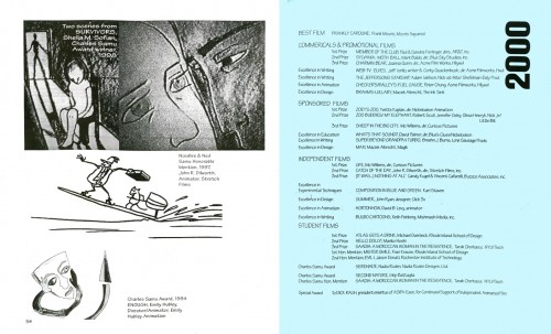
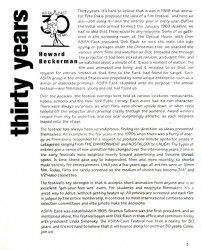
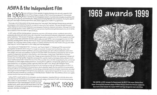
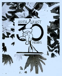 -Back in the year 2000, ASIFA East, celebrating their 30th Anniversary, produced a book outlining the history of their festival. All of the award winners over all of those 30 years were listed, and a lot of images featured some of the highlights of the past festivals.
I loved this little xeroxed booklet. It let me feel like I was an important part of this organization’s history. The booklet was designed and edited by Mark Segall, with help from Howard Beckerman and Bill Lorenzo.
Now that ASIFA East is about to celebrate their 40th Festival, I thought it not a bad idea to post all of the pages from that little publication.
Here they are:
Comment by Howard Beckerman | Back Cover
(Click any image to enlarge to read,)
There are a lot of films that won here and went on to win everything else out there. Frank Film, Your Face, A Soldier’s Tale, The Chicken From Outer Space and many others started out at this little fest and became Oscar/EMMY contenders/winners.
You never know what’ll show up – be there Sunday at 6.
