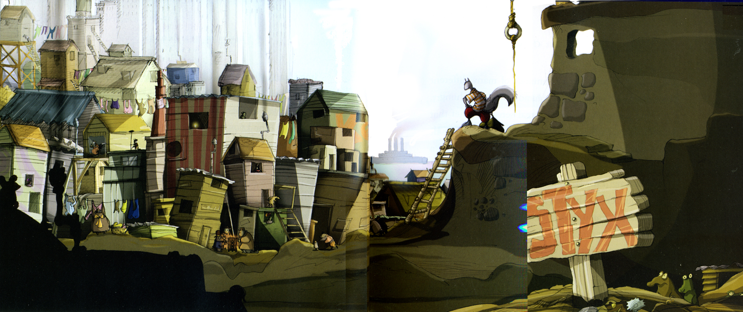
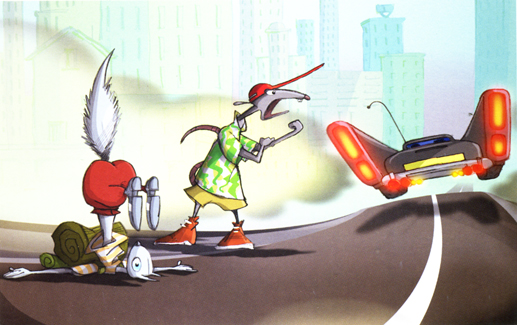
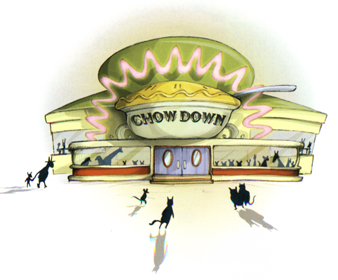
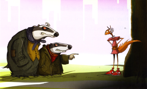
Yearly Archive2009
Animation &Animation Artifacts &Disney 24 Jun 2009 08:19 am
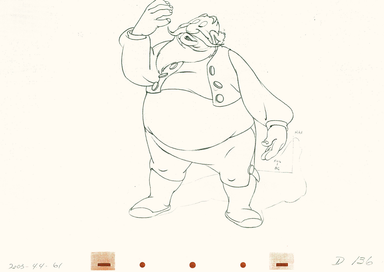
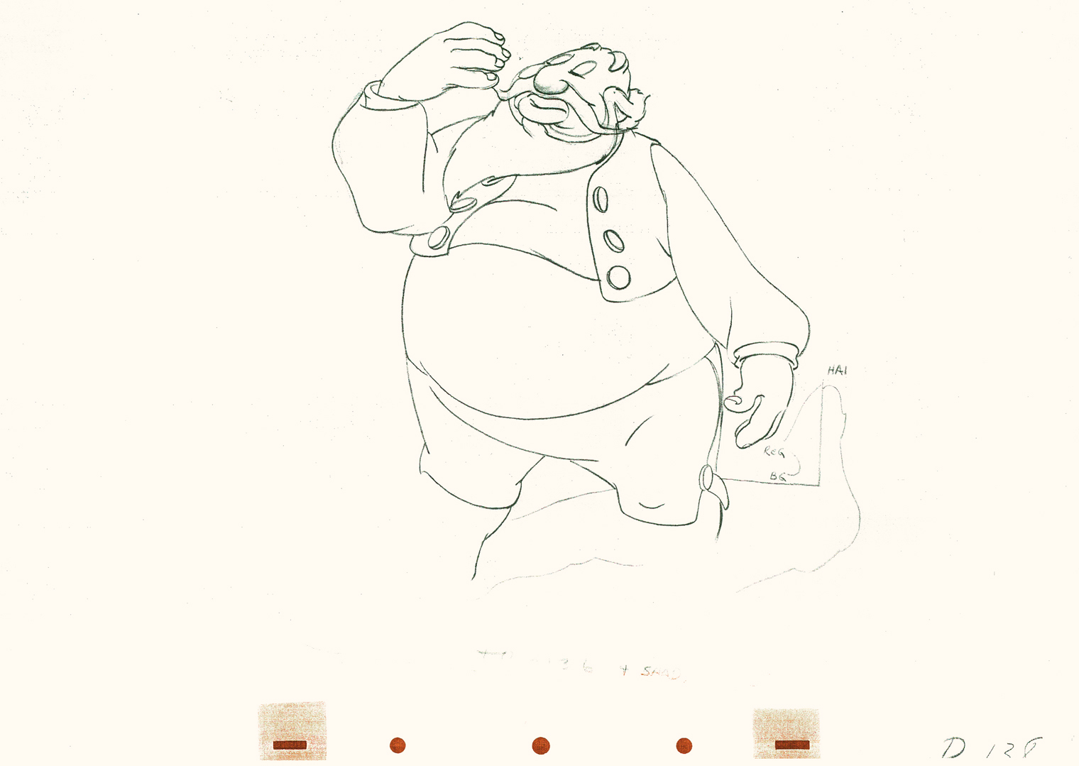
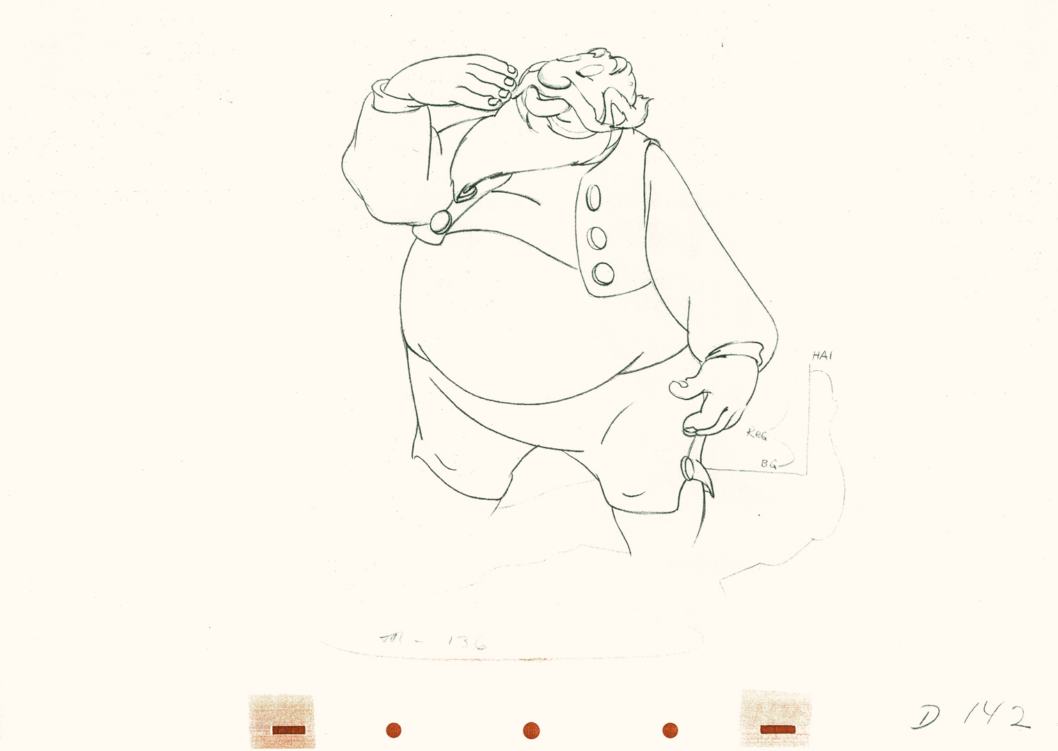
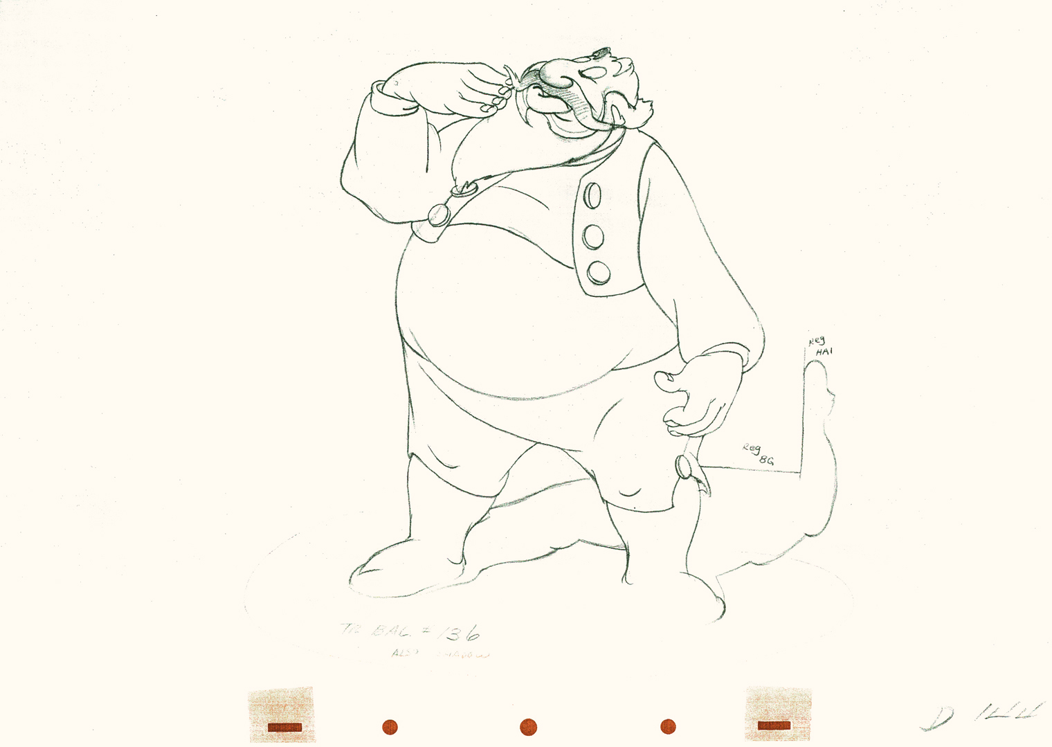
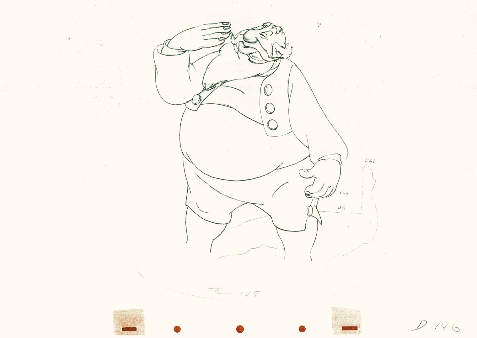
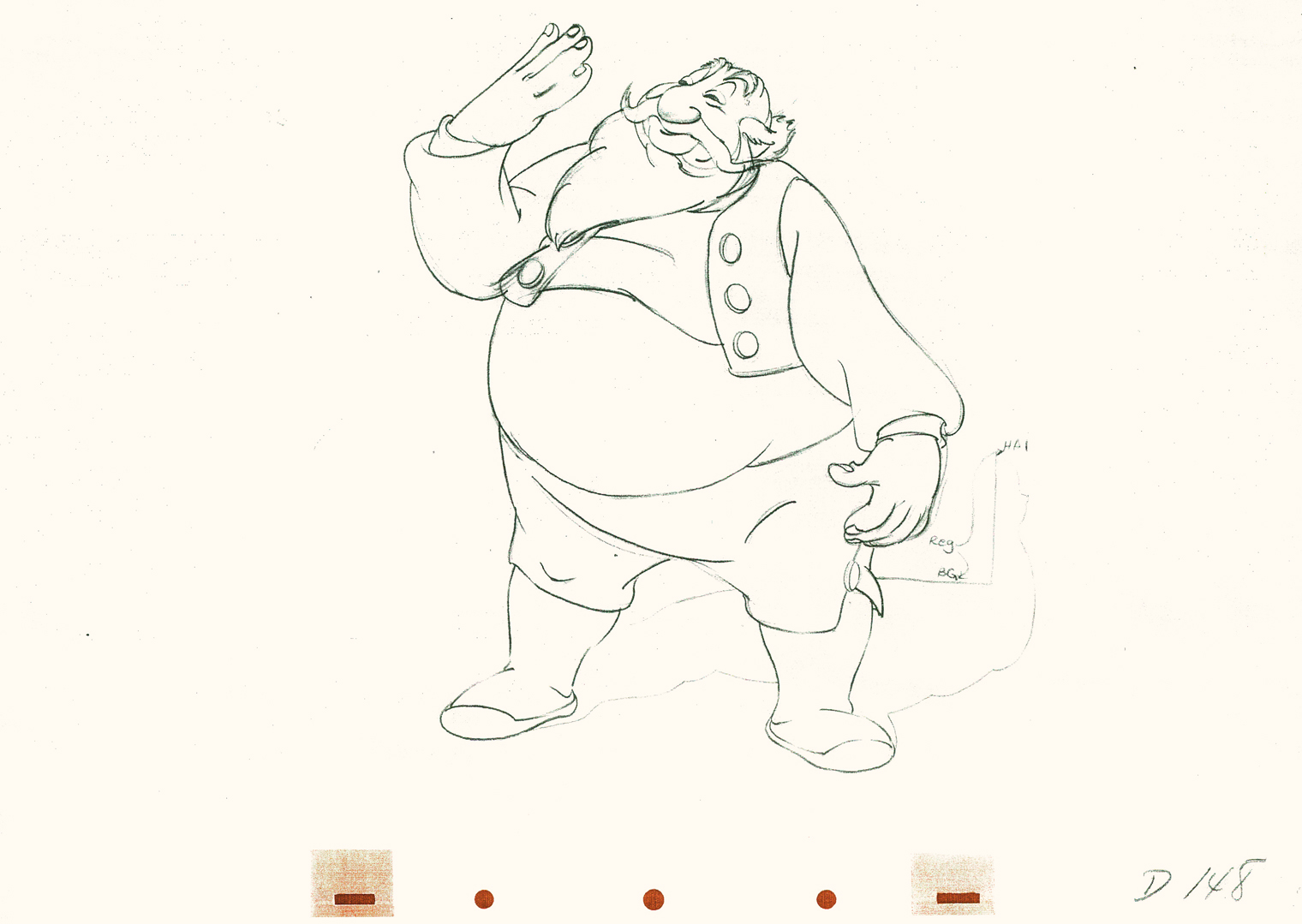
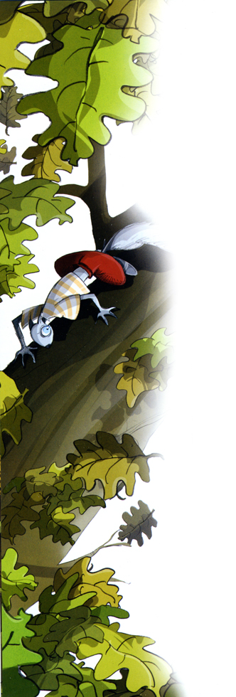
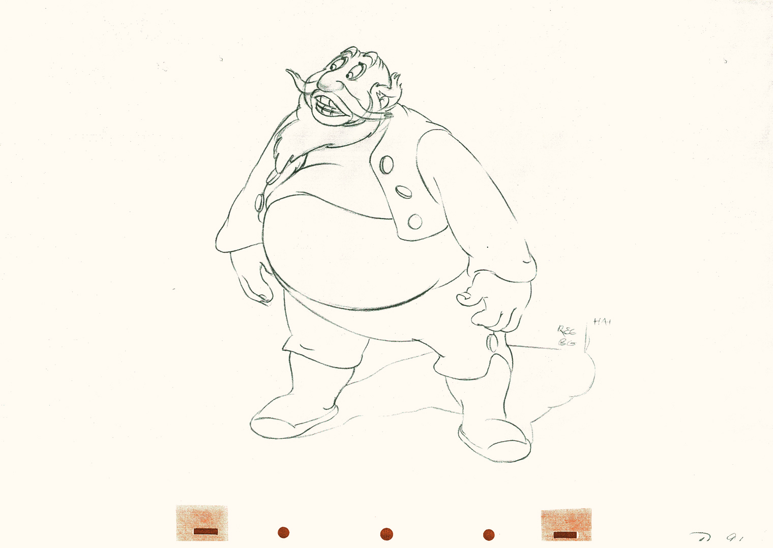
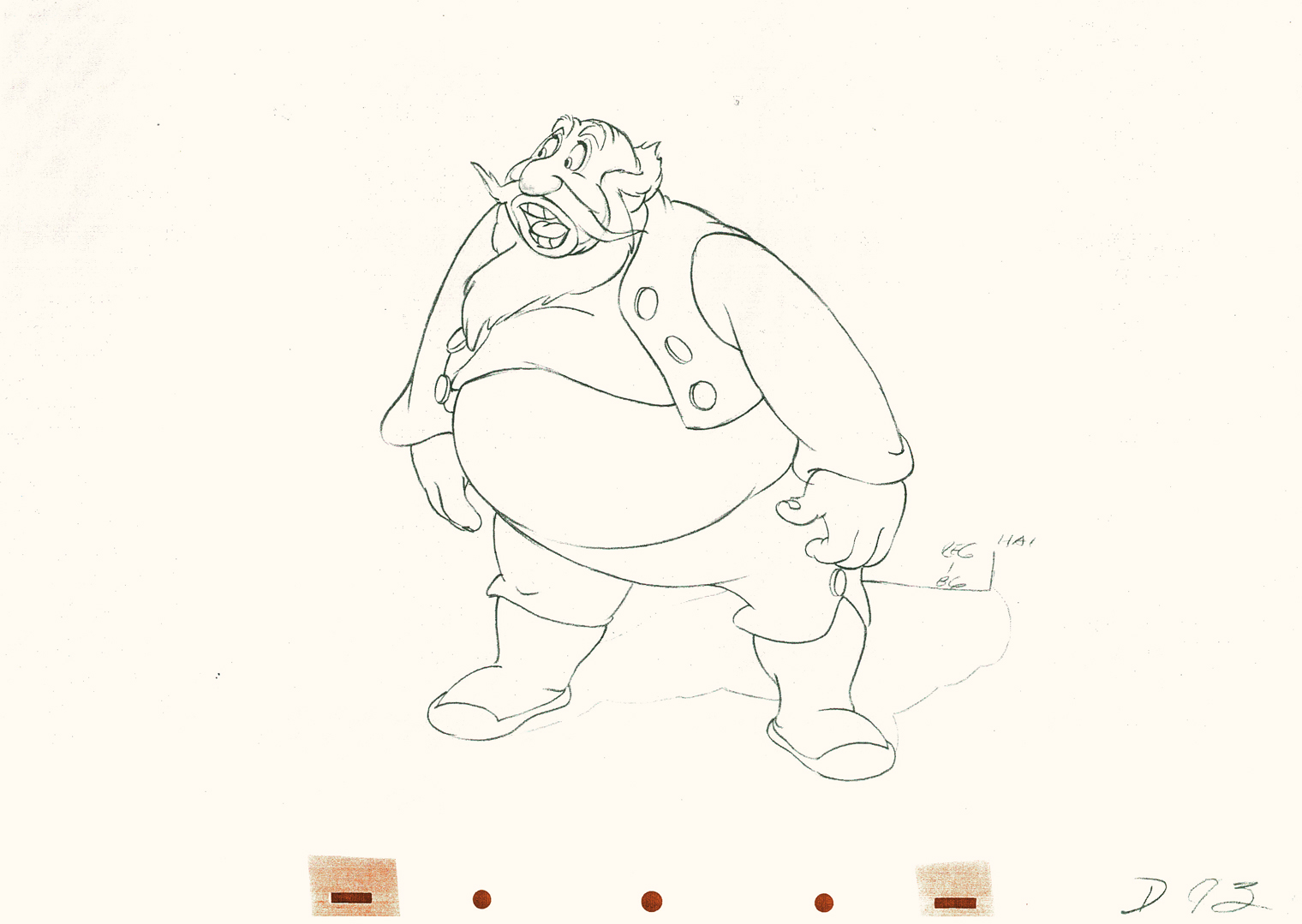
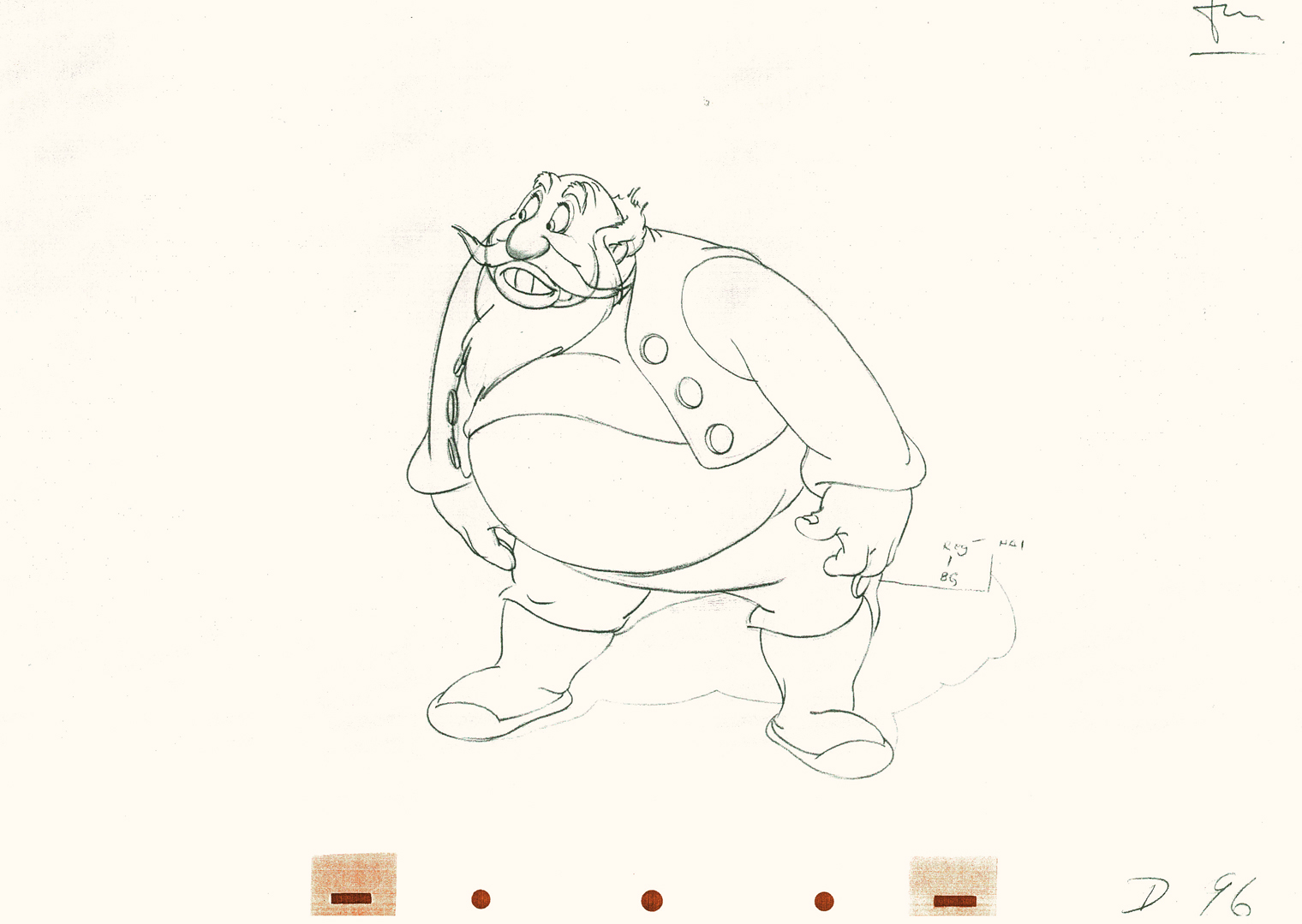
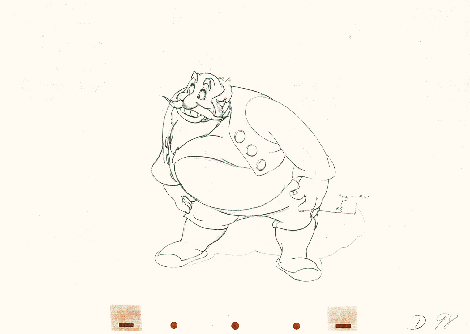
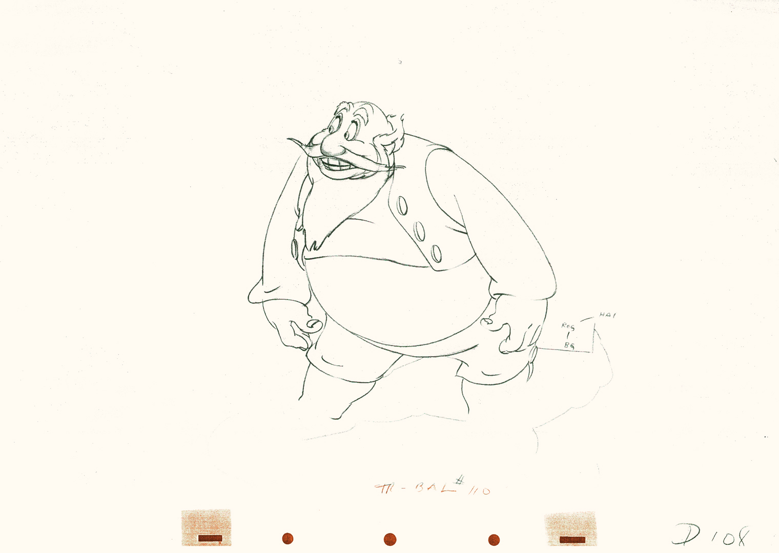
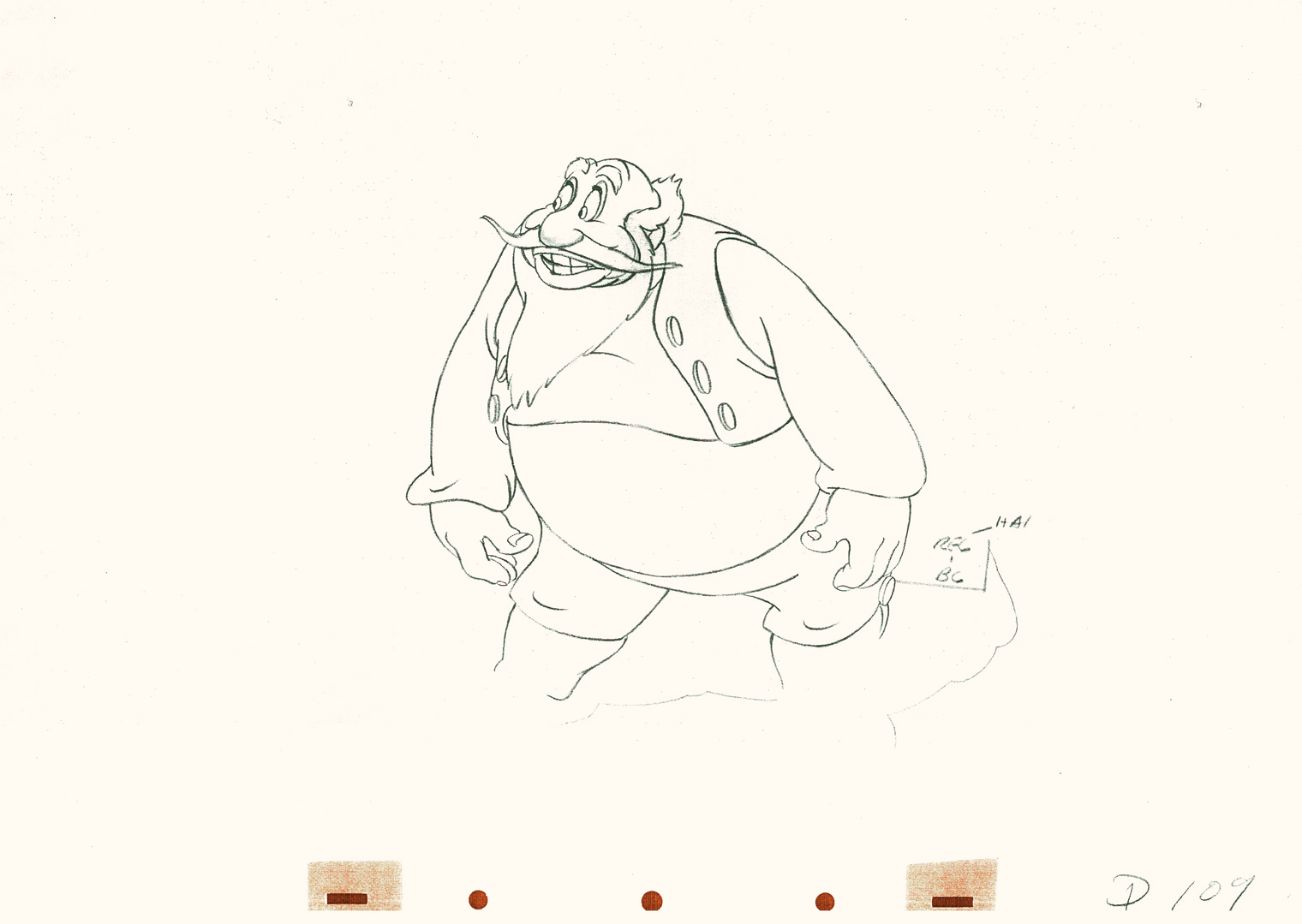
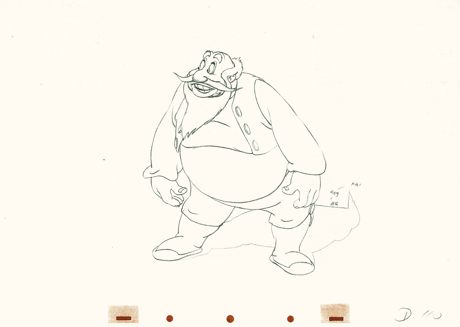
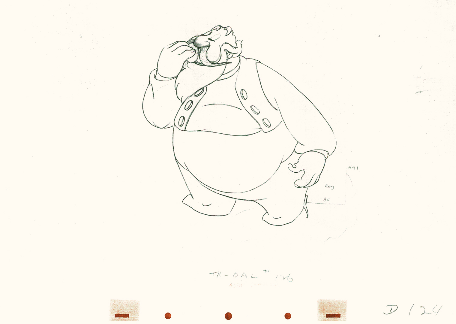
Tytla’s Stromboli – 4
- This is Part 4 of this large scene by Bill Tytla of Stromboli.
Part 1 saw a frenetic anger from Stromboli; Part 2 he caught himself to get a hold on his emotions. Part 3 he slowed down and prepared for the kiss (a break) and the bow upcoming in this, Part 4. Much of this part is on twos, as opposed to part 3 all on ones.
This is animation tour de force and there’s one part left to go next week.
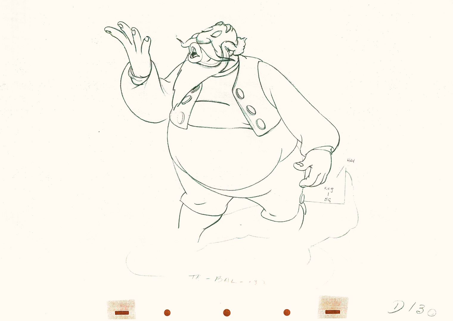 130
130(Click any image to enlarge.)
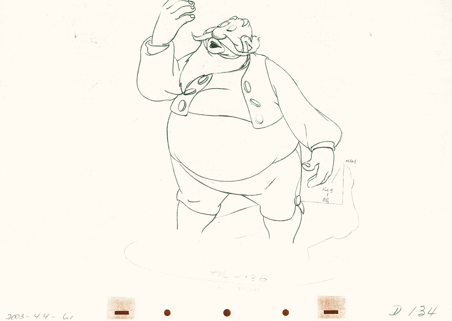
 136
136
 140
140
 144
144
 146
146
 150
150
 154
154
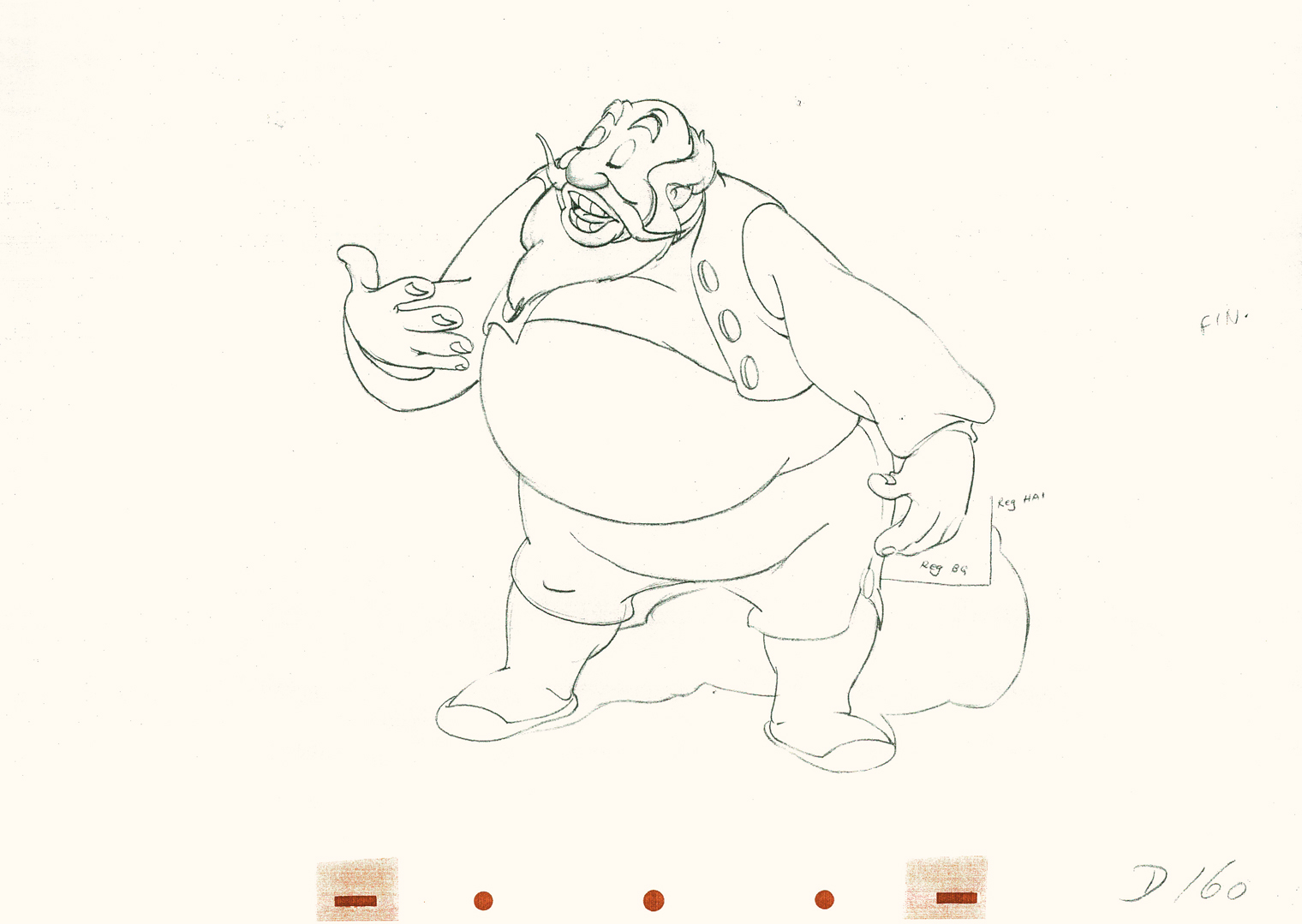
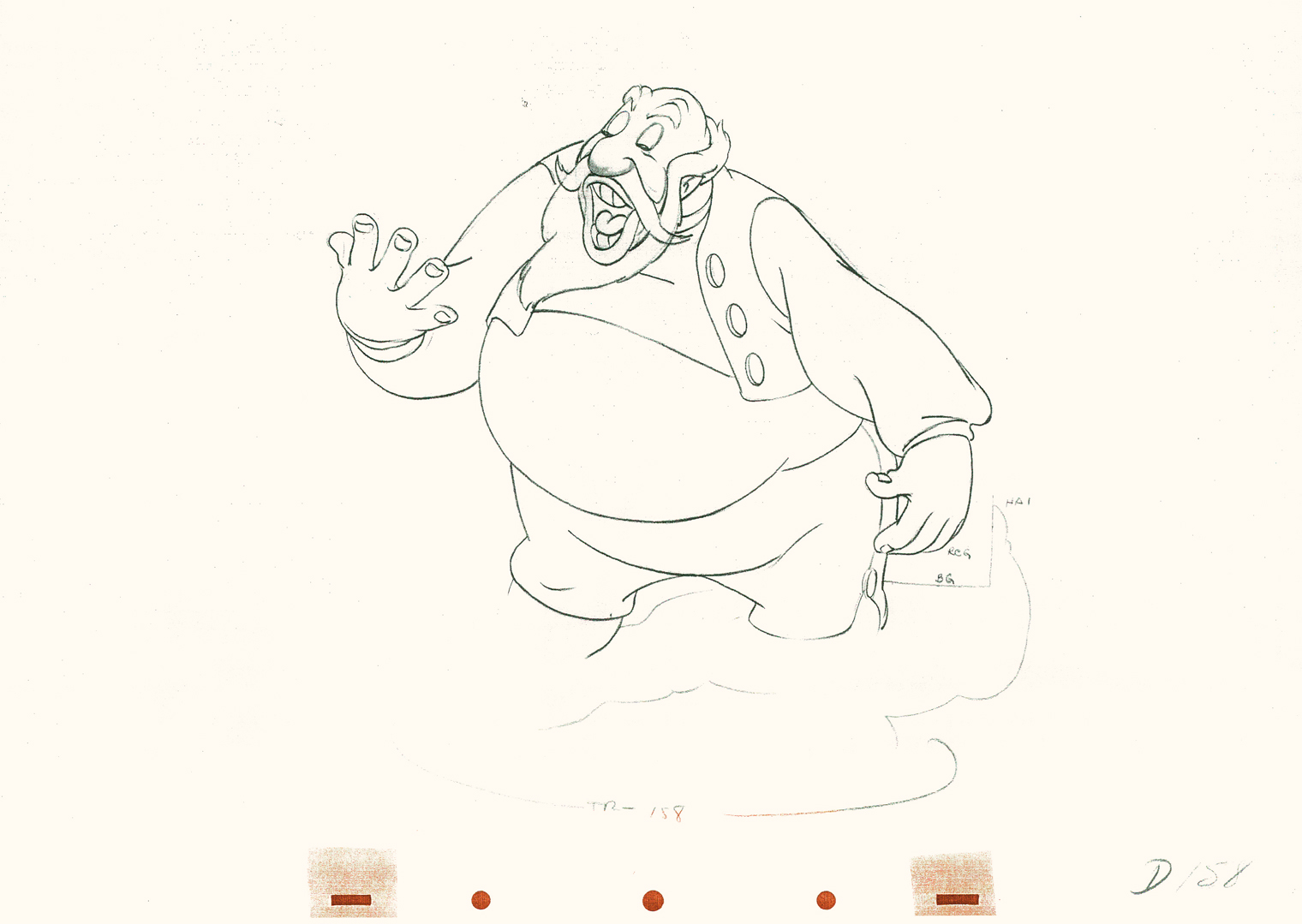 158
158
 162
162
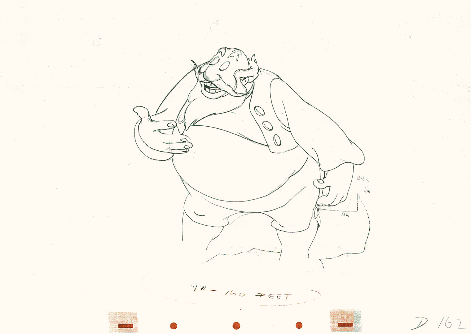
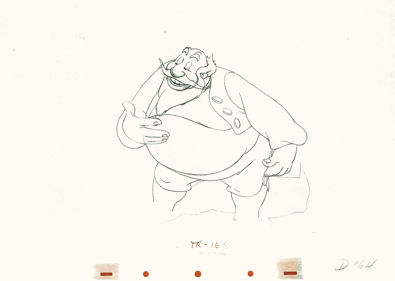 164
164
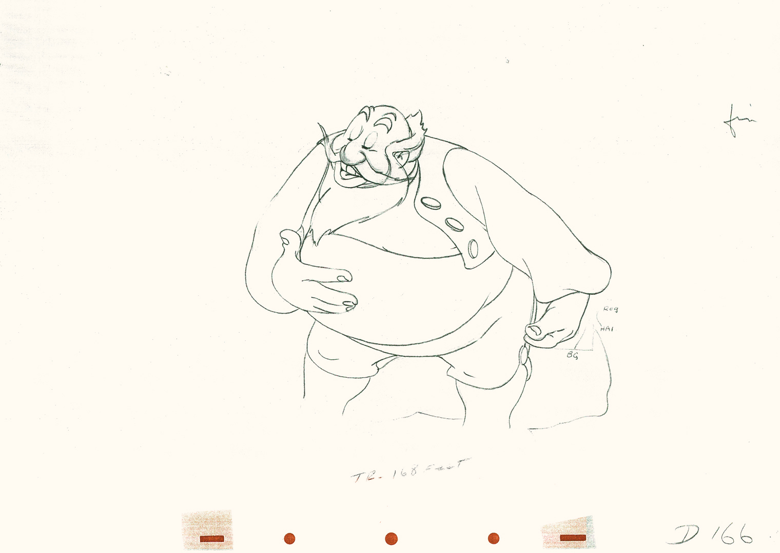
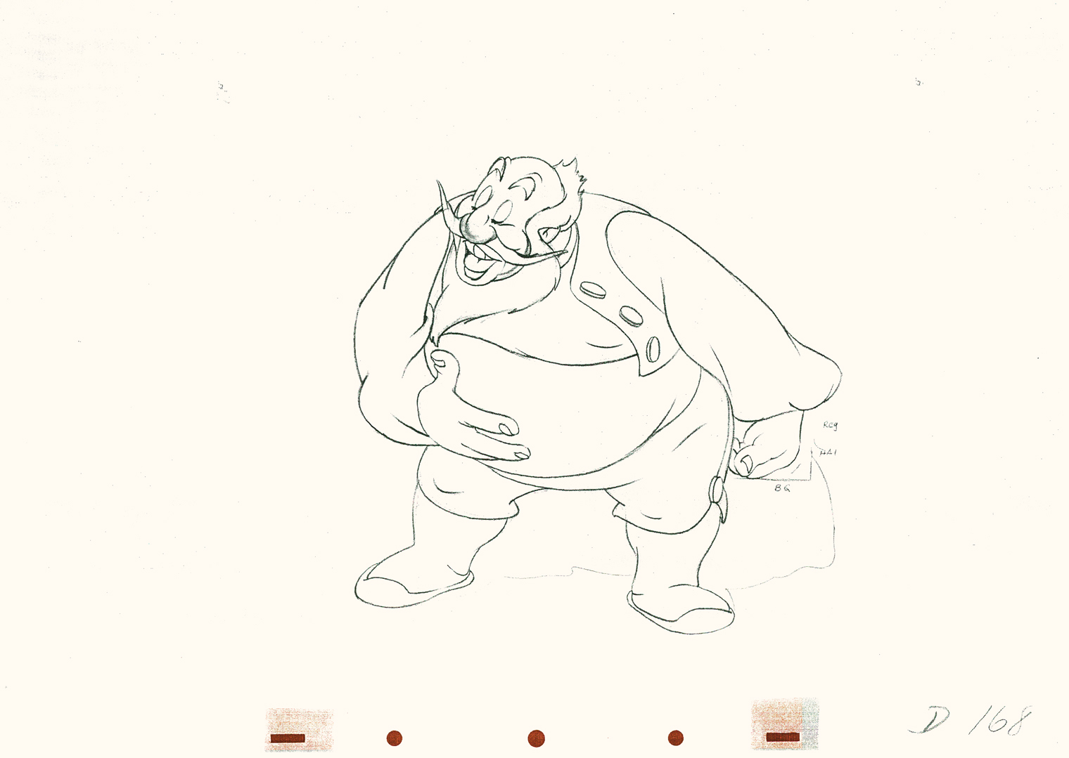 168
168
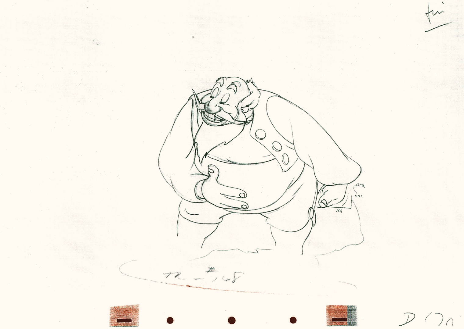
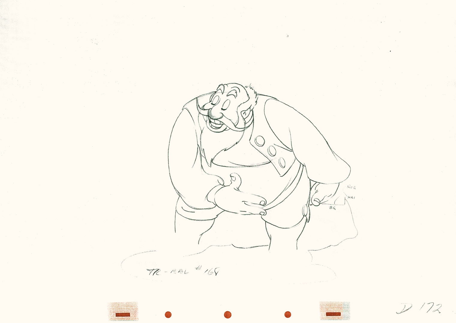 172
172
 174
174
176
Click left side of the black bar to play.
Right side to watch single frame.
Books &Illustration 23 Jun 2009 08:08 am
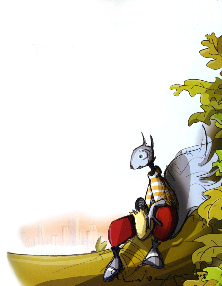
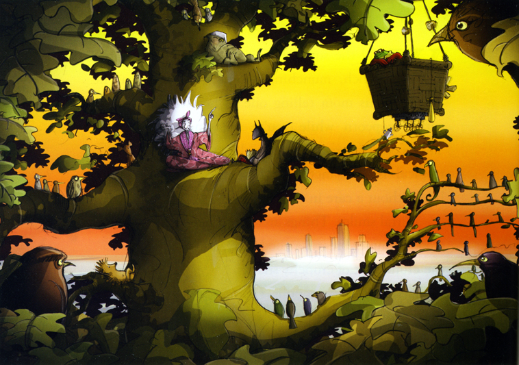
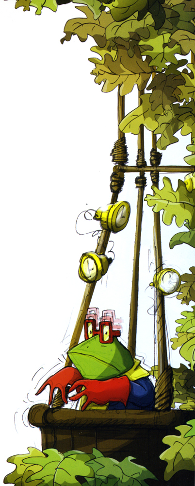
High in the Clouds
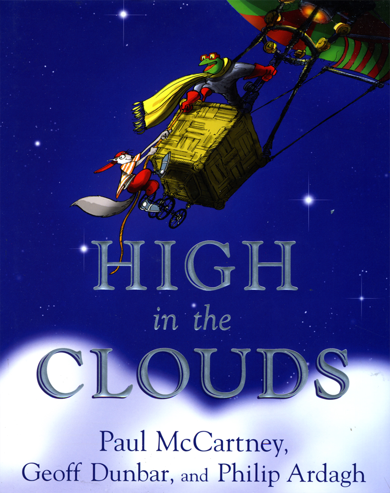 - A bit of news broke; when it was reported in Variety that Paul McCartney would be the force behind a new animated feature, High in the Clouds.
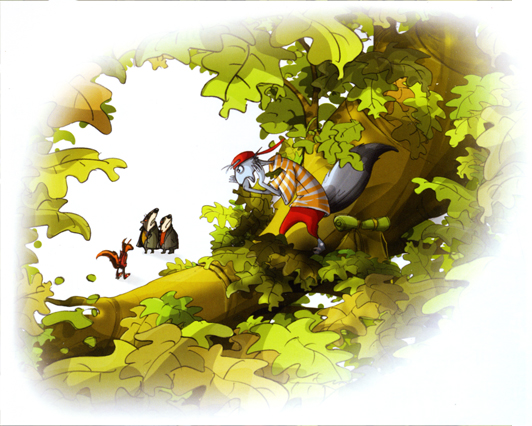
This work was a book he wrote with Geoff Dunbar and Philip Ardagh, and it was published in 2005 by Dutton. All three are given equal credit. Dunbar is an extraordinarily gifted animator/director in London. His animated short, Lautrec, as well as the animated version of the Alfred Jarry play, Ubu, helped to lead Britain to the animation renaissance of the 70′s. He also made the film, Rupert and the Frog Song, with McCartney. Ardagh is a children’s book writer with some 60 titles to his credit.
There can be no doubt that Ardgh did most of the writing, and Dunbar did the illustrations to the book.
The surprise to me is that Rob Minkoff was hired to direct the feature. He’s talented, but Dunbar had an obvious connection, and I’m surprised he did not get the job. Some obvious behind the scenes mechanics must obviously have been in play.
Caroline Thompson who wrote Edward Scissorhands, The Corpse Bride and The Secret Garden is a wonderful choice to write the script. It’s also interesting that Bob Shaye and Michael Lynne, formerly of the studio New Line Features, are producing this film with their newly devised Unique Pictures.
My hope and my fear is that Minkoff will make it look more like The Lion King and less like Stuart Little.
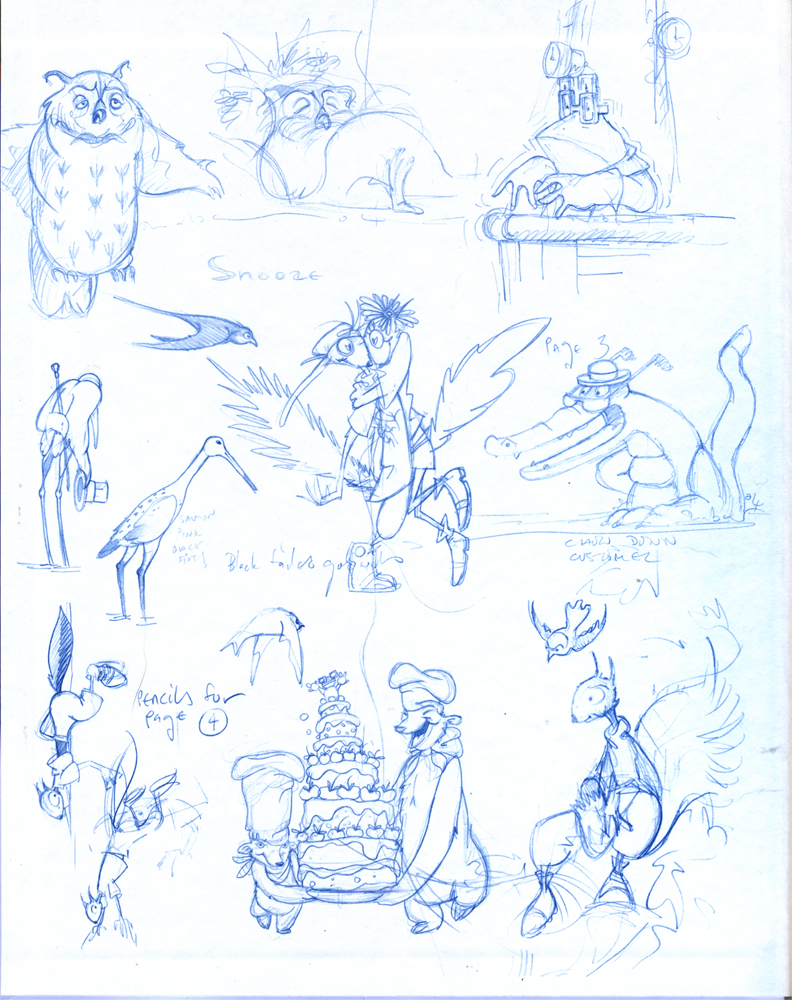
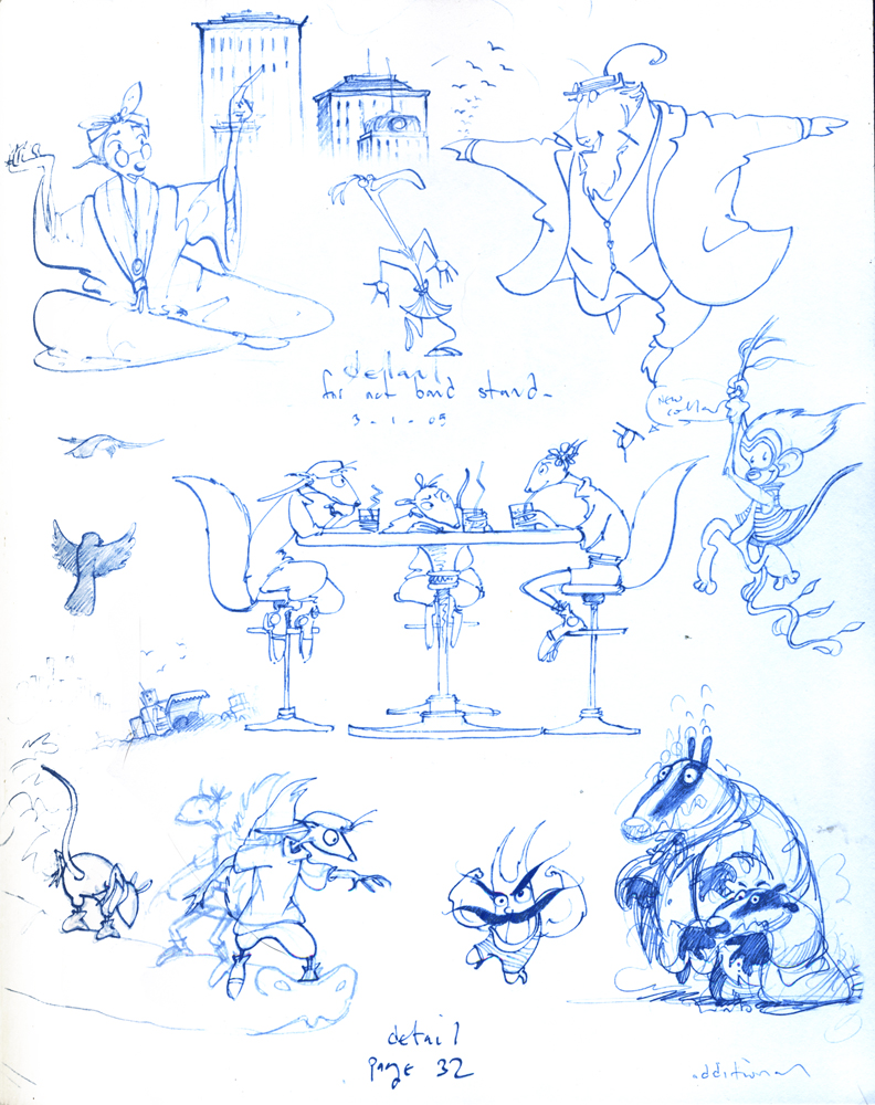
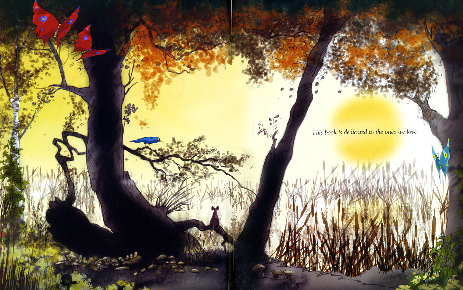
I bought the book a while back. Let me share some of Dunbar’s illustrations with you.
Inner covers
(Click any image to enlarge.)
 3
3
 4
4
 5
5 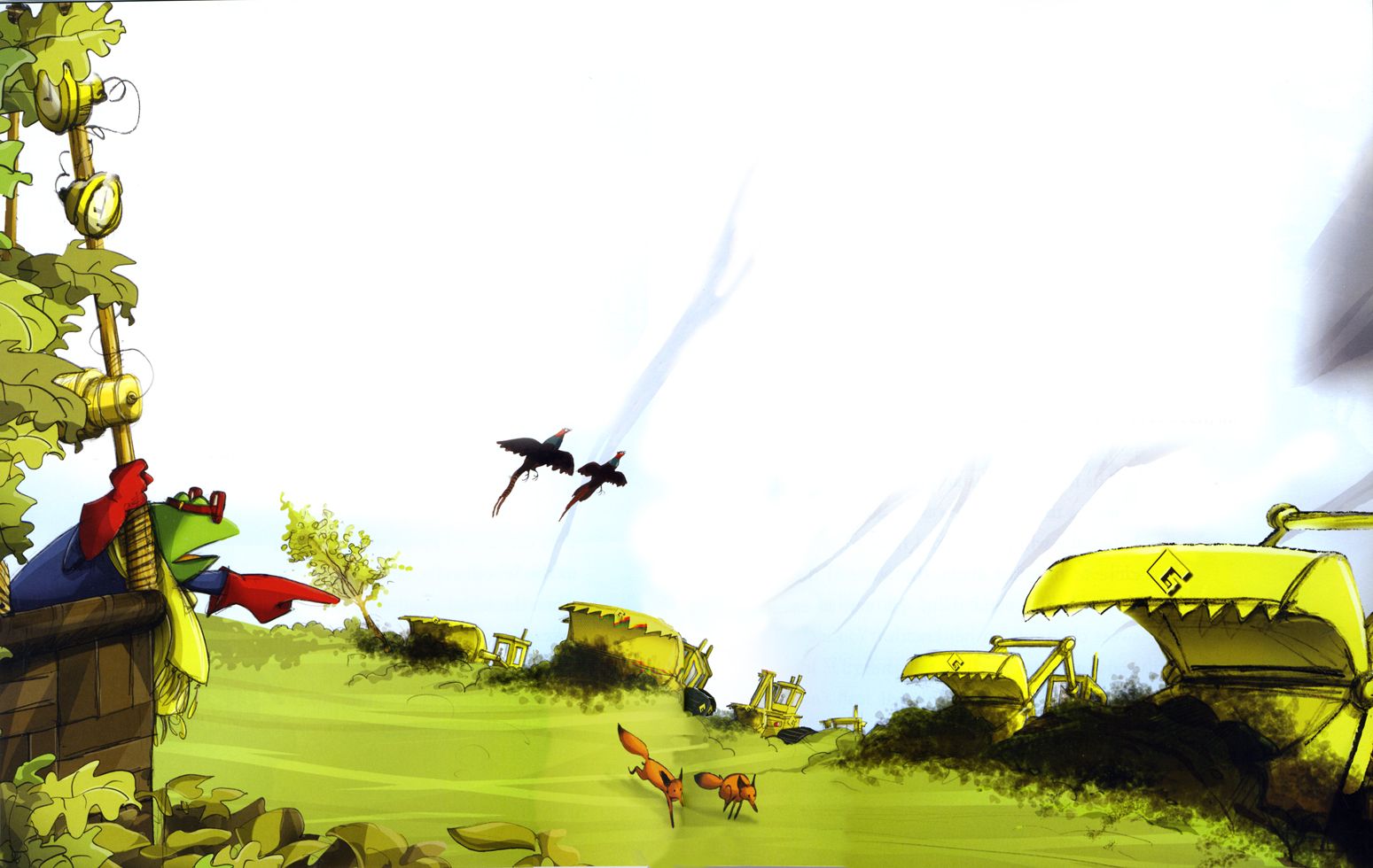 6
6
 8
8  9
9
 10
10
 12
12
 13
13
 15
15
 16
16
 17
17
 18
18 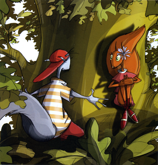 19
19
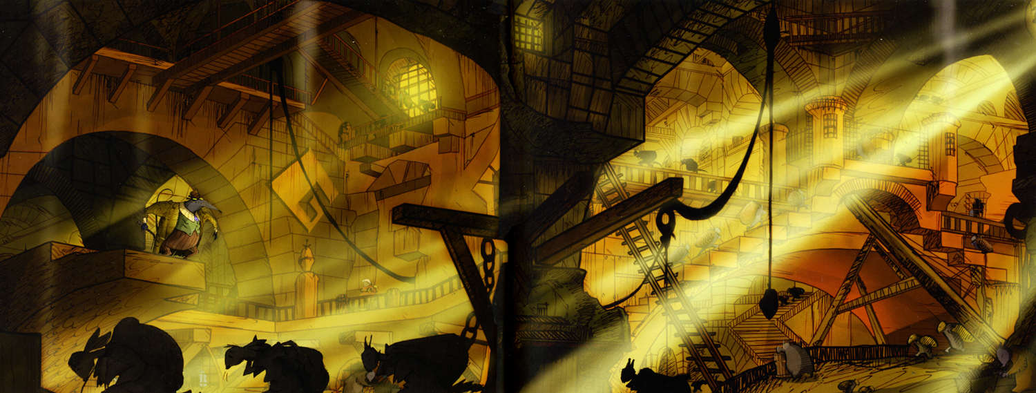
Some of these are exquisite, some not so. The character desing is pure Geoff Dunbar. (Not too distant from Paul Vester’s work.) I’m not a big fan of the stretched out characters. I like the roundness of the earlier years and think this project might’ve profited with that look.
It feels a bit like a modern take on the Wind in the Willows territory.
(More to come.)
Animation Artifacts &Disney &Models 22 Jun 2009 07:16 am
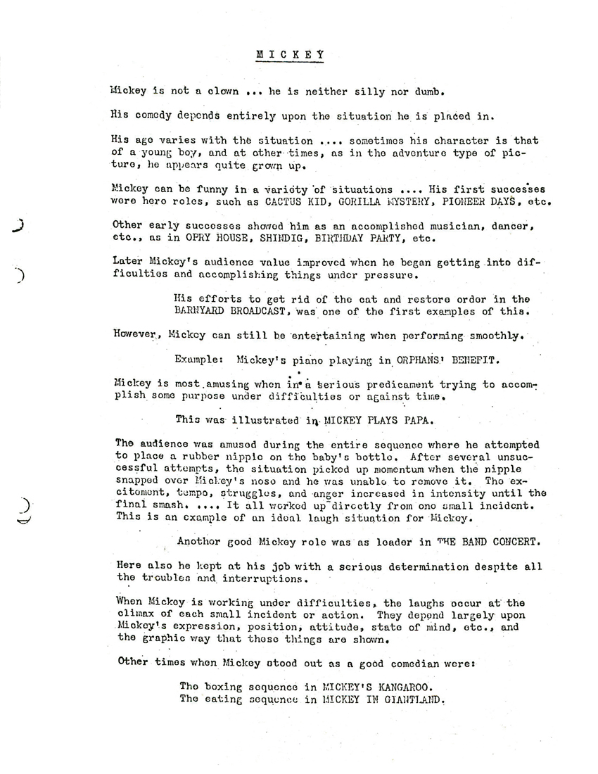
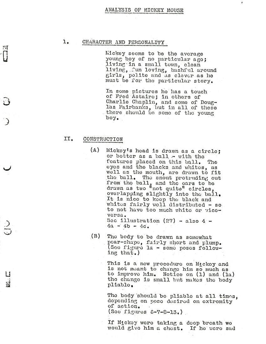
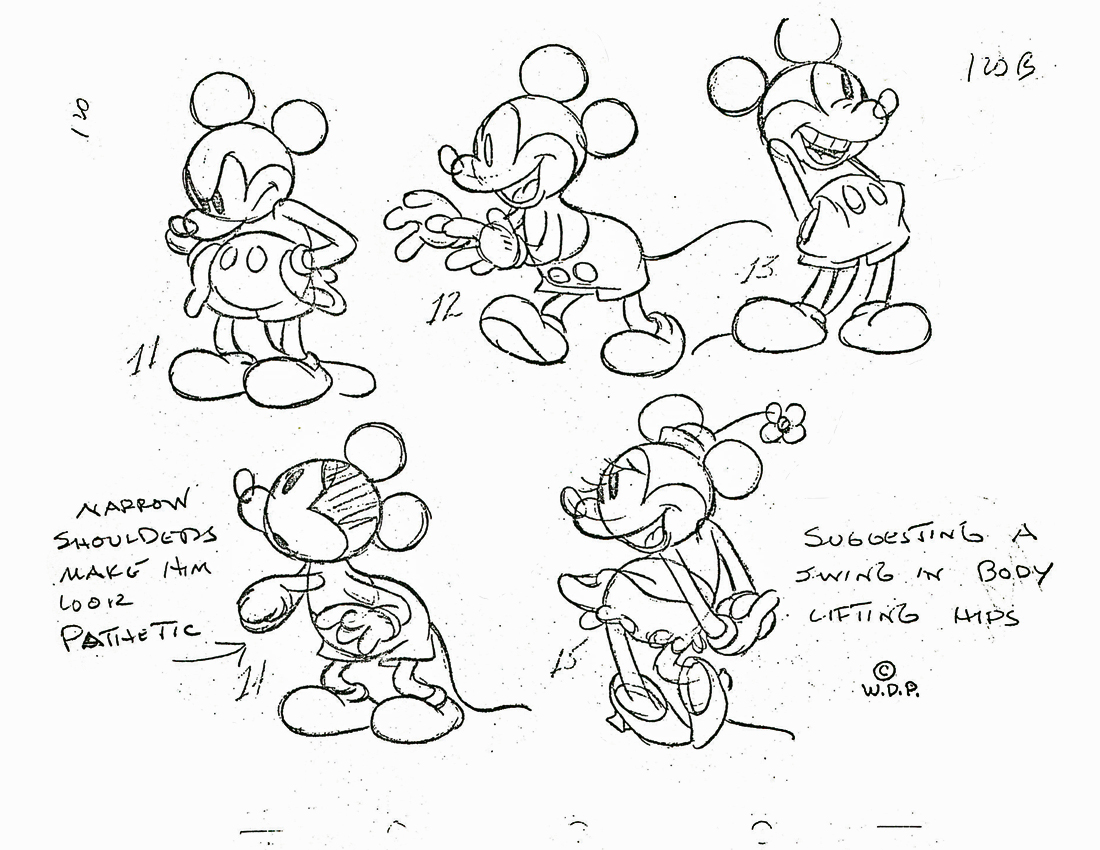
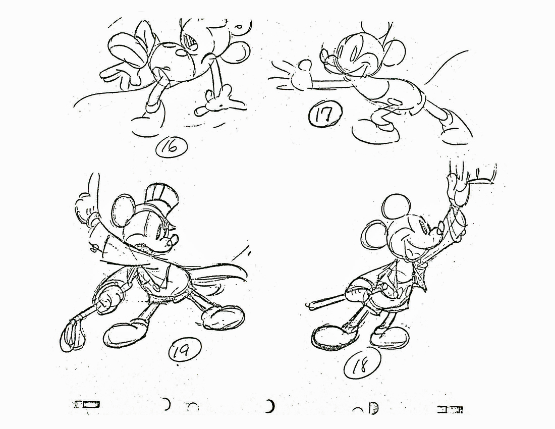
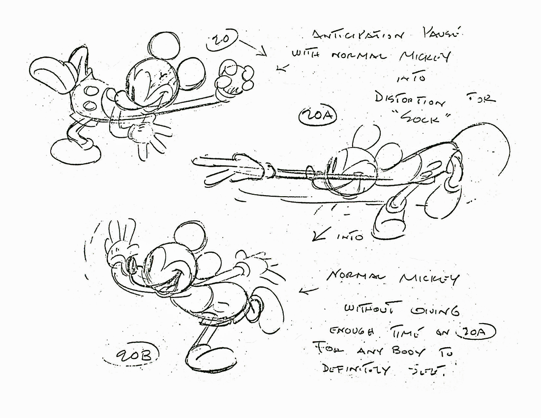
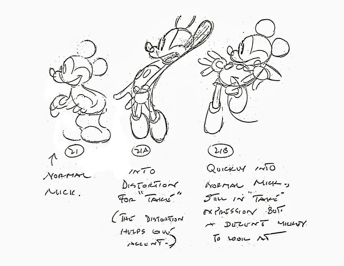
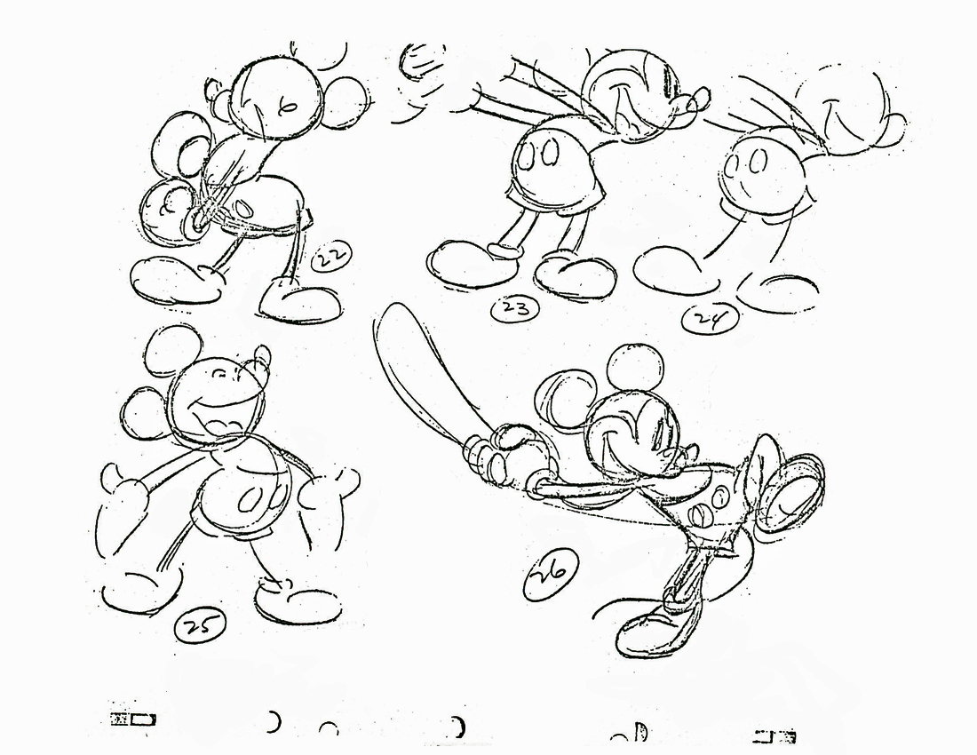
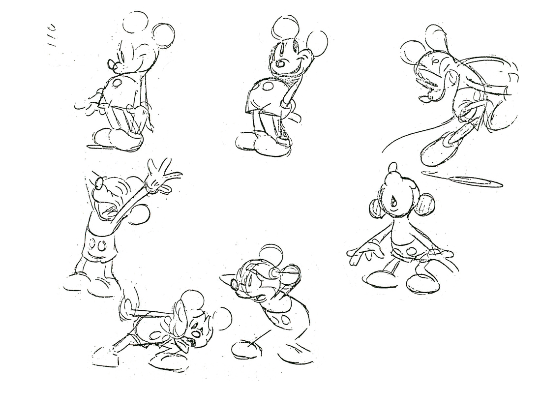
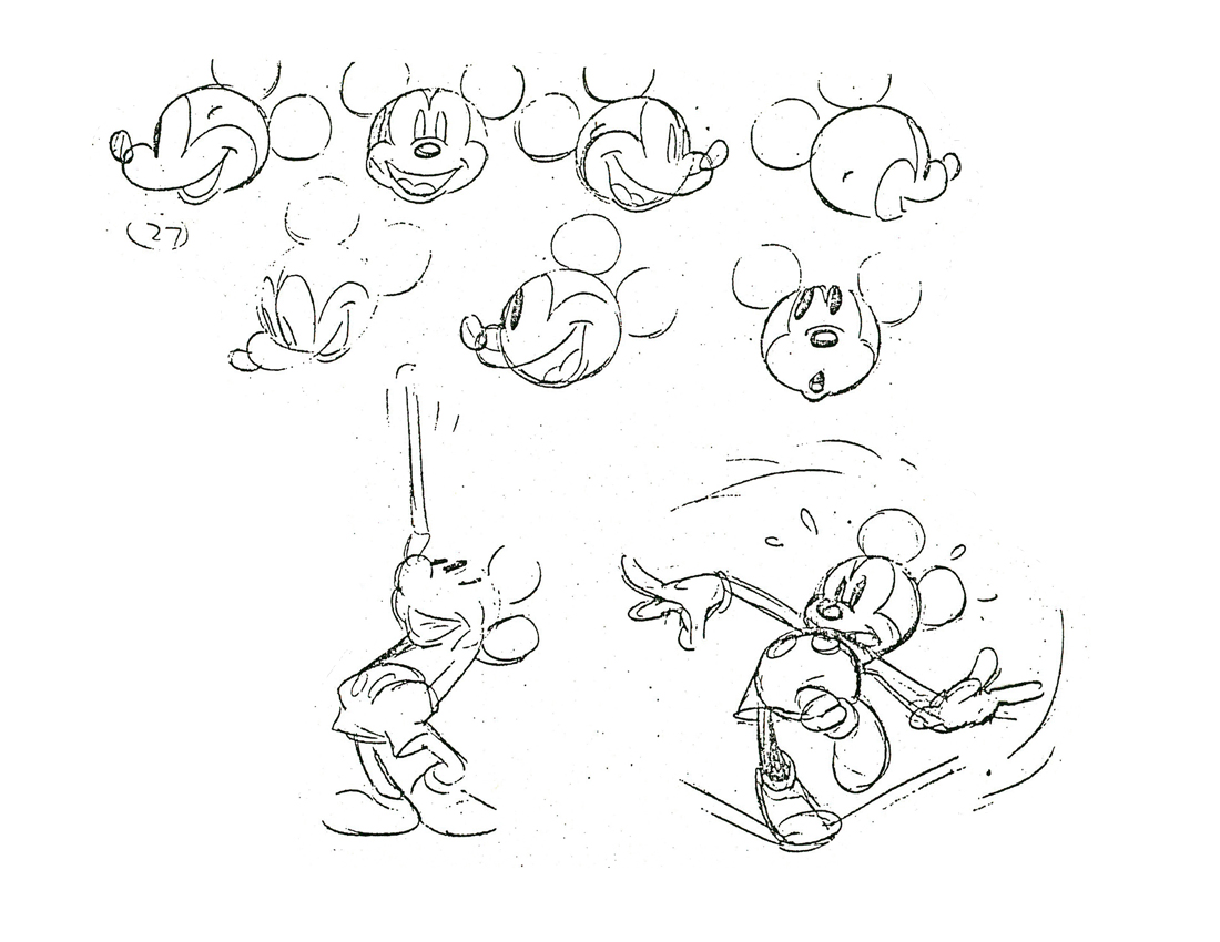
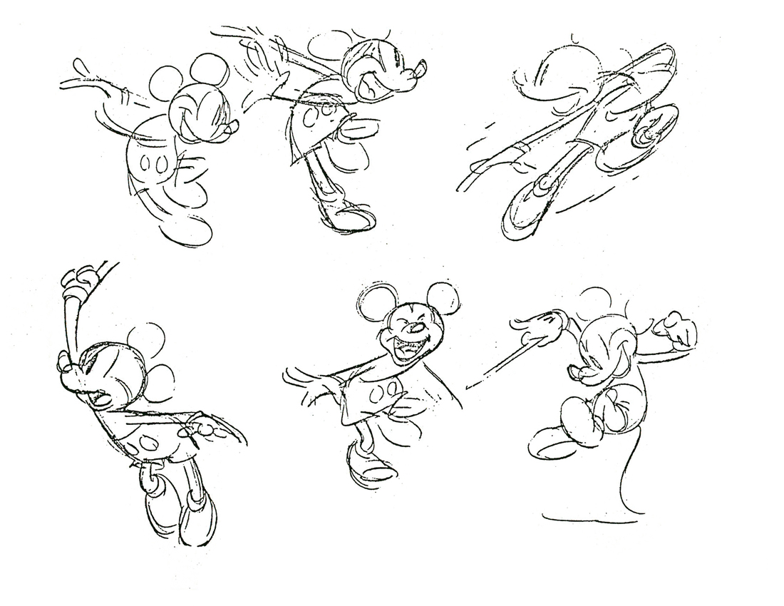
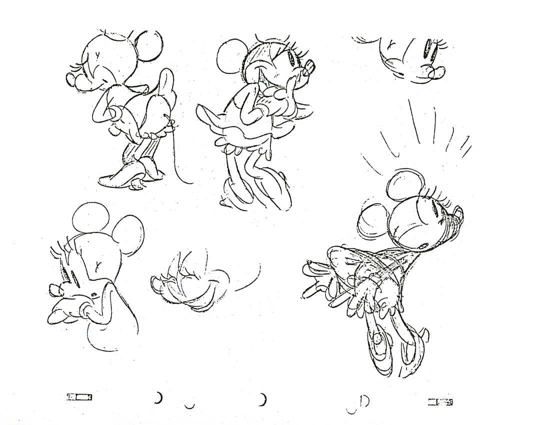
Mickey Class
- Back in March 2007, Jenny Lerew, on her excellent site, Blackwing Diaries, posted a couple of the booklets that came in the Disney Animation Kits sold at Disneyland’s Art Corner. Aside from the Tips on Animation booklet and the How to Draw Goofy booklet, there was one on How to Draw Donald and another on How to Draw Mickey.
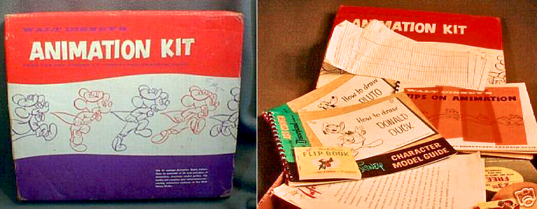
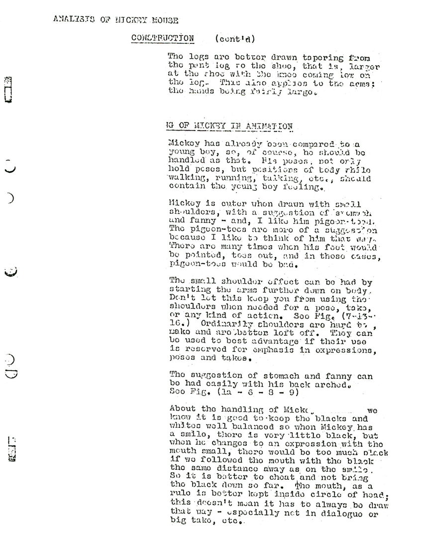
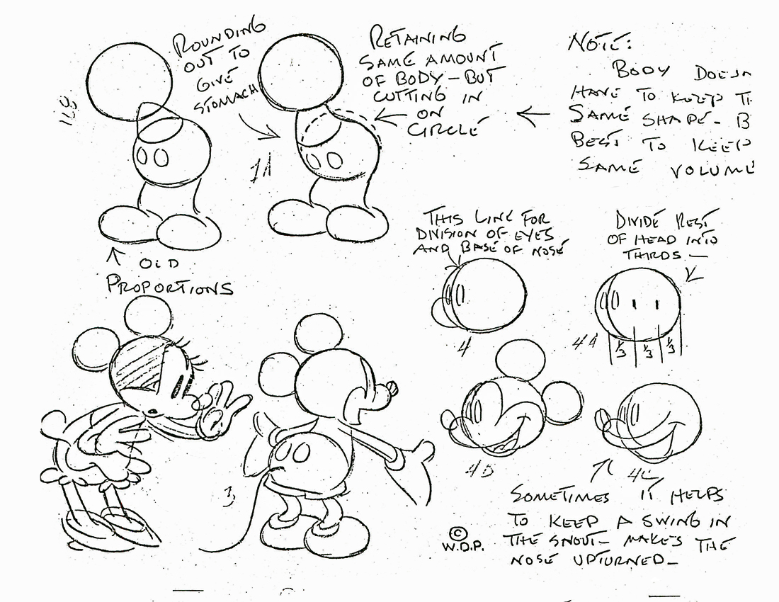
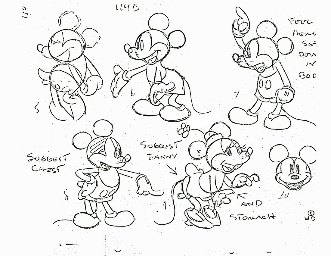
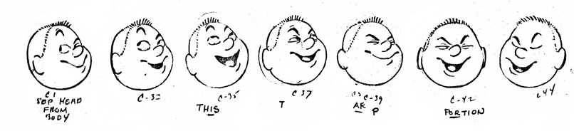
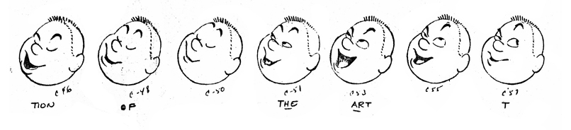
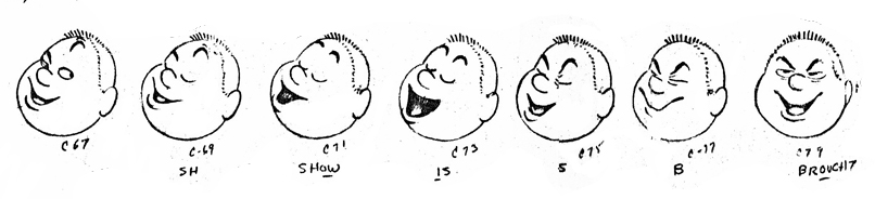
I’ll try to post these last two books in the next few days. However, for now, I’m interested in posting a professional analysis of Mickey, Goofy and Donald that was done as part of the process in the Disney studios in 1935.
The following is an analysis of Mickey given as a handout to all animators. There’s almost as much writing in it as there is drawing. The piece is introduced by Ted Sears and completes with analysis and drawings by Fred Moore.
 1
1 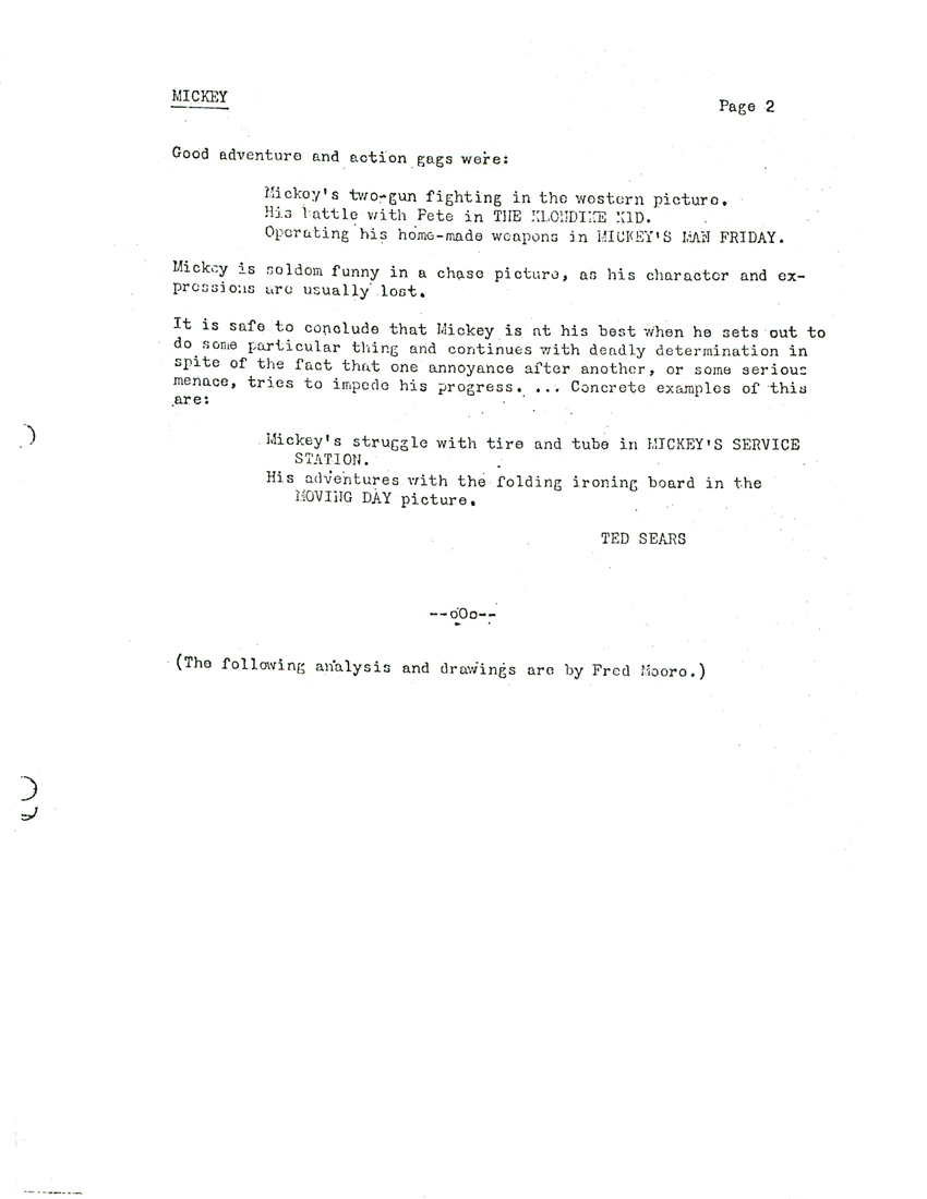 2
2(Click any image to enlarge.)
 3
3 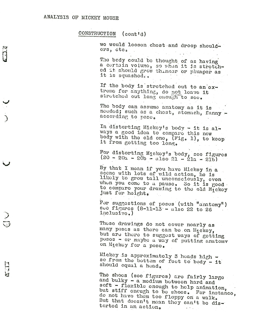
 5
5 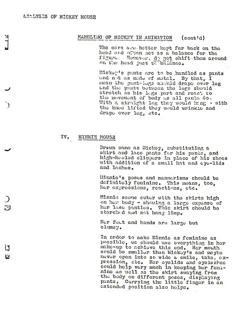 6
6
 1
1
 2
2
 3
3
 4
4
 5
5
 6
6
 7
7
 8
8
 9
9
 10
10
 11
11
Photos 21 Jun 2009 08:23 am
PhotoSunday – Patterns
- The world is made of patterns. When man touches them the patterns become eccentric. Steve Fisher’s been sending me pics for so long that I found some patterns in the patterns.
I asked for more and he complied. I love this stuff.
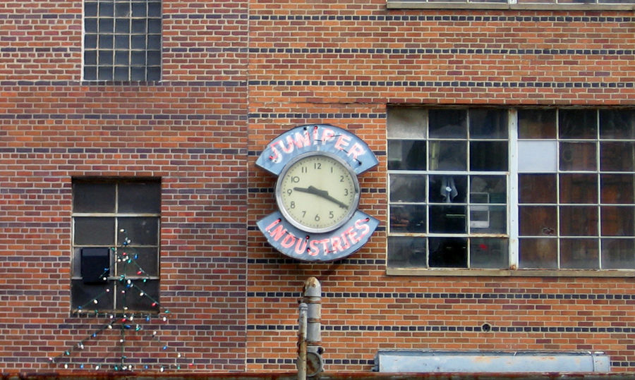
In amongst the clocks from last week was this brick wall,
and the patterns of the bricks just struck me as odd.
The same could be said of most brick walls, but this hit me harder.
.

So here are some more brick patterns. The gray of the rainy day didn’t quite
articulate the raised brick, but there’s enough to see here. The placement of the
windows creates enough of a crazy pattern.
.

A unique pattern doesn’t seem to have occurred
to the brick layer until he was about half done.
.
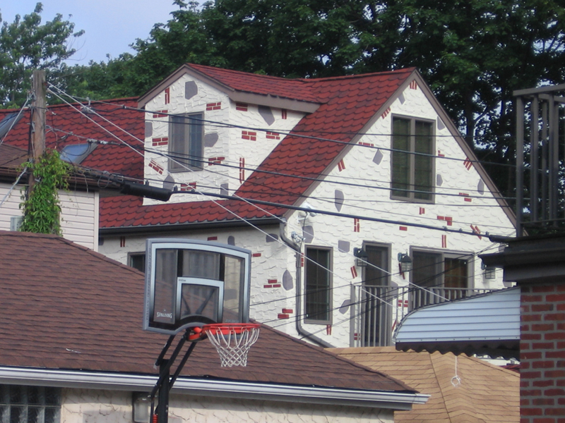
I guess someone designy lives here. I’m not sure it’s purposeful design.
.
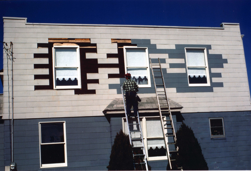

Then there’s this house. They repaired the siding to create
this eccentric pattern.
.

Ultimately they got to this beauty.
.

This stone construction could only exist in Europe.
.

The Palazzo Steripinto, famous in Sciacca, Sicily.
.

.

In 1975 the John Hancock Building had suffered a terrible curtain wall
failure, with many of its glass panels blowing out. For a long time after,
until a fix could be incorporated, most of the glass panels were replaced
temporarily with plywood and plywood painted black (the building was
even jokingly referred to as the US Plywood building back then).
The photo was taken with a telephoto lens, which further flattened the
building surface, although its articulation was already quite minimal, and
tended to abstract it to an almost graph-paper look.
One appreciates the scale of the thing only with the help of the
roof-top appurtenances a building in the foreground.
.

I couldn’t help but add a couple of my own photos.
This is a closeup of several NYU buildings not far from me.
The sameness of these casement windows is just what one looks
for in a futuristic movie of the 70′s. Multiply it by several buildings
of the same, and they almost become invisible.
.
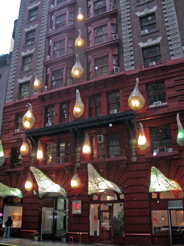
I often walk pass this building, I assume it’s a hotel. (I haven’t bothered
to check it out, to be honest.) The light sculptures that are attached
to the front entrance are nothing if not attention getters, yet the
building is hidden in amongst others on a side-street.
.
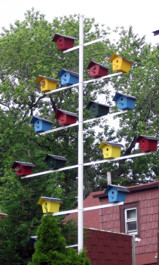
Why quit at human housing? Birds need design, too.
Steve found this construction in Queens. Very Bauhaus.
.

Finally, the truest and finest designer.
Nature.
Daily post &SpornFilms &T.Hachtman 20 Jun 2009 08:04 am
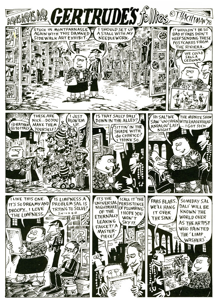
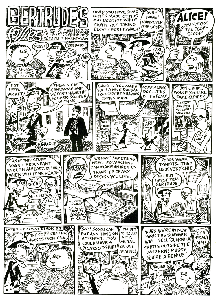
Gertrude – Recap
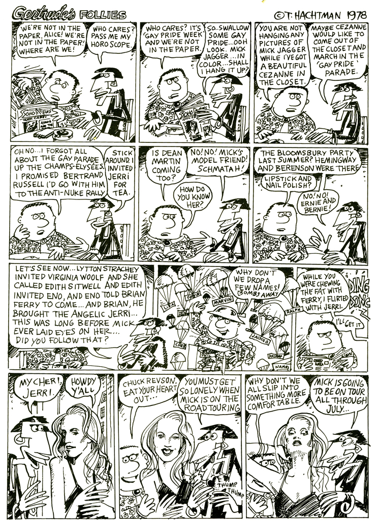
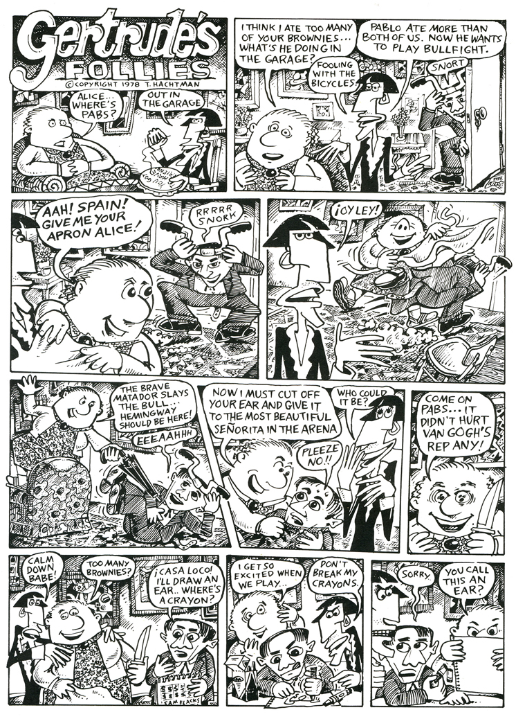
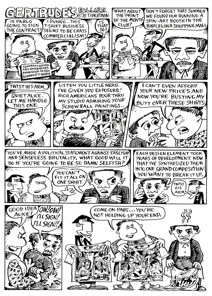
- Back in the late ’70s, there was a local newspaper that competed with the Village Voice for the alternative audience. The Soho News was smaller and thinner, but had its own treasures. Some good writing and listings, and many excellent alternative comic strips. (Bill Plympton had a weekly strip in this paper before he started animating.)
I fell in love with one comic strip called Gertrude’s Follies to the point where I waited 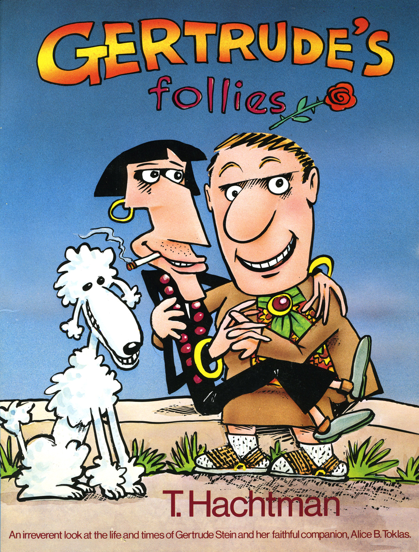 each week for the new issue and the new strip to hit to market. It was about Gertrude Stein and Alice B. Toklas and all the crazies that came into their lives – particularly Picasso, Hemingway and other iconic art types. It didn’t matter that Matisse and Capote didn’t meet; they were both available for the strip – as was everyone else.
Finally, after enjoying it for so long, I decided to locate the cartoonist behind it, and see whether he was interested in developing a storyboard and script for a feature. Maybe we could get some low-budget financing.
Tom Hachtman was the cartoonist, and he was a brilliant artist. His wife, Joey Epstein, was another fine artist. The two entered my life at this point, and some interesting things developed.
Gertrude’s Follies was an ongoing project. Tom worked with Maxine Fisher, who has been my writing partner through all the years of my studio. The two of them developed a couple of themes from the mass of strips that had been done and started to weave a storyboard. Tom left 4 or 5 panels of each 6 panel page empty, and I constructed and reconstructed story around them. Sometimes I would draw more material, sometimes I would take some away. It was real fun.
The Soho News folded, and no one really picked up the strip. It ran for a short time in The Advocate. Tom was able to publish a collected book (see the cover above.) You can still locate a rare copy on line.
Some newer, color copies of the strip can be found on line here.
Tom also does some political cartoons for the site here.
 The movie never went into production. I couldn’t raise the funds – my inexperience. We did make one short segment – a two minute piece that was the most hilarious strip. Sheldon Cohen, an animator I met at the Ottawa 76 festival, came to NY when I offered him a job on Raggedy Ann. Sheldon, ultimately, did a number of films for the National Film Board which you can watch on-line if you click on his name.
Sheldon animated this particularly funny strip. It took a while for him to animate it, and by the time he was finished, the feature had died and I had lost some interest. Years later I inked and painted it and had it shot. The short piece was never finished, though I still think about doing that.
Aside from Gertrude, both Tom & Joey worked on a number of my films and still infrequently do. The two have painted many murals on the Jersey Coast, where they currently live. Tom has been a political cartoonist for the NY Daily News, has done lots of airbrush work for Bob Blechman when the Ink Tank was in operation. He also has done quite a few cartoons for The New Yorker magazine.
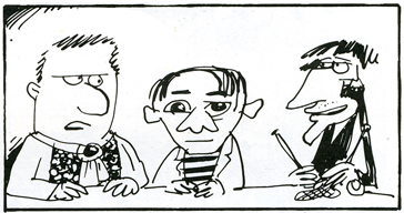
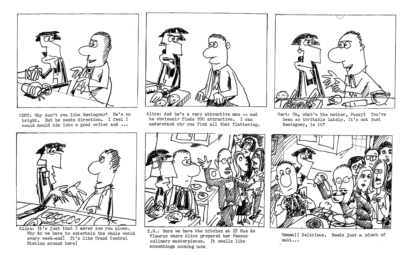
Here are a few of the strips to give you the flavor. Perhaps next week I’ll give a sample of our storyboard, comparing it with some of the actual strips. Enjoy.
 1
1 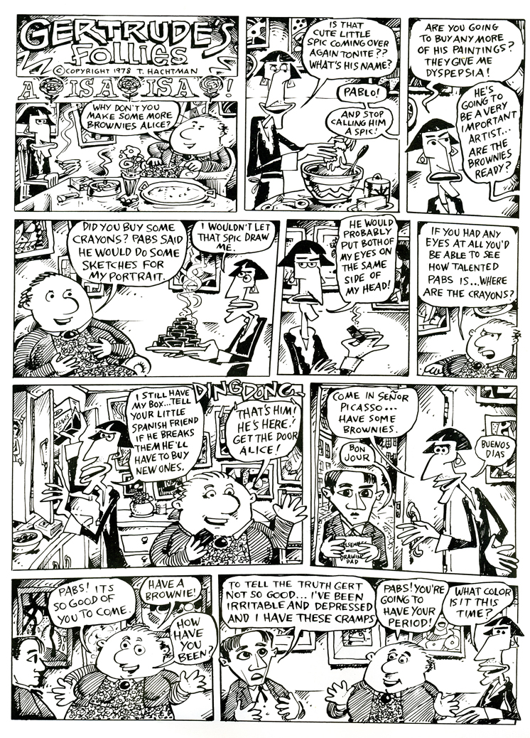 2
2
(Click on any image to enlarge so that you can read the strips.)
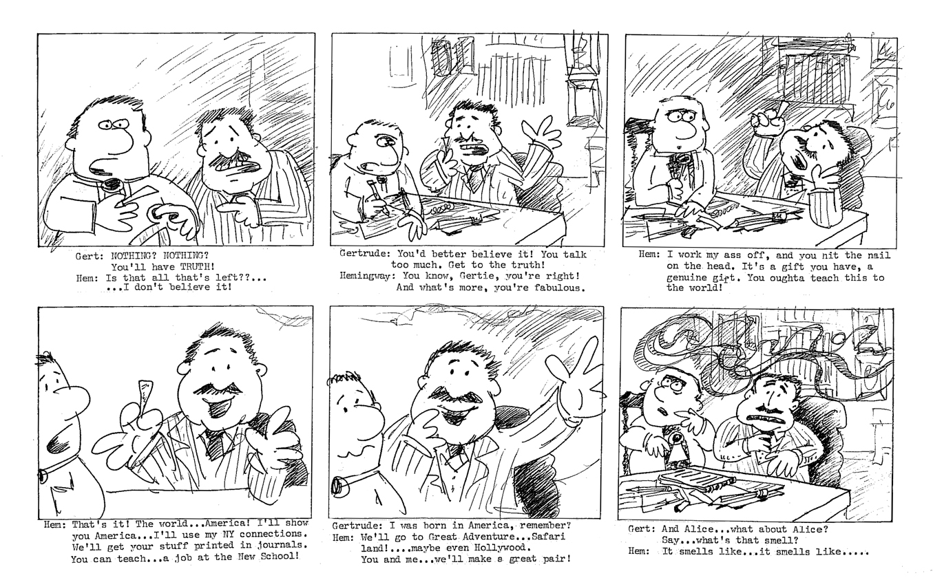
We worked up a storyboard and script for a feature. It was a bit of a rush since I found the distributor of a low budget comedy film who asked for something similar in animation. I thought we could get him interested. I wanted to strike while the iron was hot. The guy didn’t get it, thought it wasn’t funny, didn’t even understand it. His company folded six months later. A one hit wonder.
We tried to stay close to many of the strips and found a direction.
Here are two weeklies from the strip.

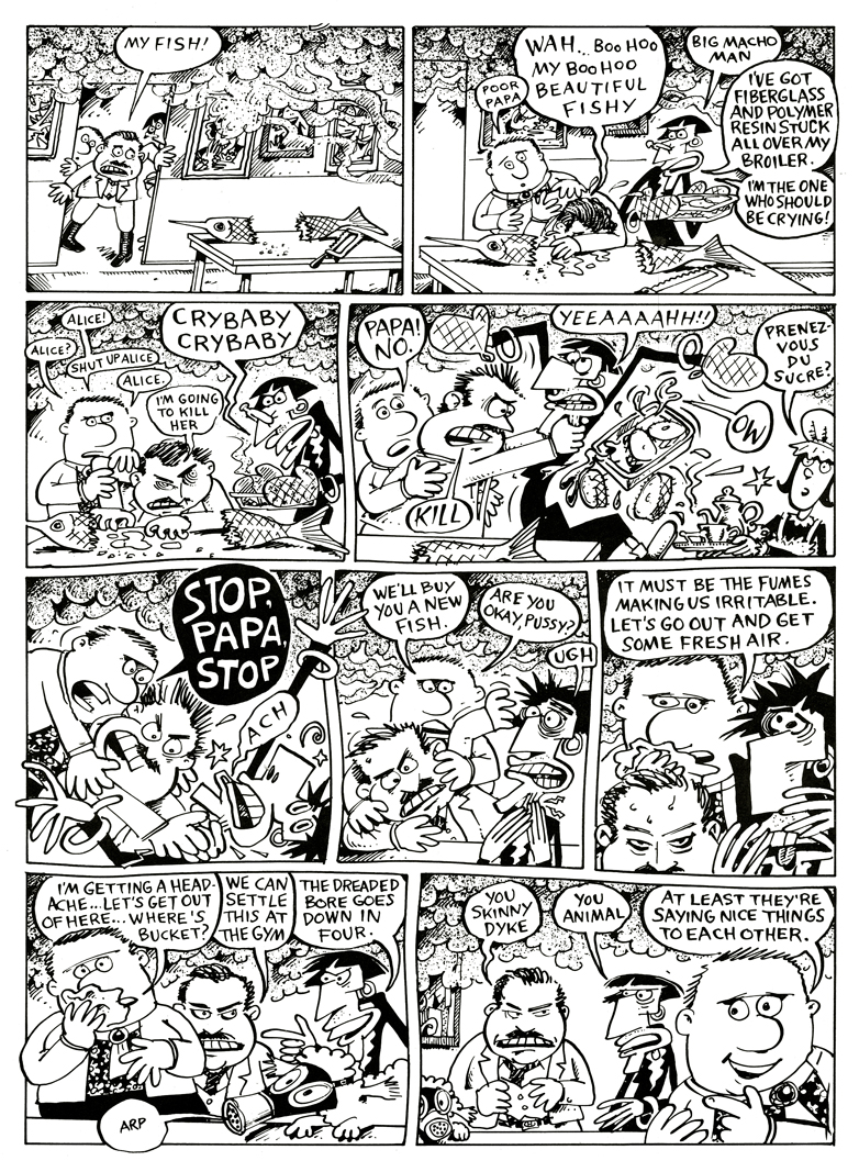
(Click on any image to enlarge.)
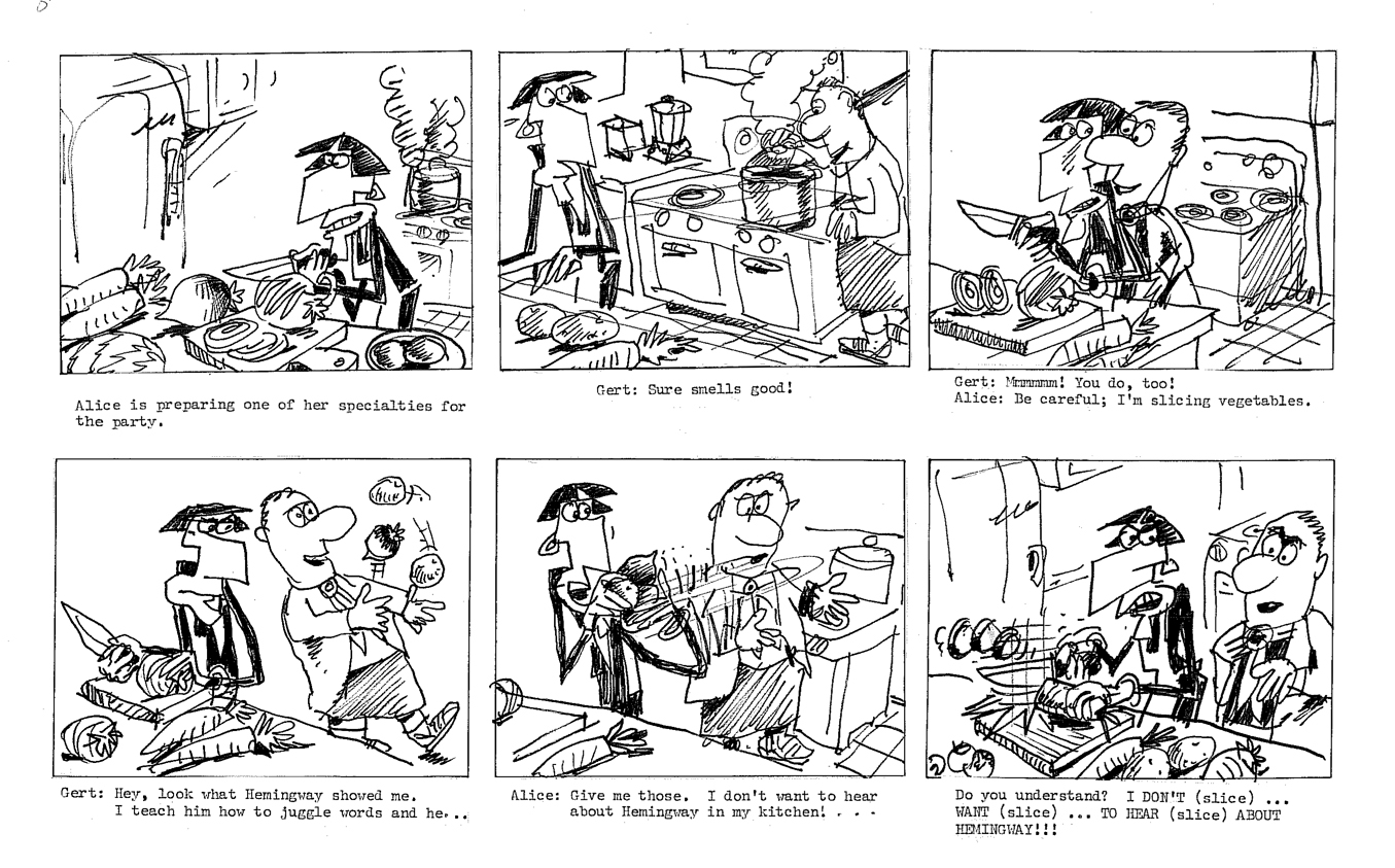
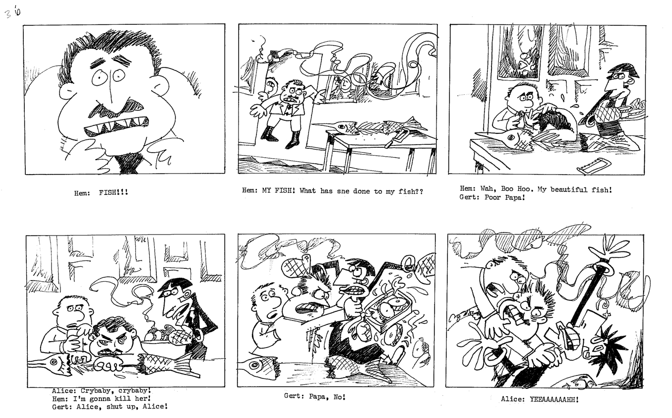
The equivalent part of the storyboard follows. To give a short syopsis of the story thus far:
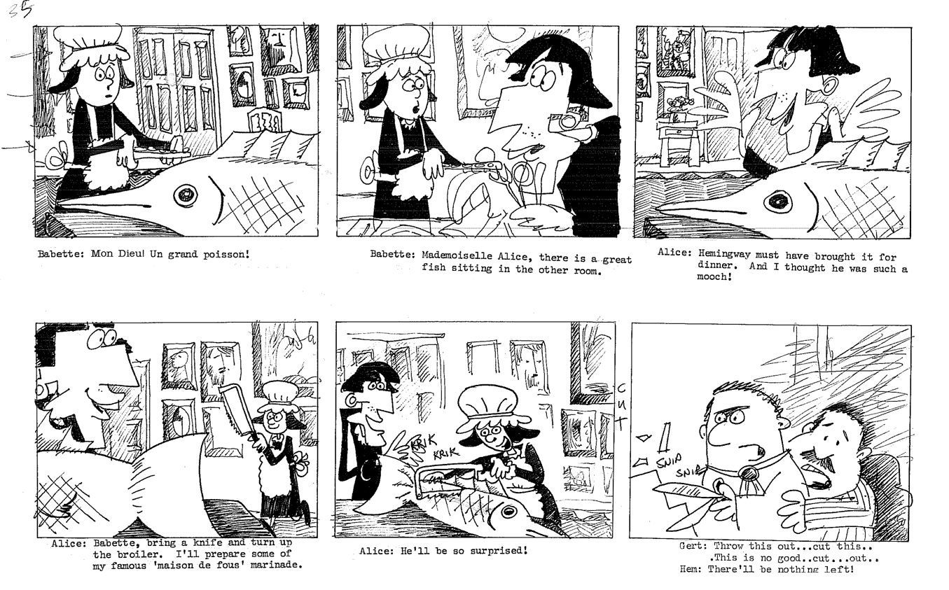
Trying to be somewhat current, we built the story around an upcoming, all-encompassing exhibit Picasso was going to have at the Museum of Modern Art. At the same time, Gertrude had just sent off a big book to her agent in NY. A party was in order, and we join them in this section of the storyboard as they prepare for the party. There’s a guided tour going on at the house as they prepare, and Hemingway arrives early.
(This is about 20 mins into the film.)
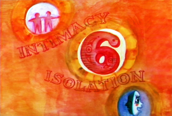
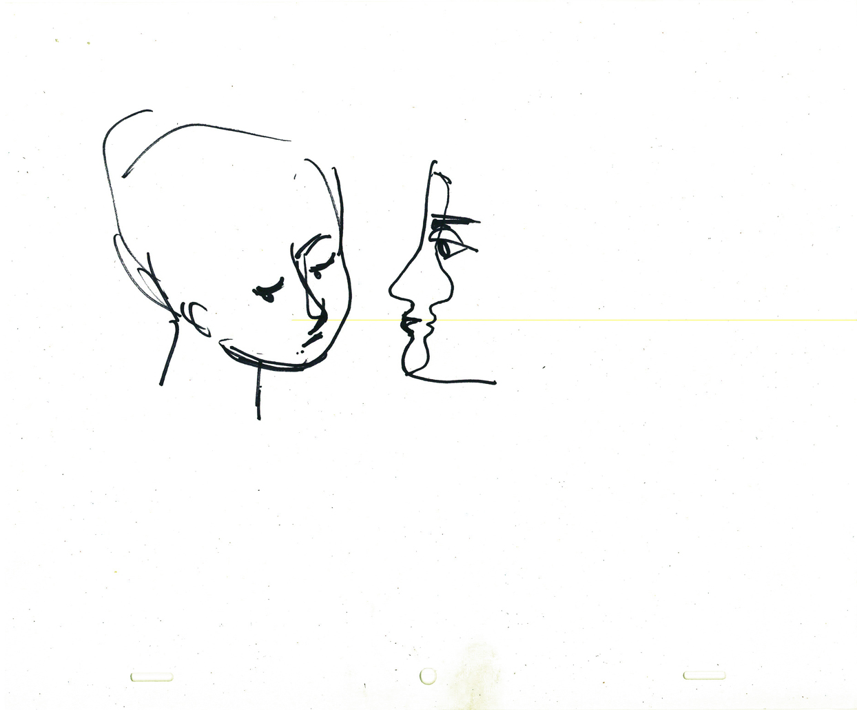
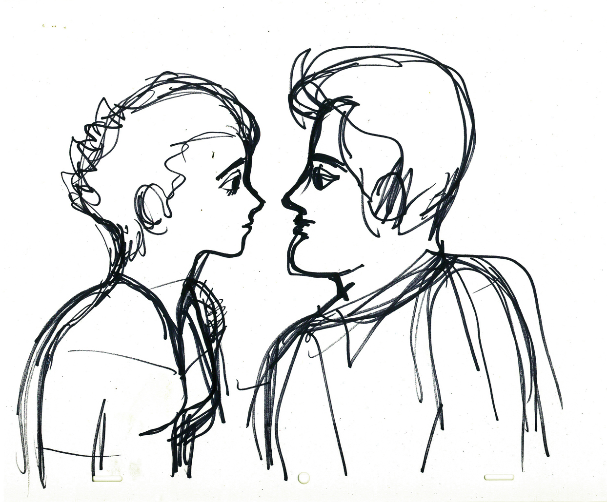
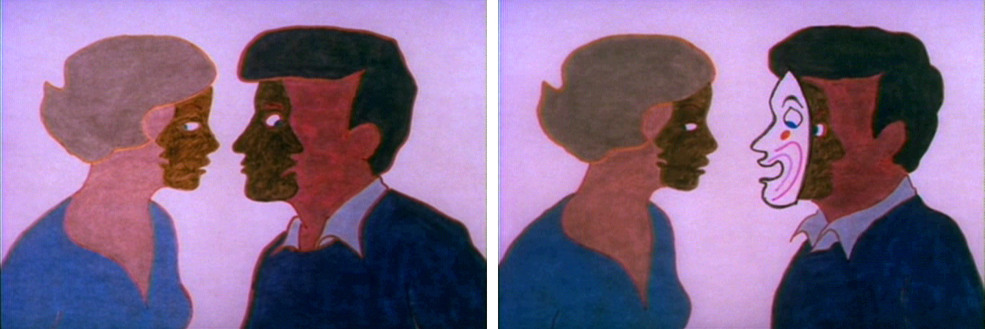
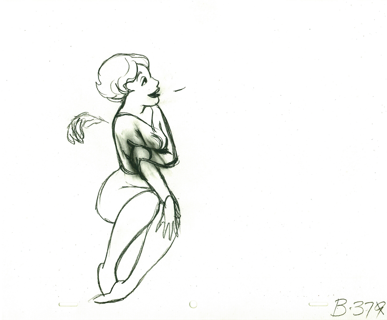
Animation &Animation Artifacts &Hubley &Models 19 Jun 2009 07:19 am
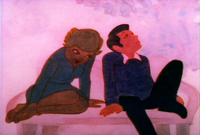
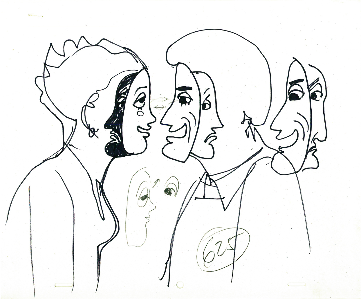
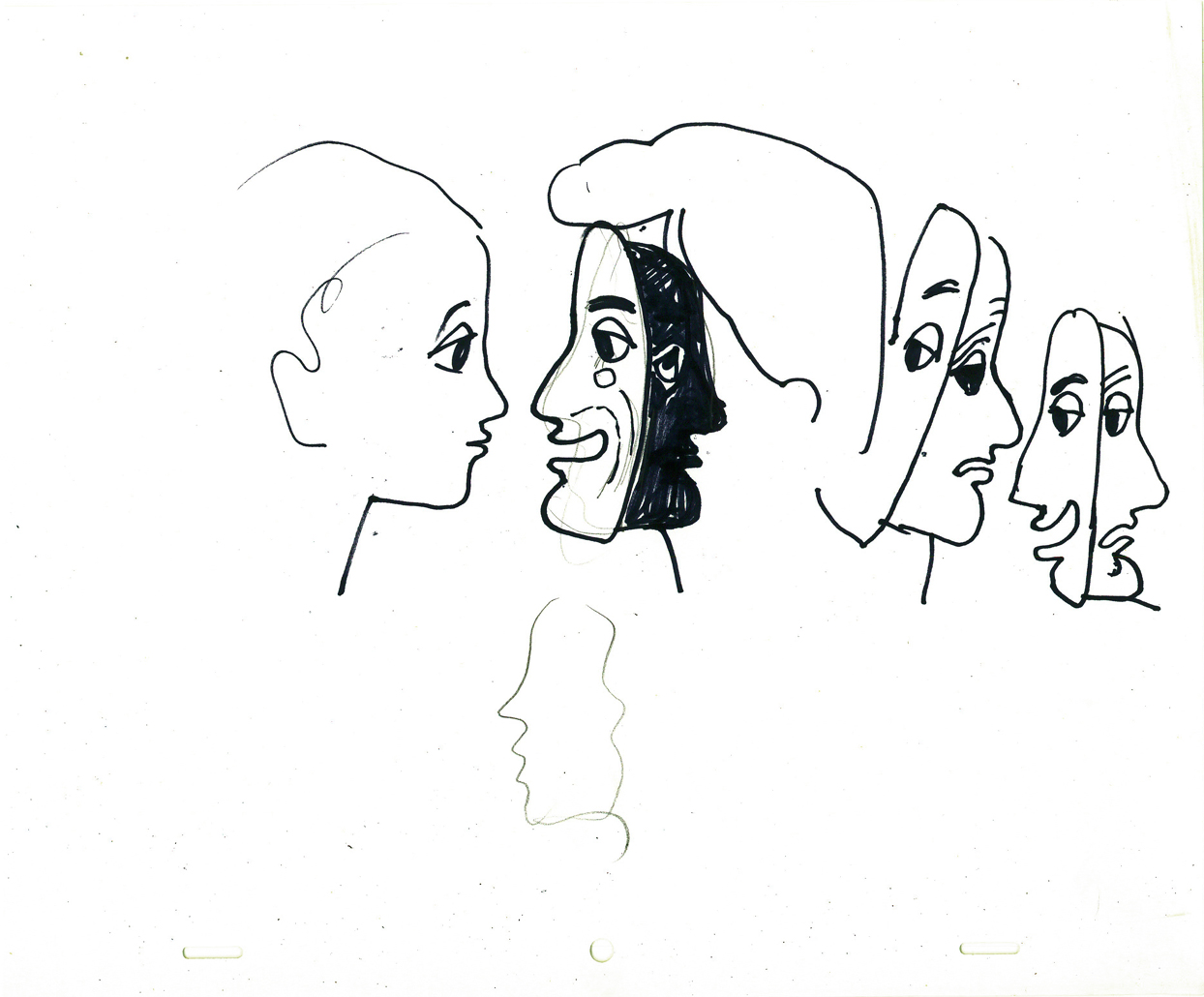
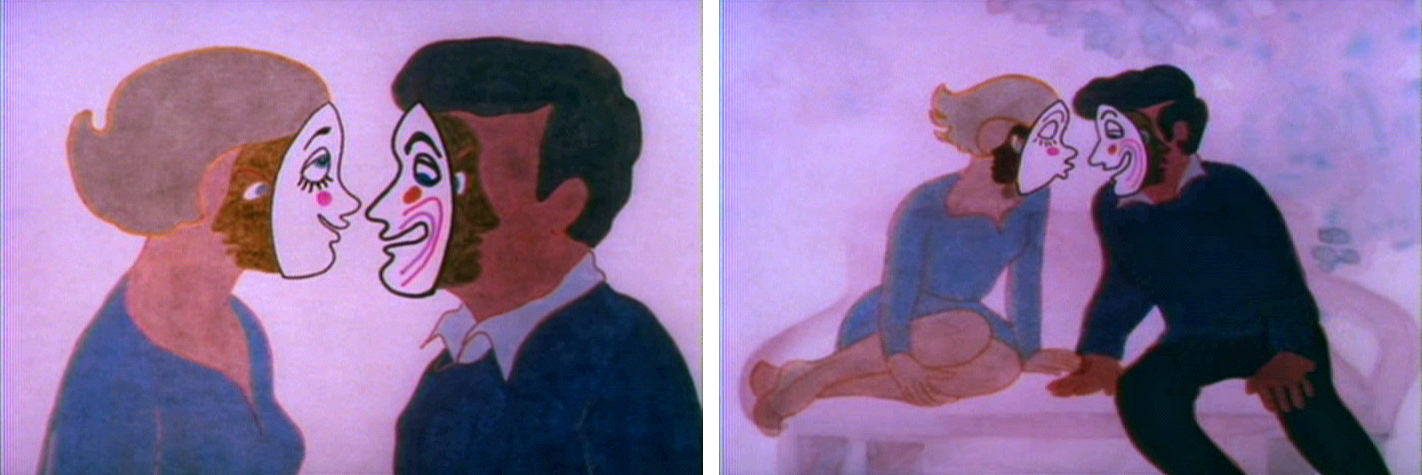
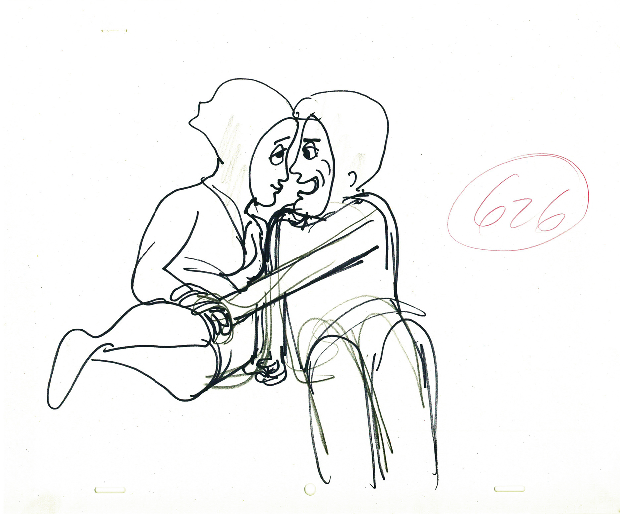
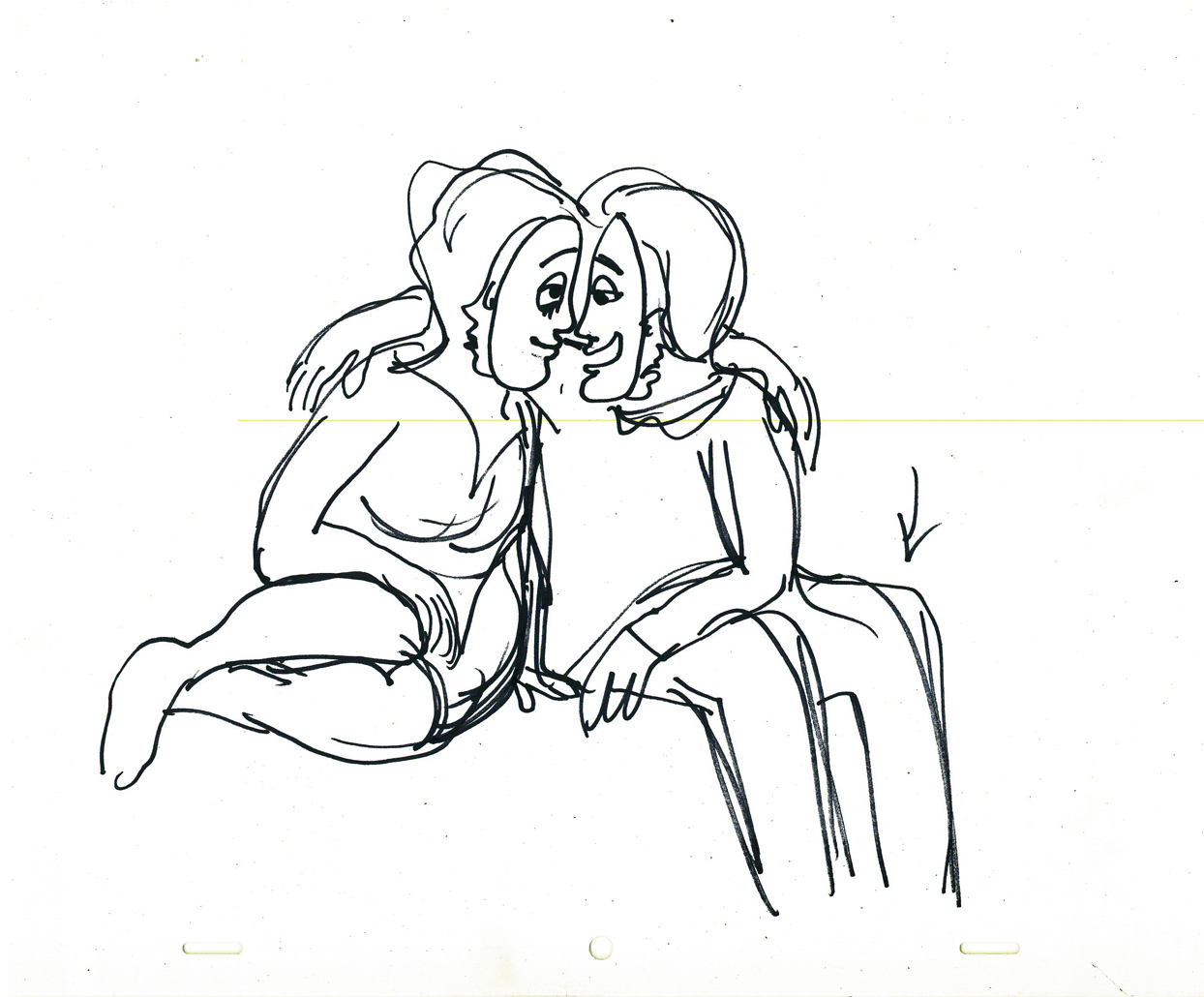
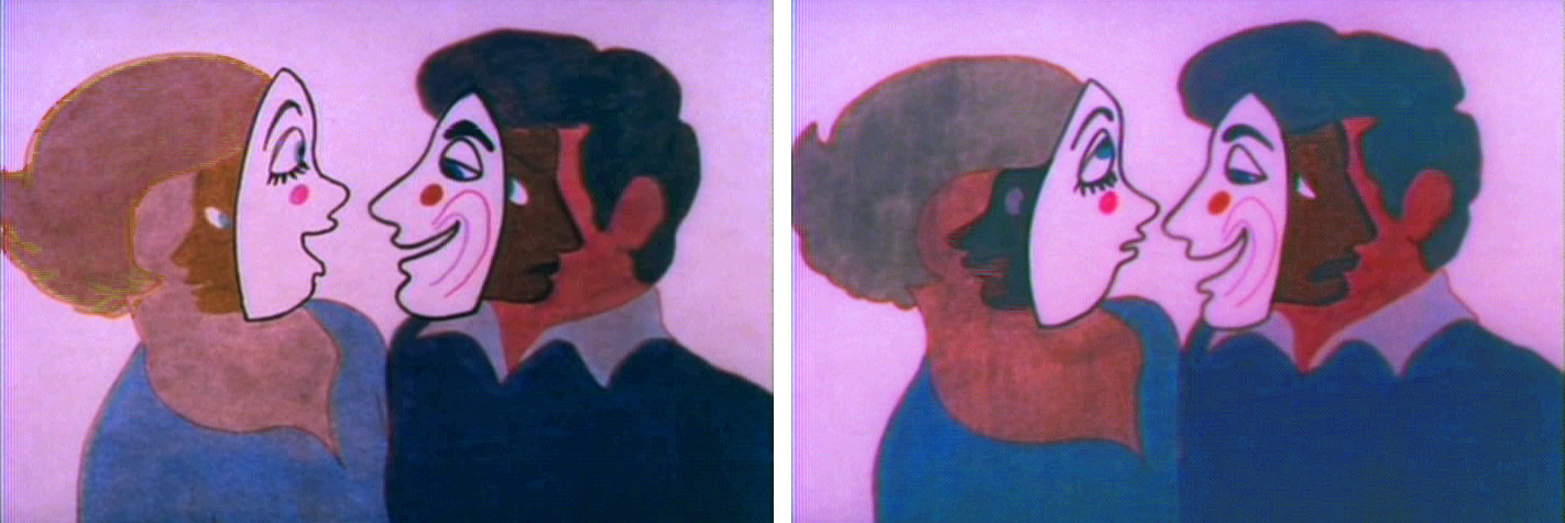
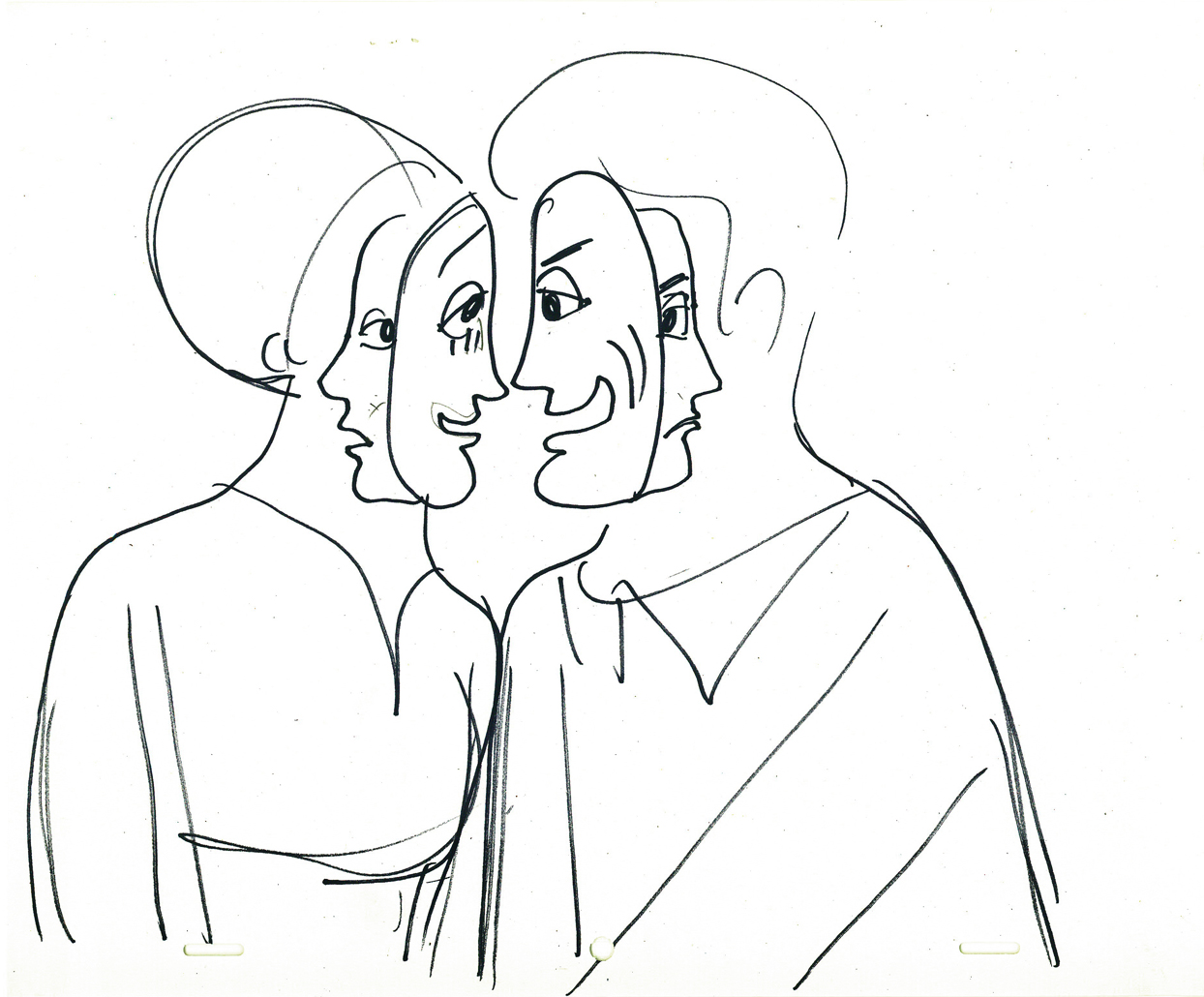
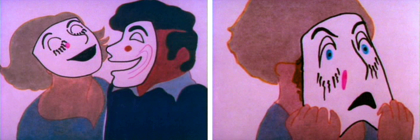
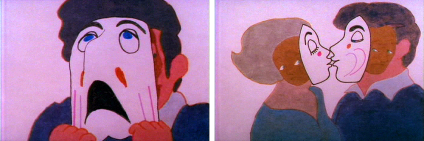
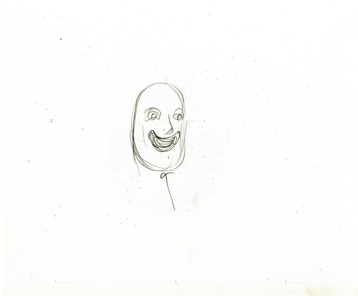
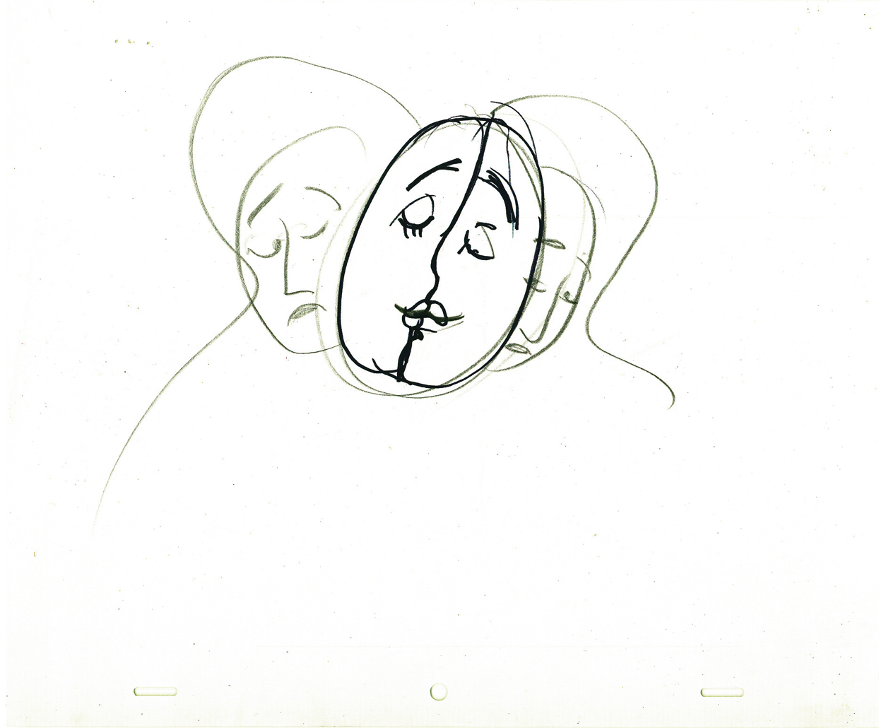
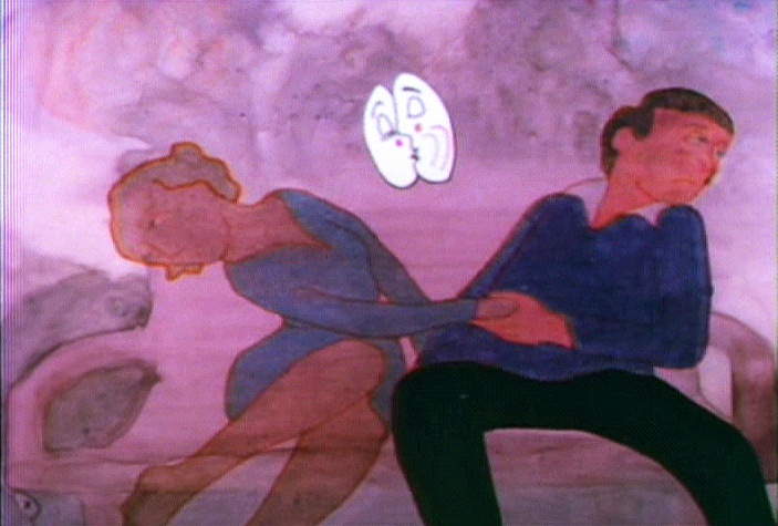
Carousel’s Lovers
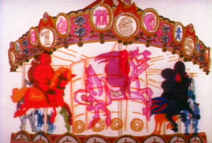 - Let’s take a look at the scene in Hubley’s Everybody Rides the Carousel
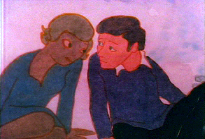
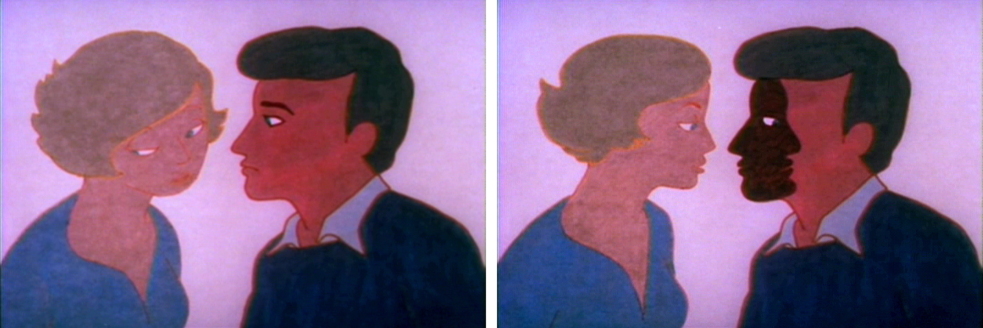
wherein the young lovers have had a spat and push on to have a romantic scene despite the fact that neither of them wants to do that.
They’ve argued over the girl having cut her hair without telling the boy. He’s annoyed and she laughs at him. They push on to a frothy conversation. Both put on masks to continue the conversation while the inner characters
 are annoyed and have an inner monologue. They get to the point where they can’t take the masks off and end plling away from each other.
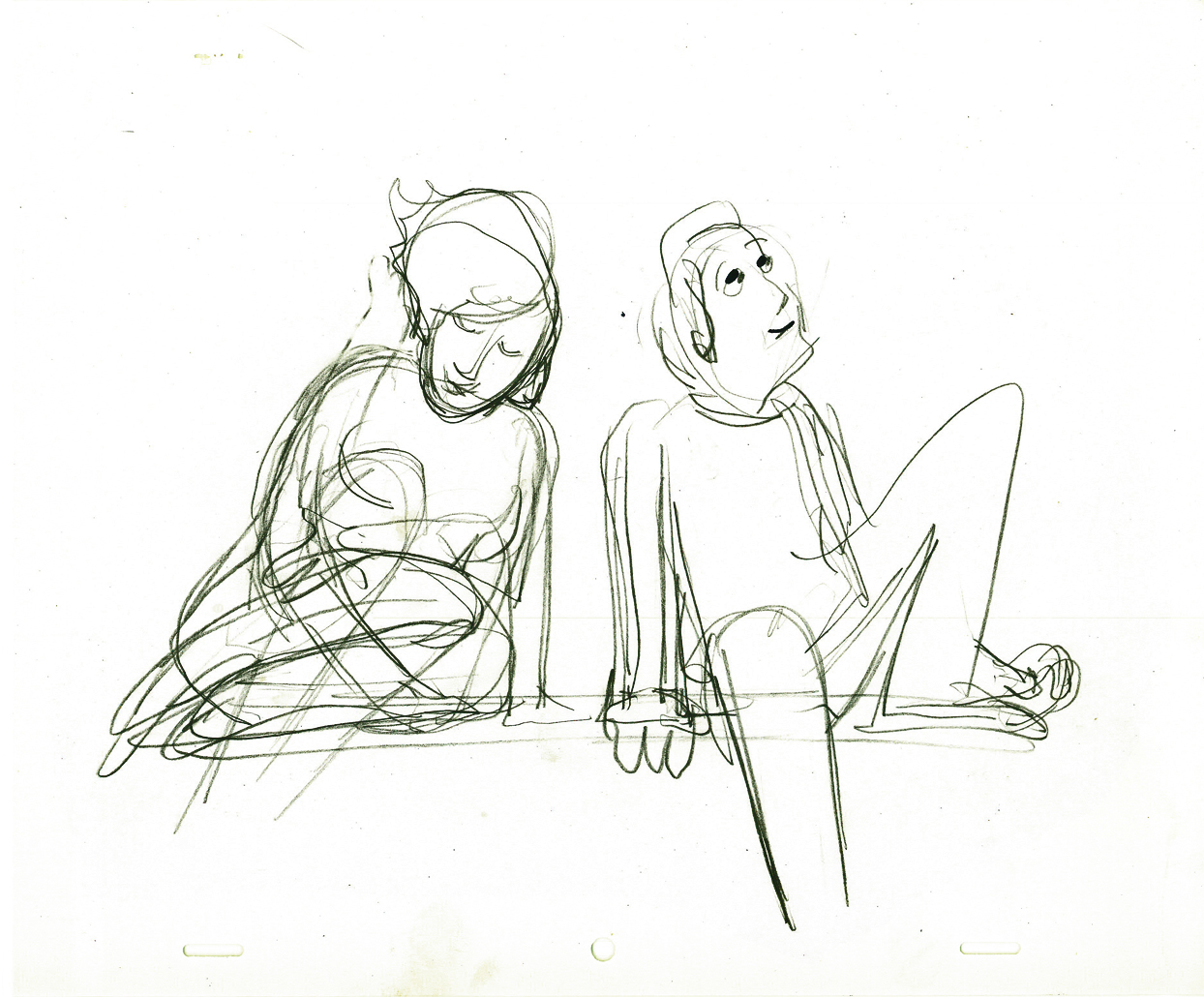
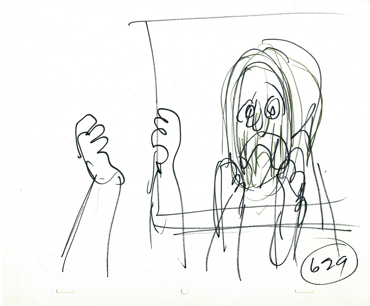
I’ve gathered John Hubley’s layouts for this sequence. Tissa David animated them. You’ll note that the pencil numbers are a scene breakdown done in Tissa’s handwriting. The very loose drawings were done with a sharpie or pencil. The pencils would have been done while in handing it to Tissa during the conversation. They’re to delineate some point in greater detail for her.
I’ve also pulled some frame grabs so you can see how it was finally rendered. The coloring was done on vellum and shot bottom light. No more than 3 levels were used (including the background.) Tissa, aside from concerning herself with the dramatics of the scene, had to watch that the characters didn’t overlap. More complication for her.
(Click any image to enlarge.)
By the way, this was Meryl Streep’s first screen performance.
Charles Levin, another NY character actor, played the boy.
 25a-b
25a-b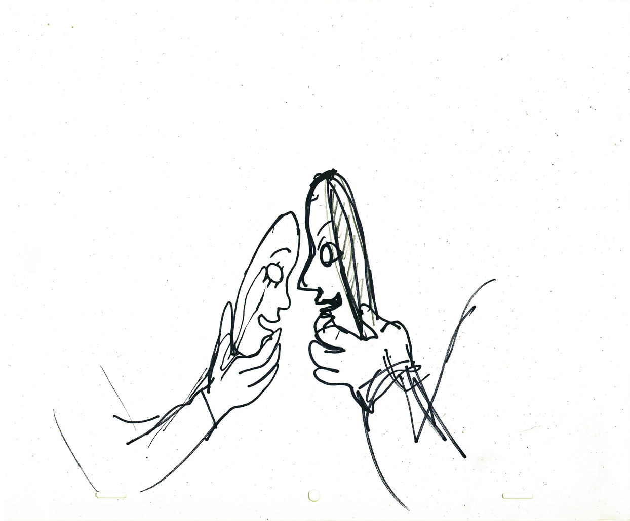
 25c-d
25c-d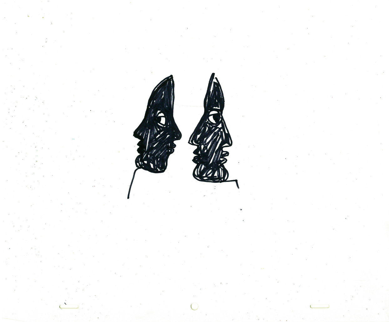
 25e-f
25e-f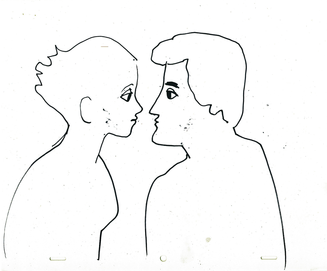
 26a
26a
 26b-c
26b-c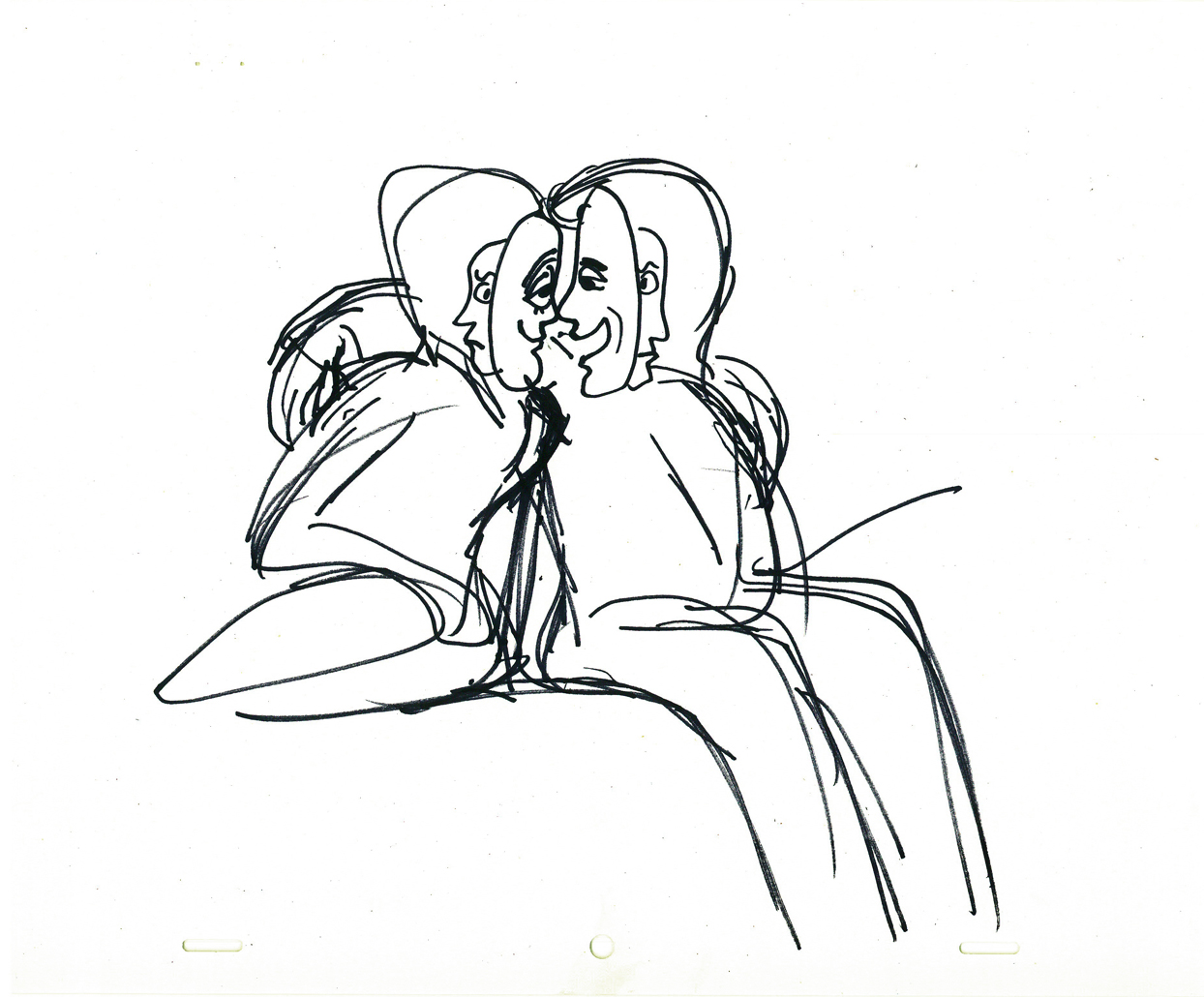
 26d
26d
 27a-v
27a-v
 27c-28
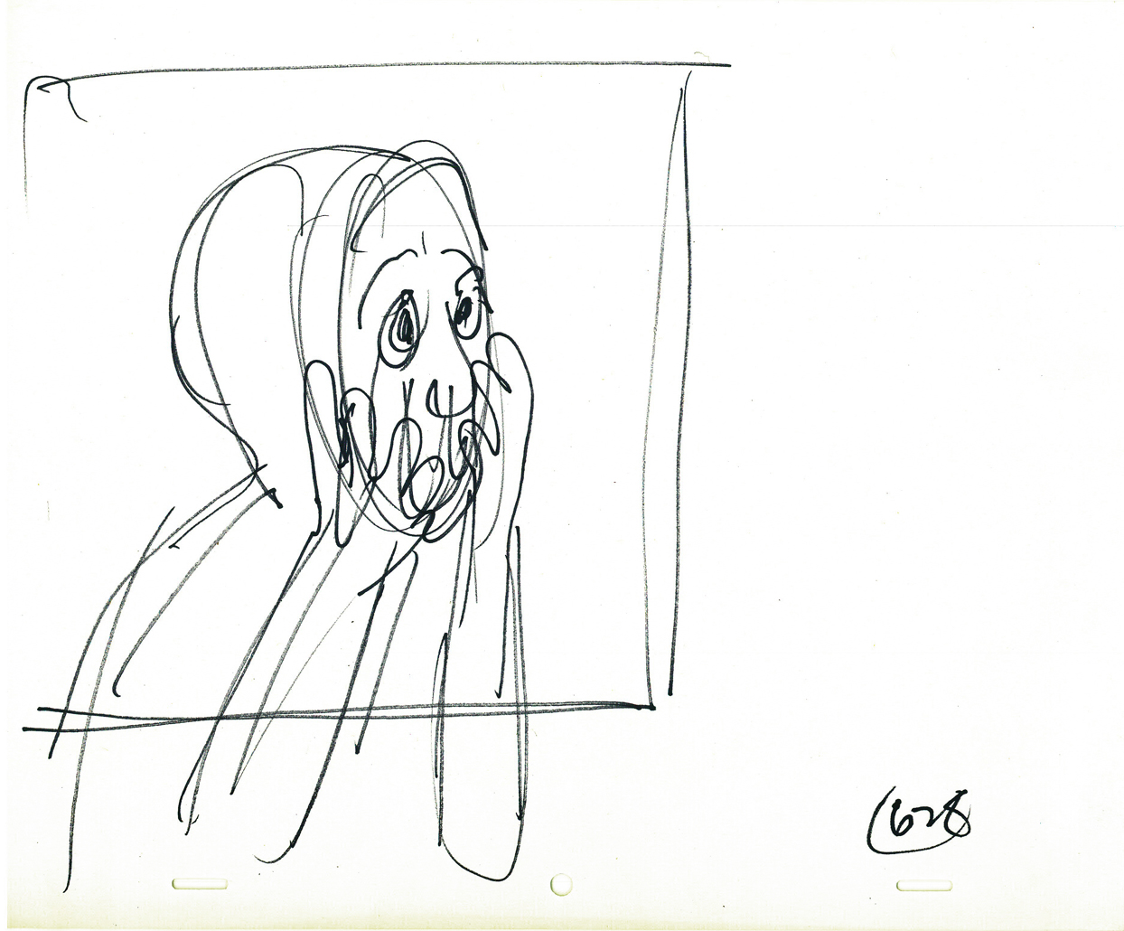
 29-30a
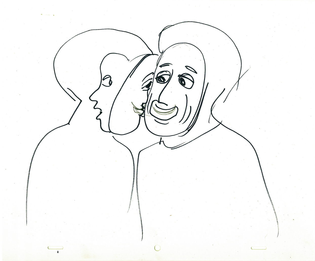
 30b-c
30b-c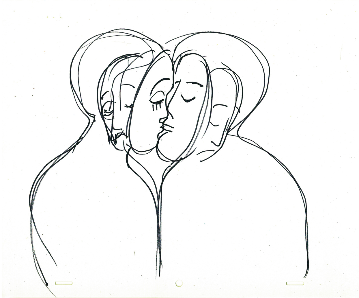
 30d-31
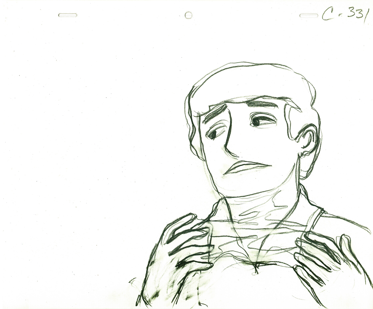
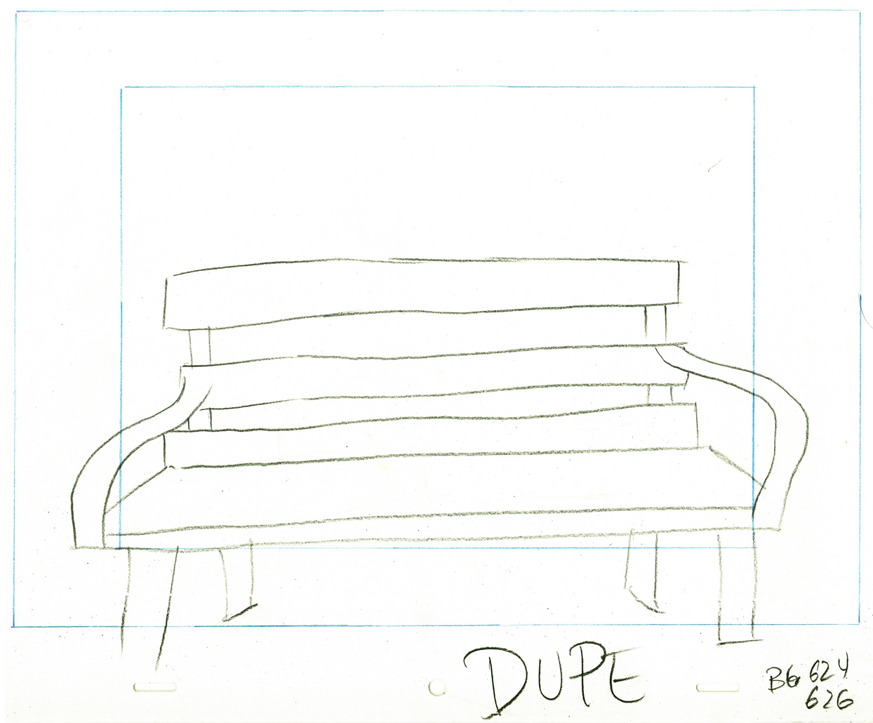
Here’s the park bench.
A quick rough copy by me to Tissa of John’s Bg LO.
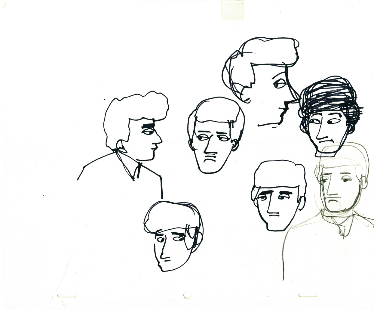
John’s model of the boy’s head for Tissa.
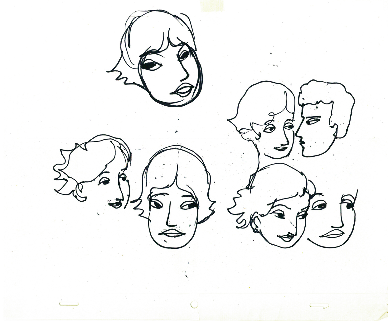
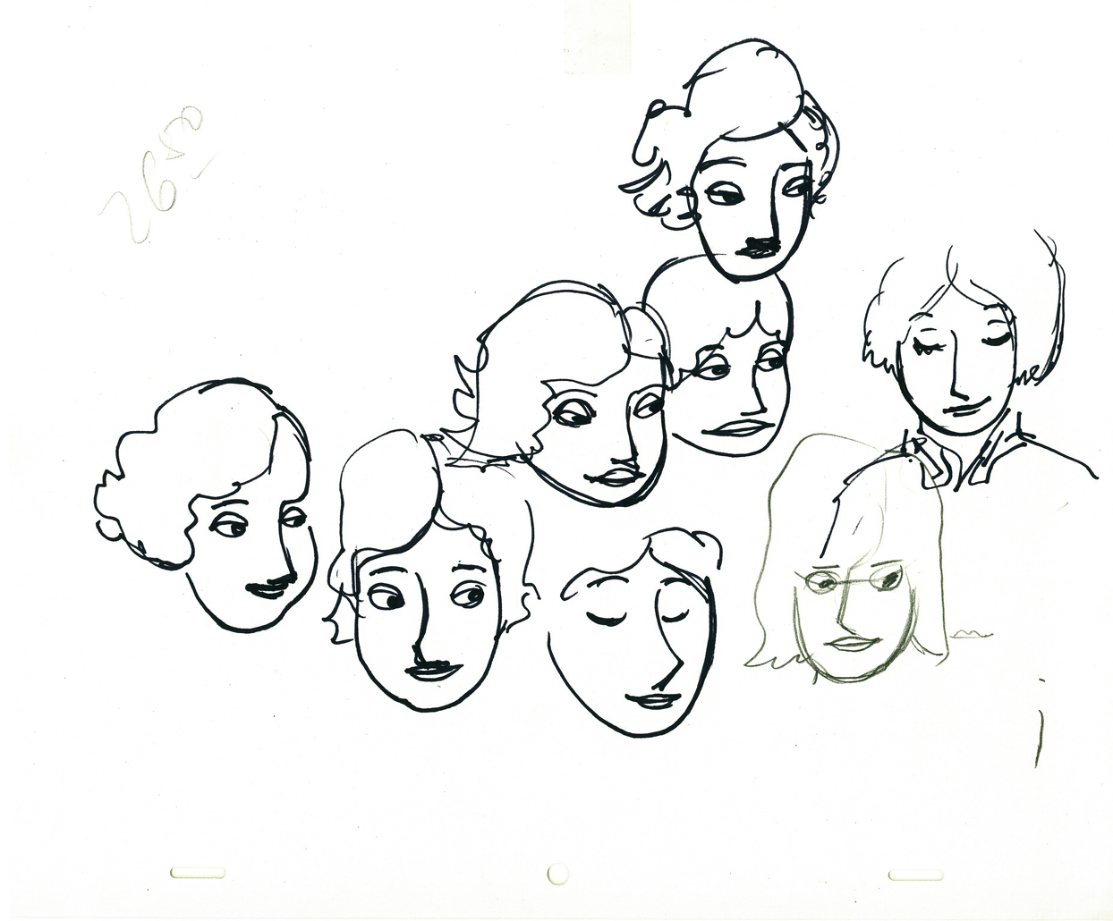
John Hubley’s models of the Girl’s heads for Tissa.
a rough drawing of the girl by Tissa.
Daily post 18 Jun 2009 07:38 am
$9.99 Opening/Snow White/Norstein
 - Tatia Rosenthal‘s animated feature has its New York premiere tomorrow evening at the Landmark Sunshine Cinemas at 143 East Houston Street (view map).
From the director, who certainly wants to celebrate:
“If you go to see it this Friday at 8:15 (tickets should be on sale soon on Fandango or on the theater’s website) we can all go after for drinks. I’ll be there to lead the way. I’m thinking La Linea or One and One – both on first Av. and First street. See you Friday!”
The film, in case you don’t know as yet, is a stop-motion animated feature based on the book by Etgar Keret, a series of short stories. Ms. Rosenthal raised the money from Israel and directed the animation in Australia. It includes an all-star cast including Geoffrey Rush (who recently won the Tony Award for Exit the King) and Anthony LaPaglia.
There was a good article in the NYTimes last Friday.
An informative interview with Tatia Rosenthal appears in Film Monthly, and there is an interview with writer, Etgar Keret, in the NYPress.
Hopefully there will be plenty more press with this opening.
The film’s official website can be found here.
Needless to say, this film is not getting quite the same marketing push that UP is getting, and the filmmaker needs as many to show up this weekend as possible to keep the film alive and thriving. Get off your bum, as they say, and go see it. It’s going to be raining all weekend anyway; perfect time for a movie.
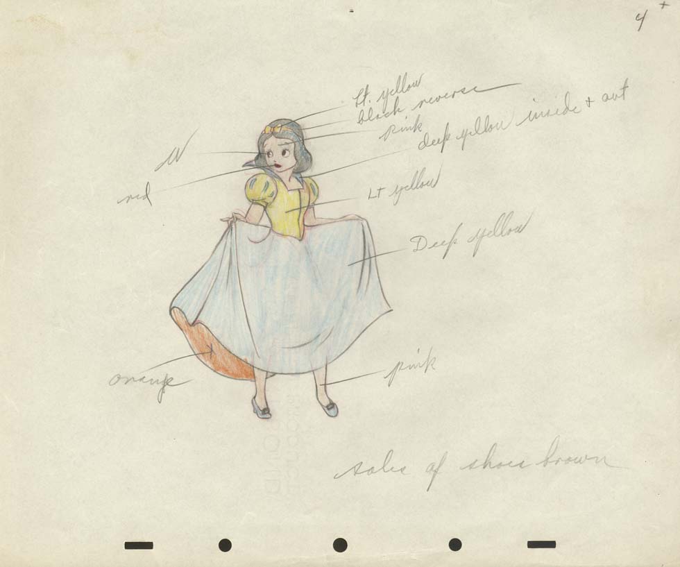
- I’d like to suggest a brilliant website with some awe inspiring artwork that you won’t see elsewhere. Most of it, currently, is from Disney’s Snow White, and you get to realize what a remarkable film that was. The Cowan Collection is just a treat for people like me. Such a wealth of material. I also suggest you leave a comment. It’s disheartening to put a lot of work into a site to have no feedback.
- There’s an interview with Yurij Norstein at the Animatsiya in English site. This is what the Art of it is all about. Thank you Niffiwan.
Animation &Animation Artifacts &Disney 17 Jun 2009 07:39 am
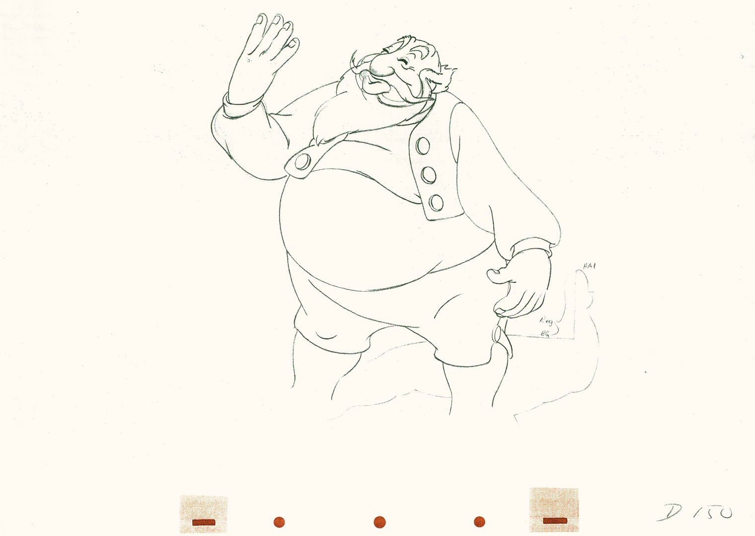
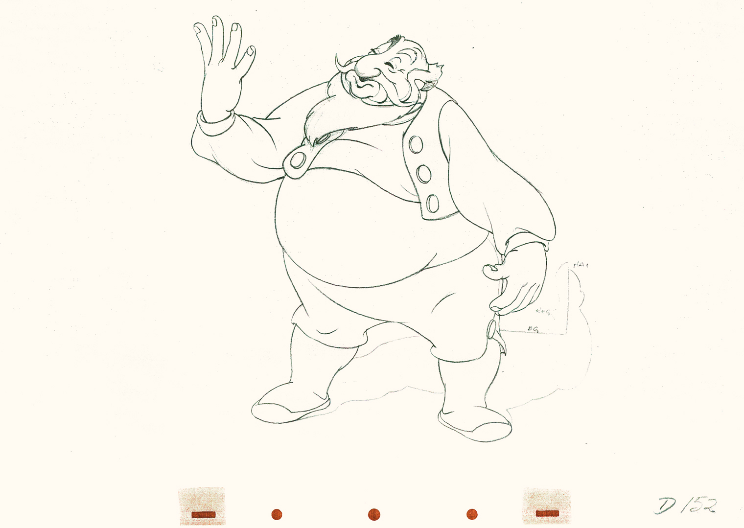
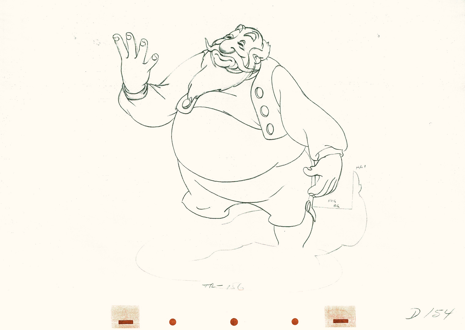
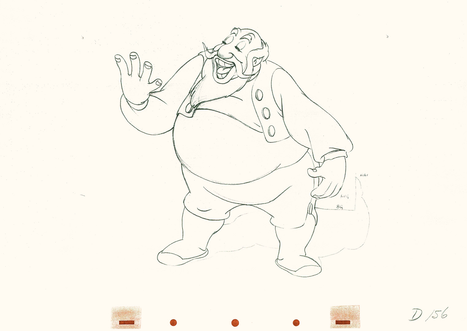
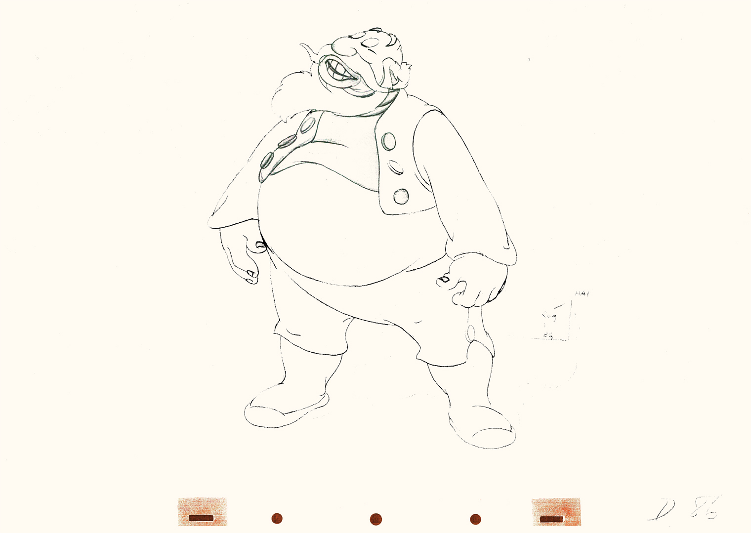
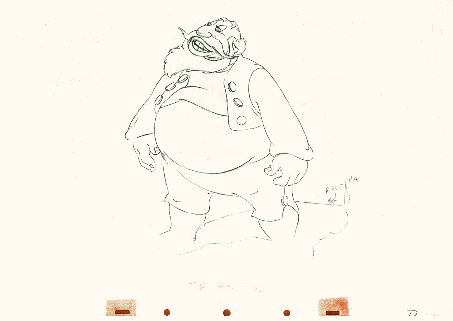
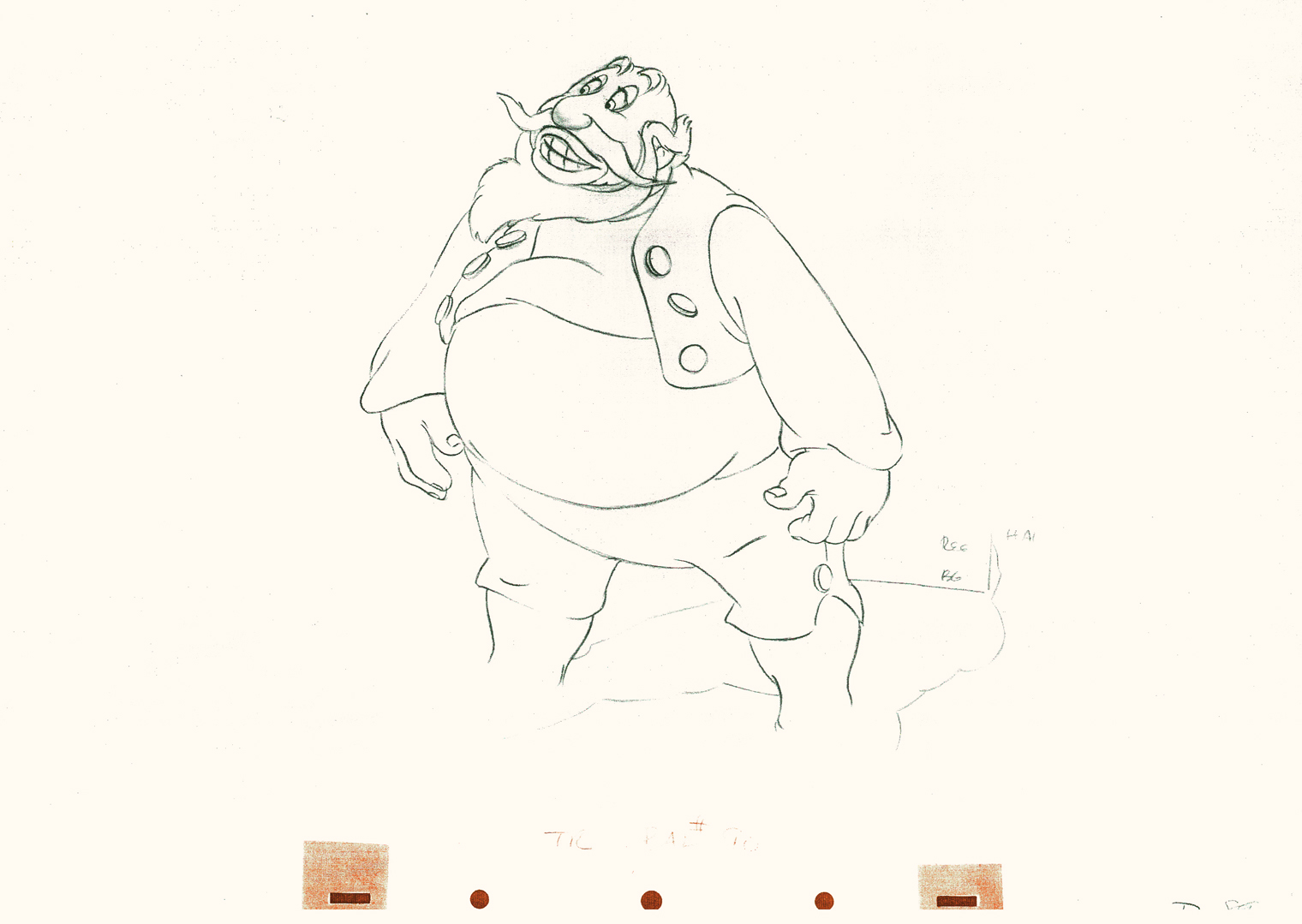
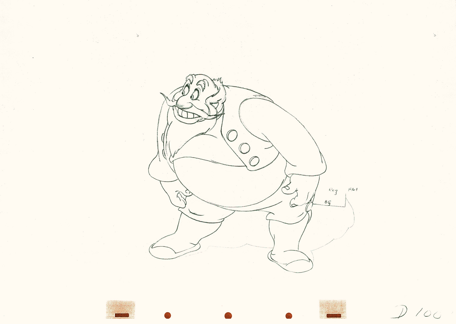
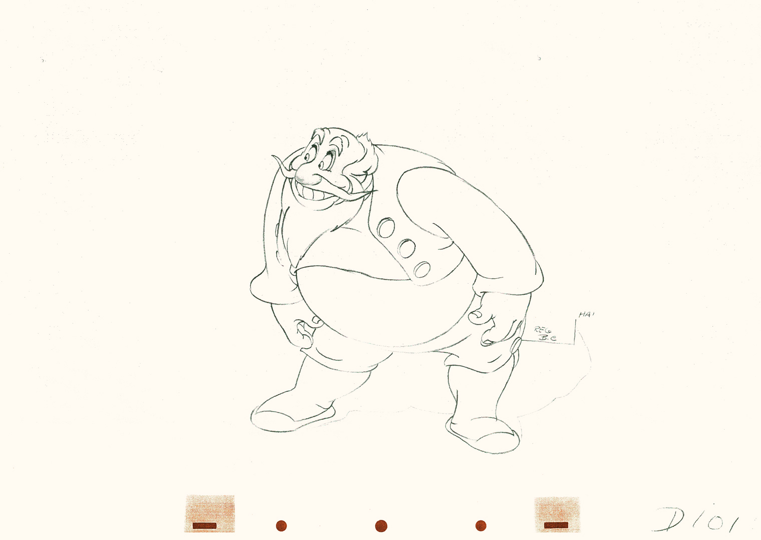
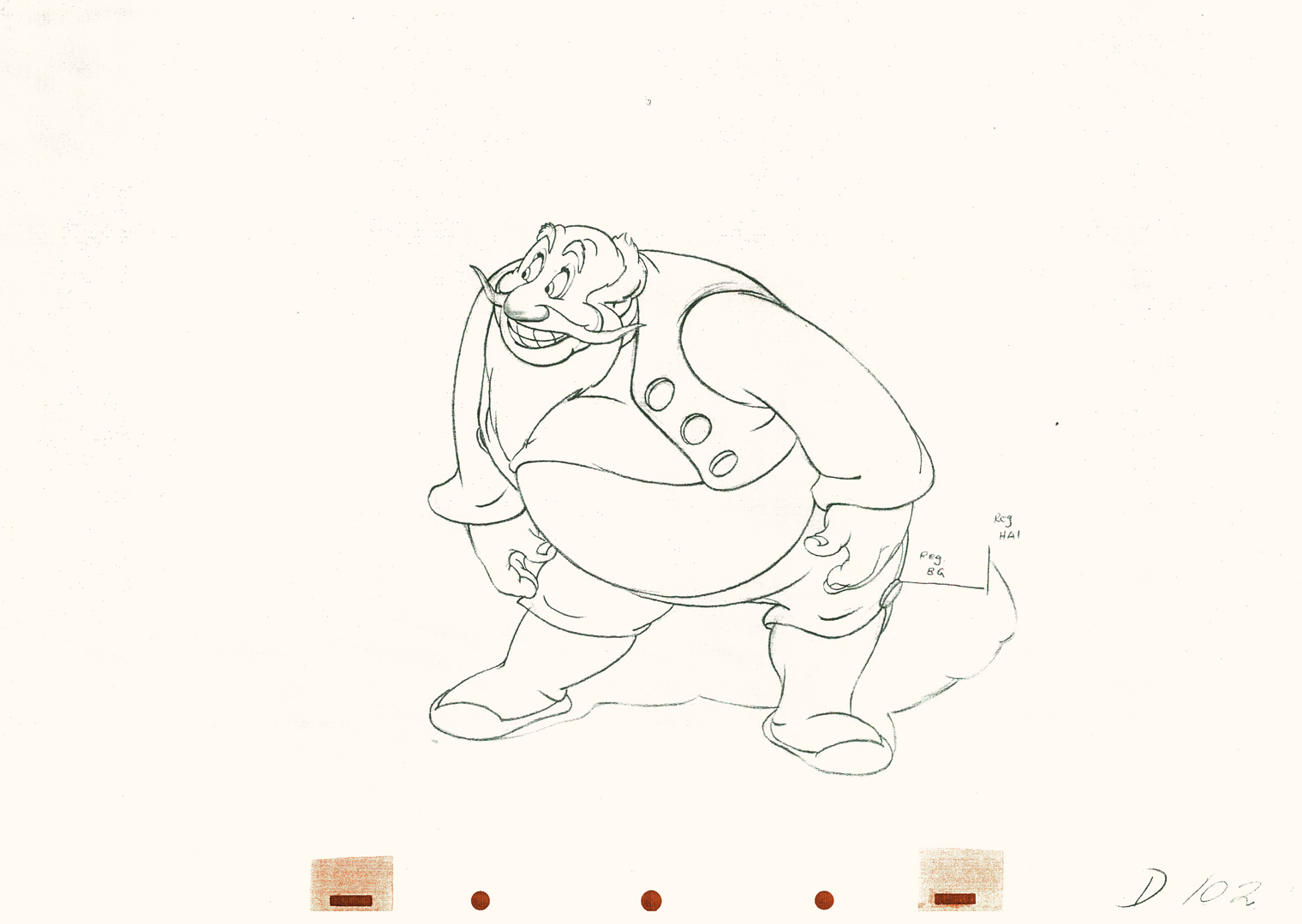
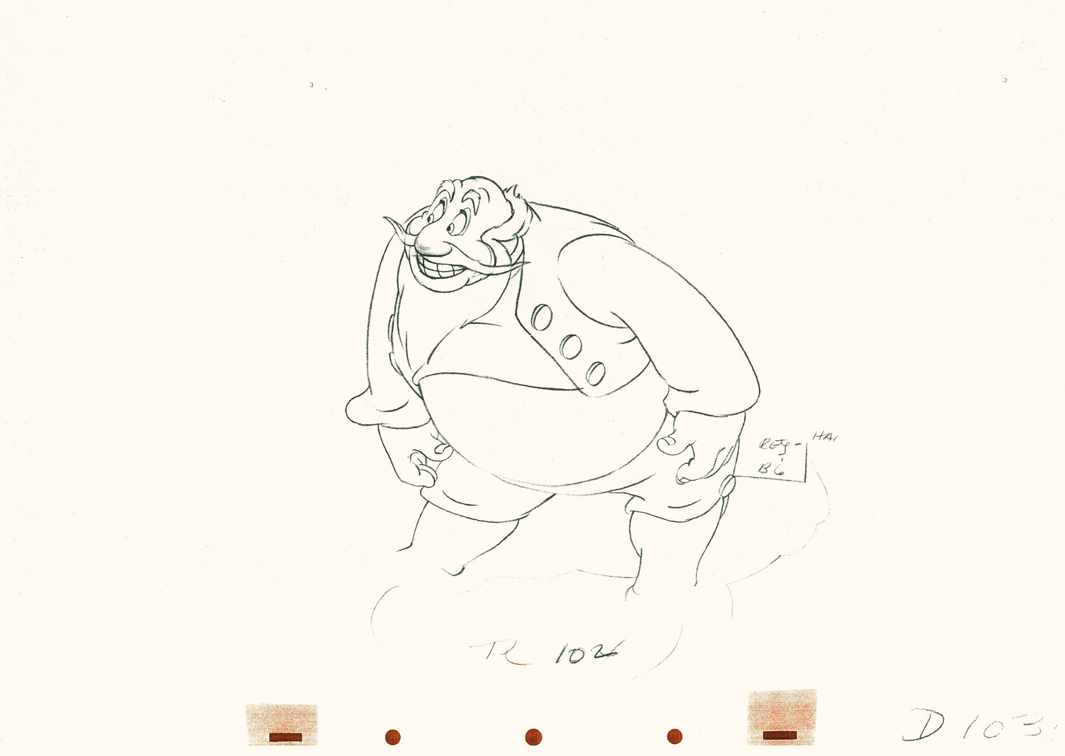
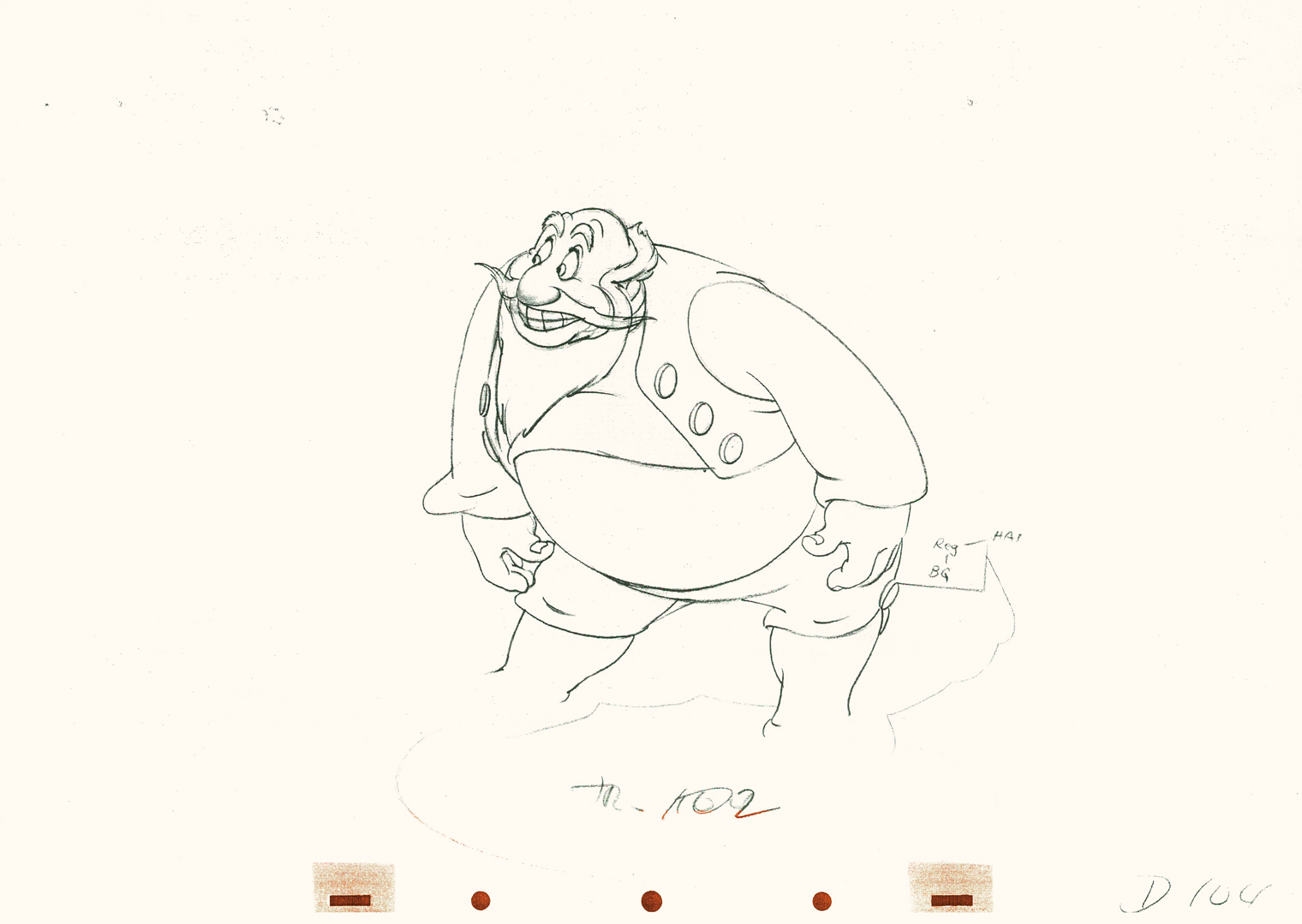
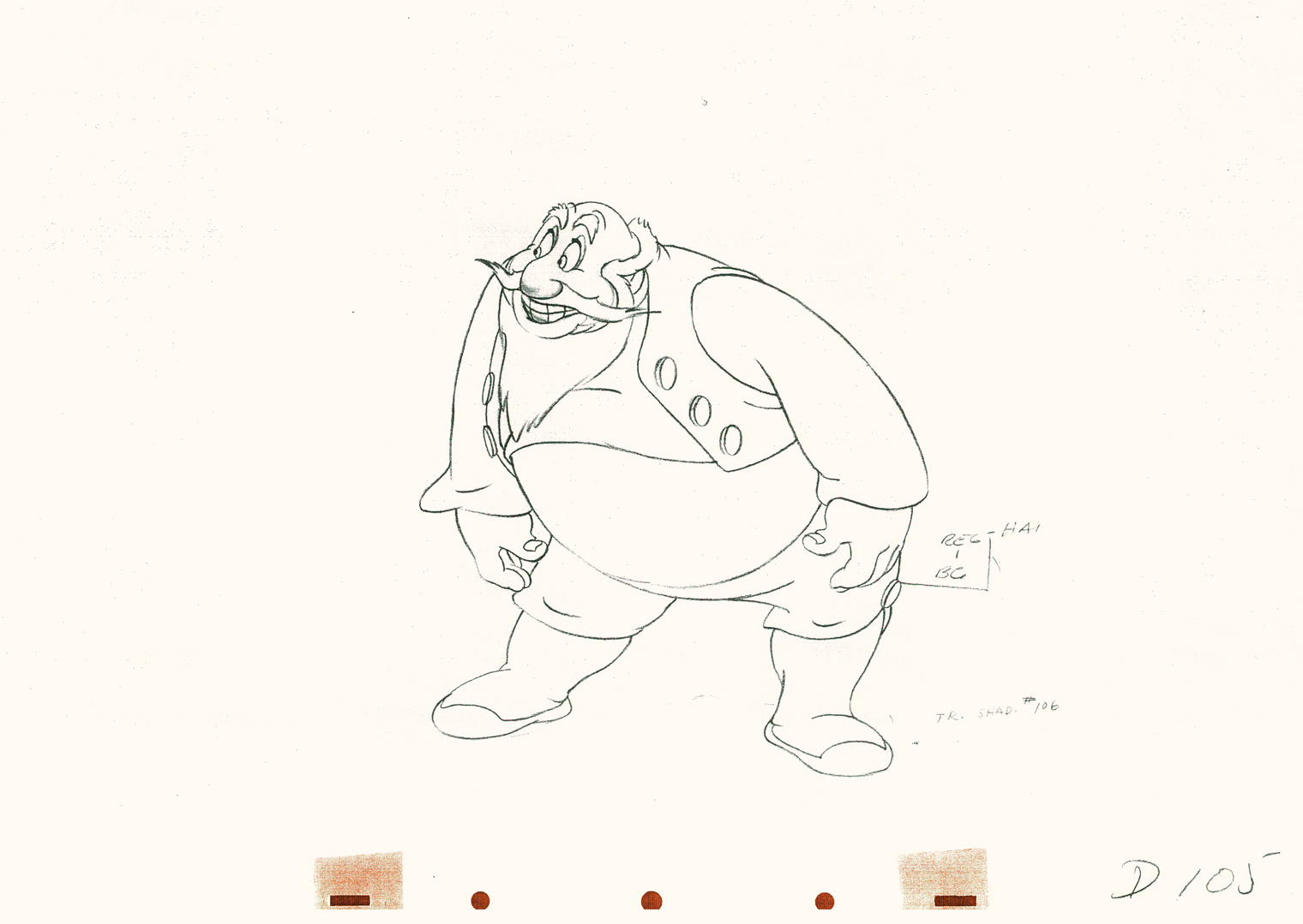
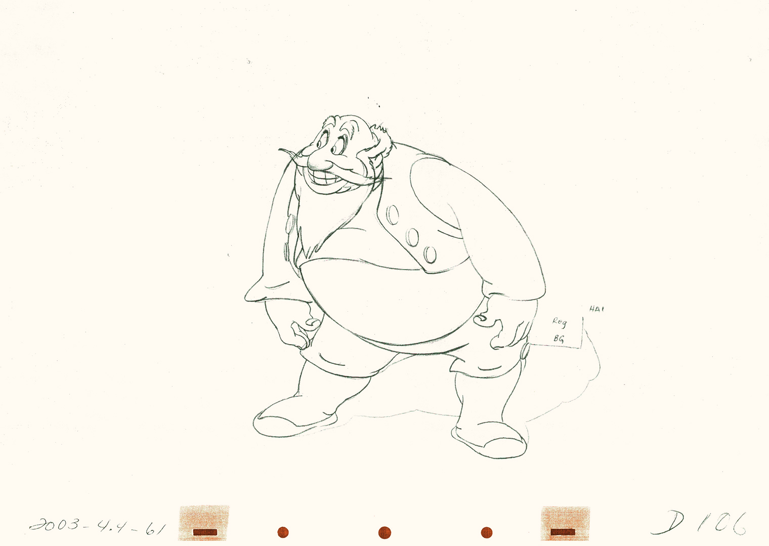
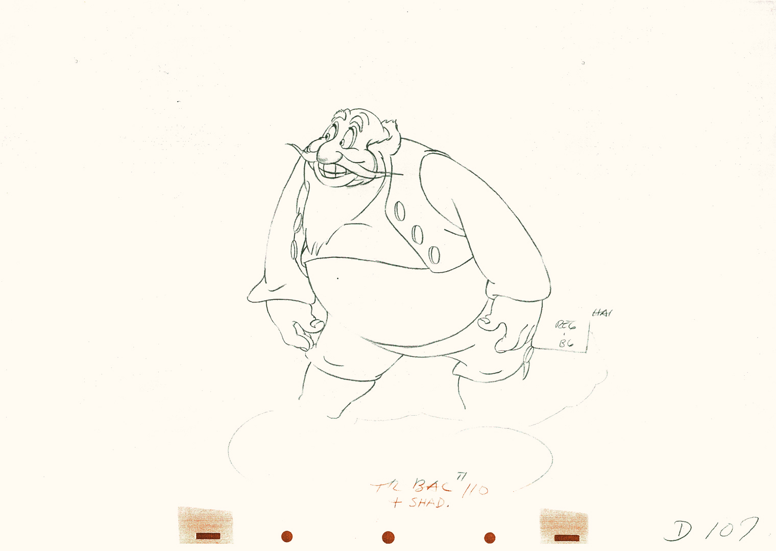
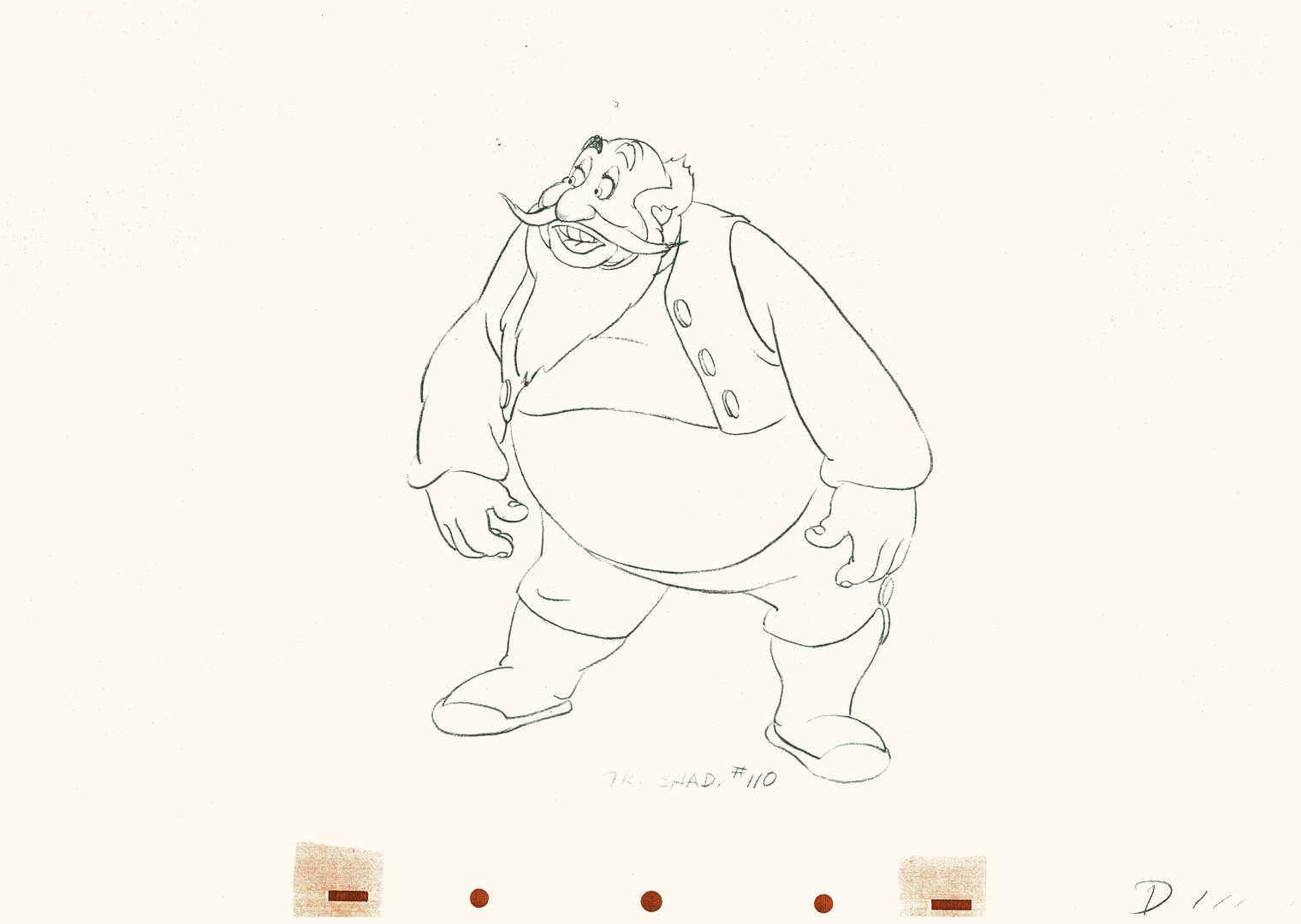
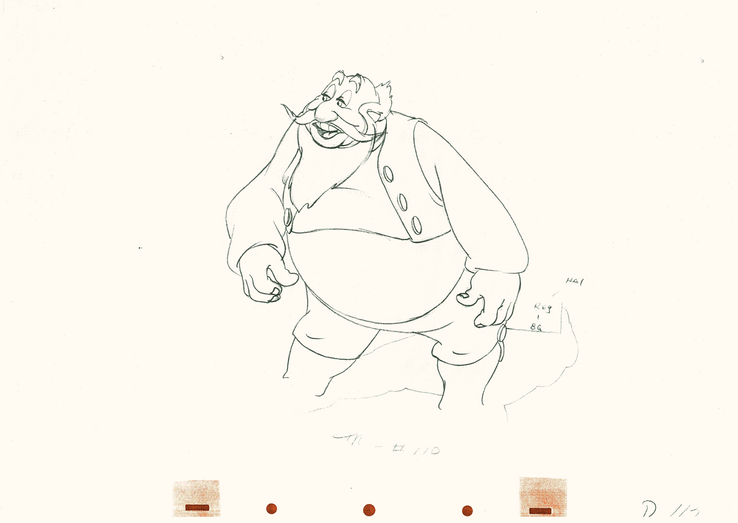
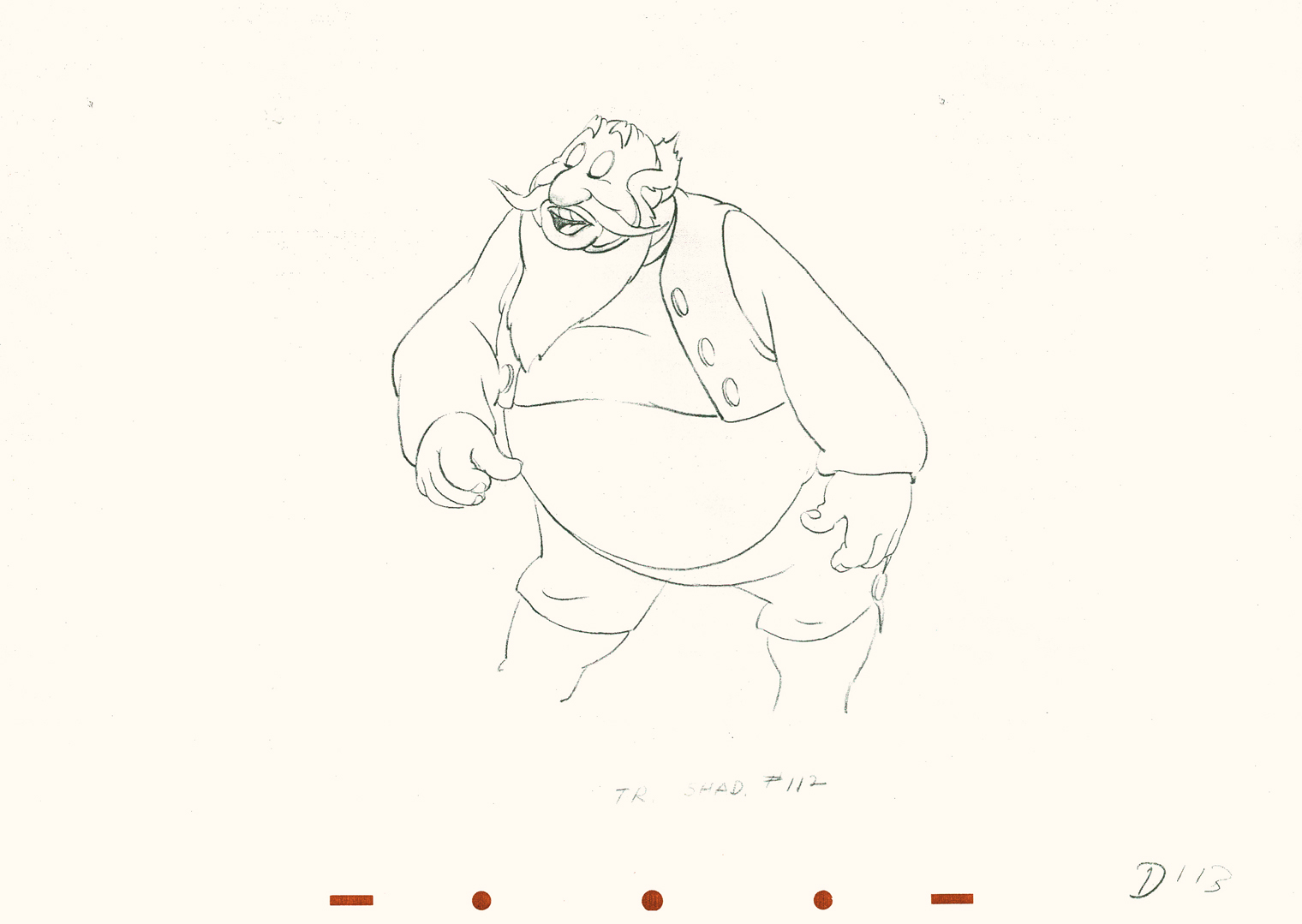
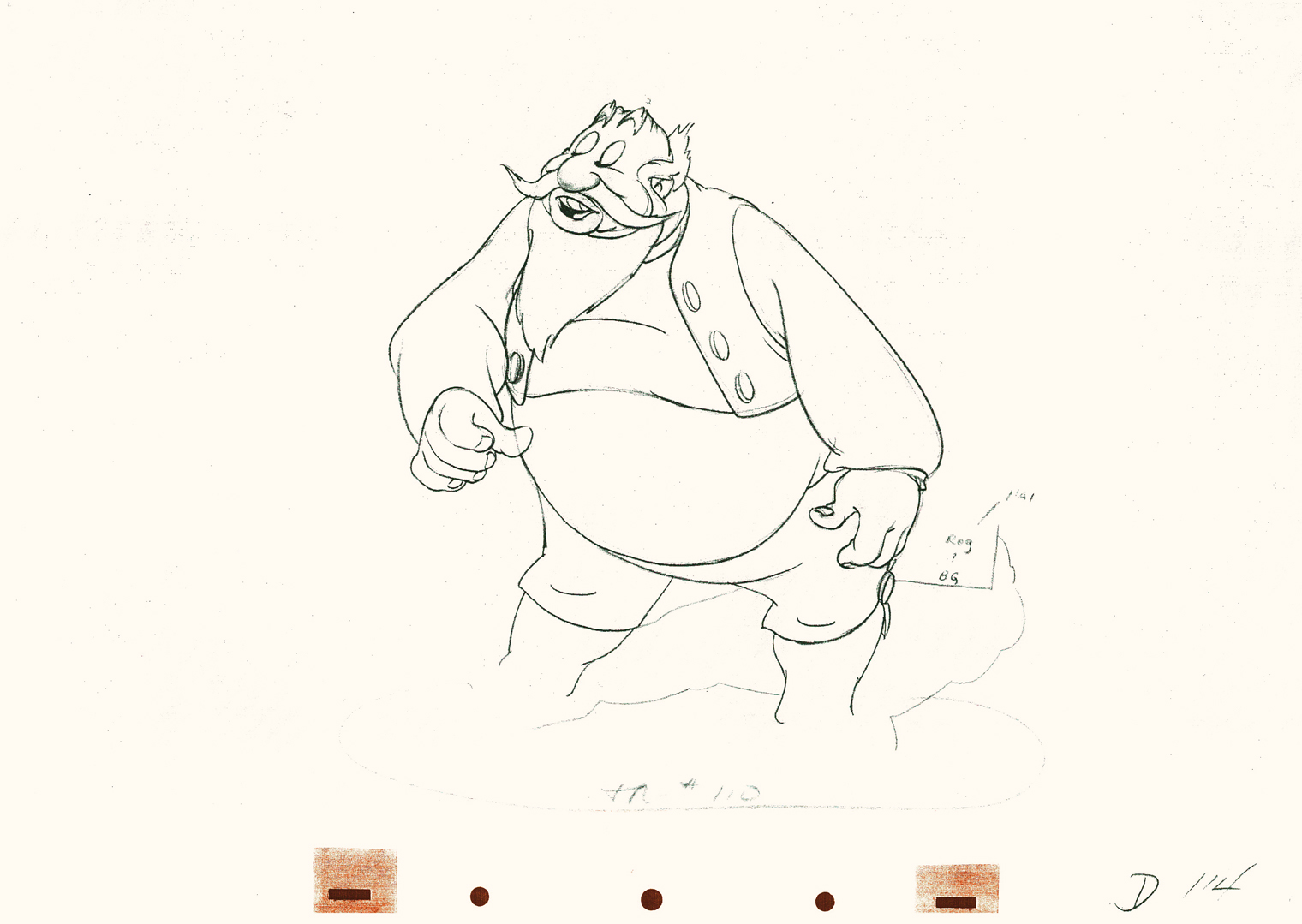
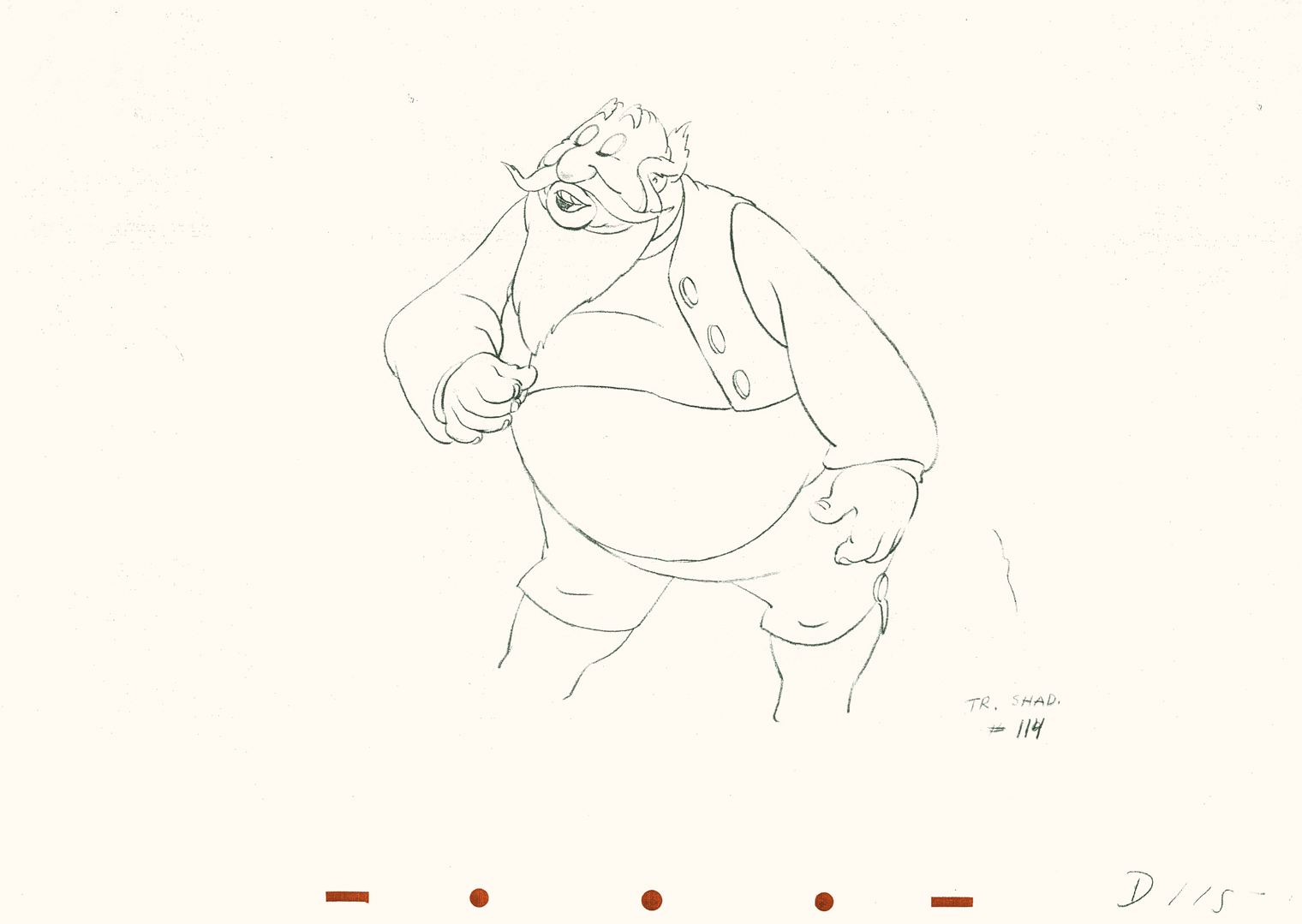
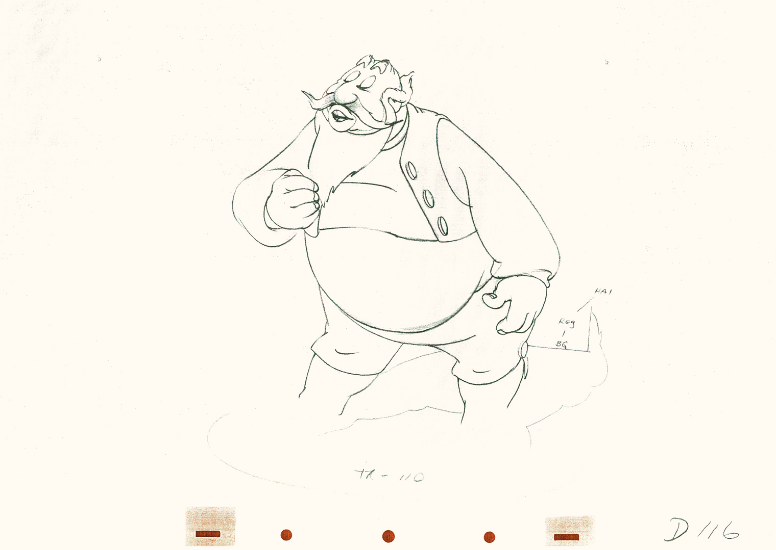
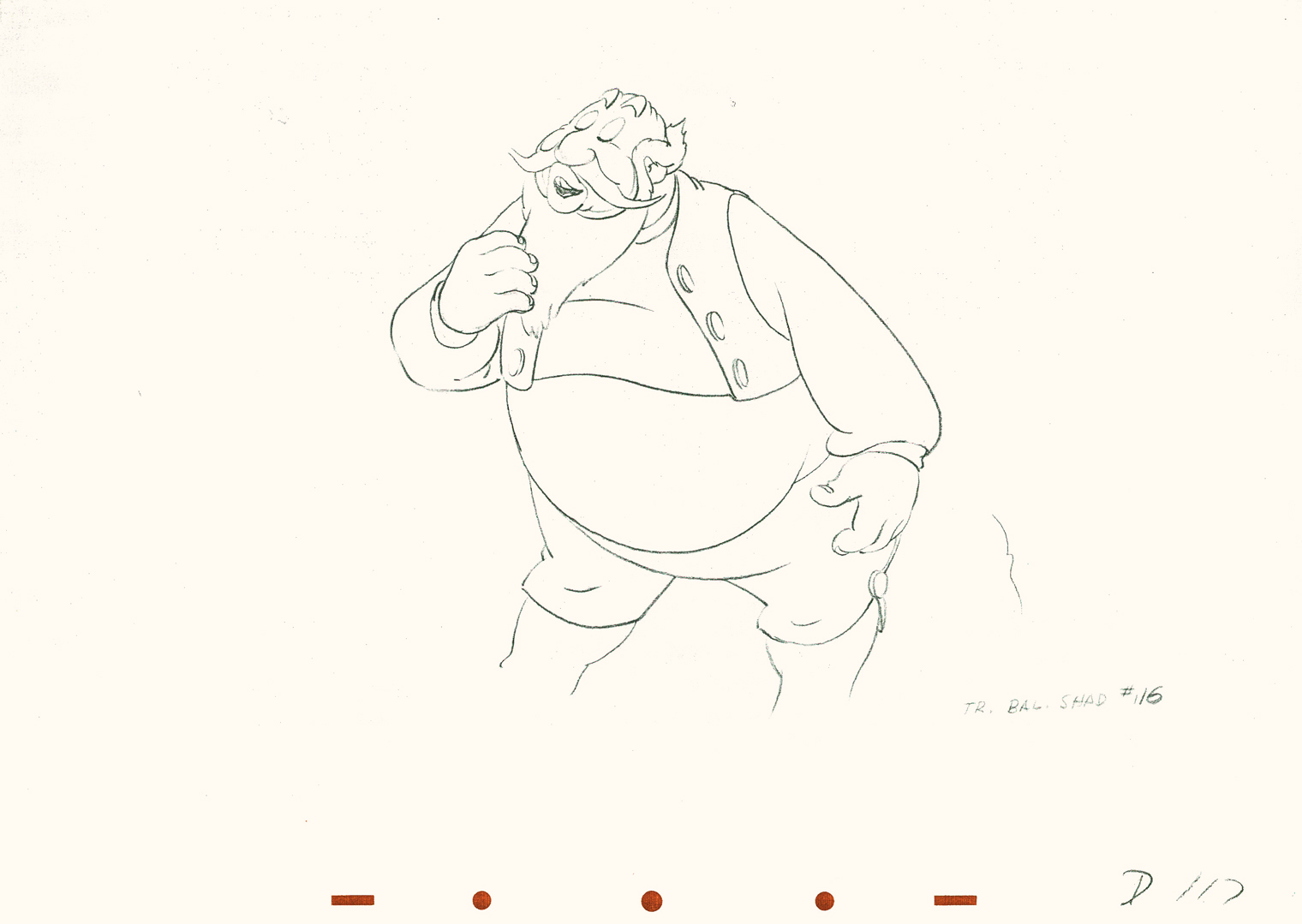
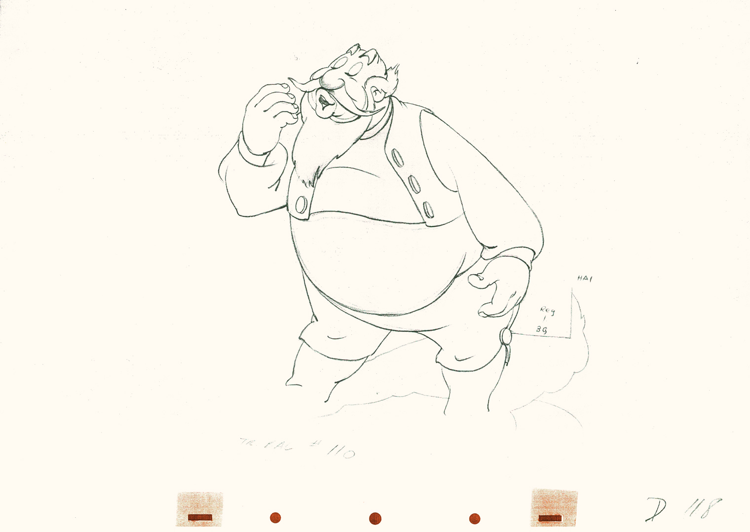
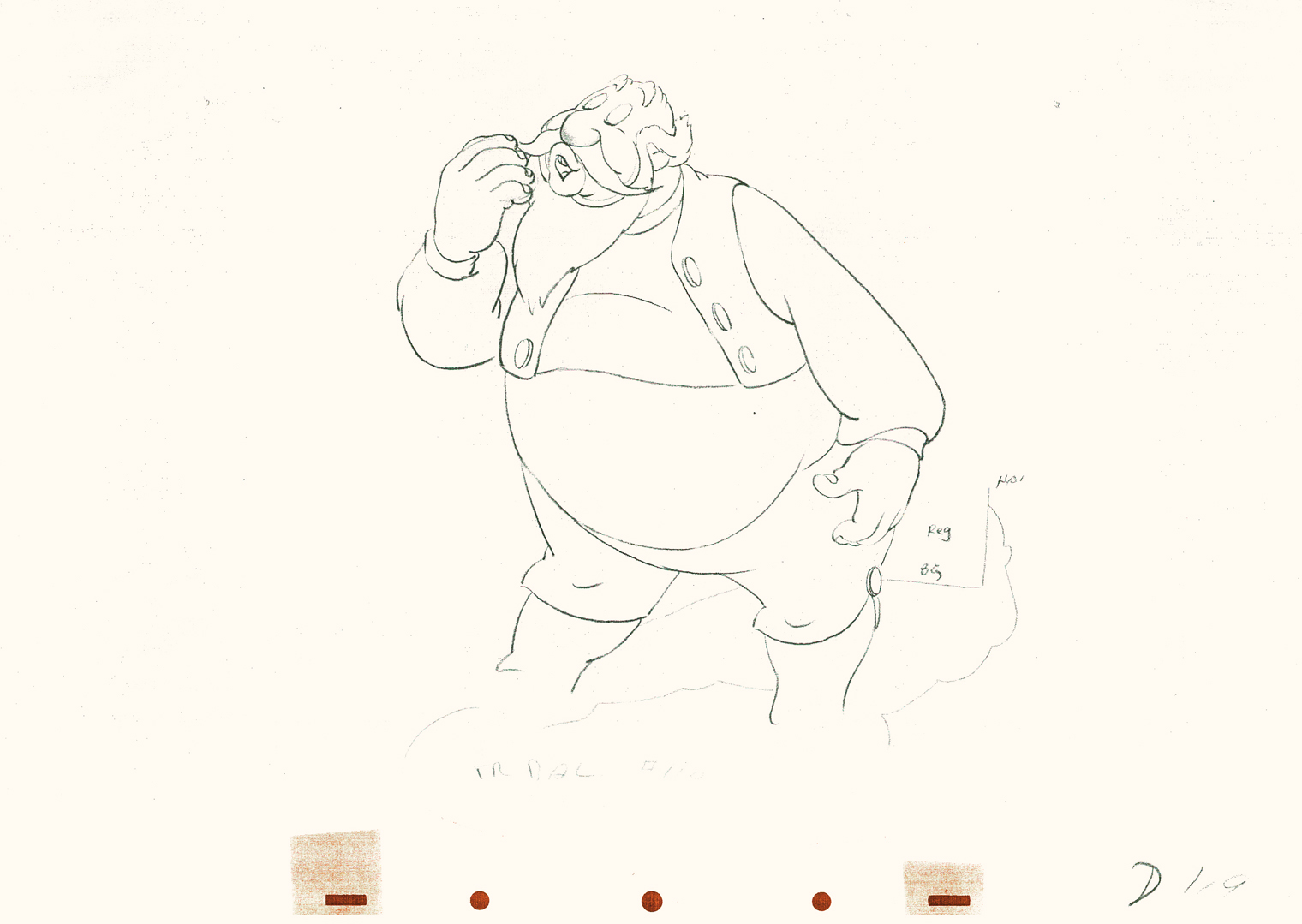
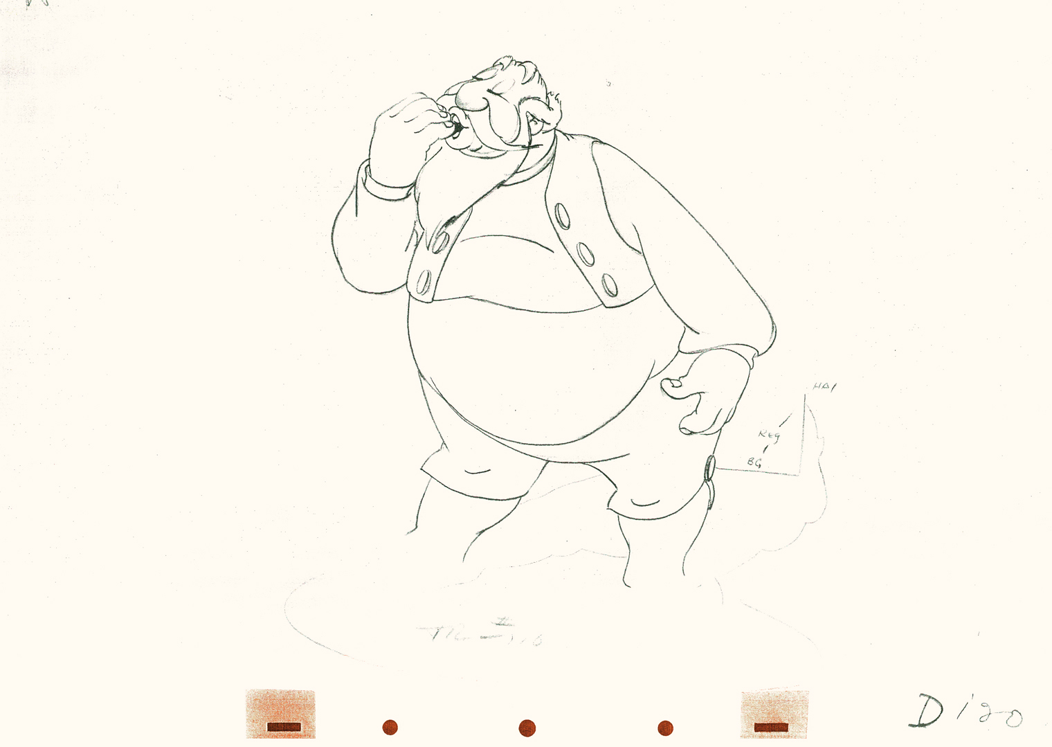
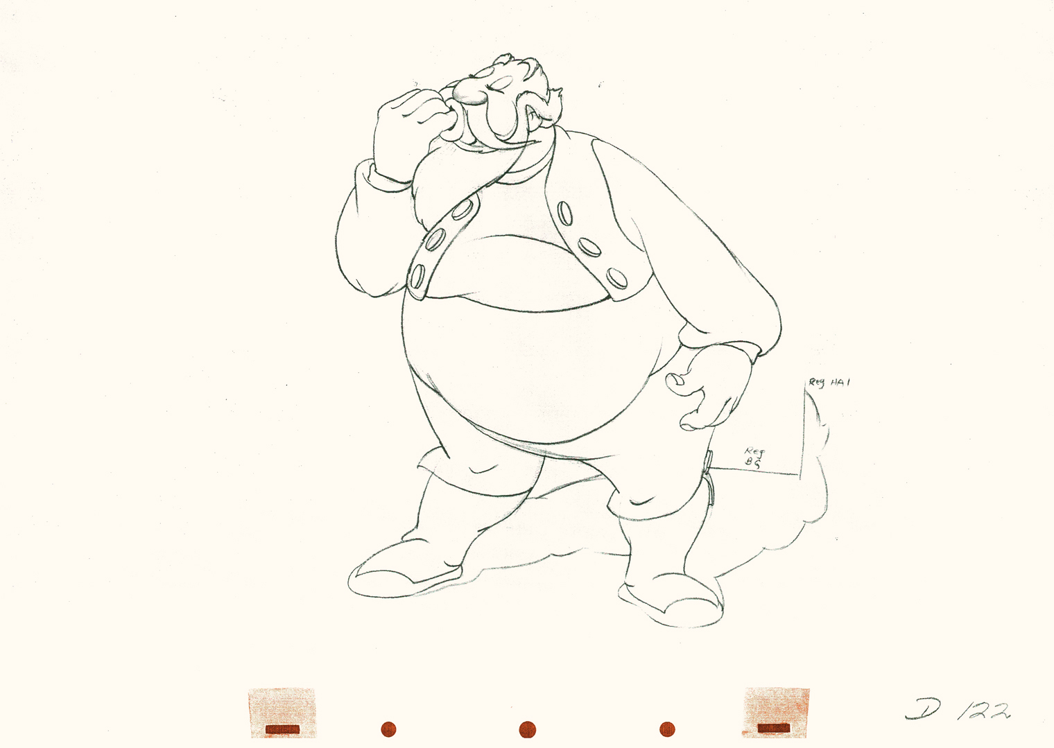
Tytla’s Stromboli 3
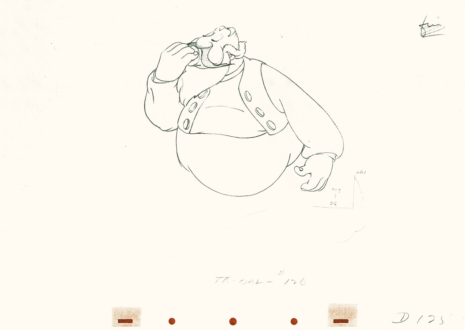
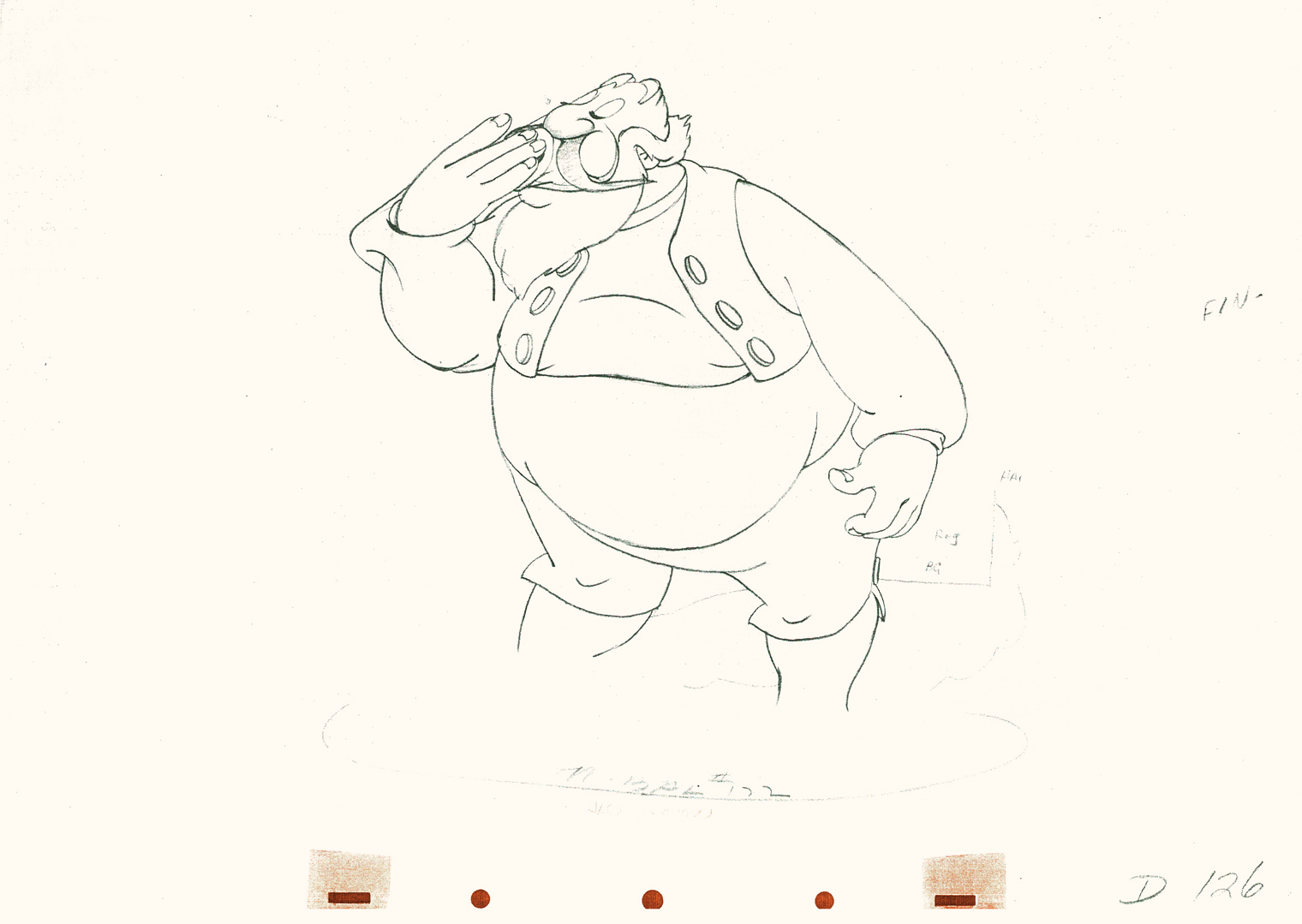
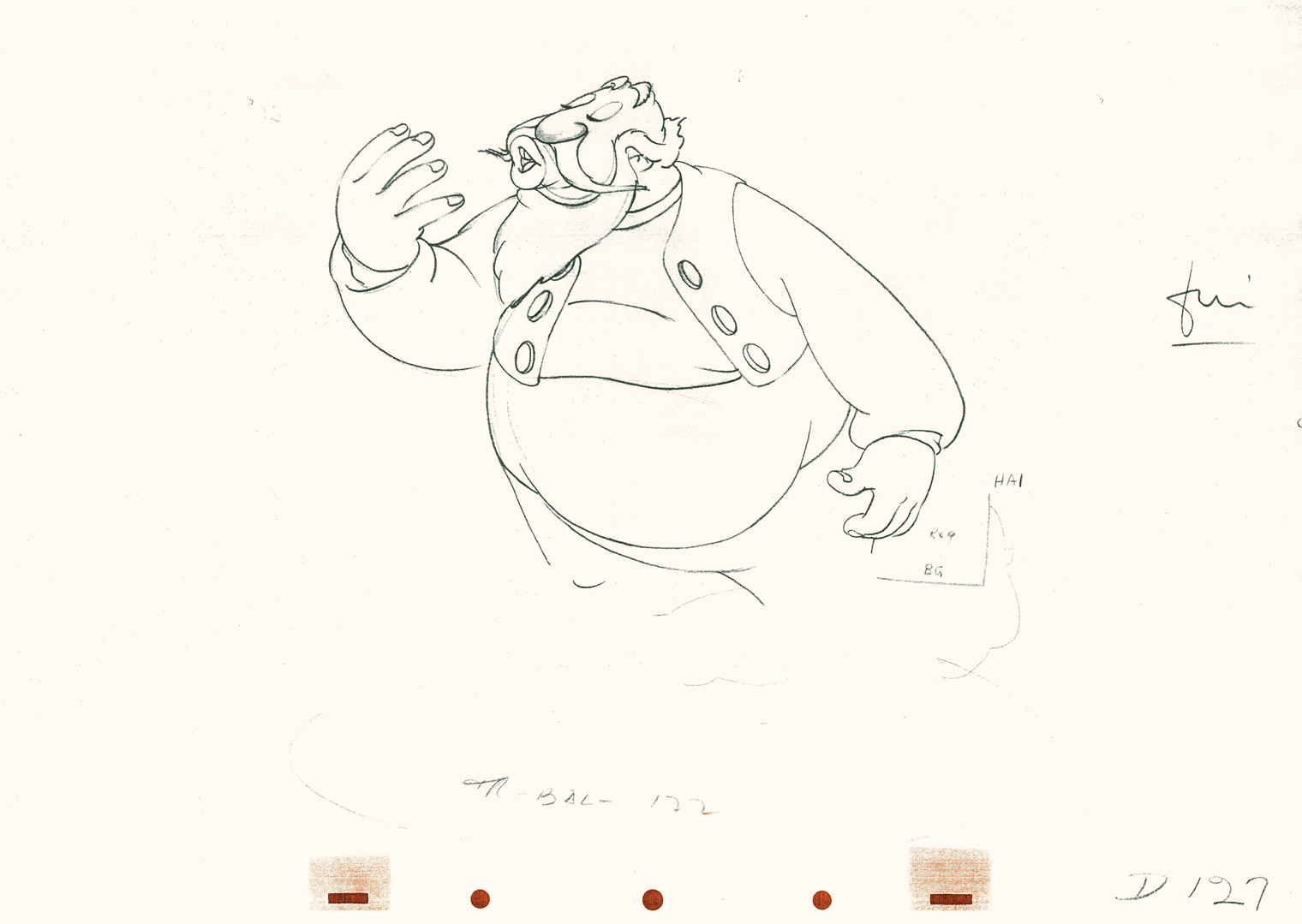
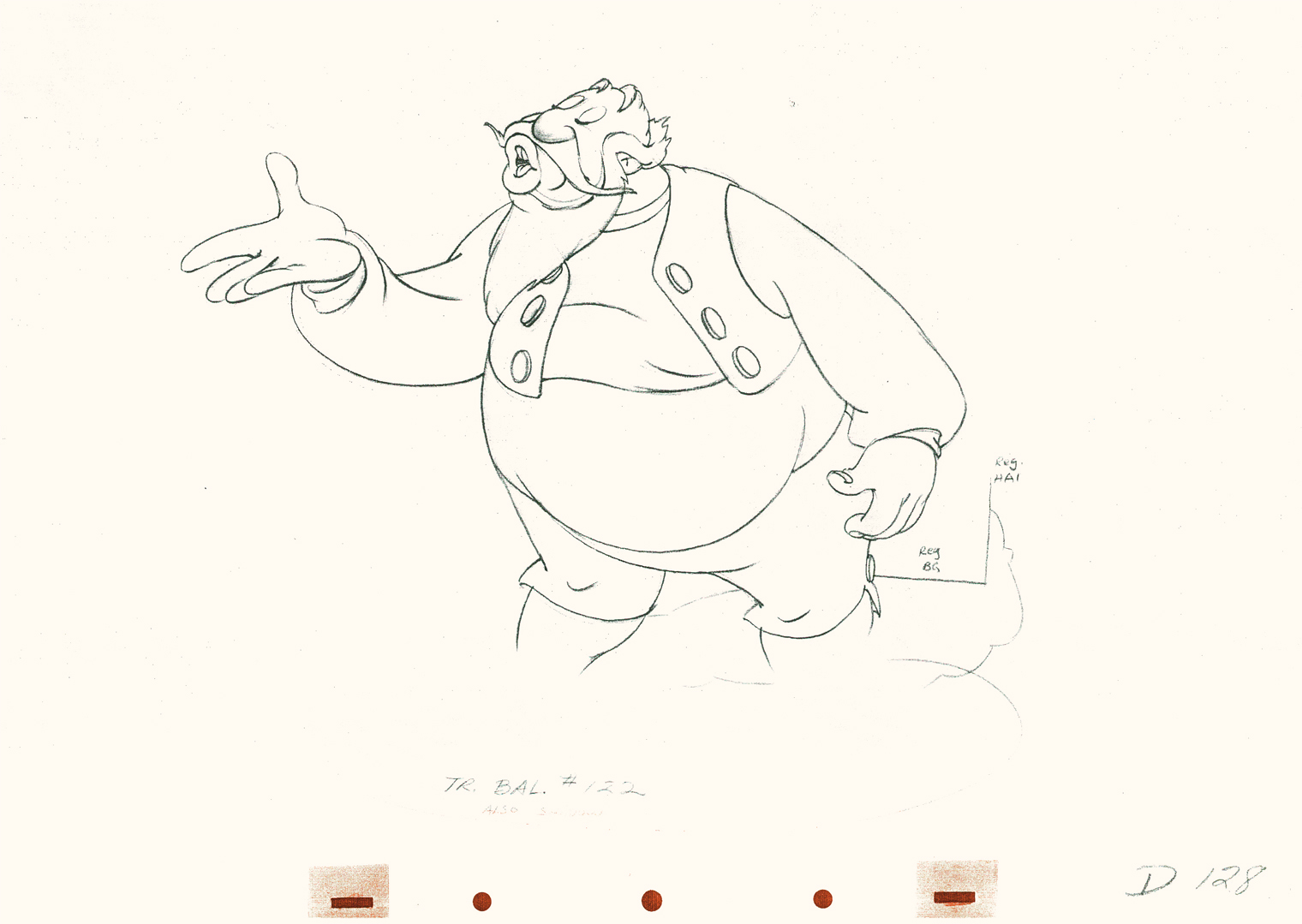
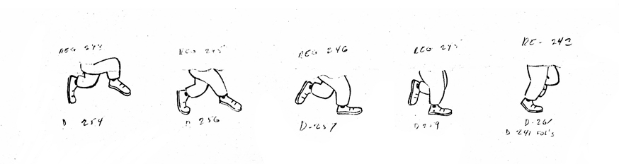
- This is part 3 of this large scene by Bill Tytla of Stromboli. The scene started in Part 1 with thoroughly frenetic anger from Stromboli. In Part 2 he tries to catch himself and get a grip on his emotions. Here in Part 3 he moves slowly and takes a 180° turn from where he started. The line against the curve. All this while playing out the lines from the scene. The drawing is stunning, the motion is brilliant, and the acting is the best animation has to offer. Those hands are just great; look at 126.
I pick up with the last drawing from Part 2.
 86
86(Click any image to enlarge.)
 87
87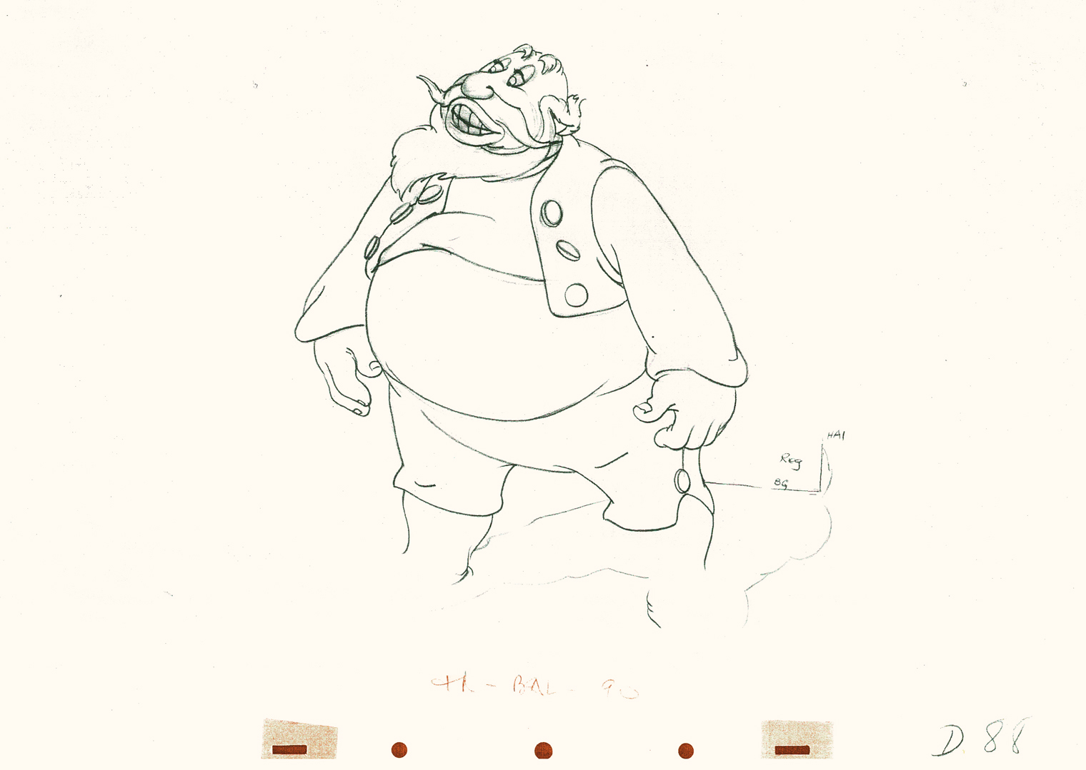 88
88
Tytla made sure he firmly planted Stromboli’s feet (in part 2)
before he attempted this firm bow.
 89
89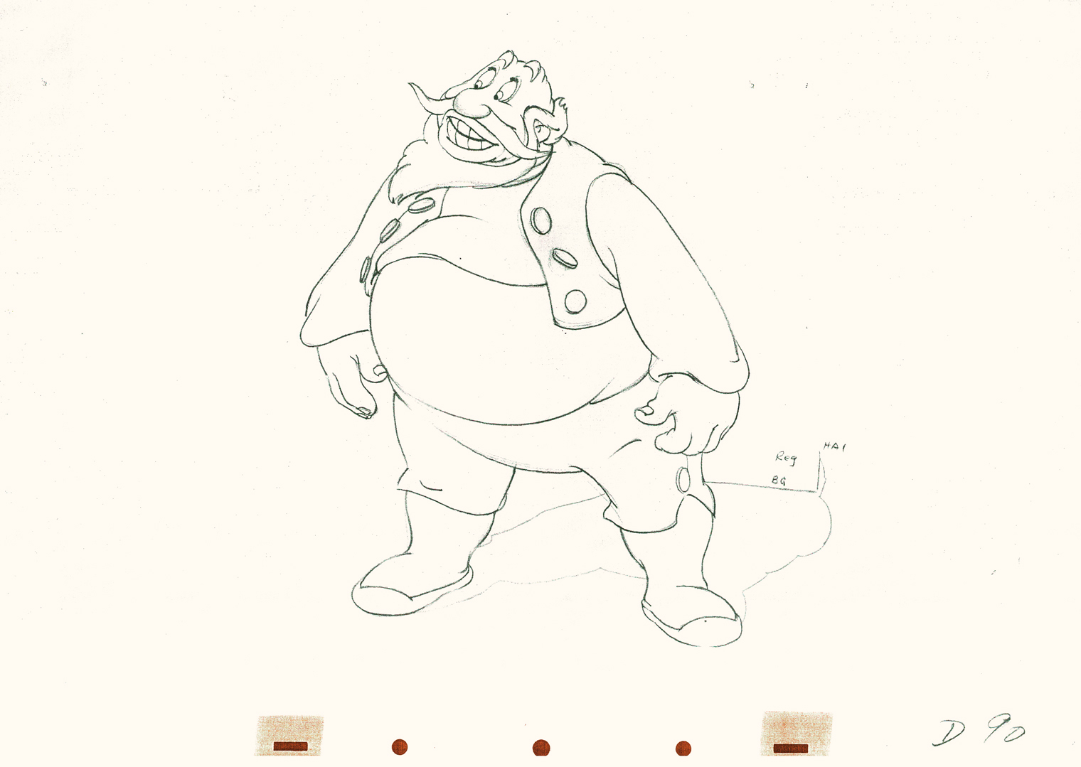 90
90
 91
91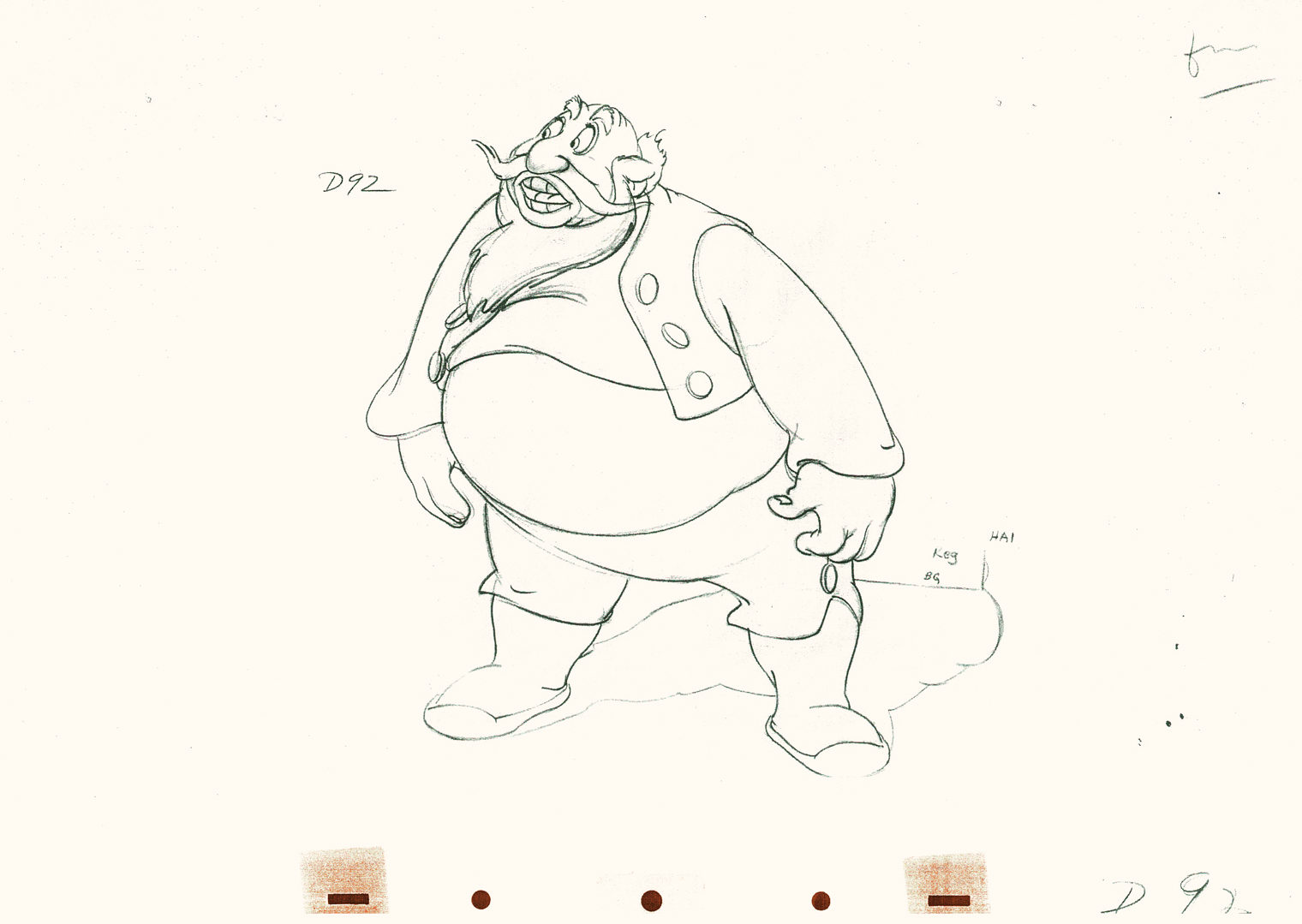 92
92
 93
93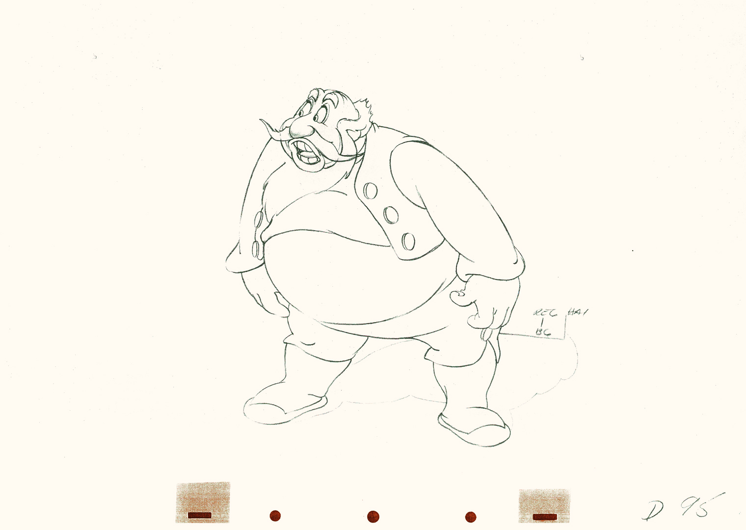 95
95
 96
96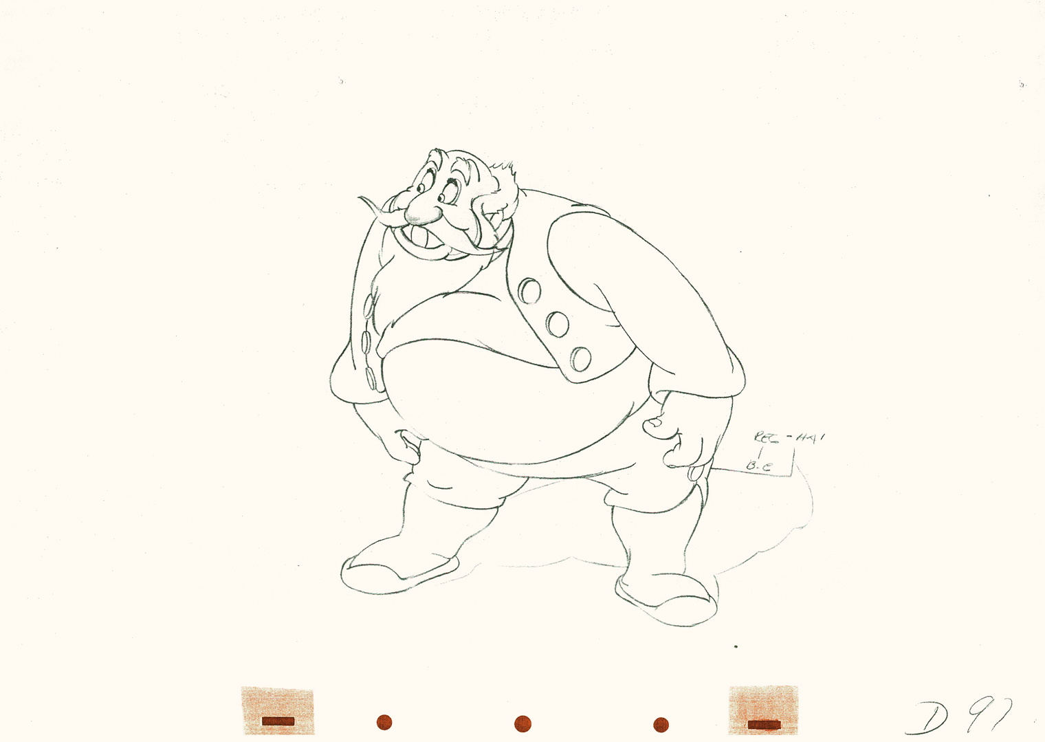 97
97
 98
98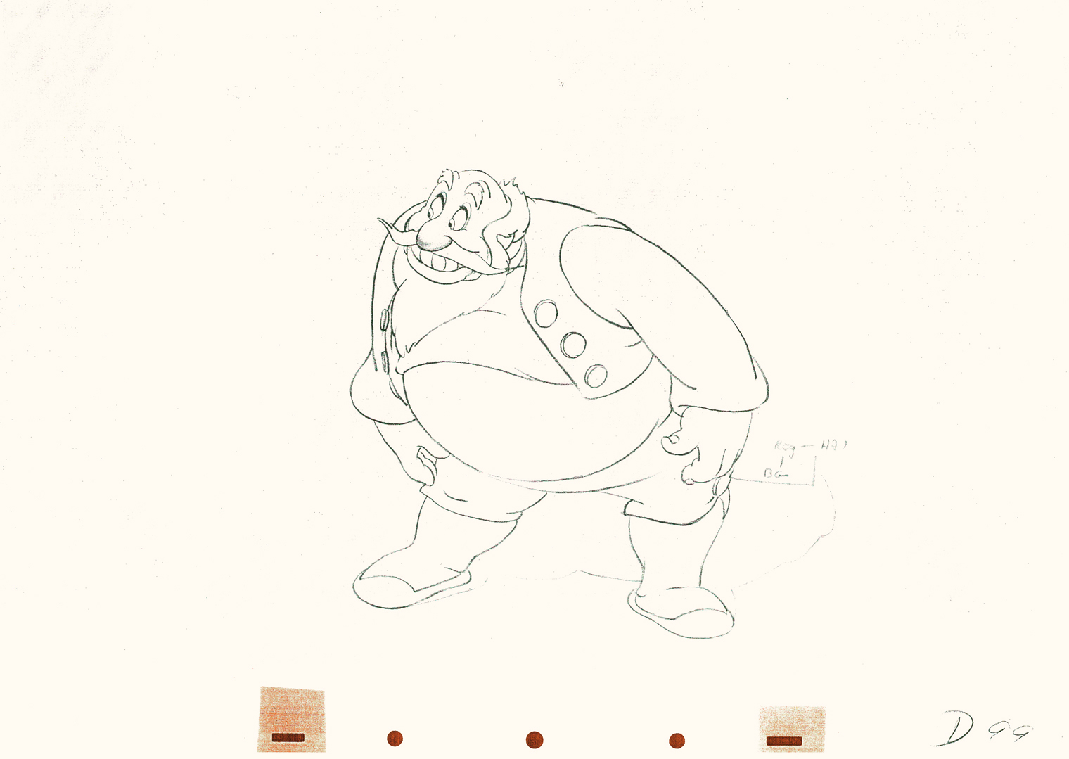 99
99
 101
101
He’s made a solid line of the back, the strength of this move,
by using the left arm held firmly in place.
 102
102
This is the bottom of the bow, now he goes back up.
 104
104
All of the shapes change naturally in the bow, though it looks
as if it remains a solid. No noticeable change. Solid weight.
 106
106
 108
108
 110
110
 112
112
 114
114
 116
116
 118
118
 120
120
 122
122
Watch the timing on the hand from here to #128
as Stromboli blows a kiss.
Many an animator today would pop it and call it animation.
 125
125
 127
127
 128
128
Click left side of the black bar to play.
Right side to watch single frame.
Articles on Animation 16 Jun 2009 08:52 am
Journal of Int’l Animated Film 2
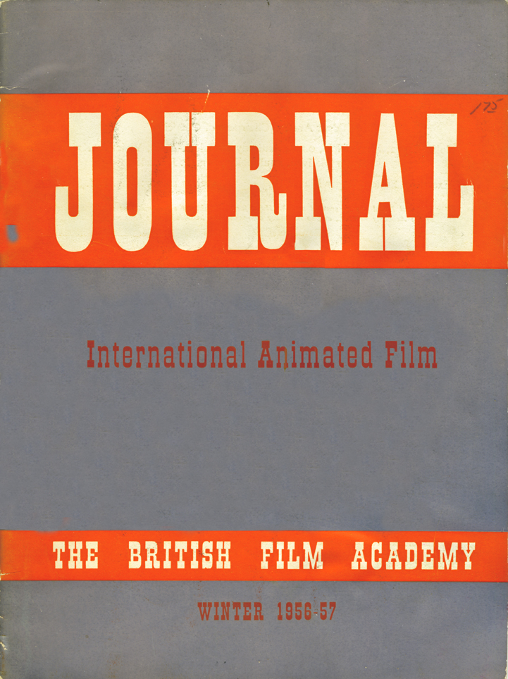 - Last week, I posted a short piece on British animation in 1957. This came from a Journal that was released (in the days before ASIFA) on the International state of the animated film.
The Journal coincided with the “first International animated film festival in Britain” at the National Film Theatre during February and March 1957.
They screened some 150 films, including 12 of the 31 features produced to that time.
The hope for the festival was to encourage theatres to include animated shorts on their programs again. The art form was dwindling. At that time, no one saw television as the panacea it would become.
This document gathered seven different writers and filmmakers to write about the state of animation in the respective countries.

AT THE Cannes Film Festival in the spring of 1956 I overheard a ticket taker remark to a puzzled tourist who evidently had tried unsuccessfully to get into the premiere of one of the full length feature presentations, “II y a aussi des petites dessins-animes.” Judging from the tone in which he spoke, half condescending, half affectionate, his words seemed to imply “tough luck, but as a consolation there are some little cartoons to be seen if you care to have a look.” He was referring to the International Festival of Animated Films which was taking place at the same time in another part of the cinema Palais. His attitude was similar to that of the general run of movie-goer everywhere. The cartoon is usually considered a
 pleasing little hors d’oeuvre to be enjoyed along with more substantial fare. That this hors d’oeuvre is welcome is apparent in the little murmurs of anticipated delight which still run through most audiences when the faces of Pluto, Mickey Mouse or Mr. Magoo come on to the screen. It is as though the audience realizes that for a few minutes they will be spared the sensational horrors which so often appear in the newsreel, or the tired cliches of a third rate travelogue. With the cartoon the audience can enter into a realm of pure fantasy, in which the laws of gravity are nonexistent, where pain is not pain and where characters become symbols or stereotypes, not to be taken very seriously.
The audience which strayed in to see the animated films at Cannes (the tickets were free) bore little resemblance to the self-conscious, publicity hungry international set which attended the gala openings of the longer features. The cartoons were attended by the producers themselves, a motley crew from every corner of the earth, and casual spectators from the streets, curious and unprejudiced. It was interesting to watch the reaction of this audience to films which ranged all the way from animated folk tales of Texas to heavy political propaganda from both sides of the iron curtain. The actor who drew the most spontaneous outburst of laughter was that ageless veteran whose career has remained unchanged throughout the years, Mr. Donald Duck. His frustration in the film which so delighted the audience was caused by his ineffectual efforts to fall asleep in spite of a relentless neon light which kept flashing off and on, and the insistent sound of dripping water from a tap which gradually increased in his imagination until each drop seemed a bomb visibly shaking the whole earth with rhythmic concussions. Donald’s frustration, seemed on that afternoon in Cannes to be such a note of understanding which reached across the
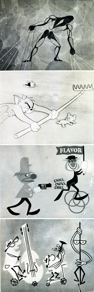
To Your Health, Tom & Jerry________barriers of language and nationality. This particular
Balentine Beer commercial,_________film was, as always with Disney, elaborately anima-
Winston Cigarette commercial_______ted, no economy tricks employed, no corners cut.
_______________________________The sound track with its metamorphosis of dripping water to world-shaking “booms” was imaginative and appropriate to the medium. Also, like most of Disney’s films, it was a sample of the usual over-cute style with background drawings similar to the easiest kind of commercial advertising.
It is impossible to consider the animated film in the United States without thinking first of Disney. After 30 years his name is still synonymous with the short cartoon in the minds of most of the American movie-audience. Sometimes during the long period since his first exciting Silly Symphonies appeared, the work from his large organisation in California seemed to have sunk into the doldrums. Formula replaced invention. The medium lost its initial public appeal. Disney’s excursions into the field of “live action” have been sometimes rewarding, sometimes disappointing. Some of the wild life films have recaptured the excitement of his early cartoons, while the romantic historic costume pieces have often seemed banal. Always a clever 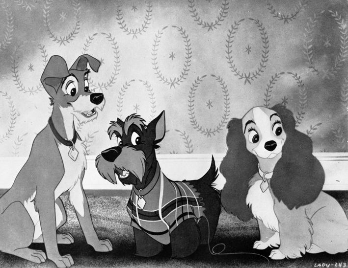 showman, he has recently built a large fun fair, or amusement park in California which serves also as a setting for television programme material. When, from time to time, a new feature length cartoon appears, such as Lady and The Tramp, in which the chief characters are dogs, one is amazed at the technical slickness of the animation and annoyed by the weak story line, which seems to be influenced by the wish to include every sure-fire box-office trick. This approach does not lead to any fresh experiments within the medium.
It was the short film Gerald McBoing-Boing which first brought a radical change of style to the attention of the public in America and soon after to the cinema-goers in Europe. This highly original short film, produced by U.P.A. Pictures, with finely integrated music by Gail Kubik and with sophisticated visual elements, seemed to satisfy a public at that time weary of the Disney formula. The talented minds which produced “Gerald” had made previous cartoons in which visual wit and economical animation had replaced the elaborately evolved techniques established by the larger studios, but these films had never been seen in the theatres. Some of the U.P.A. men had worked previously in the Disney Studios. The organisation under the leadership of Stephen Busustow has now expanded into the field of television. Robert Cannon, one of the most brilliant U.P.A. directors, brings a fertile imagination and fresh approach to each new film he creates. Another director, Pete Burness, who has been with the U.P.A. since its early days, has created a now popular cartoon character, Mr. Magoo, whose blithe innocence and near-sightedness leads him unscathed and unconcerned through the violence of the modern world. Mr. Magoo, like Donald Duck, has become a beloved international personality.
The U.P.A. style, according to their own spokesmen, derives from “modern” art. It is uncluttered, flat and often linear. The characters do not seem bound by any natural physical laws of movement. Perhaps one of the greatest contributions of the U.P.A. is that they have shown the public that the less realistic a movement is, the more creditable it becomes optically. Disney sometimes bases the movement of his characters on live action models, as with Alice in Alice in Wonderland. The greater the effort to imitate realistic movement, the more apt one is to be aware of the stroboscopic nature of the medium, the more jittery the result. If legs are used to express the symbol of walking, rather than the imitation of walking, the illusion of movement is more acceptable, a paradox which indicates the validity of the “modern” art approach. Like any device this simplification can be carried too far. If the human figure becomes too abstract it may lose all its expressive power. Usually the U.P.A. figures, moving flatly on a flat screen are consistent, humorous and convincing.
Magoo Beats the Heat , Madeline
Less effective have been certain of the U.P.A. attempts to animate the drawings of “big name” illustrators, such as Thurber and Bemelmans. The Unicorn in the Garden and Madeline are examples. Since the quality of both Thurber’s and Bemelmans’ drawings depends on a subtlety and unevenness of line which is impossible to use in the animation technique, where every celleloid must have an almost mechanical similarity, the flavour of the original is lost and the result is far less successful than the work of lesser known artists, whose training within the film medium has taught them its restrictions.
Nevertheless, the U.P.A. has been a healthy influence in the United States. The proof that a new style has had its effect on Disney and his imitators is seen in their efforts to modernise their own productions. Disney has released a short history of music called Whistle, Toot, Plunk and Boom, which seemed to imply that if his studios wished, they too could work in the “modern” style. The popular M.G.M. films, with incredibly fast pacing and surrealist gags, seem also to have cancer research or democracy. Which does not mean that good films cannot be made on these themes. But there is little chance for the individual to produce a genuinely experimental film on his own subject.
It is difficult to say what the future of this medium in the U.S. will be. At present animation is still popular in the entertainment fields and in commercial television. Some of the most imaginative uses of animation at present are in one-minute TV commercials. Animation is in demand in those sponsored industrial films where a mechanical concept can be shown more clearly than it can in live-action. Animation is also useful in industrial films which try to express abstract ideas or fantasy.
Donald Duck, in his better movements, still communicates to an international audience. It would be interesting to speculate, however, as to what animation might have been if Disney had not had his enormous influence. In the first place, animation might not necessarily have been only cartoon. The simplest visual element, a dot, or a line, can become a dancing symbol and convey an idea, an association. These ideas could be developed with other means than by conventional story telling. The film need not always be based on a literary concept. It could be, for the spectator, an experience like seeing dancing, or hearing music. Within the medium not only new forms, but new ways of expression could be evolved. The animated film need not always be a pastische, a sequence of gags or a fairy tale. It could be a powerful medium. It is condensed and potent. Like most potent things, it is better in small doses. But in a brief time it can pack a terrific punch. In the end its possibilities are limited only by the imagination of the filmmaker.
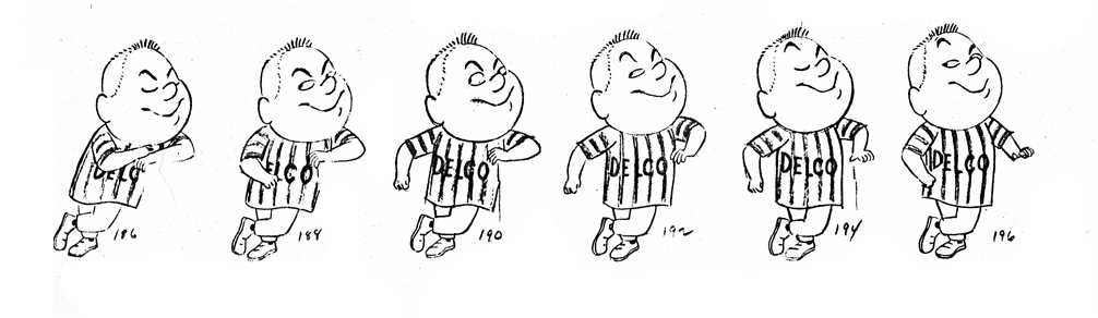
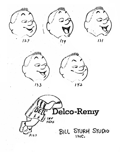
Animation &Animation Artifacts &Models 15 Jun 2009 07:27 am
Steig’s Delco
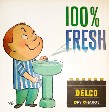
- In 1959 Delco Remy batteries featured a spokesman of a character who was everywhere, that year. William Steig designed the tough-kid for the campaign, and he did ads for all the magazines – Look, Life, Saturday Evening Post. This was an obvious offshoot of Steig’s very successful book of cartoons, Small Fry, which was originally published in 1944 but had had quite a bit of success for the cartoonist.
This was years before Steig would write and illustrate his first children’s book.
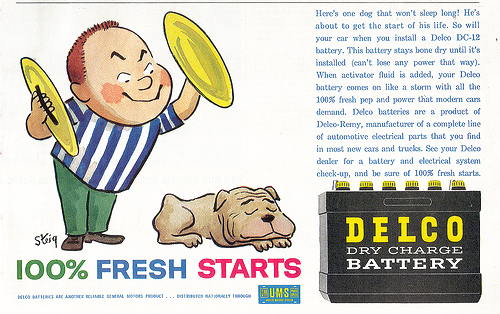
Naturally enough, there were animated ads done as well.
Here’s a model sheet made for a Delco battery spot for the Bill Sturm studio in 1959. Sturm was an ex-Fleischer animator who moved into the Fletcher-Smith studio and advertising animation in 1947. He had his onw studio as early as 1956.
This model sheet was created, as many feature models are made, by taking clippings of some completed animation. The character was by William Steig, and I’m not sure who did the animation, but Jim Logan did the assisting.
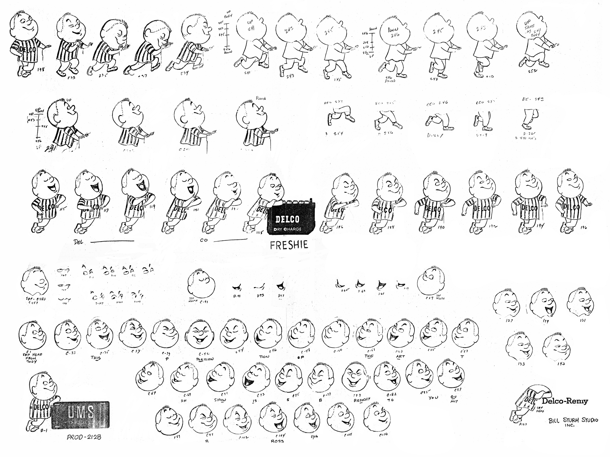
(Click any image to enlarge,)
Too large to take in all at once, let’s break the animation down to its parts:
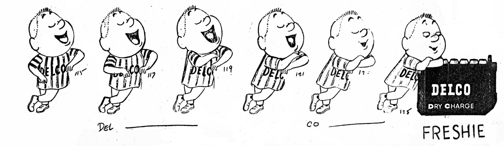
“Freshie” leans on the battery talking.
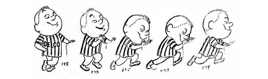
Then he starts to push the battery (which is on its own level.)
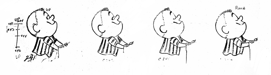
The skip is broken into levels with the upper half on one . . .
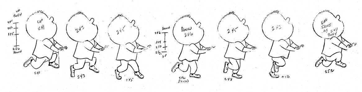
. . . and the lower half on another.
Here’s a scene of dialogue using heads only.
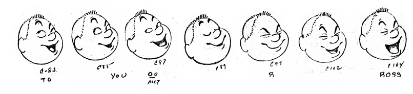
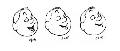
Finally here’s “Freshie”‘s tag line for the spot.
I’m not sure what this chart was used for, unless this was a series of spots, and the art from the first was what they were shooting for in subsequent spots.
Regardless, a lot of work went into this one minute spot. I’m not sure how much Steig gave them to match his models, but I would assume it was substantial (based on other spots he’d done.)
