Monthly ArchiveDecember 2008
Animation Artifacts &Articles on Animation &Bill Peckmann 11 Dec 2008 08:33 am
Ads for Ad Companies
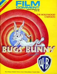 - Flipping through some old film and animation magazines, I couldn’t help but look at all the old ads for the many animation companies that were ever present and are now gone. In a way, back then, you were pleased to see the small companies that promoted themselves regularly in all the film mags.
You have to remember that animation wasn’t all present back then. It wasn’t easy to find a lot about the medium. Now you just turn on the computer, but back in the ’70s you bought a magazine and cherished the few articles. And when you found something like the Film Comment issue of 1975 (though there were no ads for animation companies in that issue), you kept the magazine close and read and reread the articles. Then you looked at all the ads for the boutique commercial companies.
The following ads all came out of three issues of Millimeter one from 1976 two from 1977.
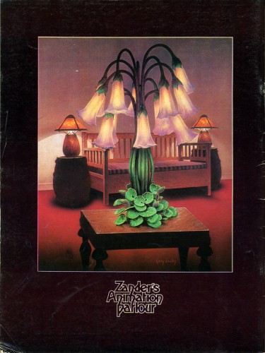
Zander’s Animation Parlour was the largest commercial company
in NY in the 70′s and their ads were the biggest and most entertaining.
They often appeared on the back cover of these magazine issues.
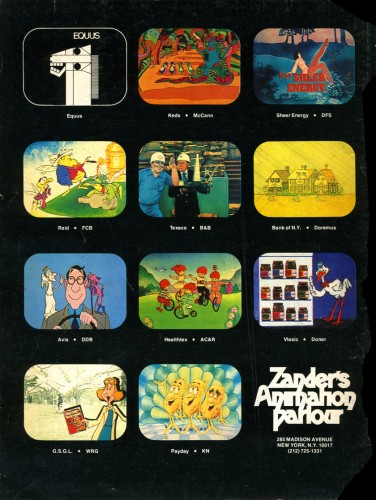
Ads changed from issue to issue, so someone in the studio
kept designing them. Jack Produced the spots with animators
Doug Crane, Dean Yeagle and Bill Railey on staff.
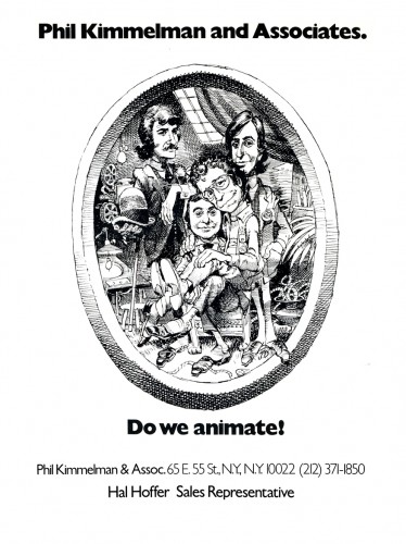
Phil Kimmelman’s studio, PK&A, was also a dominating advertiser.
Though their ads changed, as well, this one appeared often enough
to be recognizable.
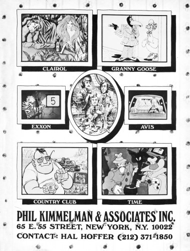
Phil Kimmelman ran the studio with Bill Peckman supervising and
doing layout. Jack Schnerk, Sal Faillace and Dante Barbetta were
regularly used animators.
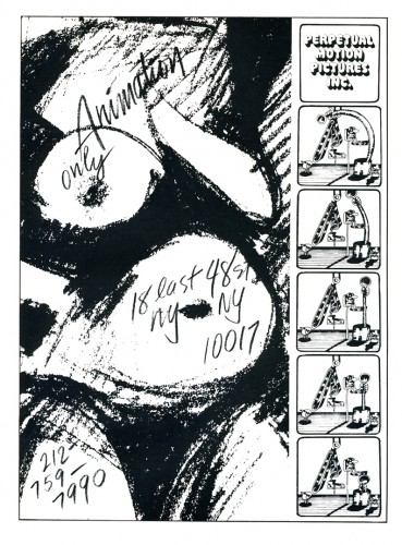
Perpetual Motion was another large studio run by Buzz Potamkin.
Their ads weren’t as obviously frequent as the other two, but
they did focus on their art.
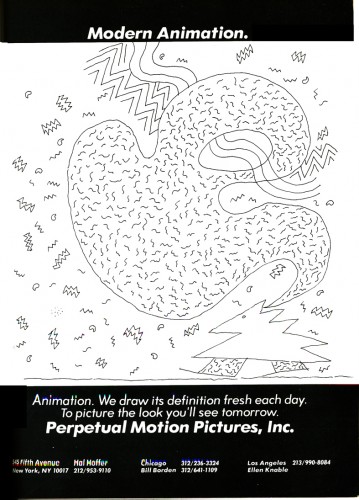
Buzz ran the studio in NY with animators Vinnie Cafarelli and Jan Svochak
on staff. Candy Kugel was the up and coming star to emerge.
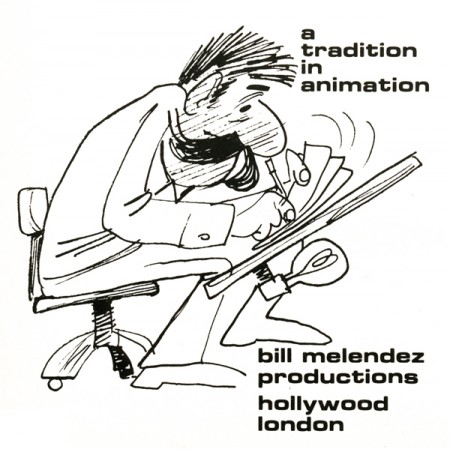
Bill Melendez, on the west coast, did the Charlie Brown shows, but
his studio also did commercials (often featuring Charlie Brown.)
Kurtz and Friends, in California, was hot.
Herb Stott’s Spungbuggy Works certainly caught my eye.
That name for a studio was genius.
Murakami Wolf, Swensen was a diverse animation studio that seemed to do everything from “The Point” to “Biker Mice From Mars” to commercials.
Mort and Millie Goldscholl ran the largest studio in Chicago, Goldscholl Ass.
Their focus seemed to be graphic animation.
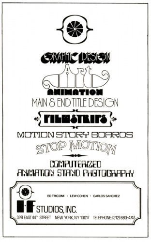
IF Studio was run by cameraman, Carlos Sanchez. They filmed animation
and produced a lot of graphic animation.
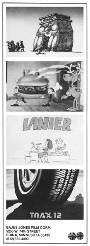
Bajus Jones was a hip studio operating out of Minneapolis. They caught a lot of attention and did excellent character animation.
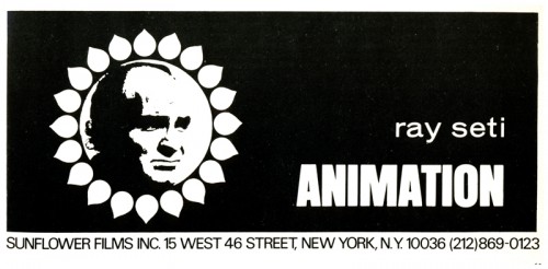
Ray Seti was an animator who opened his own one-man studio. He did a
lot of animatics for commercials and thrived for quite some time.
I have a funny story about meeting him that I’ll hold for another time.
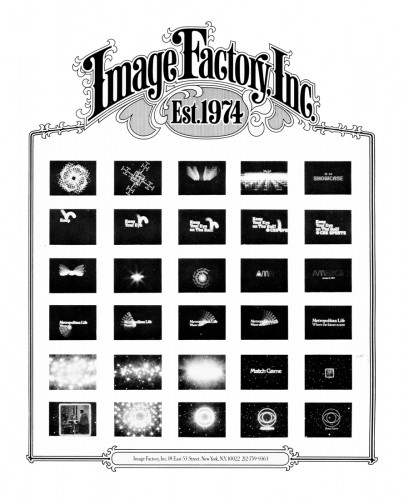
George McGuinnes and Mark Howard ran The Image Factory. They did
dynamic graphic animation. I think I did the only drawn animation for
them – which they used for a graphic spot.
Action Analysis &Animation Artifacts &Articles on Animation &Disney 10 Dec 2008 09:11 am
Tytla’s Action Analysis
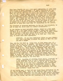
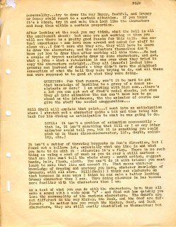
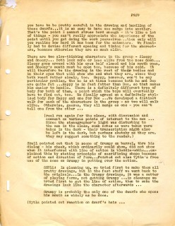
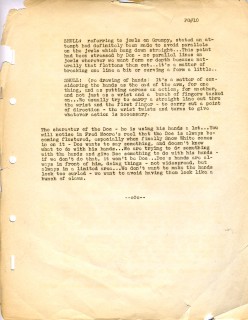
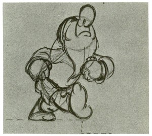
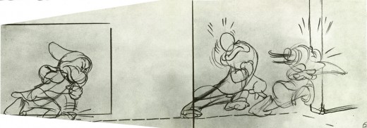
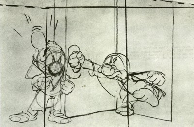
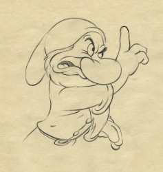 – After posting the fine drawings by Bill Tytla, and following with the “Washing sequence” board drawings it’s on appropriate to offer one of the Action Analysis classes Tytla gave at the Disney studio, after hours. This one took place on December 10th, 1936 – 72 years ago today.
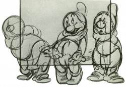
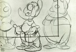
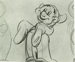
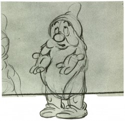
Tytla and Fred Moore were the leadaing animators of the seven dwarfs – supervising and handling seven wholly different personalities each with relatively little screen time to relay their individual traits.
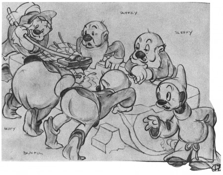
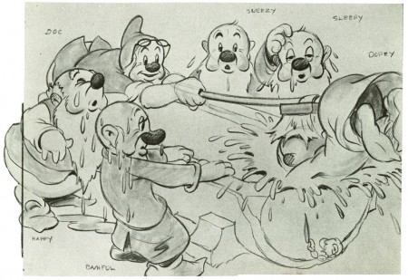
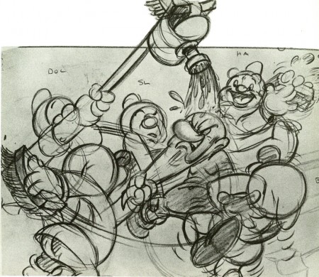
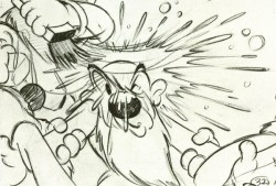
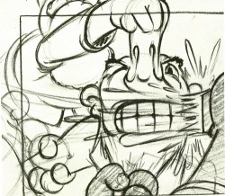
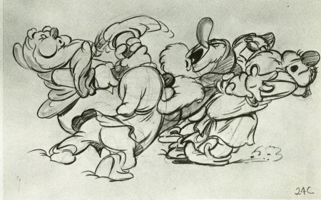
This article is chiefly concerned with the sequence of the dwarfs gathered around the wash tub cleaning themselves for dinner.
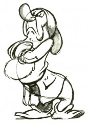
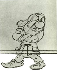
__Click image to enlarge to see full dwg._._Grumpy, of course, sits out the experience.
____________________________________They sing the washing song, “blblblbl.”
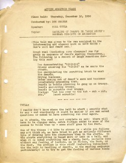 1
1 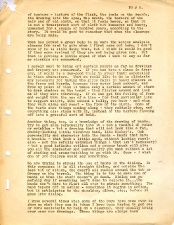 2
2(Click any image to read.)
Animation Artifacts &Books &Disney &Story & Storyboards 09 Dec 2008 09:00 am
“Blblblbl”
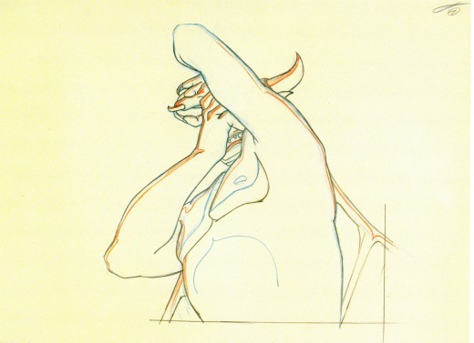
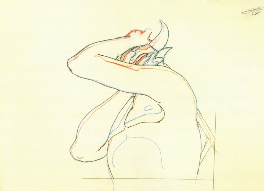
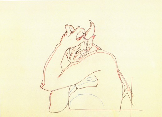
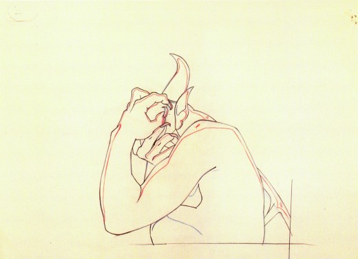
- Bill Tytla‘s animation of the devil from Night on Bald Mountain, featured yesterday, couldn’t be further away from the dwarfs he animated in Snow White. (Fred Moore was his partner in the task of supervising the dwarfs.) In this film, he had seven characters to animate, seven characters to give real characterization in somewhat short screen time. All seven had to have personalities that could be recognized within moments. It helped, of course, that they were defined by their names, but getting that across without cliché was no mean feat.
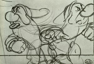
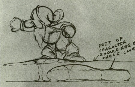
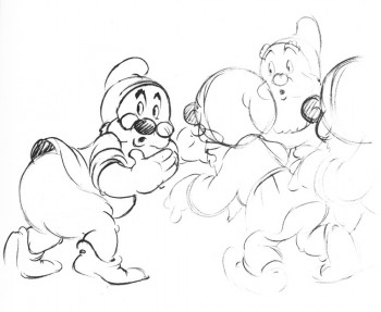
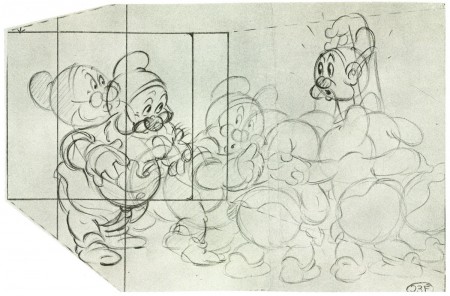
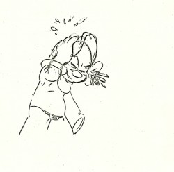
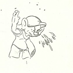
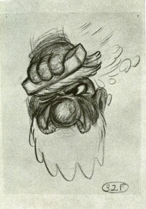
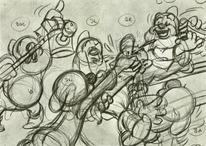
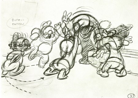
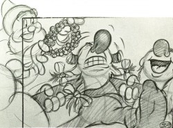
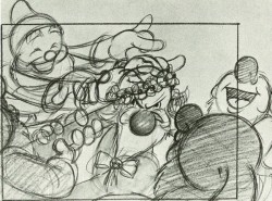
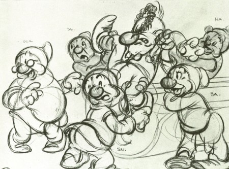
Here are some storyboard drawings, art direction sketches which would have helped lead through the washing song sequence.
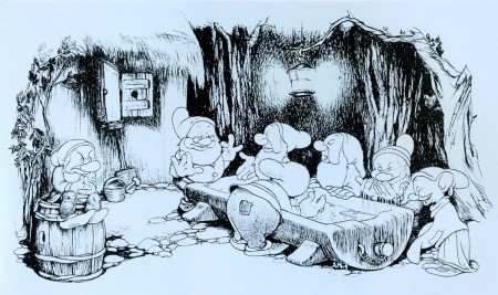
(Click any image to enlarge.)
.
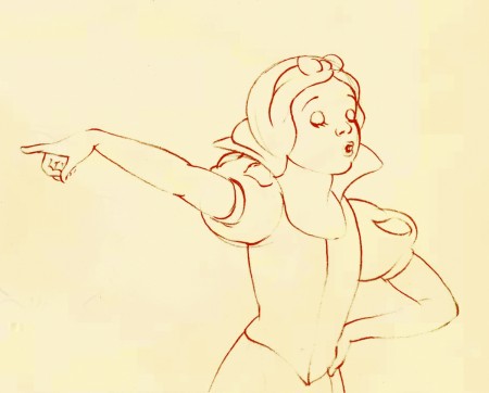
.
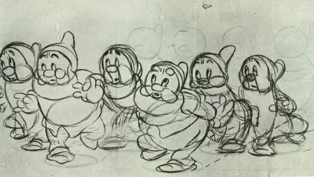
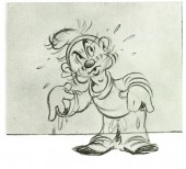
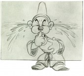
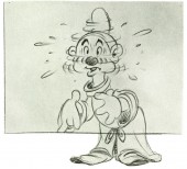
I featured Tytla’s animation for this sequence in another post – here.
A couple of drawings shown below.
.
.
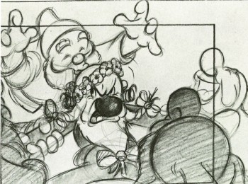
Doc kisses Grumpy. How the times have changed.
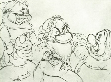
This one looks like it might be a Tytla rough.
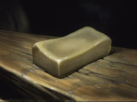
This is a bar of soap that occupies a fly.
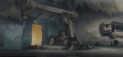
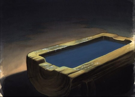
This is the exterior background where the setpiece takes place.
Daily post 08 Dec 2008 09:00 am
Devils
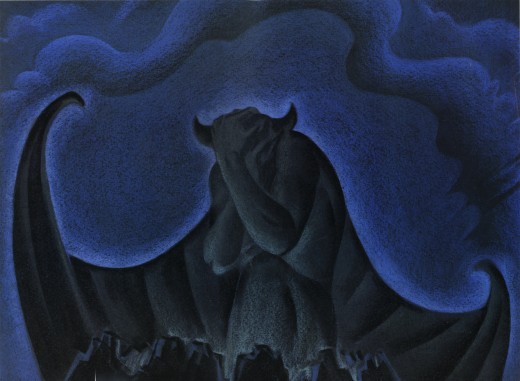
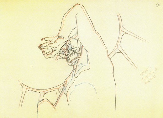
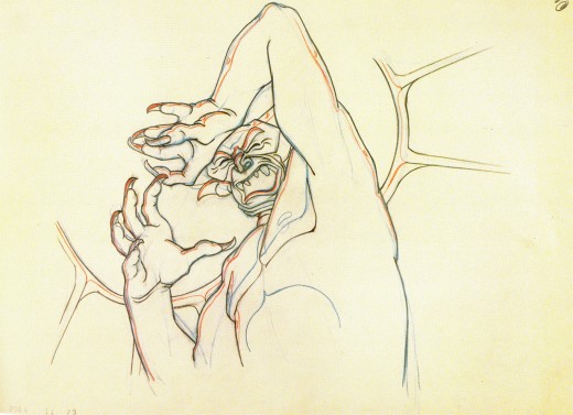
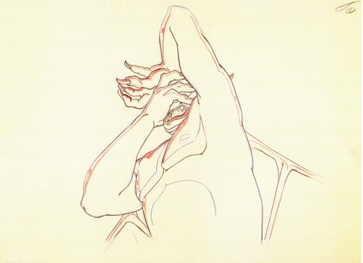
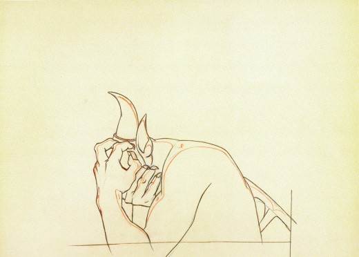
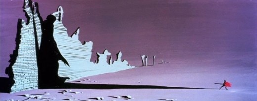
- This sequence of animation drawings by Bill Tytla is undoubtedly available elsewhere on the internet, but who cares. Thumbing through John Canemaker‘s beautiful book, Treasures of Disney Animation Art, one can’t help but be struck by these drawings, printed at their finest. Large reproductions with beautiful color (that didn’t scan as well in my scanner, but they aren’t bad) show off Tytla’s glorious work. This surely is one of the highest moments in animation’s history.
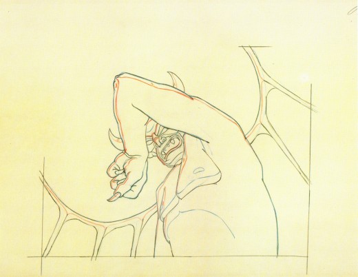
(Click to enlarge any of these drawings.)
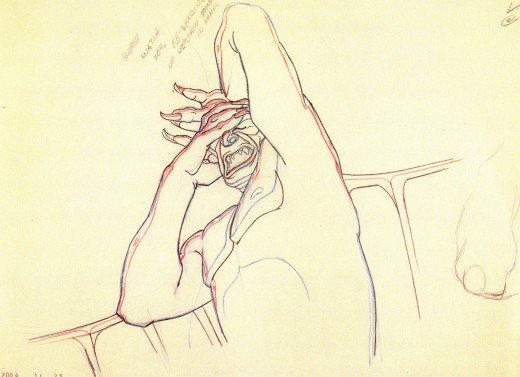
Not only are the drawings stunning, but the movement, timing and rendering couldn’t be better.
The artwork in this sequence is the highlight of Fantasia.
Animation is an art form here. The acting (without depending on a voice) is probably the best ever done in the medium – to date. The drawings, when studied, couldn’t be more beautiful. The rendering of the scene is every bit as good as the Nielsen illustrations done in design of the film.
The piece takes Modest Musorgsky’s ballet and performs an animated poem – a dance by way of Stanislavsky. It hints at the potential of the medium – a potential that was never fulfilled. I’d urge you to take these drawings one better, and look at the film again. Be inspired by Tytla and try to do as well.
Daily post 07 Dec 2008 09:43 am
Small town Xmas
 - Nothing makes New York City feel more like a small town than Christmas and some of the Christmas decorations.
Sure there’s Rockefeller Center with their 2000 ft. glossy tree, but on the other side of town things get a bit tinier and significantly more personal.
This week the City started to dress up for the holiday, and I began to take some pictures. I’m a sucker for some of this stuff. (It’s obvious, since I probably posted the very same story last year.) Of course, Madison Square Park always gets my attention; I walk through it every morning, early, on my way to the studio.
The tree stands on its little wooden box, which will probably end up hidden and surrounded by a bunch of smaller trees. They’ll all be lit with big round ornaments that look like styrofoam during the day hours, but will light up blue at night.

I like seeing Madison Square Park develop so slowly and exactly.
This is the first sign of their big tree in the “reflecting pool.”

The tree is held upright by these cables. Last year there was a violent storm.
Rain, sleet and heavy winds didn’t knock down the trees or decorations.
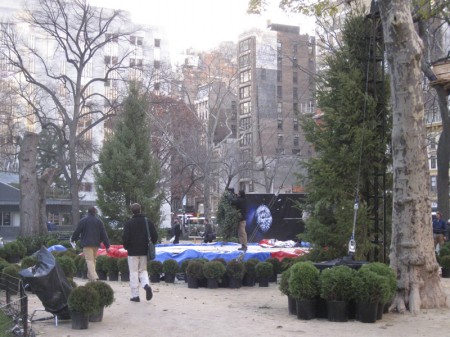
Meanwhile, on the Southern side of the park they’re setting up
more trees and some tables. I’m not sure what this will be.
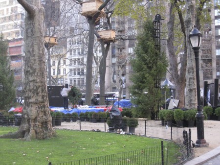
The art piece – treehouses – will look down on the new installation.

The usual tree stores have been set up outside of many of the bodegas.
A tree can be bought any time of day or night from many of these 24 hours stores.

I have to admit that I enjoy the pine scented areas
as I pass them on the way to the subway.
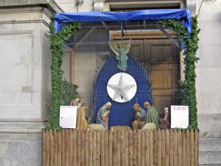
The local Portuguese church has already set up their Nativity booth.
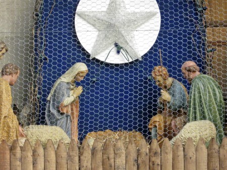
Christ will join them on Christmas Day. Something about the wire mesh and
the glass casing takes a bit of the glory away from the setup.
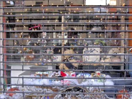
Also caged is the hay poodle wearing eyeglasses sitting in front of twinkling lights.
This is an eyeglass store, and the late night gate guard is down.
I like the home grown decorations.
Daily post 06 Dec 2008 09:53 am
Taking stock
- There were a couple of great blog posts this past week.
 Amid Amidi, on Cartoon Brew, gave us one of the blockbuster pieces of the year. He catalogued a number of Asian-Americans who worked in animation during the golden years and offered a brief bio of them as well as links to more information on all. It’s quite a serious bit of writing and I’ve saved it for my own records. I don’t think anything comparable has been done before re animation’s history.
The amount of work Amid put into this could only have been enormous, and my gratitude couldn’t be stronger. I assume most of the readers of my blog have seen that post; if not go. Here’s the link again.
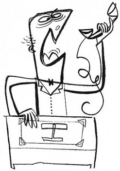
- Speaking of Amid, he’s also updated his other site, Cartoon Modern. He’s started the Cartoon Modern Tumblr where he intends to post a picture a day of art from the period. The drawing to the left, from the Tumblr is by Ed Benedict.
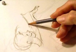 - Mark Mayerson pointed us to the upcoming celebration of Chuck Jones’ work on TCM next March. This is all centered around the new documentary Chuck Jones Memories of Childhood, directed by Peggy Stern. The film records a conversation with Chuck Jones as he reminisces about his childhood in 1920′s Los Angeles. The half-hour program blends family photos, clips from classic Jones shorts and original animated sequences directed by John Canemaker, drawn from drawings Jones made during the interview filmed in 1998.
Some of the Jones shorts to be screened include: Prest-O, Change-O (1939), Sniffles and the Bookworm (1939), Elmer’s Candid Camera (1940), Duck Amuck (1953), One Froggy Evening (1966), What’s Opera Doc (1954), and The Dot and the Line (1965). Mark gives the complete schedule.
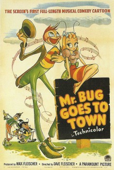 – Over the Christmas holidays the Film Forum will be screening a beautiful 35mm print of Fleischer’s second feature, Hoppity Goes To Town.
This remarkable film opened Dec 4th, 1941. Pearl Harbor occurred three days later, and the fate of the feature’s financial success was settled. Paramount closed the studio and fired the Fleischer brothers.
Dec. 24th through Jan. 1st you can see the film paired with “Betty Boop’s Rise to Fame,” a 1934 short starring Betty and Max Fleischer.
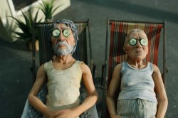 Tatia Rosenthal‘s feature, $9.99, is about to make its debut in LA with an Oscar qualifying run at the Laemmle Theater. The film is a stop-motion feature done in Australia. It stars the voices of Oscar-winner Geoffrey Rush (“Shine”) and Golden Globe winner Anthony LaPaglia.
You can watch the trailer here.
The film’s website can be found here.
If you live in LA, make the effort. Support the film, check it out.
- There’s a newish blog in town (meaning NYC) that’s worth the visit. It’s an addition to the ASIFA-East website. Called The Exposure Sheet (do studios other than mine still use these things?) it reports on business and events involving NY members of ASIFA.
The most current of these articles is the big lay-off of workers at Nickelodeon and the shutting of the doors of this last big network studio in NY.Linda Beck writes an informative piece about the actual events occurring here, and for a reality check it’s worth the read.
The article listed above has been removed from the blog. There’s no given reason. Perhaps Linda felt she’d misstated something. Perhaps someone will post something more.
- Finally a big congratulations to Nina Paley. Her film, Sita Sings the Blues, won the Gotham Independent Film Award. Theater Near You category. It took home the $15,000 prize from Artists Public Domain and D.R. Reiff & Associates.
Nina’s also been been nominated as “Someone to Watch” for this year’s 24th Independent Spirit Awards. That’s a brilliant coup for Nina. I believe this is the first time an animated film has been nominated for a ‘Spirit” in any category, and if there’s any justice in the world she’ll win. I’ll be watching on Feb. 21st with fingers crossed.
Animation Artifacts &Disney 05 Dec 2008 09:21 am
Dec. 5th 2008
- Another marked day. Today, of course, is Walt’s birthday. As a result, I’m posting one of my favorite, treasured drawings. It’s an Ub Iwerks drawing from Plane Crazy. I know it’s Ub’s drawing since he drew every frame of that film – chained to his desk in a locked room, so that no one would know what was going on. I bought the drawing during Raggedy Ann. Animator – soon to become special effects wizard, John Bruno offered to sell it to me when he learned how interested I was. I jumped, I love it.
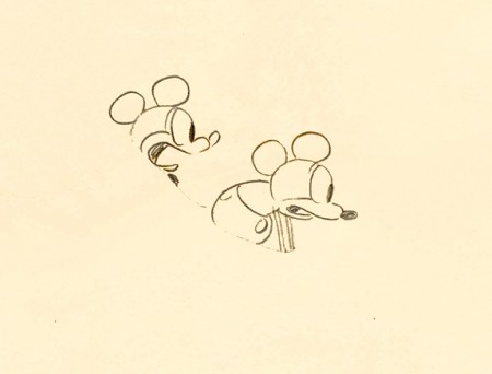
(Click image to see the full drawing.)
Wouldn’t it be nice if, somehow, the Disney company actually commented on their founder’s anniversary? Won’t happen.
- It’s also the anniversary of this blog. We’re into our third year. It feels like five. This blog has become part of my life, and I enjoy it. It’s borne me above and through some low animation points in those past coupla years. A voice allowed me to get it out of my system.
- Today’s also the date the judge promised to sentence OJ Simpson. I suppose we’ll be hearing about that later today. A diversion, just in time for the weekend.
Articles on Animation 04 Dec 2008 08:48 am
Kurtz & Stott
- Last Saturday I featured a “Close Up” article from Millimeter Magazine circa 1976 which showcased two NY producers. To be fair, I’d like to post these two portraits of LA producers also featured in Millimeter.
BOB KURTZ
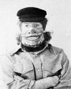 Bob Kurtz, of L.A.’s Kurtz and Friends, is clearly one of the brightest stars in the animation firmament. Bob, a slim, beared fellow with an elfish face and flashing eyes, operates out of 18 compact rooms housed in two charming bungalows enclosed in a small, idyllic courtyard just seconds from the noise and commotion of Hollywood Boulevard. 1728 Whitley Court used to be a private residence, but Bob and his “Friends” have put the bungalows to excellent use: the shelves of the large kitchen cupboard are stocked with jars of cartoon color paint; the living room is now a most handsome reception area and the second-floor master bedroom has been magically transformed into a cozy, intimate projection/screening space.
It is here that Bob shows us his sample reel. “The sample reel is what enables—or denies—the animator the opportunity to get work; it’s his resume and must be continually updated and kept current.” Bob’s fertile imagination and liquid creativity are showcased vividly in spots for Levi Strauss, Chevron, Seven-Up, Log Cabin and Sunbeam. (The latter spot won a Clio in 1972 and was shown at the Los Angeles County Museum of Art as part of an “Art in Advertising” exhibition).
Bob’s art school background and his year as a trainee writer/director at the Walt Disney Studios are distinctly evident in the accomplished agility and precision of his work. A graduate of Los Angeles’ celebrated Chouinard Art Institute (now, sadly, defunct, but once considered – the “Cooper Union of the West”), Bob, in his sparkling, inventive brush strokes and consummate pencil drawing, displays the results of his long years of intense, dedicated art studies. After his stint with Disney, he returned to teach at his alma mater for two years before striking out on his own. He is still, however, very much involved with education: every year he hires a recent art school graduate for on-the-job training and “pencil testing,” as he jokingly calls it, at Kurtz and Friends.
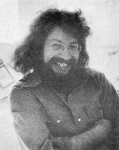 Bob and his wife, Glenna, (who is also his producer) feel very strongly that new blood and fresh ideas should be continually channeled into the company to keep the output brisk and vigorous. Also, they want to try to eliminate as many bureaucratic roadblocks and union restrictions as possible in order to provide an opportunity for young people to get started in the animation business. “I’m trying to create the kind of atmosphere for these kids that I know I would have wanted and needed when I was first starting out.”
Of course that means that the young trainees must be willing to work the same kind of endless, grueling hours that are regularly put in by Bob, Glenna, Bob Peluce (Kurtz and Friends’ designer) and the other eleven staff members. “What I’m really offering these trainees,” Bob explains with a mischievious grin, “is the chance to work their asses off . . . but, you know, that’s the best kind of training they can get.”
Kurtz and Friends has always worked exclusively in animation—does Bob foresee the possibility of any live-action shooting in the near future? “No, I really don’t think so,” he answers without hesitation. “In live-action there is just too much that is uncontrollable and time-wasting. Things like negotiating to get the talent, trying to make an animal “act,” ego trips by people involved—all of that can distract you from your real work: telling a short but memorable story. Animation, compared to live-action, is pure and clean. After all, in animation you’re only limited by your imagination.”
After a couple of hours with Bob at Kurtz and Friends we can assure you that ole Mr. Imagination is alive and kickin’ at 1728 Whitley Court, in the heart of Hollywood.
HERB STOTT
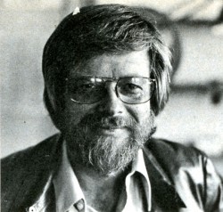 The offices of Herb Stott’s Spungbug-gy Works are located at perhaps the most glamorous spot in all Los Angeles, the corner of Sunset Boulevard and La Cienega, not more than a stone’s throw from Dino’s Lodge, for all you 77 Sunset Strip devotees and just a hop, skip and a jump from The Source, L.A.’s best organic restaurant, for all you health food nuts. Herb is a bearded, sandy-haired fellow of 42 who looks more like a trim, fit 32. He began his career at Disney Studios in the early Fifties; after a stint in the service he did some L.A. free-lancing before forming Spungbuggy in 1963. For the first ten years it was all animation for the company but within the last three years Herb has branched out into live-action. Now it’s 50-50: the Spungbuggy staff does animation under the capable leadership of Animation Directors Gary Katona and Randy Akers and Herb himself shoots the live-action spots. Despite this Herb still considers animation his metier and first love. He remembers his early, formative years at Disney with great affection: “Working there was like going to a small, rural liberal arts college. (Herb himself attended Ohio State.) There was a sports league comprised of members of the various departments that competed against each other in volleyball, tennis and softball. The employees used to have their lunch all together on the studio lawn, like one big picnic, executives and third assistant editors. There was this amazing camaraderie. Lots of genuine affection and respect, especially for Walt himself. Do you know that the studio has kept Walt’s office exactly as it was the day he died?”
While free-lancing Herb also put in time at Hanna-Barbera when they were in their infancy as animators. He loved it there—”Animators are a different breed, they’re far more affable, accessible and sincere than their counterparts in live-action. Perhaps it’s because we’re filled with an awful lot of whimsy. It might also be because ours is a one-on-one business, an animator really depends upon himself and his own imagination. Also there are no star trips or ego problems; animators create their own stars.”
Art school graduates are constantly coming to Spungbuggy seeking jobs, even if it’s only as a “gofer.” “Maybe one out of twenty-five has something special,” Herb reports. “If it’s something truly special I’ll find a spot for them, if not here than hopefully with another animator.” Herb stays in constant touch with his fellow L.A.-based animators and is, in fact, a close friend of Bob Kurtz, who was the subject of a February ’76 Close-Up. Herb is quick to praise and give credit to other practitioners of the art of animation; there seems to be none of the professional jealousy or rabid backbiting that is so commonly found among major Madison Avenue agencies. Perhaps it’s due to all that “whimsy” that Herb was talking about…
In looking at Herb’s reel one soon realizes that Spungbuggy’s client list reads like a veritable Who’s Who of television commercials. Among the clients represented are Levi-Strauss, Clairol, Raid, Nestle’s, Kellog’s, Mr. Clean and a series of spots for American Cyanimid of which Herb is particularly proud. Among our own personal favorites were a wickedly clever Tootsie Roll spot where a child’s tongue has an argument with his teeth about who gets first taste of the chocolate center, is it better to suck or chew?? And a wildly imaginative Illinois Bell spot extolling the virtues of touch-tone telephoning. This spot, not surprisingly, picked up a Clio in 1972. Perhaps the most visually impressive spot is for United Airlines: an outlandishly animated map of the U.S. complete with geographic landmark caricatures for each distinct section of the country. (Example: Marina Towers in Chicago doing a spirited version of a kind of “skyscraper Hustle.”) It is a vivacious and memorable one minute look at this diverse land of ours; yet it still succeeds most admirably in getting across United’s “friendly skies” message.
Herb’s future plans for Spungbuggy? “Nothing grandiose—I just want to continue the way we’re going. I look forward to another strong, successful year. I’m just grateful that we’re able to stay alive and healthy in such a competitive field.”
Spungbuggy is, indeed, alive and well and thriving in L.A.. Just stop by the corner of Sunset and La Cienega and see for yourself.
The Bob Kurtz article came from Millimeter Magazine, Feb/1976
The Herb Stott article came from Millimeter Magazine, Feb/1977
Commentary 03 Dec 2008 09:23 am
SB Pro & Con
- The new dvd of Sleeping Beauty has prompted a number of opinion writings on the blogs. Many of them are thoughtful, but they’re full of the usual ranting comments added on.
- The most articulate of the cons is certainly Mark Mayerson ‘s “Sleeping Beauty Puts Me To Sleep.”
The positive piece “Once Upon A Dream” appears on Brian Sibley‘s excellent blog.
As for me I understand both viewpoints, but I am an enormous fan of Eyvind Earle’s work and having seen this film many many times I have grown attached it. I love the subdued nature of it all, the use of the Technirama camera, the stunningly attractive design, and some brilliant animation. It has a majesty and a formality to it that is unique unto itself. I frequently compare the film to opera whereas most of the others are musicals.
I once posted a piece (see it here) by Marc Davis wherein he compared animating Cruella deVil vs Malificent. He said Malificent was always giving speeches whereas Cruella was conversing with others. Two very different moods. That also, in a nutshell, describes the two films. 101 Dalmatians is chatty while Sleeping Beauty is presentational. Opera vs musical theater.
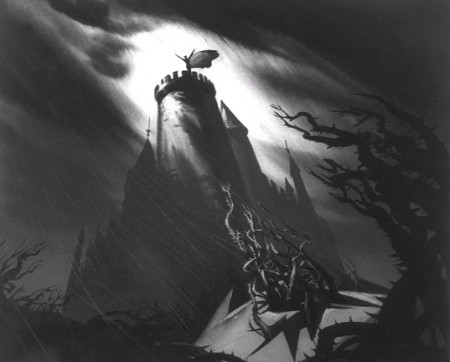 The film was born into struggle. The animation industry was challenged by a new modernity. The art was moving away from the 19th century graphics and into the 20th century. UPA wrought Toot Whistle Plunk & Boom which led to this film. Oddly enough, Sleeping Beauty aimed its art at the 15th century style of illustration; at least that was Eyvind Earle’s aim in designing the backgrounds. Tom Oreb’s character design was angled to try to work with the backgrounds almost as an amalgam between 15th & 20th centuries. For me, it works very well; others seem bothered by it.
I suspect that the general love of this film’s style has strongly influenced modern animation. Pocahontas, it seems, took it’s backgrounds directly from Earle’s work.
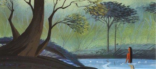
Pocahontas concept art by Michael Giaimo from the book “The Art of Pocahontas.”
The angled squirrels, owls and other forest animals, appeared in many other Disney features & shorts. Those characters were perfect designs to build on, and, what I call the CalArts style, seems to have grown out of that. Angles not circles. Flash was ideal for angles; so was this design. And so it goes. (Or, at least, that’s how it feels to me.)
- Speaking of Brian Sibley‘s blog, he has a fine piece on Eyvind Earle on his blog. His is a regular and enjoyable stop in my weekly internet reading.
Articles on Animation &Rowland B. Wilson 02 Dec 2008 09:10 am
Rowland Wilson
- Rowland Wilson was one of those artists/cartoonists who was loved by everyone.
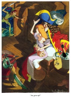
Long before I saw his connection to animation, I knew his amazing cartoons in Playboy. They were full page color images that were gorgeous to look at, and it was irrelevant whether they were funny or not. They were beautiful.
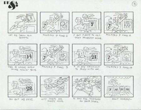
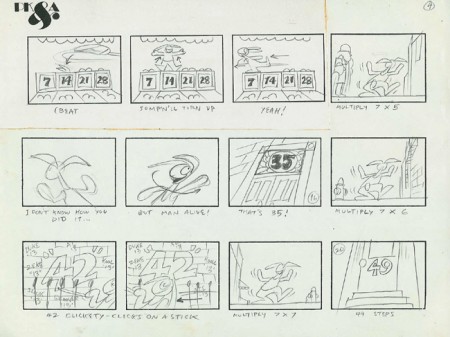
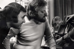 I met him only once on the School House Rock pieces he designed for Phil Kimmelman‘s PK&A back in 1973. I was an Asst. Animator there working on the spots that were animated by Jack Schnerk, Sal Faillace or Dante Barbetta. My meeting was little more than a hello.
I knew Rowland’s daughter, Amanda, who worked on Raggedy Ann, opaquing. We kept in touch for a short while after the film’s
_..__ Phil Kimmelman and Rowland Wilson__________completion. She continued in the NY
__________________________.__________________animation community for a while, until work dried up. Unfortunately, I’ve lost track of her.
Of course, it would have been Richard Williams that put him to work seriously in animation. Together they created the stunning ads for Count Pushkin Vodka. This was the
high water mark of his and Williams’
ad films. I think this ad campaign was one of the high water marks for advertising, in general. The Wilson and Williams’ work is extraordinary.
He did design work on The Cobbler and the Thief after which he worked with Bluth for a short while in Ireland on Thumbelina and A Troll in Central Park. For Disney he did “Visual Development” and “Character Design” on The Little Mermaid, Treasure Planet, The Hunchback of Notre Dame, Hercules, Atlantis and Tarzan.
 Creative Talent Network has a nice page up for him here. They also offer an extensive resume here.
Mark Kennedy offers a number of Wilson’s handouts on color, light and shadow and composition.
AWN had a fine memorial piece to Wilson written by John Culhane. here
I’d like to post here some of Myrna Oliver‘s obit from the LA Times 7/11/05:
- Born Aug. 3, 1930, in Dallas, Rowland Bragg Wilson grew up drawing Disney characters at the kitchen table. He received a bachelor’s of fine arts from the University of Texas at Austin and then moved to New York City for graduate work at Columbia University.
To support himself, he began creating gag cartoons for the Saturday Evening Post, Collier’s, Look and True magazines. He was drafted into the Army, serving from 1954 to 1956, where he used his artistic talents to draw classified charts.
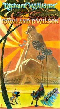
In 1957, Wilson joined the Young & Rubicam Inc. _____a poster done for Dick Williams
advertising agency where he spent seven years as
an art director, doing conceptual drawings for print ads.
At the same time he stepped up his freelancing of cartoons to magazines and became a regular with Esquire in 1958. In the late ’50s and early ’60s he also had cartoons published in the New Yorker.
 He established himself as a freelance advertising artist in 1964 but never gave up cartooning, which he described as “picture writing.†Forced by his lucrative advertising contracts to limit cartoon work to a single magazine, he focused on Playboy after Esquire abandoned its full-page cartoons.
In 1967, he also drew “Noon,†a short-lived comic strip for the New York News-Chicago Tribune Syndicate (Tribune Corp. now owns the Los Angeles Times).
As Wilson once described the strip, “The name of the main character was Noon Ringle, an unemployed cowboy in a dying small Texas town in sort of modern times.â€
Wilson illustrated two children’s books in the early ’70s, “Tubby and the Lantern†and “Tubby and the Poo-Bah.â€
It was advertising that moved him into ________a Rowland Wilson cartoon for Playboy
animation, and from 1973 to 1975 he worked in
London as a designer for the primarily commercial animation studio of Richard Williams. On his return to New York, he joined Phil Kimmelman and Associates, which concentrated mainly on advertising work.
In his cartoons, advertisements, designs for animated characters and illustrations, Wilson was known for three-dimensional drawings filled with historical detail.
“Ideas are easy to come by,†he often said, according to his daughter. “It is the drawing that takes a long time.â€
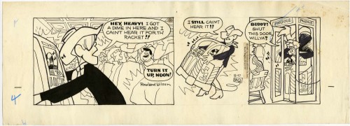
A sample of the strip “Noon”
As an animator, Wilson won a daytime Emmy Award in 1980 for his work on ABC’s “HELP! Dr. Henry’s Emergency Lessons for People†and worked on educational animation, including the television series “Schoolhouse Rock.â€
In 1975, Wilson won awards at the Venice and Irish Animation festivals, and his animated commercial film “The Trans-Siberian Express†won first prize at the third International Animation Festival in New York. He also won a Clio.
He worked for Walt Disney Feature Animation as a visual developer and served as a layout designer for “The Little Mermaid†in 1989. He also contributed to “The Hunchback of Notre Dame†and “Tarzan†among others.
But Wilson’s greatest legacy may be on the printed page. His cartoons, widely published in magazines, were reprised in several anthologies, beginning with “Don’t Fire Until You See the Whites of Their Eyes,†a collection of his Esquire work published in 1963. He earned Playboy’s Cartoonist of the Year award in 1982 and his work was included in the 2004 anthology “Playboy – 50 Years: The Cartoons.â€
For all Wilson’s love of animation, “It was sketches for a new Playboy cartoon that were on his drawing board when he died,†said his daughter Megan Wilson.
Wilson also worked extensively in advertising and was particularly lauded for his 40 or so humorous works for New England Mutual Life Insurance Co. Each cartoon-type ad depicted a person in dire straits – such as an executive with his back to a high-rise office window as a wrecking ball swings toward him, proclaiming, “My life insurance company? New England Life, of course. Why?â€
Wilson’s first marriage to Elaine Libman ended in divorce. He is survived by his second wife, artist Suzanne Lemieux Wilson; four daughters, who are all commercial artists, Amanda Wilson of Piermont, N.Y., Reed Wilson of London, Kendra Wilson of Leicestershire, England, and Megan of New York City; and three grandchildren.
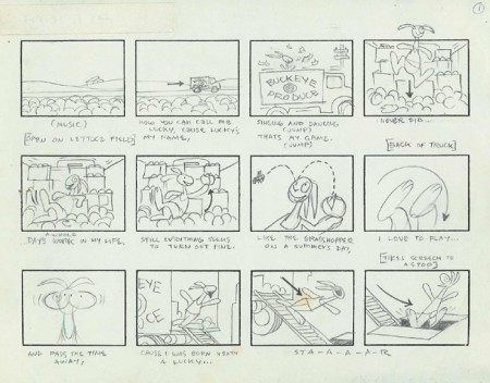
The storyboard by Rowland Wilson for “Lucky 7″ Schoolhouse Rock.
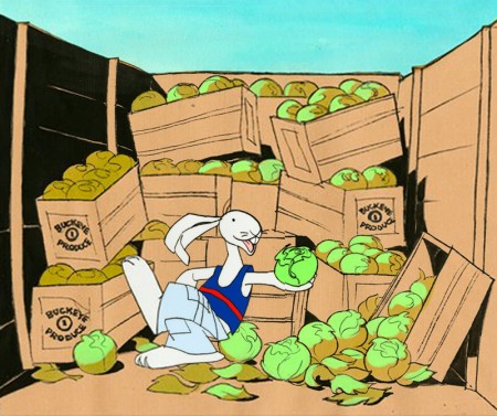
Art available on Amazon from Creative Talent Network.
.
