Monthly ArchiveDecember 2008
Photos 21 Dec 2008 08:54 am
Weather
- The last week has been a deluge of weather. All kinds – wet, sun, more wet, snow, more wet, ice and cold sun. I started taking random photos last week in all this weather, and found some pleasant (not professional) results. For want of better, here are some of the stills.

Visiting my mother, last Sunday, waiting for a train in the cold rain, I occupied myself with photographing the glimmer.

I like the colors that came through. It just looked dark
when I was shooting it.
I saw the film, Defiance, and met director, Ed Zwick, at a screening room
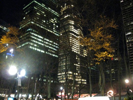
across the street from Bryant Park. While waiting to go in, I shot the top of the park.
Because of the activities in the park, it felt like Christmas – in the rain.

This was followed by a dinner in Rockefeller Center, across from the tree,
which felt more glamorous than captured, here.
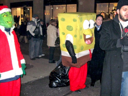
In Rockefeller Center, Spongebob, the Grinch and Santa posed with tourists.
(Heidi grabbed a hug and I shot it before the guy came over to ask for a donation.)

The diamond district, 49th Street, was lit with images of diamonds (quel
appropriate.) I guess the hassid’s of this area want to feel included.

The Chrysler Building in the snow (you can’t see the snow.)

The Empire State Building in the snow.

This motorcycle could have used a tarpaulin over it.

Of course, I couldn’t pass up the Madison Square Park tree
in the ice and rain after the light snowfall.

Then there’s the crèches of St. Anthony’s church.
Jesus will join them on Christmas.

Heavy snow was falling outside the manger.

The snow made it hard to find a decent focus from the other side of the street.

Finally, here’s an agglomeration of trees shot yesterday in Union Square
on a little traffic triangle which was set across from the market of Christmas craft shops.
The trees are covered with the last bit of snow prior to today’s storm.
Bill Peckmann &Daily post &Rowland B. Wilson 20 Dec 2008 09:14 am
Rowland Response
- My piece, posted Dec. 6th, on Rowland Wilson brought a couple of responses via email.
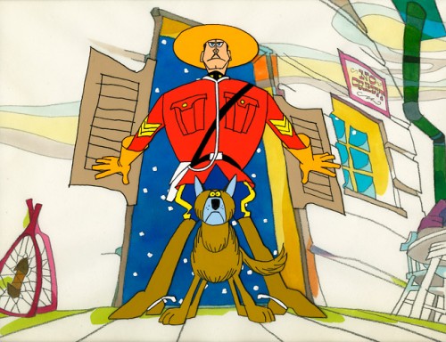
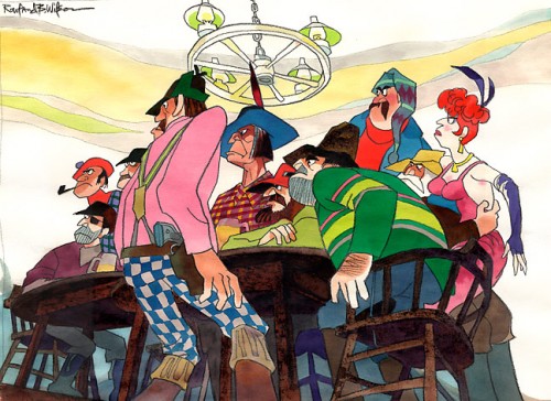
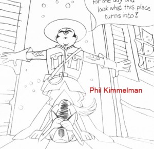
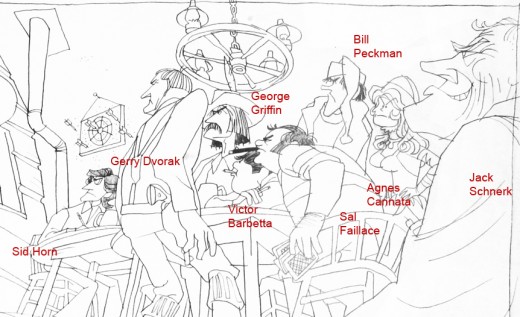
Thanks to George Griffin, I was able to post a caricature of the staff of the commercial studio, Focus, done by Bill Peckman, in the style of Rowland Wilson. To remind you, let me post that drawing again here.
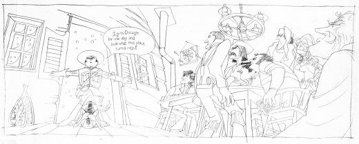
(Click any image to enlarge.)
This prompted Rowland’s wife, Suzanne Wilson to send me this message in a note:
- Enjoyed the Focus on Focus soooooo much!
Thought I would pass along the two Rowland B. Wilson originals that Bill Peckman’s caricature was based on. (Love the “No Credit” sign in the Malamute Saloon!)
It’s great seeing how Bill adapted Rowland’s work, and I thank Suzanne enormously for sharing the artwork.
Then I heard from Borge Ring, who wrote a lengthy comment that was just great to read:
- I knew Rowland Wilson well during the 1970s. We both worked at Dick Will1am’s delightful London studio, often at the same commercials. Rowland was very good company, and his interest in the craft had as many antennas in the air as your blog which is my number one art gallery.
Rowland had fallen in love with animation and joined Dick’s studio to follow Art Babbitt’s lectures. He was intensely busy because next to his work for the studio, he drew well paid advertising cartoons – complicated ones – for a NY ad agency. He always came in early and he worked Sundays but rarely at night. “He said: “That which takes you three hours to get right in the night, you can do in twenty minutes in the morning”
Blake Edwards ordered a 5-minute title for his coming Pink Panther film. It got built “straight ahead” as it were, like at a story conference by a threesome: Dick, Rowland and Ken Harris. So Rowland based upstairs under the roof did a lot of stairs-running in the little old building carrying papers with ever changing concepts. Meanwhile Ken animated the Panther doing a tap dance with straw hat and cane, He confided that: ” If the body movements are right, it does not matter what the feet are doing, as long as they do a lot.” And Dick invented – among other things -how to do Black and White neonsigns for the occasion.
His business partner appreciated the creative euphoria but looked worried because: “Dick is going to spend all the money polishing the animation.”
Rowland designed the famous VODKA commercial, you mentioned, on large celluloids using the broad side of his crayons. He also animated one of the scenes with a locomotive stoker in silhouette throwing a shovelfull of coals into the furnace. His draftsmanship made the short scene look like a piece of live action.
Rowland was helpful to everyone. I once saw him showing a young artist the difference between drawing Disney style figures and “New Yorker style” cartoons. “On the one you whittle away until you get it right. The other one must be there at first stroke, If it isn’t right you don’t whittle. You do a new one”.
“Borg,” he announced, sliding the door to my cubicle. ” The client wants another broooad in thaare” meaning that there would now be four housewives instead of three in the scene. Rowland was a Texan and it was fun to hear this gentle person sound like Hopalong Cassidy.
Rowland cherished the company of Grim Natwick. “He certainly does”, said Dick. “Because he and Grim can talk for hours about …ART. Grim is good, but he is full of bullshit.”
Dick pretended to be allergic to “intellectualism”. He and Art Babbitt shared an office. “Don’t worry … Art is on a culture kick,” he said with a grin. “He has been talking to me for months about a man he calls Moliere; and he hasn’t found out that I don’t know who that is”.
Putting Moliere’s comedies on film was an early dream with UPA when they started.
I think that Rowland’s stint at Dick’s studio was a high point in his career, and his girlfriend Skeesik informed us that, “Life is an acquired taste.”
ps
Rowland and I were having Timsum in Chinatown, and I said: ‘All you guys who draw cartoons in Playboy and the New Yorker. I suspect that your innnermost desire is to draw and paint with light and shadow like they did during the Italian Renaissance. You cannot sell Madonnas and Jesuses, so you opt for illustrating intelligent jokes in elite publications”
He stopped eating and gazed at me.
“Can YOU see THAT?
“Well. a blind chicken finds a grain once in awhile, my dear Watson.” I said trying to hide my own surprise at having scored.
yukyuk
Articles on Animation &Hubley &UPA 19 Dec 2008 09:07 am
Retreads – Rooty Toot Toot
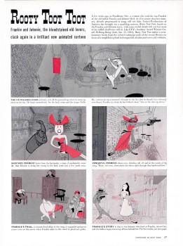
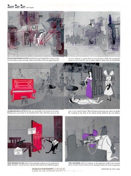
(Click any image to enlarge to a readable size.)
- In 2006 I posted this LIFE Magazine story on Rooty Toot Toot from a March, 1952 issue. They obviously enjoyed the UPA films back then, and luckily for us they posted it on something concrete – like paper.
My reason for posting it, originally, was a UPA celebration that was being screened at the Egyptian Theater in Hollywood. That’s long past, now, but Rooty Toot Toot lives on. I think of this as one of THE greatest animated films of all time. I doubt a month goes by without my watching it anew for inspiration.
The story goes that Stephen Bosustow was furious with John Hubley for taking so long on the storyboard and development of this short. Hubley eventually locked himself in his office and finished the prep to his own satisfaction. That’s how they finished the film. Needless to say, it went over budget.
The 1951 film obviously had world wide resonance. The story of a murder as told from different perspectives took the idea from the 1950 Kurosawa film Rashomon, wherein several people around a campfire tell different versions of a story. Of course, the premise dates all the way back to Chaucer, but there weren’t many film makers doing it at the time. Interestingly enough, Rooty Toot Toot was nominated for an Oscar the same year that Rashomon won a special award for Best Foreign Language film.
After seeing the short for the first time at a special UPA program in 1974, when I was working for the Hubley Studio, I told John that I’d just seen it and was blown away. He gave a short smile, turned and walked out of the room. He obviously didn’t want to talk about it. I guess the thorny years of the McCarthy era forced him to deny his own work of genius from a hellish period.
Just prior to the Egyptian screening, Amid Amidi posted some UPA crew photos on the Cartoon Modern site.
Amid has also posted some great art from the film on that same Cartoon Modern site.
part 1 part 2 part 3 part 4
Articles on Animation 18 Dec 2008 09:07 am
Spots – 1976
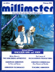 - Back in 1976 John Canemaker asked if I was interested in writing a piece on commercial studios for Millimeter Magazine. I was interested and took the job (while at the same time working at the Raggedy Ann studio.)
I found that commercial production was on a downswing and theatrical production up, keeping a lot of the smaller studios operating. That became my thesis for the piece, and I got in trouble for speaking my mind. One producer I praised said I was on his “s##t list” and I didn’t have to bother applying at his studio for a job. Since I had never sought work in his company, I found the thought amusing but was still confused that he’d found my article bothersome.
Looking back on the article now, I see that it was much ado about nothing; the article is and was harmless. However, it does give an overview of the commercial world – particularly in New York. Hence, I thought I’d entertain myself by posting it.
 As much as 20 years ago, the animated commercial was fast becoming a viable art form. Bert and Harry Piels and Marky Maypo had already entered our lives via the television spot, and audiences waited through many an hour of mediocre TV presentations to be entertained by such characters in their one-minute commercial messages.
Commercial studios competed with one another to produce higher quality productions and more popular and entertaining films. The studios were major ones employing up to 75 people to produce their work. UPA, Academy, Storyboard, Pelican, and Elektra all existed with creativity and design strongly apparent in their storyboards and continuing right through to their finished product.
There was much experimentation in design and approach. The public readily accepted the new styles which they rarely saw or sought in theatres. (Even the trend setting UFA films of the early 50′s didn’t really receive audience acceptance till the arrival of these commercials.) The workers and producers alike took pride in their commercial product, and the results showed in the finished films.
Needless to say, many things have happened in the past 20 years. TV animation took a turn for the worse. Saturday morning, which had been filled with Mighty Mouse, Winky Dink, and Ruff and Ready filtered into a heyday for revitalized prehistoric monsters sliding across the screen with a superhero or two or seven talking for endless hours. Mind you, nothing moved but the sliding monsters and their mouths, but the networks bought it.
The animated commercial also took a nose dive. Individuals from these large studios began setting up their own one- or two-man studios. Their overhead was lower and, naturally, could come up with a lower bid for the commercials. The larger studios couldn’t compete with them and, as a result, became smaller. Dozens of people were thrown out of work. They were made to fight for freelance work from these small studios, change their careers midstream, or retire from their art. Many a good animator, assistant animator, inker or background artist was lost to the system. The result of underbidding was that the budgets never increased while the cost of animation became prohibitively expensive. The producers were forced to find new methods of presentation to stay alive in the commercial market.
The “classic” commercial became a rarity rather than the norm. Even the time allotted the producer to relay the message was reduced. The spots went from 60 seconds to 30 or even 20. The commercials, like Saturday morning TV, became limited in imagination, if not in animation. The agencies took charge of the writing for all campaigns, and more often than not creativity was lacking by the time the producer-had received the spot. There was too much concern for the statistics of the testing and too little concern for what was entertaining as well as selling. When the storyboard was lacking in creativity, even the most conscientious producer was able to do little more than contribute good production values to the finished spot. The spark had been eclipsed.
It is common knowledge that the film business, particularly animation, has had an inordinately poor first half of 1975. Many an animator, unable to find work at any studio, was ready to move for the sun and retire. There was just too little work on the boards. Agencies were looking for live action; a large number of spots were being sent out of the U.S., and a large number of non-union people were competing with and undercutting the established producers (the agencies didn’t seem to mind the cut in production values if they could get the spots done less expensively). With all of these problems apparent, it seemed difficult to imagine how a production house could, indeed, remain in operation.
Toward mid-year, a number of theatricals began to creep into production: THE METAMORPHOSIS brought a new company, San Rio, into being, while RAGGEDYANN AND ANDY brought a theatrical producer, Lester Osterman, into animation; Ralph Bakshi continued his films, COONSKIN, HEY GOOD LOOK-IN’, and THE WAR WIZARDS, while Alexander Schure brought his college, New York Institute of Technology, into production of the feature TUBBY THE TUBA; a third Charlie Brown feature began production at Bill Melendez’ studio, while the 24th feature, THE RESCUERS, began production at the Disney studio. Business in animation was returning to the theatres, just when it seemed that the animated commercial was hardly capable of supporting any studio.
The Hubley Studio, owned and operated by John and Faith Hubley, was formed from Storyboard, Inc., the company set up by the Hubleys in the early 50′s after John had left UFA and he’d met Faith. Storyboard’s commercial films were unique, clever and consistently high in quality. Marky Maypo’s dialogue still exists in the minds of most of TV’s first generation of viewers. The Hubleys used the commercials to pay for their theatrical ventures. Eventually, they moved almost completely to the production of these personal, theatrical films.
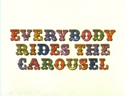
The most recent of these personal films is a 90-minute TV production, produced by CBS. Everybody Rides the Carousel is based on the writings of Erik Erikson, the noted psychologist. The film shows the development of a person in a society. This is, obviously, unique material for animation, not to speak of TV animation. It will be curious to see if any effect will be made on other animated programs.
The Peanuts specials, needless to say, have had a great impact on television animation, if not on all phases of American society. Bill Melendez runs the studio that has been producing these films. His studio has been operating for the last 12 years, but, obviously, never has it been so successful. There have been two feature-length films to spin off the very successful TV specials, and now a third theatrical film is in the works. Curiously enough, the few commercials that move through the studio are Peanuts-oriented. At the moment there are two spots being produced for Japanese television starring Charles Schulz’ characters. The studio, thanks to Peanuts, is able to keep a staff of, at least, 15 people on full time.
Most of the other commercial film producers are beginning to look into theatricals. Phil Kimmelman, producer and executive member of Phil Kimmelman & Associates, continued his use of noted designers (Jack Davis, Mort Drucker and Rowland Wilson, who has become an important mainstay of the studio, had designed ads and episodes of Scholastic Rock) when they commissioned Gahan Wilson to design a Halloween special for television. The prospect never passed the boarding stage, since the money ran out. They are still hoping for a backer.
Other studios such as Zander’s Animation Parlour and Ovation, which normally produce only commercials, (Jack Zander had directed the TV feature The Man Who Hated Laughter, and Ovation is currently making a 10-minute industrial film) have said that they are interested in making theatrical films, but they want to be sure that the budgets are large enough.
The problems involved in searching for theatrical films from the vantage point of a commercial film producer can be best illustrated by demonstrating the situation at Perpetual Motion. Studio heads Buzz Potamkin and Hal Silvermintz openly stated that they want to enter the theatrical market. They have been producing a series of low-budgeted spots for NBC’s network, late-night program Weekend. The show is aired the first Saturday of each month on NBC. Each program incorporates in its schedule one or two animated, editorial cartoons. These are usually satirical comments on some phase of the current news stories. Both producers enjoy doing these films since they’re given a freer rein than they usually have with the commercials. Stylization, story and design all combine to make miniature entertainment films for television. They would like to begin a longer film, but they want to make sure that it’ll be a project they’ll enjoy working on for the year or two it’d take to complete.
Buzz Potamkin left little doubt that he thought the animated commercial was far from dead. He stated that he expects this to be far from Perpetual’s worst year, however, if it weren’t for the Weekend spots and several jobs for NBC Sports (animated spots for Joe Garagiola’s pre-game show), the studio might have had a much poorer year. These short films allowed Perpetual to maintain a staff, however minimal.
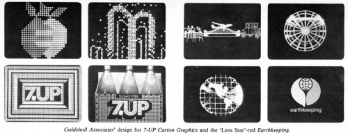
Morton and Millie Goldsholl are designers in the Chicago area who operate a studio which includes three full-time animators who are capable of table-top, stop-motion films, as well as cel animation. Morton Goldsholl states that half the studio’s film work is in longer films. They have produced a large body of work with some 12 titles listed among their experimental films. Much time is spent in experimentation, and, consequently, they have developed a “strange optical method” which is called “Lens Star.” The end result is a product which bears a resemblance to the “computer image” but, in fact, retains the warmth of the human touch. This method was used in a title to Earthkeeping, an ecology series. The 60-second title represents the beginning of life to the present ecological dilemma.
The Goldsholls seem to have touched on the best of both worlds, and perhaps this is actually what the majority of the commercial studios would like to strive for. They produce a number of commercials each year while still making the short industrial films. This has kept their studio very busy in the past two years.
Commercials, of course, have not disappeared, nor have they been as poor as this article might have led you to believe. There were a number of well-produced spots within this last year, and most of the studios can admit to a good second half of 1975. At the moment, several of the studios are at peak production.
Zander’s Animation Parlour is New York’s largest commercial producing studio. They are presently able to maintain a staff of 25 people to handle their film production. Jack Zander, a long- time veteran animator, heads the studio since 1970 when his studio, Pelican, closed. A large number of specialized commercial films are produced at Zander’s. The spots for Freakies breakfast cereal, animated by Preston Blair, have achieved quite a bit of success. Each eel is a major rendering effort, being prepared with colored pencils on colored paper and pasted to the celluloid sheets. The same method of rendering was employed in the most recent Vlasic Pickle commercials and the Hanes Sheer Pantyhose ads. The studio artists combined live-action with animation successfully on the spots for Dayton’s, a department store located in Chicago, and in an ad for Texaco.
Perpetual Motion has done a spot for Baggies which they are quite proud of. The commercial was designed by Hal Silvermintz. A recent AT&T corporate spot was designed by Guy Billout and animated by Vinnie Cafarelli and Vinnie Bell. Perpetual also has recently acquired the Schickhaus commercials, and for the past year, they have produced the Hawaiian Punch commercials. With these spots, they had a somewhat interesting problem: they were given an established character and design style and told to continue the series in the same vein. They’ve been successful.
Phil Kimmelman & Associates had a slightly different problem with the Cheeto’s Mouse. They were given these spots several years back. The client had been unhappy with the results he had received from other studios. Kimmelman has had the spots ever since. Bill Peck-man, a designer at the studio and a board member of the group, stated that these spots give them a chance to explore a bit with nuances in character. Since they’ve been handling the character for a while now, they feel that they can have some fun with him.
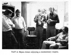 This is all quite interesting when you realize that they have just recently begun producing a number of commercials for Piels Beer which star Bert & Harry Piels.The studio has asked to continue the line of commercials done in the 50′s by UPA. The result was several 30-second spots starring the two characters (once again voiced by Bob and Ray). Kimmelman remarked that he found himself using several of the artists who had worked on the original films (Lu Guarnier had animated the spots at UPA in the 50′s and worked on them again in the 70′s). The only difference between these commercials and the earlier ones is that these are in color.
Bajus-Jones was formed six years ago in Minneapolis by Mike Jones and Don Bajus. The main office remains in that city, where some 14 people are employed. The studio has representatives in Chicago and New York, and some production is done in New York. Their work has principally been the making of animated commercials—recent commercial productions include a spot for Phillips Petroleum, and one for GMC Truck division— but they are now at work on a pilot for a feature-length film.
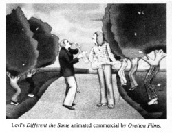 Ovation is owned and operated by Jerry Lieberman, Howard Basis and Art Petricone. Their most recent pride is for a number of spots just completed for Whitman’s Chocolate. The commercials, animated by Doug Crane, are done in the style of the sampler on the box of the chocolates. The end result is an animated crewel that is quite effective. Also of interest from the studio is a Clairol Herbal Essence spot which has a live-action figure walking through an animated garden of earthly delight. This is also the studio that did the campaign for Eastern Airlines. Each commercial incorporates a great number of animated figures. The detail is staggering.
Several studios consider themselves, basically, graphic design studios. The work of the Goldsholls was previously mentioned, though indeed, their commercial work is outstanding. A recent one for 7-Up received well-earned celebrity among TV spots. Their Gillette Right Guard ads employed rotoscoped animation within the graphics. Just recently begun were two fully animated spots for Kellogg, which Morton Goldsholl feels will be a milestone for the studio.
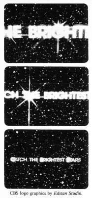 George McGinnis and Mark Howard are the proprietors of the Image Factory. The two producers are designers who would like to see greater use of design and camera in animated films. This approach is, obviously, echoed in their film production. They’ve designed and directed the introductions for the five Mobile Showcase Presentations; (this included the famed TV productions of Moon for the Misbegotten and Queen of the Stardust Ballroom.) They’ve also designed the end logo used in the Metropolitan Life Insurance campaign. They’ve produced the Fall campaign for the CBS-owned and -operated stations. The two producers have a strong interest in moving toward more wholly animated projects, and their final goal will be reached when they can successfully see the combination of animated graphics with in-depth character animation.
Edstan is run by Stanley Beck and Ed Feldman. They are a graphics studio which will put the designs brought to them on film. They recently produced the graphics for NBC, CBS and Metromedia’s Fall campaigns. They also produced the opening graphics for the networks’ film programs. The studio has been in operation since 1959 and has produced a large number of network titles (most of the late night movie titles were produced at Edstan.)
With the Cheeto’s mouse, Freakies’ freakies, the Hawaiian Punch character, Vlasic’s stork, and the revival of Bert and Harry, it looks auspiciously as though animated commercials are turning toward the characters to entertain us. Perhaps this will be the trend; the agencies will spend more time caring about the viewer and a lot of good animation will come across the TV sets in America.
Animation &Animation Artifacts &Hubley &Tissa David 17 Dec 2008 09:10 am
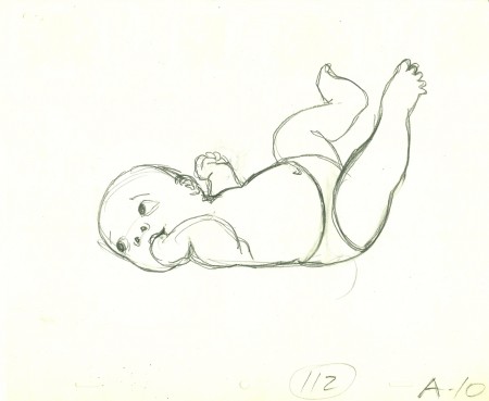
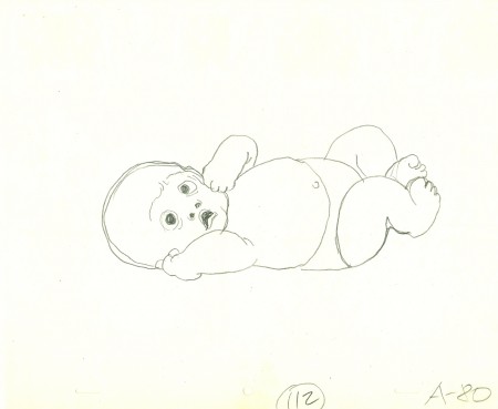
Tissa Babies
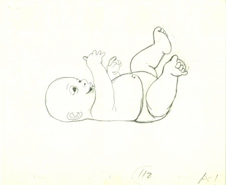
 - Yesterday I gave you a look at John Hubley LOs for some of the babies in the key scene, 112, from the Hubley feature, Everybody Rides the Carousel.
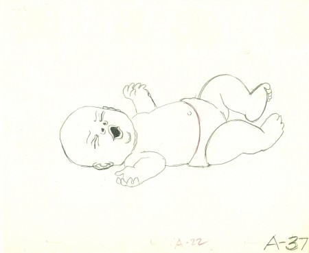
Tissa David did the lion’s share of this sequence which totaled about 10 mins of screen time. Barrie Nelson did some of the later scenes. (Tissa also did a second sequence occurring later in the film – ride #6. Barrie also completed that one.)
Tissa didn’t get any footage to study or even still photos (though she probably did her own research at the library.) She said she based her baby on her sister’s child.
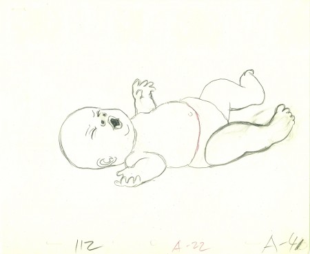
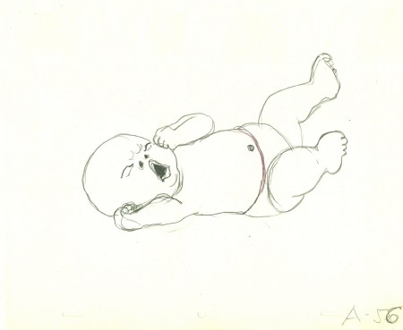
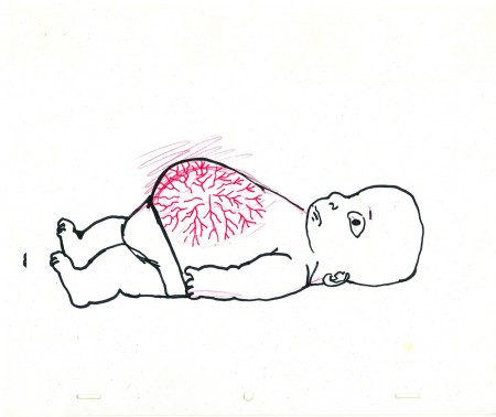
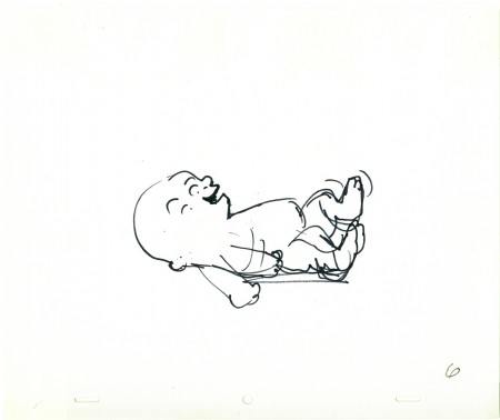
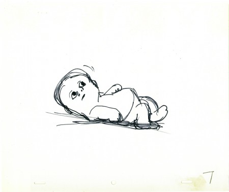
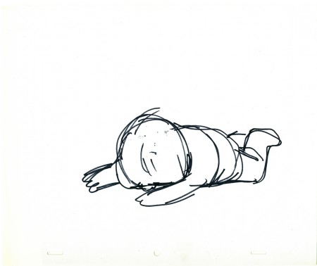
These are her drawings from the same scene – 112.
(Click any image to enlarge.)
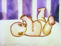

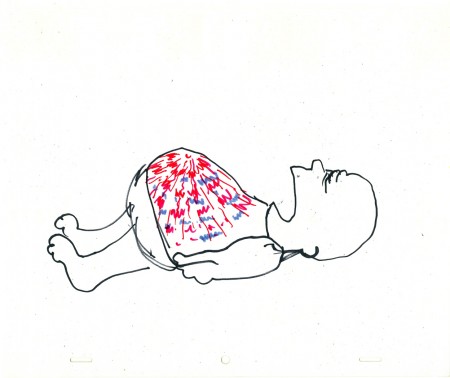
These frame grabs give an indication of how it was colored.
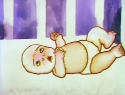
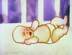
The style was to use a watercolor marker to ink the baby.
Then water was applied to the marker to loosen the color into the body.
This coloring style was used throughout the film.
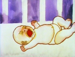
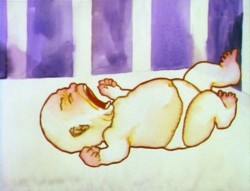
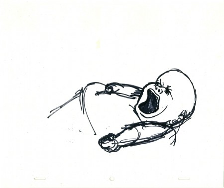
The image of the baby above right was a big deal for John Hubley.
Tissa didn’t want to do a cut mouth because it read as too two-dimensional
for her. She fought John several tries, but ended up
giving in and holding that head for a couple of frames.
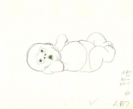
Lots of small cycles went on in this baby shot.
Tissa masterfully worked in and out of and back into these cycles
throughout the entire sequence. The baby was always in motion.
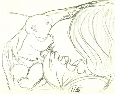
This last drawing is from Sc 115 where the mother
picks up the crying infant and nurses her.
I’ll offer more of these drawings next week.
Animation &Animation Artifacts &Hubley &Layout & Design 16 Dec 2008 09:00 am
Hubley Babies
 - John & Faith Hubley‘s feature film, Everybody Rides the Carousel was a great project to work on. The story was top notch, the art was flying left and right. (The entire production had a six month schedule and a budget of $450,000 when it was planned as three half-hour shows for CBS. Another month and $50,000 was added to extend it into a 90 min program.)
Great, talented people, as expected, worked on it.
Animators included: Tissa David, Barrie Nelson, Bill Littlejohn, Art Babbitt, Fred Burns, Adam Beckett, Lu Guarnier, Jack Schnerk, Don Patterson, Ruth Kissane, Phil Duncan and Earl James.
The excellent score was written by the rising classical/jazz composer, William Russo. (I was amazed at this in that I was addicted to his Three Pieces for Blues Band and Symphony Orchestra and hadn’t realized that the Hubleys knew his work.
The vocal talent included old reliables such as Lane Smith, Jack Gilford, Juanita moore, Dinah Manoff and Lou Jacobi and introduced new, young talent Meryl Streep and Jenny Lumet.
 For someone my age, it was a dream production. I coordinated the animation, assisted all of the animators who required help and animated some 85 scenes.
The film was an adaptation of the writings of psychoanalyst Erik Erikson, specifically his book Childhood and Society (1950). Eight Stages of Development were adapted into eight horses on a carousel, each representing a different stage in human development.
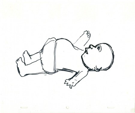
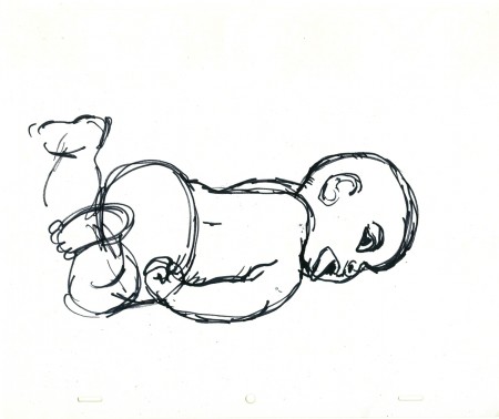
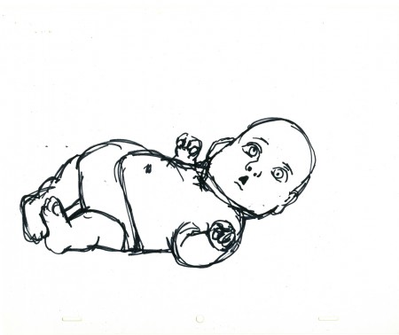
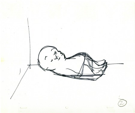
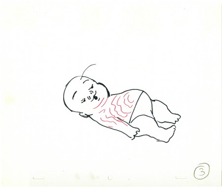
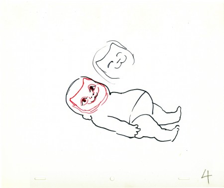
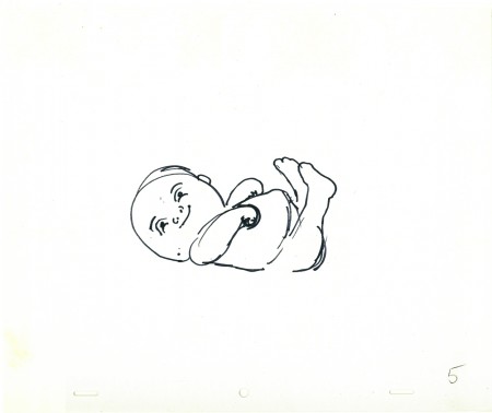
Today I’d like to post some of John Hubley’s drawings of the baby in the opening sequence. These were all animated by Tissa David, and I’ll post her drawings of the same poses tomorrow. They’re very different.
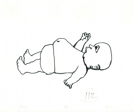
(Click any image to enlarge.)
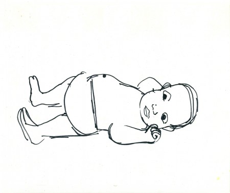
All of John’s drawings were done with a Sharpie pen,
which was his weapon of choice, most of the time.
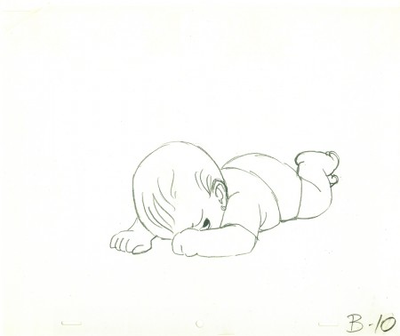
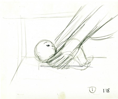
This last drawing (done in pencil) is Tissa David’s interpretation of
John Hubley’s last image. She did a bunch of these sketches and
worked with John in solidifing what the final look of the baby would be.
Tomorrow I’ll post Tissa’s drawings.
Bill Peckmann &Daily post &Rowland B. Wilson 15 Dec 2008 08:50 am
Focus on Focus
- Here’s a surprise gift from George Griffin. It’s a studio caricature of the commercial studio Focus (this predates even Phil Kimmelman’s own company, PK&A). I’ll let George’s own words inform us about it:
- I came across this copy of a drawing by Bill Peckman you might want to share on your blog. It shows Bill’s adaptation of Rowland Wilson’s design into caricatures of the staff at Focus Design. Wilson had just designed a spot we had all worked on. Phil Kimmelman is the Mountie/authority figure and to the right, Sid Horn, Jerry Dvorak, yours truly, Victor Barbetta, Sal Faillace, Bill, Agnes Cannata and Jack Schnerk. The likenesses are very accurate but the character of each person was inverted: Phil was very sweet and easy-going, Bill and everyone else was very happy, not at all like these scowling toughs.
.
.
.
I’ve split the drawing up and used George’s key to mark up and identify the people within the caricature to make it a bit easier to read.
Michael Barrier has just reviewed both Madagascar 2 and Bolt. His review, as expected, is from a singular perspective though I think he touches on thoughts we’ve probably all had. I look forward, always, to his honest comments.
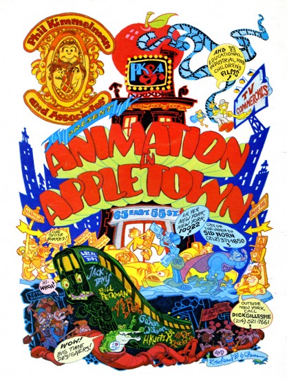
And speaking of Michael Barrier, Kellie Strøm pointed to a Phil Kimmelman ad on the back page of Funnyworld 20. This was a comment on my Ads for Ad Companies post. Though Kellie links to the ad, I thought it worth post here on its own. It’s a Rowland Wilson illustration.
 _______________________
 A blog I’ve just stumbled upon is Ian Lumsden‘s Animation Blog. It’s a British blog with some astute commentary; most of it involving British animated films. The posts on this blog have introduced me to several animators whose work I was unfamiliar with, and whose films I find worth watching out for. The most recent filmmaker under discussion is Ivan Maximov.
 -The NYTimes, yesterday, featured an article about Ari Folman and his feature film, Waltz With Bashir. The film’s about to be released this next week, and this is the start of the relatively small PR run. Here’s hoping this adult film will be noticed by the Academy voters. This is one of two animated films eligible for Oscar nomination in the category of Best Animated Feature that is considered an Israeli film. The other is $9.99 now playin in LA and soon to be released in NY.
Photos 14 Dec 2008 09:25 am
PhotoSunday – Construction
 - Do you remember the old days, when construction sites used to rip holes into their barricade walls so that pedestrians could watch the inner workings of the construction site? This was something we’d see animated in many a Looney Tune. Those holes actually did exist and were often occupied by people who were curious.
Today, probably because of insurance demands, those holes are gone. Your average construction site offers no way for people to peer into the workings beyond the street level. This also makes people like me more curious to know if something dark and nasty is going on within those walls.
I thought of this while passing the three construction sites I have to walk around each morning on the way to work. One is rather large and has been under way for the past six months (and they’ve just begun to complete the foundation), and the other two are relatively small (brownstone buildings being replaced.)

(Click any image to enlarge.)

You’ll notice that this large site on 29th St & Park Ave takes up a full
quarter of the city block. They’ve erected scaffolding to walk under and
a big blue fence to keep roaming eyes out. No peepholes.

Sneaking a peek within the locked, gated blue wall gave me
a good view of this large buildling under construction.

A smaller site close to my studio, works hard to be the most at
inconveniencing pedestrians and their attempts to keep people from
checking it out are more extreme than on the larger site.

I was able to sneak my camera into the locked fence and get
these two photos – above & below – which really don’t offer a
whole hell of a lot of information, other than that they’re guarded.

However, on the weekend, I was able to get a decent shot of the
inner workings of this site by sticking my camera in and shooting blindly.

Walking away from this site and continuing about half a block
you come upon another even more secretive site.

Here, they’re placing these large, ominous looking tanks into the
base of the developing building. It’s not a large space, so one wonders
what will possibly be the purpose of these white tanks.

They sure have enough of them. Maybe they looking for a large boiler.

You can’t even get to that side of the street to see what’s going on.

There are many sites underway in the City. This one, downtown,
has been on my horizon for almost a year now. I watched it grow
from scaffold with a crane sitting on its roof to what you presently see.
One wonders, given the current economy, who will rent those spaces.
Articles on Animation 13 Dec 2008 09:28 am
The Goldsholls
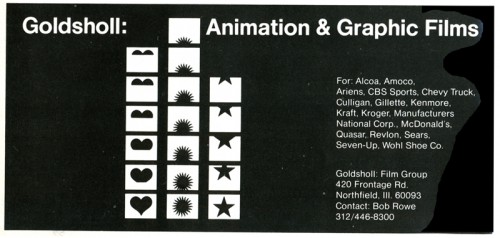
 - In posting ads the other day, I found the one for the Goldscholl Associates (reposted below), a pair of animation producer/designers, Morton and Millie Goldsholl, who have been completely overlooked in this “new era.” Mort was a prominent industrial designer who turned to film and commercials working with wife, and fellow designer/director/animator, Millie.
Trying to keep the memory alive, I went in search of any articles – even puff pieces I could find to give more info about them for those interested. I found this Millimeter Magazine article in their April 1975 issue about animation companies in Chicago. The latter half of the article was about several other Chicago companies, but my focus is on the Goldsholls.
The Loop
bu Sherry Seckel
- Historically, the first commandment of film production in and around Chicago has been that fat budgets go to the coasts and lean ones stay here. On the surface, that principle holds true for animation productions, especially in the area of commercials coming out of Chicago advertising agencies. But to say that the animation talent in
 Chicago is low-budget would do an enormous disservice to the producers and clients alike, many of whom are finding unique production capabilities right in their own back yard. In addition, clients from outside the Chicago area have discovered that the diverse talent and facilities here can make production in Chicago a matter of choice, not just necessity.
The most successful of such animation producers is probably Goldsholl Associates, located in the Chicago suburb of Northfield. What makes Goldsholl so attractive to national and international clients alike is their ability to take a project from conception through completion almost totally in-house.
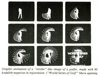
At the top of the organization is Mort Goldsholl, whom Bob Rowe, Director of Sales, calls a true “conceptualizer.” With an extensive background in design, award-winning Goldsholl has invented an optical lens distortion technique for animation which takes a two-dimensional piece of art and, in camera, makes it appear three-dimensional. Another revolutionary technique with Gold-sholl’s stamp on it is his rotoscope animation, recently 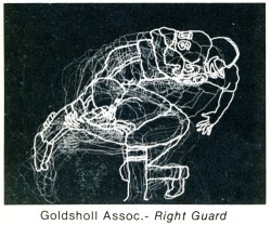 used in Gillette commercials. Working closely with Goldsholl is his wife, Mildred, who is a producer, director, writer and editor, also with a background in design. Animation Director is Peter Dakis and Production Manager is Tom Freese, a cinema-tographer known for his fluid head method used in Hallmark commercials.
Backing up the talented staff is sophisticated hardware to match. Along with a sound stage, 16mm and 35mm cameras recording equipment and editing equipment with Moviolas and a Kem is an automated Oxberry animation stand, designed by staff member Jim Logan.
After some 34 years in the business, Goldsholl Associates is firmly entrenched in its position as a consummate animation production studio. Says Bob Rowe, “Heretofore, if you needed a slick piece of animation, you had to go to the Coast or New York. We don’t have a stable of animators and painters; we want to retain our uniqueness.” Mort maintains that he does not want to be everything to everybody.
Daily post 12 Dec 2008 09:12 am
Odds and Friends
- For those of you who haven’t seen it, there is a blog devoted to artwork and photographs and some film clips of animator, Fred Moore. It’s a Spanish site run by Pedro Daniel. (Thanks to Matt Jones for directing me to it – again.)
And speaking of Matt Jones, he has a great post on his Ronald Searle tribute blog. it tells of his “pilgrimage” to meet Searle. it’s a great read.
Oswald Iten‘s blog offers intelligent and thoughtful consideration of a number of films, but his writing on 101 Dalmatians is excellent. Currently, he discusses the voice of the narrator throughout the film as it changes perspective. this has been one of my principal concerns in making and watching films. Who is telling the story? Whose perspective are we supposed to be viewing? When films slip in and out of this, I grow too easily annoyed. Lately, there’s been a lot of lax storytelling; many film makers have gotten lazy and are not telling the story properly. It makes for a good read on Oswald’s blog.
Also, if you haven’t read some of his consideration of the color design of the Dalmatian film, you should take the time to read.
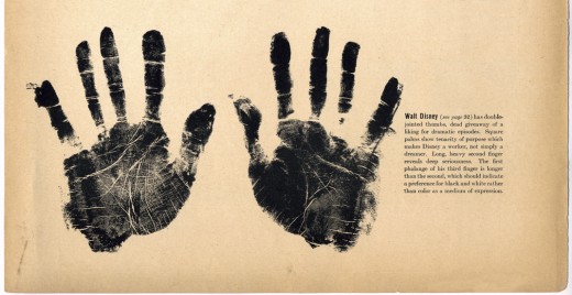
- For some reason, I have this photo/clipping in my folder. These are Walt Disney’s hand prints. The image came from a Life Magazine issue. I’m not sure if I actually scanned this from the magazine (I think I did since I own the issue) or if I lifted it from someone else’s blog. If I did, I apologize, but the image is a great one.
 .
.
- My friend Stephen MacQuignon has his first two published children’s books for sale on Amazon.
I’d like to congratulate Steve and direct you to the link. It’s been a long time coming, and he deserves a little praise for the fine work he’s done for so many years. Steve was THE principal colorist on my film,
The Red Shoes and many others.
Go here to check them out or buy them.
.
- Finally, it’s always fun watching the year’s choices for the Film Bests of the year. The LA Film Critic Assn chose Wall E as Best Picture of the year, but Waltz with Bashir was the Best Animated Feature. Is that telling or just confusing?
The NY Film Critics Circle named Wall E as Best Animated Feature.
We’ll hear from Boston and Chicago in the next week.
I have to admit that there was a good crop of features this year. I’d call Waltz with Bashir the best Flash animated feature I’ve seen, but that honor belongs to Sita Sings the Blues. Nina Paley’s Sita Sings the Blues is certainly the best of the lot though it’s $220,000 away from the possibility of a release. Bill Plympton’s Idiots and Angels is possibly his best feature and deserves more attention. Officially, though, it won’t be released until next year.


