Monthly ArchiveNovember 2008
Photos 30 Nov 2008 09:00 am
Photosunday – NY Lintels
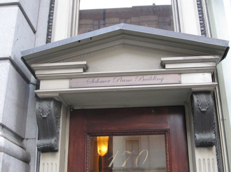
- Walking to work one early morning this week, I noticed the decorative archway pictured above. This is an outgrowth of what in classical architecture is called a “lintel.” A lintel is, in it’s basest form, a block placed over an entranceway. It solidifies the two columns that reach around the portal. As it says in Wikipedia: The lintel often rested on pillars made of piled stones such as in the building of the Treasury of Atreus in Mycenae, Greece. In architecture around the world however, a lintel is not considered (as it is in the very narrow view of classical architecture) as purely an element of the Post and lintel.
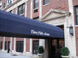
I decided to pay a bit more attention to the overhead arches that decorate doorways leading to my office.
Here are some of those I found:

(Click any image to enlarge.)
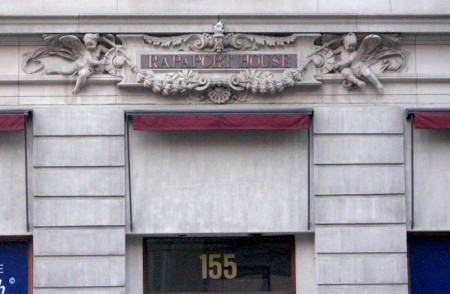
All are decorative additions, but some are more decorative than others.
Some are downright cheap, and one even wonders why do it?

Some are beautiful in their simplicity.

A number even imitate the look and feel of the
“Rosetta” window over a cathedral’s door.
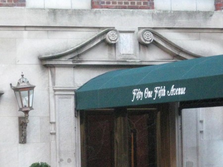
The awning introduces a wholly new element.

Some are near identical to others. The same architect?

Brick buildings present a new problem. The doorway is an add-on.

This can be decorative cement-work.

Here’s an attempt to create the decoration in brick.

Wrought iron filegree creates a whole new element of decorative design.


This building is typical of many of the buildings one sees midtown Manhattan.

The decoration gets to imitate gold and excess;
it has an attractiveness all its own.
Articles on Animation &Bill Peckmann &Rowland B. Wilson 29 Nov 2008 09:46 am
Producers of 1976
- Last Tuesday I featured the Young Independent animators of 1977. Today let me showcase a couple of commercial producers from the same period. This article came from the famous Raggedy Ann issue of Millimeter/1976, edited by John Canemaker. It was part of their regular column:
PHIL KIMMELMAN
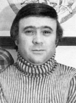 Phil Kimmelman is a New Yorker who stayed. “My love was always animation,” says the cherubic President and Director of Animation at Phil Kimmelman & Associates. At 17, he gave up a three-year scholarship to go to work for Paramount Famous. It was the 50′s; Hollywood was doing fine; budgets were big in the New York animation departments. “I’m delighted to have been a part of that. It really did a lot for me.”
After gaining some experience at Kim-Gifford and Chad Studios in New Jersey, Phil served a stint in the army as an illustrator. In 1961, he joined Elektra as an animator and animation director. “Elektra was into experimenting. We were really into exploring new areas. I think that’s where it all began for me.”
After five years, Phil left Elektra for Focus. Four years later (1971), he opened his own shop. “Fortunately, I wasn’t enough of a businessman at the time to realize how bad things were. We staffed up rather heavily at a time when everybody was resorting to freelance … we got into some problems, but now we’re busier than ever.”
“I consider myself part of a team, the other part being Bill Peckman, one of my associates. We’ve been together through Elektra and Focus. I think Bill’s one of the best talents in this business . . . and I’m glad he’s with me.”
Phil’s other associates are Bill Hegman, designer, and Sid Horn, production manager. Morty Gerstein, a former competitor, is now affiliated as a designer/director. Working madly in the next room is Roland Wilson, a Playboy cartoonist beloved by ad folks for his New England Life campaign.
These gentlemen are just the tip of the iceberg. PK & A is crawling with creative types, and the company has recently leased additional space. “One of the things that has made us successful is the versatility of our reel. We’re great admirers of a lot of cartoonists and designers from outside. If a job comes through that we feel requires a certain look—like a Gahan Wilson or a Jack Davis—we’ll put our own egos aside and go after them. I’ll give you one example: Harvey Kurtzman. Harvey is the creator of Little Annie Fanny for Playboy. He’s best known, I guess, for starting Mad Magazine (he’s no longer with them). We’ve always been fans of Harvey Kurtzman—I think the man’s an absolute genius. Bill Peckman and I chased after him, and he was very apprehensive about working in animation. He said he had a bad experience at one time. But we got him to look at our reel, and at the end of it, he applauded and said he’d be willing to chance it again. So we had Harvey design and write some scripts for Sesame Street, which we’ve sold and produced, and we’ve won a lot of awards with them. They’re beautiful spots—and they’re one example of the ‘Kimmelman look.’ ”
Yes, but how does he work with agency art directors and writers? “When an agency board comes in, I like the option of taking the board and recreating it to our way of thinking. Generally, that’s why they come to us—for our input. I think a lot of art directors and writers are not really geared, you know, to think animation. When he or she gets involved in animation, there’s a long time period where there’s very little to do. You know, it’s difficult for the people in agencies who are making the schedules to understand the time element. Where we used to have a good eight weeks to do an average 30-second commercial, we’re constantly being asked to do it in four or five weeks. It’s what I see happening more and more today that kind of upsets me. We’re working nights—around the clock—too often. That’s what it’s become. I guess we love it enough to keep doing it. I do have a line I won’t go over. If I really feel it can’t be done, we won’t do it. I’ve been in that situation many times.”
What about Ralph Bakshi and his controversial coonskins? “Fantastic. Whether you or I like his films, there’s no question that they’re breakthroughs. He’s gotten animation into the adult mind. For that reason alone, I’m delighted it’s happening.
“I think it’s sad. So much more should be happening in this industry. I think animation still hasn’t been scratched. It’s an extension beyond what live can do. There’s no limit. There are people who think it’s a dying art. I don’t think it will ever die. I’m very optimistic about that. I think, if anything, it can only go upward.”
JERRY LIEBERMAN
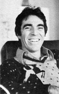 Jerry Lieberman says he originally “wanted to be a doctor,” and he endured two years of pre-med before allowing all the “fantasy, other-world head aspects involved in growing up in corny, carny, show-biz pizzaz-zy Atlantic City” to take over. As a kid he “always drew” and worked three summers as a caricaturist on Atlantic City’s Million Dollar Pier.
He admired John Hubley’s Moonbird (1960) and Saul Bass’ titles and he constructed his own make-shift 16mm camera stand to “experiment with stop-motion, and even some professional work for WCAU-TV in Philadelphia doing promos for a local kids’ show.”
After studying design and graphics on a scholarship to the Philadelphia Museum’s School of Art, and a brief stint in the Army, Jerry came to New York City in 1964. “My first year in New York,” says Jerry today, “I made a storyboard six feet by ten feet long with 200 panels. It was my portfolio and it used to knock people over when I unfolded it.”
He managed to get work right away doing animated films for NBC-TV’s Exploring, “but I learned success doesn’t come easy. There were times when I walked the pavements going from one local production house to another for six months before getting work. One time my portfolio was so severely criticized by one potential employer, I stopped seeing people and had a phobia about work and my talent.
“I worked very hard; I paid my dues; eventually I made a lot of money in a short time and went to Europe. I thought foreign influences might be good for my work.” In London, Jerry met George Dunning who told him “the best place to go for work is Italy.” In Rome, Jerry was hired by American Harry Hess, a former UFA animator, and he worked for a year doing storyboards, design and animation for Italian commercials both in Rome and Milan. He even acted in a few live-action beer commercials.
Jerry returned to America with an excellent reel and his next big break was to be hired by Jack Zander at Pelican Productions as a designer. “Because animation does include every form of art, I wrote to Lee Strasberg and asked to join the Actor’s Studio Directors Unit, and I was accepted and studied there for two years. After a year at Pelican, he freelanced on educational films and was, for a short hilarious time, Phyllis Diller’s painting instructor.
“In 1968, Art Petricone, Howard Basis and I got together and started Ovation Films, Inc.,” says Jerry. “Howard and Art met at Kim and Gifford, and I had worked with Howard on a job. We started our business during the decline of the ‘Golden Years’ of TV commercial production, but we didn’t know that at the time. We had our reputations, things built up slowly, and in March of ’76 we’ll have been in business for eight years.”
Ovation is one of the top commercial houses on the East Coast, a successful studio whose award-lined walls attest to their excellent work done for clients who include Eastern Airlines, Volkswagen, Levis, American Cancer Society, Clairol, and Children’s Television Workshop. At first, duties at Ovation were sharply defined, with Jerry doing designing, Howard handling the animation, and Art the super salesmanship, but today Jerry explains that “each of us get involved in producing and directing different commercials. Sometimes we work separately, sometimes we work together. We are now doing a little live-action work, and we are interested in doing a feature animated cartoon. Creativity, budgets keep getting tightened up, but we manage to maintain quality in our product.”
In 1973, Jerry enjoyed “a great personal success,” as La Cinematheque Quebe-coise directrice Louise Beaudet describes it, at the Annecy Animation Film Festival. “His films were so American and he looked so American when he took a bow that he was a big hit with the French,” says Madame Beaudet. Ovation’s Yes My Sweet took a prize at Annecy that year, as their Parrot and the Plumber had at Zagreb the year before.
“I admire live-action directors who are interested in the visual aspects of film,” says Jerry as he ticks off the names of favorites Warhol, Fellini, Russell, and Hitchcock. “But I love animation because you have to be so multi-talented and involved in so many fields. It’s very demanding, always a challenge, and very satisfying.”
- For a short period in 1973, I worked for Phil Kimmelman’s studio PK&A. I was an Asst. Animator alongside Larry Riley. We had a brilliant time for a period, until work got a bit shy. The studio was very tight, and the mood was one of searching for the highest quality. Rowland Wilson was a designer of many of the Schoolhouse Rock pieces I assisted on. Phil was a pleasant guy to have for a boss, and I certainly enjoyed the experience.
He retired a few years back, but he’s back producing more Schoolhouse Rock episodes for Disney. I’m glad to see it.
Jerry Lieberman was someone I came into contact with frequently. We never worked together. Somehow I think he always saw me as a rival – I don’t know if that’s a reality, but it’s my perception. The last couple of times I met him he was directing theater and loving it.
Commentary &Daily post 28 Nov 2008 09:25 am
A Bit More Thanksgiving
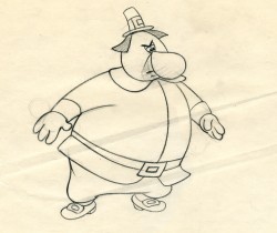 -Thanksgiving, of course, is a time for saying words of thanks. I thought it also a good day for admitting some recent things found on line that pleased me and for which I am grateful. So here are a few things that come to mind.
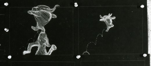
- - As a big fan of Bobe Cannon‘s work, I was ecstatic to see a couple of his rough extremes on the TAG Blog. Boy I love the internet; bits and pieces like this would never have come my way otherwise. I have a few of his drawings from a scene from Moonbird, with inbetweens by Ed Smith. I’ll post these sometime soon. ____________________Not by Bobe Cannon;
__________________________________________it’s from Herky Jerky Turkey.
- I’m pleased to see a number of the children of great animation artists who have established sites to honor their parent’s work.
I think of Roberta, Judy, and Jon Levitow offering us the site for their father, the brilliant Abe Levitow, or
the recent site hosted by Paul Spector for his father, the excellent artist Irv Spector.
Just today I heard from Peter Svochak that he’s put up a MySpace page for his father, the fine NY animator, Jan Svochak.
I’ve established permanent links on my blog to all three of these memorial sites.
- There are a couple of videos that appeared in the last couple of days that encouraged me to feel that there is still art in the world of animation:
- . I’m thankful for Cartoon Brew which led me to the films of Stephen Irwin. After seeing the first one on the Brew, I went to Irwin’s site and watched all of the rest of them. They’re all fine films, some are great. I’ve gone back to the site some four more times to watch the films anew, and all of them hold up for me. I urge you to check them out.
. I look forward to the NYTimes‘ posts of the monthly video by Jeff Scher. This month’s film, Newscycle, is a good one – or, at least, I think so. It just went up this week.
. The Chicago Tribune also posts cartoons by Joe Fournier though the last one posted was at Halloween. Fournier’s work is worth looking for. He employs a muscular drawing style somewhat similar to the work of Bill Plympton.
- - Mike Barrier‘s site has gotten down to some serious nitty gritty of animation history. The photos he’s been posting are just impossible to see elsewhere. (Where else could we have seen Walt in a gondola in Venice. He seems giddy, carrying an award he obviously won at the film festival, while his wife and daughter look sober – if not bored.) Mike’s many years of committed study of the art is certainly paying off for the likes of me. I look forward daily to checking out any new posts on the site, and continue checking daily even when there’s an announced break.
- Actually, the same is true of a couple of other sites that offer thoughtful discussion of the medium. Hans Bacher‘s site is a daily must see, as are Mark Mayerson, and Hans Perk. For a daily smile, Eddie Fitzgerald‘s site can’t be skipped.
 - One site feeds my love of NYC. Blather from Brooklyn is an excellent photo site hosted by Annulla. Her recent post on NY Prayer Booths,
was a gem. (The photo to the right comes from her blog.) These are street booths that could be mistaken for telephone booths placed around the city. My mouth dropped when I saw these photos. Annulla’s wry sense of humor and love of the city can’t be faked; it’s wonderful.
I say a prayer daily in thanks that America has finally selected a literate, organized, intelligent guy into office. His recent optimistic statements have done nothing less than given Wall Street a reason to have a bit more confidence in the system. I look forward to more of the same once he gets started. Just think, he has no authority as yet, and still he’s doing more than the fool occupying the White House at the moment. (For a while, I was begging god to stop Bush from making public comments on the economy. Every time he appeared, the market dropped precipitously.)
The future does look hopeful.
Animation Artifacts &Disney &Peet &repeated posts &Story & Storyboards 26 Nov 2008 09:35 am
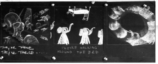
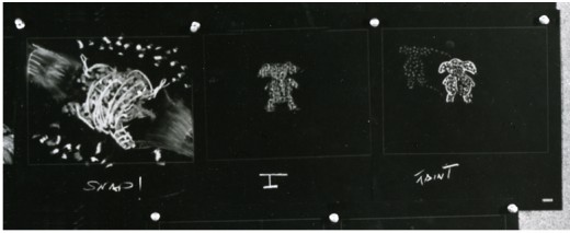
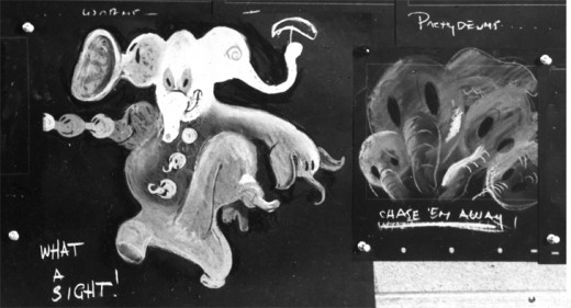
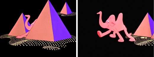
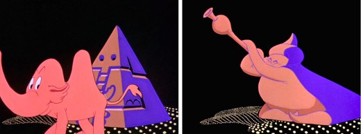
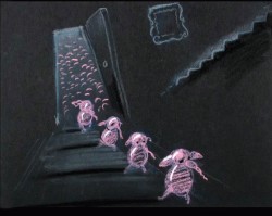
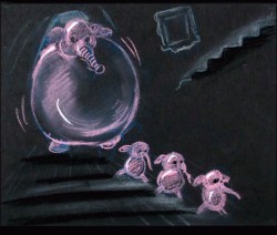
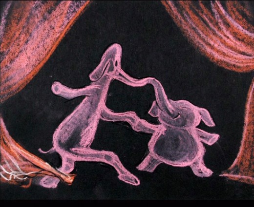
Recap – Pink Elephants
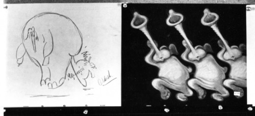
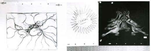
- Recently, I saw a small part of Aladdin on television. A large part of the Genie’s song reminded me of Pink Elephants from Dumbo. I thought then, that I should post anew the models/sketches and drawings from that sequence. It originally was broken in two parts when it saw daylight here in 2007. I’ve combined there into one.
Once again, thanks to John Canemaker, I have several photo images to display. Some frame grabs accompany the piece.
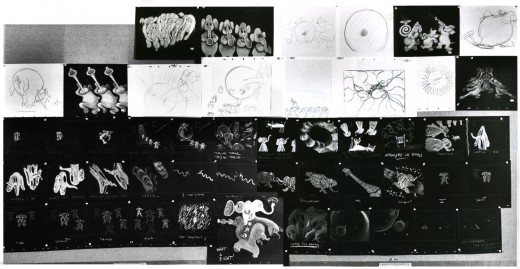
These are rather small images, so by cutting up the large boards and reassembling them I can post them at a higher resolution, making them better seen when clicking each image. It’ll take two days to post them all, so this will be continued later this week.
I’ve interspersed some frame grabs fromt the sequence to give an idea of the coloring.
The following images were in the gallery part of the dvd. These are the color versions of some of the images above.
Articles on Animation &Independent Animation 25 Nov 2008 08:37 am
The New Animators of 1977
- Jenny Lerew reminded me, this past weekend, of Richard Protovin. Richard was an Independent animator and the head of NYU’s animation department from 1979-1988. In that position, he inspired quite a few people, and Jenny’s comment got me trying to remember where I saw an article about Richard.
I came up with this article by Thelma Schenkel from the animation issue of Millimeter Magazine in 1977. I got a kick out of revisiting this article and thought it definitely should be shared.

A new generation of American animators is coming into existence. Trained in art schools and college filmmaking programs, they are turning to animation on a scale unprecedented in independent American filmmaking of the past. Mainly in their 20′s and 30′s, they were brought up on comic and storytelling cartoons, but their films are rarely broadly comical, although they’re often very witty, nor are they illustrations for stories. They are staking out a new territory for animation, one that until recently was the province of the poet. Whether their films are erotic, whimsical, or abstract, they are all in some way exploring the inner landscape — feelings, the workings of the mind, the mechanisms of perception. Although the techniques they use vary widely, they all share in the poetic impulse — in the search for new expressions of personal visions.
Until fairly recently, only a few names came to mind when one thought of experimental poetic animation in America. Today, the ranks of talented young animation poets are growing. Despite the dearth of effective distribution channels and outlets, and the difficulties of finding time and mental space to make their “personal films,” while often supporting themselves by doing commercial projects, they are making some very exciting, extraordinary films. The following are only a few of the many talented young animation artists whose films merit being seen and re-seen, talked about, and written about:
 ELIOT NOYES, JR. — Since Clay, made at Harvard’s Carpenter Center in 1964, Noyes has been dazzling audiences of all ages with his witty inventiveness, his bold handling of materials, and his humanism. In Clay, an 8-minute version of evolution, he spawns a universe out of a lump of clay with the playfulness of the ancient gods of creation. Noyes makes magic with the simplest materials: Alphabet (1966, Canadian Film Board) is drawn on milk-glass with felt-tipped pen; In a Box (1966), a tale of the barriers people and cities erect to keep out beauty and freedom, is drawn on paper; Sandman (1973) (Pictured below right) creates a dream world with an underlit handful of sand. His most ambitious film, The Dot (1975), combines live-action and animation in a half-hour allegory on the liberating
 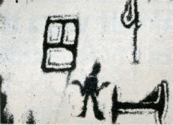 power of the imagination — the animated dot becomes the catalyst that frees the “prisoners” from the confines of school and home. Constantly exploring new techniques, Noyes is currently completing Glove Story, using actors in combinations with video-animation, and Pitcher’s Feathered Bird, which experiments with chromakeying live actors into Noyes’ drawings. If his brilliant use of technique, his wit, and the humanism of his films of the last 14 years are any indication, we can look forward to an innovative, compassionate, and refreshing use of videotape when these tapes are released.
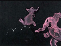
GEORGE GRIFFIN‘s self-referential films explore the tricky territory of animated illusion with marvelous wit and ingenuity. Paradoxical though it may seem, he often uses the most rudimentary of pre-cinematic toys — flip-books — to explore the most modern of ideas. Trikfilm No. 3 (1973), a complex orchestration of flip-pad metamorphoses alternating with the creation of the same sequences by the artist, combines live-action with animation, all the while delightfully fragmenting the illusion it is creating. The most elaborate of his “anti-cartoons,” as he calls them, is Head (1975), (pictured below left) an ingenious, witty essay on making filmed, photographed, drawn, painted, and Xeroxed images move.
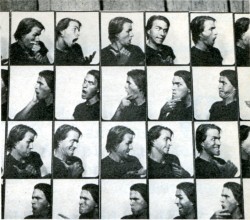 Reverberating between multi-media versions of the same events, playing with disjunctions between figure and ground, Head is “a trick-film meditation on portraiture; the animator, as actor, lives through his drawings, which in turn become actors who influence his own self-image.” An insider’s diary on the process of creation, Head is a brilliant encyclopedia exploration of the circular relationship between the animator and his creation, of the nature of animated illusion itself. L’Age Door (1975), a one-minute flip-book film about a man and a door, shows what a witty intelligence can do with just a memo pad and a pen. His most recent work, View-master (1976), drawn in parodied cartoon styles, is comprised of 8 circular drawings with 12 characters in a run cycle on each drawing. The characters, including a troupe of dancing headless waiters and a selfpropelled shoe, chase each other around until the full circle of characters is revealed at the end — a contemporary Zoopraxiscope, with Eadweard Muybridge’s running man at the center, Griffin’s tribute to one of the greats of pre-cinema. In his witty elaborations on the simple techniques of pre-cinema, Griffin is unique among young experimenters in animation today. Informed by the refreshing playfulness of film’s 19th century origins, his films are very much of the 20th and even 21st centuries, in their incisive and witty insights into the nature of time, perception, and what we call “reality.”
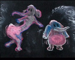
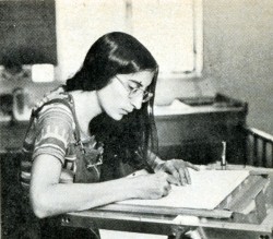 KATHY ROSE‘s insignia is the remarkable cast of “characters” who people her films and who can be traced through The Mysterians (1973), The Moon Show (1974), Mirror People (1974), and The Doodlers (1975), all made at California Institute of the Arts. In The Mysterians, her silly-putty creatures, capable of any transformation imaginable, begin playing their surrealistic metamorphic games — which become more complex in Mirror People, as the figure-ground manipulations reveal space to be as much of an illusion as corporeality. To a sound-track of fun-house screams and cackles, Mirror People, a tribe of Halloween hallucinations, fuse into each other and get absorbed into their reflections and their environments in a universe where all is flux and nothing is stable,
 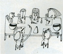 except for the constant delights of metamorphosis. The Doodlers (pictured Right) carries the game of illusion still further. Through Miss Nose and her clan of doodlers, whose curvilinear outlines and splashes of color come to life through a magic cat’s-tail brush, Rose makes some witty observations on the art of animation and on the symbiotic relationship between the artist and the characters. Although she was very excited by the films of Yoji Kuri, whose surrealistic pranks are echoed in her films, Rose’s characters have an indescribable uniqueness. It might have something to do with the way she draws them: all her characters are drawn upside-down. Yes. When she creates them, it is as if she wanted someone sitting on the other side of the table to be able to see them rightside-up, without having to turn the drawing around (of course, when they are filmed, they are rightside-up). She finds that it’s like “drawing with the eyes closed, you have one less level of consciousness.” But only the characters are drawn that way; the constant swirling changes of perspective, the simulated camera movements — all require tighter control and are drawn rightside-up. The battles and games between Rose’s characters are at some level intra-psychic encounters; she sees her characters as “parts of my unconscious” and is currently working on a film in which she and her characters confront each other. She feels that the new uses of animation have to be more than personal. They have to have an “inner truth about something real, a truth people can feel.” In their delightfully whimsical way, Rose’s films about the joys and struggles of creation succeed in conveying that truth.
AL JARNOW‘s films, which seem to be playing with the malleability of perspectival logic, with fluctuations between the subjective and objective viewpoints, have a marvelous sense of spatial humor. At times reminiscent of Escher’s disorienting figure-ground enigmas, his films often lead us through an architectural nightmare (he studied architecture at Dartmouth), but manage, through the integrity of their visual logic, to create a spatial universe which seems to make perfect sense. Rotating Cubic Grid (1975) and Four Quadrant Exercise (1975) are marvelously precise architectural games, but Auto Song (1976), his most elaborate “story” film, pushes the play between subject and object the furthest. Drawn on index cards, it narrates the journey of an invisible eye (Jarnow’s) from its (invisible) reflection in the mirror of a VW bug, across impossible highways and oceans, up stairs and through tunnels, ending in the black hole of space. Purposely starting with a recognizable image set in recognizable space, the film very soon goes off into its own space which, because we have been well teased from the beginning, we accept without question. Jarnow’s latest film, Shorelines, combines objects (shells, stones), live-action pixillation, drawings, and Xeroxes. Although it represents a move away from the draftsman’s precision of the earlier films, it continues to play with space and perspective in Jarnow’s inimitable way.
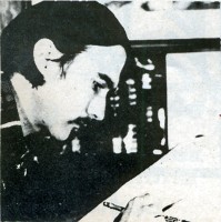 DENNIS PIES‘ early films, Nebula and Merkaba (both made at California Institute of the Arts in 1973), which he calls “experimental graphics,” already manifest his preoccupation with cosmic, mystical imagery. In Aura Corona (1974), he improvises a dance of two vertabra-like creatures which develope auras, depicting the delicate evolution of animate forms in a haunting, suggestive way. Pursuing his exploration of organic abstraction, in Luma Nocturna (1974), the “dark twin of Aura Corona” exquisitely nuanced crystalline textures float and fuse in a kind of lyrical, ecstatic cosmic dance. All done without the use of the
 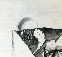 optical printer, the effects in Pies’ films are reminiscent of the work of Belson and Whitney, influences he readily acknowledges. He is currently working on Sonoma (pictured right) (an Indian word meaning “Valley of the Moon” — the general area in California where Pies lives), which deals with material from his journal of the last year. It is shot in 35 mm. color negative and is fully animated, “the full image in constant flux.”
MARY BEAMS made her first animated film, Tub Film, in 1972 at Harvard’s Carpenter Center, where she now teaches. A whimsical view of a bath from a bather’s perspective, done in rough line drawings on paper, Tub Film ends with a slurp as the woman disappears down the drain, 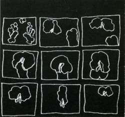 after the cat pulls the plug. Seed Reel (1975), a series of 3 sexual haikus, is done in the same rough outline style: in “Hungry Poem,” (pictured Left) (reverse printed with white lines on black), a penivorous flower devours its mate and swells into a pregnant belly; “Sniff and Lick” portrays the encounters of some very erotic flowers, and “12 Dancing Penises” dance to the tune of “Turkey in the Straw.” In Going Home Sketchbook (1975) and Paul Revere Is Here (1976), she experiments with rotoscoping and shows her deftness in handling a technique that, in other hands, can become tedious, but which for Beams becomes an exciting way of recapturing the spontaneity of the hand-drawn image.
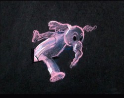
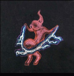
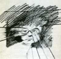 ADAM BECKETT, of California Institute of the Arts, feels that “we are at the beginning of a wonderful golden age of animation”; his innovative, unconven-tional films will have a lot to do with making it happen. Evolution of a Red Star (1973), for example, made with a 6-drawing cycle which evolved under the camera during a 6-week period, is an excellent example of what can be done with a convention — the cycle — when the principles of painting directly under the camera are imaginatively applied to it. Flesh Flows (pictured Right) (1974), done in black line drawings on paper, reflects Beckett’s continued fascination with the
 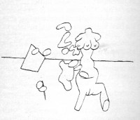 evolution of polymorphous matter. Animated male and female body parts flow into, around, and through each other, evolving into proliferating, multiform creatures in a surreal pulsating dance. Beckett is currently trying to combine work on Life in the Atom (which he has been working on for 7 years), a new version of Dear Janice, and Knotte Grosse with his commercial work.
RICHARD PROTOVIN‘s films have a naive, story-book quality about them which is definitely not what they’re about. This soft, innocent front, the delicate lines and candy-colored pastels, is an intentional disguise to arouse expectation for a simple story, expectations which he astutely manipulates for very different ends — “to turn things around, to go on the other side of the mirror.” Flamingo Boogy (1974), drawn on paper, starts out in a drive-in movie and ends up in a flock of flamingoes and winged turtles embracing the sun. The ocean itself is drawn into the sun in the mythical epiphany that ends the film. Everything flows and pulsates at the same time, disturbing movement echoing “opposites coming together in a spiritual union.” Heyzeus (1975), reflecting Protovin’s interest in Tantric Yoga, is an orgiastic dance of phallic and vaginal creatures which culminates in the creation of a
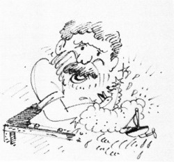
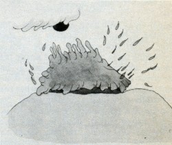
Left – Richard Protoviin/self caricature Right – “Flamingo Boogy”
mysterious bird creature exuding a powerful mystical energy. Like so many experimental animators, Protovin plays on the expectations associated with cartoons, only to turn them upside-down in an unexpected haunting way.
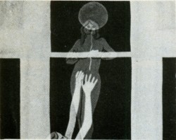 KATHLEEN LAUGHLIN‘s films explore a wide range of techniques: saturated color printing in A Round Feeling (1970), stop-motion single framing in Opening/Closing (1972) and Susan Trough Corn (1974). Her recent film Madsong (1976) (pictured Right) combines animation and live-action in a young woman’s personal everie on being female. With a polyphonic voice track (the woman’s inner voices echoed by the chorus of voices outside), it parallels the flow of her unconscious with the movement of the cycles of nature. In its artful use of live-action/animation overlap, which echoes the agitated flux of the voices of her mind from fantasy to reality, from “inside to outside, from backward to forward simultaneously,” Madsong is one of the few films about women today that succeeds in being intensely personal and univeral at the same time. Laughlin is currently working on a film about Meridel Le Seuer, a 76-year old midwestern poetess.
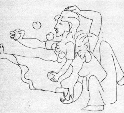 MAUREEN SELWOOD — The delicate lyricism of Maureen Selwood’s style is already evident in her first film, The Box (1969), which combines live-action and animation in a lively fantasy of the Astor Place cube sculpture coming to” life. The Six Sillies (1971), made at New York University’s Institute for Film and Television, in 35 mm eel animation, is rich with the luscious color and delicate Matisse-like line that evolve in the public service and commercial projects she has done since then.
In her current project, Odalisque (pictured Left), she moves away from story-tellling into poetry; a series of mythical women undergo the most extraordinary transformations — the kinds of dreamlike metamorphosis that Selwood’s lyricism brings to life beautifully.
The short post script as to where are they now is not going to be written by me. I know that a couple of these people have died (Richard Protovin & Adam Beckett), several are still animating (Dennis Pies and Eli Noyes are both in California), others are animating and are connected with excellent schools (George Griffin teaches at Pratt, Maureen Selwood at CalArts). I believe Al Jarnow still lives in NY state, and the last I heard of Thelma Schenkel, she was teaching at Baruch College in NY. I’m not sure of the rest.
If any of you reading this know more, I urge you to let us know in the comments section or I’ll be glad to write a more extended piece in the future. I’m already thinking about some of the Independent animators from 1977 who were left out of this article.
Daily post &SpornFilms 24 Nov 2008 09:02 am
Nice words
- In trying to put together yesterday’s links to the Oscar contenders, I consulted a lot with the Ottawa Animation Festival catalogue for info. In looking at that magazine, again, I came upon the piece about me, my studio and our work.
Written by Richard O’Connor, a principal in the Asterisk Pictures animation studio, the piece is one of my favorites of anything I’ve seen about me. So, with all lack of humility, I’m going to post that here. I hope you don’t mind this seeming self-promotion, but I like the writing and enjoy seeing it out there. (I guess I could be railing about politics, instead. Would that be worse or better?)
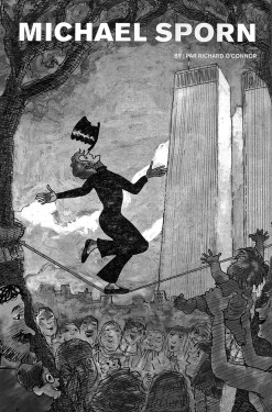 PROGRAM:
Sunday, Sept. 21, 11:00 am
(Museum of Civilization)
The Man Who Walked Between
__the Towers [2005] 10:17
The Marzipan Pig (1990] 26:23
Doctor DeSoto [1984] 10:15
The Hunting of the Snark [1989] 18:54
Reel of miscellaneous works 8:00
Turning off Seventh Avenue onto a tiny street, then another even tinier street, the New York of now – of the Real Housewives and the Gossip Girls, of the luxury condos and highrise hotels – recedes. The crassness of reality draws back, pulling forward thoughts of New York as we want it to exist In our imagination, Audrey Hepburn is sipping coffee at the corner cafe and Gene Kelly swings from every lamppost; Bob Dylan is busking in the subway and Joey Ramone incites teenaged riots down the street On this storyboard storybook street an innocuous, easily missed sign in a passageway next to a fortune teller – where a psychic fat cat suns in the window, tail snuggling a crystal ball with a deck of tarot cards as a pillow – marks the way: “Michael Sporn Animation”.
A short tunnel leads to a garden — maybe Audrey Hepburn will drop a serenade from the surrounding fire escapes. At the end of the garden is (knock loudly) Michael Sporn’s studio. Conspicuously absent its own cat to match stripes the gatekeeper’s (his previous space had an amiable feline resident), the large semi-subterranean space has a comfort, a warmth that fits with the films made there. The previous space on Broadway, now most likely a bank or an American Apparel outlet, had the practical, efficient feel of a Henry Ford operation. As a producer, Michael is practical and efficient, but here, here in this low-lit grotto, in this bustling part of the city that real estate speculation and corporate claptrap seem to have forgotten, he has found himself in a sort of Bauhaus in which the hand hewn careful construction of his work is matched with an urban rusticity that has also disappeared from our landscape.
Michael walks through the studio filled with a mixture of moviolas, Macintosh computers and lighiboxes. He’s all bushy, unruly hair. He’s all still eyes and lips that turn unexpectedly warm and smile with ease – looking every bit the part of an animator. Not surprisingly, a little like the Unabomber too, another solitary spirit out of place in the Walmart economy.
With such a ranging intellect, I would prefer to talk with Michael about anything instead of the mundane simplicity of animation. Our first ever conversation was at a dinner following a tribute to Tissa David at New York’s Museum of Modern Art. He confessed that he read several books a week, usually devouring the work of a single author in the matter of a month. He modestly attributed this to insomnia. Other insomniacs are pros at Grand Theft Auto and channel changing. At that time he was burning through John Updike. Updike, inspired by James Thurber, had wanted to be a cartoonist; writing novels, it turns out, was easier.
At that first conversation, just like now sitting across from the studio’s picnic style lunch table, Michael’s mind ranged the arts and sciences, always pulling back to animation -politics and animation, literary adaptations, Flash as a production tool (to be avoided, in his opinion), motion capture and its shortcomings. No matter how you try to avoid it, animation is inextricably tied up in his thought system.
Intelligence – book learning – is simple to relate to. Anybody can pick up a second hand “Rabbit, Run” and a study guide and join the book club conversation. Experience is a sharper fanged monster, What librarian, even one who knows every decimal of Dewey’s system, can claim to have stood side by side with Tolstoy as he plotted “War and Peace” or Dickens rhapsodizing on the French Revolution?
There’s no way to phrase this, other than to just say it: I’m slightly (…just a little…) jealous of Michael’s career. That dinnertime conversation took place a few years after we were first introduced. There was something daunting, slightly intimidating about his resume, something so cool in his demeanor that made him seem unapproachable. In the early 70s, John Hubley hired him as an intern. In short order he graduated (or was demoted) to production manager, taking large responsibilities for the films from “Everybody Rides the Carousel” to the Letter Man series for Children’s Television Workshop’s “Electric Company”. Letter Man, along with several shorts produced by Hubley and animated byTissa David rank with the most compelling and charming short films.
After Hubley’s passing he moved on to New York’s next legendary production, Richard Williams’ “Raggedy Ann and Andy”. Several years with John Hubley would teach anybody how to make films, and several months woodshedding with Williams and his assembled team of masters could teach anyone a few things about how to animate.
Michael often claims that he primarily does “work for hire” -making films for other people on other people’s dime. While that may be true in an economic sense – in much the same way that Richard Williams’ best work, it could be argued, is his commercial work, or that without CBS, Hubley never would have produced “Everybody Rides the Carousel” – Michael’s works for hire all bear his personal touches and are as “independent” as animation gets with regard to style and substance.
Amongst these notable commissions are two adaptations of William Steig books, the Academy Award nominated “Doctor Desoto” and 1988′s “Abel’s Island”. Adapting a complex and ironic artist like William Steig can be particularly difficult. The story and the illustration all have to make sense on different levels of intellectual engagement. These pieces demonstrate a rare ability to understand inner tonalities of an illustrated story and translate that feeling to film.
The credit list of “Abel’s Island” is a snapshot of influential East Coast animators. Rob Marianetti, John Dilworth, Doug Compton, Lisa Crafts, Tissa David, Steve Dovas all contributed to this (and other) films, thus perpetuating the cycle of influence and education that has made animation in New York an easily identifiable yet qualitatively indescribable art form.
Two centerpieces of this program, “The Marzipan Pig”, and “The Man Who Walked Between the Towers” share the same softness and stylistic integrity demonstrated in Michael’s two William Steig films. Much of that can be attributed to the touch of Tissa David who has worked closely with Michael since his time with Hubley. Levity, respect, inquisitiveness -a space opens in these films, as though the artists are in communion with the material and we are all brought privy to their understanding of the world.
“The Hunting of the Snark” also anchors the Festival’s program selections. This film was completed over the span of several years and was animated entirely by Michael in between projects. A Lewis Carroll poem recited by James Earl Jones, the film leaves off with a looming question, its characters teetering on the verge of new age. It’s almost certain they’ll all be devoured, a fate the film’s director has managed to avoid as the brighter-than-neon signs of “progress” encroach.
Richard O’Connor is a producing partner of Asterisk in New York. He hopes that he is intimidating.
Daily post 23 Nov 2008 11:26 am
Oscar duties
- Yesterday, the Academy had the NY screen off of the animated shorts entered for competition. Some 40 short films were projected for about 25 people – 15 members and the rest guests. The program started at 10 am and continued up to 8 pm – a V E R Y long day. A couple of members came down from Montreal to vote, some from upstate NY and the rest city dwellers.
There were a lot of mediocre films, some very bad films and a couple of excellent films. The usual for animated short collections.
Here’s a list of the films screened in the order that we saw them. I tried to find links for some of them and had difficulty in locating the directors for some of them.
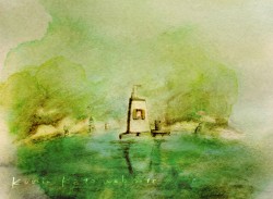 Boar Attack Jay White/Canada 4 mins
Bridge Kaaren Stang/Norway 1 mins
I Have Seen the Future Cam Christiansen/US 6 mins
La Maison En Petits Cubes (The House of Small Cubes) Kunio KatÅ/Japan 12 mins
Mutt Glen Hunwick/Aus 7 mins
Oktapodi Gobelins Student film/France 2 mins
Secrets of the Furious Five Raman Hui, Dreamworks/US 24 mins
Sea Monsters – A Prehistoric Adventure Sean MacLeod Phillips, Nat’l Geographic/US 40 mins
Hot Dog Bill Plympton/US 6 mins
I Am So Proud of You Don Hertzfeldt/US 22 mins
Lavatory Lovestory Konstantin Bronsit/Russia 10 mins
Le Noeud Cravate (The Necktie) Jean-François Lévesque, NFB/Canada 12 mins
Retouches Georges Schwizgebel/Switz. 6 mins
Veterinarian Signe Bauman/US 19 mins
Hot Seat Janet Perlman 6 mins \
The Phantom of the Cinema Erik van Schaaik/Holland 11 mins
Botnik Jacqueline Smessaert Brennan, Calabash/US 11 mins
Chainsaw Dennis Tupicoff/Aus 25 mins
Chick Michael Socha, Poland 5 mins
The Cracked Pot 4 mins
The Crumblegiant John McClasky/Ireland 5 mins
 Ergo Géza M. Tóth/Hungary 12 mins
For the Love of God Joe Tucker, NFTS student film/UK 11 mins
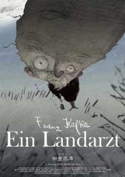
Franz Kafka’s A Country Doctor Koji Yamamura/Japan 21 mins
The Girl Who Cried Flowers Umesh Shukla/US 25 mins
Glago’s Guest Chris Williams, Disney/US 7 mins
Hungu Nicolas Brault, NFB/Canada9 mins
A Letter to Colleen Carolyn and Andy London/US 9 mins
Monster Coins Vance Yang, SOFA studios/Taiwan 10 mins
Over the Hill Peter Baynton/UK 8 mins
Perpetuum Mobile Enrique Garcia, Rubén Salazar/Spain 11 mins
Skhizein Jeremy Clapin/France 14 mins
Surviving Sid Galen Tan Chu, Karen Disher/Blue Sky/US 8 mins
Tadeo Jones and the Basement of Doom Enrique Gato 18 mins
This Way Up Smith and Foulkes/UK 9 mins
The Weatherman Will Becher/UK 3 mins
Descendants Heiko van der Scherm; Patrick Cunningham/USA-Germany 14 mins
Varmints Marc Craste/UK 24
Presto Doug Sweetland, Pixar/US 5 mins (shown out of order)
Daily post 22 Nov 2008 09:09 am
Hell and Back
 - Today is the once-a-year hell that I complain about but totally enjoy.
The Academy is having the viewing of all animated short entrees, and from the 40 films submitted, we’ll help to select the 10 or so that will be on the short list.
This year’s event promises a lot of long flms and 9 solid hours of screening. Hopefully and expectedly, there’ll be one or two films I like. I’ll try to give a longish breakdown tomorrow.
 -Karl Cohen‘s email led me to this article about Gene Deitch‘s appearance at ASIFA SF for a chat about his life’s work. (Part 1 and Part 2). It’s an engaging piece.
I know you all know about the animation autobiography Gene Deitch has on AWN, but in case you don’t I strongly suggest you read it. The man has so much to tell, and he does it in a very engaging way.
The book is free from AWN or you can buy a hard bound copy.
- Mark Mayerson has completed his Mosaic for 101 Dalmatians. I have to give him great praise and kudos for the task he’s completed. These are great tools for us all, and I’m enormously thankful.
Daily post 21 Nov 2008 10:30 am
2Dornot2D
 - Let me scream out the good news: Paul Spector has begun a blog that will feature the artwork and information by and about his father Irv Spector.
This is good news for those of you, like me, who crave solid information and goodies about animation’s past. Irv Spector was an artist who worked at Mintz, Flesicher, Paramount, and a dozen other top studios. He did every sort of animation job imaginable as well as writing stories. On top of that he did a successful comic strip.
There’s a wealth of material that’ll show up on this site, and I couldn’t be happier about it. Today there’s a great little introduction, soon some material from Linus the Lionhearted. (Despite the overly commercialized show, it was great among the Saturday morning programs for kids like me.) ____________________________Irv Spector at Mintz.
This site will offer plenty, and I urge you to keep it on your watch list. I’ve added it to my blogroll.
- Tony White‘s festival, 2D or not 2D, has just ended, and there’s an excellent account of it – including pictures and vid clips – at Ken Priebe‘s site, The Boundaries of Fantasia.
On further search, the official website of the Fest has a great view of the entire event; they show it in pictures. It was fun touring this Festival vicariously. It sounds like a true animator’s festival in an ideal location, Seattle.
Congrats to Stephen Neary for winning another award with his excellent and funny film, Cowboy Chicken.
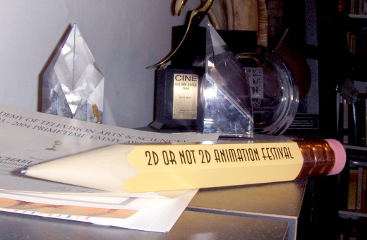
The Award I won at this festival back in 2006. It sits among some other awards and is not as close to the camera as it looks here.
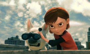 - And speaking of not 2D, Bolt opened today.
The reviews were mixed.
- AO Scott in the NY Times says: With brisk wit and impressive visual brio, “Bolt†explores an existential predicament that it also shares. It is at once a knowing, satirical sendup of the Hollywood fame-and-fantasy machinery and a sleek, expensive product of the Disney-Pixar industrial complex.
Joe Neumaier *** in the NYDaily News says: Disney animation has been let off the leash with “Bolt,” and proves that even those who’ve led know when to follow. In this case, it’s Pixar, which uses the Mouse House as its distributor, whose footsteps are the guide and whose visual precision is copied down to a dog’s hair, though the heart of Pixar’s simple stories – their gentleness – is missing.
Rafer Guzman in Newsday *** says: Familiar territory, but the Disney team still knows how to bring a story to life.
Variety‘s Todd McCarthy said: “Although it seems like a workable notion on paper, onscreen the fundamental premise feels a bit shaky.”
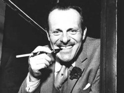 - And speaking of new blogs, Eddie Fitzgerald – Uncle Eddie to many of us – has a new blog called Love Nerds. This is something at least interesting and possibly ingenious.
You can post your own YouTube videos searching for a job or a date, love or work – maybe both. There’s going to be a wealth of wonderful material to view on this site, and it’s in my radar with great expectations.
