Monthly ArchiveOctober 2008
Animation &Articles on Animation &Tissa David 21 Oct 2008 08:03 am
Tissa – 1975
- The 1975 issue of Millimeter Magazine is an animation issue. There are a number of enormously informative articles. I was rereading the copy of the magazine, this past weekend, when I came across the Close Up section, wherein a couple of bios appear.
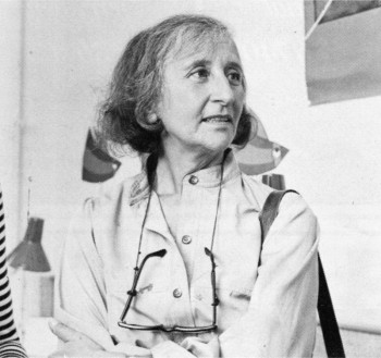
I’d like to show one for Tissa David that was included. I assumed John Canemaker authored the piece; there is no byline. When I asked him, he responded thus: “I wrote the article on Tissa. The quotes are from my first formal interview with her.It was for Millimeter when I was the animation editor and put together special animation issues.”
Tissa looks so young in that photo.
-
“I am a frustrated comedienne, for sure,” Tissa David will tell you, only if you ask. “I am a clown. If I weren’t shy, I’d probably be on the stage.” Instead she is an animator, one of the world’s best and busiest, and one of the few women to have reached the top in the traditionally male-dominated animated cartoon field.
She joyfully toils in her East-Side New York apartment, a warm, plant-filled place that often smells of baked apples. Classical music swirls quietly from a radio and the glow cast from the light under her animation board gives her the look of a sorceress.
 The lady has class—a fact one gathers upon first meeting, but a fact that is reaffirmed by catching a look at the creatures she is conjuring to life on her drawing board. The graphic line is strong and free, yet elegant (as is the artist); and when the drawings are flipped, the creatures move through their paces with a deliciously droll humor, a wit that is uniquely Tissa David’s.
As a child in her native Hungary, Tissa saw Disney’s SNOW WHITE and thought (as so many others have thought after experiencing that film masterpiece), “Now this is something I want to do.” After graduating from art school, she became an assistant animator at Magyar Film Iroda in Budapest; a little more than a year later, in 1945, she was a co-owner of the Studio Mackassy and Trsi supervising all phases of production including story and camera and was sole animator of the puppet and cartoon films.
She left Hungary in 1950 during the height of the Stalin regime, and finally landed in Paris.
Jean Image Productions hired her in September 1951 and for two years she read sound tracks, planned layouts, animated, and did the entire editing of the feature-length, BONJOUR PARIS (1953). That studio closed and Tissa animated at La Comete next, a studio that had been Paul Grimault’s.
“I had absolutely no relatives outside of Hungary except in the United States. So I asked for a visa in 1950. It took at that time five years to get a visa, that was still the quota system. So I came to New York…I loved the U.P.A. cartoons. I decided I wanted to work in that studio.” In 1956, the United Productions of America’s New York Studio was the last tenant in a brownstone on Fifth Avenue and 53rd Street slated to be torn down for the construction of the 666 Tishman Building. There was a French girl in the UPA studio and so she introduced me,” Tissa recalls. “I had no sample reel. I went in once to make a sort of tryout. I was scared; I didn’t speak English, so I was just waiting, waiting, and Grim came by…Grim Natwick is the history of animation and I can rave about him. He created Betty Boop and animated the character of Snow White all the way through. UPA had an awful lot of work and they needed an assistant to Grim.”
At that initial meeting, Natwick boomed, “Now, you know what animation is!” Tissa quietly answered, “Animation is—animation.” Natwick laughed, “You can’t argue with that!” and thus began a professional partnership that lasted twelve years. “Isn’t it strange,” says Tissa today, “that SNOW WHITE got me into animation and I really learned my animation from Grim. I know a great deal about animation, I know I know, because even today I don’t do one line without something in my brain Grim told me.”
After UPA closed in 1958, Tissa and Grim freelanced as a team on countless TV commercials, and since Grim’s retirement, Tissa has soloed successfully and most notably on several John Hubley projects, i.s.: Of Demons and Men (1970), Eggs (1970), Children’s Television Workshop segments Cool Pool Fool, True Blue Sue, Truth Ruth and others, and Cockaboody (1973). Her latest animations include three CTW Letterman episodes, a scene in Shamus Culhane’s Noah’s Ark production, and over 110 feet of Hubley’s Bicentennial film, People, People, People. She has just completed some experimental animation fora Dick Williams project and is now starting, also for Hubley, a TV special based on Erik Erikson’s writings.
A description of Tissa David’s style of animation is difficult; for while it is a distillation of the Disney influence in timing, the UPA sense of humor-through-graphic-design, and the strong, poetic John Hubley mode, it also contains a different character, unique to Tissa David, that she calls the “female difference…If the same scene is animated by a man and by me, there will be a great difference, not in quality but in interpretation. John Hubley told me I have a fine sense for detail, not in the drawing itself because I make very loose drawings, but in a scene, in expressing feelings. I am a very intuitive animator—I never know when I sit down to work what will happen.”
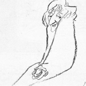 For all her gentleness, Tissa also contains an inner core of strength exhibited in her single-minded devotion to her art. Her opinions about that art, herself and other topics, is disarmingly to-the-point: “I believe very strongly that one must know how to draw,” she will offer on the subject of how-to-animate. “Even if you just animate objects, you must have a knowledge of drawing.” As for her struggles securing her place in animation, Tissa will admit, “…its very hard. Women can find work in animation if they have enough will to follow through and really do it. Even today, I’m always saying if I keep busy long enough, I will become a good animator.”
At the time this piece was written, Tissa was completing work on a pilot for Dick Williams’ film, Raggedy Ann & Andy; this one minute piece got Dick the film over Joe Oriolo and Shamus Culhane. She would thereafter work on John Hubley’s Doonsebury Special (just as he died mid film); and she was to animate for R.O.Blechman’s Simple Gifts.
Animation Artifacts &Disney &Story & Storyboards 20 Oct 2008 07:39 am
Revised Melody Bd – Pt 2
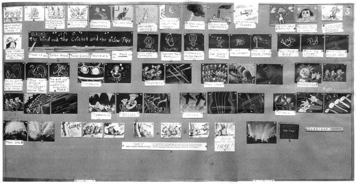
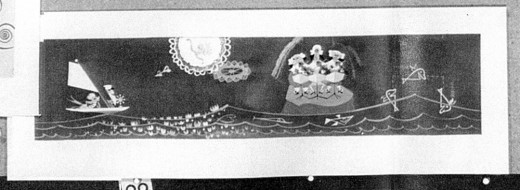
Here’s the final part of the revised storyboard for the Disney short, Melody: Adventures In Music. This version of the board was done in April ’52 and is closer to the final film (which was done in 3D.) See Part 1 here.
You’ll remember that I posted the first version of the board for this film in two parts here: Part 1 and Part 2. Many thanks to John Canemaker for the loan of all this material.
Here’s the whole board:
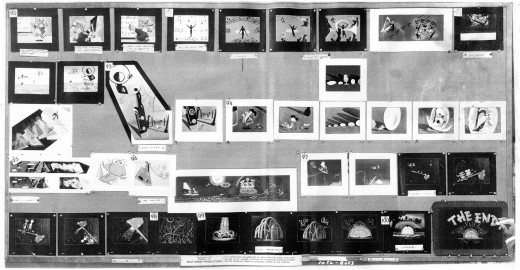
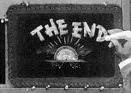
You’ll note that this board is configured oddly. You’ll also note that on each of the two photos there is a “THE END” card. I can only assume these are alternate endings.
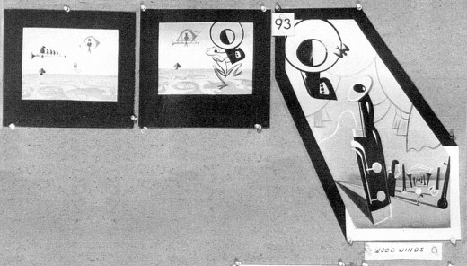
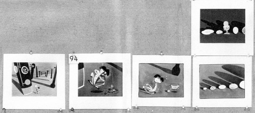
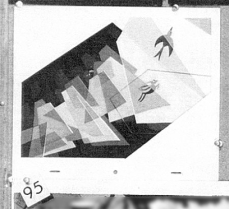
Now, here is my breakdown of the board, trying to keep the size as large as possible so that you can read it.
 31a
31aYou’ll notice as you look through this part of the board that a lot of the
artwork sketches I posted in the past two weeks are displayed here.
Art part 1 and Art part 2
Next week, TOOT WHISTLE PLUNK & BOOM
.
Photos 19 Oct 2008 08:19 am
Very Scary
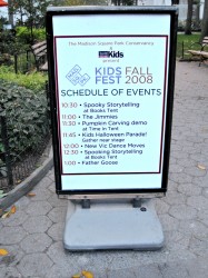 – I knew something was planned for Madison Square Park when I passed through it on Thursday.
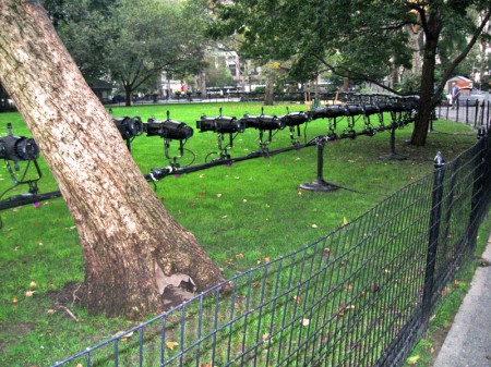
Lights had been erected in a circle, around the
“Oval Lawn.”
So I took a couple of photographs in anticipation, not knowing what was planned –
an art piece? an Oktoberfest? a concert?
This Saturday, passing through I noticed a flurry of activity with the usual tents being put up. This sign, to the right, revealed what it was for
___________HALLOWEEN !
I mean . . . Fall Fest !
(Click any image to enlarge.)
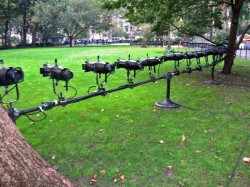
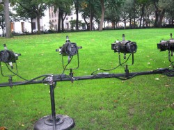
Lights had been set all around the “Great lawn.”

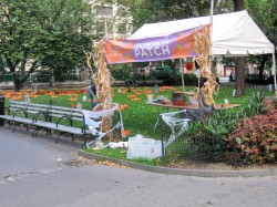
On Saturday, a couple of tents had been constructed
and planning for the event was in progress.

The smaller lawn became a cemetery filled with pumpkins.
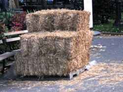
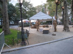
Bushels of hay flanked the cemetery, and the front of the park
was still in development.
But then I went back to the park later that afternoon, and it’s like none of this had existed.
 Everything – tents, pumpkins, hay – was gone as if it had never been there.
All that I saw to prove I hadn’t dreamed up these photos was the chit I found, pictured to the right. Apparently, the pumpkins went to the kids.
The only remaining thing was the lighting and the foliage. The squirrels enjoyed the lights; I enjoyed the foliage. Apparently,
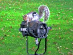 those lights must be for some other event up and coming.
- Sarah Palin made her SNL debut last night. My friend, cartoonist, Tom Hachtman did this cartoon celebrating the rise of Ms. Sarah. It’s one of his first attempts at animation. (and it wasn’t done with Flash!) The drawings were originally assembled to animate by Bill Skurski.
Daily post 18 Oct 2008 08:56 am
Azur & Asmar
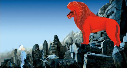
Michel Ocelot‘s animated feature, Azur & Asmar: The Princes’ Quest, has quietly opened in NYC at the IFC theater for a limited run. It plays daily at 5:20pm (and at 11 pm on Sat & Sun).
 The too few reviews have been quite favorable. Read here:
- the NYTimes says “…the movie has a terrific flair for arabesque patterning, a gemlike luminosity of surface and a handsome, classical cast of mind.”
Time Out NY says “…Azur & Asmar is absolutely gorgeous, as the director integrates visual elements and techniques drawn from medieval illuminations and Arabic art…”
The Weinstein Co. will release the dvd for this film on Nov. 11th.
Harvey Deneroff has an excellent piece on this film on his site.
- The following letter came from Jennifer Jeremich at CalArts re sending money to support Corny Cole, whose home was destroyed this week in the Marek fire:
- Thank you for contacting CalArts about helping Corny Cole recover from the loss of his home in the Marek fire earlier this week. Your compassion is deeply appreciated not only by Corny and his wife, Linda, but also by all of us at CalArts who care about their well being.
For those of you who have asked for advice on how to get financial assistance to Corny, we have designated a primary point person who will collect funds for him. Any checks should be made payable to Cornelius Cole and sent to the following address:
California Institute of the Arts
ATT: Trish Patryla, Office of the Provost
24700 McBean Parkway
Valencia, CA 91355
On behalf of Corny and Linda, thank you so much for your concern and well wishes.
Jennifer Jeremich
This letter came by way of Roberta Levitow, and I thank her for sending it to me. Once again, let me post this Paypal link which I posted yesterday, in case you want to contribute that way: PayPal link.
- A week after the DVD release of Azur and Asmar, on November 18th, First Run Features is going to release the boxed set of my films on dvd. This is something I’m particularly proud of.
They’ve just sent me a press release to approve. It’s quite amazing that I allow people to say such wonderful things about me at this stage in my life. Here’s a small part of that two page release (that eliminates some of the overly positive hyperbole.)
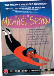 First Run has long been a fan of Michael Sporn, and when made available we’ve eagerly released his beautifully crafted, socially aware films. Thus we’re proud to announce this new Collector’s Edition Box Set, which brings together in one package all twelve Sporn films that we’ve released over the years.
Based on stories from such acclaimed writers as William Steig (author of Shrek), Russell Hoban, Hans Christian Andersen and Lewis Carroll, the 12 films in the Box Set are considered among his best – and most personal – works, and feature a stunning cast of voices, including James Earl Jones, Ruby Dee, Tim Curry, Amanda Plummer, Danny Glover, Linda Lavin, Regis Philbin, Ossie Davis and F. Murray Abraham.
The six disc set also comes with copious bonus materials created by Sporn especially for these DVDs, including short films (In the Animation Studio, etc), animatics (storyboards), art galleries, and audio commentaries.
THE COLLECTOR’S EDITION BOX SET FEATURES THE AWARD WINNING FILMS
• Whitewash • The Talking Eggs • Champagne • The Hunting of the Snark •
The Marzipan Pig • Jazztime Tale • Abel’s Island • The Dancing Frog • The Red Shoes • The Little Match Girl • The Emperor’s New Clothes • Nightingale
Animation &Frame Grabs 17 Oct 2008 07:59 am
Corny’s Mouse & Child
- Thanks to Nancy Beiman who left this Paypal link in the comments section of yesterday’s post. It’s a place where you can donate some money to a fund being raised for Corny Cole after his house fire.
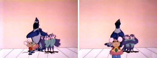
 - After thinking about Corny Cole yesterday, I couldn’t help but think about The Mouse and His Child, a feature he worked on immediately following his work on Raggedy Ann.
The Mouse and His Child was directed by Fred Wolf and Chuck Swenson and has some real charm. However, it created a small problem for me.
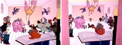
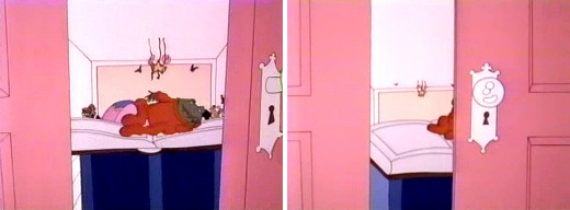
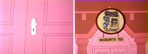
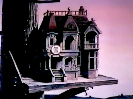
When I’d begun work on The Marzipan Pig, I had to guarantee the brilliant writer, Russell Hoban, who authored both books – The Marzipan Pig and The Mouse and His Child – that no spoken dialogue would be created by me or Maxine Fisher, who was writing the script. Hoban was annoyed by the script for The Mouse and His Child. He felt they had butchered his story.
In fact, the film ends 3/4 of the way into the story. Elements of the last quarter of the book are rushed through the film in one last scene before the end titles. (I have to admit it’s a bit confusing.) This is a scene Corny animated. It’s all one scene; no cuts; an animated BG.
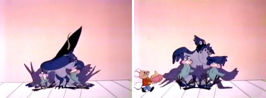
(Click any image to enlarge.)
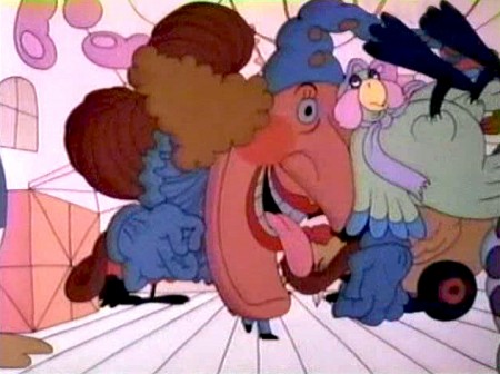
The Jack In The Box looks very different from the guy in Raggedy Ann.
You can watch this film on YouTube.
Animation Artifacts &Daily post &Richard Williams 16 Oct 2008 08:23 am
Corny’s Fire
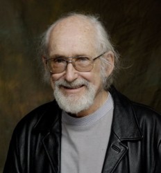 - I received emails from both John Canemaker and Roberta Levitow about Corny Cole‘s home burning down in the recent fires in California. He says that 90% of his artwork saved from over his many years has all been destroyed. Even worse is the loss of his numerous pets – cats and dogs – that all died in the fire.
I understand that a fund raiser is being formed to help Corny out. When I hear anything more, I’ll pass it on.
The FOX report reads:
- The Marek Fire destroyed more than three dozen homes in a Lake View Terrace mobile home park. One man, a noted animator, lost not only his home, but his life’s work to the fire.
You can check out a Fox video here.
The piece, naturally enough, appeared soon after I learned about it on Cartoon Brew. (They’re always ahead of the curve.) I don’t mind repeating the info in case anyone’s missed it.
For those who don’t know who Corny is, let me repost this piece I did back in 2006:
- I have quite a bit of artwork from the film, Raggedy Ann & Andy: A Musical Adventure, the 1976 feature film by Dick Williams. Hence, it’s always an easy decision to post some of it. Unfortunately, every animation drawing is so large, it takes a lot of time to scan and put it together.
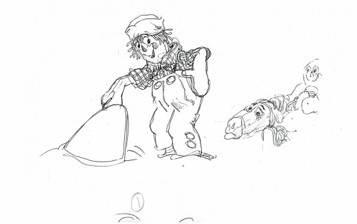
____________(Click any image to enlarge.)
I think in many ways, the unsung hero of Raggedy Ann was Corny Cole. He was there from day one working with Dick Williams and Tissa David – once the one minute pilot had secured the job for Dick. Corny was brought in as the key designer, and Gerry Potterton came on as Dick’s Associate Director.
I was hired soon thereafter, even though I had no idea what I’d be doing. For the first couple of weeks, while they were recording, I just moved furniture and read the script and whiled away the time by drawing Johnny Gruelle‘s characters.
I helped Dick and Gerry add spot coloring to the storyboard as the animatic was being shot. We spent a long Saturday coloring like mad with colored pencils. We worked on the last section of the animatic to be shot. I’d say 90% of the board was done by Corny. Dick and Gerry added spot drawings as needed, while we built the animatic.
Corny then did lots and lots and lots of drawings to give to animators.
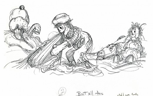
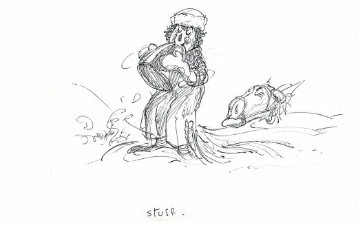
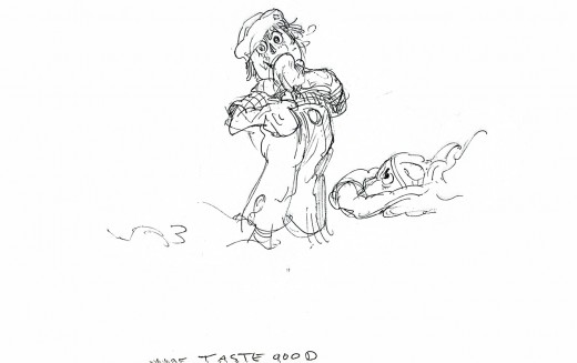
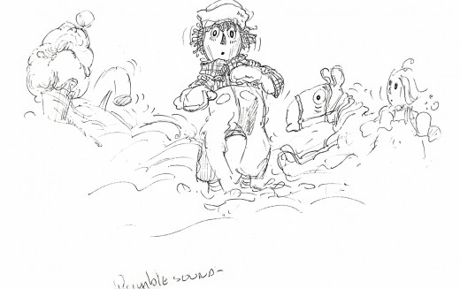
Some of those drawings are posted herein for a scene at the beginning of the “taffy pit” sequence. These drawings were also used in the animatic.
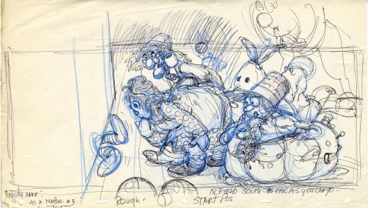
After Corny finished feeding the animators, he started animating, himself. He took on a sequence that filled the screen with a pirate ship full of dolls floating around some rough waters. The large sheets of paper were filled with Corny’s black bic pen lines. Doug Compton eventually worked with Corny to finish this overworked sequence.
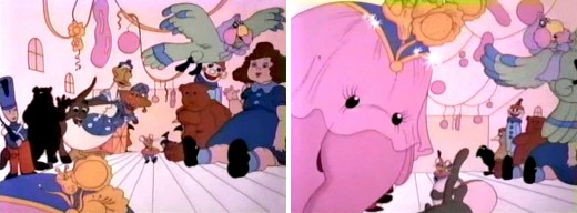
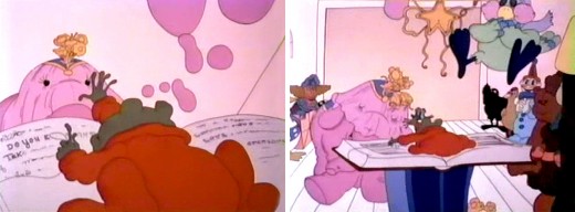
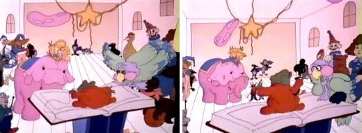
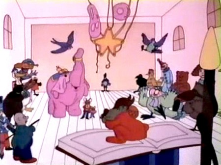
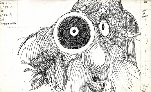
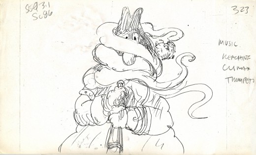
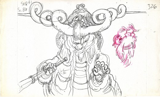
- John Celestri sent me a clipping from the Cincinnati Enquirer re the kidnapping of Ann & Andy. Hence, I am prompted to post the following layouts and storyboard drawings by Corny Cole.
This first Layout marks the introduction of Raggedy Andy. He’s under the box. This drawing gives you a good idea of the detail Corny put into every drawing.
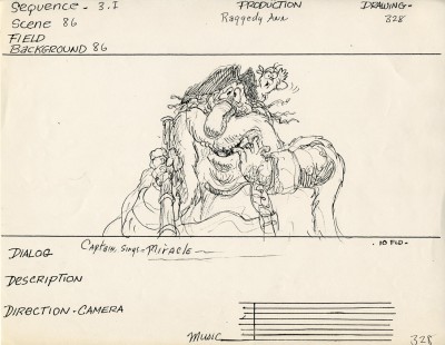
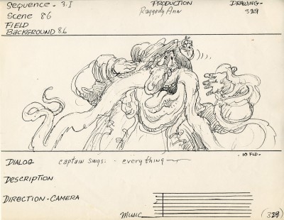
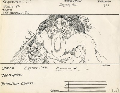
The following images come from the first shots of the Pirate Captain. He espys the new doll, Babette, and falls madly in love.
The first four stills are 8.5×14 copies of the storyboard; the remainder come from the director’s workbook. They’re all sequential.
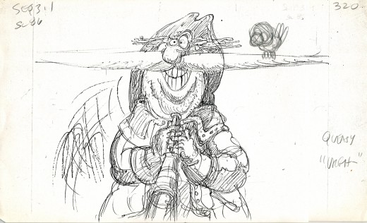
I think the parrot, which was added in pencil, is the work of Asst. Director, Cosmo Anzilotti. The bird just shows up later, so Cosmo probably tried to give him some business.
It’s here that the Pirate goes into his song (everybody sings in this film) and concocts his plot to kidnap the French doll.
Animation &Books &Disney 15 Oct 2008 08:13 am
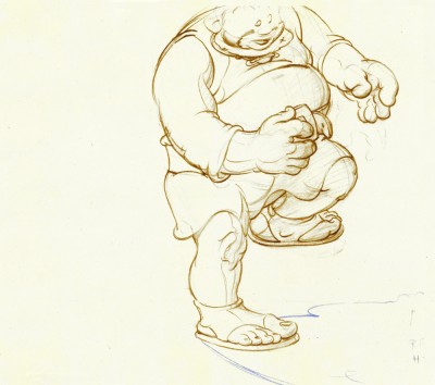
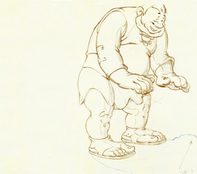
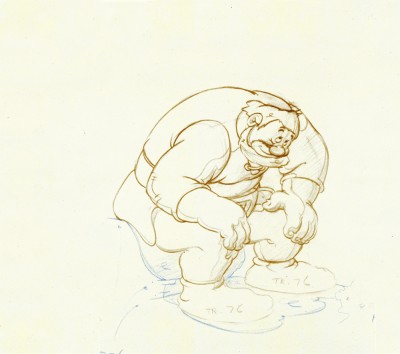
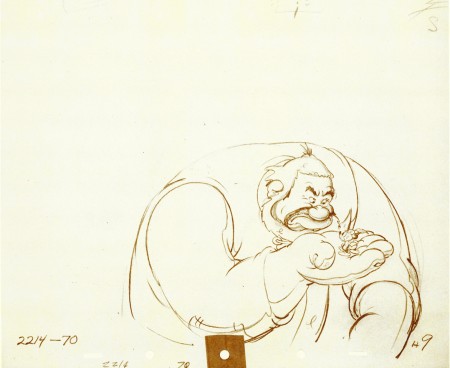
Tytla’s Willie
- When I was a kid, I was never a big fan of the “Willie” character, the giant in Mickey & the Beanstalk. It seemed that every fourth or fifth Disneyland tv show would have this character in it (or else Donald and Chip & Dale). As I got older and grew a more educated eye for animation, I came to realize how well the character was drawn and animated.
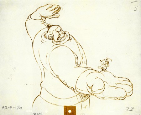
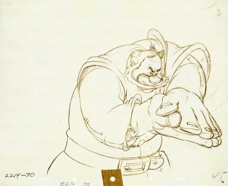
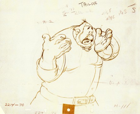
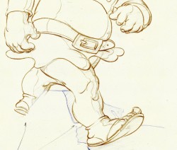
Willie first appeared in the classic Mickey short, The Brave Little Tailor, and he appeared fully formed. Bill Tytlas was the animator, and he appeared to have fun doing it.
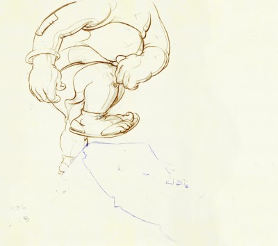
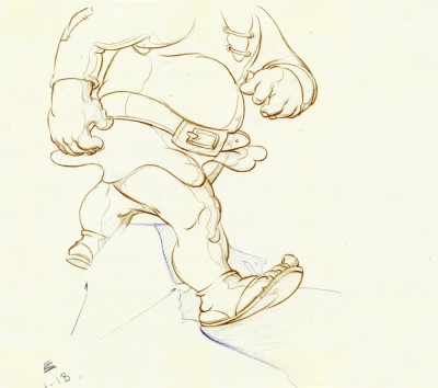
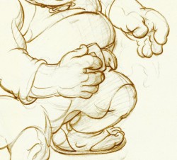
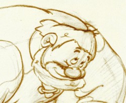
In John Canemaker‘s excellent book, Treasury of Disney Animation Art, there are some beautiful drawings worth looking at. Here they are:
 1
1(Click any image to enlarge.)
So let’s take a closer look at some of these drawings.
.
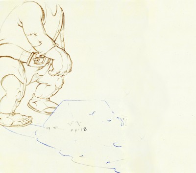
Drawing #3 features this weight shift. As the right foot hits the ground it pronates – twists ever so slightly inward. The hands do just the opposite. The left hand reaches in while the right hand holds back, completely at rest.
It’s a great drawing.
.
.
.
Drawing #4 shows Willie landing on that right foot, and his entire body tilts to the right. The hands twist completely to the left trying to maintain balance. The left foot up in the air is also twisting to the left before it lands twisting to the right.
.
.
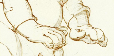
I love how drawing #5 features the two hands flattened out to
make his final stand before sitting down. It’s all about gaining balance.
.
.
.
.
Just take a look at this beautiful head in drawing #6. He’s seated, his head has come forward and tilted forward. The distortion is so beautiful it almost doesn’t look distorted.
What a fabulous artist! This guy just did this naturally.
.
.
.
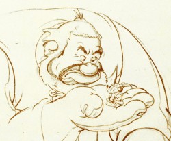
This scene begins with the seated giant eyeing the tiny Mickey Mouse in his hand. The characters are drawn beautifully almost at a rest waiting to get into the scene. The intensity of Willie’s glare is strong, and it’s obvous Mickey is in trouble.
.
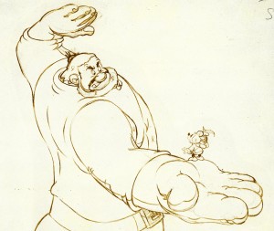 Here’s the drawing of the sequence.
The major problem with drawing a giant is his proportion to all the other characters. The screen is more oblong and vertical than it is square. (Fortunately, when this film was done it was closer to a square but still not one.) Throughout the film, Tytla had to deal with a BIG and Mickey and the landscape are small.
An obvious way of handling it – and one that would be done today, no doubt – would be to force perspective showing it from the ground up – most of the time. In the 30′s and 40′s they stuck to the traditional rule of film and editing, and they would NOT have done this.
Tytla plays with scale as the giant steps over a house and ultimately sits on it.
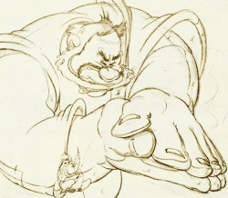
In this drawing, he does a brilliant drawing forcing the perspective with Mickey in the foreground and Willie’s left hand in the distance. The giant draws into this forceful perspective without calling attention to itself. Today it would be more exaggerated, but Tytla doesn’t want it to be noticed – just felt.
A real bit of art!
Here, Willie moves through that perspective of the last extreme, and he gets larger as he slams his hands to flatten Mickey. To exaggerate that flattening, Willie’s hands flatten for this key drawing. His head flattens as well in grimace.
The giant’s head will move in toward the hands to see the results, and the audience has a front row seat seeing Mickey escape up the giant’s sleeve. There’s a lot going on in this drawing.
.
.
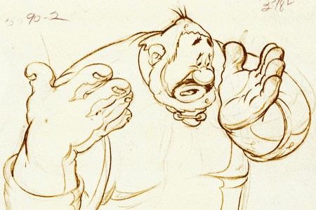
Finally, Willie tries to figure out what’s happened.
The drawing loses most of its distortion and comes to rest.
(Note that there’s still perspective distancing between the two hands.)
Mark Mayerson has done a mosaic breakdown of this cartoon and adds his excellent commentary.
Daily post 14 Oct 2008 08:08 am
Variety News
Two short articles appeared in Variety last week and they caught my attention. The first drew an audible HUH! from my mouth as I read it on the subway:
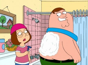 Seth MacFarlane‘s “Family Guy” stage show is headed to Carnegie Hall, with two dates booked for next month.
“Family Guy Sings!,” set for Nov. 24-25, will feature the cast of Fox’s animated hit in a live perf of two uncensored episodes of the show, along with musical numbers from various episodes and bonus material
that never made it to the air.
Thesps will be accompanied by a 40-piece orchestra led by “Family Guy” composer Walter Murphy. The perf will also include a preview of “The Cleveland Show,” the. spinoff series bound for Fox next year.
The live stagings of segs from the 20th Century Fox TV-produced laffer were a big hit at Montreal’s Just for Laughs comedy fest in 2004 and 2007. Similar live shows have been mounted for limited runs in L.A., Gotham and Chicago during the past three years.
The Carnegie Hall shows will be the most elaborate yet for the troupe of MacFarlane, Alex Borstein, Mila Kunis, Seth Green and Mike Henry. “We hope the good people at the hall are ready for a barrage of masturbation jokes that’ll make Igor Stravinsky’s ‘Concerto No. 69′ look like George Gershwin’s ‘Clean Wholesome Hugs,’” MacFarlane said.
The “Family Guy Sings!” Carnegie dates will be presented by Just for Laughs and producers David J. Foster and Jared Geller.
What else can be said? Is Broadway next? Looks like I won’t be able to make it to this show.
The second article was of more interest:
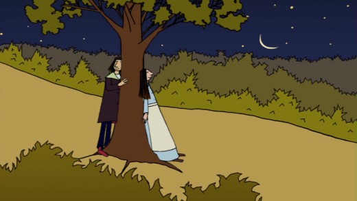 Acad touts Canuck toons
Canuck animated shorts will be feted in Washington on Oct. 27, when the Academy of Motion Picture Arts & Sciences delivers “A Salute to the National Film Board of Canada.”
Hosted by animation critic and historian Charles Solomon, the event will celebrate more than five decades of the NFB’s Oscar-nominated and winning pics with screenings of “Neighbours” (1952), “Walking” (1969), “Bob’s Birthday” (1993), “Ryan” (2004) and “The Danish Poet” (2006). The show will be followed by a panel discussion with NFB chair and government film commissioner Tom Perlmutter, NFB animation producer Marcy Page and Torill Kove, who directed Oscar winner “The Danish Poet.”
Event takes place in the William G. McGowan Theater at the National Archives in D.C. Tickets are free.
I actually wondered whether I could make it to the show. . . I can’t.
The NYTimes, today, has an extensive review of the Blu Ray disc of Sleeping Beauty.
O, Prince! How Clear You Are on Blu-ray Nice coverage.
There’s a new animation magazine on the market called GOmotion MAGAZINE. You can see a sample on line here. It’s predominantly oriented to cgi users.
Animation Artifacts &Disney &Story & Storyboards 13 Oct 2008 08:12 am
Revised Melody Bd – Pt 1
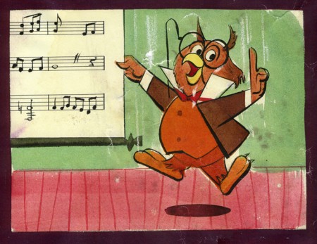 - Last week, I concluded with the original storyboard for Melody: Adventures In Music.
Now, I’d like to present the new and improved, revised version which was done in April ’52. This one is closer to the final film (which was done in 3D.)
As with all the other posted Diseny boards, a large bow of thanks is owed to John Canemaker for lending me this material from his collection.
Here, as usual, I offer the original boards as photographed:
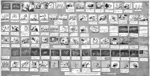
(Click any image to enlarge.)
Now, here are the rows of the board broken so as to post them as large as possible.
The remainder of this board will be posted next Monday.
.
Photos 12 Oct 2008 08:11 am
PhotoSunday Signage – 3
- In past postings, I’ve pointed out that I am a fan of hand painted signs that cover the rougher surfaces in the city.


(Click any image to enlarge.)
Not all signs, of course, are hand painted. Some small ones (above left)
are stenciled, most are just pasted (above right).
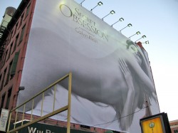

The area of town that I think is becoming the new “42nd St” – meaning there’s an
overwhelming number of posters everywhere you look – is in the Village at Houston St.
& Broadway. The signs in this small are are all of the highest technology.
However, none are hand painted signs.
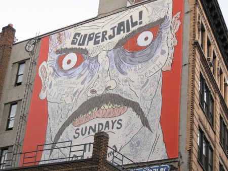
In this 4 block square area, the closest is this, ads for Adult Swim that are
draped over the surface of a brick wall – ON TOP of windows, I might add.
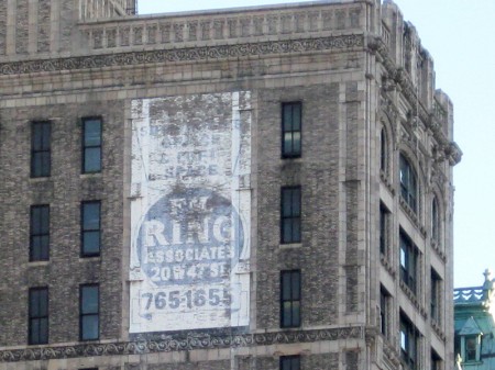
There are those that have been sitting for years and are slowly disintegrating
in front of our eyes, like this sign on 25th St, across from the Flat Iron building.
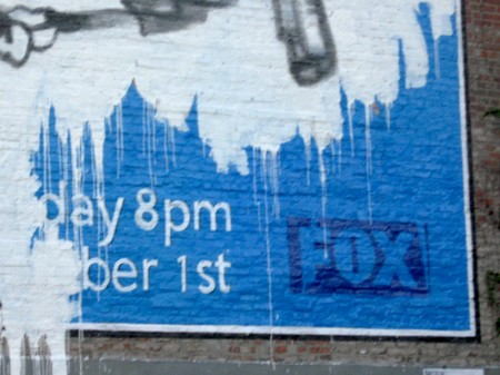
I had meant to photograph this poster that is an exact duplicate of
one seen all over the city, especially within the subways.
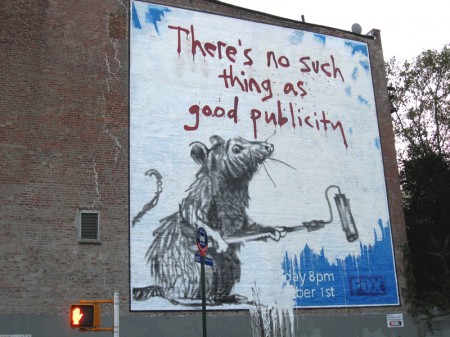
But some advertising terrorist seems to have arrived, armed with paint of their own.
They covered the hand painted sign with their own paint and did this.
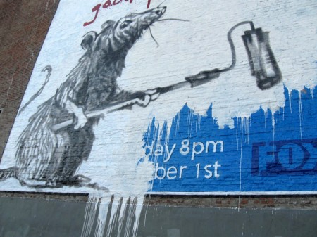
However, I keep wondering if this isn’t something that FOX
has designed to rouse my curiosity for a follow-up ad.
It almost looks too professionally done.
