Monthly ArchiveOctober 2008
Animation &Animation Artifacts &Hubley &Models 31 Oct 2008 08:12 am
Halloween Eggs
- For Halloween, we’re all posting relevant material to the “holiday.” I have a lot of artwork from the Hubley short, EGGS, which was wholly animated by Tissa David.
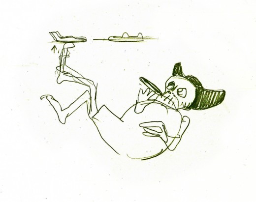
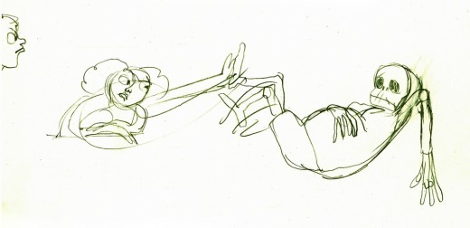
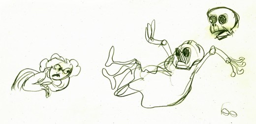
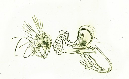
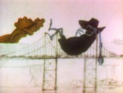
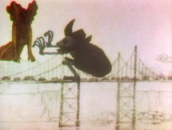
One of the two characters starring in the short is a skeleton, symbolic of death and destruction. The other is a nymph, who represents fertility. The show is basically about the complications overpopulation has presented to the world.
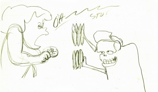
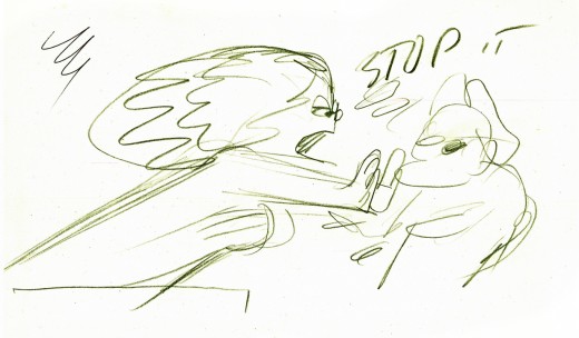
I thought it appropriate for today to post some of the drawings and models for the death character. The images displayed are cropped from the full animation sheets; when you click these displayed it’ll enlarge to the full page. Here they are.
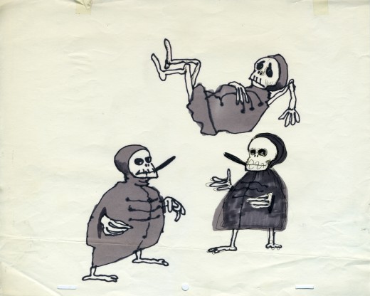
The first model of the character came close to the final.
This is a drawing by John Hubley.
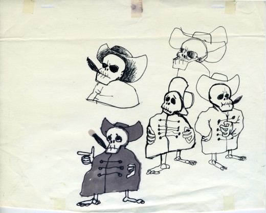
He soon solidified in this model by Hubley.
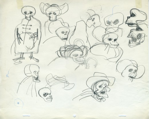
Tissa David finally worked out some of the problems for herself
and created this working model sheet.
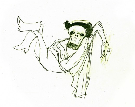
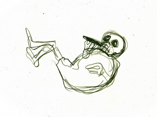
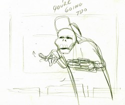
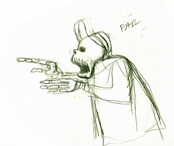
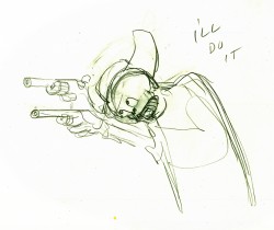
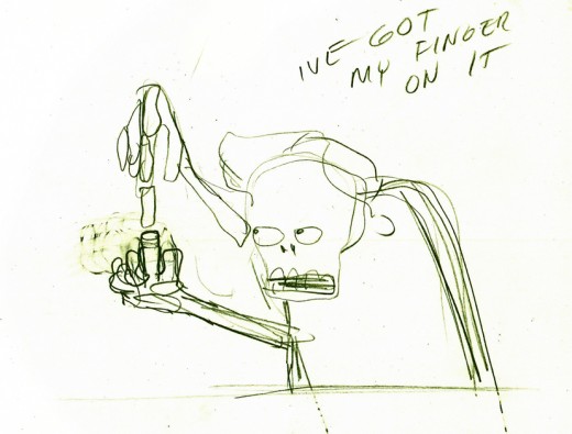
Here’s a beautiful working drawing by Tissa as
she started to pose out the scenes.
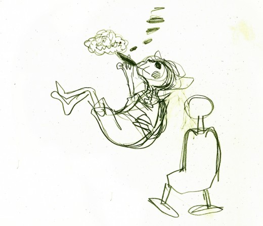
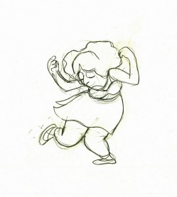
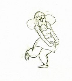
Tissa’s roughs are deceptively simple but convey so much. These drawings
are for her eyes only, usually, she’ll clean it up somewhat for animation.
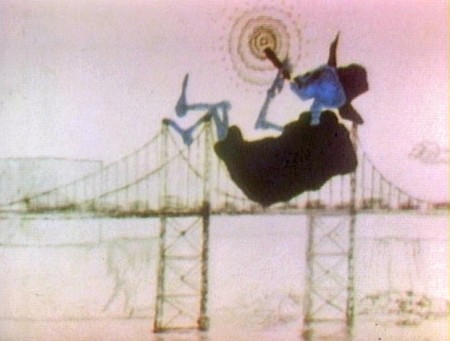
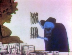
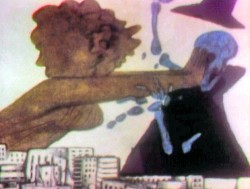
Unfortunately the dvd is a bit soft partially because of the nature of the
underlit final artwork. Perhaps someday there’ll be a better digital transfer.
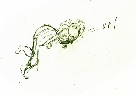
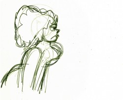
Fertility is oozing sexuality in every drawing. This is part of the
same scene as she converses with death about the human race.
Here’s a YouTube interview with John & Faith Hubley done in 1973. They discuss Eggs and Voyage to Next.
Here’s EGGS on YouTube in a contrasty but sharp copy.
Animation Artifacts &Disney &Story & Storyboards 30 Oct 2008 08:35 am
Toot Art
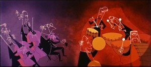
- This week we’ve seen the first draft of a storyboard for the Disney short, Toot Whistle Plunk & Boom. I’ll follow it up with the second version of the board (next Monday), however that doesn’t reveal the film that finally ends up on the screen.
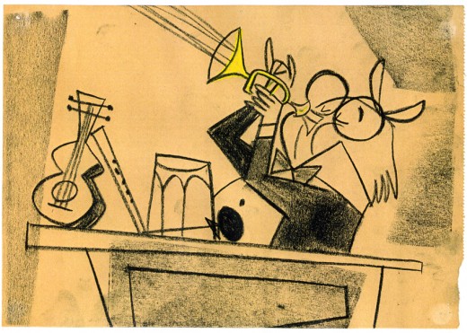
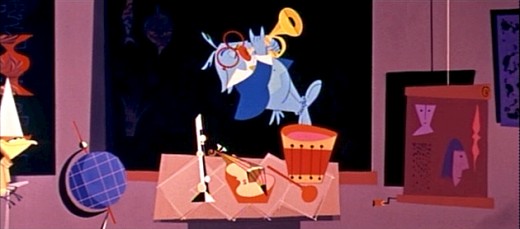
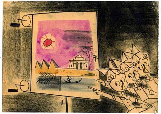
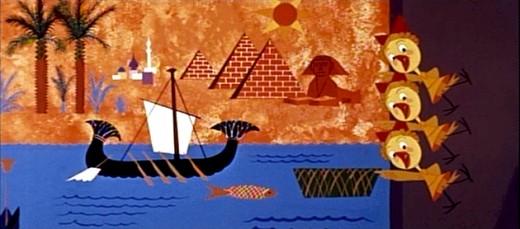
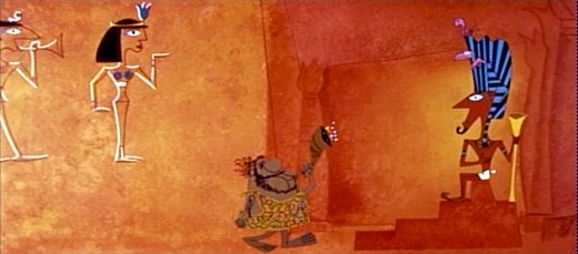
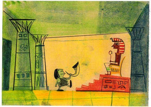
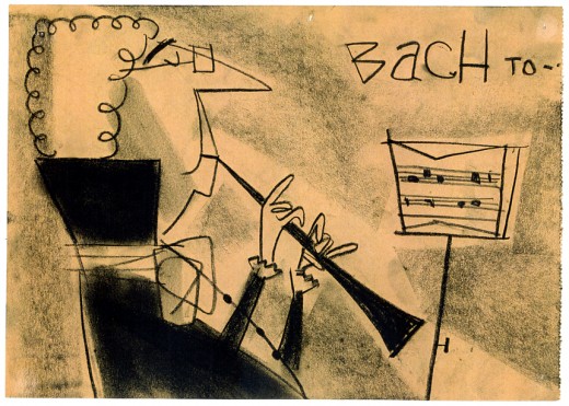
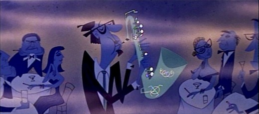
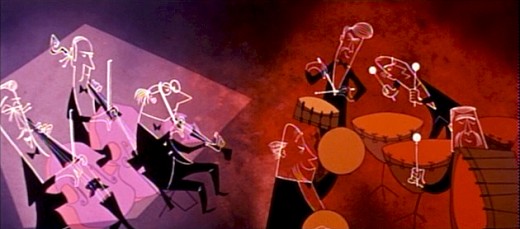
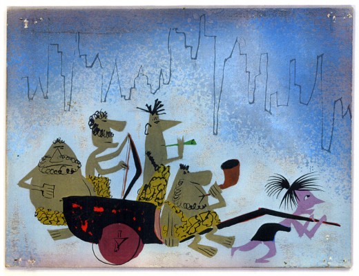
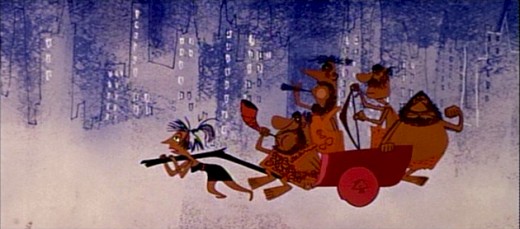
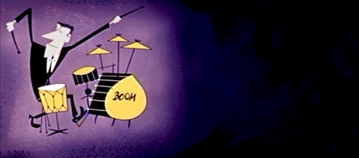
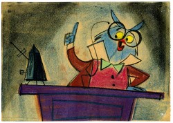
These are some story sketches that were done for the final version of the film. I have enough of them that it’ll make at least two – possibly three – posts to get them all in. I’m also attaching some frame grabs designed specifically to show how some of the art ended up as it appears in the film.
This material is on loan from John Canemaker‘s collection, and I couldn’t be more grateful, certainly in light of the interest I have in this 1953 film.
Needless to say, the film was directed by Ward Kimball.
I’m not sure who did these drawings, but the Art Director was Ken O’Connor, Assistant Art Director was Victor Haroush, the Character Styling was by Tom Oreb, and the Color Styling was by Eyvind Earle.
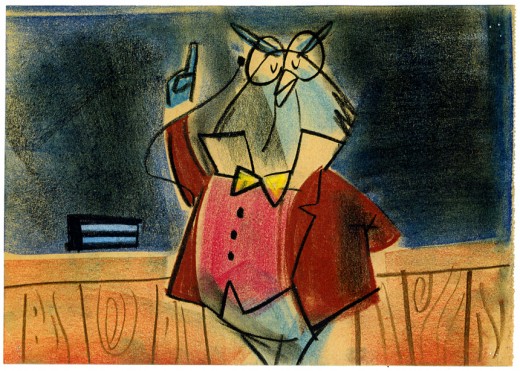
(Click any image to enlarge.)
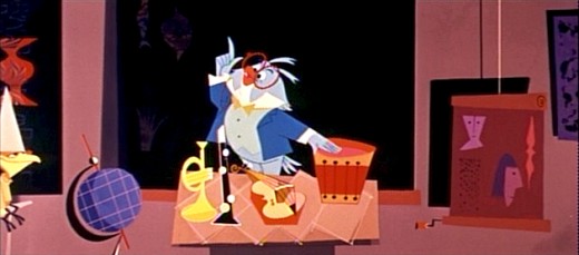
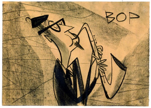
The board art calls for a number of different shots/cuts;
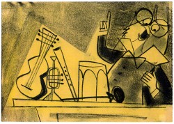
whereas the film has few cuts within this sequence.
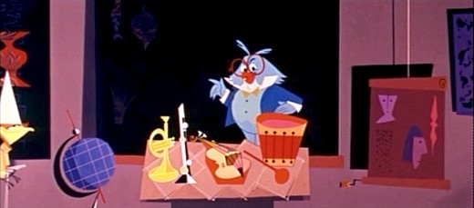
Obviously this was done because of Cinemascope. Kimball understood
that overactive cutting in Scope created a different effect than desired.
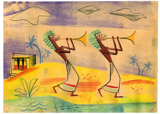
This drawing and the one below were combined into one scene.
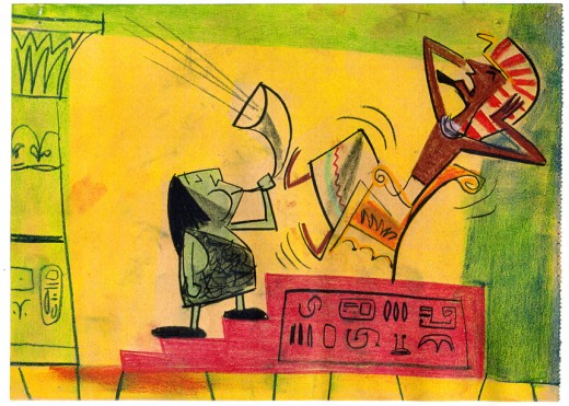
however, the payoff for the gag was different as . . .
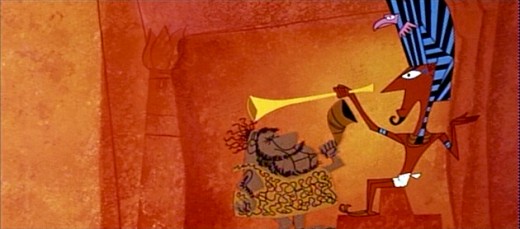
. . . the Pharoah bops the caveman’s head with the Egyptian horn.
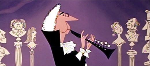
“Bach” and “Bop” are labeled in the story sketches.
The film just plays their scenes.
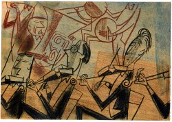
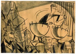
Cinemascope allowed Kimball to combine scenes that would have
been separate had they been in a traditional film.
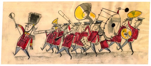
I’m not sure if the art was placed in any particular order.
The order has no relation to where it actually ended up in the film.
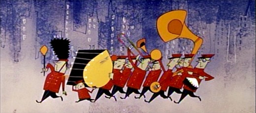
And yet the film feels so finely tuned and well constructed.
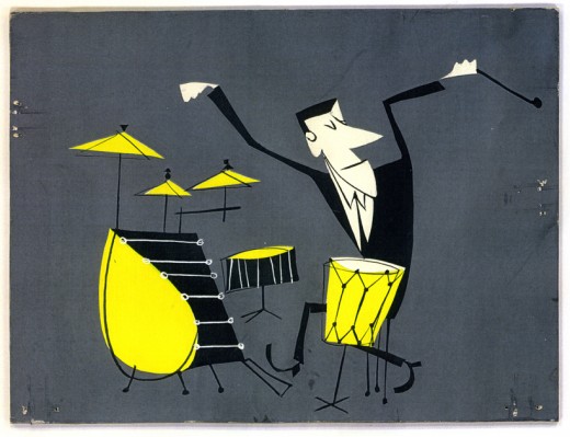
The Scope format allowed for a lot of play in composition,
and Kimball took advantage of it.
Needless to say, there’s more to come.
Animation Artifacts &Hubley &Models 29 Oct 2008 08:20 am
Doonesbury Models
- I have some of the model sheets that Gary Trudeau drew for the Hubley film, Doonesbury (which was done for CBS in 1977.)
 As I wrote once before, I had some problems with this production. It was the job I took immediately after completing Raggedy Ann & Andy. I was glad to be working with John Hubley again, and I helped on some of the prep for this show.
I was not a fan of the strip or Trudeau, and I know he wasn’t a fan of mine. Regardless, I would have walked through walls for John. Unfortunately, the walls which were covered with stunning artwork and paintings from past Hubley films, now displayed comic strips ripped from the newspaper and taped on top of the Hubley pictures. This annoyed me, of course.
But I continued layout of the show until one day when I was called into John’s office. He told me that he was about to go into hospital for a heart operation and expected to be back in about 3 weeks. I’d face a short lay off/break in work.
John didn’t come back. He died in the operation and ultimately Faith and Gary Trudeau went on to complete the film. I chose not to return.
 I worked with R.O.Blechman in putting together the PBS special, Simple Gifts. Tissa David also worked on that film. She went to work for Faith after she finished her segment. She told me that she couldn’t finish animating 100 ft. (abot a minute) a week without a fast assistant. I offered to help.
At night, after working all day for Bob Blechman, I assisted Tissa’s sequence and then did a couple of Ruth Kissane’s sequences that were too complicated for some of the novice people at Hubley’s. I wasn’t very connected to the studio and felt the distance.
The show aired on CBS and was nominated for the Oscar.
(Of course, all images enlarge when clicked.)
Animation Artifacts &Disney &Story & Storyboards 28 Oct 2008 08:03 am
Toot Bd – 1 pt 2
 - Here is the second installment of the first, preliminary storyboard for what would become Toot Whistle Plunk & Boom. You can see how little of the magic was in this board, yet it obviously inspired others to keep it alive and make it work. Ward Kimball has to get most of the credit, though designs by Tom Oreb, Ken O’Connor, Eyvind Earle and Victor Haboush sure brought it to life.
John Canemaker deserves all the kudos he gets for lending this material to me as well as plenty more.
Here are the three remaining boards as they appeared on the stats:
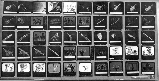 3
3(Click any image to enlarge.)
Now here’s the breakdown of the boards. Each row of images is split in two and labelled accordingly. #31a means Board 3 row 1 part a.
 31a
31a
I’ll have a later, more relevant board up next week. As well as plenty of color artwork later this week.
Ward Jenkins has posted some beautiful frame grabs from the completed film. Go here.
See this short on YouTube here.
Animation Artifacts &Disney &Story & Storyboards 27 Oct 2008 08:10 am
Toot Bd – 1 pt 1
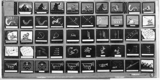
 - Our Adventures in Music continue with the preliminary storyboard for what would ultimately become Toot Whistle Plunk & Boom. This is another board on loan from the archives of John Canemaker, and you can see the outgrowth from the prior film, Melody: Adventures in Music.
This material I’m posting here is on large photostat copies. The problem is that the images are a bit fuzzy, and the text beneath the boards is illegible. In some cases, the appropriate text has been hand written on the copies themselves.
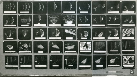
This board is the first of two that I have, and it is five pages in size. Here are two.
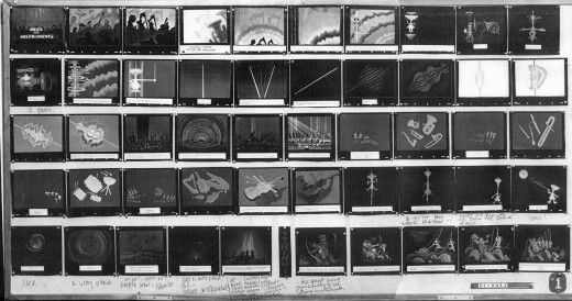
(Click any image to enlarge.)
These are breakdowns of each row of the two boards so that the images can be made as large as possible.
 11a
11a
I’ll have the remainder of the board up tomorrow.
.
Ward Jenkins has posted some beautiful frame grabs from the completed film. Go here.
Animation Artifacts &SpornFilms 25 Oct 2008 08:39 am
Nightingale revisted
- Here’s a piece I posted in Feb. 2007. I think it worth revisiting:
- We have two dvds that feature films adapted from Hans Christian Andersen tales. These films include: The Red Shoes, The Little Match Girl, The Emperor’s New Clothes and Nightingale. In making the extra material for the dvds, including a couple of documentaries, we’ve had to prep a lot of artwork and images from the films.
I found when scanning in Jabberwocky for this “Splog” that the images came 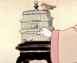 alive in the digital format. It’s much more striking than the original films. That’s also true of the artwork we’re scanning from some of these films.
Nightingale was adapted from the Andersen tale, but we made a decision, early on, to base the story in feudal Japan rather than China. This allowed me to cast one of my favorite actors, Mako, as the Narrator and Emperor.
It also enabled us to adapt the beautiful art of Japan to the animation.
(Click any image to enlarge.)
The backgrounds were done by Masako Kanayama from layouts prepared by Rodolfo Damaggio and Sue Perotto. They were done in delicate watercolors with a limited palette. The characters were inked with sepia colored brush markers so that there was a dramatic thick/thin line. To expedite the production, I animated with the marker. It allowed more control in my scenes and saved the inking stage.
The following setups give an indication of the work.

This opening pan set the mood of Feudal Japan with gold paint flattening out in the filmed version. Here it looks gold as it should, rather than the brownish tint in the film. The actual Bg is quite long.

Not once did we consider looking at anime for the style. We studied the great artists of Japan of the period and looked at actual photographic reference. It never pays to study animated films for influence in preparing an animated flim. Take the inspiration from artists and real life.

The Emperor’s court took some concern. It gave us the opportunity of showing off some of our research about interiors and allowed us to show off many of our principal characters in the opening setpiece.
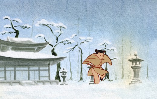
In the original there were really only two primary characters: the Emperor and the Nightingale. Since the Nightingale couldn’t talk, Maxine Fisher, who adapted the story, introduced the young girl who knows the Nightingale from the forest. She’s the intermediary between the bird and humans. She also sings all the key songs. June Angela, a fabulous actress and a wonderful soprano played the part.
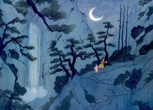
She knows the whereabouts of the Nightingale and can take the Emperor’s consort to her.
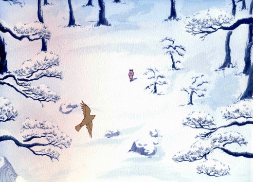
She can also console the Nightingale when she’s hurt by the Emperor.
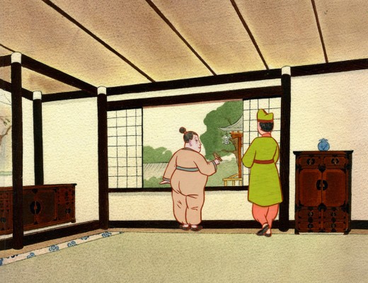
The Emperor had to develop into a very sympathetic character over the course of the film. In Andersen’s story he learns a lesson from the Nightingale. The mechanized bird cannot live up to the real songbird. We also gave the Emperor nightmares that developed out of the Emperor’s spirituality; this was a small nod to Andersen’s outspoken Christian commentaries throughout all of his stories. We allowed the Emperor to have his own gods.
Articles on Animation 24 Oct 2008 08:22 am
Jim Simon – 1975
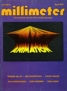 - Earlier this week, I posted a piece from the 1975 animation issue of Millimeter Magazine which gave a bio for Tissa David. Within the same column there was another animator who’d made waves in NY back then.
Jim Simon had created Wantu Animation which gave a “black” presence on the animation scene. Jim would annually win a lot of ASIFA East awards with his short spots, and you’d be impressed with the well animated output. His design sense was original. However, he left the city’s animation scene for LA and got involved in Yogi’s Space Race, the Smurfs and X-Men. After that, I’ve completely lost track of his career. If anyone knows where he has ended up, please don’t hesitate to leave a comment.
Many of his short pieces for Sesame Street are up on YouTube, so you can get an idea of his studio’s output.
Here’s the bio that was printed in 1975:
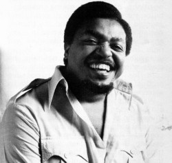 Wantu Animation is the hot new studio in New York, and Jim Simon is the young animator who is making a lot of people sit up and take notice. They notice the infectious brand of humor, the outrageous characters, the catchy music, the non-stop swirl of captivating motion inherent in all of Jim’s work. In fact, they noticed so much that he has been receiving awards for his animation right and left.
Such recognition is not entirely new to him, either; upon graduation from the High School of Art and Design, he received an award for excellence in animation, two scholarships from the Junior Epstein Memorial Foundation and a scholarship to the School of Visual Arts. There he majored in live-action TV production but became more and more drawn toward animation because of the personal satisfaction afforded him. Out of school, he landed a job at Paramount Motion Pictures cartoon studios as a background artist. Four months later the studios closed down, but by then Jim had managed to join the union. Having so little experience, he couldn’t get much work, until the director of’Paramount came back to New York with the Spiderman TV series. After a year and a half on that as assistant animator, Jim decided to freelance on his own. “I was turning out so much work, they had to promote me, because I was earning more money than some of the full-fledged animators. But it got to the point that I was just too excited about the things going on inside my own head, which I could not release while working for someone else. Also, I was young and wanted to gather a bit of knowledge about the different studios and different aspects of the business. After freelancing fora year, I realized that I wasn’t going to be allowed to animate this way either. I figured the only way I was going to become an animator was by making myself an animator.” When he inquired about doing work for Sesame Street, he was told he would need a reel and a company. “So I borrowed $250, hired a lawyer to set up a company, did a couple of story boards on my own but sticking with the Sesame Street vein of thinking, and marched back up there. And right off the bat, they bought four of the five boards that I had brought up.” That was the start of Wantu Animation. “Wantu” is Swahili for “beautiful” and the symbol used for the logo means “new birth.” That’s the theme of the company, the New Birth of Beautiful Animation, and Wantu hasn’t stopped growing since.
“There’s a new show coming out in September called Vegetable Soup. We were contracted to do the musical opening for it, plus 13 cooking spots for which Bette Midler did all the voice tracks, and also 48 thirty-second breaks. When you add it all up, it comes to about an hour’s production for our first year. We’ve won four awards for that particular show already, and two for Electric Company films. One particular film did not win all the awards, which goes to show that we’re a well-rounded studio.”
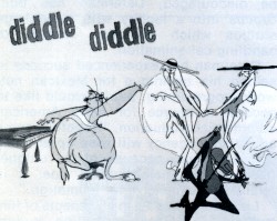 His unique style of drawing has earned Jim a few puzzled comments. “When I first did the boards for Hey, Diddle Diddle, people looked at them and said, ‘What are they? Some of them don’t even have eyes.’ They were cats, cool cats. No eyes on them, but you believe them when they’re moving. I’m basically a ham. I used to be very shy, but I lived through my characters. If I had another profession to choose, I would probably want to be an actor. When you see my characters moving around and doing crazy things, that’s me letting off steam.”
“There’s nothing coming out of agencies that we cannot do, and deliver on time,” states Jim. “We’ve turned approximately fifty films this year, about three, sometimes close to four minutes a week. Some of our freelance animators can hardly believe that they can see their finished work a few days after they do their part. We’ve gained about four years experience in this one year from the amount of things we’ve done, and the time we did them in. We’ve built up tremendous confidence in ourselves and our capabilities.”
Besides this confidence, Jim also harbors a special kind of optimism. “We’re working on a TV special; we developed the characters around Bette Midler, and she loves them to pieces. We also have concepts for features and other specials, but the hardest is always getting that first one across.”
Such personal flair is making Wantu Animation a studio to watch for, that is if you haven’t noticed it already.
You can watch “Hey Diddle Diddle” on YouTube. Go here.
Animation &Disney 23 Oct 2008 08:11 am
Thomas’ Mim
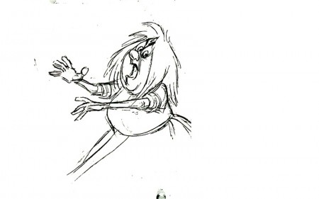
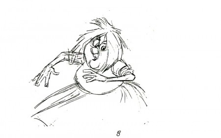
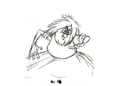
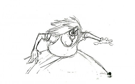
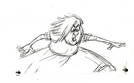
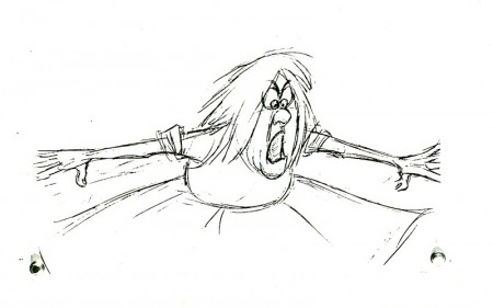
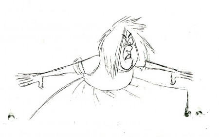
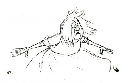
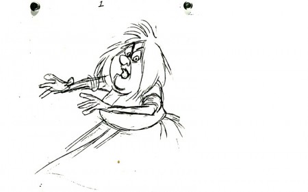
- Here’s a small bit of the Mad Madame Mim as animated by Frank Thomas. It’s not particularly enlightening, but I still enjoy looking at the drawings. I believe these drawings might have appeared in some publication or other but haven’t been able to locate them. (There are some other drawings in the Thomas/Johnston book, The Illusion of Life (pg 180-181), but I think that’s from another part of this scene.)
the most interesting part about these drawings is the breaking of joints as she turns her arms around with her body. (There’s a bit of odd foreshortening in her right arm on drawings 1 & 2.)
 1
1(Click any image to enlarge.) Madame Mim turns.
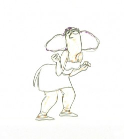
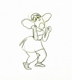
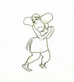
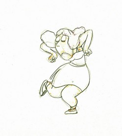
Animation &Hubley &Tissa David 22 Oct 2008 08:12 am
Tissa’s Glad Gladys
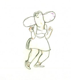
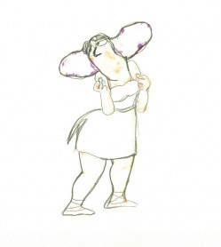
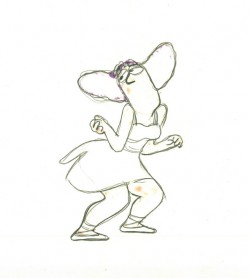
-Tissa David animated a lot of the Electric Company pieces for John Hubley. Hubley would design and write the spots, and he would get some real pros to do the tracks. In the case of this film, I believe it was the jazz legend, Billy Taylor, who wrote the music and did so for a number of Hubley’s Electric Co. films.
I’d like to post John Hubley’s LO drawings and follow it up with a few of Tissa’s animation drawings. John would usually do the loosest of layout drawings – usually in the presence of the animator as part of a discussion – and then hand it off to this person he trusted. Of course, the less he trusted the animator, the more he had to do in the LO.
In the case of this spot, Tissa received the following drawing. (That’s right ONE drawing.)
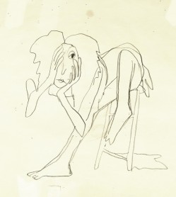
(If you click any of the images, they’ll
reveal the full animation drawing.)
If you enlarge the image, you’ll notice tape marks and pin holes where Tissa attached it to her wall.
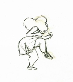
Here’s a short sequence of drawings done by Tissa. The missing mouths are on a separate level. This piece is built on reuse done artfully.
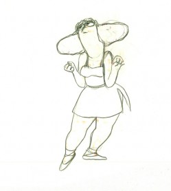 48
48 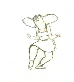 49
49
Here’s how the drawings looked when they were colored. They were colored on heavier paper. Sharpie outlines and marker coloring. The white background was all they used for the final. The animation carried the piece.
 73
73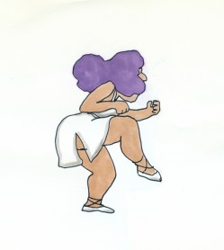 73
73Finally, here’s a copy of the film found on YouTube:
