Monthly ArchiveJuly 2008
Daily post 09 Jul 2008 07:50 am
Car Talk
- Tom Sito‘s been working for the last year and a half on a tv series for PBS. We knew it was an animated version of the delightful Car Talk radio program on NPR, but we weren’t sure how it was going to evolve. Years ago I’d read a blurb saying that the show was going to animate segments of the radio program.

Tonight, the show arrives on PBS. There’s plenty of on line representation, so you can get a good idea of the show even before it airs Wednesday night. The schedule is a little goofy, as it usually is with PBS shows. Tom Sito’s site gives us this info:
- In the two largest media outlets, WNET New York and KCET Los Angeles, CLick & Clack will premiere this weds July 9th at 10:00PM, right behind a Science documentary on Iraqi bacteria. WGBH Boston at 8:00PM, WETA Washington on the Friday the 11th at 10:30PM. All these channels do reruns during the week as well.
 In other words, check your local listings, but watch it. The show needs support. This is the first time PBS has a Prime Time animated series, and we want it to succeed.
- The official site is called Car Talk: As the Wrench Turns. There, you can find actual episodes of the show.
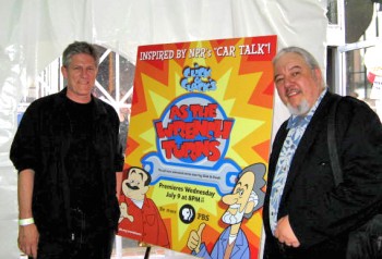
- Then, there’s the PBS version of the website called simply, PBS: As the Wrench Turns. There, you’ll __________Producer, Bill Kroyer and director, Tom Sito
find more videos as well as ___________________at the show’s wrap party at MIT.
games, episode guides and character ID’s.____________________(From Tom’s site.)
- At the band’s website: Brave.com, you’ll find
LOTS of music cues done for the show.
The show uses Flash gracefully with lots of residual action and follow through. It’s one of the first times I’ve seen Flash used almost like a real animation program. I assume that by using Flash, they were able to do all six episodes in LA without having to outsource the animation.
 Kelli O’Hara, the darling of Broadway, currently appearing in the famous revival of South Pacific, acts as the voice of Click and Clack’s recording manager. In an interview posted this June on Talkin’ Broadway‘s site, Kelli had this to say about her work in the show:
- BH: I read that you’re in an upcoming animated series on television.
KO: I am. I did a full season of a show called “Car Talk.” It’s on PBS, and I think it will premiere in June. I think they changed the name to “Click n’ Clack.” It’s very funny, actually. It’s based on the PBS radio show featuring two guys who take calls about car work. They’re very funny, they’re brothers. So they made this whole cartoon series about it. I play their producer in the record studio, their kind of neurotic little Harvard grad producer. It’s a lot of fun.
Photos 08 Jul 2008 08:13 am
Creepers
- There was an excellent documentary on PBS this past Thursday. It was called, “Home.” Perhaps it was just local channel 13/WNET that aired it. The show was a documentary about New York from the vantage point of outsiders who’d moved here. The director, Alan Cooke, interviewed lots of celebrity types; Frank McCourt, Liam Neeson, Alfred Molina, Rosie Perez, Mike Myers, Colin Quinn, Susan Sarandon and Woody Allen offered choice comments throughout the show.
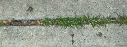
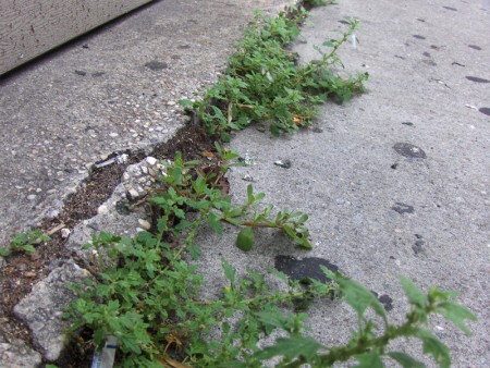
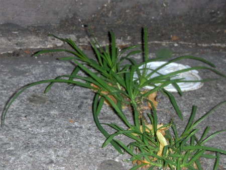
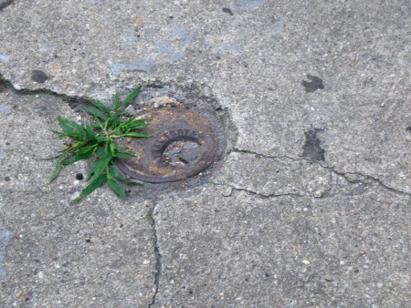
Malachy McCourt, at one point, said that the City was cold and difficult. Even the sidewalks were cold, hard concrete. Yet in these sidewalks there were always cracks with bits of life shooting up from the least likely places.
Wall-E offers a world of no vegetation, and we have to accept that premise. Yet, reality shows us that nothing can stop the bits of green from stopping in the coldest of extreme. George Carlin once said that styrofoam was not going to destroy life on earth. It was just going to stop HUMAN life on earth. He speculated that perhaps humans were put here specifically to invent styrofoam so that the earth could continue after all humans died off using styrofoam for whatever it needed. Even the devestated Hiroshima and Nagasaki have already recovered from the nuclear onslaught some sixty years ago. Grass grows there.
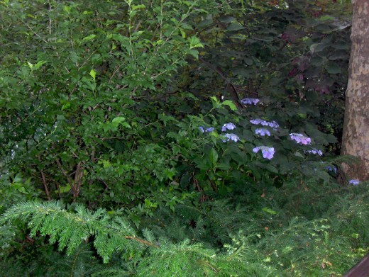
Here are bits of grass, life and plants creeping out from the least likely places.
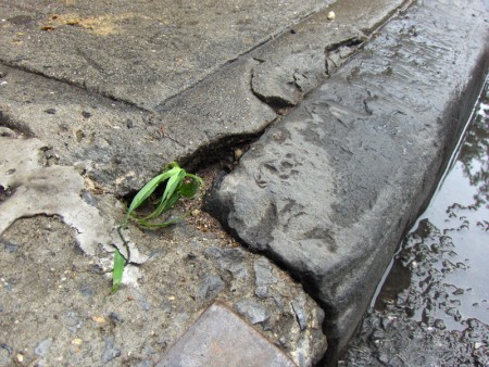
(Click any image to enlarge.)______________
To me, it’s more likely that 700 years after the humans left earth,
the planet would have looked more like the photos below.
Animation &Animation Artifacts &Disney &Models 07 Jul 2008 07:49 am
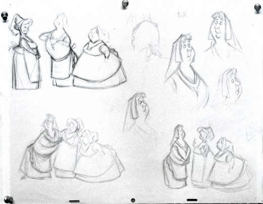
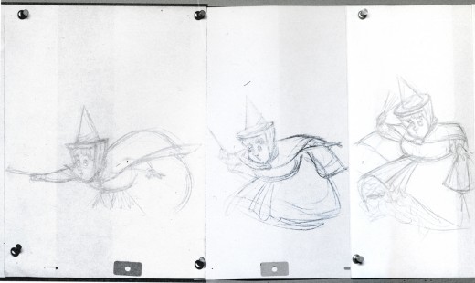
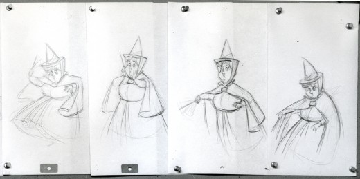
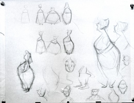
Fairies
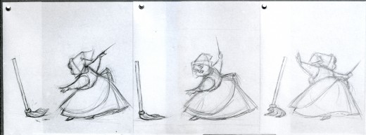
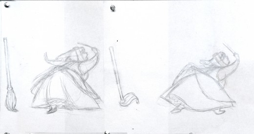
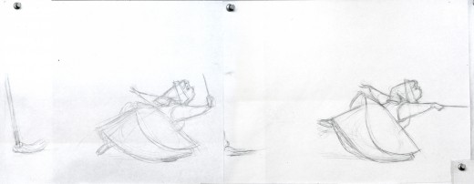
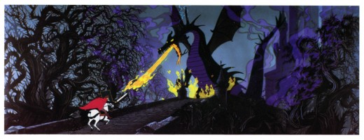
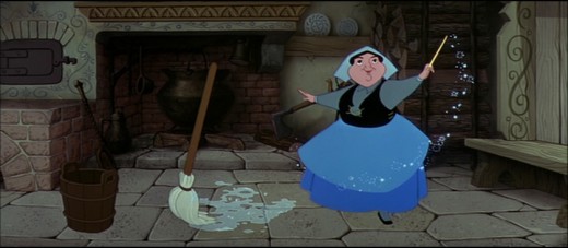 - I’m trying to coordinate with Hans Perk‘s posting of the drafts to Sleeping Beauty by offering as much material as I can locate on the film. It’s leading to some odd discoveries. (Just today, Hans offers the drafts to the cake baking sequence.)
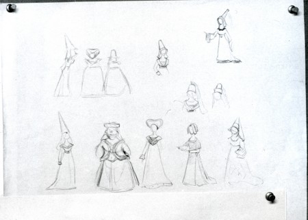
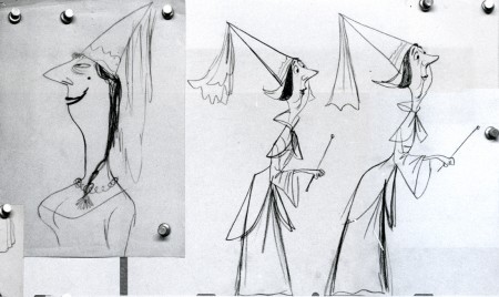
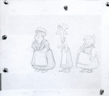
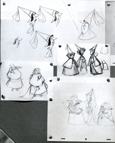
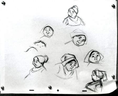
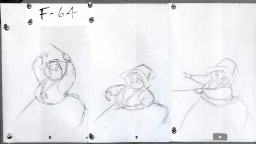
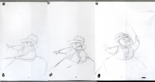
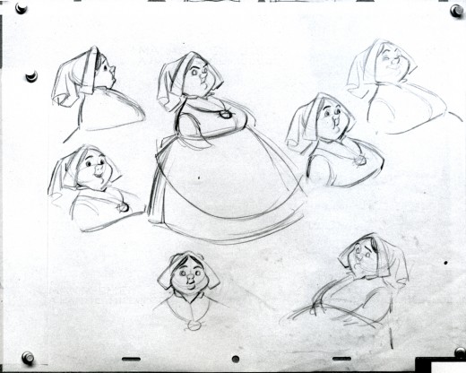
Here’s one of those galleys given me many years ago by John Canemaker. It was a way of showing off material available. Perhaps some of it has been published in some book or other. I don’t think it all has gone out, though.
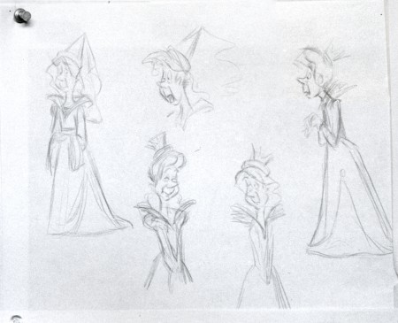
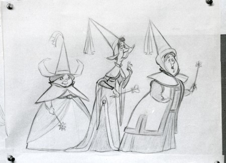
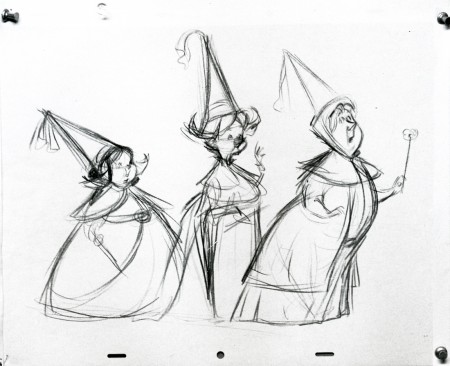
This is the development of the three fairies, Fauna, Flora and Merryweather. You’ll see they took some wacky turns on the way to the end. I believe these were drawn by Tom Oreb, Bill Peet, Ward kimball, Frank Thomas and Ollie Johnston.
This is the full photo which comes in at 24×40 inches.
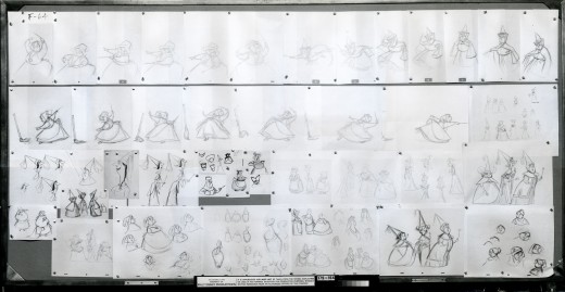
(Click any image to enlarge.)
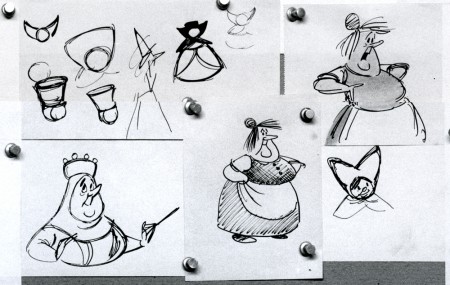
Probably Bill Peet’s storyboard characters.
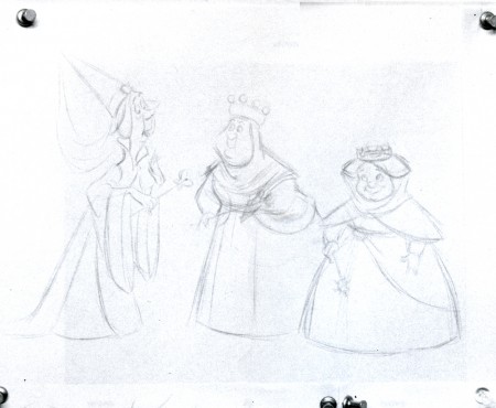
This looks a bit like Frank Thomas’ line, though the characters don’t look like his.
I have a couple of animation drawings from this film from the “Skumps” sequence. I’ll post those when Hans hits that part of the film with his drafts. This movie is a great one.
If you’re in LA, go see it in Technirama on July 16th. Academy Screening.
Commentary 06 Jul 2008 08:13 am
more or less – 2
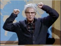 - Dana Carvey, on Saturday Night Live, used to have the “grumpy old man” character. “We had to eat worms, and we liked it!” I’m beginning to feel like the grumpy old man, but I’m hoping I’m saying something here, that touches a nerve in someone else.
Yesterday, I was headed in the direction of saying that computer animation in Harry Potter or Lord of the Rings or Indiana Jones 4 was no different to me than the computer animation in Wall-E or, ultimately, Kung Fu Panda. They all move, but, to me, none of them live. The “animus” isn’t there. Artful, well crafted movement is there, but it’s not something that inspires me to go out and draw or get back to my animation box (for the most part, a computer.)
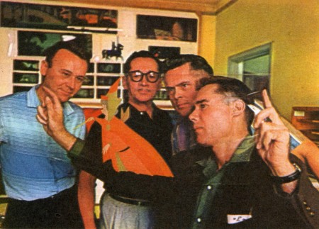 I can remember when just looking at the picture to the right of Eyvind Earle holding up a Sleeping Beauty cel (in Bob Thomas’ book, The Art of Animation) would thrill me to the bone so that I had to start drawing or get myself to the board.
After the release of Beauty and the Beast, John Canemaker and I had a conversation. He pointed out that once he or I would have been taken by a screening of Fantasia or Dumbo and been inspired to animate, and a youngster, today, seeing B and the B would have that same rush. The newer film may not have inspired either of us, but other, younger, future animators were. This was comforting to me.
But recently, when commenting about Wall-E, I wondered if anyone would be inspired by that film. Were there youngsters out there who felt compelled to animate after seeing the Pixar movie? Perhaps through lack of imagination, I can’t see it. But I can’t see it.
Somehow, though, The Iron Giant seemed like something that could inspire people. I also thought The Triplettes of Belleville and Persepolis were inspirational to future animators. I expect the same was true of Toy Story, The Incredibles, even Ratatouille. Perhaps even Kung Fu Panda.
When Don Bluth ran away from Disney and set up his own company to make The Secret of Nimh, there was a lot of excitement in watching their progress. The film wasn’t all we hoped for, but it was light years better than The Black Cauldron.
When Katzenberg left Disney and set up Dreamworks, there was a charge generated, and it was exciting waiting for Prince of Egypt. The film was pretty good, too, and seemed to auger good things for the future of Dreamworks. The announcement of William Steig’s Shrek was a real charge. The horribly ugly film that was produced was so much the loss for computer animation, and that’s when everything changed. Yeah, the grass moved ok, but it was near impossible looking at the damned thing. A sarcastic, sardonic story led the way for nasty films to come. Attitude became everything, and the graphics were lousy.
Animation seems to be diving deep and hard.
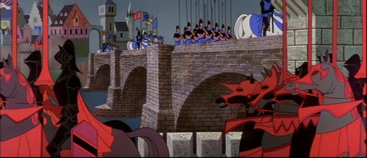
I don’t think it gets more artful than this.
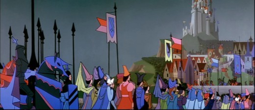
So what’s the answer? We’re in a hole; how do we get out?
It’s all about hope and hard work and not giving up finding that inspiration wherever you can.
A couple of years ago, I was about to throw in the towel. As usual, it was an incessant fight to keep my tiny company afloat. Just paying the rent was sapping my soul from any animation I could pick up. I wasn’t inspired by any of the films I was seeing, and I was beginning to lose hope.
Mike Barrier‘s book, Hollywood Cartoons, arrived just when I needed it, and I soaked it in. The book – especially the writing on Snow White – just charged me like no tomorrow. I finished reading it and started reading it again, immediately. That book saved me, no doubt, and I couldn’t have been more charged. Things turned around for me just by being excited by my medium.
You have to find the book or the film or the charge that’s going to keep you going. Writing this blog helps me, these days. In doing it, I’m always looking into films and frame grabs and endlessly studying animation I love. I can look past films that I think hurt the medium and find something that I love.
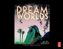 So many books such as Hans Bacher‘s Dream Worlds or Amid Amidi‘s Cartoon Modern offers lots of art; you have to find some inspiration. I’m looking forward to Sylvain Chomet‘s next film, The Illusionist. I want to see Clint Eastwood’s new film, The Changeling. Of course, I can always go to a museum in New York to find art that excites me. And live theater sometimes excites me.
In short there are worlds out there, and I find it up to me to get that inspiration moving. I’ll probably focus on more of those books and films and artworks that inspire me, so this rant just ain’t going to end any time soon.
Sorry.
Commentary 05 Jul 2008 08:33 am
more or less – 1
- Animation has completely done a big turnaround in the past 10 or so years. The medium has evolved so drastically into something else that I’ve come to feel that a lot of the past has become or is getting lost.
Yes, this is going to be one of my usual rants, but I think I have something that’s worth going on about. Maybe a good long conversation can start. I don’t really want to talk about how we got here, but I do want to talk about where we are.
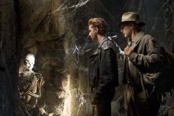 Live action movies aren’t live action anymore. Go to Indiana Jones 4 or Hancock or The Hulk or Journey to the Center of the Earth or most other fare at the local theater, and you maybe get the idea.
In 1979, the Museum of Modern Art had a special exhibit complete with chat and Q&A from Peter Ellenshaw.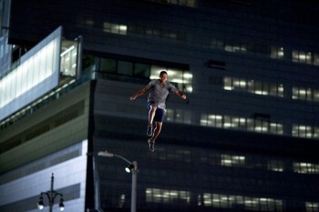
A lot of his matte paintings were displayed, and he talked in front of a projected screening of shots he worked on from many of the films. Mary Poppins, Treasure Island and Polyanna were discussed.
I was struck with how impressionist the paintings were up close, yet on screen they looked so absolutely real. I asked about this, and he said that he found that the paintings had to feel a bit ____________________What’s real?
out of focus to achieve the effect
of reality. When he painted in a very realistic mode, the paintings didn’t work.
His glass paintings, which were painted on glass, originally sat between the camera and the scene. They were designed to add to the background being filmed. Ships in a harbor were painted or a skyline was altered to more closely match the historic film being shot; these were painted on glass and matted out things in reality. These glass mattes eventually were just matted into the scenes optically, though Ellenshaw didn’t change his process.
The paintings were a bit more impressionist than the reality on the screen, but since it was only about a third of the image, we bought it.
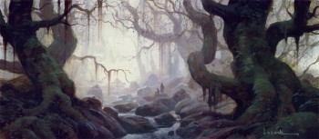 Today these paintings, of course, are painted on computer. Paul Lasaine beautifully details this process on his blog. The matte paintings have, in many films, superceded the reality being photographed. That “impressionism” has come to overwhelm the images we’re watching. When George Lucas talks about having his actors act against a blue screen with all the world being painted in by artists and animators, the film has become something else.
You can see this in the Indiana Jones films. The first had a tactile approach to the effects and the world of Indy. It DID resemble the cheap “B” movie serials it was imitating. Indiana Jones 4 completely lost that with this painted world. There are scenes where the actors are so obviously not in a real world on a real set. They’re acting against a blue screen. The scene in the grave of the aliens, where the 13 skeletons sit above them, is so obviously painted. The actors have no connection to humans in a cave or a grave; they’re not. It’s completely fake and feels it. This is one of the problems with the entire film. There’s no reality; nothing we can touch.
Every film, from Adam Sandler’s Zohan to Get Smart depends too much on the computer and robs the films of interacting humans on screen. They’re not in reality; we can’t buy or accept or understand their situations?
The Harryhausen effects were not real, but the tactile nature of his puppets allowed us, at least, to feel them. To know that something REAL was on the screen. Compare the original Yoda, the Frank Oz voiced puppet, with the digital thing of later films. One felt real, and it wasn’t the digital version of the character. Life for Lucas was made easier, a new animated world opened to him, but the experience for filmgoers was diminished. There was no there there. The real effects of the earlier film allowed us to stay in the film; the fake effects of the new film doesn’t even allow the actors in.
The computer has also changed animation. Obviously, when you have those 13 skeletons animated by computer in Indiana Jones 4, or any of the Harry Potter films or The Hulk,
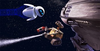 and when that looks not too different from the animation from the latest Pixar film, what is the difference? Wall-E‘s reality had nothing to do with me. It was a robot/compacter and another egg shaped robot (that I had even less connection to) interacting. I never entered the film; it had no relation to my life. I watched filmmaking choices, scene cuts and storytelling. I caught all the obvious and pedestrian biblical references, all the intended “depth,” and felt the film go completely haywire once it left what was supposed to be earth. (Why didn’t they just stay on earth and let all the fat humans come to Wall-E so that we could watch them try to rebuild? This is the real story isn’t it? Not the running back and forth throughout the spaceship.)
The film felt too connected to all the other films I see on the screen these days, films that I cannot connect to. This is pretty much all I feel for most other computer animated films.
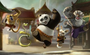 Kung Fu Panda is filled with beautifully drawn and painted backgrounds, much more pleasing than Wall-E. But the little viewmaster-puppet-characters are constantly moving in clichéd poses and actions. (Does every scene have to end with the some character arching their eyebrows?) I know this is a parody of Kung Fu movies, but who cares? What does it have to do with REAL human experience?
I also feel that every character moves identically to others. Tex Avery gave us snap animation, and Bob Clampett gave us blurred positions from A to B, but that doesn’t mean every film and every character has to imitate this. (I saw one page on Cartoon Brew from Eric Goldberg‘s new book Crash Course in Animation. It advises young animators to use this blurring technique! Not good advice in my mind. I’ll have to see the book to decide if that’s the norm.)
I haven’t seen Horton yet, but at least that LOOKS different than other computer animated films. The Jim Carrey voice over kept me away, but I’ll watch it eventually. I like some of Blue Sky’s work and still hope for the best.
To be concluded tomorrow.
Animation Artifacts &Disney &Story & Storyboards 03 Jul 2008 07:26 am
Daydreams
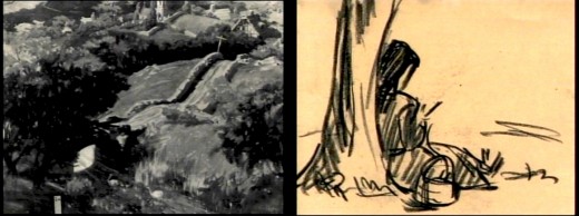
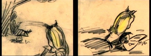
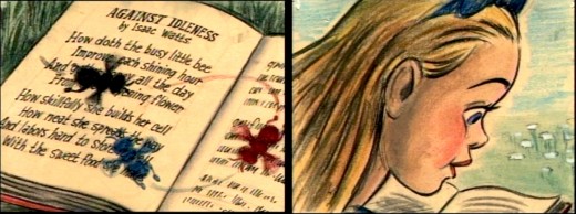
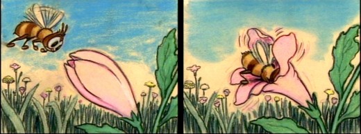
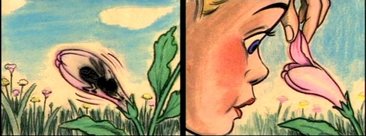
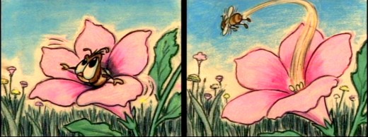
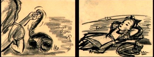
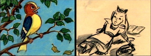
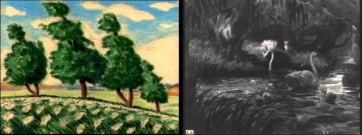
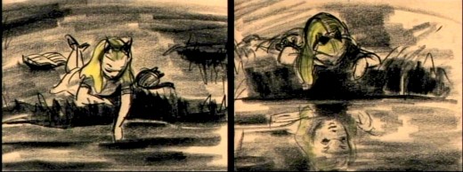
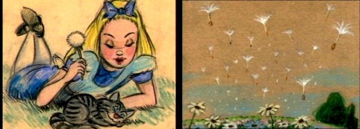
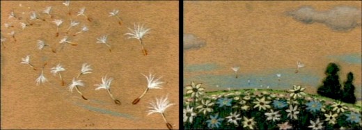
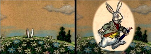
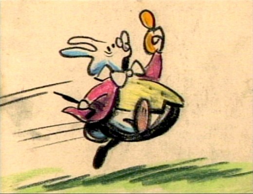
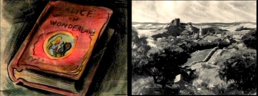
- The Alice In Wonderland dvd contains a storyboard sequence of Alice daydreaming in the park. This sequence didn’t make it to the film (for good reason), but they’ve re-assembled it for the dvd. I’ve taken some frame grabs to show off the drawings. They’re on screen for such a short time.
My favorite’s the last.
(Click any image to enlarge.)__________
Animation &Disney &Frame Grabs 02 Jul 2008 07:45 am
Dark Shadows
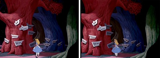
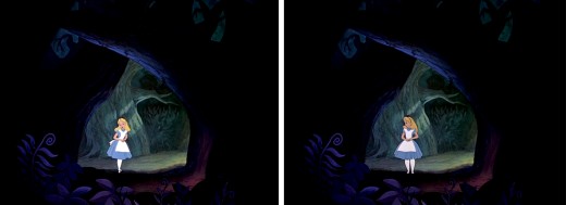
- An interesting aspect of Disney’s Alice In Wonderland, deserves some attention, and I don’t think I’ve ever seen anyone write about it.
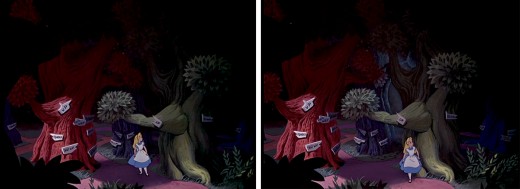
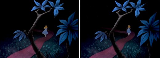
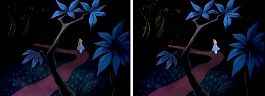
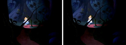
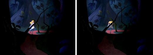
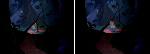
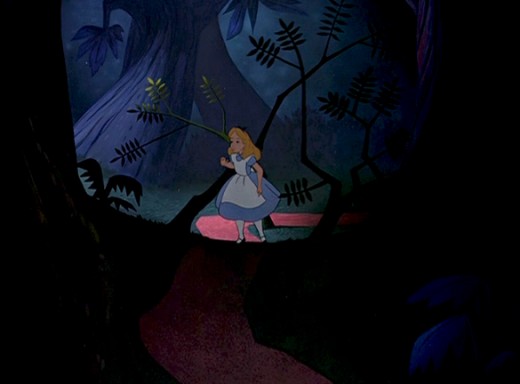
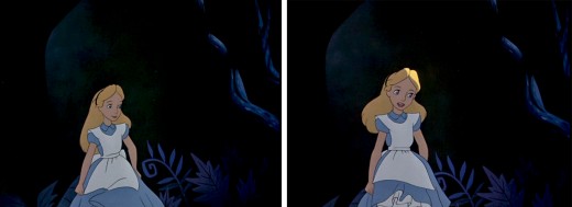
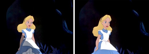
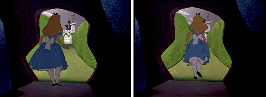
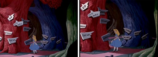
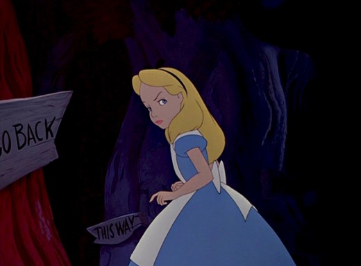
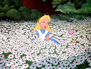 Once Alice is in Wonderland, she immediately comes upon the woods, and from there she steps in and out of the woods to meet up with new crazies and her peculiar adventures. The effects department was used to signal this move in and out of the dark world of wonderland. She constantly steps in and out of shadows.
This, as anyone who did animation in the pre-computer age, knows that it was a complication to add shadows. Not only the shadows under the characters but the shadows over and around the characters. It meant filming the scenes twice, just for the shadows. Since the camera, during the filming of Alice, was not computerized this double shooting had to be done by hand VERY CAREFULLY. Every frame had to exactly match.
Hence, this was an important part of the design. The directors and Disney took these shadows seriously; after all they cost twice as much – just to photograph. Never mind animating them, coloring them or planning them.
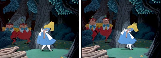
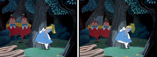
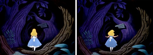
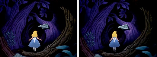
I’ve put together a number of frame grabs which illustrate the move into or out of shadows, and I’d like to share them.
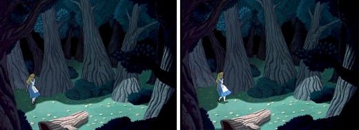
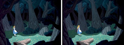
Here, Alice steps out of a shadow for the first time, and meets up with
Tweedle Dee and Tweedle Dum. They’re partially covered, themselves, by shadow.
This variant of the shadow is a hard line of darkness that moves over her.
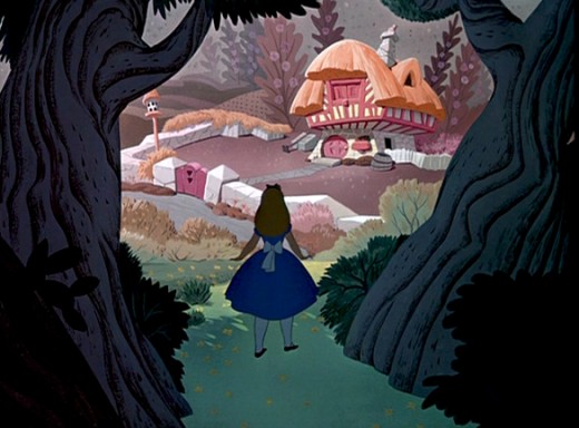
Soon, Alice moves toward the Duchess’ house. We cut from her
standing dark in shadow, to her walking in a brighter light.
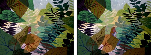
As she moves toward the Caterpillar, Alice is covered with shrubbery and shadow.
She is next seen struggling through the foliage to talk to the Caterpillar, in full light.
This variant of the shadow is a total shift in color as her entire body moves into darkness.
It was done by dissolving one Alice into another – meaning the cels were painted twice.
In the woods, Alice walks into and out of and into shadows.
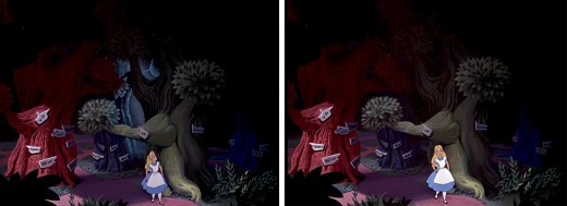
She slowly moves toward the Cheshire Cat who directs her to the tea party.
As she does she moves from shadow and cuts into light as she appears at the gate.
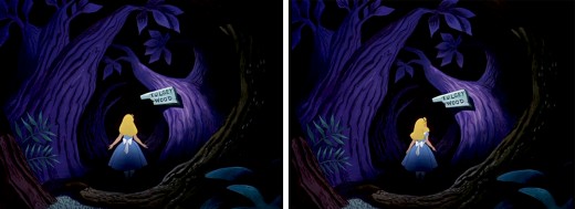
This is a particularly nice effect wherein the entire area gets spotlighted -
led by the character. The area outside of the spot darkens slowly and beautifully.
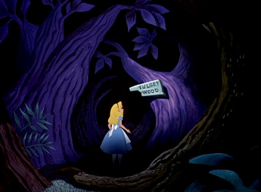
Once leaving the tea party, she wanders around the Tulgey Wood trying to find any direction. Shadows aplenty as she moves endlessly through the woods.
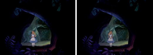
Alice moves into and out of shadow via dissolves.
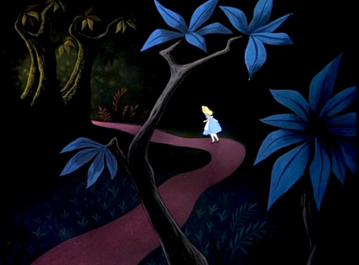
Alice passes by many crazy characters, going in and out of darkness.
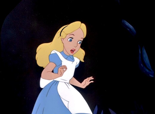
Just prior to meeting up with the Cheshire Cat, and has an extended conversation
which just about ends her stay in the woods.
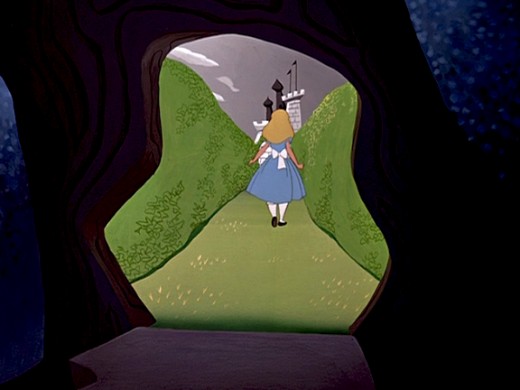
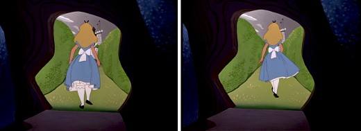
Finally, Alice steps into the Cheshire Cat’s tree and
into the light of the maze of cards to meet the Red Queen.
Daily post 01 Jul 2008 07:56 am
Academy Events
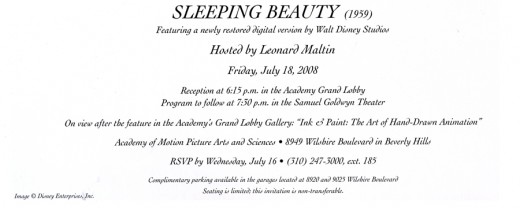
- Yesterday, I referred to the MMPAA screening of Sleeping Beauty which is up and coming. For information about the event, let me post the invitation I received the other day from the Academy.
________________________________(Click any image to enlarge to a legible size.)
I’m going to try to get the NY chapter of the Academy to screen the film here. You never know, the power of the Disney publicity machine might be helpful.
Here’s the Academy’s website page about this event for more info: Academy
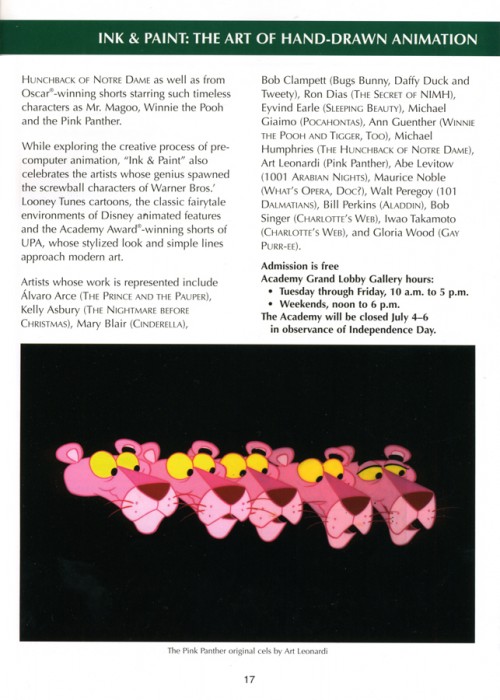
There’s also another exciting event, “The Art of Hand Drawn Animation,” on display at the Academy. This is a free exhibit on view in the Academy’s Grand Lobby Gallery. Here’s the info from the Academy monthly bulletin.
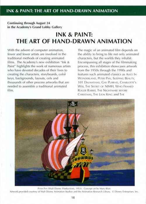
- Here’s the Academy’s website page for this exhibit: Academy
- Here;s the Academy’s link to some photos in the show: photos
- Here’s a good review of the show: Alternate Film Guide
Exhibitions like this are the difficulty with living on the East coast. There are many that I’ve missed. (I even missed one I participated in.)
