Monthly ArchiveJuly 2008
Commentary 19 Jul 2008 08:40 am
Politicks a-plenty
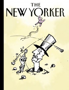 - I’m surprised and a bit pleased that my little piece on the New Yorker cover got such attention. I can’t imagine what slings and arrows the magazine had to face, but I hope it was disastrous for them. They’re the leader in published cartoons, as far as I’m concerned. If the cover of last week’s issue created such problems, I think it probably needed another draft before they published it. We should have understood the perspective of the artist.
The little gem to the right is a reworked piece by Tom Hachtman on the subject. (Though I messed it up a bit with some color – it was too white posted here.)
- Joel Stein in the LATimes had a funny piece about how to tell jokes about Obama. There are a couple of good ones in the article (an a couple of
 bad ones.)
- I have to applaud Judith Warner‘s opinion piece in yesterday’s NYTimes. It discusses in length John McCain’s attitude toward women, yet
it doesn’t bring up the many crude remarks, snide jokes, and rude actions that have been attributed to McCain. Check here if you’re interested. This seems to be information that hasn’t gone past the blogs to make it to television, yet Judith Warner has successfully avoided this part of McCain’s actions in her article. __ David Remnick with Barack Obama
Warner simply uses his voting record to back up
the worst. (Note that I admit to having no compunctions about referring to McCain’s crude jokes – past or current.)
I look forward to Frank Rich’s Op-Ed piece tomorrow to see if he broaches the subject. However, I suspect he’ll be writing about the trip to Afghanistan/Iraq etc. It seems to be today’s hot subject.
- Am I the only one who’s had it with Lou Dobbs’ obsession with illegal immigrants. This guy has had a daily hour long show on CNN, and he deals with nothing else but immigration. I live in a city of immigrants – legal and illegal – yet I can’t see that it’s that great a problem. Maybe it is in Lou Dobbsworld. Also, aren’t his teeth a bit TOO white. I think they’d shine in the dark.
- I also have to say that the new Jib Jab cartoon is the first one I’ve liked. Usually, they’re a bit too milquetoast for my taste. A cartoon without a POV is just pointless. In this one they do a bit more than just “jab” everyone. It’s funny. I assume NBC must give them a good part of the budget. They always premiere on the Leno show then receive endless repeats on MSNBC the next day.
Space Chimps had the misfortune of opening against The Dark Knight and Mamma Mia!. Though I like looking at review of animated films, I kinda missed this one. I didn’t know it was opening. Mark Mayerson‘s article clued me in.
- The NY Times, the one glowing review, said: “Space Chimps is hilarious. . . If “Wall-E†pushes the boundaries of what can be done in an animated movie, “Space Chimps†proves that the old formula is still pretty effective when executed well.
The NY Daily News said “Nothing to go ape for.” One star.
Newsday/AP said: “‘Space Chimps” sucks a whole lot of talented people into a wormhole of lousy.” One star.
The NY Post said: “No Ape-peal!” ½ star
Fox, the distributor, obviously was prepared to just dump it on the market. Barry Sonnenfeld is one of the producers; I’m surprised he didn’t have more clout – or didn’t use it.
Animation Artifacts &Books &Disney 18 Jul 2008 08:01 am
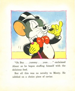
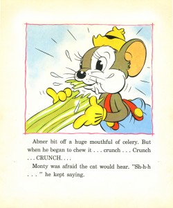
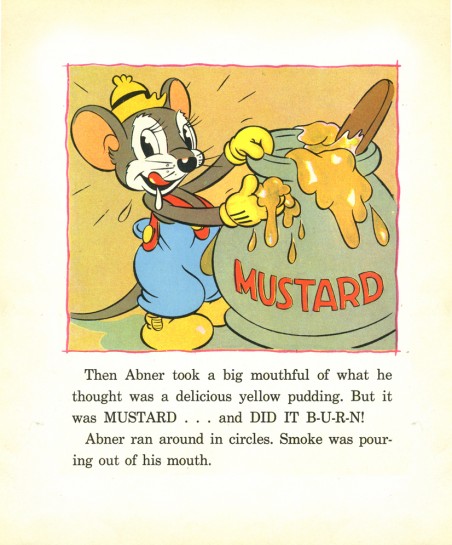
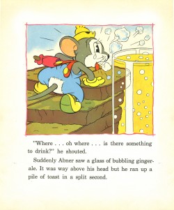
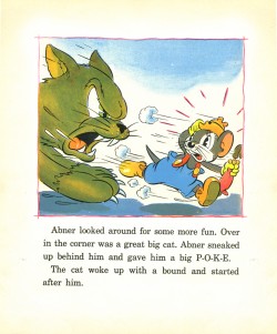
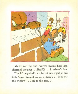
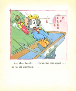
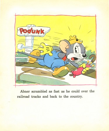
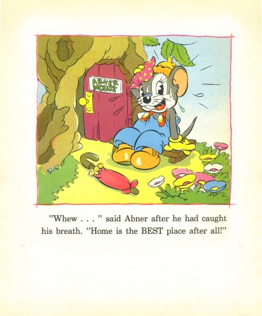
Country Cousin book
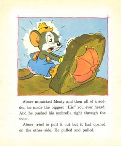
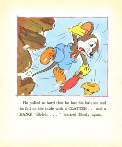
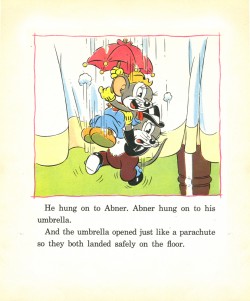
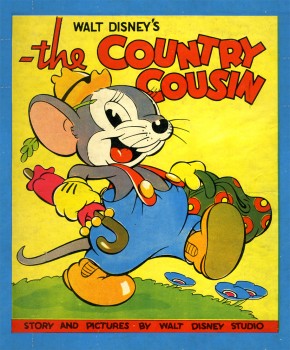 – John Canemaker has loaned me a couple of books to be scanned for posting. These are all storybooks for young children, and they’re all adaptations of Silly Symphonies.
These books are some of the first bits of merchandising to piggy back some of the more popular short films. Aside from the “Mickey” craze, there was a demand for Silly Symphony merchandise. The biggest book featured the original Three Little Pigs, which I posted back in Feb. 2007.
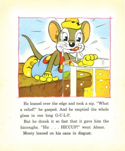
There’s no doubt that The Country Cousin was one of their more popular shorts. It’s been called one of the great advances in character animation – specifically the drinking scene animated by Art Babbitt. This all led up to the film’s Oscar win.
_______(Click any image to enlarge.)
___________________________________________I’m amazed that this book has such
thick paper with very crisp colors. It’s held up well all these years later. The book is slightly larger than posted; I cut some of the extra white space around the images.


These are the two inner cover pages. (The pages are much larger,
but I just took the drawings.)
_______
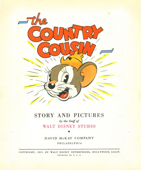
The title page
_______
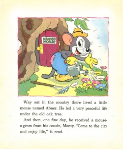
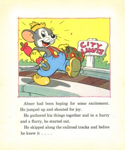
Commentary &T.Hachtman 17 Jul 2008 08:13 am
The New New Yorker
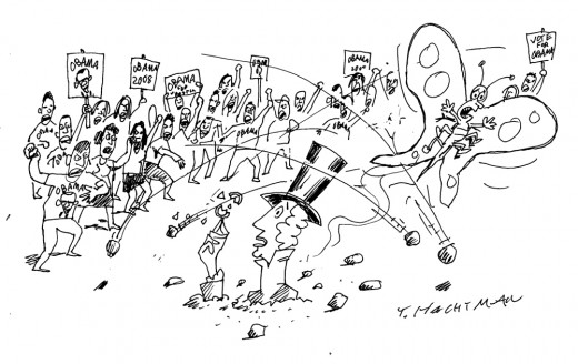
(Click if you want to enlarge any image.)A poignant cartoon by Tom Hachtman that
should be published in The New Yorker, but that
would involve good taste.
_
- I haven’t noticed any animation blogs that are screaming about the New Yorker cover that 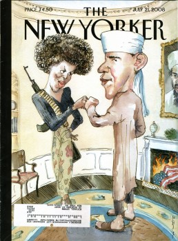 made all the headlines this week.
(Pictured to the right.)
The thing had me furious when I received my subscription copy this past Monday. I’m an ardent Obama supporter, but the subject matter isn’t what had me irritated. I appreciate a vile caricature as much as the next guy. The best political cartoons are sharp, pointed and acidic. The magazine doesn’t generally post political cartoons on their cover, yet it isn’t the fact that they’ve chosen Obama as their target. I’ve gotten used to it. There aren’t too many left wing magazines posting anti-McCain cartoons, so they may as well attack their own.
What bothered me was the obvious attempt by The New Yorker to be racy, vicious and caustic for the sake of sensationalism. They wanted to sell magazines, so they thought they’d create a stir.
I’ve been a subscriber of the New Yorker for almost 40 years. I’ve read almost all of their issues in that time. This wasn’t the standard they shot for in all those years. Tina Brown came on as editor and tried to shake the magazine up to get subscriptions and ad revenue up. She was replaced by David Remnick, and he seems to want to up the ante. This issue takes the magazine out of the realm of tasteful writing and cartooning. It got vulgar for the sake of sales. This is what they did with that other Condé Nast publication, Vanity Fair. It’s a magazine I dislike enormously.
Now I have to rethink my subscription. OK, I don’t. Within the same magazine is a great article about Obama and the backroom politics that had to be scaled to make it in local Chicago politics. This is the kind of article no one else is writing. Unfortunately, the racist, scurrilous cover is the sort of thing you can find anywhere else.
The edition of the magazine, of course, has just about sold out. Here’s a NY Post article about the business side of the story.
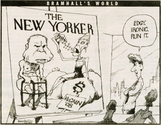
Below is a cartoon I ripped out of The Daily News by Bill Bramhall. It’s hilarious and touches on the “irony” of the situation. Since most of you probably missed it, I thought I’d showcase the cartoon.
- Jeff Scher has a wonderful new animated piece in the NY Times. Fly By Night is a film he’s made by shooting flying bugs and showing their flight paths and motions. I have to admit, I was amazed by it. Go here to watch the 1 min 34 sec film.
- I attended an Academy screening this past Tuesday night. It was the most crowded event of 2008. The place was full. Only one animation member wasn’t there, an oddity in itself. Generally three or four animation folk show up; this time there was even an animation guest, Tom Sito (currently visiting New York).
What was the film? Wall-E? Kung Fu Panda? Space Chimps?
No, it was Mamma Mia! Having seen it, I can testify that it was the most energetic film I’ve seen all year. Meryl Streep doesn’t settle down for one second. She’s all over the place. It had more action than Indiana Jones 4.
Too bad I hated it. It was nice seeing all those people show up, though.
We’ll see if The Dark Knight is as packed next Tuesday.
The Emmy nominations for animation are:
Outstanding Animated Program (for Programming Less Than One Hour)
Creature Comforts America • Don’t Choke To Death, Please
King Of The Hill • Death Picks Cotton
Robot Chicken • Robot Chicken: Star Wars
SpongeBob SquarePants • Inmates of Summer / Two Faces of Squidward
The Simpsons • Eternal Moonshine of the Simpson Mind
Outstanding Animated Program (for Programming One Hour Or More)
Blue Harvest (Family Guy) • FOX • Fuzzy Door Productions in association with Fox Television Animation Studios
Imaginationland (South Park) • Comedy Central
Justice League: The New Frontier •Warner Bros. Animation
Congrats to those nominated.
Animation &Animation Artifacts &Disney 16 Jul 2008 08:02 am
Skumps Dwngs
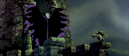
- This will be the last Sleeping Beauty post of the week. (Having lately seen a number of negative posts about this film, I’m sure some of you will be glad about that.) I promised to post a couple of drawings I have for the “Skumps” sequence once Hans Perk had completed posting the drafts for this sequence so that I could I.D. the animators. (I have to say I guessed correctly in three out of four shots, so I’m pleased with myself.)
I’m posting closeups of the drawings. By clicking on any of them you’ll see the full sized animation paper. I’m also posting frame grabs beneath the drawings so you can see how they looked in the film.
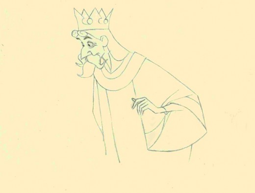
This is a Milt Kahl scene, seq 13 sc 8. This drawing is undoubtedly a clean up,
so it’s not one of Kahl’s drawings – just his pose. It’s an extreme.
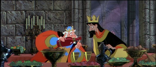
It is interesting that Kahl animated both characters.
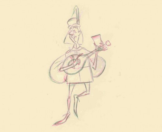
This is a John Sibley ruff. Seq 13 sc 17.
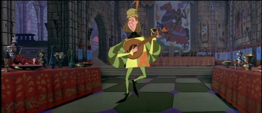
It’s a very odd, uncoordinated dance number by the drunk lackey.
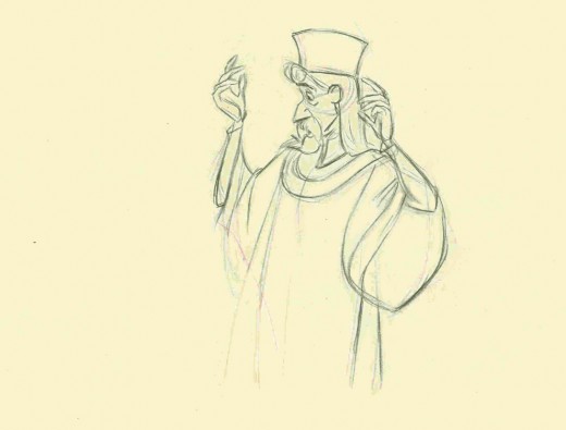
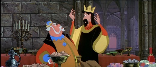
This is my favorite of these four. It’s a John Lounsbery ruff of King Stefan.
Another extreme from seq 13 sc 26.
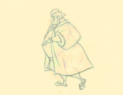
This is also another beautiful ruff by John Lounsbery. It’s King Hubert in the
very last scene of seq 13, sc 57.
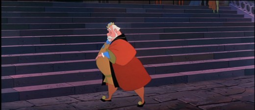
it comes just prior to Hubert’s turning and sitting on the palace steps.
And now for something completely different:
Bruce Knapp, who has worked with many of us in the New York industry, has a film competing in WNET/ch 13′s On Air competition. Every Saturday night they air two features and a short film. However, the public selects the short films from three on line contestants.
Bruce’s film Keep This Coupon, which won an ASIFA East award last year, is in the running for an airing this coming Saturday. Can I urge you all to go on line and vote for his film (prior to Thursday at 5pm)? Let’s get an animated film in the mix. Go here to vote, and/or see the films and VOTE.
Thanks to Masako Kanayama for letting me know about this.
Disney &Frame Grabs 15 Jul 2008 07:24 am
Grabs – SB ending – 1
- Continuing with yesterday’s post on the end of Sleeping Beauty. I’ve decided to get the frame grabs for the sequence and post them as well. I thought the comparison of board to actual film interesting.
__________
These images come from the “Special Edition” of the dvd, not the “Platinum Edition” now on the market. Using Hans Perk‘s posts of the drafts for these scenes, I was able to identify the animators’ names. (Trust me, I’m nopt trying to compete with Mark Mayerson‘s brilliant “Mosaics”. This is too hard; I have no intention of keeping it up.)

sc 82 (L) Milt Kahl – sc 82.1 (R) Frank Thomas

sc 82.2 (L) Kahl & Thomas – sc 82.3 (R) George Nicholas & Jerry Hathcock

sc 82.4 (L) Nicholas – sc 82.5 (R) Nicholas & Hathcock

Nicholas & Hathcock (L) sc 82.6

sc 84 (L) Ken Hultgren – sc 85 (R) Nicholas & Hathcock

sc 87 (L) Nicholas & Sibley – sc 88 (R) Nicholas & Hathcock

(L) Nicholas & Hathcock – sc 89.1 (R) Hultgren

sc 89 (L) Nicholas & Hathcock – sc 91 (R) Hathcock

sc 91 (L) Hathcock – sc 92 (R) SA sc 49 seq 8

sc 95 (L) Hathcock – sc 93 (R) Hathcock

sc 96 (L) Hathcock – sc 97 (R) Dan MacManus

(L) MacManus – sc 97.2 (R) Hathcock

sc 98 (L) Hathcock – sc 99 (R) Sibley

sc 100.1 (L) Hathcock – sc 101 (R) Les Clark & Fred Kopietz

sc 102 (L) Hultgren & Kopietz – sc 104 (R) Hathcock

sc 107 (L) Hathcock – sc 108 (R) Hultgren

(L) Hutlgren – sc 109 (R) Hathcock

sc 110 (L) Ollie Johnston & Blaine Gibson – sc 110.1 (R) Gibson

sc 110.2 (L) Johnston – sc 110.3 (R) Johnston & Gibson

sc 110.4 (L) Johnston – sc 111 (R) Johnston & Gibson
Animation Artifacts &Disney &Story & Storyboards 14 Jul 2008 08:06 am
Sleeping Beauty’s End – 1
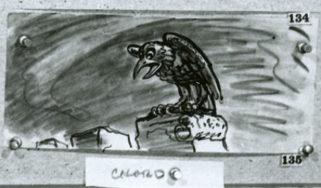
- To continue my attempt to keep up with the invaluable drafts that Hans Perk has been posting on his blog, I have some more storyboards to offer. John Canemaker has loaned me the final sequences of the film detailing the dragon fight and climax of the film. It’ll take a couple of weeks to post them all, so let’s get started.
We’re not sure exactly who did the artwork, but there’s a good chance it’s Ken Anderson‘s work. As with past boards, I’ll post the whole photograph as is, then take it apart row by row so that you can enlarge them as much as possible. Here’s the storyboard sequence #18 from Sleeping Beauty.
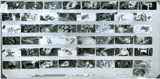
(Click any image to enlarge.)
Photos 13 Jul 2008 08:14 am
SundayPhotos – Planted Palms
 - Last week, I posted a bit about the enduring verve of the green foliage bursting through the cold, hard concrete of New York’s streets. These were accidental growths, weeds that blossomed in the cracks of the ground. This led me to think about the greening of the city, the foliage that was planted for all of us to enjoy. Perhaps not “Palms,” but trees just the same.
New York City, throughout all five boroughs, has planted many a tree to line the streets. Actually, the nearer you get to a park area, it seems, the more you’ll see planted trees.
They come in all sizes and shapes and have many varied rooted plantings. To the left, we see what I believe is the most typical type. A square of concrete has been replaced by soil, and the trees are planted to continue growing out of it. These trees, just outside Madison Square Park, are young and recently planted.
A couple of years ago the city was hard hit with a Gypsy Moth infestation that attacked most of the trees. The City had to kill off all the trees that had the pestilence and replant newer trees which were healthy and free of harmful insects.


The tree on the left seems to have no above ground space for growth.
The roots lie completely under the concrete.
The tree on the right is very typical. It shares space
with parking meters and garbage waiting pickup.


Here, on the left, we see trees that are brand, spanking new.
They’re wrapped at the bottom to protect the bases and to give them
time to adjust to the environment.
The tree on the right has a small fence to protect it from dogs.
These fences are usually placed by Block Associations.


Park Avenue has trees in the centerpiece running all the way up and down town.
It’s interesting to see the Park Dept. truck come through to spray the trees on the go.


Large numbers of planted trees are potted. These are usually bought and placed by local establishments wanting to decorate the fronts of their stores. Most often these are restaurants, like the Korean Restaurant above left.
The three planted, small trees above right decorate the front of
a local Catholic Portuguese Church.

Here’s a closer look at the attractive flowers planted at the base of these trees.

At one time there were three trees in these three barrels.
I guess they’re having a hard time of it in front of this cafeteria/restaurant.


These planters hold smaller shrubs that decorate two different restaurants
a block away from each other.
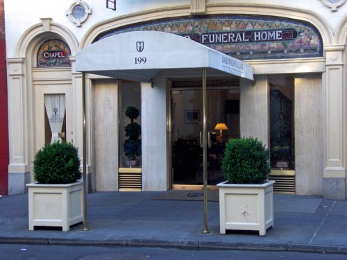
This funeral home has planted a couple of similar type of shrub.

A newer local restaurant offers these specially built boxes full of flowers.

Another, fancier restaurant offers several different types of planter and plant.
There were quite a few plants and tree displayed to soften the city view. It’s something that I generally take for granted. Regardless of whether the City is planting trees or local establishments, I have to admit it makes the world a more pleasant place for me.
Articles on Animation &Commentary &Guest writer &Independent Animation 12 Jul 2008 08:23 am
Guest writer: Why Cartoons?
 – I received the following article from Nina Paley, the creator/animator/ director/designer of Sita Sings the Blues (which won the Best Feature Prize at Annecy this year.) The article came with a letter, which I think helps explain why she wrote it.
Here’s the letter:
- Hi Michael,
I’m back in NY, finally, spending my first day home in my apartment with the AC on with the cat next to me, surfing the web. I read your review of Wall-E, which I haven’t seen yet, and thought to send you this essay I wrote for Frederator (which they never used) on the theme of “Why Cartoons?”.
Since Berlin, I’ve been convinced that most cinemagoers are simply voyeurs, craving simple stimulation of their primate visual senses in the form of close-up views of beautiful people courting and mating, and gory violence. Things our inner primates think about constantly but seldom get to see. Animation is more abstract and cerebral, visually. I prefer it to live action, but I am a freak (like most animation fans).
Pixar’s success lies in making animation that visually resembles live-action and satisfies the typical cinemagoer’s inner voyeur. Hence the expanding popularity of 3D “animation” among Hollywood producers.
Typical American cinemagoers are put off by 2D animation, but 3D gives them more of what their primate eyes want: to believe they’re watching real events up close without risking personal exposure.
Since I’m going to a lot of festivals with “Sita,” I am struck by the cultural differences between animation festivals and “real” film festivals. When I refer to films as “live-action,” most directors don’t know what I’m talking about; to them live-action is just “film,” and animation is completely off their radars. Most have never heard of Annecy or any other animation festivals. Most film festivals automatically exclude animation from competition, instead programming it in what I call the Animation Ghetto – or worse (in the case of “Sita”), the “Family” or “Children’s” sections. But their programming animation at all is evidence of some progress. And I’m grateful, especially for the 2D animation fans that already exist, and the chance to expose new viewers to the art form.
Hope you’re well,
–Nina
This is the article she sent.
- WHY CARTOONS?
Because less information = more meaning
Animation takes advantage of quirks of human perception. Good cartoons lie somewhere between nature (no abstraction) and text (full abstraction).
At its best, animation does what live action can’t. Good animation is unrealistic. This starts with the style itself: drawings and designs of things that can’t exist in the real world. Exaggerated heads and hands, huge or tiny eyes, rubber-hose limbs, cubism. A handmade line drawing of a robot requires our uniquely human imaginations to understand it as “a robot,” but we may recognize it more quickly than a photograph of a real robot.

Exhibit A: cartoon drawing of a robot.
Animated motion should also defy reality. For example, bouncy walks that no robot (or human) could replicate, even though we can recognize them as “walks.” Good cartoons stimulate and exercise our imaginations in ways live action never can.
Like reading or working out, viewing cartoons can be exhausting. But far less time is needed to communicate more meaning. That’s why cartoons are so effective as shorts (and commercials).
Live action conveys too much information. “High production values” are the art of removing as much information from nature as possible.
Wrinkles and blemishes on actors’ faces are concealed with makeup; stray threads and hairs are tucked away by stylists; wires and microphones hidden through camouflage, meticulous set design and framing; unwanted details lost in shadows via careful lighting, which heightens only those few areas and outlines intended to convey meaning. But still, excessive information abounds in live action.
Cartoons start with only the information needed. There’s nothing extraneous to hide. If you mean “eyes,” you show a symbolic short-hand representation of “eyes,” nothing more. No gunk in the corner of the eyes, no moles on the eyelids, no eyebrow dandruff – unless you explicitly intend to convey these details as well. The picture is as clear as the idea in the mind of the artist, and that clarity of meaning is transferred to the viewer.
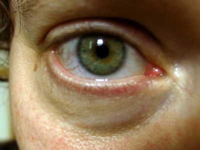
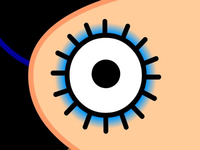
Exhibit C: real eye, belonging to the author.
Notice bloodshot veins indicating stress, wrinkles indicating wisdom and maturity,
shiny skin surface indicating absence of makeup, and other excess information.
(Also, producing animation totally trumps live action: No uppity actors. No obnoxious crew. No permits. No tedious laws of physics. If you can imagine it, you can animate it; no extra charge.)
But animation remains the bastard child of cinema. Most moviegoers just want to watch beautiful people. Bonus if the beautiful people are celebrities; extra bonus if the beautiful people are performing sex or violence onscreen. Animation can deliver meaning, story, ideas – but it doesn’t satisfy the sexual voyeur that drives most cinephiles. In live action, a camera can linger for minutes on a beautiful actress’ face, as the audience attends to all that information: every eye-blink, every change in pupil dilation, the subtlest nostril flare, the slightest movement of any of the hundreds of facial muscles lurking below the makeup. In live action, such a scene is watchable. How could such a serious and pensive scene be conveyed in animation? It would either be painfully dull (a long still) or ridiculous (imagine a Bill Plympton interpretation where every nuance is exaggerated: small nostril flare becomes huge, facial muscle twitch becomes twitchy animal running around under skin) and, like all animation, exhausting.
Live action satisfies our voyeurism, animation ridicules it.
Since I can’t take voyeurism seriously, I go for ridicule.
Animation &Commentary &Independent Animation 11 Jul 2008 08:03 am
John Schnall
- I’d like to talk about a film, but actually it’s not the film but the filmmaker that I’m interested in.
A couple of weeks ago, Mark Mayerson wrote a piece on his blog about Animation and Theater. Mark has become something of an authority on acting and animation. This piece was, in ways, an extension of past comments he’d made about the subject. Having attended a one-man show about Theodore Roosevelt, which was entitled “Bully,” Mark discussed the possibility or the likelihood of animation pulling off such a subject with as much success.
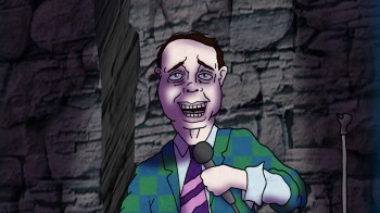 This made me think about the subject that has fascinated me for years. Animating long monologues with any such success. A year or so ago, I’d gone through a number of theatrical monologues thinking I’d have an actor record the piece (or pieces) and try getting them to work. Using animation as a medium to delve beyond the surface to understand character and characterization. One thing leading into another, I never got to complete that project – though I haven’t given up on it.
Now I find, thanks to a correspondence with John Schnall that he has done this.
John is one of the more daring animators/animation directors out there. He has for years chosen difficult subjects and difficult projects to animate. They all have a strong sense of the bizarre, but they’re all breaking molds that I don’t see others even trying to break.
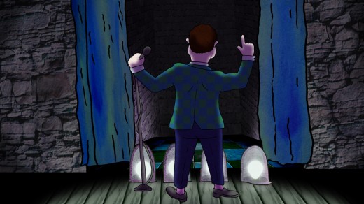
His most recent film, Dead Comic, is as difficult as it gets. The film is a monologue by a dead comedian, and it offers a gruesome exploration of the afteryears of someone married, eternally to his job. The film could have been called Dead Animator, in my case, but it wouldn’t have been as funny. John has animated a monologue – a difficult monologue.
The film is so difficult that audiences seem to be afraid of it. (Is the subject of death that difficult?) The recent ASIFA-East festival didn’t have the patience even to sit through it, though, in my opinion, it’s better than most of those that won prizes. It’s just more challenging, and the audience wanted more of the expected rather than something complex and difficult.
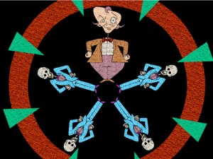 I don’t think it’s the greatest film of all time, but I do think it’s brilliant. You should watch it and understand that the staging is incredibly complex, the timing is very sharp and the design and writing are wholly original and unafraid. it took hard effort, knowledge and ability to make it work.
In any case, I am always eager to see what John is up to. He’s one of the few artists working in New York and in Independent animation.
Go to John Schnall‘s website here.
See Dead Comic here.
Buy a 40 min. compilation of John’s films here.

The last two illustrations are from Ha Ha Ha and The Binding of Isaac.
Books &Errol Le Cain &Illustration 10 Jul 2008 07:41 am
Le Cain – ‘Crisis at Crabtree’
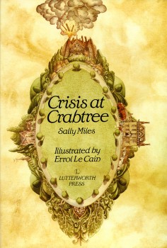 - I’ve done a number of postings of Errol Le Cain‘s marvelous illustrations and hope to continue to do more. Of course, I’ve had a distinct interest in his artwork since I first saw him in the original BBC documentary on Richard Williams’ studio at One Soho Square. The show highlighted the short film, The Sailor and the Devil, which Williams used to train Le Cain in the art of animation. The first book I saw by Le Cain, Thron Rose, hooked me, and I became a collector.
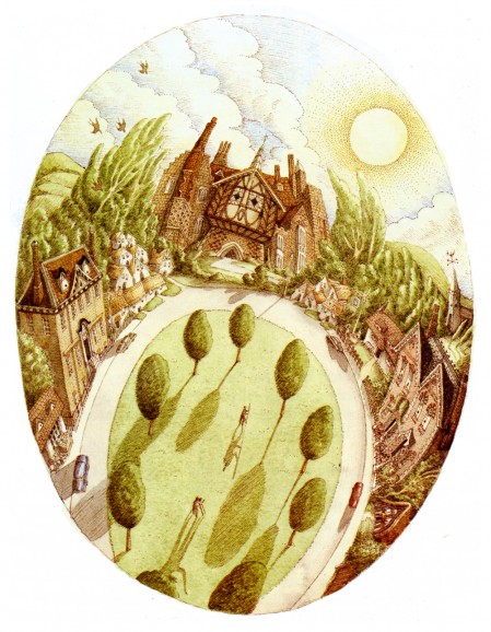
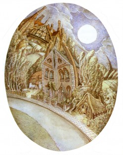
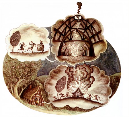
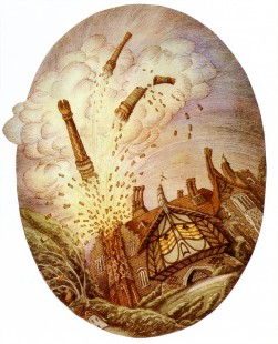
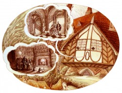
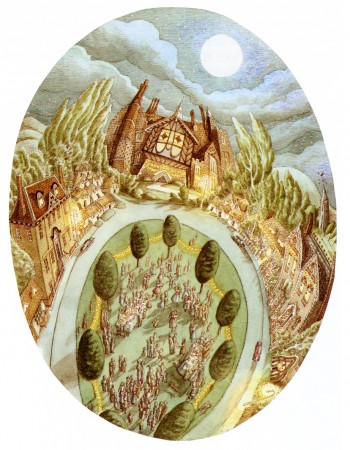
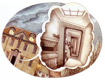
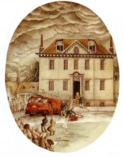
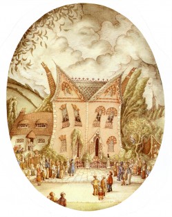
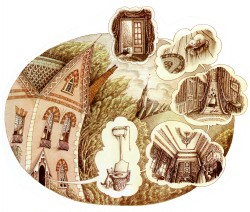
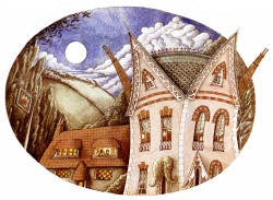
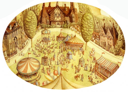
I have a peculiar book, I’d like ot share with you now. Crisis at Crabtree tells the story of the village of Crabtree, due to be demolished. All of the houses detail their histories before they are to go. Only Norman, the medieval farmhouse is slated to be protected.
This book was written by Sally Miles and illustrated by Le Cain. The illustrations, as you’ll see here, are Easter egg gems.
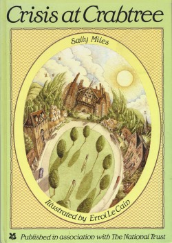
Crisis at Crabtree was published in association with the National Trust.
Here are the illustrations:
 __
__
Front Cover & Back Cover
