Monthly ArchiveJuly 2008
Books 31 Jul 2008 07:54 am
Webb’s Faces – 2
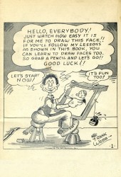
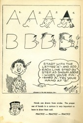
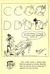
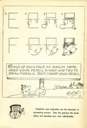
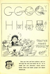
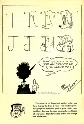
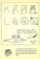
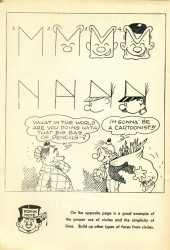
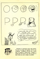
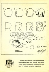
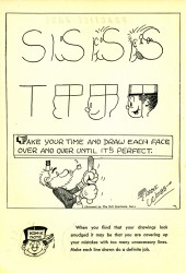
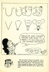
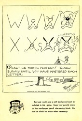
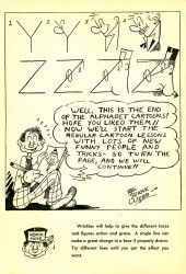
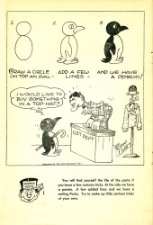
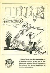
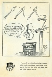
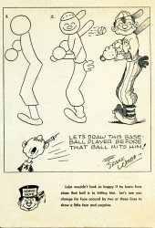
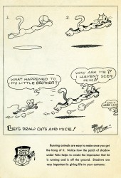
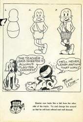
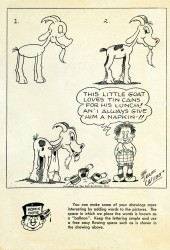
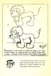
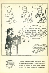
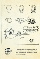
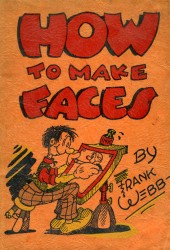 - Last week I posted the first half of the book How To Make Faces by Frank Webb. This was a book on “how to draw faces” published in 1940.
I initially posted part of this book in August 2006. Its popularity inspired me to repost it with the remainder of the book added.
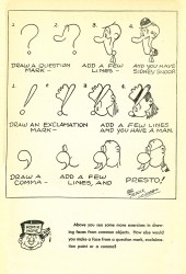
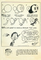
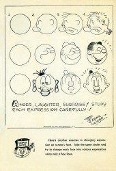
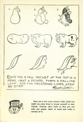
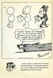
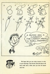
The first half takes the alphabet and builds up from there. This part takes simple shapes and does much the same.
When I initially posted the book I received an interesting letter worth posting again:
Hi,
Frank Webb was my great uncle, and I am very pleased to have found someone who still knows of him. I have a bunch of his stuff, and know a bit about his history, including him publicly proclaiming Walt Disney a crook! One of Franks drawings ended up in a sale to Disney, and renamed (from “Dippy Dogâ€) to Goofy. Thank you for including him here.
Darren Reese
Here’s the second half of the book.
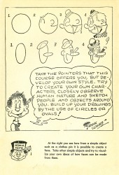
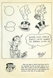
(Click any image to enlarge.)_______
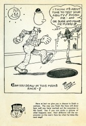
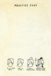
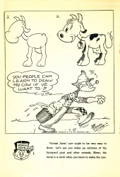
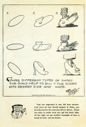
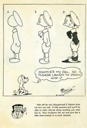
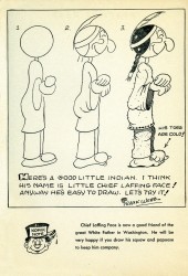
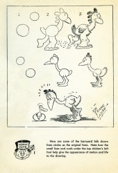
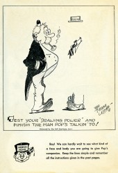
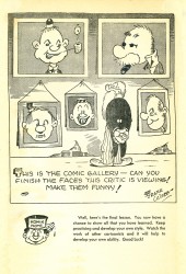
As I mentioned, every other page is a “Practice Page” where you’re supposed to try to draw the characters. For the first half of the book, these practice pages are blank (except for the type “Practice Page”), however in this second half some of the pages have an exercise at the bottom. These pages look like the one to the bottom left.
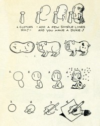
I’ve taken all of the remaining exercises and have ganged them up onto the image to the lower right.
 __
__ 
Animation &Frame Grabs &Hubley 30 Jul 2008 08:08 am
Everybody Rides – 1
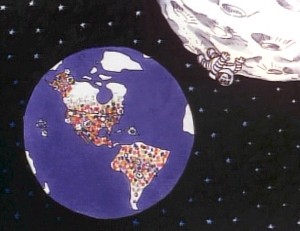 - Back in 1976, I was working on John Hubley’s Bicentennial flm, PEOPLE PEOPLE PEOPLE. This was a short film, about four minutes long, that had about a million scenes. It told the history of the US (from the standpoint of populating and overpopulating) beginning 17760 BC and ending in 1976 AD.
It started with some lengthy scenes. As the film moved on, the cuts came faster, until they hit about 6 frames apiece toward the film’s end. The final scene, from space, was the longest in the film.
There were no characters that appeared in any more than one scene. That meant that with each scene, there were new setups, new characters, new colors, new everything. As a result, it took much longer than other films and was a difficult one to pull off. But like all other Hubley efforts, it was fun. Tissa David, Jack Schnerk, Lu Guarnier, Phil Duncan and Bill Littlejohn animated it. I colored about 2/3 of the film and animated at least a dozen or two scenes (some really were only 6 frames – like that auto shot posted). I also assisted/inbetweened all of the animators.
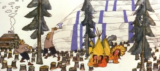
Swedes cut down all the trees in PEOPLE PEOPLE PEOPLE.
The studio, at the time, was buzzing because John and Faith had just sold a dream project to CBS. Everybody Rides the Carousel was an adaptation of Erik Erikson‘ 1956 book, Eight Stages of Development. Erikson was a psychologist who theorized that man goes through eight stages of development from birth to death, and he proceeds to break them down. The Hubleys took this book and broke these eight stages into horses on a carousel.
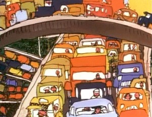 The three half hour Special shows for CBS would be about these carousel horses and the ride.
Each of the stages would be broken into two different subsets, and these would be depicted through stories which were roughly developed visually by John and Faith. Once the funding started to tricle in (about $450,000 for all three shows) they would cast their many actors and have them improvise in the recording studios to the storyboarded set pieces.
While those recordings progressed, the small studio staff was busied in completing animation, artwork and rendering of PEOPLE PEOPLE PEOPLE.
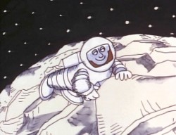
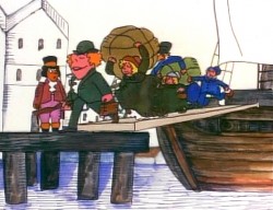
The man on the moon and the Irish immigrants.
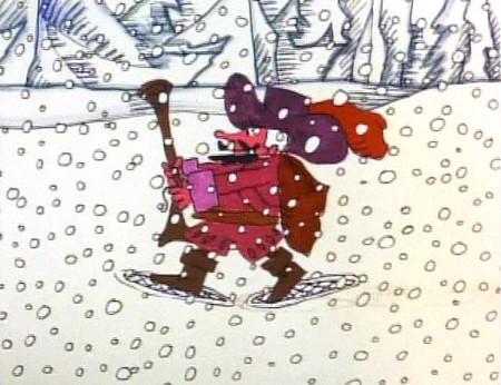
Jack Schnerk animated the French trapper sequence. There was such a rush
on the scene that I remember Jack bringing it in saying he hoped it would work.
He’d done two drawings of snow for the blizzard. Both wildly different from each other.
He asked me to ink them, then flop the drawings and ink them again.
He’d exposed the four drawings on fours. He also had the trapper with
snowshoes walking on fours. He felt it would help us feel a struggle in his
walking through the snowstorm. He felt the fours might add weight.
The scene worked beautifully, and was excellent the first time out.
Not quite the way they’d have done it at Disney. Tricks of the trade.
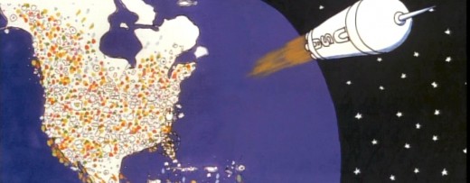
Tissa animated a majority of the film. The ending, the man going to the moon to escape
the overpopulated earth was hers. I have the drawings somewhere and will post some of them soon.
Animation Artifacts &Disney &Story & Storyboards 28 Jul 2008 08:03 am
Sleeping Beauty – storyboard Seq 19 Pt 2
- Last week we left off Part I of this storyboard sequence 19 with Phillip cutting his way through the forest of thorns trying to make his way into the castle. Maleficent watches from a distance and is getting more and more angry.
This is Ken Anderson’s storyboard presentation. The photographs of the board were loaned to me by John Canemaker, and I am indebted to him for it.
This is this photo of the board as is:
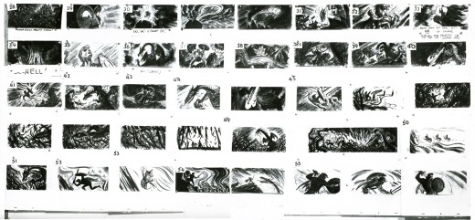
(Click any image to enlarge.)____________
Here are the rows of the board broken into two so that I can post them a bit larger.
The conclusion of this sequence remains.
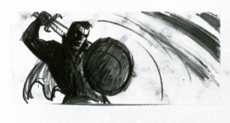
If only he knew what he’s to face next.
Photos 27 Jul 2008 08:25 am
PhotoSunday: Summer Fest
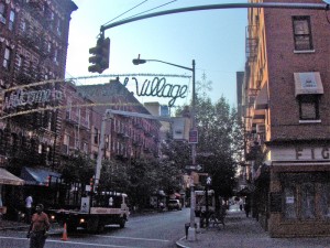 - Walking up Bleecker Street (a block away from my studio) at 6am recently, I noticed a truck putting up the “Welcome to Greenwich Village” sign.
This sign is a mainstay of the Christmas decorations that don’t go up until October, so I was curious what it was all about. I assumed it had to do with tourists and Greenwich Village and summer.
I snapped a couple of photos and went onto work.
_________(Click any image to enlarge.)
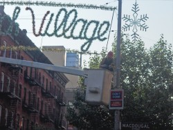
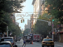
You can see that the Christmas star is attached to the “wreath”-like banner.
Despite this people walk around in summer attire.
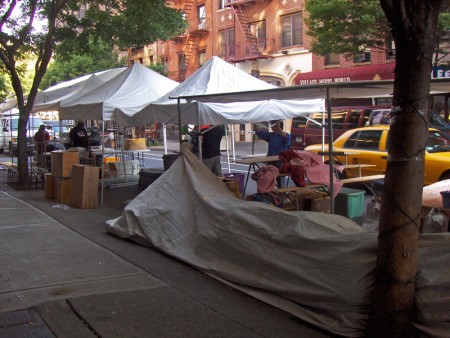
Then, yesterday morning at 7am I walked into the scene of people raising tents.
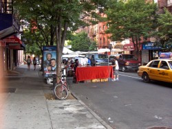
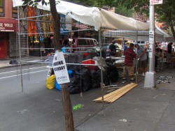
Workers are busy constructing their tents, working out of vans and trucks, busily building a small market which runs about four or five street blocks (about a ¼ of a mile.)
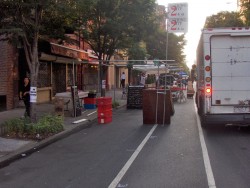
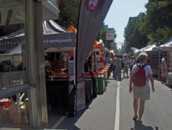
Here’s a scene at 7am and again at 11am after things have opened.
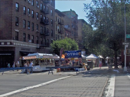
This is what Bleecker Street looks like from the other side of 6th Avenue.
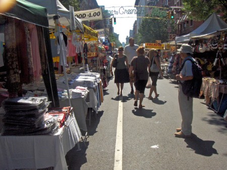
All summer long, New York becomes littered with street fairs and festivals.
Automobiles travel an obstacle course through the city trying to move in and around
these outdoor markets.
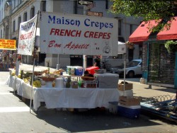
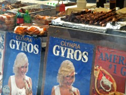
All sorts of food is the main attraction from crepes to gyros . . .
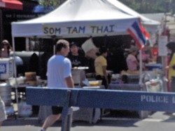
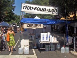
from thai food to . . . thai food.
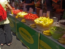
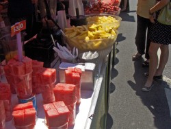
All this fresh fruit will add up to a lot of smoothies.
Anything that can be carried and eaten can be sold.
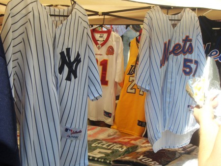
Clothing amounts to baseball shirts (where else will you find
Mets & Yankees side-by-side), scarves, belts or wallets.
Local stores join in by setting up a table and a tent
to sell samples of their merchandise.
Interestingly enough, I noticed last night that there was another one of these little market/festivals about five city blocks away. On the other side of Sixth Avenue at 8th Street (actually it’s Greenwich St.) another group of tents were selling happily.
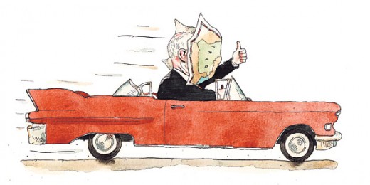
Just so you don’t miss the current cartoon Barry Blitt (the cartoonist who did the famed New Yorker cover) printed in the NYTimes to illustrate Frank Rich ‘s Sunday column, I thought I’d post it (above). I hope McCain isn’t trying to navigate around the street fairs of New York.
Animation &Fleischer &Frame Grabs 26 Jul 2008 08:16 am
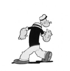
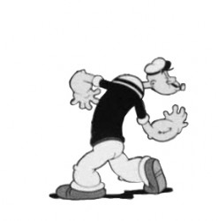
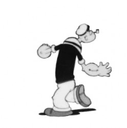
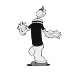
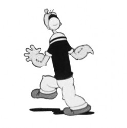
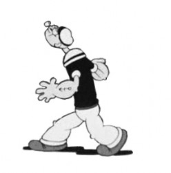
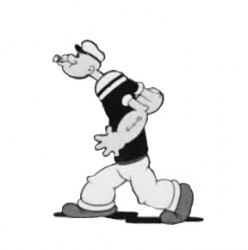
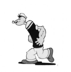
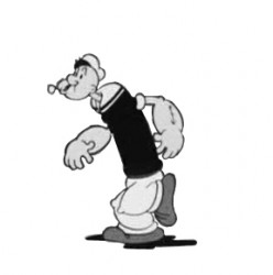
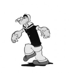
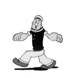
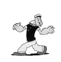
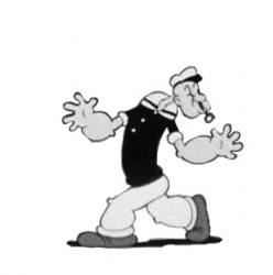
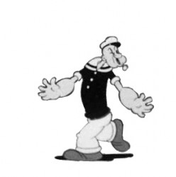
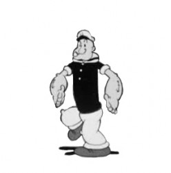
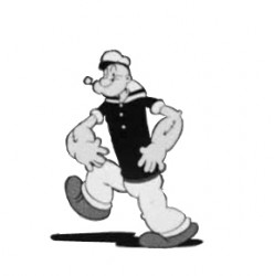
Popeye Goonland Walk
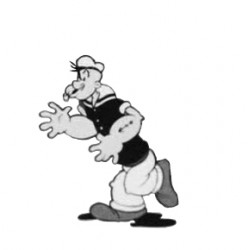
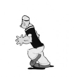
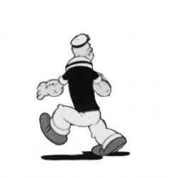
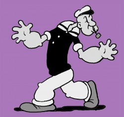 - Here’s a walk I thought funny in the 1938 Popeye cartoon, Goonland. It’s part of Vol. 2 of the Popeye collection.
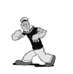
Drawing for drawing the animation in this film is hilarious. Everything seems to change sizes from frame to frame – just watch Popeye’s feet. They grow, then go back to size. Just the same, the cycle on the legs is very tight and feels as though it has some weight. This is a bit of an animation style that’s lost to CGI.
I’ve forced the drawings into a cycle – they aren’t meant to be. In the actual film, Popeye keeps perusing in other directions as the scene goes on. However, splitting it up like this gives us a chance to look a little closer.
Here are frame grabs followed by a QT movie of the cycle.
 1
1 2
2(Click any image to enlarge.) __________________________________________
_______________________ _________-______________Popeye scours Goonland withe very expressive arms.
Commentary 25 Jul 2008 08:22 am
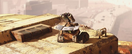
More on Wall-E
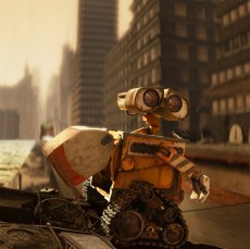 Michael Barrier hit on something with his reviews of Wall-E and Kung Fu Panda. I’ve been thinking about it for quite some time, but I never really plunged into the thought. Two lines of his review stood out for me:
- “The animation of machines is effects animation, and that’s really all we see in the first part of WALL•E.”
“What’s clear from WALL•E and Kung Fu Panda , as never before, is that computer animation is a dead end, a form of puppetry even more limited than stop motion.”
When I first saw Toy Story, I realized that the possibility of computer animation replacing traditional animation might actually exist. Nothing prior to that point led me to think that. What I didn’t expect was that I was watching the high point of the medium.
People concentrated on animating grass (A Bug’s Life), hair (Monsters Inc.), water (Finding Nemo) and, now, machines (Wall-E). Essentially, they were concerned with moving the technical capability of the medium forward and ignored the very real need of moving the characters with any REAL depth. Pixar and Dreamworks gerry-rigged stories around the capabilities of the new medium and animated around those problems. They’ve gotten to the point where they can successfully impersonate the things of real life.
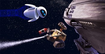 However, if a well rigged commercial can feature computer animation that equals or betters something in Pixar’s best, or a live-action/computer-effx feature (such as Spiderman 2, which has a story almost identical in parts to The Incredibles, or The Dark Knight, which has superior performances to anything in Pixar) works better than the best feature animation scene, what’s the point?
They are animating Special Effects. The animated “Effx” in The Dark Knight are good enough to be invisible as animation. In Spiderman 2 it all looked animated, and I wondered if they were going to try to horn in on the Oscar’s Best Animated Feature category.
Mike Barrier should have gone further in his statement. All computer animation has become Special Effects. Someone moves the skeleton; someone adds the flesh; someone adds textures; someone adds lighting. Who’s responsible? It may as well be a car driving through a rain storm that turns into a desert. Oh wait, was that Cars?
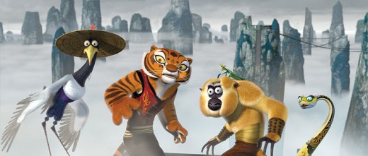
The animation of Kung Fu Panda is closer to what I think animation is, but the movement of the characters has little to do with the actual characters. It’s just fast or slow and derived from the clichés of Kung Fu movies. There’s no character development that the voice over actors haven’t given it. It becomes a lot of little dolls zipping around beautiful backgrounds. Some scenes and animation from Mulan have it all over this feature.
The director is undoubtedly the “auteur” and when you have a Brad Bird who keeps challenging the movement to be more “human” it can work. His films work well, and he seemed to be onto something after The Incredibles. If he ever gets back to animation, perhaps he’ll help advance this medium. At the moment, for me, I don’t see much of a future here. It hasn’t moved beyond Toy Story other than technically speaking.
I’ve seen some recent grumbling about Disney’s Sleeping Beauty, but I think that film was light years beyond anything yet done in computer generated animation. Perhaps, it’s just my own sensibilities and taste boiling over. I’ve watched the Emperor in his new clothes for the past fifteen years. All I’m saying is we’re all getting cold.
The medium is floundering. When you get to see the Honda guy knocking on the glass screen of the TV and are pleased because it’s, at least, animated. No Flash fakery. It’s real animation. It’s alive.
Mark Mayerson has an excellent response to my negative comments on his blog with Babies and Bathwater.
Books 24 Jul 2008 07:12 am
Webb’s Faces – 1
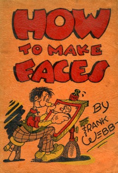 - Back in August 2006, I posted one of my most popular posts. Since then, (even as late as this past weekend) there have been many comments by people remembering and speaking positively about this featured book.
Since I’d only posted half a dozen pages, I thought I’d yield to the many requests to see more. Consequently, I’ll post the entire book in two parts. (Mind you every other page is a blank “Practice Page.” I didn’t scan any of those. If you want to practice, you’ll have to get your own paper.)
These pages are taken from a book I have, published in 1940, called How To Make Faces. The author, Frank Webb, was a comic strip cartoonist who drew the cartoon panel ‘Kartoon Kollege’ from 1940-41. When this strip ended, he created the comic strip ‘Raising Kane’, which ran until 1944.
___(Click on any image to enlarge)_______Other than that, I haven’t been able to learn
____________________-_______________much about him. I find it interesting that he signed each page of his book almost as if he expected it to run in a newspaper on a daily, one-page-at-a-time basis.
His approach was to use the alphabet and build up from there. When he runs out of the alphabet, he just turns to shapes then just asks you to copy his picture or finish the page.
This first part includes all the drawings made from the Alphabet.
Daily post &Disney &Events 23 Jul 2008 07:44 am
AMPAS Ink & Pt Exhibit, etc.
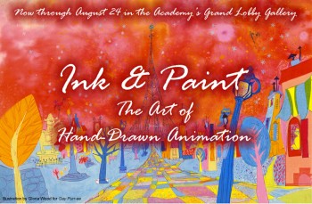 - My friend, composer, historian, Ross Care, sent me some comments on his viewing the show at the Academy exhibit in LA. This is a large exhibit of work done in traditional methods of creating animated films.
Here’s Ross Care‘s report on the show:
- At the July 18 AMPAS screening of the recent digital restoration of Disney’s SLEEPING BEAUTY I had another chance to take a look at the Academy’s excellent exhibit: “Ink & Paint: The Art of Hand-Drawn Animation.â€
This unique exhibit focuses on the art which preceded the actual productions, i.e., the conceptional drawings and paintings which inspired and determined the total “look†and style of the final film.
These concepts often turned out to be sensitive and vivid works of art in their own right. The Disney studio, which took particular care (and time) in the production of its often long-in-progress early features, was well represented.
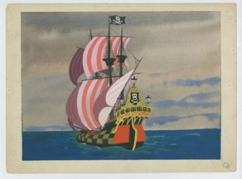 An entire section was devoted to the small, jewel-like paintings of color stylist Mary Blair who keyed the looks of Disney’s late-‘40s/ early ‘50s features. Most were from CINDERELLA and PETER PAN.
The Blair section also revealed that some of these pre-production works were also used in Disney’s prolific merchandizing of his films. Blair’s colorful painting of a stylized pirate ship can also be seen on the first page of one of the three Little Golden Books that were published at the time of PETER PAN’S release.
Eyvind Earle, whose controversial style keyed the look of the evening’s SLEEPING BEAUTY, was represented by several panoramic paintings for that epic film. There was also a small painting from the short TOOT WHISTLE PLUNK AND BOOM that the artist even had the nerve to sign.
Aside from the many Disney and Warner Bros. works, art from lesser-know films is also represented. I was especially struck by several pieces from SHINBONE ALLEY, an obscure 1971 animated feature which I have not seen since I saw it at a Saturday afternoon kiddie matinee back in Lancaster, Pa. many years ago.
SHINBONE is based on the archy and mehitabel stories of Don Marquis (and a Broadway musical based thereon). Maltin calls it “genuinely odd†and “not really for kids,†and I have never forgotten having seen it. A character study of the blond cat, mehitable, by Alvaro Arce, brought the experience vividly back.
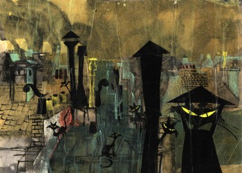 UPA’s GAY PURR-EE was represented by an amazing Paul Klee-like painting of the money cat sequence by Corny Cole, some vivid backgrounds by Gloria Wood, and character studies – the especially droll money cats – by Abe Levitow.
As the Academy flyer notes: “The magic of animated film depends on the ability to being to life not only animated characters, but the worlds they inhabit.â€
“Ink & Paint†provides fascinating, witty, and often breathtakingly beautiful glimpses into the process of the creation these worlds.
The exhibit continues through August 24 at the Academy of Motion Pictures Arts and Science, 8949 Wilshire Blvd., Beverly Hills, CA.
Ross Care‘s website is here.
Ross Care‘s Blog is here.
- For those of you who are fans of Kung Fu Panda, you may enjoy the “Animated comic books” for viewing on Yahoo. These are basically Flash animatics featuring some very dynamic graphics. It’s worth a look to see what’s out there.
- An interesting website for those of you into cartography, is the Strange Maps site. This site features a variety of interesting and curious maps all with their own explanations.
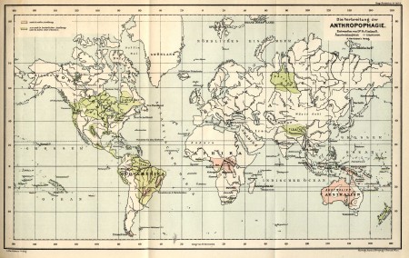
The map above, for example, details where
occurrences of cannibalism took place.
See other many, varied maps on this site. They come complete with extensive explanations – making for excellent reading.
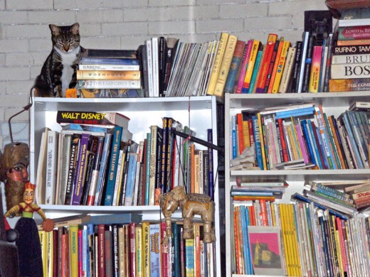
Finally, here’s the new kitten living in our studio, Lola. (Whatever she wants, she gets.) She’s found the top of my 10 foot bookshelves; it’s where she sleeps during the day.
Animation Artifacts &Disney &Story & Storyboards 21 Jul 2008 07:57 am
Sleeping Beauty – storyboard Seq 19 Pt 1
- Continuing the post of last Monday, here’s the storyboard to seq 19 of Sleeping Beauty. It’s the beginning of the dragon fight, the climax of the film. It’s on loan from John Canemaker‘s collection, many thanks to John for sharing.
Here’s the full page as is:
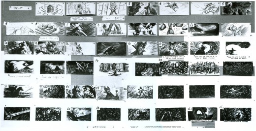
(Click any image on the page to enlarge.)
Here’s the board broken up into segments, half a row at a time.
More of this sequence next Monday.____
Photos 20 Jul 2008 08:33 am
PhotoSunday – Hitching Posts
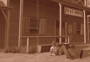 - Back in the wild, wild west, they used to have hitching posts so cowboys could tie their horses outside the local tavern to keep them from running wild. If there was no hitching post, cowboys in movies used the stanchions in front of the saloon or store.
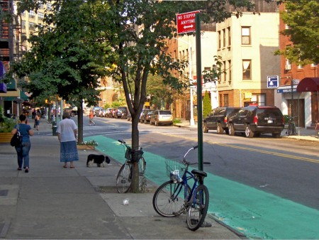
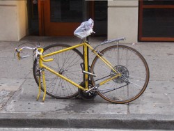
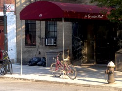
We don’t have horses in the big city, but we do have bicycles. Hitching these with chains and locks and anything to try to prevent theft has
________(Click any image to enlarge.)_____________been a primary difficulty for
_______________________________________-_____messengers and other bike riders.
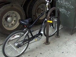
My studio has two entrances (or exits depending on how you view the situation.) At both, there are wrought iron fences which sort of act as bannisters going up/down the steps. Leaving work the other day, I noticed that the back entrance was used as a “hitching post” for a couple of bike riders. Presumably they were working out in the gym just next door.

Good thing we rarely use this exit.
This made me start looking at other hitching posts I could find on my way home, and I took some snaps.
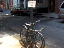
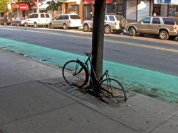
Sign posts and trees seem to be likely candidates.
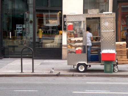
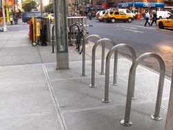
The upside-down “U” seems to be designed for smaller businesses
that want something curbside.
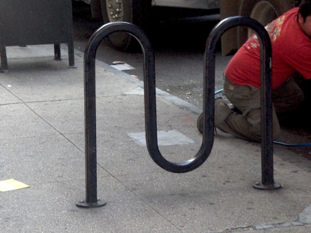
There’s also the “M” shape for a couple of bikes.
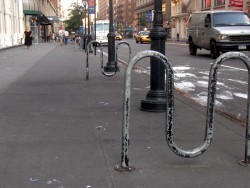

I’m not sure if these are supplied by the City or the storeowner.
There’s a uniformity around town that makes me wonder.

In places there are a number of these for the high bike traffic.
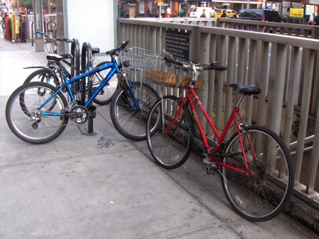
Sometimes this isn’t enough and a subway entrance serves as a backup.
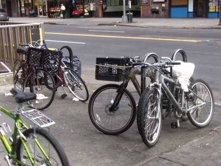
Even though many “M”s have been placed in the same area.
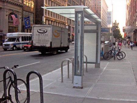
I did like noting this one unit outside a “Circuit City” store that offered
an overhead to protect the bikes outdoors.
 1a
1a 1b
1b 2a
2a 2b
2b 3a
3a 3b
3b 4a
4a 4b
4b 5a
5a 5b
5b