Monthly ArchiveJune 2008
Animation &Animation Artifacts &Disney 30 Jun 2008 07:54 am
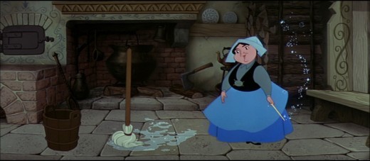
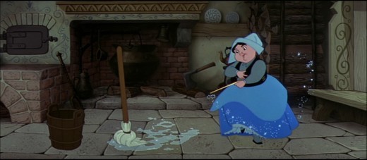
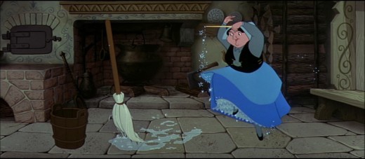
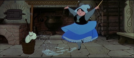
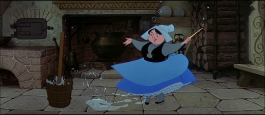
RecapMonday – Merryweather’s Dance
- Hans Perk has chosen to post the drafts to Sleeping Beauty in response to the upcoming Academy screening (in LA) of the feature film which is in response to the reissue of the video with new special additions. I thought this a good excuse to bring back these older posts:
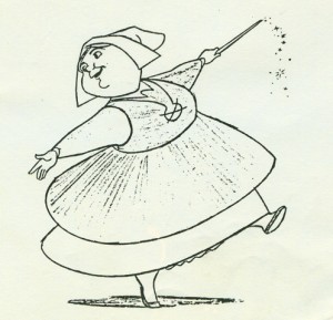 – I’ve enjoyed sharing some of the animation drawings I own via this site, and I hope to keep doing it. The drawings, to me, are so valuable in that they reveal the personality of the animators, even more than the finished films.
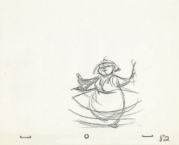
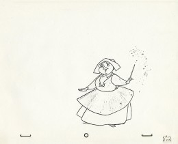
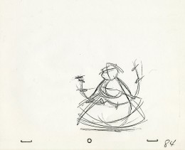
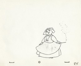
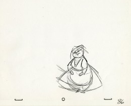
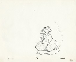
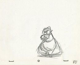
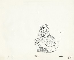
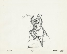
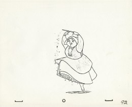
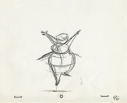
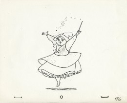
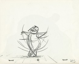
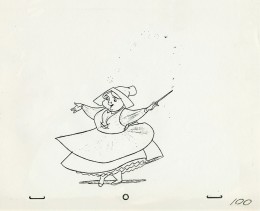
I have a bunch of copies of drawings by Frank Thomas from Sleeping Beauty. It’s the sequence in which the three fairies, within the hidden cabin in the forest, use magic to create a dress for Aurora.
Below, on the right, are some of the roughs from this scene. On the left are the final cleanups.
_
_____________(Click on any image to enlarge.)
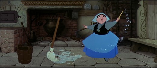
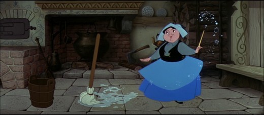
- These are frame grabs from the very same scene in the cottage featuring the Frank Thomas drawings posted above.
Frank Thomas often complained about Eyvind Earle‘s color design. He disliked the fact that Merryweather had a black bodice. He was especially peeved over this sequence, and I heard him talk about it at least three times. He felt this anchored her too much to the ground and weighed her down. I’m not sure I agree with him; I think the character moves beautifully and retains the weightlessness he sought.
There rwas quite a bit of friction between Eyvind Earle, who seemed to be Disney’s star on that film, and the animators who felt ignored.
Photos 29 Jun 2008 08:32 am
PhotoSunday – MoreSignage
- As you may have noticed in past photo pieces, I have an interest in signage. I’m a type freak, so I look at type all the time and read everything in my eye’s path. As such, I’ve always had a fascination for hand painted signs that look as though they’d been printed. Generally, they’re indistinguishable from the traditional poster.
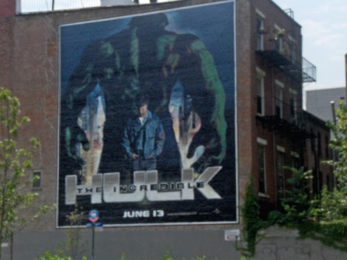
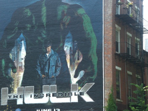
This sign for The Incredible Hulk recently appeared in the Village at
Houston and 6th Ave. It looks like any other Hulk poster around town.
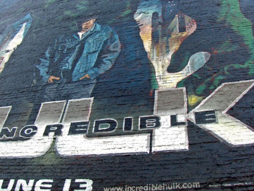
However getting closer you get to realize that someone had hand painted this
on a brick wall. One wouldn’t have been able to paste a poster.

Take a look at the type at the bottom of the sign.
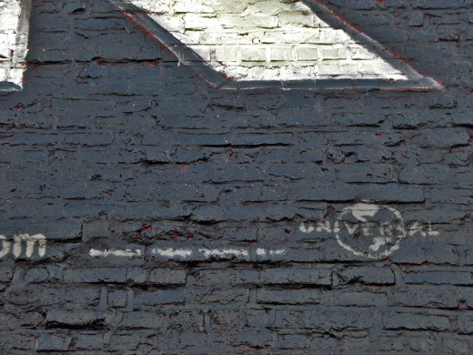
The copyright type turns into blobs of paint.
I wonder if the copyright holder realizes that
this is what they were paying for.
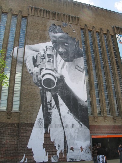
Here’s another painted wall I found on line.
No story behind it that I can find, but it’s a great hand painted image.
Many of the posters in the Village aren’t hand painted; they’re screens that are bound to brick walls by wires.
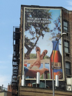
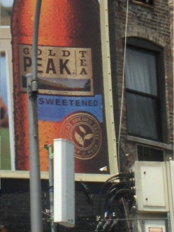
You can see, in the closeup, that this sign is a screen.

This sign completely hides the small building behind it.
There don’t seem to be any windows being covered by the screen.
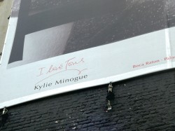
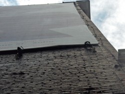
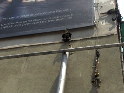
In these two closer shots you can see the hardware better.
Yes, it does say, “I love TOUS, Kylie Minogue.”
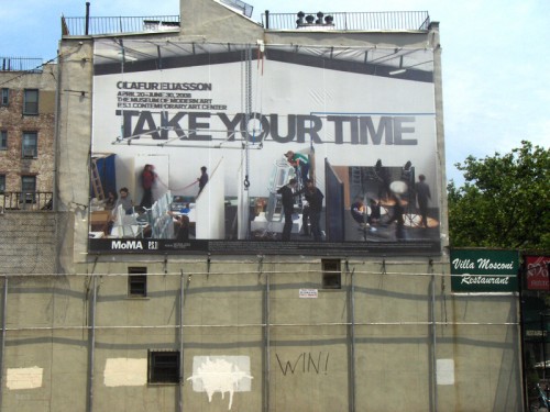
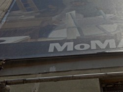
This sign for the Museum of Modern Art hangs over a playground area.
Daily post 28 Jun 2008 09:57 am
KON
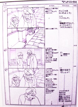
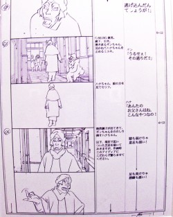
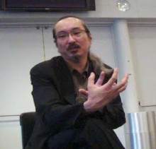 - Yesterday, I had the opportunity of meeting Satoshi Kon prior to the first screening of the retrospective being held at the Walter Reade Theater in NYC.
In the brief 10 minute interview I was given, I had prepared a number of questions to send in advance for the sake of the interpreter. We brought along a small camera to video tape and record the session. I had hoped to transcribe the interview and post it today. Unfortunately, we had a bit of a problem. The interpreter’s voice was just above a whisper and barely recorded. We have to redigitize the track and work on it to get her voice audible enough to transcribe. We’ll post the interview later this week.
There was some still art framed and mounted in the hall, though. I photographed it and caught a lot of reflection off the lights in the hall. Regardless, here are some of the images I shot. The photographs don’t do justice to Mr. Kon’s beautiful artwork. There are plenty of others I didn’t have time to shoot.
Go see the exhibit and films if you’re in NY. The full schedule is posted in my initial writing on this series. Here.
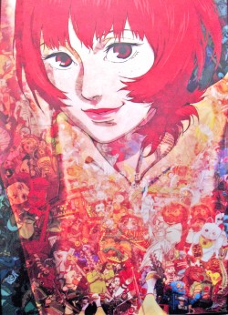
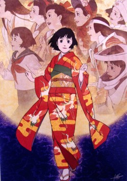
(Click any image to enlarge.)
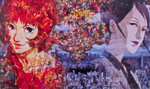
The above three images are all “Key Art” for Millenium Actress.
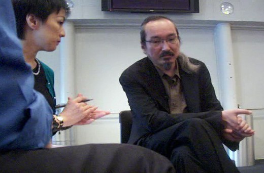
Me, the interpreter and Mr. Kon
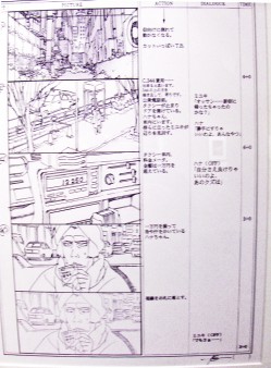
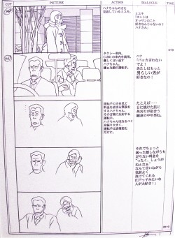
The two images above and the two below are from
the storyboard of Tokyo Godfathers.
My apologies to Mr. Kon for the poor reproductions. I’m hardly what I would call a photographer, however I did want to give a sample of what fine work visitors would see at this exhibit and program.
Sunday’s NY Times features a good article on Tom Sito ‘s new animation series for PBS, As The Wrench Turns. The show premieres July 9th.
Animation Artifacts &Disney &Models 27 Jun 2008 08:06 am
Part 2 -Rico LeBrun’s guides
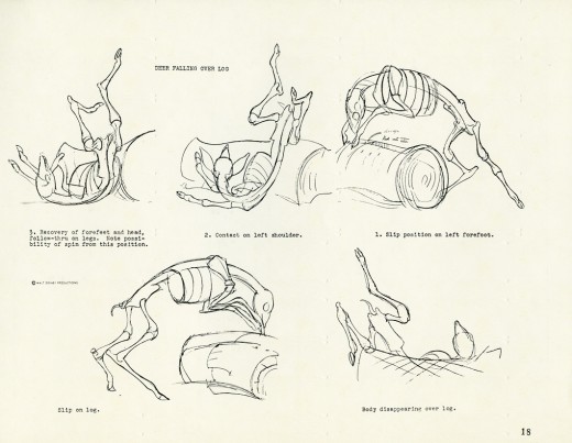
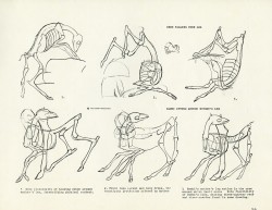
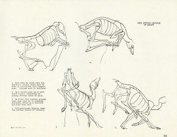
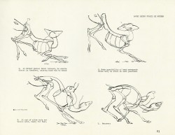
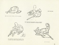
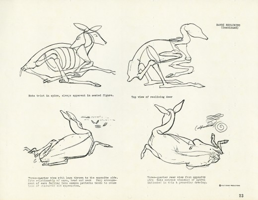
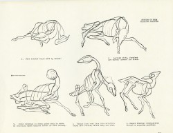
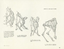
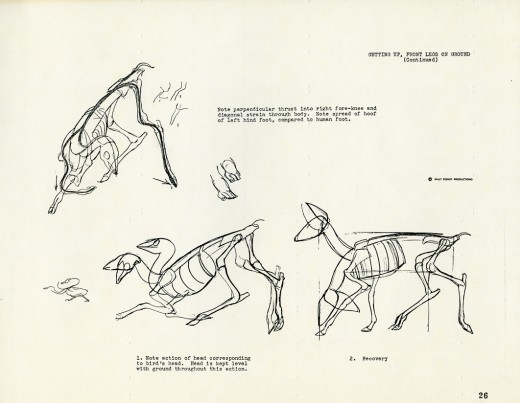
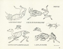
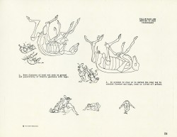
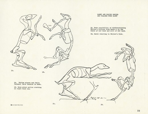
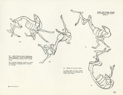
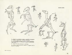
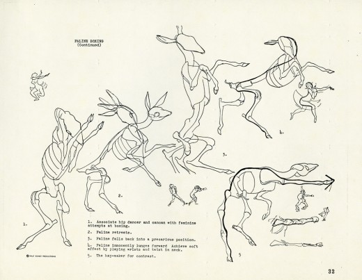
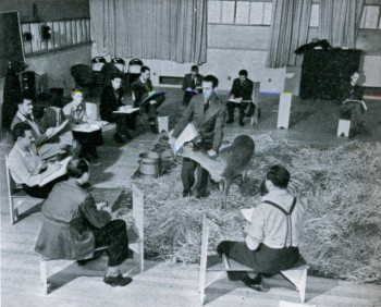 - Rico LeBrun, an established Italian artist, was employed at the Disney studio in the late ’30s to help teach the studio’s artists to learn how to draw animals. Bambi was in process, and Disney knew that he had to train his artists to reach to a new level.
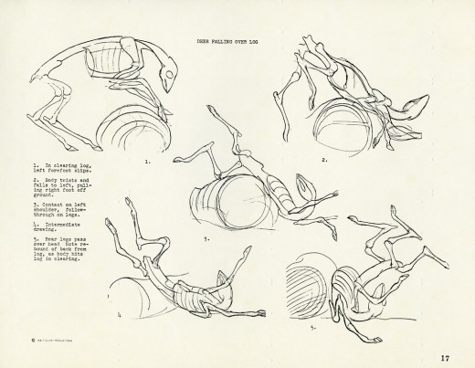
In his preparation for the job, LeBrun created a book of some 50 or so pages of the skeletal system of deer for the artists to use as reference in learning to manipulate the animal characters. His art was copied onto animation paper with typed notes added.
Sky-David had contacted me after a recent item I had posted about the drawings on Bambi. Sky told me that he had a copy of all of the pages of LeBrun’s study. He shared it with me and I posted the first 18 pages several weeks back. (Here’s part 1.) This is a second installment, thanks to Sky’s generosity, for those who’d like to see them.
 18
18
________(Click any image to enlarge.)
I’ll post the remaining 16 drawings soon.
Commentary 26 Jun 2008 07:51 am
Conflict
- Something tells me this post will get a lot of people angry at me.
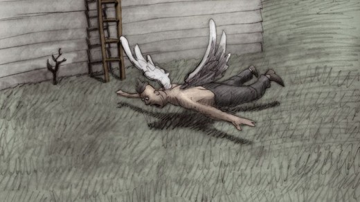
There was a bit of a conflict for me on Tuesday night in New York. Bill Plympton screened his film, Idiots and Angels, for much of the animation community here. While Wall-E played at the Academy at 6PM, Plympton’s film started at 4PM. It was a tough hustle to get from one to the other. What was more of a problem for me was having to leave work at 3PM to see Bill’s film. I couldn’t make it work, and I’m sorry I missed it.
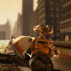
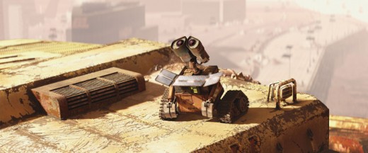
I wasn’t as sold on Wall-E as every review I’d read to date. The film, to me, felt less like an animated film than a special effect film.
The story of Wall-E, for those of you who don’t know, is about a robot who has been left on earth (presumably for about 700 years) to try to gather the residue of the planet left behind by the humans. They’ve made earth inhospitable for their own survival. Wall-E is the robot left, with a companion roach, to gather the garbage and compact it into large piles of cubes. He eventually falls in love (robot love) with a more modern robot sent to earth to search for signs of vegetation. Wall-E finds a plant and gives it to her.
Humans have moved to a large spaceship and are treated much too well. They’ve all grown enormously fat not moving from their lounge chairs. The machines are in control, until one human takes charge with the help of Wall-E and brings people back to earth.
Watching the film, it was starting to get claustrophobic while they were on on earth, so I was glad to see them leave. Something had to advance the story. The new world on board the spaceship ends up with robots chasing other robots back and forth, up and down the large ship. It gets awfully tiring, quickly.
The technical abilities are high, and the film is done with the greatest professionalism. But they’re machines being animated, and I never felt close to them. The Iron Giant, from that film, was a hostile, war machine and was supposed to stay a machine, but I felt more for that character than I did for Wall-E or his cutely developed girlfriend, EVE.
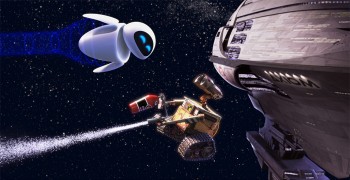 The film has a better concept than story. It’s the bane of all movies these days. If you can narrow the story down to one sentence, it’s more concept than story and has a harder time being successful. Wall-E feels a lot like Short Circuit 3 with no humans – for at least the first half.
I was, again, impressed with the incredible artistic abilities of the Pixar people, but I didn’t feel as though I were watching an animated film. It felt like a live action film (until the balloony fat people entered) with high effects. Perhaps that’s a positive; I’m not sure anymore.
Pinocchio, Bambi, Dumbo, Snow White. These films were magic to me as a child. I imagine Wall-E is like every other effects film to today’s children. I can’t imagine it will inspire future generations to get into the field. Maybe, you never know.
I’m sorry I missed Idiots and Angels; I’m sure I’ll see it in Ottawa.
Today’s NY Post gives Wall-E a four star review which ends with, “Some day, there will be college courses devoted to this movie.” The Village Voice‘s glowing review says, “a film that’s both breathtakingly majestic and heartbreakingly intimate.” I can also understand their POV. See it for yourself.
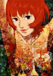
- I wanted to remind those in the New York area that the animated films of Satoshi Kon will be playing at Lincoln Center’s Walter Reade Theater.
The complete retrospective starts tomorrow, Friday, and continues through next Tuesday. Go here to see my recent post including the schedule and other information.
I hope to meet Mr. Kon tomorrow and will report on that this Saturday.
Commentary 25 Jun 2008 08:00 am
A Future
- Lately I’ve been quite bothered by animation, as it currently exists. I’m talking, specifically, about hand-drawn animation. Frame-to-frame drawing.
I don’t include cgi in this, just as I wouldn’t include 3D puppet animation. They’re both different media, to me.
I don’t include Flash films, which to me is a form of cut-out animation. Characters aren’t drawn frame-to-frame, they’re manipulated. (I know, I know, you can use this program to draw frame to frame, but that’s not how it’s used by 99.7 % of those using it.)
I’m talking about drawn animation, frame-to-frame. All of the frames are drawn (not inbetweened by a computer), all of the movement is out of the animator’s hand and head. This is practiced by fewer and fewer artists, and I really worry about the future and trained animators.
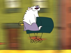 Recently, I received an email from a Scottish student who’d visited my studio back in January ’07. Laura Whyte and Mike Dziennik were in NY and had arranged to meet with me, see the studio and show me their work. Yesterday, she’d sent me a link to the graduation films that the two had done, and I was able to look at other work from the school, Duncan of Jordanstone, the University of Dundee.
I have to admit, I was pleasantly surprised. These were students of real animation and real storytelling. Most of the student films from this school were capable and energetic pieces done with some panache. Animation seemed alive.
I suggest you look at the two films of these fine graduate students:
- Chasin’ Tail by L. Whyte, Mairi Steele, Arthur Crook & Shaun Gordon.
Here are Laura’s comments about the film:
Chasin’ Tail was traditionally animated, but we cleaned up in ink and then
vectorised it in Adobe Illustrator.. the backgrounds were designed by a traditional painter and then because there were so many of them, most are digital mockups of her style done in Photoshop. The spinning door is After Effects 3D and the envelopes were done in Maya… and there’s a couple of bits of After Effects animation on the cars and the butterfly in places.
Apple For Sir by Mike Dziennik & Grant Crawford
Laura writes about this film:
Apple for Sir was a much more technical process than Chasin’ Tail… they did all their animation using cut outs in Adobe After Effects, and their backgrounds were 3D environments built in After Effects — they had some epic rendering times, that’s for sure…
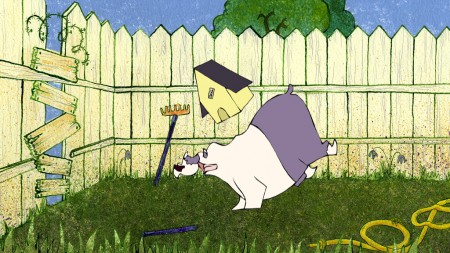
A still from “Catchin’ Tail”
If you want to see other films from this school go here.
Right after seeing these, I saw the link on Cartoon Brew to the Gobelins Animation Gallery. There were Festival openings these students did for Annecy. Here was feature animation quality films done in this extraordinary school. If you haven’t seen them already, go.
I have to say after watching these student films from Scotland and France, I realized that
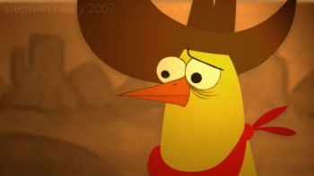 there was hope for hand-drawn animated films. The problem is that I just need to be reminded every so often. I’m sure there are others being done in the US; I just haven’t seen them. There were a couple at the NYU showcase I’d seen that were very promising. (One, Chicken Cowboy by Stephen Neary looked as though it were ready to go ________________Stephen Neary’s “Chicken Cowboy.”
as the pilot for an excellent tv series.)
Then there’s the Rauch brothers’ work, Tim & Mike Rauch; Germans In The Woods was certainly the right track. There is some hope.
I’m looking forward to the Ottawa Festival to get a better gauge on the professional films.
Animation Artifacts &Books &Disney &Mary Blair &Models 24 Jun 2008 08:03 am
Mary Blair Boards
- Let’s imagine.
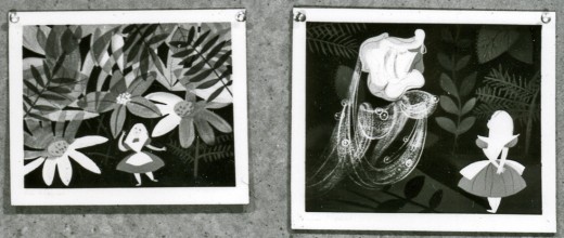
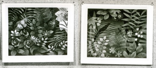
Mary Blair is the most brilliant of all the color stylists to have worked at the Disney studio during its heyday. Among the photographed storyboards loaned me by John Canemaker was this board of Mary Blair images. The only problem is that it’s B&W. So, we have to imagine the array of greens and blues and yellows the designer would have used for this very colorful sequence.
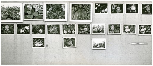
This is the board in it’s entirety. Now, to split it up so you can look at the images a bit more closely.
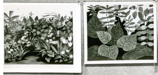 1a
1a
_____To enlarge any of the images, click on them.
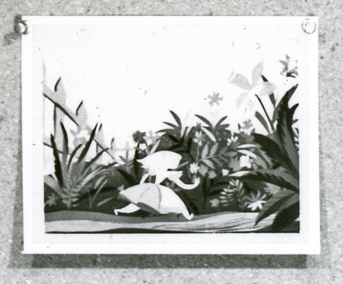 3c
3c
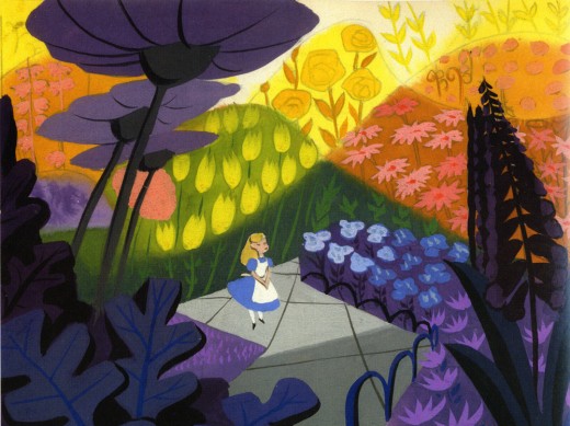
Here’s an image from Canemaker’s book, The Art and Flair of Mary Blair. I just wanted to remind you of how these other images probably look in color.
Animation Artifacts &Disney &Mary Blair &Story & Storyboards 23 Jun 2008 07:59 am
Alice Boards 3
- This is the third photo of the board for Alice In Wonderland. Once again, I think it was drawn by Joe Rinaldi. I have no evidence to prove otherwise, and that guess makes the most sense to me at the moment.
As with past posts, I show the storyboard photo as is, then reproduce it one section at a time so that I can enlarge it to the largest size.
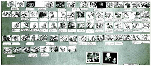
____________(Click any image to enlarge.)
At the base of the storyboard are these two Mary Blair images. I did a bit of a search (and I do mean “a bit”), and I wasn’t able to find color reproductions of these two pictures. So I’m posting them as they appear in this photo. They’re a bit blown out in the photo in hand, so I did a little work in photoshop to pull out a bit more of the grays.
There is another photo which includes a bunch more of Mary Blair’s designs for Alice. I’ll post that soon (though I also have to search to see if any of those are printed in color elsewhere.)
Photos 22 Jun 2008 08:26 am
I Get Photomail
– Back when I was a kid, sleeping in the same room with my two brothers, we had on the wall a number of Disney characters.
These weren’t painted on the walls, they were some kind of pressed cardboard, about 3/4″
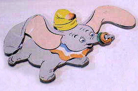 thick, cutout characters. They were brilliant, though. The grouping of cutouts, hung like picture frames, using nails, painted little scenes. Cinderella in her coach with all of the horses and coachmen, Dumbo flying with Timothy below him, or the Three Little Pigs and their varied houses with a lurking wolf. (The image to the left was found on line, but it’s not as well drawn as the images I saw daily back in the early 60′s.)
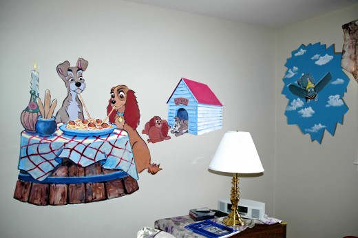
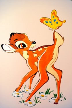 I recently received some pictures sent by Tom Hachtman. You may remember that he, the cartoonist friend who draws Gertrude’s Follies, works with his wife, Joey Epstein, as part of a group which paints murals on walls for people who commission such things. (See posts 1 or 2.)
Obviously, they’ve been hired to put a little Disney on a couple of walls. Tom sent me photos of the end results, and I’m inclined, obviously, to share them.
This is a long way from the pressed cardboard characters that floated over my bed. Times have changed – only a bit, though. This very same Bambi setup was one of the cardboard setups I looked at daily. A good image is a good image.
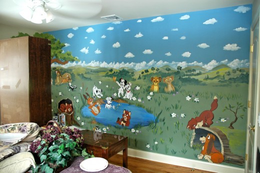
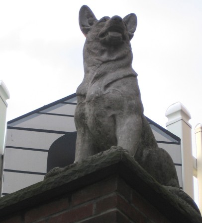
I think this is the first time I’ve seen the Fox and the Hound mixing with 101 Dalmatians
with Lady & the Tramp. A doggy park on the wall.
_____________(click any image to enlarge.)
- Artist and friend, Adrian Urquidez, pointed me to some older images of park benches. “Why park benches?” you ask. You may remember that I posted an entire group of photos of NY benches. He thought I’d find these illustrations of interest. I did and still do, and I thought it time to share. Here are some park benches of the past – they’re probably still in use in NYC parks.
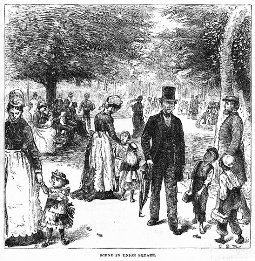
These benches are found in Union Square, the park at 14th Street and Park Avenue. My post featured benches about 9 blocks away at Madison Square Park.
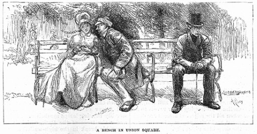
I think Adrian may have noticed that these benches also had dividers. I’d commented that I thought they were adding dividers to the new benches to stop vagrants from stretching out and sleeping on them.
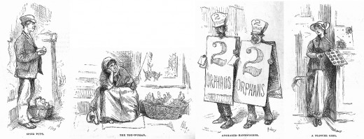
There are no benches in this picture, but Adrian sent it, and why not include it?
- In the past, I’ve posted a number of photos from my friend, Steve Fisher. He’d sent me many other stills, but I never found the proper time or place to post them. So, this one fills the bill. The photos are too great to not share. Thanks Steve.
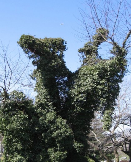
It kinda looks to me like a camel got stuck up in a tree.
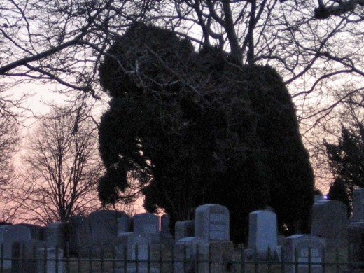
One might wonder if there were elephants set free in Woodlawn Cemetery.
And his most recent photo:

No leash policy.
Daily post 21 Jun 2008 08:21 am
Hopping Skipping & Jumping
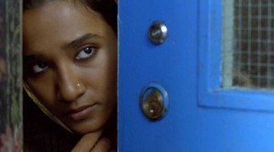 - Thursday night I went to the Academy screening of Get Smart (which turned out to be a zero of a movie. I should have expected that despite the J. Hoberman/Village Voice rave.) There was another film playing that evening, Brick Lane, a small British movie about an Indian woman who is sent to England at age 17 to marry a cousin she has never met.
That short synopsis was all I knew about the film. Rotten Tomatoes gave it a 63% on the “tomatometer,” and I expected something small and hoped for the best. I was in the mood.
The film turned out to be great. The music by Jocelyn Pook virtually lifted this film to one of the best films of the year. It’s excellent, and I thought I should tell you all to look out for it. If you’re thinking of going to Get Smart, don’t. Go to see Brick Lane, if it’s available near you. If it isn’t, keep the film in mind for the future. There’s real poetry and heartbreak there, and it’s a fine film.
I’ll get to see Wall-E next Tuesday and will probably comment on it afterward.
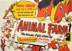 - I don’t have to repeat myself. I like Animal Farm a lot. That’s why I like to visit Chris Rushworth‘s excellent site, animalfarmworld.
Chris regularly posts lots of images from his collection of artwork from this film, and continually adds to it. I amazed at the number of cels and drawings up on this site. He has recently added some new pages for links to other sites and posters.
I’ve added Animalfarmworld to my list o’ links.
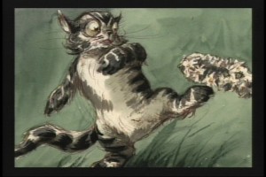 – Almost as a companion piece, Thad Komorowski has complimented my posts of the storyboards for Alice In Wonderland. He’s posted David Hall’s boards for sequence 1 and sequence 2.
This film, Alice In Wonderland, has generated a lot of beautiful artwork. David Hall’s boards are so illustration-like as compared to the energetic boards roughed out by Joe Rinaldi. (At least I think they’re Joe Rinaldi’s work.) Compare both to the amazing color styling of Mary Blair. (Check out Canemaker’s book, The Art and Flair of Mary Blair.
Note: after I post the third and final of the boards John Canemaker has loaned me I’ll post a bunch of Mary Blair images.
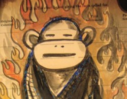 Lynda Barry has an interesting essay on “the power of the paintbrush” on the Tricycle archive. Read it. After you read that go out and get her new book, What It Is.
I was sent to the article via a link on Drawn. I learned of the book from Matt Clinton, a principal animator in my studio, who stood on line for a while to get Barry’s signature. She spoke at length to each of those on line, so there was a bit of a wait. She drew a cartoon for Matt, making it all worth waiting for.
Lynda also recently spoke at NYU as part of a symposium on the cultural importance of comics. Annulla tells the tale on her great blog, Blather from Brooklyn.
 1b
1b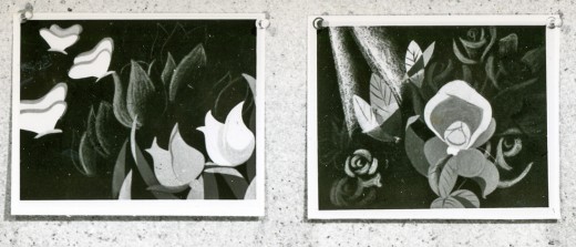 1c
1c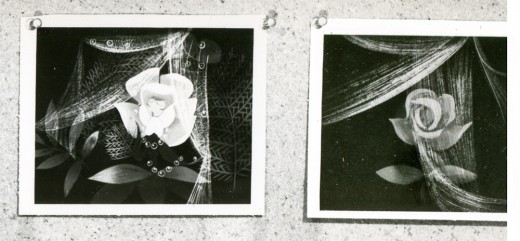 1d
1d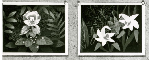 2a
2a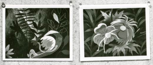 2b
2b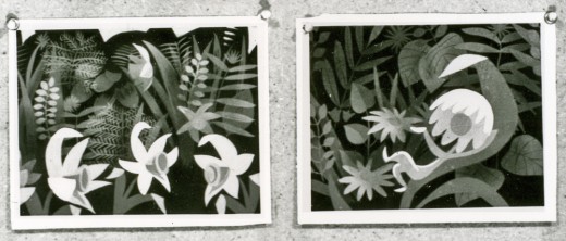 2c
2c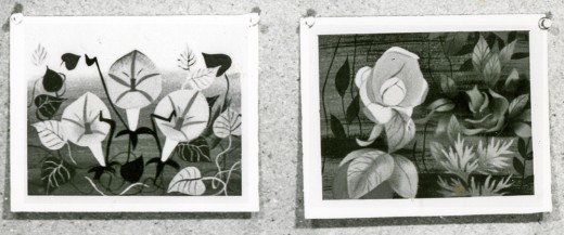 2d
2d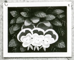 3a
3a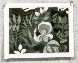 3b
3b 1a
1a 1b
1b 2a
2a 2b
2b 3a
3a 3b
3b 4a
4a 4b
4b 5
5