Monthly ArchiveDecember 2007
Daily post 21 Dec 2007 09:29 am
MoMA Shows In Jan.
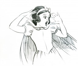 - Today officially marks the anniversary of the premiere of Snow White and the Seven Dwarfs, the first US animated feature. Seventy years later, it’s still one of the finest. There’s an excellent article by Wade Sampson about the premiere. If you have the dvd, why not watch it again?
Though Snow White isn’t going to play in a theater soon, a number of other features will.
Here’s your chance to see some great and important animated features on a big screen.
____________________________________
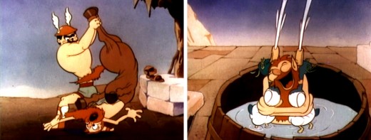
 In January, the Museum of Modern Art will present a month of animation from its collection, ranging from early shorts (including three Dave Fleischer Popeye shorts from 1936, ’37 and ’39) to four features including 2005′s Wallace & Gromit in the Curse of the Were-Rabbit.
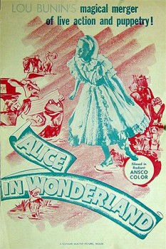
The Popeye films and a 1948 Bunin/Bower Alice in Wonderland will both be projected on prints recently restored by the Museum. You can bet I’ll have a lot more to say about Alice as time gets closer.
Still Moving
The Museum continues its regular series derived exclusively from its film collections, featuring works that have been acquired and preserved by MoMA over the last seven decades.
Still Moving features animation, from traditional cel animation to puppets, clay, and CGI. Included are three Technicolor Popeye shorts from the Fleischer studio, recently restored by the Museum, as well as My Neighbors the Yamadas, a disarming chronicle of contemporary daily life by Japanese animation master Isao Takahata. MoMA’s restoration of Alice
in Wonderland, Lou Bunin and Dallas Bower’s deft melding of live actors and puppets, will be screened, as will the feature debut of Wallace and Gromit, and Pixar’s a bug’s life.
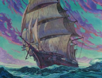 Popeye the Sailor Meets Sinbad the Sailor. 1936. USA. Directed by Dave Fleischer. 17 min.
Popeye the Sailor Meets Ali Baba’s Forty Thieves. 1937. USA. Directed by Dave Fleischer. 17 min.
Aladdin and His Wonderful Lamp. 1939. USA. Directed by Dave Fleischer. 22 min. Program 56 min. ________________
Tuesday, January 1, 2:00
(T2); Wednesday, January 9, 1:30 (T3); Thursday, January 10, 1:30 (T3)
(The image above thanks to Animation Backgrounds.)_
Alice in Wonderland. 1948. Great Britain/France. Directed by Lou Bunin, Dallas Bower. Screenplay by Henry Myers, Albert Lewin, Edward Eliscu.With Carol Marsh, Stephen Murray, Pamela Brown. 96 min.
Wednesday, January 2, 6:00 (T2); Friday, January 11, 1:30 (T3); Thursday, January 17, 1:30 (T3)
Wallace & Gromit in The Curse of the Were-Rabbit. 2005. Great Britain. Directed by Steve Box, Nick Park. Screenplay by Box, Park, Bob Baker, Mark Burton. Acquired from Dreamworks Animation. 84 min.
Thursday, January 3, 6:00 (T2); Wednesday, January 16, 1:30 (T3); Friday, January 18, 1:30 (T3)
A Bug’s Life. 1998. USA. Directed by John Lasseter, Andrew Stanton. Screenplay by Stanton, Don McEnery, Bob Shaw. 94 min.
 Friday, January 4, 6:00 (T2); Wednesday, January 23, 1:30 (T3); Thursday, January 24, 1:30 (T3)
Hohokekyo tonari no Yamada-kun (My Neighbors the Yamadas). 1999. Japan. Written and directed by Isao Takahata. In Japanese; English subtitles. 104 min.
Wednesday, January 30, 1:30 (T3); Thursday, January 31, 1:30 (T3)
(Image above thanks to Conversations With Ghibli _
Articles on Animation &Commentary 20 Dec 2007 08:36 am
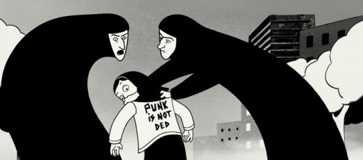
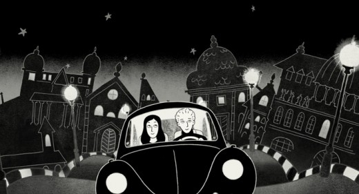
Persepolis – Opening Soon
- I saw Persepolis for the second time last Thursday. I am an ardent supporter of this film, and any criticism I offer must be taken with that grain of salt. The film is not the most daring of animated films, but it certainly does advance the intelligence of the animated feature – in enormous strides – given the current state of things. However, it is also cinematically annoying.
To start with, I must say the music does no service to this film. A synthesized tinkle and a simplemided tune does not help the emotional state of the film. In my opinion, it detracts rather than adds to the whole. On the second viewing, the music actually became an irritant for me.
The animation is simple, but I often wished it were more rooted in the soul of the characters. Instead, it seems more rooted in the style of the comic. The film is adapted from Marjan Satrapi’s “graphic novel” – “bandes dessinées”. As such the story is simple and built around clever graphics. These graphics served to set the scene for the film, and they play out as short set piece after short set piece with graphic transitions from one to the other. Irises, wipes, morphs all cleverly pull us from one short sequence to the other always 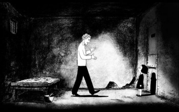 hiding the fact that we’re not living the film; we’re being told what’s happening. In fact, it gets a bit tiring. Something that would work enormously well in a short, gets exhausting and then tedious in a feature.
This, I think, is the product of inexperienced film makers and the very faithful transition from book to screen. Mind you, as I stated earlier, this is my favorite animated feature this year; I only wish I could feel like I’d want to watch it again. Unfortunately, it feels as though I’ve seen the film, and there’s not much more I can get from it.
I’ve read many of the reviews; some of the more mainstream reviewers are beginning to check in. Deservedly most of those reviews that have been printed have been positive. However, the one by Anthony Lane in The New Yorker feels particularly true for me. In his final paragraph, Lane writes:
- The film is largely in black-and-white, yet the result, far from seeming gloomy, has the pertness and the simplicity of a cutout. I found it, if anything, too simple. The faces are no more than tapered ovals, which makes some of the characters hard to distinguish, and I was left with the nagging, if ungallant, impression that I had been flipping through a wipe-clean board book entitled “Miffy and Friends Play with Islamic Fundamentalism.†There is no denying the boldness of “Persepolis,†both in design and in moral complaint, but there must surely be moments, in Marjane’s life as in ours, that cry out for cross-hatching and the grown-up grayness of doubt.
I’ve seen a number of interviews with Marjane Satrapi and co-director Vincent Paronnaud. They’re starting to repeat themselves. At my initial screening, I was given a press book. Therein were a number of official interviews with the staff and cast. I’d like to post one with “Art Designer,” Marc Jousset. It’s informative, not too long and it gives another voice to this fine feature.
 Interview with Marc Jousset – Art Designer
Why did you decide to produce Persepolis almost completely in a “traditional” way, not using computer generated images?
The question of which technique to use, arose very quickly when we discussed the movie. We started with 2D images on pen tablets, but we were not totally happy with the result. The lines lacked definition. It also seemed logical that Marjane should be able to work with the animators using the tools of her trade; paper and ink. It was clear that a traditional animation technique was perfectly suited to Marjane’s and Vincent’s idea of the film.
It’s an animation film with many characters…
Development took a long time, because of the sheer number of characters. For Marjane’s character, there were five separate steps: little girl, pre-teen, teenager, young woman and adult. Since it was also based on real events, and took place in Tehran under the Shah’s regime, then under Khomeini’s revolution, (not to mention Austria), we had to take into account the way people were dressed. There are scenes taking place at the university, in airports, at a punk concert, so it was impossible to draw only two or three characters. We had to animate a good deal of extras. However, we were lucky. Marjane drew all the characters. I thought we would have 200 model sheets to do, each character seen through different angles, so there was no discrepancy from one shot to the other, but actually we made over 600! I think it’s a record for an animated movie.
Did the use of black and white make things particularly difficult for an animated movie?
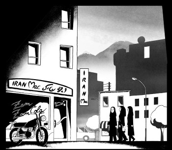
Using only black and white in an animation movie requires a great deal of discipline. From a technical point of view, you can’t make any mistakes. As soon as an eye isn’t in the right place, or a pupil not perfectly drawn, it shows up straight away on the large screen. It’s even more obvious in this particular film since it’s not a cartoon with codes, conventions and distortions. We were closer to Japanese animation because of the story’s realism, but we couldn’t apply the techniques used in manga. As a result, we had to develop a specific style, both realistic and mature. No bluffing, no tricks, nothing overcooked. With animation director Christian Desmares, twenty animators worked on the movie. Marjane had quite an unusual way of working. Each sequence (1,200 shots) was given to an animator. Marjane insisted on being filmed playing out all the scenes. Given that she’s a genuinely talented actress, it was a great source of information for
the animators, giving them an accurate approach to how they should work. It was also very encouraging for them that she was so committed and passionate. Usually, in animated movies, directors are rarely so concerned with the day-to-day work on the film. After animators, the assistant animators put the finishing touches to the drawings and check them against the original. Marjane’s drawings look very simple and graphic, but they’re very difficult to work on because there are so few identifying marks. Realistic drawings require outstanding accuracy.
 How many drawings were needed for Persepolis?
About 80,000 drawings for around 130,000 images. That’s quite reasonable for a feature made in the traditional way.
What do you think are Marjane Satrapi’s best attributes?
It’s a combination of rigor and generosity. She was always there for you, and never acted like a diva, like filmmakers who pop in once a week to hand out praises and criticisms. Not thinking about what memories this process might rekindle in her, she was totally committed and involved. She even animated certain scenes in the movie. It brought a unique atmosphere to the team and the collaborative effort.
What about Vincent Paronnaud?
His rigor, his eye and his daring. Marjane and Vincent have always favored content, whilst being very respectful to the visual work done. The story always came first. It’s not a movie made by technicians. They went to work on PersepoHs as though it were a live-action film.
Vincent is very good at artistic direction, composition, playing with black and white, and Marjane masters that as well. She was, however, more focused on the accuracy of emotions and feelings. Each had enough hindsight with his or her work, so that their advice stimulated the other. It’s quite amazing to see them work together. They are a true two-some.
What was the main challenge for you?
To be on schedule, and to stay within budget, whilst maintaining our requirement for high quality. The budget was 6 million Euros, which is reasonable for a 2D movie made in France. I’ve rarely seen a team so focused on a project, not only for the technical challenge, but also for the story itself. I think the culmination of the fact that it was a true story, that the main character worked with you, that an animated movie dealt with a current issue and that it was intended for adults was tremendously exciting for the team.
Animation &Books &Daily post 19 Dec 2007 09:35 am
Jack Zander and other thoughts
- Because I was never very involved in the commercial (meaning ads) end of the New York animation world, I didn’t have much contact with Jack Zander. Yet, I do know that he was a significant part of that end of the business in this city. Once you got past the names of Paramount and Terrytoons, Zander’s Animation Parlour was the big studio of my earliest days.
In fact, I probably had more contact with Jack’s son, Mark, over the years. The one interview I had at Zander’s was with Mark. It was one of those interviews where something in the air tells you that you’re never going to work at this place, so why try again. It was nothing Mark did; nothing I did. It just didn’t feel like I was a good fit. I didn’t try again and didn’t have much contact with Jack in the future.
Mark Mayerson let me know, last night, that Jack had passed away Monday at the age of 99. Mark also has one of the best, most succinct bios I’ve seen of Jack’s life on his site this morning. I urge you to check it out.
Tom Sito also has a nice post about Jack on his site today.
AWN has an interview with Jack Zander by Joe Strike.
Jack Zander was a significant figure in New York’s commercial history. He deserves some attention.
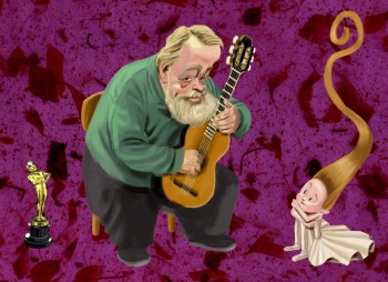 - Michael Barrier had a wonderful post at his website, Dec. 17th; it was on Borge Ring, and excuse to print his letter to Mike. I was a pleasantly surprised to see myself mentioned in the piece. Many people have said nice things about me, but this is the first truly poetic quote I’ve read. Borge is a poet of an animator.
He made a small error though in commenting on my film, Dr. DeSoto. Borge said I made the film for $4000. In fact, it was $3500 per minute. I don’t think I could have gotten it photographed for $4000. I’m sure I miscommunicated, as usual, way back in 1984 when we spoke of that film. I hope he doesn’t like the film less.
If you’d like to see some of Borge’s work, Mark Mayerson wrote about him and led us to several films in 2006.
The illustration, above, is by Patrick Mate. I couldn’t resist swiping it for this post; it’s such a great picture and really captures Borge – in my mind, anyway. Patrick’s blog is worth checking into if you don’t know it.
 - I just received my issue of Hans Bacher‘s book Dream Worlds. It took a while for Amazon to get it out.
I haven’t read it as yet, but was astonished in carefully thumbing through it. With the same ardent enthusiasm I had for Amid Amidi’s Cartoon Modern and Mike Barrier’s The Animated Man, I encourage you to buy a copy of this book if you’re serious about animation.
It’s stunningly beautiful, filled with excellent art, attractively designed and it looks to be enormously informative. The book shows you what a production designer does in an animated film. I’ve seen no other book like it.
I will have much more to say about this book as I read it.
Comic Art 18 Dec 2007 08:40 am
Gasoline Alley
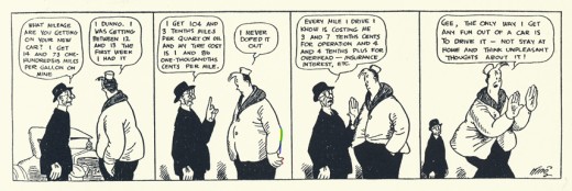
- I recently posted a number of comic strips panels and story threads from The Gumps by Sidney Smith. This was an example of one of the great story strips that reigned in the 1920-30′s. It was certainly not the only example of these.
Gasoline Alley has always been one of my favorite strips. I fell in love with it when I was a kid just about the time that Dick Moores took over the strip from Frank King. Probably as a result of this, I have been more a fan of Moores’ work than I have been of King’s. There’s something about his open drawings that really sing to me.
Moores had been a long time assistant to King prior to taking over the strip, so he knew it well. Only recently, thanks to the work of Bill Blackbeard and Chris Ware have we been able to really appreciate this strip. It’s being published in chronological order via Drawn & Quarterly Books.
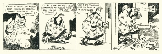
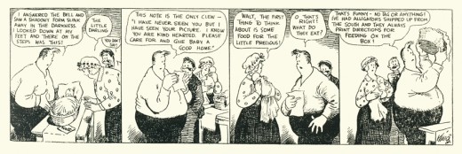
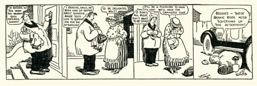
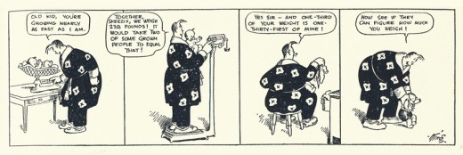
Walt found Skeezix, a baby, on his doorstep on Feb. 14th, 1921. For an unmarried garage mechanic to raise a child in the 20′s there were obvious problems to face. The strip faces these problems as we watch Skeezix grow up over the years and Walt grow older. Life goes on in this strip, and it’s wonderful.
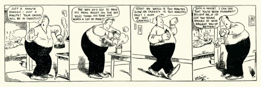
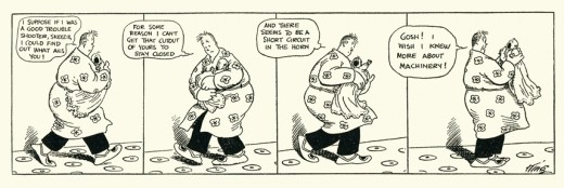
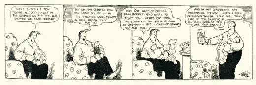
Here are a few strips from the 1921 and 1922.
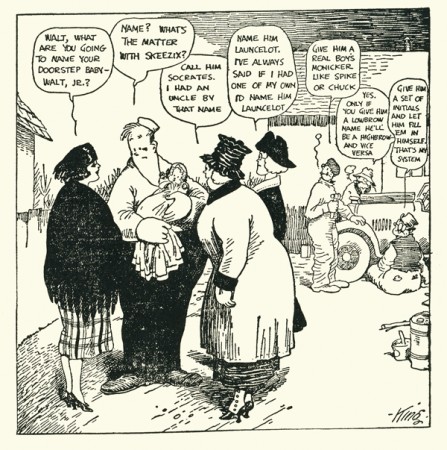
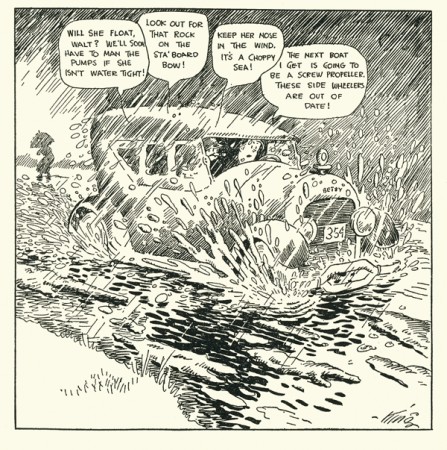
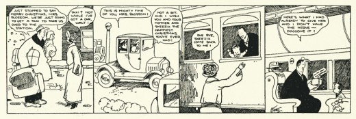
Within the first year you can already see the attachment between Walt and Skeezix, and you can see that Skeezix is growing up in front of your eyes. It’s just great.
A while back I posted a piece about the illustrated novel by Frank King “Nina and Skeezix.” It was published in 1941, 20 years after Skeezix was born. You can read that post here.
Animation Artifacts &Commentary &Daily post 17 Dec 2007 08:36 am
Return to an Eyvind Earle Christmas
 – Way back in July I posted this piece.
It’s a celebration of the animated segments Eyvind Earle did for The Tennessee Ernie Ford Show. I thought this would be a good time to repeat the post.
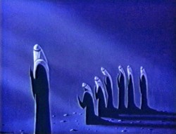
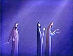
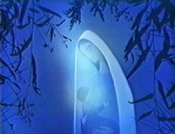
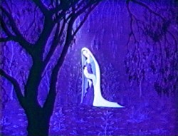
“The Story of Christmas” is a piece which is about ten minutes long interspersed throughout this half hour special.
The entire show is a Christian carol sing featuring the Roger Wagner Chorale singing around Tennessee Ernie’s gospel read and sing-along.
The whole is a very reverent piece with no attempt at lightness and comes off as very religious. This would certainly not work on television today, never mind ABC TV which is where it premiered as one episode of the Tennessee Ernie Ford series. Some of you may remember the animated Hubley titles for the show which can be found in John Halas‘ Technique of Film Animation.
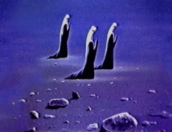
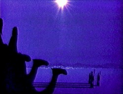
Three segments feature the animated graphics with the group singing. The only real narrative tells the birth of Christ in animation. Otherwise the Roger Wagner Chorale, dressed in Dickensian outfits, gather around varied sets looking like the early 19th Century England.
(Click any image to enlarge.)
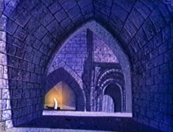
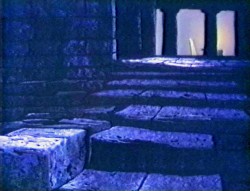
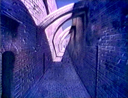
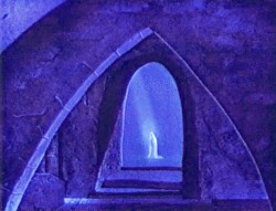
Earle’s animation was done immediately after Sleeping Beauty was completed. He’d left the studio (or was more probably left by the studio during their massive layoff at the time) and formed his own small independent studio to do work like this. I think this was probably his largest job, and it seems perfectly suited to his style.
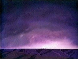
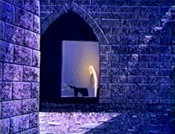
Lots of pans and flare effects are built around sliding cells trying to imitate the look of the multiplane camera. There really is no animation here, just the sliding cels of the characters over the pans. It’s still quite attractive for what it is and holds the attention. The piece is well planned and shows off everything Earle had learned at Disney’s studio.
Go here to purchase a copy of the dvd.
The following are frame grabs from many of the scenes:
 _
_
.

.
 _
_
.
 _
_
.
 _
_
.
 _
_
.

.
 _
_
.
.
 _
_
.
 _
_
.
 _
_
.

Photos 16 Dec 2007 10:05 am
Trees
 – I thought for one edition of these sunday photo trips, I’d post images I’ve taken of some of the Christmas trees decorated around New York.
So, of course, we have to start with Rockefeller Center.
This is the most famous one we have. Since NBC is centrally located around this tree and skating rink, it’s been featured on TV forever. Saturday Night Live ice skating after one of the shows around the tree; Keith Olberman doing his news with the tree behind him, or even David Letterman telling viewers, for years, to go home there are just too many tourists there. The tree gets its annual plow of plugs.
My first REAL incident with this tree came a million years ago when I was still in the Navy, on home for Christmas leave. I was on a double date with a friend. The four of us at 2AM came upon the rink empty on not completely dark – just dimmer. There was the tree; there was the ice skating rink; there we were.
The four of us skating around the tree late night (without skates) brings back a fun memory. The security guard chased us away after ten minutes of our play. I suspect that I might be in Guantanomo Bay if I tried that today.

I was told that Rockefeller Center had installed some solar panels atop one of these buildings which would cover the electricity for the lights. This would make sense of all the additional lights this year. I don’t remember all the white lights, but I do remember that the tree was lit differently. This year it’s quite blue. In the past, it felt less color coordinated.

For those who haven’t seen it in person, the way to the tree is this alley lined with stores. The centerpiece has a lot of over illuminated angels blowing horns. This leads to the skating rink with the tree dominating the space.
_
Looking 180 degrees from the tree, you see a wall of Saks Fifth Avenue. They’ve lit their wall with snowflakes, and it’s attractive as a backstop
for all the Rockefeller Center decorations.
_ _
_
Don’t ask me why, but I’m a sucker for the tiny tree in Madison Square Park. I’ve posted images of this tree several times, and I’ll probably do it again.

This was historically the firsts lit public tree in the City. 1925 was the first ceremony, and
it was broadcast on radio.

In Union Square, where they have an elaborate farmer’s market as well as a crafts fair at Christmas, the adjoining park has this tree at its center. It looks a bit lonely.

Of course, any of us in the City looking to bring a real tree into our homes go to the local supermarket where groups of brigands have settled in for the season to make as much money as possible from trees they’ve brought to our local CTown, Food Fair or Gristedes.
Articles on Animation &Commentary 15 Dec 2007 09:11 am
Death of an Immortal
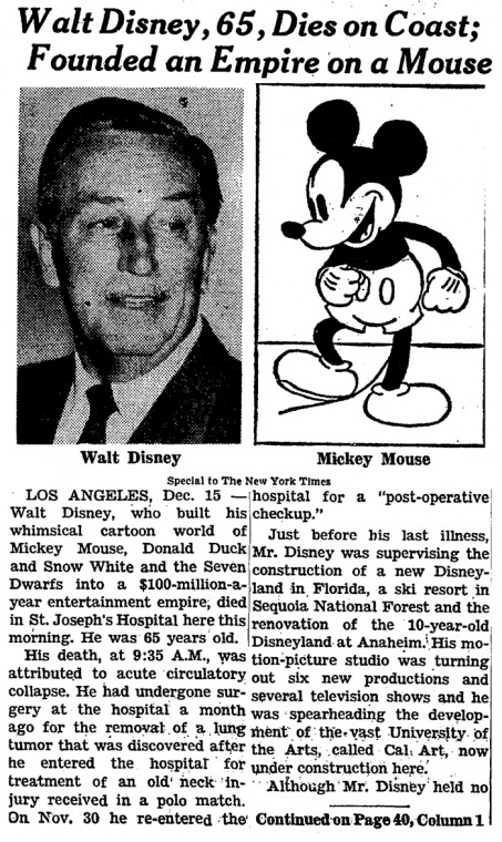
 Today’s the anniversary of Walt Disney’s death.
He had been in bad health for a few months prior to his entering St. Joseph’s Hospital in Burbank, CA on November 2, 1966, complaining of pain in his neck and back.
An X-ray revealed a tumor on his left lung and surgery was advised. This surgery was performed on November 7th, and his left lung was removed for cancer.
Disney was released from the hospital after two weeks. He collapsed at his home in Palm Springs after spending Thanksgiving Day with his family. He spent his 65th birthday in the hospital with his family at his bedside.
On December 14th, Lillian spent some time with him, and his brother Roy visited in the evening. Roy ordered the lights at the Disney Studio across the street, to stay on at all times, while Walt was in the hospital. Walt would ask the nurses to prop him up so he could see the studios.
He died at 9:30 AM on Thursday, December 15, 1966.
The cause of Disney’s death was announced as acute circulatory collapse and was listed as cardiac arrest on his death certificate.
Not much of the information detailed above was open to the world at large.
I was a senior in college in 1966. In the middle of my day, I was preparing for a showcase I was supposed to give of an artpiece that was due for an advertising class. A number of the other art students in the school came running in to break the news to me. They were certain that I would just fall apart, and I remember not being shocked about it. I took the news in stride and went on to prepare my artwork.
I’ve always felt that I somehow hurt those classmates by not being more taken by Disney’s death. It’s at moments like this, that we start to realize things that others expect of us, and we start figuring out how to give it back to them. I guess I was affected by that day, but I’m sure it wasn’t directly related to Walt’s death.
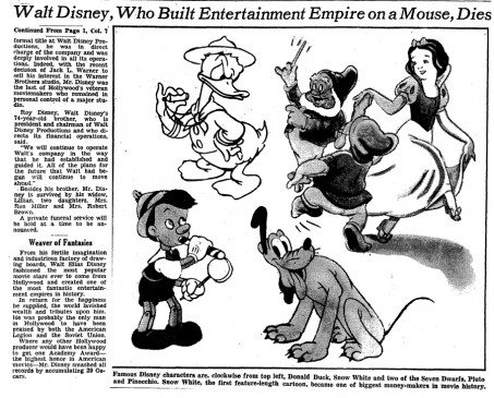
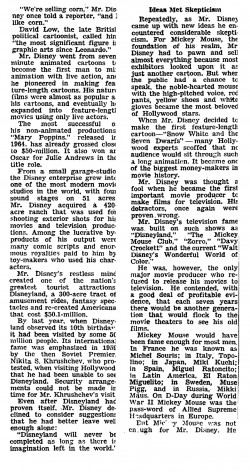
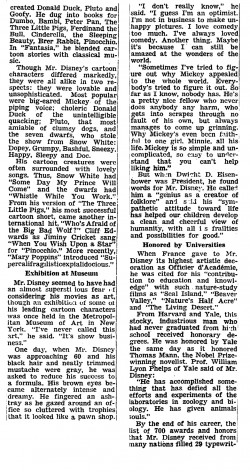
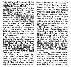
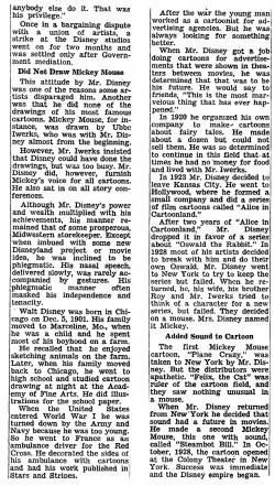
Just for the interest of anyone out there, I’m posting here the Obituary for Disney which was published in the NYTimes that day. It’s very long, so I had to break it into six big docs. To read it, you’ll have to click on the images to enlarge.
 1
1
Animation Artifacts 14 Dec 2007 08:46 am
Guilty Greek Pleasures
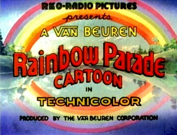 – Mark Mayerson started it. He posted a well-deserved praise for the dvd collections that have been released by Steve Stanchfield through his Thunderbean Animation.
Steve’s been doing a fabulous job of packaging some great shorts that would certainly be otherwise ignored. His Cubby Bear dvd is outstanding. Harman-Ising did several of these films immediately after leaving the Schlesinger studio, just prior to taking over MGM. Without Steve’s dedication, they’d be all but invisible in the home market.
Mark’s comments focused on the new Little King collection from Thunderbean. Otto Soglow‘s silent comic strip character was nicely adapted to animation via the Van Beuren studio, and the results are well collected here.
I have an interest in the work done at this New York studio that I think is more than just nostalgic. Amadee Van Beuren was one of the founders of the Fables Corporation and ultimately bought out the other investors after already setting up the Van Beuren Corporation in 1928. He rolled Fables Corp into Van Beuren and fired a number of its employess including Paul Terry and Frank Moser (They ended up forming a company that became known as Paul Terry-toons.) Van Beuren was able to get a theatrical release for his shorts via RKO.
The principal product was a series of Tom and Jerry cartoons. Not the cat & mouse but the tall & short guys. These weren’t very successful, so by 1933, there was a series of Amos and Andy cartoons. Adapted from the radio show by Gosden and Correll, the series suffered when the creators couldn’t come up with enough material to keep the shorts in production. The Little King series wasn’t well received, and RKO looked for a way to ramp up Amadee Van Beuren’s decision making. They needed stars.
Burt Gillette originally came from New York, went to work for Disney directing some of their great shorts – including The Three Little Pigs and Flowers and Trees before 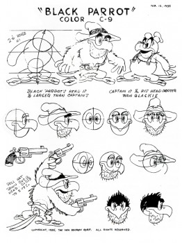 ending up at Van Beuren directing the studio. Mark Mayerson records a good summary of his career.
A number of other important animation personnel passed through the studio on the way to something bigger. Jack Zander, Joe Barbera, Carl Urbano, Bill Littlejohn, Johnny Gentilella, Izzy Klein, Tom Palmer, Frank Tashlin, Pete Burness, Marty Taras, Dan Gordon and Shamus Culhane all had short stays.
The company had no real star to feature in their shorts. They offered Molly Moo Cow in a couple of amiable but not great films; the Toonerville Trolley travelled in from the comic strips with a couple of successful films; Felix the Cat was reworked and bastardized for a limited couple of shorts. There was also a series set in “Parrotville,” and an odder group of cartoons you’ll be hard pressed to find.
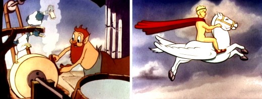
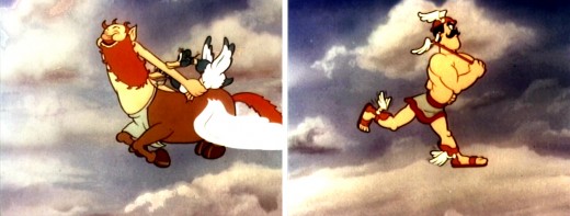
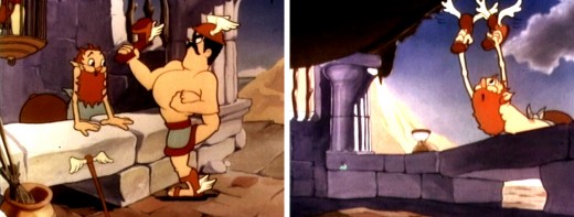
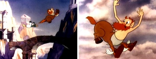
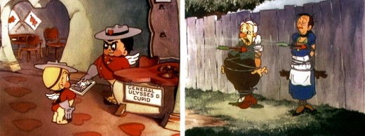
The failed shorts that wholly grabbed my interest, when I was younger, was the start of a series they did featuring characters from Greek and Roman mythology. It never got very far; they did only two of them.
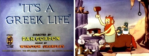
It’s A Greek Life (1936) starred a shoe repairing centaur, two ducks and Mercury who comes to get his winged shoes repaired. Oddly, a film called “The Greek Life” has a group of characters with clichéd Italian accents. The film was directed by Dan Gordon. Winston Sharples was obviously going to move from here to become Paramount’s in-house animation composer.
Here are some frame grabs:
You can watch a podcast of this short on-line at The Animation Station.
Another short, Cupid Always Gets His Man, directed by Gilette and Tom Palmer, features a training depot and way station for Cupids out to get their “Man”. In this case is a caricature of W.C.Fields and Edna Mae Oliver (not as well drawn as the Disney caricatures in Mickey’s Gala Premier also directed by Gillette.)
On DVD they’re part of Cartoons That Time Forgot from Image.
For those of you who enjoy reading the third string movie reviewers of your local newspapers, today’s a good day. Someone had to review Alvin and the Chipmunks.
In New York the NYDaily News had Elizabeth Weitzman:
“‘Chipmunks’ drive us to rodent rage”
the NYTimes had Andy Webster:
“Hollywood continues its tired milking of old television properties with “Alvin and the Chipmunksâ€
First stringer, Lou Leminick, of the NYPost said:
UPDATED ALVIN A GYP-MUNK
“For adults, it’s like being hit over the head with a mallet every 10 seconds for 90 minutes. Two days later, I still had a headache.”
Story & Storyboards 13 Dec 2007 08:20 am
N By NW
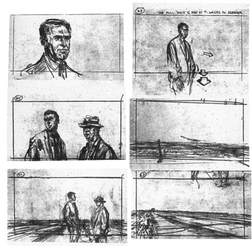
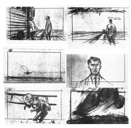
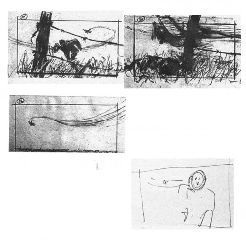
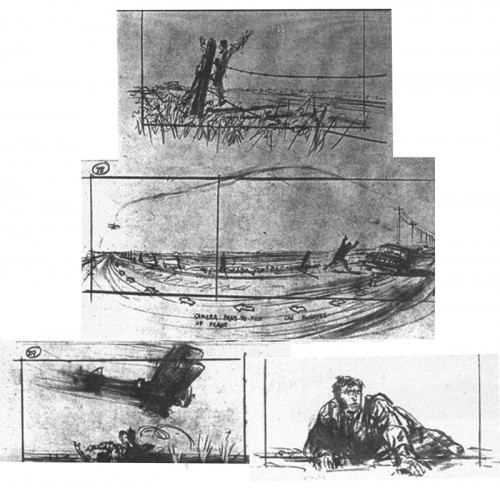
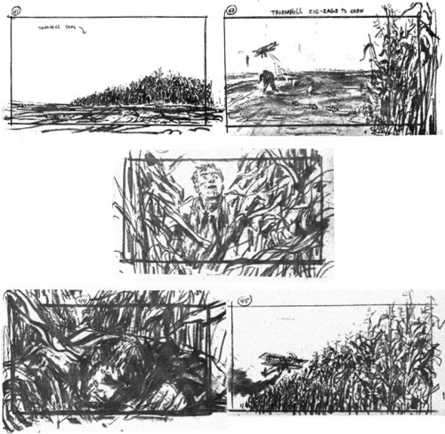
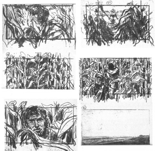
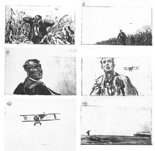
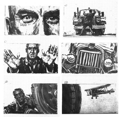
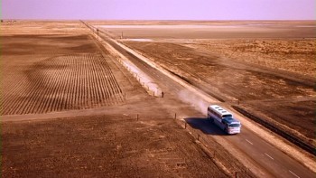 - Thanks to the site 1000 Frames of Hitchcock (and thanks to Mark Mayerson for leading us there) we can view a frame by frame analysis of Hitchcock’s works. This is essential for any film lover or storyboard designer. These films are the masterworks and our foundation.
North By Northwest features one of the most studied film sequences of all time. By going to the photo-site, you can truly look at how the scenes break down into their montage.
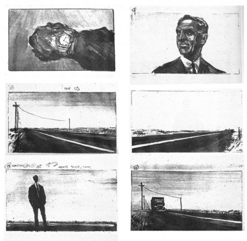
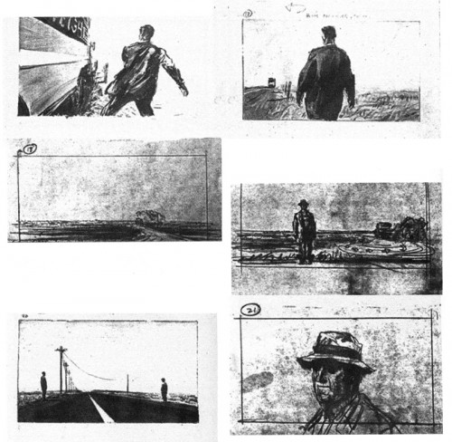
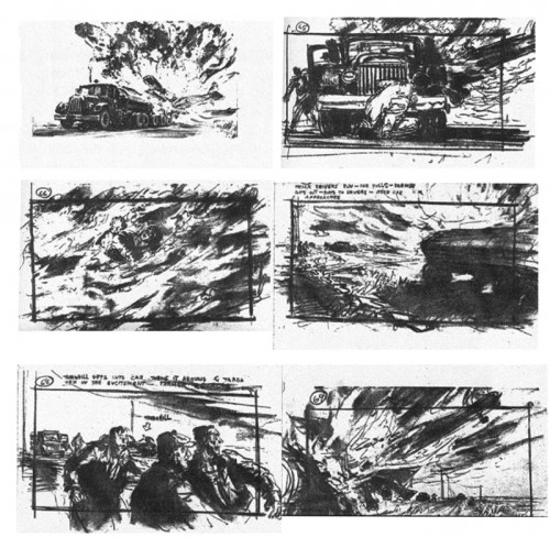
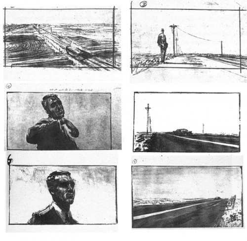
This encouraged me to put up the boards I have in a book entitled Hitchcock’s Notebooks by Dan Auiler. Auiler says that once Alfred Hitchcock completed the script with Ernest Lehman, they handed this sequence to storyboard artist Mentor Huebner and gave him free reign to do as he thought fit. If you study the photos from the film, on the new site, you’ll see that one doesn’t exactly duplicate the other. I caught a mispublication in that some of the drawings were printed out of order in the book. Regardless, certainly the mood of the sequence is here, and the cutting style is established.
This is Huebner’s board:
 1
1
____(Click any image to enlarge.)
Animation &Tissa David &walk cycle 12 Dec 2007 08:37 am
Tissa Elephant
- Before I get into the post for today, I wanted to call attention to a brand new site dedicated to Richard Williams‘ film The Cobbler and the Thief.
The site, called The Thief, is a collaboration of four artists who worked on the film, but they’re encouraging conversation from others who were involved. It looks to be a promising site.

Thanks to Matt Jones for directing me to it. (By the way, check out Matt’s site if you aren’t familiar with it.)
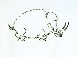
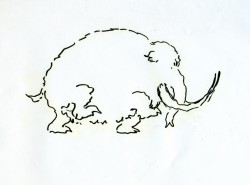
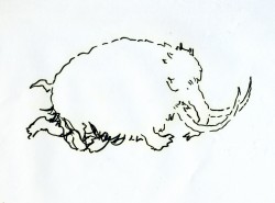
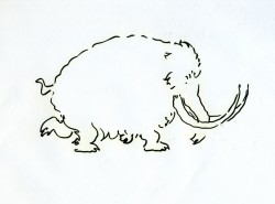
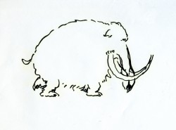
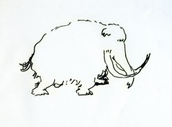
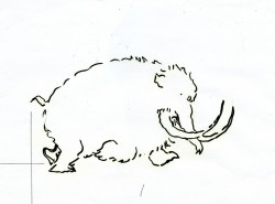
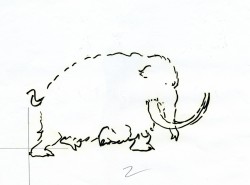
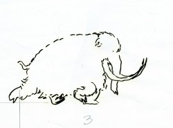
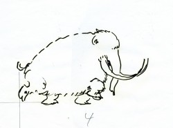
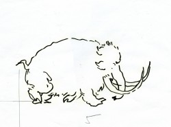
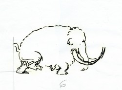
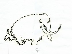
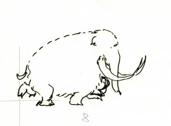
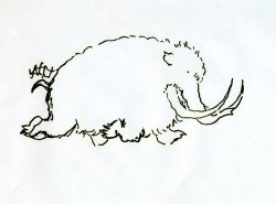
- Here are the drawings for a walk cycle Tissa David animated for an elephant walking in a well-played Perrier commercial from the 80′s. It was a spot done for the Ink Tank in R.O. Blechman ‘s style. These are rough drawings.
Tissa did two versions of the walk in ruff. I’m posting both here so you can see the difference she got in the walks. The second one, which is the final, is subtlety. It’s a quieter walk and is more apporpriate to the tone of the spot. (That’s back when animation didn’t have to jump from pose to pose and could actually move properly.) I’ve added a QT version of each of the walks to view the movement.
The first RUFF version follows:
 1
1 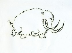 2
2
Click on the drawings to enlarge.
The version used for the final follows.
You’ll note the crosses on each drawing. One might assume this is for re-registering the drawings, but that’s not the case. (You’d need at least three crosses for a fair registration.)
Tissa usually draws a horizon line for each foot of the walker. In the case of these drawings, she drew only the line for the back two legs.
When teaching people how to draw a walk, she starts by drawing two parallel lines and informing you that each line is for one of the feet of the character. The two feet (four in an animal) should NOT be on the same line. It helps to give a slight feeling of depth to the body.
I can’t tell you how many walks I’ve seen lately that don’t even follow this simple and basic rule.
If you go here, you’ll see another spot Tissa and Blechman did for Perrier from the same campaign.
