Monthly ArchiveNovember 2007
Animation &UPA 30 Nov 2007 08:56 am
Our Mr. Sun
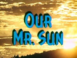 - Back in the 50′s the film director, Frank Capra, produced, directed and wrote four specials for TV which were sponsored by Bell. Our Mr. Sun (1956), Hemo the Magnificent (1957), Unchained Goddess (1958) and The Strange Case of the Cosmic Rays (1957) were devoted to explaining basic science to family home audiences. Capra was educated as an engineer, so he had a lifelong interest in science and he initiated these prorams.
Capra also had a long time interest in animation. He was responsible for securing a distribution contract for Disney with Columbia back in the early 30′s. Animation became a large part of these four programs, and Capra found different animation houses to do them. UPA, Disney, Shamus Culhane‘s studio and WB all were involved.
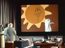
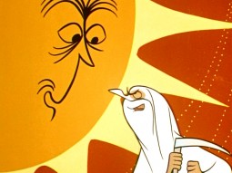
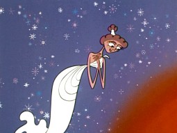
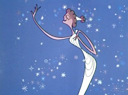
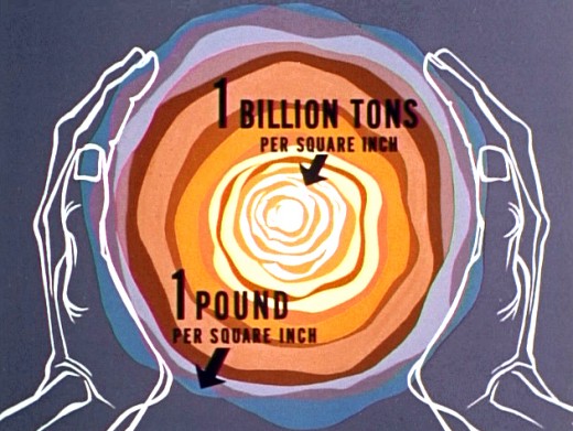
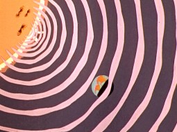
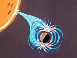
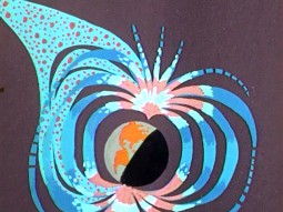
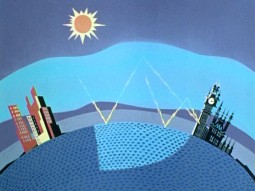
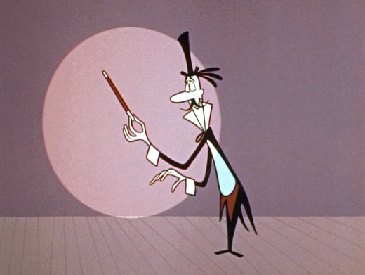
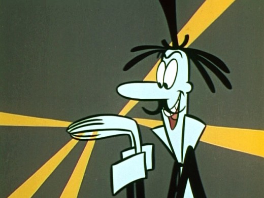
UPA did the artwork for Our Mr. Sun, the first of these programs. (You can watch it here.) I have a copy of the script marked up by Grim Natwick, so I know he animated on it out of the NY studio of UPA.
The shows play a bit like Ward Kimball‘s “Tomorrowland” episodes of the Disneyland television show. Perhaps these are a bit less joke oriented. The animation is just as limited and design oriented. This format has forever affected many who grew up watching them. Check out the new Pixar 2D piece, You’re The Rat, currently on YouTube (it’ll probably be removed soon.) There’s an obvious link.
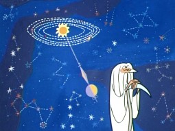
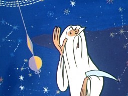
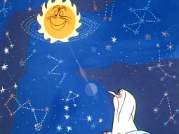
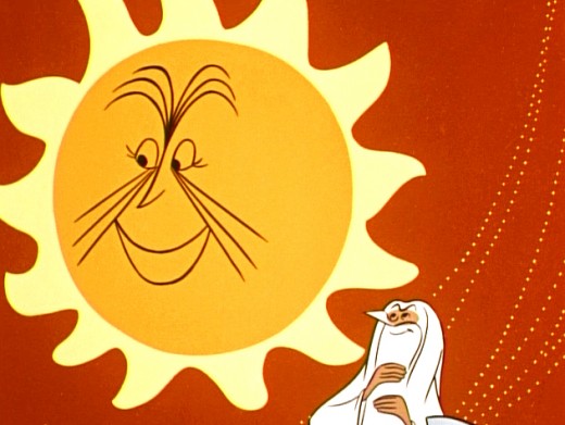
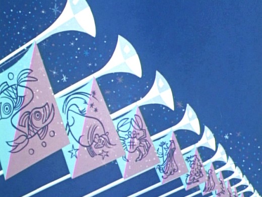
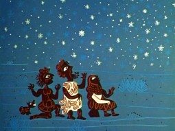
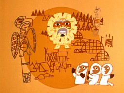
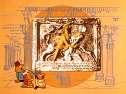
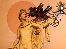
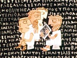
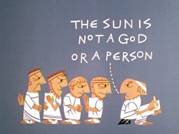
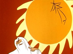
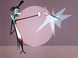
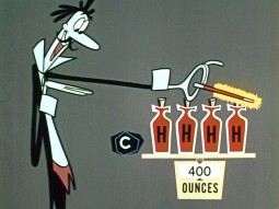
Here are some frame grabs from this first show of the Bell Science Series: Our Mr. Sun.
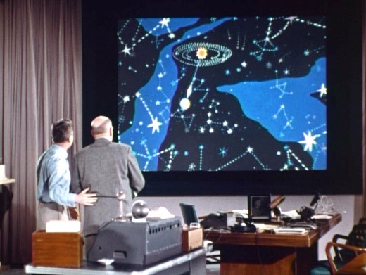
(Cllick any image to enlarge.)
Animation &Rowland B. Wilson 29 Nov 2007 09:05 am
Jack Schnerk
- I apologize for the server problems we had yesterday. Our site was down for most of the day. If you haven’t seen yesterday’s post, just scroll down.
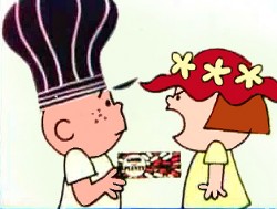 - Jack Schnerk‘s daughter, Mary Schnerk Lincoln, has put three of her father’s commercial sample reels onto YouTube . This gives me a good excuse to call attention to his work, once again. There are a number of well-known and collector’s item commercials in these reels. Included are spots designed by the likes of Gahan Wilson, Tomi Ungerer, Charles Saxon and Rowland Wilson.
Jack Schnerk was a great animator who deserves considerably more attention. He was a strong influence on me in the first eight years of my career and taught me quite a few large principles about the business. He also told me a few stories of his work as an assistant at Disney’s on Bambi and Dumbo as well as the great times animating at UPA and the difficulties of animating at Shamus Culhane’s studio. Actually, he didn’t tell me about his problems with Shamus; another animator did. Jack complained about the business, but never about how he was treated.
I wish I had more samples of the many scenes of his that I assisted. He worked in a very distinct style – I don’t think I’ve seen anyone elseever draw that way. Somehow, the very rough drawings weren’t hard to clean up, and he didn’t leave the bulk of the work for the people following him. He was concerned about the timing and did every drawing he needed 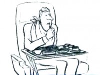 to make sure that timing worked. Most of the time we worked together, he had no chance to see pencil tests. Only on Raggedy Ann did he have that luxury.
Jack had a dark side, that I appreciated, but he also brought a lightness and individual sensibility to the work he did. He took chances in his animation and timing and sometimes failed but usually succeeded with them. That’s more than I’ll say for most of the animators I’ve met in the business.
See Jack Schnerk sample reel 1.
Animation &Animation Artifacts &Disney &Story & Storyboards 28 Nov 2007 08:45 am
Bill Tytla’s Dumbo sequence
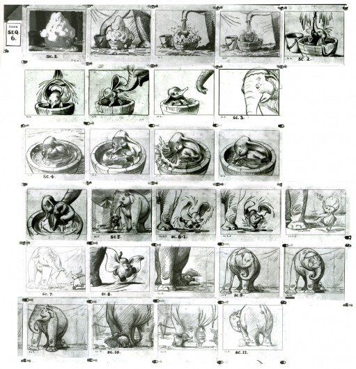
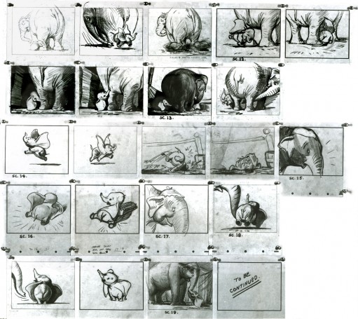
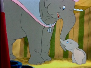 - Yesterday, I posted John Canemaker‘s archival copy of the storyboard for Dumbo; the sequence where he gets washed by his mother and plays around her legs.
I think this sequence, on film, is one of the greatest ever animated. There’s a sweet tenderness and an obviously close relationship between baby Dumbo and his mother which is built on the back of this sequence. It not only establishes both characters solidly, without words, but it sets up the mood of everything that will soon happen to the pair during the remaining 45 minutes of the film. Without that established bond, the audience wouldn’t feel so deeply for the pair during the “Baby Mine” song or care so much about Dumbo’s predicament.
Tytla has said that he based the animation of the baby elephant on his young son who he could study at home. Peet has said that Tytla had difficulty drawing the elephants and asked for some help via his assistant. There’s no doubt that both were proud of the sequence and tried to take full credit for it. No doubt both deserve enormous credit for a wonderful sequence. Regardless of how it got to the screen, everyone involved deserves kudos.
Here are a lot of frame grabs of the sequence. I put them up just so that they can be compared to the extraordinary board posted yesterday. Both match each other closely. Whereas the board has all the meat, the timing of the animation gives it the delicacy that would have been lost in a lesser animator’s hands, or, for that matter, in a less-caring animator’s hands. The scene is an emotional one.
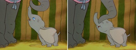
(Click any image to enlarge.)

Animation Artifacts &Disney &Story & Storyboards 27 Nov 2007 08:48 am
Bill Peet’s Dumbo Board
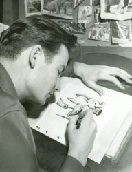 - Thanks to a loan from John Canemaker, I can continue posting some of the brilliant storyboard work of Bill Peet. The guy was a masterful artist. Every panel gives so much inspiration and information to the animators, directors and artists who’ll follow up on his work.
This is the sequence from Dumbo wherein baby Dumbo plays around the feet of his mother. Brilliantly animated by Bill Tytla, this sequence is one of the greatest ever animated. No rotoscoping, no MoCap. Just brilliant artists collaborating with perfect timing, perfect structure, perfect everything. Tytla said he watched his young son at home to learn how to animate Dumbo. Bill Peet told Mike Barrier that he was a big fan of circuses, so he was delighted to be working on this piece. Both used their excitement and enthusiasm to bring something brilliant to the screen, and it stands as a masterpiece of the medium.
Of this sequence and Tytla’s animation, Mike Barrier says in Hollywood Cartoons: What might otherwise be mere cuteness acquires poignance because it is always shaded by a parent’s knowledge of pain and risk. If Dumbo “acted” more, he would almost certainly be a less successful character—”cuter,” probably, in the cookie-cutter manner of so many other animated characters, but far more superficial.
I had to take the one very long photstat and reconfigure it in photoshop so that you could enlarge these frames to see them well. I tried to keep the feel of these drawings pinned to that board in tact.
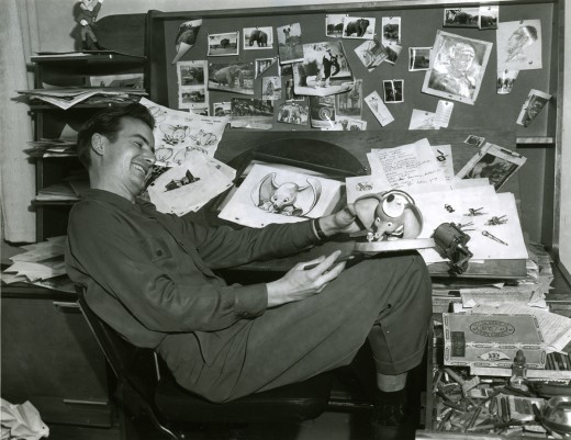
Bill Peet at his desk on Dumbo.
_______________________________________________Tomorrow, Bill Tytla‘s Dumbo.
Daily post 26 Nov 2007 08:38 am
POE, Escape! & an Auction
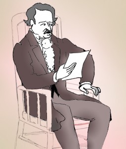 – I’d like to call your attention to a new website we’ve started, as of today.
Now that my feature, POE, is nearing its production start we’ve decided to devote a site specifically to that film. This is an outgrowth of the Poe Page we’ve had at MichaelSpornAnimation.com.
Much of the artwork and clips have been carried over from the old Poe page,
however on Poestory.net, new materials will be added more frequently. There will also be a running journal which will be an extension of the one we’d started on the older site. However, it’s expected that this one will also have entries by others working on the film.
We hope to be able to give a running visual and verbal log of our production as it goes through its growth in the next 16 months. The images up today will continue expanding even through the next week until we’ve started to settle into a regular routine.
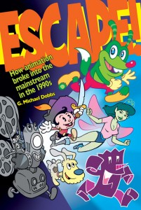 - You may know the name of G. Michael Dobbs through the two animation publications he’s produced, Animato or Animation Planet. Or you may know him through his websites, Out of the Inkwell and Made of Pen and Ink.
Now Mr. Dobbs has a new animation book on the market, and I encourage you to look for it.
Escape! How animation broke into the Mainstream in the 1990s describes how animation “escaped” the kidvid onus and moved into more of an adult vein.
As the press release reads:
- From the shock value of “The Simpsons,†to the experiment of putting “Ren & Stimpy†on MTV to the popularity of anime among teens, animation saw a revival due to a variety of reasons that came about rather organically, as Dobbs shows in his book.
The book includes interviews with all of your favorites: John Kricflausi, Bill Plympton and Ralph Bakshi. The rise of the Cartoon Network and Nickelodeon are detailed and the story of the modern, changing adult feature is told: Beauty and the Beast to Bee Story and Beowulf.
G. Michael Dobbs also continues to write his history on the Fleischer brothers and their studio. You can get a remarkable sample of this long-in-the-works book at his Made of Pen and Ink site on which two chapters are posted.

 – The extraordinarily vital FPS website is currently holding their fourth annual charity auction live on ebay until the 30th of November.
There are quite a few fine animation goodies for auction via the site. Books, dvds, cds, posters, models and other items are all available and will help the Cancer Research Society. What a great use of their website!
Included among the items to be auctioned are:
__Art of Disney Japanese exhibit catalogue, Art of Disney Japanese exhibit DVD
__Once Upon A Time/Il etait une fois Walt Disney Montreal exhibit posters
__dvd shorts donated by NFB:
______Madame Tutli-Putli
______The Danish Poet
______Ryan
__books:
______Animated Cartoons by E.G. Lutz, 1926 edition
______The Art of Bee Movie ______The Art of Beowulf
______The Art of Cars _______.___The Art of Ratatouille
______The Art of the Incredibles
A full list of items is available here. Go – before Nov. 30th, get some good stuff, support Cancer research and keep your eye on the great site: FPS.
One final note. In case you haven’t noticed, Hans Perk is at it again. He is posting the drafts to Disney’s feature, Alice in Wonderland. The man and his site, A Film LA, are a veritable well stream of animation information.
Photos 25 Nov 2007 09:00 am
Signage Sundayphotos
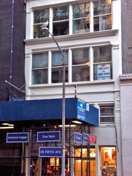 – It’s been a bit of time since I’ve put up one of these photo bits on Sunday, so I’m looking to get back into the stream of things. What I’ve tried to do is keep my eyes open when walking my daily route in New York. Anything that pops out at me tends to get into these blog spots.
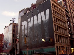
Naturally, in a place like NY there’s an awful lot of signage about. The image to the left gives a good idea of the typical everywhere in this city. There are signs on the temporary construction, signs on the building, signs on the windows. Signs are everywhere and have become the ordinary part of the landscape. In fact, they’ve become part of the building, itself.
The signs that interest me usually are the ones that are actually painted on the buildings, themselves. I have to admit I’ve always been curious about these, and
_____(click any image to enlarge.)_______.___ I’ve wondered how they actually do them.
Unlike the usual poster that’s printed onto strips that are pasted together on the billboard, these posters are actually painted in place on the brick walls. How, exactly, are these done? Realistic looking images are painted there. Paint by numbers? Perhaps I’ll do a little research and try to find out.
 __
__
Of course, the City provides many blank canvases (open building walls) where ads can be placed. Several can be seen looking down any street. It’s actually not much different from the construction site image at the top of this post. A space is a space, and that space can
be rented out. (The image on the right is a closeup of the one of the several signs on the left.)
 __
__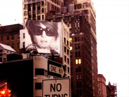
The fashion industry seems to have their own wealth of ads on buildings. These are photographically realistic, yet they’ve obviously been painted there somehow.
You can see the bricks under the coating of paint.
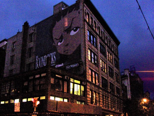
This Cartoon Network ad for “Boondocks” is painted right over a number of windows.
(You can see the lit window shining through it.) How do these folk see out? I assume
it must be some kind of special paint.
 __
__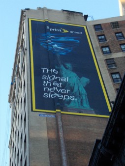
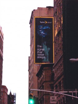
This ad for Sprint presents a new problem. When you look at the sign straight on, it looks fine. However, if you move a bit, you’ll see that the building/wall on which it’s painted has a shift in it. The sign had to have been designed to take in this change in level of the canvas. An interesting problem. (If you look closely at the Boondocks sign, you can see the same problem existed there.)

Here we have a melange of signage, not all of which are painted on walls. Does the skull represent a building under reconstruction?

Of course, any construction site offers plenty of blank canvas.

Naturally, I couldn’t pass up this image. The tiny Commerce Bank on the corner is overwhelmed by the Chase Bank next door and on the second floor. However Commerce seems to have painted its own add on the Chase construction-site doorway.

Finally, an image sent me by Steve Fisher, shows an odd and funny juxtaposition of signs.
It would make me a bit nervous to have my pet cared for by this veterinarian.
Animation 24 Nov 2007 09:08 am
Intvw – JRDilworth
John R. Dilworth is a good friend. He’s currently in Europe putting together some interesting animation projects. He sent me a copy of this interview which was conducted by Andrew La Punta from the School of Visual Arts. Since I was thinking of writing about John, myself, I’ll post this interview for now to give John some due attention.
 When did you first realize you wanted to pursue animation as your career?
The moment appeared in the form of a sudden shock to my psyche experimenting with children book illustrations. I was reviewing a few illustrations I had done for an unpublished author on spec; this was before my study at SVA, and I thought to myself, quite unexpectedly, I would love to see this move. That was it.
How did you first start out in the animation field?
I began my animation career during study at SVA. I would go to the jobs board and apply for the listings that appealed to me. Among my favorite was animating a greeting card flip book. It was produced and distributed and brought me satisfaction, including a life friend of the producer. When I was not doing homework, or “freelance” as a student, I would make animated films. I made 3 during SVA. One of them, my graduation film, Pierre 1985, I used to show producers in the industry. I simply called all the studios I could and made appointments for portfolio review. This was a difficult period. I worked in advertising until I was able to earn enough to work in animation full time. It took me nearly two years. My first jobs in animation were in production. I accepted any job offered me. I hand painted cels, worked in production, interned for Howard Beckerman. I joined animation groups like ASIFA. I volunteered with these groups. I made an effort to meet artists and producers. I traveled to take “tests” in Los Angeles and Florida. I made phone calls in these cities to producers and artists and introduced myself.  This was a very tough process as I am a modest and shy individual by nature. I had forced myself to “break on through to the other side” of this to give myself a better chance. Eventually, I was given assisting and inbetween work. Then animation. I was reading and studying motion and the fundamentals of movement. I liked attending dance performances. The kinetic energy of dance stimulated my impulses to “dance” on paper. And throughout this process of development, I made my own animation art. When I produced the Dirdy Birdy in 1994, I was moving into the next level of making animation and earning a living solely based on my work.
What are some difficulties you face as an animator?
Currrently, the biggest difficulties are finding the most complimentary relationships with producers and distributors, raising the funding to make animation, back-end participation and technology’s influence on hand drawn animation in the market.
What methods do you use to look for inspiration?
In the past, I was in a kind of undeclared art therapy. I used semi-autobiographical material 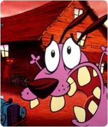 such as my relationship with family and society ( Smart Talk with Raisin ), lovers ( When Lily Laney Moved In, The Limited Bird, N&N, Catch of the Day), my own dysfunctional behavior ( The Dirdy Birdy, The Mousochist, Courage the Cowardly Dog ) or personal collisions ( Life in Transition ). These themes tend to be my current sources of influence today as well, now that I think it over. My method of inspiration is introspection, self-inquirery and a pursuit to understand the universe. Only once did an illustration I admired in a catalog of erotic art inspire a short film, and of course I cannot discount the method of sitting back and watching great films and cartoons. I would often make notes on those aspects of this “viewing” that inspired something in me.
In the past, animators would have to paint cels and shoot frames on a camera. Today, 2d animation is mostly digital. What are your thoughts about the direction 2d animation has taken?
My last hand painted film on cels was The Dirdy Birdy (1994). I embraced the new technology to paint and compose hand drawn animation in the computer, I believed that I could manage my films better than having to delegate. On my next film, The Chicken from Outer Space (1995 ), I out-sourced the Ink & Paint to the Animo software system and later transfered to film directly from digital files. Currently, I do not have a personal relationship of expression using FLASH, for instance. I do not “feel” the human uniqueness of spontaneity and sudden and impetuous diversion in line and motion that characterized, in part, the struggle of traditional animation. However, I freelance the duties of AFX. FLASH or Photoshop to artists who have the facility and I continue to enjoy hand drawing. I am aware  that the substance of a project should be awarded the medium in which to best express it. I would not have enjoyed watching Tex Avery or Bob Clampett cartoons in FLASH. However, the “look” of the creative stuff coming out of these softwares are itself a unique thing and the current market appears to demand it. That is itself a validation of direction the overall medium is taking. What I do wish would return is the mentor/protege model of experience. The new softwares tend to isolate the individual from the intra-personal group experience. Talent do not even read the manuals. I’ve noticed that they go solo and learn the vocabulary built in the software.
What are your thoughts about the future of 2d animation? Will it eventually fade away, be replaced with 3d animation, or stay forever?
 The market is king. Currently, the market is investing heavily in computer animation and 3-D without glasses. These are advances in a visual medium that rival the technological revolution upon the release of “Snow White”. That’s the commercial consideration and human necessity for invention and “progress”. The future for me will always include hand drawn animation. I continue to offer the market my talent and continue to make my art by hand. If I can no longer afford to make animated films by hand, for instance, I will probably do something else. The most important thing to remember is simply do what you enjoy the most and what brings you the most satisfaction, like masturbation. And I am a master at pleasing myself!
At the end of the day, do you have any regrets with your decision on becoming an animator?
No, I have no regrets becoming an animator. I do have regrets over my attitude as an animator towards certain producers and network executives. I would have liked to react to the outrage I had to endure with more gallantry. I regret that I allowed my pride to reign over civility. I regret that I allowed myself to be truculent in attitude, aggressive in opinion and arrogant to ideas and perceived ignorance of others, even to the deliberate greed and megalomanic insecurities of these characters. These incredulous acts of my self-defeatism  contributed to a diminished reward, the reward of enjoying the moment of conflict and creation. No, I have no regrets becoming an animator, only the regret that I did not make a better effort to be a gentleman animator. However, I must accept that the chemistry of deep passion for my art will contrive with my irrational reactions yielding something beyond my control, like one of my favorite militants in cartoons, Daffy Duck.
Animation &Animation Artifacts &Disney &Story & Storyboards 23 Nov 2007 08:59 am
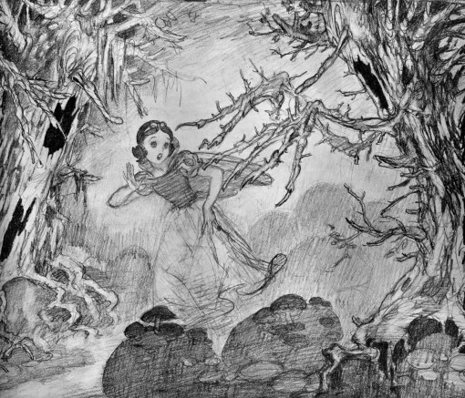
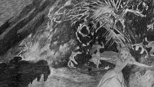
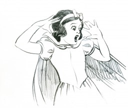
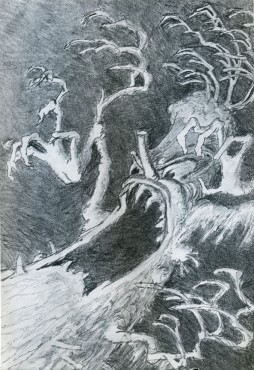
Fear of Trees
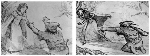
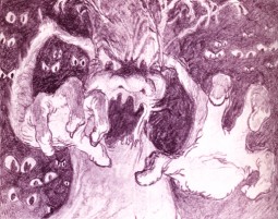
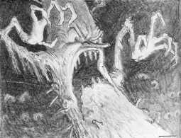
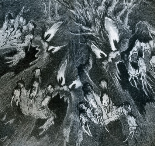
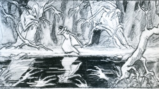
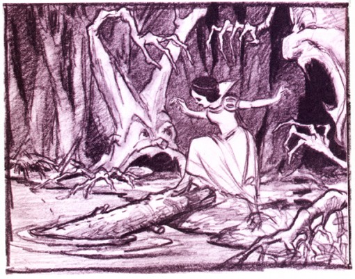
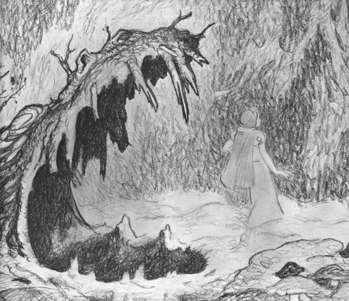
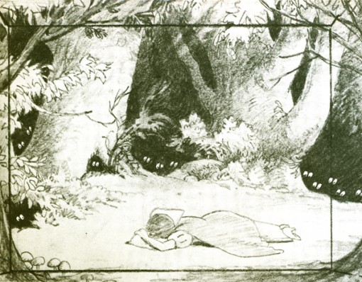
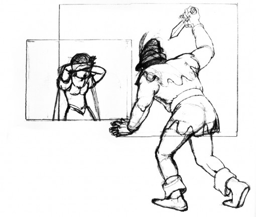
 – Once again I dip into the oversied Snow White book bought years ago. It’s filled with storyoard/layout drawings and illustrates the story of Snow White using only such drawings. There are plenty of beautiful images in this book, and I can’t help but pull them out to post.
There’s no indication of who drew what, so you have only the B&W images to look at with no other references to go by. This film is a true source of inspiration for me, so these drawings are always great to study, and this
odd book is jam packed. Unfortunately, the only text within the book is the story of Snow White.
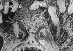
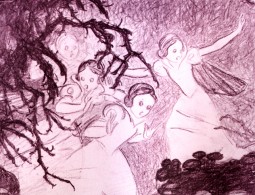
This is Snow White’s run from the hunter – really from the Queen – into the deep, dark woods. Her fears get the better of her, and the trees turn into creepy creatures,
frightening her to tears.
(Click any image to enlarge.)
_
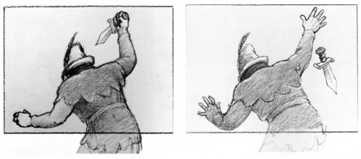
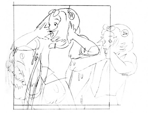
This looks to me like a rotoscope drawing traced off the live action.
Photos 22 Nov 2007 09:05 am
Thanksgiving Photolog
- I haven’t been able to post any photos for the past few weeks since I was so focused on the animation events flying all about me.
My friend Steve Fisher has been sending me a bunch of pictures from Queens – Maspeth, to be exact – that are more than a little appropriate for the day.
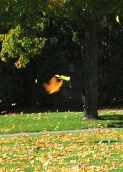
Autumn is flying by us, and it’s a good time to look at leaves. Steve has captured some of them for me, and here they are for your amusement. There are also a few turkeys (balloon turkeys) thrown in for the heck of it. I guess it’s not enough to decorate your house for Christmas; Thanksgiving is a good excuse for some people as well.
_
 _
_
_____(Click any image to enlarge.)

 _
_
Are these supposed to be Pilgrims? Or are they Thanksgiving leprachauns?


Animation &Fleischer &walk cycle 21 Nov 2007 09:13 am
Betty Walks
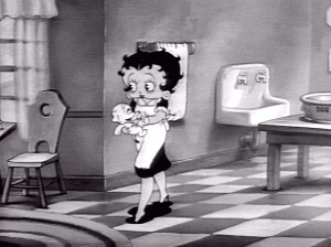 – Back when I wanted to become an animator, there was always the same statement by the hardened professionals: it takes ten years to become a decent animator. I always wondered what happened in that ninth year. I wondered if you could do it sooner. Ward Kimball and Myron Waldman were considered boy wonders who quickly rose to the top of their respective studios. Not only did they become animators; the became directing animators.
Nowadays, all you have to do is register with Flash, and you’re an animator.
As I entered the business, it became obvious that the walk cycle was the make or break point for an animator. You had to be able to master the walk cycle and be able to do something interesting with it – something interesting that helped define the character. (Although, Adam Elliot did boast that he’d never done a walk cycle in all of his films including the half-hour Harvie Krumpet which won the Oscar.)
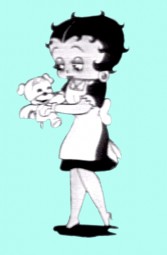
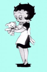
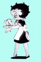
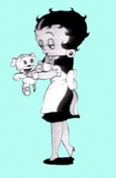
However, even in Flash you often have to make characters walk. That’s why I’ve put a lot of focus on walk cycles, lately. The Fleischer films seem to have created cycles that are more manageable, so it’s easy to focus on them. Here’s a cycle of Betty from the short, A Little Soap and Water (1935). I’m pretty sure it’s Myron Waldman‘s work. It’s not really a cycle, but I’ve maneuvered into one for viewing.
 1
1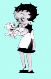 2
2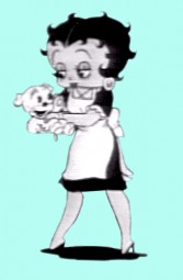 3
3
____(Click any image to enlarge.)

