Monthly ArchiveOctober 2007
Animation Artifacts &Books &Disney &Story & Storyboards 31 Oct 2007 08:17 am
Witches & Apples
Today’s Ollie Johnston‘s 95th Birthday. Happy Birthday, Ollie. Let’s celebrate with the first feature Ollie worked on.
- I’m a Snow White fan. If there’s one feature I look to for that chill of inspiration to hit me, it’s Snow White. There’s something about it that screams out great drawings all done by  hand on paper. There’s something about those incredible watercolor backgrounds, the beautiful animation by the young masters. All the daring, all the pride in their work, all the challenges met by these excellent animators; it’s all on display in every frame of this film. I love it.
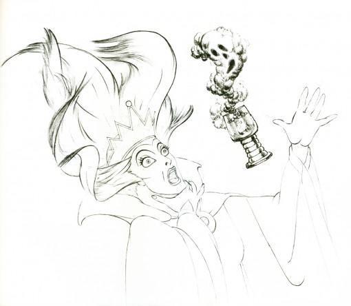
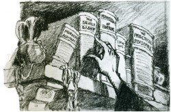
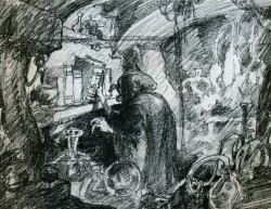
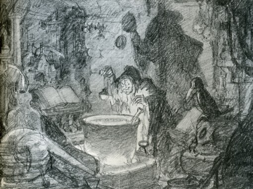
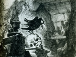
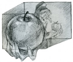
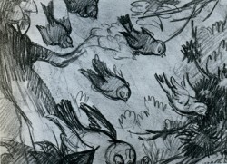
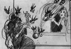
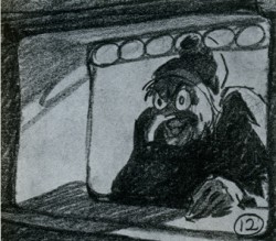
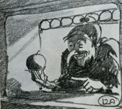
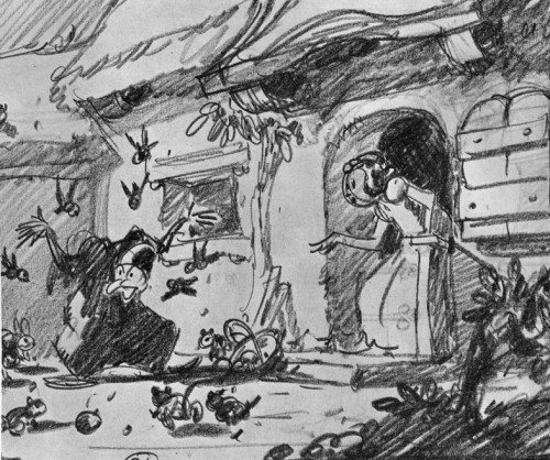
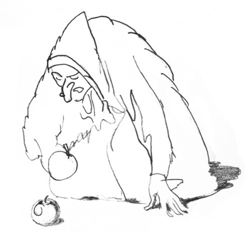
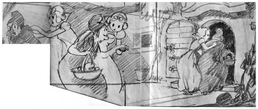
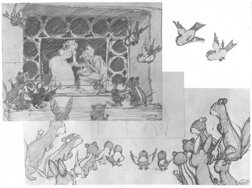
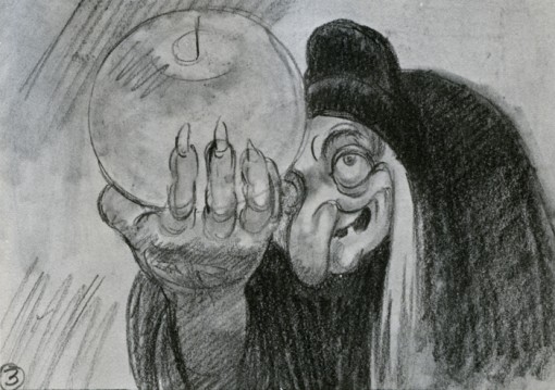
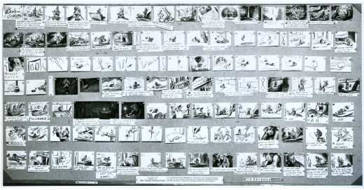
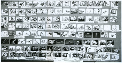
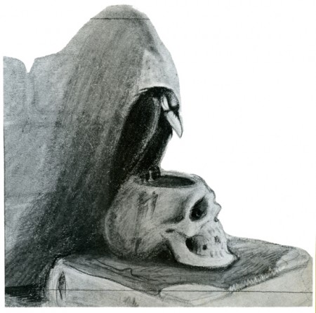
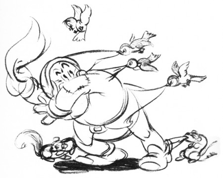
I have an extraordinary book that displays a lot of artwork from this film. It was published for American Express and released by them in a limited edition. To my knowledge it never hit the bookstores. So, because I love the film, because I get a kick out of this book, and because it’s Halloween, I thought it a good time to post some images of the Witch preparing her apple and delivering it.
Most of the images are obviously storyboard drawings, though a few beautiful animation drawings and Layouts slip in there. I’m not sure if any or all of these have made it to the dvd or other books, but it doesn’t quite matter to me.
Here they are.
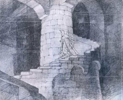
___(Click any image to enlarge.)
Animation &Animation Artifacts &Fleischer 30 Oct 2007 08:19 am
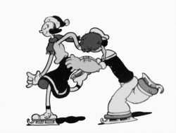
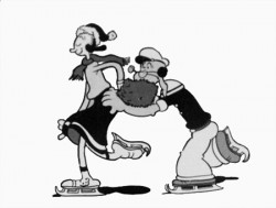
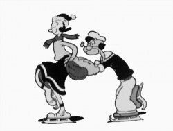
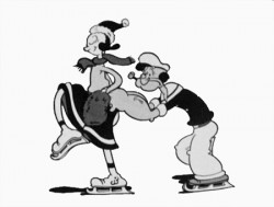
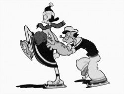
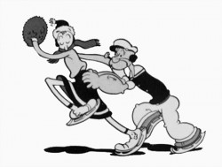
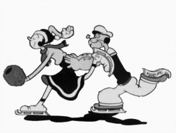
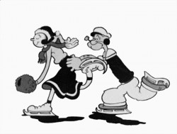
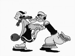
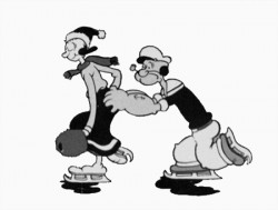
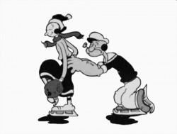
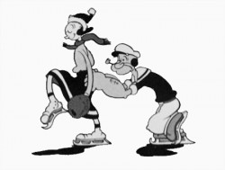
Popeye cycle
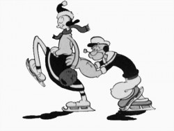
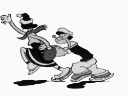
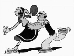
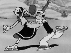 – Here’s a good example of something you won’t see animated in cgi. This is an ice skating cycle out of a Popeye cartoon, Seasin’s Greetinks!. It’s, of course, on the Popeye dvd just out, and is animated by Roland Crandall and Seymour Kneitel.
These Fleischer cartoons are so original in their jokes that there’s always a surprise or ten in every scene. The twists and turns are designed only to get laughs; I can give you a dozen examples from this short alone, but I’ll just recommend you watch the film.
It’s not just the stories that take odd spins, it’s the animation as well. There are bits that move in their own idiosyncratic way that are designed purely for laughs. Eccentric movements that would rarely show up in a Disney film dominate these Fleischer shorts.
Check out this cycle. Every eighth drawing is completely off the book. It gives the cycle a hilarious turn and completely dominates the move. It’s probably not the best way to build 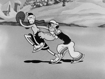 character (unless, perhaps, only one character moves like this), but it sure makes for some funny animation.
The thing about these Fleischer films is that it moves this way all the time. There’s always something about to take you for an odd turn, and while you’re looking for the big move, you’re just buying these small ones. The effect is cumulative, and the animation in these Fleischer films is just plain wacky.
A cgi animator doesn’t look for the odd twist in every frame. They can, but it wouldn’t make sense to be doing it that way, especially when the goal is to make the animation fluid in the final. The animation is too based on real life, and the individual frames don’t exist in the same way they do in 2D paper animation. There’s more risk in the 2D mode, but the reward can also be more ingenious and gratifying.
But what do I know? I don’t animate with cgi, and I’m just making a supposition based on what I’ve seen so far. Everything’s possible, but it sure doesn’t seem probable from my seat.
Having said that, let me also say that there aren’t too many animators doing 2D animation like this anymore. Maybe that’s the complaint I really have. Invention and daring in our medium seems to be a thing of the past.
 1
1 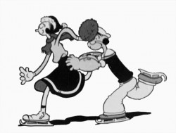 2
2
(Click any image to enlarge.)
Animation Artifacts &Disney &Story & Storyboards 29 Oct 2007 08:15 am
Ben & Me I
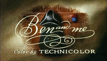 - Bill Peet was one of the prime artists who shaped many of the Disney features. He has been an enormous influence on me and thans to John Canemaker, who has loaned me the following storyboard, I’m pleased to post some of Mr. Peet’s excellent artwork.
Ben and Me was a 20 min short produced in 1953. It’s an oddity in the Disney canon. The story of a mouse who influences Benjamin Franklin through many of his most famous moments was originally a book by Robert Lawson and was adapted by Bill Peet for the studio.
The photostats of the storyboard, like others I’ve posted, is extremely long. Hence, I’m posting them as large as I possibly can so that you’ll be able to read them once you’ve enlarged the images.
These three panels are followed by a couple more revisions. The revisions I only have as xeroxes – lesser quality. I’ll post those tomorrow.

This image is a recreation of the extraordinary pan as seen in the first row of the storyboard posted above. It’ll enlarge to a size where you can properly see it. A couple of the objects were on secondary overlays creating a minimal multiplane effect.
Photos 28 Oct 2007 08:21 am
Halloween Photosunday
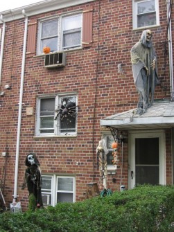
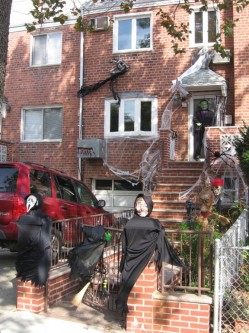
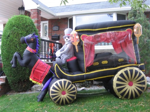
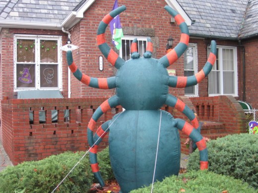
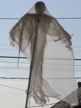 - Halloween’s here – or at least it will be this coming Wednesday. How could I pass up a chance to post some Halloween photos?
In Manhattan not a lot gets decorated except for store windows, apartment doors or the small jack-o-lantern in the lobby. The event becomes monstrously large with the Village parade that blocks off all traffic (auto and pedestrian) within the route of the event. Adults (20 somethings for the most part) dress up in bizarre costumes and get rowdy for a couple of hours. This happens two blocks from my studio, so police barricade everything in sight for a day or two. It gets a bit inconvenient. Too bad kids aren’t usually involved.
In the outer boroughs, everything gets decorated. My friend, Steve Fisher sent me some photos of Maspeth, Queens, where he lives. Steve has a great sense of humor, which comes across in his pictures, and I thought it all-too-appropriate for me to appropriate his photos (with his permission) for this post.
Happy Halloween.
_______

_______(Click any image to enlarge.)
Animation &Animation Artifacts &Fleischer 27 Oct 2007 08:27 am
Betty Drawings
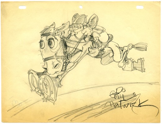
- I promised to post all the Grim Natwick drawings of Betty Boop I have in my collection. A number of them aren’t specifically Bettys, but they’re pretty interesting just the same. Here’s a rough drawing of a jockey jumping done in 1931, signed by Grim. You can tell it was done in 1931 because he’s printed the date on the back (and you can see it bleeding through the paper on the lower left.)
Can anyone identify this cartoon?
As I said in the past, I’m very impressed by the holes punched in the paper. Whereas every other studio at this time was using a 2-hole punch for their paper, Fleischer was using this more sophisticated peg system. I don’t think Disney switched over to their 5 hole paper until 1934, and I’ve seen WB art still on 2-hole paper from 1938.
The other interesting item, noted by David Nethery on my last posting, is that they were using 8½ x 11 paper. Disney’s paper on Plane Crazy, two years earlier, was 9½ x 12. It’s amusing to note that many studios are back to drawing on 8½ x 11 paper today(unless they’re doing feature work) that is, if they’re still using paper.
Animation &Daily post 26 Oct 2007 08:18 am
Zagreb on the B i g Screen
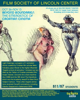
- The Film Society of Lincoln Center is hosting a series called,
Beyond Boundaries: The Emergence of Croatian Cinema (Oct 26-Nov 13).
Included in this program is a selection of some of the best films from the Zagreb School of Animation, which quickly became the cutting edge following its unveiling at the Cannes Film Festival in 1958. I wrote about Zagreb and one specific film, Tup Tup, back in March and I posted this magazine article about the studio.
 The animated films slated to screen include:
__The Loner Vatroslav Mimica, 1958
__Concerto for a Submachine Gun ____Dusan Vukotic, 1958
__The Inspector Is Back! ____Vatroslav Mimica, 1959
__The Piece of Shagreen Leather ____Vlado Kristl, 1960
__Don Quixote Vlado Kristl, 1961
__The Substitute Dusan Vukotic, 1961
__The Wall Ante Zaninovic, 1965
__Curiosity Borivoj Dovnikovic-Bordo, ____1966
__Revelry Zlatko Bourek, 1966
__Passing Days Nedeljko Dragic, 1969
__Satiemania Zdenko Gasparovic, 1978
These films will screen at the following dates and times:
__Sat Oct 27: 2pm, Thu Nov 8: 3:45pm, __Fri Nov 9: 9:15pm, Wed Nov 14: 2pm
For more information and tickets, go here.
In honor of this program, here are some frame grabs from Nedeljko Dragic‘s excellent film done in 1974, Diary. It was an animated diary he did in the style of Saul Steinberg.

_____(Click any image to enlarge.)
Daily post 25 Oct 2007 07:32 am
Satrapi’s Small Steps
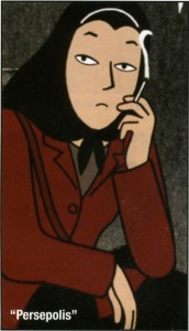 - – The Michael Musto article in the current issue of the Village Voice contains a short passage about Marjane Satrapi. This isn’t the usual material you get to read about Satrapi in her push toward the opening of Persepolis – scheduled to open wide on December 25th.
- By any name, the New York Film Festival closed with Persepolis, the inventive animated film based on Marjane Satrapi’s autobiographical graphic novel about an Iranian Eloise growing up through political tumult, a gay boyfriend, and a grandmother who soaks her tits in ice water, even her nipples. In the midst of the Café des Artistes dinner for the film, Satrapi left her ice water on the table to go outside and smoke like a chimney as she fielded my queries. Was her childhood in Iran all bad? “Primo Levi said total happiness doesn’t exist,” Satrapi replied, puffing away. “Total sadness doesn’t exist either. We had our good moments.” What brought her the most pleasure? “Smoking in the toilet with friends,” she admitted. “I loved putting something forbidden in my mouth in the toilet.” And she didn’t even have to tap in the stall!
Will publicity as good as this allow Ms. Satrapi to beat Bee Movie to the finish line come Oscar time? Animation is usually given the back seat in the PR rush. Unless you have a Bee Movie where Jerry Seinfeld is out there on Oprah pushing everyone (including Oprah) to wear Bee hats, you’re in the ghetto of the publicity machine. If you can’t act like an infant, there isn’t going to be a whole lot of press.
I’m pleased to see Musto write about Satrapi like this. It means she’s stepped over the border into adult-world. Her film is being treated like a real film not a kiddie comedy. It’s a big step in the right direction. It’s also nice that it’s being done by a woman. Arguably, Bakshi did the same years ago, certainly with Heavy Traffic which made many “Best Films of the Year” lists. However, the current fodder of second-rate animated features has thrown things back a few years, and we need a good representative to bring things up somewhat. We can hope that Marjane Satrapi will lead the quiet charge.
Animation &Animation Artifacts &Disney 24 Oct 2007 08:04 am
Tytla’s Stromboli
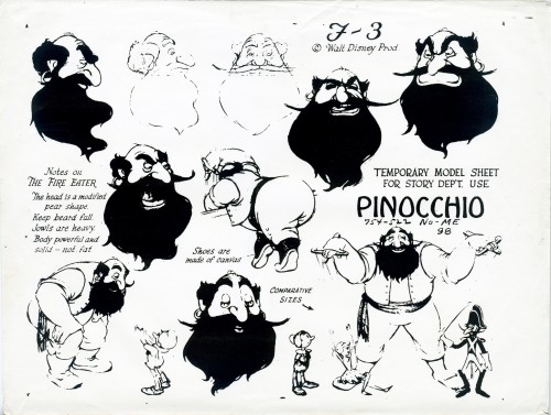
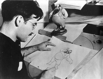 - Mark Mayerson has just completed his final mosaic of Pinocchio. This has been an extraordinary effort on his part, and I can’t say how much I’ve enjoyed it. This film was possibly the pinnacle of traditional animation, and we can’t study it or honor it enough. Mark’s efforts have only elucidated this point more than ever. There’s so much there; the film is an animation treasure.
One of the gems of the film was Bill Tytla’s animation of Stromboli. A minor character takes on an enormous personality and a major threat to Pinocchio under Tytla’s hands.
The Frank Thomas/Ollie Johnston book, The Illusion of Life, contains a flip book in the upper corner – a short bit of Stromboli flying off the handle. The images are quite small and it’s hard to really see them. I have a slightly larger version of them, so thought I post them as my small tribute to the film.
 1
1
_
 2
2
_
 3
3
_
 4
4
(Click any image to enlarge.)
Daily post &Photos 23 Oct 2007 08:26 am
Mattes & Silent Films
Paul Lasaine has a great new site which reveals some of the incredible artwork he’s done for a number of films.
He has a beautiful post which details some of the matte paintings he did for Disney in the years he worked in their matte department. Films like Dick Tracy, The Jungle Book (live action), and Lord of the Rings show before and after shots of the artwork he did for those films.
This is a beautiful site with lots of examples of Paul’s artwork – including background art he did for Prince of Egypt as the supervisor. There are examples of art he did for a number of features.
 _
_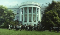
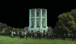
The image on the left is the live action constructed set for the film Dave; on the right the same shot combined with Paul’s matte painting.
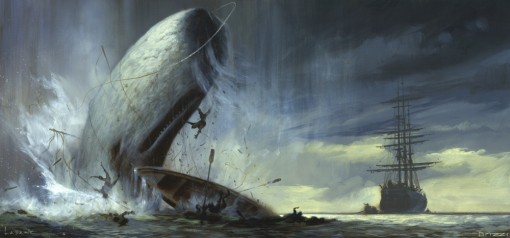
The painting, above, is from a version of Moby Dick he was helping to develop at Dreamworks. The Brizzi brothers would have directed it.
This is turning into a regular stop for me, an excellent site. Check it out tout de suite.
I’m a sucker for silent movies. I think I’ve read at least a dozen biographies of D.W. Griffith, and I’ve seen a lot of his films (probably all of the features) at least once. I’m impressed with the drive and the love those people put into their work. They didn’t think of it as an art form, and they weren’t considered artists in their time. But in the end, there can be no doubt that some of the filmmkaers of the time were creating art.
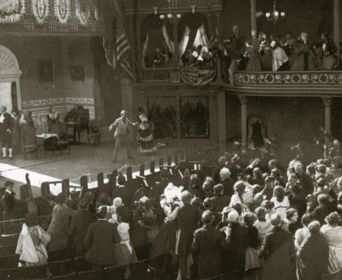
A scene from Griffith’s The Birth of A Nation. It’s a recreation of Ford’s Theater as Lincoln gets shot.
I once saw a silent feature with no musical accompaniment. The silence was defeaning. It was amazing how silent the audience remained throughout the feature film. I guess the film was absorbing enough to make that audience unaware of the silence. That was about 15 years ago; I wonder if the same would occur today.
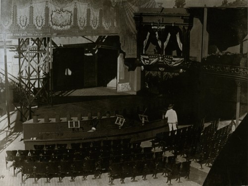
DW Griffith on the Booth Theater set under construction.
Watching silent films with organ music playing background is not the ideal way to see them. 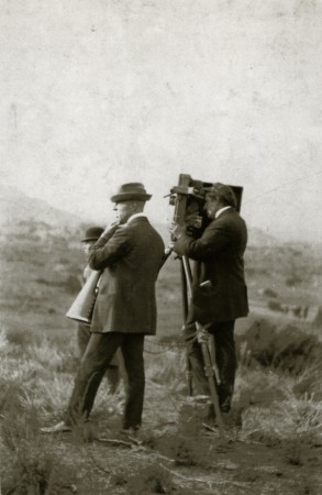 Most piano players who back up these films also aren’t really up to the task. But when you see a film with a great pianist or a good orchestral score it makes all the difference. There’s a musical group called the Alloy Orchestra that enhances the films they accompany, and allows the movies to live up to their full potential. I suggest you try to attend one of their programs if they’re in your neighborhood. (Or just buy one of their cd’s; you won’t regret it.) I suggest Metropolis or one of their sampler albums.
A rare picture of D. W. Griffith and Billy Bitzer on location for Biograph around 1912. Bitzer is lining up a. shot through ground glass, which he has inserted into the gate — there was no viewfinder on the Mutograph camera. This large machine, which punched its own sprocket holes, was smaller and more portable than Biograph’s first cameras. Negatives made with it are still providing superb quality prints.
________(Click any image to enlarge.)
Animation Artifacts &Disney &Story & Storyboards 22 Oct 2007 08:17 am
Bill Peet’s Tar Baby pt 2
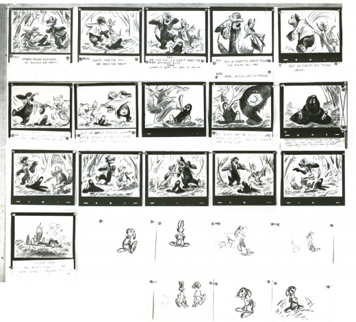
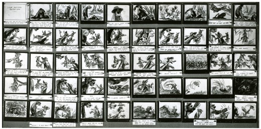
- Continuing my post of the Song of the South boards by Bill Peet, I find I have just two pages left. John Canemaker loaned these to me for this site. There’s a bit of an overlap between the two pages of storyboard.
The first is a bit overexposed, so some of the detail couldn’t come across, although I tried pushing it a bit in photoshop.
The second board has a bit more meat in it, and comes across nicely even though it is large.
I also recommend you go to Hans Bacher‘s Animation Treasures 2 to see backgrounds he’s reconstructed from this film.
