Monthly ArchiveSeptember 2007
Photos 30 Sep 2007 08:03 am
Steam City PhotoSunday
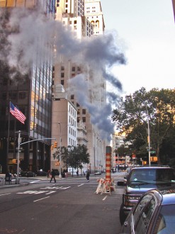 - Steam is the secret energy that runs my city. There’s an article in a local paper called The Gotham Gazette which describes the system in full detail. It’s a good read, so I urge you to go there if you’re interested in further understanding the system.
Atop ground we get to see steam leaking out of sewers, see giant pipes spewing steam into the air, and read about exploding steam pipes that cause damage. (There was a recent explosion at 42nd Street near Grand Central Station. Another in Murray Hill, a couple of years back, destroyed a building and closed a city block for several weeks.)
We pass by these steampipes and stewing manhole covers without thinking about it. It’s like some primeval force out of the Rite of Spring hiding underground.
_
(Click any image to enlarge.)
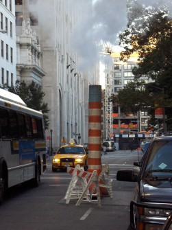 For the times Con Edison is working on the system at specific locations, they construct barber-pole colored pipes which emit large bursts of steam into the air. That wonderful scent you get when walking into a dry cleaners often surounds these pipes.
Back when Raggedy Ann started, there was a very large construction and similar pipe steaming up the entire front of the Brill Building in which we were located. I seem to remember we were originally on the fourth floor, so any offices that faced the front of the building saw nothing more than steam flowing all day long.
Dick Williams had one such office; the conference room was another.
The steam would make a very loud SHUSSSHHH-ing sound as it flowed out. This was often accompanied by workers  jackhammering their way underground.
There was a Saturday rush to complete the art for the rough animatic. Dick and Gerry Potterton and I were in the conference room for at least 8 hours madly coloring storyboard drawings with colored pencils. We had a great time laughing and joking and gossipping about everyone under the sun. I was a lowly Asst. Animator, but they treated me like an equal. It was fun, needless to say.
All day long that incessant SHUSSSHHH; all day long that steam flowing up and pass our large bank of windows. It was crazy-making.
Dick finally broke from a conversation we were having to scream out at the steam and the workers. He was sure that New York was ready to burst out and blow up underneath us. Gerry and I had a good laugh at the rant.
_

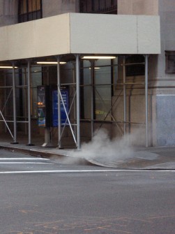
Obviously, not all of these pipes are striped in the Con Edison orange and white. I found
this black, short pipe.
 _
_ 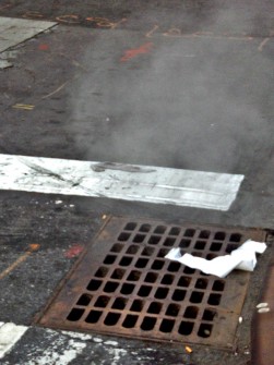
You can see it coming out the sewer caps. Sometimes heavy, as in the left; sometimes
light, as in the right.
 _
_ 
Often close to invisible. I had to go closer to see the steam coming out of this cap.

This truck trailer has been parked on Fifth Avenue and 8th Street for a while. Apparently Con Edison isn’t supplying all the steam needs for the city.

I found this guide to where things are underground. It gives a good, informative view of what’s flowing underneath us in this town. Maybe it will blow up someday.
Animation Artifacts 29 Sep 2007 07:51 am
Betty on Saturday
- Once again I have another Grim Natwick drawing of Betty Boop to showcase. As I indicated on past posts, Grim did a number of drawings of Betty in the early 70′s. These were given to people who met up with him and asked for a drawing. Done in advance, they were able to save Grim the chore of having to do a Betty on the spot.
More of them looked like this image than not. These were drawn by Grim in pencil and colored by him with markers and colored pencil. The animation paper has Oxberry holes. This would have to have been done in New York, since LA was working exclusively with Acme pegs in the 70′s. NY continued with Oxberry, some studios used Acme pegs and some others still used Signal Corps (which was a cross between the two.)
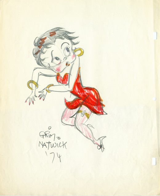
(Click image to enlarge to actual size 10.25 x 12.5)
Articles on Animation 28 Sep 2007 07:58 am
A Couple of Early French Animators
- In 1981 there was a gallery showing in France celebrating the 100 years of French animation. They focused on a number of celebrated names. I have a copy of the catalogue and thought it might be a good idea to translate a couple of the pages and feature a couple of these French masters. I hope to feature more in future posts. These two are the ones I’ve heard about my whole life. Halas made them both stars with his Technique of Film Animation.
Born in Hungary, Jean Image (pseudonym of lmre Hajdu) emigrated to France in 1932 and worked in advertising prior to World War II. He was located in the southern zone during the German occupation of France.
His first films included the shorts, Les Noirs Jouent et Gagnent (1944) and The Adventures of Monsieur Pinceau. His films opened in the unoccupied zones and moved onto Paris after the Liberation. The film Saturn Rhapsody (1946) was selected for the Cannes Film Festival.
Image became the most prolific French producer-director doing both animated short films and features. (Jeannot the Intrepid in 1950, Bonjour Paris in 1952, etc). He was one of the first in France to produce several series for television, such Joe and the Bees (1960-1962) and Kiri the Clown (1966-1969). He was unquestionably a popular figure. In his late films, he worked in collaboration with his wife, France Image, who wrote scripts.
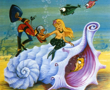
The Adventures of Baron Munchausen
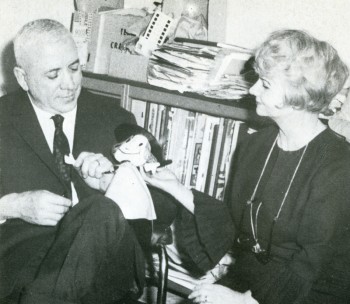
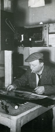
French animation still sought a style of its own when the company “Gemini” was established by André Sarrut and Paul Grimault in 1936.
Their first films reflect the original talent of Grimault combined with an organized production which was often lacking in France.
The team patiently trained animators around Grimault and led the industry thereafter and for many years. Artists such as Lacam, Allignet, Dubrisay, Dupont, Genestre, July, Landrot, Leroux, Mutschler, Ruiz, Vausseur, Watrin, etc, became the elite of French animation.
Grimault’s first film to receive International acclaim was Le Passagers de la Grande Ourse in 1942. (See my separate post about this film.)
Paul Grimault was the winner of the 1st Emile-Reynaud prize awarded in 1943 by film criticis for the body of his work. He was again awarded the Louis-Delluc prize for his full-length feature Le Roi et l’oiseau. Grimault had worked since 1945 to complete this film which was released by Sarrut in 1952 under the title, La Bergère et Le Ramoneur. This caused a great rift between Sarrut and Grimault. With his cohort and companion, Jacques Prévert, he was able to reclaim the film and complete the definitive version released in 1980.
In the interval, several short films were made under the of Grimault’s direction – Le Petit Soldat (1947), Voleur de Paratonnerres(1944), etc. – and more recently,
Le Diamant (1970), Le Chien Mélomane (1973) and La Table Tournante (1977).
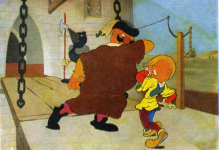
Le Marchand de Notes
Books &Errol Le Cain &Illustration 27 Sep 2007 07:48 am
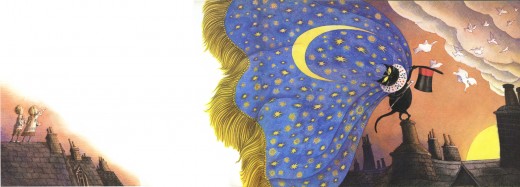
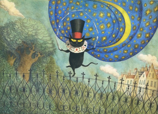
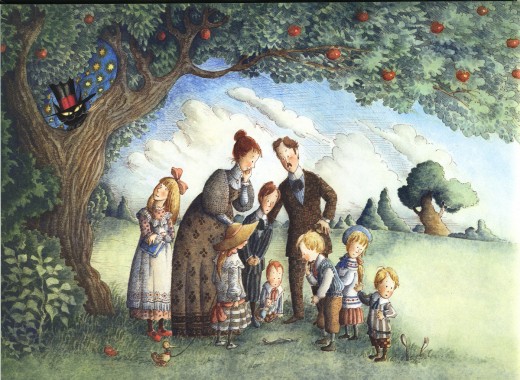
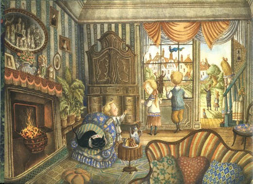
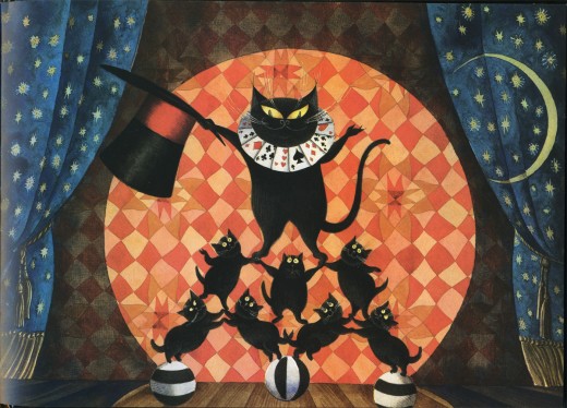
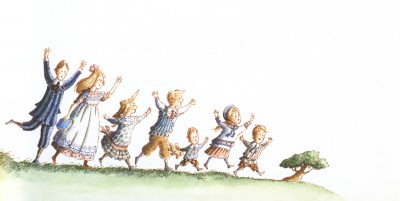
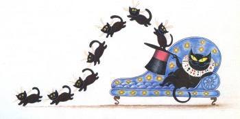
Le Cain’s Mr. Mistoffelees
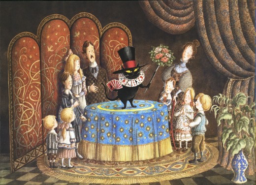
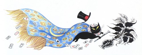
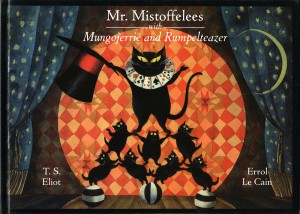 – Continuing my neverending homage to Errol Le Cain, I present here his illustrations for the first half of the book, Mr. Mistoffelees with Mungojerrie and Rumpelteazer. We’ll save the Mungojerrie and Rumpelteazer part for another time.
This story is part of the Old Possum’s Book of Practical Cats by T.S. Eliot.
That was, of course, the source material on which Webber and Nunn based their show CATS. These images are so attractive and stylish, I was quite curious to know whether Andrew Lloyd Webber had seen the books. Especially when he was about to put CATS onto the screen as an animated film.
(You can see some of the preliminary art from that aborted film on Hans Bacher‘s older, yet brilliant site. More here.)
Here are the illustrations by Le Cain:
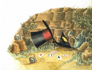
________ (Click any image you’d like to enlarge.)
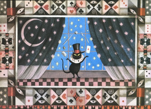
_____________Mr. Mistoffelees
___________You ought to know Mr. Mistoffelees !
___________The Original Conjuring Cat -
___________(There can be no doubt about that).
___________Please listen to me and don’t scoff All his
___________Inventions are off his own bat.
Commentary &Daily post 26 Sep 2007 02:38 pm
Charming!
What’s happened? Is Joanna Quinn no longer doing these spots? This is ugly and unfortunate and criminal! Here’s an ad agency without any real taste. MoCap is going to kill me; I know it.
Animation Artifacts 26 Sep 2007 07:43 am
More Rosie
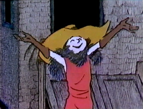
 – I was a bit surprised by the response I got for posting some frame grabs from Maurice Sendak‘s 1975 CBS special, Really Rosie. (See Part I here.) As I mentioned in that post, I was never drawn to this show and have had a hard time sitting through the whole thing. I do know, however, that it’s a very popular film, so I bow to the popularity. They certainly tried something different when they made it, and I’m glad to have seen it done.
Sendak got his feet wet in animation with this show, and I wish he’d done more. There were a few Weston Woods films adapting some of his books. Gene Deitch was the principal director on those. They’re a bit better than this show in their execution. Sendak’s style seems to invite an unfortunate flatness in the animation.
Since Chicken Soup With Rice is the most popular song, I’ve scanned some frames from that piece. It seems endless to me today, as it did when I first watched it. Even Carole King sounds as if she’s getting tired of singing it at one point. I would have hated to have had to plot out this song for the show. Every bit of creativity was necessary.
I apologize for the quality of some of these images. They come from a VHS tape which played at the SLP mode (meaning lowest quality). It was hard to keep images in focus. So here are the images I did get:
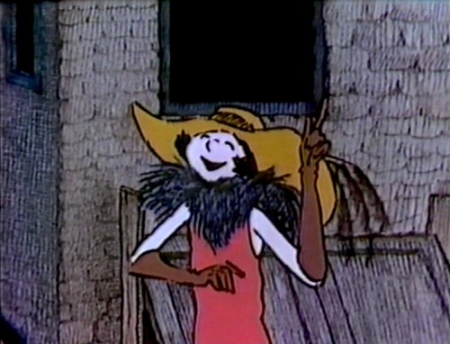
Rosie, voiced by Carole King, in the basement of the building (it’s now raining outside)
invites some of the kids to audition to perform this number. _
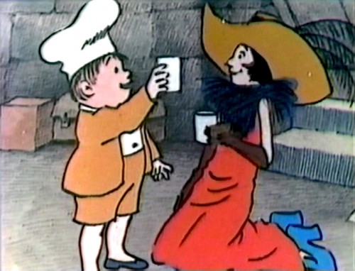
A child look-a-like for the baker from Sendak’s book, In The Night Kitchen, gets the
lead – though Rosie really holds onto the lead in all of the songs._
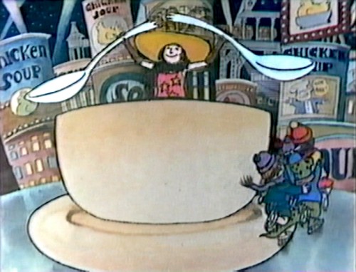 _
_
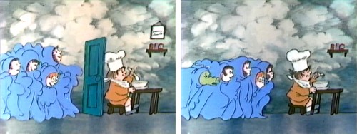
They all rally around a cup into which soup is poured. Good thing it’s not hot, or the song might have ended with this scene after they were all scalded.
Not even a warning telling kids not to try this out at home. Those wacky 70′s!_
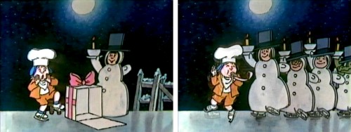
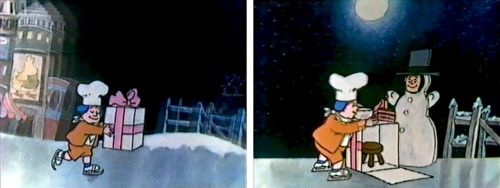
Ice skating leads to the kids dressed as snowmen carrying birthday cake._
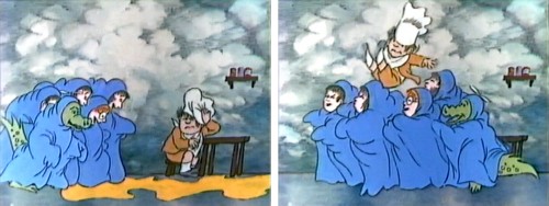
And blowing out candles leads to blowing away doors, spilling soup, and blowing one
of the kids into the air._
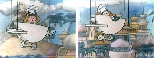
Then we’re floating across the world (really a stage back-drop) in a plane made out of
the tea cup – or should I say soup cup._
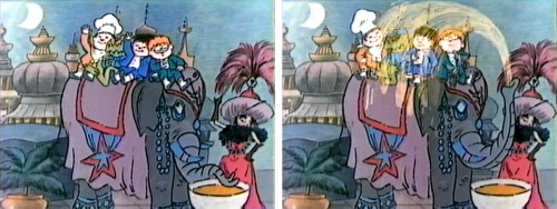
Landing on an elephant, where all the other kids join in just as the elephant sprays them
all with chicken soup. _
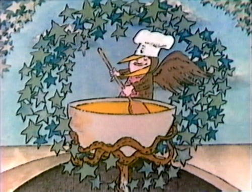
Now a child, dressed like a bird, stirs the cup-o-soup under a starry wreath.
(Let my freak flag fly.)_
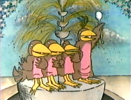
Pan down to another tier of the tureen where more children dressed as birds sing their hearts out._
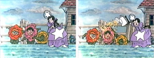
Queen Rosie waters the “flower” children with chicken soup._
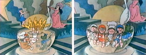
And they all dive into the clear cup of soup._
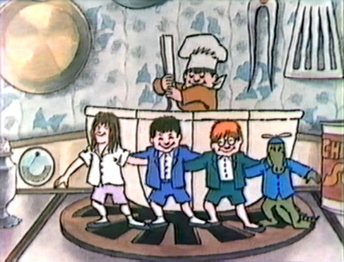
Another cup of soup, a breakaway cup – a prop for the production these kids are staging
in their minds – gets stirred.
Too often, it seems to me, the crocodile character is looking straight on at the camera.
It’s an awful pose to draw and always looks ugly. Never do it – always give a 3/4 or
side view on a face. _
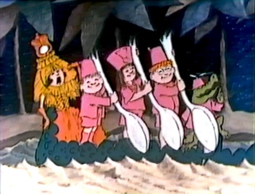
_
See how much better that croc character looks here._
 _
_
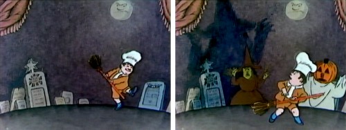
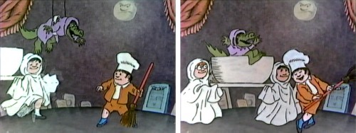
Now we’re dancing around a cemetery.
I think a Halloween soup is the order of the moment._
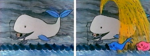
A whale bursts chicken soup with rice – as might be expected._
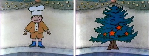
Then, trying to get in all of the holidays, a boy changes into a Christmas Tree. This was done several times by Sendak. His beautiful Christmas card that included this piece was animated by Ed Smith as part of R.O. Blechman‘s PBS show, Simple Gifts. It’s a mag-
nificent bit of animation. I’ll scan it soon for you. Great watercolors by Sara Cologero._
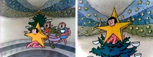
Now the kids are dressed like ornaments for that tree._
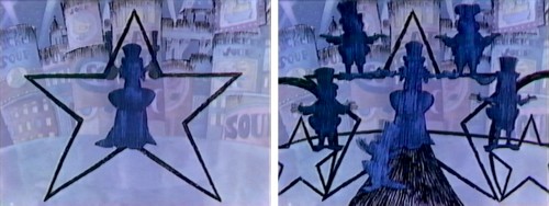
Rosie’s star ornament turns into a star abstraction_
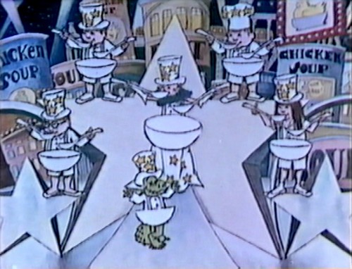
Which, when finally lit, gives us the elaborate set for their song._
Animation Artifacts &Books &Disney &Models 25 Sep 2007 08:08 am
Pastoral Pics
![]() – The Pastoral sequence from Fantasia is definitely not a favorite of mine. I have a lot of problems with it that it’s best not to start a critique. However, these days – there being so much bad art-in-animation – it’s like saying it’s my least favorite Rembrandt.
– The Pastoral sequence from Fantasia is definitely not a favorite of mine. I have a lot of problems with it that it’s best not to start a critique. However, these days – there being so much bad art-in-animation – it’s like saying it’s my least favorite Rembrandt.
Just the same, I’ll still say the sensibility offers everything I dislike about Disney.
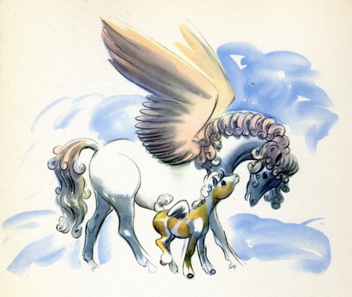
In the past couple of weeks, I’ve been posting artwork from the Deems Taylor book, Fantasia. This is pretty much a storybook for all the sequences from Fantasia. It was published in 1940 by Simon & Schuster.
Here are the illustrations for the sequence featuring the Pastoral by Beethoven.
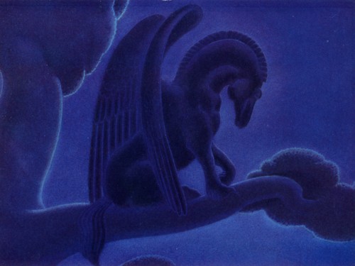
This is probably my favorite drawing in the sequence. There’s a lot of power in it.
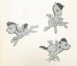
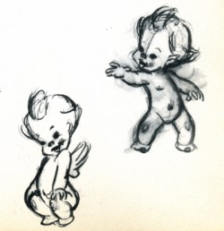
There’s not much to say about drawings like these. They’re very skillful but very sweet.
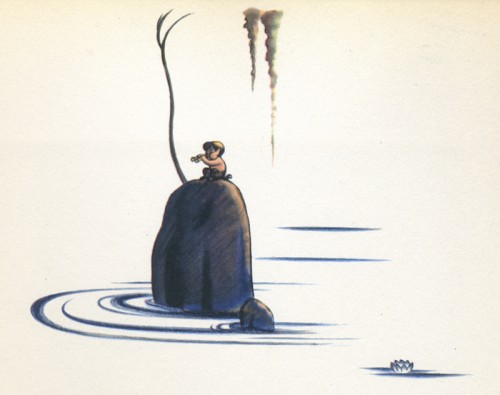
I like this image. There’s a lot of atmosphere in it, and it seems to fit well into the book’s design overall.
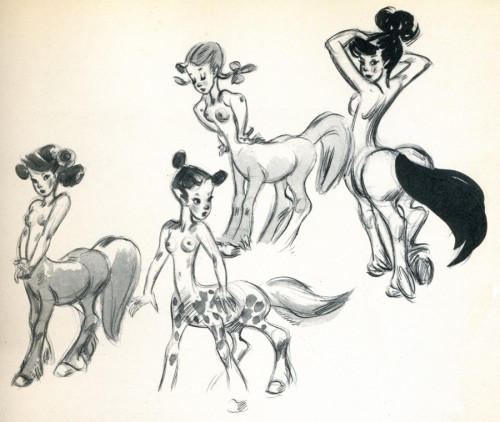
I’m not convinced that these drawings are by Fred Moore, though they’re obviously trying
to emulate what Moore has done.
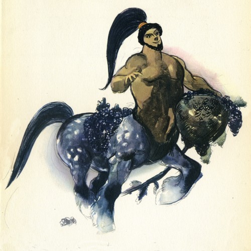
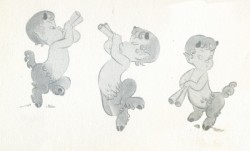
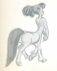
I don’t know how this image made the book. I suppose they needed one of these centaur types. Surely, there must have been a better drawing done for the sequence.
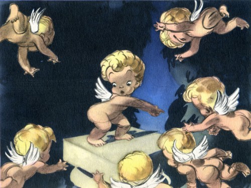
Another drawing of these very cute characters, but I think this one is really
well done, trading in a lot of the cuteness for artistry.
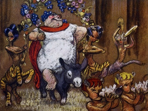
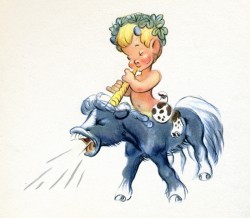
__Bacchus. Ward Kimball animated a lot of this character and did a good job of it.
__I think it’s probably the best animation in the sequence.
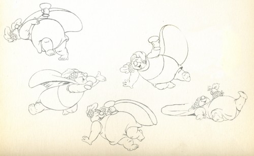
__These look like Kimball’s drawings from the sequence.
__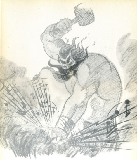
_____Thor. I’m glad the final didn’t look like this.
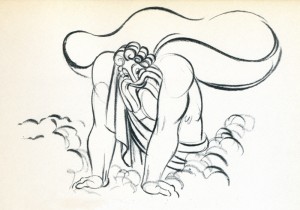
__The animation drawing of Zeus is attractive. The character was nicely done.
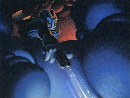
This color sketch of Zeus is quite different though it gives a good sense of what they were looking for in the sequence.

__This image appears in quite a few places representing the sequence.
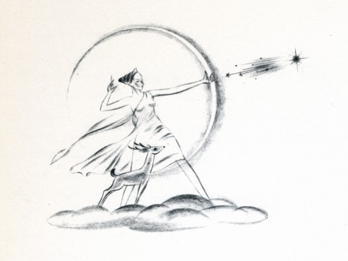
__This, I think, is a nice, rough drawing.
Daily post 24 Sep 2007 08:09 am
Screenings
 - Per Variety:
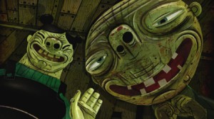
Luis Cook’s The Pearce Sisters won Europe’s Cartoon d’Or at the 18th Cartoon Forum, which wrapped Saturday in Girona, north of Barcelona. This prize is awarded by the European Association of Animation Film for best European short film of the year. The competition is restricted to winners from one of Cartoon’s 10 partner festivals.
Produced by Aardman Animation, Sisters turns on a couple of old spinsters living a despondent existence on a remote strip of coast. One day, the sea washes up a half drowned and handsome man, whom they try to revive and then captivate.
The other four finalists from 27 candidates were: Tomek Ducki’s Life Line from Hungary, Suzie Templeton’s Peter & the Wolf from the U.K., Ami Lindholm’s The Irresistible Smile from Finland, and Daniel Gray and Tom Brown’s t.o.m,” again from the U.K.
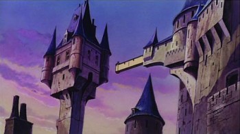 - Miyazaki on the big screen. Wednesday, Sept. 26th, for one night only, Miyazaki’s feature, Lupin III: The Castle of Cagliostro, will be screened in theaters across the country. This is part of a program called the Anime Bento movie series. The film will be screened in the dubbed version, which is no doubt a disappointment to anime purists. However, it is a rare chance for fans to see a Miyazaki film on the big screen.
Thursday, Sept. 27th, they’re screening Karas: the Prophecy, which is not a Miyazaki film; it was directed by Akira Takata.
To locate the theater nearest you go here.
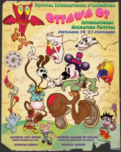 The Ottawa Animation Festival ended yesterday and sounds as though it were a good one. I’m sorry I missed it. There were a number of screenings that sounded very attractive to me.
Congratulations to these and all other winners:
BEST ANIMATED FEATURE
Persepolis [2007] Vincent Paronnaud & Marjane Satrapi, France
BEST INDEPENDENT SHORT ANIMATION
Franz Kafka’s A Country Doctor [2007] Koji Yamamura, Japan
INDEPENDENT SHORT ANIMATION COMPETITION
Narrative Short Animation under 35 minutes: Madame Tutli-Putli [2007] Chris Lavis & Maciek Szczerbowski, National Film Board of Canada, Canada
BEST COMMISSIONED ANIMATION
Golden Age [2007] Aaron Augenblick, Augenblick Studios, USA
Thanks to Frames Per Second for posting all of the award winners. One wonders why most festivals are always the last to announce their own award winners on line.
Methinks some of these may show up again at Oscar time.
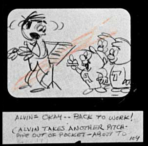
And speaking of Alvin & the Chipmunks, if you haven’t seen the ASIFA Hollywood Animation Archive site’s go there. They’ve posted the storyboard for the pilot for this tv show (the original by Format Films, not the unattractive offspring). You can’t do better than to study a successful board by Leo Salkin.
Photos 23 Sep 2007 07:59 am
Kid Parks Photo Sunday
- Remember those old schoolyard playgrounds we had as kids? Well, maybe not all of us; just the older of us. There was a jungle jim, some swings, and a sandbox. In the summer, there might be a sprinkler of some kind that would spray water on us. It was all concrete and apparently somewhat dangerous. Funny it didn’t feel that way. I can see that plopping a kid in a box of sand might not be the best way to entertain a child.
Well, things have changed. On my daily walk to & from my studio I get to see a couple of children’s playgrounds. (I’d hesitate to call them playgrounds except that the sign below calls it that.) They all seem to be constructed on the theme park model. I’m sure these playgrounds are no different than anywhere else in this country. The attitude toward child rearing has definitely changed.
Madison Square Park has a relatively large and elaborate area.

The idea seems to be to shroud the playground in foliage and an elaborate wrought iron fence. They’re trying to create a positive approach.
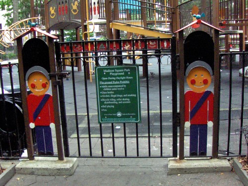
This is the entrance to the area. The gateway says it all. Rules aplenty to all these spaces.

Pleasant foliage with lots of well-kept flowers surround the playground. Colorful constructions are inviting to the eye. It’s obviously a pleasant area for these kids to play.


There are a number of turreted spaces connected by a bridge with plenty of crawlspace areas. It’s a safe way for kids to actively move around.


Designed with plenty of places to climb, slide down or run across, these areas are
probably great for fantasies of forts or castles.
Though all of these playgrounds I’ve looked at are similar, this one – in Madison Square Park – seems the most interesting and friendly to me. I’d have enjoyed it as a kid.
Washington Square Park 1
- There are two Playground areas in NYU’s Washington Square Park in Greenwich Village. They’re undoubtedly connected, though both are a bit more rustic than the others I’ve photographed.

The front gate to the larger park is intimidating with this enormous iron fence. I thought
the area was locked (at 7am when I photographed it) but learned that it was just tightly closed. A mother with a child in a stroller entered after giving me dirty looks.

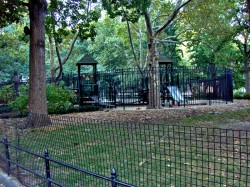
The large fence and a very large grass moat surrounds the large space. I certainly felt
like I was an outsider in the movie “Little Children.” I wondered how the kids inside there felt.
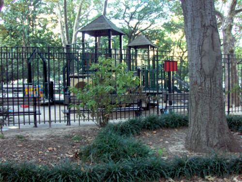
The turreted areas look out from behind the shrubery hiding the play area, but the
casual on-looker sees what looks like a more traditional playground.

The space contains more of the turreted areas, with more of the usual picnic benches
and slides.
Washington Square Park 2

This second, tiny playground intrigues me more than the larger one. The surrounding, wrought iron fence, again, is nothing if not intimidating. Again, I felt like I was doing something wrong in taking a photograph of the locked area when a cop car drove by.

-
-
-
-
-
-
-
-
-
-
There’s one rustic-looking turreted space with a ramp and stairs. The whole affair looks a bit lonely, and I’m not sure what kids are supposed to do here but feel outcast.
Maybe I’m wrong.
I usually only see the space when it’s locked up and no kids are playing.
-
-
-
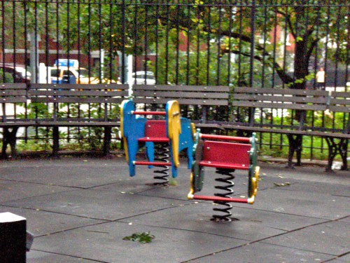
Two odd, springy seats seem to be a peculiar replacement for swings. They look a bit dangerous. They are the only spots of color in the area.
Downing Street Playground
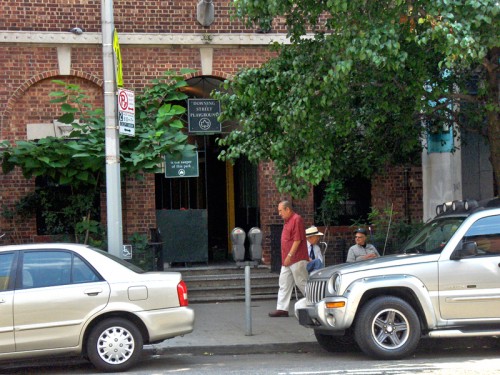
The third playground I’m going to feature here, is the Downing Street Playground. This
is a small area with its entrance on Carmine Street (about a block from my studio in the
West Village.) The gated and guarded entrance usually has a couple of old people
sitting in front.
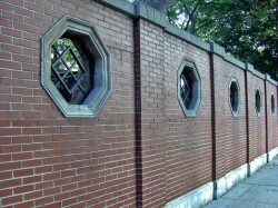

The rear of the park is on Downing Street and is backed by a brick wall with some octagonal, concrete windows to peer in.
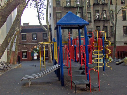
Within, there’s a colorful turreted play area, with lots of colorful and odd-shaped pipes to climb up or slide down. Not many flowers or foliage is evident. It looks like the
back yard of a building, which it is. I kinda like it in a city way.

What looks like a yellow, circular jungle jim stands behind the turrets. The whole place
looks fairly safe and possibly fun for some imaginative kids. I’m pleased to see that this small, Italian neighborhood has made a real effort to establish an area specifically for kids.
Animation Artifacts 22 Sep 2007 07:53 am
Natwick Betty Saturday
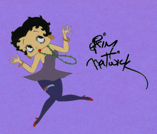
- On a couple of the past recent Saturdays, I’ve posted some drawings that Grim Natwick did back in the early 70′s. Since he was often requested to draw Betty Boop, who was experiencing a renaissance of her own in the 70′s, he decided to do a number of drawings in advance. These were usually colored with markers or colored pencil.
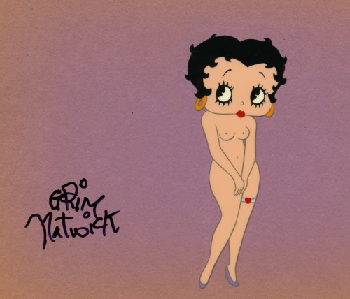
Then he hired a local New York inker to make a couple of cels for him. Stephen Worth pointed out last week that Duane Crowther’s studio did some of the same for him in LA. All those in my collection were done by an inker I know who completed the cels and placed the construction paper behind them. Grim, then, signed these cels with a Sharpie.
Regardless, these were all handed out to press people interviewing him to save him the task of trying to make a good drawing on the spot. I have a bunch of them, and I’m posting them as they come.
Stephen Worth spoke of a naked Betty in the batch, so I’ll post that today. As a matter of fact, these are the only two cels I have. The rest are drawings on paper done in what is recognizably Grim’s hand.
- The New York Times has taken their extra charges off their NYTimes Select pages so, readers no longer have to pay to read Frank Rich or Maureen Dowd or Tom Friedman on line.
This means that it’s also free to view the animated spots by
Jeff Scher.
If you haven’t been able to view these spots previously, go there now for your own mini film festival.
-
-
