Monthly ArchiveMay 2007
Animation Artifacts 21 May 2007 08:12 am
8mm Popeye
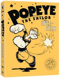 – Of course we all are waiting for the Popeye dvd’s to hit the market. This promises to be the ulltimate collection for many of the Paramount shorts. However, Popeye’s been on the home entertainment market for quite some time.
Back in the old days – before Blu Ray, before dvd, before vhs – there was 8mm. No, I’m not even talking about Super 8mm; I mean 8mm. This was the home movie for the masses.
I owned a couple of cameras and projectors by the time I was 16. I bought all of them myself with my own money earned from part time jobs. You could buy used models downtown (an hour subway ride for me) at a camera store called Peerless-Willoughby.
(A variant of this store still exists called Willoughby.) Within the store, they had an enormous department of 8mm and 16mm films to buy or rent. I spent a lot of time thumbing through those 8mm films and bought a few. I had rigged my projector to screen the films frame by frame so I could study some of the animation.
When Super 8mm came in, sound was added (although it had to be dubbed after the film was shot.) 8mm was threatened and they came up with a couple of schemes to add sound. My friend, Stephen MacQuignon, shares this Popeye cartoon. This is one such scheme a small distributor tried. Oddly, it’s not too different from the first sound films back in 1928. You play the soundtrack off a record. Appropriately, the cartoon with this record is one of the King Features shorts which was dependent on dialogue.
Things change but not always in great leaps.
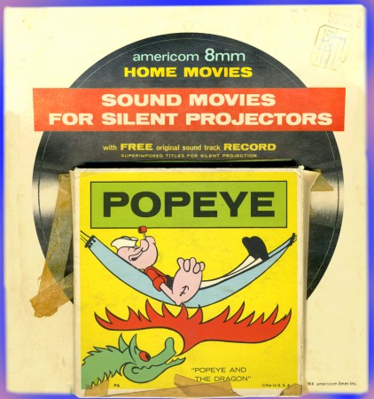
The 8mm reel came in the attached box pasted to the front of the record package.
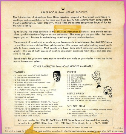
This is the back of the package so you can see other titles that were
available from “Americom” including a number of the King Features shorts.
Unfortunately, I don’t have a projector anymore, and I’m having trouble
getting the record transferred to dvd. I will though.
Daily post 20 May 2007 10:23 am
Problems
Commentary &Daily post 19 May 2007 07:02 am
Liquid Blend
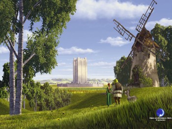 – Well, Shrek 3 opened yesterday and is onto making a crop of cash for Dreamworks Animation. Good for them.
The reviews weren’t sterling. The most positive I saw in the NY papers came from AOScott of the NYTimes. He’s getting to be one of the reviewers I most enjoy reading for insightful, intelligent and creative writing.
This is how he ends his Shrek review:
- “Shrek,†“Shrek 2†and “Shrek the Third,†by contrast, are flat and simple, hectic and amusing without being especially thrilling or complex. Their naughty insouciance makes their inevitable lapses into sentimental moralism all the more glaring. In this movie we hear some speeches about how it’s important not to care about what other people think of you, and to be yourself above all. Yeah, fine, whatever. This doesn’t strike me as necessarily good advice, and in any case today’s wised-up kids don’t need life lessons from an ogre. But then again, the kids are not the ones who identify with Shrek as he makes his grouchy way through the life cycle.
Dreamworks last year had a charming little short called “First Flight” which was light years better than Pixar’s “Lifted.” I hope they get away from the ugly Shrek graphics and into something a little more human like that short.
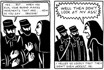 - The feature I’m waiting to see is Persepolis. The film is directed by Marjane Satrapi and Vincent Paronnaud and is adapted from the her graphic novel.
This black-and-white animated feature recounts Satrapi’s experiences growing up in Iran after the fundamentalist revolution of 1979 created a more repressive nation and a climate of fear among educated Iranians. It features the voices of Gena Rowlands and Catherine Deneuve.
A number of clips have shown up on YouTube, and it looks as original as I hoped it will be. Unfortunately all of the clips are in French, but you can figure out what’s going on.
Teaser trailer
Clip 1
Clip 2
Clip 3
The film will premiere next Wednesday & Thursday in competition at the Cannes Film Festival.
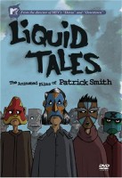 – NY animator, Pat Smith has put together a collection of his animated shorts and calls the dvd Liquid Tales.
The collection sells for $25 from Smith’s Blend Films site or can be bought on Amazon or in storers everywhere.
The films included in the dvd are:
Drink Delivery
Moving Along
Handshake
Puppet.
It also comes with extras. Read reviews at Blend Films.
SpornFilms 18 May 2007 07:30 am
Poor Hans
 – One of the centerpieces of tourism in Copenhagen, the statue of the Little Mermaid, was once again vandalised.
The statue was commissioned in 1909 by Carl Jacobsen after his love for a balletic version of the fairytale. The sculptor and creator of the statue was Edward Eriksen, which he unveiled in August 1913.
Eriksen used his wife as the model.
In April 1964 some politically motivated artists sawed off the head, and a new one had to be sculpted and attached. In 1984, an arm was sawn off and returned two days later by the vandals. In 1990 another attempt to cut off her head failed, and the statue ended with a deep cut in her neck.
In January 1998, her head was cut off again but was returned to a television station and was reattached to the sculpture.
This time varmints just poured red paint on her. This is the eighth time the statue has been doused with paint. It’s hard for a mermaid to survive above water.
- This is as good a place as any to note that I have two upcoming dvd releases available on the 19th of June. Each of the two will contain two programs of Han Christian Andersen tales we’d produced about ten years ago.
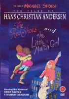
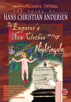 One will include The Red Shoes and The Little Match Girl; the second will contain The Emperor’s New Clothes and Nightingale. Both dvds will also feature galleries of additional art and storyboards, an animatic of a section of the films, and a documentary about the making of the films.
It’s a relatively full program for these films that hadn’t yet been released on dvd, and I’m proud of the final products. I am enormously grateful to the distributor, First Run Features, who are treating my work as if it’s a big deal not just another kiddie program.
There will also be an ASIFA East program on June 20th to highlight these dvds, and I hope to show a program of some of the material. Maybe we can put together something interesting.
Art Art &Daily post 17 May 2007 08:36 am
Jeff’s Show
- Unfortunately, there’s been a lot of spam coming my way, and a lot of it gets to the blog. So for the moment, I’ve put all comments on moderation. Hopefully, I can change it back soon, but it’s smarter to handle things that way for now.
 – A short piece in yesterday’s NYTimes talked about Stephen Spielberg and Peter Jackson going digital to direct three “Tin Tin” animated features for Dreamworks. They’ll use the Supermarionation technique – no, I’m sorry, the “3D” Performance Capture technique (some call it animation) to craft their wizadry. Peter Jackson has already done a 20 minute test reel that all of the executives love.
I have to wonder if Andy Serkis is going to play the lead, Tin Tin.
Happy Birthday, Tin Tin – 100 years old on May 22nd.
This coming Saturday, May 19th, NY animator JEFF SCHER will have a program of his films screened at the Millennium Film Workshop at 8PM.
Here’s a press piece about Jeff’s work and history:
-
Jeff Scher is a New York-based filmmaker, who defines himself not as an animator, but as a painter working in motion. He is fascinated by the human mind’s ability to create the illusion of movement from disparate images. His montages are dizzying arrays of color, light, figures and forms that flit about like unruly thoughts, tricking the
eye and revealing unexpected visual harmonies. Scher gave up his pre-med studies for film while at Bard College in the mid-1970s. He still makes use of rotoscoping, an old animation technique in which film frames are blown up and traced individually onto animation cels. In Scher’s case, he painstakingly hand paints and shoots each frame of film, sometimes substituting clay, paper models or found materials for his paintings.
Jeff was one of the final judges at last year’s Ottawa Animation Festival. Some of you may have met him there.
This Saturday’s program is the following:
LIGHTTIDE (12 min.-1974)
GARDEN OF REGRETS (8 min.-1994)
WARREN (3 min.-1995)
POSTCARDS FROM WARREN (1 min.-1995)
NERVE TONIC (3 min.-1995)
YOURS (4 min.-1997)
GRAND CENTRAL (15 min.-1999)
THE JACOBSONS (3 min.-2000)
WHILE YOU WERE SLEEPING (3 min.-2001)
LOST AND FOUND (3 min.-2004)
YOU WON’T REMEMBER THIS (2 min.-2005)
DOUBLE PLAYDATE (2 min.-2007)
OXYGEN (3 min.-2007)
Millennium Film Workshop Personal Cinema Program MAY 19 (Sat.) 8 pm
66 East 4th Street, NY NY 10003
Here’s a great article by Stephen Heller in EYE Magazine about Jeff.
Art Art &Books 16 May 2007 12:22 pm
Blake’s Nov. B’day
.
– Well, it’s poetry time, boys and girls.
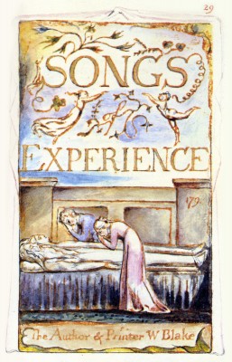
One of my most memorable trips to a museum was a visit to the Tate in London where I got to see the original paintings by William Blake. I’d been an admirer of his work ever since I’d learned about it. I have to admit I knew him as a poet before I realized he’d painted his work.
This is the 250th anniversary of his birth (Nov. 28, 1757) and many commemorative celebrations are planned. Let’s start things off by posting a couple of the works from The Songs of Innocence and Experience.
I’ve chosen Songs of Experience.
.
.
.
.
.
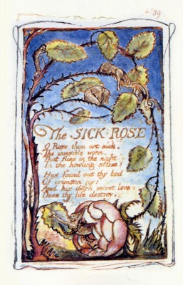
. . . . . . . . The Sick Rose
. . . . . . . . O Rose Thou Art Sick.
. . . . . . . . The invisible worm,
. . . . . . . . That flies in the night
. . . . . . . . In the howling storm:
. . . . . . . . Has found out thy bed
. . . . . . . . Of crimson joy:
. . . . . . . . And his dark secret love
. . . . . . . . Does thy life destroy.
.
.
.
.
.
.
.
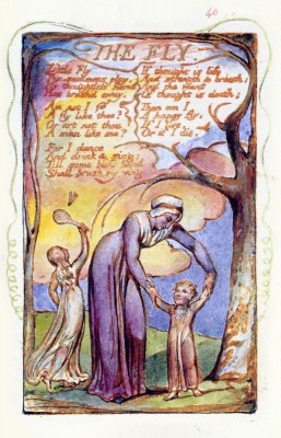 . . . . . . . . The Little Fly
. . . . . . . . Little Fly
. . . . . . . . Thy summers play
. . . . . . . . My thoughtless hand
. . . . . . . . Has brush’d away.
. . . . . . . . Am not I
. . . . . . . . A fly like thee?
. . . . . . . . Or art not thou
. . . . . . . . A man like me?
. . . . . . . . For I dance
. . . . . . . . And drink and sing;
. . . . . . . . Till some blind hand
. . . . . . . . Shall brush my wing.
. . . . . . . . If thought is life
. . . . . . . .And strength and breath;
. . . . . . . . And the want
. . . . . . . . Of thought is death;
. . . . . . . . Then am I
. . . . . . . . A happy fly,
. . . . . . . . If I live
. . . . . . . . Or if I die..
.
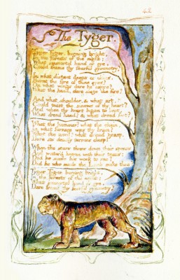 . . . . The Tyger
. . . .Tyger Tyger, burning bright.
. . . .In the forests of the night;
. . . .What immortal hand or eye
. . . .Could frame thy fearful symmetry?
. . . .In what distant deeps or skies.
. . . .Burnt the fire of thine eyes?
. . . .On what wings dare he aspire?
. . . .What the hand dare sieze the fire?
. . . .And what shoulder & what art,
. . . .Could twist the sinews of thy heart?
. . . .And when thy heart began to beat,
. . . .What dread hand? & what dread feet?
. . . .What the hammer? what the chain,
. . . .In what furnace was thy brain?
. . . .What the anvil? what dread grasp,
. . . .Dare its deadly terrors clasp?
. . . .When the stars threw down their spears
. . . .And water’d heaven with their tears;
. . . .Did he smile his work to see?
. . . .Did he who made the Lamb make thee?
. . . .Tyger Tyger, burning bright.
. . . .In the forests of the night;
. . . .What immortal hand or eye
. . . .Could frame thy fearful symmetry?
Daily post 15 May 2007 02:41 pm
Leo
 Leo The Late Bloomer was adapted from the book by Robert Kraus and Jose Aruego. It was the first co-production between Weston Woods and Pat Sajac‘s company. More attention was given to the work since there were now more eyes watching and commenting on things. A lot of hands were in the broth, but it worked out surprisingly well. Mary Beth Hurt narrated it.
Ernest gave me a score that was the height of my hopes. Its delicate South American rhythms made the film. It was a bit of a complicated film. The story was very delicate yet had a lot of repetition. One didn’t want to call attention to that repetition, and yet the film had to keep that drive – always moving forward. Keep the kids into the story; it needed music that would have that hook.
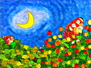 Here are four cues that give you an indication of how Ernest pulled it off.
-This is the main theme of the film. It establishes Leo’s problem: he’s a slow learner:——–Leo’s theme
- Dad worries about Leo and follows his every move:—Dad’s theme
- When the Spring comes, Leo starts to get it. He begins to keep up with the others:———–Spring
- This is the end of the film, including final credits:—–Leo Bloom’s mix
Commentary &Photos 13 May 2007 08:09 am
Up On the Rooftops
I’ve always had something of a fascination with the rooftops in New York. There are lots of pipes and chimneys, and other paraphernalia on tar paper covered roofs. My curiosity should have pulled me off my bum to do a bit of research and find out what those bits & pieces and unidentifiable objects are.
For this reason, I often look up while walking down the street. I decided to photograph some of these things while out and about this past week. For better or worse here they are:
 a
a  b
b
Most buildings look like these three. There are the older buildings constructed in the early 20th Century (as in “a”) with a fancy ediface. They’ve been cleaned of any gargoyles or protrusions that might’ve once leaned off the face of the building – landlords didn’t want to be sued as these objects started to come loose and fall off.
 There are the sleeker, newer, less interesting buildings (as seen in “b” above) which are boring to the eye. The flat top in the foreground is not as attractive as the turreted red building in back of it.
My favorites are the smaller, more interesting buildings built (to the left) with odd pipes and chimneys peeping out.

In the not-too-distant past, rooftops were covered with TV antennae.
This has been replaced with satellite dishes. I’m not sure which is more attractive.
I know illustrators still enjoy putting an occasional antenna on a city rooftop
or even a pair of rabbit ears atop a television set.
After all, what says TV more than an antenna? A cable box?
 d
d  e
e
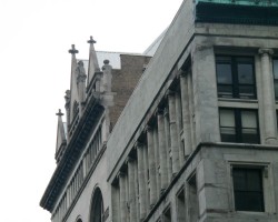
I only photographed the one building, but I found that many of the early 20th Century constructions had crosses on the top. These aren’t churches, either. Perhaps in an earlier time they had some connection to a Christian organization, but today they’re very commercial. However golden globes are definitely big on the tops of many of the buildings in the City.
 e
e  f
f
Many are under maintenance; many just stand out shining.
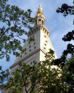 There are also those, such as the building on the left, which have a beautifully sculpted golden top that merely crowns the steeple of the building.
A lot of care went into these rooftop pieces that shone over a pre-neon city. This building, on 23rd Street and Madison Avenue, was at one time the governmental center of the city. It was a very rich area until the downtown low-lifes started encroaching, and the rich moved further uptown. The Mayor’s home, Gracie Mansion, is on 88th Street, the far East side of Manhattan.
Where does such a building keep its air conditioning equipment and water towers so prevalent on other buildings of the period? That might be asked of a lot of buildings, today, in this modern era.

Speaking of water towers, there are plenty of them. They cover the rooftops and range in sizes and shapes. Some look more industrial than others, and I’m not sure what purpose they serve.
Years ago I took my father to a show at Lincoln Center. He was an air conditioning engineer, and as we passed the large fountain in the square, he remarked that the water of the attractive fountain also served the air conditioning of the entire center. That bit of information has stuck with me for many years.
Do the water towers of the city also serve the air conditioning? Are they the remnant of an architectural solution of the past? The newer, less attractive buildings don’t seem to have these structures. I guess I have more homework to do.
 m
m  n
n
Plants, of course, proliferate on the City’s rooftops. Any way to add green to the tans and greys of Midtown is obviously optimistic.
 o
o 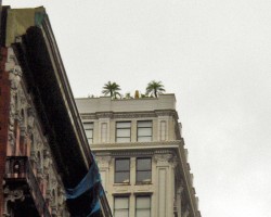 p
p
However, one isn’t always prepared for the variey of plants and trees one sees in the distant sky. Many fir trees abound, but obviously a homesick Californian would plant palm trees on his roof. (see “p”)
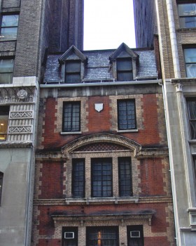 I couldn’t help but finish with one of my favorite little buildings in town.
It’s not so much the rooftop that’s interesting, here, but the building, itself.
You see the entire structure in this photo to the left.
.
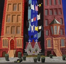
It sits on 28th Street squeezed between two larger buildings. In a way it reminds me of the “Little House” in the Disney film as designed by Mary Blair. I doubt laundry would ever have hung out of a midtown Manhattan window. They used to dry it on clotheslines on the rooftops (a bit I used in my film, The Red Shoes.)
One wonders what the story of this building can be told and what interesting landlord didn’t sell out to the money grubbers to the left and right of him. There’s a lotta history in this City.
Music &SpornFilms 12 May 2007 08:43 am
Ernest’s Tadpole
 – The Mysterious Tadpole was another of the films I’ve done for Weston Woods which was also scored by Ernest Troost.
In 1984 Doctor DeSoto was nominated for the Oscar. For a full year from the date of the announcement I was without work except for one job from Weston.
The Mysterious Tadpole had a budget which totaled about $15000. That was it for the year. So much for the glory. The budget was such that I had to do the entire film with help from only Bridget Thorne, who helped render the artwork and prepare it all for camera.
As a result, I got particularly close to this film. When it came time for the music, I had formed a lot of specific ideas. I’d thought about it a bit too much. This made the job for Ernest particularly difficult; I was going to be hard to please.
When the music arrived it sounded completely different from what I’d expected. This was in the days before synthesized music, so the only way I’d heard it played was on a piano. It was a complete surprise to hear those final tapes. The orchestration was not what I’d heard in my head, and I’m afraid my disappointment was obvious.
 After spending a bit of time placing the music into the film with Paul Gagne, who was co-producing the film and editing it, I started to warm to the score. By the time I’d heard it in place and watched the film with its score two or three more times, I’d fallen in love with what Ernest had done. My ideas were so simple, and he had done something complex.
That was a lesson to learn. When you’re working with someone whose talent you respect, trust that person. So often when hearing music for my films or when hearing an actor reading the script, I’ve had a surprise jolt getting something completely unanticipated. I have to say 90% of the time I’ve immediately recognized it’s positive. That other 10% of the time it’s often just an attitude adjustment I’ve had to make.
That’s not to say that there aren’t those times when I know it doesn’t work as well as it might have, but that doesn’t happen too often if I’m working with people whose talent I respect.
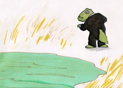 – Continuing to look at a couple of Sesame Street spots Ernest Troost scored for me, my favorite, by far, is Crocodile Smiles. This was done in 1981. Edith Zornow was the producer of animation at Sesame Street, and I saw her as my guardian angel. (I’ve said that before.) She always seemed to show up just when things seemed bleakest. The first three spots I did for her included this film and it really sold me on Ernest’s work.
I wanted opera, and he gave me more – cartoon opera. It really feels like this group would be playing in some 30′s cartoon. Again, the budgets for Sesame Street was always low. These two films had about $5000 total for everything from script/board to completion.
This film is available on YouTube, but I don’t like the resolution of that copy, so I’ve put it up here as a QT movie.
The Stranger was done a couple of years later. This is from one of the last films we did for Edith Zornow. She died soon after of Parkinson’s Disease. Since my father was also suffering from the disease at the same time, I was comfortable with it, though she seemed obviously uncomfortable. It didn’t stop her from going on right to the end.
Animation Artifacts &Story & Storyboards 11 May 2007 08:21 am
More Wizard Inspiration
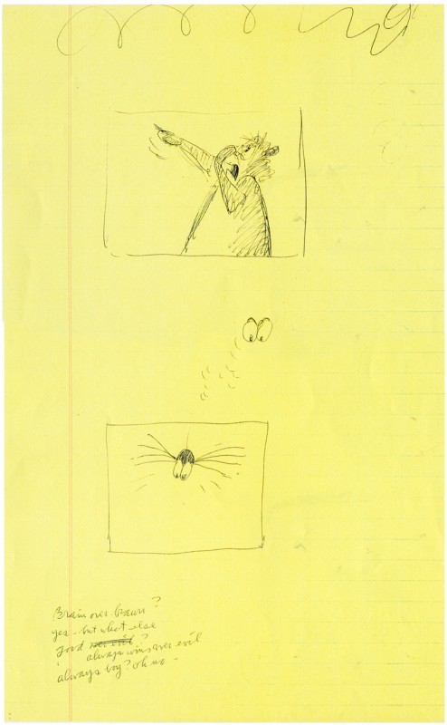
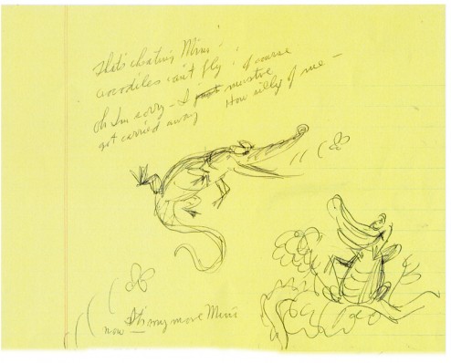
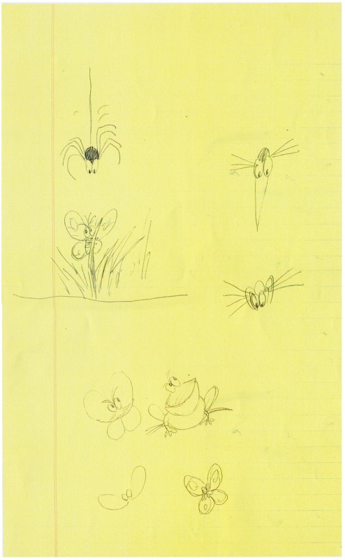
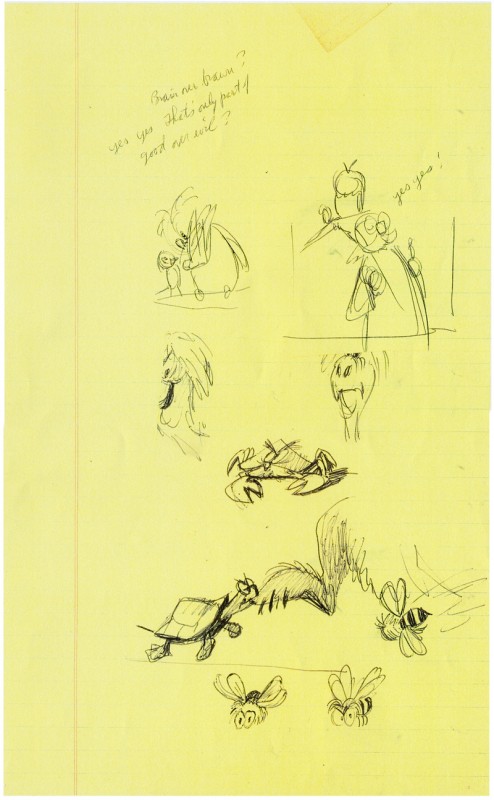
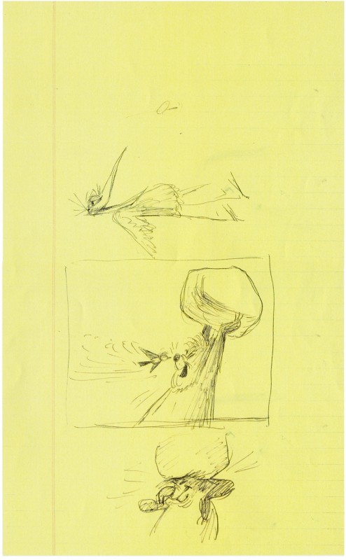
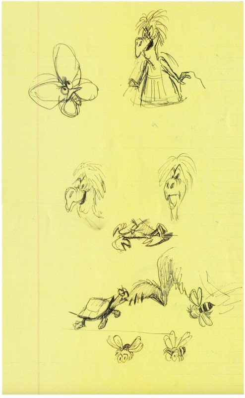
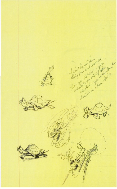
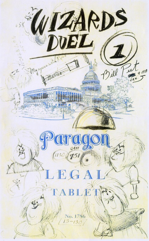 – Yesterday, I posted the first of some drawings that Bill Peet did in developing the “Wizard’s Duel” for the 1963 Disney feature, The Sword In The Stone. This section of the film, which was supervised by Milt Kahl, was considered one of the highlights of the feature. Kahl took pride in his work on “Mim;” he had good reason to do so.
Today, I’m posting the final part of this sketchbook.
I love how Peet drew all over the cover (to the left) making his notes and sketches, finally labelling the cover page. I think this is something we can all associate with, and it helps to make the art less “Art” and more working drawings to give the final film the life it has.
If I were more energetic, I’d put together a “Mosaic” a la Mark Mayerson‘s excellent handiwork. However, I do not have the drafts for the sequence, so it’d just be a frame-grab show-and-tell. Perhaps, another day.
(Click any image to enlarge.)
