Monthly ArchiveMay 2007
Daily post 31 May 2007 07:47 am
Ugly Maypo
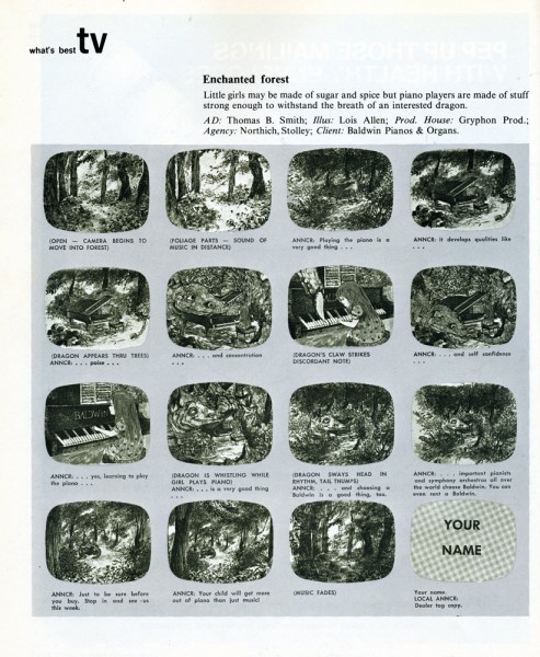
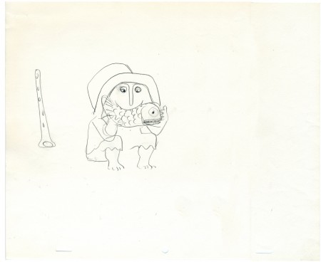
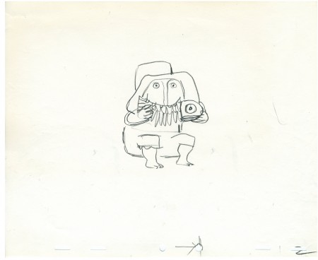
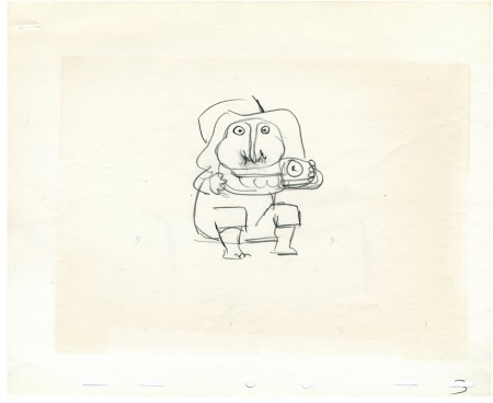
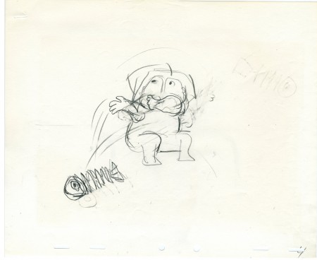
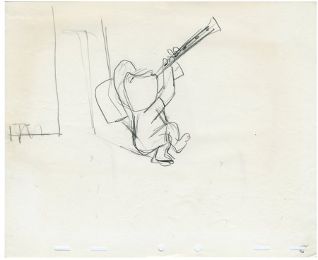
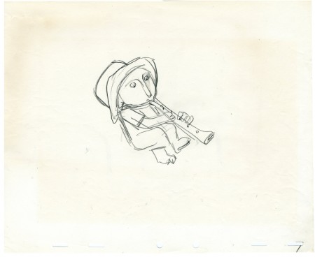
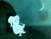
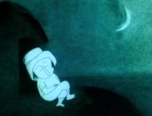
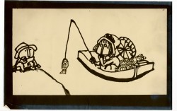
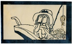
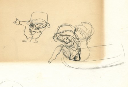
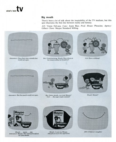
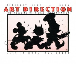 – I was thumbing through an old issue of Art Direction Magazine (Feb, 1972 issue) when I came upon a breakdown for a Maypo commercial.
By the time of this piece, the Hubleys had stopped doing the commercials for the product. The original agency, W.B.Doner, no longer represented the cereal, and I wonder if that’s why the Hubleys were on the outs.
I know from later years that Faith adamantly fought to keep their names off commercial connections and production. John was a bit more open minded and used me to do his last couple of commercials – again for the same agency, W.B. Doner.
By the way I like the magazine’s cover illustration by Art Director, Frank Mell.
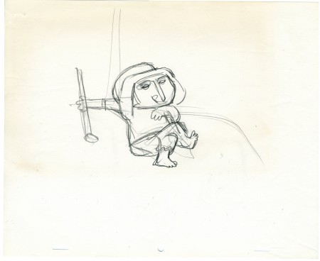
Here’s the revised and ugly Maypo:
(Click any image on the page to enlarge.)
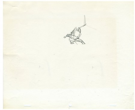
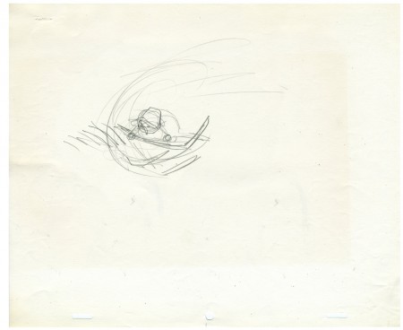
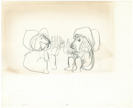
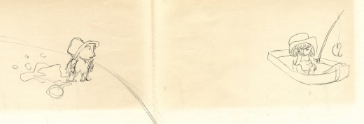
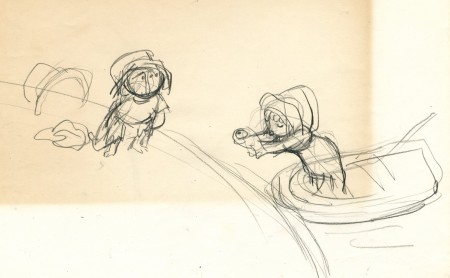
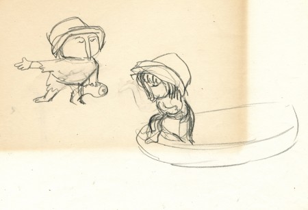
The following was another commercial broken down in the same issue. I may as well put it up for lark’s sake. I don’t remember the spot, but I do remember the Ugly Maypo, above.
You can catch some of the good Hubley Maypo spots on YouTube.
Commentary &Daily post 30 May 2007 09:39 am
Kudos and Dodos
 – As I mentioned on Monday, Marjane Satrapi and co-director Vincent Paronnaud is to be congratulated for their film, Persepolis having won the Jury Prize at the Cannes Film Festival. However, the film seems to be on a real hate list in Iran. An advisor to Iran’s President was furious over the prize saying that the movie promoted “Islamophobia.”
Mehdi Kalhor, a cultural adviser to President Mahmoud Ahmadinejad said, “Islamophobia in Western drama started in France and producing and highlighting the anti-Iranian film Persepolis in Cannes falls in line with this Islamophobia.”
Iranian authorities had already protested to France over the Cannes screening of the film co-directed by Satrapi, who insisted that her comic-memoir was about family and not politically oriented. Reacting to the complaint from Iran, France’s Foreign Ministry Tuesday defended the Cannes Film Festival’s decision to screen a movie that paints a bleak portrait of life after the Iranian revolution.
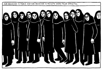 “Iranian authorities must understand that France is very attached to freedom of expression and freedom of creation,” French Foreign Ministry spokesman Jean-Baptiste Mattei said in Paris. “The festival chose the film … It was nothing to do with politics.”
Marjane Satrapi, on stage to receive her award, Sunday, said: “I’ll speak for both directors. We want to express our thanks Gilles Jacob and Thierry Frémaux for having selected our film. We thank the Jury for having awarded the Prize to us. We thank the whole crew of ninety people who worked with us for two years. Personally, although this film is universal, I wish to dedicate the prize to all Iranians.”
The story made yesterday’s NYTimes and today’s Variety.
The film will open in the US this coming November.
Boy, say one thing to criticise John Krisfalusi and you may as well have offended the Iranian government. I think Stephen Worth may have finished his doctoral thesis on my website for all the fury I aroused in him.
 In defending, UPA on Saturday against the barbs of John Krisfalusi and his ignoble
stance against these masterful films, I began to wonder if appreciation of these films was purely generational.
Was the generation before me, who had made these films, and mine, who appreciate them, wrong?
Was my enjoyment of many of these shorts a sign of my growing obsolescence.
N a h !
I know better. Just because there are still a lot of Picasso-haters out there, modern art isn’t wrong. Those who dislike Picasso are wrong.
Of course, UPA, like Picasso, produced a lot of swill. It was expected that any studio that wants to keep rolling has to make a lot of commmercial trash, and I think somewhere around 1953 UPA lost it, and their cartoons became mawkish.
However, even the worst of these UPA films is still interesting to me, just as I still enjoy many Terrytoons or Paramount films. I’m not going to rant about either, though.
However I do recognize the classics, and I give them their due diligence.
The mass of vehement comments wasn’t completely surprising to me. I’d once stepped in the goo of John K. before and found my mailbox full. Thank goodness I don’t live in LA or I might have had death threats. (Just joking.)
Interesting that John, who I think is a very shy guy (I don’t know him), stays behind his theories at his blog. I’ll keep checking in there, but promise not to fill up his comment box with long winded rants. I’ll use my own blog for that.
By the way, John has a good report today on the interesting interviews conducted this past weekend in Chicago. John interviewed Bill Plympton one night and Bill interviewed John the next night. Amusing.
Books &Puppet Animation &Trnka 29 May 2007 08:05 am
3D Puppet Book Corner
I’ve written about a lot of books on 2D animation, but I also love 3D puppet animation and have a small collection of books on the subject.
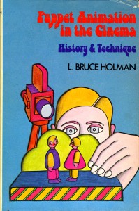 – Bruce L. Holman’s book, Puppet Animation in the Cinema: History and Technique was originally published in 1975 and can only be located today in old book bins (meaning Amazon or ebay). It’s a real primer on the medium, and when it was published was the only one of its kind.
The book does exactly what its title says, it gives a history of the form and tells how the films are made. There are photos of a lot of European puppetmakers and stills from their films. I think David Allen is the only important American who makes it into the book. But then, at the time, that’s pretty much what the landscape described. Loving Jiri Trnka, as I do, I was quite pleased to see quite a bit of space devoted to him, and, of course, that’s as it should have been at the time.
The book stood on its own for quite some time, and those of us who love puppet films loved this book.
_____________
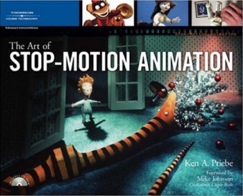 – Another book that you CAN get your hands on is Ken Priebe‘s The Art of Stop-Motion Animation. It brings things more current clearly explaining how puppet films are made, how to construct puppets of your own and how to make films of these puppets. There’s also a chapter on the history of the medium.
It’s a real nuts-and-bolts book that gives a clear demonstration of the process and a commendable how-to approach.
It’s obvious that Priebe loves puppetry and invests that love in the writing. This is a good book for anyone thinking of trying the medium and/or making a living of it.
_____________
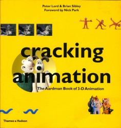 – Because the market for this medium is slim, there are a number of excellent books about the medium which exist to promote filmmakers. One such book is Cracking Animation by Peter Lord and Brian Sibley; it’s the story of Aardman and the making of their 3D animation. It’s amazing how many animation books Sibley has been connected to.
The book goes into nice depth in illustrating the history of 3D animation and moves from there to show how the Aardman puppet films are made. Nice illustrations show all of the phases with lots of stills of armatures, walk cycles, sets and animators. It’s a solid book with a lot of information. I believe later editions of the book have been updated to feature more recent films.
Of course, it’s Aardman-centric, but that’s not such a bad thing.
_____________
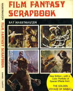 – Another book that puts its focus on one individual is this Film Fantasy Scrapbook by Ray Harryhausen.
Of course, Harryhausen is the “auteur” who created all those stop motion monsters and sci-fantasy films. (Anyone who has seen Jason and the Argonauts can only remember those incredible fighting skeletons.) This book is literally a scrapbook of stills and posters and illustrations showing off Harryhausen’s career up to 1972, when the book was published.
It’s all in B&W and one wishes there were more back stage imagery as you see in the Aardman book. It’s really more of a “fanzine” type book, but if you’re at all a Harryhausen fan, you’d love owning the book.
Harryhausen has written a number of other books about his film work. I don’t own any, but The Art of Ray Harryhausen looks like it might be good. Unfortunately I was never a wildly enthusiastic fan of this type of special effects animation, so I haven’t gone wild over his books. The only reason I include this book here is that you can’t mention 3D animation without referencing Harryhausen.
_____________
- Finally, let me showcase the book The Corpse Bride: An Invitation to the Wedding by 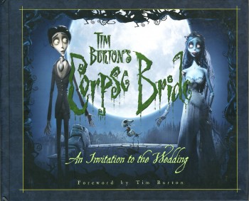 Mark Salisbury.
This is an out-and-out promotional book for the film. However, it really gives a state-of-the-art demo to show how studio puppet films are made. The book includes lots of backstage photos which go into detail about how certain scenes were created. This is a variant on the excellent book done to promote The Nightmare Before Christmas.
We’re shown how some scenes combined 3D puppets with 3D cgi (a technique all puppet animation films include these days.) The details of the odd digital photography are explained fully and illustrated in detail.
Considering the obvious devotion Tim Burton seems to have for 3D puppet animation, it’s worth watching closely. Having made Vincent, Nightmare Before Christmas, The Corpse Bride and, now in production, 9 Burton has become one of the most important advocates of the medium.
Daily post 28 May 2007 08:41 am
Redcat Screening
 – Congratulations to Marjane Satrapi and co-director Vincent Parranaud for winning the Jury Prize at the Cannes Film Festival for their film Persepolis. Read more about it here.
The stop motion film, Madame Tutli-Putli, by Chris Lavis and Maciek Szczerbowski won the Petit Rail d’Or as Best Short. Congratulations to them as well.
- We have a program of our films screening this coming week in Los Angeles.
The Redcat International Children’s Film Festival will present a program of our films on June 3, 9, 16, and 23.
Included in this program will be four of my favorites:
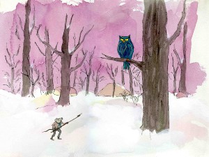 Dr. Desoto (1984)
The Red Shoes (1990)
Abel’s Island (1988)
The Man Who Walked Between . . . . the Towers (2005)
The program will screen in the Walt Disney Concert Hall.
It’s 70 mins. long and the admission is just $5.
I suggest you look into the overall program to see what other excellent children’s films are screening.
- There are a couple of items on line that I wanted to point out. For animation readers there are the usual reg’lars:
- Michael Barrier has a stunning studio photograph of Harry Reichenbach on display. His timing couldn’t have been more perfect. I’ve been reading and rereading The Animated Man, Barrier’s biography of Disney, slowly – very slowly. He gives enormous detail to a lot of the key shorts and the workings behind them. We get detail such as the invention of the storyboard or the first use of moving holds as a matter of course. No fanfare is called to this information – information that doesn’t really appear elsewhere. It’s an enormous book which I can’t recommend too highly to anyone interested in animation and/or Disney.
Anyway, Reichenbach was the Press Agent running the Colony Theater which first 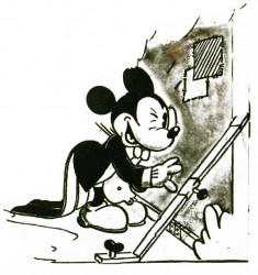 screened Steamboat Willie for Disney and allowed the film to reap its success.
I had just devoured this section when the photo appeared on line, and I appreciated the timing.
Back in 1978, for the 50th Anniversary of Mickey’s first appearance, the Disney studio arranged a screening of Mickey in Steamboat Willie. It took place in that very same Colony Theater (which is now called the Broadway Theater, across the street from David Letterman’s theater) for all the geeks of the world who wanted to celebrate the date. I remember it clearly – of course, I was there to celebrate the event.
Barrier also has an extremely interesting essay on his site about the flypaper sequence Norm Ferguson animated in Playful Pluto.
- - Mark Mayerson continues two important threads:
Pinocchio Part 10 has just gone up, and it’s a beauty. Forget the information these “Mosaics” relay; just look at the beauty of the images. It’s stunning. I almost wish Mark would take his time completing this survey of the Disney’s most stunning film; I want to treaure it for a long time, and the longer it takes to post, the longer I’ll have to look forward to it. Mark’s thoughts, of course, are the real treasure.
Mark is posting his thesis on animation acting in parts. It’s tremendously interesting reading, and a book in the making. Animators should always be thinking about this subject, and I’m not sure anyone has ever been more eloquent about it.
- Cartoon on Film, Tom Stathes’ site which gives a lot of attention to silent film animation (something which has always interested me), has an interesting post about some older silent film collections that were available on 8mm and 16mm.
For those just looking for something non-animation related but entertaining to read:
- - Annulla at Blather from Brooklyn offfers a couple of great posts.
She gives a great account of visiting two television shows from an audience’s pov. The View and Montel Williams couldn’t be more different, and the differences couldn’t be more interesting. I caught myself smiling throughout this read. It comes complete with photos.
Then there’s the post of the pony rides offered to a bunch of rich kids on the Upper East Side on Manhattan. It’s amazing!
Animation &Commentary 27 May 2007 08:21 am
Aaargh!
- I tend to stay away from John Krisfalusi‘s site because I often come away angry. John is one of the most knowledgeable, articulate and intelligent animation writers out there. His “course” in animation, built on the back of the Preston Blair primer, is priceless. I’ve followed that myself knowing full well that I still have a lot to learn about the medium.
However, John likes to taunt the world beyond his little box of fans and followers.
As promoted by Stephen Worth‘s AHAA blog (the link that led me to  John K), a recent post had John espousing the positive “creative freedom” in 1940′s studios such as Terrytoons and Walter Lantz.
. . . . S p i t. . t a k e !. . (WHAT!!!)
As if that weren’t enough, he then posts UPA’s Unicorn In The Garden and calls it: “depressing downbeat dreary, creatively stifled drizzle.” I repeat, he’s just compared the UPA classic negatively to Terrytoons and Walter Lantz’ cartoons. (A better place, I think, to look for “dreary drizzle”.)(Dick Lundy’s creative freedom!)
. .
In later postings, atop a rough sketch from UPA he writes: “If it’s bland and sterile, it’s design.” Or he says “… and the other UPA guys decided to abandon animation, fun and lush movement and instead focus on ‘design’.” Then he praises Bill Tytla’s insipid animation and direction at Terrytoons in an ugly little short that has its own immature charm – but little else praiseworthy. There’s no lush movement or fun anywhere to be found in that short. There’s only a boxed-in, brillliant artist, Tytla, unable to work at the top of his game.
Of course all this derisive goading prompts his sycophantic fans to comment of Unicorn In The Garden:
“It’s painful to look at.”
“Upa did destroy the cartoon world.”
“… it was just a big “fuck you” to the audience.”
“Even with the better examples, there’s no denying that most of their flat designs are quite ugly. UPA sorta made it okay to do ugly animation.”
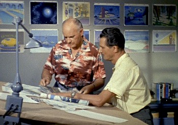 The problem is that John Krisfalusi knows full well how important the UPA break was to animation.
He knows that unless a group of artists broke from the 19th Century style of illustration animation would have remained a world of cute kittens and fairies, princesses and witches. History exists and we have to look at all of the influences to understand why it changed as it did.
(Beware: designers exercising creative freedom at the Lantz studio.).
Without UPA, 101 Dalmatians, Heavy Traffic, and Ward Kimball’s late success wouldn’t have existed. Without UPA, Maurice Noble’s brilliant work for Chuck Jones, Ralph Bakshi’s classic early films or Ren and Stimpy wouldn’t have existed. There had to be a break with the past – design wise – to enable other talents to take it to another level.
Milt Gross‘ style was squeezed at pre-UPA MGM, and good as his shorts were, they don’t equal the insanity of his strips. Today that can be done thanks to UPA.
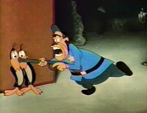 John goes into some detail about the art of Jim Tyer (but doesn’t really say why his work is great.)
Mind you I think Jim Tyer was brilliantly well ahead of his time, and I’ve studied his work endlessly.
I also recognize that his animation was a GRAPHIC (read: DESIGN) distortion of his characters to pull out any inner spirit. You feel as though his pencil rushed to get out these drawings. The result is endlessly hilarious, but it also works in a larger, more subconscious way.
(Jim Tyer, free from Paul Terry’s low budgets.). . . . . .
Without the graphic changes brought about by UPA, Tyer’s work would not have been accepted by even the cheap producers at Terry’s or Famous. Tyer was endlessly put down by the animators around him at those studios, but he continued to do what he did.
Johnny Gent told me, “Jim could never hold a character.” Two of Terry’s best known assistants told me that he “couldn’t stay on model.” Thank god Bakshi appreciated Tyer’s work. Baksi also appreciated Hubley’s work. He stole from him in putting together his first feature.
Artists like Jules Engel, Bill Hurtz and Paul Julian; animators like Bobe Cannon, Grim Natwick and Art Babbitt had real creative freedom at UPA, and changed the world of animation for the better.
You don’t have to like The Yellow Submarine to recognize that it was a breakthrough, and you don’t have to like UPA’s films to recognize that it was a breakthrough. You don’t have to attack one of the great animation shorts, Rooty Toot Toot, to make your point. Especially when you’re aware of the brilliant animation and design – yes, design – in that film. It all comes together perfectly.
My gosh! Isn’t it time to have to stop defending Picasso as an artist. Michelangelo was great, but so was Pablo in his own way.
You do have to be honest, John K. You want to make a point, and you go so far over the edge thinking it’ll help your case, but it doesn’t. You’re speaking to new generations of animators, and perhaps they don’t fully understand or appreciate the history as you do. Take smaller steps in your criticism, please. And keep writing but don’t think you have to incite the world to get your point across. It’s just annoying and dishonest.
Daily post 26 May 2007 08:23 am
Cannes & PosterArt
Two animated films are among the shorts in competition at Cannes. These are:
 Spegelbarn (Looking Glass) is from Sweden/Finland/Denmark.
Swedish filmmaker, Erik Rosenlund is the Director/producer/animator
The synopsis reads: A dark stormy night. A little girl is home alone, but is she really?
The second film is
 Ark from Poland.
Grzegorz Jonkajtys is the Polish Director of the film.
Synopsis: An unknown virus has destroyed almost the entire human population. Oblivious to the true nature of the disease, the only remaining survivors escape to the sea. In great ships, they set off in search of uninhabited land. So begins the exodus, led by one man. . .
Neither of these films is listed among those to be screened at Annecy.
The award ceremony at Cannes will be held tomorrow, Sunday.
Through Aug. 1, the Posteritati Movie Poster Gallery (239 Centre St.) lets New Yorkers escape into the past with a collection of art from fantasy films ranging from 1937′s “Snow White and the Seven Dwarfs” to modern-day favorites like “Raiders of the Lost Ark” and “The Incredibles.”
Gallery hours are Tuesday – Saturday, 11 a.m. to 7 p.m.; Sundays, noon to 6 p.m.
…. ….
….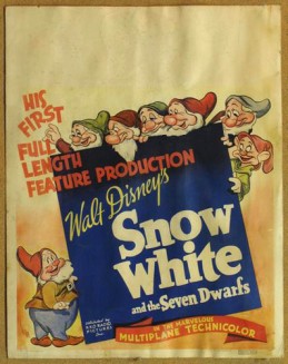
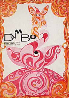
The 1960 Czech poster (above left) for Dumbo (1941) and the original US poster (above right) for Snow White (1937).
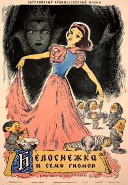
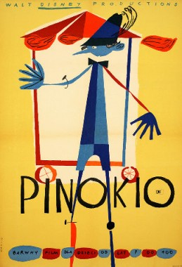
>A 1955 Russian poster (above left) for Disney’s ‘Snow White and the Seven Dwarfs’ (1937), the first animated feature released in the U.S. and a 1962 Polish poster (above right) for Disney’s ‘Pinocchio’ (1940).
Commentary 25 May 2007 08:35 am
Animated Hope
- I have to admit that there are finally a couple of animated features I’m interested in seeing. They sound adult, intelligent and thought provoking. No, I’m not talking about 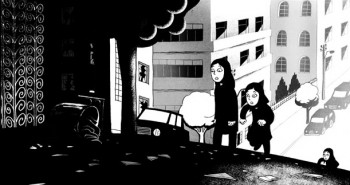 Surf’s Up with it’s tedious, jerky, completely unoriginal style of animation. I shouldn’t comment so negatively about a film I haven’t seen. But the point is I won’t see it; there’s nothing about this film that attracts my interest.
However, Persepolis has my hopes flying, and Paprika allows me to hope for the best.
Persepolis just opened at the Cannes Film Festival on Wednesday, and it will hit the US later this year. Read the opening paragraph from Lisa Nesselson‘s review in Variety:
- Any stragglers still unconvinced that animation can be an exciting medium for both adults and kids will run out of arguments in the face of “Persepolis.” Like the four-volume series of graphic novels on which it’s based, this autobiographical tour de force is completely accessible and art of a very high order. First-person tale of congenitally rebellious Marjane Satrapi, who was 8 years old when the Islamic Revolution transformed her native Teheran, boasts a bold lyricism spanning great joy and immense sorrow. In both concept and execution, hand-drawn toon is a winner.
 Sounds good enough to get me excited about animation again. It’s been a long time.
The film had already created a political stir when Iran, this week, officially protested the screening of the film at Cannes. This made for a very heated Q&A for Marjane Satrapi, the film’s creator and co-director, at Cannes. She refused to speak to the “irate Iranian journalists” and defended herself by saying, “I simply didn’t want to nourish this dispute. It has blown up out of proportion and I don’t want to add fuel to the fire. I accept criticism. I believe in freedom of expression and speech.” There’s a fuller article about this controversy at Bloomberg.
I’m a bit surprised that I didn’t read about this incident on any of the big animation news sites I visit.
See part of the press conference here.
See the trailer for the film here.
By the way, Marjane Satrapi wrote an Op Art/editorial for the NY Times in November, 2005. You can still read this on the Times’ site.
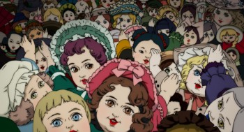 The Japanese film, Paprika, has an enticing trailer, and I’ve liked the two other films I’ve seen by the director, Satoshi Kon. Three Godfathers and Millennium Actress both were thoughtful and mature, and both were entertaining enough to make them more riveting than the average Anime. They both felt a bit too wedded to live action films for me to be completely satisfied with them, but they represented a clear voice whose work I want to follow.
The film’s reviews today are sterling. All of the New York papers glowed with praise. Here are a few quotes:
-
NY Daily News‘ Elizabeth Weitzman writes: Whatever it is you’re looking for – comedy, horror, parades of singing frogs and dancing kitchen appliances – you’ll find it in Satoshi Kon’s anime adventure, a jaw-dropping feat of imagination.
Manohla Dargis in the NY Times wrote: A mind-twisting, eye-tickling wonder, this anime from the Japanese director Satoshi Kon bears little relation to the greasy, sticky kid stuff that Hollywood churns out, those fatuous fables with wisecracking woodland creatures selling lessons in how to be a good child so you can grow up to be a good citizen. Model behavior isn’t on the menu in “Paprika,†and neither are dinky songs and visuals.
and Gene Seymour of Newsday & AP wrote: Whether viewed as science-fiction in the manic, shape-shifting tradition of Philip K. Dick or as a hyperbolic analogue to the movie industry, “Paprika” is like little else you regularly experience in animated or live-action movies. Those for whom the pictorial style of Japanese anime holds no charm won’t care about its densely layered narrative or about how clever it is with its cinematic references. The rest of us can once again wonder why so few animators in this country even try to take their art to such exotic extremes.
The story about manipulating wild dreams isn’t something I’m interested in, but I’ll take the leap for the sake of this director.
Perhaps someday I’ll be enthusiastic about the opening of an American film in the same way.
Shrek 3 was one I chose to pass, despite the invitation I’d received to a screening. (Shrek #1 was ugly albeit funny; #2 was uglier and not funny; I’ve wasted enough time on this franchise to see #3. Sorry.) They’ll make enough money off it – always a positive thing when an animated film is successful – even if I don’t want to see it.
The aforementioned Surf’s Up looks like a bad blend of Madagascar and Happy Feet.
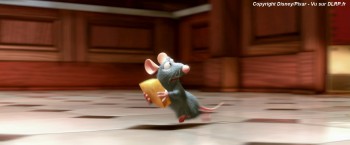 Ratatouille is probably the only one of the Hollywood films I’ll see in a theater. I do like Brad Bird‘s work. The Incredibles actually had a couple of fine acting performances that Bird had pulled from some animators. (I wish I could name the animators, but the system in cgi just doesn’t allow us to connect any hand, other than the director’s, to animated acting.) However, the nine minute clip I’ve seen from Ratatouille looks entertaining and obvious and completely impersonal in its construction. I won’t judge it, though, until I’ve seen the whole film. I do also have to say that it’s going to take some doing for me to sympathize with a rat as the lead character. (I am amused by a film, whose marketing feels compelled to tell you how to pronounce its title. That doesn’t read big box office to me.)
If you’d like to see the recipe for Ratatouille success, go here.
Animation Artifacts &Hubley &Tissa David 24 May 2007 08:20 am
More Demons
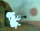
- Last Monday, May 21st, was John Hubley‘s birthday, so it seems appropriate to focus on one of his excellent films. Continuing yesterday’s posting of Tissa David artwork from Of Men and Demons, I have more of the layouts she did for this opening sequence of the film. As I mentioned, Art Babbitt did the opening scenes and Tissa then was hired to revise these scenes and go on from there.
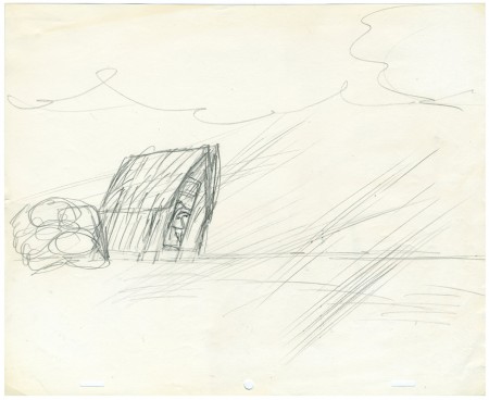
This is the BG Layout for the first scene with the farmer.
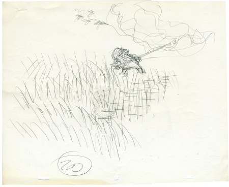
These character positions go with the opening scenes that Art Babbitt animated
and Tissa revised. These are Tissa’s drawings.
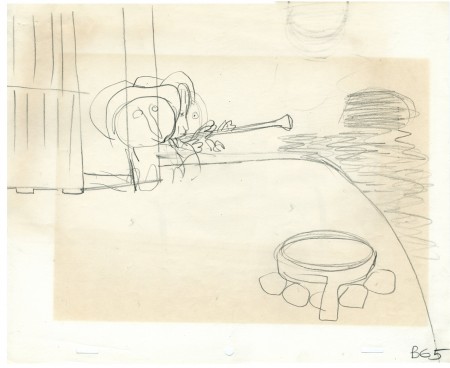
This is the BG Layout for the scenes Tissa started animating.
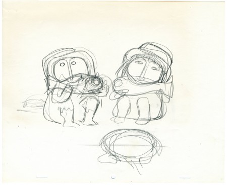
These two rough drawings indicate overall poses for the scene wherein
the two characters begin sharing their lives.
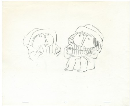
The drawing above and the following drawings represent the poses
Tissa prepared for her animation of the scene.
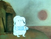
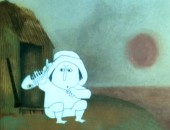
Finally, here are frame grabs from the scene
so you can see how it all came together:
Animation Artifacts &Hubley &Tissa David 23 May 2007 08:05 am
Of Men & Demons
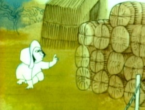 – Since first seeing the Hubley short, Of Men & Demons, back in 1967, I’ve been a fan. The artwork was stunningly different and original. It had a rich tone to it and some beautiful artwork. The music by Quincy Jones was as original as the film, itself.
The short was actually an industrial film done for IBM to explain the binary code to its employees. The Hubleys, however, built on that story to make something of a personal film that received an Oscar nomination.
(Click any image on the page to enlarge.)
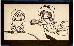
Art Babbitt was one of the first animators hired. At some point, Tissa David was brought on to rework some of Babbitt’s beautiful animation. Unfortunately, it was on about a fourteen levels and had to be combined and reconstructed and shortened. (Today, of course, there are no limits to levels, but in the days of the camera you kept things to 4 cel levels, as a rule, and never more than 5.) It was complicated by the fact that John Hubley had decised to shorten the piece, and Quincy Jones’ score was shorter than Babbitt’s animation. This chore took some effort and involved dissolve animation. Tissa then continued on the sequence animating the little protaganist and his female companion through the remainder of the film.
About 25 years ago, Tissa David gave me an envelope full of art from this film, and going through a lot of my old material recently, I came upon that envelope. I’m going to post a few of these drawings in the next day or two.
 3
3 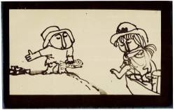 4
4
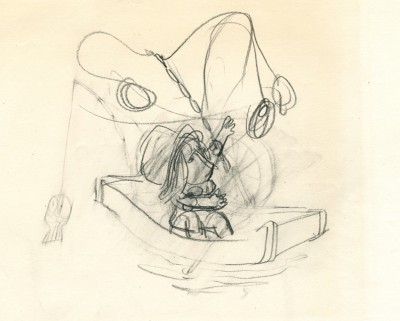
These are storyboard drawings for a short sequence. Tissa got these drawings and prepared LayOuts for the sequence. You can see how much is actually in John’s drawings so it’s easy to build on what he’s given you.
 1
1The following are key drawings Tissa prepared for the sequence in laying it out.
Animation Artifacts 22 May 2007 07:40 am
Hot Air Aces
- My Popeye posting yesterday remided me of a storyboard drawing I.Klein gave me that
I haven’t posted. It’s a nice drawing from a post-War short, and I thought it worth sharing.
I believe the drawing comes from Hot Air Aces (1949) and was directed by Izzy Sparber.
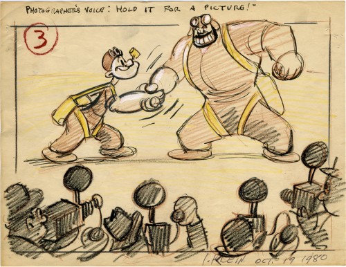
(Click image to enlarge.)
In today’s NY Times, there’s an article about the future of cinema and the inevitablitiy of 3D. Much is made of the recent announcement that Steven Spielberg and Peter Jackson would be making a realistic trilogy of 3D films starring Tin Tin. Motion Capture takes them into this realistic/cartoon world.
Unfortunately, real cinema is no longer real, and cartoon cinema is no longer cartoon.
