Monthly ArchiveApril 2007
Books &Mary Blair 10 Apr 2007 08:12 am
Animation History Books
 – In a letter from a friend, I was asked to recommend some animation books. That’s always a hard thing to do. Hard because I like things about books that aren’t necessarily things others like or are searching for. Hard because reading, to me, is such an individual preference that I know my likes aren’t going to please most others. And hard because so many books are written by friends whose work I admire – making me feel guilty (for no good reason) for recommending them – as if it were a bias on my part just because they’re friends. It’s particularly hard these days because there are so many good books coming out every day, and there are just too many books to point out. For that reason, I’m going to talk primarily about books I love – regardless of their availability.
Saying all that, I also have to say that I’ve been thinking about such a post (or two) for a while, and I didn’t need too much encouragement. I love books. My studio is overrun with them; my apartment is overrun with them. Bookshelves are overstuffed, floors have piles on top of piles. I spent many years as a child in libraries going through art, animation and illustration books, lusting after so many of them. When I grew old enough to afford any, I started buying. So these are some of the books I love.
My all time favorite animation books include two impossible to get
classics:
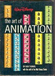 Bob Thomas‘ The Art of Animation. I’m only talking about the 1959 version, the one that promotes Sleeping Beauty, not the reworked versions they did for later features. I think I favor this book so much because it was the first big-deal animation book I ever owned (and read till the book just about fell apart.) The book gives a good overview of animation’s processes and methods and gives a sense of history to the subject. I learned so much from this book that I can’t properly evaluate it. I also may have read a lot inbetween the lines, but I got a lot out of it. Unfortunately, this book is out of print and is hard to find though I recently bought another copy of this book on ebay.
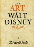 Robert Feild’s The Art of Walt Disney was an historical oddity that my local library had when I was young. It was published in the arly 40s and illustrates, in a somewhat formal way, the art of Disney’s early classic features. No artists are identified, no credit is given to anyone other than Disney.
However, the book was so much a part of my childhood that I cherished it and was so proud when I finally was able to afford a rare copy I found at a used book seller back in the 60s. Elelments of animation that didn’t appear in the Thomas book were here: real art direction roughs, real animation roughs. Oddly both books feature sections on storyboards that were eliminated. I love them both.
Now to books that are more readily available – especially on-line – that I relish more for the material within than the nostalgia factor. However, just as I was significantly influenced by the above two books, I suspect the following are affecting new generations of animators:
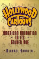 Mike Barrier‘s Hollywood Cartoons: American Animation in Its Golden Age is for animation fans as well as history buffs. Barrier is an articulate, knowledgeable, well-researched author who puts everything he has into his writing. He backs up his research with a monstrous collection of interviews with all the greats he writes about. His books aren’t big coffeetable tomes stuffed with great images; he writes about artists, animators and studios in a sophisticated way unearthing bits of history that add up to a sharp and dynamic picture of everyone or every film he focuses on.
In a year, when I was despondent over the state of animation – particularly the work going (or not going) through my studio, this book is the only thing that kept me inspired and hopeful about animation and its possibilities. But that’s a very personal thing, and I make no bones about it. I’ve reread this book sevaral times and will do again. There’s just so much in it. 
Michael Barrier has also just seen his new book, The Animated Man, A Life of Walt Disney, released. I won’t review it here since I’ve just started reading it, but I’m totally hooked only fifty pages into it. I didn’t like the recent biography by Neal Gabler (I couldn’t get through it), but this is totally engrossing. I’ve read Disney’s life story what seems a million times over, so I’m amazed at how captivated I am.
When I’ve finished reading I’ll have more to say about it, but don’t wait for me. If you like Disney, like accurate history, like animation and want a good read, buy it.
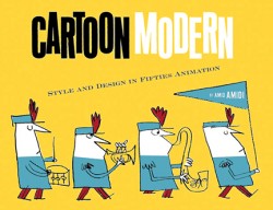 Amid Amidi has contributed a completely original title to the compendium of animation history with his book, Cartoon Modern: Style and Design in 1950s Animation. This is one of the finest art books with a focus on animation. It’s a treasure of glorious illustrations of hard to find films (never mind the actual artwork from the films) from the 50s and early 60s, with the analysis on the design in the films. Since these films were more about their design than their animation, this makes perfect sense. The organization within the book is a bit peculiar, but that’s expected given the numerous designers and studios involved. It’s become one of my treasures since its publication last year.
Animation inspires heavy duty coffee table books. John Canemaker is the king of beautiful books filled with excellent artwork telling the stories about the world of animation. John’s books are the closest to the classics I found as a child, the Thomas and Feild books, and I can only guess at how many kids were turned onto animation because of his writing.
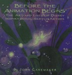 His Disney classics include: Walt Disney’s Nine Old Men (the story of the nine principal animators that Disney liked to focus on during the 50′s) and Paper Dreams: The Art and Artists of Disney Storyboards and The Art and Flair of Mary Blair (a focus on one specific Disney designer.) These are all filled with choice illustrations that are hard to find elsewhere (even on the internet) and lots of specific information that is informed and key to the history of Disney’s greatest films. My particular favorite among the books is relative to my specific interest in animation: design. The book, Before The Animation Begins, tells the story of Disney’s inspirational art directors and designers. It’s a beauty; well conceived, written, and designed.
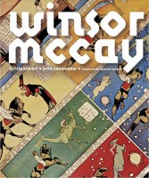 John Canemaker has non-Disney books as well. Two of them classic treasures among animation books. Winsor McCay : His Life and Art is the only significant book to put such a fine-tuned focus on animation’s first, great artist. There’s a wealth of material in this book with stunningly valuable illustrations. McCay deserved nothing less than the brilliance he put into his films, and Canemaker delivers.
In Felix: The Twisted Tale of the World’s Most Famous Cat John gives the proper attention to the brilliant cartoonist Otto Messmer who did the hard work of supervising and drawing Felix to stardom. This is animation’s first big star, and the book shows you why.
I’ll post some favorite non-history/historical books later this week.
Animation Artifacts &Story & Storyboards 09 Apr 2007 07:55 am
The Wind In The Willows
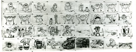
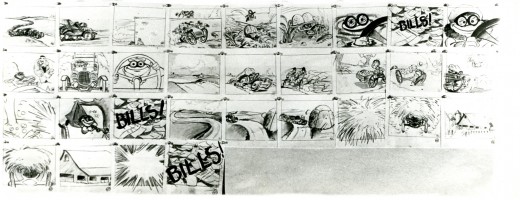
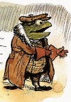 – Probably my favorite children’s book is The Wind In The Willows. There have been many animated adaptations of this book since it became a public domain item, but for years there was only one version, Disney’s Mr Toad half of The Adventures of Ichabod and Mr. Toad. The loudest most raucous parts of Kenneth Grahame’s delicate novel, blared their way onto this animated compilation feature.
We all know that the book was planned as a feature way back when Disney, in the late 30s, was buying up titles of famous children’s books to prevent other competing studios from turning them into animated features. Work began on adapting the book. 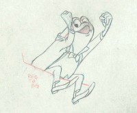 They never quite broke it as they hoped, and it ultimately became a featurette with its primary focus on the loose cannon, Mr. Toad.
. . . .The film, as it exists now, has some positive elements and some fun animation, but the story was always a bit too quiet and British to successfully survive a proper adaptation in the Disney canon.
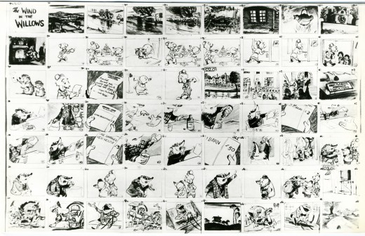
When John Canemaker loaned me his copy of the Pinocchio boards, he also brought The Wind In The Willows (not titled Mr. Toad). There are few captions here, but this obviously is designed for a full-out feature not an abbreviated featurette. The images on his original stats are small, so I’ve blown them up a bit and tried to marginally clean them up. It’ll take a little time to scan and post all 17 pages, but here we begin:
 1
1
(Click any image to enlarge.)
Disney’s Mr. Toad first aired on the Disneyland television program on February 2, 1955. You can buy the dvd of Ichabod and Mr. Toad on Amazon among other places.
If you’re interested you can read the entire book of Kenneth Grahame’s work (minus the beautiful Shepherd illustrations) here.
You can buy the book here.
Dave Unwin‘s version is my favorite adaptation in that it retains some of the flavor of the original book and isn’t afraid of being quiet at times.
Daily post 08 Apr 2007 07:46 am
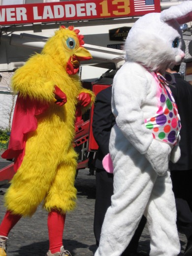
The Rabbit or the Egg?
to South Park.
I give them the award for
Best Easter Show.
* * * *
They took the time to find the link between Jesus and the Easter Rabbit and colored Easter eggs.
A very informative show.
Funny, too, but that was expected.
.
Daily post 07 Apr 2007 08:13 am
Canemaker & Plympton Events
John Canemaker sent me this information about some upcoming shows of his work:
John Canemaker
Monday, April 30, 6:15 pm
Sunday, May 6, 10:30 am
AMC Kips Bay Theater 14
570 Second Avenue (at 32nd St.)
Thursday, May 3, 11:59 pm
Tribeca Cinemas – Theater 2
54 Varick Street (Below Canal St., at Laight St.)
The Tribeca Film Festival’s continuing celebration of NYC-based independent animators features a program of the career work of John Canemaker, pre-eminent filmmaker, author, teacher and historian. Due to his longstanding, unflinching commitment to this particular moving image art form, Canemaker has been called “animation’s ambassador at large [who] has brought animation’s unsung heroes into the limelight, expanded the parameters of the medium, and inspired those who are embarking on careers in the industry.”
Films in the program include: Confessions of a Stardreamer; Bridgehampton; The Wizard’s Son; Bottom’s Dream; Otto Messmer and Felix the Cat; and the Academy Award-winning The Moon and the Son: An Imagined Conversation.
John Canemaker Art Work Exhibit
A display of hand-drawn, original animation art from John Canemaker’s Academy Award-winning film The Moon and the Son: An Imagined Conversation, will be on display from April 16 through May 23 in the Hewitt Gallery of Art at Marymount Manhattan College, located at 221 East 71st Street.
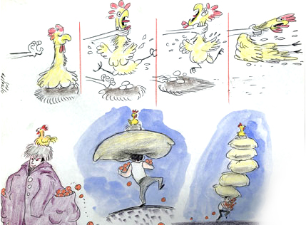
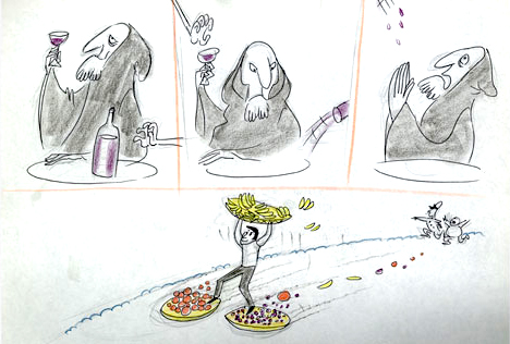
Next week we’ll have some more goodies to display from John’s collection of Disney material. The Wind In The Willows storyboards starting Monday.
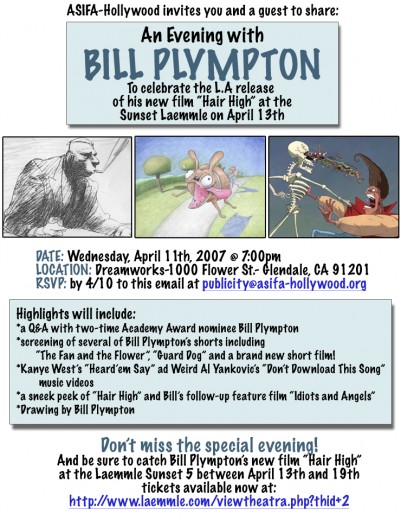
For the LA readers, ASIFA Hollywood is going to celebrate the work of Bill Plympton this coming Wednesday, April 11th. Check out the poster below:
Daily post 06 Apr 2007 07:48 am
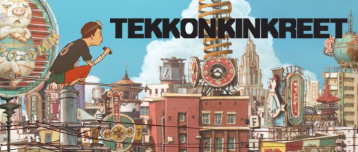
Tekkonkinkreet
- The Museum of Modern Art will premiere the screening of a new animated film that was directed by an American, Michael Arias (The Animatrix), designed by the Japanese artist, Shoujiro Nishimi(Steamboy), and adapted by an American, Anthony Weintraub, from a Japanese Manga by Taiyo Matsumoto. An Anime with lots of cross-cultural influences.
I saw an advance screening of the film today and was quite impressed with the graphics and animation. Its stylization reminded me of the work of Igor Kovalyov (Milch and Duckman). The characters all have wide spaced, small eyes, and their bodies are oddly shaped – not unlike Prince of Egypt. Small feet and long, oddly shaped legs. In other ways, I was reminded of Bill Plympton‘s characters.
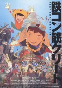 The animation is a combination of hand drawn 2D work combined with cgi art, made to look like 2D. The backgrounds were busy and dark with a look all-their-own. It was busy. Busy motion, busy backgrounds.
Unfortunately, the story was busy, too. It was adapted from a serialized Manga and felt like it. To be continued. Always fits and starts, climaxes coming and coming and coming. Don’t get me wrong, it was emotional, but that was too often the case, and you get to feel a sameness overall.
Perhaps, I’m the wrong person to give an opinion of this, because that could be the same review I’d give many an Anime. Akira filled that bill as did The Animatrix or Steamboy. It made for a very graphic and attractive film, scene for scene, but it didn’t build emotionally or feel like it was designed for a bigger feature.
Regardless, it was done for adults not children unlike every American animated feature done last year – other than Scanner Darkly.
I will say that it should be seen if you’re an animation fan.
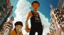 But you judge for yourself.
MOMA’s schedule is slated for a premiere on Wednesday, April 25th at 8:30pm. Director, Michael Arias will be in attendance to introduce the film.
Other screenings are: April 26 at 8:30pm, April 28 at 2:00pm, April 29 at 2:00pm, and April 30 at 8:30pm. Plenty of opportunity.
Animation &Commentary 05 Apr 2007 07:58 am
Tubby
- I was reading the 1957 Disney Studio Directory posted on Joe Campana‘s site, Animation – Who & Where. when I came upon the name of Howard Diettrich. This threw me back to 1973 and Tubby The Tuba.
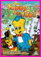 I’d just been layed off at the Hubley Studio, after completing the first 20 (of 60) episodes of Letterman. Officially, I had been categorized as an “inbetweener” in the Union. I’d done everything from animate to ink at Hubley’s, but that was my category. I received a call from Johnny Gentilella. We’d met through Hubley, and he was now working for NY Institute of Technology. They were in the early stages of production on their feature, Tubby The Tuba, and I was offered the job of Assistant Animator, a categorical promotion.
NYIT was the school I’d graduated from and received my BFA; it was located in Old Westbury, Long Island – about an hour’s drive from Manhattan. It’d be interesting, returning to my old school just to see how it had changed. By taking the Long Island Rail Road, I was able to cut down that ride by a few minutes and leave the driving to someone else. I was picked up at the station and driven to the animation building, a small cottage on the campus. Everyone was out to lunch except for Johnny Gent, and he drove me (about a couple hundred yards) to meet Sam Singer, the producer recently hired to do the film.
 Singer had done all those Courageous Cat cartoons that had infested children’s programming back in the late 60s/early 70s. Oddly, I enjoyed them; I always was a glutton for bad animation. Love those cel flares, shadows, scratches and cel edges.
I was directed to his office. In there was another producer (I’ll hold back his name) who had broken his ankle and was on crutches. I got to meet the two of them and listen to them kibbitz around me, virtually ignoring me for a few minutes. Singer was chewing on a cigar, and I couldn’t take my eyes off the spittle that seemed to be moving down the cigar in his mouth. When I finally left to return to the animation building, I saw that Singer was also on crutches. He had a clubbed foot.
I sort of remembered that meeting as an omen of things to come. The entire place, while I was there, felt like it was on crutches.
I liked Johnny Gent a lot; we got along well at Hubley’s; on Letterman I got to mangle quite a few scenes by him as I learned how to inbetween properly.
There were only about 8 others at NYIT at the time. Other people I met included Walt Kubiak, another assistant who I enjoyed talking to; animator, Chuck Harriton, who I’d met at Hubley’s (and never really was crazy about); Lou Marcus who was filming the work on an Oxberry. Lou had gone back in animation for many years and had plenty of stories to tell. (See Andrew Marcus’ comment below.)
The person I most associated with was the editor of the film, Phillip Schopper. He was a young guy who took the LIRR everyday from Brooklyn to Old Westbury. We’d meet daily on the train and laugh over the events of the days out there. I’ve stayed friends with Phillip, who has become a first-rate filmmaker; we rarely talk about those days at NYIT.
It was not a fun place to work. At the time, everyone chatted over their cubicle walls. I was in the front of the studio with full view of the front door. I was constantly getting notes from Chuck Harriton who persistently altered the models of the characters in ways that no one else was drawing. I was forced to work his scenes off-model. Johnny Gent always had a beautiful drawing style and made it easy for assistants to follow and inbetween. He and I spent most of our lunch hours alone together in the studio. We were able to have quite a few conversations; I loved that part.
Everyone seemed to back talk everyone else as they walked out the front door. I couldn’t help wondering what they said about me when I left. Too much swiping makes for an unpleasant working condition.
At one point, Sam Singer brought in a number of his people from California. I’d already been there about four weeks so was glad to see some new blood. Many of the few people were ex-Disney people, so there was a lot for me to learn. Nino Carbe, was a good example of this. He had done some incredible work at Disney’s on Fantasia and other films. He was an artistic force and a nice guy to meet.
Howard Diettrich was a virtuoso assistant who had worked on Sleeping Beauty. Unfortunately, he was an alcoholic who had a big problem. Sam Singer took him under his wing and had decided to cure him. Hypnotherapy came in, and Howard went through the mill for Singer. It made a soap opera of a story for all of us working there, and it was hard for me to watch.
I decided to leave. They wouldn’t allow me to quit without going to Alexander Schure. He was the President of the school – yes, NYIT was still predominantly a school – and he was financing the whole thing. His idea, ultimately, was to introduce computer animation to the world, and he invested heavily there. Some of the brilliant people who grew out of this department moved on to develop Lucas and Pixar.
So I went to Alexander Schure, and he argued with me for about 30 minutes. I told him that the travel time was too much. He didn’t accept that. He liked the fact that I was an art school grad from his school and was working there. He offered to have his son pick me up and drive me.
I knew that there was no solid directorial voice coming from the top, and the film could never be good. My artless tactic was to say as much. He told me that he was going to take over from Sam Singer, and he would be the voice of clarity. Now I knew I really had to get out. He finally surrendered, and I left. Happily.
I was back with Hubley within two weeks. Even better.
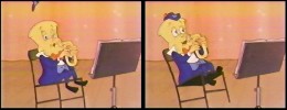 I didn’t get to see the film until I borrowed a vhs copy from Dante Barbetta, who eventually joined their staff to animate when it got significantly larger.
That was not a good film, as a matter of fact it was incredibly bad. I’m not sorry I left, though I would have enjoyed more time with Johnny Gent; it was the last time I worked with him. I also still wonder what happened to Howard Diettrich.
Note: Last year, John Celestri wrote about the later period in the making of this film on Mark Mayerson‘s site. Part I and Part 2.
Luzzati & Gianini 04 Apr 2007 08:18 am
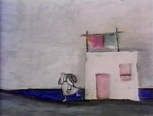
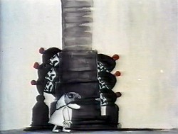
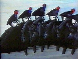
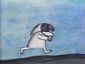
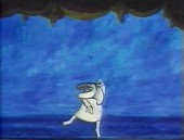
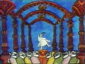
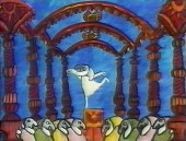
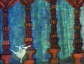
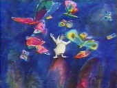
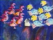
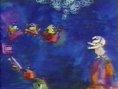
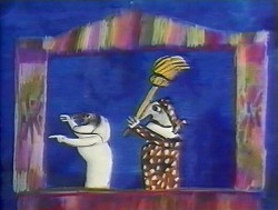
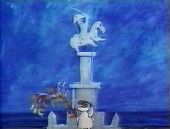
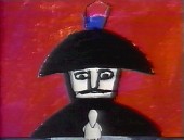
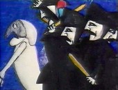
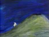
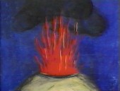
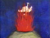
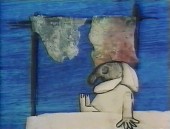
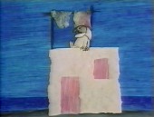
Pulcinella
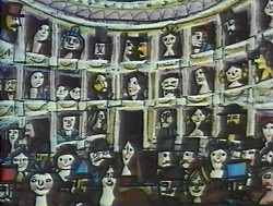
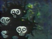
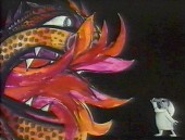
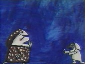
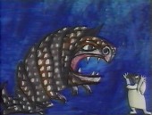
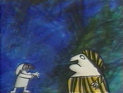
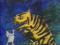
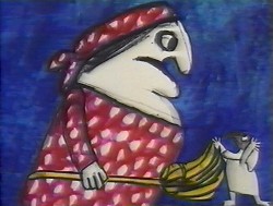
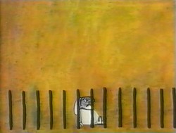
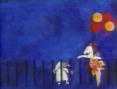
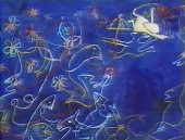
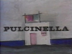 – I received a call from The Guardian in London. The newspaper was doing an obituary for Emanele Luzzati, and they couldn’t find any illustrations to color their report. They’d found some on my blog and wanted to know if they could use them.
(Go here to see all Luzzati/Gianini posts.)
Of course, I directed them to Luzzati‘s distributor who could give the clearances they needed.
But I found it all depressing.
This was one of the world’s greatest designers of Operas and Animation. His brilliant animated version of The Magic Flute is a feature that should be in theaters now. Unfortunately, it never made it to theaters (at least, not in the US), and his designs for the opera are equally as stunning.
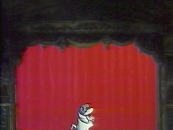
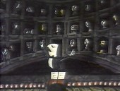
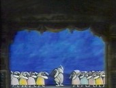
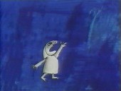
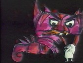
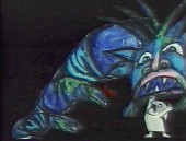
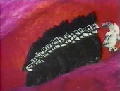
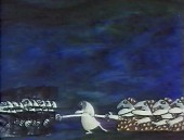
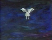
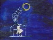
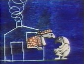
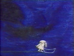
Years of amazing art he’s produced, and there’s so little – even on-line – that could be readily found for his obituary. I find it confusing. This was the original reason I had for putting so much attention on his work, and the call from the paper pushes me back to do another post. Unfortunately, all I have are frame grabs.
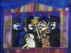
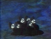
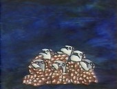
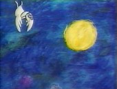
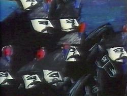
Here is Pulcinella. It is a short that was nominated for the Oscar in 1973. Another cut-out animated film, Frank Film by Frank and Caroline Mouris won the award. The Legend of John Henry by Sam Weiss, produced by Nick Busustow was also nominated.
Like other Luzzati/Gianini films, the score is taken from an opera overture, Rossini’s The Turk in Italy.
The animated film is an abbreviated, caricatured version of the opera. 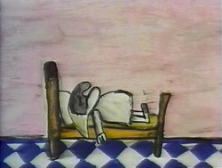
Pulcinella (Punch, as in Punch & Judy) is the principal character who dreams himself into a wild nightmare of a dream that leads us through an abstract world. It’s nice to see how the animators/designers play off the puppet character as well as the opera.
I’m just going to post the images without detailing the story. I like it better that way.
There are some 90 images, so it takes some attention to graphics.
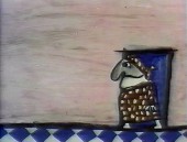
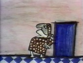
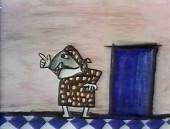
(Click any image on the page to enlarge.)
Art Art &Comic Art &Daily post 03 Apr 2007 08:46 am
MOMA movement
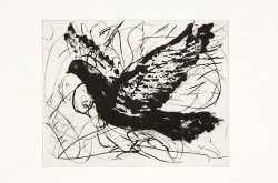 – The Museum of Modern Art has a big schedule of films and artwork upcoming:
On Tuesday, Apr 17, 2007 at 6:30 PM, they will host an “Artists Speak” session:
Conversations on Contemporary Art with Laurie Anderson and William Kentridge as host by MOMA’s Glenn D. Lowry.
Performance artist Laurie Anderson and William Kentridge – director and scene designer for BAM’s spring production of Mozart’s The Magic Flute – discuss how they bring their creative process to performance. 
To reserve tickets go here.
Kentridge‘s The Magic Flute will play at the Brooklyn Academy of Music for four performances beginning April 9th. Kentridge directed and designed it and has animated pieces in his signature style throughout the program.
To see a video trailer for the opera go here.
To buy tickets to the Opera go here.
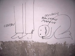 The Museum also has what it calls Projects 85. You can see Romanian artist Dan Perjovschi draw his “spontaneous” art on the walls of MOMA.
“For two weeks prior to the official opening, April 19, Perjovschi will draw on the wall during public hours, allowing visitors to observe the creation of the work.” This work will then be exhibited from May 2 thru August 27, 2007.
Of course, one of the earliest 20th Century quick-draw artists was Winsor McCay. He performed on Vaudeville stages with a large pad telling his stories which he illustrated live. Eventually, he added the animated backdrops of his cartoon characters.
Finally, regarding MOMA, I wanted to point out that they’re just starting a complete retrospective of the films of Rainier Werner Fassbinder. If you don’t know his films, you should. If you do know his films, you get to see them again in excellent projected format. Check the museum schedule for times.
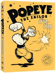
– Enough about art. Let’s talk Popeye. Warner Home Video has announced a July 31st date for the Popeye dvd: Popeye the Sailor – Volume 1: 1933-1938.
The package will include 60 cartoons plus 5 hours of bonus material: retrospectives such as “The Story of Popeye the Sailor Man” and “The History of the Fleischer Studios”. There are also “behind-the-toons” featurettes, bonus shorts, and commentary tracks by animation historians and other experts. Greg Ford directed one of the documentaries. He spoke on camera with every notable animator in New York. As one of those interviewed, I have particular reason to be interested in seeing the docs.
The Popeye shorts, themselves, will be uncut, unedited cartoons that are authorized and come from the original masters. The fact that it’s labeled volume 1, gives us good hope that other volumes will follow.
Of course, real Popeye aficionados will go back to E.C. Segar’s original strip. There’s another Popeye there that is beyond even the Fleischer shorts.
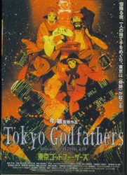 - While we wait for Satoshi Kon‘s most recent feature Paprika to open in theaters, (opens in NY May 25th/in LA June 1st) his last film Tokyo Godfathers was just released on dvd. His other features, Millenium Actress and Perfect Blue.
Tokyo Godfathers is another version of that John Ford classic, Three Godfathers. This same story was reworked to make Three Men and a Baby (both American and French versions) and Ice Age.
The John Ford version was a remake of the Richard Boleslawski film of the same title done in 1936. That original film, Three Godfathers, got a lot of reworking.
If you haven’t seen the trailer for Paprika watch it here.
(This is the box for the Japanese dvd.
I like it more than I do the US version.)
Animation Artifacts &Story & Storyboards 02 Apr 2007 07:41 am
Monstro Sneezes
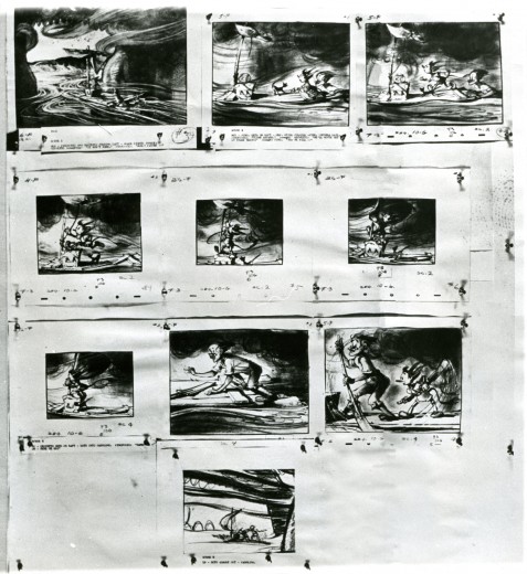
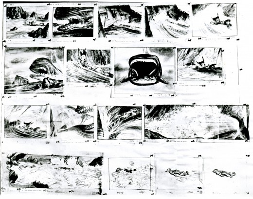
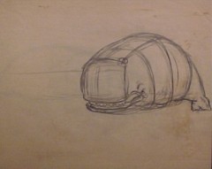 – These are the last of the pages of storyboard I have from Pinocchio. It’s the big climax: Pinocchio and Gepetto, on the raft within the belly of the beast, escape and make it to shore.
They’ve started a fire of their only safety within and are hoping it’s going to make Monstro open his mouth so that they can escape.
The drawings are all large scale images on five hole animation paper. They’re pinned to the board as opposed to the tape used in some of the earlier pages, and it feels a bit more of a working board than others of this series. However, I assume this is still for some kind of publication.
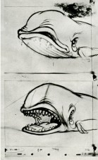
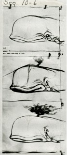 Of note is this first page of Monstro poses. It really details the action as Monstro works up a sneeze. These certainly look like animation drawings rather than storyboard. Note the perspective ruling for the front of the whale on the second and last image.
.
(Click any image to enlarge.)
 The Animation Guild Blog directs us to this article in The London Times which tells us the Aardman and Sony will soon be in business together. After the Dreamworks breakup, it was expected that Aardman would eventually find a new home, and it looks as though they’ve found one. The announcement is expected to be made official today, Monday, by Sony.
Extra note: SONY made it official. There was a formal announcement via Variety that said Aardman and Sony will work together, but they haven’t decided on the first film.
Jaime Weinman has directed us to the closing sequence to Variety Girl which features great caricatures of celebrities by T. Hee. This film also includes a wonderful puppetoon sequence by George Pal (not shown on YouTube.) A take off on Cinderella, it pretends to be a backstage view; it’s charming. I believe T. Hee had a hand in writing it.
Photos 01 Apr 2007 07:57 am
Christo takes NY
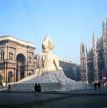 – Do you know who Christo and Jeanne-Claude are?
They are the artists who have made their reputation by covering sculptures, fountains, buildings and shorelines with drapes. Their silk has covered buildings all over Europe and the United States.
The work of the companions has evolved over the years so that they no longer seem to be covering things. Their “Gates” sculpture seemed to have taken New York by storm a couple of years ago. They set up hundreds of flag-like orange gates throughout Central Park, and everyone went. The park became a free and open exhibition.
However, though they may have abandoned covering buildings, I think the idea has caught on in New York City.
I’m here to present evidence that there are many a draped building in NY.
Art has overtaken the City.
(click any image to enlarge.)
I came to realize this while taking my daily walk from home to studio.
I walked past what is becoming my favorite building in the City – the Flatiron Building.

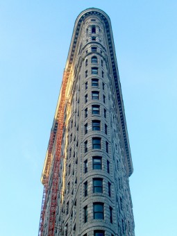
The building, from a bit of a distance, looks flat, but when you come right up on it you realize that it’s a triangular shaped building that angles off as it reaches the cross streets of Broadway/5th Ave and 23rd Street.

As you look down the building, coming to its base, you notice the scaffold.
Scaffolds are everywhere in the City. They’re built to allow building owners to repair, clean or alter the edifice of their building. This way if anything falls off the buildings they won’t be sued.
(I remember a friend who had just bought a cherry-red sports car. His first drive into Manhattan, he parked in front of my old alma-mater, NY Institute of Technology. Their ornate building had an Egyptian-esque decor. When the friend returned to his car, there was a gargoyle looking up from his trunk. It had fallen off the building, smashed through the trunk and smiled up through the bright red metal.)

These scaffolds are everywhere. Across 5th Ave from the Flatiron Building, Bank America is covered in wood and steel.
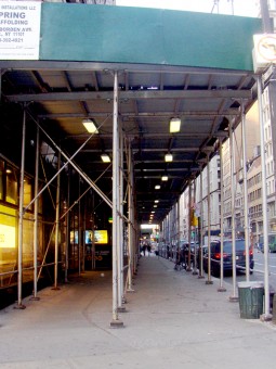

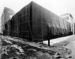
To the casual pedestrian, these coverings can protect you from rain, but they also block out the sun. However, it isn’t just the scaffolding. As you look up from the scaffolding, you’ll see that the building has been wrapped – Ã la Christo.


The scaffolds are a mesh of piping. They contain infrequent openings to get in and out of the structures, and they often block up pedestrian traffic.
Stores have to create new signs for themselves so that people can locate the stores buried under the scaffolds.
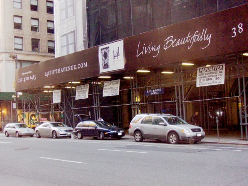
Naturally, this makes for some wacky signage that seems incongruous with the new ediface over the building’s ediface.
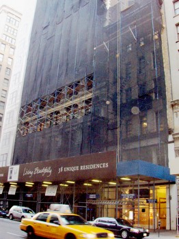
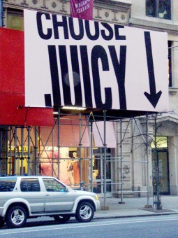
Nothing seems “Juicy” anymore, It’s more like “cagey.”


The wraps come in different colors, designed to beautify the ugly buildings underneath, no doubt. Here’s a blue cover.

Some scaffolds have to be long to cover the extremely wide sidewalks at some points. However, since this building isn’t very wide, the wide scaffold is narrow from the front.
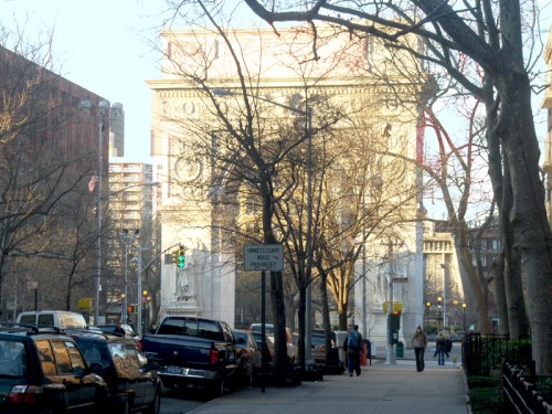
The monument in Washington Square Park was covered in mesh last summer as workers cleaned it. (I don’t have a photo of that, but here’s what it looks without the wrap.)


A block away from my studio is the little but attractive Italian church, Our Lady of Pompeii. They have been wrapped for the past few months. It’s not a high water mark for the church.
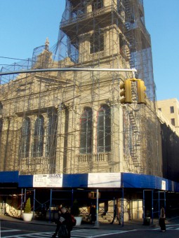

However, better for them to be covered than MY building. I get shivers just thinking about that idea.
With all these impersonators, it’s no wonder that Christo and Jeanne-Claude have moved from “wrapping” buildings to “gates.”
By the way, all of the images in this post (up to the Washington Square monument & Our Lady of Pompeii Church) were taken between 23rd and 19th Street on fancy Fifth Avenue. However, this is indicative of the City as a whole, not just that area.

