Monthly ArchiveMarch 2007
Articles on Animation &Commentary 31 Mar 2007 08:23 am
New Guys and Old
Meet The Robinsons opened yesterday to largely negative reviews in NYC. The NYTimes critic, A.O.Scott, started his review with these two paragraphs:
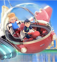 At the end of “Meet the Robinsons,†a new 3-D computer-animated Disney film (loosely based on a popular children’s book by William Joyce), the screen is filled with an inspiring quotation from Walt Disney himself. The gist of it is that “around here†— meaning at Disney’s entertainment workshop — not a lot of time is spent looking backward. Instead, the motto is, as it is for some of the characters in the film, “Keep moving forward.â€
In other words, learn from your mistakes. And it seems appropriate that this great man’s words appear at the end of this movie, since they implicitly invite you to forget what you have just seen and may even serve as a sort of apology. Whether or not it counts as a mistake — movies tend to be made on purpose — “Meet the Robinsons†is surely one of the worst theatrically released animated features issued under the Disney label in quite some time.
Most of the reviewers I’ve read came to the same conclusion about that bit of text at the end of the film. I wonder if anyone out there knows the story as to why the decision was made to place this quote at the tail of the movie. If you do, I’d appreciate hearing it.
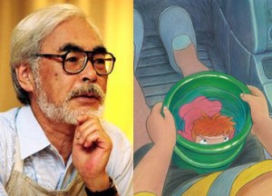 – Of course, there’s nothing like an old master to bring us back to the basics.
News was revealed this last week that Miyazaki is at work on his next feature film, Ponyo On a Cliff. This is the story of a five year old boy, Soskue, and the goldfish princess, Ponyo. The film is set for a Summer 2008 release in Japan. Miyazaki is doing the storyboard with watercolors and pastels. I wouldn’t mind if they released the animatic version of his films. His storyboards are the heart of the movies. A Variety article had this to report:
- Instead of incorporating ever more CG cuts into 2-D animation, as Studio Ghibli has done in recent pics, Miyazaki intends to make “Ponyo” with a pastel watercolor, hand-painted look.
Miyazaki will “go back to his origins and use not any CG,” Studio Ghibli prexy Toshio Suzuki told reporters at Monday’s press conference announcing the toon. “Instead he will use simple, childlike drawings. He intends to make something different from his previous films.”
Daniel Thomas MacInnes, naturally, posts one of the best pieces about this film on his site, Conversations on Ghibli.
Not far from the same subject, there’s an interesting post at AniPages Daily. It places the focus squarely on the female animators working at Ghibli. It’s nice to see some bios of these lesser known Japanese animators, and I thank Ben Ettinger for the post.
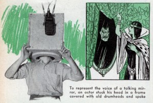 - Just in case you missed it, Cory Doctorow brought to the attention of Boing Boing an article in Popular Mechanix on the making of Snow White. It’s worth a look; some of the graphics are beautiful. the article is five pages long.
The illustrations for the article (e.g. the one on the left) seem to use early production art. There isn’t much resembling the final film, despite the magazine’s 1938 publication date.
- A couple of sites have appeared on my horizon that I’d like to point out to you:
Mike Matei has a site, Classic Animation, which features a lot of animated shorts of the YouTube style. However, many of them are hard to see Van Buren films. It’s good to see a lot of the B&W Tom and Jerry cartoons (the Mutt & Jeff impersonators not the cat and mouse). It’s a good way to spend some time if you have it.
I found this site through Tom Stathes‘ Cartoons on Film blog. This site pays a lot of attention to the silent and early sound cartoons. Many of them can be bought on dvd through there.
A post about the two Amos and Andy animated shorts brought Mike Matei to comment with posted versions of both shorts. I last saw these in silent 8mm versions I’d owned (I bought them for $.99 way back when), so it was interesting seeing them again.
Commentary 30 Mar 2007 08:03 am
tup tup
- Infrequently, there are cartoons which sometimes make a difference as to how you see a particular character, or studio, or sometimes even the world. One of these I recently thought of was Tup Tup by Nedeljko Dragic in 1972. It was nominated for the Oscar and lost to Richard Williams’ Christmas Carol.
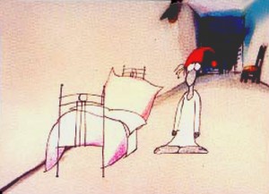 I had seen a lot of films from Zagreb and had heard a lot about how great they were. They were even Oscar winners for Ersatz in 1962. Yet, I wasn’t a fan. I didn’t understand the acclaim the films were getting, yet kept it to myself. It was obvious that I was the alone in my opinion, and it confused me.
So along comes Dragic‘s film, Tup Tup. At first the film was annoying, but then it got under my skin and stayed with me. The cartoon had an insidious insanity which overwhelmed and haunted me.
I started looking at Zagreb shorts a little differently, but, I’m sad to say, my opinion didn’t change much. Many of the films just seemed like a new-found freedom in an iron curtain country, but it didn’t make the films great to me. I was a very big fan of UPA and Hubley at the time, and Zagreb didn’t come close.
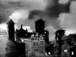
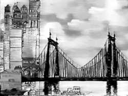
(Some frame grabs from The Four Poster. Go here to see some great stills of artwork.)
I’d even heard about the effect The Four Poster had had on the Zagreb founders. Apparently, when this live action/animation feature made it to Yugoslavia, they hijacked the print and studied it for two weeks prior to returning it. Their admiration for Hubley‘s work in the Stanley Kramer produced feature film caused them to develop their own studio and style. A new animation studio was born. By the time I’d seen Tup Tup, I’d already seen The Four Poster on television (in the early sixties) and knew everyting about Hubley. Nothing I’d seen from Zagreb even compared to what I’d seen from UPA, never mind Hubley. It was all so cold and unemotional, to me, although it did try for some blaring stylization.
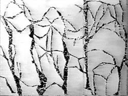
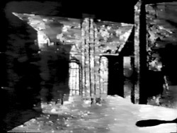
(More frame grabs from a bad dvd copy of The Four Poster.)
But there was Tup Tup. it stayed with me. The style of the film didn’t overwhelm the story, and I was into it.
To be honest, there were other films by Mr. Dragic that I found just as compelling. Diary is another excellent film which is literally an animated diary of his animation festival going. It’s not as persistent as Tup Tup, but it’s as gripping. I think ultimately, it’s a matter of the artist rather than the studio, and I suppose the same is true of any grouping of artists. The National Film Board has produced an inordinate number of brilliant films, but there are a few clunkers in there. The same is, I guess, true of Zagreb; I’ve only seen a couple dozen of their films, so I wouldn’t make a blanket statement.
Actually, the low budget films they produced, in retrospect, however small, are significantly better than 99% of what’s produced today. The difference is an intelligence behind the films. That’s conspicuously missing from most of the shorts we see today. Americans are generally trying to make stupidly funny shorts and aren’t concerned with articulating any statement about life or society. It’s sad, really. I wonder that I can make such negative comments about a studio like Zagreb when we’re living through such a fallow period.
There are a couple of dvds available of Zagreb films, but far too few. I don’t think Tup Tup is among those on dvd; at least I haven’t found it.
Tup Tup
1972 10min.,
Script, Director, Drawings, Animation, Backgrounds: Nedeljko Dragic
Music: Tomica Simovic
Animation Artifacts &Story & Storyboards 29 Mar 2007 08:00 am
More Monstro
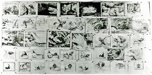
- The next section of the storyboard I have available to post, shows Gepetto in the belly of the whale and his reunion with Pinocchio.
Unfortunately, here, the type is almost illegible on the originals. I’ve tried to goose it a bit in Photoshop, but I don’t think I had much success, unless I want to destroy the images.
There are actually three pages here. Two worked lateral to each other, so I’ve attached them so that you can view it more easily. Boards I’ve marked 5b and 5c are longer than the past boards (and look smaller as thumbnails.) I hope they don’t take too long for you to enlarge and download.
 5a
5a
(Click on any image to enlarge.)
Thanks, again, to John Canemaker for lending the boards to me for posting; thanks to Borge Ring for giving them to John, and Dave Hand for giving them to Borge.
Articles on Animation &Daily post 28 Mar 2007 08:12 am
Super Mouse
I guess the big news today comes from a report in Variety that Chris Sanders who left (or was ousted) at Disney, a couple of months ago, has arrived at Dreamworks to direct “Crood Awakenings.” (You can’t invent a title like that, can you?) It’s a caveman story that was being developed with Aardman in mind – before Aardman broke with Dreamworks.
It’s all too incestuous. He’s directed one solid movie but makes the lead on the front page of Variety. Slow story day.
Let’s hope a good film develops out of it, but the title doesn’t give me a lot of hope. Check out the Reuters headline: “Lilo” director shooting “Crood” cartoon.
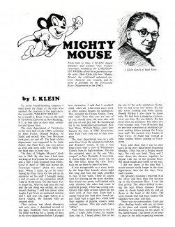
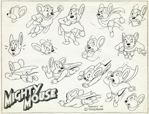 – Here’s an I. Klein article published in the Dec. 73 issue of Cartoonist Profiles. Ostensibly, it tells how Izzy klein created Mighty Mouse without getting credit for it. However, more pertinent and interesting to me, and the reason I’m posting it, is that the article details how the Terry story team worked. (Not together, is the answer to that one.) It’s a wonder that their stories are so good.
Without the bangup sound effects their films just wouldn’t have been as good.
 1
1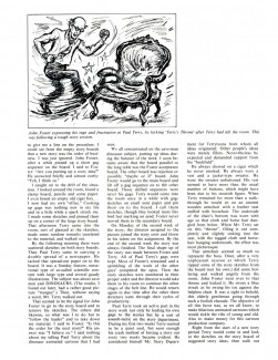 2
2
(Click any image to enlarge.)
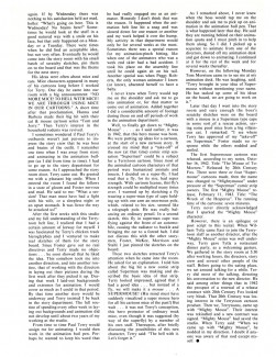 I find it interesting that this story by Klein details how he created a super bug which Terry pushed to become a super mouse. It obviously took Terry a bit of time to mull the idea over before putting it into action.
Of course, the way Klein tells it there seems to be no doubt that he came up with the core idea, but he had no hand in developing it – even beyond its origin as a bug. He says that in this article.
Yet, if you look anywhere on the interenet, it’s Klein that gets all credit for the creation of Mighty Mouse. We talked once before about sloppy and slippery history appearing on the internet, and this seems to be another good case of it. Klein was a true talent whose work I respected enormously and who, as a person, was very genial and warm.
I also take on face value this story he tells. To be honest, I don’t much care who created Mighty Mouse (though I loved that character as a kid and still have a fondness for the shorts), but I find the heart of this article by Klein to be about the workings of the Terry story department, such that it was. It’s an interesting article that has a lot more than meets-the-eye within it.
To continue this theme to a more modern era, check out today’s ASIFA Hollywood Animation Blog. Stephen Worth has posted a Yogi Bear storyboard by Warren Foster, the former Warner Bros. story writer.
Commentary &Daily post &Mary Blair 27 Mar 2007 07:54 am
Song of the South links, etc.
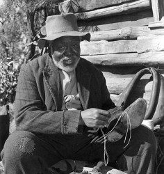 – USA Today has an article about Song of the South and the difficulties they seem to be having in releasing a dvd of the film. Isn’t it a little pathetic that the Disney execs have to squirm this much over the release of this film? Yes, we appreciate the political-correctness scares them, but is this film any worse than Gone With the Wind?
Isn’t it time the Disney folk gave James Baskett his due? He was the first African-American male to be given an Oscar (albeit a special award; he wasn’t put in competition). Baskett and Ethel Waters (who won Best Supporting Actress for Pinky that year) didn’t sit among the other stars, but were placed to the rear during the ceremony. Isn’t that the same thing Disney is doing, now using their fear of political correctness?
To this day his is still probably the best performance by an actor working with animated characters. There were significantly more restrictions on the actors then than there were at the time of Roger Rabbit, or anything more current (and controlled by computer aids.) It was all in his acting. The focus in his eyes tells you this man sees those characters, and they became real for us. Check out the Zip-A-Dee-Doo-Dah segment and look at his eyes. It’s outstanding.
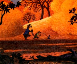 Read the Drafts for the film’s animation on Michael Barrier‘s site.
See some Mary Blair paintings done for this film on Amid Amidi‘s Cartoon Modern.
There’s a highly stylized Nash auto ad from the ’50′s on YouTube (in case you haven’t seen it) starring the three main characters from Song of the South.
Watch the Zip-A-Dee-Doo-Dah segment courtesy of Thad Komorowski.
The Asifa-Hollywood Animation Archive has some nice illustrations by Al Dempster and Bill Justice for a Little Golden Book version of the film.
 – Tom Sito had a nice little note on his blog today:
1952-U.P.A.’s cartoon Rooty-Toot-Toot premiered. Its music score was by jazzman Phil Moore, the first African American to receive a screen credit for scoring a movie.
Congratulations to SVA school grad, Dony Permedi for having won YouTube’s first ever award for the “Most Adorable” piece on the internet. His Kiwi was a Master’s thesis at SVA and has received over 6.5 million hits on the site. If you haven’t seen the Maya created video, check it out.
Stop Mo Expo – On Sunday, April 21st ASIFA Hollywood is presenting a day of celebration of 3D puppet animation. There will be all day seminars and conferences (from 9am to 5pm), as well as a number of screenings (from 6pm to 10pm). Filmmakers represented include: Will Vinton, the Chiodo brothers, Mark Caballero, Corky Quackenbush, and Seamus Walsh among others.
It will take place at Woodbury University, 7500 Glenoaks Blvd. Burbank, CA.
Vintage ToonCast is an entertaining site that includes a lot of public domain animated shorts such as Mel-O-Toons, Fleischer Superman,k Betty Boop and Popeye shorts, Daffy and the Dinosaur, A is for Atom (the John Sutherland film not the Disney “Our Friend the Atom”) and a lot more.
Animation Artifacts &Story & Storyboards 26 Mar 2007 08:46 am
MONSTRO
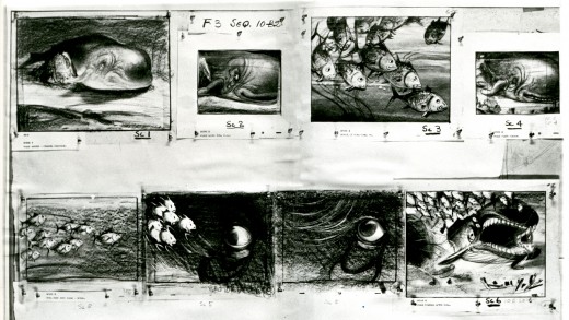
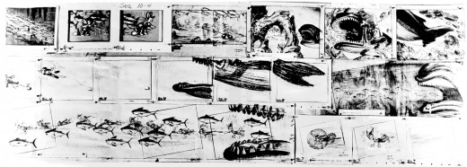
- The pieces of the Pinocchio storyboard I’ve been presenting are missing whole chunks of the film. We jump to the underwater scene where Monstro wakes up.
 4a
4a
 4b
4b
(Click any image to enlarge.)
 5a
5a
 5b
5b
Unlike the earlier posted segments, these are pinned to the board, and the drawings are done on the large animation paper used at Disney in the late 30′s. Each image would be about 12½ x 15½ on five hole paper. That’s a big board.
Just a reminder. Mark Mayerson continues to do a bangup job of posting his “Mosaic” of the entire film of Pinocchio, based on Hans Perk‘s posted Drafts. Mark’s comments are at least as valuable as the “Mosaics”. Visit his site if you haven’t yet and love Pinocchio.
Daily post &Photos 25 Mar 2007 10:00 am
Another Photo Sunday
- So let’s talk about something boring. What I do everyday is walk to and from work. That’s about a two mile stretch from 30th Street on the East side of NY to the West Village. (And back.) Everytime I walk it I see a lot of the same things, but those things are always varied and interesting.
I see a lot of taxis. Taxis used to come in two forms:
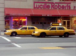

the normal kind of everyday-looking-car type; and the Checker Cab.
 These cabs were vehicles that could seat six people comfortably, or if there were just one or two of you, it left a lot of leg room. Somehow even the look of the bubbled Checker Cab was pleasant, and it was specific to NYC.
However, for some reason a couple of years back, the wise NYC officials decided to outlaw the Checker Cab. I suppose it was time for them (in their minds) to modernize the look of the NYC taxicab. So an institution left our city streets and was replaced by these:
This is all an attempt to turn New York City into the largest suburban shopping mall in the world. It’s working.
 However, there is something else that is specific to New York (and probably Los Angeles).
Everyday – I mean it every single day – I come upon a block (always a different one on that two mile walk) that is “coned off,” meaning you’re not allowed to park there. Sometimes they even block off access to pedestrians. This can only mean one thing:
They’re shooting a movie.

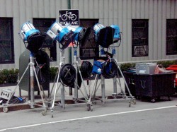
There are always signs telling you what film or commercial they’re shooting and there are always bits of movie paraphernalia being set up.

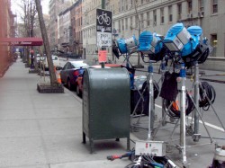
Usually it stretches around a couple of blocks as guys unload trucks of equipment.
.
 This is New York, so you expect to see a lot of signage. I don’t mind that; I’ve always found it entertaining.
As a matter of fact, I’ve sometimes played a game (with myself) incorporating words in my sightline into conversations I’m having with people. I try to get away without their knowing it. As you may imagine this annoys some of those who know what nonsense I’m up to.
However, on their own, signs are interesting. They reveal a bit about the person who created them.


Many are unwittingly entertaining, others are tittering jokes.


Still others are just downright intellectually amusing. The book store, of course, pulls me in every time (it’s a great shop for remaindered books). Eisenberg’s Sandwiches makes me smile. Without my presence would Heisenberg’s Principle even exist?


As I get through Washington Square Park, my walk starts winding down. I’m getting closer to my studio.
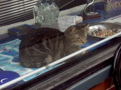

Oh look, the storefront gypsy palmreader above me has gotten a cat. He’s a couple of years old. He reminds me a bit of Alex, my new boy, who’s almost a year old.
Enough with the photos; I’m at the studio. Oh, yeah, all of the pictures enlarge by clicking them.
Comic Art &Festivals &SpornFilms &T.Hachtman 24 Mar 2007 08:19 am
Hamburgers
 – Having finished a bunch of work for Between The Lions, the PBS show out of WGBH (a greater client can’t be found), we’ve met with a quiet period.
To keep busy we’ve started production on a short segment of the Gertrude’s Follies storyboard feature done years ago.
To see the history of this project go here and here.
What this has done is forced me to push cartoonist Tom Hachtman back to work on the strip. I need some new dialogue written between Gertrude and Alice, and I’d like him to do the backgrounds (only a couple are needed.) He’s a great watercolorist and airbrush artist – the real thing, not computer.
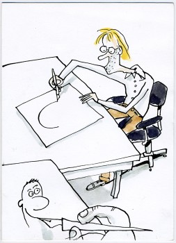 Of course, I prefer the watercolor painting, but I’ll take whatever he’d like to do. It’s his strip and his characters; that’s his decision.
Anyway, I got this card (to the left) from Tom. It thanks me for getting him back to Gertrude. (It’s my treat; the characters are so much fun drawing.)
Matthew Clinton has finished his first draft of animating the piece that’s about 2 minutes in length. Paul Carrillo has already edited up a hilarious first cut soundtrack of effects and music. All we need is the finishing parts.
It’s funny. That’s what counts.
I’m reluctant to post the strip it’s based on
(I don’t want to give up the joke, though it really doesn’t matter). It’s about Pabs eating his first hamburger – just in case any of you have seen it. (I just had a flash thinking how horrible this would have looked if we’d done it in Flash. Sends a chill through me.)
(Click images to enlarge.)
I just received in the mail a copy of the program from the Seattle Children’s Film Festival that was held in January of this year. They’d done a two program retrospective of some of our films. It was a kick having someone ask for the program; it was fun knowing that our films stay alive.
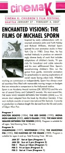 The program was enough of a success that the curator of that festival has just sent an email sayng that she is curating . . .
- “. . . the second annual REDCAT International Children’s Film Festival at REDCAT (Roy and Edna Disney Calarts Theatre) in Los Angeles. The festival will be comprised of a selection of the best of Cinema K: Children’s Film Festival Seattle and additional new programs.
I would like to include one of the retrospective programs we showed at Northwest Film Forum: Dr. DeSoto, The Red Shoes, Abel’s Island, and The Man Who Walked Between the Towers.”
Of course, this will be an honor, so our program will be presented at that festival in June. When I have the dates, I’ll pass them along.
All these retrospectives popping up! (There was one in Philadelphia recently, another in North Carolina, and a very big one which will be in NYC this Fall – we’ll talk about it when it gets closer.) I’m starting to feel old, but I’m loving it. (The Seattle program
from last January.)
Animation Artifacts &Story & Storyboards 23 Mar 2007 08:11 am
Pinocchio Rides
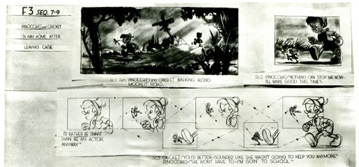
- Well, we’re going to skip a couple of sequences for the next storyboard segment I have available from Pinocchio. The first is the Lobster Inn where we meet the coachman as he conspires with Foulfellow the Fox and Gideon the cat. They plot on kidnapping little children for a coach ride to Pleasure Island.
The boards seem to be missing all of Stromboli and Pleasure Island. I’ll post what I have.
Again, I’m splitting these boards in two laterally for the largest size resolution.
Thanks, once more, to John Canemaker; Borge Ring for giving them to John, and Dave Hand for giving them to Borge.
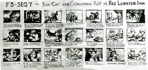 1a
1a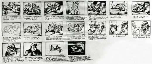 1b There’s a nice flow to some of this page and some decent reaction shots which we hadn’t seen in any other of this board.
 2a
2a 2b
2b
This page seems a bit different than others. The images are a bit more detailed and are spread out. I’m still not sure what purpose these boards served. Interesting that the images are taped and not pinned up. They’re obviously storyboard images regathered for some purpose, possibly a publication.
MONSTRO on Monday.
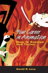
ASIFA-East President, David Levy, will be on radio today. The show NON FICTION is hosted by Harry Allen. Tune into WBAI-NY / 99.5 FM at 2:05 PM. The segment is scheduled to last 20 minutes.
Listen on line here.
Commentary 22 Mar 2007 08:40 am
Nuts
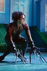 – Last night I got to see Edward Scissorhands, the Mathew Bourne ballet at the Brooklyn Academy of Music. (Watch BAM’s video montage here.)
I like Bourne’s choreography; it seems to fit somewhere between Jerome Robbins and Mark Morris.
Caroline Thompson, who wrote the script for the original film, reworked the story for the ballet. (She also wrote Corpse Bride and Nightmare Before Christmas.)
Danny Elfman, who did the score for the movie added to the score for the ballet.
So, the set was beautiful, gorgeous costumes, original writer and composer, and I liked the choreography. What was wrong? Why didn’t I find it thrilling?
Five words: Johnny Depp, silence & Tim Burton.
(Click any image to enlarge.)
If you’re out to rework a movie that a lot of people love – and a lot of people love this movie – you’d better top it. That means you have to find an approach that is different than and better than Johnny Depp‘s character. Depp IS Edward Scissorhands! In the Bourne production, we had an imitation of the personality Depp created for that film. It was an original, and it can’t be duplicated by someone else, or it ends up feeling like one of those stuffed people dressed like Mickey Mouse and Goofy wandering around Disneyland. (A small side note: I once asked my young niece and nephew, who watched tv with me as Michael Eisner cavorted with people dressed like Donald and Mickey, if that was the REAL Donald and Mickey. They categorically said, “No!” The real characters were cartoons.)
Johnny Depp was being impersonated in this ballet, and the real guy was a pirate in a sequel coming out this summer.
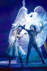 In the movie, Depp’s character was silent; everyone else talked. In the ballet, no one talked. This takes away from Edward’s character. He obviously CAN talk, now, since no one talks in this version – they performed mime to tell the story. Everyone was Edward Scissorhands.
Tim Burton is an original. Go from Edward Scissorhands to The Corpse Bride to Willy Wonka to The Nightmare Before Christmas to Big Fish. No one has to tell you that Tim Burton made those films (with and without Caroline Thompson.) The ballet tried to recreate the movie; they tried to recreate Tim Burton. I’m sorry but originality can’t be duplicated.
I’m glad I saw the ballet, but I’d have preferred something original.
You can see more video clips on YouTube: go here.
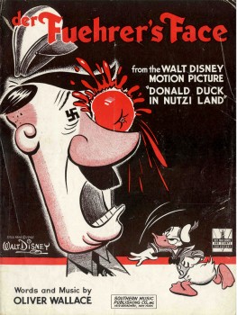 – Last year I posted the sheet music cover and talked about the animated short, Donald In Nutzi Land or, Der Fuehrer’s Face (after the name change).
Now on the site Toons At War layout drawings for this sheet music have been posted. You’ll find a lot of other documents about the film there as well.
Bob Thomas, in the original The Art of Animation (1958) wrote the following story from composer, Oliver Wallace:
-
A favorite story of his concerns the time when Walt returned from Washington in wartime.
“I need a song for a cartoon the government wants me to do about the enemy,” Walt said. “It’s got to be serious, but funny.”
“You mean serious to them but funny to us?” Wallace suggested. (Click any image to enlarge.)
“Yes,” Walt replied.
The composer went home that evening, had dinner and took a nap. His wife asked him
to bicycle to the market with her. As he pedaled, a marching tune began to come to him.
 His wife lost him in the market and finally discovered him leaning against a wall and tapping his foot. When he got home, he went to work. In an hour and a half, the words and music to “Der Fuehrer’s Face” were ready for the publisher. Both the song and the Donald Duck short were hits. “Der Fuehrer” was hailed by Oscar Hammerstein II as the great psychological song of the war.
To hear the song as played by Spike Jones & His City Slickers go here.
The film is available on the Disney Treasures dvd On The Front Lines – Disney Goes To War.
Michael Barrier is hooked, and we benefit. He not only released the Draft for the Disney masterpiece, Who Killed Cock Robin?, but he’s produced a “Mosaic” Ã la Mark Mayerson. This, along with his Capsule notes on the film, give the short quite an analysis. Show and tell isn’t always enough. Good commentary is necessary. That’s where Mike Barrier and Mark Mayerson’s sites excel far beyond most. (Originality. I’ve heard that word before, somewhere.)


