Monthly ArchiveFebruary 2007
Animation Artifacts &Hubley &Story & Storyboards 28 Feb 2007 08:04 am
Hub Boards
- The conversation on storyboard use goes way back – before the internet. If you check out the 1969 book by John Halas, Techniques of Film Animation, there’s a Q&A session wherein a number of animation greats were asked several questions, and the answers are given by question.
Here’s one question about storyboards and the answers given:
To what extent to you think a storyboard should be developed prior to production?
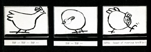
- GENE DEITCH: I believe in complete scene and shot breakdown in story-board or a thumbnail board form before production begins. I use a thumbnail storyboard as a sort of bar-sheet, indicating all effects, dialogue and music cues, scene transitions, etc. Great savings in cost, and an overall perspective of the film in advance are to be gained.
JOY BATCHELOR : As fully as possible without detriment to the following phases of production.
STEHPEN BOSUSTOW: If time and money allow, the storyboard should include as many details as possible, particularly if it is to be assigned to a large production unit. However, if only a few people are to be working on the picture, the storyboard can be quite sketchy, with the details being developed during production by the key people who have an overall feeling for and knowledge of the story.
ADRIAN WOOLERY: The storyboard is the first step, after the idea. Every problem must be solved and the story completely resolved on the board prior to consideration of any production.
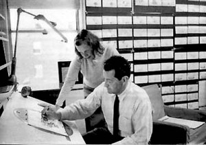 JOHN HUBLEY: It has been my experience that the more detailed a story-board and the more carefully it is designed to reflect the appearance of the finished production, the more successful the film.
GEOFFREY SUMNER: The storyboard, or breakdown of the film, has as many different forms as there are ways of putting actions in relation to one another.
The classic storyboard is the set of working drawings of the sequence of a film used in large studios on the Disney model where numbers of subsidiary workers must conform to a total pattern they can almost never see.
It is used in conjunction with model sheets. It could be called the “model sheet” of the sequence of the film.
It is strictly for use within a studio and should not be shown to dangerous people like sponsors.
An earlier stage is the treatment, which can be specifically directed at sponsors. If the basic idea of the film is simple, the treatment need be no more than half a dozen drawings and a brief synopsis to convey a ten minute film.
A storyboard must necessarily be constructed after the music has been done. The musician and the director can work together from a stage following the treatment. From the finished recorded track the storyboard is made.
 For years prior to even meeting Hubley, I had remembered his response to this question. It impressed me. His storyboard development was pretty intense. The scripts generally were done visually and tacked to the wall.
I don’t remember ever seeing text up there. John would present the board to key people, and he would give an indication of dialogue verbally. We all knew this would ultimately be ad-libbed by actors.
With the Carousel feature, sections were boarded but then developed in greater  length through improvised sessions. The boards then grew out of the edited tracks. The voices often came first, here.
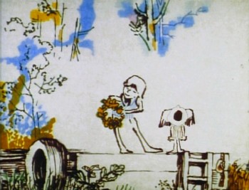
I suspect this is probably also true of the films like Cockaboody, Windy Day and Moonbird which were dependent on the children’s verbal play at the microphone. Something like The Hole or Voyage To Next were boarded visually, then recorded improv sessions which were adapted in newer boards.
Of course it has to be remembered that the two features done within this studio, Everybody Rides The Carousel and Of Stars and Men, both started out as text. Both were heavy-duty books that were adapted for film. In the case of Of Stars and Men, the author, mathematician Harlow Shapely had major involvement in the film’s script and narrated it as well. The concepts for both films were fully worked out before anyone started boarding. So essentially a script – of sorts – existed. Since CBS financed Everybody Rides The Carousel, you know they had to approve a script.
I, of course, only remember the board.
Story & Storyboards 27 Feb 2007 08:05 am
Boards
 Mike Barrier continues the script vs. storyboard dialogue in some recent posts. I think this was recently prompted by some comments on Eddie Fitzegerald‘s site. Eddie sides with the storyboard lead, and all the comments on his blog, naturally, back him up. It’s John Krisfalusi‘s viewpoint, and it works for them in a somewhat hardened way.
Mike Barrier is less dogmatic. His is the historian’s approach, and he talks primarily about ways others have worked. This approach to the argument appeals to me since I’m curious about what others have done in the past to make some of their great films.
However, in all honesty, I have to say that I’ve enjoyed reading both sides of the argument without any emotional involvment. None of it seems to match the way we’ve done films in my studio. I suspect this is true of all individual studios; methods are developed which work, and that’s the route followed. It also seems to vary with each and every film.
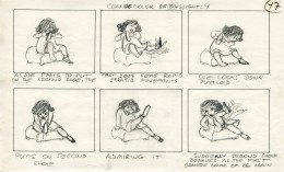
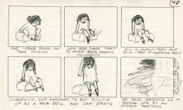
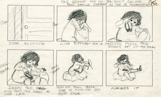 These are a few pages from my film The Red Shoes. This storyboard for a non-verbal section was done by Tissa David from a script by Maxine Fisher. The board changed the script. The LO’s changed the board, and Tissa’s animation of her own board & LO’s changed that.
I love construction so feel that you have to work with a script. I’m not sure you can see a larger picture (for anything other than short films) with a storyboard only approach. However, after scripts are written, I generally ignore all descriptions of specific action after my initial reading. In doing the storyboard, I prefer to come up with my own movement to build around the dialogue. This is also a stage where I’ll eliminate a lot of dialogue (if I can).
Once the board is done, I go back to reread the script to see if the writer had anything more interesting than what I’ve come up with. Usually there is, and I’ll then plug this action into the board. We then do a rough animatic to see how it works and fix rough spots. Then it’s back to rewrite the script.
The film is always alive for me. If the actor improvises a better line, that’s the one. If we can make it better in Layout, we will. If we can change it to make the animation better, we will. If Coloring the piece offers a better idea, we’ll take it. Flexibility is the key. I make decisions and changes on the spot and live with them. Directing is dangerous.
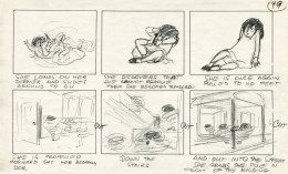
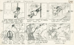 Tissa viewed an animatic we constructed to a tempo. She animated to the overall timing we gave her, but she changed the tempo and animated the four minute dance to a beat. Caleb Sampson had very little time, so he composed the music to the beat, and we made it work to Tissa’s final scene.
I like surprises. When an actor reads the line the way I’ve heard it in my head, it’s usually not the best reading. I want more personality. I tend to laugh at these surprises, and the actors become confused by my laughing during their dramatic readings.
This is true of every stage of production. I also love seeing unexpected happy bits in the animation. It’s all about the acting, the performance of the characters as channeled by the actors and animators.
(Script page – click to enlarge.)
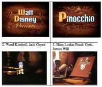 Mark Mayerson has begun a Mosaic culled from the information taken from the Drafts Hans Perk is posting on his site.
These Mosaics are a treasure from Mark; a quick visual reference to the film and the animators involved in the particular scenes. The amount of work he puts into them is enormous, and I couldn’t be more thankful. The same goes out to Hans for posting the Drafts.
With a work as monumental as Pinocchio, one can’t study it enough, and Mark’s Mosaics make it a little too easy for all of us.
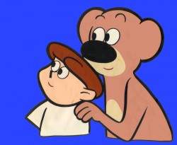 - Last year I wrote about Spunky & Tadpole. The post elicited some response. Most recently, Charles Brubaker wrote to tell me that an episode of the series has popped up on YouTube and can be reached here.
The episode almost looks as though it were shot off a tv screen, and that video was transferred to YouTube. Lots of color deterioration. However, it doesn’t look as bad as one might expect. Spunky and Tadpole wasn’t animated in Flash and looks better for it, despite the low quality transfer. (Click images to enlarge.)
Daily post 26 Feb 2007 09:21 am
Oscartime
 - I enjoyed last night’s Oscar ceremony. Ellen Degeneris brought an amiability to the procedings that made it entertaining. Despite my heated comments about the Animation nominees, I was, overall, generally pleased with the Live Action choices. The winners were a better mix for my taste.
The Lives of Others was certainly one of the best films of the year, and it was pleasing to see that win for Best Foreign Film over the overheated and, in my opinion, overrated Pans Labyrinth. If you have the opportunity seek out this German film; it’s intelligent, exciting and arresting.
I was pleased that Forest Whitaker had written such a noble speech after being so tongue-tied at the Golden Globes. Unfortunately, Helen Mirren rewrote her speech after winning so many, and the joke – if it was one – didn’t work. Alan Arkin is a treasure, so it was great seeing him win. Eddie Murphy can make Norbit II, and doesn’t lose much by not winning for his fine performance.
 To animation: Happy Feet beat out Monster House and the only animated feature nominated, Cars. This is the first MoCap film to have won an Oscar for that “Special Effect.” It’s impossible now for them to separate this program driven “animation” out of the category, and before long all of the nominated films will be “Performance” capture rather than animation.
It is an effect, and we get to see a non-animator like George Miller accept his Oscar for “Animation.” Perhaps, Robert Zemeckis will win for Beowulf next year.
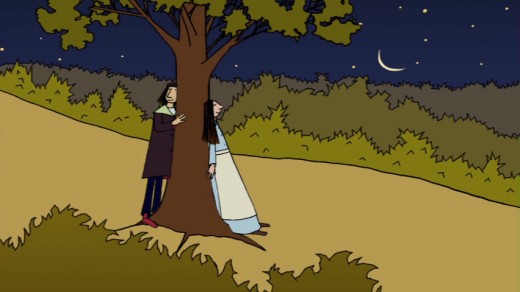
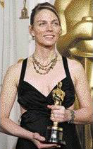
At least, Torill Kove won the award for Best Animated Short with The Danish Poet. When I first saw the film, I was pleased to hear Sigrid Undset’s name show up in animated cartoon! It gave me hope that literacy wasn’t completely dead; now, this film gives me hope that 2D isn’t completely gone – yet. Perhaps, the people at Disney in conjunction with Robert Zemeckis, can take care of that as they build their ultra-high-tech new facility to create “Performance” capture films. (Sorry, I’m being too sarcastic even for myself.)
Congratulations to Torill Kove and the NFB; I am very pleased that the best nominated film in this category won.
Animation &Commentary &UPA 25 Feb 2007 09:54 am
There’s So Much Out There
- Mike Barrier had something interesting to say on his site, and this was compounded by Hans Perk‘s response on his site. I’ve thought about it all yesterday into this morning.
Mike pointed out the Hans was posting the Drafts for Pinocchio on his site, A Film LA. Of course, Barrier was pleased about this but wondered how much it was appreciated. He said that he found the response to some Song of the South drafts he’d posted last September
(pg 1, pg 2, pg 3, pg 4, pg 5, pg 6, pg 7, pg 8, pg 9, pg 10) brought little response to it.
The amount of work that goes into scanning and posting these things is enormous, I can assure you, and it’s disappointing when there doesn’t seem to be much of reaction in the community.
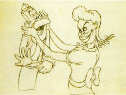 I immediately jumped to Hans’ site to see his response. Hans has been posting many of the Disney Drafts. Everything from Mother Goose Goes Hollywood to The Band Concert to . . . well, Pinocchio.
Hans pointed out that not only was he disappointed at some of the reaction of these drafts but even more so when he places some of the notes for the Action Analysis classes from the 30′s Disney studio. The silence gets to be deafening. He questioned whether there’s a lack of interest in how to best improve the quality of animation – even in the 3D business – without the knowledge of those who came before us.
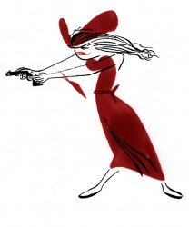 I had an amazing advantage coming along at the time I did and receiving some of the breaks I had. Of course, I wasn’t just searching for a job. This was always going to be my life. Getting a job working for and with my hero, John Hubley, at that developmental stage of my career, allowed me to ask questions and get a significant response. I knew not to bother him about history. (Disney and UPA were sore spots for John, and I stayed clear of the subject. The one time I mentioned it was after seeing Rooty Toot Toot for the first time, and, having been blown away by the film, mentioned it the next morning telling John what an amazing work it was. His response was to say, “Do you think so?” and leave the room. He wanted no conversation about it.)
(Thanks to Cartoon Modern for this model.)
.
So, I would gather several questions and rework them so that in asking one good question, it would solve several for me. John always gave good answers to every question about the work, and I learned a hell of a lot.
But most people didn’t have access to John Hubley (or, in my career, Tissa David, Dick Williams, Art Babbitt or a dozen other brilliant people.) But there are these lecture notes from the Disney studio. And there are the Drafts where we can study the films, analyze who did what, and really get to know the significant difference between animators.
Mark Mayerson uses Hans’ Drafts to create these brilliant Mosaics on his site. He makes the work easier for us; we don’t even have to look at the film – it’s all layed out for us.
And then these scenes show up on YouTube somewhere else. You don’t even have to buy the films to see many of them. The Drafts Mike Barrier posted for Song of the South immediately turned up on Thad Komorowski‘s Animation ID site. (Disney, of course, removed it for copyright infringement, but it was there as was the opportunity to see it for a short bit.)
Basically, what all this rambling comes down to is that there’s so much out there. There’s so much to learn, and there’s so much opportunity to learn it. I love Tissa David, who I like to call my mentor. She is one of the great animators, trust me, and in her mid eighties she’s still animating. She says that she still has a lot to learn. If she feels that, imagine how I feel. Imagine how we all should feel.
Yet, there’s this incredible new tool out there – the internet. It gives us so much material and with sites like Mike’s and Hans’ and Mark’s and others (like most of those listed to the right of this post) we just have no excuse for all the bad animation out there. Get to work people; we’re all watching.
Hans points out in his commentary, that not publishing pictures probably gets less attention. Hence there are some pictures here.
The Oscars are tonight. I don’t like most of the animation choices.
For animated feature I see only one nominee that’s been animated, Cars. And I wasn’t crazy about that film. The animation was excellent in places, but conceptually the film’s a wreck.
For animated short, I didn’t think most of the films were good, never mind great. I voted for The Danish Poet since it was the only one that really told an adult story. It was a cheap gag or a sophmoric attempt at filmmaking. (Really, students have told many of these same stories without spending the wads of cash on them.) You all know my favorite was Joanna Quinn‘s film. That got my Oscar.
SpornFilms 24 Feb 2007 09:27 am
Nightingales
- Lately we’ve been preparing documentaries/extras about our Hans Christian Andersen films which will finally be released in dvd come June. These include: The Red Shoes, The Little Match Girl, The Emperor’s New Clothes and Nightingale. In making this extra material for the dvds we’ve had to prep a lot of artwork and images from the films.
Yesterday, I found when scanning in Jabberwocky for this “Splog” that the images came 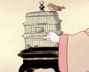 alive in the digital format. It’s much more striking than the original films. That’s also true of the artwork we’re scanning from some of these films.
Nightingale was adapted from the Andersen tale, but we made a decision, early on, to base the story in feudal Japan rather than China. This allowed me to cast one of my favorite actors, Mako, as the Narrator and Emperor.
It also enabled us to adapt the beautiful art of Japan to the animation.
(Click any image to enlarge.)
The backgrounds were done by Masako Kanayama from layouts prepared by Rodolfo Damaggio and Sue Perotto. They were done in delicate watercolors with a limited palette. The characters were inked with sepia colored brush markers so that there was a dramatic thick/thin line. To expedite the production, I animated with the marker. It allowed more control in my scenes and saved the inking stage.
The following setups give an indication of the work.

This opening pan set the mood of Feudal Japan with gold paint flattening out in the filmed version. Here it looks gold as it should, rather than the brownish tint in the film. The actual Bg is quite long.

Not once did we consider looking at anime for the style. We studied the great artists of Japan of the period and looked at actual photographic reference. It never pays to study animated films for influence in preparing an animated flim. Take the inspiration from artists and real life.

The Emperor’s court took some concern. It gave us the opportunity of showing off some of our research about interiors and allowed us to show off many of our principal characters in the opening setpiece.
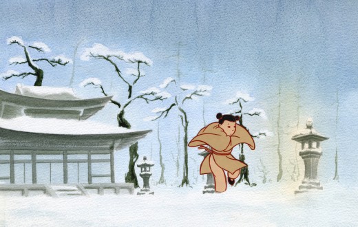
In the original there were really only two primary characters: the Emperor and the Nightingale. Since the Nightingale couldn’t talk, Maxine Fisher, who adapted the story, introduced the young girl who knows the Nightingale from the forest. She’s the intermediary between the bird and humans. She also sings all the key songs. June Angela, a fabulous actress and a wonderful soprano played the part.
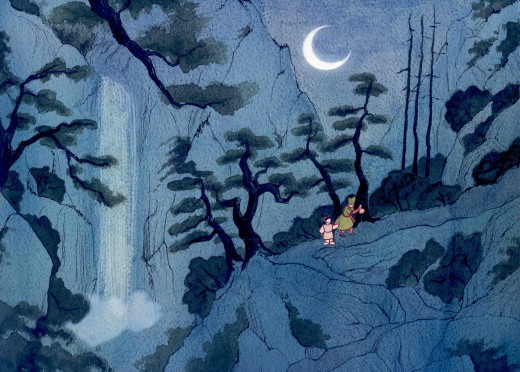
She knows the whereabouts of the Nightingale and can take the Emperor’s consort to her.
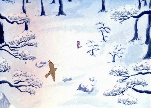
She can also console the Nightingale when she’s hurt by the Emperor.

The Emperor had to develop into a very sympathetic character over the course of the film. In Andersen’s story he learns a lesson from the Nightingale. The mechanized bird cannot live up to the real songbird. We also gave the Emperor nightmares that developed out of the Emperor’s spirituality; this was a small nod to Andersen’s outspoken Christian commentaries throughout all of his stories. We allowed the Emperor to have his own gods.
SpornFilms 23 Feb 2007 07:48 am
Jabberwocky 2
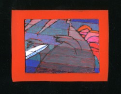
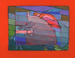
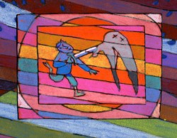
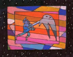
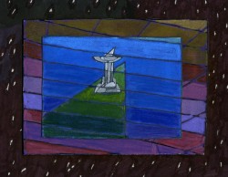
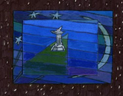
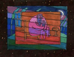
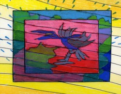
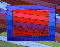
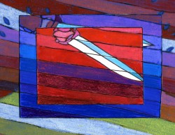
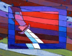
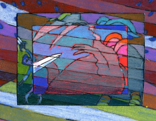
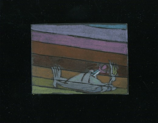
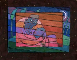
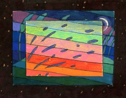
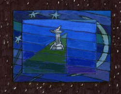
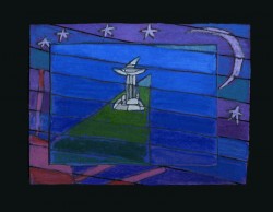
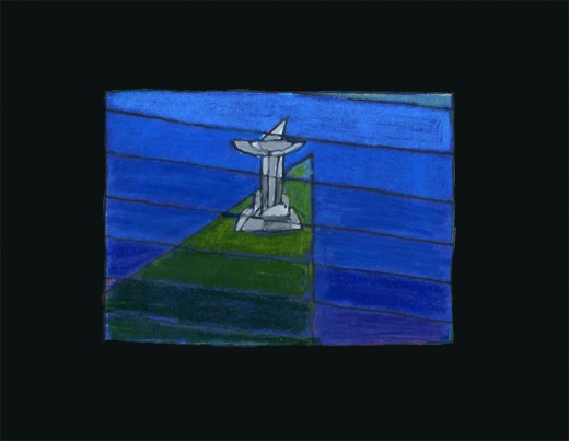
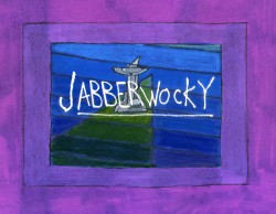 – To continue my pix display of art for an animated Jabberwocky, I’m posting here a few of the images from my short adaptation of the poem. I tried to mimic a style I’d used in my oil paintings and felt it was a bit successful. I don’t think the filmed version is all it could be – it was rushed to complete a package which included the 19 min. film, The Hunting of the Snark, as well as an animated documentary done about Lewis Carroll’s nonsense poems. Of course, the video package wouldn’t have made sense without including Jabberwocky.
(click any image to enlarge.)
But I’ve scanned these images from the actual artwork and realize how well they’ve held up. I’m going to redo the film digitally and see where I can go with it.
Here are some of the images:
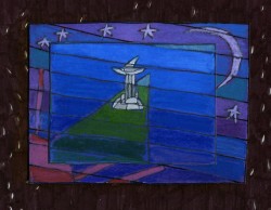
‘Twas brillig and the slithy toves,
Did gyre and gimble in the wabe;
All mimsy were the borogoves,
And the mome raths outgrabe.
“Beware the Jabberwock, my son!
The jaws that bite, the claws that catch!â€

“Beware the Jubjub bird, and shun
The frumious Bandersnatch!â€
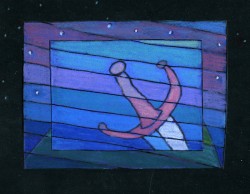
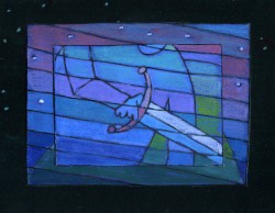
He took his vorpal sword in hand;
Long time the manxome foe he sought -
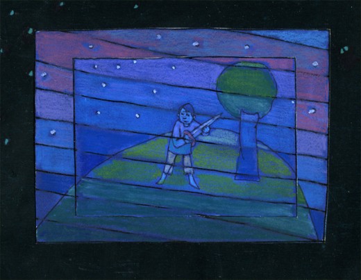
So rested he by the Tumtum tree
And stood awhile in thought.
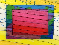
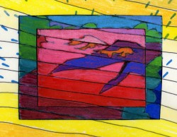
And as in uffish thought he stood,
The Jabberwock, with eyes of flame,
Came whiffling through the tulgey wood,
And burbled as it came!
One, two! One, two! And through and through
The vorpal blade went snicker-snack!
He left it dead, and with its head
“And hast thou slain the Jabberwock?
Come to my arms, my beamish boy!
O frabjous day! Callooh! Callay!â€
He chortled in his joy.
‘Twas brillig and the slithy toves
Did gyre and gimble in the wabe;
All mimsy were the borogoves,
And the mome raths outgrabe.
Animation Artifacts 22 Feb 2007 08:01 am
Jabberwocky 1
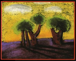
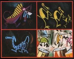
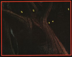
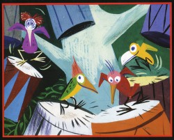
- To me, Lewis Carroll‘s nonsense poem, Jabberwocky, is one of the most brilliant pieces ever written. It’s always been important to me, and I’ve collected many versions of it in illustrated versions. Now that I mention it, let me confess that I’m a Lewis Carroll addict, and Jabberwocky is one of my favorites among his many poems.
In film, you have the one live action feature by Terry Gilliam; it’s a good film with a clunky monster in the end. In animation, professionally, I know of only two versions completed. One was by Jan Svankmajer done in 1974. I did a version of it in 1989. Mine, of course, sticks closer to the poem even though it is pretty “arty”.
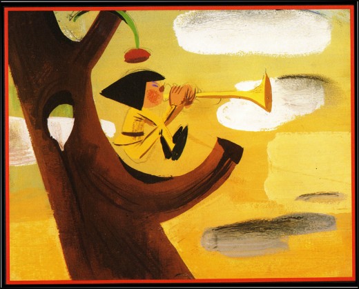
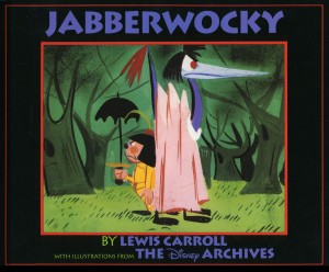 Apparently, there was also a version Disney was preparing as part of Alice In Wonderland. A book was published, credited to the “Disney Archives,” with illustrations from the preparatory drawings of this sequence. It’s obvious that the final versions of these drawings were done by one person, but there’s no record in the book of who did the finals.
I’m not in love with the images in the book. I like the technique used, but I find the images too cute. Though, it’s amazing how current they look.
(Click on any image to enlarge.)
I’m going to give you a number of the book’s pages today and, in comparison, will follow it up with images from my version tomorrow.
‘Twas brillig and the slithy toves
Did gyre and gimble in the wabe;
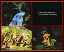
All mimsy were the borogoves,
And the mome raths outgrabe.
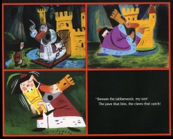
“Beware the Jabberwock, my son!
The jaws that bite, the claws that catch!”
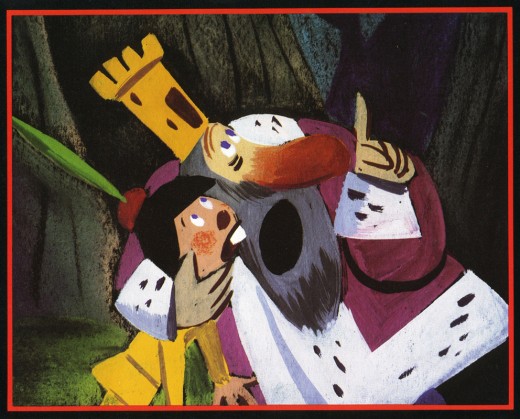
“Beware the Jubjub bird, and shun
The frumious Bandersnatch!”
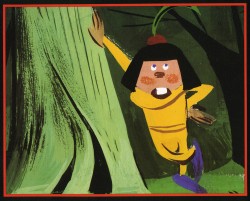
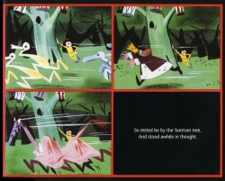
He took his vorpal sword in hand;
Long time the manxome foe he sought -
So rested he by the Tumtum tree
And stood awhile in thought.
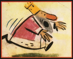
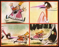
And as in uffish thought he stood,
The Jabberwock, with eyes of flame,
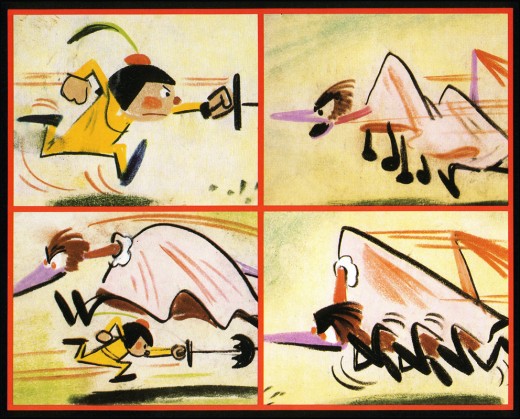
Came whiffling through the tulgey wood,
And burbled as it came!
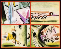
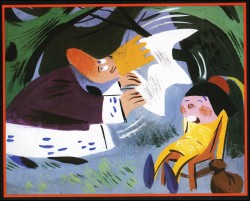
One, two! One, two! And through and through
The vorpal blade went snicker-snack!
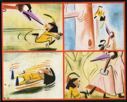
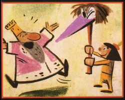
He left it dead, and with its head
He went galumphing back.
“And hast thou slain the Jabberwock?
Come to my arms, my beamish boy!
O frabjous day! Callooh! Callay!”
He chortled in his joy.
Jim Hill talks a bit about this book on his site in a letter response. here.
For amusement, you might check out this site for translations of this poem into 58 other languages, 23 parodies of the poem, and 10 explanations trying to define what Carroll meant by it.
Tomorrow, I’ll post images from a version I did.
Animation Artifacts &walk cycle 21 Feb 2007 07:54 am
He’s Got Strings
- Hans Perk, on his site A Film LA, has been posting the complete set of Drafts for Pinocchio, and after my post of the Jiminy Cricket run last week, I feel compelled to give more from this great Disney film.
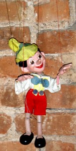 I have this walk – Pinocchio with strings, as operated by Gepetto from above. It’s one of the most complex problems I can imagine, and I think you have to be something of a genius animator to pull it off. Needless to say, Frank Thomas did. He mastered all the challenges of the weight of the object to allow you to completely disbelieve you were watching drawings move, yet you were able to get into the mind of the puppeteer.
It’s a brilliant piece of acting. A lifeless creature given life through Gepetto’s manipulation. The scene, of course, contrasts with the “Got No Strings” number where Pinocchio dances among puppets that are manipulated by the professional puppeteer, Stromboli, as opposed to the non-professional, Gepetto. It’s so complex yet done so well that it looks simple.
The drafts list this film as Prod. F3, but the drawings are labelled as F5. I’m not sure what else F5 could stand for since it’s certainly not the seq or sc number. Confusion on my part.
Here they are. Enlarge all images by clicking them.
![]() Note that the drawings read from Right to Left:
Note that the drawings read from Right to Left:
.
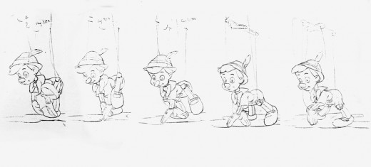
I love Pinocchio’s hand grazing the ground as he’s moved forward. The thrust of his body is all in the head, butt and upper back, as are most marionettes. The strings are an extension of the puppeteer’s hands.
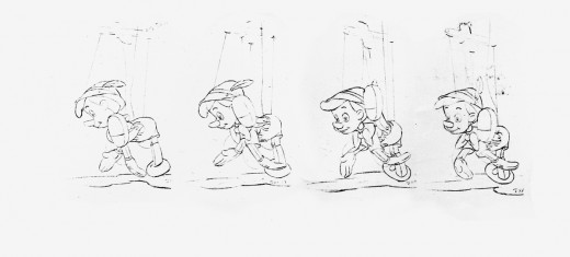
As the foot moves around the rest of the puppet is spun around, too. It’s a beautiful and graceful turn.
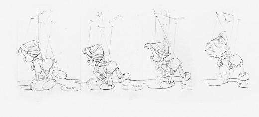
His foot slaps down, and again the hand touches the ground as the puppet prepares to be lifted forward by the offscreen control demands in the play against gravity.
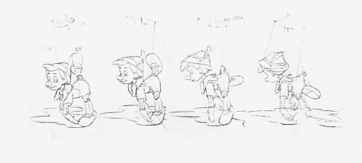
As the back leg goes up and around, the smiling face comes back around to us. Pinocchio’s butt is up there with that foot. A great puppeteer wouldn’t have Pinocchio bent over in this walk, as we see later in Stromboli’s characters.
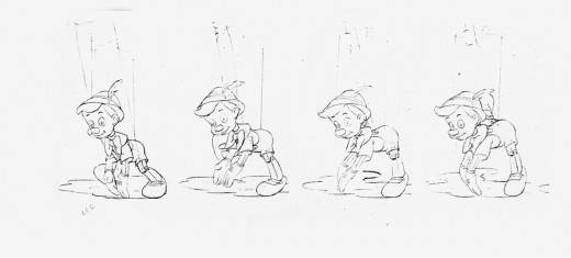
Finally, Pinocchio comes back to the starting point as if this were a normal walk cycle. What a gem of a piece. There were brilliant animators going at it at that studio. Technically, this can be done by some of today’s 2D animators, but I wonder if the meat of the scene would be as good.
Animation Artifacts &Models &UPA 20 Feb 2007 08:04 am
Random Models
- Did I ever mention that I was a model-sheet Junky? I love them, no matter where they come from or how big they are. I enjoy looking at notes on them, how they were constructed, and signatures. The whole package.
They come in so many sizes, forms and designs.
This is why I get off on a couple of sites that post some beauties. The ASIFA Hollywood Animation Archive has done this frequently, e.g here, here and here.
The Disney Informer also offers quite a few models.
Here are a few from from my collection representing different studios. Of course, I’ll start with Disney, the classics:
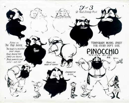
The three models I have are matte photostats, though I believe the handouts were copied onto Disney’s large 5-hole animation paper. On one of these you can see traces of the pegholes.
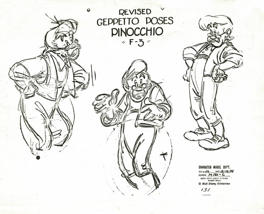
I have a large cel of Gepetto from the pose on the left, hands akimbo. I’m not sure it was ever in the film.
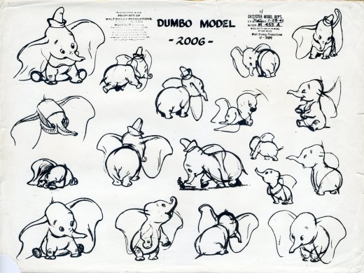
What a beautiful Dumbo. I think I could look at these drawings all day. It’s one of my favorite films. No tricks, no pretensions. Just a great cartoon to make you cry. This is the top of their game.
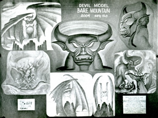
Unfortunately, this one is a photograph I have of the model on a bulletin board. It’s not the best focus.
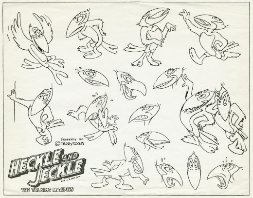
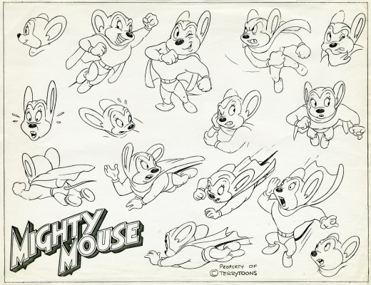
Terrytoons had a beautifully composed model sheet with some fine poses. I wonder how much this helped Jim Tyer. Another Terry model sheet, one of Mighty Mouse, follows. I suspect that Connie Rasinski drew both of them.
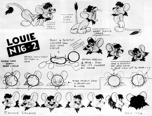
At Paramount, they were a little different. The stats they made, at least those I have, were high gloss. This one has some damage to it where it must’ve gotten wet.
This is the info for this short I found on Dave Mackey‘s invaluable site: Lion In The Roar Rel 12/21/56 – Noveltoon Featuring Louis The Lion, Directed by Seymour Kneitel. Larry Riley drew this model.
I have a couple of the original models which were compiled on animation paper from cut-out drawings. The glue has had a hard time holding up. I gave examples of this last year with an Indian film. See here and here.
The animators received these glossy stats.
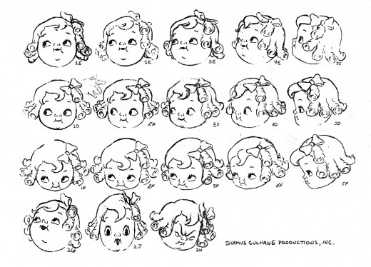
For this Campbell Soup commercial a lot of effort went into drawing the girl. No doubt they were out to please a client. This is the best this character has ever looked.
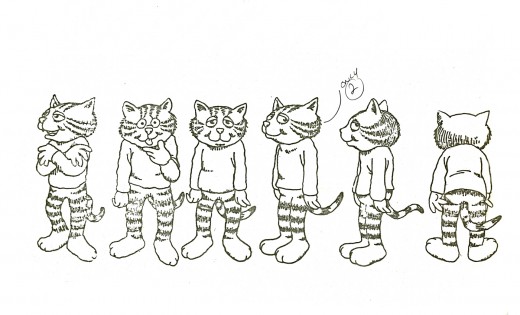
By the time we get to Fritz the Cat, the Xerox machine was in use to make hand-outs for the staff. They didn’t bother with photostats.
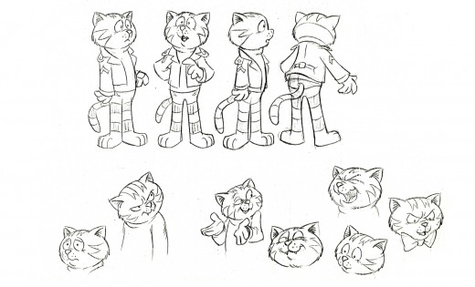
The drawings look like different artists were at work. No wonder the character shifts about on screen. I actually enjoy watching that shift. There’s something alive about it.
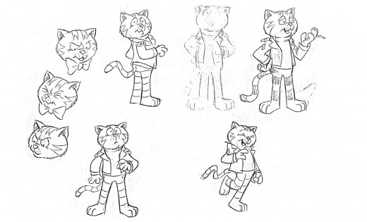
I keep thinking these last two are from The Nine Lives of Fritz the Cat, but I’m sure they came from the original film.
- May I suggest you go to a couple of other sites today, while they’re still fresh. Good work from both of these regular must-read writers.
- Floyd Norman‘s essay over at Jim Hill Media is as great a read to me as anything else he’s written, and I love reading all of his pieces.
- Mark Mayerson has a great piece on his site today whcih certainly got me weathered up. He definitely has some of the most thoughtful, provocative and interesting material on the web.
Festivals 19 Feb 2007 09:16 am
ASIFA East Festivals #38 & #37
– Tonight, Feb 19th at 7PM, David Levy, author of Your Career in Animation will be moderating a “Round Table” at MOCCA, the Museum of Cartoon & Comic Art.
 Come by and be a member of the discussion group to talk about the current state of the animation industry. Complimentary drinks and a “nosh” will be on hand.
The Museum of Cartoon and Comic Art
594 Broadway, Suite 401
NYC, NY 10012
Admission: FREE
As if that weren’t enough,
MOCCA’s website has several online exhibits:
Duck cartoons as drawn by some famous artists
Cartoons Against the Axis with a companion article by Art Spiegelman.
.
- Ballots are now out for the ASIFA East Festival #38. All are encouraged to enter; get your application here.It’s the homiest of Festivals with an focus on the Independent animator.
All members of Asifa are invited to come to the open screenings of the films and cast their votes for whichever films they like. These judging screenings will take place at the School of Visual Arts as follows:
Student Judging: Mar 6th 3rd floor amphitheater
Commercials & Promos Judging: Mar 7th 5th floor room 502
Sponsored Films over 2 mins Judging: Mar 8th 3rd floor amphitheater
Independent Films Judging: Mar 14th 5th floor room 502
On the ASIFA East site, President, David Levy, writes 10 tips on entering the Festival.
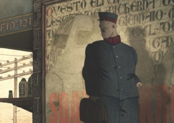 – Last year’s ASIFA East Festival winners have been gathered in a single program which will be screened in LA next Wed, Feb 27th. It will take place at 7:00 pm at Dreamworks Animation, 1000 Flower St. Glendale, CA.
However you should RSVP; Email your full name, guest name, and daytime phone number to publicity@asifa-hollywood.org no later than February 20th (Tuesday.)
Pictured above, MILCH by Igor Kovalyov.
.
The ASIFA-East show is the nation’s premiere animation competition honoring independent animators, professionals and students.
This years program will include:
BEST IN SHOW
Fumi and the Bad Luck Foot -Thunderbean Animation/David Chai
Plus INDEPENDENT FILMS:
1st Place Guide Dog - Plymptoons
2nd Place Milch – Acme Filmworks/Kovalyov
3rd Place Stoopid Movie!!! – David Chai
Excellence in Experimental Techniques Urban Animals – Karl Staven
Excellence in Animation Crossing the Stream – Skip Battaglia
Excellence in Soundtrack Robot Dance Party – Will and Fran Krause
Excellence in Design Siniestro – Dancing Diablo
Excellence in Writing/Humor Tony Cartoons – Sean McBride
As well as winners in SPONSORED FILMS, COMMERCIALS and STUDENT FILMS!
