Monthly ArchiveSeptember 2006
Illustration 07 Sep 2006 07:42 am
2001 New Yorker Covers
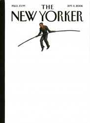 – I’m a bit in love with and a bit angry at John Mavroudis & Owen Smith‘s New Yorker cover(s) for Monday, September 11th.
There are two covers: Philippe Petit walks against a white BG. No tightrope, no World Trade Center. Nothing. This white one is the real cover.
That overlays pg. 3 of the magazine – the painted version. Philippe Petit walks on air with a lot of buildings below him and the residue of 2006′s marker where the Twin Towers stood. No tightrope, no World Trade Center, a cityscape from the air.
It’s a great idea. Philippe Petit walking on nothing – the buildings are gone. There’s a bit of shock factor there. It strikes hard, especially for New Yorkers who lived through the tightrope walk and then experienced the collapse of the buildings.
Now, of course, I’ve done a film version of Mordicai Gerstein’s book, The Man Who Walked Between The Towers. And I have a real attachment to that book and the art from it. We used it to shape a film I’m proud to have made.
Seeing these covers, after getting over my first surprise at the jolt of the political picture it painted, 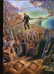 I wondered if the artists had seen the book or the film. I had to believe they had. It’s a good idea, but it looks so much like Mordicai’s work.
Yet, it is such a good idea – how mad can you get!
I think Art Spiegelman‘s cover back in September 2001 was much stronger.
It was the one piece of art that I’d seen which really captured the mood of the city. At first, it looked like an all black cover, but looking long enough, you slowly realized the twin towers were there – black on black. It was stunning.
The feeling could never be captured on a computer. (Go here to see an online version using blue & black inks. It doesn’t work.) You had to have the hard copy in your hands with the ink almost blending into the reflection of the black cover.
It was so appropriate. The emotions at the time were raw; the subject was sensitive; the cover had to have the jolt and the sensitivity. Spiegelman captured it exactly. It was the feeling we all were having. He expressed it and drew us into his fold. A perfect political cartoon. He had something to say; said it, and gave us a flag to salute.
This year’s cover is appropriate for 2006, but I have to wonder if Mordicai Gerstein’s book didn’t influence them.
(By the way, there’s a good conversation in the online edition with some of the New Yorker’s political editors including Seymour M. Hersh, Jon Lee Anderson, and George Packer discussing the aftermath of the event.)
Hendrik Hertzberg also has an excellent commentary in this issue on the event and its residue and exploitation.
- Speaking of exploitation, I have to get a tad political. On Sunday and Monday, ABC-TV will broadcast a two part program entitled The Path to 9/11. This program was created by right-wing conservative writers and relies on the old GOP playbook of using terrorism to scare Americans. It is out-and-out exploitation of an important event, and ABC has become their mouthpiece. I’d encourage anyone out there to voice against it and preserve the 9/11 event as a non-political event. Go here to sign a petition to Robert Iger, the head of Disney which controls ABC.
Animation Artifacts 06 Sep 2006 07:39 am
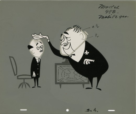
Ray Patin Model
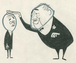 – Located on the ASIFA-Hollywood Animation Archive are some drawings from the Ray Patin Studio commercials.
I noticed one which matches the color model I have for the very same setup. So you can look at the 3-cel model setup here and then procede to their site if you want to see the drawing.
Interesting how detailed the drawing is in comparison to how they finally ended up coloring the spot.
(Above: from ASIFA-Hollywood Animation Archive)
- Speaking of this incredible site, the ASIFA-Hollywood Archive has more of Mark Kausler’s fabulous Milt Gross collection. This guy was the real deal; one of the greatest cartoonists of the Twentieth Century.
Animation &Daily post 05 Sep 2006 07:34 am
John Canemaker
- Last week Cartoon Brew posted a link to I Get Mad, a Sesame Street spot on YouTube. The spot was directed by Derek Lamb and animated by John Canemaker. I’ve been thinking about this piece all week. Actually, not just that piece but all of John’s work.
I’ve been a friend of John’s since about 1973 when we both entered the world of animation.  We met the year John had done a couple of short films Lust and Greed, both of which won awards at the ASIFA-East festival. I gladly helped John with the cut & paste part of his next film, Street Freaks and have followed his work as a film maker, writer and Oscar Winner through these many years. I watched from the sidelines as John did quite a few Sesame Street spots, not only for Derek Lamb but for Bruce Cayard as well.
(Emily Hubley, me, my Mother, John C.
at a party in my studio 10 yrs. ago)
I’ve now got a collection of great books, magazine articles, and dvd’s that John has produced, and I have to say his is a singular talent.
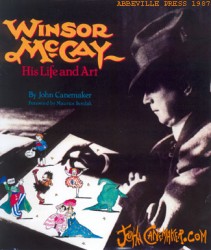 I don’t think there’ve been any other animation historians who have been so wide-ranging in taste and so wide-reaching in publication. John has written tirelessly about:
some of the important figures in early silent animation – Winsor McCay and Otto Messmer come easily to mind;
some of the most commercial figures – look at the array of volumes John has done on Disney and Disney artists;
and some of the most Independent of animators – articles on everyone from Dali to Kathy Rose to Oskar Fischinger to Suzanne Pitt.
The odd part about it is that all of the writing – despite the variety – is authoritative, well researched, and easy reading. John has a casual and entertaining way of slipping the reader into a very informative article about even the most eccentric of animators. Undoubtedly, this is the reason he and his work is so beloved in animation circles.
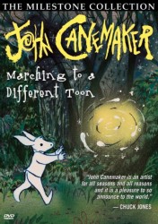 His many lectures given around the world from MOMA to Zagreb to Telluride (where John is currently speaking and screening films) are entertaining, informative and colorful.
Yesterday, I did a bit of writing about Amid Amidi and his new book, Cartoon Modern. I discussed Amid in comparison with Michael Barrier, and I expressed my enormous respect for them both. I wanted to include John Canemaker in there, but I felt that John was a different breed of historian. Both as a writer/historian and as an Independent film maker/animator, John has trod a solitary path in animation history. His writing is certainly unique in that it is so widely varied and so sensitive to the artist’s visions and feelings. His films are unique in that you can easily spot one with the very first frame you watch; he has a style all his own that has been imitated by many of his students but never captured by them.
Expressing his own voice in his own Independent films has colored John’s writing and made it so unique, and seeing I’m So Mad again has me wanting to say as much.
Books &UPA 04 Sep 2006 09:45 am
Cartoon Modern
- I hope I’m not sounding like a shill, but I don’t really mind. I believe in the product, and I’m going to broadcast my enthusiasm until you’ve got tears in your eyes.
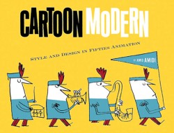 Amid Amidi’s book Cartoon Modern is the best book on animation I’ve encountered since Michael Barrier’s Hollywood Cartoons.
When Barrier’s book came out, I was depressed and could find no inspiration in anything animated. As a matter of fact, I didn’t want to see any more animated films. I read his book and found the charge I was looking for. I reread the book and found more. Just getting some trustworthy version of some of the pioneers and artists who pushed their way through the medium did it for me. I found new life in the work I did after that. I reread that book at least once a year – just for the pleasure.

(An Eyvind Earle study for Sleeping Beauty.) . . . (All images enlarge by clicking.)
Cartoon Modern has had a similar effect. The story, here, isn’t about the pioneers who built a business and an artform; it’s about the artists who rebelled from that business to advance the art. Their story is every bit as thrilling and certainly as much of an inspiration. This is especially so in that I grew up while these guys developed the look they advanced. In some small way I was taught – through their cartoons – that modern art was good. Also, as a small business animator, how could I not associate with these guys?
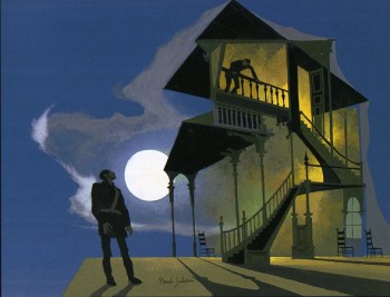 This book is filled with glorious illustrations as only such a story could be told. We are talking about people who found a way to update the art and break the mold of the 19th Century.
I’ve recklessly copied a couple of the stills from the book to illustrate how magnificent Amid’s photo research is to illustrate his text. It involved more than going to one archive and having them open their wares to you.
(Paul Julian’s painting for UPA’s “The Telltale Heart.”)
Amid had to go to many artists who shared the wealth. That, let me tell you, is a trying job. None of the difficulty is apparent here. Just the love. Love of the material and the medium.
Amid Amidi has a lot in common with Michael Barrier. 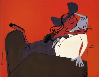
They’re both fine writers, articulate and intelligent. Both are in love with the medium, and neither is afraid to call a spade a spade or a bad cartoon a bad cartoon. You don’t always have to agree with them, just agree to listen.
For this quality, as a writer, you have to have more than a little responsibility.
Your sense of taste has to be impeccable and your audience has to trust you.
(Cel set-up from “Rooty Toot Toot.”)
Amid gained my trust and my affection for his writing years ago – thank heaven for the internet! Animation Blast, Cartoon Modern (the website), and Cartoon Brew have all informed me in a deep and solid way.
My delight in this book couldn’t be more sincere.
I haven’t completely finished reading it, and I do have a couple of quibbles. But that would have been the case of any book. However, this book is all about taste, and I’m so pleased to be in the hands of such a fine writer and historian – it’s a great feeling.
Animation Artifacts 03 Sep 2006 08:29 am
More Skeletal Systems
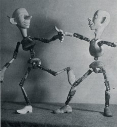 – Yesterday, I posted a couple of links to images of imagined animation skeletons. I completed with the build-it-yourself armatures of Monterey Motion Puppets.
I feel as though this is a subject that deserves a bit more attention. Armatures.
There’s quite a bit of information on line, and I want to call attention to a couple of links.
At Stop-Motion Express, more armature building instructions as well as a lot of advice on puppet animation is available. You can also buy one through their store.
If you’re not handy and cannot build an armature yourself, you can buy one on ebay express. The Armaverse Armature sells for $149 – preconstructed and ready to be altered to your character’s needs. Or another smaller one for $139.
 There are a number of articles about Aardman and their armatures. One from the BBC features a couple of small pictures.
Vince Backeberg has a site that features methods of armatures for all “Claymation” puppets. (I’m not sure he realizes that “claymation” was a copytighted term for Will Vinton’s animation process.)
AnimateClay is a webpage devoted to – guess. It features methods and devices needed.
Getting Started in Animation is a great Q&A article with 3Bears Animation a site where all the ins and outs of puppet animation are discussed, including armatures.
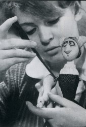 This article is part of exposure.co.uk, a site for advice on low budget film making.
Not to completely ignore the skeletons of cgi, Blender3d.org has posted a detailed article on How Armatures Work. Obviously, they’re talking about cgi armatures.
Two of the images posted here are from magazines. The top image comes from an article on Lou Bunin and shows a 1939 armature he had built when he was just starting out. The image to the right is part of a French magazine-sized publication from Folimage about Jiri Trnka. Pictured here is one of about five clustered together which can be viewed in total by clicking that image. The middle image is of Wallace as armature without his head.
Animation &Daily post 02 Sep 2006 07:25 am
Skeletons
 – In case you haven’t seen this yet, the Arario Gallery, a Korean gallery, has on display some skeletons for noted animation characters. The Roadrunner, obviously, is pictured to the left. Felix the Cat, Mickey the Mouse and the Coyote are also depicted as are photos of the constructions in process. Though there are enough photographic stills of the sculptures and a number of sketches, I wish there were a bit more text to let us in on the reasoning behind them. (Thanks to Boing Boing.)
- This is the second version of this idea I’ve seen. Michael Paulus, on his website, displayed skeletal systems for 22 cartoon characters. These are pretty hilarious if you haven’t seen them.
(Click on images to enlarge)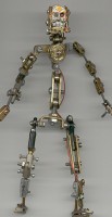
More imagination has gone into these illustrations than went into the Korean sculptures. Paulus is an exceptional artist, and you might take a browse around his other art works displayed.
– For real animation skeletons, let’s talk 3D armatures.
Would be puppet animators out there who are looking for realistic (meaning cost-controlled) armatures for their puppets, go to Monterey Motion Puppets to get instructions on how to do it.
They also have a number of their armatures on display at the site. “Junkman,” pictured on the right, is one of their “skeletons.”
Animation Artifacts 01 Sep 2006 07:59 am
Levitan Book
The other day I wrote about bar sheets and posted some examples from Halas’ Technique of Film Animation and Eli Levitan’s Animation Art in the Commercial Film. I realized that that may be a book that’s unfamiliar to most people and would like to give it some attention here.
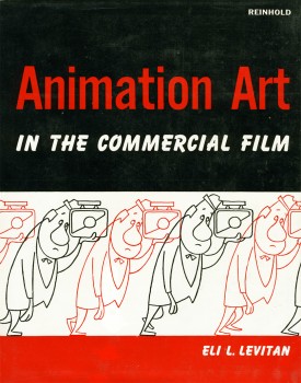 – When I was a kid, I was determined to work in animation. By the time I was 12 and had saved enough to buy an 8mm camera (these are the prehistoric days before the invention of video tape – nevermind dvd’s), I had already animated some films and had a gang of characters. I’d learned everything I knew about animation from books, really.
There was the Disneyland show every couple of weeks about animation, and they gave you some information about how the work was done. In fact, though, that was more entertainment than informational. The same was true of the Walter Lantz segments on the Woody Woodpecker show.
So, it was books. I went to the library a dozen times a week to read through the books I couldn’t take out, and I memorized the books I could bring home. The Halas book, Techniques of Film Animation, was the real deal. Heavy information (some of it I still don’t understand – all those equations in the back of the book). A Christmas Present brought Bob Thomas’ The Art of Animation, which focussed on Sleeping Beauty‘s production. This started my book collection.
There were only a couple of others at the library. I knew all the titles by heart in that small section. There weren’t a lot of animation books back in the late fifties. Animation Art in the Commercial Film (1960) was an oddity that showed up one visit. It was by a NY cameraman/producer, Eli Levitan and highlighted the technical parts of animation. It used a GE commercial for all of its illustrations. The technical aspects of the book were good, but anything to do with drawing or animation, itself, seemed forced. Unfortunately, it didn’t name- drop animators from Disney – or even NY – as the Thomas or Halas books did. It didn’t even name the people who posed in the photographs printed. This is something I religiously sought in my books. I wanted to know who those people were.
Of course, in time, I memorized this book as well. There was a lot in it for someone who understand most of the mechanical aspects of the medium and was interested in learning more.
Levitan had at least two more books about animation: A Handbook of Animation Techniques (1979) and Electronic Imaging Techniques: A Handbook of Conventional and Computer-Controlled Animation, Optical, and Editing Processes (1977)
 1
1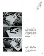 2
2 (Click on any image to enlarge.)
