Monthly ArchiveJuly 2006
Comic Art 22 Jul 2006 07:35 am
Zombies
- I have to admit that I’ve never understood the allure of zombies, but I have to admit there is one for a lot of people. A number of comic sites have been sprinkling the blogosphere, and there’s some fine art to be found there as well as some interesting approaches to laying out a comic page.
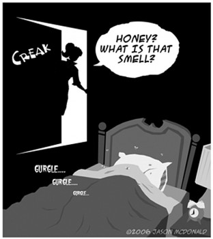 – A friend of mine, who’s worked in my studio for years, Jason McDonald has built a site around a comic that he’s creating and unveiling: one page each week. Like all of Jason’s art, the imagery is imaginative and clever. He’s focussing on the day-to-day routine of a teenage zombie, tedium and all included. It’s the Adams Family wired to feel more at home in the 50′s than the original. Leave It To Beaver, and Beaver is a girl and a zombie.
My Living Dead Girl includes lots more than the strip. There’s a blog, GAK News, giving info about the strip’s development, including lots of art, photo reference com- parisons to the art, and even a store to buy lots of things.
Jason also has another site featuring his non-zombie artwork: jasonmcdonaldesign.com
(By the way, I’m long overdue to post a focus on Jason’s work for my studio. He’s shaped many a film for me with some exciting, humorous and daring Art Direction.)
- Zombies? is a webcomic site by Eric Maziade, and it’s very different from Jason’s strip. It, too, is developing on line as Eric writes the strip, and the site/blog offers writing as well. However, the link list leads you to some other zombie strips.
Eric Maziade also two other sites:
One called In The Maze which seems to have more of a technological bent discussing the technical aspects of hardware and the internet. The site also has a number of good links including other non-zombie webcomics.
The other called Maze’s Lair features a lot of Eric’s artwork.
Comic Art 21 Jul 2006 07:50 am
Comix Reuse
- Animated films have been stealing from comic strips forever. I mentioned weeks back that the Letterman films took some of its inking style from Herriman’s Krazy Kat.
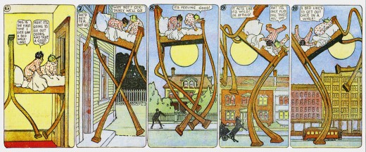
- This strip (only a partial strip is posted) was used on Raggedy Ann & Andy as a guide for Ann, Andy & the Camel to slide down the banister into the King’s palace. Other strips from McCay’s Little Nemo were used as well.
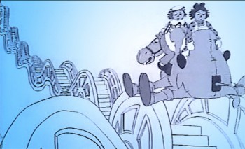 John Kimball animated this sequence, and I did many of the inbetweens (I also got to dole out a lot of them).
Between this and the seq- uence where 72 camels animated concentrically into the distance, six months of the film moved very slowly for me. I was doing a lot more supervision and pro- duction work concurrently, but kept coming back to this Kimball animation.
- Nancy Beiman, on her blog The Demon Duck of Doom, posts some material about Winsor McCay and Little Nemo. It’s a good read, and Nancy has an equally good blog.
Animation Artifacts 20 Jul 2006 07:38 am
Memo: Disney Classes
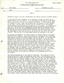
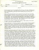
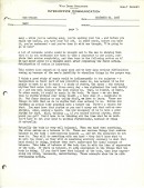
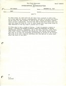
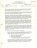
- Hans Perk, on his excellent site A-Film LA, has been posting many of the Disney notes for the afterhours classes at the studio in the 30′s. I also have a pretty complete collection of these. One document that I value is the original memo Walt Disney sent to Don Graham in 1936 discussing how they should set up these classes.
The letter gives a clear indication of what Disney thinks a good animator does, and what makes for a good animator.
Since Hans is taking a break and hasn’t posted this, I thought I would. It’s an interesting memo. Here are the 8 pages:
 1
1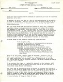 2
2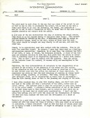 3
3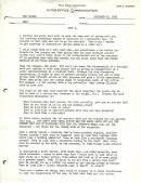 4
4
(Click any image to enlarge.)
- Alan Cook on his blog Cooked Art has an interesting commentary on CGI vs rotoscope vs motion capture. It’s worth the read, and his site is worth visiting.
- Dave Nethery on his site You’re A Gazelle features photos of a Cintiq imbedded in an animation table virtually replacing the disc. It’s an interesting idea on an interesting blog. His studio site is also worth a visit.
Daily post 19 Jul 2006 07:55 am
A Scanner Darkly reading
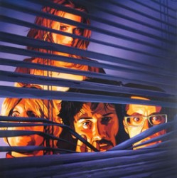 - Last night I saw A Scanner Darkly. I was impressed, and I have to somehow convey my thoughts about it.
- As an animator, I saw two films up there.
One is the film, the Richard Linklater film. It’s a brilliant take on the novel: a well acted, tightly scripted, Orwellian, tour de force by a literate and intelligent person.
The second is a rotoscoped, computer-driven, 100 minute animated film.
One: This is a film that doesn’t look like other films. It doesn’t resemble Waking Life in that the story is driven in a direct and purposeful way. It is a tense good guy – bad guy – good guy drama with lots of twists and turns in a difficult story. There’s tension throughout, as there would be in any police drama, but there is nothing obvious about this story. It’s about drugs – an experimental, government-controlled drug. But, on a deeper level, the story is about duality. People are split in two – jobs vs home, tedium of life vs the reality of life, friends vs users, good vs bad vs grey.
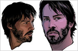 Everything works toward revealing that story: the acting is superb (acted for the rotoscope in a slightly more aggressive manner – more like theatrical acting than tradiitional film acting). Robert Downey Jr. has his mannerisms locked in; Woody Harrelson acts similarly to other pieces he’s done (and comes off feeling more like a live-action person than an animated version of live-action person). Winona Ryder plays the role and is good at it. Keanu Reeves is a wonder. His acting gets better with each film as he reveals complications within his characters more through his eyes than through his oddly graceful movements. (There are tight closeups in this film that make you feel as though you could enter the character’s sad eyes.) The three guys play a trio of housemates that really work off each other in dynamic ways as their characters jar with each other.
Linklater has decided to rotoscope this film rather than leave it as a live-action film. The reason is that theme of duality. People are not people are not animated people. They are what they are on the screen, and our brains have to accept that duality before we can move forward. We have to share that information lode before we can accept the people on the screen. It’s the duality, we, as an audience, have to get past.
- Two: as an animator, I was always just a bit outside the film watching the technique – just as I was outside of Cars, or King Kong or Lady and the Tramp. The film is rotoscoped, but in a new sense; it’s done by computer.
In NY, there’s an ad on YES, the NYYankee network, for a show featuring two radio hosts, Mike and the Mad Dog. They are two radio jocks who sit at their desks, earphones on, and talk to their callers. The ad is a quick cutting rotoscoped version of them at their desks, screaming excitably about sports, as they do on their show. The rotoscoping is the kind we’re used to seeing – badly traced off drawings, moving wildly about, almost out of registration. They’re badly colored, photoshop drawings, with the coloring moving almost as much as the erratically drawn lines. It’s the rotoscoping we’re used to seeing in student animation.
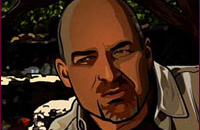 A Scanner Darkly is not that rotoscoping. In a way, it’s not even the rotoscoping of those Charles Schwab ads. It’s tight, much tighter than the old rotoscoping technique, but it’s more translucent than the Schwab ads. (Pictured to the right)
The style’s a bit hypnotic after awhile, you do have to step into it to get into this film. There is that constant motion, but it’s very controlled here. You can easily get lost in the shading over the shading over the shading. There’s an oddness on screen.
The old rotoscoping technique has no weight; characters always seem to be floating over their environs. Not here; these characters are just the opposite. I often felt that the heads of the characters had a weight I wasn’t used to seeing in animation. And though the characters are anchored to the backgrounds, there are many times when the camera will move around them, and they lose that anchoring. As the camera shifts, so do the characters – but they shouldn’t. It’s just an odd part of the process.
There’s a lot to talk about here, and I certainly don’t understand how Bob Sabiston’s process works. I just know that Richard Linklater uses it wisely. It is different in A Scanner Darkly than it was in Waking Life, and it’s done for a reason.
The film is good; it’s not great. However, it’s an ADULT film, not one made for 14 year old boys. If you want to complain about the rotoscoping go see the predictable, juvenile Monster House or The Ant Bully. Richard Linklater is trying to push animation to an adult level. It may be rotoscoped, but it is animation, and it is grown up, and it’s about time.
Animation 18 Jul 2006 08:18 am
NFB & OIAF – Canada
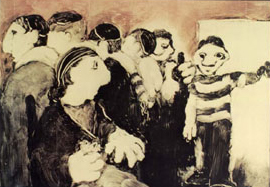 - The National Film Board of Canada has put 50 of their films online for free viewing. These are some of the greatest shorts out there, and I commend everyone to check it out.
Caroline Leaf’s three films are must viewing. As are Sheldon Cohen’s The Sweater, Richard Condie’s The Big Snit . . . As a matter of fact, try to watch them all. They’re fabulous films.
Go here for a full listing.
- The Ottawa Animation Festival has listed their accepted entries for the 2006 competition. For a complete list of films go: here. (I had intended to list those accepted from NY, but I wasn’t able to ascertain all of the New Yorkers included – so I went National.) This is a list of those films made in the USofA:
Independent Short Animation Competition
Narrative Short Animation under 35 minutes
A Painful Glimpse Into My Writing Process (In Less Than 60 Seconds) (2005) Chel White
The Doctor (El Doctor) / Suzan Pitt
It Pains Me to Say This (2006) George Griffin
Experimental / Abstract Animation under 35 minutes
Backyard Shadow (2006) Karl Staven
Copenhagen Cycles (2006) Eric Dyer
Game Over (2006) PES
Student Animation Competition
High School Animation
Goin’ Hotdoggin’ (2005) Anabel Rodriguez
Kaz Lichtenstein (2005) Kultur Woolf
Liam (2005) California State Summer School for the Arts
The Mind of the Animator (2005) George Ilavsky
Mr. Smith (2005) Carolyn Chrisman
Undergraduate Animation
By Volume (2006) Philip Woods
Morning, Day, Evening, Night and Morning Again (2006) Lev Polakov
Songs From the Haven of Despair / Jazzmen Lee-Johnson
The Possum (2005) Chris Choy
Commissioned Animation Competition
Promotional Animation
Ad Council ‘Give Blood’ (2006) JJ Sedelmaier
Comedy Central ‘Robogirl vs. Spankbot’ (2005) Michael Uman & Luis Blanco
Dodge ‘Focus Group’ (2006) Brian Beletic
Dodge ‘Hemi the Engine’ (2006) JJ Sedelmaier
FedEx ‘Stick’ (2006) Traktor
Fellowship Bible Church ‘Go Out To The Lobby’ (2006) JJ Sedelmaier
Oxigen ‘Oh Style!’ (2006) Beatriz Ramos
United Airlines ‘Dragon’ (2006) Jamie Calire
United Airlines ‘Mr. Pants’ (2005) Amanda Forbis & Wendy Tilby
Washington Dept. of Health ‘Rec Room’ (2005) Chel White
Music Video
Jason Forrest ‘War Photographer’ (2005) Joel Trussell
Television Animation for Adults
The Brothers Pistov (2005) / Dan Sousa & Lincoln Pierce
Harvey Birdman, ‘Sebben & Sebben Employee Orientation’ (2005) Rich Ferguson-Hull
Journey to the Disney Vault (2006) R. Marianetti, D.Wachtenheim & G. Steinmacher
New Media Competition
Animation Short Made for the Internet
2-0-5 (2005) Greg Spiridellis & Evan Spiridellis
A Good Joke (2005) Nick-Fox Gieg
It’s JerryTime! ‘Jailtime For Jerry’ (2005) Orrin Zucker
It’s JerryTime! ‘The Brute’ (2006) Orrin Zucker
ePrey (2005) Tom Kyzivat
Animation Made for Children
Short Animation Made for Children
The Man Who Walked Between the Towers (2006) Michael Sporn
Pass the Pinha! (2005) Elanna Allen
Television Animation for Children
Camp Lazlo ‘Tree Hugger’ (2006) Mike Roth
Codename: Kids Next Door ‘Operation: L.I.C.O.R.I.C.E.’ (2006) Mr. Warburton
Daily post 17 Jul 2006 07:45 am
Svankmajer and Lunacy
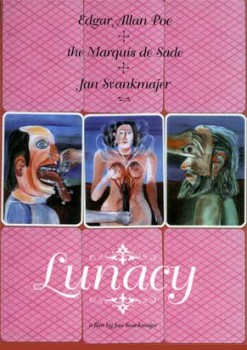 - Jan Svankmayer‘s most recent film, Lunacy, will be coming to the Film Forum in New York August 9th through 22nd.
The film has been a hit at many international film festivals, including Seattle, Melbourne, Cannes, Venice, and Göteborg.
When Lunacy premiered at the Tribeca Film Festival in April, Time Out Magazine said: “‘Lunacy‘ is a characteristically visceral mix of live action and stop-motion animation from Jan Svankmajer – leave it to the Czech surrealist lunatic to pump fresh blood into the idea of insanity as a functional state of mind.”
Jan Svankmajer’s master animation has influenced Tim Burton and the Quay Brothers. LUNACY builds on his previous features (ALICE, FAUST, CONSPIRATORS OF PLEASURE, and LITTLE OTIK.)
It’s a “philosophical horror film,†according to Svankmajer. One would guess that he should know best. All I know is that every work he’s done is a revelation and an inspiration for a lot of important animators. That probably makes it an important film to see.
- To get a glimpse of Svankmajer’s work on line, go to YouTube. (I guess no one’s challenging this copyright infringement.)
Comic Art &SpornFilms 15 Jul 2006 07:18 am
Letterman Strips Redux
- Time to recap:
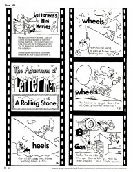
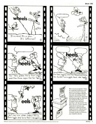
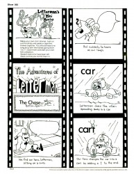
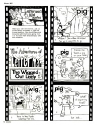
 Last week I’d posted some Letterman comic strips I’d done for the Electric Company Magazine way back in 1973. My server went down, and a couple of my July posts were lost. I’ve decided to put these back up, adding two more strips to the batch.
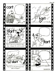
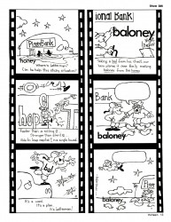
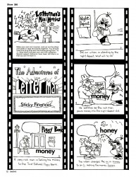
Between the second and third seasons of Letterman, I was kept on staff with the Hubley Studio to draw a comic version of the animated pieces we’d been doing. The strips had to accompany the airing of the shows within each monthly issue of the magazine. John Hubley gave me complete latitude to do what I wanted with the strip. (This was how he worked with his animation as well. If he trusted you, he let you go. He worked with animators exactly as he worked with the actors doing the improvised Voice Overs.)
 1a
1a 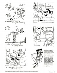 1b
1b
(Click on any image to enlarge.)
I pretty much had to bounce my scripts off the shows’ scripts, but I was asked to make it interactive, if possible. Teaching kids was everything, and each show had its instructional guide lines.
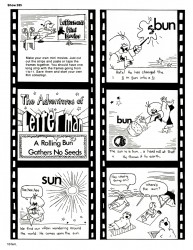
In conjunction with the editor at CTW, I came up with the corny idea of the shoebox theater (outdated even back then in the pre-computer days), but I thought it was retro-funny. I also started the strips with all the dialogue in balloons, but slowly removed the words from the balloons as the strips progressed. The idea was to get the kids to fill in the appropriate dialogue – or any words they wanted. It was also designed to be a coloring book.
The only time John Hubley looked in on me, was to comment on the line work I did on the strip. For the animated shows, we originally took the linear style from Krazy Kat – including the simple cross-hatching that Herriman used. When it came time for the strip, the lines had to get a bit bolder (cheap printing; make it a coloring book). John had seen some drawings I did in which I manipulated the ink line by copying over every line, and he was curious to see what it would look like with Letterman. I played with that a bit trying to maintain the original feel and get it to be fun. Looking back on it makes me cringe a bit, but it was a long time ago.
I think I did six strips, two pages each. It enabled me to keep working on some pet projects going on at the studio, pay my salary, and give me a small bit of autonomy. A good deal for everyone involved.
 5a
5a 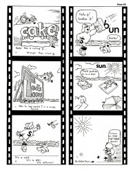 5b
5b
(To see this episode animated, go to this link.)
Daily post 13 Jul 2006 07:33 am
Darkly Cutting
- Michael Musto, in his column in the Village Voice, gives a short encapsulation of the Q&A session for A Scanner Darkly at a recent event. It’s humorous enough that I’d like to post a short paragraph here:
 Audience members kept asking banal questions about the animation process, and director Richard Linklater politely responded that he doesn’t know how anyone can sit at a computer for 12 hours without grabbing a shotgun, “but it’s an interesting tool.” So’s a shotgun. Interesting tool Downey noted that “the missus” told him the film reminds her more of him than some of his live-action characters do. Well, he’s certainly animated. With eyes flaring, he gleefully bitched about the Texas house they shot in, moaning, “It was condemnable.” (“And smelly,” interjected Keanu—or Bob or Fred or fuckin’ Bruce—getting into the fun.) But the panel froze when they noticed—no, not ETHAN HAWKE strangely running for the exit, but a woman in the audience wearing a shirt that ominously said, “Explanation Kills Art.” “As she’s shutterbugging the hell out of us, by the way,” sardonicized Downey. “Love you,” he added, to the woman. “Can’t explain why.”
We’ve all been there. I love Musto and read his column religiously. His reviews of movies and plays is usually done as an aside in one or two sentences and is usually right on target.
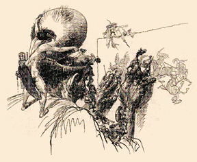 - Fresh on the heels of the successful $135 million opening of Pirates of the Caribbean, Variety reports that the Disney studio will cut back its number of films from 18 to 8. This also, of course, will lead to a substantial number of cutbacks in staffers. To quote Variety, “The cutbacks will be far greater than many anticipated, as Walt Disney Studios chairman Dick Cook looks to reinvent the architecture of his studio. Move reflects an effort to improve the studio’s return on invest- ment and get infrastructure back into line.”
We don’t know how many jobs will be lost, nor do we know if this affects the newly re-tooled Animation Division. All things being equal, one assumes it probably will. All I 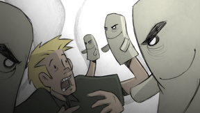 know is that even David Letterman in his top ten last night was mocking Disney for the move.
– If you’re going to be in San Francisco this Friday, Patrick Smith is presenting an “Animation Happy Hour” at 7:00 PM. This was the info provided by ASIFA San Francisco, the sponsor of the event.
“You may have seen his much touted films “Drink” “Handshake” and “Delivery” which have screened at many festivals internationally. On Friday he will show his awesome new film, “Puppet”. So join us at Amber for free appetizers , and Pete the bartender will mix you a mean Sidecar. (not free, but powerful).”
For more information on Patrick go to: this link.
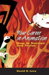 – Speaking of ASIFA, our local ASIFA East president, Dave Levy, has been making the rounds in support of his excellent and inform- ative new book, Your Career Animation: How To Survive and Thrive.
(If you don’t yet have the book, I suggest you pick it up at your local book store and thumb through it. You’re probably going to want to buy it after you do.)
He’s done an interesting interview about his career, the book, and all things animation . You can hear this interview with David by going to: this link.
Animation Artifacts &Illustration 12 Jul 2006 07:32 am
Celebrity Caricature
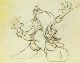
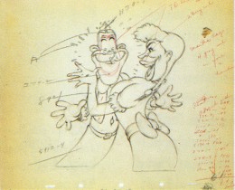
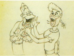
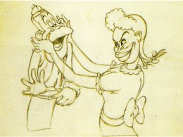
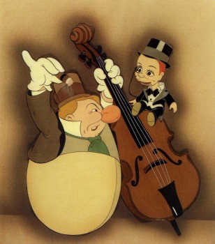 -I’m currently researching the art of Covarrubias. An exhibit at New York’s Public Library at 42nd Street in 1998 was one of the best I’ve ever seen. It was a program of “Celebrity Caricature” mostly from the 20′s & 30′s. Covarrubias, the developing Hirschfield, and a number of other brilliant artists were all represented well. In among the art was a small section on animated caricature. Drawings by Tee Hee and Joe Morgan were on display with a couple of cel set-ups. There were also a couple of WB model sheets (without artist names.)
From the book of that exhibit I’m posting some of the animation art represented. Again no names are given.
(cel – Charlie McCarthy & W.C. Fields in “Mother Goose Goes Hollywood”)
(Click on any image to enlarge)
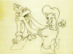
(Joe E. Brown and Martha Raye from “Autograph Hound”)
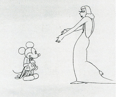
(Garbo & Mickey – animation drawing for Mickey’s Gala Premiere)
(Greta Garbo model sheet for Warner Bros.)
A small sampling of this show can be found on the National Portrait Gallery website. Non-animation caricatures are on view there, and the beautiful book/catalogue can be purchased there.
Credits for the above stills goes to:
1. “Mother Goose Goes Hollywood” from the collection of Jeff & Therese Lotman
2-5. “Autograph Hound” National Portrait Gallery, Wash.D.C.
6. “Mickey’s Gala Premiere” WDFeature Animation Research Library
7. The Steve Schneider Collection

- Actor, Barnard Hughes died yesterday at age 90. I worked with him several times and found him hilariously subtle in his sense of humor. He was the perfect actor in a couple of my films. In What’s Under My Bed? he told a nightmarish story in my adaptation of James Stevenson‘s book. In The Emperor’s New Clothes, he was one of five narrators telling the tale. I’ll miss his talent. This is the NY Times obituary.
- In case Cartoon Brew‘s link to Jim Hill Media hasn’t enouraged you, let me give you the link to the Floyd Norman article there about life in the “Bullpen” at Disney in the ’50s. Floyd’s book, How The Grinch Stole Disney, is on sale at Afrokids, and I encourage you to look into it. The man has a real wit and it comes across well in all of his books.
Animation 11 Jul 2006 07:30 am
Saved By The Bells
-Tonight on PBS there will be a documentary on Tin Tin creator, Herge. The show has gotten some attention. This is today’s NYTimes review.
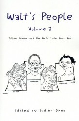 – Currently I’ve been reading Didier Ghez‘ three volume set of books Walt’s People: Talking Disney with the Animators Who Knew Him. There’s a lot of good information in these interviews. There are inaccuracies galore in the animators’ memories – as is expected from all interviews -, but the editors correct the information at the end of each interview. Presently, I’ve been reading Ward Kimball’s comments about the Disney strike. He seems very defensive as if he wants to make sure he’s on both sides of the fence.
One bit he said was that John Hubley and John McLeish were making a documentary about the strike and were disappointed to have not been able to screen it. As Kimball says, “. . .they agreed we shouldn’t open 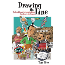 old wounds.” This could have been possible. I knew, while I was working for him, that Hubley had a lot of 16mm footage of the strike, and I saw a lot of still photos. I hadn’t heard, till reading this book, that they were trying to make a professional documentary. Still, given the many inaccuracies in Kimball’s comments, I’m not sure that it was real.
Art Babbitt’s view of the strike is much more engaging. There is no doubt that a reality is behind his memories. They’re all so exact and detailed. It makes for a captivating read.
I’m looking forward to Tom Sito‘s book, Drawing the Line. This is an informed history of the unionization of the artists in animation. I’d read parts of this in an advance manuscript Tom had shown me and found a lot of new material. I suspect I’ll find a lot more in the final book when it hits the market in October. An excellent piece of history from a dedicated historian.
 - Last night Pee Wee’s Playhouse invaded Adult Swim/Cartoon Network. It’ll air Mon-Thurs at 11pm. I love this show; I love Pee Wee Herman; I love that it was done in NYC (the first and best season). I doubt I’ll watch the reruns.
I could complain about live action on the
C – A – R – T – O – O – N NETWORK , but the whole notion of such a complaint seems tiresome at this point.
(And I did that already.)
At least Pee Wee’s Playhouse had some funny animation wrapped into each show and it was done (in NY) by Broadcast Arts, a good animation studio that ultimately became Curious Pictures.
And it’s not Saved By The Bell.

