Monthly ArchiveJune 2006
Animation Artifacts 20 Jun 2006 09:44 am
Beginnings
 - In the past week I’ve seen a number of animated films. Cars is the only one I saw in a theater. On television, my television, there were a lot of other films: Robots, The Incredibles, Lady & the Tramp, one of those Bugs Bunny compilation things, and Toy Story. On dvd I watched: the complete Norstein, about ½ of Raggedy Ann & Andy, some old Hubley commercials, and the opening of Bambi.
(Quiet)
That’s a lot of animation to watch. Some of it was accidental, some of it was on purpose. Most of the films just showed up on tv, and I watched. However, I thought of something while watching Cars and was curious to follow up on some of the others.
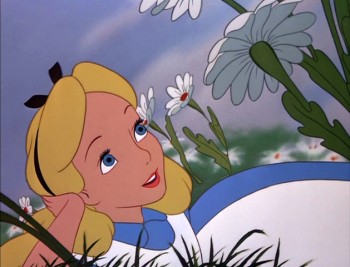
Back when I was a teenager, after viewing a lot of animated features, I realized something. My favorite part of most of these films happened within the first fifteen minutes or so. I particularly loved the openings, the introductions to the characters.
Snow White until she finds the dwarfs’ cottage; Bambi born in the woods; Pinocchio as a puppet until that magnifecent shot of the village wakening; Lady as a pup up to the point where she scorns the Tramp (even that great introduction to the rat); that great intro to all of the characters in 101 Dalmatians right up to the Twilight Bark. I could go on for a while.
It’s true, even of non-Disney features: Hoppity comes home to a torrent of trouble happening amongst the other bugs in Mr. Bug Goes To Town; Gulliver‘s landing and that great tie-him-up sequence; the intros of Hans & Kay & the Snow Queen in the Universal-Americanized version of The Snow Queen; Magoo and his nephew meeting other principle chartacters in 1001 Arabian Nights. Ok, maybe Im pushing it now.
But you get my point. Those quiet, unassuming introductions were just so delightful. We were given some real screen time to get to know all of the important characters,
and they were wonderfully developed before the story really started to unveil.
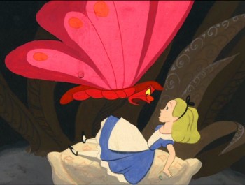 Today we’re thrown hard-core into a film. After the powerful Lion King opening – those first four minutes or so – everything has changed. Like TV shows, you have to get the attention of all the little buggers out there. (Forget the fact that they paid to see the film and are trapped in a theater, many of the kids are going to watch the show on tv anyway.)
.
(Not so quiet.)
.
I think Toy Story does it well; they’re loud and fast-paced, but we get to know a lot of the characters in the nursery before the adventure begins. I also liked Robots; it gives us a nice gentle opening really reinforcing the lead character and his family. We don’t meet the louder, more violent characters until our hero gets to the city. Cars starts off with a high tension couple of shots happening inside Lightning McQueen’s head, with his voiceover, then the tension really starts. Or at least it’s loud and fast-paced. We’re sort of thrown into the movie. The world of Pinocchio and Lady & The Tramp is left far behind. Probably not better or worse; it’s just different.
- Lane Smith has a funny pre-4th of July posting today on the site for his book, John, Paul, George & Ben.
- I’ve come to enjoy checking in with Ward Jenkins‘ site. He has such a sweet and gentle personality (as comes across in his blog, at least) that I usually end up smiling after reading it. Today’s posting is one of those times. I also love the very personal touch he brings to it.
- In a completely different way, I enjoy Eddie Fitzgerald‘s blog. His story of his first animation job is funny, revealing, and reminded me of some of my first days.
- Jim Hill Media has an interesting article about the box-office take of Cars. Is too much being made of box-office take these days? Should we be more concerned about the “artistry” of these films?
Animation 19 Jun 2006 08:18 am
Barry Purves
- Following up on Saturday’s entry about Lou Bunin, I thought I’d bring a little note of attention to another master working in this medium, 3D animation, today.
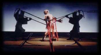 Barry Purves has made a number of absolutely beautiful films and has created in his own studio some masterfully realized pieces. His work has a discriminating taste, graceful and controlled movement with superb acting, and an intelligence that is rarely found in animation today.
He was nominated for the Academy Award for his film Screenplay, a virtuoso work which follows the rules of Kabuki theater and presents a double-layered story of a man watching and revealing a story from his past which eventually rips through the past and tears at the present. It’s a work of animated puppetry, displayed as theater and a stunning film that should have won its Oscar.
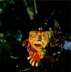 Rigoletto presents the opera in a condensed version that has been reduced for television. It’s a packed half-hour which places you into the full opera and allows you to follow it without any confusion. It has a majesty in its sweeping and dynamic camera moves which whisk you along in the luscious music; they carry you along through the depths of the complex story. It’s a wonderful film that certainly grows richer with each viewing.
Other works he’s done include a wonderful film about Gilbert & Sullivan: The Very Models gives us the pair as seen through the eyes of D’Oyle Carte. A rich and entertaining diary into the making of this film can be found on AWN and a short clip of the film is available there as well.
As a matter of fact, I found his diary there so entertaining, I’ve also followed the diary he keeps on his own website.
You can get a small glimpse of Barry Purves‘ craft by viewing the clip reel at Acme Filmworks. But you’re left without the full heft of his work until you’ve seen the complete storytelling ability he presents in the whole films.
Puppet Animation &Trnka 18 Jun 2006 08:31 am
The Hand
As you can tell, from some of my recent postings, I have always had a love affair with puppet animation. There’s something extraordinary about that medium that has drawn me in. I’ve always demanded a tactile approach to animation, including all of the 2D work I’ve done.
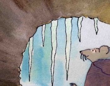 I remember seeing Lady & The Tramp in 1955, on its first release (I was nine.) It was then that I consciously noted that one of the backgrounds in the “Bella Notte” sequence (I can now see that it was an Eyvind Earle BG) had texture in its paper. The board it was painted on came through the animation photography and reached out to me. The human hand became evident in the film.
Perhaps, this was what I loved so much about animation in the first place. Humans did it, and it was self-evident. Being reminded of it, in the subtlest ways – usually unintentional, added to my joy.
Perhaps this is what brought me to John Hubley’s films. Those films were so obviously painted: characters and BG were both used by the photographer to combine for us, and the unintentional was often caught on screen. (I immediately loved those highlighted rings double-exposed around the characters in Moonbird, the brush strokes of The Hole, the transparency of the characters’ paper in Of Stars and Men.) It added to the experience.
In a sense, I was brought out of the film but held in it and given the opportunity to love it even more.
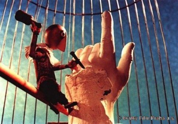 I’ve had this same sense with the best 3D animation. Though I was always there viewing it, I was also caught up in the emotions of the film. Trnka’s masterful film, The Hand, had my understanding those tears and sweat on the little potter were moistened ink that had been his painted eyes. But the anguish I felt the first time I saw the film and that effect has never left me. The perfections of the Human Hand in that film forced the imperfections of the puppet potter to be revealed until it destroyed him.
Perhaps this is also what keeps me from embracing cgi animation. Despite the faked textures of the computer, it’s so obvious that it is not real. At least not when the characters are cartoons.
A very small example of what I’m trying to communicate stands out for me in Cars. The paint job of newer cars has a flecking/speckling of glitter within the paint. In the right light, the main character, Lightning McQueen, had this paint job. Everytime I saw it, I was distracted and pulled out of the film. Like the real paint on a real car, that flecking was embedded within the paint, itself. It didn’t feel like the byproduct of a human hand; it felt like a computer trick.
 I am no more capable of coloring the computer skin of that computer hand than I am of painting a real car. It isn’t tactile for me, it’s just distracting.
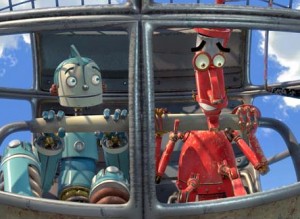
It’s just something I never feel I can reach out and touch. This is something that has been overcome, for me, in a couple of films. The Incredibles gets very close often. Moments of Robots, such excellent design for the medium. Some of Toy Story.
(Click on any image to enlarge and enjoy the textures.)
Of course, I recognize that this is my problem. However, I recognize it’s a problem that other people probably have and wonder if there isn’t a solution. In The Iron Giant, the Giant is animated by a computer. I was told that the animation had to be rigged to be animated on “two’s” so that it wouldn’t separate from the rest of the hand-drawn animation. Oddly, it felt totally acceptable to me; I saw no problem and accepted that robot. There has to be, in there, a way to resolve it – I’m just thinking here and don’t expect anyone to try to follow what I’m saying. Perhaps if “human” problems, technical problems, were added to the animation. . . No this is even too stupid for me.
Puppet Animation 17 Jun 2006 07:46 am
Lou Bunin
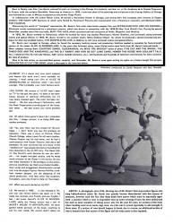
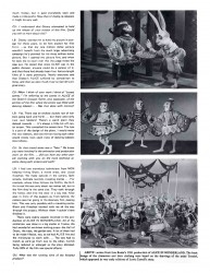
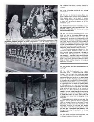
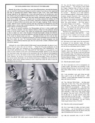
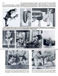
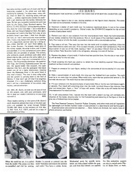
In my collection, I have this article from an out-of-print Close-up Magazine, and I thought I’d post it for the 3D lovers out there.
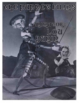
– Back in the days when I was scouting New York for any possible job in the animation industry, my love of puppet animation came to the rescue.
Through ASIFA East I’d met John Gati and had talked with him through many trips on the subway (we both lived in Queens at the time), about 3D animation. John made his living with model animation for commercials, though his love was full-out puppets. At a dry time for me, he offered 2-3 days work helping him on a commercial spot for Care*Free Sugarless gum.
The Care*Free gum had to undress itself (take off the wrapper) and jump on a scale. Trident gum, did the same on the other end of the scale. Which weighed more? Care*Free, of course.
(Click on any image to enlarge and read.)
I prepared the packaged gum, wired it up for 3D movement and helped in the shoot. Just as we were completing the spot, word came down that Trident was changing its package. We had to do the spot again. Another two days of work for me.
Midweek, another spot started on the other side of the studio (a large open room with a lot of cameras, movieolas and equipment. Lou Bunin had just started animating a Lucky Charms commercial with a puppet elf. This was a test commercial General Mills wanted to view to see how the character worked in 3D. (Obviously, they didn’t do the change.)
For a couple of days, I got to watch and talk with Lou seeing how real characters were animated. It was memorable for me, a neophyte in love with all things animated.
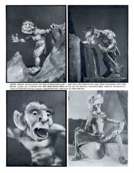
Lou Bunin had done a memorable feature of Alice In Wonderland which was released at the same time as Disney’s film. This puppet film, is probably closer in feel to what Lewis Carroll was thinking when he wrote Alice, and the film should be seen for comparison.
.
Years later, after I’d formed my own animation company, I found my first short film to produce for a company called Learning Corporation of America. This was a non-theatrical division of Columbia Pictures. For LCA I did two short films, Byron Blackbear and the Scientific Method and Why We Need Doctors.
Assigned to me as my assistant Producer for LCA was a woman named Amy Bunin.
In a quiet moment alone, I asked if she were related. It turned out that Amy was Lou’s daughter, and I knew that some sort of karma was at work.
#7
Animation Artifacts 16 Jun 2006 08:01 am
On-line viewing
Thad of Animation ID has posted a number of cartoons of interest: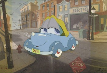 –
–
- The Tex Avery short One Cab’s Family tells the story of a family of cars with a hot-rodder amongst them. This short offers beautiful design, excellent direction, good story, great track.
I often wondered which film influenced the other: this or Susie The Blue Coupe. Both done in 1952. Both look similar, though the Disney film is lusher. Those windshields for eyes.
(Susie The Blue Coupe – thanks to Cuckoocomics.)
- Larry Doyle produced a series of shorts using the Warner Bros. characters as if they were in a TV sitcom. I’m not sure that actually was the plan when they were made.
Deliciously unfunny. Completely unwatchable. You can try if you like.
Thanks to Thad for posting them. I otherwise might not have seen the minute I watched.
- There’s an interesting biography of Charles Dickens animated by the Rufflebrothers for the BBC at Bleak House. This is the site for the BBC live action drama, Bleak House, and the flash animated piece gives an idea of Dickens’ life. It’s an on-line accompaniment to the series. I think the animated piece stands up on its own, although it gets a bit dry.
Aardman animation has just sold their Big Jeff shorts to MTV2 for airing starting late June. You can get a sample of these shorts at Big Jeff.com.
Animation Artifacts 15 Jun 2006 08:12 am
Grim Voice
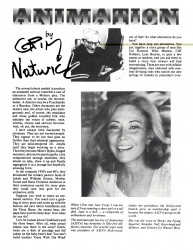
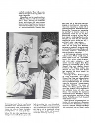
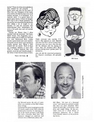
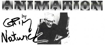 - Today’s guest writer is Grim Natwick. This is a short-lived column Grim Natwick wrote for Cartoonist Profiles magazine.
This particular one was printed June 1980. It’s an article about cartoon voices.
(Click on any image to enlarge.)
Here are a couple of interesting links:
- Thanks to Drawn, here’s a link to a collection of Bill Mauldincartoons.
- There’s a entertaining video of a “Rube Goldberg” machine made of sticks, stones and leaves at Make:Blog
Animation Artifacts 14 Jun 2006 07:19 am
Marty Taras/More Fritz
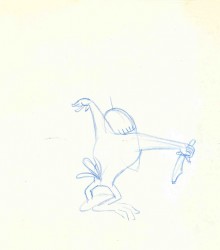
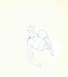
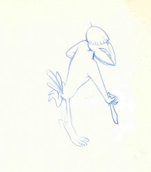
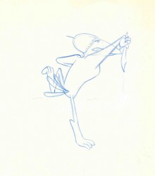
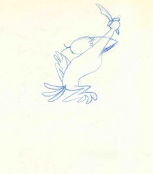
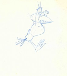
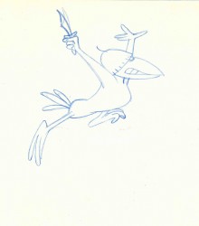
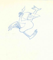
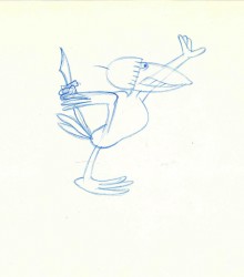
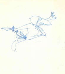
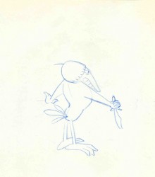 – No, these aren’t drawings from a Heckle & Jeckel cartoon; it’s a Marty Taras scene from Fritz The Cat. I thought I’d post some more bits from one of the scenes I have. It’ll give you an idea of the clean/roughs that Marty drew.
His work was always drawn this way, very clean leaving easy work for the assistant. A number of animators I worked with had a similar drawing style. Johnny Gentitlella and Earl James both had drawings very much like this. Nick Tafuri‘s style was broader, but most of the drawings had the same look. This was the look of the Terrytoons/Paramount material. If an animator drew too rough, then the assistants had to work harder, and it ended up costing the producers more money. The animators adapted.
#1 (Click any image to enlarge to see full pages.)
Commentary 13 Jun 2006 09:48 am
CARS – a flop?
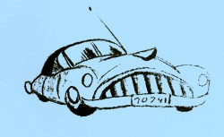 – In response to Hans Perk‘s comment on my post yesterday, I posted a reply. After writing it, I thought I should bring greater attention to this NY Daily News article which points out that despite the $62 million opening of Cars, Disney analysts were disappointed. They expected $70 million. The shares for Disney stock went down yesterday in reaction. This came as a surprise to me but shoudn’t have.
I haven’t seen the film and don’t know whether I’ll think it a good film. However, I was pleased with what I thought was its successful opening. PIXAR is the premiere company making animated films today, and I want them to do well – if only for the sake of the industry. But it’s obvious that too much money will never be enough.
Illustration 13 Jun 2006 08:21 am
Tim Hildebrandt
 Fantasy fans are in mourning today with the news of the death of Tim Hildebrandt. He was, of course, one the famous Hildebrandt Brothers whose artwork was at the peak of fantasy illustrators.
Here is his official obit:
From the Hildebrandt Family – June 11th, 2006
Tim Hildebrandt has passed away. And, with him, so has an era.
Tim, 67, died today from complications due to diabetes. He is survived by his mother Germaine, twin brother Greg, sister Janie, wife Rita, son Charles, nieces Mary and Laura, and nephew Gregory.
Tim was an otherworldly artist. For 47 years, his captivating work fostered the dreams and fantasies of millions of fans, young and old.
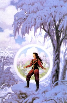 Best known as part of the Brothers Hildebrandt team, Tim’s career transported him to—and through—many worlds. Technically speaking, Tim and Greg worked side by side. But their work together on such masterpieces as the original Star Wars poster and 70’s J.R.R. Tolkien calendars proved that their individual talents could coalesce seamlessly into one.
Tim was a wonderful man with a great sense of humor. While he loved and appreciated all forms of art, he had a particular passion for animation and illustration.
While he will be greatly missed by all of us who love him, we take comfort knowing that he will live on in the art that he created.
Anyone wishing to express condolences to Greg Hildebrandt can send them to:
The Spiderwebart Gallery,
5 Waterloo Rd.
Hopatcong, NJ 07843
Comic Art 12 Jun 2006 07:07 am
Pyongang
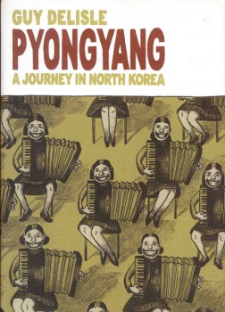
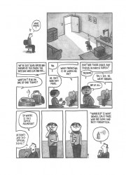
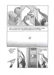
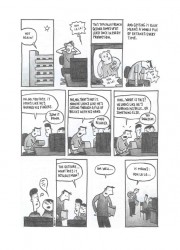
- On my birthday, back in April, my friend Adrian Urquidez (he, who wonderfully constructed this site and connected blog) gave me a copy of this graphic novel, Guy Delisle’s Pyongyang. I’m not a big fan of graphic novels, so it sat on my desk for months. But I did read it yesterday and found it more than compelling. The book is worth searching out.
It’s the story of an American cartoonist working in France who accepts a job in North Korea, Pyongang to be exact, working as a supervisor for a French animation company.
Through his eyes we see what it’s like for a foreigner living in North Korea, and we see what it’s like as an animation supervisor in such a distant/different country. It’s a very interesting read; you’re somehow sure it’s all fact not fiction.
(Click on any image to enlarge.)
Guy Delisle has another book in print, Shenzhen. I’m certain to read that one next.
Here are three samples from this book that have to do with animation:
- Hans Perk is back from Annecy with a few photos of sunny Annecy as well as a small glimpse into the jury’s confused state. This is always the case, in my eye, at this festival. Note that I’ve posted the award winners a couple of days ago.
- Also back writing on his site is Michael Barrier. He gives us a bit of a tease review of CARS. However, I think he leaves no doubt as to which way down his thumb is pointing. I’m looking forward to his review.
My interest has been strong enough to read about two dozen reviews of this film. I’m looking for one to tell me why I should want to see it other than to see what the best cgi studio work looks like and an obligation to a life in animation. From trailers and clips I see everything I expect: something loud and too-fast-for-its-own-story. I’m hoping I’m wrong, but that’s the film they’re selling. I’ll see the movie this coming Saturday (at an Academy screening).
- If anyone has a particularly useful review to point me to, please do.
- The only really interesting one I’ve found so far is this: ‘tooned out By Christopher Kelly of the Fort Worth Star-Telegram. He uses this film as a jumping off point to talk about the difficult task cgi animation has in telling a story. Very insightful, I think – worth reading.
- The new New Yorker magazine comes with a good (though not positive) review by Anthony Lane of Cars. It expresses many of the expectations I had on the subject and handling of the film. Again, I’ll have to see it for myself.
There is also a very good article about Gregg Toland that is not available on line. It doesn’t mention Song of the South.
There’s also a good article by Oliver Sacks about stereo vision. Also not available on line. This is a good issue.
