Monthly ArchiveJune 2006
Animation &Books 30 Jun 2006 07:33 am
Grendel
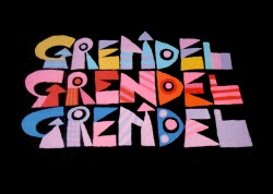 – Grendel, the opera, directed and adapted by Julie Taymor from John Gardner‘s novel recently opened in San Francisco to good reviews. There’s an excellent review on the site The Lemmings Were Here, and there’s another by animation composer, Ross Care, at Music From The Movies. (You’ll remember Ross’ commentary on the Bambi dvd.)
The opera is set to open July 11th at Lincoln Center as part of its Lincoln Center Festival.
(Click on any image to enlarge.)
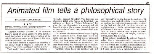
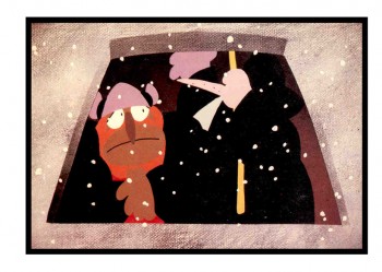
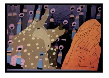
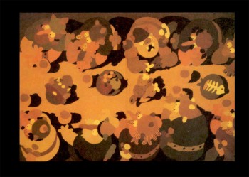 For those long-hearted animation afficionados, you’ll remember that there was an animated feature based on this same book. Grendel Grendel Grendel was an Australian film directed by Alexander Stitt. Stitt was a commercial director/producer down under. He put all his chips into this film and gave it a dynamic style. As a matter of fact, his house style seemed to be limited animation without outlines on his characters. Unfortunately, the script and the direction was bland, and the dynamic book died as a film. It also wasn’t distributed widely, nor was it marketed well.
At the bottom of this page, I’ve included a saved copy of the NYDaily News review, in case you’re interested.
 I have some interest in this opera and animated film because of my connection to the book.
Back in 1976, when I’d first started working at Raggedy Ann & Andy, I was thoroughly grabbed by the book and felt that it would make a wonderful animated feature. I did the unconscionable move of the innocent; I wrote to the author, John Gardner, c/o his publisher. I told him that we could make a great film and would somehow raise the money. It wasn’t the greatest concern. (I said I was innocent.)
Believe it or not, John Garder wrote back and said he was interested. The fact that I’d worked on one of his favorite animated shorts, Cockaboody, gave him a bit more interest in me. We eventually hooked up, and he gave me a couple of stories to tell just with that first evening when we met at his home in Bennington, Vermont. It was a real trial of an evening which ended with an all night bout of martini drinking and conversation.
I ended up with the rights to the book, and John Gardner, himself, would write the screenplay. The problem was that I was that innocence I spoke of. A real neophyte, I didn’t raise the money, and the project stagnated in my hands.
I came close when an executive at United Artists was sold on it, and wanted to go. She was a real mover in the company and had clout. Unfortunately, UA collapsed in scandal, and MGM bought the company outright eliminating all execs, including my contact. I came close in selling it to Cinema V, who had just had a good hit in Terry Gilliam’s Jabberwocky.
I have no doubt that I would be able to sell it today if I went out with the materials I had in hand and that selling point, John Gardner’s name. I’d also found a couple of celebrities who were willing to connect to it – including Paul McCartney. But it wasn’t to happen.
Gardner had a hard divorce, came down with cancer (which he overcame), and owed a lot of back taxes. He had to sell the project to an Australian filmmaker who offered cash. My last ditch effort before he sold it was to call Roger Corman. Corman took my call (the magic of John Gardner’s name) and tried to think how we could raise, at least, the $25,000 to secure the rights. He asked me to give him a week. At the end of the week, Corman decided to let it go, and I had to surrender.
I did get invited to the Alexander Stitt film when it played in NYC. It only stayed at that one theater for a couple of weeks, then it too disappeared. But I got an interesting lesson in life. I also have some incredible memories of John Gardner; I illustrated a couple of his books.
I look forward to Julie Taymor’s opera.
Photos 29 Jun 2006 06:56 am
Grim’s 100th Birthday Party
(Click on either image to enlarge.)
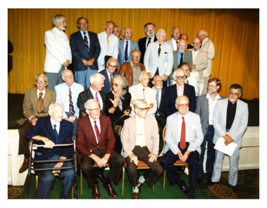
– Back in August 1990, a crowd of animation folk gathered to celebrate Grim Natwick‘s 100th birthday. At one point, during the celebration, a photo was taken of many of the elder statesmen positioned on the stage.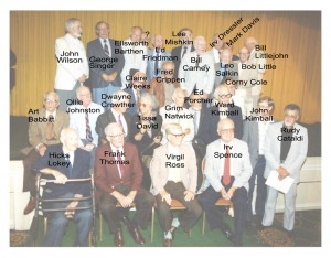
It was a blast being there; events like this probably occur in LA often enough, but they’re truly rare in NYC. I spent a good part of the evening talking with Bob Little, who had painted BG’s for many – if not – most of the Paramount cartoons, and I had a great time doing so. I thought it funny that we both had to fly out to LA to meet.
I recently located this photo that Tom Sito sent me, and thought it’d be fun to post it. Below the original, I’ve posted a key to identify those on stage. I’m not sure why Walter Lantz didn’t make it to the photo, but he was most certainly there. Only one person remains unknown in the picture. (Please let me know if you recognize the gentleman in the back row.)
Animation Artifacts 28 Jun 2006 07:32 am
Spunky & Tadpole
Spunky and Tadpole is a dark spot in my unconscious memory of bad animation that I 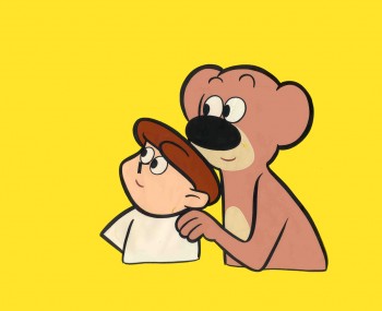
somehow have an affection for.
Jerry Beck listed it as one of the ten worst animated series ever created. (I don’t agree with that, certainly not with all those abominable Hanna-Barbera/Filmation/ Ruby-Spears shows that were so godawful and unwatchable. At least Spunky and Tadpole had a bit of style; perhaps because it stands out, it can be recognized as bad. It was bad; just not among the very worst. But I’m splitting hairs; bad is bad.)
There seems to be very little recorded about the production of the show. A couple of vhs copies of the series exists in the remainder bins of the internet and can be bought for little. The only credit listed anywhere on-line is that of a director, Art Moore, whoever he may be. I haven’t been able to locate any information about him either. (Someone on a chat room thinks he may be the producer of The Regis Philbin show.)
The show went into distribution via syndication in 1958 and was virtually knocked out of business by the rise and popularity of 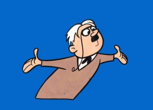 Hanna-Barbera’s product, Huckleberry Hound and Yogi Bear. Spunky & Tadpole were featured on local programs that had local hosts introducing shorts. I was surprised to find out that as many as 150 episodes of the serialized cartoon series were produced.
The cast included: Joan Gardner as Spunky, Don Messick as Tadpole. Ed Janis replaced Don Messick in the last episodes.
This cast means the show was probably done in LA.
(Click on images to enlarge and properly view the excellent inking.)
Some time ago, I still couldn’t resist buying a couple of cels which were selling on Ebay for just about nothing. They still amuse me.
- Speaking of good animation acting, Mark Mayerson has another chapter in his provocative series on Acting in Animation. I enjoy these posts; they get my mind working on a sore subject. (Sore subject because Bad Acting is pretty much all I see these days. Lots of jerking from pose to pose animation.)
Animation Artifacts &Daily post 27 Jun 2006 08:25 am
Film Dope
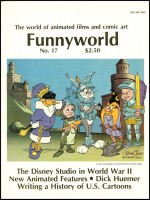 – Magazines are very important to me. The most treasured, unfortunately, do not publish anymore. There are these two that have given me such amazing information and insight that I will always treasure them.
- I have about half a dozen issues of Michael Barrier’s Funnyworld magazine, and I hoard them all preciously. The magazine was the first I’d found to value animation as a real art and give critical information about the films and the form.
Fortunately, Michael Barrier continues to post articles, reviews and invaluable information on his website. I can also reread Funnyworld articles. I value his writing and insight.
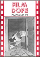 – Right in line with Funnyworld was the British publication Film Dope. This magazine printed an alphabetical listing of film makers, and people important to films. Actors, cinematographers, directors, costume designers, musicians and cartoonists all were blended together in alphabetical order, and one-by-one their careers were offered and analyzed. A formidable chronology of their work was detailed and a short critical commentary was printed.
Until 1996, the magazine was published on poor paper in a lackluster printing method, but the material was always spectacular. Wonderful scholarship and solid information was the norm. (Only once did I locate an error or oversight in their catalogue. Not that I’m the greatest arbiter.) Their opinions were often a bit ascerbic, but they usually had significant points to make, and I always enjoyed the writing style.
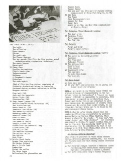
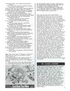
To give an indication of the magazine, I’m posting the entry for Ub Iwerks. About the only place to find back issues is on Ebay.
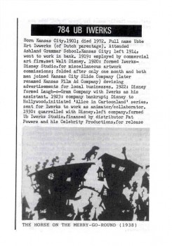
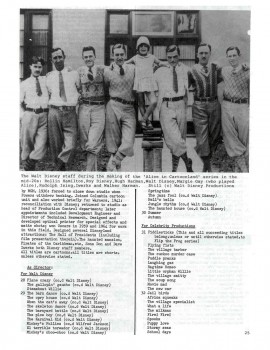
(Click on any image to enlarge and make it readable.)
The magazine was packed from inside cover to inside cover with such material. No ads.
Current magazines that I love are few, too. I have a hard time getting through a week without The New Yorker magazine. I also love Amid Amidi’s Animation Blast and wait patiently for each issue knowing there will be a payoff. Both thankfully still exist.
Animation &Daily post 26 Jun 2006 07:55 am
Robot Heads
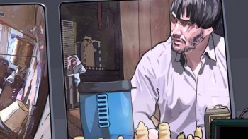 A Scanner Darkly opens on July 11. This is the animated film adapted by Richard Linklater from the Philip K. Dick story. It’s done in the same rotoscoped style (or whatever computer folk call it) used in Waking Life.
There’s an unusual side story to the opening of this film. I caught this article in Saturday’s NY Times: A Strange Loss of Face, More Than Embarrassing.
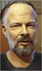 The “Face” in the headline is really the head of a robot designed by “computer whiz, David Hanson”. This was an android version of the late author, P.K. Dick. The robot would sit and answer questions in a presumably lifelike manner.
Hanson enroute to LA accidentally left the head on his plane in an American Tourister rollaway bag. When he called the airline, they’d located the head, put the bag in a box (so they said) and shipped it to the owner. Unfortunately, the head never arrived .
Gone was the interview between Letterman and the robot-P.K. Dick. Gone were the personal appearances. How did it affect the publicity plan for A Scanner Darkly? My favorite line in the article comes at the end. A studio exec said, “He was perfect for the film. Now he’s disappeared — and that’s perfect for the film too.”
(The robot-head.)
Real life.
- Mark Kennedy has been posting some beautiful thumbnails by Bill Peet on his blog, Temple of the Seven Golden Camels. These drawings from Sword In The Stone are an inspiration. By the way, if you don’t own Bill Peet’s autobiography, you’re missing out on one of the great books available.
Animation &Animation Artifacts 25 Jun 2006 07:39 am
Babbitt Runs
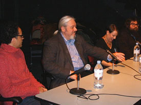 – AWN has an interesting (though somewhat dated) article about a seminar held at School of Visual Arts to hear what came of some of its more luminous animation graduates.
(pictured) Tom Sito, John Dilworth, Yvette Kaplan, Chris Chris Prynoski and Alex Kupershmidt responded to questions which were compiled by AWN writer, Joe Strike.
The program was part of an exhibit of art by the ex-students of SVA. I reviewed the art and the opening here though I didn’t get to the seminar.
- I’d also recommend everyone go to Oscar Grillo‘s blog. He has some beautifully drawn images of his take on some classic comic strips. I’d love to see some animated film versions of the characters as they look here. This man is an artist.
- On my Lou Bunin posting, Mark Mayerson asked: “Somewhere I remember seeing a drawn walk cycle of a dodo bird that Art Babbitt did for Bunin’s feature.”
The answer came from Mark Harding: “The Babbit cycle is on page 189 of Shamus Culhane’s Animation, From Script to Screen.”
I thought I’d post these two pages from that book. There are two more of these studies for Bunin’s film, and the book includes an enormous wealth of other animation referential material. It’s a must-own for animation fans.
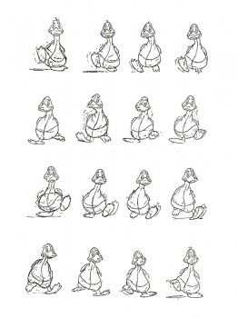
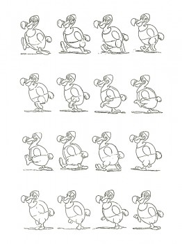
(Click either image to enlarge.)
Kentridge 24 Jun 2006 07:52 am
Flip Book
- There’s a good interview at Cartoon Brew by Amid Amidi. Garrett Gilchrist has recently completed a compiled version of Richard Williams‘ film The Thief and The Cobbler: Recobbled Cut. Garrett had sent me a copy of this compilation, and it’s the real deal. He’s done some magnificent and laborious work getting it to the wonderful condition. It’s like watching an excellent rough cut of the film. See it (in 17 parts) on You Tube. Garrett’s website is OrangeCow.org.
- Thanks to Rhett Wickham at Laughing Place. There’s a great article posted there about John Lasseter’s guidance on future animation projects. It seems clear that 2D animation might not be dead after all.
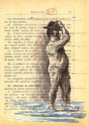
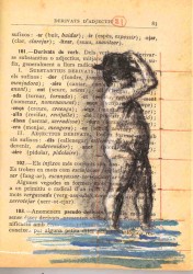
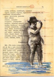
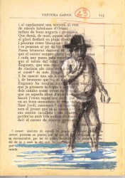
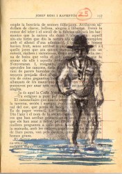
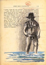
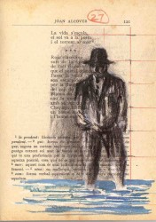
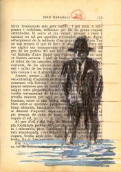
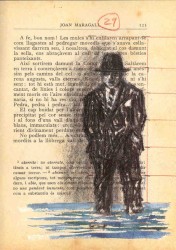
- The South African artist, William Kentridge uses animation as part of his art. He’s made a number of flip books that are stunning pieces. I’m posting a small part of one of these here to show the fingerprints of art. You’ll note he used an existing book and just painted his images on the pages. Of course this proves we can make Art without expensive tools; we just have to do it.
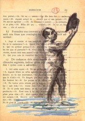
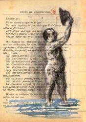
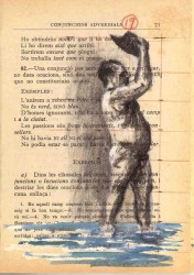
(Click on any image to enlarge.)
Animation Artifacts &Trnka 23 Jun 2006 08:08 am
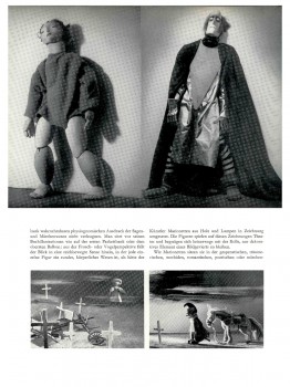
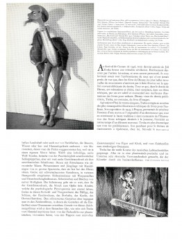
Graphis Trnka Article
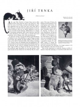
To continue with my interest in animators that leave fingerprints, I return to the father of all puppet animators, Jiri Trnka. I have this Graphis Magazine article from 1947. This was published before any of the great Trnka films: The Hand, Archangel Gabriel and Mother Goose, Midsummer’s Night Dream.
Regardless, there are still some beautiful images in his earlier work.
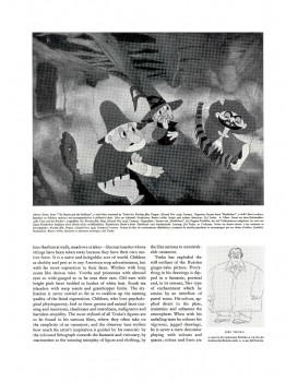
(Click on any image to enlarge.)
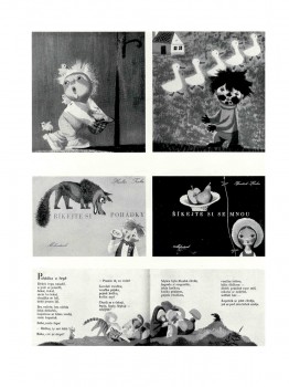
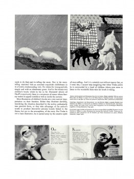
(Note: Graphis printed in three languages; all of the English is included.)
Animation Artifacts &Comic Art 22 Jun 2006 07:23 am
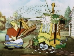
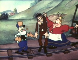
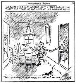
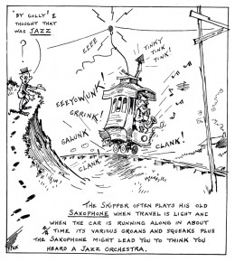
The Toonerville Trolley
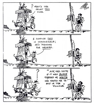
- I’ve been a big fan of the “Toonerville Folks” for a long time. I didn’t find the strip for a while. When I was young, a local TV channel, an ABC subsidiary, ran a lot of old silent Aesop’s Fables. They had classical music backing them up; usually Bizet filled the bill.
One year they upgraded by throwing a number of the Van Buren shorts in betwen the Terry silent films. These Van Buren films, many of them directed by Burt Gillette or Tom Palmer, were odd. There were a number of films with Greek gods as their stars. Then came the shorts with Molly Moo Cow and those with the Toonerville Trolley characters.
(Click on any image to enlarge.)
I liked these and learned from the credits that they were adapted from a comic strip by Fontaine Fox. So, I sought out the comic. Of course, in those days, prior to computers, all you had was the library to research things. My local branch had only one or two examples of the comic strip which ran from 1915 through 1955.
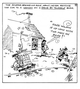
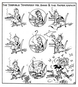
The animated shorts were made in the mid-thirties when Van Buren tried a run to improve their films. Neither sound and color nor the acquisition of the rights to this strip didn’t help; even the “terrible tempered Mr. Bang couldn’t help.” The studio closed before the decade had ended.
In 1978 I worked with R.O. Blechman as his Assistant Director to put together the PBS show, Simple Gifts. This was a packaged of six segments adapted around Christmas with a number of different illustrators designing the segments. One of them, the one I was most attracted to was The Toonerville Trolley. Blechman bought the rights from King Features (at an enormous price) for a four minute film in the middle of the program. I’d worked hard to get the piece to animate. I even did a one minute sample of the film in my off time at night, and I thought it was pretty good. However, Blechman was afraid of losing me in the operation of his studio. (We were doing more commercials than show, and I hated it.) Bill Littlejohn did a nice job of animating the entire piece which was completely subcontracted out to him. That was probably appropriate since Bill worked at Van Buren when they produced these shorts.
Story & Storyboards 21 Jun 2006 07:52 am
Starting Off With A Punch
One of the most violent films I can think of is Raging Bull.
The show starts with an incredibly lyrical, slow-motion sequence in B&W with blood-red credits, in small type, (designed by Dan Perri). Over this very slow motion footage of a brutal fight an operatic aria plays on the soundtrack, and the live action cutting flows beautifully with the music.

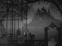
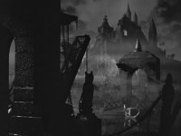
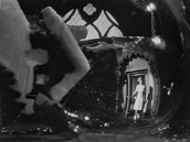
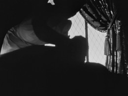
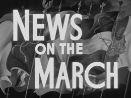
(All of these images from the opening of Citizen Kane – another brilliant opening sequence – can be enlarged by clicking them.)
We have been pulled into the story, we’re captured by the imagery – actually the images mixed with the beautiful vocal. Because of the slow moving images, we’re not thrown by the violence we see on the screen as Robert DeNiro gets beaten violently. It’s sublime poetry.
Finally the credits end, the last image hits us with a JOLT – normal speed and the loud smash – as DeNiro’s face gets brutally punched. We’re into it.
From this we cut to the story of Jake Lamotta, DeNiro’s character. We’re slowly drawn into the story of the fighter, and we’ve already adjusted to the violence we can expect to come. But it’s not going to be in slow motion anymore.
Martin Scorsese knows how to open his film. He slowly pulls us in, allows us to adjust to the incredible violence we’ll see, and then introduces his characters – slowly.
We haven’t been hurled into a violent film and been expected to sit patiently with an unlikeable character for two hours. It doesn’t work that way. We have to learn who these characters are, see their vulnerable spots and then be allowed to watch them be heels.
The topical sentence, the first sentence of a novel is probably the most important. The same is true for film; that opening sequence sets the tone for the whole movie. Crash! Boom! Bang! or lyricism.
Making films is a difficult proposition. Anyone can assemble images, but complex difficult storytelling is an art. Scorsese is one of our greatest artists.
Enough about Art Onto another subject: Money.
The grosses for Cars may not be as overwhelming as Disney had hoped, but it’s obvious that it will be a smash in merchandisiing. Per the Jim Hill article I linked to yesterday, Disney guessers had hoped for $300 million domestic from the Pixar film but have now lowered their sights to $200 million for the film that cost $125 million. But the real money will come from the merchandising per this Daily News article. They expect to wrangle $600 million this year. Should Michael Eisner be thanked now?
