Category ArchiveIllustration
Bill Peckmann &Comic Art &Illustration 09 Nov 2012 06:40 am
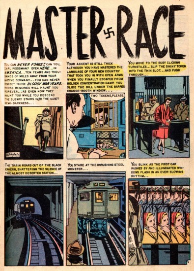
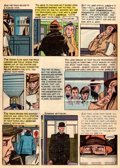
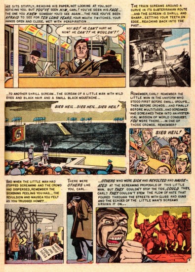
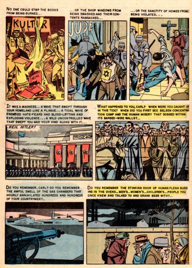
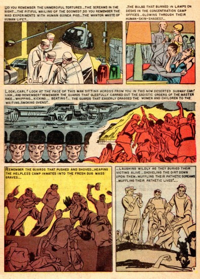
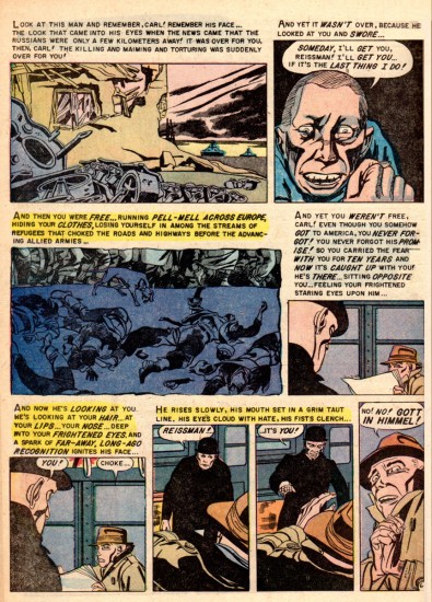
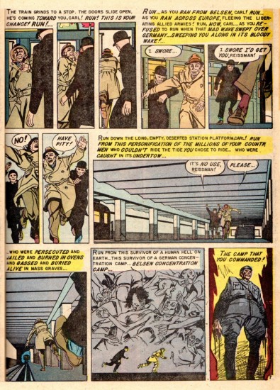
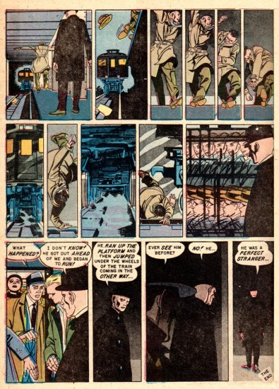
Bernard Krigstein’s “Master Race”
Bill Peckmann continues to introduce me to new and interesting artists. Here’s what he wrote abot Bernard Krigstein:
- Comic book artist Bernard Krigstein, like animation artist Fred Mogubgub, was ahead of his time. In the 1950′s, Krigstein’s page and panel designs with their distinct breakdowns set the pace for comic book art that followed later in the century.
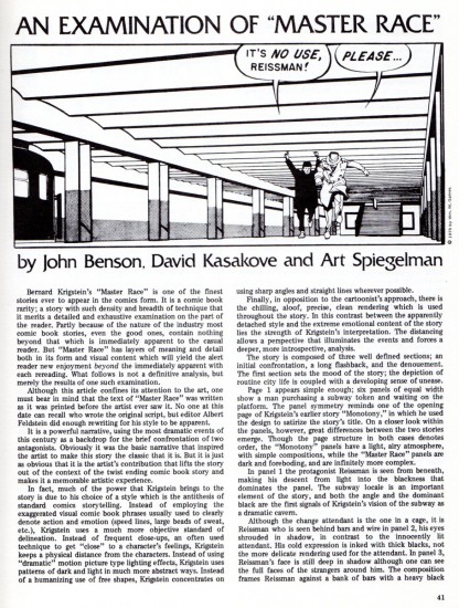
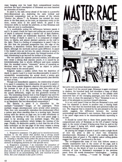
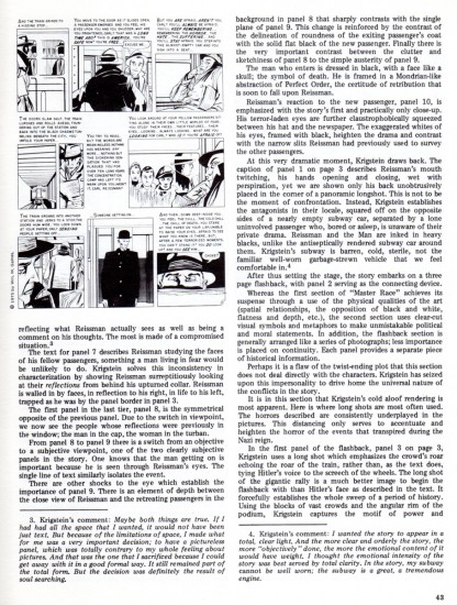
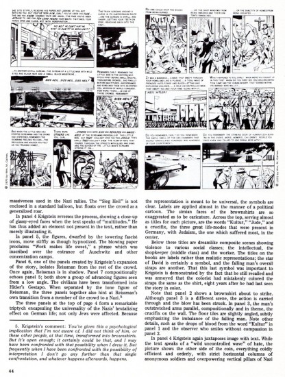
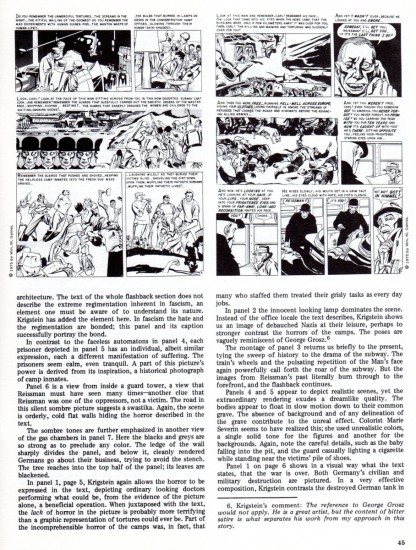
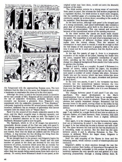
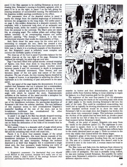
Here from the original 1955 comic is his most reprinted story, “Master Race”. It appeared in the first issue of EC Comics’ “Impact”. It will be followed by an excellent essay/examination of that story which appeared in the EC fanzine “Squa Tront”, in 1975.
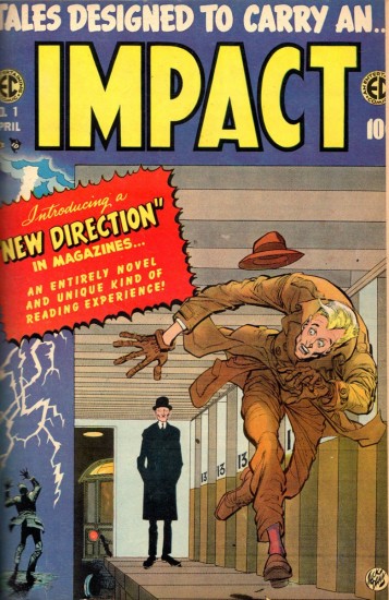
This is the cover of “Impact” No. 1 drawn by Jack Davis.
Here is an article which appeared in the fanzine, Squa Tront in 1975:
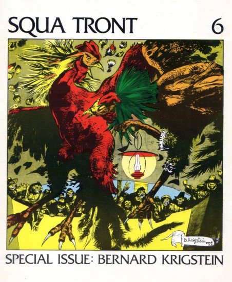
The Squa Tront cover
Illustration &Layout & Design 07 Nov 2012 06:19 am
Hal Silvermintz
- Hal Silvermintz was the Art Director and Designer for Stars & Stripes Prods. Forever Inc. as well as Designer and partner in Perpetual Motion Pictures. His design work hasn’t gotten much attention lately, so I’d like to offer a couple of pieces in the archives held by Buzzco Associates. Candy Kugel, is sending a lot of their past artwork to the Museum of Modern Art, so I’d like to showcase a few of these pieces before they’re out of my hands.
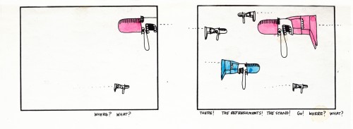
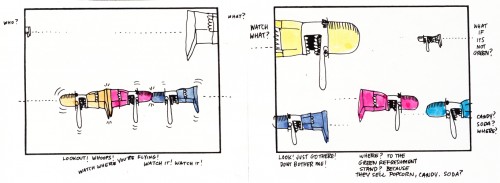
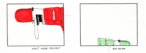
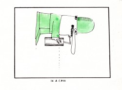
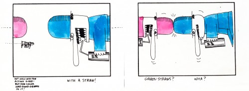
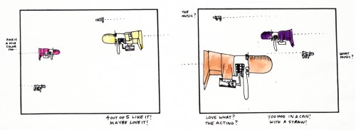
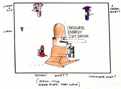
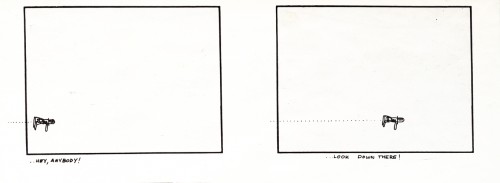
I’ll start with one of the screwiest looking storyboards I’ve ever seen. It’s for some kind of Chocolate Energy Drink. Since it’s one page and very large, I’ll present it in the one page version. Then, for you to be able to read it, I’ve broken it down into panes and will present it a second time. So here goes:
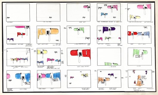
Full sized storyboard
The following are individual panels from the same board:
 1
1(Click any image to enlarge to read.)
.
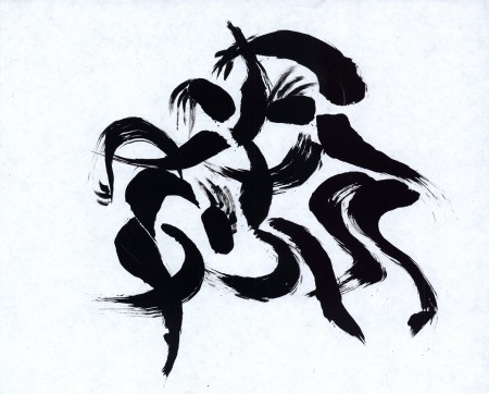
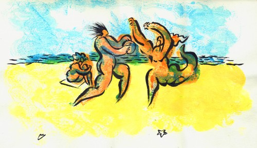
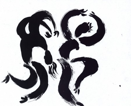
At one point Hal had designed “Fast Food Matador” for a personal film done by Hal, Candy Kugel and Vince Cafarelli. While the studio worked on the short Hal continued to turn out sketches of dancers (paint on cel) that really had nothing to do with the short, except mood.
Here are two of these.
 1
1
.
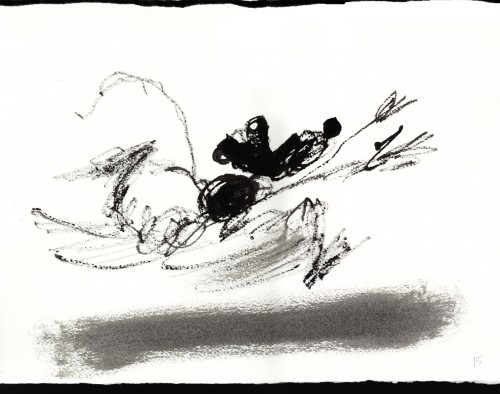
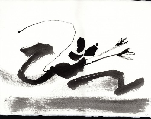
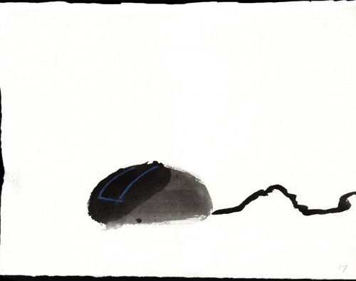
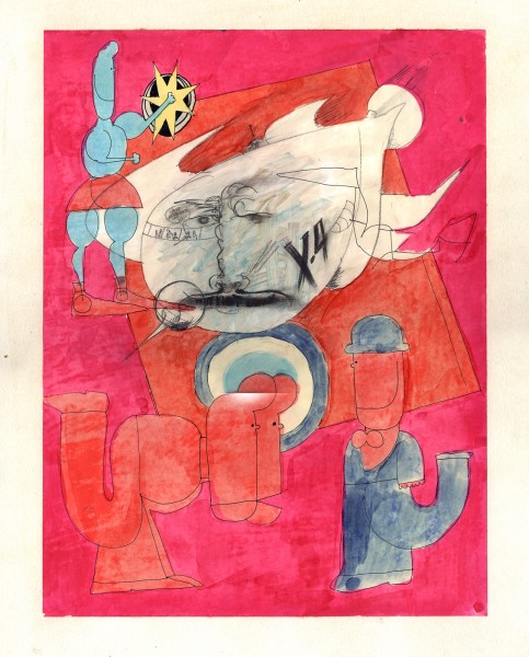
The following 18 pieces were done by Hal in preparation of a short the studio, Buzzco, was going to do called “Mouse Potato”. This was in 2002. The idea was it was the computer equivalent of a “couch potato.” Circumstances made them stop work on the film, but these large paintings still live on.
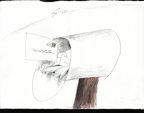 1
1
.
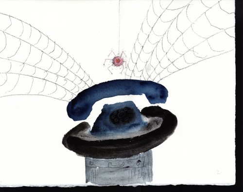
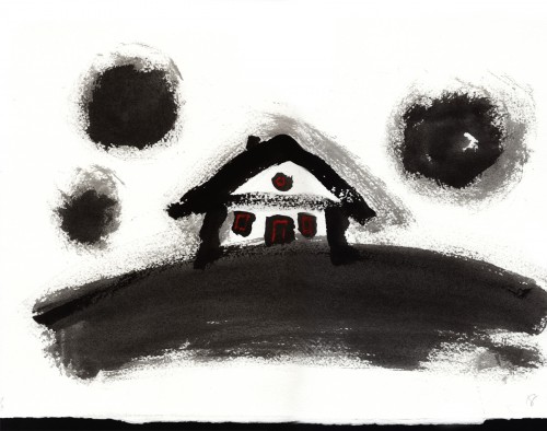
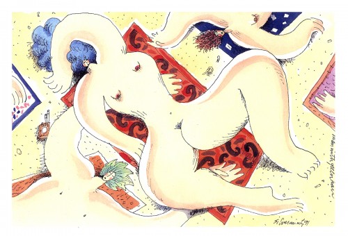
The following 4 pieces were done by Hal Silvermintz as personal works of art.
They weren’t done for any specific films.
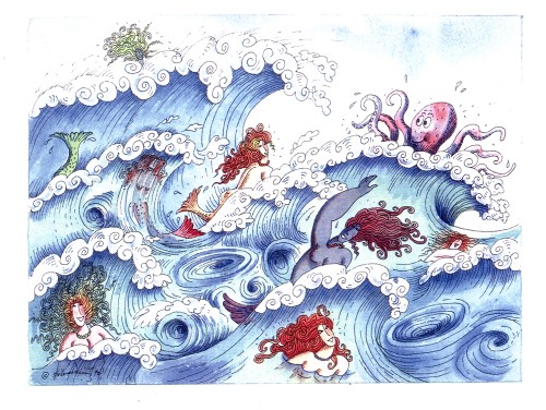 1
1
Art Art &Books &Commentary &Illustration 29 Oct 2012 06:21 am
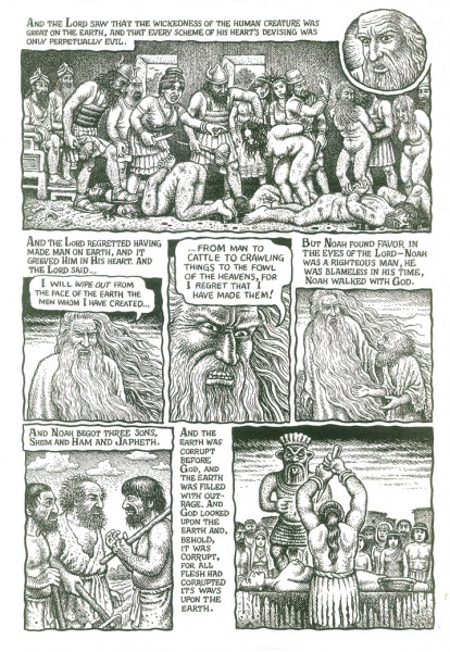
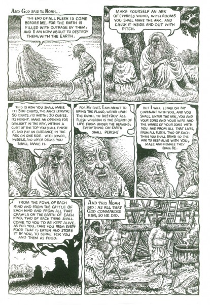
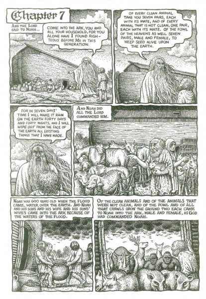
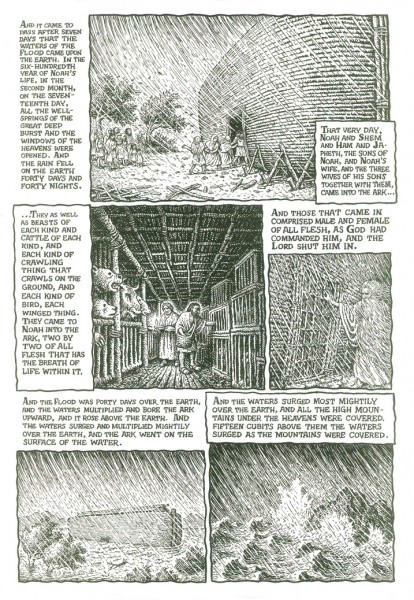
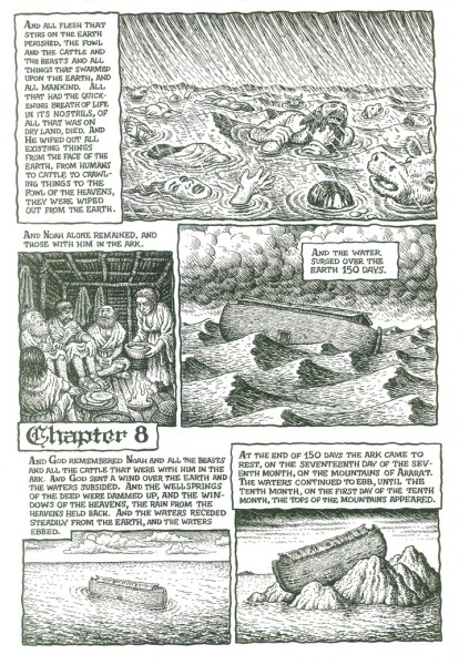
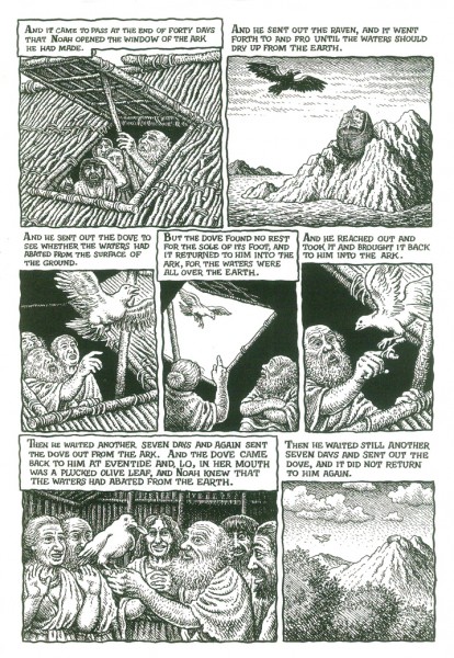
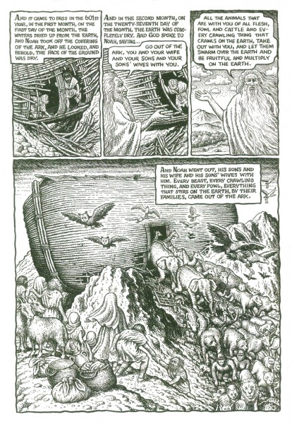
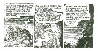
Crumb’s Mighty Genesis
- Tsunami’s in Hawaii and Northern california, Hurricanes in New York and the Northeast. Floods everywhere. I see only one responsible thing to post at this point. Mitt denies the science of globl warming. Obama doesn’t fein stupidity but hasn’t done anything abot it. Not that his moronic Congress would allow him to take even a baby step.
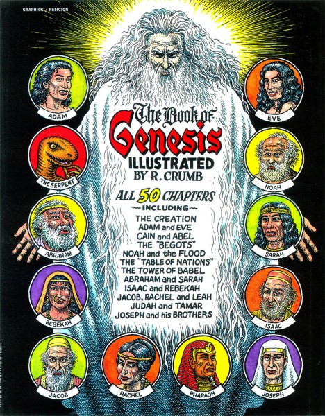
In 2009 a book came out containing the appropriate chapter and artwork and response to our current dilemma.
Robert Crumb‘s Complete Book of Genesis.
His fantastic illustrations pull you into the book, and his condensation of the stories of the Old Testament couldn’t be better. If you don’t know about this Crumb book (and it’s hard to imagine that you don’t) you should get to a library or Amazon and buy a copy. It’s a grand work of Art, in my opinion.
Noah’s Ark, illustrated here in fewer than seven pages, gives a good sampling of what Mr. Crumb is doing with the work and deals with our modern problems.
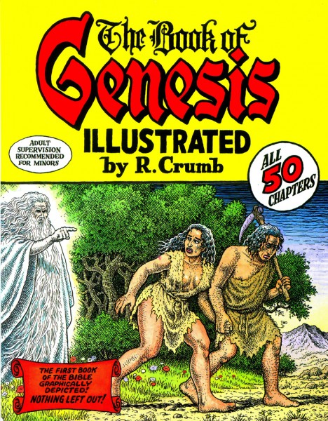
The Front Dustcover of the book
Animation &Bill Peckmann &Books &Comic Art &Disney &Illustration 19 Oct 2012 06:38 am
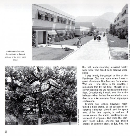
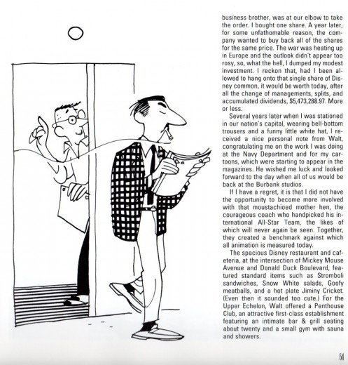
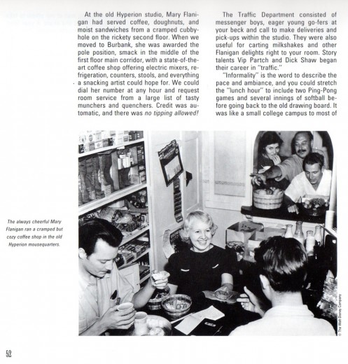
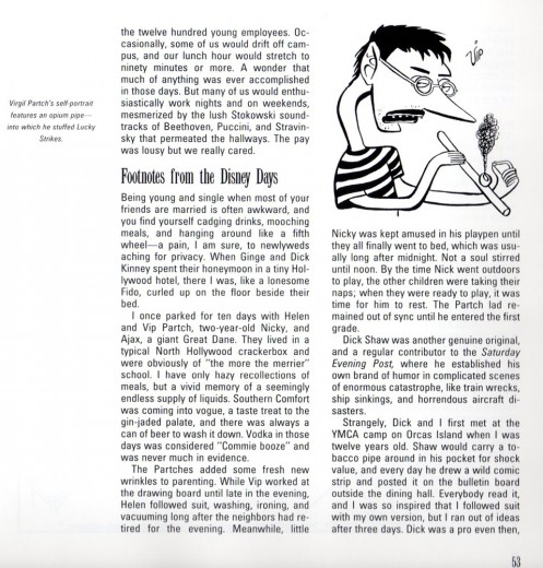
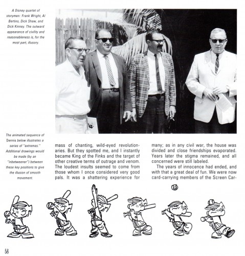
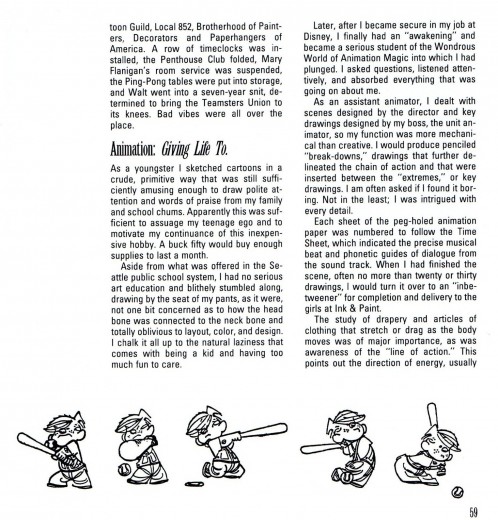
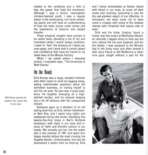
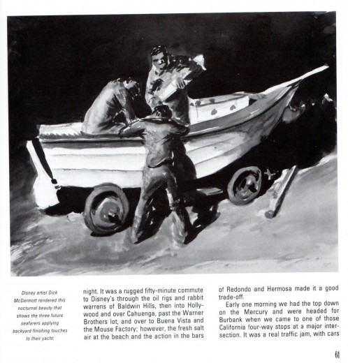
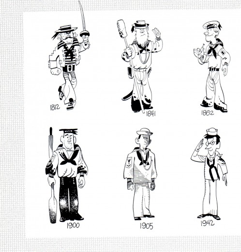
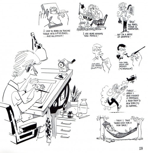
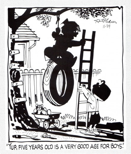
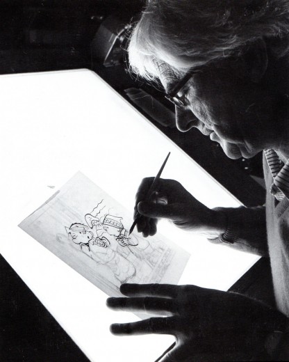
Hank Ketcham @ Disney – 2
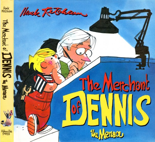
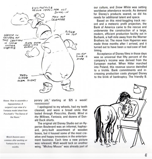
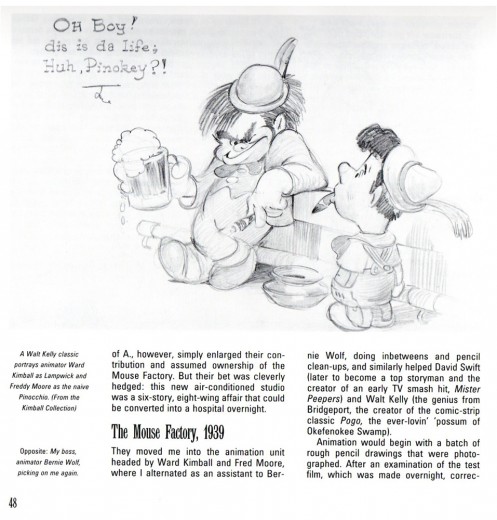
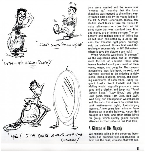
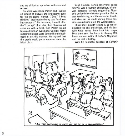
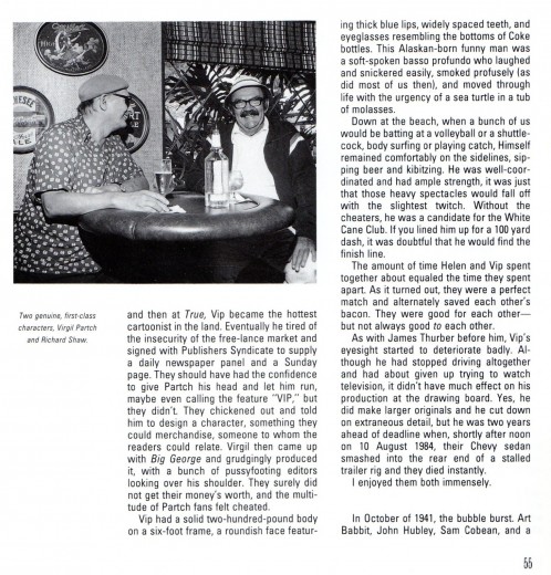
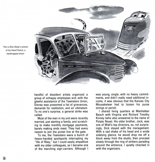
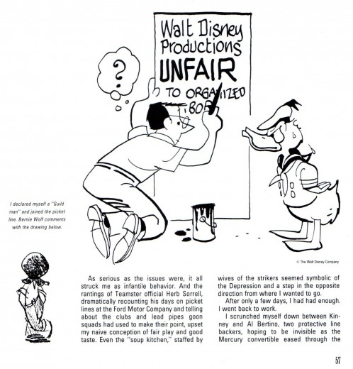
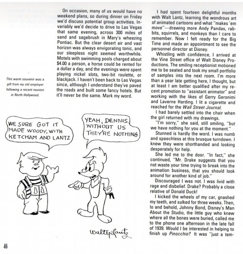
- On Monday I started posting this chapter from Hank Ketcham’s autobiography, The Merchant of Dennis the Menace: The Autobiography of Hank Ketcham. Bill Peckmann introduced me to this book, and the chapter I’m posting here. Many thanks to him for the scans.
This is the second half.
 18
18
Bill Peckmann &Books &Illustration 16 Oct 2012 05:53 am
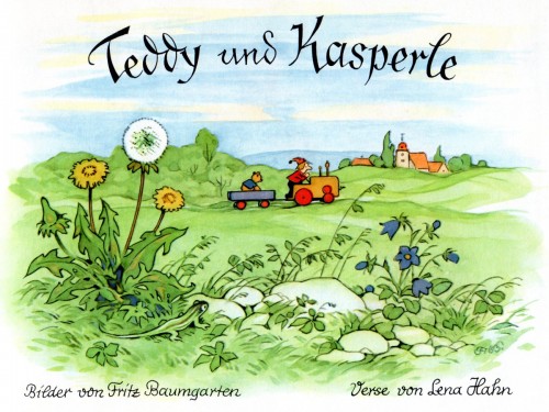
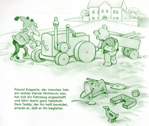
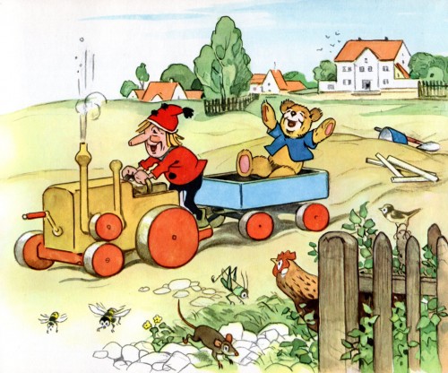
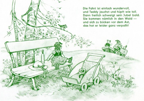
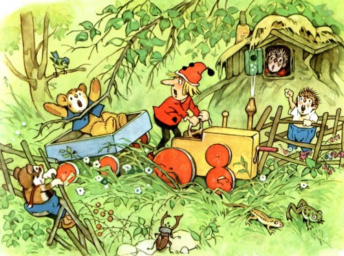
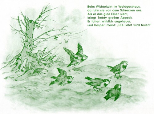
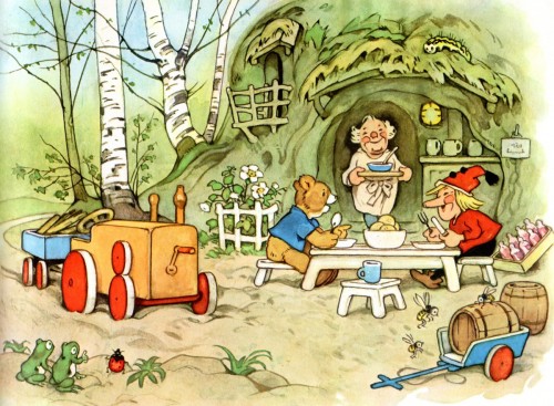
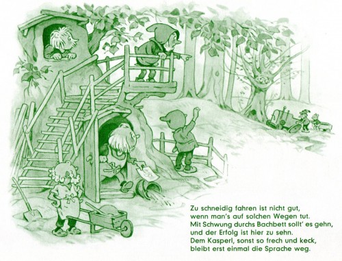
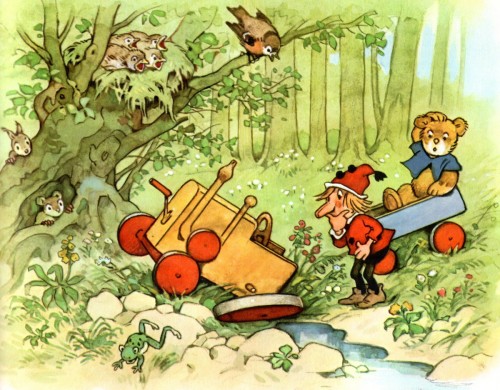
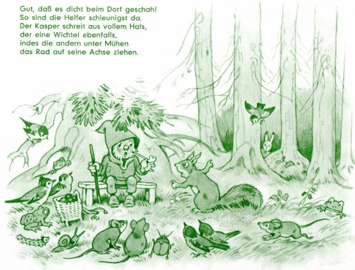
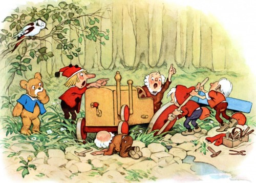
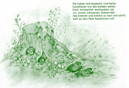
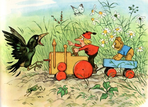
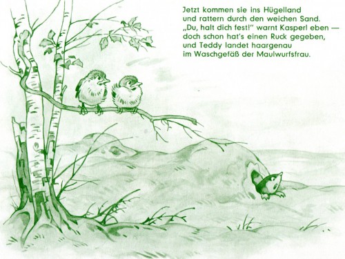
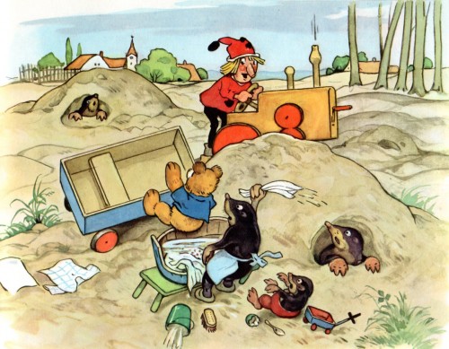
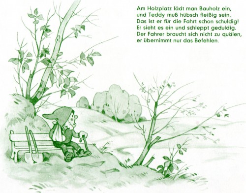
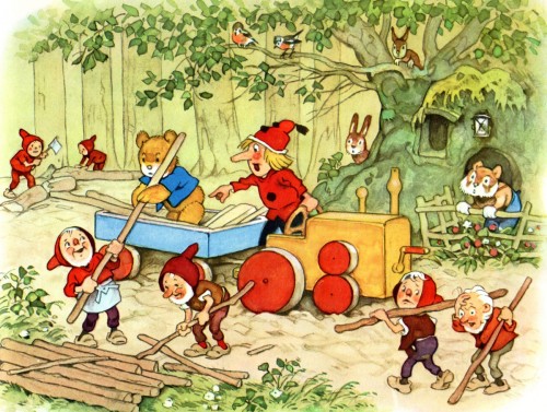
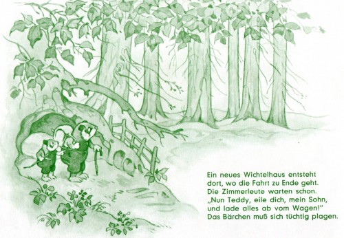
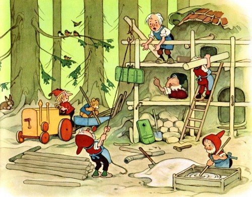
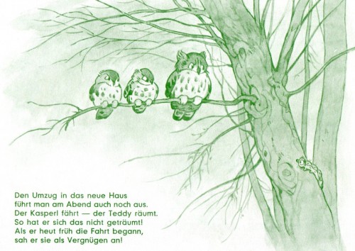
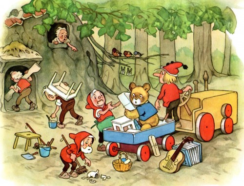
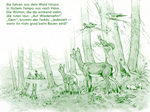
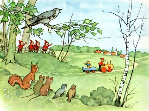
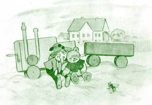
Baumgarten’s “Teddy und Kasperle”
- As you know by now, I am a fan of Fritz Baumgarten‘s illusration work.
Bill Peckmann couldn’t please me more than by sending more scans of Mr. Baumgarten’s work. And it seems as though Bill has a large collection of his books. Here’s another one, Teddy und Kasperle. Teddy appears in quite a few of Mr. Baumgarten’s books, and he’s an entertaining character.
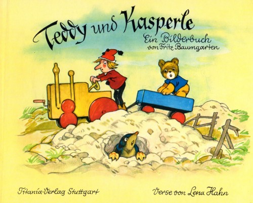
The book’s cover
Art Art &Bill Peckmann &Illustration 09 Oct 2012 05:43 am
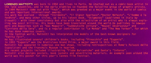
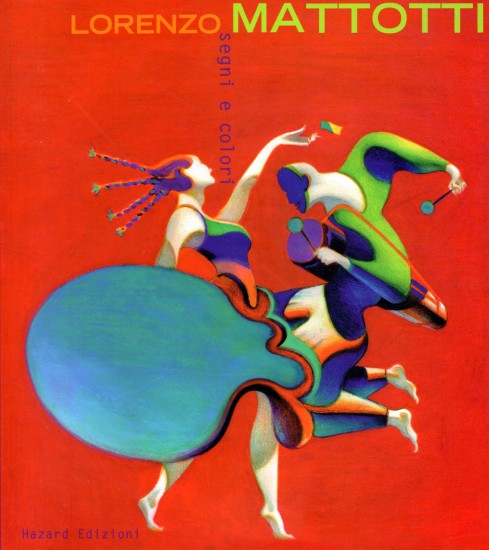
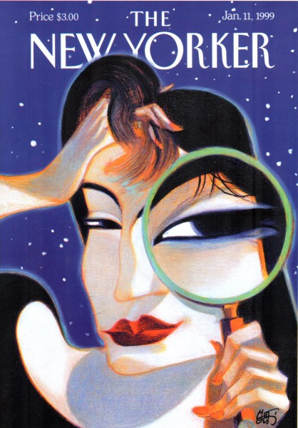
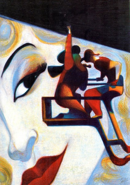
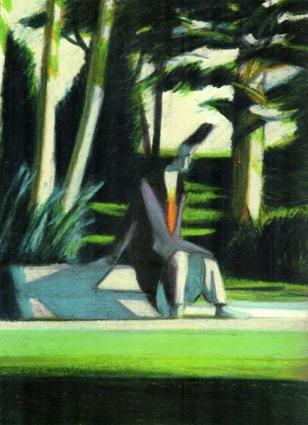
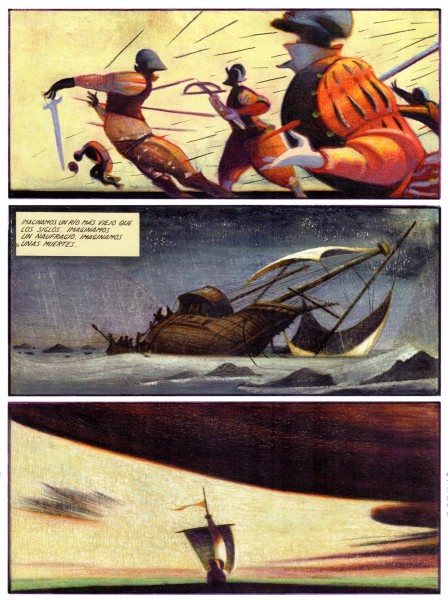
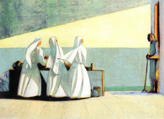
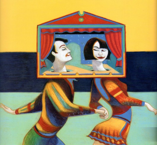
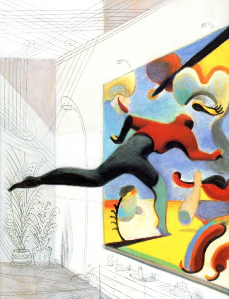
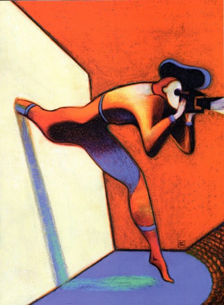
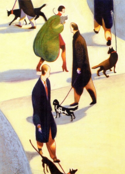
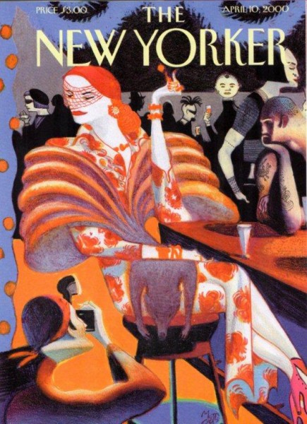
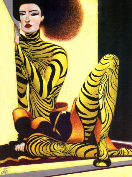
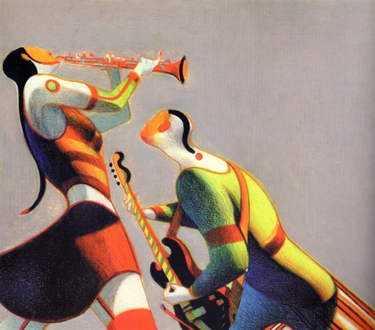
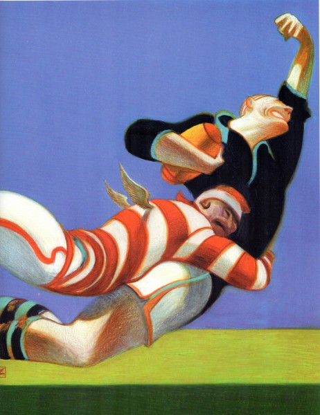
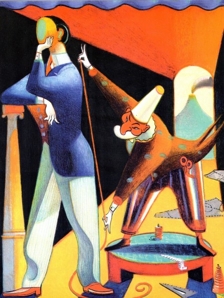
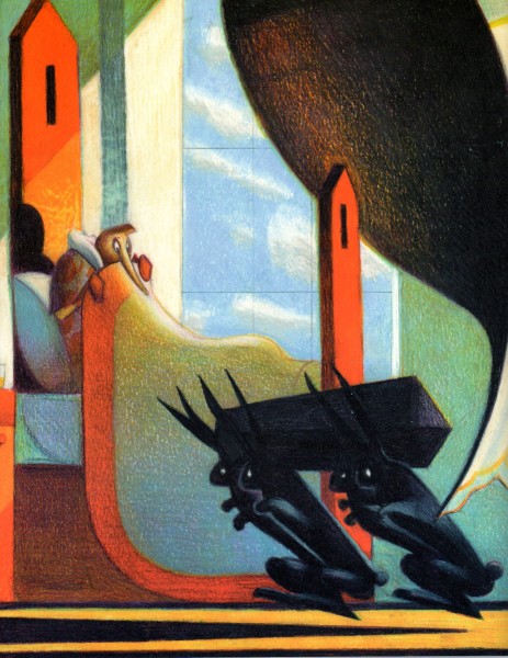
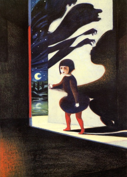
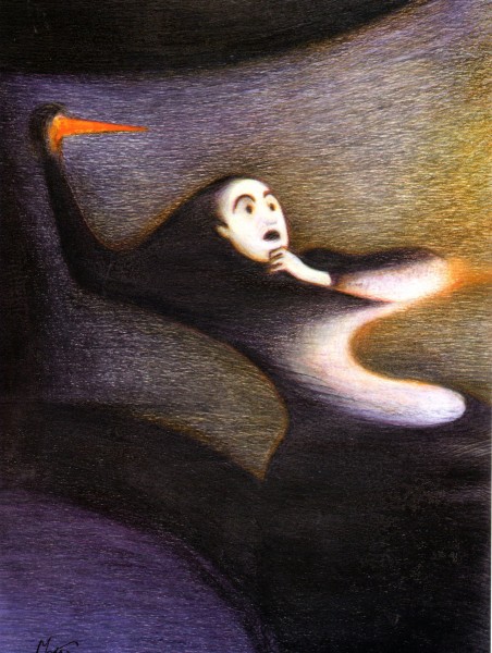
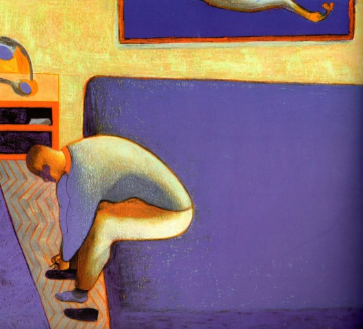
Lorenzo Mattotti
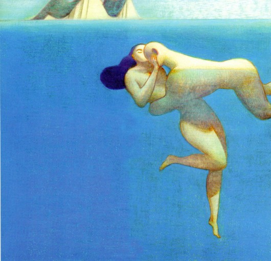
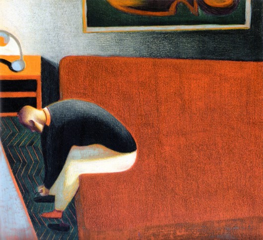
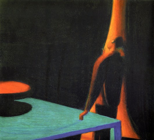
- Bill Peckimann reminded me of a great illustrater/artist who did many New Yorker covers for a short period of time. Lorenzo Mattotti is a sterling artist whose work always inspired. Bill put together quite a few pages from Mattotti’s book of artwork, and the results are exciting. Here are Bill’s comments:
- In the late 1990′s, Lorenzo Mattotti‘s New Yorker covers always had a way of jumping out of the newsstands and right into one’s briefcase! So it was a real delight when this book of his collected works came out in 2000.
If there happens to be a dark and dingy day and you want/need inspiration, this is it!
There are more beautiful drawings, sketches and colored images at:
the Official website (in English)
Mattotti blog (in Italian)
Here are some of his works:

Bill Peckmann &Comic Art &Illustration 05 Oct 2012 05:48 am
The “Z” that stands for “Zorro”
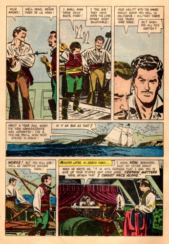
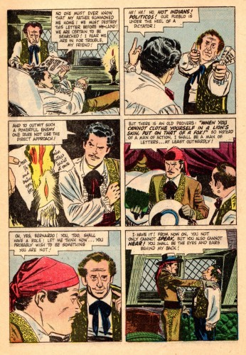
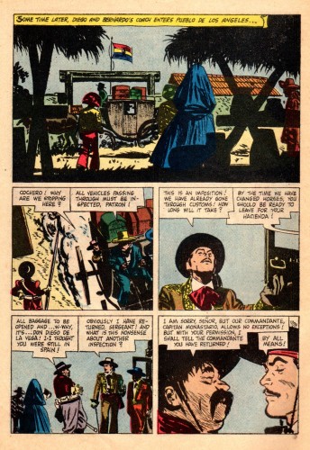
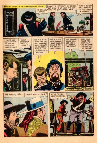
- When I was a kid in 1957, I was all hopped up on the start of a new series coming to TV. Every kid in America was. Zorro was promoted endlessly on the Disneyland Show and on Mickey Mouse Club. When it finally came time for the show to premiere, I was in trouble. I had caught the Asiatic Flu, troublesome in those days, and was violently sick. I wasn’t allowed to leave my bed. I was so upset at the idea of missing Zorro, that I was probably getting myself sicker. My father carried me out of my bed into the living room to watch the premiere, and I was ecstatic. The show was great (but probably not as great as the one that had built n my mind), and all was right with the world.
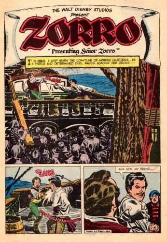
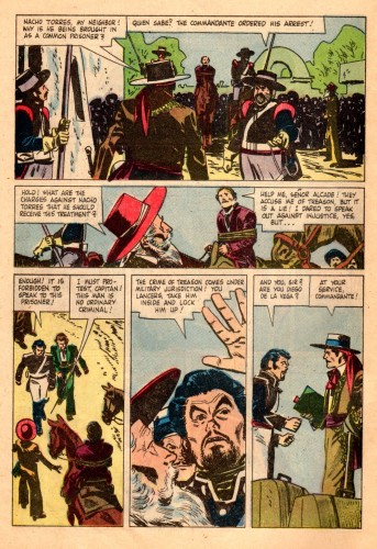
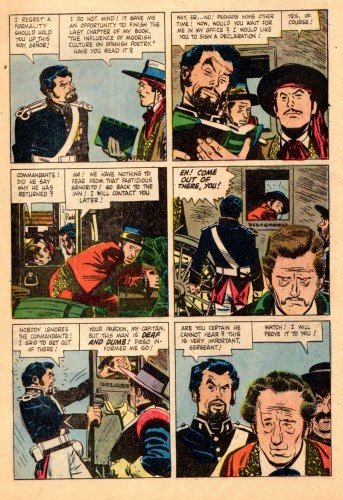
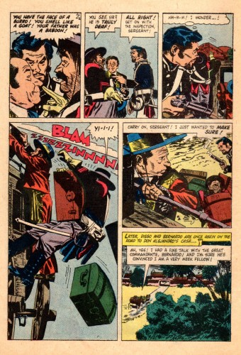
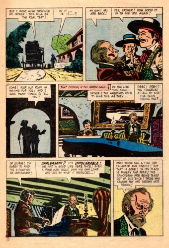
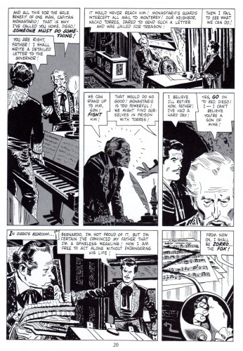
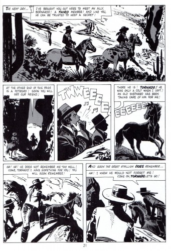
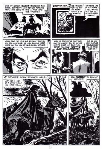
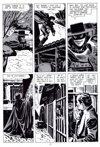
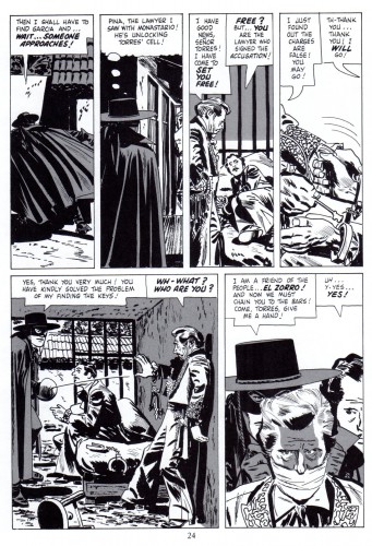
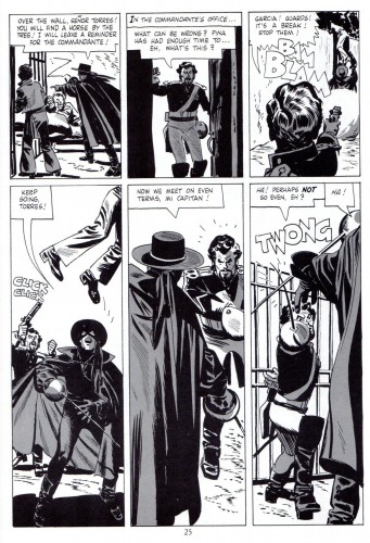
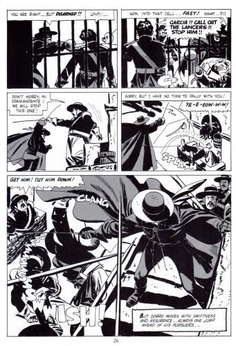
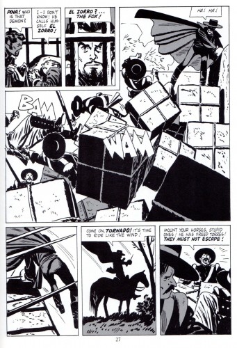
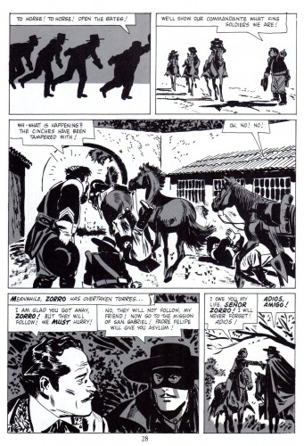
Naturally, I owned the comic book when that came out. Now here comes that very same comic via email. Bill Peckmann sent me scans and added a lot of additional material as well. I hope you enjoy it. Here’s Bill:
- What happens when you take a cartoonist who excels in designing and staging in black ink and give him the assignment of illustrating a western capped crusader dressed in black, you get the classic comic book series “Walt Disney Presents Zorro”, that’s what!
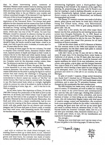
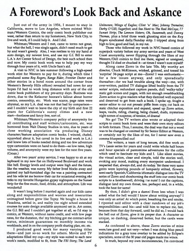
We lucky fans of Alex Toth always felt it was a match made in heaven, but Alex had a slightly different take on it, which you will read further into the post.
Here is a small scrapbook of “Zorro” art that spans over 40 years.
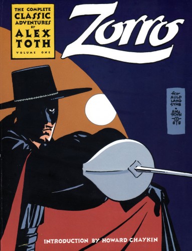
We start with the first Zorro (origin) story from Dell printed in 1957. The first half of the story is the original color comic book, the second half of the story is a black and white reprint version taken from Eclipse Books’ “The Complete Collection of Zorro” printed in 1988. Editor Dean Mullaney was able to get Alex to add new gray toning to the pages and do two new beautiful covers!
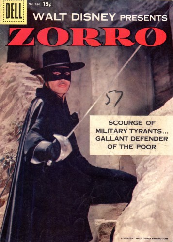
Magazine cover
 20
20
The two new covers done in 1988, Alex at the top of his game.
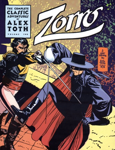 21
21
This illustration is from Manuel Auad’s “Alex Toth” book.
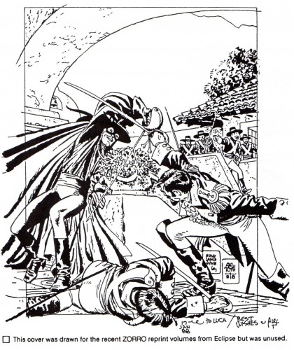 22
22
This is taken from Manuel Auad’s “Alex Toth” book.
 23
23
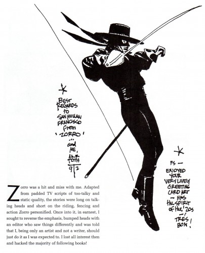
Alex’s thoughts on “Zorro” taken from Dean Mullaney’s Eclipse book.
 25
25
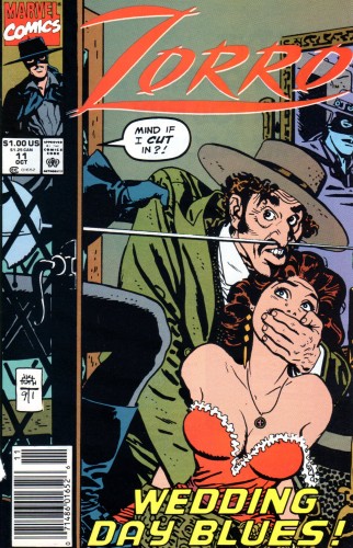
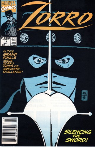
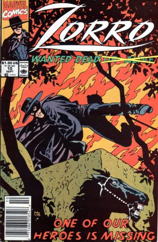
Marvel Comics brought Zorro out of retirement in 1991
and Alex did three covers for that venture.
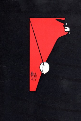 28
28
There was always need for a Zorro sketch here and there
and Alex always obliged!
commercial animation &Disney &Illustration &Independent Animation 25 Sep 2012 05:29 am
Eyvind Earle – recap
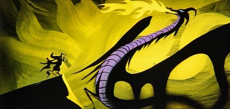
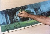
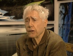 – Let’s talk a little about Eyvind Earle. This is the artist who rose to fame when he was selected by Walt Disney to set the style for the long-in-production feature, Sleeping Beauty. The animators disliked his art direction and openly protested it. Walt remained true in his stance and supported Earle to the end; though it could be said that Walt was more involved in Disneyland’s construction and gave too little attention to the in-fighting at the animation studio.
I remember Frank Thomas, specifically, stating that he had done everything possible to supercede Earle’s style after he, Thomas, had animated the Merryweather scene as she creates Aurora’s dress and cake in honor of her birthday. He felt that the black bodice that Earle had designed took all the lightness out of his character’s delicate dance.
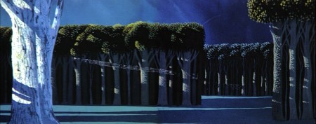
(Click on any image to enlarge.)_________________________________
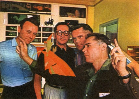
L to R: Al Dempster, Dick Anthony, Ralph Hulett and Eyvind Earle
Thomas publicly attacked Earle at the Lincoln Center celebration of Disney animation back in 1973. I’d already read something similar, and heard it privately. None of the others on stage at Lincoln Center – Woolie Reitherman, Ken Anderson or Ollie Johnston – countered in support of Earle.
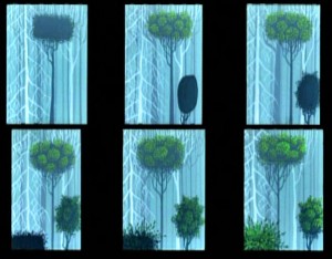 Sleeping Beauty was such a drastic change in look from the other Disney features, that I think it took deep hold in the minds of a lot of Baby Boomers growing up around this feature. Earle became a strong target of interest, and I think his reputation has grown annually.
I have to admit it was odd seeing the backgrounds of Pocohontas trying to emulate Earle’s Sleeping Beauty style, but in some ways it seemed fitting. The studio had been ripping off the films of the past for so long that it was only appropriate that they’d focus on someone who was such a dynamic force.
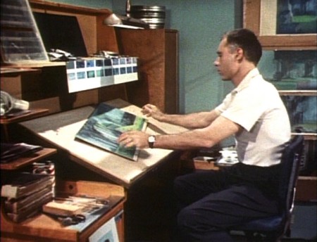
For a short period after he was released by Disney, in the post-Sleeping Beauty layoffs, he worked with John Sutherland Productions where he designed the short, Rhapsody of Steel. Then he formed his own studio, Eyvind Earle Productions, Inc. He did an animated trailer for the film, West Side Story, under the supervision of Saul Bass. He did an animated title for the Kraft Suspense Theater, and he did a Christmas Special for Tennessee Ernie Ford.
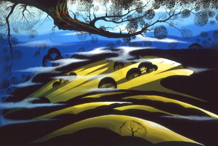
Ultimately, Earle made a success of his own art after leaving animation. He’s been represented by a number of very large galleries and has sold a lot of popular art in a style all his own. Here are a couple of examples found on line:
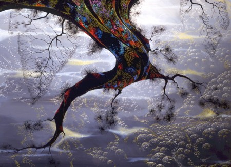
I’m not always a big fan of the color schemes in his graphics, though he always makes them work, but I have to give credit to Earle for his originality and the dynamic approach in his art.
His autobiography, Horizon Bound on a Bicycle, is a must for all real fans.
This is his animation resume:
- 1951 Started with the Walt Disney Studios as background painter on: FOR WHOM THE
__ BULLS TOIL, MELODY, and the Academy Award winner for “Best Short of the Year”
__TOOT, WHISTLE, PLUNK and BOOM which also received a Cannes Film Festival Award.
__Production Designer, Color Stylist and Background Painter for the DIsney animated __classic SLEEPING BEAUTY, as well as, PIGS IS PIGS, GRAND CANYONSCOPE,
__PAUL BUNYAN, LADY AND THE TRAMP, LONDON BRIDGE, and WORKING FOR PEANUTS.
__He designed 5 murals for Disneyland.
1958 Joined John Sutherland Motion Picture Company in Los Angeles.
1960-1966 Created 24 sheet poster for Hamm’s Beer.
__Started motion picture animation company, Eyvind Earle Productions, Inc.
__Created animated commercials for Chevrolet Motors, Chrysler Corporation, Marlboro
__igarettes, Motorola Television and the Kellogg Cereal Company.
__Created animated trailer for WEST SIDE STORY for United Artists.
1961 Created animated television special THE STORY OF CHRISTMAS starring
__Tennessee Ernie Ford and the Roger Wagner Choral.
1962 Created animated television special THE EASTER SPECIAL.
__Created title for the KRAFT SUSPENSE THEATER.
__Created the logo trademark trailer for Universal Pictures.
__Produced and created the theatrical short DEATH AND SUNRISE
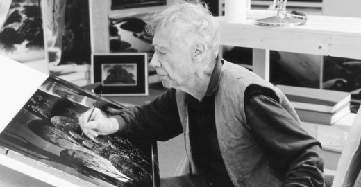
You’ll find a lot of merchandise including all the books listed here, on the Eyvind Earle website.
Bill Peckmann &Comic Art &Illustration 20 Sep 2012 05:24 am
Conan from Toth – 2
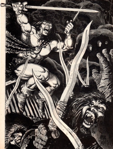
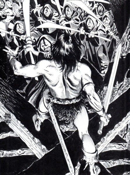
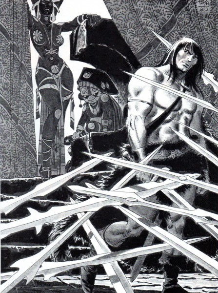
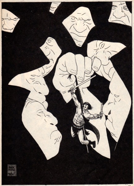
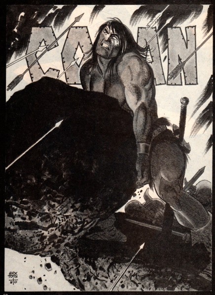
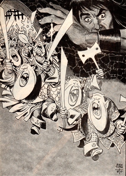
- Bill Peckmann offers a bevy of beautiful Alex Toth illustrations for Conan the Barbarian. Here are Bill’s comments for these incredibly fine illustrations:
-
I haven’t seen many of these Toth illustrations on the Net, and I thought maybe the Toth fans out there might enjoy these.
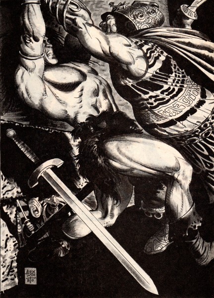
Here is Alex Toth in the early 1980′s taking a stab at the Sword and Sorcery genre and doing a ripping job of it. These are single page illustrations from Marvel’s black and white magazine, “The Savage Sword of Conan“. Alex is at the top of his game; design and drawing leave nothing to be desired. the assignment held his interest long enough so we came away the winners with these nine examples.
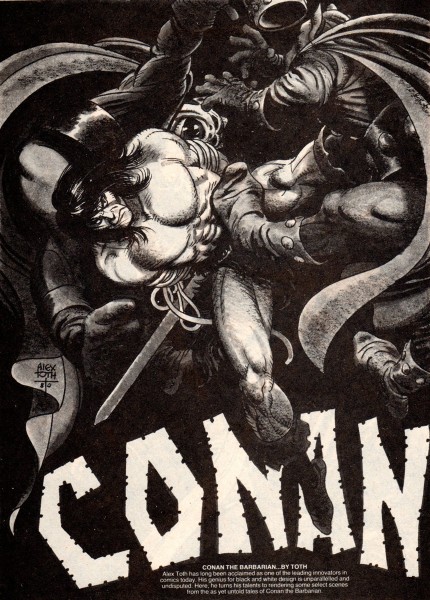 1
1
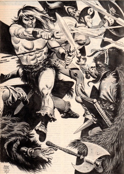 9
9
That was the last of Alex’s Conan. He did a total of
10 illustrations for Marvel’s Conan, so we have all but one.
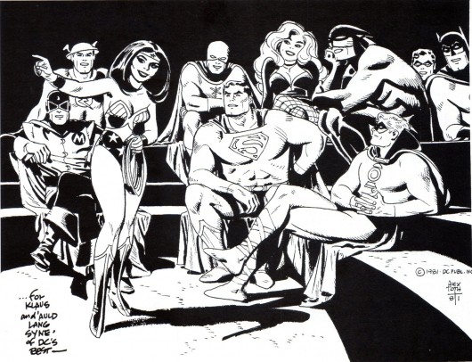
Here is a 1981 drawing of super heroes that Alex dedicated to Klaus Strzyz,
a fan, a friend and interviewer of Alex’s. The drawing was then made into a
handsome cover on Roy Thomas’ “Alter Ego’s” fanzine tribute to Toth in 2006.
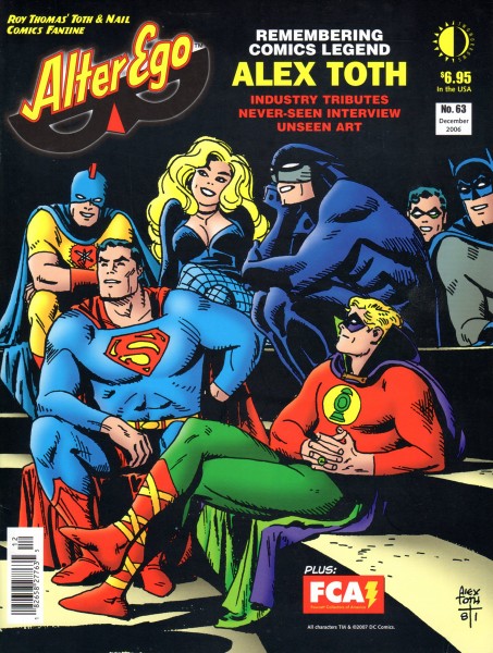
This is the final cover for Roy Thomas’ 2006 “Alter Ego’s” tribute to Toth.
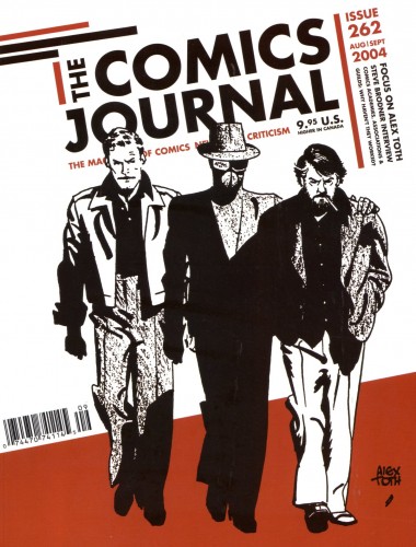
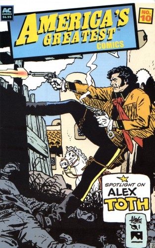
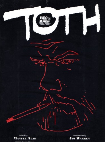
These are the covers of books and magazines that have collected the words and work of Alex. Hopefully for new fans they still might be available somewhere on the net or in used bookstores.
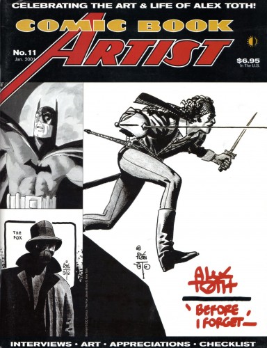 1
1
The next two excellent books were authored and published by Toth fan and friend Manuel Auad. (Manuel was also responsible for the great, recent Robert Fawcett book and the forthcoming (October) book on illustrator Albert Dorne. The illustrator who still remains Jack Davis’ biggest idol!)
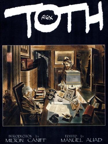 4
4
Tipped in autographs for “Alex Toth: Black & White”.
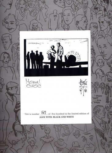 6
6
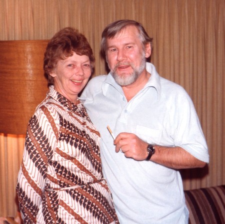
Alex and his wife/best friend Guyla in their Hollywood home in 1979.
They met at Hanna-Barbera and the rest is history.
Their marriage will be brought to life in the upcoming book “Alex Toth, Illustrated“,
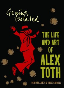
second in the trilogy of Alex’s work, by Dean Mullaney and Bruce Canwell.
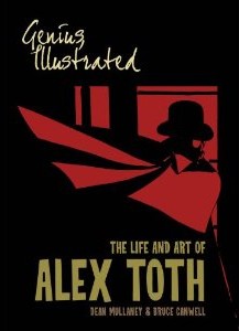
Vol 1 & 2 by Dean Mullaney and Bruce Canwell.
Now available on Amazon.
Many thanks to Bill Peckmann for all the scanning as well as the loan of the artwork.
Bill Peckmann &Comic Art &Illustration 18 Sep 2012 05:41 am
Conan from Toth – 1
- Bill Peckmann sent me a stash of nine extraordinarily fine illustrations by Alex Toth done for the magazine, The Savage Sword of Conan.
To fill up the post, Bill sent a number of magazine covers (front and back). However, I thought the Conan drawngs so excellent, that I’ve chosen to have them stand alone. So, I’m using these pieces – great as they are (they certainly stand alone as a post) – as a teaser for Thursday’s images of Conan. Trust me, come back if you’re a fan of Alex Toth’s work.
For part 1, Bill wrote:
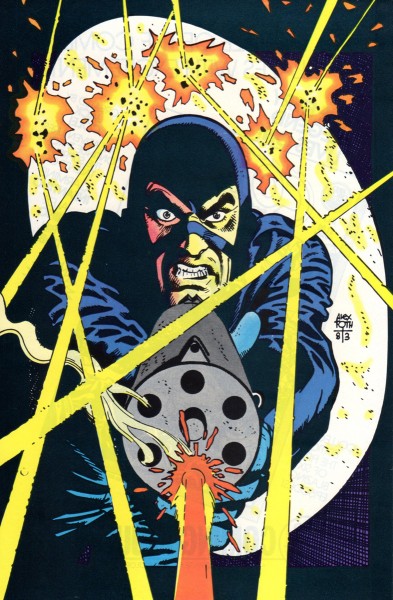
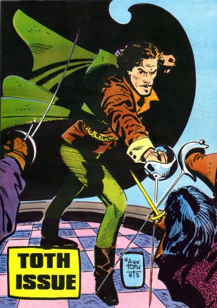
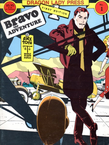
- Here’s a potpourri of front and back covers that Alex did in the 1980′s.
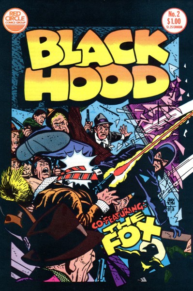 1
1
