Category ArchiveIllustration
Bill Peckmann &Comic Art &Illustration 08 Mar 2013 05:35 am
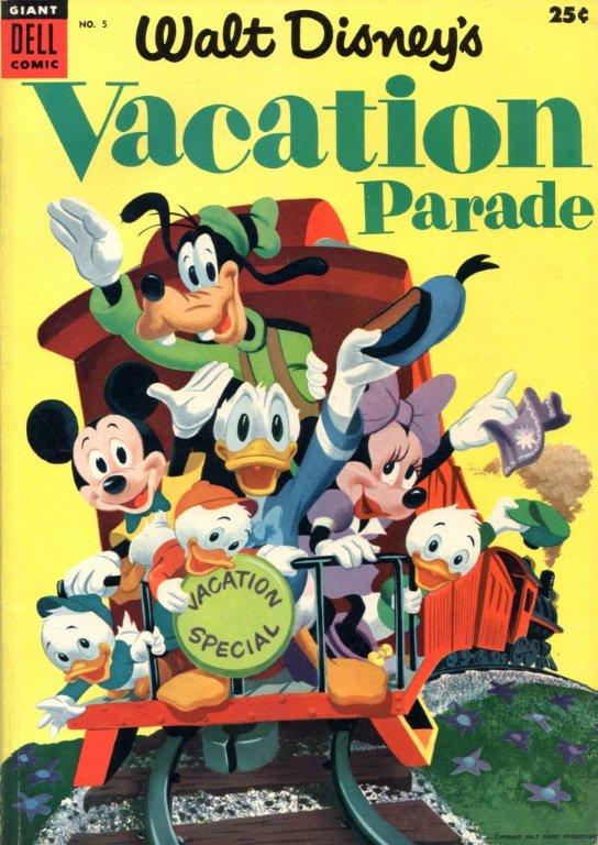
Vacation Parade
I’ve written in the past about how much I enjoy the work of Dick Moores. So I’m always pleased when Bill Peckmann sends comic art by him, and am excited to post it. Here’s the latest. From Bill:
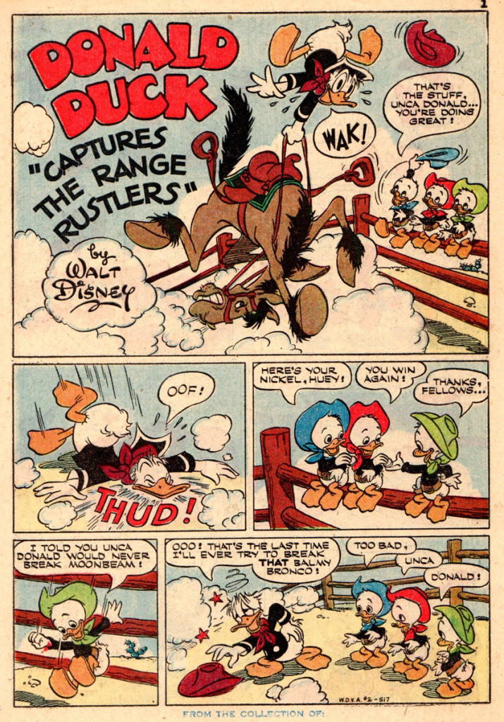
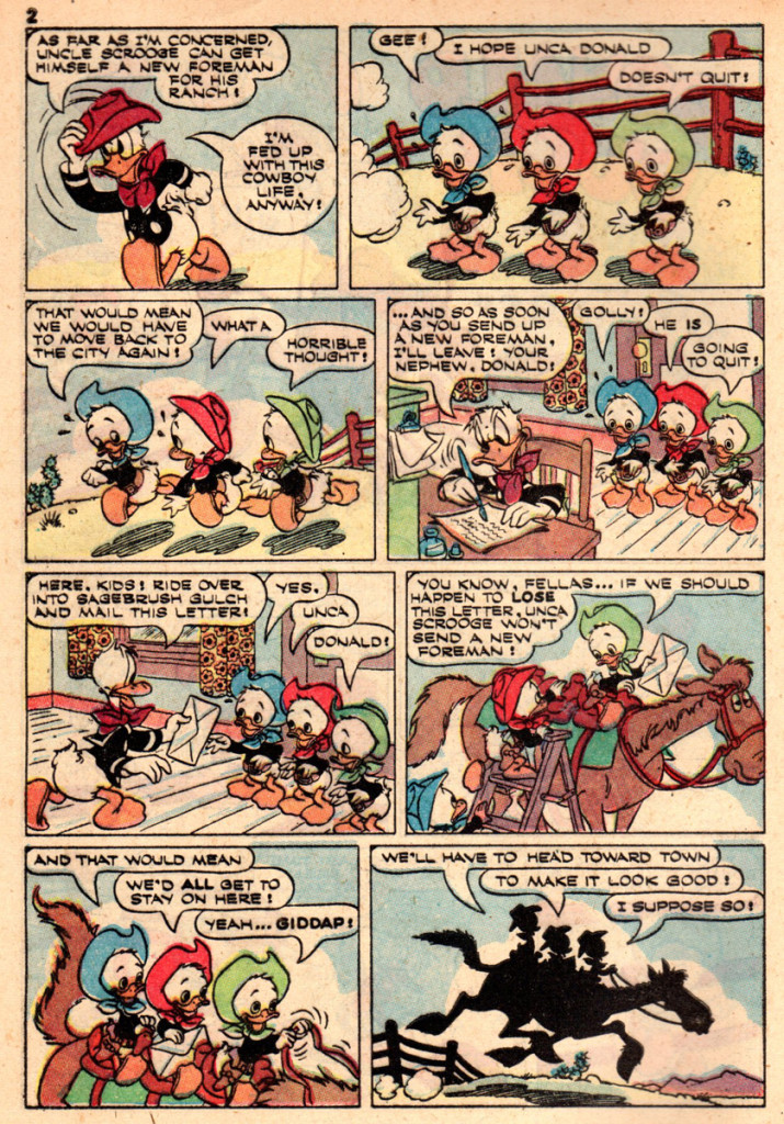
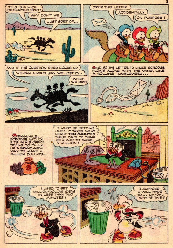
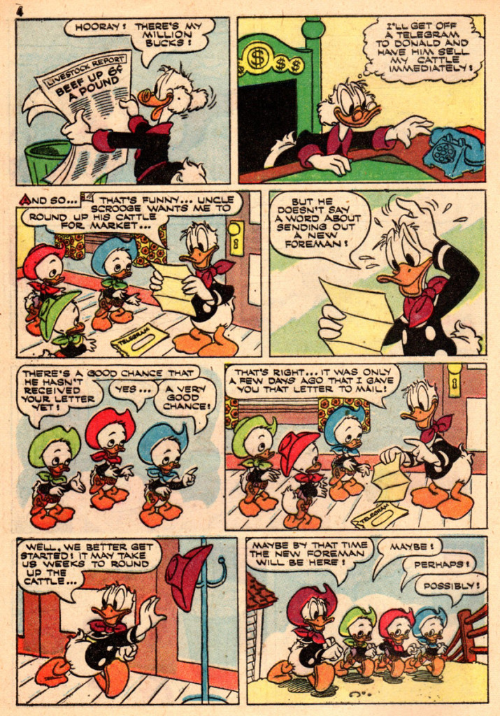
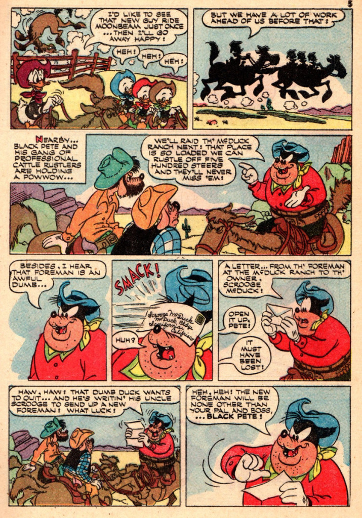
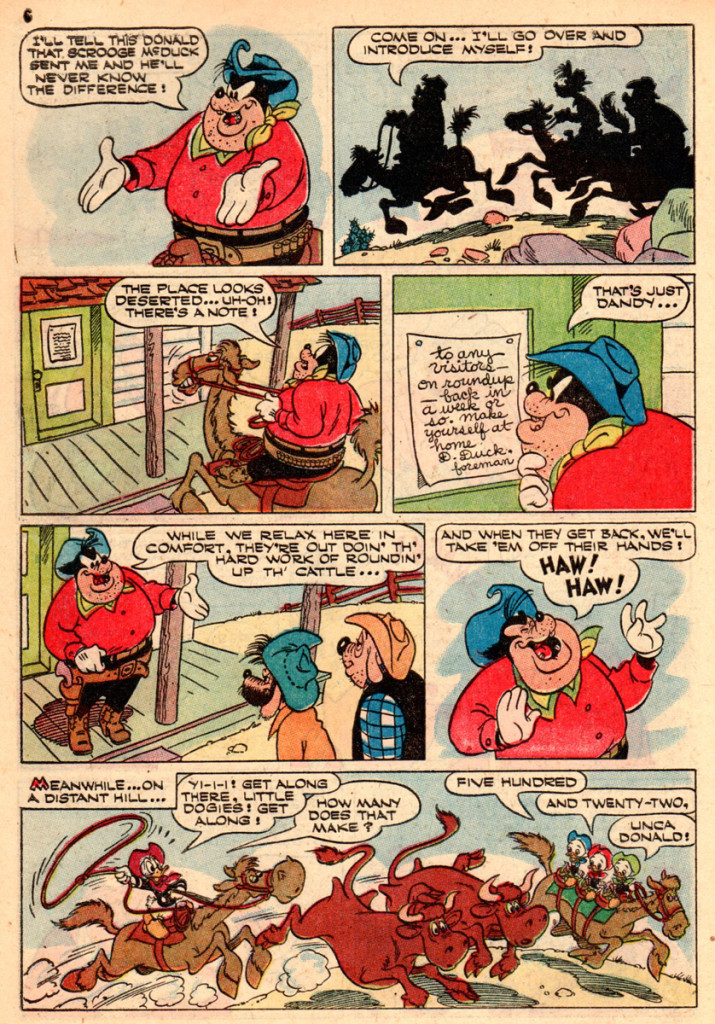
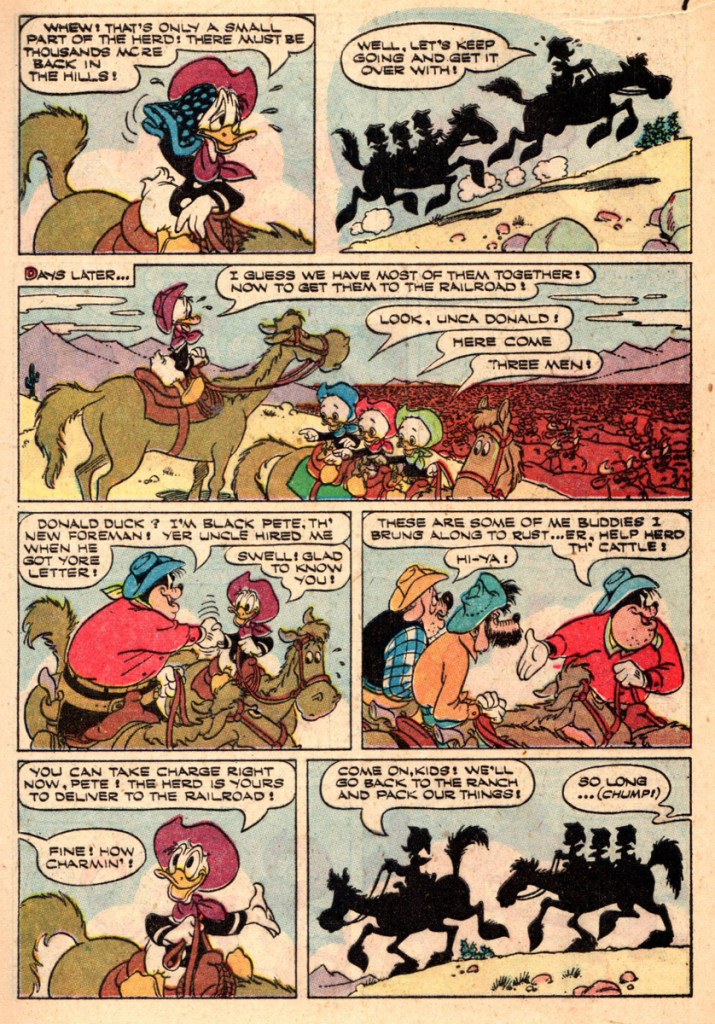
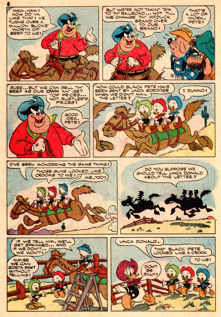
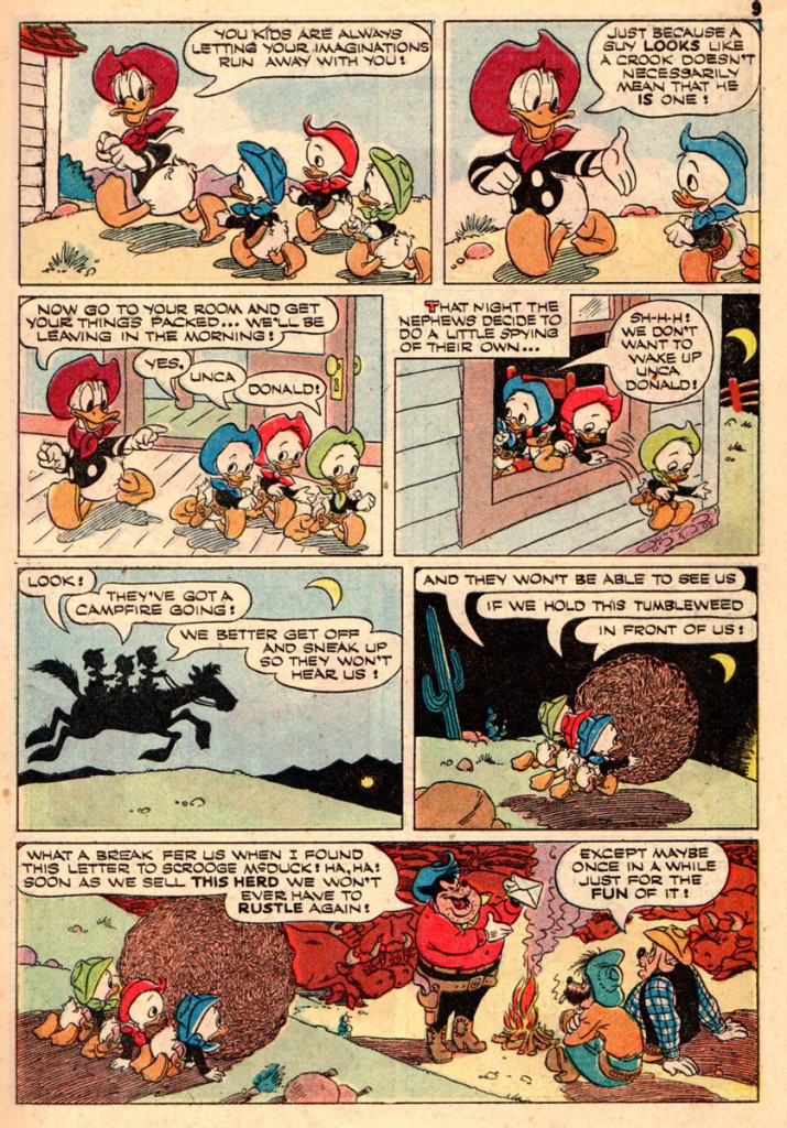
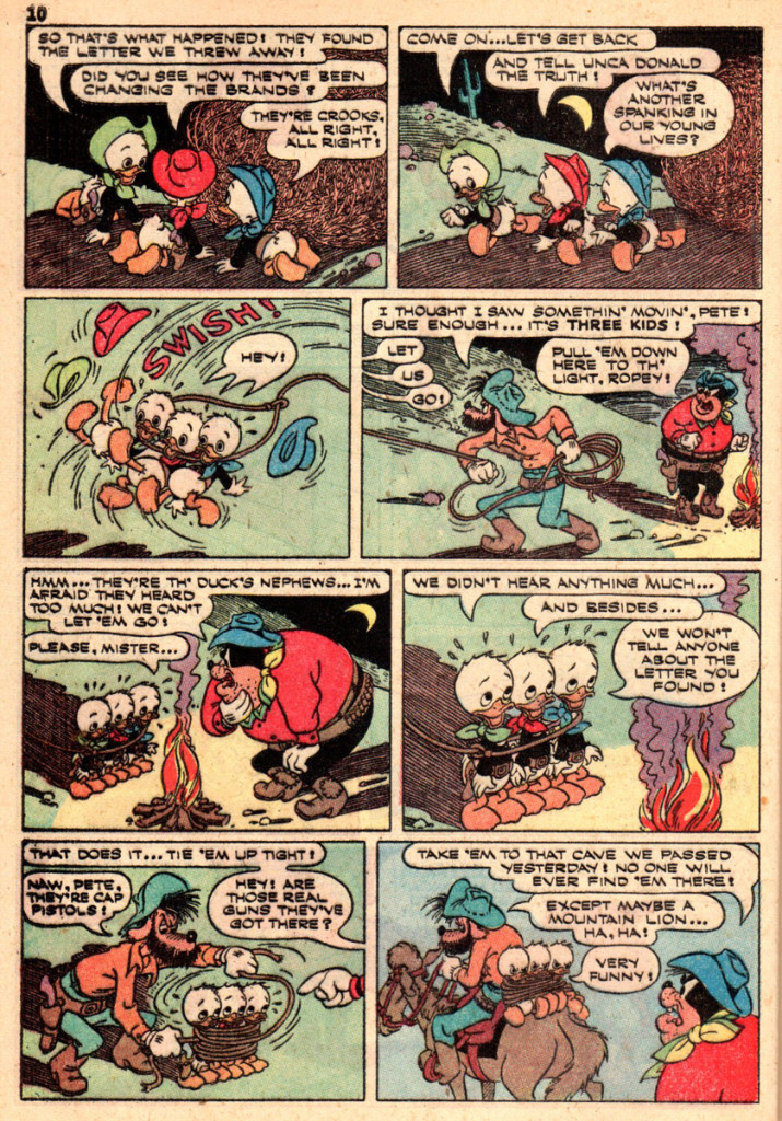
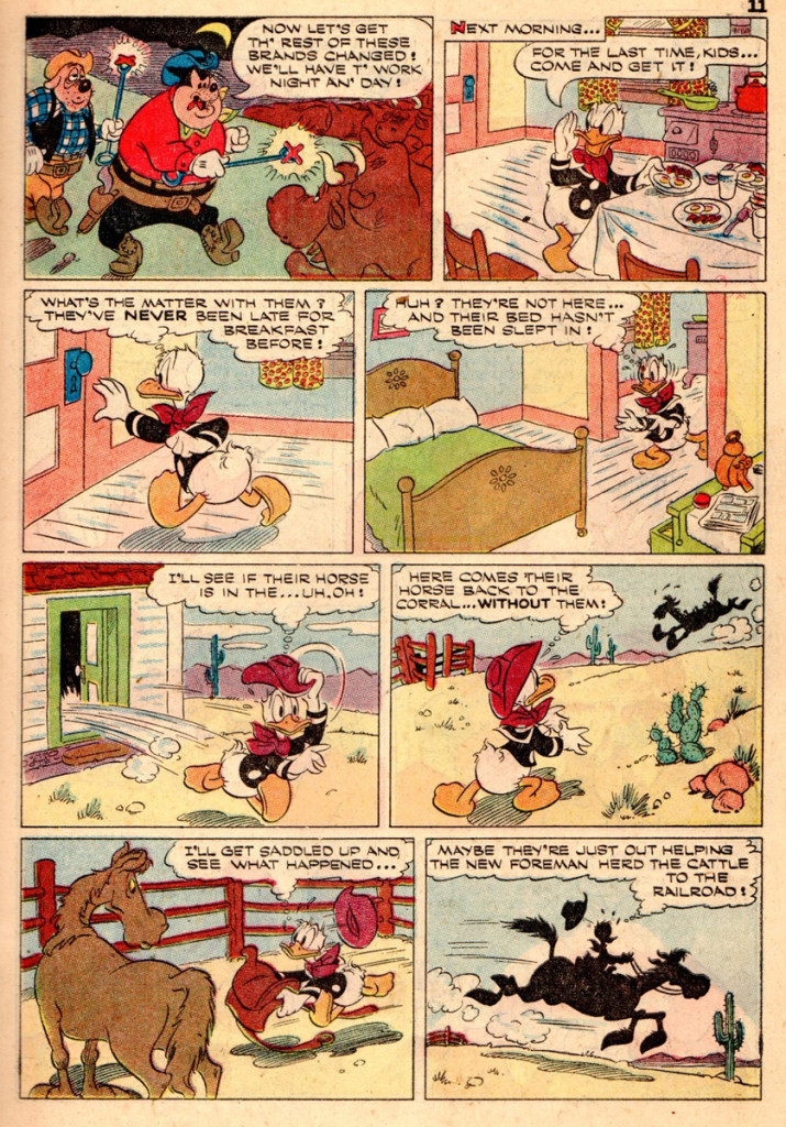
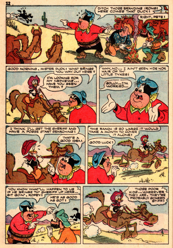
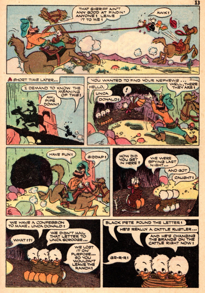
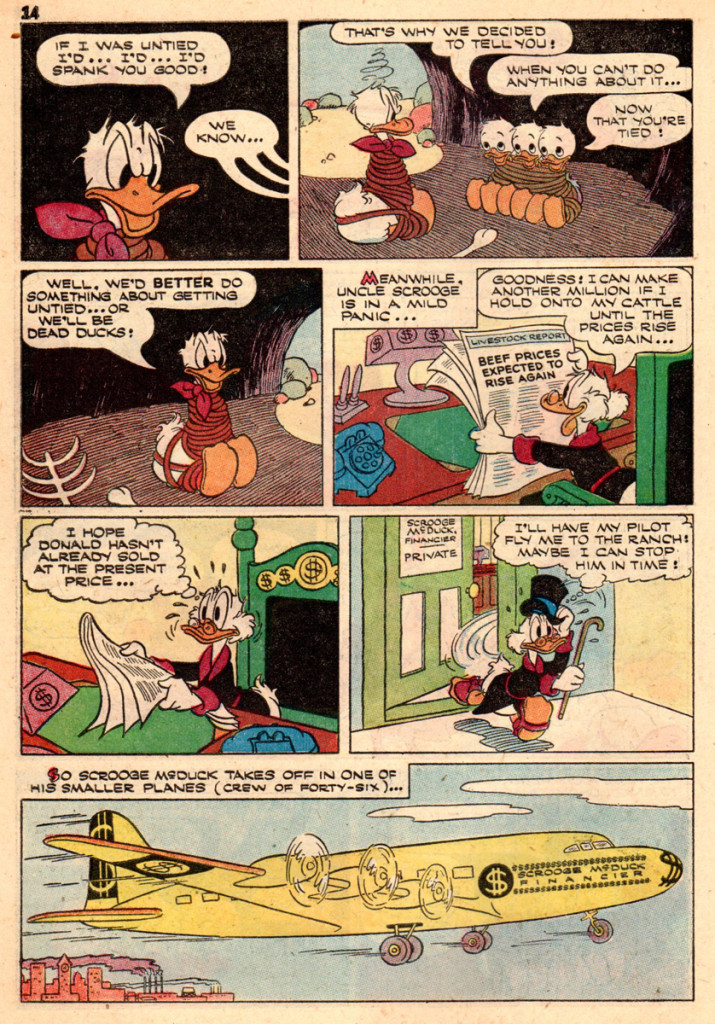
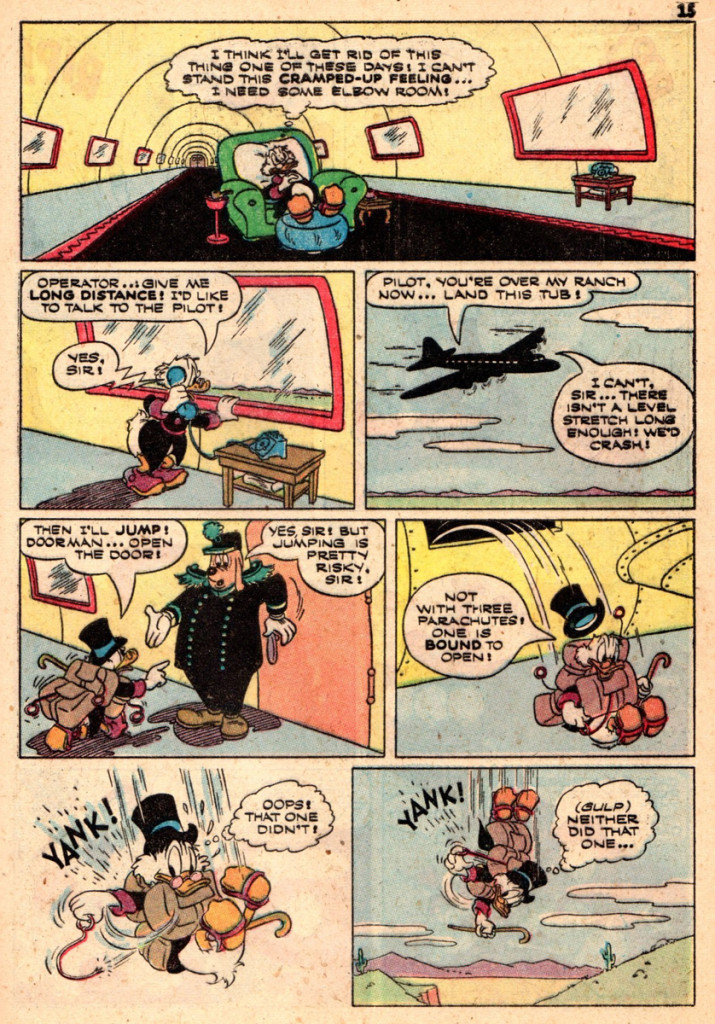
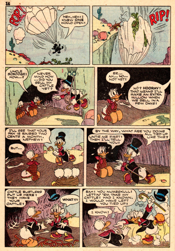
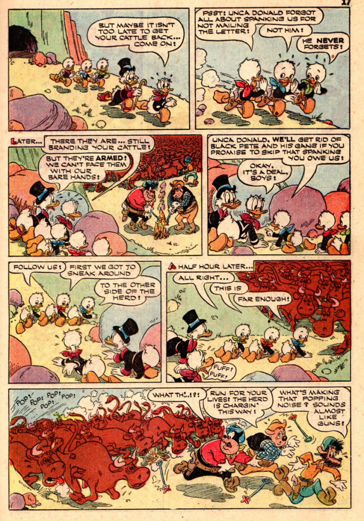
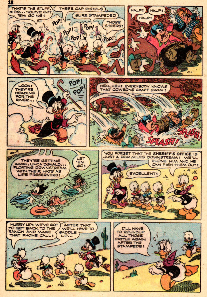
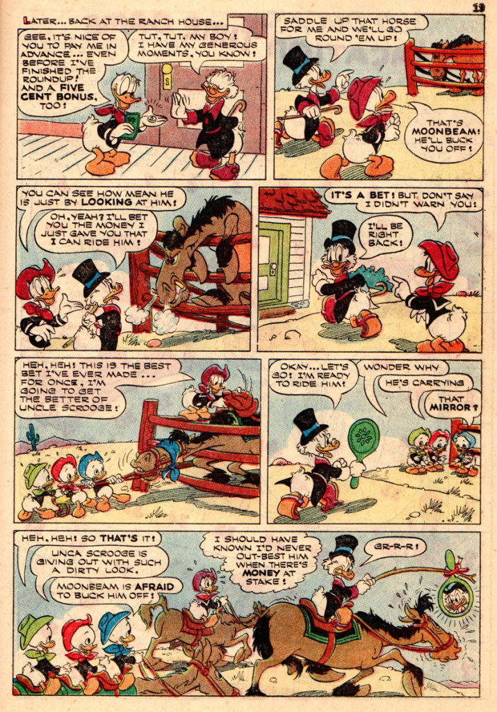
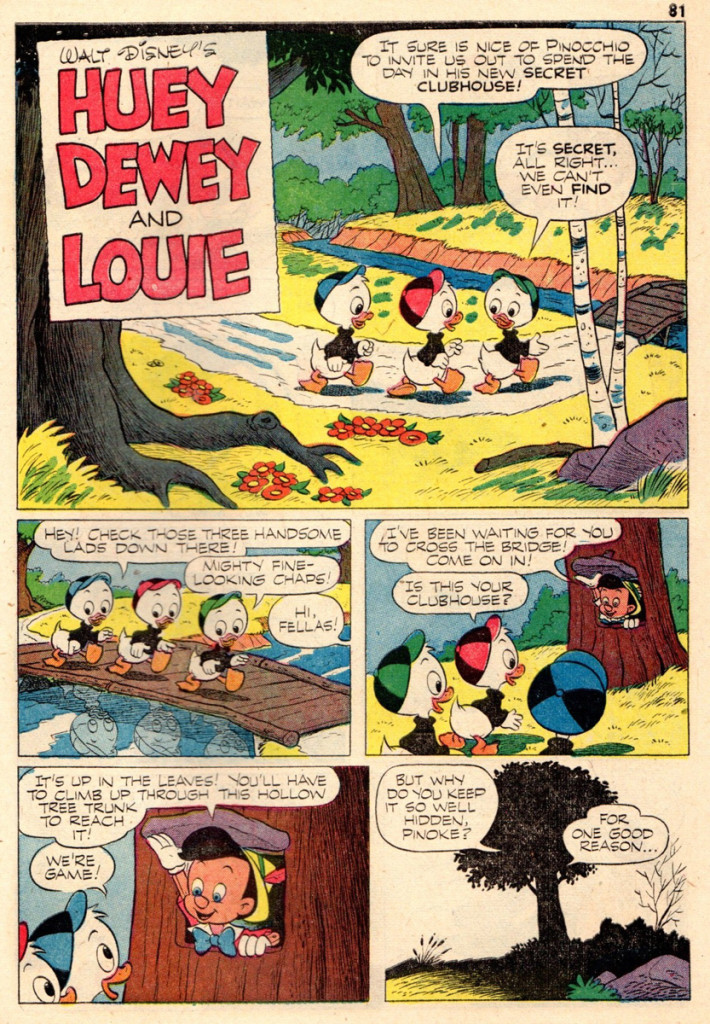
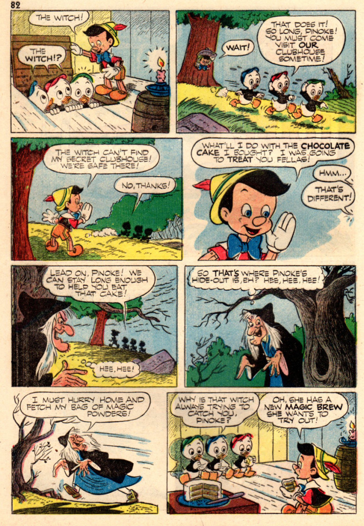
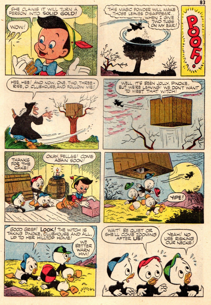
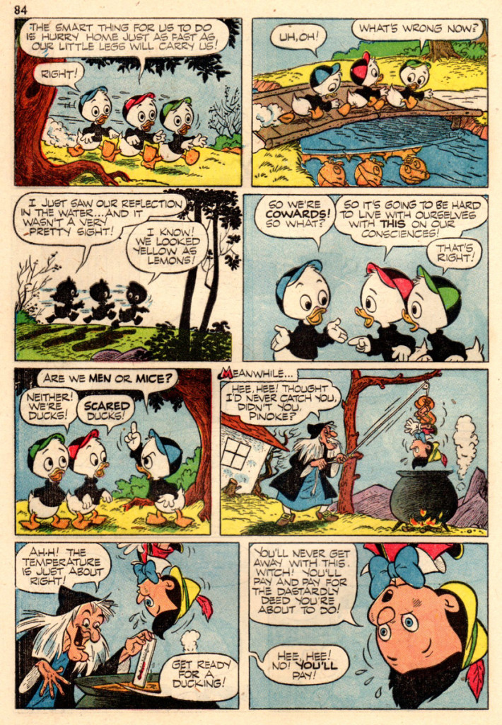
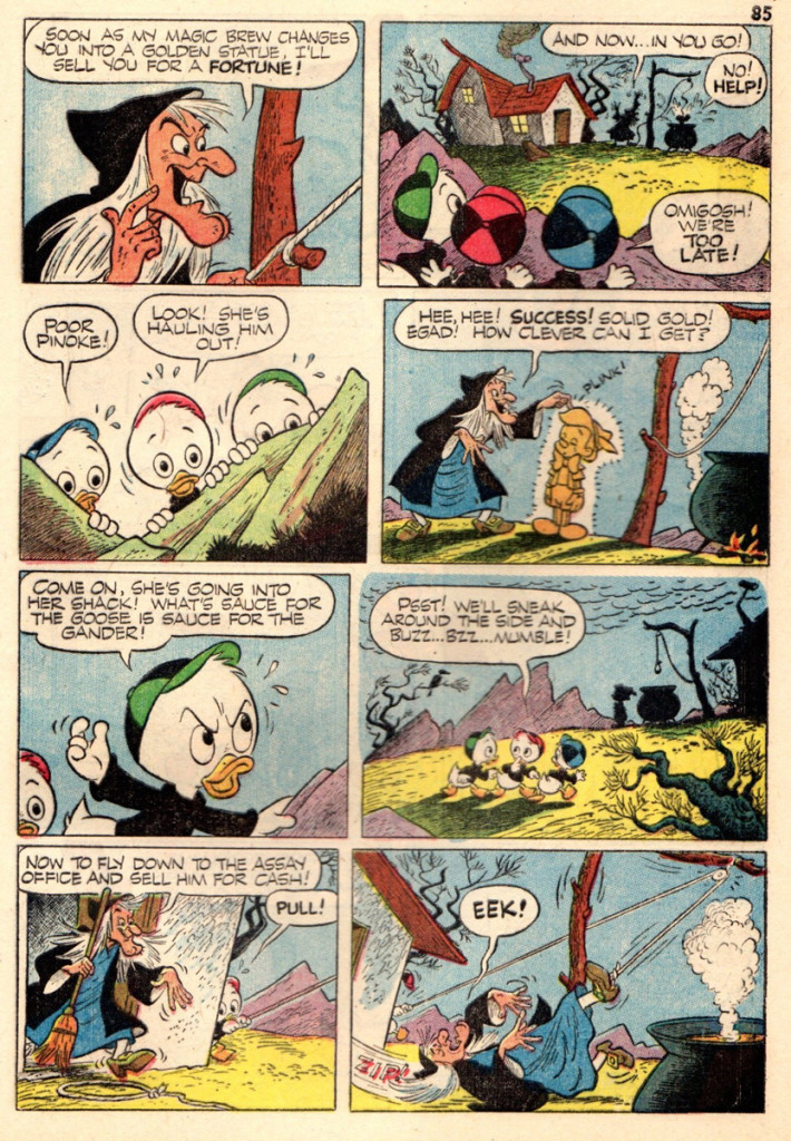
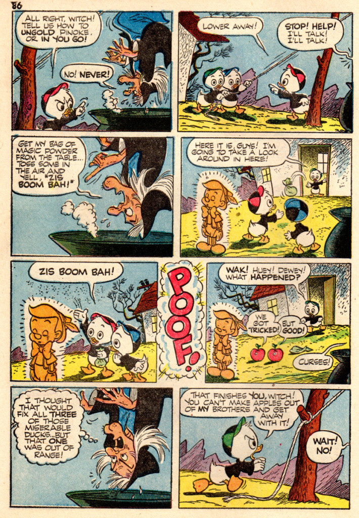
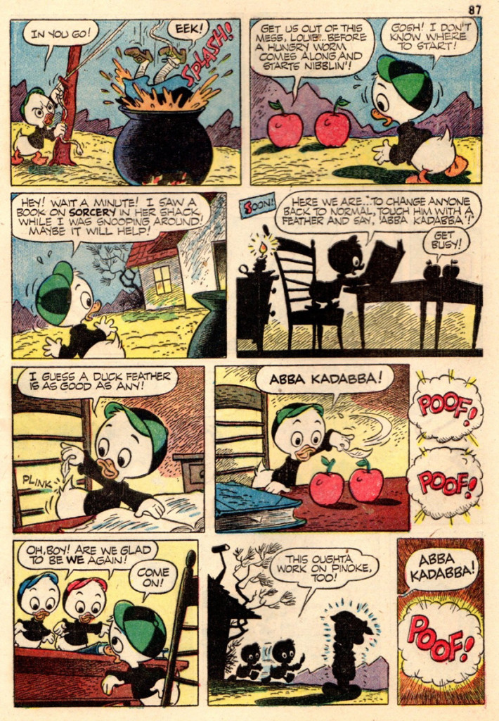
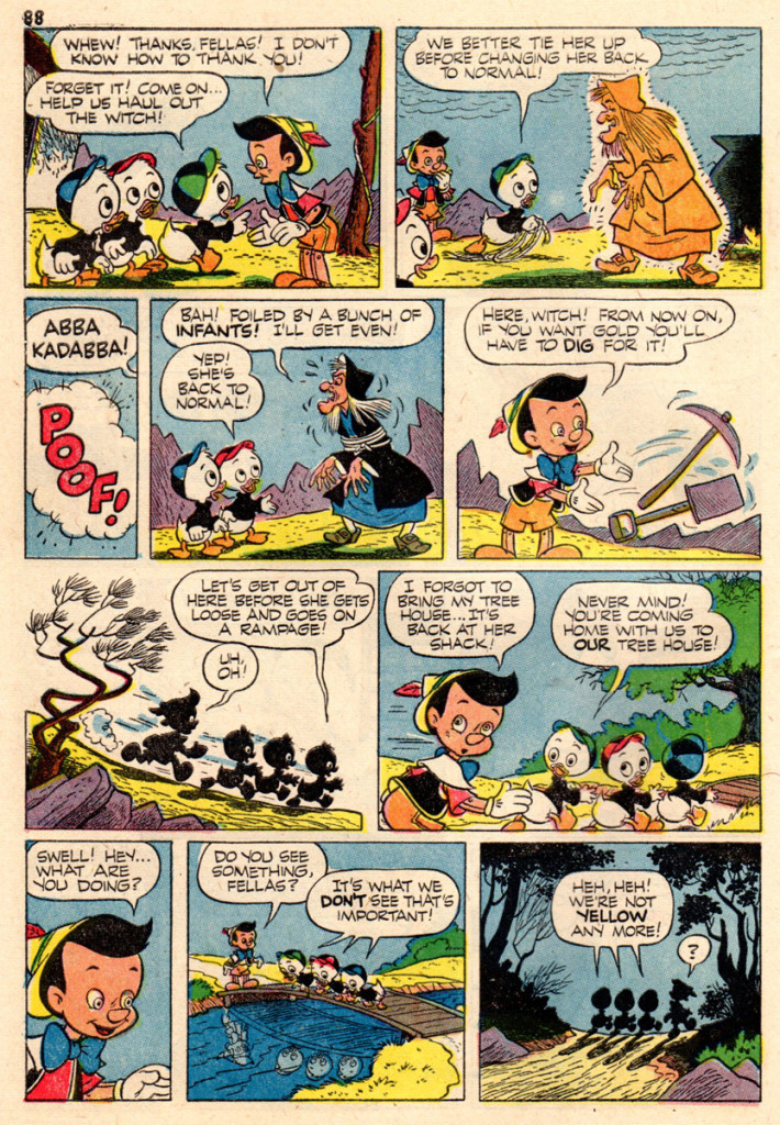
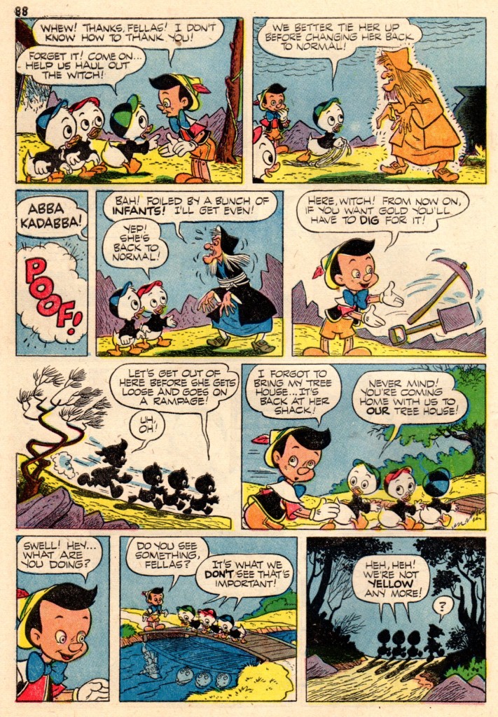
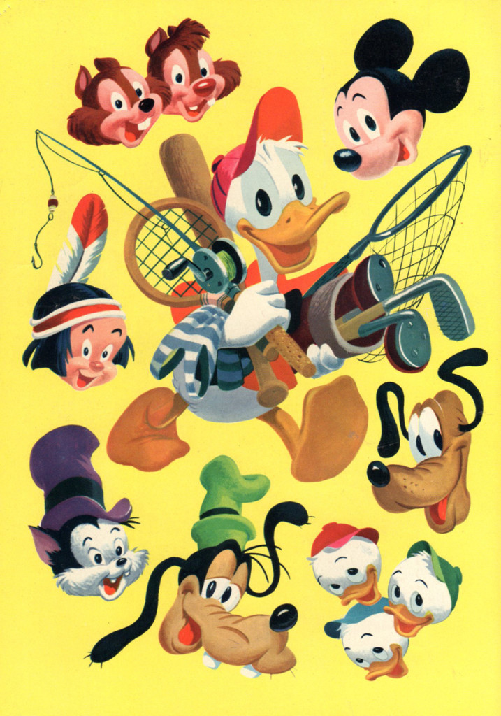
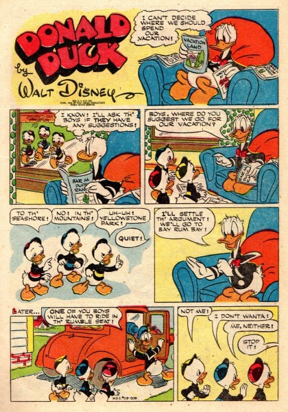
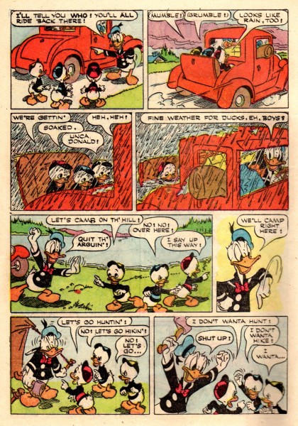
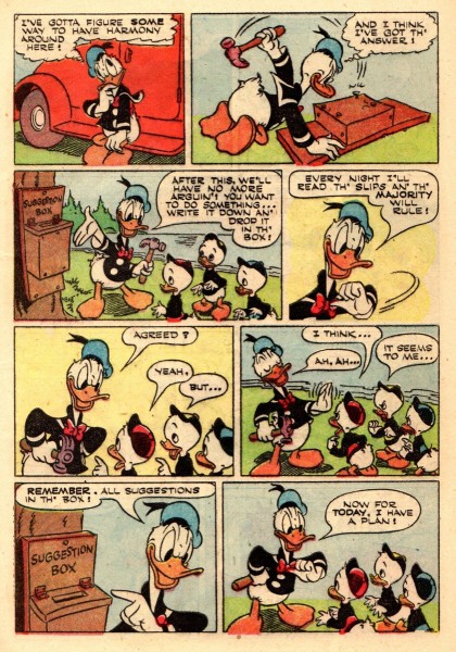
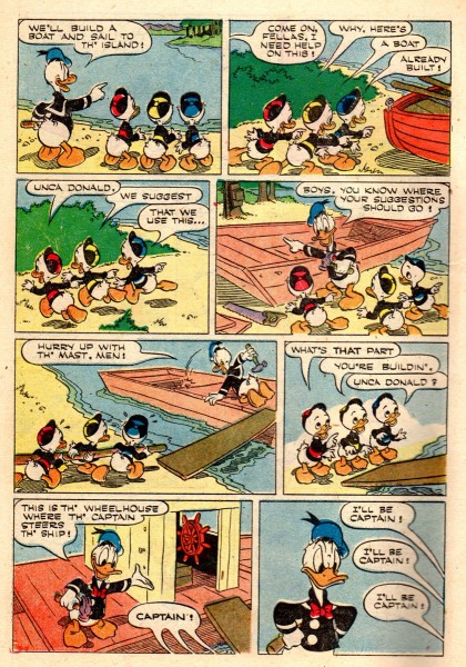
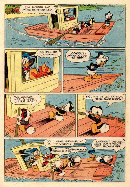
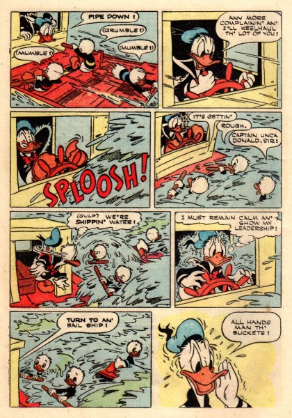
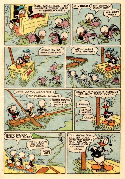
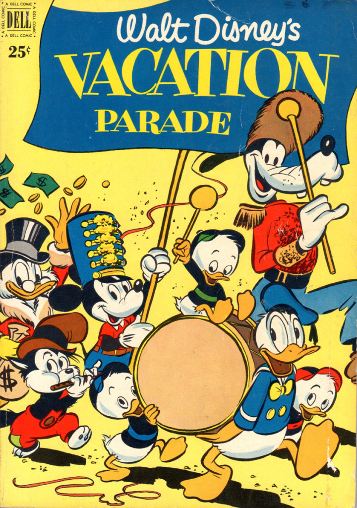
- It may be a tad too early for summer vacation but it’s never too early for “Walt Disney’s Vacation Parade” comic books, especially if they contain two of the best of Uncle Walt’s comics bull pen! Back in those days, the New York Yankees had Mantle and Maris, the M&M Boys, Disney also had his own M&M Boys, Dick Moores and Paul Murry, also grand slammers!
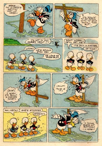
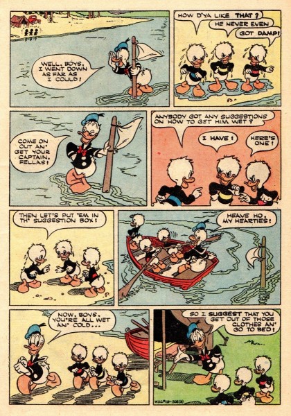
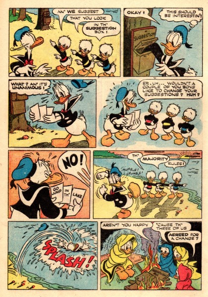
Here from “Vacation Parade” no. 2 is a 19 pager by Paul Murry, Donald heads the cast and we get to see how Murry handles Scrooge McDuck. The comic book is from 1951, just about the same time Paul was doing his daily comic strip “Buck O’Rue“!
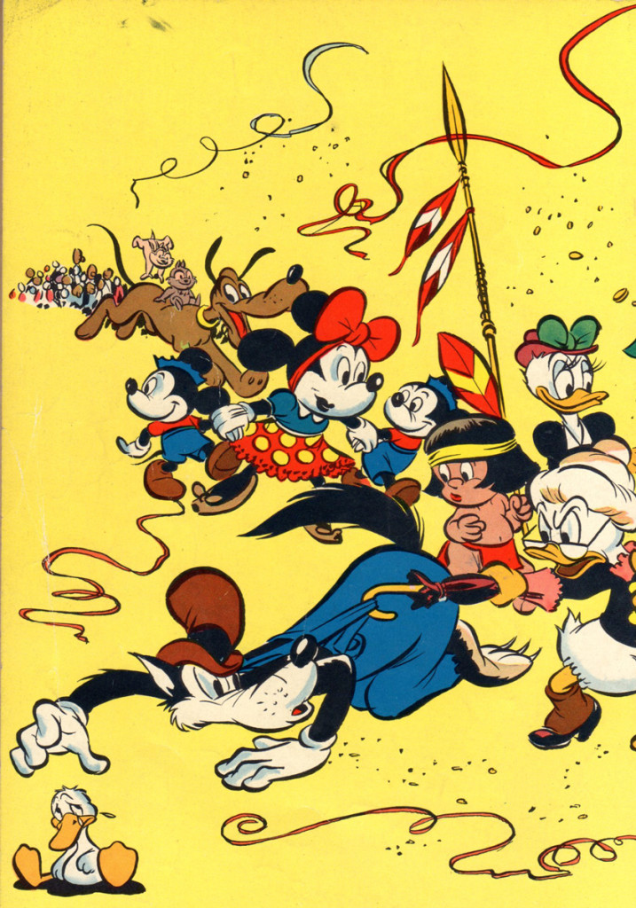
Cover 1
Bill Peckmann &Comic Art &Illustration 22 Feb 2013 03:59 am
Jack Davis flashback
Bill Peckmann put together a post of Jack Davis illustrations. It was an obviously difficult piece to assemble and I thank Bill for all the work. From here on, these are Bill’s words:
- The year 1963 was a big year for all of us Jack Davis fans, that’s the year our favorite “Mad” cartoonist did the poster art for the movie ‘It’s A Mad, Mad, Mad, Mad World” and established himself as an art force to be reckoned with. It was probably also Jack’s first foray into the world of animation, a trailer for the movie was produced at Elektra Films by doing animation camera moves over Davis’ original movie art. (It was also my first year at the studio as an apprentice, fledgling go-fer, so I was able to sit and stare [and drool] at beautiful original JD art when no one was looking!)
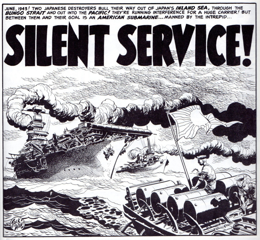
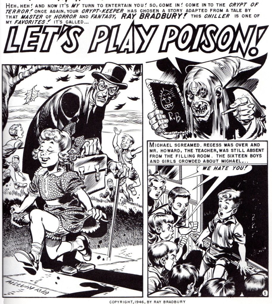
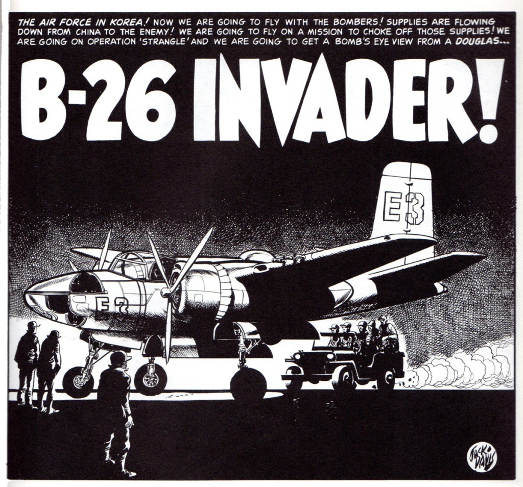
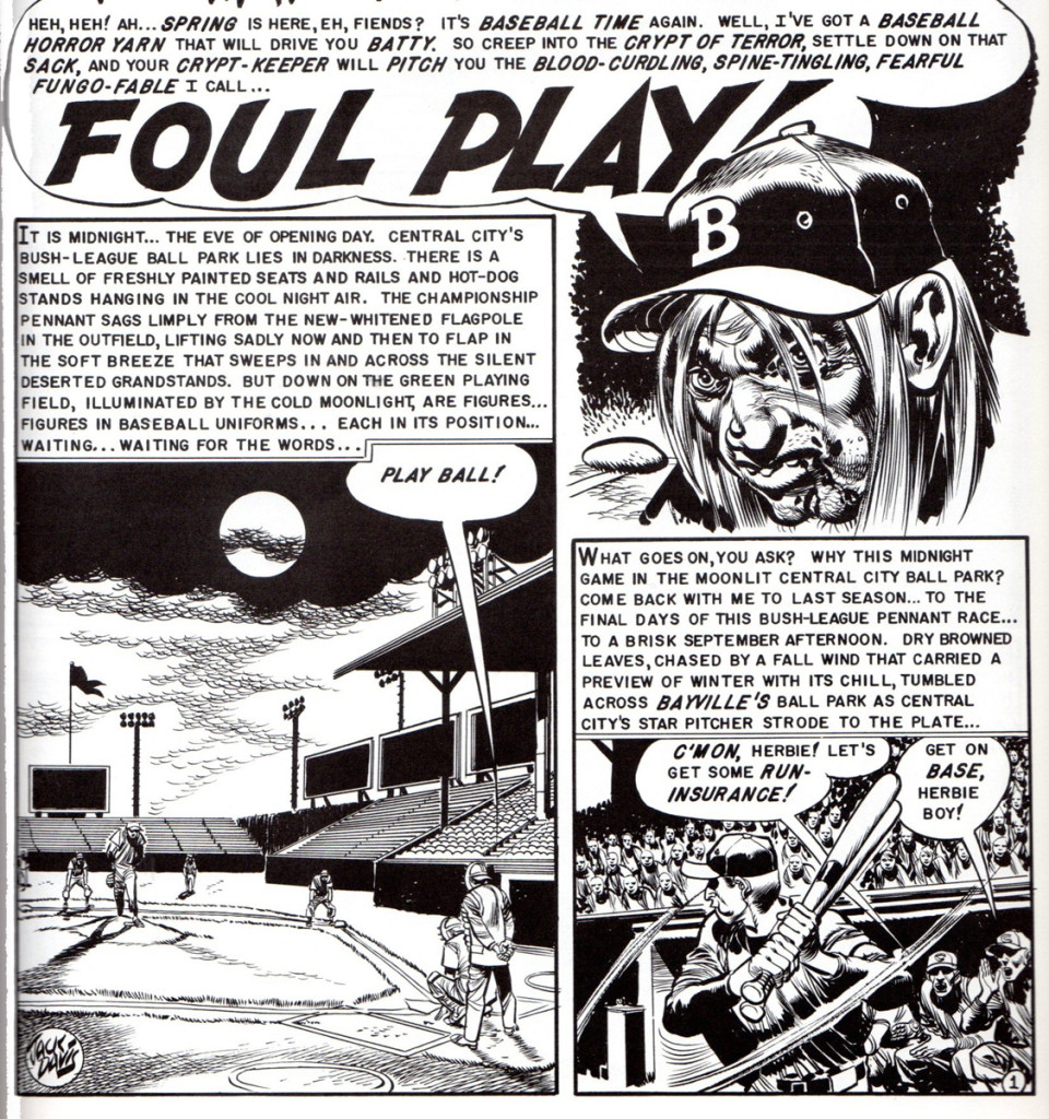
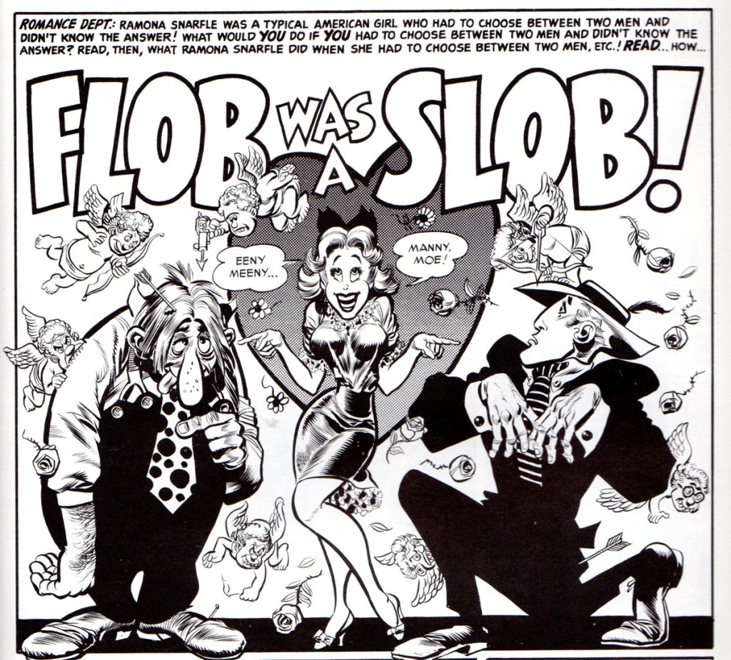
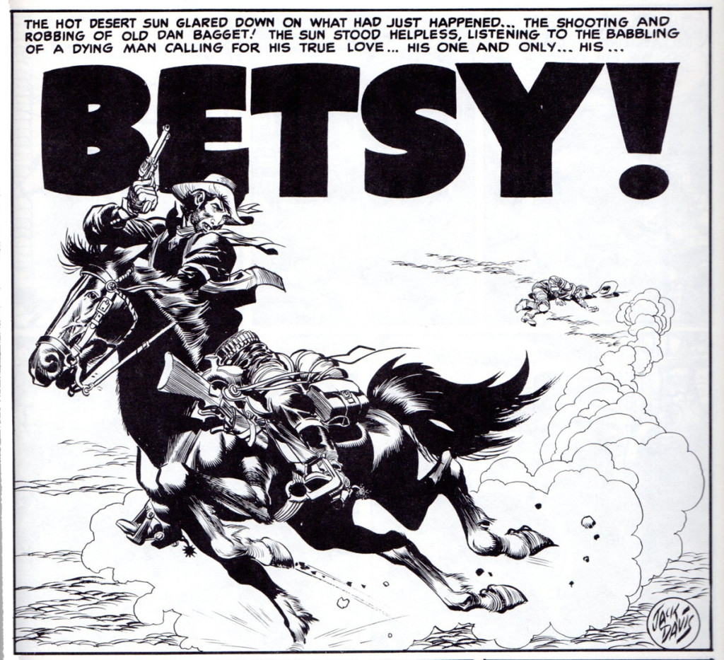
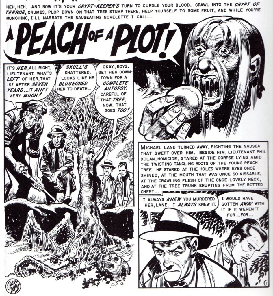
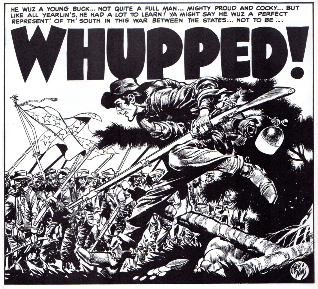
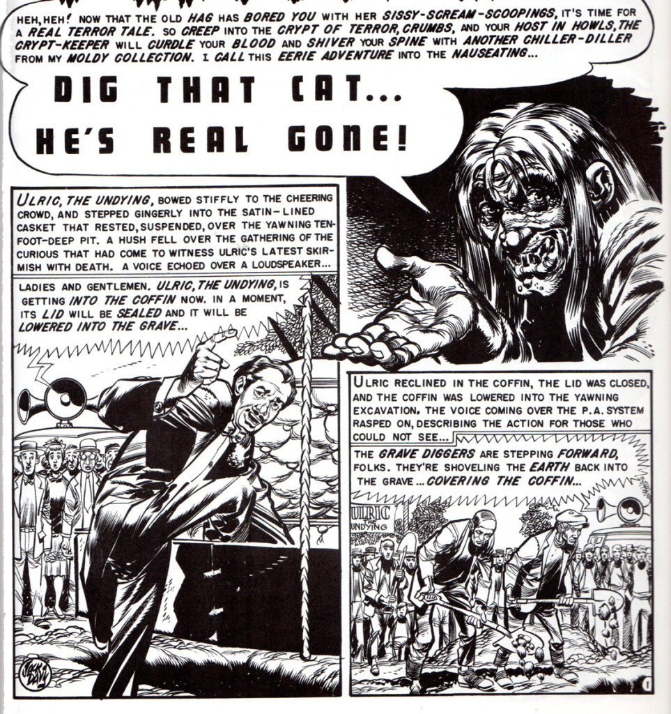
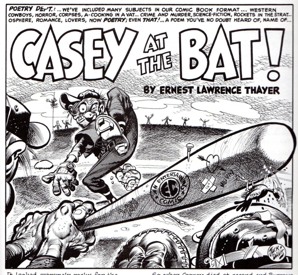
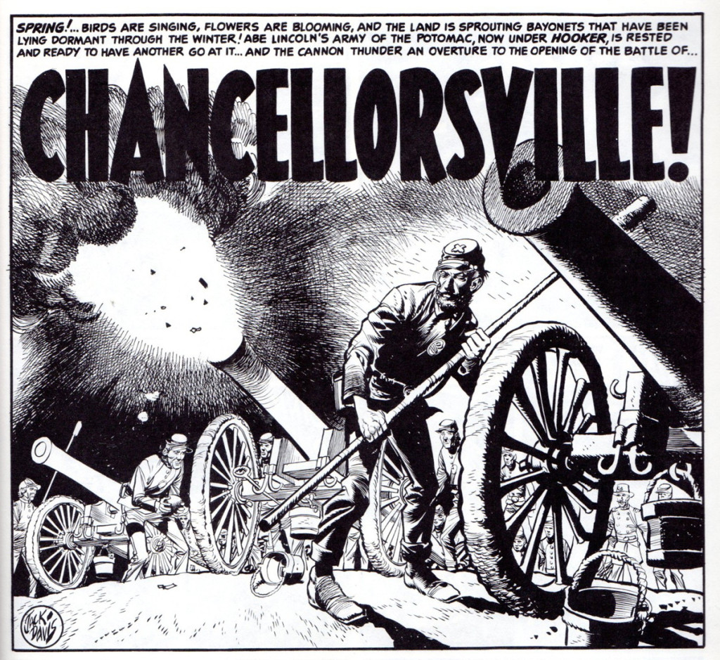
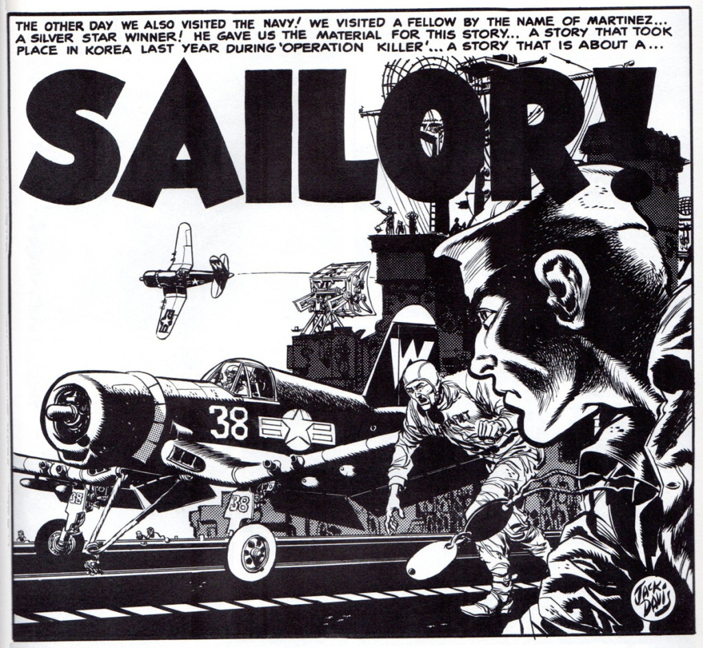
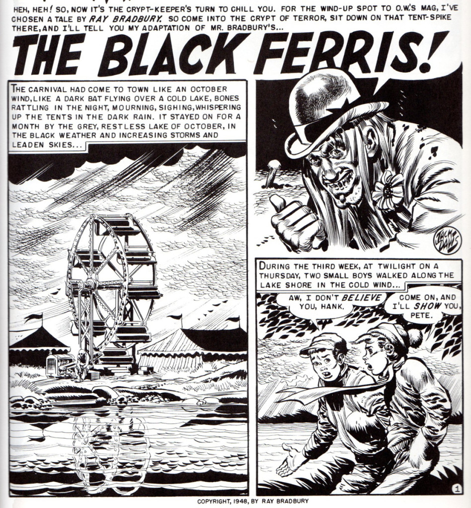
Now, to a quick, short 10 year flashback to 1953, when Jack at age 29, was still cutting his comic art teeth, pen nibs and #3 red sable brushes at the hallowed halls and art tables of EC Comic Books. Even then, known for his speed at getting the job done and his agile ability to cover all of the genre bases, I thought it would be fun to see a sample of Jack’s work from this time period in his life. By showing only the lead, splash panels of the many stories he did, you’ll get a sense of how much work he turned out in an 8 month stretch. March to October 1953. This doesn’t even include his cover art for the different EC titles.
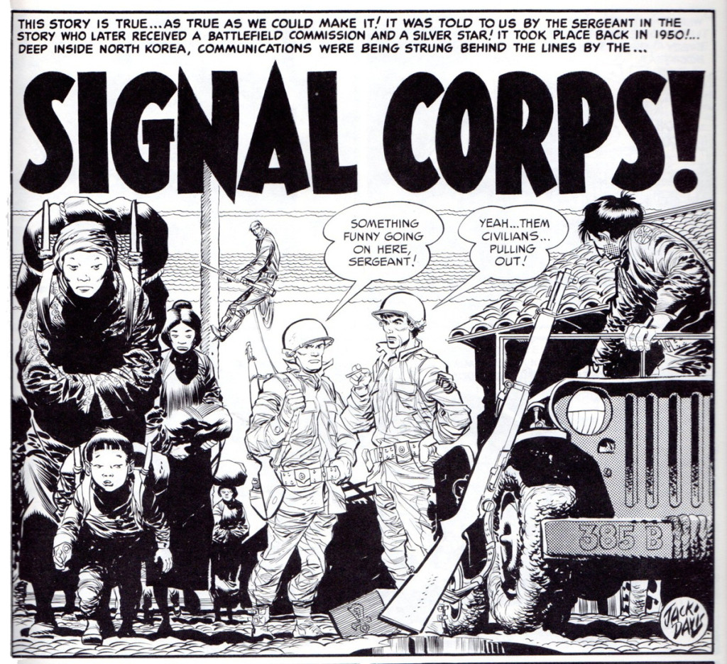
 1
1This story is from “Frontline Combat” no. 11.
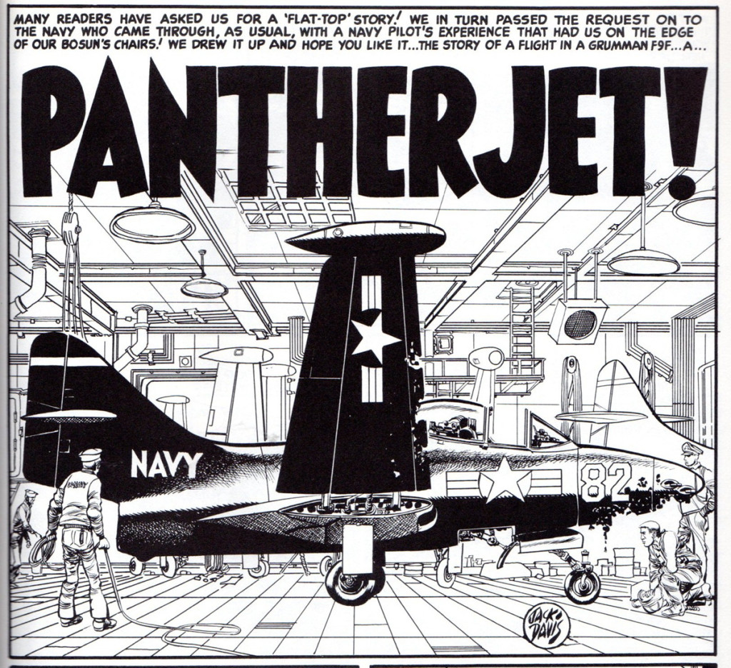
 2
2
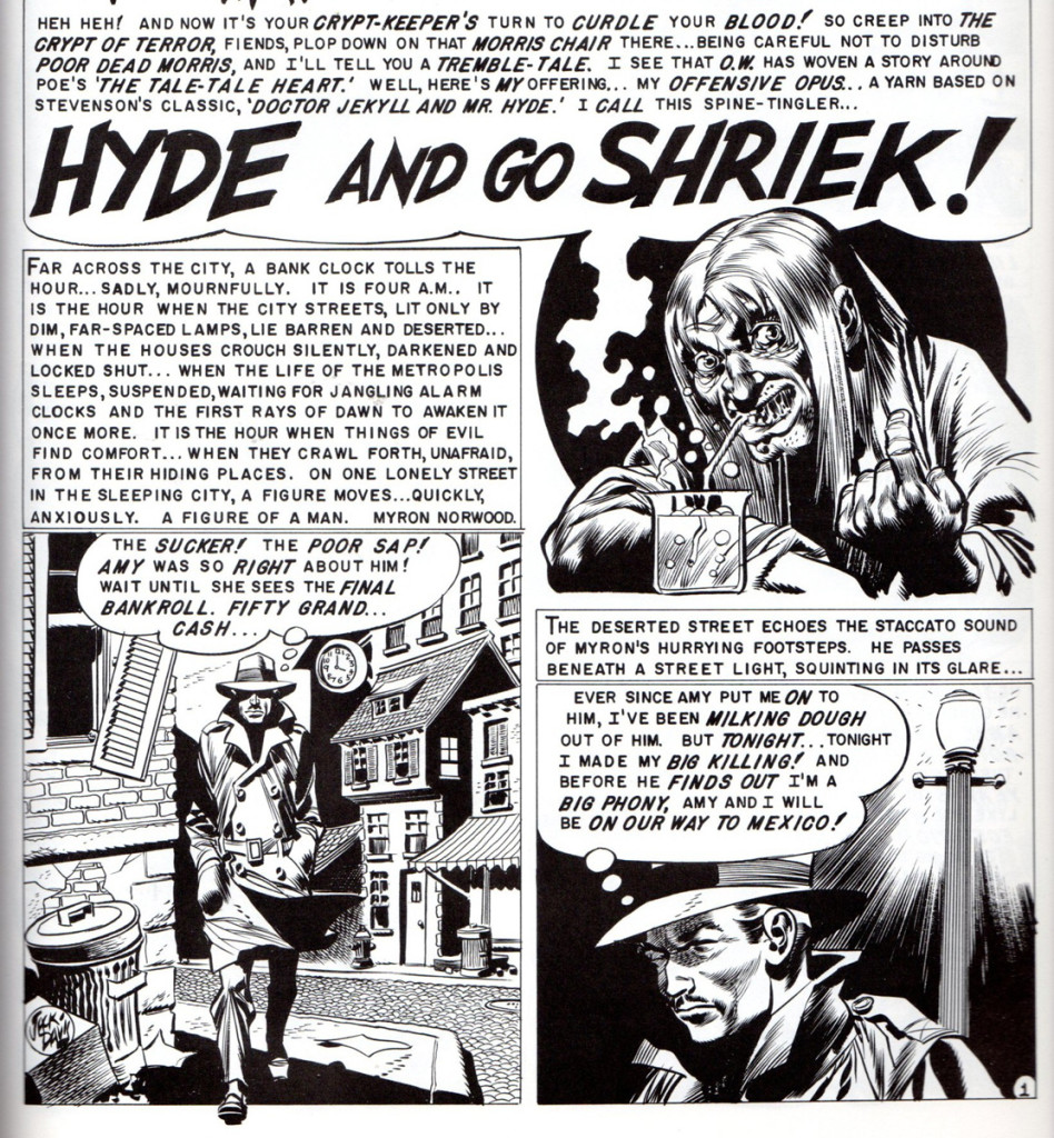
This panel is from “The Haunt of Fear” no. 18, horror comic.
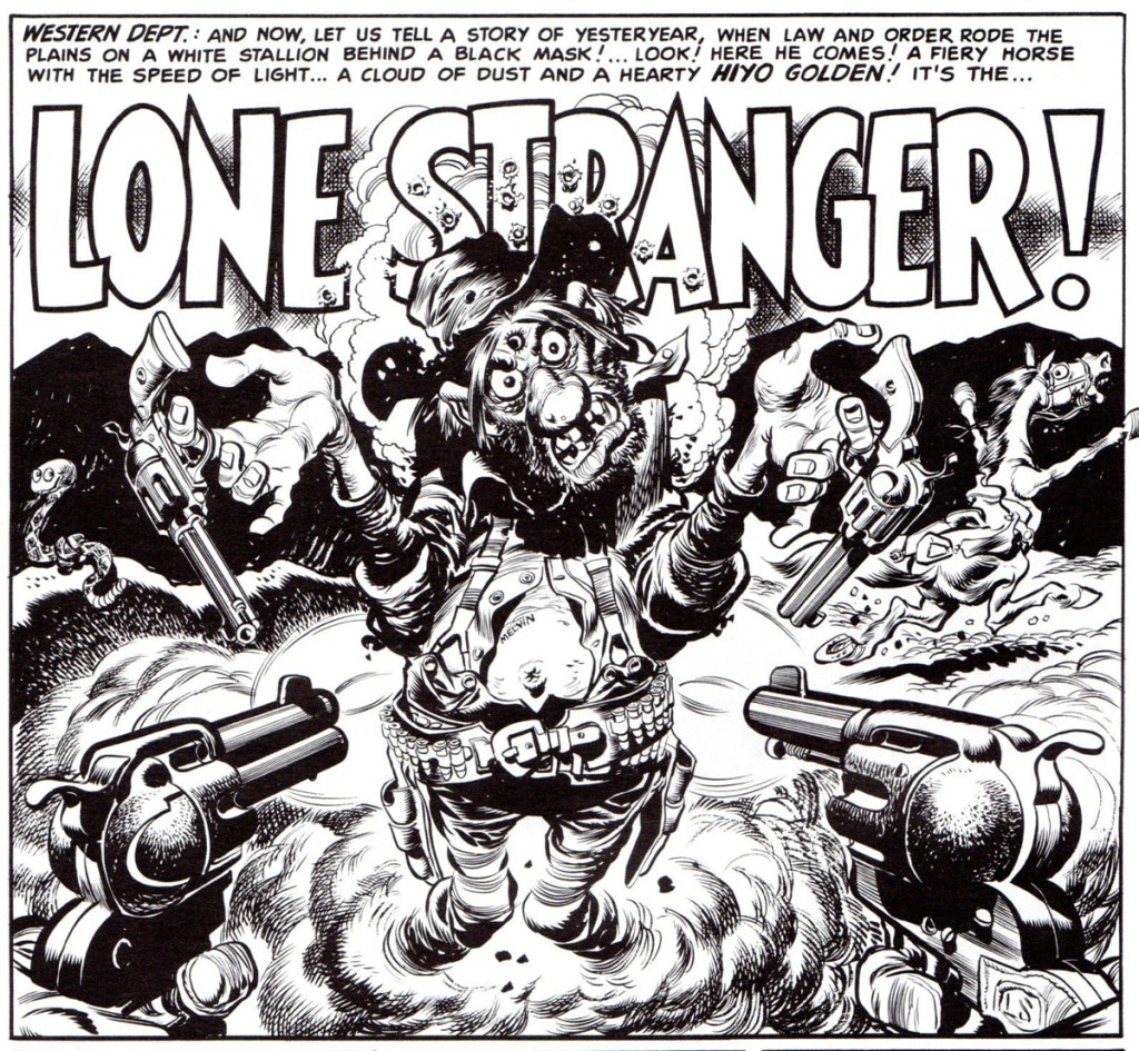 3
3
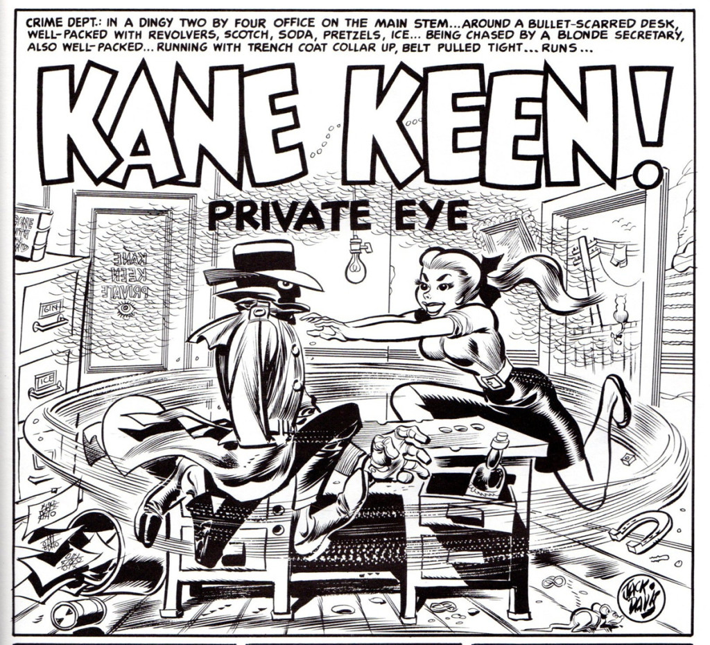
This panel is from “Mad” comic book no. 3.
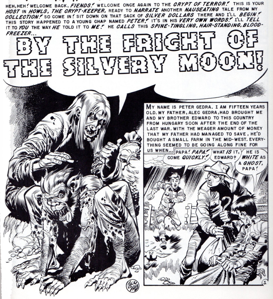 4
4
“Tales from the Crypt” no. 35.
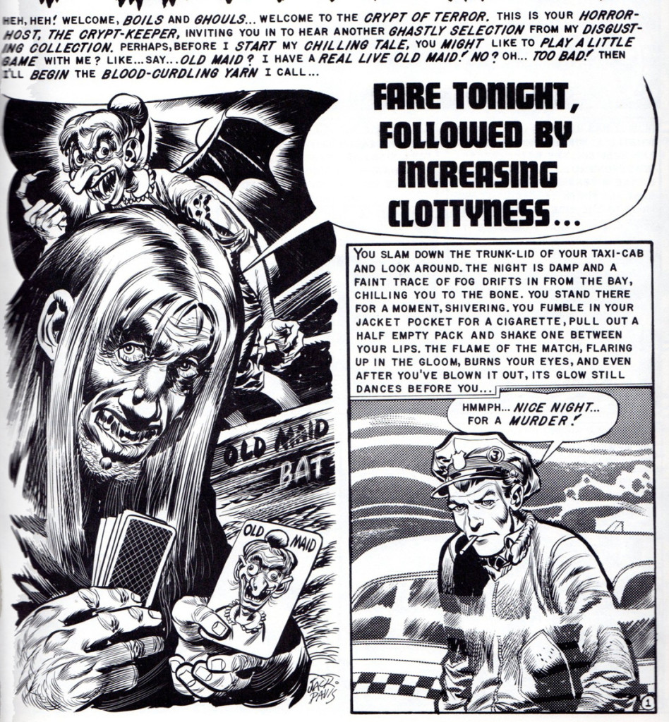 10
10
“Tales from the Crypt” # 36.
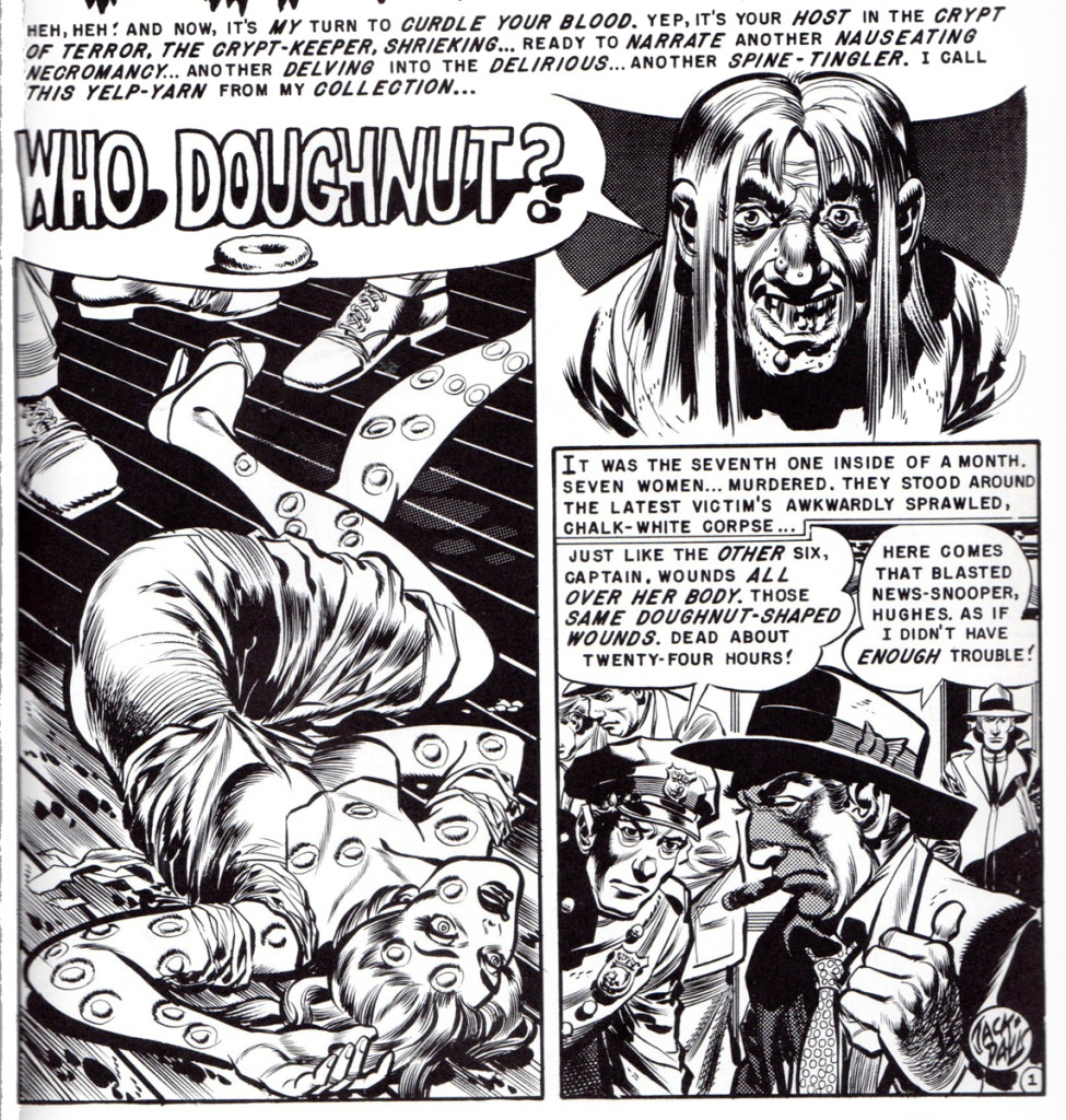 12
12
“The Vault of Horror” no. 30.
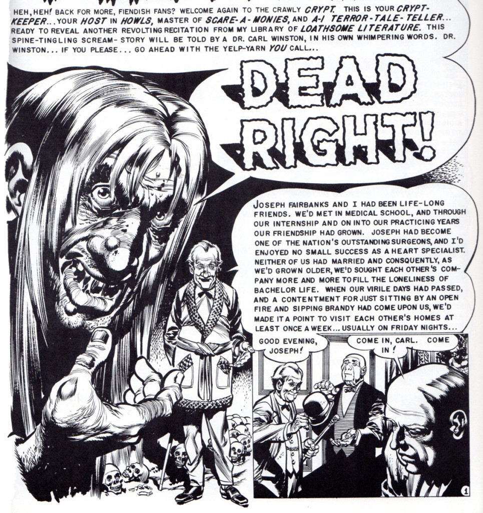 16
16
“Tales from the Crypt” no. 37.
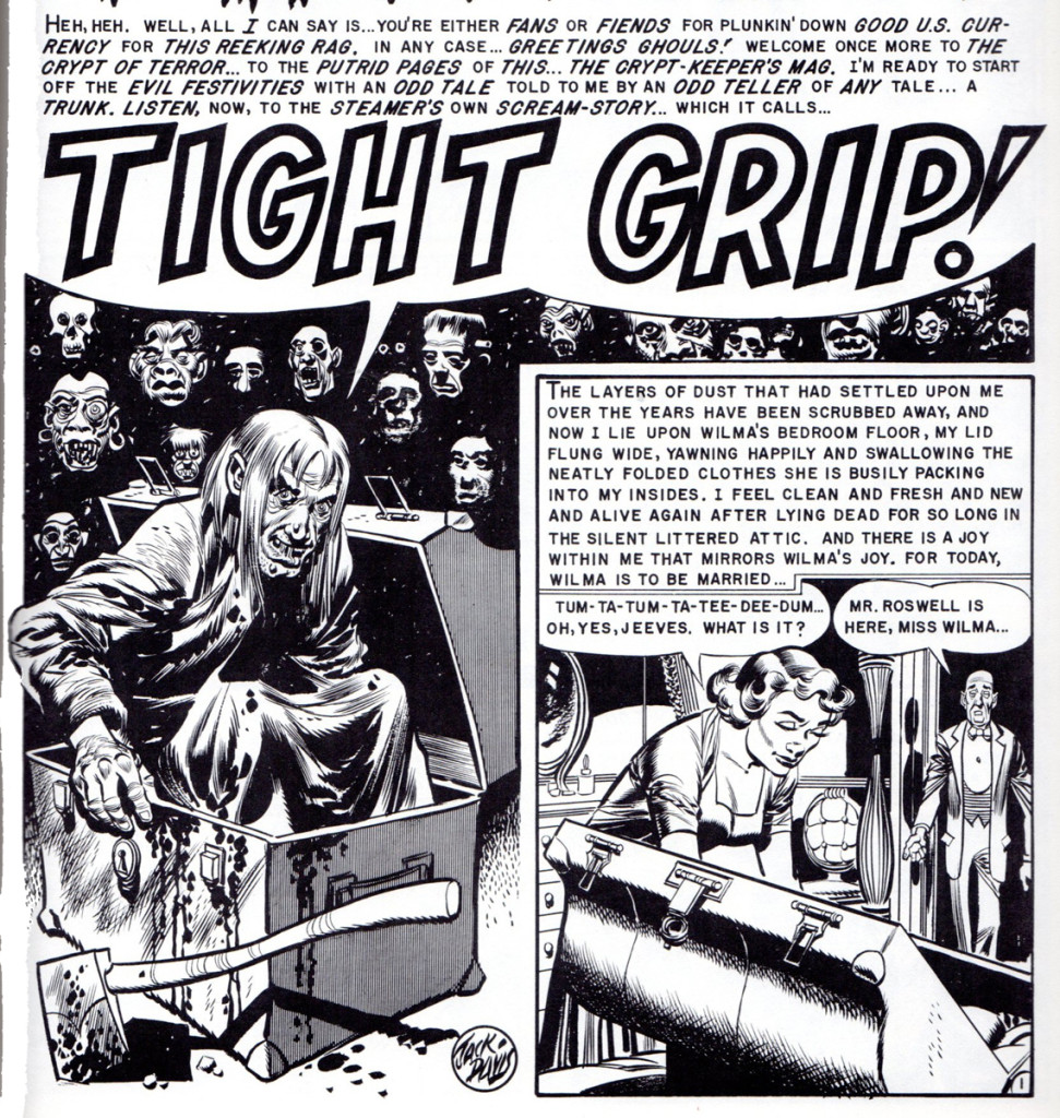 22
22
“Tales from the Crypt” no. 38.
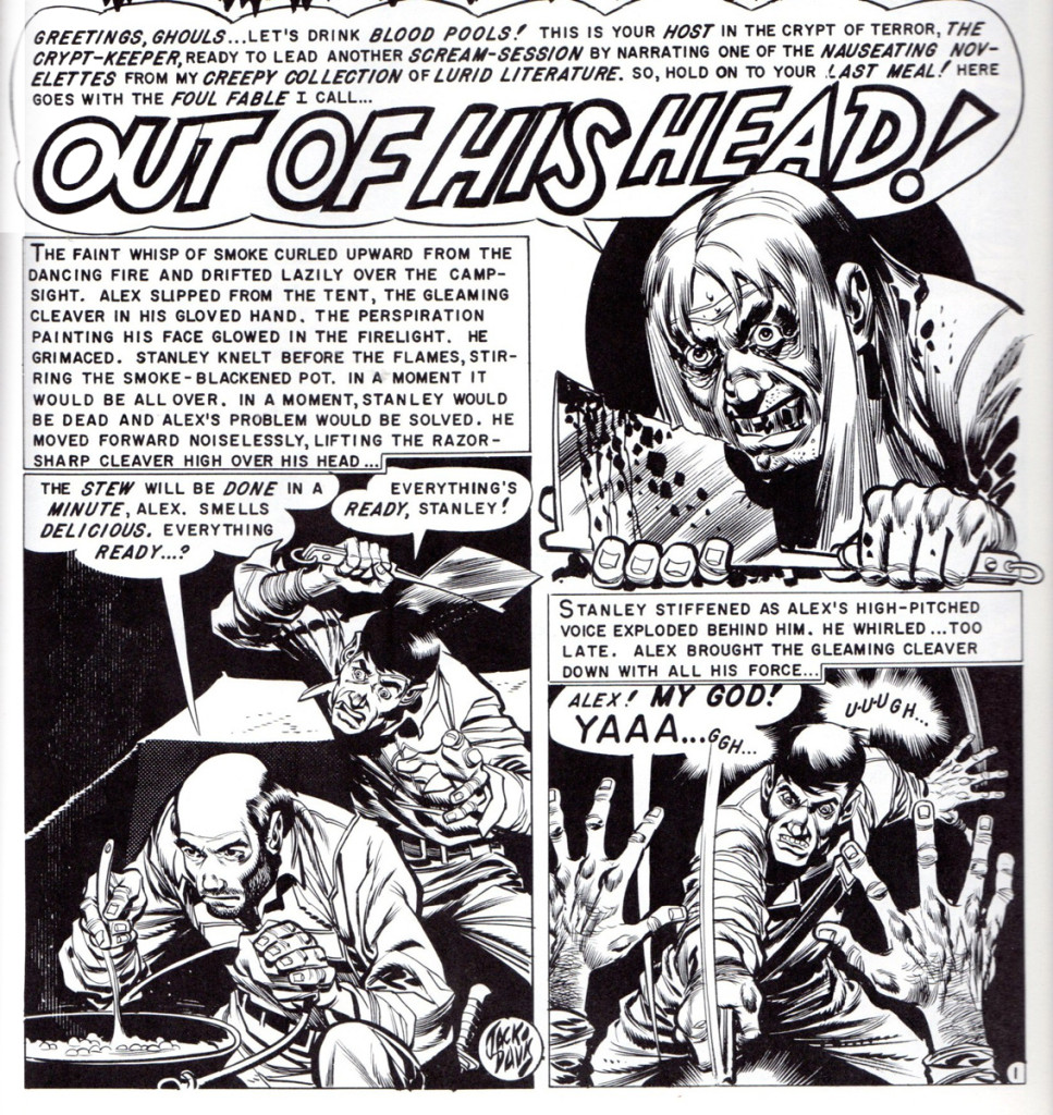 24
24
“The Vault of Horror” no. 32.
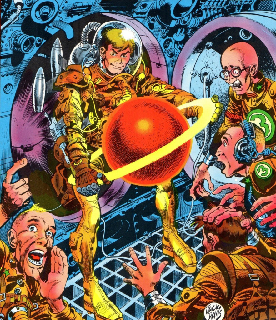 25
25
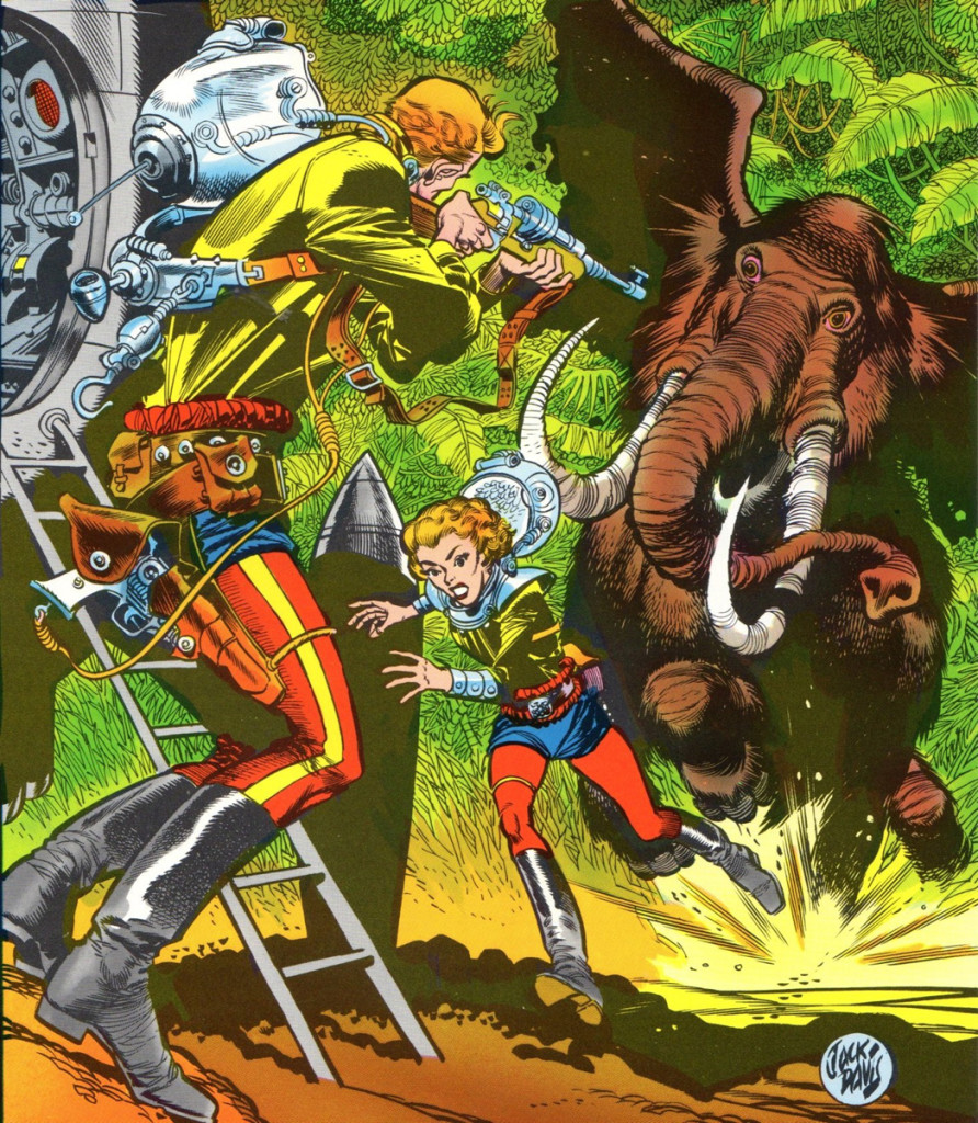
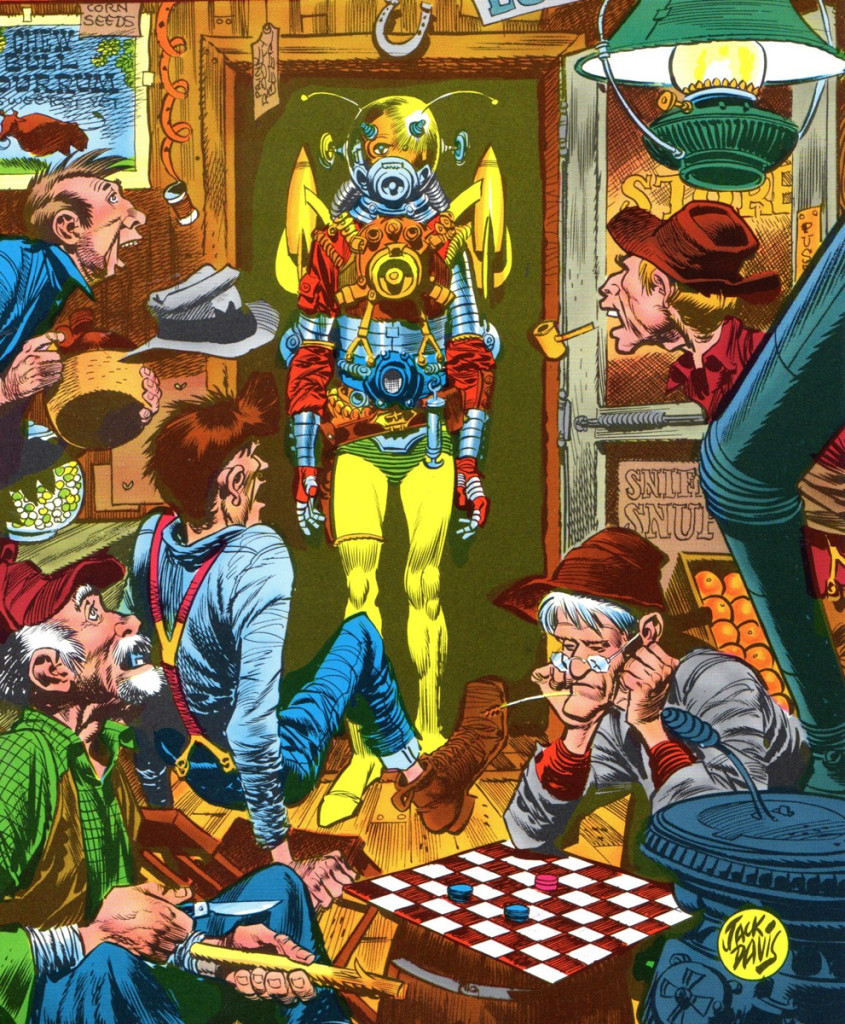
We’ll end with a splash of color. These three covers,
colored by EC colorist Marie Severin, were some of
Jack’s final pieces of art for the end run of EC comics
in 1955. They were done for their “Incredible Science
Fiction” title. With these covers and his stories inside
the books, meant that Jack worked on all of EC’s titles,
crime, horror, humor, science fiction and war. Lucky for
us, he made all these genres his own!
Here is “Incredible Science Fiction” no. 30.
 26
26
“Incredible Science Fiction” no. 31.
 27
27
“Incredible Science Fiction” no. 32.
(One almost gets the sense that Jack had his idol
Albert Dorne egging him on with this cover. A nice
tribute to both those gents!)
Bill Peckmann &Comic Art &Disney &Illustration 15 Feb 2013 05:18 am
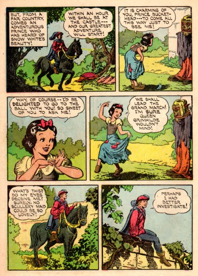
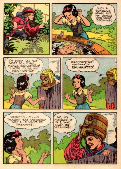
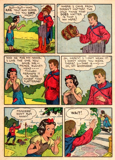
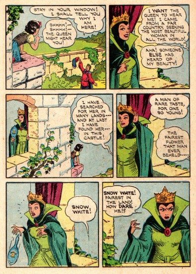
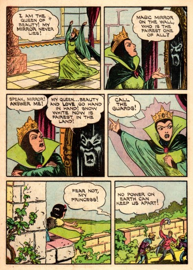
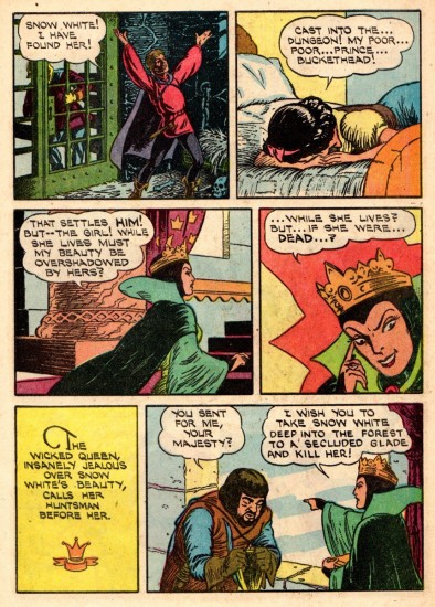
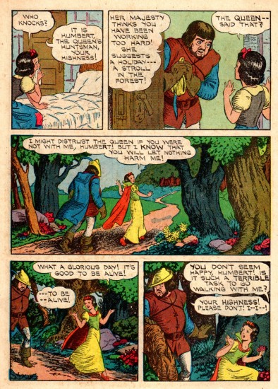
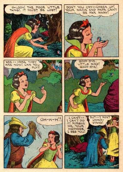
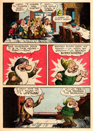
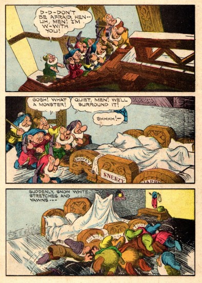
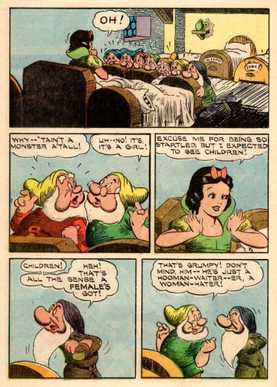
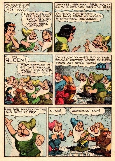
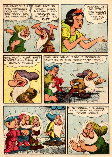
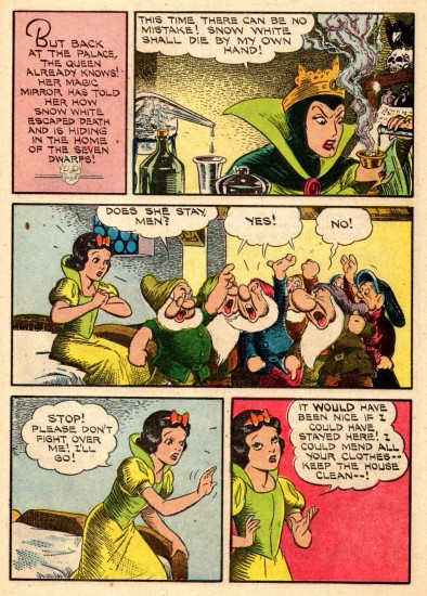
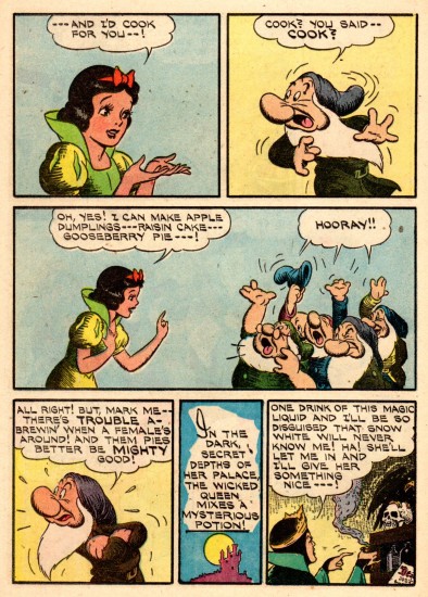
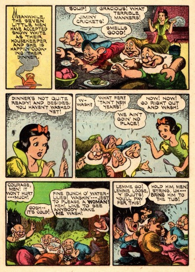
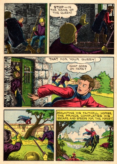
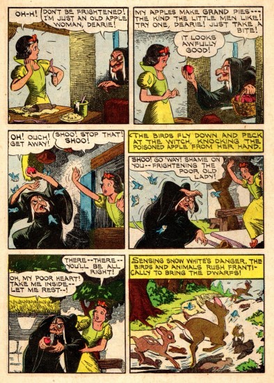
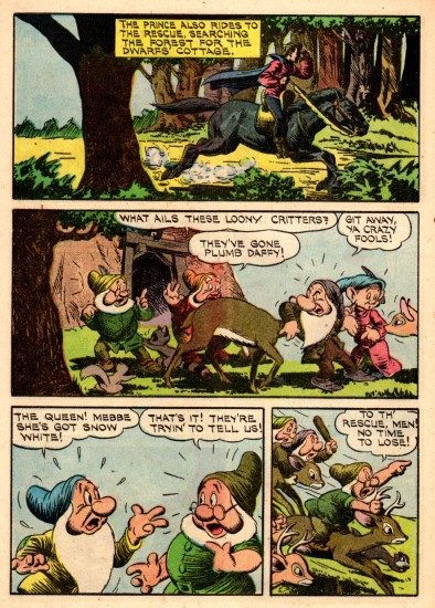
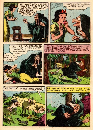
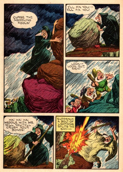
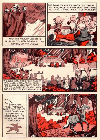
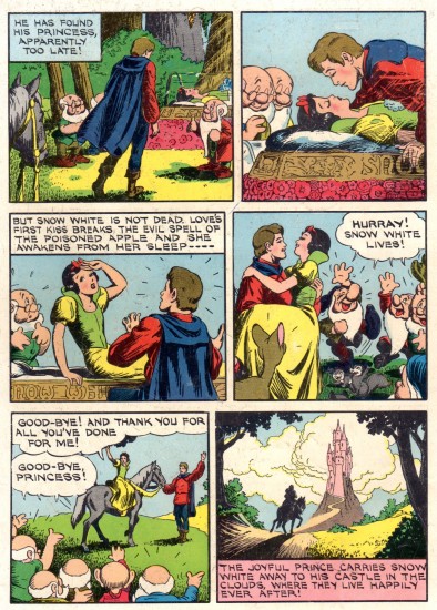
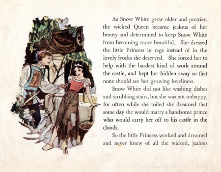
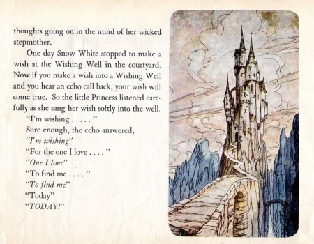
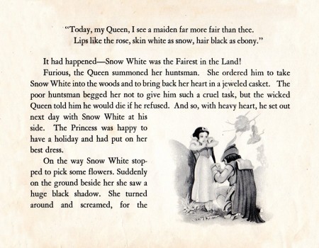
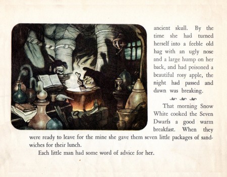
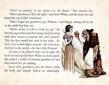
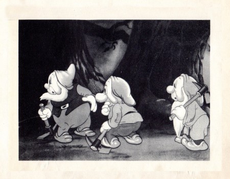
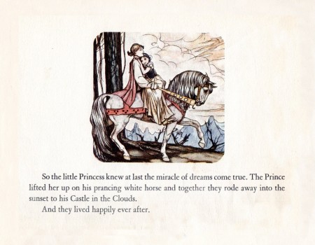
Snow White Comic – 1950
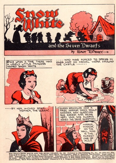
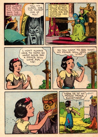
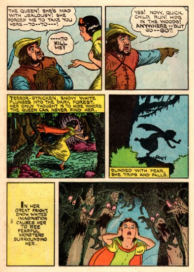
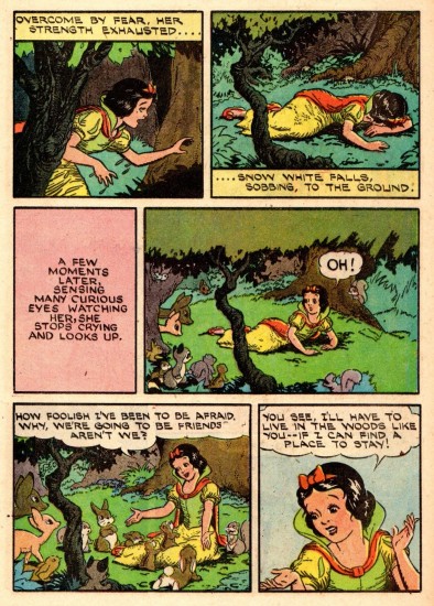
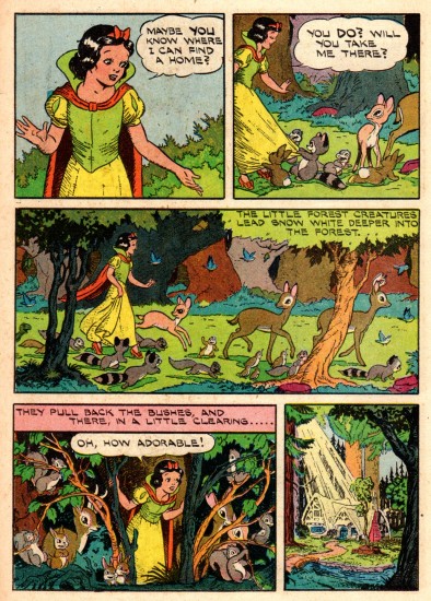
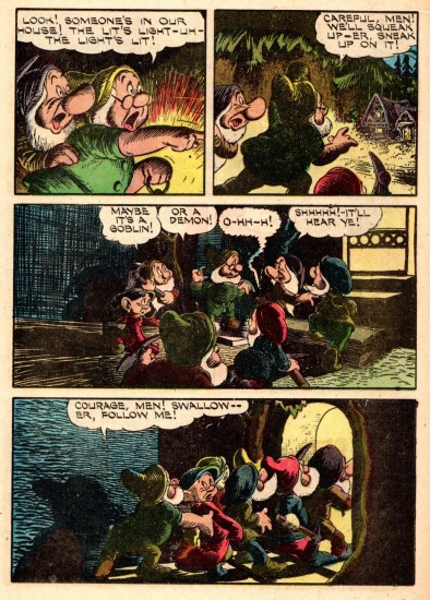
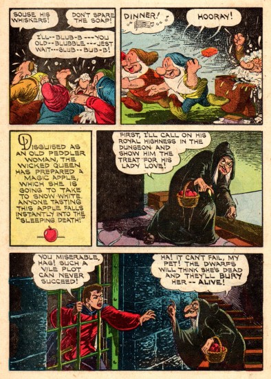
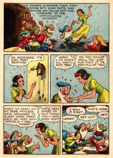
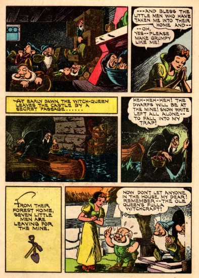
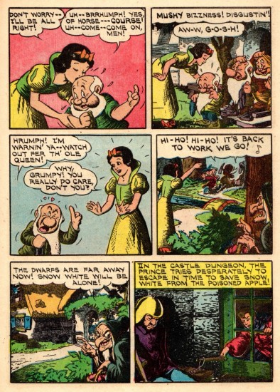
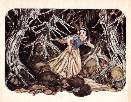
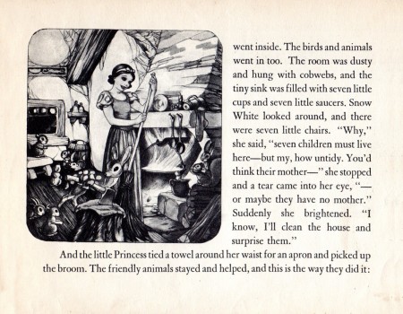
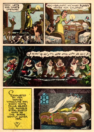
- With the re-release of Snow White, came an overhaul of the comic strip. The strip that had been syndicated in the newspaper in 1937, was now shoe-horned into a comic book version, with some modifications. This is that revised edition. Again many thanks to Mr. Bill Peckmann for having such an amazing archive and for sharing it with us. This is the note he sent along with it:
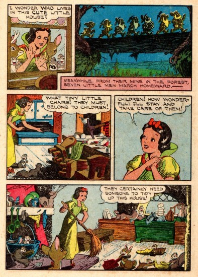
- Dell Comics’ early 1950′s ‘Snow White’ comic book. They took the original 1937 SW comic strip and cut it up to fit the comic book page format of the day. Seeing the book now only shows how good those original strip layouts were. This adaptation was first done 1944, that comic book had a Walt Kelly cover and was colored differently. I believe since then it’s been used for reprinting many, many times.
I’d posted that original 1937 version last week here.
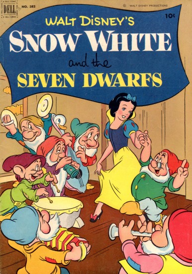
The brand new cover with artwork
by Walt Kelly.
 14
14
The cheap printing on the newsprint
adds something to this version.
 15
15
The cross hatching stands out and brings out
the expressionist feel of the original artwork.
Animation &Animation Artifacts &Bill Peckmann &commercial animation &Illustration &Models &Story & Storyboards 30 Jan 2013 08:26 am
More Misc Commercial Art
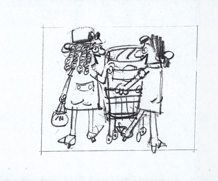
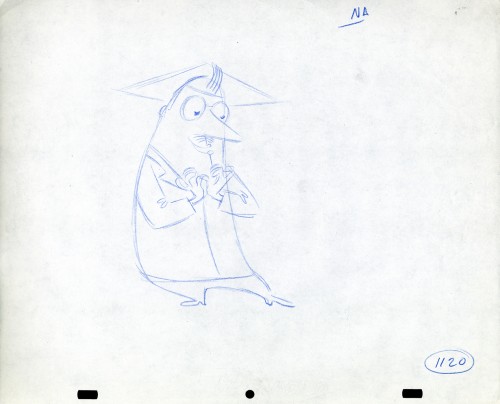
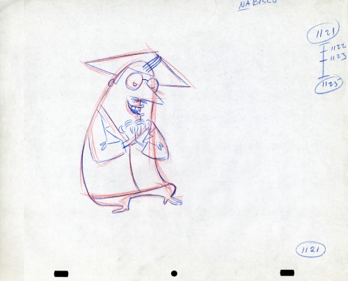
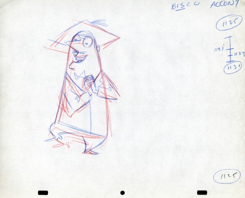
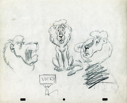
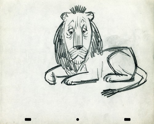
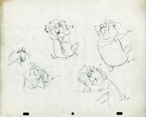
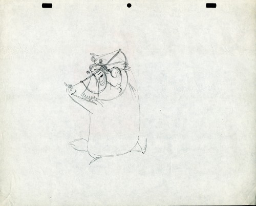
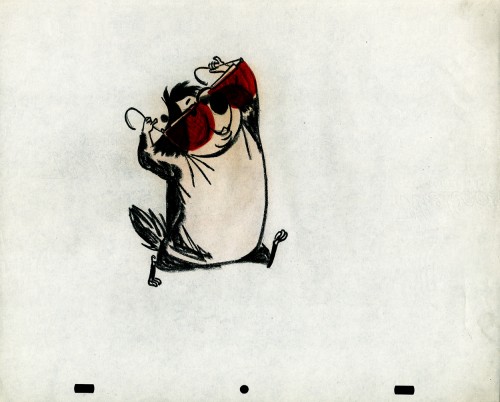
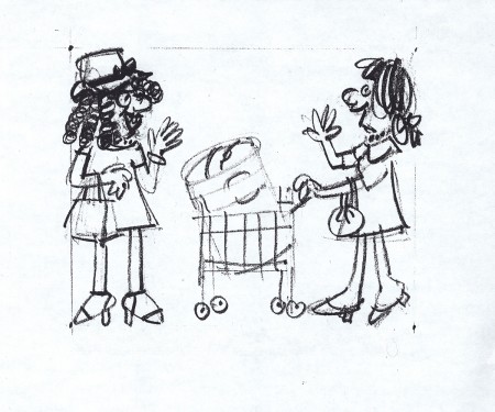
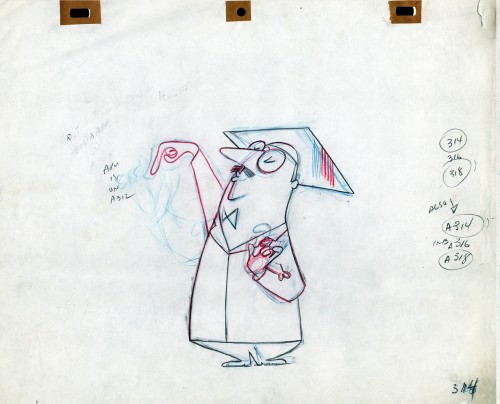
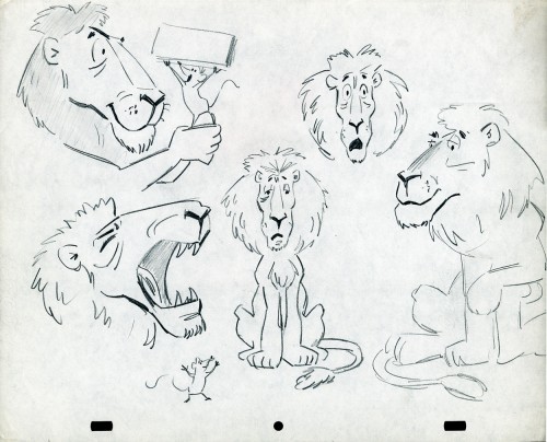
- Still left in the Vince Cafarelli collection of drawings from commercials he did, most probably, at Goulding-Elliott-Graham (for the moa part) are the drawings below. We know through some small bits and pieces of information what a couple of the sponsors were. (The wording of dialogue the professor speaks that the sponsor is Nabisco Shredded Wheat; the lion and the mouse ad is obviously for Vicks – drops or vap-o-rub.) However, too many other bits leave us empty handed. I can recognize cartoonist, Lou Myers‘ work anywhere, but no clue what they’re for. Candy Kugel and I were also able to delineate Lu Guarnier‘s drawing style (Vinnie was his assistant for years), and I know Jack Schnerk‘s great work. I recognize the brilliant and great hand of George Cannata from similar work that Bill Peckmann had recognized (see here) in a past post. So it is great to learn as much as we can, even though there’s a lot of guesswork in it.
The following are three storyboard drawings by cartoonist Lou Myers for some spot:
 1
1
The following drawings are for Nabisco Shredded Wheat. They’re animation drawings/ruffs by Lu Guarnier. The delicate pencil lines of these years turned into dark rougher ones in his later years. The timing charts were always the same right out early wB years. You’ll notice a lot of quarters and thirds in the breakdowns. This is something you’d never see from Disney. There, everything is broken into halves and halves again and again.
 1A
1A
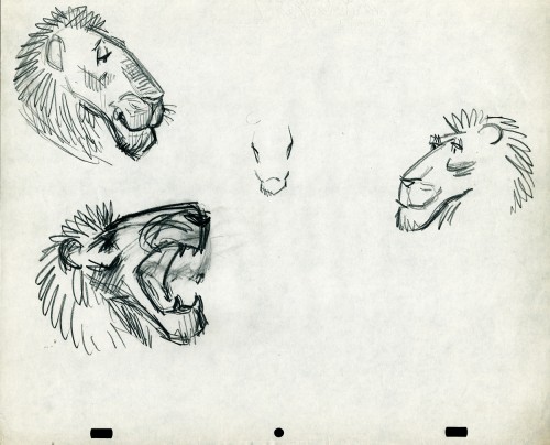
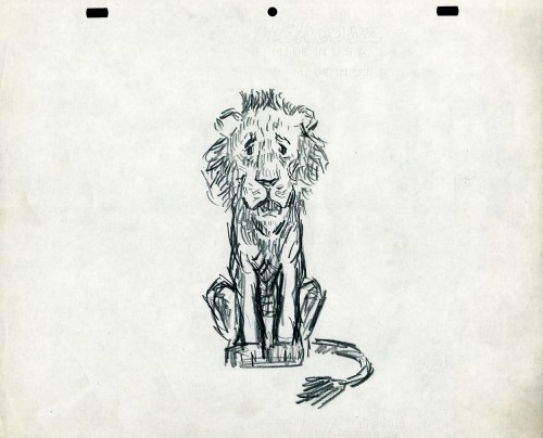
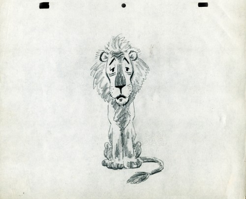
- The following lion is designed and animated for a Vick’s commercial. (Note the second model sheet.) There were quite a few commercials during the period that reworked this great Aesop tale for the sponsor’s use. The lion obviously has a cold. Rather than pulling out the thorn, the mouse introduces him to Vicks’ cough drops and the lion feels a whole lot better.
What has been left behind of this ad includes a couple of model sheets of the lion as well as a couple of animation drawings. I don’t know who the designer is, but the animation drawings are most definitely the work of Jack Schnerk. I suspect all the drawings here are by Jack. He probably kept reworking the model sheet until he got the character in his hand. I can remember him lecturing me on the quality of my drawings. Unless my drawings became roughs, rather than tight clean ups, he was convinced I couldn’t get good animation in my pencil. Jack’s work was rough. and it became much more rough than this, certainly by the time I knew him and was assisting him. He also had a peculiar style of roughness; very choppy angular lines chiseling out the fine drawings. You can get a good example of that with drawing labeled “2D”.
The last four drawings are all animation drawings. “2D” is a rough, “2E” is a clean-up by Jack. The last drawing is a beauty and probably the final look he hit upon.
 2A
2A
Here we have some drawings by a designer. I suspect that it’s the work of George Cannata. I did a couple of posts on a designer at Robert Lawrence Studio a few weeks back. Bill Peckmann identified the primary designer whose work screamed out to me. Since then, I’d recognize that line anywhere, and it’s most definitely below.
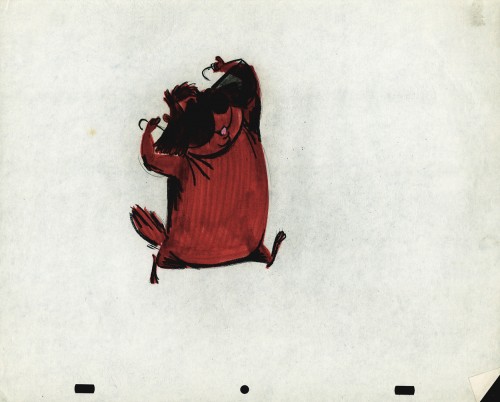
The Groundhog below is obviously a character with a southern drawl. The first step was to try the obvious making him a cowboy (“3A”). But that soon changed. and the character got plenty more sophisticated (“3B & C”). After that the line got juicy and the color got bold. There’s really so much to a character like this who just about animates himself.
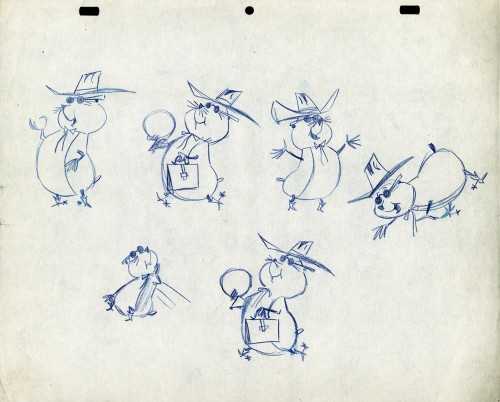 3A
3A
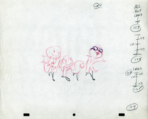
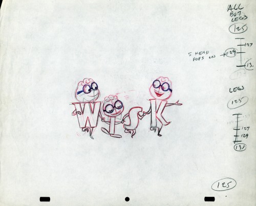
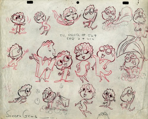
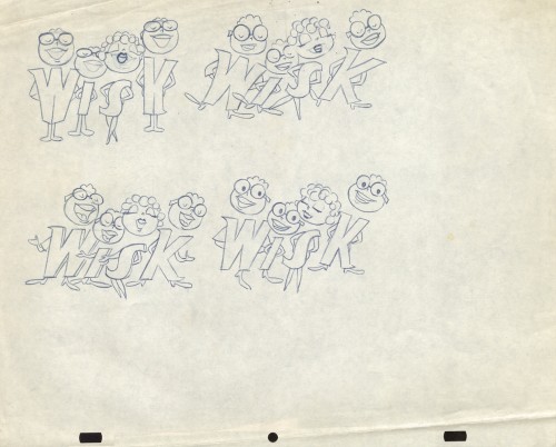
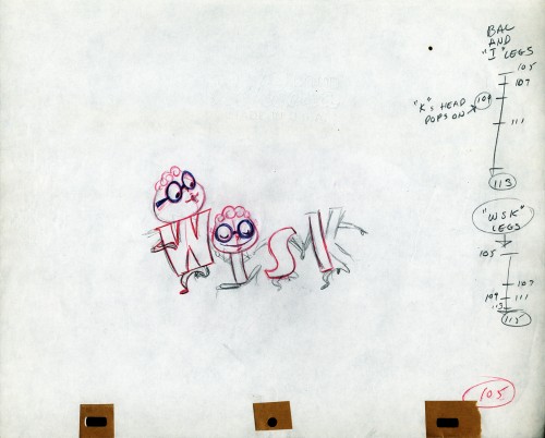
The following five drawings are for a WISK commercial. There are two model drawings and three animation ruffs. The primary model indicates that the spot is done for Screen Gems which was a viable studio in the early 60s and 70s. However, I don’t know who the animator was. Neither Lu Guarnier nor Jack Schnerk fill the bill.I know that Irv Dressler was at Screen gems for many years, but am not sure about this time especially since IMDB has him free lancing for King Features and other entertainment studios. The drawswing style of these animation drawings is right out of the Paramount/Terrytoons mold. Many animators’ work looked like these. People such as Johnny Gentilella, Marty Taras et alworked in a very similar style, though these are a little harder lines than either of those two.
 A
AThis is the primary model for the entire family. It’s a
beautiful drawing, and the characters have a lot of play
in them despite being connected so obviously.
Just look at the father’s hair. Beautifully done
 B
B
Here’s a secondary model. I suspect this is the animator
tracing off the characters and seeing what he can do with them.
 C
C
Animation drawing #105. Those breakdown charts are something.
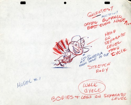
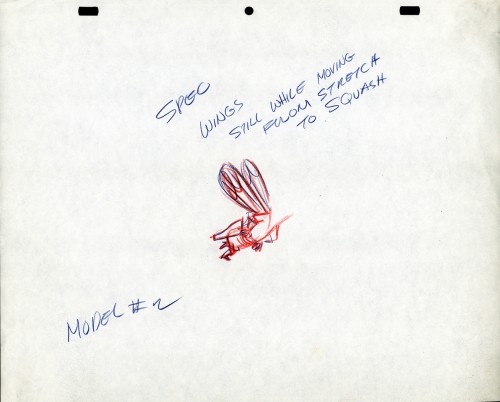
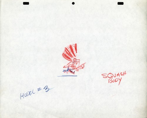
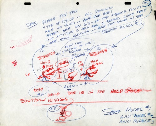
The Buffalo Bee for Honey Nut Oats is also a model sheet from Screen Gems. With it come an animation model sheet for the walk cycle of the character. These drawings look like Lu Guarnier’s to me, but there’s no official way I could confirm that, of course.
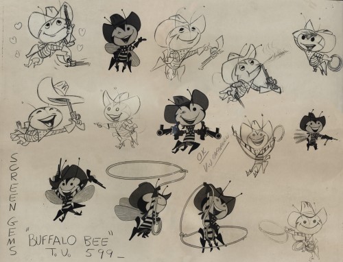
Model sheet
Bill Peckmann &Books &Disney &Illustration 25 Jan 2013 11:07 am
Snow White Book
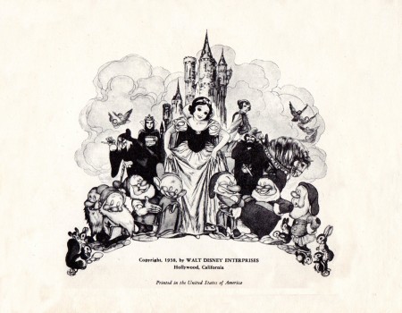
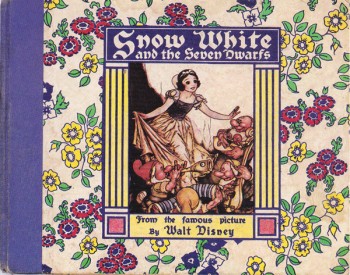 - I’m reading J.B. Kaufman’s two Snow White books, both at the same time, and I’m taking my time about it. Bill Peckmann aroused my interest with a couple of Snow White oddities. Featured in Kaufman’s The Fairest One of All is a the Whitman children’s book that was released with the initial release of the movie in 1937. (See the cover to the right.)
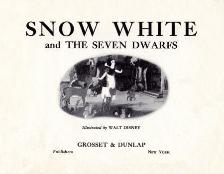
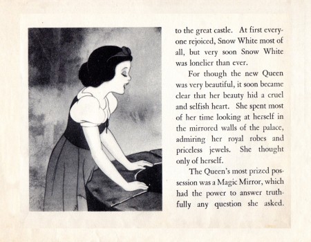
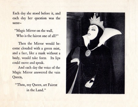
Bill sent me the cover of his copy of the book, bought at a local street fair. His version was the rerelease of the book by Grosset and Dunlap done in 1938. And it’s a beauty. The book contains some B&W screen images from the movie,, but more than half of it is made up of illutrations by Gustaf Tenggren, the studio artist/designer so responsible for some of the film’s look. He joined the studio in 1936 and had involvement in finishing the movie and giving it the Old World look that it has. Ferdinand Horvath and Albert Hurter were already at the studio when he joined and had equally strong contribution in the design. Tenggren was principal in the publicity materials done for the movie. Here’s the copy of bill’s book, complete with damaged cover:
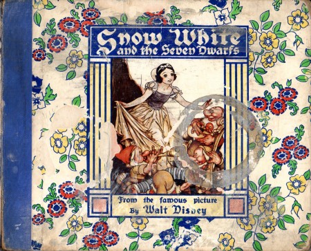
This is the dameaged cover of Bill’s book.
Bill Peckmann &Books &Comic Art &Disney &Illustration 18 Jan 2013 08:33 am
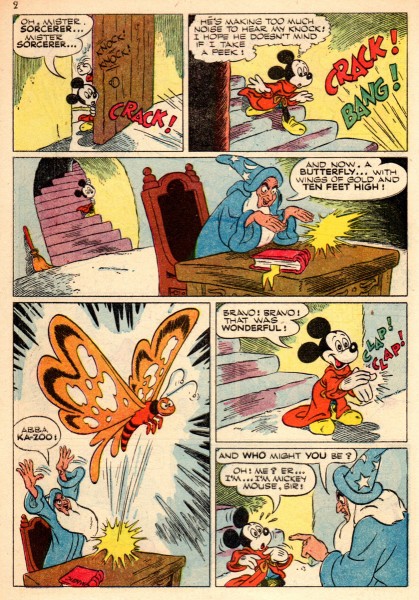
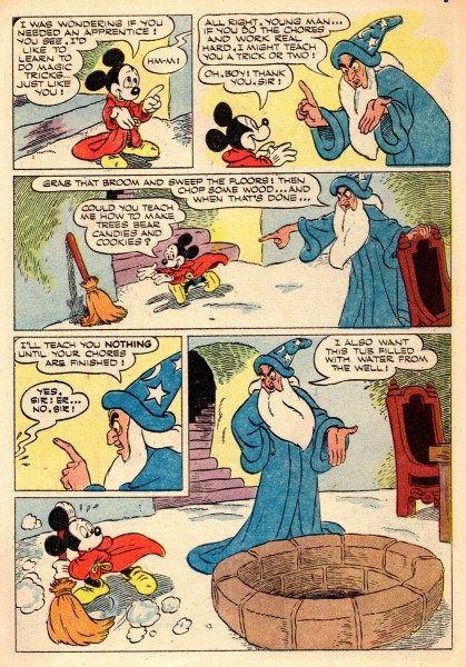
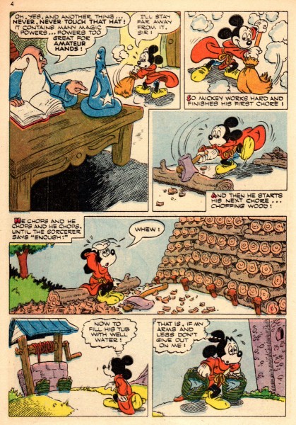
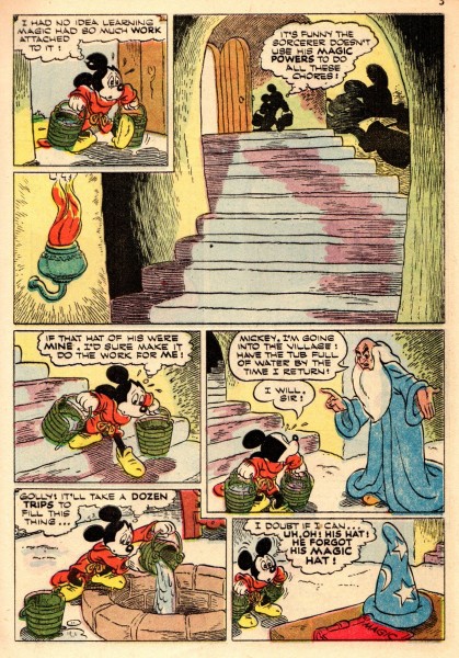
H2O, Donald and Mickey via Paul Murry
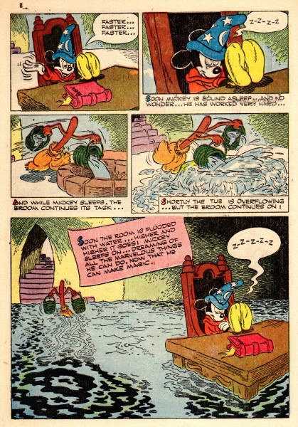
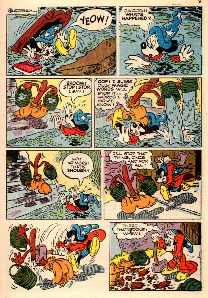
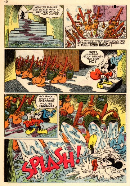
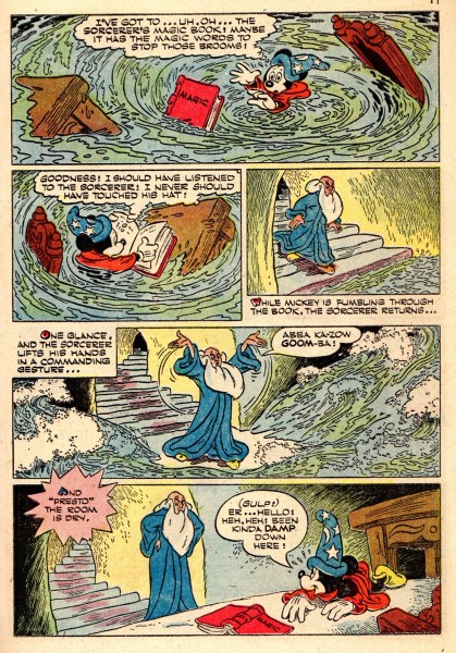
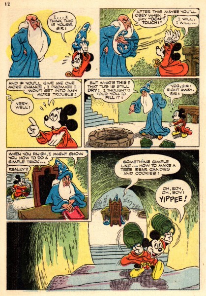
Water water everywhere and Paul Murry gets to draw it all. Here are two stories starring Disney’s greatest characters, Donald and Mickey. The two stories have three years apart from each other, but Murry gives us plenty of a stylized water, drawn slightly differently from one story to the next. How appropriate of Bill Peckmann to send us these tales when Congress finally got off their butts and voted the victims of Hurricane Sandy some financial relief. Here’s Bill’s comments:
- Here is another Paul Murry story containing H2O hi-jinks. It’s a ‘Walt Disney’s Comics and Stories‘ Donald Duck 10 pager from 1950. (It was the only year that DD regular Carl Barks missed doing a number of his signature character stories. There’s another great Murry Duck story that deals with an overnight flood; sorry, I just can’t remember what comic book it’s in.)
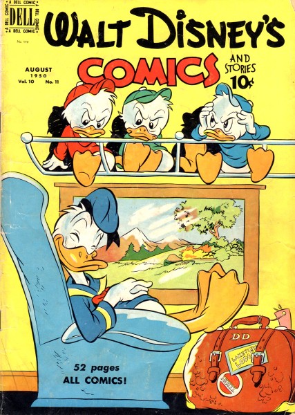
The comic cover from1950. This cover art is by Carl Buettner. ___________________________________________
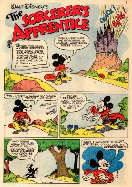
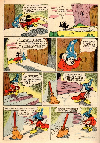
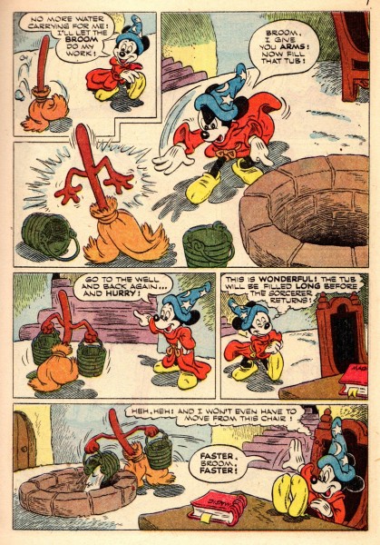
If we jump three years to 1953, we’ll find another Paul Murry story with a strong focus on water. Here our intrepid artist adapts The Sorcerer’s Apprentice from Fantasia. (Perhaps there was a re-release of the film that year.) 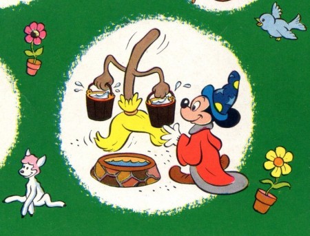
Part of the cover.
___________________________________________
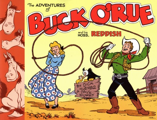
- Speaking of Paul Murry, let me end by giving another pitch for the excellent collection of The Adventures of Buck O’Rue and his hoss, Reddish by Dick Huemer & Paul Murry. This is a rip roaring (you’ll be roaring with laughter) classic of a brilliant strip.
No, no one is paying me for this or prompting my wanting to remind you of the perfect Valentine gift. I just like this book and this strip, and I think you might like it, too.
Animation Artifacts &Commentary &Illustration &Layout & Design &Top Cel 16 Jan 2013 08:23 am
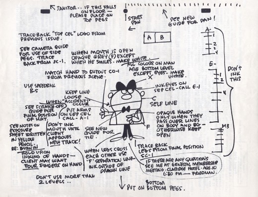
Top Cel – 1
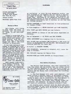
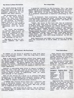
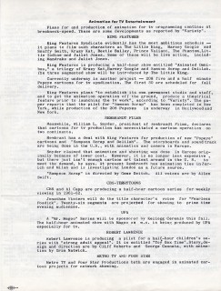
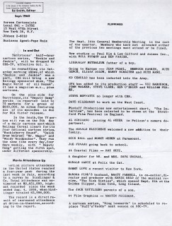
- Over the years I’ve found that a number of animation personnel saved their copies of Top Cel, the u-nion newspaper. However, we’re not talking every copy of Top Cel, we’re focused on the Ed Smith years. Ed was the editor for a number of years, and his issues were filled with great graphics done by local members.
I have a complete collection from the late forties up to the final years. That collection has been in storage for the entire run of this Splog, or I would have been posting these sooner. However, there among the Vince Cafarelli collection was a couple of the Ed Smith years’ papers. Starting with July 1960 and running through May 1968, there are a lot of papers. I hope to post the graphics from these and wil pick out particular stories or images within to give an idea of what was happening in the business. I don’t want to post the entire thing, since many of the articles pertain specifically to u-nion business, and it seems pointless in its outdated nature.
We’ll start with the first 10 issues:
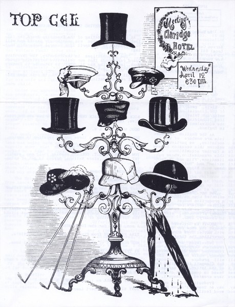
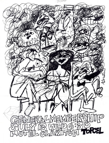 1
1July 1960
Artwork by Mordi Gerstein
 1a
1a  1b
1b
(Click any of these frames to enlarge to a more legible size.)
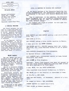
 2
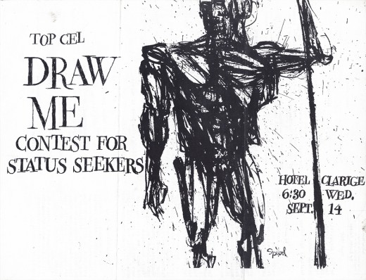
2
August 1960
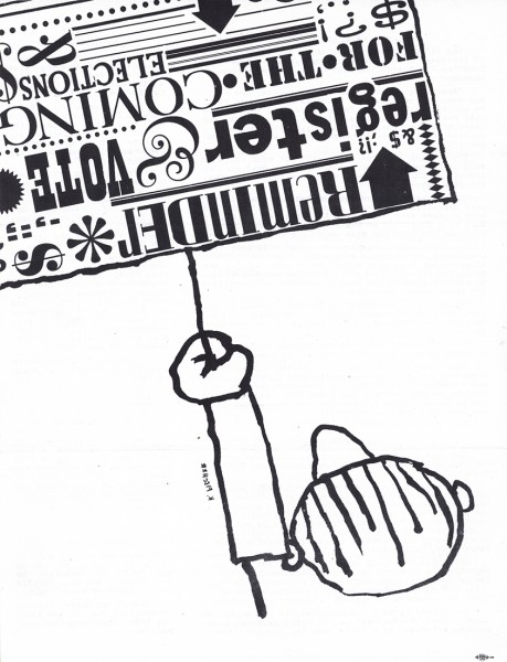
This issue, like many others, has to be turned clockwise to properly read.
For the sake of these covers, I am turning the image 90° c/w
for you to read and will do this for all subsequent covers.
Artwork by Ed Friedman
 3
3
Sept 1960
This cover was also turned 90° c/w.
Artwork by Spipol (? I have difficulty reading the name ?)
 3b CU
3b CU
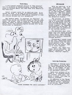
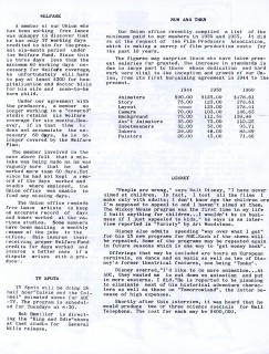
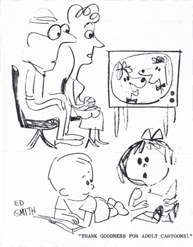
This cartoon, by Ed Smith, makes fun of the fact that the fashionably popular
HuckleberrynHound and Yogi Bear were being advertised as “Adult” cartoons.
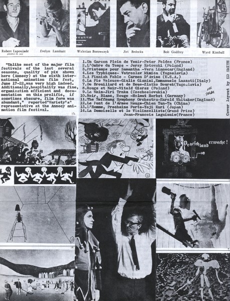
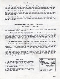
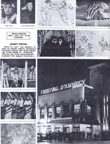
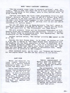
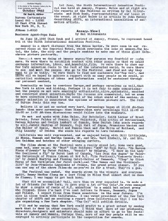
Within this larger issue, there were two pages of photos taken at
the Annecy Animation Festival to which a number of members went.
The left page is posted above, the right page is posted below.
 3d
3d 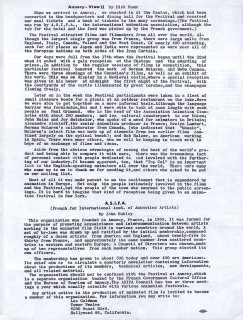 3e
3e
Reports about the Festival by two members, Dick Rauh and Hal Silvermintz.
 4
4
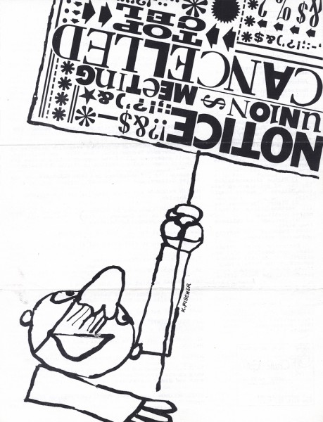
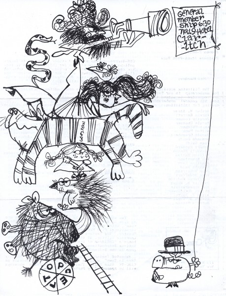
October 1960
The front cover of this issue.
Artwork by Karl Fischer
 5
5
Nov 1960
Artwork by Mordi Gerstein
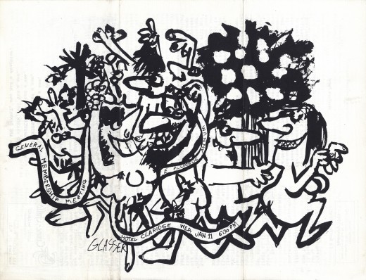 6
6
Jan 1961
Artwork by Len Glasser
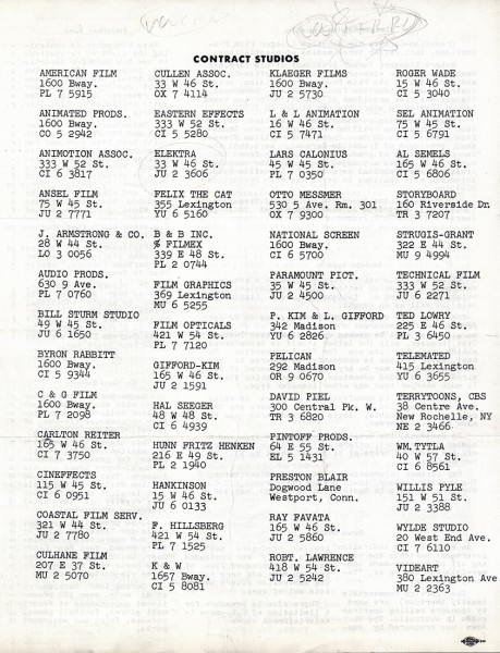 6c
6c
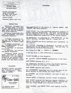
This back page had the contacts of all contracted studios in NY.
I love that P.Kim & L.Gifford have
different contact info from Gifford-Kim.
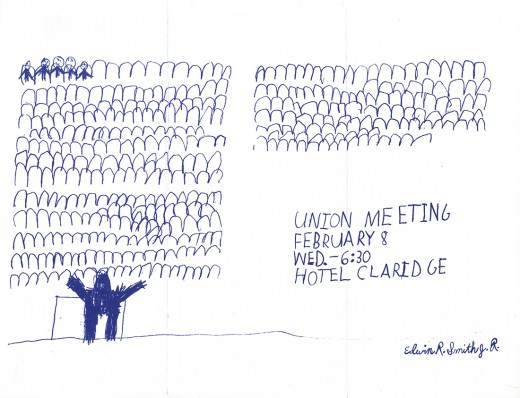 7
7
February 1961
Turned 90° c/w.
Art by Edwin R. Smith J.R. (Ed’s son?)
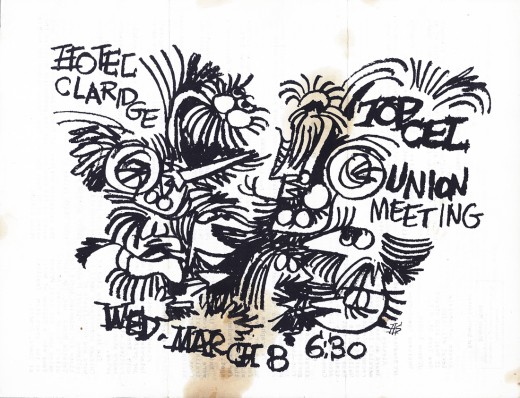 8
8
March 1961
Turned 90° c/w.
Art by Hal Silvermintz
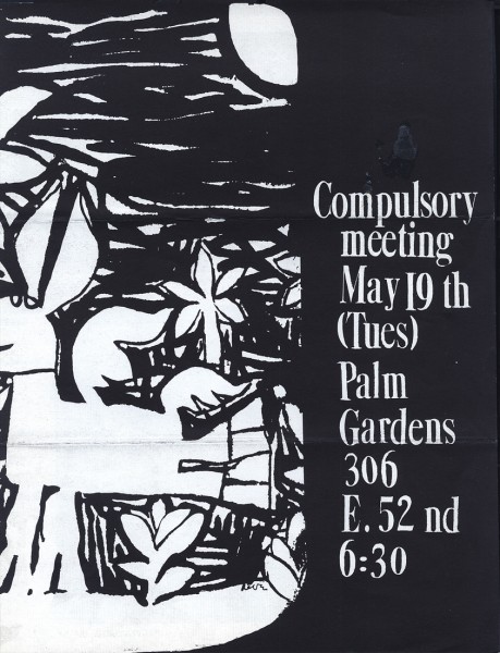 10
10
May 1961
I think the artwork is by Arnie Levin
Front cover
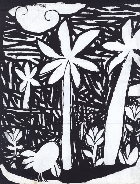
Back cover is an extension of the front.
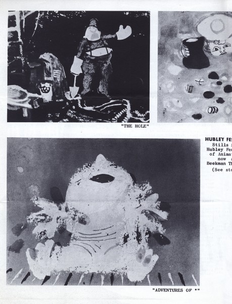
Inside is a 2-page promotion for the Hubley show at the
Beekman Theater. This was the premiere of their feature, Of Stars & Men.
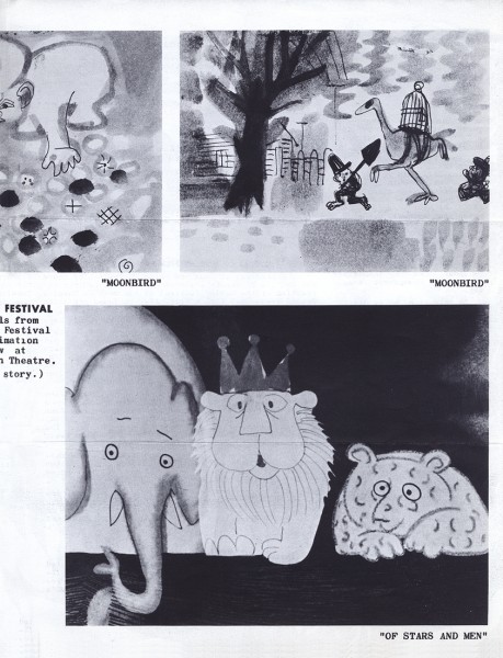
This was the 2nd page of the promo.
There also must have been a middle page of text which is lost from this copy of the issue.
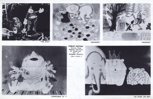
Attached the program looked like this.
This was my first viewing of the Hubley works. I had never seen a Hubley short
prior to this program. I was a Sophomore High School student at the time.
I went back a couple more times, and my world was changed forever.
To see some copies of Top Cel which were issued in 1945 and 1946, Richard O’Connor and his company’s blog Ace and Son has ostd quite a few of these issues. By going here, you’ll find 8 or 10 documents.
Bill Peckmann &Books &Illustration 11 Jan 2013 07:09 am
Baumgarten’s Sports
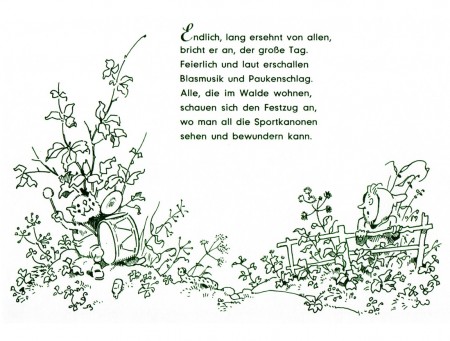
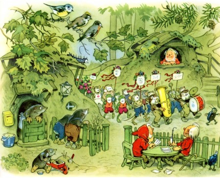
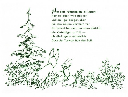
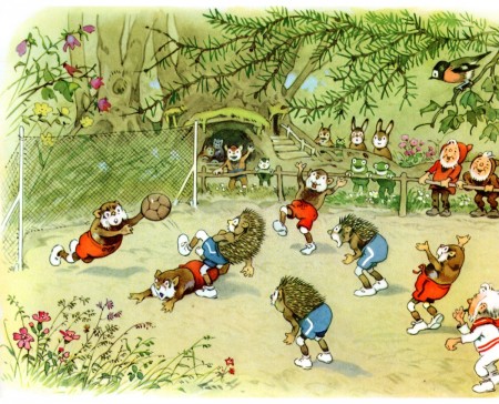
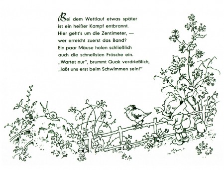
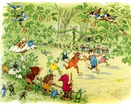
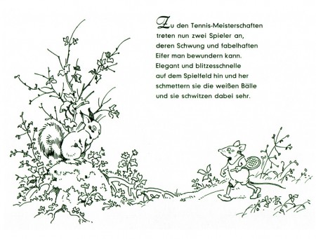
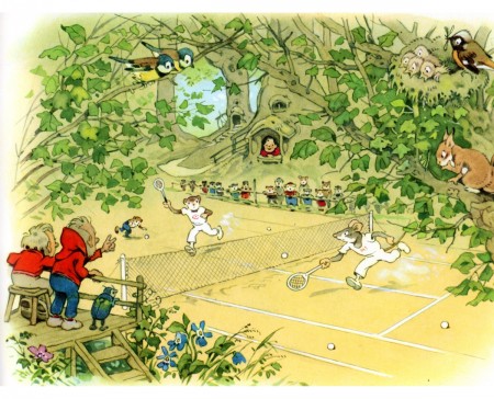
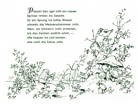
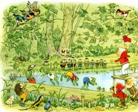
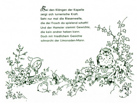
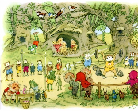
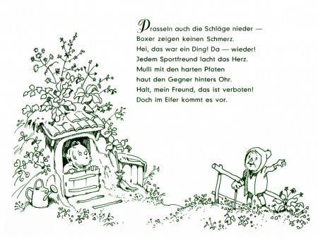
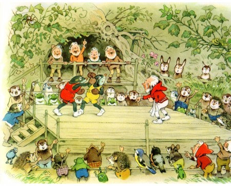
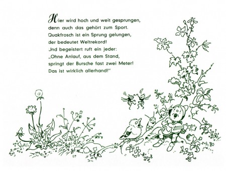
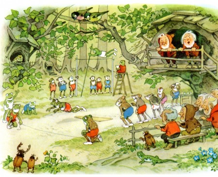
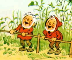 - Bill Peckmann has given us a wide assortment of beautiful books by Fritz Baumgarten. The illustrator has written many books built around a world of creatures and their environs that he’s created. His style is so affectingly attractive with the very rounded turns that we almost miss the beautiful inking and the fine watercolor techniques. The books are all very different, but there is a bit of a sameness to the work in that we don’t stray from the woods where the creatures – the small animals and dwarfs – make their homes.
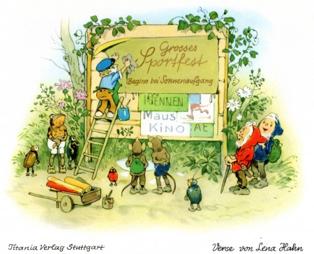
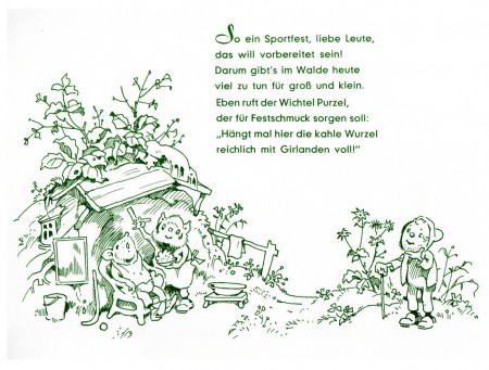
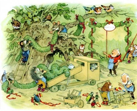
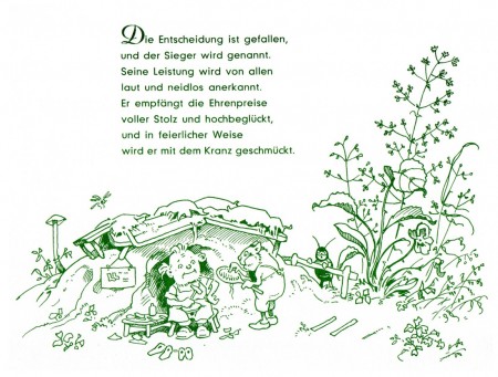
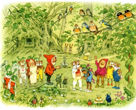
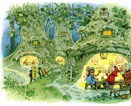
This book takes a different turn and gives Baumgarten a chance for some fun. Sportfest im Walde is obvious in its subject. The dwares and animals compete with a number of sports. From tennis to racing to boxing, activities abound.
I hope you enjoy it; I do. It’s a world I wouldn’t have otherwise seen, and I wish there’d been an animated version somewhere along the way. When Goebbels set up an animation studio to promote all things German, he should have animated hese books. They would have been wonderful as a series. They still are.
Many thanks, yet again, to Bill for the scans and the book, itself.
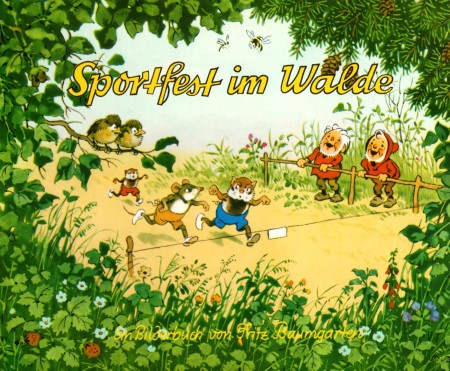
The book’s cover
Comic Art &Illustration &Miyazaki 09 Jan 2013 06:39 am
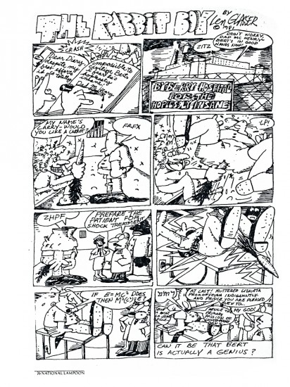
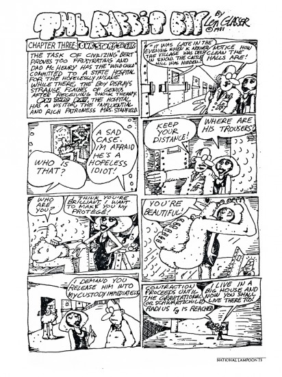
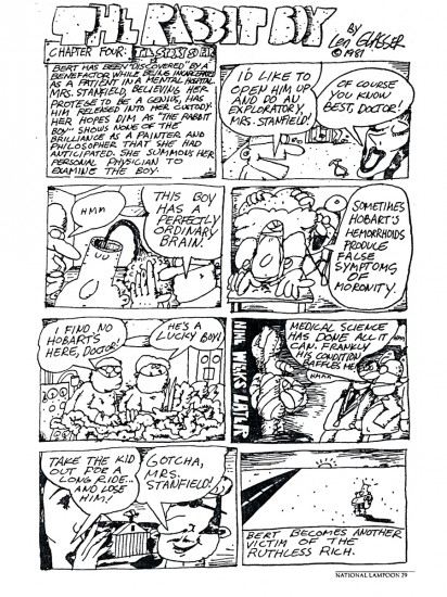
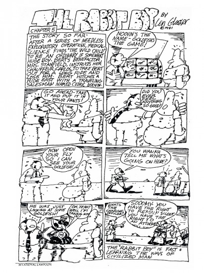
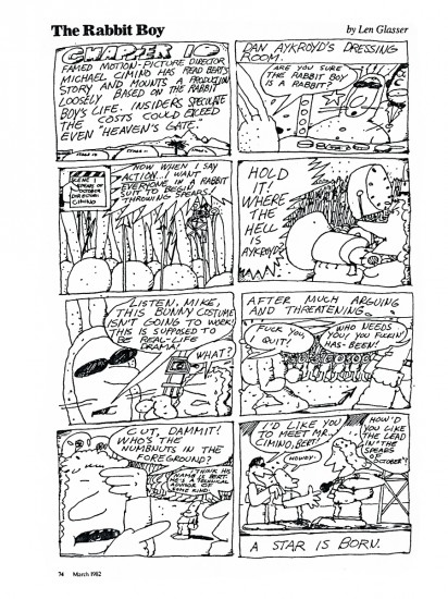
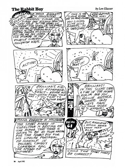
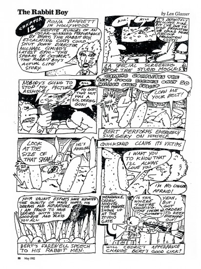
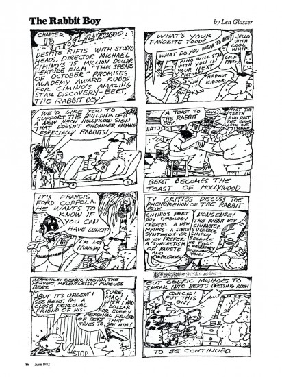
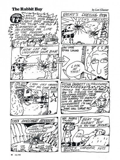
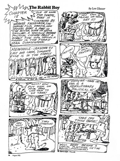
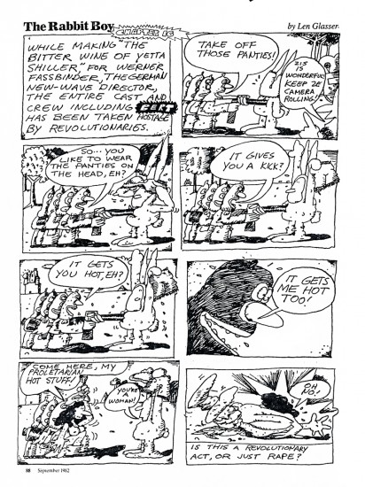
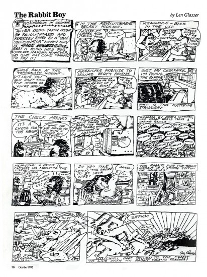
Len Glasser’s Rabbit Boy
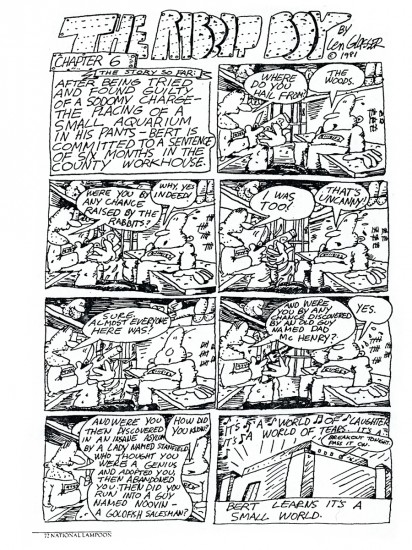
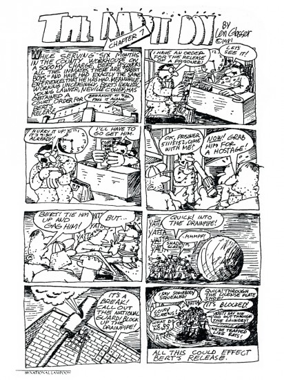
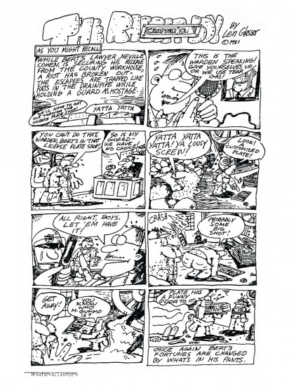
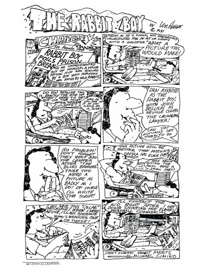
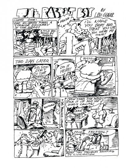
- In 1981 and 1982, designer Len Glasser did a comic strip which appeared in the National Lampoon Magazine. This was a full page strip that appeared once a mnth. I’m not sure how many episodes there were of the strip, but I have copies of 17 of them. Mr. Glasser’s style seems well suited for a strip, and the writing is a large part of it. I hope you enjoy, Rabbit Boy.
 1
1
Bill Peckmann &Comic Art &Disney &Illustration 28 Dec 2012 08:04 am
More of Moore’s Mickey
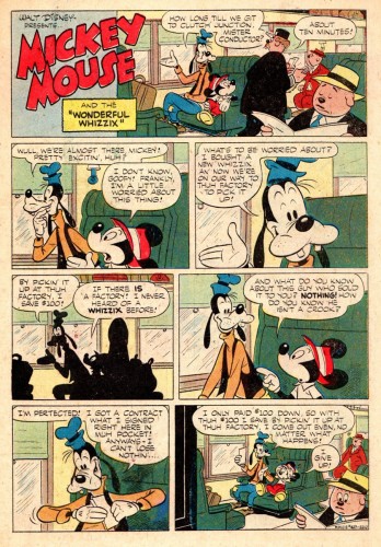
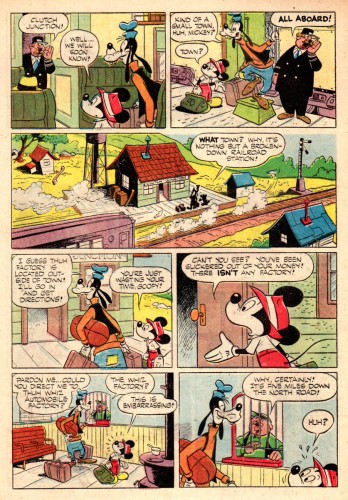
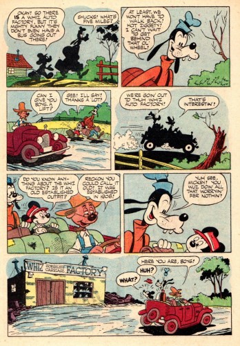
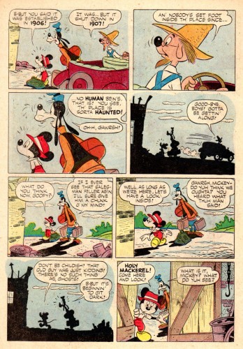
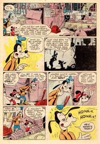
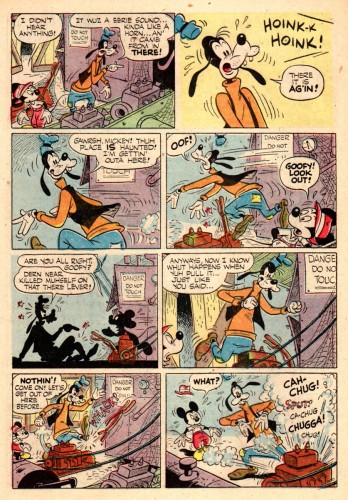
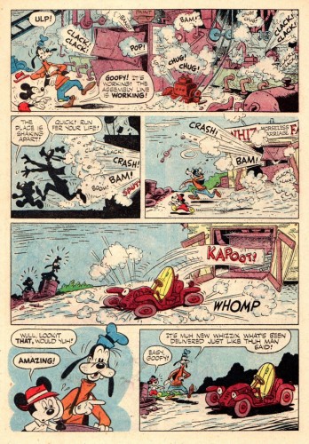
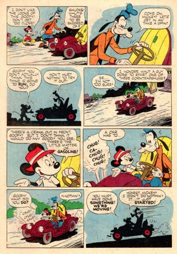
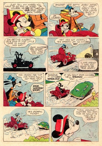
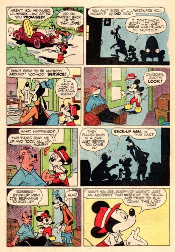
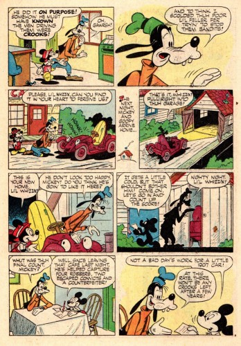
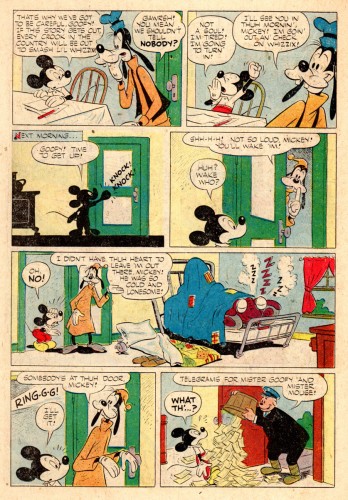
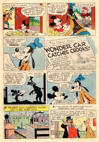
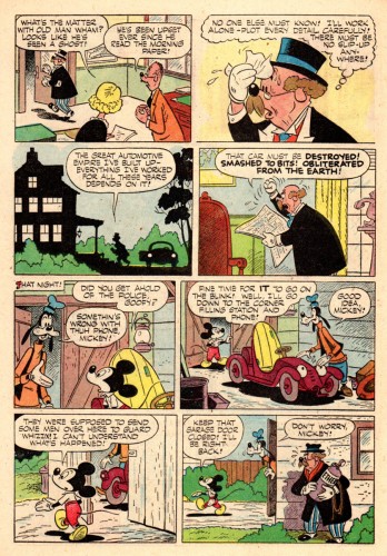
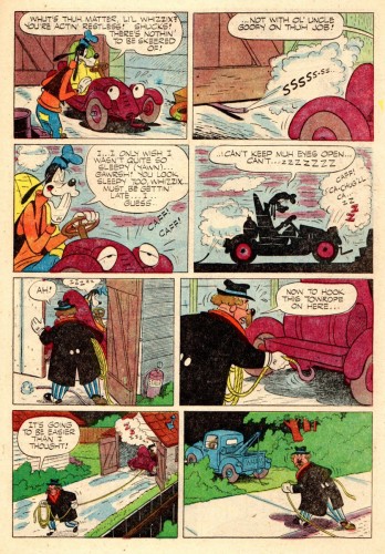
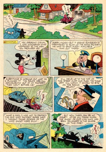
- Bill Peckmann chooses one of my favorite artists to end the comic strip posts for 2012. Dick Moore’s is a champion to me, and his work on the Mickey Mouse strips is wonderful.
I, personally, like the way he draws Goofy. But this is Bill’s entry, so here he takes over the post:
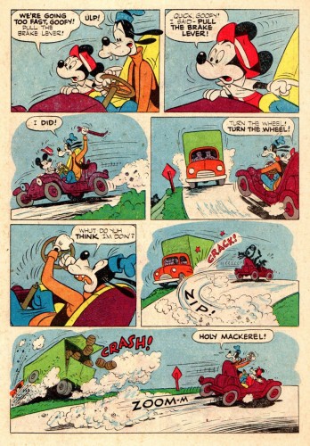
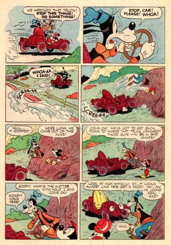
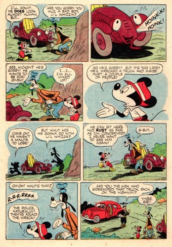
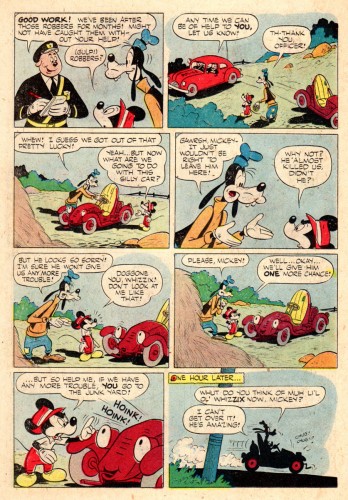
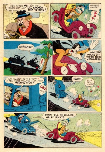
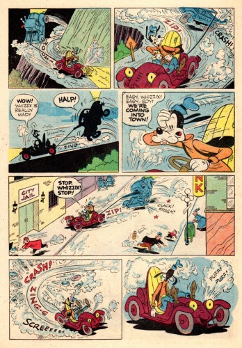
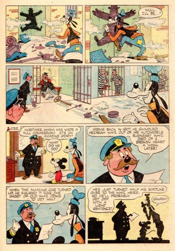
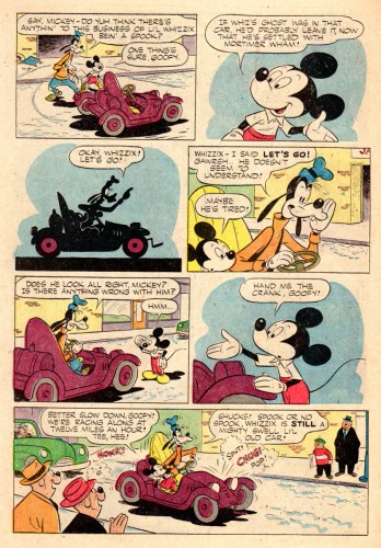
- I’ve always been a fan of Dick Moores’ Disney comic art work, especially the two Mickey Mouse comic books that I have, (we’ve posted one already) if he did more than these two, I’m not aware of them. And if he only did these two, wow, that is really our loss. He had a great understanding of the Mick and the Goof characters.
His combination of excellent story telling and outstanding art makes you wonder what he could have done with Mickey and Goofy, if he would have had the same lengthy run with them that he had with his super successful Gasoline Alley comic strip.
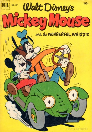
The magazine cover
Here from 1952 is Dick Moores’ “Mickey Mouse and
the Wonderful Whizzex” Dell comic book.
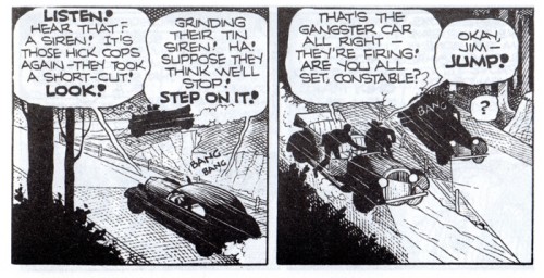
…I thought it would be fun to line up these two panels from
Moores’ 1936 comic strip “Jim Hardy” next to the following panel
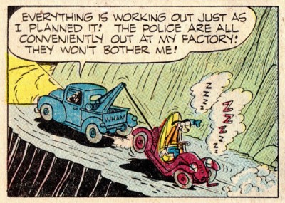
from “Wonderful Whizzex” done sixteen years later.
