Category ArchiveIllustration
Animation Artifacts &Illustration 03 Mar 2006 07:37 am
Big Little Big
- With all the brouhaha over Oswald, maybe it’s time to give the original superstar some attention. Mickey has been left behind and ignored by the Disney studio, itself, for the past how-many-years showing up in a couple of distorted cgi abominations and otherwise used for nothing more than a theme park escort.
It’s very nice that Oswald is back in the fold, but when you have a licensed character – many licesnsed chararacters that have been so abused by the current owners, it’s hard to get excited for what we’ll see of Oswald in the future. I expect John Lasseter will only be able to do so much. The bigger guys (marketeers) still run the front office.
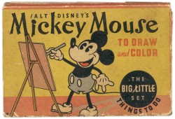
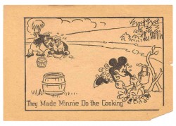
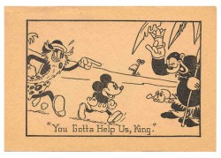
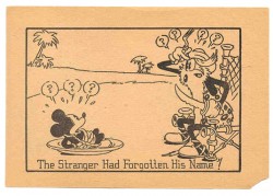
This box of Big-Little coloring cards was given to me as a gift many years ago. It’s fun every once in a while to flip through them.
(Click on images to enlarge.)
- The ASIFA Hollywood Archive’s site has a good overview of Art Babbitt’s career with a short bio of Babbit by Tom Sito and a good filmography.
Animation Artifacts &Illustration 26 Jan 2006 08:12 am
Steig too
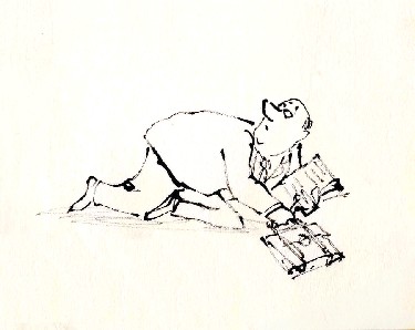 I decided to add another layout by William Steig for a different commercial.
I’m pretty sure it’s also an Alka Seltzer spot, but I can’t verify that. I do know it is an Elektra Studio spot, like the ones posted yesterday.
It was drawn using the same pen and is on rice paper, not punched.
Steig‘s artwork was especially strong after the ’60s. By then the personality of his art certainly moved him into the forefront of national cartoonists.
He was an interesting man and led an interesting life. His devotion to the psychoanalyst, Wilhelm Reich, brought him and his artwork places they might not have otherwise gone.
Here, I quote the NY Times obituary for Steig:
“In the 1940′s, Mr. Steig discovered Wilhelm Reich, who became a psychological mentor for him.
“Mr. Steig saw Dr. Reich for therapy 40 times and credited him with saving his life as well as his mother’s. He also bought an orgone box, a booth made of cardboard, steel wire and metal that is supposed to collect the world’s orgone, or orgasmic energy. He sat in his orgone energy accumulator every day. He also owned an orgone blanket.
“Long after Dr. Reich died in prison, convicted of mail fraud for using the United States mail to sell his orgone boxes, Mr. Steig still believed he would be vindicated one day. In the 1950′s Mr. Steig illustrated one of Dr. Reich’s books, ”Listen, Little Man!” He also wrote ”Agony in the Kindergarten,” dedicated to Dr. Reich, about the repressive comments parents make to or about their children.”
For me, this information brought new meaning to many of the Steig children’s books – certainly some of those I adapted. I did the films with the same intention as the author regardless of the fact that I do not believe in Reich‘s theories.
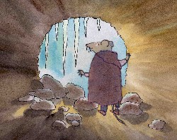 Abel’s Island: In the middle of the winter, Abel takes refuge within his log and spends many hours meditating on his love for his wife from whom he is separated. The log, I saw, as Abel’s “Orgone box” enabling him to emerge stronger and more capable of resolving his future.
The Amazing Bone features a pig, Pearl, who is captured with her talking “bone”. They’re locked in an enclosed room while they hear the wolf in the next room preparing the meal that Pearl is going to be part of. The long moments in the tight, enclosed room allow the bone to concoct a plan to overtake the wolf.
There’s quite a bit behind most artwork, and the more we delve, the more we should be able to reveal – at least to ourselves. That was certainly true of most of Steig‘s work, and I try to bring the same intensity to every illustrator I adapt.
_
By the way, I’ve just learned how to place links in the stills so you can enlarge them when you click them. I’m a slow learner, but it gives a better look at some of the art, now.
Animation Artifacts &Illustration 25 Jan 2006 09:29 am
Steig Alka Seltzer
 I thought today I’d post some layout drawings done by William Steig for an Alka Seltzer commercial produced in the early 60′s.
Obviously, for the purpose of viewing, I’ve reconfigured the poses so that several of them are on each set-up. There are actually 15 drawings to the commercial, all on separate sheets of paper.
 The commercial was done by Elektra Studios. Steig worked with a bamboo reed cut to form a point. He dipped that in ink and drew. The paper is particularly thick and is designed to absorb the ink. They’re punched with Oxberry peg holes top and bottom. I have one of the “pens” he used to draw these layouts. The final comercial was basically an ink line drawing against a white field.
 I’ve been a big fan of Steig‘s since my earliest days when I first discovered him in the New Yorker Magazine. By the time I’d made it to college, I’d already seen two art exhibits of his artwork.
 By the time I saw my third exhibit of his work, I was able to barely afford one of the New Yorker drawings. It’s done on rice paper with the same type of “pen”. Years later, when I told Steig that I’d bought it, he said that it was the only drawing to have sold at that exhibit.

It was real luck for me to have been able to adapt a couple of his children’s books to animation. I not only got to meet him and his wife, Jeanne, but worked with his flutist son, Jeremy, on a number of projects.
I’m rather partial to Abel’s Island as a film. There were only about two dozen B&W pen and ink illustrations in the book, so we had to do quite a bit of designing in the style of Steig Bridget Thorne, who art directed the film, did some of her finest work ever on the backgrounds – beautiful pieces that I still treasure. I think this is one of Steig‘s best books, and I think we did it justice. - I still wonder what Shrek might have looked like if they’d followed Steig‘s book illustrations.

Illustration &Theater 23 Jan 2006 09:06 am
Aronson Designs
- Cartoon Brew has a number of insightful comments about the Disney/Pixar buyout. All of the markers seem to be designed to make a good marriage, but I always fear the worst. We can only hope that Pixar will maintain the same autonomy it’s had in the past and continue to produce excellent films.
– I’d like to recommend a stunning art book that’s been out  there for years: The Theater Art of Boris Aronson by Frank Rich & Lisa Aronson (Knopf, 1987). The book is a bit difficult to get and expensive. If you can’t afford it, go look at in a library.
Aronson was one of theater’s greatest designers; it was a privilege to have seen a number of his theatrical productions from Company on up.
He and Tony Walton are the only designers that have ever brought me into the theater especially at current prices.
A collage for “A Little Night Music.”
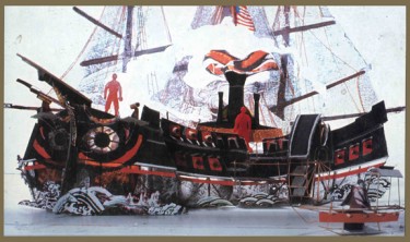
A model for Admiral Perry’s ship in “Pacific Overtures.”
The book is rich in photos of actual sets as well as background material to illustrate how Aronson came up with the set he did. For many shows, he produced a collage of the theme of the production. Then he did models from his paintings of the sets, and finally the sets were constructed.
This is not unlike the process that an animation designer should be using to make sets and costumes. It’s not always easy to do, especially on some of the over-rushed jobs we have to do, but it certainly will help the art expand and develop. I hope to offer more samples of this brilliant artist’s work this week.
 The Man Who Walked Between The Towers is having enormous success at film festivals; I’m always a bit embarassed to toot my own horn, but this news is special for me. We just won the Carnegie Medal, an award presented by the American Library Association. It’s the film equivalent of the Caldecott Award. It’s a real treat. Congratulations to my two other producers, Paul Gagne and Melissa Reilly and all the other great artists who worked on the film.
Illustration &Puppet Animation &Trnka 21 Jan 2006 10:46 am
Trnka Art
Ramblings:
 - I am an ardent fan of the work of Jiri Trnka, the brilliant puppet animator who died in 1969. His work was intelligent, artful and adult. He worked in a period before computer assistance or instant playback. There’s a wonderful book published by Artia, Jiri Trnka Artist & Puppet Master that is long out of print. If you can locate a copy anywhere, buy it. The book’s a gem.
I am particularly in love with Trnka’s 2D art: the storyboards, the preproduction drawings, the paintings and illustrations. To that end, I’ll post a couple of his pieces today.
- Unless things change this weekend, Hoodwinked seems to have celebrated its 15 minutes. The box office reports now put the film in 7th place.
Making any animated feature is an unbelieveable task. I have to give credit to Cory and Todd Edwards. They got the job done and competed with the big guns. And there’ll be a sequel to boot. We can hope that they’ll put some art into the craft.
- Michael Barrier has some good comments on his site today regarding Miyazaki‘s oeuvre. I do agree with much of what he has to say. Effects animation in the films generally serves as the climaxes of the films. This is particularly true of his earlier films, and I think it’s also endemic of most Anime.
Barrier‘s thoughts on the character animation are astute, but I find myself sucked into some of the human movement. Small moments like the girl going down all those stairs in Spirited Away make the experience exciting. The biggest problem I have with the animation is that I can’t personalize it – I don’t know who did what animation, and it’s doubtful I could find out even in doing enormous research. These sections that I love may  all be done by the same person, but I don’t think I’ll ever know. Hence, I have to give credit only to the director, Miyazaki and focus on the elements that are unique to his work, and there’s a lot of it.
– One thing I can credit his films for is the movement of the children. Unfortunately, American animation usually features children who are either terminally cute or act like babies with all the characteristics of 15 year old boys. This has become the cliché, and I’d like to see us get past it.
One of the greatest animated scenes ever done is Bill Tytla‘s scene in which Dumbo runs playfully around the legs of his mother. It’s joyous, honest, and brilliant. Tytla studied his child and animated what he saw. He didn’t study other cartoons, and regurgitate that on the drawing board. But maybe that part of the art is lost. Isn’t it time to start charicaturing life instead of trying to recreate other cartoons. Enough with the animated homage.
Oberon from A Midsummer Night’s Dream
Animation Artifacts &Illustration 15 Jan 2006 09:25 am
Animal Farm horses
Dredging Up More Memories:
When I was young, of course, I was under the Disney influence. I can remember with absolute clarity the day I went to see Lady And The Tramp for the first time at my local theater. 1955; I was nine years old. My parents allowed me to go alone, but I had to take and supervise my younger brothers and our cousins. It was another era. 
The year that film was completed was also the year Halas and Batchelor‘s Animal Farm was released.
I don’t remember it being released theatrically in the US, but it took another four years for that British film to make it to our local tv programming where I first saw it. I hadn’t read the book, so I was completely unaware of the story. The film was overwhelming, and I was completely taken with Boxer, the horse that represented the strength and will of the farm.
This was different for me – grown-up animation. There was no looking back.
1959 was the same year I found Halas’ Technique of Film Animation in my local library. Now I could read about the making of this unique movie.
It only took another two years for me to be completely dedicated to the films of the Hubleys and another 11 years for me to be working for them. Just before John was to leave for England to direct Watership Down we had a short conversation. I’d brought up Animal Farm as a serious attempt to make an adult film and told him I was looking forward to seeing his work on this film. He then told me that he thought that the bungled job Halas & Batchelor had done on the film was a great regret to him. “What a film that could have made,” were his exact words.
 Pretty funny that it was that same year Hubley’s assistant gave me a gift of the Halas book.
I thought of all this yesterday after visiting Cartoon Modern and seeing the new links that Amid had put up on his site. He has a great resource there, and I look forward daily to what new items he’ll send our way.
An illustration from Ralph Steadman’s book, “Animal Farm.”
Charles Solomon has a couple of interesting articles in the New York Times today. One is on Miyazaki‘s son who is preparing an animated feature. The second is about the success of non-computer animated features in the race for the Oscars.
Commentary &Illustration 07 Jan 2006 08:17 am
Oscar films & Daumier
 Today there’s scheduled the longish screenings in NYC for Academy voters to vote on short films. Since New Yorkers were allowed – for the first time – to cast a say in the initial votings, to help select the short list of animation films, those films aren’t returning for another screening. I would have liked to have seen the animated films again before voting, but I’ll settle for what I can.
4 hours of live action shorts. I usually enjoy these films, and I look forward to the screening. I also look forward to seeing how many animators return to view only the live action films. It’ll make for an interesting day.
I’ve been a fan of Daumier’s work most of my life. The paintings have particularly influenced my work. There isn’t a lot of time for writing today, so . . . a Daumier etching.
The caption reads: “O Moon, Inspire Me . . . .”
