Category ArchiveIllustration
Daily post &Illustration 19 Jan 2007 08:24 am
J.P.Miller and Art Buchwald
 - John Canemaker wrote to tell me that he has a cover story in the new issue of CARTOONS, the International Journal of Animation (Vol. 2, Winter 2006), which is now available.
The story is about Disney storyman and beloved children’s book illustrator, J.P. Miller (1913-2004). “In Search of John Parr Miller,” which contains all new research by Canemaker and biographical material never before published on Miller, is the first of a two-part series (with 13 profusely illustrated pages).
This is the link to a “Remembrance” of Miller by his brother, George, on Cartoon Brew.
Other samples of Miller’s work are Part I and Part 2 and Part 3 and here and here.
.
 Humorist Art Buchwald died on Wednesday and was reported in yesterday’s late editions of the newspapers. The NY Times has their traditional obituary on the front page of the paper as does the Washington Post.
However, the Times gave Buchwald the opportunity of doing a digital streaming obituary, and he did. It begins with the lines:
“Hi I’m Art Buchwald, and I just died.”
I loved Buchwald’s column in the Washington Post; I’ve linked to a number of past articles by him if you’re in the mood for reading.
I used to spend a couple of weeks in the summers vacationing on Martha’s Vineyard. The island has three small movie theaters, and they bicycle movie prints that rotate all three theaters within a week. My favorite of the three was the “Vineyard” theater downtown Vineyard Haven. One year we went to see In The Line of Fire, Clint Eastwood’s fabulous film of intrigue about a Washington security guard protecting the President.
I found myself sitting near Art Buchwald and Mike Wallis. Both lived on the island.
It was amusing that the two of them chatted almost constantly. Throughout the film, whenever D.C. exteriors were shown, the two of them pointed to this hotel or that, what streets they were filming now, what places are no longer there. That type of thing. It was great fun for me to listen in on the two celebrities, D.C. diehards, talk about their city.
Daily post &Illustration 05 Jan 2007 08:39 am
Miss Potter meet Hugo
– Animation Magazine has an article and interview about the animation in the new film,  Miss Potter. I enjoyed the film particularly the acting of Renee Zellweger and Emily Watson. There wasn’t a lot of animation, perhaps a minute or two done in snippets.
The animation was done at Passion Pictures by Alyson Hamilton. (Ms Hamilton also acts as Renee Zellweger’s hand double in the film.)
I thought the 2D animation captured the look of the Beatrix Potter drawings (though it was obviously colored digitally) but lacked in the actual movement. The animation, for my taste, was just too cute and 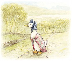 exaggerated, Jemima Puddleduck in particular. As another animator at the screening suggested, Miss Potter might not have approved.
However, it’s nice to see the credits for the animation given at Animation Magazine. They weren’t elaborate on the film giving only a couple of overall credits.
There was once an article in Animation Magazine about this film to star Cate Blanchett with CG versions of the Beatrix Potter characters. We can only thank heaven better taste survived.
As Mark Mayerson points out, there’s little promotion built around animation; this film is a prime example. We have to search it out and celebrate it.
FPS has 6 views of the Year In Review for animated features. These commentaries are worth a read. I especially liked those of Bob Miller and Emru Townsend. A positive look-back to 2006.
My friend, Jason McDonald and his wife Dina Mermelstein had a baby boy on Jan. 3rd. Hugo McDonald. Jason has worked on many projects with us over many years. All the best wishes go out to all three of them.
As a result Jason will take a break from doing his weekly on-line comic strip, My Living Dead Girl. Jason also has a blog for the strip.

(Click on all images to enlarge.)
Illustration 03 Jan 2007 08:15 am
Lisl Weil
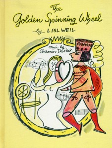 Lisl Weil was a book illustrator/author who pro-duced over 100 children’s books since the 1950′s. She also wrote at least half of them.
She’s had a modest contact with film. In 1962, The Sorcerer’s Apprentice captured her performance at Lincoln Center, drawing larger-than-life characters in different colored chalks while aggressively dancing to the Dukas score. Weston Woods distributed it.
Her art, to me, seems right out of the UPA mode, although the line is definitely looser. The books I’ve seen are a bit restricted in colors. That’s undoubtedly caused by the expense of the 4 color process, and publishers sought art with fewer colors. (I’m fascinated with all the illustrators pre-80′s who worked with a two or three color system.)
I’ve seen a number of her books which adapt lesser known operatic works.
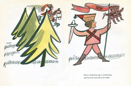
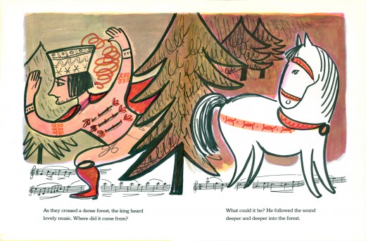
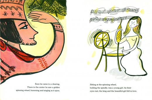
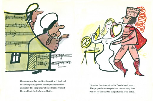
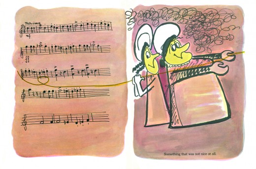
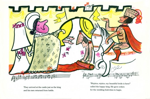
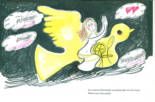
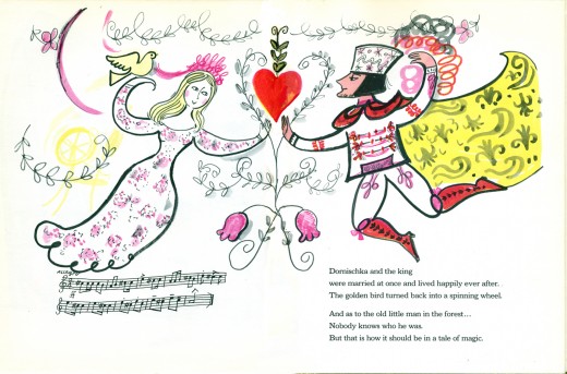
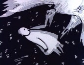
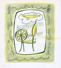
The Golden Spinning Wheel, published in 1969, takes one of Dvorak’s five musical poems and illustrates it. I enjoy how she incorporates the musical ligature into the illustrations.
Here are a few of the double page spreads from that book. It’s about a third of the book. I wanted to share a sample.
 1
1 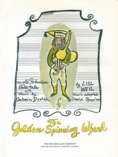 2
2
(Click on any image to enlarge.)
Illustration 20 Dec 2006 08:09 am
Sue Coe – BULLY
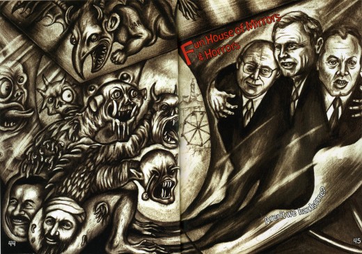
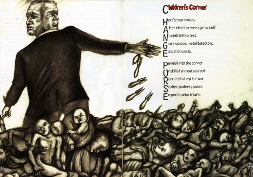
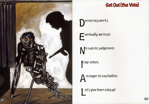
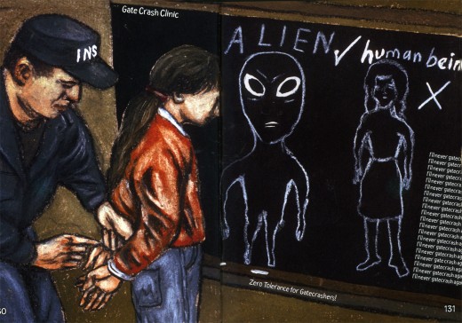
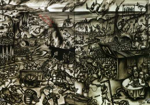
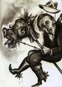 – Sue Coe is one of those artists whose work I am drawn to. She has illustrated a number of books. Her political views are overtly stated in pointed observations. She follows in the footsteps of Daumier, Nast and Shahn. Her work isn’t delicate.
This book, Bully, was published in 2004. It features art that was part of an exhibit in New York at the Gallerie St. Etienne during the Republican Convention. With co-author, Judith Brody, Coe takes aim at the choices made by Bush and his agenda.
She actively takes inspiration from Hogarth, Daumier and Kathe Kollowitz. These sources can be felt in her work which breathes with a visceral passion.
Of course, this material doesn’t appeal to all people, but it certainly reaches me.
(Click on any image to enlarge.)
Some of the book’s illustrations follow:
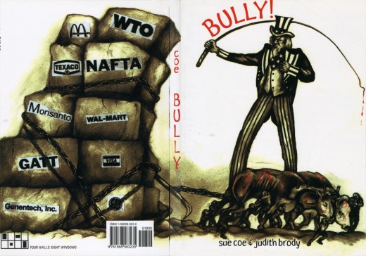
BULLY – The cover of the book, both front and back.
Illustration 19 Dec 2006 08:16 am
Steadman Cat Book
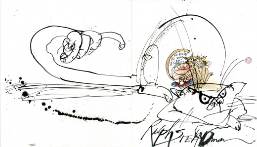
- Yesterday I mentioned that I was a fan of Ralph Steadman’s work. The man is not only a brilliant artist/illustrator but is an excellent writer as well.
I have a collection of his books (both for adults and children) and treasure them all.
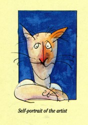
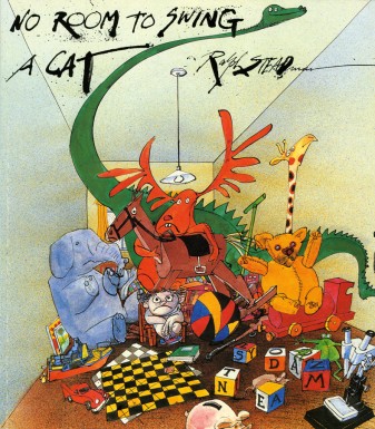 Imagine my delight, when I came upon this book and found that Steadman had autographed it on the inside cover with an elaborate illustration.
Now that’s a treasure!
.
.
(Click any image to enlarge.)
All except for the color image was drawn with a crow quill and black india ink. The ink splotches spilled over to the back cover, which can be seen by clicking the self portrait.
 The New York press has printed a number of obituaries for Joe Barbera, who died yesterday. I thought I’d post links to some of them in case you’d like to read about him.
The NY Times, of course, is the longest. Go here.
Newsday has a story here and an obit here.
The NY Daily News has their story here.
The NY Post just ran the AP (Newsday) story.
Illustration &SpornFilms 18 Dec 2006 09:35 am
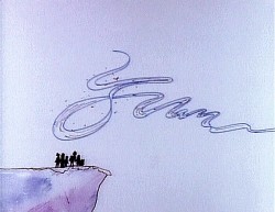
Snark!
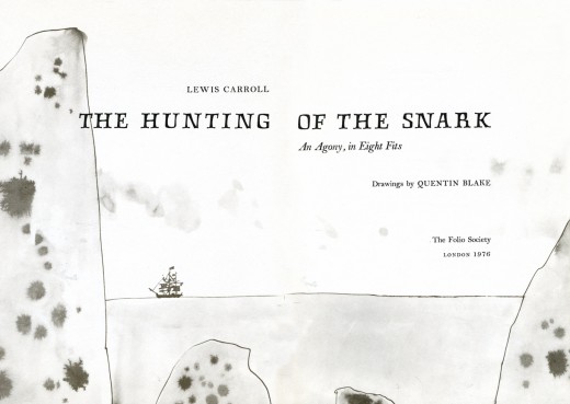
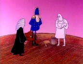
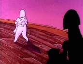
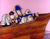
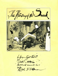 – The Hunting of the Snark, by Lewis Carroll, is one of my favorite poems. It is also, among the films I’ve made, one of my favorites.
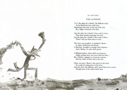
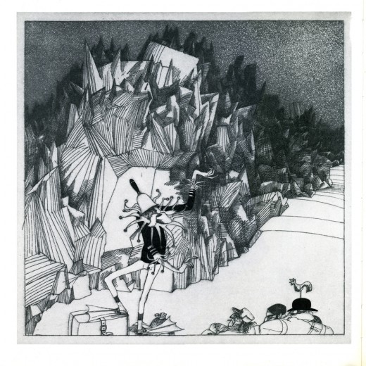
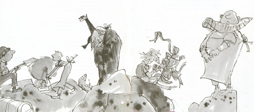
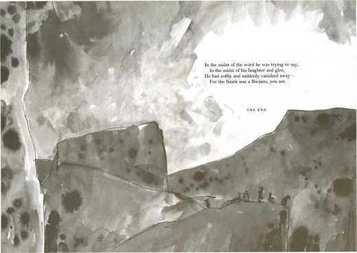
Two of my favorite illustrators, Ralph Steadman and Quentin Blake, have both illustrated versions of the Carroll poem.
I didn’t know either of these books when I made the film, and I’m pretty sure they weren’t familiar with each other’s adaptations of the poem.
Yet, it’s interesting how similarly some of the illustrated settings are given only Carroll’s poem.
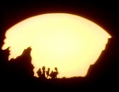
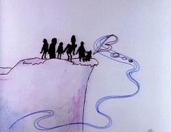
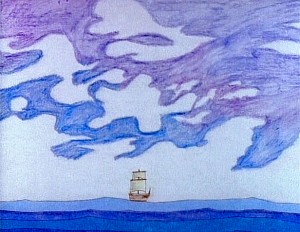
I thought it might be entertaining to post some of the illustrations from the two books, both in B&W, along with some frame grabs of the similar sequences from my film.
The cover of Steadman’s book is to the left.
(Click on any image to enlarge.)
 The original book was illustrated by Henry Holiday.
I was never particularly fond of his images and found little inspiration, there, in adapting the poem to film.
He was an English Pre-Raphaelite artist who didn’t seem to do more than illustrate the poem, despite the fact that he supposedly delighted in the project.
I don’t think Carroll found an equal to Tenniel in Holiday.
For those who would like to read the poem, in its entirety, you can find it here.
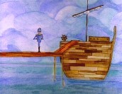
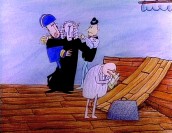
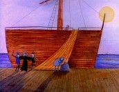
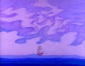
The opening sequence to my film.

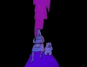

“They walked along shoulder to shoulder.”
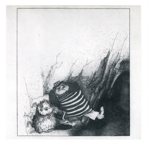
Steadman’s Butcher & Beaver “walk along side by side.”
Daily post &Illustration 12 Dec 2006 07:24 am
Street Art
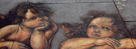
 – 18 months ago, an artist had set himself up in front of Our Lady of Pompeii church, about a block away from my studio. He painted a rosetta image of Madonna and Child using some kind of chalks, I wondered how long the image would stay. Three days, maybe five?
When it didn’t fade away quickly, I assumed it must have been done with oil pastels. I still don’t really know but am curious. The church, at Bleecker and 6th Ave in Greenwich Villiage, is a landmark in the city, and a lot of people walk by and around it.
Now it’s a year and a half later, and the Madonna is fading slowly despite hundreds of people walking over it.
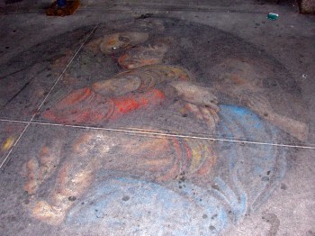 The aging actually seems to have improved it; I’m impressed with its endurance.
I also wondered who the artist was. He obviously copied what looked to me like a Caravaggio. It took him about three days of work to complete. Though I walked past him several times (the church is on the way to the subway from my studio) I never stopped to ask who he was.
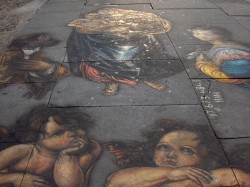
This past week, for the first time, I noticed another street painting by the same man at 8th Street in Greenwich Village.
 1
1 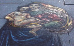 2
2
(Click any image to enlarge.)
1. This is a more ambitious painting, and includes quite a bit of detail. There’s Mary and Child, two angels and two saints.
2. I had difficulty photographing it; I tried early morning – when crowds would be fewer – but had an overbearing sun blocking out Mary’s face. It seemed to glow. Hence, I had to go in for this close-up of Mary and Child.
With this picture, the artist left his name and phone number. I found his site on the internet. Hani Shihada takes pride in what he does, and he should. He also decorates stores, restaurants et. al.
I’m just happy with the way he’s decorated my City.
Additional Note:
The NYTimes, today, has an article on Nickelodeon and it’s money machine – cartoons.
Illustration 08 Dec 2006 09:48 am
More Fellini
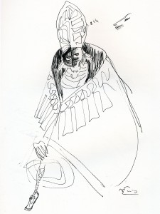
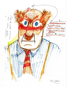
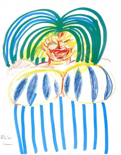
 – Yesterday I highlighted some of Federico Fellini‘s cartoons. I thought I’d pick out some of the drawings he made of the people in the pictures he was making.
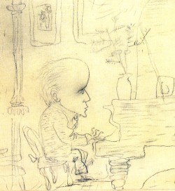
A lively exuberance fills almost every image – not unlike his films of the period. My favorite drawing, though, is the portrait of Nino Rota, his composer and dear friend. There’s an enormous sensitivity there.
(Click on any image to enlarge.)
1. Nino Rota at the piano.
2. A drawing of Broderick Crawford in Il Bidone.
3. Aurelio Biondi in Amarcord.
4. A “female with stripes” from Women of The City.
5. Woman in the Bedroom from Roma.
6. Marcello Mastroiani in Fred & Ginger.
Illustration 07 Dec 2006 09:06 am
Fellini’s Cartoons
 – Continuing yesterday’s thread of cartoon/storyboard material and their relationship . . .
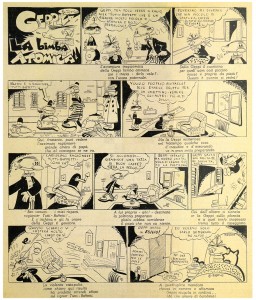
- Everyone in the film business should know Federico Fellini‘s films, but I wonder how many know that Fellini was an artist. He was primarily interested in being a cartoonist and aimed his career in that direction. He did a number of comic strips, a lot of caricatures and spot cartoons.
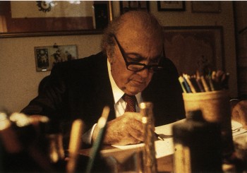
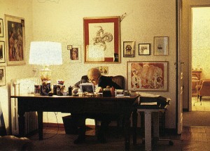
(Fellini in his studio drawing.)(Below, a comic strip Fellini did in 1940.)
- 
It was only during World War II that he got caught up in a group of film makers and put all of his energies into motion pictures. However, this didn’t stop him from drawing.
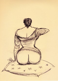
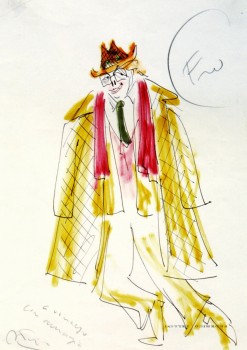
Fellini did poster designs for many of his films, storyboarded sections of his movies and caricatured many of his actors. He frequently did cartoons on his sets Рmany of them quite risqu̩.
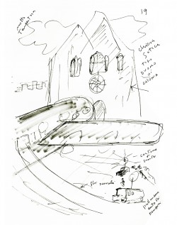
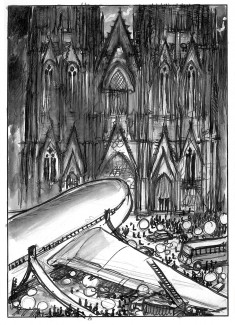
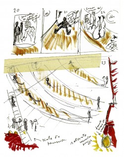
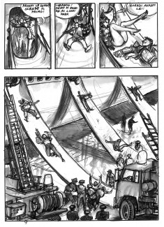
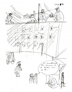
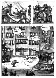
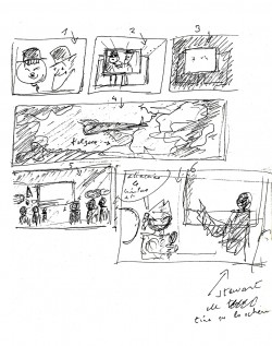
The Voyage of Mastorna was a graphic novel he did in collaboration with Milo Manara. Fellini storyboarded his part and Manara reworked the boards into the book.
Fellini wrote this about the book:
When did I first think of a story for a movie like that of the Voyage of Mastorna?
I can’t remember. I have always believed that my movies were awaiting me, all finished and ready, the way a station waits for a train that is pulling in. . . .
. . . Just as I, a director, can now talk about a film that I have made. The problem is that I never made Mastorna. It is a story that has accompanied me for almost thirty years and, as I have said many times, helped to shape, with ideas that belonged to it and it alone, nearly all the movies that I made in its place. A stimulating, fascinating presence, with perhaps I did not know how to live without. A pilot ship that would guide me out of the harbour, obliging me to take different voyages, to face unknown adventures. In other words, to make other movies. And so, Signor Fellini, why have you decided to abandon once and for all that story if it was.
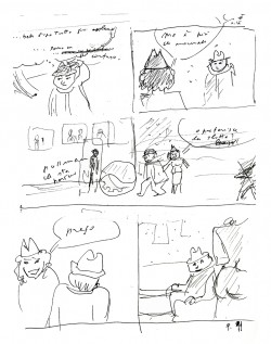
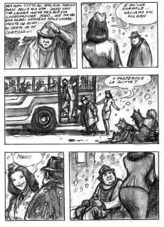
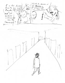
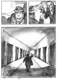
Here is a section of the book. On the left Fellini’s board, on the right Manara’s reworking:
 1a
1a 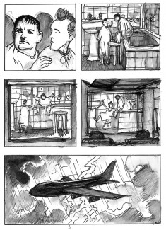 1b
1b
(Click on any image to enlarge.)
Illustration &SpornFilms &Story & Storyboards &T.Hachtman 06 Dec 2006 07:54 am
Gertrude’s Board I
-Back to Gertrude’s Follies, the film.
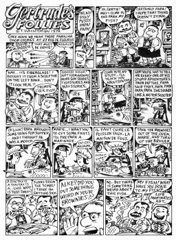
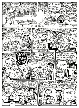
I talked last week about my excitement over the comic strip by Tom Hachtman, Gertrude’s Follies. We worked up a storyboard and script for a feature. It was a bit of a rush since I found the distributor of a low budget comedy film who asked for something similar in animation. I thought we could get him interested. I wanted to strike while the iron was hot. The guy didn’t get it, thought it wasn’t funny, didn’t even understand it. His company folded six months later. A one hit wonder.
We tried to stay close to many of the strips and found a direction.
Here are two weeklies from the strip.
(Click on any image to enlarge.)
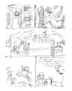
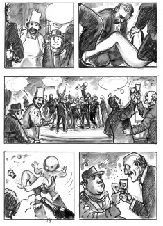
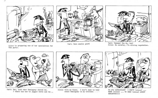
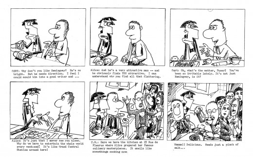
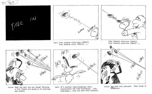
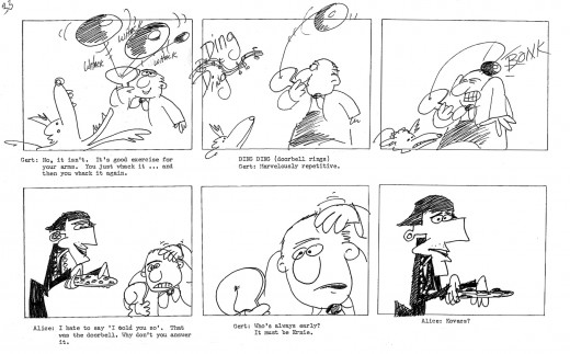
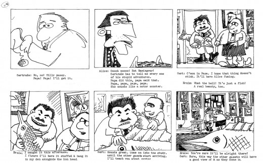
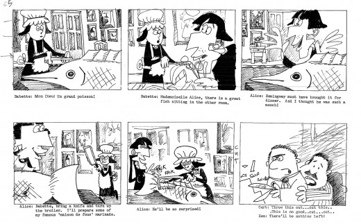
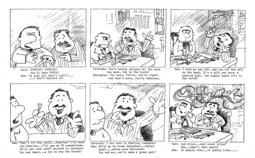
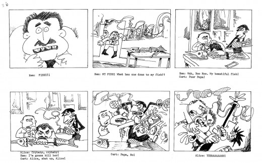
The equivalent part of the storyboard follows. To give a short syopsis of the story thus far:
Trying to be somewhat current, we built the story around an upcoming, all-encompassing exhibit Picasso was going to have at the Museum of Modern Art. At the same time, Gertrude had just sent off a big book to her agent in NY. A party was in order, and we join them in this section of the storyboard as they prepare for the party. There’s a guided tour going on at the house as they prepare, and Hemingway arrives early.
(This is about 20 mins into the film.)
