Category ArchiveIllustration
Illustration &SpornFilms 06 Dec 2007 08:42 am
Blank Slates & Maps
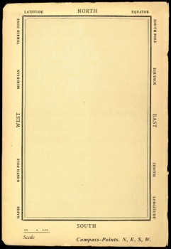 - One of my favorites of my films is The Hunting of the Snark. I adapted this from Lewis Carroll’s poem. It was an enigma to the audience when it was first published – Carroll refused to explain its meaning, and it’s an enigma now.
I remember screening it with an audience of fifth graders – about 200 of them along with a number of their parents. The program, in Chicago, was part of a retrospective of some of th echildren’s films I’d done at the time. I made the decision to show the Snark, even though I wasn’t sure the audience would sit still for it.
The response was amazing. The adults, during the Q&A period, had a lot of questions. The kids had no problems. When, finally, one parent asked me what it was supposed to mean, I decided to turn it around. I asked if one of the kids could answer the question. A lot of kids raised their hands, and the first one gave me the appropriate answer.
A bunch of guys go hunting for a monster________This is how the map was illustrated by
that’ll make them disappear, and one of_________the original illustrator, Henry Holiday.
them catches it. For all intent and purposes
that IS what it’s about.
I love showing this film as part of my programs. It’s easy for me to discuss, and I’m proud of it. I don’t think most animators like it, but that doesn’t bother me.
During the story there’s one key part that all illustrators love to illustrate.
But we’ve got our brave Captain to thank:
(So the crew would protest) “that he’s bought us the best–
A perfect and absolute blank!”
_
A blank page! What could be easier to illustrate? A couple of illustrators have cheated such as this map found on line:

Figure One: Bellman’s Blank Ocean Chart
Barry Smith at the University of Buffalo dept of Philosophy uses this map – a blank slate – to treat it as a map of heaven. Carroll was an Evangelical minister, but I’m confident this is not what he had in mind when he conjured up the lines in the poem.
____________________________________________
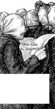 Mehendra Singh has a website which is slowly illustrating the entire poem. His illustration for this passage appears to the right. This is part of his comment accompanying the illustration.
- Yet another shameless Magritte pastiche, and not the last one to grace these pages, I’ll wager. Shameless — the 10th Muse of Protosurrealism!
Even more shameless — this insistence that the crew of the HMS Snark use the French language for navigational purposes when it is clearly evident to anyone who has ever been lost at sea that English is the natural language of confusion. This is easily verified. Stand on a streetcorner in any francophone city and ask a stranger: where am I? If necessary, pull at shirtsleeves and wave your arms, speak very slowly while pronouncing every phoneme at the utmost decibel level.
Singh has a curious and interesting site in its own right.
Let me encourage you to check it out for all the original illustration on it.
____________________________________________
_
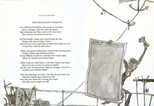
This is how Quentin Blake chose to illustrate it in his version. Since he obviously was nervous about just showing the blank map, he illustrated the Bellman holding it.
______________
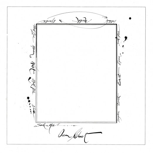
This is Ralph Steadman’s version. He went for the gold and just showed the map.
Yet, it’s still, obviously, a Steadman.
______________
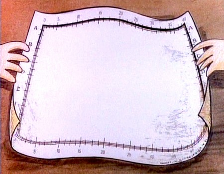
This is how I chose to depict it in my film. Showing hands and table behind it,
gave me the opportunity of trucking in to white to transition to the next scene –
an image of the sea, itself.
Books &Errol Le Cain &Illustration 27 Sep 2007 07:48 am
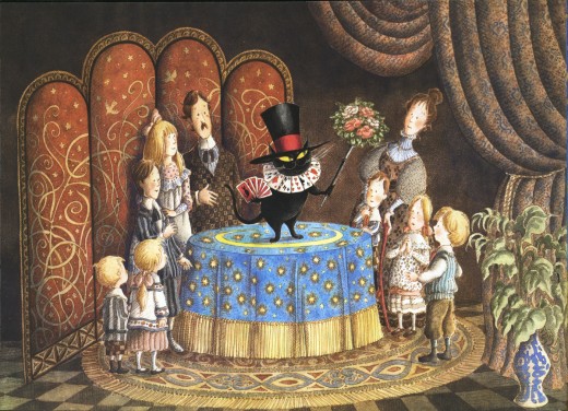
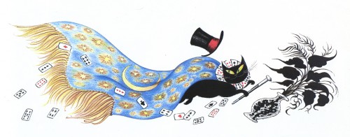
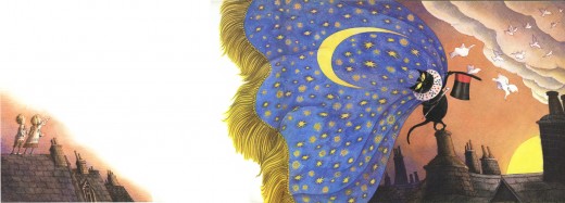
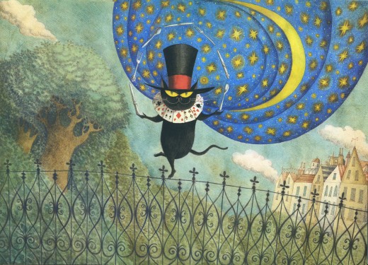
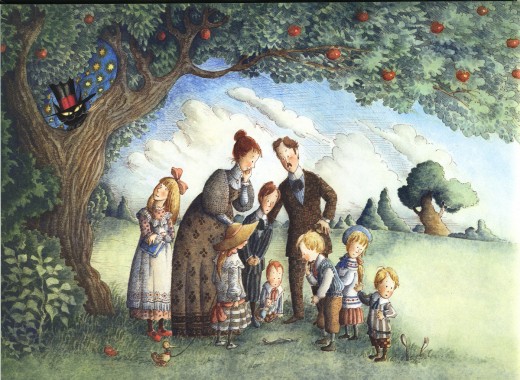
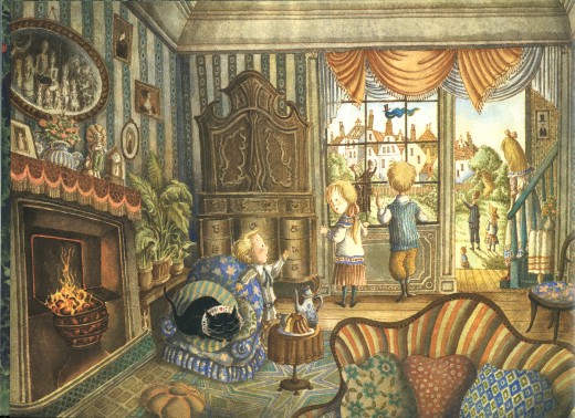
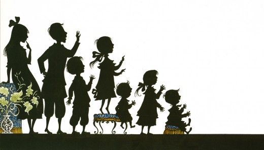
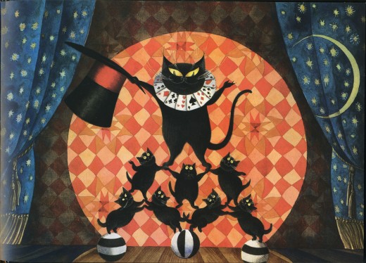
Le Cain’s Mr. Mistoffelees
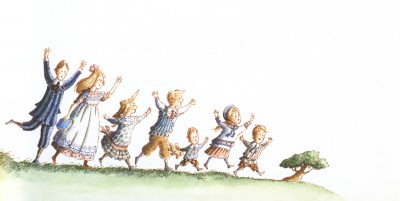
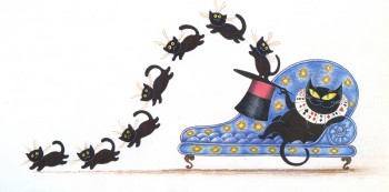
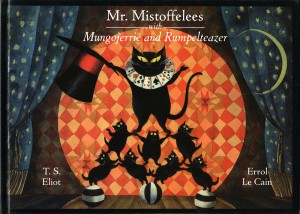 – Continuing my neverending homage to Errol Le Cain, I present here his illustrations for the first half of the book, Mr. Mistoffelees with Mungojerrie and Rumpelteazer. We’ll save the Mungojerrie and Rumpelteazer part for another time.
This story is part of the Old Possum’s Book of Practical Cats by T.S. Eliot.
That was, of course, the source material on which Webber and Nunn based their show CATS. These images are so attractive and stylish, I was quite curious to know whether Andrew Lloyd Webber had seen the books. Especially when he was about to put CATS onto the screen as an animated film.
(You can see some of the preliminary art from that aborted film on Hans Bacher‘s older, yet brilliant site. More here.)
Here are the illustrations by Le Cain:
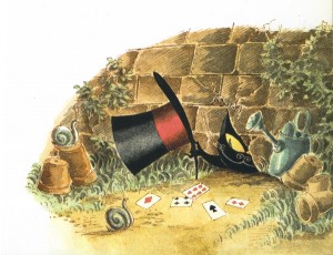
________ (Click any image you’d like to enlarge.)
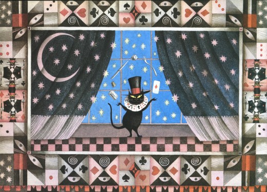
_____________Mr. Mistoffelees
___________You ought to know Mr. Mistoffelees !
___________The Original Conjuring Cat -
___________(There can be no doubt about that).
___________Please listen to me and don’t scoff All his
___________Inventions are off his own bat.
Books &Illustration &Models 13 Sep 2007 07:51 am
Eyvind Earle
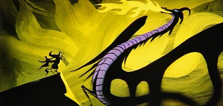
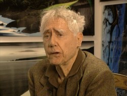 – Let’s talk a little about Eyvind Earle. This is the artist who rose to fame when he was selected by Walt Disney to set the style for the long-in-production feature, Sleeping Beauty. The animators disliked his art direction and openly protested it. Walt remained true in his stance and supported Earle to the end; though it could be said that Walt was more involved in Disneyland’s construction and gave too little attention to the in-fighting at the animation studio.
I remember Frank Thomas, specifically, stating that he had done everything possible to supercede Earle’s style after he, Thomas, had animated the Merryweather scene as she creates Aurora’s dress and cake in honor of her birthday. He felt that the black bodice that Earle had designed took all the lightness out of his character’s delicate dance.
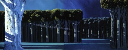
(Click on any image to enlarge.)_________________________________
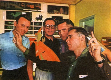
L to R: Al Dempster, Dick Anthony, Ralph Hulett and Eyvind Earle
Thomas publicly attacked Earle at the Lincoln Center celebration of Disney animation back in 1973. I’d already read something similar, and heard it privately. None of the others on stage at Lincoln Center – Woolie Reitherman, Ken Anderson or Ollie Johnston – countered in support of Earle.
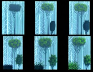 Sleeping Beauty was such a drastic change in look from the other Disney features, that I think it took deep hold in the minds of a lot of Baby Boomers growing up around this feature. Earle became a strong target of interest, and I think his reputation has grown annually.
I have to admit it was odd seeing the backgrounds of Pocohontas trying to emulate Earle’s Sleeping Beauty style, but in some ways it seemed fitting. The studio had been ripping off the films of the past for so long that it was only approopriate that they’d focus on someone who was such a dynamic force.
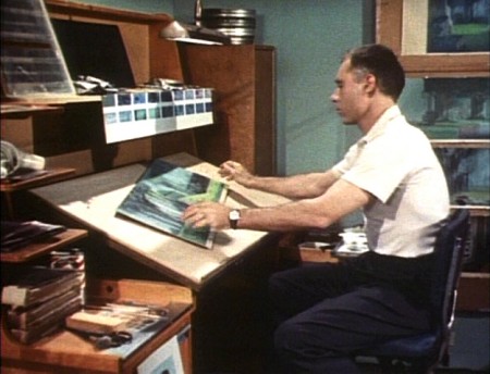
For a short period after he was released by Disney, in the post-Sleeping Beauty layoffs, he worked with John Sutherland Productions where he designed the short, Rhapsody of Steel. Then he formed his own studio, Eyvind Earle Productions, Inc. He did an animated trailer for the film, West Side Story, under the supervision of Saul Bass. He did an animated title for the Kraft Suspense Theater, and he did a Christmas Special for Tennessee Ernie Ford.
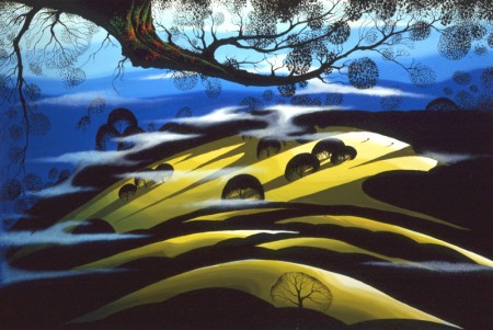
Ultimately, Earle made a success of his own art after leaving animation. He’s been represented by a number of very large galleries and has sold a lot of popular art in a style all his own. Here are a couple of examples found on line:

I’m not always a big fan of the color schemes in his graphics, though he always makes them work, but I have to give credit to Earle for his originality and the dynamic approach in his art.
His autobiography, Horizon Bound on a Bicycle, is a must for all real fans.
This is his animation resume:
- 1951 Started with the Walt Disney Studios as background painter on: FOR WHOM THE
__ BULLS TOIL, MELODY, and the Academy Award winner for “Best Short of the Year”
__TOOT, WHISTLE, PLUNK and BOOM which also received a Cannes Film Festival Award.
__Production Designer, Color Stylist and Background Painter for the DIsney animated __classic SLEEPING BEAUTY, as well as, PIGS IS PIGS, GRAND CANYONSCOPE,
__PAUL BUNYAN, LADY AND THE TRAMP, LONDON BRIDGE, and WORKING FOR PEANUTS.
__He designed 5 murals for Disneyland.
1958 Joined John Sutherland Motion Picture Company in Los Angeles.
1960-1966 Created 24 sheet poster for Hamm’s Beer.
__Started motion picture animation company, Eyvind Earle Productions, Inc.
__Created animated commercials for Chevrolet Motors, Chrysler Corporation, Marlboro
__igarettes, Motorola Television and the Kellogg Cereal Company.
__Created animated trailer for WEST SIDE STORY for United Artists.
1961 Created animated television special THE STORY OF CHRISTMAS starring
__Tennessee Ernie Ford and the Roger Wagner Choral.
1962 Created animated television special THE EASTER SPECIAL.
__Created title for the KRAFT SUSPENSE THEATER.
__Created the logo trademark trailer for Universal Pictures.
__Produced and created the theatrical short DEATH AND SUNRISE
Books &Errol Le Cain &Illustration 06 Sep 2007 08:05 am
Errol LeCain – Puffin
 – I need not tell you that I’m a fan of the work of Errol LeCain. I have a good collection of his illustrated books.
To remind you, he’s the artist who led the design and stylization of the BG’s for Dick Williams’ Cobbler and the Thief feature. He worked at Dick’s Soho Square studio until his death. Something in his style always held me captive. I suspect this is what initially drew me to Richard Williams‘ work.
I’ve gotten my hands on this 1976 “Puffin’s Pleasure” book. It’s sort of a sampler of piece by the artists and writers who’ve done many of Puffin’s books. (Puffin is the children’s book division of Penguin Books.)
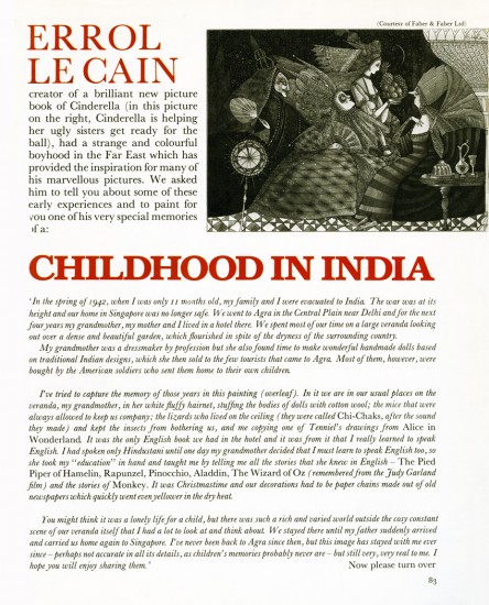
Within this book, Errol LeCain has a three page spread. The first image below covers the first page of his piece. This is all the text the article gives us.
_________
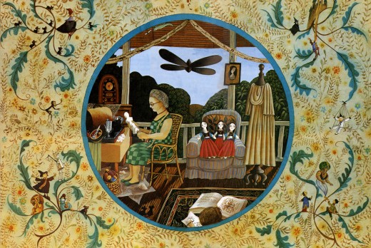
I’ve done a number of posts featuring LeCain’s art.
You can view them here:
____The Snow Queen_______________-____Aladdin
____Growltiger_________________________Thorn Rose
____Pied Piper of Hamelin_______________12 Dancing Princesses
____Have You Seen My Sister____________Hiawatha’s Childhood
- Just for my own amusement here are a couple of setups from Dick Williams’ film,
The Cobbler and the Thief. Errol LeCain did the backgrounds.
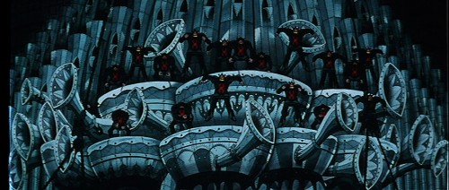
Thanks to Garrett Gilchrist for these images.______
If you haven’t seen Jaime Weinman‘s article on Ed Benedict (actually Amid Amidi’s Animation Blast article with some stills added), check it out.
Books &Illustration 13 Jul 2007 08:31 am
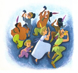
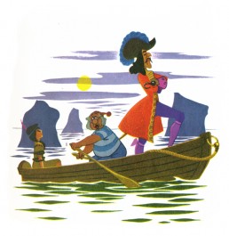
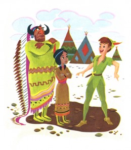
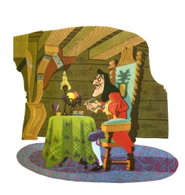
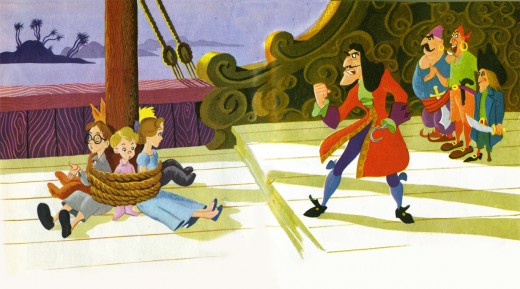
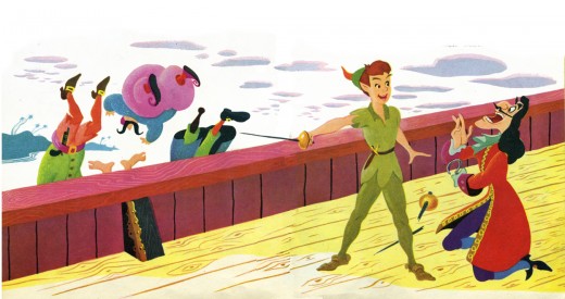
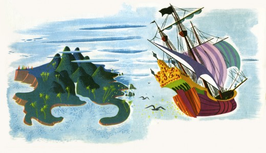
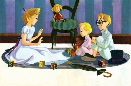
Eyvind Earle: Peter & Wendy II
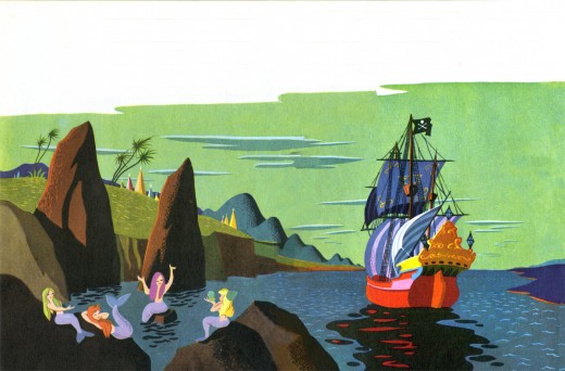
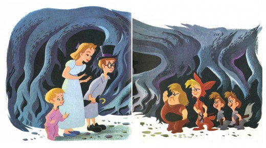
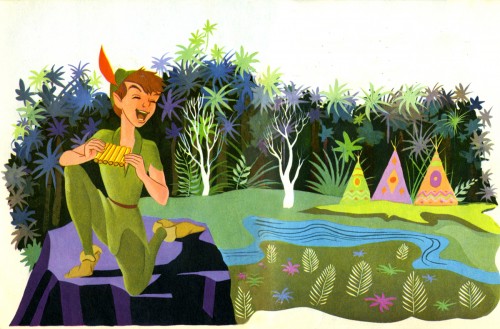
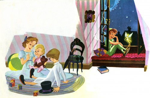
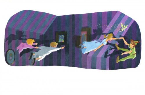
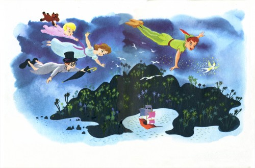
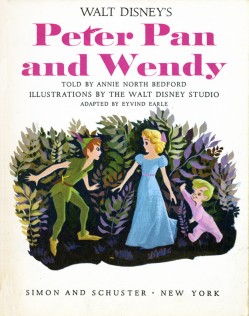
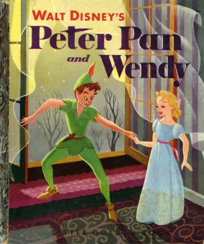 – Here, then, is the completion of Eyvind Earle’s Little Golden Book illustrations for Peter and Wendy, first published in 1952. I posted the first part on Tuesday. As I wrote then, the book seems a bit different in that there are a preponderance of double page spreads in the book. A very intereresting approach that almost works in making the book feel larger.
I doubt there was a large amount of play allowed the artists in creating these books. There was obviously a house style that was followed and a feel that the publisher sought. Earle seemed to be interested in experimentation and enjoyed pushing the envelope. This is something that didn’t endear him to the hearts of the old guard. (The animators at Disney
(Click any image to enlarge.)…………….. incessantly complained about his busy designs and
…….._______________________………..color schemes for Sleeping Beauty.)
Here is the remainder of the book:
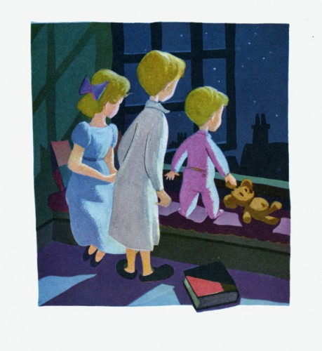
This last illustration is my favorite.
Books &Illustration 11 Jul 2007 08:08 am
Eyvind Earle: Peter & Wendy I
 – I’m an Eyvind Earle fan. I have been ever since getting my hands on Bob Thomas‘ original version of The Art of Animation (1959), which promoted Sleeping Beauty and its artwork, and then going up to Radio City Music Hall to see the first theatrical run of the film. After the Disney film, seeing Earle’s Nativity film on the Tennessee Ernie Ford show and watching Paul Bunyan and other Disney shorts of the period even closer, studying his work made me more of a fan.
I got to meet the man thanks to Michael Barrier. We had one of the craziest interviews ever when we drove upstate to his house and sat in a somewhat darkening room as the afternoon dimmed and Earle continued to quietly answer the questions.
(Click any image to enlarge.)
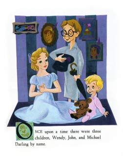
I loved that day, but I loved Earle’s work even more. After posting Retta Scott‘s Golden Book of Cinderella, I realized that I had this book, Peter and Wendy, which is Earle’s odd adaptation of Peter Pan. He’s obviously in love with Cinemascope in that most of the book’s illustrations are two-page spreads. Sort of wide screen proportions. This is unusual for a Little Golden Book.
The images look a bit like the backgrounds in Paul Bunyan, and the characters are not quite on model with the film. The printing, as with most of these books, is pretty dull. You know a lot has been lost in the transfer.
Again, because of the number of illustrations, I’ll break it into two postings.
Enjoy.
Animation Artifacts &Illustration 13 Feb 2007 08:03 am
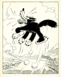
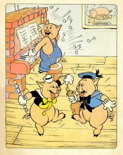
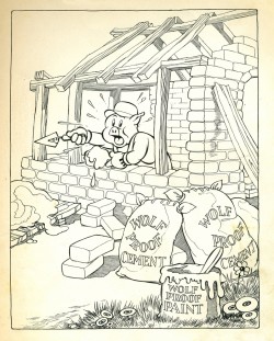
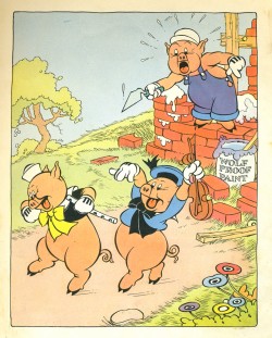
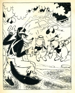
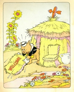
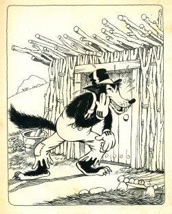
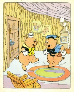
Three Little Pigs Well Done
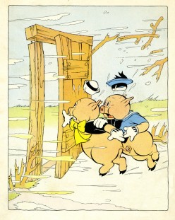
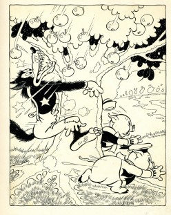
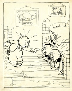
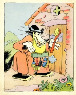
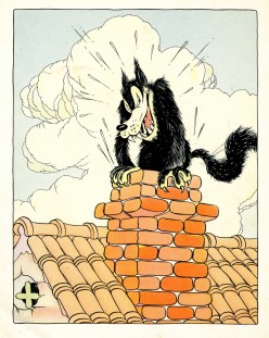
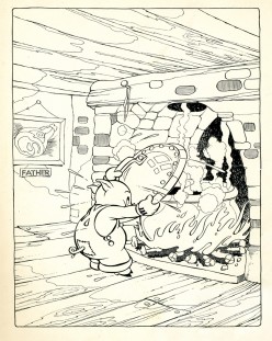
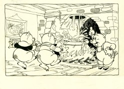
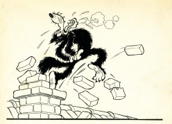
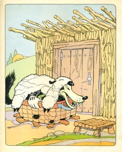
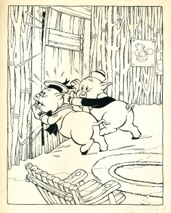
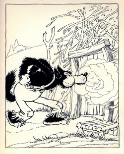
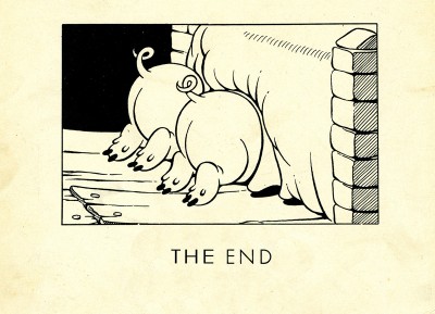
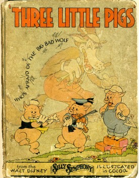 – Well, boys and girls, it’s time to complete our story. When last we left the three pigs, we saw that the wolf was huffing and puffing on the door of the 2nd little pig’s house where two of the little guys were hiding.
This is the completion of my posting of the book published in 1933 at the height of the Three Little Pig‘s phenomenonal success. The book’s illustrations have some of the charm of the original short
For years we heard that this was film acted as a metaphor for the Depression – the Big Bad Wolf knocking on America’s door. This supposedly was the reason for the film’s success. Was that an interpretation that was made during the Depression? I suppose if I were an historian I might actually look into it.
(Click on any image to enlarge.)
Art Art &Daily post &Illustration 02 Feb 2007 08:10 am
Gallery
- Thanks to George Griffin for directing me to a couple of gallery shows in NYC that include animation work. They’re worth seeing for the rules they break, if nothing else. Though there are inspired moments in it. Like sitting through the recent films of Jean Luc Godard, I have a hard time staying awake, but I always walk away inspired, refreshed and excited by the thoughts on the screen.
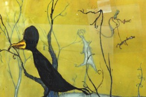 - The Bellweather Gallery features Brent Green. This show features wildly mixed media in a number of pieces, the longest of which is “Paulina Hollers” at 12 minutes. Using everything from magic markers on glass to 3D stop-motion animation he creates films that have all to do with death.
Bellweather Gallery at 134 Tenth Avenue.
This show closes tomorrow, Feb. 3. See it right away.
These are capsule reviews in the New York Times, The New Yorker, and the Village Voice.
 - The Marianne Boesky Gallery has an exhibition of work by Jacco Olivier. This show isn’t quite as impressive and far less inspiring, more like watching paintings progressing to their conclusion shot in stop-motion.
The gallery is located at 509 West 24th Street, between 10th and 11th Avenues. Tues to Sat, 10am to 6pm. (212) 680-9889.
You can view some stills of the artwork at the Gallery’s site.
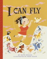 – For those Mary Blair fans out there, story artist and animator, Fred Cline, has posted a commercial from the 50′s that uses designs Mary Blair created for a Little Golden Book called I Can Fly.
The commercial was done at TV Graphics, Inc. in New York and was supervised by Lee Blair, Mary’s husband. The commercial is for Milk, but Cline says he has a second for ice cream.
See the spot here.
The book can still be purchased through Random House.
Hardcover $12.95, Paperback $4.95.
(I first found this info on Drawn posted by Ward Jenkins.)
If you’ve watched The Family Guy sequence which rips off the sequence from Anchors Aweigh, you owe it to yourself to go back and watch the original with Jerry the mouse. The original was animated by Ken Muse and Ray Patterson.
Both versions depended on rotoscoping. The original rotoscoped Gene Kelly’s dance to match it with Jerry; The Family Guy rotoscoped Jerry to cover him up with the same animation redone featuring their character, Stewie. More Happy Feet.
Animation Artifacts &Illustration 01 Feb 2007 08:24 am
Three Little Pigs That Could
 – One of the great, classic cartoons in the Disney canon is The Three Little Pigs. This animated short Silly Symphony was a very big item in its day. Its popularity came close to rivalling Mickey Mouse, and its theme song Who’s Afraid of the Big Bad Wolf was an overwhelming hit. It’s hard to remember this when watching the innocent, little original film.
There were three follow-up shorts featuring the same characters, though none of them really had much of an impact. The film had widespread cross-promotional success (sheet music sales, dolls, books, etc.) and was a big money-earner for the studio.
Even today you can find a recently constructed flash animated version of the characters on one of the Disney sites.
It’s always been said that this was the first real brakthrough for character animation. By featuring three almost identical characters, the Disney artists had set a chore for themselves trying to differentiate between each of the three pigs. It was a resounding success, and the rubber hose characters were left behind. After the popularity of this short, Disney put even more emphasis on character development and construction.
I have a number of pieces from that period that I thought I might share.
The first is this children’s book adapted from the film and published in 1933. It’s big enough that I’ll have to break it up into two separate posts. Here’s the first part:
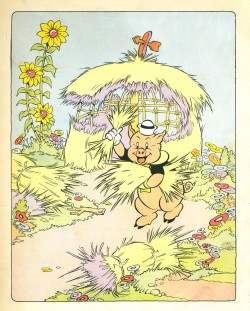 1
1 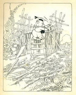 2
2
(Click on any image to enlarge.)
- A post note. Just today, Cartoon Brew talks about a cartoon sequence in a 1963 live action South American film, Cri-Cri el Grillito Cantor. The film features an animation sequnce directed by Bill Justice and X. Atencio. The sequnce can be seen on Didier Ghez‘ site posted last November. The pigs are alive in some form or other.
Errol Le Cain &Illustration 25 Jan 2007 08:15 am
Le Cain Growltiger
 - As you probably know by now, I am an ardent fan of Errol Le Cain‘s artwork. He was a key to the design style of Richard Williams’ Cobbler and the Thief and he was involved in the Williams Soho studio from its earliest days.
He was also the illustrator of many children’s books. In the past, I’ve given samples of a number of his books and I still have a few more.
Two of his last books were illustrated adaptations of poems from T.S. Eliot‘s Old Possum’s Book of Practical Cats. This is the same material that inspired Andrew Lloyd Webber & Trevor Nunn to write Cats, the Broadway musical.
Cats had its own history as an animated feature, and it currently rests in the hands of Universal Pictures, which owns the rights and has no plans of committing to production. (Perhaps, with Chris Meladandri moving to setup a studio at Universal will change that. See LA Times article.)
Tom Stoppard wrote the last of the scripts for that film. You can get a glimpse of what this film might have looked like from an entry on Hans Bacher‘s site.
Last week a new and useful website was launched to feature Le Cain‘s illustration work.
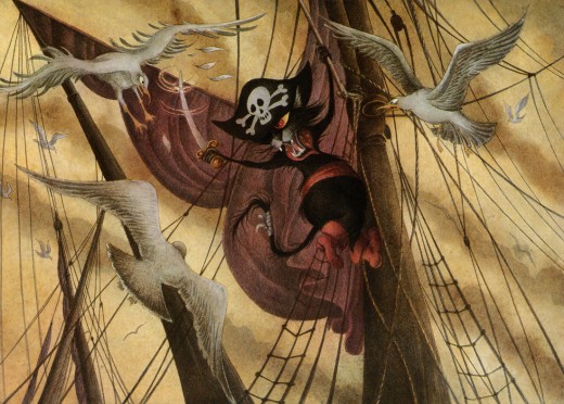
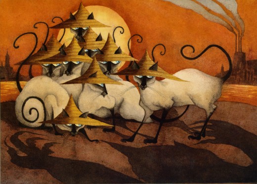
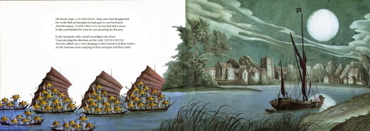
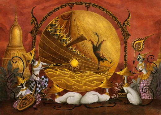
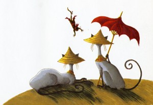
Here are a sampling of the illustrations from one of the two Le Cain books adapting Cats.
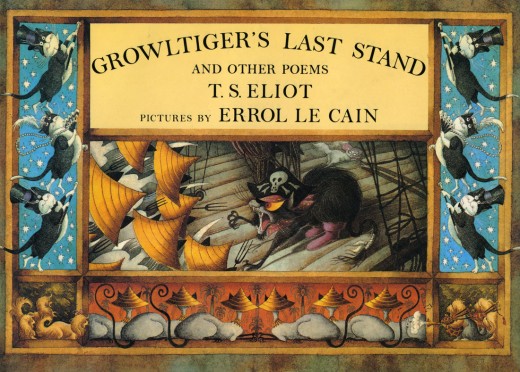
(Click on any image to enlarge.)
In fact he was the largest cat that ever roamed at large.
From Gravesend up to Oxford he pursued his evil aims,
Rejoicing in his title of”The Terror of the Thames.”
To Cats of foreign name and race no quarter was allowed.
The Persian and the Siamese regarded him with fear –
Because it was a Siamese had mauled his missing ear.
