Category ArchiveIllustration
Books &Errol Le Cain &Illustration 10 Jul 2008 07:41 am
Le Cain – ‘Crisis at Crabtree’
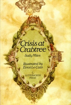 - I’ve done a number of postings of Errol Le Cain‘s marvelous illustrations and hope to continue to do more. Of course, I’ve had a distinct interest in his artwork since I first saw him in the original BBC documentary on Richard Williams’ studio at One Soho Square. The show highlighted the short film, The Sailor and the Devil, which Williams used to train Le Cain in the art of animation. The first book I saw by Le Cain, Thron Rose, hooked me, and I became a collector.
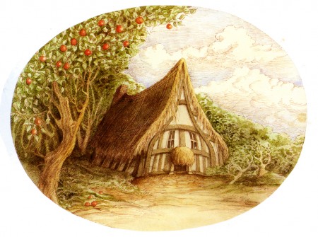
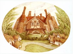
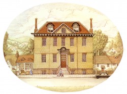
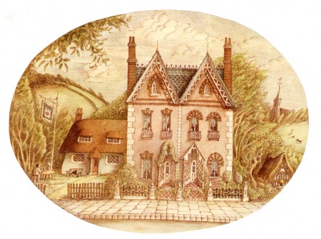
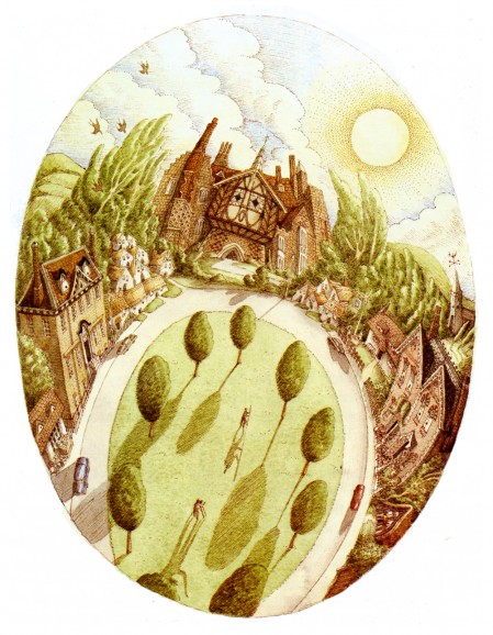
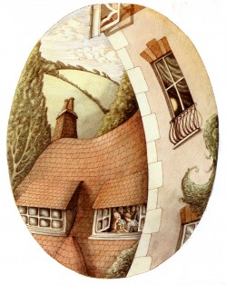
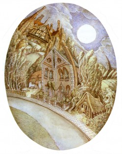
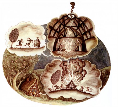
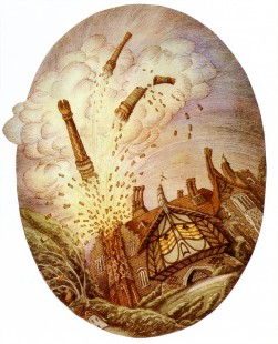
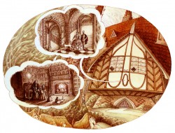
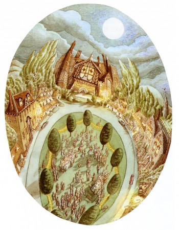
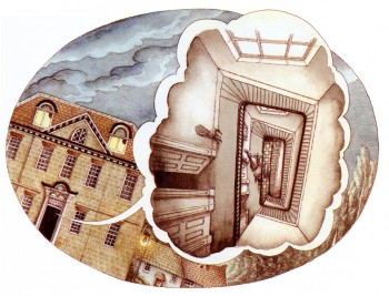
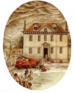
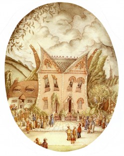
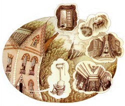
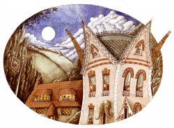
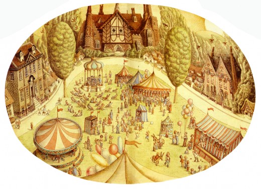
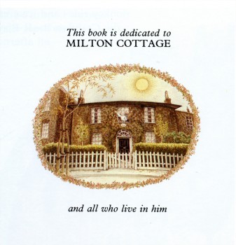
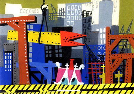
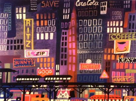
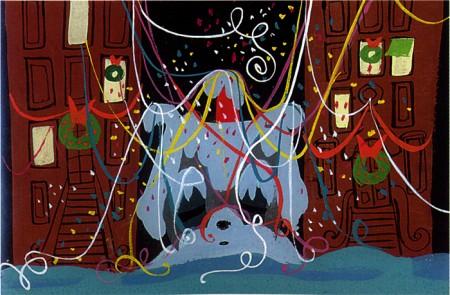
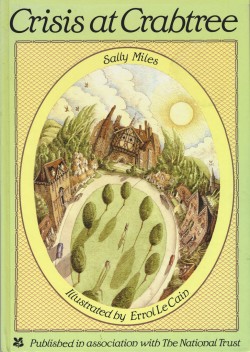
I have a peculiar book, I’d like ot share with you now. Crisis at Crabtree tells the story of the village of Crabtree, due to be demolished. All of the houses detail their histories before they are to go. Only Norman, the medieval farmhouse is slated to be protected.
This book was written by Sally Miles and illustrated by Le Cain. The illustrations, as you’ll see here, are Easter egg gems.
Crisis at Crabtree was published in association with the National Trust.
Here are the illustrations:
 __
__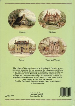
Front Cover & Back Cover
Art Art &Illustration 10 Jun 2008 08:16 am
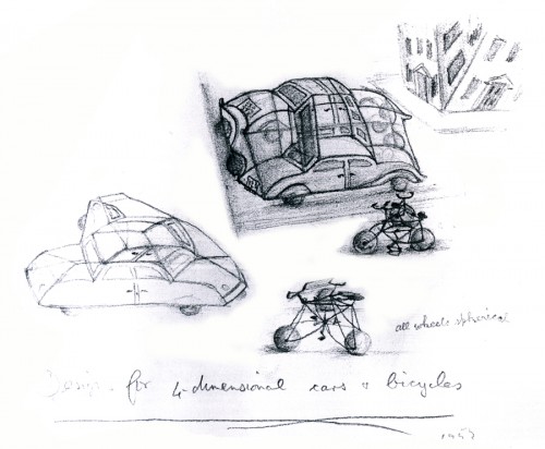
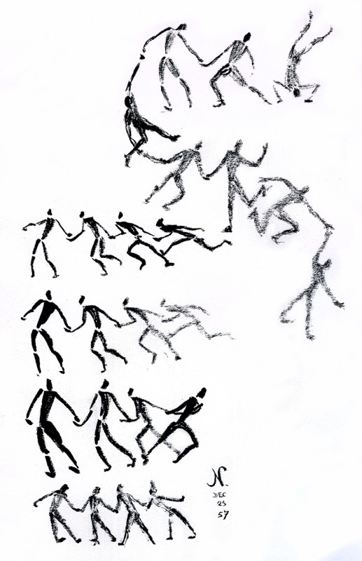
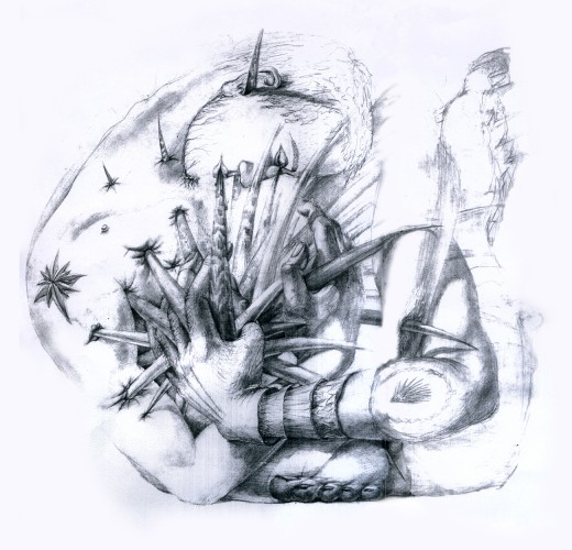
More McClaren’s Dwngs
- When I posted several of Norman McClaren‘s drawings, recently, it got a bit of attention. I received a number of comments and emails about the post, and I realized that fewer people have seen these drawings than I thought. Obviously, it means, to me, that I should post more of them.
McClaren was certainly a brilliant artist, and his experimentation and developments brought about a real maturation of the art form. I wonder how he would have dealt with the technology we’re using today. Remember, he realized that the soundtrack could be drawn and did his own exploration of this part of the process.
The book was published in 1975 by Tundra Books.
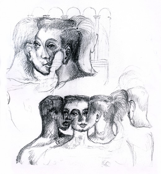
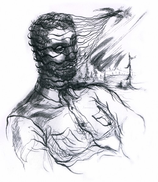
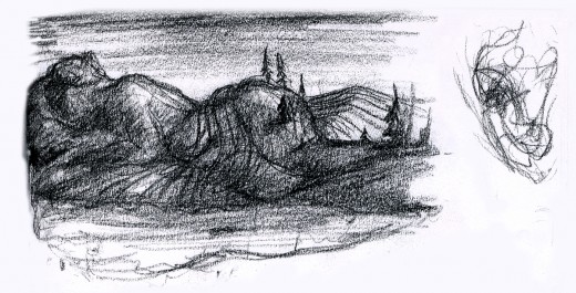
Because the one illustration which graces the book’s cover, was of such interest to those reading my piece, I’ll start with the rest of that page. It’s a series of sketches done for the film, “LÃ -haut sur ces montagnes” and was drawn in 1945.
__________________(Click any image to enlarge.)
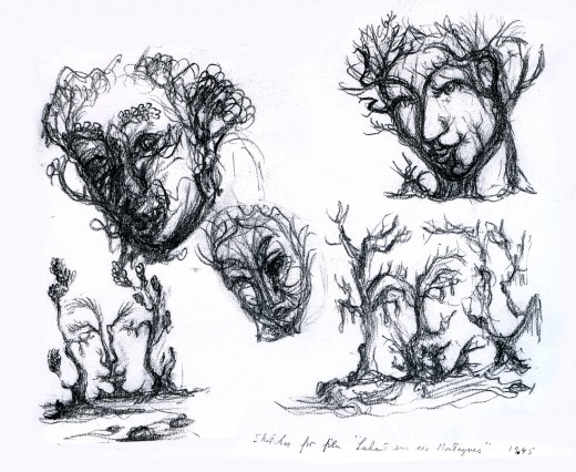
The two illustrations above are connected on the same page. I separated them .
The entire page is labelled: Sketches for the film, “LÃ -haut sur ces montagnes.”
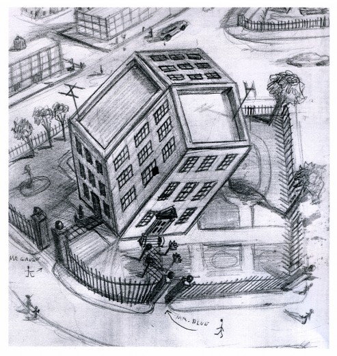
“Tesseractine House”
I’m fascinated that a number of his illustrations look not too unlike Steinberg’s work. It’s obvious he was an influence for a lot of animators in the late ’40′s.
Books &Commentary &Illustration 19 Mar 2008 07:58 am
Only God Can Make a Tree
- If you’ve only heard clips of the Obama speech given yesterday, spend the time and watch the whole thing. It’s time to plant apples here. Part 1, Part 2, Part 3, Part 4.
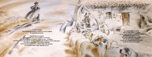
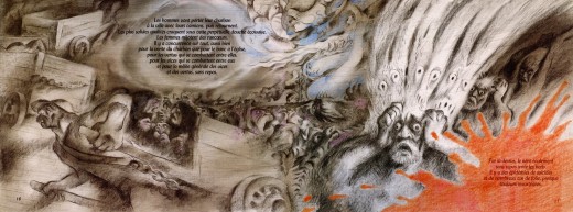
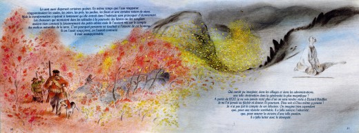
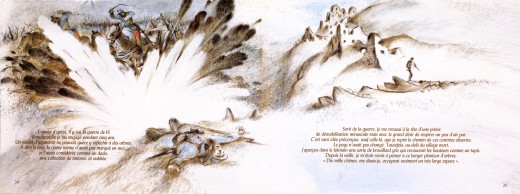
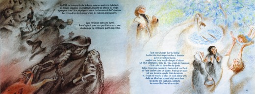
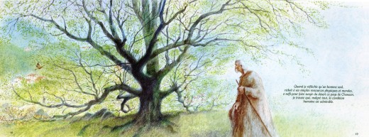
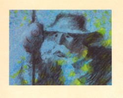 - Mark Mayerson features an article on his blog about Frédéric Back and the news about an exhibit of his artwork. I’m not in Canada, so it’s hard to see the exhibit and the screeenings. However, I thought it might be a good idea to look again at Back’s stunning film, The Man Who Planted Trees. Naturally, I want to share what I’m viewing with you, so I thought to put up some frame grabs. This film, though, is so stunning, I don’t think fuzzy frame grabs will do.
I have a book of the film which was illustrated by Frédéric Back from art for the film. It’s in French, and I haven’t attempted to translate it. I’m posting these images purely for the artwork. Aside from the cover, all six images I’m posting are double-page spreads. The book has about 50 pages, so I may post more some other day, but for now enjoy these.
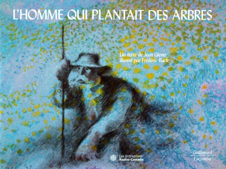
(Click any image to enlarge.)
Books &Frame Grabs &Illustration 25 Jan 2008 08:54 am
Steadman’s Animal Farm
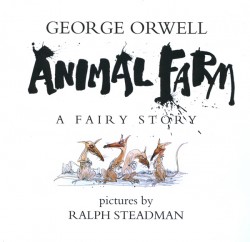
- I saw Halas & Batchelor’s Animal Farm at a seminal point in my animation development, so I guess you could say I was struck over the head at just the right time. The same is true of Lady and the Tramp, Sleeping Beauty or Magoo’s Christmas Carol. They, and a number of other films from that period, have enormously affected how I see animated cartoons and what it is that I like. Somehow, I think I’ve mentioned this before.
I am also a big fan of Ralph Steadman‘s work. For some inspiration, I was looking over his illustrations for Orwell’s book. The story vibrates in his hands. I thought it might be interesting to post some of these and find relative images from the film to see how they compare.
Make no bones about it, I think Steadman is as close to an artist an illustrator can become, and I have no similar thoughts about the artwork for the Halas & Batchelor film. I am interested, however, in how different people view images they get from the same text.
_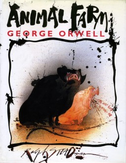 _
_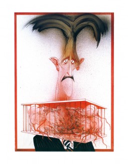
___On the left, we have the book’s dust jacket, cover. On the right, Steadman offers a
___caricature of George Orwell holding rats in a cage. A reference out of “1984.”
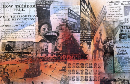
___The inner cover of the book’s front features this double page collage/painting by
___Steadman. Politics of Orwell’s time is put front and center.
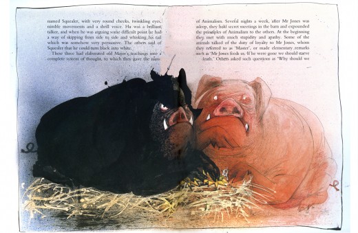
____Napoleon and Snowball closely align with each other and give each other support.
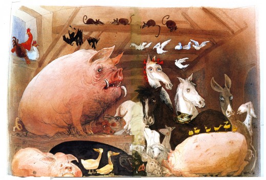
_______All the animals meet in the barn to create a plan. The pigs take the lead.
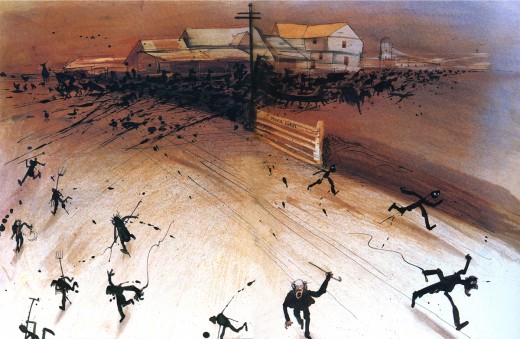
___The major battle with the humans ends with the farmers running away from the
___animals who have joined together to take over the farm.
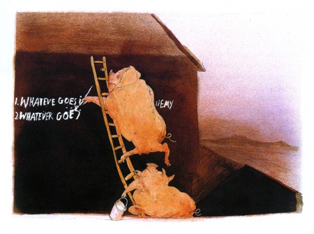
The pigs post new rules that they’ve created.
_
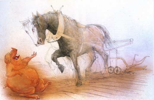
________________The horse, Boxer, is the strongest and most loyal worker.
The Halas & Batchelor Film
_ _
_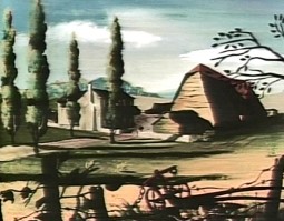
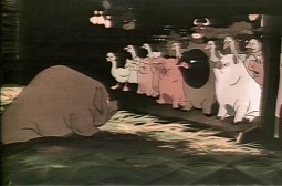
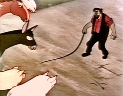
__________The Halas and Batchelor film starts out with master shots of the farm.
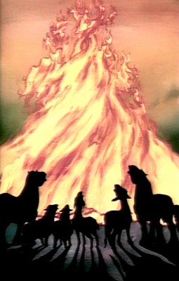
__The animals push the farmer and his drinking buddies off the farm and end the
__sequence with a rousing animal song around a fire.
__
__
__
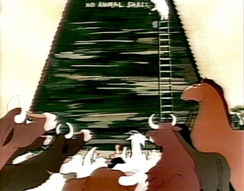
The rules are written on the barn wall while cross cutting to Napoleon hiding newborn puppies in the hayloft. We’ll later learn that he’s trained these dogs to grow into attack guards for him when he takes over the farm. It’s interesting that the French version of the book calls this pig Caesar.
__
__
______(As ever, click any image to enlarge it.)
Books &Illustration 24 Jan 2008 09:24 am
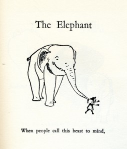
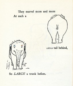
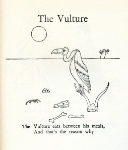
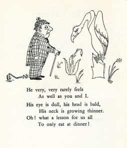
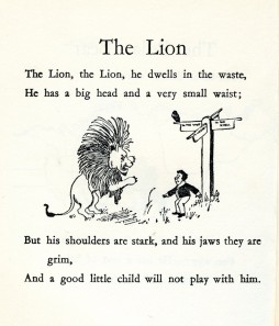
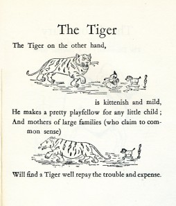
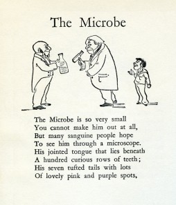
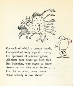
Belloc’s Bestiary
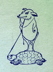 - I have two books of chilldren’s verse written by Hilaire Belloc. I’ve been a fan of these poems and have prized the books. I thought it worth sharing.
After graduating from Oxford, Hilaire Belloc served in Parliament. After two terms, thoroughly disatisfied with public office, he left the House of Commons. He wrote extensive commentaries during the first World War. His first son was killed in that conflict; his second son during the second World War.
He was a very opinionated political writer, which didn’t help his reputation during his life. He also refused to be pigeon-holed writing in many different styles and forms. Hence he was barely accepted by the cogniscenti of the time. Many of his children’s poems are whimsical but quite dark. Victoriana lives on in his mood and attitude. His poems are all on line (none of the illustrations are there).
B.T.B. was properly named Basil Templeton Blackwood, the third son of the Marquess of Dufferin. He met Belloc when they were both students at Oxford. He became a Lieutenant in the Grenadier Guards in WW I and was killed in action in 1917.
Blackwood became a solicitor, but he illustrated several of Belloc’s books. These include:
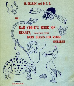
The Bad Child’s Book of Beasts (1896)
More Beasts (1897)
The Modern Traveller (1898)
A Moral Alphabet (1899)
Cautionary Tales for Children (1907)
More Peers (1911).
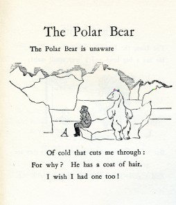
Here we have selected pages from the first two of these books which were combined into one volume I own. It was last published by Duckworth in 1971. A “Bestiary”, of course, is an alphabetical listing of animal poems originally designed to teach children the alphabet. (Sorry that I post these pages out of alphabetical order.)
 _
_
______(Click any image to enlarge.)
Animation Artifacts &Books &Disney &Illustration &Mary Blair &Peet &Story & Storyboards 21 Jan 2008 09:35 am
Peet and Blair’s Little House
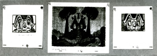
- Earlier this week, I posted John Canemaker ‘s loan of a couple of storyboards by Bill Peet from Bill Cottrell’s script for The Little House. This was adapted from the children’s book by Virgina Lee Burton.
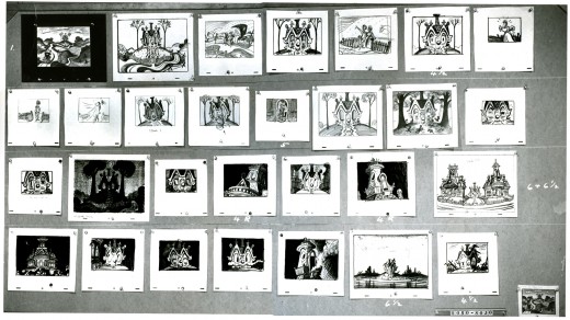
Today I’ve got a fifth board. I’m not sure it’s storyboard; the images look a bit more like background layouts. Perhaps it’s something in between the two. I’m not even sure the drawings are by Bill Peet.
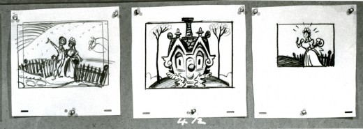
This is the actual board. However, I’m posting it as I did the others in pieces so that it can best be enlarged for good viewing.
_
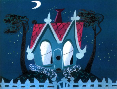
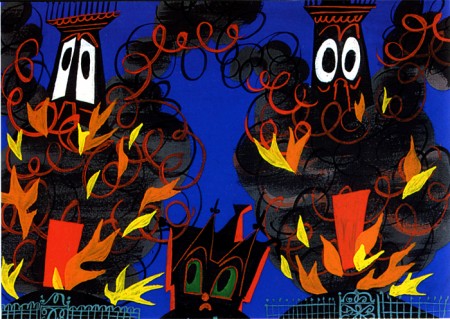
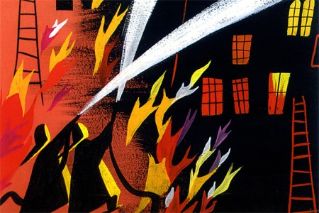
- Mary Blair was the dominating design force on this film, and her work stands out vigorously.
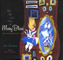
John’s exceptional book, The Art and Flair of Mary Blair includes a number of key pieces of art for this short. I think it might be remiss for me not to post them alongside these storyboards to see how Peet and Blair worked together. With thanks and apologies to John and his excellent book, here are the color scans.
_
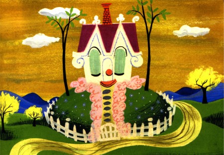
(Click any image to enlarge.)
Books &Illustration 18 Jan 2008 09:28 am
Steig Children’s Books
 - Continuing my obsession with William Steig I’m posting some artwork from some of Seig’s children’s books. I’ve done four of the books as films: Abel’s Island, Doctor DeSoto, The Amazing Bone and Sylvester and the Magic Pebble. I’ve always felt a kinship in the artwork of Steig and find it easy to draw in that style. It just feels natural to me, probably because I’ve been doing it since I was about 12.
You can view a lot of the original art at The Jewish Museum in NYC until March 16, 2008. The exhibit is delightful, and you’ll see how intense the original colors are in his artwork. William Steig’s brother, Arthur Steig, developed dozens of art supplies over the years, including Luma Colors, a line of brilliant watercolors, and calligraphic inks that would not clog technical pens. William used these Luma dyes profusely in his work. The first use was in what was originally called The Bad Island (1969) and was later republished with a new text as The Rotten Island.
These Luma colors are delicate, and I feel they often don’t publish well in the printing process. The colors of the originals are absolutely radiant, whereas even in the new art book, The Art of William Steig, many of the colors are a bit on the reddish side, and have lost something in the transition.
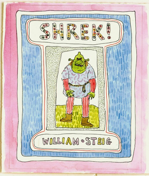
Cover illustration for Shrek! (1990)
pen and ink and watercolor on paper
© 1990 William Steig
Can someone tell me how they got from these illustrations to the ugly art on display in the Shrek films? Even the drawings on display at the museum from Dreamworks are much more palatable than those films. It’s sad.
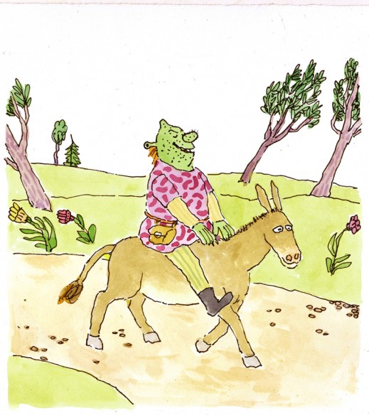
“‘You jabbering jackass!’ Shrek screamedâ€
pen and ink and watercolor on paper
© 1990 William Steig
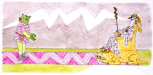
“There before him was the most stunningly ugly princess on the surface of the planetâ€
pen and ink and watercolor on paper
© 1990 William Steig
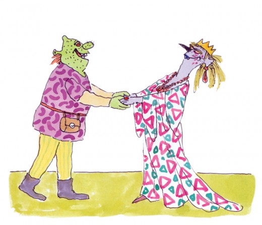
“Oh, ghastly you, with lips of blueâ€
pen and ink and watercolor on paper
© 1990 William Steig
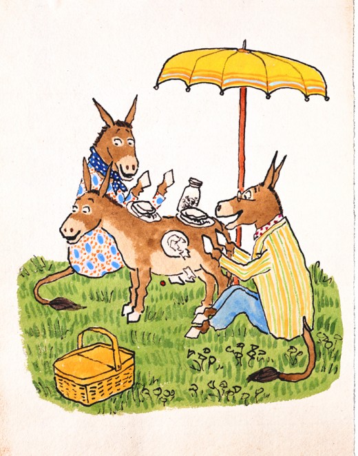
“‘Oh, how I wish he were here with us on this lovely May day,’ said Mrs. Duncanâ€
preliminary illustration for Sylvester and the Magic Pebble (1969)
pen and ink and watercolor on paper
© 1969 William Steig, renewed 1997
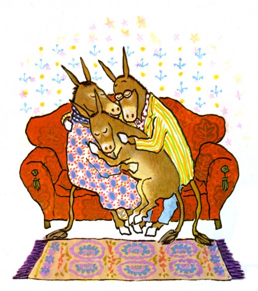
Final illustration for Sylvester and the Magic Pebble (1969)
pen and ink and watercolor on paper
© 1969 William Steig, renewed 1997
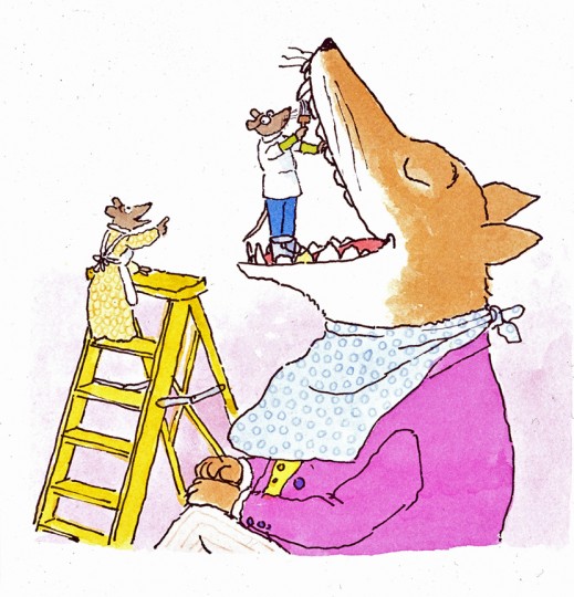
“Doctor De Soto stepped into the fox’s mouthâ€
illustration for Doctor De Soto (1982)
pen and ink and watercolor on paper
© 1982 William Steig
Tomorrow’s Saturday. The museum is free. There’s no excuse. Go, take a look if you’re in the NY area.
Art Art &Illustration 05 Jan 2008 09:31 am
More on Steig at the Jewish Museum
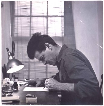 - After my post last Sunday about the William Steig exhibit at the Jewish Museum, I was contacted by them to ask if I wanted images of art from the show for my blog, and of course I jumped at the chance.
They sent quite a bit of material as well as the captions that go with the art, and this gives me a good excuse to post more of Steig’s art. Because these images are photos (not scans) of the original art, they show the texture of the paper and the edges including some Steig’s writing, so I feel like there’s a good reason to post it. (The photos of the art, by the way, are all by Richard Goodbody.)_________Photo of Steig circa 1930′s.
I’ll probably display these image in a couple of posts so you can see a good sampling of this man’s work. I don’t have to say that I am a fan; I think by now it’s obvious.
You might want to check out the book, The Art of William Steig, which is a catalogue of the show. It’s available through the Museum as well as through other resources.
Ann Scher left a comment on my last post that the Steig exhibition is on view at The Jewish Museum in NYC until March 16, 2008. It will then travel to San Francisco, to be shown at The Contemporary Jewish Museum from June 8 – September 7, 2008.
If you have the time take a visit.
Here’s some of the earlier work that this artist did.
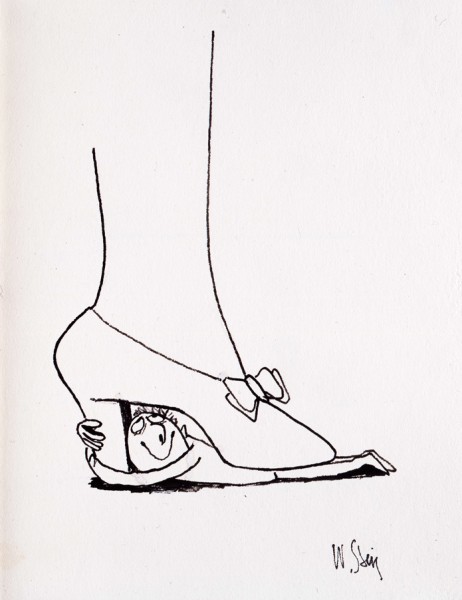
What a Woman!
preliminary drawing for The Rejected Lovers (1951)
pen and ink on paper
© 1951 William Steig, renewed 1979, 2007
_
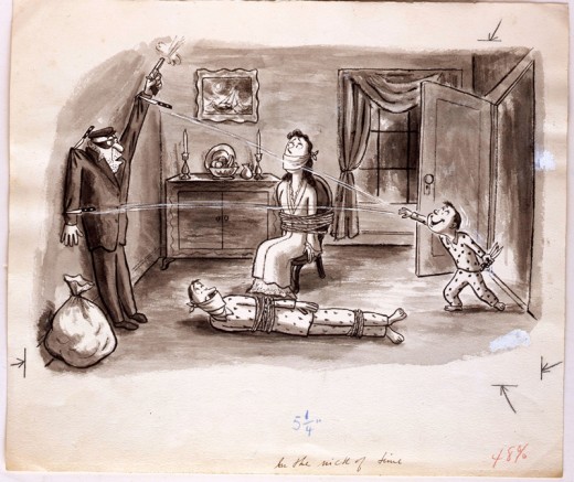
In the Nick of Time
from “Dreams of Glory†series, published in The New Yorker, May 26, 1951
pen and ink and wash on paper.
© 1951 William Steig, renewed 1979, 2007
_
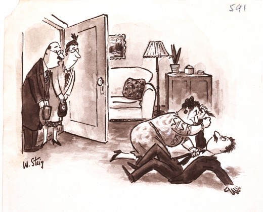
“Are we early?â€
Delivered to Look magazine, May 17, 1956
pen and ink and wash on paper
© 1956 William Steig, renewed 1984
_
_
 _
_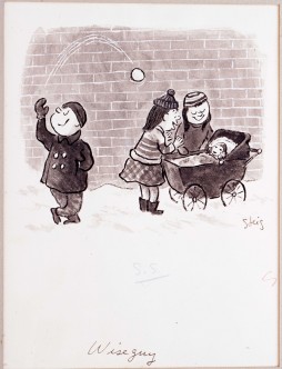
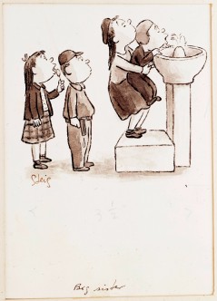
___________Big Sister_________________________________Wiseguy
from “Small Fry: Park Playground†series______from “Small Fry: Snow†series
published in The New Yorker, April 18, 1953__._published in “Dreams of Glory and Other
pen and ink and wash on paper_____________Drawings” (1953)
© 1953 William Steig, renewed 1981 ____.____pen and ink and wash on paper
________________________________.______© 1953 William Steig, renewed 1981
_
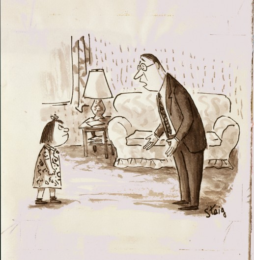
“What did I do?”
published in The New Yorker, June 30, 1962, pen and ink and wash on paper
© 1962 William Steig, renewed 1990
_
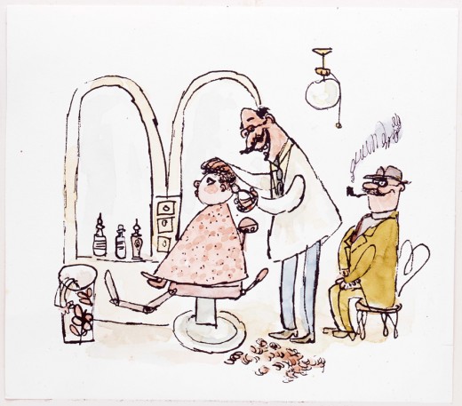
“I got my first haircut at Ditchick’s Barbershopâ€
final illustration for When Everybody Wore a Hat (2003)
pen and ink and watercolor on paper
original version, in pen and ink and wash, c. 1959
© 2003 William Steig
Errol Le Cain &Illustration 26 Dec 2007 08:24 am
Christmas Stockings
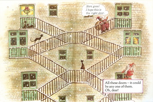
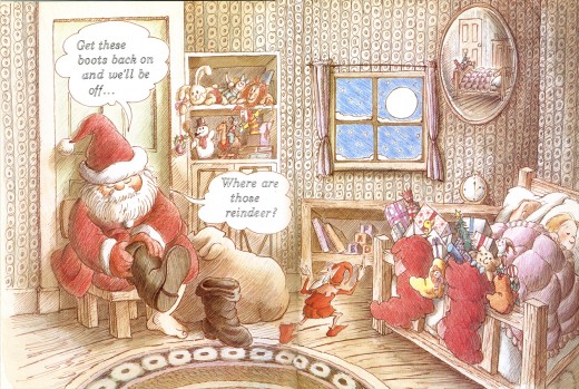
 - The book by Matthew Price, The Christmas Stockings, is a fun book for kids with large illustrations by Errol Le Cain. Santa has trouble getting around an apartment building in the city, so you have to help him locate a number of doors and windows, which cut out and open, so that he can move from apartment to apartment delivering his goodies.
It’s not a book that I ever loved, but it’s certainly part of the canon. The style is less like the irridescent watercolors of his other books, and more like a cartoon book done with a mix of watercolors and colored pencils.
Each page is a double page spread, so that there are fewer individual illustrations and big is the byword. Not as delicate as some of the others but still it’s the work of an artist.
More to the point, it’s specifically a Christmas book, and when more appropriate to attend to it than now. So here are several of its double page spreads.
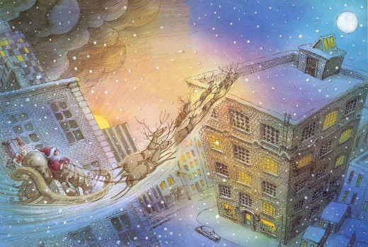
Inside front cover; Santa arrives._______(Click any image to enlarge.)
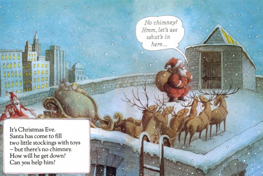
Pages 2-3___Santa arrives on the rooftop.
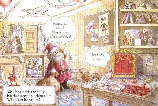
Pages 4-5___Once inside, he tries to move down the building’s floors, but needs the reader to help him find an exit. There’s a hidden door under the airplane that opens.
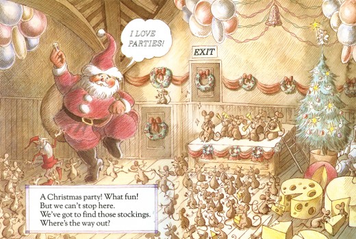
Pages 8-9___The door marked “Exit” opens.
Pages 12-13___The door in front of Santa opens.
Pages 16-17___The window opens allowing Santa to escape.
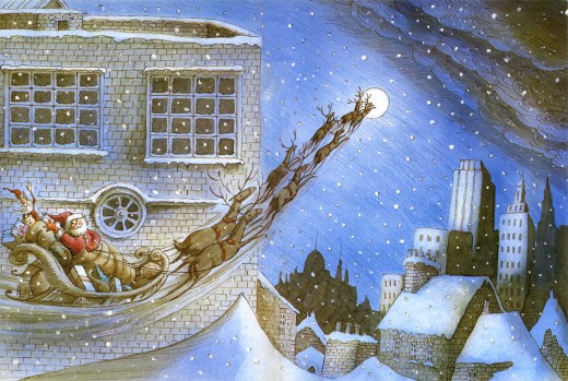
Inside the back cover sits one of the best illustrations in the book.___
As you know, I’ve posted a number of his other books, and you can click any of these links to find those posts.
____Puffin Books_______ ________________Mr. Mistoffelees
____The Snow Queen_______________-____Aladdin
____Growltiger_________________________Thorn Rose
____Pied Piper of Hamelin_______________12 Dancing Princesses
____Have You Seen My Sister____________Hiawatha’s Childhood
_________Funny Thing Happened on the Way to the Forum
____
Books &Illustration &SpornFilms 08 Dec 2007 09:54 am
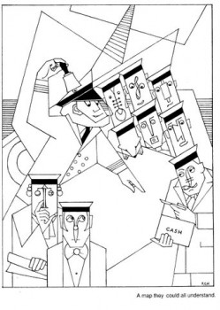
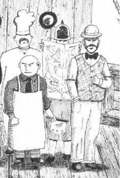
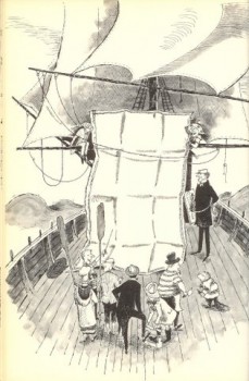
More Illustrated Blank Maps
 – Last week, I posted a piece about the “Map they could all understand” from Lewis Carroll’s poem, The Hunting of the Snark. It prompted a number of interesting comments. One in particular from Doug H. in Australia was followed by a delightful email full of other wonderful illustration of the same part of the poem.
- “Other maps are such shapes,
______ with their islands and capes!
But we’ve got our brave Captain to thank:
(So the crew would protest)
______ “that he’s bought us the best–
A perfect and absolute blank!â€
I’d like to post some of these illustrations here, for your amusement, and with many thanks to Doug, I do so here. With respect to all of the illustrators, about half of whom
are unfamiliar names to me. They merit a good look,________me discussing the animation
especially for Snark lovers. _____________________________ process for How Magazine.
___ Just scroll down. Click any image to enlarge a bit.)
 1
1 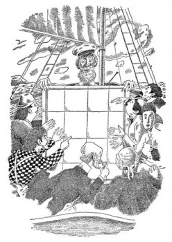 2
2
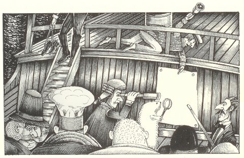
______1. Frank Hinder (1989)_______________________2. Harold Jones (1975)
______
__ 3.__
3.__ 4.
4.
______3. Michael Capozzola (2005)_________________4. Kelly Oechsli (1966)
 5.
5.5. John Lord (2006)
______
______
6._________________________________7.
______
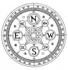
______6. Max Ernst ((1950) _______________________7. Jonathan Dixon (1992)
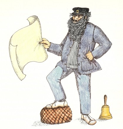 8.
8.8. Helen Oxenbury (1970)
