Category ArchiveIllustration
Books &Disney &Illustration 05 Aug 2009 07:18 am
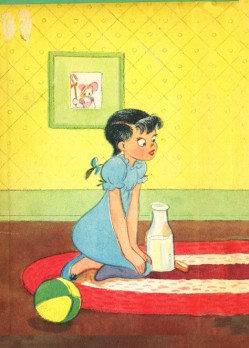
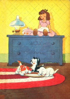
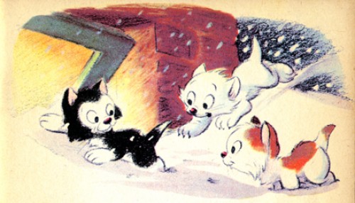
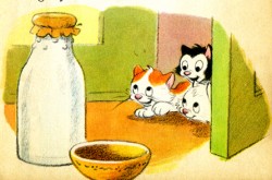
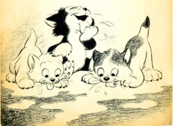
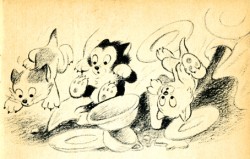
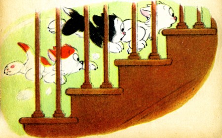
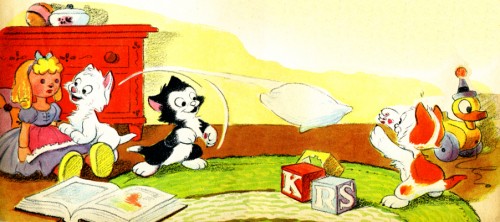
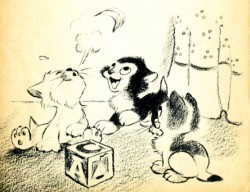
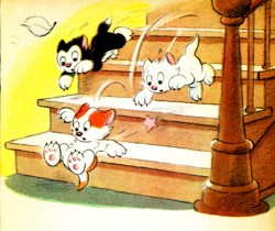
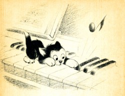
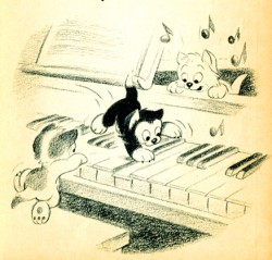
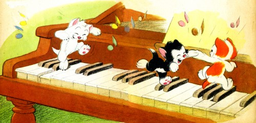
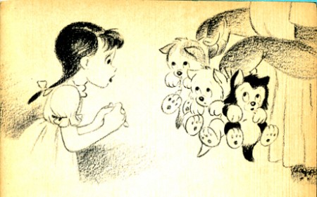
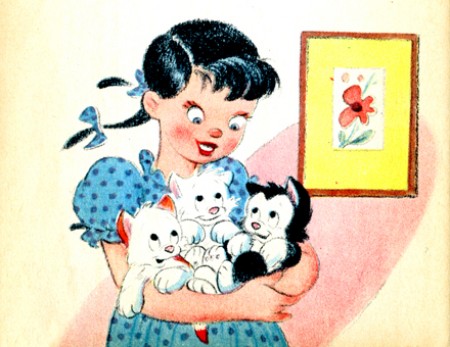
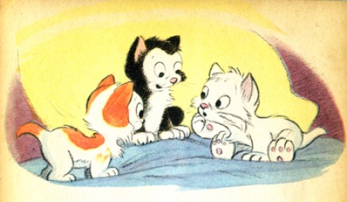
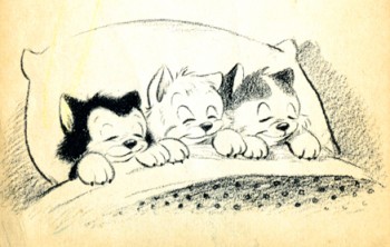
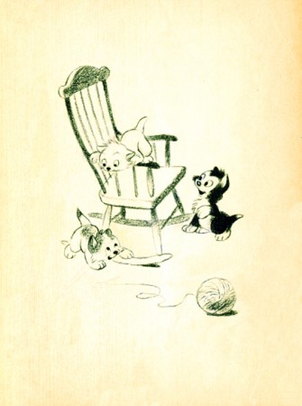
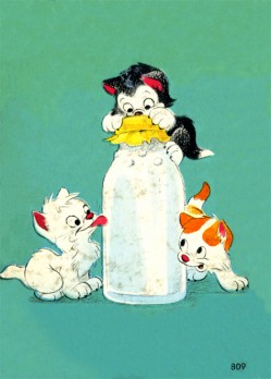
Three Little Kittens book
- I’ve often been curious about the generation that lived through the late 30′s early 40′s. The animated cartoons that were made during this roughly six year period often feature enormously cute characters going through cute storylines. The audiences must have loved it considering the fact that there are so many of these films, including Oscar nominees and winners.
Lend A Paw, The Milky Way, Merbabies, Wynken Blynken and Nod, Two Little Pups, and any of the Sniffles cartoons all featured good animation and high prduction values but terminally cute material.
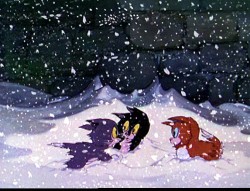
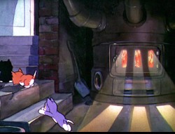
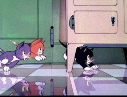
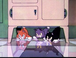
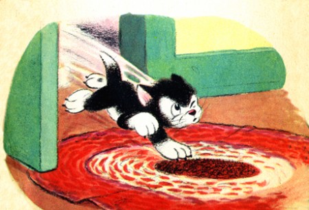
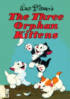
The Three Orphan Kittens of 1935 was an Oscar winner and as cute as all getout. Not only are these mischievous kittens, but they’re also orphans. The film was directed by David Hand and featured a seuquence by Ken Anderson in which floorboards were animated to try to capture the illusion of 3D.
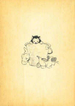
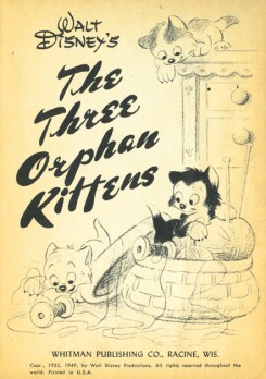
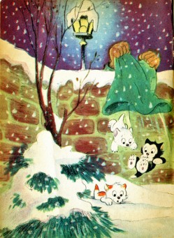
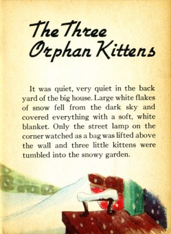
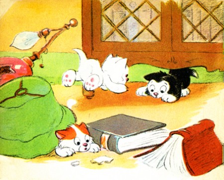
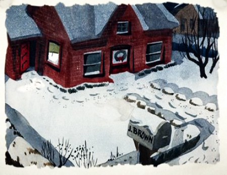
A number of children’s books were produced from this material, and I offer here the illustrations from one smaller-sized book. It was originally published in 1935 and was obviously such a success that it was reprinted in 1949.
(Click any image to enlarge.)
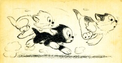
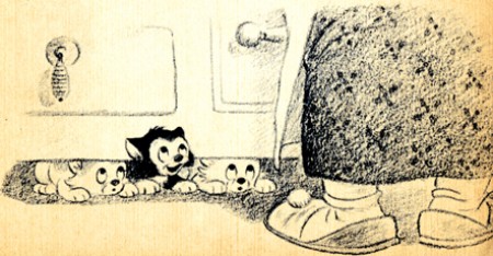
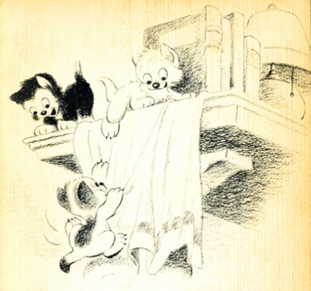
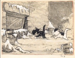
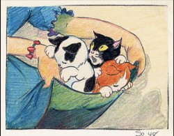
Here are a couple of preproduction drawings done for the film.
It’s interesting to compare this material with the excellent shorts by Simon Tofield featuring Simon’s Cat. Both utilize pet cats as the featured star; both are lightyears apart from each other. They’re both representative of their time. Two different kinds of cuteness. One works today.
Books &Illustration 25 Jul 2009 07:52 am
High in the Clouds – Part 2
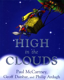 - I know, I know. I gave you the first part oh High in the Clouds weeks ago and haven’t followed up with the second part. Well, here it is.
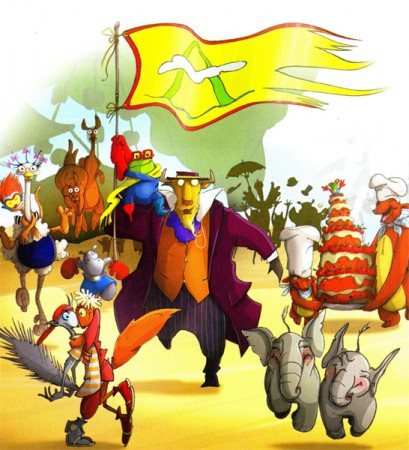
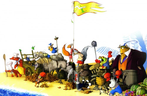
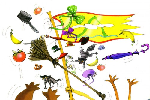
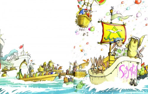
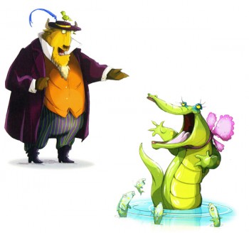
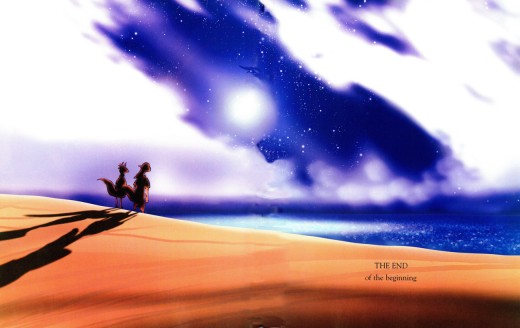
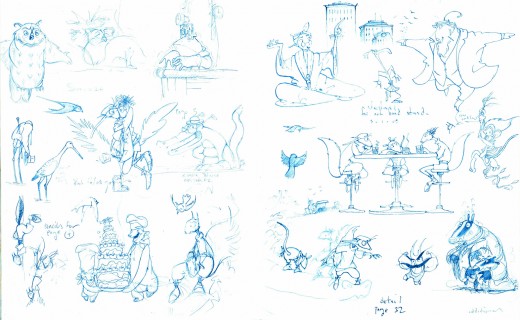
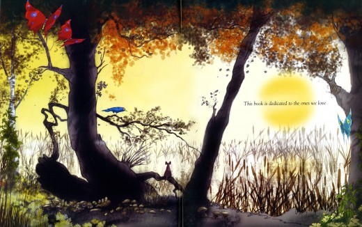
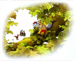
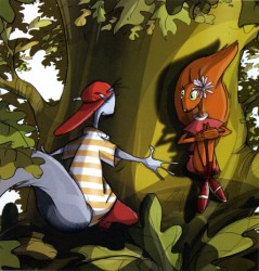
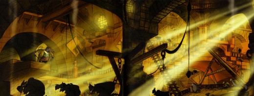
This is the storybook by Paul McCartney, Geoff Dunbar and Philip Ardagh that will be made into an animated film, directed by Rob Minkoff.
Dunbar is the animator/director who won lots of awards for some of his shorts and commercials. He’d animated a couple of McCartney songs in the past. Ardagh is a writer, and McCartney is McCartney.
Minkoff was the co-director of The Lion King, director of Stuart Little and The Haunted Mansion.
I have no real knowledge of this, but I assume it’ll be done in CG. Why else hire Minkoff when Dunbar’s already designed the hell out of the idea? Hopefully, it won’t look like all the other crap out there, but I have no confidence in anyone anymore.
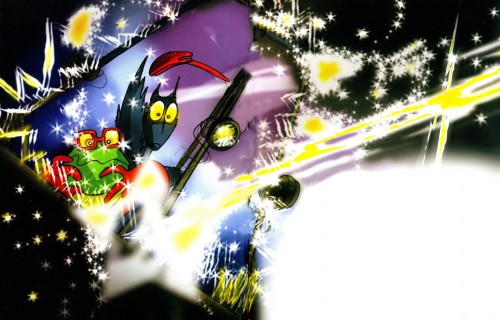
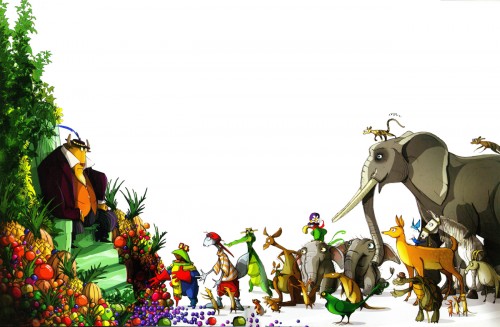
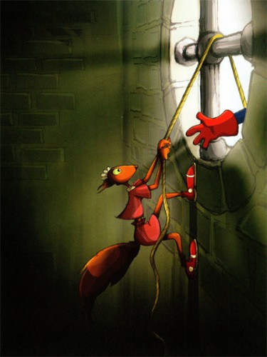
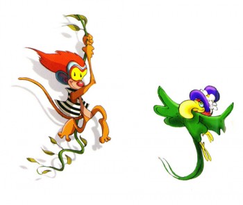
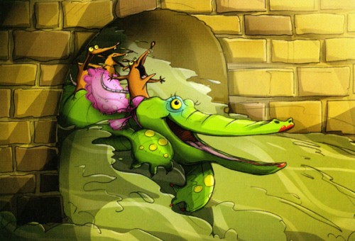
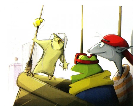
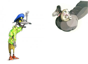
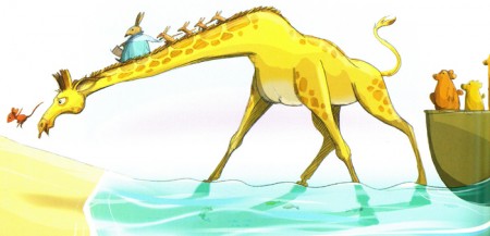
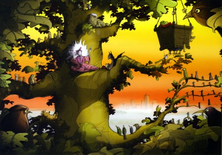
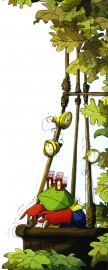
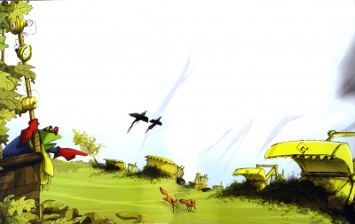
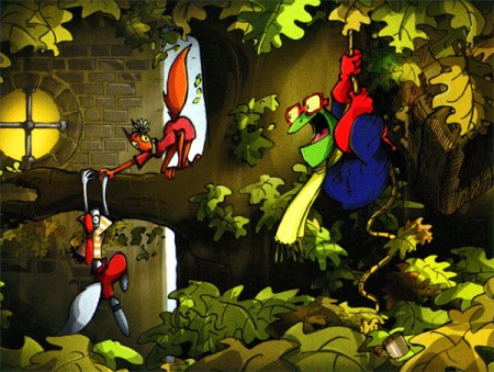
So here are the rest of the illustrations. I haven’t read the book, and am not sure I will. It looks like a reworked/printed animated program, as it is.
 22
22(Click any image to enlarge.)
Books &Illustration 23 Jun 2009 08:08 am
High in the Clouds
 - A bit of news broke; when it was reported in Variety that Paul McCartney would be the force behind a new animated feature, High in the Clouds.
This work was a book he wrote with Geoff Dunbar and Philip Ardagh, and it was published in 2005 by Dutton. All three are given equal credit. Dunbar is an extraordinarily gifted animator/director in London. His animated short, Lautrec, as well as the animated version of the Alfred Jarry play, Ubu, helped to lead Britain to the animation renaissance of the 70′s. He also made the film, Rupert and the Frog Song, with McCartney. Ardagh is a children’s book writer with some 60 titles to his credit.
There can be no doubt that Ardgh did most of the writing, and Dunbar did the illustrations to the book.
The surprise to me is that Rob Minkoff was hired to direct the feature. He’s talented, but Dunbar had an obvious connection, and I’m surprised he did not get the job. Some obvious behind the scenes mechanics must obviously have been in play.
Caroline Thompson who wrote Edward Scissorhands, The Corpse Bride and The Secret Garden is a wonderful choice to write the script. It’s also interesting that Bob Shaye and Michael Lynne, formerly of the studio New Line Features, are producing this film with their newly devised Unique Pictures.
My hope and my fear is that Minkoff will make it look more like The Lion King and less like Stuart Little.
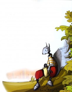
I bought the book a while back. Let me share some of Dunbar’s illustrations with you.
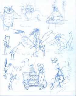
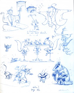
Inner covers
Some of these are exquisite, some not so. The character desing is pure Geoff Dunbar. (Not too distant from Paul Vester’s work.) I’m not a big fan of the stretched out characters. I like the roundness of the earlier years and think this project might’ve profited with that look.
It feels a bit like a modern take on the Wind in the Willows territory.
(More to come.)
Illustration &Trnka 30 May 2009 08:24 am
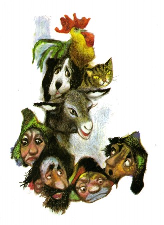
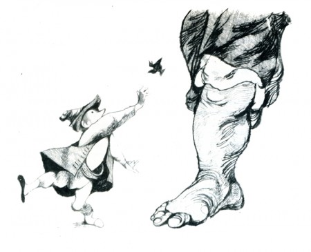
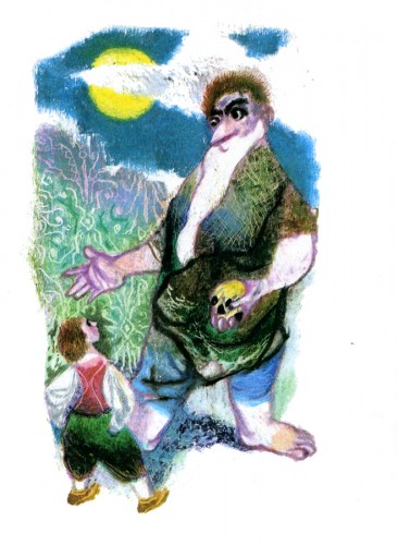
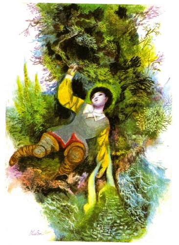
Trnka’s Grimm
- Jiri Trnka is one of my heroes. His sense of design is as gorgeous as his puppets. There’s a feminine delicacy wrapped around a very masculine strength. The same is true of his puppet films. Look at any frame of The Archangel Gabriel or Midsummer Night’s Dream.
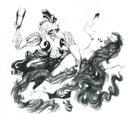
We don’t often see Trnka’s illustrations, so I’ve decided, for my own entertainment, to post a few of those in the Grimm’s Fairy Tales book. You can still find copies of this republished many times over. (I suspect the manuscript and illustrations are in public domain.)
Here are about half of the book’s illustrations:
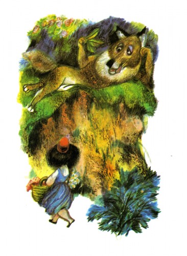
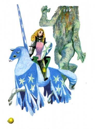
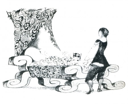
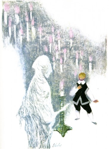
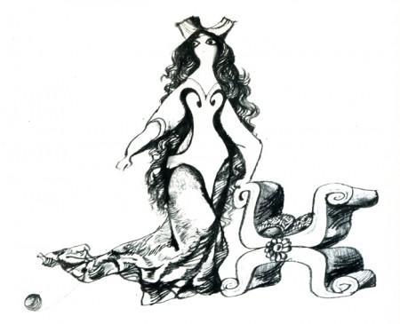
Red Riding Hood
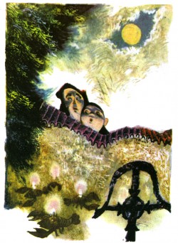
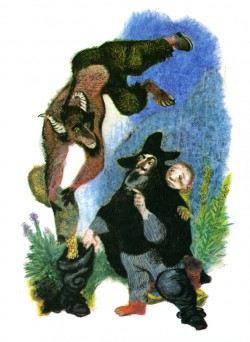
The Master Thief | The Grave Mound
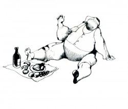
The Spirit in the Bottle | The Wishing Table, the Gold Ass & the Cudgel
Illustration &T.Hachtman 25 May 2009 07:53 am
Trompe Monday
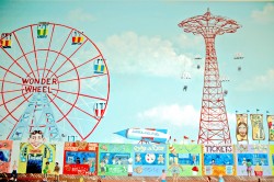
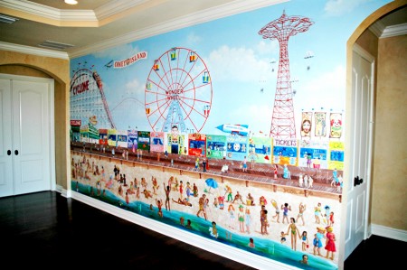
- From time to time, I’ve been pleased to showcase some mural paintings by my friends, cartoonists Tom Hachtman and his wife Joey. She has a company out of New Jersey which paints murals and commissioned Trompe l’oeil paintings.
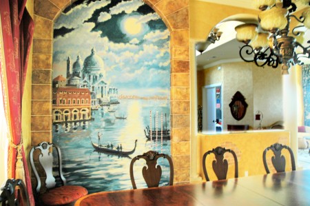
Last year they went to a Parkland, Florida home and painted Venice by moonlight in a dining room.
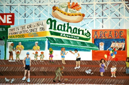
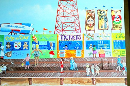
This year they returned and painted the Coney Island boardwalk by daylight in an upstairs hallway.
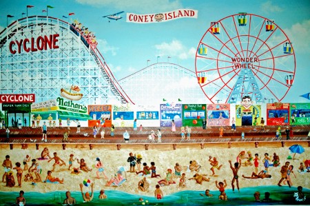
(Click any image you’d like to enlarge.)
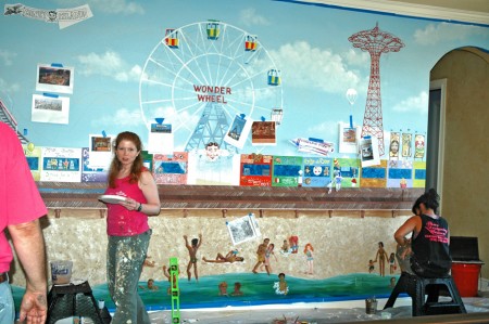
Here’s the group working on the painting.
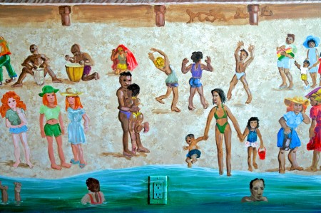
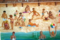
Joey did the people on the beach.
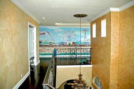
How it sits on the second floor.

The crew, from left to right: Joey, Christine, Katie Mae and Tom.
Books &Illustration &Luzzati & Gianini 29 Apr 2009 07:42 am
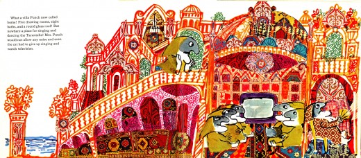
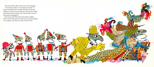
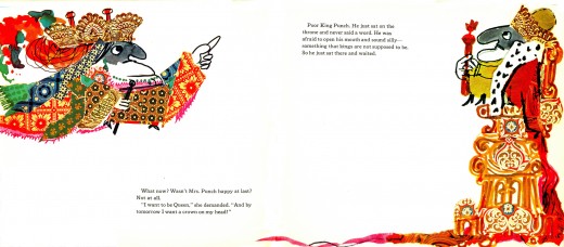
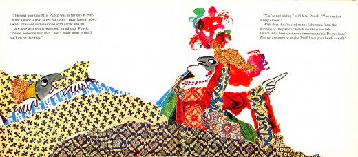
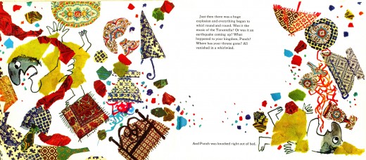
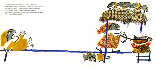
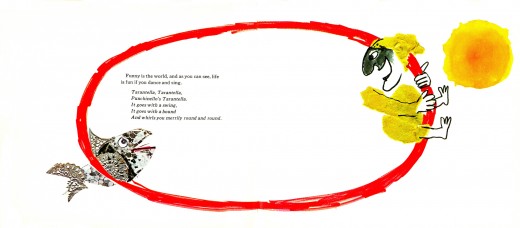
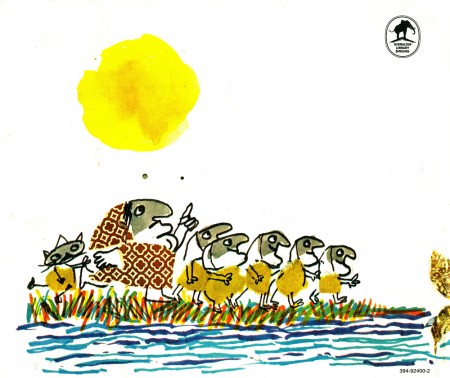
Luzzati’s Magic Fish
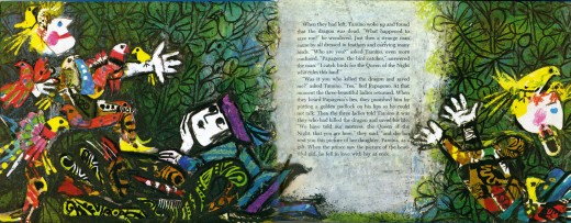
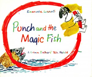 - Last week I posted a book byEmauele Luzzati, The Magic Flute. (Part 1, Part 2)
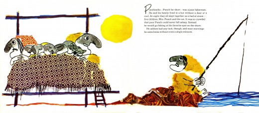
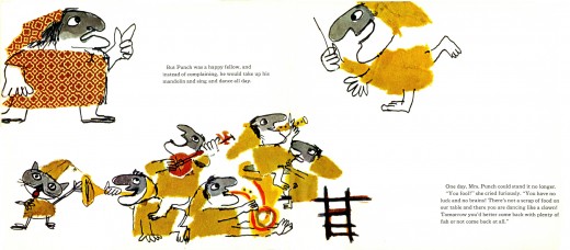
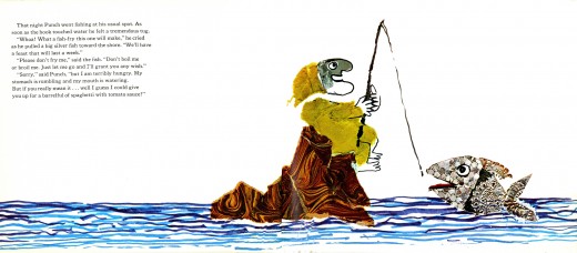
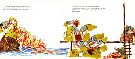
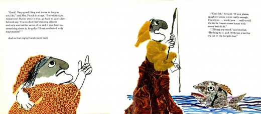
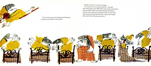
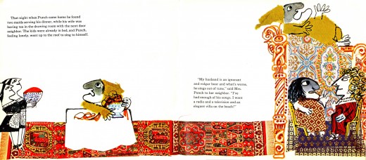
This was an adaptation of the feature film he did with Giulio Gianini. Luzzati also did a number of other children’s books (aside from all the animated films, as well as the theater and opera designs he did). None, that I know of, were pure adaptations of his film work. However, he did build on the character Pulcinello (Punch) to develop his story around Grimm tales.
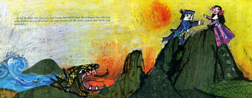
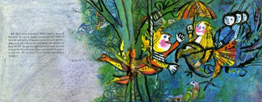
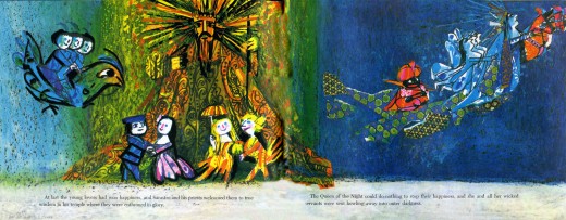
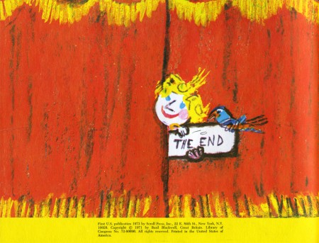
Here’s a version of Punch and the Magic Fish, first published in English in 1972.
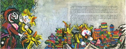
Most of the book is done as two-page spreads. I didn’t separate them. As with his past work, Luzzati uses a lot of mixed media. It looks like marker was the primary tool he used.
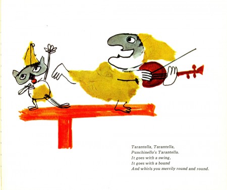 pg 1
pg 1(Click any image to enlarge.)
Animation Artifacts &Disney &Illustration &Story & Storyboards 27 Apr 2009 07:46 am
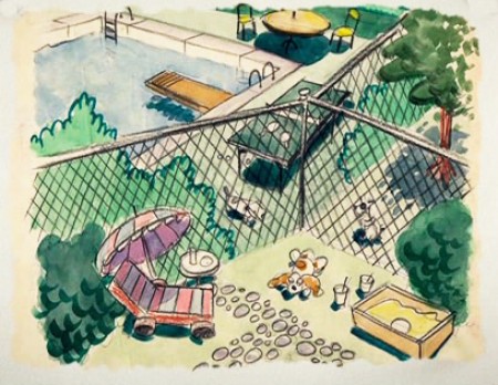
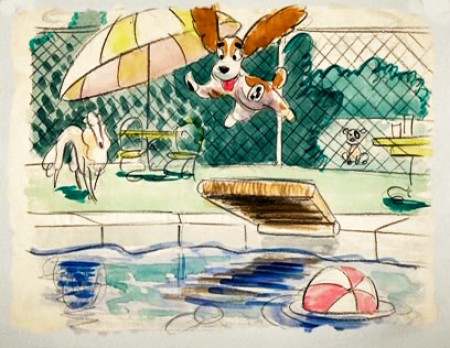
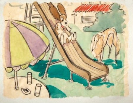
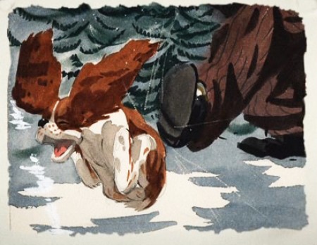
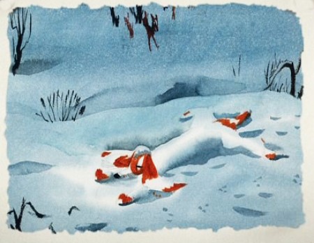
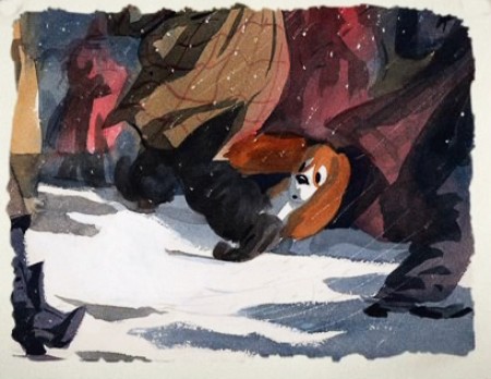
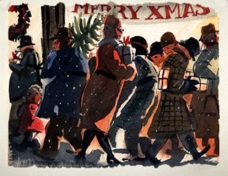
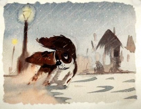
Some Lady drawings
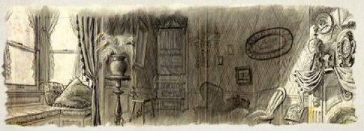
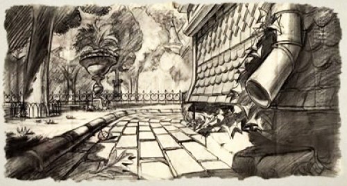
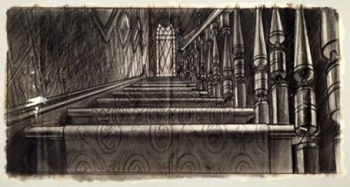
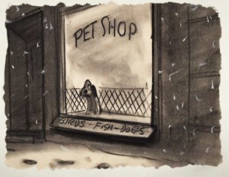
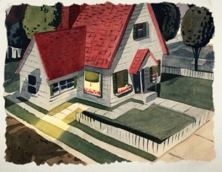
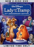 - The recent DVD of Lady and the Tramp includes some preliminary artwork for the film. I collected a bunch of it and am breaking it into a couple of posts. It’s easier to read off a blog than a tv screen, especially when the DVD tries hard to reduce them to the smallest size they can muster within an overworked border that is virtually pointless.
The illustrations – some are obviously BG layouts, others storyboard drawings – have a light and jaunty feel. They’re very cartoon in nature, and belie the actual feature they produced which, at times, is quite beautiful. Disney truly got the feel of “Main Street, USA” in this film.
I’m interested that most of the images don’t take in Cinemascope (since they were probably done before the decision to go Scope.) Most of them are also fast drawings that don’t feature the Tramp as we know him, and even Lady takes on a different form.
You get the feeling this film was pushed out relatively quickly. The results are excellent, regardless. Sonny Burke and Peggy Lee wrote an excellent pop-song score that doesn’t quite capture the turn-of-the-century, but it does capture the atmosphere of early 50s USA.
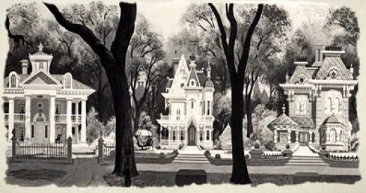
This drawing is in B&W on the DVD, but it appears in
Bob Thomas’ 1958 book, “The Art of Animation.”

Bg for The Princess and the Frog.
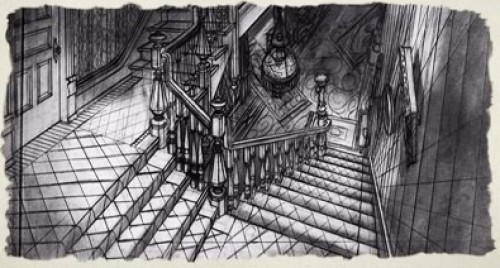
This looks not too different from a shot in Hitchcock’s Psycho.
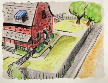
We seem to be in the Little Golden Book territory
with some of these images.
An earlier and different view.
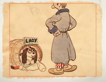
Or did I mean the New Yorker circa 1948?
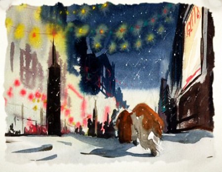
I love weather and would have applauded more of it in the film.
To be continued tomorrow.
Books &Illustration &Luzzati & Gianini 17 Apr 2009 07:51 am
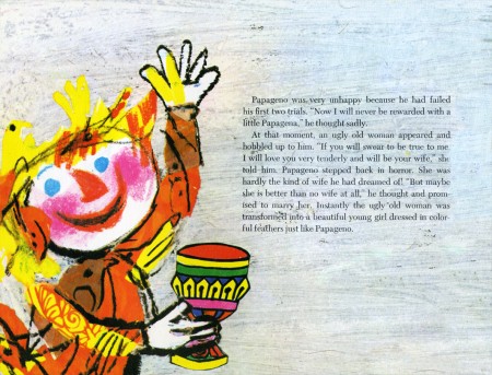
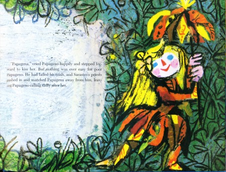
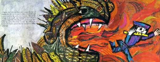
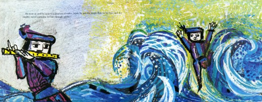
The Magic Flute – 2
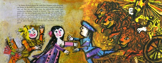
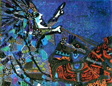
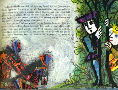
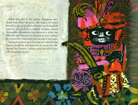
- This post concludes the images from The Magic Flute, a book by Emauele Luzzati. The illustrations are reworked sketches and drawings done for the animated feature he did with animator, Giulio Gianini in 1978.
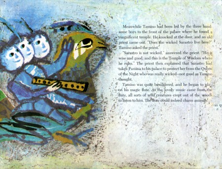 13
13(Click any image you’d like to enlarge.)
Books &Illustration &Luzzati & Gianini 16 Apr 2009 08:06 am
The Magic Flute – 1
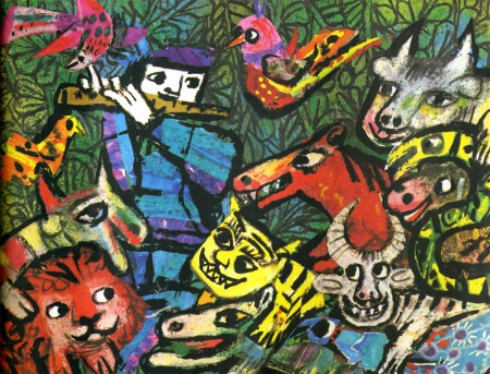
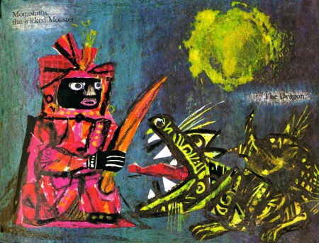
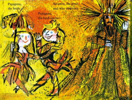
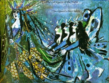
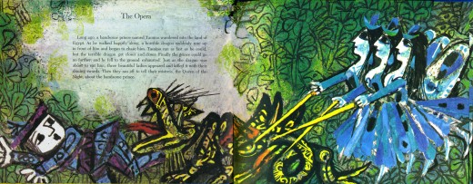
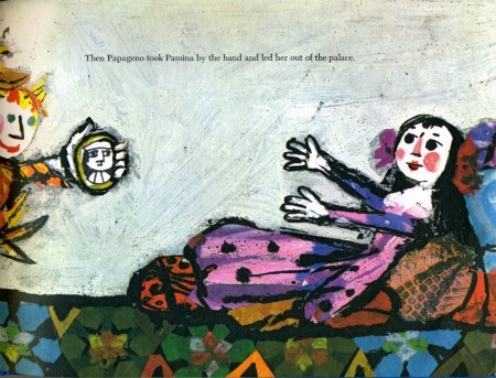
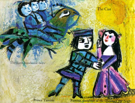
- Emanuele Luzzati teamed with animator Giulio Gianini many times to produce some of the most beautiful films of the 60s & 70s. Their feature version of The Magic Flute completed in 1978 was also adapted into a book by Luzzati. He’d done the sets and costumes for a version of the opera in 1963.
The film didn’t get the attention it deserved, and it remains hard to locate. A small snippet is incorporated into a video on YouTube. (The animation doesn’t come on until about a minute of the piece.)
I originally saw the film when it once aired on local WNET (PBS station). It wasn’t repeated and video wasn’t available back then. However, I do have the children’s book which Luzzati published from his designs for the animation.
Here are the first half of the illustrations in the book.
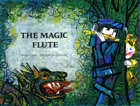
(Click any image to enlarge.)
 1
1
I left the type in the illustrations, though it’s a bit hard to read.
To be concluded tomorrow.
Books &Illustration 08 Apr 2009 07:48 am
Un Drago Troppo Solo
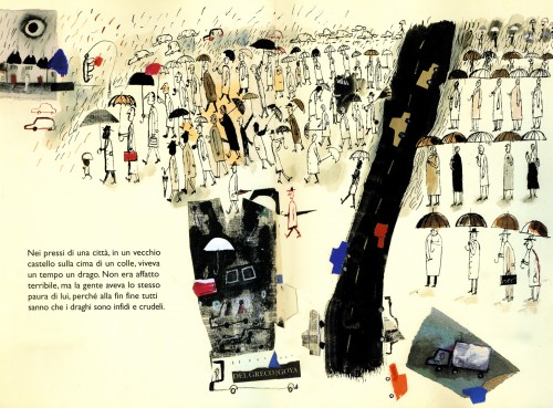
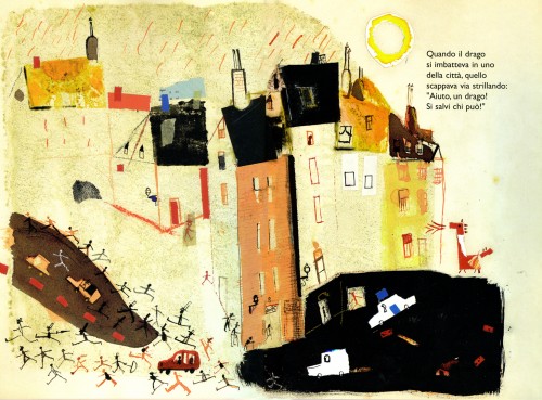
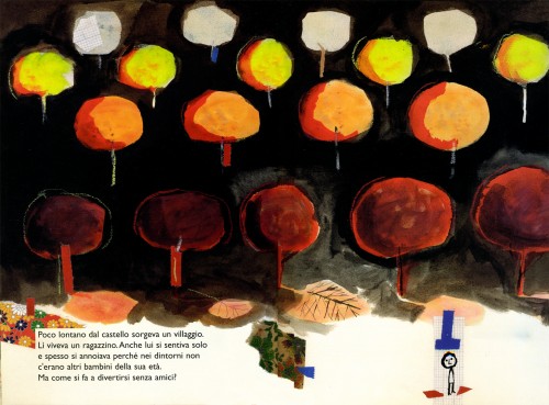
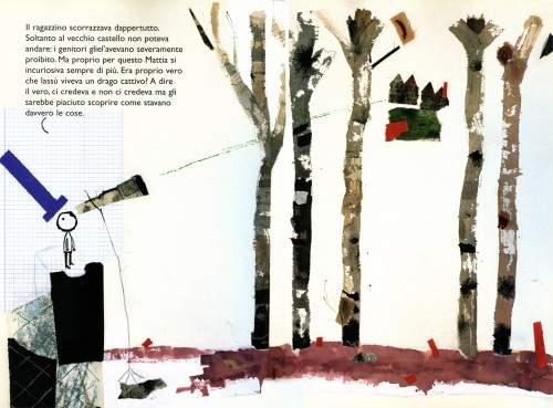
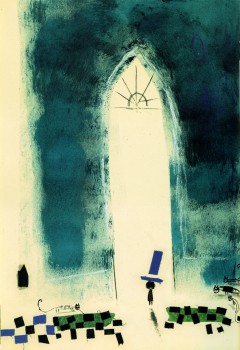
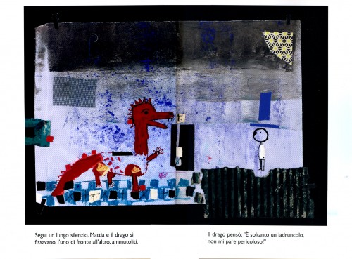
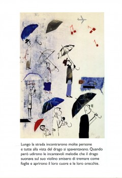
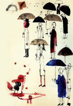
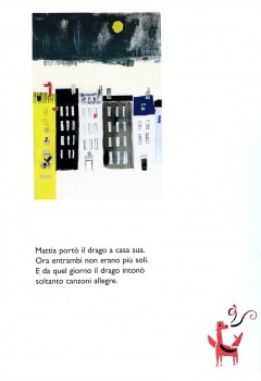
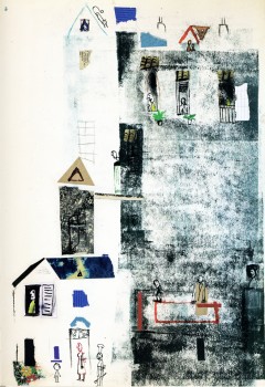
- John Canemaker knows that I love great children’s book art. He’ brought this book to my attention and loaned it to me to post some of its illustrations. Un Drago Troppo Solo (Only a Dragon Too) is a beautiful Italian children’s book written by Doris Diedrich and illustrated by Javier Zabala.
It’s the story of a bored boy who tames a dragon. The illustrations are right out the Abstract Expressionist handbook. Using collage, bits of tape, graph paper, splattered paint and strong expressive painting, the illustrations are distinctive and inspiring.
Here are a few of the book’s illustrations:
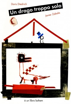
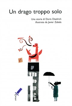
The front cover | the Title Page
