Category ArchiveIllustration
Books &Illustration 27 Oct 2009 07:49 am
Tooooot !
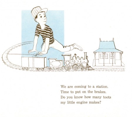
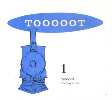
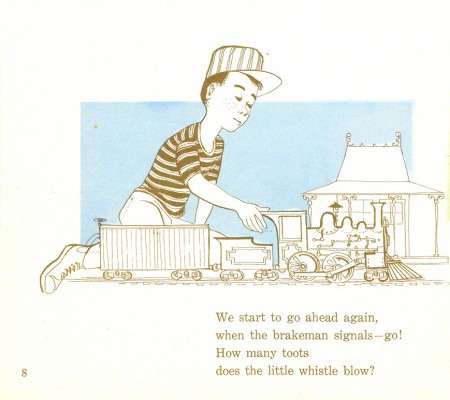
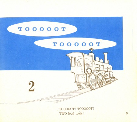
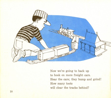
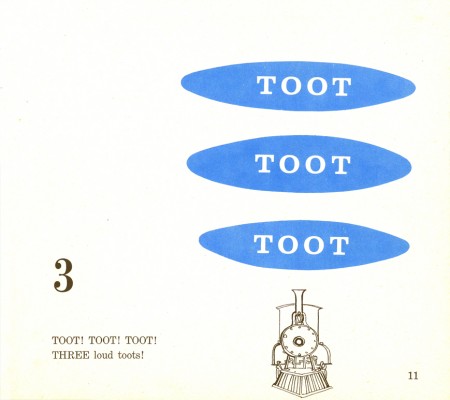
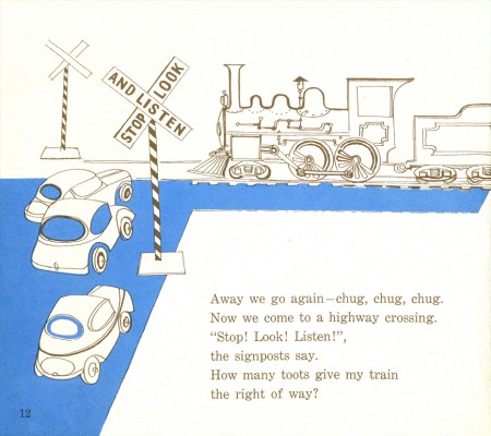
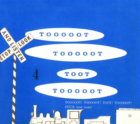
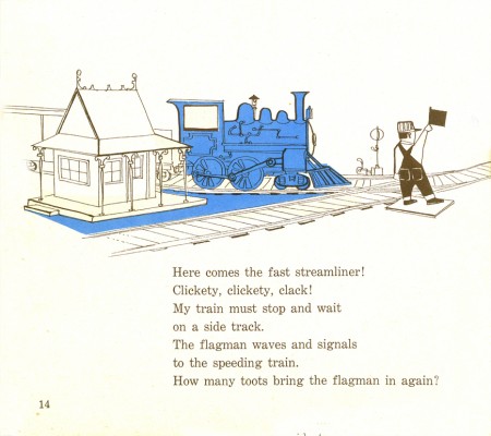
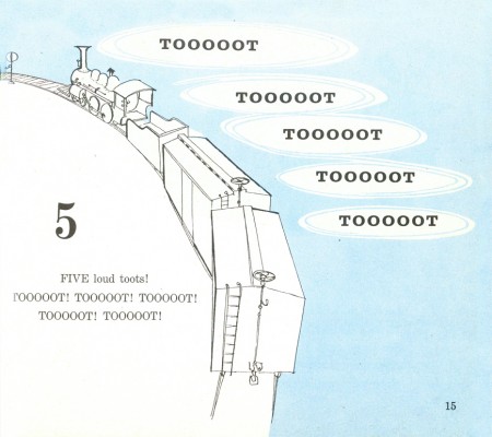
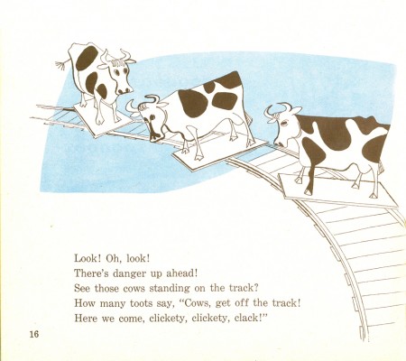
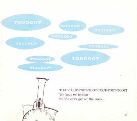
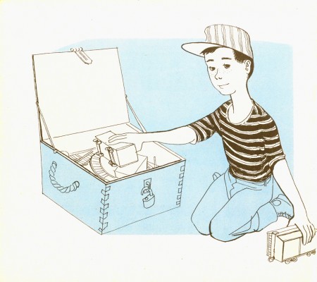
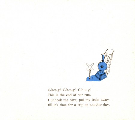
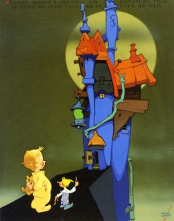
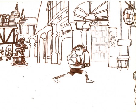
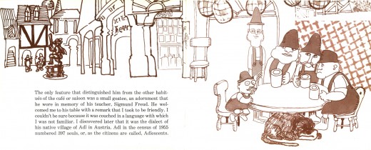
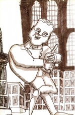
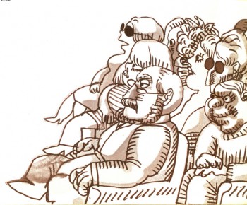
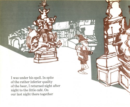
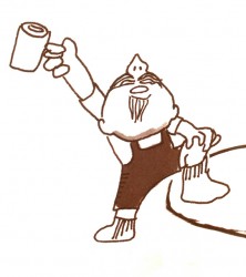
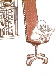
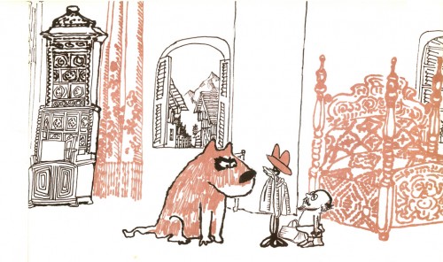
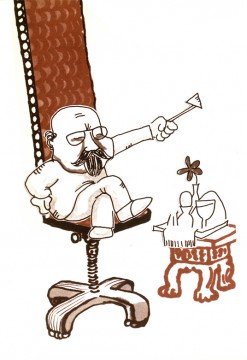
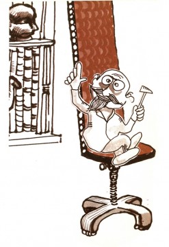
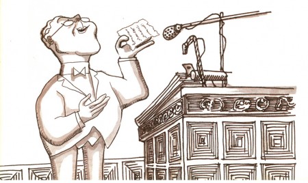
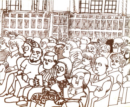
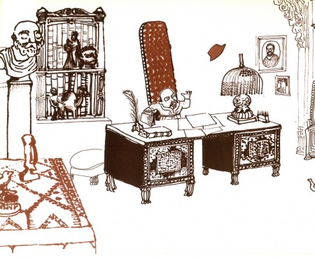
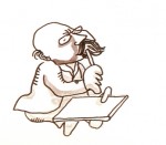
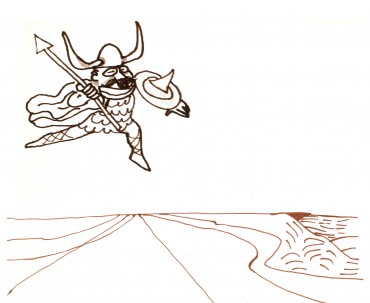
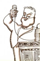
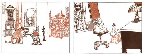
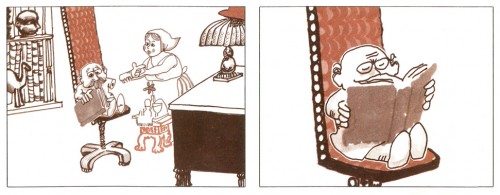
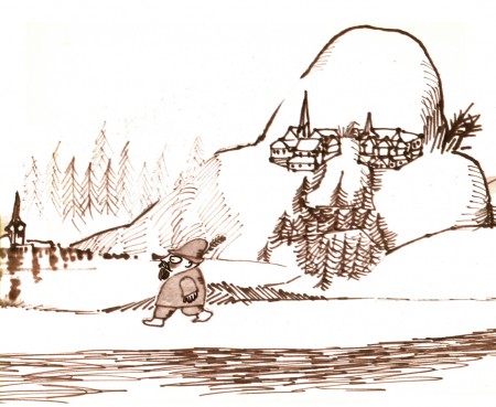
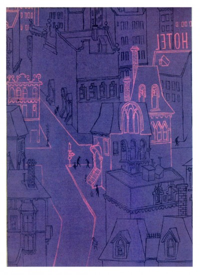
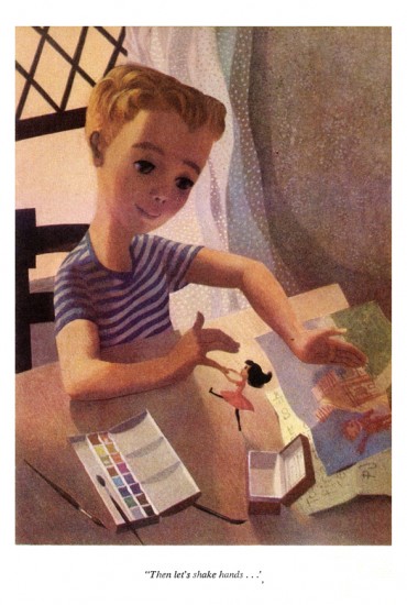
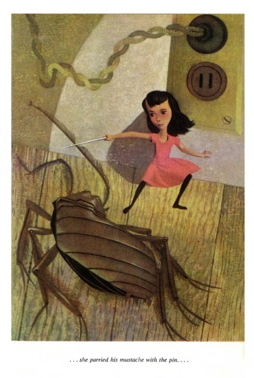
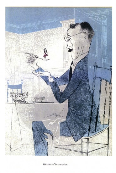
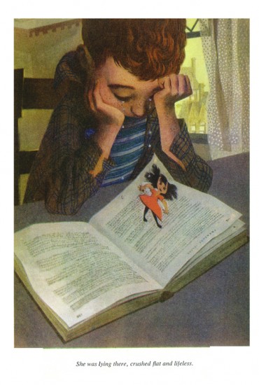
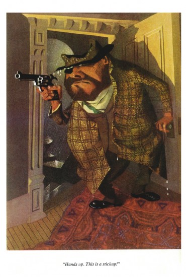
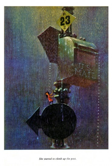
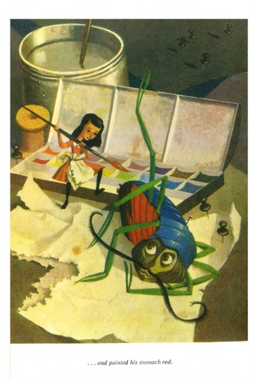
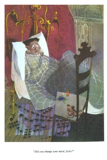
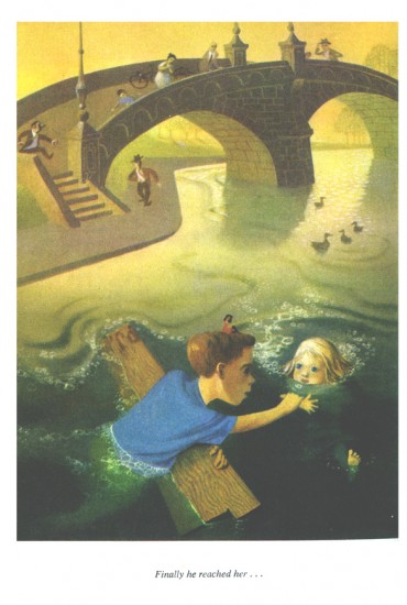
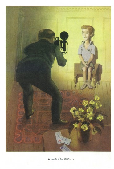
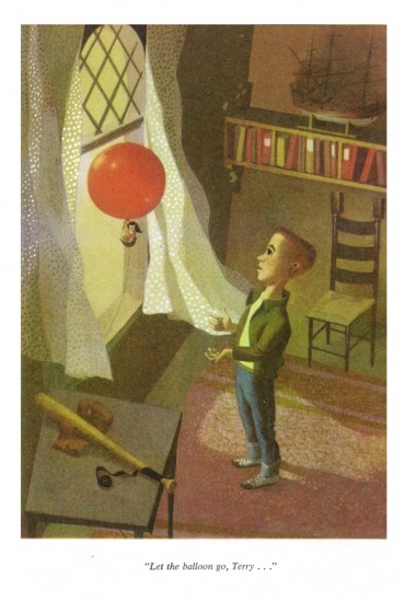
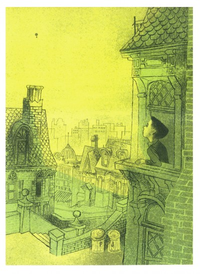
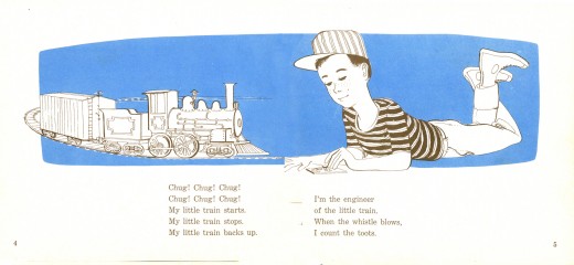
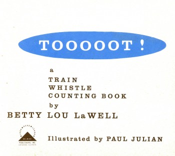 - Here are the illustrations for Tooooot! which is a book illustrated by Paul Julian in 1958 to a text by Betty lou LaWell.
It’s a two color book (black and blue) as were many books of the period. I’m always amazed at how much illustrators of the time got out of the limited color printing. So many big books (by the likes of Dr. Seuss, Bernard Waber, Maurice Sendak among others) were published at the time with more imagination than many of the current books with full color.
The artwork, unlike his other book Piccoli, is composed of graceful and delicate line drawings with the simple, flat color. The work looks very much a part of the brilliant illustrations and art coming out of the 50s, influenced by Ben Shahn and Gregorio Prestopino.
 2
2
Commentary &Illustration 20 Oct 2009 07:48 am
Not Paul Julian’s Wild Teen
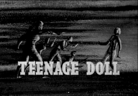
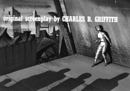
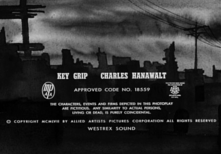
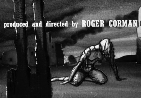
- Here are the scenic art that makes up the title sequence to Roger Corman’s film, Teenage Doll. I would be posting this as a Paul Julian title, as many ardent fans credit the titles. But they’re wrong, this is not the work of Julian. It’s a poor imitation.
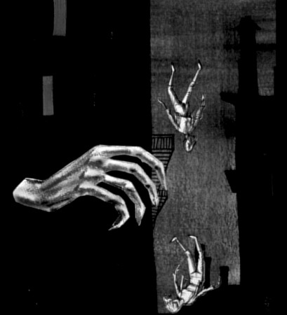
(Click any image to enlarge.)
A couple of peculiar cards set up the main title.
First a very slow pan down while hands appear and disappear.
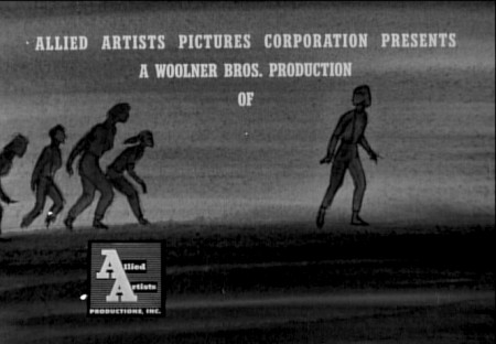
Allied Artists gets their title card – not full screen!

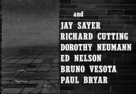
The camera pans across brick wall fragments
as a few names come and go.
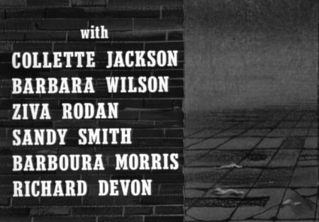
The camera makes a slight move as we go from the
title above to the title below.
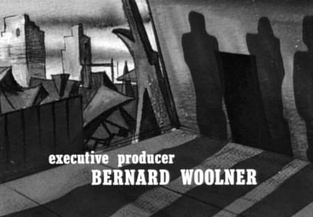
Shadows move in as type changes.

Cut to a pan as a bunch of titles fade on and off.
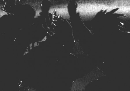
Some black cut out figures pan up and in.
They’re so shoddily produced that the lights are
shining off the edges of the card.
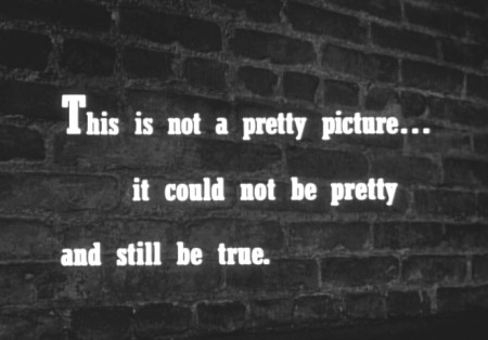
The text is printed over a photo of a brick wall.
I guess they had no left over artwork.
Obviously there are problems with this title sequence. The worst has to be seen as it moves on screen. A pathetic sense of timing has type popping on and off the screen too brieftly or held too long. The artwork looks more like some agency storyboard than actual production artwork.
This is most certainly not Paul Julian’s work. Stylistically it’s obvious, however, there’s so little professional about these titles that I know Julian couldn’t have been involved.
What I expect happened, was that he was offered the job for less than the couple of hundred dollars usually offered. He turned it down and some beginner took it to get his feet wet. Too bad.
The unfortunate part is that the designer didn’t even get a credit, so we don’t know who did it.
Bill Peckmann &Books &Illustration 01 Oct 2009 07:39 am
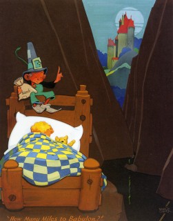
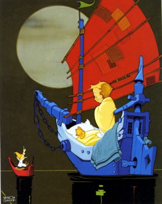
Vernon Grant’s Nursery
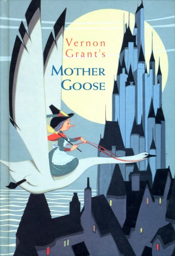 - As posted yesterday, the illustrations of Vernon Grant gave us the cereal icons Snap, Crackle and Pop. After they helped make Rice Krispies an enormous success, Kelloggs employed Grant to illustrate Mother Goose nursery rhymes which graced the back of the packages.
Again, these pictures brought more success for the cereal company, and they ultimately brought them to a publisher to bind all of Grant’s illustrations in one book.
The result was the book that appears to the right. Vernon Grant’s Mother Goose is still available some 70 years later. He also had a second book, Vernon Grant’s Santa Claus.
Grant was a graduate of Chouinard Art Institute. While most of his classmates headed to Disney’s studio to break into animation, Grant went East to New York where he sought advertising work and illustration jobs. He had some modest success with his gnome characters which finally led to the Kellogg’s job where his life’s work was set.
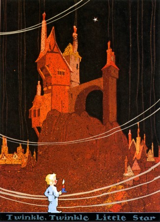
The Mother Goose book contains 25 illustrated pages; each page contains an illustration accompanied by the Mother Goose rhyme. These are the illustrations below:
 1
1(Click any image to enlarge.)
Twinkle Twinkle Little Star
 2
2
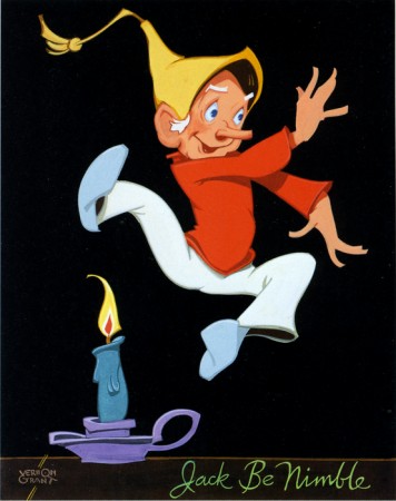
Jack be nimble, Jack be quick
 3
3 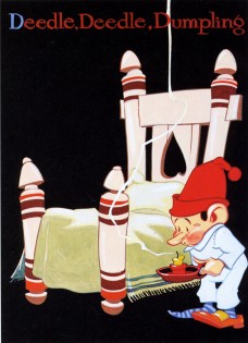 4
4
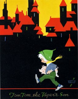
Tom Tom the Piper’s Son / Deedle Deedle Dumpling
 5
5 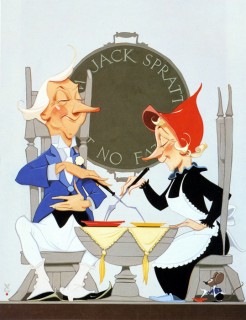 6
6
Little Jack Horner / Jack Sprat could eat no fat
 7
7 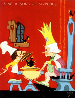 8
8
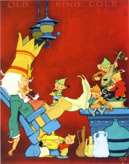
Old King Cole was a merry old soul . Sing a song of sixpence
 9
9
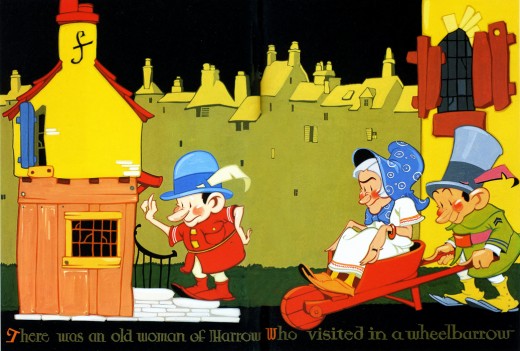
There was an old woman of Harrow
 11
11
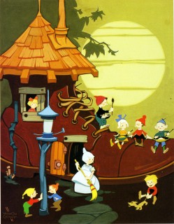
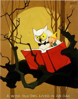
Old woman in the shoe / A wise old owl lived in an oak
 13
13
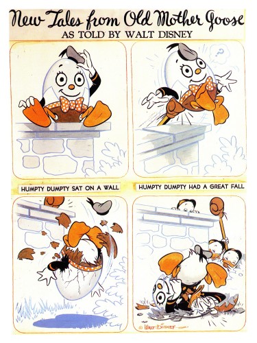
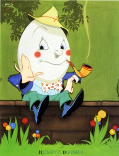
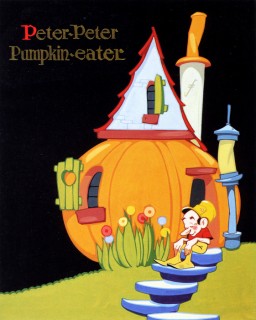
Humpty Dumpty/ Peter Peter Pumpkin eater
 15
15
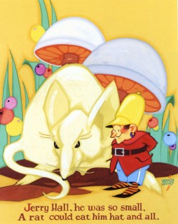
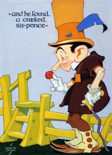
Jerry Hall / A crooked sixpence
 17
17
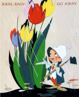
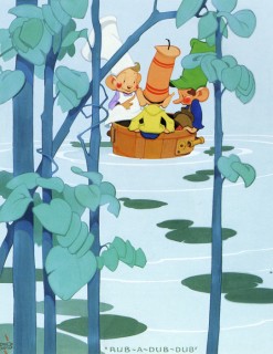
Rain Rain Go Away / Three men in a tub
(Note that the three men in the tub are Grant’s Snap Crackle and Pop.
 19
19
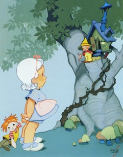
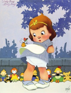
Nose Nose, Jolly red nose / Ladybug Ladybug
 21
21
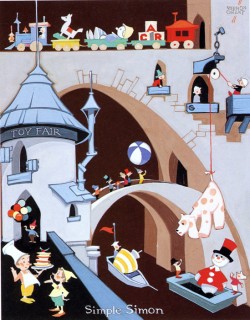
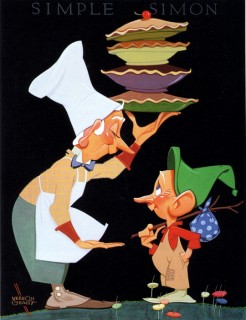
Simple Simon and the Pieman
Thaks, again, go to Bill Peckmann for the introduction to Vernon Grant as well as the loan of the book.
Books &Hubley &Illustration 24 Sep 2009 07:57 am
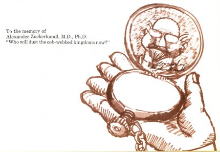
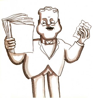
Zuckerkandl! book 1
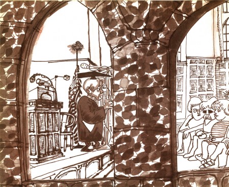
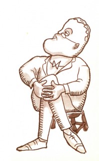
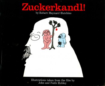 - Weeks back I posted a piece on the John & Faith Hubley film, Zuckerkandl!. There I posted some animation drawings, models and a several pages from the picture-book version of this film, which is a favorite of mine.
The story is an animated version of an annual lecture given by author, Robert Maynard Hutchins. The lecture is a parody of philosophical theories created by the author in the name of the fictitious Alexander Zuckerkandl, M.D., Ph.d.
A comment from Tom Shea at that post asked for a specific couple of setups (that I didn’t even approach), and I thought that I should, indeed, post all of the illustrations from the book (which were culled from the original art of the film.) Thus this post; here art those illustrations:
(Click any image to enlarge.) __
 3
3
The remainder of this book will be posted Saturday.
Bill Peckmann &Books &Illustration 17 Sep 2009 07:39 am
Good Housekeeping 3
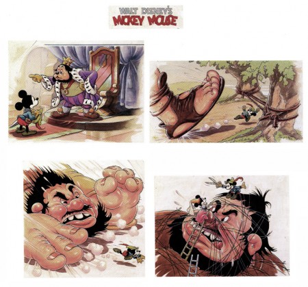
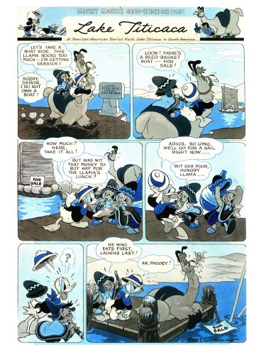
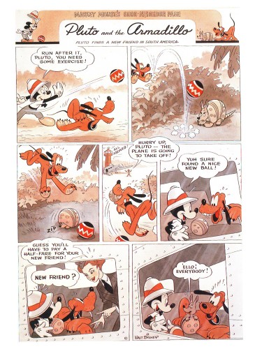
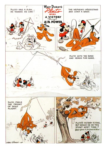
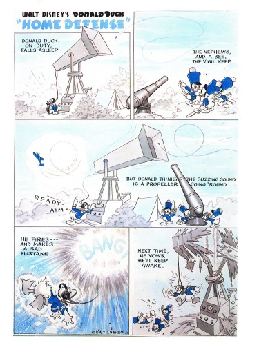
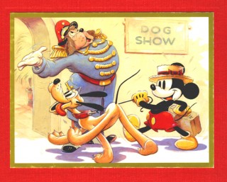 - Bill Peckmann loaned the book of collected Good Housekeeping illustrations that were publishrf bryeen 1938 through 1944. (The illustrations actually began in 1934 and were printed complete in an interesting recent book called Mickey and the Gang which was edited by David Gerstein. That book includes so much more than these illustrations – including the text that went with the illustrations. However, I like the printing, on non-glossy paper, of the 1987 book.)
I’ve done two other posts of these illustrations (part 1, part 2) and finish them up with this piece.
 1
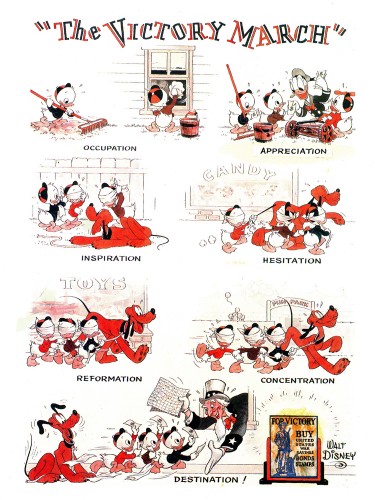
1The Victory March, August 1942
 2
2
Lake Titicaca, December 1942
 3
3
Pluto and the Armadillo, February 1943
 5
5
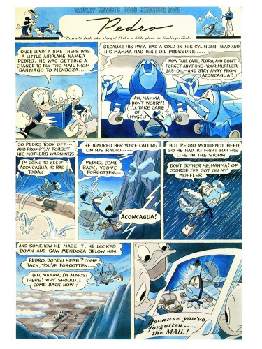
Pluto wins A Victory Through Air Power, April. 1943
 6
6
Donald Duck Home Defense, August 1943
 7
7
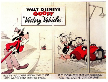
Victory Vehicles, September 1943
This edition, published in trhe Alexander Gallery catalogue
is really just the upper half of the strip.
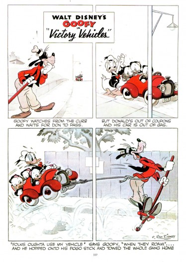
Here’s the whole strip as printed in
Mickey and the Gang.
More white no colored grays.
 8
8
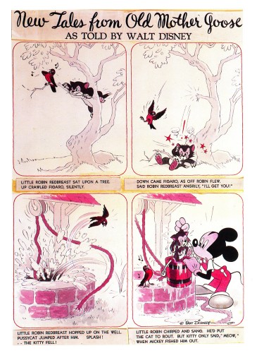
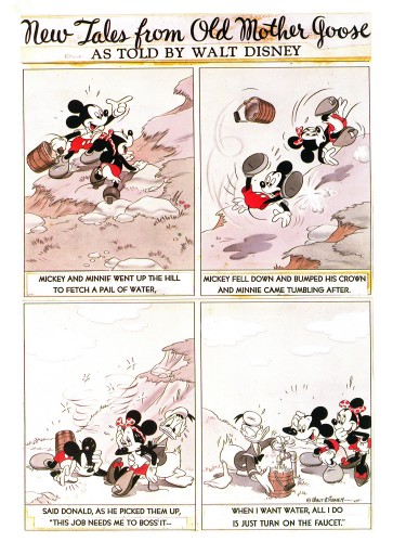
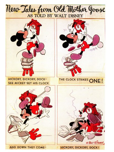
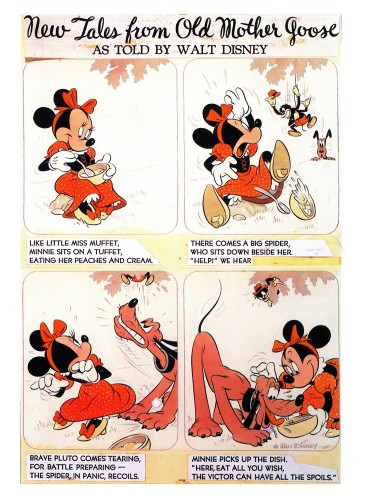
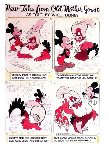
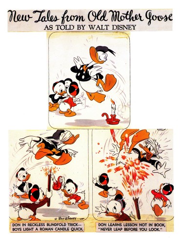
From 1943 on, the illustrations became “New Tales from Old Mother Goose.”
This was a revision from “Donald Duck’s Mother Goose” that had
appeared in Mickey Mouse Magazine, published in the 1930′s.
Hank Porter and his writers dealt with a more limited subject in a
more comic-strip sense and used the two color process during the war.
Mickey an Minnie Went Up the Hill, October 1943
 9
9
Hickory Dickory Dock, February 1944
 10
10
Little Miss Muffet, May 1944
 11
11
Hickety, Pickety, June 1944
 12
12
Don be Nimble, Don be Quick, July 1944
Animation Artifacts &Books &Illustration 15 Sep 2009 07:29 am
Piccoli
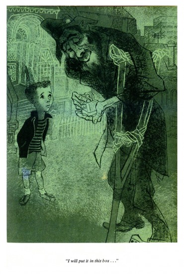
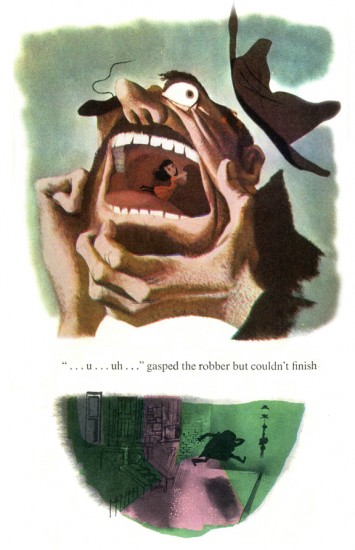
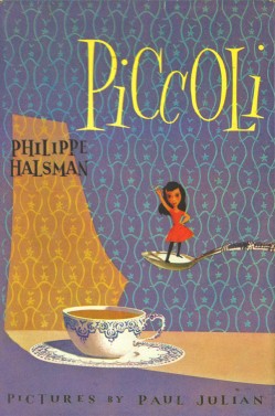 - The brilliant artist/designer/background artist, Paul Julian, illustrated a stunner of a children’s book in 1953. Piccoli is the story of Piccoli Sogni (little dreams) a tiny girl who lives in a matchbox. A stranger gives her as a gift to a sad young boy. She helps to inspire him creatively.
The story is by Phillippe Halsman which he had written for his daughters. He was a celebrated photographer who worked with Salvador Dali on the book Dali’s Moustache. In 1958 he was chosen as one of the 10 greatest photographers in an Internation poll. His 1959 book, Philippe Halsman’s Jump Book, collected more than 200 recognized photographs.
Paul Julian, of course, is well known by animation enthusiasts as one of the principal background artists for many of the most famous Warner Bros cartoons. He also gained some fame for his art direction of the UPA masterpiece, The Tell-Tale Heart.
His work has always seemed just slightly this side of the surreal, to me. His color choices were masterful and the many backgrounds he did reflect his own style. See this excellent post by Hans Bacher on his important blog, Animation Treasures.
John Canemaker loaned me a number of color copies of the book, and I tried to get an accurate read on the colors from the copies, but I suspect they’re still a bit off. Here are Julian’s illustrations for Piccoli:
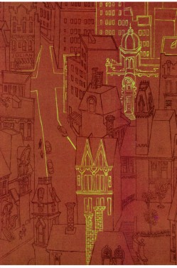
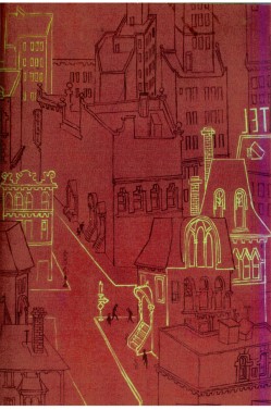
The inner cover of the book.
 2
2
At times the art looks influenced by Gregorio Prestopino.
 8
8
This is actually a composite of two different illustrations
on two separate pages in the book.
Art Art &Commentary &Illustration 01 Sep 2009 07:32 am
Hirschfeld
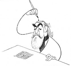 - Last week there were the noisy attacks pro and con of the 09 Ottawa Animation Festival poster. It climaxed with Amid Amidi’s turn on Pete Emslie’s artwork attacking his caricatures as: “. . .tired Hirschfeld impersonations”. This isn’t quite a bad put down considering the almost 70 year brilliance of Al Hischfeld’s caricatures. Hirschfeld was an artist of the highest calibre, and to say one’s work looked like his is to say it looks like a Matisse or a Picasso.
I was never a raving fan of Hischfeld’s work, though I couldn’t help but respect his lifelong consistency, clean art and beautiful ink work. However, when I went to an exhibit which toured NY through the Public Library a few years ago. This exhibit initiated at the National Portrait Gallery/Smithsonian and moved across the country.
It was after seeing this work, in person, that I began to see Hirschfeld himself. Somehow we ended up at the same venues for four or five occasions at this late point in his life. I was always too shy to go up to him to introduce myself.
Surprisingly, Hirschfeld’s caricatures were the stunning gems throughout the show. (There were also those beautiful Joe Morgan celebrity caricatures as well as setups and drawings from Disney’s Mother Goose Goes Hollywood (see this post.)
By the age of 18, Al Hirschfeld had been an art director for Louis Selznick, Sam Goldwyn and Universal Pictures. His connection with movies and movie stars was set for the rest of his life. He befriended Miguel Covarrubias in 1923 when they shared a studio and many interests.
In 1924 he left to study painting in Paris and traveled extensively for the next few years. In the interim he began to pubslish celebrity caricatures. Dick Maney, intrigued by the actor Sasha Guitry, noticed and liked a caricature on a playbill that Hirschfeld had done. Maney brought it to the attention of the New York Herald Tribune. Thus was began Hirschfeld’s career in the newspapers – including 20 years at the Tribune where he even acted as Moscow Theater correspondent for the paper.
After he had done the Marx Brothers’ collage caricature he was on a bee-line to great success.
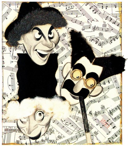
The Night at the Opera 1935, a collage.
(Click any image to enlarge.)
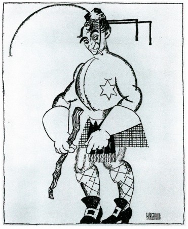
A 1928 caricature of Scottish comedian, Harald Lauder, printed in the NYTimes.
This was one of the earliest published and a good start to a career.
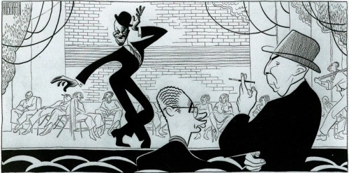
A 1939 drawing of dancer Bill Bojangles in the show, The Hot Mikado.
Designer, Nat Karson and Producer, Hassard Short stand to the right.
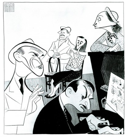
This 1946 caricature of the Cradle Will Rock shows composer,
Marc Blitzstein at the piano surrounded by the cast.
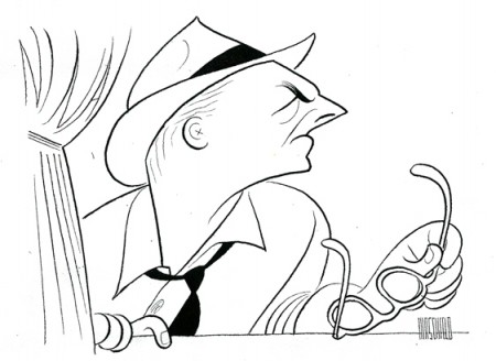
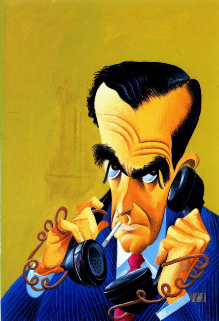
This 1950 caricature of Walter Winchell shows the
style fully formed including the imbedded NINA.
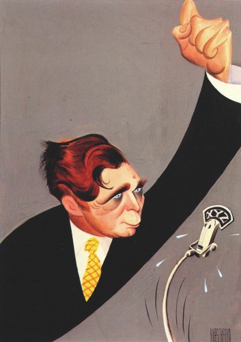
Presidential candidate Wendell Willkie was painted for
American Mercury magazine in May of 1944.
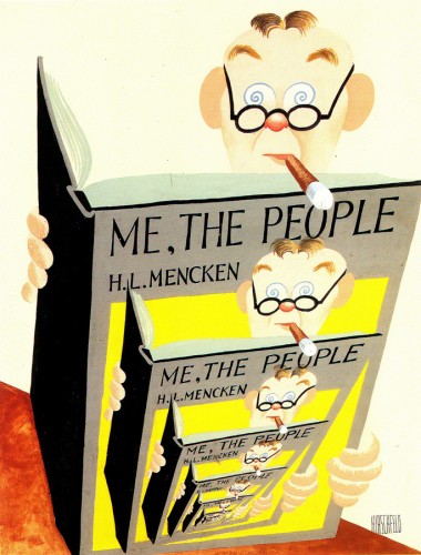
A 1949 painting of H.L.Mencken as the first of a series of covers for
American Mercury magazine, Lawrence Spivak, publisher, commissioned it.
Good caricature is an artform of its own.
Great caricature can be as brilliant as art can get.
Articles on Animation &Bill Peckmann &Books &Disney &Illustration 27 Aug 2009 07:26 am
Good Housekeeping 2
- Before getting into today’s post, I want to make sure you’ve all seen the notation on Tom Sito‘s great blog today. (An amazing and unique blog if there was one.)
- 1968- Former master animator Bill Tytla’s request to return to Disney was turned down. The artist who animated Grumpy the Dwarf, Dumbo and the Devil on Bald Mountain even offered to do a free “trial animation test” to show he still had it. Disney exec W.H. Anderson wrote him:” We really have only enough animation for our present staff.”
Tytla died later that year.
 - This is the second part of my posting of the illustrations from Good Houskeeping Magazine.
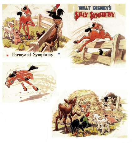
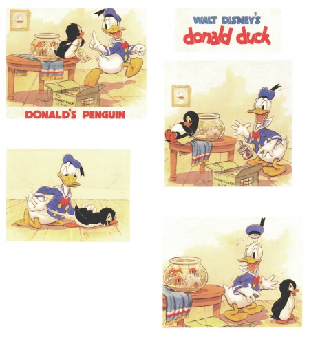
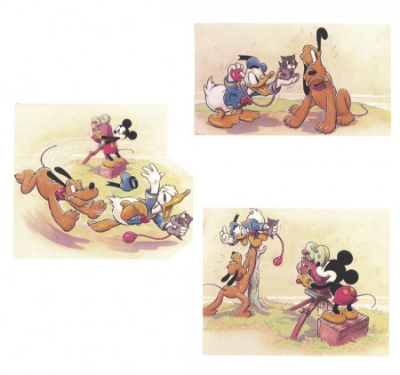
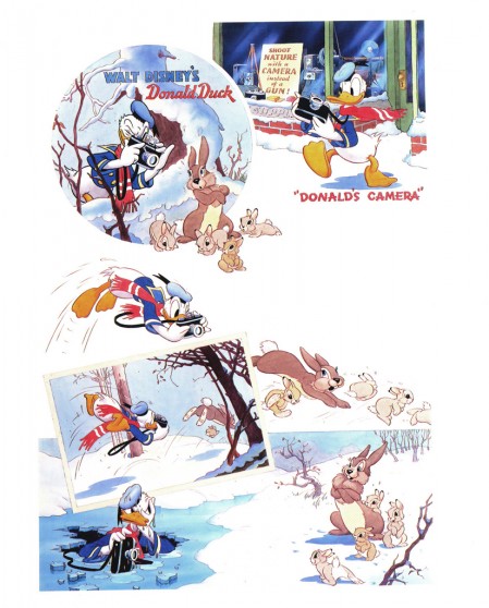
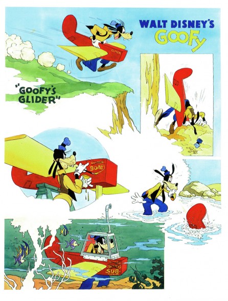
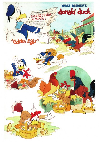
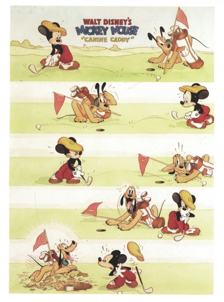
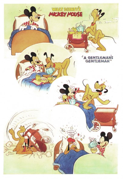
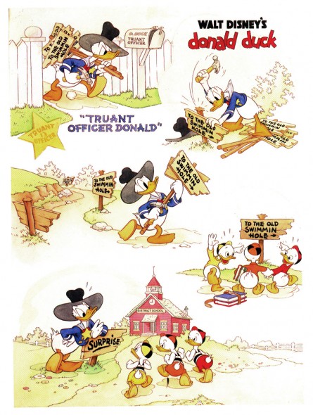
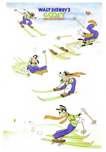
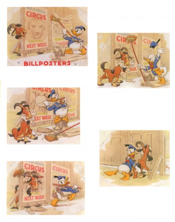
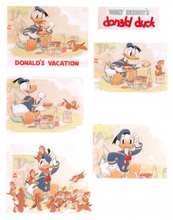
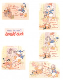
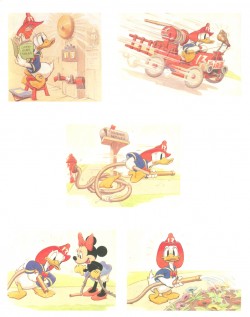
From 1934 continuing into the late 1940′s, they printed four-color full page previews of newly-released Disney shorts. These illustrations were, at first, painted by Tom Wood, and later by Hank Porter.
The Alexander Gallery collected these illustrations in 1987 for an exhibition, and they published a book of them. Bill Peckmann has kindly loaned me his copy of the book.
These illustrations were published recently in the book, Walt Disney’s Mickey and the Gang. It’s a good book which publishes more art than the Alexander Gallery collector’s item. However, the printing in this book feels more glossy and contrasty. The delicacy of the watercolors is sacrificed. That’s why I’m intent on posting them in the better form. However, this book also includes a lot of other info on the animated films and it includes the text originally published in Good Housekeeping.
Here is the second group of pages:
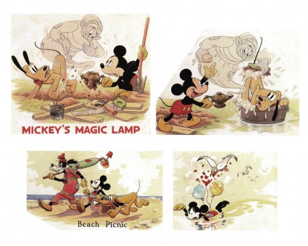
Mickey’s Magic Lamp 1940 | Beach Picnic 1938
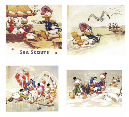
The Sea Scouts 1939 | The Hockey Champ 1939
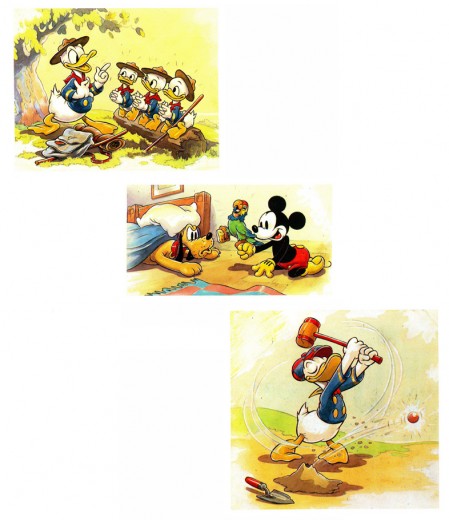
The Good Scouts 1938 | Mickey’s Parrot 1938 | Donald’s Golf Game 1938
Interesting to note the play with Mickey’s ears. These are the ears
with three dimensions used in only a couple of shorts.
Another play on Mickey’s ears – very different.
.
Articles on Animation &Bill Peckmann &Comic Art &Disney &Illustration 20 Aug 2009 07:20 am
Good Housekeeping 1
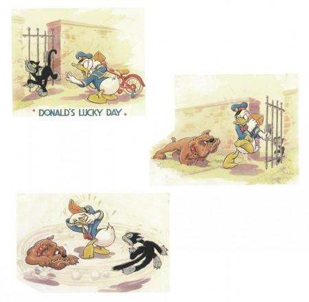
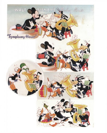
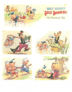
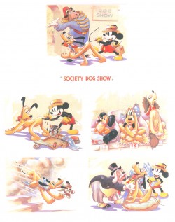
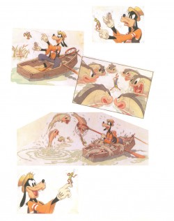
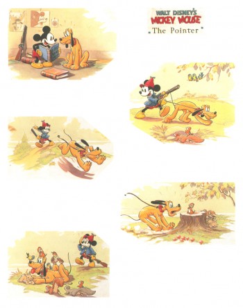
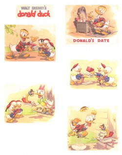
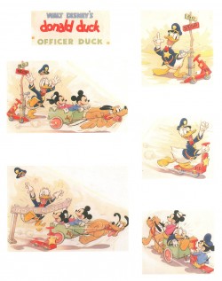
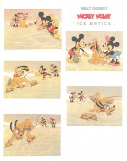
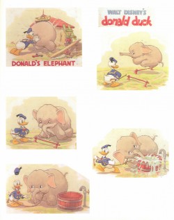
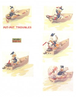
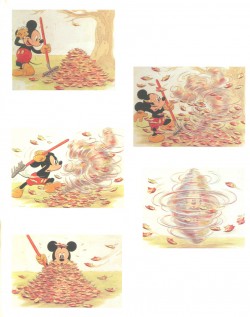
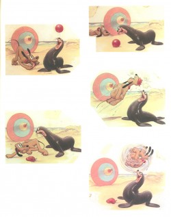
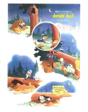
 - From 1934 continuing into the late 1940′s, Good Houskeeping Magazine printed four-color full page previews of newly-released Disney shorts. These illustrations were, at first, painted by Tom Wood, and later by Hank Porter.
Here’s information from the book on Wood and Porter:
- Tom Wood came to Disney Studios in 1932 from his position as a Los Angeles daily newspaper artist. A quiet, hardworking individualist, he was well liked and highly regarded by those who knew him both personally and professionally. He worked at the Studio until his untimely death in 1940 and, as publicity artist, assumed primary responsibility for the monthly Good Housekeeping page as well as the creation of publicity stills for the theater. Since Good Housekeeping was the only magazine for which Disney produced these monthly watercolor sequences, we recognize their scarcity.
Wood typically worked on each of these pages for a full week. Beginning with sketchy, pencilled drawings which he would then ink himself, he also created the final watercolors which represented a 7-minutc Disney film short. Assisted by an “idea man” and a third person who wrote the story or dialogue, the publicity artist had the final approval on the finished version. After Wood’s death Hank Porter would continue working with the magazine well into the late 1940′s. Thereafter, production of these shorts was discontinued as costs became prohibitive and the Studio refused to compromise on quality.
The Alexander Gallery collected these illustrations in 1987 for an exhibition, and they published a book of them. Bill Peckmann has kindly loaned me his copy of the book, so I’ll post the illustrations over a number of posts.
Here are the first group of pages:
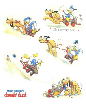 1
1
Donald Duck in “The Delivery Boy” 1938
(L) Donald Duck – Antarctic Troopers 1938
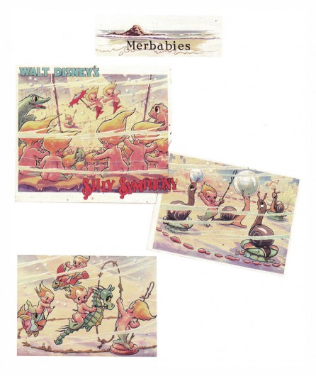
(R) Silly Symphony – The Practical Pig 1938
(L) Mickey Mouse – Society Dog Show 19389
(R) Goofy and Wilbur – Goofy and Wilbur 1939
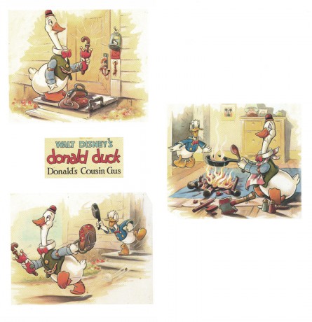
Mickey Mouse – The Pointer 1939
(L) Donald Duck – Donald’s Date 1939
(R) Donald Duck – Officer Duck 1940
(L) Mickey Mouse – Ice Antics 1940
(R) Donald Duck – Donald’s Elephant 1940
Donald Duck – Billposters 1940
(L) Donald Duck – Donald’s Vacation 1940
(R) Donald Duck – Window Cleaners 1940
(L) Donald Duck – Fire Chief 1940
(R) Donald Duck – Put-Put Troubles 1940
(L) Mickey Mouse – The Little Whirlwind 1941
(R) Mickey Mouse – Big-Hearted Pluto 1941
Donald Duck – Timber 1941
Articles on Animation &Bill Peckmann &Disney &Illustration &Mary Blair 19 Aug 2009 07:33 am
El Groupo & Mary Blair’s Peter Pan
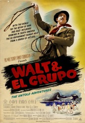 - Yesterday I saw a preview screening of Walt and El Groupo. This is a documentary exploration of the Disney trip to South America to bring back material for Saludos Amigos and Three Caballeros. If you have any interest in Walt Disney or the history of his studio or Mary Blair, you’ll have to see this film. It features interviews with a number of the children of those who went to South America with Disney. Interviews with those who hosted Disney talk about the visit.
The film is shot in a beautifully lush color that is almost reminiscent of IB Technicolor. One would expect the home movies to be grainy and unattractive, but instead they’re gorgeous.
The film is worth the visit. It’ll open in NY & LA on Sept. 11th. I’ll write more about it as the event gets closer.
There’s also upcoming a screening for MOCCA, the Museum of Comic and Cartoon Art featuring a Q&A with writer/director Ted Thomas and producer Kuniko Okubo, moderated by John Canemaker. This will take place on Thursday, August 27th, 7:30 PM at the Brooklyn Academy of Music, BAM Cinema 4, (30 Lafayette Avenue, Brooklyn, NY).
Admission is free for Members of MoCCA. To rsvp, call (212) 254-3511.
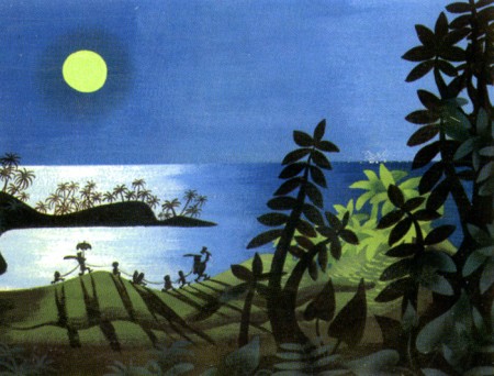
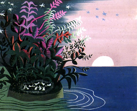
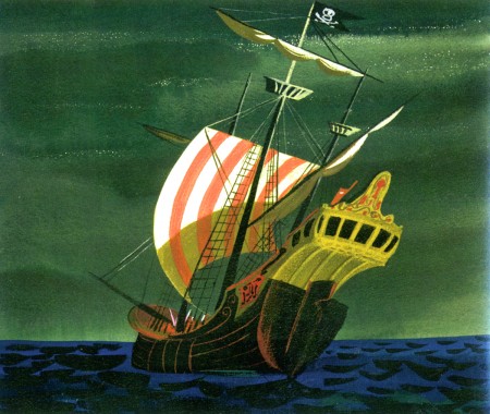
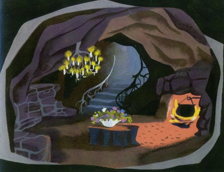
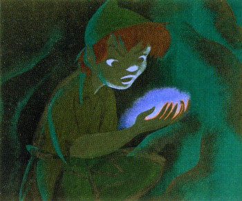 - In tune with the above comments and having posted, this past week, the wonderful 1940 model sheets from Disney’s Peter Pan (thanks to Bill Peckmann and his fine collection), I thought about the Mary Blair art for this film. Neither those model sheets nor Mary Blair’s art made it to the film.
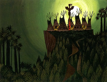
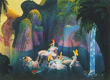
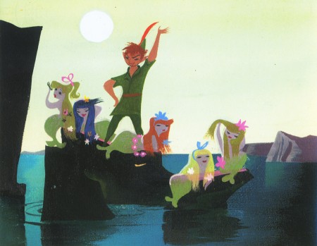
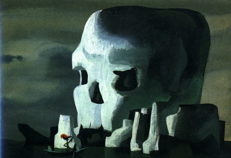
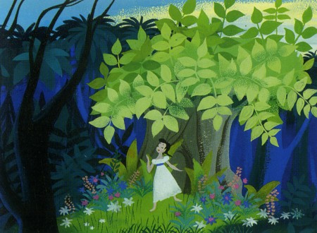
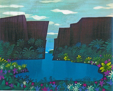
I thought, as a companion piece to those early model sheets, I’d post the Peter Pan illustrations in John Canemaker‘s fine book: The Art and Flair of Mary Blair. A number of these have been used to illustrate the new book, Walt Disney’s Peter Pan. They’re all attractive and modern in style. I think the film took the colors without the style and came up with a picture postcard look.
Here are Mary Blair‘s paintings:
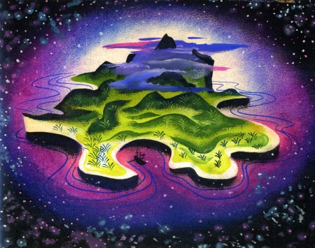
(Click any image to enlarge.)
