Category ArchiveIllustration
Commentary &Illustration &Independent Animation &repeated posts &SpornFilms 29 Dec 2011 06:49 am
Blank Maps – repeat
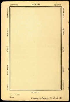 - One of my favorites of my films is The Hunting of the Snark. I adapted this from Lewis Carroll’s poem. It was an enigma to the audience when it was first published – Carroll refused to explain its meaning, and it’s an enigma now.
I remember screening it with an audience of fifth graders – about 200 of them along with a number of their parents. The program, in Chicago, was part of a retrospective of some of the children’s films I’d done at the time. I made the decision to show the Snark, even though I wasn’t sure the audience would sit still for it.
The response was amazing. The adults, during the Q&A period, had a lot of questions. The kids had no problems. When, finally, one parent asked me what it was supposed to mean, I decided to turn it around. I asked if one of the kids could answer the question. A lot of kids raised their hands, and the first one gave me the appropriate answer.
A bunch of guys go hunting for a monster________This is how the map was illustrated by
that’ll make them disappear, and one of_________the original illustrator, Henry Holiday.
them catches it. For all intent and purposes
that IS what it’s about.
I love showing this film as part of my programs. It’s easy for me to discuss, and I’m proud of it. I don’t think most animators like it, but that doesn’t bother me.
During the story there’s one key part that all illustrators love to illustrate.
But we’ve got our brave Captain to thank:
(So the crew would protest) “that he’s bought us the best–
A perfect and absolute blank!”
_
A blank page! What could be easier to illustrate? A couple of illustrators have cheated such as this map found on line:

Figure One: Bellman’s Blank Ocean Chart
Barry Smith at the University of Buffalo dept of Philosophy uses this map – a blank slate – to treat it as a map of heaven. Carroll was an Evangelical minister, but I’m confident this is not what he had in mind when he conjured up the lines in the poem.
____________________________________________
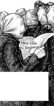 Mehendra Singh has a website which is slowly illustrating the entire poem. His illustration for this passage appears to the right. This is part of his comment accompanying the illustration.
- Yet another shameless Magritte pastiche, and not the last one to grace these pages, I’ll wager. Shameless — the 10th Muse of Protosurrealism!
Even more shameless — this insistence that the crew of the HMS Snark use the French language for navigational purposes when it is clearly evident to anyone who has ever been lost at sea that English is the natural language of confusion. This is easily verified. Stand on a streetcorner in any francophone city and ask a stranger: where am I? If necessary, pull at shirtsleeves and wave your arms, speak very slowly while pronouncing every phoneme at the utmost decibel level.
Singh has a curious and interesting site in its own right.
Let me encourage you to check it out for all the original illustration on it.
____________________________________________
_
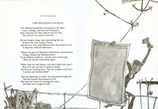
This is how Quentin Blake chose to illustrate it in his version. Since he obviously was nervous about just showing the blank map, he illustrated the Bellman holding it.
______________
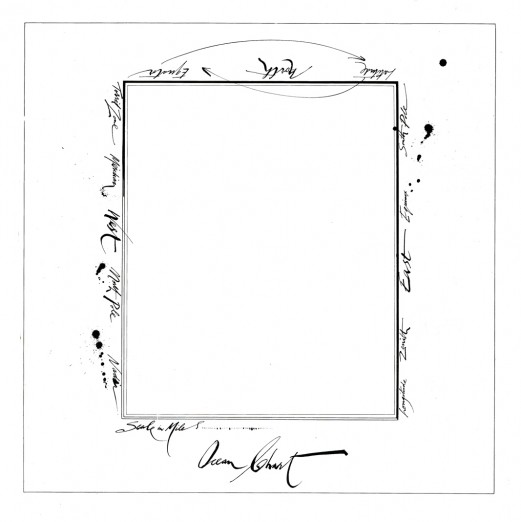
This is Ralph Steadman’s version. He went for the gold and just showed the map.
Yet, it’s still, obviously, a Steadman.
______________
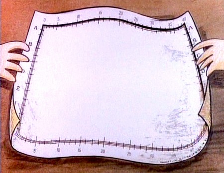
This is how I chose to depict it in my film. Showing hands and table behind it,
gave me the opportunity of trucking in to white to transition to the next scene –
an image of the sea, itself.
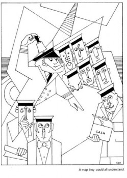
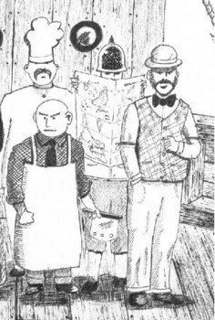
Doug H. in Australia responded to the material, above, with an e-mail full of other wonderful illustrations of the same part of the poem. I’d like to post some of these illustrations with many thanks to Doug. With respect to all of the illustrators, about half of whom
are unfamiliar names to me. They merit a good look.
___ Just scroll down. Click any image to enlarge a bit.)
 1
1 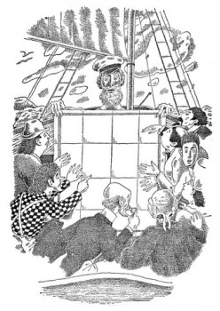 2
2
______1. Frank Hinder (1989)_______________________2. Harold Jones (1975)
______
__ 3.__
3.__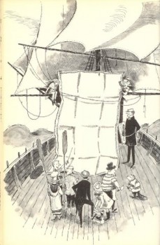 4.
4.
______3. Michael Capozzola (2005)_________________4. Kelly Oechsli (1966)
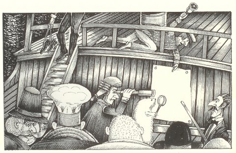 5.
5.5. John Lord (2006)
______
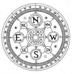
______
6._________________________________7.
______
______6. Max Ernst ((1950) _______________________7. Jonathan Dixon (1992)
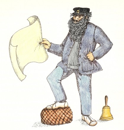 8.
8.8. Helen Oxenbury (1970)
Bill Peckmann &Books &Illustration 27 Dec 2011 06:35 am
Ralph Barton
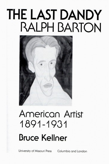
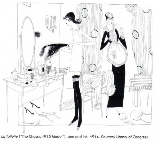
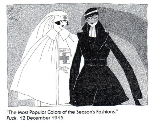
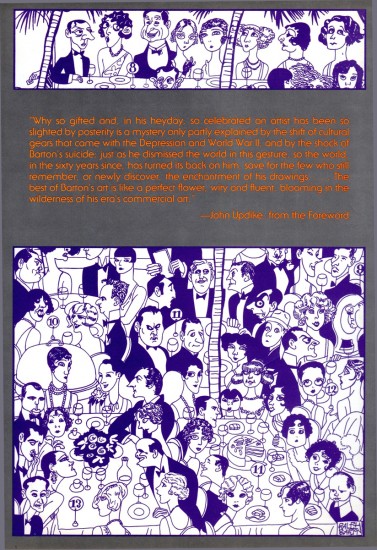
- Last week, Bill Peckmann sent me scans from a book about artist, Ralph Barton by Bruce Kellner. I’d like to share some of that book with you. I don’t know much about Mr. Barton or his work, but some of his images are arresting. Here’s what Bill wrote:
- After looking at all of those perusable pages of Disney and EC comic books, I thought that maybe you’d like a change of pace and look at something else, namely the work of artist/caricaturist Ralph Barton.
This intro should have been written by Rowland Wilson, because Rowland was a huge fan of Barton’s and was kind enough to give me this book.
The title of the book is “The Last Dandy, Ralph Barton, American Artist, 1891-1931” by Bruce Keller, published 1991. It’s a very thorough biography of Ralph Barton, with terrific illustrations that show what a great artist he was in the 1920′s. During that time he appeared in The New Yorker, Vanity Fair, Harper’s Bazaar and Photoplay magazines.
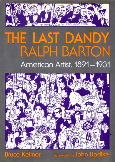
the book’s front cover
Books &Illustration 13 Dec 2011 07:05 am
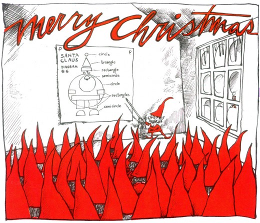
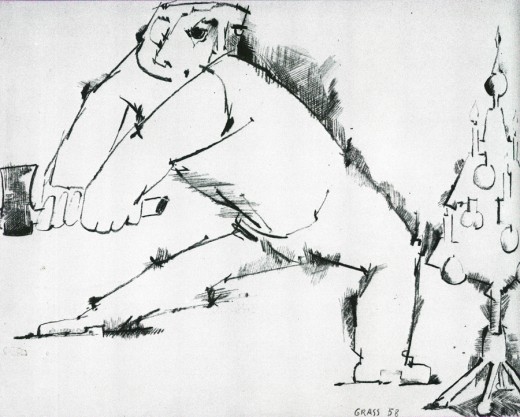
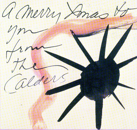
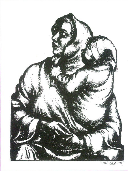
Christmas Cards
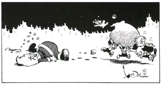
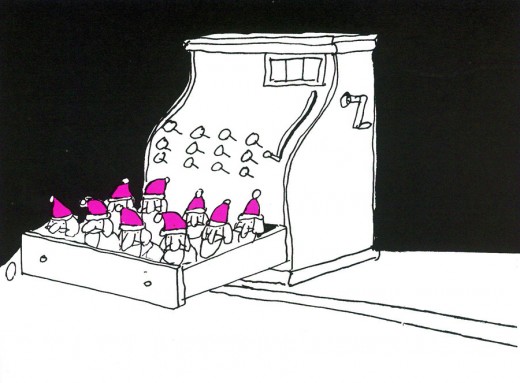
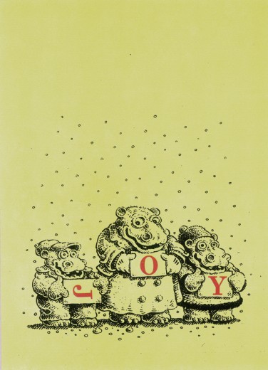
- This past Saturday, hundreds of 20 and 30-somethings filled the streets of Manhattan dressed as Santa. Apparently they were somehow raising money for “Toys for Tots” by bar-hopping in the Santa uniform (many of them very makeshift). I don’t know how it worked, though it felt a bit like the Christmas version of St. Patrick’s Day (without the parade.) A lot of white guys inebriated.
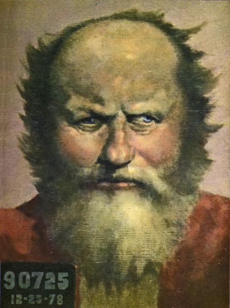
Regardless. The proliferation of Santa’s, however, reminded me of a Christmas card I did back in 1978. The card was picked up by Steven Heller and used in a book he edited called Artist’s Christmas Cards. (I always thought it should have been called Illustrator’s Christmas Cards, though I have to admit that I’d call two or three in the book “Artists”.) There was no pay for it, but there was the enjoyment of having my card connected to some great company.
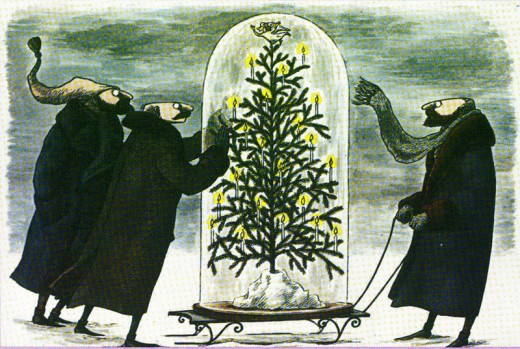
I thought it’d be interesting to post a few of the cards in the book. So here we have them:
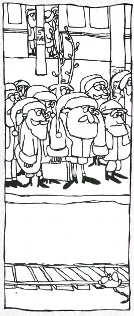
Here’s MY card that reminded me
of Saturday’s funfest.
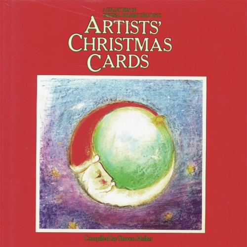
The original book’s cover with a card by
Paul Degen gracing the red face of the book.
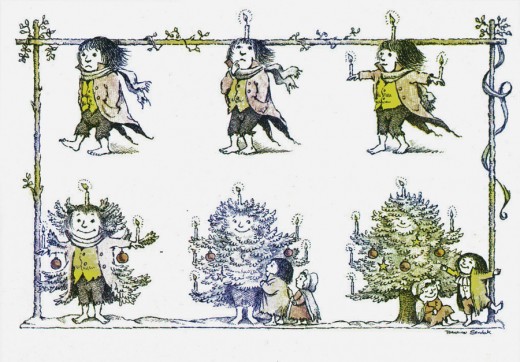
This MAURICE SENDAK card would later become the
animated opening to Simple Gifts, a show for which
I acted as Asst Director for R.O. Blechman in 1978.
BLECHMAN’s card, which he turned into an animated
I.D. spot for CBS – which has become very visible on the net.
Art Art &Books &Comic Art &Illustration &John Canemaker &T.Hachtman 03 Dec 2011 07:45 am
Paul & Sandra and John and Tom and Bill
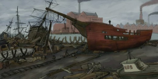
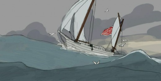
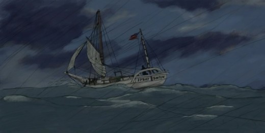
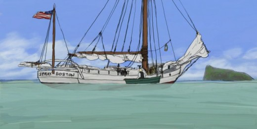
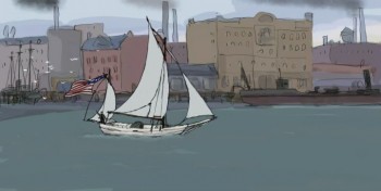 - This past Thursday night, Paul and Sandra Fierlinger presented an hour’s worth of their latest project at Parson’s School. The film, Slocum at Sea with Himself, tells the story of the first person to have sailed SOLO around the world.
The film was a work in progress in every sense of the phrase. It started in full color, included scenes over final Bgs that weren’t colored and had other scenes that were pure pencil test. The sound was predominantly music composed and performed by the brilliant Shay Lynch. (You may know his music from the many films he did for Jeff Scher.) Yet, it all stood with a great dignity as a strong piece.
The film was full of potential to be even greater than their last feature, My Dog Tulip. Imagery was stunning and beautifully designed and animated (as usual from this team). It was a real treat seeing the work in progress, and it was easy to fill in the gaps. The movie takes place almost completely on water, and it’s amazing the effects they’ve achieved in animating such a difficult project. I was wholly taken by it.
As monumental as the screening was – truly inspirational, the talk Paul gave in advance was thought provoking. They are making the film with their own money and planning to release it online in short segments. All told the feed would take about six months to receive the entire feature. To buy these feeds, which will be built into a website that would constantly change for each segment, will cost about $30 in total. They’re hoping for a built-in audience of boaters and leisure craft enthusiasts around the world. Slocum is a well-known story to these folk, and the likelihood that they’d have interest in the subject is great.
Theirs is a provocative idea for distributing the film, and the business model Paul presented seemed original and probably a successful one. It will take some time before the feature is finished, but I’ll be watching closely to see how successful they’ll be. I’d bet on them, too.
There is no doubt of the love they’re pouring into this project. Take a look at these stills:
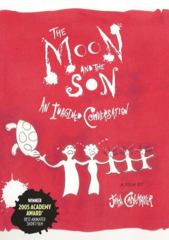
- The Moon and the Son: An Imagined Conversation, John Canemaker’s animated short, is now available in a special edition DVD. This powerful and moving film, which has won both the Academy Award and the Emmy Award, explores the difficult emotional terrain of father/son relationships as seen through Canemaker’s own turbulent relationship with his father.
The Moon and the Son combines many different elements from John’s remembered versions of the facts, to the actual evidence of the life on screen: the trial transcripts, audio recordings, home movies, and photos. The original and stylized animation tells the true story of an Italian immigrant’s troubled life and the consequences of his actions on his family. The film features the voices of noted actors Eli Wallach and John Turturro in the roles of father and son.
The DVD includes the complete 28-minute film and the following bonus materials:
- A new documentary detailing the film’s creative evolution, influences and reception, with animation director/designer John Canemaker and producer Peggy Stern.
- The first rough cut (working title: “Confessions of my Fatherâ€) with original soundtrack
- A Photo gallery of production sketches, preliminary artwork and storyboards
I enjoyed thumbing through all the extras on this DVD. When the film was being made, John shared its progress with me at several stages. I’m intrigued with how much material was there in the development. As a long time friend with John, I felt I’d known some of the story over the years. But the film, and now the new material, give me larger insight to the full story. Spending time reading the storyboard (one of the extras) again – having seen the film several times – allowed me to see some of the background which shaped John’s quest to tell this story.
The DVD is available now on Amazon.
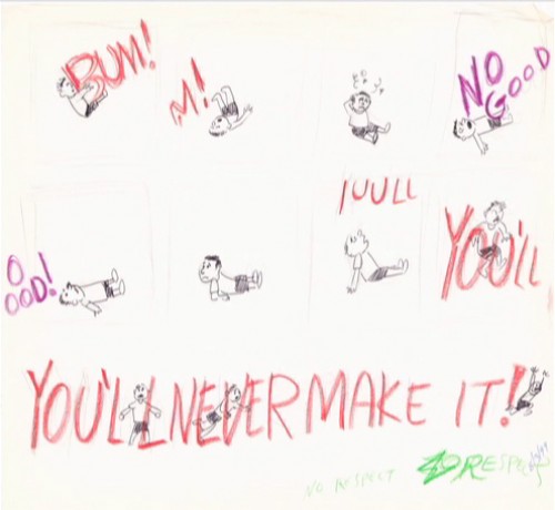
A somewhat Feiffer-like page within the storyboard.

A very “Canemaker” sketch that reminds me a bit of a Picasso sketch.
There’s lots more on the DVD.
____________________________________
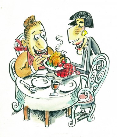
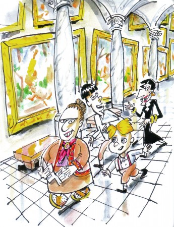
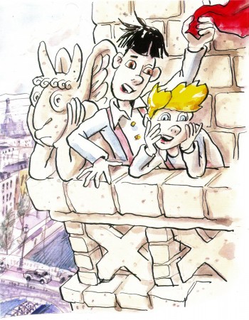
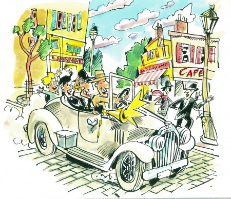
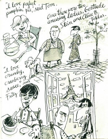
- Tom Hachtman has seen an unusual turn with his Gertrude and Alice characters. You’ll remember that he’d developed a comic strip, Gertrude’s Follies, built around Gertrude Stein and Alice B. Toklas. A friend and admirer of the strip, Hans Gallas, has written a children’s book around Tom’s characters, and Tom illustrated the book. Now that book’s been published, and can be purchased from their site. Gertrude and Alice and Fritz and Tom is a charming account of what happens when Gertrude and Alice have to take care of a couple of young boys during their stay in Paris.
Here are some of the book’s exuberant illustrations.
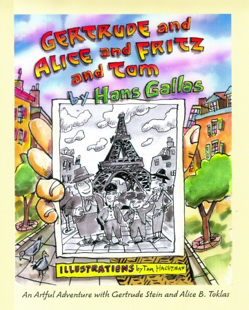
The book’s cover
And here are some of Tom’s original sketches for the book.
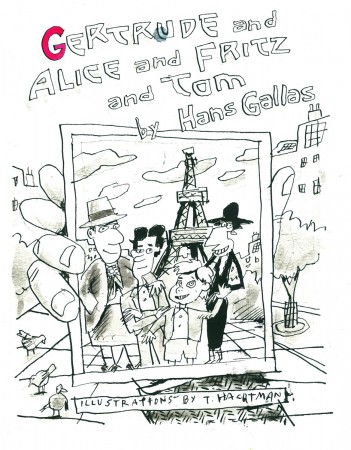
Original sketch for the cover.
Très different from the final.
A preliminary sketch for a lot of pages
_____________________________________________________________________
_____________________________________________________________________
- Bill Benzon, on his blog New Savannah, has finally completed his treatise on Fantasia and has published it in a PDF form. You can download this here for a great read. 96 pages of intelligent discourse on the feature. This document contains his original, and shorter commentary on the Pastoral sequence. For his longer take on that sequence download this document.
Bill Peckmann &Comic Art &Illustration 02 Dec 2011 07:30 am
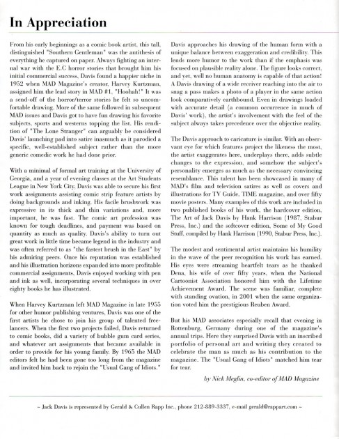
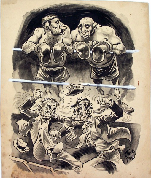
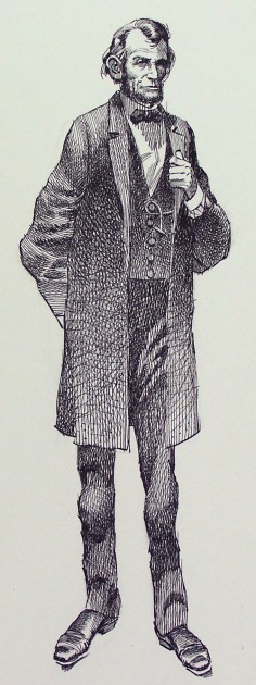
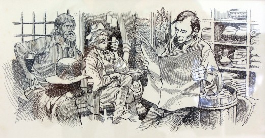
More early Jack Davis
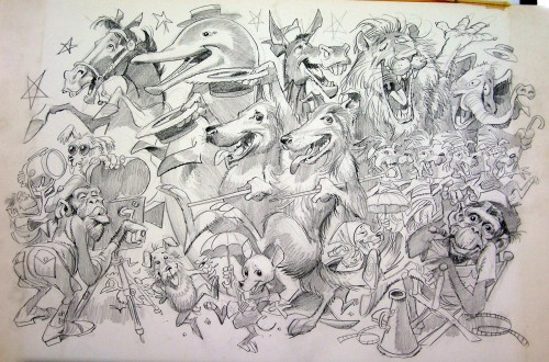
- There were a number of other early Jack Davis pictures that I didn’t post last week (here). These were all sent courtesy of Bill Peckmann. Note that a couple seem to have reflection coming off them; presumably they were in frames.
As Bill wrote in the first post:
undated, ranging from the beginning of when he first put pen and brush
to paper, up to recent endeavors. So, we’ll just have to sit back and enjoy
what’s going to served up in front of us without rhyme or reason.
I don’t think anyone will have a problem with that. 99% of the art was
new to me, as I hope it will be for the rest of his fans.
 1
1Animals
Art Art &Commentary &Illustration 26 Nov 2011 07:42 am
Patel’s Pictures at an Exhibition and Gene Deitch’s Chopsticks
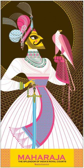
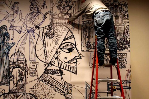
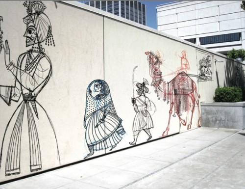
- After I’d posted a review of Sanjay Patel‘s most recent publication, The Big Poster Book of Hindu Deities, he sent me some information about an exhibit opening in San Francisco at the Museum of Asian Art. Included in the email were a number of photos of the exhibition setting up. I’ve chosen some to post which follow below:
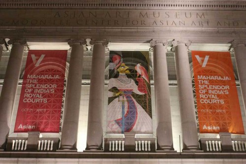 1
1The banners outside the Museum
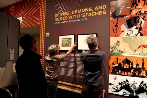 2
2
Setting up the exhibit’s entrance sign
More pictures can be found on Sanjay’s site.
I’ve also found this short video piece about his work and thought I’d share it with you. It’s quite informative.
Mr. Patel also had an exhibition of some of his work which is reviewed here in the Asian Art Museum in San Francisco and here in the New York Times.
I received this note from Gene Deitch in the past week:
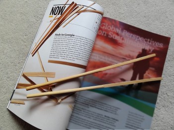 . . . it seems nearly impossible to buy anything that’s not made in China or some other competitive distant land that’s taken over our jobs. I thought we had no other choice but to give gift certificates to local services, to benefit our own workers.
- But lo! The brand new December, 2011 issue of National Geographic magazine, published in Washington DC, and totally reliable for the truth, has come out with the news that chopsticks, necessary for all Asiatic food, are actually Made in USA, in Georgia, and exported to China and other far east, forkless regions!
Consider a gift parcel of this traditional American product!
- (A subscription of National Geographic itself would also be great, but not without warning of the a trap I myself have fallen into. It’s impossible to give the National Geo for a single year! Once begun you are hooked for a lifetime of renewals! The magazine is so precious, so informative, and so beautifully printed, that it’s not too discardable. We ourselves have had to move four times to progressively larger quarters, just to accom-
modate the ever growing shelf space needed since I started my subscription in 1946!)
Bill Peckmann &Comic Art &Illustration 25 Nov 2011 08:51 am
Early Jack Davis
- Bill Peckmann sent the following collection of art by the incomparable Jack Davis. Many of these pieces are from the very early career of Mr. Davis. At this point, I’ll let Bill take on the writing in his own words:
- I came across the program guide for Jack’s exhibition of work at the Society of Illustrators in 2002. It’ll be 2 pages: The cover, a B&W illustration from Field and Stream magazine titled “The Hunters” and the second page which is a heartfelt intro by fellow MAD staffer Nick Meglin.
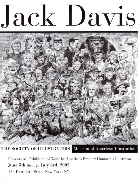
Program cover
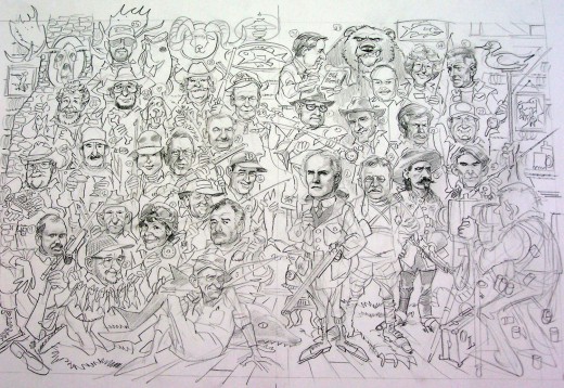
Here is a pencil drawing of the Society of Illustrators cover illustration,
“The Hunters,” printed on the cover of the program, above.
The rest of the Davis dinner will be images from the discs that Jack sent me. They are untitled and undated, ranging from the beginning of when he first put pen and brush to paper, up to recent endeavors. So, we’ll just have to sit back and enjoy what’s going to served up in front of us without rhyme or reason. I don’t think anyone will have a problem with that. 99% of the art was new to me, as I hope it will be for the rest of his fans.
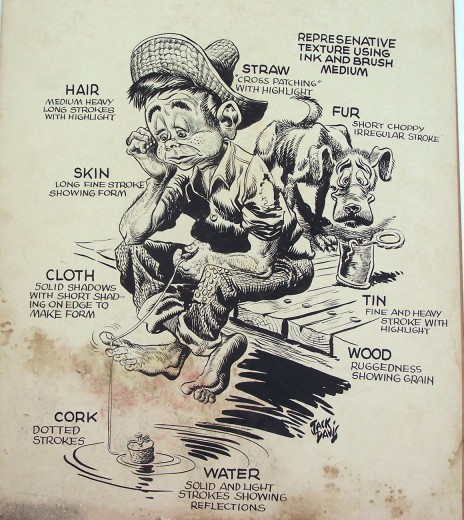
A very, very early piece, either an art school exercise
or a portfolio sample.
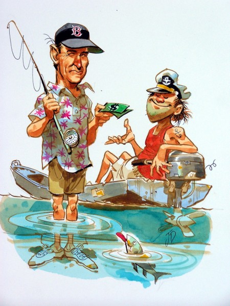
Another fishing theme but quite a few years later.
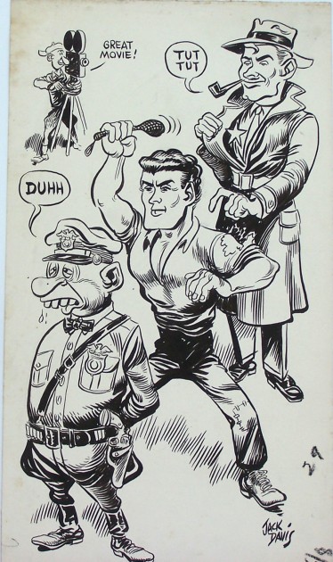
Another early fascinating piece.
Here’s another drawing done by very young, budding cartoonist
Jack Davis. I recently found out that Jack was and has always been
a big fan of illustrator, Albert Dorne. Interesting, because I believe
you can see Dorne’s influence in these early pieces by Jack.
Bill Peckmann &Illustration 18 Nov 2011 06:41 am
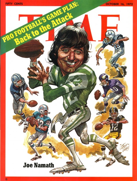
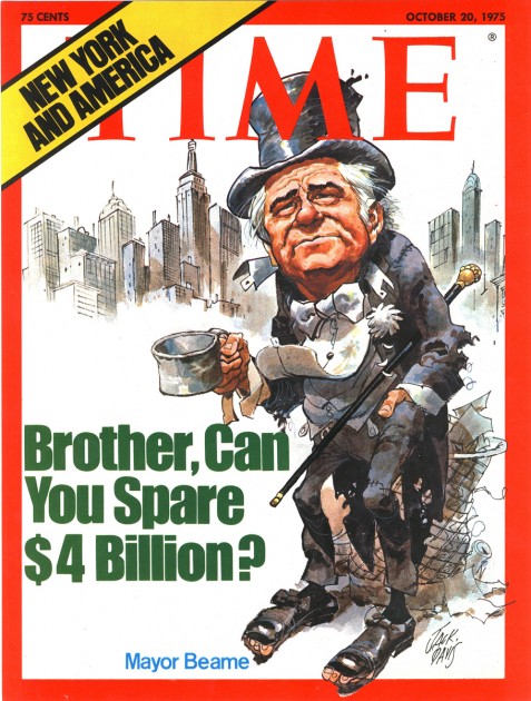
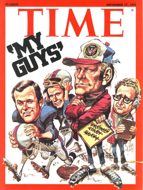
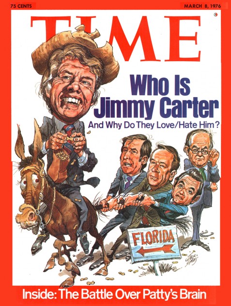
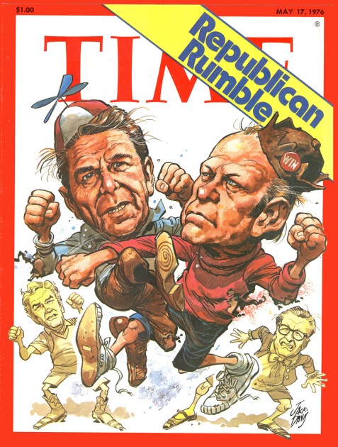
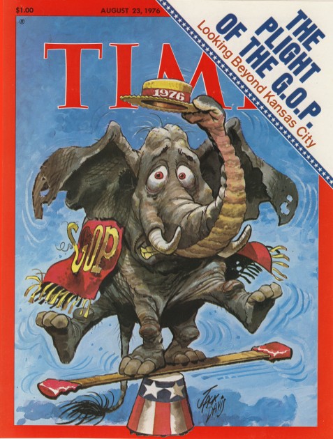
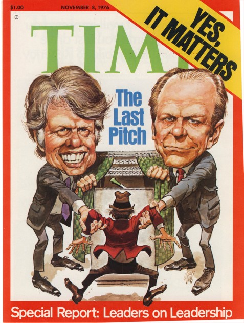
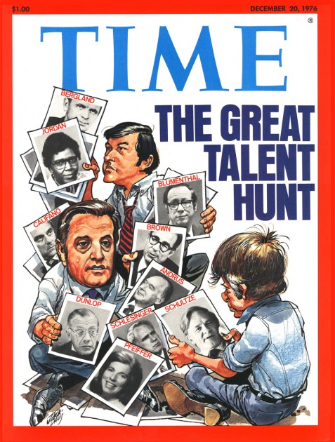
Jack Davis Time Covers
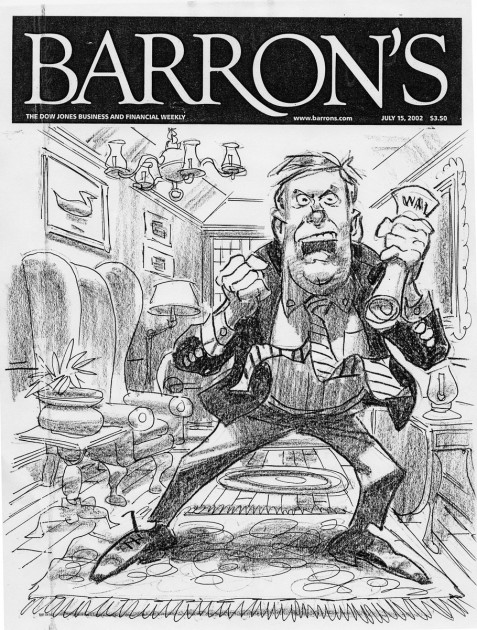
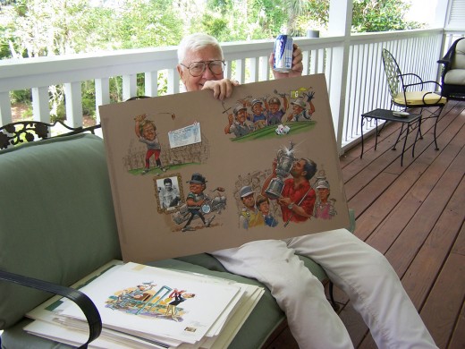
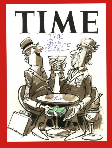
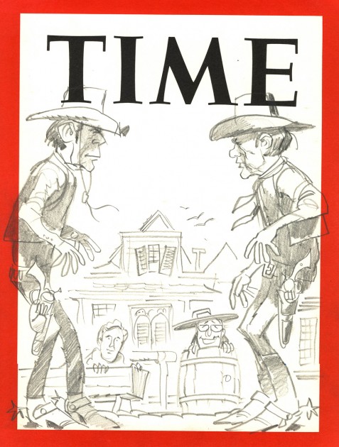
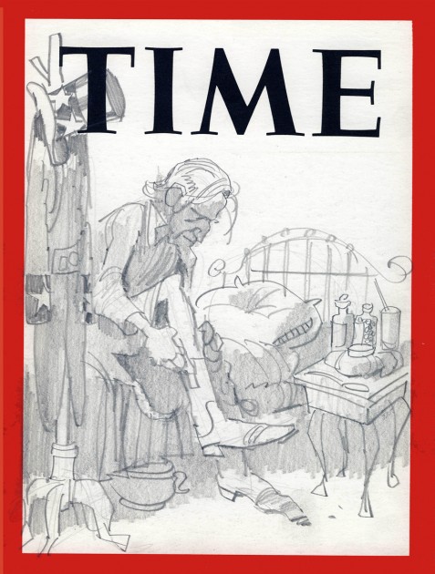
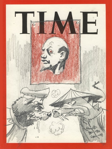
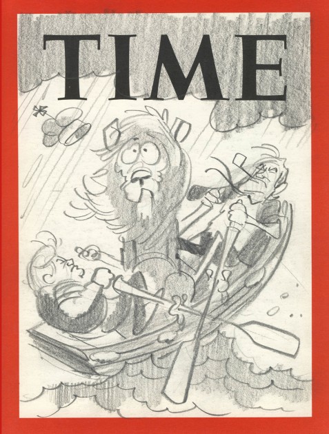
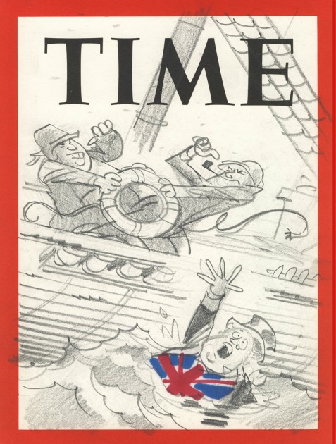
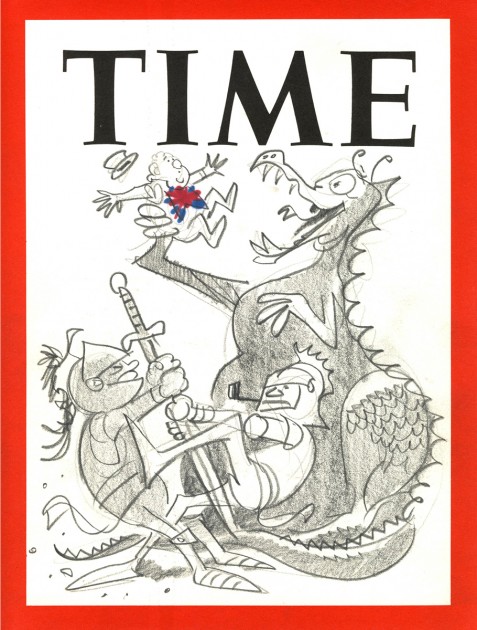
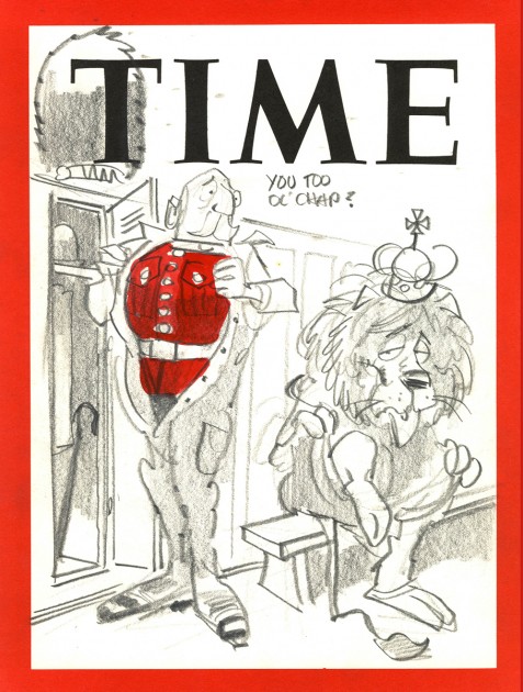
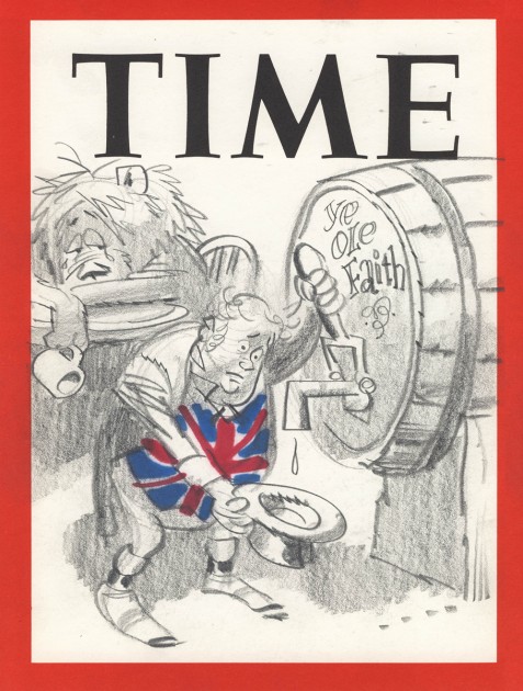
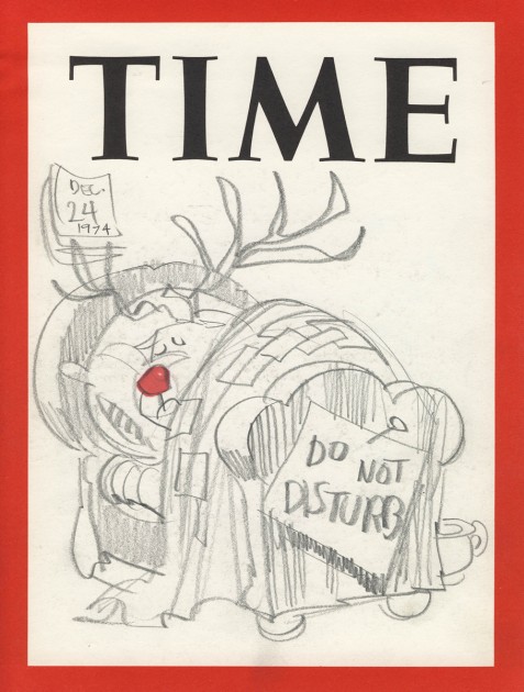
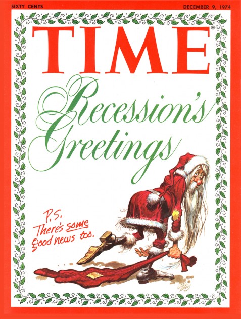
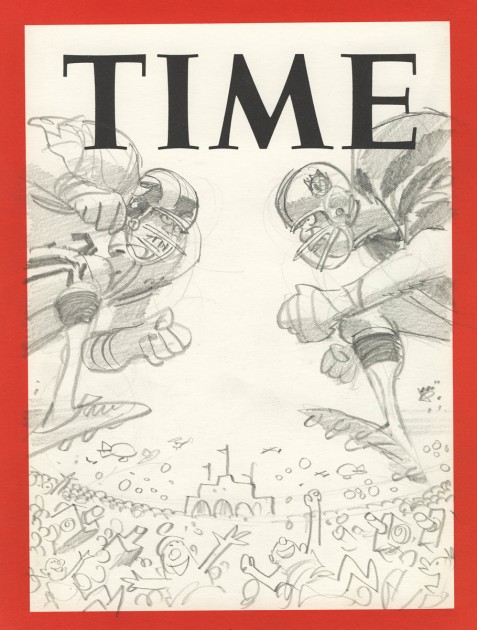
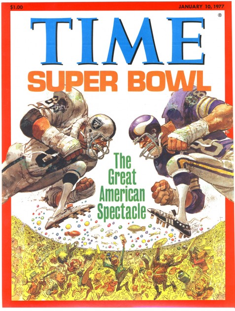
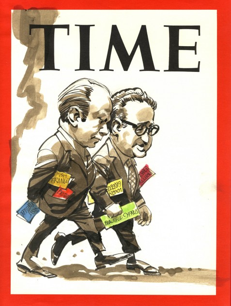
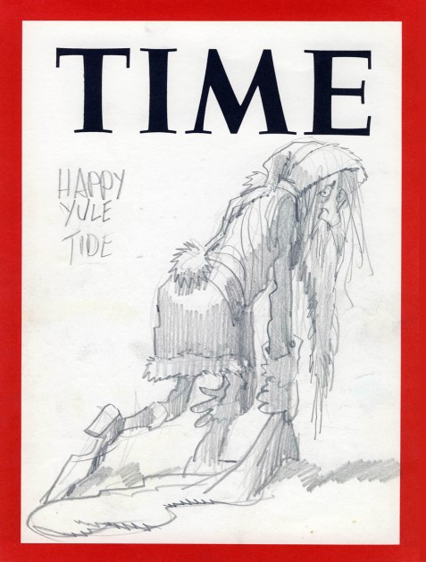
- Bill Peckmann received a host of Time Magazine ruffs from Jack Davis. Bill has forwarded them to me for the blog, and he’s added a few final covers with that. It all makes for a fun posting, and I hope you enjoy it.
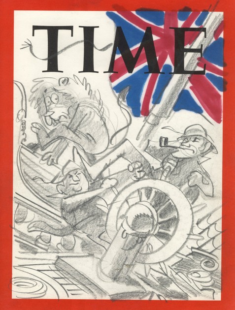 1
1
 3
3
I just love this image. Great caricatures.
 13
13
This one’s a ruff for the next image.
The remaining images are from the final covers
Oh, yes. One last thing, a self caricature by Jack Davis:
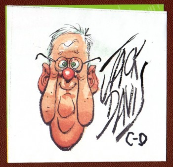
Many thanks to both Bill Peckmann for the loan and scans of the material and
to Jack Davis for graciously allowing us to post it.
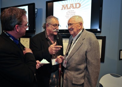
There was a reuniting of MAD Magazine artists in Savannah, GA. Here’s an Associated Press Article about the meeting. In attendance were: Jack Davis, Sergio Aragones, Al Jaffee, and Paul Coker Jr.
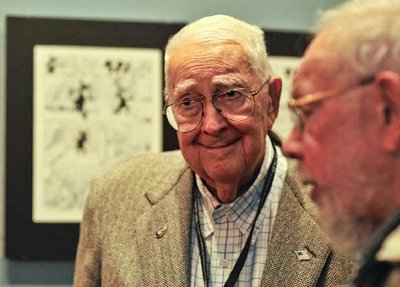
Jack Davis (L) and Al Jaffee (R)
Bill Peckmann &Comic Art &Daily post &Illustration 17 Nov 2011 07:58 am
Kurtzman’s “Lucky” and “Cagney”
- We seem to have run out of pieces that Kurtzman and Davis have worked together in creating. So this week, Bill Peckmann has supplied me with two pieces. Today we have one on Harvey and tomorrow we have a special one from Jack.
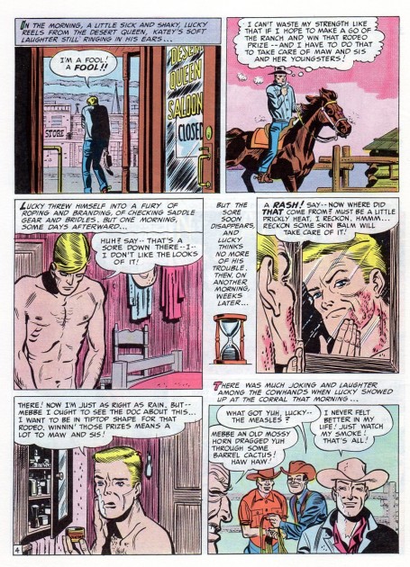
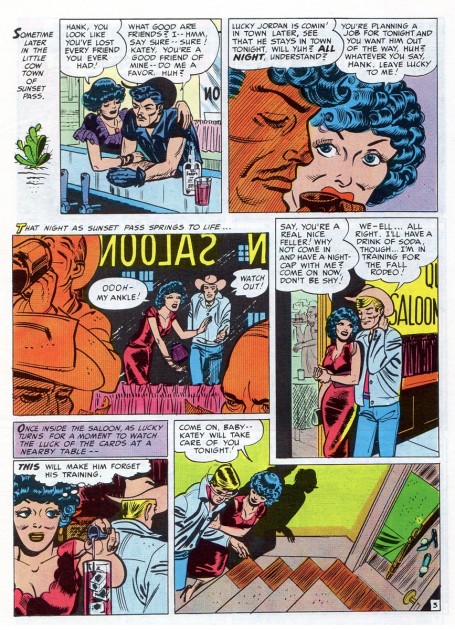
- Here’s a story by Harvey Kurtzman that Bill Peckmann recently contributed. Bill writes:
- Here’s a Kurtzman collection that could be called, “10 years, what a difference time makes”. The first piece of work was done in 1949 and the second piece was done in 1959.
 1
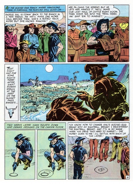
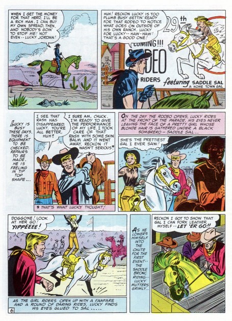
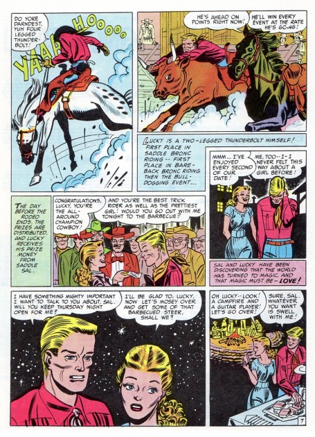
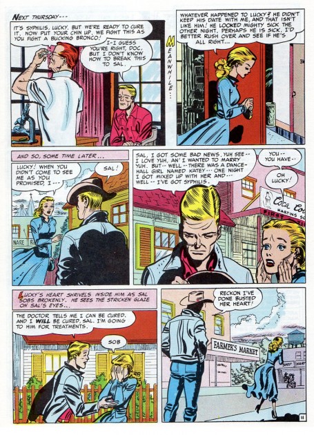
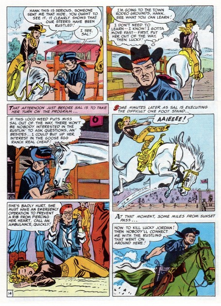
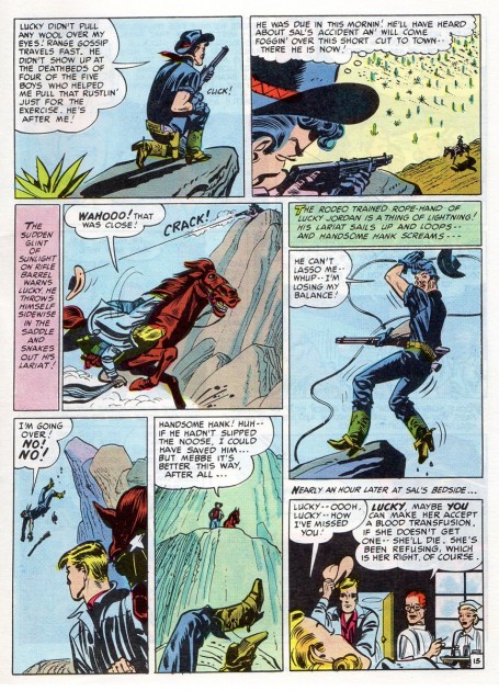
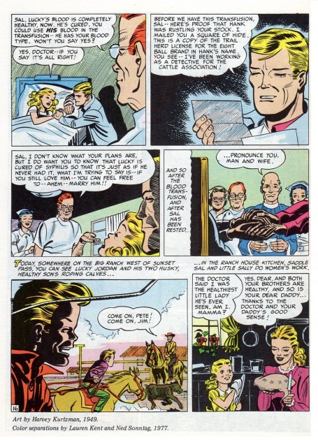
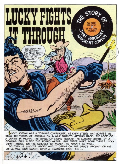
1In 1949 Harvey did a comic book story titled “Lucky Fights It Through”.
It was the first piece of work he did for EC. It was a 16 page educational
comic done for the public by EC Comics when they were in the process of
transitioning from “Educational” to “Entertaining” comics.
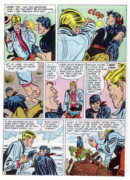 2
2
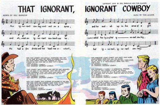
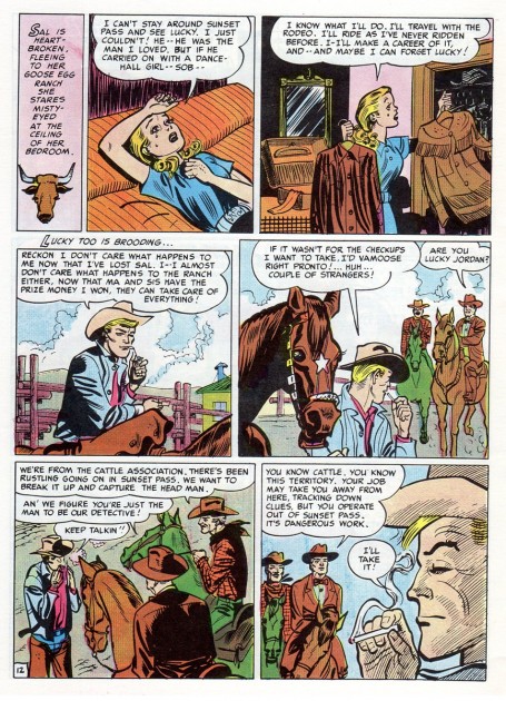
Even though it wasn’t done for one of EC’s main titles, it did get Harvey
through the door, he was able to show his prowess, the editors noticed
and the rest is history.
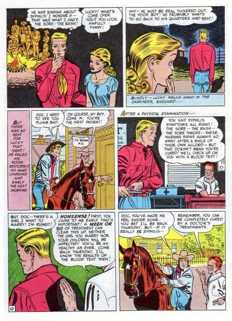
 3
3
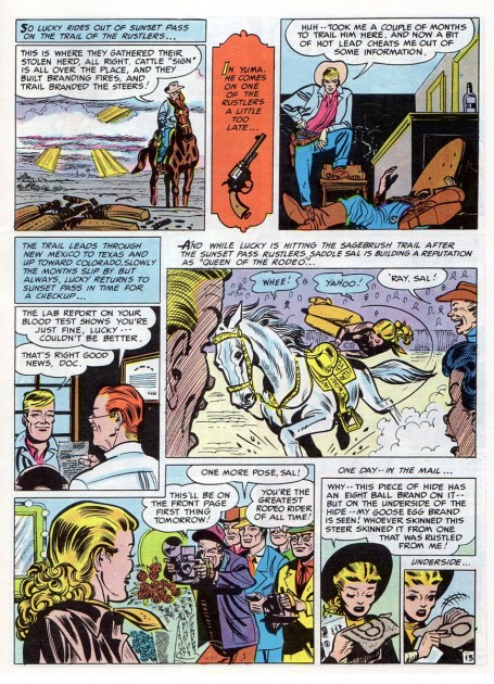
The scans are from a reprinted version that appeared in
John Benson’s fanzine “Squa Tront”, issue No. 7.
 1
1
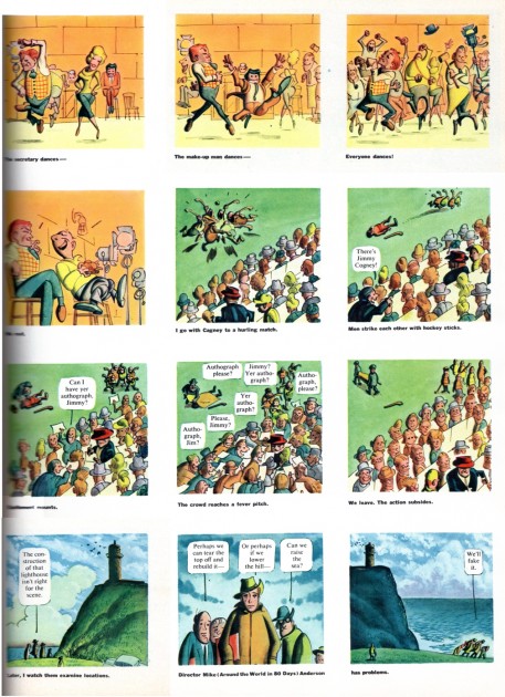
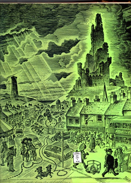
The year is 1959. MAD magazine, TRUMP magazine and HUMBUG
are all history for Harvey Kurtzman. He had to turn to free lance work.
Fortunately at that time, Harold Hayes editor of Esquire magazine was
a big Kurtzman fan and gave Harvey this story,
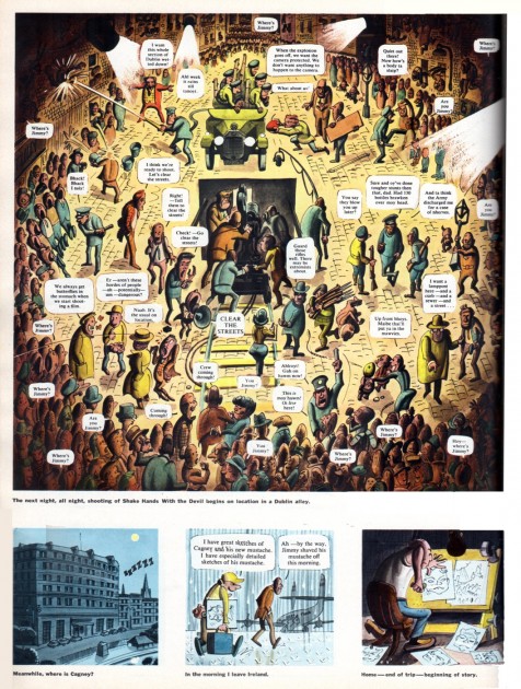
“Assignment: James Cagney In Ireland”, to do.
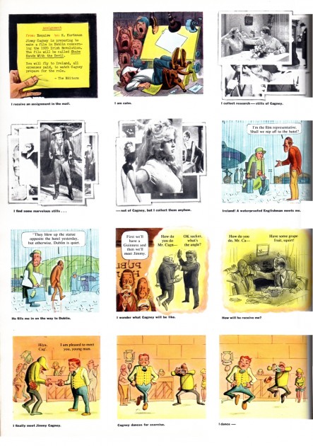 2
2
Hayes sent Harvey to cover the shooting of Cagney’s “Shake Hands With The Devil” movie. The film set was in Dublin and this is Harvey’s take on the whole experience. It’s one of the best things he ever did.
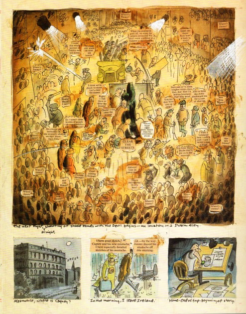
Here’s Harvey’s rough for the last page of the Esquire story.
It’s taken from “The Art of Harvey Kurtzman, The Mad Genius
Of Comics” by Denis Kitchen and Paul Buhle.
The book contains the whole Esquire Cagney story plus all of
Harvey’s roughs for the story. This alone is worth the cover price
of this excellent/outstanding book on Harvey and his work.
Many thanks to Bill Peckmann for assembling this post.
Bill Peckmann &Comic Art &Illustration 04 Nov 2011 05:31 am
Harvey and Jack – Part 5
- The collaboration between Harvey Kurtzman and Jack Davis has proven to be a very fertile one.. Bill Peckmann has continued to send more material to extend the idea, and I take delight in posting it. Bill wrote the accomp;anying notes:
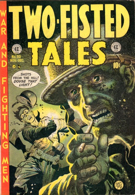
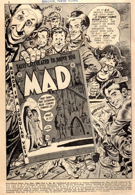
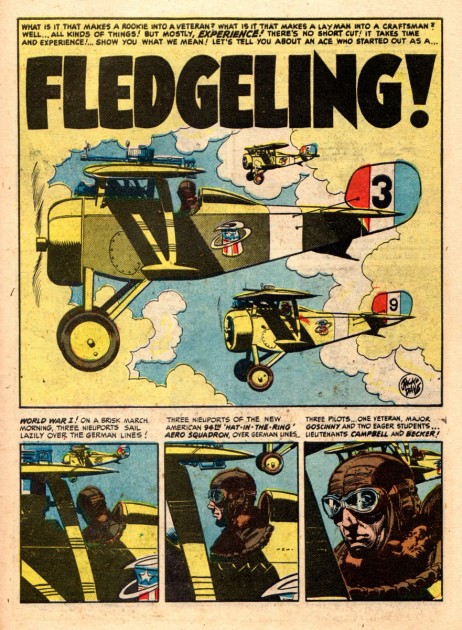
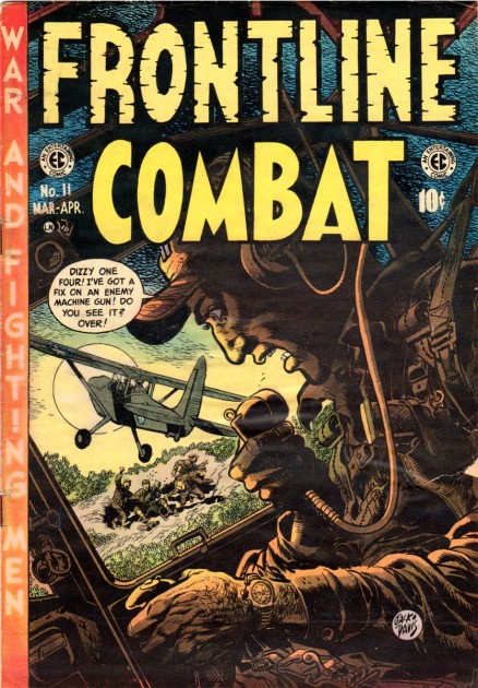
In really reaching and stretching to show more Harvey and Jack “firsts”, I’m sending you the first two covers that Jack did for Harvey’s war comics “Two-Fisted Tales” and “Frontline Combat” along with a Harvey and Jack story from each issue.
 1
1Here is the cover of “Two-Fisted Tales” No. 30, 1952.
.
 2
2This is the inside cover of “Two-Fisted”. One of the
big treats of EC Comics were their “in house” ads for
other titles. Here is the ad for MAD No.1 done by Jack.
It was great the way EC put faces to your favorite artists.
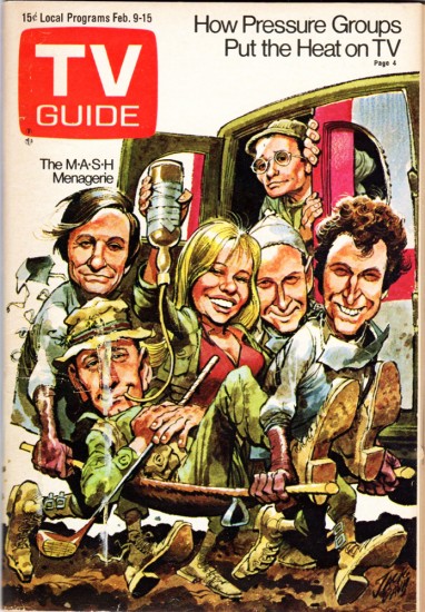
I’d say the roots for Jack’s future TV GUIDE covers are right here.
.
 3
3Skipping ahead twenty-two years, (a break in the action)
I’m inserting a Jack Davis TV GUIDE cover from 1974.
(It also has a Korean War theme.)
.
 4
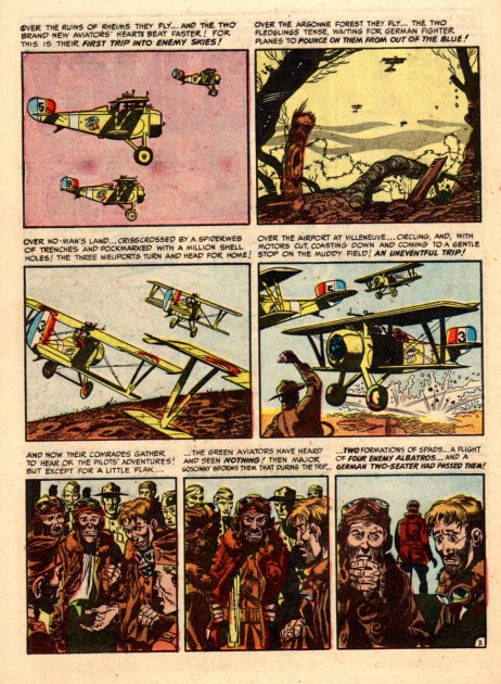
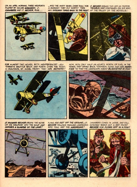
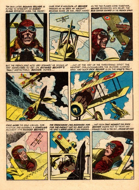
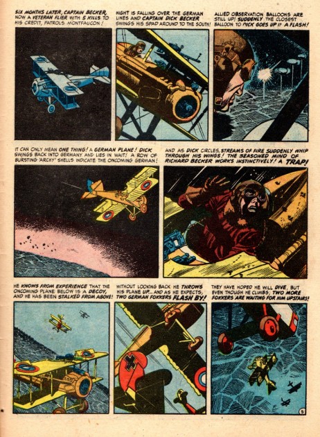
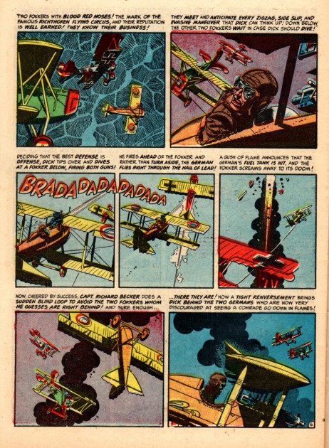
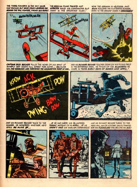
4Harvey and Jack’s story from No. 30.
(They certainly gave the great aviation cartoonist,
Alex Toth a run for his money!)
.
 5
5.
 6
6.
 7
7.
 8
8.
 9
9.
 10
10.
 11
11Jack’s first “Frontline Combat” cover, No. 11, 1953.
.
 12
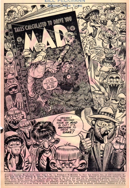
12Inside front cover of “FC”. It’s an ad for MAD No. 2 done by EC great, Bill Elder.
(Sorry about the front cover colors bleeding through.)
.
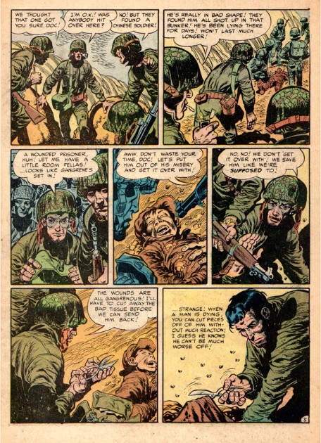
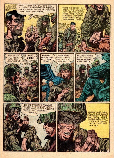
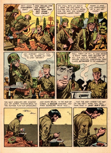
 13
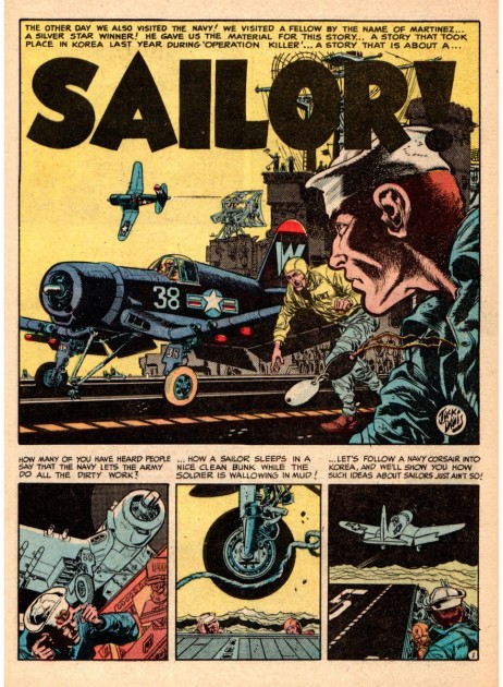
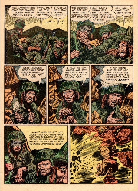
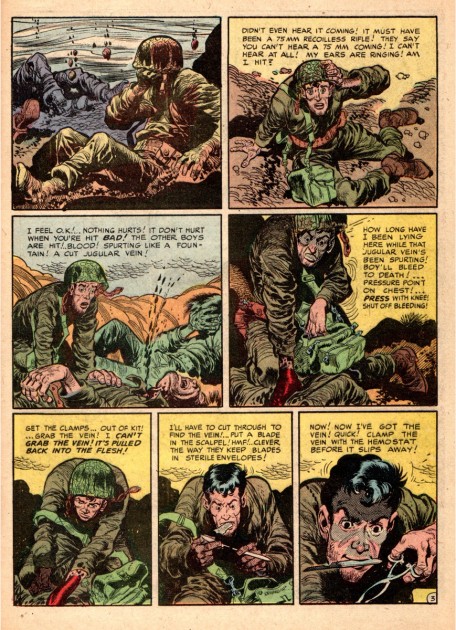
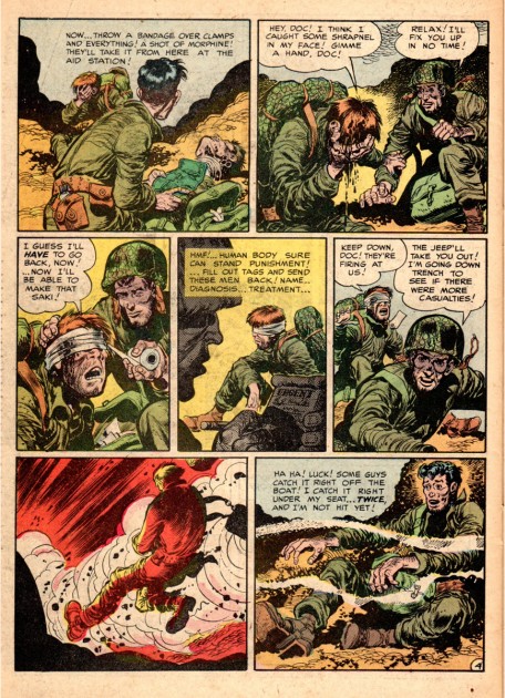
13“Sailor!”, Harvey and Jack’s collaboration for “FC” No. 11.
It shows the horrors of war (as much as you could in a
comic book back then), the realism that was to come later
in films like “Saving Private Ryan”.
.
 14
14.
 15
15.
 16
16.
 17
17.
 18
18.
 19
19.
 20
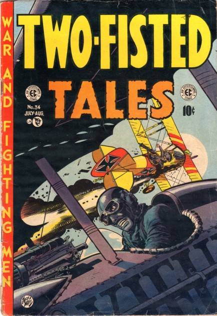
20The colors, excitement and dynamics of the cover are just terrific.
Jack makes it look so easy.
.
 21
21Back in the days before comic book reprints, fans had to do with
whatever copies they had collected. One way to keep comics from
getting battered and tattered was to have them bound in volumes.
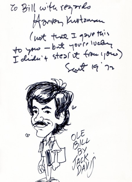
Working with Harvey and Jack on animated projects back in the
early 70′s, I was very fortunate and they were very kind to put their
John Hancocks in my bound volume of “Frontline Combat”.
Many thanks to Bill Peckmann for sharing the material and putting it all together.
.
