Category ArchiveIllustration
Animation &Animation Artifacts &Bill Peckmann &Disney &Illustration &Rowland B. Wilson 19 Apr 2012 07:18 am
Rowland Wilson Scrapbooks
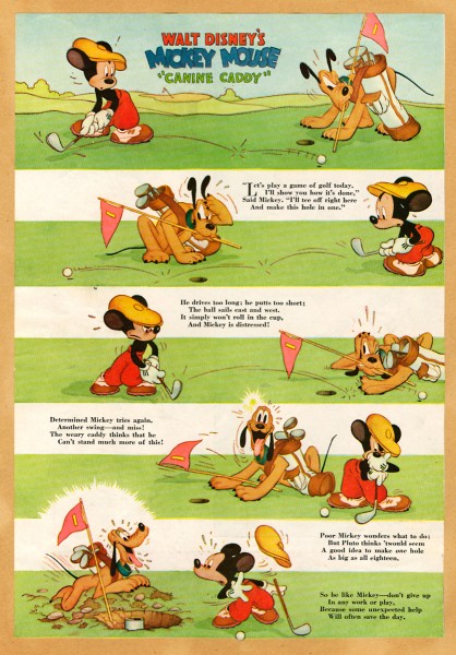
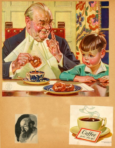
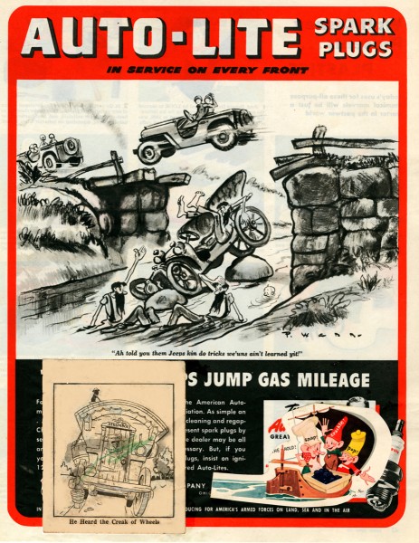
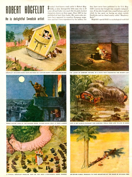
- Suzanne Wilson sent me some pages from the private scrapbook that Rowland B. Wilson kept for inspiration and reference. Seeing these pages, I was a bit surprised at what he collected. When I was a kid, I kept a scrapbook of everything – and I do mean everything – that was printed about animation. Remember, there were few books about animation back in the 60s; I had to hold onto everything available. I found looking at Rowland Wilson’s scrapbook not too different from my own, except that he kept material about the “Golden Years”. It gave me a smile.
Here are some of Suzanne’s comments:
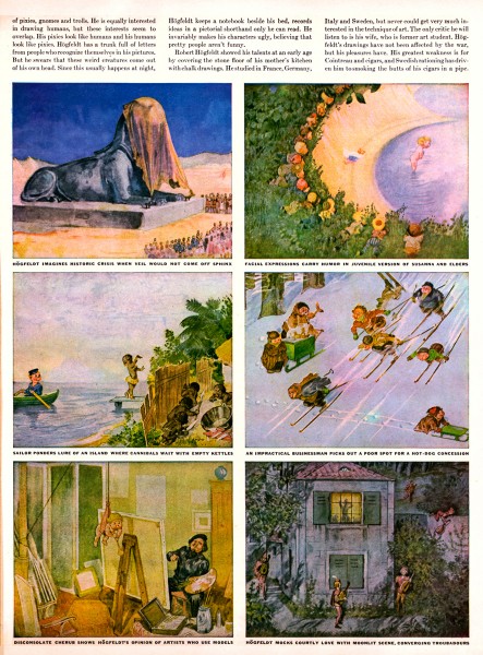
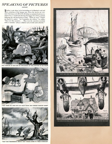
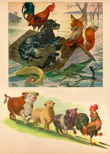
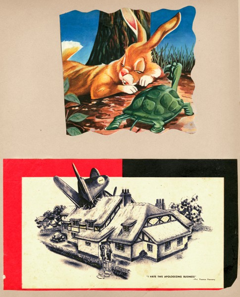
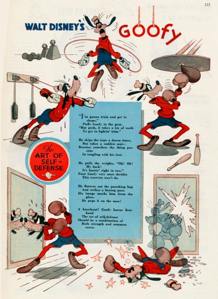
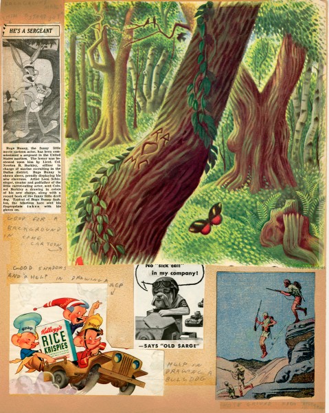
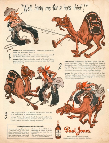
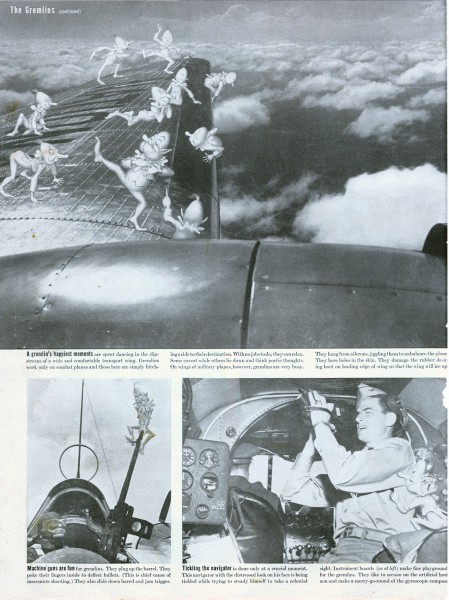
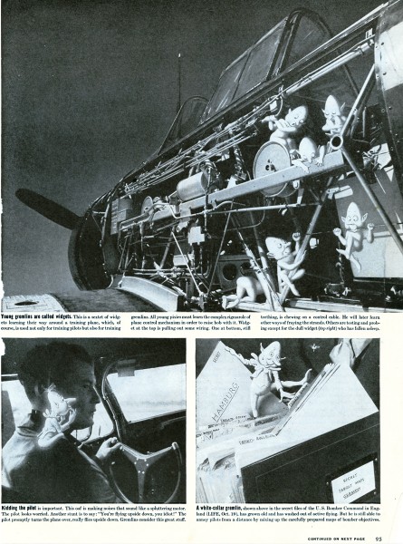
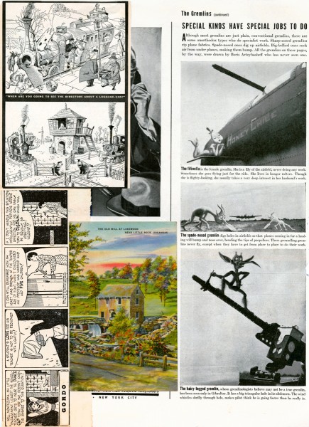
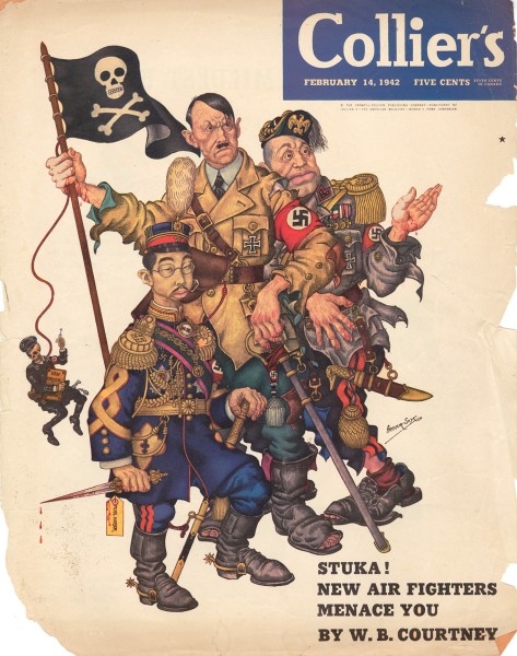
- Rowland B. Wilson, ever the contrarian, once said when speaking of deciding one’s future “Why should you expect an eight-year-old boy to decide what a grown man should do?†He may have been a bit older than that (dates of the periodicals suggest age 12 through 15) when he assembled scrapbooks of his favorite subjects and illustrations from Disney, Life, Collier’s and Look magazines and the Dallas newspapers, but one look shows the premonition of a later artistic sensibility. He zeroed in on what exactly appealed to him visually and subjectively and never deviated. The influences were taken to heart and incorporated into a personal recognizable style.
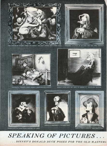
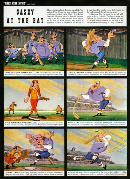
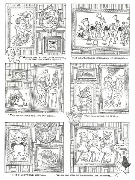
For example, “Speaking of Picturesâ€, a Disney spoof on the Old Masters (Image 15) clipped from Life Magazine in 1945 can be compared to The Sneezenfitz Gallery, drawn in 2005 for the cartoon novel “Cloak and Pistolâ€. One only has to look at “Casey at the Bat†(Image 16 to see a gestalt that was to emerge in the definitive baseball players in TV Guide. (See Rowland B. Wilson TV Guide Originals-1, posted February 16th.)
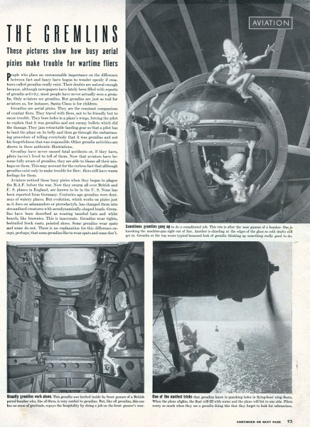
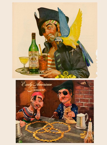
The clippings can also be seen as interesting ephemera. Those from wartime show aircraft insignia designed by Disney, aviation gremlins and advertising of the time.
Here are some comments from Bill Peckmann, who requested Suzanne send me the material:
- I have to admit it’s been over 35 years since I last laid eyes on them when Rowland brought them in to PK&A for show and tell. He had just returned from a trip to his hometown of Dallas, Texas and couldn’t wait to show us what he brought back with him. This was just about the time in the 70′s when Disney was starting to come back into the good graces of the art world again. (Think Lincoln Center.) I remembered there was Disney and other great stuff in there, but couldn’t quite remember exactly what. Seeing the collection now after all these years, it feels like I’m looking at a precursor to the SPLOG. One can see now what a terrific eye and good taste Rowland had as a young teenager, and it’s also neat to see that animation was in his blood at such an early age, he just got a little sidetracked with very successful advertising, cartooning and illustrating careers before he went back to the first love of his life, animation. Lucky us!
 1
1
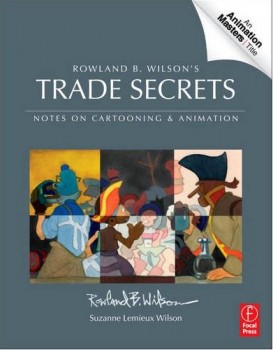 Suzanne Wilson is about to have a new book on the market: Rowland B. Wilson’s Trade Secrets: Notes for Cartooning and Animation.
It’s obvious that this book is directly related to this post. Rowland Wilson obviously kept journals in which he wrote about illustration and animation, and the information must certainly be very informative to students; some of these journals are published here. Presumably pages of the scrapbook may have made the book.
The book seems to offer quite a bit of attention to Mr. Wilson’s animation art, just as it does his brilliant illustration and cartooning. I look forward to getting my copy.
Bill Peckmann &Books &Illustration &Rowland B. Wilson 18 Apr 2012 06:33 am
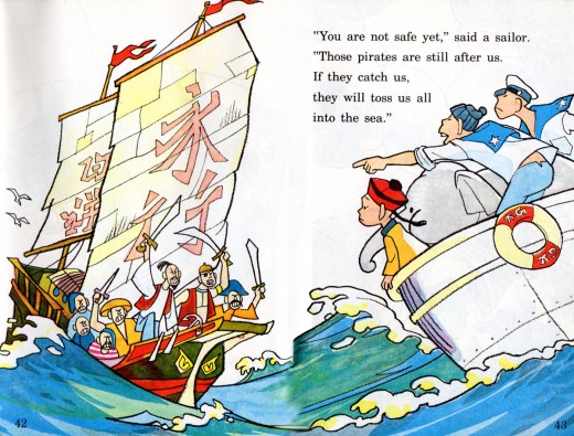
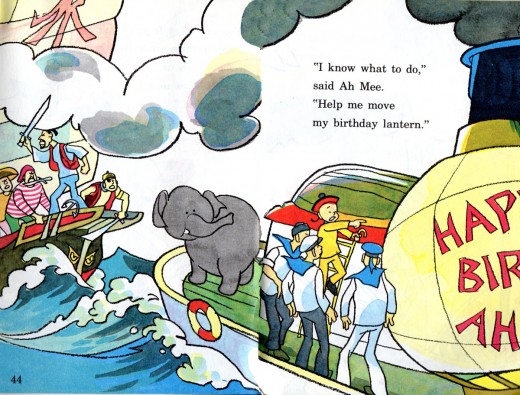
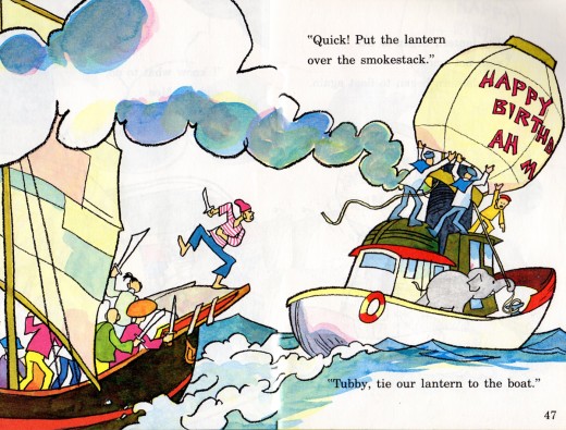
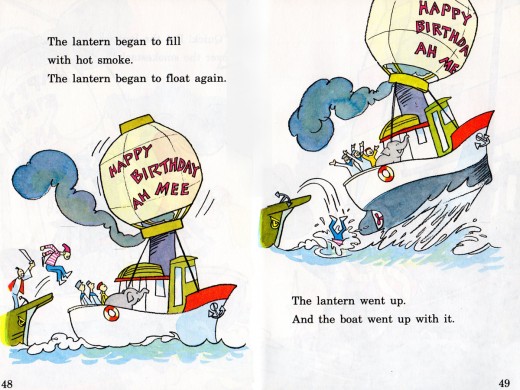
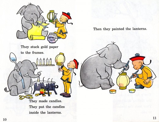
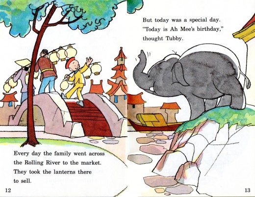
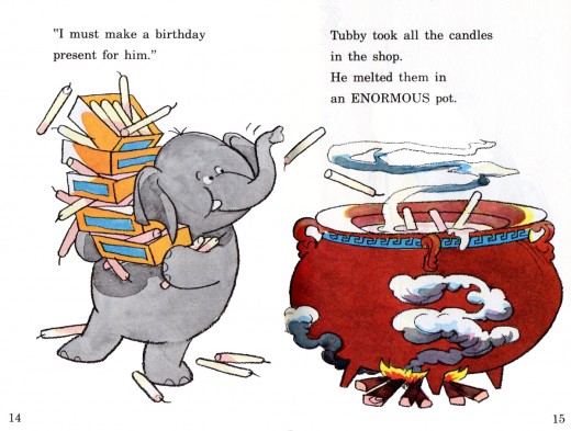
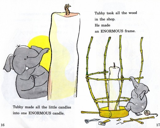
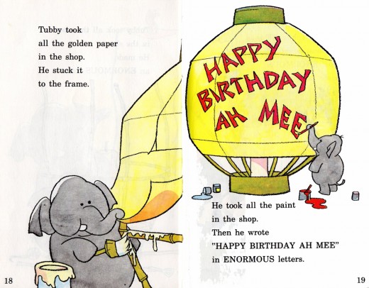
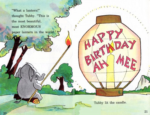
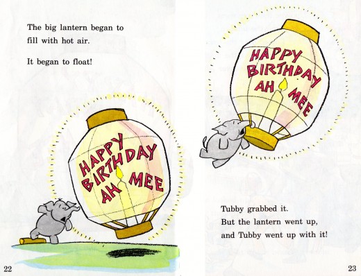
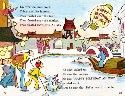
Tubby and the Lantern – pt. 2
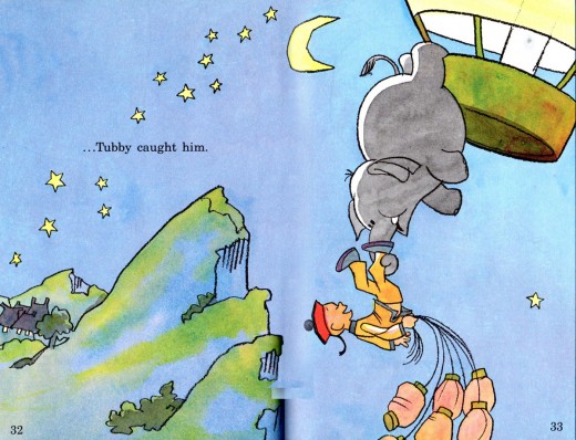
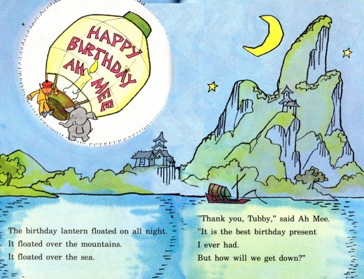
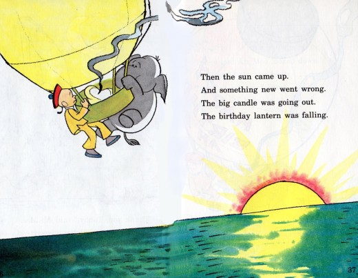
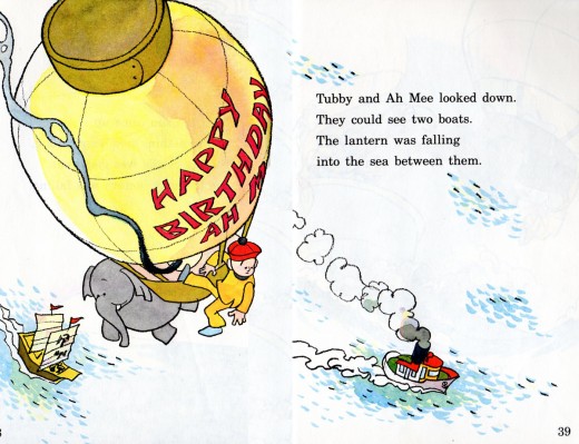
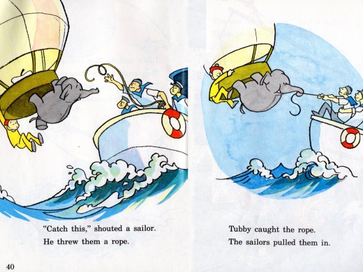
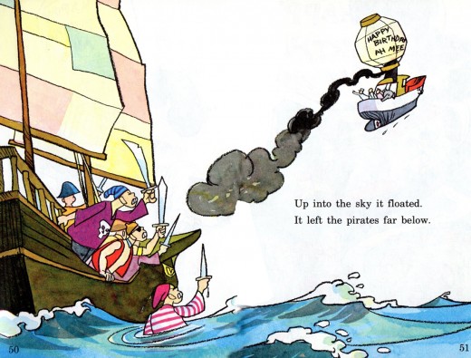
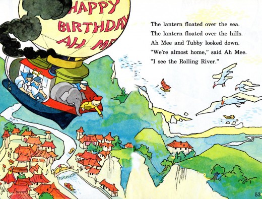
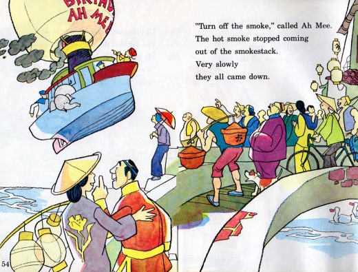
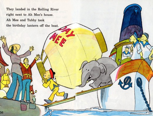
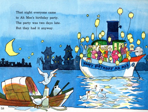
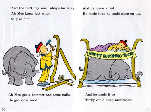
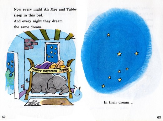
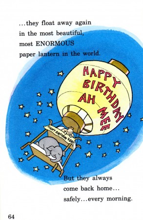
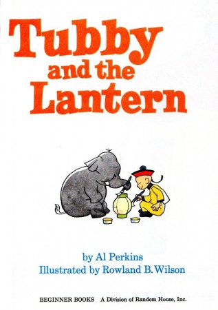
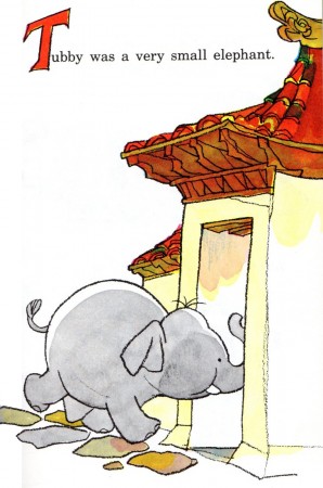
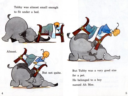
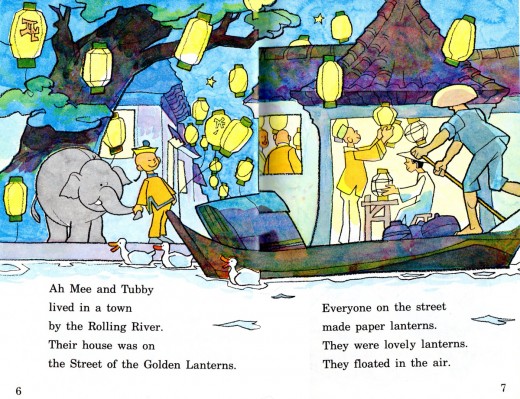
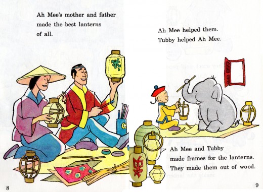
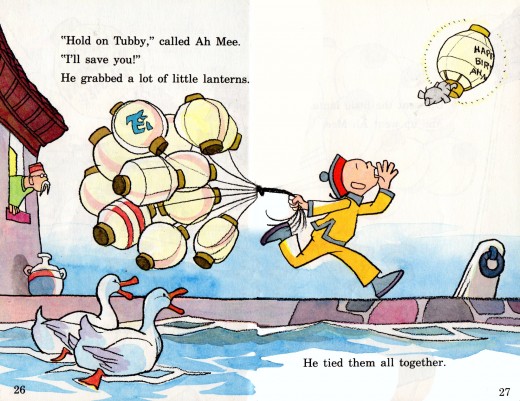
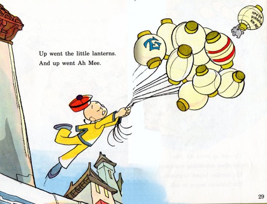
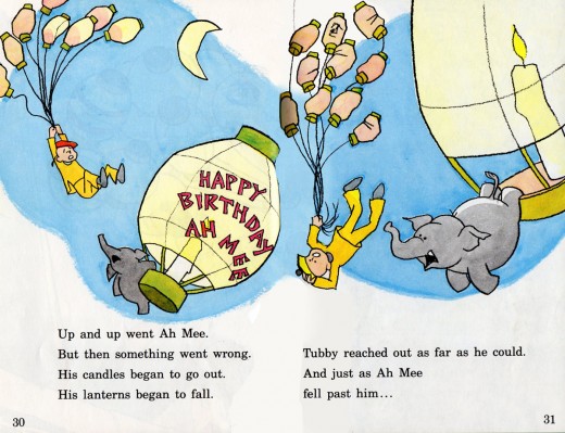
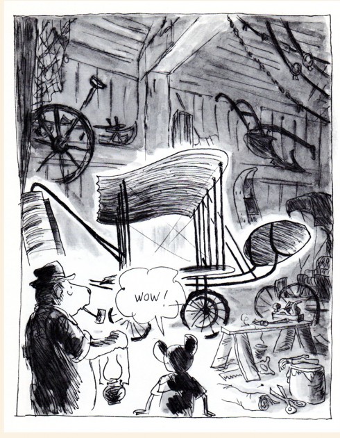
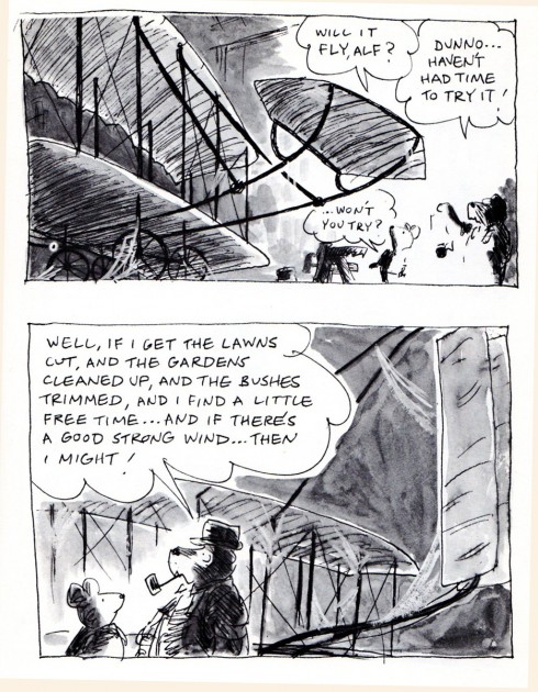
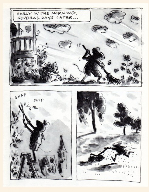
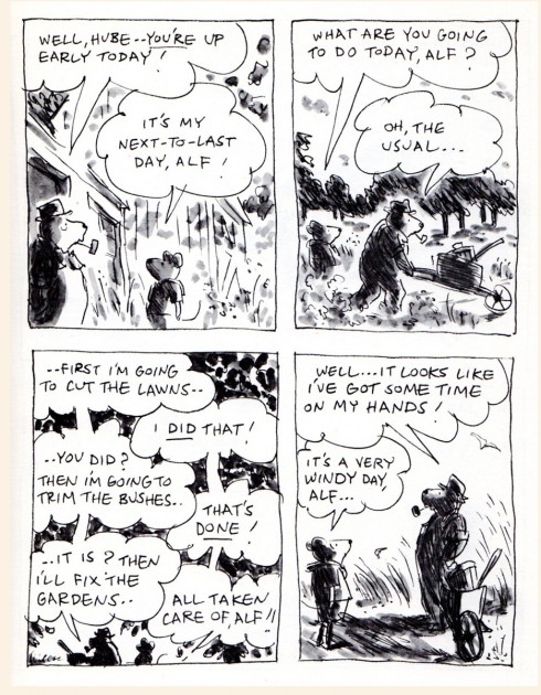
- Here’s the conclusion of Tubby and the Lantern, the children’s book illustrated by Rowland B. Wilson and written by Al Perkins. Bill Peckmann has kindly sent scans of the double paged art of the book. We pick up where we left off . . .
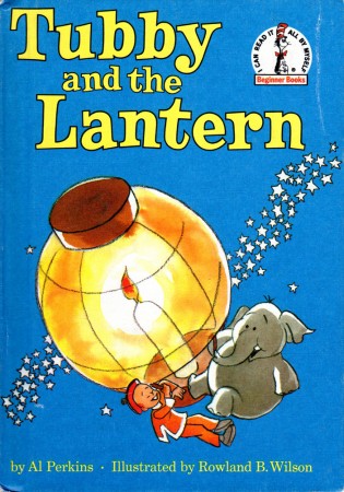
The book’s cover
Bill Peckmann &Illustration 13 Apr 2012 05:54 am
Jack Davis’ Don Quixote
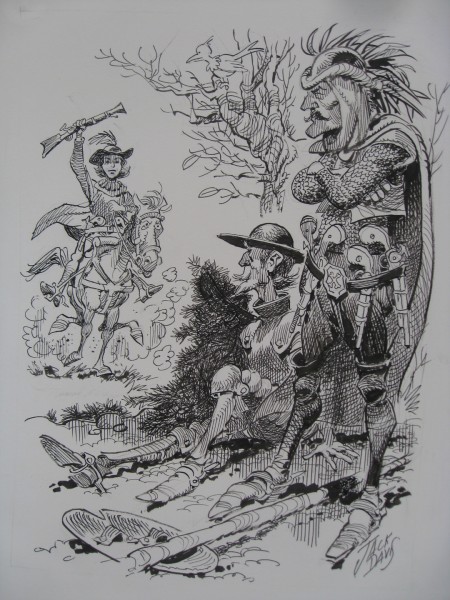
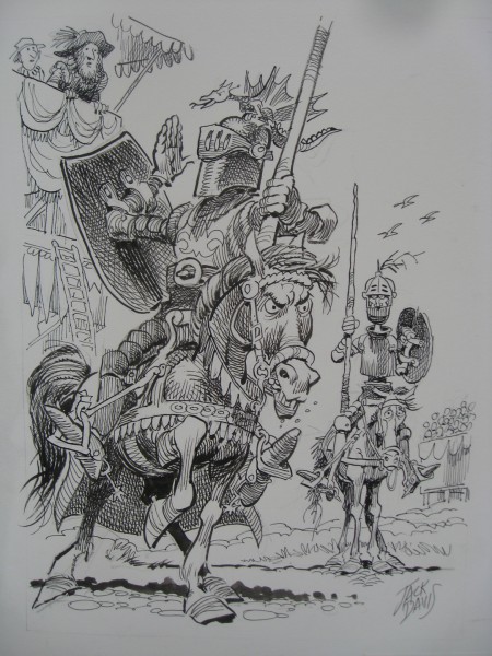
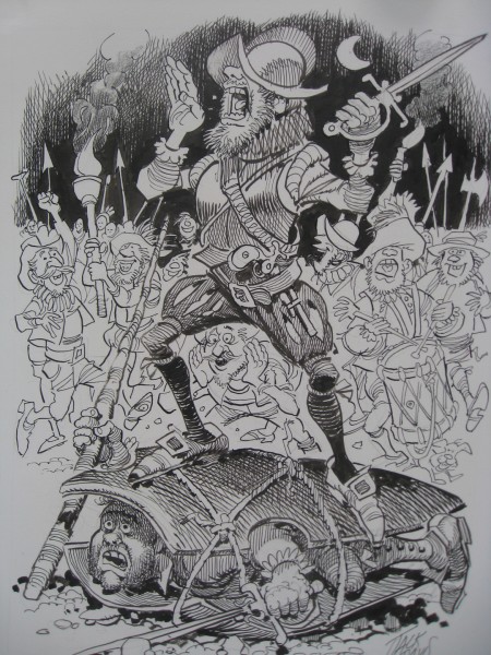
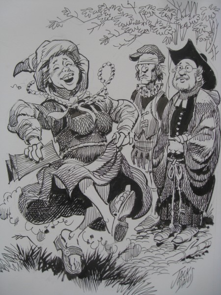
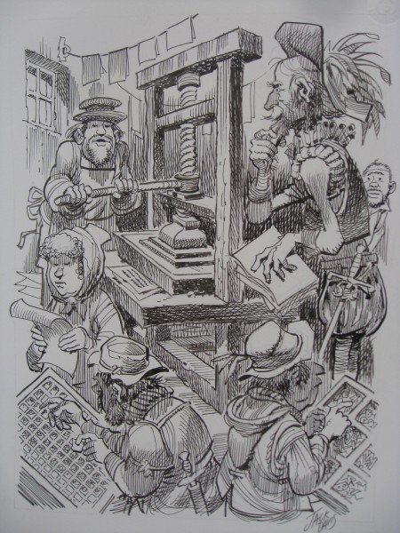
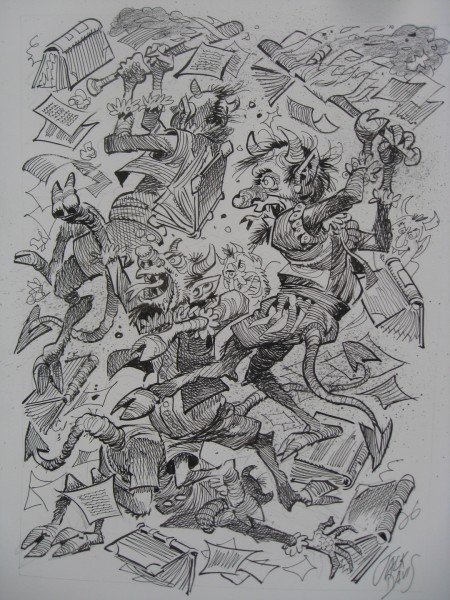
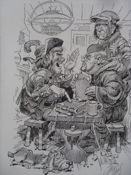
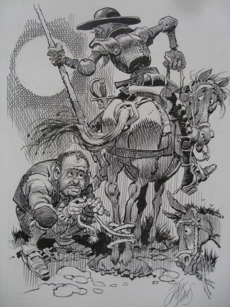
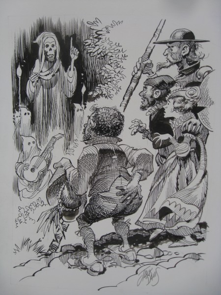
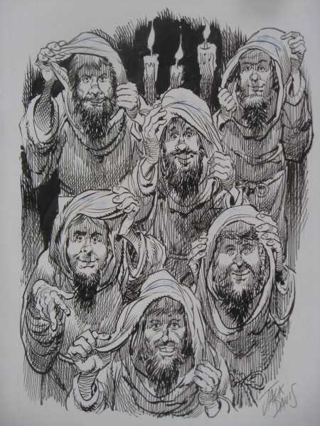
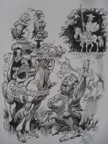
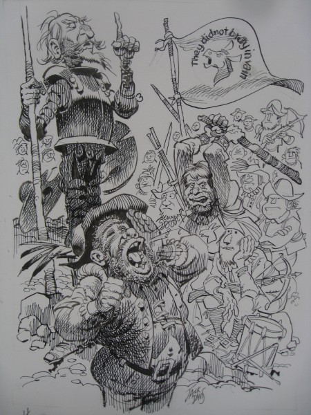
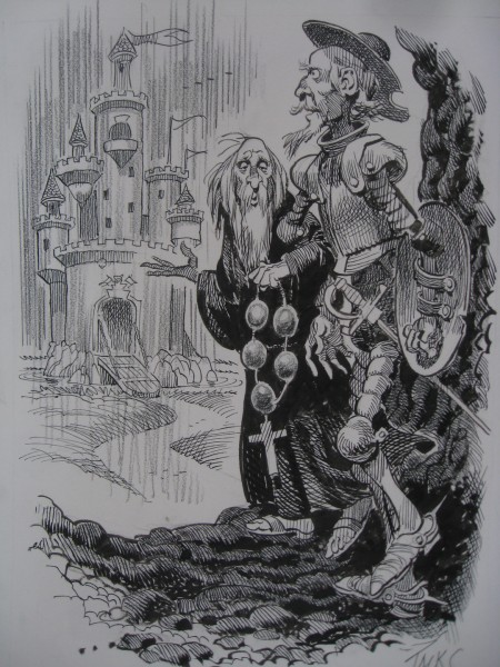
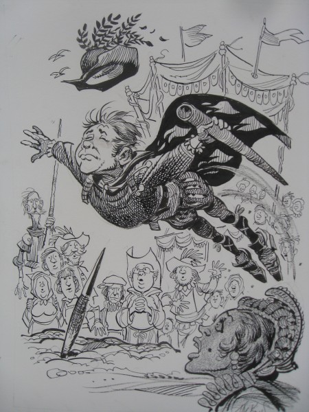
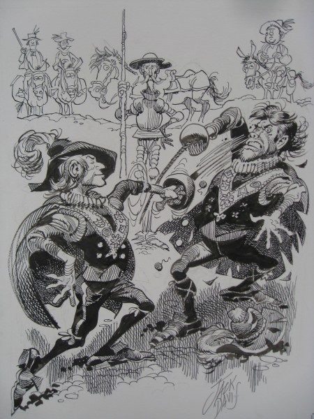
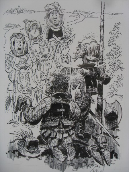
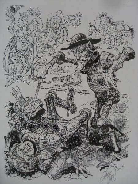
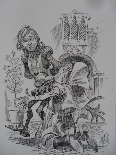
Recently, Bill Peckmann sent me the following B&W illustrations by Jack Davis of Don Quixote. These have no real relationship to the color illustrations that are part of the book currently on the market, The Misadventures of Don Quixote. They exist for themselves, alone, and they’re pretty darn good.
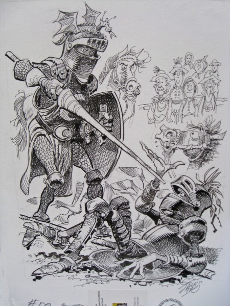 1
1
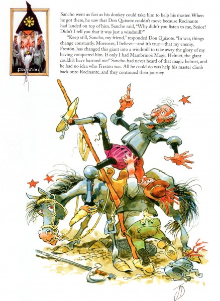
Here’s a sample color page from the book that was published.
Bill Peckmann &Books &Illustration &Rowland B. Wilson 10 Apr 2012 07:42 am
Tubby and the Lantern – pt. 1
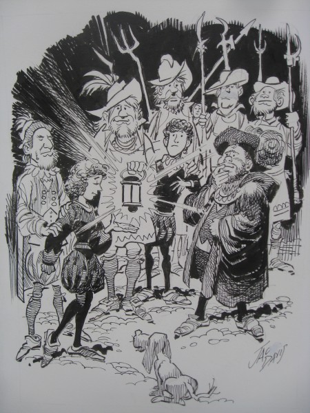
- Tubby and the Lantern is a book illustrated by Rowland B. Wilson and written by Al Perkins. It was recently sent to me by Bill Peckmann. Here’s Bill’s comment on the book:
- RBW’s book was very good when it came out in 1971, but I’ve got to say that looking at it today, it has a much richer texture to it because we now know what Rowland did with the rest of his life and career. Row’s work is/was always so well thought out, whether it was done in a simple or more robust style.

Book’s cover
.
To be continued.
Bill Peckmann &Comic Art &Illustration 06 Apr 2012 06:49 am
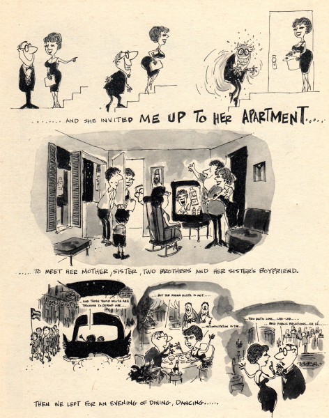
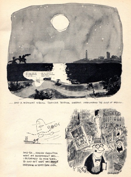
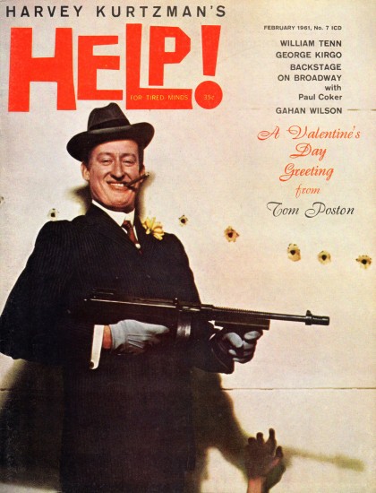
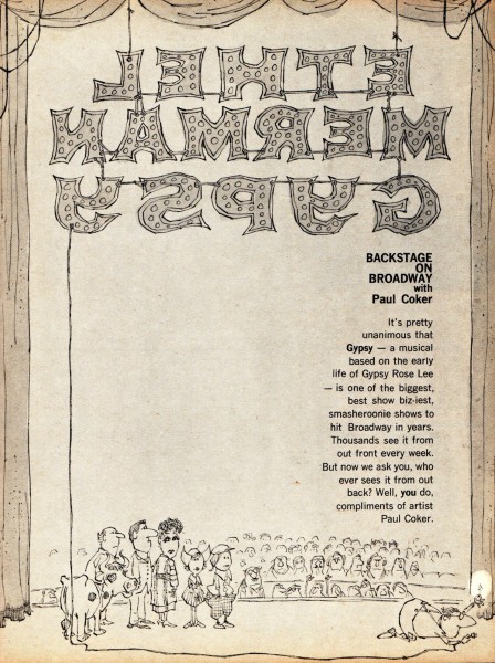
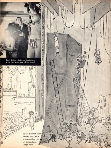
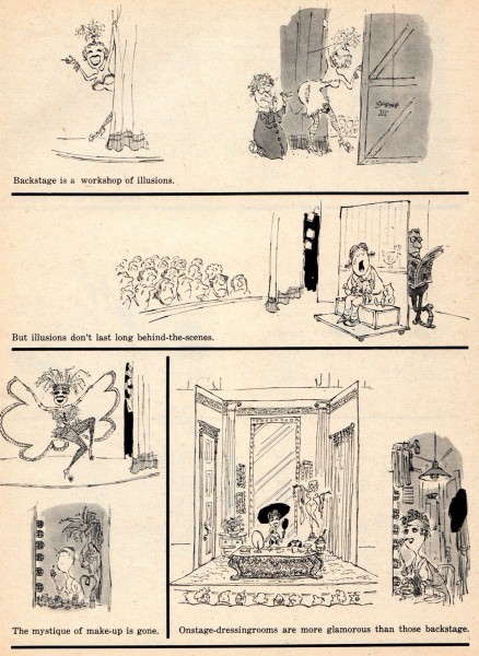
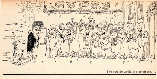
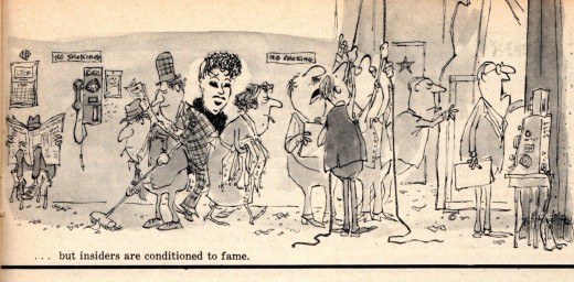
Paul Coker Jr. – Help 1961
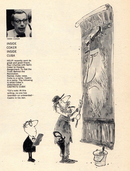
- Of course, we all recognize the style of Paul Coker Jr. if only from all the Rankin-Bass animated shows he designed. Bill Peckmann has sent me two stories Coker did for HELP magazine back in Jan. & Feb. 1961. Here’s Bill:
- Here are two Paul Coker Jr. story assignments that he did for Harvey Kurtzman’s HELP magazine in the early 1960′s. Harvey always had a great eye for new talent and Paul did not let him down. It’s very nice to see Coker in continuity form, beautifully designed characters and panels!
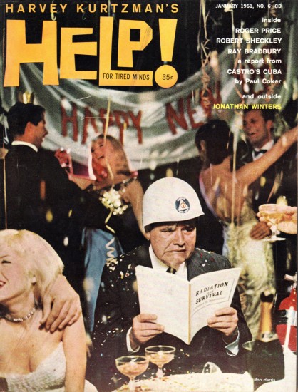
Issue #6 cover
Articles on Animation &Disney &Illustration &Mary Blair 03 Apr 2012 07:44 am
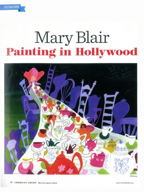
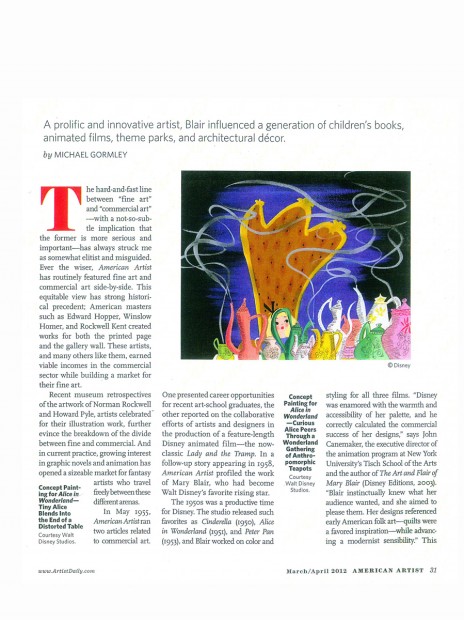
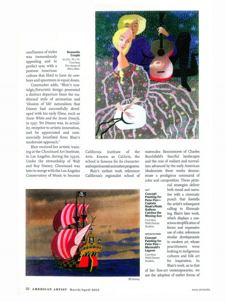
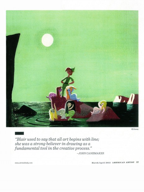
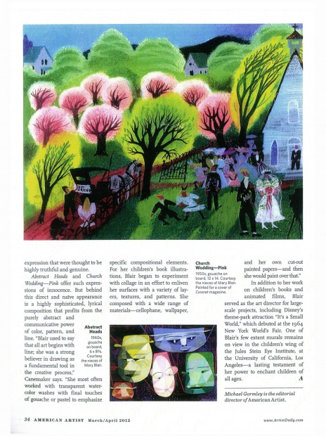
Mary Blair – American Artist
- The current issue of American Artist Magazine has a piece on Mary Blair’s work in Hollywood. I thought you might like to take a peek at the issue.
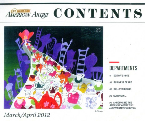
Contents page
Bill Peckmann &Books &Illustration 30 Mar 2012 08:07 am
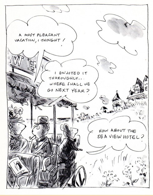
Stevenson’s Sea View Hotel – pt 2
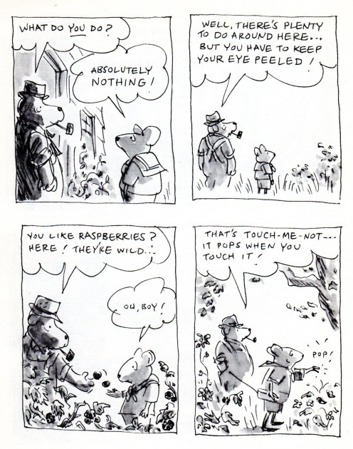
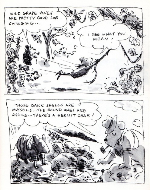
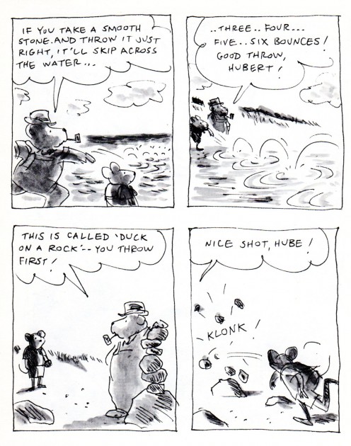
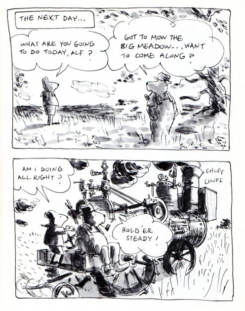
- James Stevenson‘s book, The Sea View Hotel, is a beauty. The illustrations are all B&W washed pen and ink, yet it feels like it was done in color. I thank Bill Peckmann for sending it to me, and here’s the second half of it. Go here to see the first half.
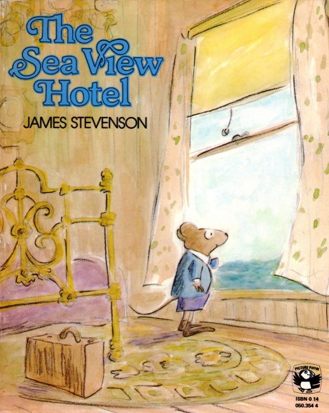
Cover
Bill Peckmann &Books &Illustration 28 Mar 2012 07:21 am
Sommerfest im Märchenwald
- Before we get into today’s posts, I have to remind you again
that we’re in the last days of our
Kickstarter Campaign.
Thanks for your support.
________________________
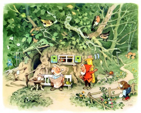
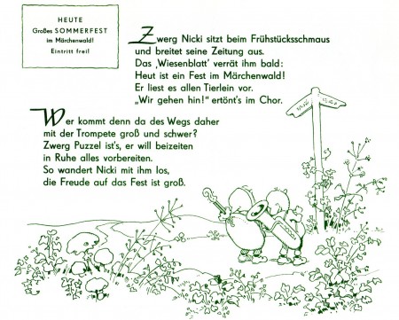
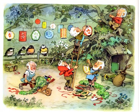
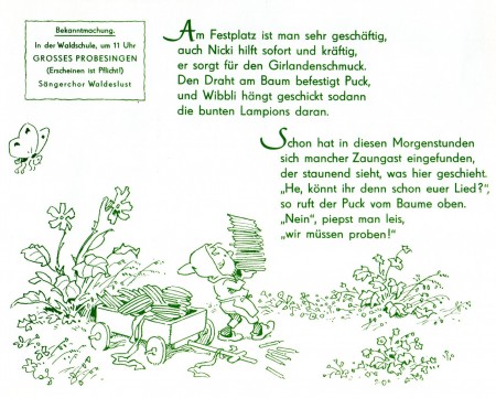
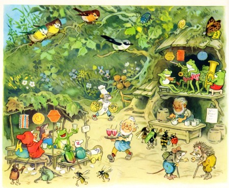
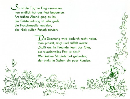
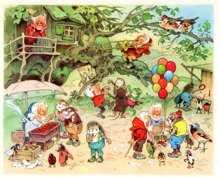
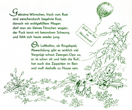
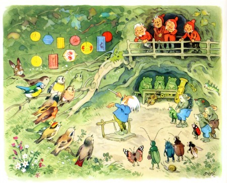
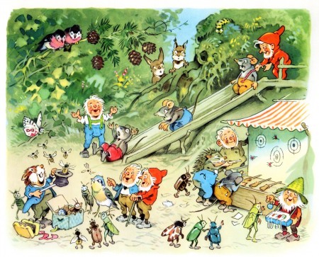
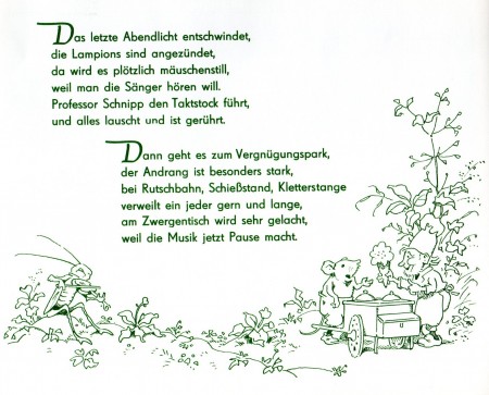
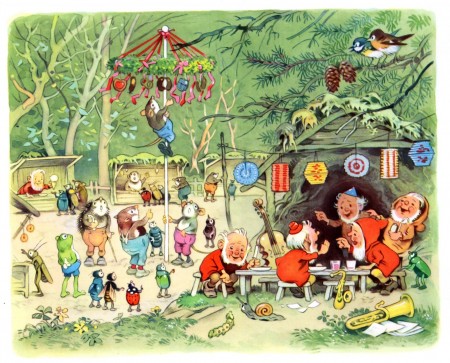
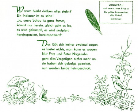
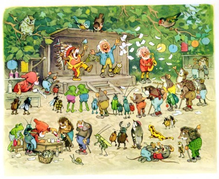
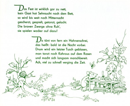
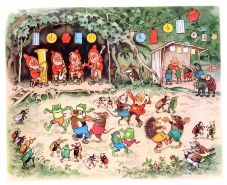
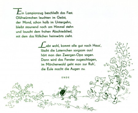
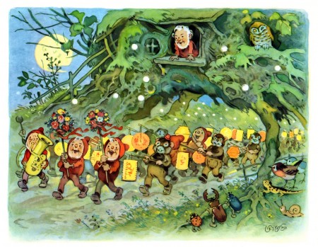
I’m sure the weather inspired Bill Peckmann to send the delightful, German book, Sommerfest im Märchenwald by the great illustrator, Fritz Baumgarten. The book’s a gem, and I hope you enjoy it.

The cover
Animation Artifacts &Bill Peckmann &Illustration &Layout & Design &Models &repeated posts &Rowland B. Wilson 26 Mar 2012 07:23 am
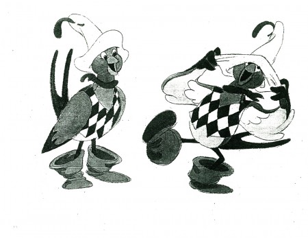
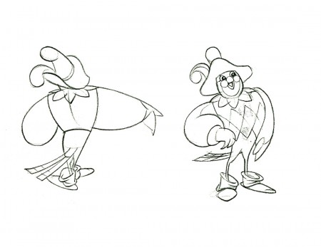
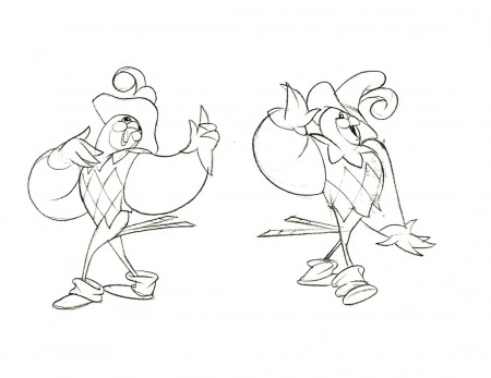
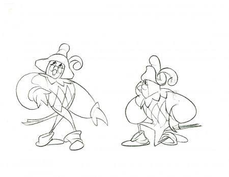
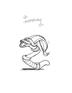
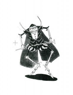
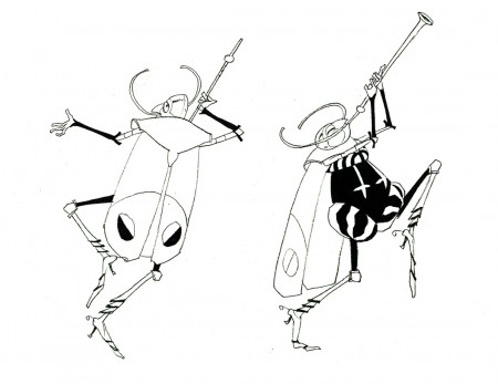
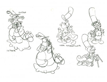
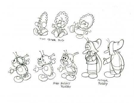
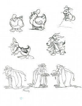
Thumbelina from Rowland B. Wilson
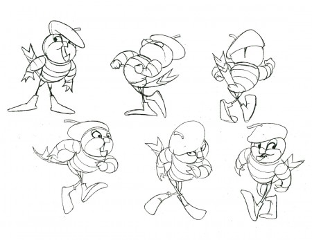
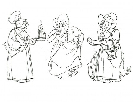
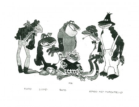
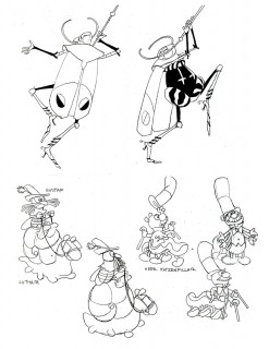
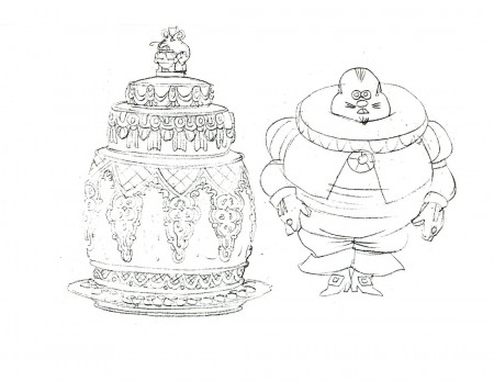
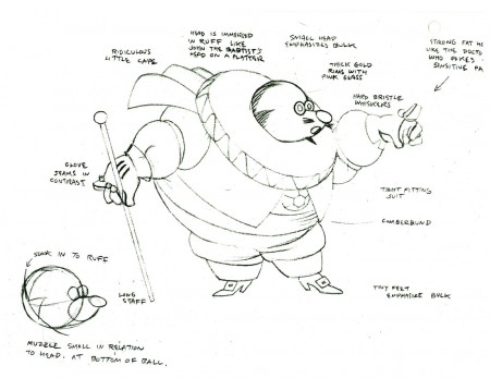
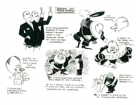
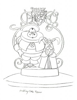
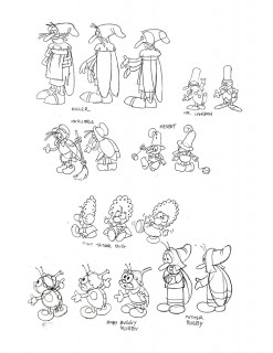
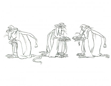
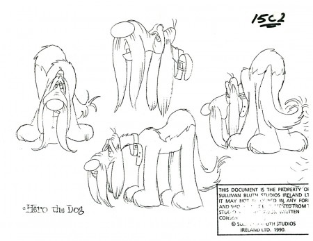
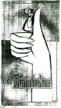 - Thanks to Bill Peckmann‘s extraordinary collection of design material, I have access to quite a few model sheets by Rowland B. Wilson.
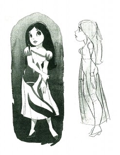
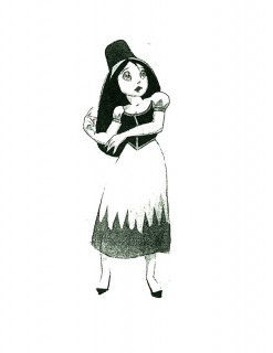
His models for Don Bluth‘s feature, Thumbelina, fill a binder. I’m gong to have to break it up into two posts.
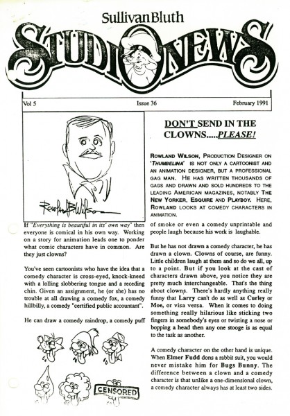
Here, I’ll reproduce the article Rowland had written for the in-house organ “Studio News.” This follows with models for some of the lead character models.
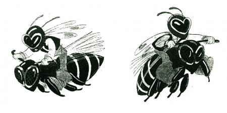
These models were done in pencil and ink, sometimes in color. Unfortunately, all of these are 8½ x 11 xerox copies. Blacks wash out and washes blacken. Regardless, they all come across fine enough to get the idea.
Any feature takes a lot of work. You can understand that just in the large number of model sheets that grace the production. When you have a talented artist such as Rowland Wilson doing that modelling for you, your art is off to a good start.
 1
1(Click any image to enlarge.)
 1
1
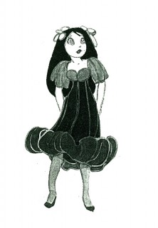
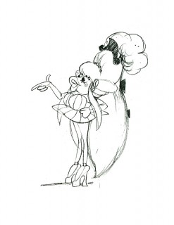
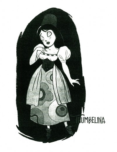
Here we have the model that Rowland drew for Thumbelina.
This is definitely not the rotoscoped princess that we saw in the film.
 2
2 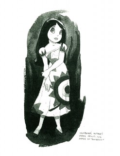 3
3
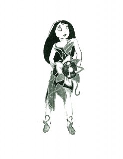
Here we have a lot of different costumes Thumbelina
will wear as she travels on her expeditions.
 4
4 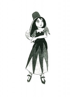 5
5
An original idea – a character who wears
more than one costume in a film!
This film is far from the best of Don Bluth, but it goes to show how much solid work is done for any feature film. There’s also quite a bit to be learned from any feature. Many of these models didn’t end up in the film (take a look at Thumbelina herself in yesterday’s post) but the drive was a forward one.
Off to the modelshow:
 1
1
(Click any image to enlarge.)
 3
3
Another color one copied in B&W
 30
30
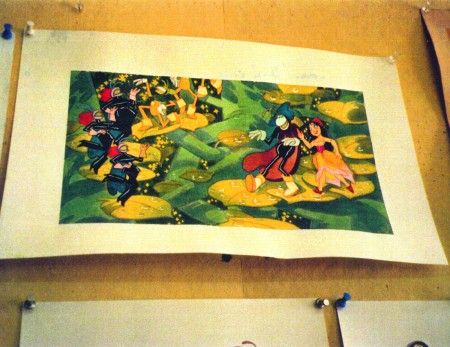
Finally, here are two color photos Rowland took of his presentation art.
Animation Artifacts &Bill Peckmann &Books &Disney &Illustration &Rowland B. Wilson 19 Mar 2012 09:32 am
Rowland B. Wilson’s Hercules – Another look
 Given the new book coming onto the market, Rowland B. Wilson’s Trade Secrets: Notes for Cartooning and Animation, I thought it appropriate to take a fresh look at some of his brilliant art for the animated film.
Last week I showcased some material previously posted, which had been done as preproduction art for Disney’s Hunchback of Notre Dame. Today, we look back to some of the work for Disney’s Hercules. It’s all pretty stunning material. Unquestionably the work of a master.
This is a book that was put together by Suzanne Lemieux Wilson, and it looks to be as much about animation as about cartooning. I’m not sure exactly what’s in the book, but I’m certainly eager to find out, and will give you a report as soon as I see it.
- Here’s Hercules.
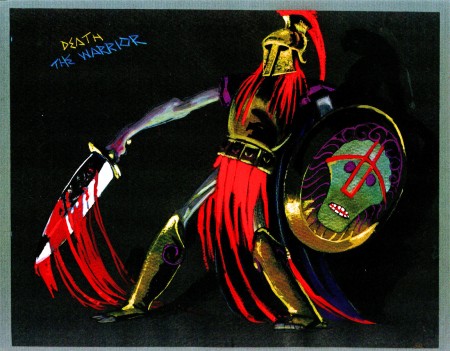
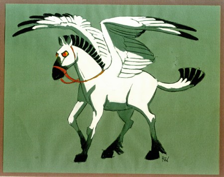
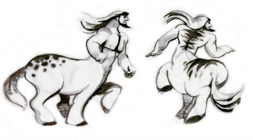
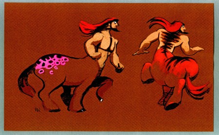
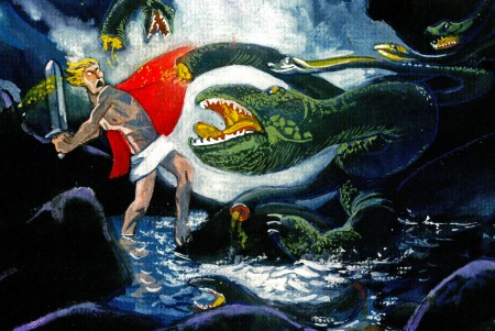
This entry includes character sketches for characters that developed into something completely different, or didn’t end up in the film at all.
Once again, I must express my debt of gratitude to the generosity of Bill Peckmann for lending me the art to post here. And to Suzanne Lemieux Wilson for some additional sketches. Thank you, both.
 1
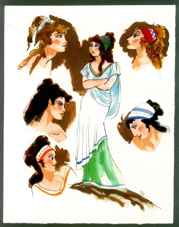
1Megara
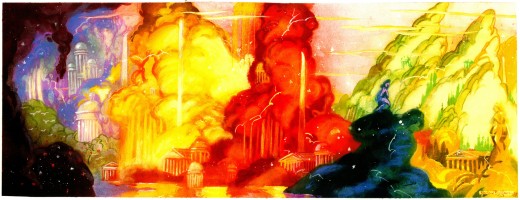
These watercolors are less character designs than they are inspirational pieces. They are inspirational. How stunning this art. I would have loved seeing something like this on the screen rather than Gerald Scarfe‘s. But that’s just me.
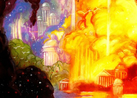
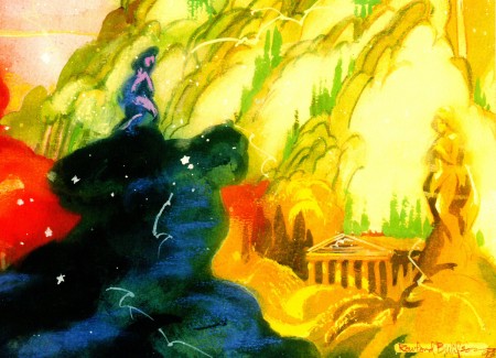
As with some of the last posts, I’m showing the larger piece (and they are large) and then going in for some tighter blowups.
 13
13(Click any image to enlarge.)
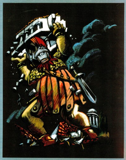
Typed beneath this image:
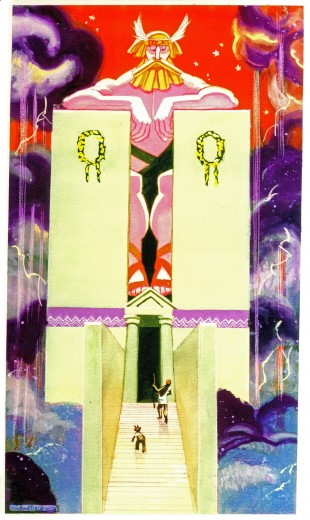
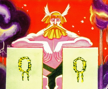
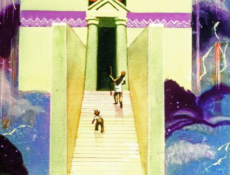
HERC AND PHIL ADDRESS ZEUS ON MT. OLYMPUS
The realm of the gods is in the sky. The landscape is made of sky imagery –
the classic buildings, the trees, the hills are the colors of rainbows, thunderheads,
lightning, rain, hail and stars. Trees have tops made of clouds and trunks of rain
or lightning. Buildings evolve out of mist as do the gods themselves.
The gods can be large or human scale as needed.
In mythology, Zeus changed himself into a swan, a bull, a cloud,
and even a shower of gold.
Everything is as changeable and colorful as a sunset.
THE HOME OF THE GODS.
A skyscape. Trees, mountains and waterfalls appear and dissolve away.
We can see shapes in the clouds – temples and statues.
Lightning flashes and stars gleam in unexpected places.
The whole skyscape is slowly drifting.
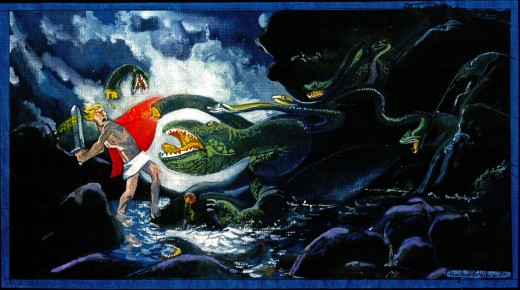
This one looks almost as though it were painted
on black velvet – appropriately enough.
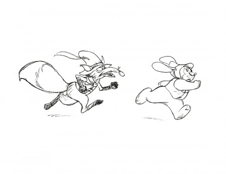
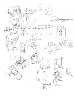
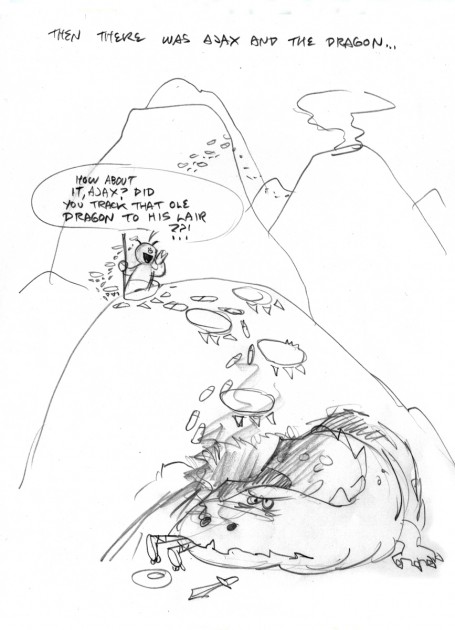
Suzanne Wilson also sent these very rough cartoons RBW did:
 19
19
