Category ArchiveIllustration
Animation &Books &Disney &Illustration 09 Nov 2013 02:31 pm
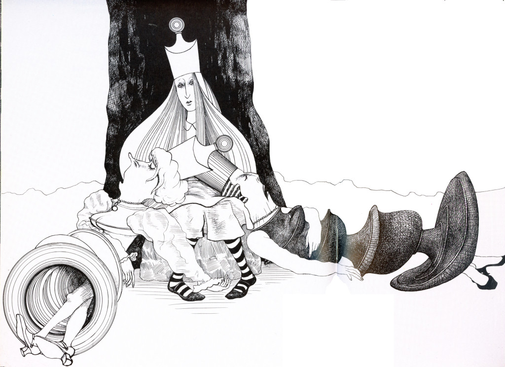
Waking UP
 1
6
1
6I’m still Here by Tom Waite and Kahleen Brenan
 7
7
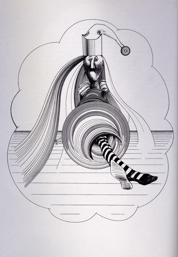
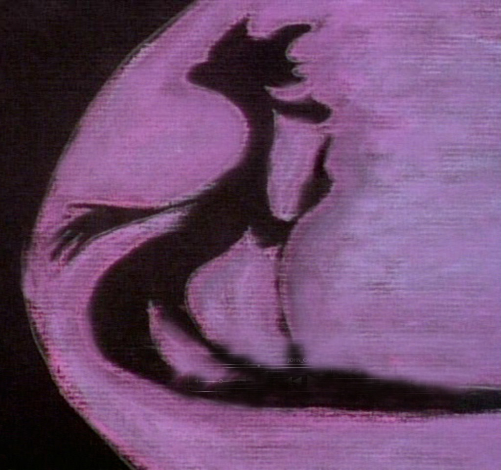
You haven’t looked that way in years you dreamed me up and left me here.
 8
8
How long was it you wanted me for you haven;t looked at me that way in years.
 9
9
Your watch has stopped and the pond is clear.
 10
10
Someone turn the lights back on I’ll love you til all time is gone
 11
11
You haven’t looked atr me that way in years.
 16
16
Song from Alice by Robert Wilson. Song by Tom Waite and Kathleen Brennan]
Books &Commentary &Illustration 22 Oct 2013 06:20 am
Steadman meets Jabberwocky
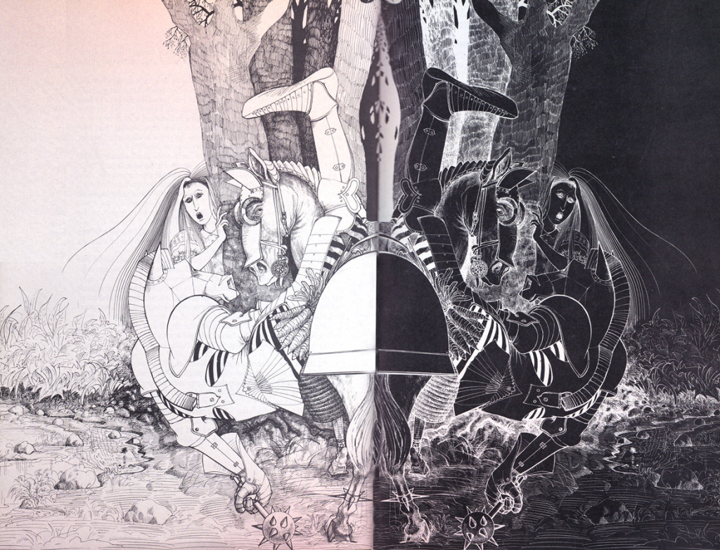
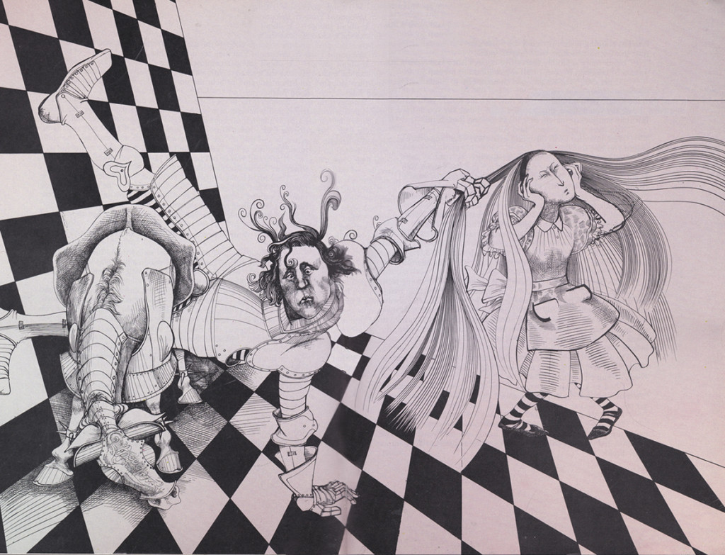
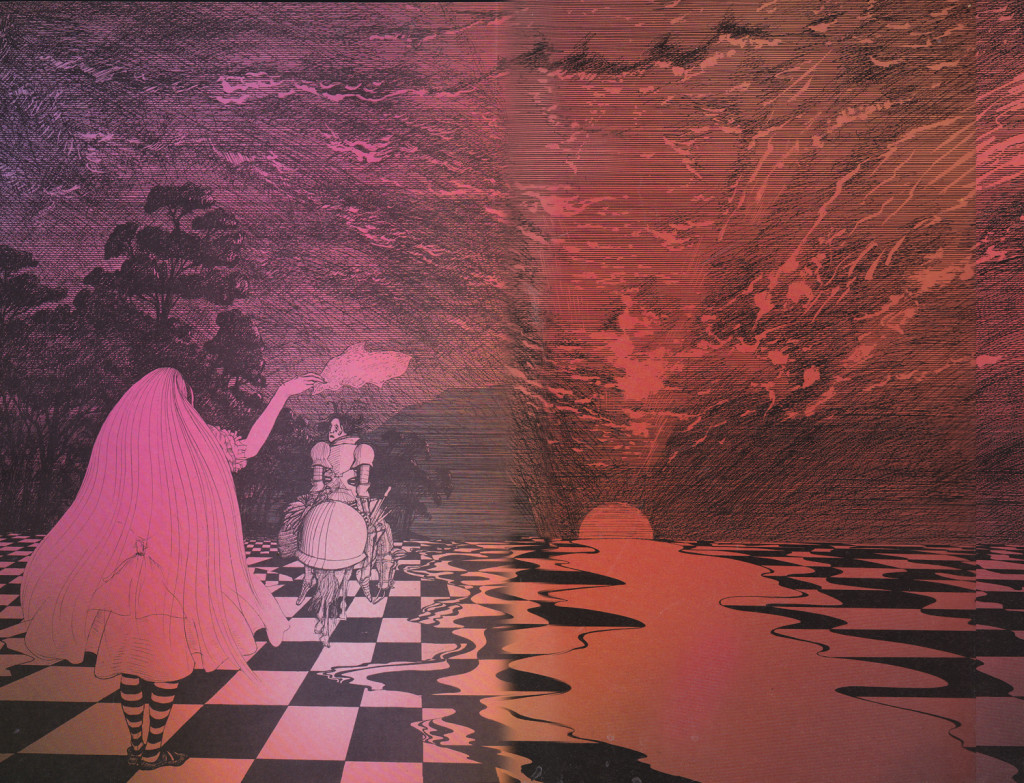
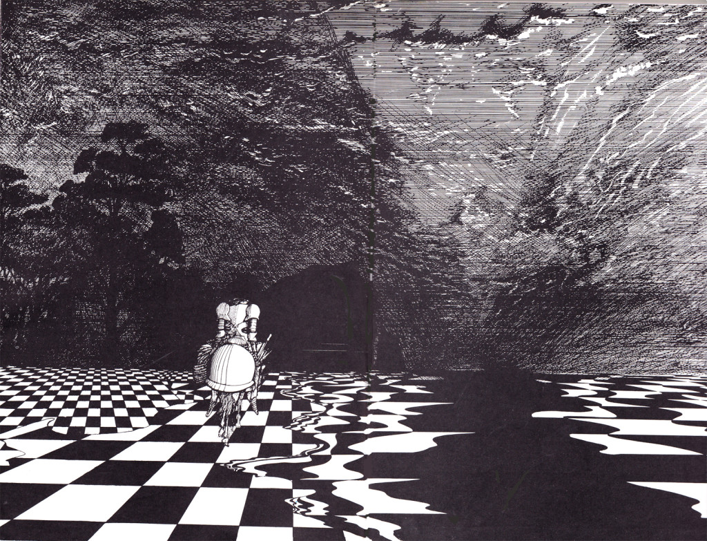
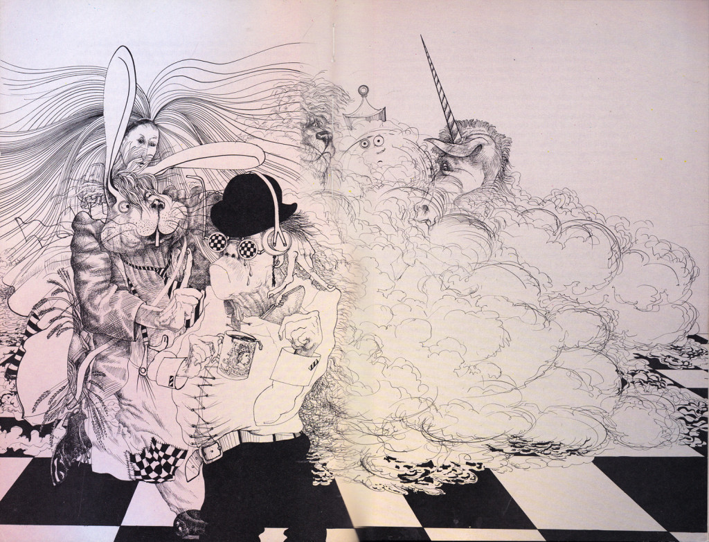
Ralph Steadman has reached the White Knight, who gets to recite Jabberwocky for the first time.
It’s a brilliant delight, of course, and the illustrations are completely up to the task. But this is from a wholly different book. (It’s published out of order within this volume. If it weren’t out of order it’d be too long to fit dramatically, here.) I believe I may have once posted Jabberwocky or some of it, anyway. I can’t find it just now. I also have the version by QUentin Blake which I know I didn’t post. (THAT book is a rarity.) I really do love Lewis Carroll’s work.
Soon after the White Knight is defeated by the young, imbalanced Red Knight (don’t ask, read it), the Red Knight tries to recite his poem but has a bit of difficulty. He has to keep time with his right hand while trying to stay in balance on his horse.
However, he keeps falling off the horse when his isn’t reciting. The man has a problem.
Tell me, don’t you think the Red Knight looks a bit like a young Prince Charles? My thought, of course. Would Steadman be that rude to treat his royalty so?
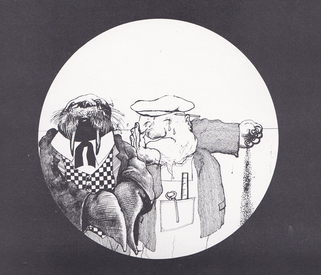
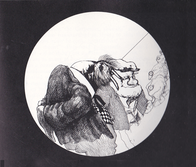
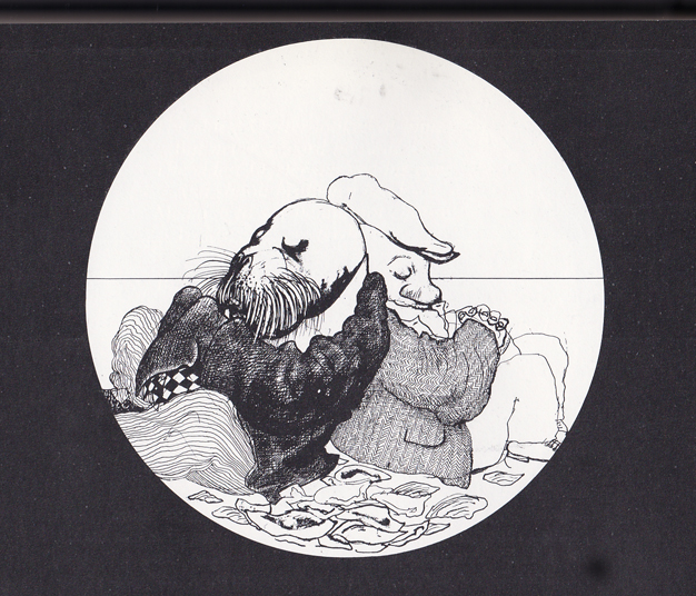
Here, uninterrupted, are the illustrations:
 1
1
Starting today, I’m going to end a lot of my posts with images from Michael Sporn Animation Inc films. I have to say, in all the years of making so many films, too infrequently have I posted pictures of the work we’ve been doing. It’s about time.
Michael Sporn
Sporn images
from
The Hunting of the Snark
The individually wrapped video box from First Run Features 1
Books &Chuck Jones &Commentary &Illustration &Layout & Design &Models 26 Sep 2013 08:22 am
Rhapsody in Working for Suherland
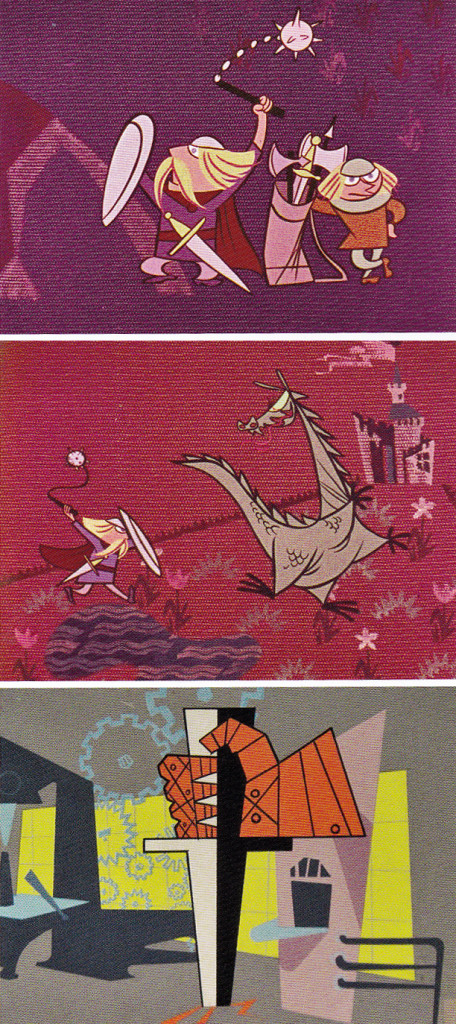
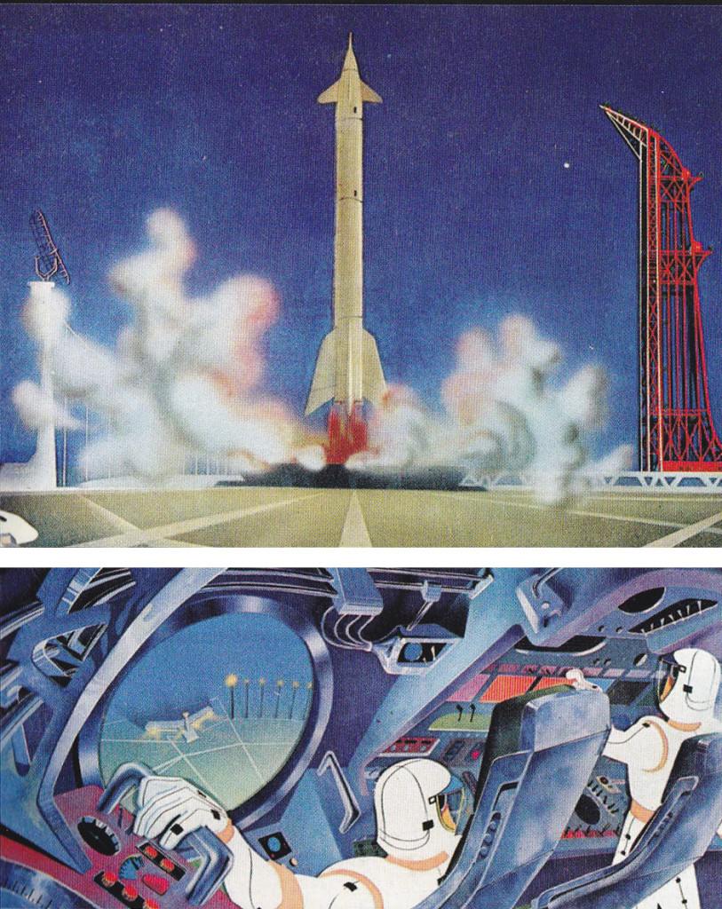
Maurice Nobel worked several years at Warner Bros. under Chuck Jones for the most part, but in 1950 he moved to John Sutherland Productions where he worked on lesser known projects. He had a money war with Eddie Seltzer at WB and accepted the higher price from Sutherland with Selzer telling him that the door would remain open.
WB tried to turn everything to 3D and gave up after one cartoon, Lumberjack Bunny. It’s obvious that some of Maurice’s LOs were prepared for 3D and were switched at the last minute. WB was closed for a year when it was decided to stop production on the 3D films. Noble had taken the right course in working for Sutherland for the few years he was there.
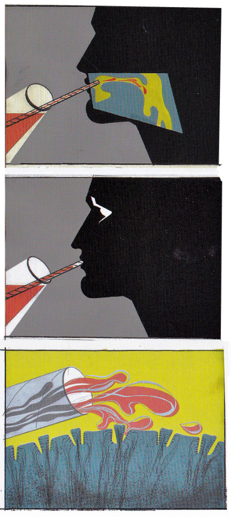
Color keys to the John Sutherland Prod
Gateways to the Mind
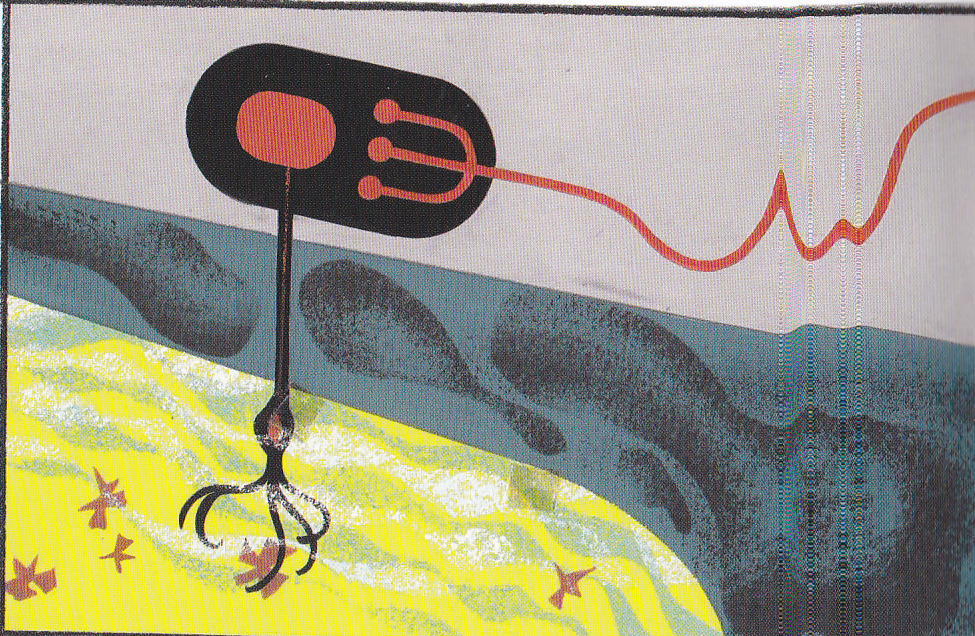
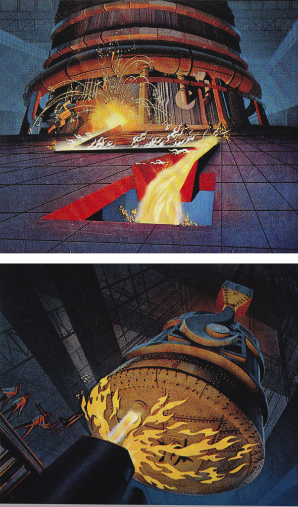
Rhapsody in Steel (below) was a high budget film for Sutherland with Eyvind Earle hired as Art Director. Ultimately he just painted the BGs that were designed by Maurice Noble. This beautiful film can be seen on YouTube, here.
Illustration 25 Sep 2013 05:58 am
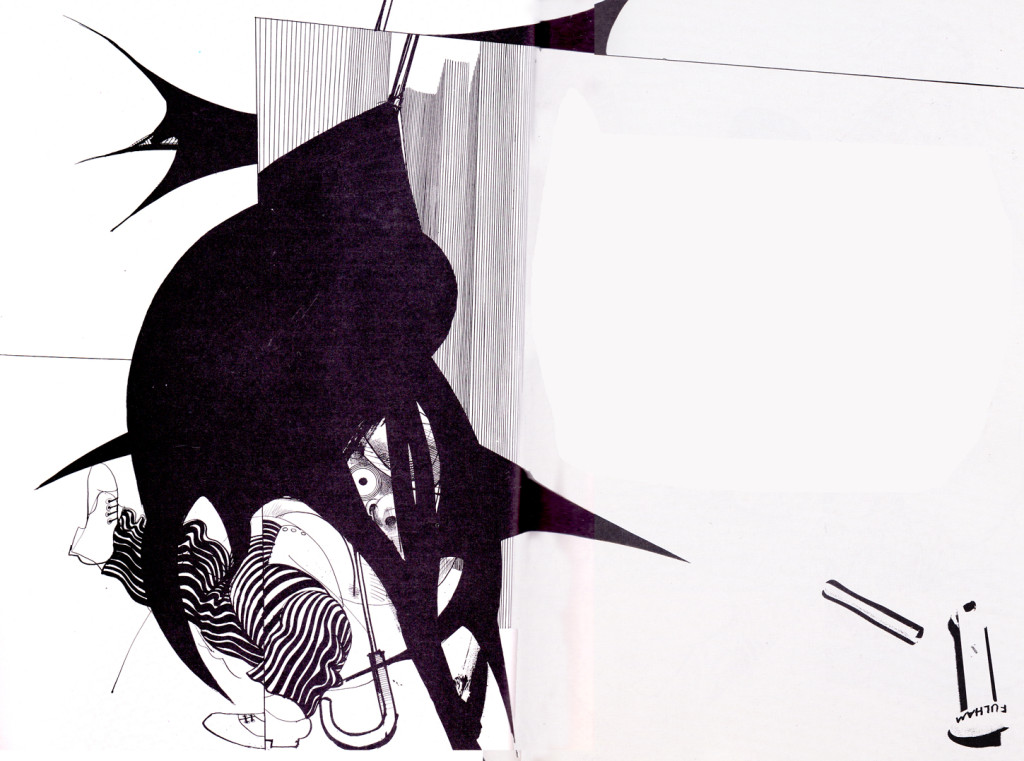
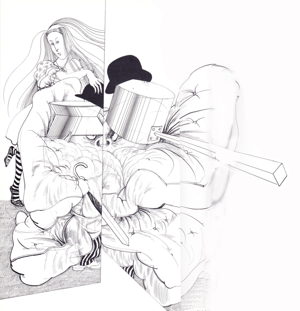
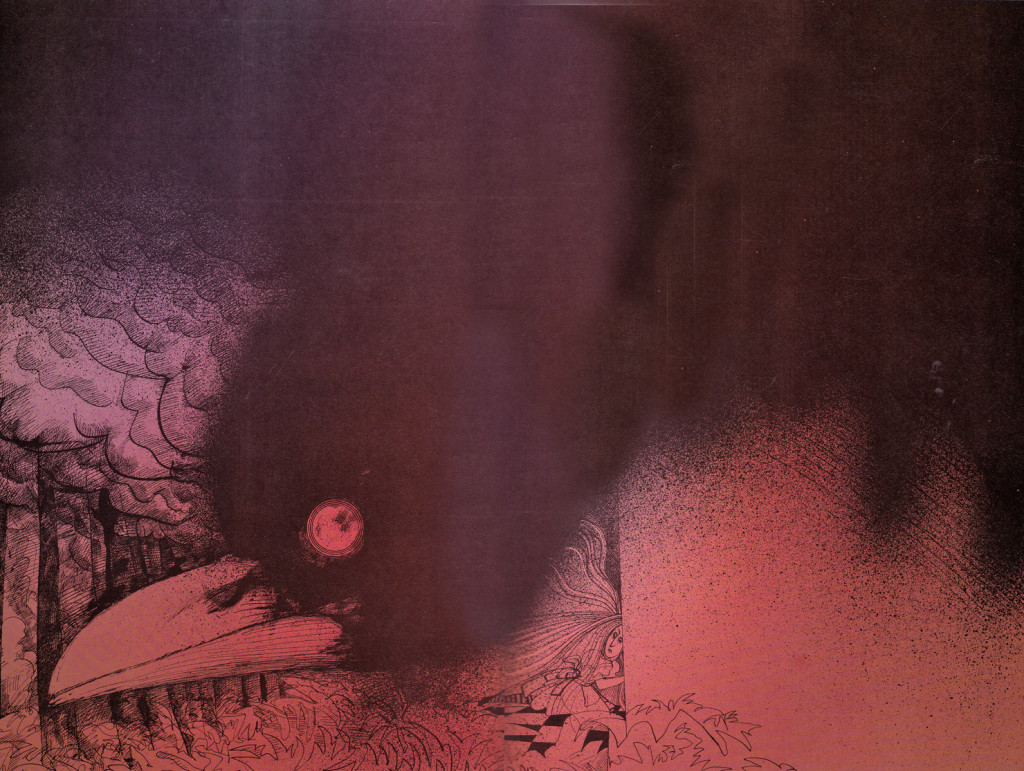
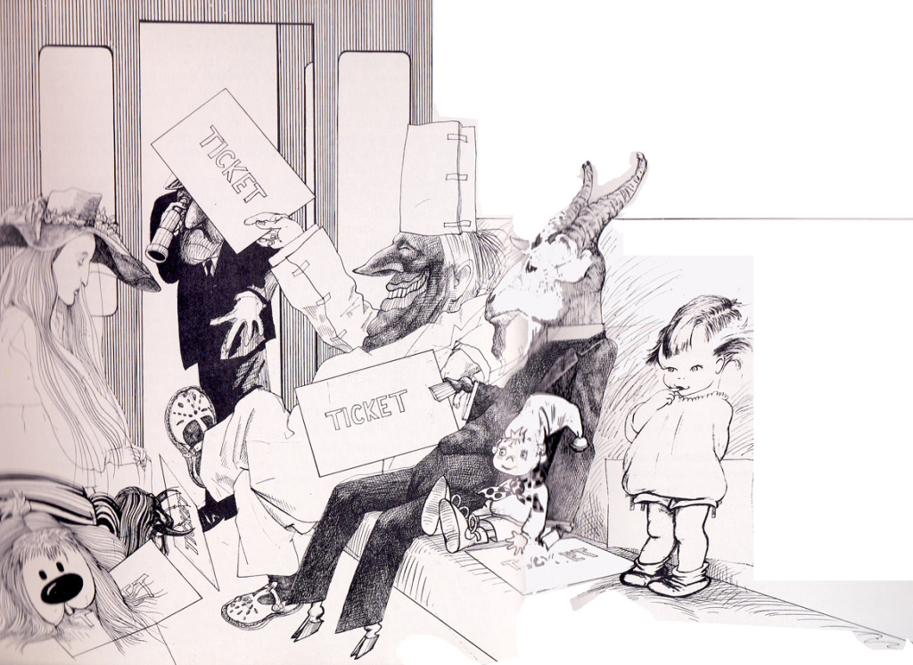
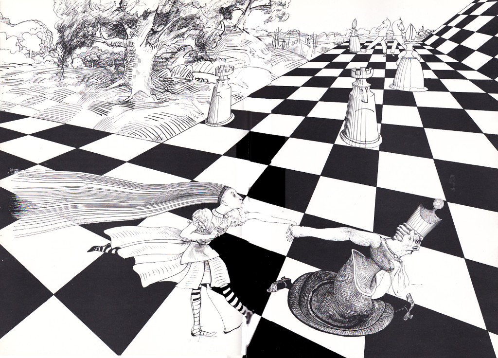
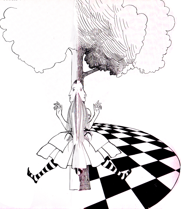
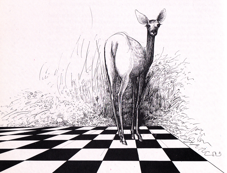
Steadman’s Alice in Extremis
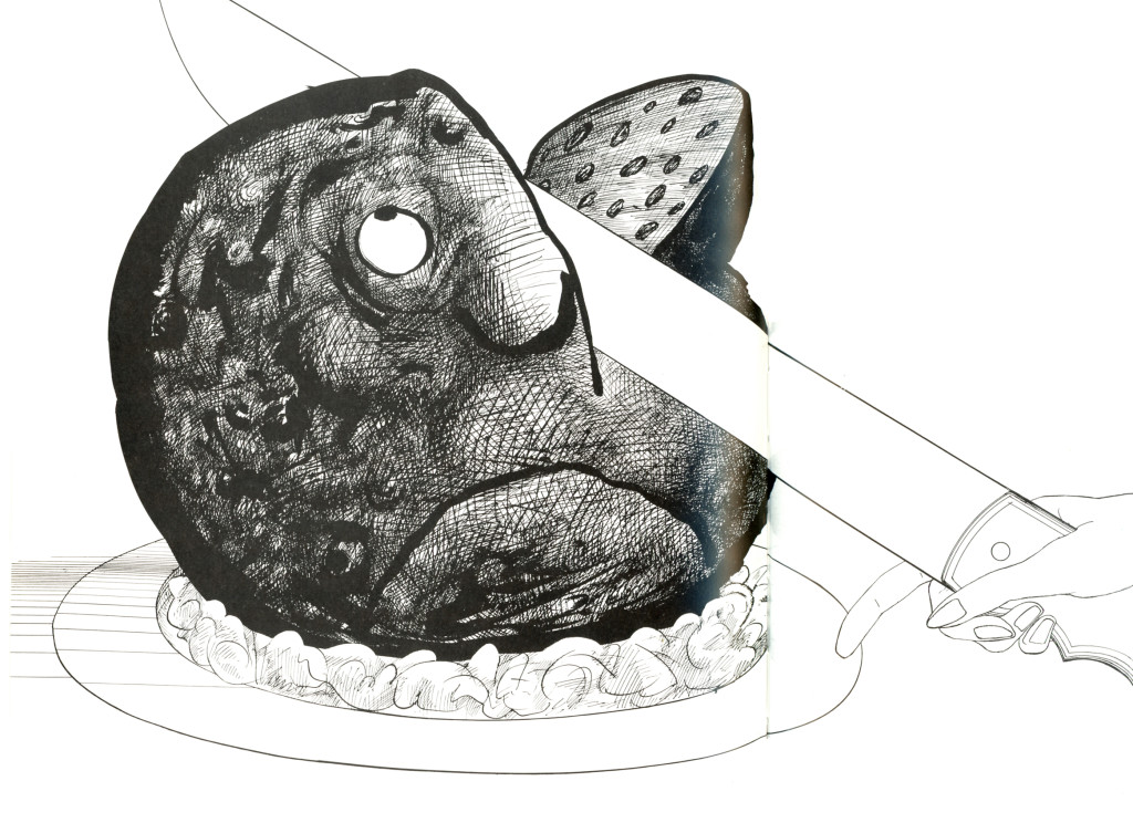
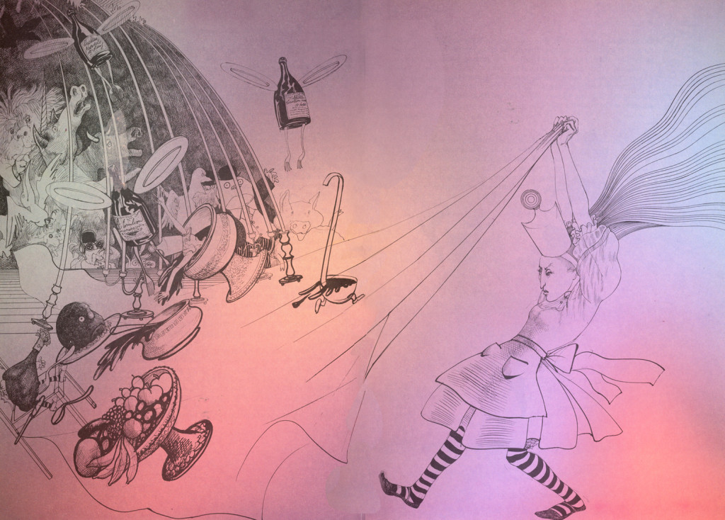
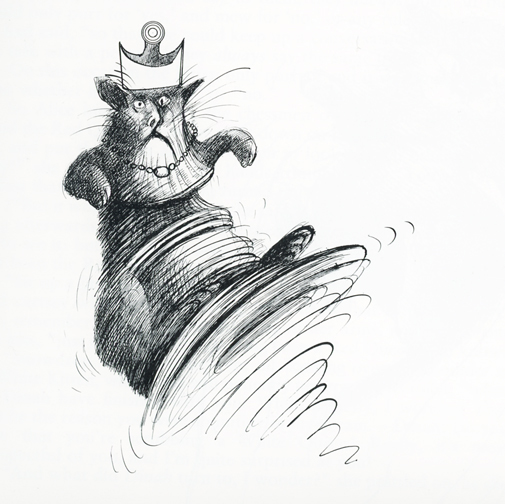
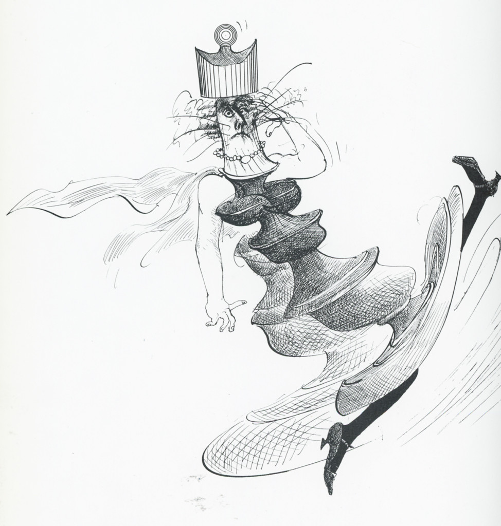
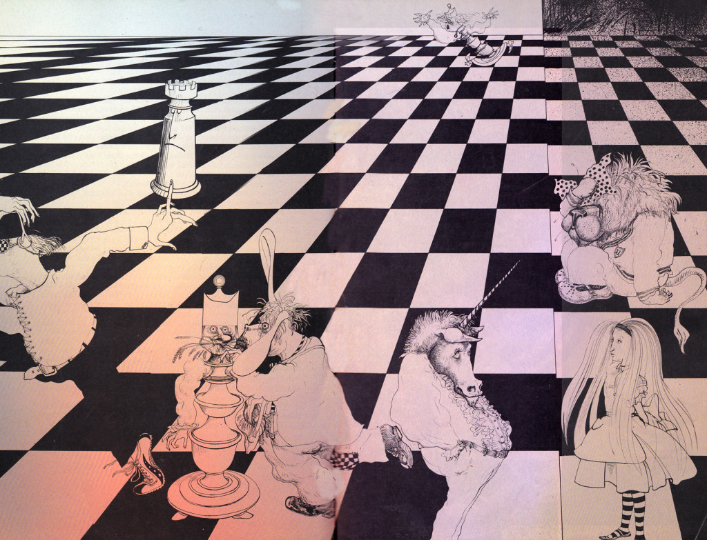
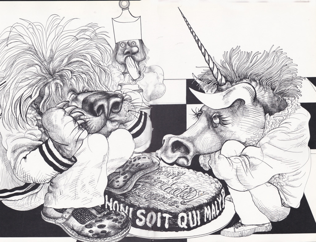
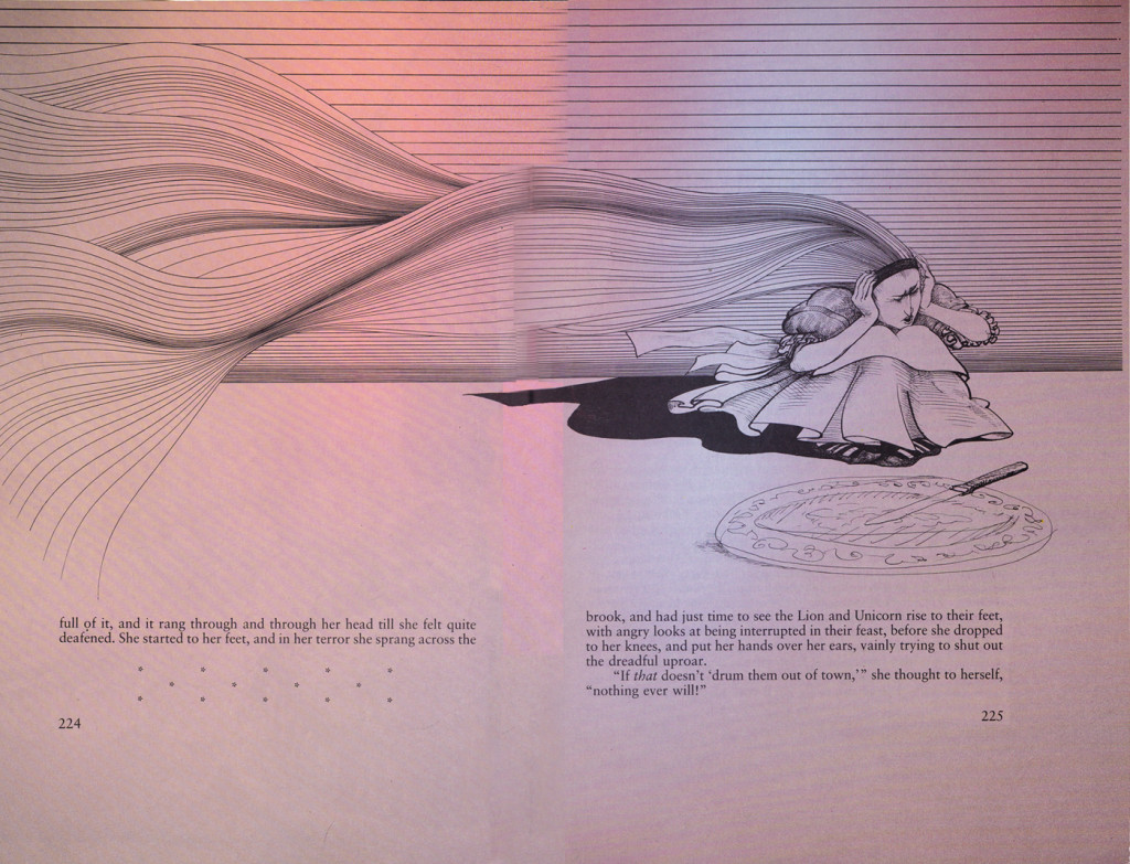
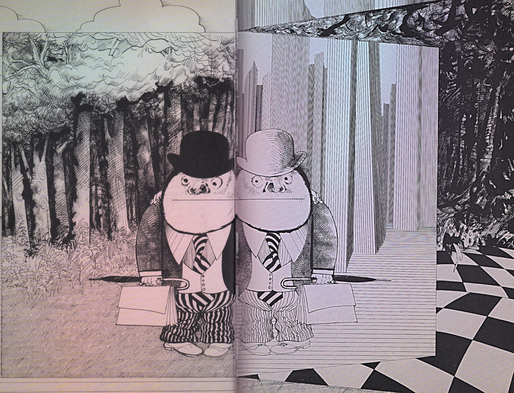
Here we have some real choice illustrations by Ralph Steadman. Some of these images seem more an illustration of something Edgar Allan Poe might have done than delicate portals to Lewis Carroll’s world. Yet Swteadman has captured the underbelly of the beast of that afterrnoon tale Dodgson created onn-the-spot for Alicie Liddell. But let’s not split hairs; let’s just enjoy the artwork. These pieces take us about half way through the book. Lots of work all great. Only John Tenniel had done better work, and his was the first voice we got to hear.
 1
1
Animation &commercial animation &Illustration &John Canemaker 19 Sep 2013 01:05 am
John Canemaker’s Movies
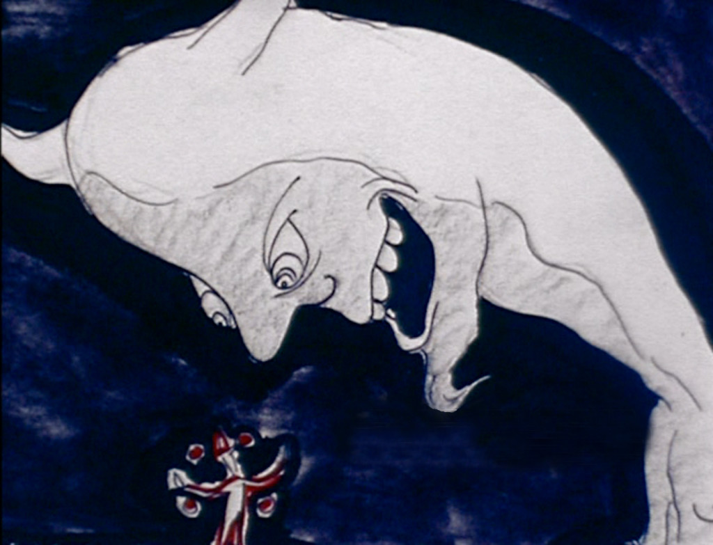 John Canemaker has been making animated movies for ever. I know because we both started at about the same time. Somewhere in the late Seventies we exchanged our early films to get a look at what each other was doing when we were younger. Leslie was tuning out a lot of footage imitating sequences I’d sen in the movies: a couple of dogs (certainly not Lady or Tramp) eating lunch, a limited animation vizier climbing pillars in imitation of 1001 Arabian Knight not with Mr. Magoo.
John didn’t do much in the way of limited animation; he told me he wasn’t able to figure it out. My own work was definitively derivative. I’d redone the Flintstones opening – my own version. Gay Purr-ee led to my attempt at animating the impressionists. I saw something in a theater or on TV and would immediately immitate it. I did a lot of live action/animation combinations. I was fascinated by the modern work. Title sequences to Saul Bass’ films led to my versions. Once I’d seen UPA – the Gerald McBoing Boing Show, I did my own variant. There was a comedy album called The First Family.Vaughn Meador and other comedians impersonated the First family – the Kennedys – singing song parodies of the time. I did my parody of these sung-through albums that quickly lost synch. But you could see the effort that had been taken.
Whereas John worked only in 2D cel animation, I brought out lots of other wares. Clay was easy to animate and allowed me to turn out footage fast.
When we screened them for each other, we were both impressed even though we had to trade off the films and watch them privately. We both did great work; we both did horrible work. My father and brother-in-law constructed a multiplane set with about 16 levels of glass (easily 18″x24″) with about 8000 watts of light. I had my take on Fantasia to work out.
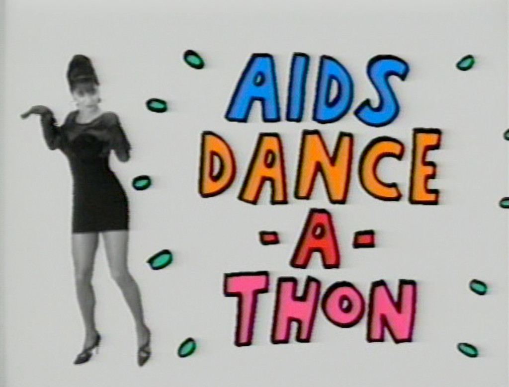
 John’s early films – not those we’d shared with each other, but his more professional work – now have a DVD all their own, and I’d
like to talk about these pieces. The DVD, John Canemaker – Marching to a Different Toon will permanently act as a good sampling of one artist’s view of the world. It presents a multiplicity of styles with a wide range of subject matter.
Bottom’s Dream feels like a sketch out of Fantasia as we see a short piece derived from Shakespeare’s “Midsummer’s Night Dream.” Once Titania has turned Bottom into an ass there is a dance wherein he’s trying to escape from the curse. Composer, Ross Care brings Mendelsohn’s music to life as the film’s backdrop.
Confessions of a Star Dreamer features the actress, Diane Gardner, expressing the problems and joys of becoming an Actress. Confessions of a Comic did the same for an aspiring young stand-up comic. Several sequences froom some of the excellent documentaries are also incuded:Break the Silence: Kids Against Child Abuse (TV Movie documentary) (animator), 1988 You Don’t Have to Die (Documentary short), The World According to Garp’s animated seqeunces are also included.
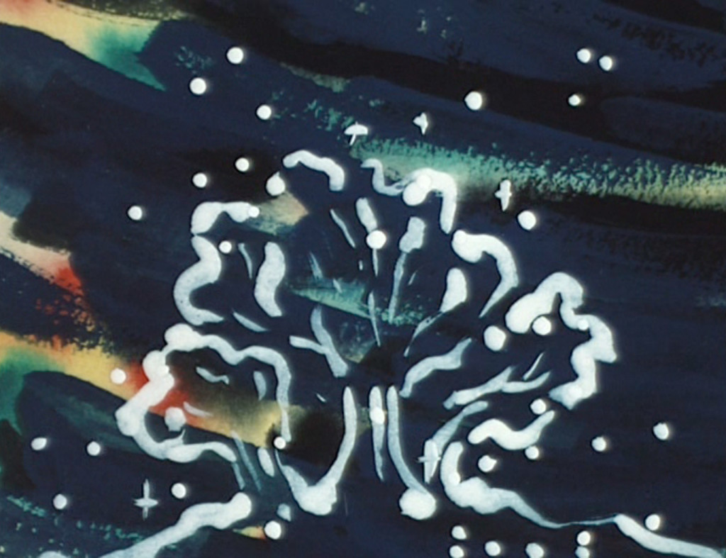
 I love the short Bridgehampton, which animates the beautiful garden John and his companion Joe Kennedy, hae developed over the years (see some photos of the actual garden here.) It’s a wonderful little spot on the earth and how joyful for John to make a film paying tribute to his own little bit of nature.
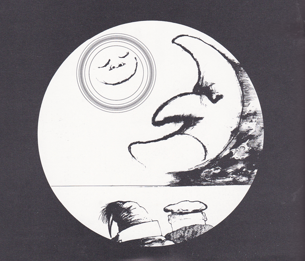
These films were all done just prior to John’s Oscar winning short, The Moon and the Son: An Imagined Conversation, which is featured on its own DVD.
This is a rare collection of shorts and one you’ll enjoy if you want to know more about the fame animation historian/animator.
Books &Commentary &Illustration 16 Sep 2013 07:45 am
More of Steadman’s Alice
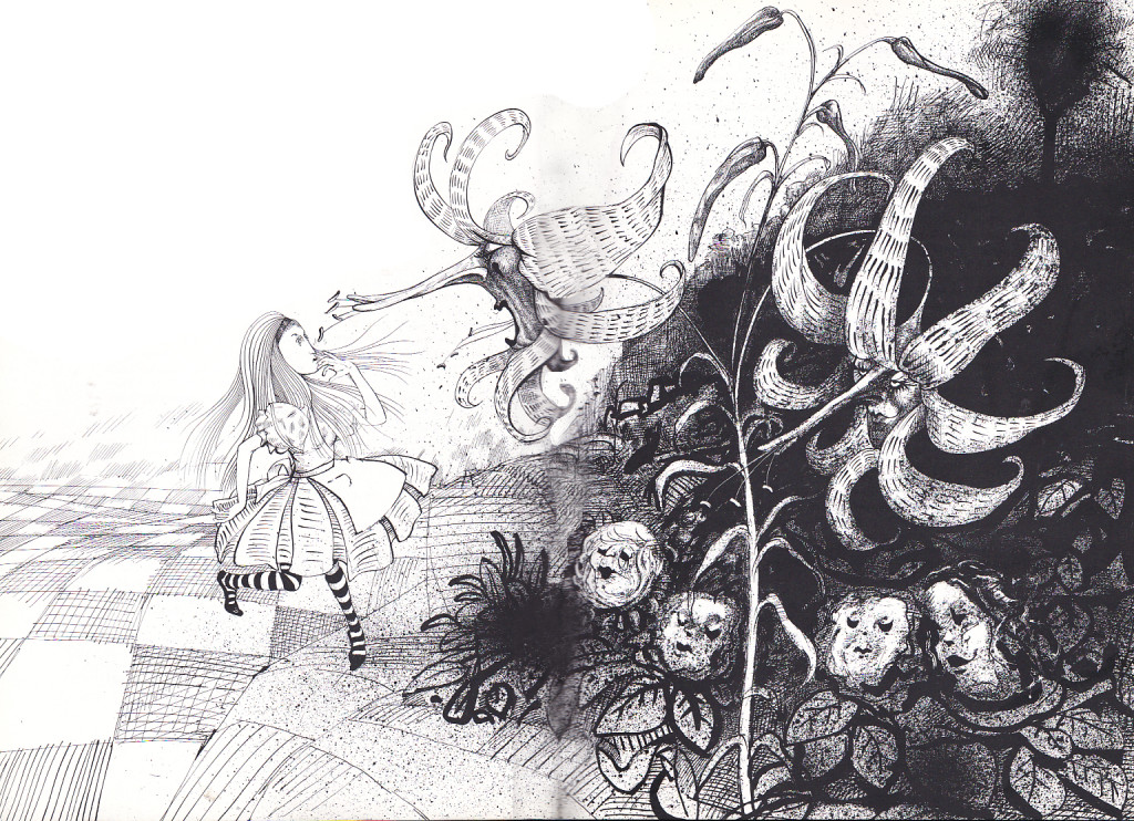
Here are a few more pages of Ralph Steadman‘s Alice In Wonderland. This takes us up to Tweedledee and Tweedledum. Major scanning coming up, so I had to break here.
 1
1
Illustration &repeated posts 07 Sep 2013 11:50 pm
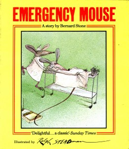
Emergency Mouse – repost
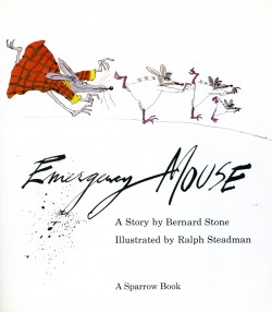
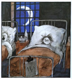
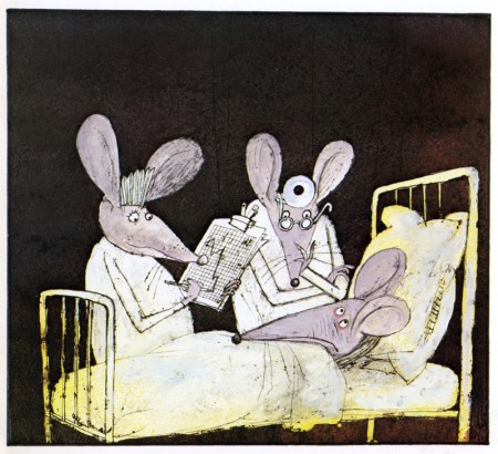
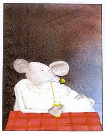
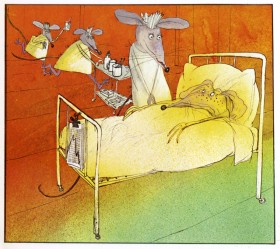
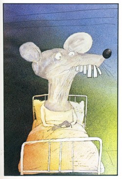
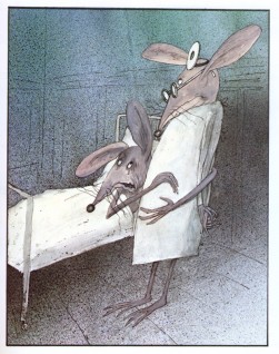
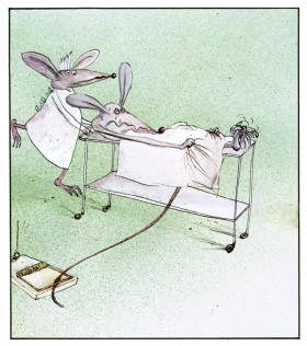
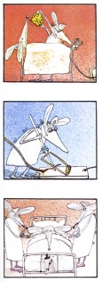
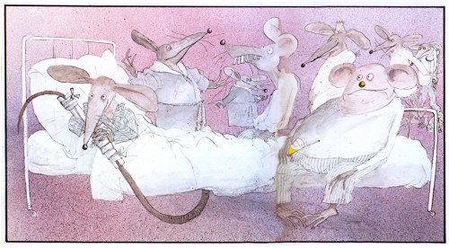
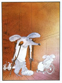
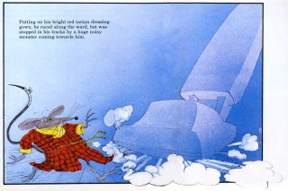
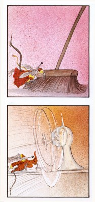
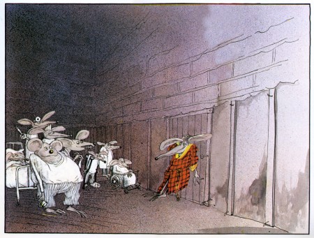
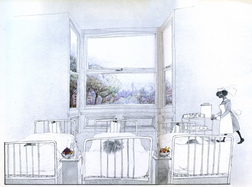
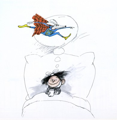
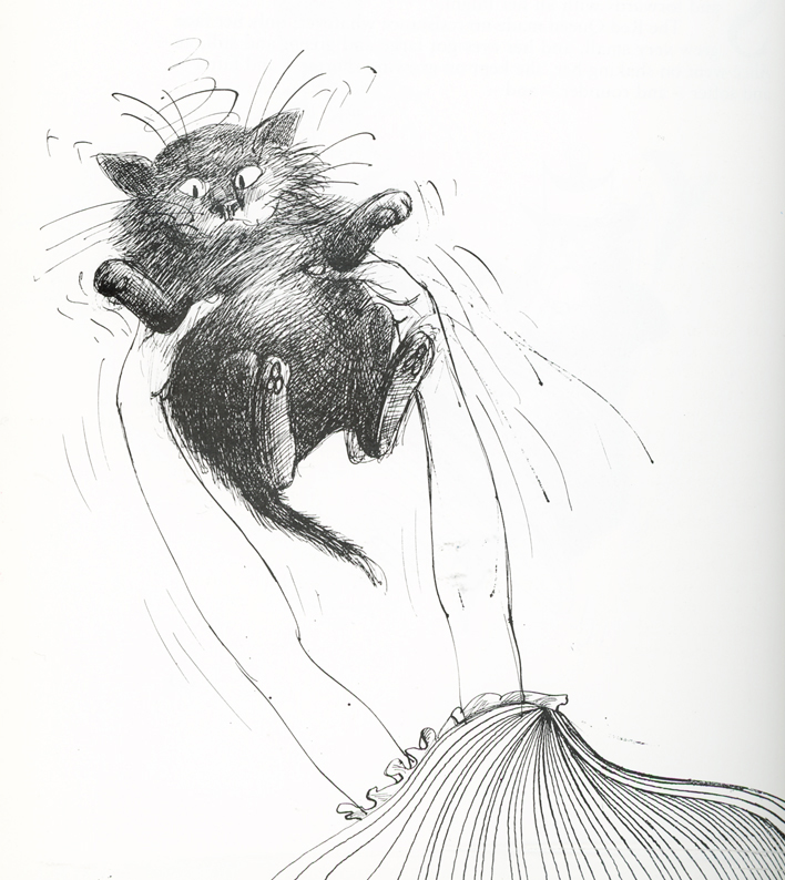
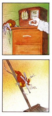
- Have I mentioned more that a dozen times in the last few weeks, that I’m a fan of Ralph Steadman’s artwork. Here we take a short break from Ralph Steadman‘s Alice in Wonderland to post something original from him, Emergency Mouse. The guy’s a real artist. Here’s a few pages from the book:
 – I’ve been a Ralph Steadman fan/collector for most of my life. I love the guy’s work and would give anything to be able to do anything remotely as well as he does.
His versatility with pen and ink, dyes and watercolors doesn’t quite hide the magnificent draftsmanship behind his illustrations. Many try to copy his style and none have come close – though Gerald Scarfe has made a nice living off of a similar style – though a bit sweeter. Others, more academically inclined, those who swear by the Bauhaus rules, tend to turn their noses up at his work. I like to think of Steadman as the Jim Tyer of illustration.
Regardless, the work is brilliant. His art always has an amazing intelligence carrying it to the highest pinnacle. It breaks the rules and makes new ones. Illustration comes damn close to Art.
Not too many people have focused on his children’s books, and there are many. Not least is the series of “Mouse” books he’s done with Bernard Stone. Here is Emergency Mouse, a good example. I’ve not lifted the script but am merely showcasing the illustrations. Unfortunately, this also takes a bit away from the book design which is unique on its own. The type is well placed to balance off the different sized illustration.
If you want to read the story, you’ll have to get the book from the library – or buy it.
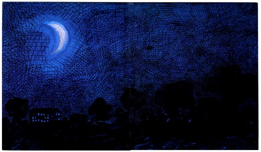
(Click any image to enlarge.) This is the inner cover. ____
 14
14
Animation &Animation Artifacts &Commentary &Illustration &Independent Animation 31 Aug 2013 08:27 am
Getting Old
You see the problem is that when you get older, priorities change. Take a look at Mike Barrier‘s blog. He knows what’s important amd surely it’s the ghsts of the past. Yes, we want to know who did what and when and where, and we move heaven and earth to get that part right. For the most part it is.
Then you have to look for and preserve those beautiful drawings of our youth. We get all the help we can, and we get it right. But there’s still so damned much work to do.
I’ve been digging into the archives, and lord knows most people aren’t ready to admit they’ve already viewed these drawings a half dozen times before. It’s not like saving Savannah or moving some extraordinary pictures. So they were moved on, then 0n again, before being devoured,
I love this work; I love animating it even more. When some semblance of life shows up in those drawings.
Getting older means it’s harder to get the point across. The message engines more seriously, and people all about watch for the brim of your head. They want to see you, too, so you’re on display like as not. The cartoon you planned has turned into some kind of “Art” and you try harder.
Then you really get tired. But you go on,god bless you. You try hard.
Commentary &commercial animation &Illustration &Layout & Design 30 Aug 2013 12:49 am
Child Development care – on a tight shoestring
- Let me give some attention to a series of films we did for UNICEF back in the 90′s. There were four films which focussed on Child Development, trying to teach parents in the Third World how to take care of their children in the first eight years of development.
The animation proved crucial, but without a unique artistic style there’d be nothin but cute baby pictures. We were successful (or I wouldn’t be talking about them.)
These films were brought to me by one, Cassie Landers. A well trained educator and an employee of Unicef where she promoted child development training and was hoping to use film to get the message across to the Third World.
Primary to these films was to get the point across that females deserved as much attention, including education, as the boys did. This is a major problem throughout the world, and UNICEF has done an entire series specifically for India about it.
Our aim was to encourage good diet, good behavioral practices and, again, the importance of a good education. The four films were ultimately combined with some live action footage of T. Berry Brazelton talking with children and introducing each of the four segments.
Hillary Rodham Clinton, as First Lady, introduced the entire 1/2 hr. show.
Here are some frame grabs from about 2/3 the scenes of the first film, Off To A Good Start.
 1
1
 2
2
After the UNICEF logo, the film started with a montage of children’s faces.
 3
3
I’ve compiled about a third of the faces.
 4
4
The camera continually moves in on the faces while …
 5
5
… constantly dissolving to the next setup.
 6
6
This was the opening to all four of the films.
 7
7
It was accompanied by narration by Celeste Holme describing the films.
 8
8
The narration was written by UNICEF Producer/educator, Cassie Landers.
Sue Perotto drew all of the children’s faces for the opening.
 10
10
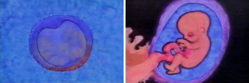
The first film started with prenatal care.
 11
11
Giving a very short the child in the womb.
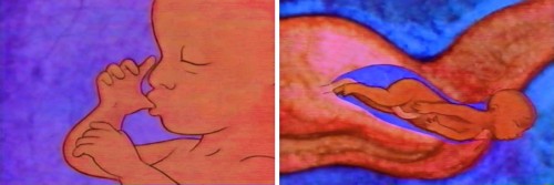 12
12
Right through to the actual birth.
 13
13
Then it jumps to the first year of development.
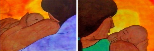 14
14
The art style was designed after Matisse’s Moroccan paintings.
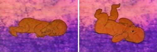 15
15
He had a very primitive set up colors with
earth-toned characters dominating their paintings.
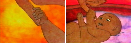 16
16
We tried to reproduce the feel of these paintings
allowing the texture of the paintings to run and bleed.
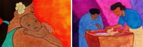 18
18
This was all done pre-computer days, so all art was
painted on paper, then cut out and pasted to cels.
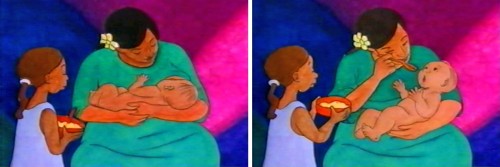 19
19
It was all shot on camera by Gary Becker at his FStop Studios.
 20
20
The first year continues with similar setup.
 21
21
After showing some advanced activity . . .
 22
22
. . . we show how the brain has started to . . .
 23
23
develop enormously in this first year.
 24
24
The child learns to get up and crawl.
 25
25
From here she learns to walk.
 27
27
Then he learns to play more sophisticated games . . .
 28
28
. . .utilizing tools that require more dexterity and thought.
Directed by Michael Sporn
Produced and Written by Cassie Landers EdD, MPH
Narrated by Celeste Holme
Music by David Evans
Production Coordinated by Masako Kanayama
Backgrounds by Jason McDonald
Edited by Ed Askinazi
Photography by FStop Studio – Gary Becker & Bob Bushell
Technical Consultant Marc Borstein Nat’l Inst of Health, Bethesda MD.
Office Manager Marilyn Rosado
Animation by Rodolfo Damaggio, Sue Perotto, Michael Sporn
Rendering by Christine O’Neill, Matt Sheridan, Stephen MacQuignon, Masako Kanayama
Special Thanks to Nigel Fisher, Deputy Regional Director,
UNICEF Regional Office for the Middle East and Africa
Articles on Animation &Books &Chuck Jones &Illustration 27 Aug 2013 11:11 pm
More Than the Scenery
I am a fan of the work of John Ford. If I’m caught catching a minute of one of his films, you’ll see me stay through to the end. Likewise I have almost as great a respect for the animation design work of Maurice Noble.
It never fails. I get to the point where I’ve just about run out of hope for animation, and I feel like the greatest pessimist in the world. When I say “animation,” I mean 2D. Every frame is controlled by one person. The rest – cgi – is, to me a graphic effect, electronic puppetry. I’m certainly not talking about the overacted cg action you see in most films done today. Most animation to me, these days, is something that’s done in a computer by teams of people, and isn’t wholly designed as “personal.” There are, of course, the exceptions. When something like THE LIFE OF PI shows up, it feels like magic; the magic you expect of great animation.
There’s just too much of everything in most current animation; even the flash Mickey Mouse spots go too fast with their Zips, Pans, Takes; the simplest move seems to go over the edge. Gestures are bigger than they need be, actions are over the top, dialogue is too loud and frenzied unless it wants to be quiet – then, it really is dead. The animator became that big red button they have at “Staples.” You press it and the client can fix what he has to – his way. The poetry has vanished from the art form when this animation begins. Too bad there’s no personality in those big red buttons.
John Ford made some of the most beautiful movies we have on film. Many of these are Westerns, Westerns which notably featured some of the most extraordinary, natural land masses photographed. The incredible buttes and sights appear in the Arizona Desert, called “The Painted Desert”, and whether they were shot in the glorious golds, violets and other colors or even shot in B&W they add extraordinary sights to these films. If they weren’t already there, constructed and painted by some god, Ford would have had to have a mass of people construct these images.
Working to a better advantage is the art director Maurice Noble who created his original version of the “Painted Desert” mostly out of his own imagination. I suspect he and a couple of other artists were all it took to develop these animated scenics: far fewer people and a lot less time.
As I said, Noble’s desert was original, a recreation of the actual “Painted Dessert” but one that developed out of Noble’s imagination. These are almost as beautiful as the real thing, in that “design-y” way Noble’s art had.
So here we have two film plans. Elaborate impersonal scenery that was designed by Mother Nature, vs the personal designs delicately designed by Maurice Noble. Both are very different but have similar effects on the films they inhabited. A personal world Ford shares with us and another that Noble constructs for the backdrops of the Coyote and Road Runner. Both set designs are larger than life and full of that very-same-life. It’s in gloriously wonderful color (even thoughmany of these sets were shot in B&W) it’s just the beginning of the strength of these films. We’ll look further to see what more has been offerred to us in their films.
