Category ArchiveAnimation Artifacts
Animation &Animation Artifacts &Hubley &repeated posts 30 Jul 2012 04:55 am
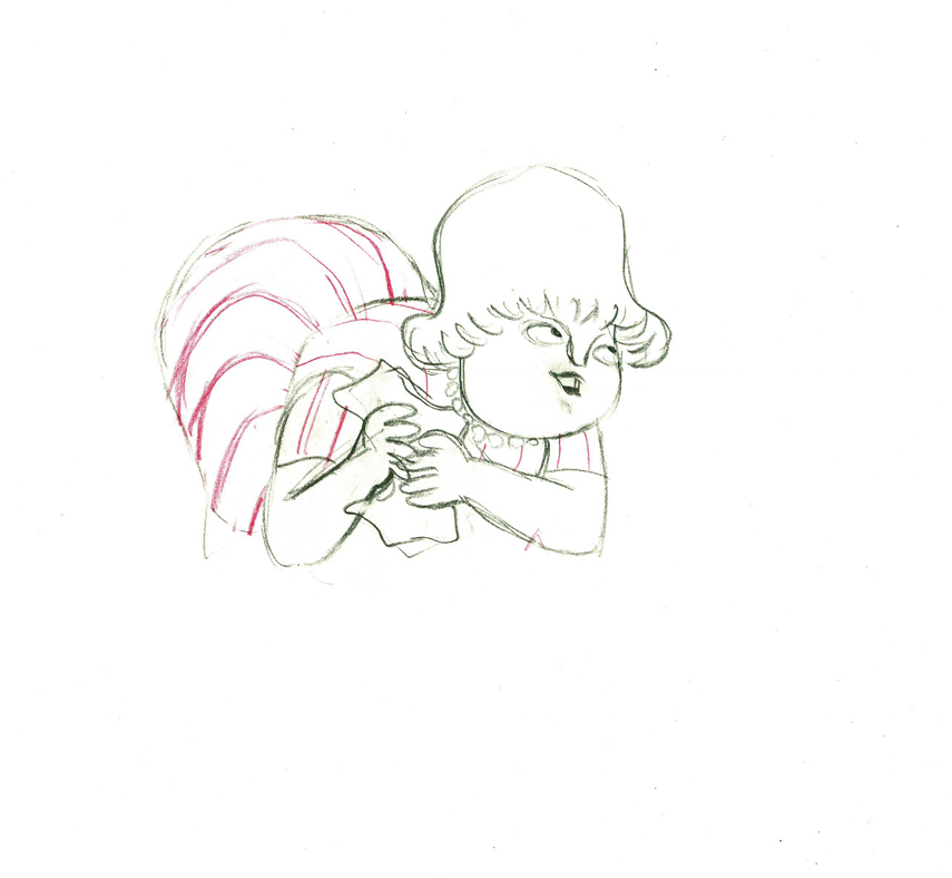
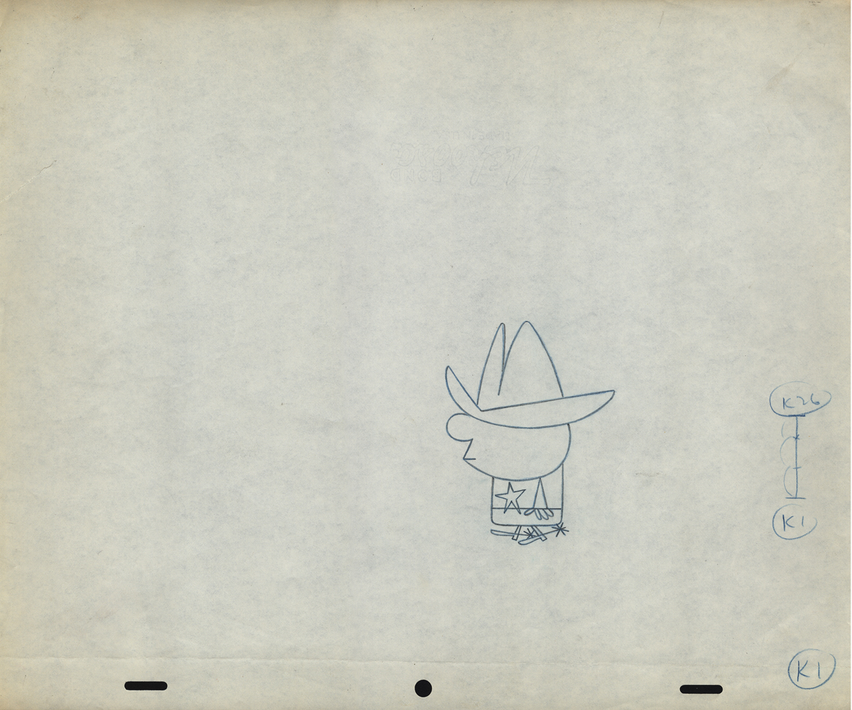
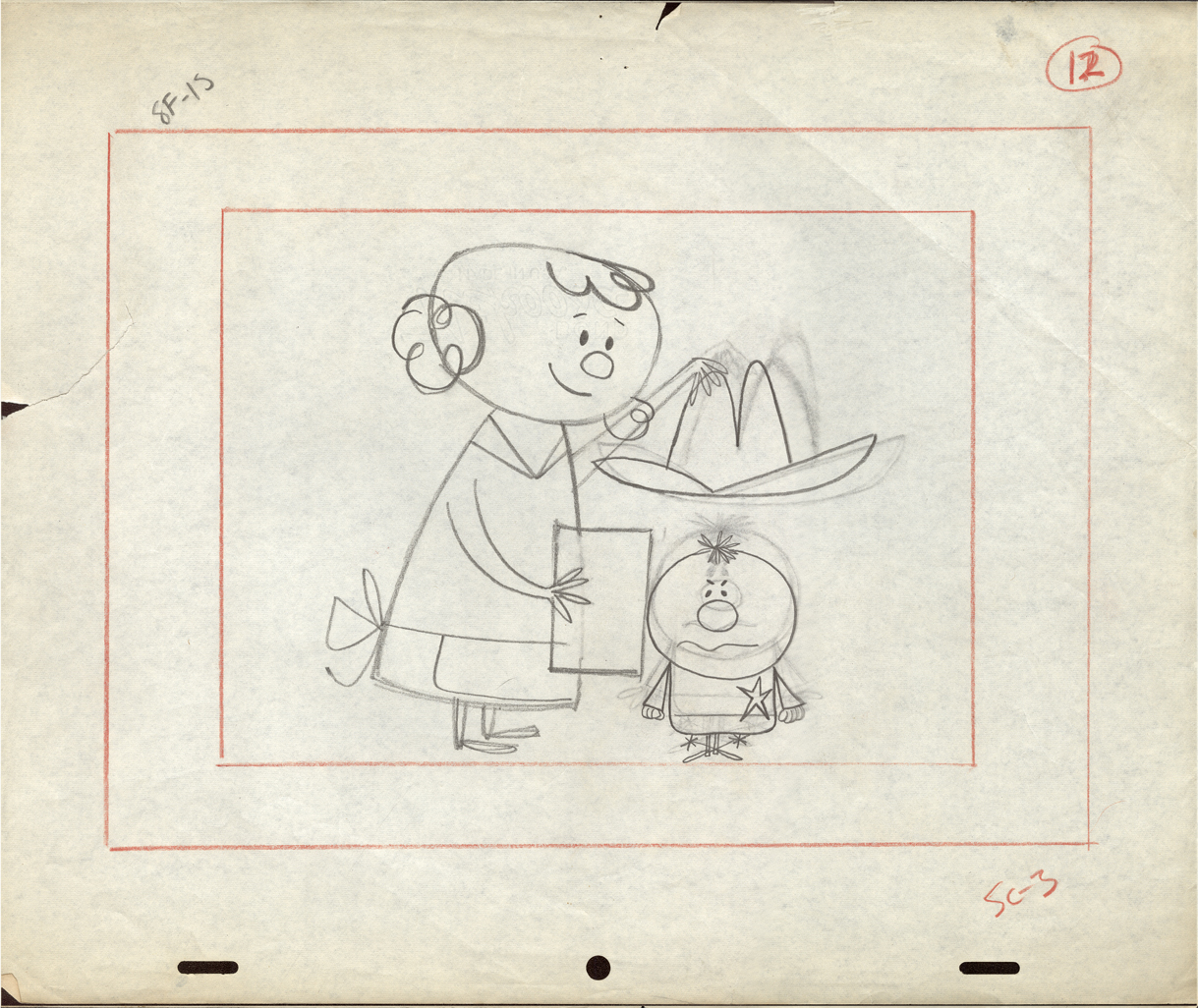
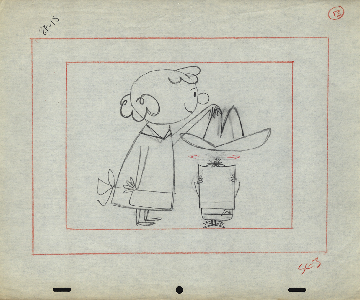
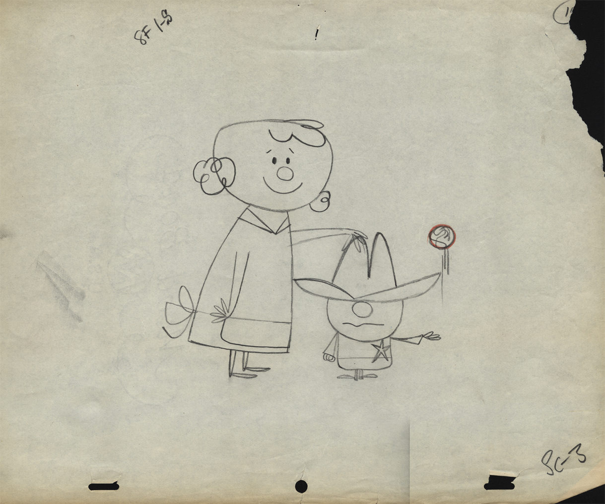
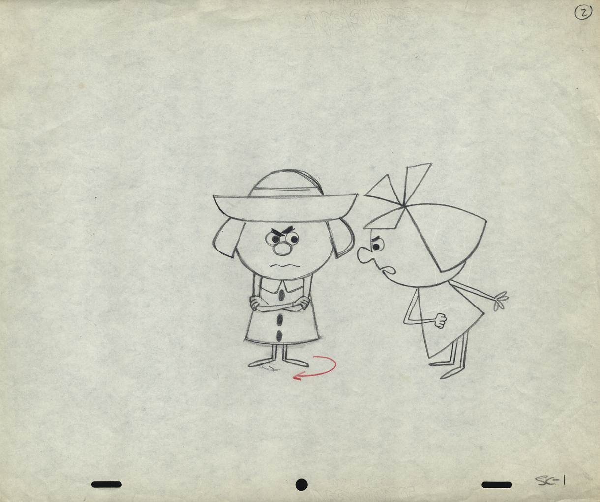
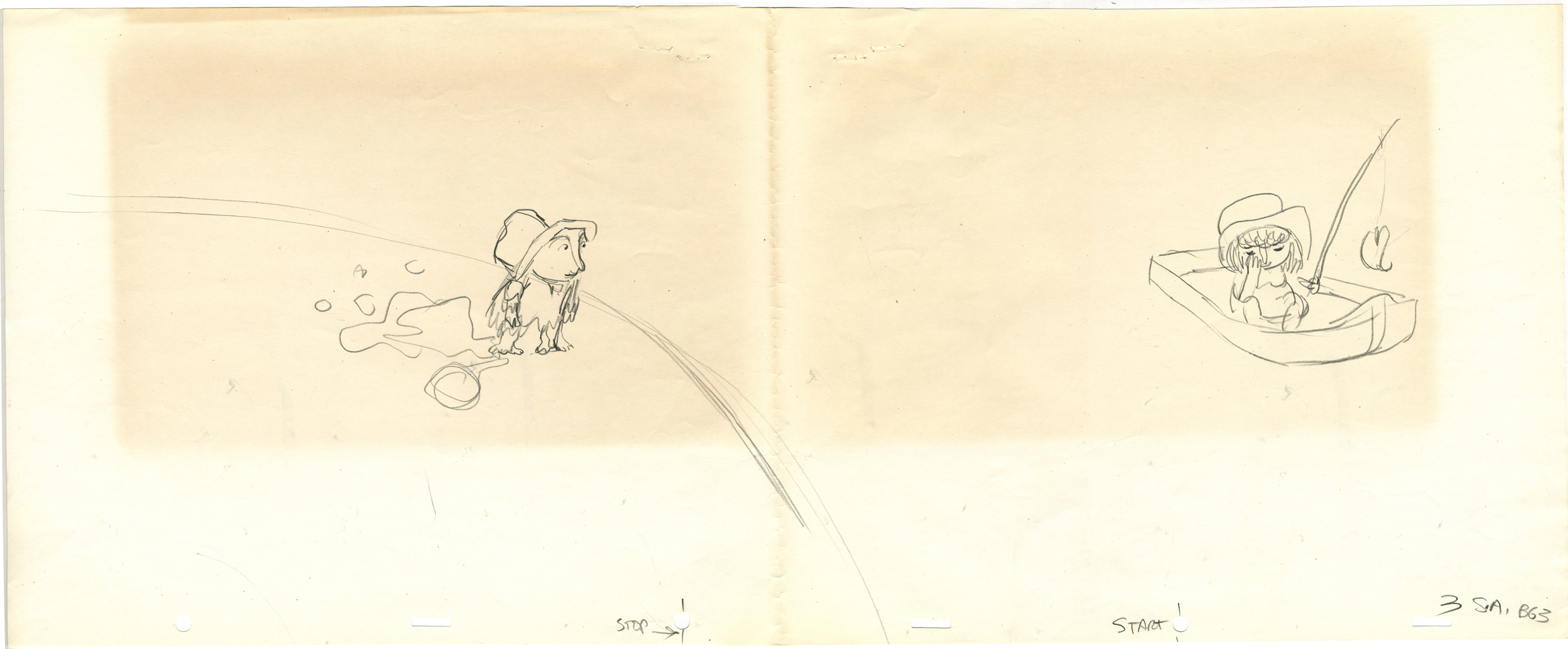
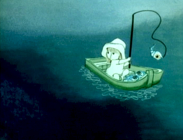
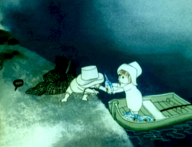
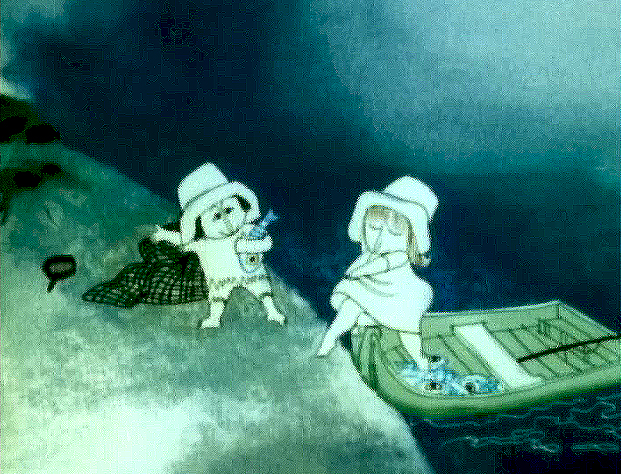
Tissa’s Glad Gladys – revisited
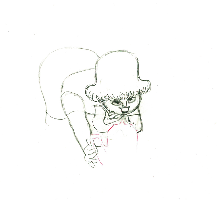
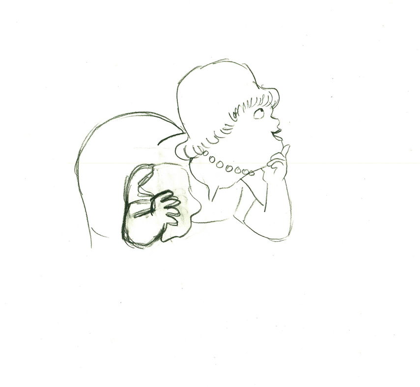
-Tissa David animated a lot of the Electric Company pieces for John Hubley. Hubley would design and write the spots, and he would get some real pros to do the tracks. In the case of this film, I believe it was the jazz legend, Billy Taylor, who wrote the music and did so for a number of Hubley’s Electric Co. films.
I’d like to post John Hubley’s LO drawings and follow it up with a few of Tissa’s animation drawings. John would usually do the loosest of layout drawings – usually in the presence of the animator as part of a discussion – and then hand it off to this person he trusted. Of course, the more he trusted the animator, the less he had to do in the LO.
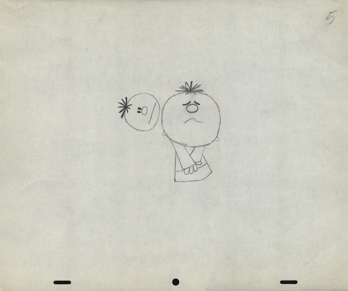
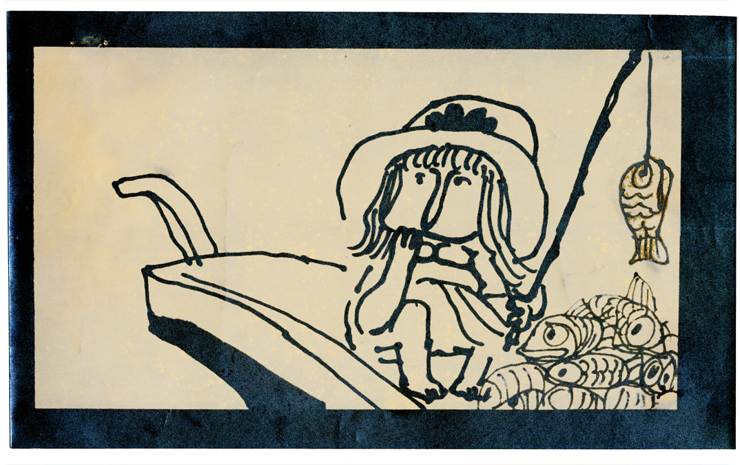
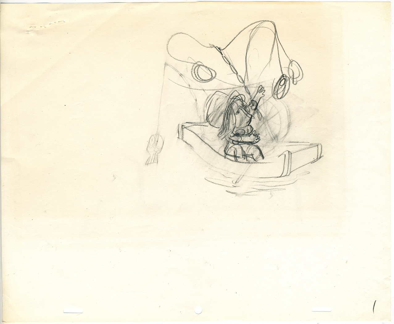
In the case of this spot, Tissa received the following drawing. (That’s right ONE drawing.)
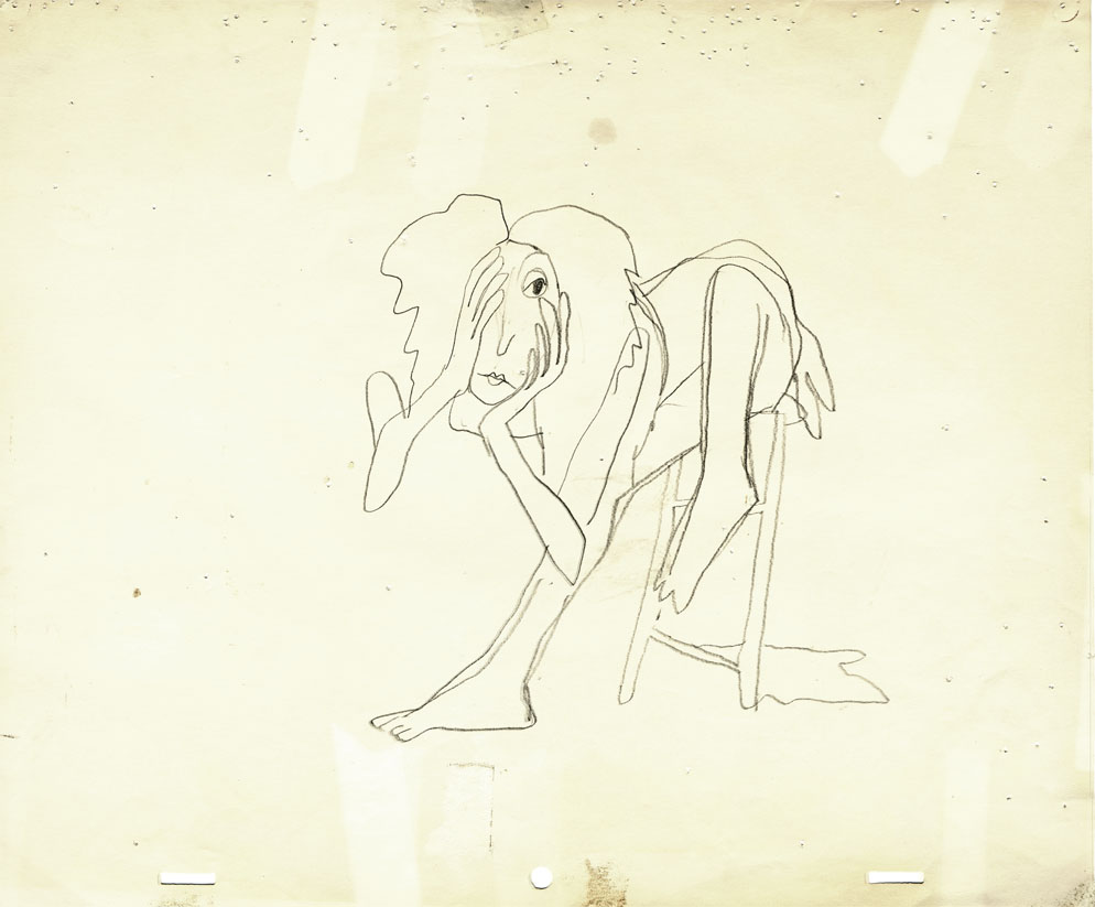
(If you click any the image, you’ll
reveal the full sized animation drawing.)
Enlarge the image, and you’ll notice tape marks and pin holes where Tissa attached it to her wall.
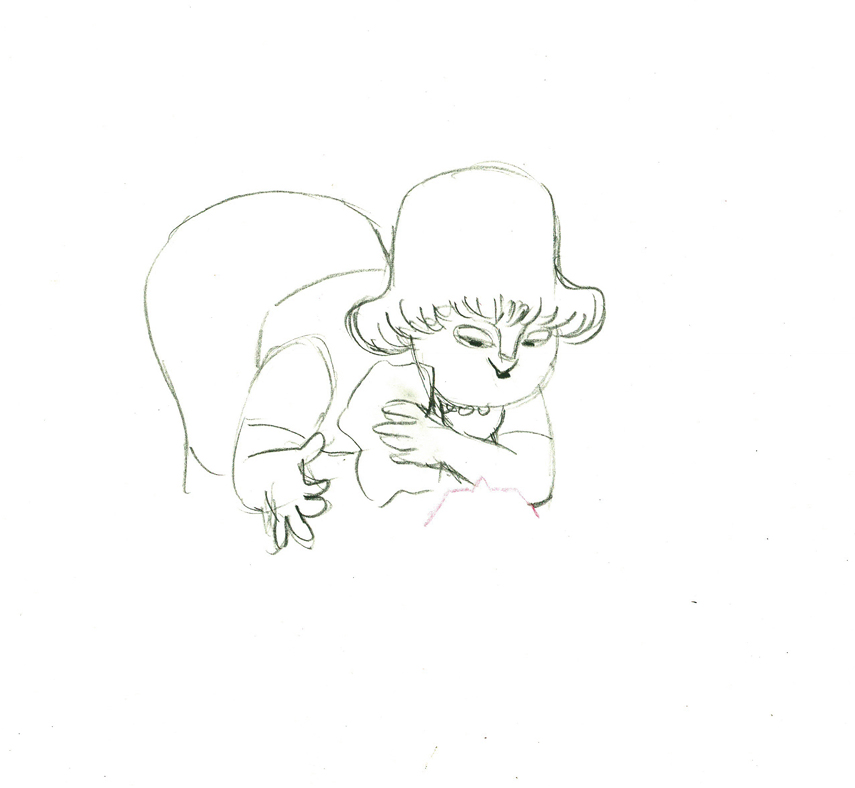
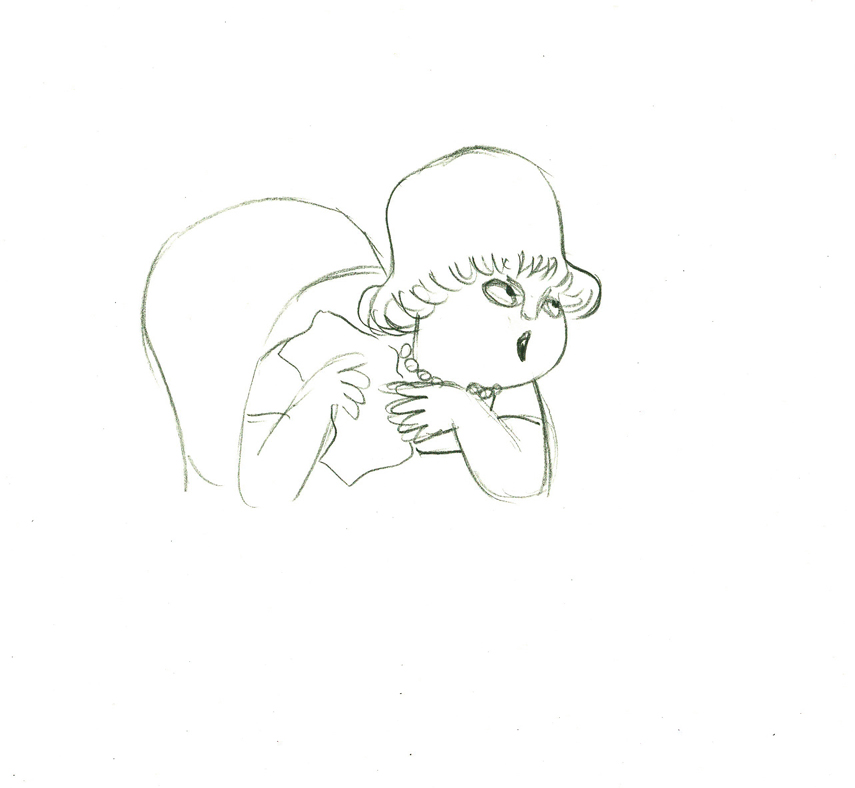
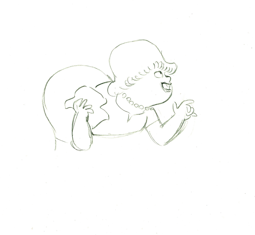
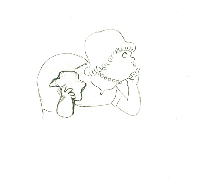
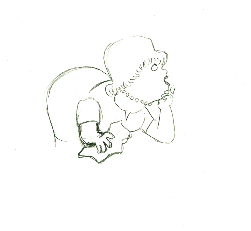
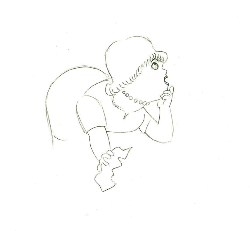
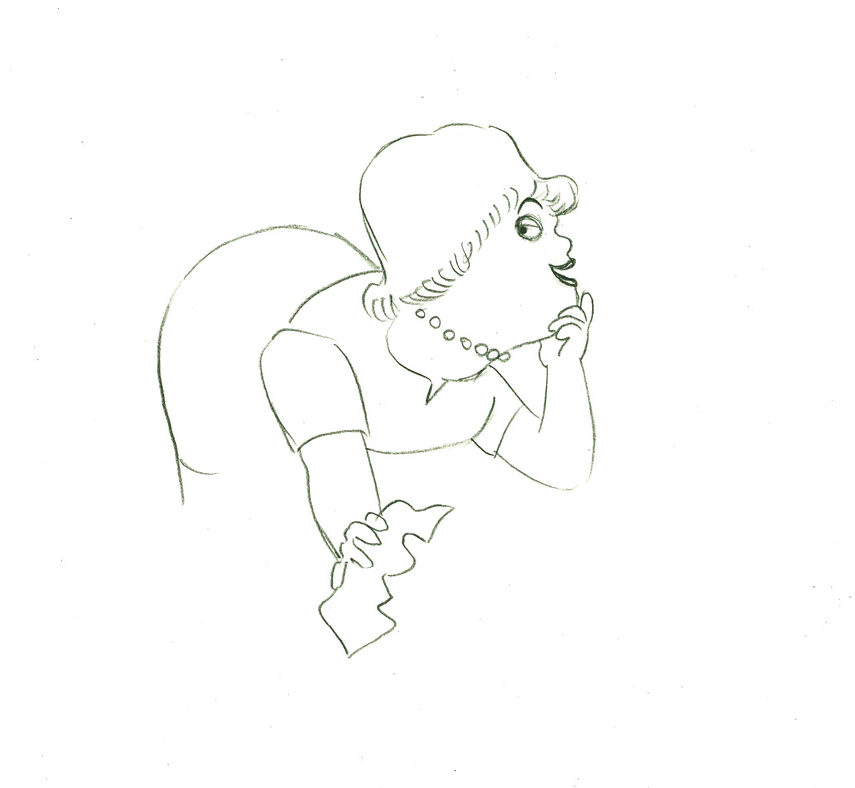
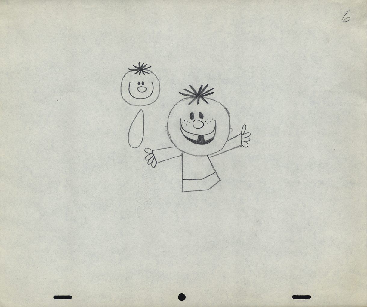
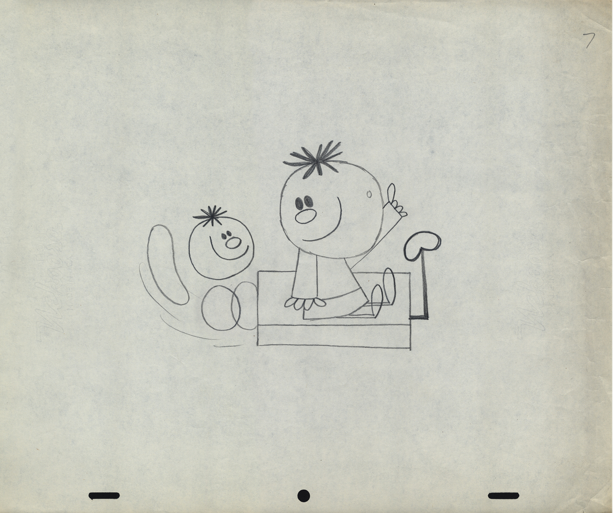
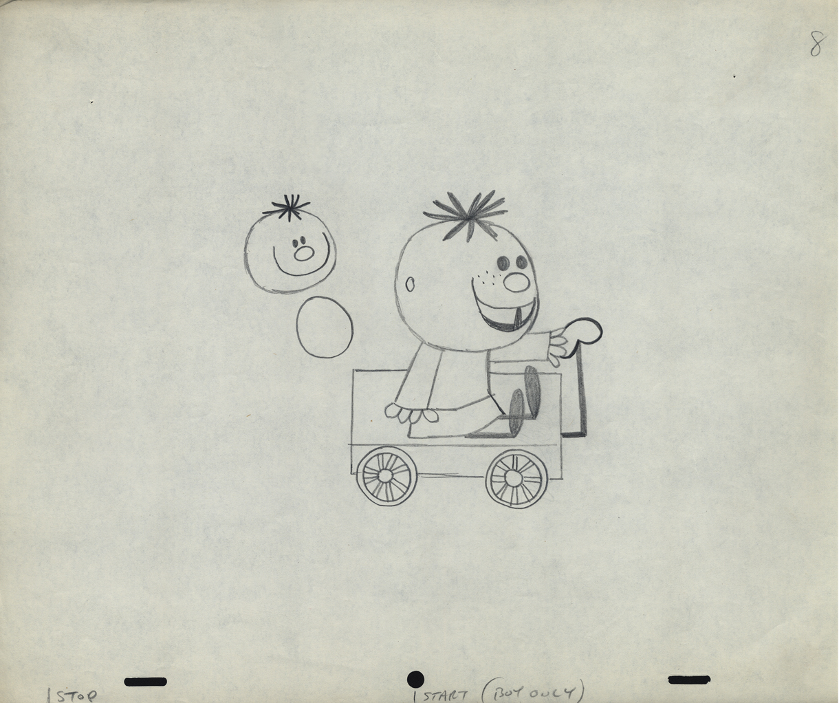
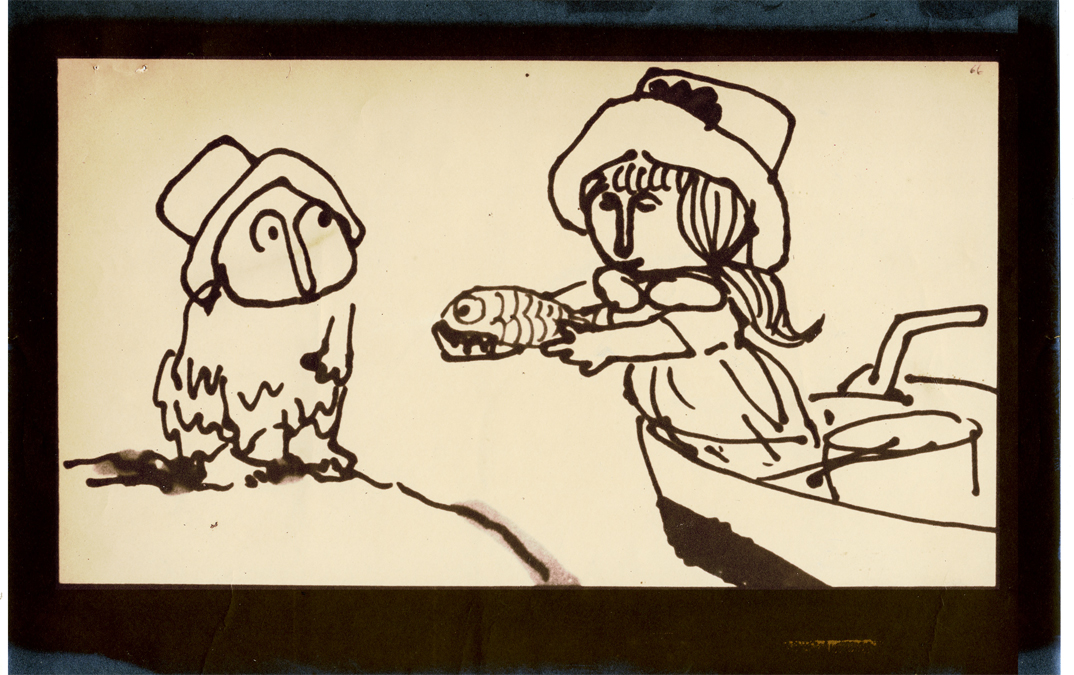
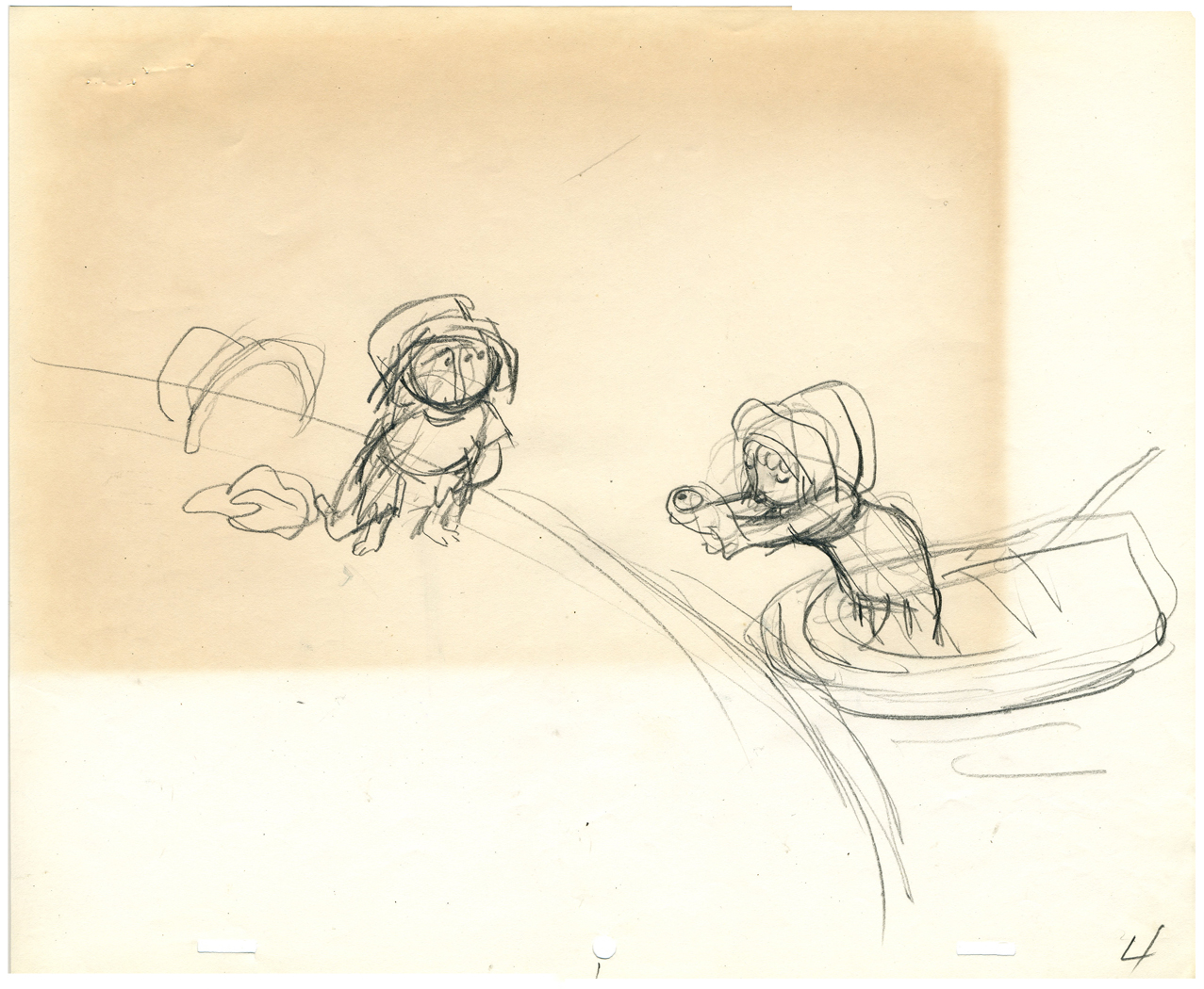
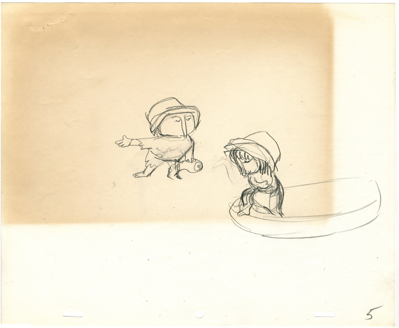
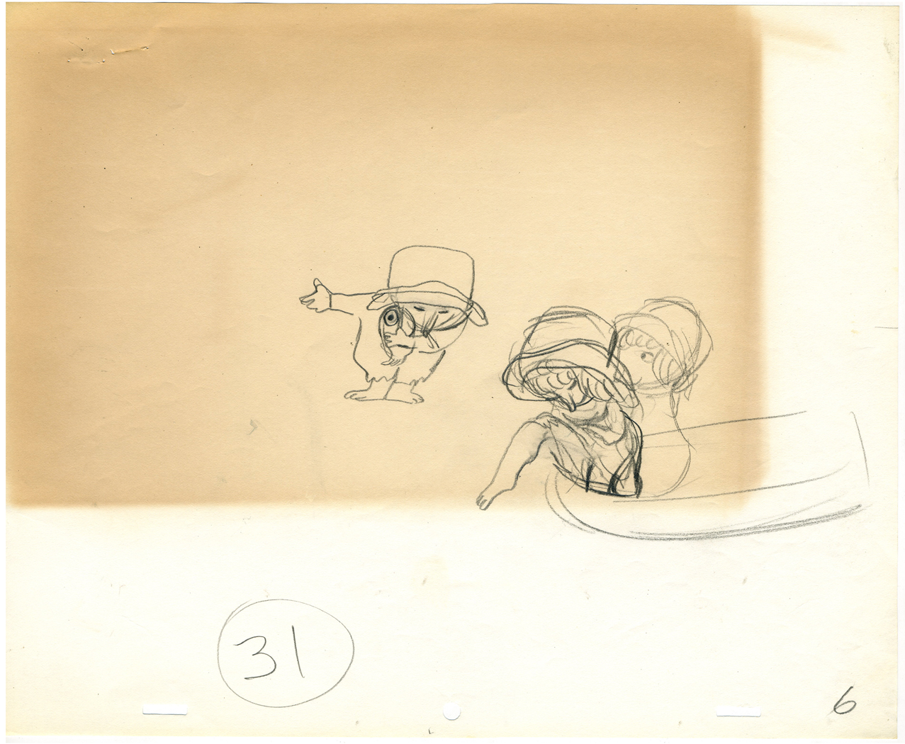
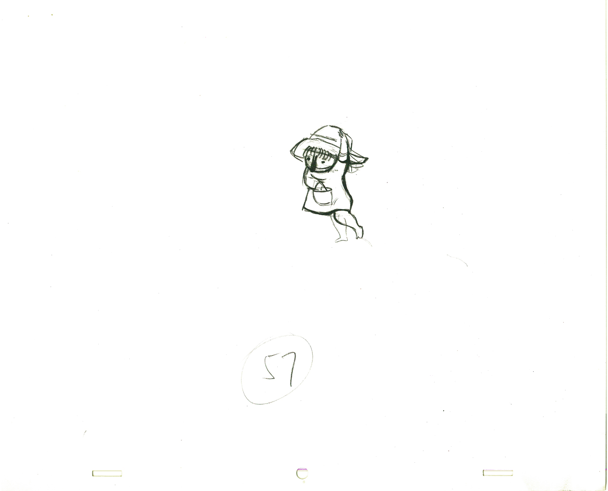
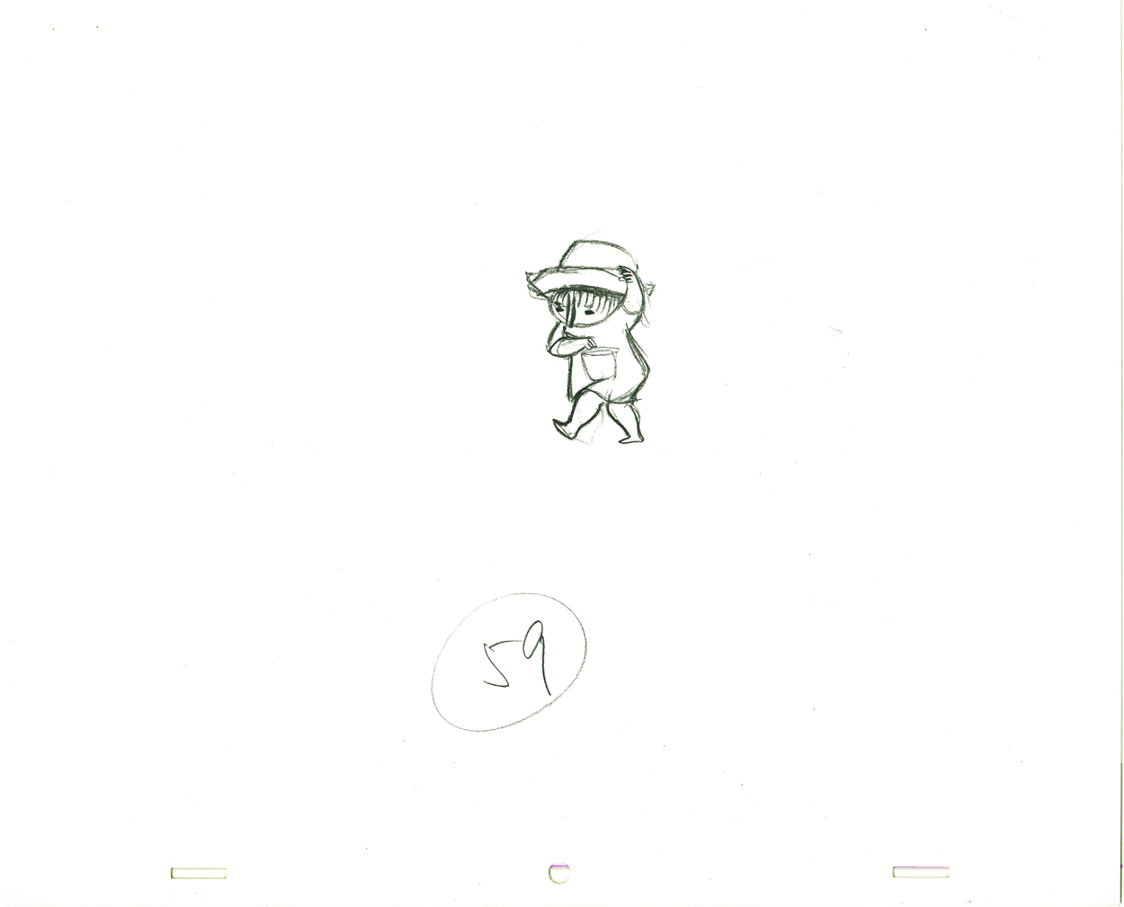
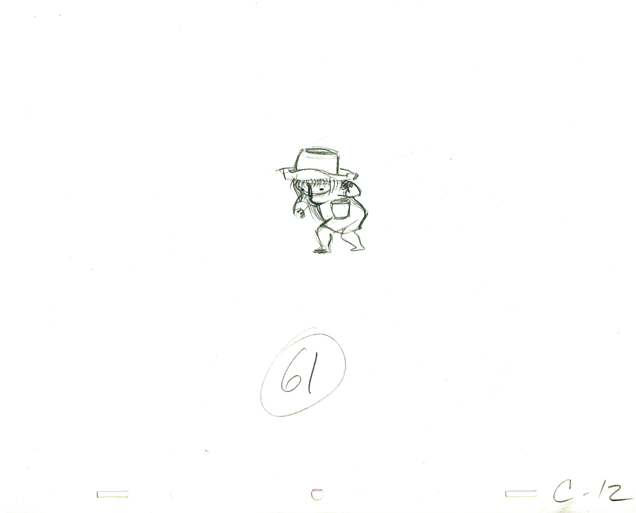
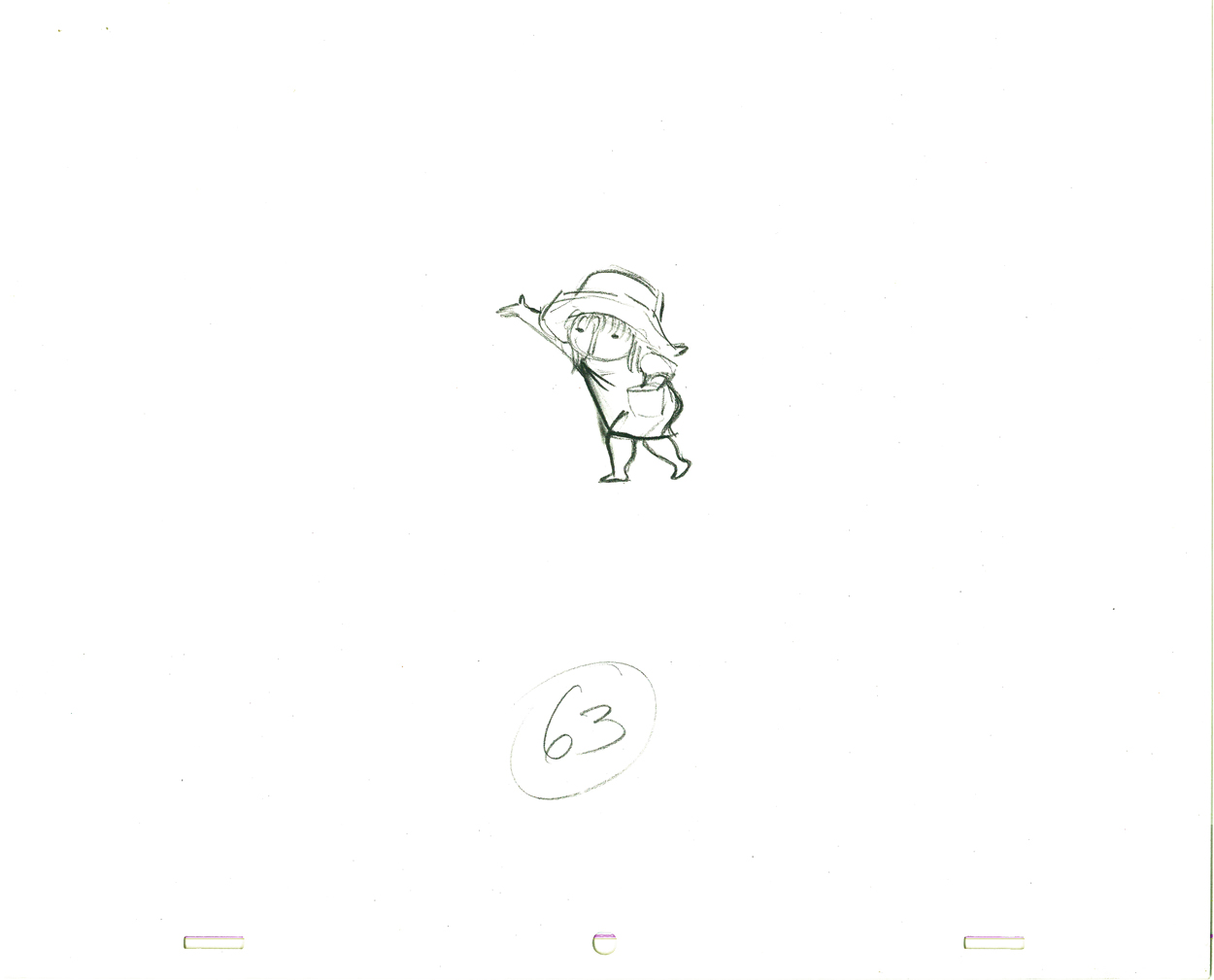
Here’s a short sequence of drawings done by Tissa. The missing mouths are on a separate level. This piece is built on reuse done artfully.
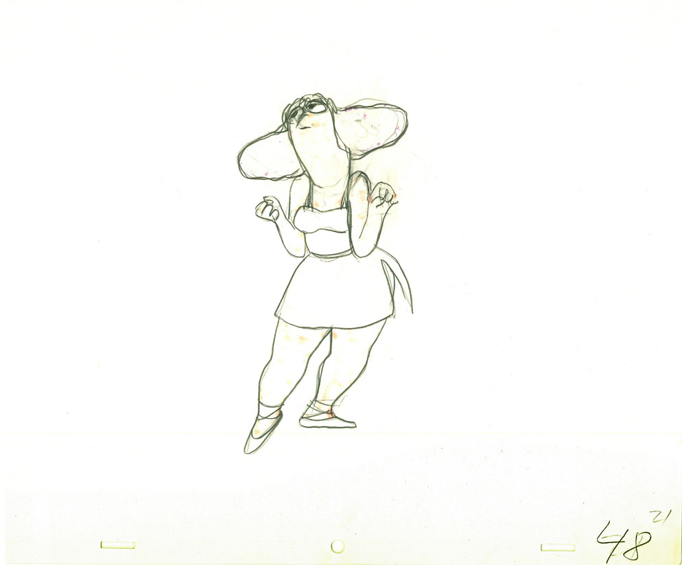 48 49
48 49
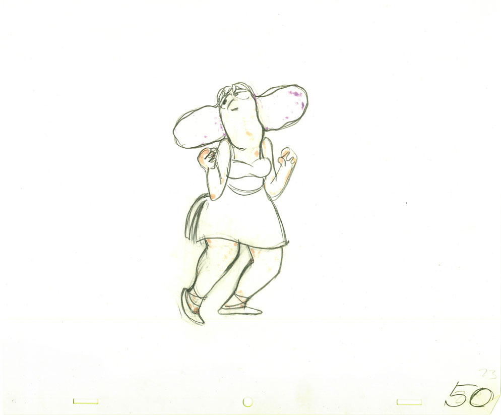 50
50 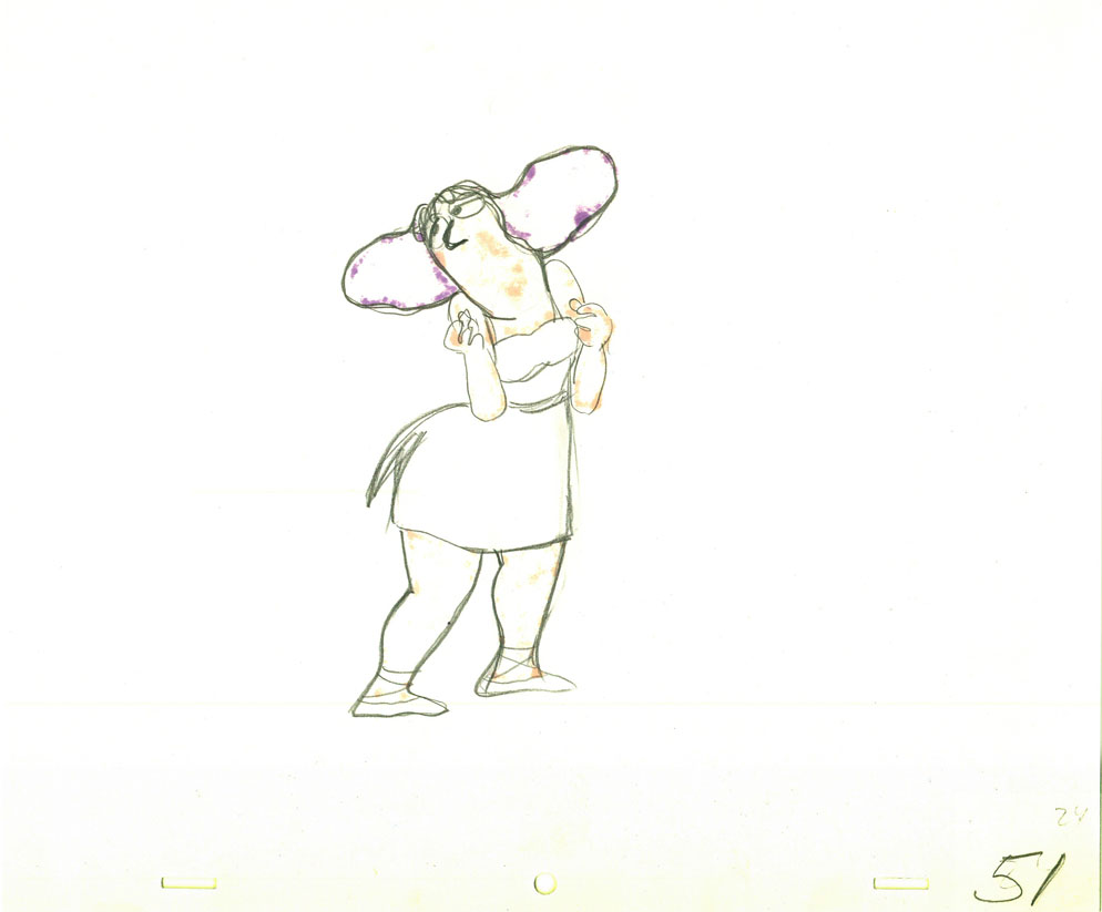 51
51
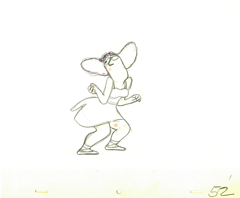 52
52 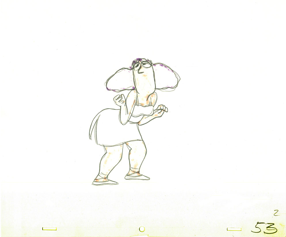 53
53
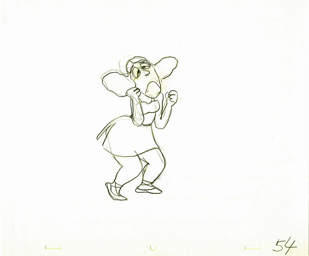 54
54 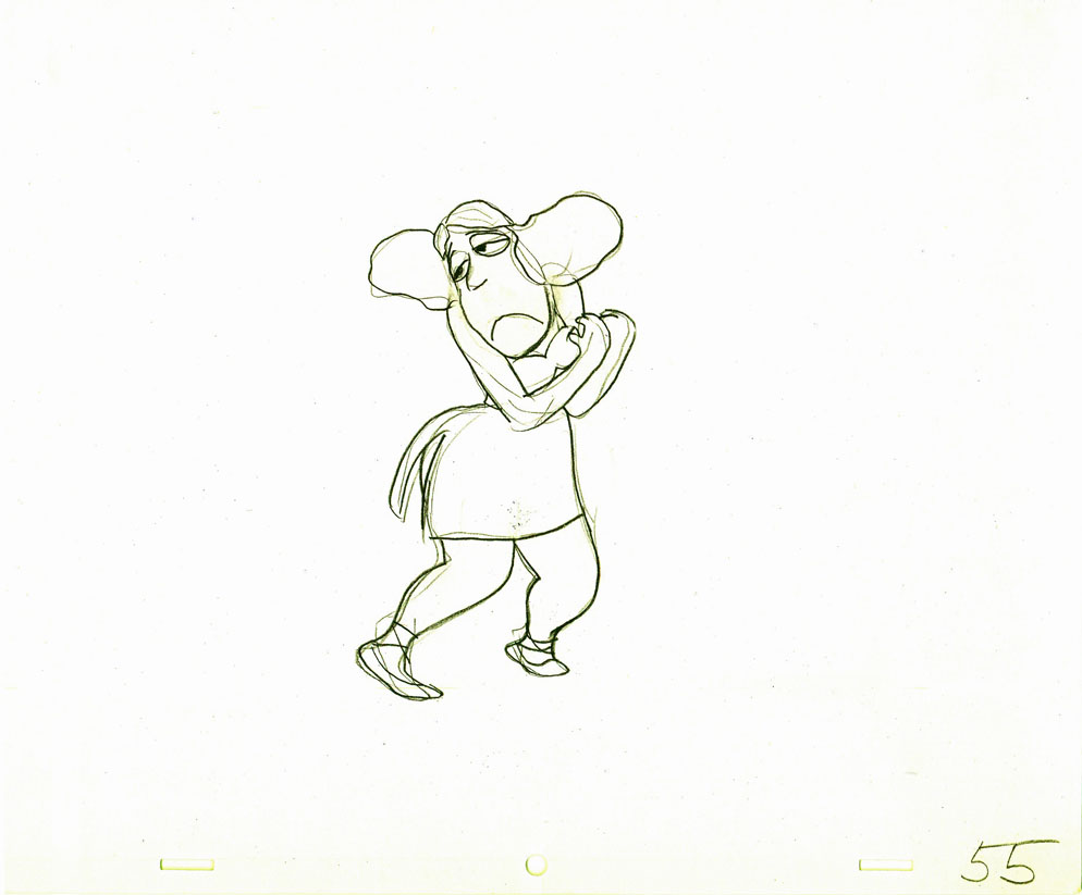 55
55
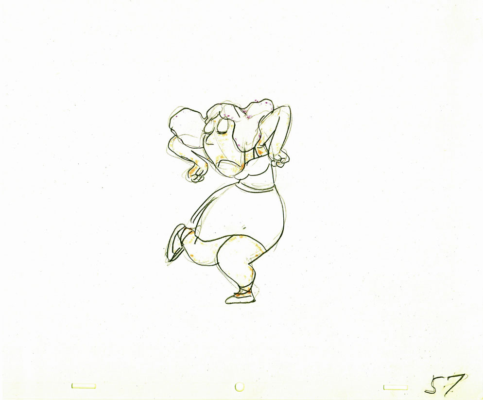 57
57 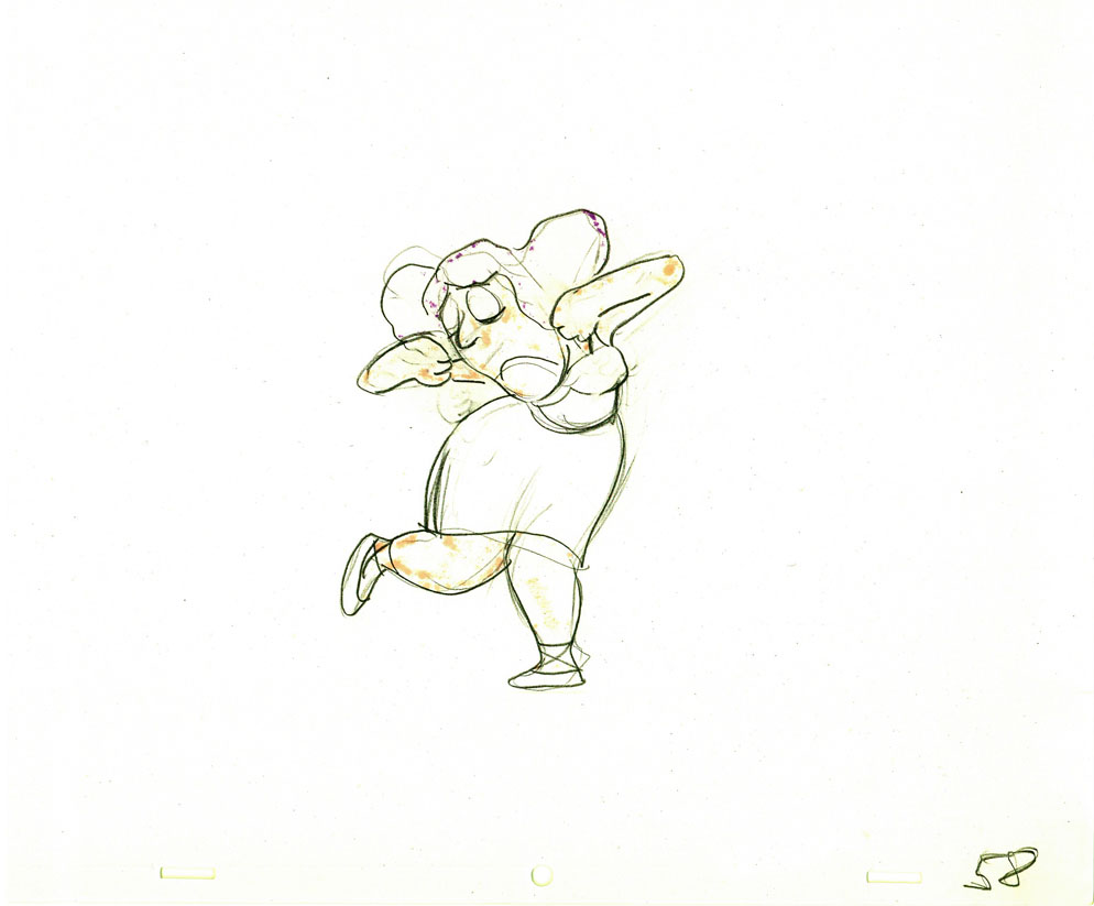 58
58
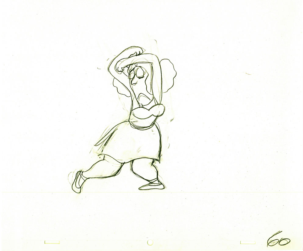 60
60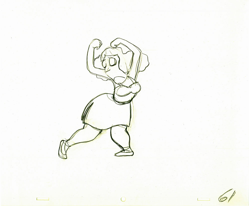 61
61
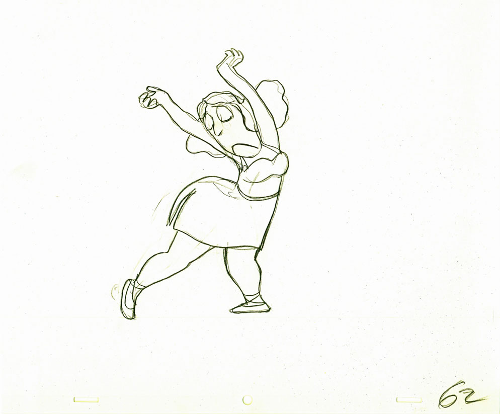 62
62 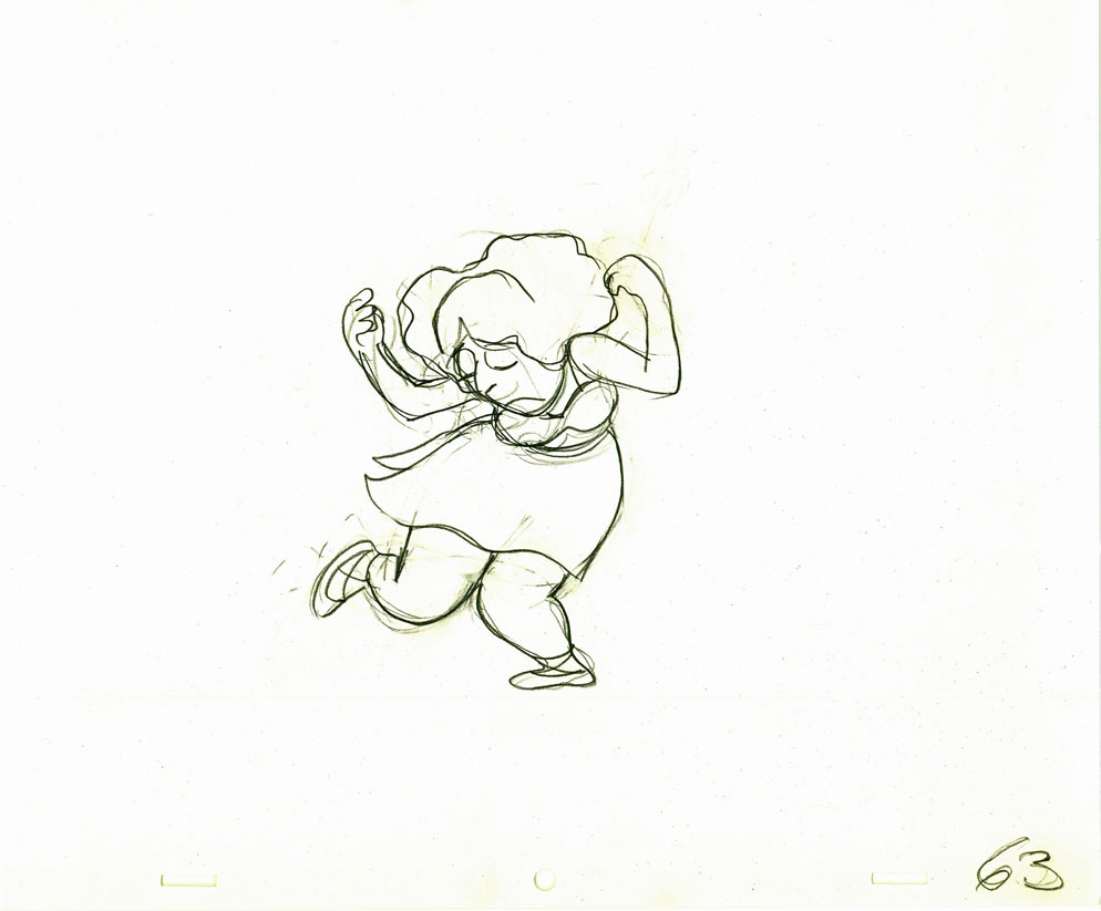 63
63
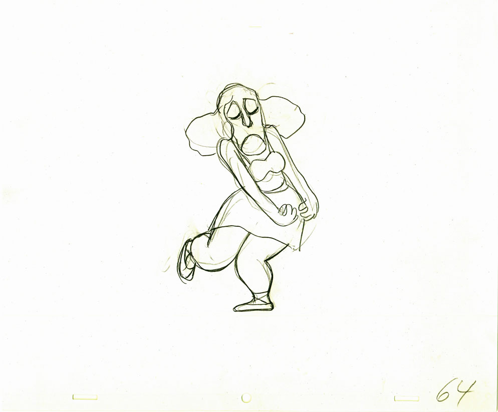 64
64
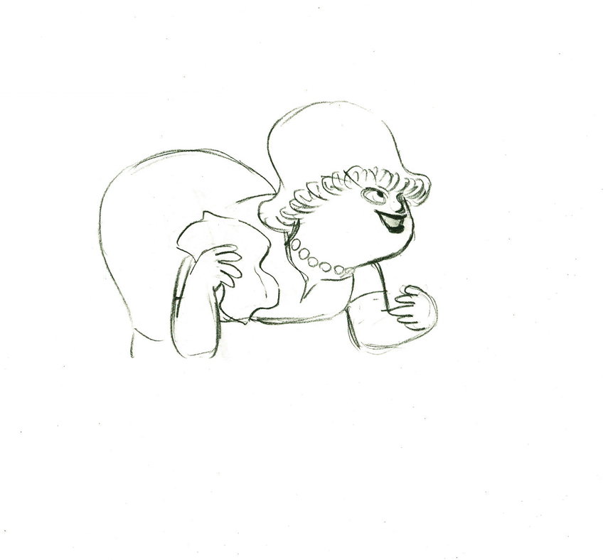
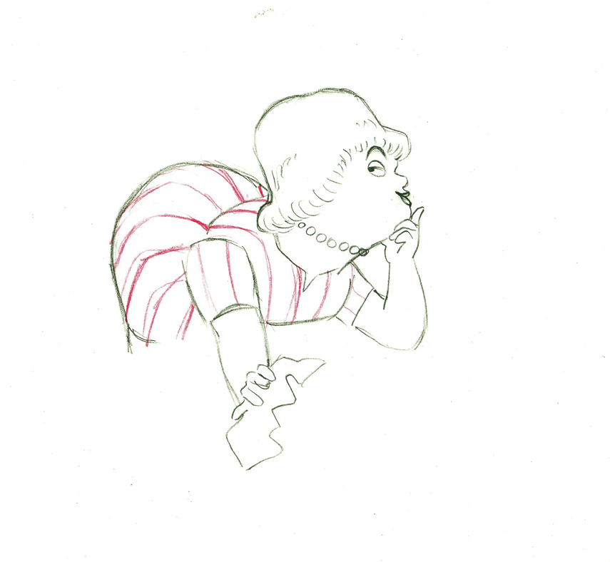
Here’s how the drawings looked when they were colored. They were colored on heavier paper. Sharpie outlines and marker coloring. The white background was all they used for the final. The animation carried the piece.
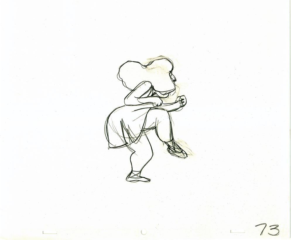 73
73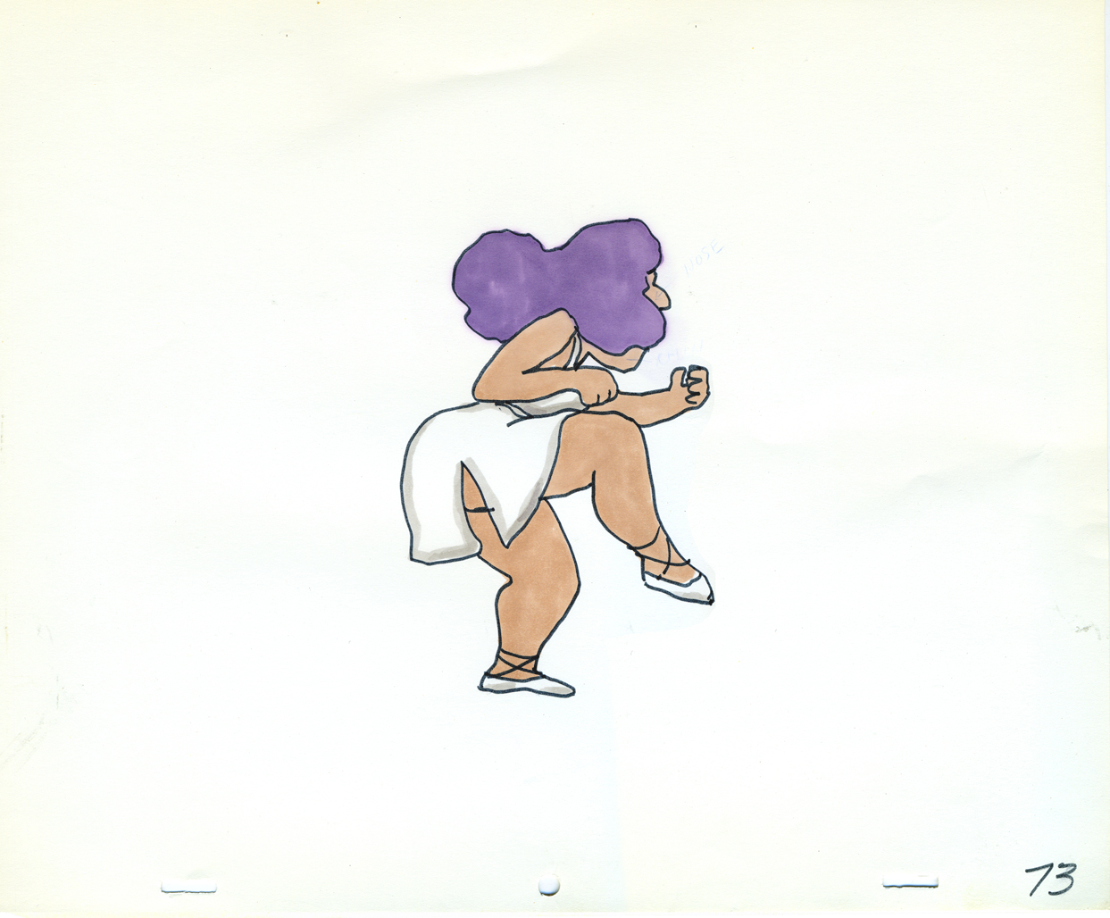 73
73Finally, here’s a copy of the film found on YouTube:
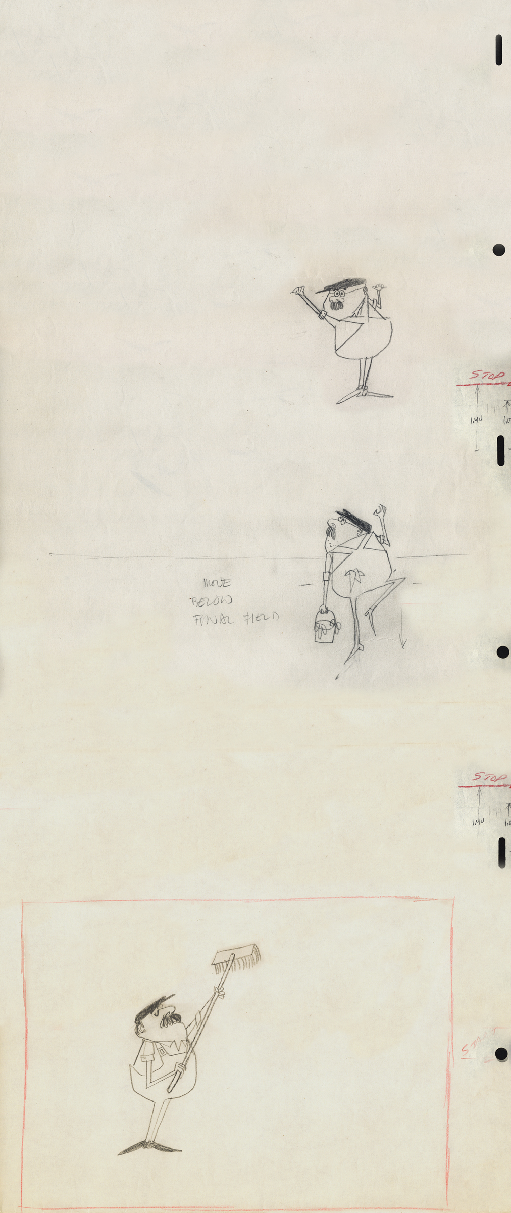
Action Analysis &Animation &Animation Artifacts &commercial animation &Hubley &Tissa David 26 Jul 2012 07:22 am
A Simple Move – recap
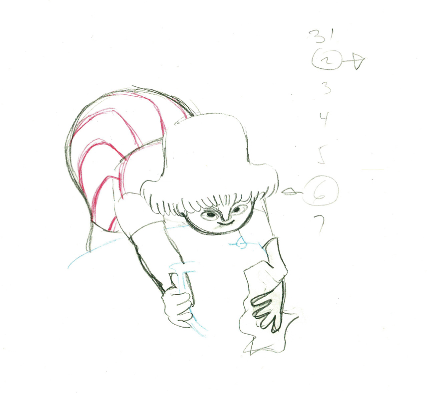
- Here’s what looks like a simple move done by Tissa David when she animated this Viva, paper towel commercial. It was produced, directed and designed by John Hubley. A very simple and beautiful character.
The character’s move in this scene is a complicated one done simply. She has been bent over, cleaning with her paper towel, and she moves up. You can follow the overlapping action as her eyes pull her up, head turn, and body follows.
The stripes will come and go. Tissa depends on someone else to concentrate on this material when she’s working on a commercial.
 e37
e37(Click any image to enlarge.)
 38
38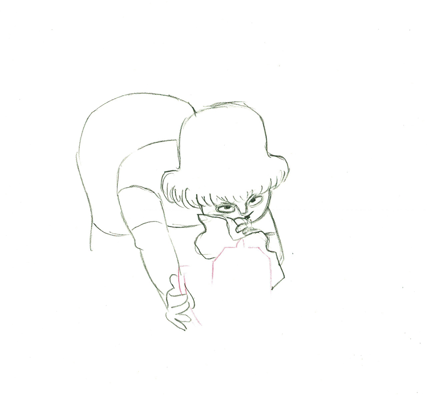 39
39
 40
40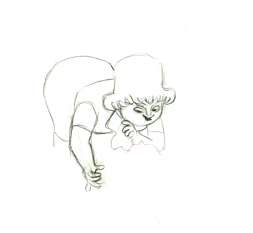 41
41
 42
42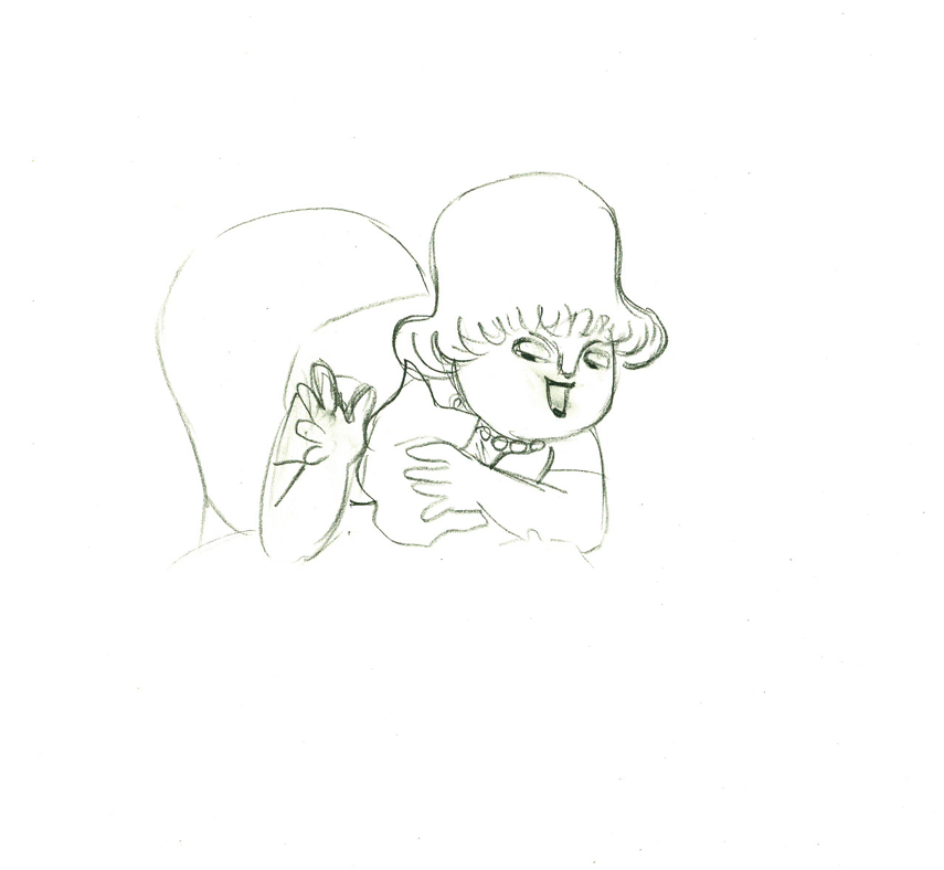 43
43
 e44
e44
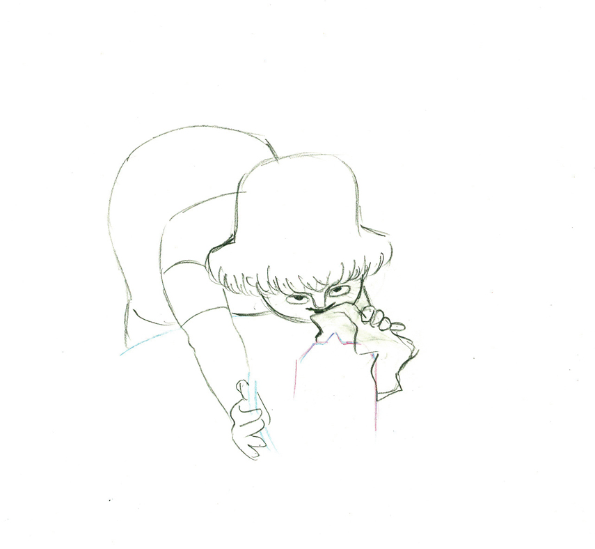
Her eyes point in the direction she wants to go,
and the rest of the scene moves her up and into profile.
This key move is hidden under the exchange of the
paper towel from one hand to the other.
 45
45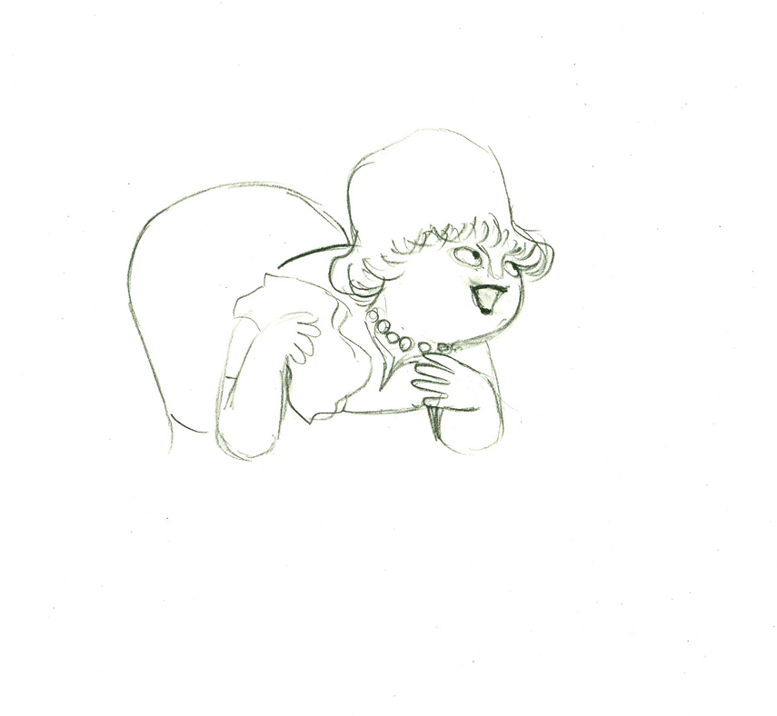 46
46
 47
47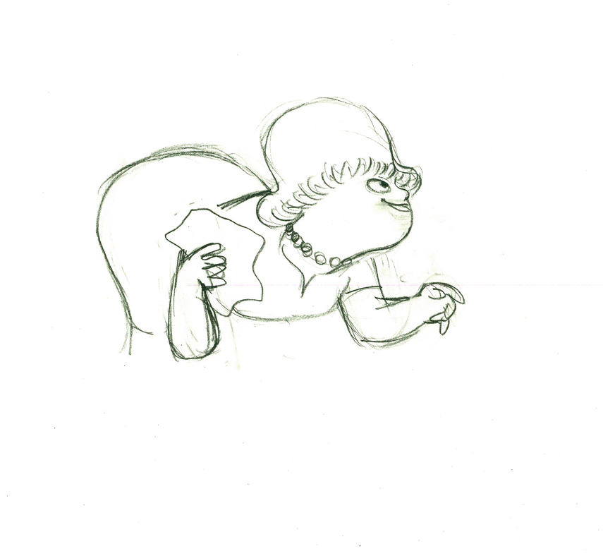 48
48
 49
49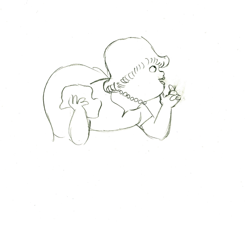 50
50
 e51
e51
She stops to think (accenting her monologue.)
 52
52 53
53
 54
54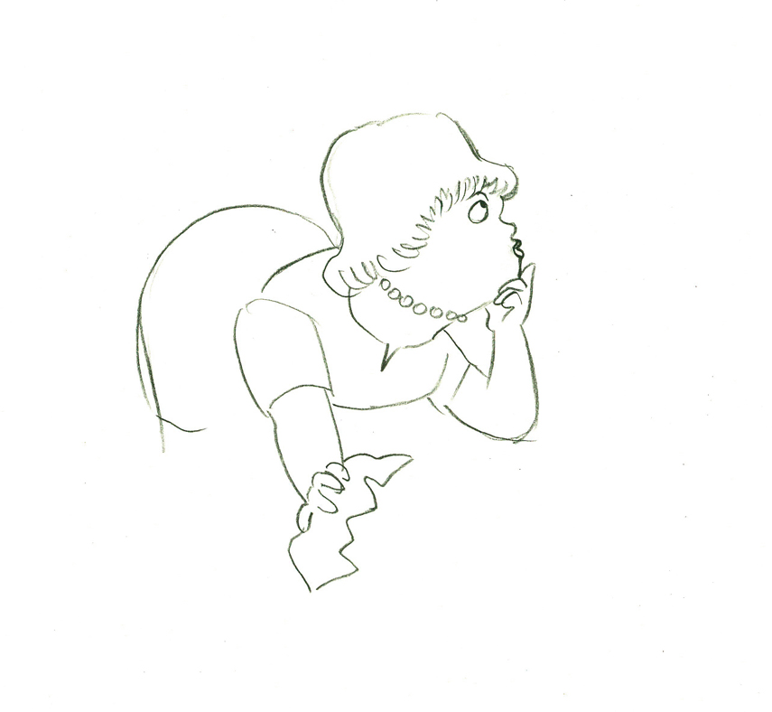 55
55
 56
56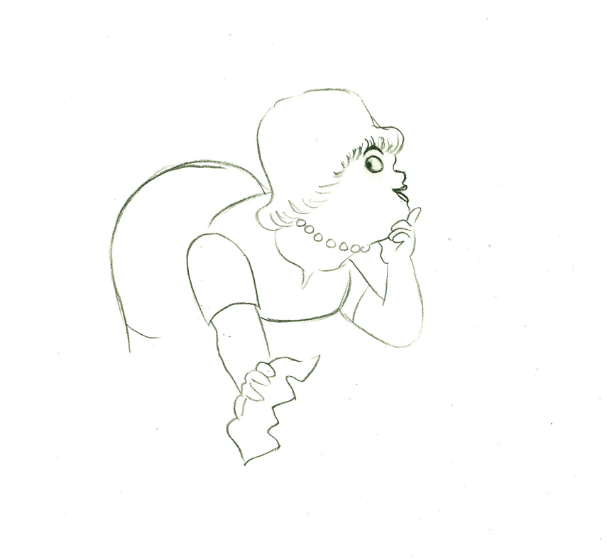 57
57
 e58
e58
And she slyly looks back to camera to respond with her thought.
 e59
e59
She continues, all through this move, talking.
She’s pitching the product.
Here’s a QT of the piece:
Cleaning for VivaClick left side of the black bar to play.
Right side to watch single frame.
Animation Artifacts &commercial animation &Layout & Design &UPA 25 Jul 2012 05:21 am
Even More UPA Spots
- Here are more Layouts and character poses for the commercial work done at UPA. They are all pulled from Vince Cafarelli‘s collection of artwork. I assume these all come from UPA since Magoo models were in the same folder. The design styles are consistent with what we’ve seen from UPA at the time.
 1
1
 2
2
 3
3
A photostat of a character model sheet
 4
4
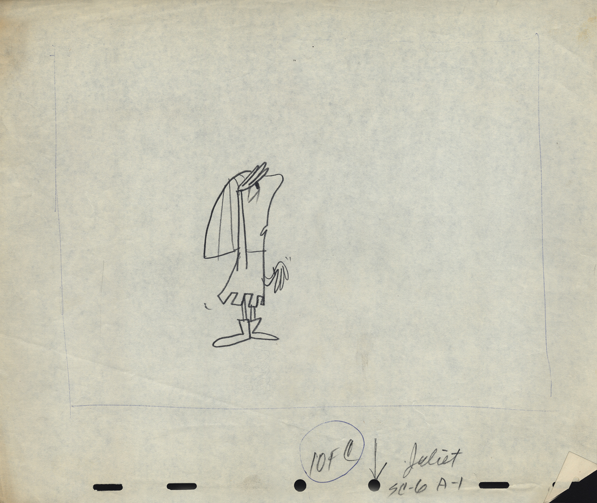
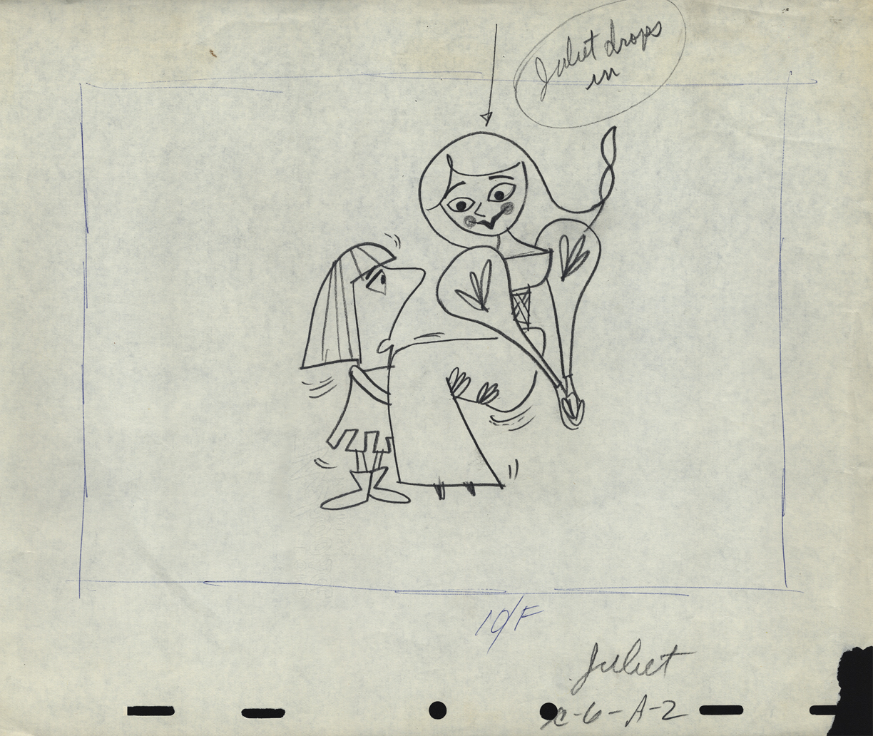
An ad that features Romeo and . . .
 5
5
. . . Juliet
 6
6
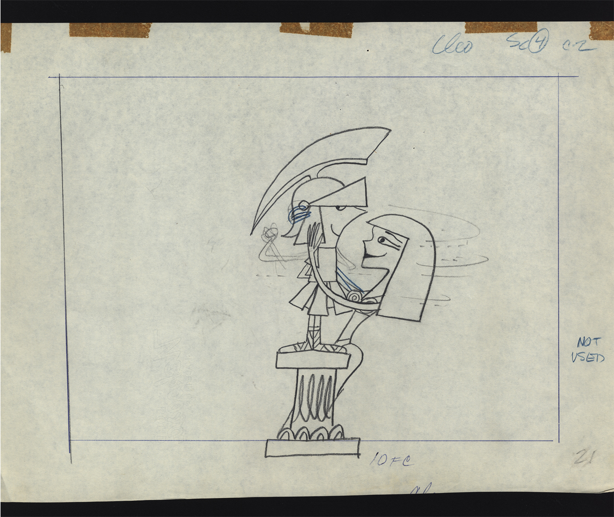
Cleopatra was obviously cut out of the spot.
Note that the pegs were cut off the NG drawing.
 7
7
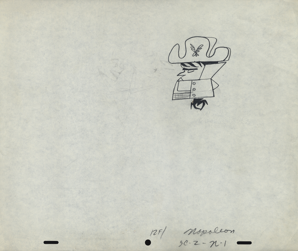
Napoleon, but it looks like it comes from a different spot.
 8
8
Was this something that stuck in Gene Deitch’s mind before he left
UPA to go on to run Terrytoons? Shades of Gaston le Crayon.
 9
9
 10
10
 11
11
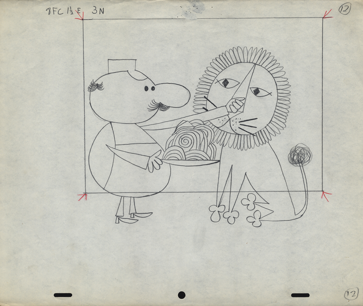
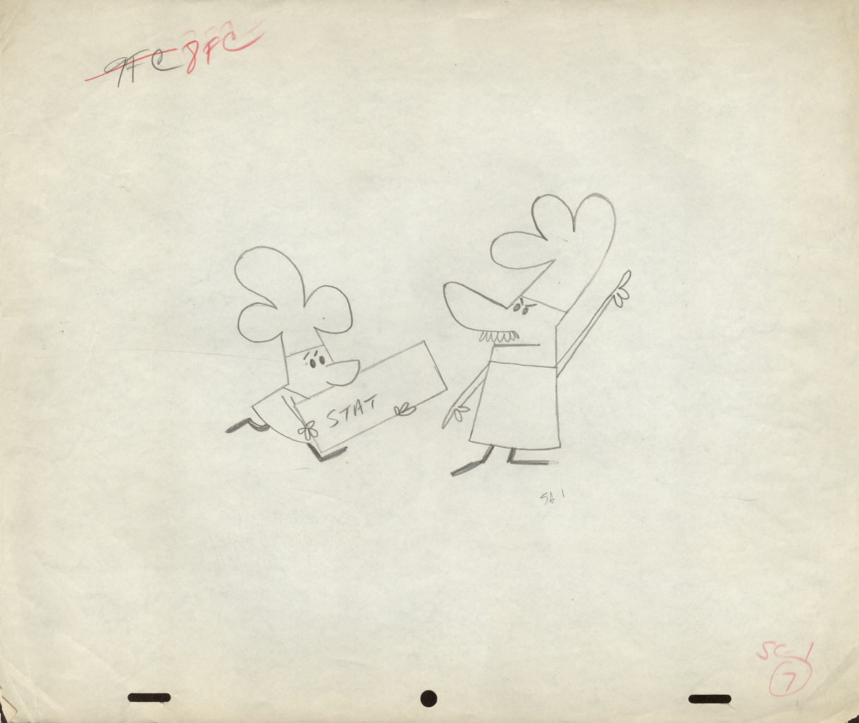
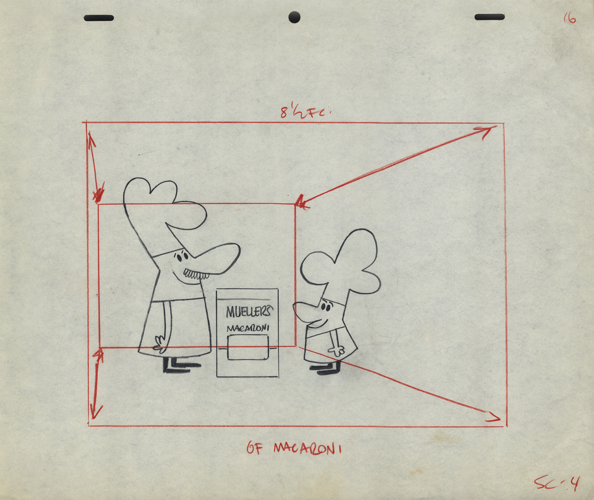
Obviously, an ad for Mueller pasta
 12
12
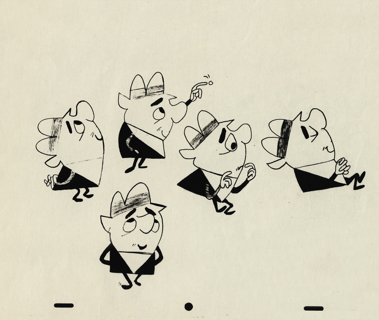
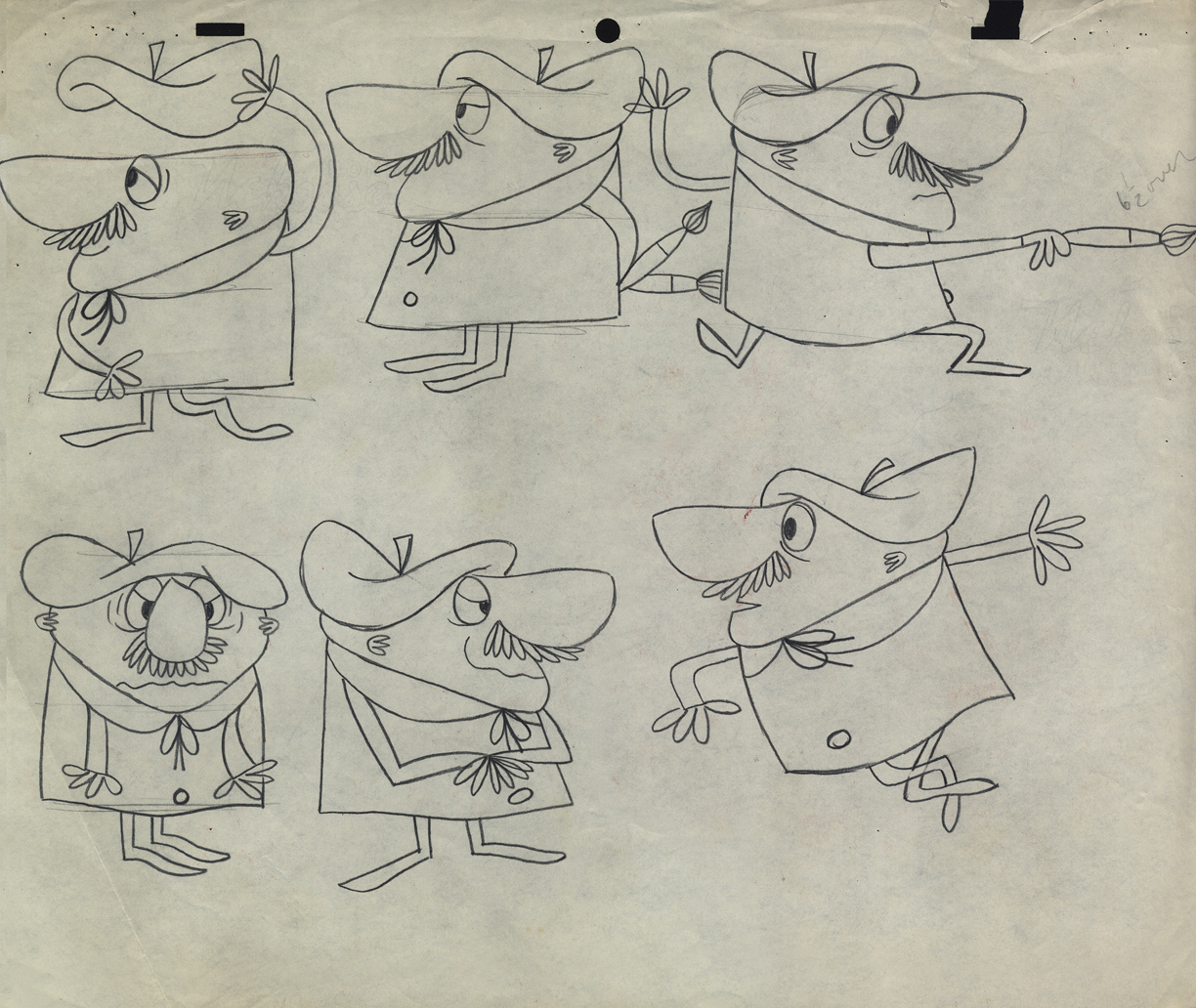
An interesting series of Layouts. I’m not sure if they’re for an ad . . .
 13
13
. . . or a short film for the McBoing Boing Show.
 14
14
 15
15
 16
16
 17
17
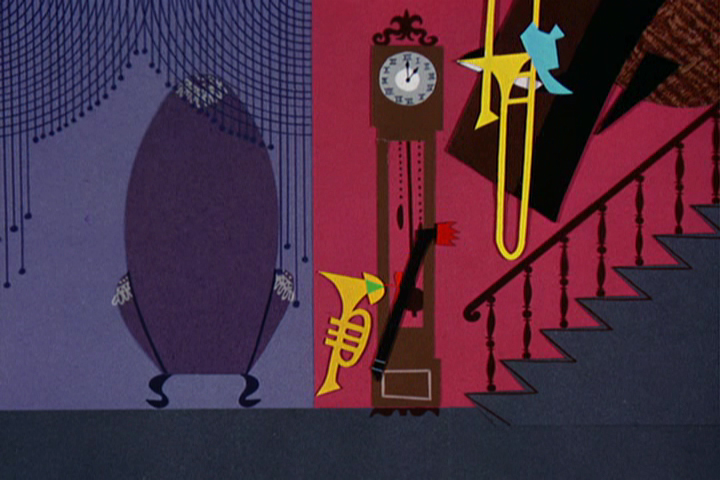
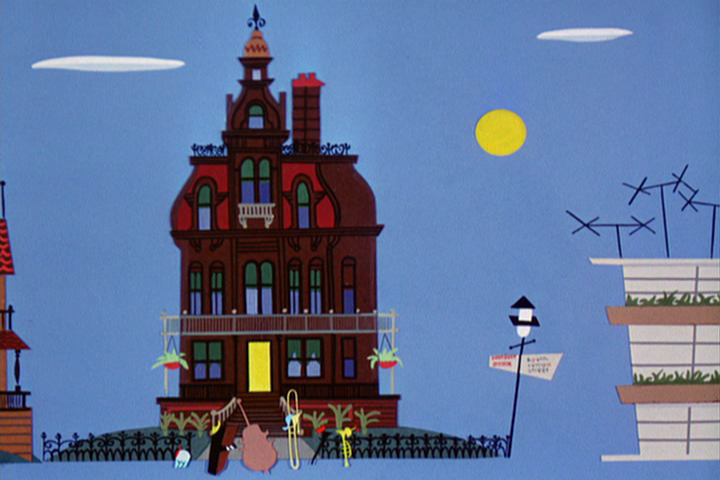
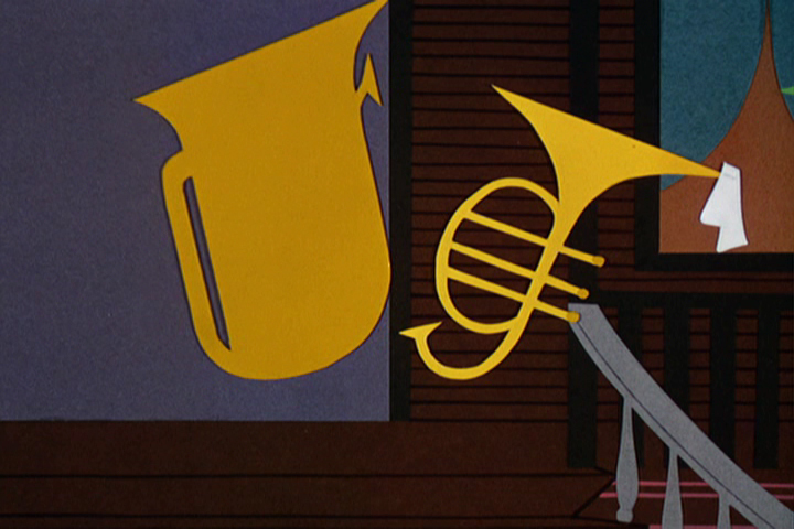
Animation Artifacts &Frame Grabs &Story & Storyboards 23 Jul 2012 04:33 am
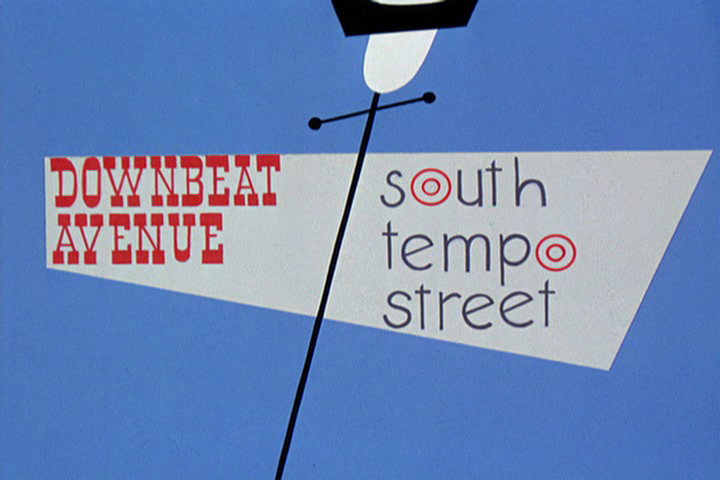
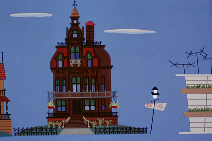
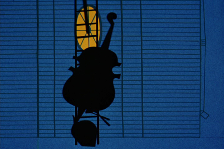
Oom Pahs
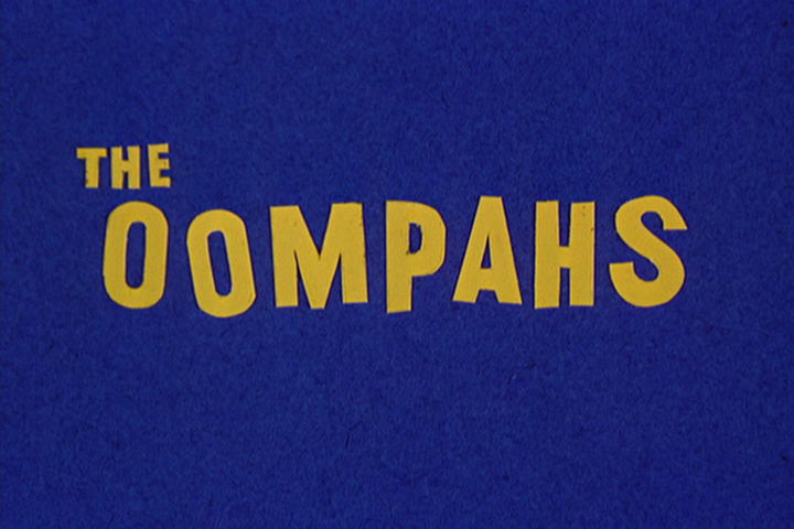
 - I’m a fan of T.Hee‘s work. I bought the storyboard he did for the film The Oom Pahs a while back. How could I go wrong since I also love UPA and Bobe Cannon, who directed it. This was the first collaboration between T.Hee and Bobe Cannon.
The short was a 1952 UPA film directed by Bobe Cannon. The film’s music score was by Ray Sherman who worked with Ben Pollack’s group, the “Pick-a-rib Boys.”
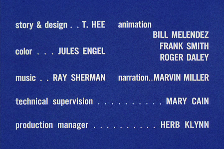 T. Hee boarded and designed the film with Jules Engel doing the bgs, and the animation was by Roger Daley, Bill Melendez and Frank Smith.
The film isn’t one of the best UPA shorts. I find the style interesting (cut out colored construction paper) but the story (which to me seems to be a variation of Warner’s I Love To Singa, which was a take on Jolson’s Jazz Singer) is a jazz vs classical music riff. The film talks down to its audience a bit – a frequent problem with many of the UPA films.
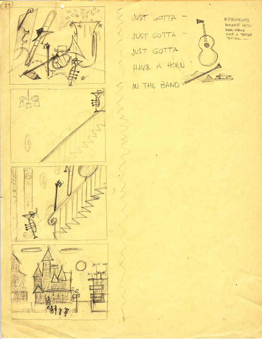
The pages I have obviously are not the whole thing nor are they consecutive in number, but they’re a good sampling.
Here are those board pages intergrated with frame grabs from the same sections of the film so you can see how closely the cutout animation followed T.Hee’s board.
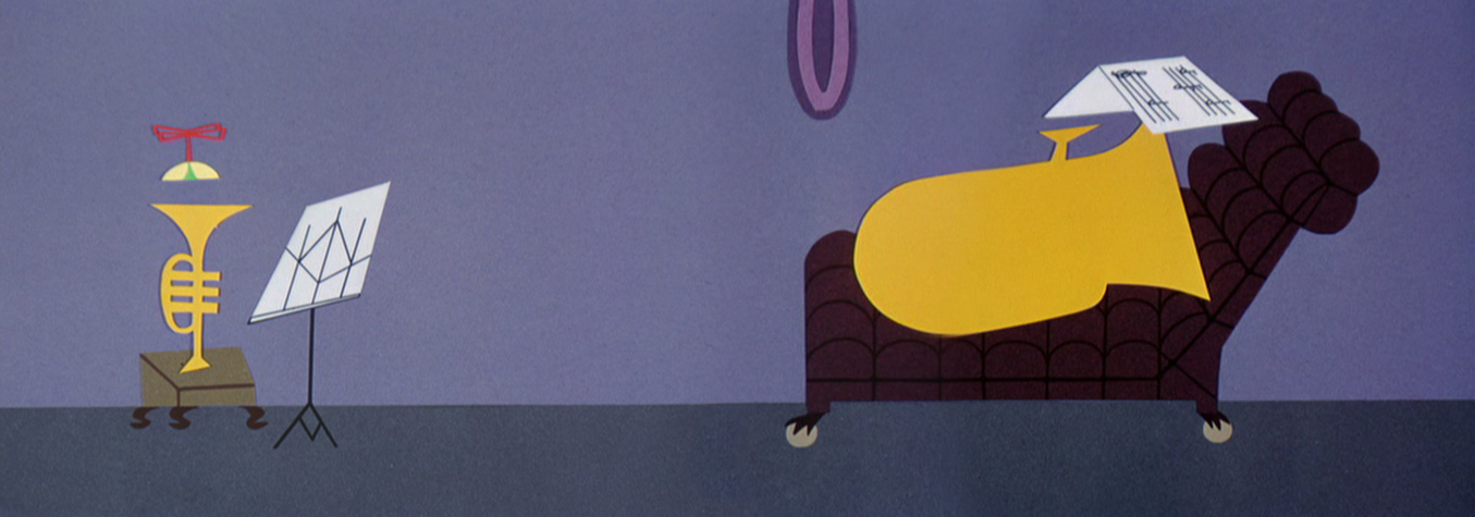
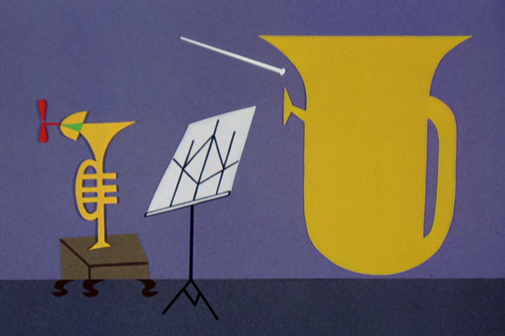
The story tells of a young trumpet in a family of horns.
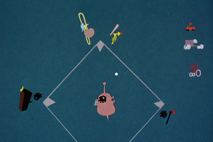
He gets in trouble playing baseball (jazz) when he should be . . .
. . . practicing his classical music lessons.
 1
1 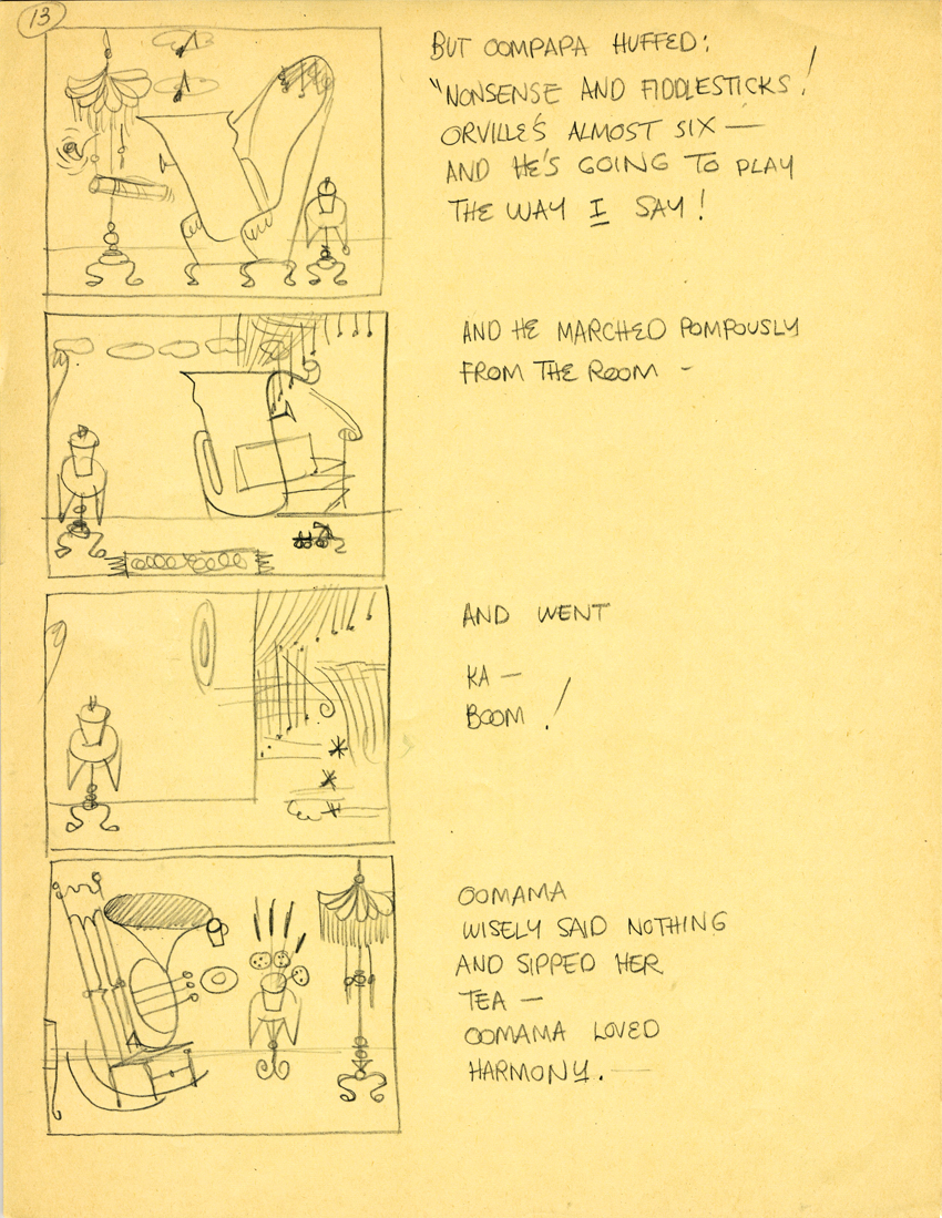 2
2
#1 is a rough version of #2. Both are page 13.
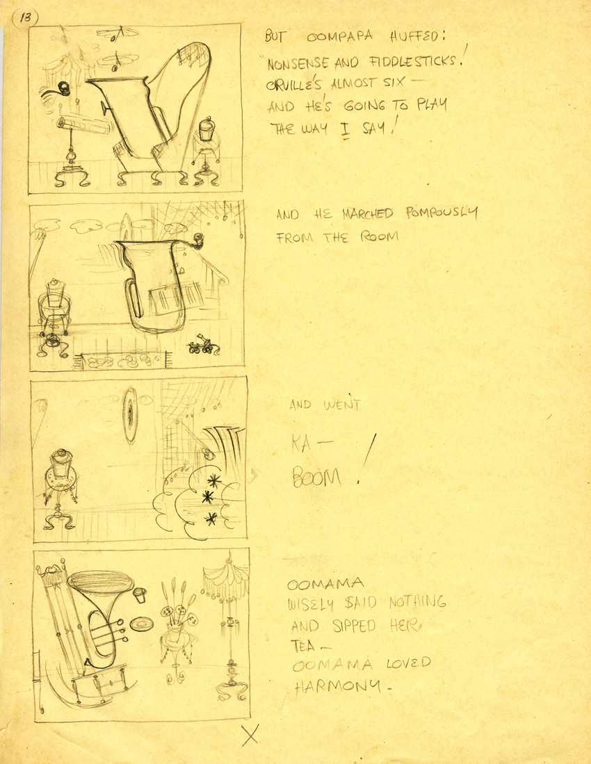
“… And he’s going to play the way I say!”
There’s no doubt the cutouts are pasted to cels.
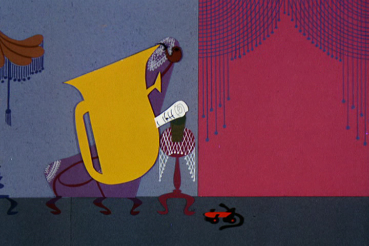
“And he marched pompously from the room.”
The animation repeats itself exactly, and it could not
have been animated under the camera, on the fly.
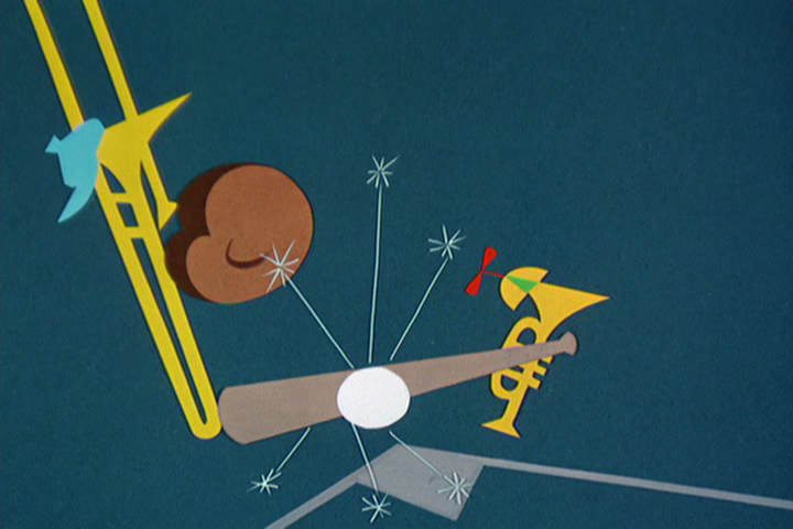
“And went . . . ”
” . . . KA BOOM!”
“OomMama wisely said nothing
and sipped her tea.”
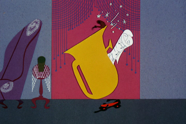
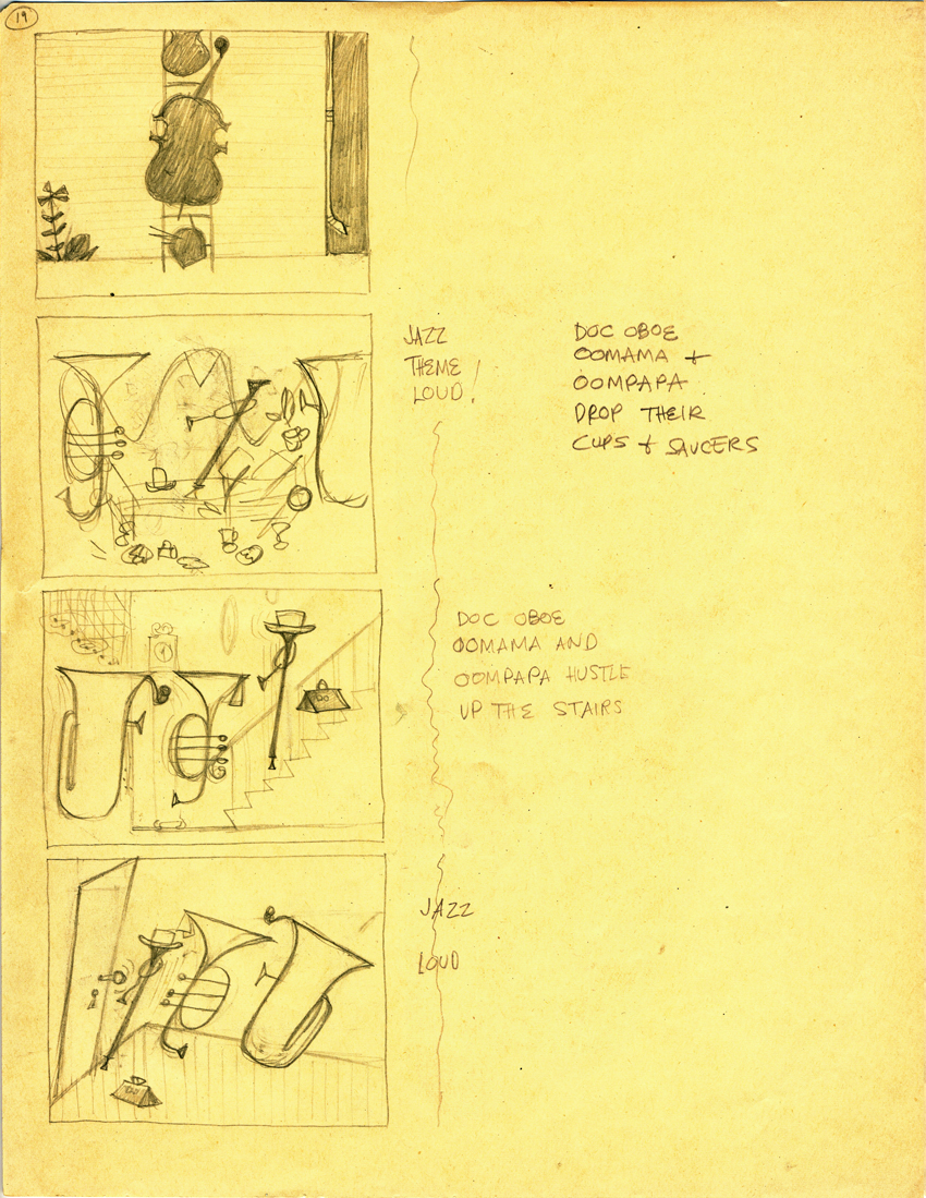 3
3
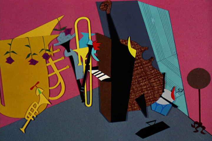
Jazz . . .
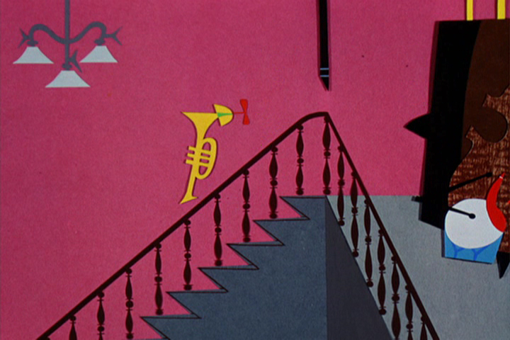
“Doc, OomMama and OomPapa drop their cups and saucers . . . ”
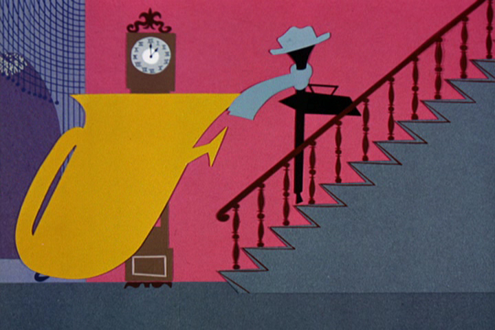
“. . . and hustle up the stairs.”

Jazz, loud.
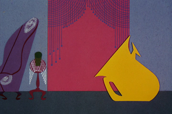
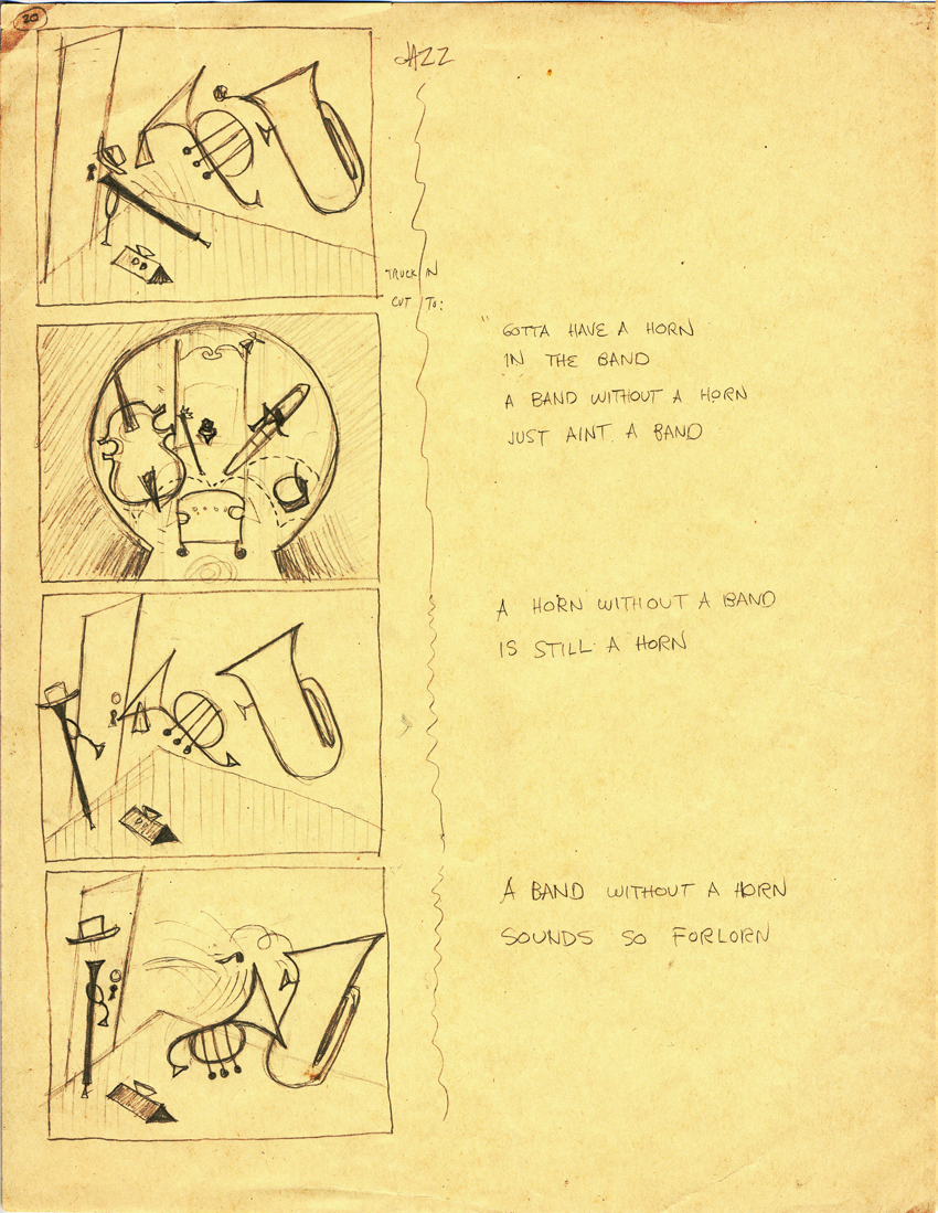 4
4
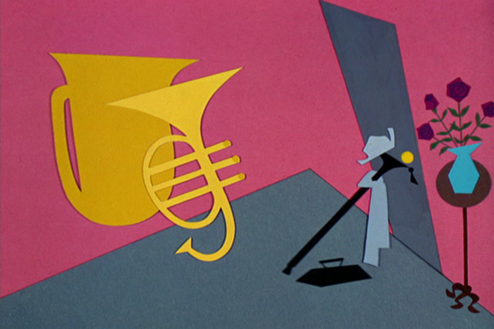
JAZZ
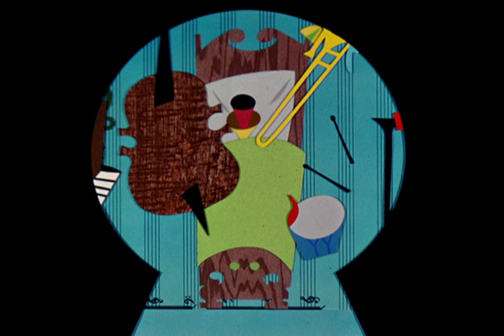
“A band without a horn just ain’t a band.”
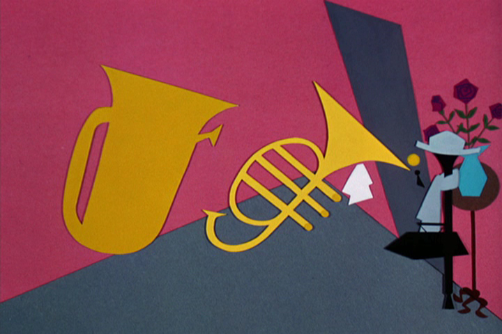
“A horn without a band is still a horn.”
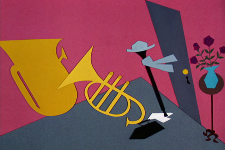
“A band without a horn sounds so forlorn.”
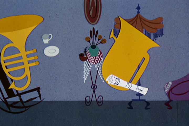
 5
5
“Just gotta, just gotta, just gotta . . . ”
“. . . have a horn in the band.”
OomPapa agrees that sometimes you need a break.
The End
To see a couple of layout drawings for this short, from Hans Walther‘s collection, go to site here and here.
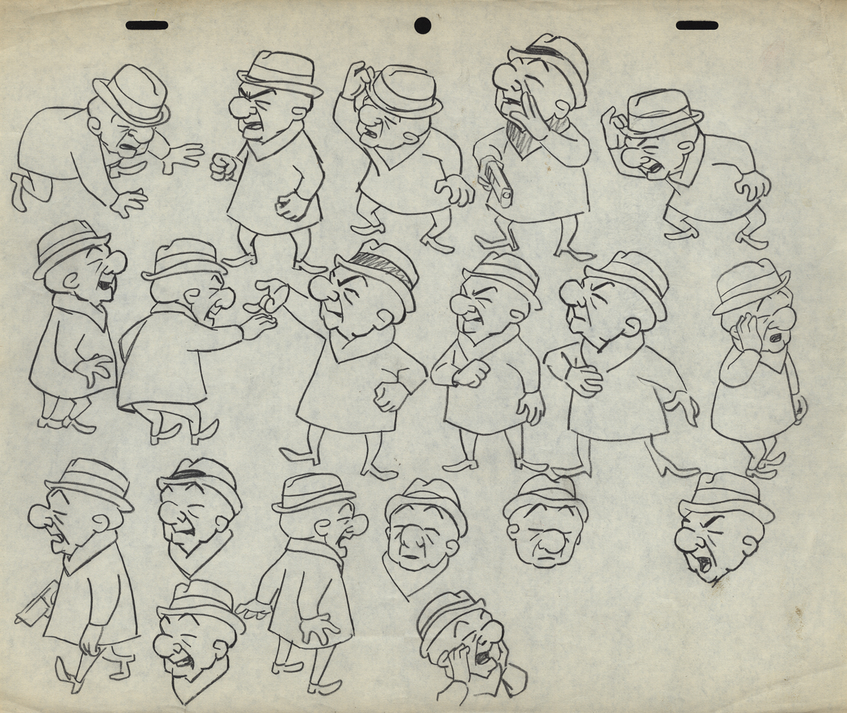
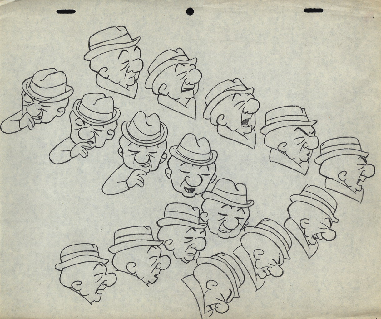
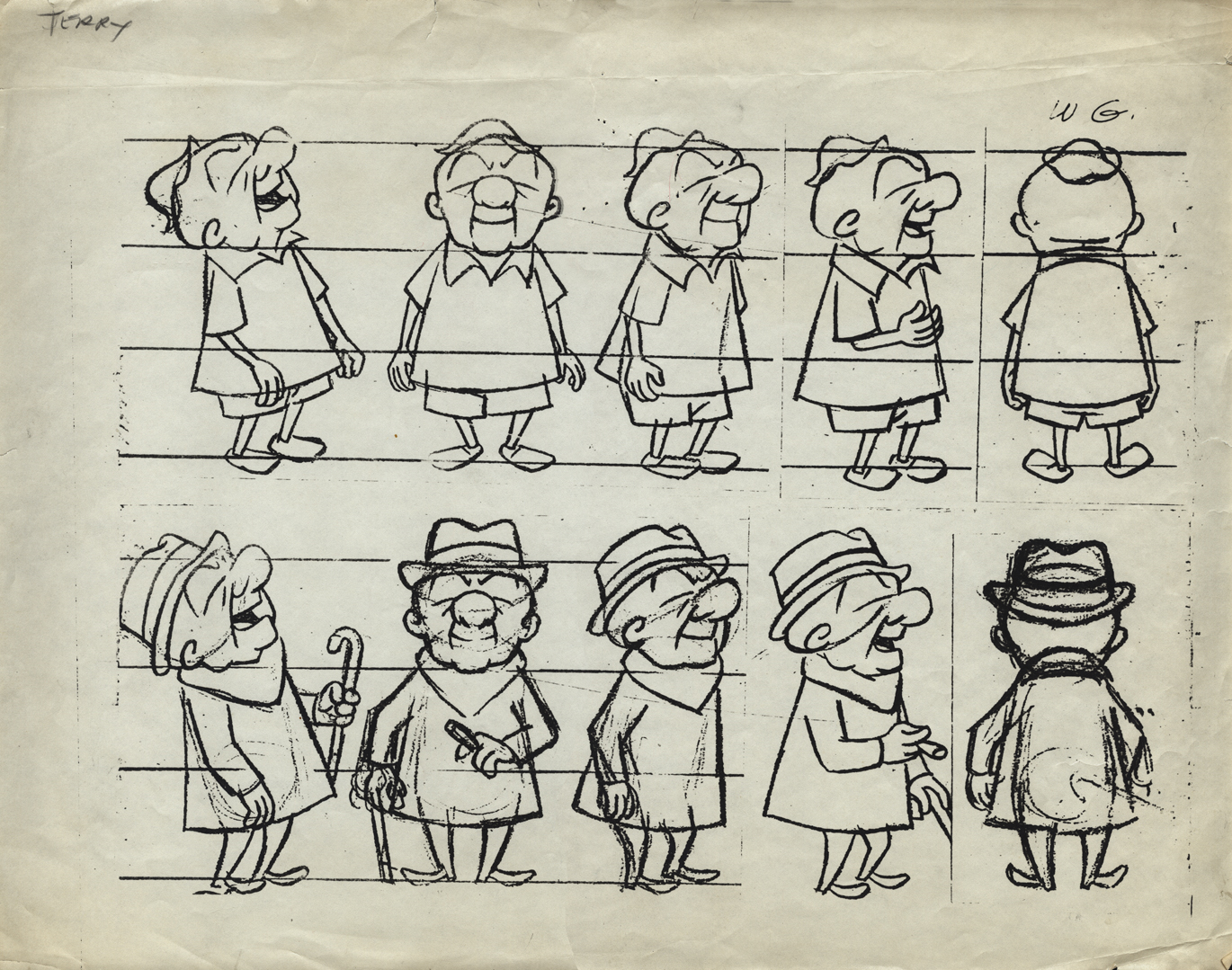
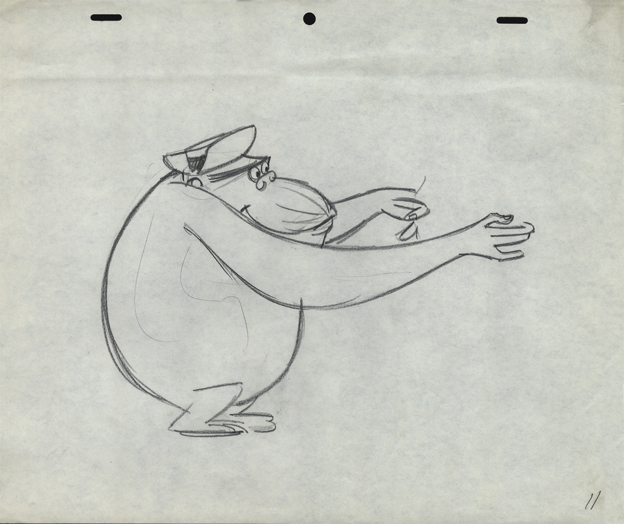
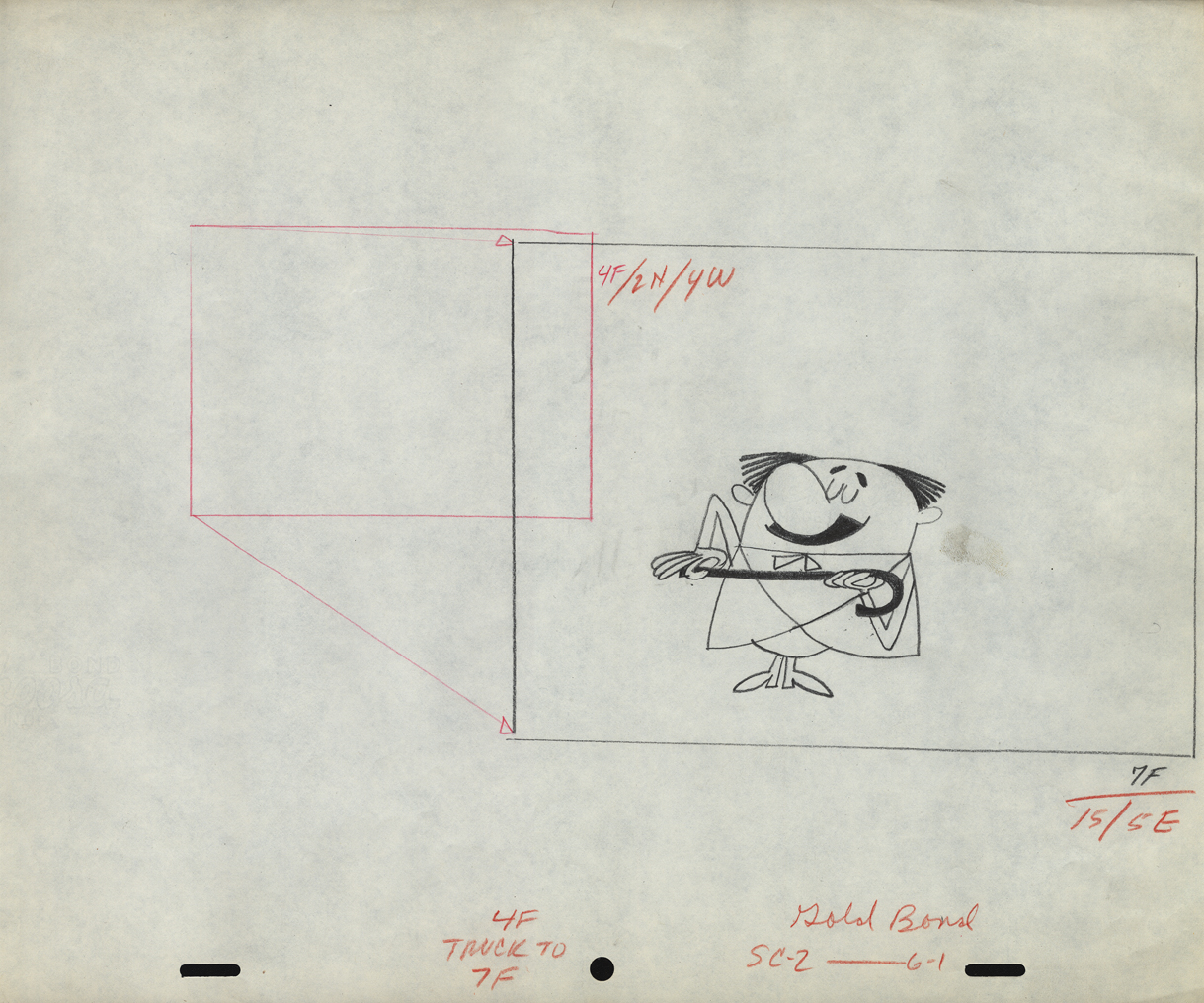
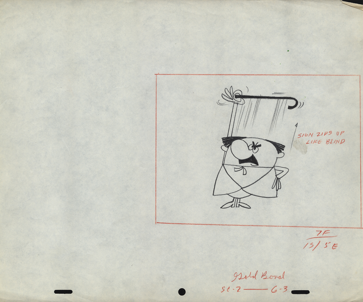
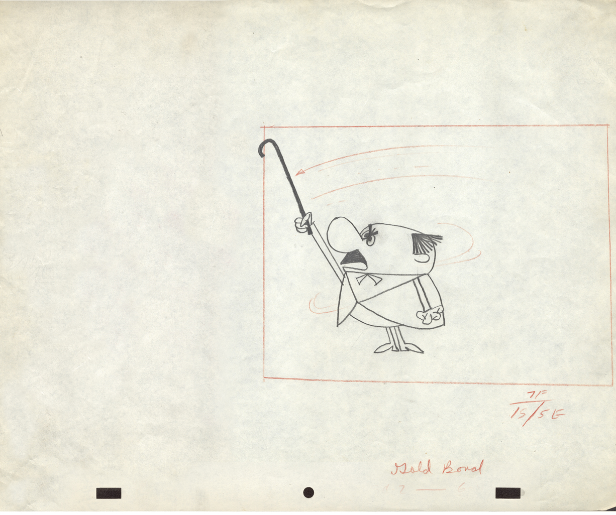
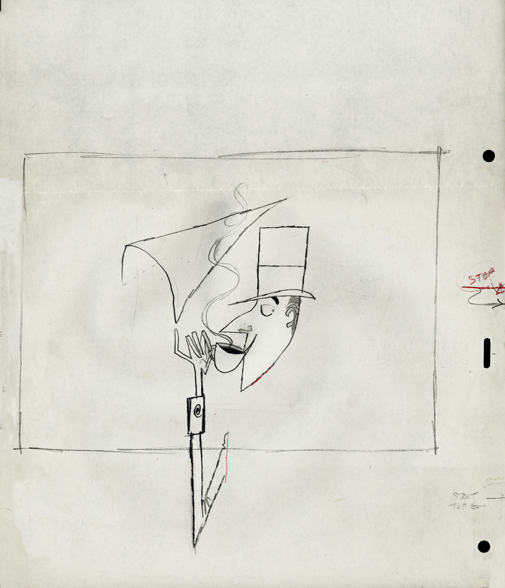
Animation &Animation Artifacts &commercial animation &Layout & Design &Models &UPA 18 Jul 2012 07:05 am
More UPA Spots
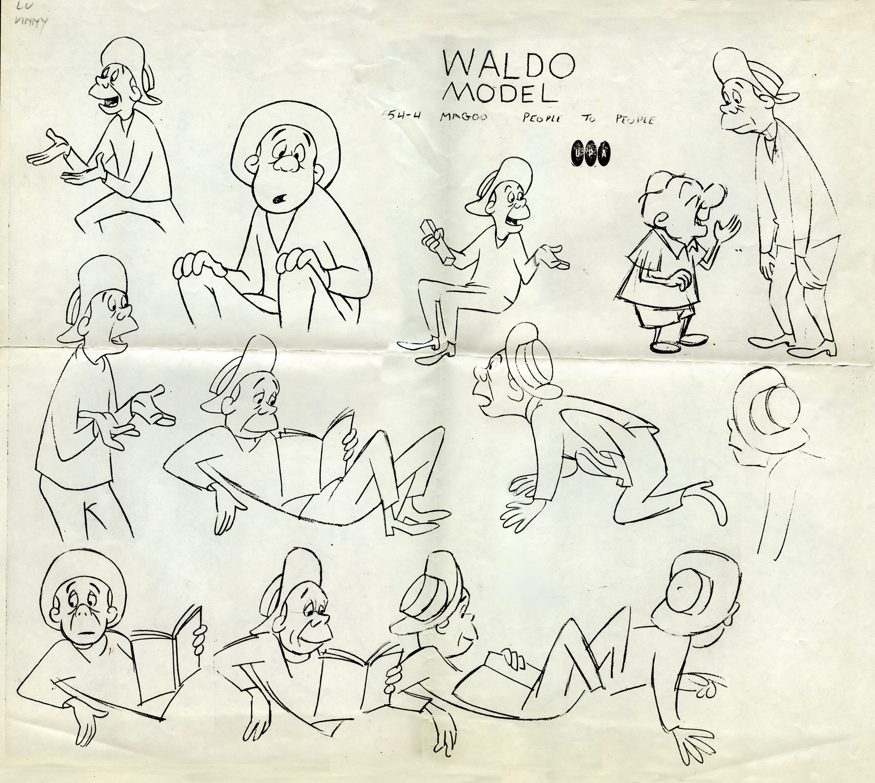
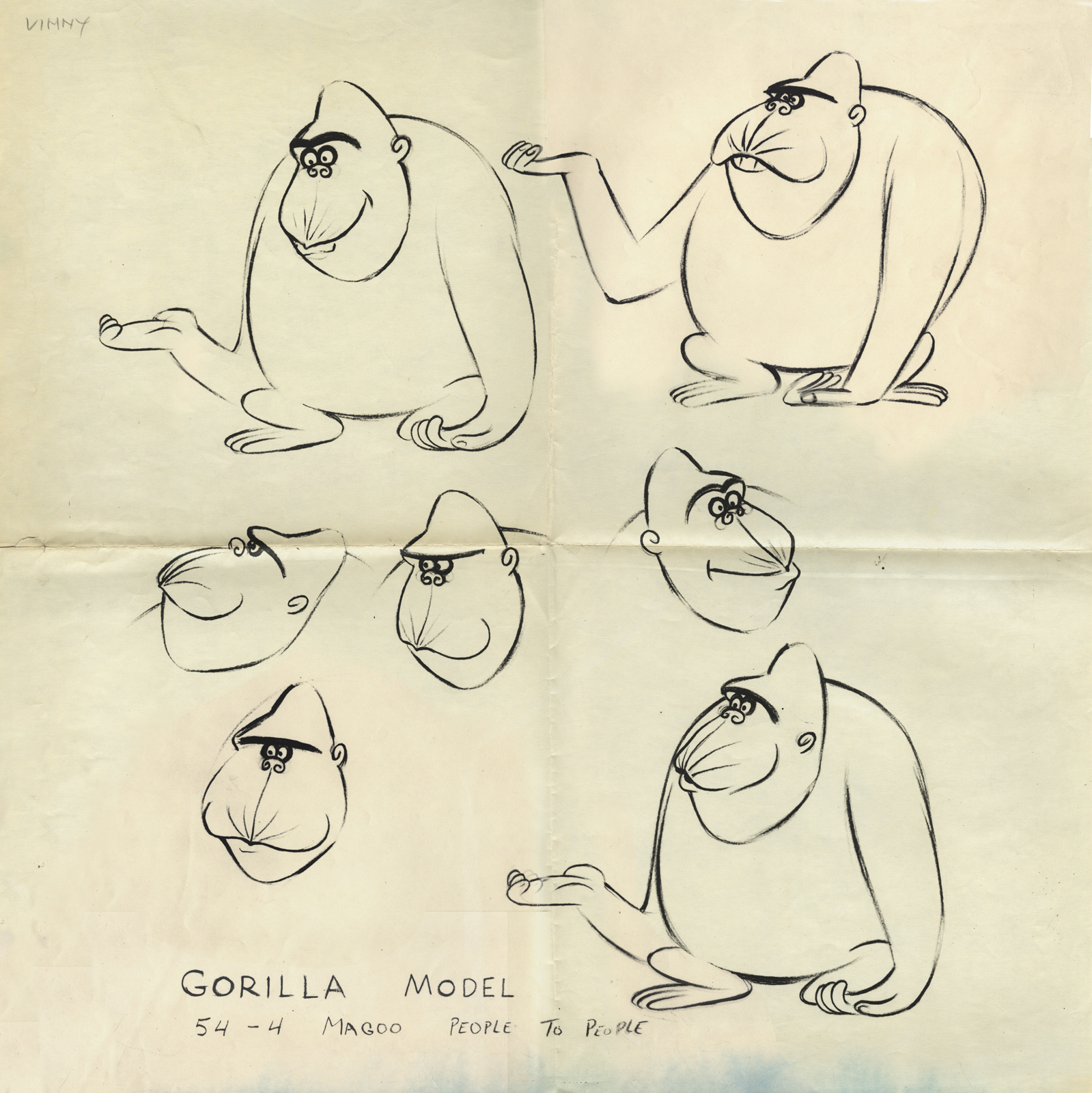
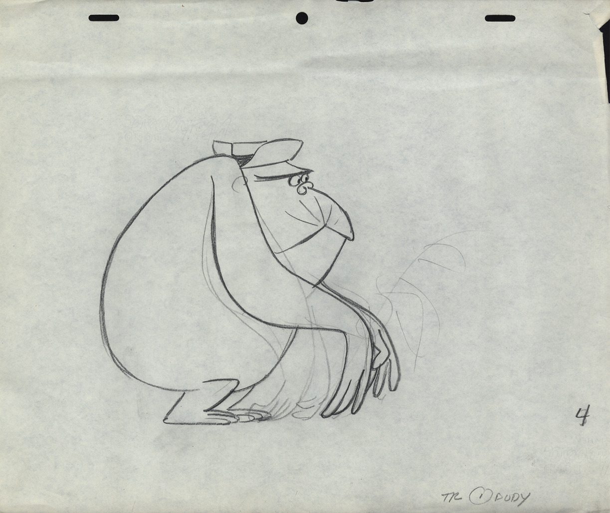
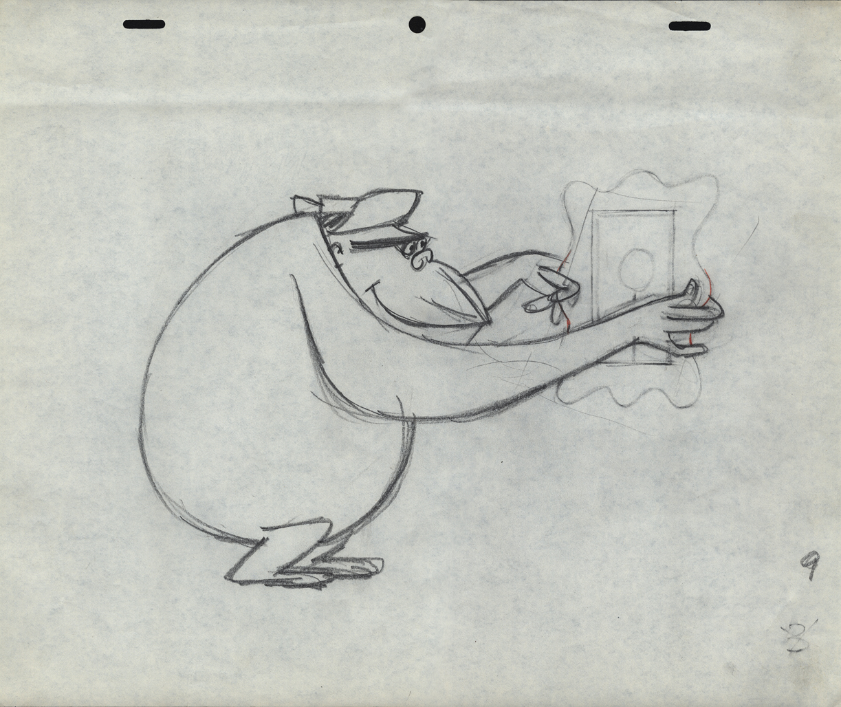
- Out of the Vincent Cafarelli collection, we’ve found another burst of UPA drawings. We know they’re UPA because there are models and animation drawings from a Mr. magoo short: “People to People.” The accompanying drawings from commercial spots and segments of the Gerald McBoing Boing Show all come on the same paper stock. The peg system is Acme not Signal Corps (which leads me to believe that some of those I called UPA in a past post are really from the Gifford Studio.)
 1
1This model and the other Magoo pieces here are from
the short “People to People” which features a gorilla.
 2
2
Per Mark Mayerson, in the comments section, the film was retitled
Terror Faces Magoo and was directed by Chris Ishii and Jack Goodford.
 3
3
See the film here.
 4
4
 5
5
This model comes with the names “Lu” and “Vinny” indicated.
Obviously Vinny Cafarelli was Lu Guarnier’s assistant.
 6
6
The following three drawings are key animation poses of the Gorilla.
 10
10
An ad for Gold Bond powder
 11
11
 12
12
 12
12
 13
13
 14
14
 15
15
 16
16
This is obviously a drawing of the Tworlinger Twins, a
series done for the McBoing Boing show. The NY office
seems to have done a number of pieces for the show.
 17
17
These guys look similar to the three who open
the McBoing Boing Show carrying their logo.
 18
18
A vertical pan for a Savarin Coffee spot. A sign painter
pastes a placard of the product on a billboard.
 19
19
Part of another vertical pan for the Savarin spot.
20
21
22
23
24
25
Animation Artifacts &Art Art &Independent Animation &Layout & Design &Photos &Puppet Animation 15 Jul 2012 05:43 am
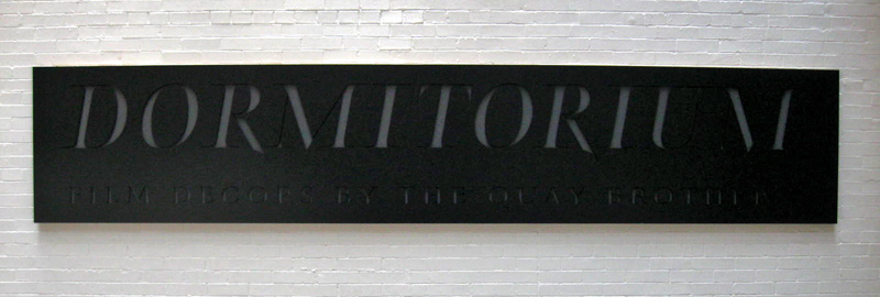
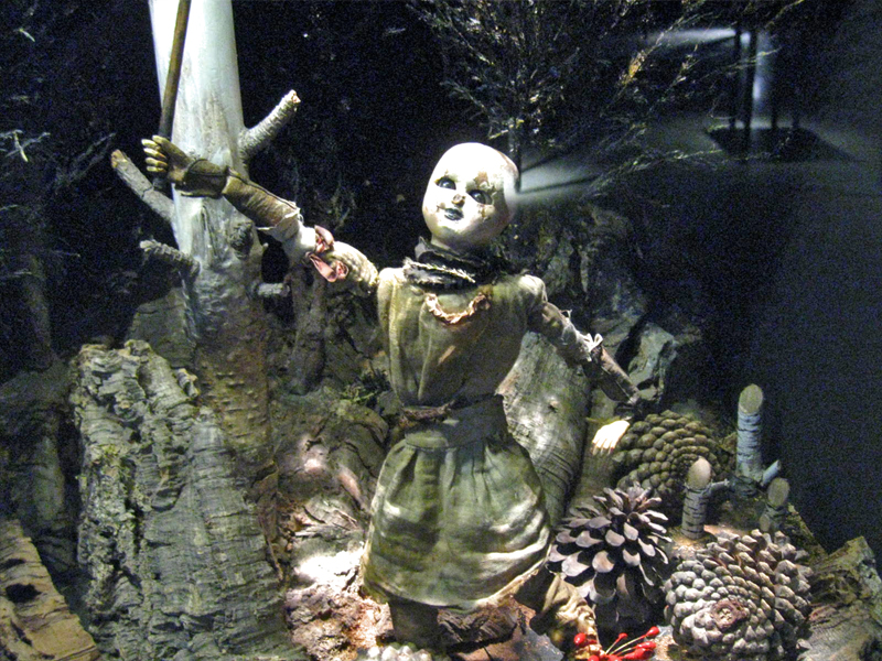
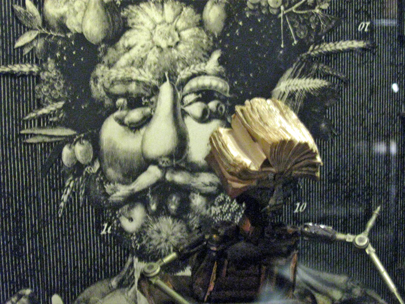
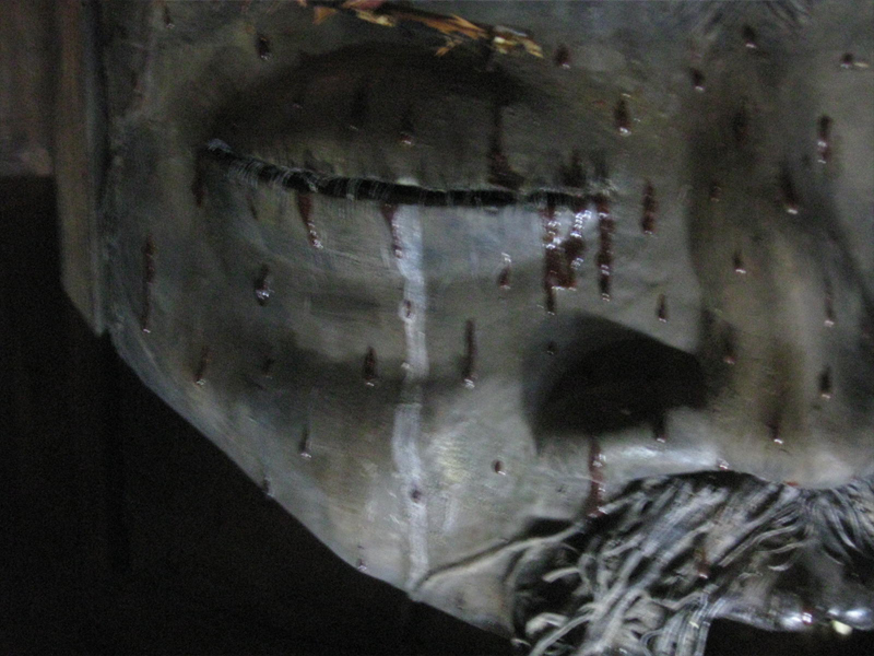
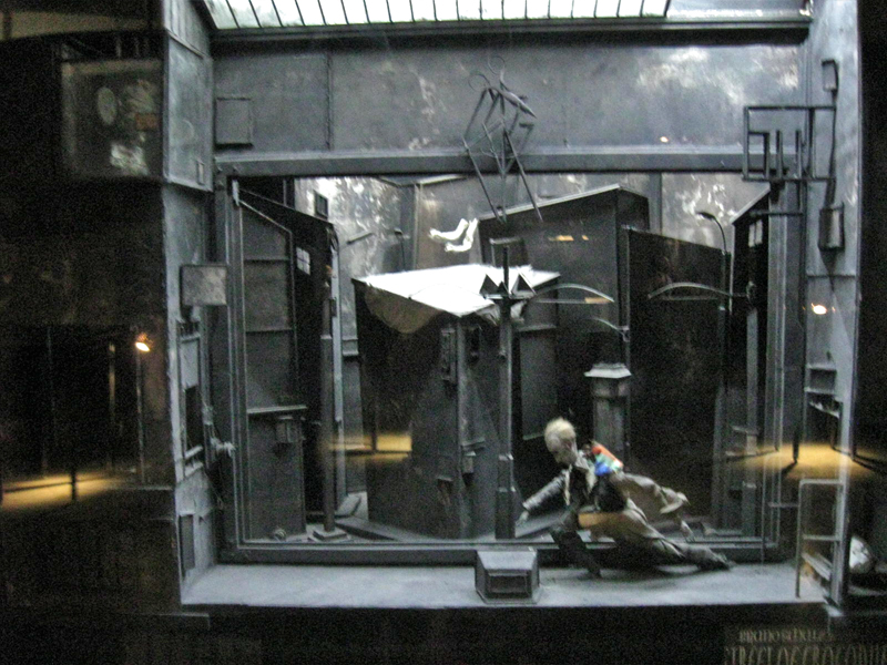
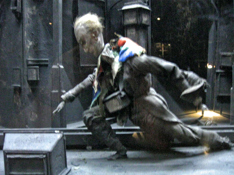
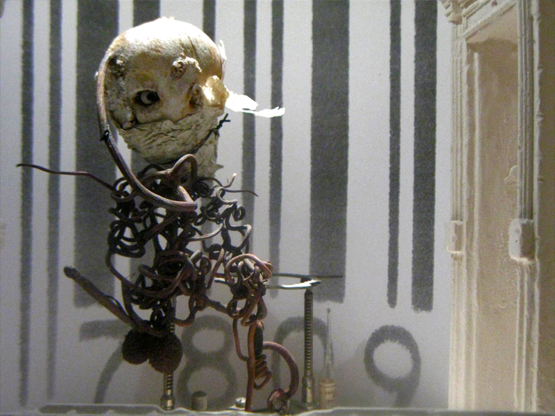
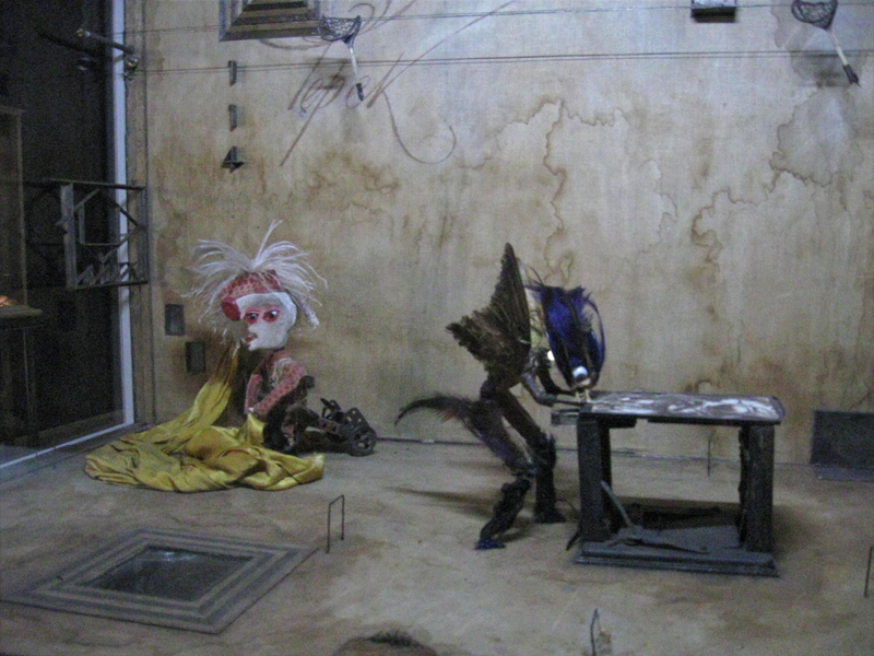
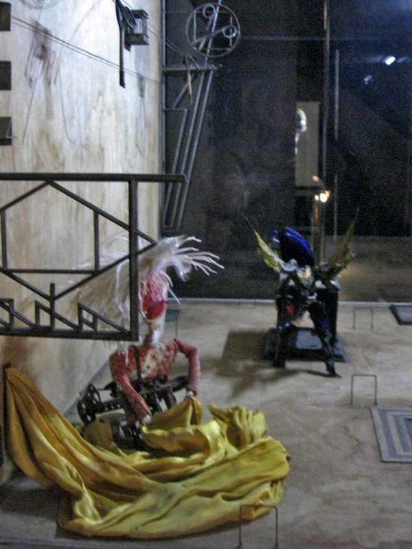
Quay Dormitorium – repost
August 11th a big show and retrospective of the work of the Quay Brothers will open at the Museum of Modern Art. Part of the exhibit will be a small puppet world within glass casings that they created called “Dormitorium.” This was actually exhibited in New York several years ago, and I photographed that presentation. I thought this might be a good time to repost it, getting us all in the mood for the world of Quay.
The Brothers Quay have an exhibition on display at Parsons School of Design, 2 West 13th Street on the ground level. It’s on exhibit from now through October 4, 2009.
Stephen and Timothy Quay claim writers Franz Kafka and Robert Walser, animators Walerian Borowczyk and Jan Lenica, puppeteers Wladyslaw Starewicz and Richard Teschner, and composers Leoš Janácek, Zdenek Liška, and Leszek Jankowski among their influences. All of these artists can be felt with each of the constructions on display.
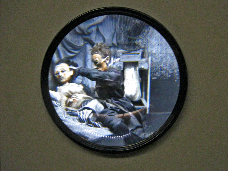
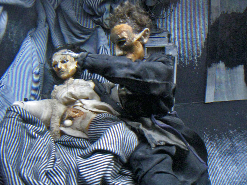
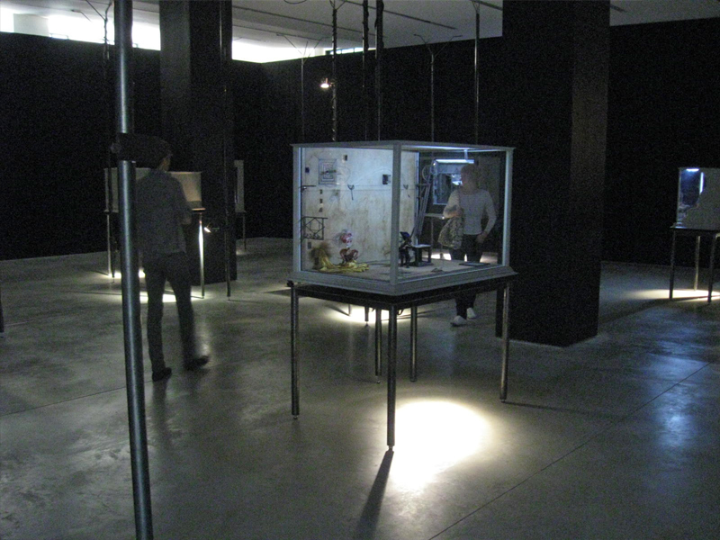 1
1On entering you see a darkened room with boxes about
the size of your torso – maybe 3′ x 4′ – on display.
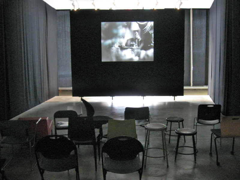
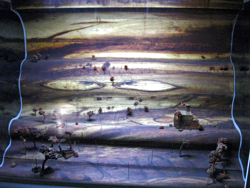
Of to the side there’s a theater with constantly running films
showing Quay brother works. One of every kind of chair.
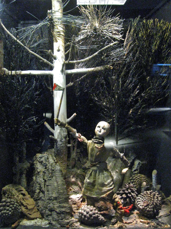
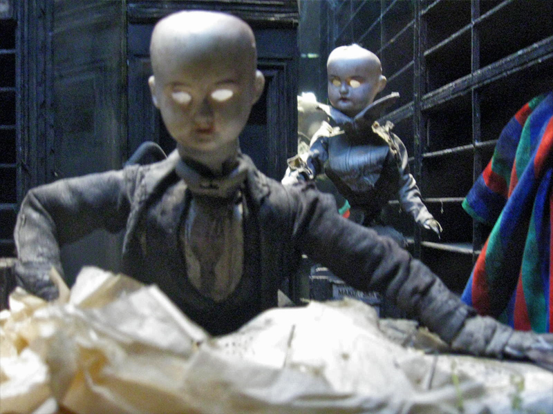
Within the boxes there are whole worlds.
Magnificent detail upon detail.
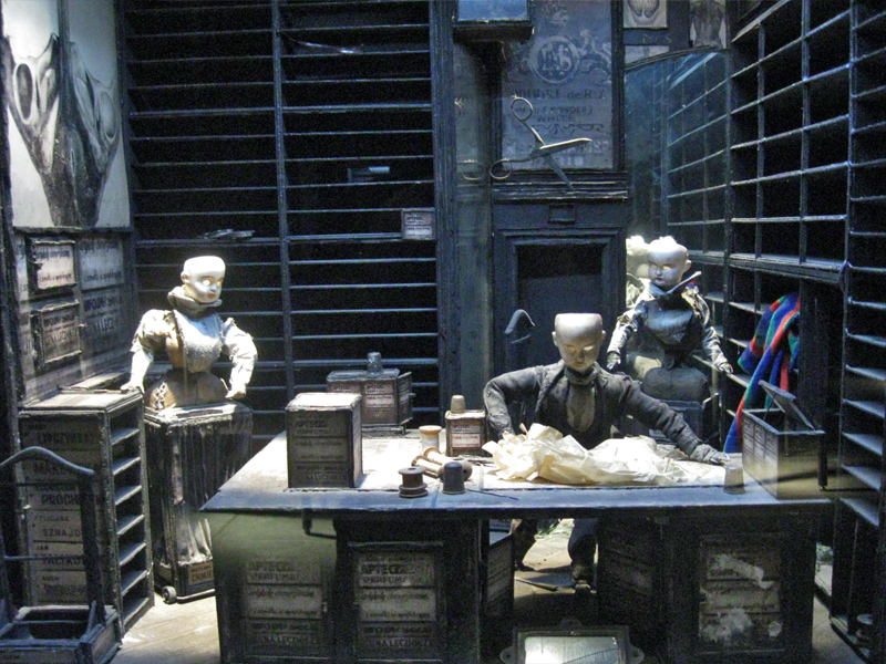
To the next box for a wholly different world.
Again the amazing detail is brought to the enclosure.
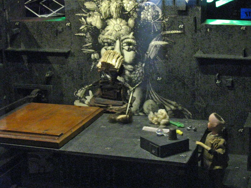
A couple of the boxes are seen through a prism.
The interior is magnified.
You have to get close to it to get real clarity.
You virtually enter these little rooms.
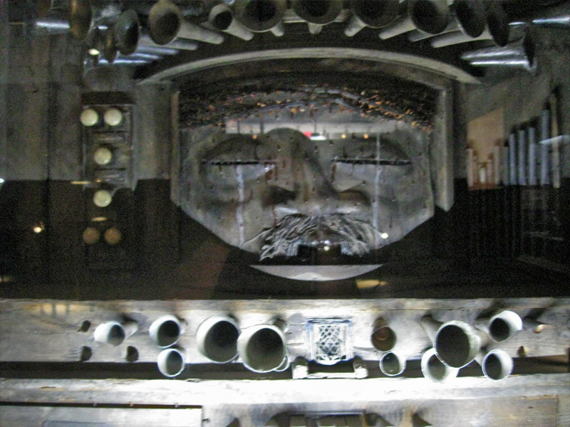
Some of these worlds seem enormous.
There are many closeups one could take given all there is to see.
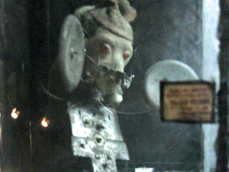
This little scene is in the upper left box of the full view above.
The central character on the main stage.
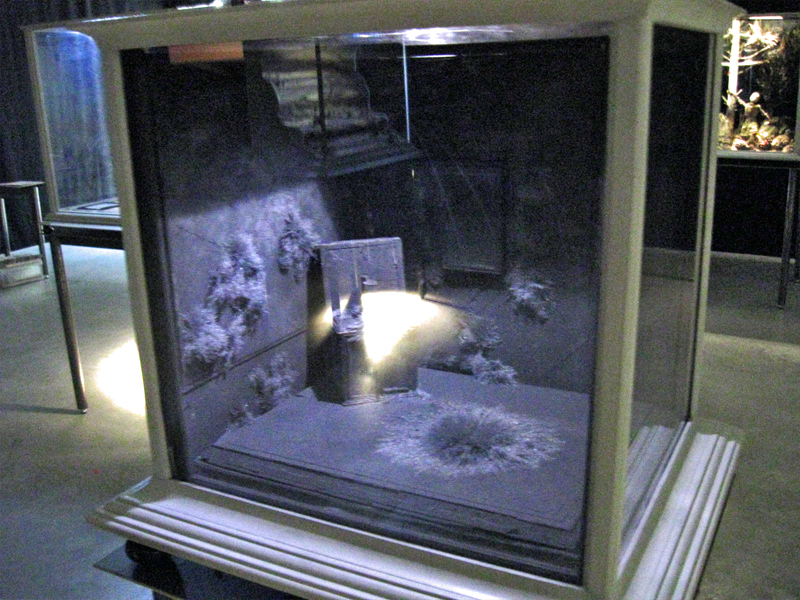
You can get an idea of the cases and the display.
All contain their own little worlds.
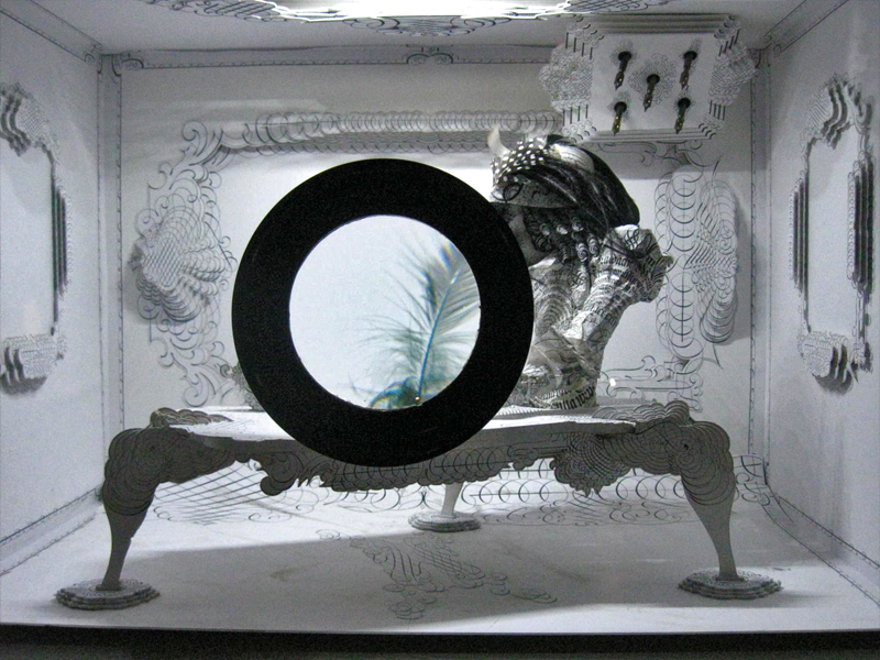
Another magnifying glass focuses on a feather.
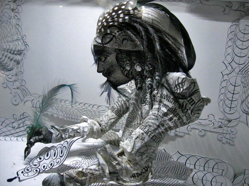
Just beyond the feathered quill there’s the writer.
The last box near the exit has a label within.
Many of the cases can be viewed
from three different perspectives.
Animation Artifacts &Books &Comic Art &commercial animation &Models 11 Jul 2012 05:37 am
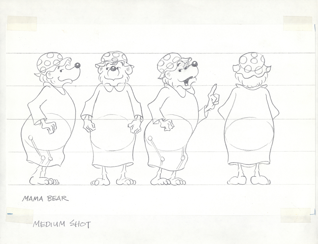
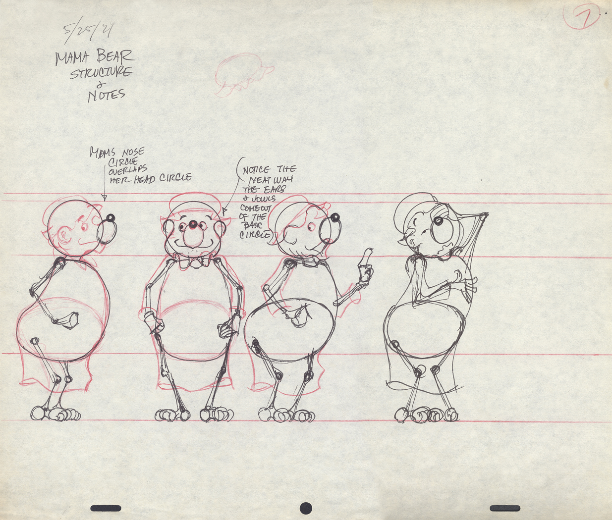
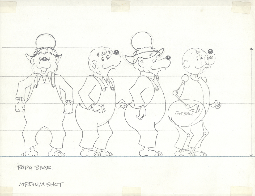
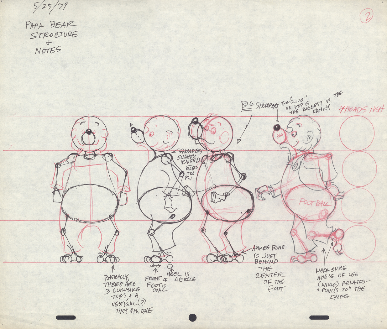
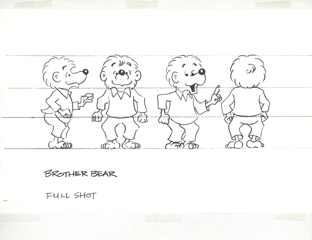
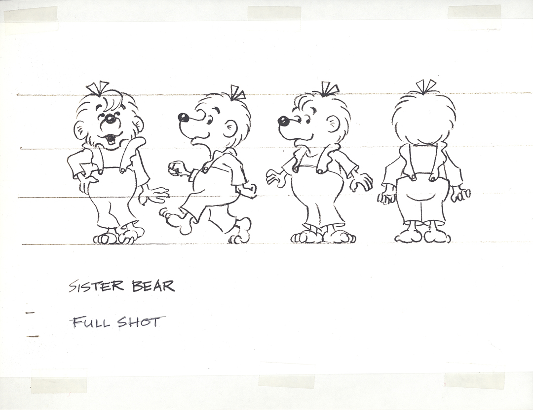
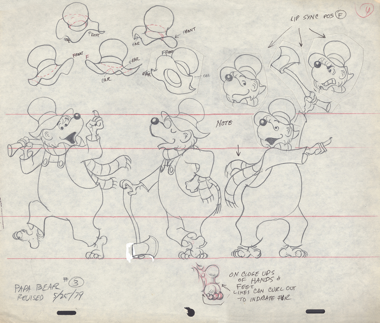
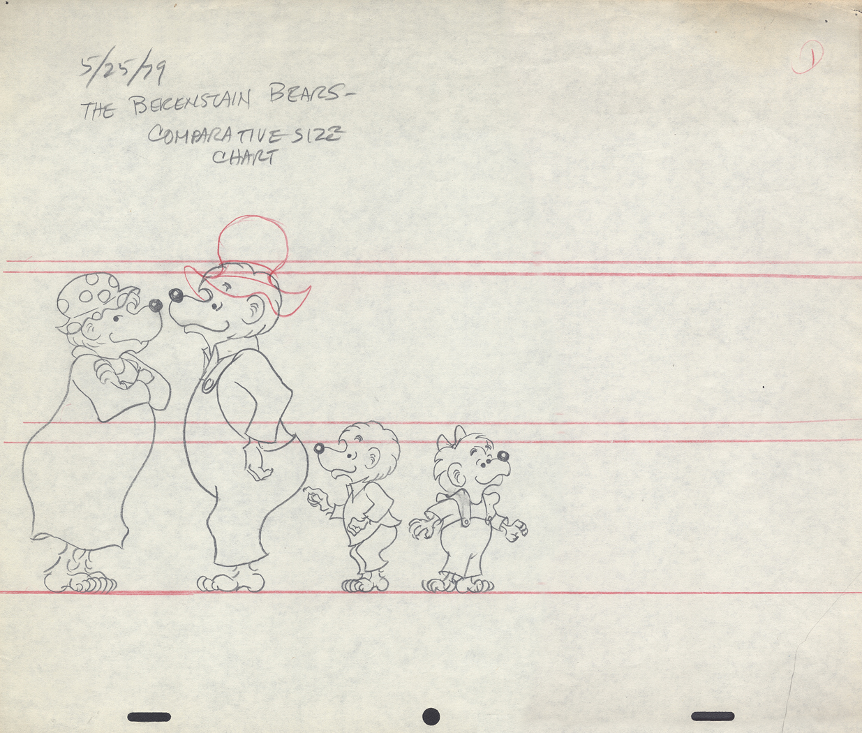
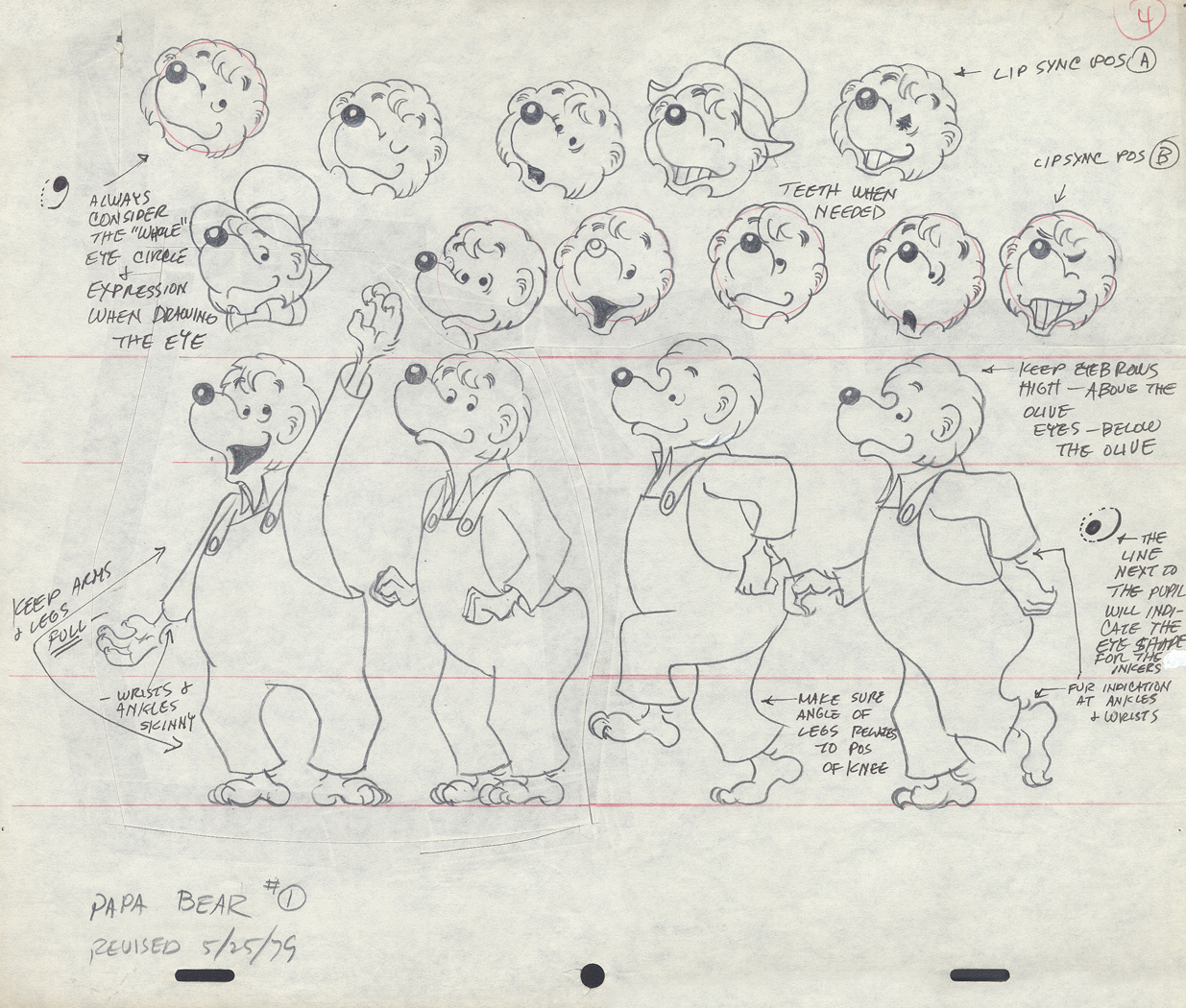
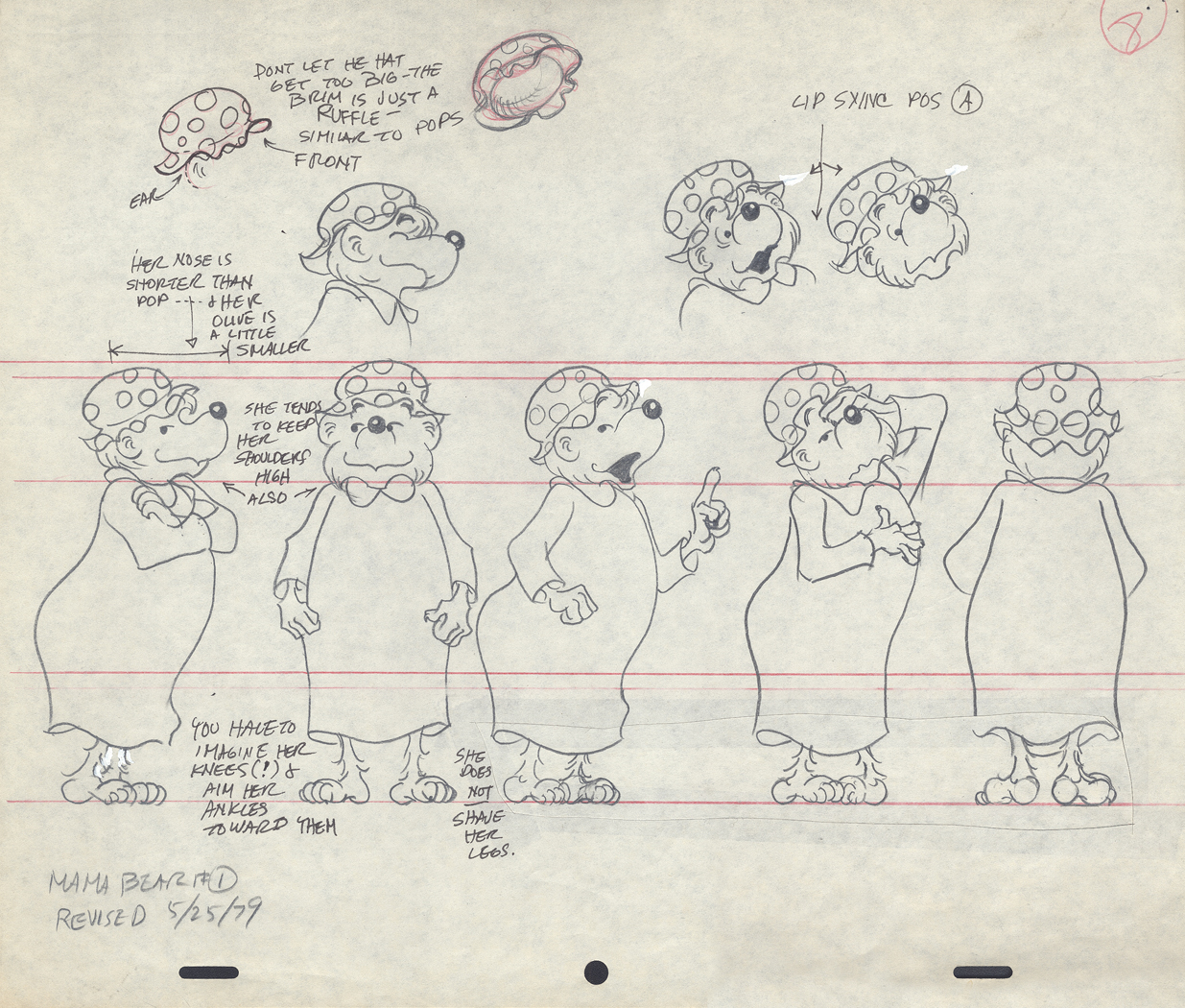
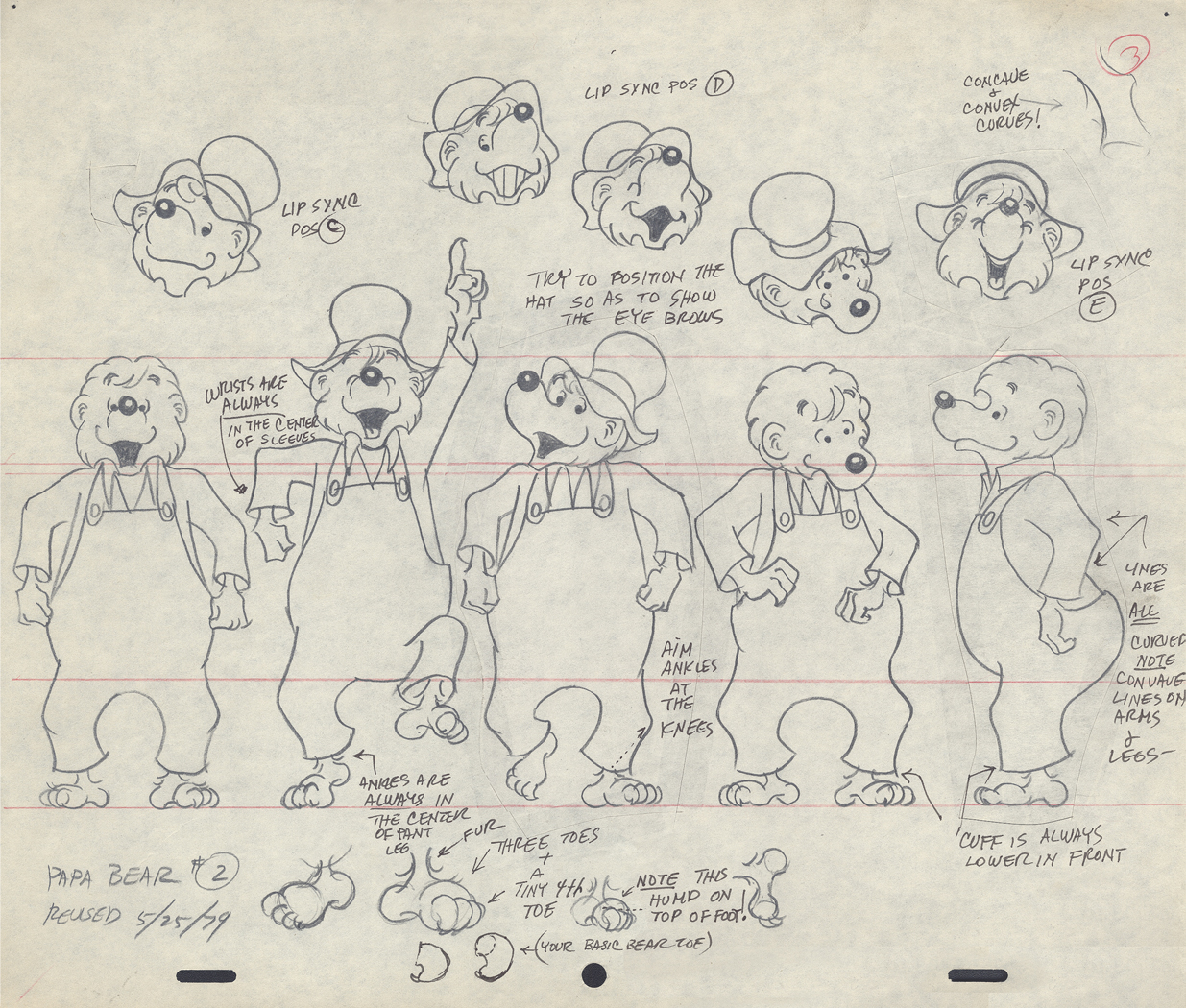
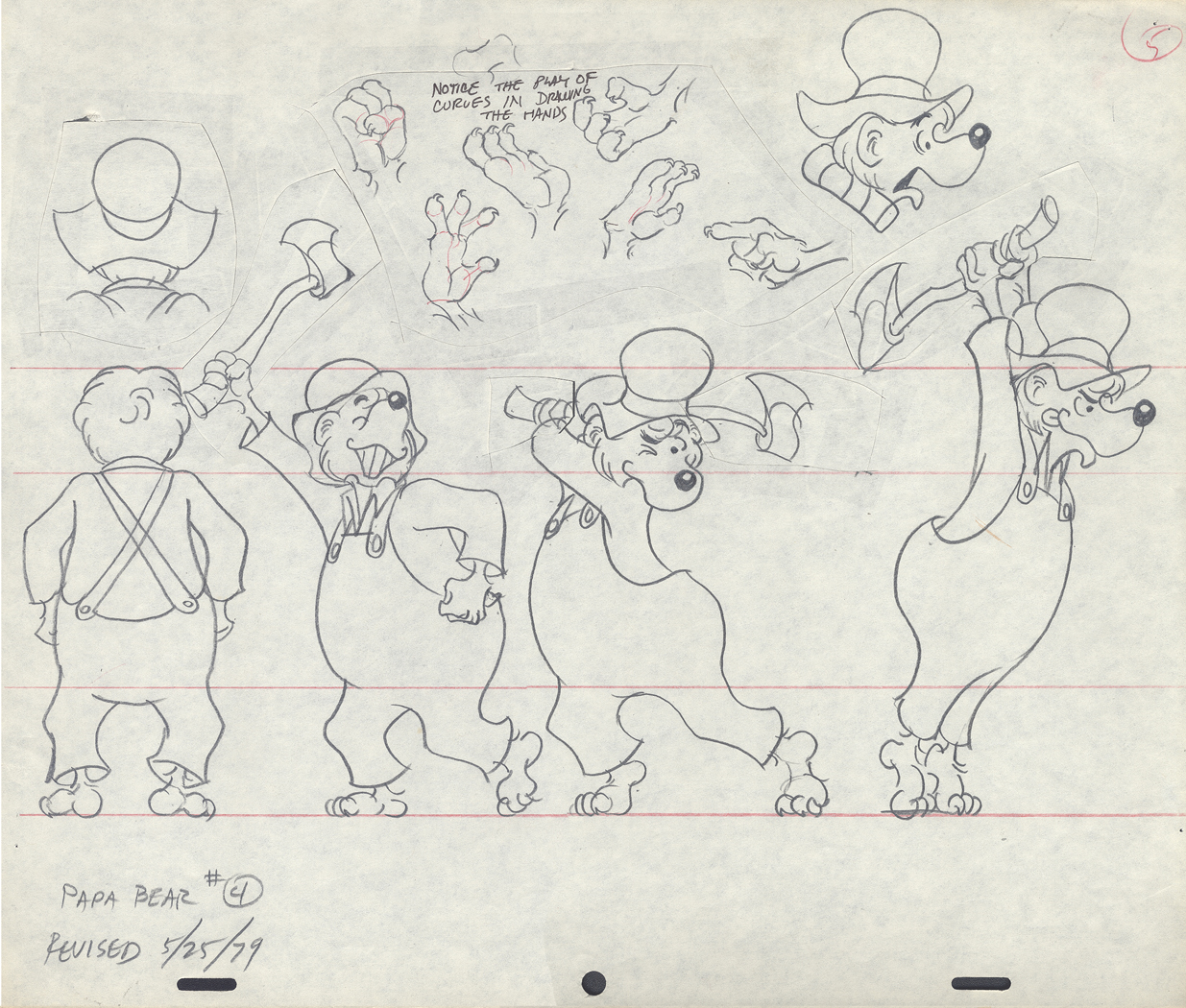
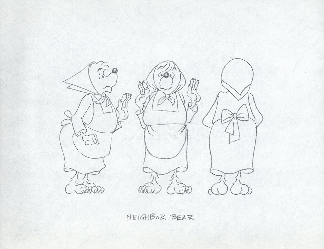
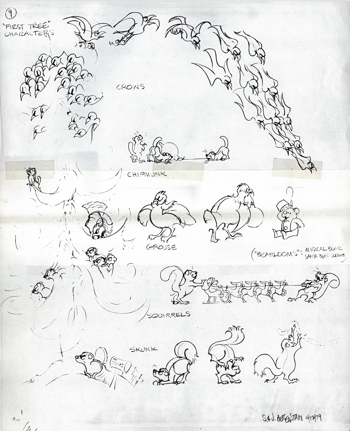
Berenstain Bear Models
- From Vince Caferelli‘s collection, this week we jump to his years at Perpetual Motion Pictures. The first Berenstain Bears Special, Berenstain Bear’s Christmas Tree, was done for NBC in 1979 and was followed by another four. This was a very successful half hour made from the comic strip which was created by Stan and Jan Berenstain. They wrote the original TV special which was directed by Mordecai Gerstein, Animated by Vinnie Bell, Vincent Cafarelli, Jack Dazzo, Lu Guarnier, Jan Svochak and Fred Mogubgub.
The Asst. Director was Candy Kugel, and the Bgs were done by Linda Daurio and Cotty Kilbanks.
Here are the model sheets which were drawn by director, Mordi Gerstein, and animator, Jan Svochak, from original drawings by Stan Berenstain. These, for the most part, are original pencil drawings of those models.
 1
1
 2
2
 3
3
 4
4
 5
5
 6
6
 7
7
 8
8
 9
9
 10
10
 11
11
 12
12
 13
13
 14
14
 15
15
This ic a copy of a model digned by the Berenstains.
____________________________________
This is the half-hour Special as it appears on YouTube.
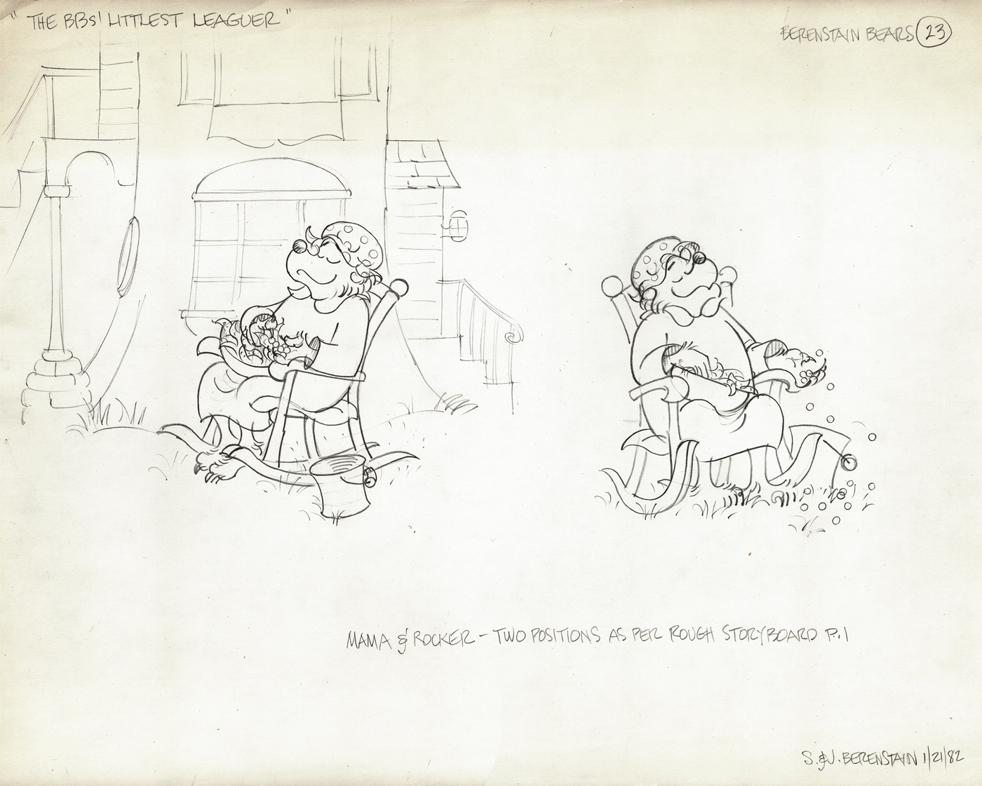
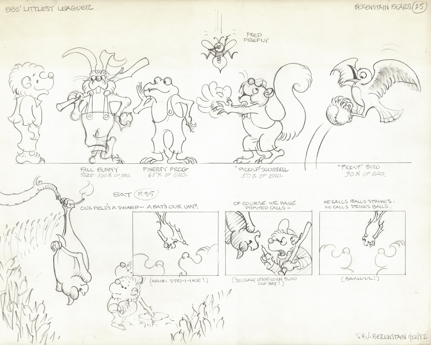
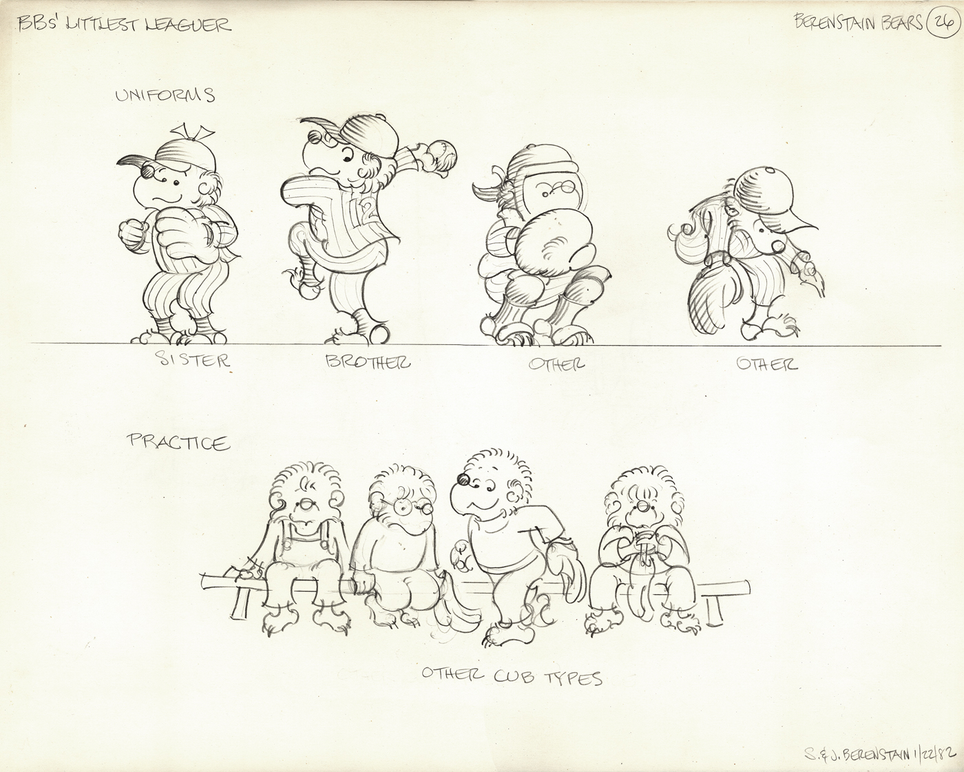
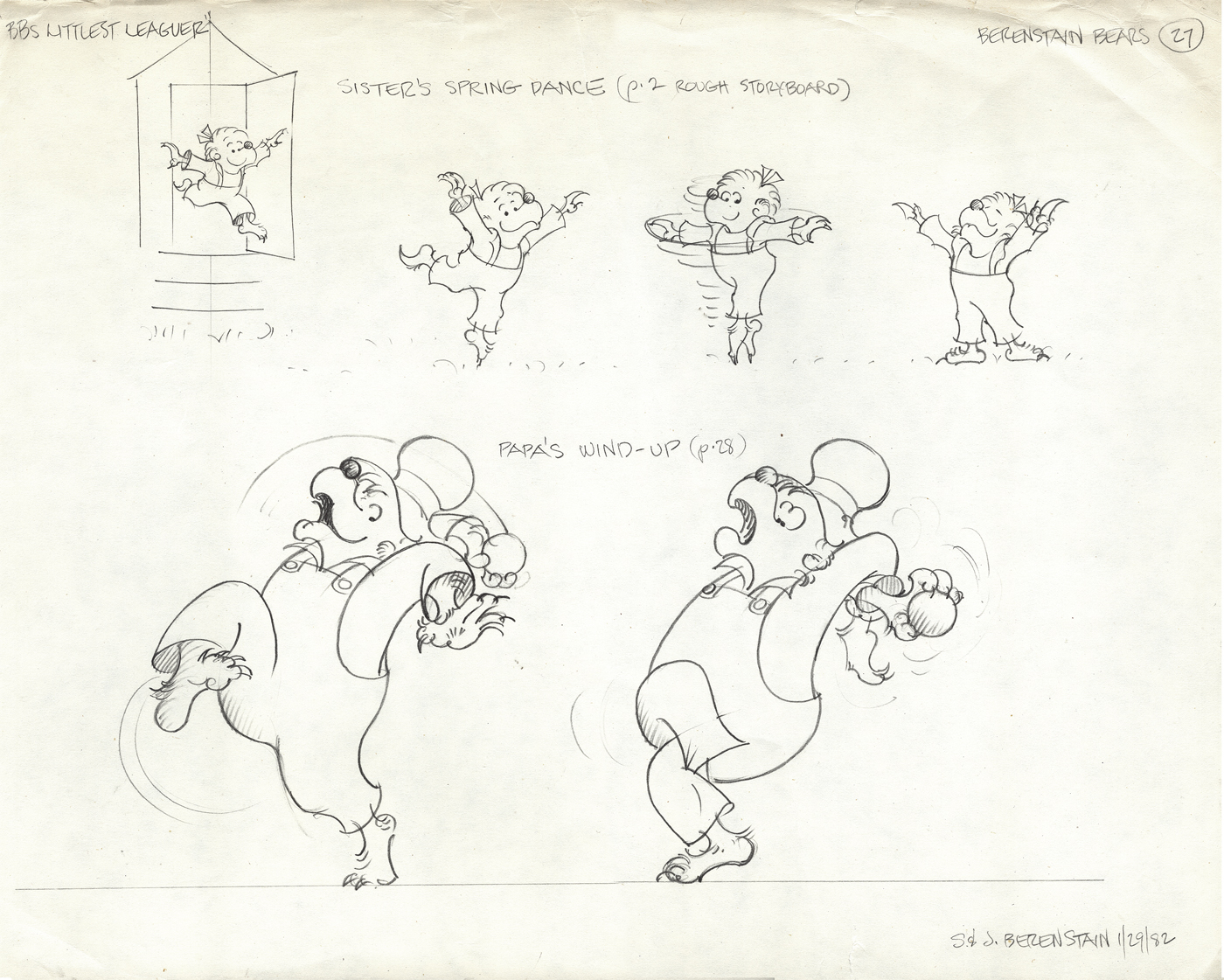
The next four models come from a later show, “The Berenstain Bears’ Littlest Leaguer.”
All are original models signed by the Berenstains.
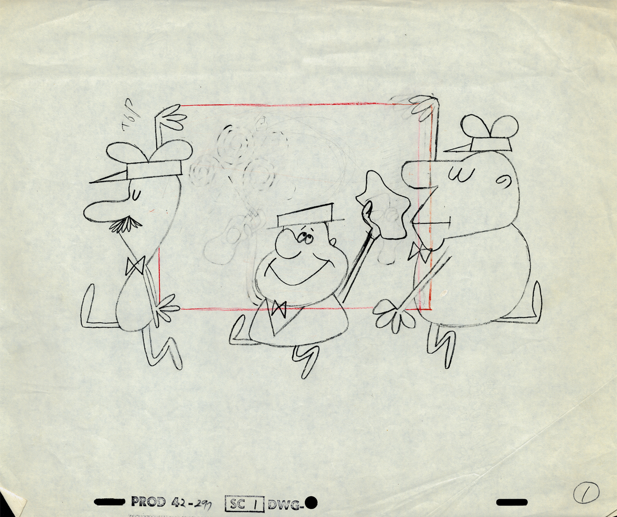
Action Analysis &Animation &Animation Artifacts &Frame Grabs &Hubley &Independent Animation &Layout & Design &Tissa David 09 Jul 2012 05:24 am
Of Men & Demons – Redux
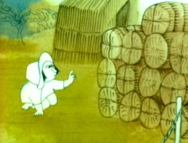 – Since first seeing the Hubley short, Of Men & Demons, back in 1967, I’ve been a fan. The artwork was stunningly different and original. It had a rich tone to it and some beautiful Hubley Bgs. The music by Quincy Jones was as original as the film, itself.
The short was actually an industrial film done for IBM to explain the binary code to its employees. The Hubleys, however, built on that story to make something of a personal film that received an Oscar nomination.
(Click any image on the page to enlarge.)
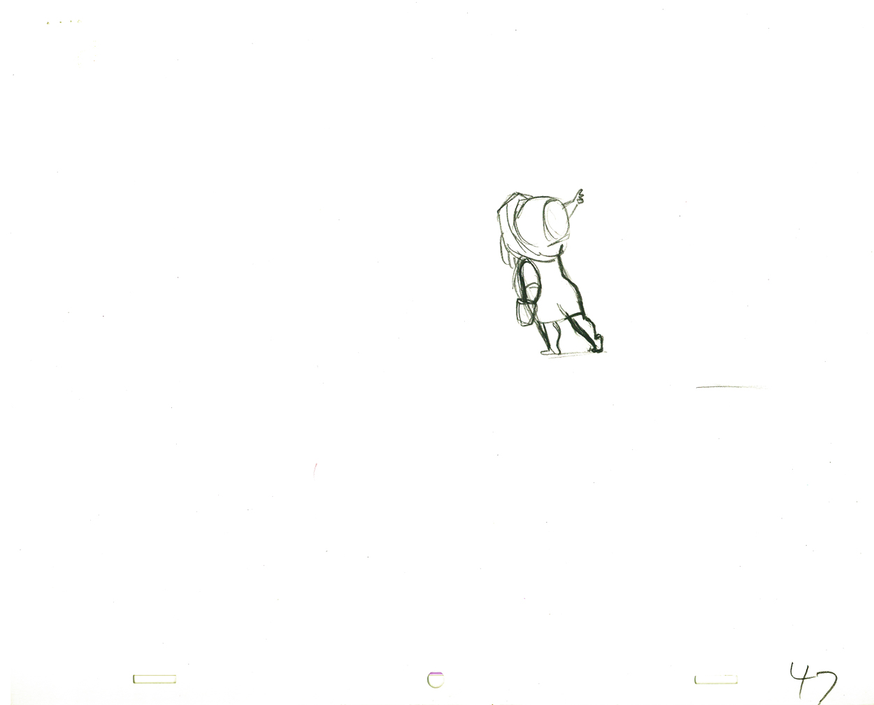
Art Babbitt was one of the first animators hired. At some point, Tissa David was brought on to rework some of Babbitt’s beautiful animation. Unfortunately, it was on about fourteen levels and had to be combined and reconstructed and shortened. (Today, of course, there are no limits to levels, but in the days of the camera you kept things to 4 cel levels, as a rule, and never more than 5.) It was complicated by the fact that John Hubley had decided to shorten the piece, and Quincy Jones’ score was shorter than Babbitt’s animation. This chore took some effort and involved dissolve animation. Tissa then continued on the sequence animating the little protagonist and his female companion through the remainder of the film.
About 25 years ago, Tissa David gave me an envelope full of art from this film, and going through a lot of my old material recently, I came upon that envelope.
 3
3 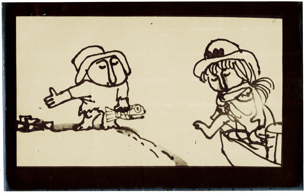 4
4
These are storyboard drawings for a short sequence. Tissa got these drawings and prepared Layouts for the sequence. You can see how much is actually in John’s drawings so it’s easy to build on what he’s given you.
 1
1The following are key drawings Tissa prepared for the sequence in laying it out.
.
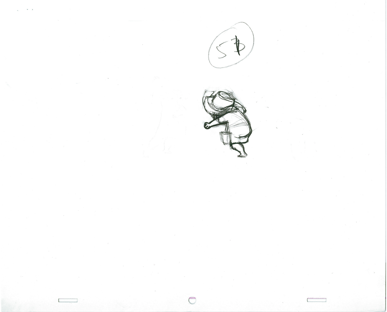
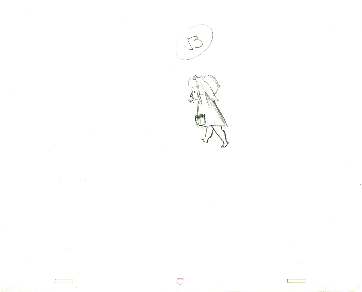
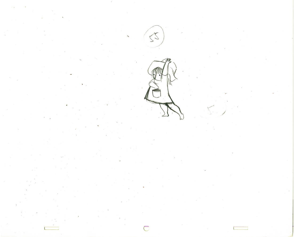
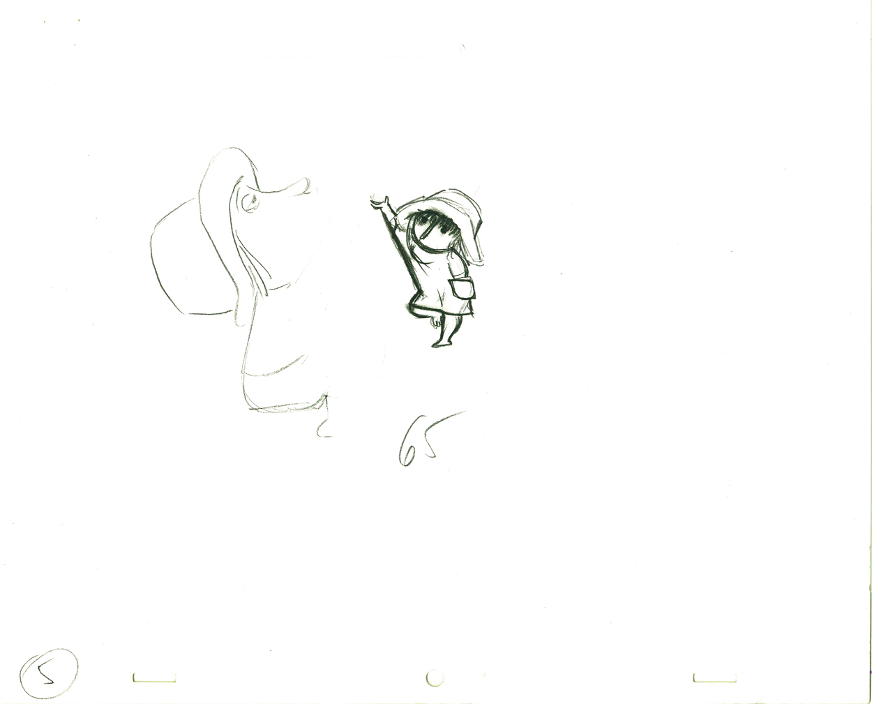
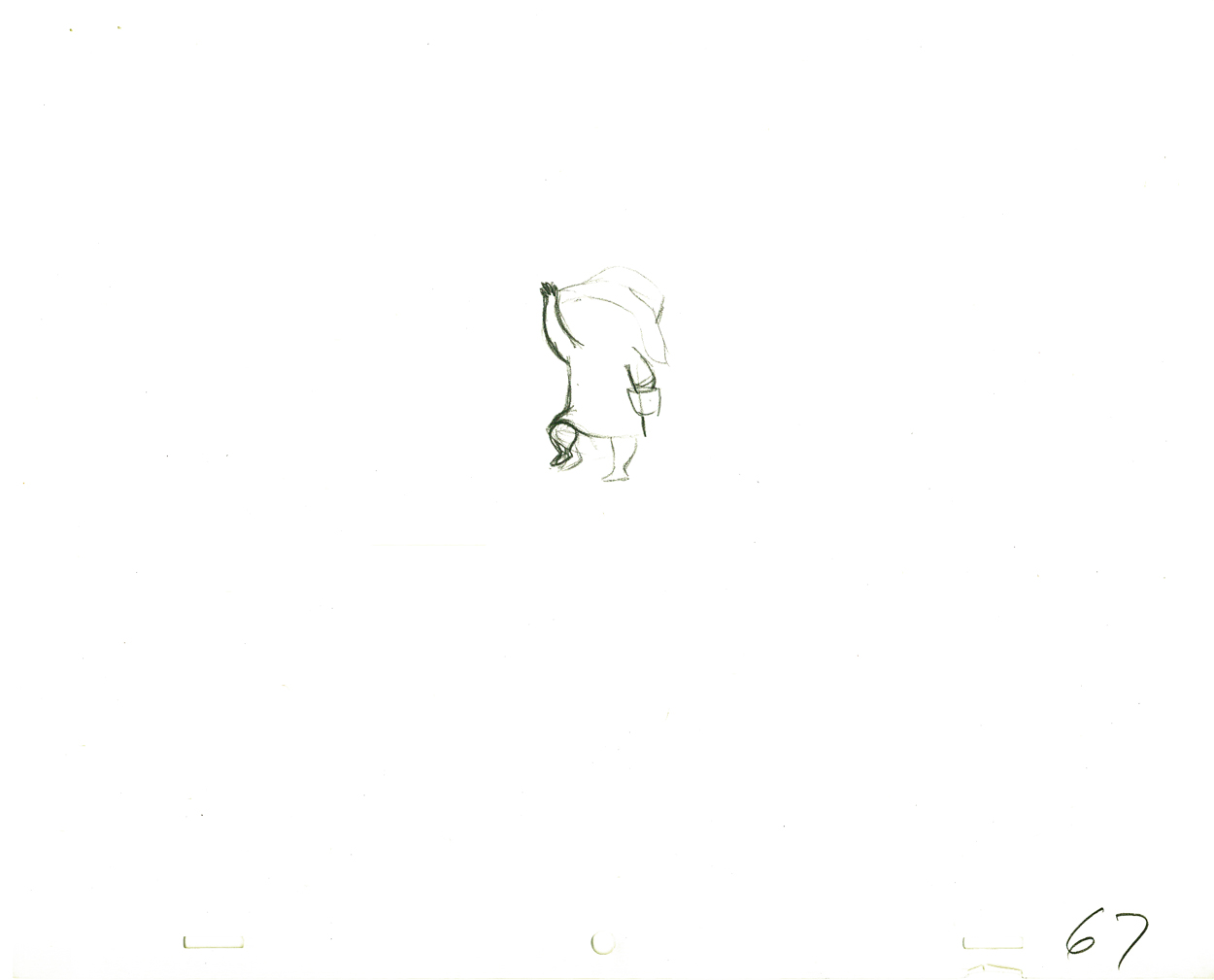
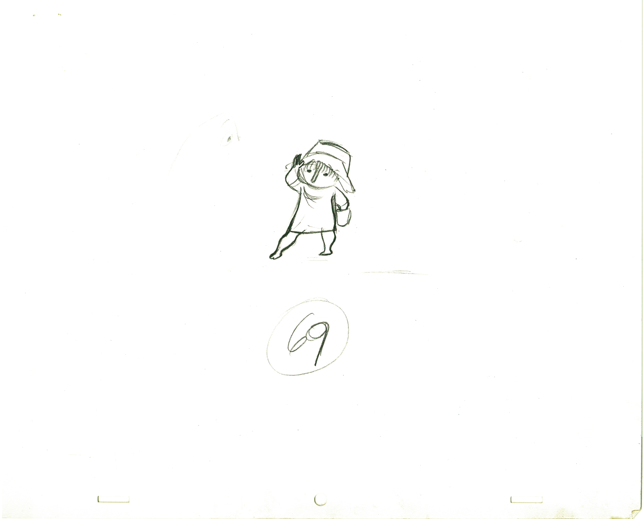
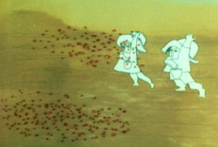
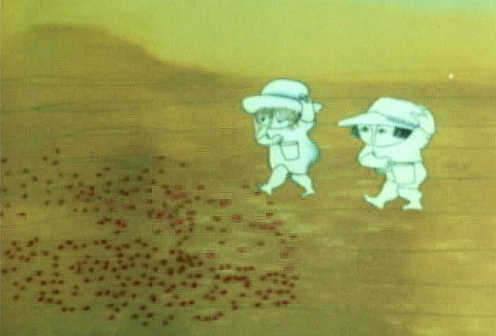
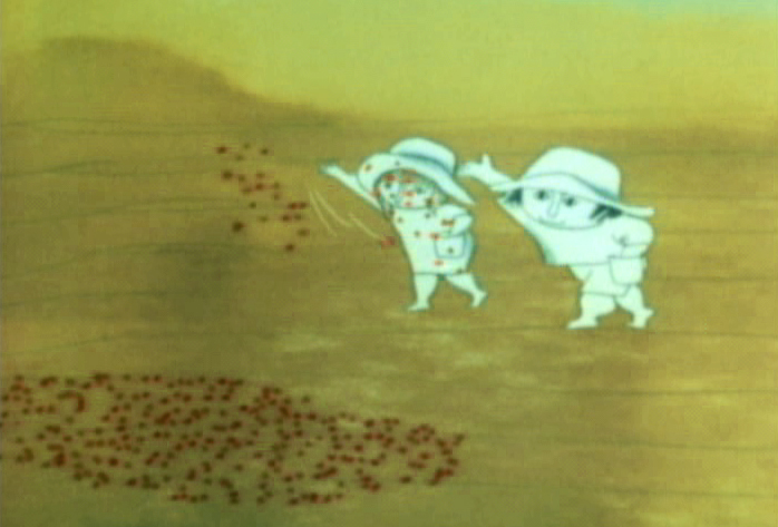
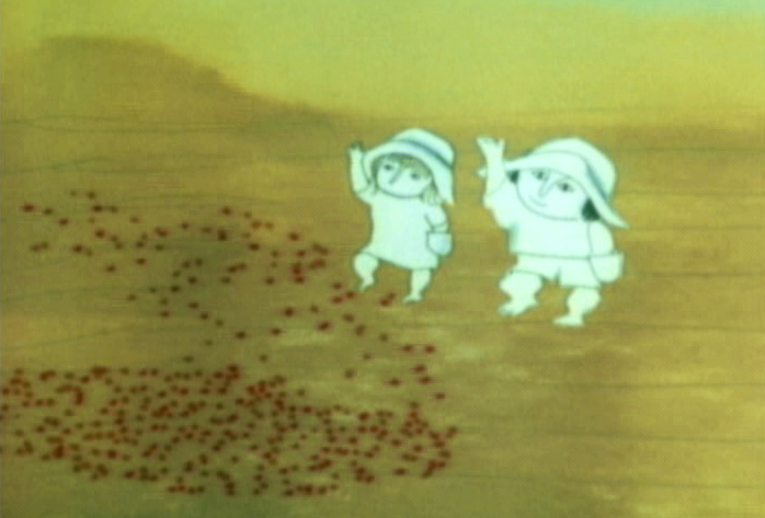
Here is a short piece that Tissa did of the little woman character seeding her front yard. There’s so much grace in every one of these drawings and enormous information in the walk, itself.
 G47
G47(Click any image to enlarge to full animation sheet.)
.
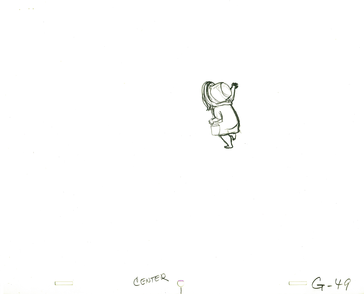 G49
G49.
 G51
G51.
 G53
G53.
 G55
G55.
 G57
G57.
 G59
G59.
 G61
G61.
 G63
G63.
 G65
G65.
 G67
G67.
 G69
G69
And here are the matching frame grabs from the film.
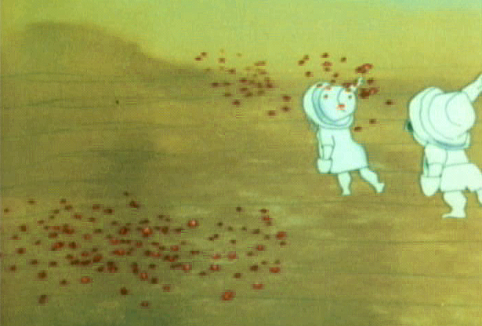 47
47 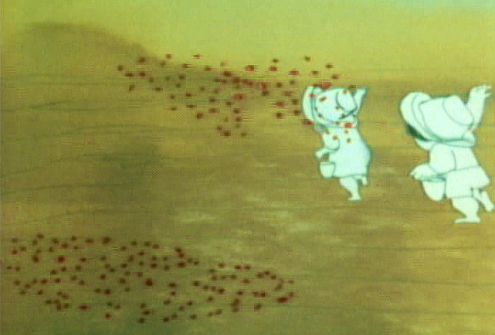 49
49
51 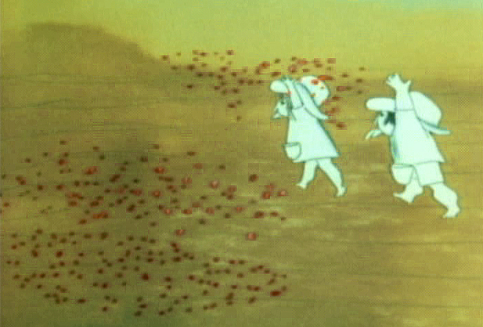 53
53
 55
55 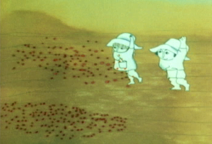 57
57
 59
59 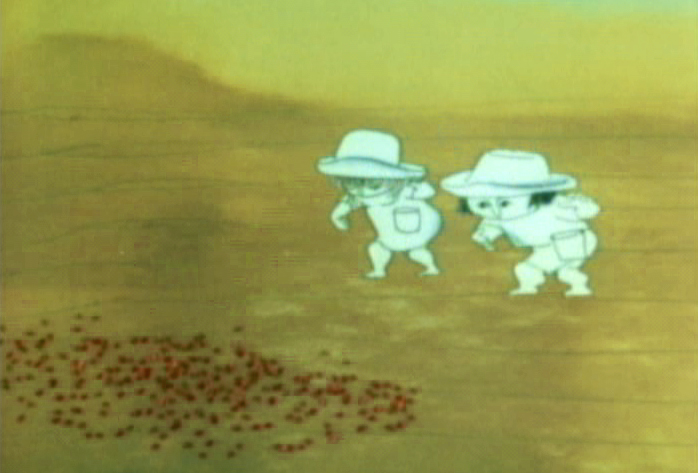 61
61
 63
63 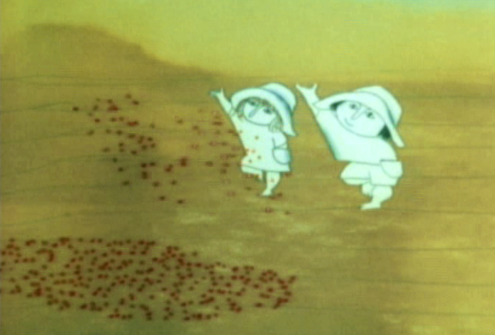 65
65
 67
67 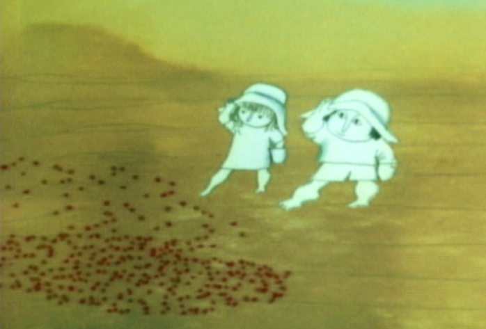 69
69
.
Seeding crops PT & Final Color
Animation Artifacts &repeated posts &SpornFilms &Title sequences 08 Jul 2012 07:05 am
Prince of the City – recap
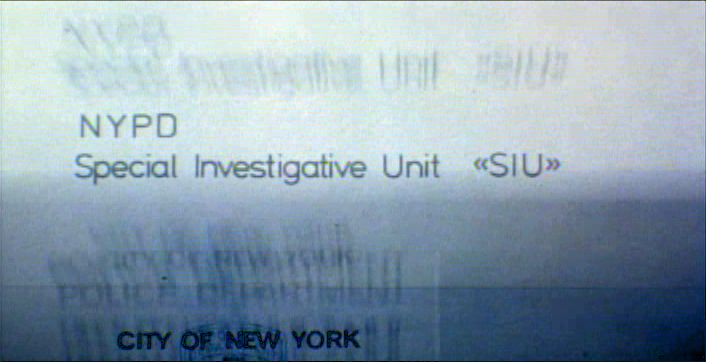
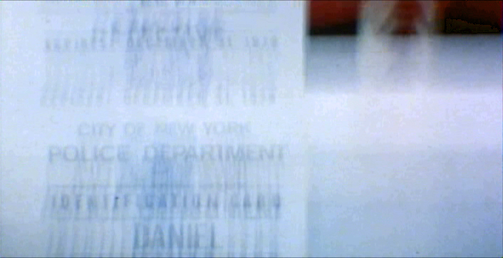
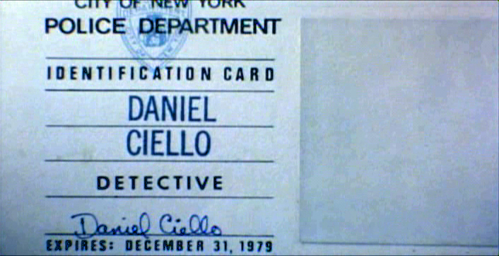
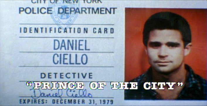
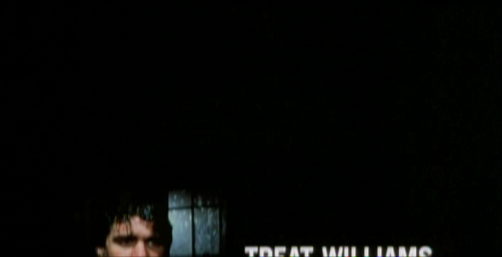
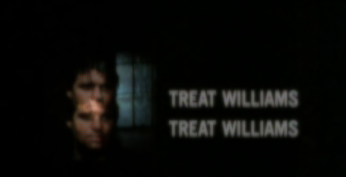
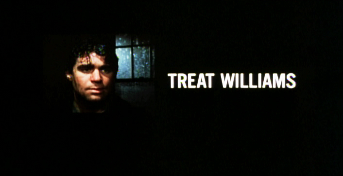
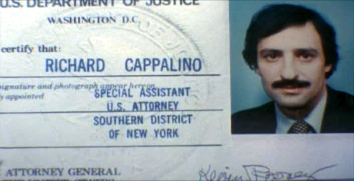
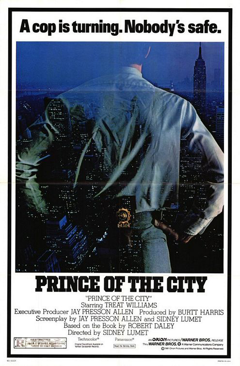 - One of my studio’s very first jobs was to do the titles to a big Sidney Lumet feature film, Prince of the City. (Feb, 1980) The film was a hard-nosed crooked cop drama brilliantly directed by Lumet. The problem it had was that few of the actors in the large cast were known, and the audience was having a recognition problem. Treat Williams was in his break-out role and the only other identifiable actor was Jerry Orbach.
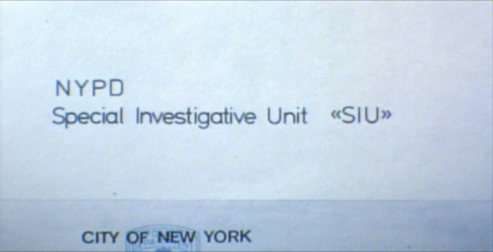
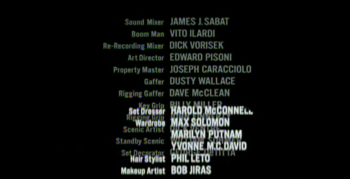
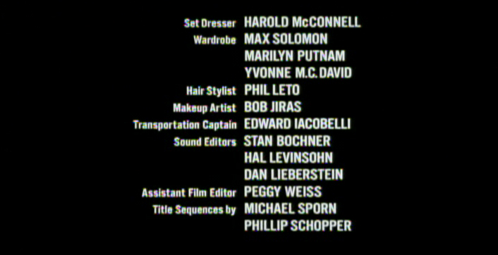
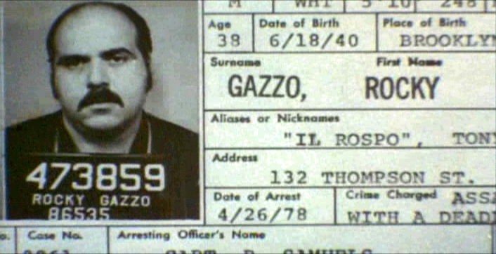
I was hired to ID all of the cops, lawyers, good guys and bad with what-looks-like live action identification cards. I also did title cards throughout the film, breaking it into chapters. Finally there were the end credits (no opening credits.)
I pulled in a friend and film genius, Phillip Schopper. Together we shot the actors with Polaroid film trying to make the photos look a bit cheesy, as the real items would. Phillip took the Polaroids and doctored them to our needs. Treat Williams, for example, had moved onto another film and came back only for these photos. His hair was now jet black for the new movie, so Phillip had to recolor his hair in the doctoring (in those years before computers.) Jerry Orbach had a blemish on his lip that he wanted retouched. There were plenty of little things to deal with on the photos.
I had to locate the real identification cards (NYC police dept, NYState Supreme Court judges and DA’s, etc.)
Then I had to forge them. I worked with a printing shop in NY that didn’t ask questions. We chose to actually print the cards as if they were done via mass production so that they would look authentic. The cards should have that slightly embossed feel as if the letters were pressed into the card stock. (Printing these days has the type laying on the paper without pressing into it.) I also had to find appropriate paper and laminating machines to get the actual look of these cards. This was all done before the wide use of computer technology.
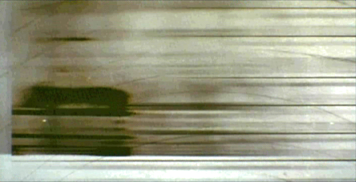
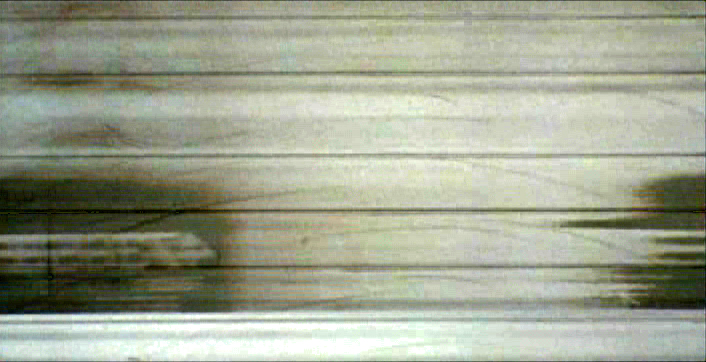
We had to film the sequences.
We worked with animation cameraman, Gary Becker for about a week and took over his Oxberry. We built miniature sets to hold the ID cards at odd angles, and we relit the cards with shadows built in. We wanted these cards to have a gritty reality to them that an animation stand didn’t generally offer.
The cards were animated moving as if a machine were printing them or a folder were being opened or papers were being tossed aside. This involved a lot of work getting out-of-focus images in the animation. When a folder opens, it moves in soft focus. The folder will pick up the top sheet and let that drop back again. We had to manipulate this all in stop motion to get it to work properly.
(Click any image to enlarge.)
 2
2 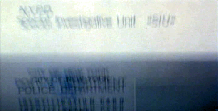 3
3
 4
4 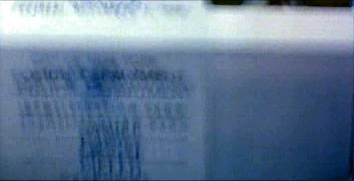 5
5
 6
6 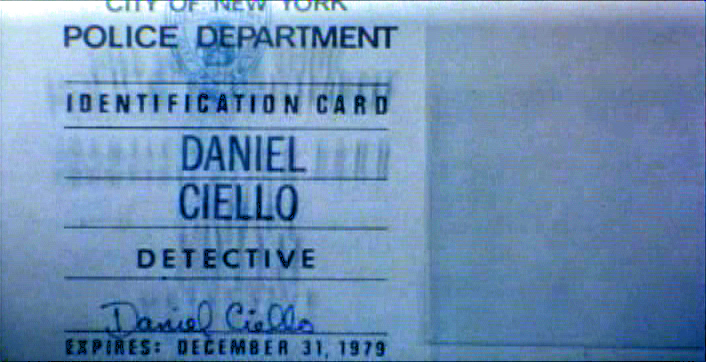 7
7
 8
8 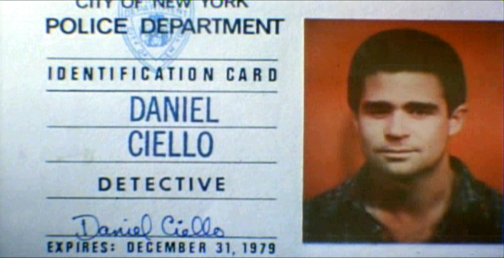 9
9
 10
10
These cop cards (about five of them – one for each
of the five cops) appear twice. Once for the new enthusiastic cops.
Another for the tired and jaded cops.
There were about 8 insert sequences about a minute each.
When it came time for the end credits, we chose to include photos of the actors with their names so that people would be able to recognize them from the film, without having to have had to memorize their characters’ names. We pushed these cards up as if a machine were printing the titles, a card at a time. The cards had to move in out-of-focus, as well. It was long and arduous shoot.
 2
2 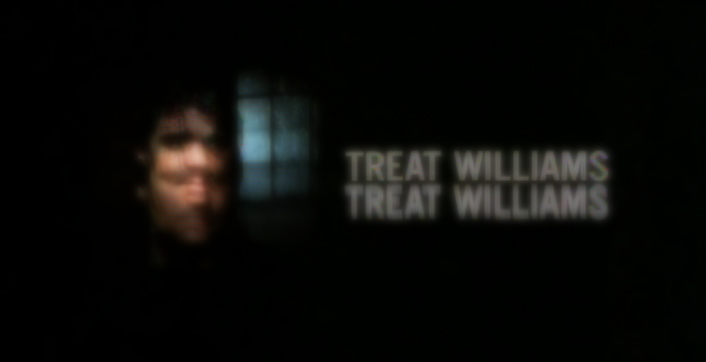 3
3
 4
4
All of the credits came up at varying speeds, timed to the music.
This was helpful in that all titles go through changes after they’re done.
Our system gave us a lot of flexibility to addd or change cards as
necessary without having to reshoot them all.
Sidney Lumet didn’t want me to have a company credit. I couldn’t include the studio name, Michael Sporn Animation, Inc. because he felt that people would try to figure out what was animated. He didn’t want them to know there was any animation in the film. Hmmmm.
I put both my name and Phillip’s as doing the titles and insert shots.
 1
1  2
2
 3
3
There’s actually a four frame fade out of the old credit list
as the new list zips up and in / out-of and into-focus.
I did quite a few other title sequences for Sidney as a result of this job, and I was pretty proud of the film and the job that I had done.
 1
1
Records in a folder. The embossed stamp was a headache.
We shot the back of a card’s actual stamp in shadow, then we
printed it on a document in reverse on the front of our card.
 2
2  3
3
 4
4 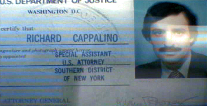 5
5
 6
6
.
 1
1
The microfilm look for mug shot records.
The slightly bad guys in B&W.
 2
2  3
3
 4
4
Animation Artifacts &Disney &Layout & Design &Story & Storyboards 05 Jul 2012 06:08 am
Daydreams – recap
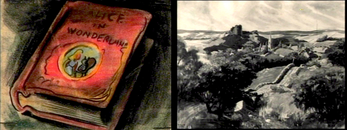
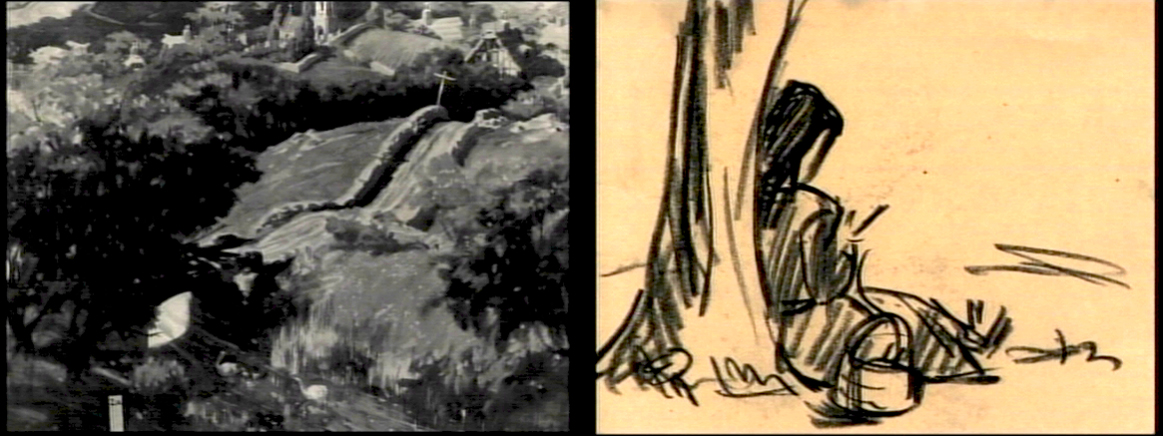
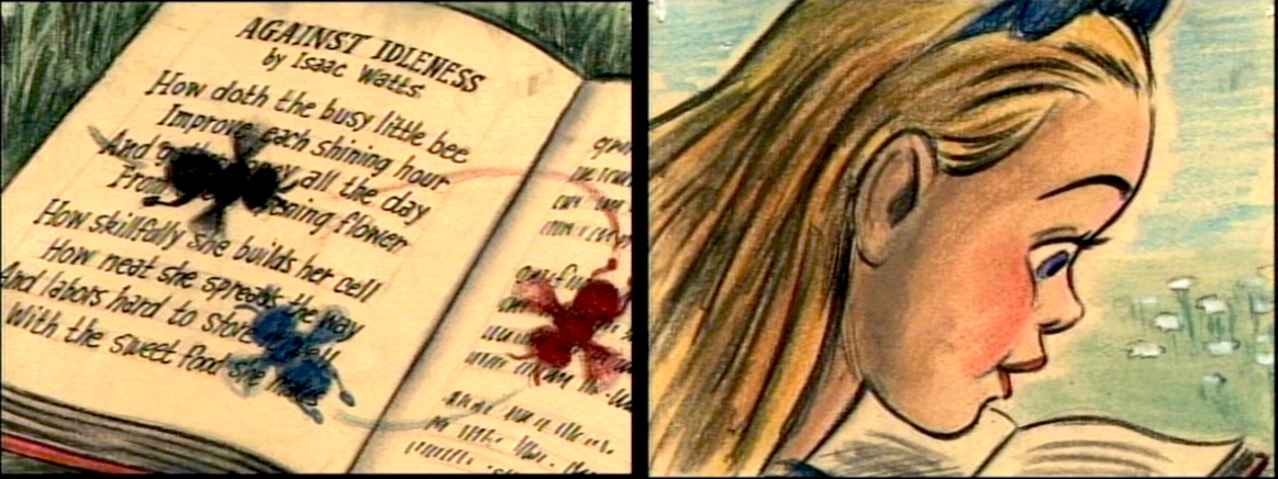
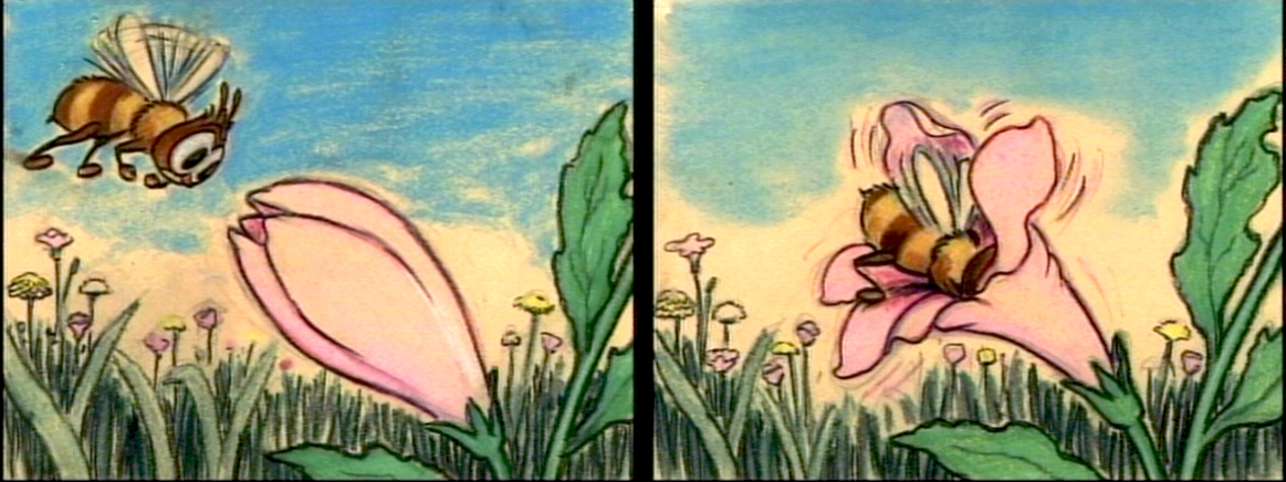
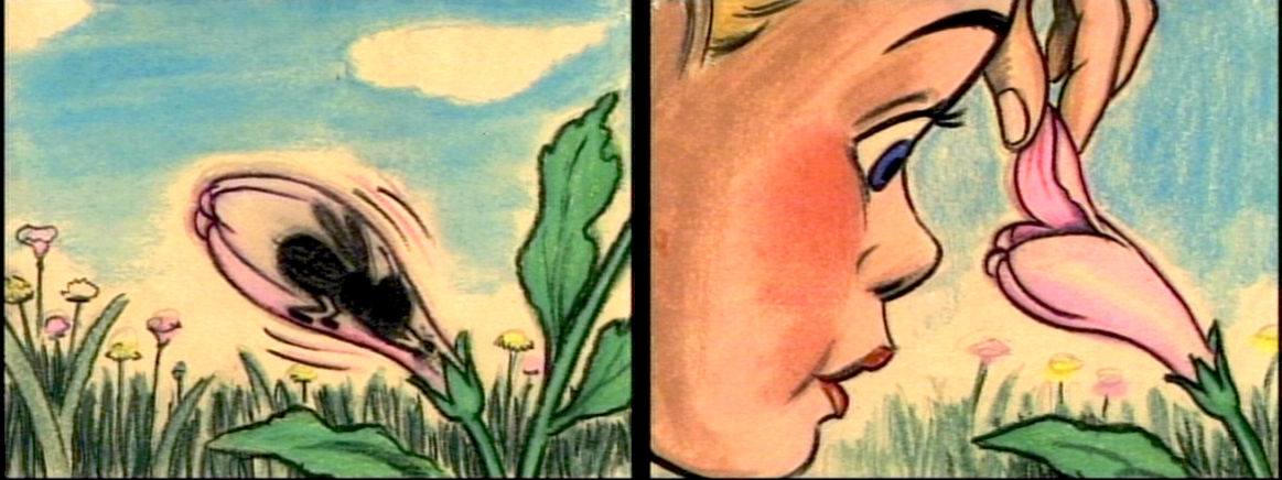
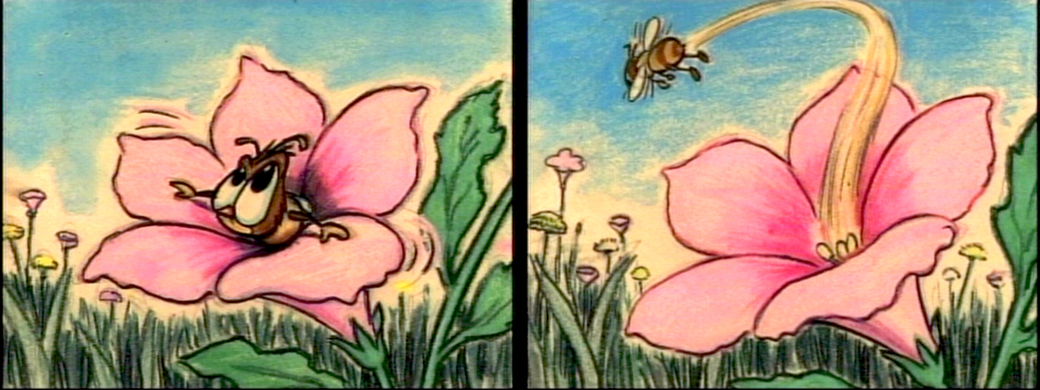
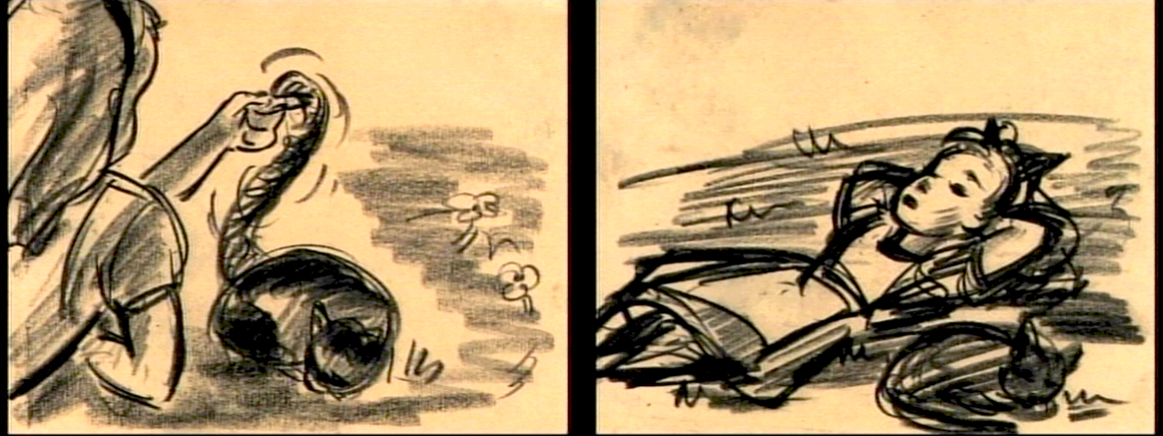
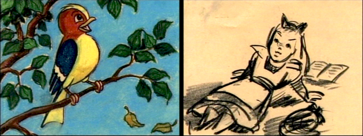
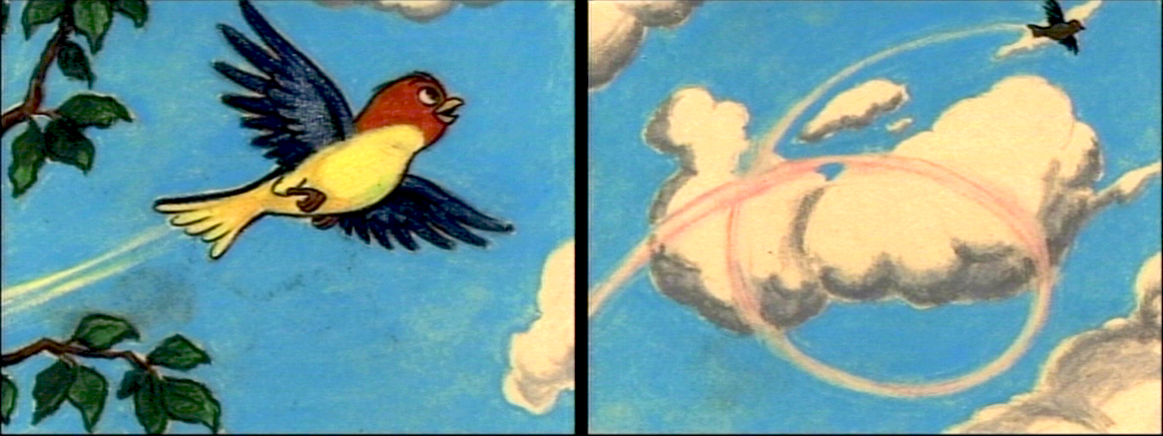
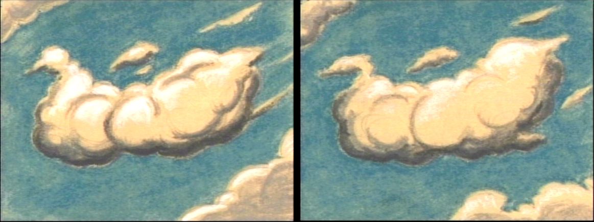
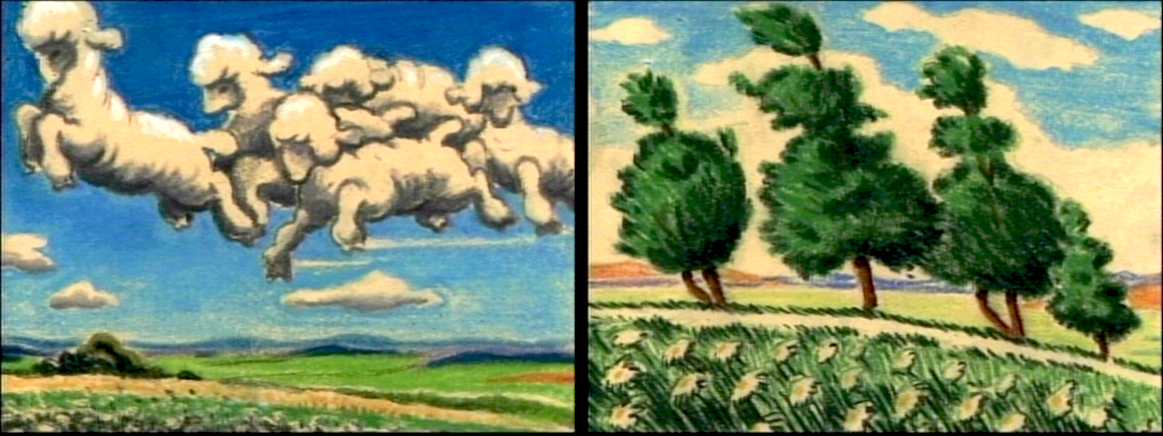
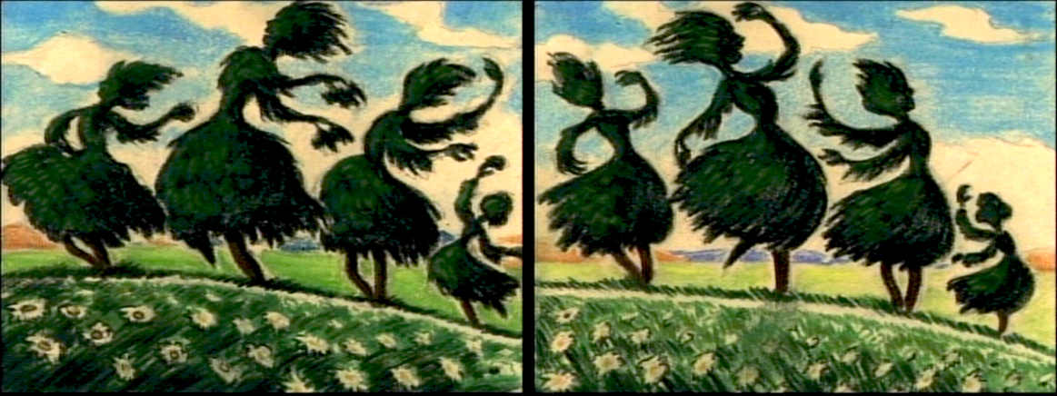
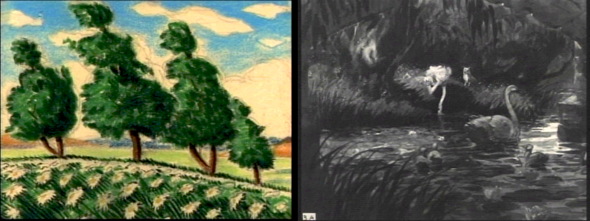
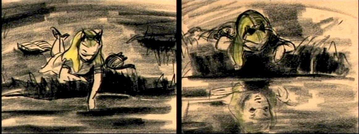
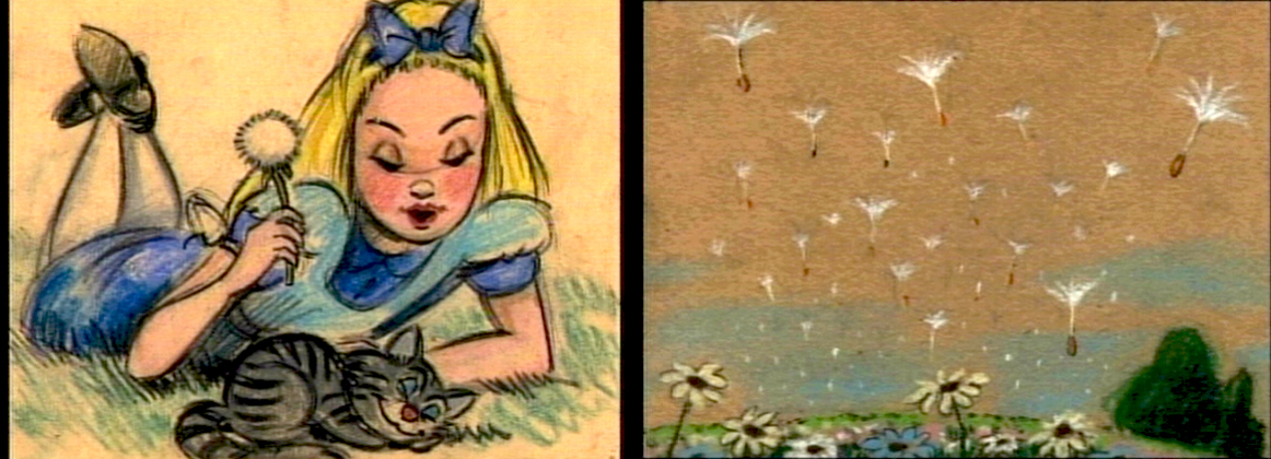
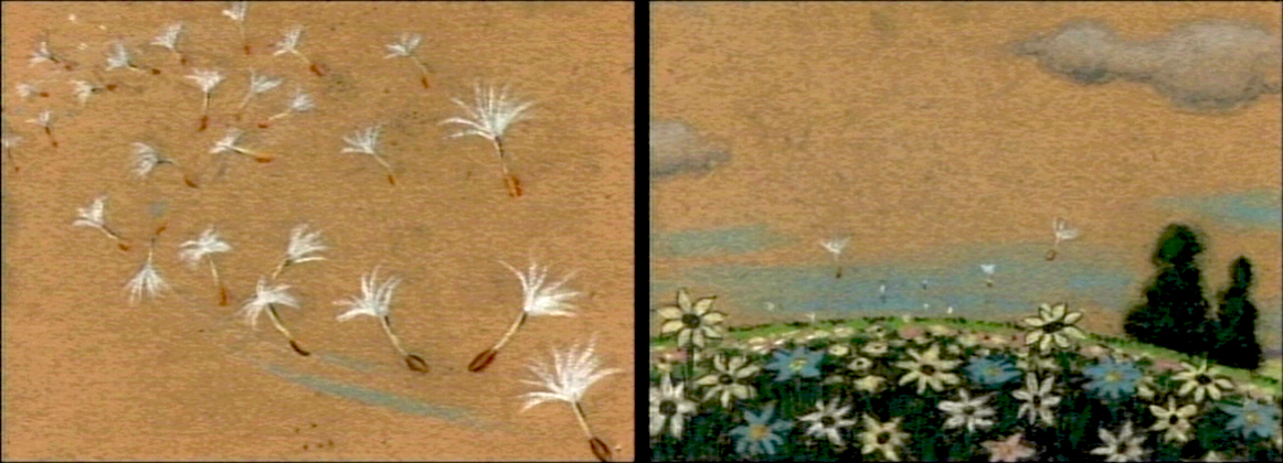
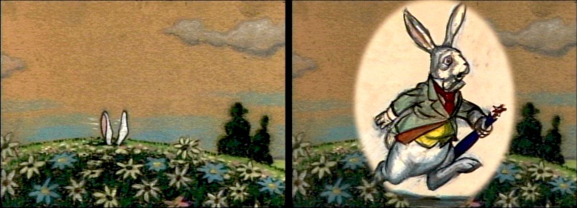
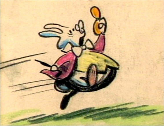
How frequently, lately, they’re running Alice in Wonderland on tv. Unfortunately, nowadays, it’s the Tim Burton version. Horrible. I’m going to have to go back to the DVD to watch the cartoon again. Speaking of which, the MoMA is going to screen the Lou Binin version in late July. I’ll write about it on Saturday, and I’ll re-review it when it does. I’m definitely going. Here’s an oldie but goodie.
- The Alice In Wonderland dvd contains a storyboard sequence of Alice daydreaming in the park. This sequence didn’t make it to the film (for good reason), but they’ve re-assembled it for the dvd. I’ve taken some frame grabs to show off the drawings. They’re on screen for such a short time.
My favorite’s the last.
(Click any image to enlarge.)__________

