Category ArchiveAnimation Artifacts
Animation Artifacts &Bill Peckmann &commercial animation 31 Aug 2012 05:51 am
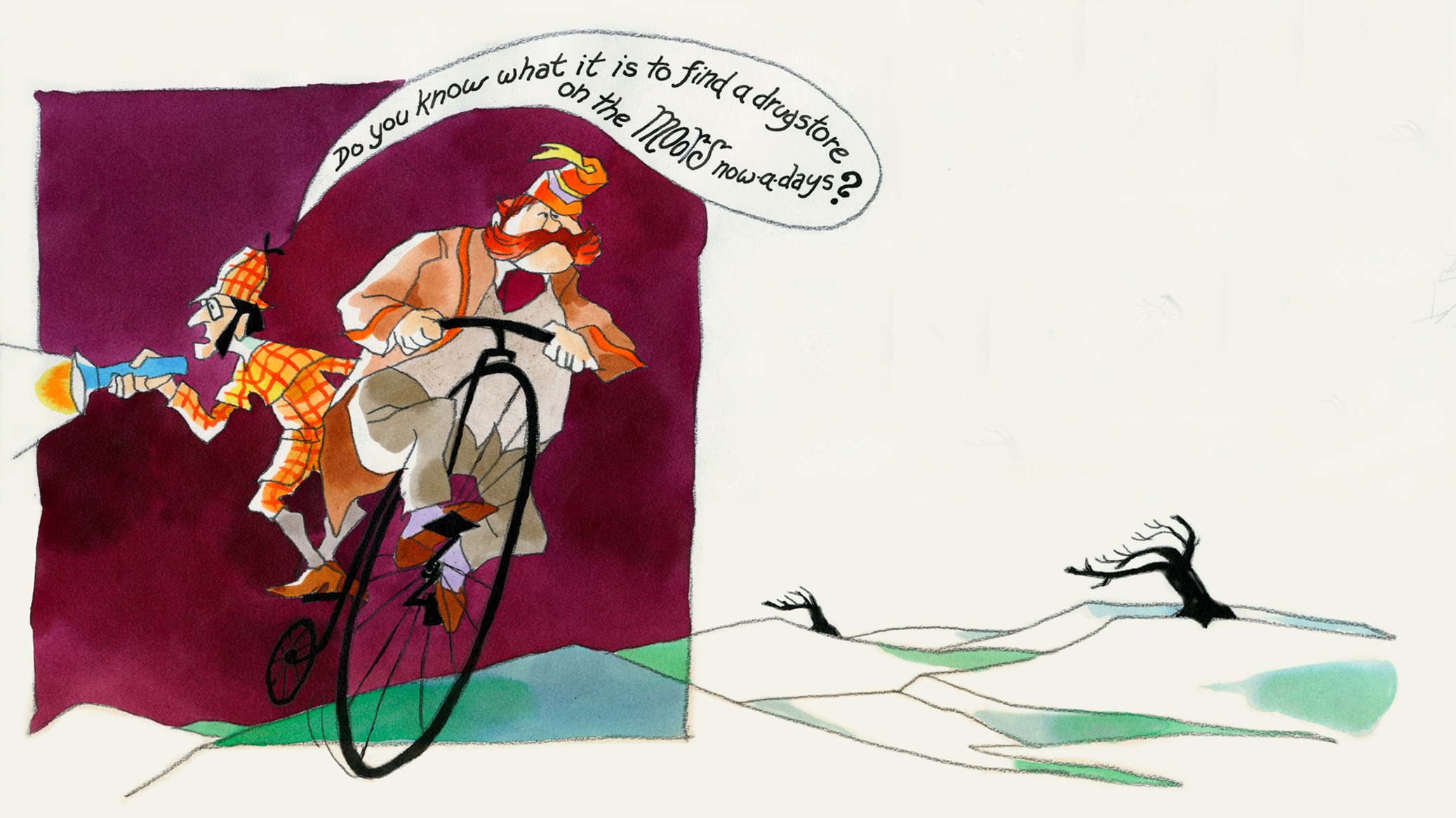
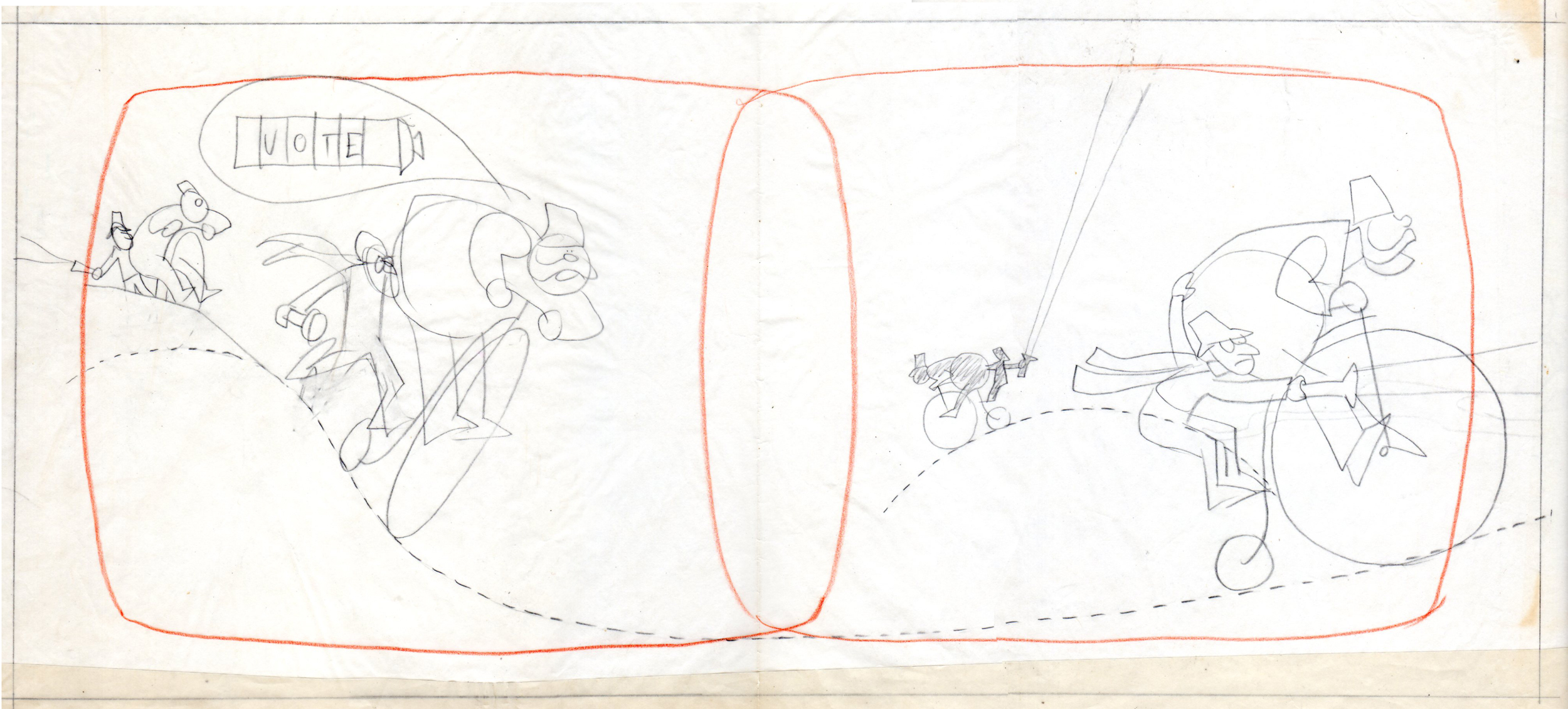
Combs and Plotzen – Part 2
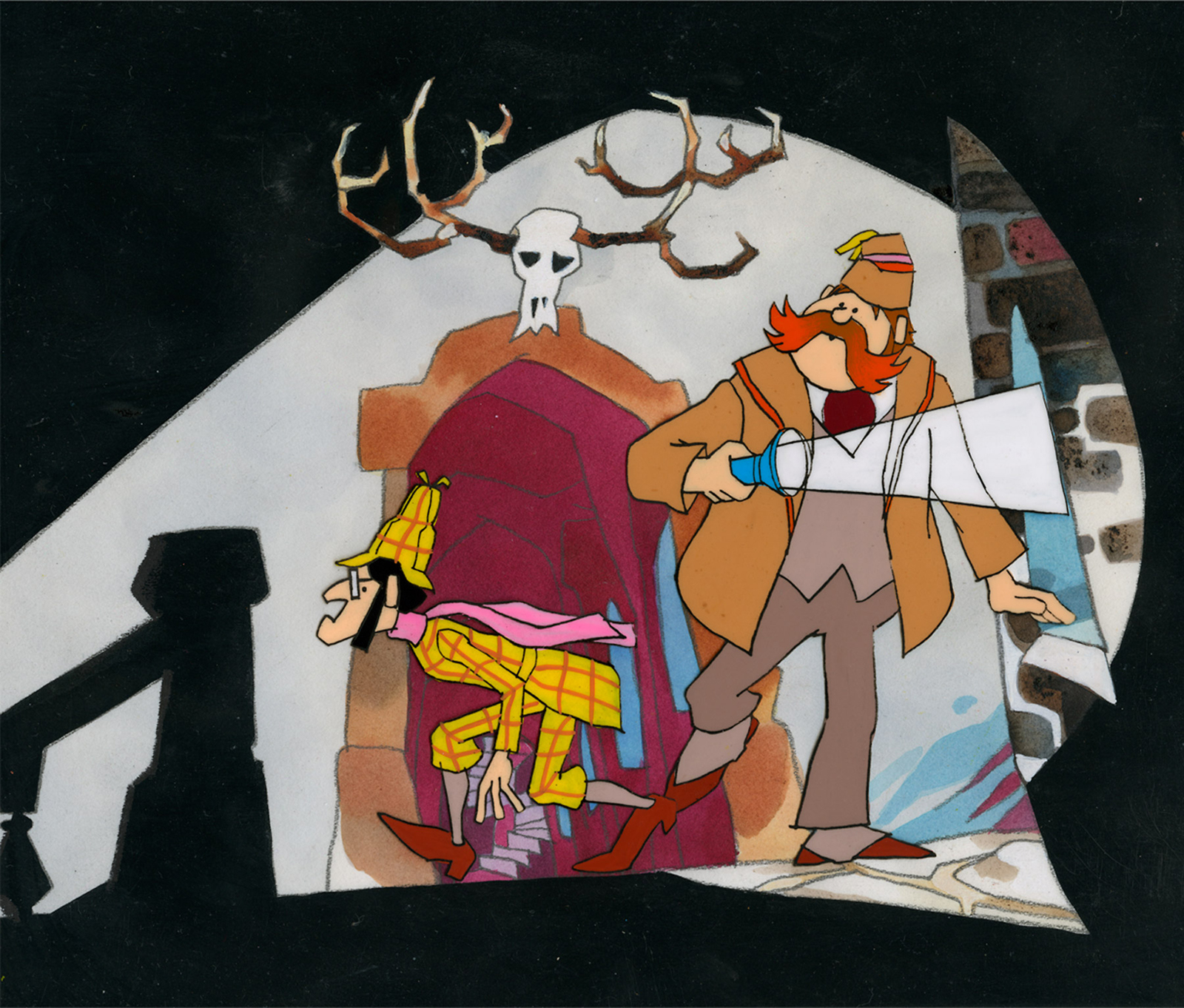
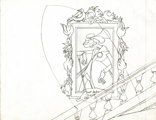
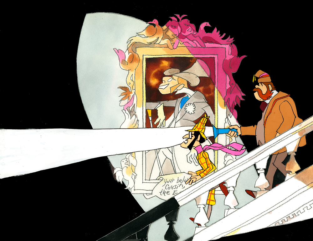
- Last week, Bill Peckmann forwarded a number of pieces of art by Rowland B. WIlson which was preliminary work for a commercial at Phil Kimmelman and Associates. The commercial, for Vote Toothpaste, was a parody of Sherlock Holmes called Combs and Plotzen. More art surfaced this week for that spot, and I thought it worthwhile to extend the post for a second part. (See Part 1 here.)
Bill Peckmann writes:
- Combs & Plotzen was the second TV commercial that print cartoonist Rowland B. Wilson designed in 1969 and his grasp of the animation production steps was truly amazing. No crash course in storyboarding, model charts, Layouts etc. was necessary. It was like he was doing it all of his life. We were in total awe.
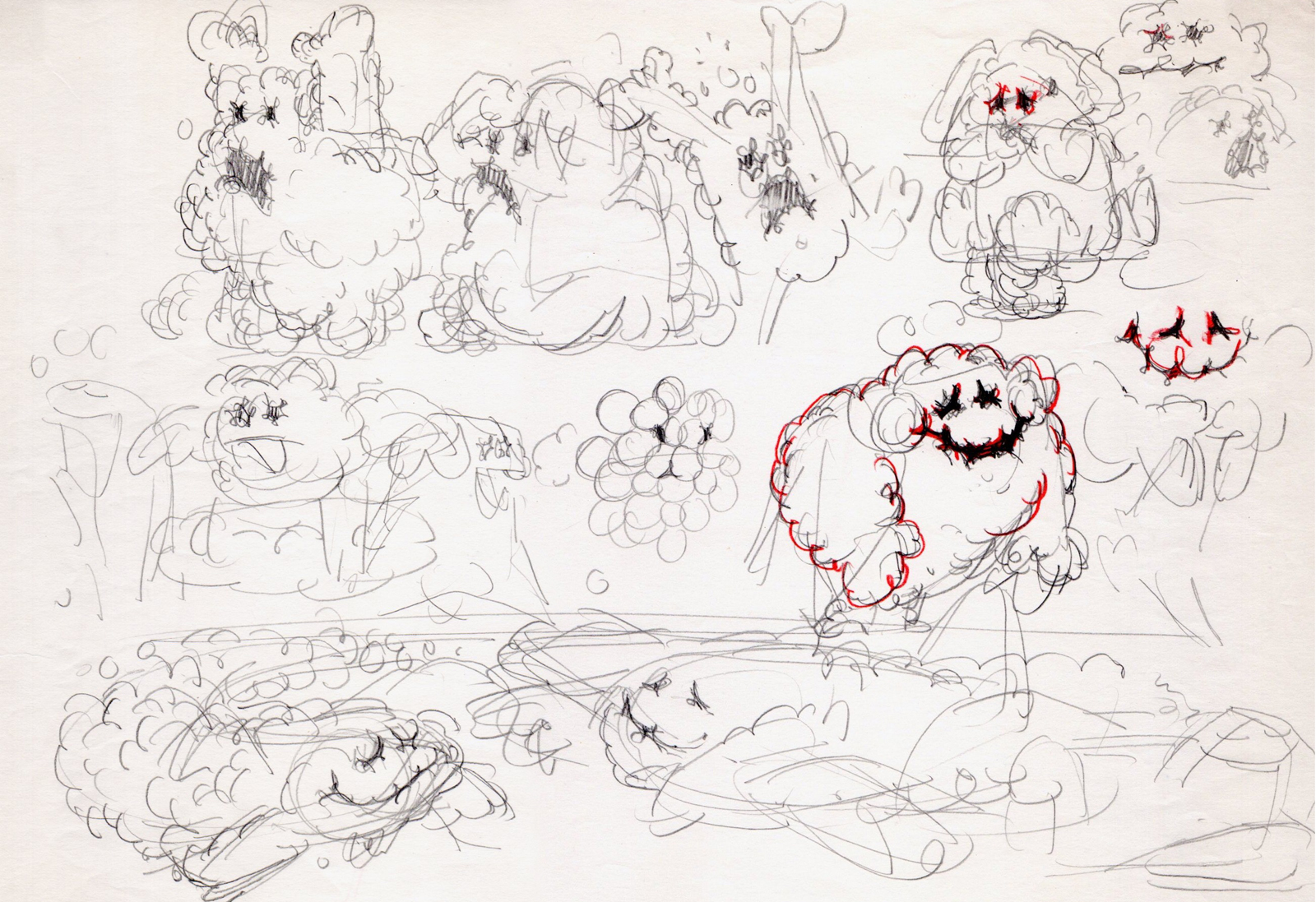
- At that time, Rowland was always very comfortable doing his animation drawings on the paper he knew best, tracing paper. He would work up roughs on layering tracing paper panels without having the need of a light box. No pegs for him in those days.
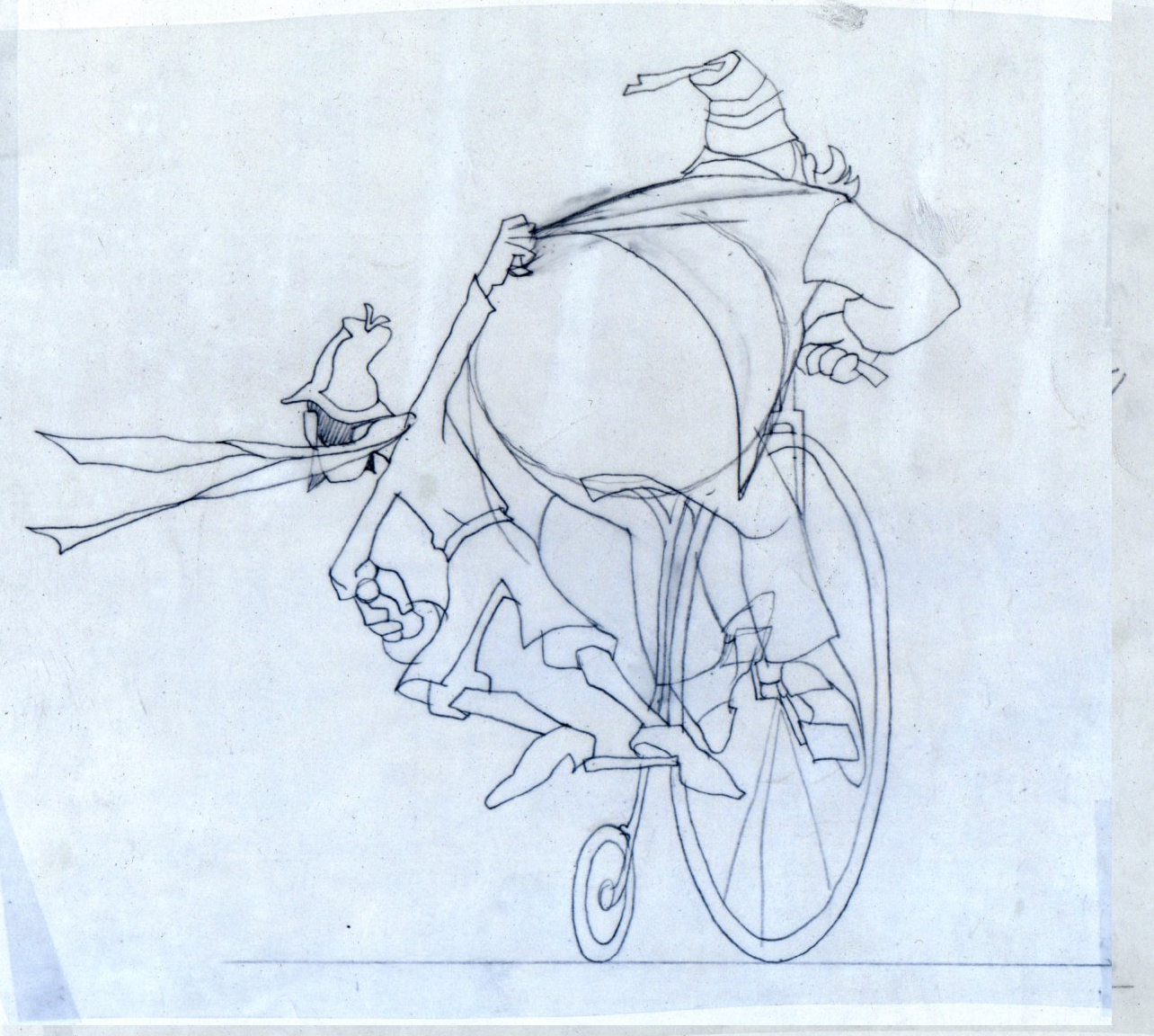
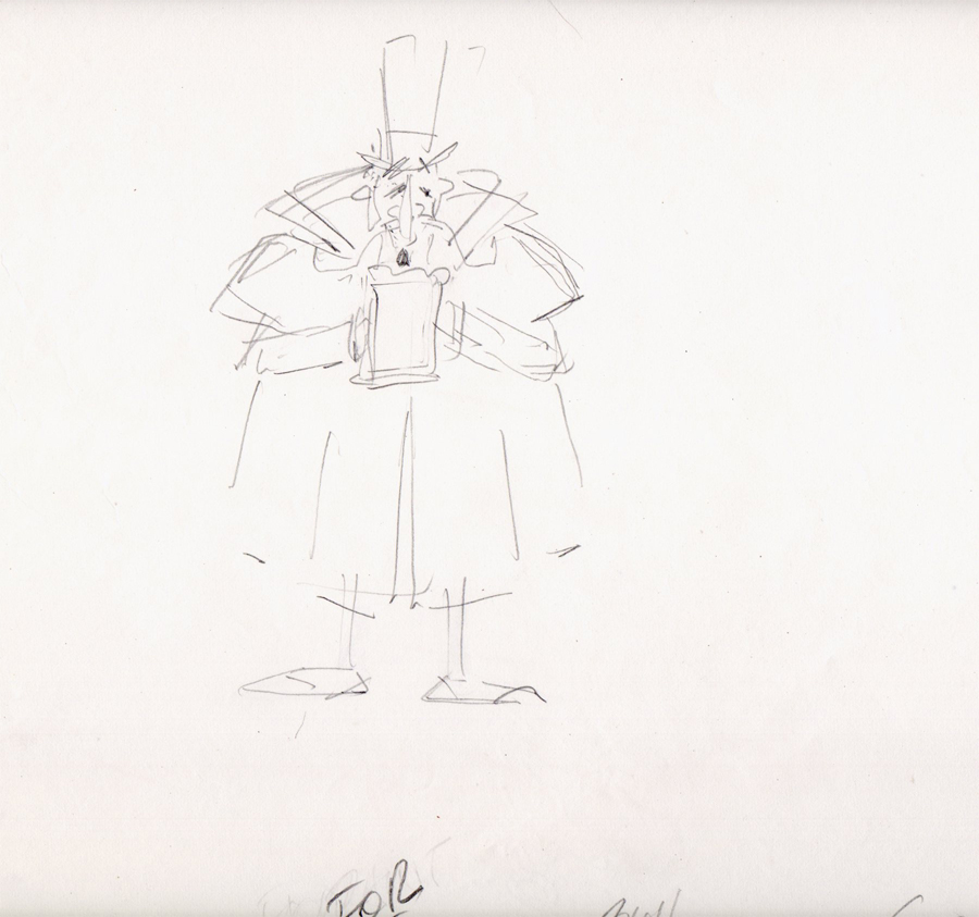
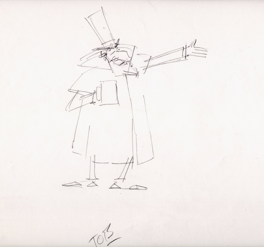
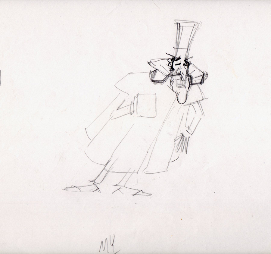
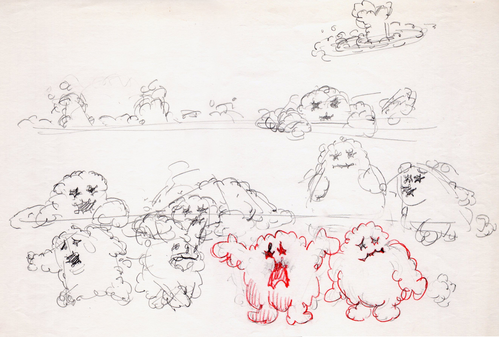
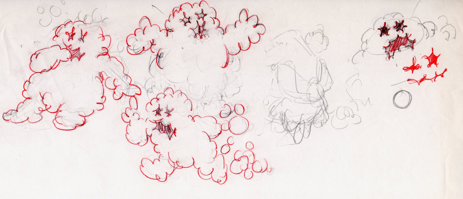
 1
1These first five drawings are Layouts by Rowland Wilson.
 2
2
 3
3
 4
4
 5
5
 6
6
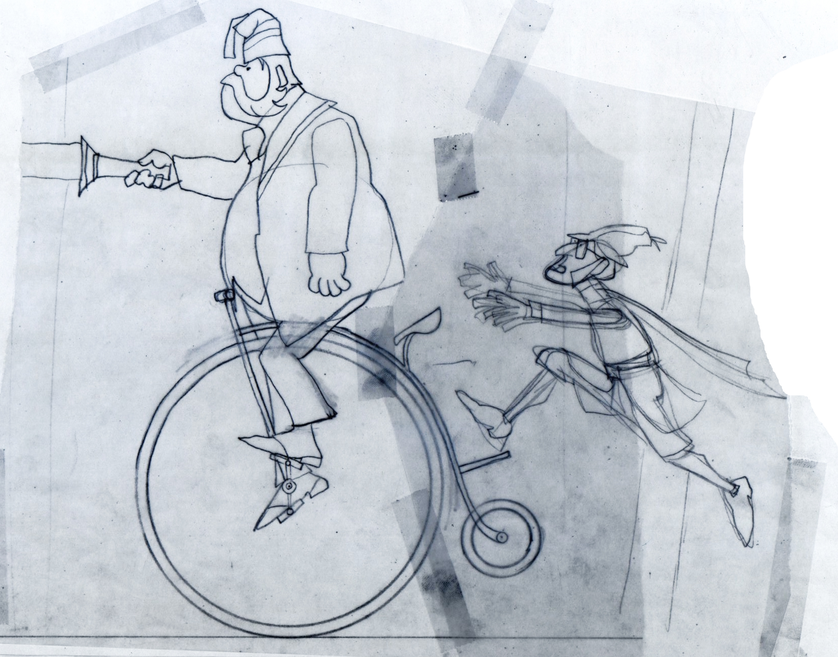
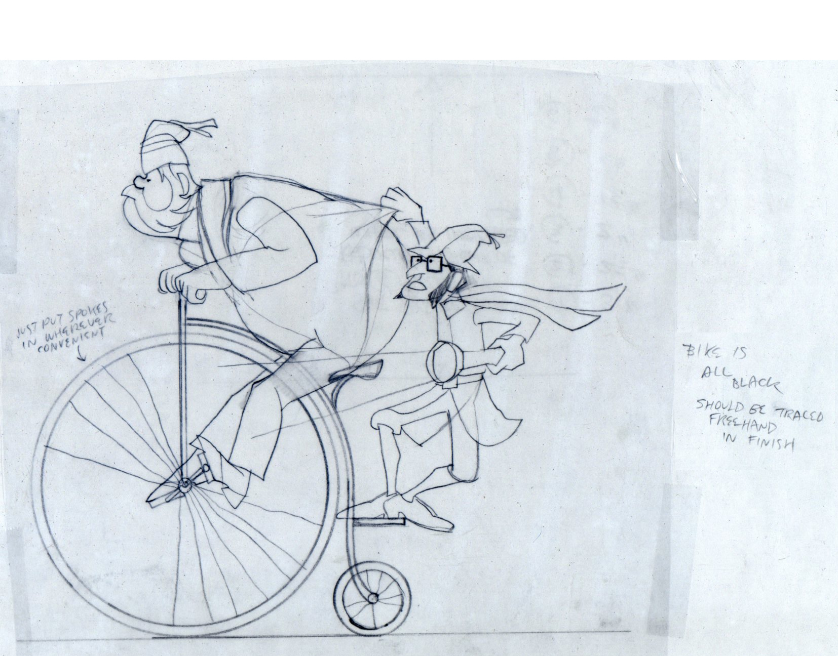
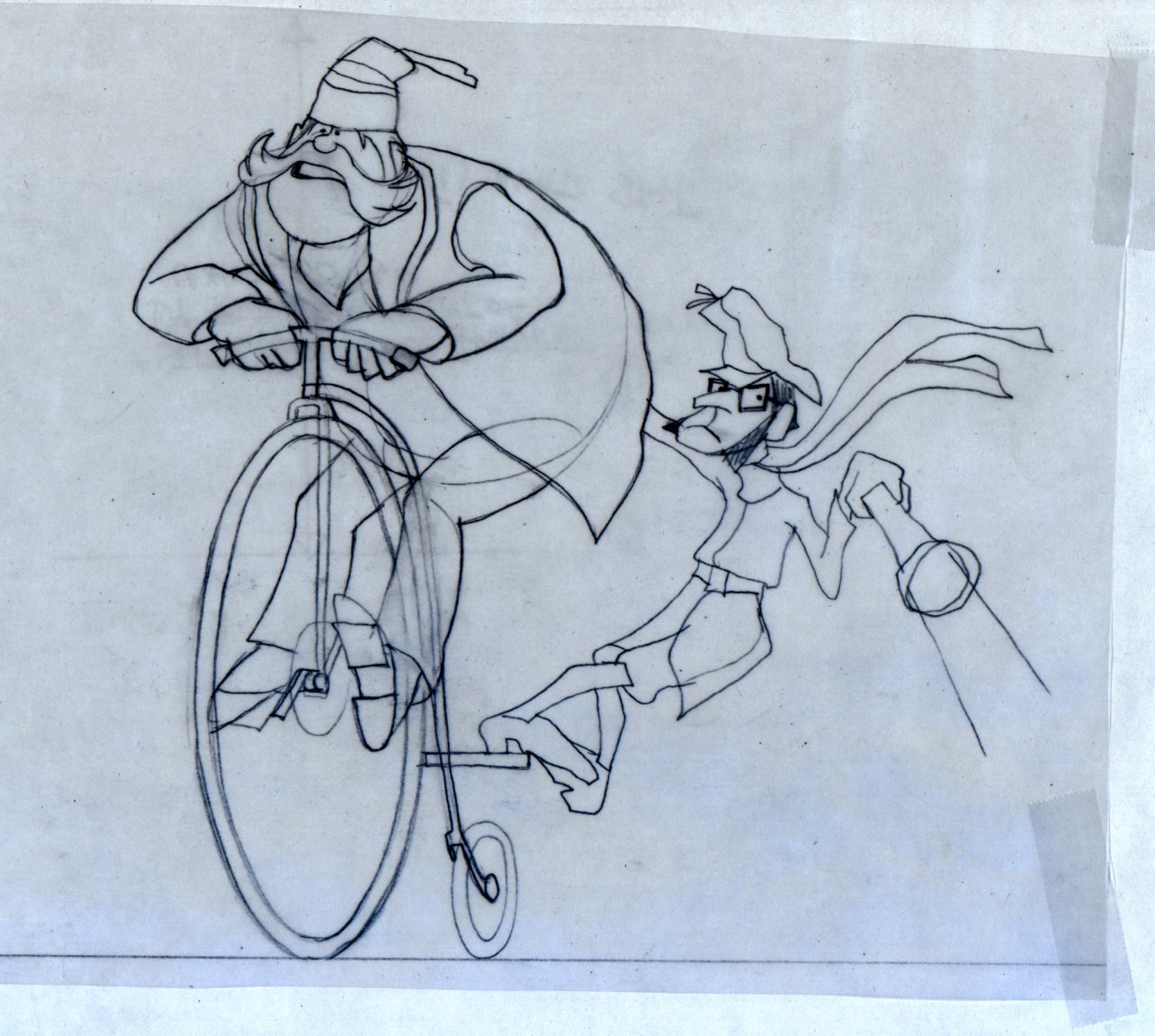
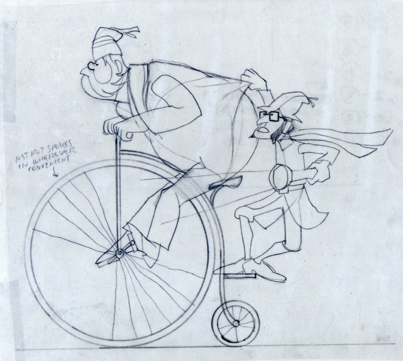
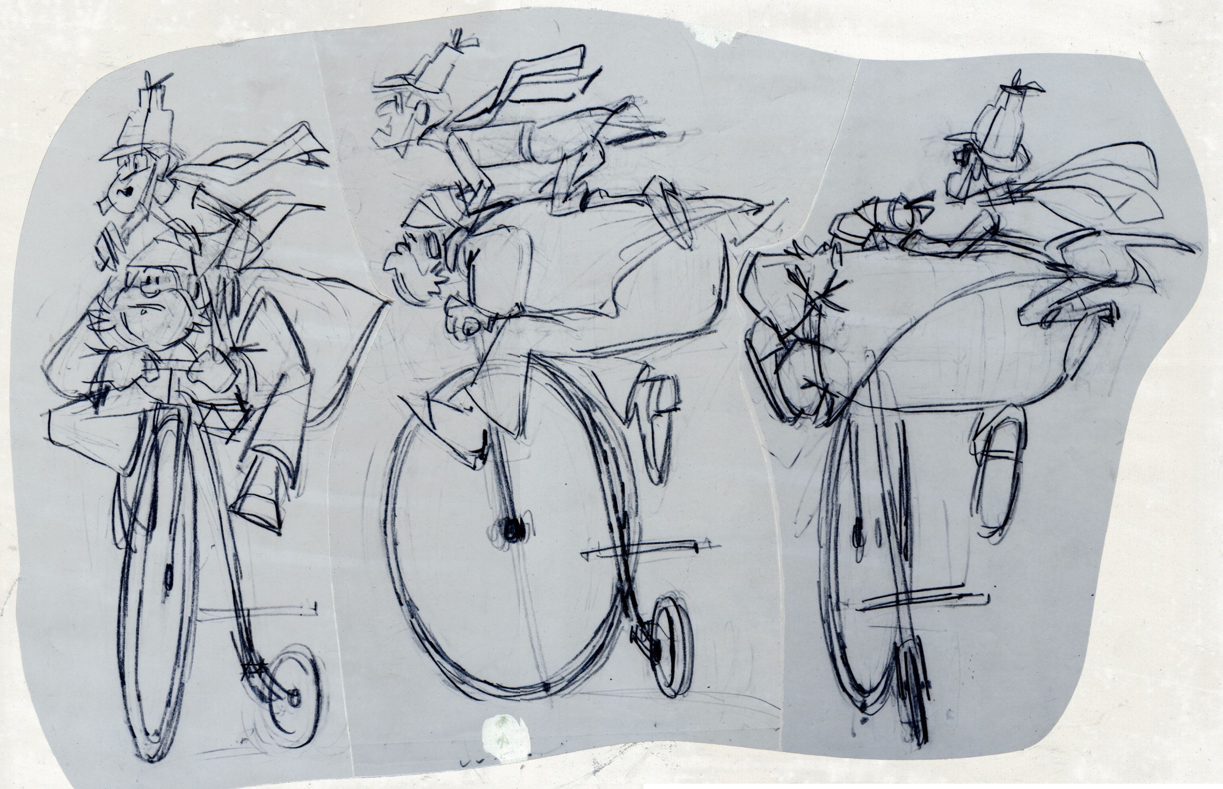
These are Jack Schnerk‘s roughs of the bicycle scene.
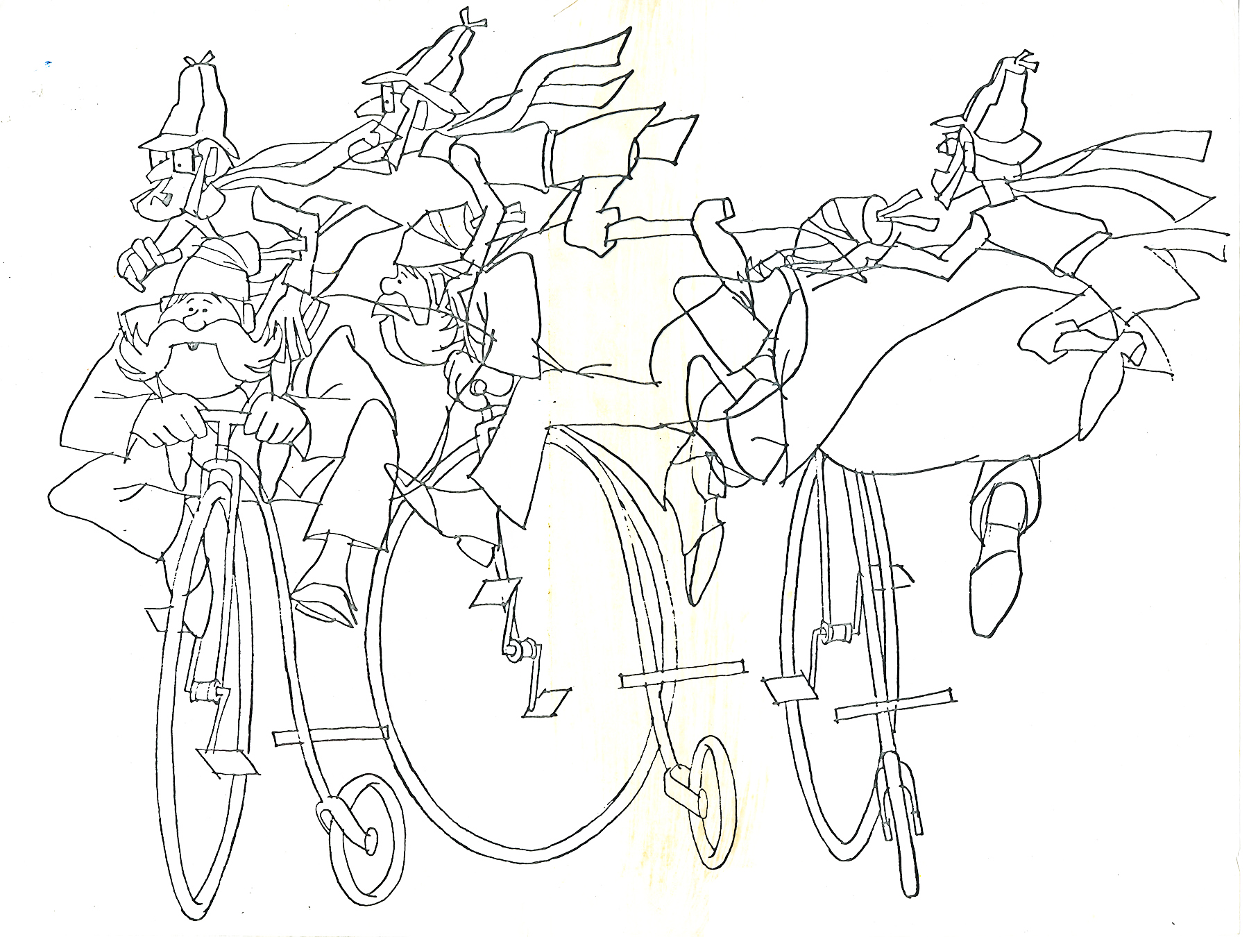
These are Bill Peckmann’s clean ups of Jack’s roughs.
 8
8
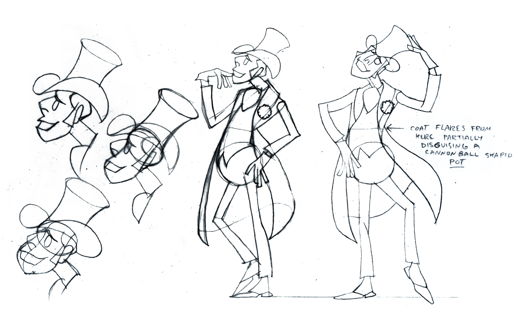
A model sheet from Rowland Wilson.
 9
9
These three color sketches are in the new book,
Trade Secrets, by Rowland Wilson and Suzanne Lemieux Wilson.
 10
10
 12
12
 13
13
 14
14
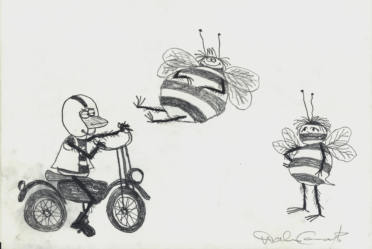
Row’s rough for pan scene.
 16
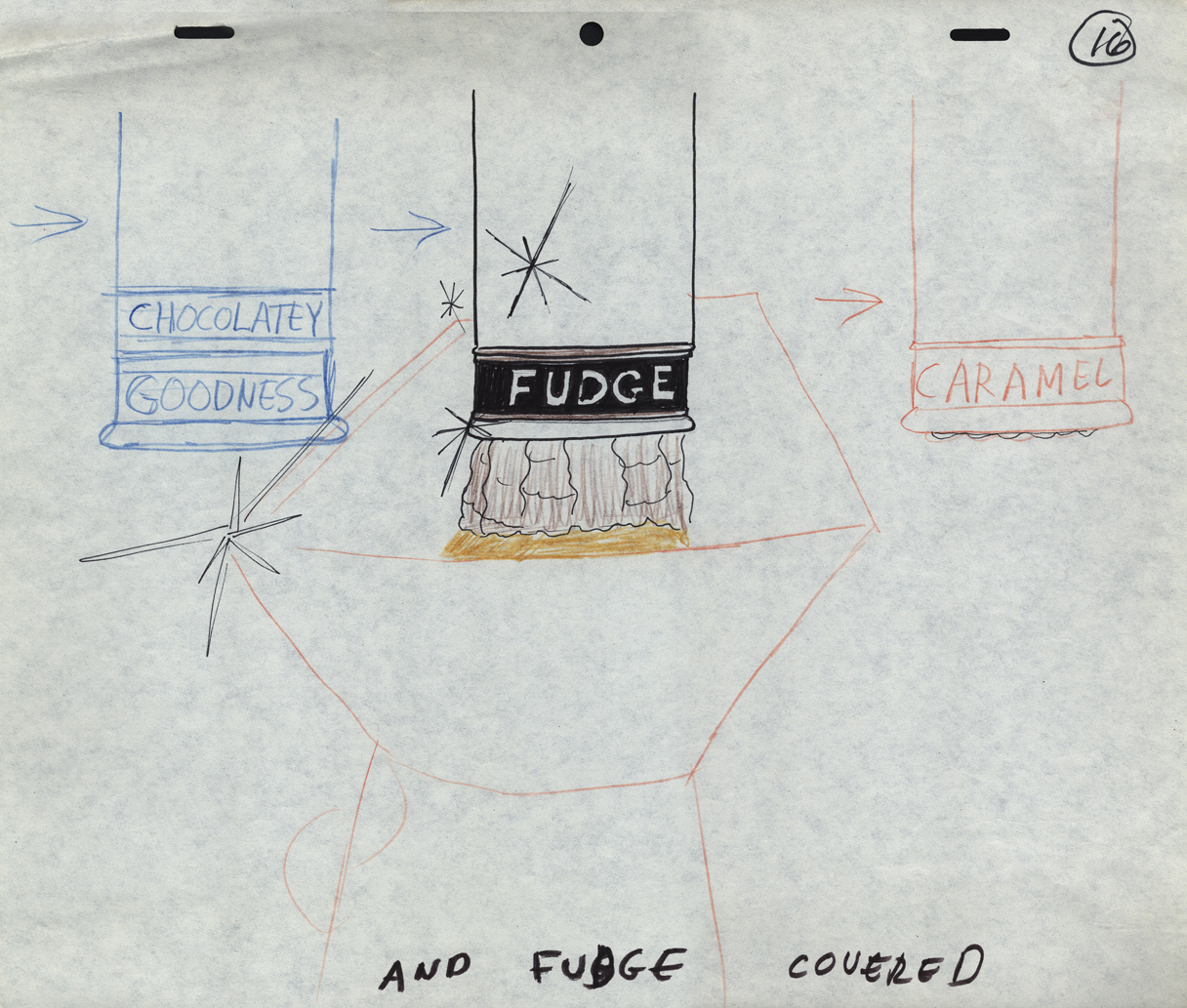
16
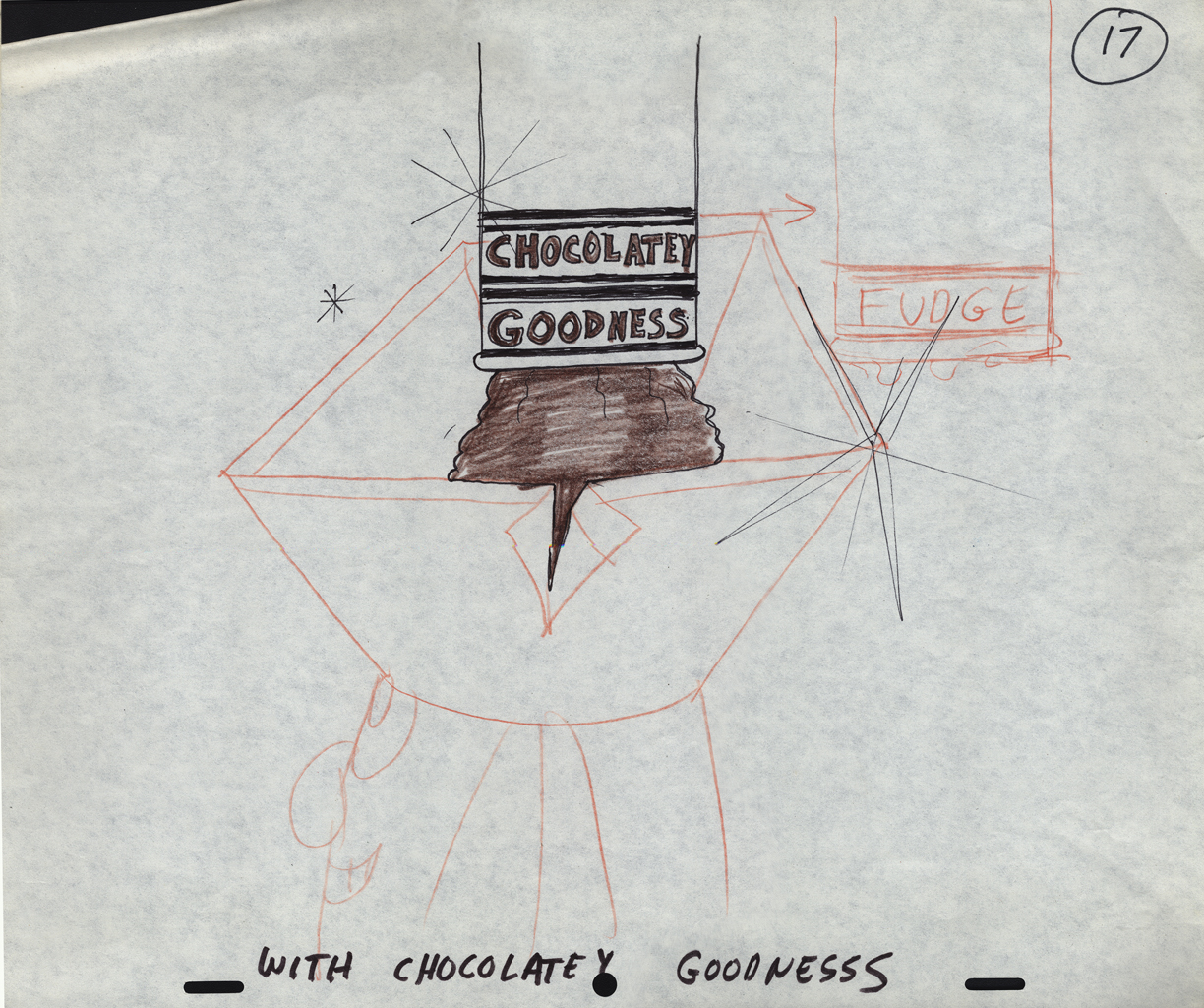
 17
17
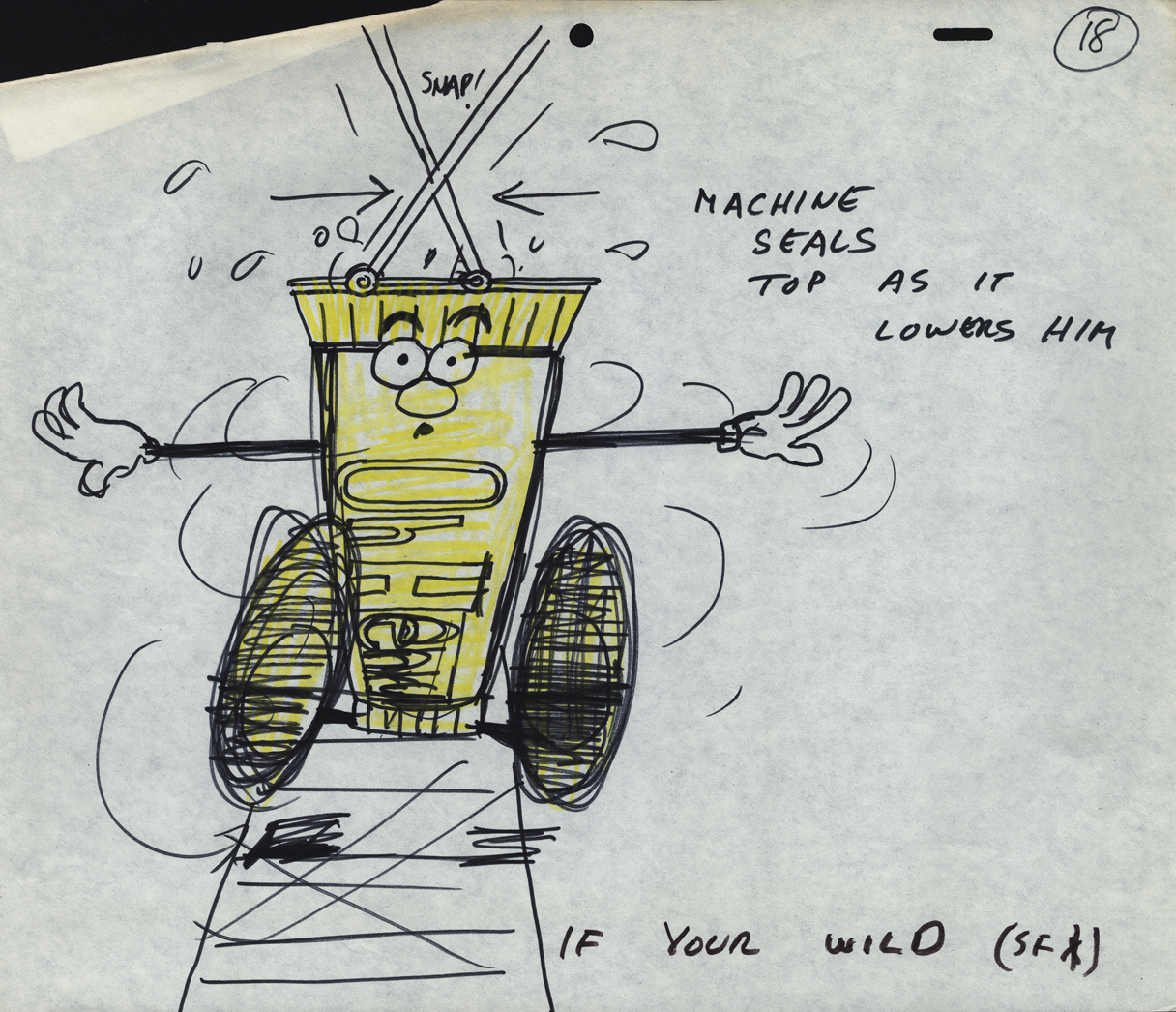
 18
18
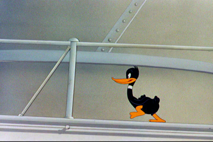
A ‘Combs’ cel.
 19
19
an unpainted model cel.
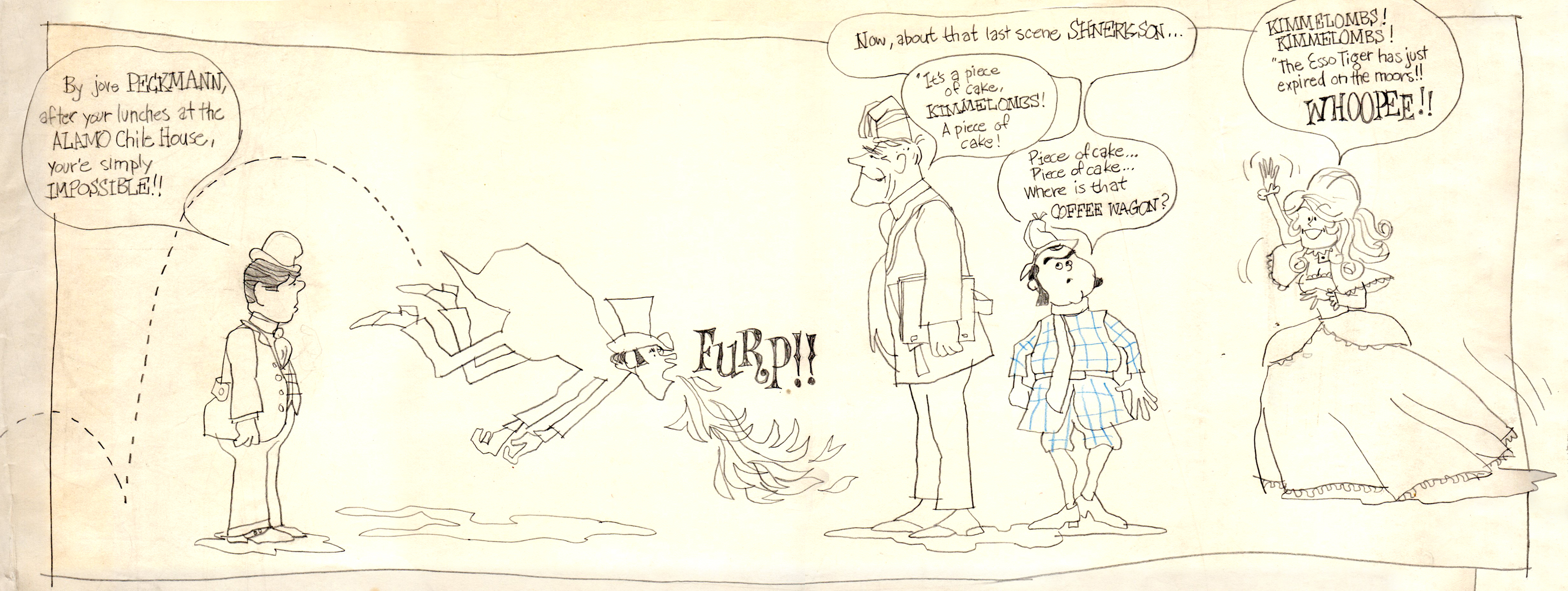
I found the original drawing I did of the crew that worked on Combs & Plotzen
way back then. It’s Vic Barbetta commenting on my lunchtime eating habits,
Jack and Phil’s anticipating the most important part of the day, the coffee wagon
bell, and Agnes hearing the good news of not having to draw anymore tiger stripes.
.
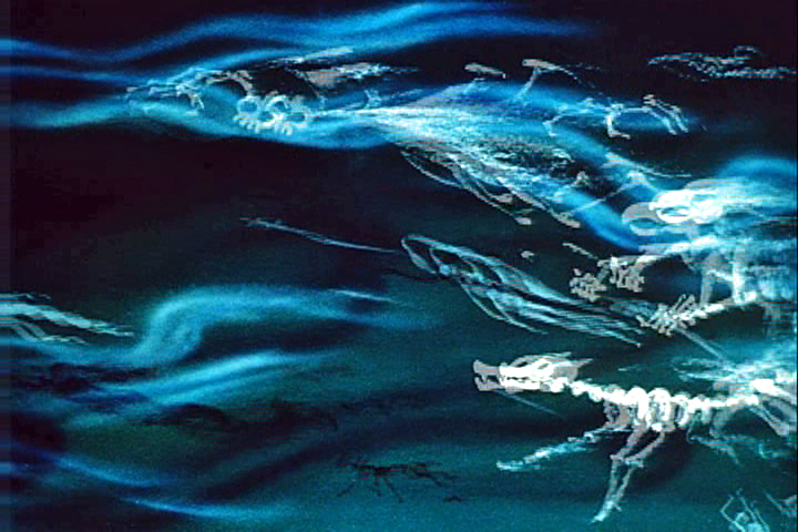
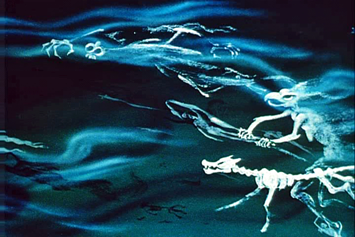
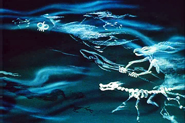
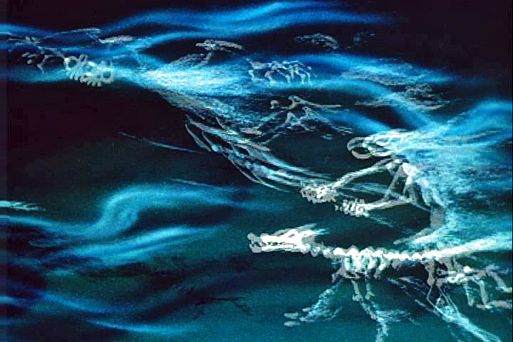
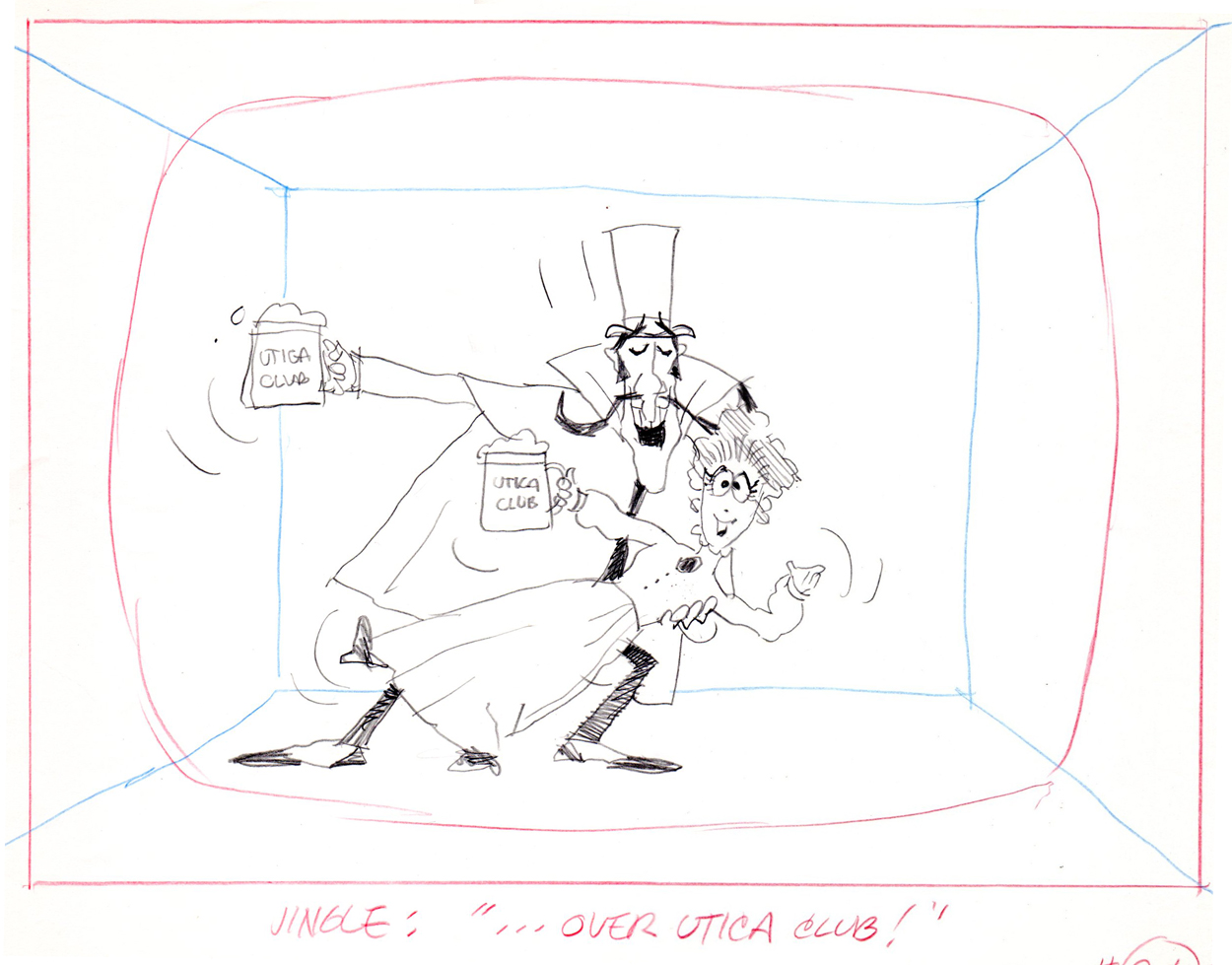
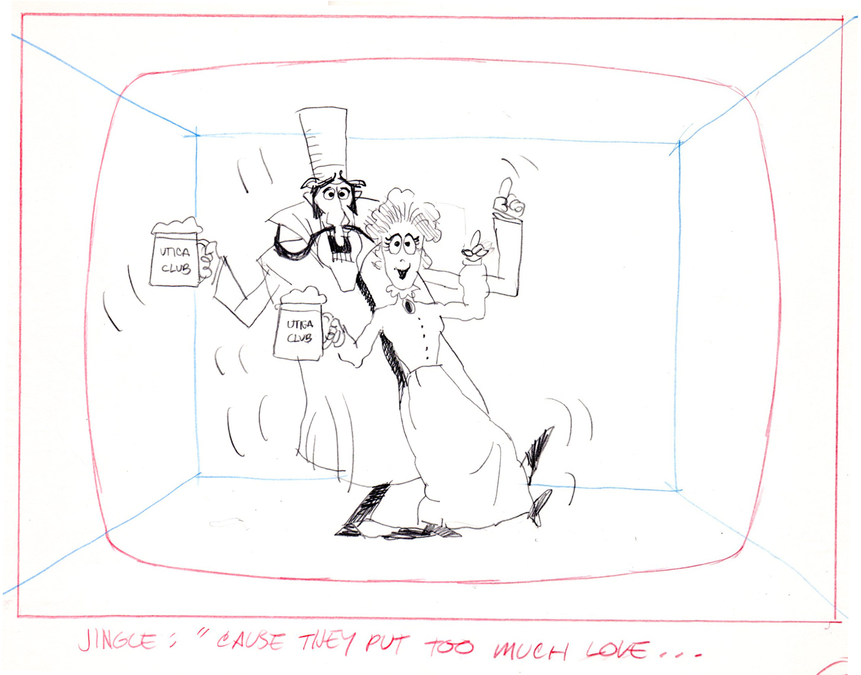
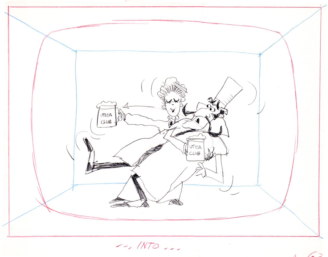
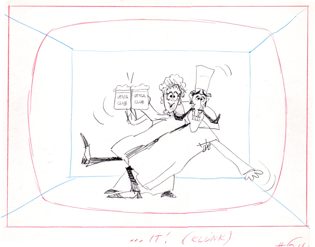
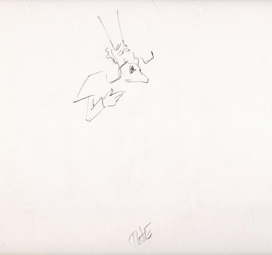
At the time that Rowland designed his Utica Club Beer ‘Mountie’ spot, he also did another U. C. Beer spot where the two adversaries were a Knight and a dragon.
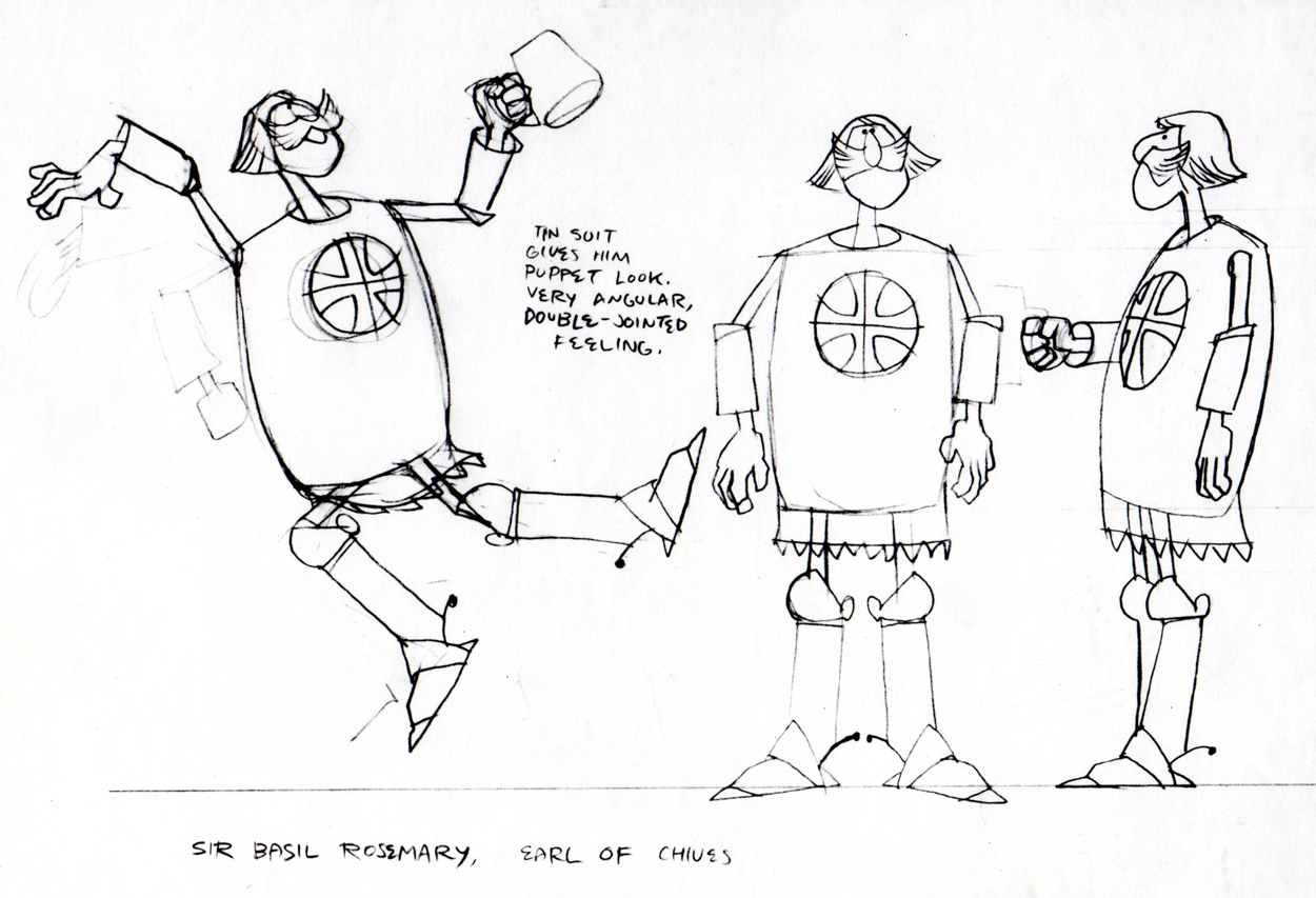
Unfortunately the only remaining piece that
I have from it is this stat of the Knight.
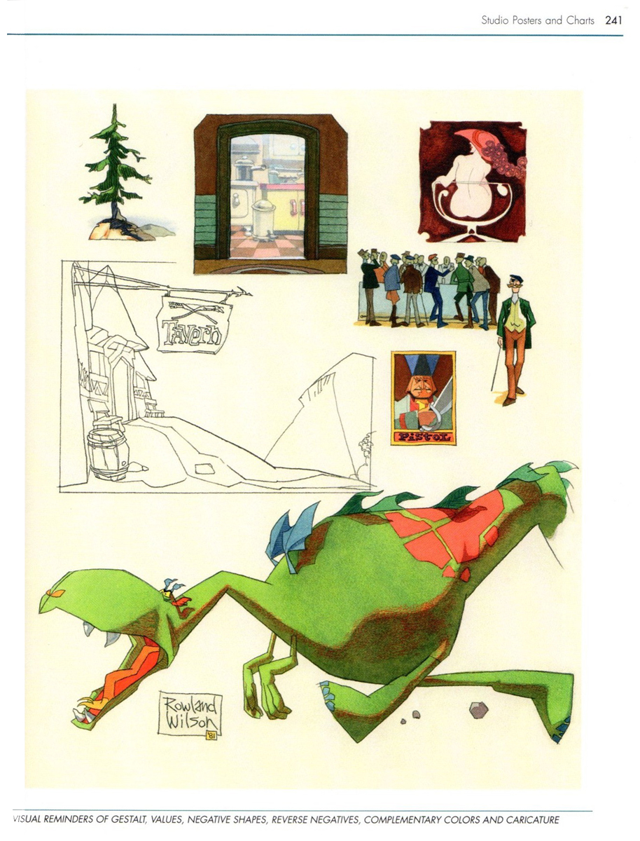
As for the dragon, all I can do is show you this page from
Suzanne Wilson’s ‘Trade Secrets’, where Rowland didn’t
forget his old friend from that commercial and gave him a
new coat of paint. One of his best character designs ever.
The tavern panel is a bg. from the same spot.
The Vote spot starts at 0:37 on this Jack Schnerk sample reel.
Animation Artifacts &commercial animation &Layout & Design &Models 29 Aug 2012 07:45 am
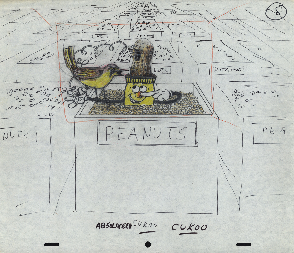
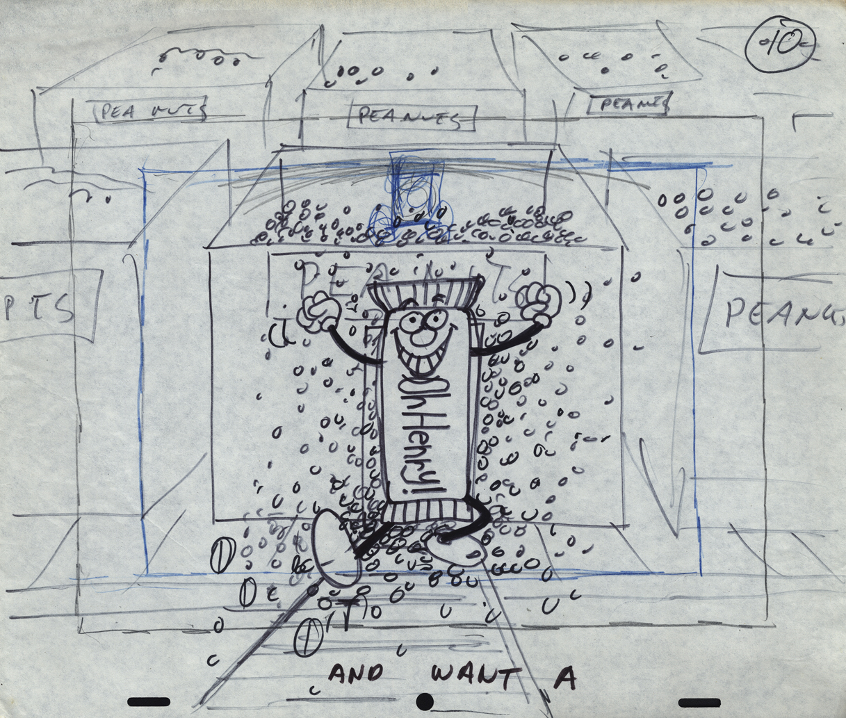
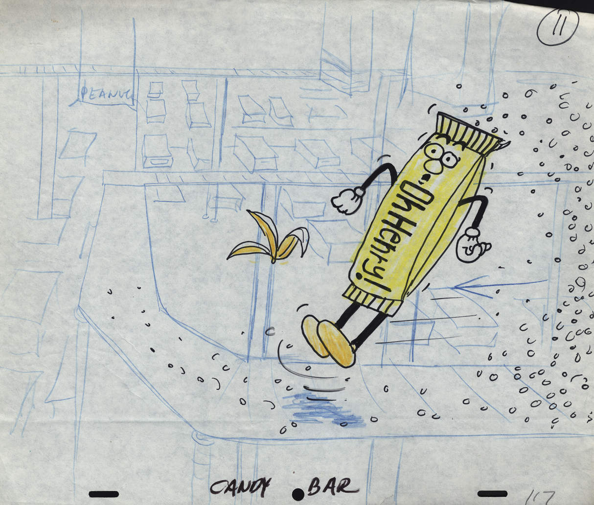
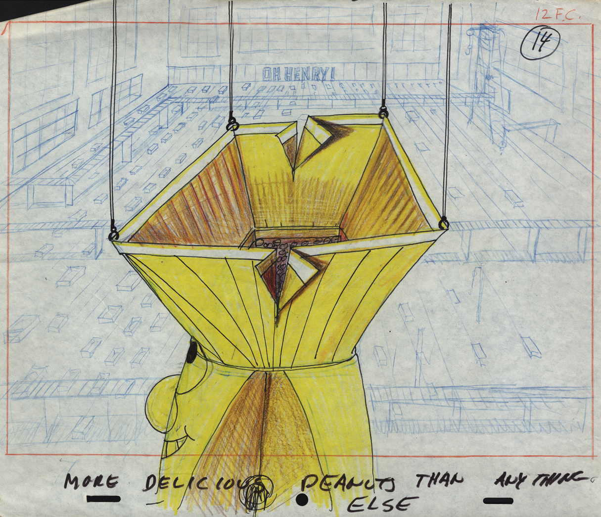
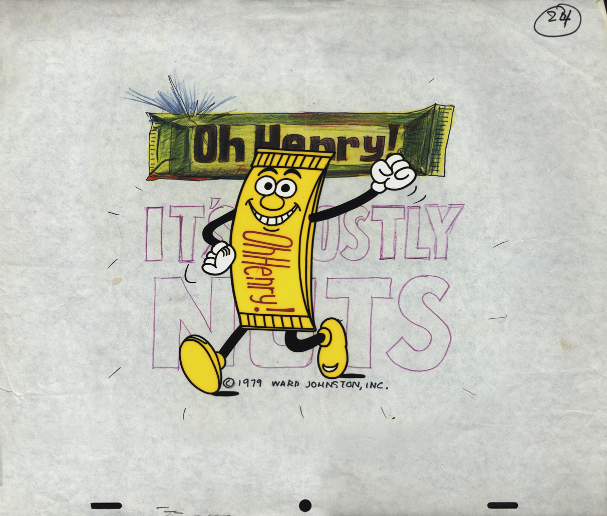
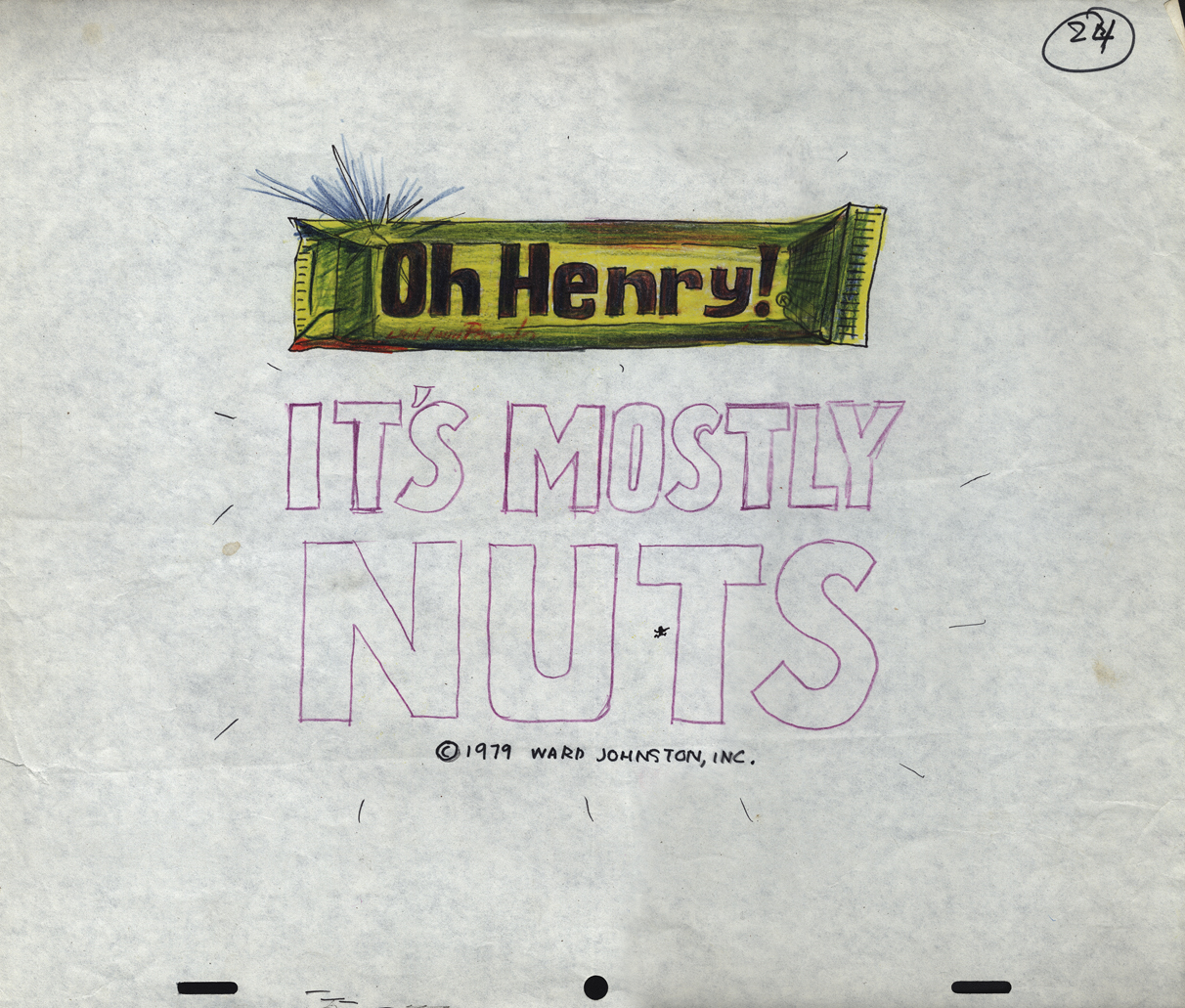
Mogubgub’s O’Henry Bar
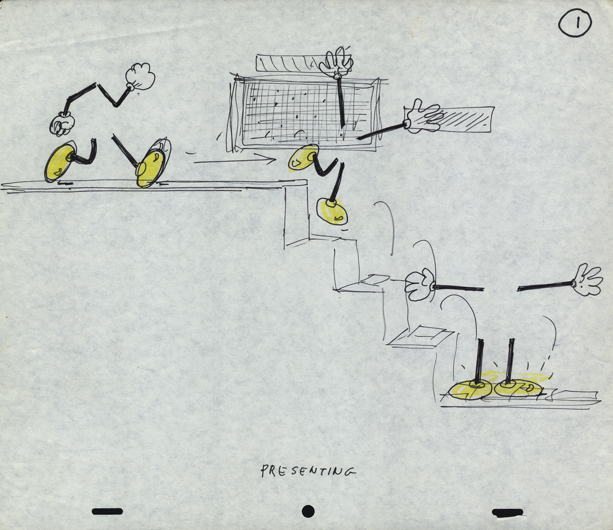
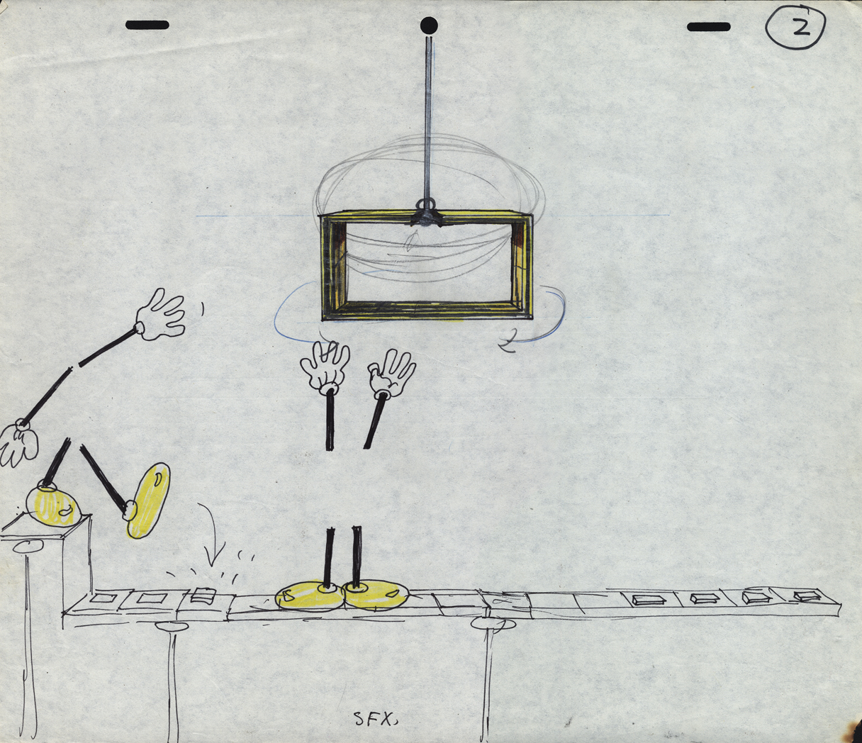
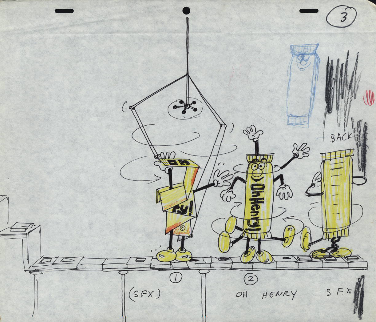
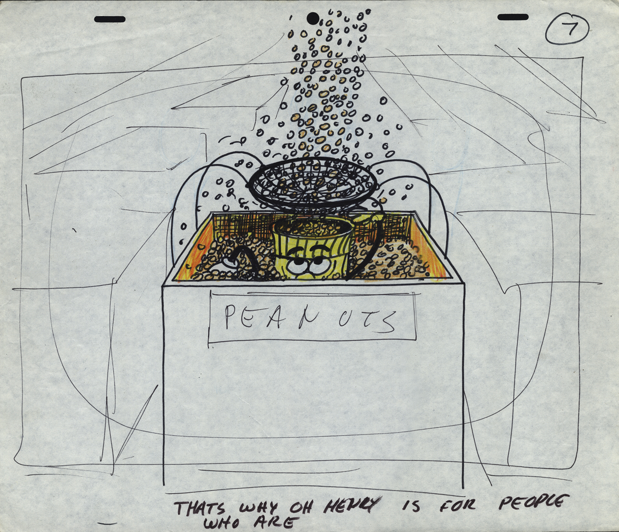
- Sifting through the boxed archives of Vince Cafarelli‘s saved material, there are quite a few pieces of art from a number of commercials. One that stands out includes the LayOut drawings of Fred Mogubgub for an O’Henry Bar animated commercial. The spot comes from the early days of Buzzco, 1982 or 1983 when Buzz Potamkin was still the principal in the company.
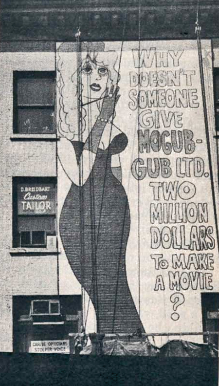 Fred Mogubgub was enough of an eccentric that I would be attracted to his artwork. (In case you’re unfamiliar with Mogubgub‘s work, here’s a four part series including his bio and some films.) I remember – as an art student in NY and desperately wanting to get into animation – the sign on 46th St and Sixth Ave: “Why Doesn’t Someone Give Mogubgub Ltd. Two Million Bucks to Make A Movie?” I asked Fred if he’d had any response. He said that ABC contacted him, and he gave them a script that was about a thousand pages big. It was about the contents of an ashtray. The characters were cigarette stubs, ashes and matches. To illustrate the script, he’d attached some used butts and matches within. They didn’t give him the money; you might have guessed.
On Blechman’s The Soldier’s Tale, there was a PT section of the animatic that Fred had done. We had to prepare this for a big screening for PBS trying to sell it for Bob. To get it into color, Fred and I would literally color the film, itself. He started at the head of the scene and I started at the end. We met in the middle. That piece of film had a life that was just too great. It couldn’t retain what we had done when it went to completion. Very exciting work and a fun afternoon coloring some footage with Fred.
Here are the Lay Outs Vinnie had saved for the past 30 or so years:
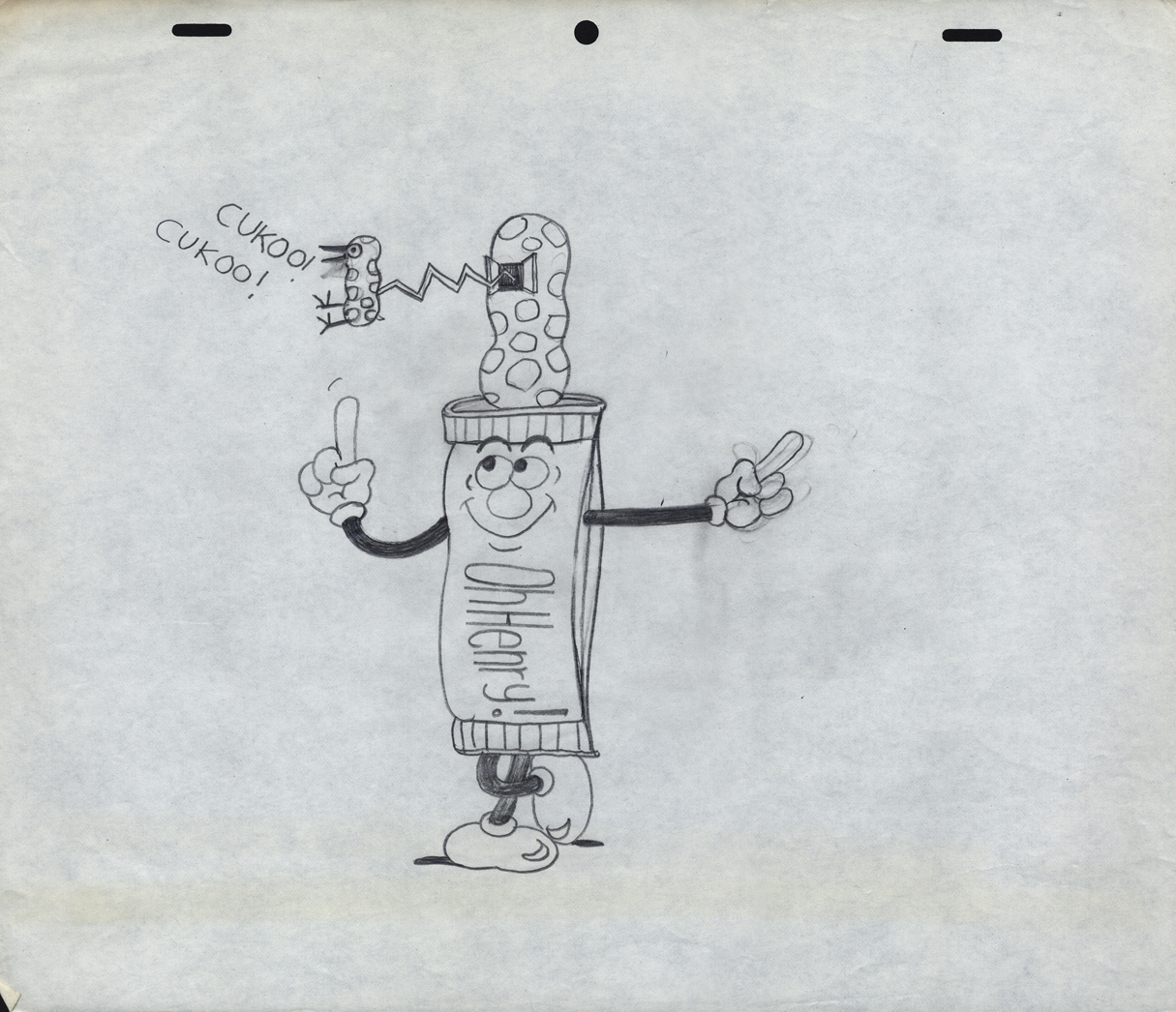
Our Lead Character – a model
 1
1
There seems to be no rhyme or reason
as to when things are top or bottom pegged.
 2
2
The pegs shift from drawing to drawing.
 3
3
 7
7
 8
8
 9
9
 10
10
 11
11
 14
14
 16
16
 17
17
 18
18
 22
22
 24
24
A cel setup.
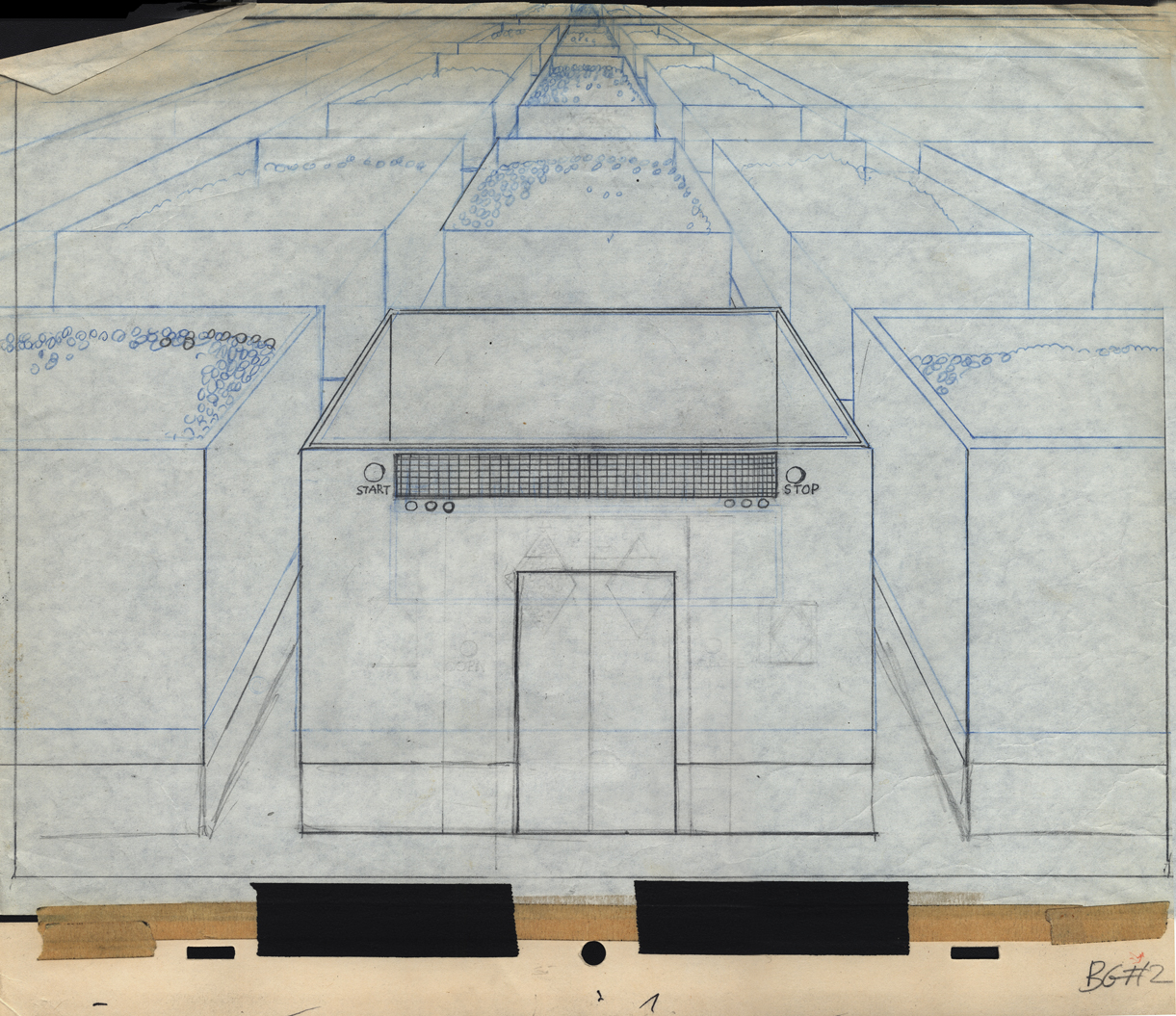
Bg LO 2
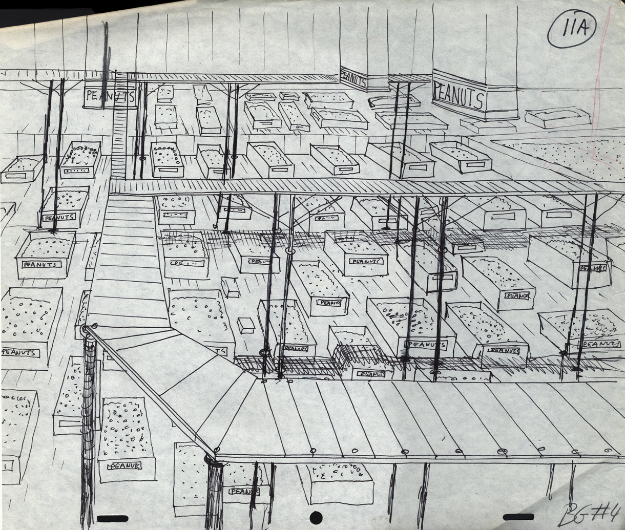
Bg LO 11
Bg LO 24
Animation Artifacts &Bill Peckmann &commercial animation &Illustration 24 Aug 2012 05:05 am
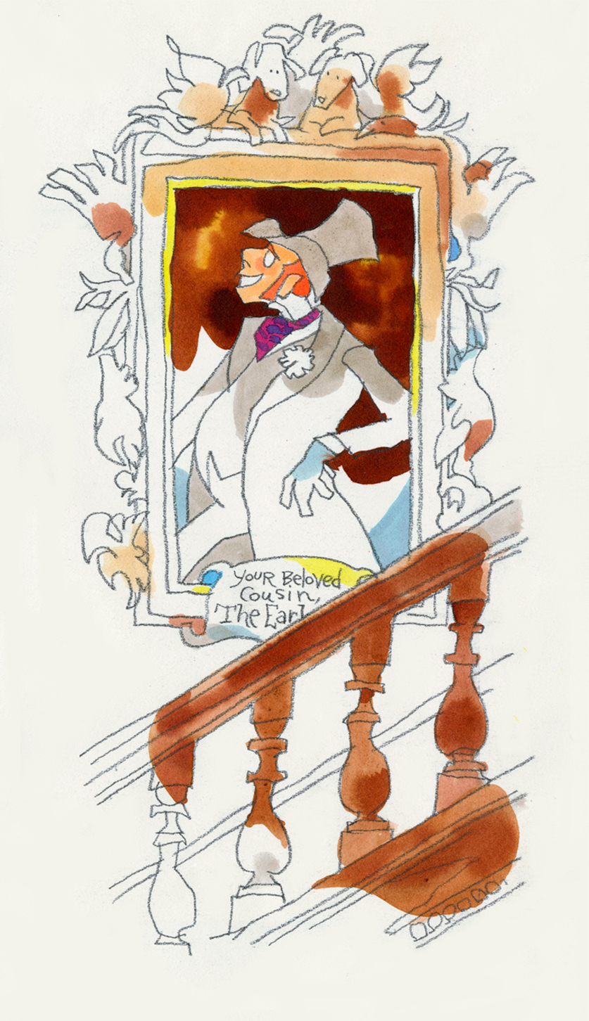
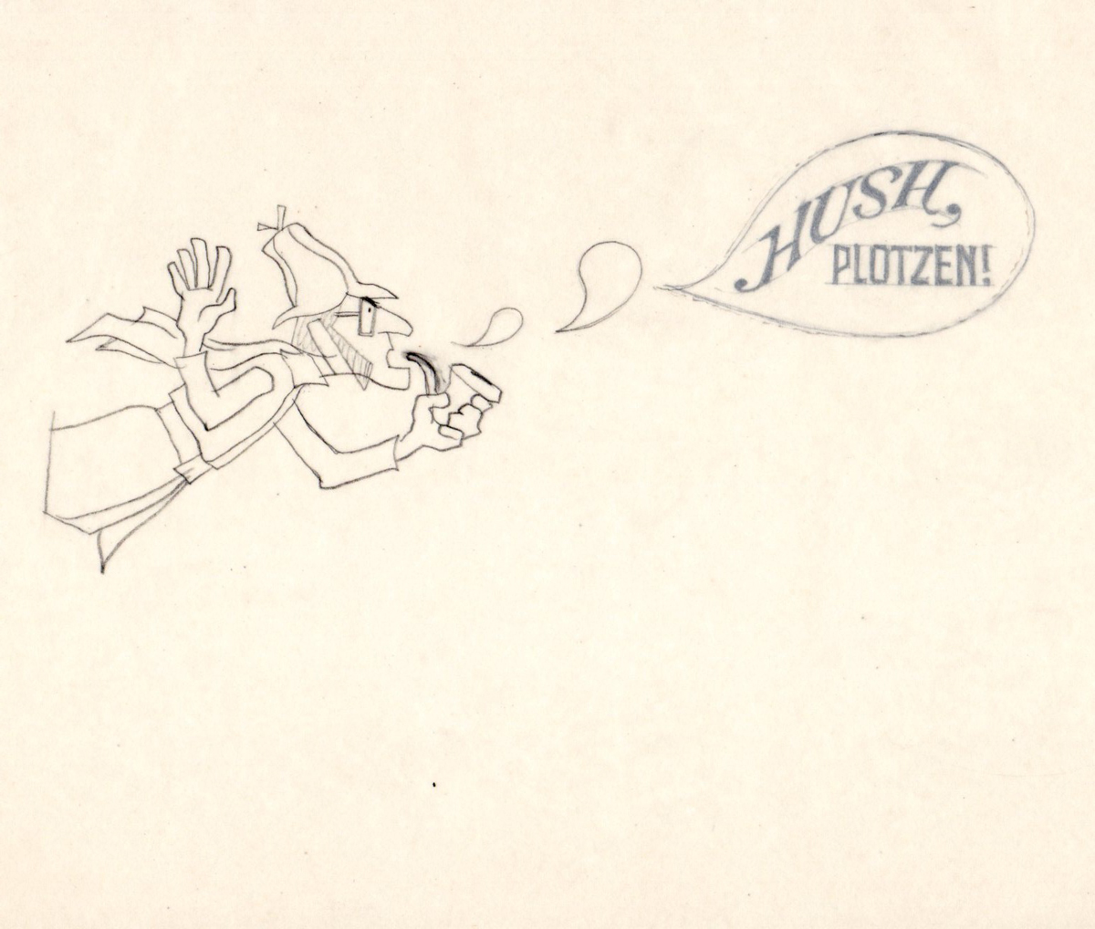
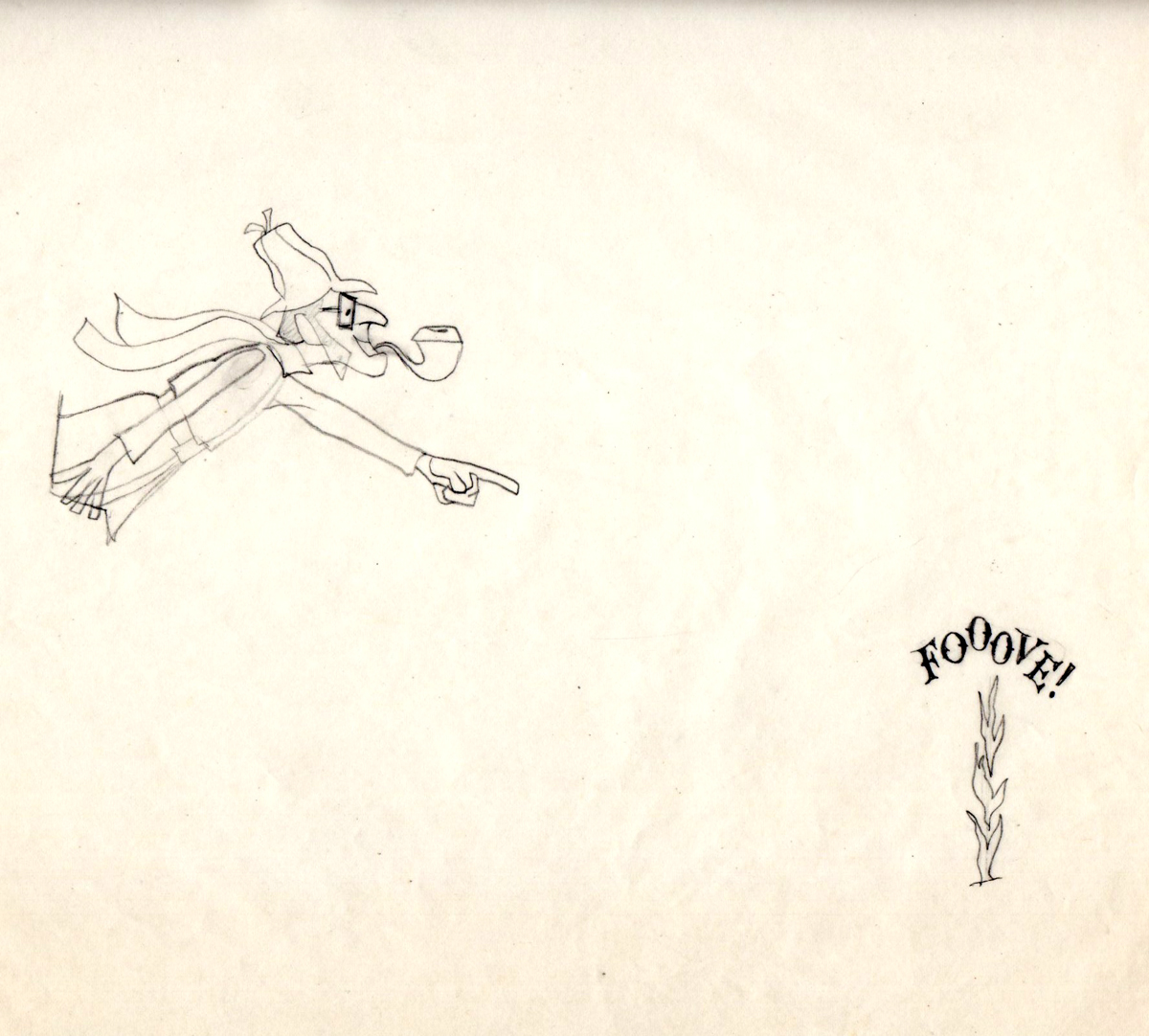
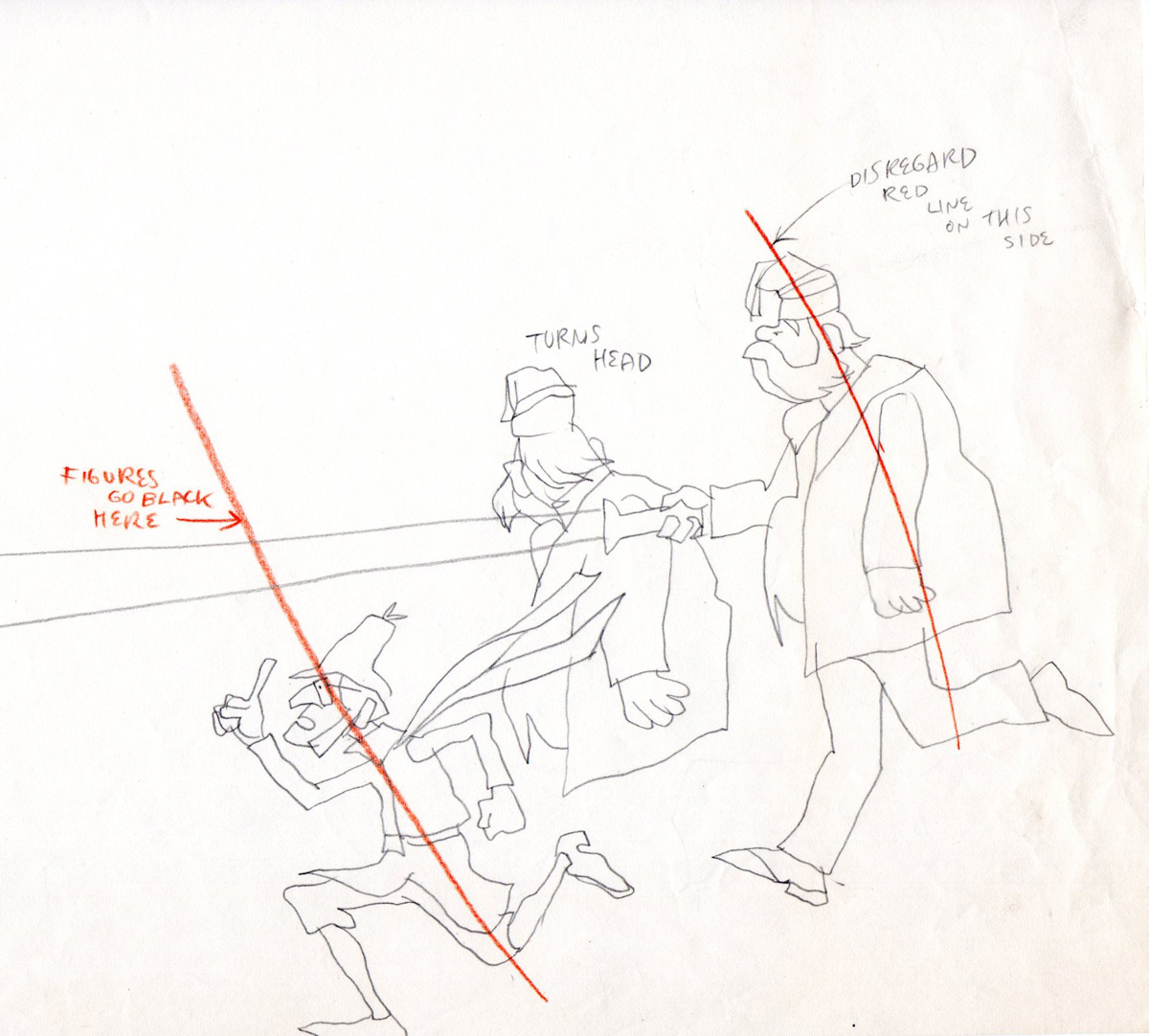
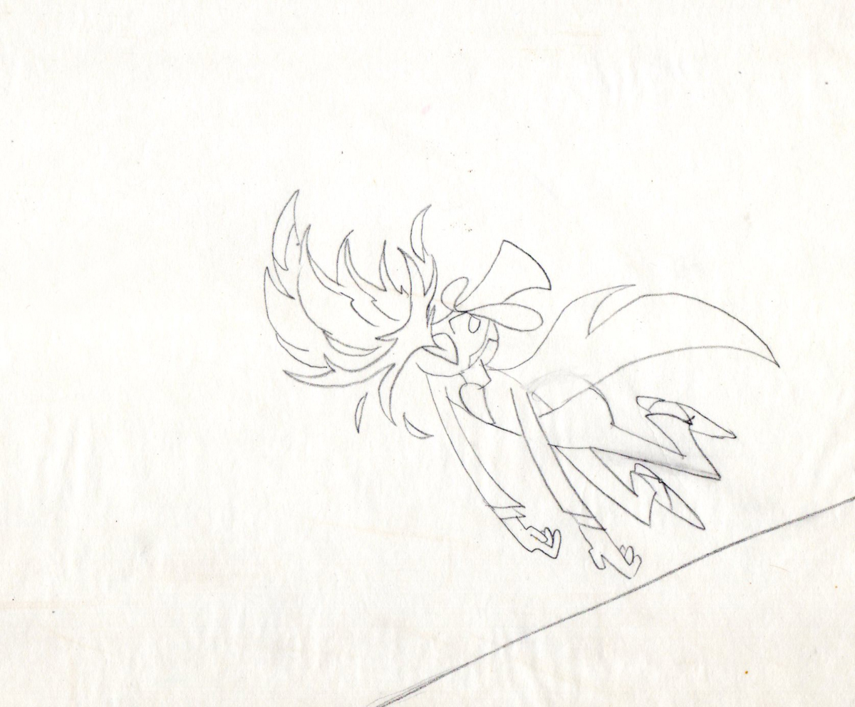
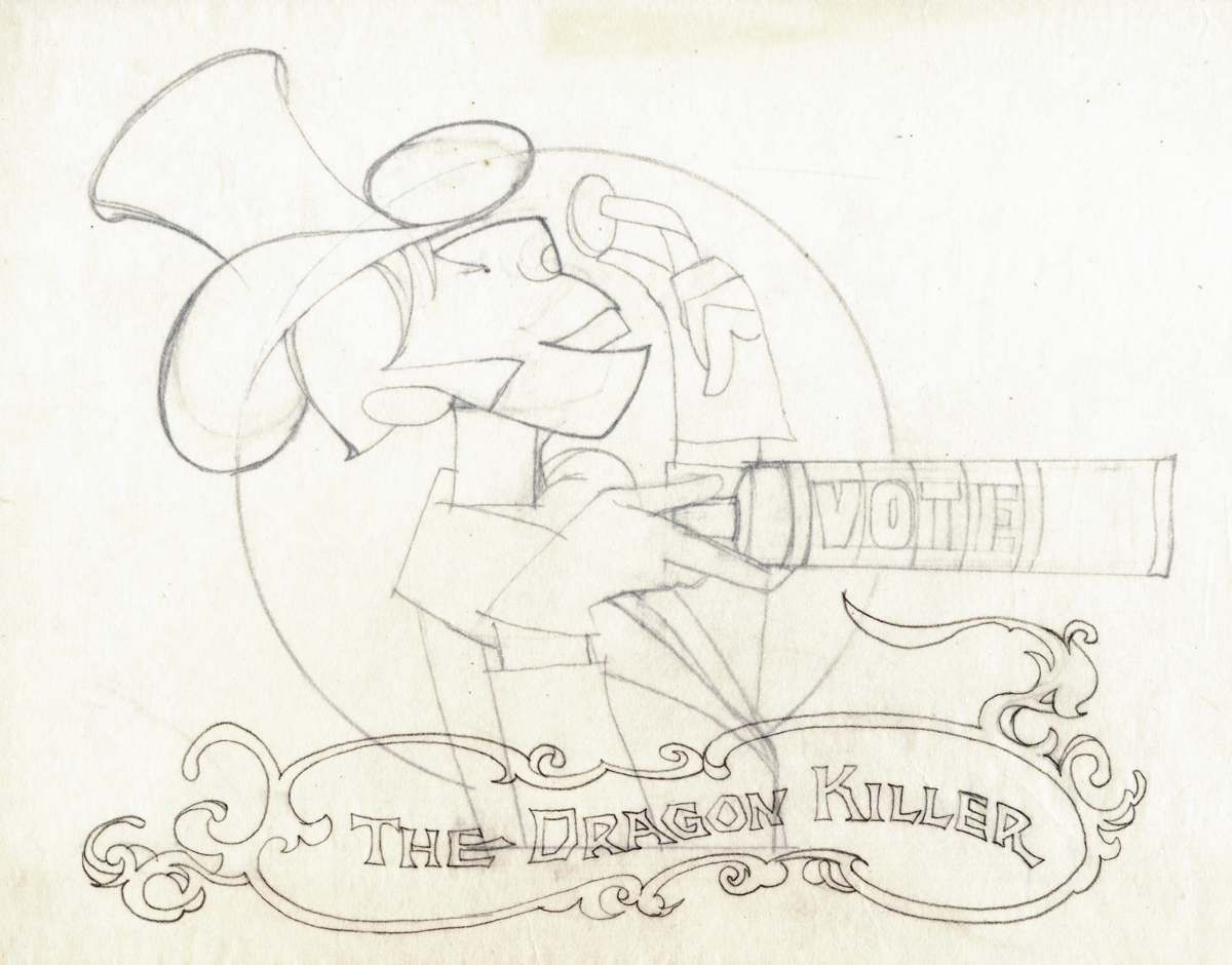
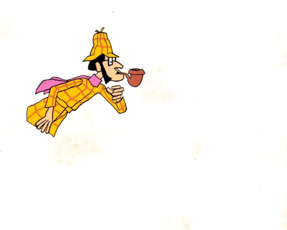
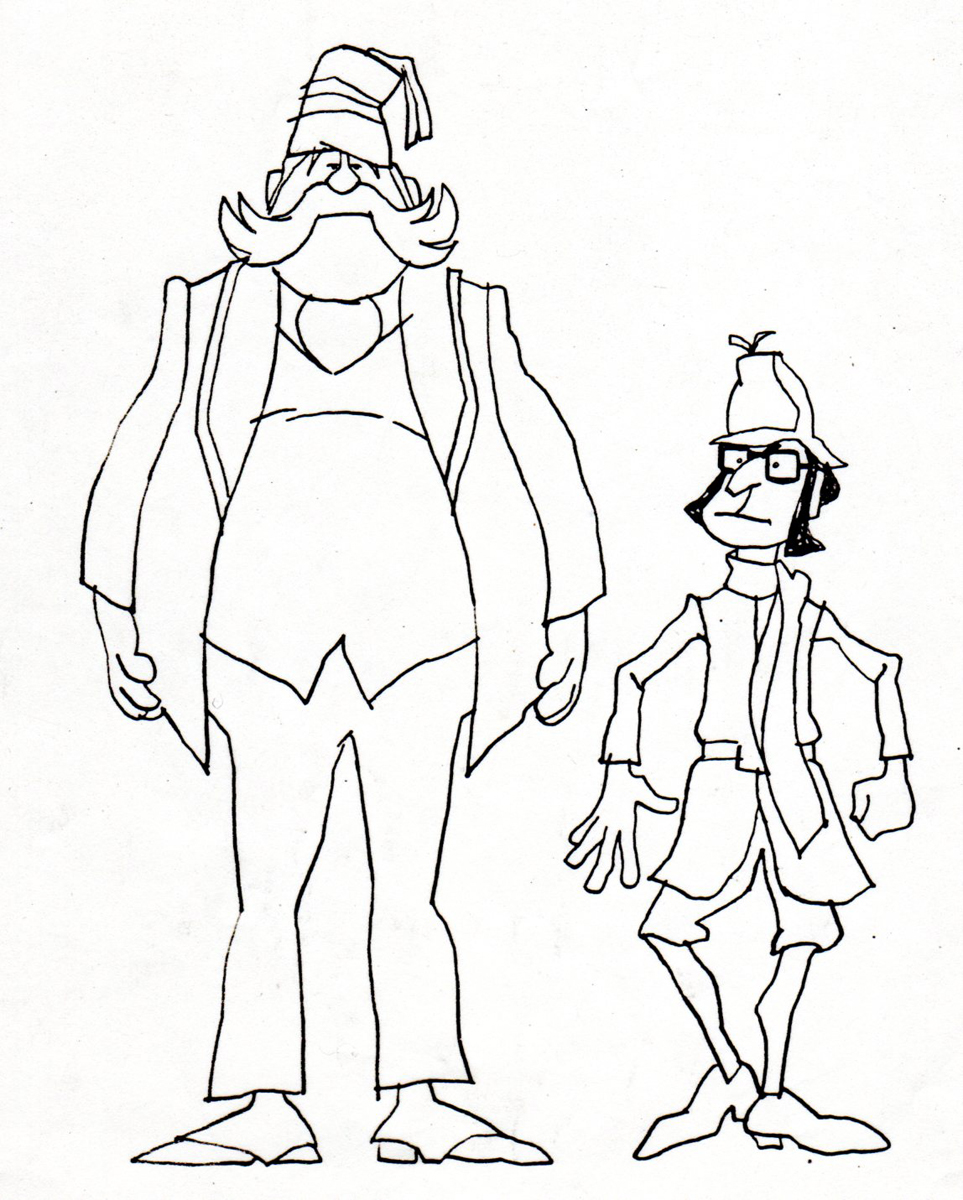
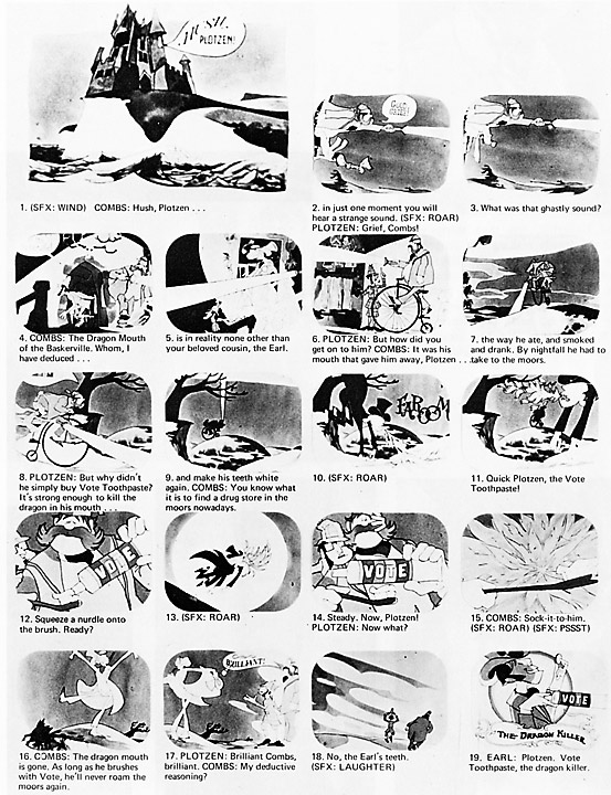
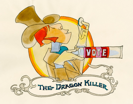
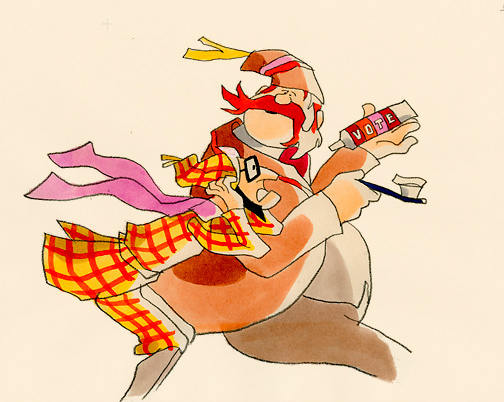
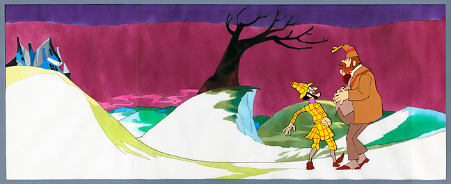
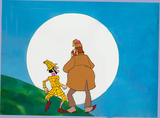
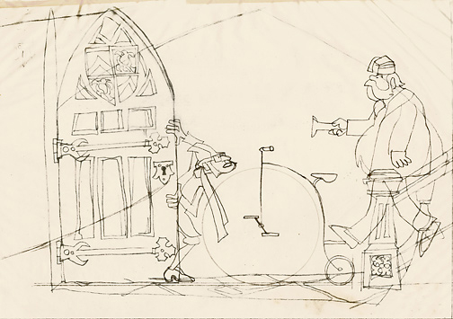
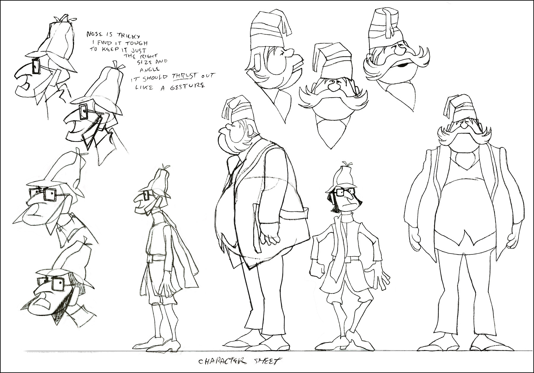
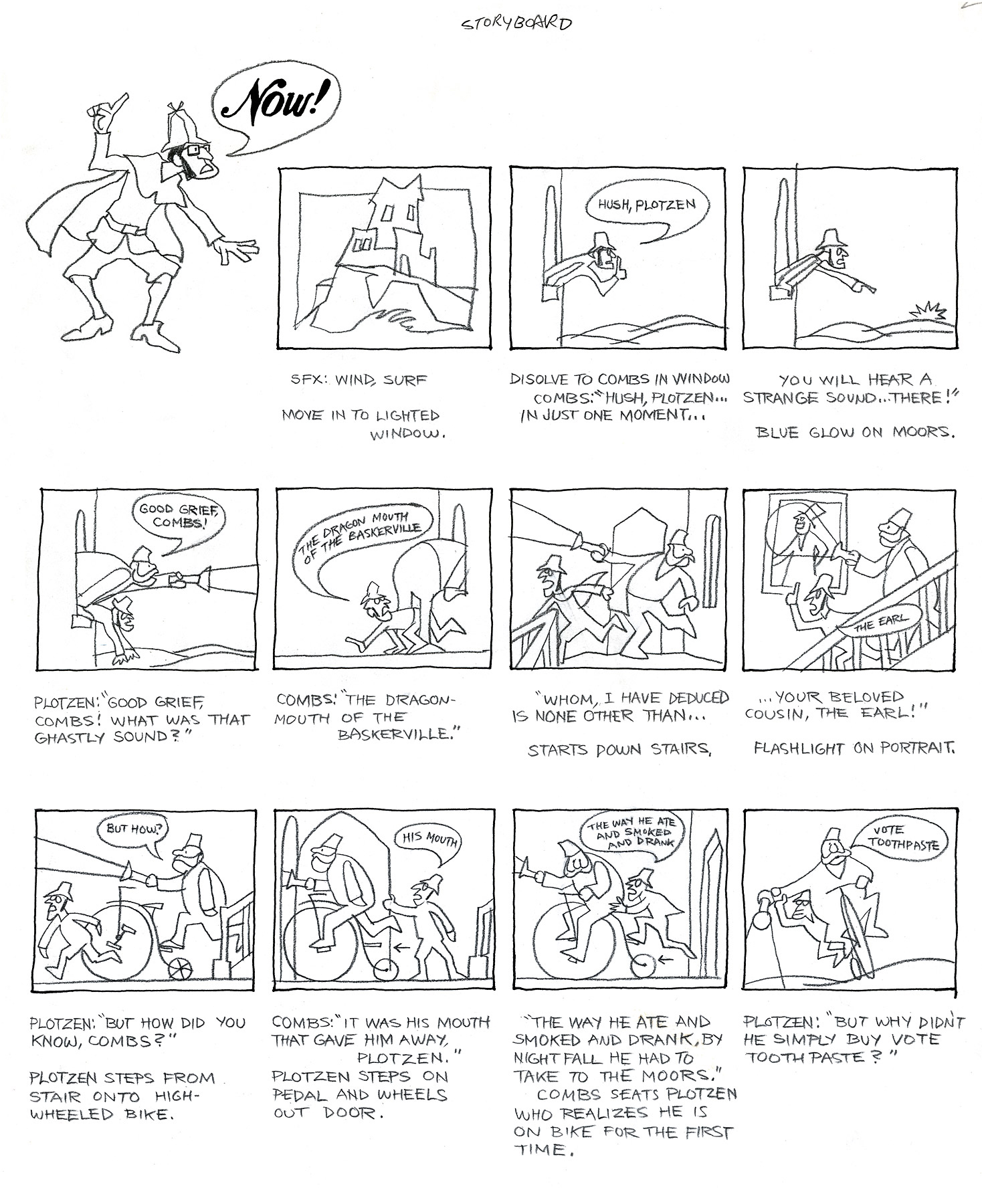
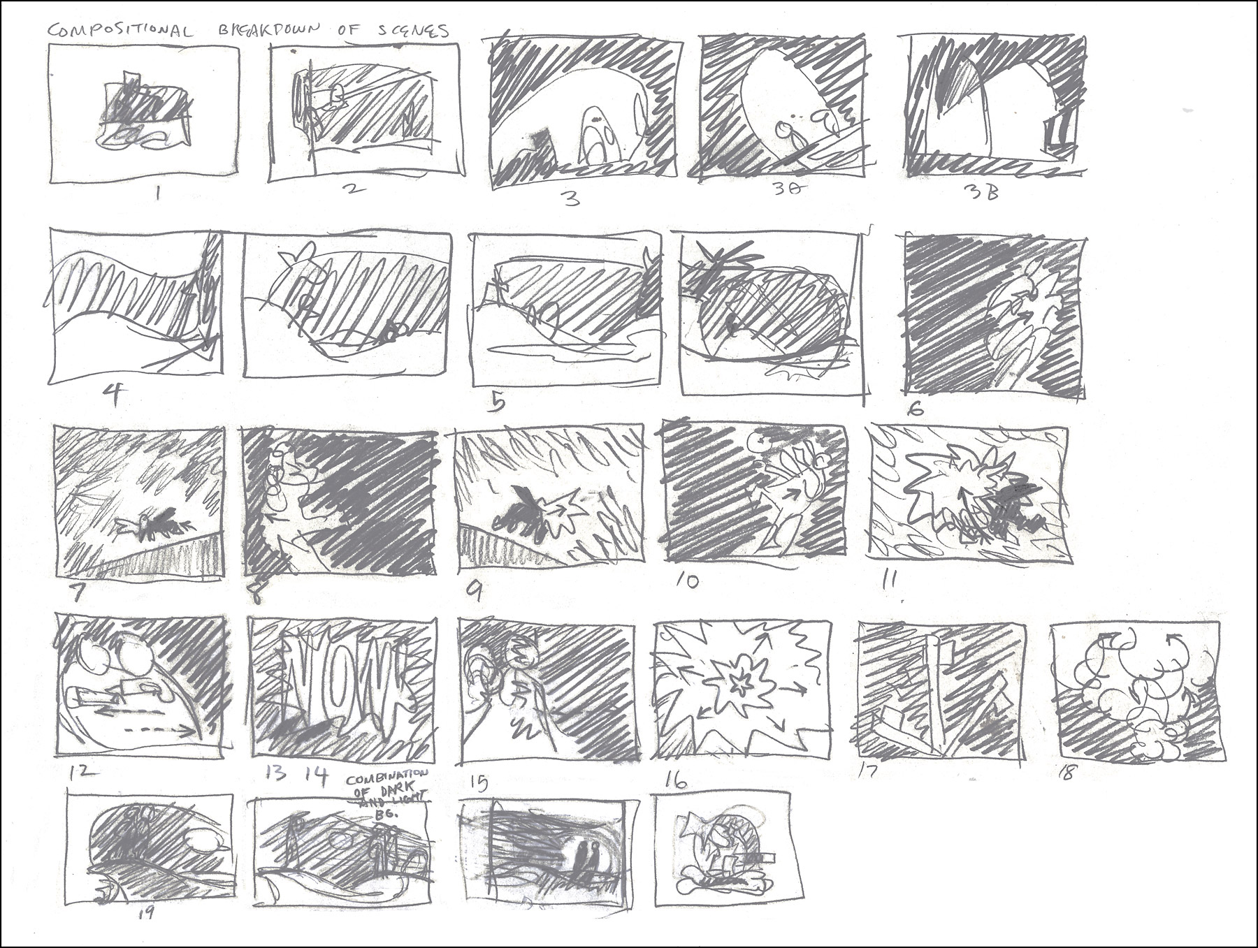
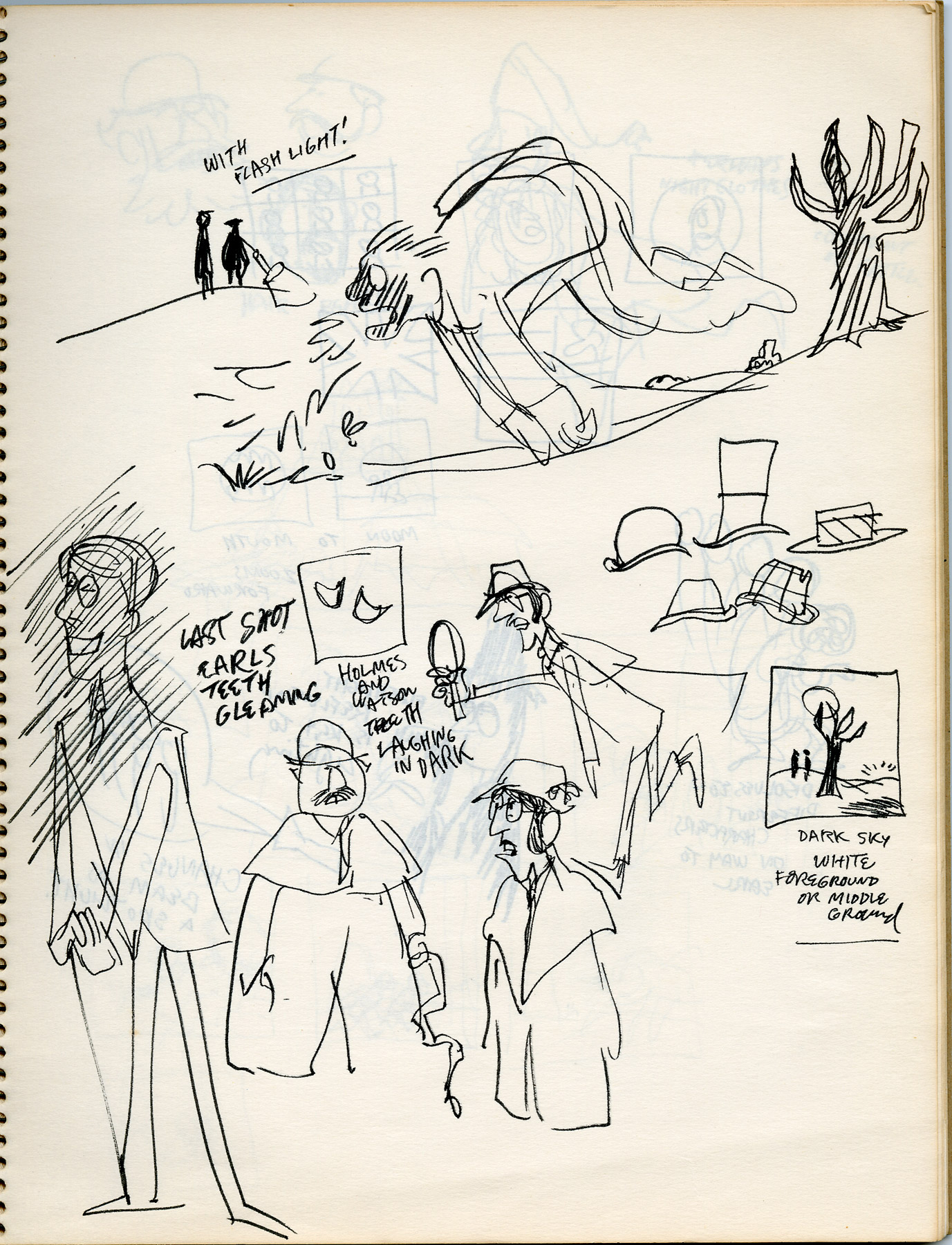
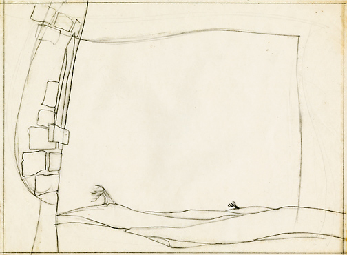
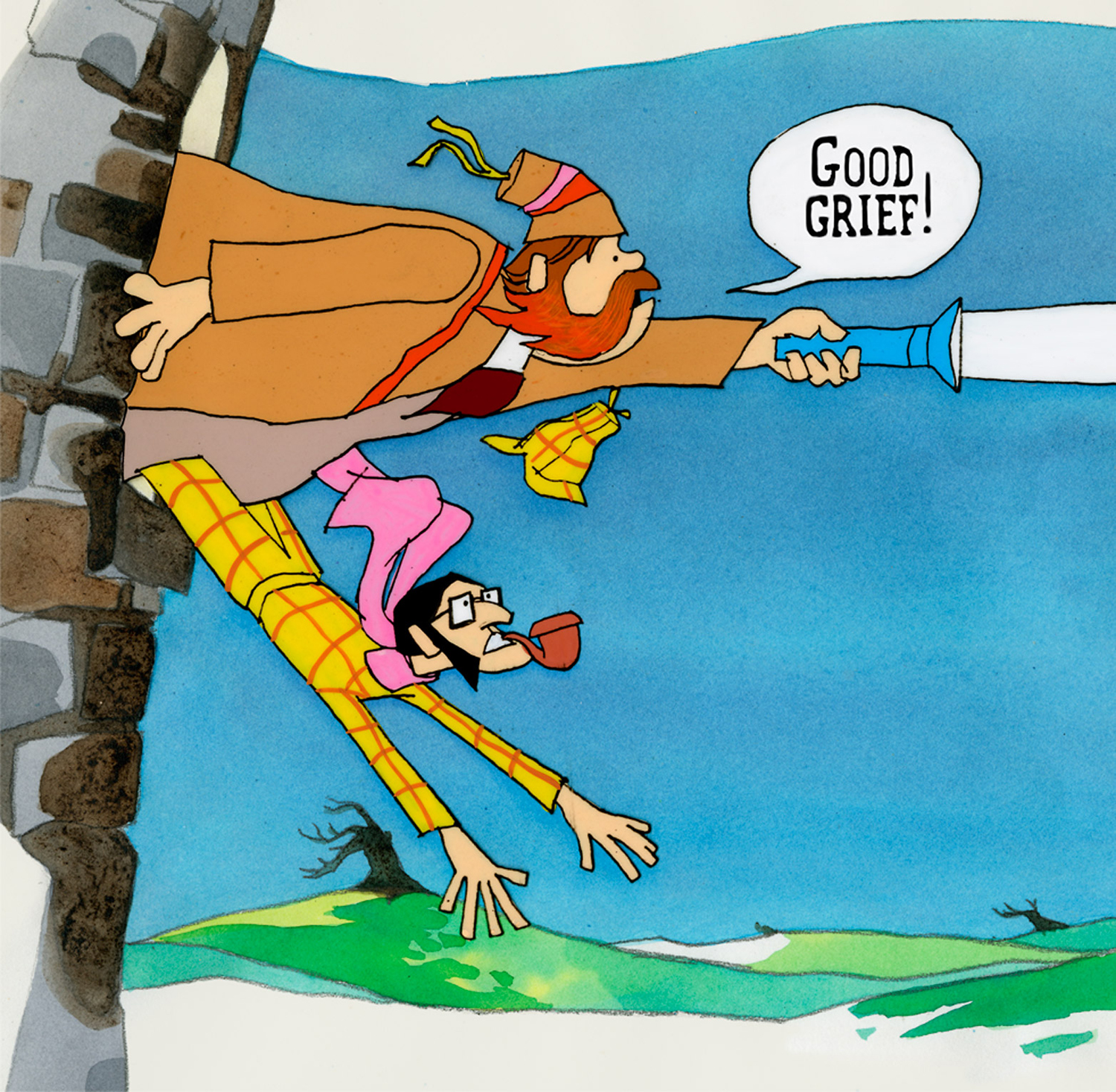
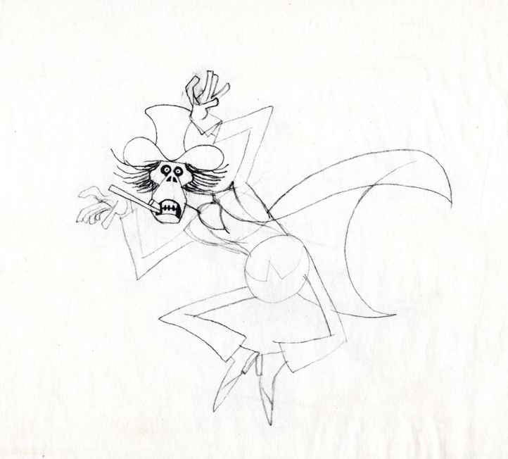
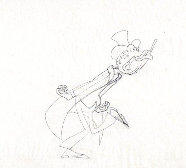
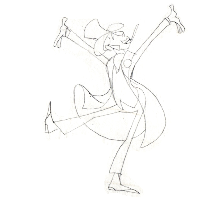
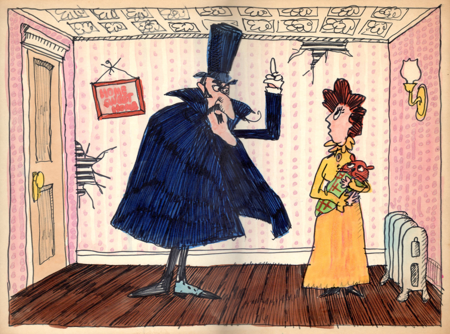
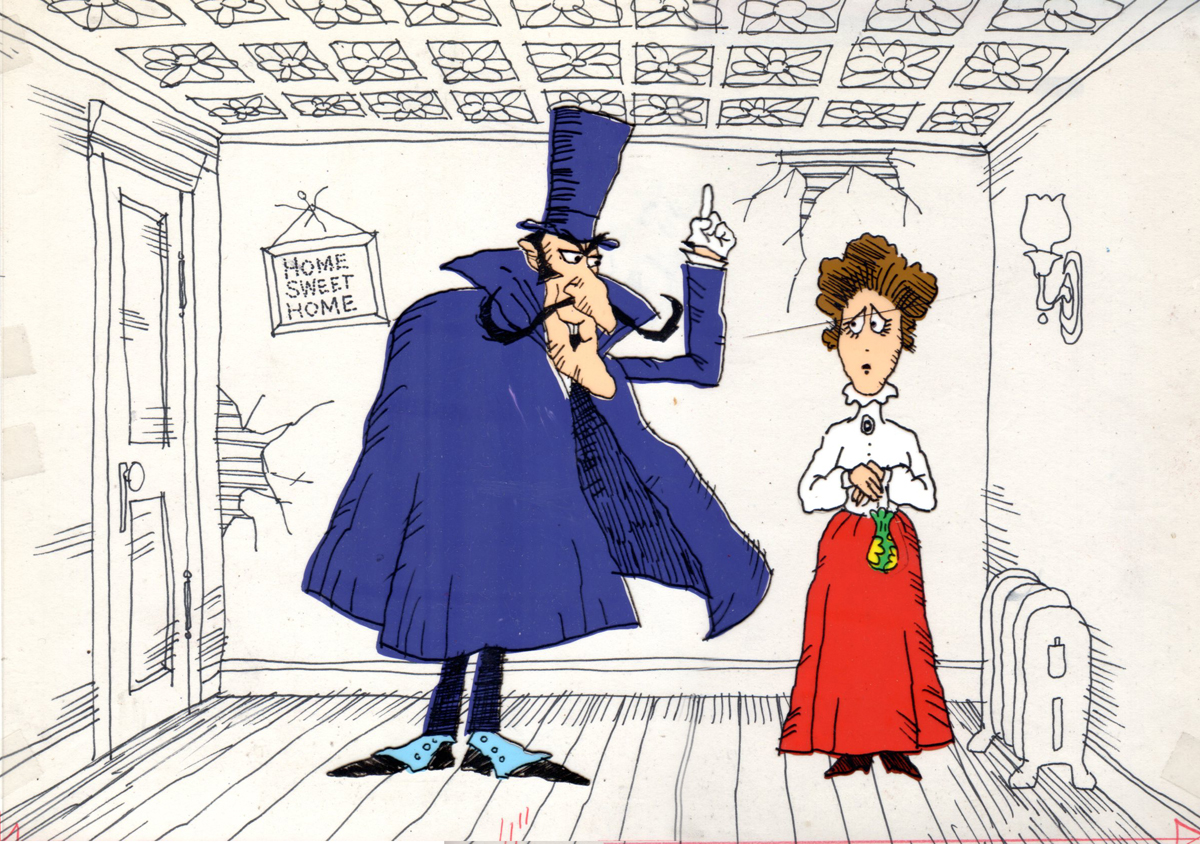
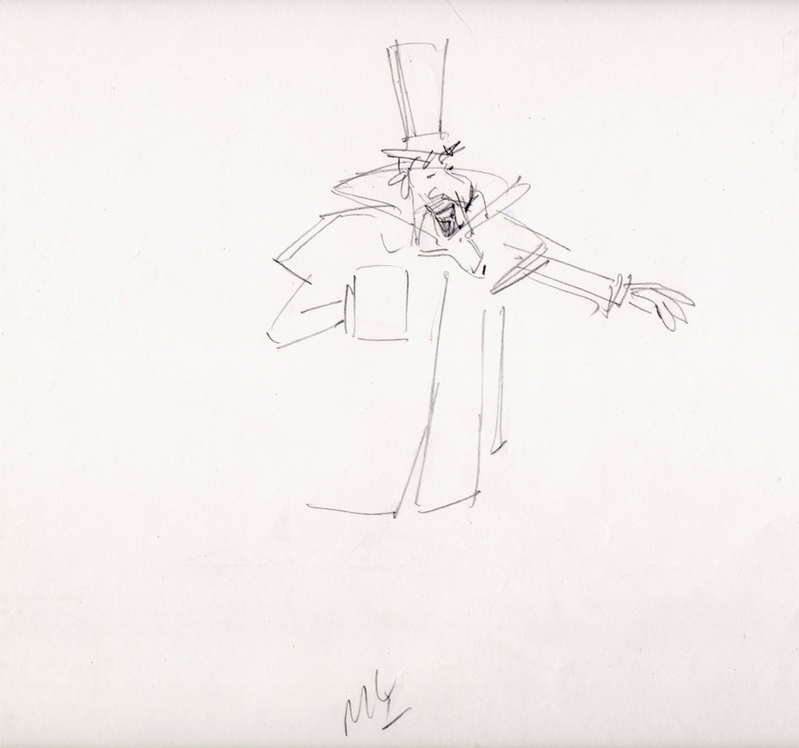
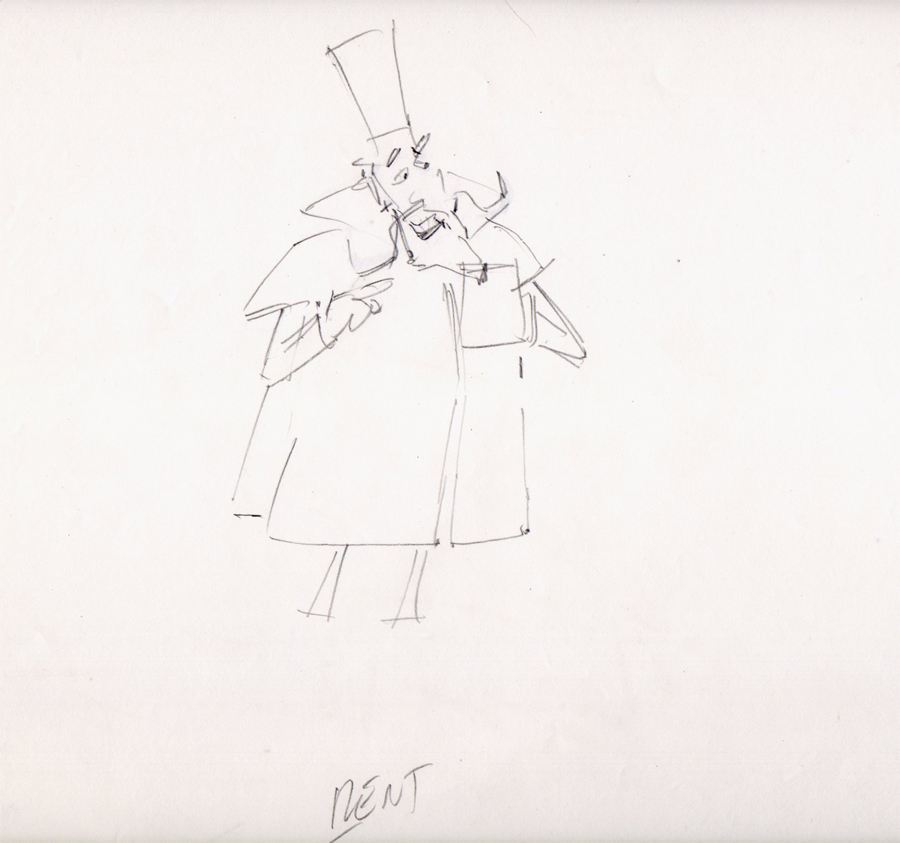
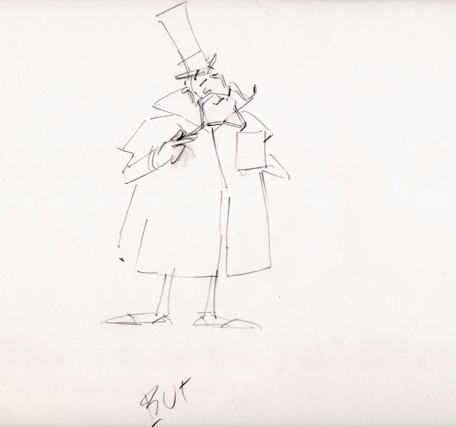
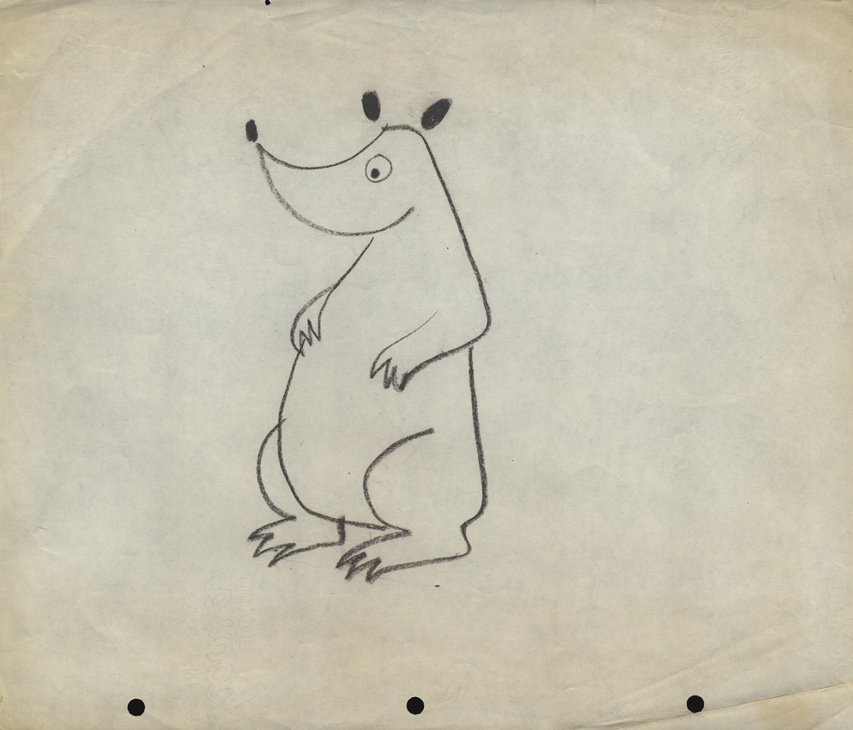
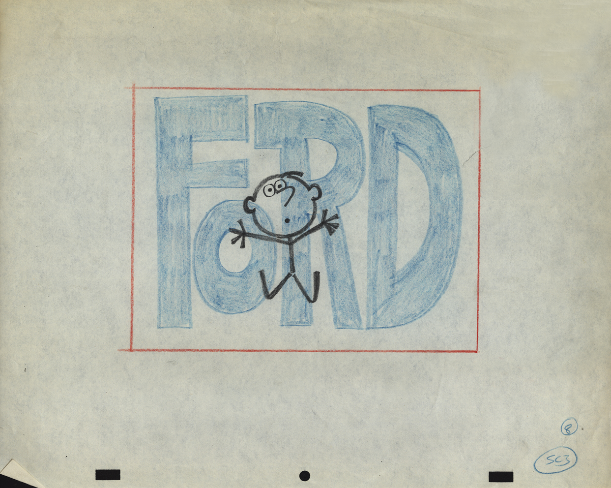
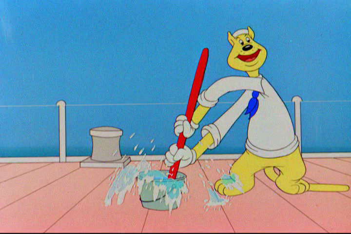
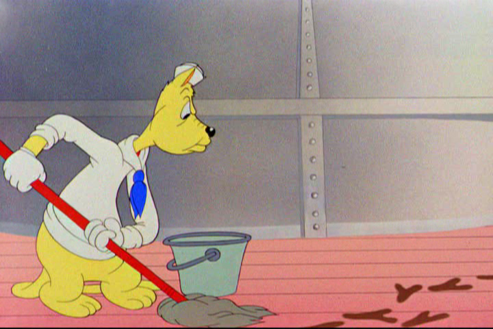
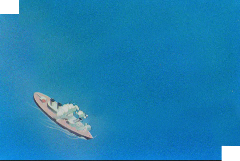
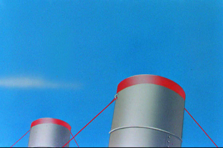
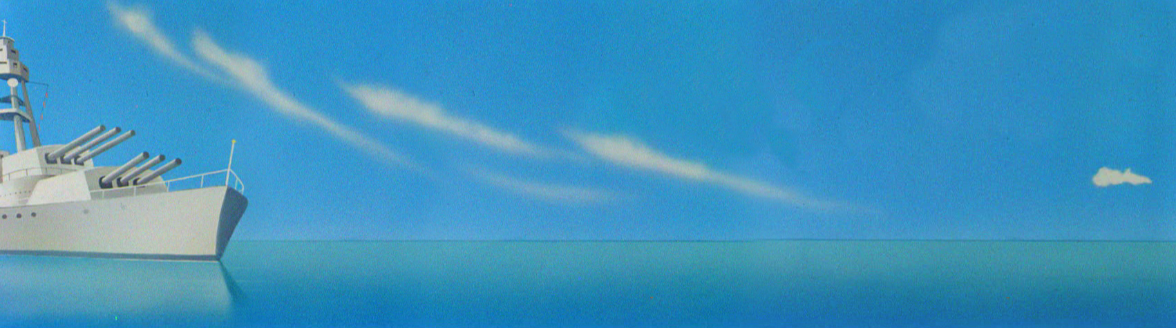
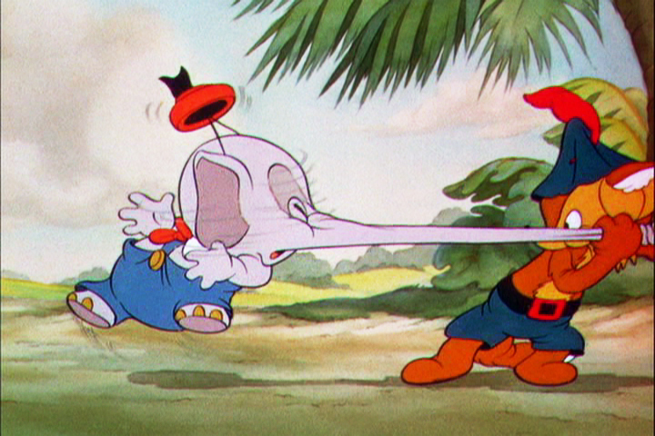
Rowland Wilson’s Vote Toothpaste
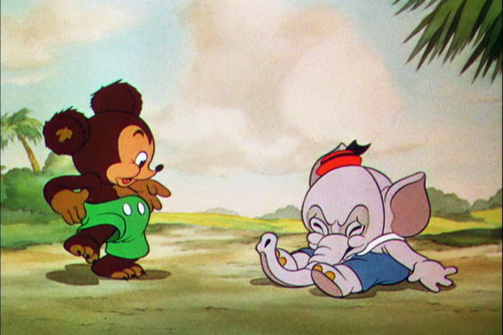
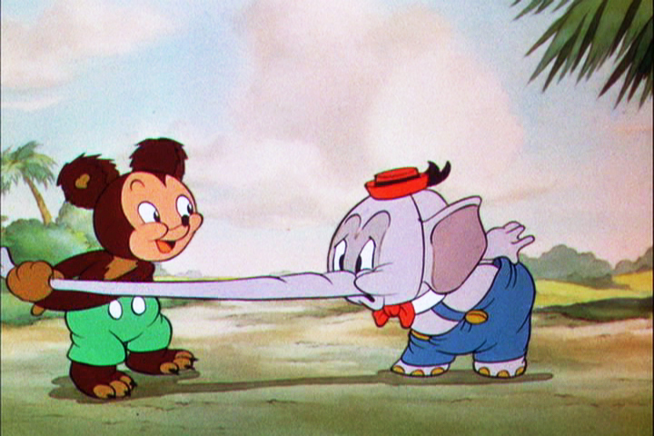
-If you’re a brilliant designer, you get there by doing the work that’s necessary. If you’re as great as Rowland B.Wilson was, you take the opportunity of a fine commercial spot, and you research it, plan it, and sketch it out. That’s just what Rowland did with this spot for Phil Kimmelman and Ass. back in the 70s. Vote toothpaste had a gem featuring “Plotzen” and “Coombs”. They just look like Sherlock and Watson.
Thanks to Suzanne Wilson, here’s the prep work Rowland did for this commercial. Many thanks to Bill Peckmann for getting it to the Splog and for additional artwork.
 1
1
 2
2
 3
3
 5
5
 6
6
 7
7
model sheet
 8
8
 9
9
The characters turn 180º in this animation model.
This was animated by Jack Schnerk and cleaned up by Bill Peckmann.
 12
12
 13
13
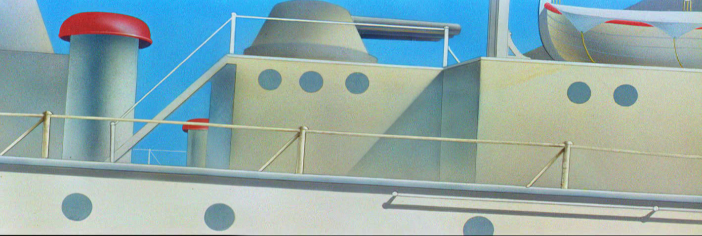
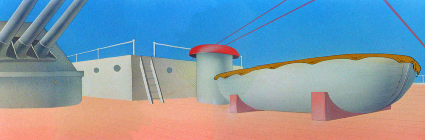
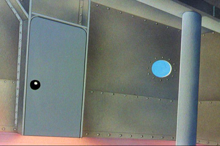
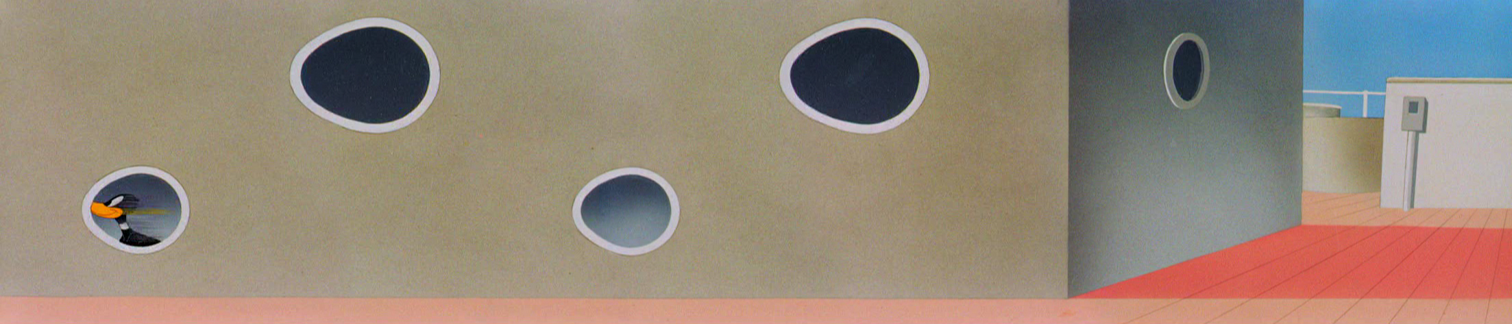
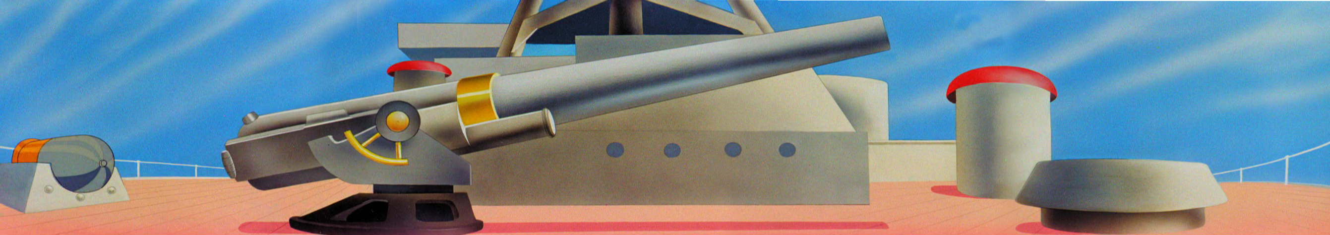
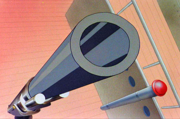
B&W BG Layout for the color image to follow.
 14
14
 15
15
 16
16
B&W Bg Layout for the following image.
 17
17
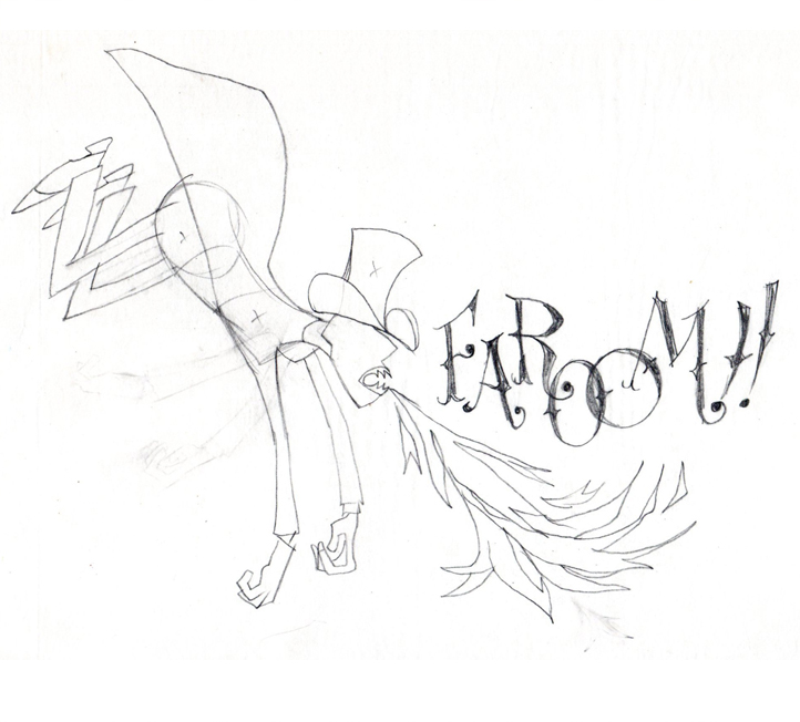
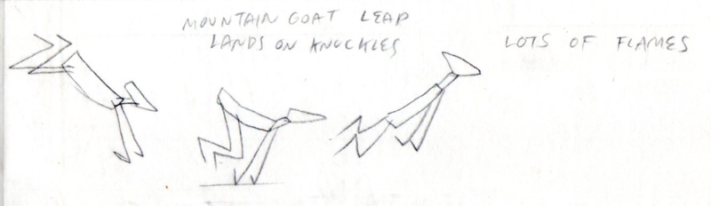
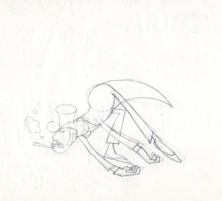
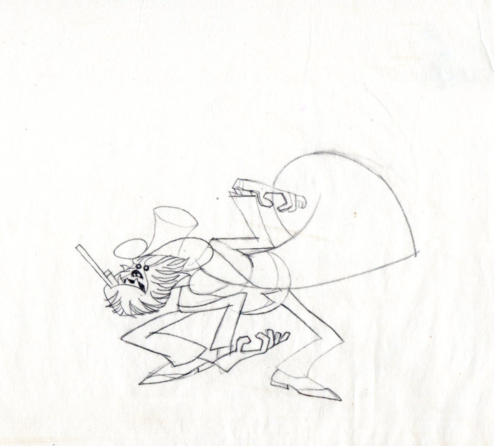
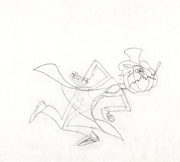
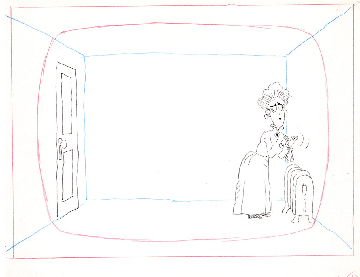
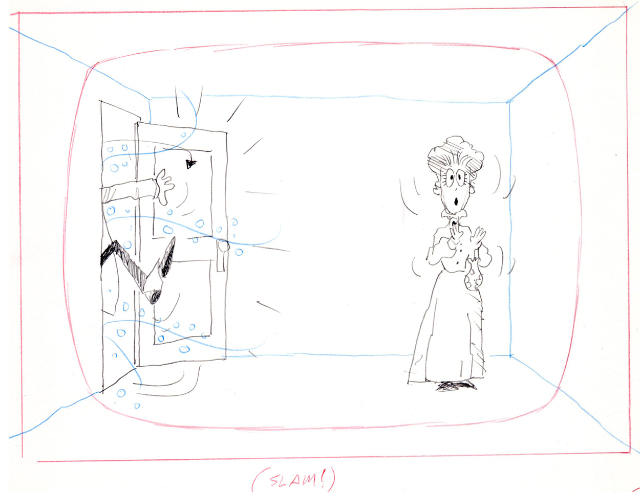
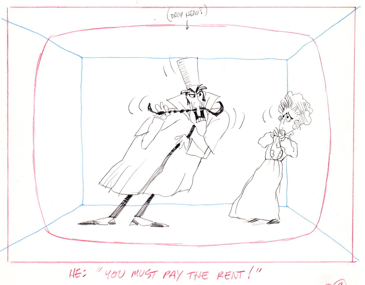
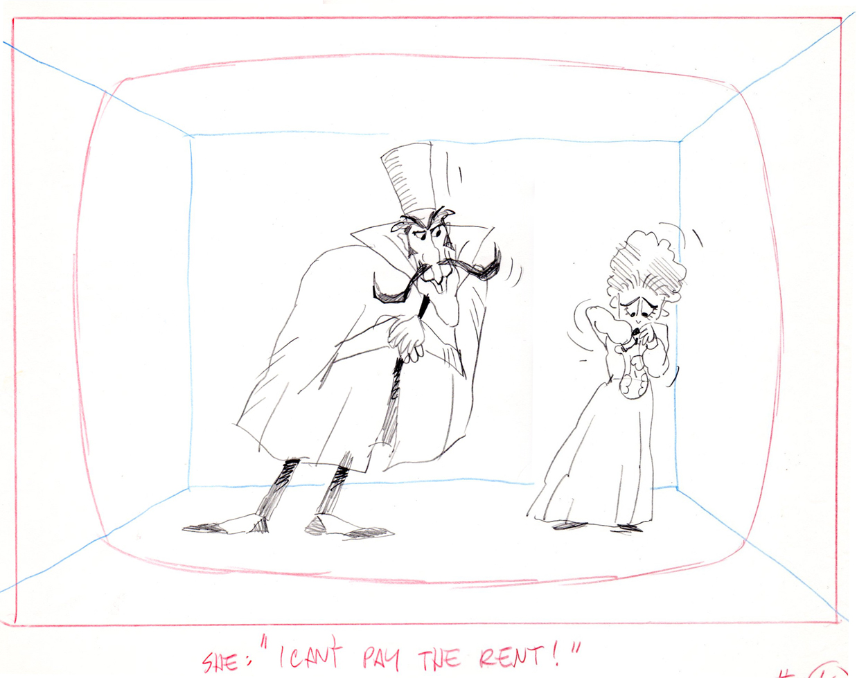
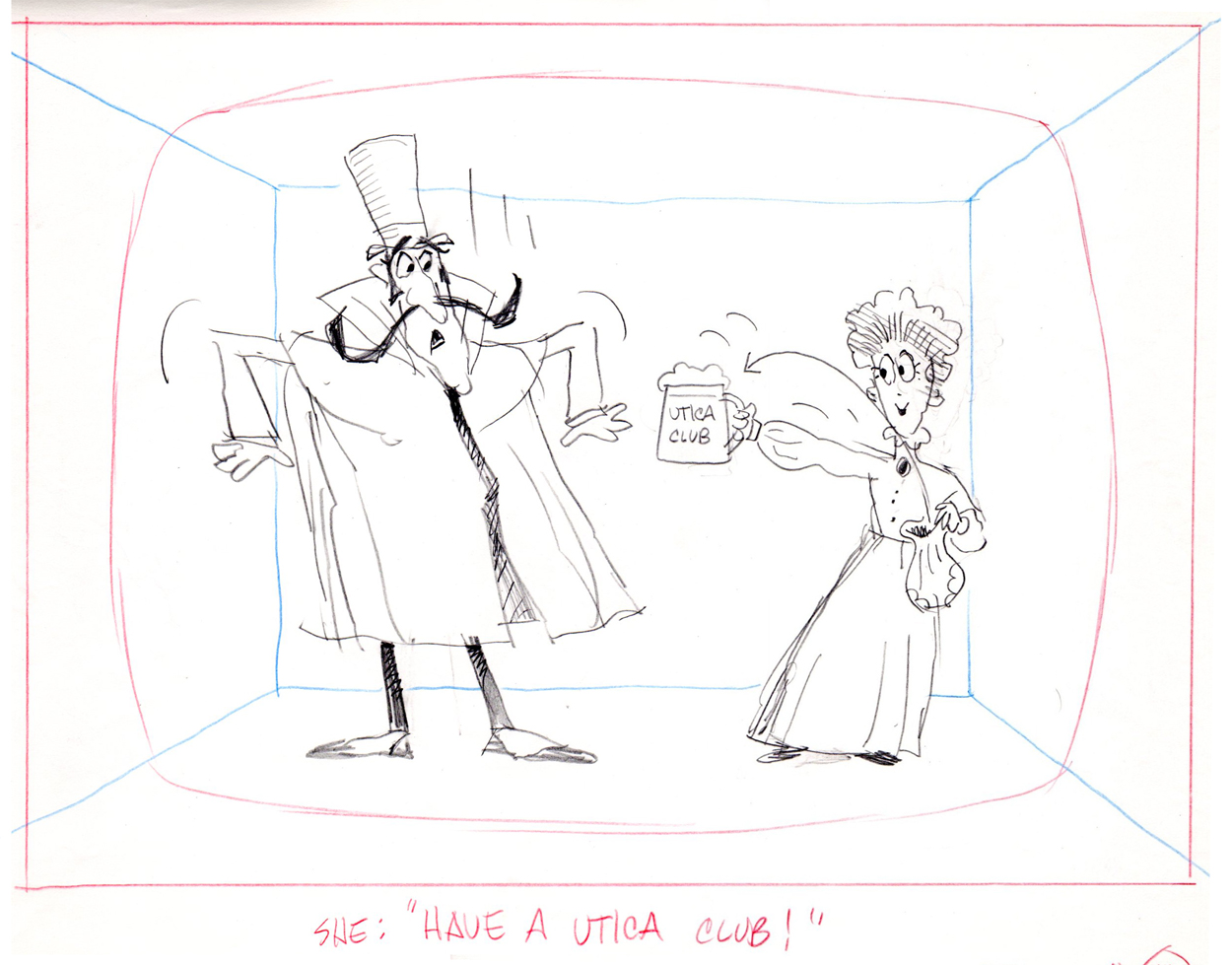
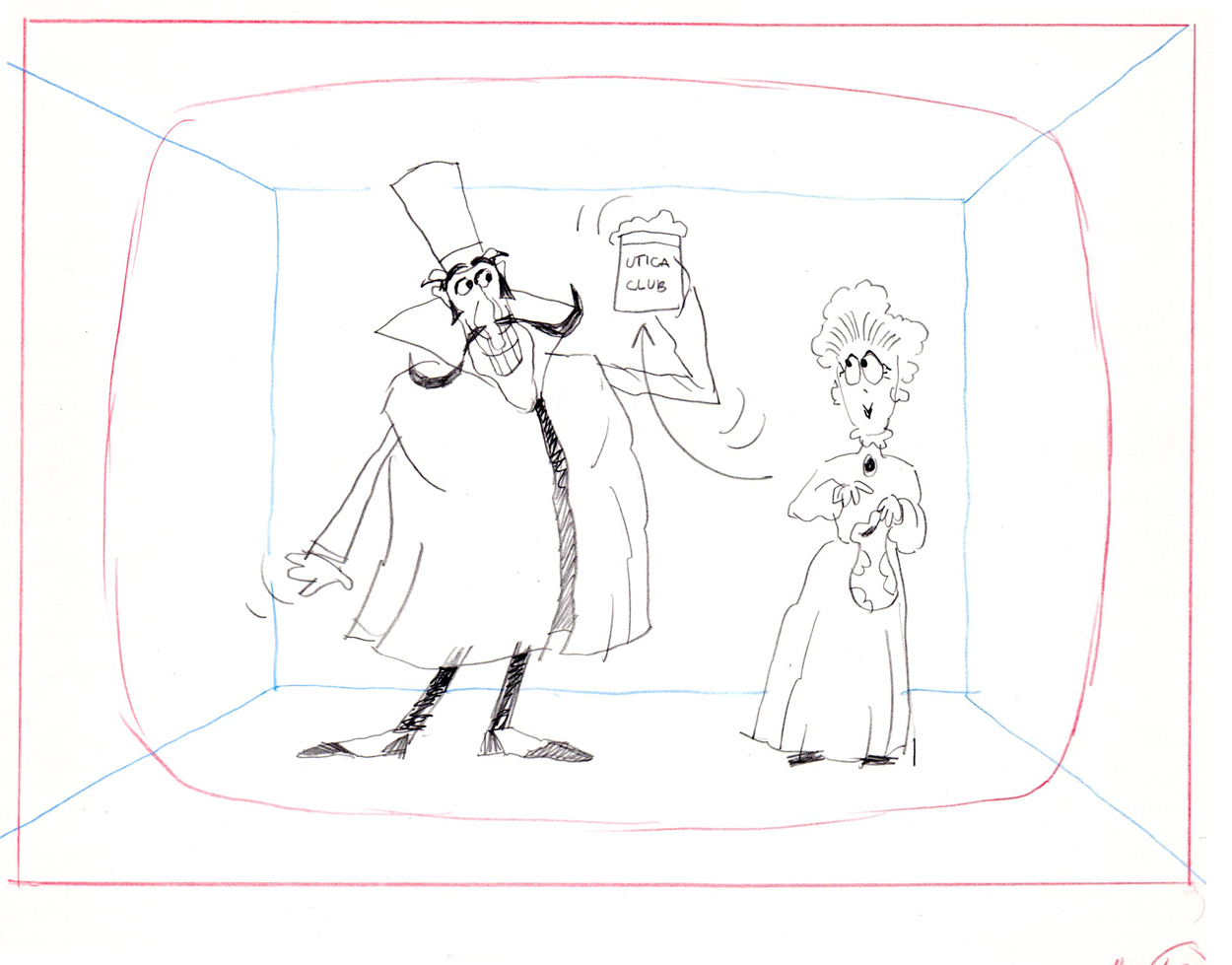
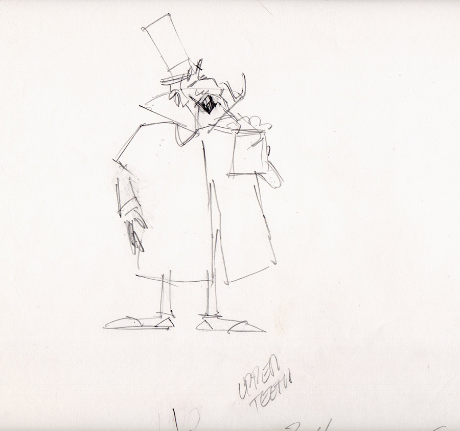
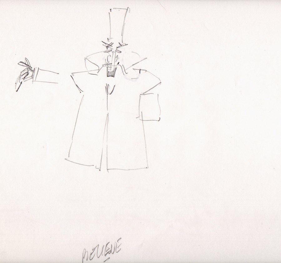
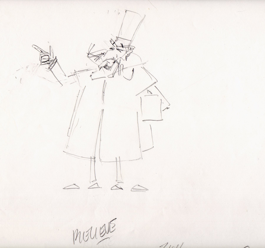
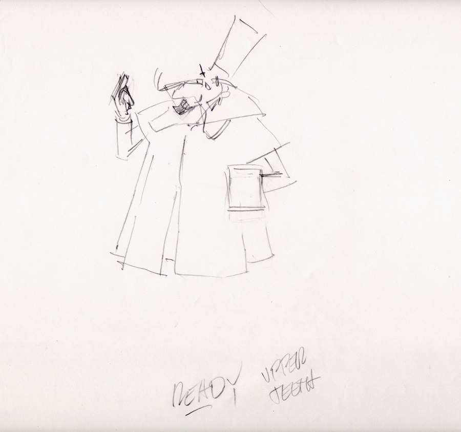
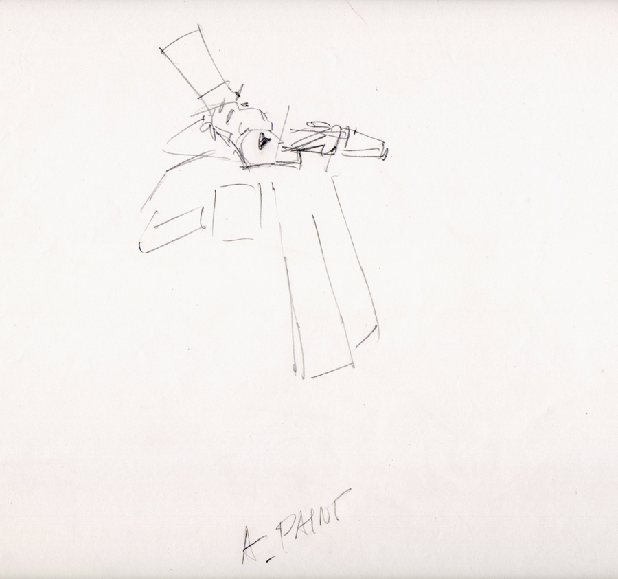
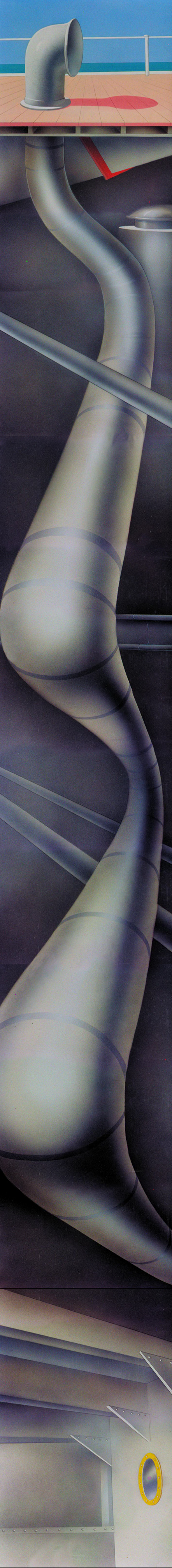
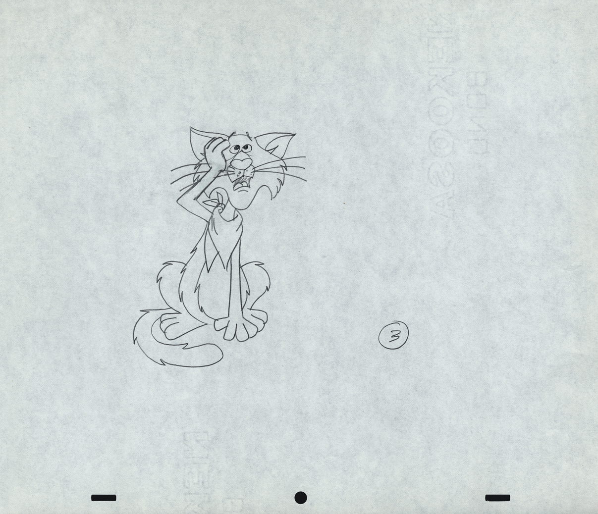
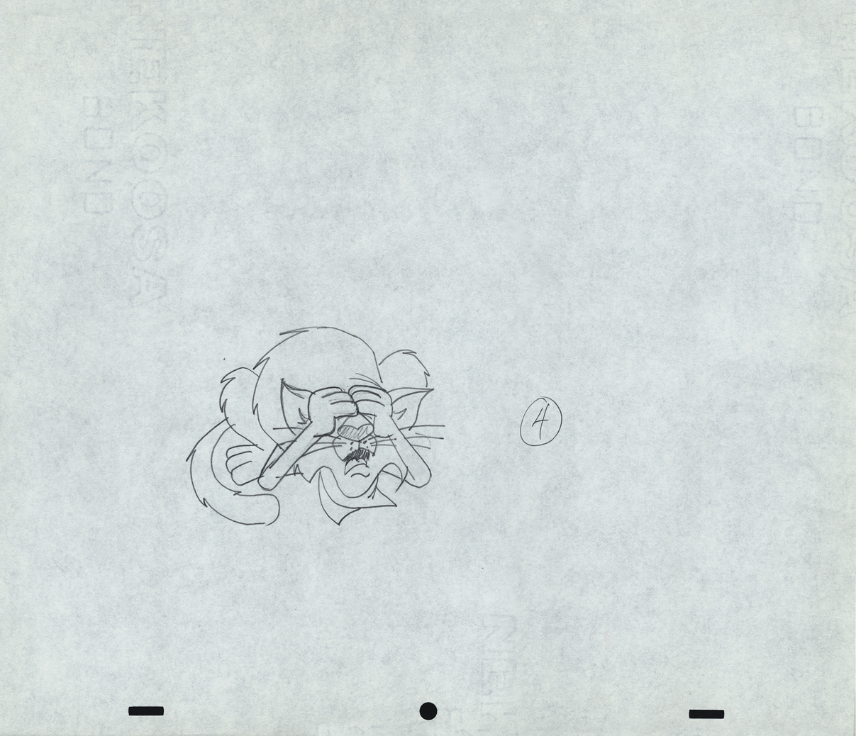
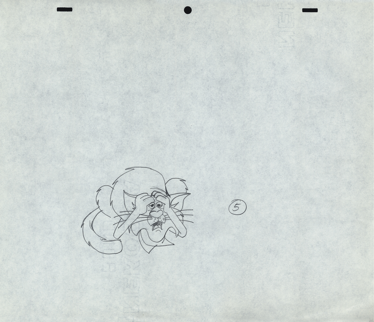
Finally, here are some rough sequential drawings that Rowland did
for a sequence where the villain transforms via Vote toothpaste.
The object in his mouth is a toothbrush with toothpaste on it.
 1
1
 3
3
 4
4
 5
5
 6
6
 7
7
 8
8
The Vote spot starts at 0:37 on this Jack Schnerk sample reel.
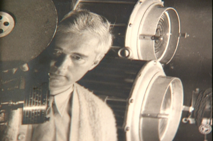
Animation &Animation Artifacts &Disney &Hubley &John Canemaker &repeated posts 20 Aug 2012 05:53 am
Fantasia FX – Schultheis – recap
John Canemaker recently completed his latest book about Herman Schultheis and the effects department at Disney’s during the early 40s. It, hopefully, will be published in late 2014. This encouraged me to pull up this piece I posted in Sept/2009. It’s amazing how much information I was able to cull from the photos I found on the DVD.
I’m pleased with this post and am glad to repeat it for those who might not have seen it. John’s book, by the way, is one I’m looking forward to reading. He’s written a bit about it on his website.
- Herman Schultheis was an effects animator who worked on Fantasia. He kept a tight record of the effects they were creating from 1938-1941 and a photo display of how they were done. Schultheis disappeared in 1954 while trekking through Central America, and the notebook was forgotten until his wife’s death in the early 1990s, after which it was discovered by Howard Lowery behind the couple’s bedroom wall.
(Click any image to enlarge.)
Herman Schultheis created the book of charts and photos
which gives us a link to the many creative effects in the film.
The book is on display at the The Walt Disney Family Museum. It’s also been digitized so that visitors are able to go through the book, enlarge photos and view it page by page. An interactive display.
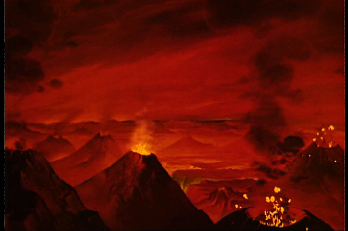
Prior to the discovery of the book we were able to figure out a few of the effects. One Disneyland show, in fact, recreated the bubbling lava scene from the Rite of Spring sequence.
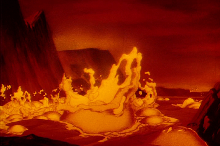
Josh Meador recreated the slow motion shoot of the
boiling concoction used to develop the bubbling lava.
However, the book revealed so much more than we’d understood
about how the superb effects had been crafted.
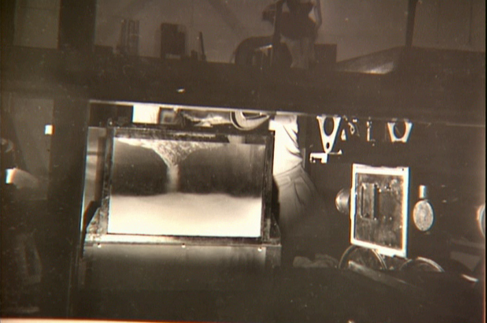
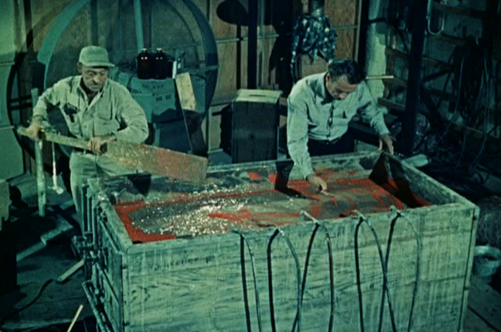
Using a vat of water, they were able to
drop ink into the liquid and film it in slow motion.
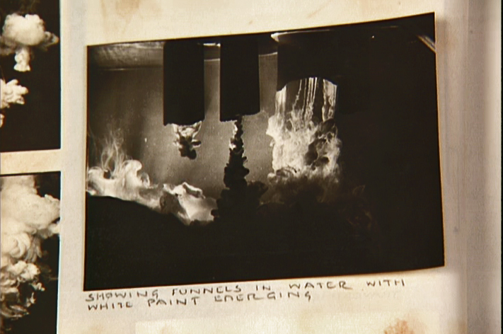
A photo of the ink spilling into the water behind built-in mattes.
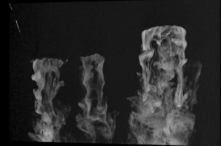
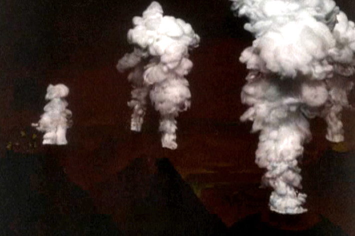
Taking the shot of the ink, they then turned it upside-down.
They then superimpose the “smoke” (or ink) over the volcanoes.
This same effect was used in Close Encounters of the Third Kind
to create clouds when the alien ships were moving in on the
farmhouse where the boy and mother lived.
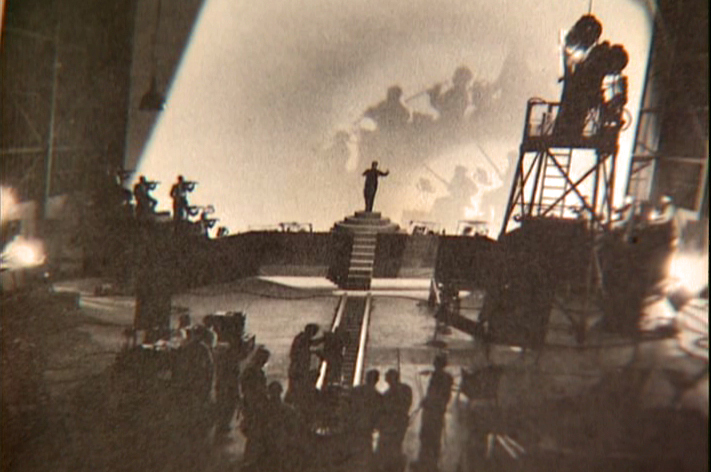
The orchestra was shot on a set with strong, planned shadows.
All these shots were orchestrated and planned for color effects.
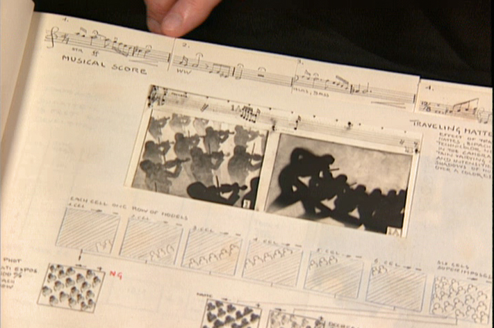
They were also catalogued by Schultheis who kept close
track of the music, as well, in his book. You can see a
page by page breakdown of the score at the top of the page.
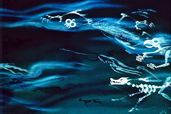
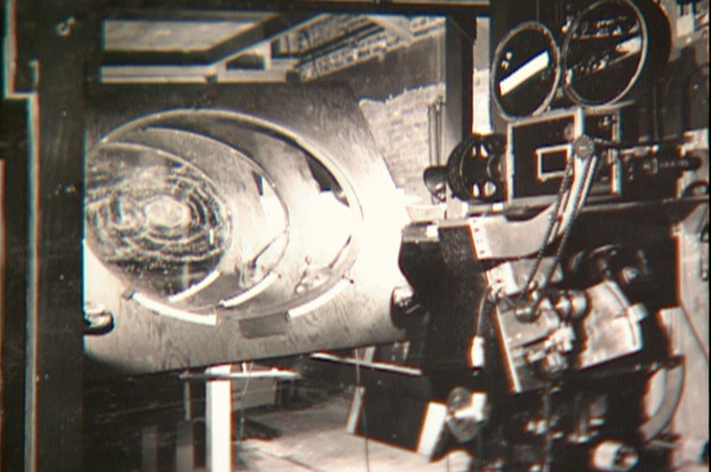
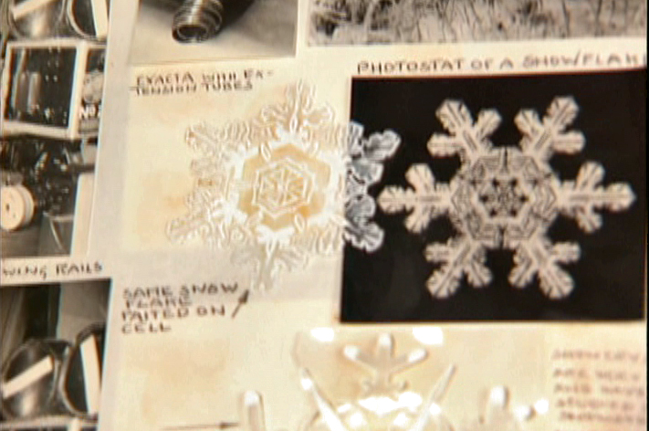
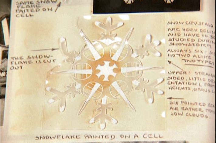
You can see the highly polished sheet of metal (middle left) which reflected
and distorted the animation drawings. This is what the camera photographed
in some of the scenes during the Night on Bald Mountain sequence.
It was also used for the fire in Bambi.
 1
1 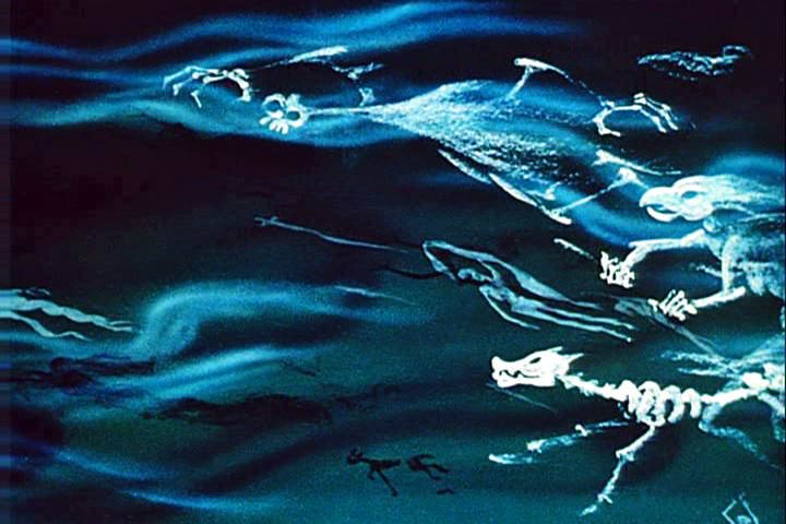 2
2
This scene’s ghosts were shot using that distorted metal reflection.
 2a
2a 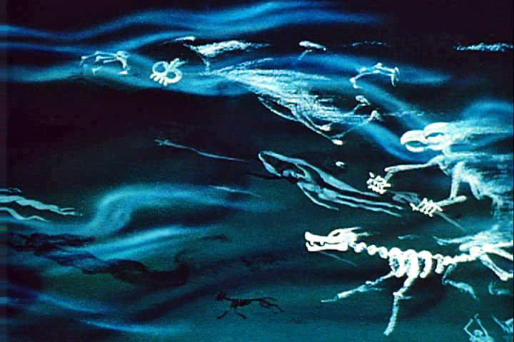 3
3
The ghosts also used a form of cross dissolve.
John Hubley explained to me how that was done, and
we used the technique in Everybody Rides the Carousel.
 4
4 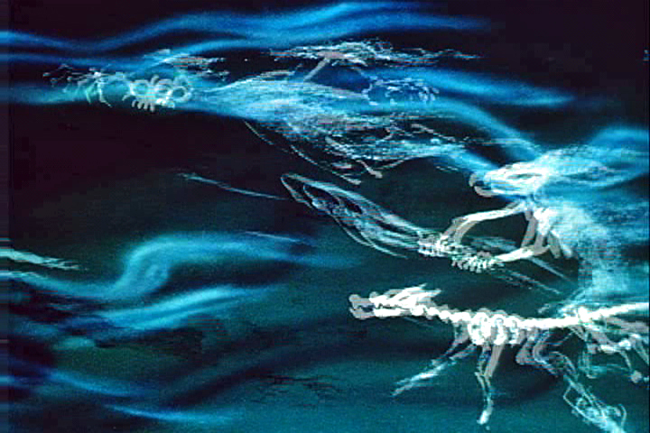 4a
4a
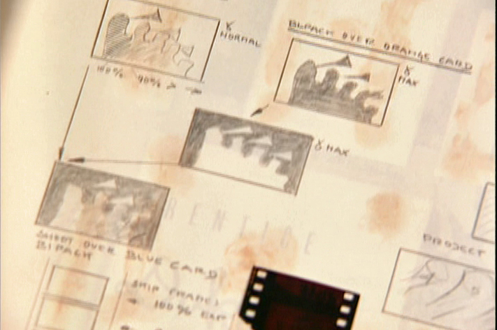
They shot the entire scene at 50% exposure. Then they went back
to the beginning and reshot the entire scene again at 50% exposure.
 5
5 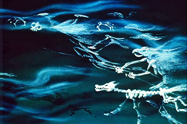 6
6
However on the second shoot, they started by shooting a black frame.
This made #1 fall where #2 should have been, #2 for #3 etc.
This creates a ghostly dissolve effect.
 6a
6a 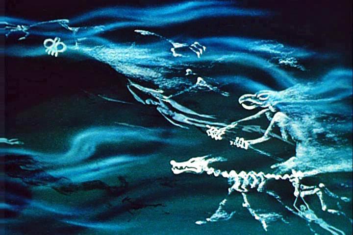 7
7
All of the drawings labelled with an “a” are the double exposures:
2a, 4a, 6a
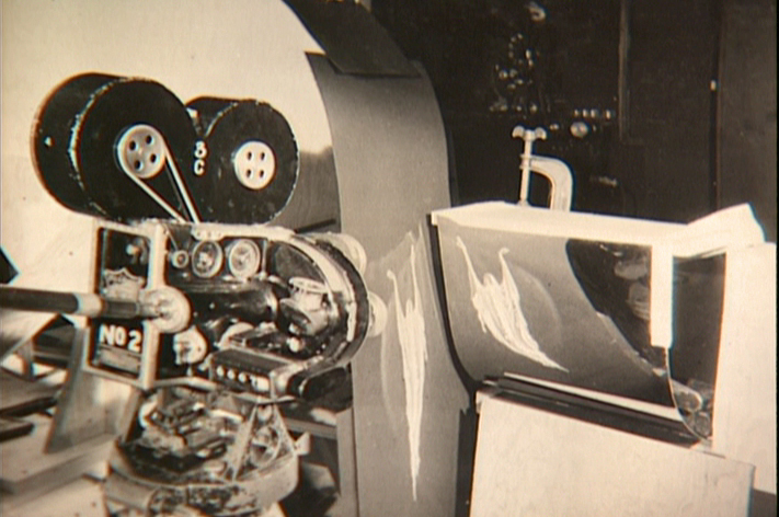
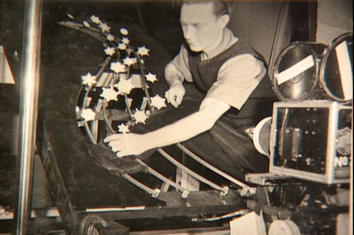
A make-shift circular multiplane camera was built.
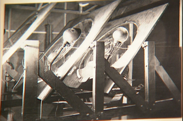
Created out of wooden sheets with holes cut out,
placed so they could shift angles, they were designed to
allow revolving artwork in the circular cut outs.
This allowed shooting scenes such as this shot of
a spider web as the camera moved around it
while dew glistened off of it.
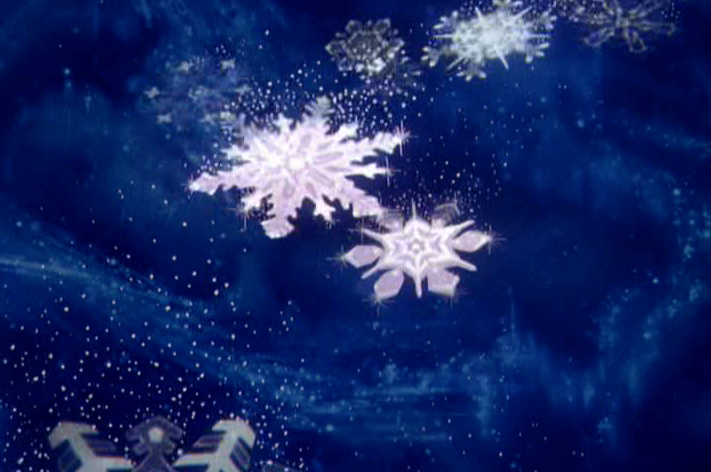
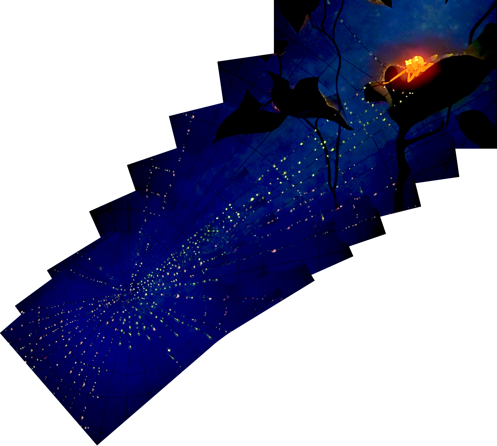
The spinning snowflakes are well explained in Schultheis’ book.
The snowflakes had a detailed construction.
The path of action was intricately defined.
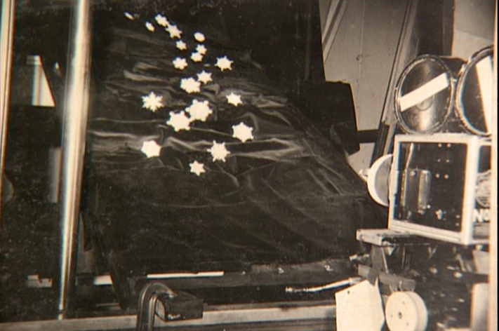
The snowflakes were shot against a sheet of
black velvet hiding the wire guides.
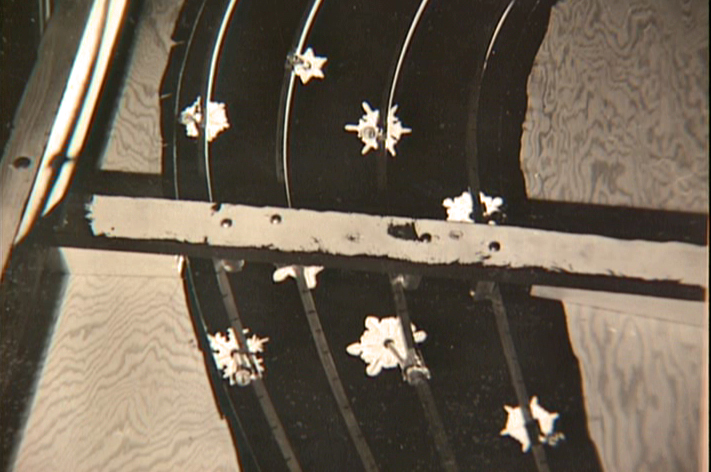
They were shot in tight closeup. From below you can
see the turning gears they were constructed on.
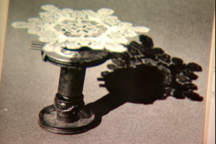
Each snowflake was built on a turning gear
so that they could revolve in their path of action.
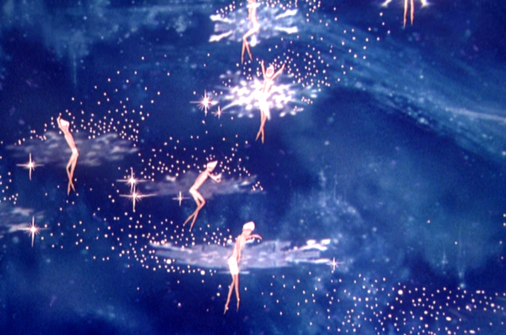
Burn these snowflakes over the multiplane background
and add matching 2D animated fairies within each snowflake,
and you have the finished scene.
Animation &Animation Artifacts &Bill Peckmann &commercial animation &Layout & Design &Models 17 Aug 2012 06:23 am
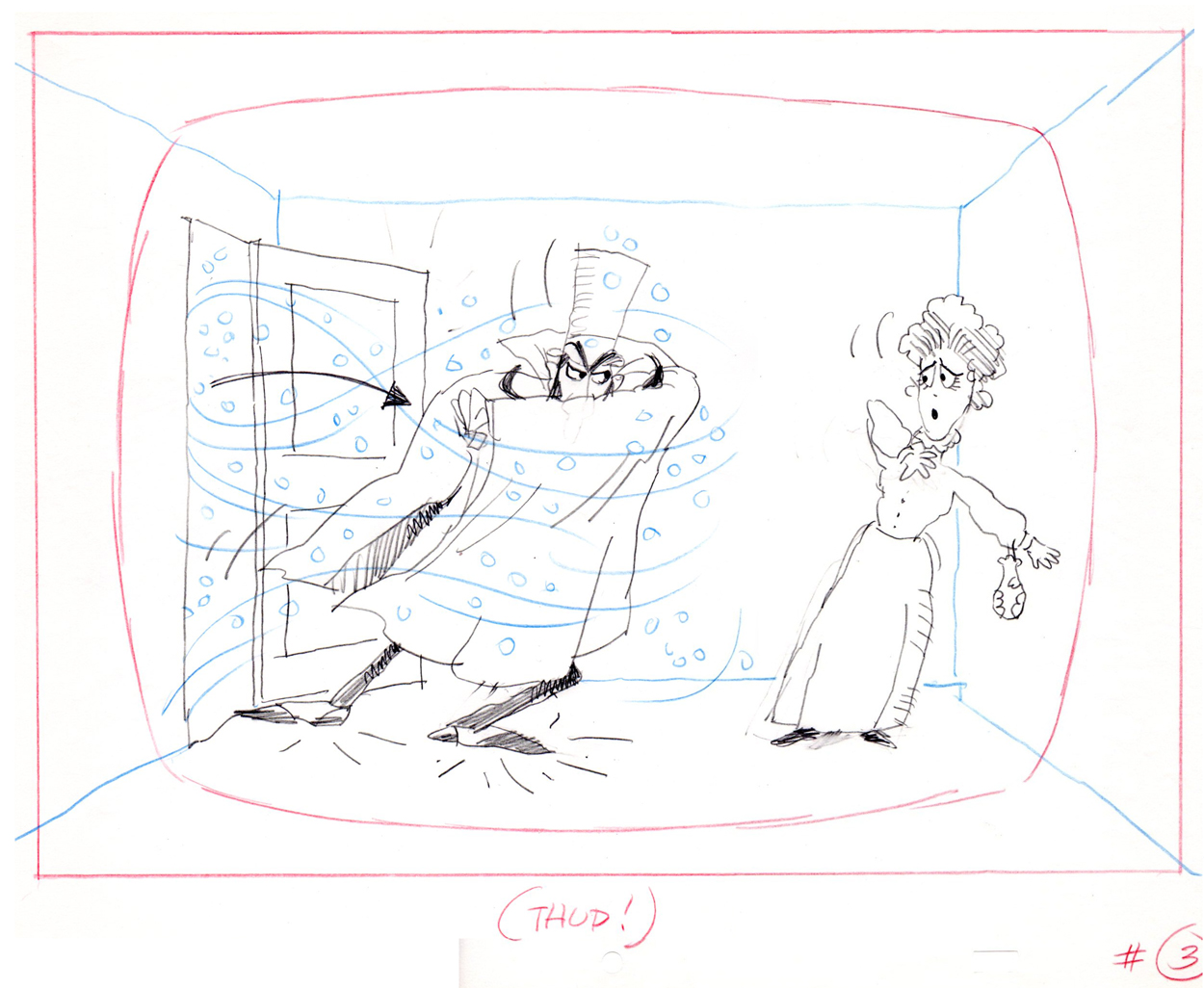
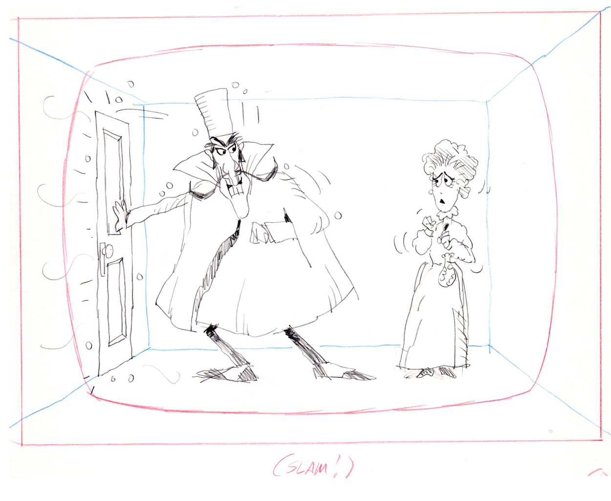
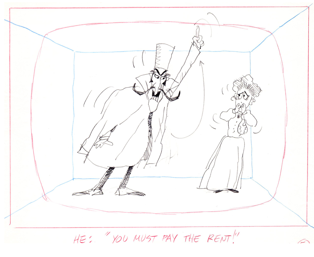
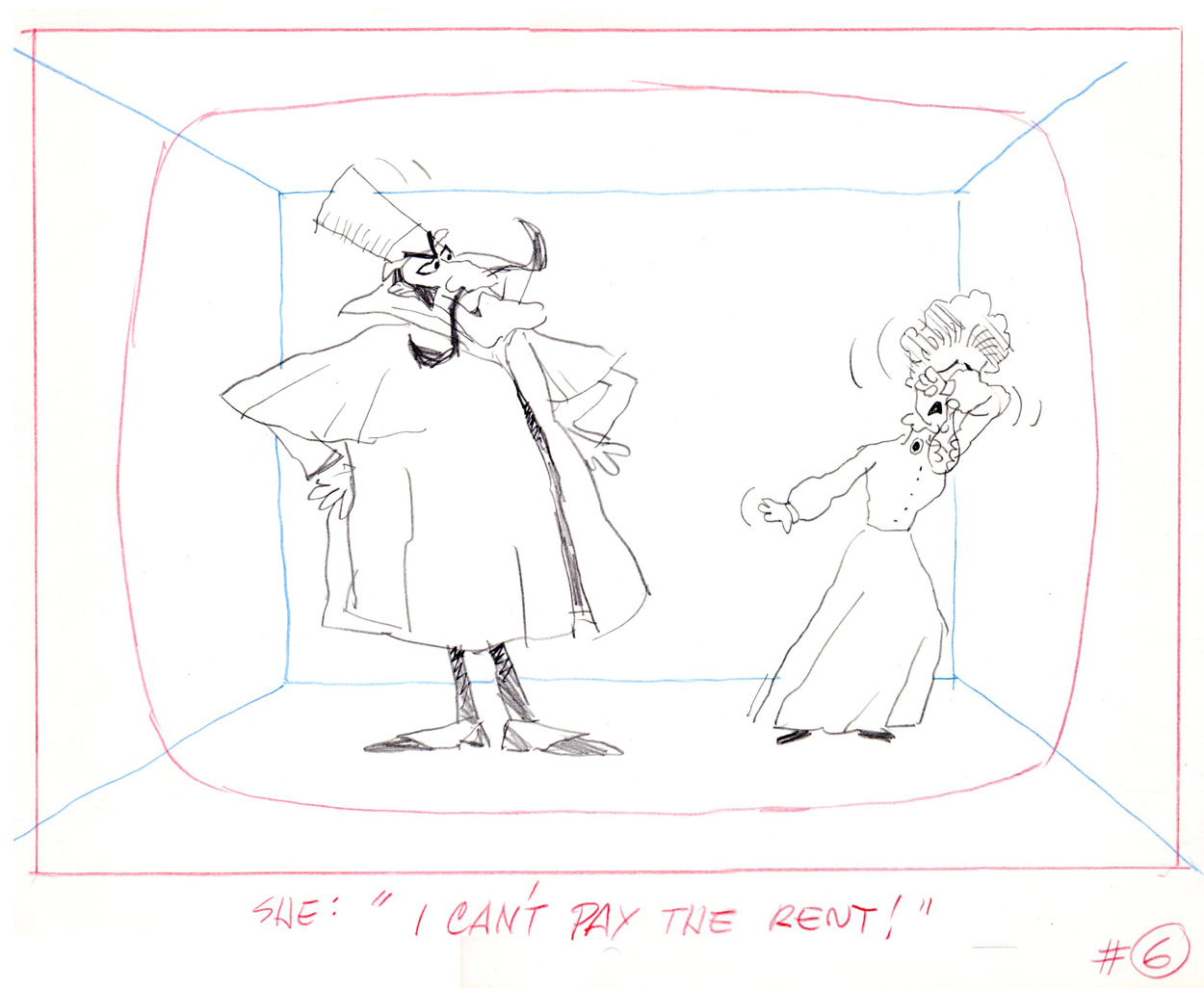
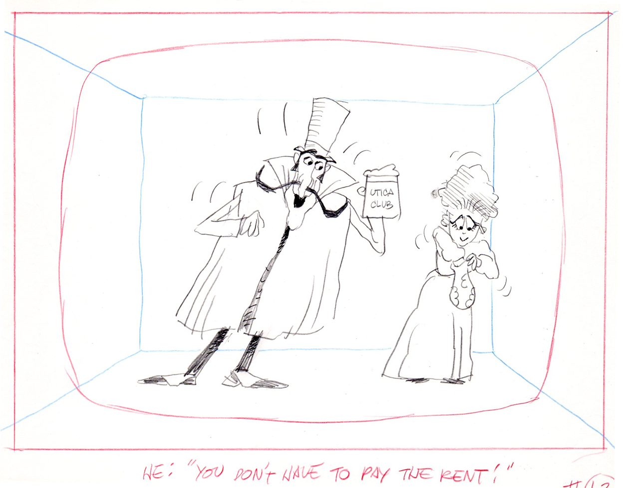
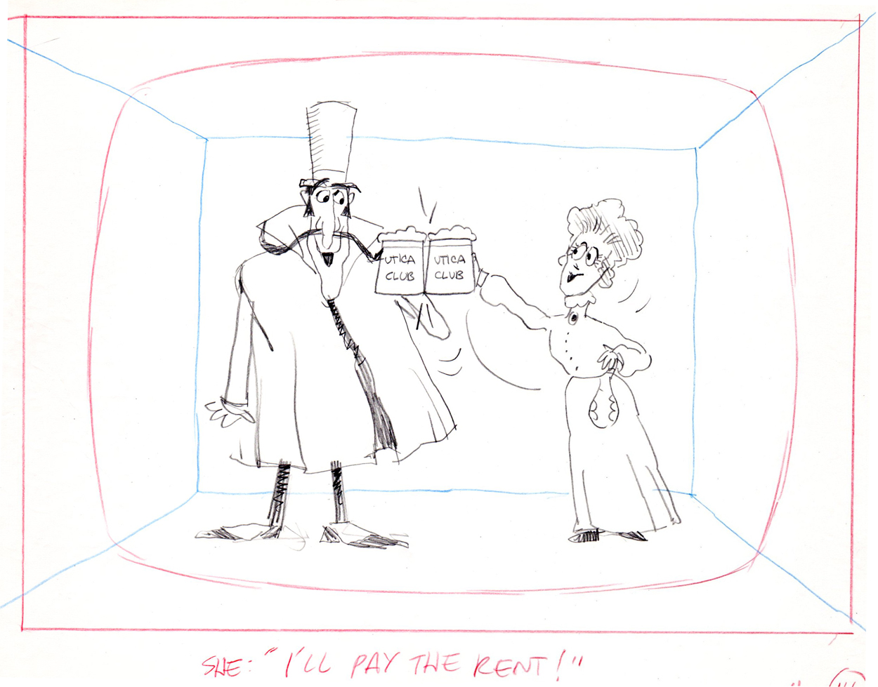
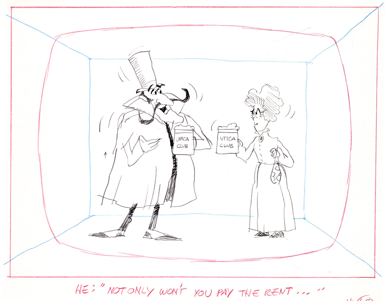
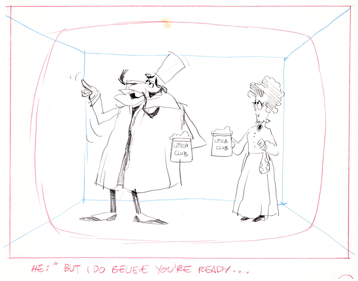
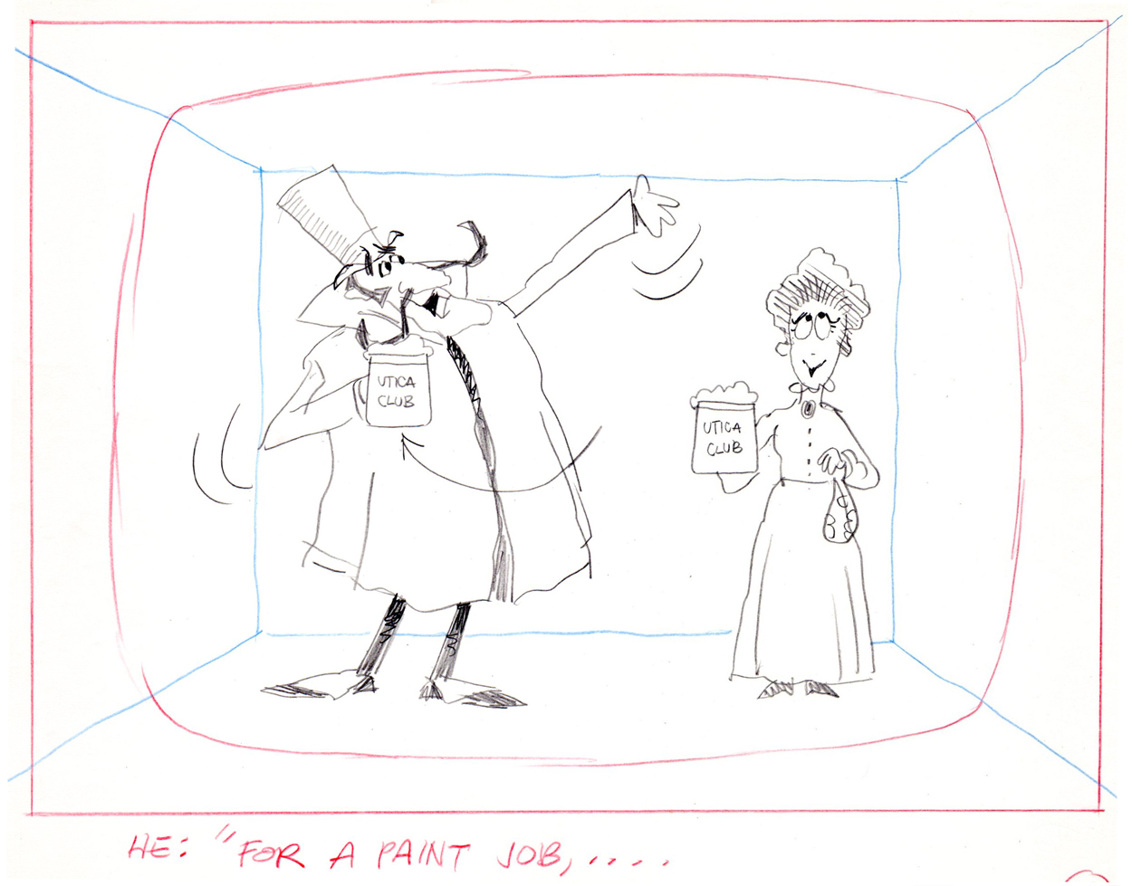
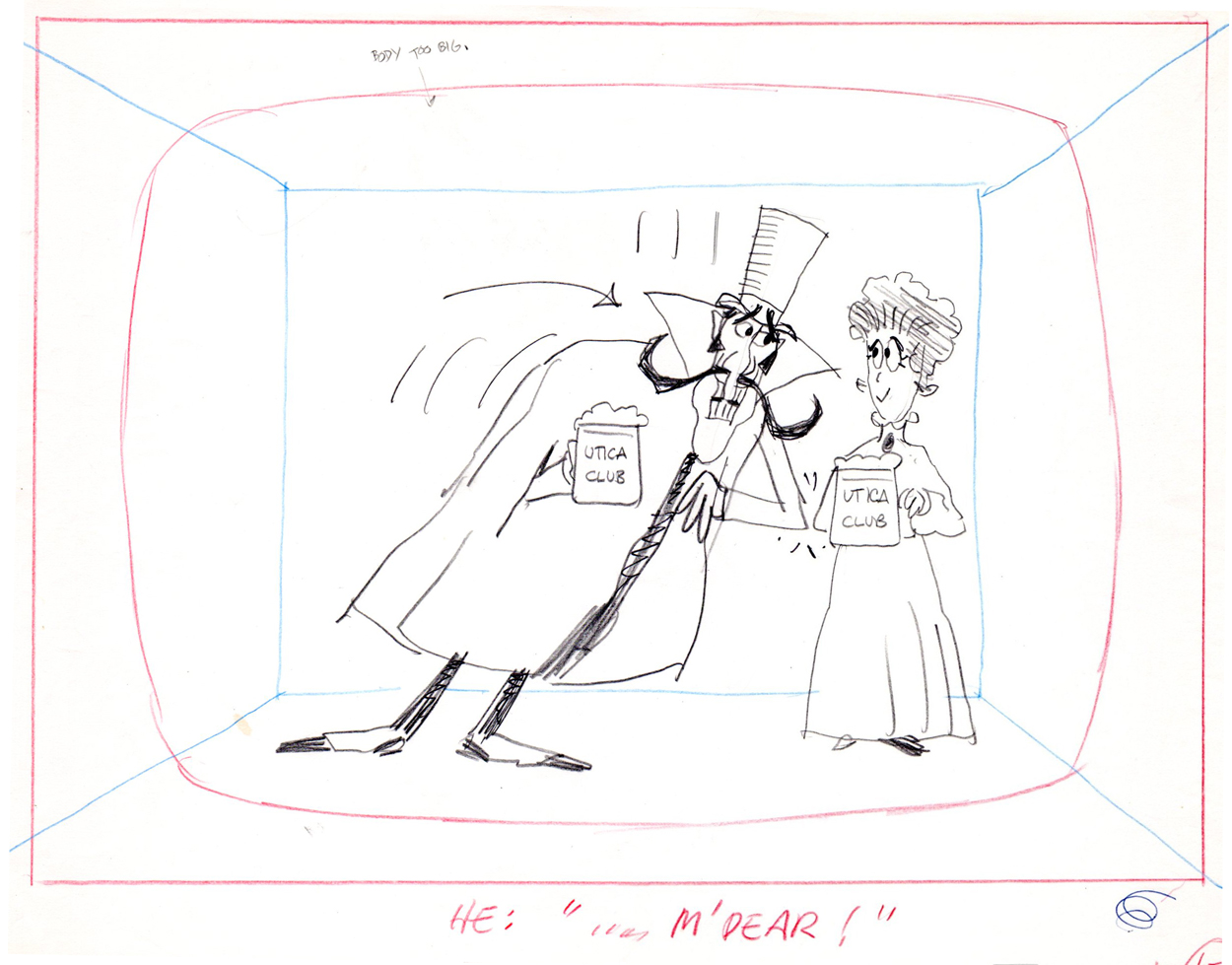
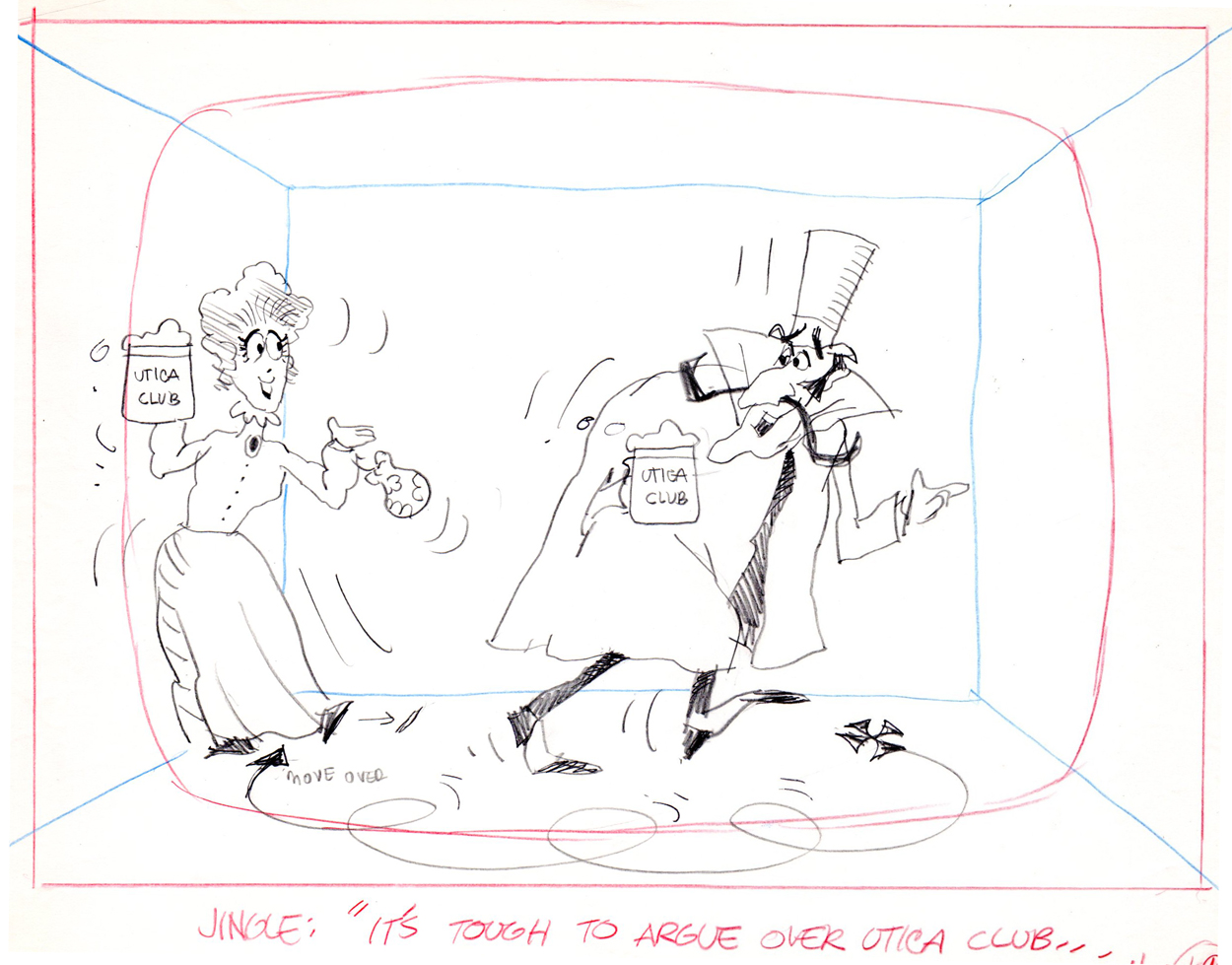
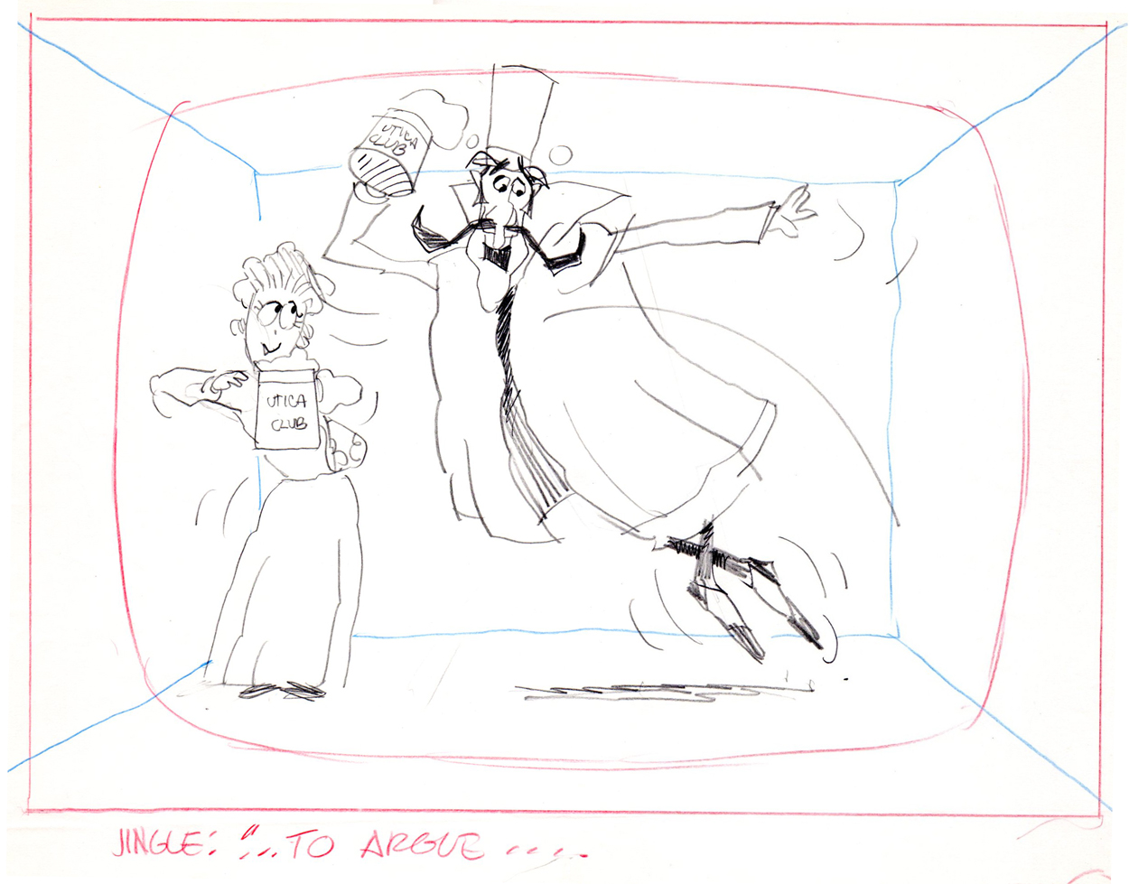
Peckmann & Schnerk’s Utica Club
Another spot on Jack Schnerk‘s reel was Utica Club’s ‘Landlord’. Here with the little bit of art that I have from that commercial, I will try to illustrate some of the steps that went into making the film.
Here is the ad agency’s concept art.
Here’s my tweaking of the agency art design.
This is a cel color model against a line version of the bg.
Next will be my first six rough layout drawings of the spot.
 1
1
 2
2
 3
3
 4
4
 5
5
 6
6
 7
7
 8
8
 9
9
 10
10
 11
11
 12
12
 13
13
 14
14
 15
15
 16
16
 17
17
 18
18
 19
19
 20
20
 21
21
 22
22
The following are animation key drawings by Jack Schnerk.
 1
1
 2
2
 3
3
 4
4
 5
5
 6
6
 7
7
 8
8
 9
9
 10
10
 11
11
 12
12
Once when we were doing designs for a soap bubble character, Jack took a break from animating to do these quick sketches. They are full of life, like all of Jack’s work.
 1
1
 2
2
 3
3
I hope for those who were fortunate enough to work with Jack, his drawings will bring back some good and happy memories, they do for me!
You can watch this spot on Jack Schnerk Sample Reel 2 starting at 3’01″.
Animation Artifacts &Models &Photos 15 Aug 2012 05:13 am
Another Vince Cafarelli Miscellany
- I continue to weave through the boxes that make up the collection of animation art assembled by Vincent Cafarelli. This week I have anothe rmix of artwork; these pieces were all xerox copies (sometimes copies of copies.) I’ve tried to make them all presentable having to photoshop out some of the schmutz that came with old copiers. Since these are all models and pieces from the 30′s, I thought it worth the trouble.
Let’s start with the mix of models:
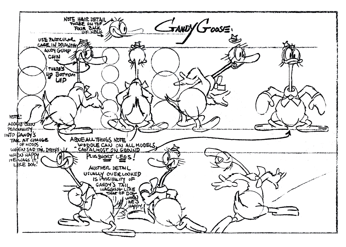 1
1Gandy Goose a Terrytoon character. Not the best quality copy.
 2
2
Cubby Bear, an early Van Buren character
 3
3
Parrotville, another Van Buren product from their last years
 4
4
Another Parrotville model sheet
 5
5
I have no idea where this character was created,
though I’d bet on Van Buren.
 6
6
A Fleischer character to play off Pudgy
 7
7
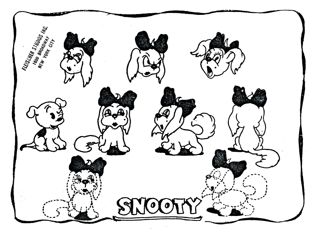
Another kind of Fleischer dog.
 8
8
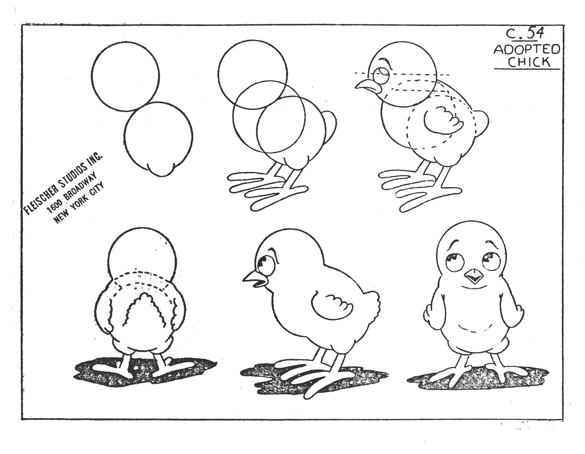
A Fleischer chicken
 9
9
A typically racist character from Fleischer’s ethnic types.
Here’s a copy of the program from the Paramount theater in New York on their premiere of Gulliver’s Travels.
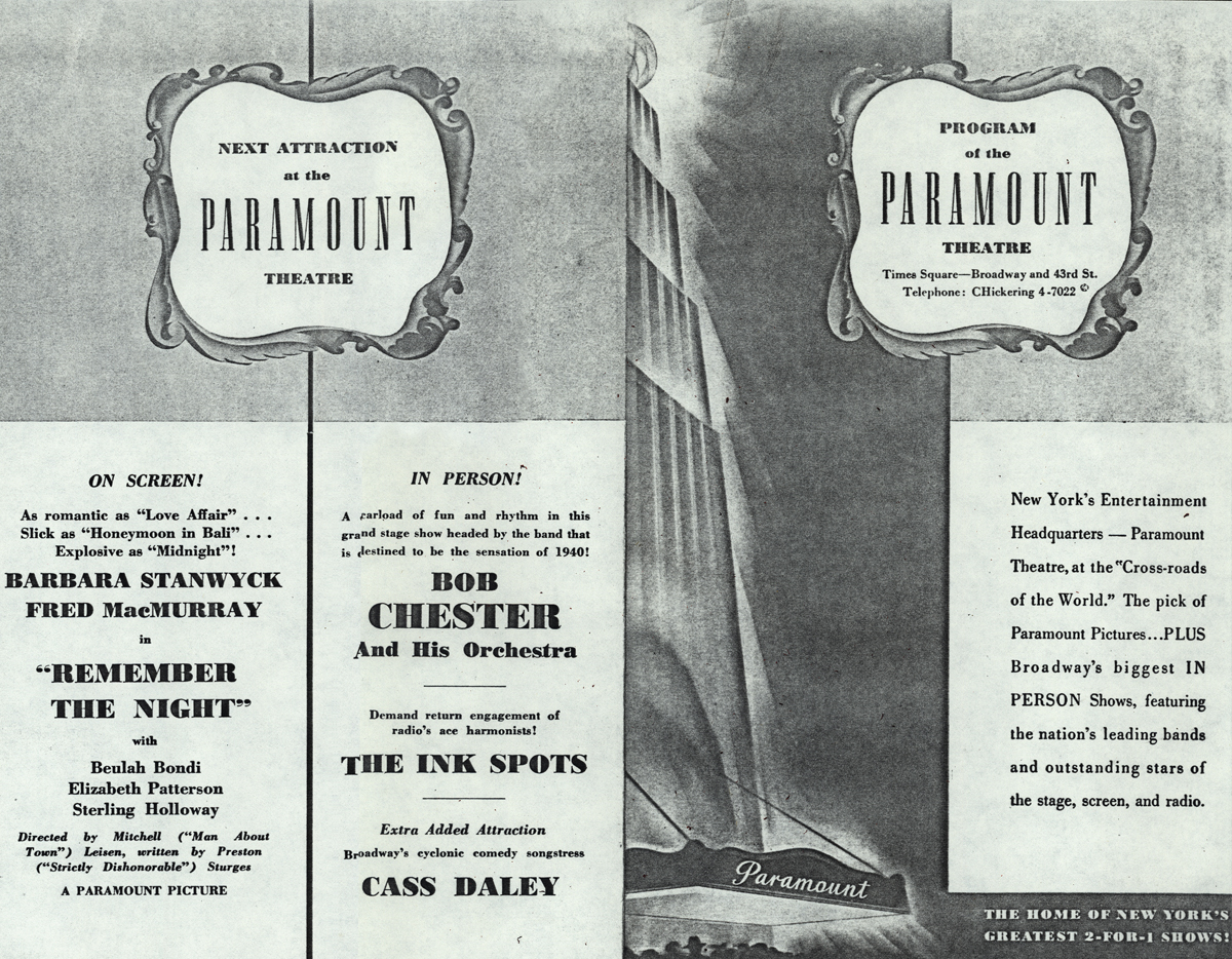
First the outside pages (folded in the center)
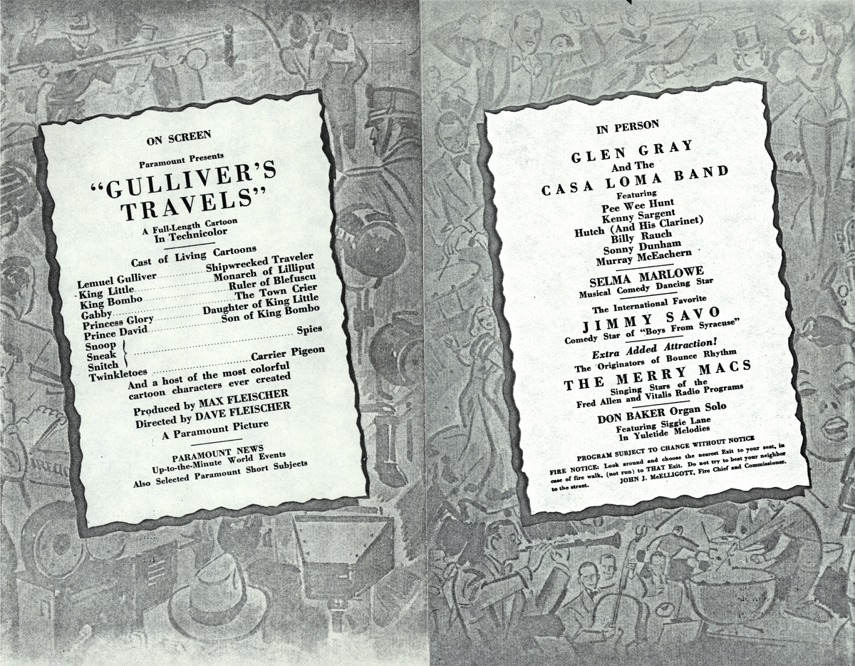
Then the inside pages.
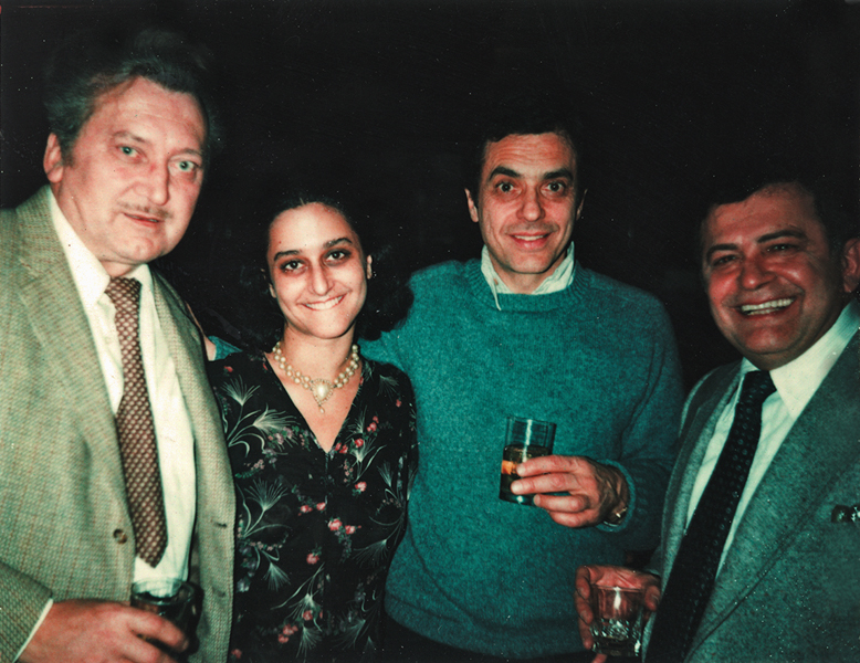
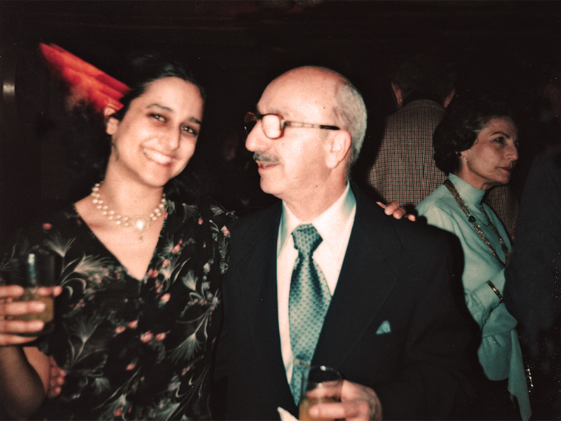
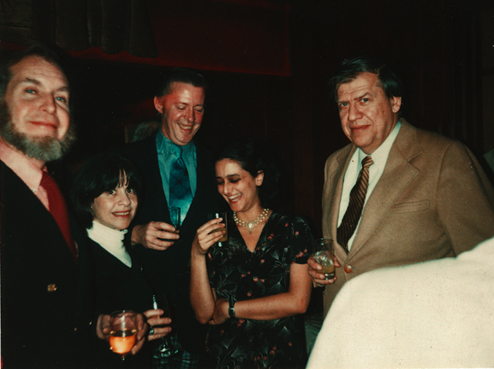
To add to the post, I thought I’d throw a random group of photos taken over the years with Vince and Candy at Perpetual Motion/Perpetual Animation or Buzzco.
Nick Tafuri’s party for animators
(LtoR) Jan Svochak, Candy Kugel, Vinnie Cafarelli,
And u-nion rep Gerard de Salvio.
Candy Kugel and Johnny Gentilella and Mrs. Tafuri
(LtoR) Howard and Iris Beckerman, Doug Crane, Candy Kugel and Ed Smith
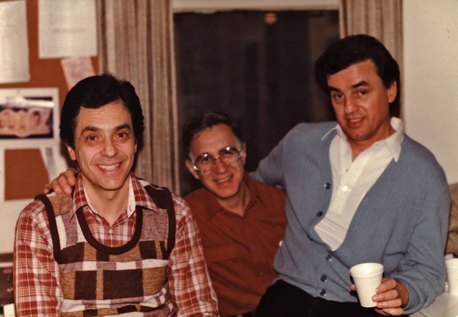
Perpetual Motion Pictures:
(LtoR) Animators Vinnie Cafarelli, Jack Dazzo and Vinnie Bell
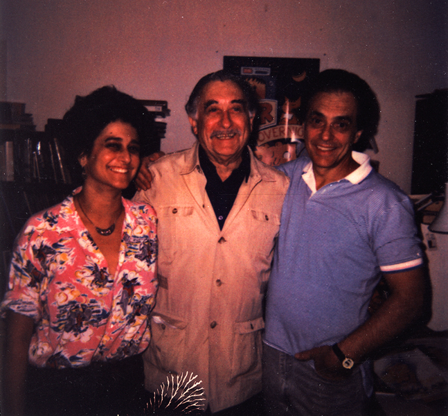
Buzzco: (LtoR) Candy Kugel, Lu Guarnier, Vinnie Cafarelli
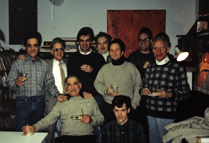
Buzzco: (LtoR standing) Vince Cafarelli, Jack Dazzo, Vinnie Bell,
Jan Svochak, Arnie Levin, John Lopez, Max Seligman
(seated) Lu Guarnier, Bryon Moore
Some NY animation Academy members:
Vince Cafarelli, Candy Kugel, Jimmy Picker,
Frank Mouris, me and John Dilworth
Animation &Animation Artifacts &commercial animation &Layout & Design &Models &Story & Storyboards 08 Aug 2012 07:00 am
Vince Cafarelli Grabbag
- Today we have a mix of odds and ends from Vince Cafarelli’s collection of animation artwork. We start with some artwork from the commercial studio in NY in the 1950s-60s.
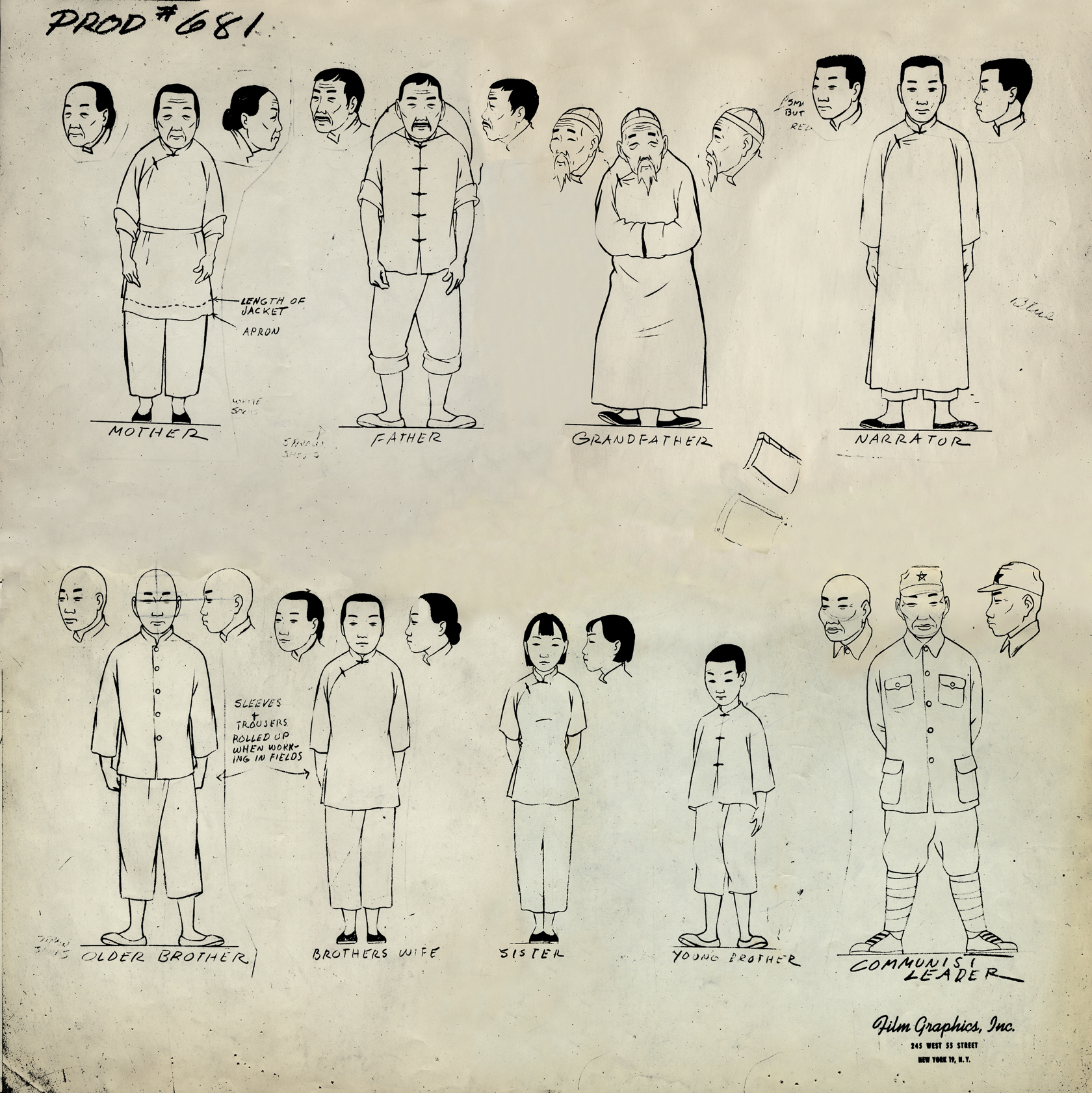 1
1This is a model sheet for something done
at Film Graphics. No doubt it’s not a commercial
but probably some kind of Educational film.
 2
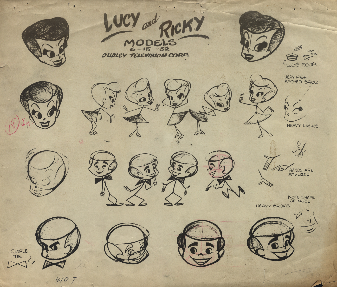
2
This is a model sheet for the opening titles to
the “I Love Lucy” show. My guess is that
this also comes from Film Graphics.
 3
3
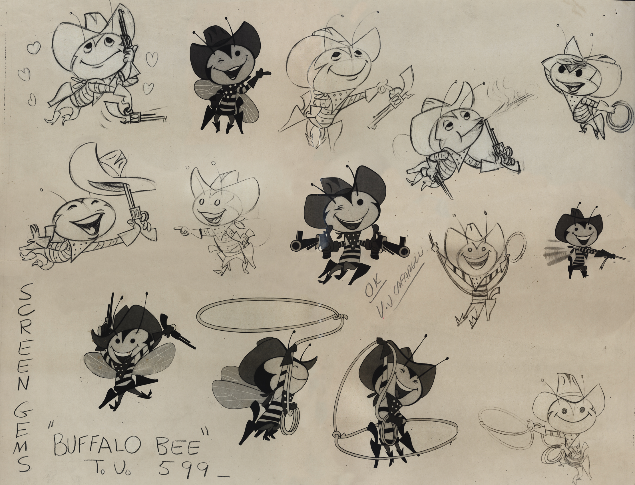
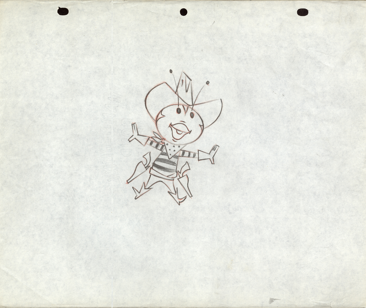
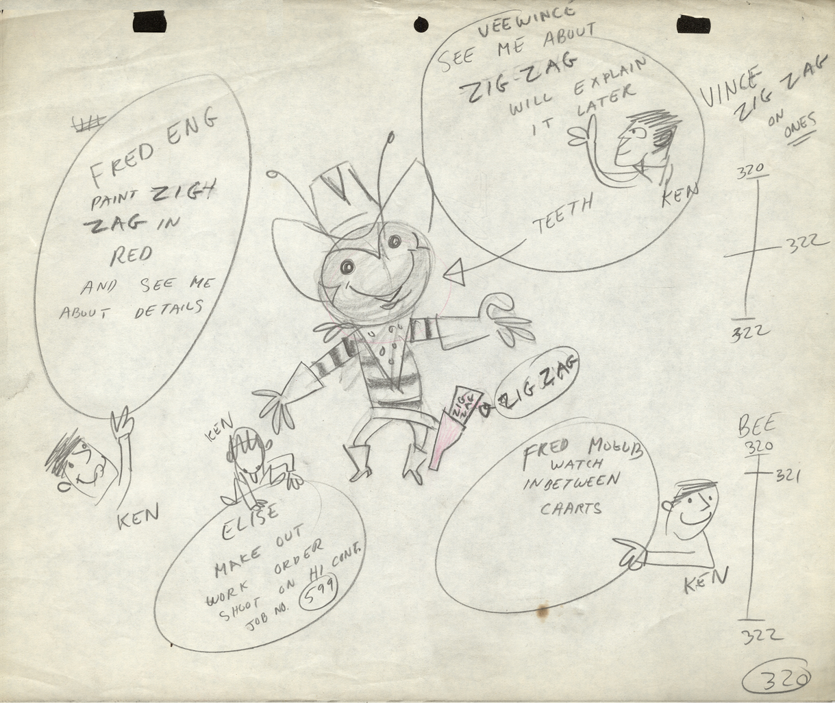
The Buffalo Bee model sheet for the Nabisco
Wheat Honeys commercials. Mae Questel was the voice.
This was probably done for the Gifford Studio.
 4
4
 5
5
 6
6
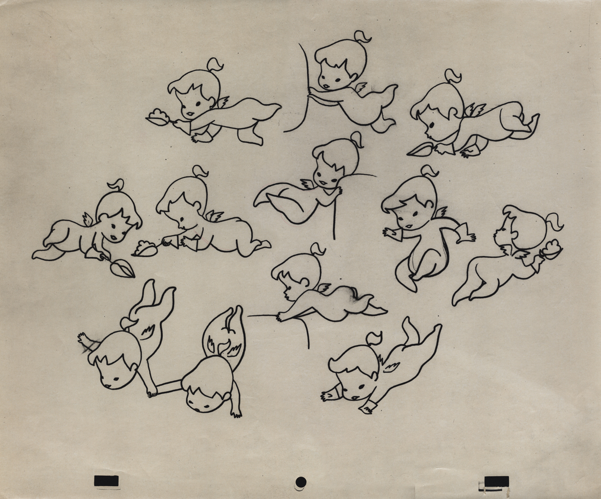
A model for a little angel. I assume this is for a
paper product commercial. Again, I think it’s the Gifford Studio
 7
7
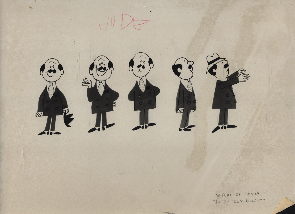
A turn-around model for a Mutual of Omaha commercial.
Again, since it’s with other Gifford Studio material I’d guess the same.
 8
8
Here are two bear drawings from some commercial.
It looks like Dick Williams’ Cresta Bear (only this was
done years before that.)
9
The three round peg holes is certainly unique.
Fleischer used a similar system for a wile as did
Krantz Studio on Fritz the Cat.
I don’t know where these are from.
 10
10
I’m sure this comes from the Gifford Studio.
 11
11
An interesting design. I assume it’s from a spot.
Peg holes look like the Gifford Studio.
 12
12
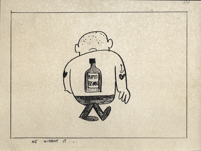
A storyboard drawing for a Pepto Bismol commercial.
UPA had this account for a long time.
The following three drawings are two animator’s drawings (#106 & 108) and one Inbetween (#107). I believe the animator is Frank Endres; the inbetweener is Vince Cafarelli. For some reason I think this is from a Little Lulu cartoon directed by Bill Tytla, but I can’t vouch for that. I’m sure one of you visitors will let me know how wrong I am, and I welcome it.
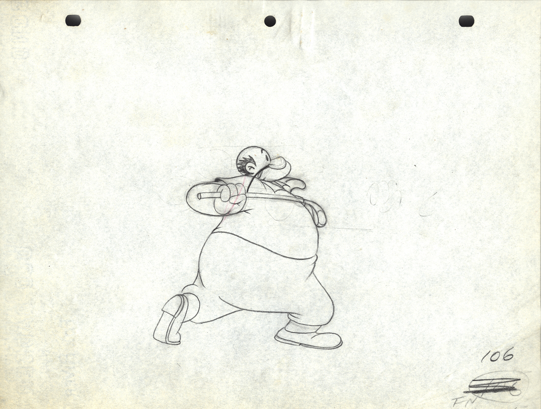
Drawing # 106 – animator’s drawing
I’m surprised at how small the paper is; not quite 8½ x 11.
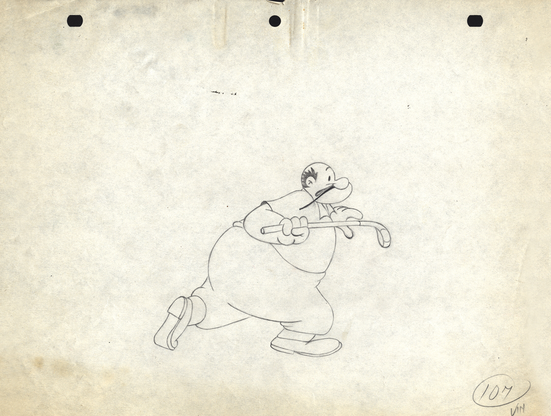
Drawing # 107 – inbetweener’s drawing
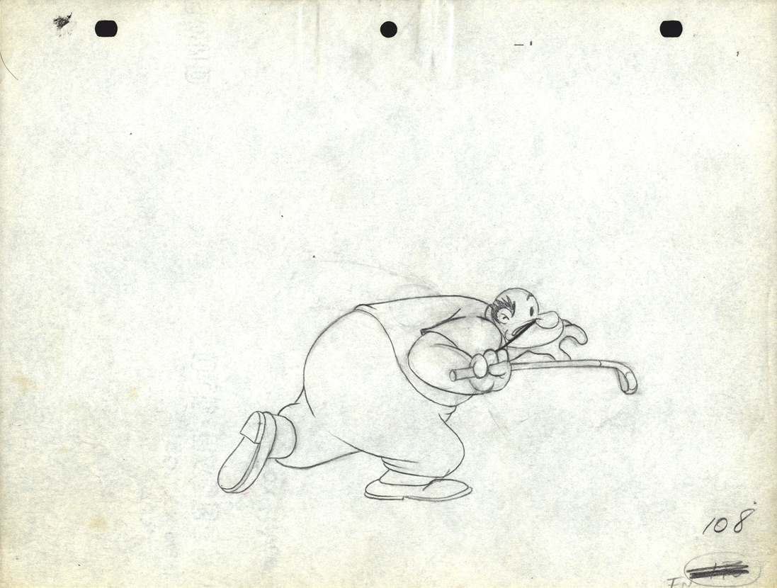
Drawing # 108 – animator’s drawing
The peg holes are Signal Corps.
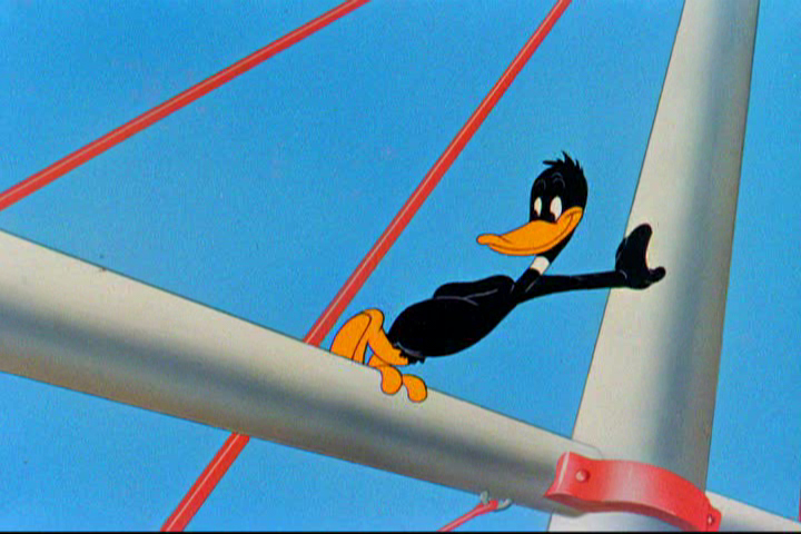
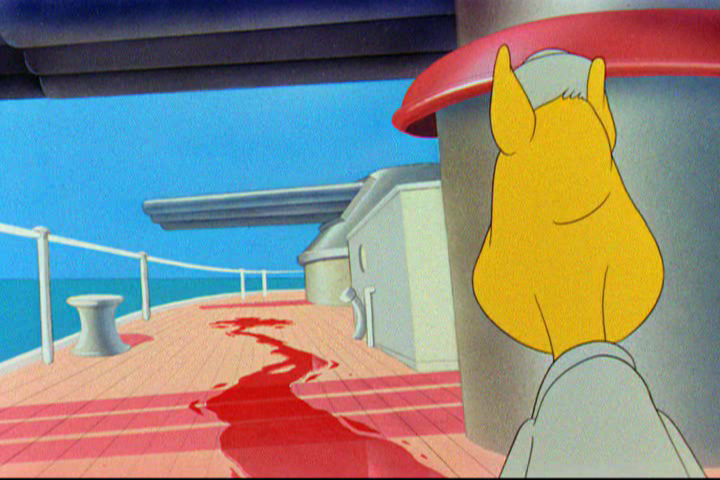
Animation &Animation Artifacts &Chuck Jones &Frame Grabs &Layout & Design &repeated posts 06 Aug 2012 06:38 am
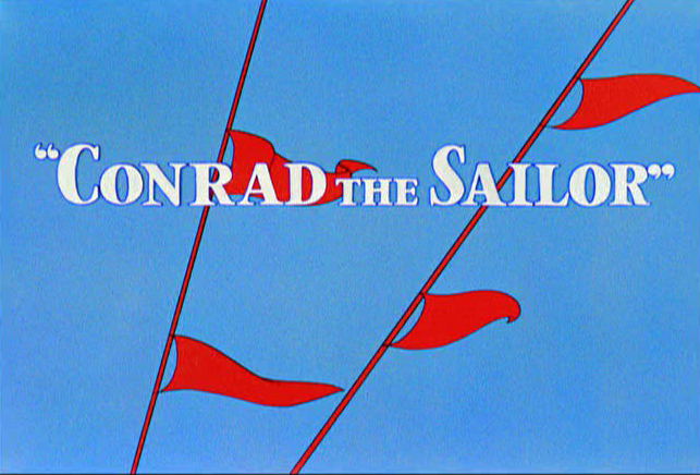
Conrad – again
I repeat this post for good reason. This is one of the prime films John McGrew planned for Chuck Jones, and the work is just dazzling. However, to our eyes it hardly looks unusual. Many of the tricks here were done for the first time, and others are so seamlessly done that we hardly notice them. It just looks like another War cartoon from WB. It ain’t.
It’s special.
 - Regulars to my blog know that I’m a big fan of the work of John McGrew. He was a designer/Layout Artist working in Chuck Jones’ crew at Warner Bros. in the late Thirties/early Forties. His work was daring beyond compare, and, I think, with support from Jones, he changed the look of modern animation backgrounds.
He designed the seminal film The Dover Boys as well as amazing pieces like Aristo-Cat, Inki and the Lion and Conrad the Sailor.
In an interview conducted by Greg Ford and RIchard Thompson, Chuck Jones was asked about McGrew’s style: 
- Q: What about John McGrew’s style and approach, as compared with Noble’s?
A: John McGrew didn’t really have a style; he was experimenting all the time. Maurice does have a style. John McGrew, you might say, was more of an intellectual. You could be intellectual, and get away with it— but if you’re solely intellectual as a director, you weren’t going to get away with it. The result was, however, that he goosed me into thinking that it might be worthwhile to try some different things with backgrounds and so forth. And later on, I would find this kind of thing very useful, in that often it would make your gag work, and sometimes you wouldn’t even know why. Like that little abstract background at the end of Duck Amuck, with the sharply angled lines going off.
Today I’d like to feature some frame grabs from Conrad the Sailor. Where I could, I separated the characters from the backgrounds to just feature the Bgs. My guess is that the Bgs were painted by Paul Julian, but they were planned by McGrew.
The one scene I don’t illustrate is the most original in the film. Daffy is shot into the air with a bullet. (illus #18) The camera does a 360° turn to head back to the ship. The Bgs don’t hold up on their own. Lots of blue sky and wisps of cloud. It works in motion.
Of this short & McGrew, Jones says:
- . . . we used a lot of overlapping graphics on that particular cartoon so that one scene would have the same graphic shape as an earlier scene, even though it would be a different object: first we’d show a gun pointing up in the air, then in the next shot, there’d be a cloud in exactly the same shape. It gave a certain stability which we used in many of the cartoons after that. John McGrew was the artist responsible for that sort of thing. Conrad was also the one where we used the first complete 360° turn, when the characters went up through the air.
For more information read Mike Barrier’s excellent interview with John McGrew.
 1
1(Click any image to enlarge.)
 4
4
 5
5
 6
6
 7
7
 8
8
 9
9
 10
10
 11
11
 12
12
The following BG pan can be seen in full to the left. I’ve broken it into three parts for a closer look.
 12a
12a .
.
———-(Continue scrolling down.)
.
.
.
.
.
.
.
.
.
.
 12b .
12b . 12c
12c
 13
13
 14
14
 15
15
A bicycle pan that keeps moving to the left.
 16
16
Continue moving right to left.
 17
17
 18
18
 19
19
 20
20
 21
21
 22
22
And here’s the cartoon.
Pay attention to the Layout in the sky from 6’25″ to the end.
It’s amazing.
Animation Artifacts &commercial animation &Layout & Design 01 Aug 2012 05:23 am
Cafarelli Spot Stuff
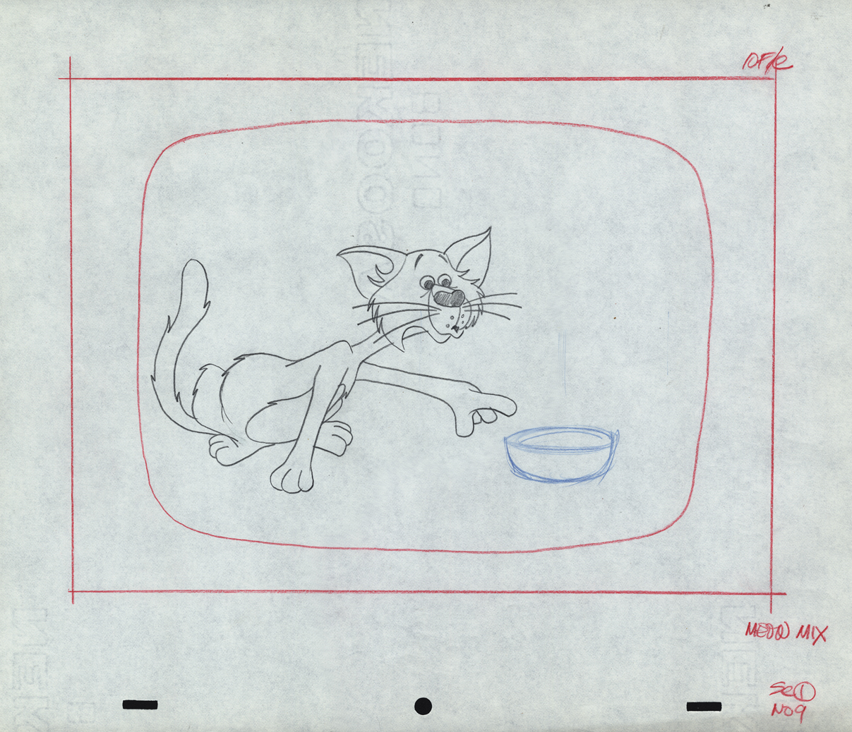
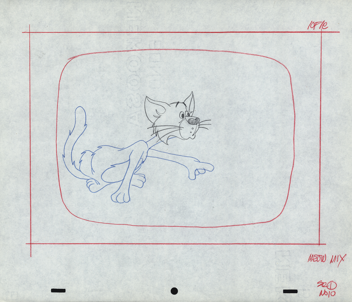
- I’ve been posting a number of drawings from commercials that Vince Caffarelli worked on. He saved many of the drawings, which are mostly Models and Layouts from these spots. Many of the older ones can’t be identified as to which studio they came from. The more recent drawings (1970 up) can be.
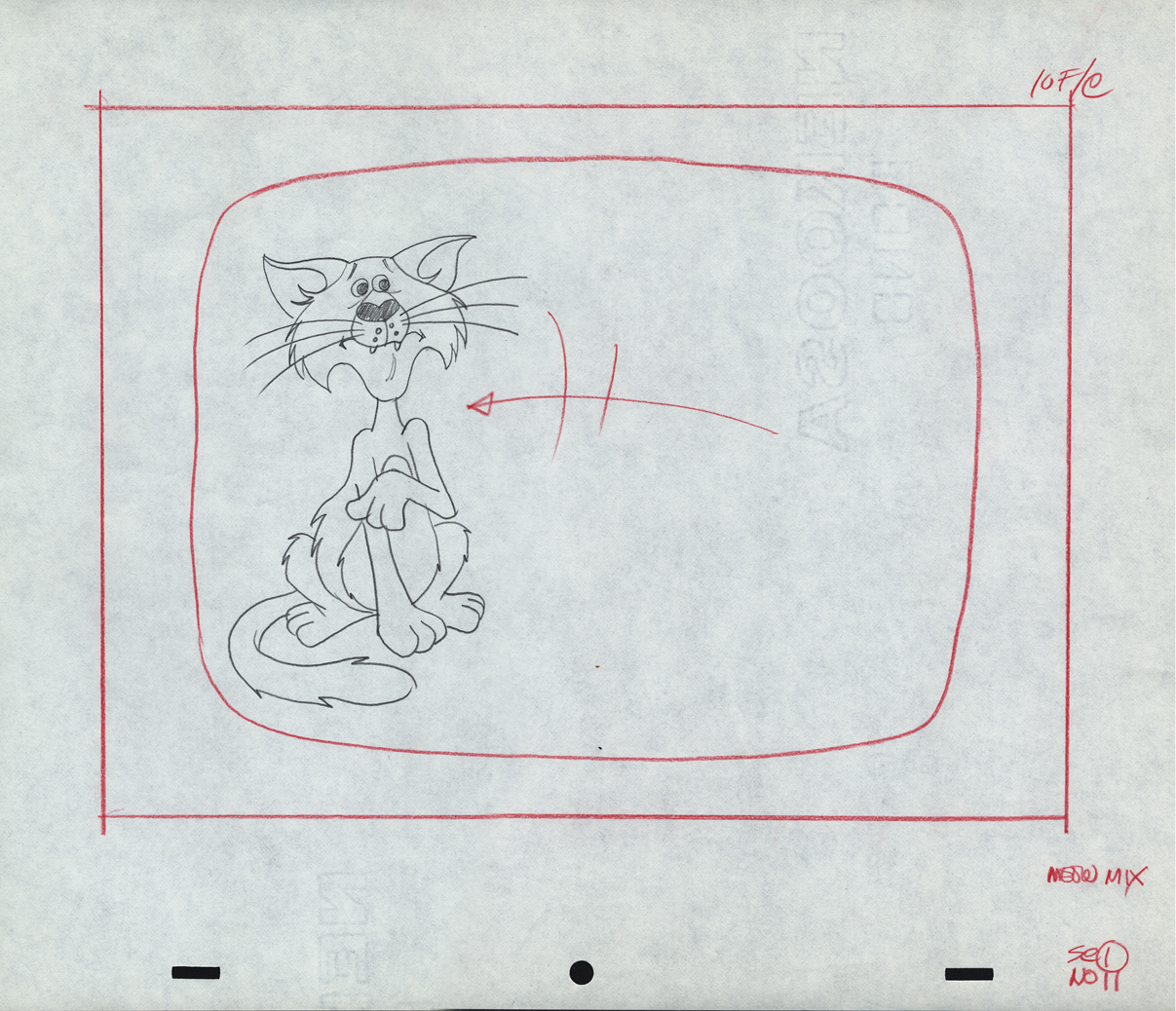
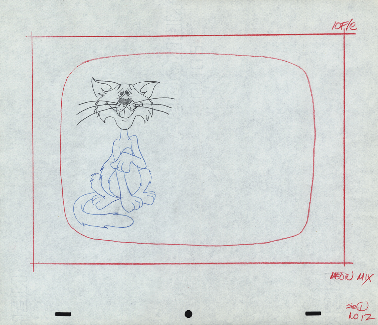
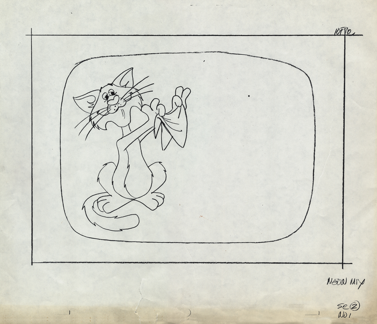
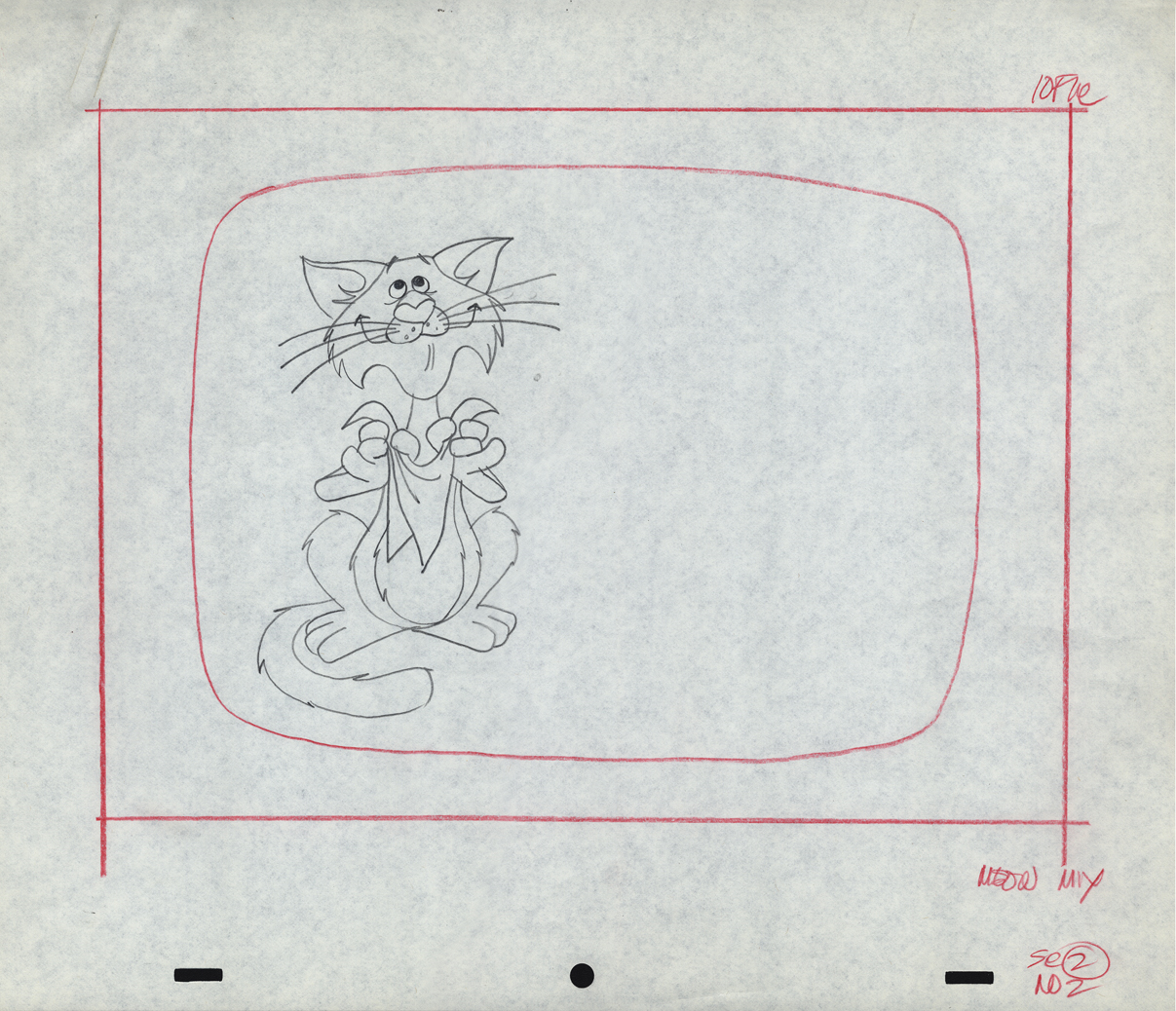
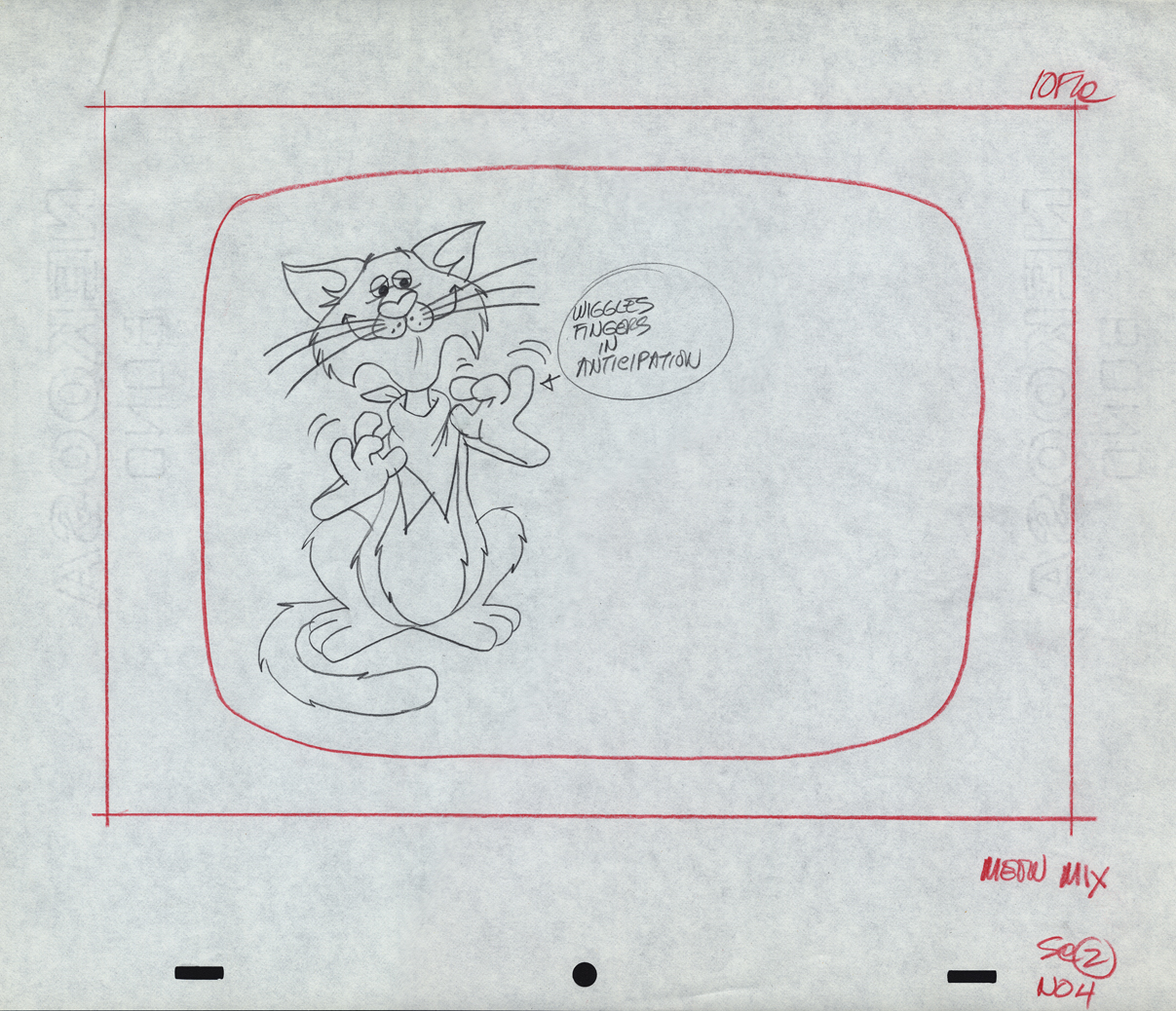
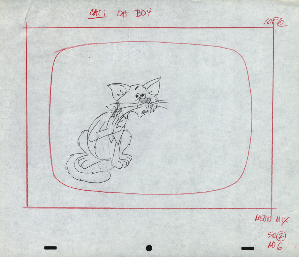
This first lare group of drawings can be classified as work from Perpetual Motion. They were drawn by Wayne Becker as Layouts and models for a Meow Mix commercial. Wayne worked in New York for many years predominantly doing Layout for many of the studios. His style, as you can see, is very tight.
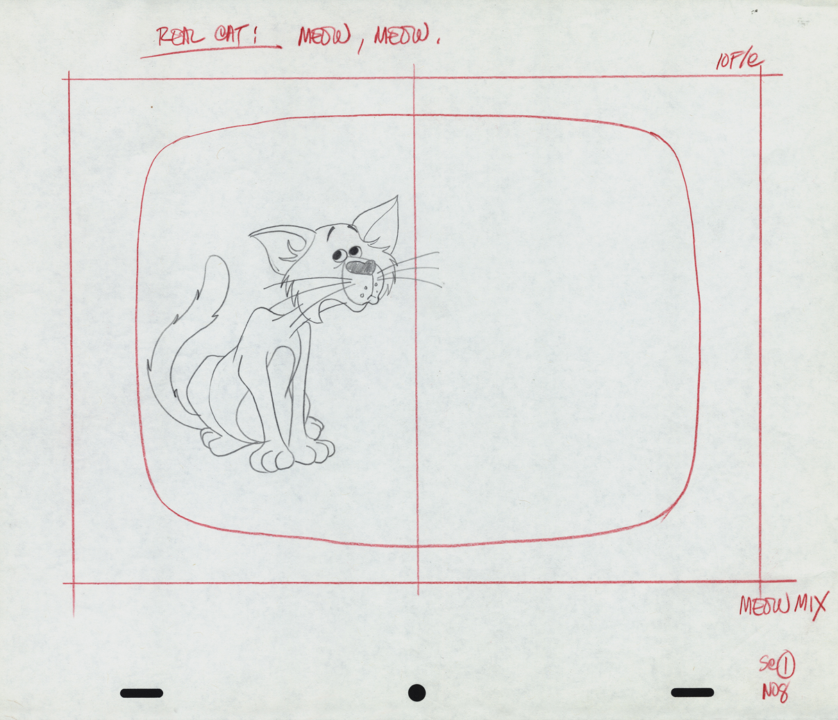
The first drawings from Scene 1 are missing. This is #08.
1-9
1-10
1-11
1-12
This starts Scene 02. Oddly this is a photostatic copy of drawing #01.
All the other drawings are pencil on animation paper.
2-02
2-04
2-06
This is an alternate version of Sc 2 – #06
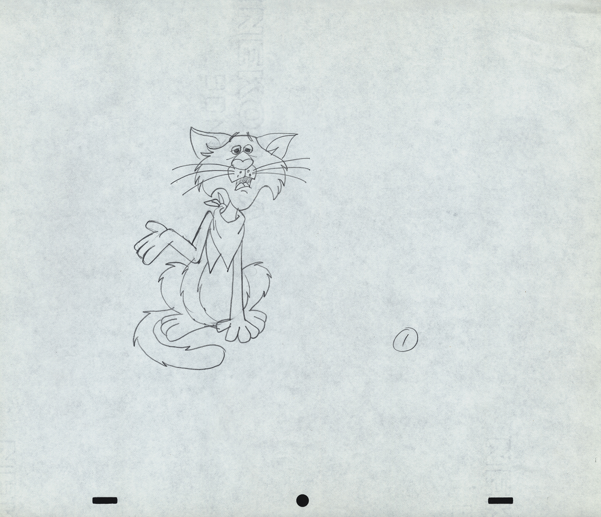 1
1
These drawings are not labelled as part of Sc. 02, but they
seem to be just an extension of the scene – additional poses.
Perhaps they changed the ending.
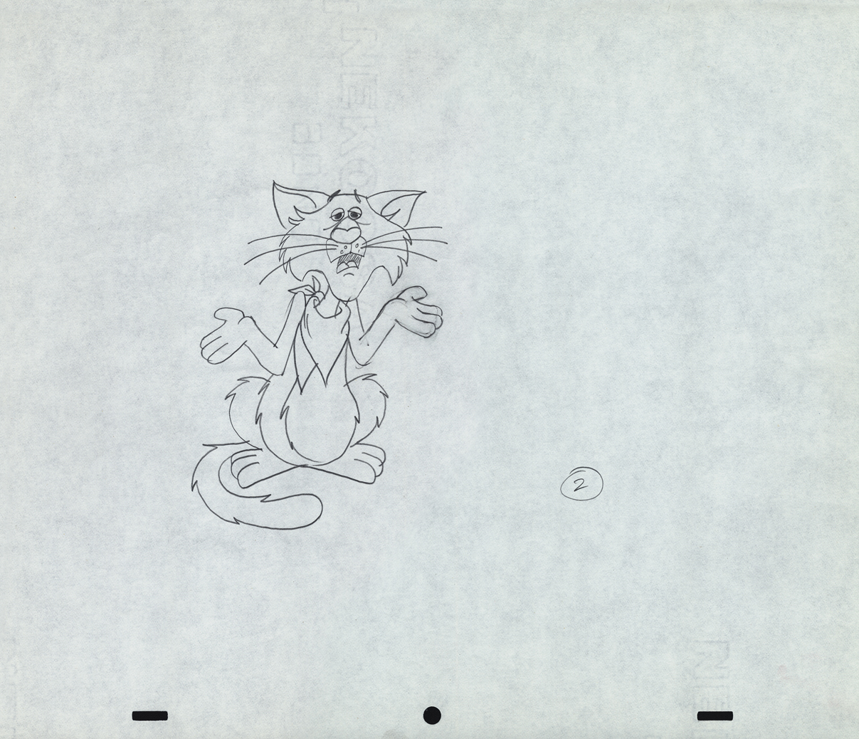 2
2
 3
3
 4
4
 5
5
Here’s a QT movie of the spot when finished.
__________________________
For a lively change of pace, here are two caricatures drawn by Marty Taras of Vince Cafarelli and Pablo Ferro. The two were inseparably close friends at Paramount where these drawings were probably made. Marty, of course, was one of the mainstays in New York, workinig at Terrytoons and Paramount, where he was the man behind Baby Huey.
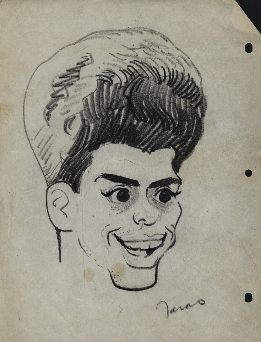
Vincent Cafarelli
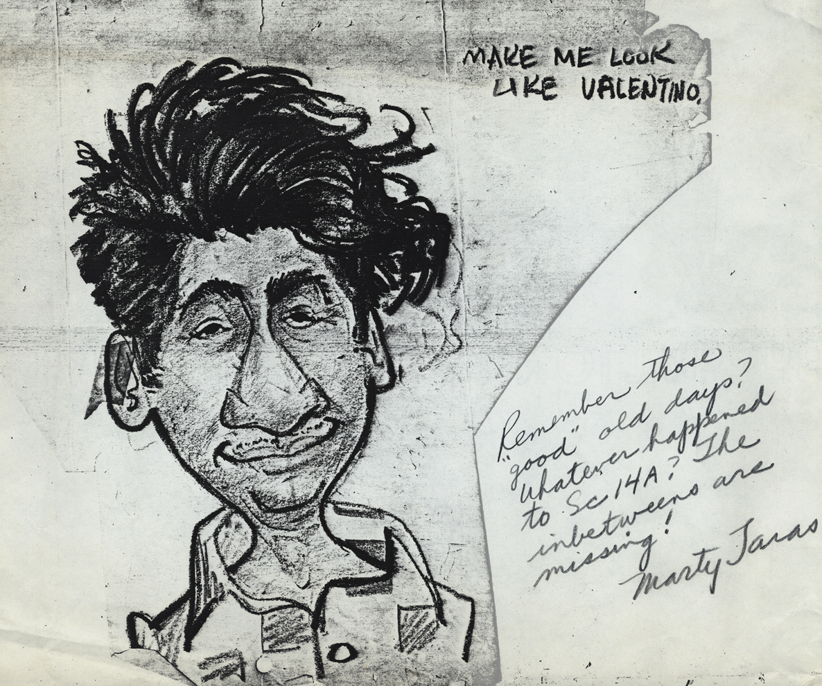
Pablo Ferro
__________________________
Finally, here are some drawings done by Dolores Cannata when “Buzzco.” was formed after “Perpetual Animation” had folded. Dolores was the daughter of George Cannata Sr. and the sister of George Cannata Jr. I met her very briefly when I was first starting out and making the rounds of the studios. My appointment was with George Jr. who liked my drawings and advised me not to be an animator but a designer.
She was a gifted designer; that’s for sure.
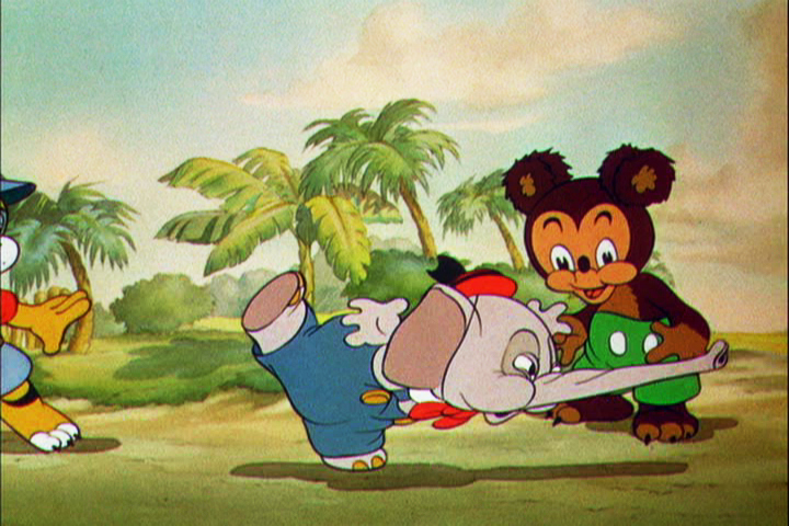
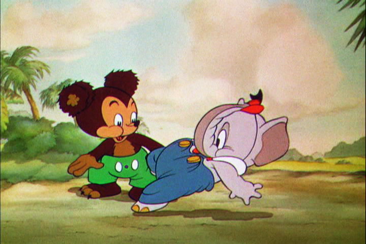
Action Analysis &Animation Artifacts &Disney &Frame Grabs &repeated posts 31 Jul 2012 05:12 am
Elmer Elephant X-Sheets – recap
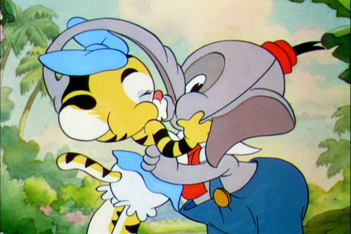
- This old post on Exposure Sheets was a popular one back in March, 2009. Today most animators work with the track and no track reading or record of the moves they’ve done. It’d be a nightmare to try to reconstruct what they’ve done in a scene. All we now have to go on is the completed scene. A lot is lost in the history of animation being done today. For that reason, I thought it’d be nice to take a look at all we can learn from one simple X-Sheet.

Robert Cowan sent me an exposure sheet that was tucked into an envelope in the Ingeborg Willy Scrapbook, which he owns. (Ingeborg Willy was an inker working at Disney’s during the 30′s and made a photographic scrapbook of her stay.)
The sheet is from the Silly Symphony, Elmer Elephant (1935).
(Click any image to enlarge.)
The film’s about a bunch of baby animals.
Elmer is the shy kid who gets laughed at by the other kids.
Eventually with the help of an old giraffe he saves the day by putting out a fire …
… and winning the girl.
This exposure sheet is about a sequence wherein Elmer is pushed across a row of animals and is poked and prodded in absolute humiliation.
Let’s review what’s on the sheet for the completely unitiated viewer:
There are several columns: Action, 4,3,2,1 and camera.
These are basic to all X-sheets. Sometimes you get 5 numerals, oftentimes you get a column for Bg. Uusaly there’s also a Track column.
Below these descriptives you have lines. Each light blue line represents one frame of film. If the drawing’s on twos or threes or more it’s indicated as in #149. Other numbers are on ones – one frame per drawing.
In the “Action” column, the director writes notes telling where he wants some action to happen. For example: the director has noted that he wants Elmer to try to stop his turn from frames 32 through 49. The animator will follow this as best as possible.
The numbered columns represent cel levels. #1 is the bottom cel and #4 is the top cel. Most sheets also have a column for the Background so you know what number Bg is called for.
The “Camera” column indicates any special camera movements or effects. There we see a pan. The Bg is moving from screen right to left. The actual amount of the physical movement is indicated on every frame. 1/2 is a half inch, 1/4 is a quarter inch etc. Pans usually slow down as they come to a stop and gear up when they start out. This is why it goes from 1/2 to 3/8 to 1/4 to 3/16 to 1/8 to 1/16 before you reach STOP PAN.
You’ll see the sound track indicated at red marked 163 top line middle of the sheet. A character is saying, “Bye Elmer.” The actual number of frames it takes is broken down for you. The animator would animate the mouth accordingly.
Here are frame grabs for the part exposed.
 1
1 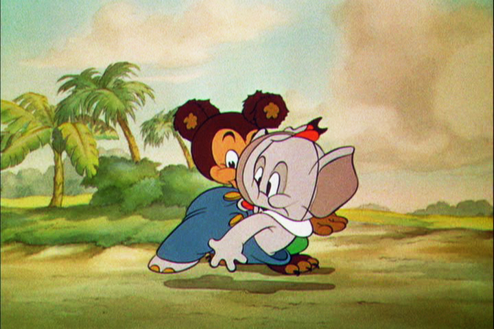 2
2
 3
3 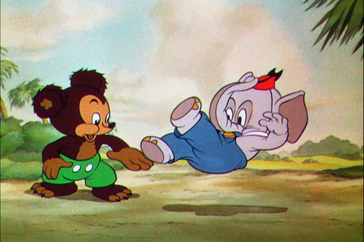 4
4
 5
5 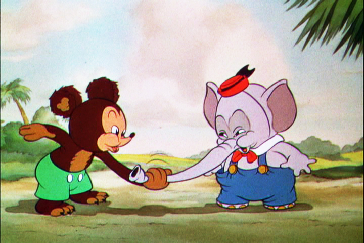 6
6
 7
7 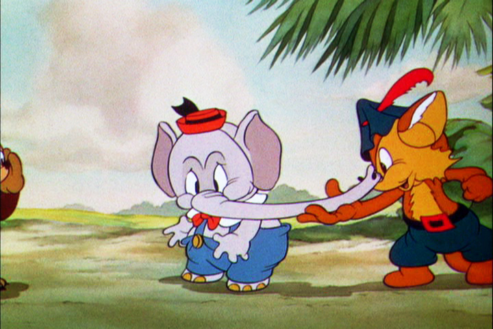 8
8
 9
9 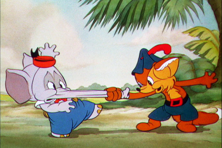 10
10
Let’s analyze the exposure sheet a bit. (For those not familiar with X-sheets, I have more of a breakdown below.)
First off, for me it’s an oddity. There seem to be two sheets combined onto the one. It’s split down the middle into two full sheets – all using only one cel level.
Secondly, there are some highlighted numbers – 160 through 165.
These fall at every 32nd frame. I’m not sure why. It’s not a foot (16 frames) or a second (24 frames). Is it a beat? I notice that the action calls for “ACC” at each of these markings. I assume it stands for “Accent” which would make that part of a musical tempo. Every 16th frame is also marked in red. This would be the only indication that this is what it is.
The pan moves are indicate in FRACTIONS ! I’m not sure why since it created a difficult transposition to decimals for the camera operator. I mean 3/8 of an inch equals what? Quickly now. Time is money. How about 1/16th? I have only met fractions which divided into 20ths. When did the change come in? John Oxberry, anyone?
Of course, some master checker would probably do the math before the scene got to camera.
Some of the drawings are exposed on twos, even for a short bit during the pan. This would be anathema in modern day animation, yet it hasn’t gotten better.
The track reading isn’t the most detailed I’ve seen, yet it does the job, doesn’t it?
The film is directed by Wilfred Jackson. I assume the “Action” column was filled out by him. I think the animation was by Paul Hopkins.
There’s a lot of information that can be pulled out from this one exposure sheet of a film done 73 years ago. Is that enough reason to advocate for continued use of the Exposure Seet?
