Category ArchiveAnimation Artifacts
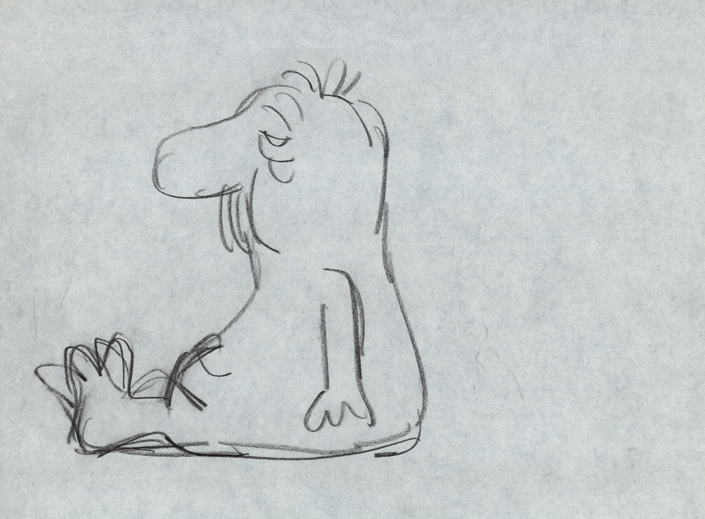
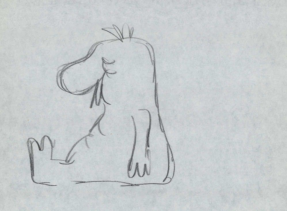
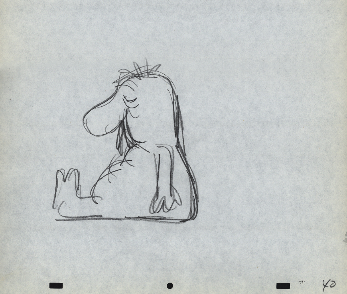
Action Analysis &Animation &Animation Artifacts &Tissa David 27 Sep 2012 06:57 am
Tissa’s Class
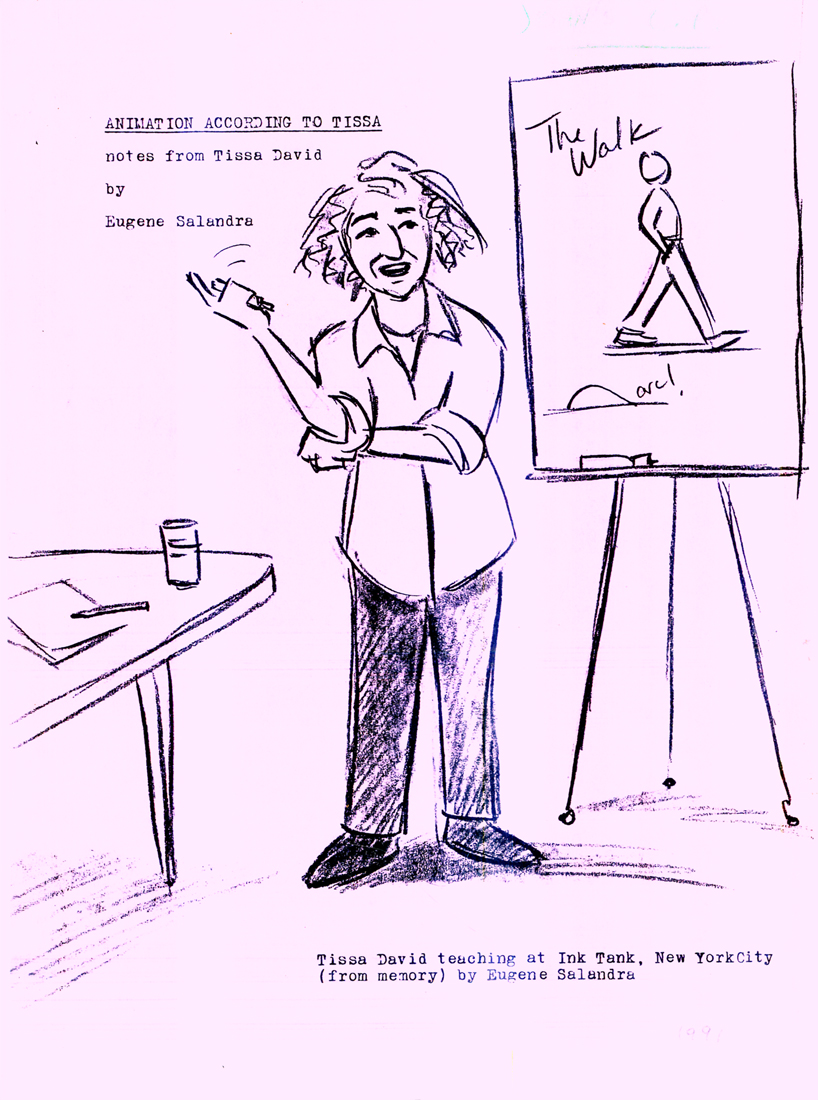
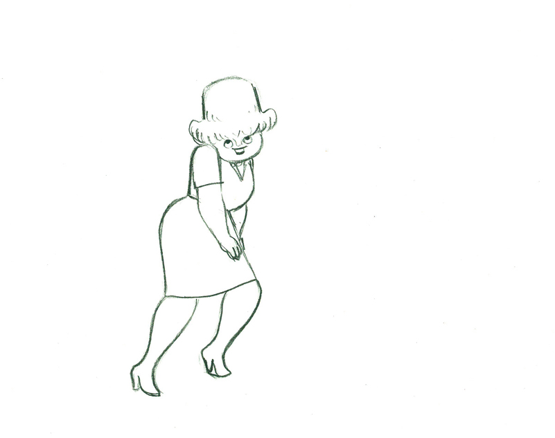
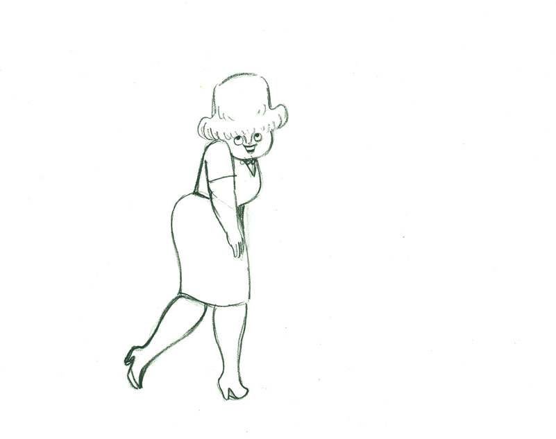
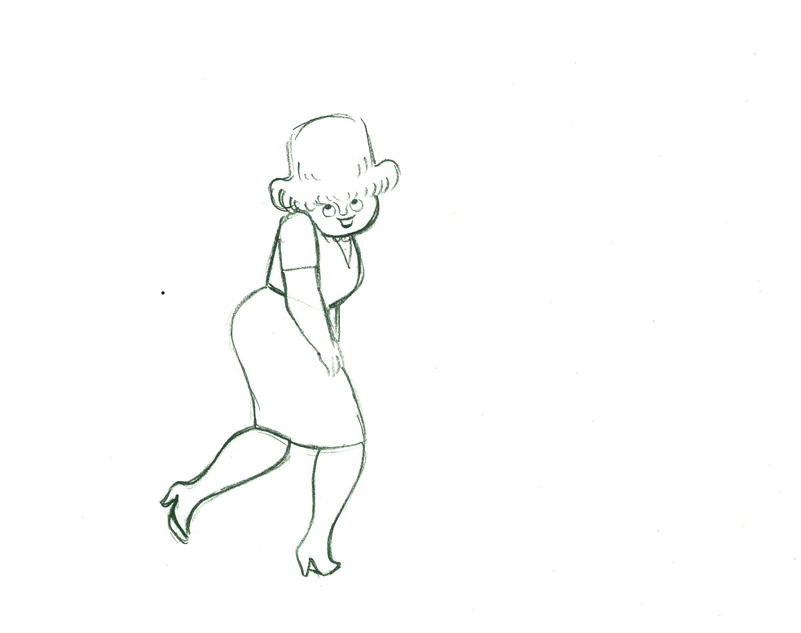
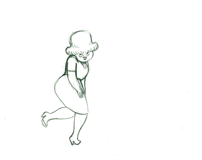
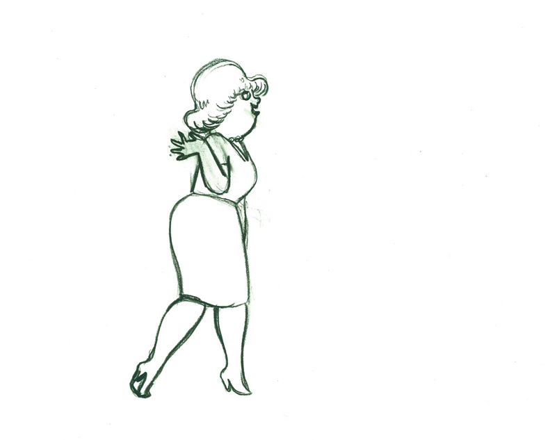
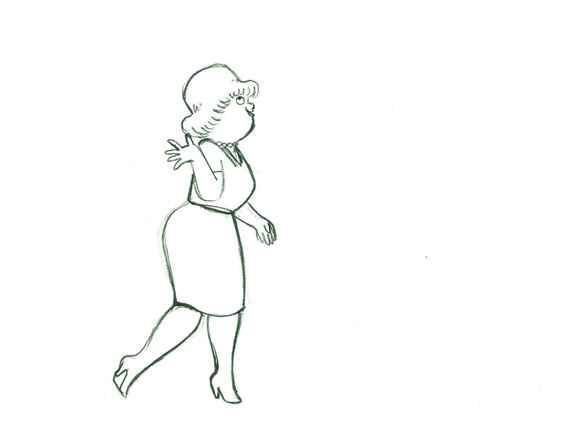
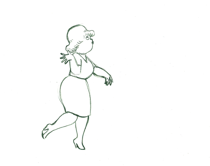
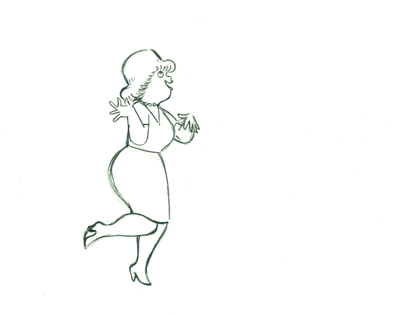
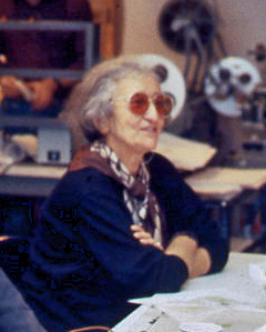 – There was a time in New York when Tissa David taught a class in animation for free, open to anyone who wanted to attend. This was sponsored by R.O. Blechman out of his studio, the Ink Tank. It was held after hours, so that those who worked in the business could attend.
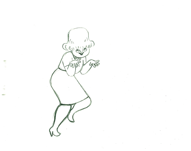
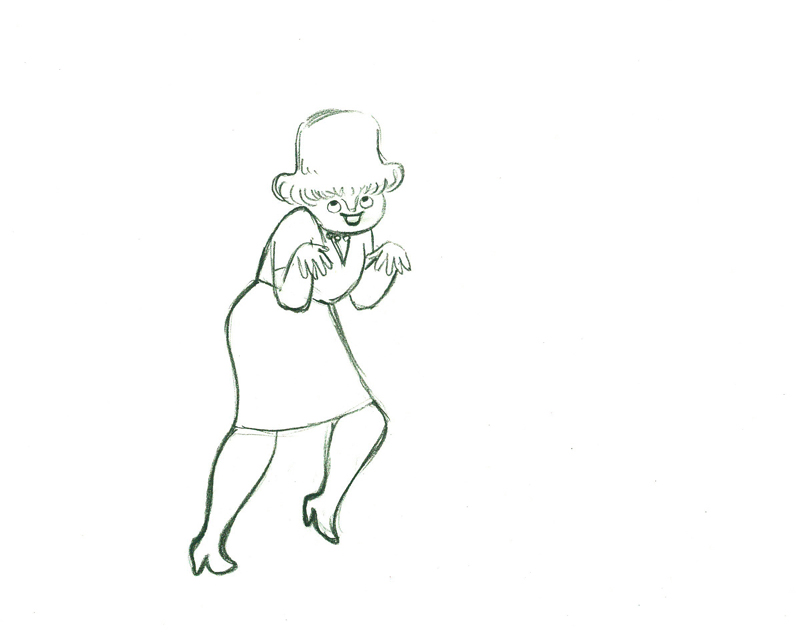
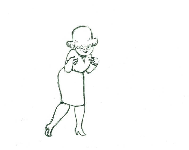
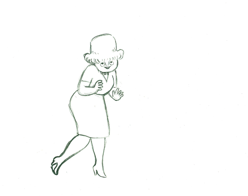
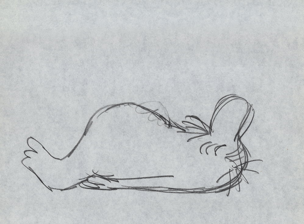
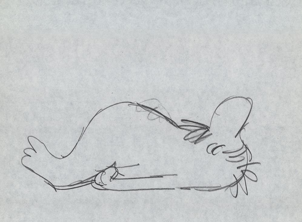
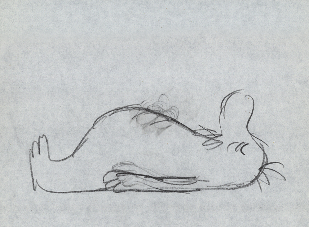
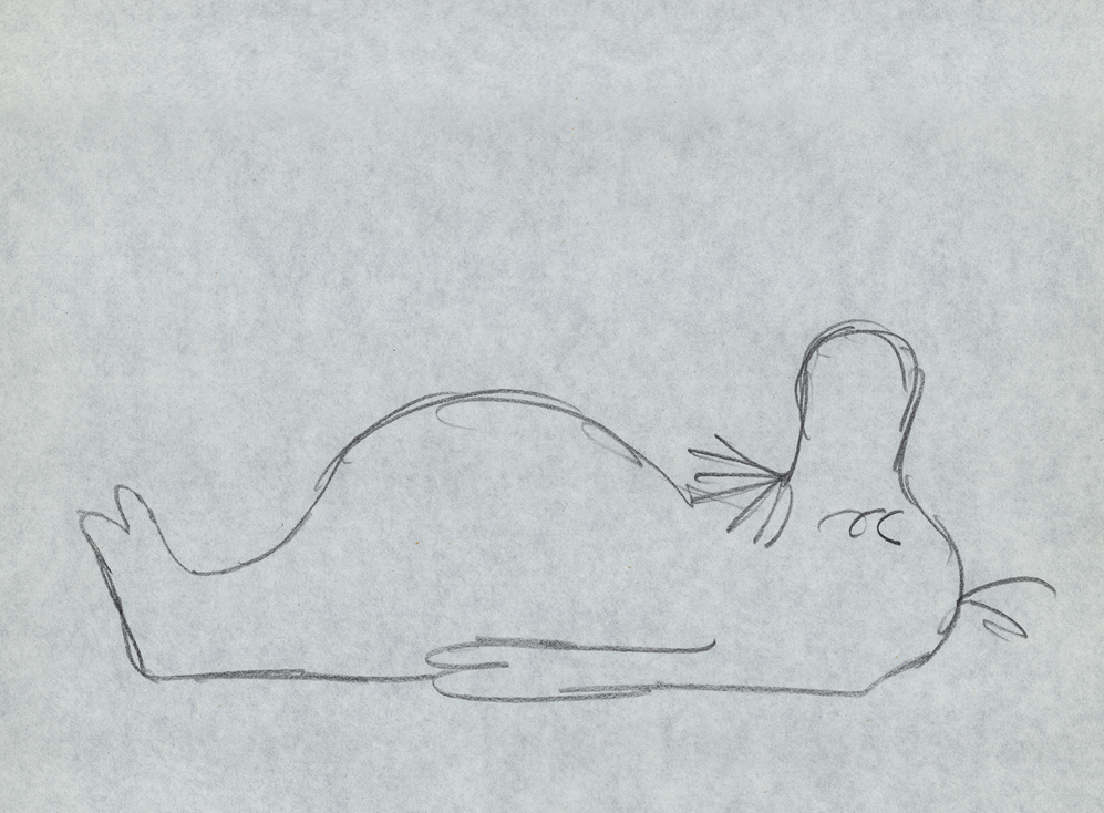
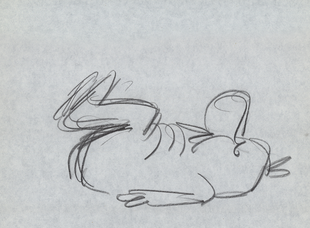
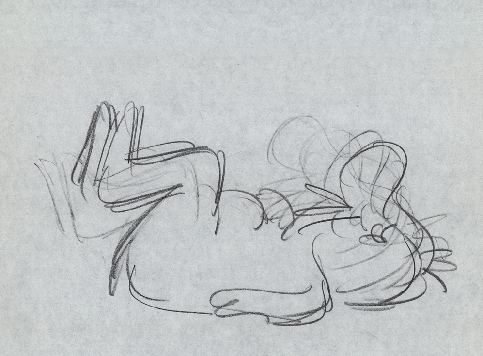
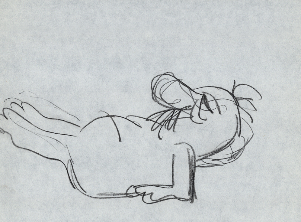
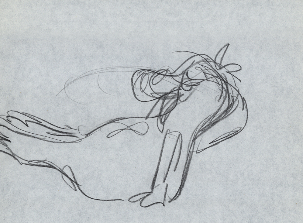
There were several sets of notes I’ve seen taken from Tissa’s talks, kind of a poor man’s version of Dick Williams‘ famous Art Babbit notes. A copy of Dick’s notes circulated within the business and quite a few people studied from them. Recently, John Canemaker loaned me a copy of Eugene Salandra‘s notes from Tissa’s class. Eugene had graduated from John’s class at NYU and had become a professional in New York, before he moved to California to work for Disney. As a professional, he was able to cut to the quick to synthesize Tissa’s basic lessons. I was impressed, and I contacted Eugene to see if he minded my posting some of the pages. He was supportive of the idea and hoped that he would help get the information out to others.
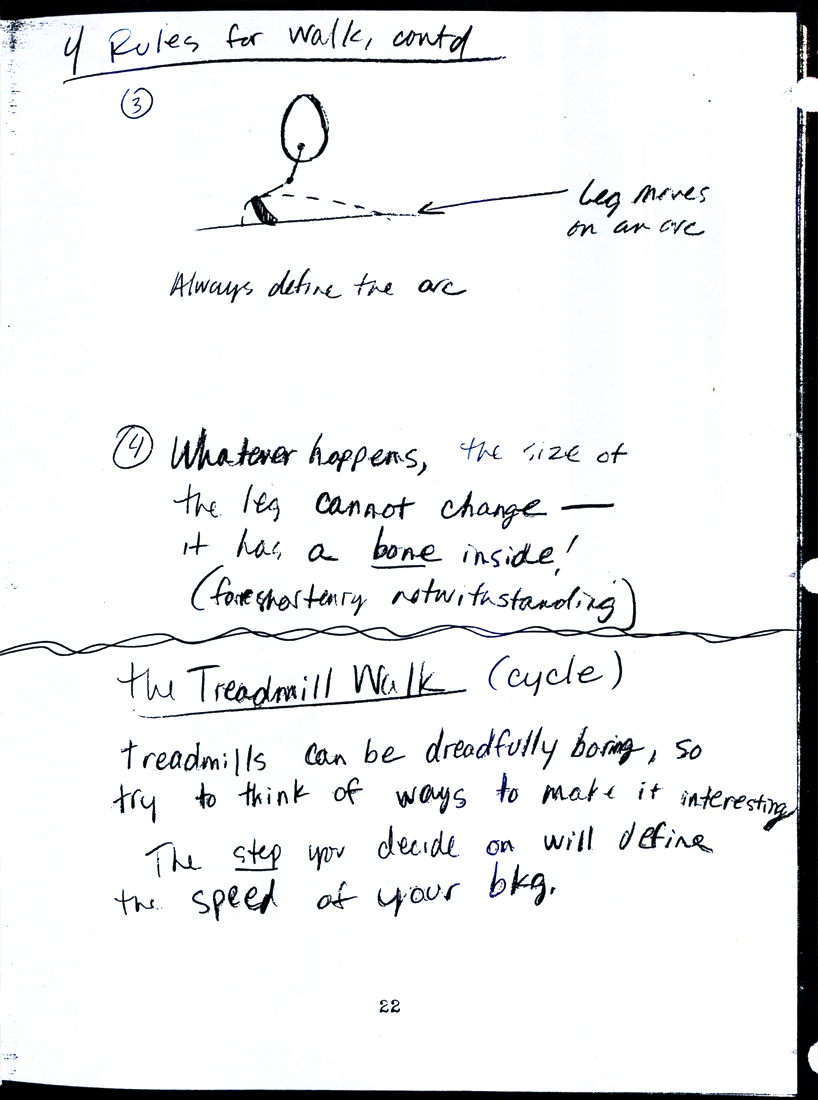
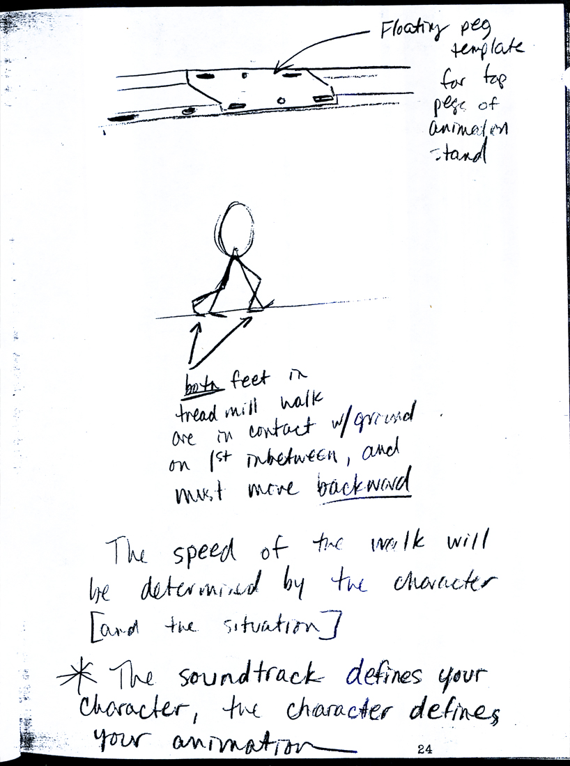
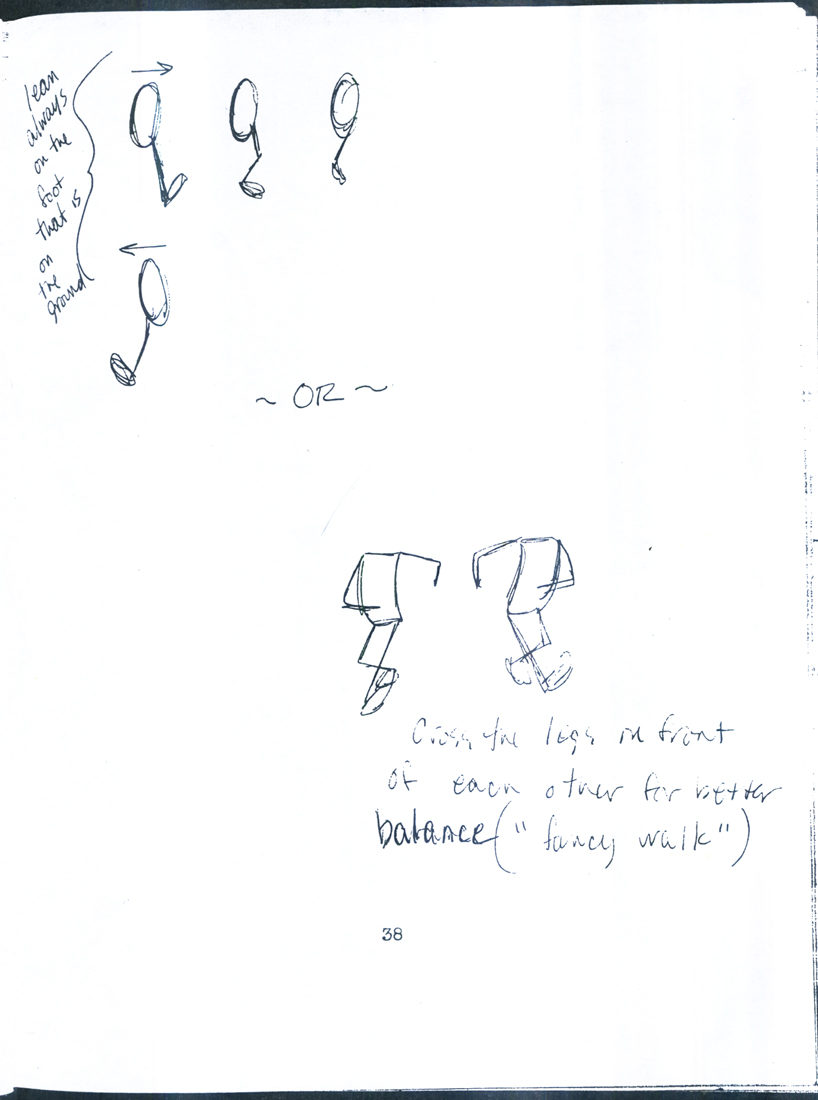
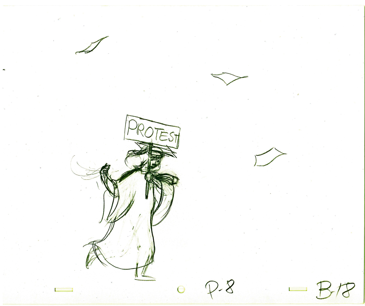
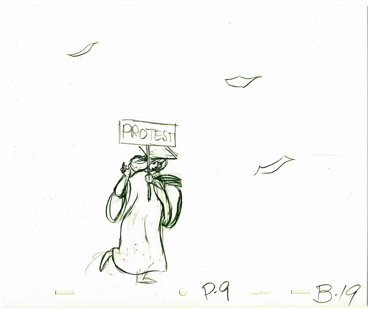
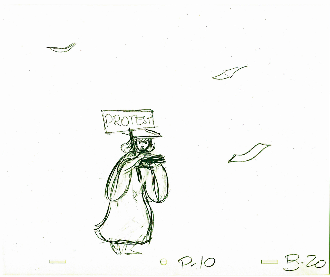
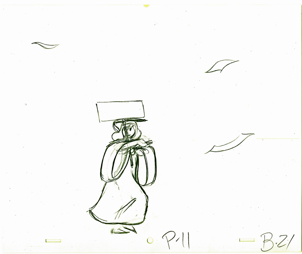
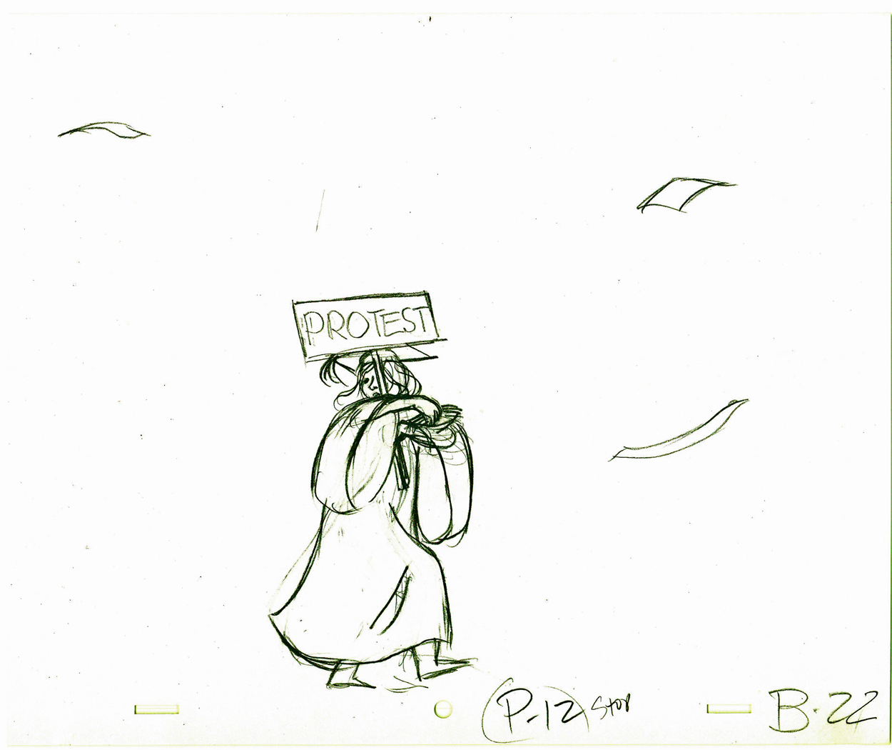
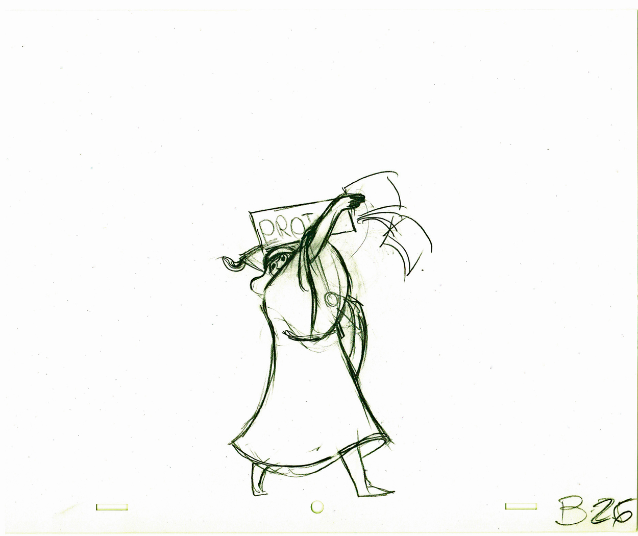
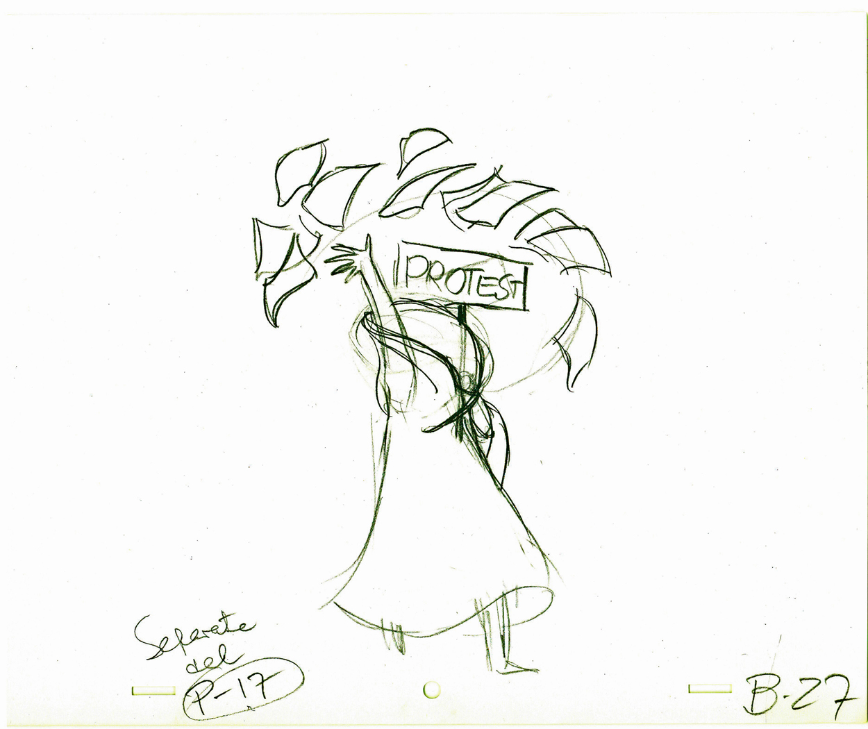
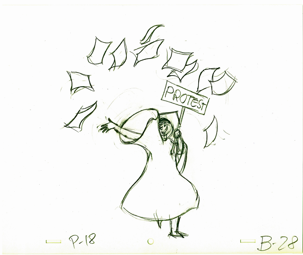
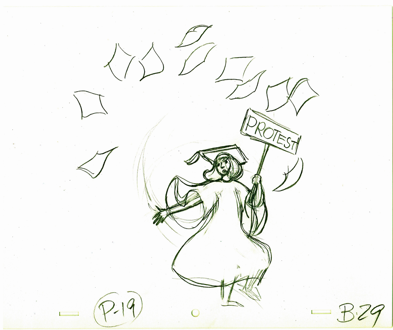
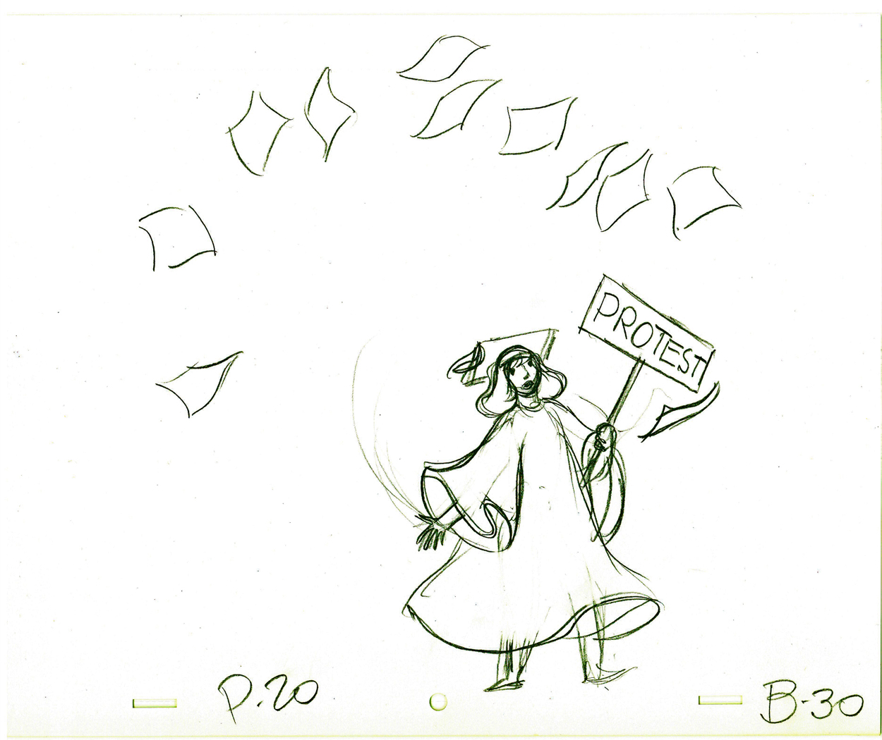
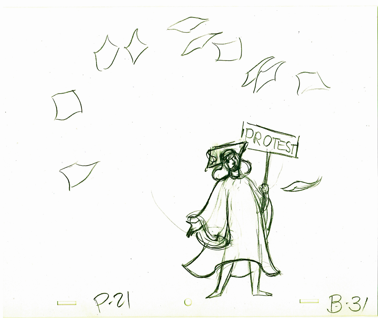
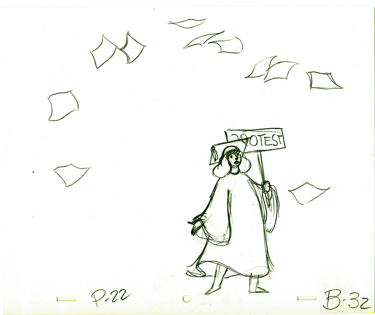
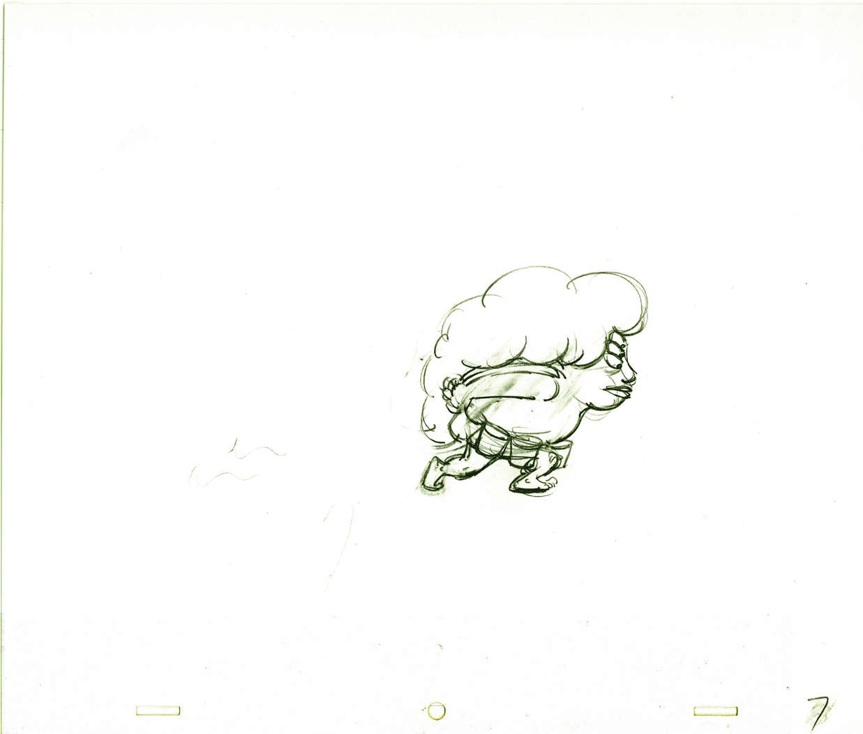
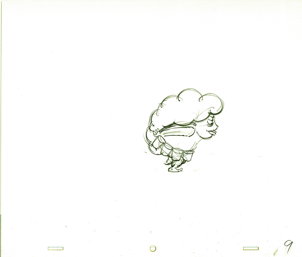
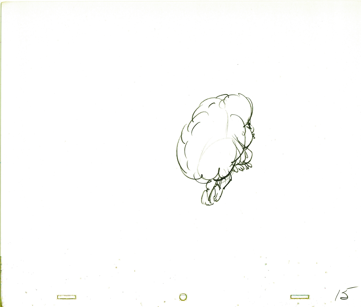
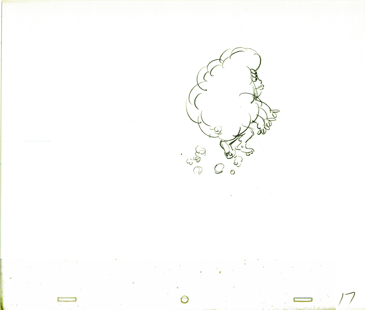
So, here I’m posting the first batch of these notes, which I think are very readable. (You’ll have to click on any of the images to enlarge so that you can read them.) If the reaction is good, I’ll offer more. This group is predominantly about walk and run cycles. But if you look close enough, you’ll see that they cover a lot more.
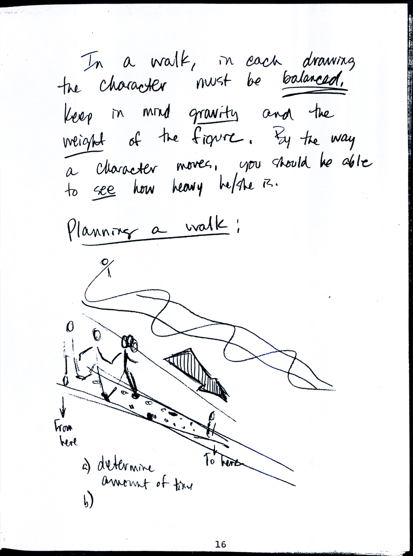
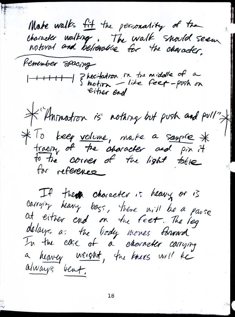
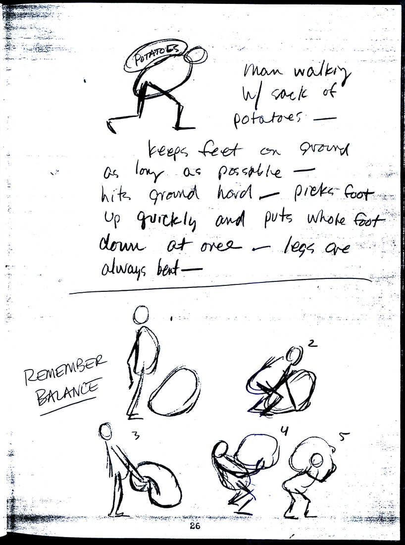
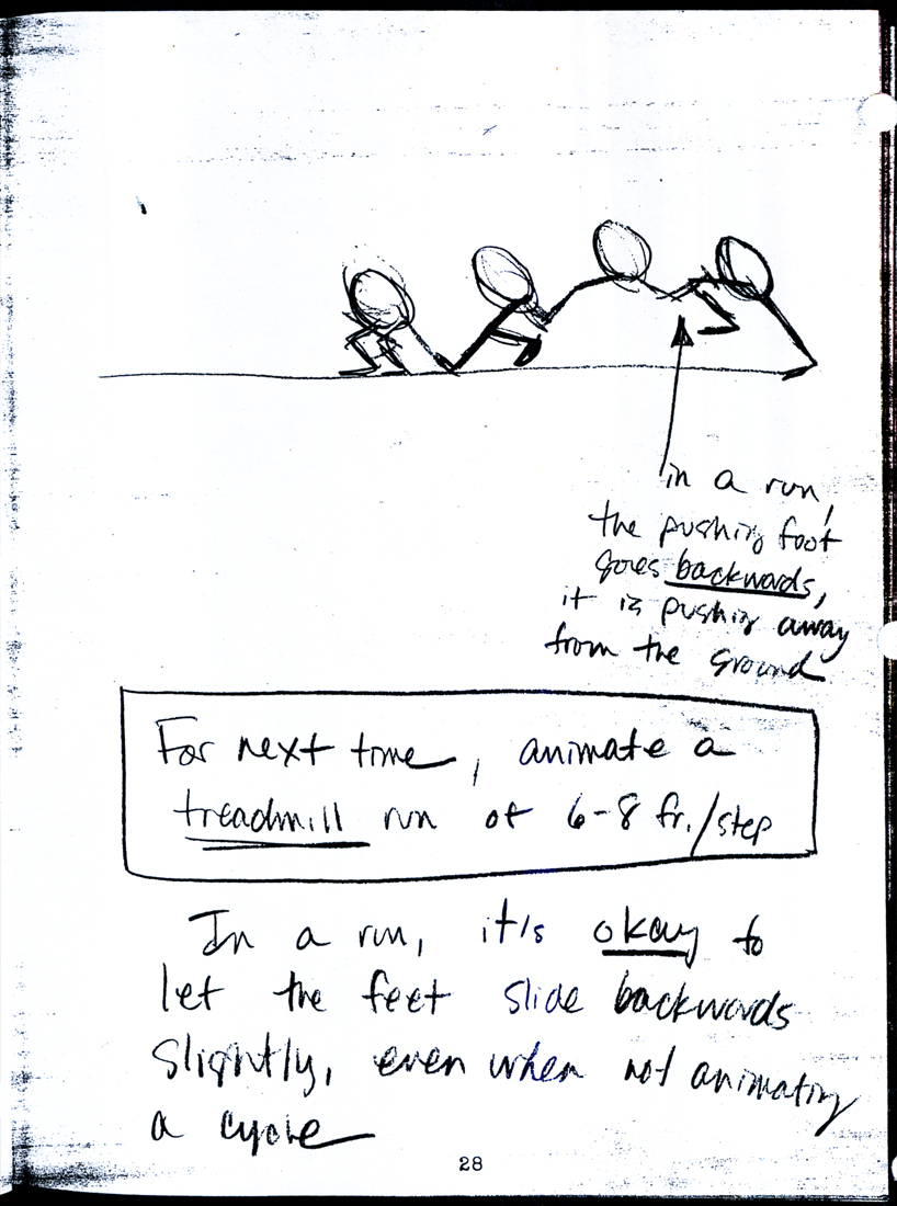
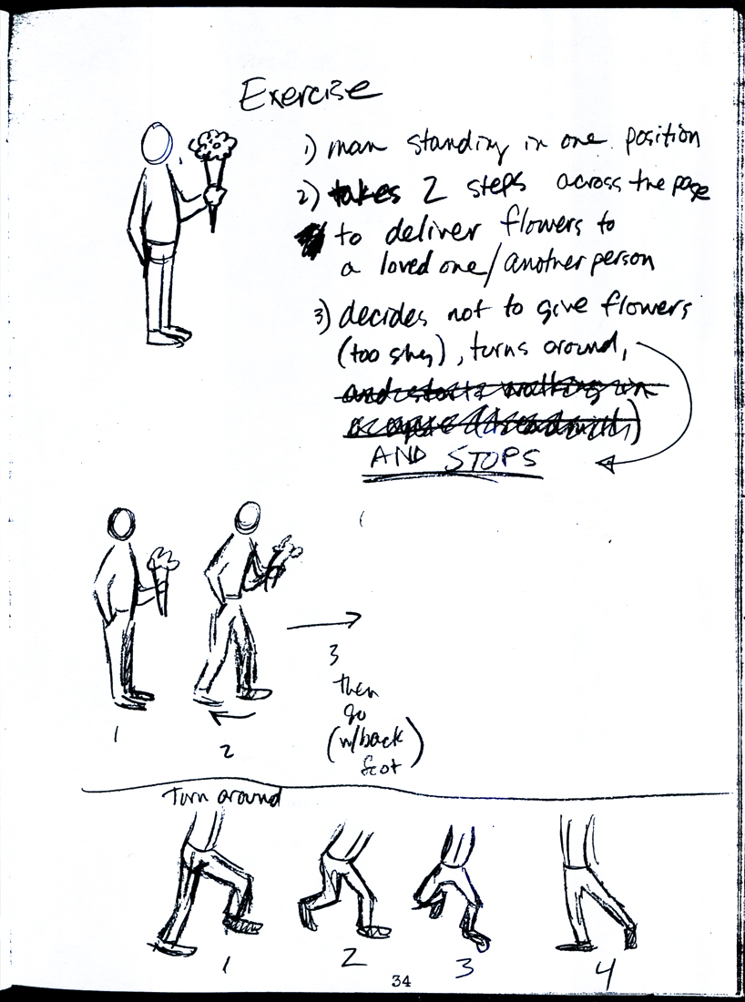
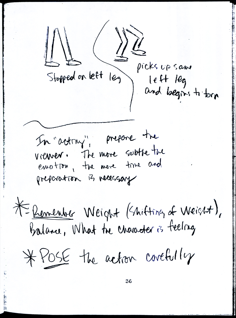
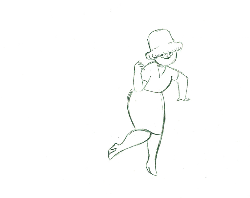
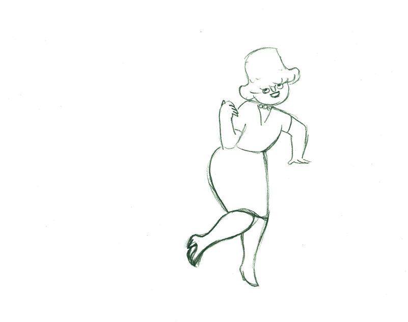
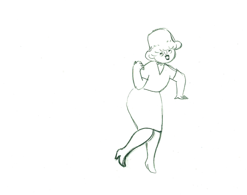
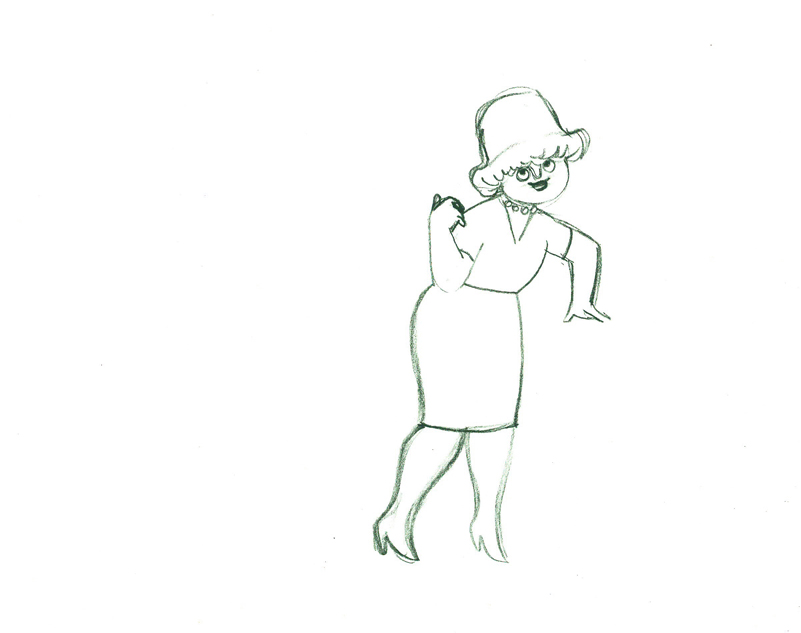
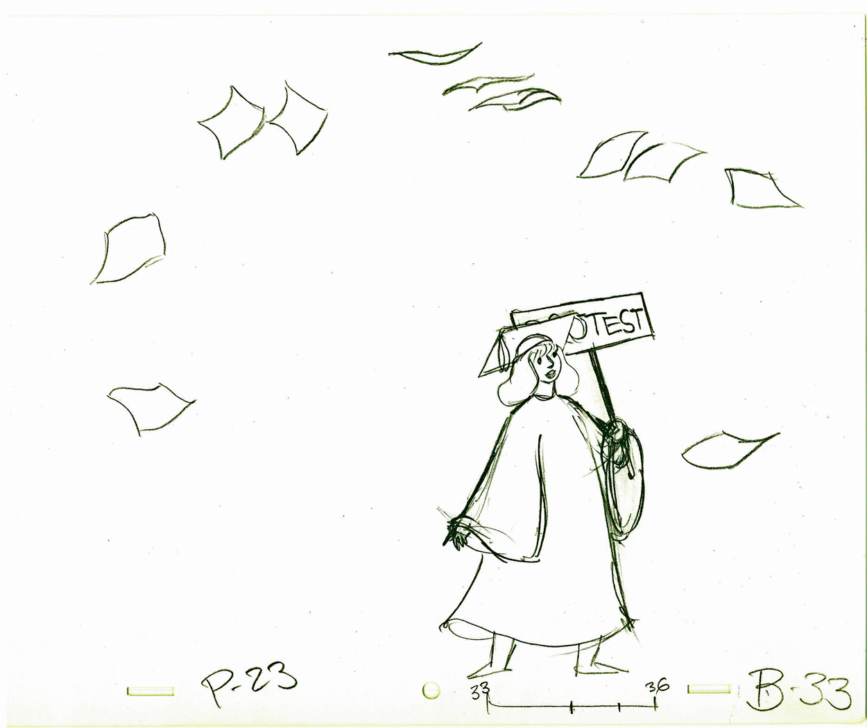
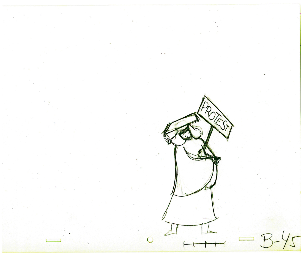
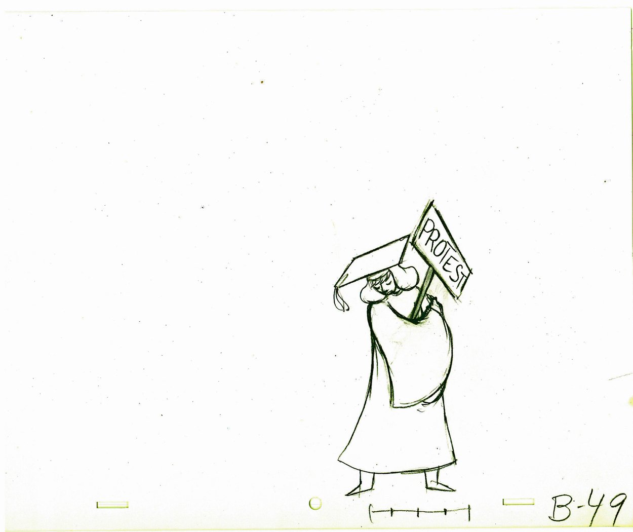
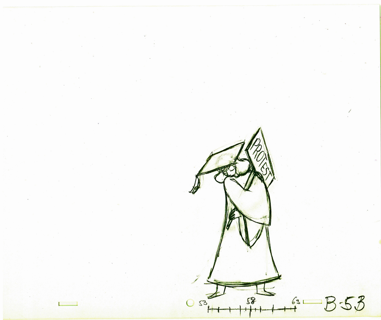
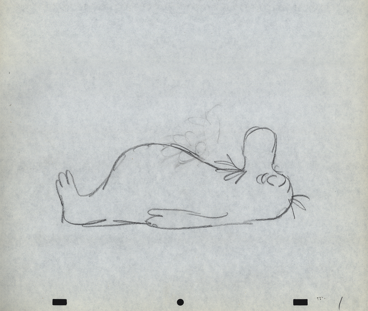
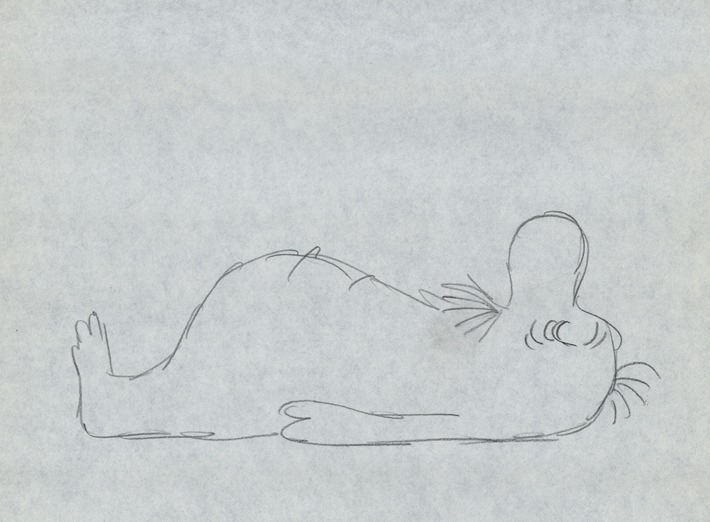
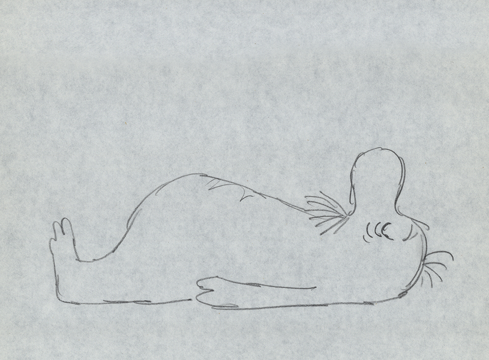
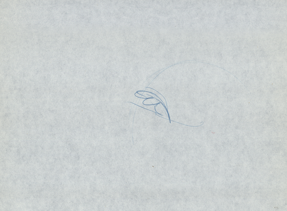
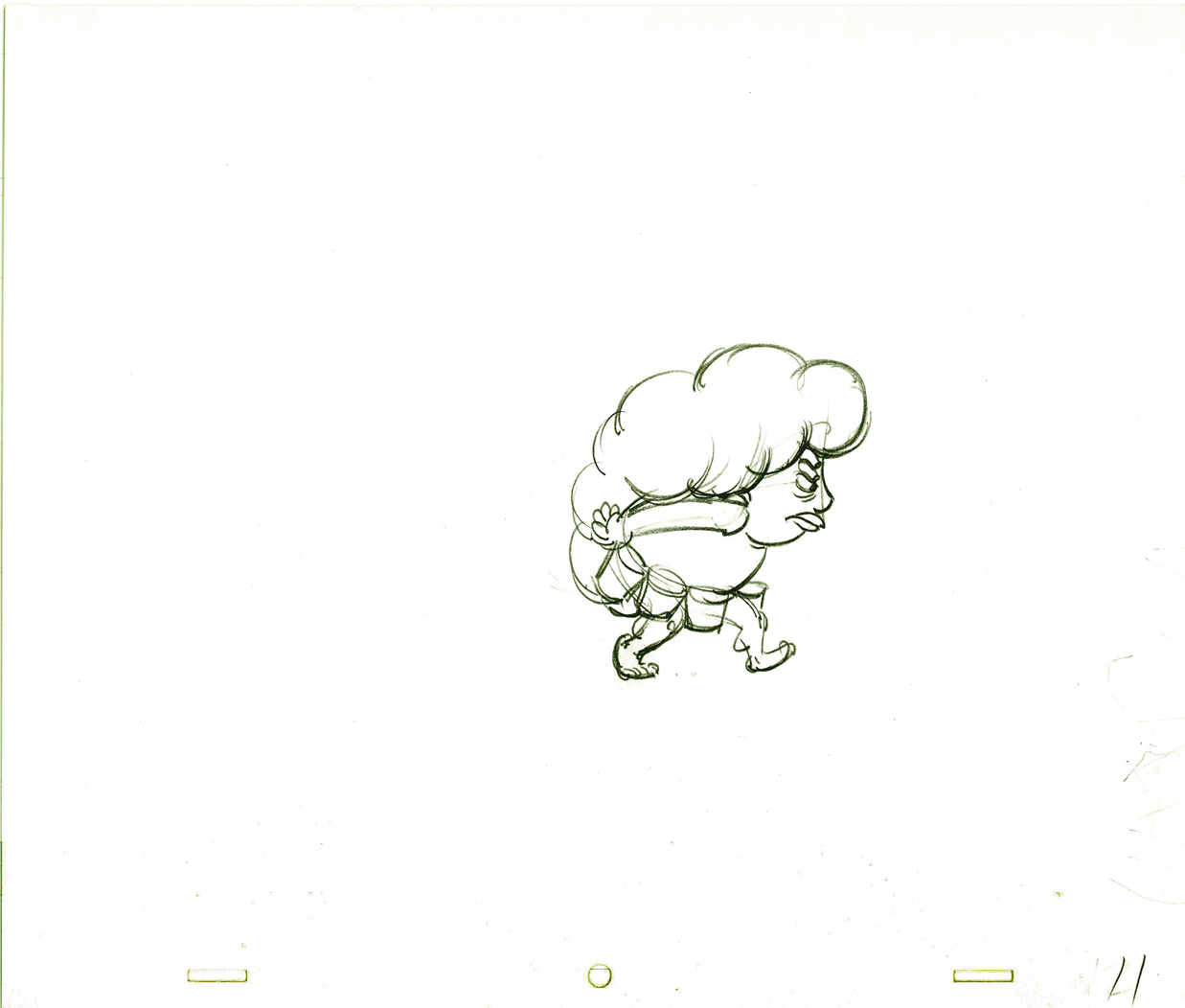
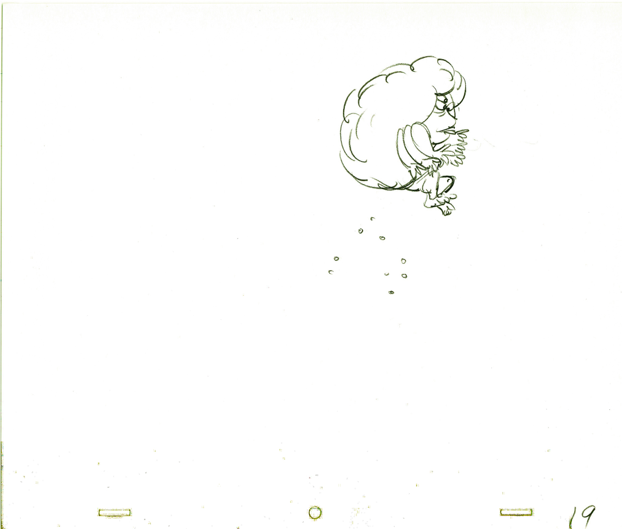
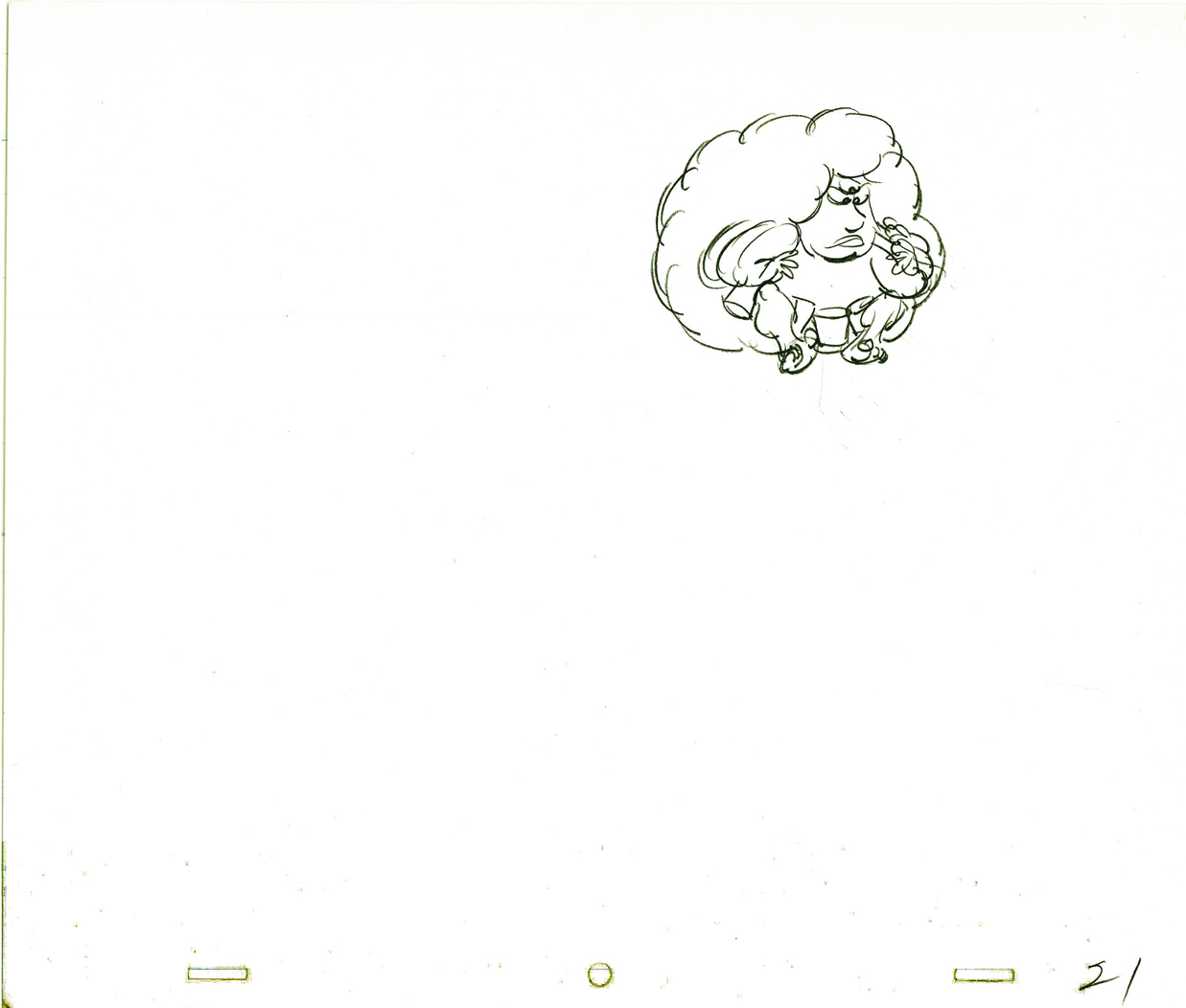
 1
1  2
2
 10
10 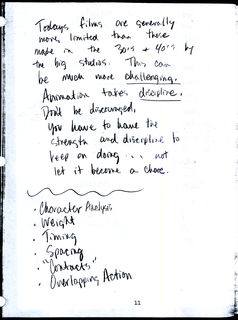 11
11
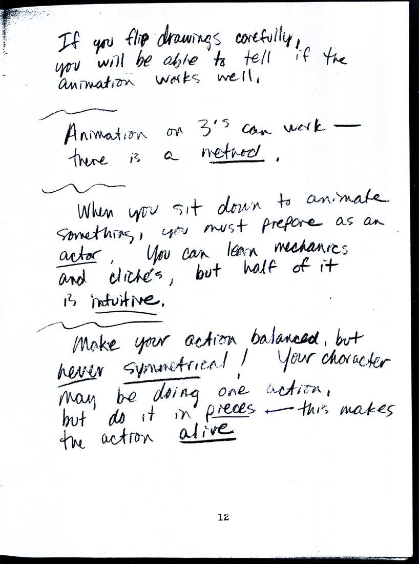 12
12 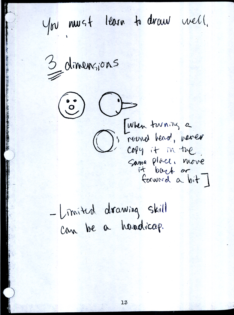 13
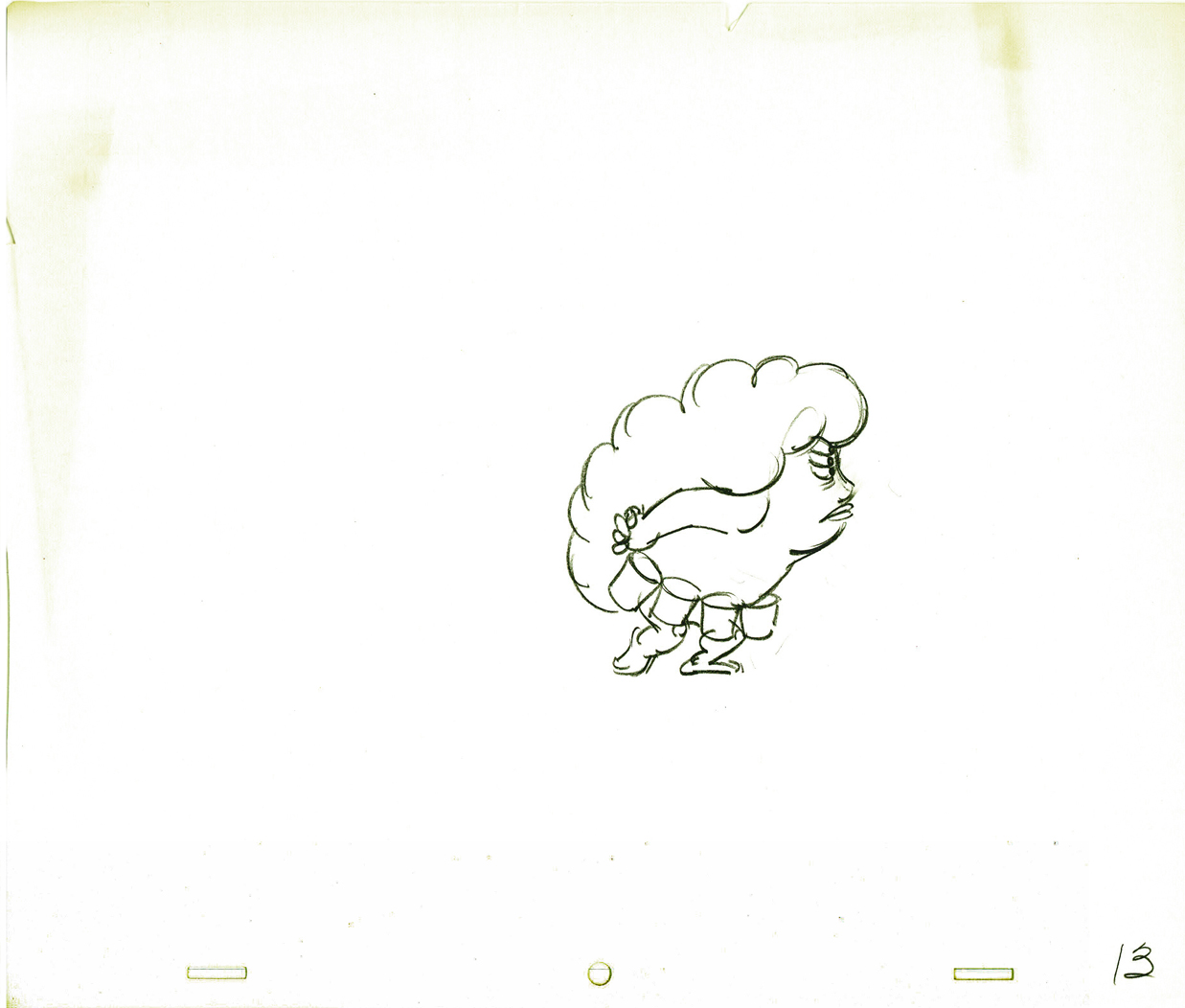
13
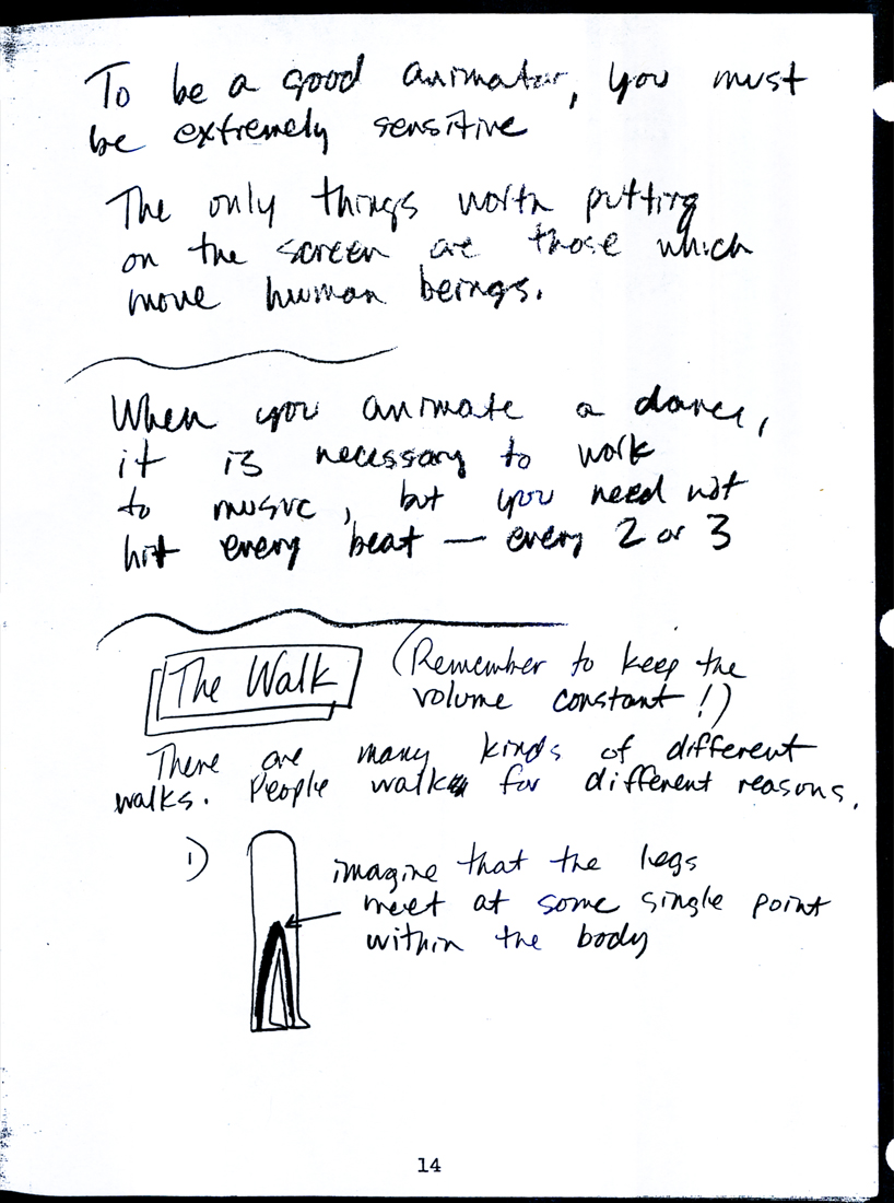 14
14 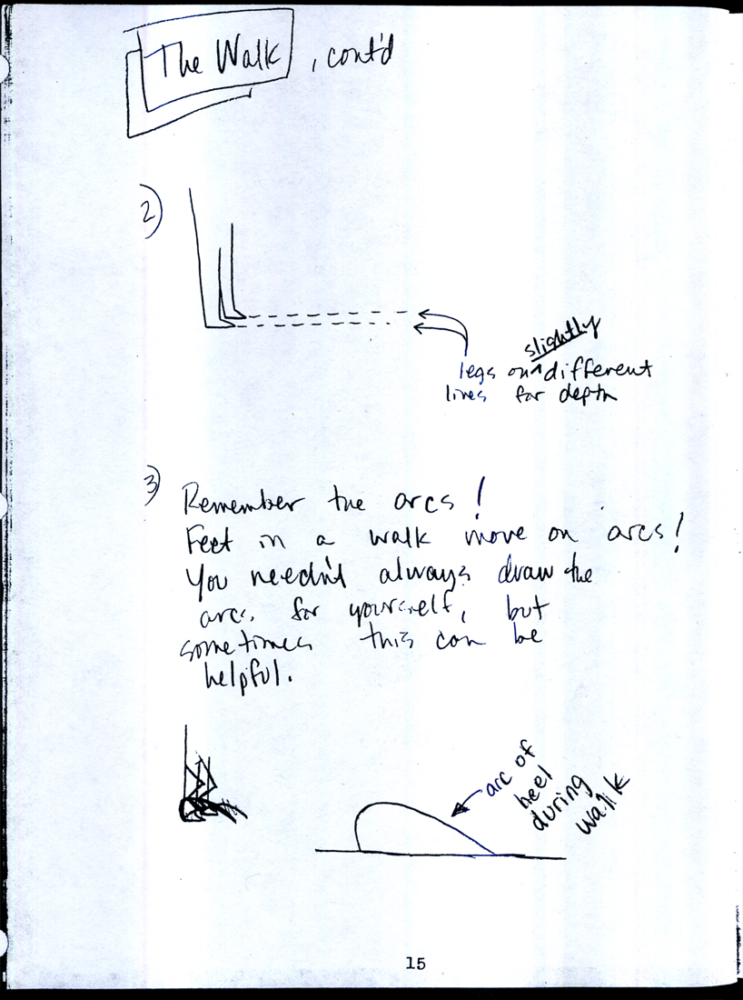 15
15
 16
16 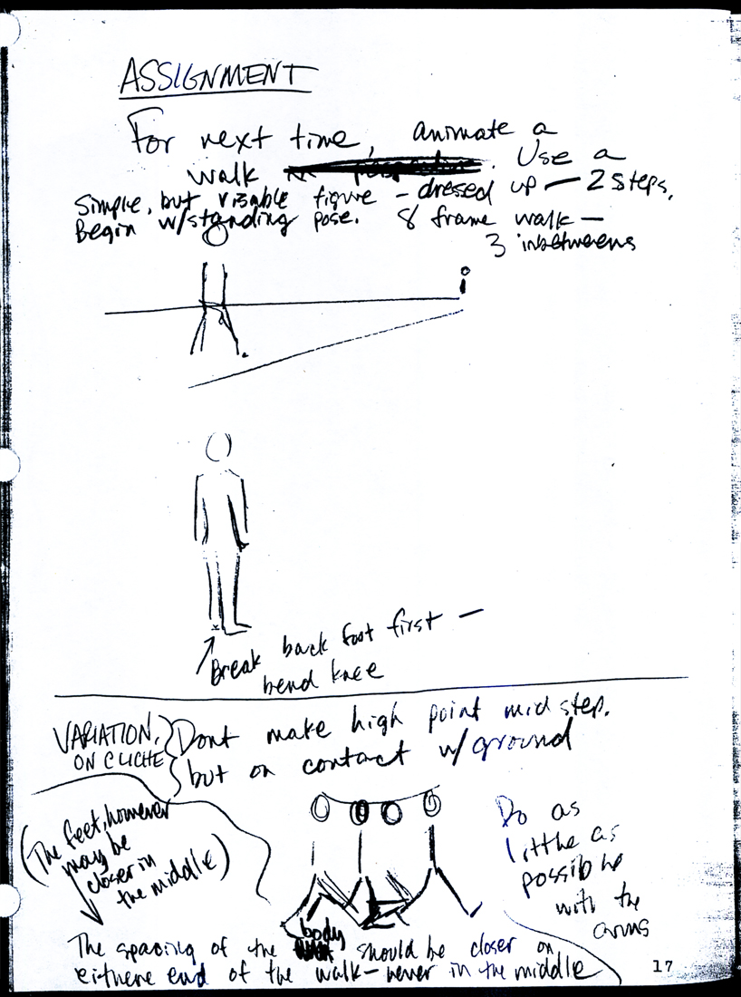 17
17
 18
18 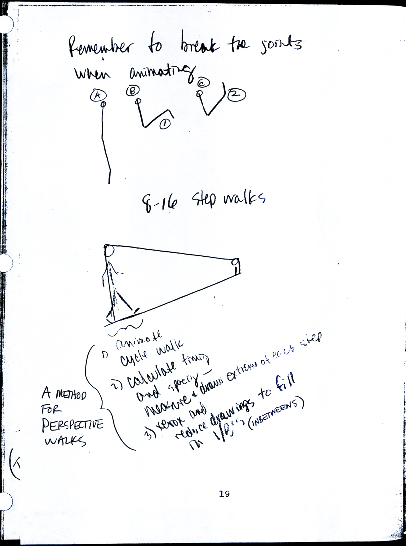 19
19
20 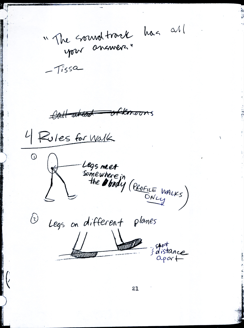 21
21
 22
22 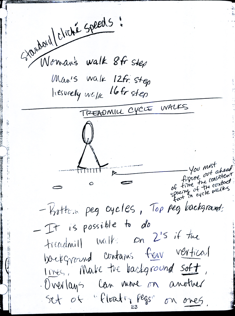 23
23
 24
24 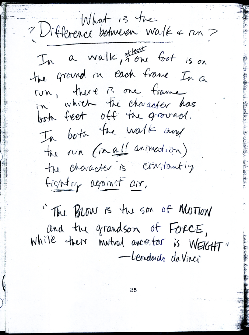 25
25
 26
26 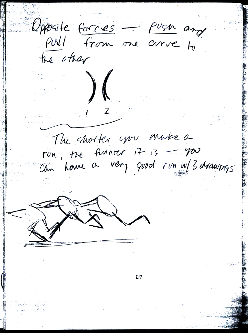 27
27
 28
28  29
29
 30
30  31
31
 32
32 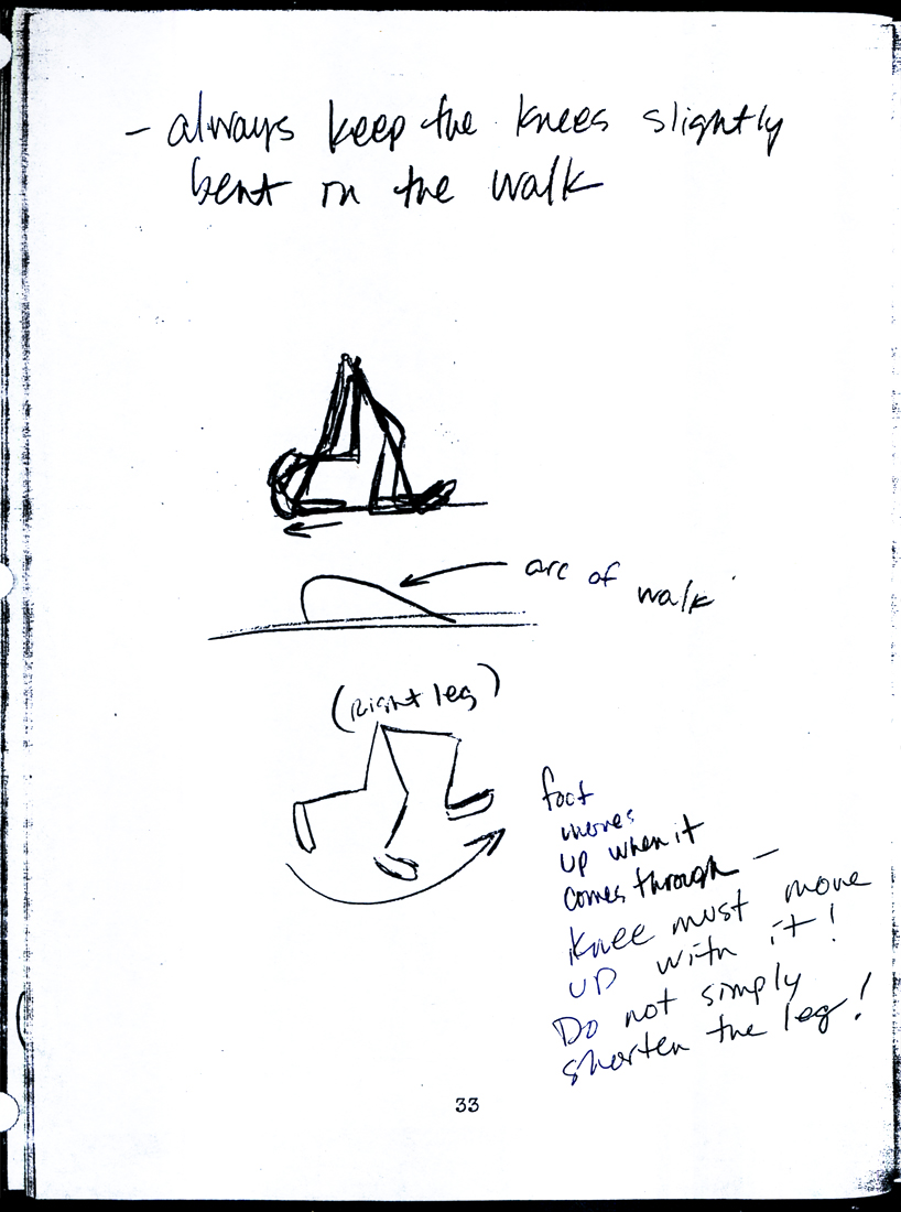 33
33
 34
34 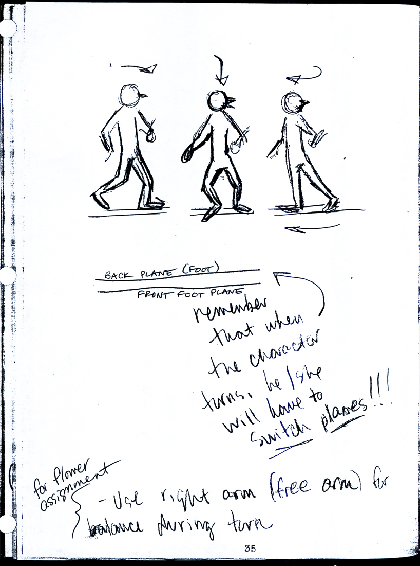 35
35
 36
36 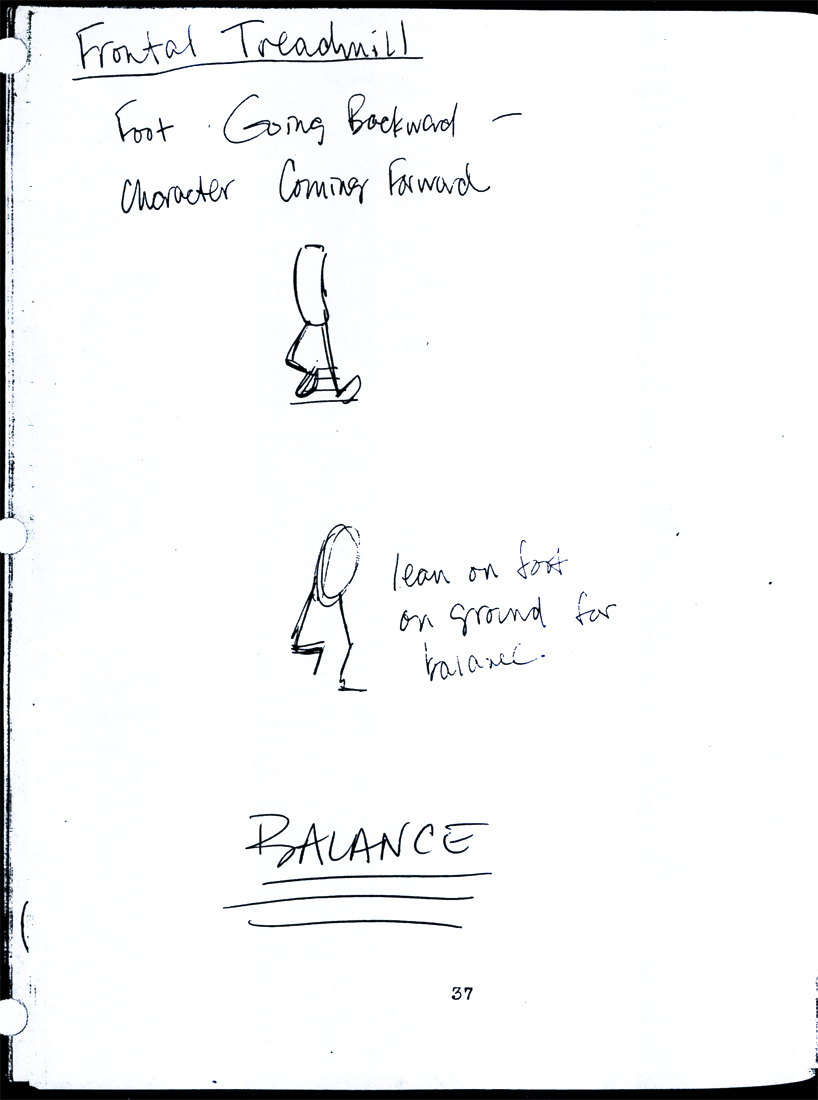 37
37
 38
38
Animation &Animation Artifacts &commercial animation &Layout & Design 26 Sep 2012 05:15 am
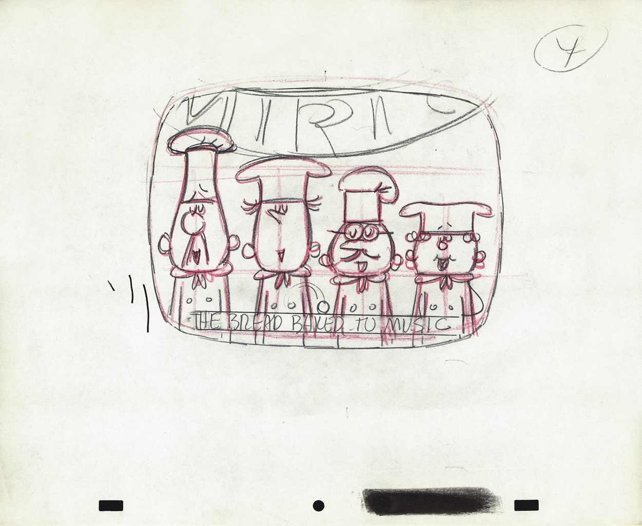
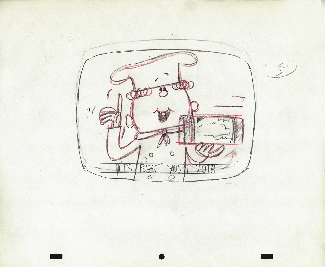
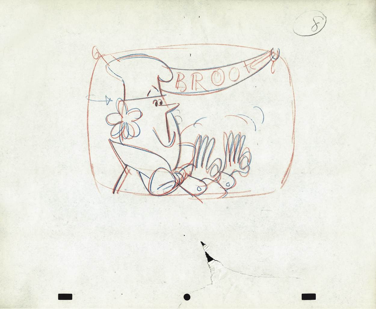
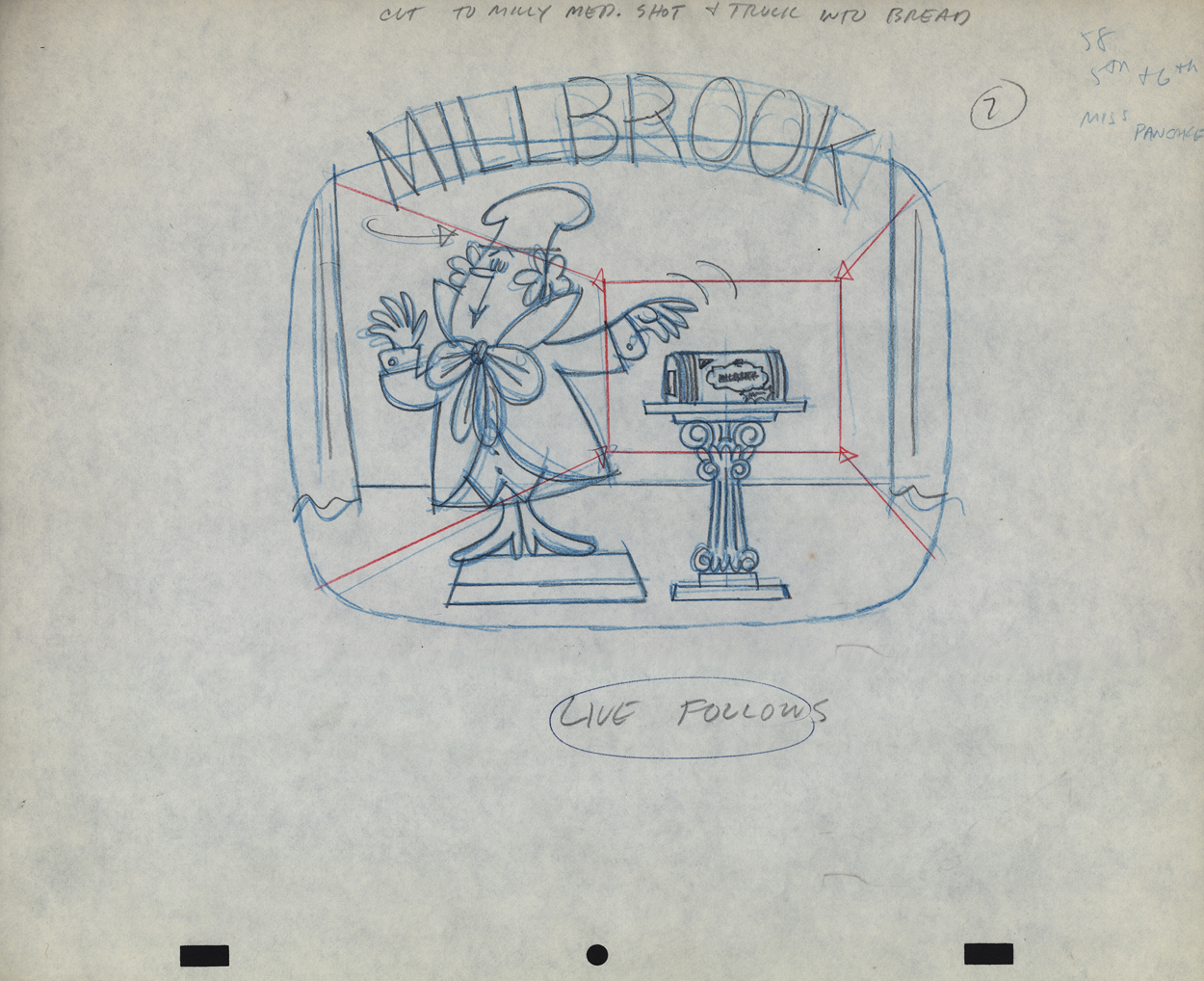
Vince Cafarelli’s Millbrook Bread – 2
- Last week we saw the first of these two spots Vince Cafarelli did while working for Goulding-Elliot-Graham Prods., Inc. Millbrook Bread was the client and the Piels Bros. voices, Bob Elliott & Ray Goulding, owned the studio with Ed Graham. They also did the voices for these bread spots. This particular one must have been pretty big; the video survived these many years later, and I’ve attached it to the end of this post.
But first, here are the Layout drawings which I believe were done by Vinnie Cafarelli.
 1
1
 2
2
 3
3
 4
4
 5
5
 6
6
 7
7
 8
8
 9
9
 10
10
 11
11
 12
12
 13
13
 14
14
 14-5
14-5
 15
15
 16
16
 17
17
 18
18
 19
19
 20
20
 21
21
 22
22
 23
23
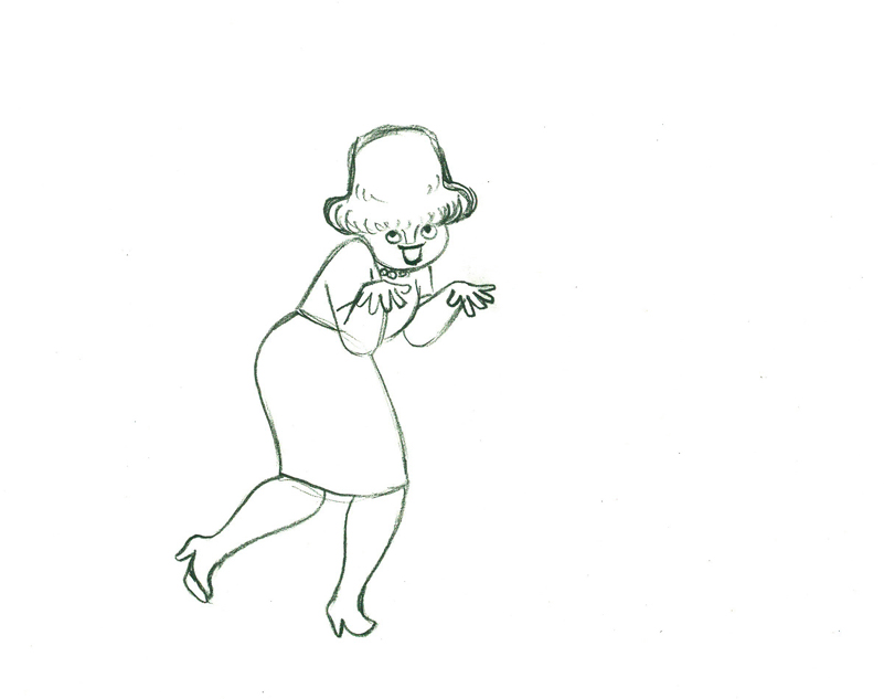
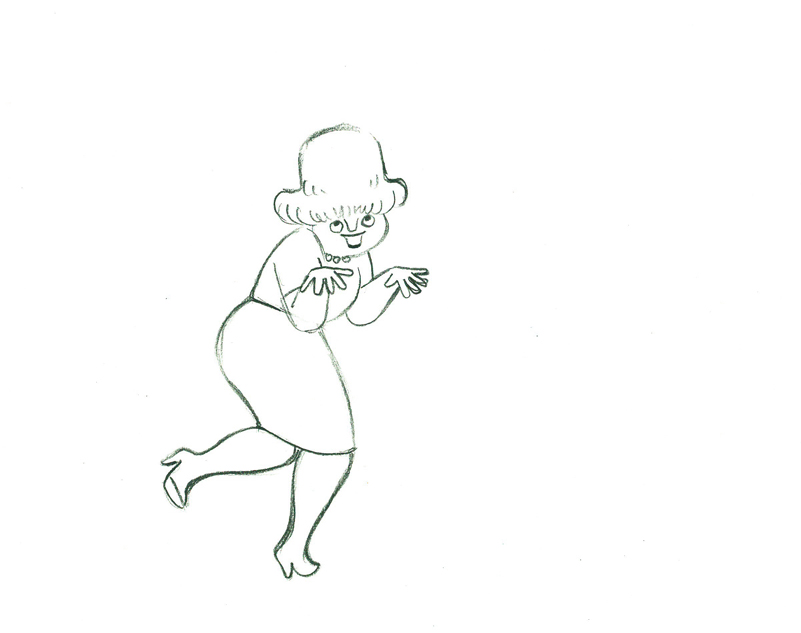
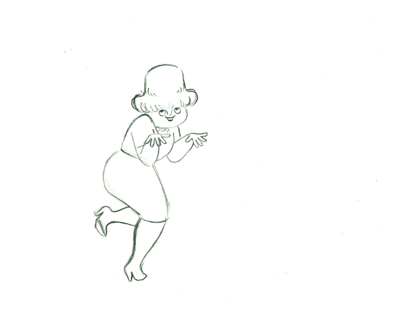
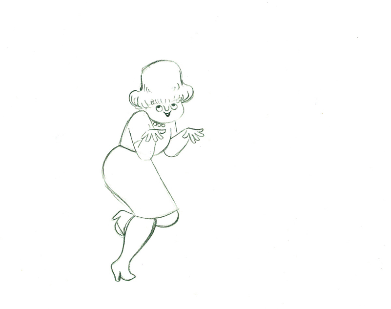
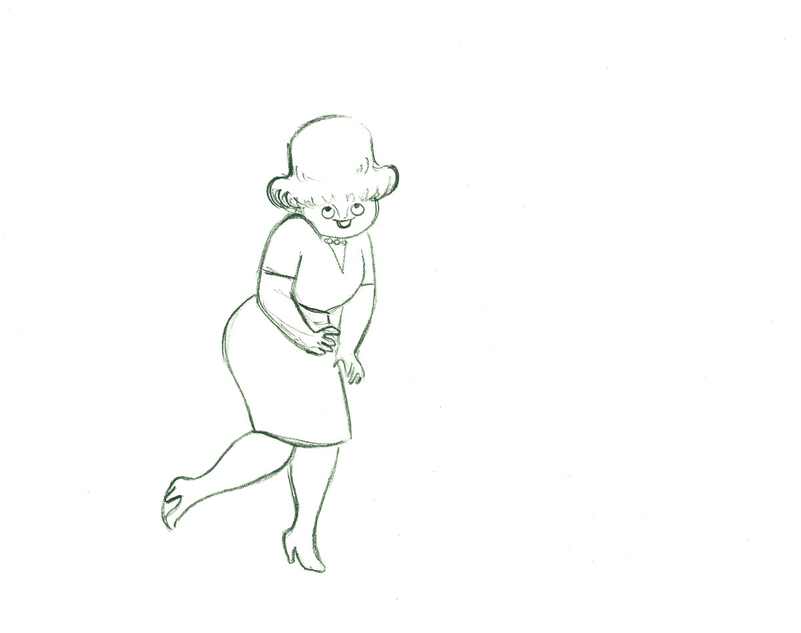
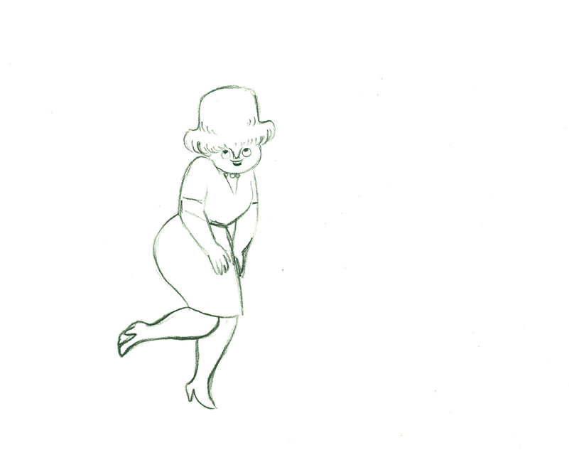
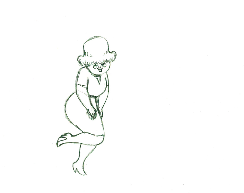
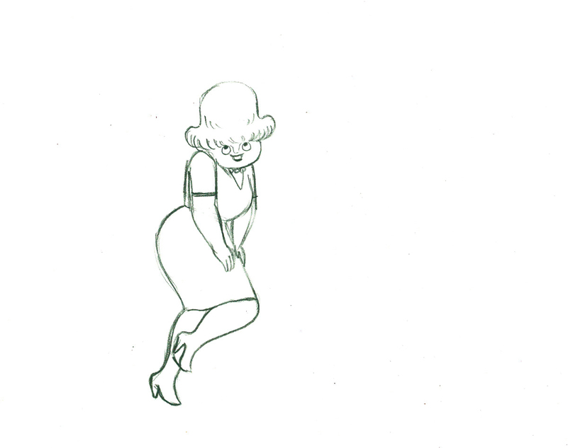
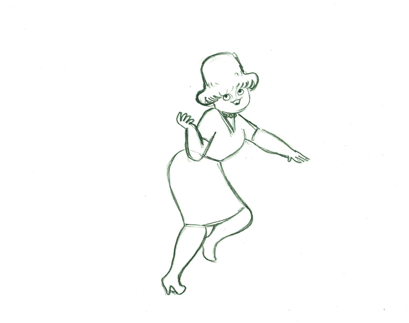
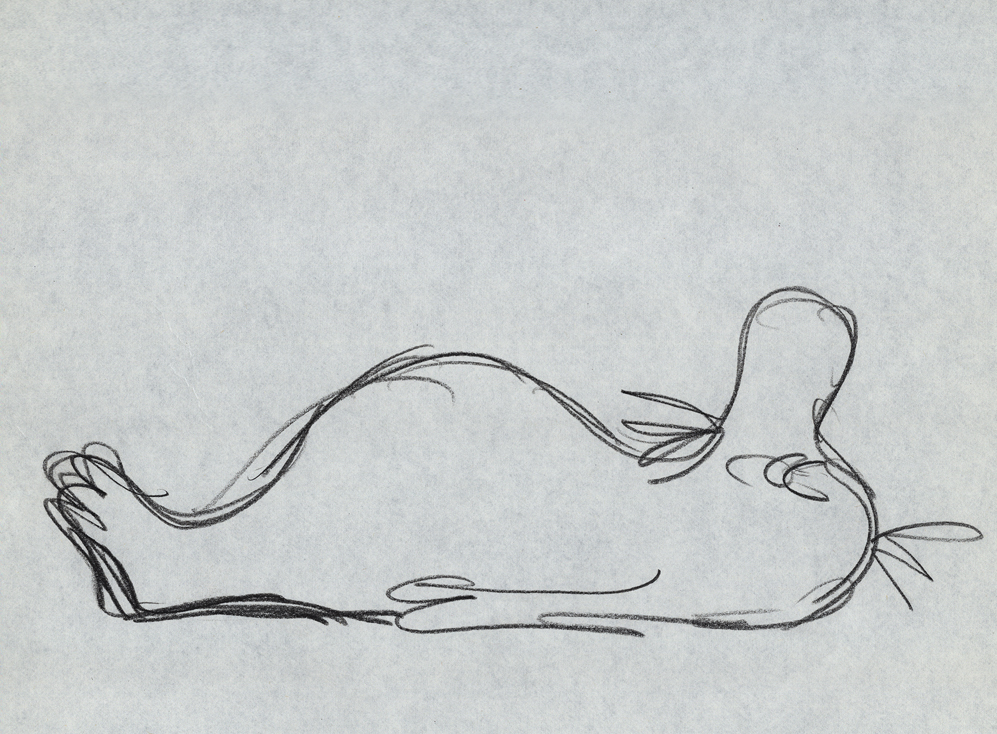
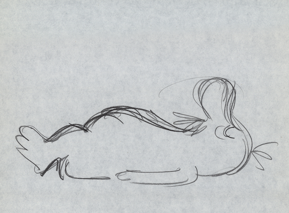
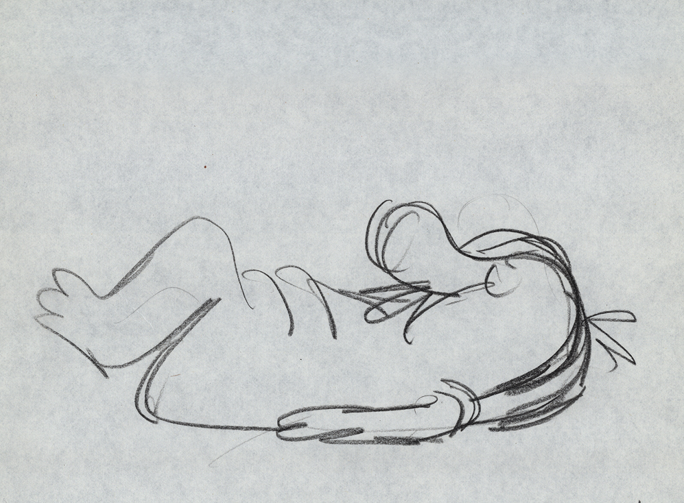
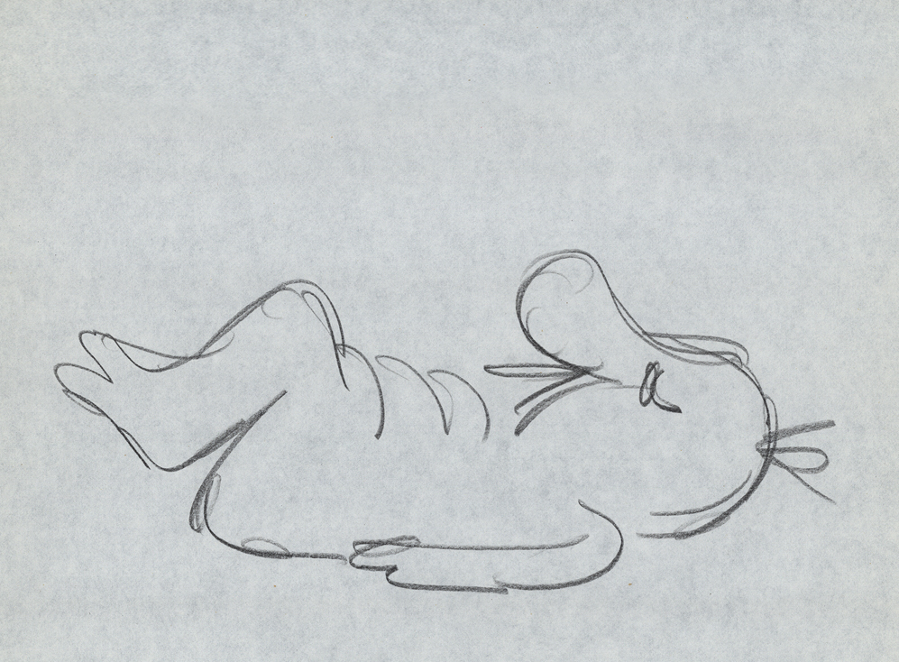
Action Analysis &Animation &Animation Artifacts &Hubley &Independent Animation &Tissa David 24 Sep 2012 05:41 am
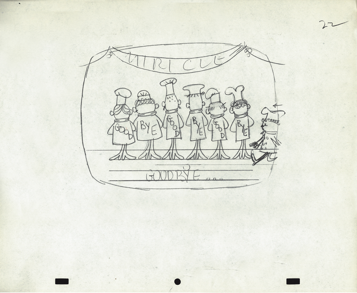
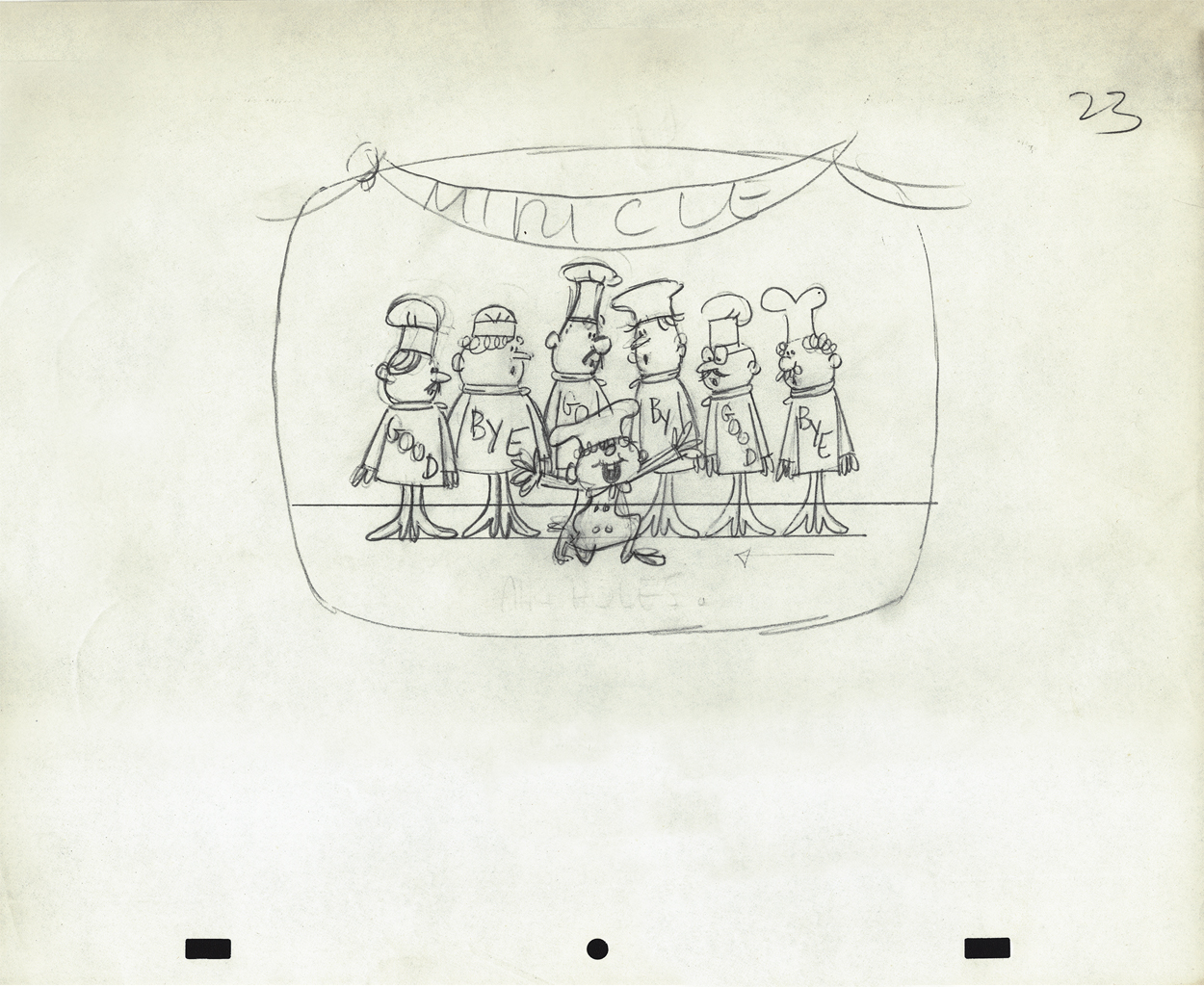
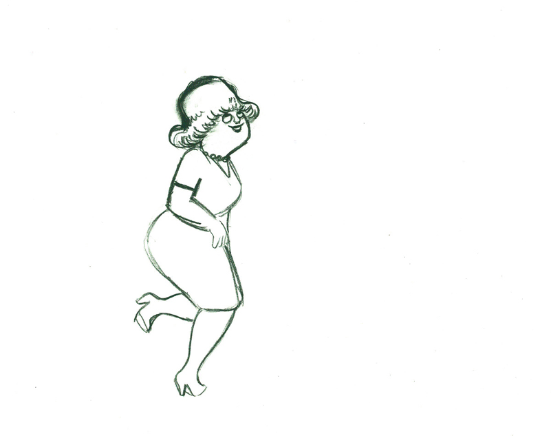
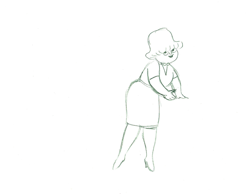
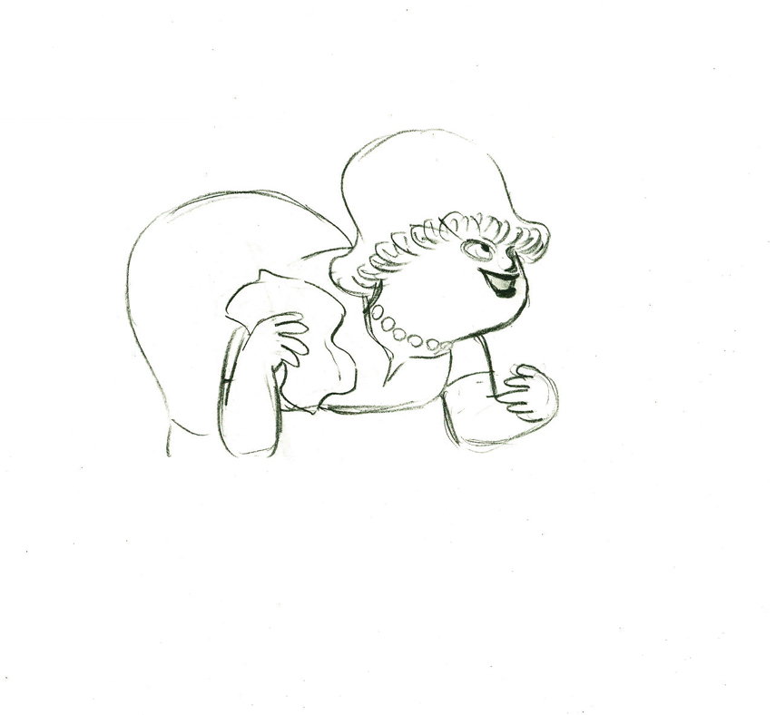
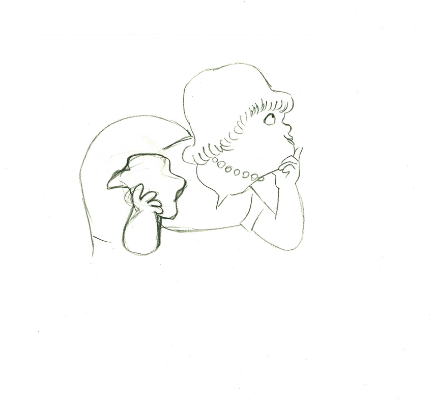
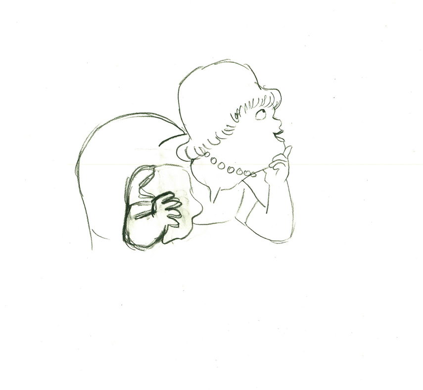
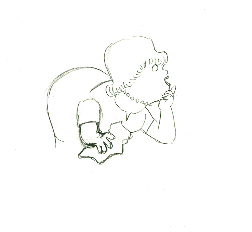
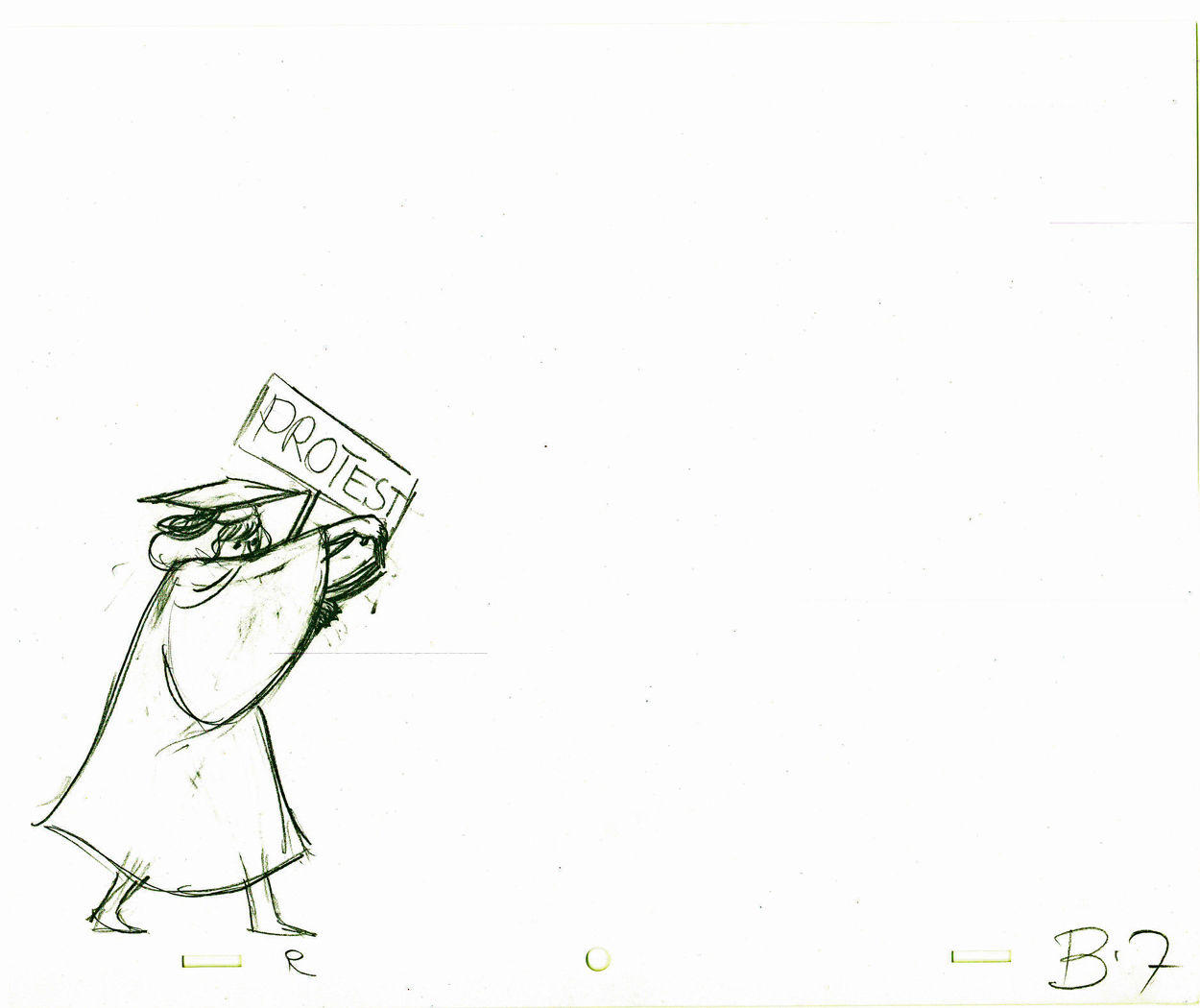
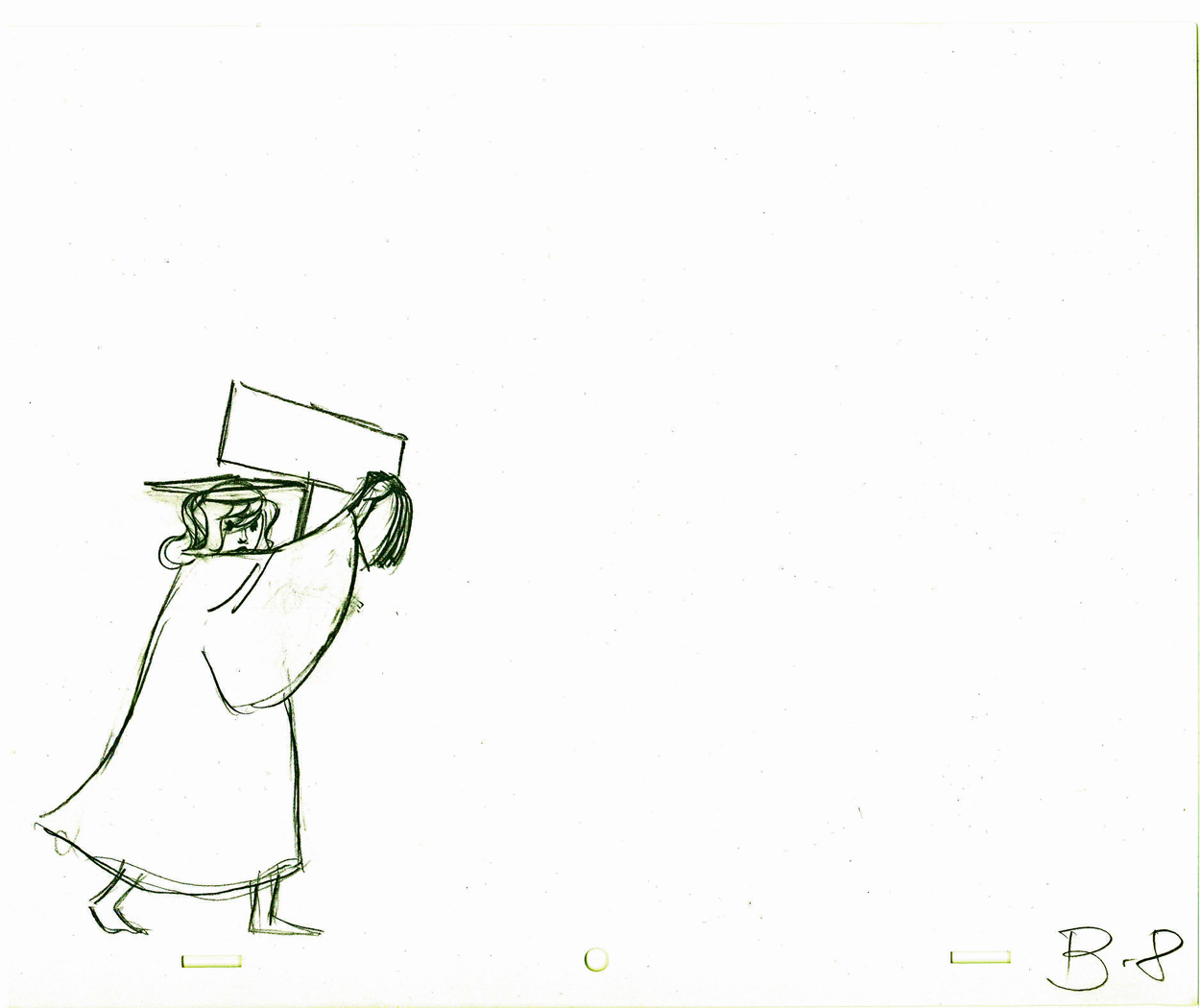
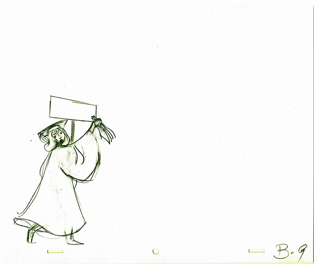
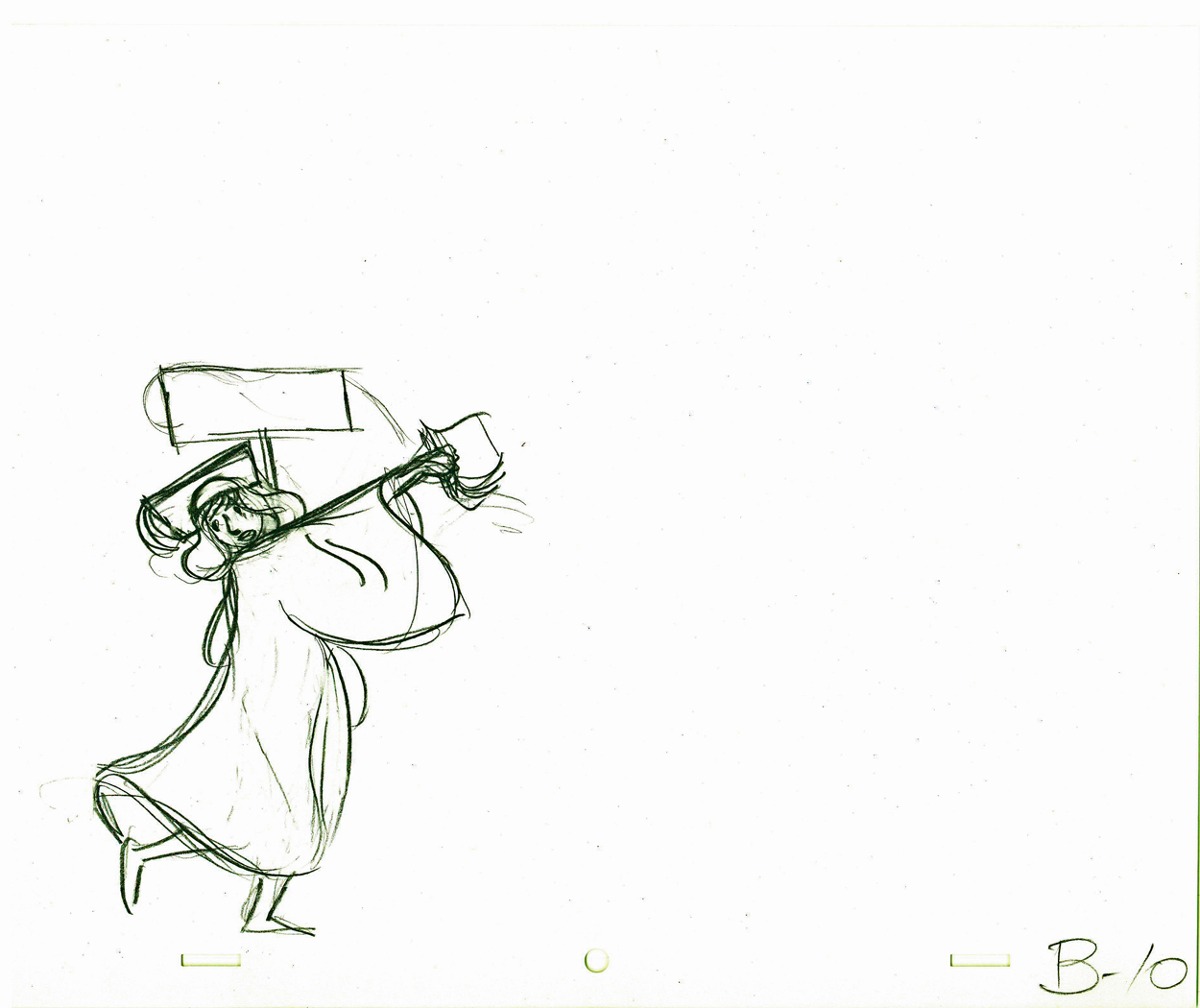
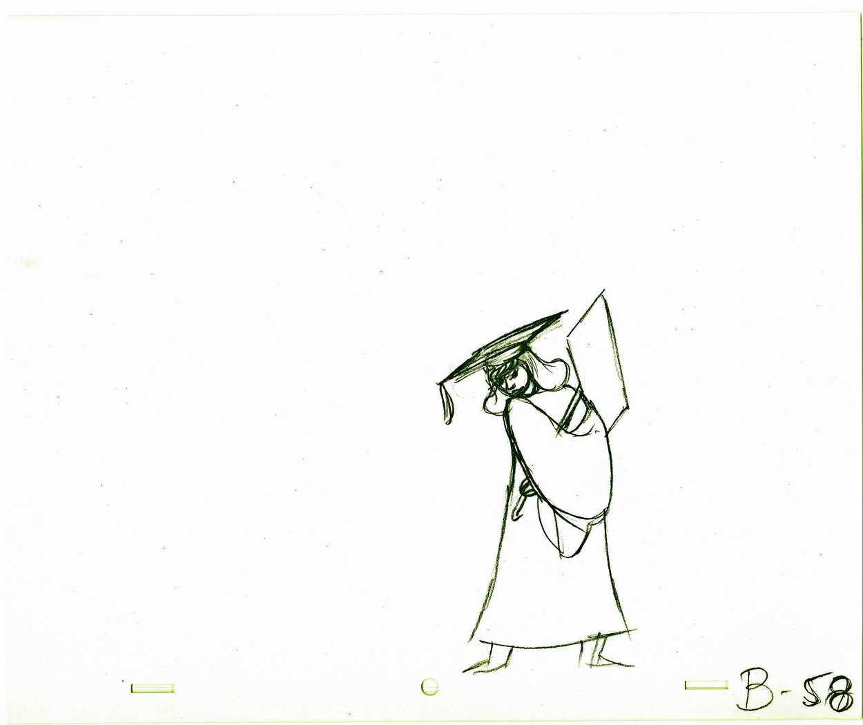
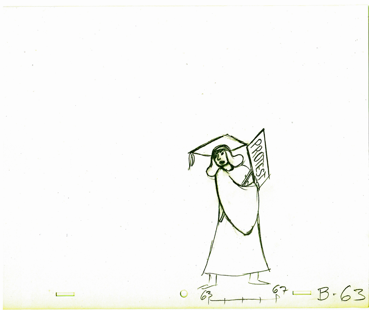
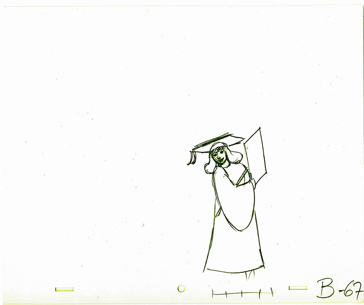
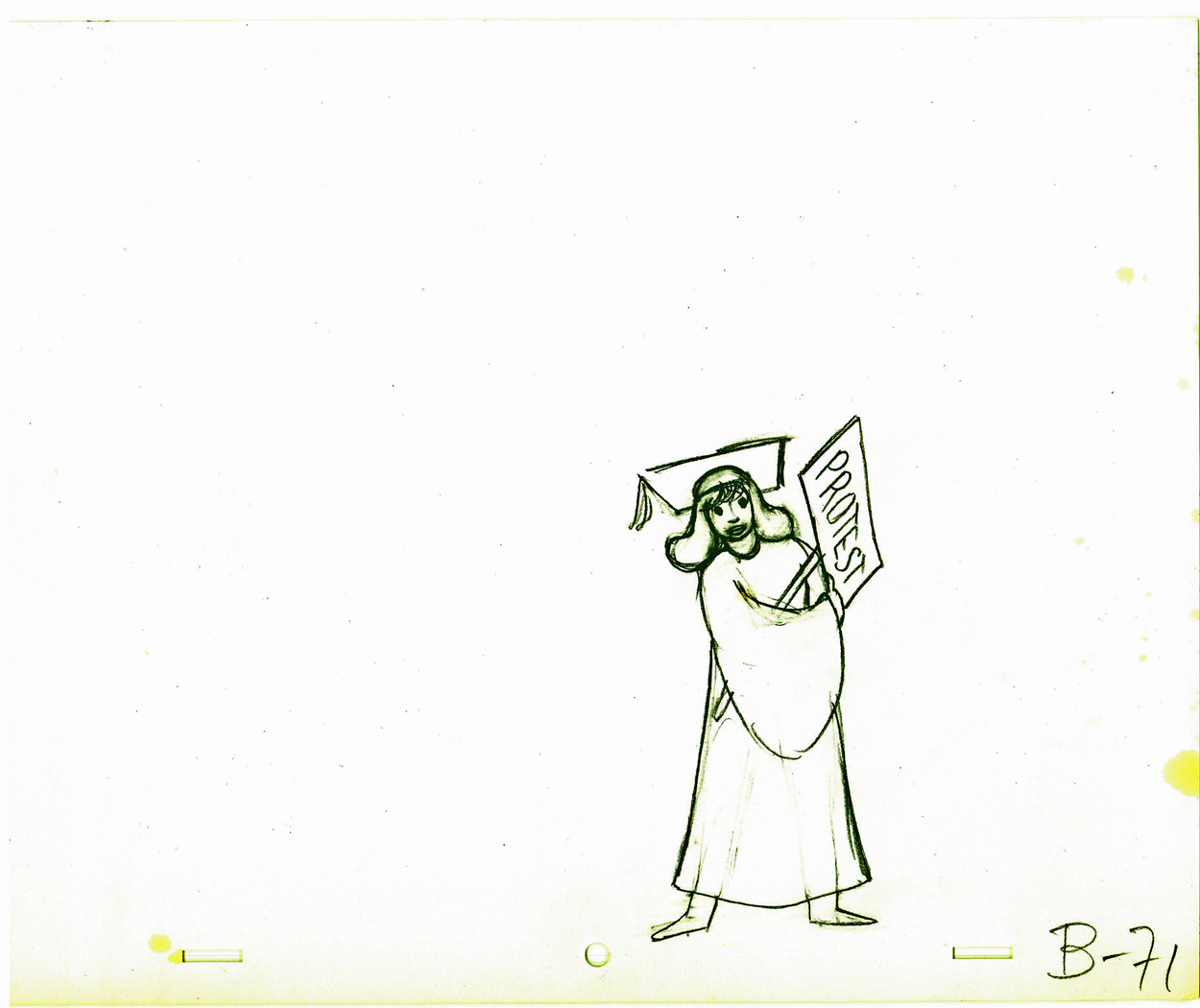
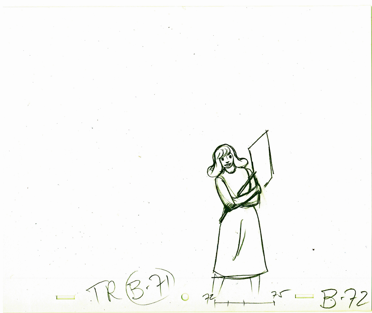
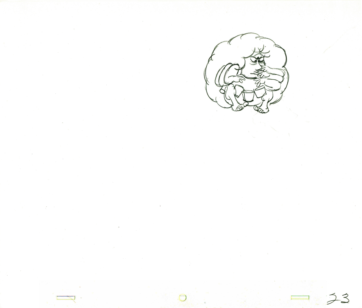
Viva à la Tissa
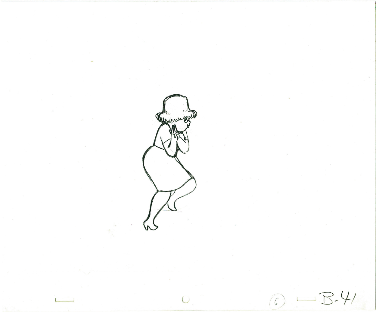
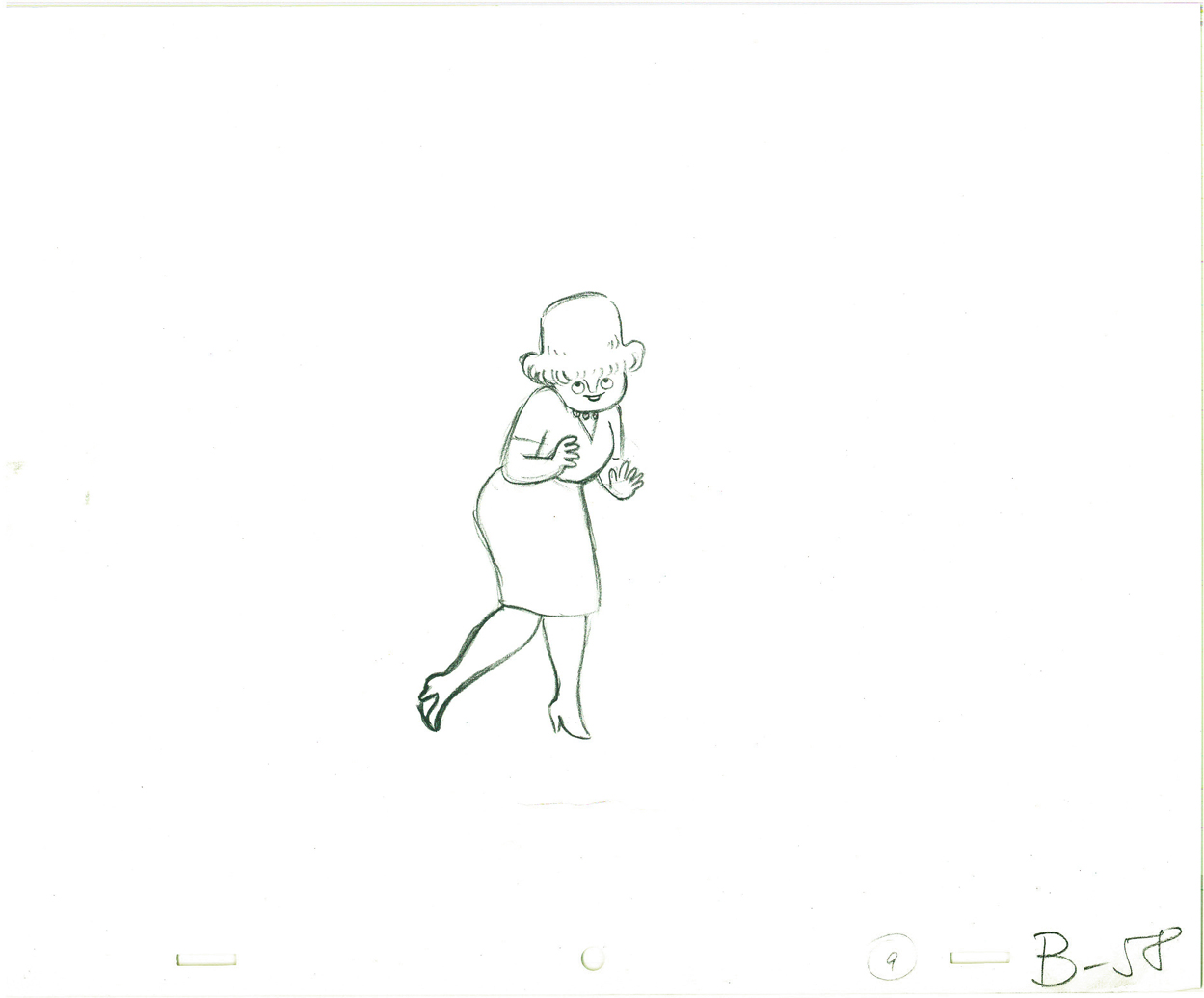
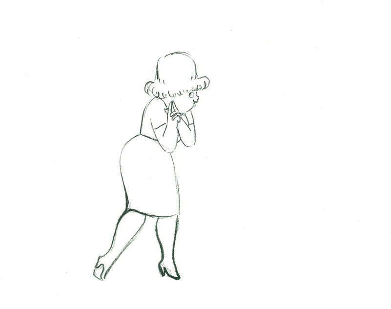
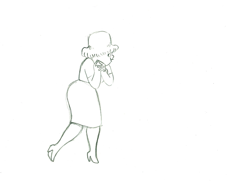
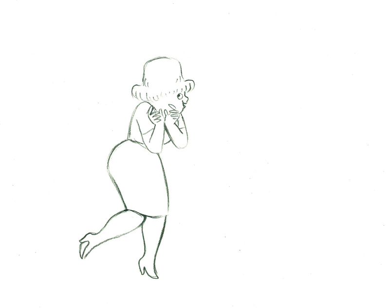
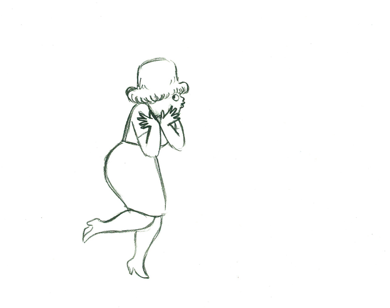
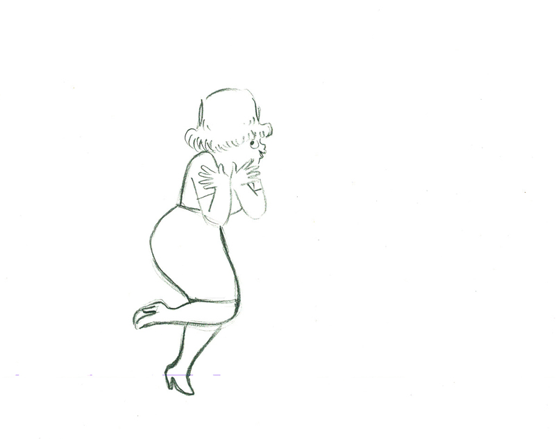
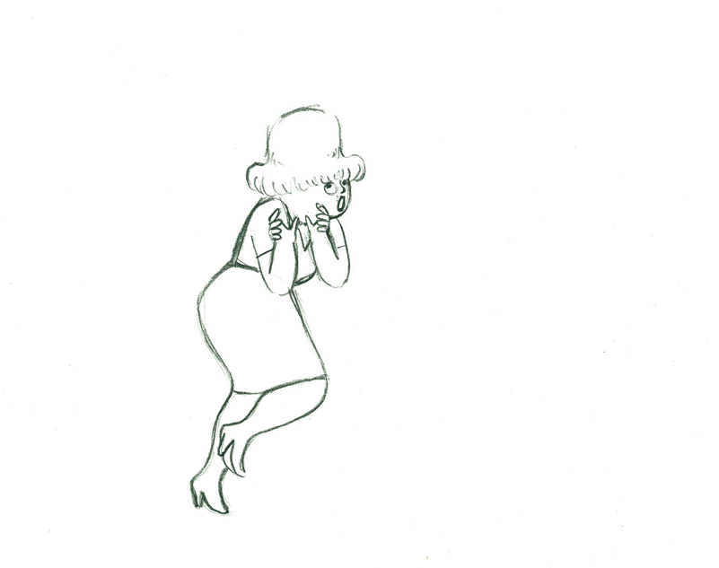
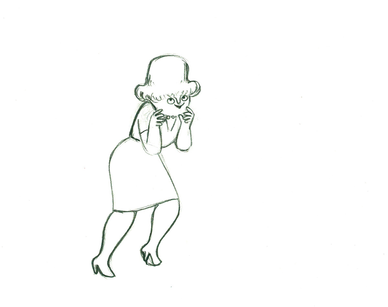
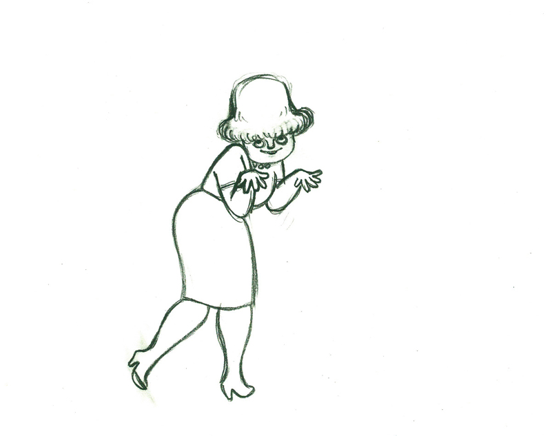
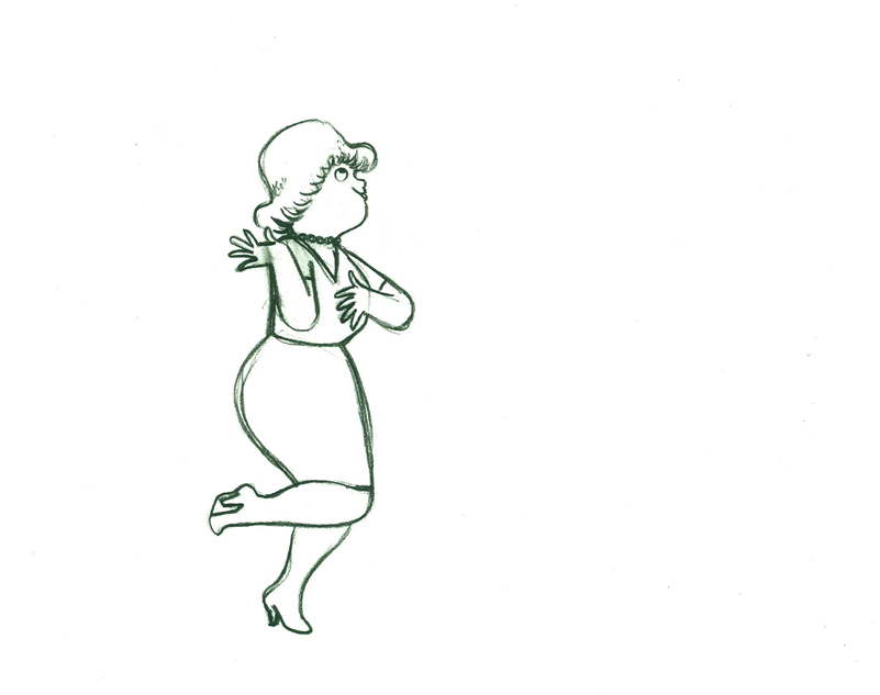
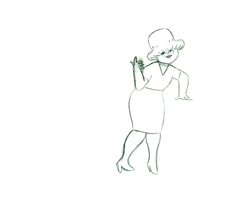
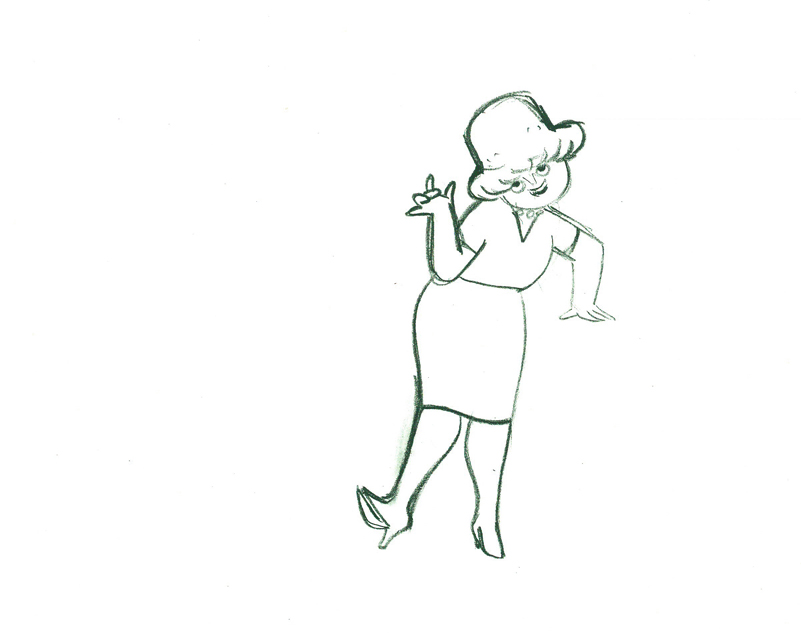
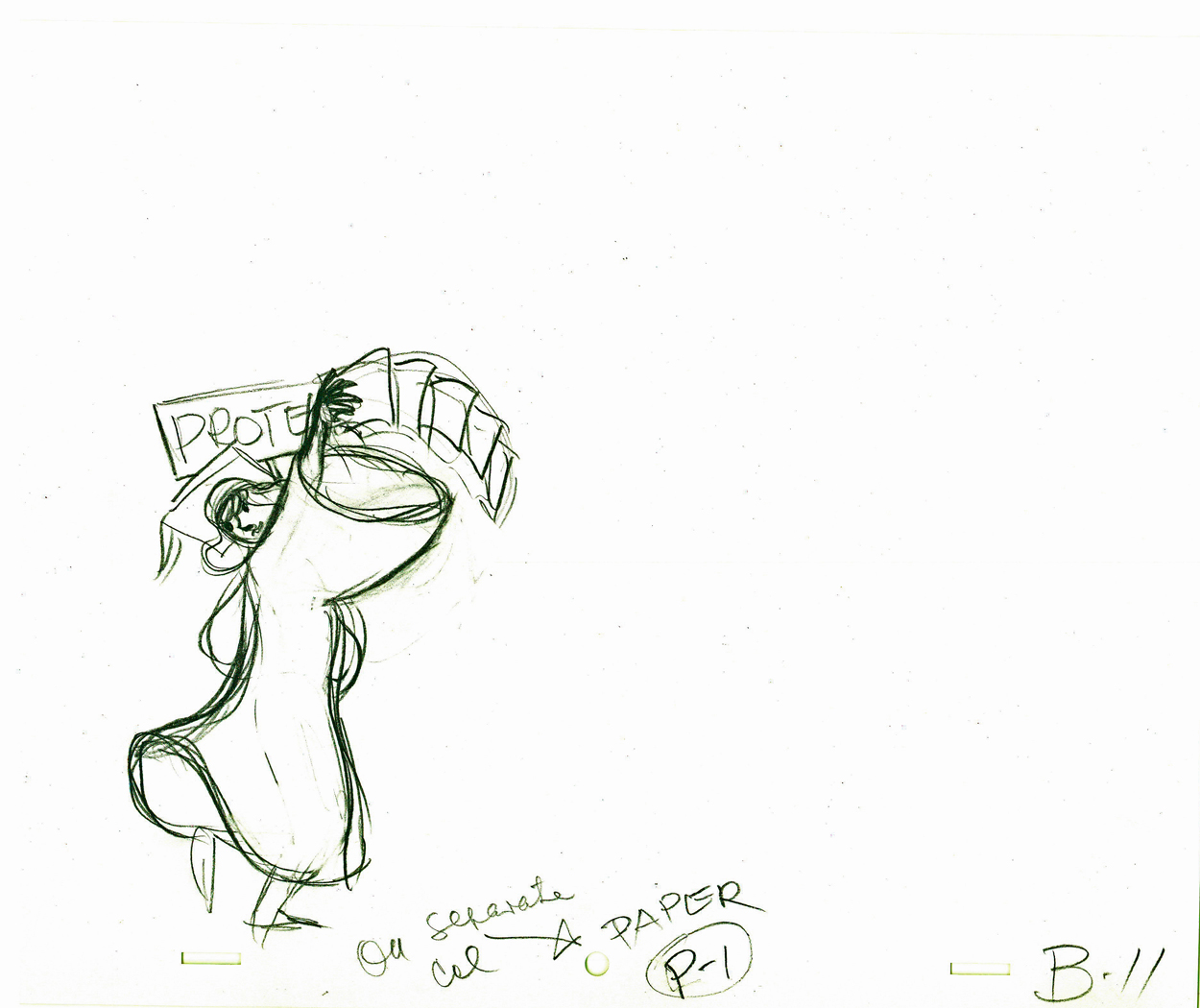
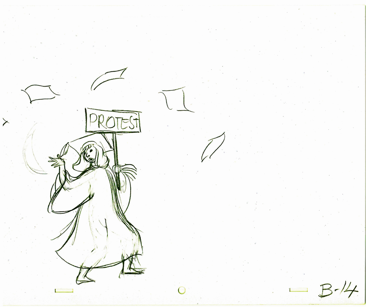
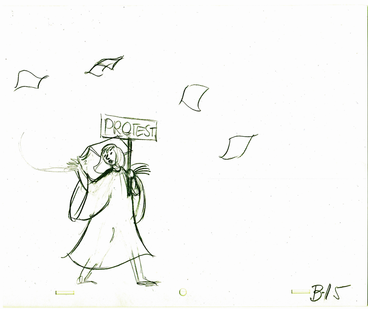
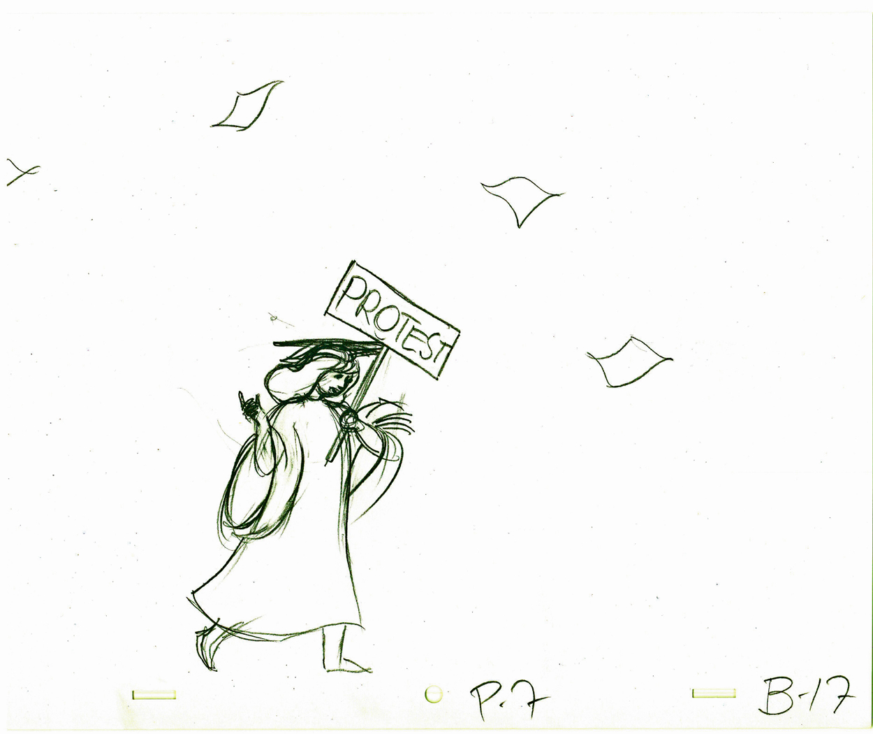
- Tissa David animated a VIVA paper towel spot for John Hubley. Here’s a scene wherein the lead, a woman, walks through (Bg pans behind her at .25 per drawing) toward the kitchen, where she stops.
Instead of giving you the entire page of animation paper, I’ve trimmed it down to just include the character and her walk. Here are four examples of what the entire drawing looks like, untrimmed.
 B41
B41
 B58
B58
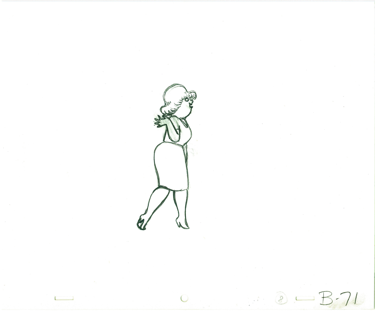 B71
B71
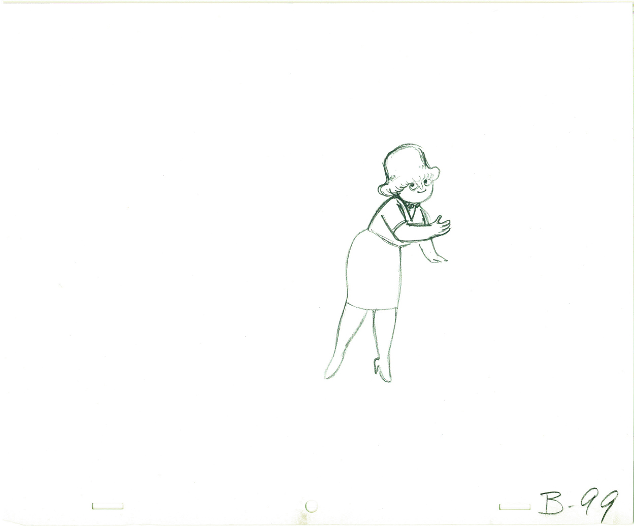 B99
B99
And here are all the drawings for the scene cropped:
 41
41
 42
42
 43
43
 44
44
 45
45
 46
46
 47
47
 48
48
 49
49
 50
50
 51
51
 52
52
 53
53
 54
54
 55
55
 56
56
 57
57
 58
58
 59
59
 60
60
 61
61
 62
62
 63
63
 64
64
 65
65
 66
66
 67
67
 68
68
 69
69
 70
70
 71
71
 72
72
 73
73
 74
74
 75
75
 76
76
 77
77
 78
78
 79
79
 80
80
 81
81
 82
82
 83
83
 84
84
 85
85
 86
86
 87
87
 88
88
 89
89
 90
90
 91
91
 92
92
 93
93
 93½
93½
 94
94
 94½
94½
 95
95
 95½
95½
 96
96
 97
97
 98
98
 99
99
________________________
.
The following is a QT of the entire scene with all the drawings included.
Since I didn’t have exposure sheets, I put everything on two’s straight ahead.
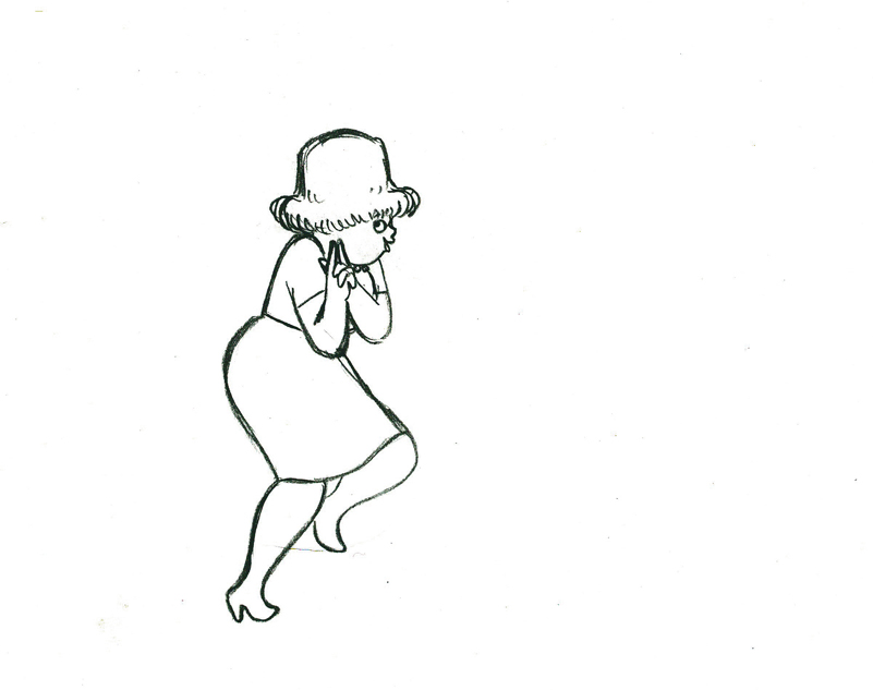
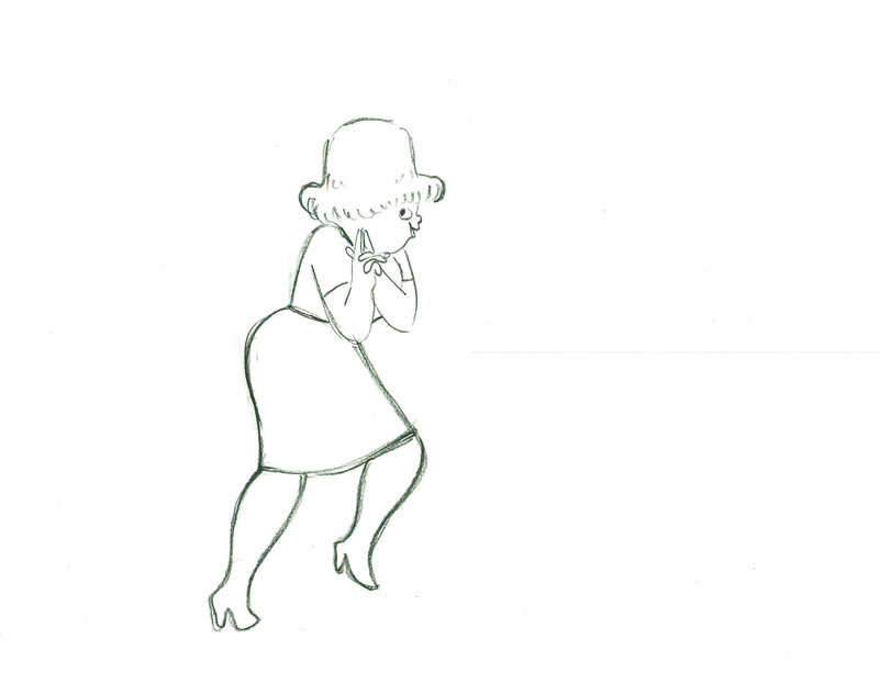
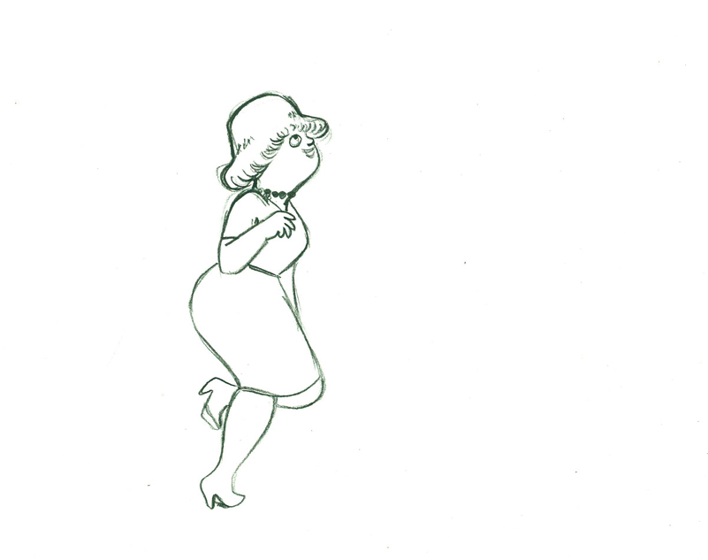
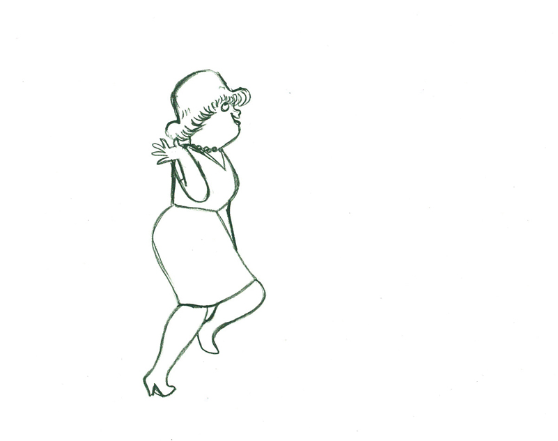
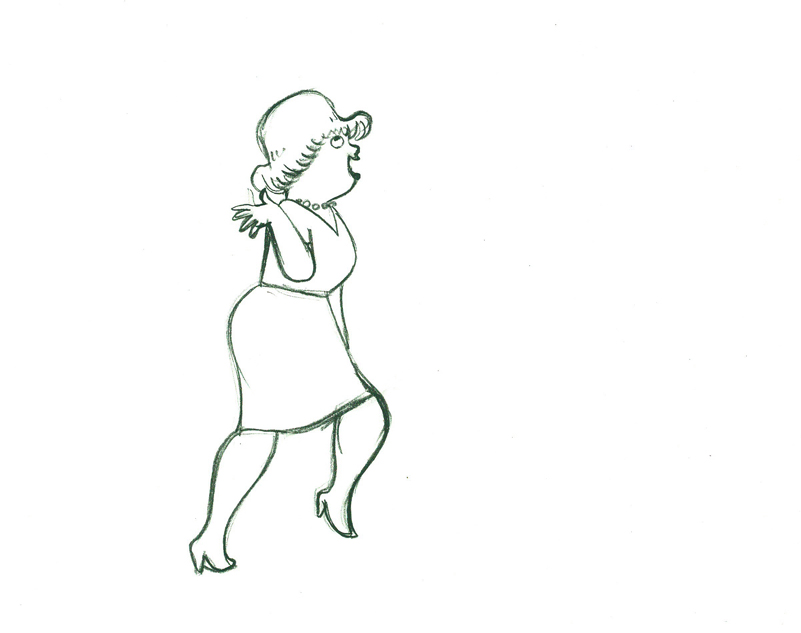
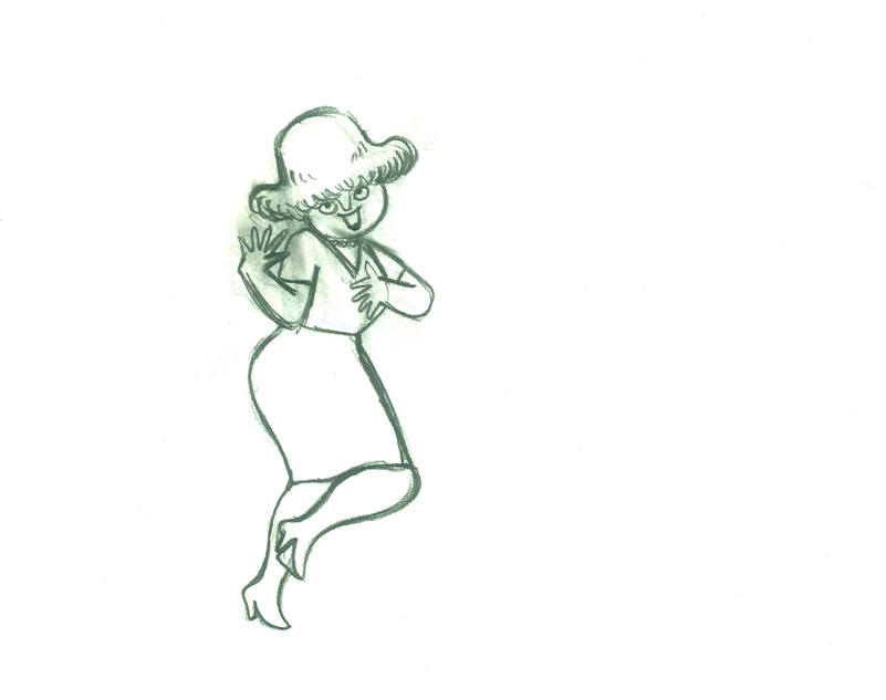
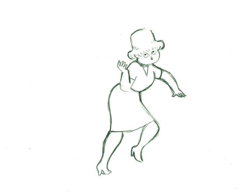
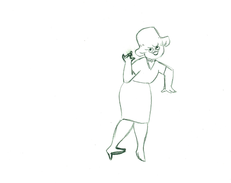
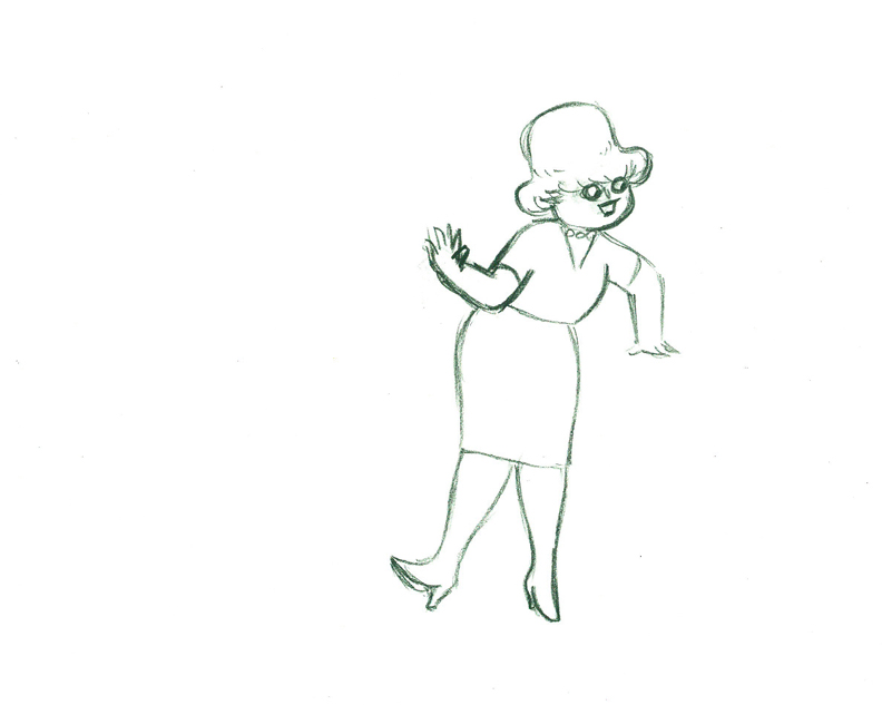
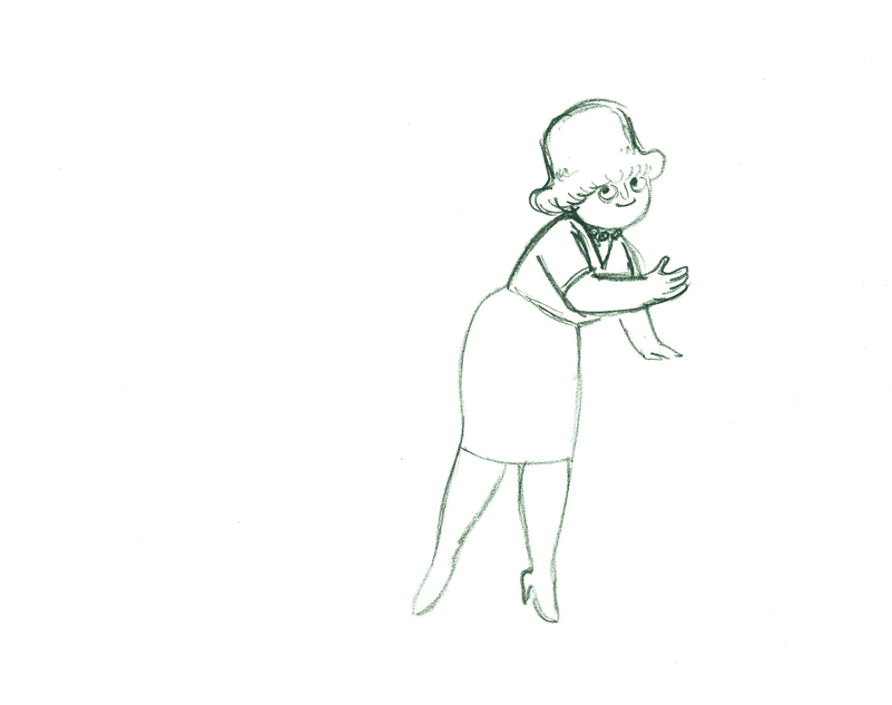
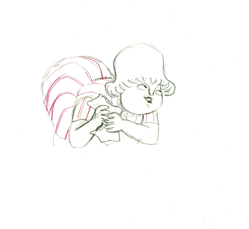
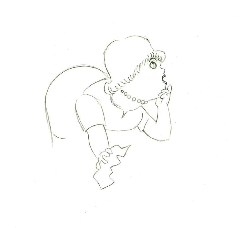
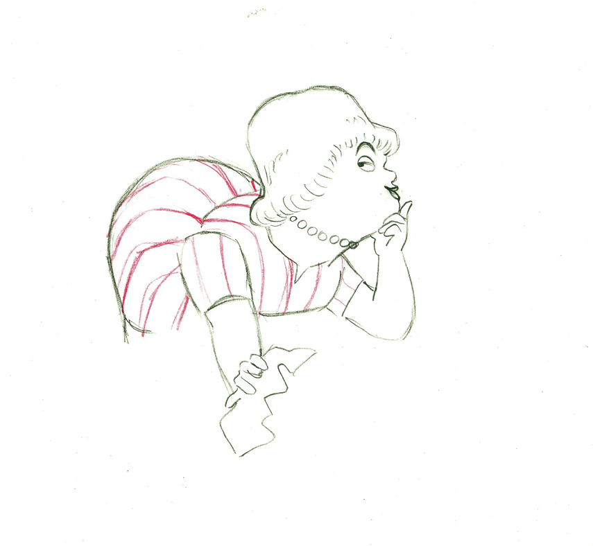
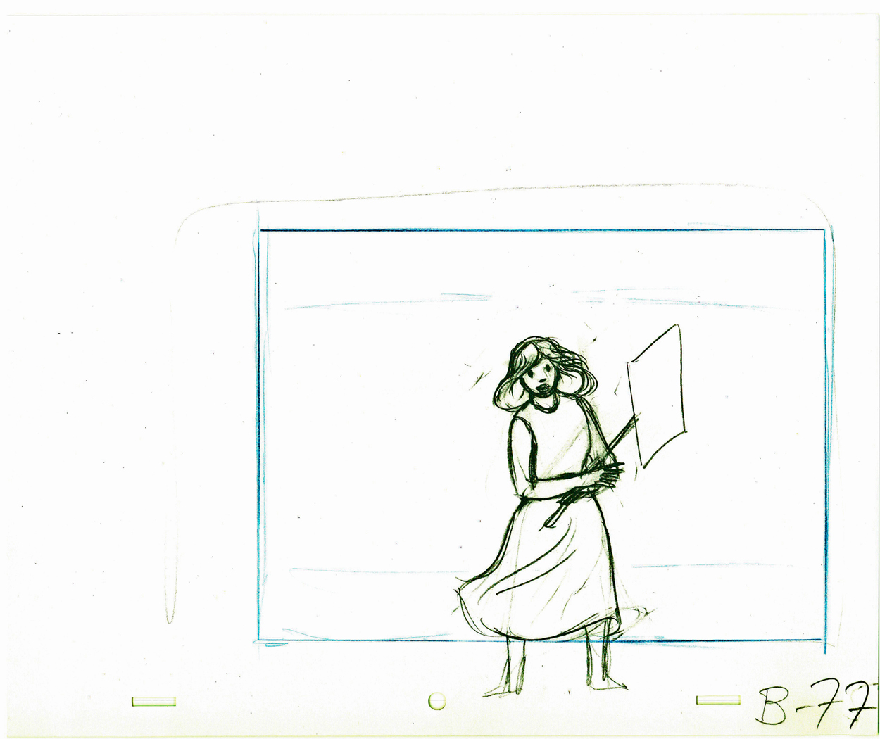
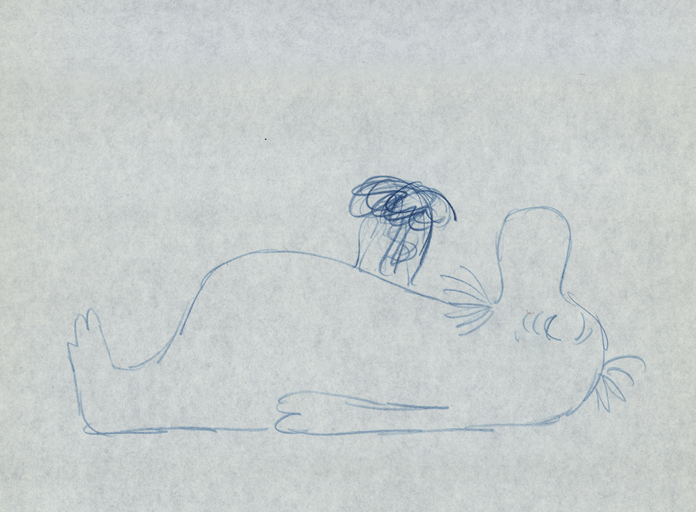
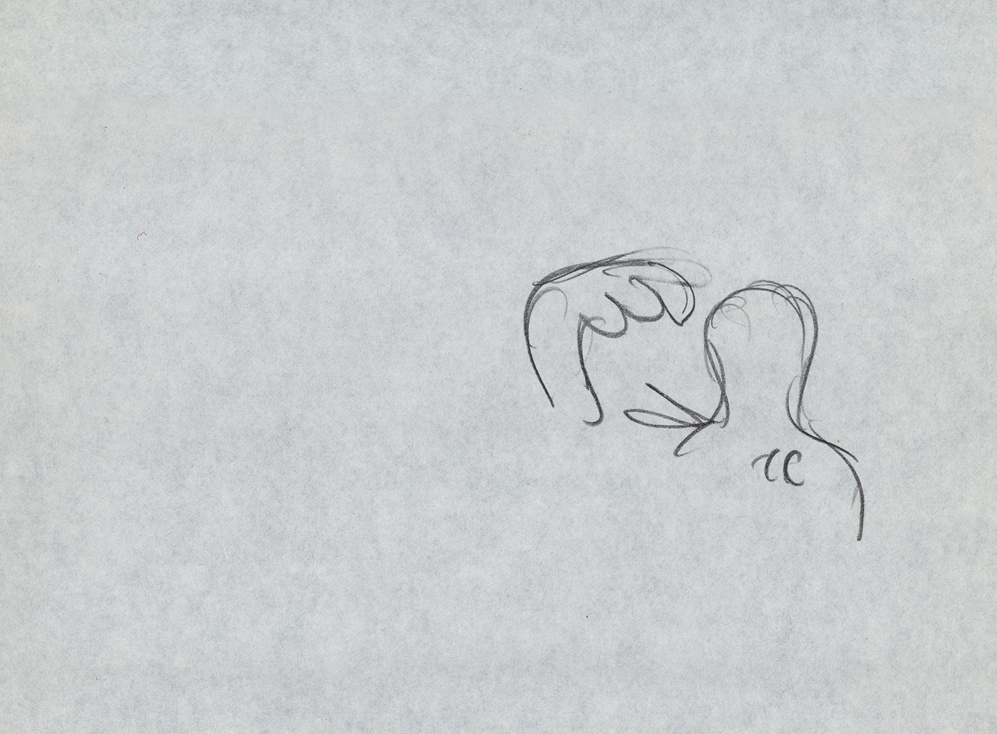
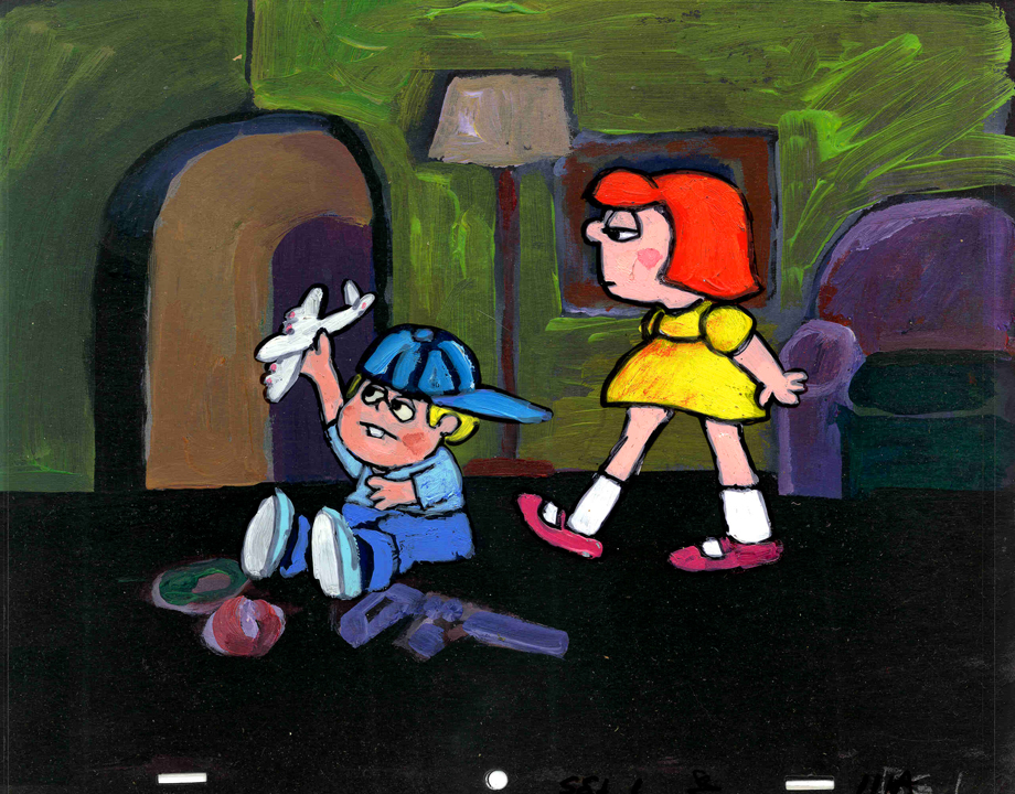
- Here’s what looks like a simple move done by Tissa David when she animated this Viva, paper towel commercial.
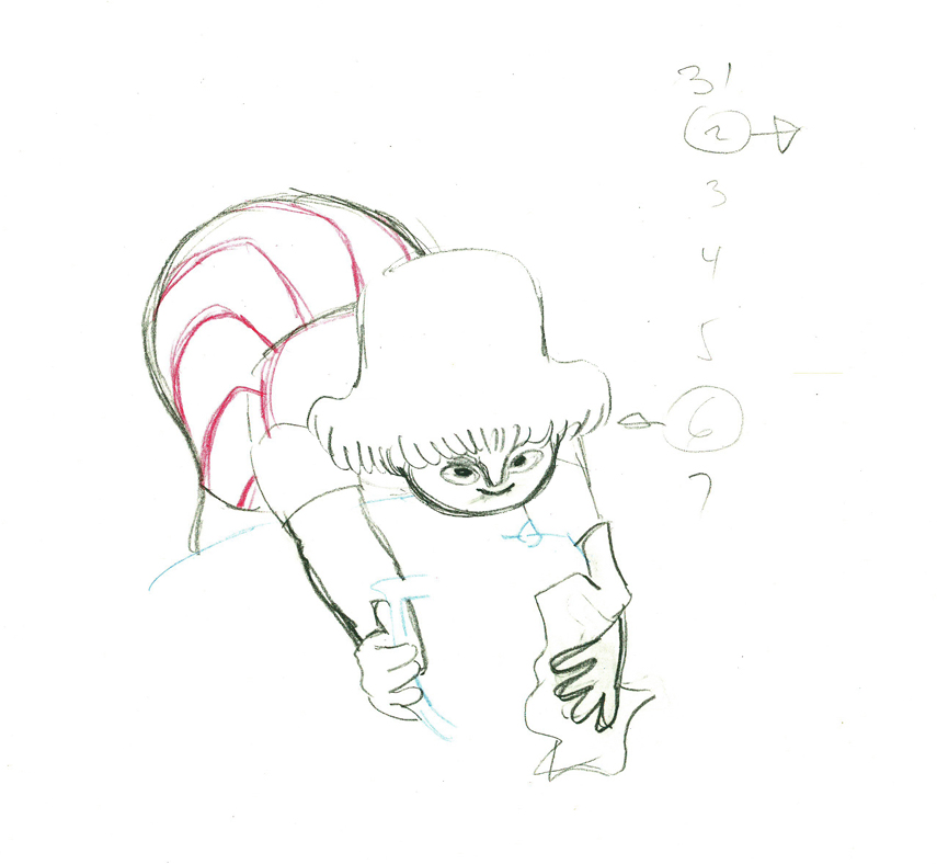
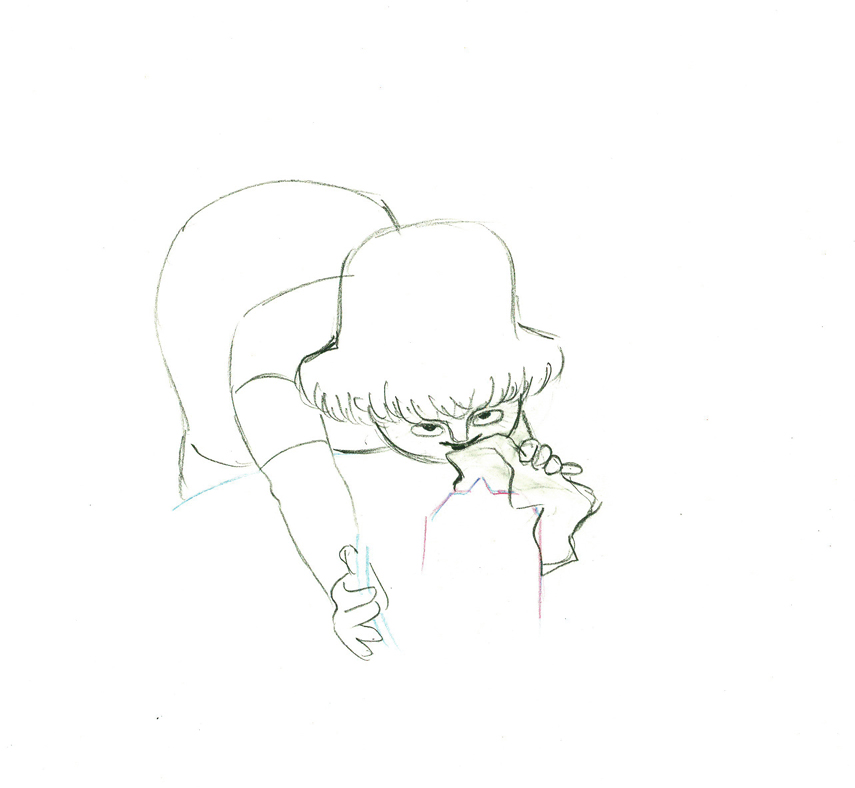
The character’s move in this scene is a complicated one done simply. She has been bent over, cleaning with her paper towel, and she moves up. You can follow the overlapping action as her eyes pull her up, head turn, and body follows.
The stripes will come and go. Tissa depends on someone else to concentrate on this material when she’s working on a commercial.
 e37
e37(Click any image to enlarge.)
 38
38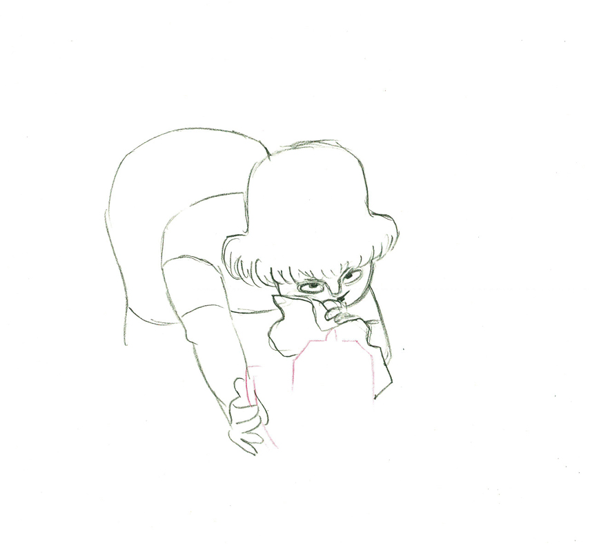 39
39
 40
40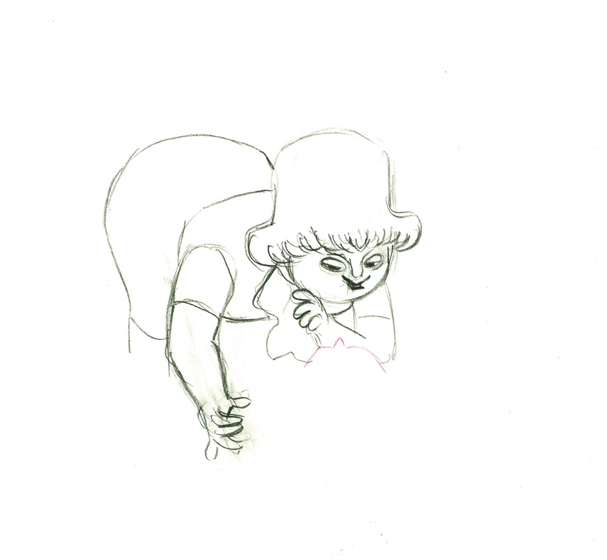 41
41
 42
42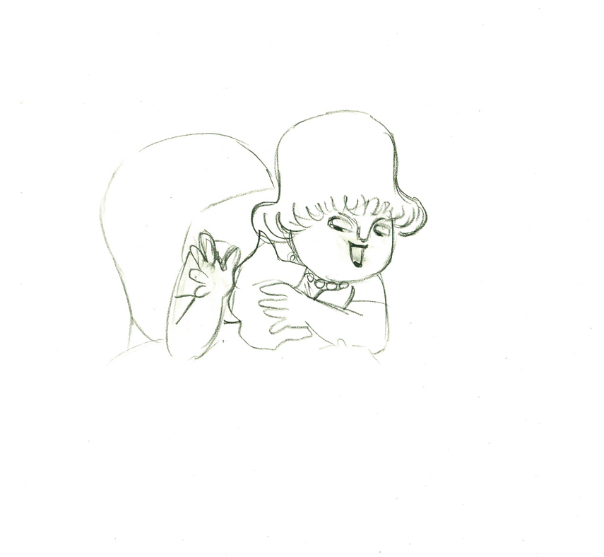 43
43
 e44
e44
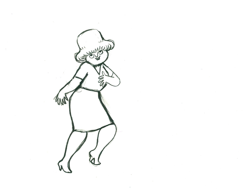
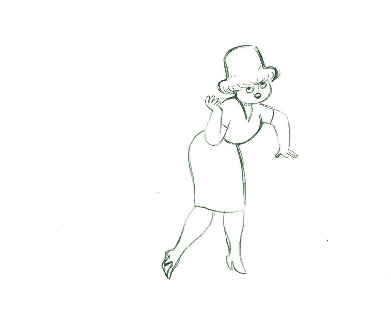
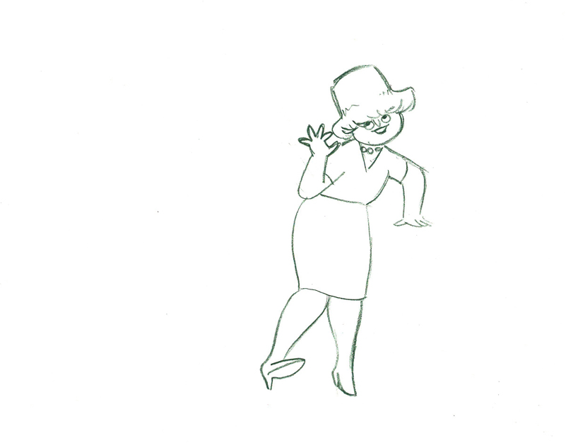
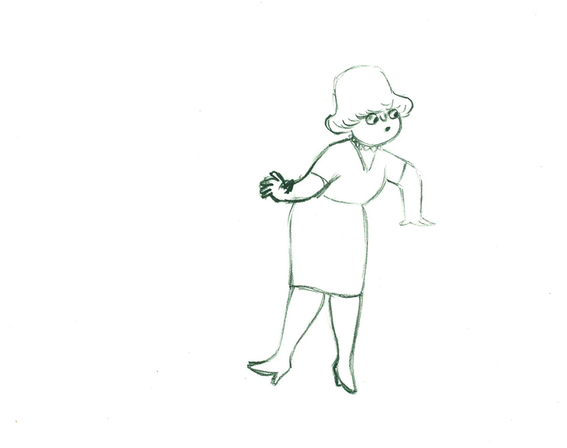
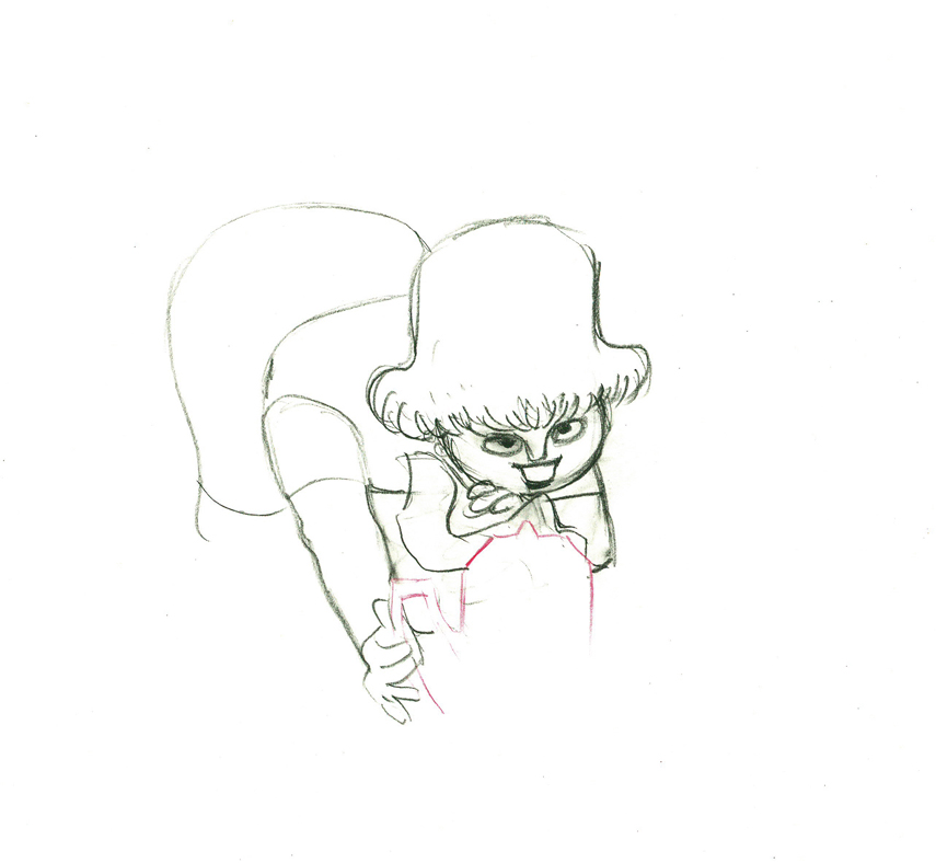
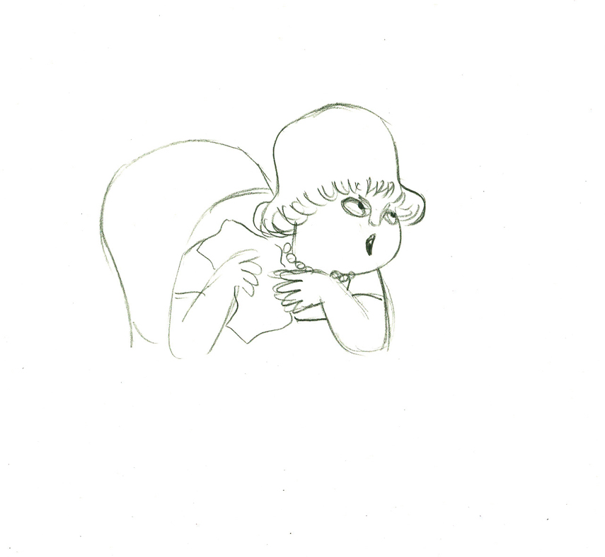
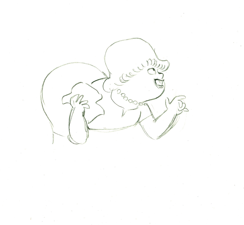
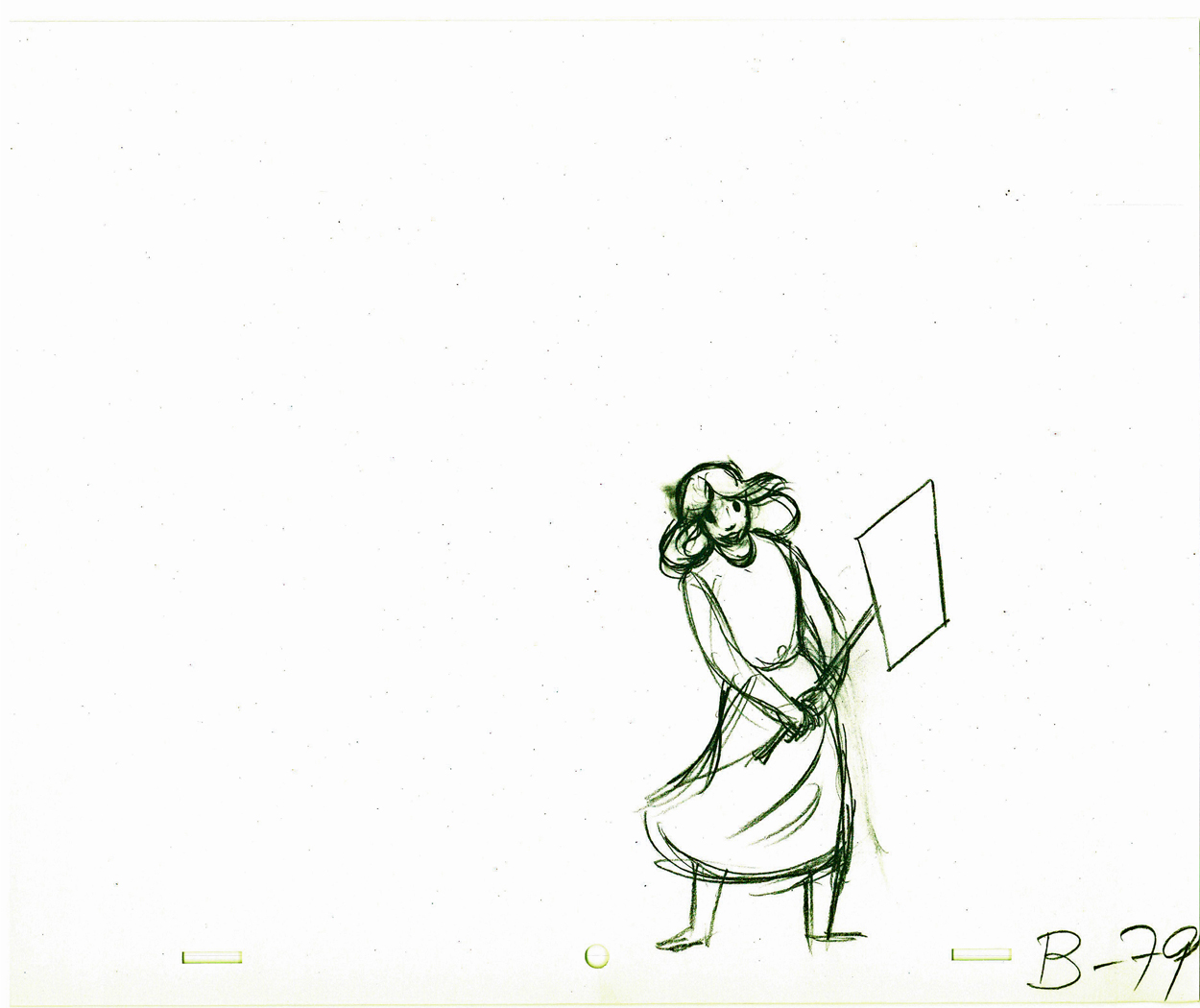
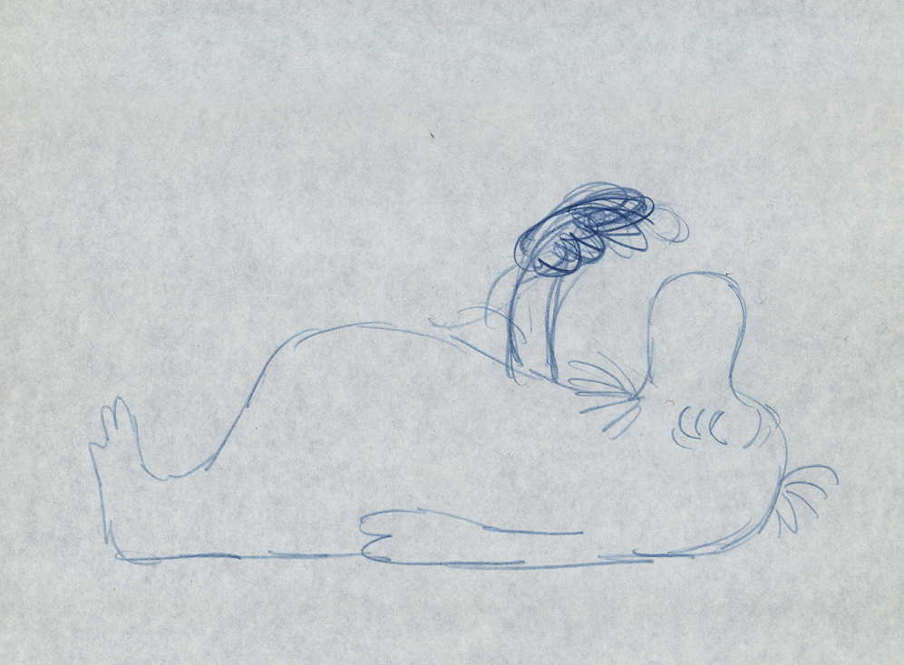
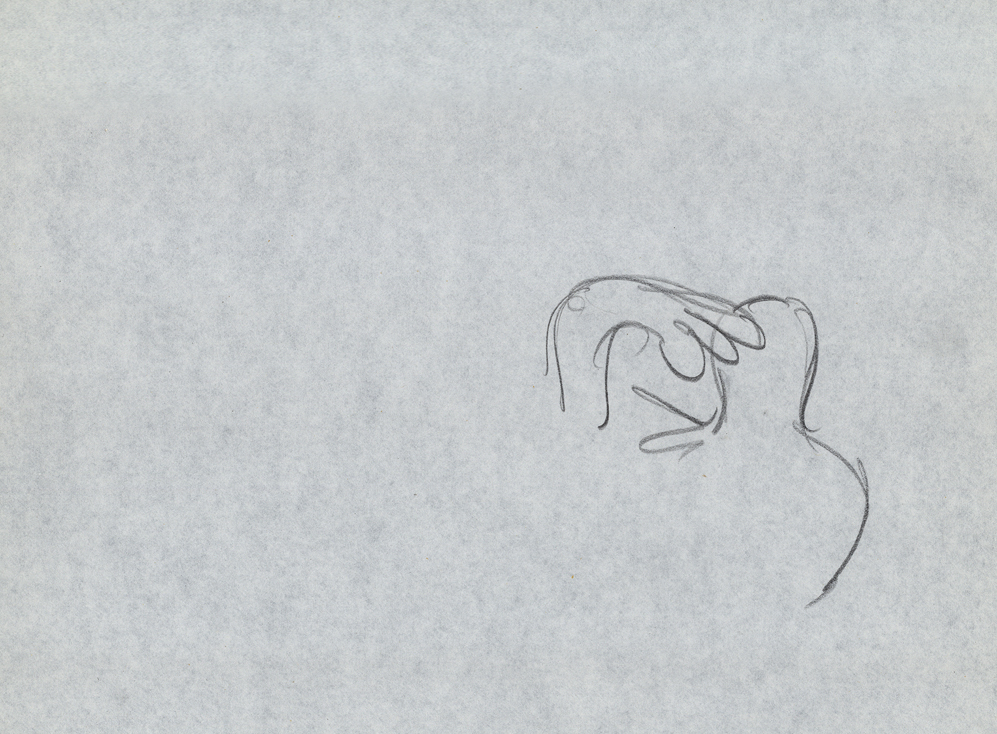
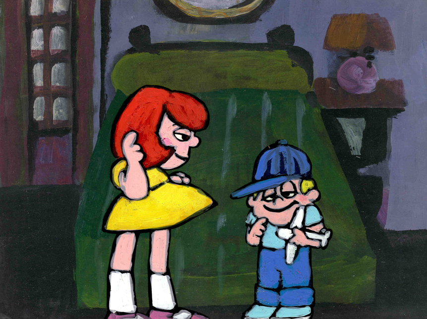
Her eyes point in the direction she wants to go,
and the rest of the scene moves her up and into profile.
This key move is hidden under the exchange of the
paper towel from one hand to the other.
 45
45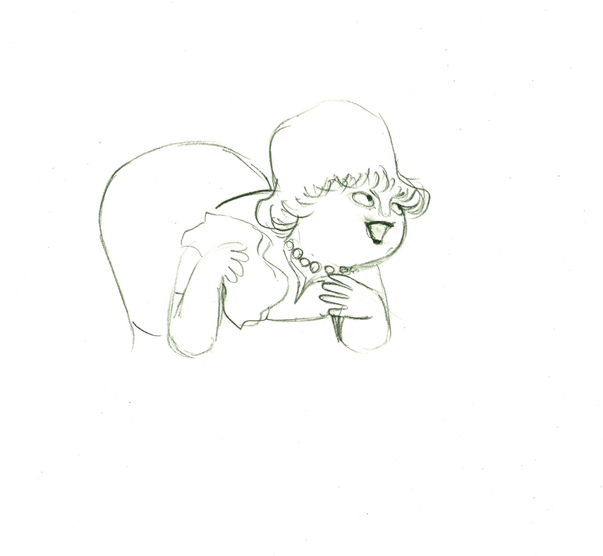 46
46
 47
47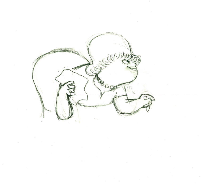 48
48
 49
49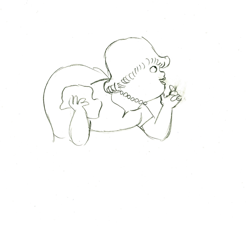 50
50
 e51
e51
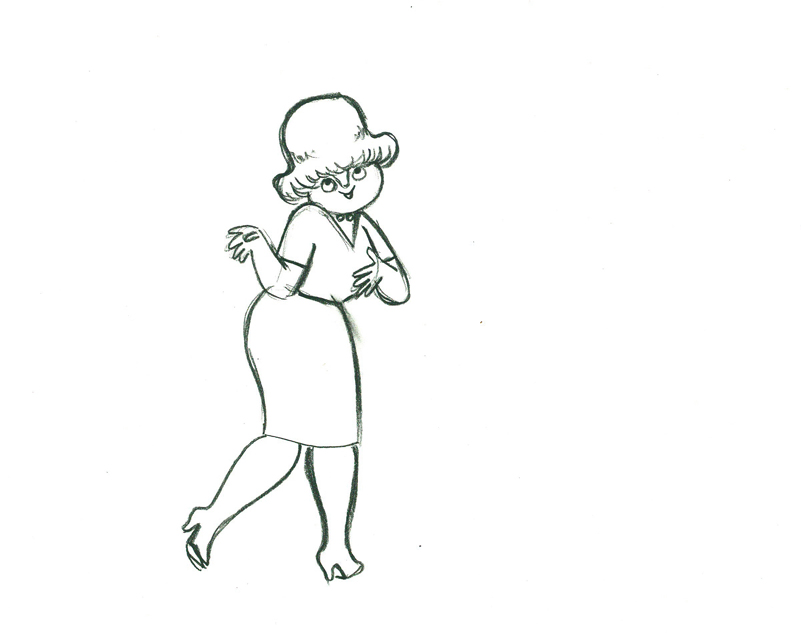
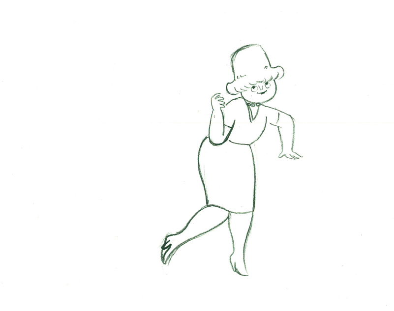
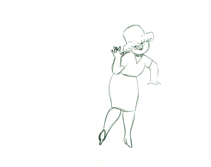
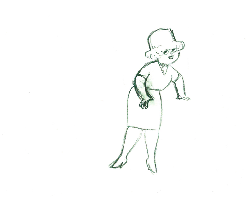
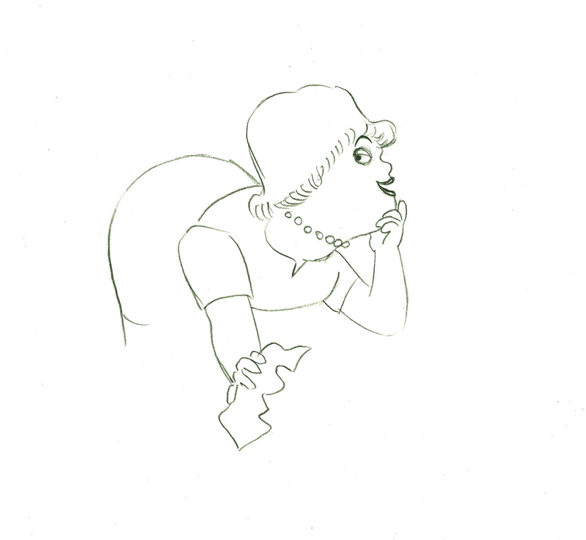
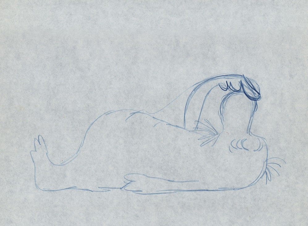
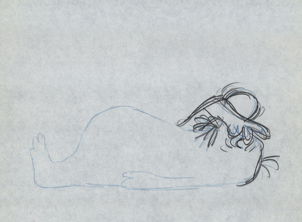
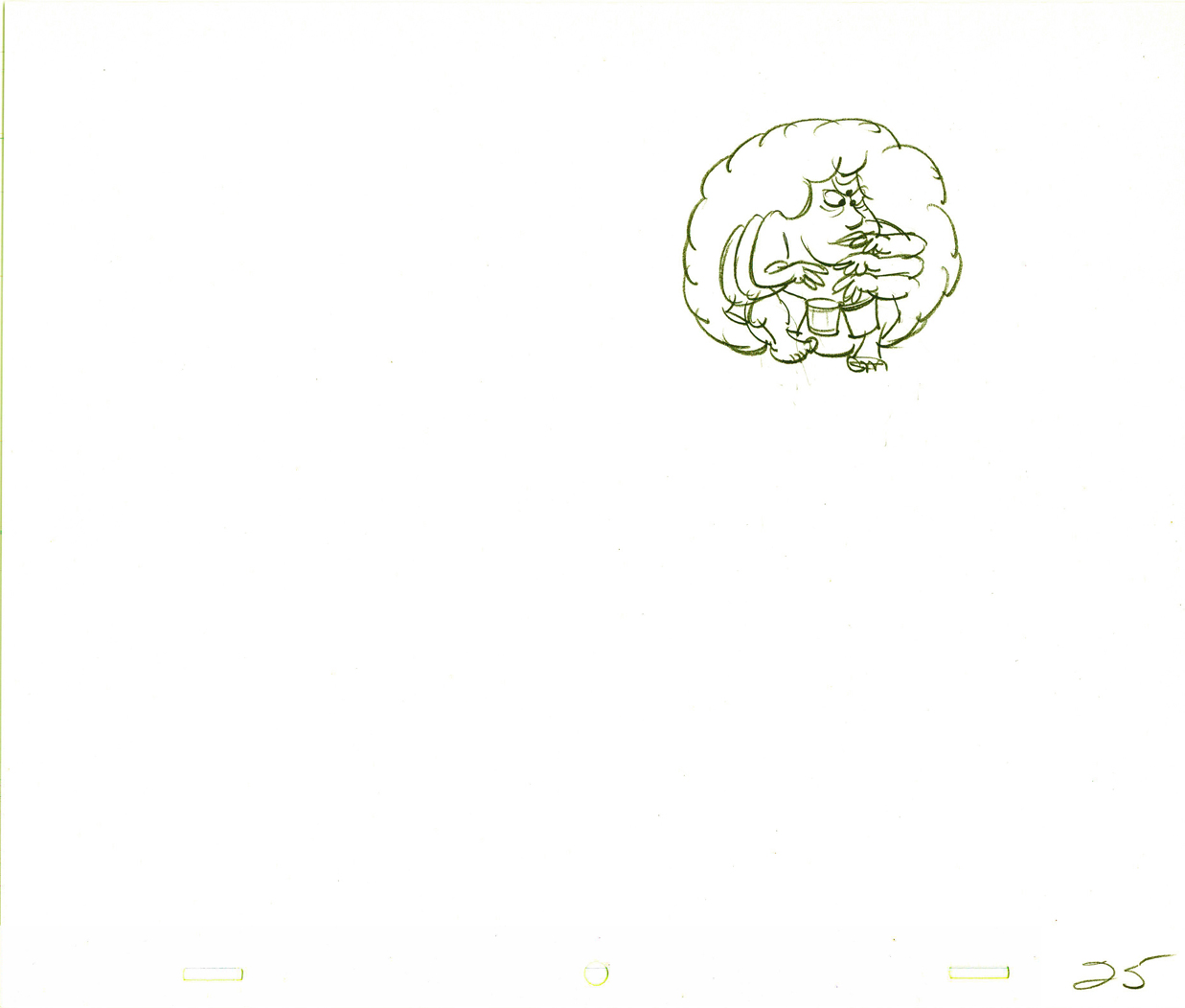
She stops to think (accenting her monologue.)
 52
52 53
53
 54
54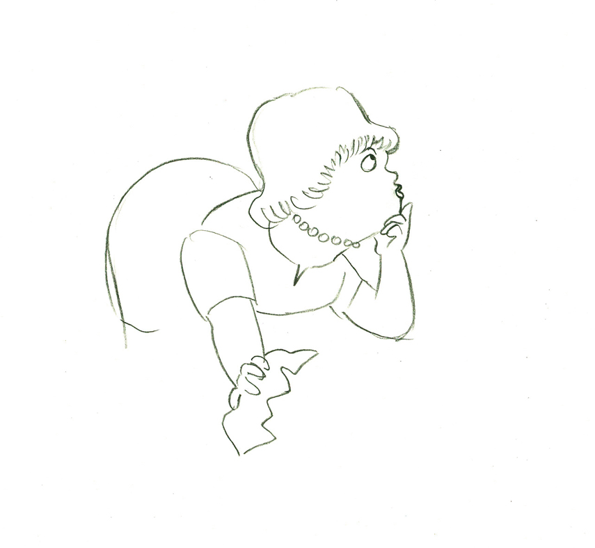 55
55
 56
56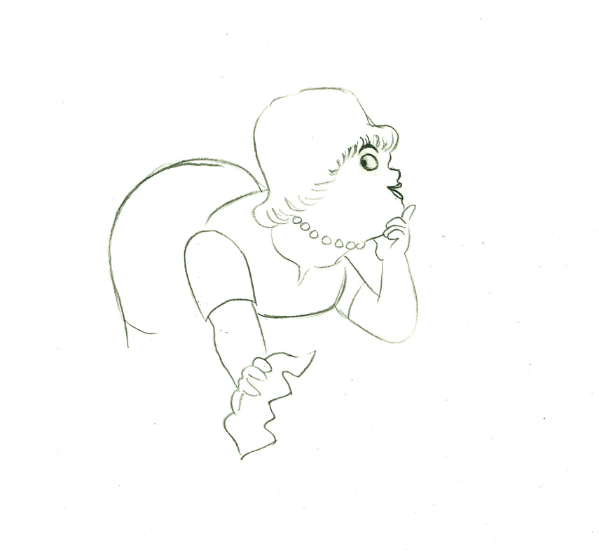 57
57
 e58
e58
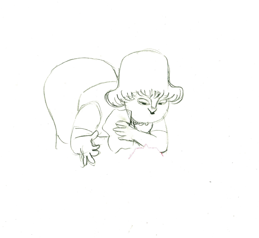
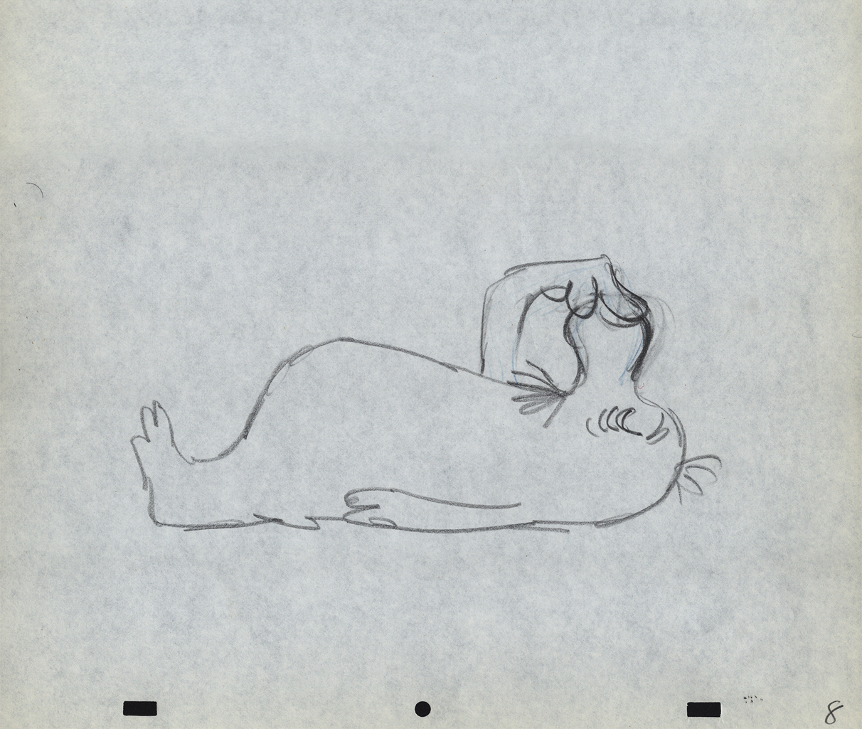
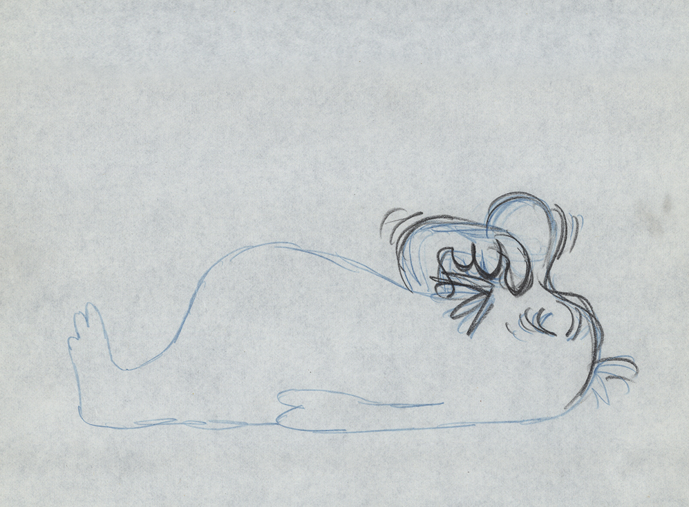
And she slyly looks back to camera to respond with her thought.
 e59
e59
She continues, all through this move, talking.
She’s pitching the product.
Here’s a QT of the piece:
Cleaning for VivaClick left side of the black bar to play.
Right side to watch single frame.
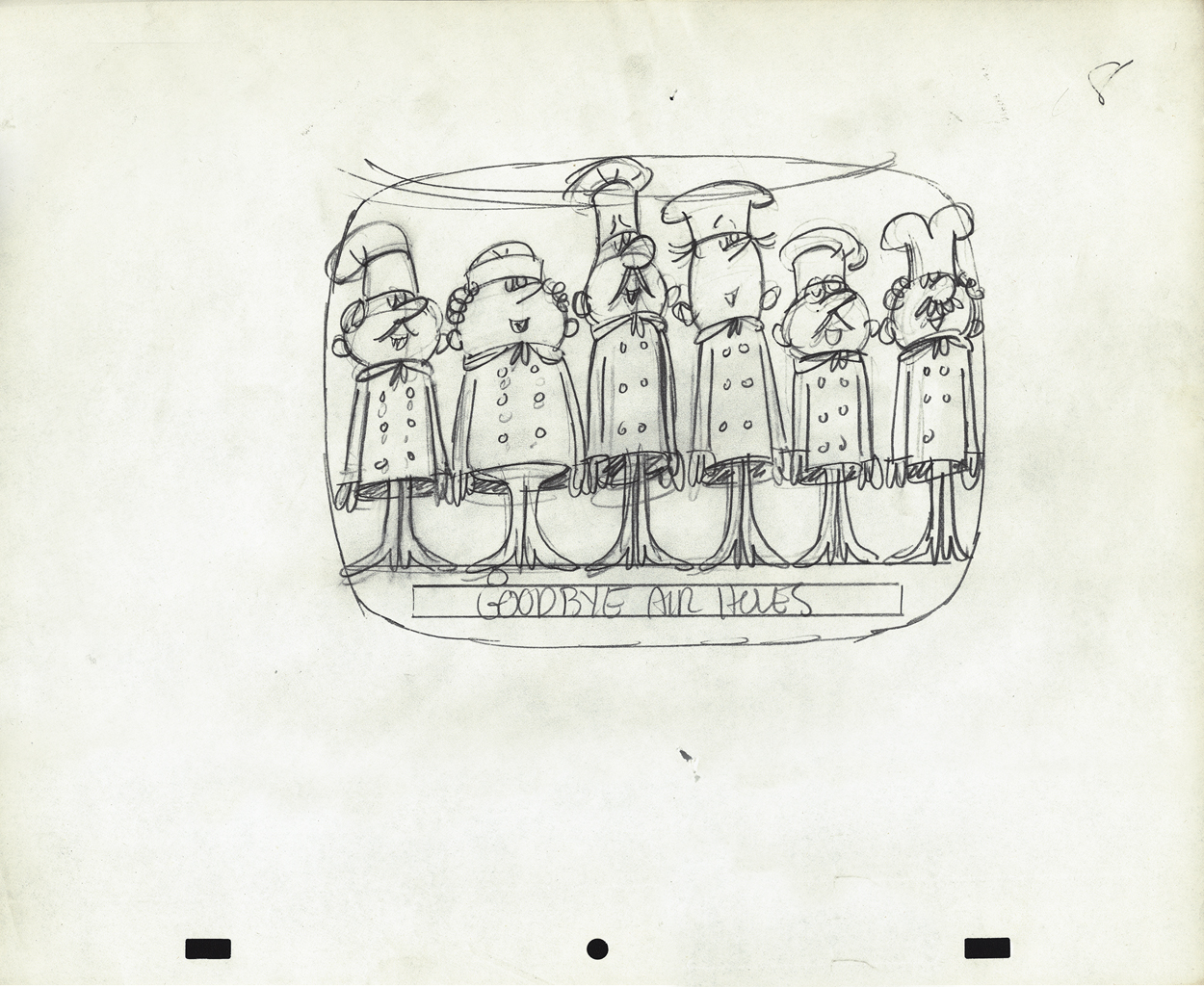
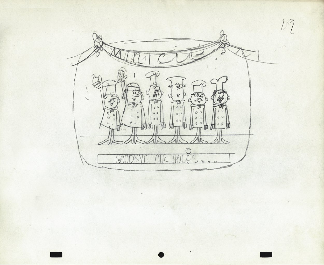
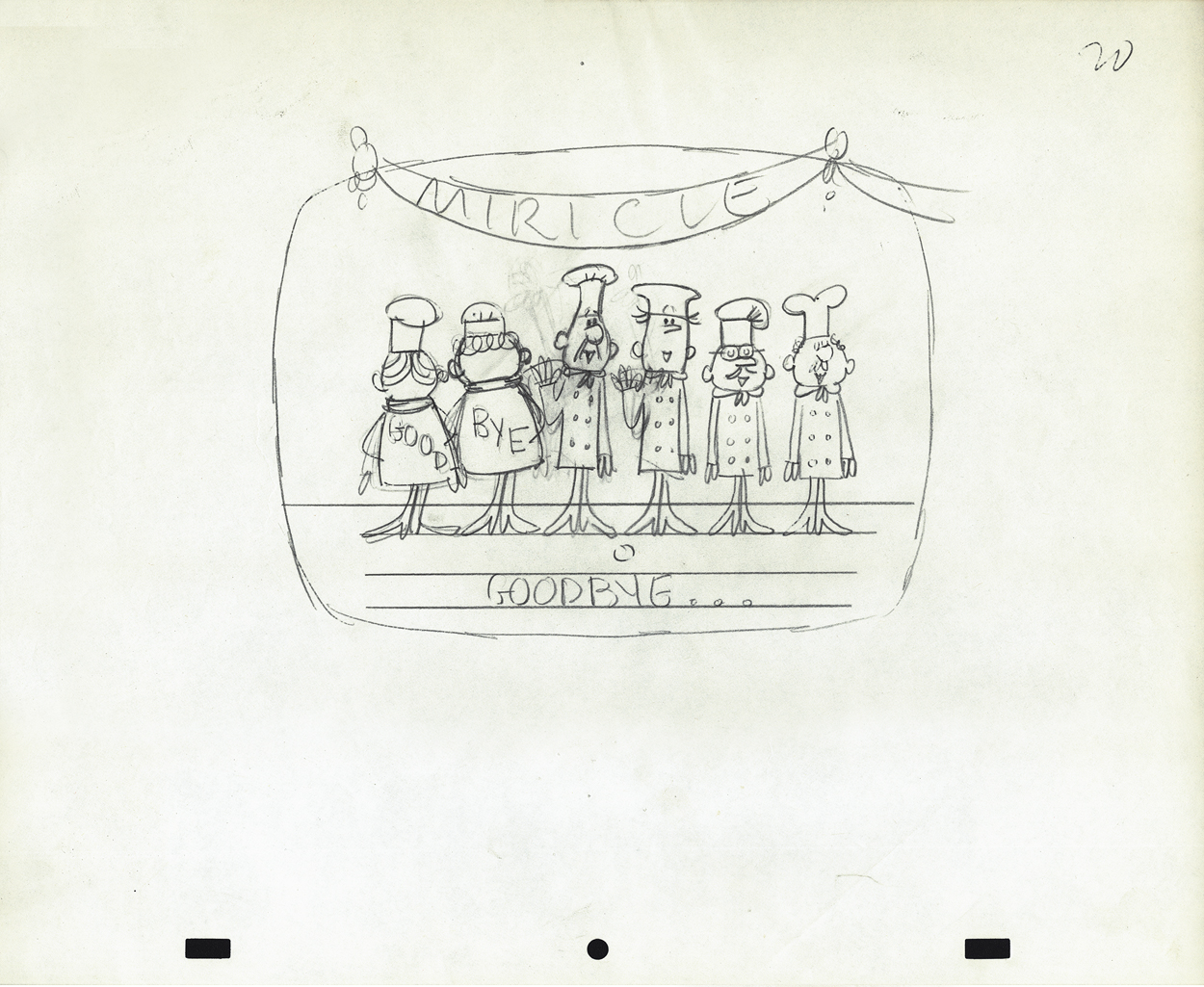
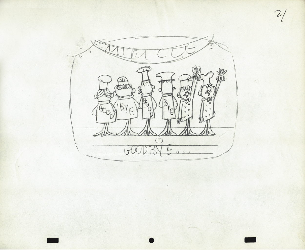
Animation Artifacts &commercial animation &Layout & Design 19 Sep 2012 05:22 am
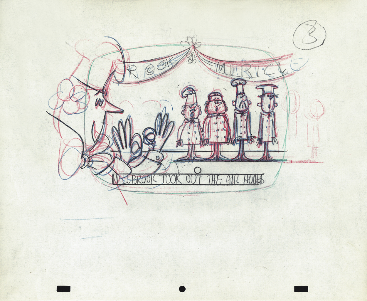
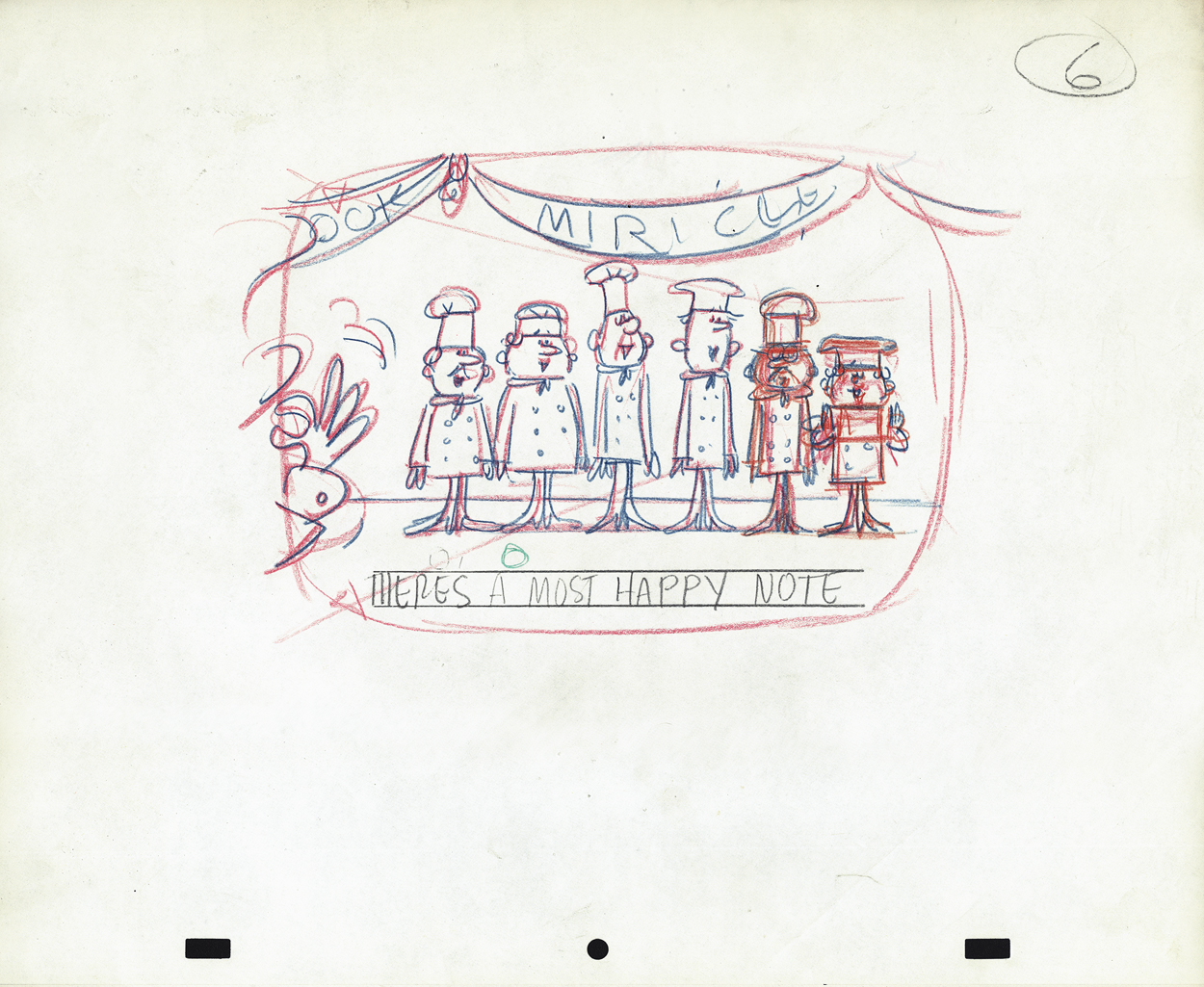
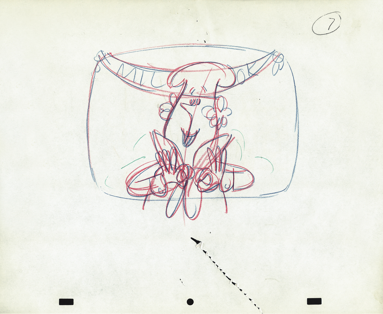
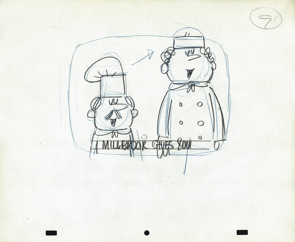
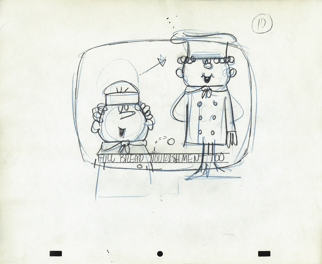
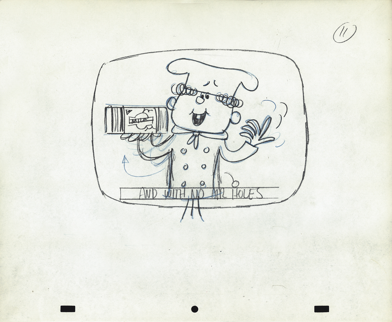
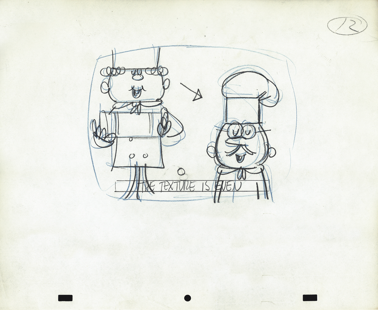
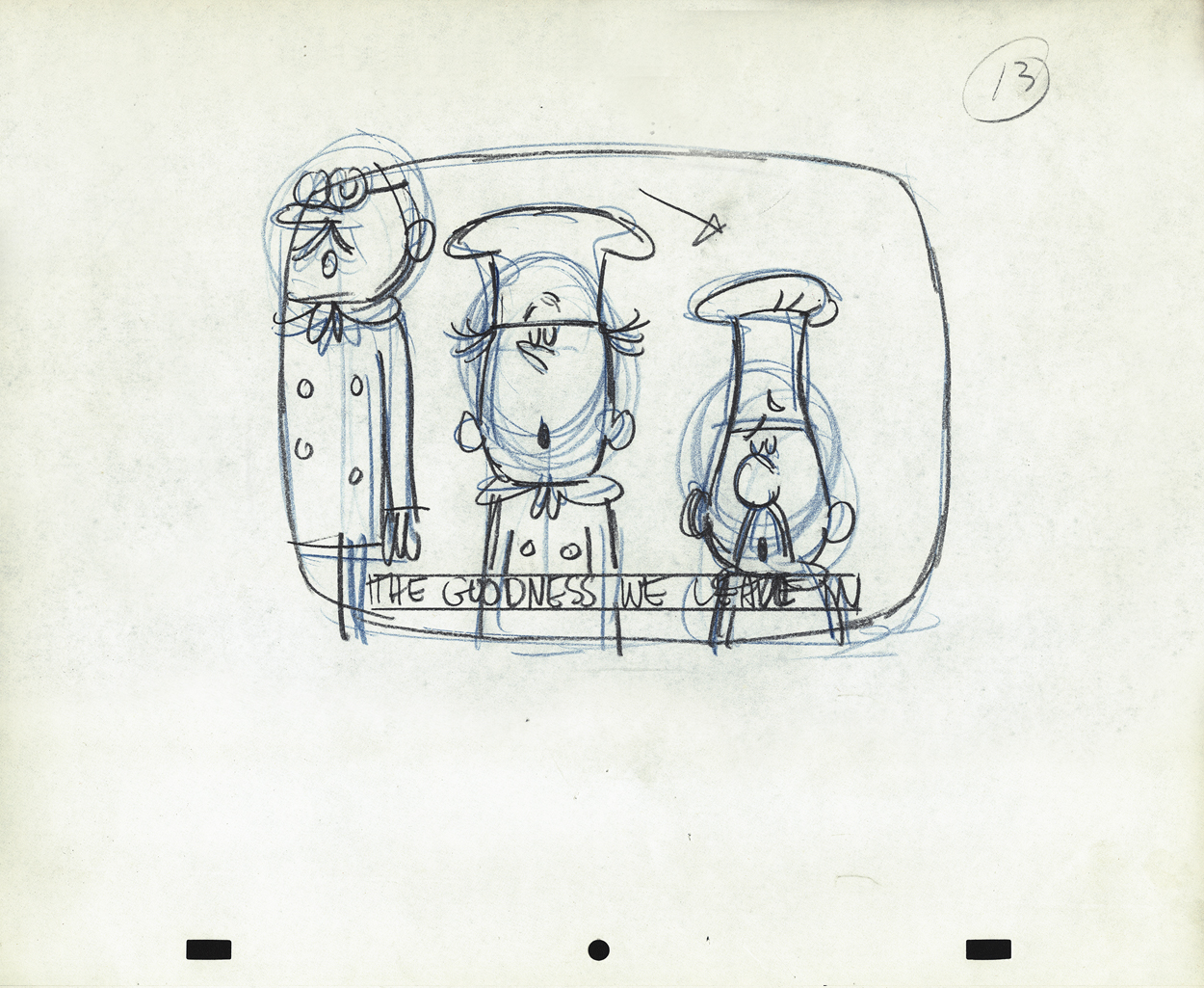
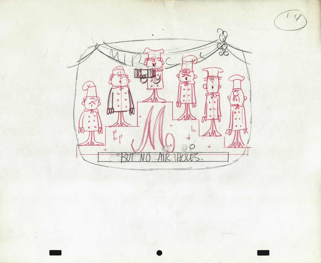
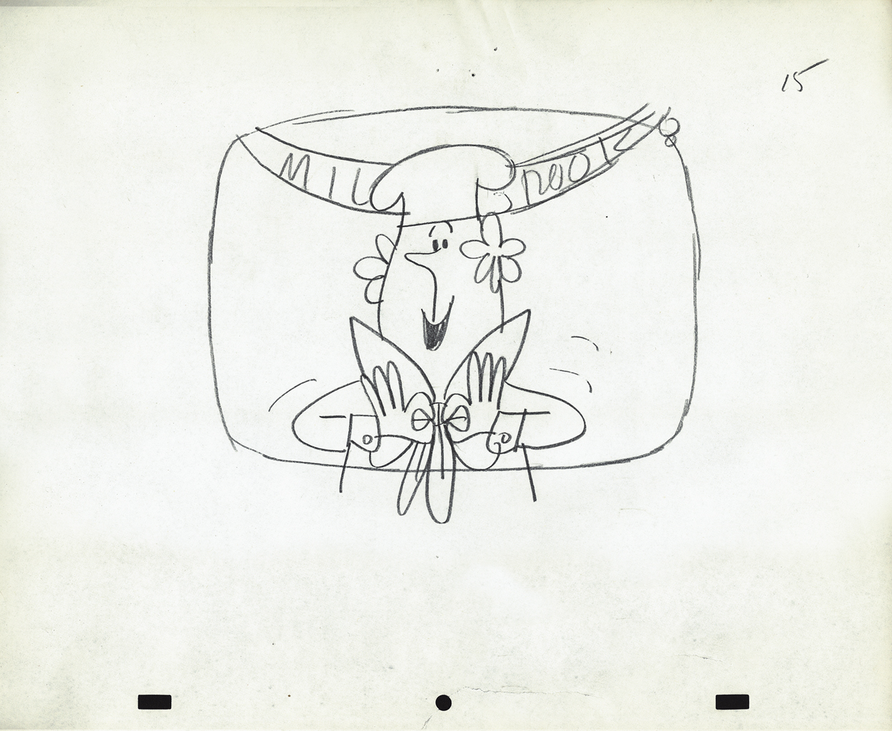
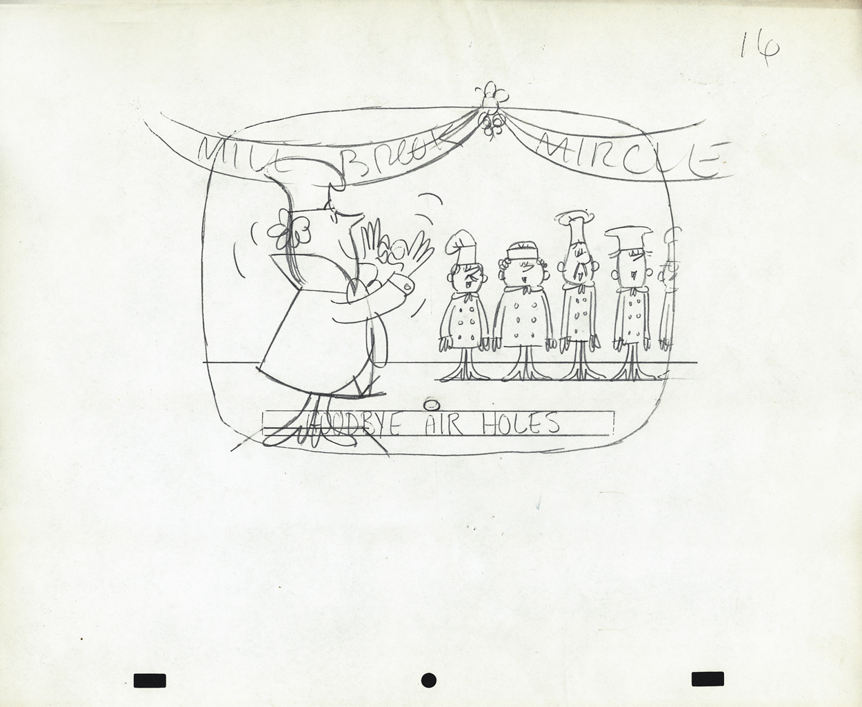
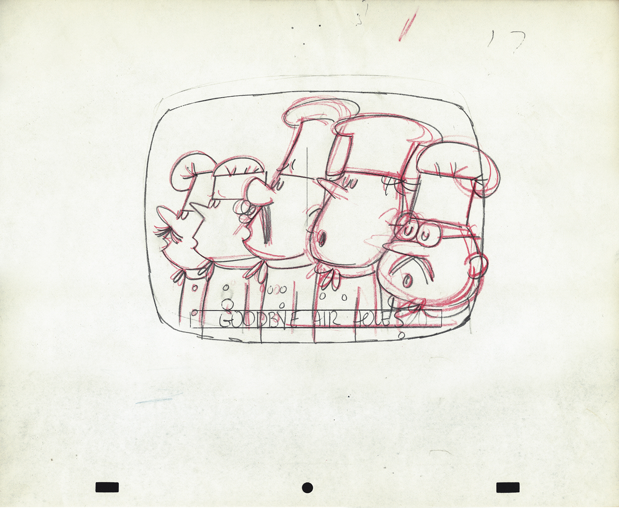
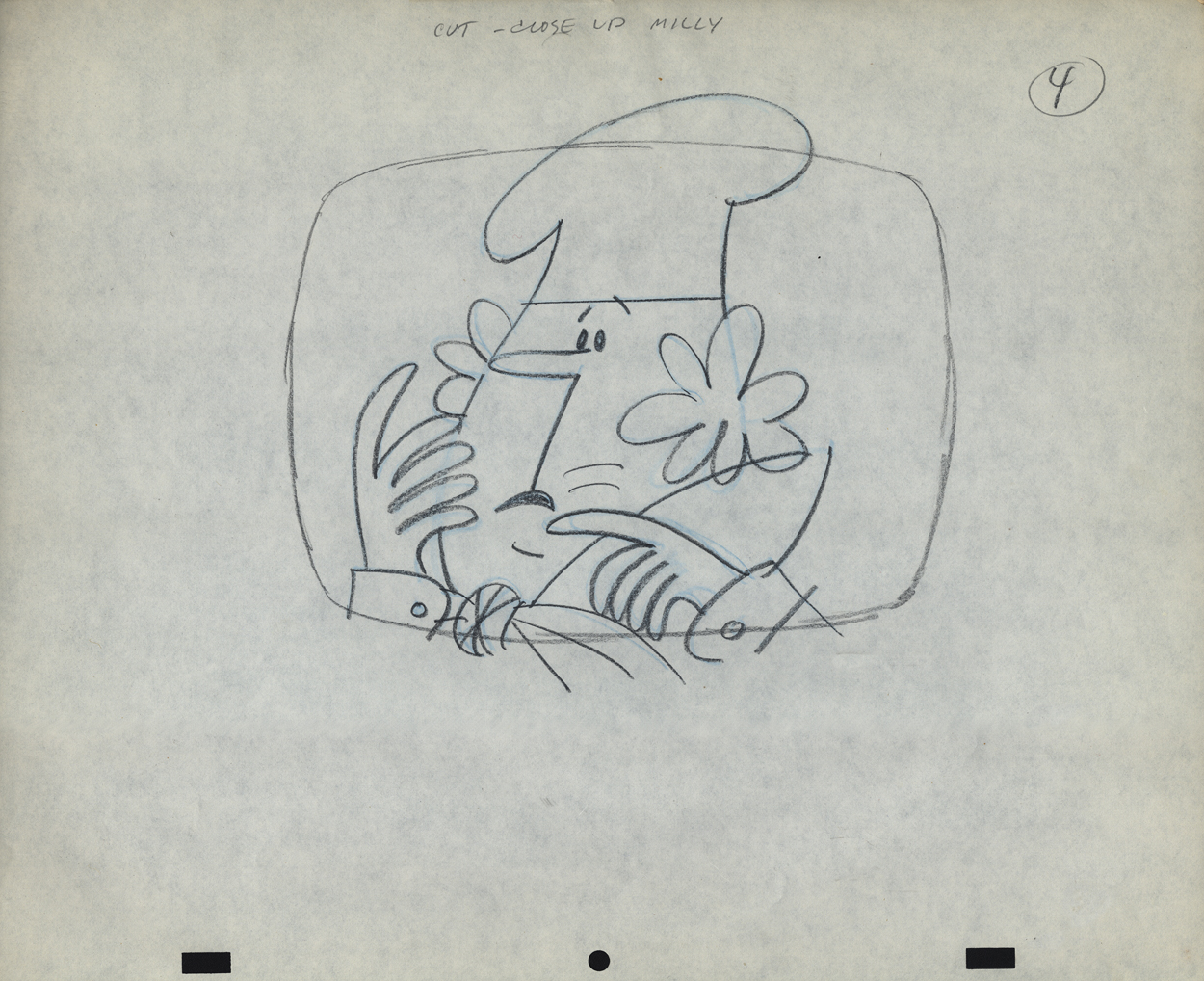
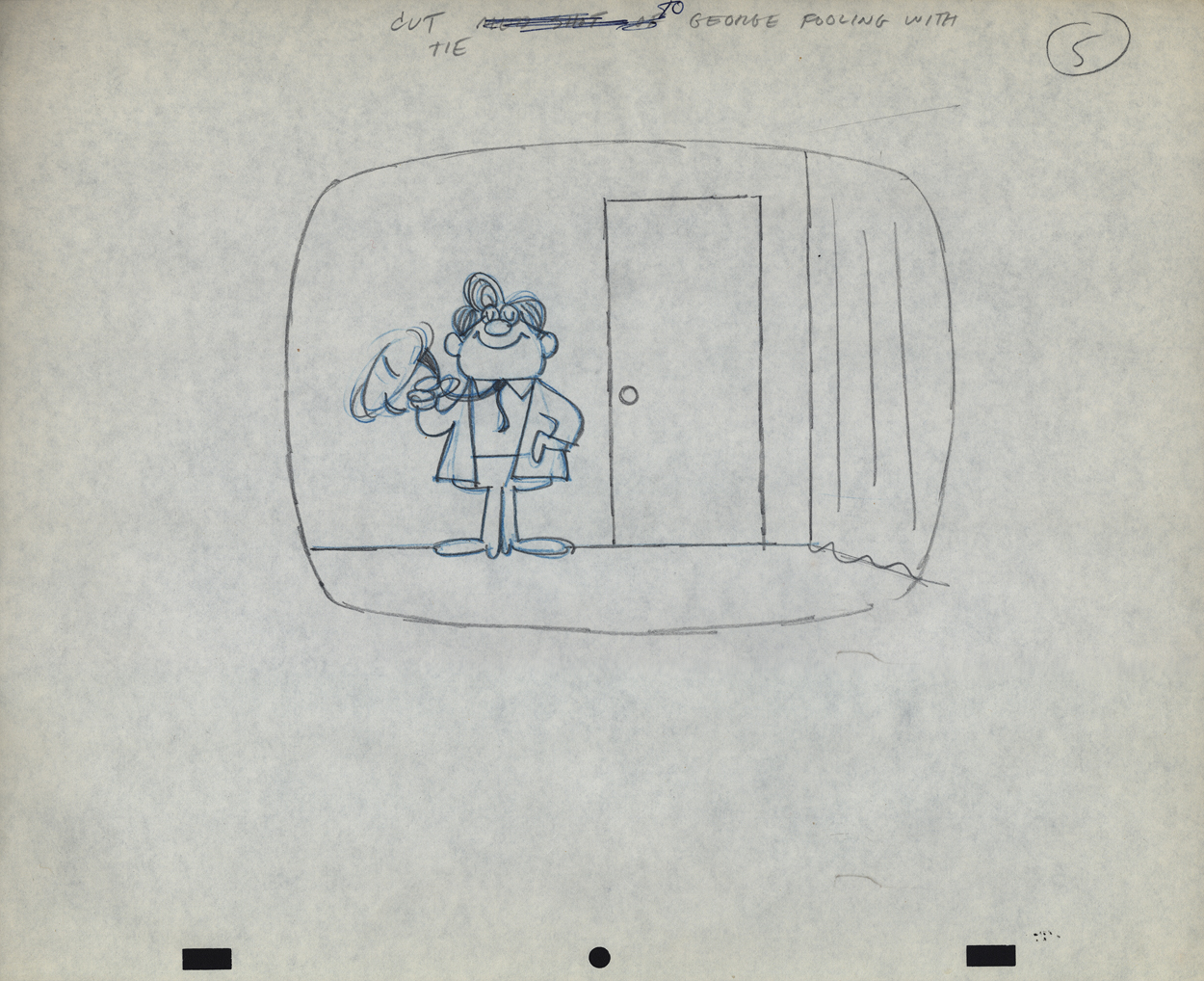
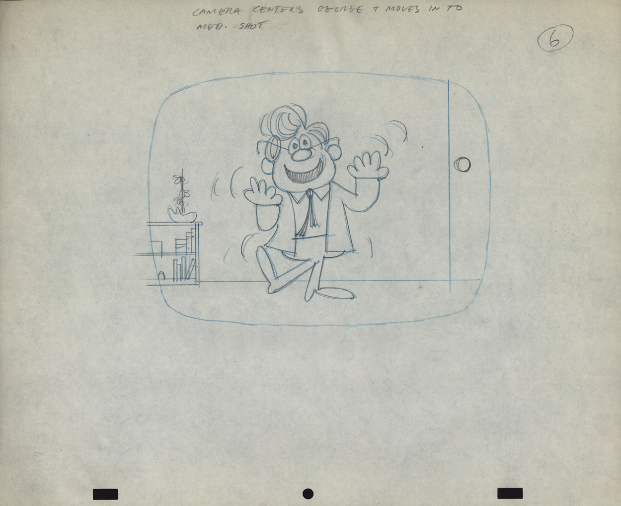
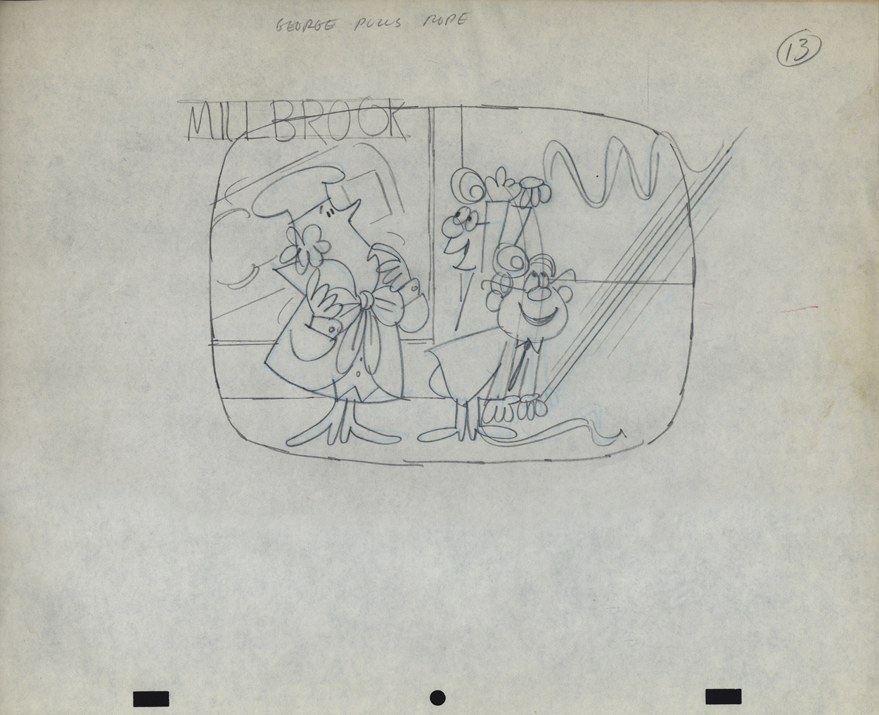
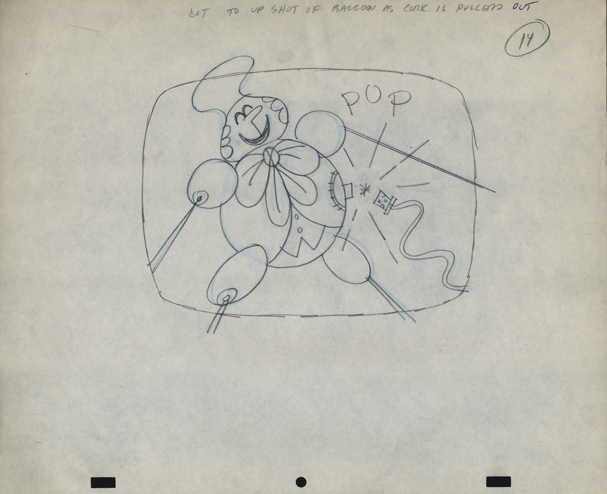
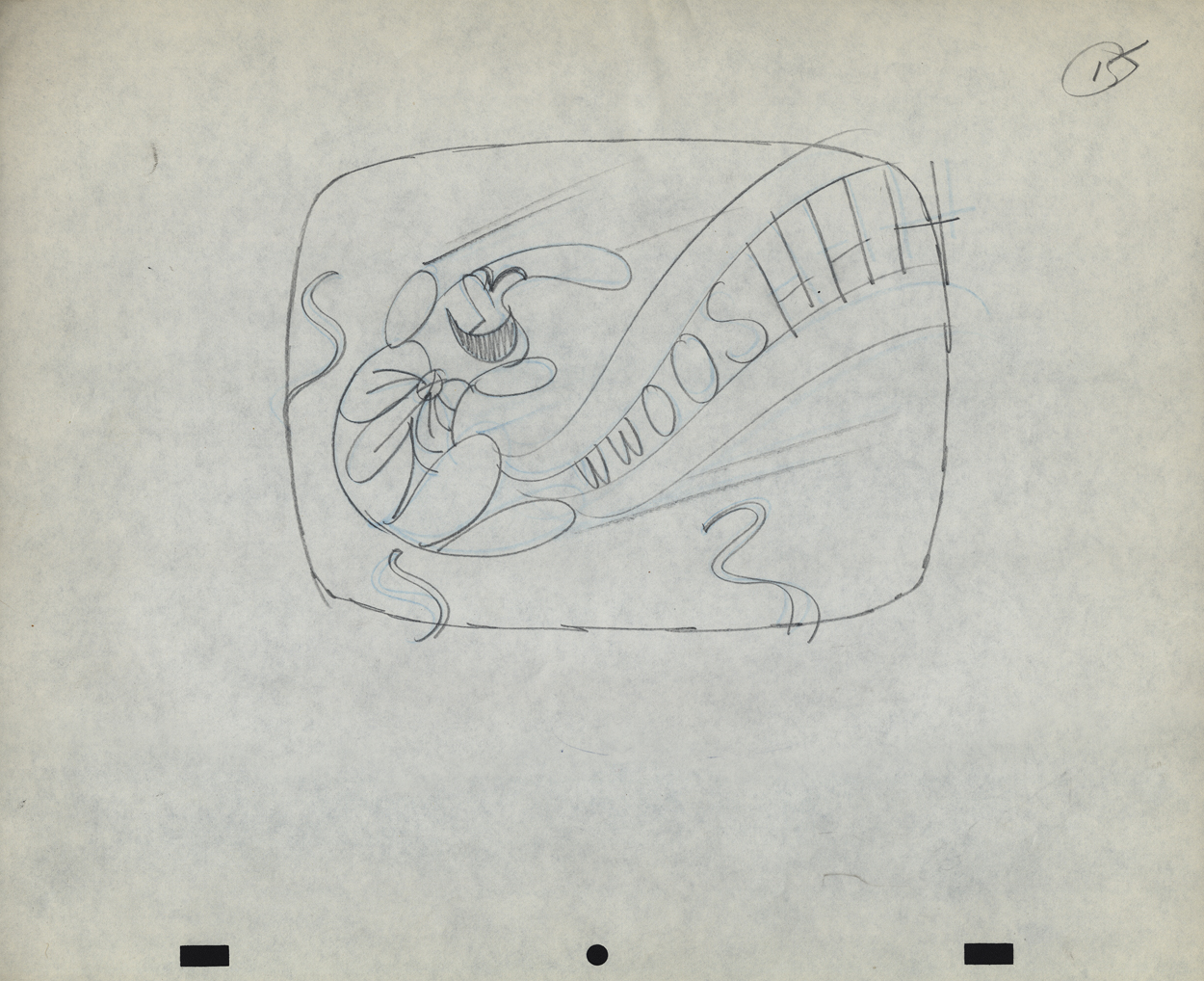
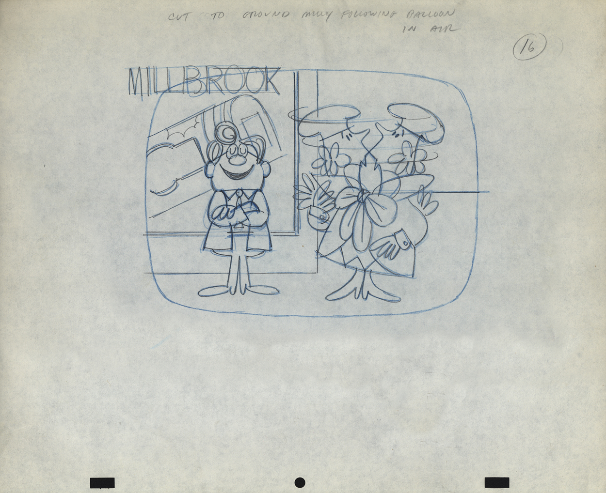
Vince Cafarelli’s Millbrook Bread – 1
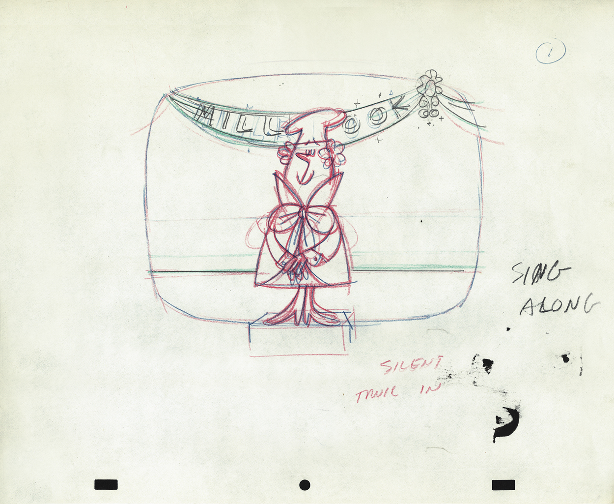
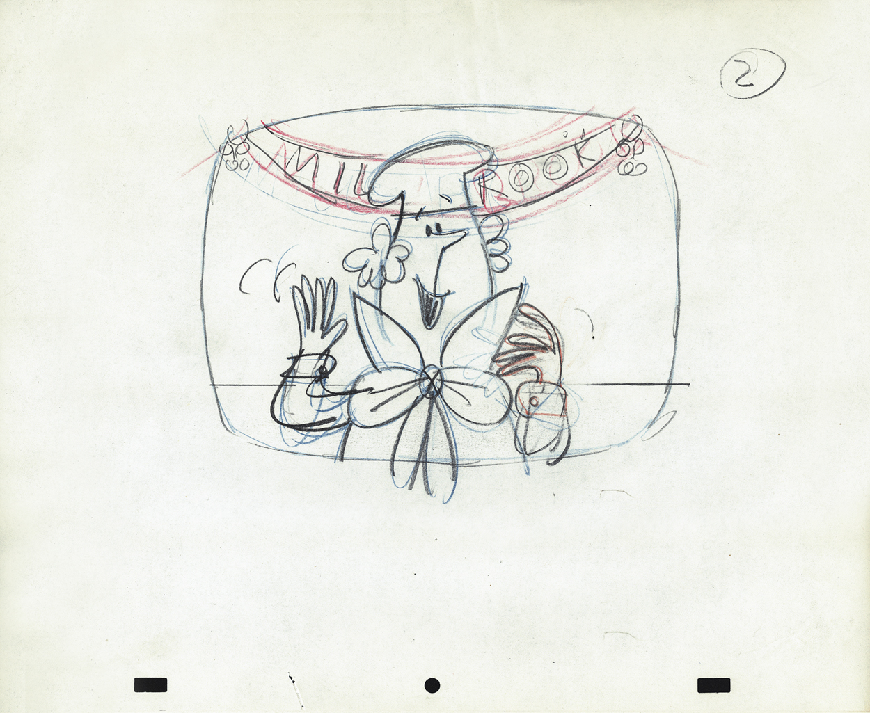
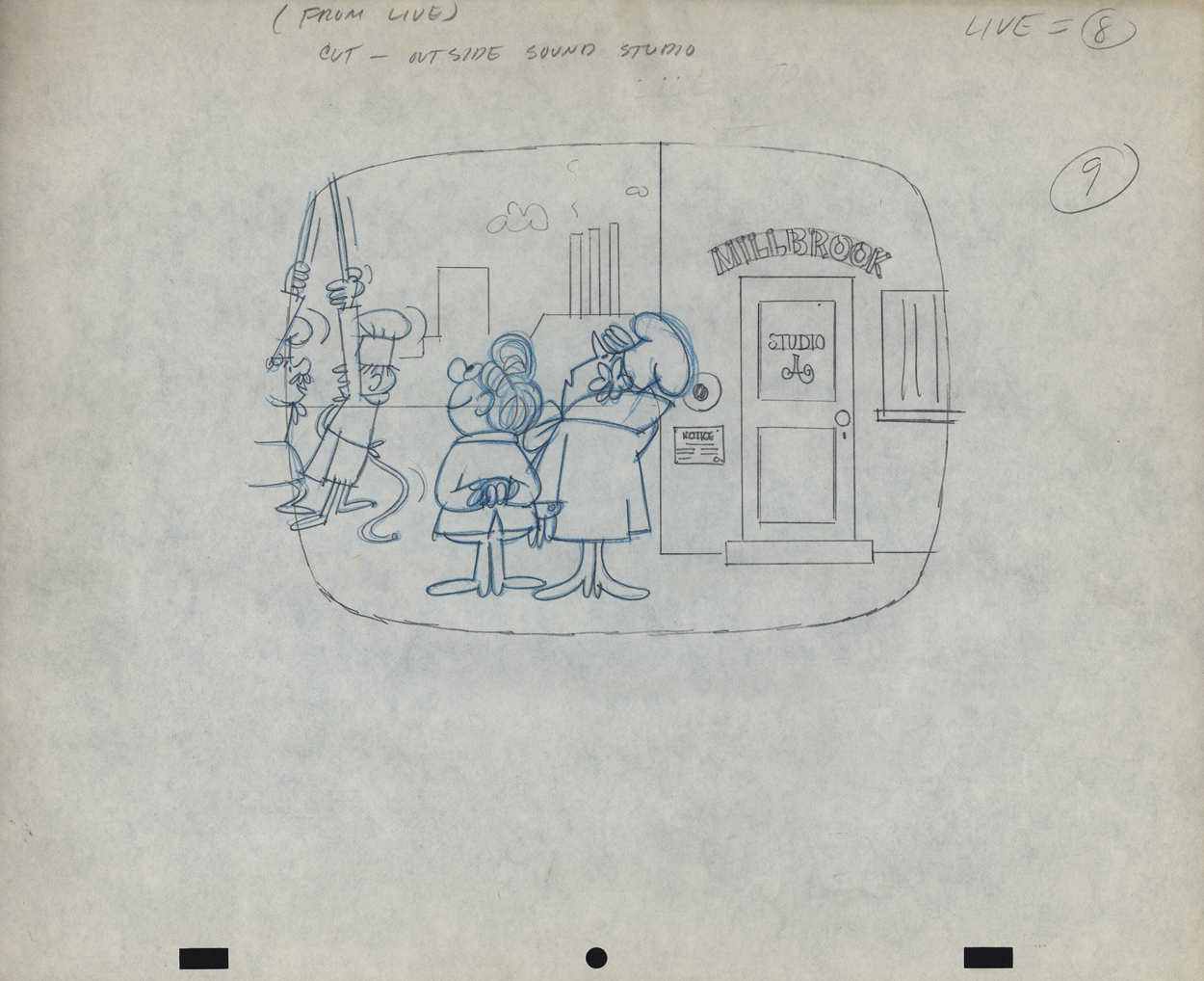
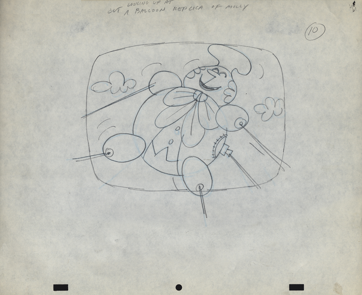
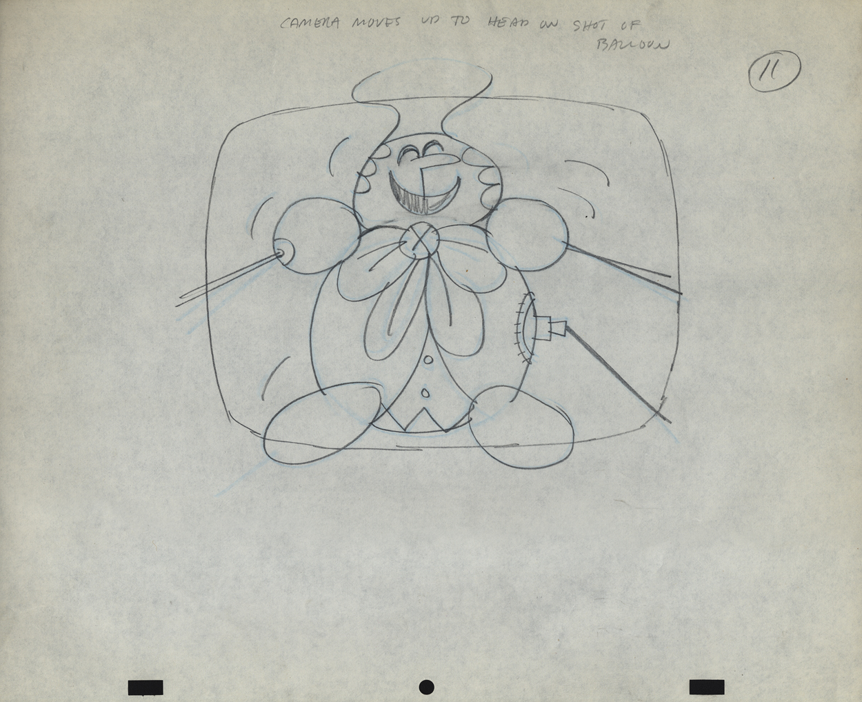
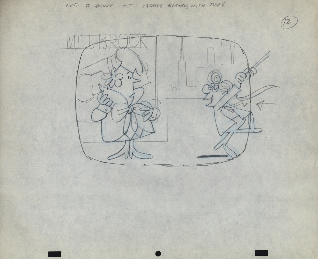
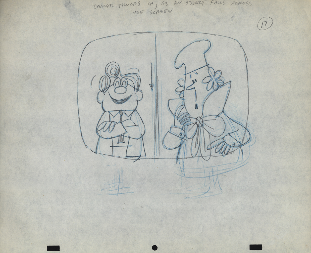
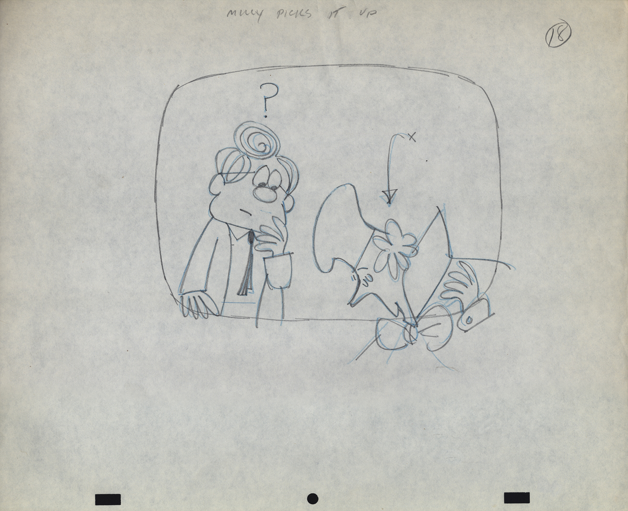
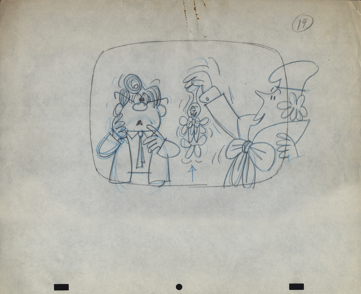
- When Bob Elliott and Ray Goulding (of Bob & Ray fame) found a chance, they scooped up the Piels Brothers account from UPA and, with Ed Graham, they opened their own animation studio to do the Piels commercials. The blend didn’t last long, and they soon went out of business. Vince Cafarelli worked at Goulding-Elliott-Graham Prods. for a while and several Millbrook Bread commercials were produced, featuring “Milly” the baker.
I remember these commercials from my childhood well. I loved the very graphic style of the spots. I remember seeing how the character turned his head (see number 16, below) and was taken by the movement. I think I was probably 11-12 years old at the time. The video records the date as 1963, but I’m sure they’re wrong – 1959, maybe?
I previously posted this Christmas card from Goulding-Elliott-Graham Prods., Inc. If you click on the card and look in the window of the house, you’ll see “Minny” the Millbrook baker (centered) within, singing Christmas Carols.
Michael Smollin takes credit for directing the commercials, but I’m not sure he worked for Elliott-Gould-Graham. I thought that Ed Graham had directed all spots in house. Smollin may have designed the characters. We’re assuming that Vinnie drew these images. The writing is his. It’s doubtful he would have been directing at this point, so he probably drew the Layout drawings.
In Vinnie’s collection of art, the layouts for two of these spots were found. I’ll post these from the first spot this week and the second spot will come next Wednesday.
 1
1
 2
2
 3
3
 4
4
 5
5
 6
6
 7
7
 9
9
 10
10
 11
11
 12
12
 13
13
 14
14
 15
15
 16
16
 17
17
 18
18
 19
19
We don’t have a copy of this spot that we could post. However, to give you an idea of how the voices sounded, here’s a vradio spot done for Millbrook Briead by Bob and Ray.
Animation &Animation Artifacts &SpornFilms &Tissa David 17 Sep 2012 06:20 am
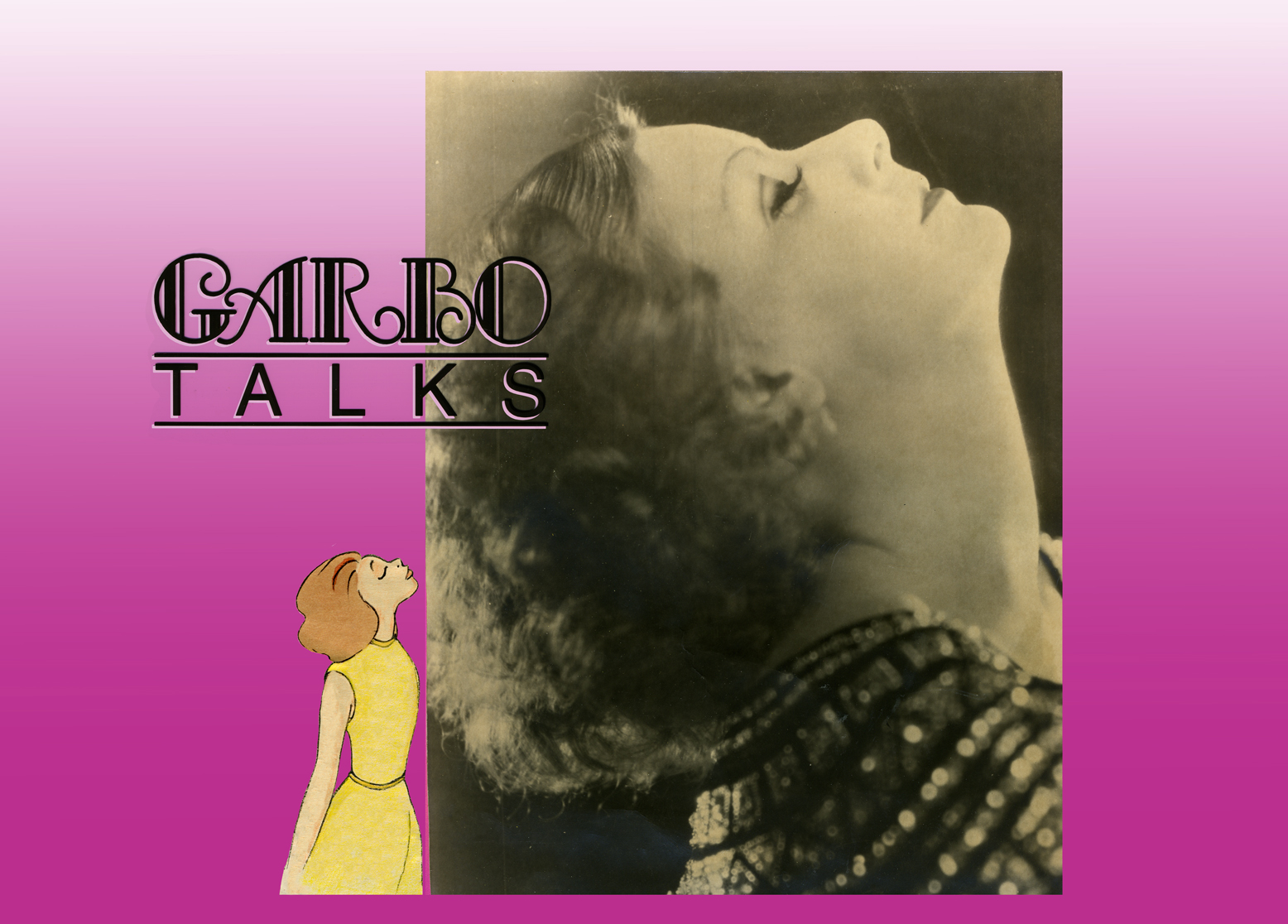
Garbo Talks thru Tissa’s Animation
The initial rough/cut screening for Garbo Talks was a bit peculiar. I sat down and a woman sat next to me; I sort of recognized her. We said hello when she sat down. Somewhere midway during the film I realized who the woman was – Betty Comden, that half of the Comden & Green writing team. I realized she was playing the part of the older Greta Garbo in the film, without receiving credit. It was brilliant casting, but you could say that about all of Sidney Lumet’s movies.
When I left the screening room there was a tense meeting going on with four people. I caught Sidney’s eye and waved goodbye. Going down in the elevator Burtt Harris, the producer, rushed in as the doors were closing. He asked what I thought of the film. Before I answered he said it wasn’t working, and Elliott Kastner and MGM weren’t very happy. A rough conversation in an elevator.
The next day, Sidney asked what I thought of the film, I said that I felt we didn’t know enough of the back story of the Ann Bancroft character in the film. I suggested that I try to offer this in the opening credit sequence. Sidney loved the idea. He just made me promise that it wouldn’t feel like the credits to “I Love Lucy” or “I Dream of Jeannie.”
During the mix, we were talking about the music for Garbo Talks when we slipped off into discussing the music for some of Sidney’s other films. I told him that the music by Richard Rodney Bennet for Murder on the Orient Express was one of the most brilliant film scores ever done. Sidney hesitated in responding finally saying he didn’t get it at first, and it took a while for him to appreciate the music for that film. Sidney wasn’t always perfect in selecting a composer for his films, although I do think that Johnny Mandel was a great choice for him on Deathtrap and The Verdict (or any film, actually).
Bob James had scored Garbo Talks. (He is an eminent jazz pianist, whose most famous piece is probably the theme to the tv show, Taxi.) Bob and I had to work together very closely. He wrote the score to the animatic I’d given him and would build the rest of the film’s score from that. He hit many of the actions in that opening title, and Tissa David‘s animation hit them all. There was a very tight sync between music and title animation.
The preview screening was held on Long Island. I drove there and met the group of Sidney, editors and MGM execs, including Elliott Kastner. He was the leading producer on the film. They weren’t happy at the end of the screening, and I was sure my titles were going to go. It took a week to hear that the titles were staying, but the score by Bob James was dropped. The composer took the hit, unfairly. A new score was being written by Cy Coleman. All that tight sync work!
Coleman wrote a lovely melody for the film, but just swept across the animation not hitting any points in particular. It’s taken me a long time, but I’ve come to like the music he wrote. Tissa wouldn’t watch the piece again with the new music.
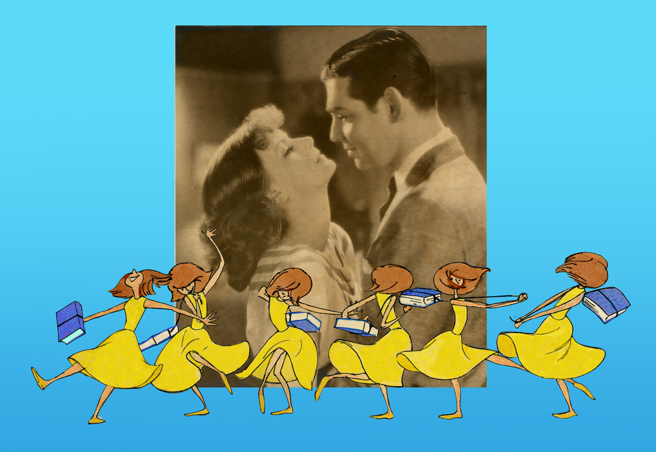
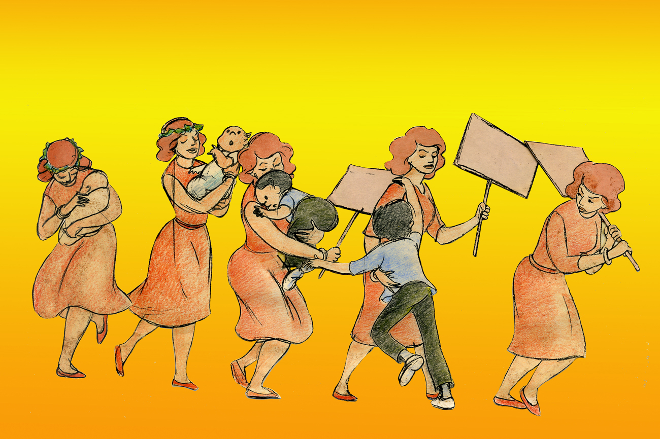
In the film, the character played by Ann Bancroft has had a life that, in some small way, was shaped by Greta Garbo’s feature films. This is a small bit of backstory in the live action film, until the end.
For the credits, I chose to develop this aspect of her story, and Sidney agreed on the approach. We told her life in a caricature of Ann Bancroft‘s character, growing up. The sequence ends with her at her current age, an elderly woman, and the live action begins. Hence, we were giving the life story of the film’s lead character before the film started.
The idea was to use the device that had been developed for TV in the 50′s & 60′s of the caricatured characters whisking through the sitcom titles. (See Bewitched or The Carol Burnett Show.) However, it was our intent to treat it in a serious way.
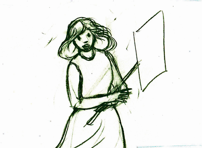
Tissa David did a stunning, tour de force of a brilliant piece of animation. It was a dance that the character went through, and the credits played off the animation, which played off stills of Greta Garbo’s films.
There was a small crew on the piece, which ran about 2 ½ minutes. Tissa animated, I did whatever clean up was left. Robert Marianetti single-handedly colored everything; Janet Benn and Christine O’Neill did additional I&P. Gary Becker filmed it, and Edith Hustead edited.
.
.
Tissa had about two weeks to animate about 2½ mins. of animation. I begged her to leave inbetweens for me, which she did, though only on close positions. I inked on paper, and Robert Marianetti colored directly from these rough-ish drawings. It was done with prismacolor pencils on paper. The paper drawings were then cut out and pasted to cels.
.
 7
7
(Click any image to enlarge.)
 8
8
 9
9
 10
10
 11
11
 13
13
 14
14
 15
15
 17
17
 18
18
 19
19
 20
20
 21
21
 22
22
 26
26
 27
27
 28
28
 29
29
 30
30
 31
31
 32
32
 33
33
 45
45
 49
49
 53
53
 58
58
 63
63
 67
67
 71
71
 72
72
 77
77
 79
79
Below is a rough PT of the piece with its staccato rhythm since it’s missing inbetweens.
Garbo Talks ruff PT On twos at 24FPS
Click left side of the black bar to play.
Right side to watch single frame.
The entire title sequence.
Thanks to Roger79 for uploading it.
Thanks to Stephen MacQuignon for finding it.
Action Analysis &Animation &Animation Artifacts &Disney &Tytla 13 Sep 2012 05:48 am
Tytla’s Terry-Disney Style
- Bill Tytla is probably the finest animator who has graced the history of the medium. He was a brilliant actor who dominates most of the classic early films of Disney work. Snow White, Pinocchio, Dumbo, and Fantasia are all appreciably greater films because of his work. In studying this master’s work frame by frame you can see a real elasticity to the character, one that is not apparent in the motion of those same characters. There’s true emotion in the acting of these characters, and it’s apparent that he uses that elasticity to get the performances he seeks.
There’s something else there: Tytla’s roots were in Terrytoons: I have no doubt you can take the guy out of Terrytoons, but it seems you can’t take the Terrytoons out of the guy.
Let’s look at some of the drawings from some of the scenes I posted here in the past.
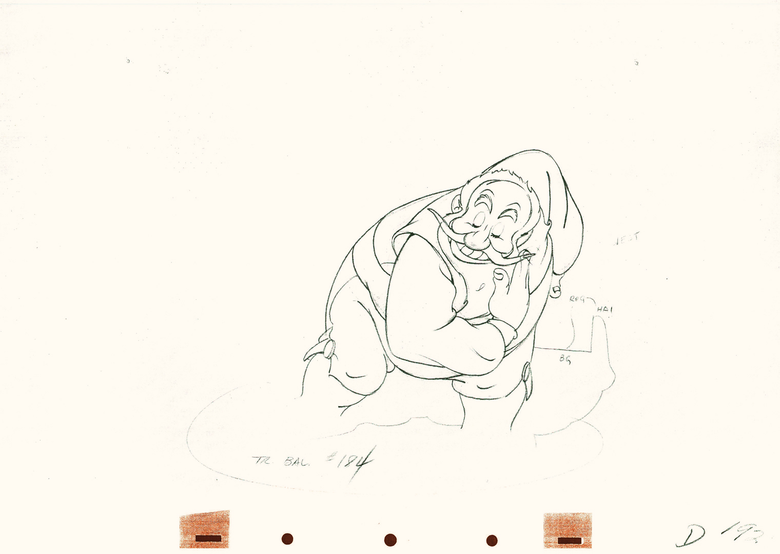
Where better to start than with those gorgeous dwarfs from Snow White. Here’s a scene I posted where all seven are animated on the same level as they carry Grumpy to the wash basin. If he won’t clean himself, then the other six will do the job for him. Take a look at some of the distorted characters in this scene, then run the QT movie. Look for the distortion in the motion.
As for the drawing, like all other Tytla’s scenes it’s beautiful. But tell me you can’t find the Terrytoons hidden behind that beautiful Connie Rasinski-like line.
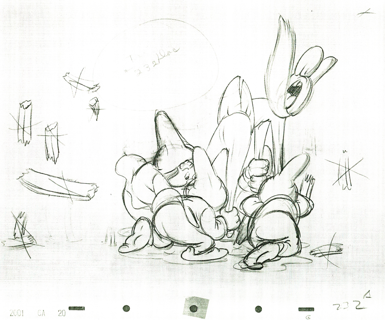 232
232
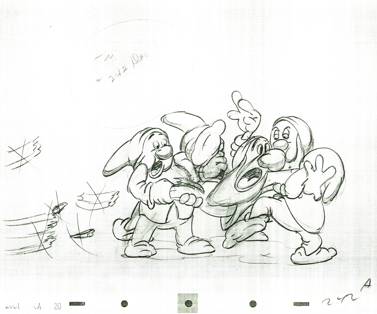 242
242
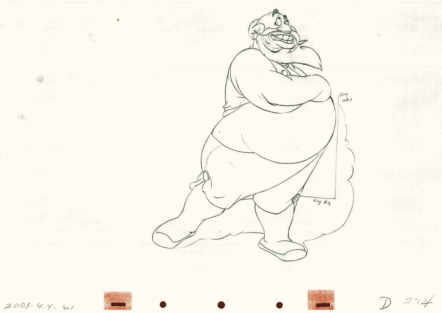
Flipping over to Stromboli, from Pinocchio, we find animation almost as broad as many Terrytoons, the difference is that Tytla’s drawing that roundness and those enormous gestures on purpose. He knows what he’s doing and is looking to capture the broad immigrant gestures of those Southern European countries. Stromboli goes in and out of distorted drawings, as I made clear in a past post.
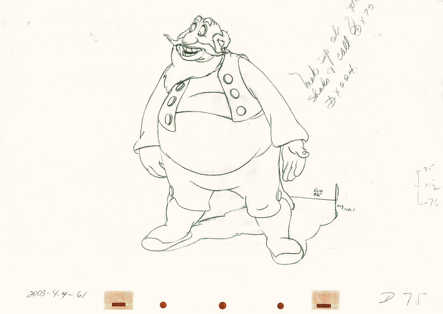 75
75
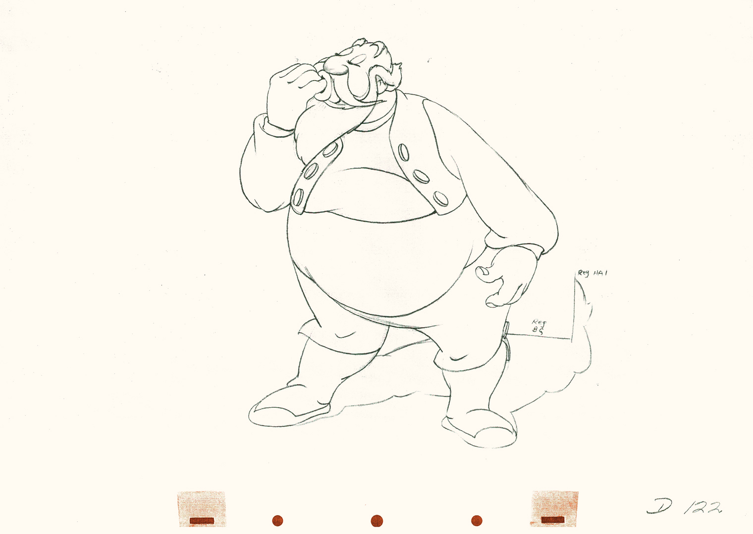 122
122
 192
192
 224
224
A strip by “Paul Terry”as starring his 1930s character, Barker Bill.
Borrowed from Mark Kausler’s blog It’s the Cat.
from the Terry short, The Tempermental Lion
The Laughing Gauchito was a short that was, no doubt, going to be part of The Three Caballeros. Tytla, Frank Thomas and Ollie Johnston had all animated for the short before Disney, himself, cancelled the production.
Here are three drawings from the film, and they are all beautiful extremes from the scene. (Tytla marked his extremes with an “A” to the right of the number, or at other times with an “X” in the upper right.) The beautiful roundness does not come at the expense of his drawings. Below the Laughing Gauchito we see a cartoon drawing by Carlo Vinci from a 1930′s Terrytoons short.
 9
9
 13
13
 21
21
A Terrytoons drawing by Terry artist Carlo Vinci from a mid ’30s short.
borrowed from Animation Resources
Here’s a scene Bill Tytla did for a Harman-Ising cartoon. He was the supervising animator, and the lack of Disney becomes evident in the drawings. The animation is closer to a Terry short than what he did at Disney’s. The movement feels muddy in that actual cartoon. I’m sure it was his own animation trying to blend with the style of Harman’s work.
 11
11
 52
52
 100
100
Another beautiful Carlo Vinci drawing from a 30′s Terry short.
borrowed from Animation Resources
And here’s a drawing out of a Little Lulu cartoon. I’s not a film directed by Tytla, and is not a good drawing. But Tytla’s influence on all the Lulu shorts at Paramount at the time can’t be denied. It certainly looks more Terrytoon than Paramount. This is not even a good Terry drawing – though its for a Paramount cartoon.
Back at Disney, Tytla animated Willie the Giant from the Mickey short, The Brave Little Tailor. This character, like Stromboli, owes a lot to Terrytoons. I felt this when I first saw the short as a child, and I still think it true. The same, I think, is also true of the same Giant character when he appears in Mickey and the Beanstalk, which Tytla obviously didn’t animate but would have handled if he’d stayed at the studio.
 3
3
 6
6
 8
8
Another Carlo Vinci sketch.
borrowed from Animation Resources
This following, last drawing is a Tytla drawing I own. I know Tytla did it. He gave it to Grim Natwick who gave it to Tissa David who gave it to me. It’s a gem.
Animation &Animation Artifacts &commercial animation &Models &Story & Storyboards 12 Sep 2012 07:00 am
Sleeper – Vince Cafarelli collection
- Today I stumbled upon an odd spot in the collection of artwork saved by Vince Cafarelli. This is the storyboard and rough animation for a piece that Vince animated to a storyboard by Hal Silvermintz. The two worked on this when they were employed at Stars & Stripes Productions Forever, Inc.. It was something that the two were obviously doing for themselves – (an Independent film?). In any case it never seemed to have gone farther than this animation. . . at least, not in this form.
“Weekend” was a weekly news show that included a short animated piece. Perpetual Motion Studio did these weekly animation pieces for the NBC show airing on late night Saturday night. (This was before Saturday Night Live aired.) The budget was almost nil, so the material had to be not too expensive and the work had to be fun.
During the run of this series of shorts, Hal Silvermintz pulled out the storyboard, and it moved ahead in a new version. Candy Kugel animated the “Weekend” version and finished it for Ink & Pt. The final color spot aired in 1973-74.
Here’s the storyboard and a model sheet:
The original storyboard.
The character model chart
Here are drawings from about half of the first scene. For four key positions, I’m posting the entire page, pegs and all. For the remainder of the drawings, I just have the character for you.
 1
1
 2
2
 3
3
 4
4
 5
5
 6
6
 7
7
 8
8
 9
9
 10
10
 11
11
 12
12
 13
13
 14
14
 15
15
 16
16
 17
17
 18
18
 19
19
 23
23
 25
25
 26
26
 27
27
 28
28
 29
29
 30
30
 31
31
 33
33
 34
34
 36
36
 37
37
 39
39
 40
40
 41
41
 42
42
Here’s a QT movie of the drawings posted above.
There were no X-sheets to offer timings, so I had to
guess at the timings that might have been used.
Animation Artifacts &commercial animation &Illustration &Models 05 Sep 2012 05:40 am
Odds & Ends from the Cafarelli collection
- Going through a stack of boxes searching for genuine animation, one tends to find a number of gems that represent animation past but don’t nicely link to other pieces. The end result is that you hold a lot of odds and ends in your hands and you seek a way to post them. That’s certainly the case with Vinnie Cafarelli’s collected works.
I’ve located a lot of pieces that interest me, but I don’t necessarily know where they come from or why they were saved. So today I’m posting a number of these bits of art.
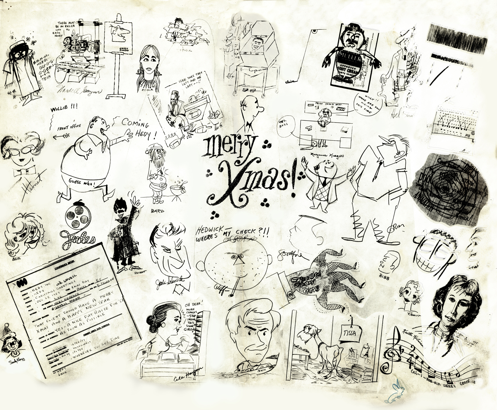
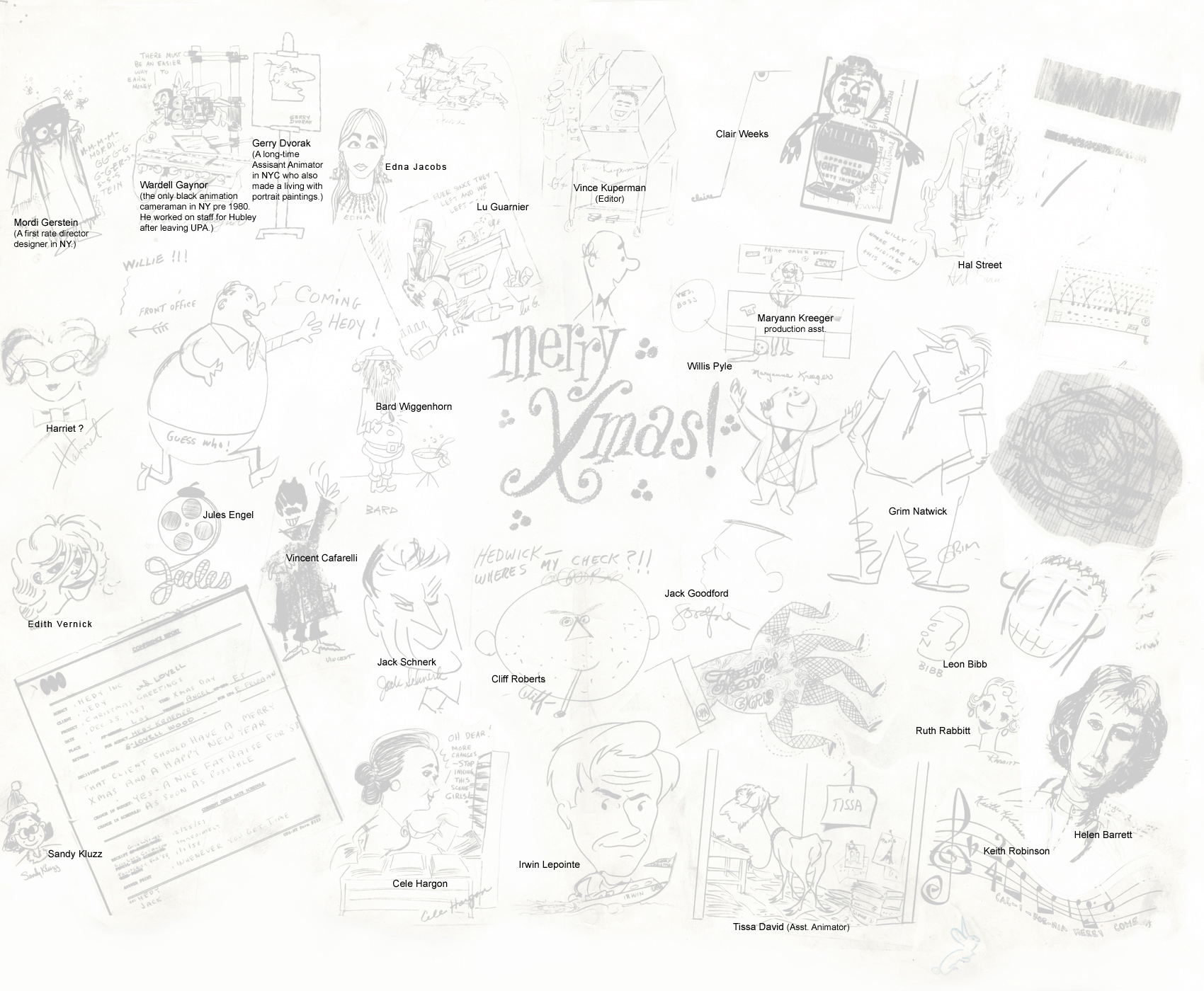
Here we have Layouts, cel setups, photos, models and more than a small share of invitations and Christ cards. Here they are:
 1
1A Christmas Card from the NY-UPA Studio.
Many of the employees signed it.
 1a
1a
A guide to many of the names
of those who signed the card.
(Click to enlarge)
I had a scanning problem on the upper
right and will try to correct that.
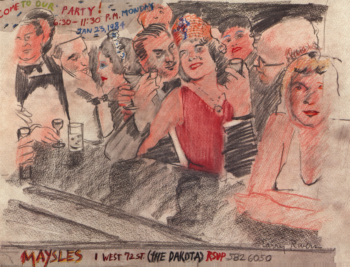
An invitation to a Christmas party at the Maysles Bros
studio. Certainly only for a member of the elite.
A Christmas Card from Fred Mogubgub.
A Christmas Card from the Goulding-Elliott-Graham Prods.
Ray Goulding and Bob Elliott, together with Ed Graham formed
this studio to do Piels commercials. (Bob Goulding & Ray Elliott were the
voices and held onto ownership of the characters. work dried up soon
since one commercial product & client couldn’t maintain the studio.)
A finished setup from a Yellow Pages commercial.
This was done at Gifford Productions.
Pablo Ferro during UPA days.
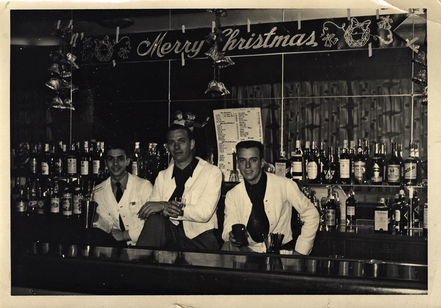
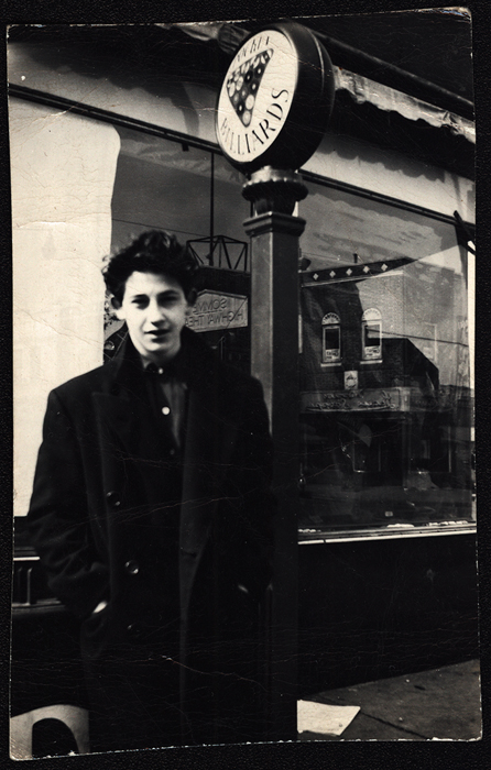
Vince Cafarelli (far left) while in the military at
Fort Benning, Ala. made extra money as a
bartender. These are the days just prior to his
workng at UPA.
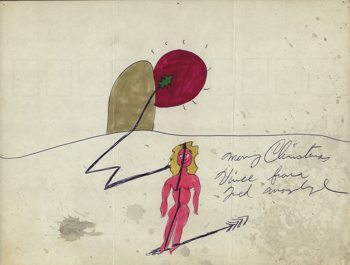
A small racy sketch among the art.
We’re not sure who drew it but guess
it might be Vince Cafarelli’s work.
All that remains of a pitch for an antacid spot.
Obviously drawings 1 & 2 are missing, but
these two were interesting enough for me to post.
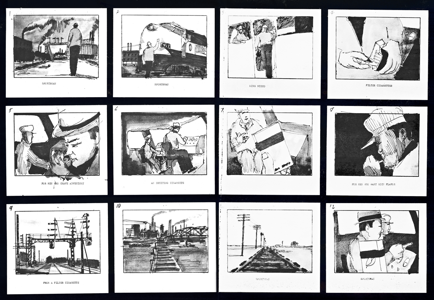 1
1
A storyboard (3 pages) for a cigarette company
(Sportsman Cigarettes?). Obviously a sample board.
Is it a live action spot? Probably for Gifford Studio
which also did live action spots.
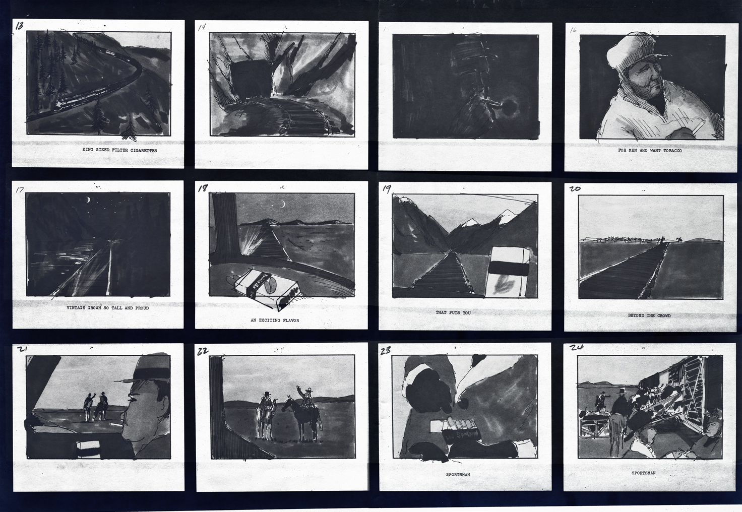 2
2
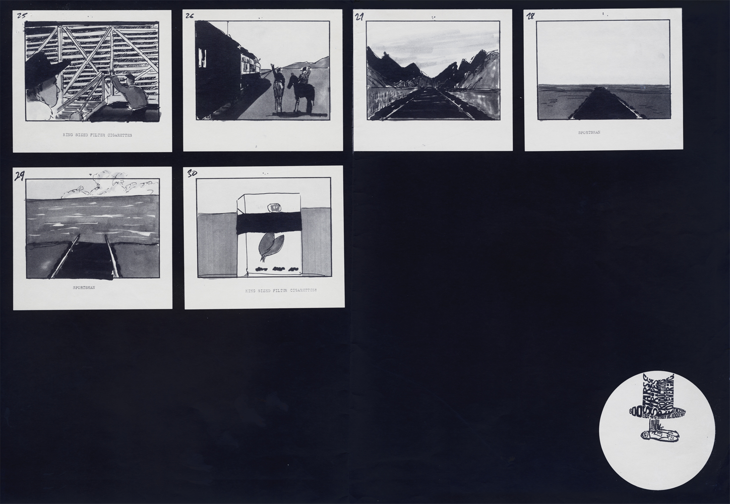 3
3
Animation &Animation Artifacts &Hubley 04 Sep 2012 06:12 am
Phil Duncan’s Walk Cycle – recap
 - Phil Duncan was a mainstay of the Hubley animators in all the time I was there. That was my good fortune. What a learning experience for a young animation student.
You could tell who Hubley’s favorite animators by the frequency in which he doled out sequences to them. Whereas Tissa David or Bill Littlejohn or Barrie Nelson would have been asked to animate entire shorts by themselves, someone like Phil Duncan would get whole sequences to animate. At the same time, John so depended on Phil and trusted what he did.
There were never pencil tests at the Hubley studio. Only one instance of it do I remember, and that was on the Art Babbitt mime scenes from Carousel. As I said once before, I remember John running out to get me asking if I’d like to see animation as good as I’d ever see. We then watched the PT over and over together. Ultimately John took Art’s animation on twos and had me put it on four frame dissolves to get more screen time out of it. A budget was a budget and you had to make the most out of the excellence you had in your hand.
But as I mentioned yesterday, Phil would animate on odd numbers expecting the even numbers to be inbetweened. Most times, John asked me to reexpose the scene on fours and not do the inbetweens. Of course, Phil was aware this would happen and had planned on it.
.
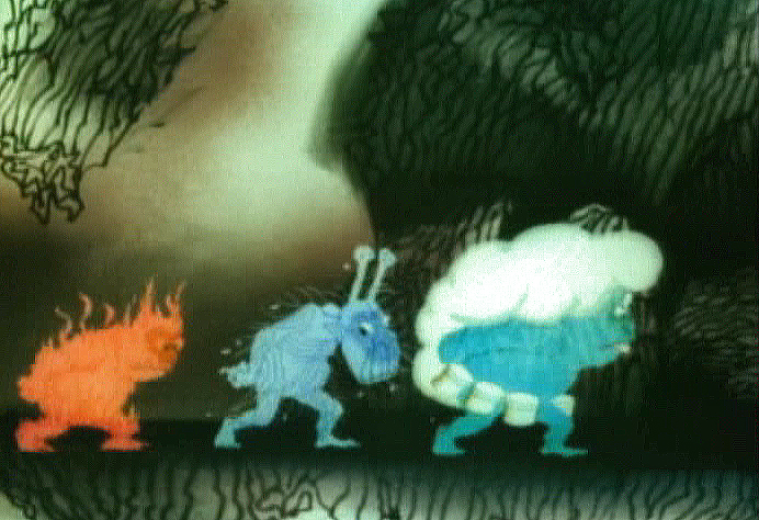
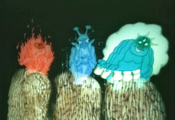
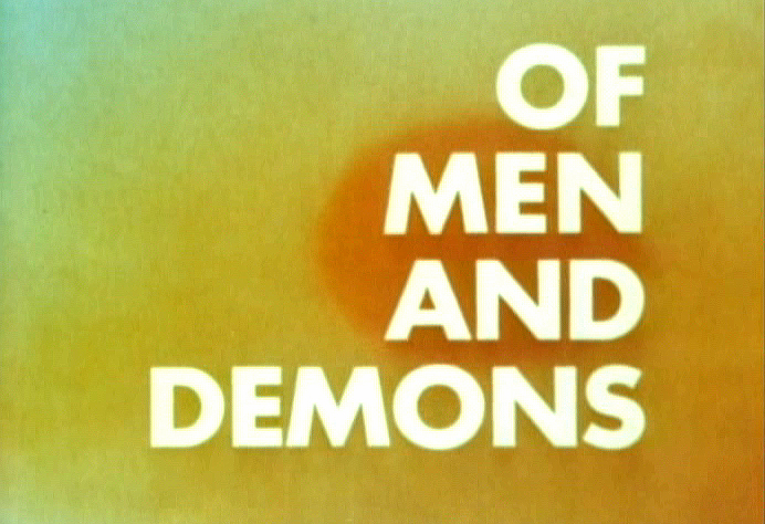
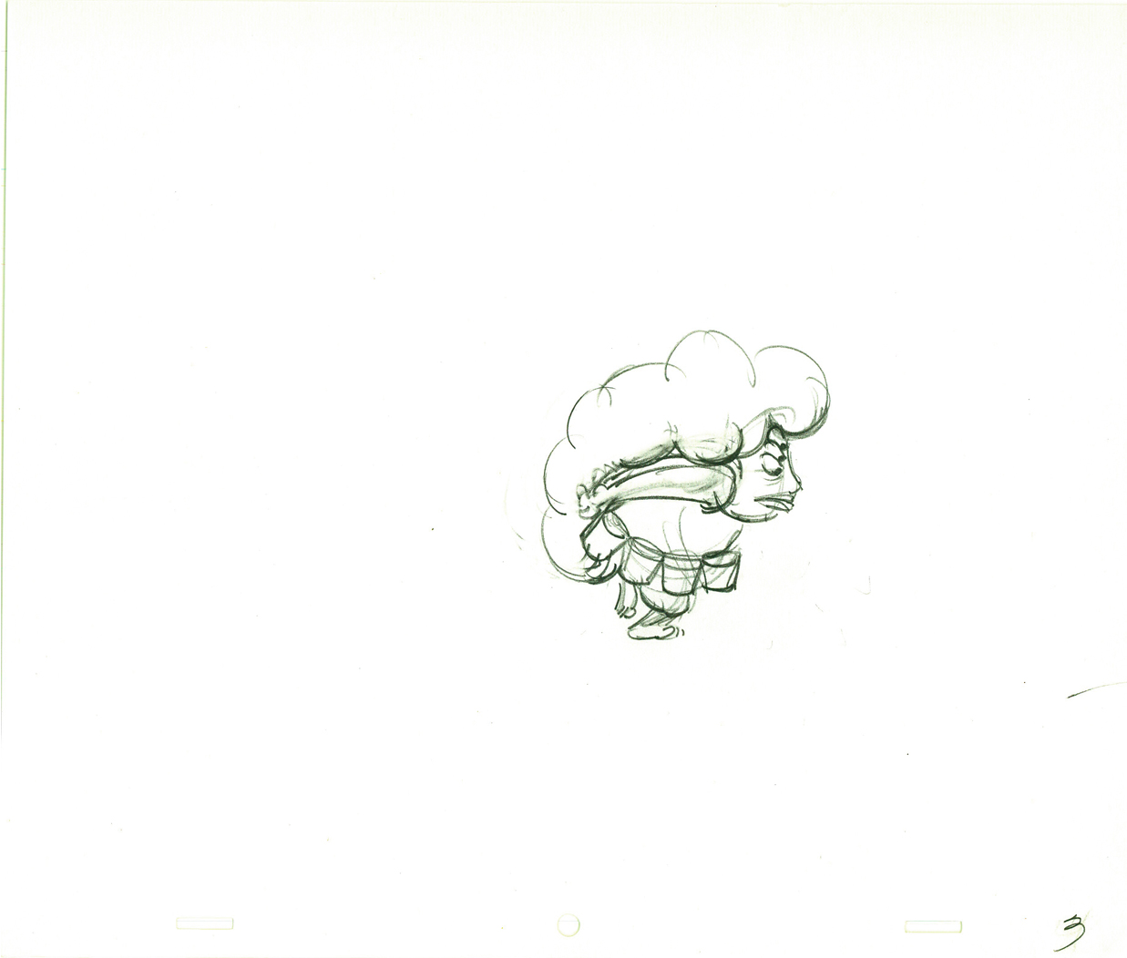
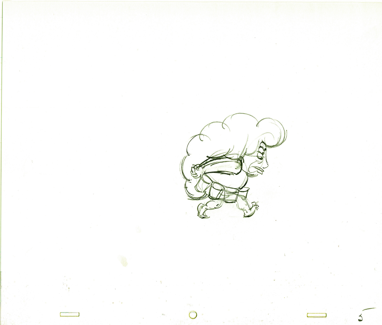
Here is a walk cycle (and more) by Phil Duncan from Of Men and Demons, which was nominated for the Oscar in 1969. The full scene includes the three demons walking and then flying up to their cave.
 1
1 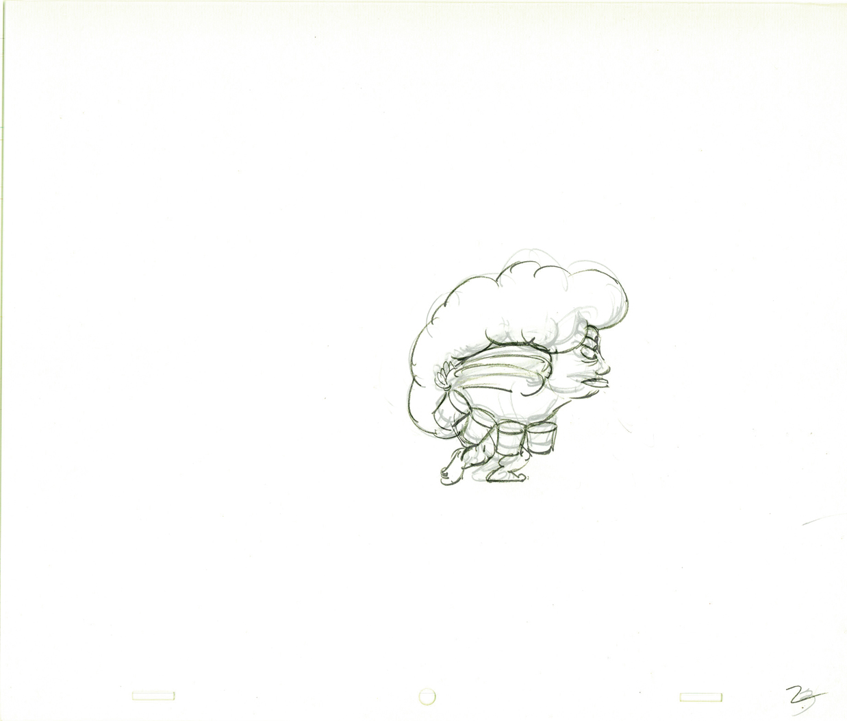 2
2
(Click any image to enlarge to full animation paper view.)
 3
3 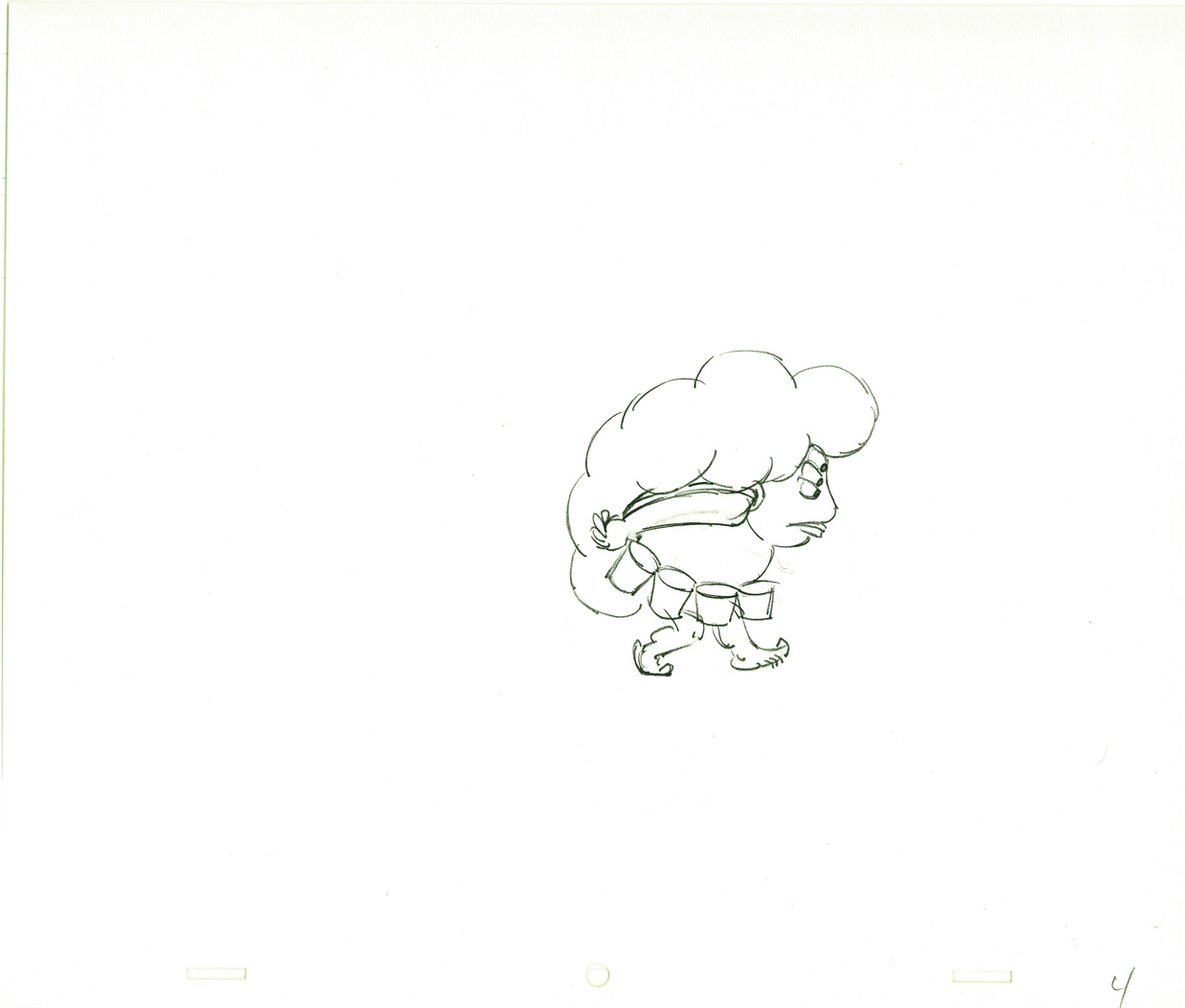 4
4
 5
5 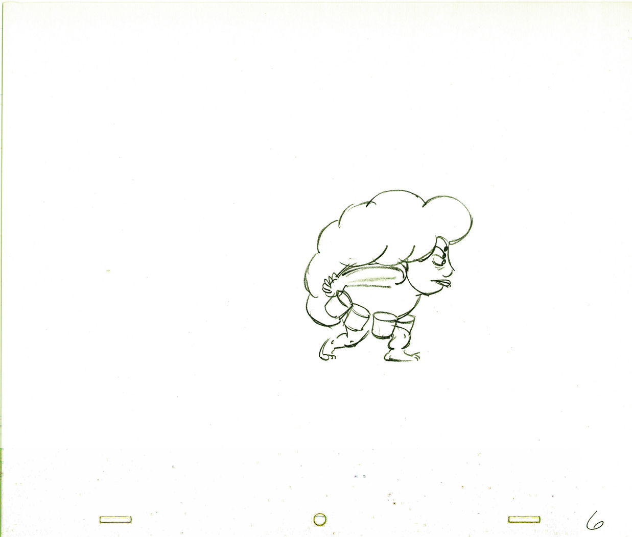 6
6
 7
7 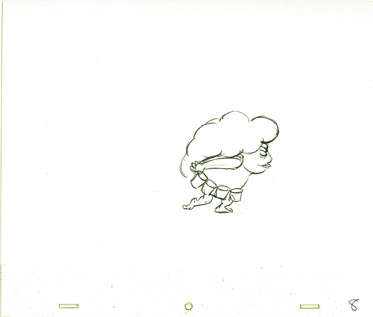 8
8
 9
9 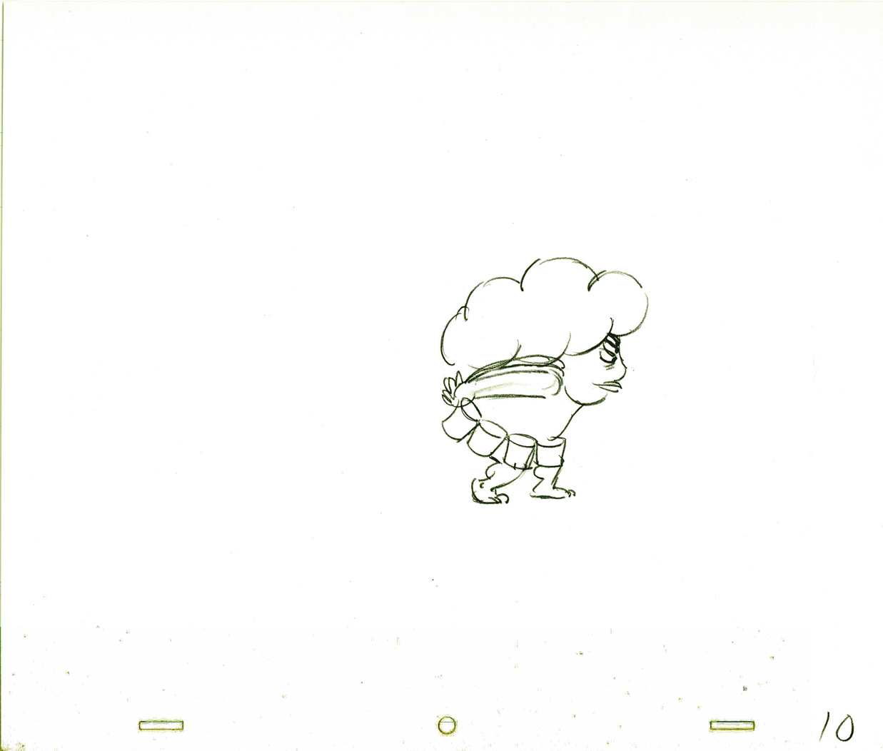 10
10
 11
11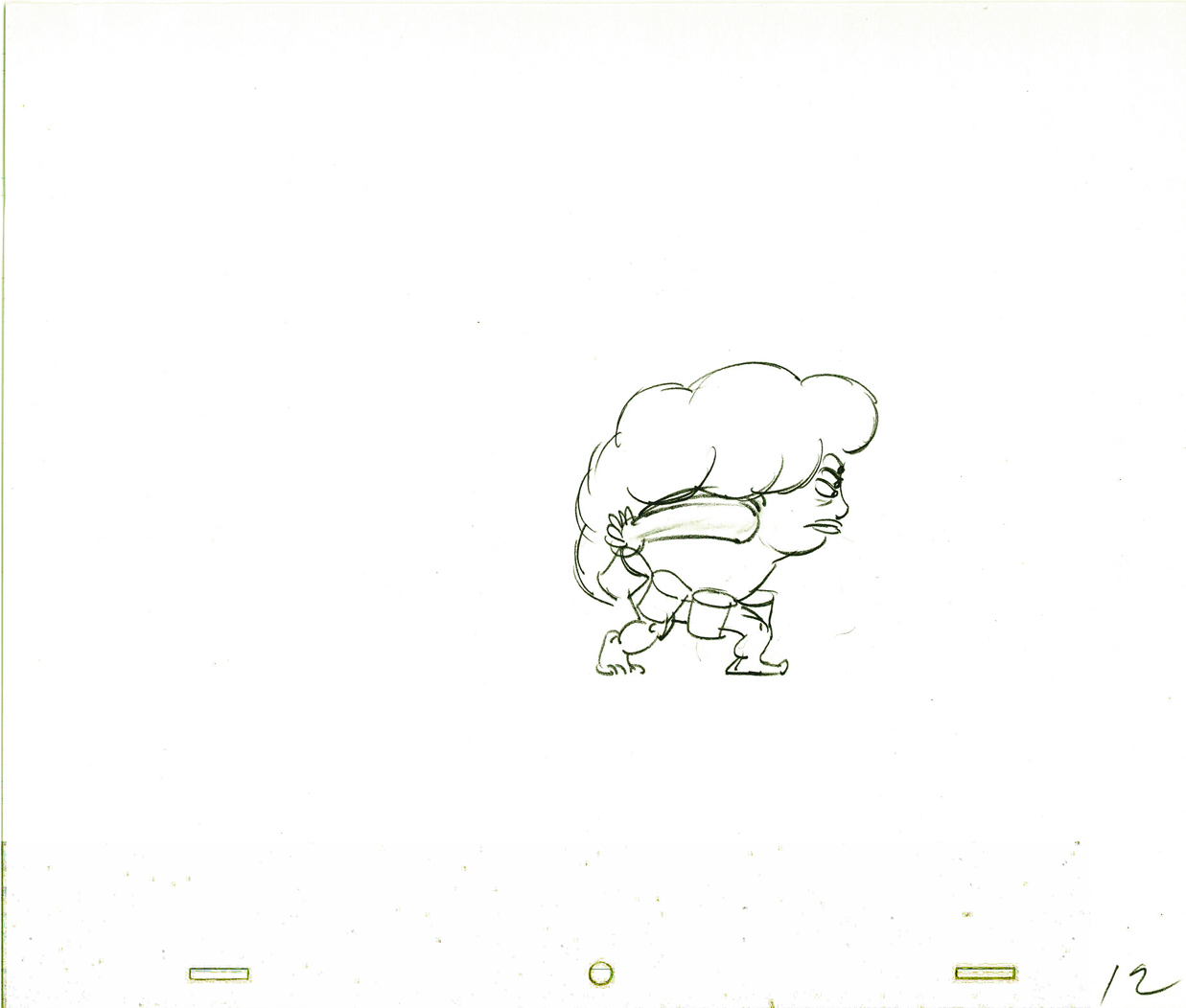 12
12
The rest of the scene breaks out of the walk cycle. I
enlarged the frames to accomodate the remainder of the action.
 13
13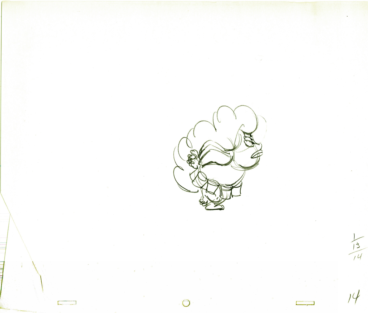 14
14
 15
15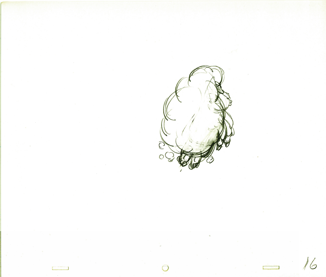 16
16
 17
17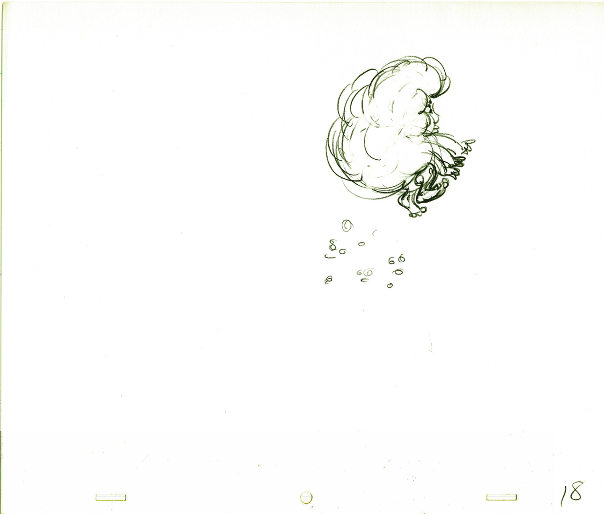 18
18
 19
19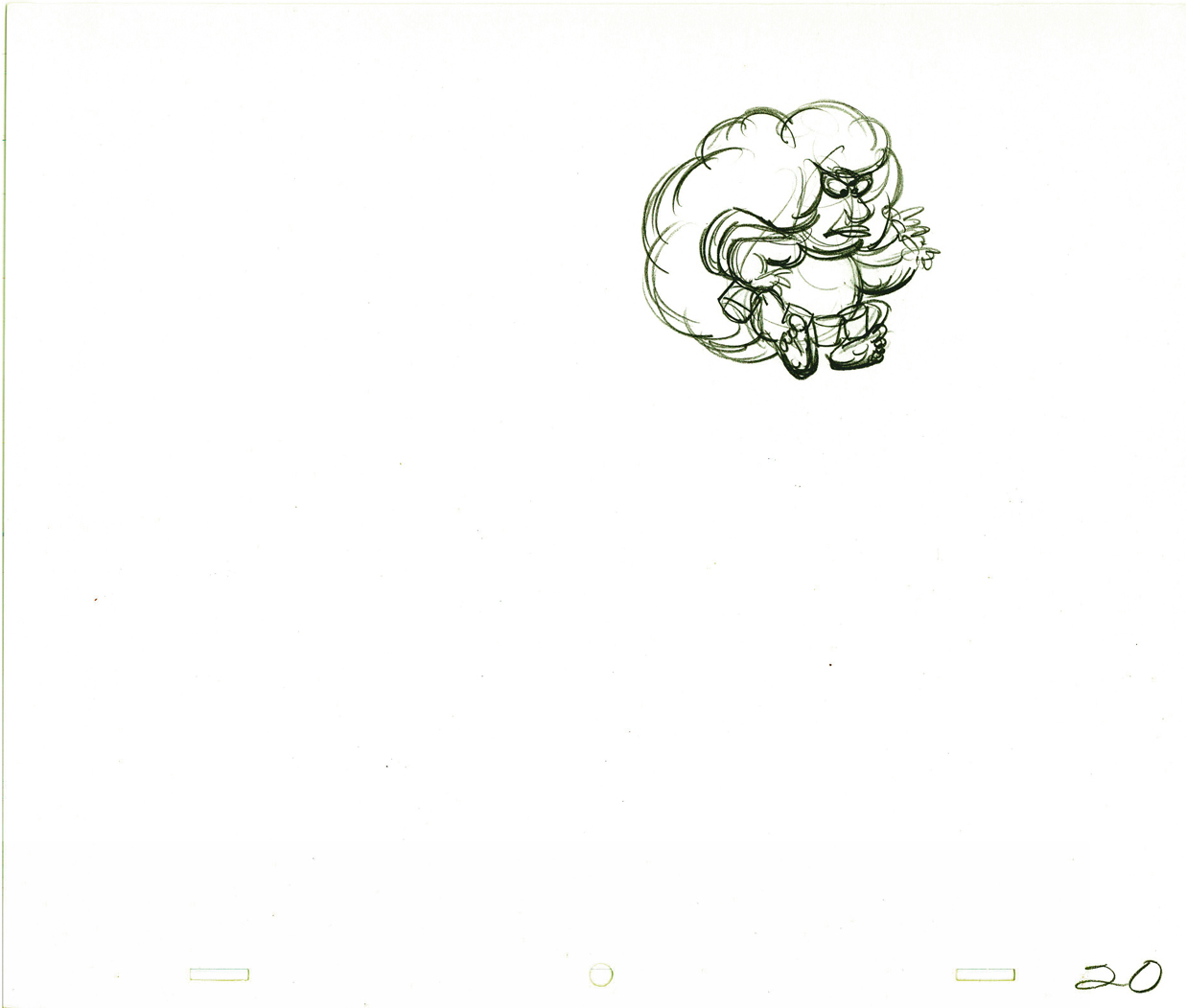 20
20
 21
21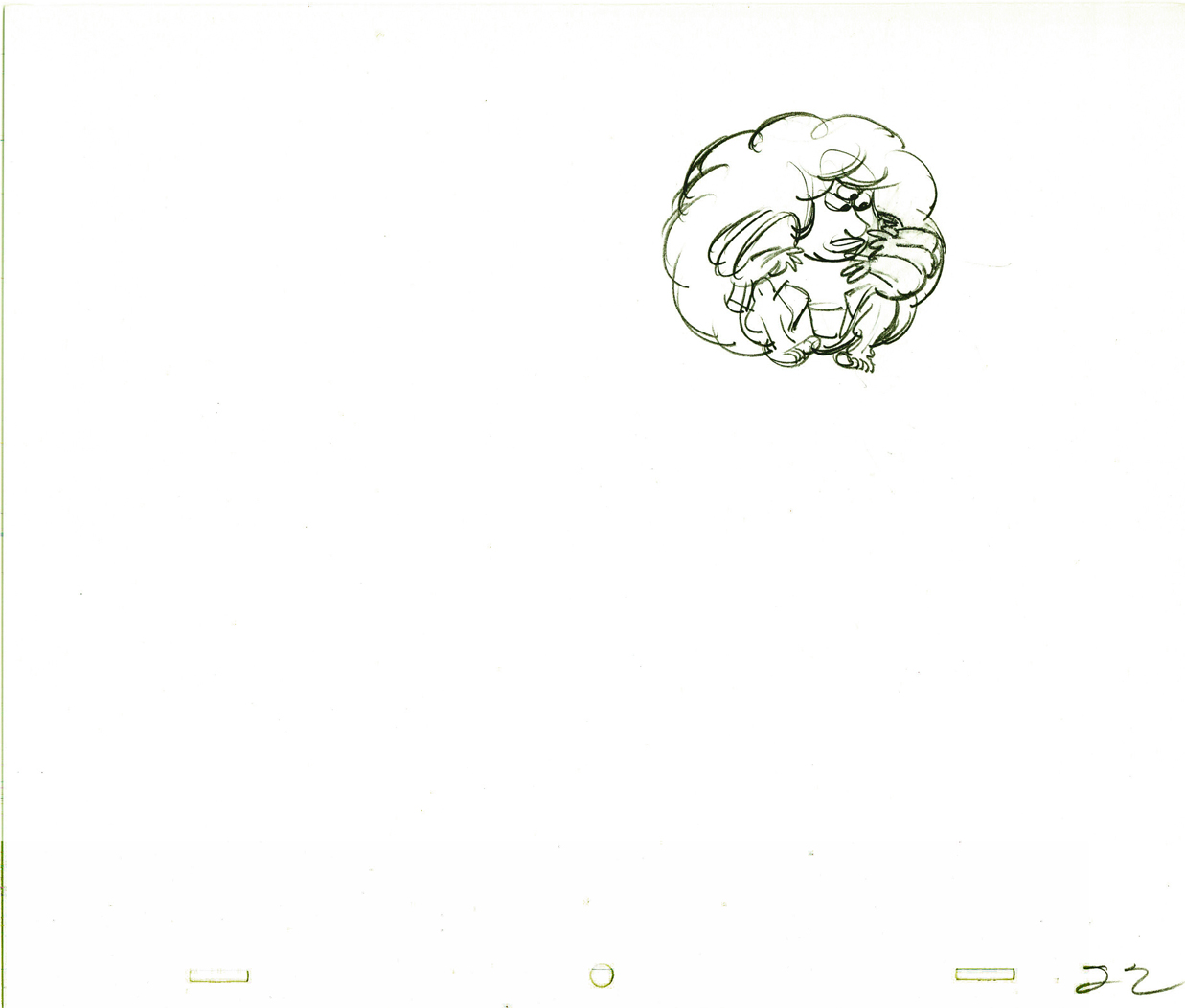 22
22
 23
23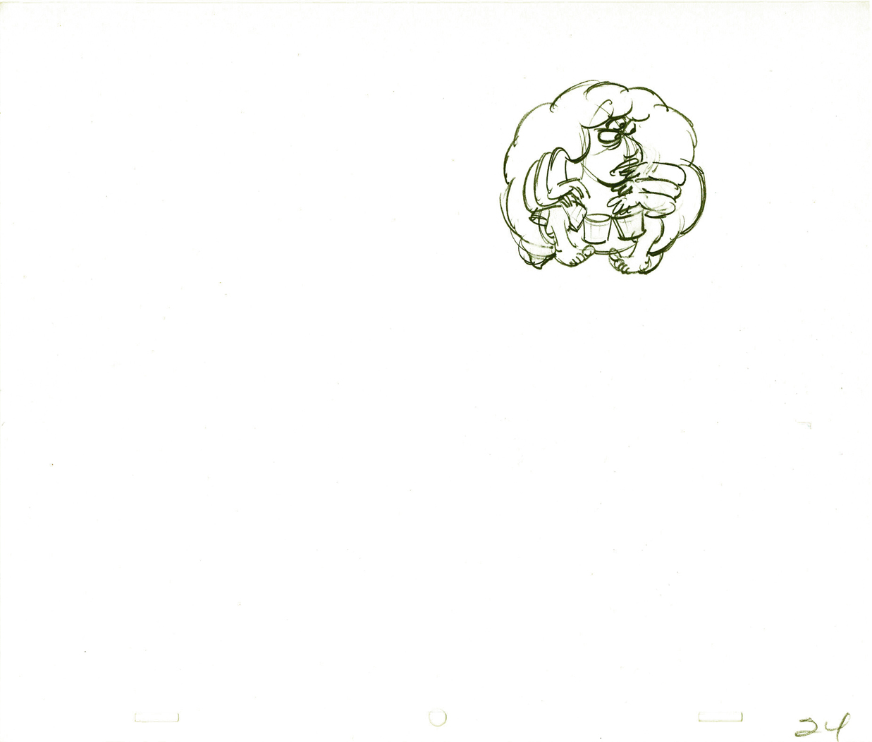 24
24
 25
25 26
26
On threes at 24FPS
Click left side of the black bar to play.
Right side to watch single frame.
Animation &Animation Artifacts &commercial animation &Hubley &Models &repeated posts 03 Sep 2012 05:11 am
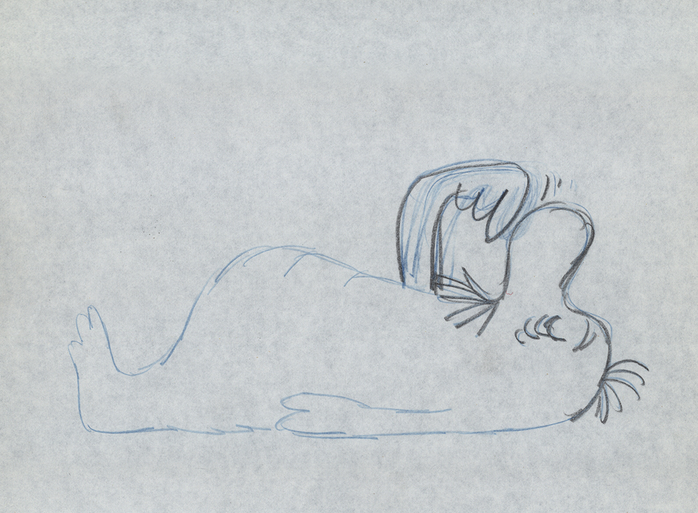
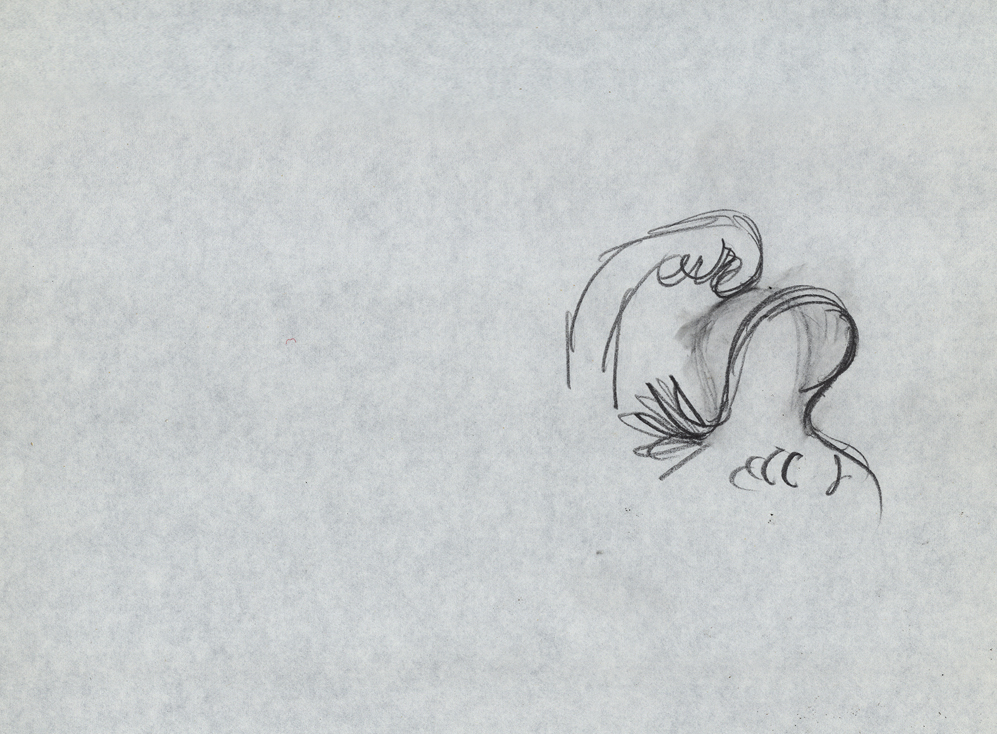
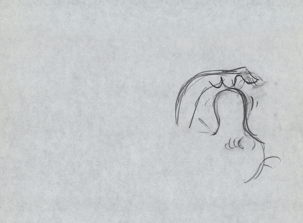
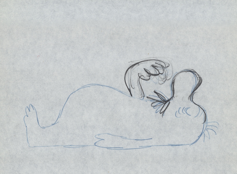
Vlasic Business at the Hubleys
 – Years ago I worked at the Hubley studio on a pair of commercials for Vlasic pickles. One of the two spots made it to the air.
This is from the spot that never made it.
Vlasic had a commercial they wanted, and because of the agency’s long time relationship with the Hubleys, they came to him to try to develop the character. (The agency was W.B. Doner, the agency that had done so well with Hubley’s Maypo commercials.)
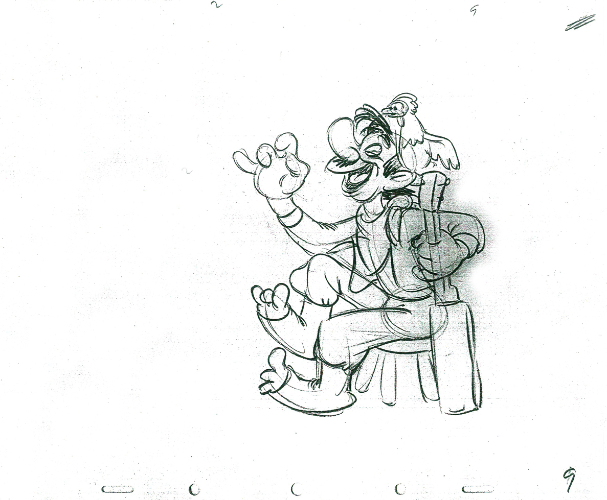
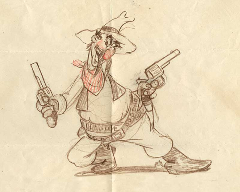
The agency came with two already-recorded voices: one was a Groucho Marx impersonator (Pat Harrington was the Groucho impersonator ultimately used for the stork’s voice.*) The other voice was character actor, Edgar Buchanan, a man with a gruff voice who appeared in a million westerns. John Hubley wanted Edgar Buchanan – it was a much richer voice, lots of cowboy appeal.
John designed the character to look like one of those stationmasters in cowboy films. The guy who gives out tickets and does morse code when he has to. The stork had a vest and a blue, boxy, stationmaster-type cap cocked off to the side. It was a great character.
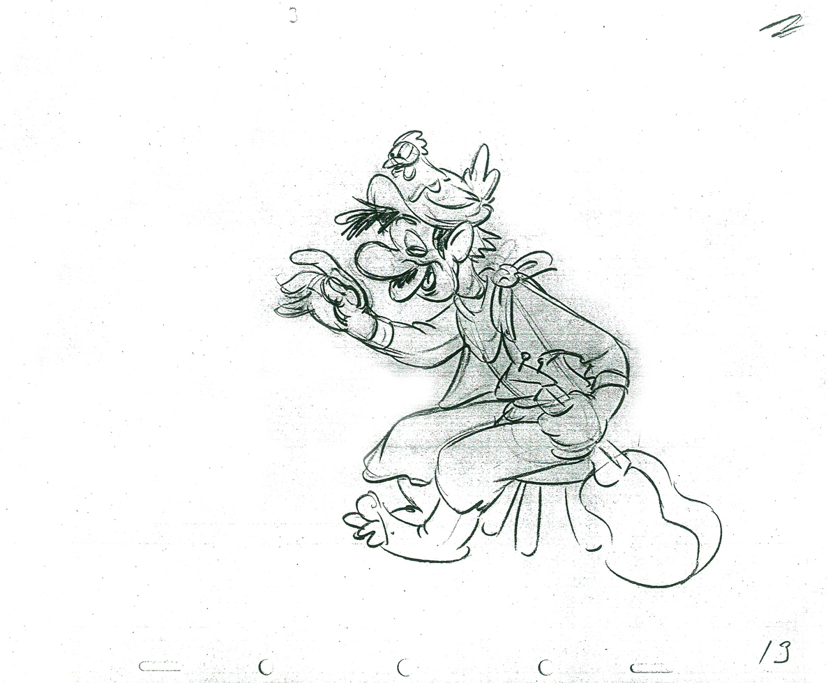
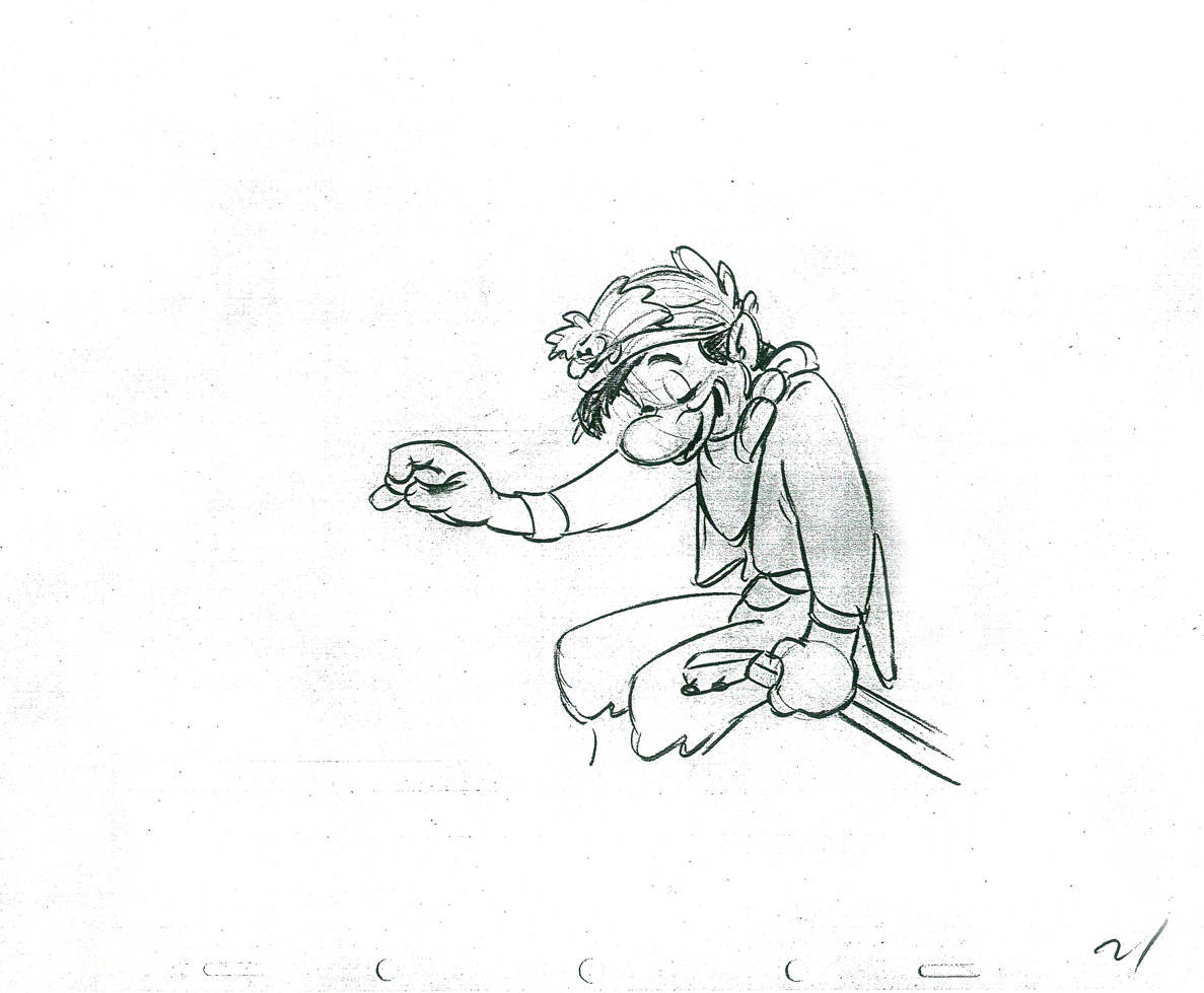
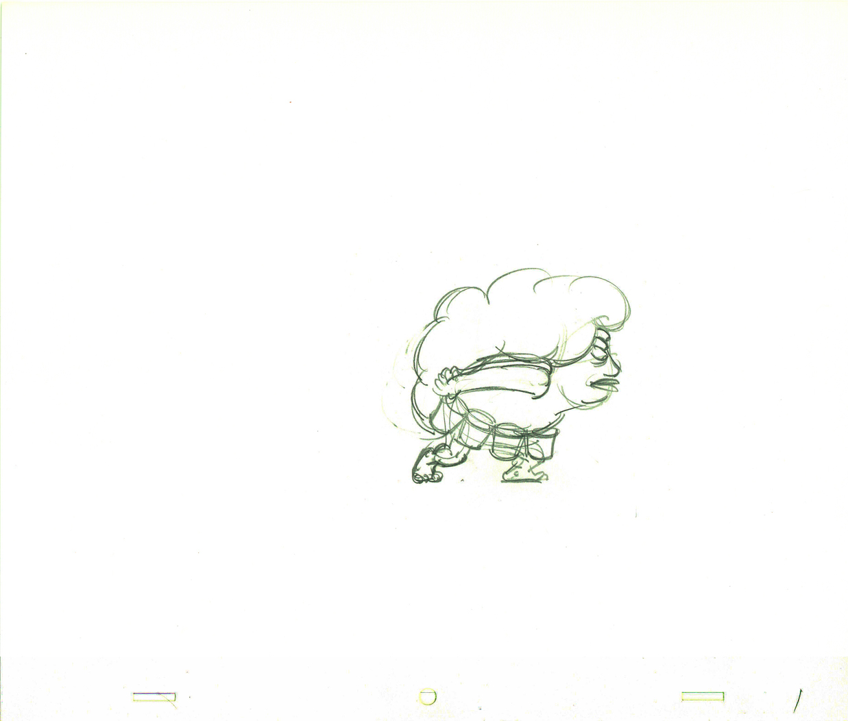
Phil Duncan was the animator. A brilliant character guy who had done everything from Thumper to George of the Jungle. I loved cleaning up and inbetweening his work. It was all fun and vibrating with life.
The rough thumbnail drawing (above) fell out of one of Phil’s packages. It was a thumbnail plan of the action. Phil would do these things which usually stretched around the edges of his final drawings. In a nutshell, you could see the scene and how he worked it out. Lovely stuff.
I felt this drawing was as beautiful as the original animation drawings.
 The agency approved the stork, Edgar Buchanan and the plan of action.
We’d already finished the first commercial which was on the air. (Represented by the two set-ups posted here.) The style was done with acrylic paints – out of a tube – on top of the cel. Ink with Sharpie on cel; paint dark colors – ON TOP of cel
- up to and over ink line; after drying we painted it again with lighter tones, and we pained it again after it dried using even lighter tones with a translucent color. Imagine kids & a gun in a spot today!)
Phil Duncan did a great job of animating it. I inbetweened, and the Agency loved it and approved it to color.
All this time, John and Faith were busy preparing the start of Everybody Rides the Carousel. It was to be three half-hour shows (Eventually CBS changed their mind and asked the shows, still in production, to be reconfigured to make a 90 min film) and was in preproduction. I did the spots on my own with John checking in. Faith wanted nothing to do with a commercial and was somewhat furious that a commercial was ongoing. She daily spoke out against this spot with many shouting matches. I never quite understood the problem. The spots didn’t hold up any other studio work; I was making it as easy as possible for John to not have to do much work on the spots, and they were getting necessary money to help finance some of the preliminary work for the Carousel. (Of course, the Hubley name was involved, but even Michelangelo did commercial work – like the Sistine Chapel to pay for the art. Not that Vlasic was the Sisine Chapel, of course.)
 Within weeks the spot was in color and two junior exec. agency guys, John and I stood around the Hubley moviola. (It was a great machine with four sound heads and a picture head that was the size of a sheet of animation paper. Pegs were actually attached to enable rotoscoping!)
The two agency guys were buttoned up with good suits and briefcases. They stood behind John and me, and I operated the moviola.
We screened the spot the first time. I turned around and these two guys had come undone. Their ties were loose and astray; they were visibly sweating. I swear this all happened within the course of 30 secs.
 John smiled and optimistically asked how they liked it. They looked at each other, and couldn’t answer. I don’t think they were able to form a decision or say what they actually thought. Eventually, they left with the spot in their briefcase and would get back. It wasn’t good.
They did get back. I was asked to pack up all the elements and ship them back to W.B. Doner. The spot was thrown out of the studio by John who refused to change it. (Hubley’s stork.)
He liked what was done, and apparently had
a rider in his contract which covered him – somehow.
The spot showed up at Jack Zander‘s studio, Zander’s Animation Parlour. They used the Groucho impersonation and slicked it up a lot. Vlasic is still using that stork, and that was John’s last commercial endeavor. The character is still showing up in a cg version, just as bad as the 2D version.
* Thanks to Mark Mayerson for this information.
