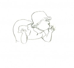
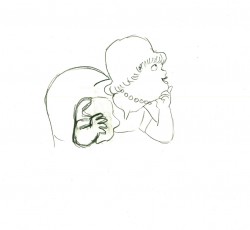
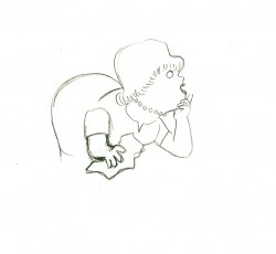
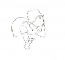
Category ArchiveAction Analysis
Action Analysis &Animation &Books &Commentary 06 Dec 2012 07:03 am
The McKimson Brothers
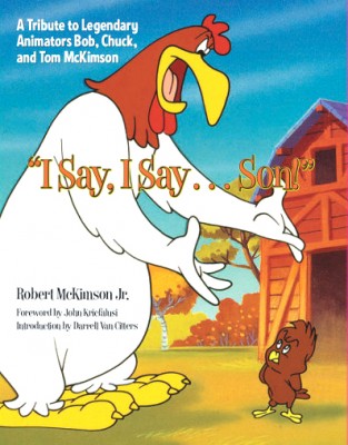 I Say, I Say . . . Son! This is the title of a book by Robert McKimson Jr. Any ideas what it might be about?
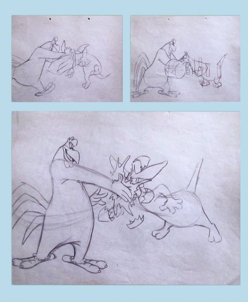
Sound anything like Foghorn Leghorn?
Yes, it’s a tribute to Bob McKimson with a big nod to Chuck and Tom McKimson, as well. This, to me, is something of a feat in its own right. The book is a workhorse of a picture book with lots of valuable images that you haven’t seen before. It’s not like the big glamour picture books that come out of Disney or Dreamworks. The Art of Whatever. It’s not one of those heavyweight oversized books that cause coffee table legs to bowl outward under their weight. No, this is a go to book on good paper; it’s solid. There are lots of drawings and photographs, frame grabs, newspaper clippings, and posters. Just looking at the pictures will give you a pretty good idea of the story the book is telling.
And it’s a valuable story – the part of the jigsaw puzzle that’s been left missing.
There have been about a half dozen books by and about Chuck Jones, one enormously expensive tome on Friz Freleng with lots of key references to him in most animation histories. Bob Clampett did a lot to promote himself; he gave us films and videos, not books. There are at least three Tex Avery books. This is the first on Robert McKimson – the other Warner’s director. And it was written by his son.
McKimson was loved by Leon Schlesinger who tried to make him a director early on. Yet, Bob didn’t feel that he was ready. He became the head of all animators in the studio, responsible for solidifying the style of all the different variations of the characters. He helped tie Jones’ Bugs Bunny to Freleng’s or Clampett’s Porky Pig to Tashlin’s. When Schlesinger sold the studio in 1944 and Eddie Selzer took charge, McKimson pushed himself into the directorial position, and he gave us meat and potatoes films with characters that were all his: Foghorn Leghorn, the Tasmanian Devil, Sylvester Jr., and some of the Speedy Gonzales work.
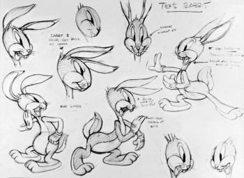 Before reading this book I was certainly well aware of Bob McKimson‘s work, and I was not quite as familiar with the other McKimson brothers. I’m not sure much has changed about that. As an animator Bob McKimson was brilliant, but as a director I never quite saw the lyricism that we saw in some of his best animation. McKimson was the Milt Kahl of the WB studios. He could draw like dynamite and knew every trick in the
 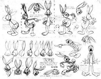 service of giving the tightest, sharpest animation possible. When you look at his scenes you’ll see beautifully drawn animation with solid timing and a muscular approach. Go to an extreme and take the pose as far as you can, and then go farther still, and then go even farther still. Bob not only did that, but his brilliant draftsmanship held the characters together in those unrelenting poses. It was near miraculous how _____2 of many Bugs model sheets drawn by Bob McKimson
he pulled that off. Animators
like Rod Scribner or Jim Tyer would go as far as he did, but their drawings blew up into funny. Bob’s artwork just got more solid. Bobe Cannon was probably the only other person at WB that could match him for drawing ability. Even still Cannon would purposefully distort his drawings more than McKimson would. Bobe was interested in the 20th Century Art, Bob was interested in the artistry.
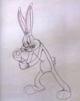 As may be obvious, I’m not the greatest enthusiast when it comes to Bob’s direction. It all shows so little panache that I must say I’ve easily dismissed it. The work is just that, a solid bit of work. The backgrounds are cartoon realistic. No flair the way you’d find in Maurice Noble‘s art, no personality as in Paul Julian‘s paintings. Dick Thomas, Cornett Wood and Robert Gribbroek did most of the design and background painting. All of the effort was put into the animation and little concentration seemed to focus on the design of the films. I can remember Mike Barrier talking about McKimson’s work. His layouts and the stacks of animation drawings that came from his cartoons far outweighed the piles of art from work by the other directors. Jones’ impeccable poses, Freleng’s exquisite timing. McKimson worked the funny into his cartoons and he got the same from his animators. He used drawings and more drawings. The style came from good, hard solid work, not timing or poetry.
There are all those stories about Rod Scribner and his wildly artistic period under Clampett. He was a different guy under McKimson. It’s hard to see the same animator in the two different phases. There’s pure delight in the animation under Clampett and solid workmanlike craft under McKimson. No doubt this was also because Clampett probably was off leaving Scribner on his own to do what he wanted. McKimson kept Scribner under his thumb and, in my opinion, didn’t get that great and wild personality that had been available. As a matter of fact, I suspect this was true of all the artists McKimson controlled. It probably worked well with the two brothers, Chuck working under Bob’s direction, but I’m not convinced it was the best way for most artists to work.
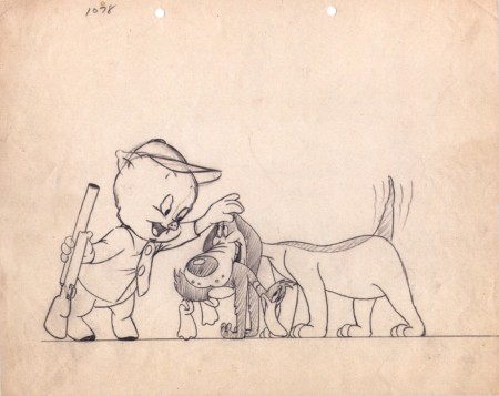
A Bob McKimson Layout for “daffy Duck Hunt” (1949)
For this book, there can be no doubt that a major source of information had to have been Mike Barrier‘s excellent interview with McKimson. (Go here if you want to read that – and you should have already read it.***) I’m afraid there is no interview with Tom or Chuck McKimson readily available. I would have liked to see more of them in this book. Toward the end of the book, we see roughs and stills from the illustration work the two have done for comics and coloring books. Robert McKimson certainly dominates the bulk of this volume.
It is the visual materials available here that shows the real value of the book and makes it important to own. For anyone who recognizes the importance of WB cartoons and wants the whole picture recognized this is the reason for this book. The artwork. There are some beautiful early drawings printed, especially, the pages of clean-roughs done by Bob that were animated by Tom. Excellent poses once again from Bob with no sign of Chuck’s drawing. Again, it’s only toward the end, when we get into the comic books and other print material, that we see some of Chuck and Tom’s artwork. These are definitely not up to that of Bob’s drawing, but if the focus is to be on all three, we need to see all three on display.
I appreciated the photos throughout as well as a reprint of the few articles about any and all of the brothers. Perhaps more of an analsis from the author about the variance from one artist to another. Despite their being brothers, they do have very different talents and we can see, despite the limited amount of art from Tom & Chuck, that Bob was the obviously the strongest draftsman of the three, but there for the lack of drawings goes this book.
Regardless, I’m glad to have what I do have. The excellent WB art of Bob McKimson and the familiar comic book covers of Tom. Both broght back memories of differing kinds. Chuck, he was the animator, he worked within his brother’s unit at WB, and there isn’t much sign of his drawing. But the films are there, and we can enjoy those films and the talent that went onto their making. I wonder if ever there were a conversation or a statement by Bob about his brothers’ work. Perhaps someday, that curtain will be opened a bit more. Until then, I’m grateful for this book.
*** Actually if you want to go the heart of animation history just go through Mike Barrier‘s archives and interviews, and you’ll have a good solid base. Take a tour of MichaelBarrier.com. Spend a lot of time there.} Perhaps someday we’ll get Mike Barrier’s article about the three brothers. Maybe a review of this book will bring him out on the subject.
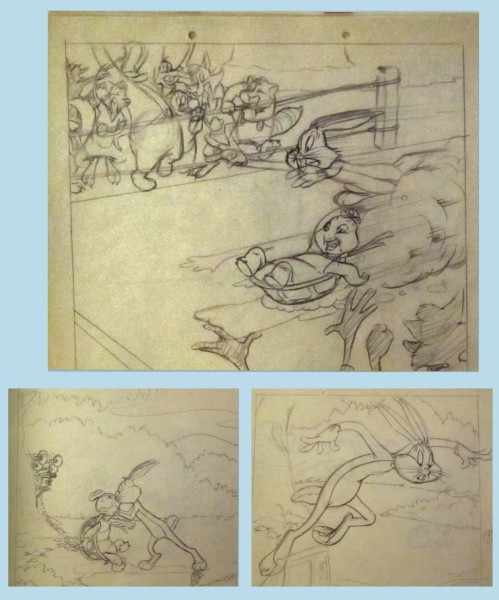
Bugs Bunny and the Tortoise
Some roughs for a 1948 book by Bob McKimson.
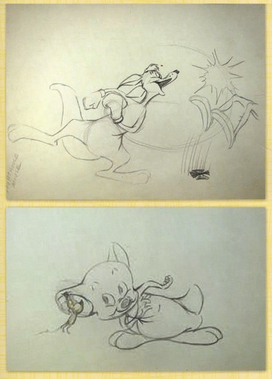
Top – Layout for “Hippity Hopper” (1949) Bob McKimson
Bot – Layout for “Lighthouse Mouse” (1955) Bob McKimson
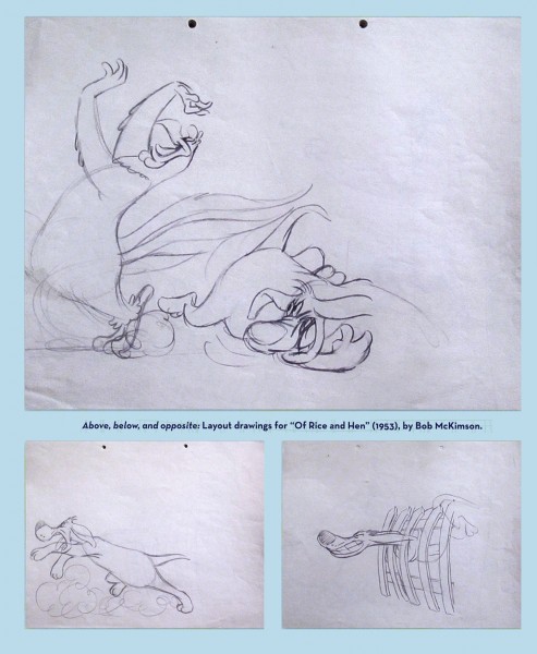
Some beautiful roughs for Layouts by Bob McKimson
for “Of Rice and Hen” (1953) directed by him.
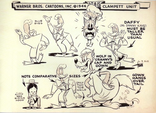
A model sheet by Tom McKimson. One of a few in the book.
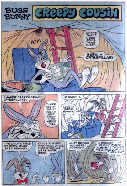
A comic book page by Tom McKimson
A very different model than Bob would have drawn.
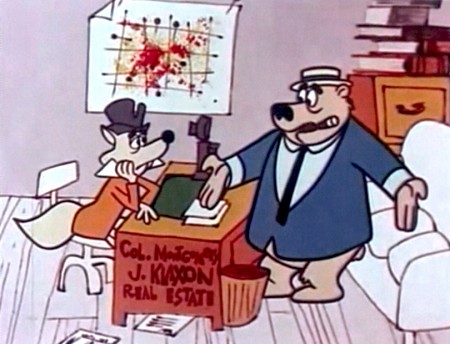
A setup from “Calvin and the Colonel” directed by Chuck McKimson (1962)
Action Analysis &Tissa David 04 Oct 2012 05:38 am
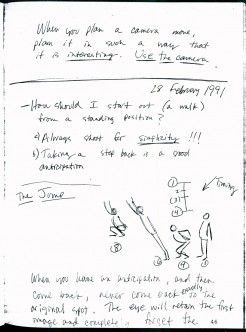
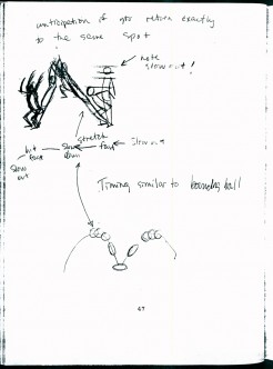
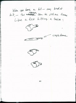
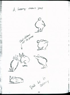
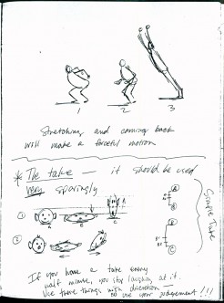
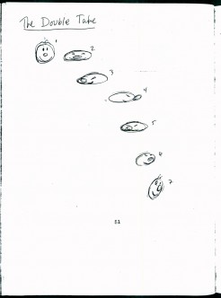
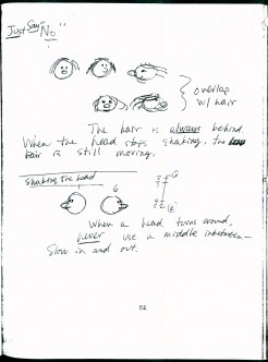
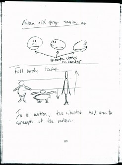
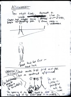
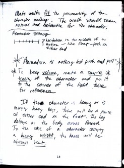
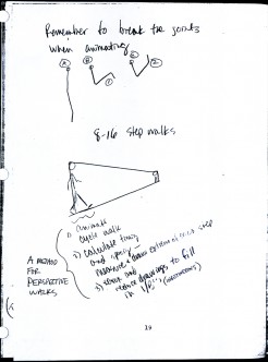
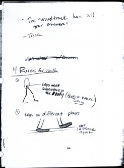
Tissa’s Class – part 2
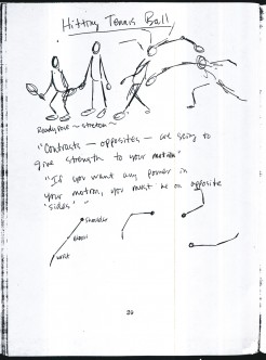
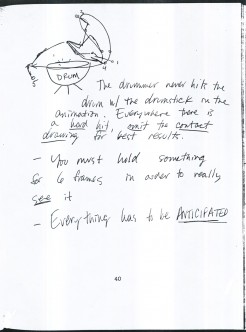
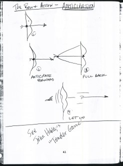
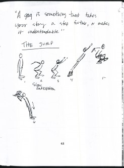
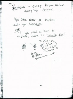
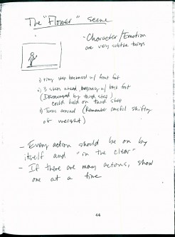
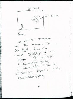
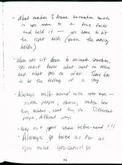
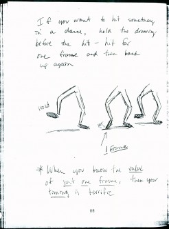
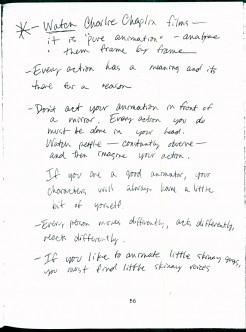
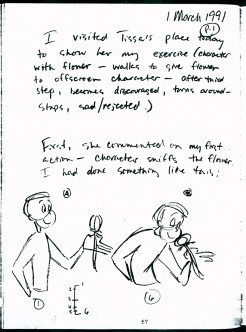
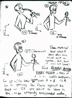
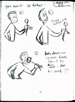
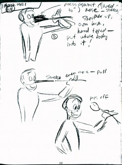
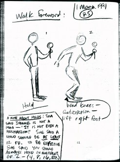
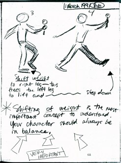
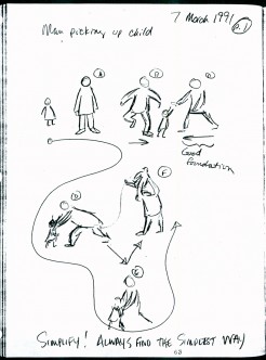
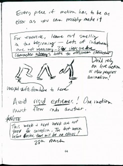
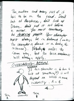
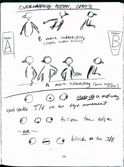
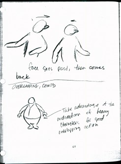
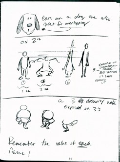
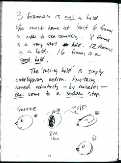
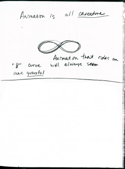
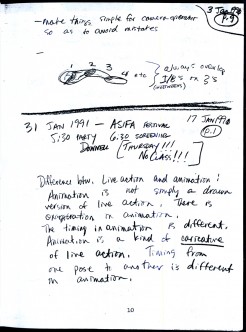
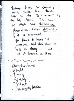
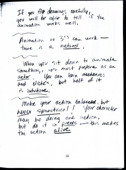
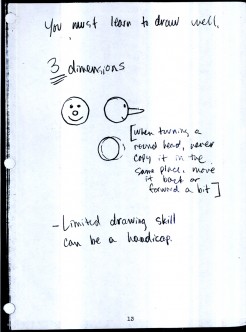
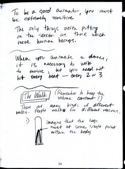
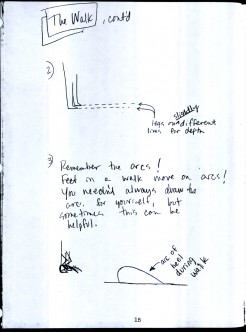
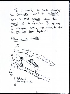
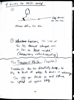
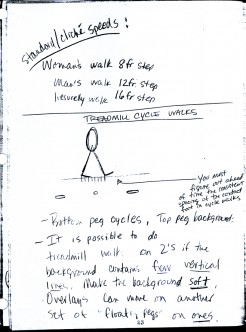
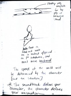
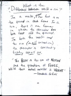
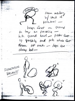
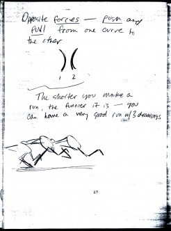
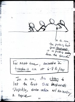
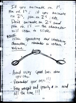
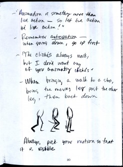
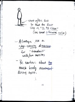
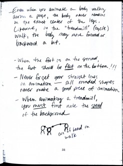
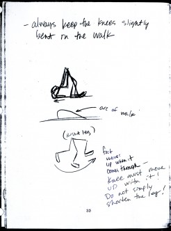
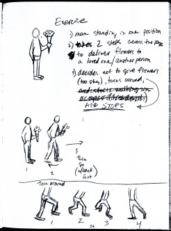
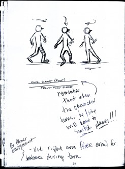
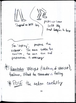
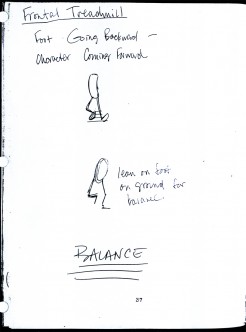
- Last week I started posting parts of Eugene Salandra‘s notebook which he did while taking an animation class conducted by Tissa David at the Ink Tank. (Part 1) There was enough of a request for more that I can’t help but to post away. The material was so clear and evident and enormously helpful.
I pick the book up exactly where we left off. It’s wonderful for me to go through this even as a refresher course, trying to kick some of those bad habits. (What I take from this week’s lessons is that when you’ve gone as extreme as you can, go a step more. But don’t make it cartoony – unless that’s the effect you’re trying for.)There’s plenty of advice in there.
Animate away folks.
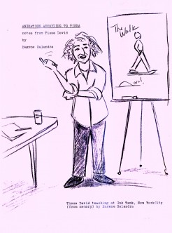 1
1 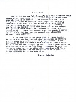 2
2I repeat these first two pages.
(Click any image to enlarge.)
To be continued next Thursday.
Action Analysis &Animation &Animation Artifacts &Tissa David 27 Sep 2012 06:57 am
Tissa’s Class
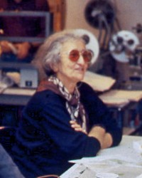 – There was a time in New York when Tissa David taught a class in animation for free, open to anyone who wanted to attend. This was sponsored by R.O. Blechman out of his studio, the Ink Tank. It was held after hours, so that those who worked in the business could attend.
There were several sets of notes I’ve seen taken from Tissa’s talks, kind of a poor man’s version of Dick Williams‘ famous Art Babbit notes. A copy of Dick’s notes circulated within the business and quite a few people studied from them. Recently, John Canemaker loaned me a copy of Eugene Salandra‘s notes from Tissa’s class. Eugene had graduated from John’s class at NYU and had become a professional in New York, before he moved to California to work for Disney. As a professional, he was able to cut to the quick to synthesize Tissa’s basic lessons. I was impressed, and I contacted Eugene to see if he minded my posting some of the pages. He was supportive of the idea and hoped that he would help get the information out to others.
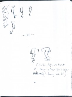
So, here I’m posting the first batch of these notes, which I think are very readable. (You’ll have to click on any of the images to enlarge so that you can read them.) If the reaction is good, I’ll offer more. This group is predominantly about walk and run cycles. But if you look close enough, you’ll see that they cover a lot more.
 1
1  2
2
Action Analysis &Animation &Animation Artifacts &Hubley &Independent Animation &Tissa David 24 Sep 2012 05:41 am
Viva à la Tissa
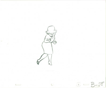
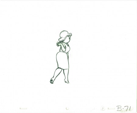
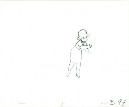
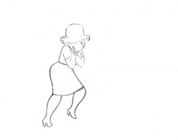
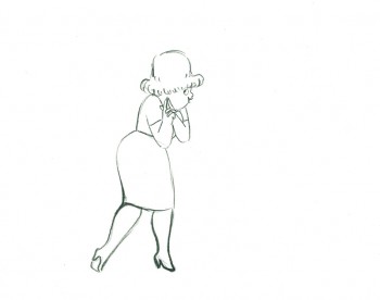
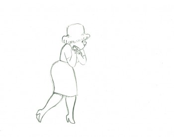
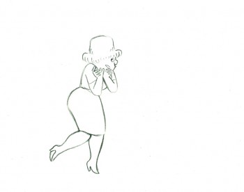
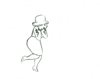
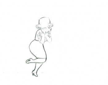
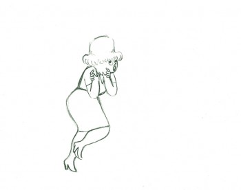
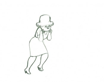
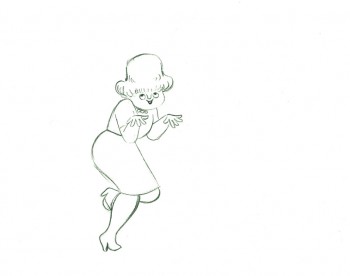
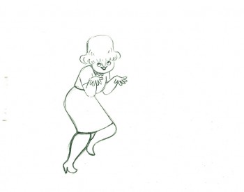
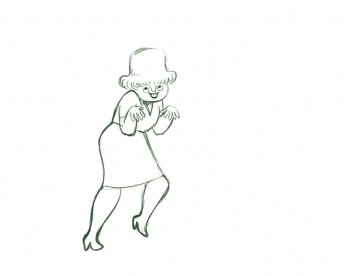
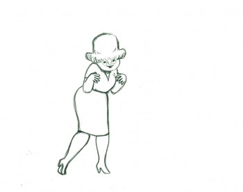
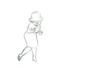
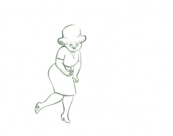
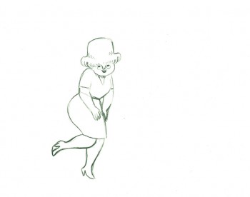
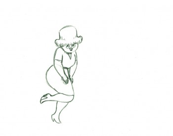
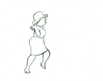
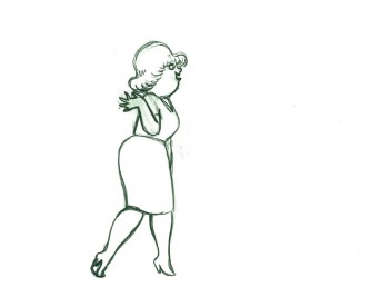
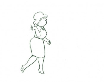
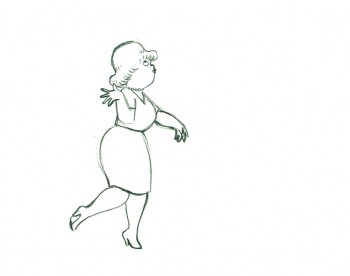
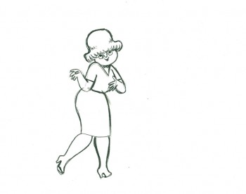
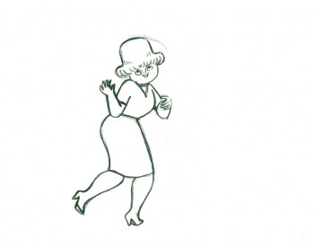
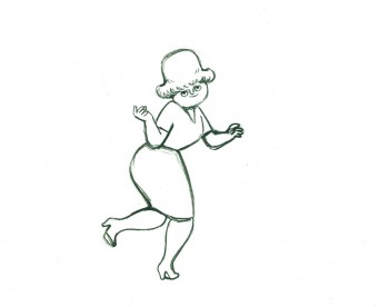
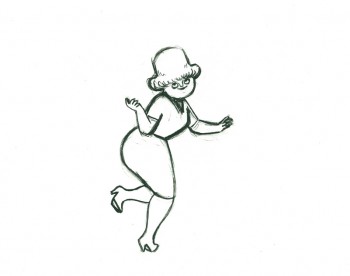
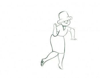
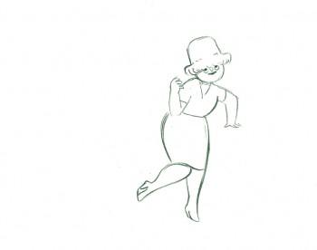
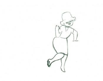
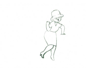
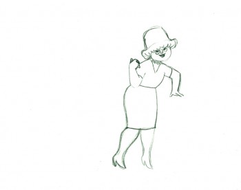
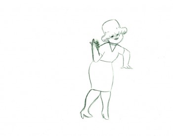
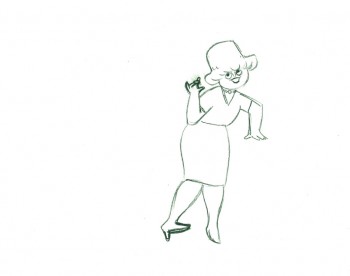
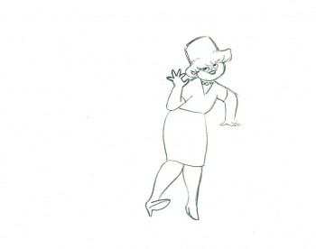
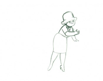
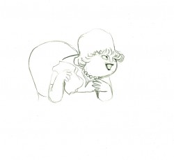
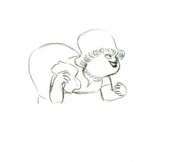
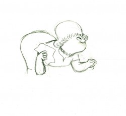
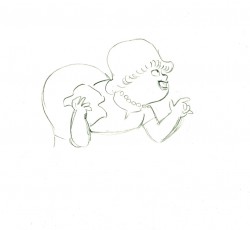
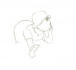
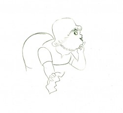
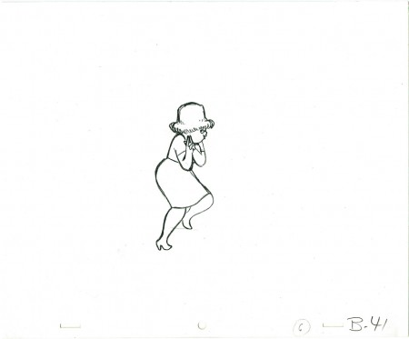
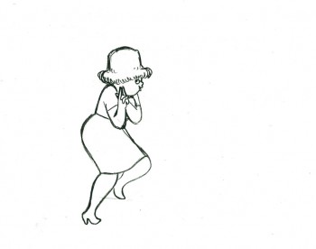
- Tissa David animated a VIVA paper towel spot for John Hubley. Here’s a scene wherein the lead, a woman, walks through (Bg pans behind her at .25 per drawing) toward the kitchen, where she stops.
Instead of giving you the entire page of animation paper, I’ve trimmed it down to just include the character and her walk. Here are four examples of what the entire drawing looks like, untrimmed.
 B41
B41
And here are all the drawings for the scene cropped:
 41
41
________________________
.
The following is a QT of the entire scene with all the drawings included.
Since I didn’t have exposure sheets, I put everything on two’s straight ahead.
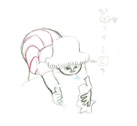
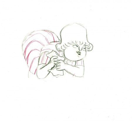
- Here’s what looks like a simple move done by Tissa David when she animated this Viva, paper towel commercial.
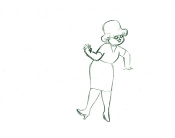
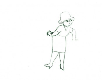
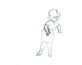
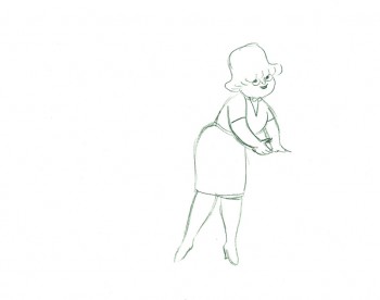
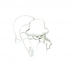
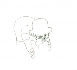
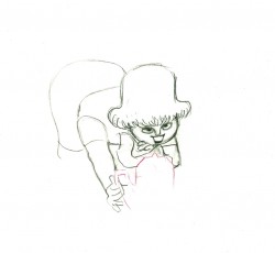
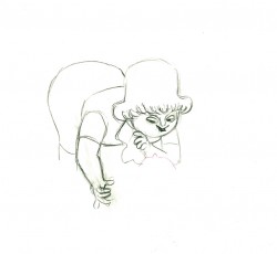
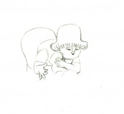
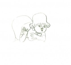
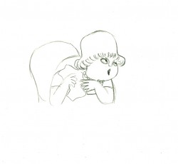
The character’s move in this scene is a complicated one done simply. She has been bent over, cleaning with her paper towel, and she moves up. You can follow the overlapping action as her eyes pull her up, head turn, and body follows.
The stripes will come and go. Tissa depends on someone else to concentrate on this material when she’s working on a commercial.
 e37
e37(Click any image to enlarge.)
 e44
e44
Her eyes point in the direction she wants to go,
and the rest of the scene moves her up and into profile.
This key move is hidden under the exchange of the
paper towel from one hand to the other.
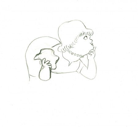 e51
e51
She stops to think (accenting her monologue.)
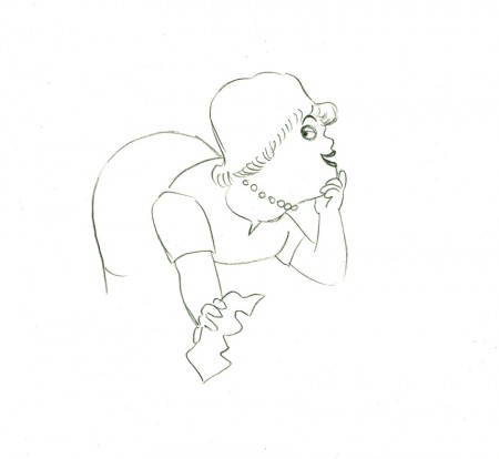 e58
e58
And she slyly looks back to camera to respond with her thought.
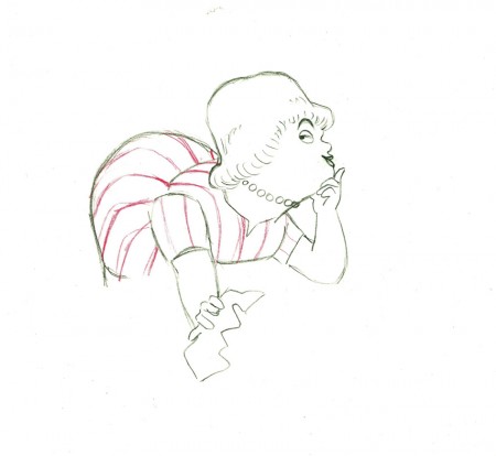 e59
e59
She continues, all through this move, talking.
She’s pitching the product.
Here’s a QT of the piece:
Cleaning for VivaClick left side of the black bar to play.
Right side to watch single frame.
Action Analysis &Animation &Animation Artifacts &Disney &Tytla 13 Sep 2012 05:48 am
Tytla’s Terry-Disney Style
- Bill Tytla is probably the finest animator who has graced the history of the medium. He was a brilliant actor who dominates most of the classic early films of Disney work. Snow White, Pinocchio, Dumbo, and Fantasia are all appreciably greater films because of his work. In studying this master’s work frame by frame you can see a real elasticity to the character, one that is not apparent in the motion of those same characters. There’s true emotion in the acting of these characters, and it’s apparent that he uses that elasticity to get the performances he seeks.
There’s something else there: Tytla’s roots were in Terrytoons: I have no doubt you can take the guy out of Terrytoons, but it seems you can’t take the Terrytoons out of the guy.
Let’s look at some of the drawings from some of the scenes I posted here in the past.
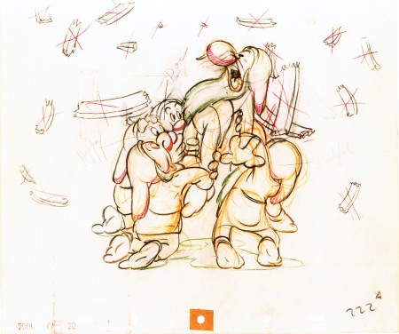
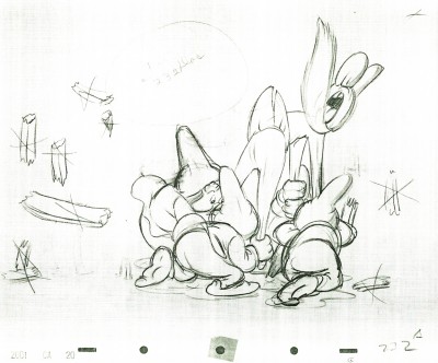
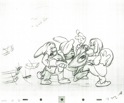
Where better to start than with those gorgeous dwarfs from Snow White. Here’s a scene I posted where all seven are animated on the same level as they carry Grumpy to the wash basin. If he won’t clean himself, then the other six will do the job for him. Take a look at some of the distorted characters in this scene, then run the QT movie. Look for the distortion in the motion.
As for the drawing, like all other Tytla’s scenes it’s beautiful. But tell me you can’t find the Terrytoons hidden behind that beautiful Connie Rasinski-like line.
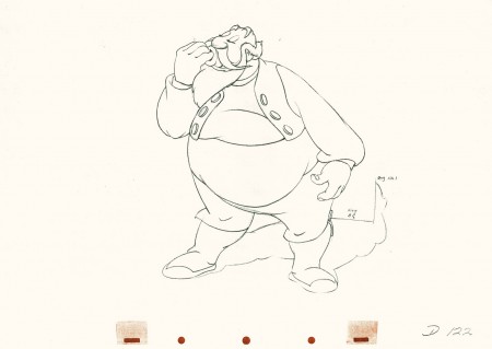
Flipping over to Stromboli, from Pinocchio, we find animation almost as broad as many Terrytoons, the difference is that Tytla’s drawing that roundness and those enormous gestures on purpose. He knows what he’s doing and is looking to capture the broad immigrant gestures of those Southern European countries. Stromboli goes in and out of distorted drawings, as I made clear in a past post.
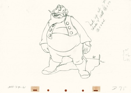 75
75
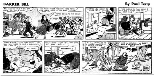
A strip by “Paul Terry”as starring his 1930s character, Barker Bill.
Borrowed from Mark Kausler’s blog It’s the Cat.
The Laughing Gauchito was a short that was, no doubt, going to be part of The Three Caballeros. Tytla, Frank Thomas and Ollie Johnston had all animated for the short before Disney, himself, cancelled the production.
Here are three drawings from the film, and they are all beautiful extremes from the scene. (Tytla marked his extremes with an “A” to the right of the number, or at other times with an “X” in the upper right.) The beautiful roundness does not come at the expense of his drawings. Below the Laughing Gauchito we see a cartoon drawing by Carlo Vinci from a 1930′s Terrytoons short.
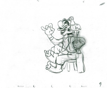 9
9
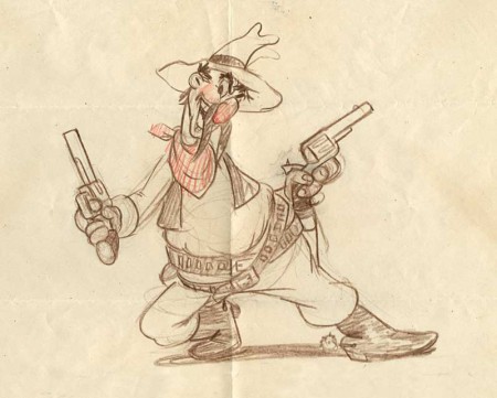
A Terrytoons drawing by Terry artist Carlo Vinci from a mid ’30s short.
borrowed from Animation Resources
Here’s a scene Bill Tytla did for a Harman-Ising cartoon. He was the supervising animator, and the lack of Disney becomes evident in the drawings. The animation is closer to a Terry short than what he did at Disney’s. The movement feels muddy in that actual cartoon. I’m sure it was his own animation trying to blend with the style of Harman’s work.
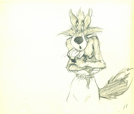 11
11
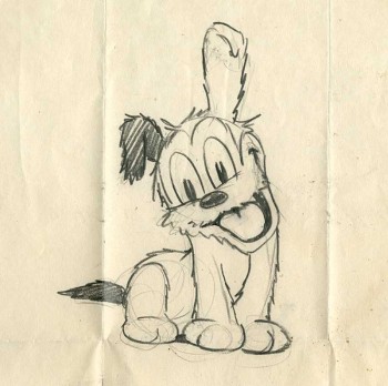
Another beautiful Carlo Vinci drawing from a 30′s Terry short.
borrowed from Animation Resources
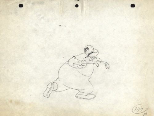
And here’s a drawing out of a Little Lulu cartoon. I’s not a film directed by Tytla, and is not a good drawing. But Tytla’s influence on all the Lulu shorts at Paramount at the time can’t be denied. It certainly looks more Terrytoon than Paramount. This is not even a good Terry drawing – though its for a Paramount cartoon.
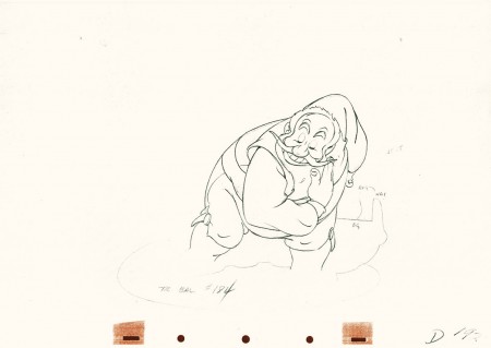
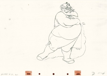
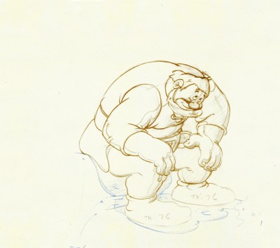
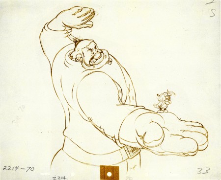
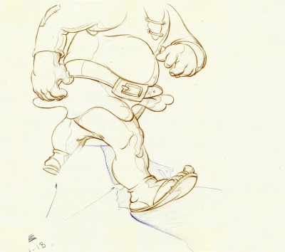
Back at Disney, Tytla animated Willie the Giant from the Mickey short, The Brave Little Tailor. This character, like Stromboli, owes a lot to Terrytoons. I felt this when I first saw the short as a child, and I still think it true. The same, I think, is also true of the same Giant character when he appears in Mickey and the Beanstalk, which Tytla obviously didn’t animate but would have handled if he’d stayed at the studio.
 3
3
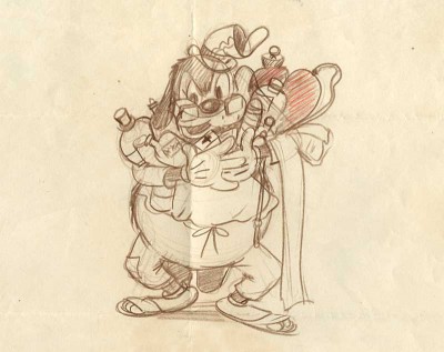
Another Carlo Vinci sketch.
borrowed from Animation Resources
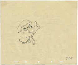
This following, last drawing is a Tytla drawing I own. I know Tytla did it. He gave it to Grim Natwick who gave it to Tissa David who gave it to me. It’s a gem.
Action Analysis &Animation Artifacts &Disney &Frame Grabs &repeated posts 31 Jul 2012 05:12 am
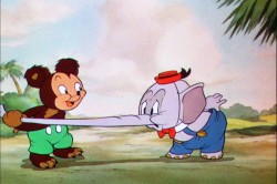
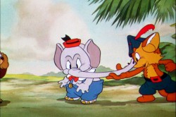
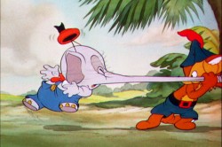
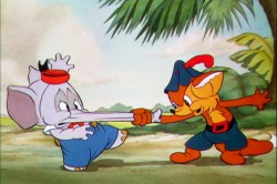
Elmer Elephant X-Sheets – recap
- This old post on Exposure Sheets was a popular one back in March, 2009. Today most animators work with the track and no track reading or record of the moves they’ve done. It’d be a nightmare to try to reconstruct what they’ve done in a scene. All we now have to go on is the completed scene. A lot is lost in the history of animation being done today. For that reason, I thought it’d be nice to take a look at all we can learn from one simple X-Sheet.
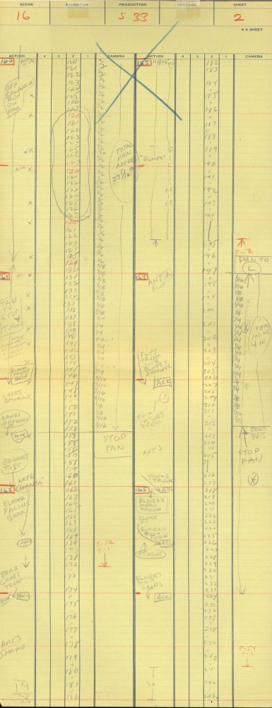
Robert Cowan sent me an exposure sheet that was tucked into an envelope in the Ingeborg Willy Scrapbook, which he owns. (Ingeborg Willy was an inker working at Disney’s during the 30′s and made a photographic scrapbook of her stay.)
The sheet is from the Silly Symphony, Elmer Elephant (1935).
(Click any image to enlarge.)
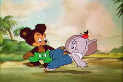
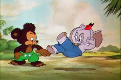
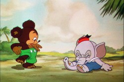
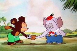
The film’s about a bunch of baby animals.
Elmer is the shy kid who gets laughed at by the other kids.
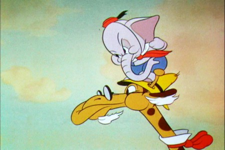
Eventually with the help of an old giraffe he saves the day by putting out a fire …
This exposure sheet is about a sequence wherein Elmer is pushed across a row of animals and is poked and prodded in absolute humiliation.
Let’s review what’s on the sheet for the completely unitiated viewer:
There are several columns: Action, 4,3,2,1 and camera.
These are basic to all X-sheets. Sometimes you get 5 numerals, oftentimes you get a column for Bg. Uusaly there’s also a Track column.
Below these descriptives you have lines. Each light blue line represents one frame of film. If the drawing’s on twos or threes or more it’s indicated as in #149. Other numbers are on ones – one frame per drawing.
In the “Action” column, the director writes notes telling where he wants some action to happen. For example: the director has noted that he wants Elmer to try to stop his turn from frames 32 through 49. The animator will follow this as best as possible.
The numbered columns represent cel levels. #1 is the bottom cel and #4 is the top cel. Most sheets also have a column for the Background so you know what number Bg is called for.
The “Camera” column indicates any special camera movements or effects. There we see a pan. The Bg is moving from screen right to left. The actual amount of the physical movement is indicated on every frame. 1/2 is a half inch, 1/4 is a quarter inch etc. Pans usually slow down as they come to a stop and gear up when they start out. This is why it goes from 1/2 to 3/8 to 1/4 to 3/16 to 1/8 to 1/16 before you reach STOP PAN.
You’ll see the sound track indicated at red marked 163 top line middle of the sheet. A character is saying, “Bye Elmer.” The actual number of frames it takes is broken down for you. The animator would animate the mouth accordingly.
Here are frame grabs for the part exposed.
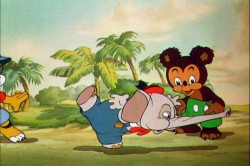 1
1 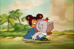 2
2
Let’s analyze the exposure sheet a bit. (For those not familiar with X-sheets, I have more of a breakdown below.)
First off, for me it’s an oddity. There seem to be two sheets combined onto the one. It’s split down the middle into two full sheets – all using only one cel level.
Secondly, there are some highlighted numbers – 160 through 165.
These fall at every 32nd frame. I’m not sure why. It’s not a foot (16 frames) or a second (24 frames). Is it a beat? I notice that the action calls for “ACC” at each of these markings. I assume it stands for “Accent” which would make that part of a musical tempo. Every 16th frame is also marked in red. This would be the only indication that this is what it is.
The pan moves are indicate in FRACTIONS ! I’m not sure why since it created a difficult transposition to decimals for the camera operator. I mean 3/8 of an inch equals what? Quickly now. Time is money. How about 1/16th? I have only met fractions which divided into 20ths. When did the change come in? John Oxberry, anyone?
Of course, some master checker would probably do the math before the scene got to camera.
Some of the drawings are exposed on twos, even for a short bit during the pan. This would be anathema in modern day animation, yet it hasn’t gotten better.
The track reading isn’t the most detailed I’ve seen, yet it does the job, doesn’t it?
The film is directed by Wilfred Jackson. I assume the “Action” column was filled out by him. I think the animation was by Paul Hopkins.
There’s a lot of information that can be pulled out from this one exposure sheet of a film done 73 years ago. Is that enough reason to advocate for continued use of the Exposure Seet?
Action Analysis &Animation &Animation Artifacts &commercial animation &Hubley &Tissa David 26 Jul 2012 07:22 am
A Simple Move – recap
- Here’s what looks like a simple move done by Tissa David when she animated this Viva, paper towel commercial. It was produced, directed and designed by John Hubley. A very simple and beautiful character.
The character’s move in this scene is a complicated one done simply. She has been bent over, cleaning with her paper towel, and she moves up. You can follow the overlapping action as her eyes pull her up, head turn, and body follows.
The stripes will come and go. Tissa depends on someone else to concentrate on this material when she’s working on a commercial.
 e37
e37(Click any image to enlarge.)
 e44
e44
Her eyes point in the direction she wants to go,
and the rest of the scene moves her up and into profile.
This key move is hidden under the exchange of the
paper towel from one hand to the other.
 e51
e51
She stops to think (accenting her monologue.)
 e58
e58
And she slyly looks back to camera to respond with her thought.
 e59
e59
She continues, all through this move, talking.
She’s pitching the product.
Here’s a QT of the piece:
Cleaning for VivaClick left side of the black bar to play.
Right side to watch single frame.
Action Analysis &Animation &Animation Artifacts &Frame Grabs &Hubley &Independent Animation &Layout & Design &Tissa David 09 Jul 2012 05:24 am
Of Men & Demons – Redux
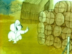 – Since first seeing the Hubley short, Of Men & Demons, back in 1967, I’ve been a fan. The artwork was stunningly different and original. It had a rich tone to it and some beautiful Hubley Bgs. The music by Quincy Jones was as original as the film, itself.
The short was actually an industrial film done for IBM to explain the binary code to its employees. The Hubleys, however, built on that story to make something of a personal film that received an Oscar nomination.
(Click any image on the page to enlarge.)
Art Babbitt was one of the first animators hired. At some point, Tissa David was brought on to rework some of Babbitt’s beautiful animation. Unfortunately, it was on about fourteen levels and had to be combined and reconstructed and shortened. (Today, of course, there are no limits to levels, but in the days of the camera you kept things to 4 cel levels, as a rule, and never more than 5.) It was complicated by the fact that John Hubley had decided to shorten the piece, and Quincy Jones’ score was shorter than Babbitt’s animation. This chore took some effort and involved dissolve animation. Tissa then continued on the sequence animating the little protagonist and his female companion through the remainder of the film.
About 25 years ago, Tissa David gave me an envelope full of art from this film, and going through a lot of my old material recently, I came upon that envelope.
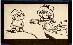 3
3 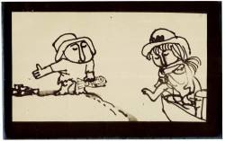 4
4
These are storyboard drawings for a short sequence. Tissa got these drawings and prepared Layouts for the sequence. You can see how much is actually in John’s drawings so it’s easy to build on what he’s given you.
 1
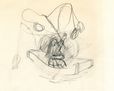
1The following are key drawings Tissa prepared for the sequence in laying it out.
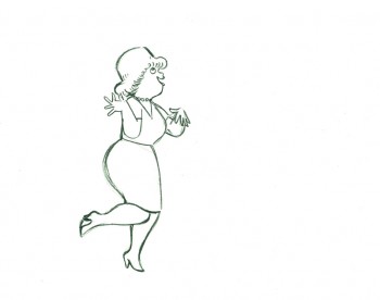
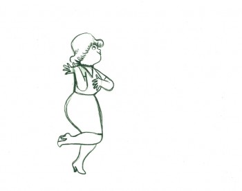
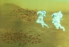
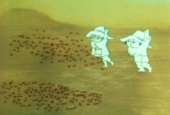
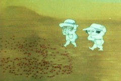
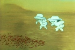
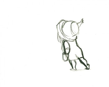
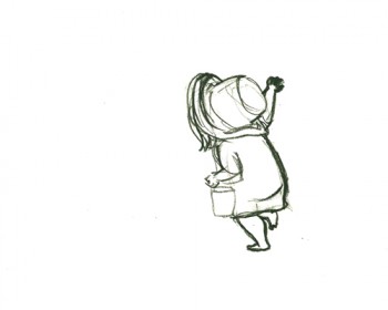
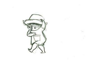
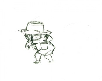
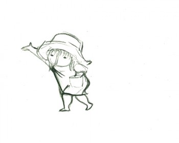
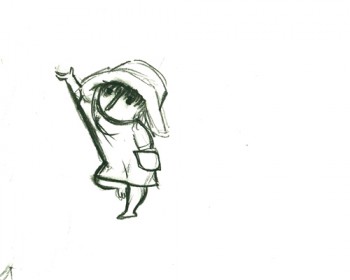
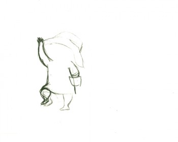
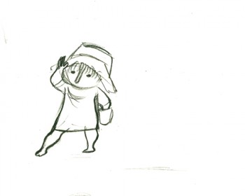
Here is a short piece that Tissa did of the little woman character seeding her front yard. There’s so much grace in every one of these drawings and enormous information in the walk, itself.
 G47
G47(Click any image to enlarge to full animation sheet.)
.
 G49
G49.
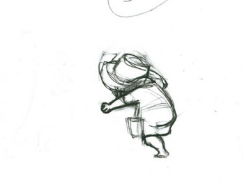 G51
G51.
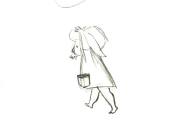 G53
G53.
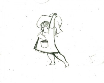 G55
G55.
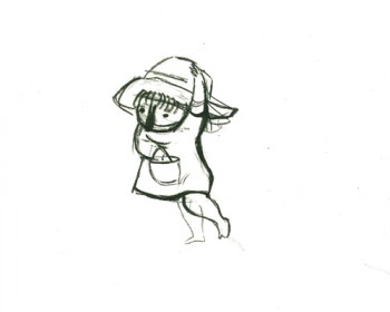 G57
G57.
 G59
G59.
 G61
G61.
 G63
G63.
 G65
G65.
 G67
G67.
 G69
G69
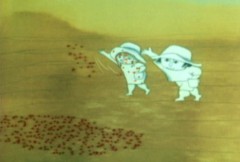
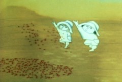
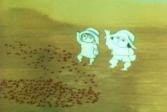
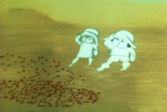
And here are the matching frame grabs from the film.
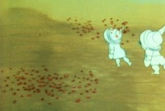
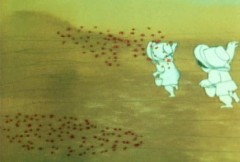
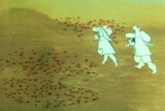
Seeding crops PT & Final Color
Action Analysis &Animation Artifacts &Disney 05 Apr 2012 06:26 am
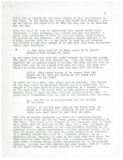
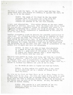
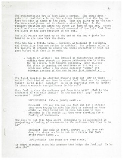
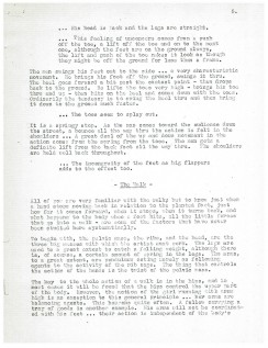
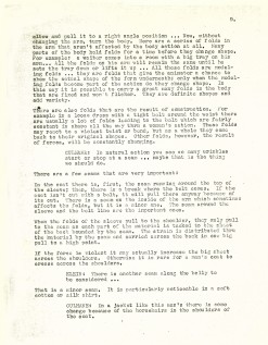
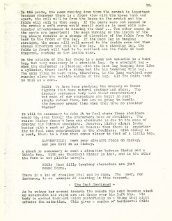
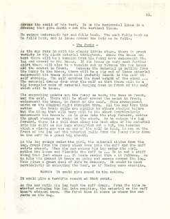
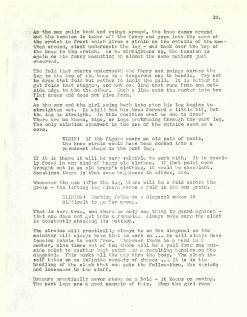
Action Analysis – May 17, 1937
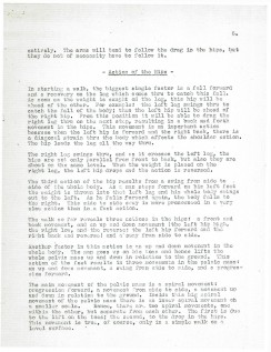
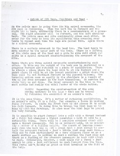
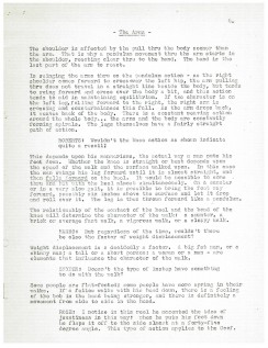
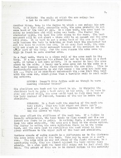
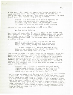
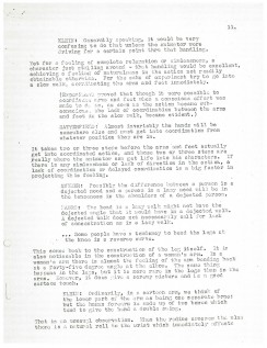
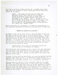
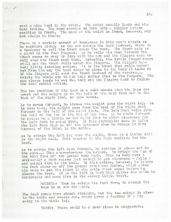
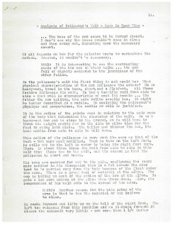
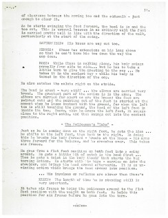
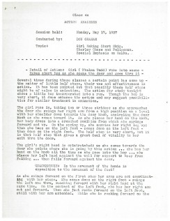
- To continue my posting of the Disney after hours Action Analysis class notes, I have this edition from May 17, 1937. It’s a short scene from a Charley Chase comedy sort. A girl skips into the scene followed by Chase and a Policeman with odd walks. Some of the participants include: Stan Quackenbush, Bill Shull, Izzy Klein, Jacques Roberts, John Vincent Snyder, Joe Magro, (?) Rose, Jimmy Culhane, and Paul Satterfield.
 1
1
Action Analysis &Animation &Disney 15 Mar 2012 05:26 am
Action Analysis – May 10, 1937
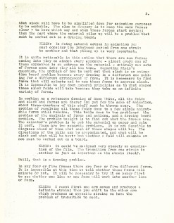
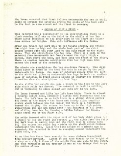
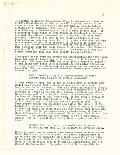
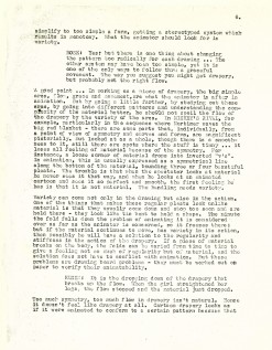
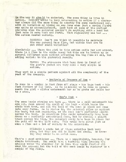
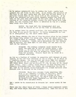
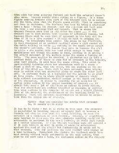
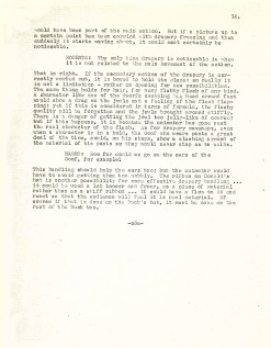
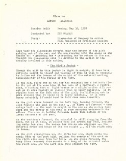
- For those archivists out there, I continue posting my collection of Action Analysis notes from the Don Graham night classes at the Disney Studio. These took place in the Spring of 1937. The following lecture took place on May 10, 1937.
It’s an analysis of a film clip of a girl getting out of a car. The focus is wholly on the movement of the drapery in action around her.
The participants of the class include: Joe Magro, Jacques Roberts, Izzie Klein, David Rose, Ken Petersen, Paul Satterfield, Jimmie Culhane, and Walter Clinton.
 1
1 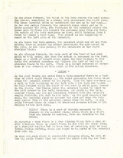 2
2
