Category ArchiveAction Analysis
Action Analysis &Animation &Animation Artifacts &commercial animation 24 Apr 2013 05:07 am
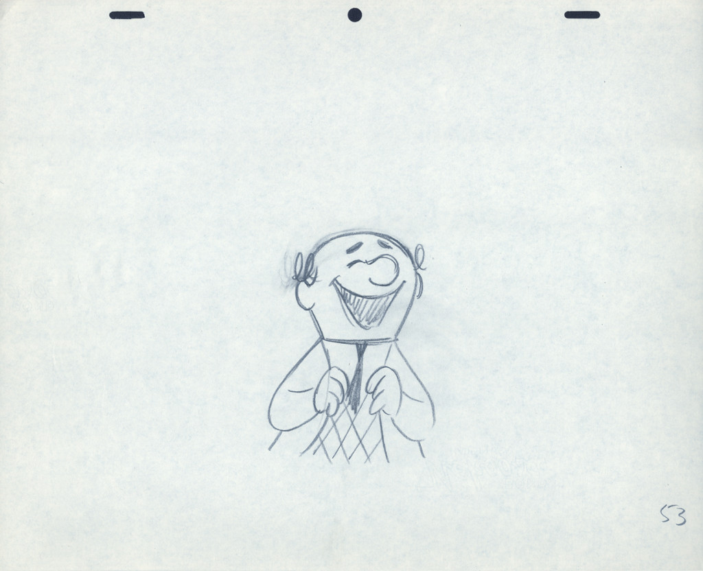
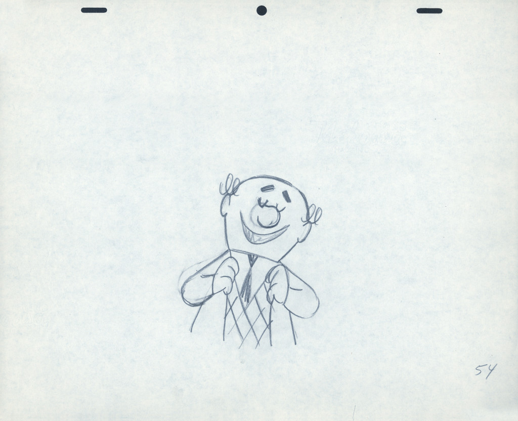
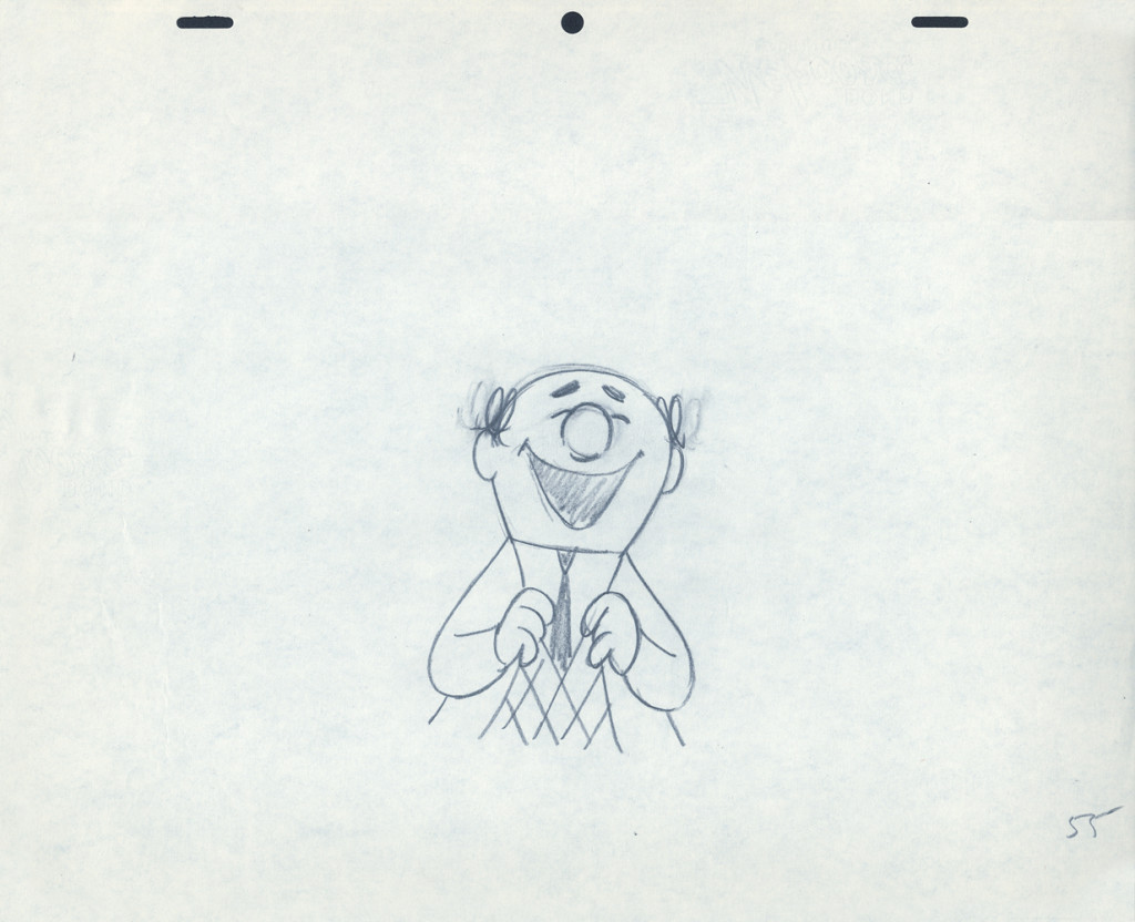
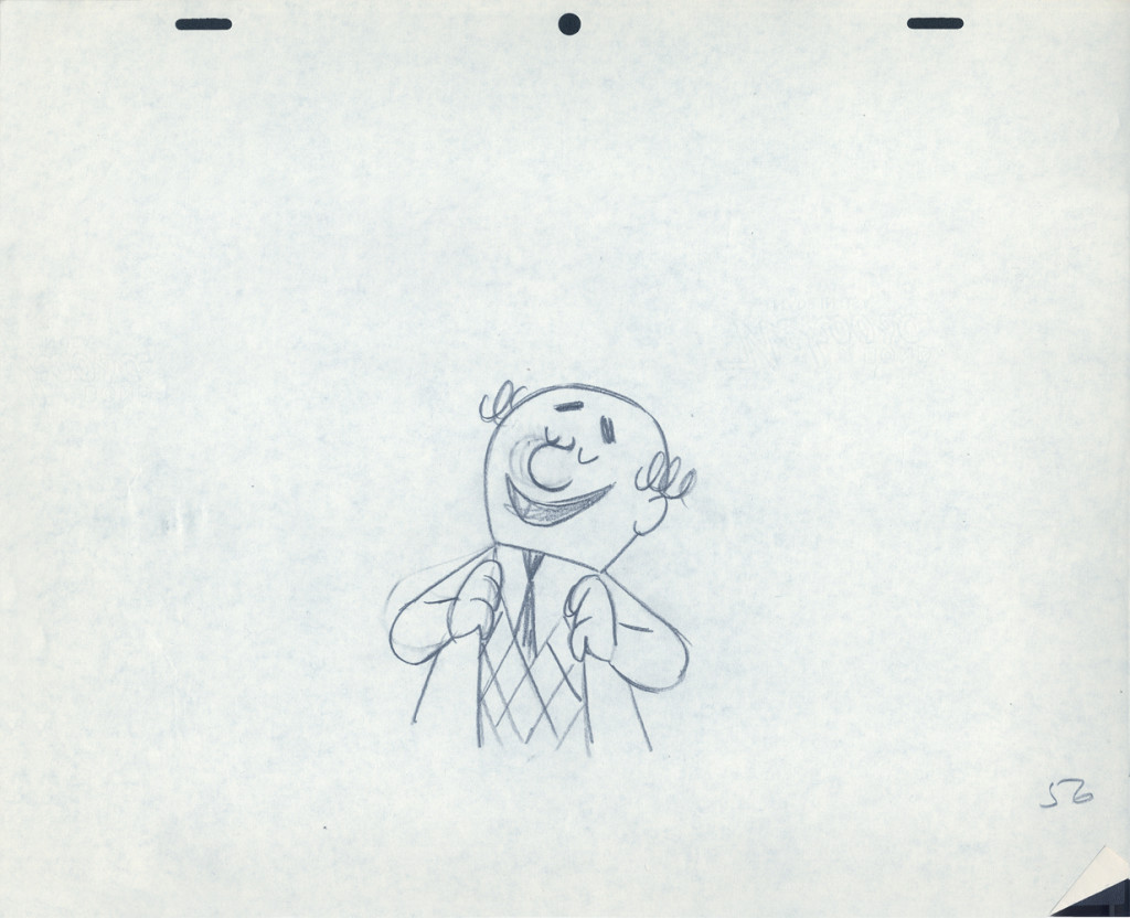
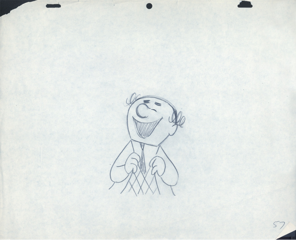
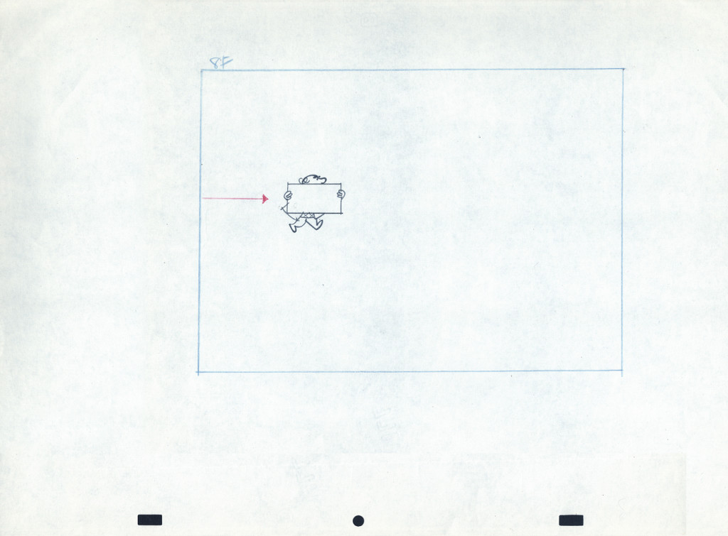
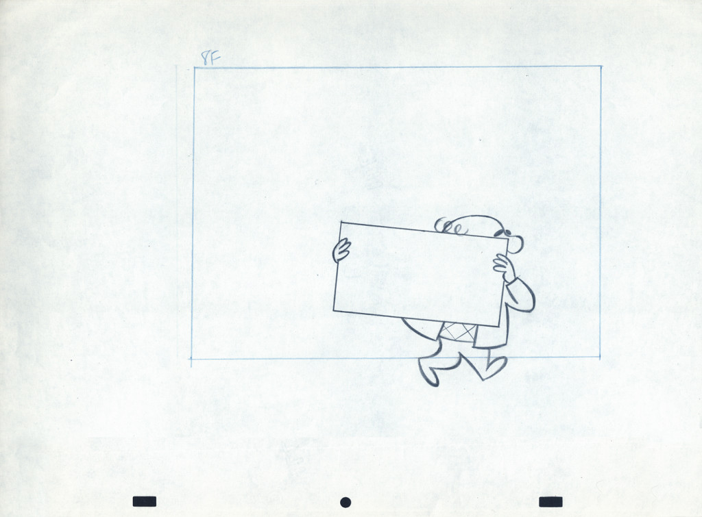
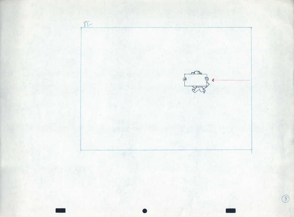
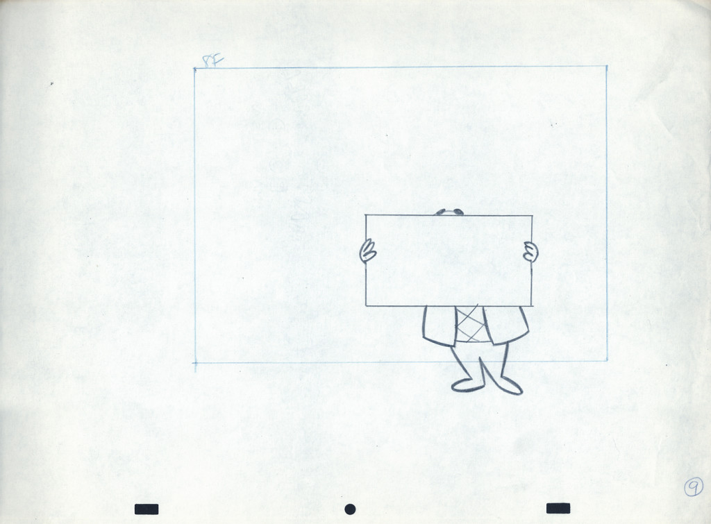
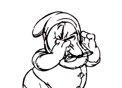
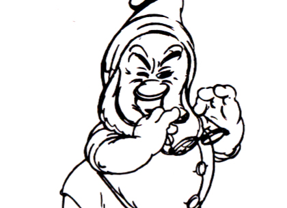
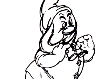
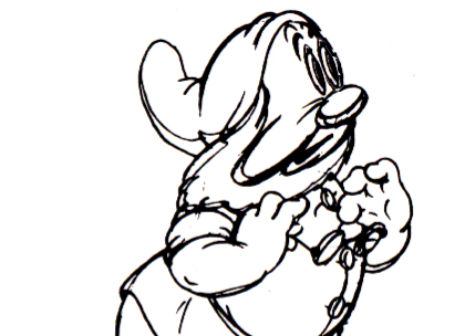
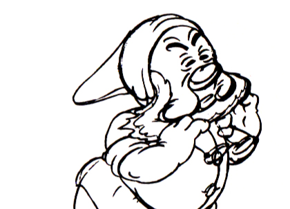
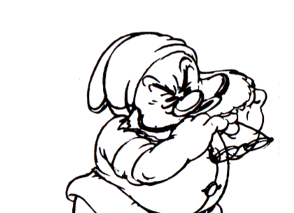
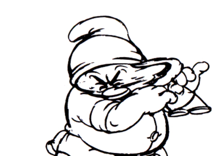
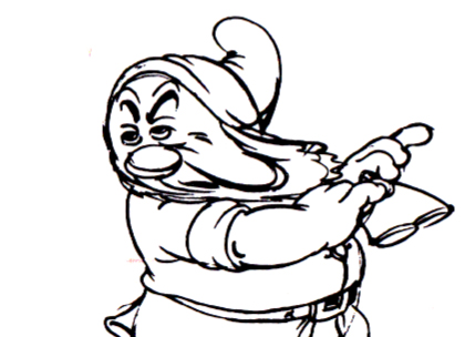
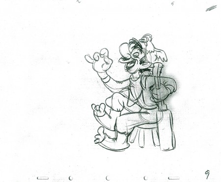
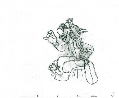
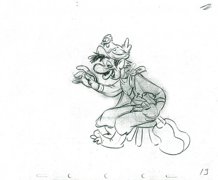
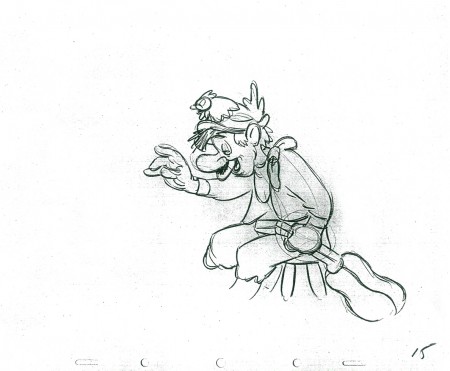
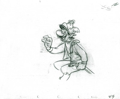
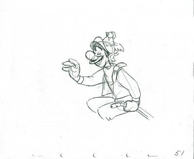
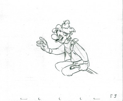
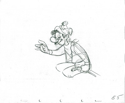
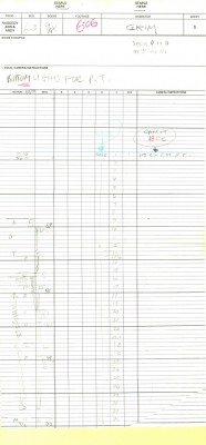
Piels Bert CU
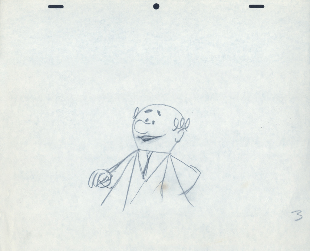
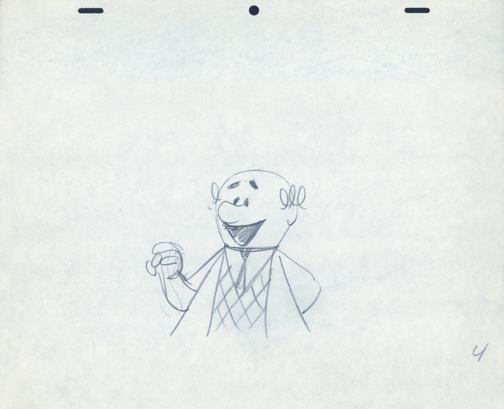
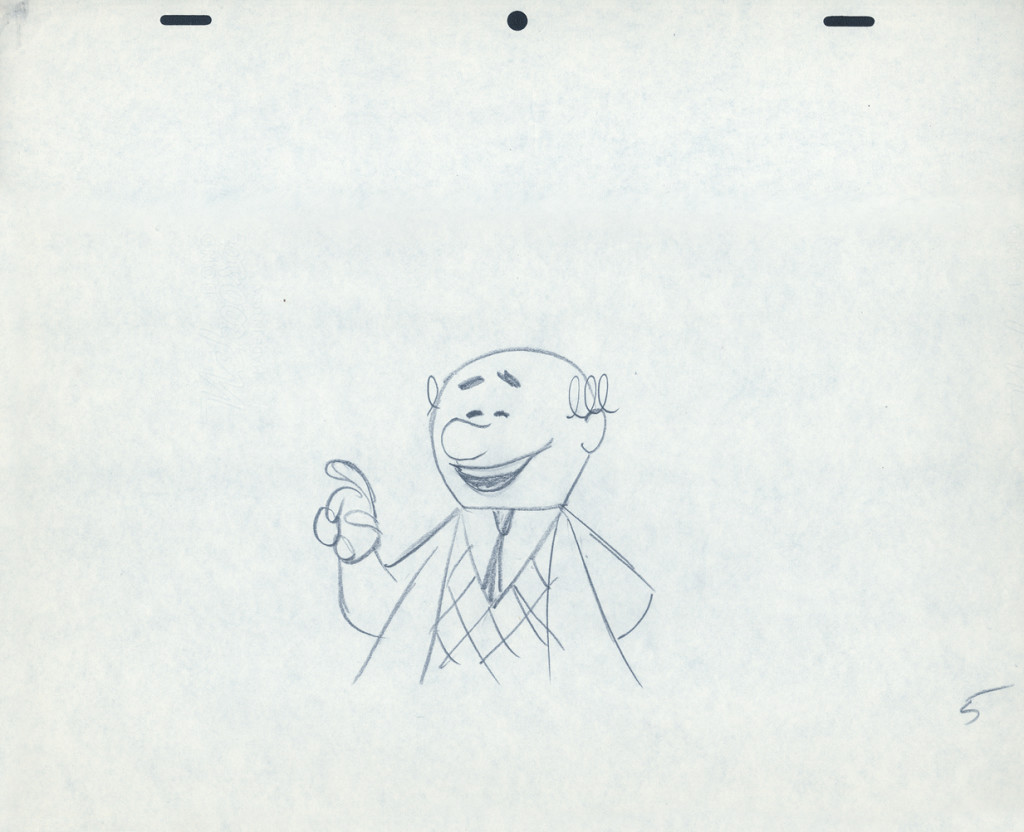
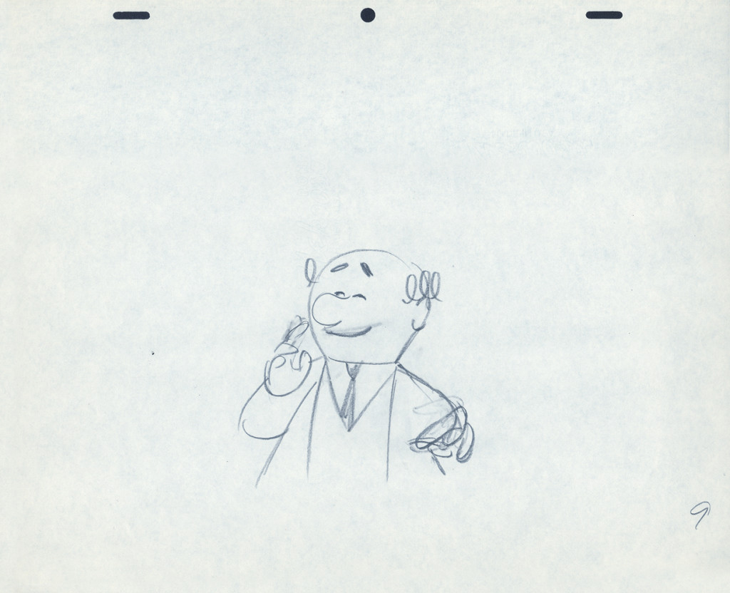
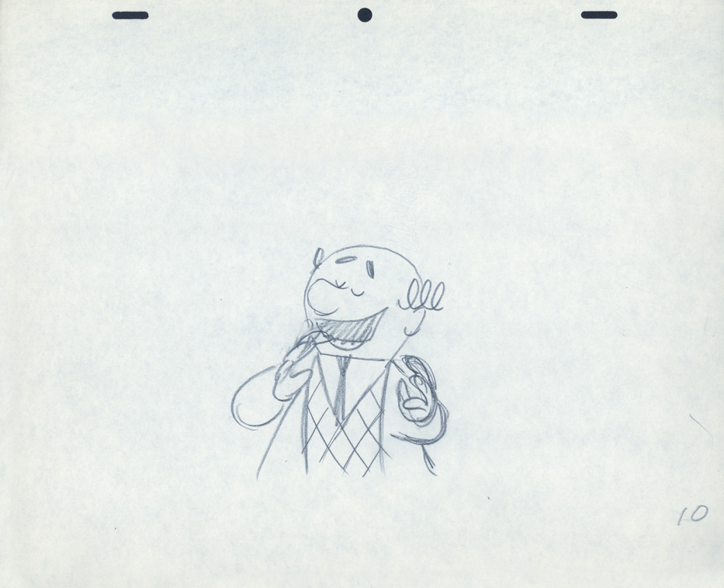
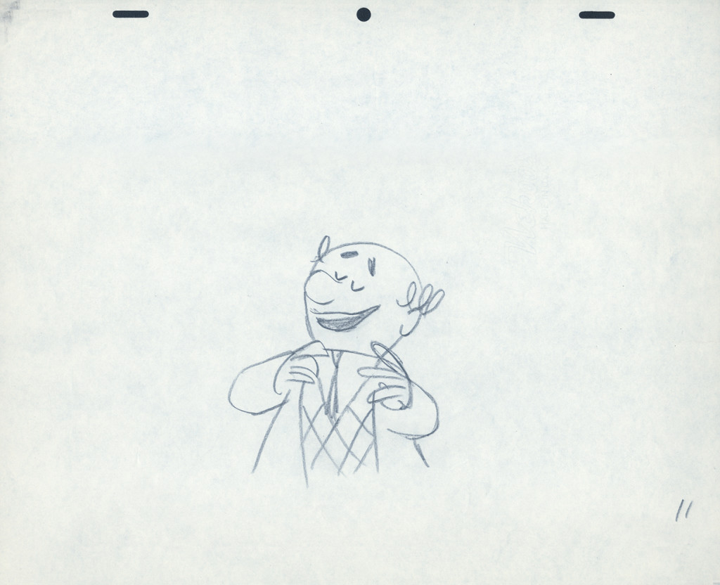
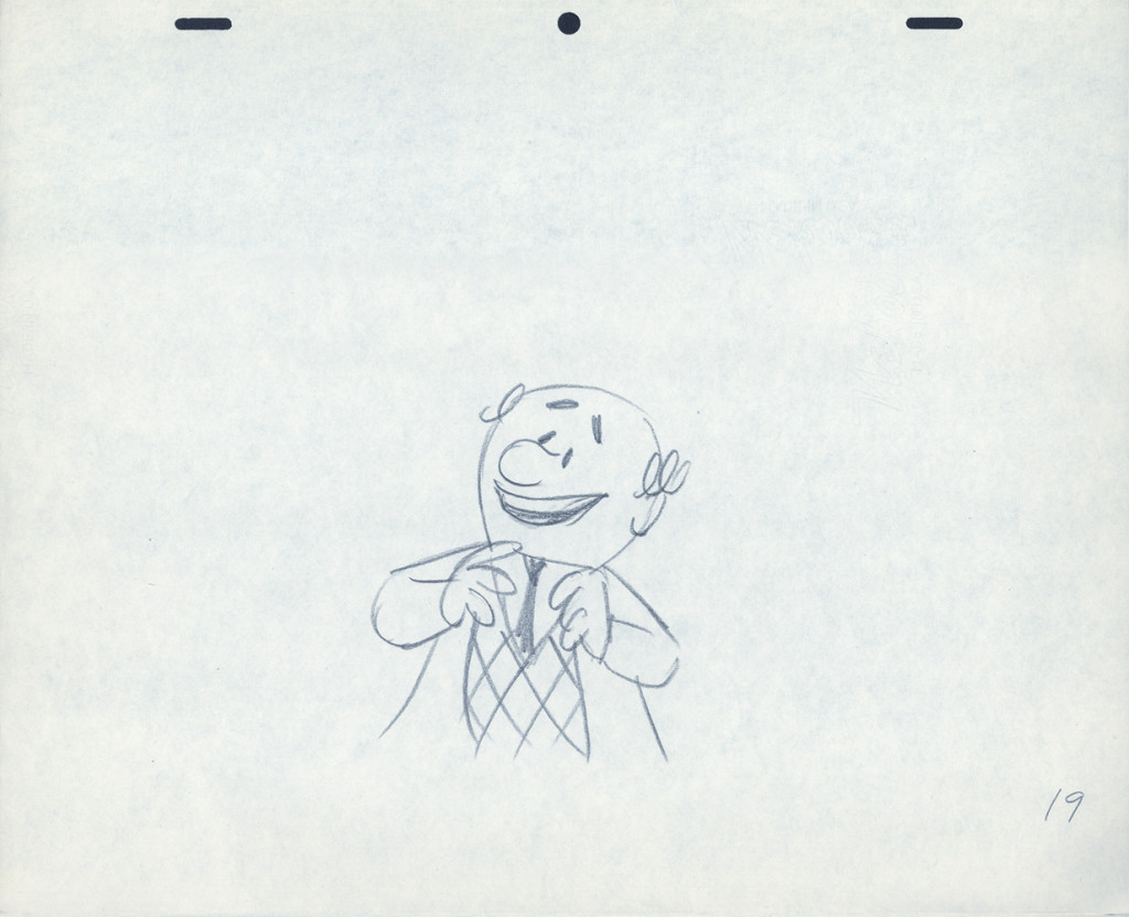
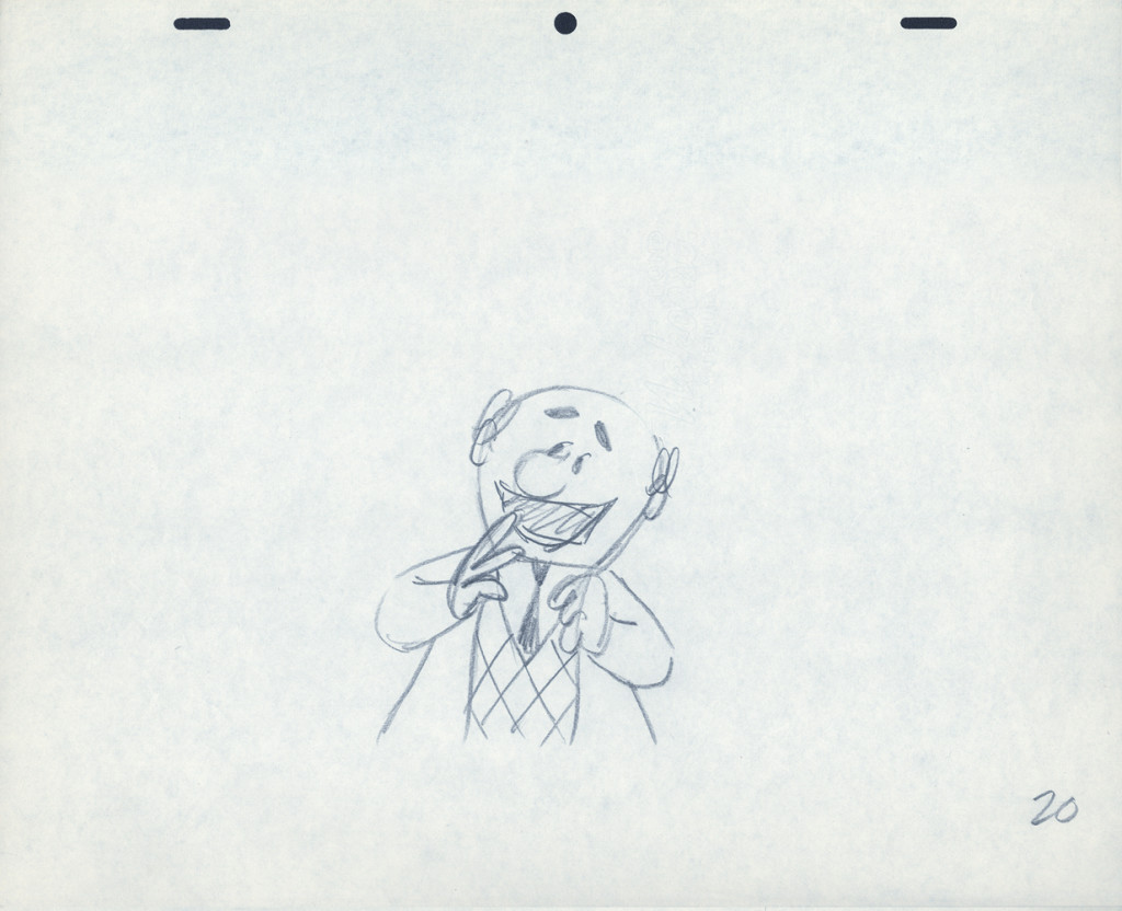
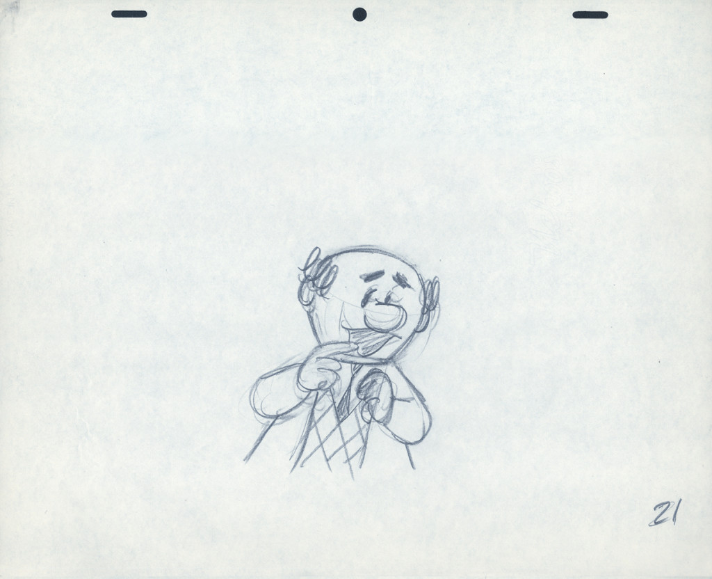
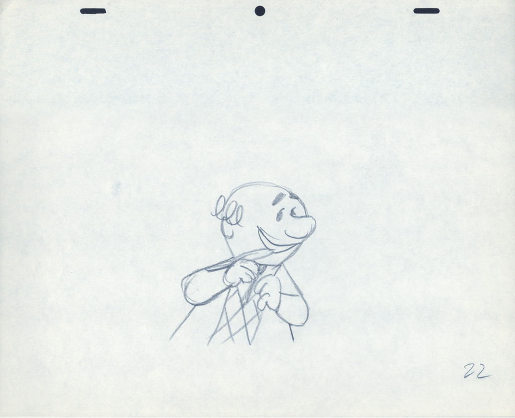
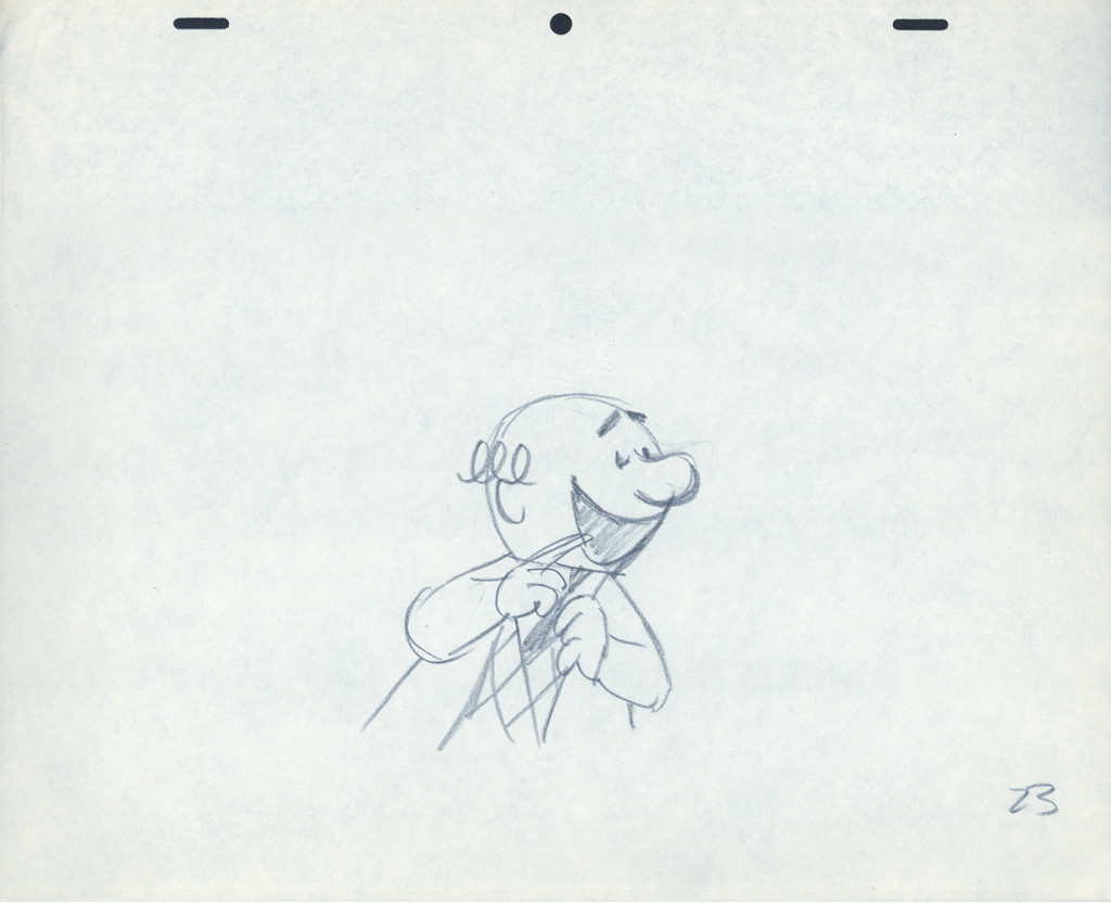
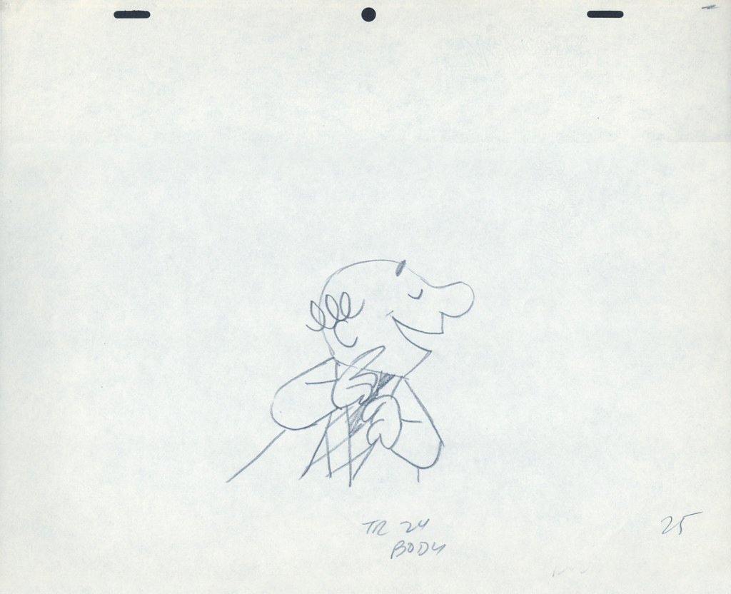
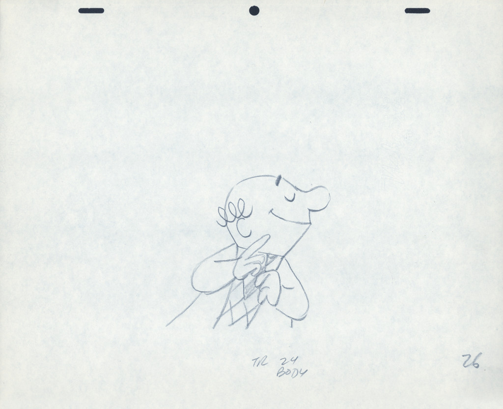
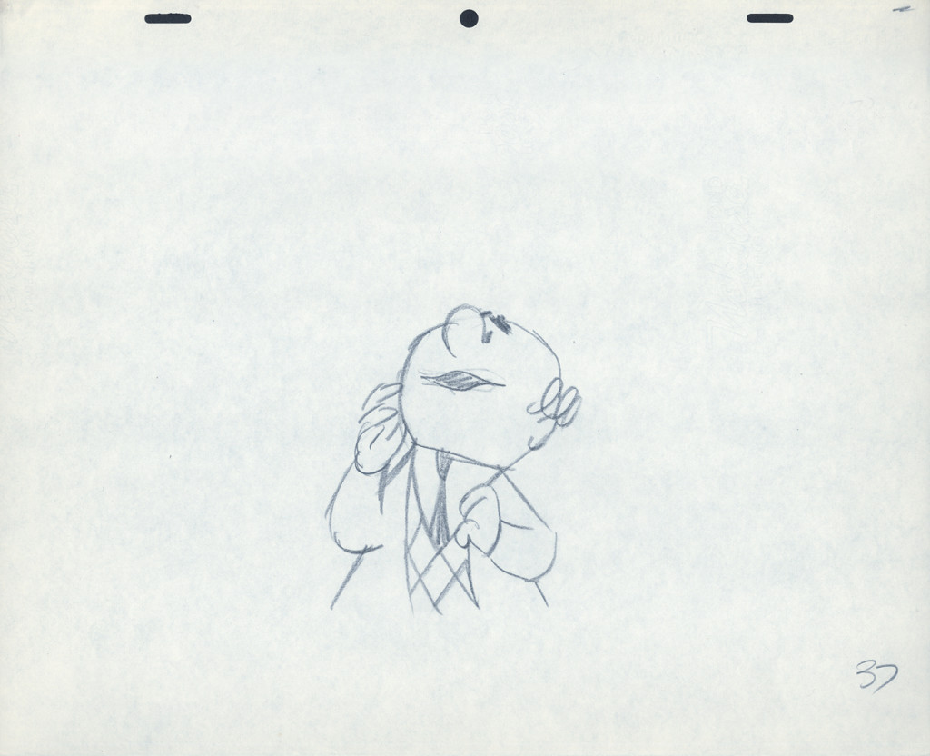
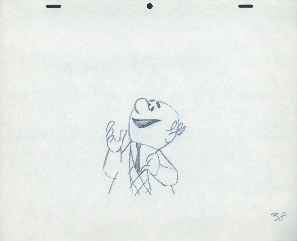
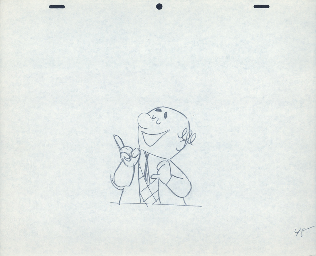
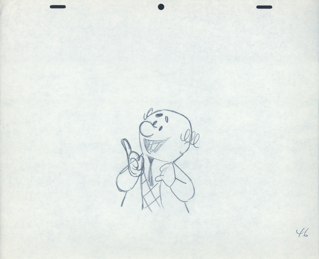
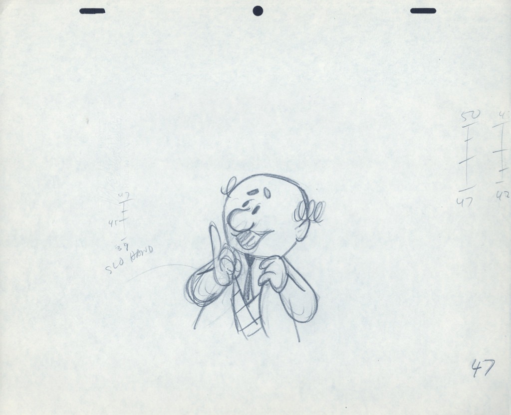
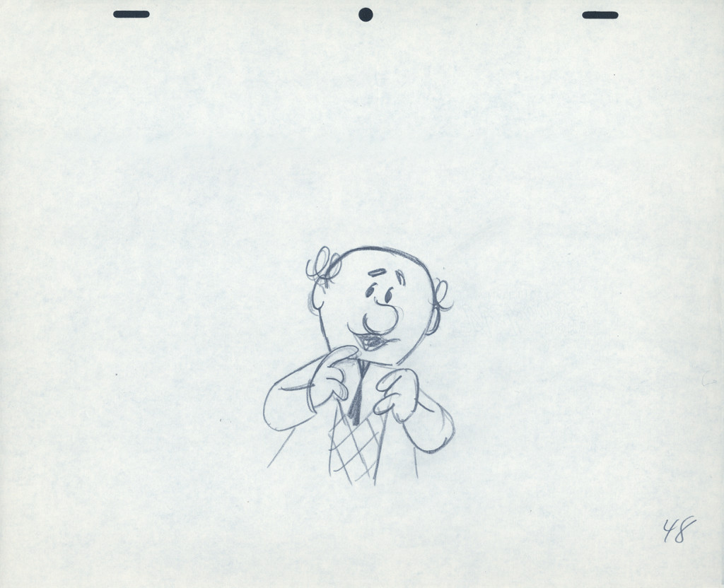
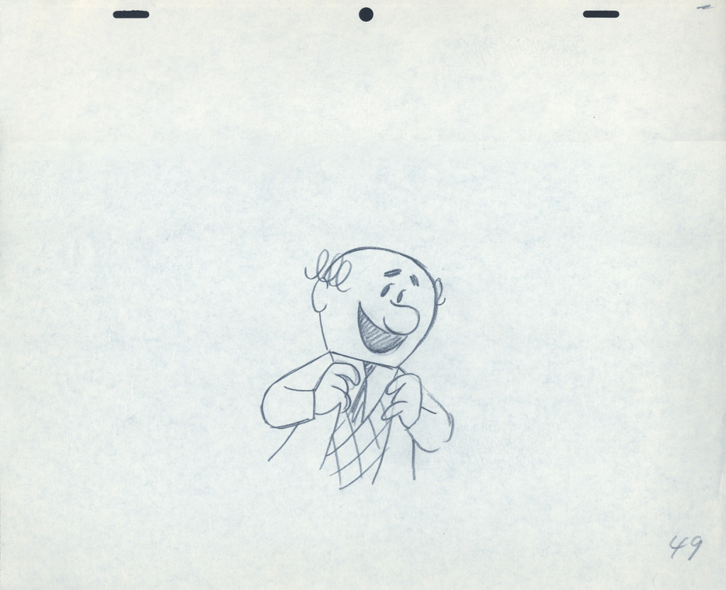
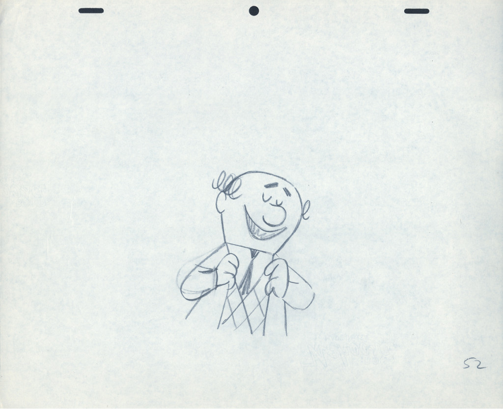
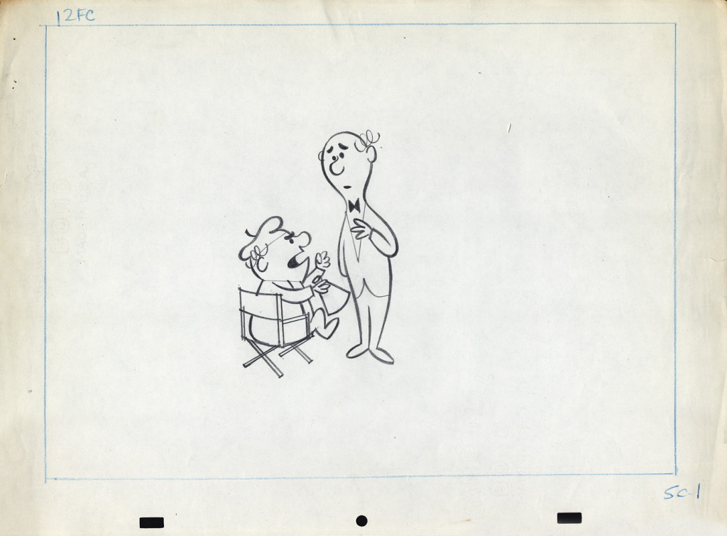
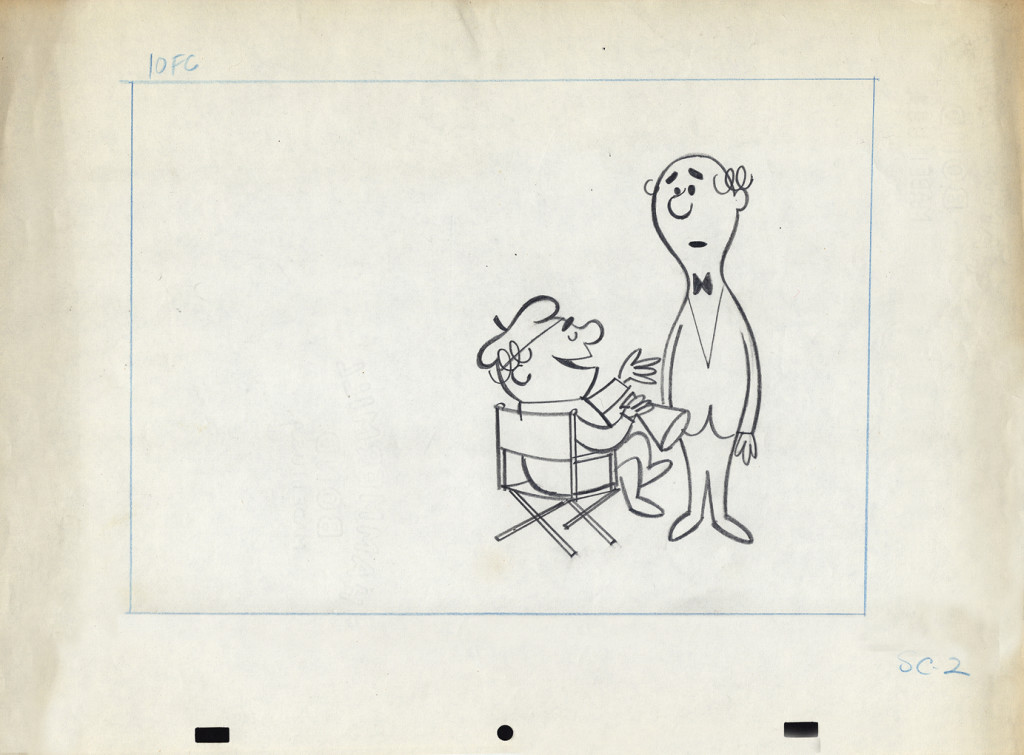
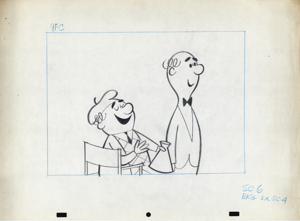
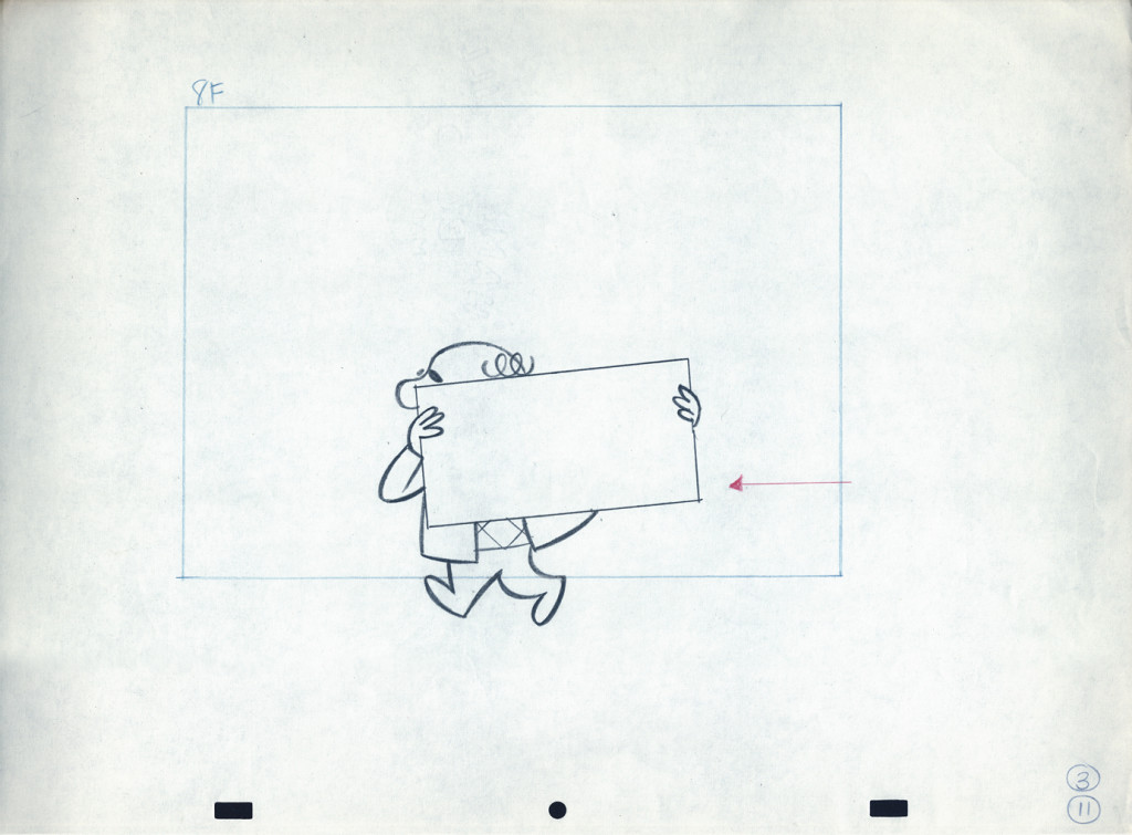
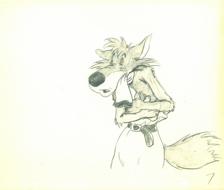
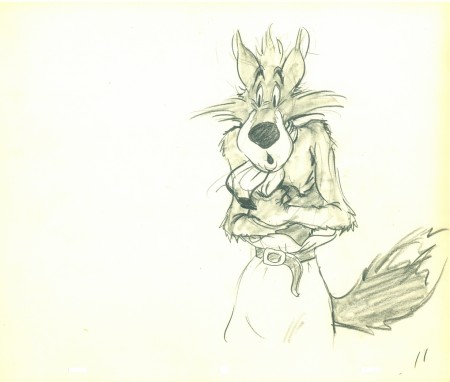
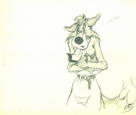
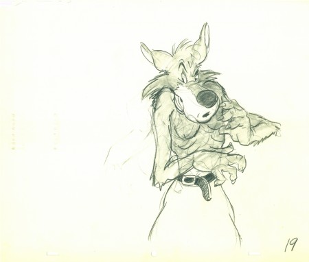
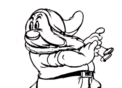
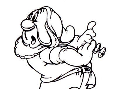
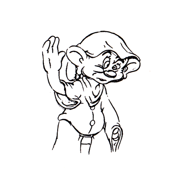
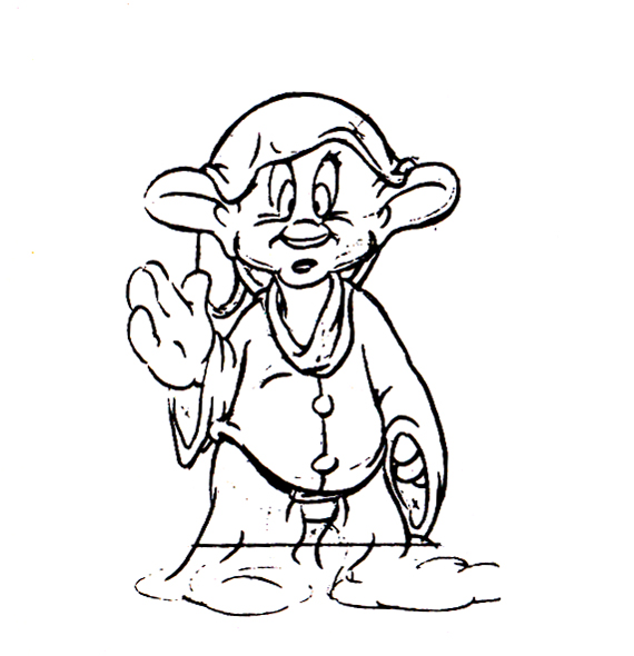
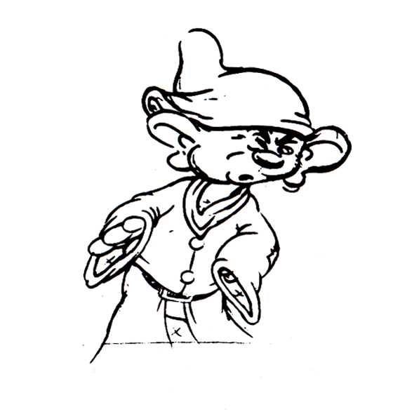
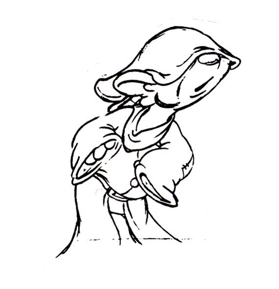
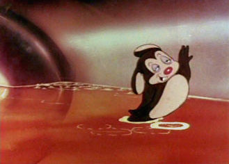
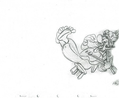
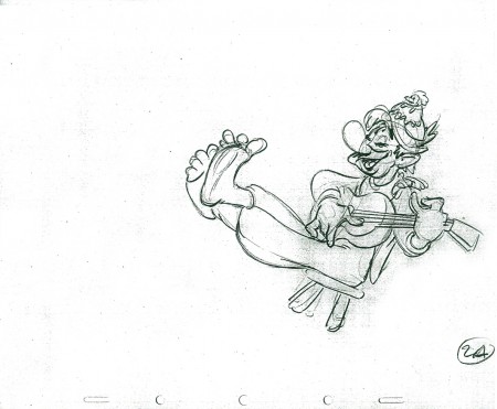
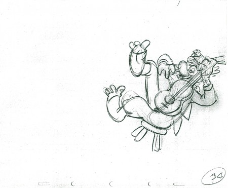
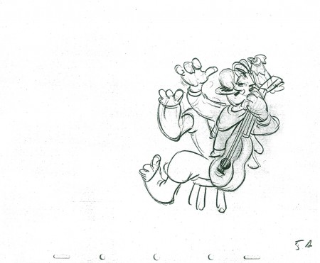
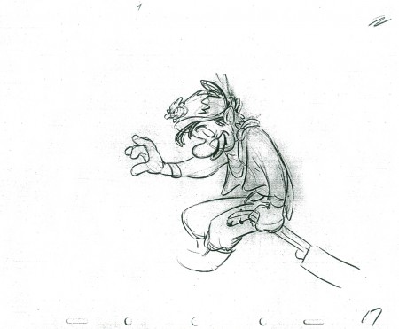
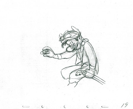
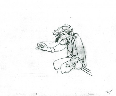
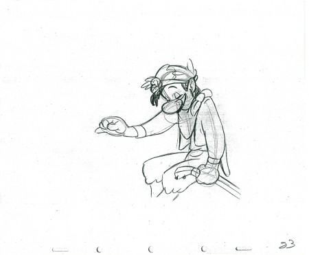
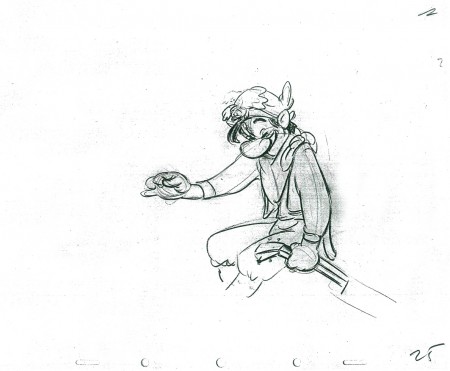
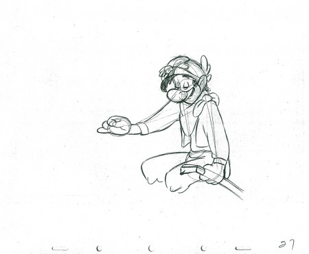
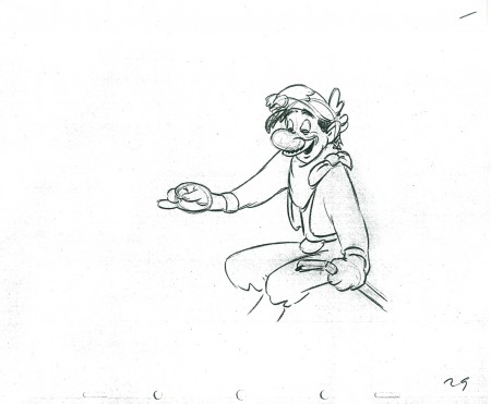
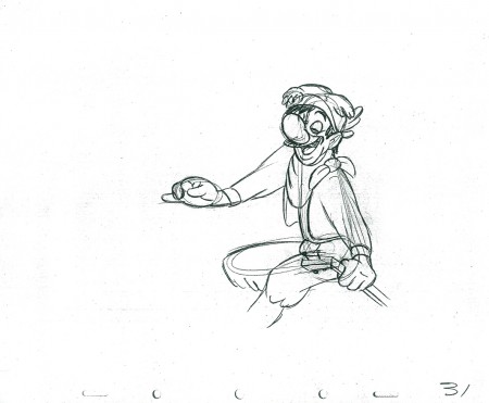
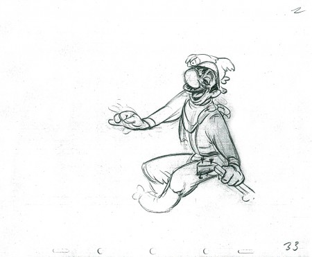
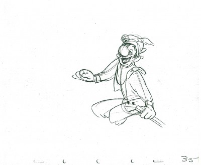
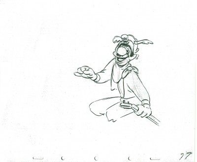
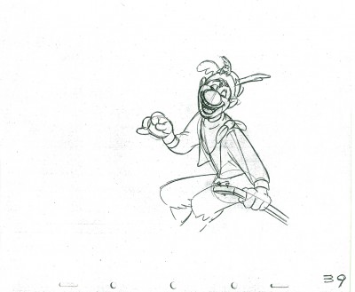
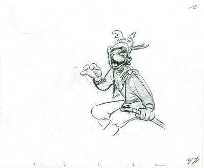
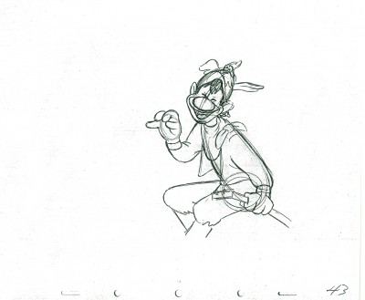
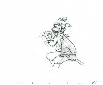
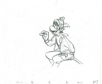
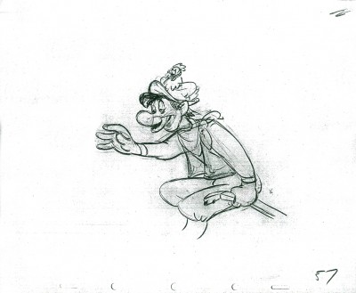
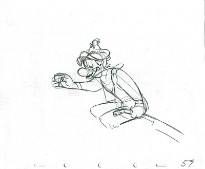
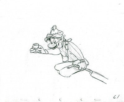
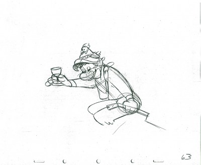
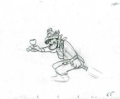
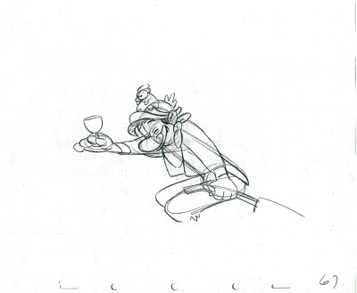
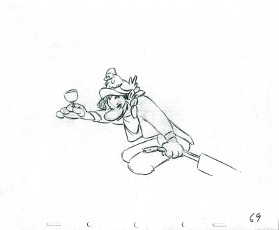
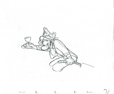
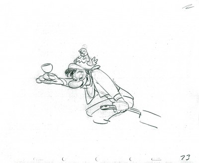
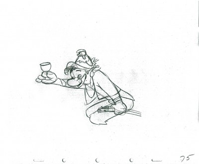
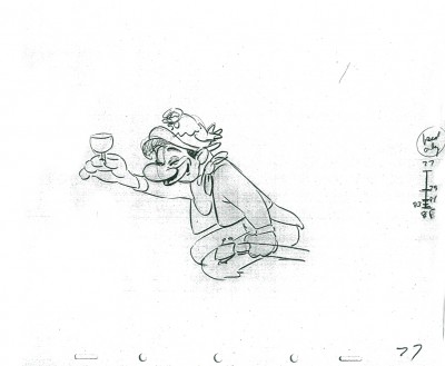
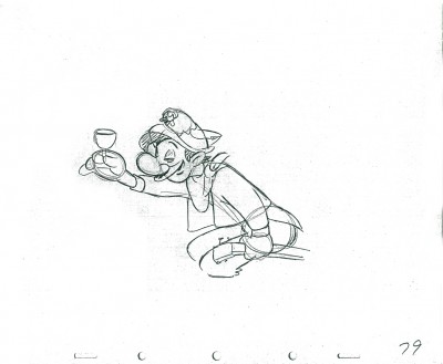
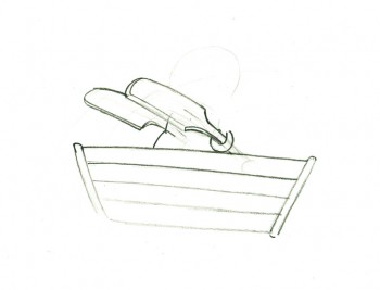
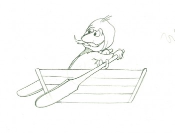
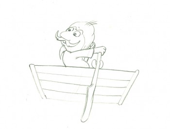
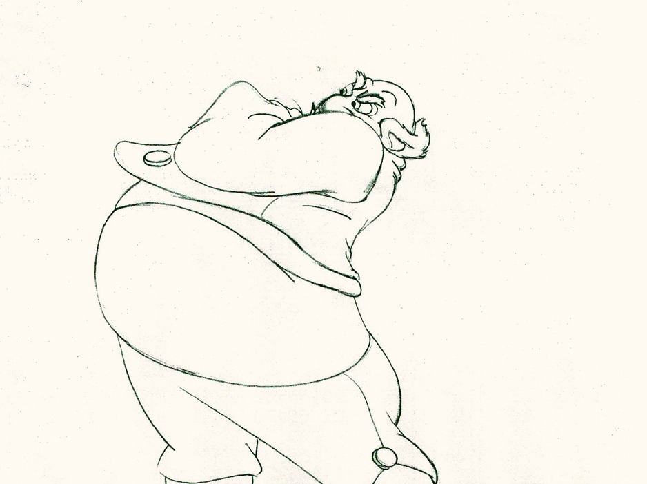
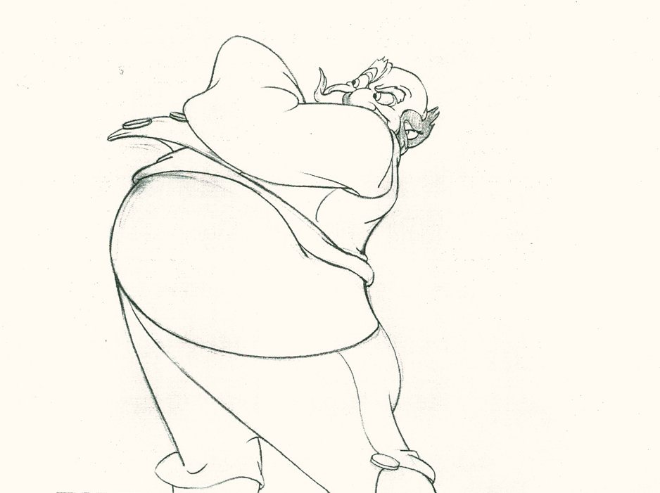
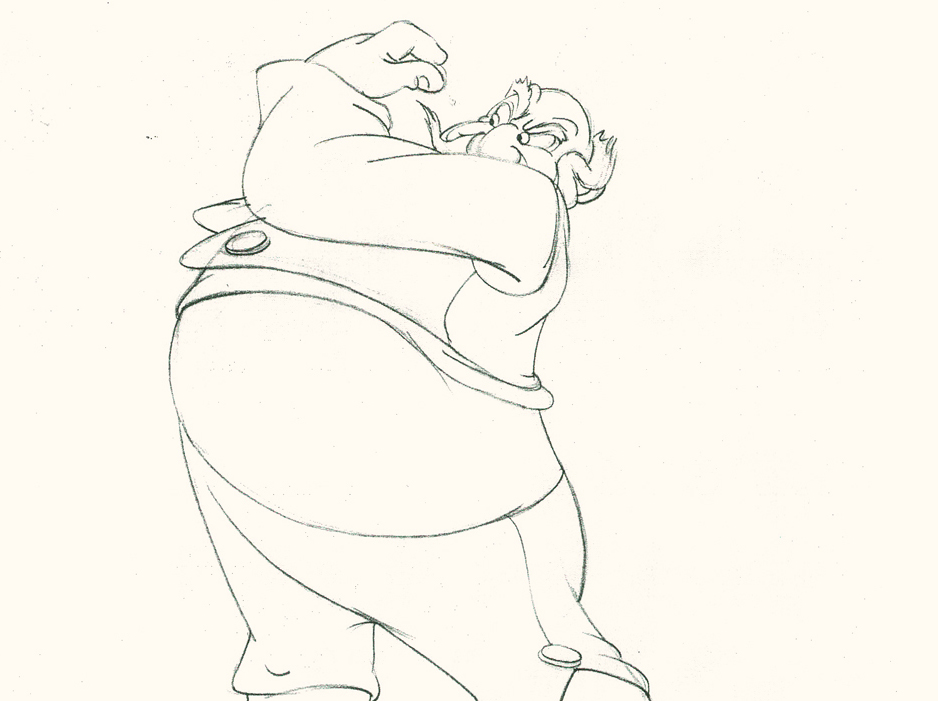
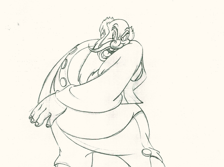
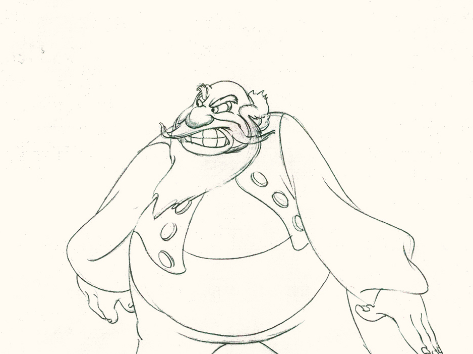
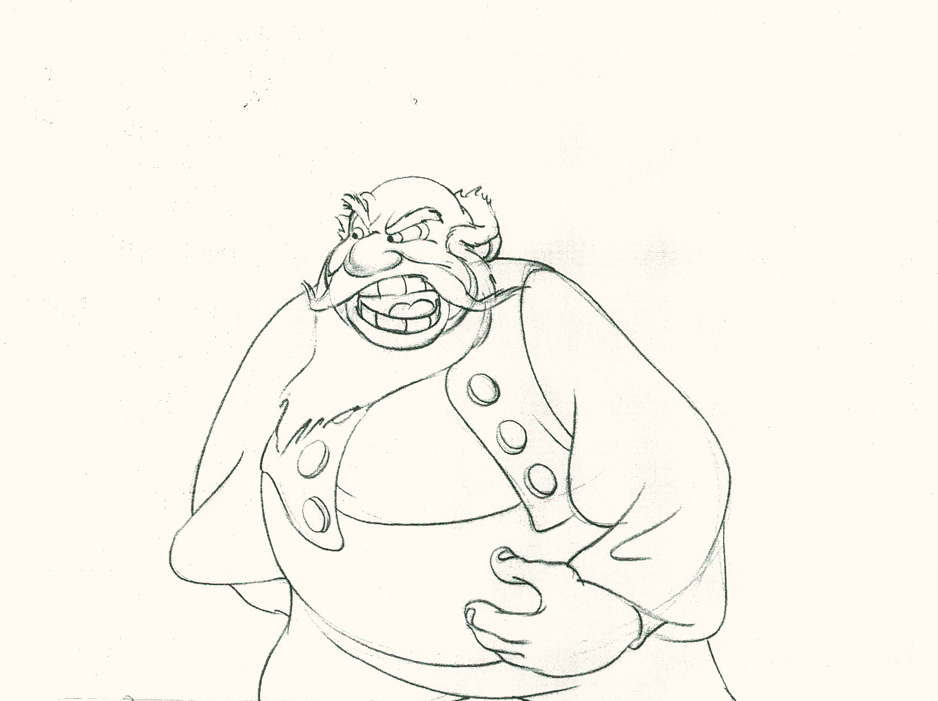
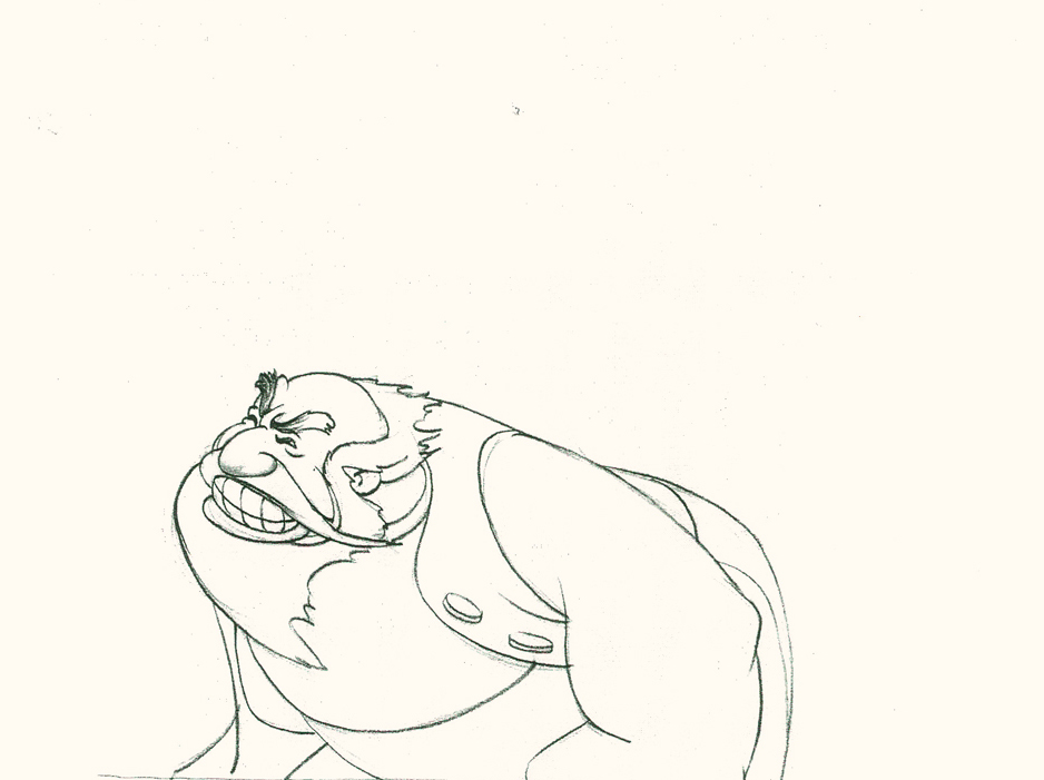
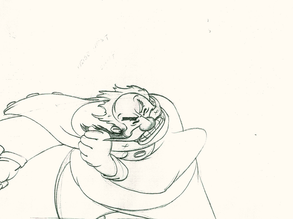
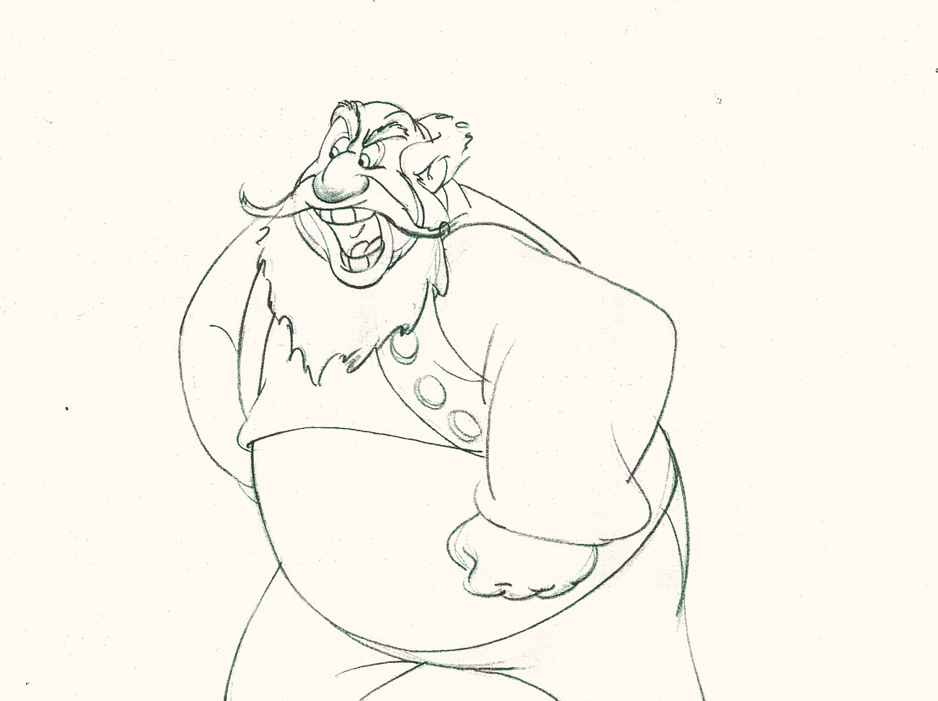
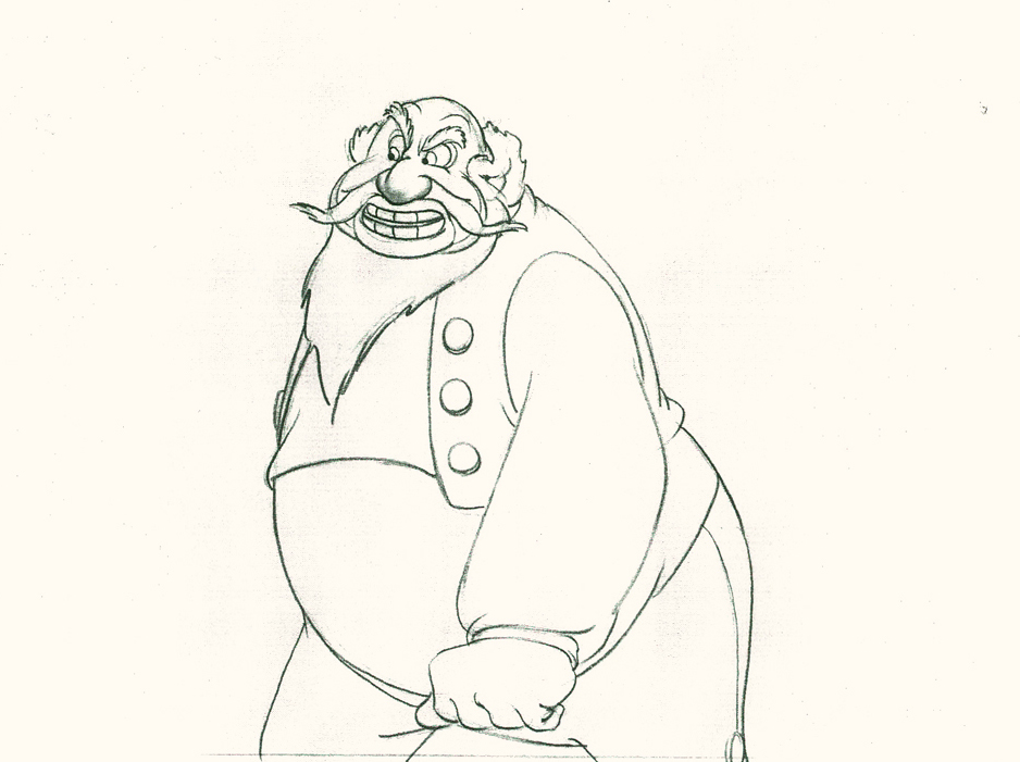
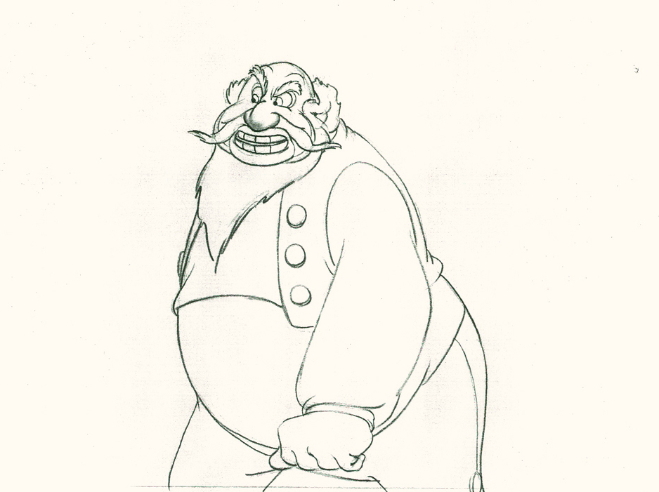
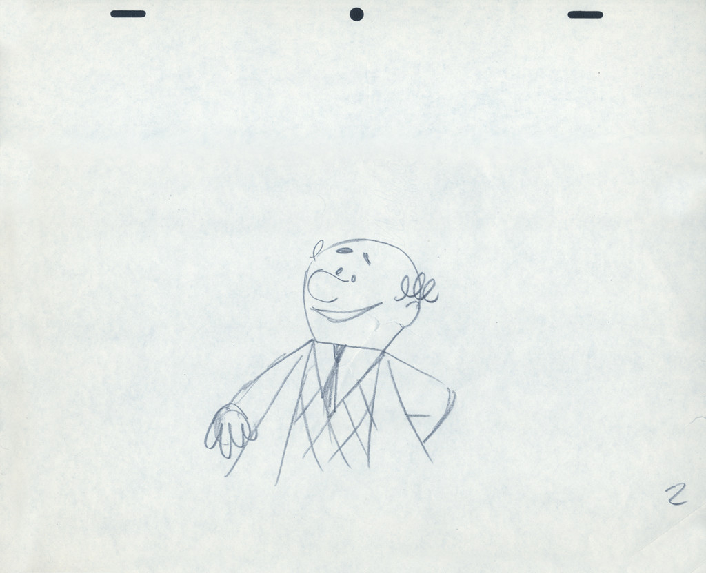
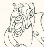
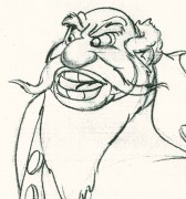
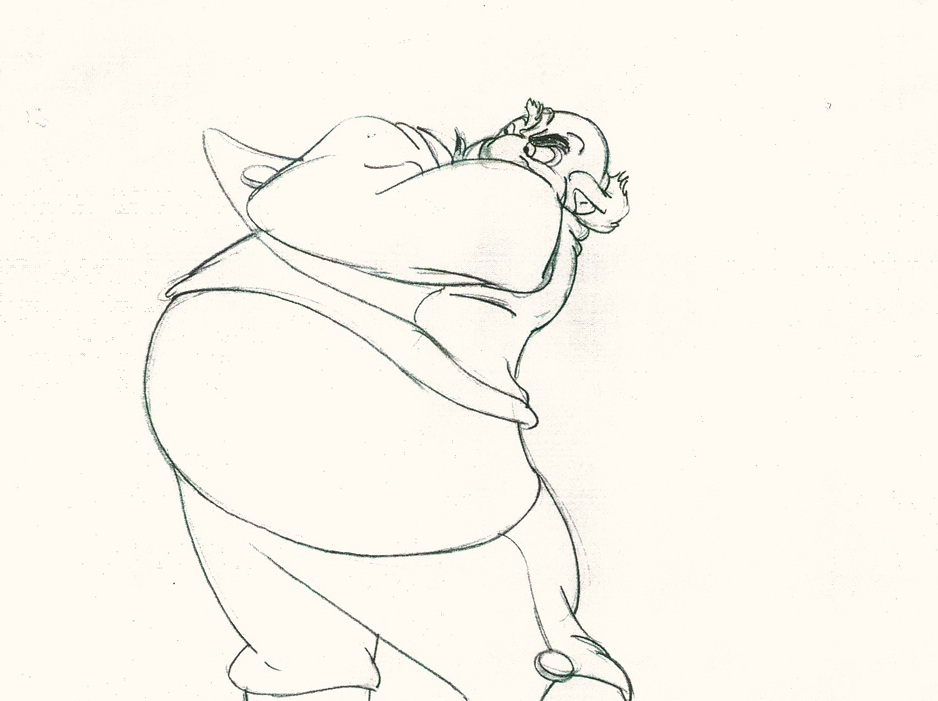
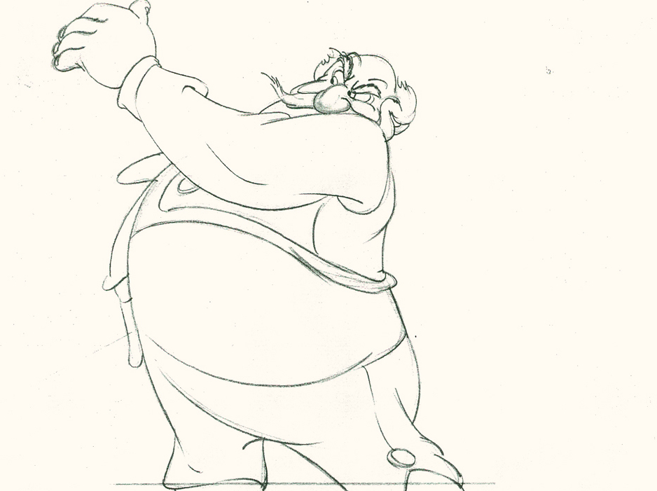
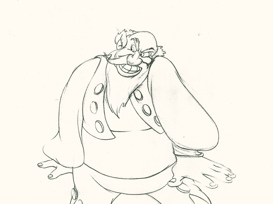
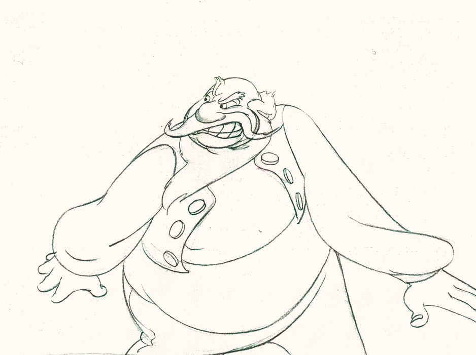
- Here’s one of the scenes saved by Vince Cafarelli from a commercial he did while at Goulding-Elliott-Graham. The commercial was animated by Lu Guarnier, and Vinny was the assistant on it. Hence, he saved the rough drawings (instead of Bert Piels. (Sorry I don’t know what he’s saying, though I’m looking for the storyboard.)
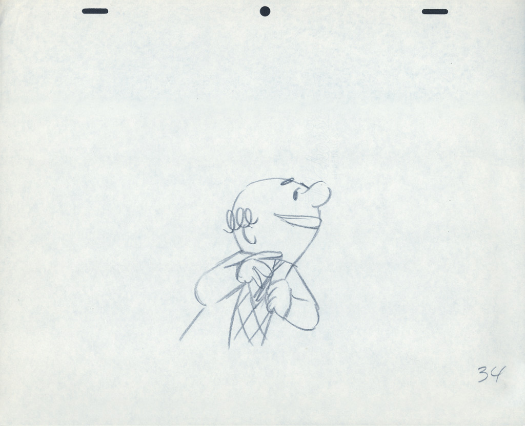
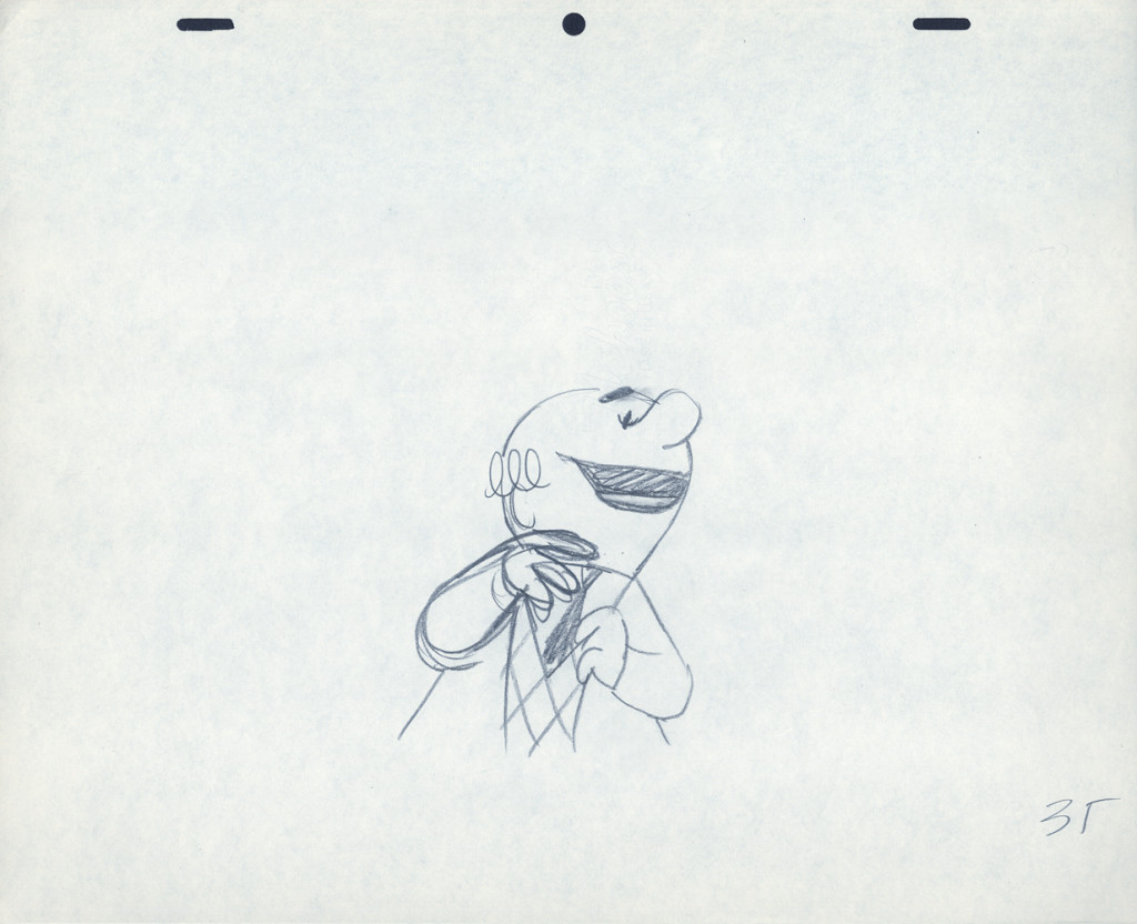
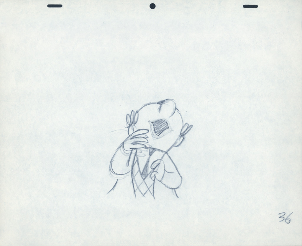
So, here are Lu’s rough drawings in this CU
 2
2
The following QT movie was made by exposing all drawings on twos
except for the extreme positions that were missing inbetweens.
For those, I dissolved from one extreme to the next.
It drove me crazy that Lu Guarnier always animated on top pegs.
Next week with the last of these three posts on this Piels Bros commercial, I’ll talk about Lu’s animation and some of my pet peeves.
Action Analysis &Animation &Animation Artifacts &commercial animation &Layout & Design 17 Apr 2013 05:51 am
Piels Bros. Odds & Ends
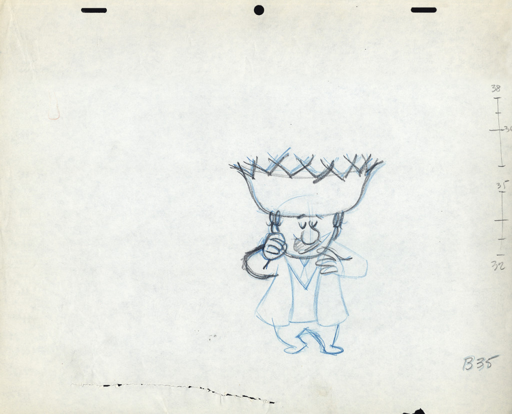
Among Vince Cafarelli‘s remaining artifacts there are lots of bits and pieces from several Piels Bros. commercial spots. I decided to put some of it together – even though they’re not really connected – into this one post.
There are animation drawings I’ll try to post in other pieces.
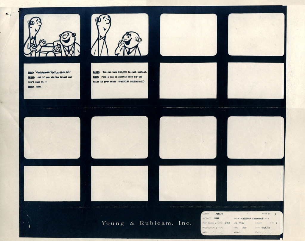
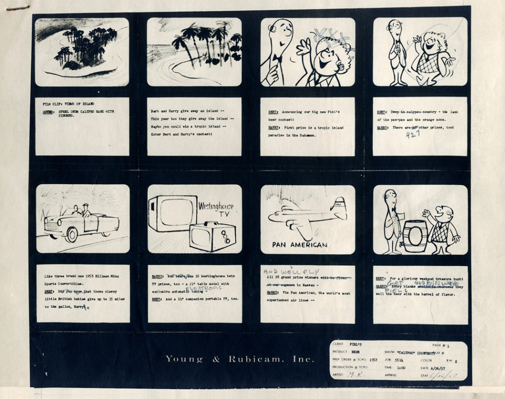
Here, we have a storyboard for a spot; I believe this is an abbreviated spot promoting some contest Piels beer was running. I think this is from a shortened version of a one minute spot since there are animation drawings which are obviously from the same setup, but they’re not part of this storyboard. (There’s an unveiling of the barrel, which is upside down.)
Since the boards are dated 1957, and given the use of signal corps pegs, I believe these were done for UPA.
Regardless, the drawings are excellent. I presume they’re hand outs to Lu Guarnier, animating, and Vince Cafarelli, assisting.
 1
1
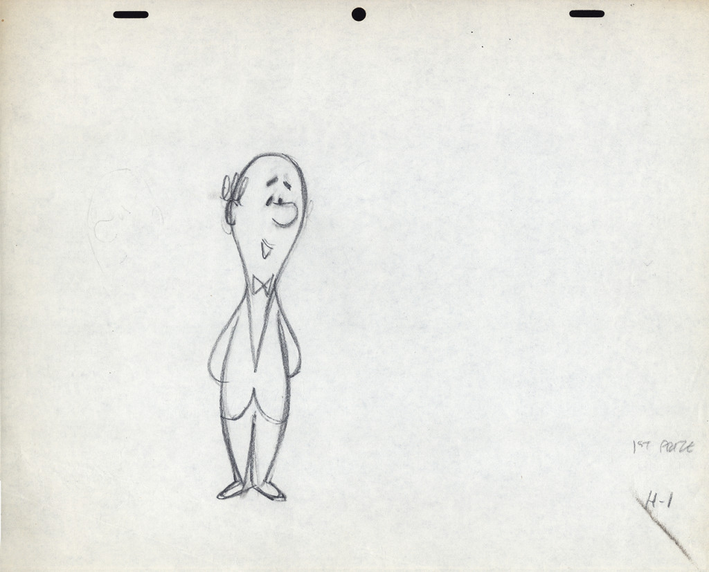
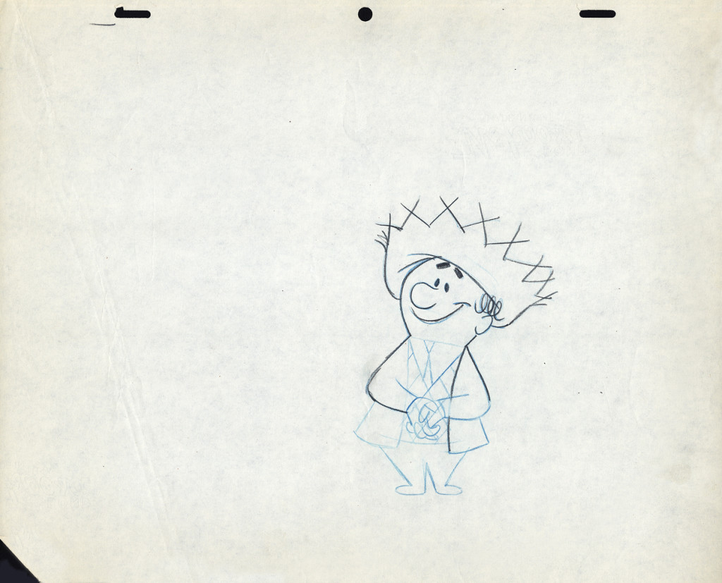
The following are three drawings from the opening scene of this storyboard. Others from this scene weren’t saved.
 1
1Here’s Bert.
Let’s follow that with layout drawings from two different spots. The first doesn’t really offer much, but the quality of the clean-ups and the drawing is first rate. I’m pleased to post it:
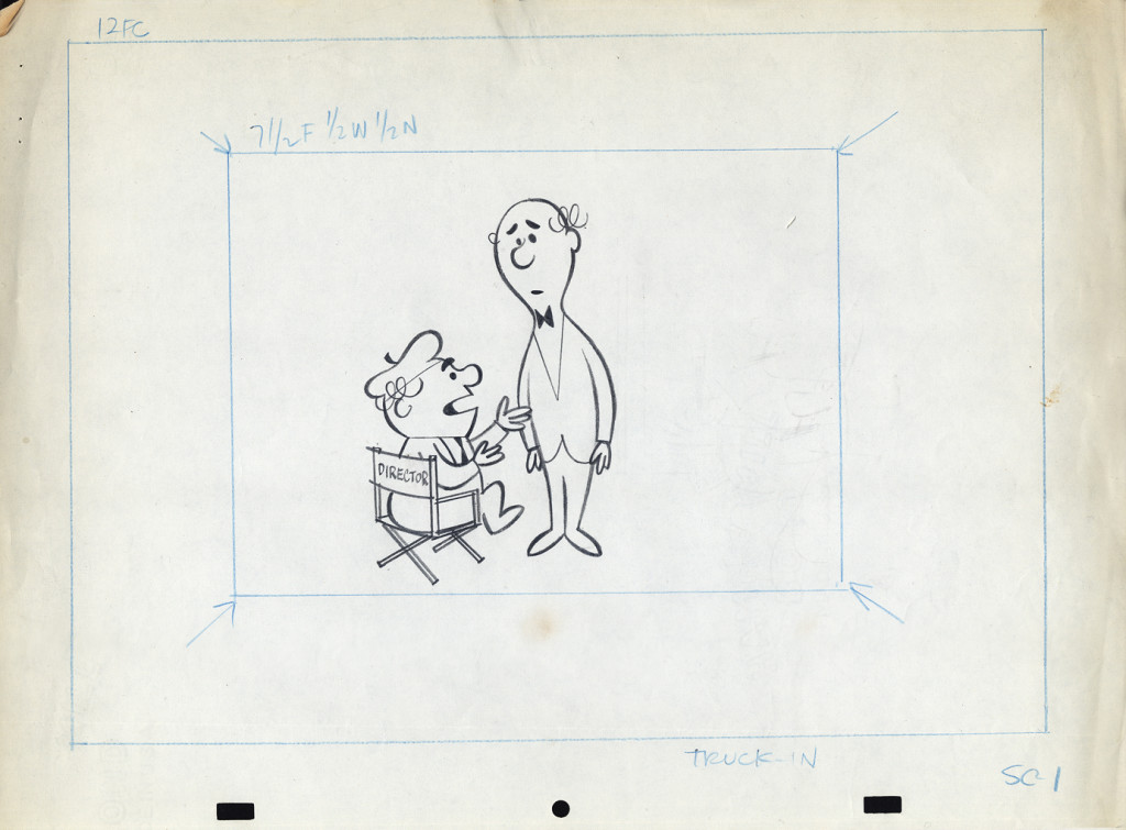 1a
1a
Here are layout drawings for the second of the two spots I have in hand. I presume this is also a spot promoting that contest.
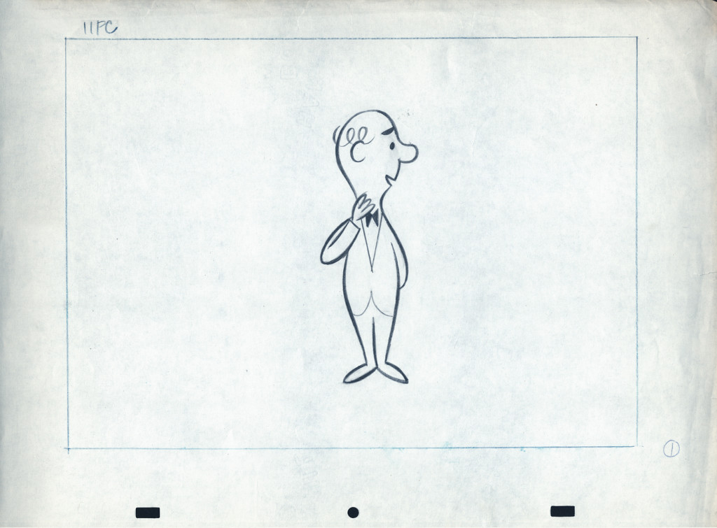 1
1
In the next week or two, I’ll post some of the animation drawings left behind so you can get an idea of the movement and Lu Guarnier‘s animation. I’ll probably have some to say about Lu’s style of movement. It drove me crazy when I had to assist him. The movement always looked great on screen, but it took a lot for an assistant to get it there.
Action Analysis &Animation &Animation Artifacts &John Canemaker &Tytla 16 Apr 2013 05:12 am
Tytla’s Hungry Wolf – recap
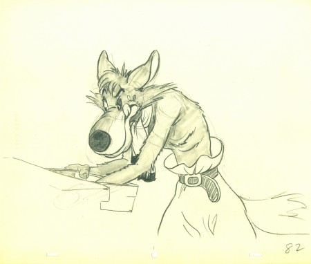
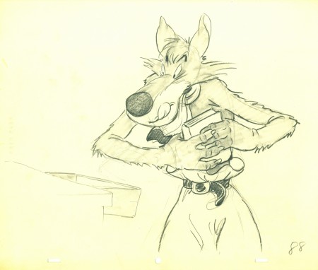
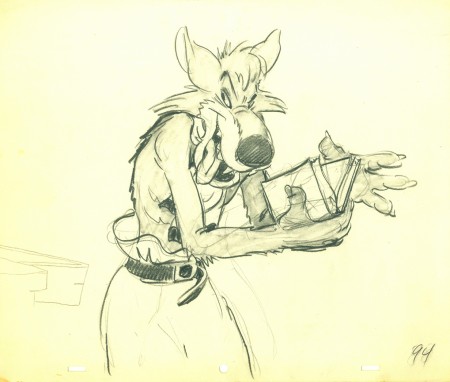
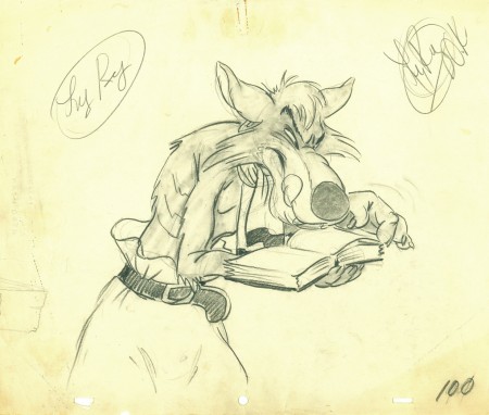
- With all the recent thought and posts on Bill Tytla, I couldn’t resist revisiting this artwork from the Harman-Ising short, The Hungry Wolf. So here it is.
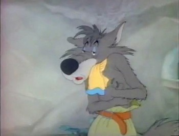 We’ve seen that Tytla veered his animation style completely toward the “Method” and there is no doubt that he carried that with him even after he left the Disney studio. Unfortunately, he went to the lowest of the low and couldn’t survive any longer as an animator. He turned to direction and had to adapt his use of Stanislavsky to his directing technique.
Unfortunately, the “actors” he was given weren’t up to the task. Those “actors” were the least of the animation industry, those who had learned a lot of bad techniques, ways of cheating and a lack of a deep interest in bringing the souls of his characters to life.
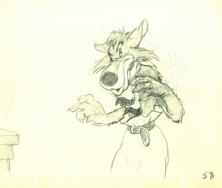
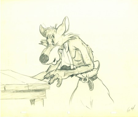
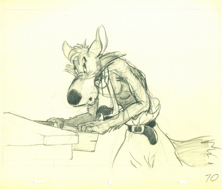
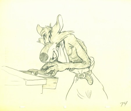
I was surprised to learn that Tytla had worked at a studio that was a bit better than Terrytoons or Paramount right after he’d left the haven of Disney. John Canemaker loaned me a cache of drawings for a Hugh Harman film, The Hungry Wolf, made in 1940 at MGM. It’s not a very good film; the drawings are signed by Tytla, but they have no ladder indication for an Assistant to do the inbetweens. Most oddly, the wolves are shaded in by Tytla. Also take note of the table being animated into place. Are these animation drawings? Is it LayOut posing to give to someone else to animate? And greatest of all, what is Tytla doing at MGM?
Since this would have been completed in early 1942, I can only assume that it was during the strike at Disney that Tytla did some work for Harman in mid 1941. Most probably he was acting as an Animation Director and NOT animating the scene. He worked under Harman, who got credit for directing.
There’s no attempt at distorting or stressing the drawings in any way. I assume the character wasn’t designed by Tytla. It’s similar to a character design that was used in other Harman films.
Here are all the drawings given me by John.
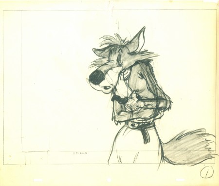 1
________________________
1
________________________.
The following is a QT of the entire scene with all the drawings included.
Since I didn’t have exposure sheets, I calculated everything on ones
(which seems to reflect the timing in the final film) and left however many drawings to the assistant and inbetweener.
Many thanks to John Canemaker for the loan of the drawings. It was great just touching them.
Action Analysis &Animation &Animation Artifacts &Commentary &Tytla 15 Apr 2013 05:25 am
Tytla Distorts – 5
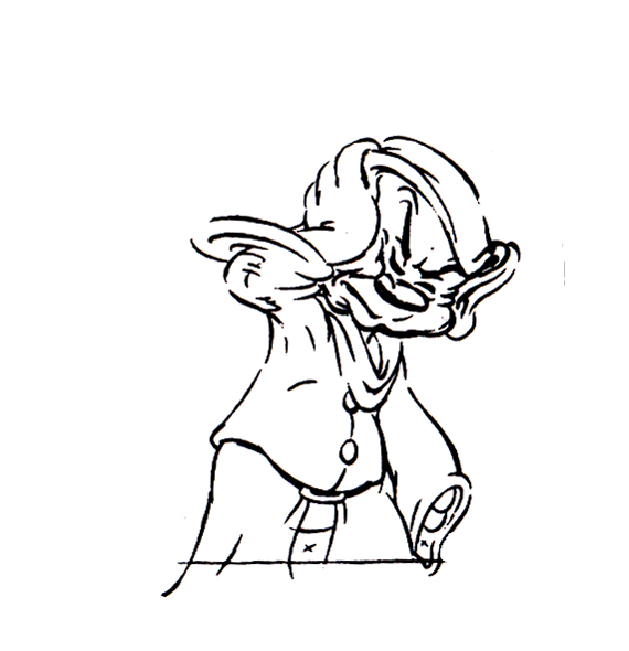
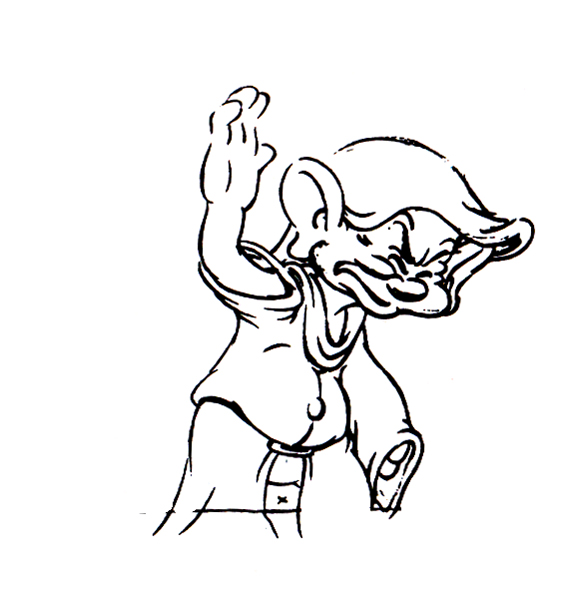
- I thought it’d be a little fun to give a little showing of some of the distortion and stress Bill Tytla did on some of his drawings. He didn’t feel the need in all of his characters to actually distort and stretch the character completely out of shape as he did in a character like Stromboli.
There were times when he could use the limbs of the character and the flexibility of the movement to provide the looseness that he was searching for. Cartoon characters like the seven dwarfs or Stromboli allowed a wildness that another, such as the devil in Night on Bald Mountain offered.
Let’s just jump into it and take a look at some drawings.
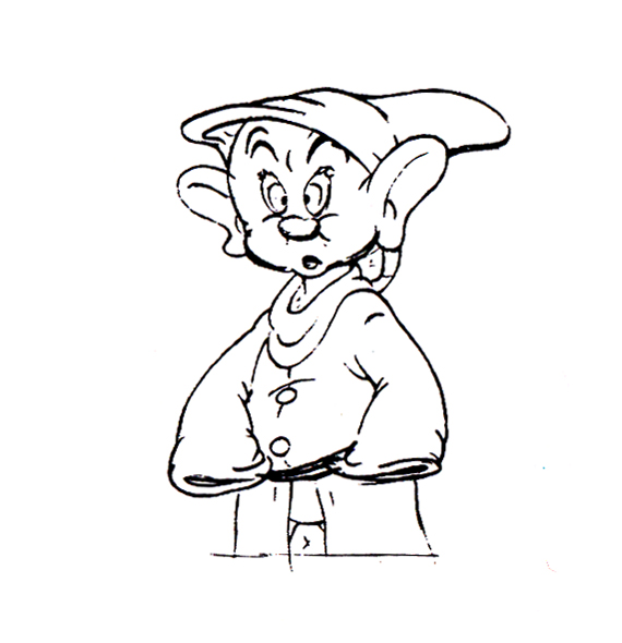
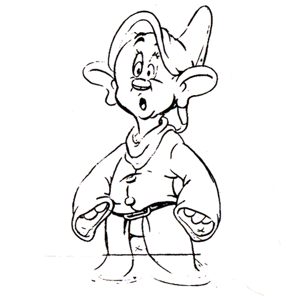
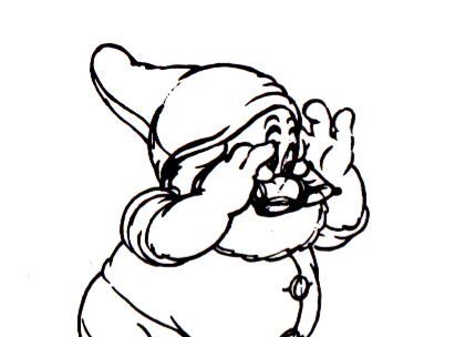
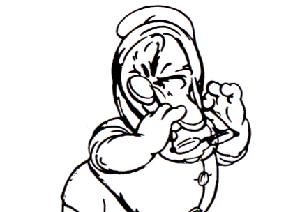
Obviously, this first one is Doc from Snow White
as he drains some water from his face:
 1
1
 3
3
Immediately we can see a flexibility in the jowls of Doc’s face,
and Tytla has plenty of fun with it.
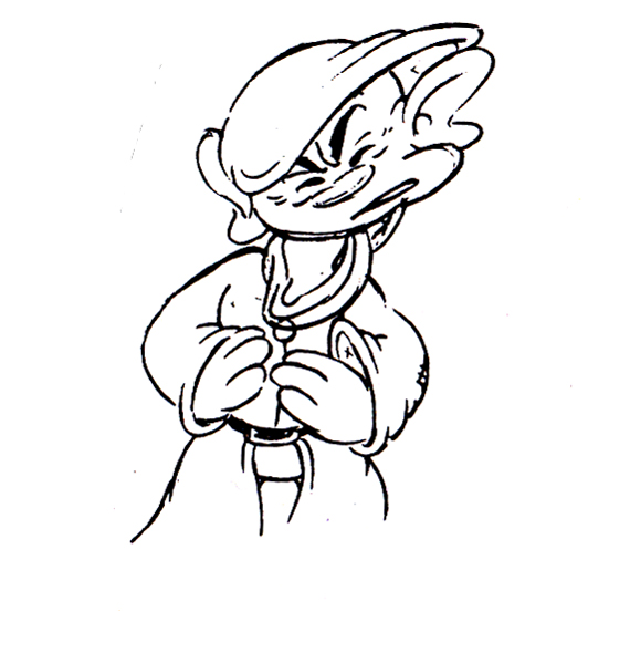
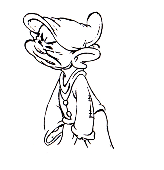
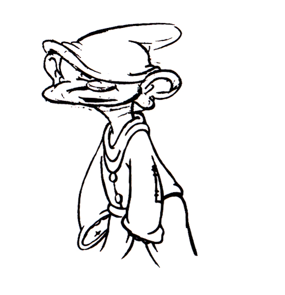
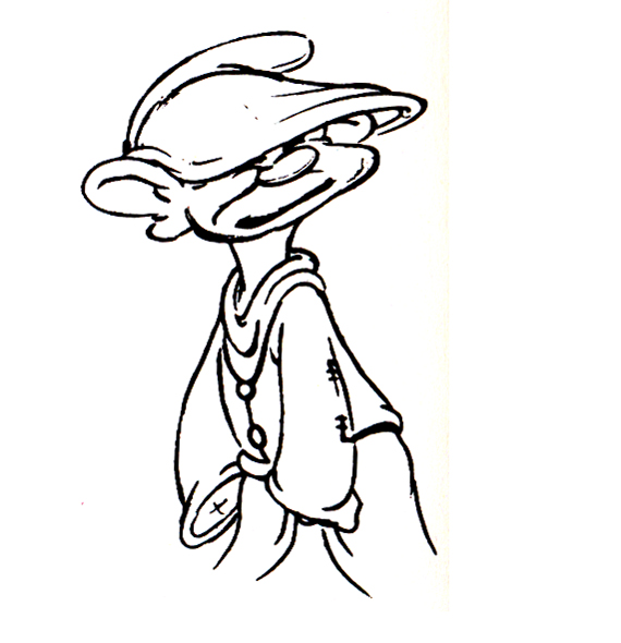
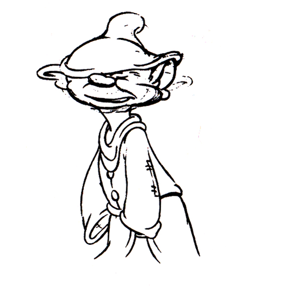
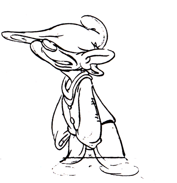
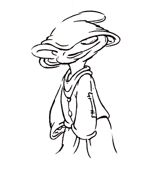
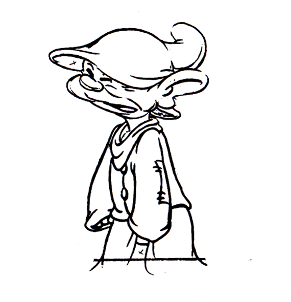
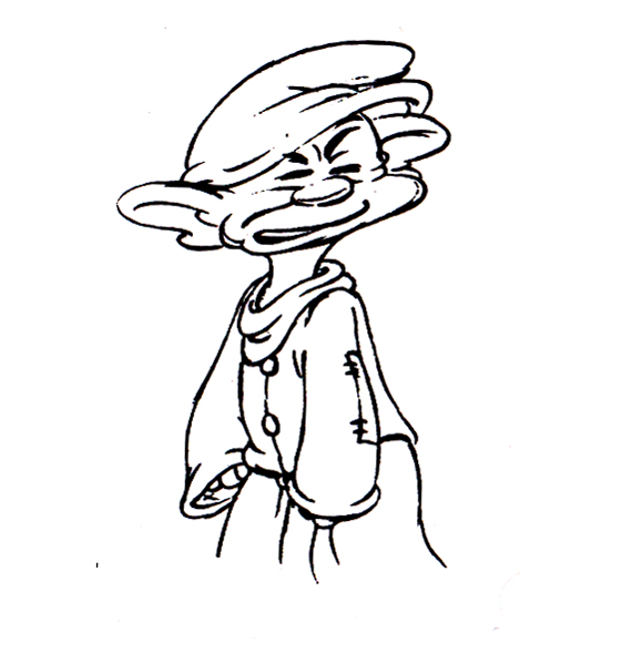
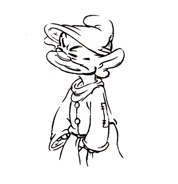
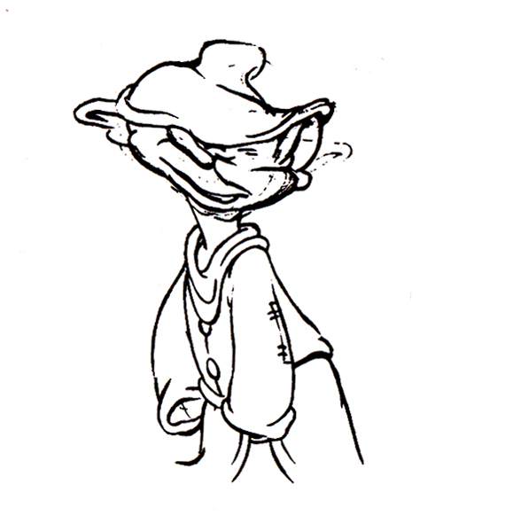
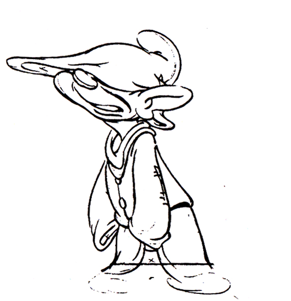
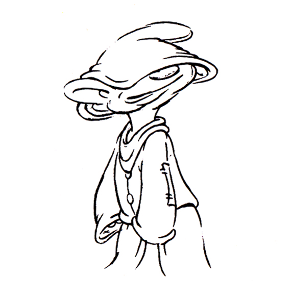
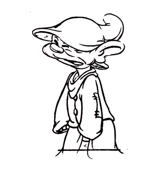
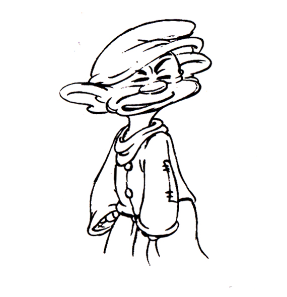
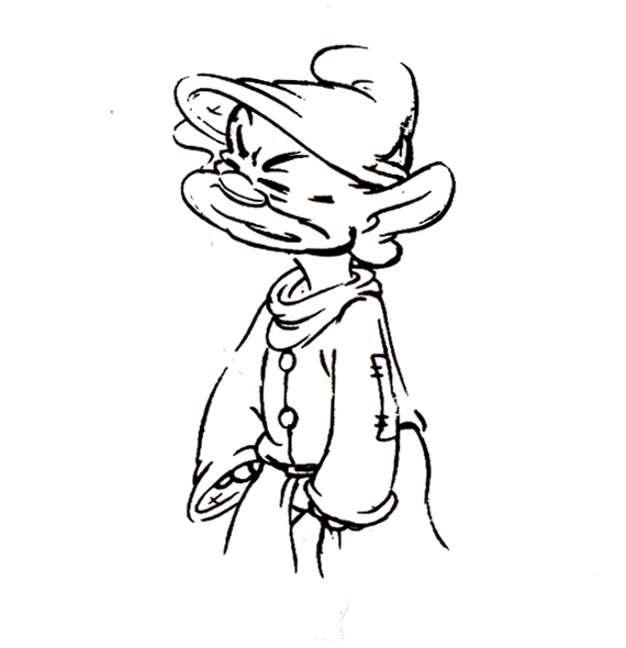
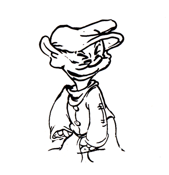
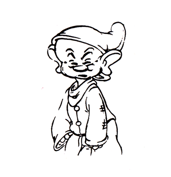
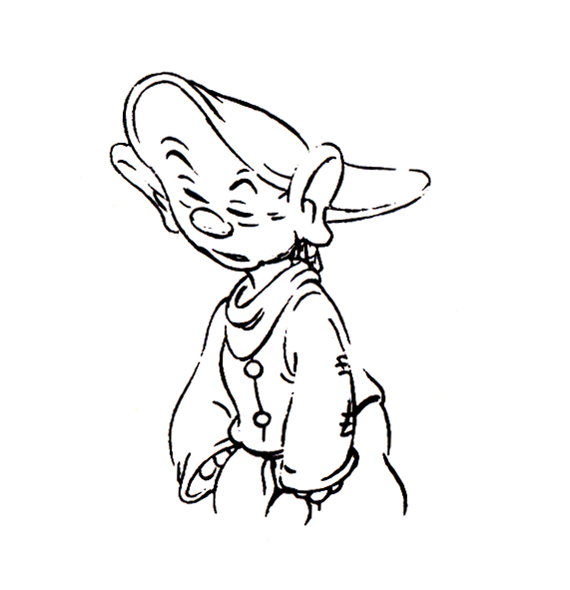
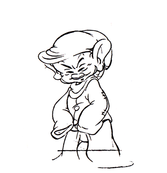
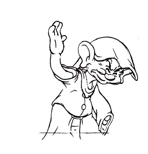
Now here’s a similar thing with Dopey shaking the water out of his head.
 1
1 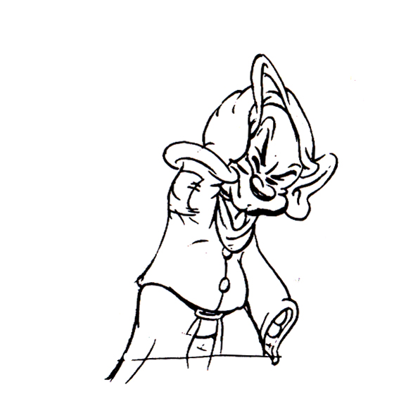 2
2
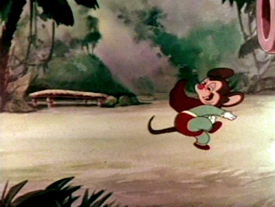
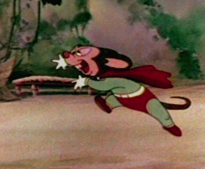
I also thought I’d pick out a nice frame grab or five of Tytla’s animation for a Mighty Mouse cartoon when he later went to Terrytoons.
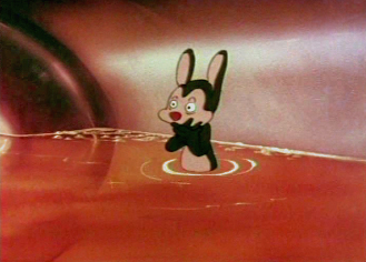 1
1
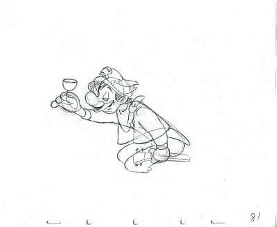
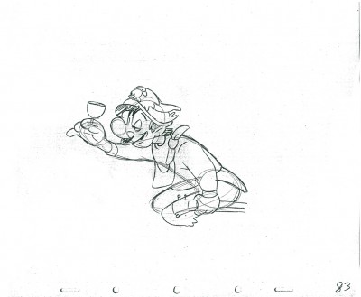
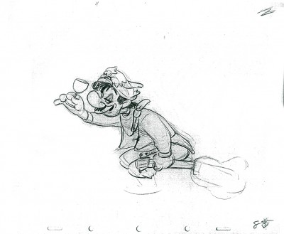
If we’re going to look at Tytla’s play on a drunk character, let’s look at this beauty of a scene. It’s from a film that was never completed, The Laughing Gauchito. This was one of the short pieces being developed during the period when the South American themed films, Saludos Amigos and Three Caballeros, were in production.
For this scene Tytla uses the rubbery feel for the face, but keeps the looseness in the character for the arms and legs. There’s quite a bit of depth he writes into the scene. The character is drinking (and a little tipsy) loses his balance and tries to regain it without spilling his drink. There’s a lot there, and it’s beautifully developed, yet still not a finished scene.
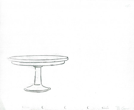
The Background
 1
1 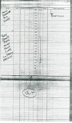 2
2
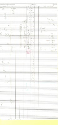
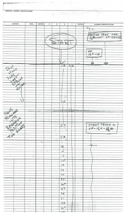
These are the X Sheets for the scene.
Here’s a QT of the scene with all the drawings included.
I strongly suggest you take a look into J.B. Kaufman‘s excellent book, South of the Border; it gives a full accounting of this film and Disney’s tour of the South American countries in preparation for the film.
Action Analysis &Animation &Animation Artifacts 09 Apr 2013 07:23 am
Johnny Gent’s Spellbinder – recap
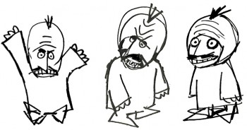 Johnny (Gentilella) Gent had the hardest time on the Letterman series done for the original Electric Company. He could never get the characters and kept trying to add 3D form to the 2D characters that John Hubley had created.
It was my first job, and I was in awe of every animator that walked through ________A very early John Hubley model of Spellbinder.
the door. We had 2½ months to do
all the artwork on the 20 spots that were 2½ mins each. A total of 50 mins in 10 weeks. (That’s about right these days for a 30 second spot!)
I did all the assisting, inking and inbetweening and had to do it quickly. (I estimated about 18 secs. per drawing. The game I played with myself to keep up was to keep one eye on the drawing and another on the clock.)
As I said, it was my first animation job. What did I know! I had to take Johnny’s drawings and reshape them into Hubley’s characters, and I had to do it in ink. No pencil tests. Just do it. Whatever came out, was the final artwork (and I use that word loosely.) I felt, even while I was doing it, that I was killing Johnny’s work, so it went as it did.
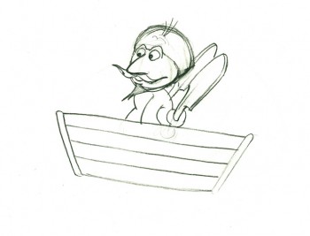
Here’s a cycle of Johnny Gent’s Spellbinder rowing a boat.
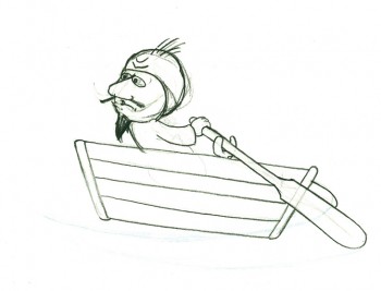 1
1(If you click on any drawing it’ll show you the full animation page.
Johnny Gent’s Spellbinder rows a boat
on two’s per drawing indicated
Click left side of the black bar to play.
Right side to watch single frame.
Six months later, I was on a lay-off from the Hubley Studio in need of a job. At NY Institute of Technology, a school in Long Island, they were starting work on a feature animated film that the school’s dean, Alexander Schure, was financing. He had decided to create the world’s largest computer animation department, and they were just barely starting to get a reputation for the incredible people they were employing (Ed Catmull, Alvy Ray Smith and other pioneers among them), but first they were going to do this hand-drawn feature.
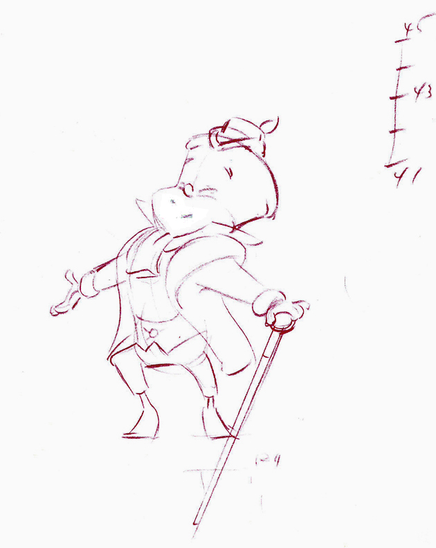 Out of the blue, I got a call from Johnny Gentilella. He was now the head of animation at Tubby the Tuba and was offering me a job as an Asst. Animator. NYIT was my alma mater, so I was curious to see what the place now looked like. Assistant was a promotion with a pay raise. I took the job right quick.
The staff included about ten people in those early days, and we worked in what seemed like a log cabin. I was given a seat directly across from the front door and handed a scene of Tubby the Tuba to clean-up and inbetween. I did it. Then another, then another, then another.
A few weeks later, at lunchtime, Johnny and I were alone in the space eating our sandwiches. I took the opportunity of apologizing to him for what I did at Hubley’s studio. I was taking Johnny’s sculpted drawings and flattening them. To make up time I skipped a step by not working in pencil. I’d clean up with a Sharpie on heavy paper. In the process flattening and taking all of the life out of the drawing. I apologized to John for what I felt was destroig his work. I was also only days into my first job and didn’t really know what I was doing. But I did it anyway.
He said that he hadn’t even noticed. Because of the schedule and the budget on the Letterman series, he knew I was doing what was best for the work. There was nothing I needed to apologize for. He appreciated how I felt but told me not to worry about it.
At the same time, I pointed out that I had just done a scene of Tubby the Tuba giving a speech at a lectern. It was identical, drawing for drawing, of a scene Johnny had done at Hubley’s. There it was Spellbinder, here it was Tubby. How and why did John do that?
He explained that on films like Letterman they were done so fast that there was no time for Pencil Tests. Animators couldn’t do as they did in the old days, animate a scene then see a PT of the scene and correct it if it needed the work. They had to knock out the scenes. If anything went wrong it was the animator’s fault and he’d be out of a job and a future contact for further work. So animators did what they knew would work. Better to be stale and save face, keeping your job, than to be daring and without a job.
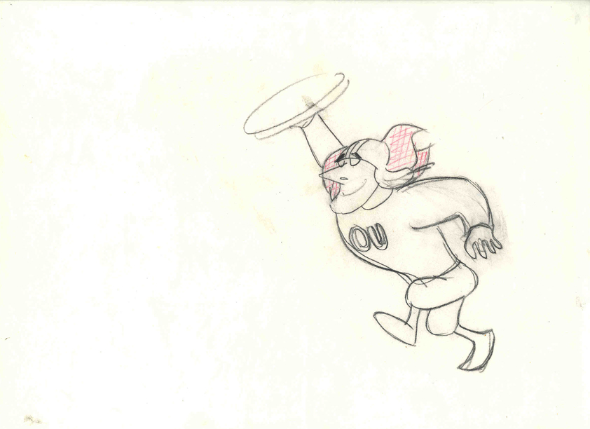 The following Saturday, I told Tissa David this story. She was giving me lessons in animation and inbetweening on Saturday mornings at her apartment. I let Tissa know about Johnny’s cheating to make it work. Tissa’s response – “How lucky Johnny is! I wish I had such luck!” She said she was unlucky to have a memory that couldn’t remember how to do such a scene and to catalogue the work, math and all, in her memory. Obviously John could do that. Tissa, instead, had to approach every scene as wholly new. She had to ____________________Tissa’s Letterman”
animate from scratch whereas John could
pull the scene from his memory.
I got Tissa’s point.
.
.
Note: the drawing of Tubby, above, was done by the
animator, Ed DeMattia, many months later in the production.
Action Analysis &Animation &Animation Artifacts &Commentary &Disney &Peet &Tytla 08 Apr 2013 05:05 am
Stanislavsky, Boleslavsky and Tytla’s Smears & Distortions – 4
Boleslavski was a great admirer of Stanislavsky and his acting techniques. When he, Boleslavsky, came to the United States, he taught the Stanislavsky technique to his students. These included Lee Strasberg, Stella Adler and Harold Clurman; all were among the founding members of the Group Theater (1931–1940). The Group Theater was the first American acting ensemble to utilize Stanislavski’s techniques, and its members all went off to espouse their own versions of the “method.” American acting had taken some real turns into the creation and development of a true system for getting the best performance out of the actor.
In animation, there was animation technique and styles. These rarely had anything to do with acting. However, there were a number of animators at the Disney studio who wanted to put the focus on their acting and actually studied Stanislavsky and Boleslavsky so that their characters would give a great performance. Tytla was certainly a leader among the animators to do this.

Whereas in Pinocchio, while working with such a flamboyant and
eccentric character, Tytla stretched and distorted Stromboli to
get the necessary and sudden emotional mood shifts desired.

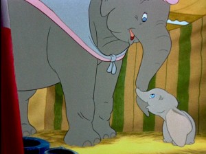
With Dumbo, Tytla modeled the character after his own son,
and he animated this scene wholly on the two characters
given to him on the strong storyboard by Bill Peet.

He didn’t use distortion, because it wasn’t the character he was animating.
Dumbo was gentle, all truth. The honest performance meant keeping everything
above board and on the table. That is undoubtedly the performance Tytla drew.

In my opinion, it has to be one of the greatest animation performances
ever drawn for a film. It’s quite extraordinary and cannot be undercut
in any possible way.
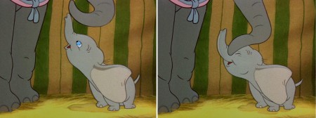
(Click any image to enlarge.)
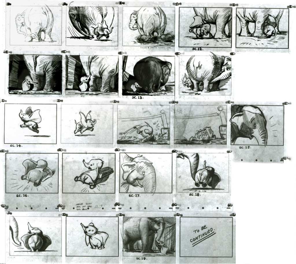
You can see that Bill Peet’s storyboard was certainly an inspiration,
at the least, for Tytla to follow, if not to equal.
Let’s move to another film. Fantasia.
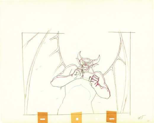
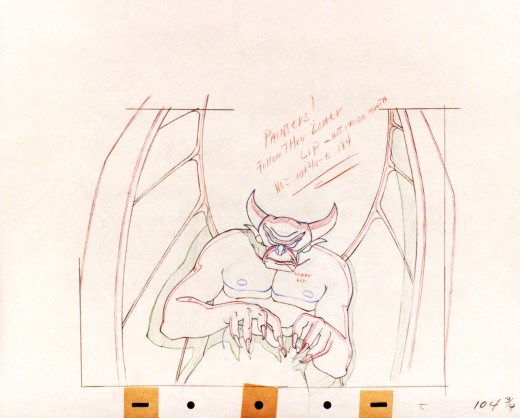
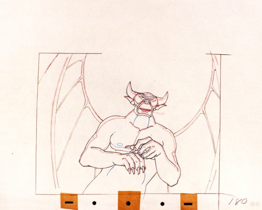
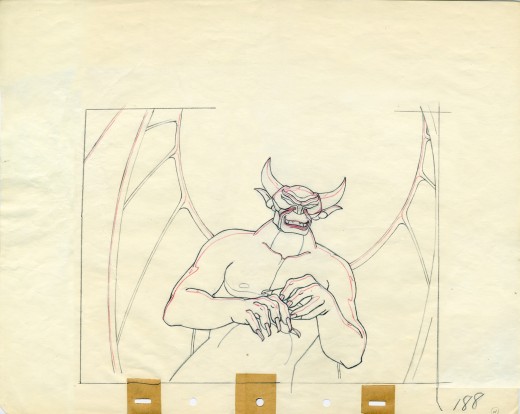
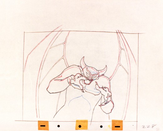
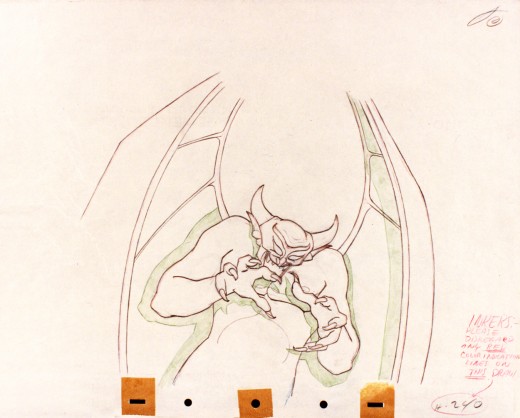
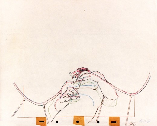
Vladimir Tytla worked on the devil in Mussorgsky’s – Night On Bald Mountain.
Here are some drawings for the scene. They’re part Tytla and part clean up by his assistant.
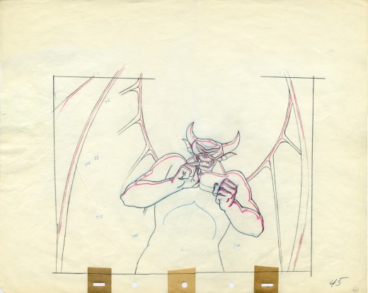
A good example of a Tytla drawing.
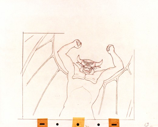
They’re pretty damned impressive drawings. If there is any distortion,
it comes from making a body builder’s shape stronger. There’s no violent
flexing of those muscles, just the natural thing on display in the middle
of a dance sequence. Strong and forcefully beautiful drawings. The
distortion is done by the other spooks floating out of their graves on
the way up to their leader.
The devil’s motion throughout this piece is very slow, tightly drawn images of the devil lyrically moving through the musical phases. It’s pure dance. Any distortion is done via the tight editing that Tytla has constructed. Very close images of the hands with the flame shaped dancers moving about in tight close up as Chernobog’s large face with searing eyes closely watching the fallen creatures dancing in his hands. It’s distortion enough.
Tytla has constructed the most romantic sequence imaginable, and the emotion of the dance acts as the climax for all of Fantasia, and it succeeds in spades. All hoisted by the animation, itself. No loud crushing peak, just a dance done in a tightly choreographed number completely controlled by Tytla. It’s the ultimate tour de force of animation, and we’ll never see the likes of it again.
So essentially I’m pointing out that Tytla used distortion in the animation drawings to execute his acting theories, but as he grows, he not only uses his animation (and animation drawings) to “Act”, he uses his abilities as an Animation Director. The cutting and the movement of the scenes is used for the Acting, as well.
Action Analysis &Animation &Commentary &Tytla 01 Apr 2013 04:55 am
Stanislavsky Boleslavsky and Tytla’s Smears & Distortions – 4
 I would guess an actor, one who was truly devoted to their craft, would try to assume the full personality of the character he or she is playing. For an actor who felt devoted to the craft, they’d veer toward some specific acting school. Stanislavski or Boleslavsky, Actor’s Studio, Meisner, Chekhov or whatever combination thereof, the actor would use these schools of approach trying to fully possess the soul of the character.
Marlon Brando, Julie Harris, Paul Newman, John Garfield, Clifford Odets, Montgomery Clift and Marilyn Monroe all these acting greats had their techniques, and all those methods did start with Stanislavsky.
The question for us is how did this affect animation’s actors – the animators? Or did it? I’ve only seen this discussed in depth in one book, Mike Barrier‘s Hollywood Cartoons. Barrier shows a real understanding of Stanislavsky and Boleslavsky when he discusses the overt course of action taken by one animator, in particular, Bill Tytla.
We know that there were plenty of others that were excited by the newly discovered techniques, though we don’t know how wide spread this influence was. My first realization that it was a strong influence came from a joke John Hubley shared with me. He said that the animators broke into two groups, those that were interested in Stanislavsky and those that couldn’t spell it. Hubley was friends with Tytla. Tytla had been the close roommate to Art Babbitt, and Babbitt was close with Hubley, right to the near end.
But Tytla. Let’s look into what he was doing with his animation. I’m going to make a lot of suppositions to tell you what I think he believed . . . the reasoning and the way he worked.
Now, let me show you something.
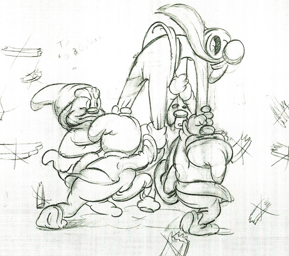
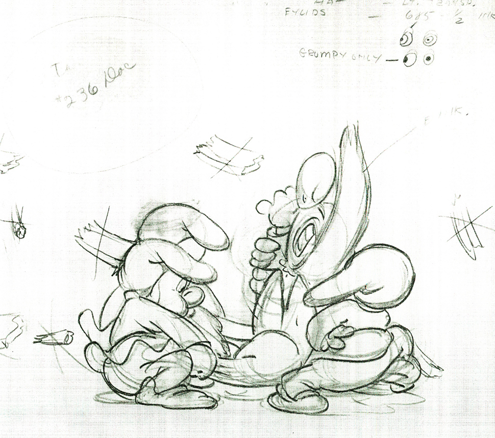
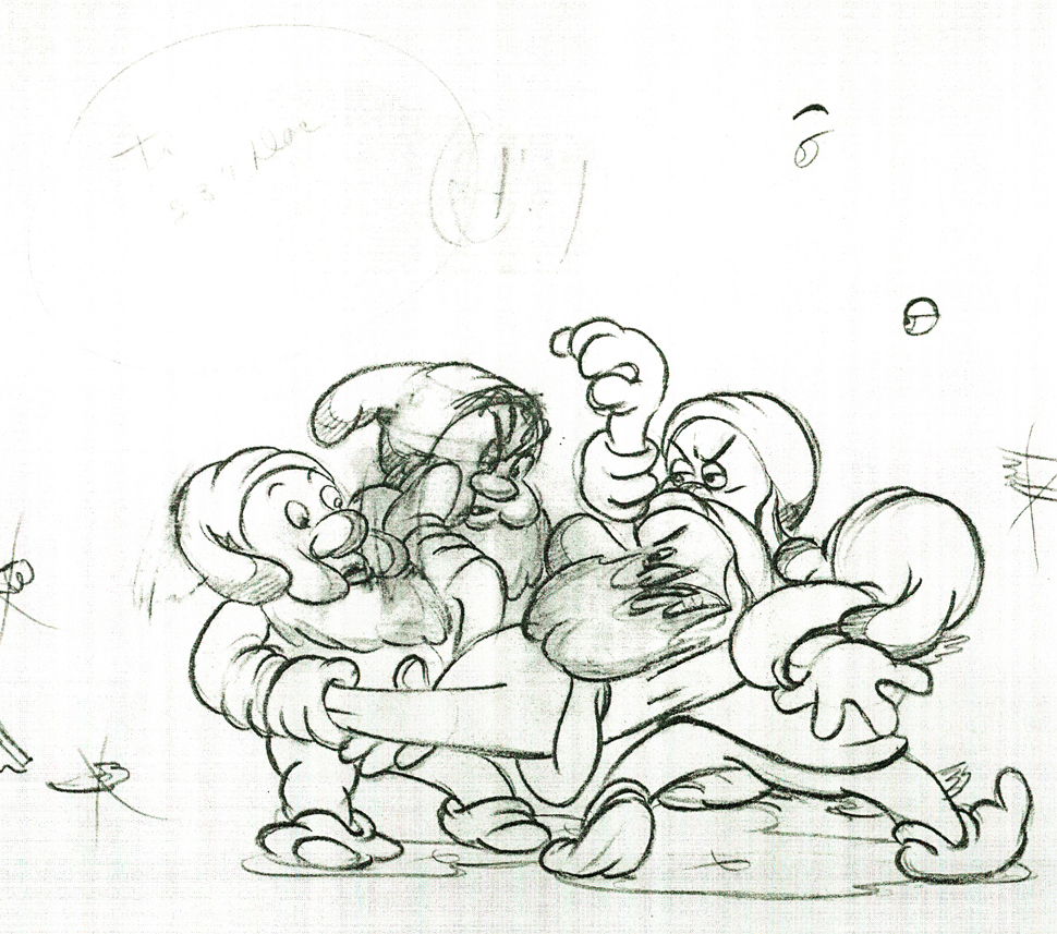
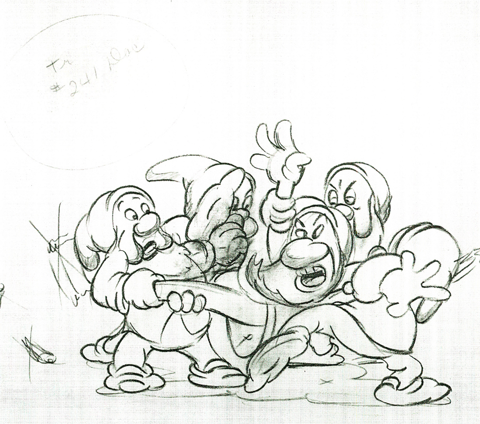
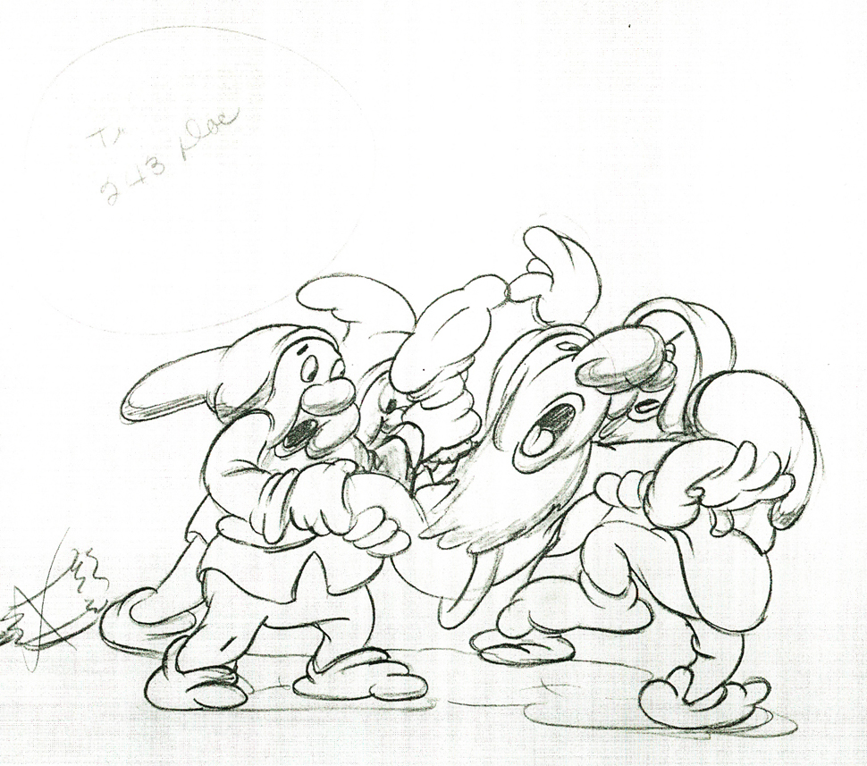
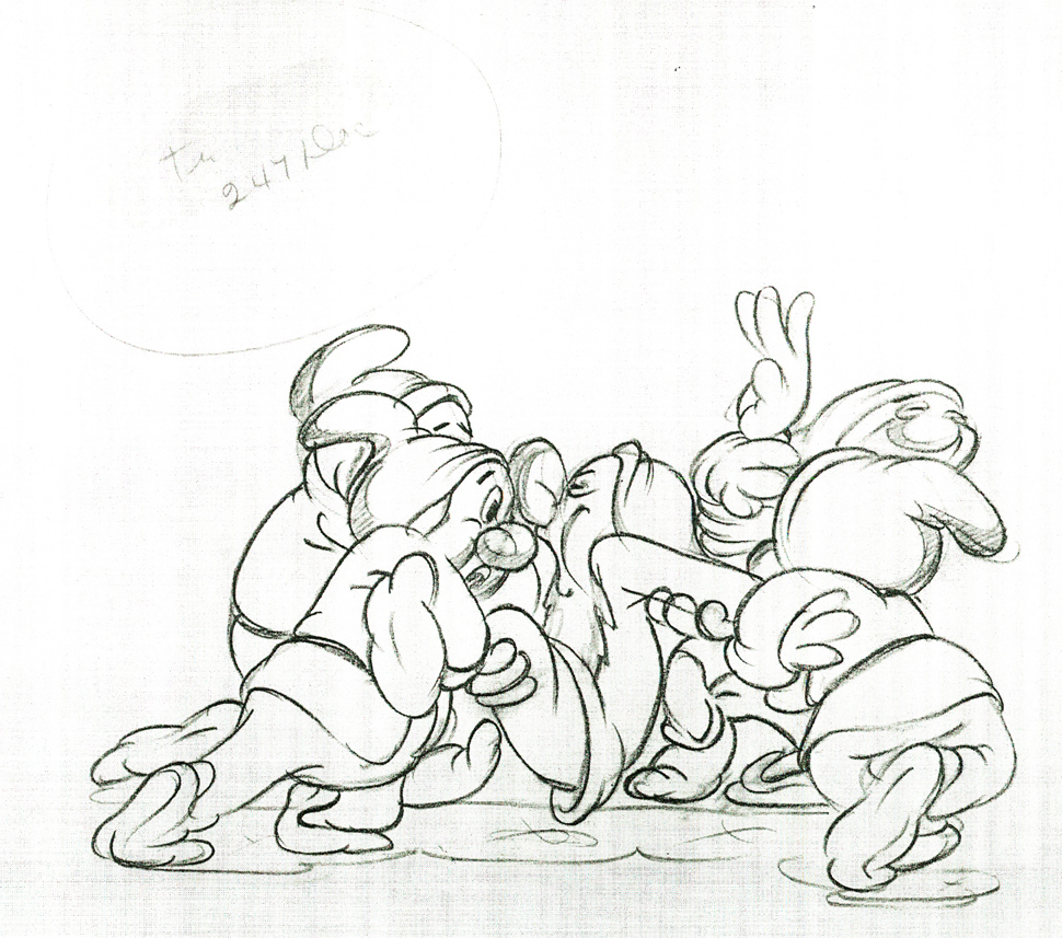
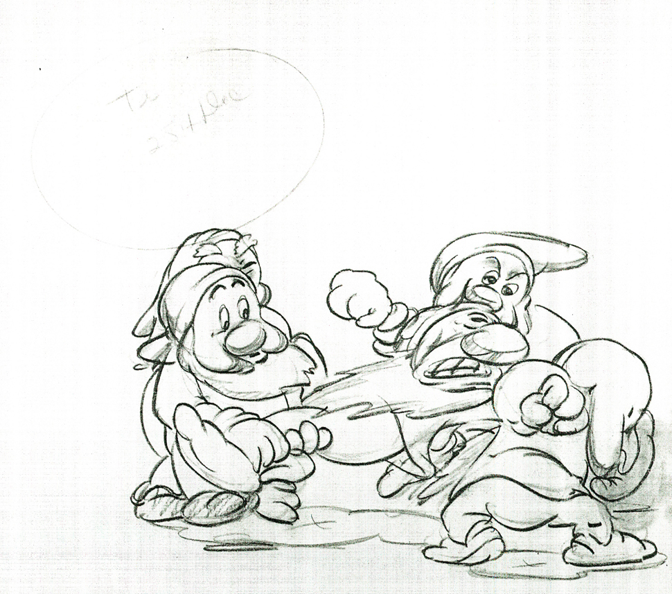
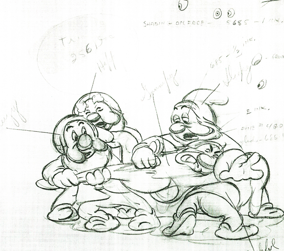
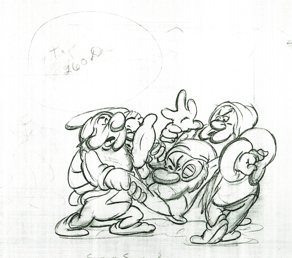
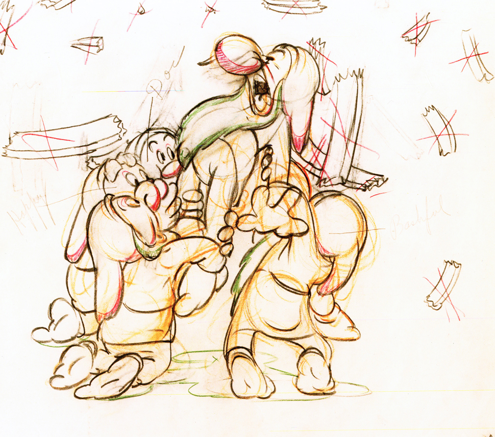
Here are some drawings and a QT movie of the seven dwarfs. Six of them are carrying Grumpy to the wash basin to clean him despite his violent protests.
Note the distortion on many of the drawings. #239 & 241 for example. #254 & 256 as well.
 222
222
Here’s the QT movie of the full scene:
The P.T. is exposed on ones at 24FPS.
Note the buttons on the bottom far right will allow you to
advance (and reverse) the action one frame at a time. You
should go through this to see the distortion on the inbetweens
and how it works when the animation is in full motion.
There’s a great deal of distortion and smearing in Tytla’s work. I think he uses it to heighten the acting moments that his characters are performing. This particular scene is more action than acting, so other than to show off his distorting the characters, it isn’t a great example of acting, per se. Bt that drawing #239 is a good example of what he’ll do, even to the face of the principal character in the scene, to get his animation to work.
It’s almost as if he’d studied live action frame by frame and represents all those motion blurs in live action by smearing the face. The dwarfs are probably the first time complicated acting is successfully achieved. They’d done it before with many of the characters in the Silly Symphonies, but these are characters who sustain strong personalities over a long period of film. They also go through strong emotional changes which underline and works off their personalities.
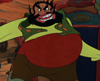
Tytla had a very different character in Stromboli for Pinocchio. He was a theatrical type, very changeable personality with emotions going all over the place – from high to low in the bat of an eye.
Tytla brought beautiful distortion to many of the drawings he did, using it as a way to hammer home some of the emotions in the elasticity he was creating. Yet, the casual observer watching this sequence in motion doesn’t ever notice that distortion yet can feel it in the strength of the motion.
Four drawings (#1, 11, 22, & 48) that shift so enormously but call no attention to itself.
Brilliant draftsmanship and use of the forms.
After I first posted some of these drawings and spoke a bit about the distortion Tytla would use to his advantage – for emotional gestures – I received some comments. I’d written that . . . “It’s part of the “animating forces instead of forms†method that Tytla used. This is found in Stromboli’s face.
This note arrived from Borge Ring after my first post Bill Tytla’s scene featuring Stromboli’s mood swing:
- The Arch devotees of Milt Kahl have tearfull misgivings about Wladimir Tytla’s magnificent language of distortions. ‘”Yes, he IS good. But he has made SO many ugly drawings”
Musicologists will know that Beethoven abhorred the music of Johan Sebastian Bach.
yukyuk
Børge
Note in one of these arms (right) Tytla uses Stromboli’s blouse to make it look like there’s distortion. It barely registers but gives strength to the arm move before it as his blouse follows through in extreme.
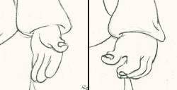 There’s also some beautiful and simple drawing throughout this piece. Stromboli is, basically, a cartoon character that caricatures reality beautifully. A predecessor to Cruella de Vil. In drawings 76 to 80 there’s a simple turn of the hand that is nicely done by some assistant. A little thing among so much bravura animation.
Many people don’t like the exaggerated motion of Stromboli. However, I think it’s perfectly right for the character. He’s Italian – prone to big movements. He’s a performer who, like many actors in real life, goes for the big gesture. In short his character is all there – garlic breath and all.
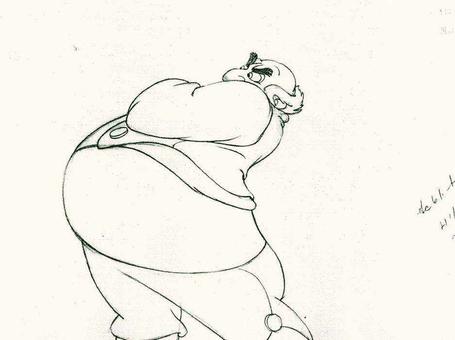
Here’s a short part of another scene. I’ve enlarged the images a little so that the thumbnails are more revealing. Just look at the distortion on the heads and how he stretches the arm to give it a violent emphasis.
 1
1Tytla starts with arm and head all the way back to
the character’s right. It’d be hard for Stromboli to
reach any further back without real distortion.
 5
5
He then slowly advances the head inbetweening slowly.
The arm hasn’t moved very much – maybe what they
call today a “moving hold.”
 11
11
Now the arm comes out swiping violently.
The head’s almost complete in its turn to the left.
 13
13
The arm rips across in three drawings.
The head has gone too far.
 14
14
The head goes back to where it should – almost no inbetweens
for Stromboli to get ready for speech. He’s taken 14 drawings
to display his anger.
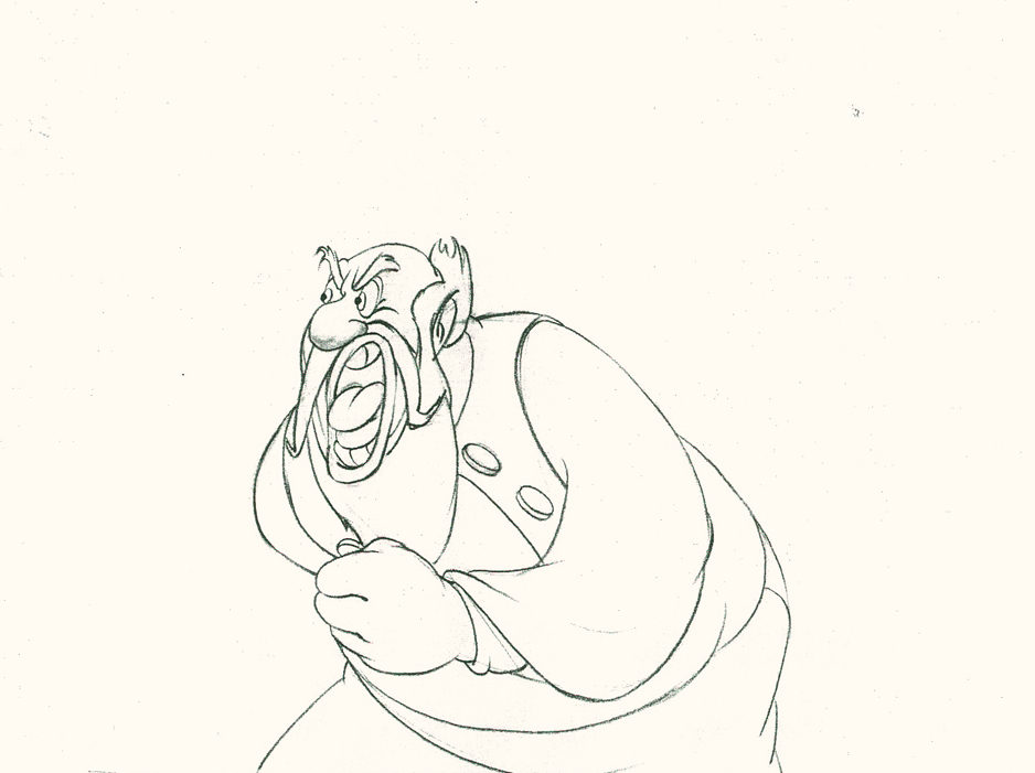 20
20
The arm comes back into a near fist; the expression is violent.
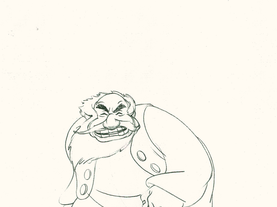 22
22
The head starts shaking in a “no” gesture.
Violent.
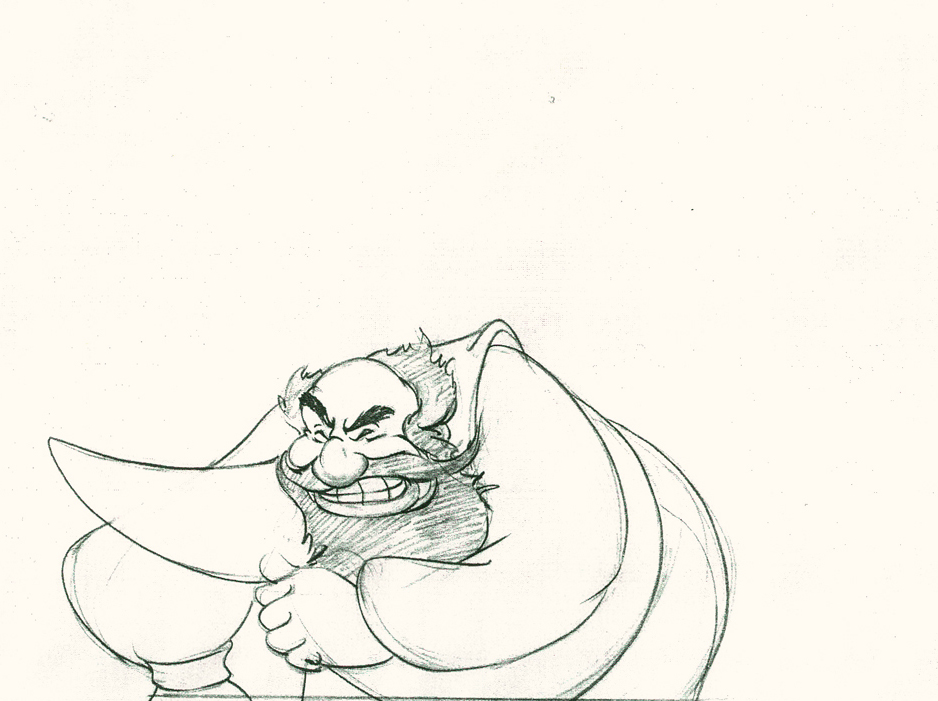 25
25
The head and arm are all the way back.
The vest has been set up to make a violent move.
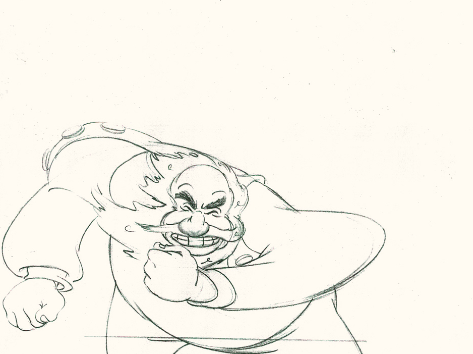 28
28
Now the arm and fist swipe across in violence.
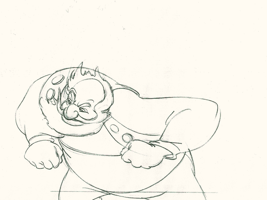 30
30
He’s completely pulled his angry head in to his neck.
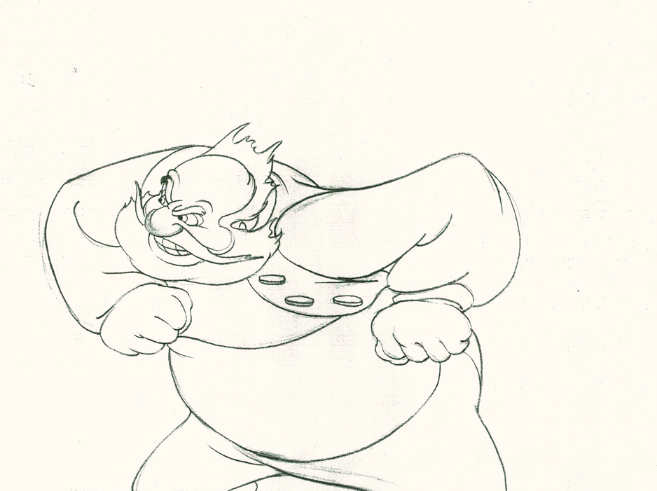 32
32
Both arms, moving violently, are suddenly restrained.
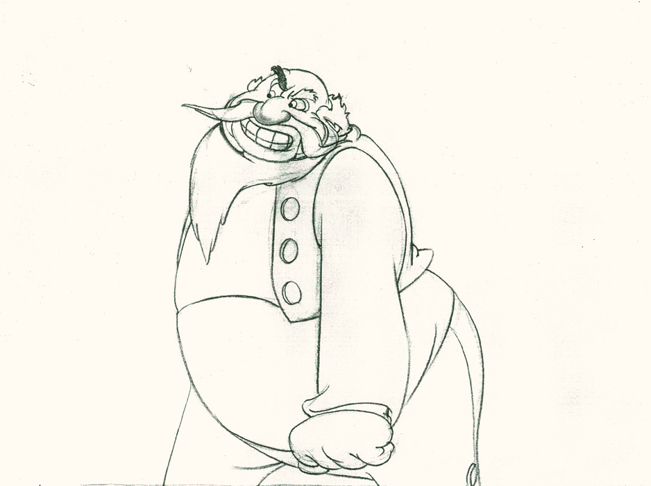 34
34
He hits a full stop with his arm.
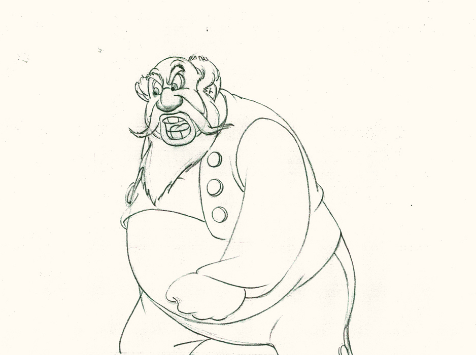 37
37
He’s made the realization that he has to change his expression
so that he doesn’t lose the frightened kid – completely.
Here’s the final QT of the entire scene.This part comes at the very beginning:
Stromboli
Click left side of the black bar to play.
Right side to watch single frame.
David Nethery had taken my drawings posted and synched them up to the sound track here.
It’s not clichéd, and it’s well felt and thought out. Think of the Devil in “Night on Bald Mountain” that would follow, then the simply wonderful and understated Dumbo who would follow that. Tytla was a versatile master.
We’ll continue next time with Dumbo Fantasia and other Tytla gems.
Action Analysis &Animation &Animation Artifacts &repeated posts &Richard Williams &Tissa David 27 Mar 2013 04:26 am
Grim’s Jester – recap
- Yesterday I focused on a couple of scenes Grim Natwick animated in his early days at the Fleischer studio. He was obviously experimenting with distortions, breaking of the joints, the visibility of inbetween drawings and how much he could get away with in “Rough drawings.”
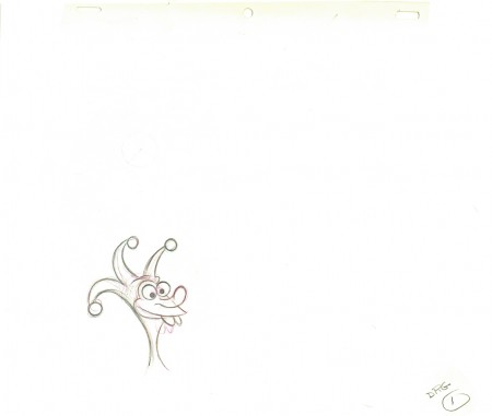
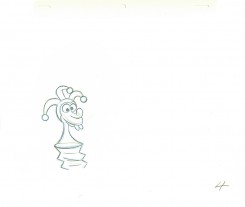
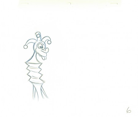
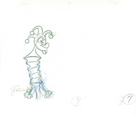
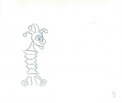
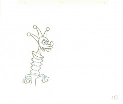
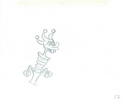
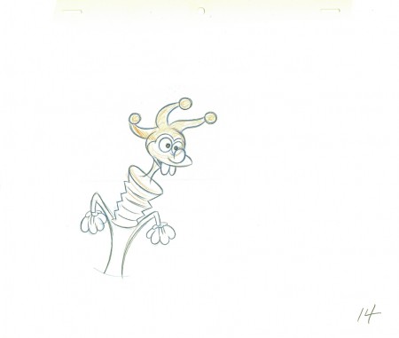
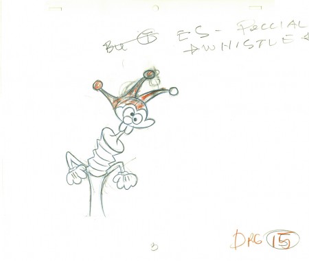
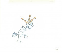
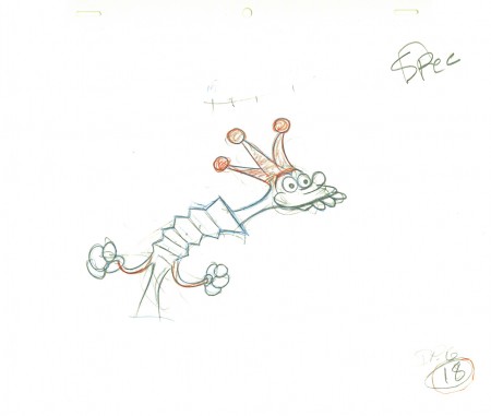
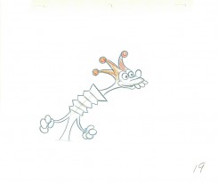
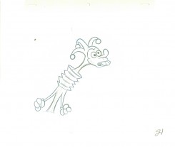
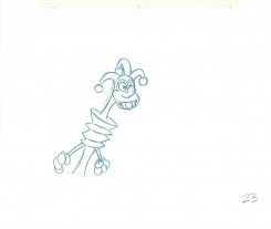
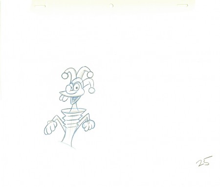
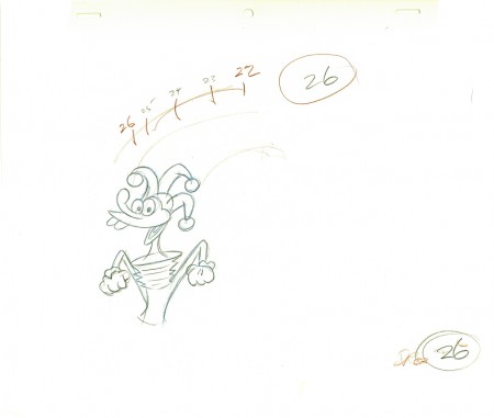
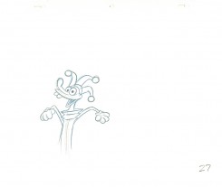
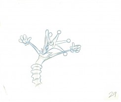
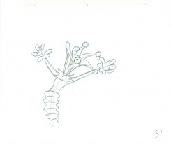
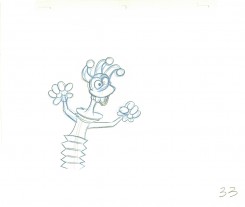
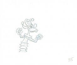
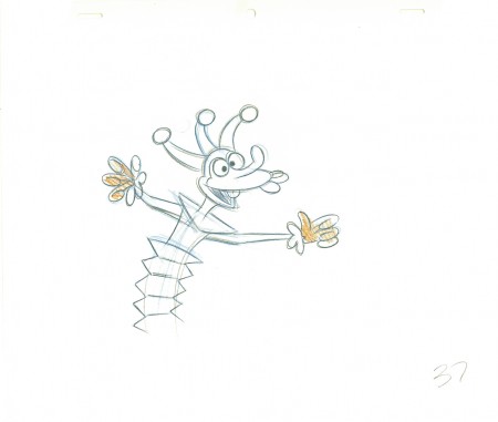
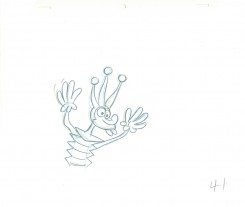
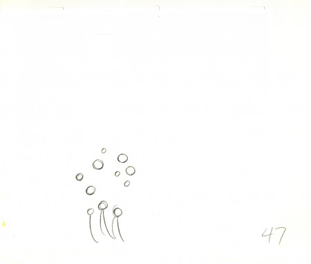
This, of course, isn’t the animator that Grim became, but gives us some light to understand what did make up that animator. The scene here today is something I’d posted on my blog once before, in 2010. It features a lot of Grim’s ruffs as well as the clean ups by Richard Williams, himself.`
You can see Grim’s drawings erased and cleaned up. (The semi-erased semblance of Grim’s very large numbers remain on many of the drawings, as do Grim’s notes. The inbetweens were all done by Dick. (It’s Dick’s writing in the lower right corner, and I remember him doing this overnight.)
The scene is all on twos. There are two holds which Dick changed to a trace back cycle of drawings for a moving hold. It actually looks better on ones, but there was a lip-synch that Grim had to follow. It is interesting that both Tissa David, one of the five key animators on this film, and Grim Natwick, who Tissa had assisted for at least 20 years, both shared the one assistant on key scenes in this film – Richard Williams. Eric Goldberg assisted on many of Tissa’s other scenes.
 1
1.
 2
2  3
3.
 4
4 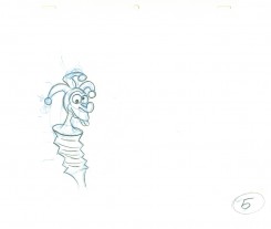 5
5.
 6
6An inbetween by Dick Williams.
.
 7
7A cleaned-up extreme by Grim Natwick.
.
 8
8 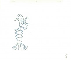 9
9.
 10
10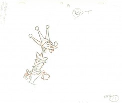 11
11.
 12
12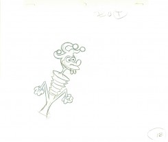 13
13.
 14
14Dick Williams clean-up.
.
 15
15Grim Natwick (sorta) cleaned-up rough.
.
 16
16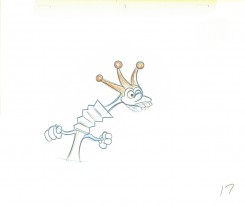 17
17.
 18
18Grim Natwick rough.
.
 19
19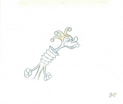 20
20.
 21
21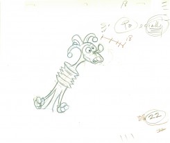 22
22.
 23
23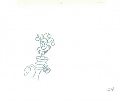 24
24.
 25
25Williams inbetween.
.
 26
26Natwick ruff, cleaned up.
.
 27
27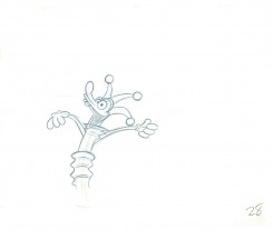 28
28.
 29
29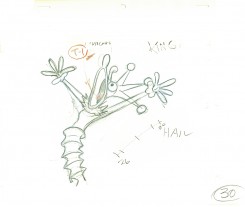 30
30.
 31
31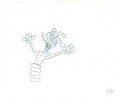 32
32.
 33
33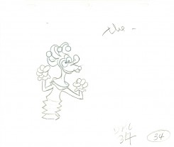 34
34.
 35
35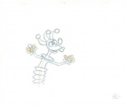 36
36.
 37
37Dick’s clean-up inbetween.
.
 39
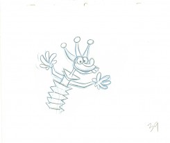
39Definitely a Grim Natwick drawing – cleaned up by Dick (his handwriting).
.
 39
39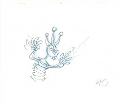 40
40.
 41
41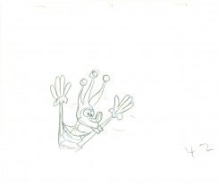 42
42.
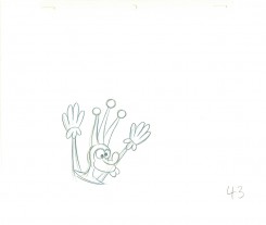 43
43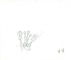 44
44.
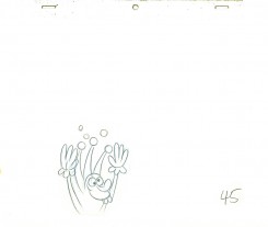 45
45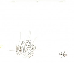 46
46.
 47
47Drawings 44-47 are all Grim’s roughs with minor CU.
.
_____________________________
Here’s a QT movie of the complete action from the scene.
The scene is exposed on twos per exposure sheets.
_____________________________
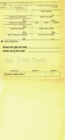
Here are the folder in which the two exposure sheets
are stapled (so they don’t get separated.)
Action Analysis &Animation &Fleischer &Frame Grabs 26 Mar 2013 05:45 am
Grim – Distortions Smears, Abstractions & Emotions – 3
- In 1930, the animation in the Fleischer studio (as evidenced by Michael Barrier in his great book, Hollywood Cartoons) was pretty much controlled by the timing department. They supported a very even sense of timing and would expose everyone’s animation in the house meter. This virtually destroyed the timing within the studio. Their idea was that every drawing had to overlap the drawing before and after. It was done to such an extreme that it caused the even timing throughout their films.
There was at least one animator free of the timing department. Grim Natwick was the key guy in the studio, at the time. His animation was built, back then, on a distortion, a freedom of expression, that very much resembled what Bill Nolan was doing in Hollywood. The difference was that Natwick could draw, so his artwork was planned, designed to look that way. It wasn’t just a matter of straight ahead animation causing distortion. It allowed distortion with scenes going back to square one every so often to hold off the appearance of distortion. The inbetweens distorted and, in a way, smeared always to come back to a nice, tight pose of an extreme.
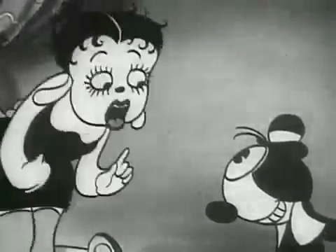
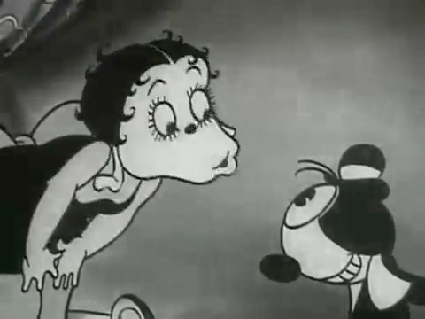
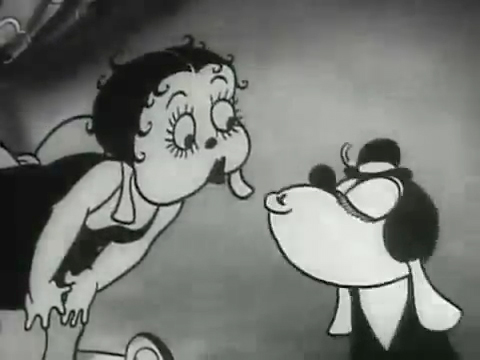
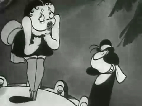
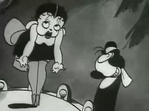
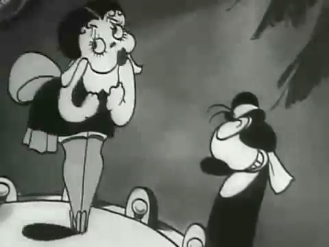
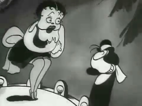
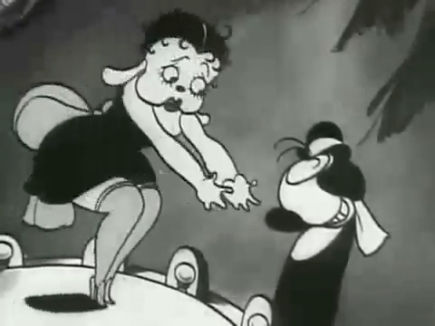
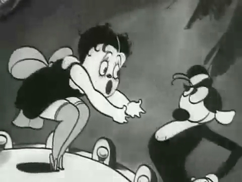
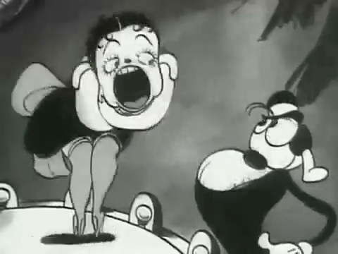
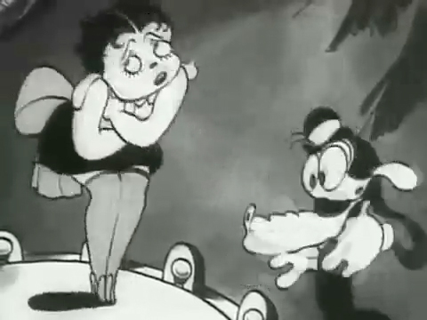
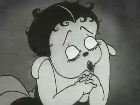
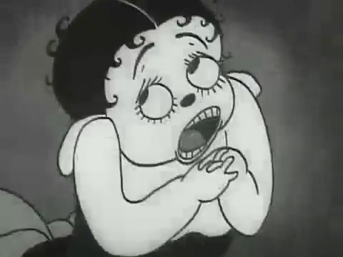
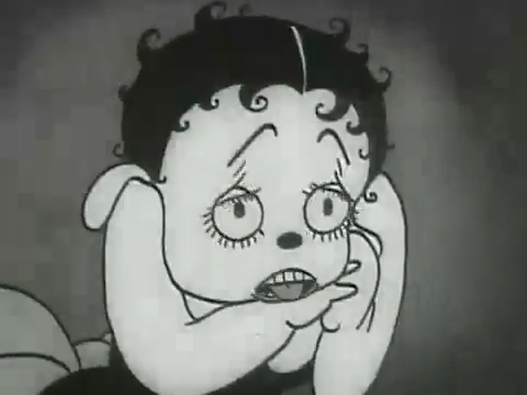
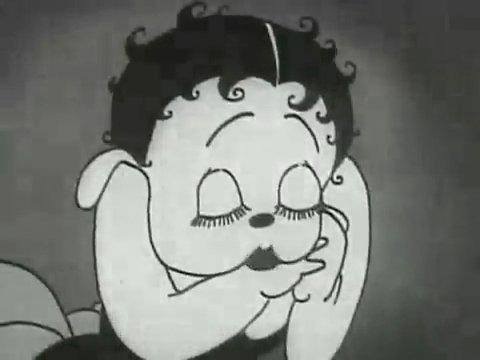
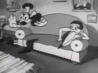
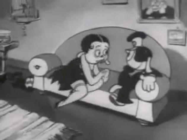
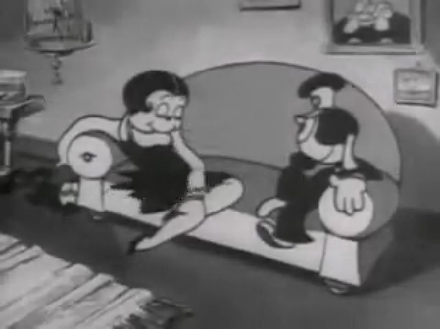
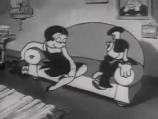
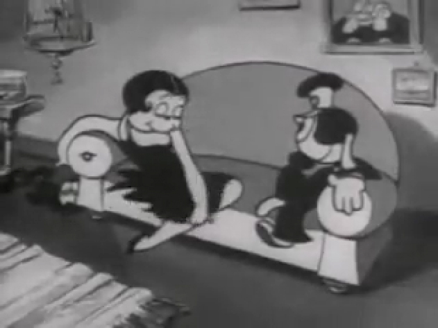
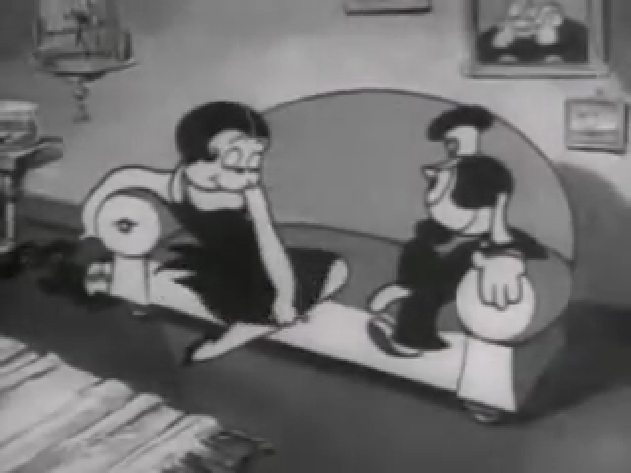
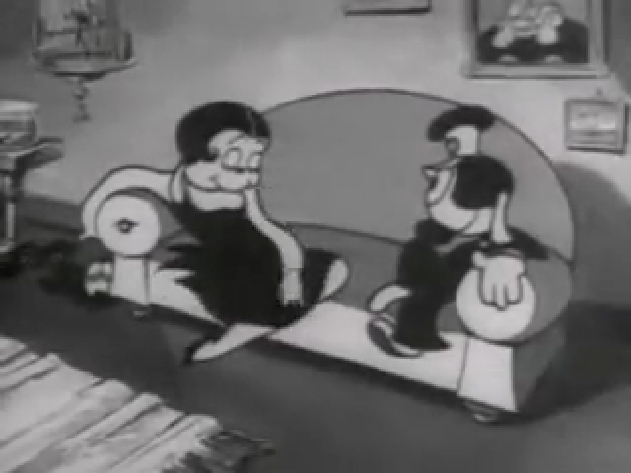
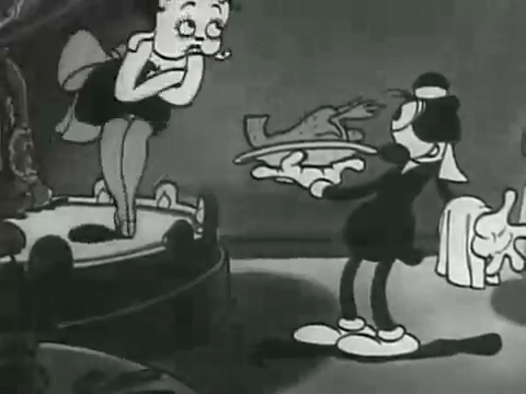
The film “Dizzy Dishes” is the perfect example of this style. This was actually the first Betty Boop cartoon, and Betty, a plump dog sings broadly. She really goes wild as she sings a song on top of a table à la Marlene Dietrich!. Here are some frame grabs from a couple of connected scenes to give you an idea of what was going on.
 1
1
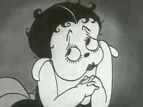
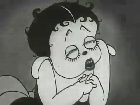
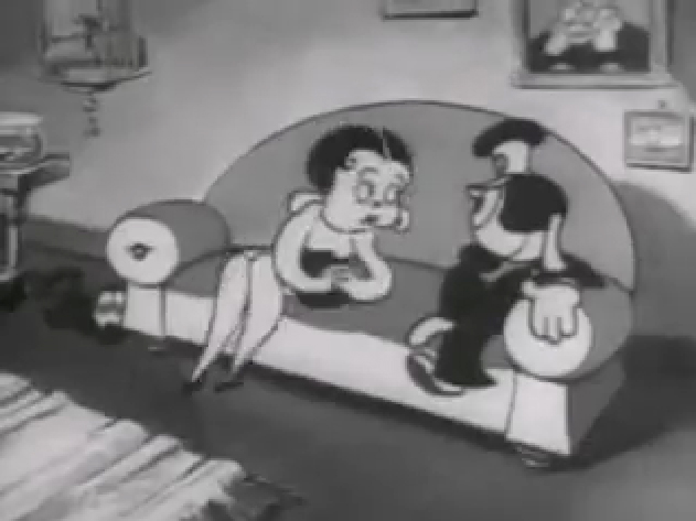
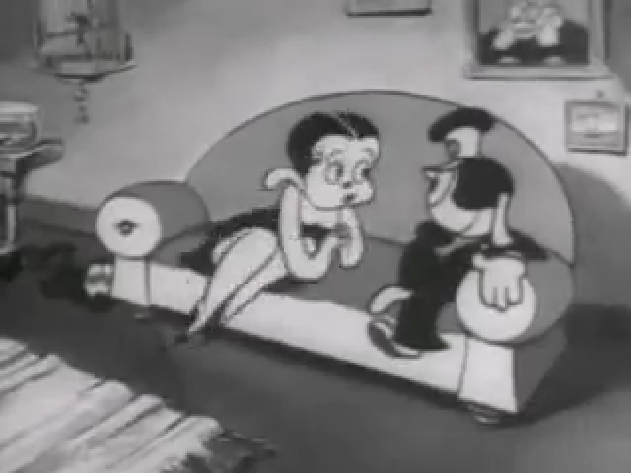
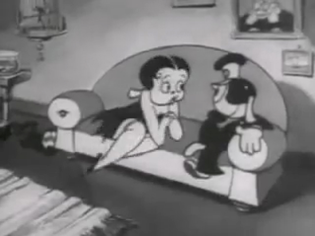
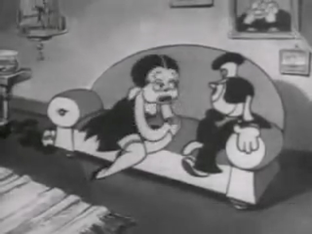
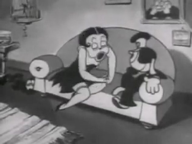
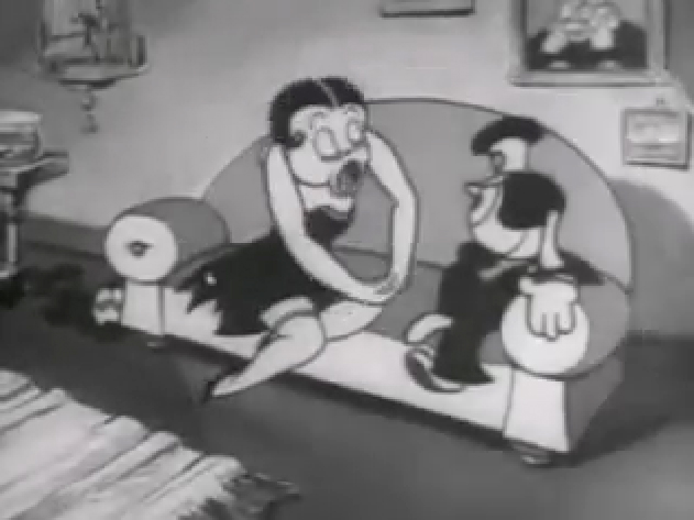
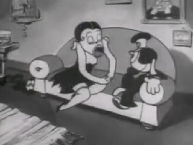
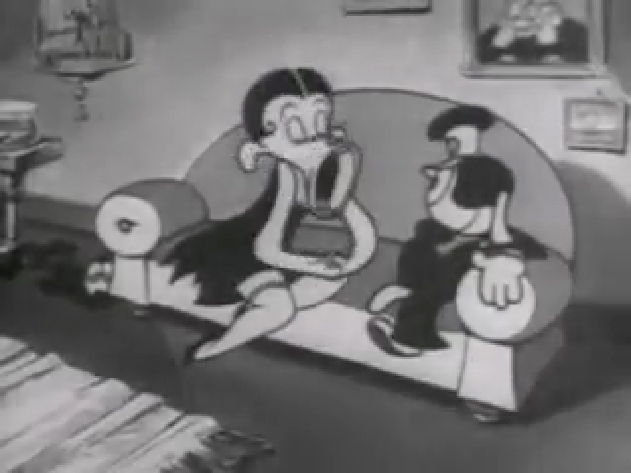
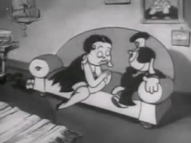
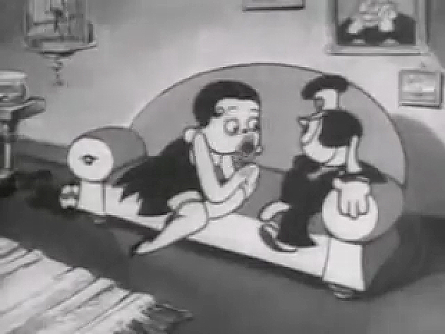
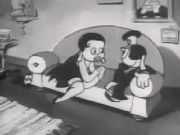
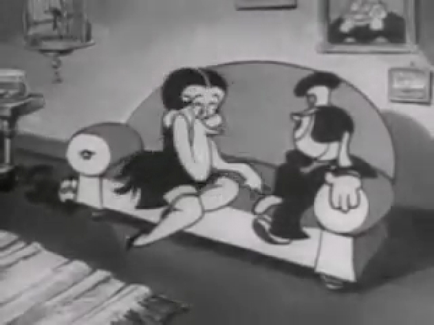
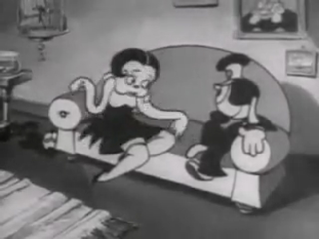
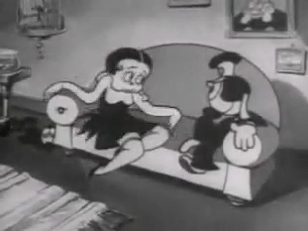
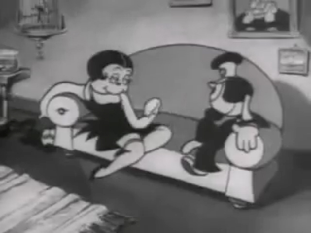
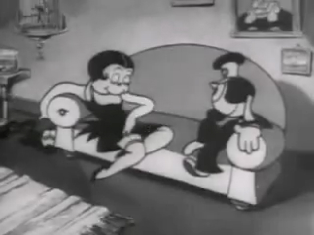
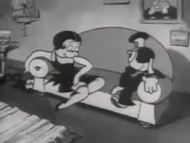
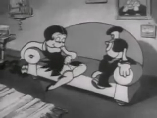
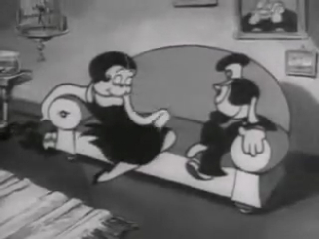
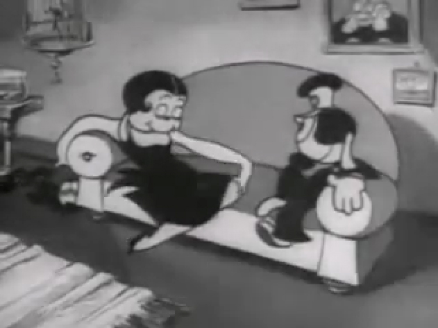
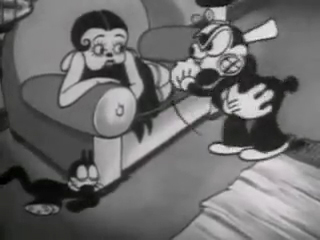
If you jump ahead to Fleischer’s “Barnacle Bill”, also from 1930, you’ll find this wild scene where Betty is seducing Bill, you’ll see all sorts of distortion in the inbetweens which Grim has maneuvered for Betty’s movements on the couch. Note how well posed his extreme positions are drawn despite the distorted inbetweens, when she is moving.
 1
1
Look at the beautiful drawings (above) of this character in some of these extremes from this film. The character of Betty isn’t moving whereas Bimbo – I mean Barnacle Bill is all over the place. Yet your eyes are on Betty in that held position.
Now, let’s look at what the inbetweens are doing as Betty gets from one pose to the next. It’s really funny. Grim has found a way to create a sympathetic, adult and female character, yet he keeps her funny with the surface of the animation.
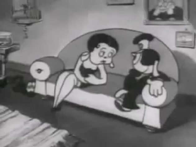 1
1
At times in the animation, Betty’s hand may turn into a claw, but that might be that Grim delivered a rough which was poorly cleaned up by an assistant. Or perhaps the inker just inked from a rougher drawing, perhaps a Grim “clean up” if there ever were such a thing. He worked ROUGH. In fact, that distorted claw of a hand doesn’t matter. It’s the extremes that counted for Grim, and he was experimenting with this animation to see if that really were true.
I’ve remembered over many years an interview with Dick Huemer,* who worked alongside Grim on some of these films. Huemer gets credit for inventing the inbetweener to use in the animation process. It allowed him to turn out more animation and not worry about the many drawings that would paste the scenes together. In that interview, Huemer said that it didn’t really matter what the inbetweens looked like. You could draw a “brick” and it would still work. They actually may have believed this, at that time. Grim is using the inbetweens to get somewhere else in putting the scenes together.
(Tomorrow, I’ll post, again, a scene Grim did for Raggedy Ann with Dick Williams’ clean ups alongside so you can see the variance.)
* In Recollections of Richard Huemer interviewed by Joe Adamson, [1968 and 1969] Huemer said:
- And i decided that I would save all that work of inbetweening by just having a bunch of lines or smudges, just scrabble, from, position to position, When something moved fast. To prove it, I had an alarm clock flying through the air, and right in the middle of the action I put a brick. And vhen they ran the finished
film you didn’t see the brickl It proved that you didn’t really see what was in the middle. But I overdid it.
Action Analysis &Animation &Commentary &Frame Grabs &Tytla 25 Mar 2013 06:05 am
Smears, Distortions, Abstractions & Emotions – 2
- I wrote about this stylistic animation device not too long ago. I was leading up to the master, of course, Bill Tytla. He distorted things, alright, and in the way he did it, he changed animation forever, as far as I’m concerned.
But I started that story by writing about traditional animation and where it came from and where it was going; leading to a sort of rebellion as animators started distorting things, generally, in working closely with their unconventional directors. I purposely skipped a step there, and I should go back a tiny bit and talk about a couple of animators from the silent/early sound days. Today I have Bill Nolan in my sights; tomorrow, Grim Natwick. It’s kind of important before going on to Bill Tytla.
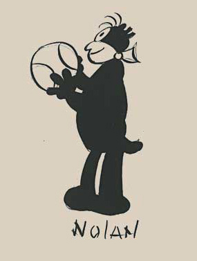 In the animation community in 1927-1930, there were two key animators who were considered the leaders in the business:
Ub Iwerks at Disney (until he left to open his own studio) and
Bill Nolan (at first with Pat Sullivan & Felix the Cat, then with Mintz’ Krazy Kat, and then onto a series of topical gag films called “Newslaffs.”
Both were considered the fastest animators in the country, and it was debatable as to which was quicker, though Iwerks was probably the guy. When Disney learned that Iwerks was leaving, he interviewed Nolan in New York to see if he were interested in replacing Iwerks. Disney offered a high salary of $150 per week for the job. It didn’t work out; Nolan was doing an unusual series, but ultimately went to ________________Nolan’s Krazy Kat looked original.
Oswald the Rabbit after Universal had taken
charge of it. Nolan just about ran the studio under Walter Lantz and allowed them to turn out an enormous amount of footage.
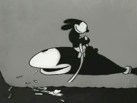
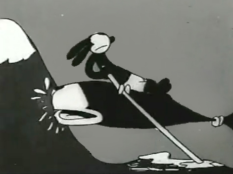
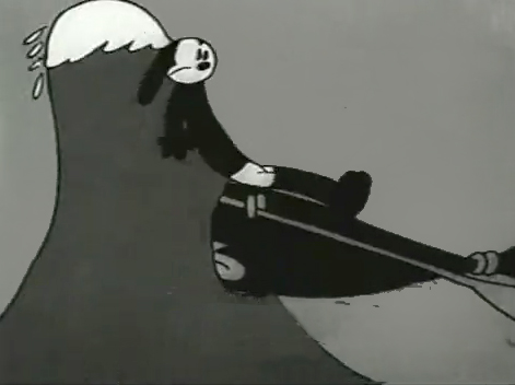
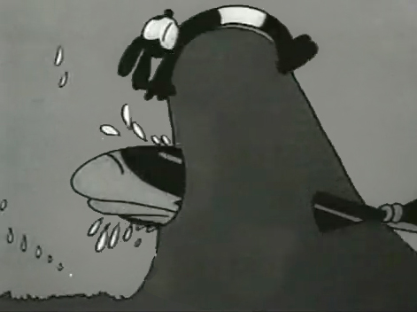
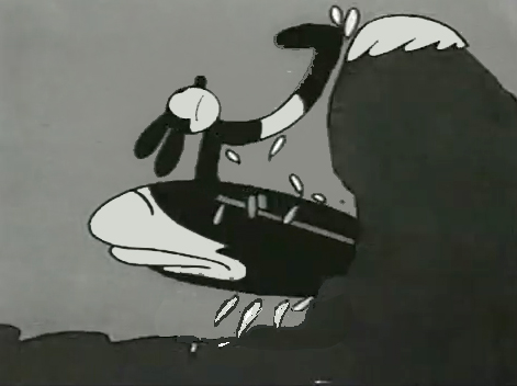
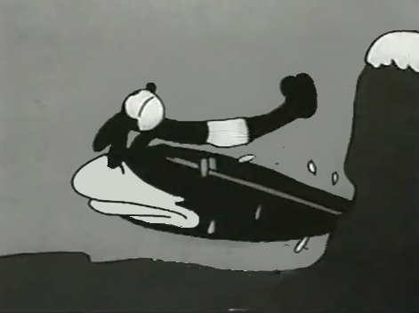
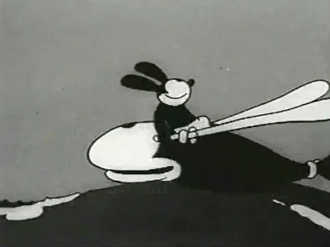
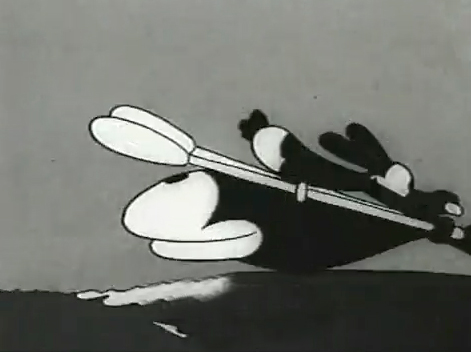
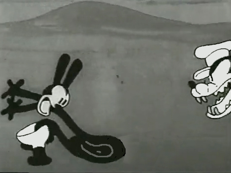
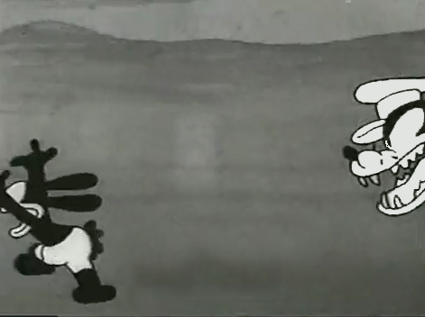
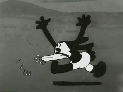
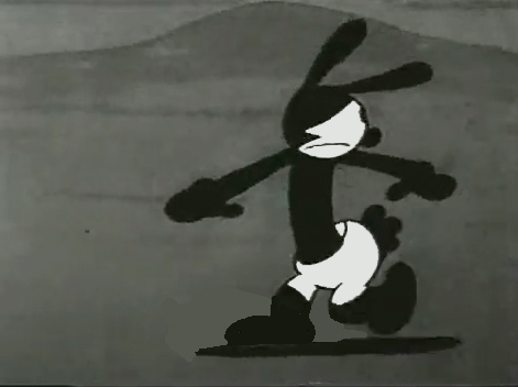
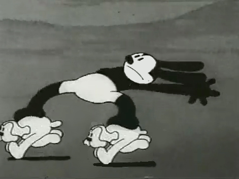
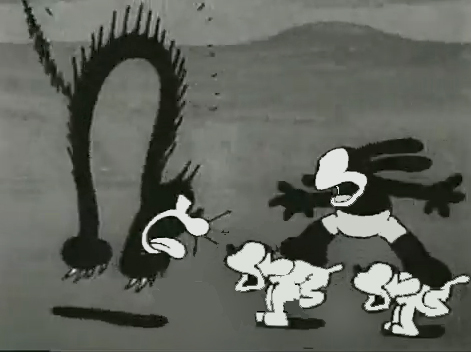
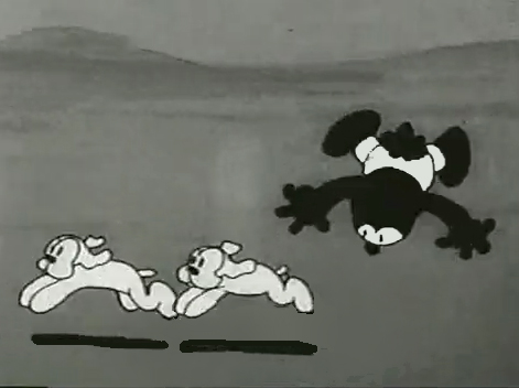
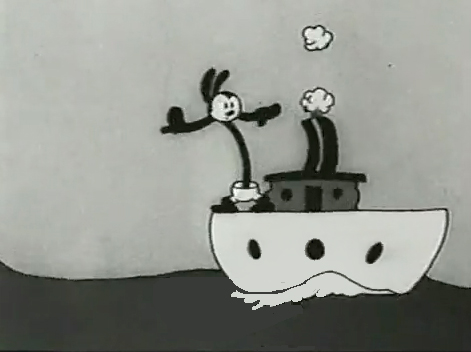
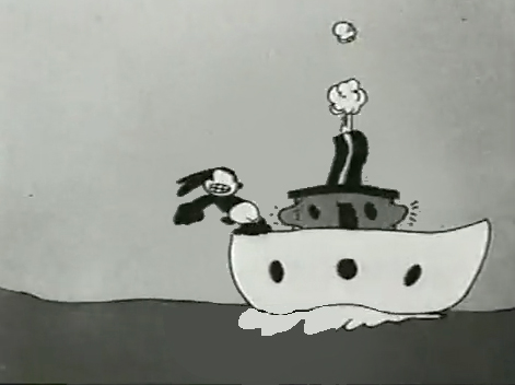
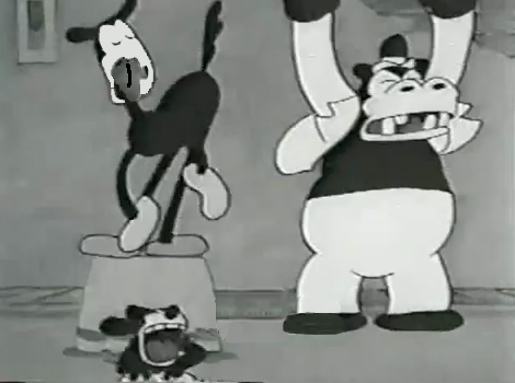
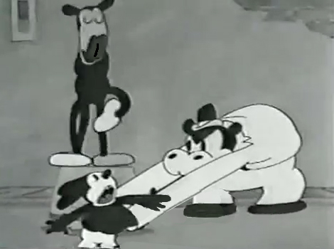
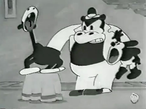
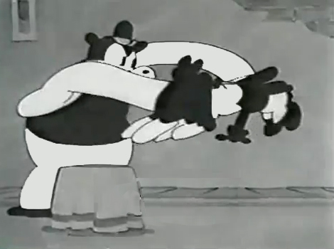
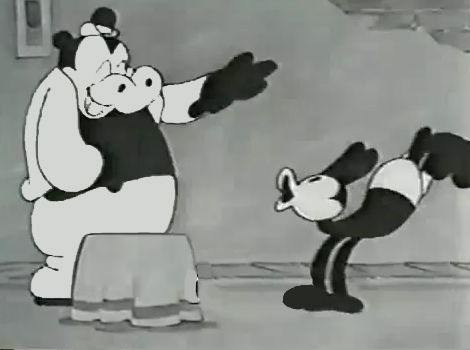
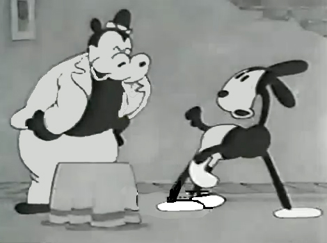
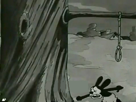
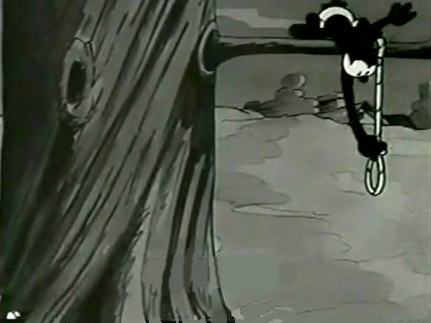
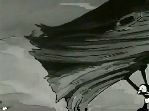
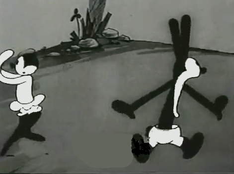
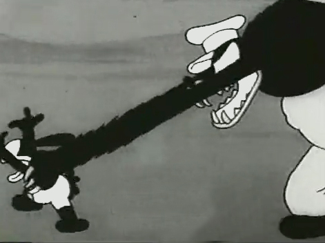
Nolan had developed a style known as the “rubber hose” style in that the limbs of a character were like flexible hoses and joints would be broken wherever the animator wanted. The style also featured very circular drawings. Stylistically, this fought the angularity of some other films that were being made and allowed Nolan to turn out many more drawings than usual. The roundness offered a faster line, and there was also quite a bit of distortion in Nolan’s drawings. Quite often the characters, Oswald, for example, didn’t even look like the character on the model sheet. In fact, you’d have to wonder if there was a model sheet, given the look of the animated character. Both Nolan and Iwerks were straight ahead animators, which meant they could easily go off model. Iwerks was better at holding things than Nolan, who seemed to enjoy being wild. Nolan would go back through his wild drawings and correct a couple of them, but would leave any other changes to lesser artists.
Nolan’s work was somewhat similar to the work of Jim Tyer, but I don’t think Tyer was drawing/animating that way to turn out faster work (though he was a very fast animator.) Nolan had to push the work out, and the rounded, distorted drawings enabled him to animate very quickly. As he went on, the artwork grew more and more wild, and it varied somewhat from the other animators’ work. Tyer tried to get his art to distort, as it does; Nolan just ended up there.
 1
1 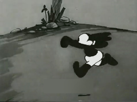 2
2I’d chosen a lot of stills from several of the
Universal/Lantz Oswald cartoons, animated by Nolan.
 3
3 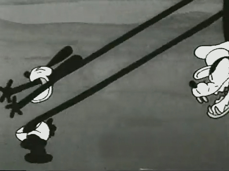 4
4
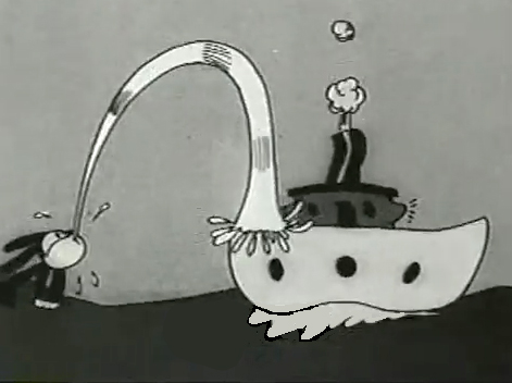
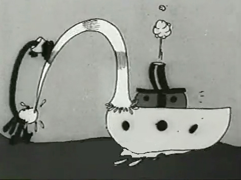
But so many of these from the short, “Permanent Wave,”
are good enough to illustrate my point.
 13
13 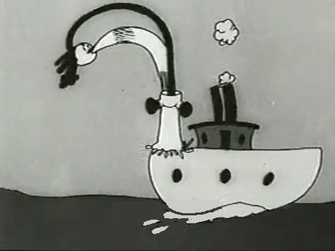 14
14
His body moves out in front of his head
as it climbs up the water he’s spitting onto the boat.
“The Hash Shop” was about as crazy as the animation and the gags went. Here’s one that ends the film.
By 1930, Bill Nolan seems to have settled down a bit. He still abstracts and distorts his animation, but he tries to fit in a bit more with other animators who aren’t drawing their animation quite so abstractly.
After Disney’s “The Three Little Pigs,” other studios tried to catch up with this new type of animation. Nolan and, to a lesser extent, Lantz, didn’t try very hard to change. They liked the way things were going. However, it didn’t take long for Lantz to move for a change in Oswald’s design. They went cuter and whiter on the rabbit.
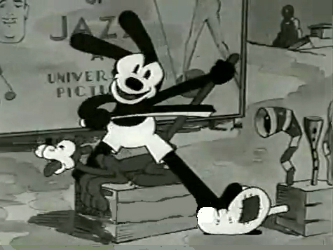
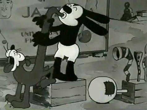
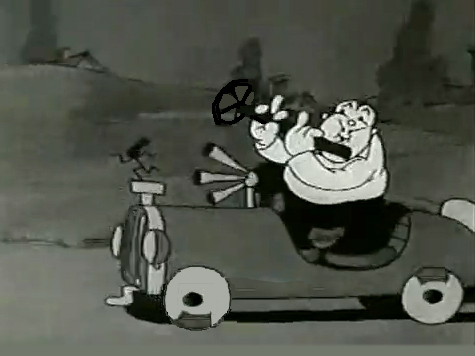
Here are some frame grabs from “My Pal, Paul.” In it Oswald wants to play music with jazz conductor/musician, Paul Whiteman. As it happens, Whiteman’s car breaks down while he’s driving through the woods, and the two get a bit of a duo as Whiteman plays the steering wheel like a clarinet. (Maybe that’s abstract enough.)
