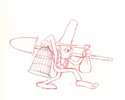
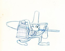
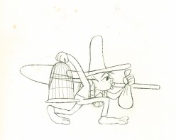
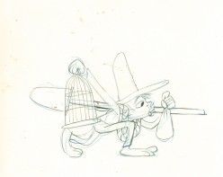
Category ArchiveAction Analysis
Action Analysis &Animation &Commentary &Disney &Guest writer 21 Oct 2013 06:13 am
Women and Men, Boys and Girls, & Toads and Horses
I can’t believe all this nonsense I’ve been reading about what Joanna Quinn might have said about this Disney film or that. She’s right and anyone who argues with her has to be a real dullard and a total fake. If she says it’s easy or hard to animate women, take her word for it. (Not just because she knows how to animate women better than anyone on the planet, these days, but because what she’s saying is common sense.
Women are people, too, not just insipid cartoon characters the way the Disney people draw them. If a male is easy to animate, it’s because they’ve figured out how to design them as the cartoons they’re making. If women are hard to animate, it’s 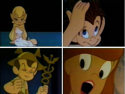 because the lead character in FROZEN looks like every other generic female these guys can draw. Give it up. Hire a few good women who can animate, and we’ll see what we see. (I expect nothing different unless the woman drawing the figure is a good animator (not just great, like Joanna Quinn) and knows how to draw well (not even great, as JQ can do). But the character they’re animating is well designed (unlike the lead in FROZEN).
It reminds me of the in-house joke around the film METAMORPHOSIS. The principals didn’t have names, and the model sheets read: “Lead Boy” and “Lead Girl”. The animators usually read their names as “Led Boy” and “Led Girl” because they looked generic and they could only make them move like “lead.”
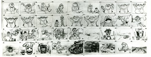
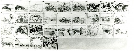
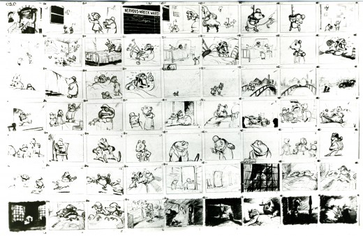
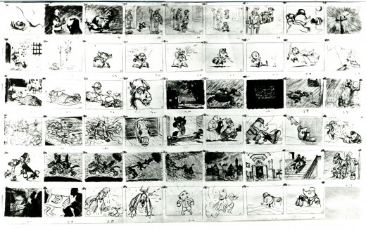
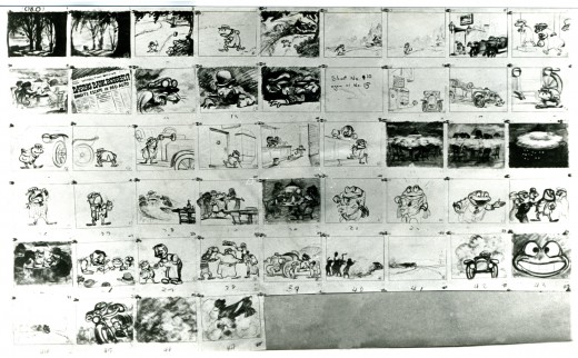
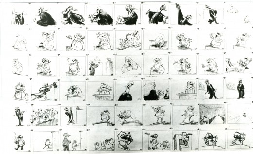
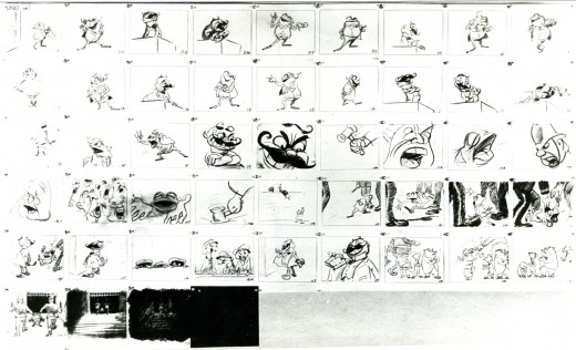
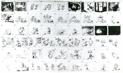
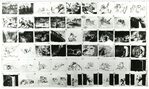
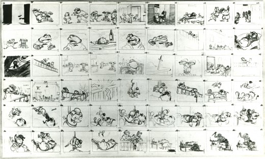
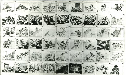
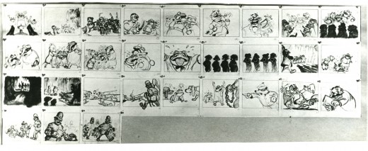
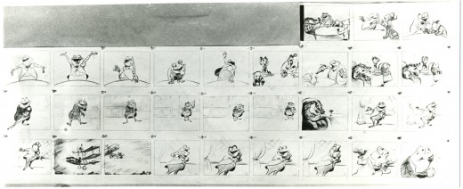
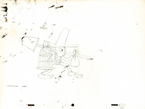
As long as we’re talking about drawing and designing and animating women let me repeat a segment of an older post. It includes storyboard from Disney’s The Adventures of Ichabod and Mr. Toad. Of course, the original of this was The Wind in the Willows by Kenneth Grahame.
My reason for repeating it has more than a touch upon Joanna Quinn’s fine comments. I received a letter from the great Borge Ring who pointed out who the artist was of this storyboard. An excerpt from his letter:
-
hi Michael
Re Give me a Drawing
Daan Jippes who worked on The Prince and the Pauper saw the storyboard of “The Wind in the Willows” and said:
“The story sketches of that opening sequence look exactly like the finished scene. How can they give an animator credit for something that has already been done ?”
The draft said the scenes were animated by Frank Thomas, and I asked Thomas:
“Frank,who drew the storyboard of the sequence?”
“I did – I am not sure I did much else”
greetings
from
Borge 92
PS
You mention Oscar Wilde
He is supposed to have said:
“Sexual gratification is so useful to us humans. Because it enables us to think
of other things too”
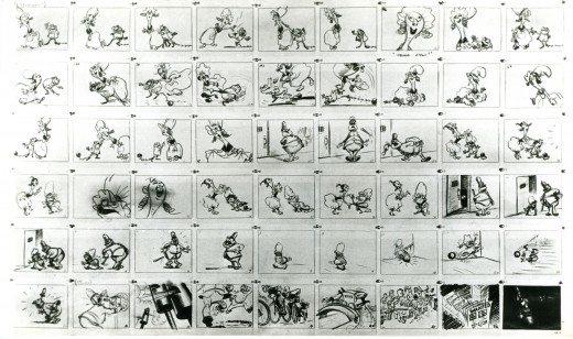
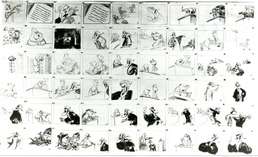
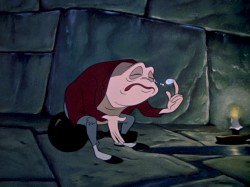
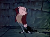
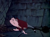
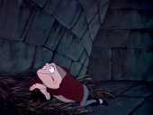
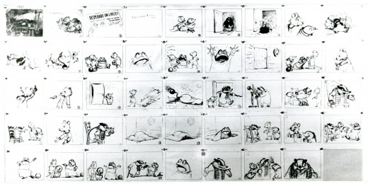
So here, then, is a bit of that storyboard – more from the end rather than the beginning.
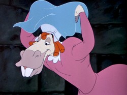
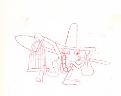
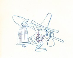
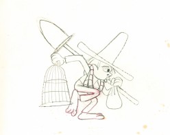
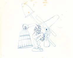
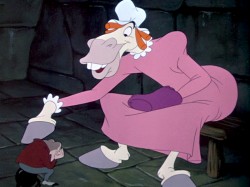
Talented those men were (they could even draw men, a toad and a horse, dressed as women pretending to be women – with very little success.
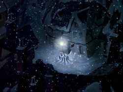
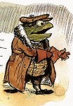 – Probably my favorite children’s book is The Wind In The Willows. There have been many animated adaptations of this book since it became a public domain item, but for years there was only one version, Disney’s Mr Toad half of The Adventures of Ichabod and Mr. Toad. The loudest most raucous parts of Kenneth Grahame’s delicate novel, blared their way onto this animated compilation feature.
We all know that the book was planned as a feature way back when Disney, in the late 30s, was buying up titles of famous children’s books to prevent other competing studios from turning them into animated features. Work began on adapting the book. They never quite broke it as they hoped, and it ultimately became a featurette with its primary focus on the loose cannon, Mr. Toad.
. . . .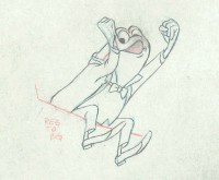 The film, as it exists now, has some positive elements and some fun animation, but the story was always a bit too quiet and British to successfully survive a proper adaptation in the Disney canon.
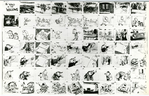
When John Canemaker loaned me his copy of the Pinocchio boards, he also brought The Wind In The Willows (not titled Mr. Toad). There are few captions here, but this obviously is designed for a full-out feature not an abbreviated featurette. The images on his original stats are small, so I’ve blown them up a bit and tried to marginally clean them up.
As suggested by Michael Barrier, this board was probably assembled to produce a preliminary Leika reel. The giveaway is the lack of dialogue and commentary underneath the drawings. The assembly was made to be photographed.
 1
1(Click any image to enlarge.)
Disney’s Mr. Toad first aired on the Disneyland television program on February 2, 1955. You can buy the dvd of Ichabod and Mr. Toad on Amazon among other places.
If you’re interested you can read the entire book of Kenneth Grahame’s work (minus the beautiful Shepherd illustrations) here.
You can buy the book here.
Dave Unwin‘s version is my favorite adaptation in that it retains some of the flavor of the original book and isn’t afraid of being quiet at times.
 7
. .
7
. . 
 . .
. . 
 12
12
Action Analysis &Animation &Disney &Music 11 Sep 2013 02:24 am
Noble Touches
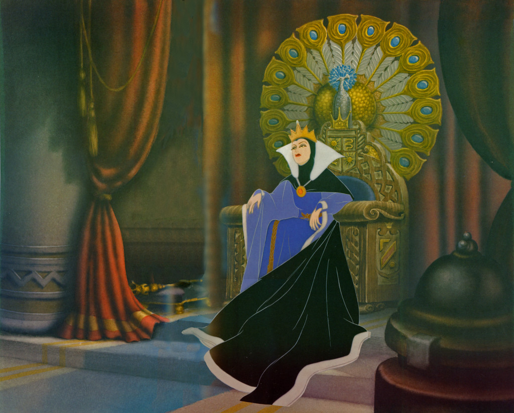
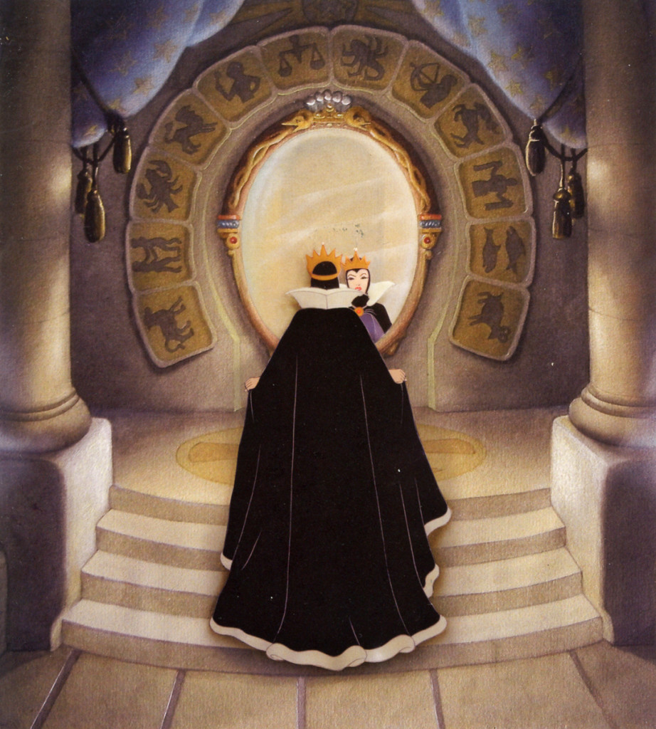
When Maurice Noble first started in animation he went, of course, to Mecca, The Disney Studios, where he made a name for himself. He was a Bg painter there. Two of his more noted pieces included the seat for the Queen. Included in the designs was the signs of the Zodiac. This, of course, was a well know feature for the signs of the Dark Forces. Well known author, John Gardner, himself a specialist in medieval history and Art, included 12 chapters in his novel, Grendel, a retelling of the Beowulf story. It’s a classic edition of the story as told by the monster, Grendel, himself.
Two of the illustrations of the Queen’s chair are pictured below:
 1
1
Action Analysis &Animation &Animation Artifacts &Disney &John Canemaker 21 Aug 2013 04:54 am
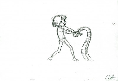
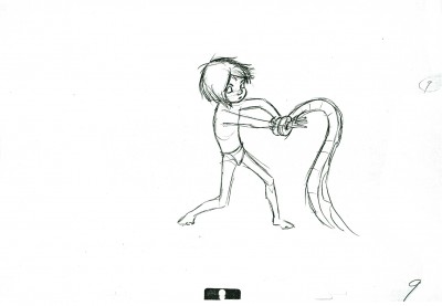
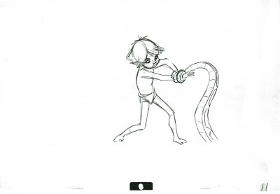
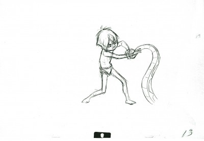
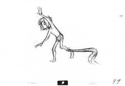
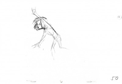
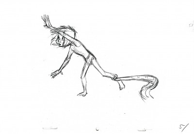
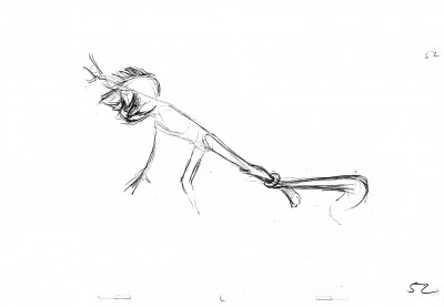
Mowgli & Kaa – repost
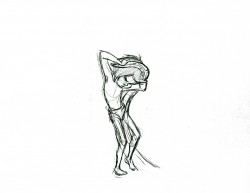
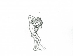
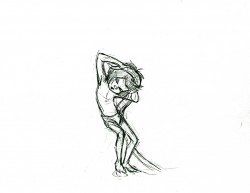
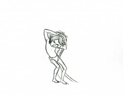
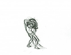
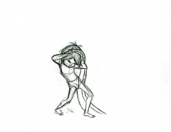
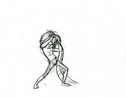
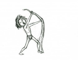
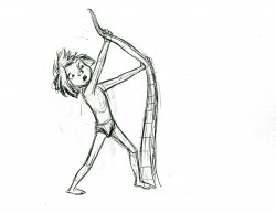
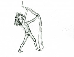
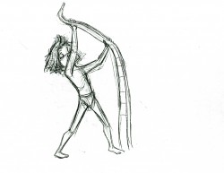
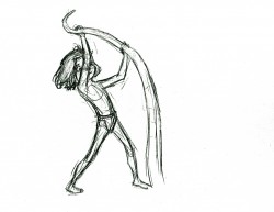
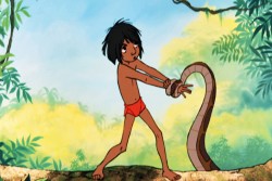
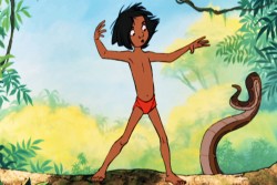
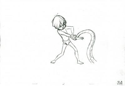
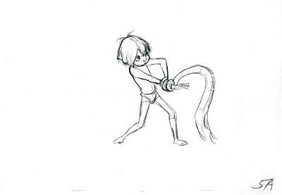
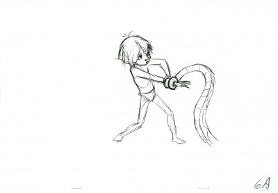
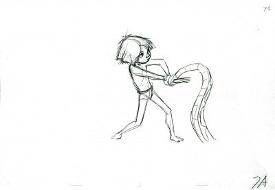
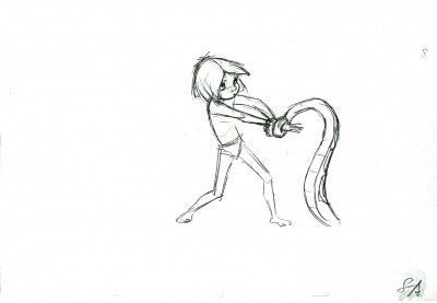
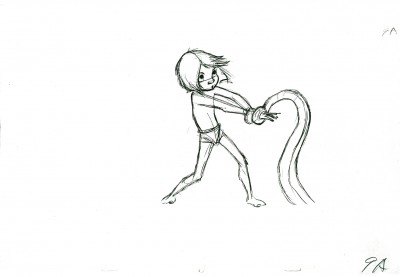
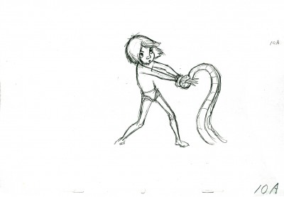
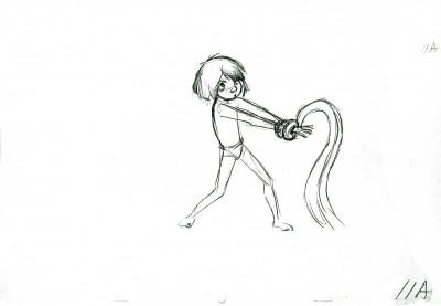
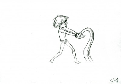
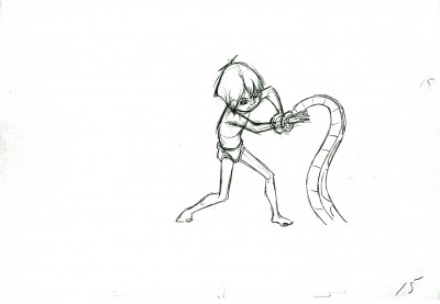
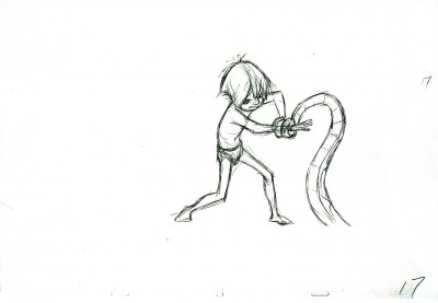
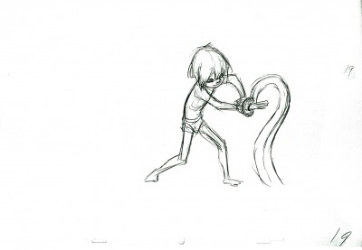
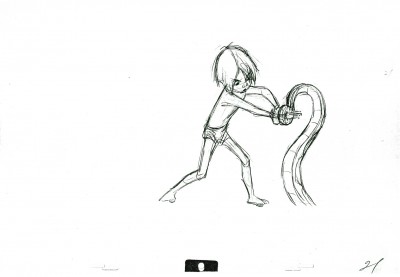
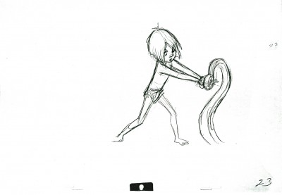
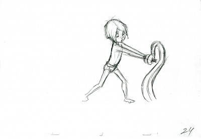
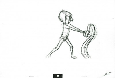
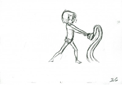
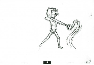
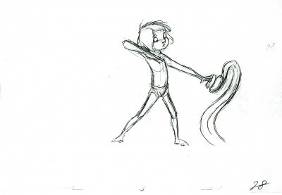
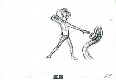
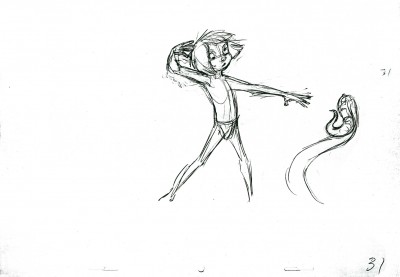
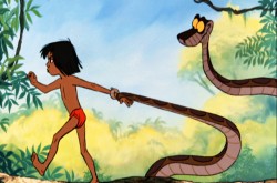
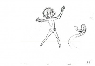
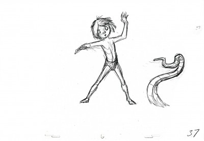
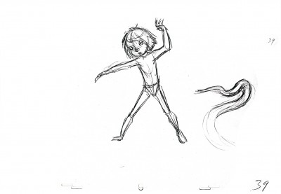
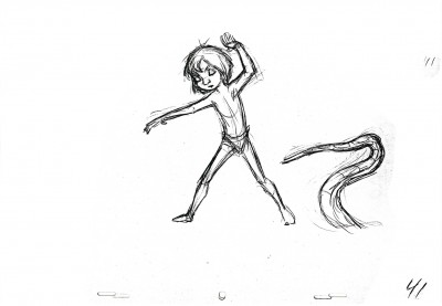
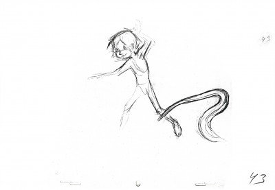
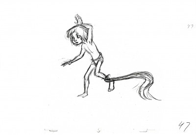
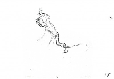
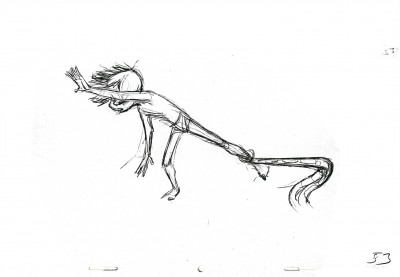
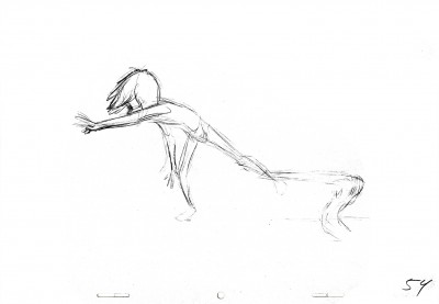
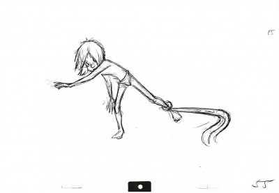
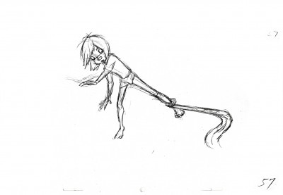
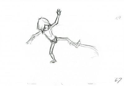
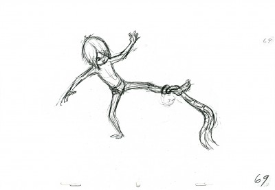
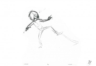
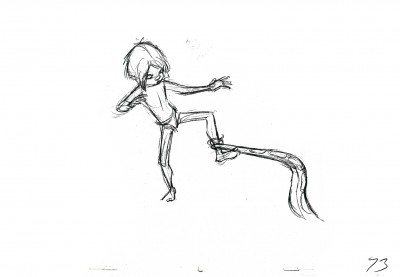
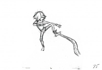
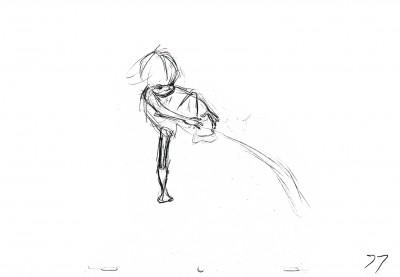
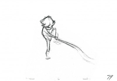
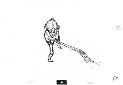
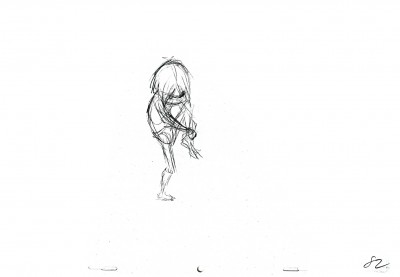
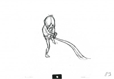
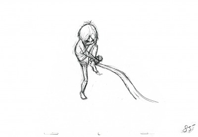
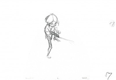
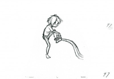
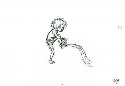
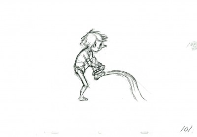
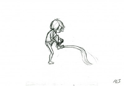
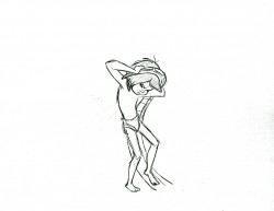
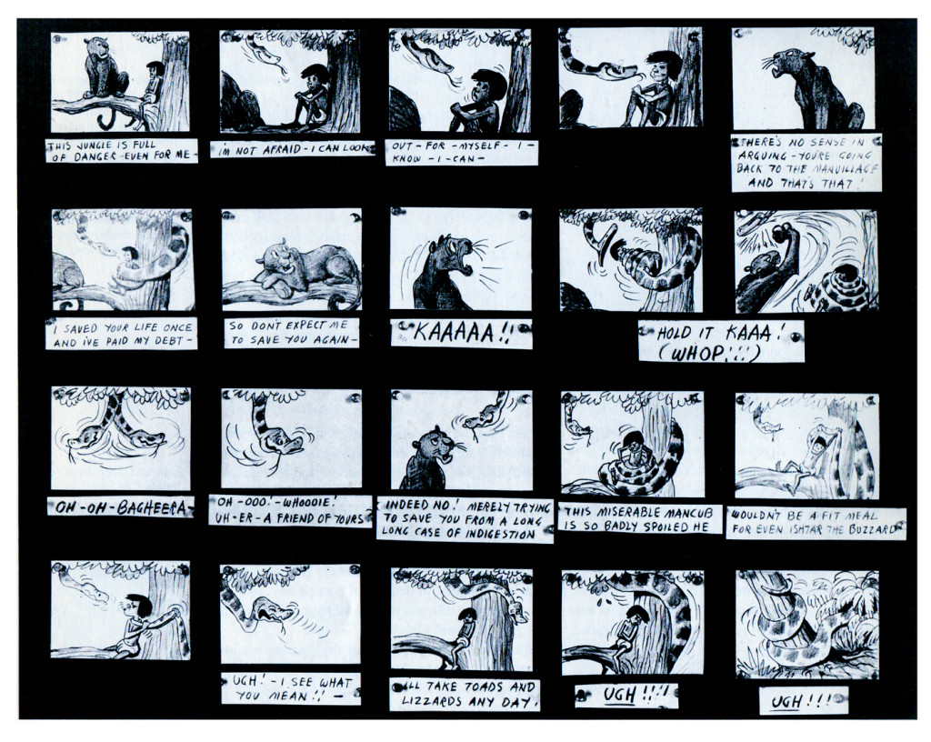
Today I’m going to re-post this scene between Mowgli and Kann. It was loaned to me by John Canemaker and stands out like the gem it is. THere are”75 drawings in all, and I’m going to post this whole right here, thoug I’ve put in two short breaks. Enjoy.
I’m not a fan of this film, however, I can’t deny the animation is mostly excellent and sometimes brilliant. Needless to say, Frank Thomas delivered some beautiful work. This scene is a typical example of his work even though it’s not one that calls attention to itself.
In studying the scene you might pay attention to what is on one’s (1-12) as opposed to what is on two’s (13-27) and figure out why.
 2
2(Click any image to enlarge to full animation paper size.)
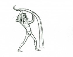 25
25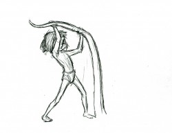 27
27
More to follow next Monday.
Here’s the QT of all the drawings from this scene.
Mowgli & Kaa
Click left side of the black bar to play.
Right side to watch single frame.
Here is another, companion scene with the same two characters. (It comes in the film with only a closeup of Kaa separating the two.)
There are 103 drawings to the scene, so I can’t possibly get them all into the one post. Consequently, I’ll try to do it in three.
Once again, many thanks go to John Canemaker for sharing these on line.
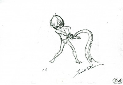 1a
1a(Click any image to enlarge.)
The Following QT movie is of the complete scene.
I love how he shakes his head and mouths the word “No”
just prior to wrenching his hand from Kaa’s grip.
Right side to watch single frame.
- Last week, I posted the first part of a scene Frank Thomas animated for The Jungle Book. This is the second scene offered that involved the boy, Mowgli, and Kaa, the snake.
This scene follows one I posted several months back. (The two come in the film with only a closeup of Kaa separating them.)
The 103 drawings in the scene will have to be broken into three parts, so you can expect the last third next week.
Once again, many thanks go to John Canemaker for allowing me to share these on line.
I begin with the last of the drawings up last week, #33:
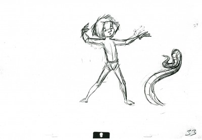 33
33(Click any image to enlarge.)
The Following QT movie is of the complete scene.
Click left side of the black bar to play.
Right side to watch single frame.
Action Analysis &Animation &Animation Artifacts &Commentary &Hubley &repeated posts &walk cycle 02 Aug 2013 04:29 am
Marky’s Walk, cycled
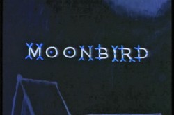 - If I had to choose who was my favorite animator, I’d have a tough time. Equal credit would probably have to go to three different people: Bobe Cannon, Tissa David and Bill Tytla. Jim Tyer and Ed Smith would fall just a smidgen below these three, for me. But there are none like them all, as far as I’m concerned.
I’ve posted a lot of drawings from Tissa and Bill Tytla, but have very few drawings by Bobe Cannon (nor have I seen many published anywhere.)
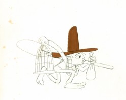
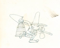
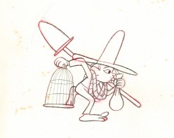
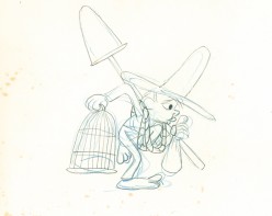
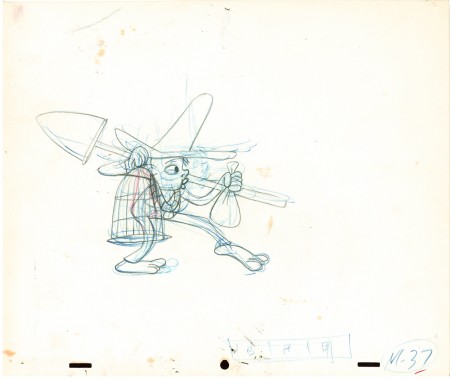
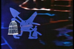 Here is a walk cycle from the beginning of Hubley’s monumental short, Moonbird. The odd numbers are extremes by Cannon, and the inbetweens (even numbers) were done by Ed Smith. Three different sized papers were used for this, and you can view them full sized if you click the thumbnails.
You’ll notice there’s paint all over the drawings. The ink & paint involved tracing the drawing, then using oil paints to cover all of the clear area in black. Some of that paint seeped onto the originals. In one drawing even to coloring the hat accidentally.
 37
37(Click any image to enlarge.) “Marky” walk cycle from Moonbird
On twos at 24FPS
Click left side of the black bar to play.
Right side to watch single frame.
There’s a lot more to this scene including several variants on the walk.
At some future time, I’ll add the other drawings to show off the entire scene.
Action Analysis &Animation &Frame Grabs 29 Jul 2013 11:16 am
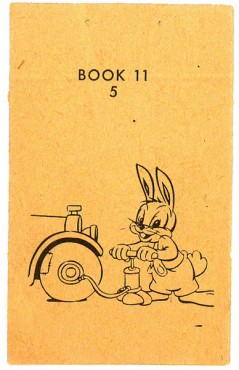
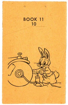
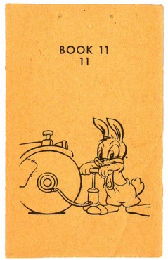
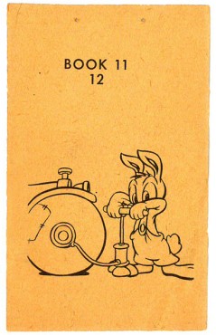
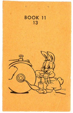
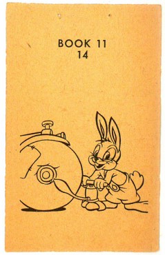
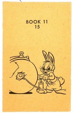
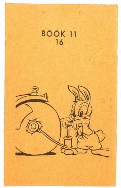
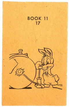
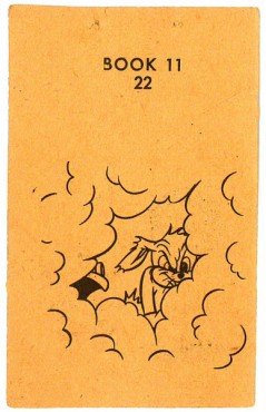
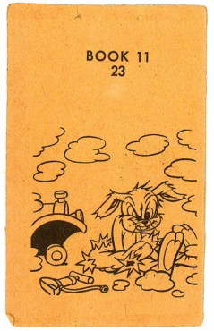
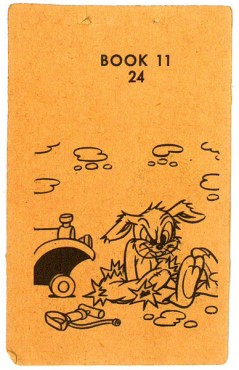
Andy Panda & Oswald Rabbit Flipbooks
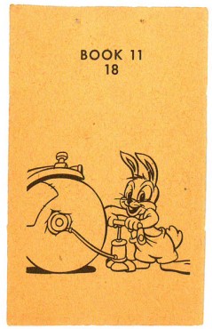
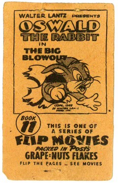
- Imagine you’re a kid in 1949 eating your Grape Nuts Flakes in the morning. You’re about to pour on the milk when you realize you’ve found the Flipbook that was included in the box. Would that start you on your way of wanting to become an animator? Would you just flip it and throw it out?
Back then the Walter Lantz studio had a promotion going where they gave a number of flipbooks free to consumers of the Post cereal.
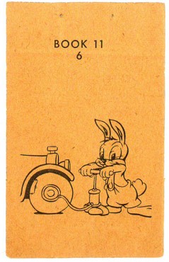
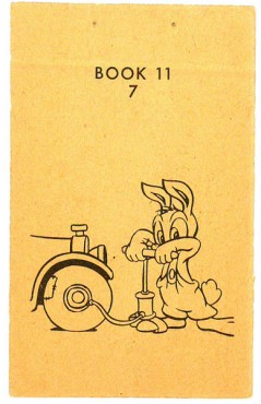
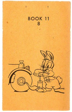
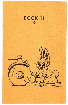
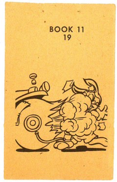
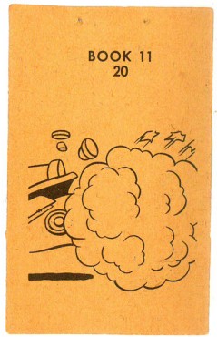
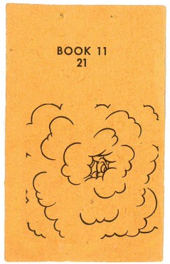
The pages were double-sided. This side features Oswald the Rabbit blowing up his tire. The flip side has Andy Panda. Andy is in full color, whereas Oswald was just line work, so you know which one was still a “star” in 1949.
The registration wasn’t very good on the printed page, and I had to adjust a bit to make it work. The paper it was printed on is newsprint and delicate. The images in the thumbnail are about twice the size of the original.
 1
1 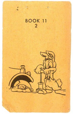
(Click any image to enlarge.)
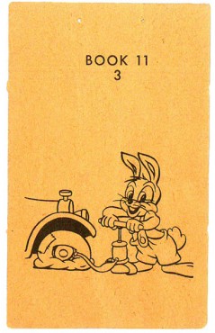 3
3 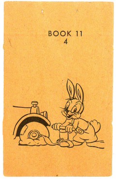 4
4
The following QT movie is exposed on 3′s to make the action work.
Click left side of the black bar to play.Right side to watch single frame.
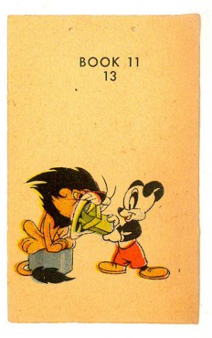
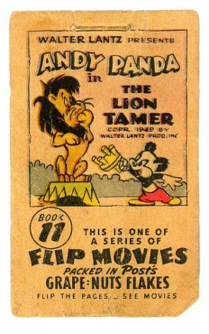
- Then I posted the other side of this flipbook. In 1949, the Walter Lantz studio had a promotion going where they gave a number of flipbooks free to consumers of Grape Nuts Flakes.
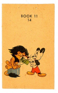
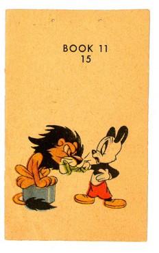
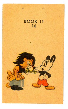
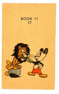
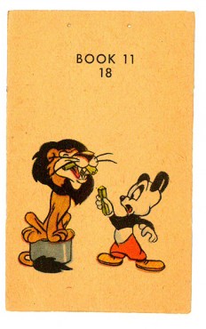
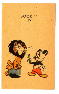
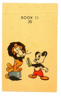
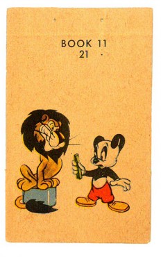
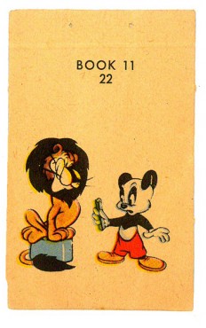
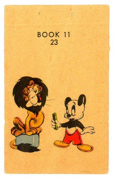
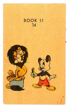
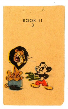
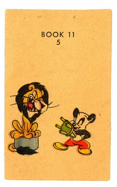
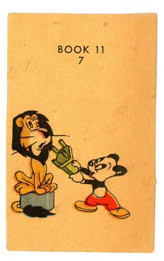
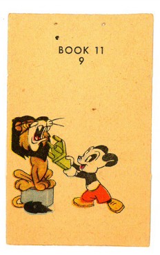
The pages were double-sided. This side features Andy Panda taming a lion. Andy is in full color, whereas the flip side – Oswald – was just line work, so you know which one was still a “star” in 1949. See the Oswald book here.
The registration wasn’t very good on the printed page, and I had to adjust a bit to make it work. The paper it was printed on is newsprint and the color registration is also off. The images in the thumbnail are about twice the size of the original.
 1
1 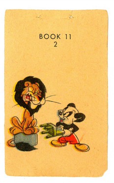 2
2(Click any image to enlarge.)
“>
 3
3 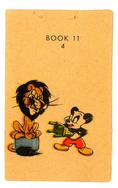 4
4
“>
 5
5 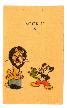 6
6
“>
 7
7 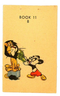 8
8
“>
 9
9  10
10
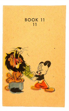 11
11 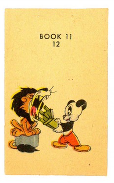 12
12
The drawings of the following QT movie were exposed
on threes to best make the action work.
Right side to watch single frame.
Action Analysis &Animation &Animation Artifacts &Commentary &Disney &Frame Grabs 15 Jul 2013 06:40 am
Mickey’s Service Station Grabs
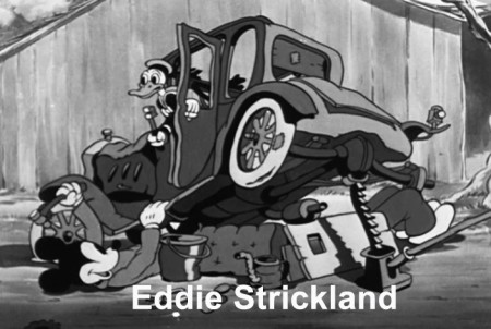
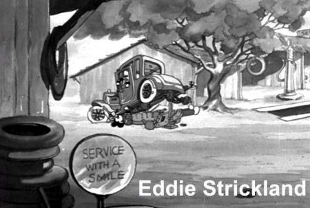
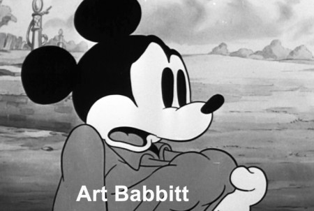
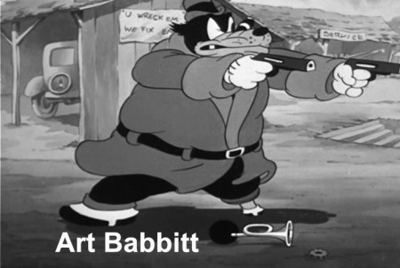
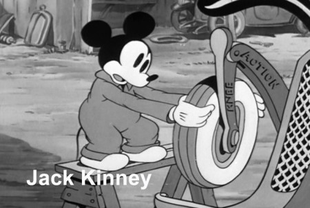
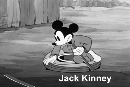
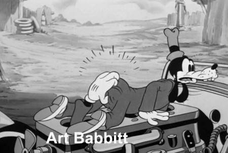
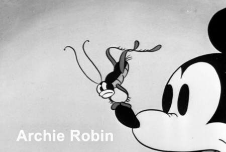
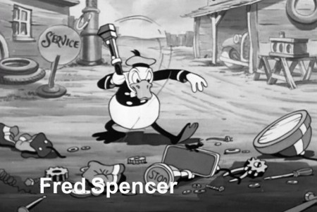
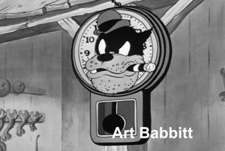
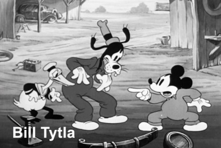
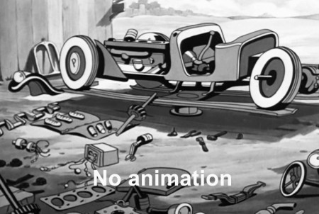
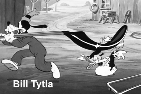
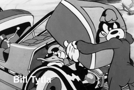
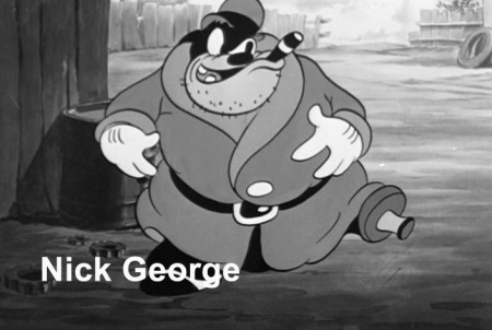
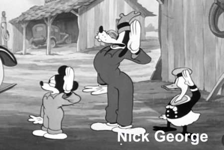
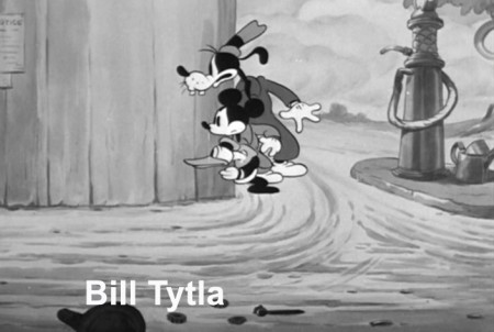
- Having posted sketches from Mickey’s Service Station, the brilliant 1935 short, the last B&W Mickey film, the next thing for me to do, logically, is post frame grabs from the final film – for comparison.
Since Hans Perk has made available the film’s draft on his incredibly resourceful site, AFilmLA, I’ve also added the animators’ names to the frame grabs. What an assortment it is, too. Art Babbitt, Eric Larsen, Bill Tytla, Jack Kinney, Don Towsley, Fred Spencer, Milt Kahl, Ferdinand Hovarth, Archie Robins among others.
Here, then, are the scenes from the film:
 1
1(Click any image to enlarge.)
Action Analysis &Animation &Articles on Animation &Commentary 07 Jul 2013 05:00 am
Two Tier Tyre
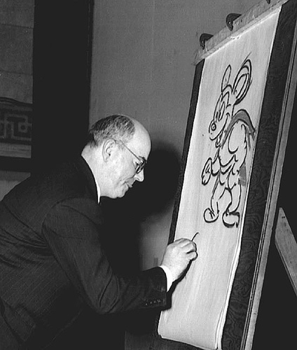 – Somehow always touching in the back corners of the recesses of my mind is the work of Jim Tyer. He’s possibly the most well-known animator in the medium’s short history. The guy has done such eccentric work that it’s impossible to find someone comparable. Even to those who don’t realize they’re mimicking his work, they would be surprised to learn that they’re doing Jim Tyre and not Tex Avery or Bob Clampett and Rod Scribner.
A number of things have been written about Jim Tyer. Interestingly, it’s predominantly the same few people that seem to be writing and usually the same bits are repeated.
Chief among sites that offers bits and comics among their offerings, is Kevin Langley‘s Cartoons Comics and Model Sheets. This blog first caught my attention with plenty of Mr. Tyer’s imaginative drawing. Not quite rough, not quite gesture drawing, and certainly not rendering. The best one could say was Wacko.
You see I’d been an ardent enthusiast of Mr. Tyer’s work for years, and here they were – stills. Plenty of them. So there were lots and lots of links. You can’t really write lots of words when processing Jim Tyer’s material. As a matter of fact, I can only think of one pwerson who did that job and did an impeccable turn of it. Mark Mayerson.
As a matter of fact, you might want to stop reading here and go to Mark’s comments, now. He had two key things to say and no one else has had much more to say to me. It’s a paper he wrote in 1990 and with it he had more to say about Jim Tyer‘s work than had anyone else to that date.
I meant for this piece to be much more exhaustive, but the problems I’m having with my internet are annoying. Unfinished pieces have been thrown up as complete. This is one of them, the Provenson piece (though that’s much more finished) made it to post, and others as well. I may quit writing at all until Verizon finally comes to my door to correct my phone service. (I still don’t have an operating phone number after three weeks and my internet is intermittently up and down based on its own whim.)
I apologize for the sloppiness of the whole thing.
Action Analysis &Animation &Animation Artifacts &Commentary &Fleischer &repeated posts 18 Jun 2013 07:41 am
Popeye and Olive Cycle – repost
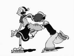
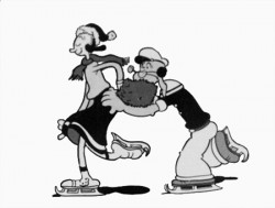
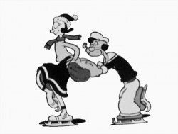
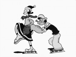
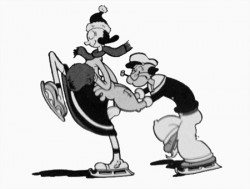
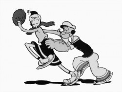
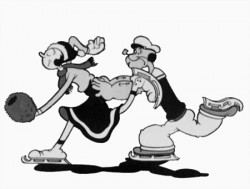
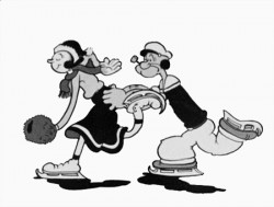
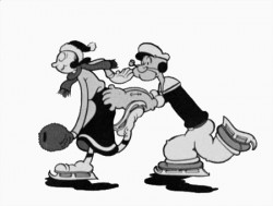
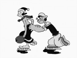
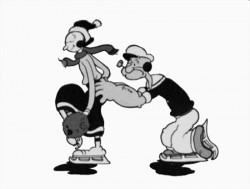
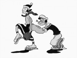
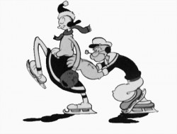
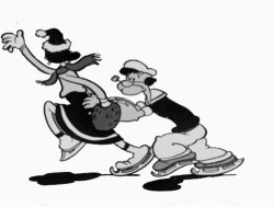
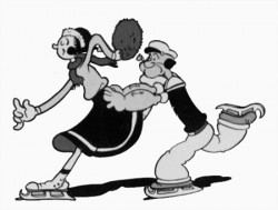
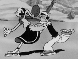 – Here’s a good example of something you won’t see animated in cgi. This is an ice skating cycle out of a Popeye cartoon, Seasin’s Greetinks!. It’s, of course, on the Popeye dvd, and is animated by Roland Crandall and Seymour Kneitel.
These Fleischer cartoons are so original in their jokes that there’s always a surprise or ten in every scene. The twists and turns are designed only to get laughs; I can give you a dozen examples from this short alone, but I’ll just recommend you watch the film.
It’s not just the stories that take odd spins, it’s the animation as well. There are bits that move in their own idiosyncratic way that are designed purely for laughs. Eccentric movements that would rarely show up in a Disney film dominate these Fleischer shorts.
Check out this cycle. Every eighth drawing is completely off the book. It gives the cycle a hilarious turn and completely dominates the move. It’s probably not the best way to build 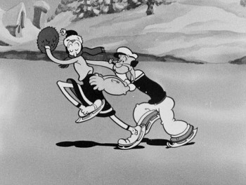 character (unless, perhaps, only one character moves like this), but it sure makes for some funny animation.
The thing about these Fleischer films is that it moves this way all the time. There’s always something about to take you for an odd turn, and while you’re looking for the big move, you’re just buying these small ones. The effect is cumulative, and the animation in these Fleischer films is just plain wacky.
A cgi animator doesn’t look for the odd twist in every frame. They can, but it wouldn’t make sense to be doing it that way, especially when the goal is to make the animation fluid in the final. The animation is too based on real life, as the computer sees it, and the individual frames don’t exist in the same way they do in 2D paper animation. There’s more risk in the 2D mode, but the reward can also be more ingenious and gratifying.
But what do I know? I don’t animate with cgi, and I’m just making a supposition based on what I’ve seen so far. Everything’s possible, but it sure doesn’t seem probable from my seat.
Having said that, let me also say that there aren’t too many animators doing 2D animation like this anymore. Maybe that’s the complaint I really have. Invention and daring in our medium seems to be a thing of the past.
 1
1 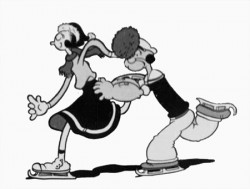 2
2
(Click any image to enlarge.)
Action Analysis &Animation &Articles on Animation &Books &Commentary &Disney &Illustration &Richard Williams &Rowland B. Wilson &SpornFilms &Story & Storyboards &Tissa David 10 Jun 2013 03:31 am
Illusions – 3
I’ve written two posts about Frank Thomas and Ollie Johnston‘s book, The Illusion of Life the last couple of weeks. I came to the book only recently and realizing that I’d never really read the book, I thought it was time. So in doing so, I’ve found that I have a lot to write about. The book has come to be accepted almost as gospel, and I decided to give my thoughts.
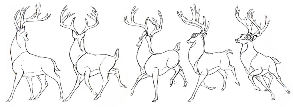
There were two major complaints I’ve had with what I’ve read in their book so far, and I spent quite a bit of time reviewing those.
- First out of the box, I was stunned to read that these two of Disney’s “nine old men” said that they’d originally believed that each prime animator should control one, maybe two characters in the film. Then, later in life they decided that an animator should do an entire scene with all of the characters within it. This is not what I’d seen the two (or the nine) do in actual practice. post 1
Secondly, they argue for animating in a rough format, and they give solid reasons for this. As a matter of fact, it was Disney, himself, in the Thirties who demanded the animators work rough and solid assistants who could draw well back them up. Then much later in the book the two author/animators suggest that it’s better for an animator to work as clean as possible with assistants just doing touch-up. This helped out the Xerox process, but didn’t necessarily help for good animation. post 2
The book starts out sounding like it’s going to be a history of Disney animation, but then starts getting into the rules of animation (squash and stretch, overlapping action and anticipation and all those other goodies) exploiting Disney animation art in demonstration. Soon the book moved into storytelling and how to try to keep the material fresh and interesting. It all becomes a bit obvious, but you keep hoping that some great secret will be revealed by the two masterful oldsters.
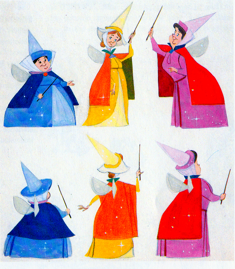 They do go into depth about how to develop characters when making animated films. They offer lots of examples from Orville, the albatross in The Rescuers to the three fairies in Sleeping Beauty, but their greatest attention goes to Baloo the Bear in The Jungle Book. They were having a hard time with this guy; they had been trying to do an Ed Wynn type character, until Walt Disney, himself, suggested Phil Harris. Once they auditioned Harris, they knew they were on the right track, and the character kept grabbing more screen time and grew ever larger. In the end, audiences just loved him.
Personally, I’ve always hated Phil Harris’ performance in this film. What was it doing in Rudyard Kipling’s book? When I was a kid, Harris and Louis Prima were the perfect examples of my father’s entertainers. He loved these guys and spent a lot of time in front of the family TV watching the Dinah Shore Show______Tom Oreb designs for Sleeping Beauty.
and other such entertaining Variety Shows with
lots of little 50′s big-band jazz-type acts. I hated it; this was my parent’s kind of music and humor and had nothing to do with me. I was the kid who paid his quarter to see the Walt Disney movies (that was the children’s price of admission in 1959.)
In their book they say they knew he was perfect because generations of kids later (who have no idea who Phil Harris was) still take joy from Baloo. What they forgot is what I knew all along. This was The Jungle Book. If they had been truly creative, they would have developed a character in line with Kipling’s material that would have been an original, not an impersonation of Doobey Doobey Doo, Phil Harris. The same is true of Louis Prima as a monkey. (There was a time when Disney said that they should never animate monkeys because monkeys are funny on their own, in real life. Animation wouldn’t make them funnier.) Sebastian Cabot, as Bagheera, works as does George Sanders as Shere Khan.
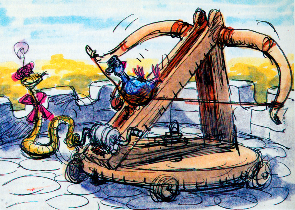
- Right: A discarded sequence from Robin Hood showed a messenger pigeon so fat and heavy he had to be shot into the air. This gave the animators the beginnings of The Albatross Air Lines in The Rescuers.
Phil Harris was so successful, they dragged him into Robin Hood as well. Robin Hood. The very same character from The Jungle Book is now Little John! All those cowboy voices in Robin Hood don’t work either, especially when you mix them up with Brits like Peter Ustinov and Brian Bedford. When these two thespians work against Pat Buttram, Andy Devine and George Lindsey, it’s one thing. Throw in a Phil Harris, and you have something else again. Where are we, the audience, supposed to be? Is it “Merry Ol’ England”? Or is it the lazy take on character development by a few senior animators who have taken license to jump away from the story writers for the sake of easy characters of the generation they’re familiar with. Robin Hood is a mess of a story – even though it’s a solid original they’re working from, and I find it hard to take written advice from these fine old animation pros who take an easy way out for the sake of their animation; shape shifting classic tales to fit their wrinkles.
At least, that’s how I see it – saw it. And perhaps that’s why it’s taken me so long to read this book. I felt (at the age of 14 when these films came out) that the Disney factory had turned into something other than the people who’d made Snow White and Bambi and Lady and the Tramp.
They had, in fact, become the nine old men.
The Jungle Book was the last film Bill Peet worked on. He left
before the film was done. He’d had a long, contentious relationship
with Disney. He never felt he’d gotten the respect he deserved.
They were incredibly talented animators, and they certainly knew how to do their jobs. The animation, itself, was first rate (sometimes even brilliant as Shere Khan demonstrates), but try comparing the stories to earlier features. Even Peter Pan and Cinderella are marvelously developed. Artists like Bill Peet and Vance Gerry knew how to do their jobs, and they did them well. When Peet quit the studio, because he felt disrespected, Disney’s solid story development walked out the door.
The animators were taking the easy route rather than properly developing their stories. The stories had lost all dynamic tension and had become back-room yarns. Good enough, but not good.
Today was Nik Ranieri‘s last day at Disney’s studio. He’s definitive proof, in the eyes of Disney, that 2D animation is dead as an art form. This is the end result of some of the changes Thomas and Johnston suggest in their book. The medium took a hit back then; it just took this long for the suits to catch up. Good luck to Nik and the other Disney artists who no longer work steadily in what is still a vitally strong medium.
Action Analysis &Animation &Books &Commentary &Disney 20 May 2013 05:54 am
Illusions – of Life
I started discussing some of the thoughts put forward in The Illusion of Life, the book by Frank Thomas and Ollie Johnston. I had some major problems with some of the discrepancies in that book. Here’s the second, a continuation of that post.
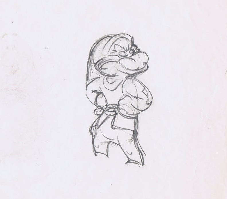 It cannot be doubted that without the speedy roughs, there would never have been the brilliance of Tytla‘s best work or Ferguson’s great comic animation.
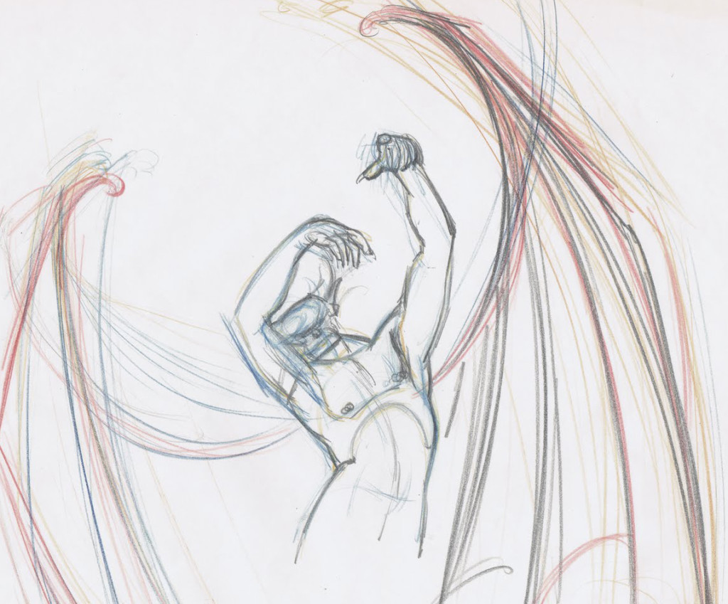
- On page 39 of the book, we read, “Walt introduced two procedures that enabled the animators to begin improving. First, they could freely shoot tests of their drawings and quickly see film of what they had drawn, and, second, they each had an assistant learning the business who was expected to finish off the detail in each drawing. Walt was quick to recognize that there was more vitality and imagination and strength in scenes animated in a rough fashion, and he asked all animators to work more loosely. The assistant would ‘clean up’ these drawings that looked so sloppy, refining
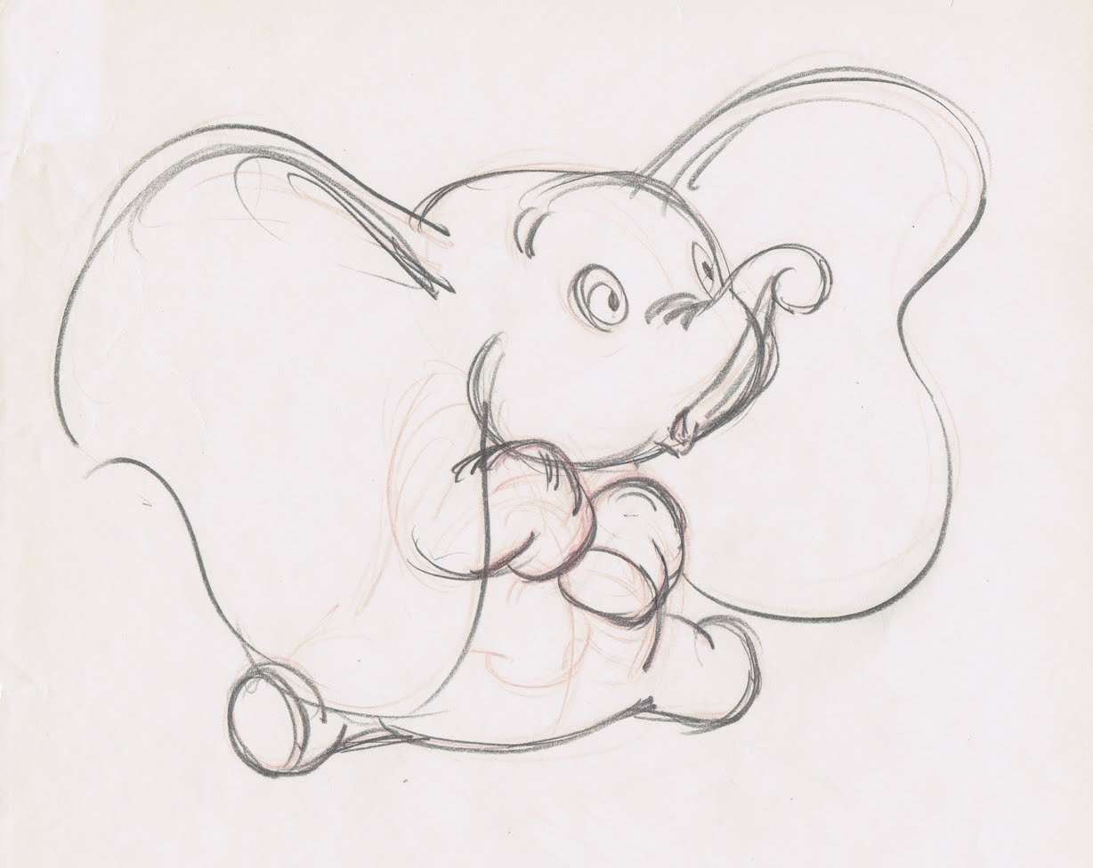 them to a single line that could be traced by the inkers onto celluloid. The assistants became known as ‘clean-up men,’ and the animators developed one innovation after the other, achieving effects on the screen that no one had thought possible. In some cases, the drawings were so rough it was difficult to find any cartoon figure inside the tangled swirl of lines, and the men who made a duck or a dog out of smudges and scratches had to have a very special type of knowledge.
Shooting tests of scenes while they were still in the rough enabled the animators to check what they had done before showing it to anyone. Any part that was way off could be corrected quickly and
 shot again. This encouraged experimentation, exploration, and imagination, quickly promoting a closer bond among the animators.
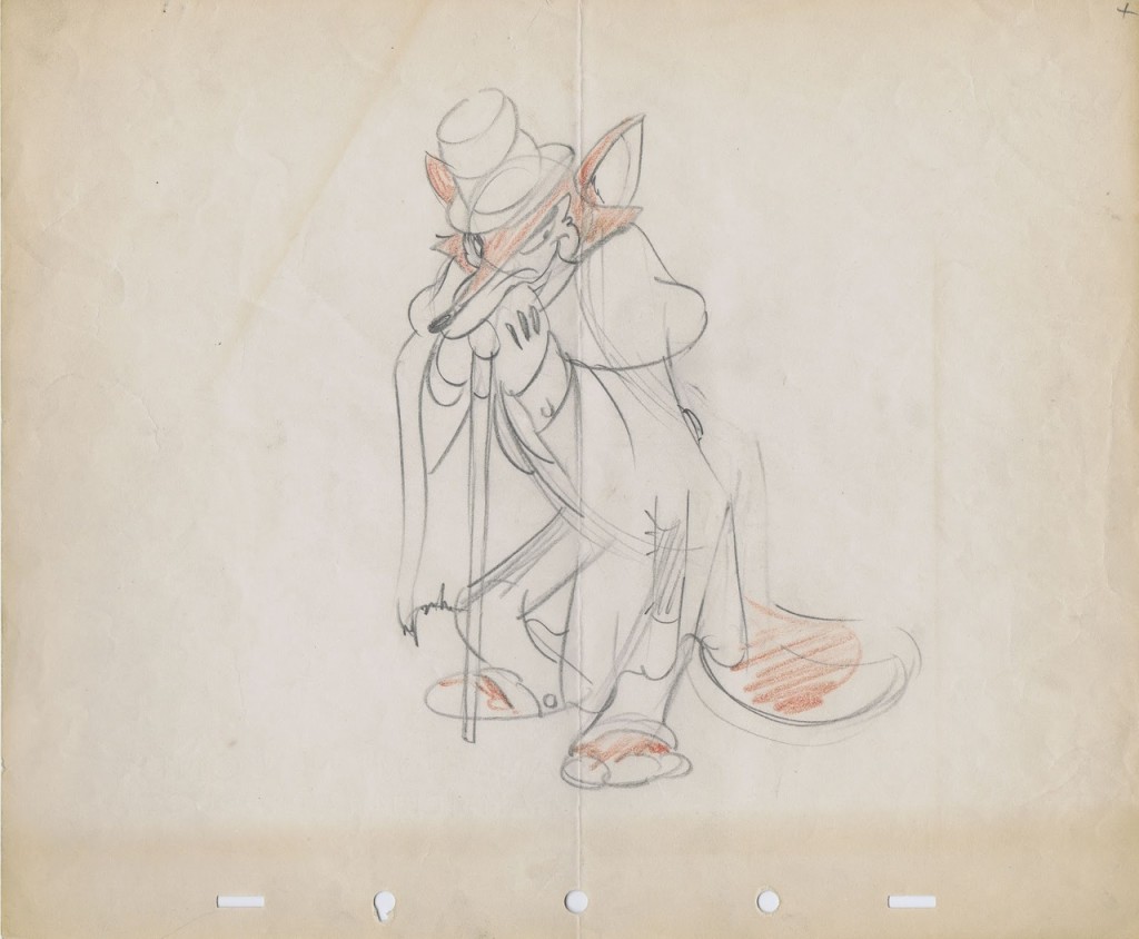
- Yet on page 229 the authors turn to side with management when they suggest that “. . . a new procedure called ‘Touch-up’ was instigated. It asked that the animator draw slowly and carefully enough so that the assistant need only touch up the drawings here and there to make them ready for the Ink and Paint Department. By this time all of our animators had become more skillful and were able to adjust to the new idea without noticeable damage to the product. Top quality clean up work is needed on only a handful of scenes in any sequence, and a great variety_____________Three Tytla ruffs
of shortcuts can be used on the balance
to make them acceptable.”
 In short, this means that the older nine men and some of the other more seasoned veterans could work clean because they were already brilliant at the animation thing. Whereas Walt had demanded that animators, in the 1930s, work rough so as to keep the animation as loose and free and alive as possible.
It also veered toward Milt Kahl’s pleasure at seeing hos own lines used in the newly developed Xerox outline in the final ink & paint. If the assistants would indiscriminately erase only some of the animators’ lines leaving many other key lines (including, at times, construction lines for the face and body parts). Kahl’s ego wanting to see his own beautiful line meant superseding color inking – as had been done in the past._______A relatively clean drawing by Norm Ferguson
Using this new procedure would mean a need for fewer clean-up artists who could work faster and with fewer problems, thus speeding up the footage rates. It also depended on the animators, such as Thomas and Johnston who worked fast enough, that the footage rates were now closer to what they could turn out.
One wonders if this new found speed would also cut into the imagination of the scenes these men animated. (By they way, I use the term “men” because Johnston and Thomas do not once in this book consider the possibility of a female animator. It’s always”men” or “he” or “him”. Old prejudices die hard; though I suspect the two had no problem with the idea of a female animator. In fact they always bowed low in front of Tissa and her abilities. And I’m certain they were not patronizing her in any way.
One wonders if a chink in the armor hadn’t developed then and there in the animation production. Younger people would do all they could to work clean, thus handicaping the animation they turned out.
As a long-time assistant, I know that my animation has been tight to the extreme, annd more than once Jack Shnerk advised me to start working rough when I animated. However, as management (I am the boss of my own company and controller of my own films), I sought to turn out the largest output and eliminated any assistant or inbetween working on my material. I sacrificed good animation for speed and production. It has not only hurt my work but my films, and I know it.

