Category Archivecommercial animation
commercial animation &Layout & Design &Models 04 Jul 2012 05:25 am
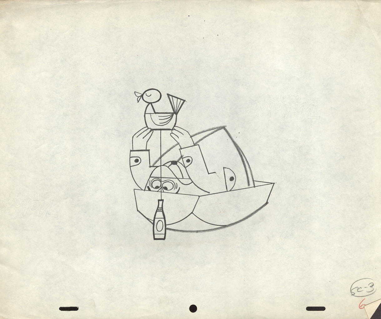
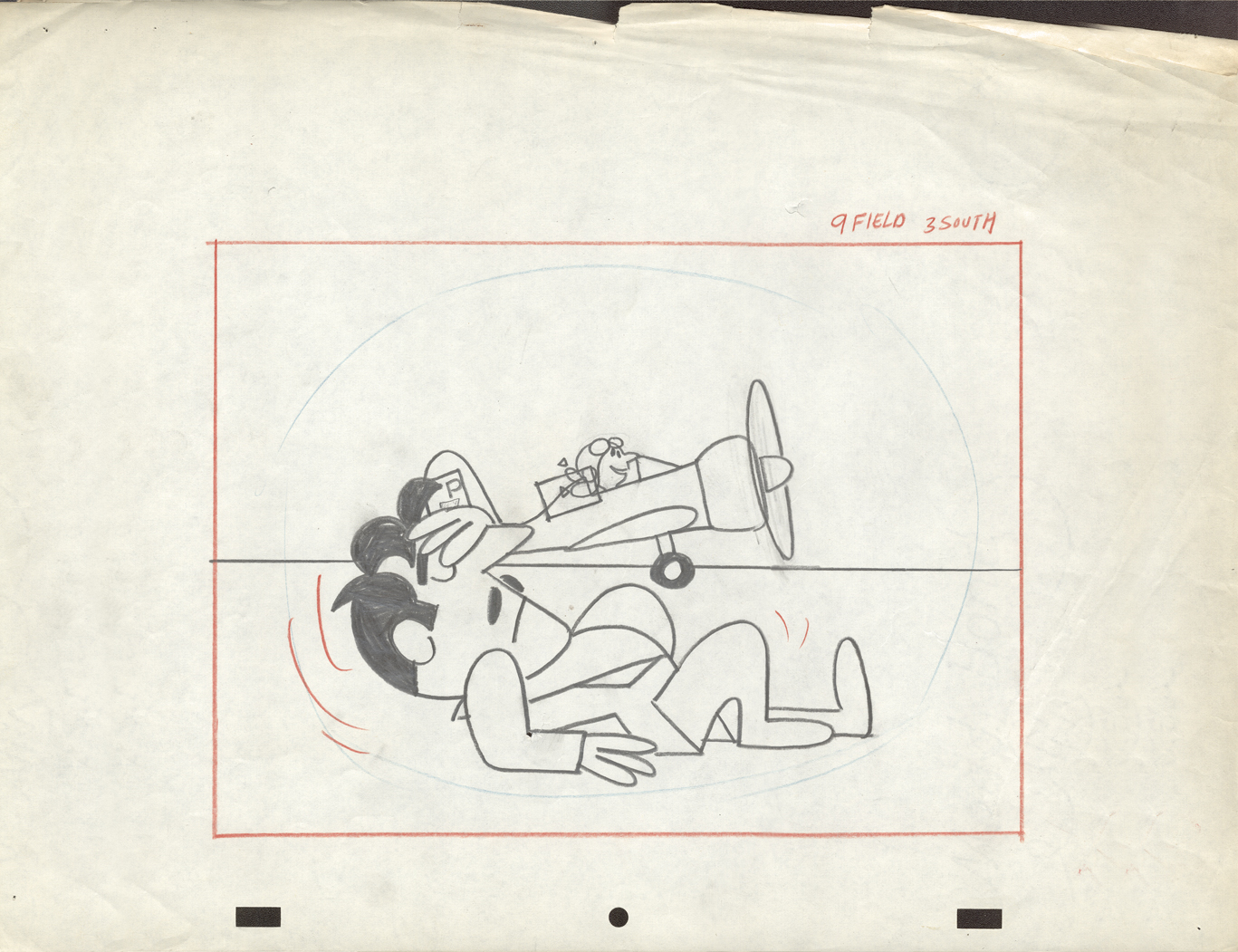
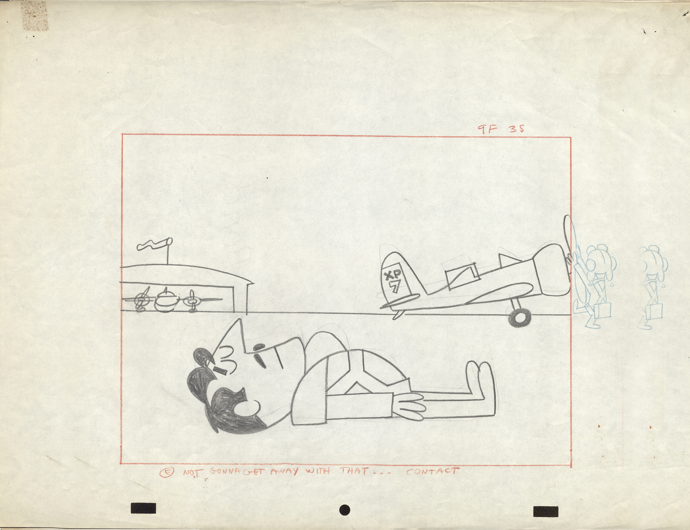
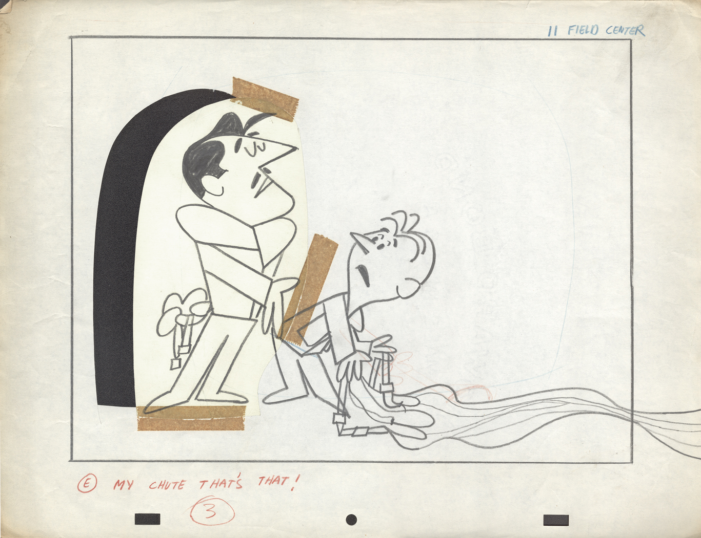
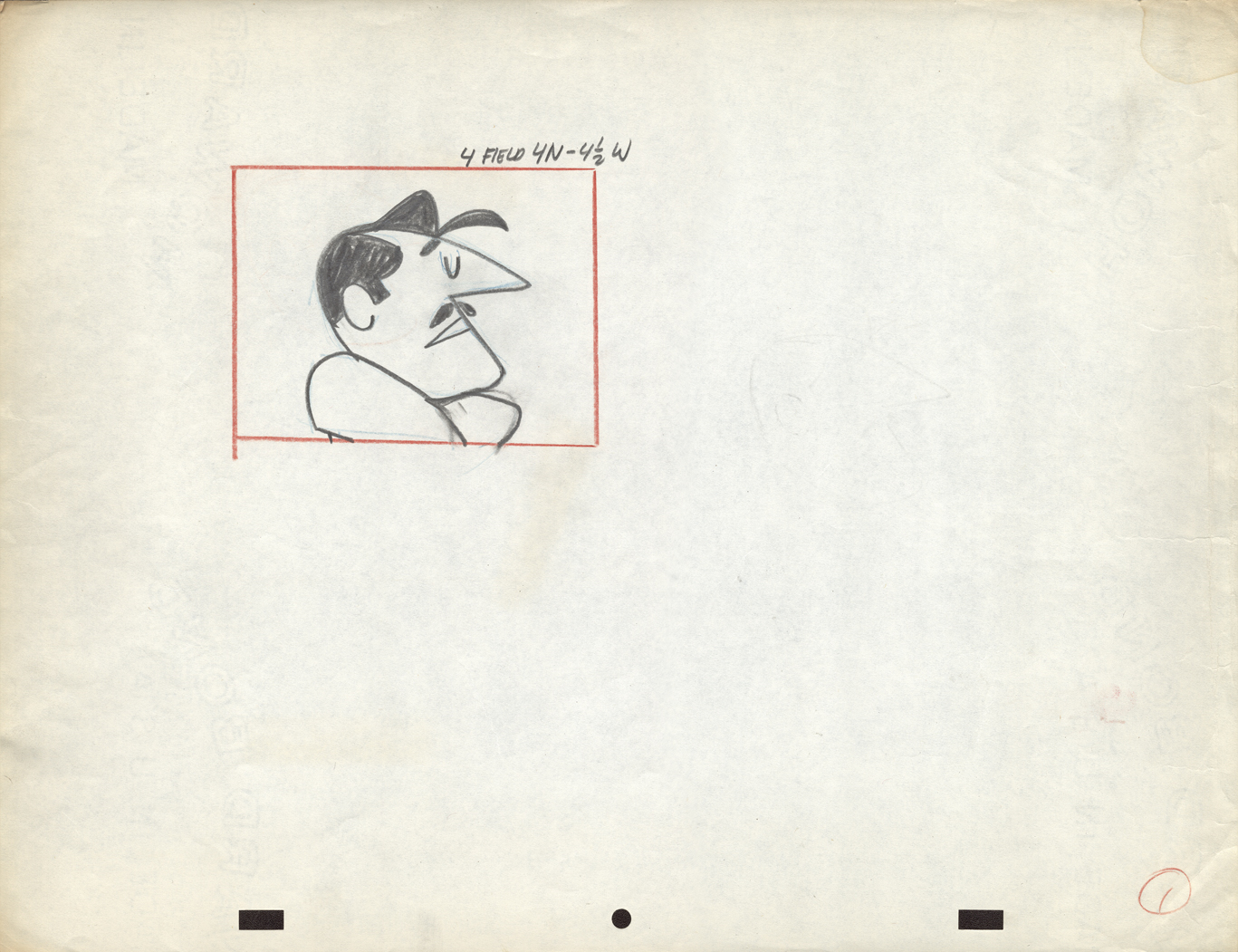
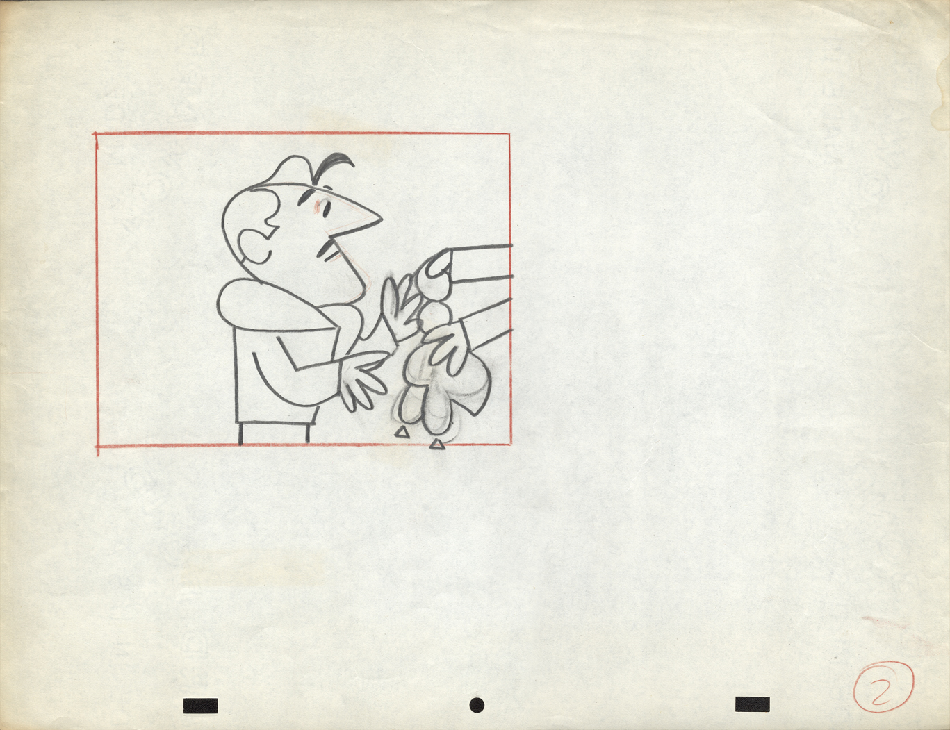
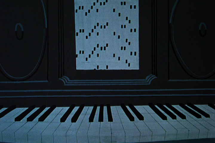
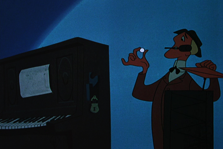
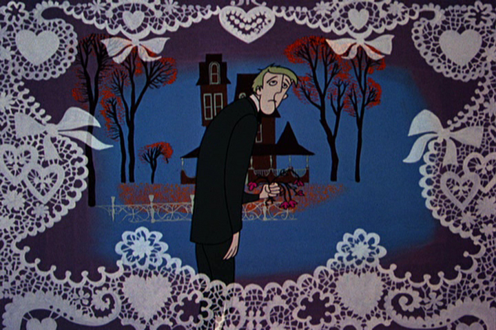
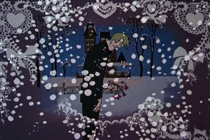
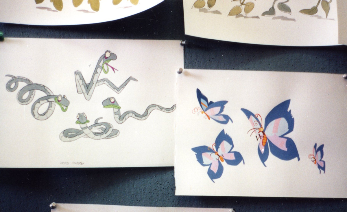
More Commercials from UPA
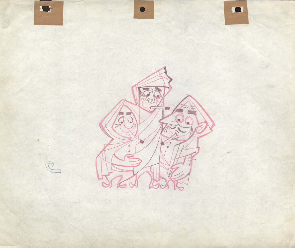
- Last week I posted a number of drawings from spots which Vince Cafarelli had worked on and saved as a sample of his different projects over the years. Unfortunately, there’s no guide to tell us what studio they were done in or who the sponsor was. I’ve assumed (maybe mistakenly) that the spots using the Signal Corps pegs came from UPA. Those done with Acme pegs (1,2,3,5) may have come from Gifford Animation or TV Cartoons.
I have a large number of other such drawings and will continue the post of these, despite the lack of information behind their history. If anyone can identify any of these, please tell us in the comments section, and I’ll add it to the post.
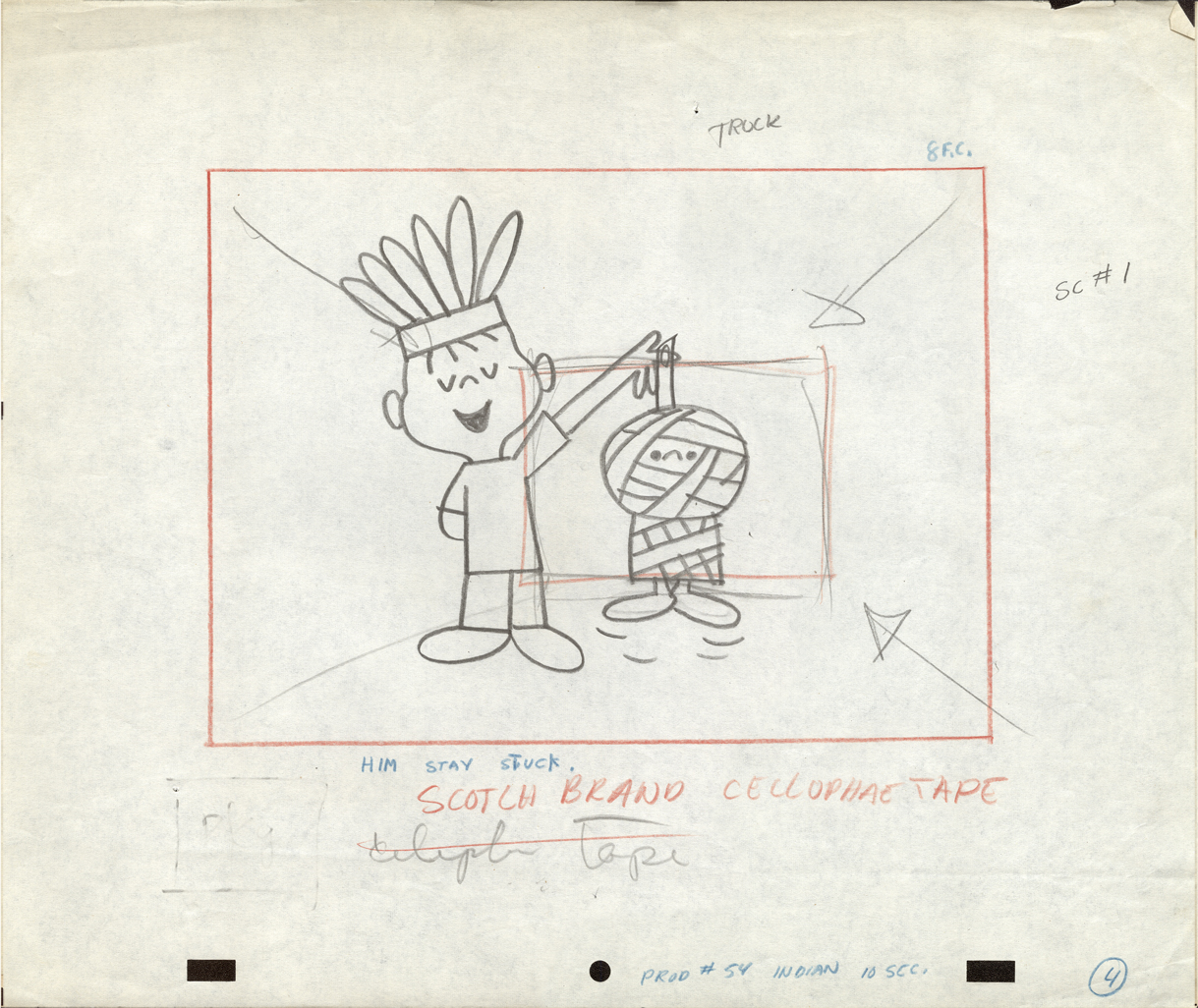
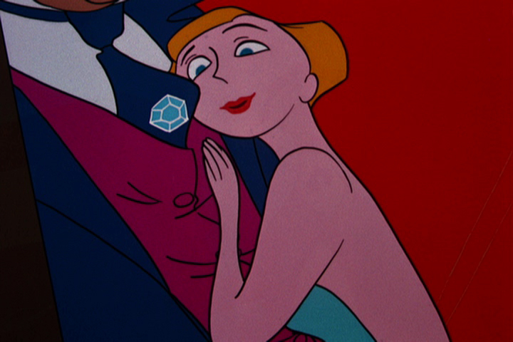
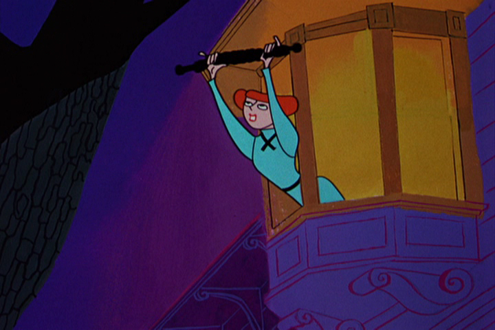
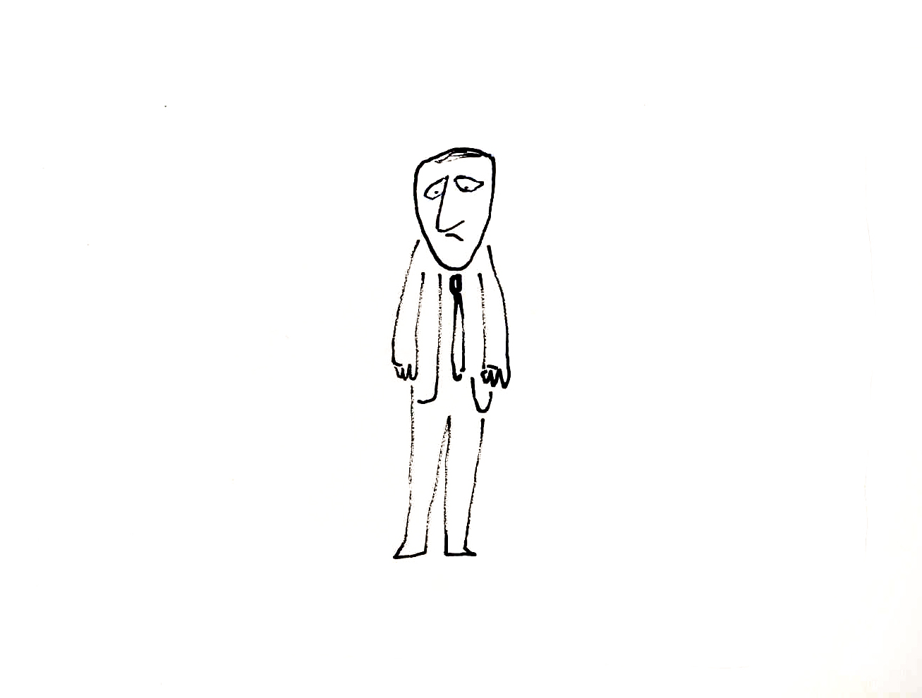
 1
1Some of these drawings & designs are undeniably brilliant.
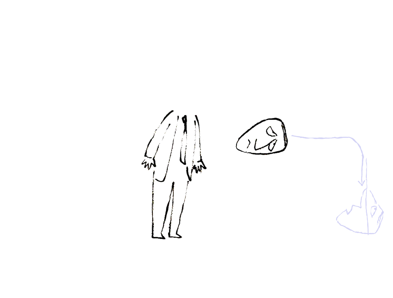
 2
2
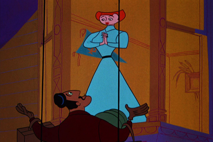
 3
3
This is just an absolutely great drawing.
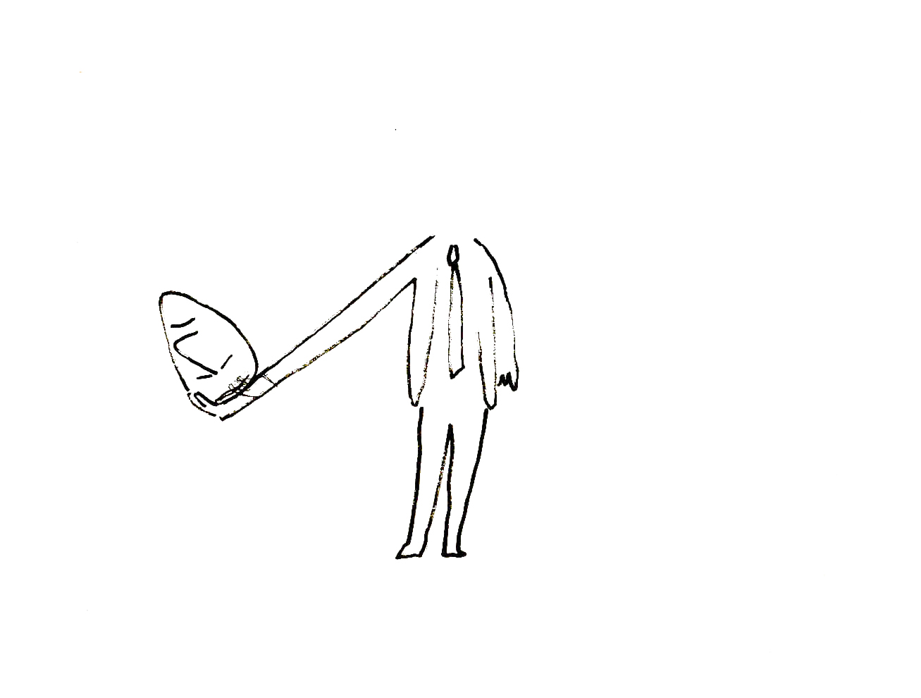
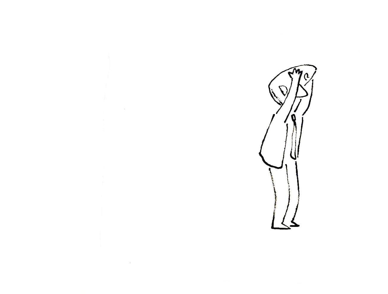
 4
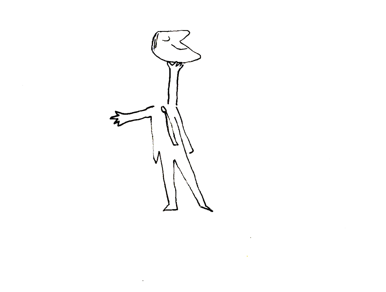
4
 5
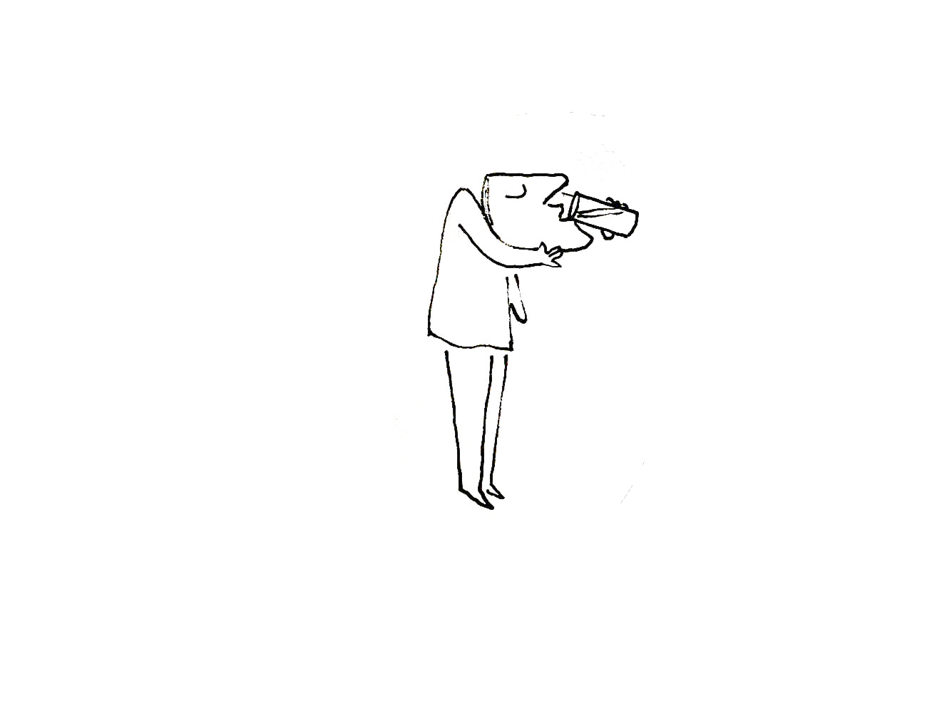
5
 6
6
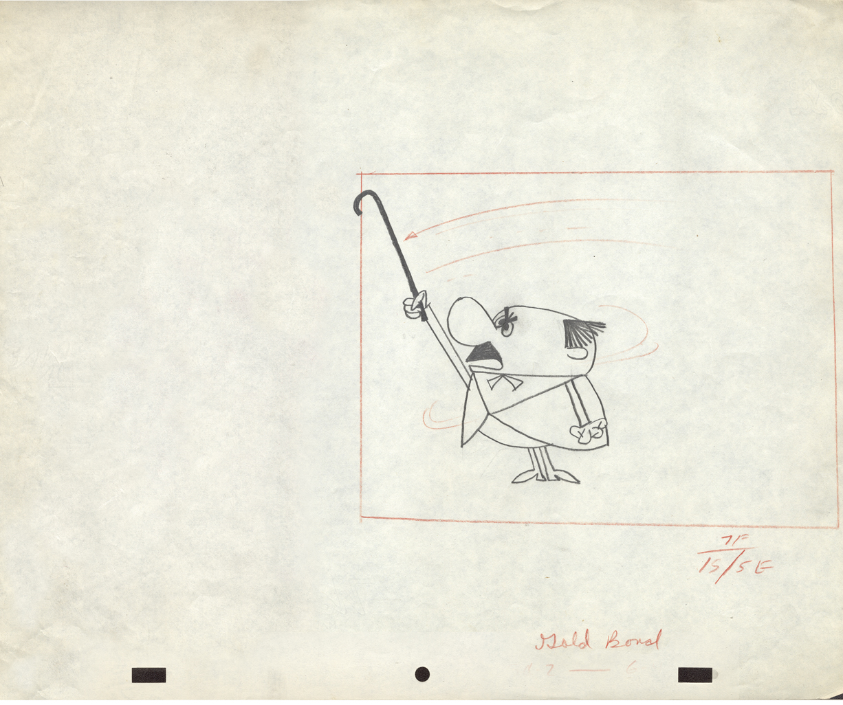
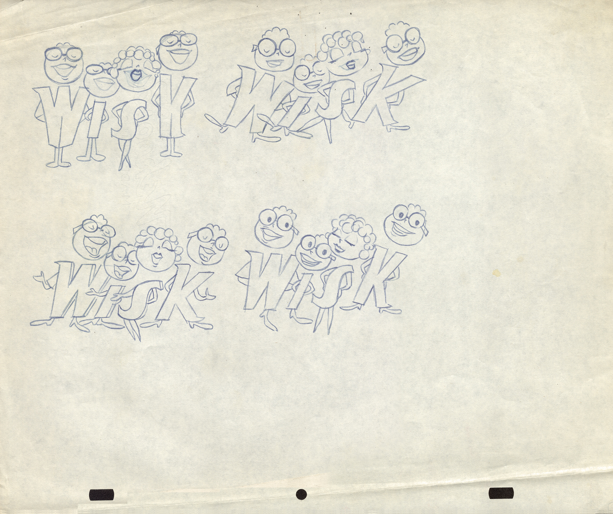
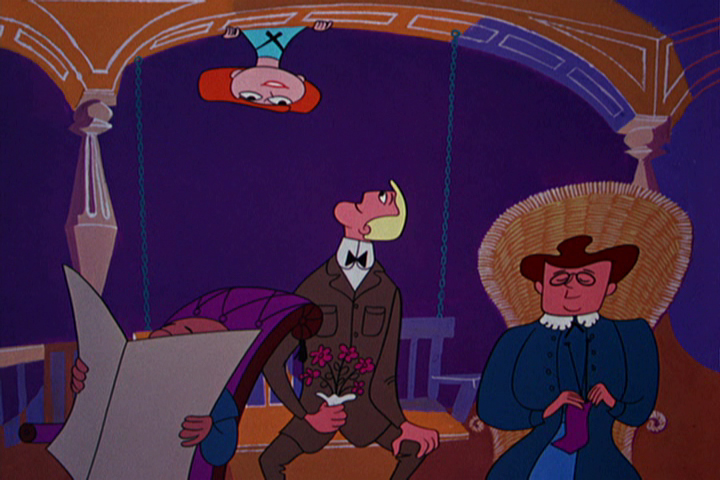
This drawing, #6, and the following seven layouts are from the same spot.
Interesting characters, but I have no idea what they’re selling.
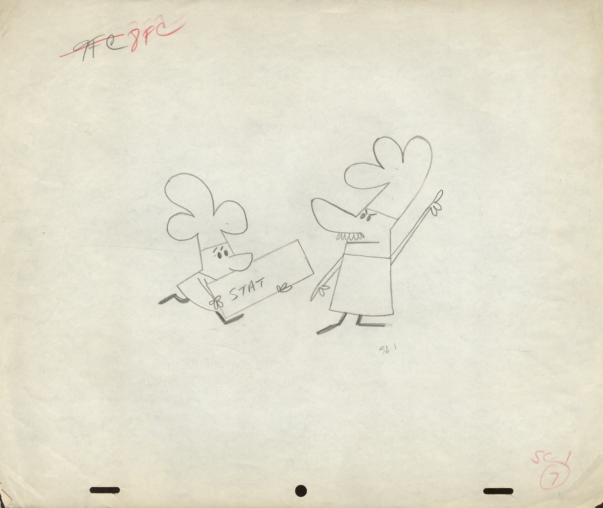
 7
7
 8
8
 9
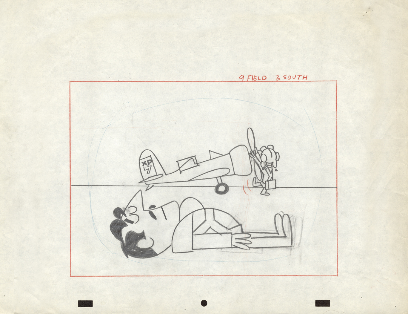
9
The pilot was physically cut out and moved.
Easy in photoshop not so easy in the real world.
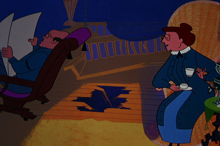
 10
10
 11
11
 12
12
 13
13
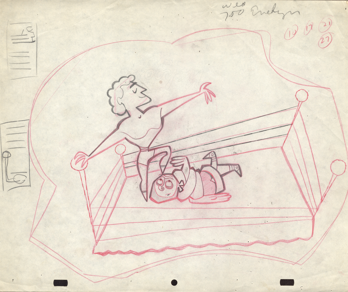
A torn ending to a short story.
Animation Artifacts &commercial animation &Illustration &Photos 01 Jul 2012 06:08 am
Animator Photos
- I love shots of animation people at various functions. It’s particular fun when you know the people and the pictures show them from a different time and place. Here are a few that nicely fill the bill.
- Ralph Bakshi was in touch after seeing the Fleischer model sheets that I posted. He sent me a photo from the early 1960s.
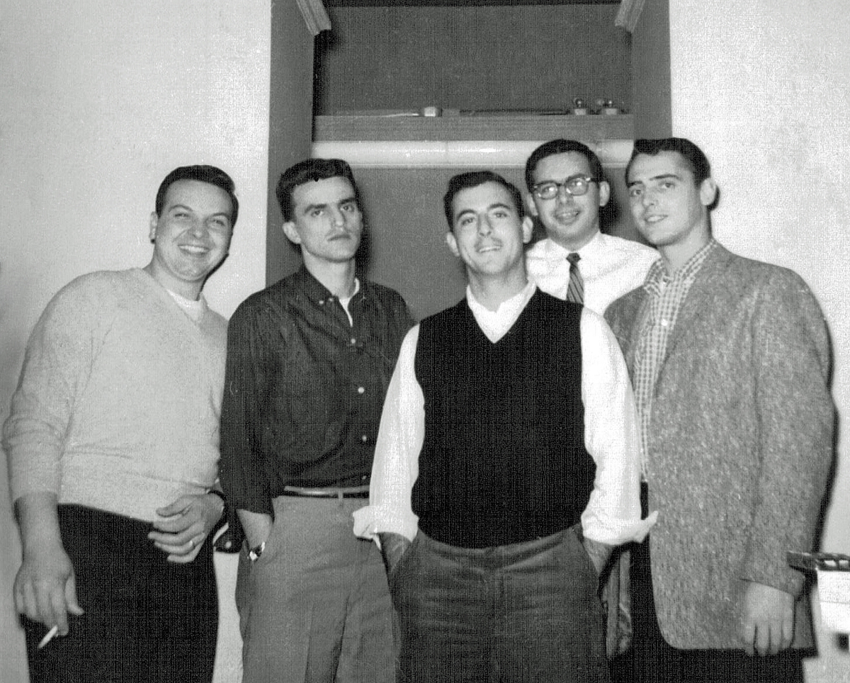
(L to R) Al Chiarito, Vinny Bell, Arnie Levy, Nick Alberti, Bill Ackerman
Candy Kugel had a couple of other photos from two events. The first two are from a Lcl 841 u-nion meeting. Candy and I tried to ID the people in the photos, and we’ve named a number of them. If you notice an error or can name some others, please just drop a note in the comments.
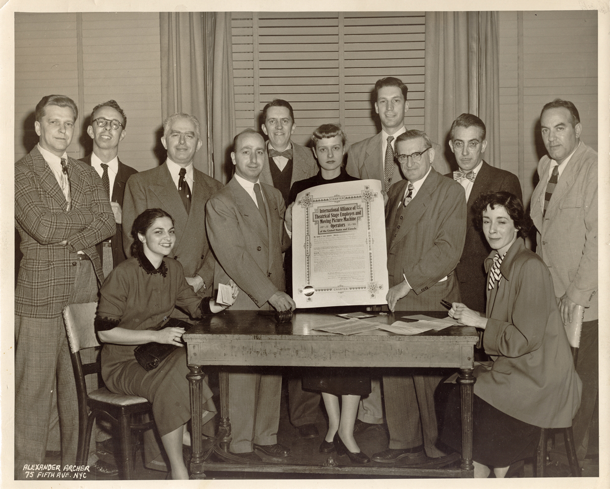
(L to R) Cliff “Red” Augustin, unknown, Izzie Klein,
Marsha Kaplan (seated), Johnny Gentilella, Gordon Whittier,
female center unknown, unknown, unknown, unknown,
unknown woman seated, Nick Tafuri
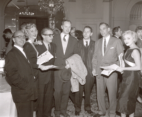
Johnny Gentilella (L), unknown fem, Pepe Ruiz,
unknown, unknown, Gordon Whittier, Unknown fem.
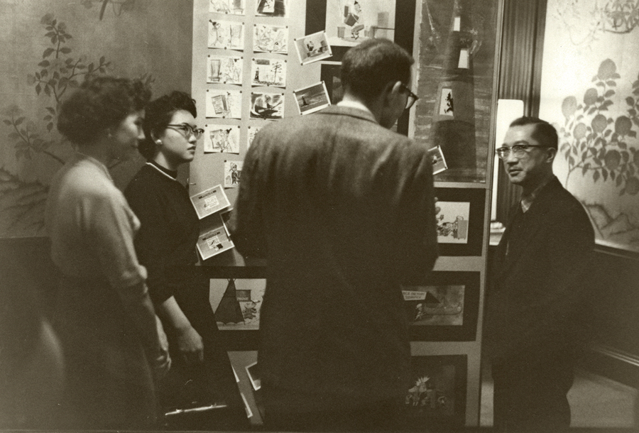
Other photos are from an exhibition of animation art and screenings from the different commercial studios in NYC. This was held in April 1952.
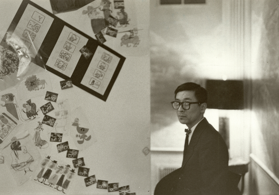
Pauk Kim was the artistic designer of the exhibition.
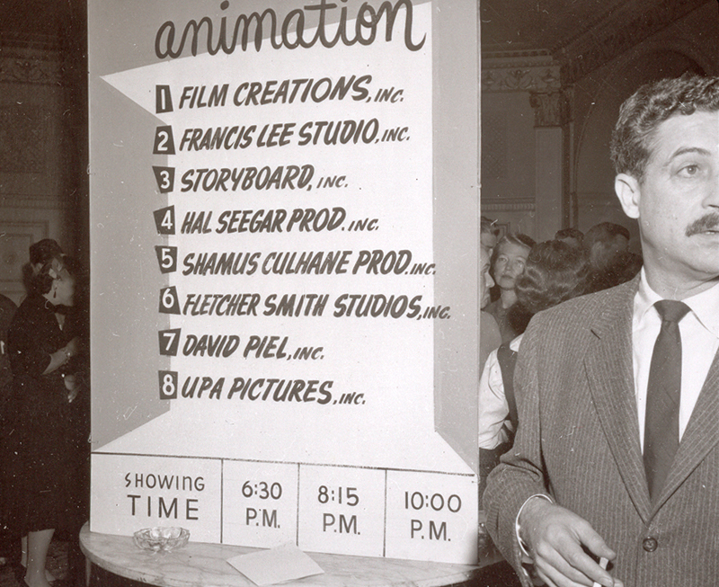
This is Lu Guarnier in front of a sign which lists
all the studios at the time that participated in the
exhibit of cels and artwork – and a screening of spots.
Rose Eng (?), Anne Eng (Fred’s wife), unknown visitor, Fred Eng
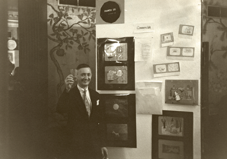
Francis Lee
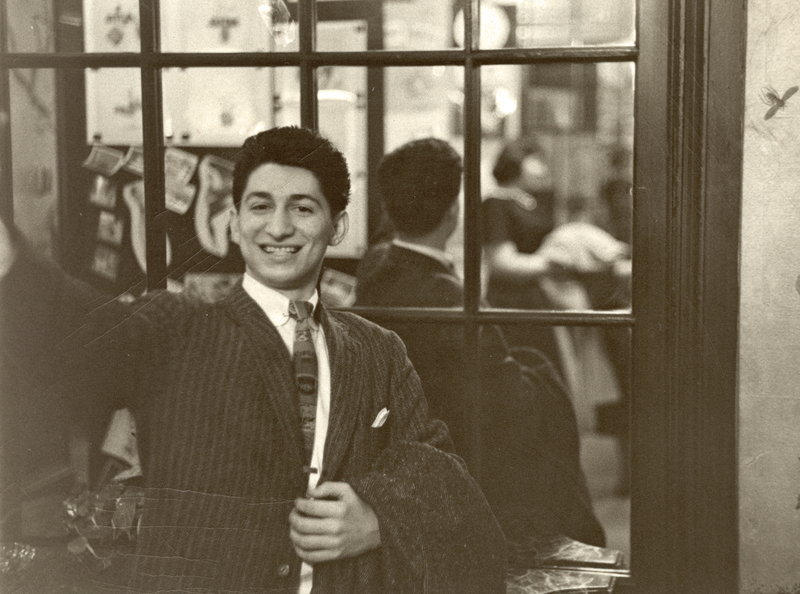
Pablo Ferro
Lu Guarnier
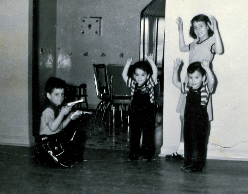
And at the very same time these animators were being
photographed at the animation function, I was holding up
my twin brothers and older sister dressed in my cowboy garb.
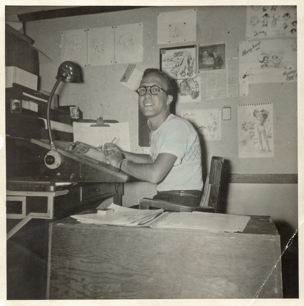
Among Candy’s photos was this one of an inbetweeener,
Fred Diamond, at his desk in Famous Studios. I thought
it interesting to see what the setup looked like at Famous.
Finally here’s a picture of Assistant Animator, Gerry Dvorak, who painted baseball cards in his early days, then went into pictures of snow leopards.
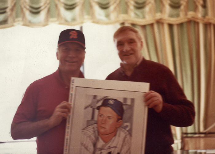
This is Gerry posing with Mickey Mantle at Mantle’s hotel room.
They’re holding up Gerry’s baseball card painting of Mantle.
____________________
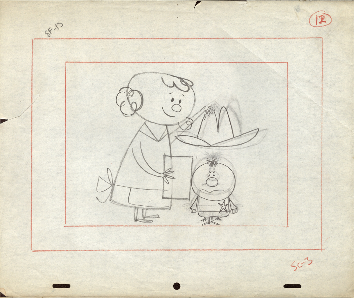
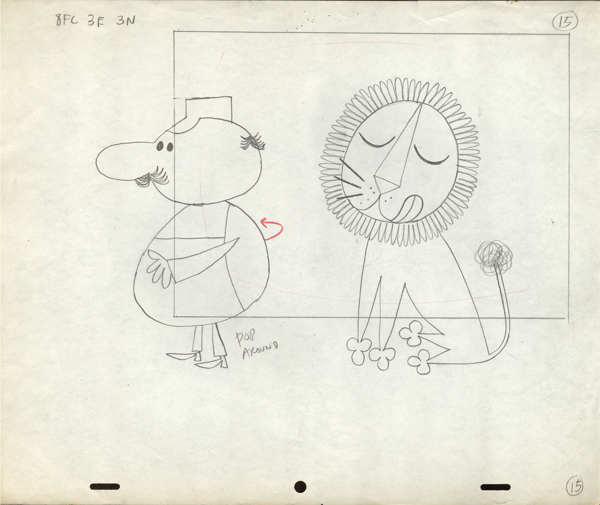
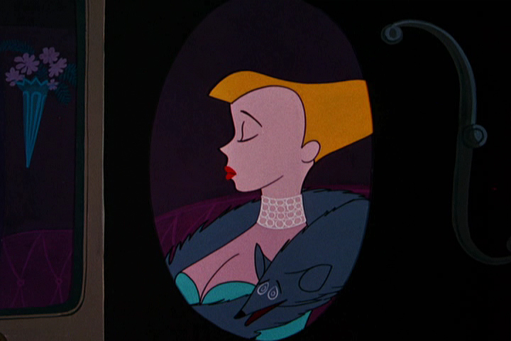
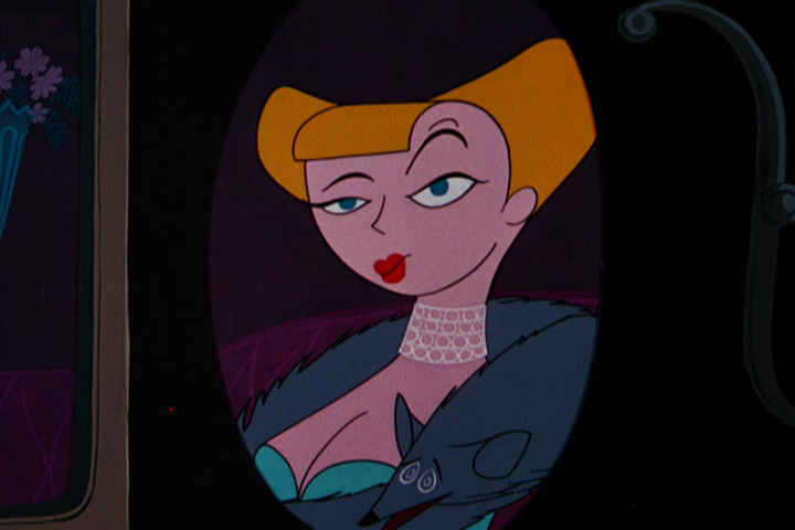
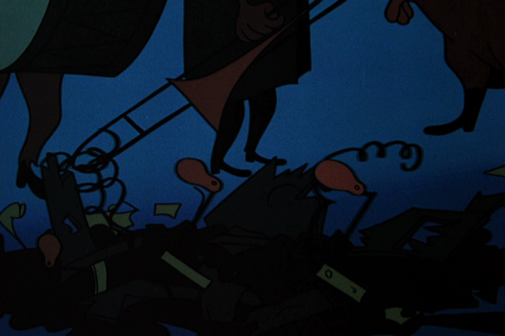
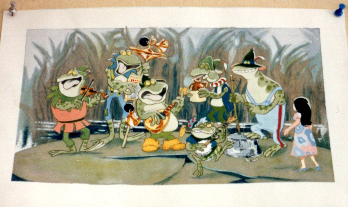
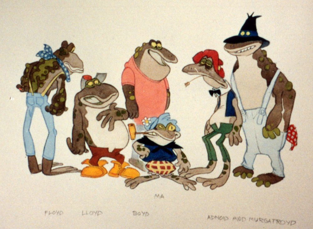
Animation &commercial animation &Layout & Design &UPA 27 Jun 2012 05:44 am
UPA Commercial Layouts
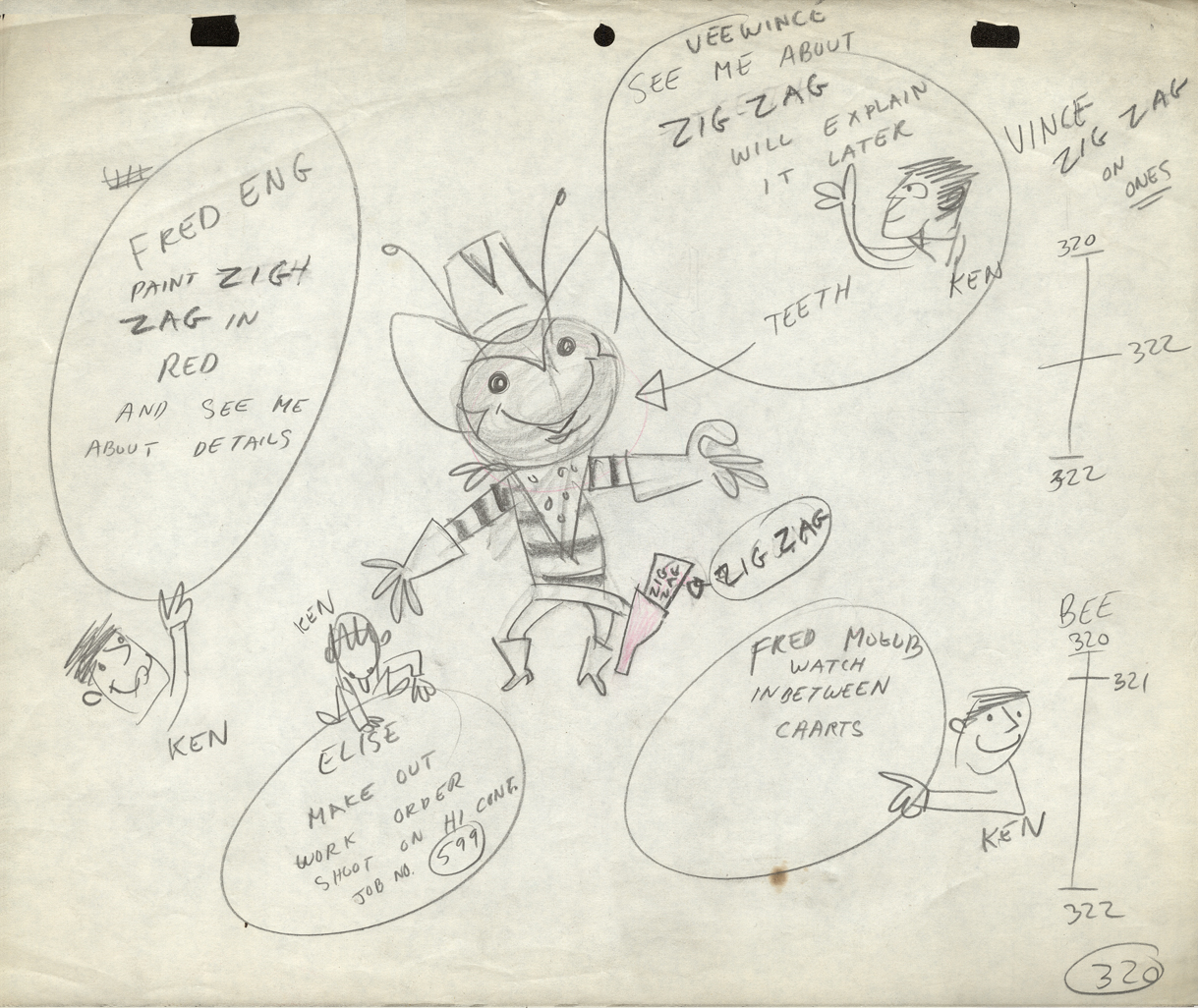
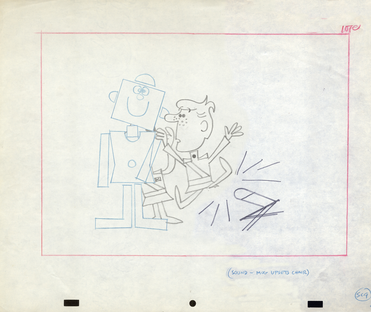
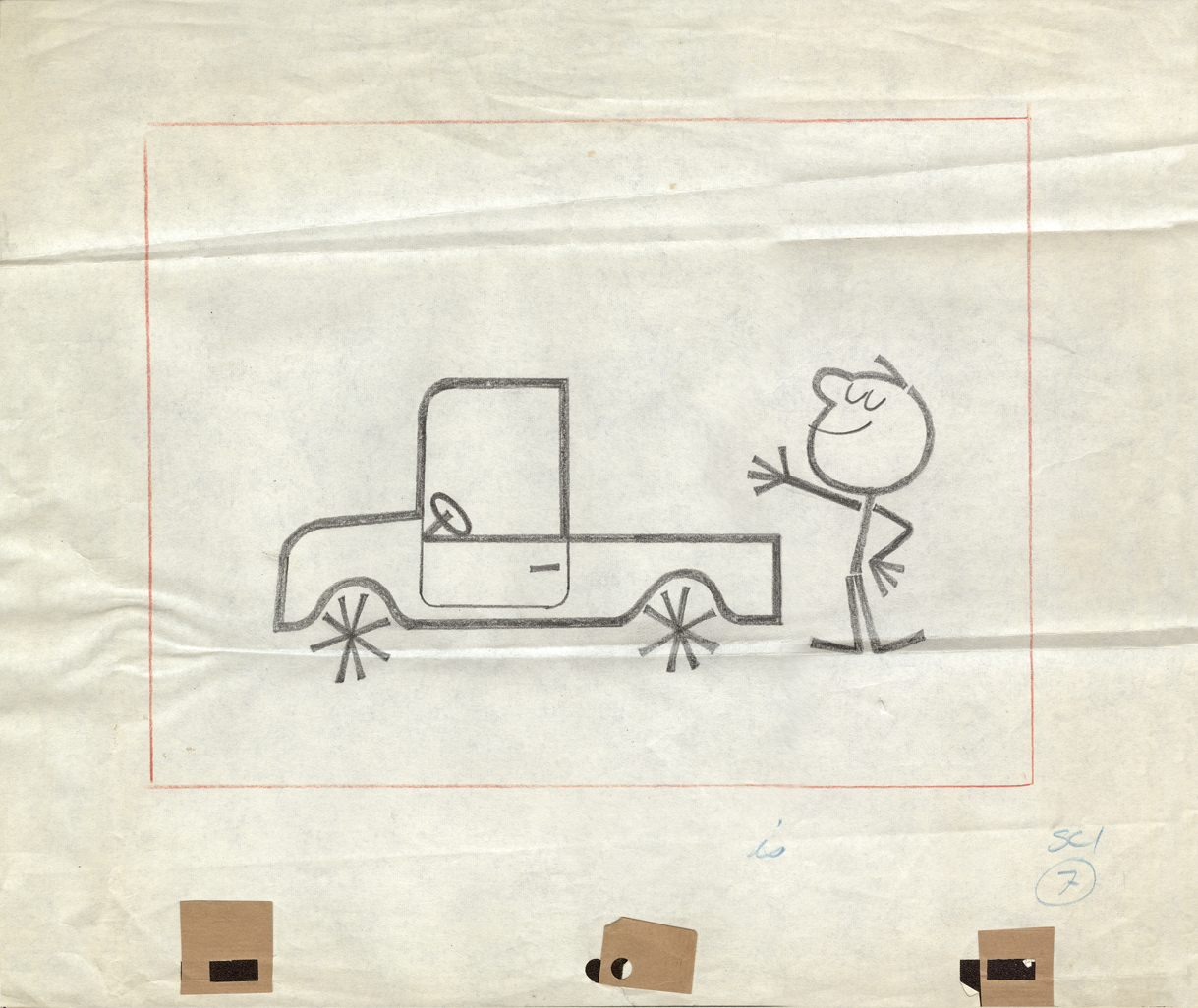
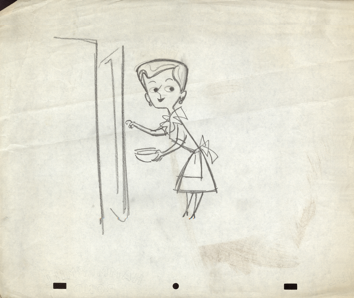
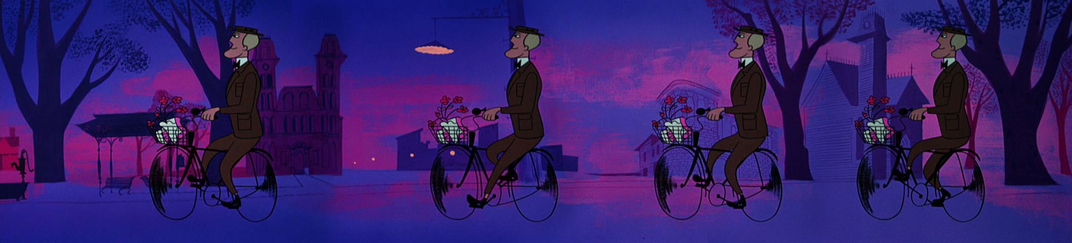
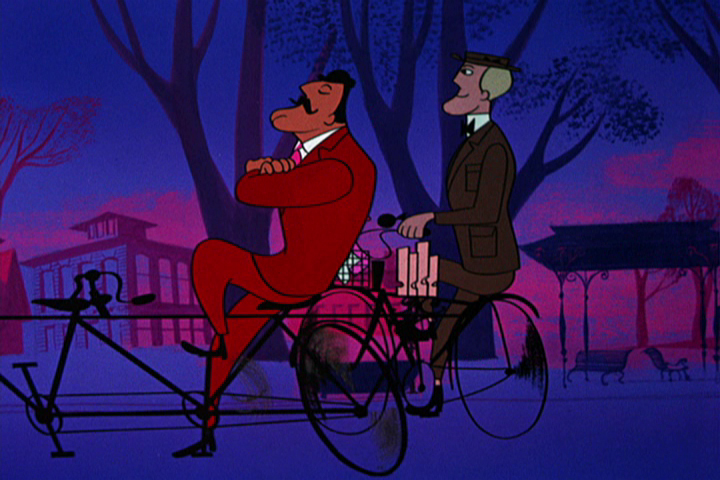
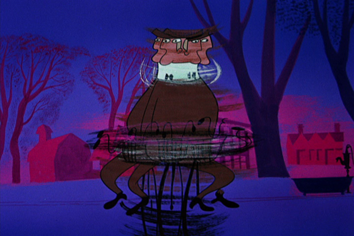
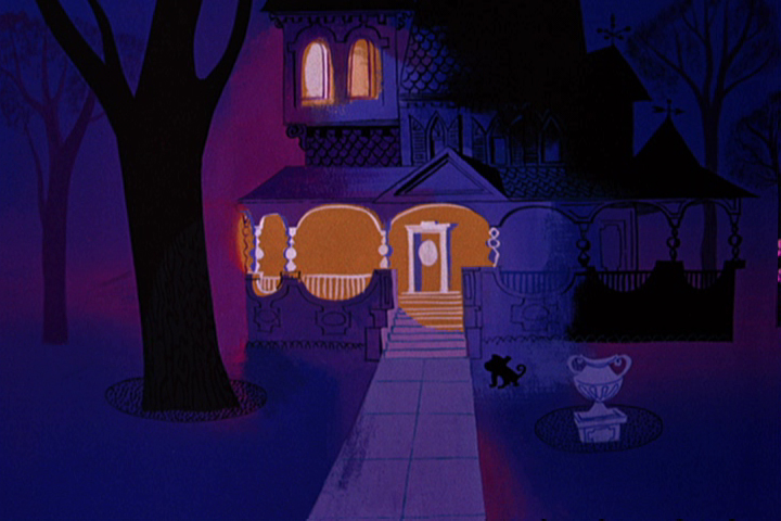
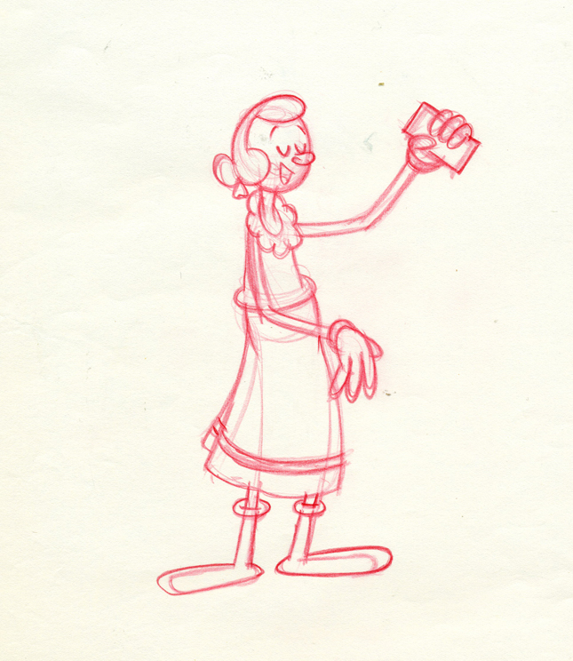
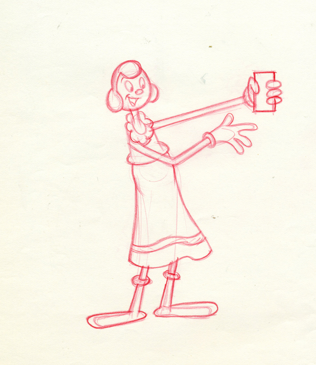
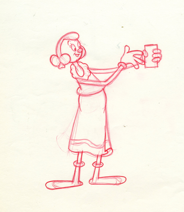
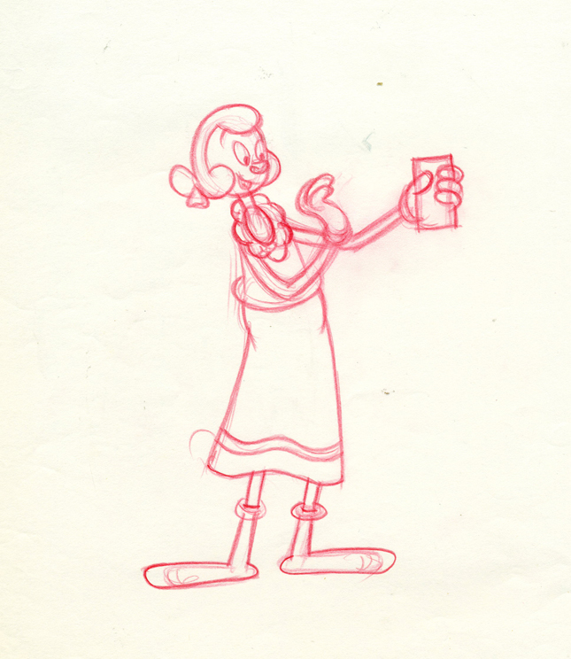
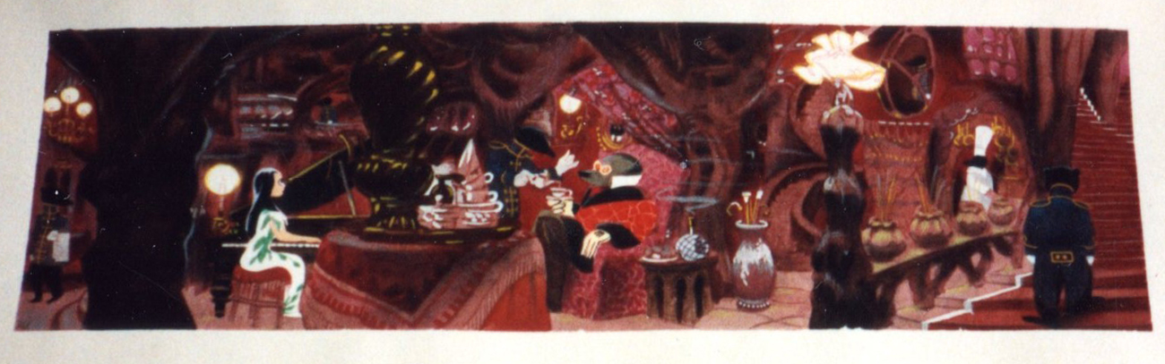
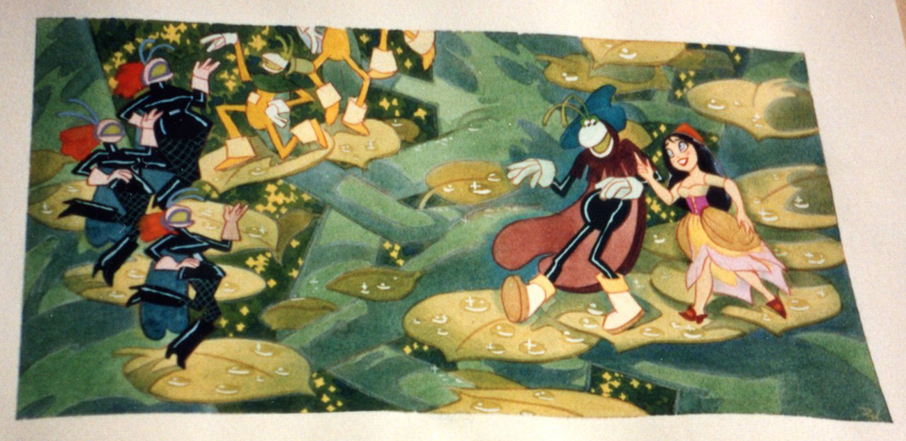
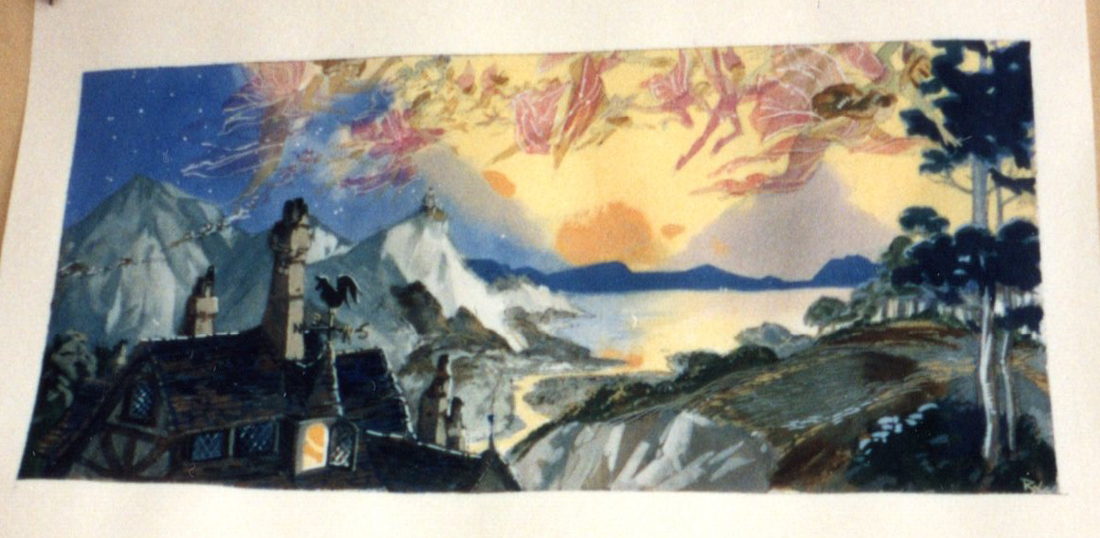
- Having swept through Vince Cafarelli‘s collection of Fleischer/Paramount artwork, We move onto the next box which is his commercial work. Vince was an Assistant Animator at UPA New York. He saved a group of layout drawings for some of the commercials. Unfortunately, only a few are marked as to what the sponsor was. so it amounts to a number of drawings which often have no relation to each other.
However, the drawings included all are good representation of the beautiful and diverse design employed at the studio. Here are a first group; when I can identify the spot, I will. If you recognize any of them, please let me know.
The peg system used throughout is called “Signal Corps.” This is where the size of pegs was first used. By this time, New York animators had three different sized pegs to use: Acme, imported from California;
Signal Corps, a hold-over from the Army, and
Oxberry, invented just after the War by John Oxberry.
They all had their different advantages, and they all remained in use through the 80s, when Acme finally took over.
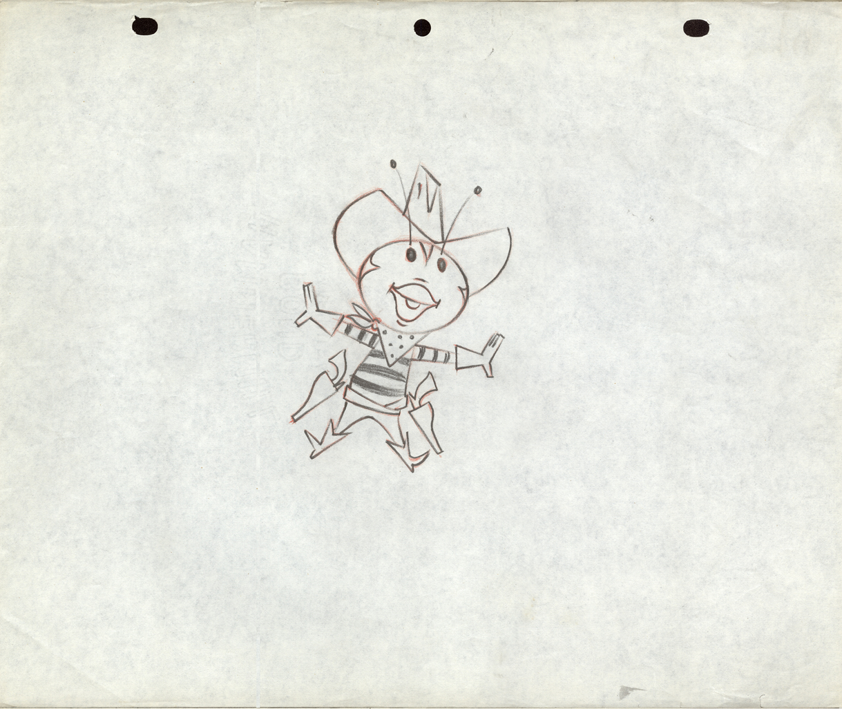 1
1Mark Kausler commented: “… the first two are “Buffalo Bee†from
the Nabisco Wheat Honeys commercials. Mae Questel was the voice,
they appeared on the early Mickey Mouse Club shows, 1955-56.”
 2
2
Note how the animator leaves notes for the crew who will work on the spot.
“Vince” was the Assistant Animator. “Fred Mogubgub” was the inbetweener.
“Elise” was the checker/Prod. Coordinator, and “Fred Eng” the talented inker.
 3
3
 4
4
 5
5
 6
6
 7
7
This is obviously for a Wisk commercial.
 8
8
 9
9
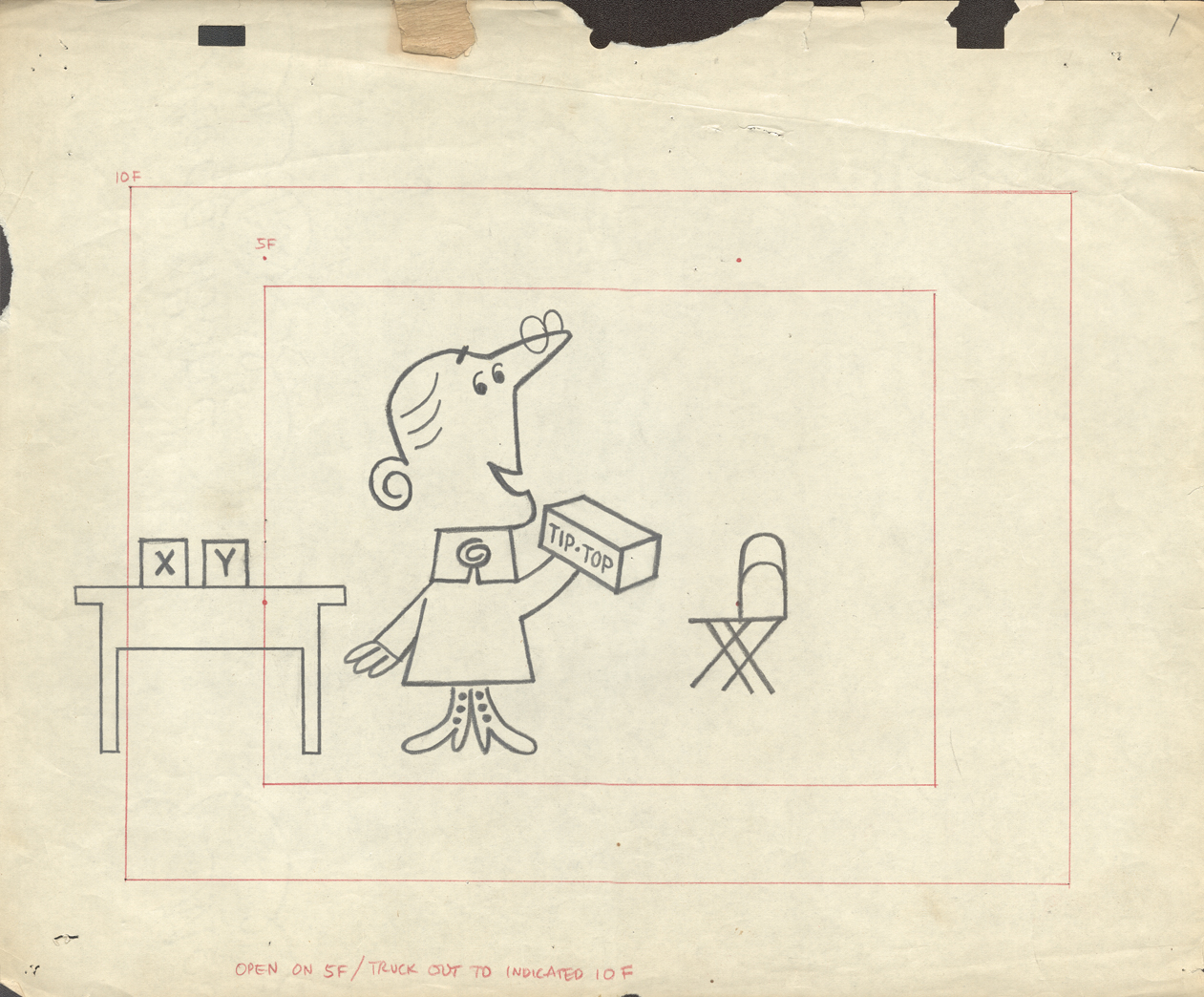
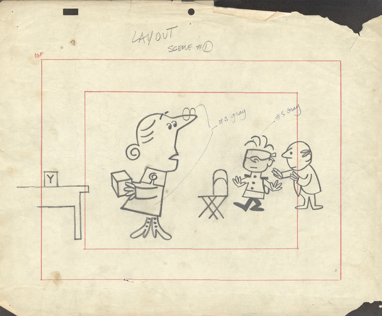
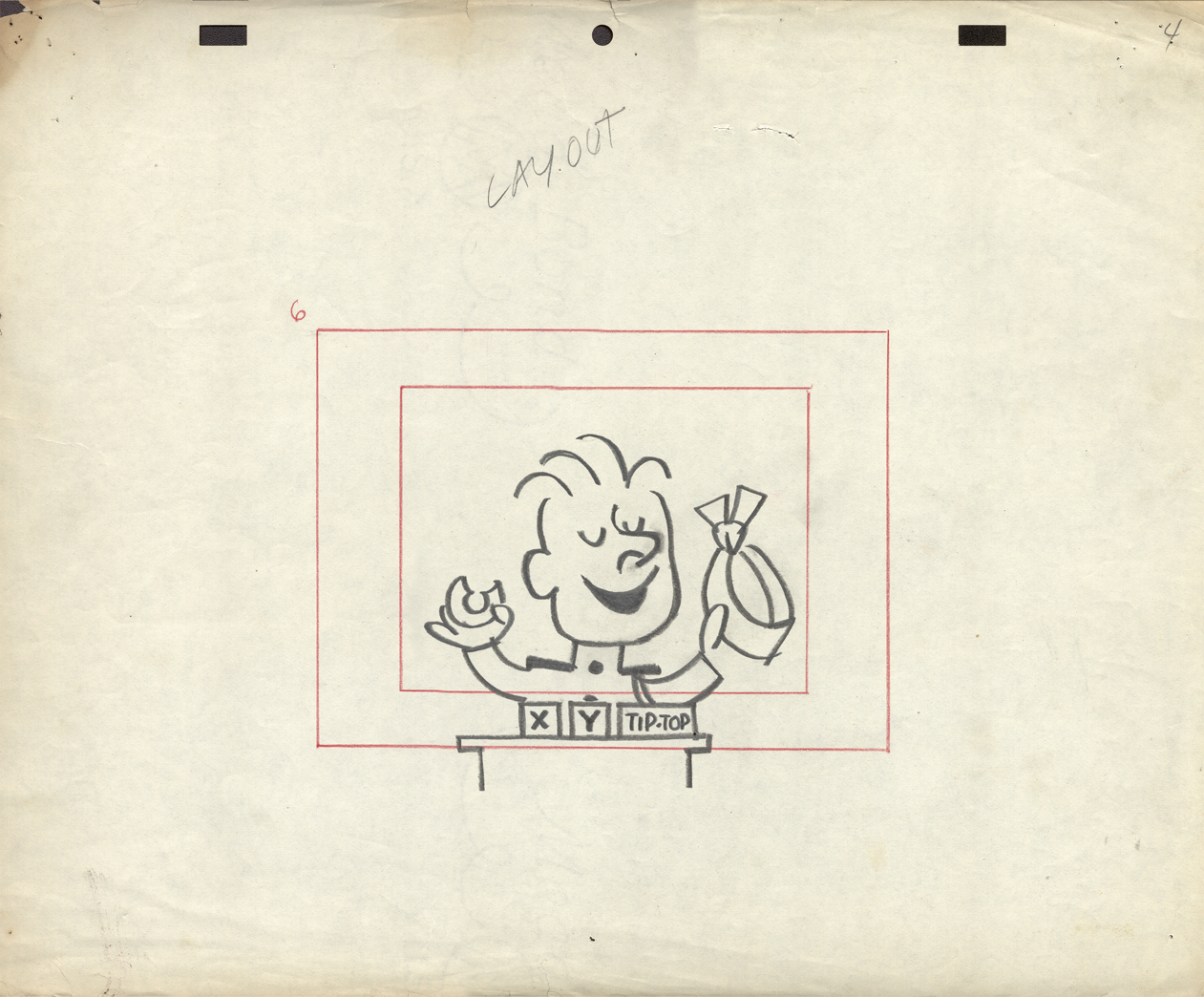
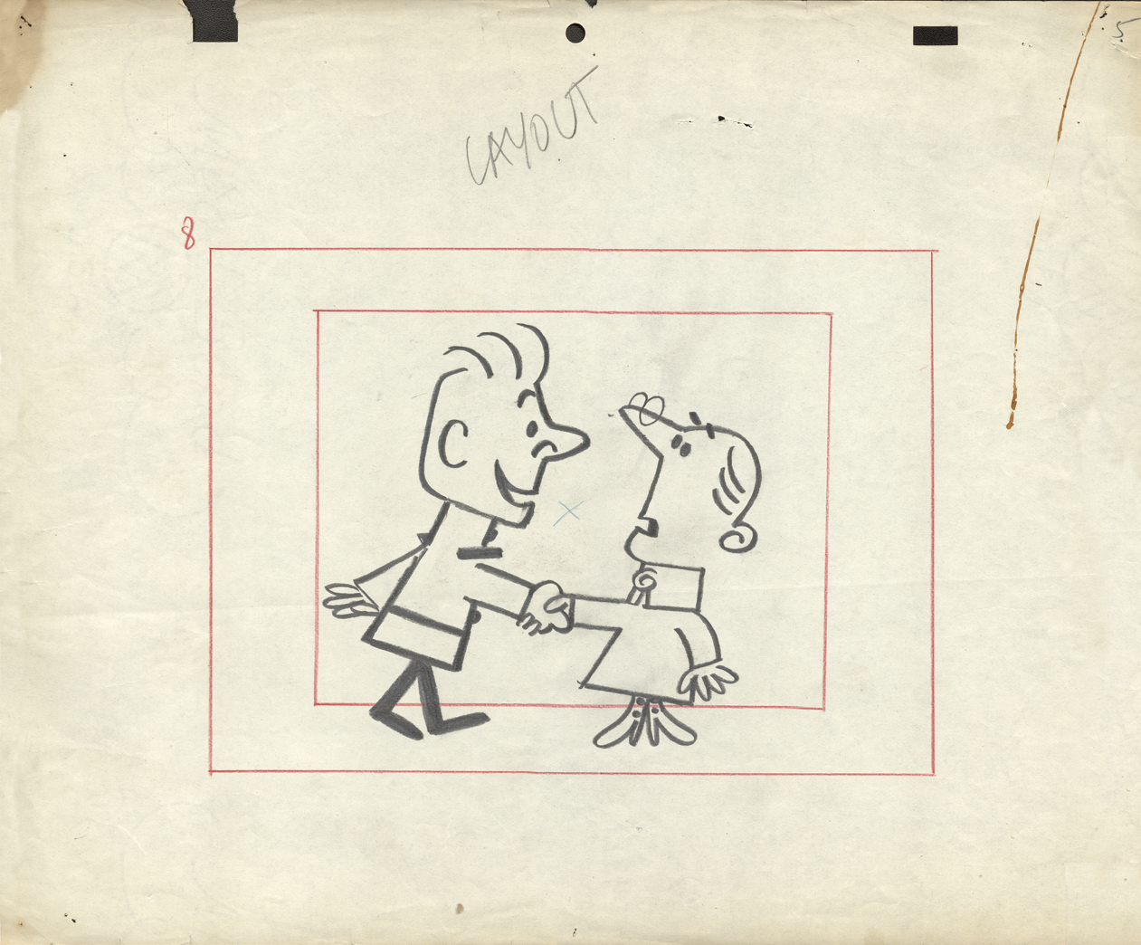
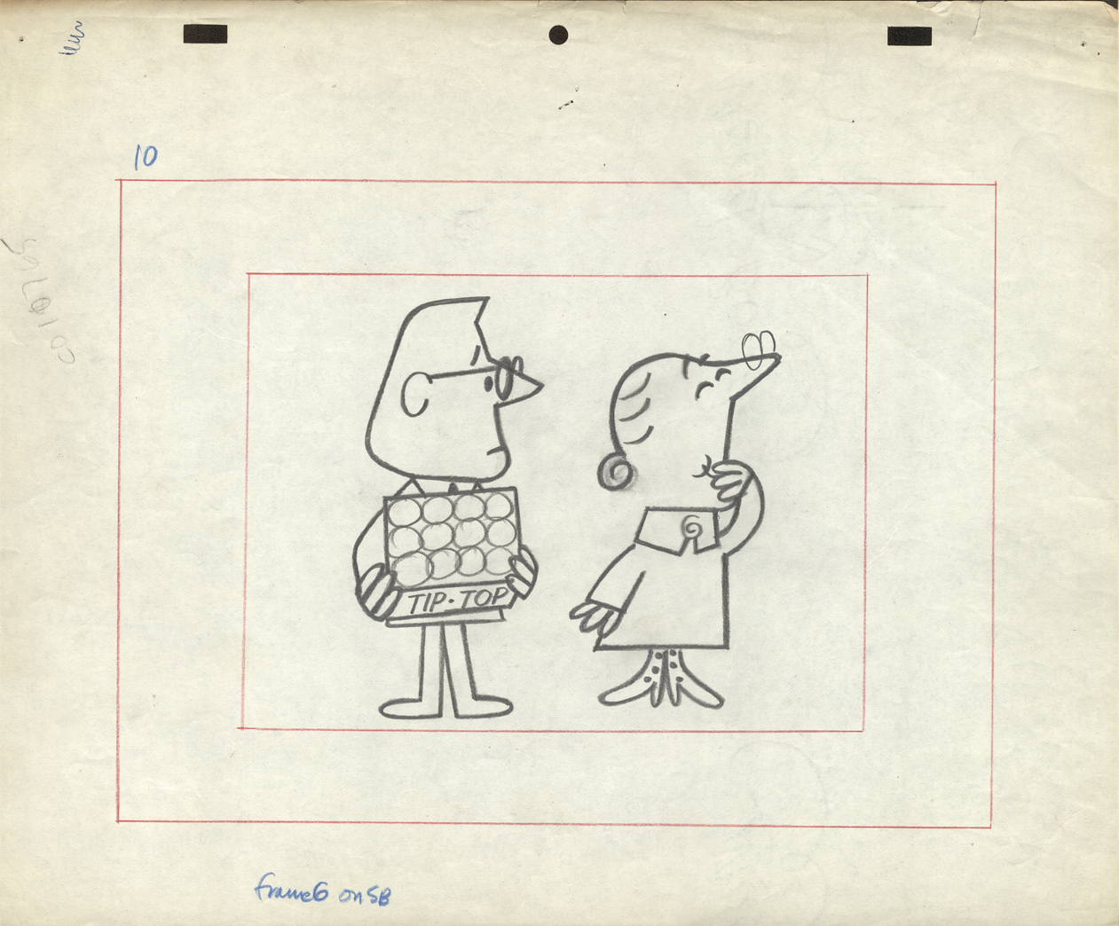
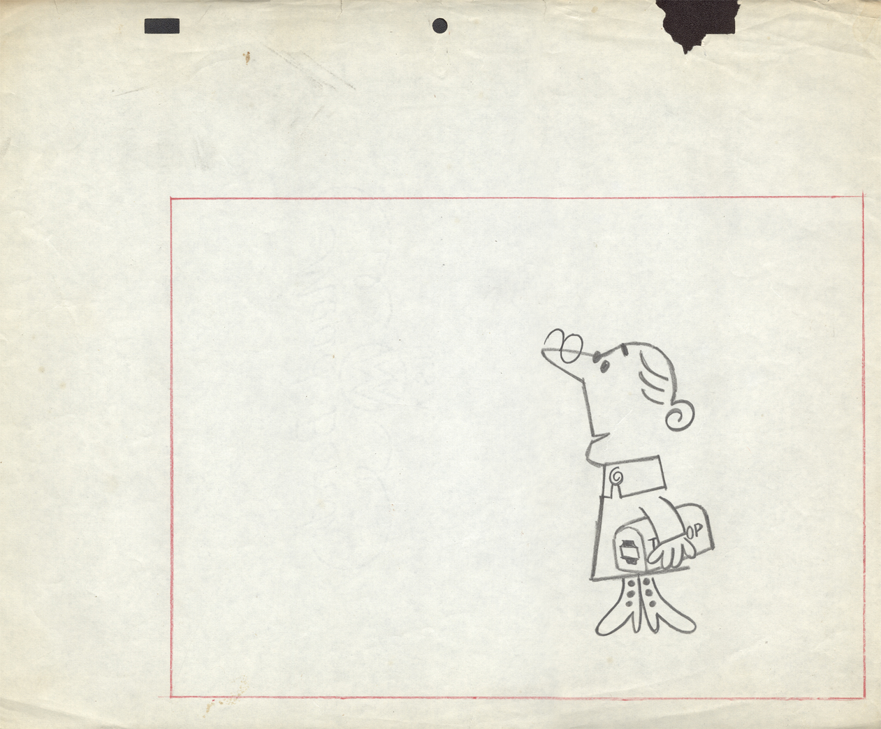
The final six LO drawings are Emily Tipp for Tip Top bread.
She was a very successful spokesperson for the bread company.
These may have been done at Kim-Gifford Studios rather than UPA.
I kept them with UPA because the peg system is consistent
with other UPA commercials.
 10
10
To see some of the Emily Tipp spots go here
at the Buzzco website.
 11
11
 12
12
 13
13
 14
14
 15
15
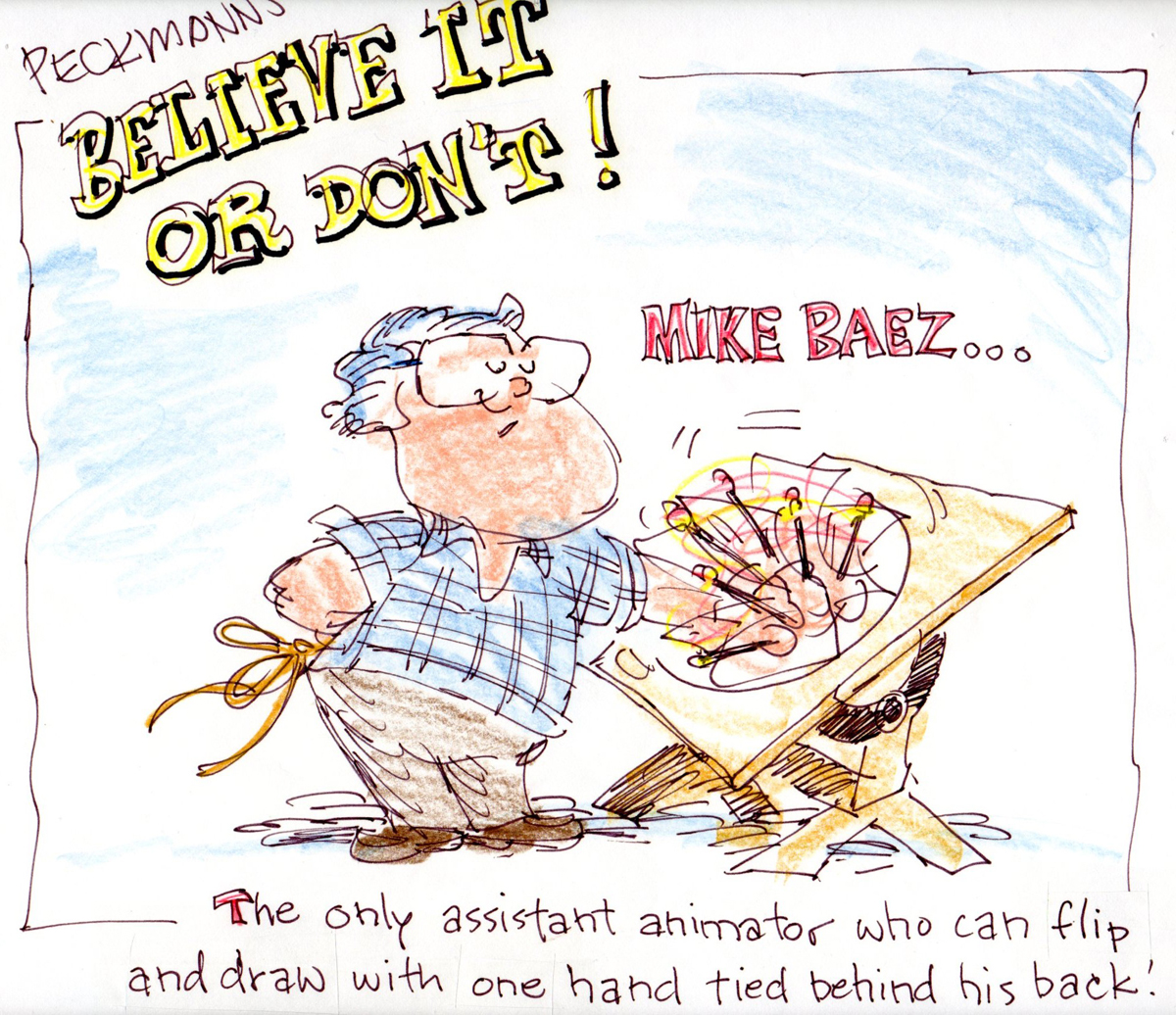
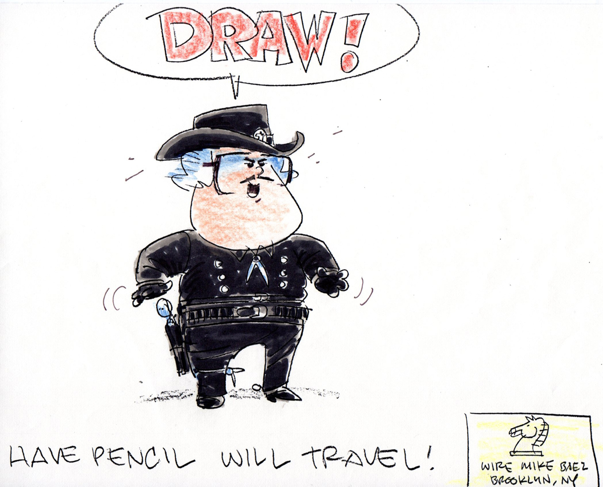
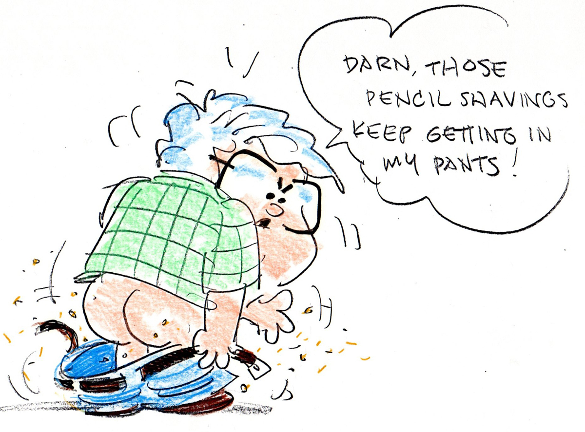
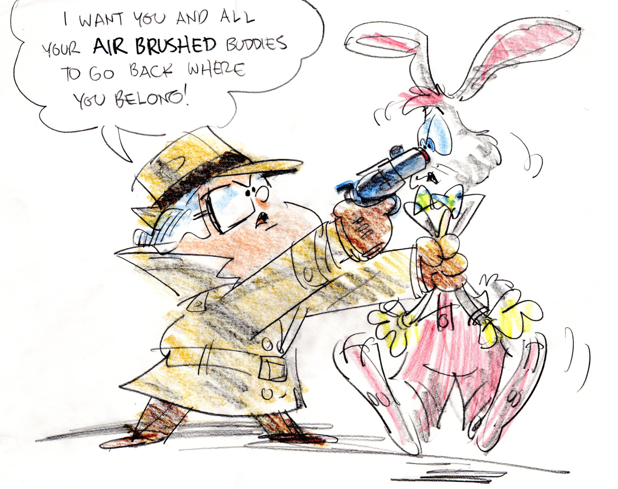
Animation Artifacts &Bill Peckmann &commercial animation &Illustration 01 May 2012 07:26 am
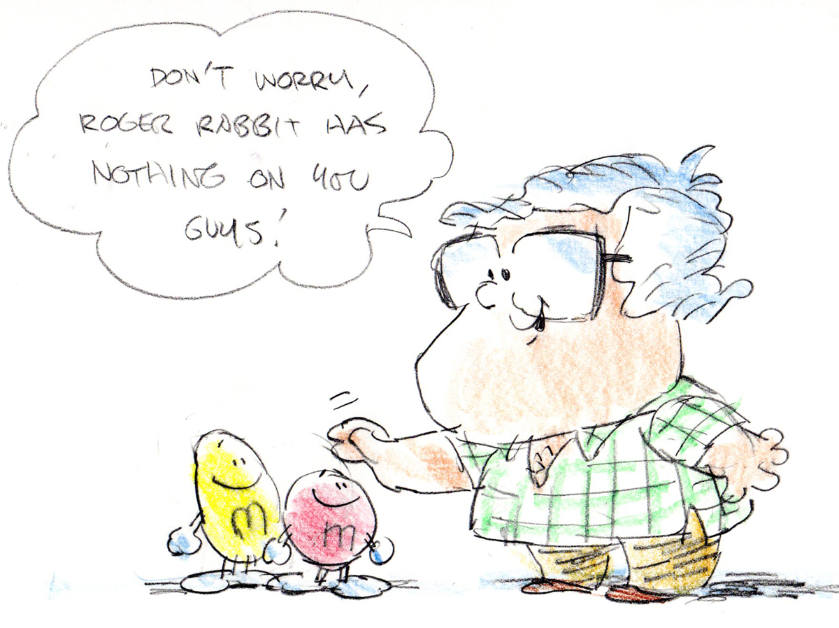
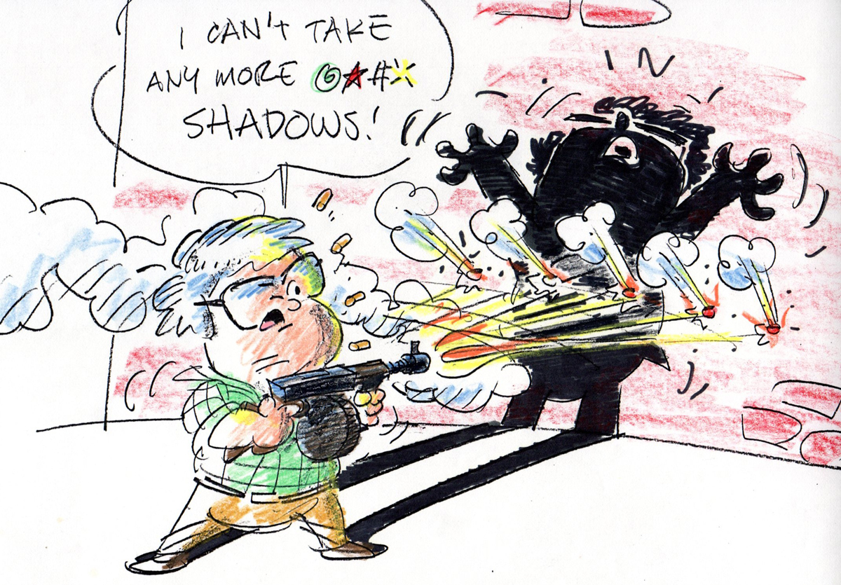
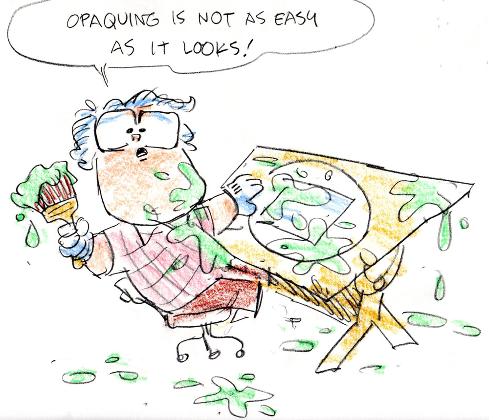
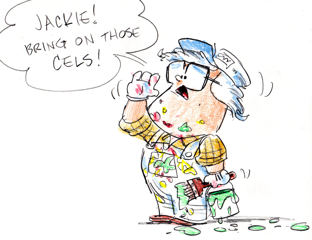
Kimmelman Studio Gags
- Bill Peckmann sent the following drawings, and I’ll leave them to him to explain them:
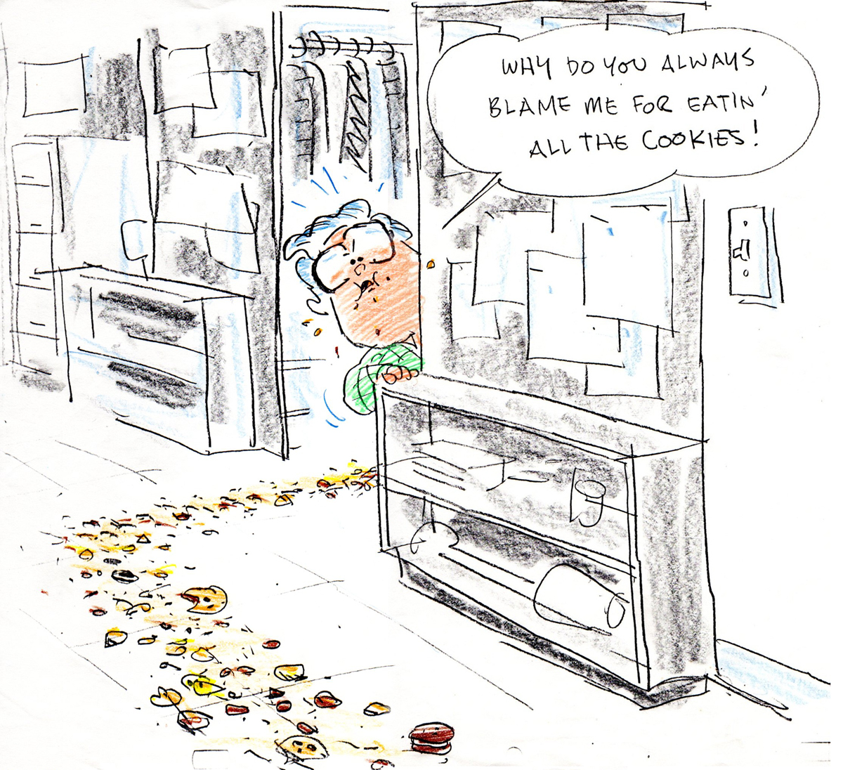
- In the 1980′s, studio gags were a great way to chase away the daily dose of blues from working on a few of the more tedious TV spots that we did. Nobody had a better time of this, than assistant animator Mike Baez and myself at KCMP Studios. Not quite sure why I saved mine but I did and here they are. The gags of course have a “you had to be there” or an “in” feeling to them, so I’ll drop in a few captions to help.
 1
1“The magic of animation even works when you’re shticking around.” .
 2
2“Congratulations on a commercial well done!” .
 3
3“Mike Baez was always one of the best… ” .
 4
4” …and the fastest… ” .
 5
5” …and went through 2 boxes of Blackwings in a day!” .
 6
6“Adv. clients always loved to add feature film effects to their commercials.” .
 7
7“M&M’s with one of their first shots at shading.” .
 8
8“Doing accurate cast shadows always meant twice the amount of work!” .
 9
9“Always there to help out in a pinch… ” .
 10
10” …and then some.” .
 11
11“What was a studio if it didn’t have a cookie jar on the receptionist’s desk.” .
 12
12“Or a candy jar on the front desk.” .
 13
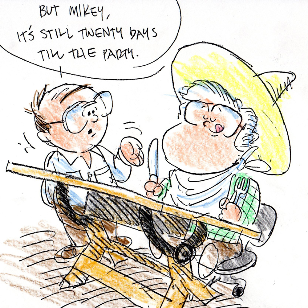
13“Eating, one of any studios beloved pastime, especially the
annual Christmas party at our favorite Mexican restaurant.” .
 14
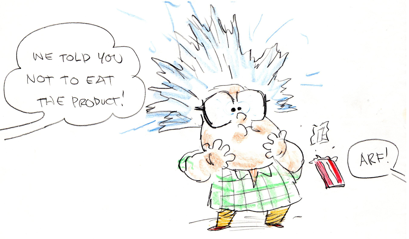
14“Who didn’t look forward to the client dropping off their
food product when we were working on their commercial.” .
 15
15“Those clients dropped off a lot of product, and when they did… ” .
 16
16” …we definitely had to look into a diet plan!” .
 17
17“Lunch hour reading.” .
 18
18“20 years before ‘Cars’” .
 19
19“Reflections.” .
 20
20“Those halcyon years at K.C.M.P. Studios, you don’t know what you got till it’s gone.” .
 21
21“All work and no play . . . ” .
 22
22“The day after watching your favorite TV series.” .
 23
23“With apologies to Arnold S. and Danny D . .” .
 24
24“Dreams of a back up, second career.” .
 25
25“To the one and only Mike Baez who made working fun!” ______________________
Indiegogo
LAYOUT FROM SC. B45
Drawing by Tissa David
And now the promotion. The POE Project is up and running at INDIEGOGO, where there is a new page seeking contributions (however small) in support of a feature animated film I’m seeking to produce. The film has seen preproduction grow and the film start to blossom under the many thumbs of those who’ve worked on it. The script, the preparatory drawings, the storyboards and animatics (video story reels) and the great early voice over recordings all show us how promising a film this will be. We’re seeking some money to finalize a couple of minutes of the film to show investors what we’d like to see with the finished film.
Please visit our Indiegogo site.
commercial animation &Layout & Design &UPA 23 Apr 2012 05:15 am
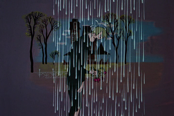
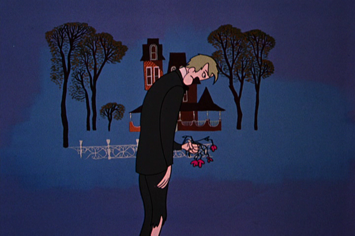
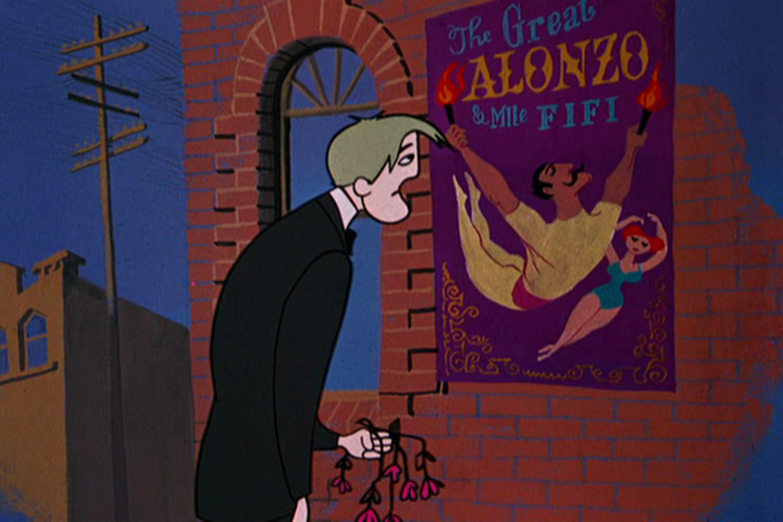
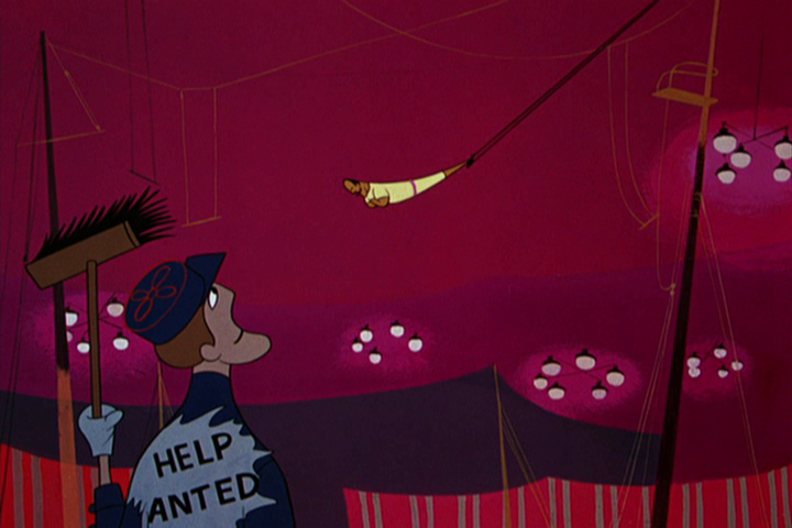
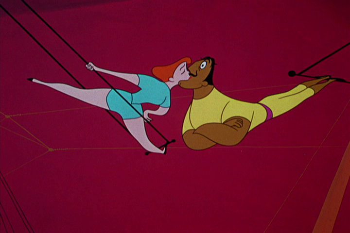
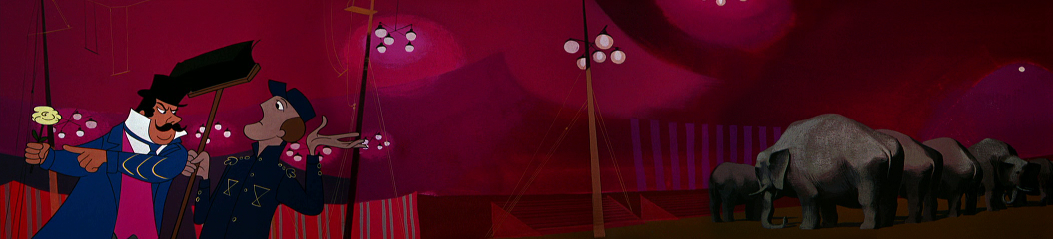
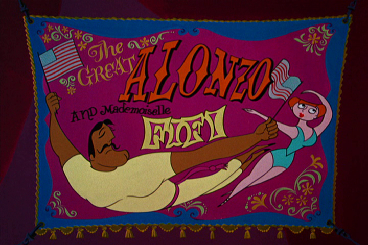
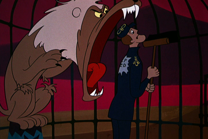
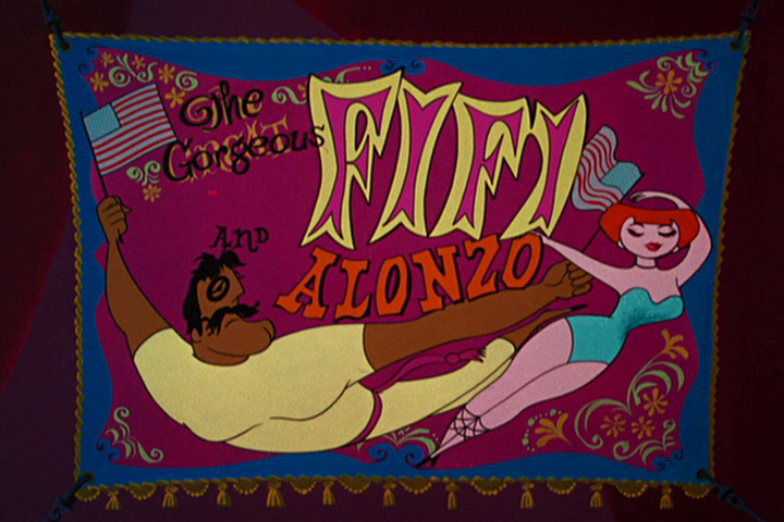
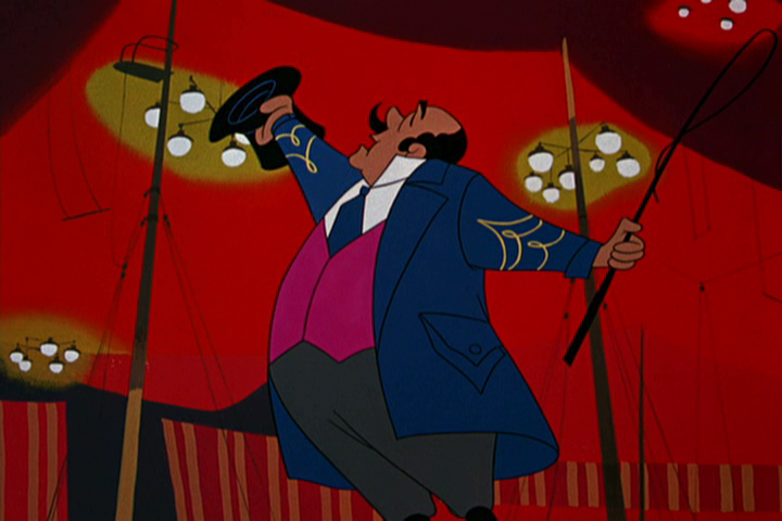
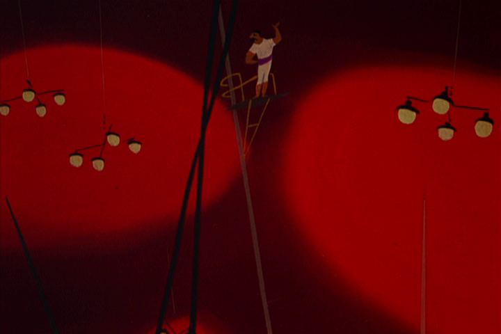
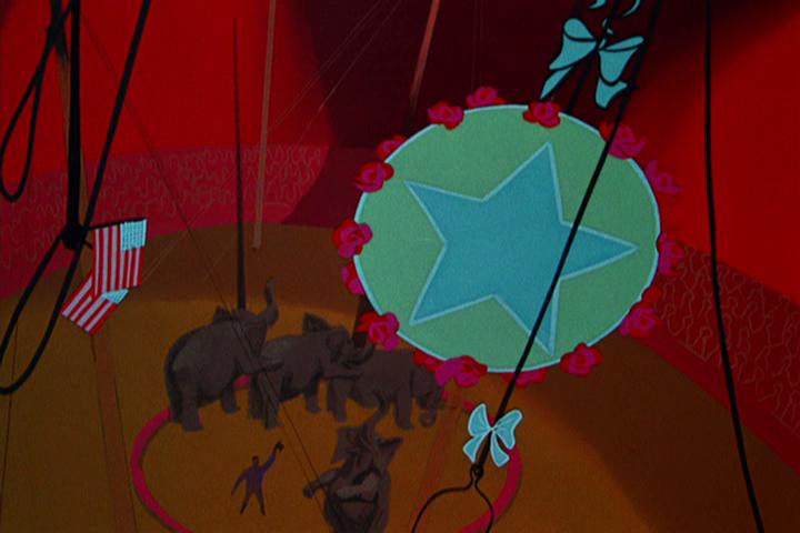
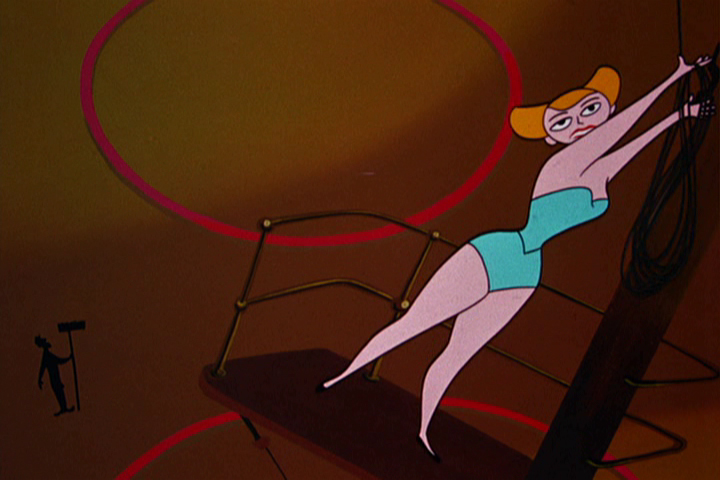
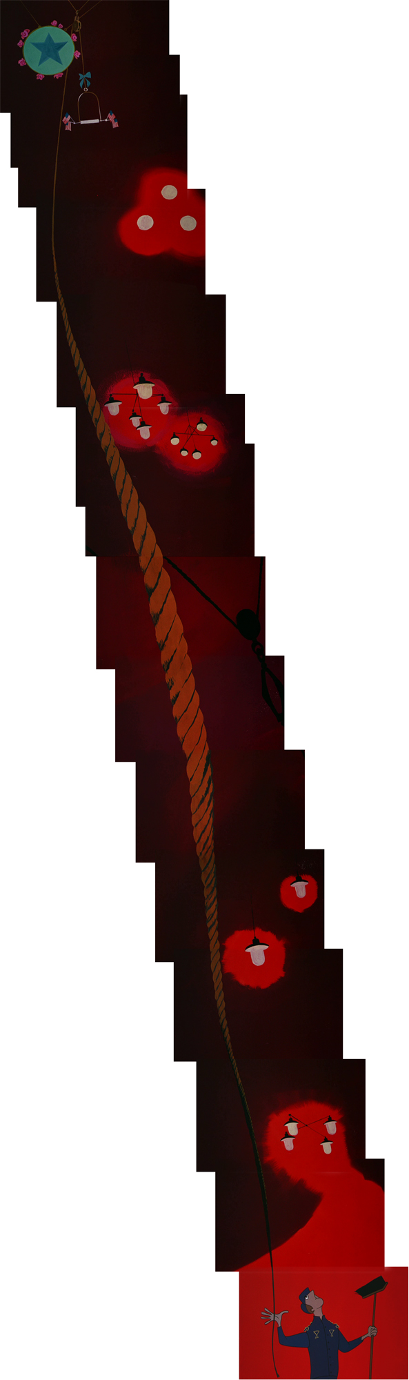
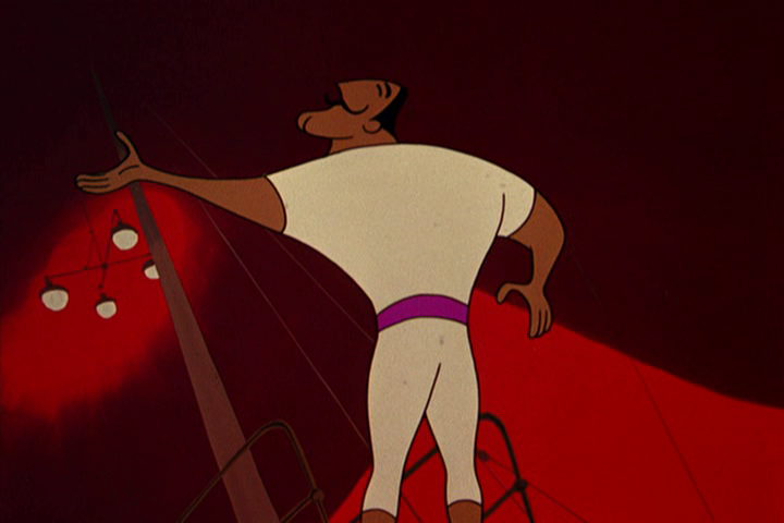
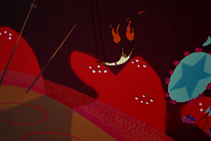
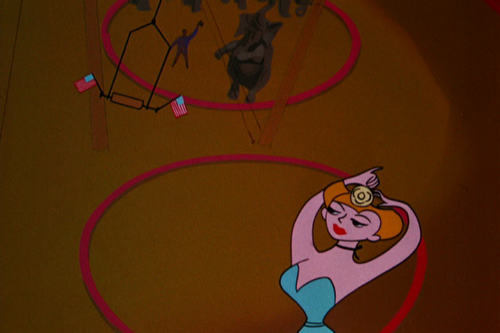
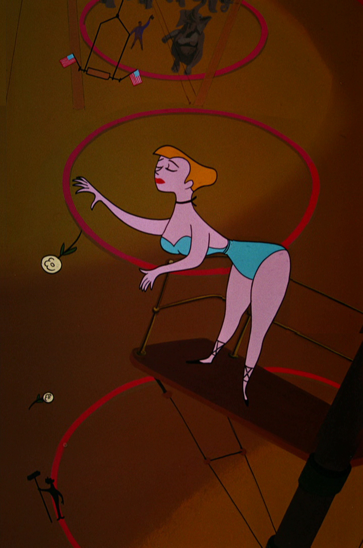
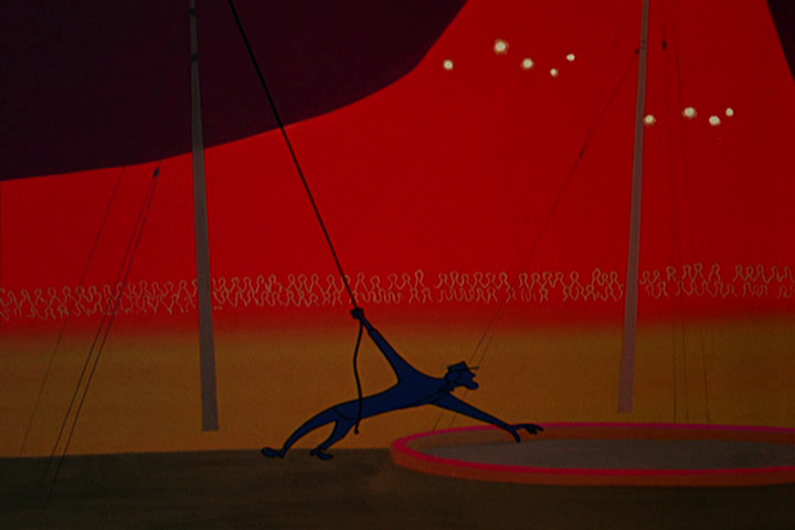
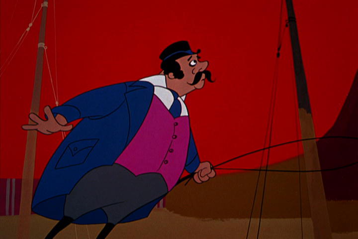
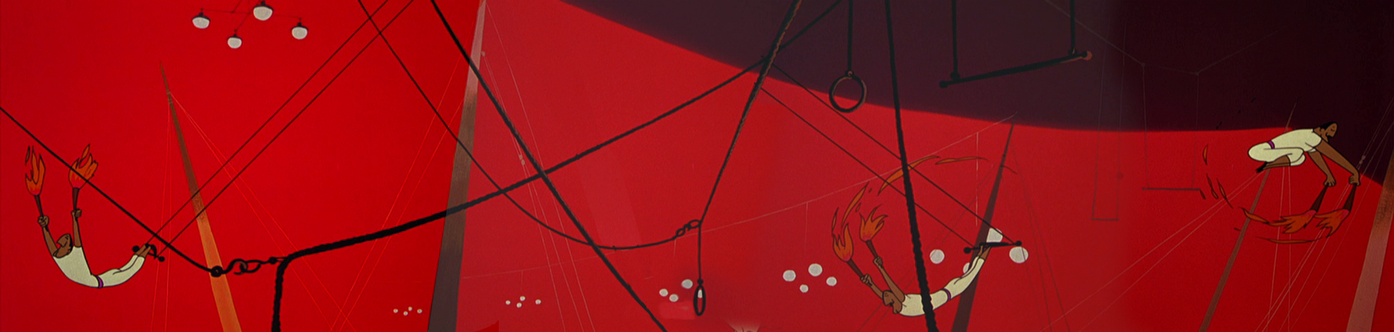
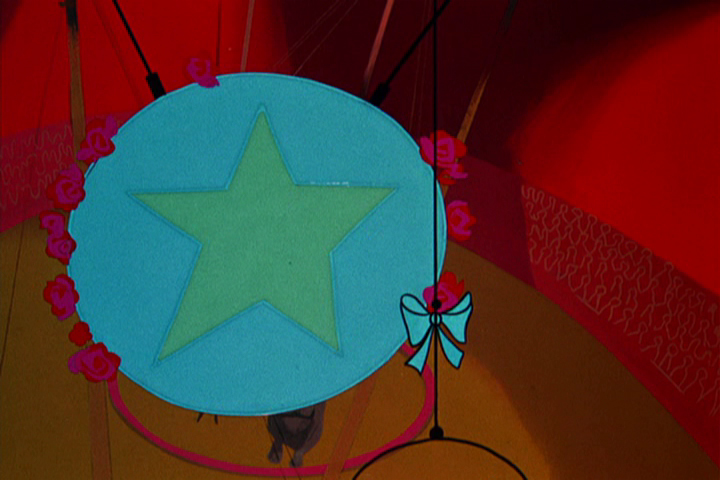
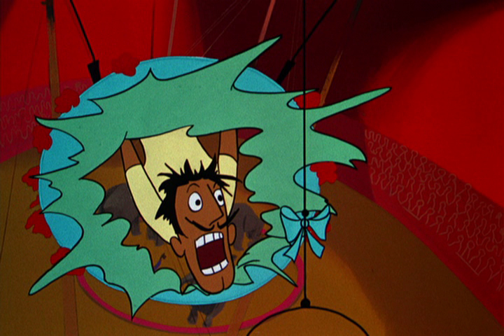
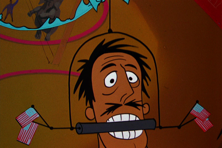
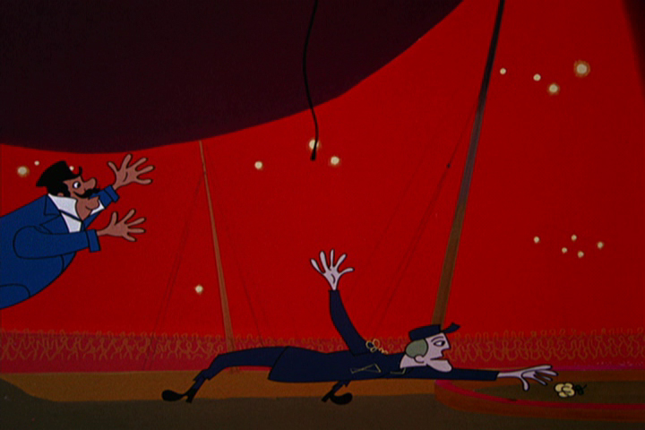
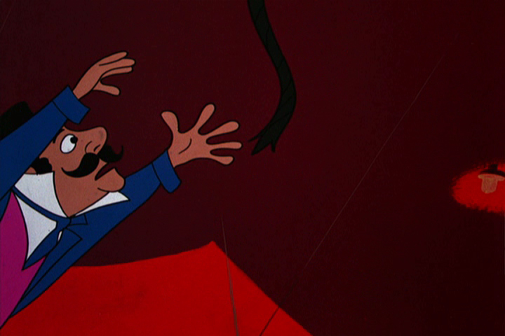
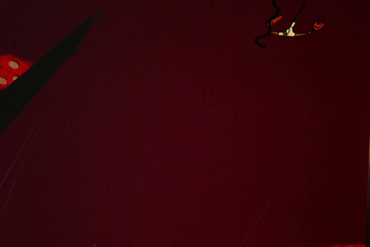
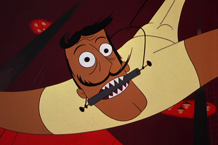
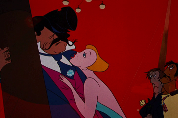
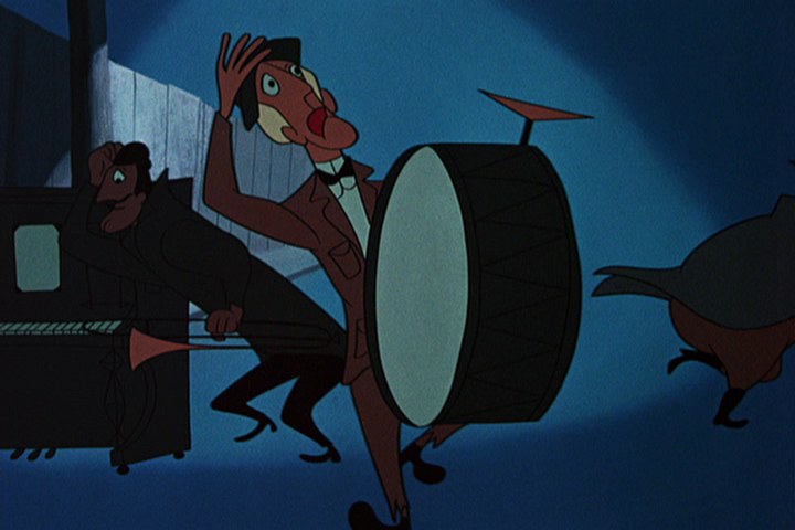
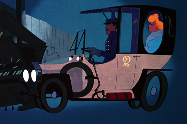
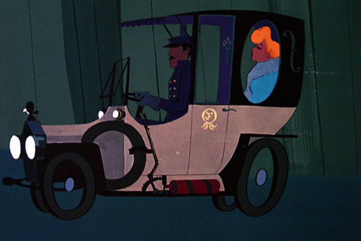
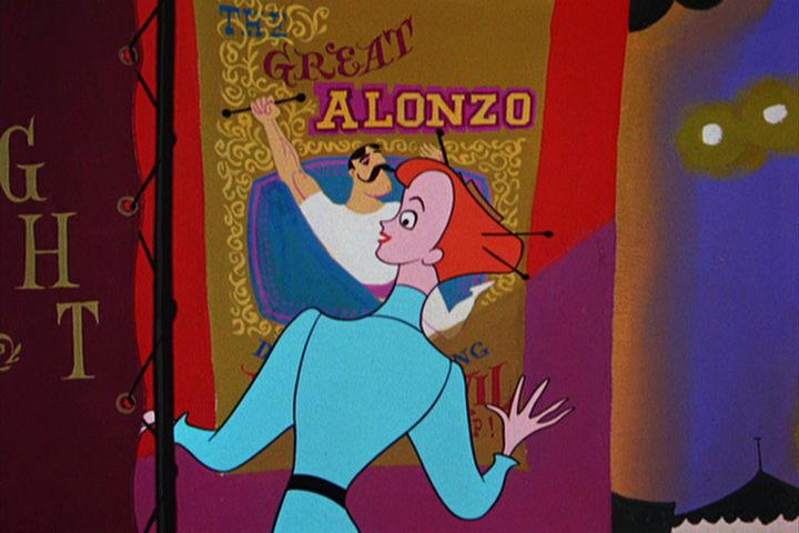
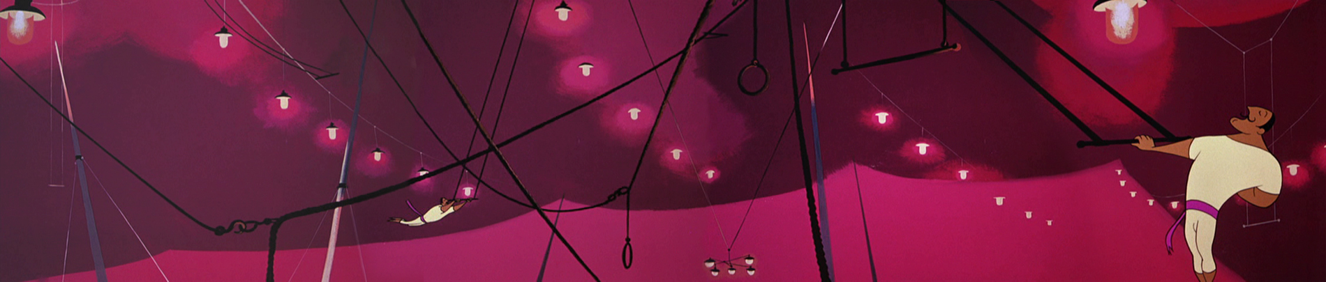
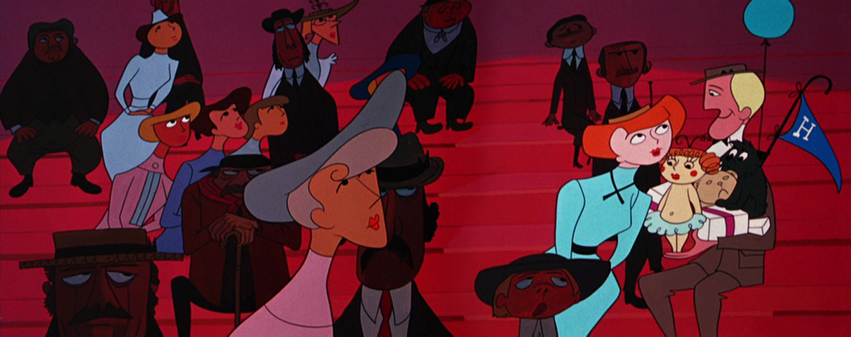
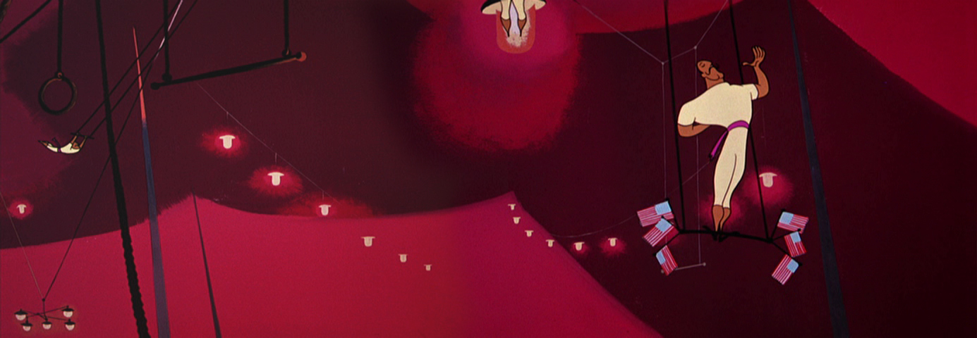
The Man on the Flying Trapeze – pt.2
- Here is the 2nd half of the frame grabs of the UPA film, The Man on the Flying Trapeze. As I said, last week, the film is not the best of UPA. However, Paul Julian’s work, to me, is always sterling, and that’s my reason for putting some focus on the film. Julian did the design and backgrounds.
 34
34
 35
35
 36
36
36-39 is an interesting transition.
The guy walks through all types of weather
as the fleur du lis framing device falls away.
 37
37
 38
38
 39
39
 40
40
39 dissolves to 40 and moves in.
 41
41
 42
42
 44
44
 45
45
 46
46
 47
47
A beautiful layout and setup.
 48
48
47-49 pans down while revoving while pulling out.
It was impossible to try to hook up the artwork,
so I left it apart.
 49
49
 50
50
 51
51
Start at the bottom and quickly pan up.
 52
52
 53
53
 54
54
 55
55
 56
56
 57
57
He reaches for the flower -
 58
58
– just out of reach.
 59
59
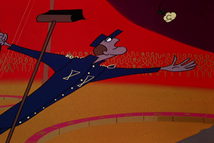
The ringmaster sees what is happening.
The Trapeze Artist tumbles and twirls and flies to the end of the routine.
 61
61
 62
62
 63
63
Crash !
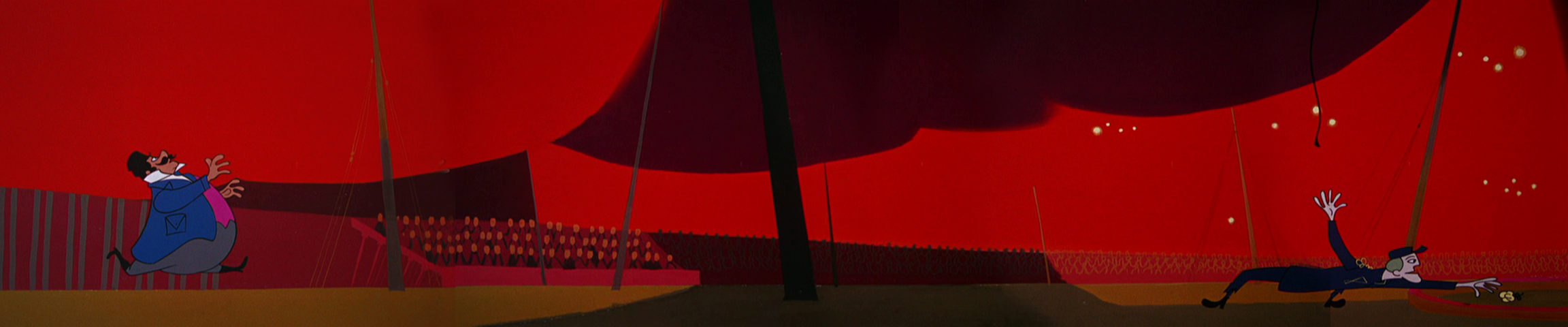
He lets go og the cord at the end of the pan.
 65
65
The ringmaster jumps to get it.
 66
66
 67
67
 68
68
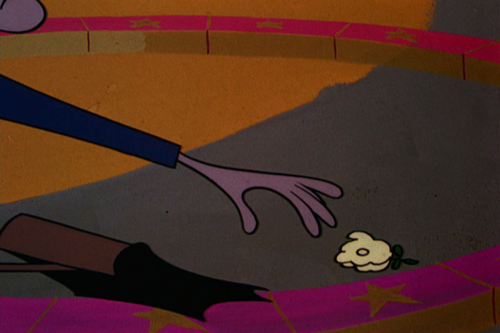
The end of the Trapeze Artist.
 69
69
 70
70
Diamonds are a girl’s best friend.
 71
71
 72
72
No more coins to put in the player piano.
 73
73
 74
74
 75
75
A car chauffering the girl comes crashing through the piano.
 76
76
It passes across the main title card.
 77
77
 78
78
 79
79
A knowing wink.
 80
80
The last scene should start at the feet and move up
to the full band, beaten. (There’s a hint of a move on
the DVD.) But it cuts off here to the End card.
 81
81
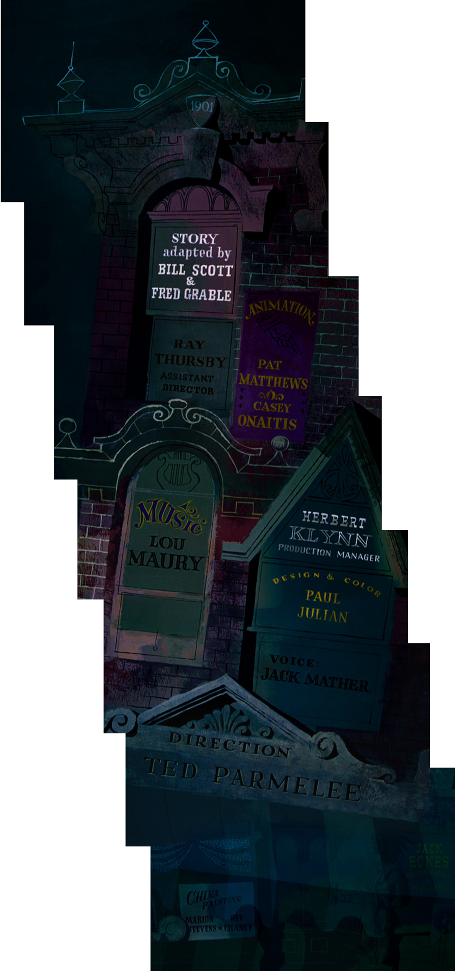
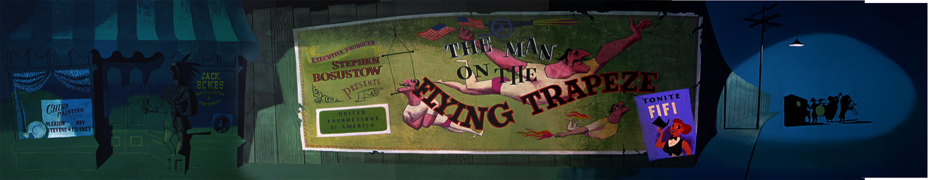
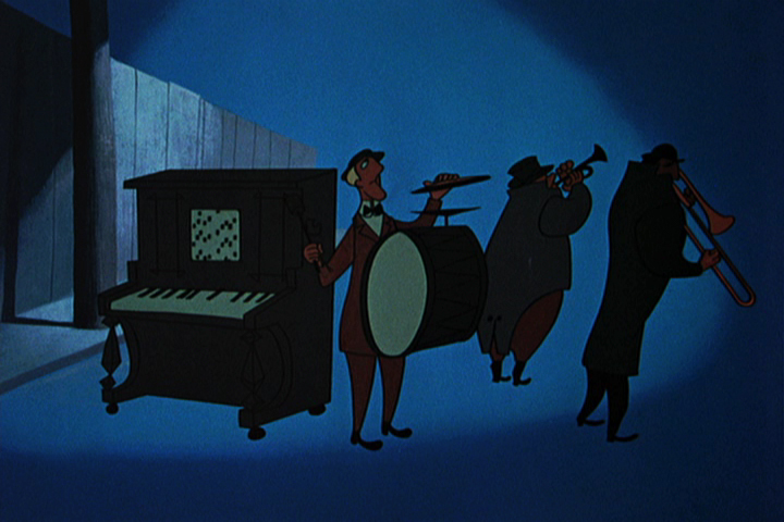
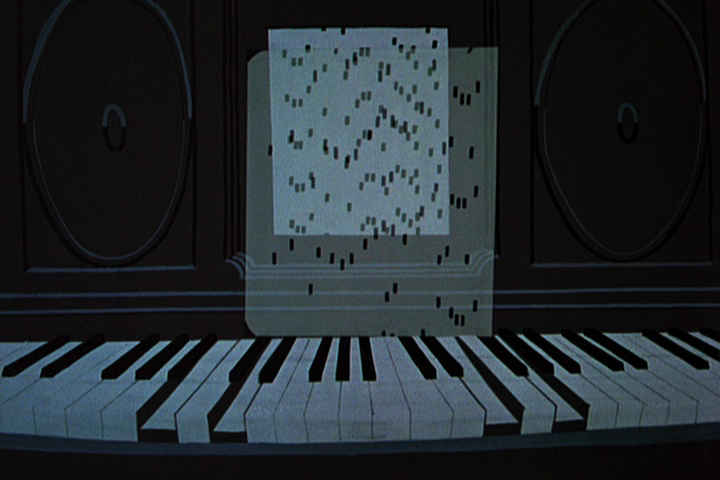
commercial animation &Layout & Design &UPA 16 Apr 2012 04:59 am
The Man on the Flying Trapeze – pt.1
- The new UPA dvd 3-set comes in three separate categories: there are the Great films, the Good films, and the Bad films. Definitely, one of the Bad films is The Man on the Flying Trapeze. It seems to want to be either The Dover Boys or Rooty Toot Toot, and it’s most certainly neither. The film is just poorly plotted. There are some interesting transitions and some interesting set pieces. I give credit for that to the designer.
The designer is Paul Julian who also did the backgrounds, and his work, as far as I’m concerned, is brilliant. I decided to pull frame grabs of this film to highlight the beautiful design and background work of Julian. It’s taken a very long time, and I’ll have to break this post into two. I just can’t get it all done in one day. But I hope you can see the excellence of Julian’s work.
 1
1Just a brlliant title card.
 2
2
A slow pan down over the credits.
Left to right stoppng on the main title.
Then continuing into the scene.
 4
4
 5
5
The player piano sets the mood for the entire film.
A ragtime score, piano leading, with little consequential dialogue.
 6
6
 7
7
The guy just fades on, in place, ready to throw the dart.
 8
8
 9
9
 10
10
Pan left to right with the Trapeze Artist.
Slow pan left to right with the audience.
Again pan left to right with the Trapeze Artist.
 14
14
 15
15
 16
16
 17
17
Beautiful trees remind me of the scene in The Dover Boys
where the villain pulls the heroine away from the tree.
 18
18
 19
19
 20
20
 21
21
We pan with the bicyclist.
 23
23
The man from the trapeze passes our hero . . .
 24
24
. . . who spins out of control.
 25
25
A beautiful Julian house and a great new color scheme
for this section of the film.
 26
26
 27
27
 28
28
Taking advantage of the new colors to . . .
 29
29
. . . separate the interiors from the exteriors.
 30
30
 31
31
 32
32
 33
33
34
35
to be concluded next week.
Animation &Animation Artifacts &commercial animation 04 Apr 2012 07:20 am
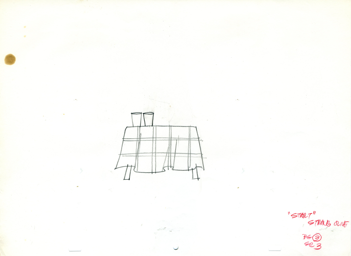
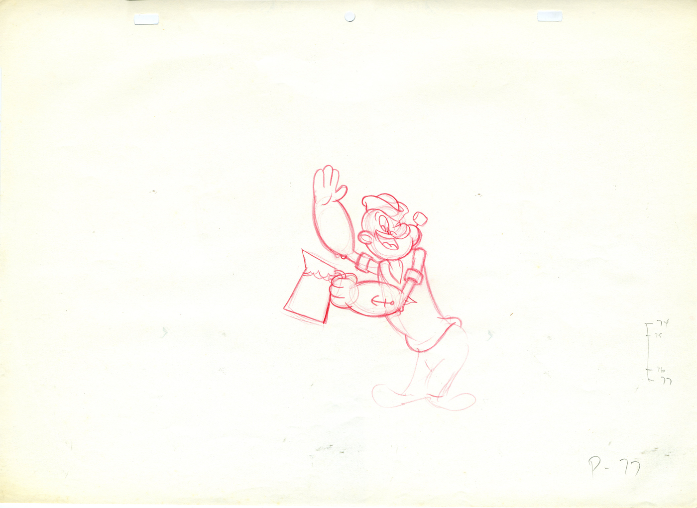
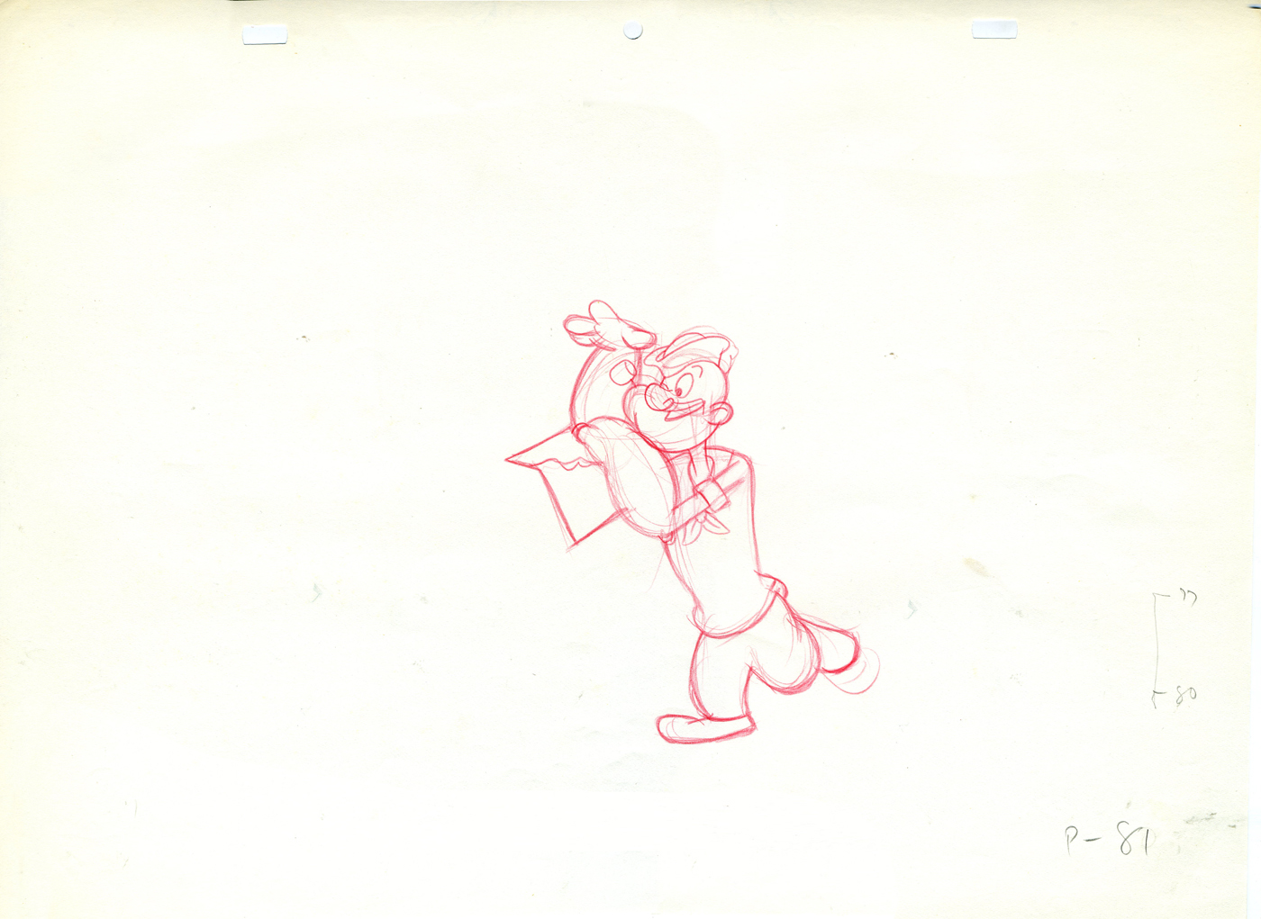
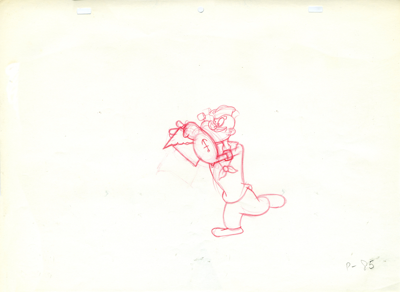
Tangy Popeye – repost
Tangy Popeye
 - Here are some of the drawings I have from what is probably the last piece of animation Jack Zander did professtionally.
It must be remembered it was Zander’s Animation Parlour that did the TV one hour “Special”, Popeye and the Man Who Hated Laughter. I was working as an Assistant Editor at Hal Seeger’s Studio when the job came through to Seeger. He decided to hire Zander’s Studio when he got the show from King Feature’s Syndicate. It was exciting to watch, first-hand, as the show developed.
This is from a Start commercial, a Tang competitor, done at Zander’s Animation Parlour. Instead of doling out the animation, Jack was intrigued with the idea of animating the character. He hadn’t animated Popeye before.
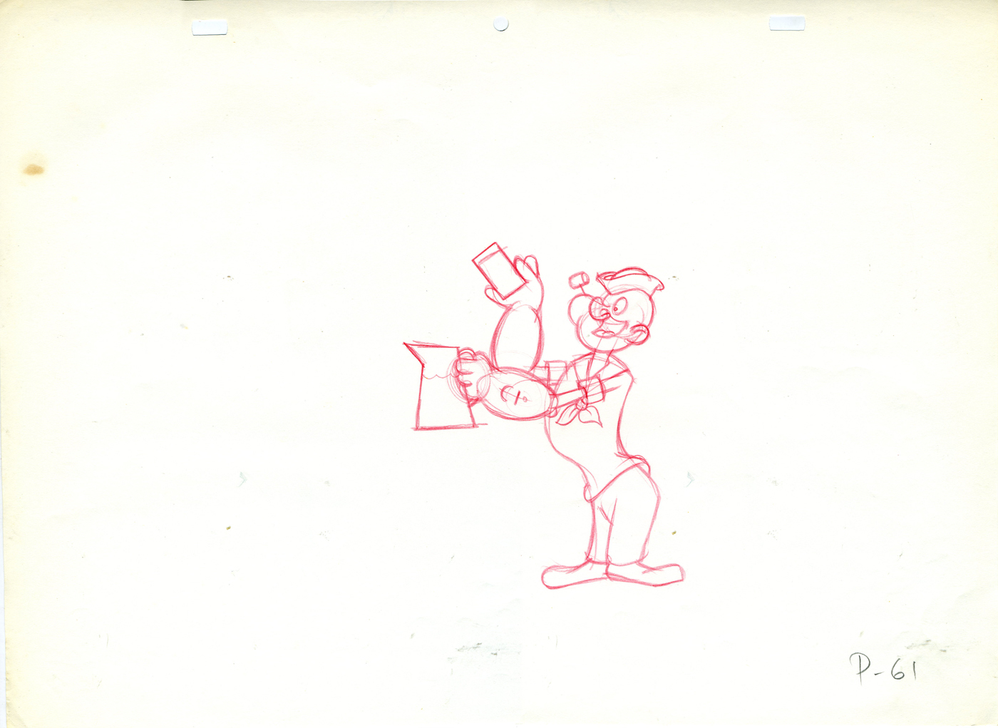 61
61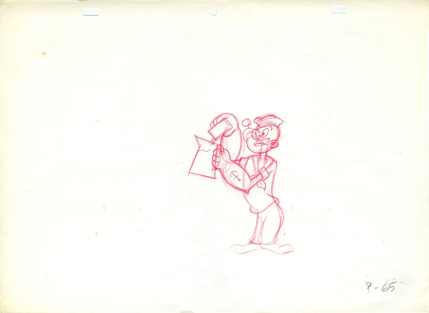 65
65
(Click any image to enlarge.)
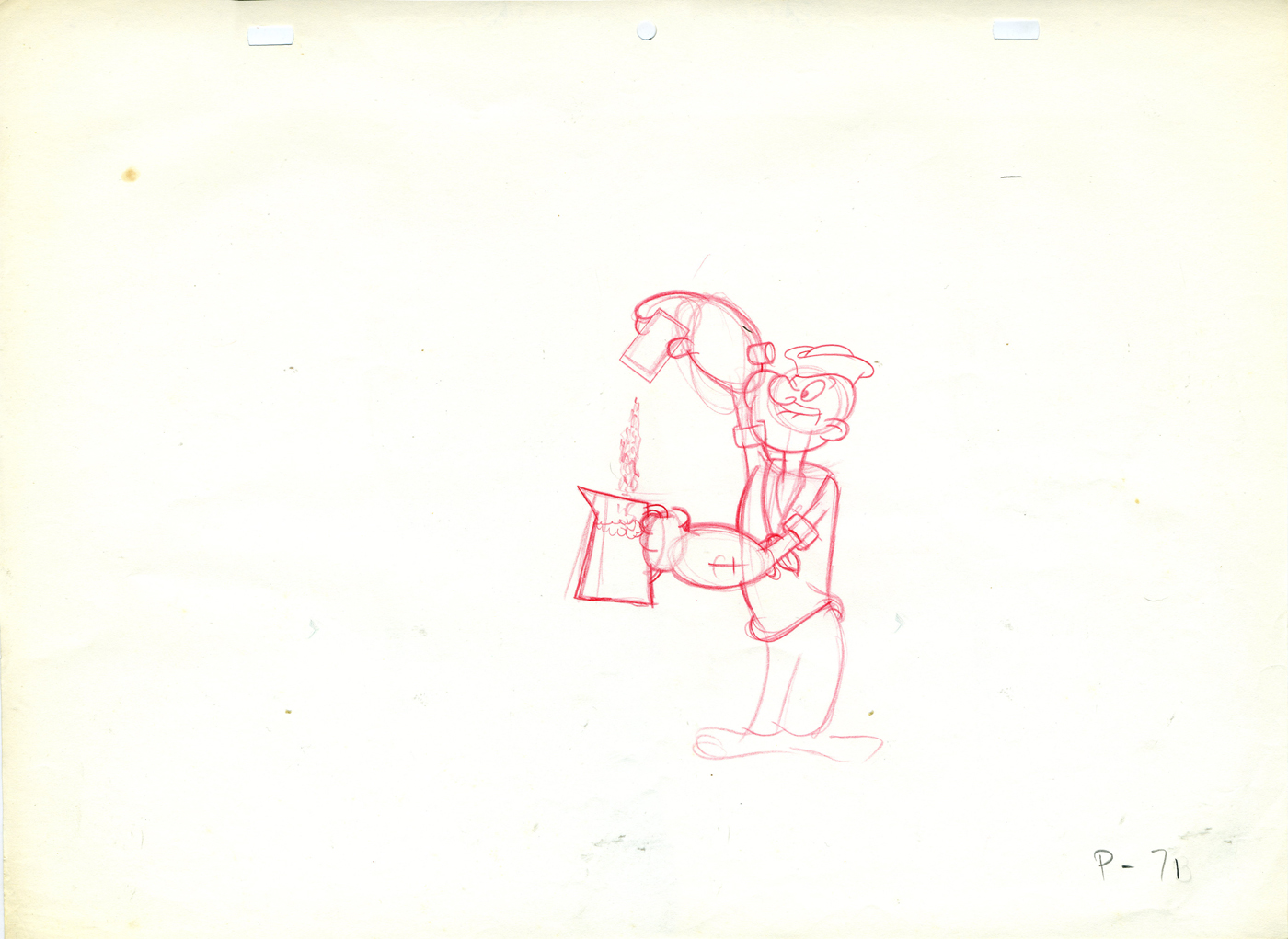 71
71 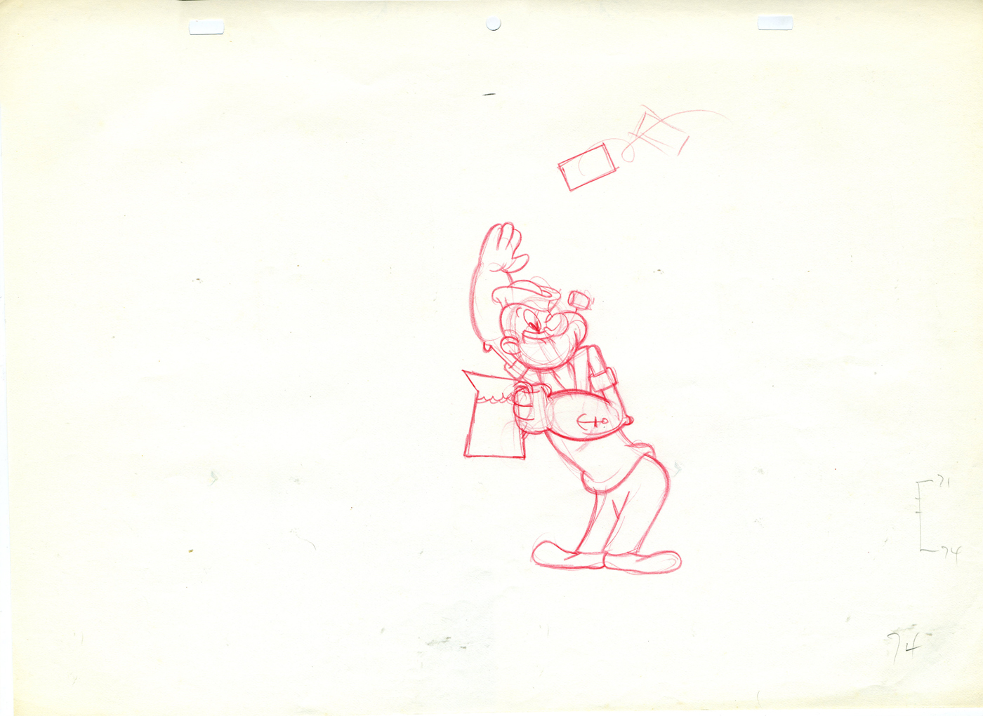 74
74
Do you think the assistant asked for a straight on model of Popeye’s face to do the inbetweens?
 85
85 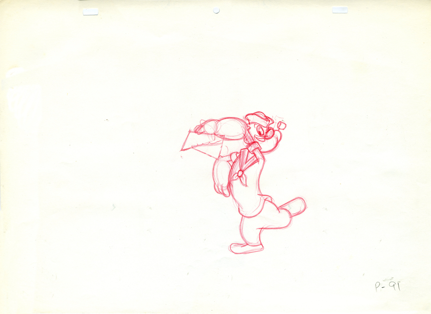 91
91
I think Jack might have been a bit out of practice when he did this spot. It looks a bit stiff.
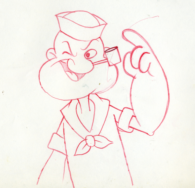
By the way, this drawing is an example of how Jack drew
Popeye, straight on. I’m not sure anyone else used this pose.
.
Tangy Olive Oyl
– Continuing my posting of the animation keys from the Popeye Tang commercial done at Zander’s Animation Parlour back in the early 70′s. Jack Zander cast himself to animate the spot since he hadn’t worked with these characters before. (His studio did the animation for The Man Who Hated Laughter for King Features Syndicate via Hal Seeger Prods. back in 1972, but Jack didn’t animate on it.)
(Click on any image to enlarge.)
On Saturday past, I put up the Popeye portion of this scene. Here are the Olive Oyl drawings. Jack has a bit more fun with her, and his drawings are much more loose.
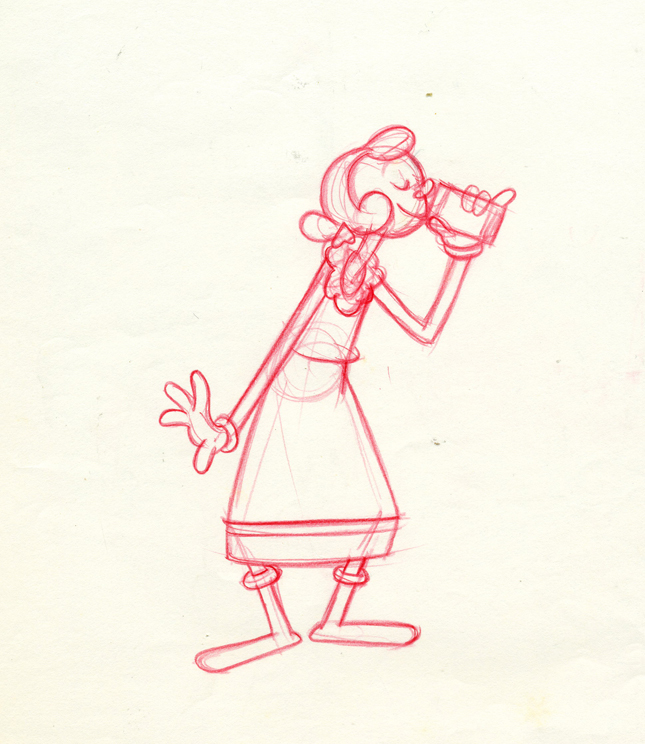
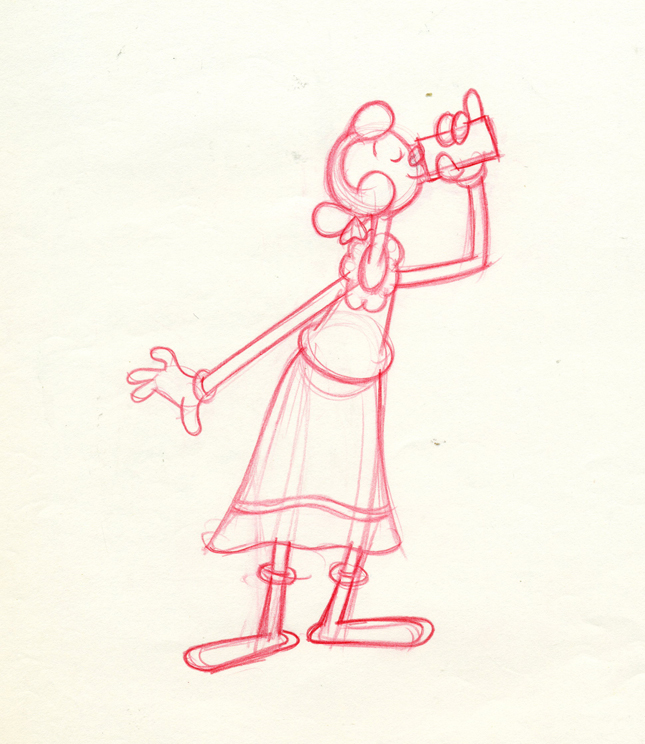
 57
57
I’d thought this was a Tang commercial, but
Charles Brubaker in the comments, below, directed
me to one of the spots on YouTube. It’s for
“Start”, which I assume was a Tang competitor.
AWN has on its site an excellent Joe Strike interview with Jack Zander about his career.
Bill Peckmann &commercial animation &Independent Animation &Layout & Design 27 Mar 2012 07:10 am
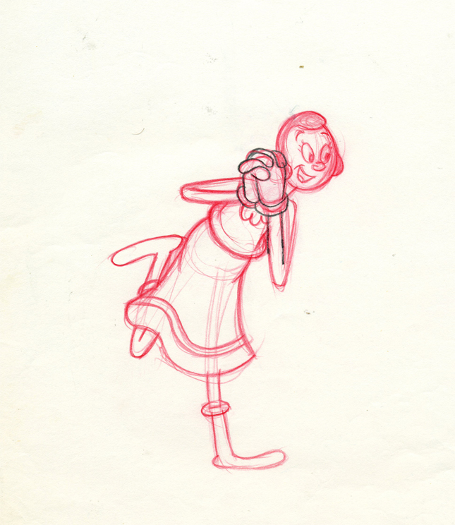
Thumbelina Photos
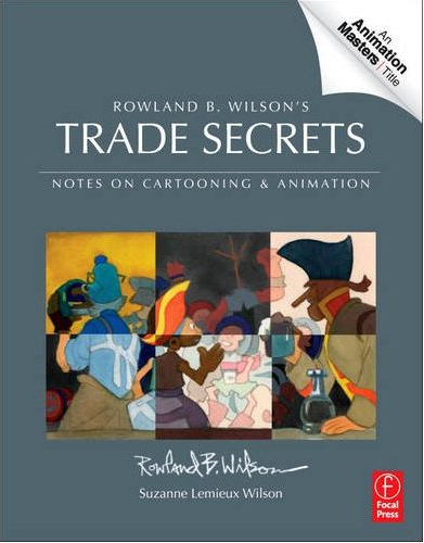 - There’s a wonderful new book on the market, and I want to keep it in your attention. So I’m trying to give as much attention to the great work of Rowland B. Wilson.
Rowland B. Wilson’s Trade Secrets: Notes for Cartooning and Animation seems to offer quite a bit of attention to Mr. wilson’s animatoin art as it does his brilliant illustration and cartooning.
Keep it in mind.
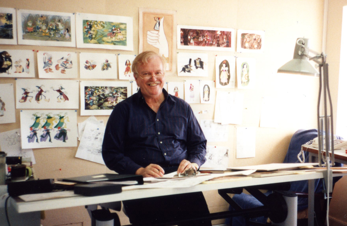
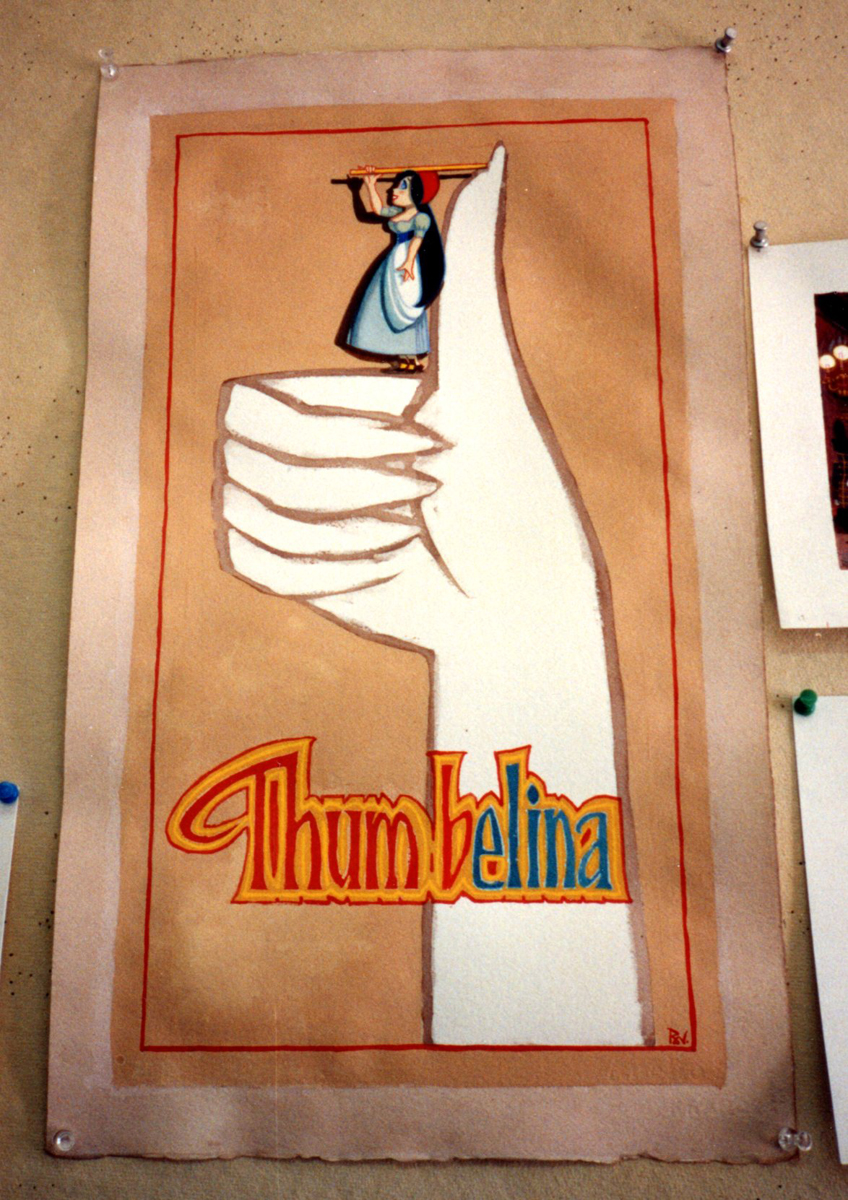
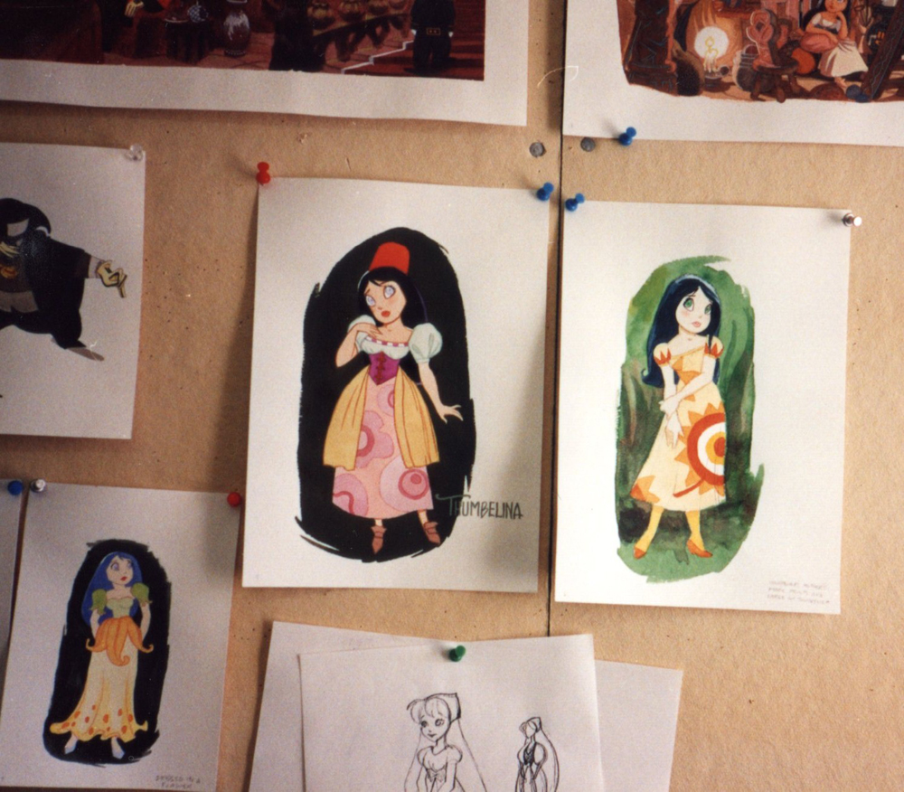
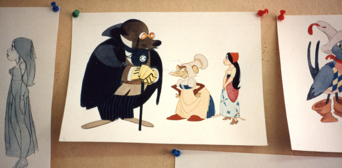
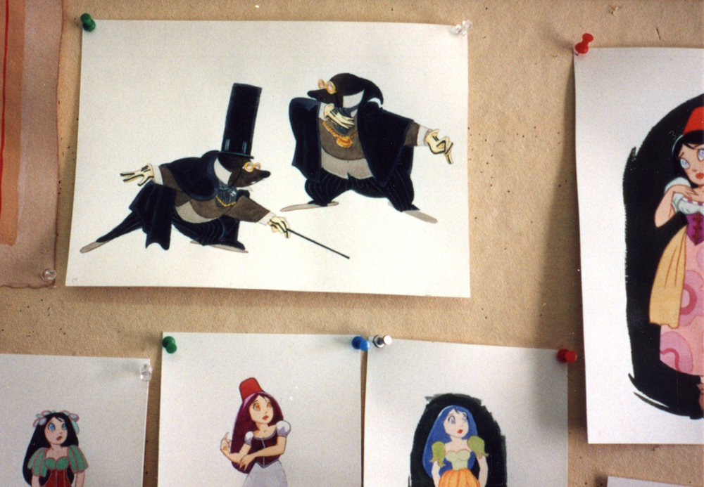
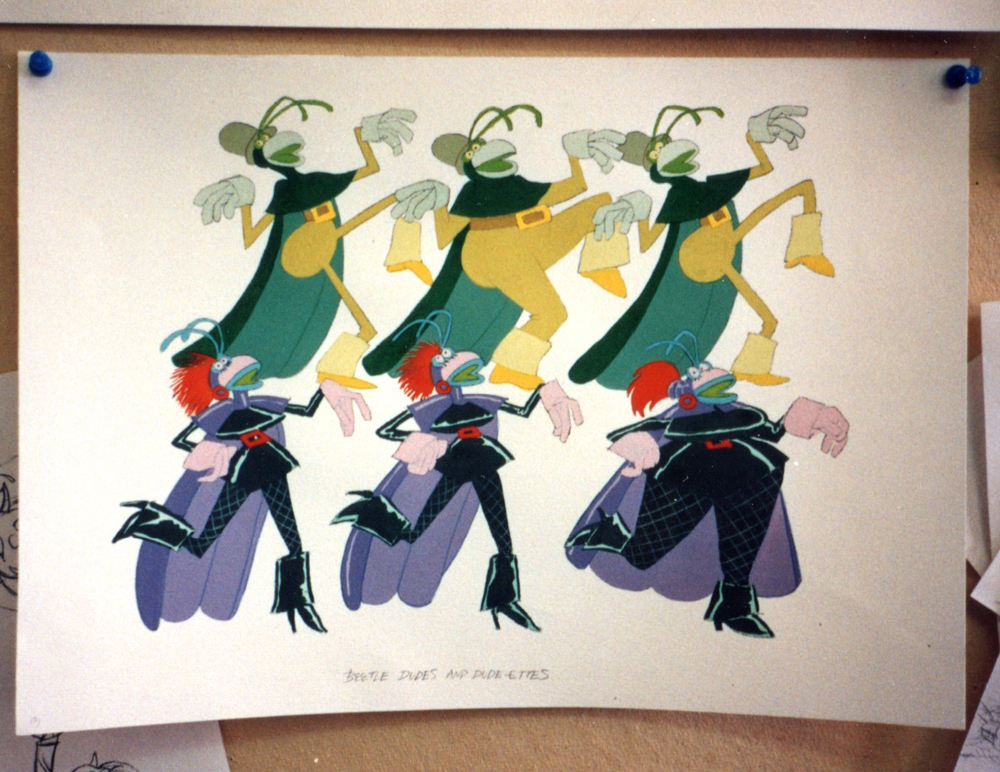
- Yesterday, we saw a lot of B&W models by Rowland B. Wilson done for Don Bluth‘s feature, Thumbelina. Today, I have a cache of photos taken by animation producer, Phil Kimmelman, when he visited Rowland in Ireland. Many of the models overlap, except that these are in color.
These all come by way of Bill Peckmann‘s great collection, thank you very much.
 1
1Rowland at his desk.
 2
2
 3
3
 4
4
 5
5
 6
6
 7
7
 8
8
 9
9
 10
10
 11
11
 13
13
 14
14
 15
15
 16
16
 17
17
 18
18
Rowland (L), Phil Kimmelman (Ctr)
Bill Frake (R), unknown in rear
Animation &Animation Artifacts &Art Art &commercial animation &Independent Animation &SpornFilms 05 Mar 2012 06:22 am
Steig Alka Seltzer Drawings
 I thought today I’d post anew some layout drawings done by William Steig for an Alka Seltzer commercial produced in the early 60′s.
Obviously, for the purpose of viewing, I’ve reconfigured the poses so that several of them are on each set-up. There are actually 15 drawings to the commercial, all on separate sheets of rice paper.
 The commercial was done by Elektra Studios. Steig worked with a bamboo reed cut to form a point. He dipped that in ink and drew. The paper is particularly thick and is designed to absorb the ink. They’re punched with Oxberry peg holes top and bottom. I have one of the bamboo “pens” he used to draw these layouts. The final commercial was basically an ink line drawing against a white field.
 I’ve been a big fan of Steig‘s since my earliest days when I first discovered him in the New Yorker Magazine. By the time I’d made it to college, I’d already seen two art exhibits of his artwork.
 By the time I saw my third exhibit of his work, I was able to barely afford one of the New Yorker drawings. It’s done on rice paper with the same type of “pen”. Years later, when I told Steig that I’d bought it, he said that it was the only drawing to have sold at that exhibit.
It was real luck for me to have been able to adapt a couple of his children’s books to animation. I not only got to meet him and his wife, Jeanne, but worked with his flutist son, Jeremy, on a number of projects.
I’m rather partial to Abel’s Island as a film. There were only about two dozen B&W pen and ink illustrations in the book, so we had to do quite a bit of designing in the style of Steig Bridget Thorne, who art directed the film, did some of her finest work ever on the backgrounds – beautiful pieces that I still treasure. I think this is one of Steig‘s best books, and I think we more than did it justice. Too bad negative feelings developed toward the end of that film as Jeremy sought some kind of financial greed, and I had to move on past him to protect the film, itself. - I still wonder what Shrek might have looked like if they’d followed Steig‘s book illustrations.

The original one minute spot.
These are some of the layout drawings done by William Steig for an Alka Seltzer commercial produced in the early 60′s.
 2
2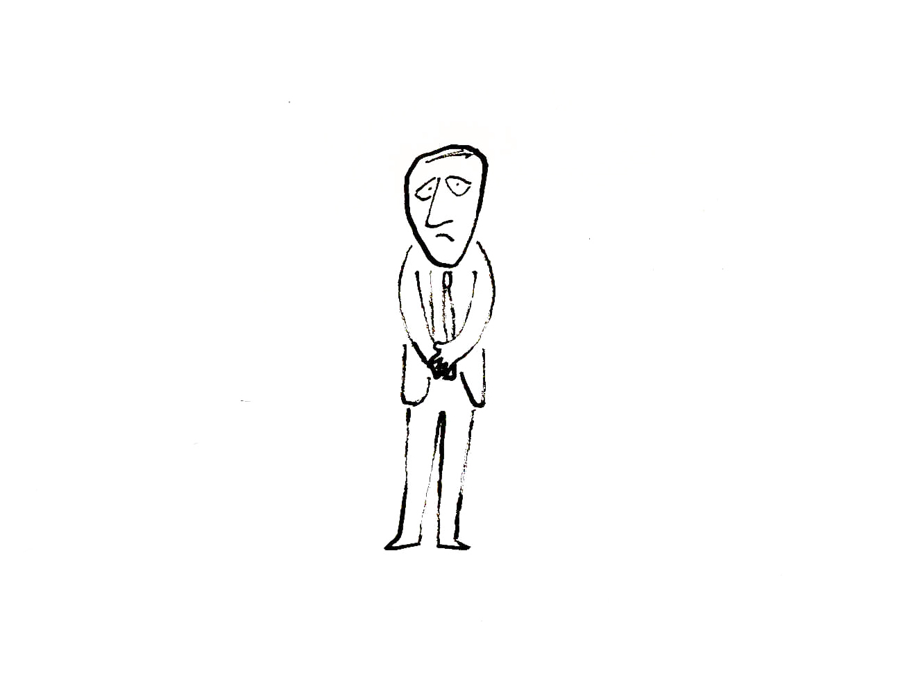 3
3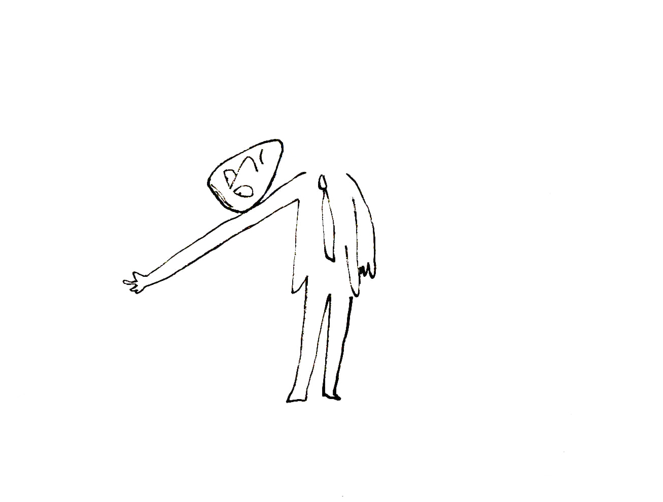
The commercial was done by Elektra Studios. Steig worked with a bamboo reed cut to form a point. He dipped that in ink and drew. The paper is particularly thick and is designed to absorb the ink. They’re punched with Oxberry peg holes top and bottom. I have one of the “pens” he used to draw these layouts. The final comercial was basically an ink line drawing against a white field.
 7
7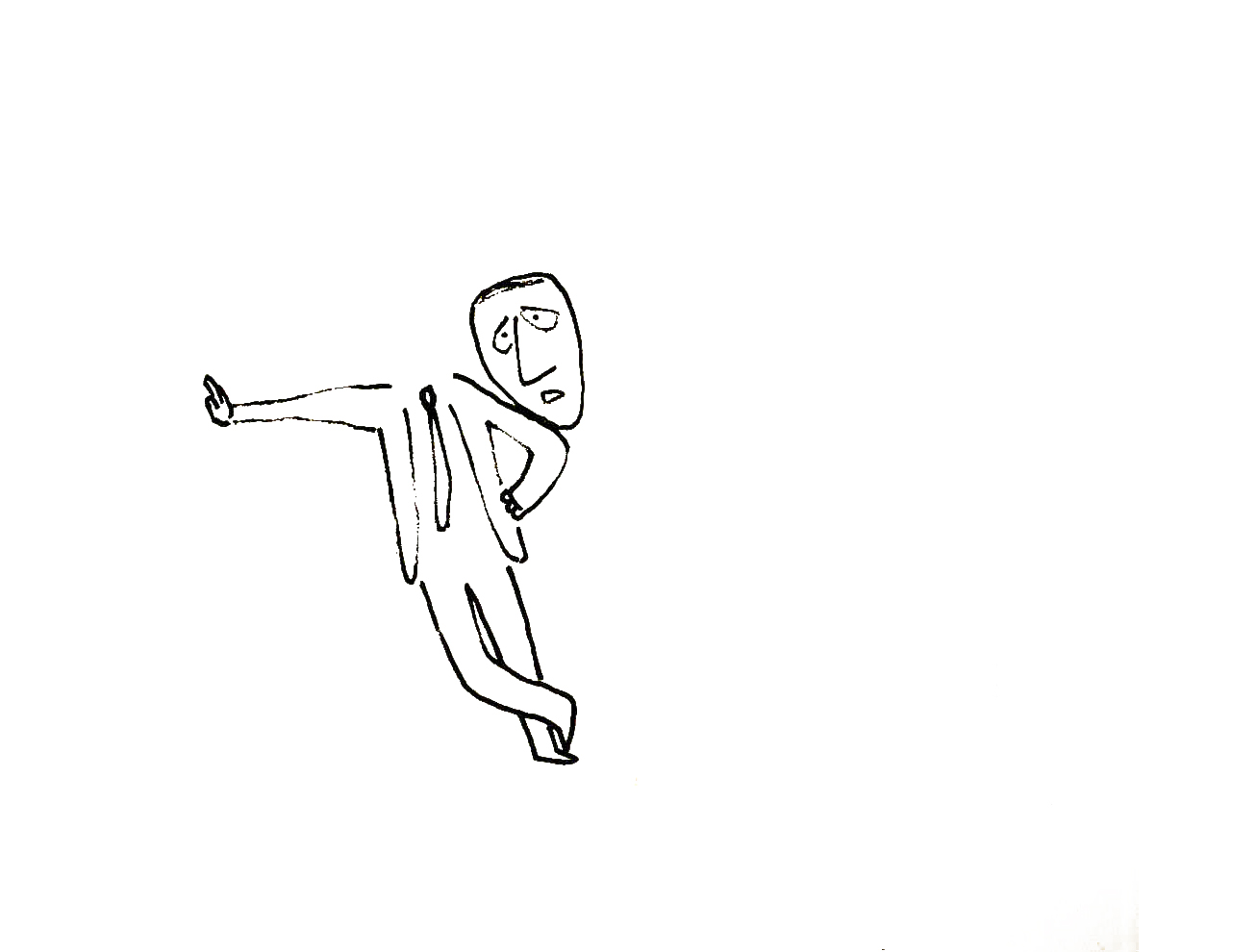 9
9I’ve been a big fan of Steig‘s since my earliest days when I first discovered him in the New Yorker Magazine. By the time I’d made it to college, I’d already seen two art exhibits of his artwork.
 12
12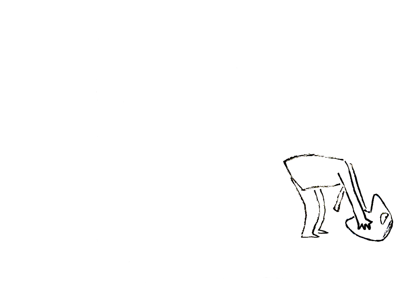 13
13By the time I saw my third exhibit of his work, I was able to barely afford one of the New Yorker drawings. It’s done on rice paper with the same type of “pen”. Years later, when I told Steig that I’d bought it, he said that it was the only drawing to have sold at that exhibit.
 15
15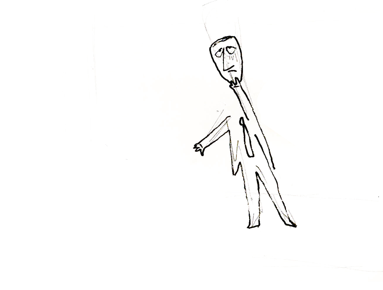 17
17It was real luck for me to have been able to adapt a couple of his children’s books to animation. I not only got to meet him and his wife, Jeanne, but worked with his flutist son, Jeremy, on a number of projects.
Bridget Thorne, who art directed the film, did some of her finest work ever on the backgrounds – beautiful pieces that I still treasure. I think this is one of Steig‘s best books, and I think we did it justice. 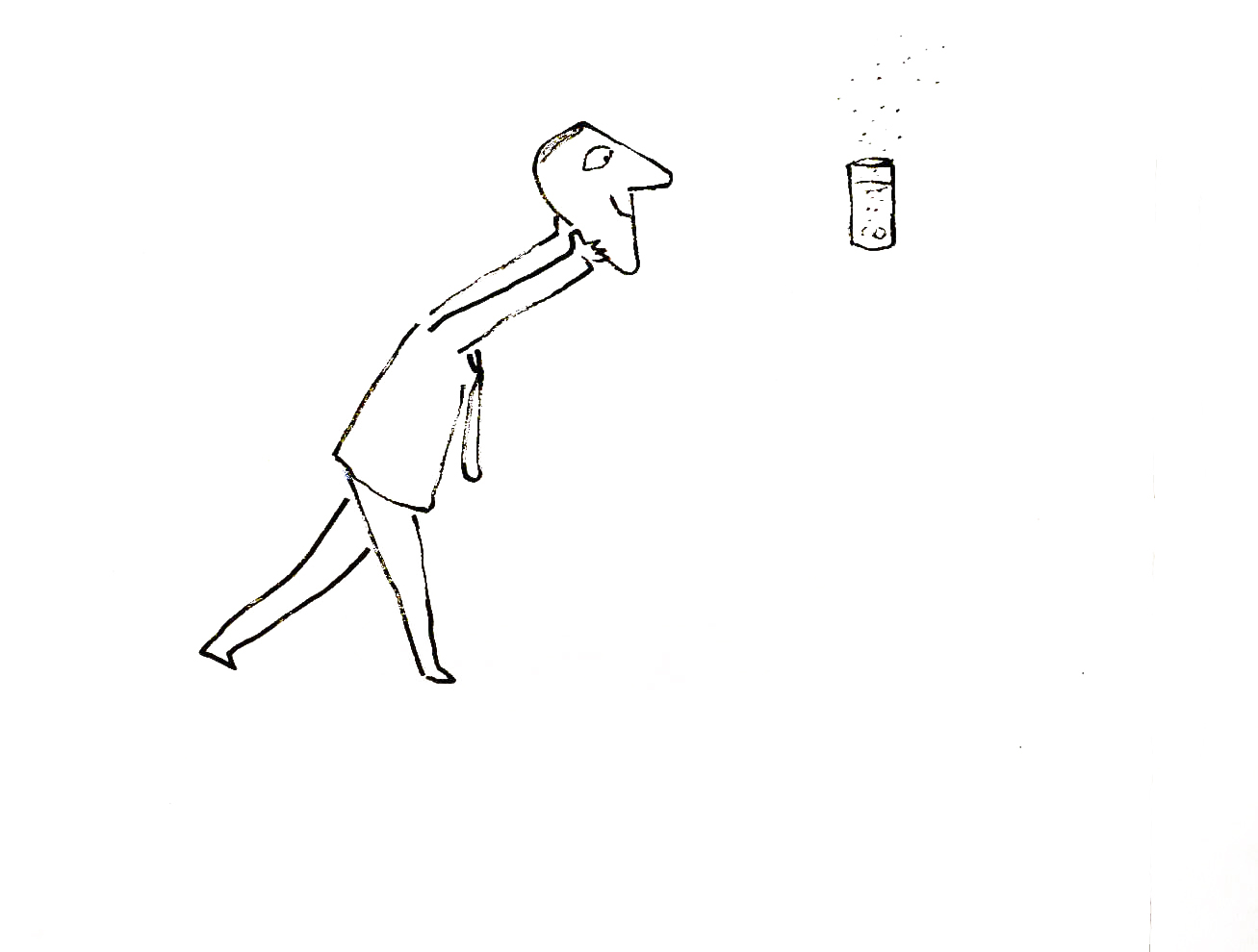
I’m rather partial to Abel’s Island as a film. There were only about two dozen B&W pen and ink illustrations in the book, so we had to do quite a bit of designing in the style of Steig
 24
24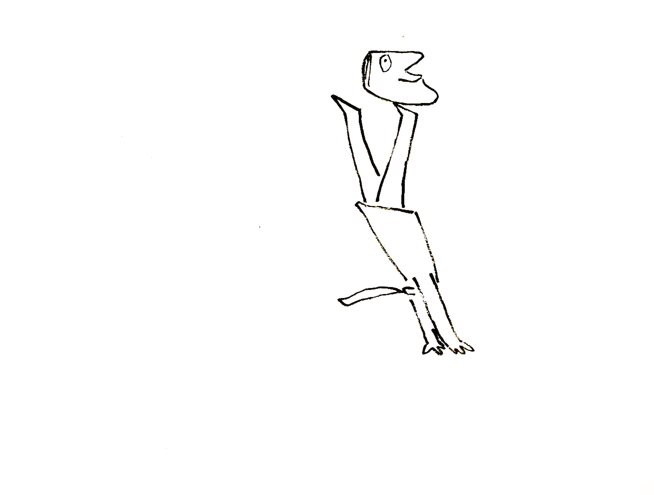 27
27
Animation Artifacts &commercial animation &Richard Williams 04 Mar 2012 08:24 am
Williams/Frazetta/Bakshi – Recap
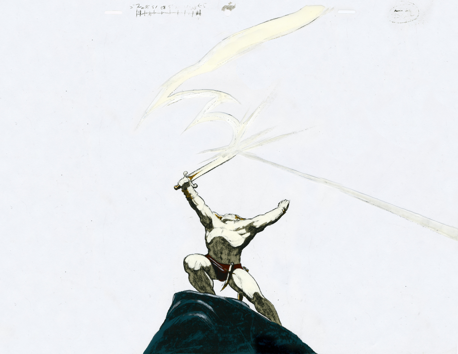
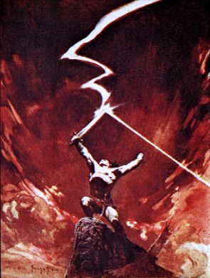 – Having given images of both Dick Williams‘ work and Bakshi‘s, I thought it’d be a good time to post the cel below. It reminds us of what an extremely talented animator and draftsman Richard Williams was – and still is.
This is a cel from his commercial for Jovan done in Frank Frazetta‘s style.
Of course, Williams captures the illustrator’s work better than Bakshi did in Fire and Ice (although to be fair Bakshi had an enormously lower per second budget.) There’s a gallery of some art from Bakshi‘s film here, and there’s a trailer for it on YouTube.
Dick Williams‘ beautiful commercial ran briefly in 1978.
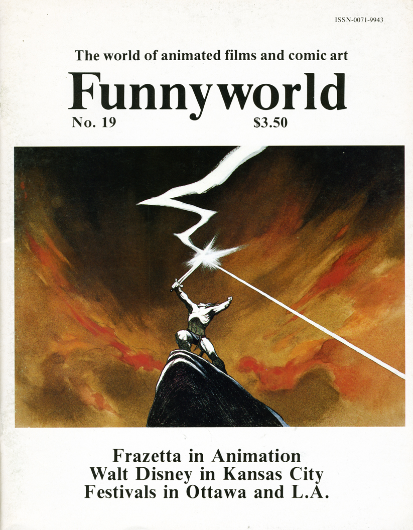
An image scanned from the cover of Funnyworld #19 runs beneath the cel to give an indication of what it looked like in the final. It appears to be a cel from the __________Frazetta’s original.
same scene – a bit closer on the character.
The cel was given to me by Dick. (I also have another which matches the other Funnyworld illustration from this spot.)
(Click on any image to enlarge.)
Dick animated the spot directly on cel with his Mars Omnichrome pencil (no longer available, of course.) There were six weeks for the entire production. Illustrator Rebecca Mills painted the backgrounds in oil. I remember Dick telling me how brilliant her work was while this commercial was in production.
_________________
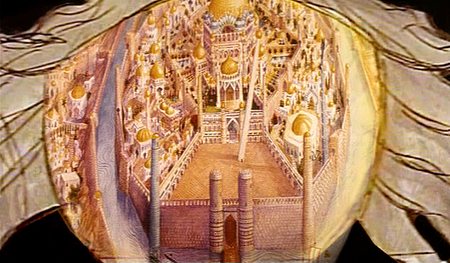
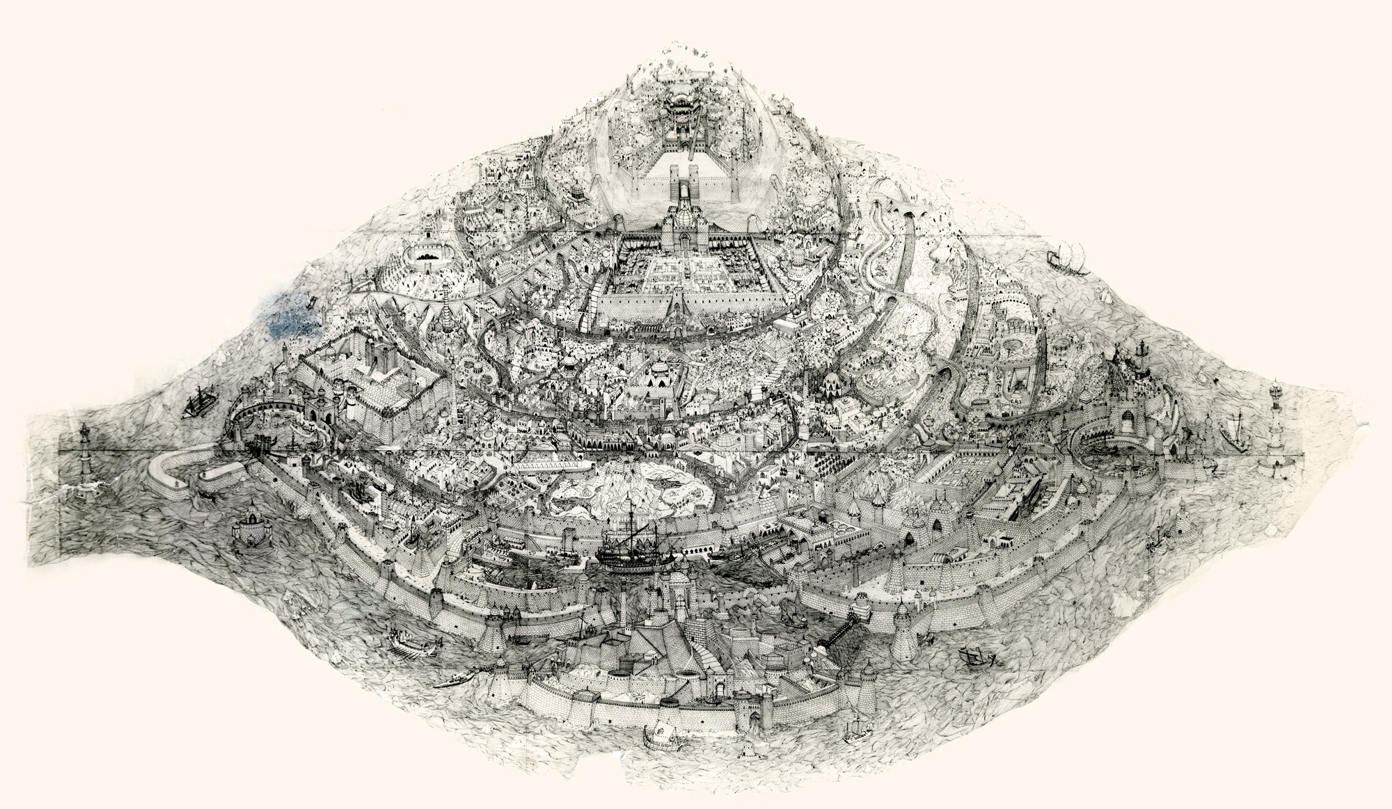
- Lets go even beyond Frazetta and Bakshi with the Richard Williams‘ studio in the heyday when he was about to prove himself with The Cobbler and the Thief. Let me share another image with you.
When Raggedy Ann & Andy was winding down, Richard Williams asked me, over dinner, whether I would be interested in working in London on his feature, The Cobbler and the Thief. He had in mind one sequence which he said would be all mine. This was the film’s opening – a slow truck into the island where all the action of the film would take place.
 (Click on any image to enlarge.)
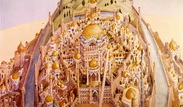
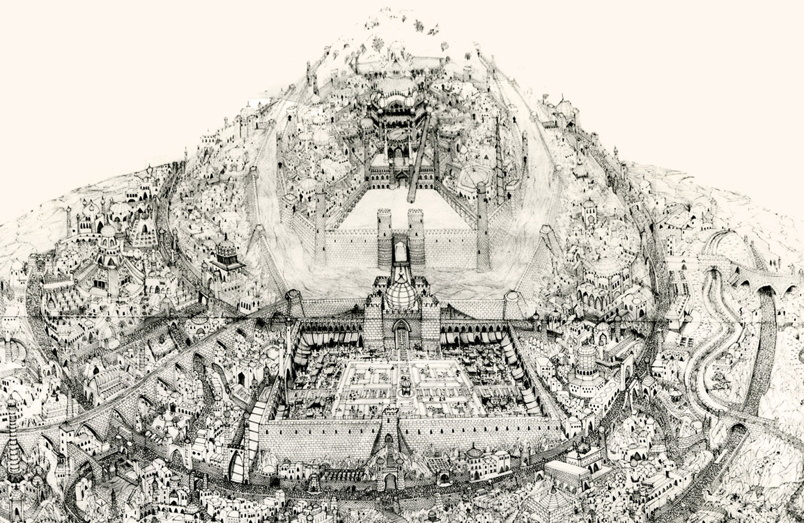
This was a photostat of this island. The original drawing, Dick had said, was enormous. It was composed of many smaller segments that were pinned together on a wall in his studio. If you look closely you can see those dividers in this photostat. To give a better indication of the detail in this drawing, I’m posting, below, a second image of a small portion of it.
The idea of it exhilarated me. I believe he said that Roy Naisbitt was involved with it, and that was something to get me going. I’d read about many of Dick’s staff and had already placed them on pedestals – including Roy’s work. I would not only get to meet them but work with them as well.
I decided not to take the job. I thought it would be better to remain friends with Dick than to continue working with him. That decision is something I don’t regret. It would have been fun to have been involved with that film, but so much has happened in my life by staying put, that I have no regrets.
The storyboard for the original cut of Dick’s film included these panels which led into the image of the animated city. A still of the city remained in the Miramax/Fred Calvert version, but that’s all.