Category Archivecommercial animation
Animation &Animation Artifacts &Bill Peckmann &commercial animation &Layout & Design &Models 17 Aug 2012 06:23 am
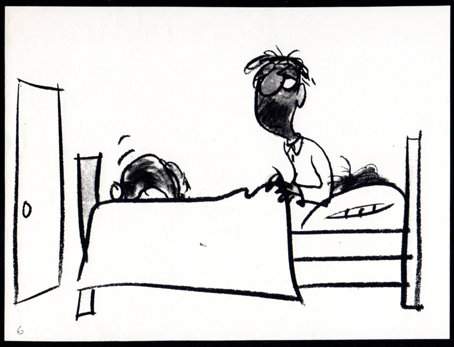
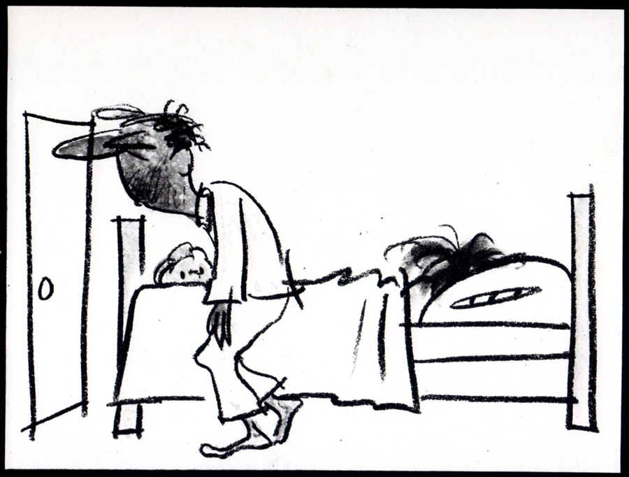
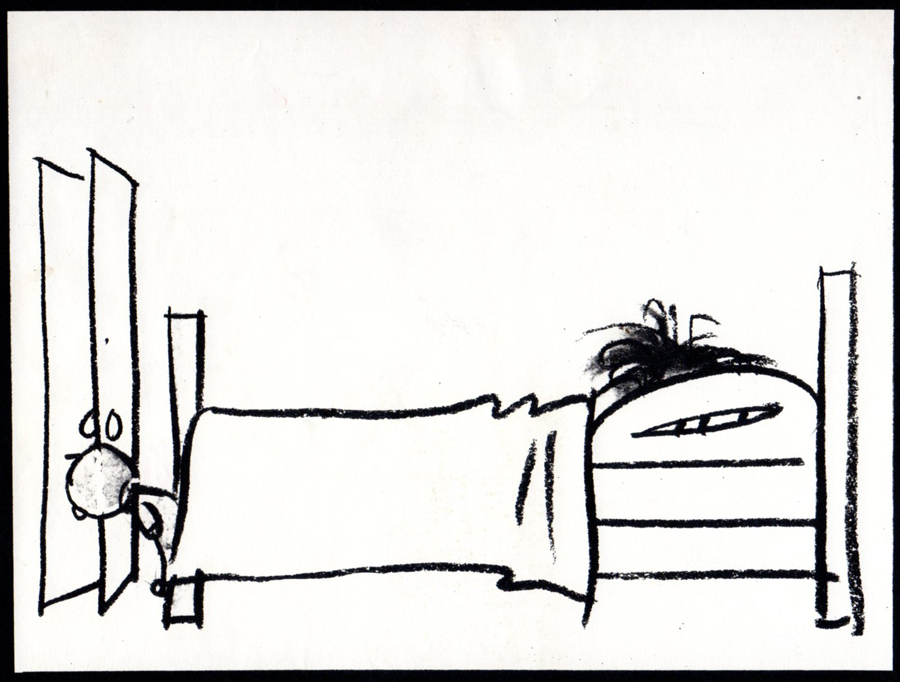
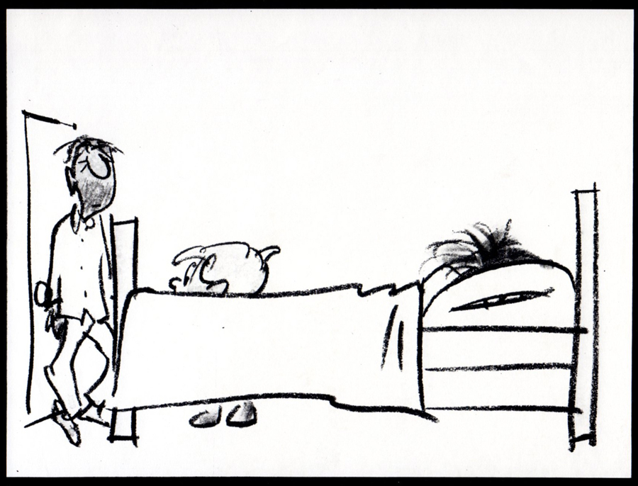
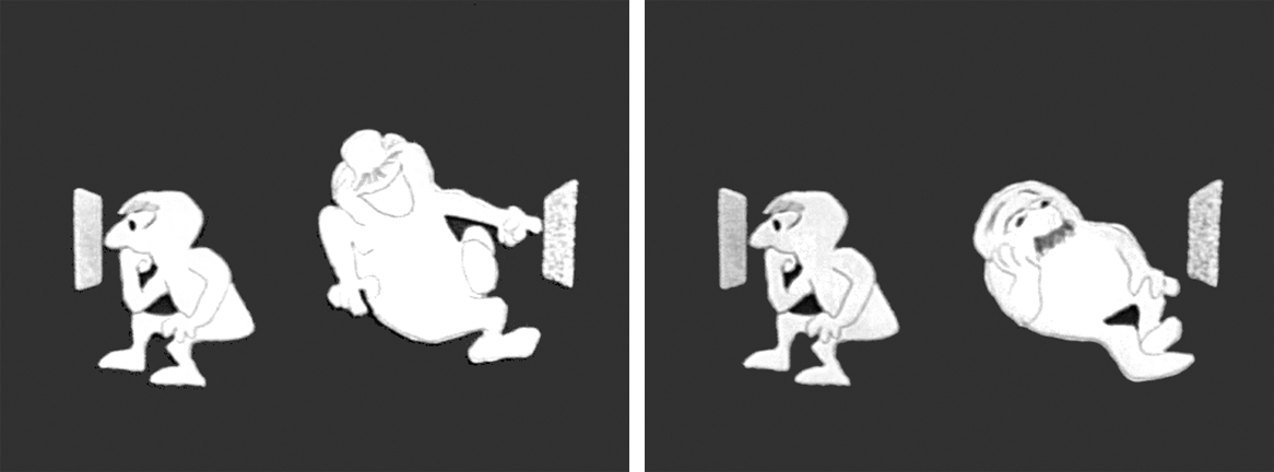
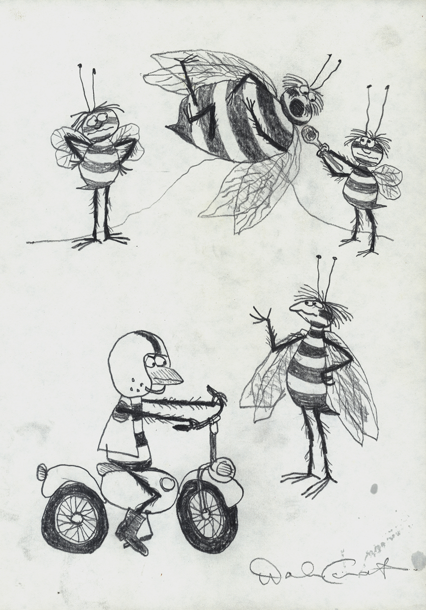
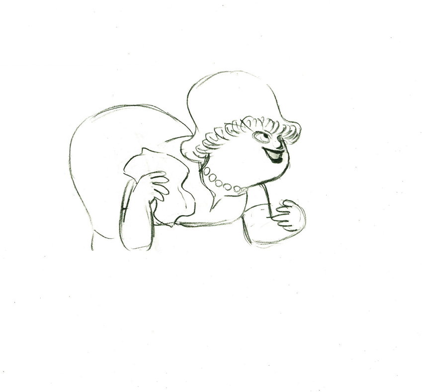
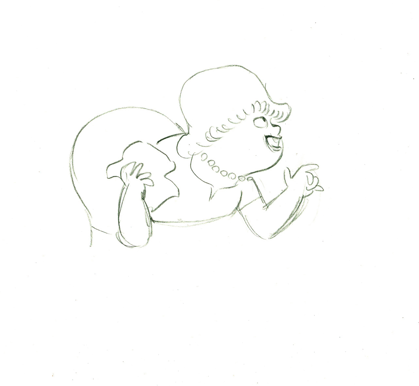
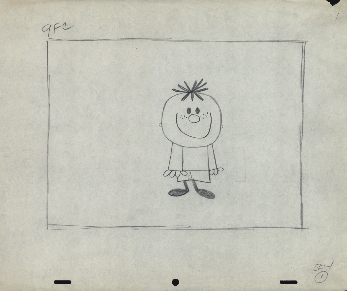
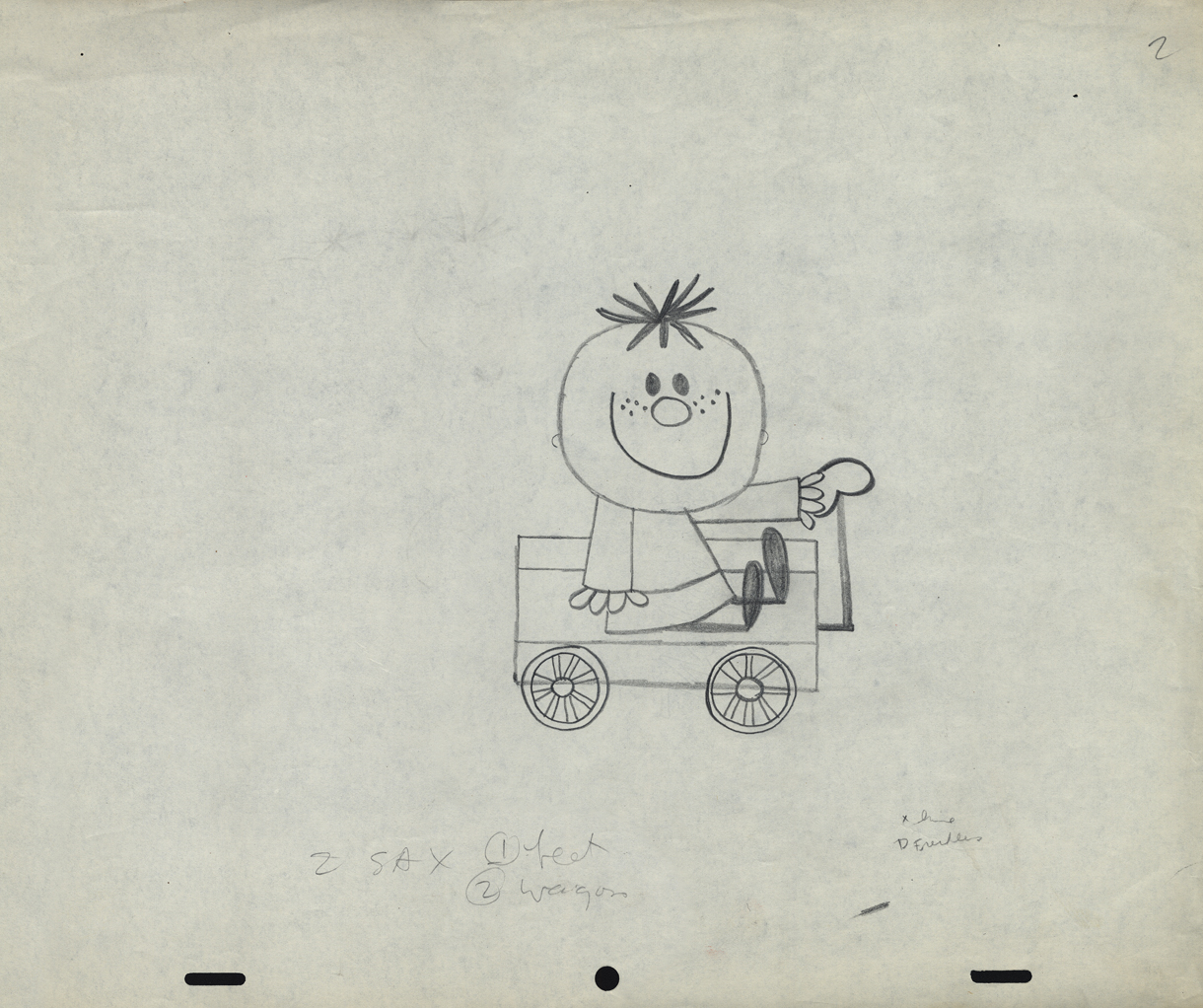
Peckmann & Schnerk’s Utica Club
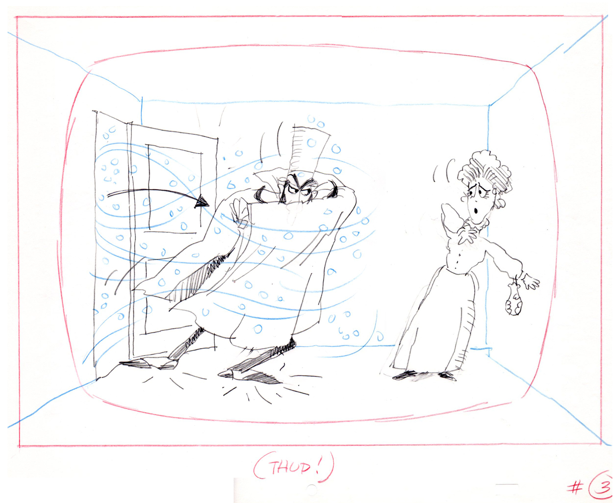
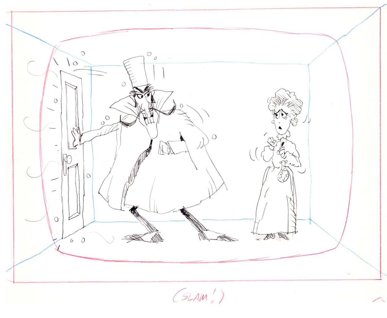
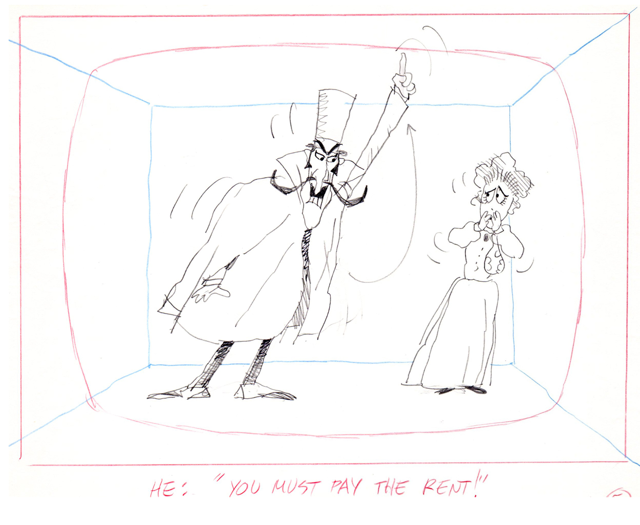
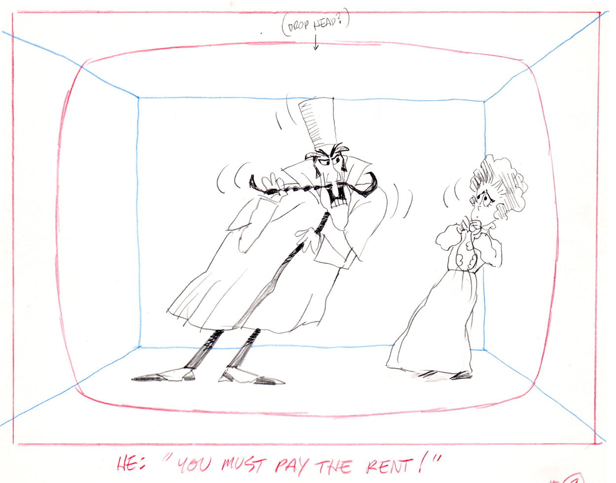
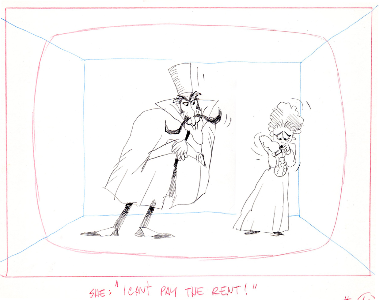
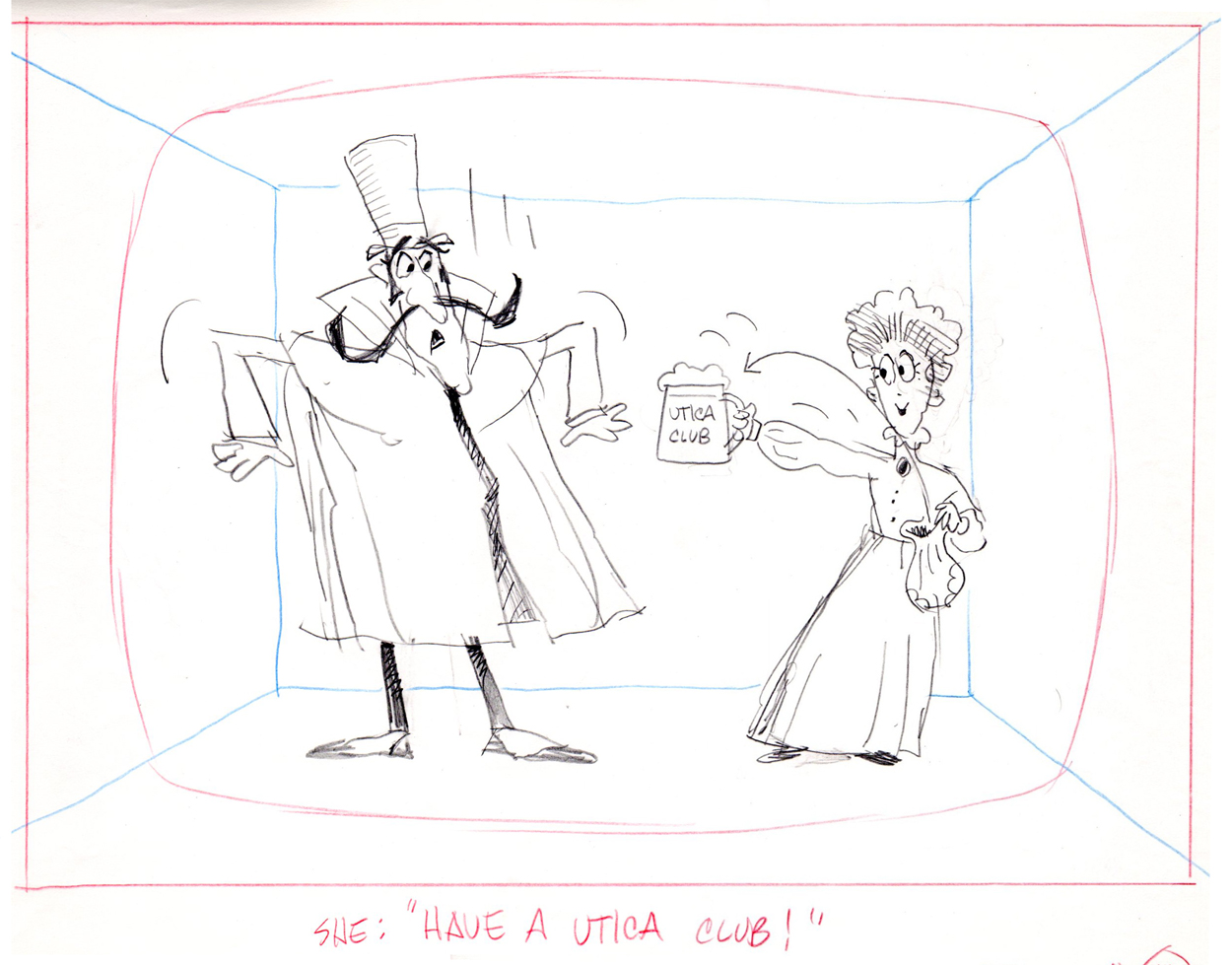
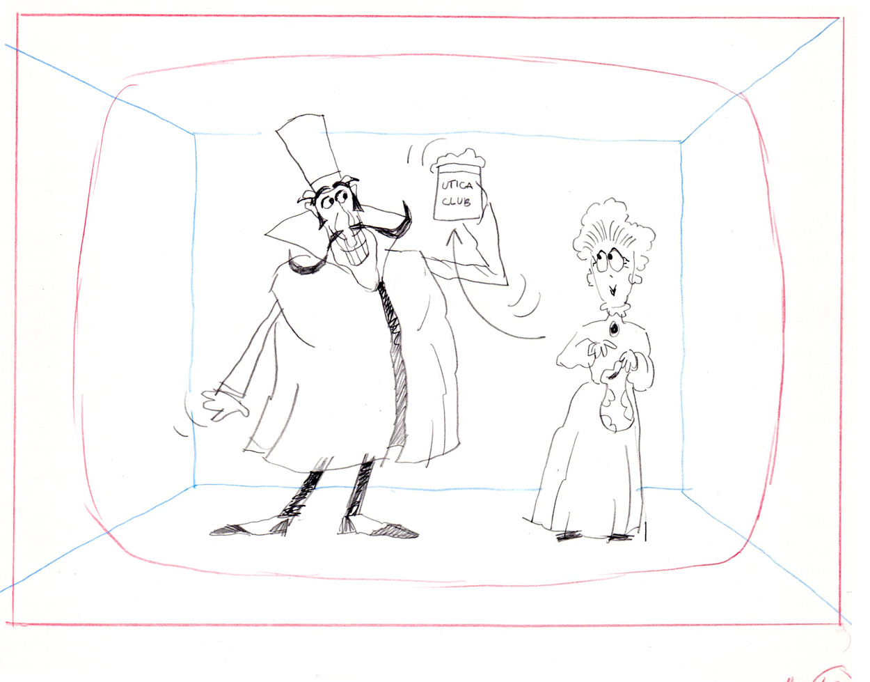
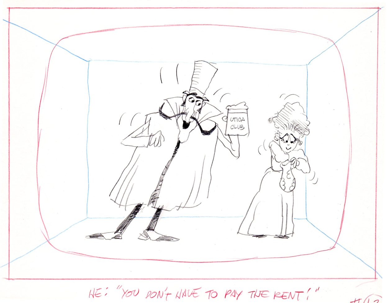
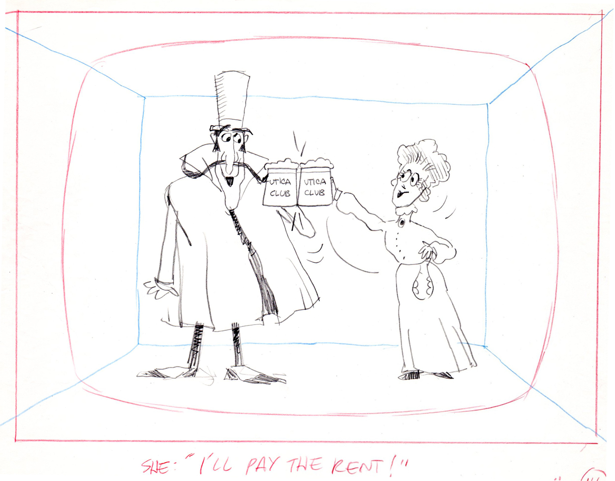
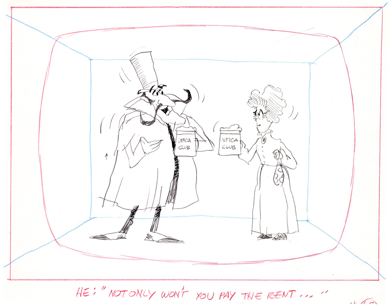
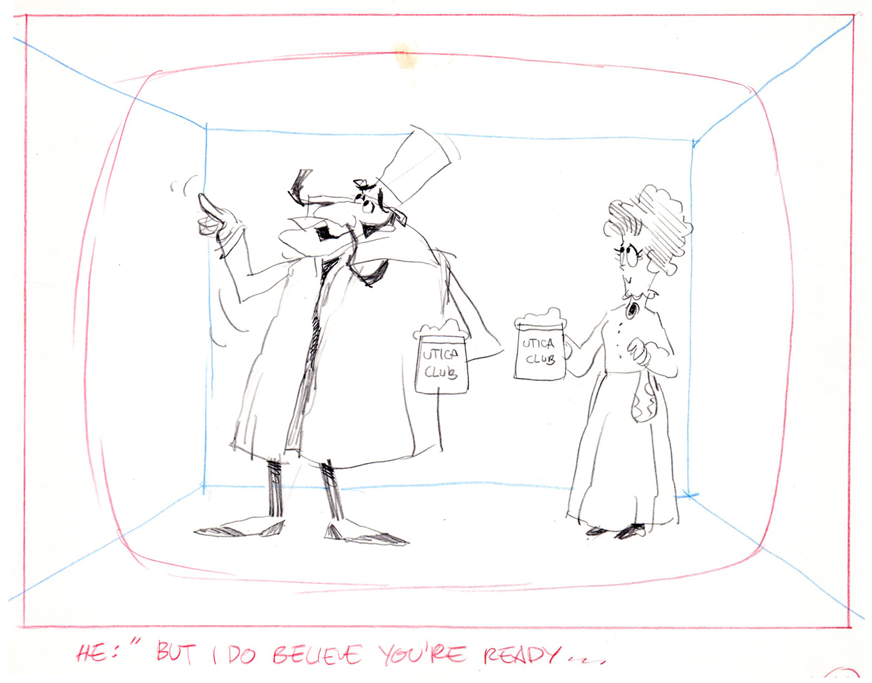
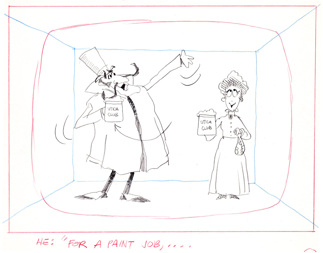
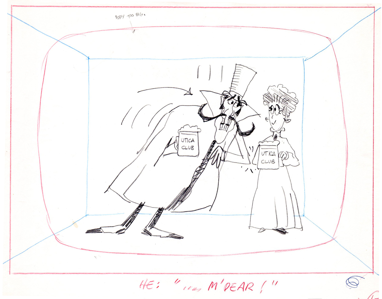
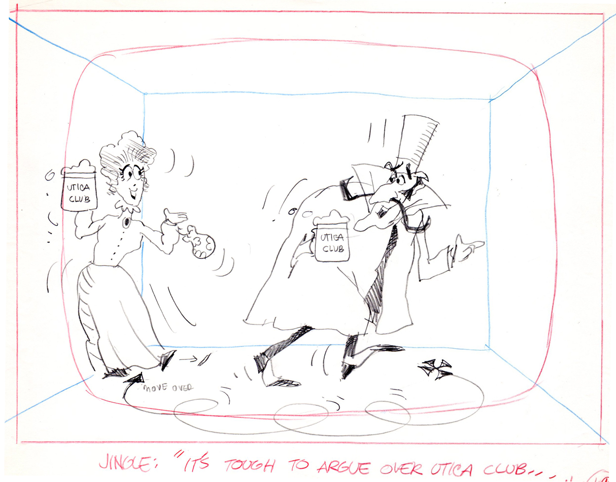
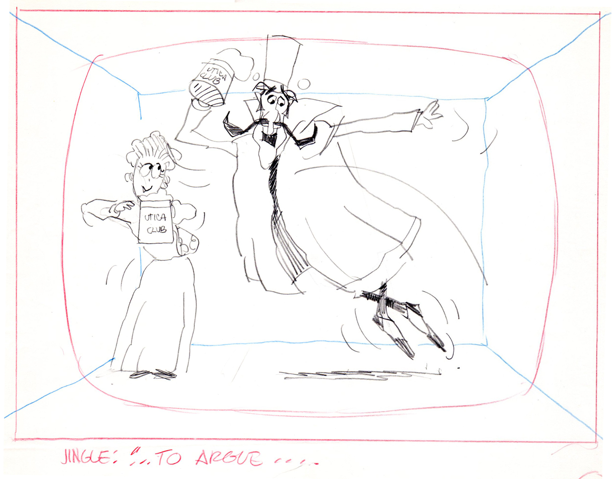
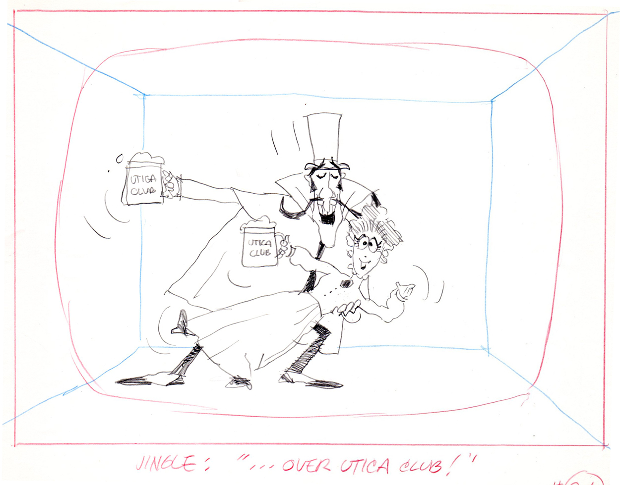
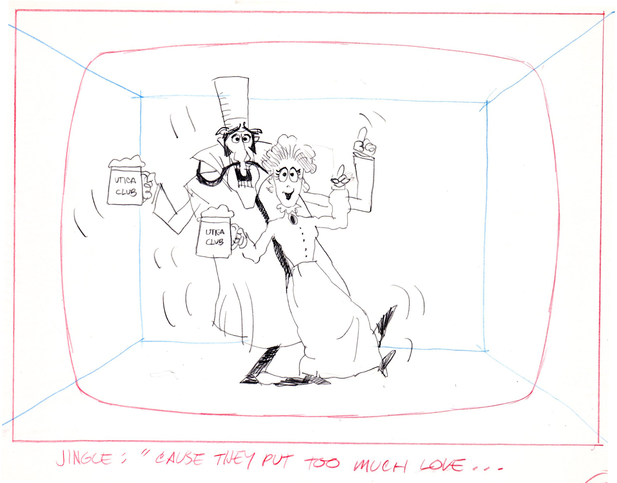
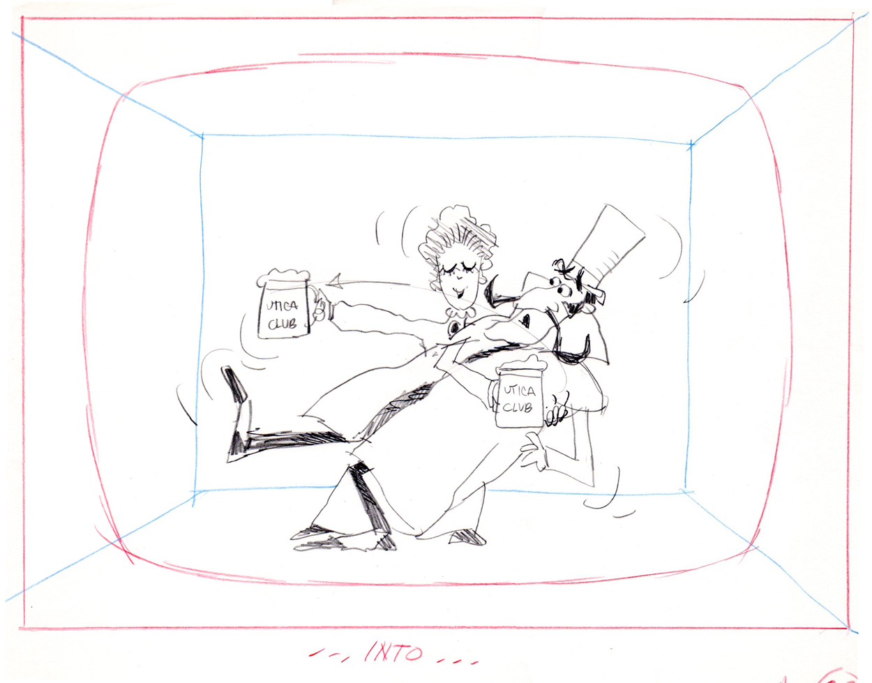
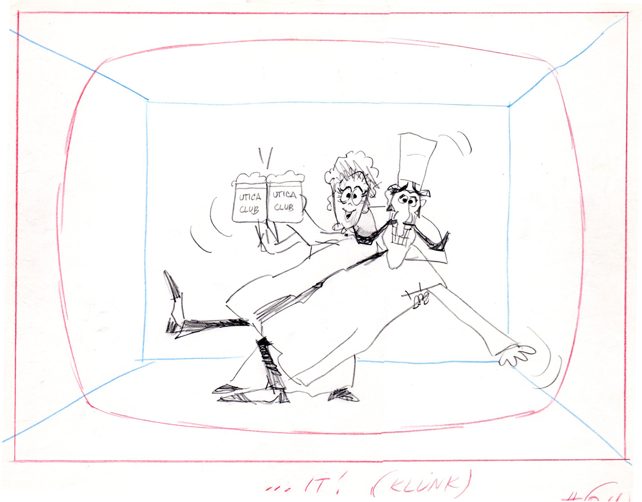
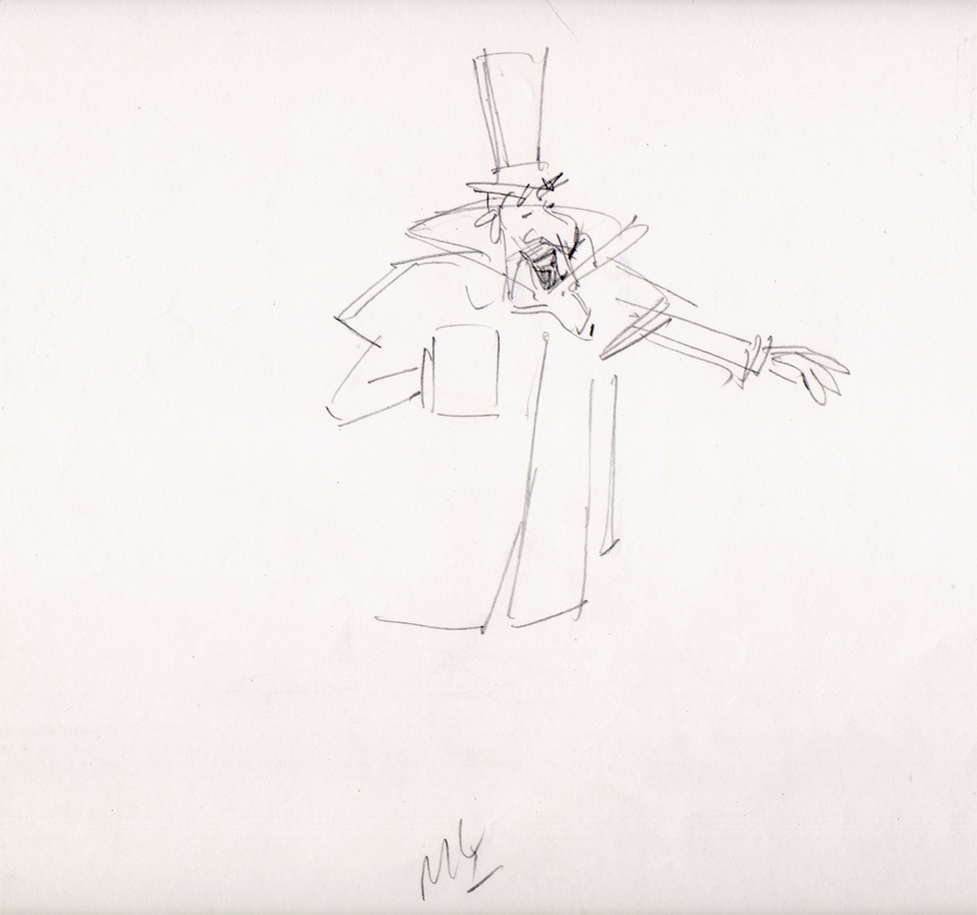
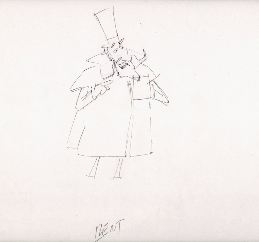
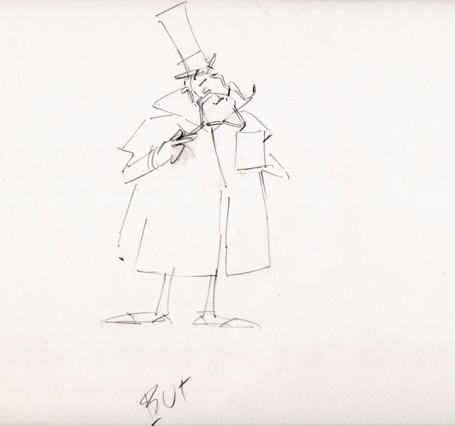
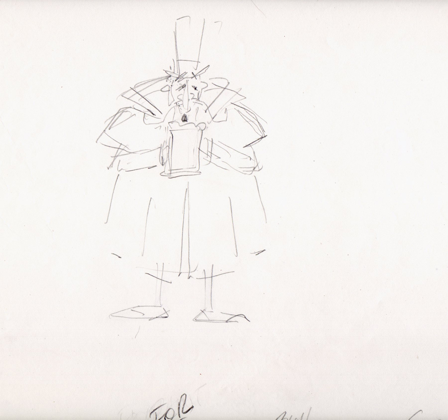
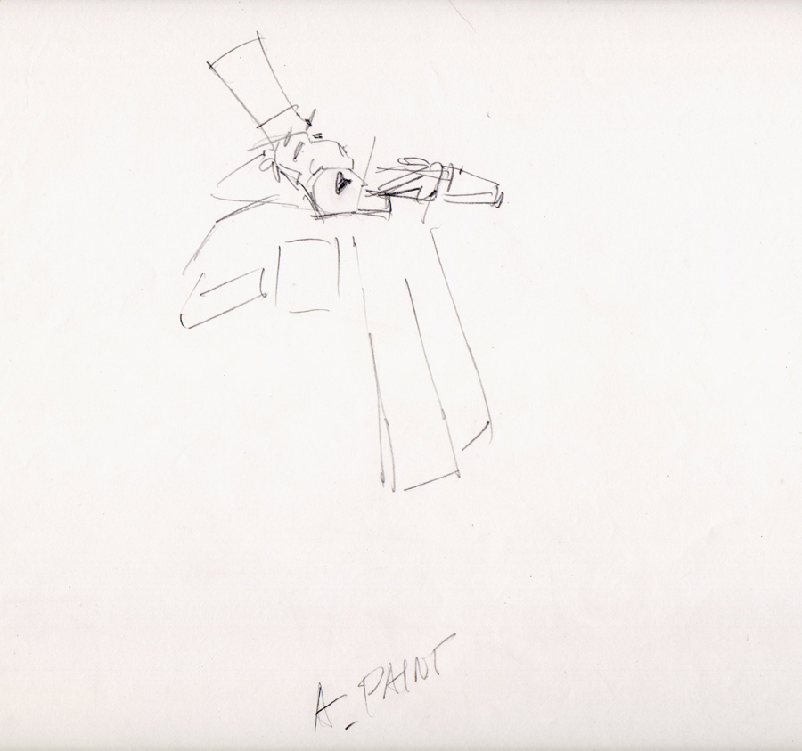
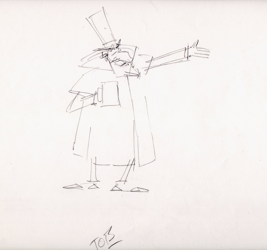
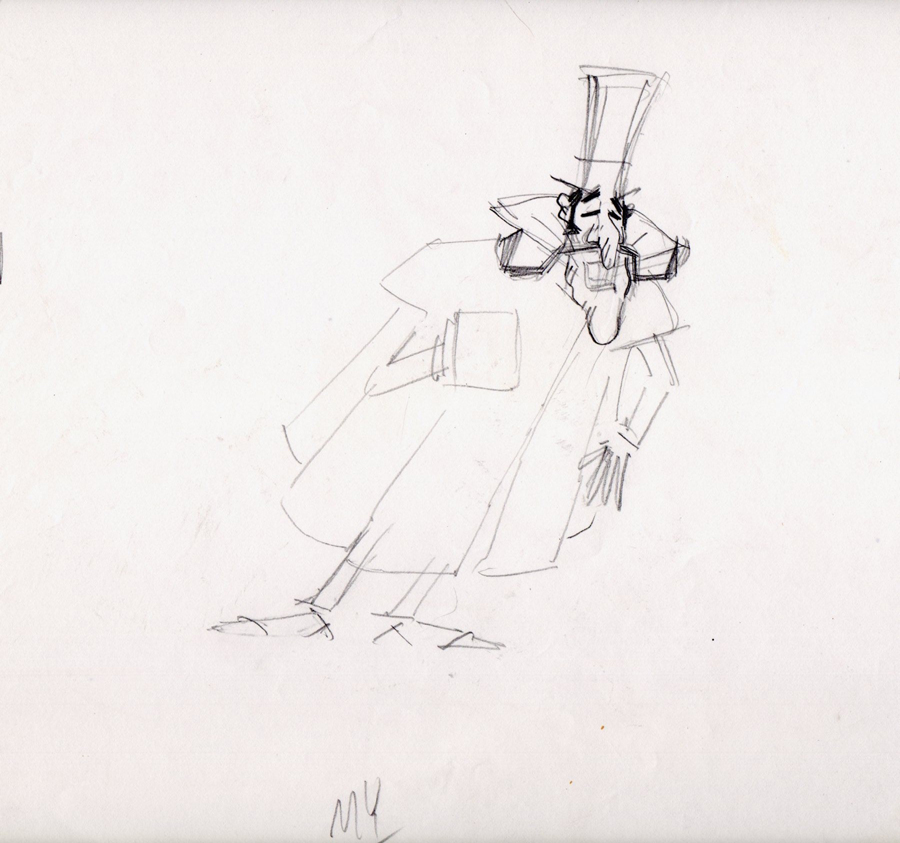
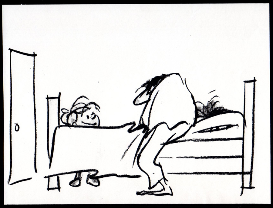
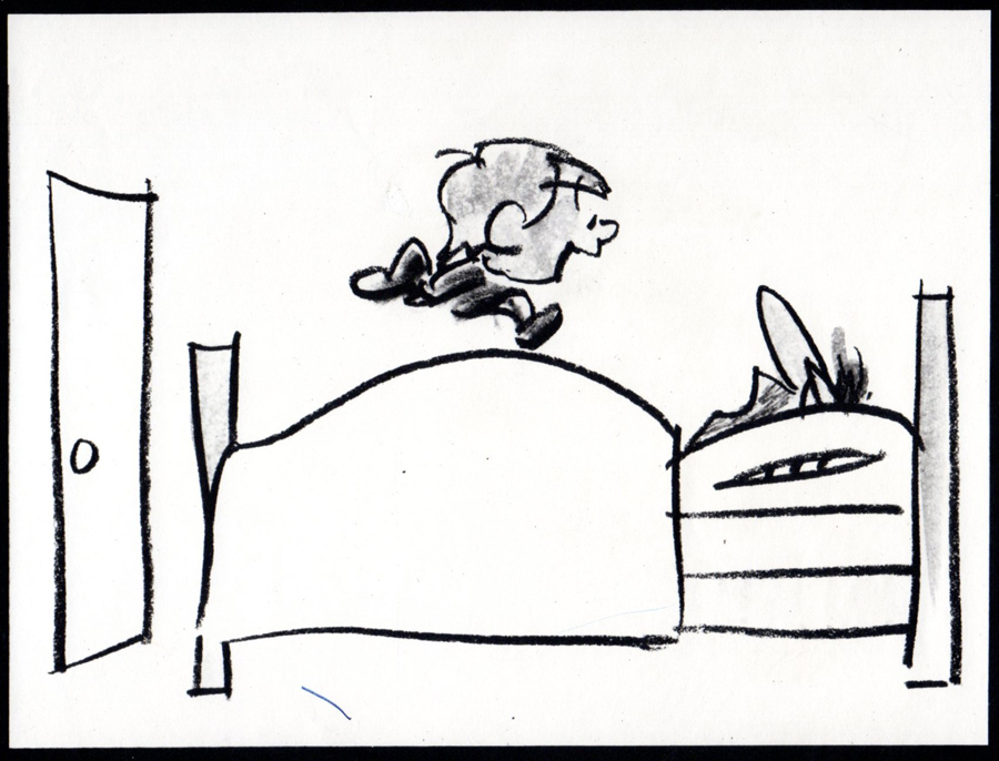
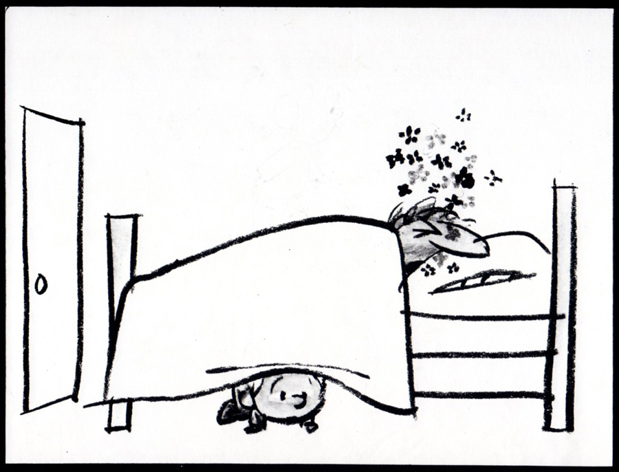
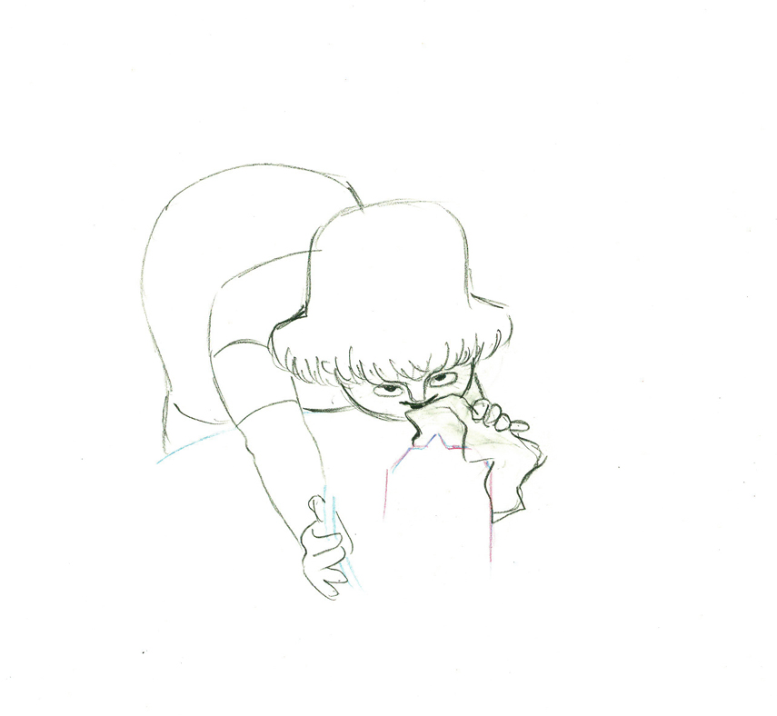
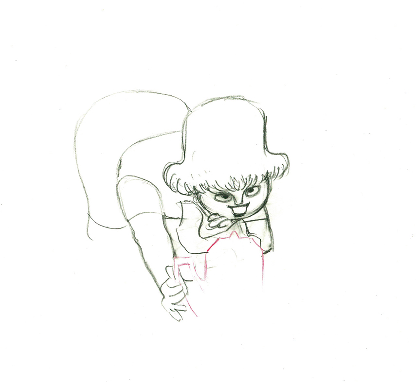
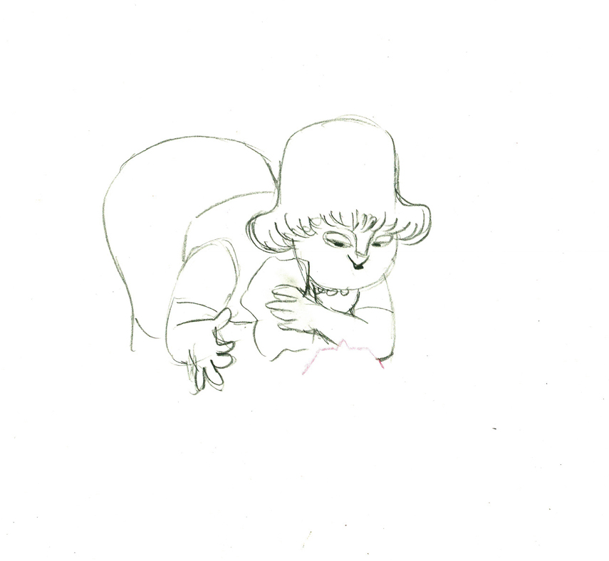
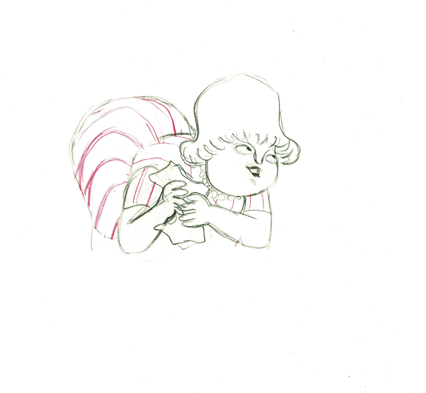
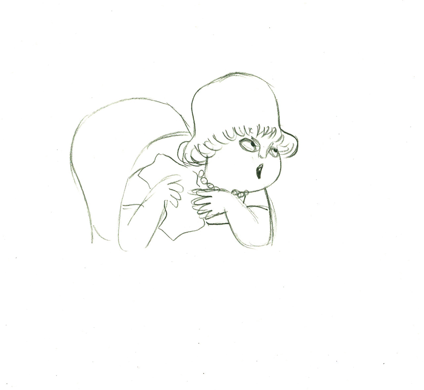
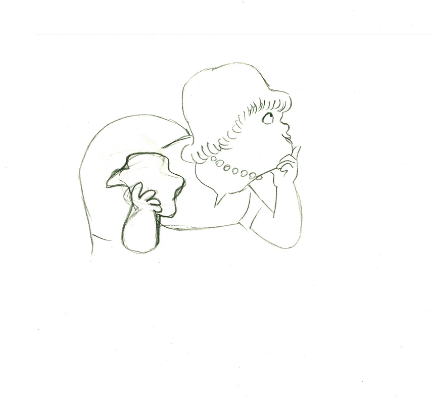
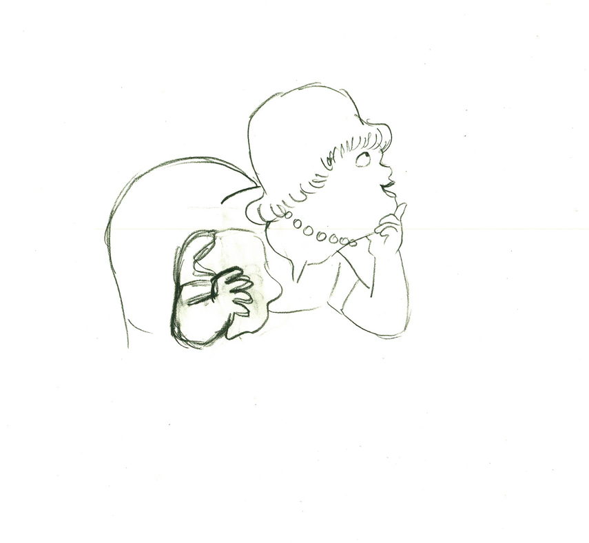
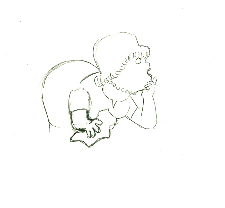
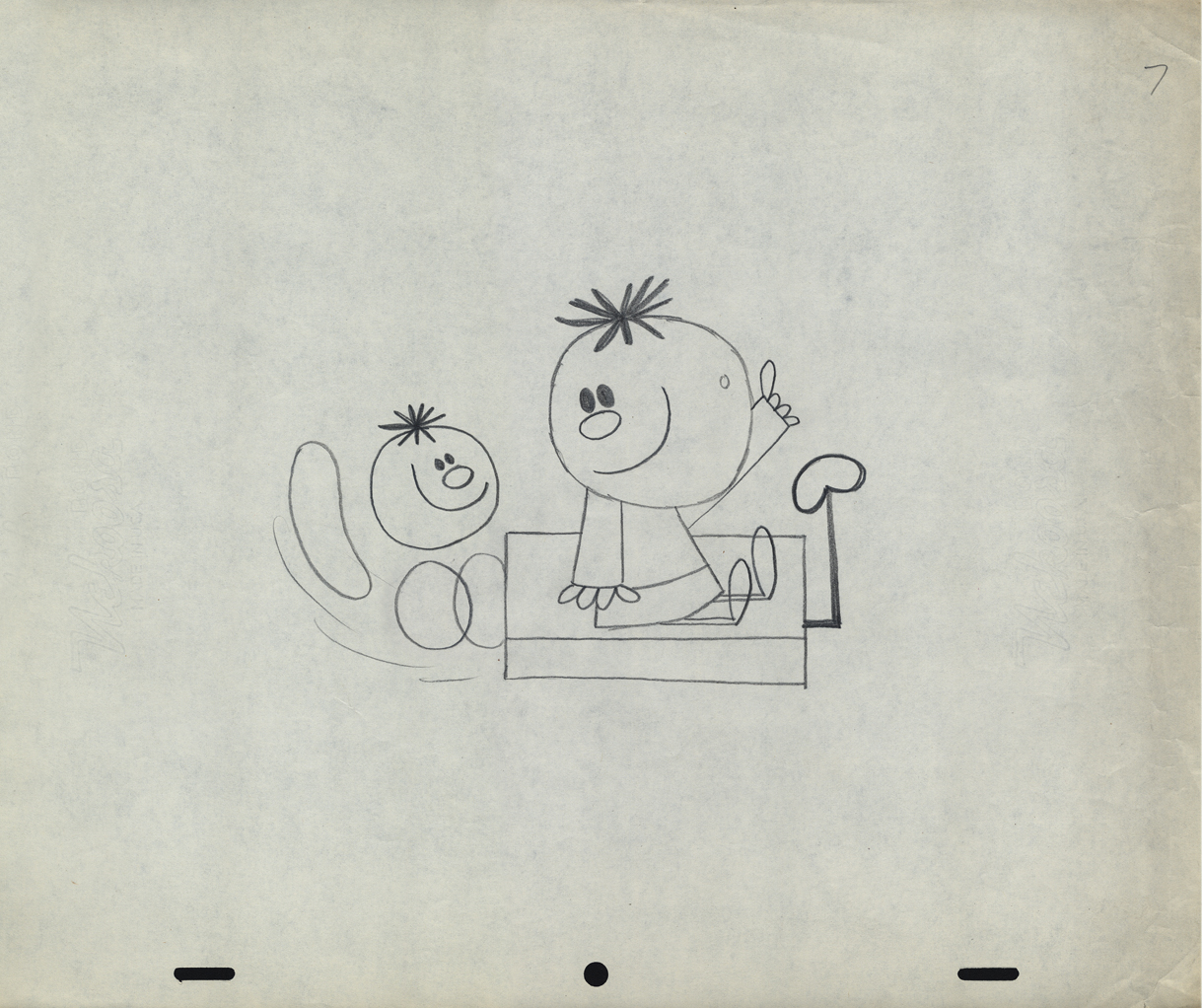
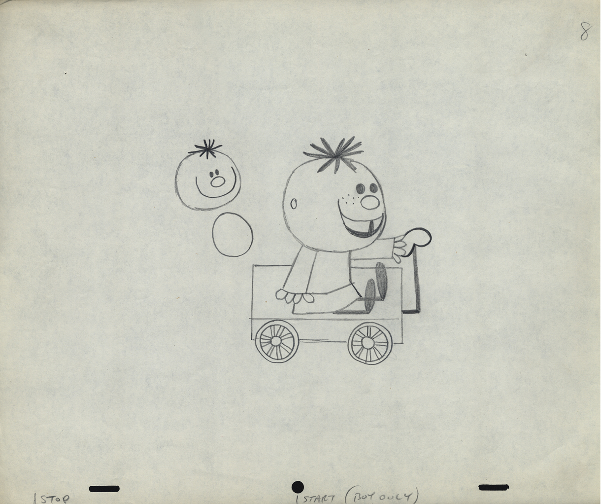
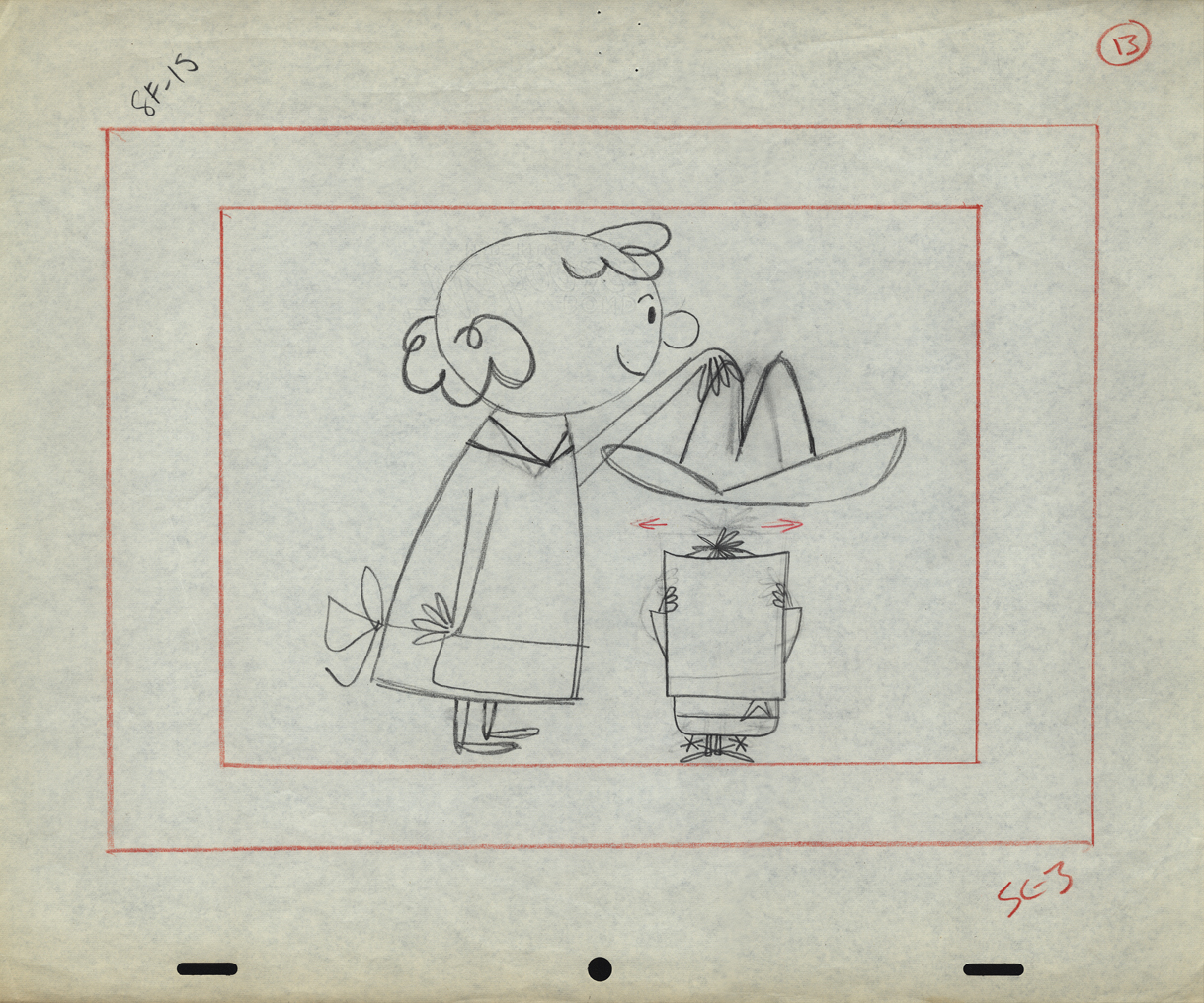
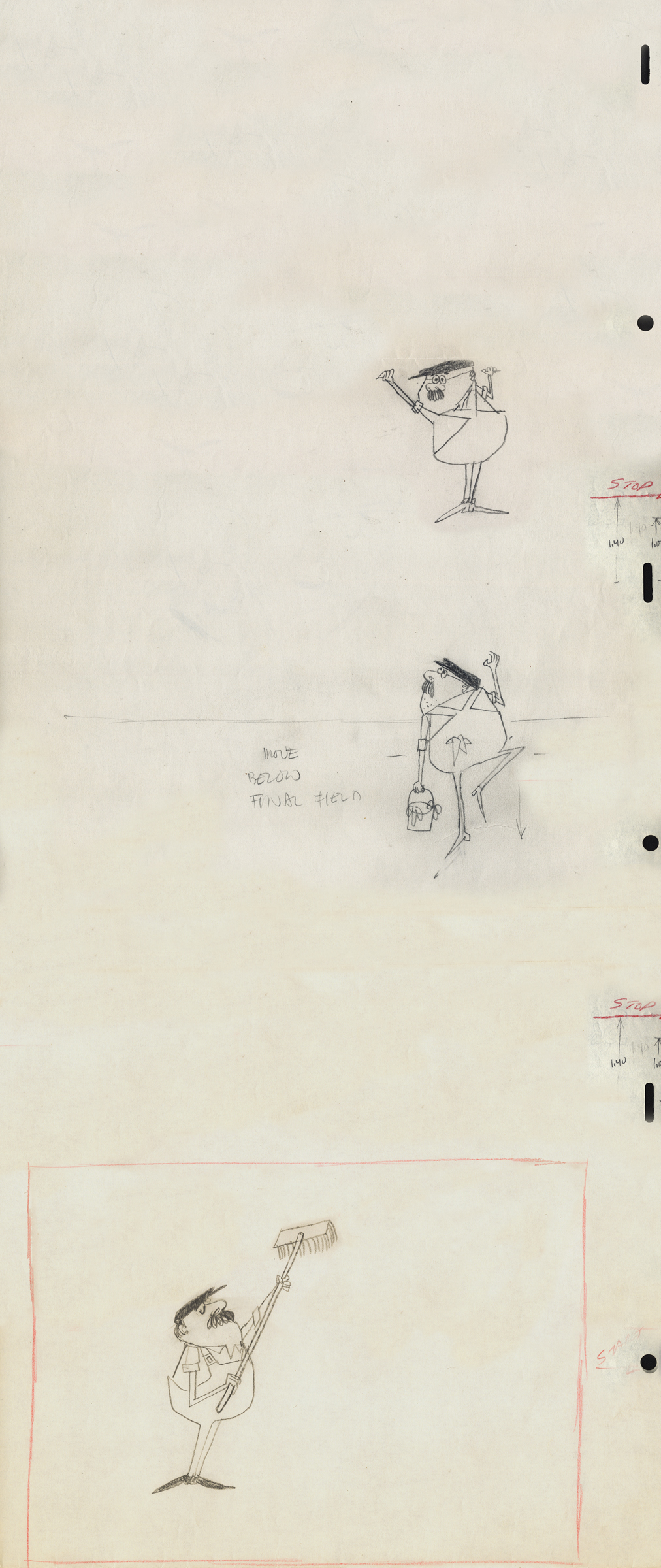
Another spot on Jack Schnerk‘s reel was Utica Club’s ‘Landlord’. Here with the little bit of art that I have from that commercial, I will try to illustrate some of the steps that went into making the film.
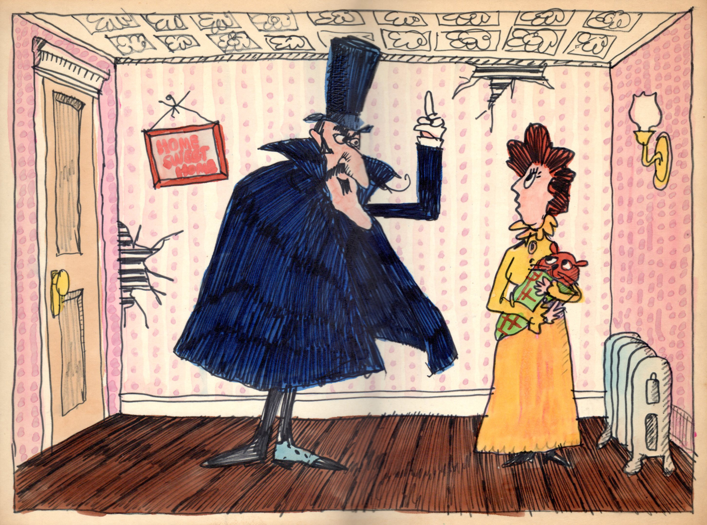
Here is the ad agency’s concept art.
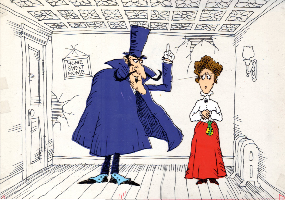
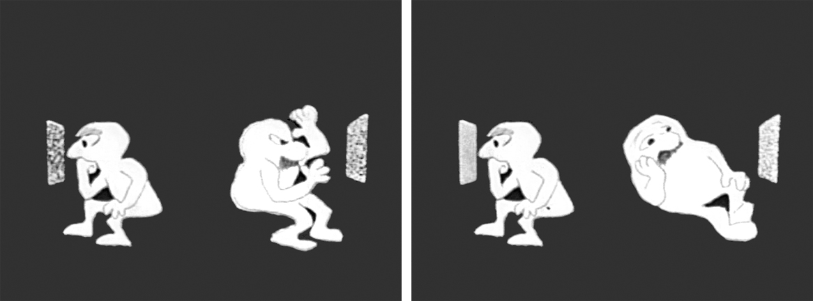
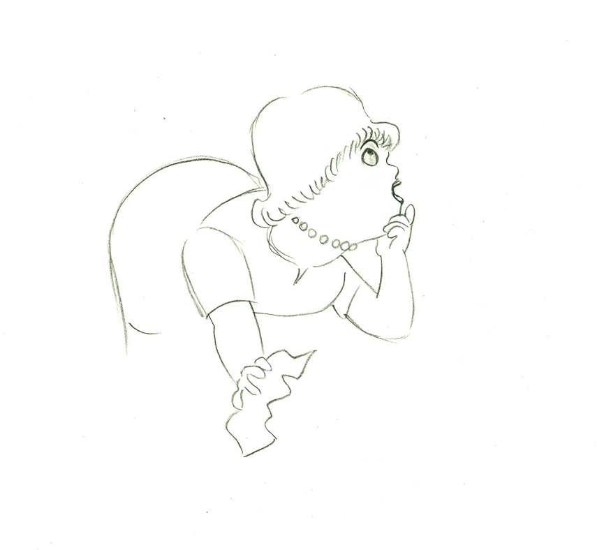
Here’s my tweaking of the agency art design.
This is a cel color model against a line version of the bg.
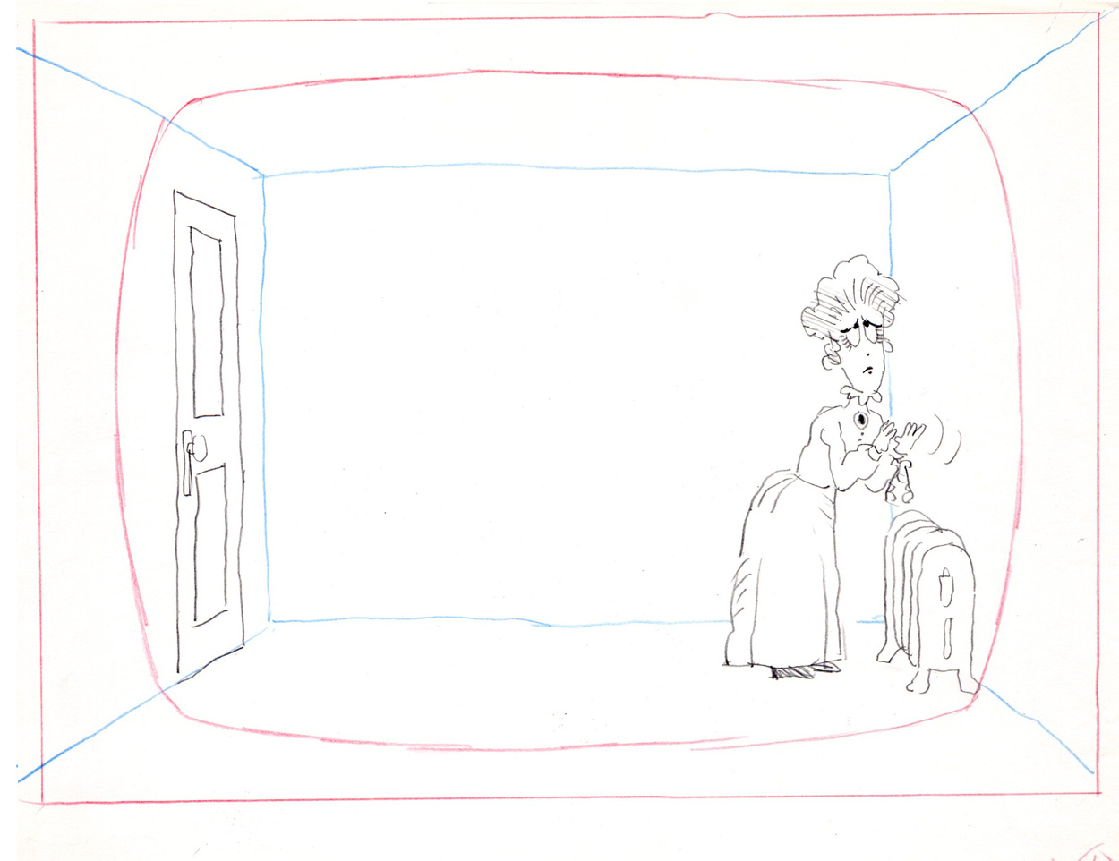
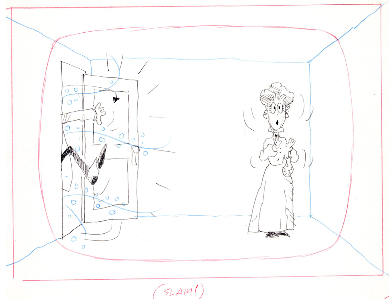
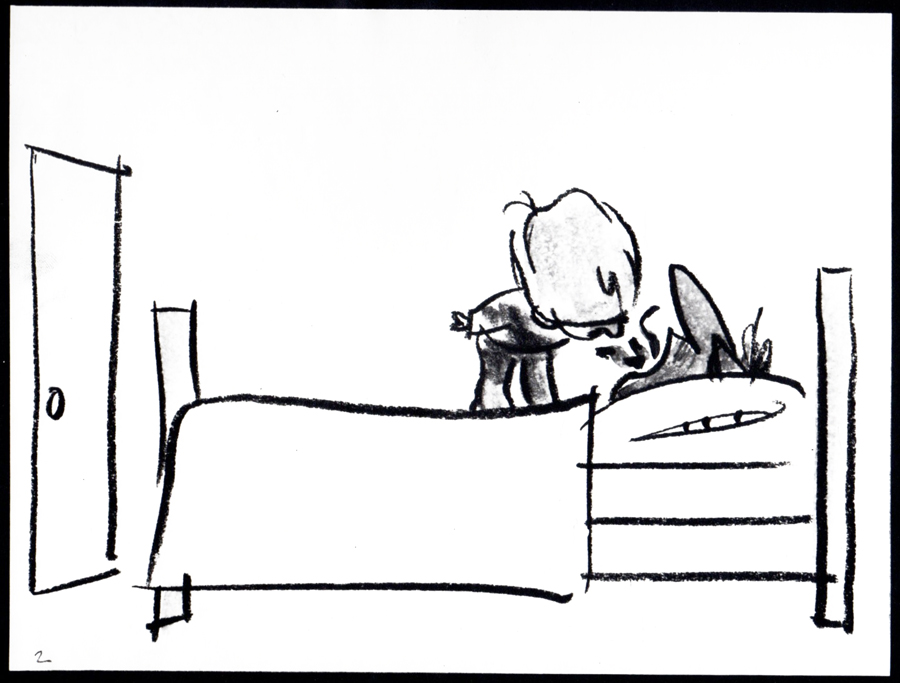
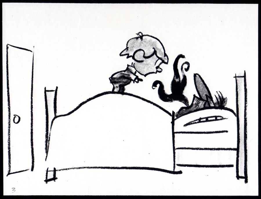
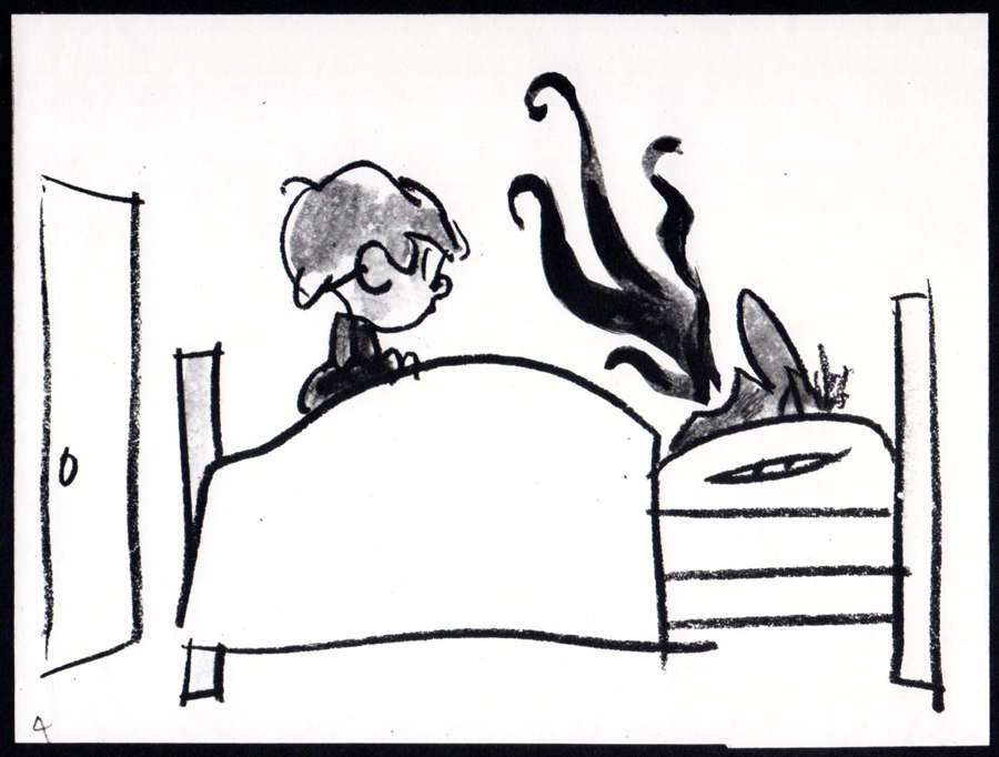
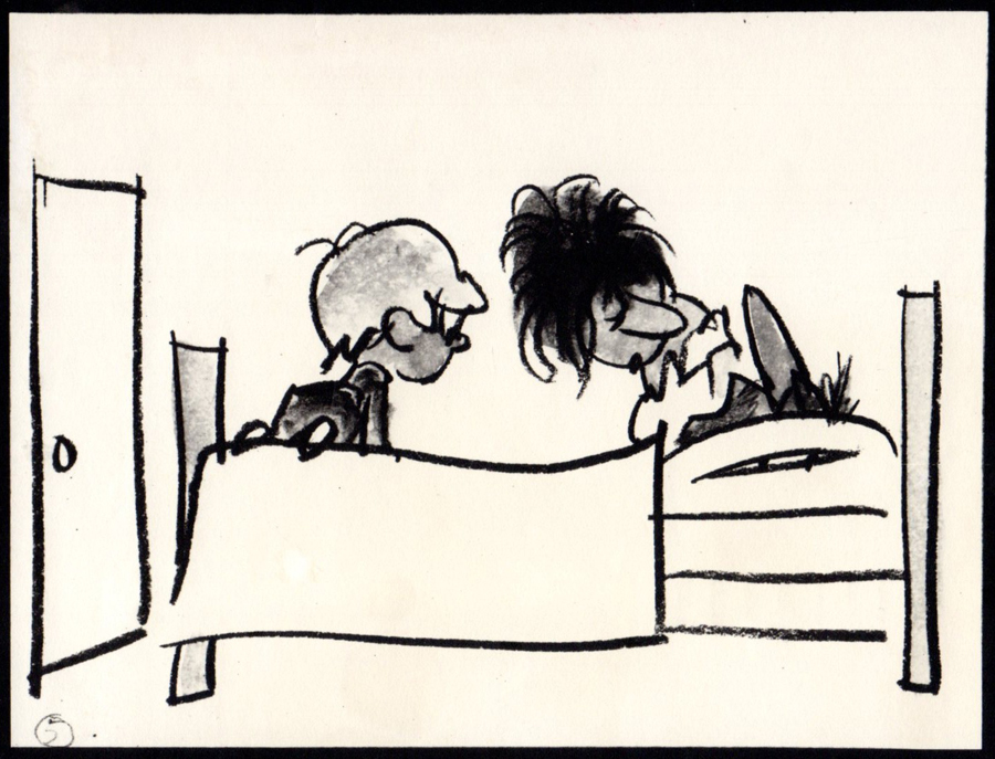
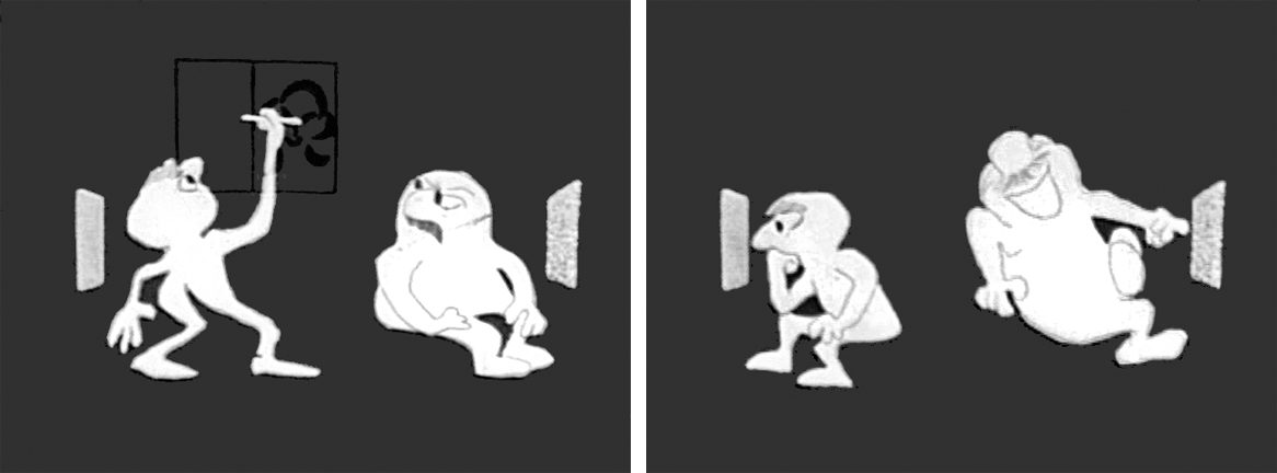
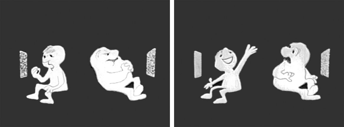
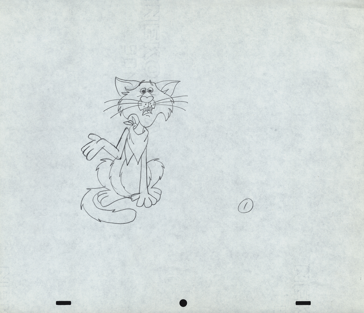
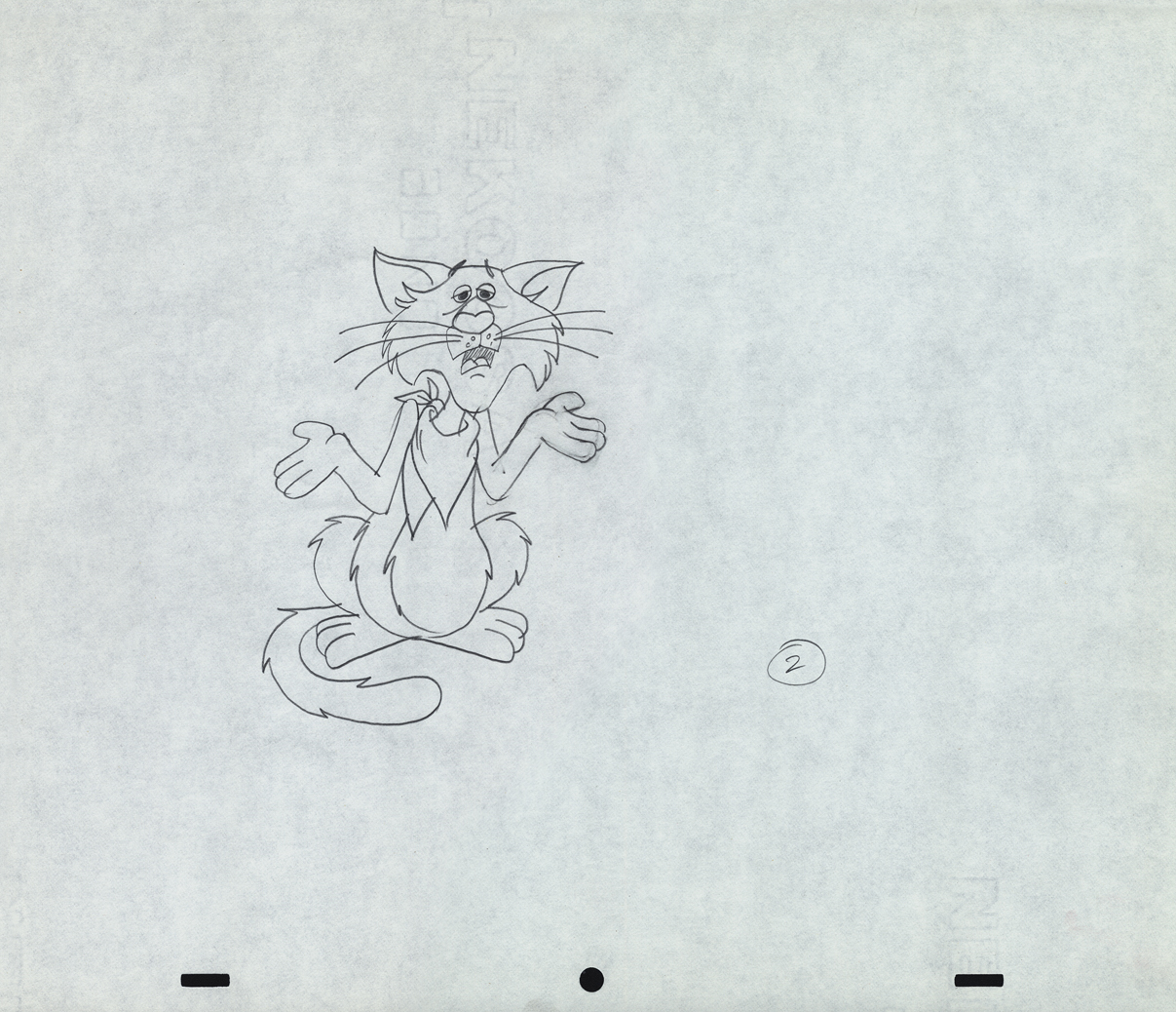
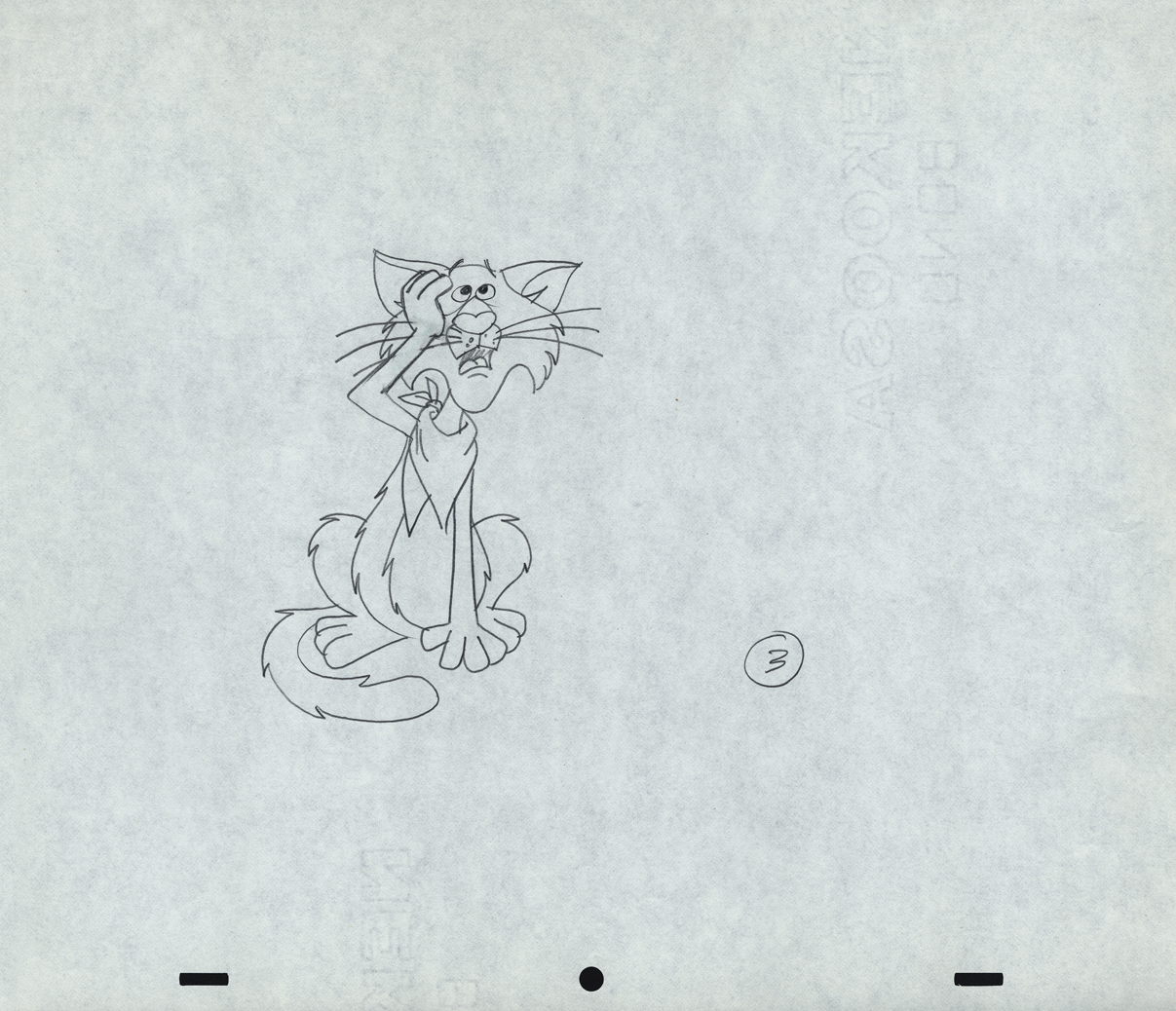
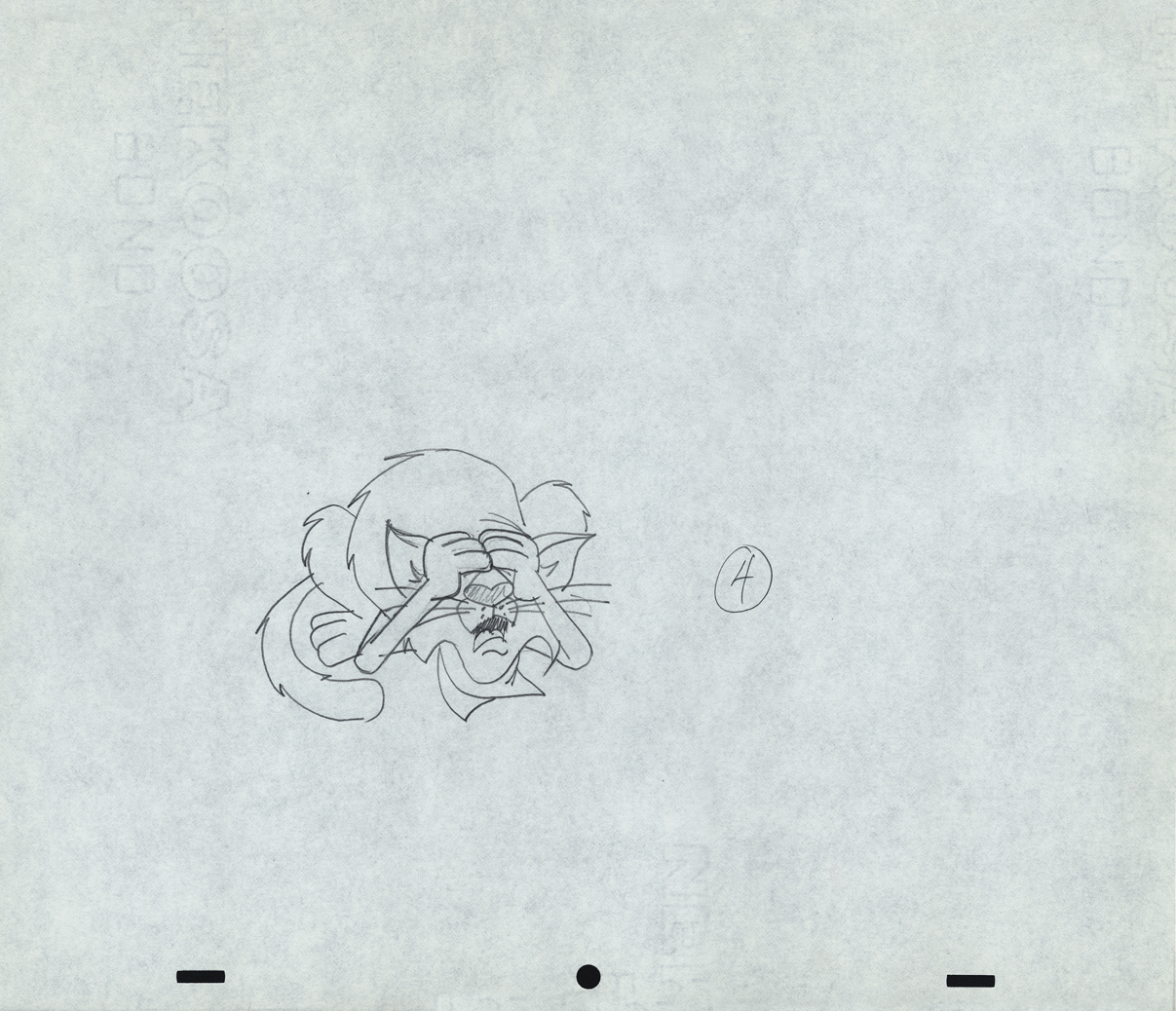
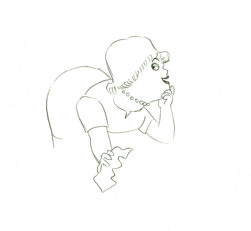
Next will be my first six rough layout drawings of the spot.
 1
1
 2
2
 3
3
 4
4
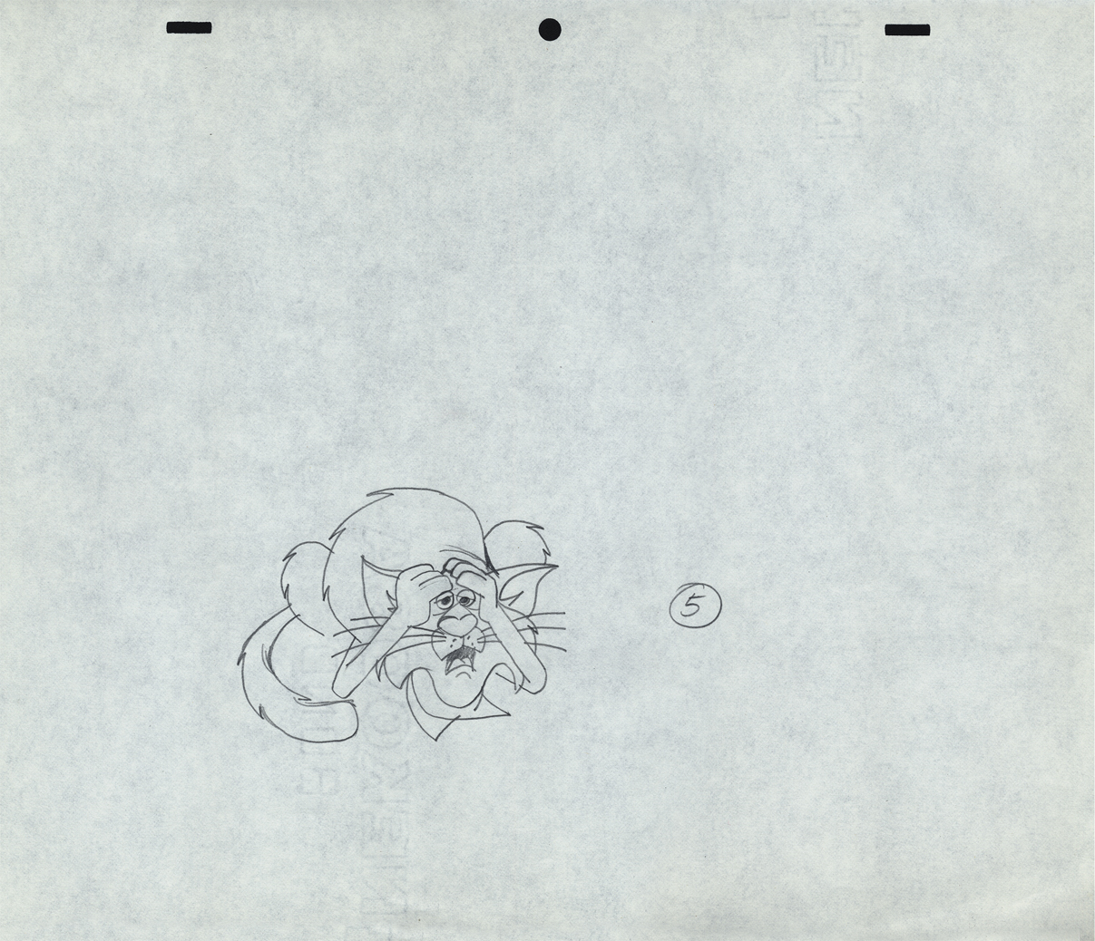
 5
5
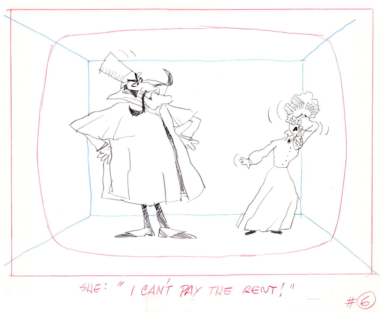 6
6
 7
7
 8
8
 9
9
 10
10
 11
11
 12
12
 13
13
 14
14
 15
15
 16
16
 17
17
 18
18
 19
19
 20
20
 21
21
 22
22
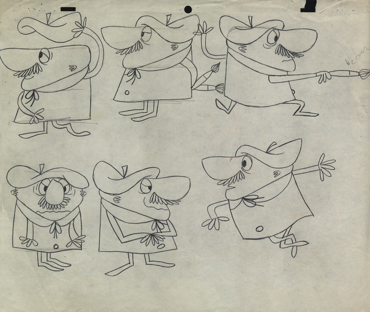
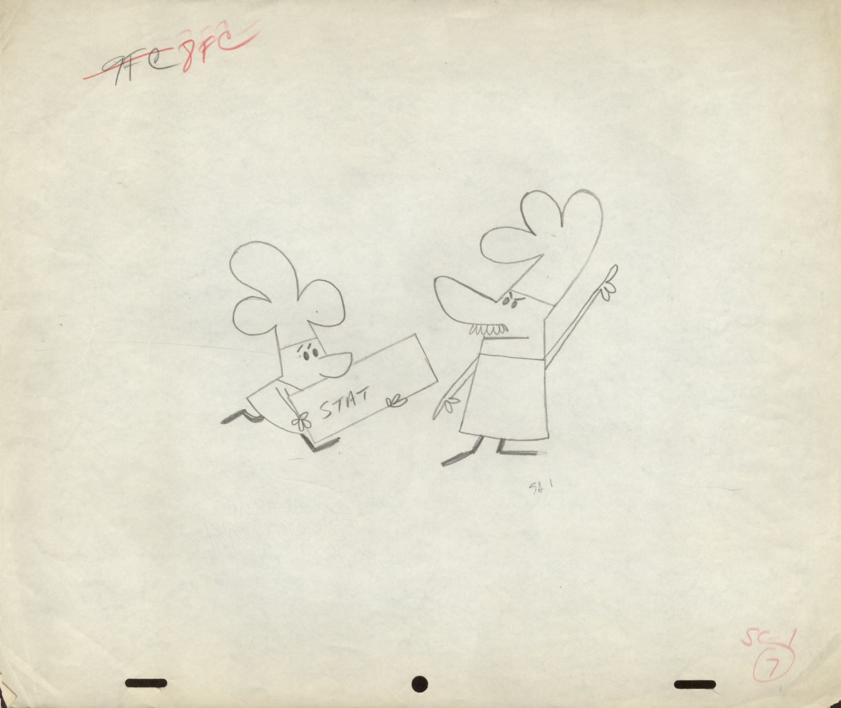
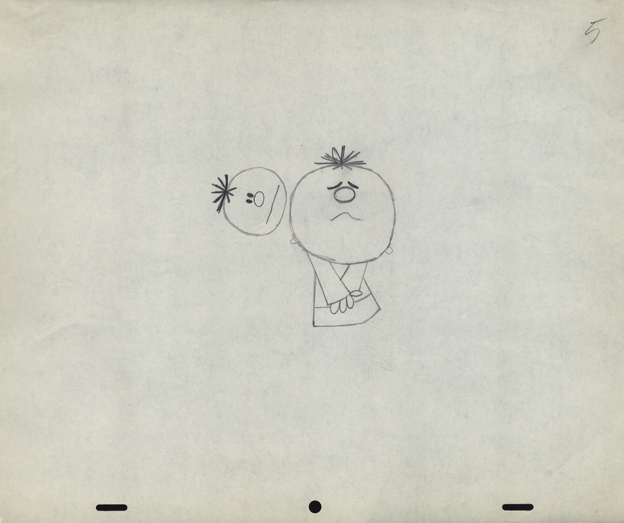
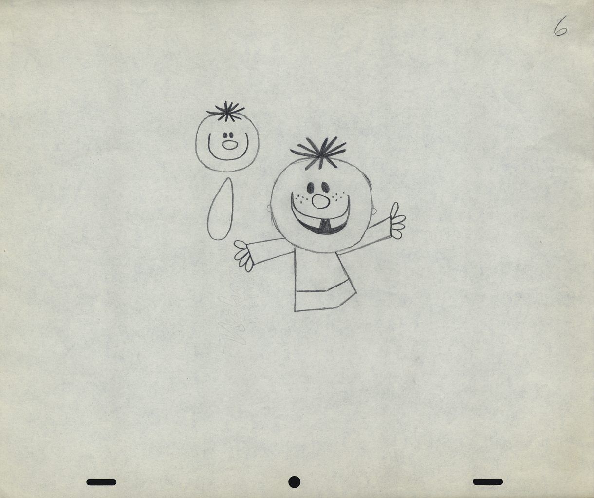
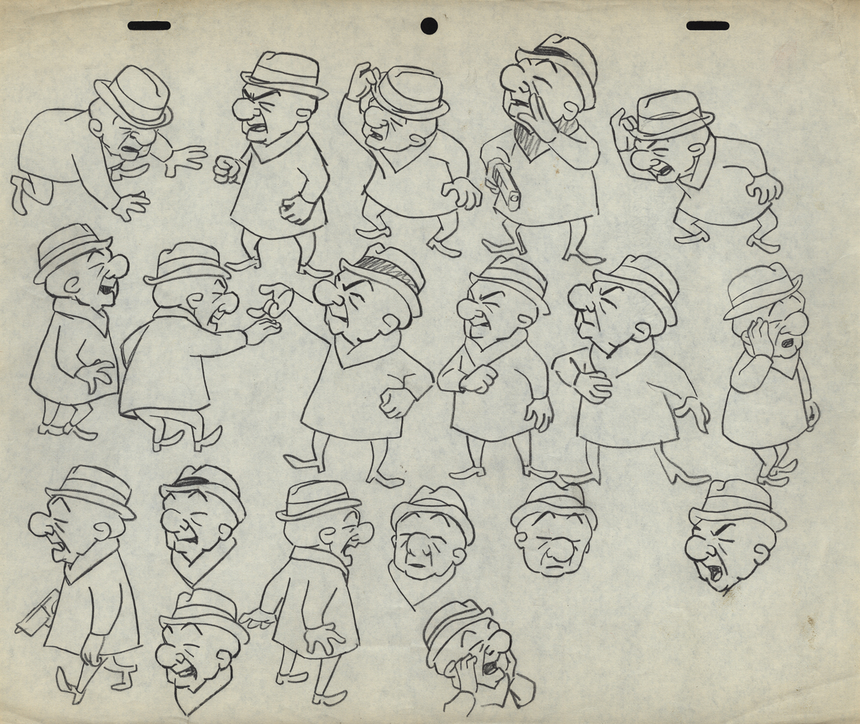
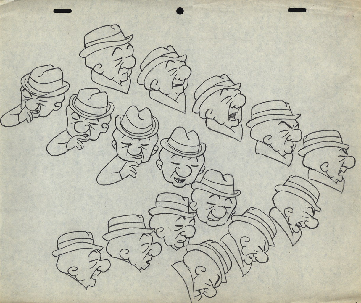
The following are animation key drawings by Jack Schnerk.
 1
1
 2
2
 3
3
 4
4
 5
5
 6
6
 7
7
 8
8
 9
9
 10
10
 11
11
 12
12
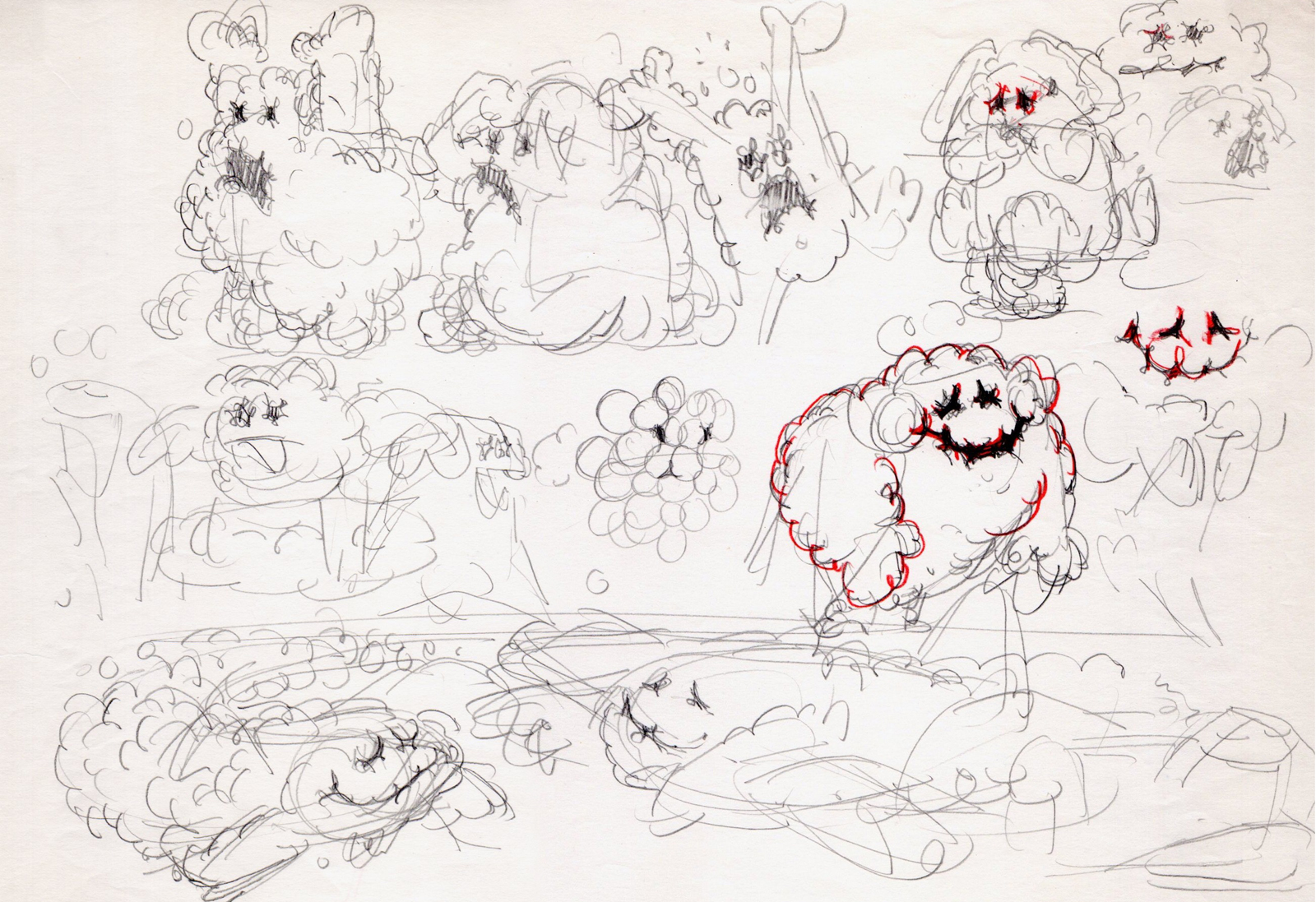
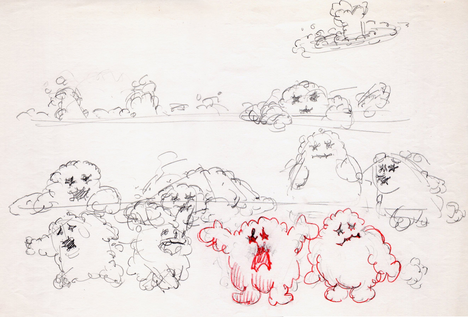
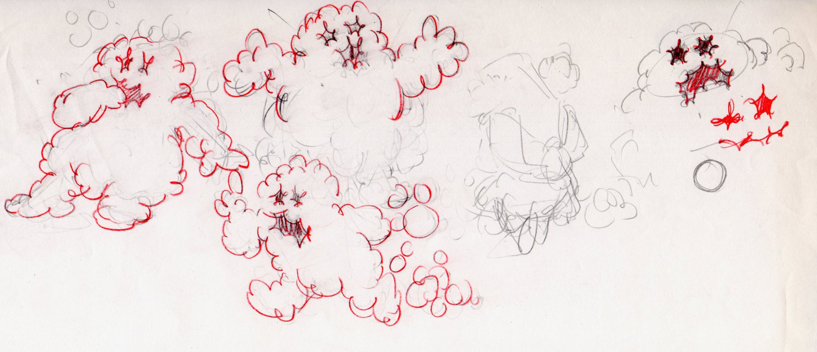
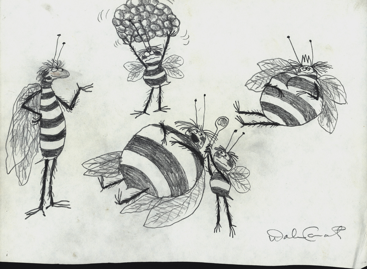
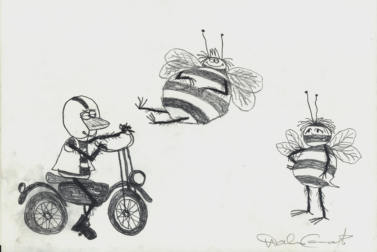
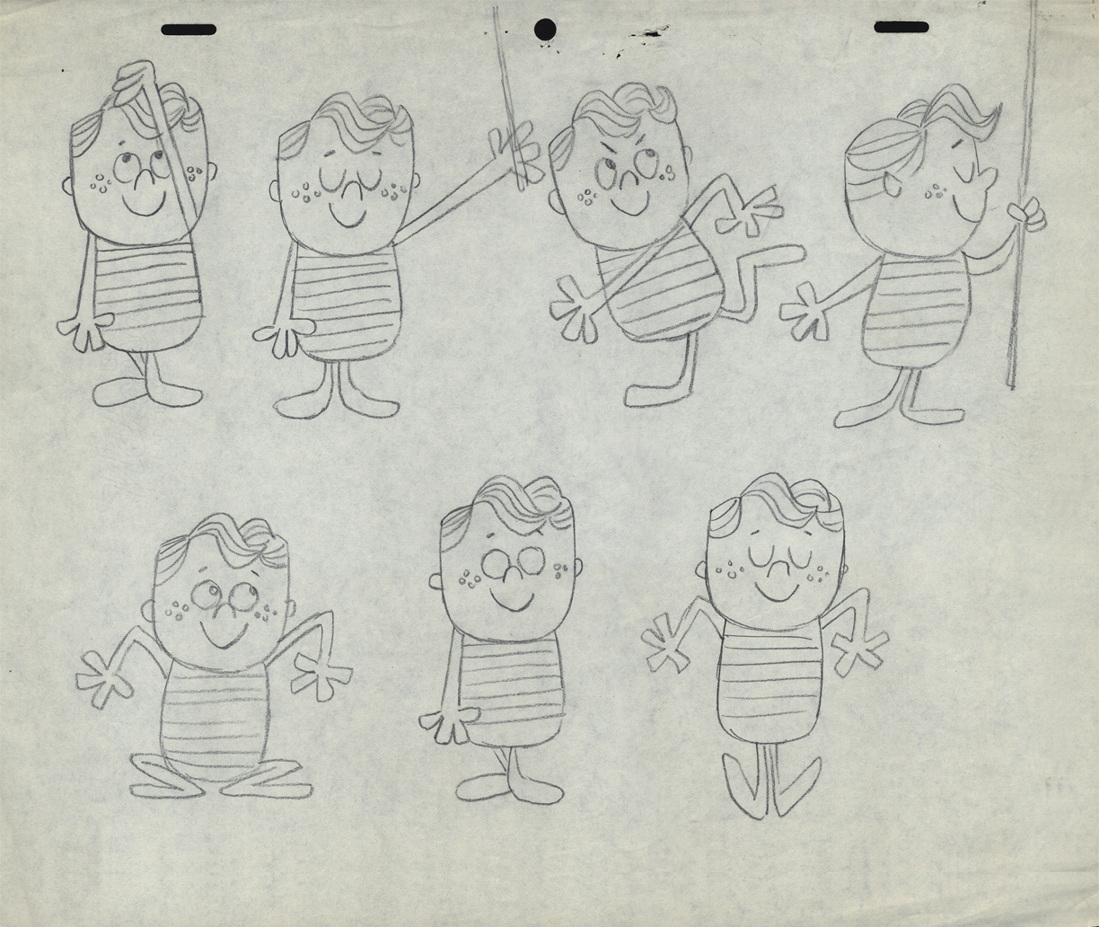
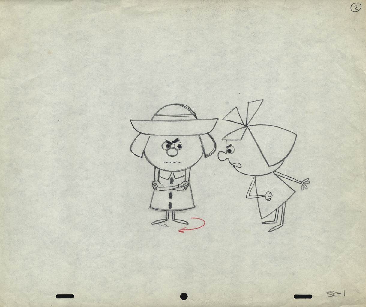
Once when we were doing designs for a soap bubble character, Jack took a break from animating to do these quick sketches. They are full of life, like all of Jack’s work.
 1
1
 2
2
 3
3
I hope for those who were fortunate enough to work with Jack, his drawings will bring back some good and happy memories, they do for me!
You can watch this spot on Jack Schnerk Sample Reel 2 starting at 3’01″.
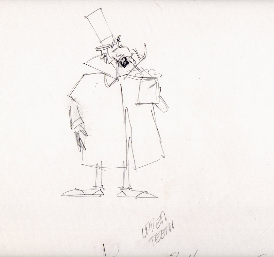
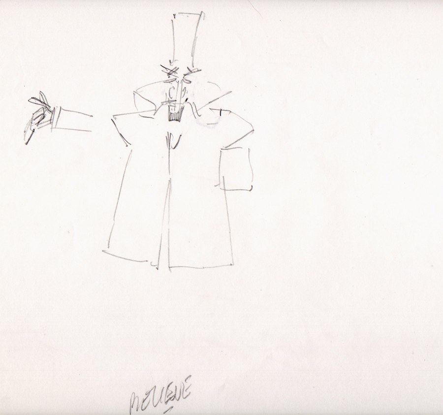
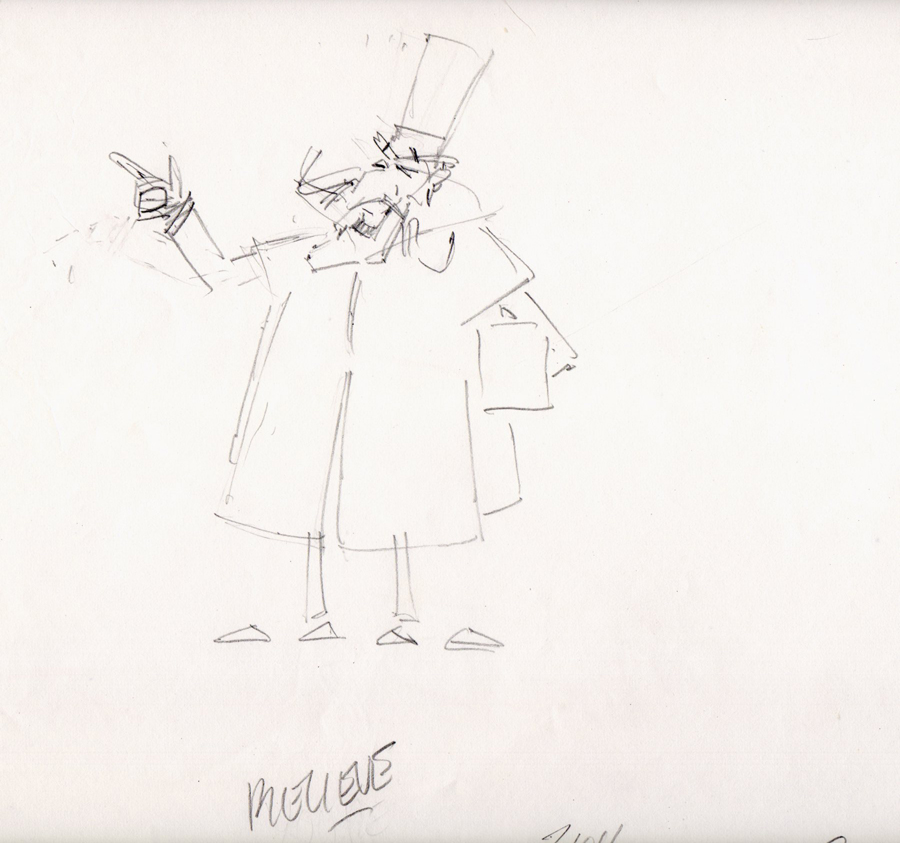
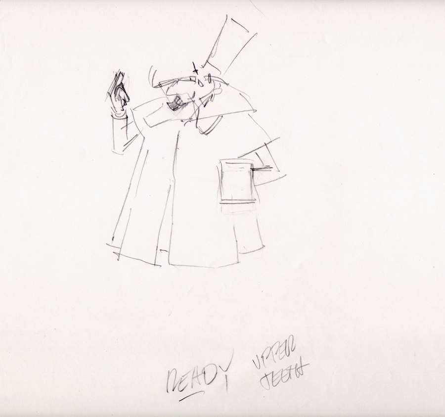
Bill Peckmann &commercial animation &Layout & Design &Models 16 Aug 2012 04:43 am
Weber & Schnerk Vote Toothpaste
Bill Peckmann shared these great LO sketches for one of Jack Schnerk‘s animation samples:
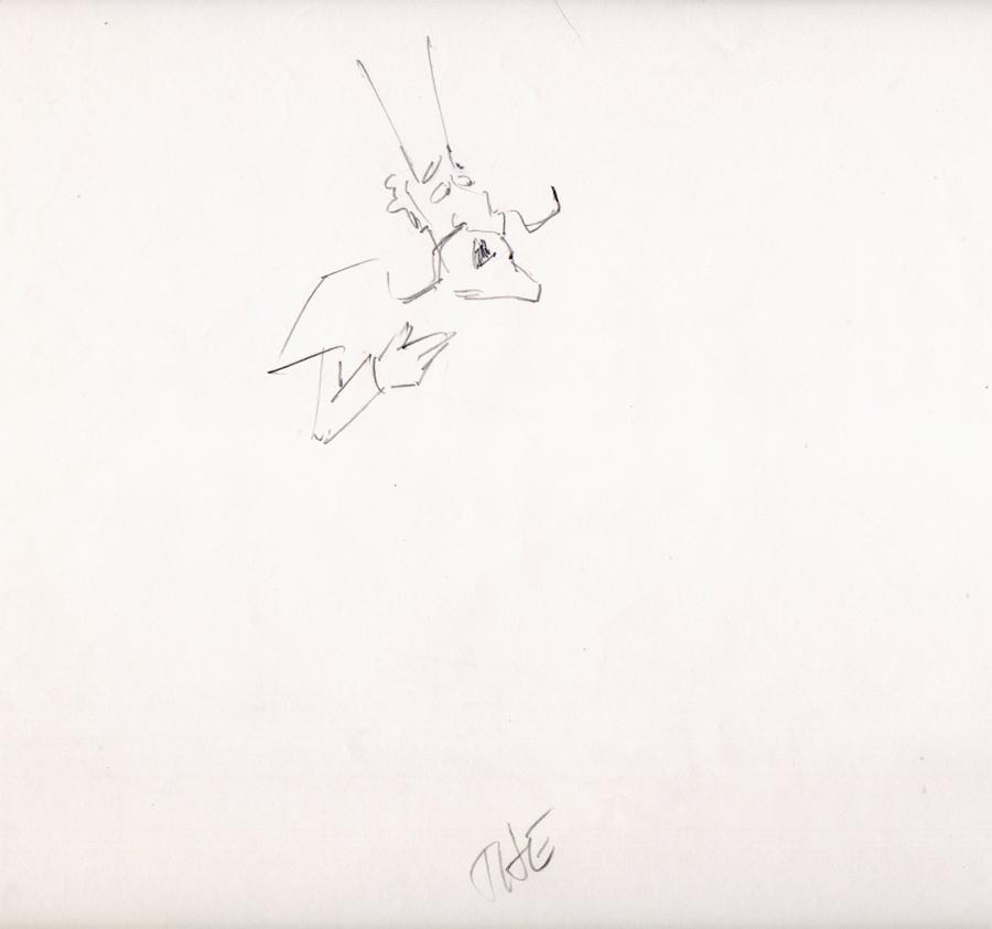
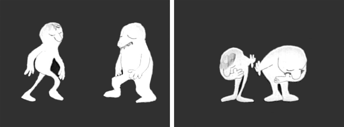
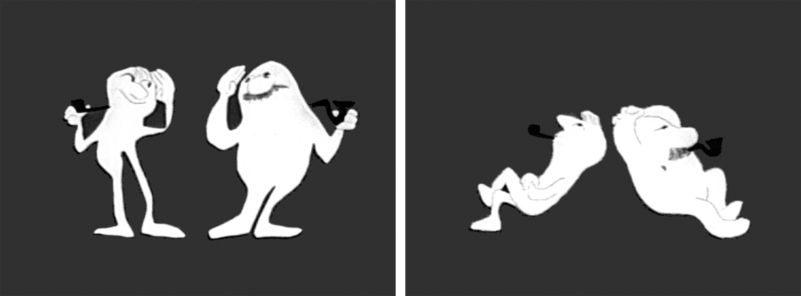
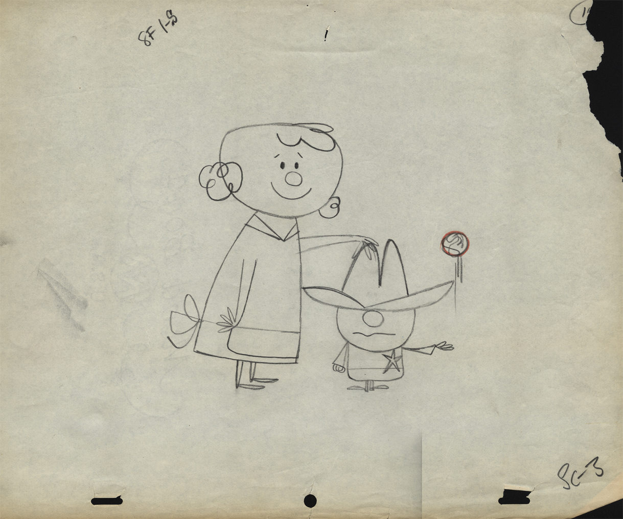
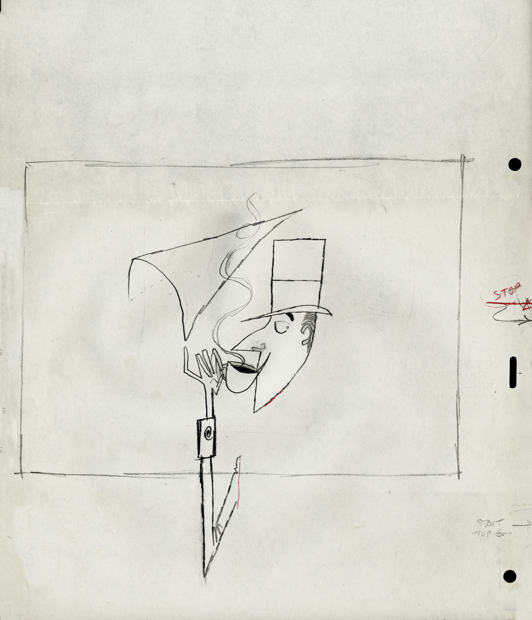
- Since one of the first spots on Jack Schnerk‘s reel was his ‘Dragon’s Mouth‘ Vote Toothpaste commercial, I thought you’d enjoy seeing New Yorker cartoonist Bob Weber‘s key LayOut drawings for the spot. Unfortunately they are not the full color original illustrations but black and white stats that were made to fit in a comfortable field size. These are for the first half of the spot.
These were the only keys that Jack had to guide him on this spot to work his animation magic. It was always a super treat to clean up Jack’s roughs, especially when he animated ‘named’ print cartoonists. The essence of the pose was always there in those terrific sketchy lines and the body proportions were also always bang on!
 1
1
 2
2
 3
3
 4
4
 5
5
 6
6
 7
7
 8
8
 9
9
 10
10
 11
11
 12
12
Bob Weber had a great sense of what to do in animation, his poses are beautiful. You only wish he would have been given more spots to design.
You can also go here and just watch the first spot to see a larger version.
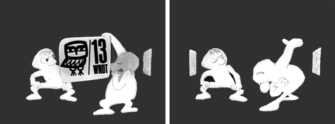
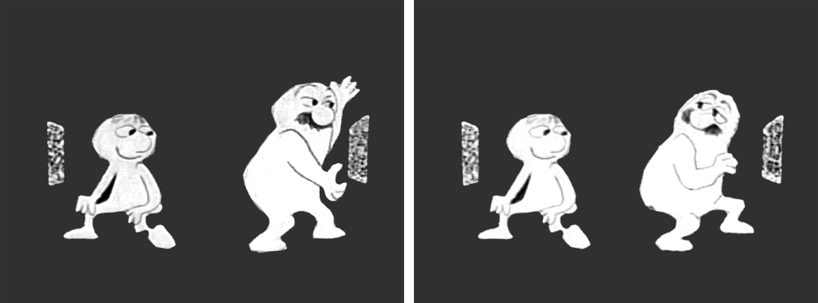
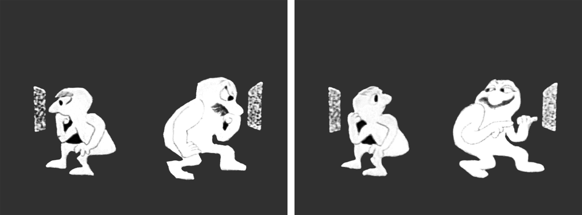
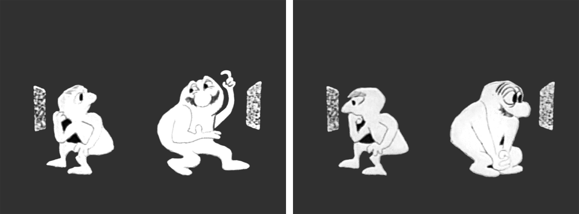
Animation &commercial animation &Frame Grabs &Hubley 13 Aug 2012 05:28 am
Hubley Bumper – recap
- Last week, Emily Hubley told me that some people up at WNET (previously WNDT), the local PBS chapter, saw this piece on my blog. They were hoping to get copies of the Hubley spots to show in celebration of their upcoming 50th anniversary. It’ll be great to see these films alive again.
Here’s my post on a couple of the films.
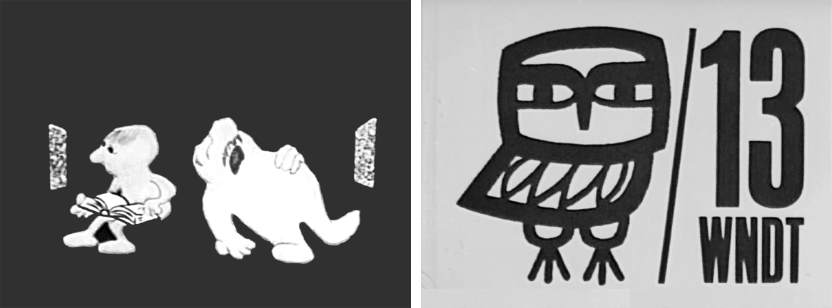
 - One of my all time favorite pieces of Hubley animation was a station ID for WNDT-TV, New York’s public service station back in the 60′s. I thought of this spot last week when I posted the piece about Stanley Kaufman’s Art of Film for that station. It ultimately became WNET, NY’s PBS channel 13.
This spot was undoubtedly animated by Bill Littlejohn, and I think it’s one of his finest pieces. The timing is excellent. He obviously animated straight ahead; the characters distort and morph to the needs of the animation. It’s a full 2mins: 40 secs, so it would qualify as a short film these days,
The piece ran in B&W. It employed the multiple exposure technique. The characters had black paint filling everything but the animation drawing. This was double exposed over the BG, hence a see-through quality to the characters. This technique was used on Moonbird, The Hole, Of Stars and Men and several other Hubley shorts.
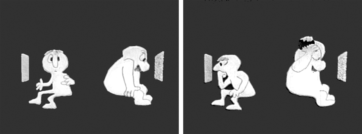
Here are some frame grabs of the spot.
The two guys come out on to the stage and take a bow.
They greet each other, light up and sit down.
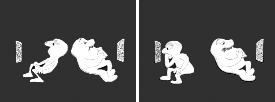
A little bored, they both turn on TV’s. The little guy gets involved.
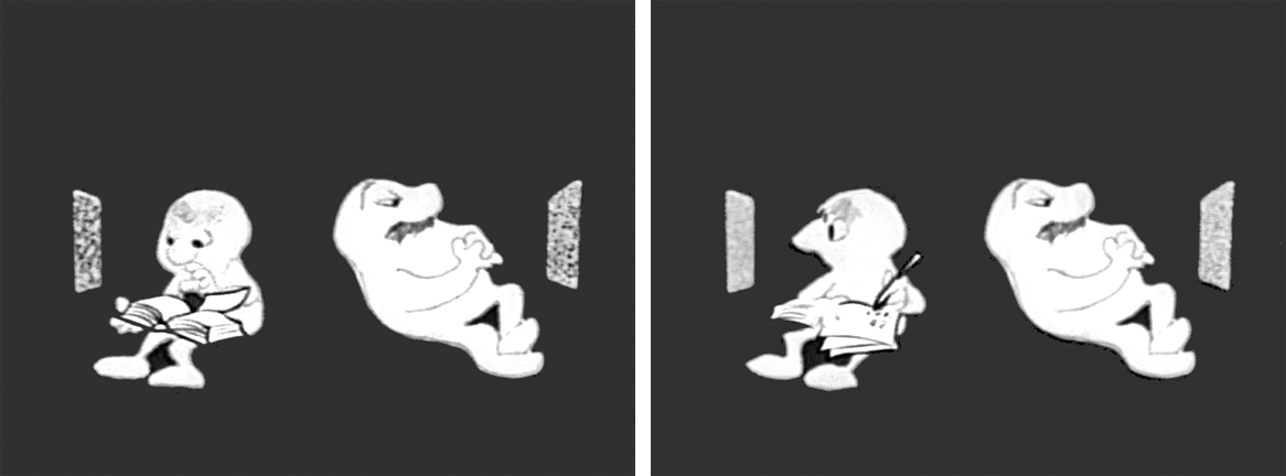
He takes out a book and takes notes comparing it with what’s going on his TV.
He goes back to watching. The big guy laughs at something until he gets bored again.
The big guy practices some wrestling moves until that gets dull.
Little guy does some brush painting. Big guy laughs again.
Little guy practices Russian. The big guy gets annoyed.
The big guy takes out a comb and starts combing until . . .
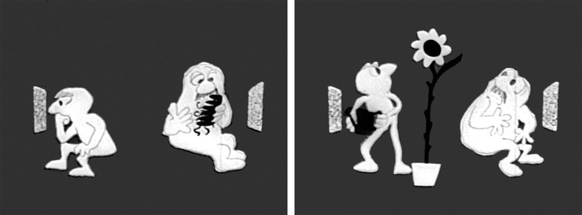
.. he has grease all over his head. The little guy grows a plant.
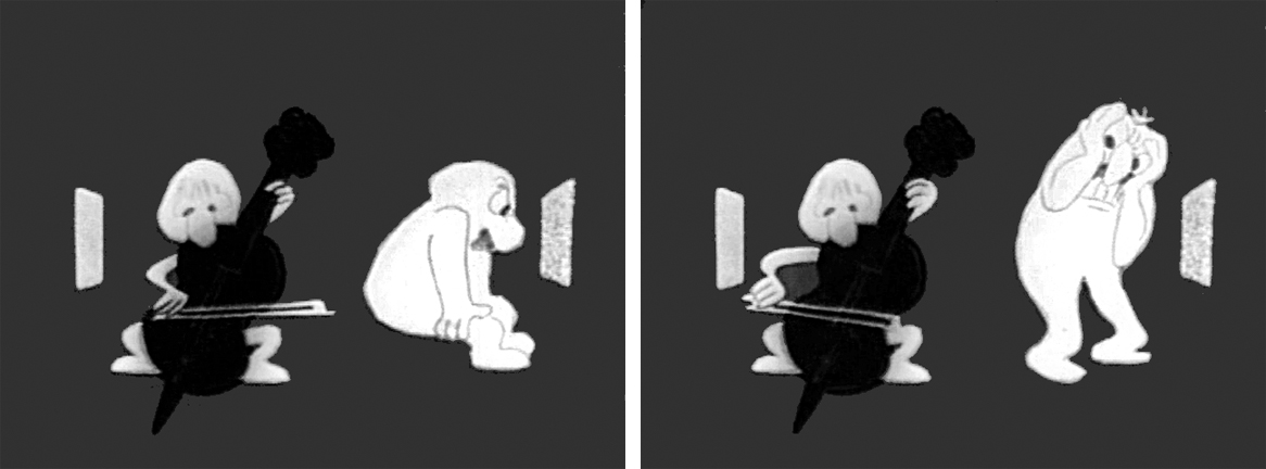
The little guy takes out a cello and starts to play. This annoys the big guy.
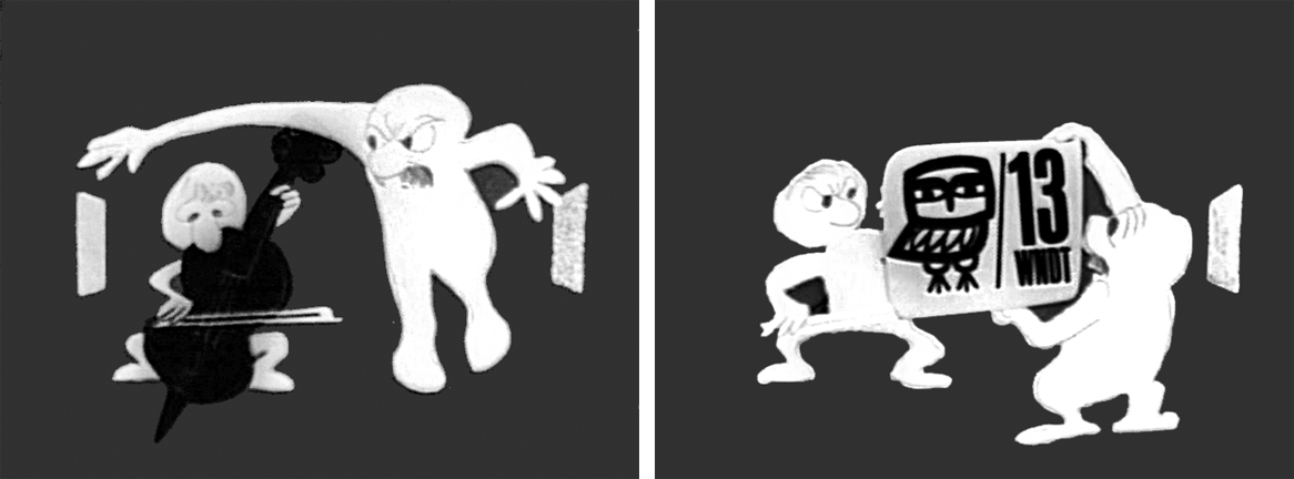
He pulls up the little guys screen. Public Television !
Embarrassed, he bows to the “Arts” station.
He turns to it on his own TV. He’s planning for something great.
They watch intently until the big guy makes sure little guy knows he’s still watching.
“Brain food” They watch intently.
The big guy falls asleep while the little guy goes back to his book. Dissolve to station card.
I love how the shapes of the characters shift and distort and change throughout the piece always coming back to the original models. This is a sure sign of straight ahead animation, and it almost makes the acting feel like an improvisation exercise by two actors. It supercedes animation and becomes acting.
The obviously loose time of the piece shows that the animator was probably given a lot of leeway with his timing, and he took it. As I said, I have no proof that Bill Littlejohn animated it, but I’ve never doubted it for a moment. It’s certainly as much his style as it is Hubley’s.
That is the odd thing about working for a director with a strong personality. I remember the day that I looked at one of my drawings and realized that it looked like one of my drawings, but there was no doubt it was a Hubley. Something happens, and you just end up drawing in their style.
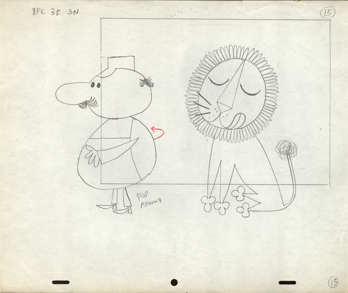
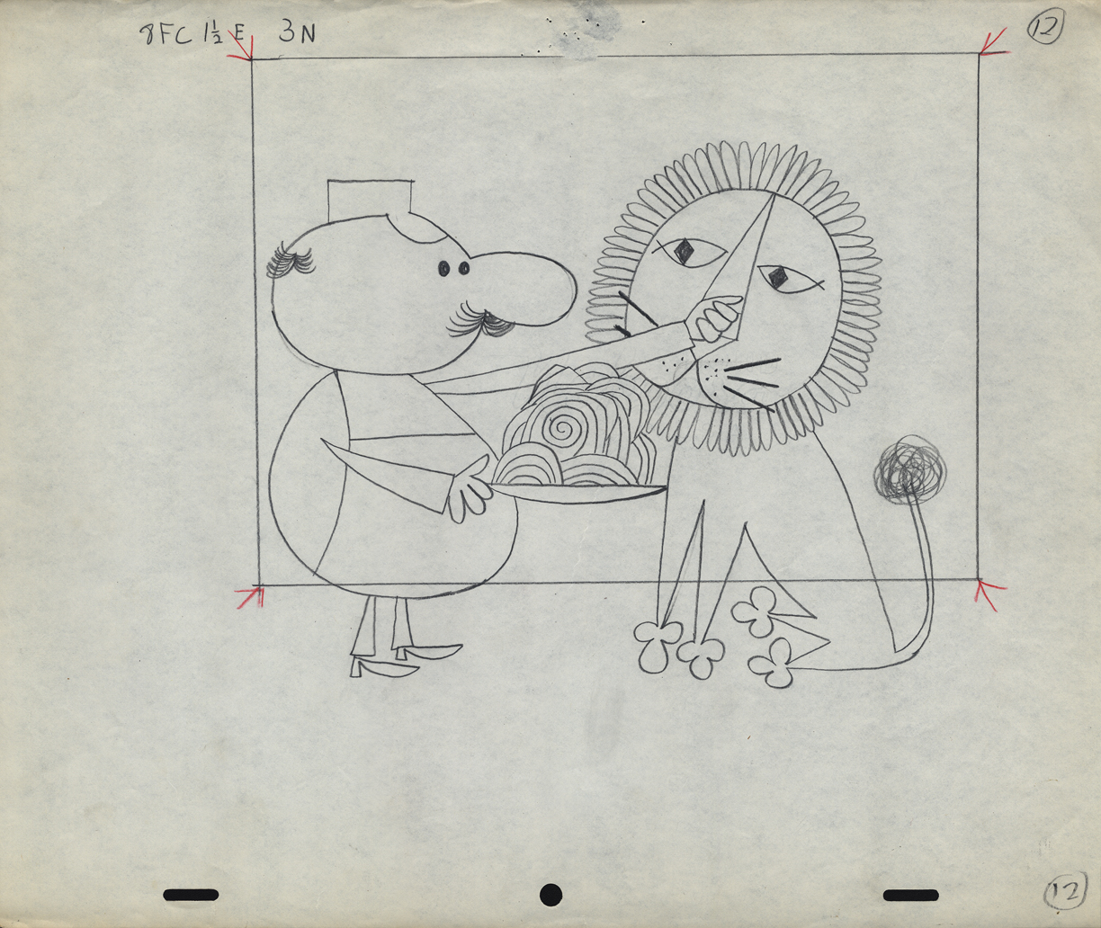
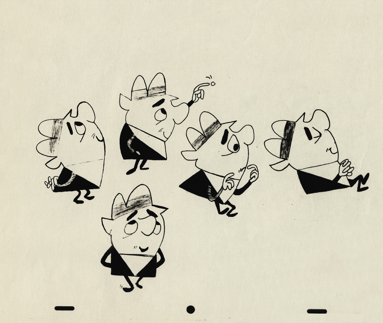
Animation &Animation Artifacts &commercial animation &Layout & Design &Models &Story & Storyboards 08 Aug 2012 07:00 am
Vince Cafarelli Grabbag
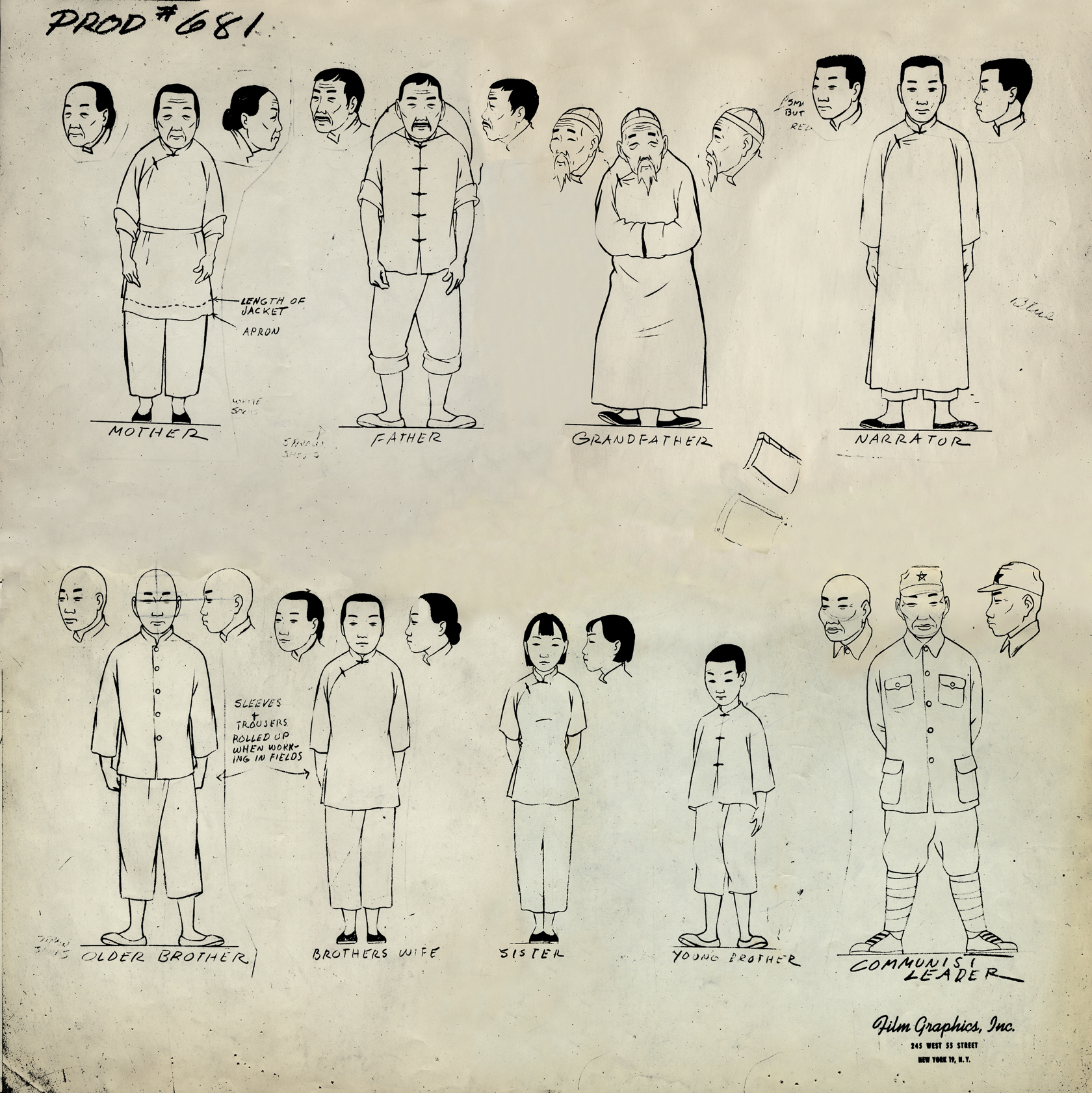
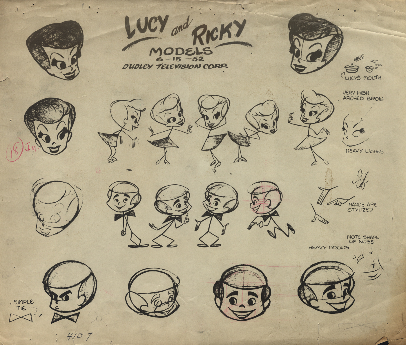
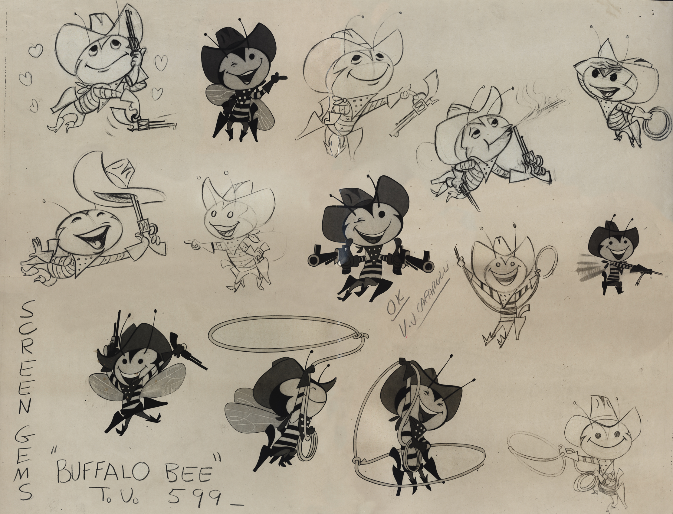
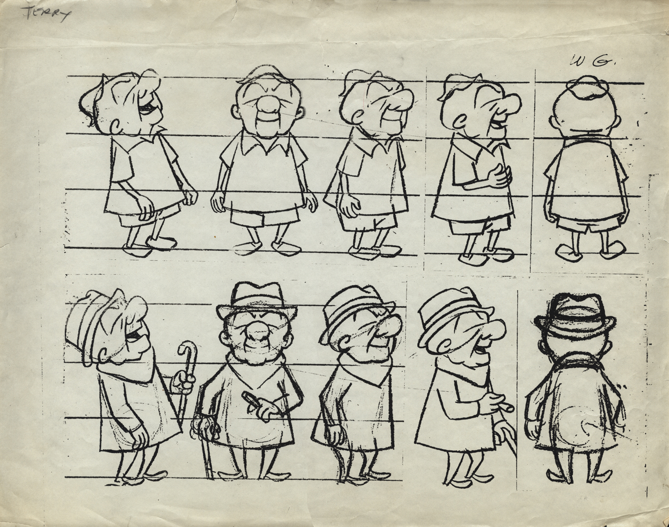
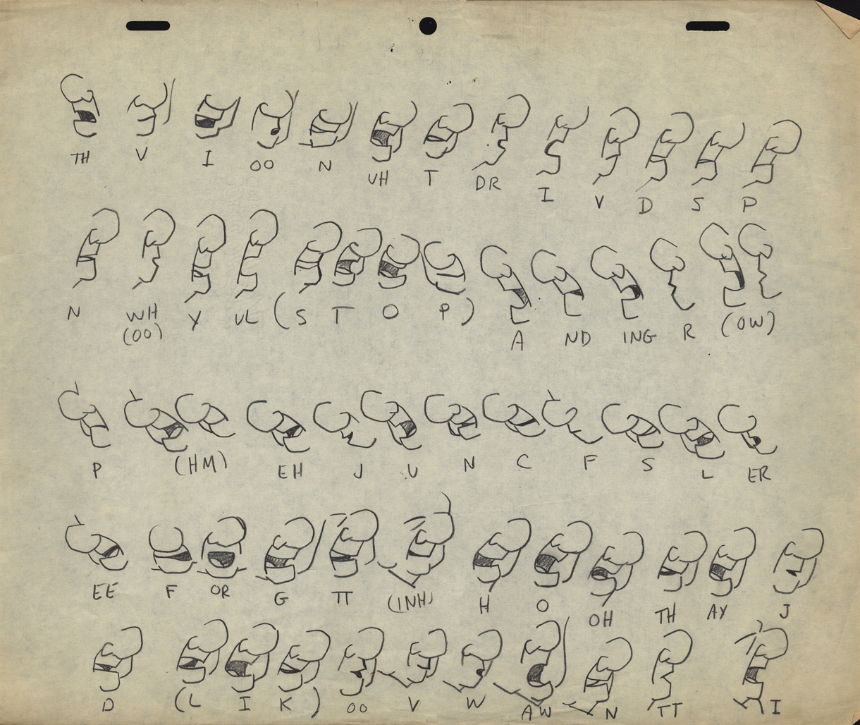
- Today we have a mix of odds and ends from Vince Cafarelli’s collection of animation artwork. We start with some artwork from the commercial studio in NY in the 1950s-60s.
 1
1This is a model sheet for something done
at Film Graphics. No doubt it’s not a commercial
but probably some kind of Educational film.
 2
2
This is a model sheet for the opening titles to
the “I Love Lucy” show. My guess is that
this also comes from Film Graphics.
 3
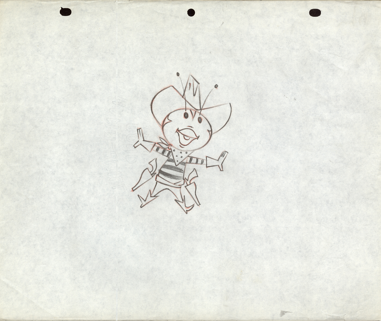
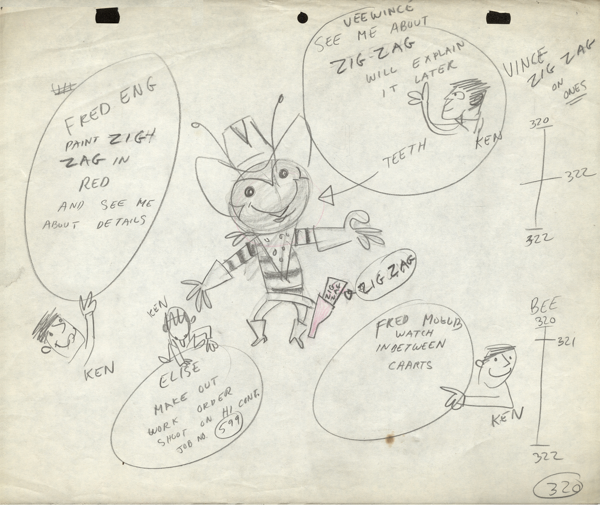
3
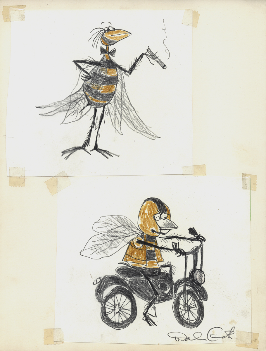
The Buffalo Bee model sheet for the Nabisco
Wheat Honeys commercials. Mae Questel was the voice.
This was probably done for the Gifford Studio.
 4
4
 5
5
 6
6
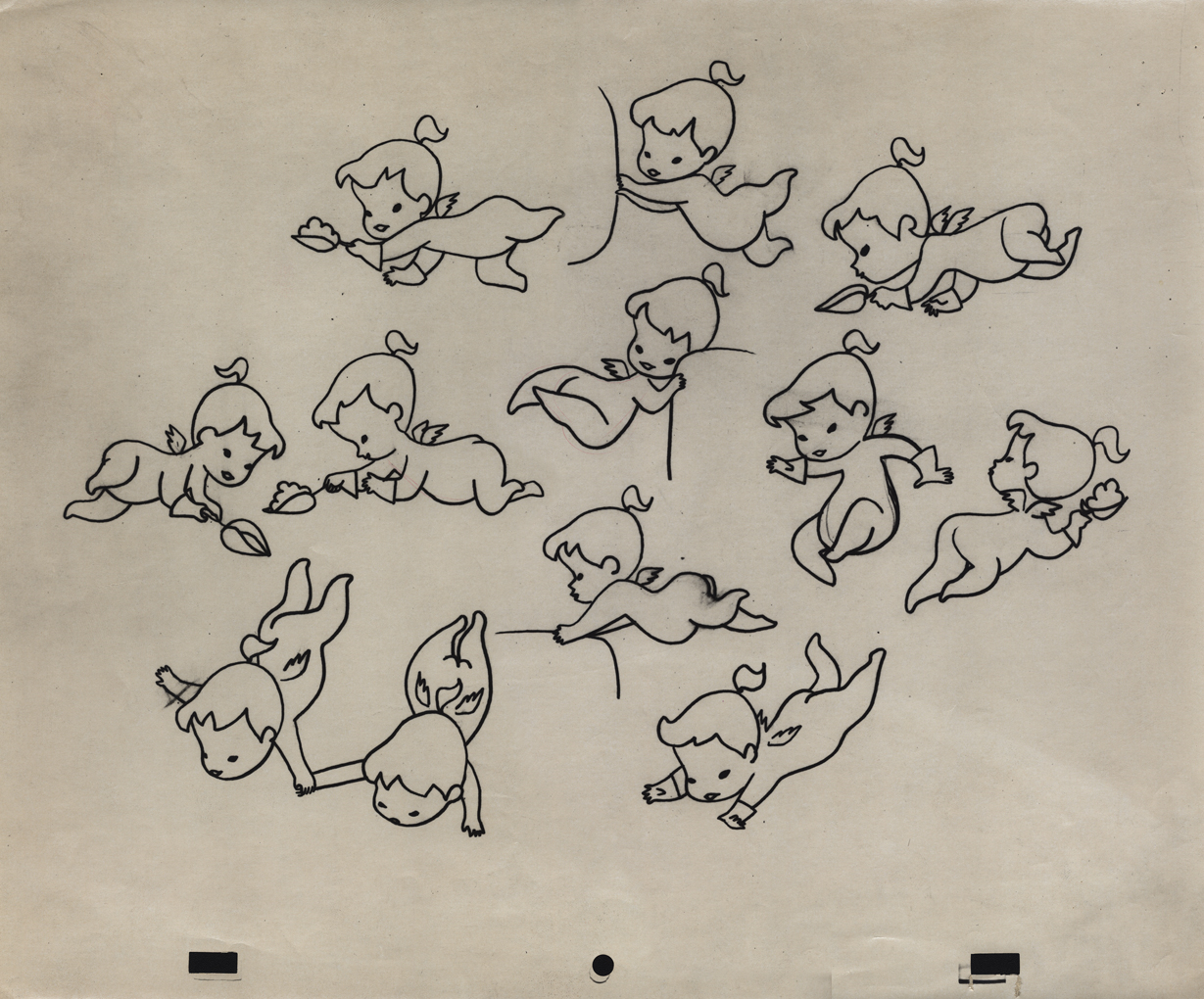
A model for a little angel. I assume this is for a
paper product commercial. Again, I think it’s the Gifford Studio
 7
7
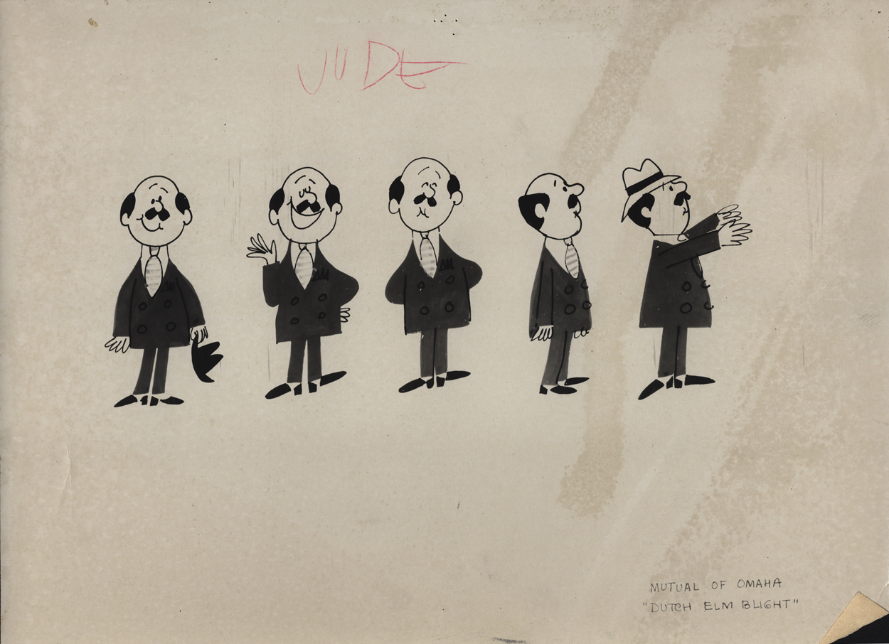
A turn-around model for a Mutual of Omaha commercial.
Again, since it’s with other Gifford Studio material I’d guess the same.
 8
8
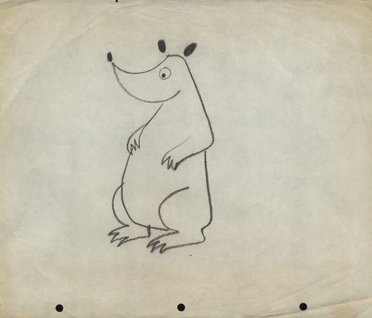
Here are two bear drawings from some commercial.
It looks like Dick Williams’ Cresta Bear (only this was
done years before that.)
9
The three round peg holes is certainly unique.
Fleischer used a similar system for a wile as did
Krantz Studio on Fritz the Cat.
I don’t know where these are from.
 10
10
I’m sure this comes from the Gifford Studio.
 11
11
An interesting design. I assume it’s from a spot.
Peg holes look like the Gifford Studio.
 12
12
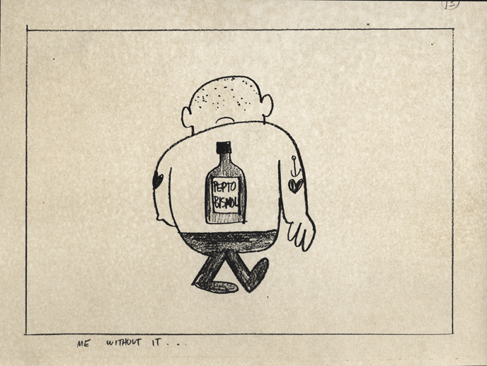
A storyboard drawing for a Pepto Bismol commercial.
UPA had this account for a long time.
The following three drawings are two animator’s drawings (#106 & 108) and one Inbetween (#107). I believe the animator is Frank Endres; the inbetweener is Vince Cafarelli. For some reason I think this is from a Little Lulu cartoon directed by Bill Tytla, but I can’t vouch for that. I’m sure one of you visitors will let me know how wrong I am, and I welcome it.
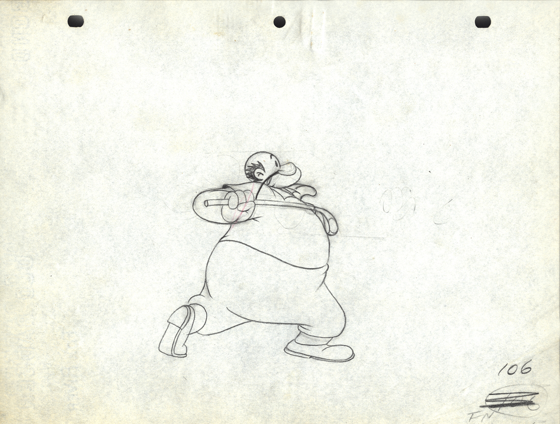
Drawing # 106 – animator’s drawing
I’m surprised at how small the paper is; not quite 8½ x 11.
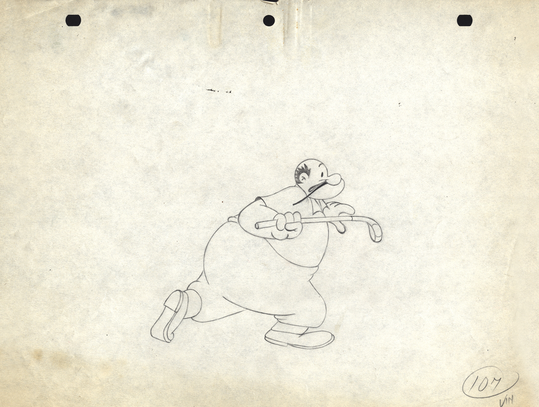
Drawing # 107 – inbetweener’s drawing
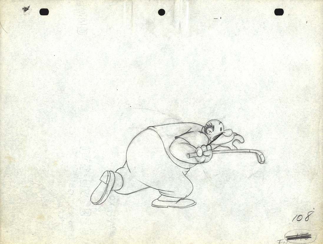
Drawing # 108 – animator’s drawing
The peg holes are Signal Corps.
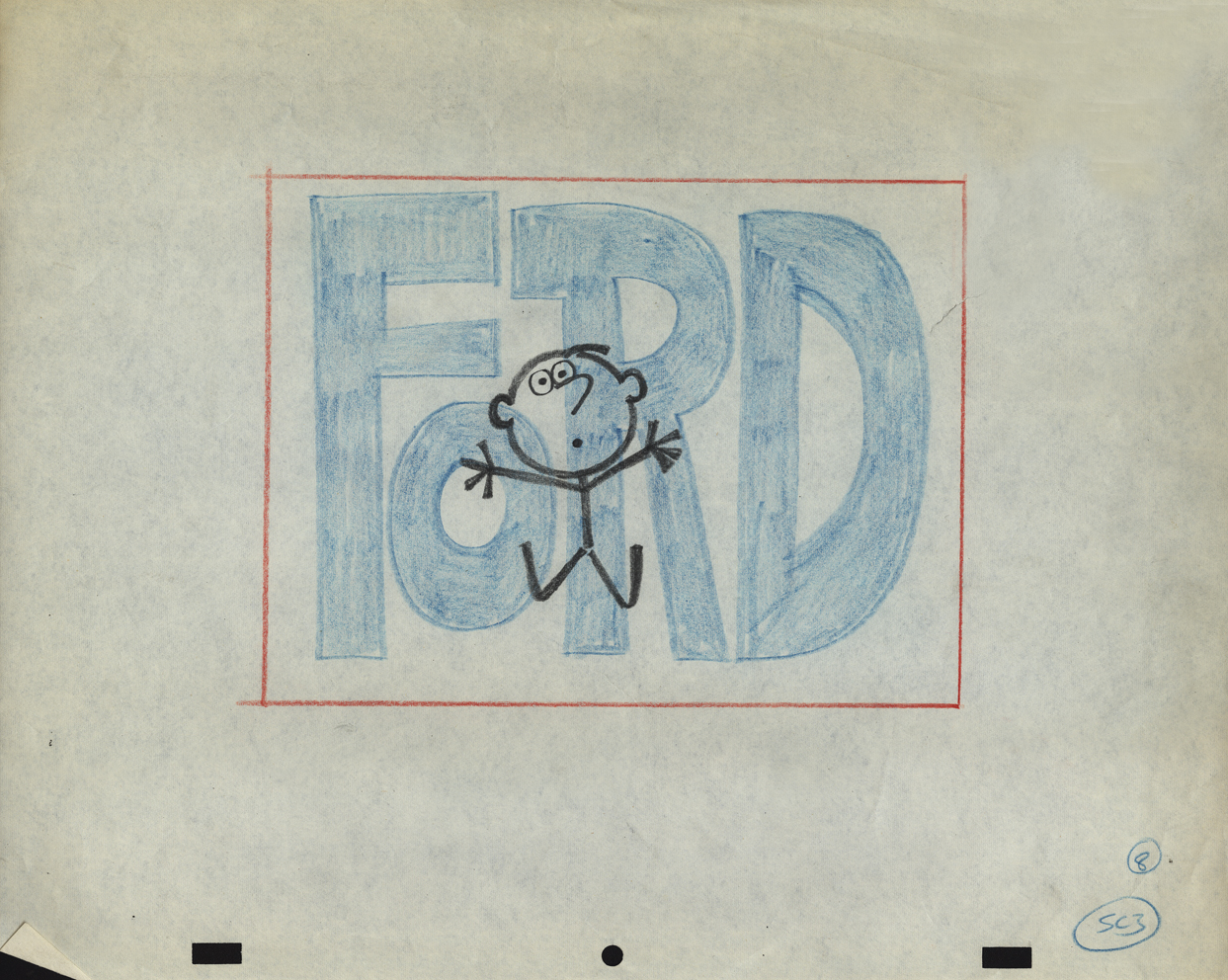
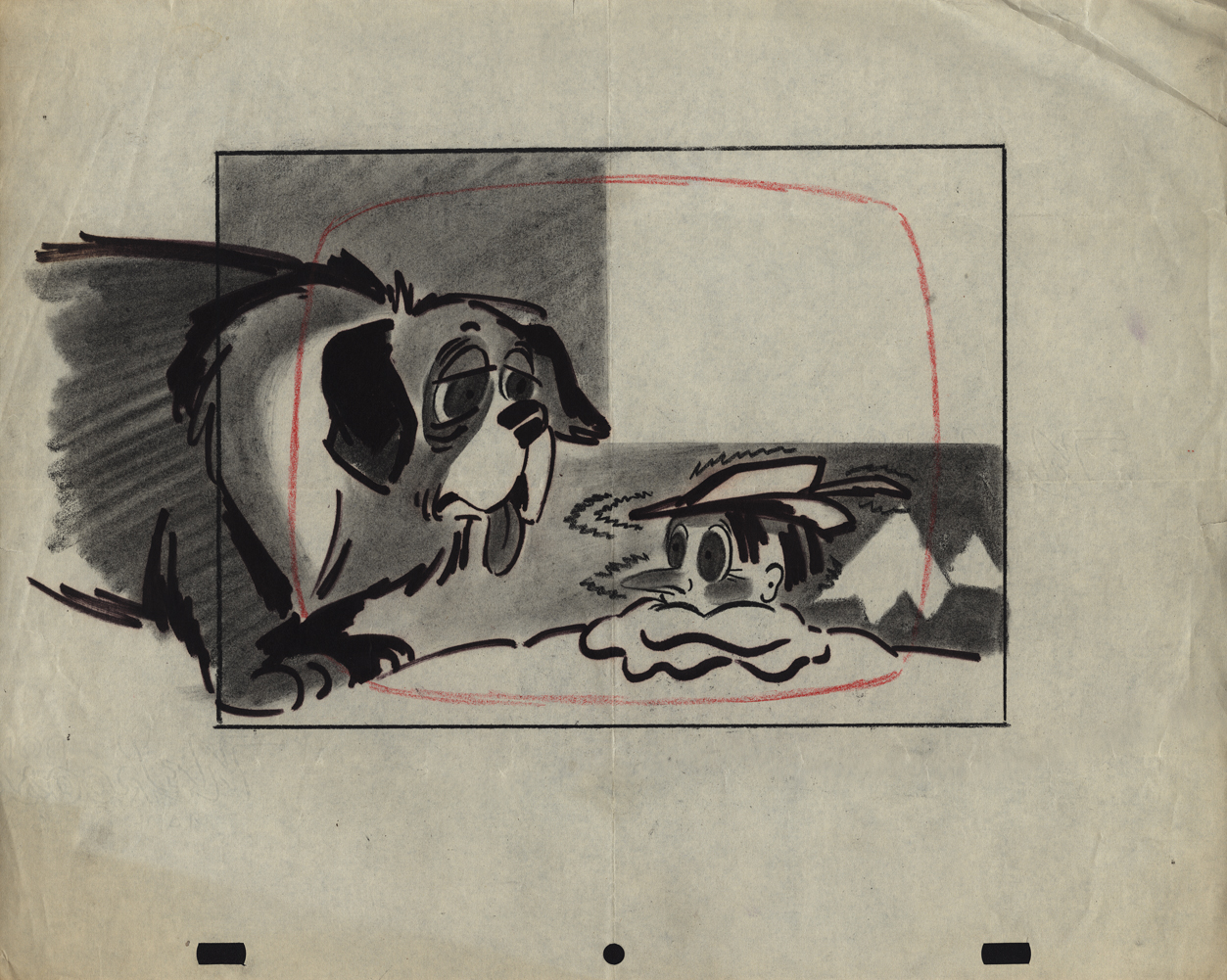
Animation Artifacts &commercial animation &Layout & Design 01 Aug 2012 05:23 am
Cafarelli Spot Stuff
- I’ve been posting a number of drawings from commercials that Vince Caffarelli worked on. He saved many of the drawings, which are mostly Models and Layouts from these spots. Many of the older ones can’t be identified as to which studio they came from. The more recent drawings (1970 up) can be.
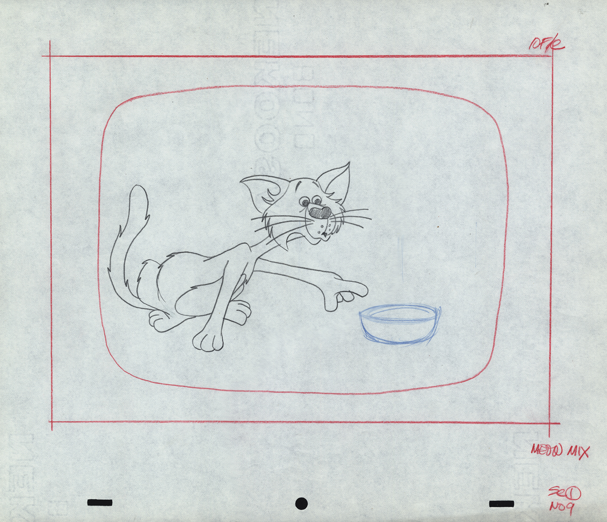
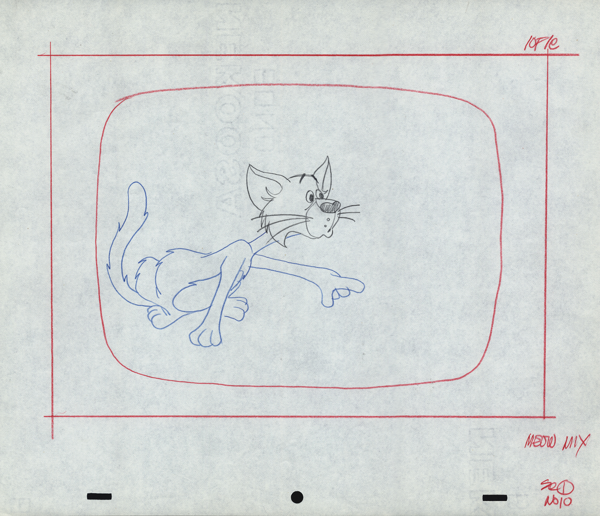
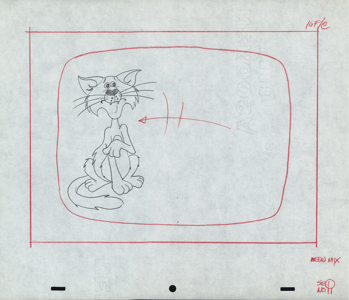
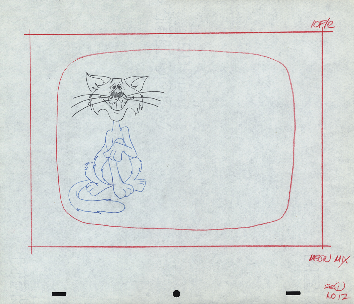
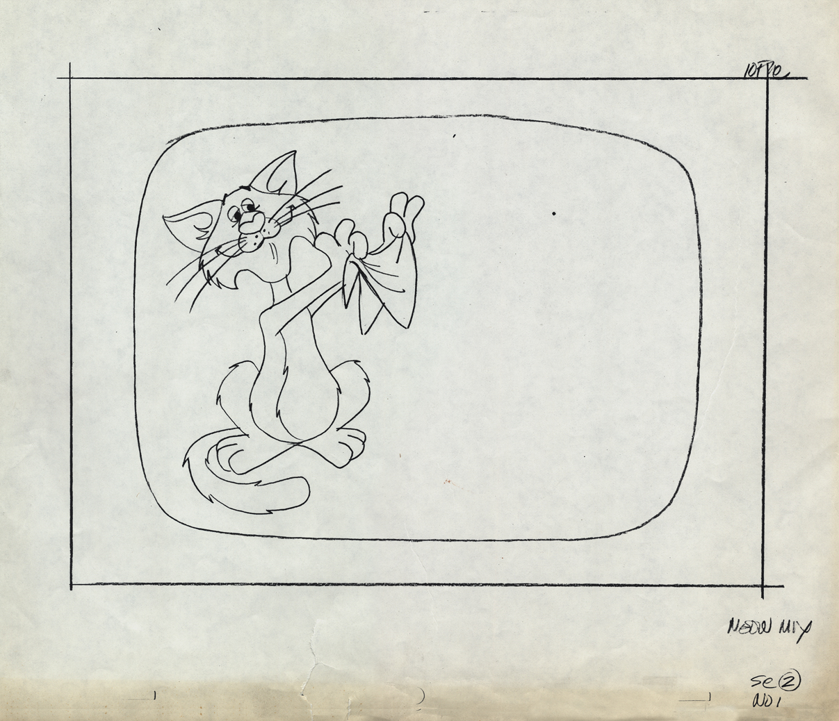
This first lare group of drawings can be classified as work from Perpetual Motion. They were drawn by Wayne Becker as Layouts and models for a Meow Mix commercial. Wayne worked in New York for many years predominantly doing Layout for many of the studios. His style, as you can see, is very tight.
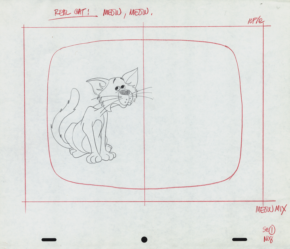
The first drawings from Scene 1 are missing. This is #08.
1-9
1-10
1-11
1-12
This starts Scene 02. Oddly this is a photostatic copy of drawing #01.
All the other drawings are pencil on animation paper.
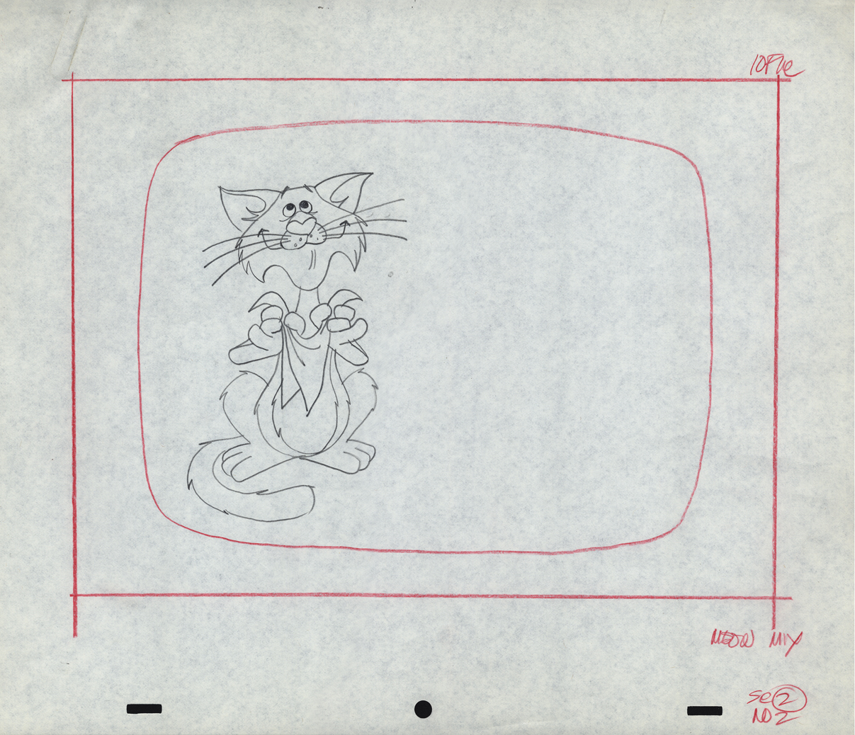
2-02
2-04
2-06
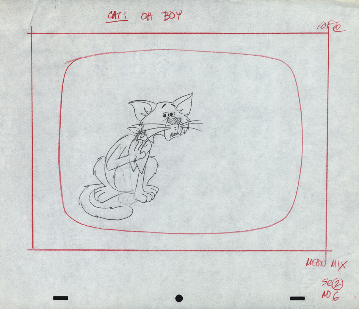
This is an alternate version of Sc 2 – #06
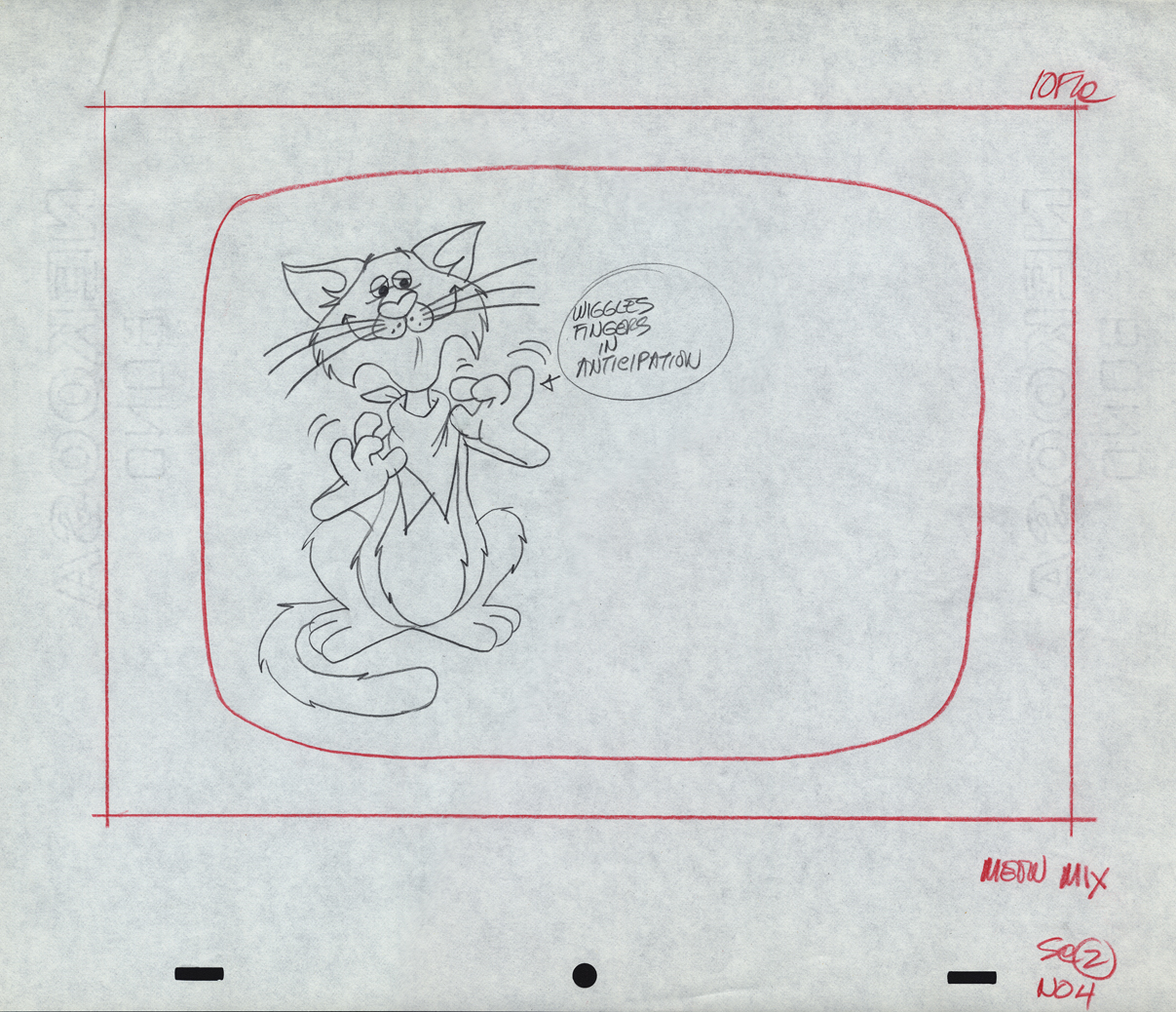
 1
1
These drawings are not labelled as part of Sc. 02, but they
seem to be just an extension of the scene – additional poses.
Perhaps they changed the ending.
 2
2
 3
3
 4
4
 5
5
Here’s a QT movie of the spot when finished.
__________________________
For a lively change of pace, here are two caricatures drawn by Marty Taras of Vince Cafarelli and Pablo Ferro. The two were inseparably close friends at Paramount where these drawings were probably made. Marty, of course, was one of the mainstays in New York, workinig at Terrytoons and Paramount, where he was the man behind Baby Huey.
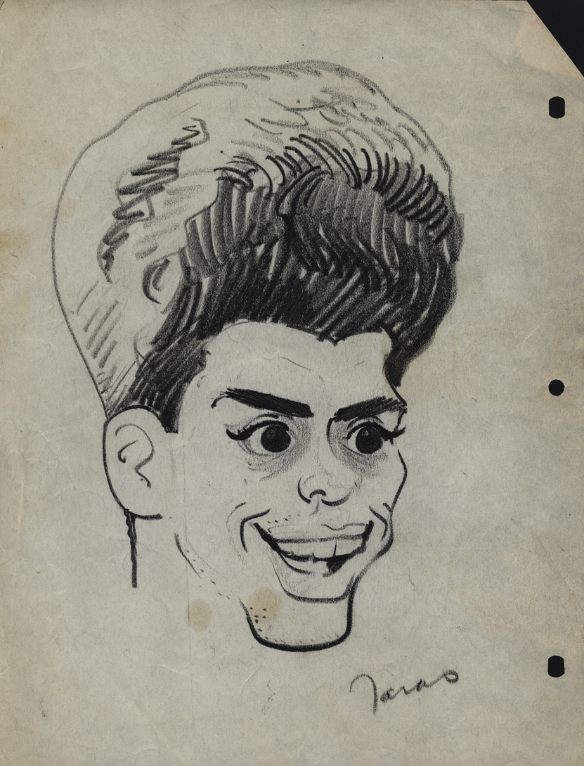
Vincent Cafarelli
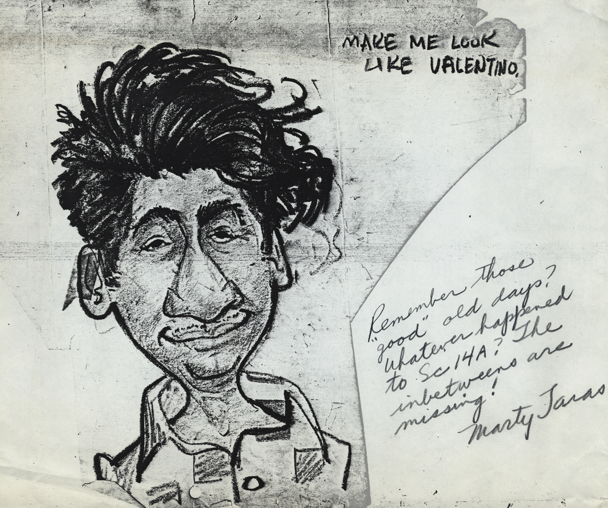
Pablo Ferro
__________________________
Finally, here are some drawings done by Dolores Cannata when “Buzzco.” was formed after “Perpetual Animation” had folded. Dolores was the daughter of George Cannata Sr. and the sister of George Cannata Jr. I met her very briefly when I was first starting out and making the rounds of the studios. My appointment was with George Jr. who liked my drawings and advised me not to be an animator but a designer.
She was a gifted designer; that’s for sure.
Action Analysis &Animation &Animation Artifacts &commercial animation &Hubley &Tissa David 26 Jul 2012 07:22 am
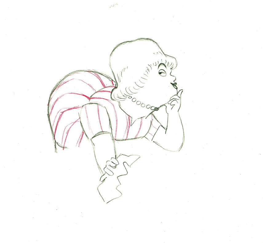
A Simple Move – recap
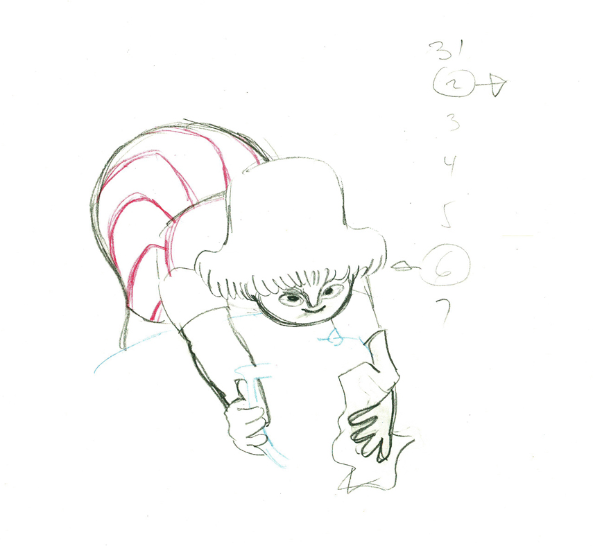
- Here’s what looks like a simple move done by Tissa David when she animated this Viva, paper towel commercial. It was produced, directed and designed by John Hubley. A very simple and beautiful character.
The character’s move in this scene is a complicated one done simply. She has been bent over, cleaning with her paper towel, and she moves up. You can follow the overlapping action as her eyes pull her up, head turn, and body follows.
The stripes will come and go. Tissa depends on someone else to concentrate on this material when she’s working on a commercial.
 e37
e37(Click any image to enlarge.)
 38
38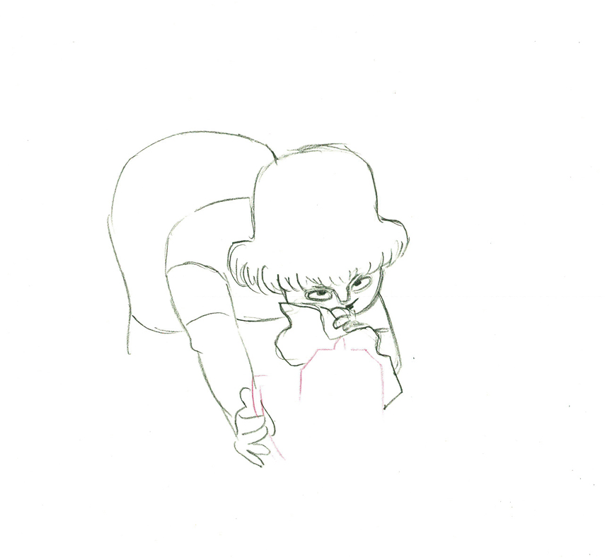 39
39
 40
40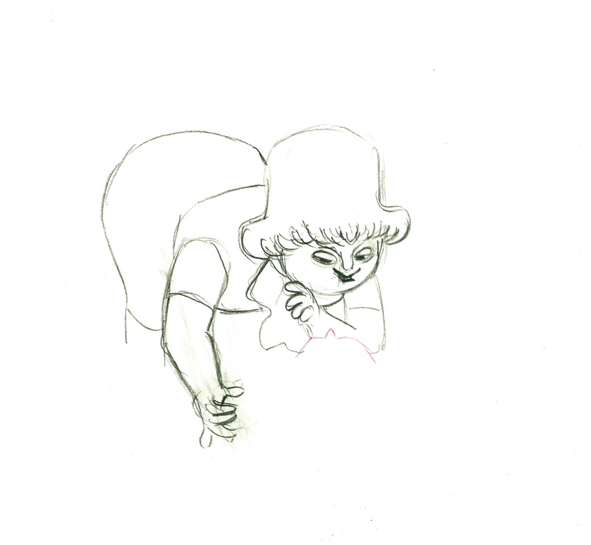 41
41
 42
42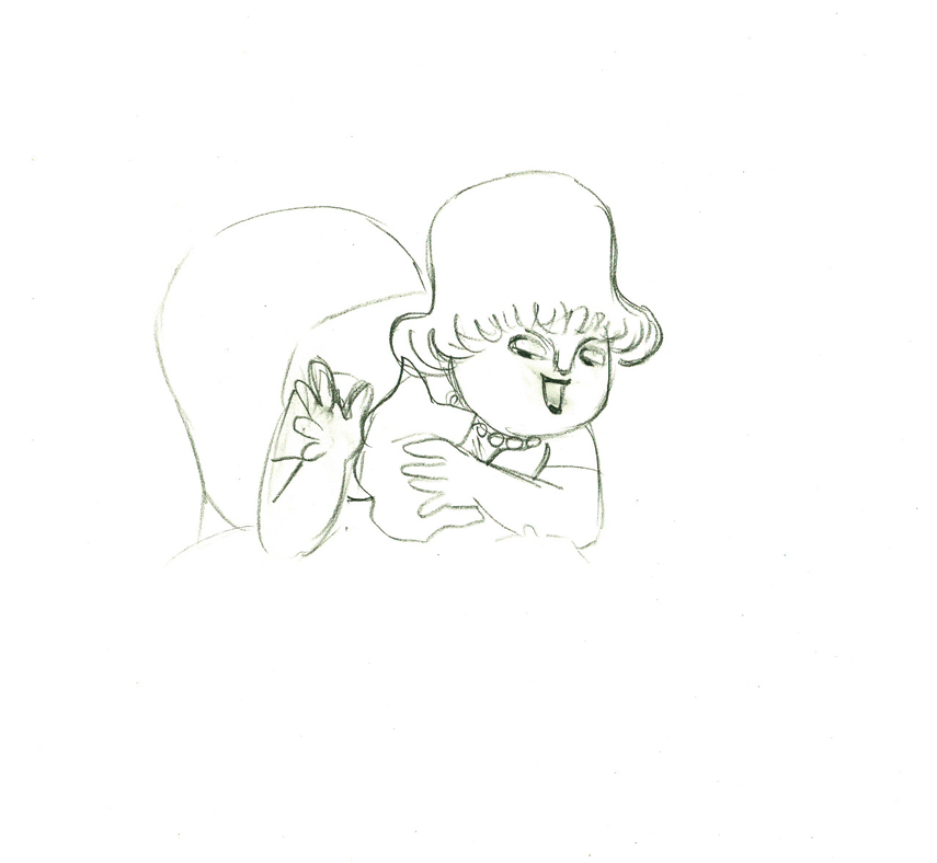 43
43
 e44
e44
Her eyes point in the direction she wants to go,
and the rest of the scene moves her up and into profile.
This key move is hidden under the exchange of the
paper towel from one hand to the other.
 45
45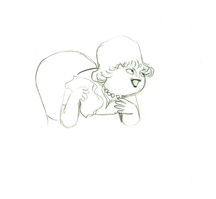 46
46
 47
47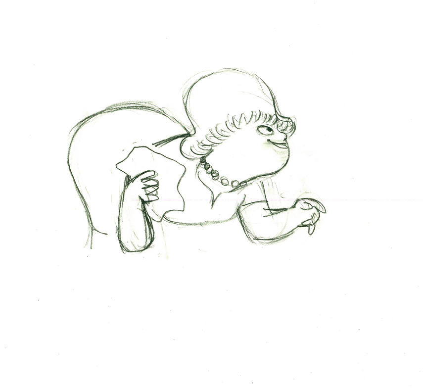 48
48
 49
49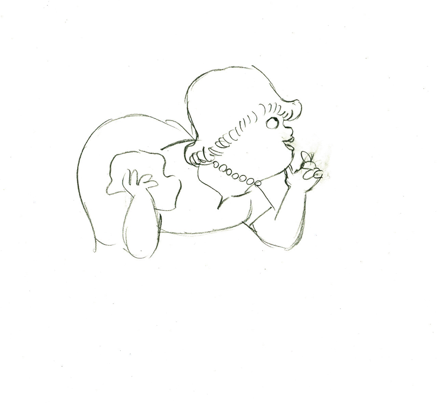 50
50
 e51
e51
She stops to think (accenting her monologue.)
 52
52 53
53
 54
54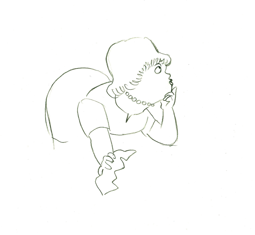 55
55
 56
56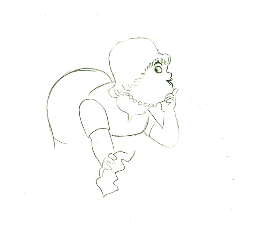 57
57
 e58
e58
And she slyly looks back to camera to respond with her thought.
 e59
e59
She continues, all through this move, talking.
She’s pitching the product.
Here’s a QT of the piece:
Cleaning for VivaClick left side of the black bar to play.
Right side to watch single frame.
Animation Artifacts &commercial animation &Layout & Design &UPA 25 Jul 2012 05:21 am
Even More UPA Spots
- Here are more Layouts and character poses for the commercial work done at UPA. They are all pulled from Vince Cafarelli‘s collection of artwork. I assume these all come from UPA since Magoo models were in the same folder. The design styles are consistent with what we’ve seen from UPA at the time.
 1
1
 2
2
 3
3
A photostat of a character model sheet
 4
4
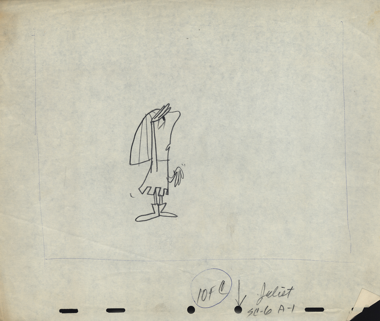
An ad that features Romeo and . . .
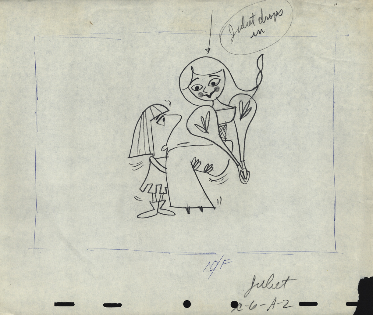 5
5
. . . Juliet
 6
6
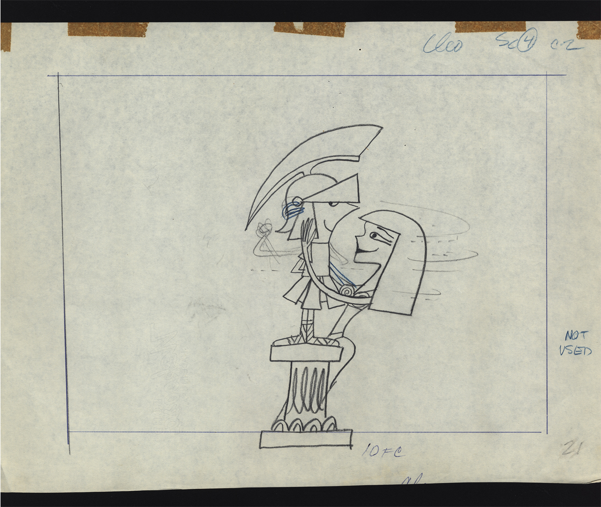
Cleopatra was obviously cut out of the spot.
Note that the pegs were cut off the NG drawing.
 7
7
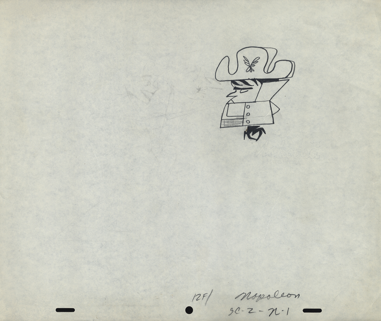
Napoleon, but it looks like it comes from a different spot.
 8
8
Was this something that stuck in Gene Deitch’s mind before he left
UPA to go on to run Terrytoons? Shades of Gaston le Crayon.
 9
9
 10
10
 11
11
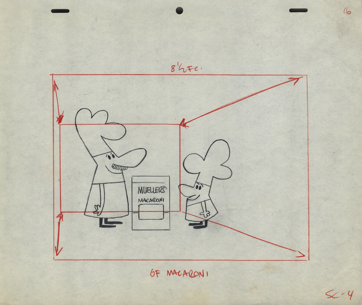
Obviously, an ad for Mueller pasta
 12
12
An interesting series of Layouts. I’m not sure if they’re for an ad . . .
 13
13
. . . or a short film for the McBoing Boing Show.
 14
14
 15
15
 16
16
 17
17
Animation &Animation Artifacts &commercial animation &Layout & Design &Models &UPA 18 Jul 2012 07:05 am
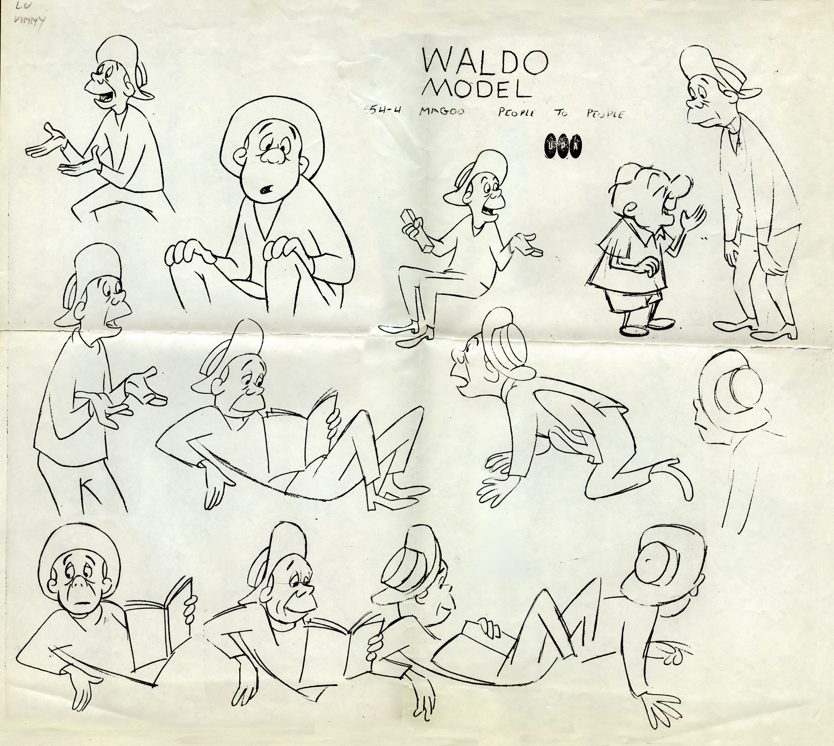
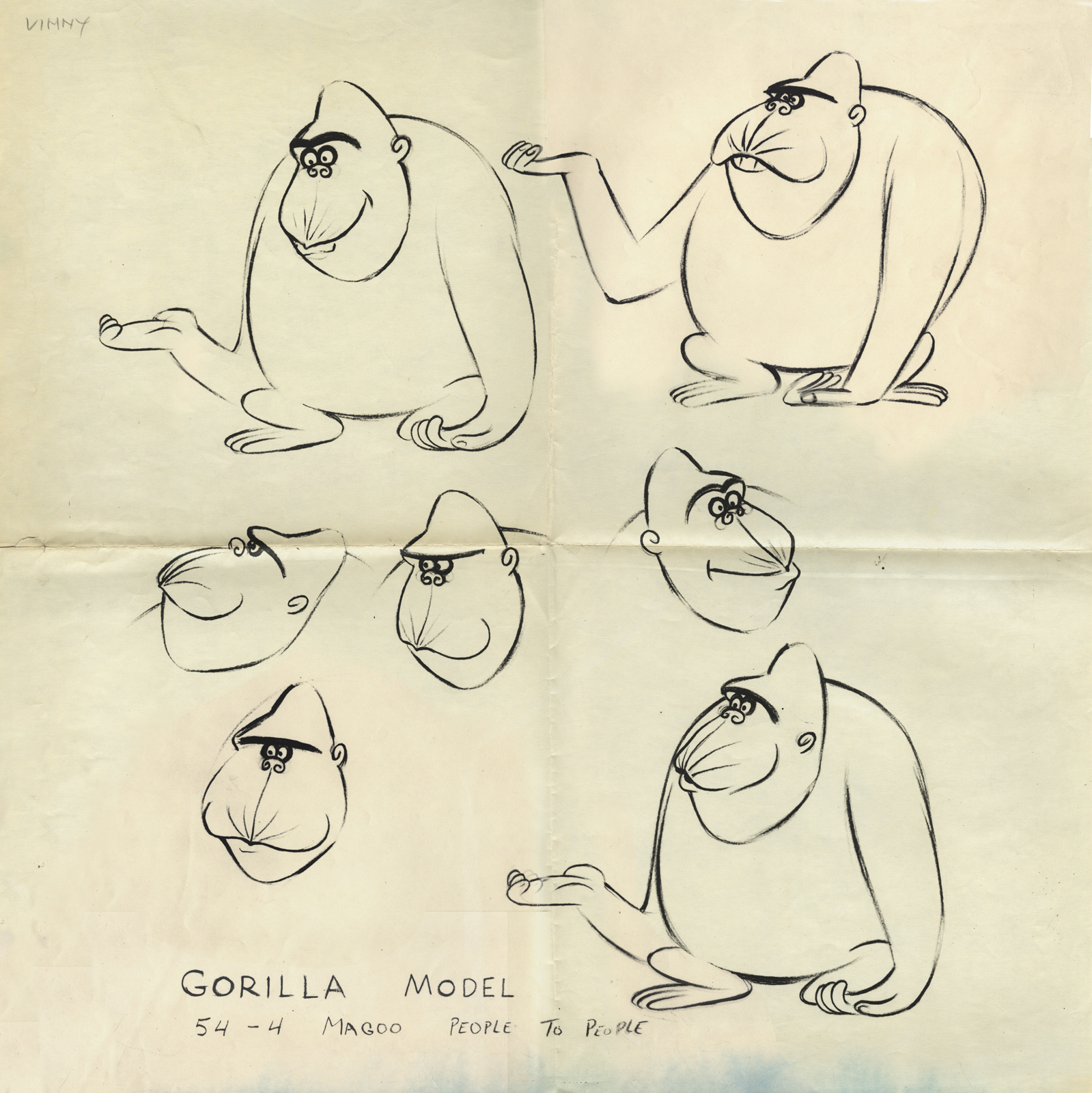
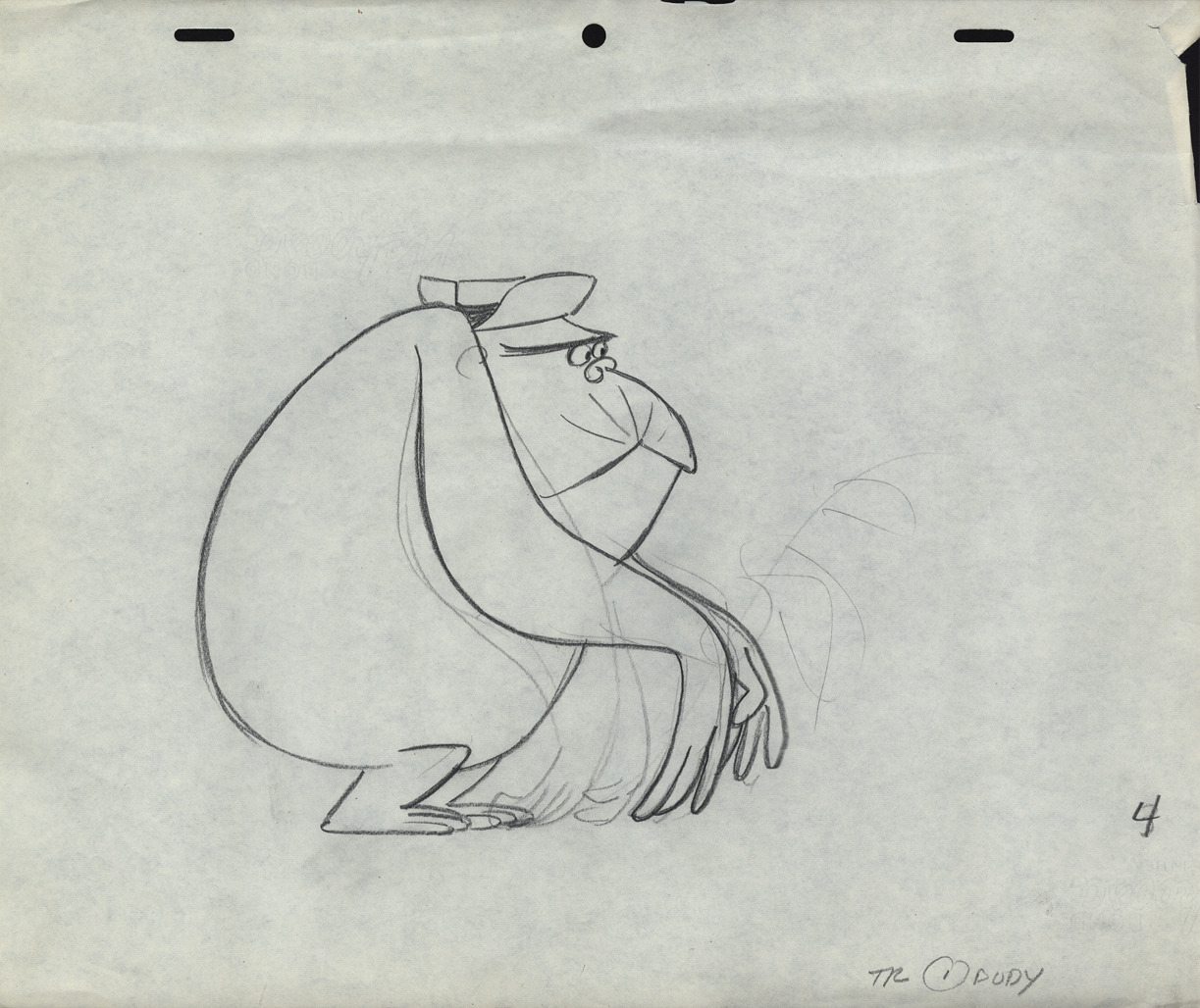
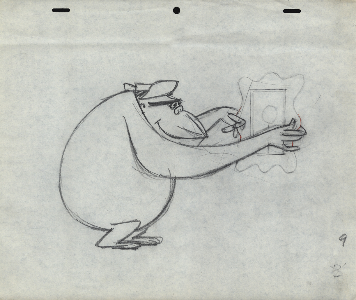
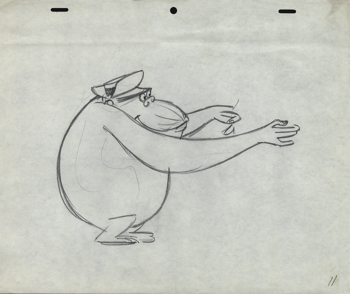
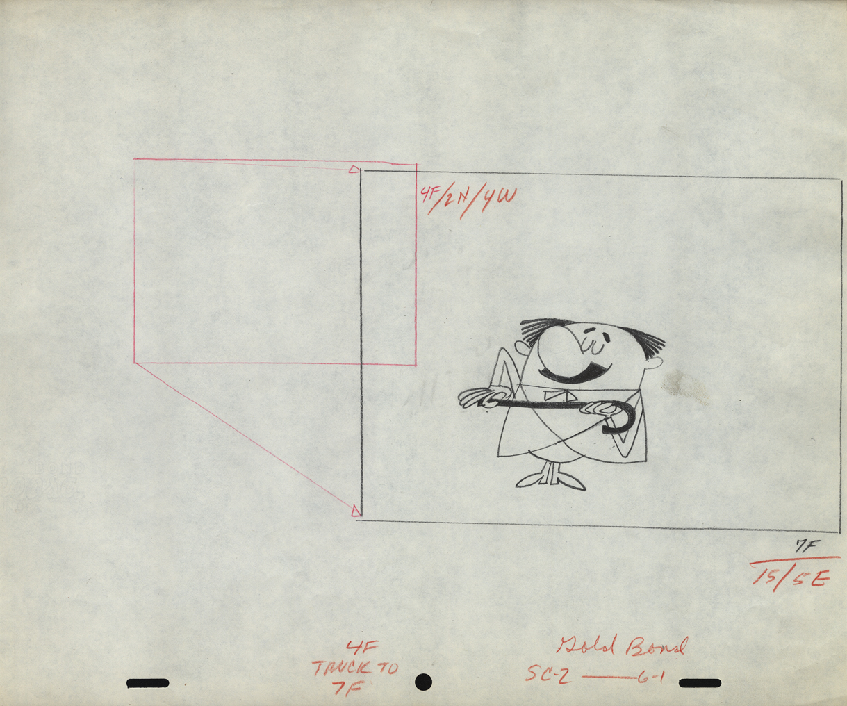
More UPA Spots
- Out of the Vincent Cafarelli collection, we’ve found another burst of UPA drawings. We know they’re UPA because there are models and animation drawings from a Mr. magoo short: “People to People.” The accompanying drawings from commercial spots and segments of the Gerald McBoing Boing Show all come on the same paper stock. The peg system is Acme not Signal Corps (which leads me to believe that some of those I called UPA in a past post are really from the Gifford Studio.)
 1
1This model and the other Magoo pieces here are from
the short “People to People” which features a gorilla.
 2
2
Per Mark Mayerson, in the comments section, the film was retitled
Terror Faces Magoo and was directed by Chris Ishii and Jack Goodford.
 3
3
See the film here.
 4
4
 5
5
This model comes with the names “Lu” and “Vinny” indicated.
Obviously Vinny Cafarelli was Lu Guarnier’s assistant.
 6
6
The following three drawings are key animation poses of the Gorilla.
 10
10
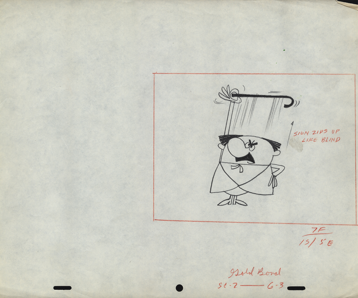
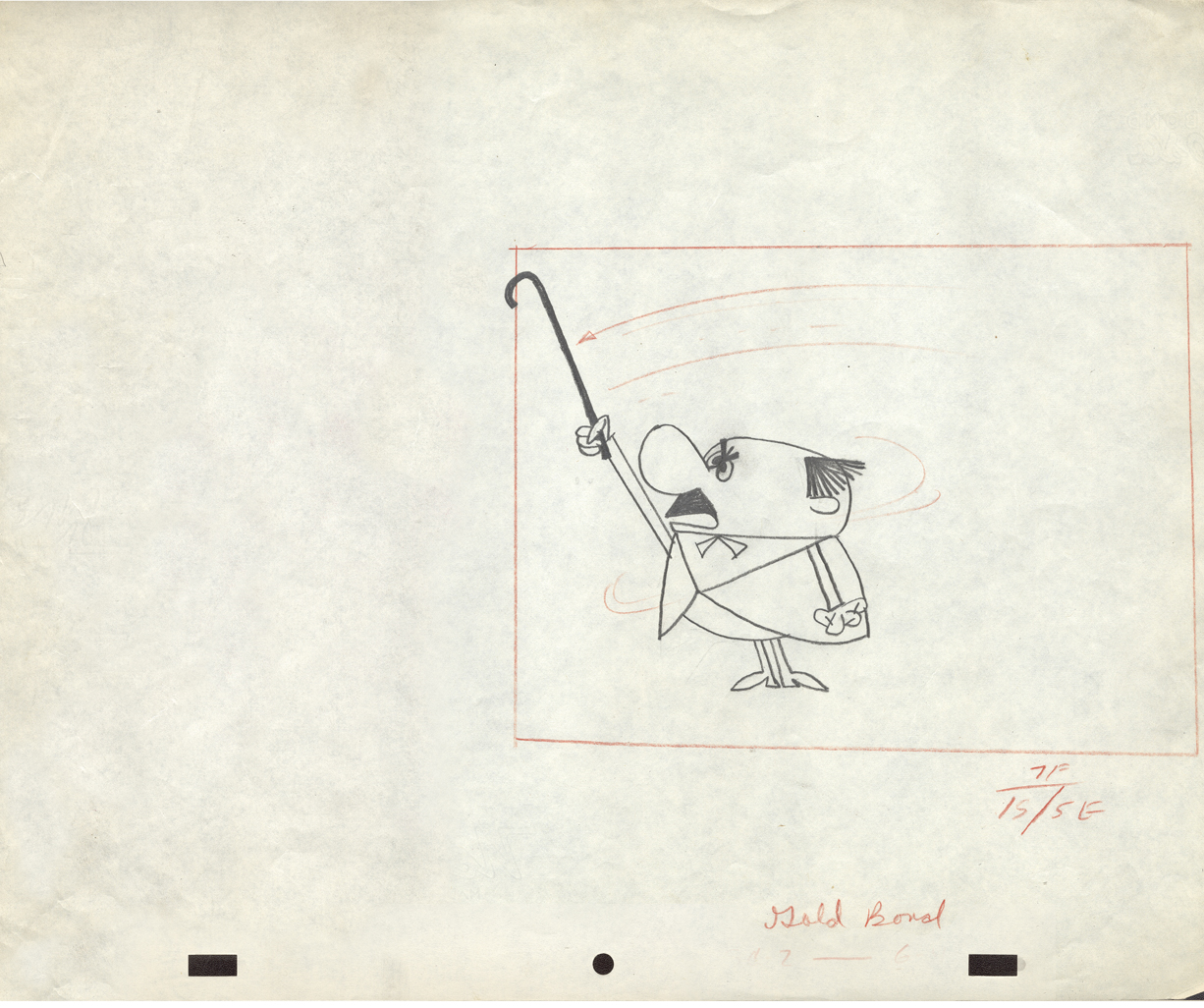
An ad for Gold Bond powder
 11
11
 12
12
 12
12
 13
13
 14
14
 15
15
 16
16
This is obviously a drawing of the Tworlinger Twins, a
series done for the McBoing Boing show. The NY office
seems to have done a number of pieces for the show.
 17
17
These guys look similar to the three who open
the McBoing Boing Show carrying their logo.
 18
18
A vertical pan for a Savarin Coffee spot. A sign painter
pastes a placard of the product on a billboard.
 19
19
Part of another vertical pan for the Savarin spot.
20
21
22
23
24
25
Animation Artifacts &Books &Comic Art &commercial animation &Models 11 Jul 2012 05:37 am
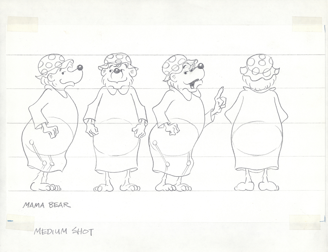
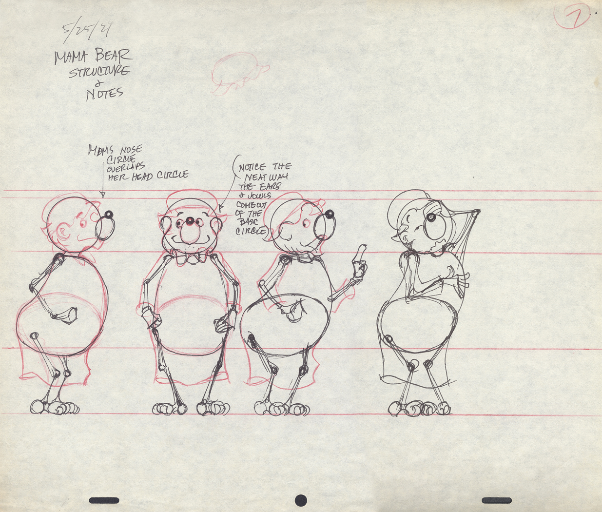
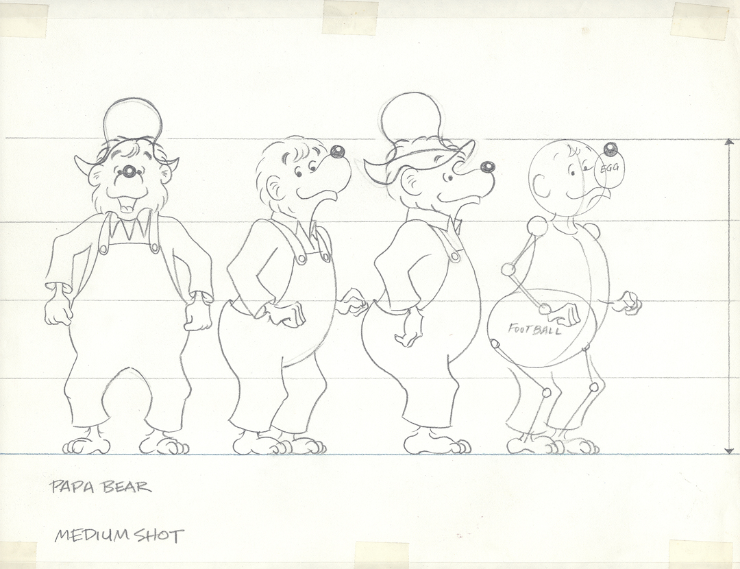
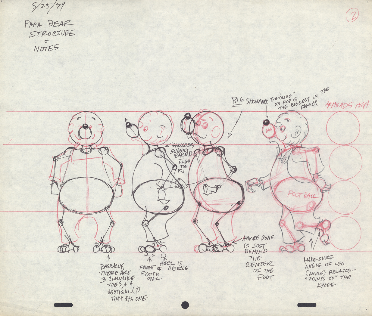
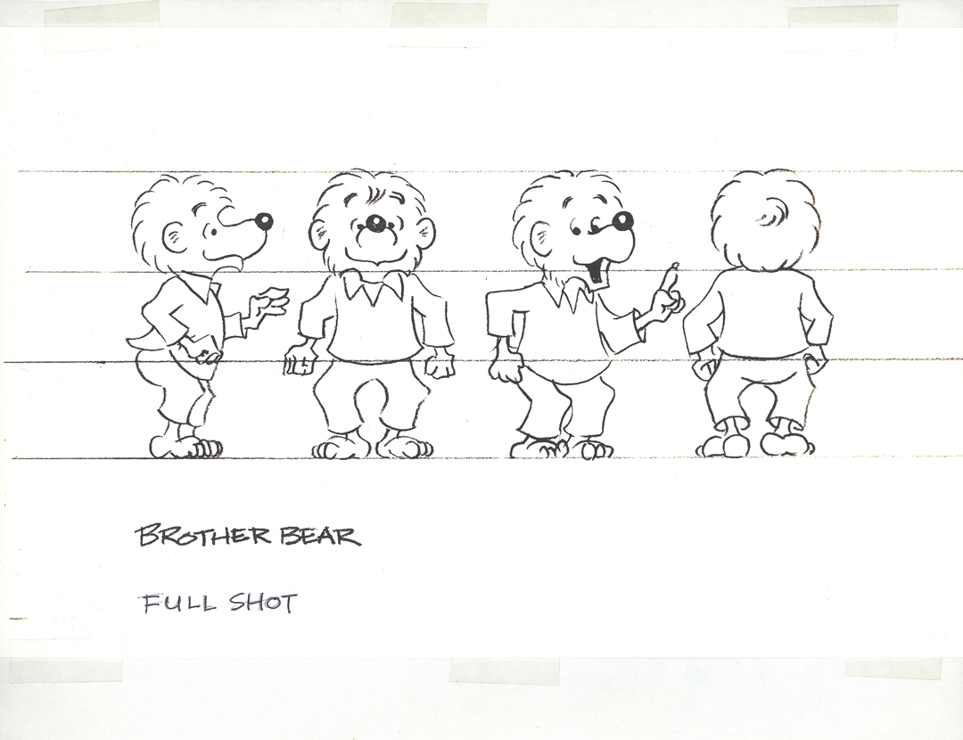
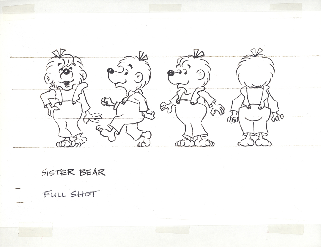
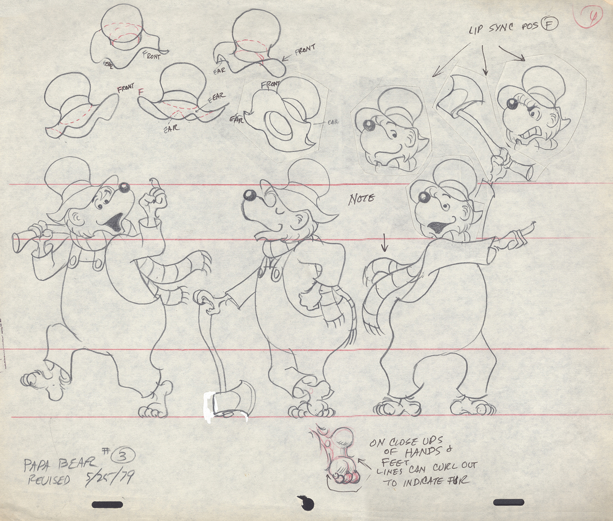
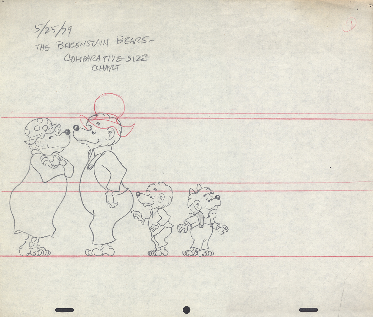
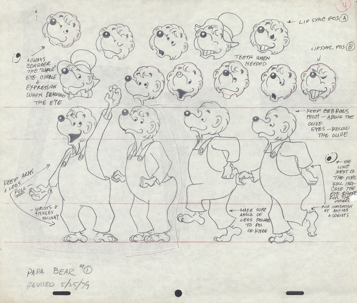
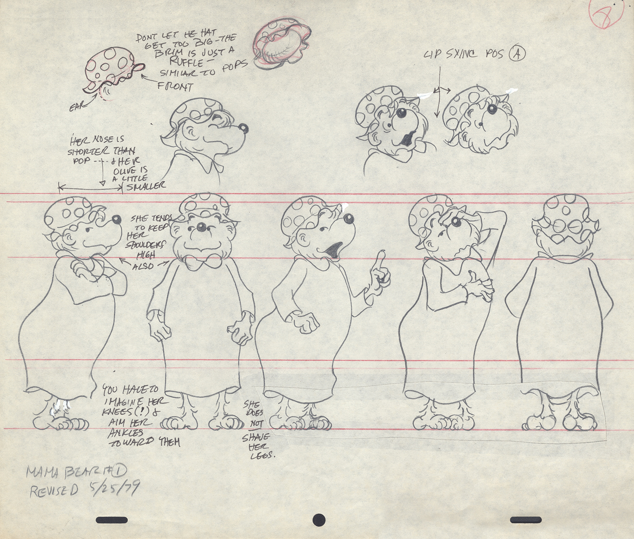
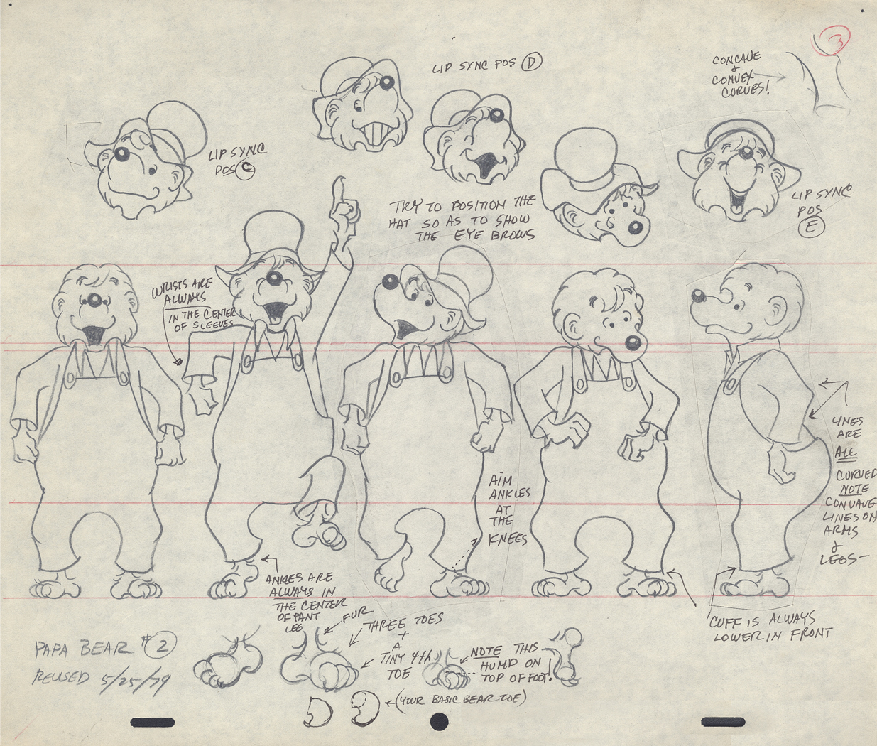
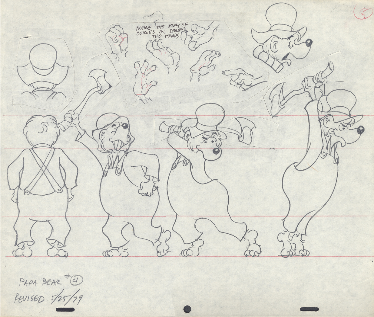
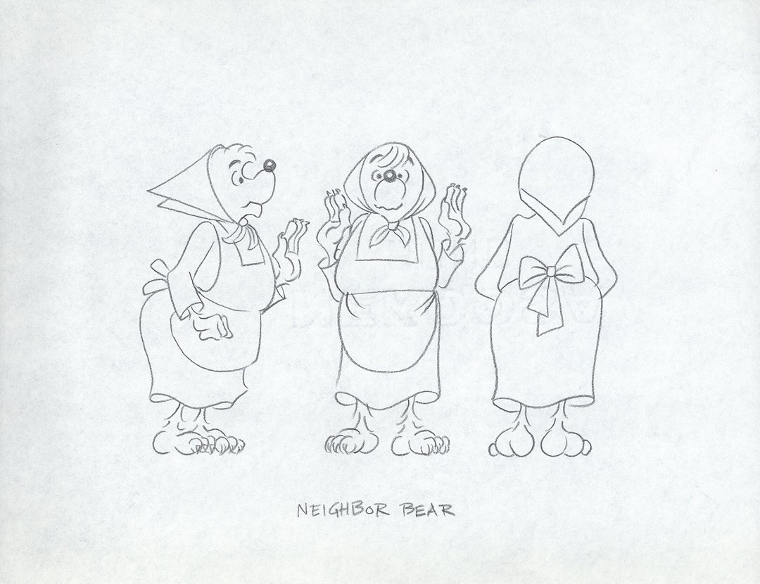
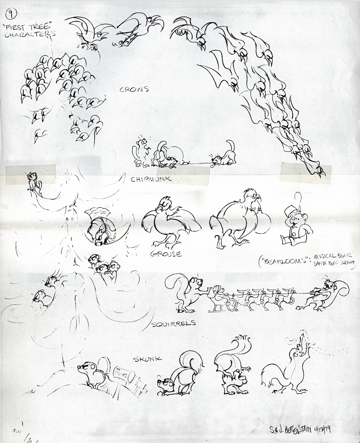
Berenstain Bear Models
- From Vince Caferelli‘s collection, this week we jump to his years at Perpetual Motion Pictures. The first Berenstain Bears Special, Berenstain Bear’s Christmas Tree, was done for NBC in 1979 and was followed by another four. This was a very successful half hour made from the comic strip which was created by Stan and Jan Berenstain. They wrote the original TV special which was directed by Mordecai Gerstein, Animated by Vinnie Bell, Vincent Cafarelli, Jack Dazzo, Lu Guarnier, Jan Svochak and Fred Mogubgub.
The Asst. Director was Candy Kugel, and the Bgs were done by Linda Daurio and Cotty Kilbanks.
Here are the model sheets which were drawn by director, Mordi Gerstein, and animator, Jan Svochak, from original drawings by Stan Berenstain. These, for the most part, are original pencil drawings of those models.
 1
1
 2
2
 3
3
 4
4
 5
5
 6
6
 7
7
 8
8
 9
9
 10
10
 11
11
 12
12
 13
13
 14
14
 15
15
This ic a copy of a model digned by the Berenstains.
____________________________________
This is the half-hour Special as it appears on YouTube.
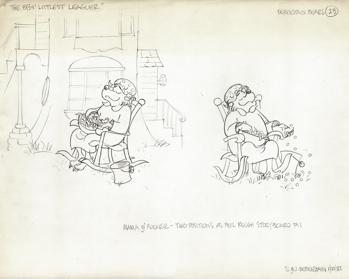
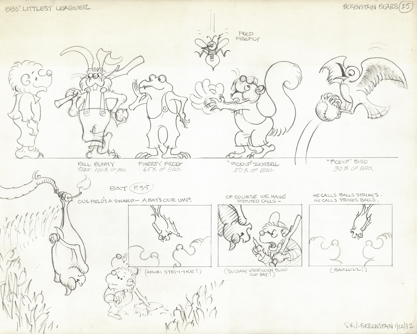
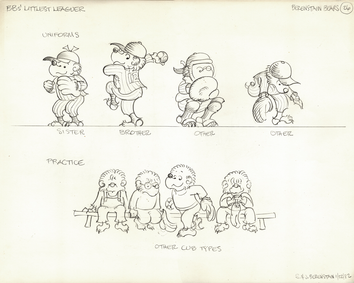
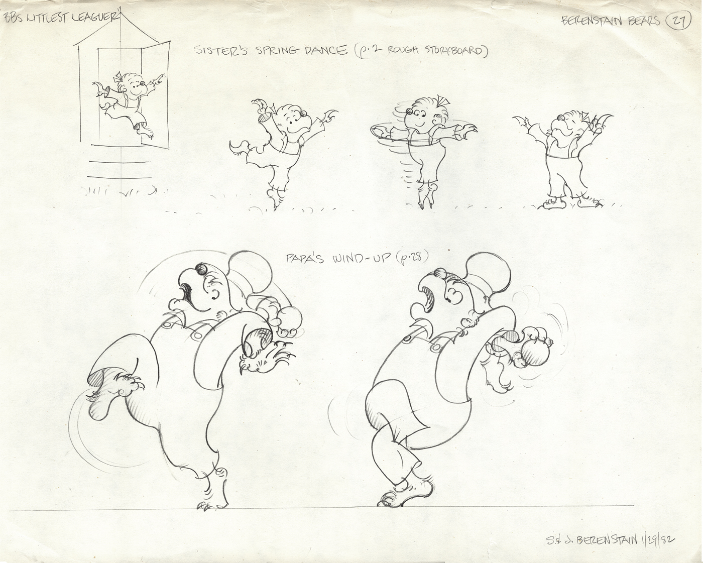
The next four models come from a later show, “The Berenstain Bears’ Littlest Leaguer.”
All are original models signed by the Berenstains.
Articles on Animation &commercial animation 10 Jul 2012 04:33 am
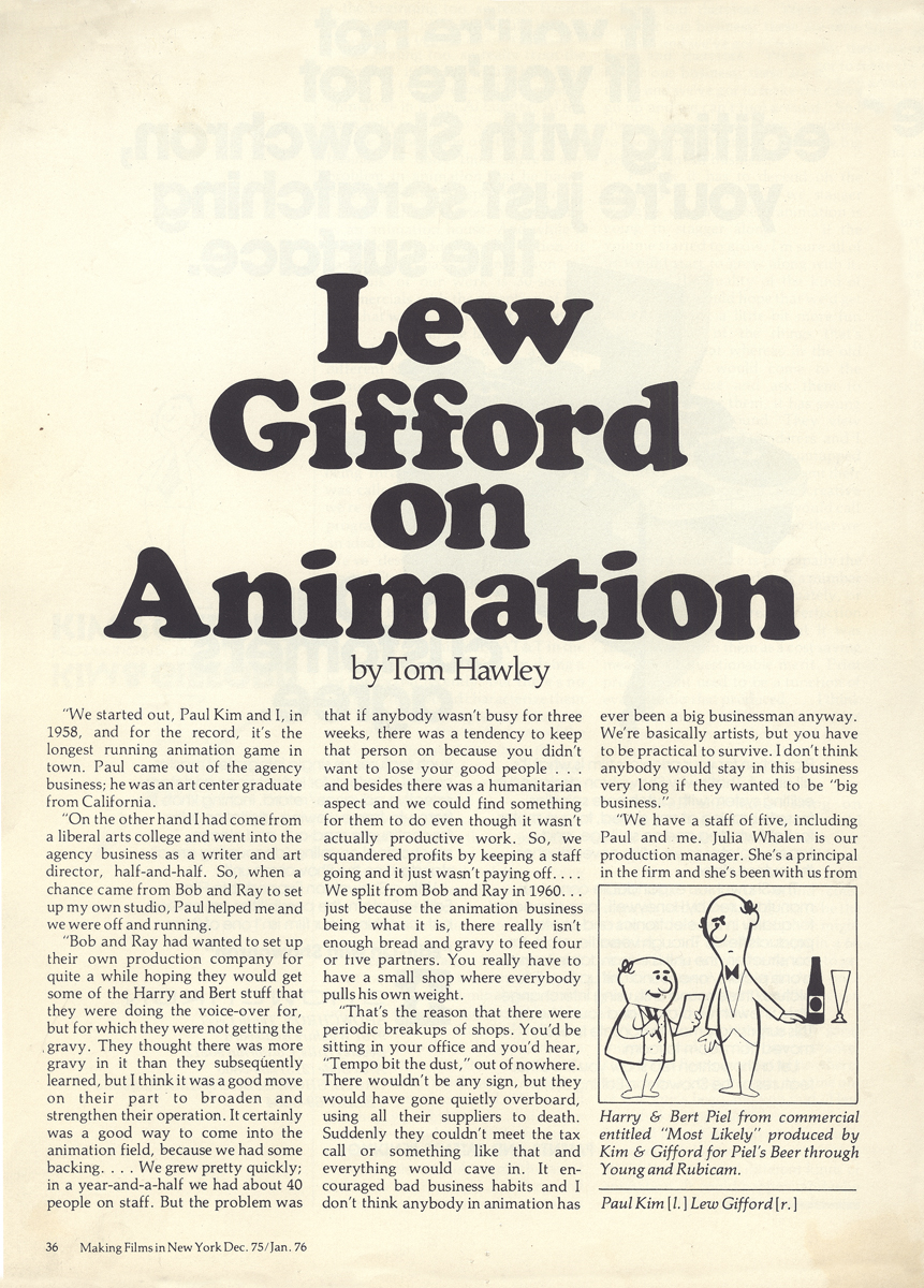
Gifford on Animation
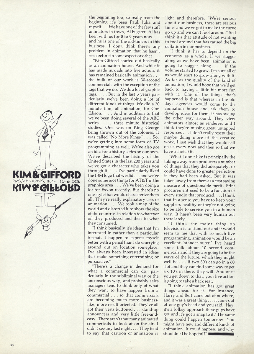
- The Gifford Studio, in NYC, was one of the prime boutique shops for animation from the 50s through the 80s. The studio was formed in 1958 to service Bob and Ray who hoped to dominate the Bert & Harry Piels Brothers account. Eventually, they came to feel as though there were too many bosses, and they separated. Eventually, the studio became Kim-Gifford Studio, and they continued to operate primarily as a commercial producer for many years.
Al Eugster was the permanent/on-staff animator through many of those years. You can see more photos of him at Mark Mayerson’s vital website: Eugster’s Photo Album.
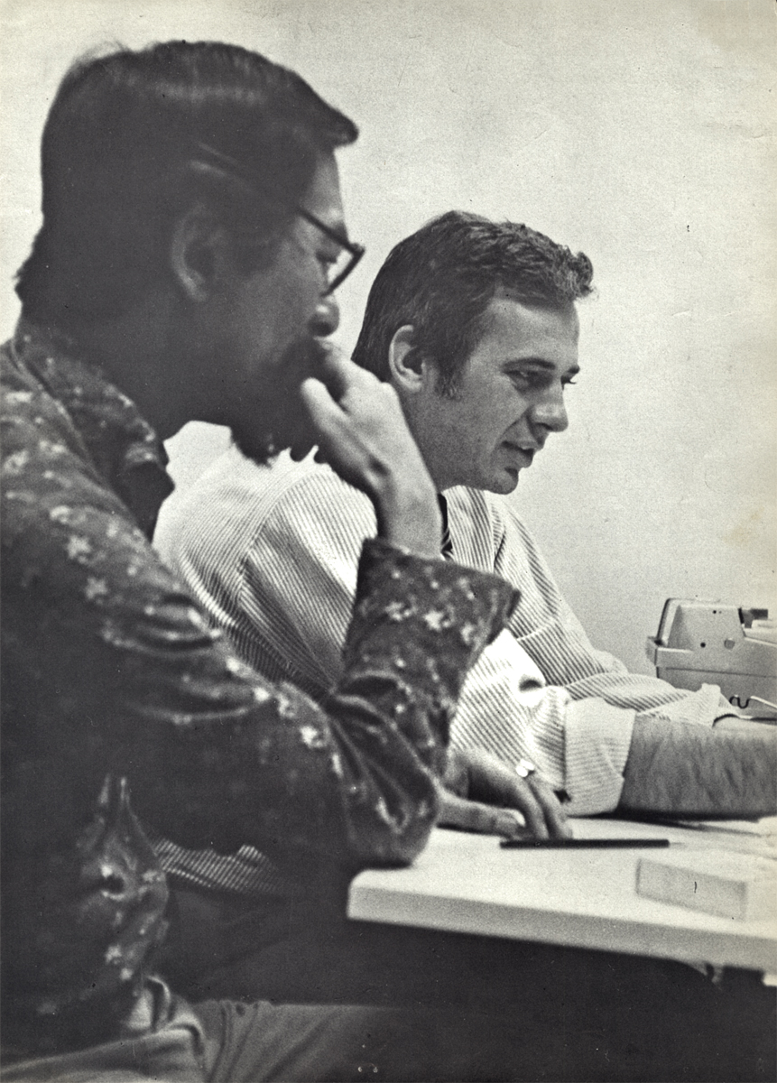
I recently found this article among Vince Cafarelli’s collection of artwork. resumably, though this article was not when Vince worked at Kim-Gifford where he did the Emily Tipp series, he was interested enough to hold onto the piece. The article is from Making Films in NY, Dec.75 issue, and thought it interesting enough to post.
 1
1
 2
2
 3
3
