Category Archivecommercial animation
Animation Artifacts &commercial animation &Layout & Design 03 Oct 2012 06:46 am
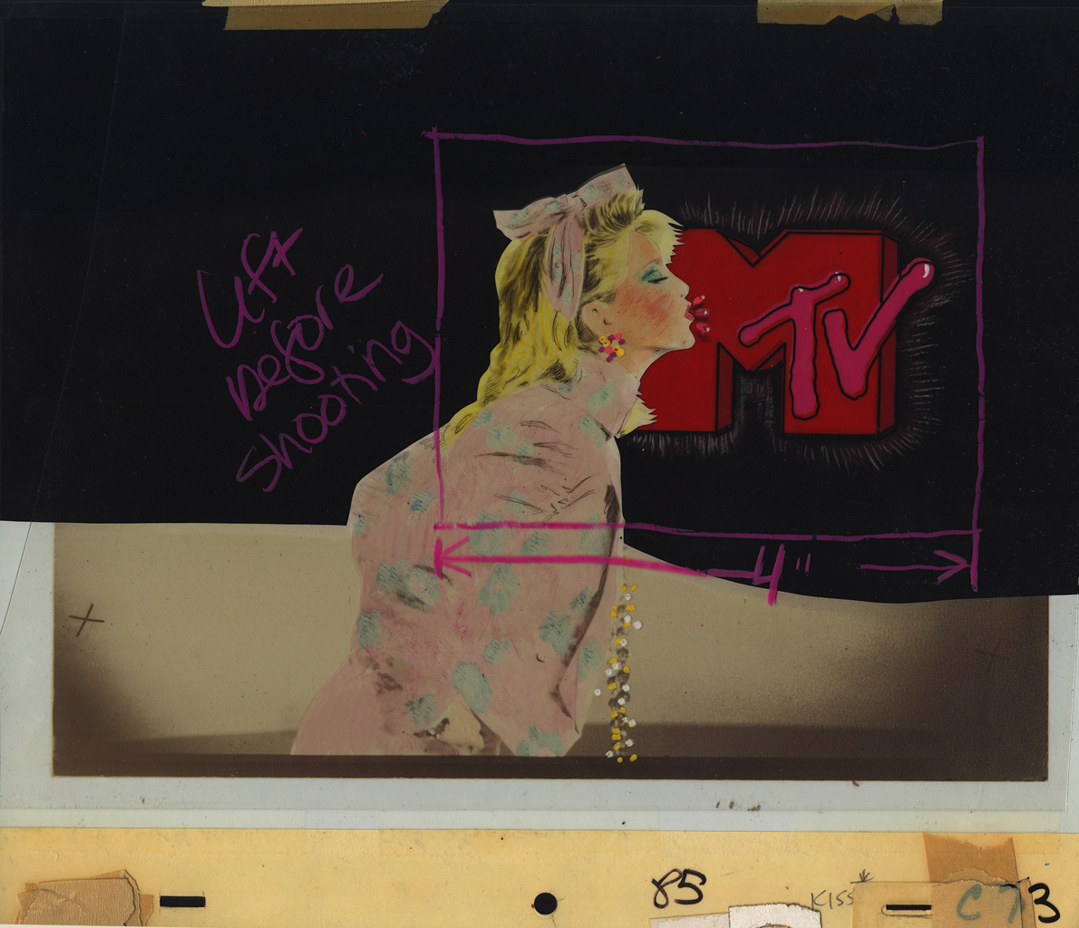
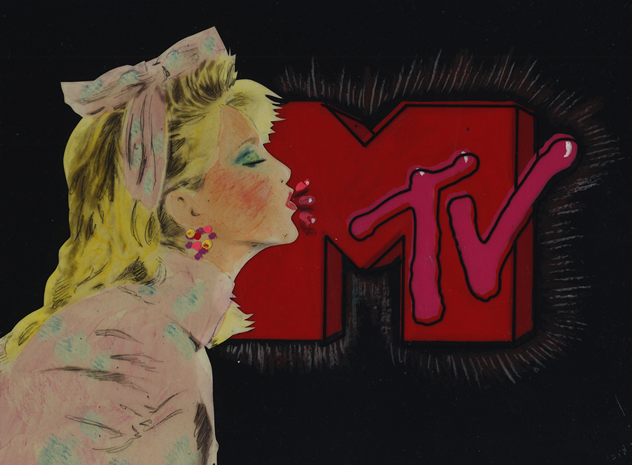
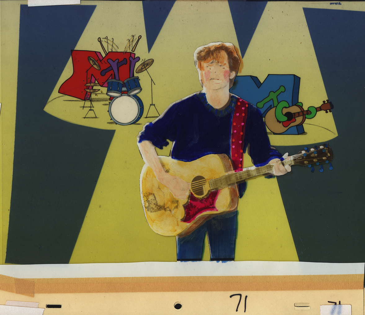
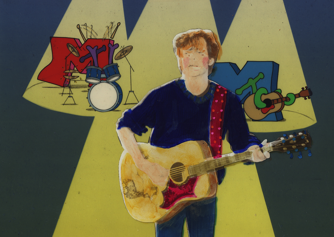
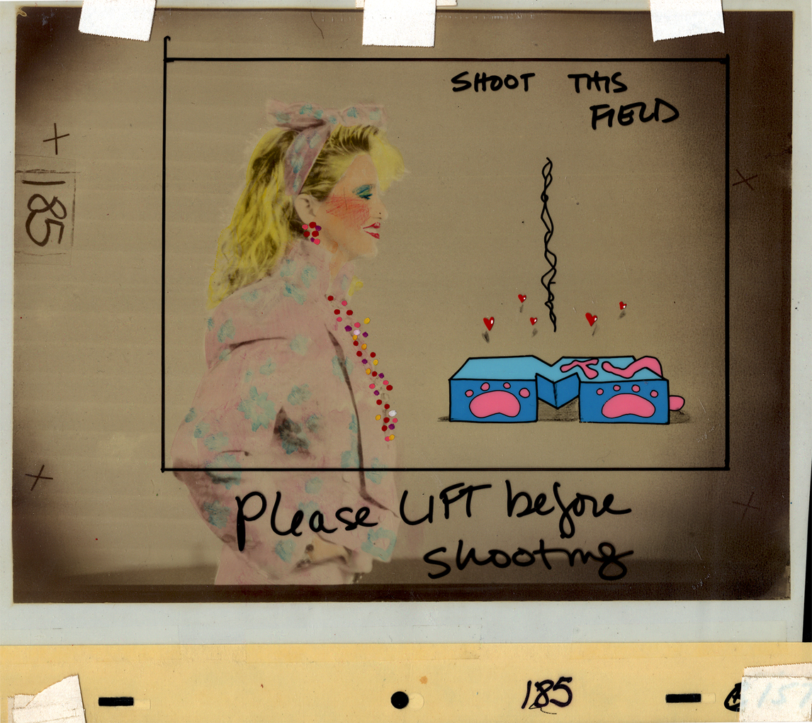
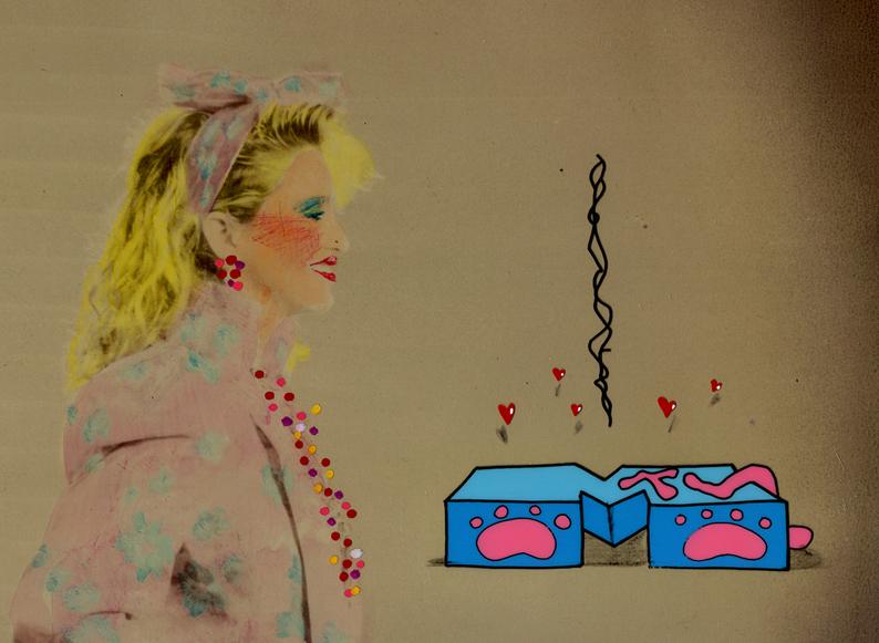
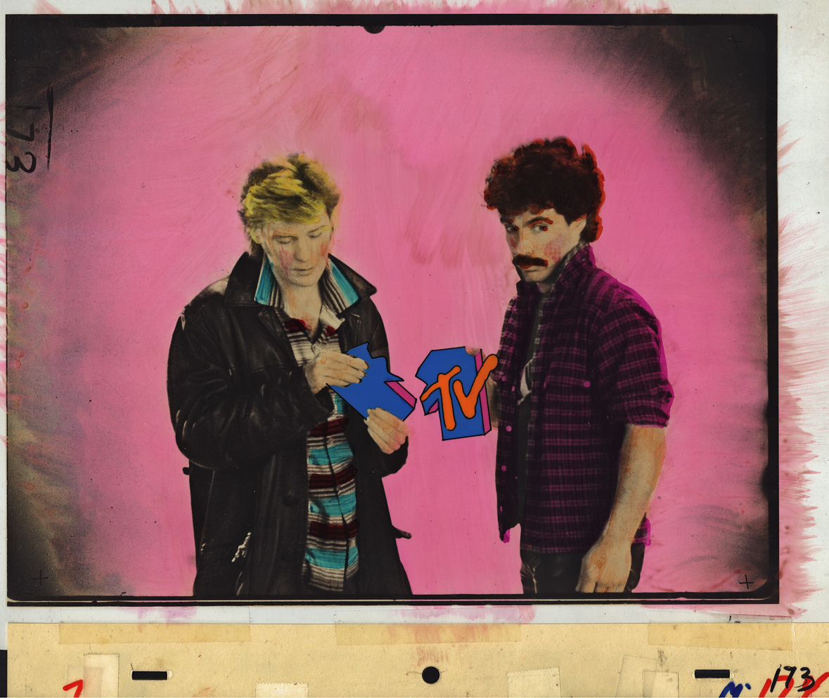
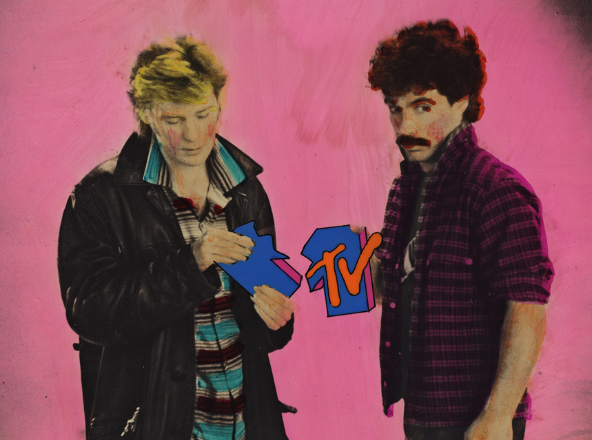
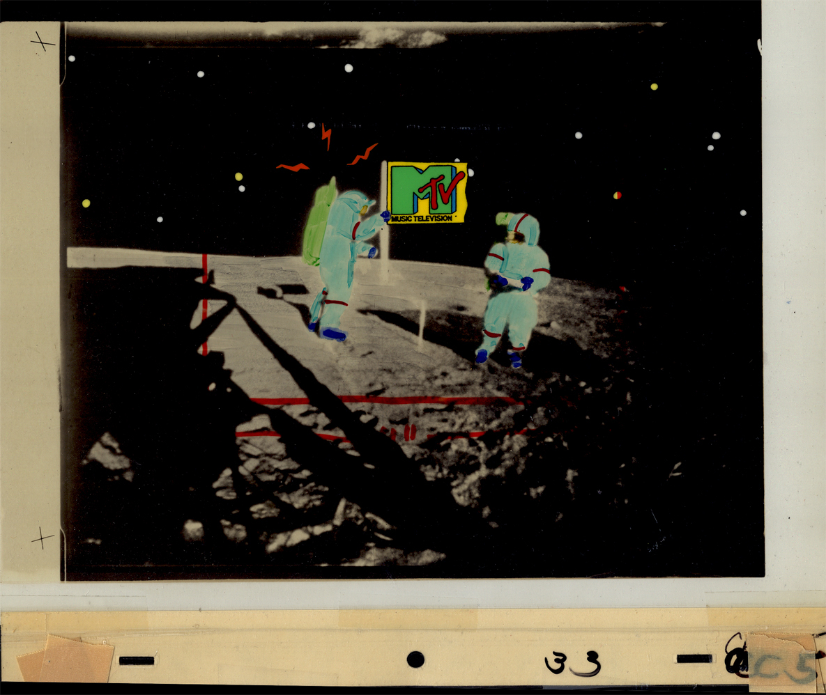
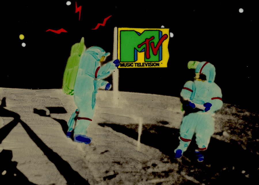
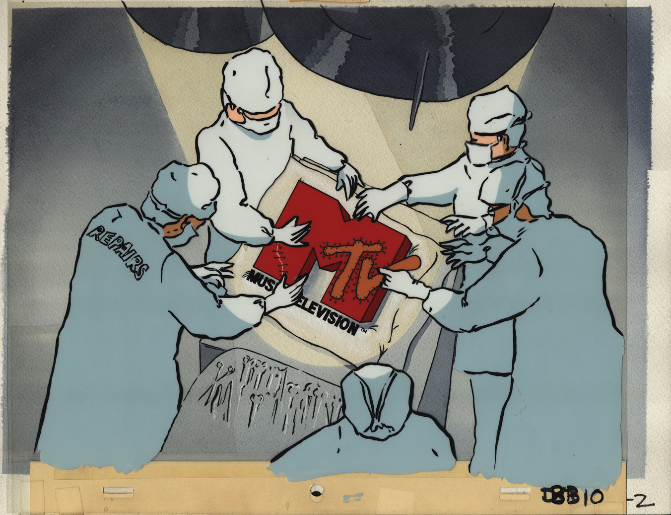
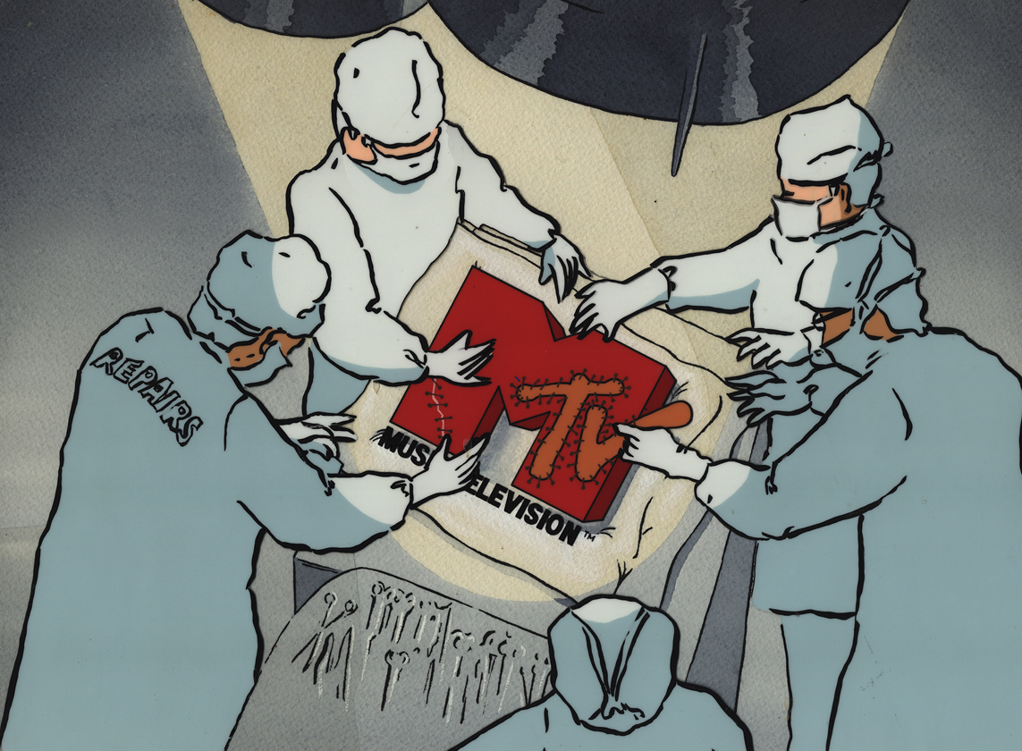
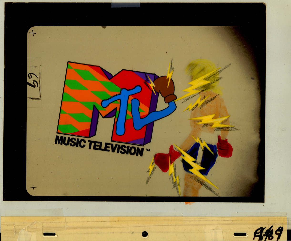
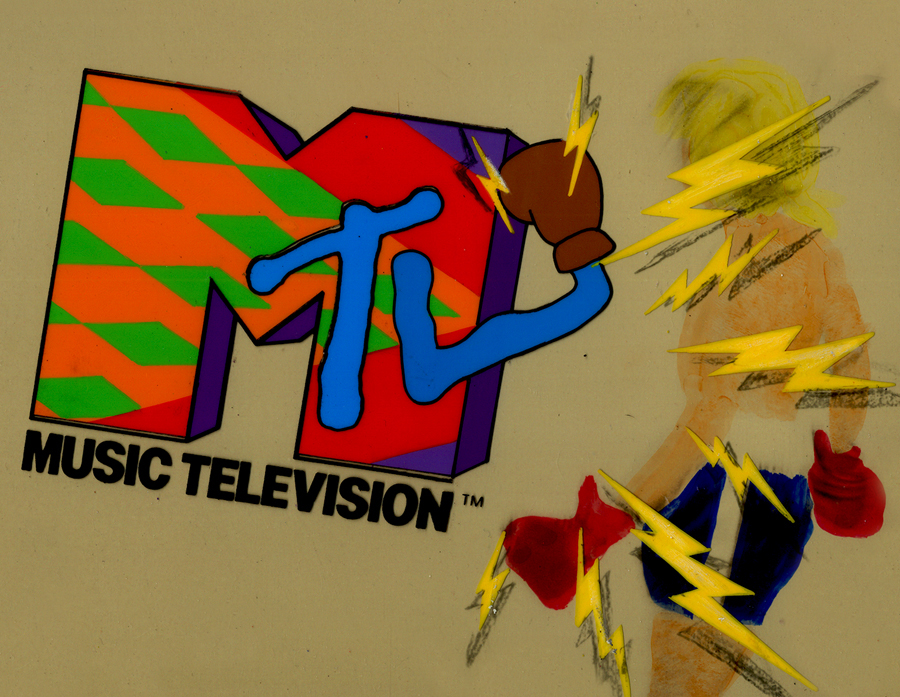
I want my MTV
- In searching through the archives of work at Buzzco, where Vince Cafarelli‘s collection is housed, I came upon some MTV artwork. Some of you may remember that MTV had some wild art bumpers when they first started out. Buzzco did the lion’s share of these early logos. Candy Kugel did the artwork for them, and Vince Cafarelli wasn’t involved. These were done when Perpetual Motion was breaking up and Buzzco was coming into being. Buzz Potamkin would pull Candy into another room and give her the new assignment so that no one at Perpertual knew what she was up to. Once the split happened, Buzzco kept the account.The colors have deteriorated a bit in some of these. I’ve done some minor photoshop adjustments to brighten the colors a bit.
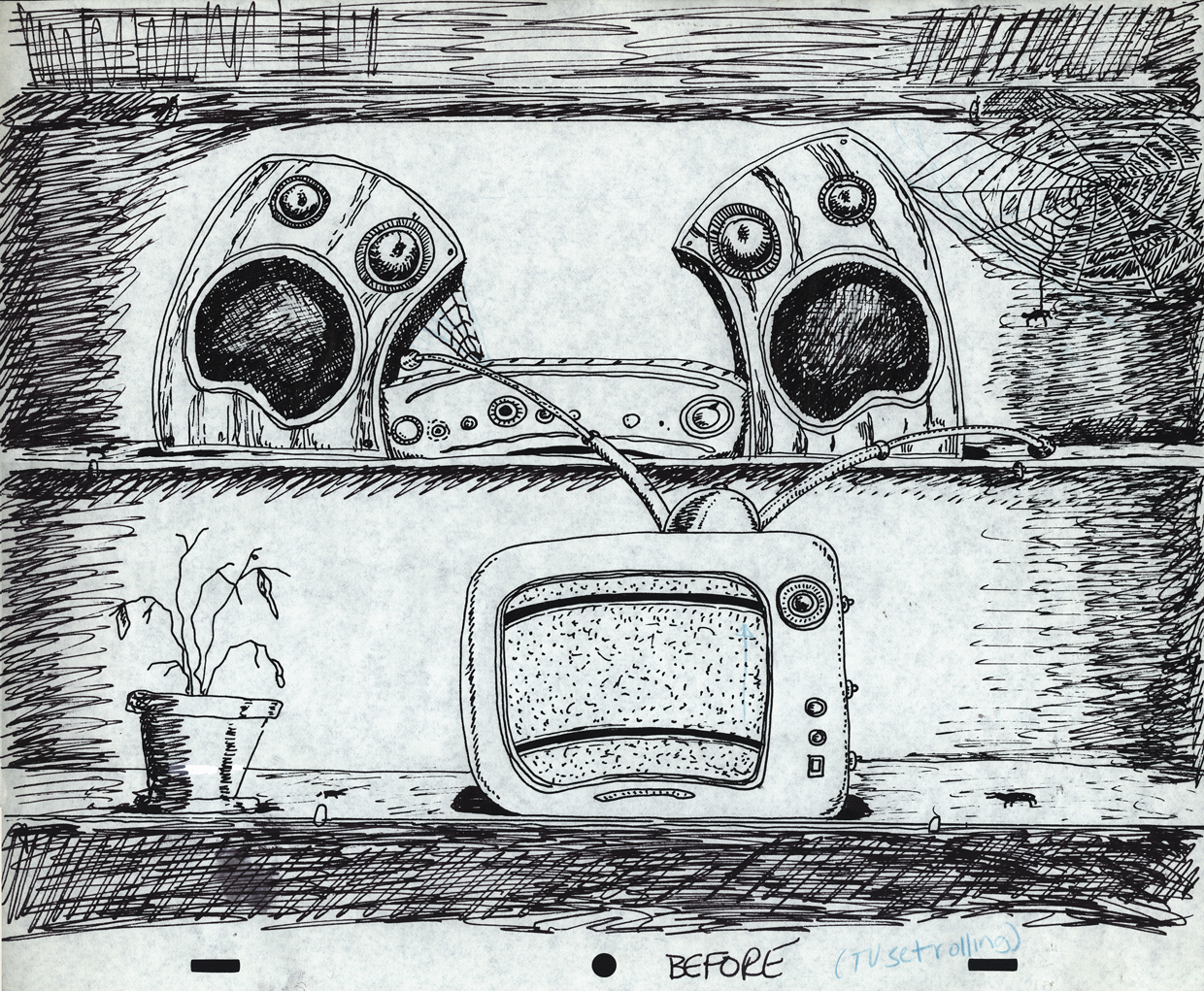
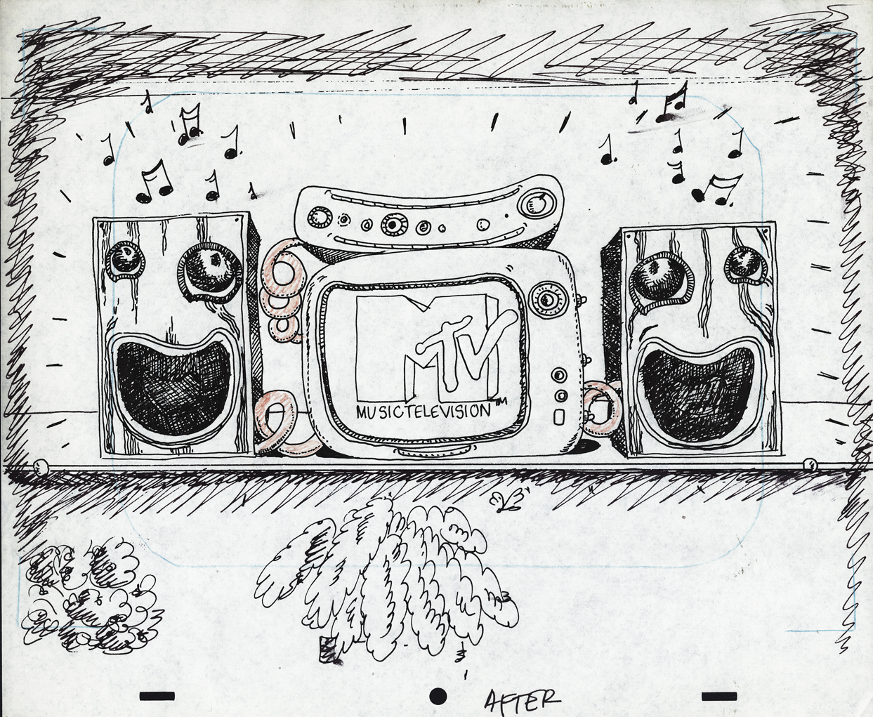
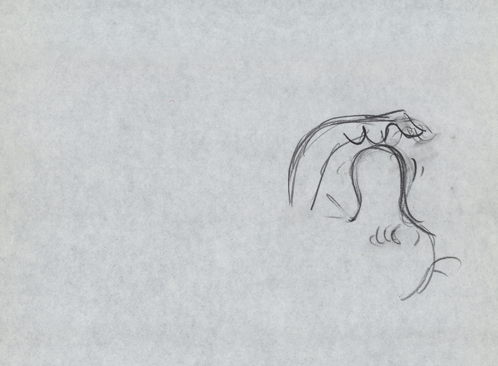
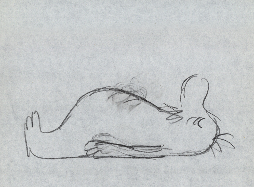
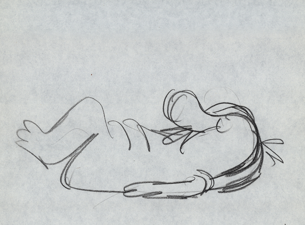
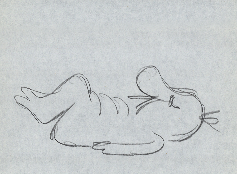
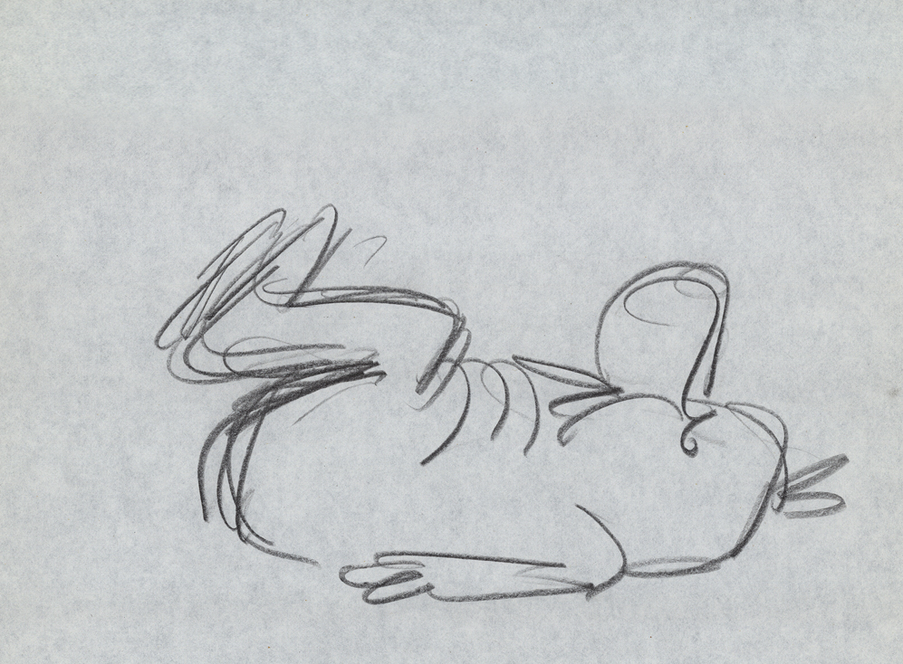
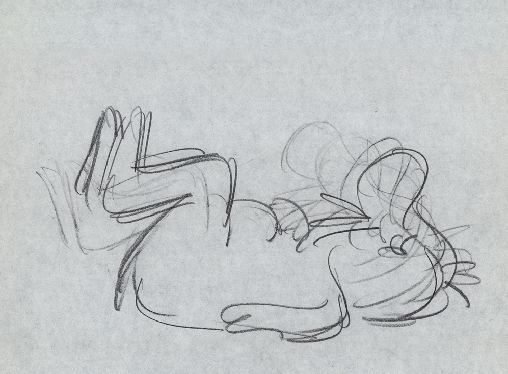
But first let me show some rough sketches for the very first promo for MTV in 1982. This came before the MTV campaign, “I want my MTV.” I vaguely remember this, but am not sure of it. I wasn’t a confirmed MTV watcher in those early days.
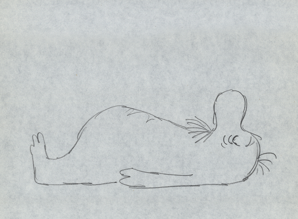
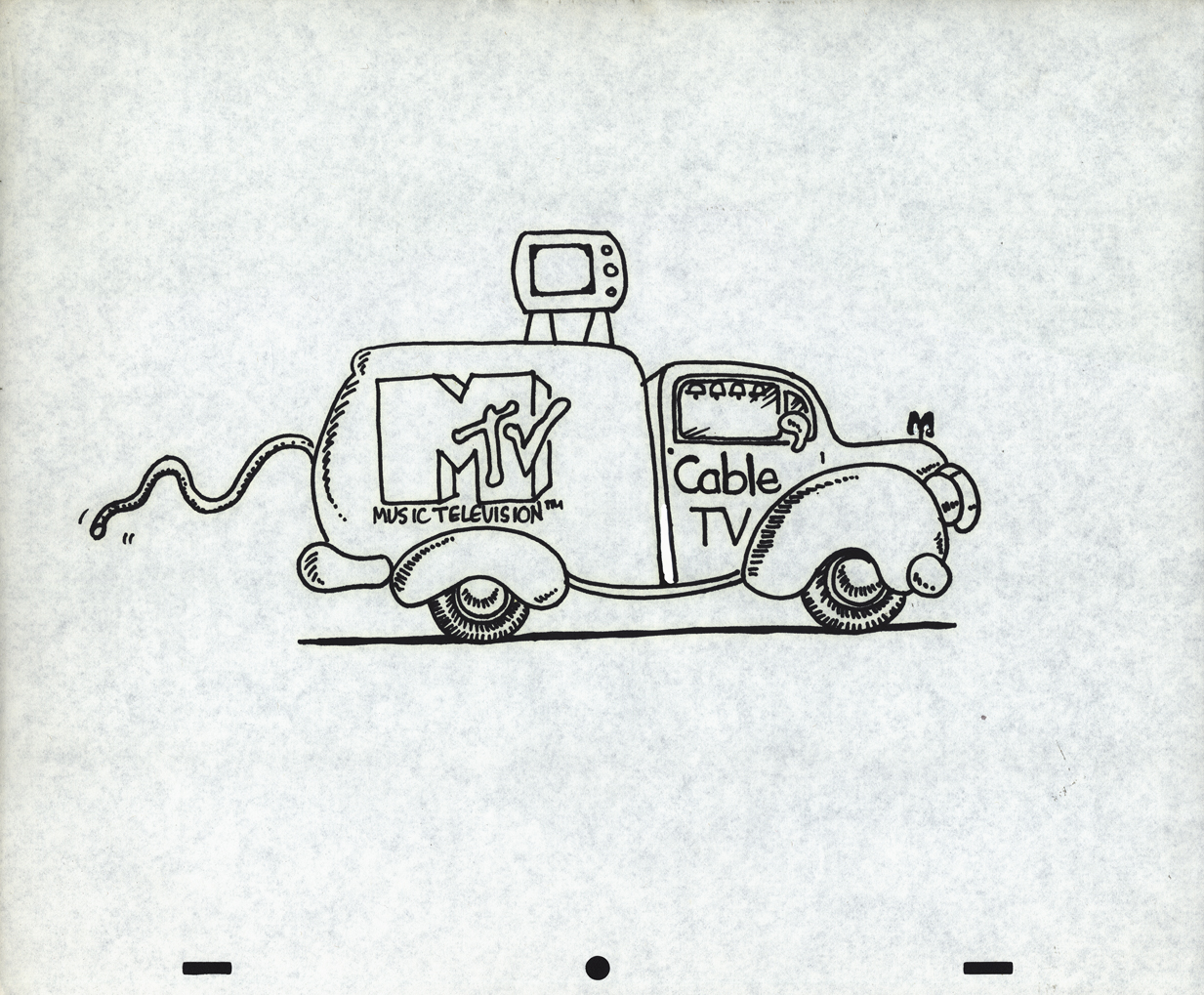 1
1Drawing by Candy Kugel
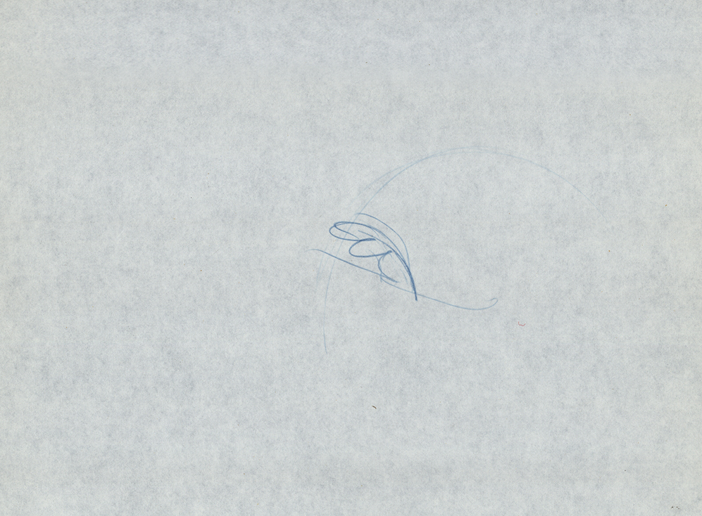
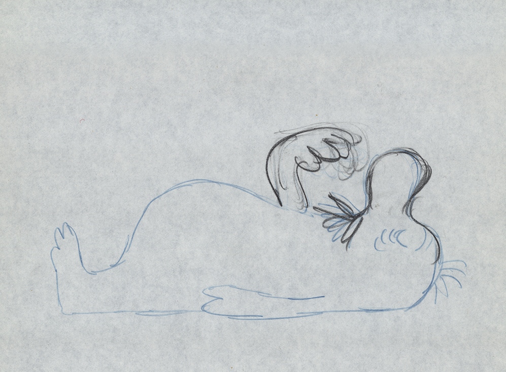
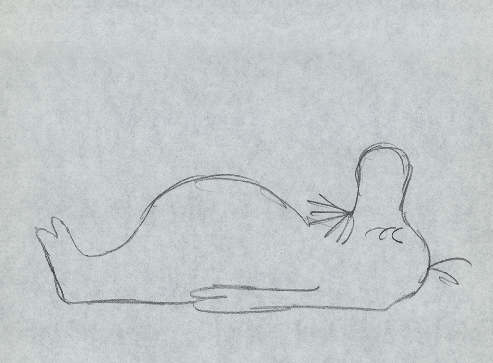
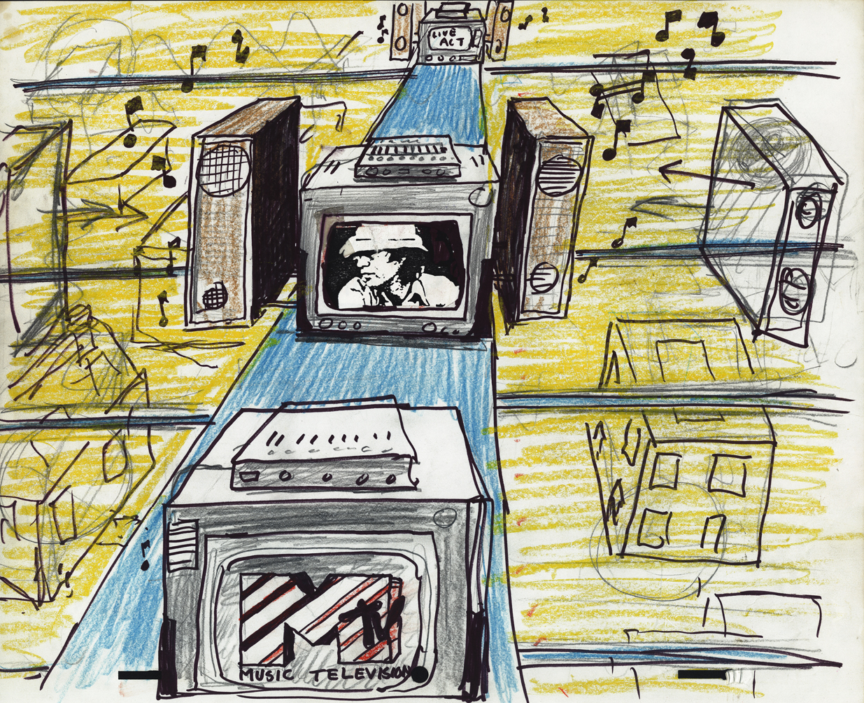 2
2
Drawing by Fred Mogubgub
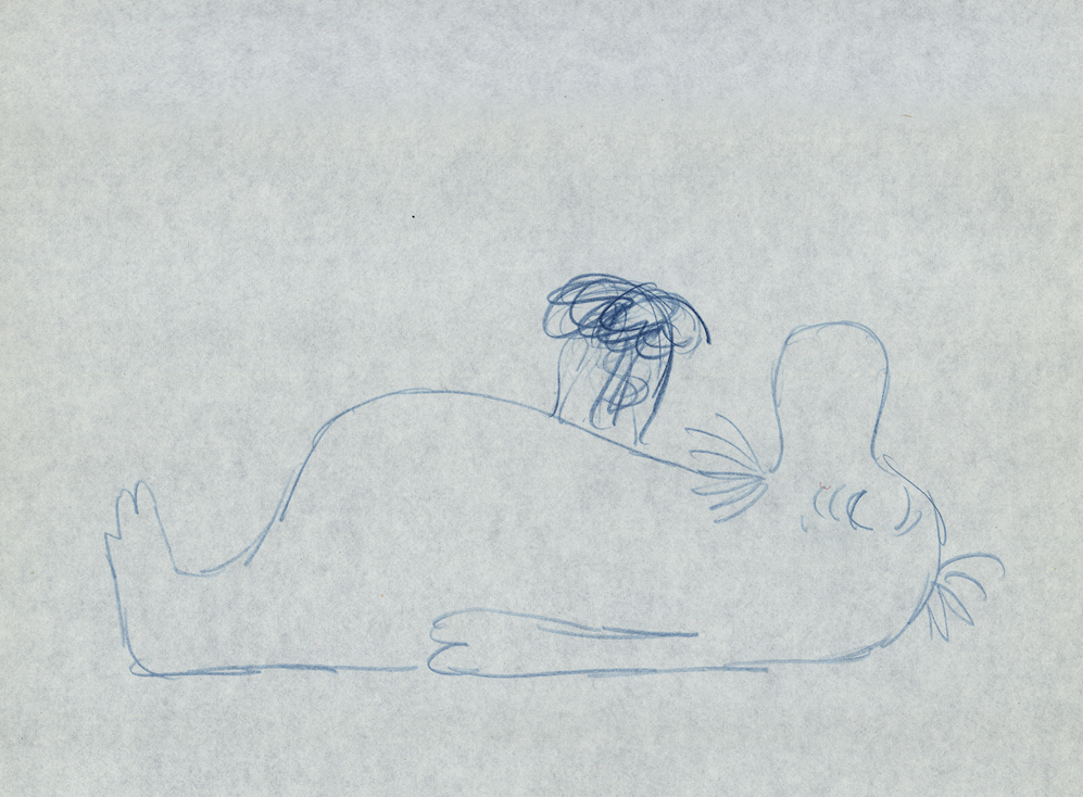
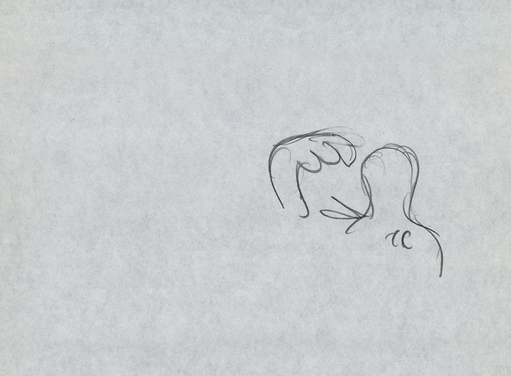
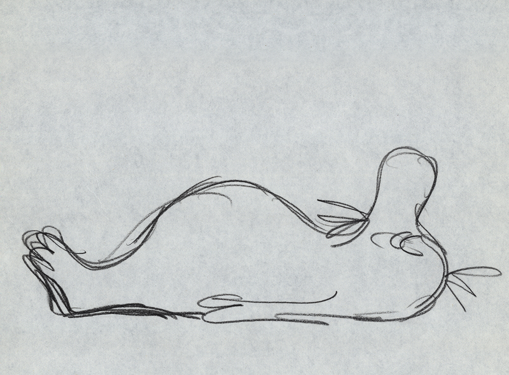
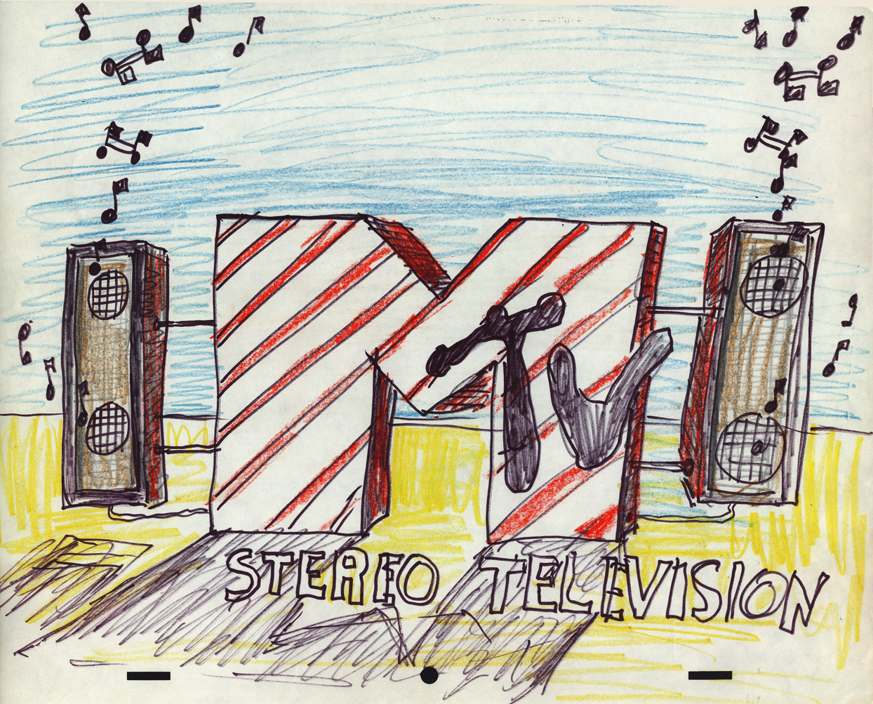 3
3
Drawing by Fred Mogubgub
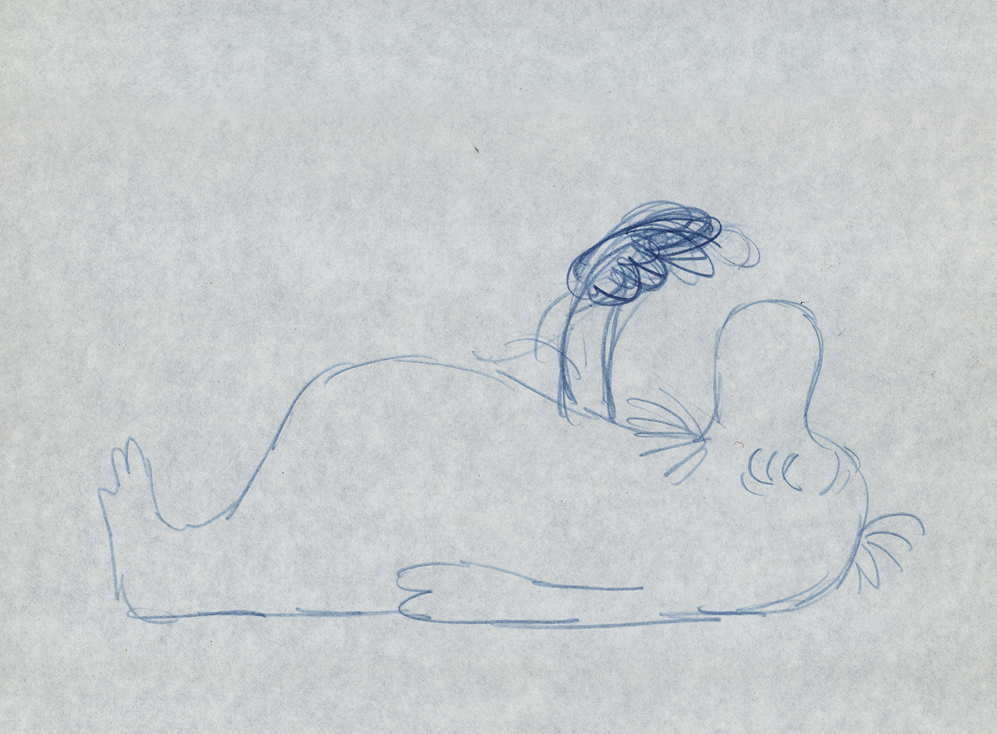
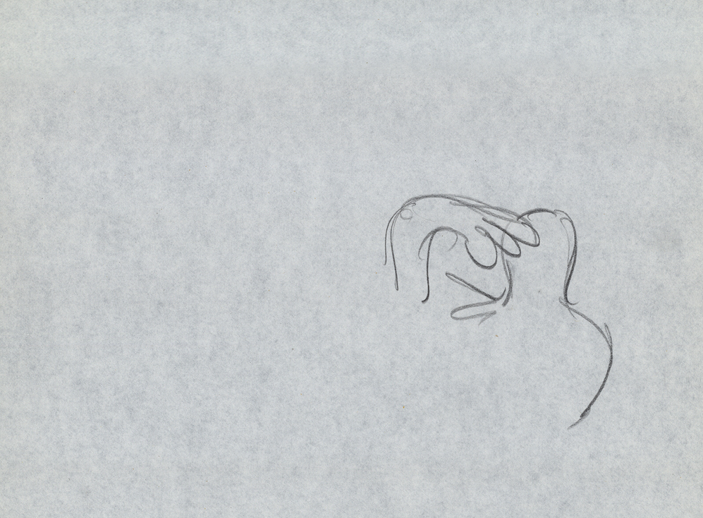
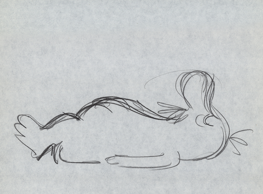
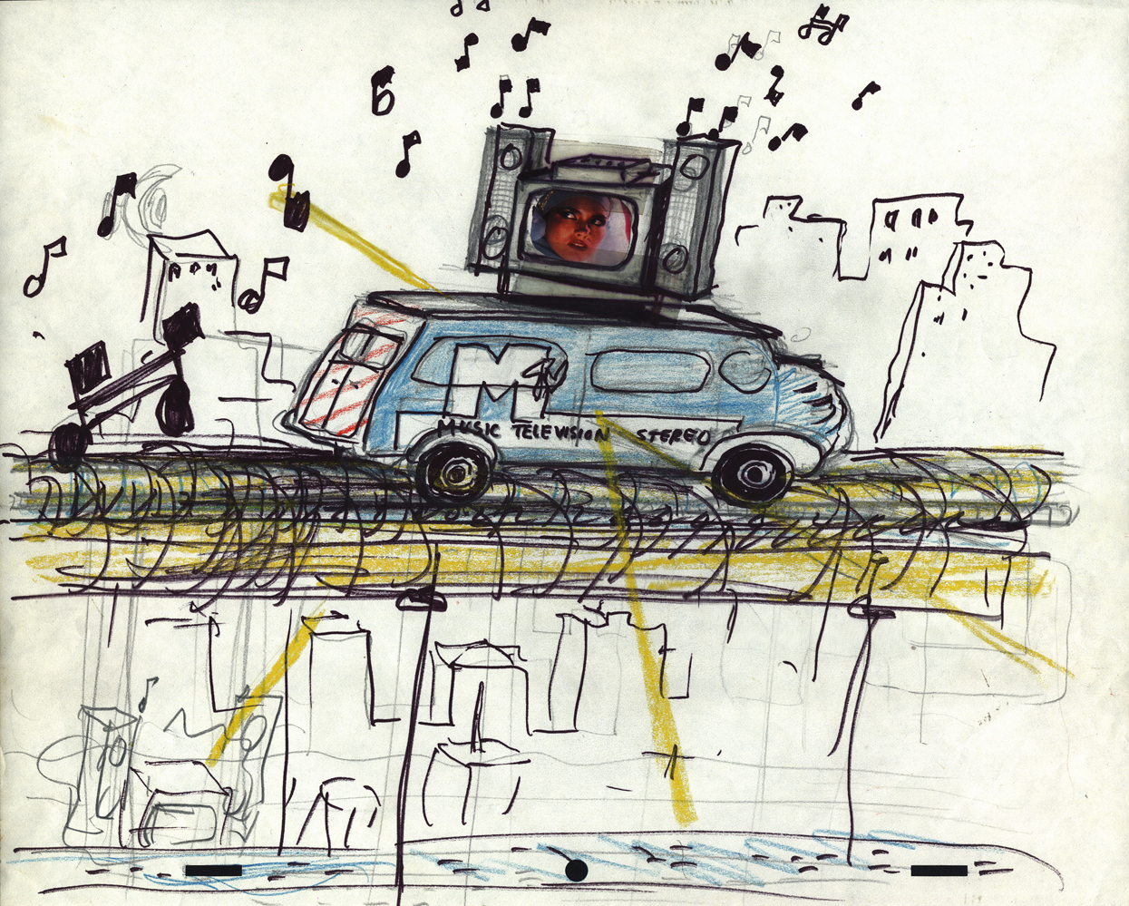 4
4
Drawing by Fred Mogubgub
 5
5
Drawing by Candy Kugel
 6
6
Drawing by Candy Kugel
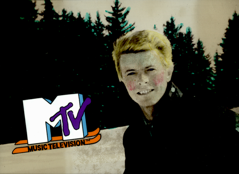
Here are eight of the color pieces. I’ll display two versions of each setup: the full artwork first, then the screen-sized art following so that you can see the proper framing.
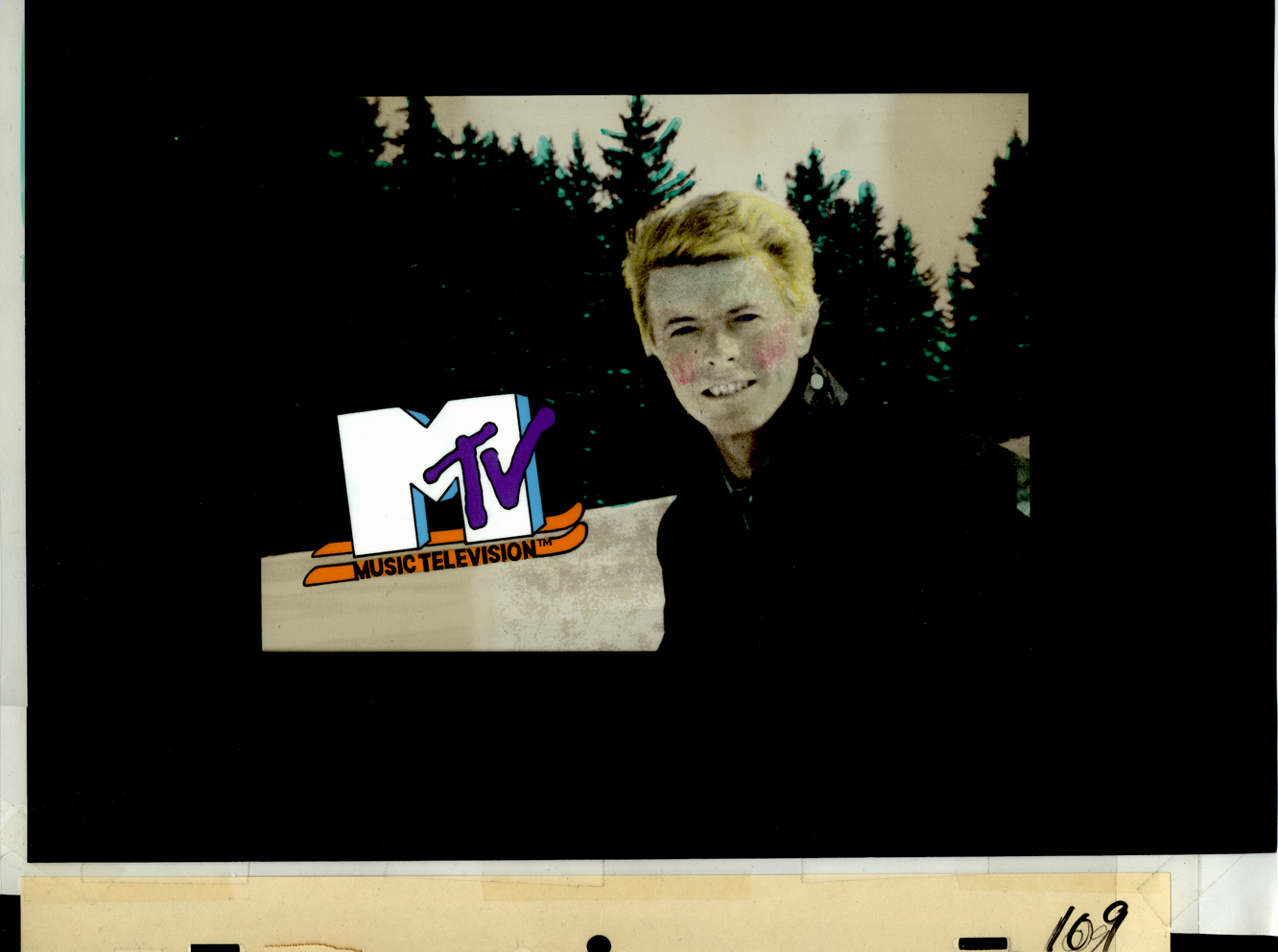 1a
1aDavid Bowie
 1b
1b
 2a
2a
Madonna
 2b
2b
 3a
3a
John (Cougar) Mellencamp
 3b
3b
 4a
4a
Madonna again (she was popular)
 4b
4b
 5a
5a
Hall & Oates
 5b
5b
 6a
6a
The famous Moonwalk
 6b
6b
 7a
7a
 7b
7b
 8a
8a
Joe Elliott of Def Leppard
 8b
8b
Animation &Animation Artifacts &commercial animation &Layout & Design 26 Sep 2012 05:15 am
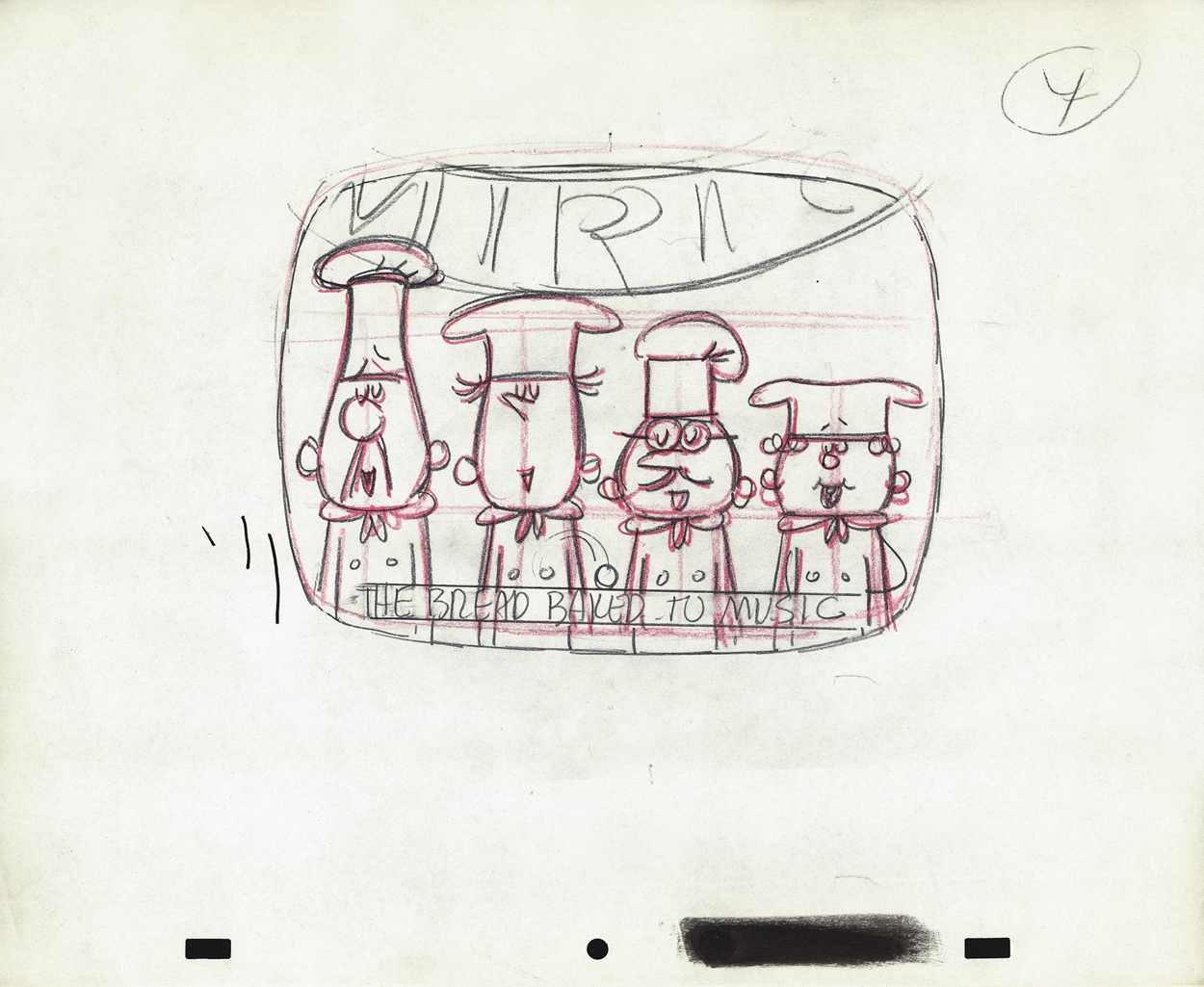
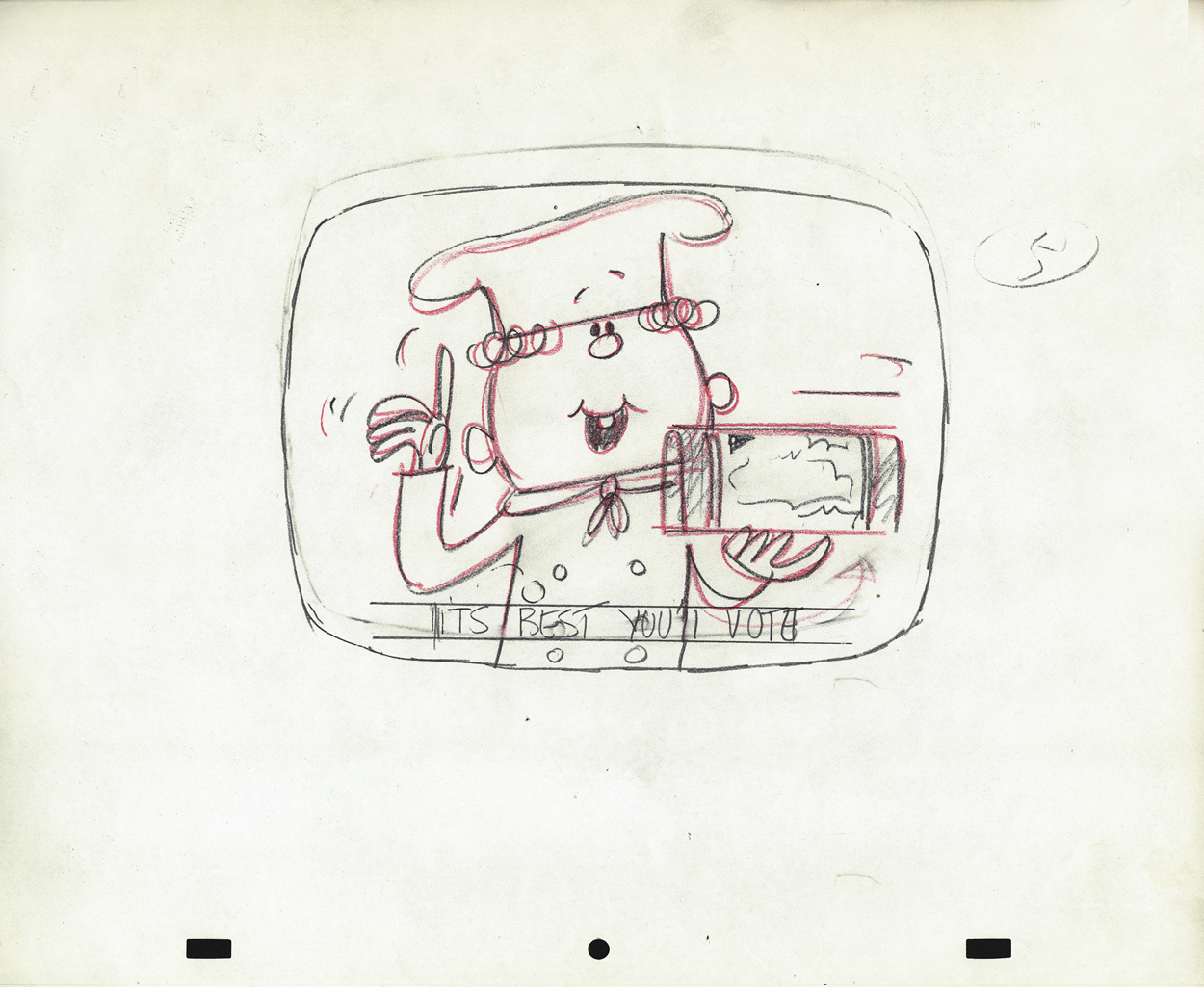
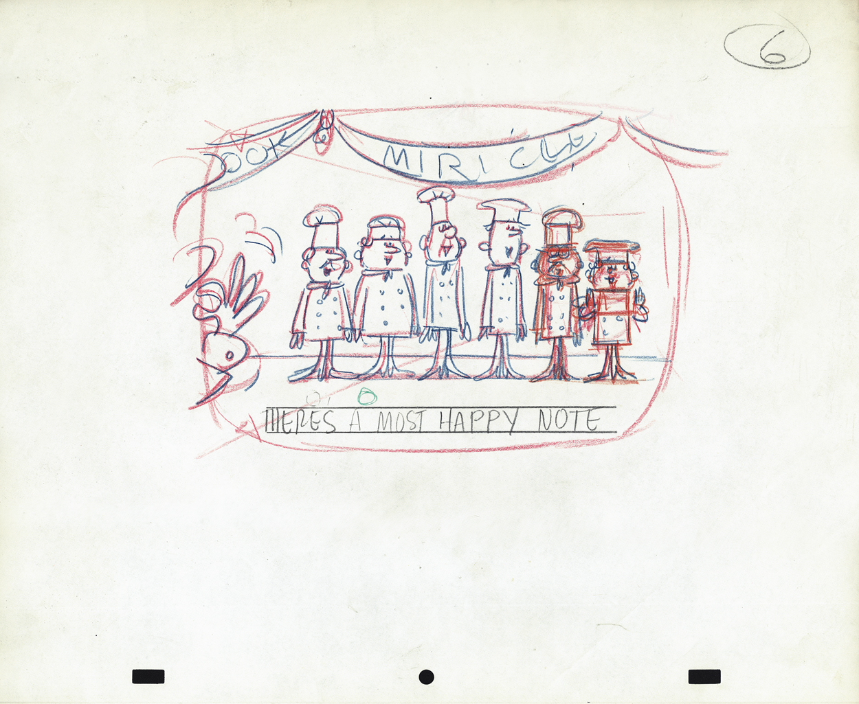
Vince Cafarelli’s Millbrook Bread – 2
- Last week we saw the first of these two spots Vince Cafarelli did while working for Goulding-Elliot-Graham Prods., Inc. Millbrook Bread was the client and the Piels Bros. voices, Bob Elliott & Ray Goulding, owned the studio with Ed Graham. They also did the voices for these bread spots. This particular one must have been pretty big; the video survived these many years later, and I’ve attached it to the end of this post.
But first, here are the Layout drawings which I believe were done by Vinnie Cafarelli.
 1
1
 2
2
 3
3
 4
4
 5
5
 6
6
 7
7
 8
8
 9
9
 10
10
 11
11
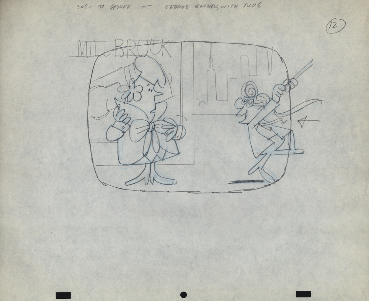
 12
12
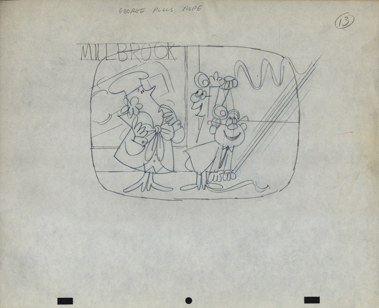
 13
13
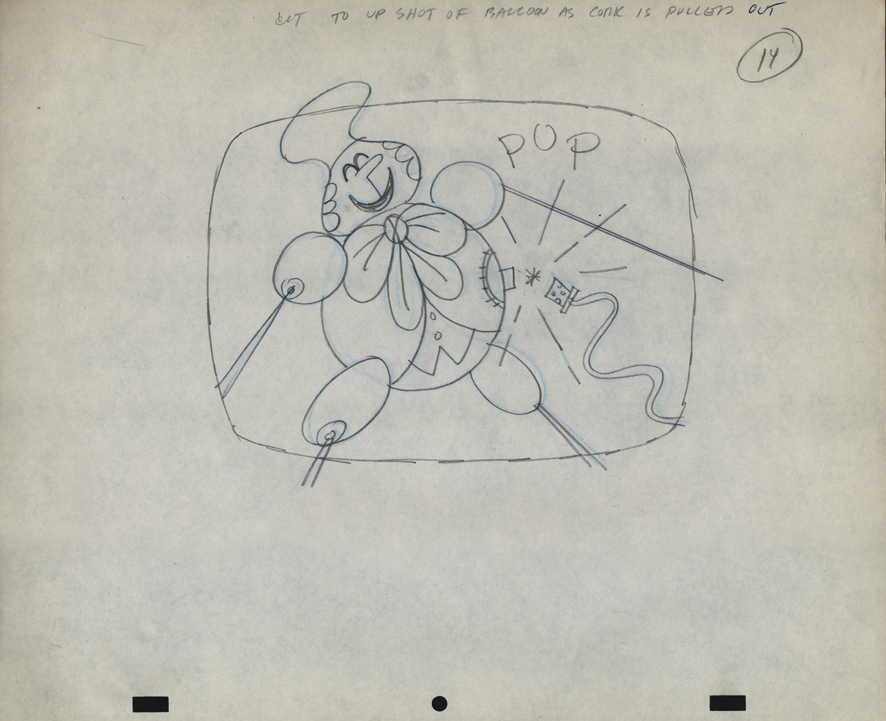
 14
14
 14-5
14-5
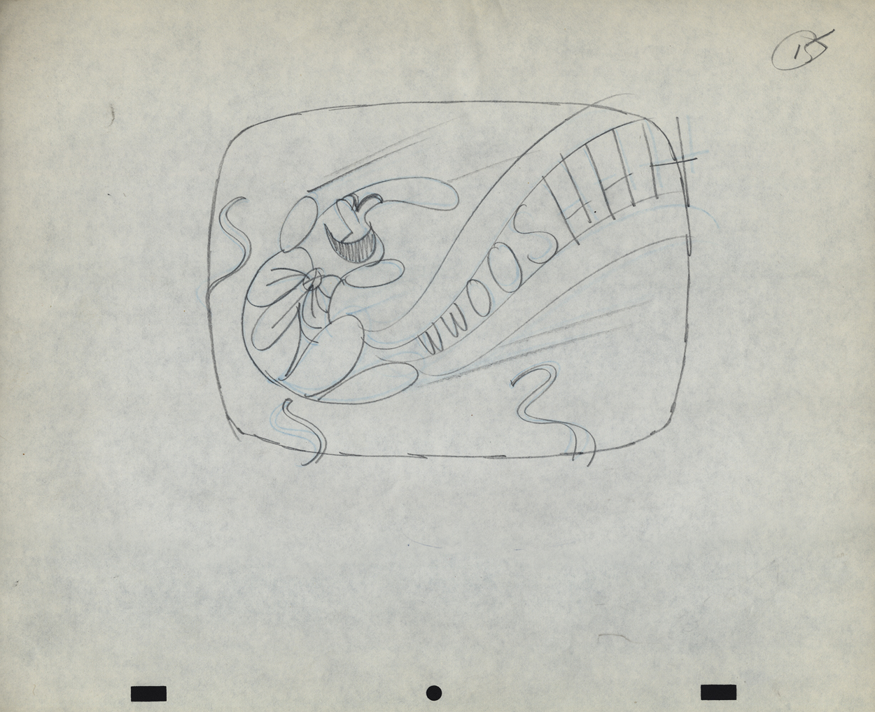
 15
15
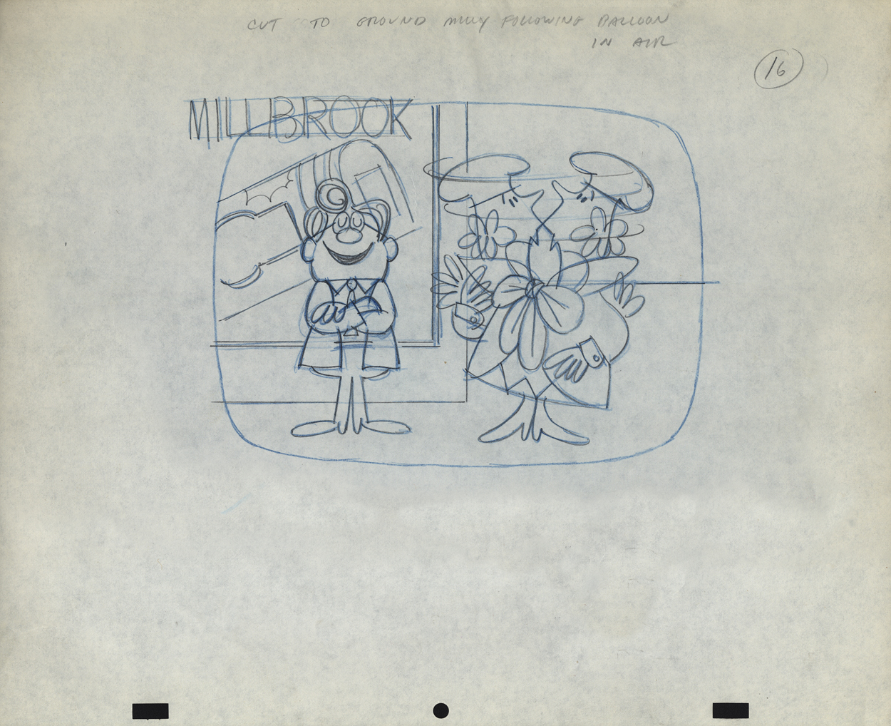
 16
16
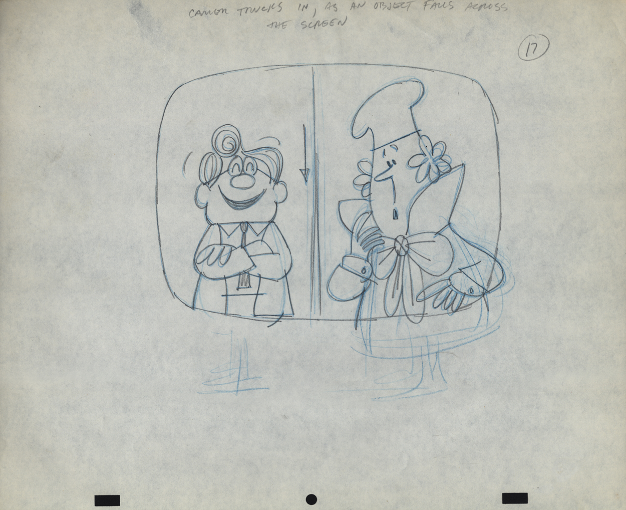
 17
17
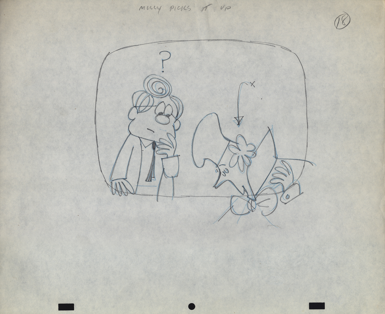
 18
18
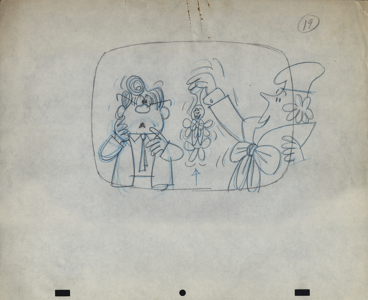
 19
19
 20
20
 21
21
 22
22
 23
23
commercial animation &Disney &Illustration &Independent Animation 25 Sep 2012 05:29 am
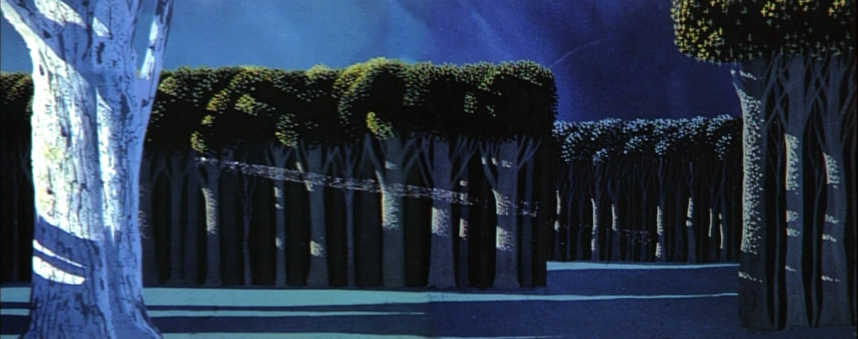
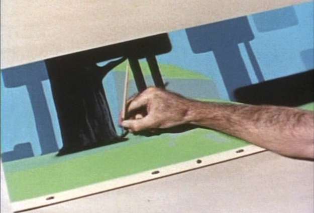
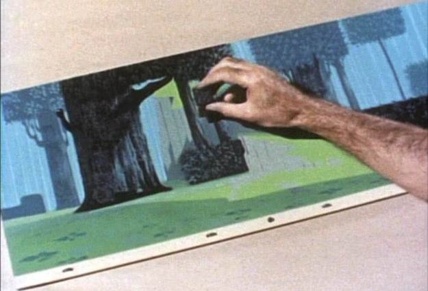
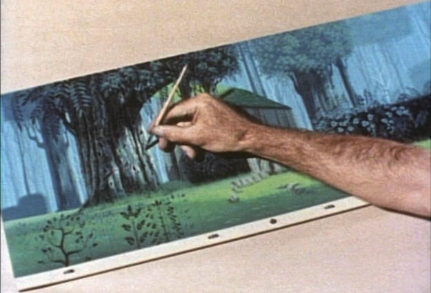
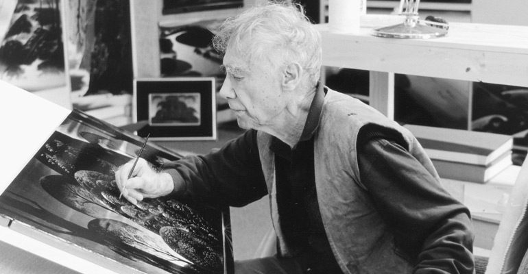
Eyvind Earle – recap
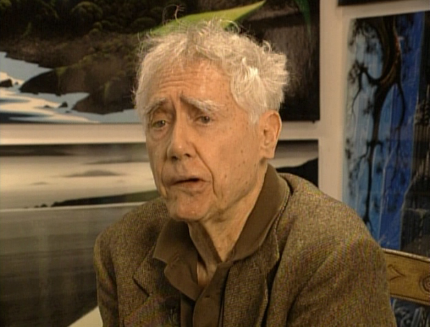 – Let’s talk a little about Eyvind Earle. This is the artist who rose to fame when he was selected by Walt Disney to set the style for the long-in-production feature, Sleeping Beauty. The animators disliked his art direction and openly protested it. Walt remained true in his stance and supported Earle to the end; though it could be said that Walt was more involved in Disneyland’s construction and gave too little attention to the in-fighting at the animation studio.
I remember Frank Thomas, specifically, stating that he had done everything possible to supercede Earle’s style after he, Thomas, had animated the Merryweather scene as she creates Aurora’s dress and cake in honor of her birthday. He felt that the black bodice that Earle had designed took all the lightness out of his character’s delicate dance.
(Click on any image to enlarge.)_________________________________
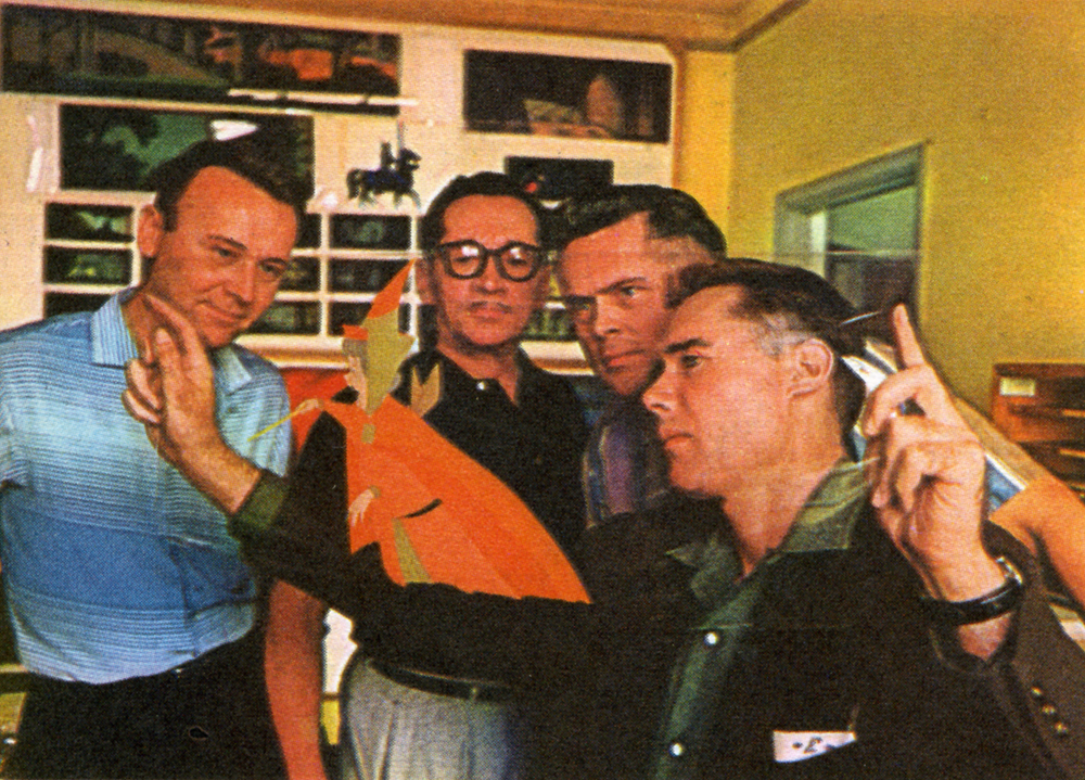
L to R: Al Dempster, Dick Anthony, Ralph Hulett and Eyvind Earle
Thomas publicly attacked Earle at the Lincoln Center celebration of Disney animation back in 1973. I’d already read something similar, and heard it privately. None of the others on stage at Lincoln Center – Woolie Reitherman, Ken Anderson or Ollie Johnston – countered in support of Earle.
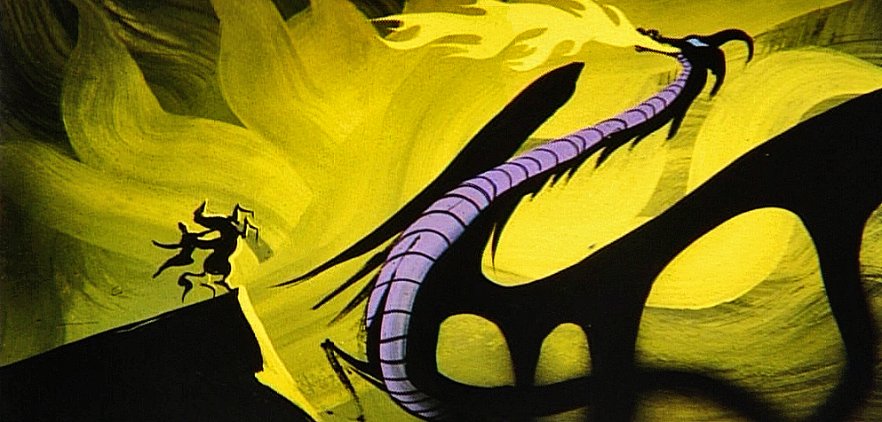
 Sleeping Beauty was such a drastic change in look from the other Disney features, that I think it took deep hold in the minds of a lot of Baby Boomers growing up around this feature. Earle became a strong target of interest, and I think his reputation has grown annually.
I have to admit it was odd seeing the backgrounds of Pocohontas trying to emulate Earle’s Sleeping Beauty style, but in some ways it seemed fitting. The studio had been ripping off the films of the past for so long that it was only appropriate that they’d focus on someone who was such a dynamic force.
For a short period after he was released by Disney, in the post-Sleeping Beauty layoffs, he worked with John Sutherland Productions where he designed the short, Rhapsody of Steel. Then he formed his own studio, Eyvind Earle Productions, Inc. He did an animated trailer for the film, West Side Story, under the supervision of Saul Bass. He did an animated title for the Kraft Suspense Theater, and he did a Christmas Special for Tennessee Ernie Ford.
Ultimately, Earle made a success of his own art after leaving animation. He’s been represented by a number of very large galleries and has sold a lot of popular art in a style all his own. Here are a couple of examples found on line:


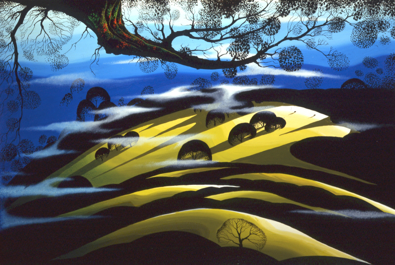
I’m not always a big fan of the color schemes in his graphics, though he always makes them work, but I have to give credit to Earle for his originality and the dynamic approach in his art.
His autobiography, Horizon Bound on a Bicycle, is a must for all real fans.
This is his animation resume:
- 1951 Started with the Walt Disney Studios as background painter on: FOR WHOM THE
__ BULLS TOIL, MELODY, and the Academy Award winner for “Best Short of the Year”
__TOOT, WHISTLE, PLUNK and BOOM which also received a Cannes Film Festival Award.
__Production Designer, Color Stylist and Background Painter for the DIsney animated __classic SLEEPING BEAUTY, as well as, PIGS IS PIGS, GRAND CANYONSCOPE,
__PAUL BUNYAN, LADY AND THE TRAMP, LONDON BRIDGE, and WORKING FOR PEANUTS.
__He designed 5 murals for Disneyland.
1958 Joined John Sutherland Motion Picture Company in Los Angeles.
1960-1966 Created 24 sheet poster for Hamm’s Beer.
__Started motion picture animation company, Eyvind Earle Productions, Inc.
__Created animated commercials for Chevrolet Motors, Chrysler Corporation, Marlboro
__igarettes, Motorola Television and the Kellogg Cereal Company.
__Created animated trailer for WEST SIDE STORY for United Artists.
1961 Created animated television special THE STORY OF CHRISTMAS starring
__Tennessee Ernie Ford and the Roger Wagner Choral.
1962 Created animated television special THE EASTER SPECIAL.
__Created title for the KRAFT SUSPENSE THEATER.
__Created the logo trademark trailer for Universal Pictures.
__Produced and created the theatrical short DEATH AND SUNRISE
You’ll find a lot of merchandise including all the books listed here, on the Eyvind Earle website.
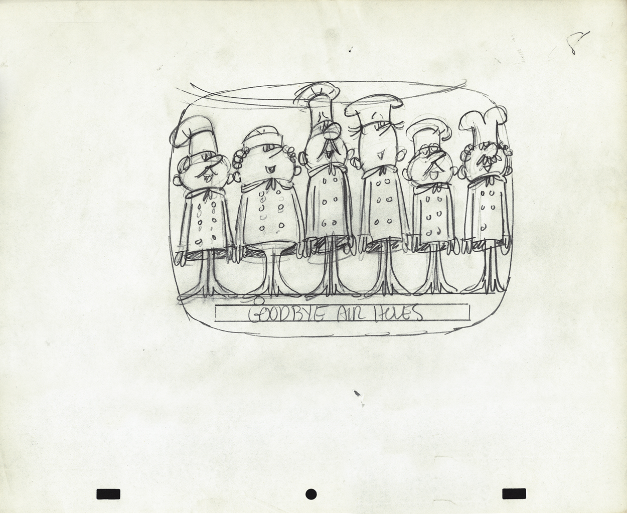
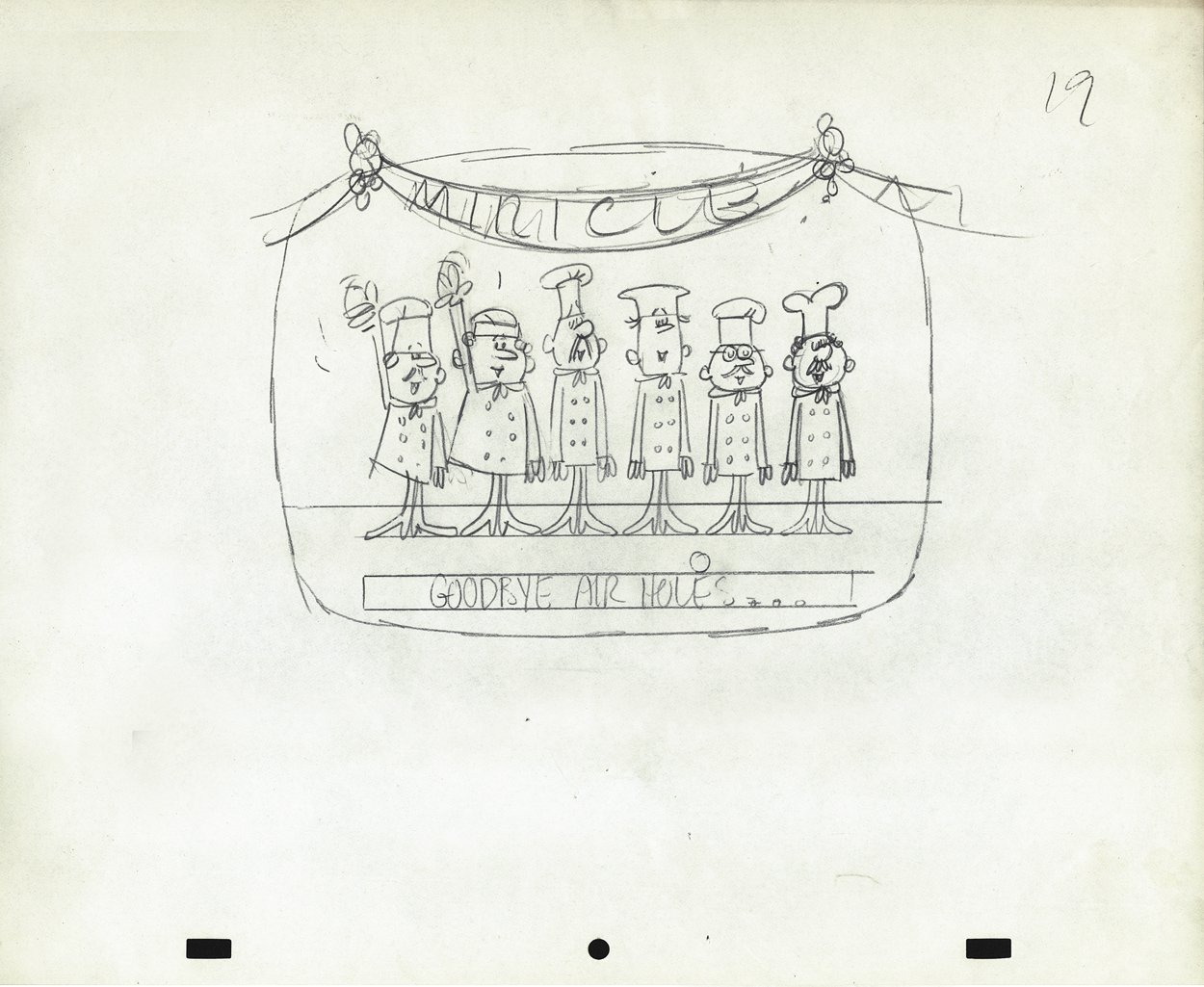
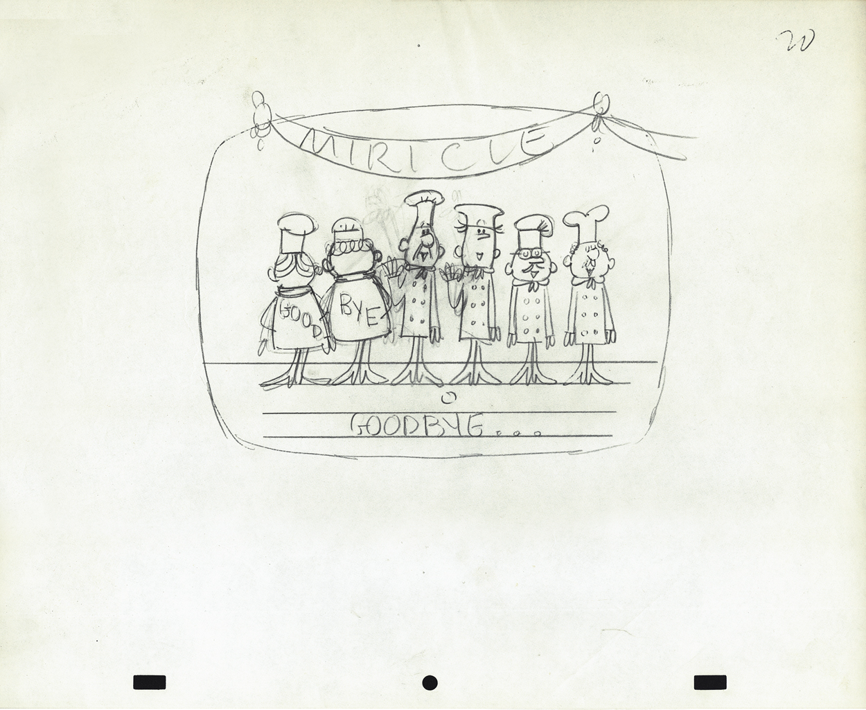
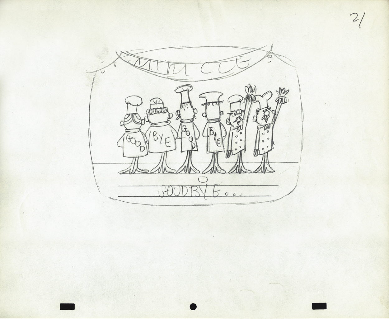
Animation Artifacts &commercial animation &Layout & Design 19 Sep 2012 05:22 am
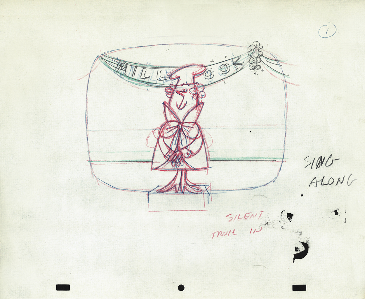
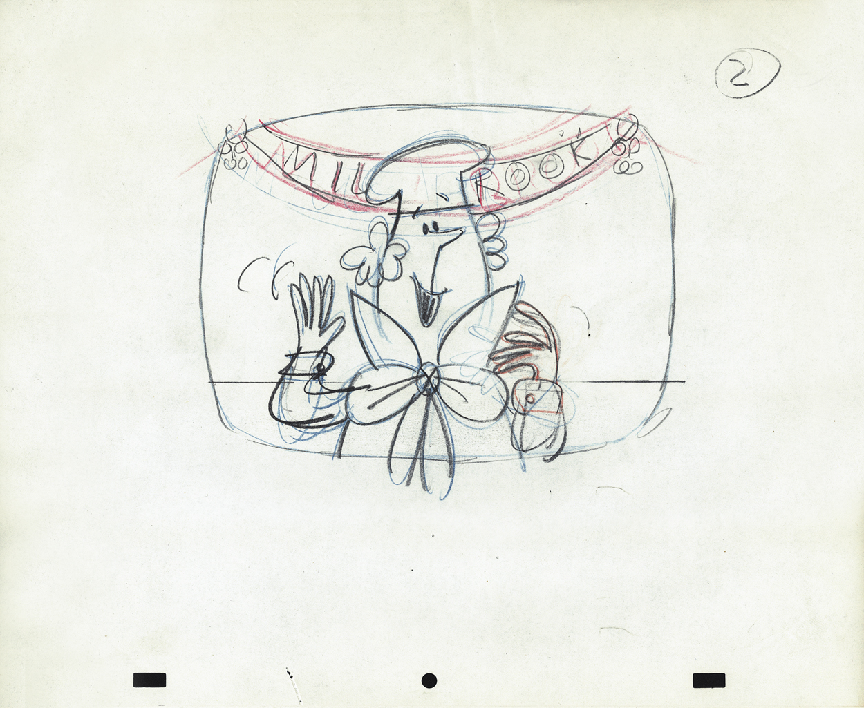
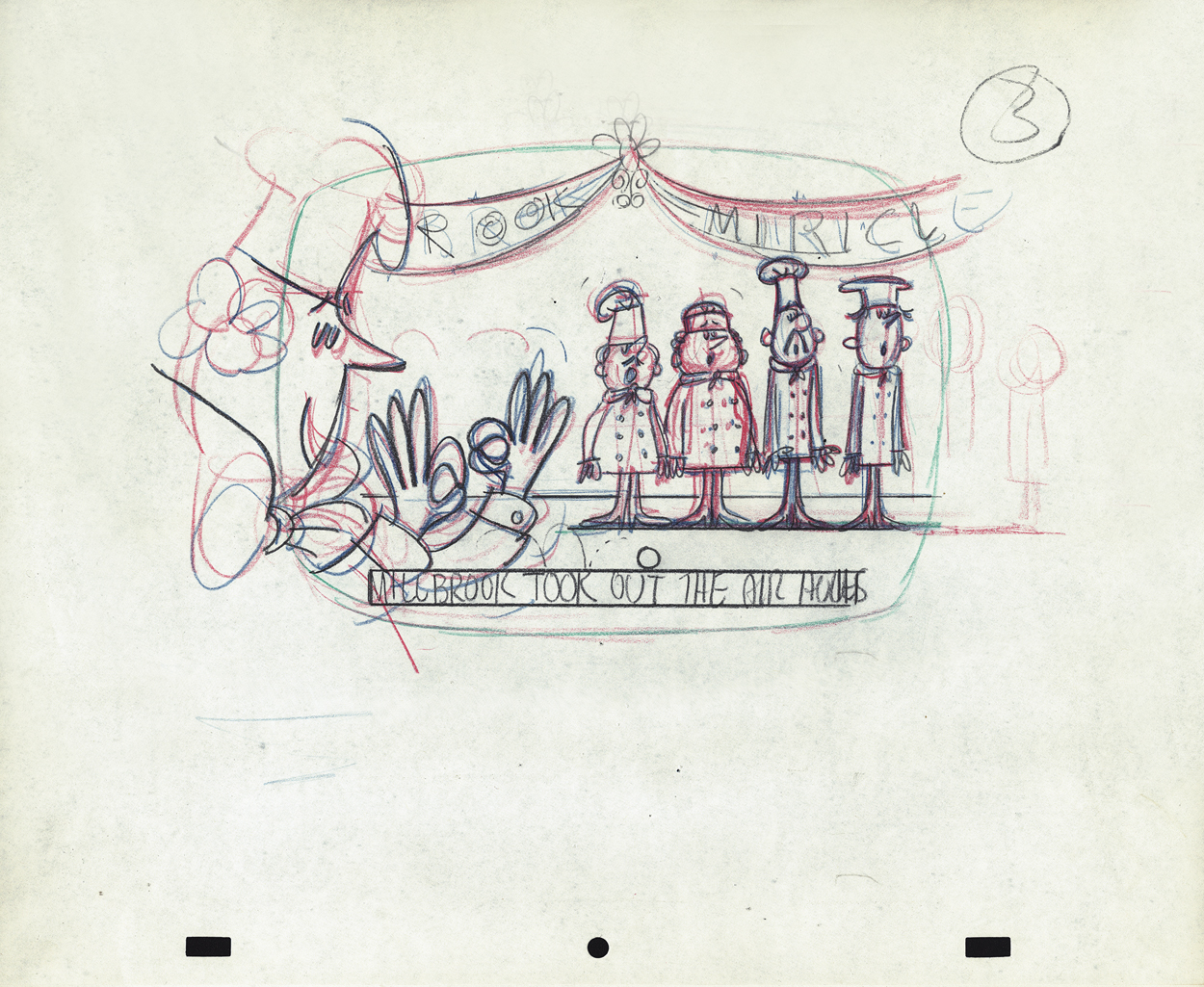
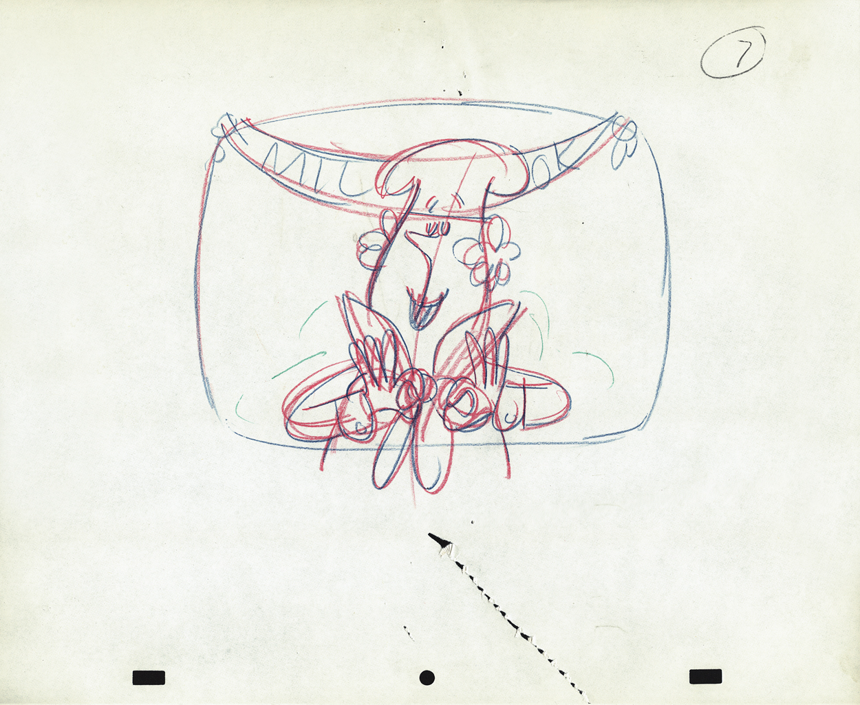
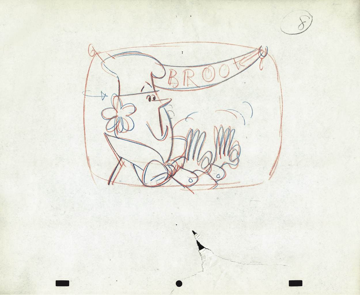
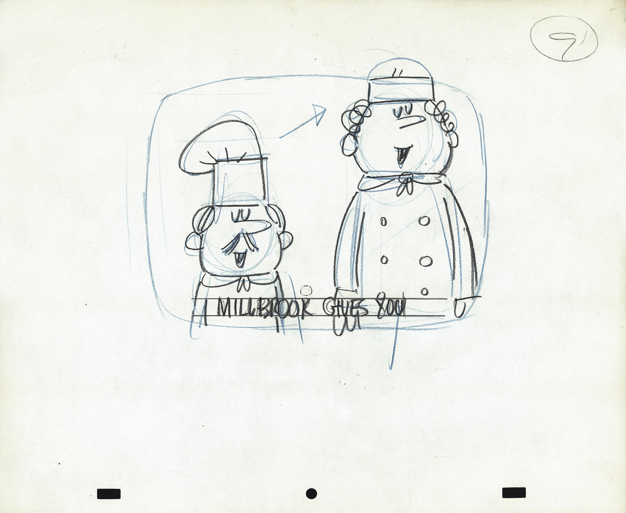
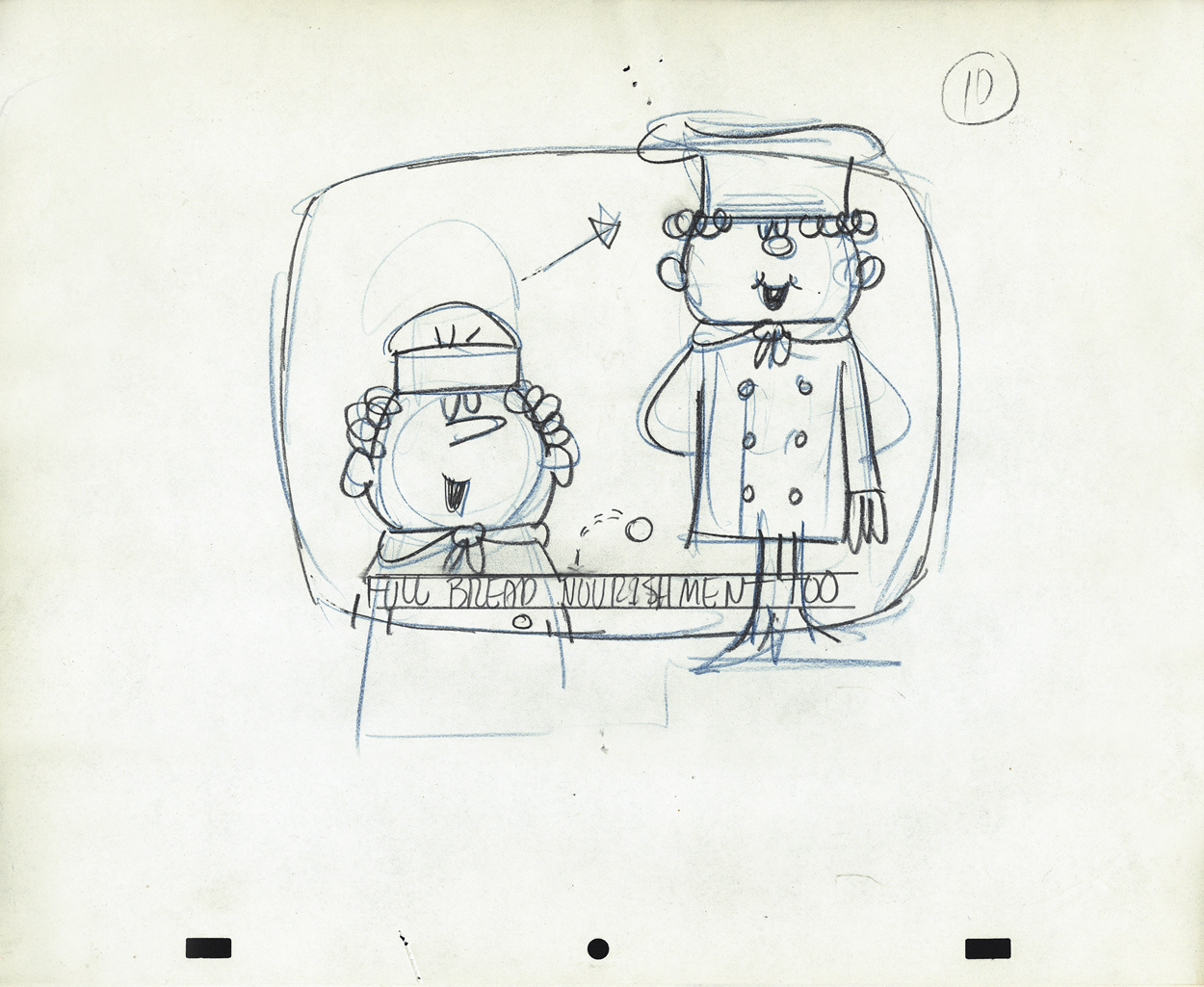
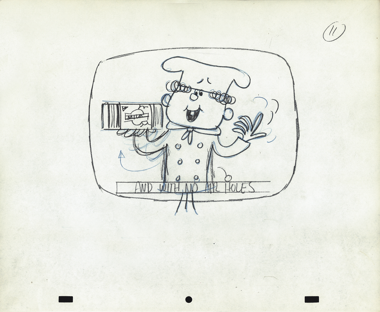
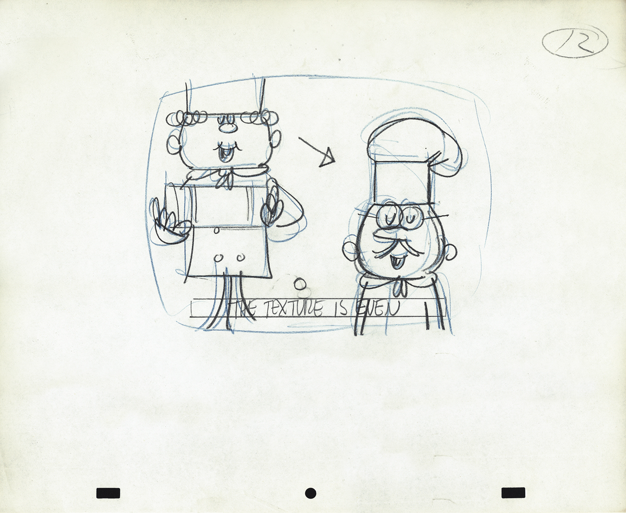
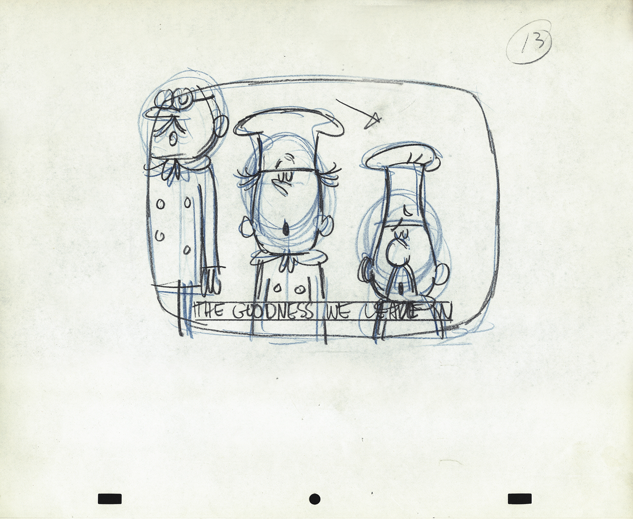
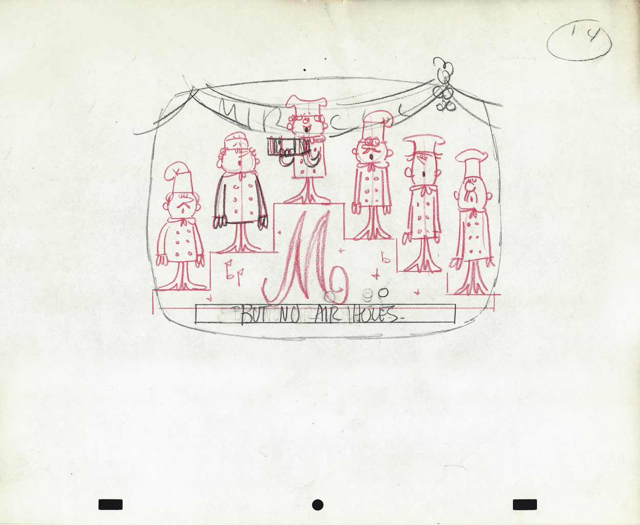
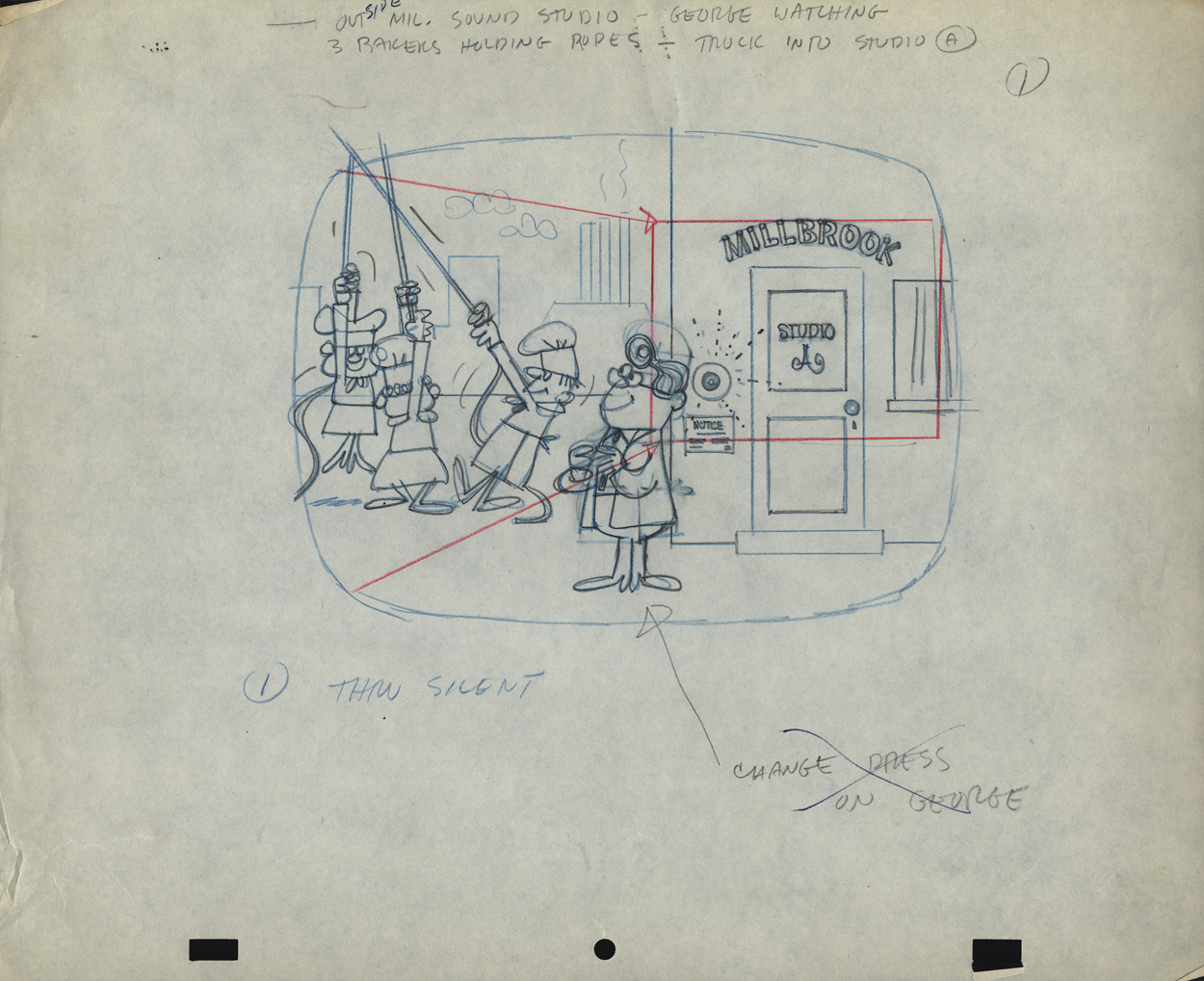
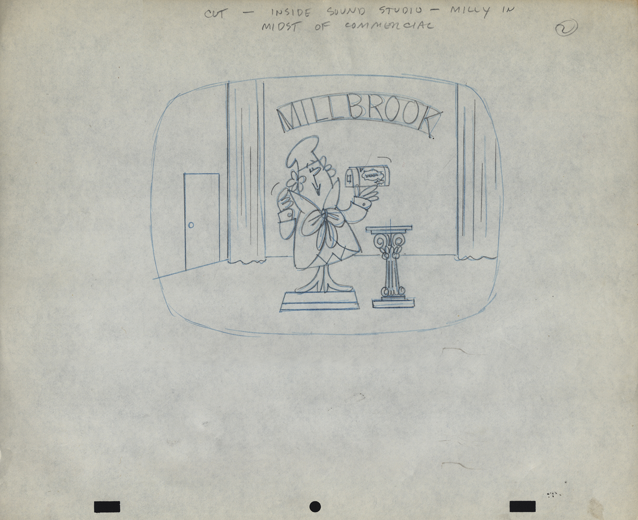
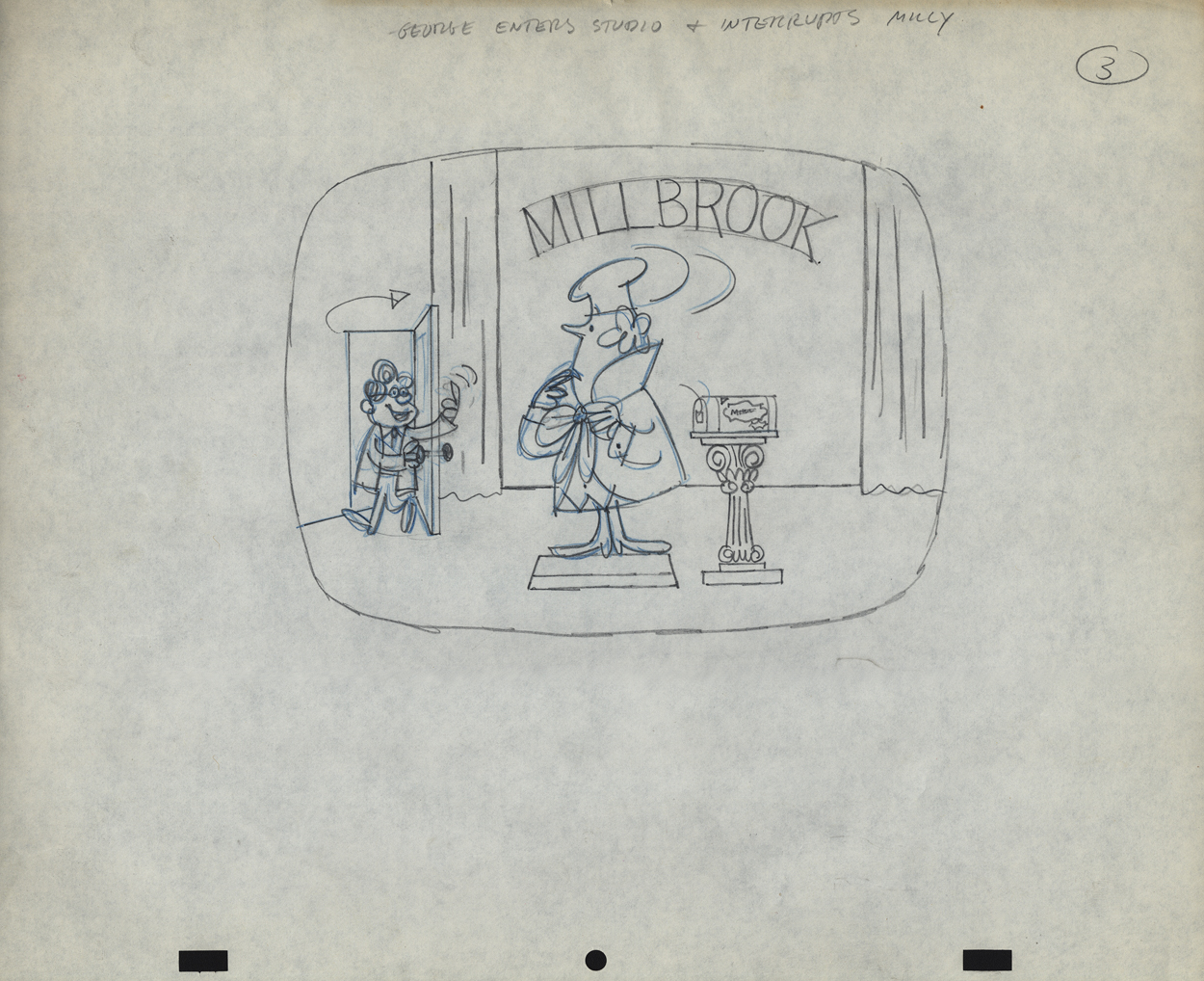
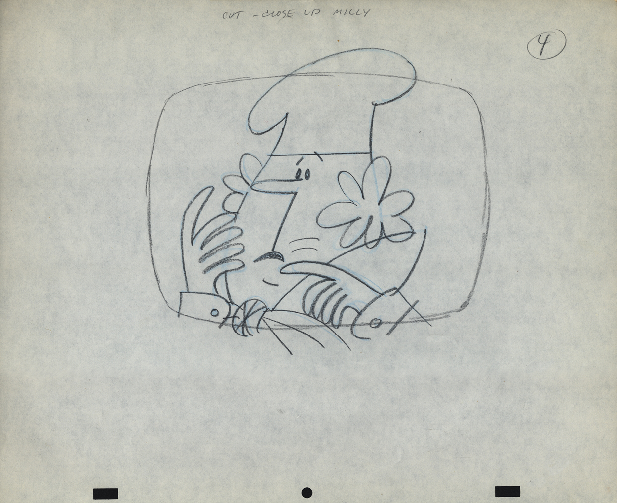
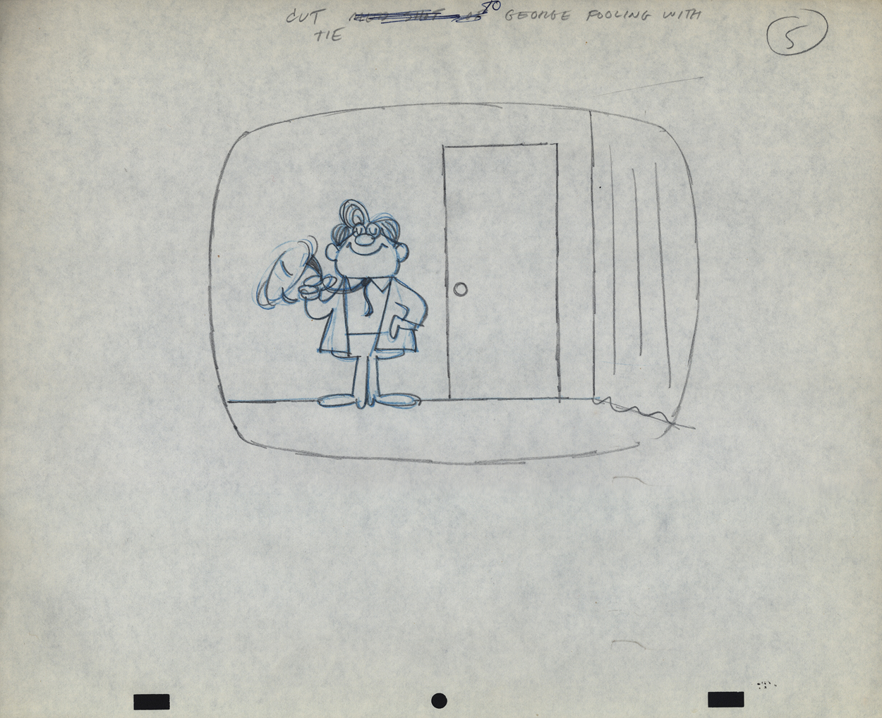
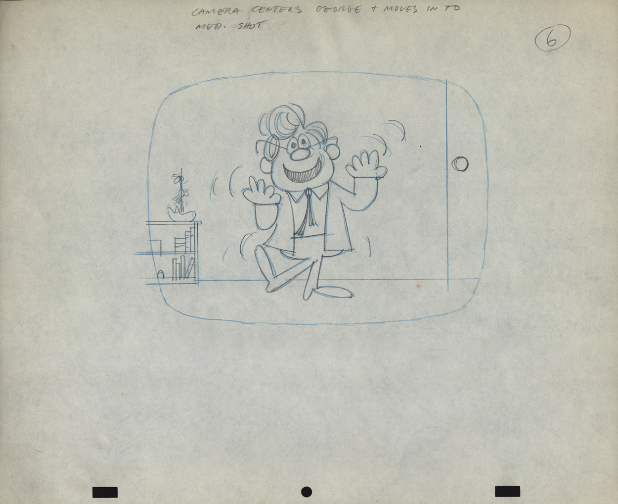
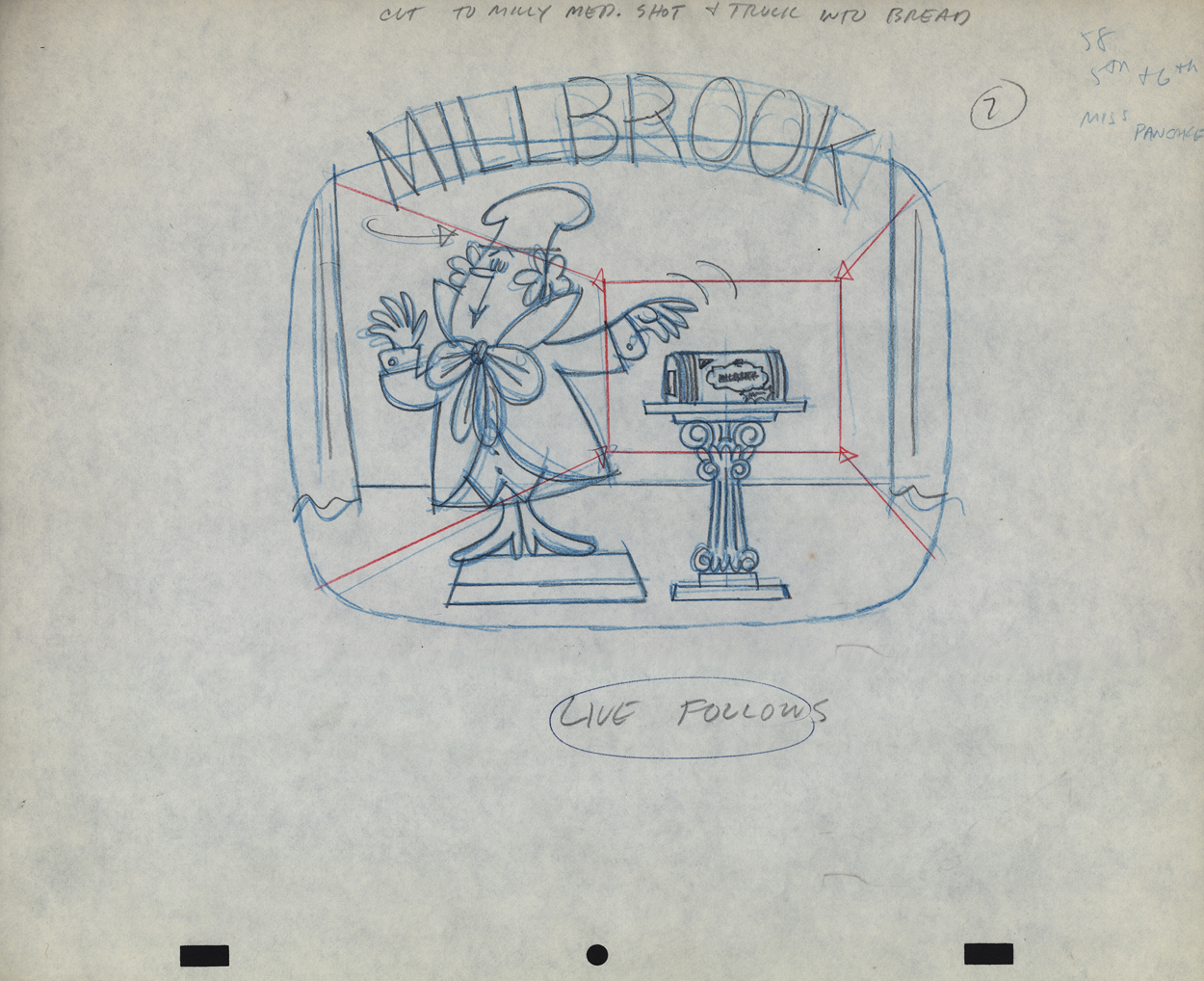
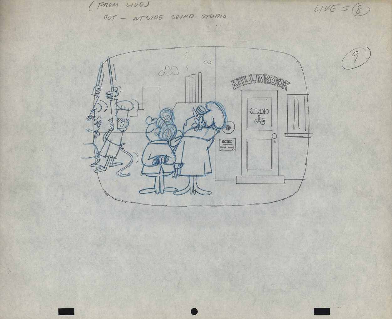
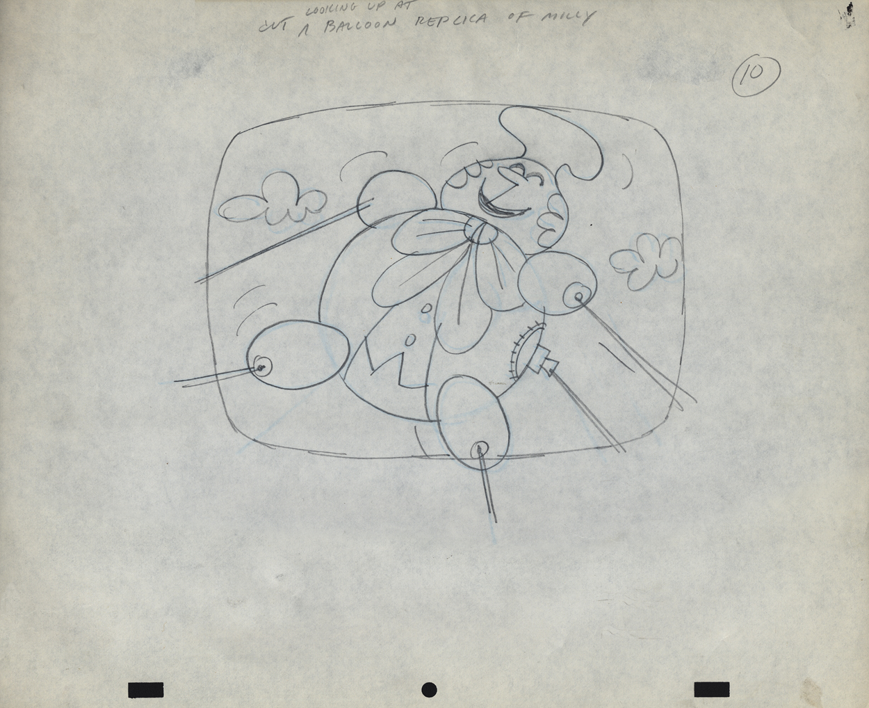
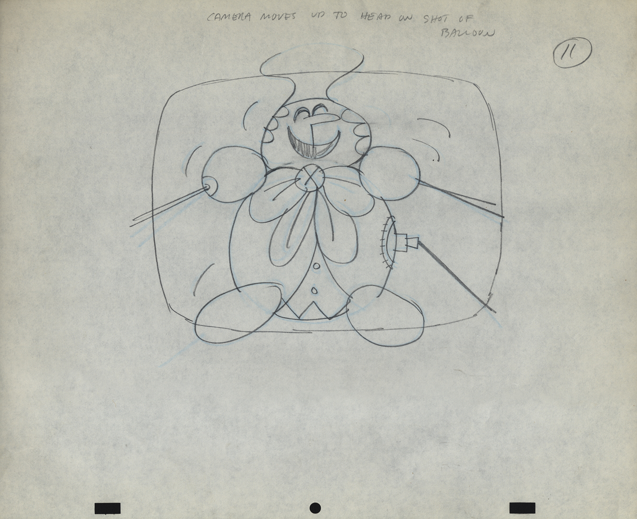
Vince Cafarelli’s Millbrook Bread – 1
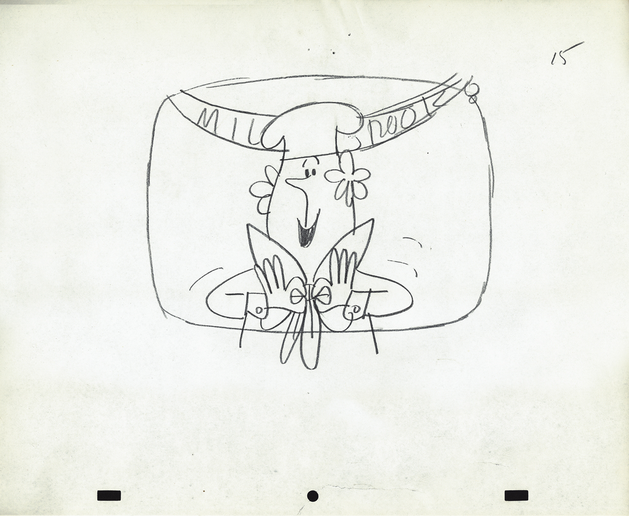
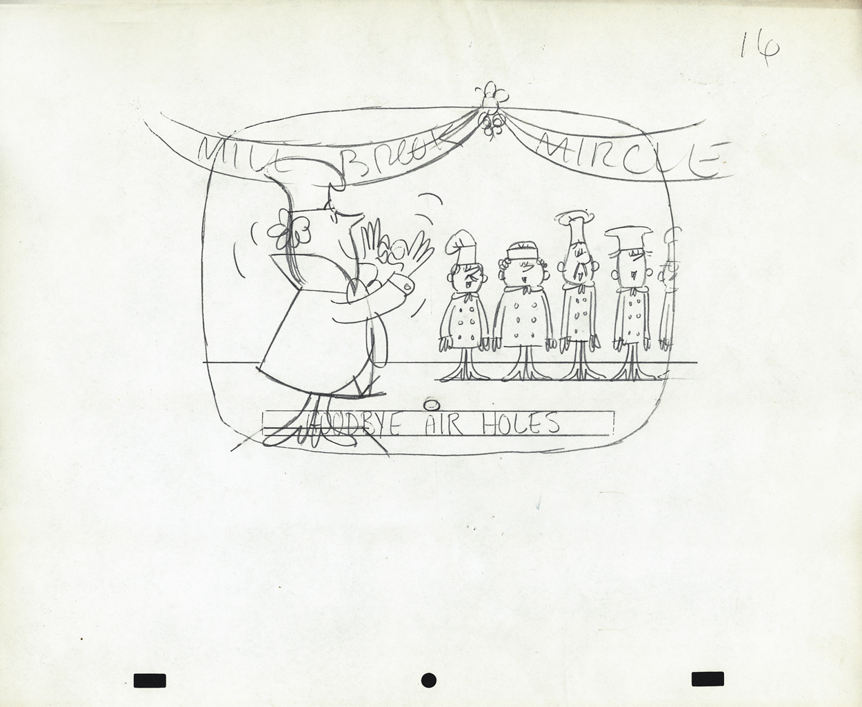
- When Bob Elliott and Ray Goulding (of Bob & Ray fame) found a chance, they scooped up the Piels Brothers account from UPA and, with Ed Graham, they opened their own animation studio to do the Piels commercials. The blend didn’t last long, and they soon went out of business. Vince Cafarelli worked at Goulding-Elliott-Graham Prods. for a while and several Millbrook Bread commercials were produced, featuring “Milly” the baker.
I remember these commercials from my childhood well. I loved the very graphic style of the spots. I remember seeing how the character turned his head (see number 16, below) and was taken by the movement. I think I was probably 11-12 years old at the time. The video records the date as 1963, but I’m sure they’re wrong – 1959, maybe?
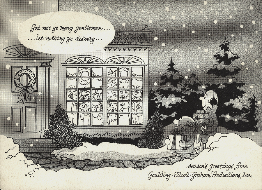
I previously posted this Christmas card from Goulding-Elliott-Graham Prods., Inc. If you click on the card and look in the window of the house, you’ll see “Minny” the Millbrook baker (centered) within, singing Christmas Carols.
Michael Smollin takes credit for directing the commercials, but I’m not sure he worked for Elliott-Gould-Graham. I thought that Ed Graham had directed all spots in house. Smollin may have designed the characters. We’re assuming that Vinnie drew these images. The writing is his. It’s doubtful he would have been directing at this point, so he probably drew the Layout drawings.
In Vinnie’s collection of art, the layouts for two of these spots were found. I’ll post these from the first spot this week and the second spot will come next Wednesday.
 1
1
 2
2
 3
3
 4
4
 5
5
 6
6
 7
7
 9
9
 10
10
 11
11
 12
12
 13
13
 14
14
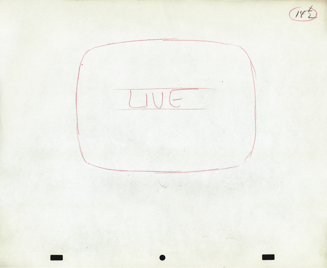
 15
15
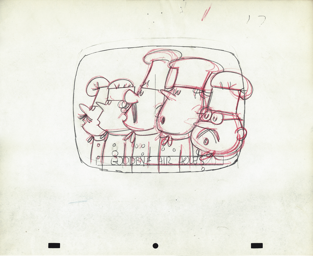
 16
16
 17
17
 18
18
 19
19
We don’t have a copy of this spot that we could post. However, to give you an idea of how the voices sounded, here’s a vradio spot done for Millbrook Briead by Bob and Ray.
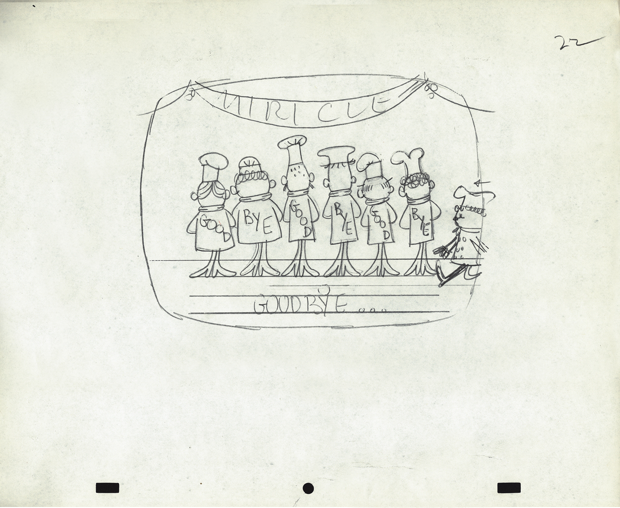
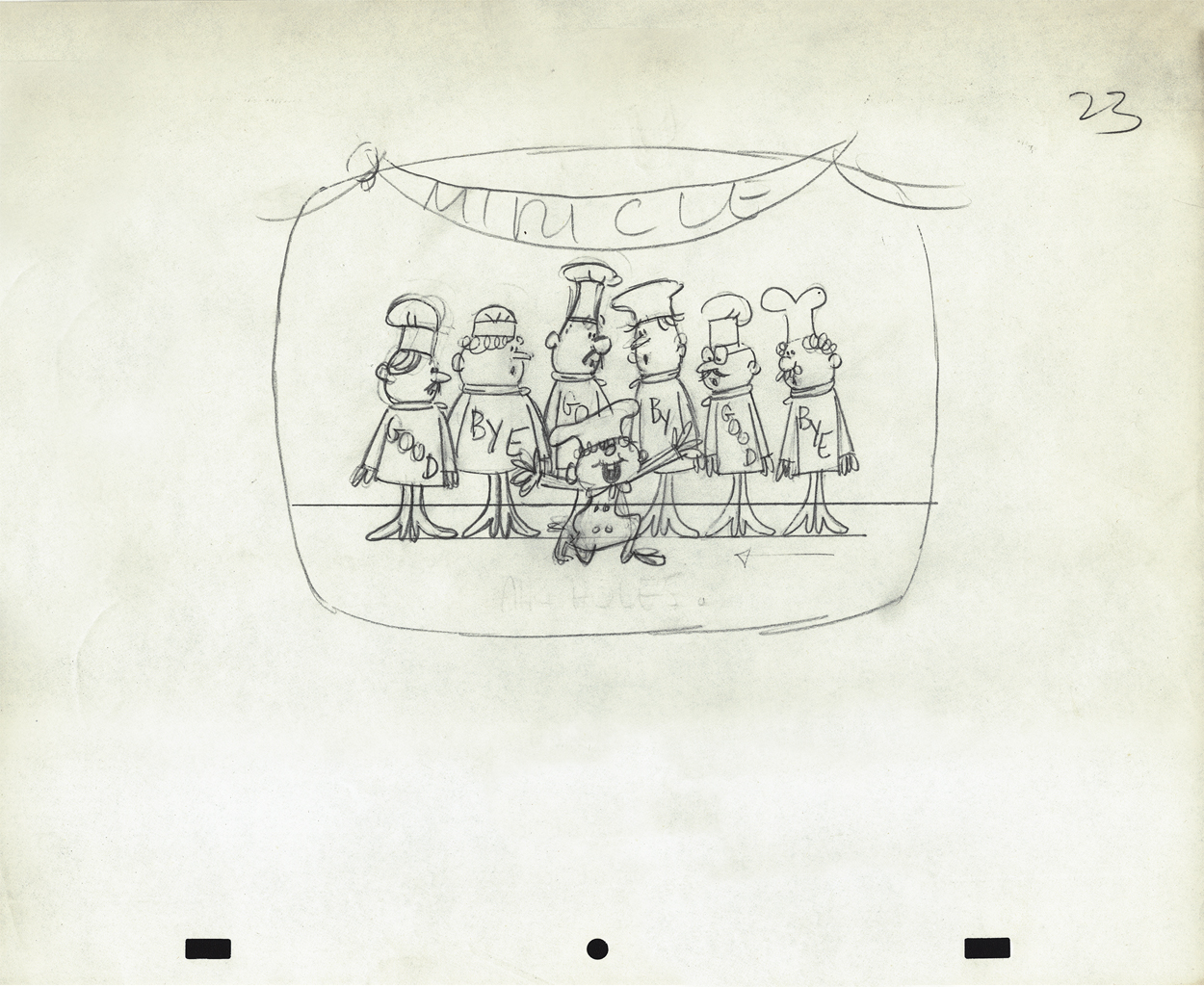
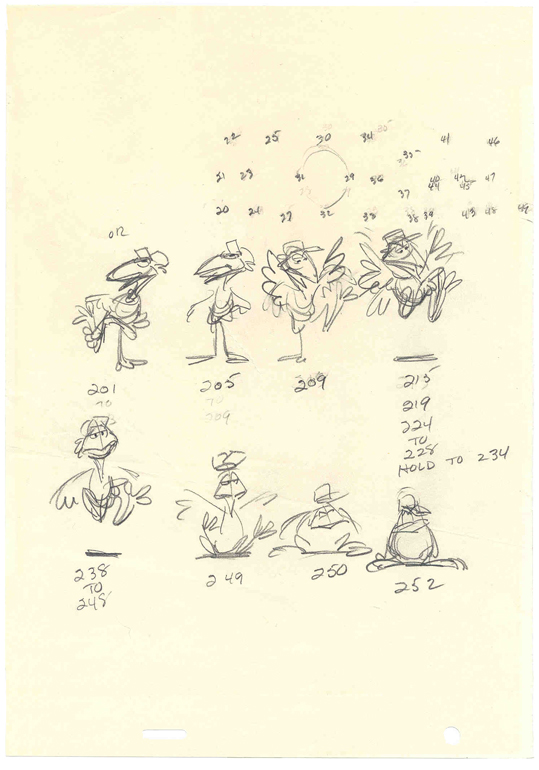
Animation &Animation Artifacts &commercial animation &Models &Story & Storyboards 12 Sep 2012 07:00 am
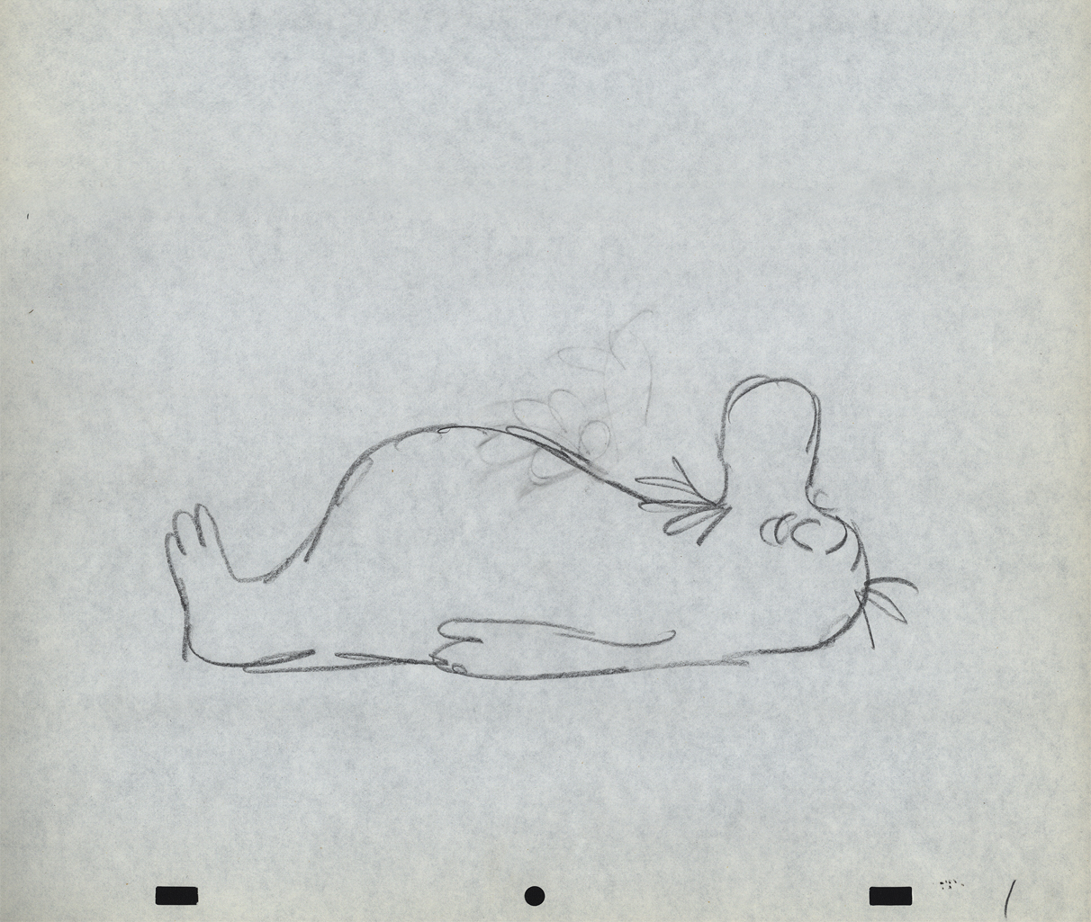
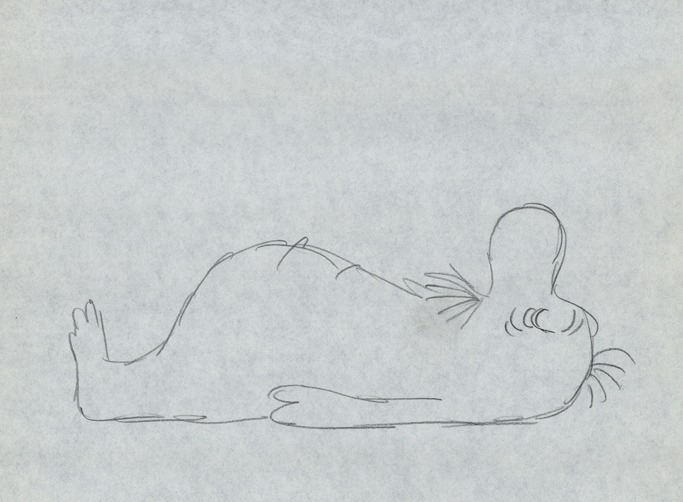
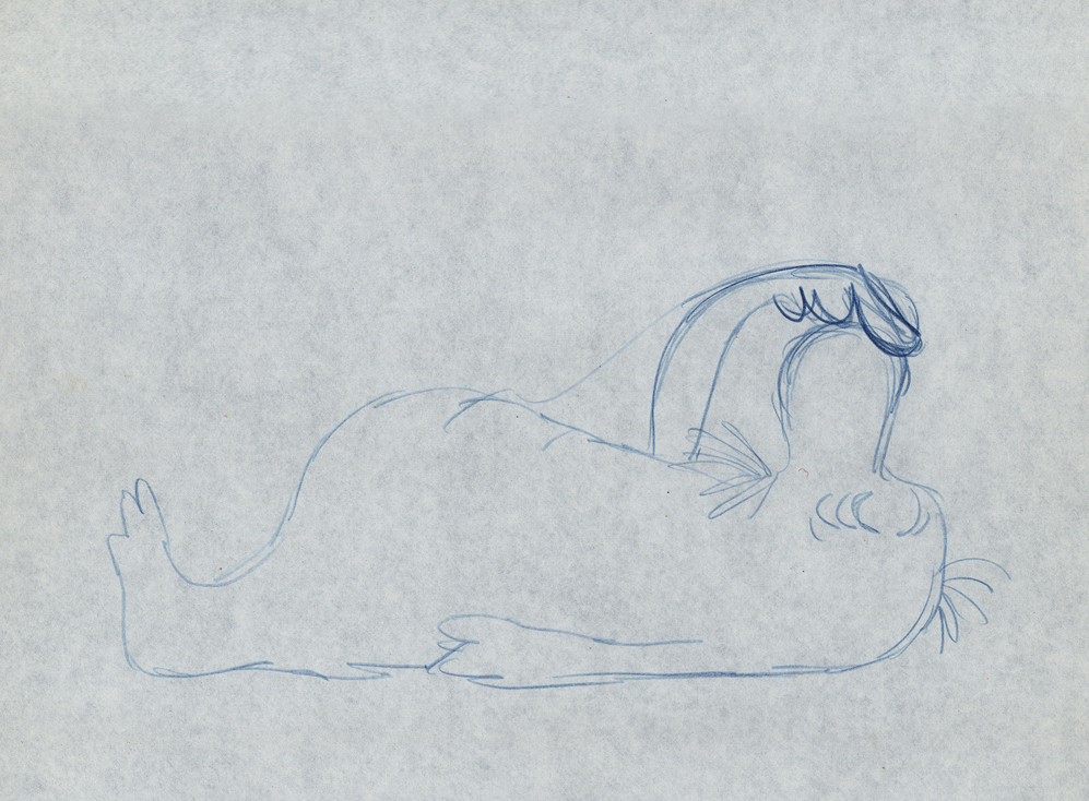
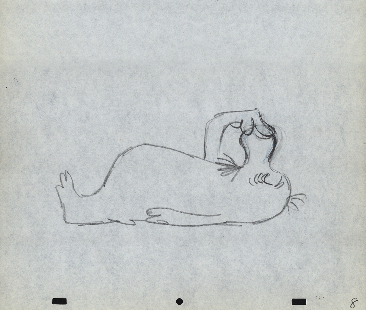
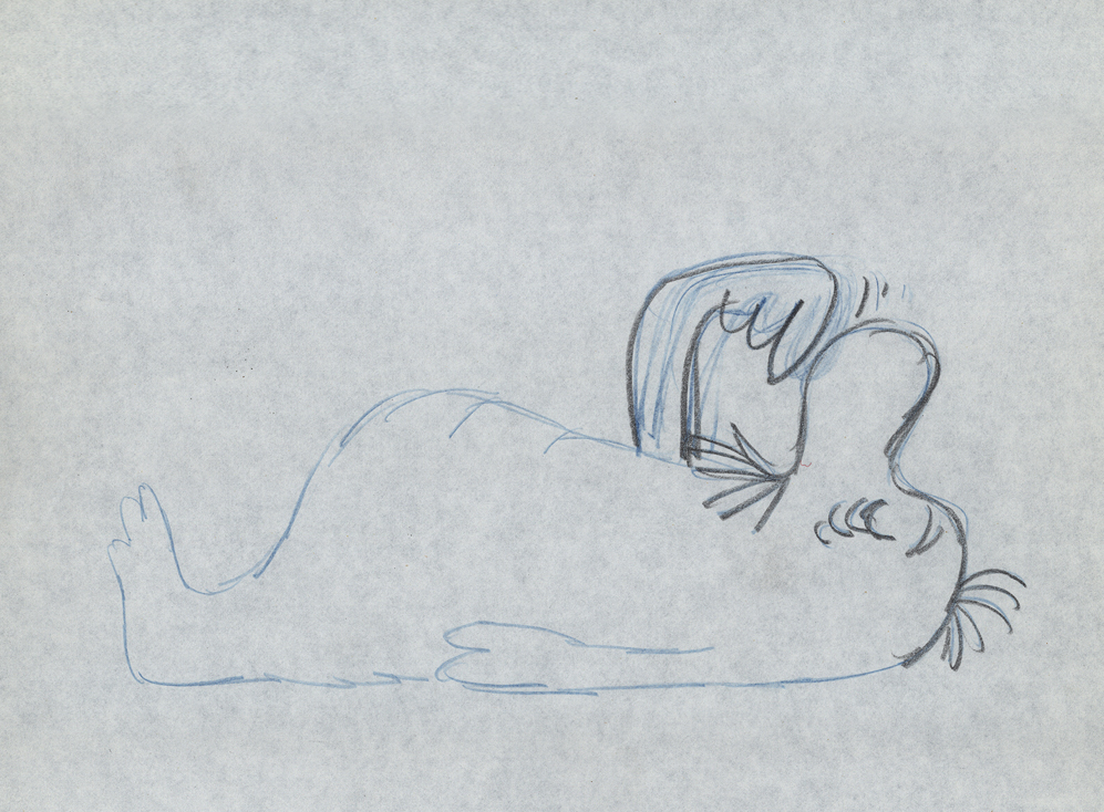
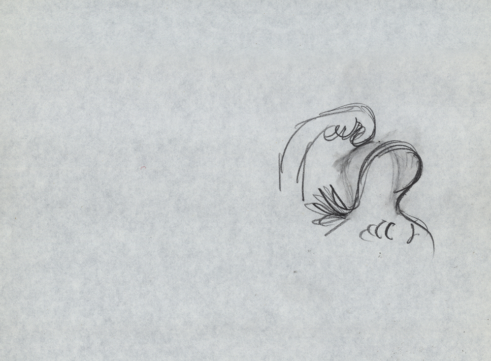
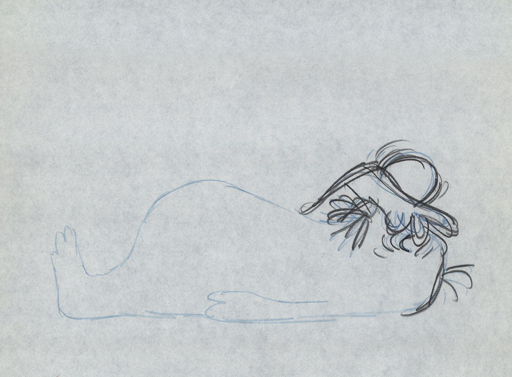
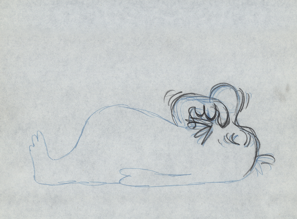
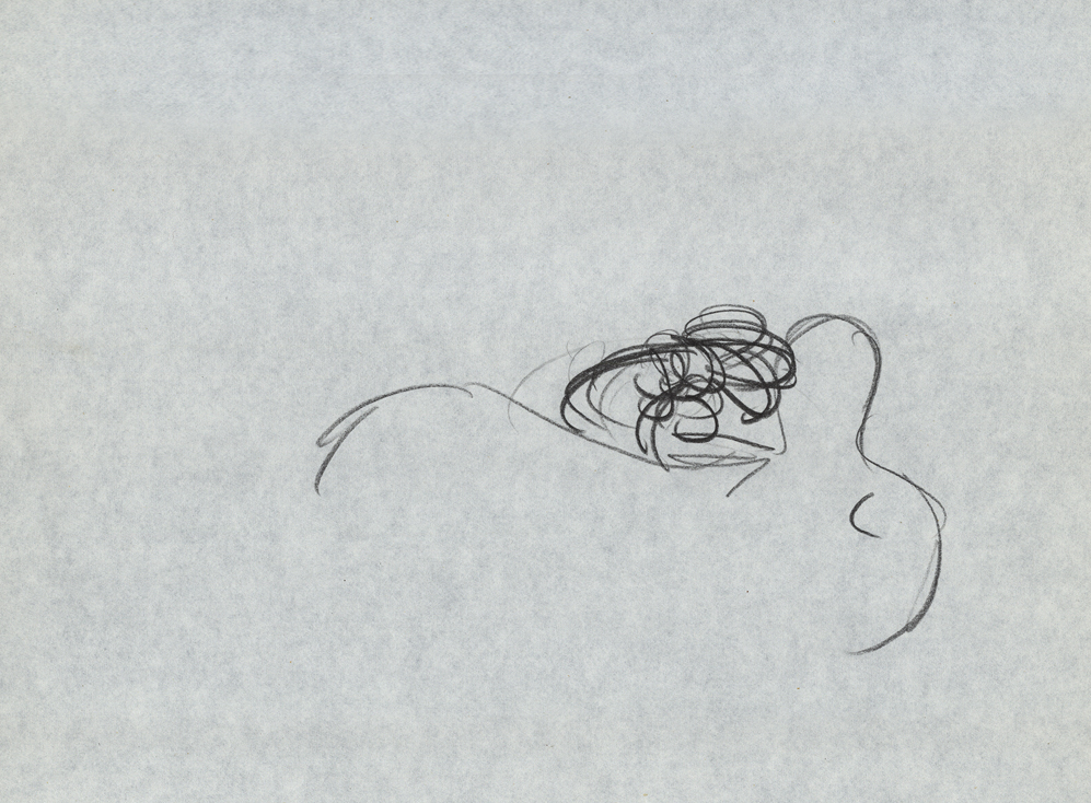
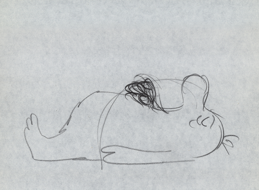
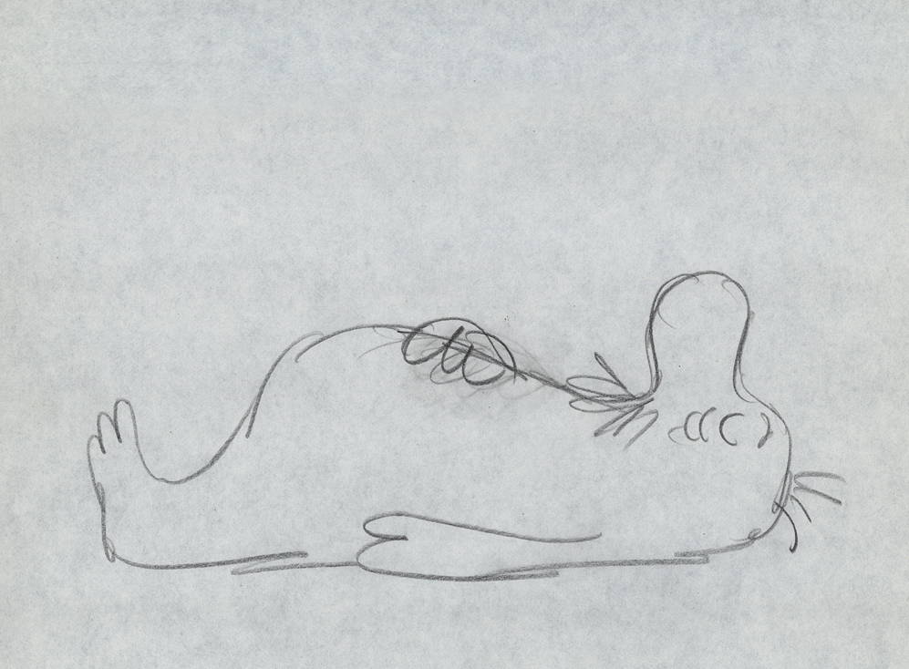
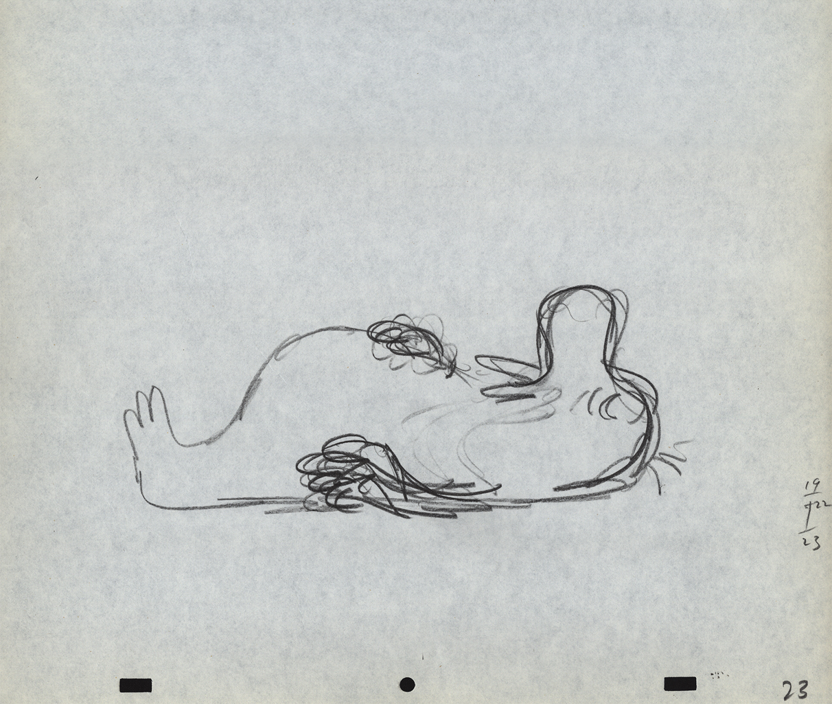
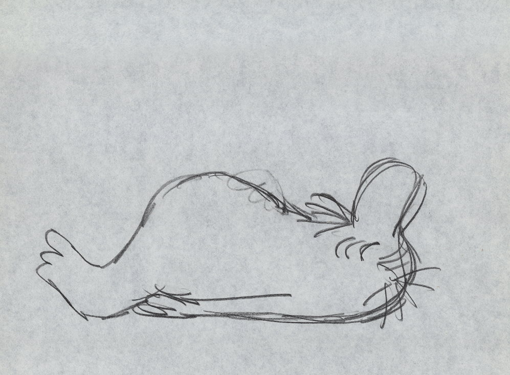
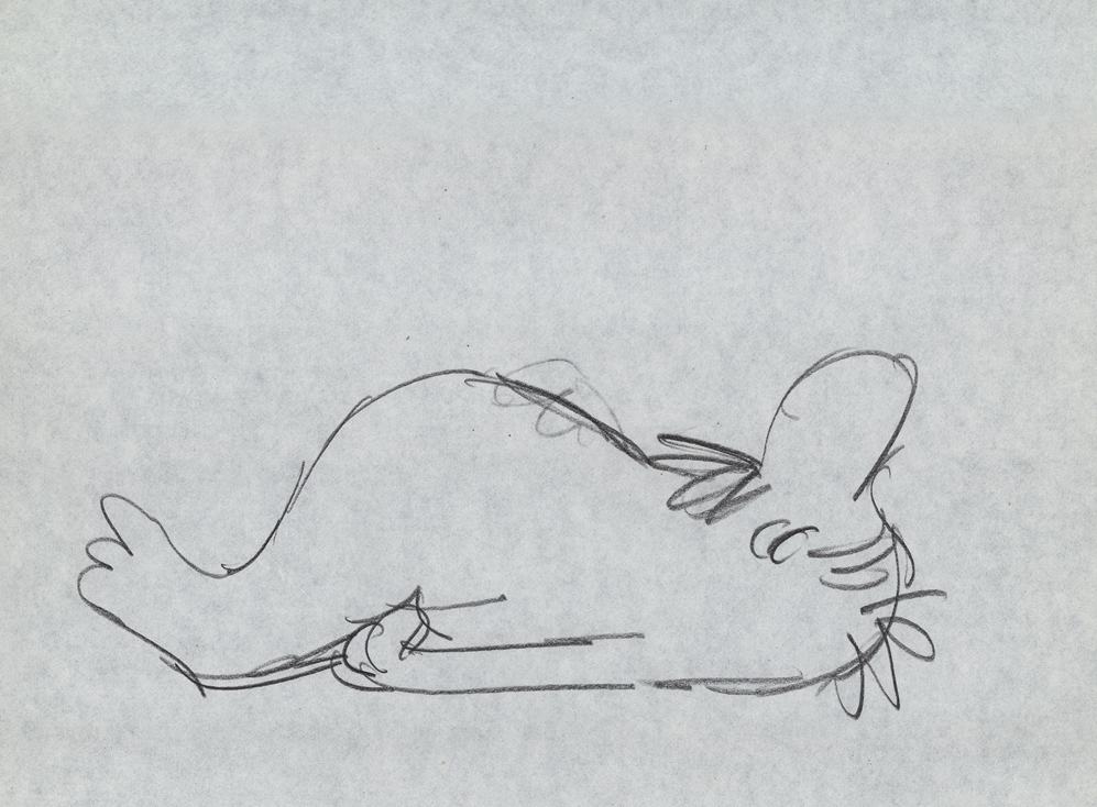
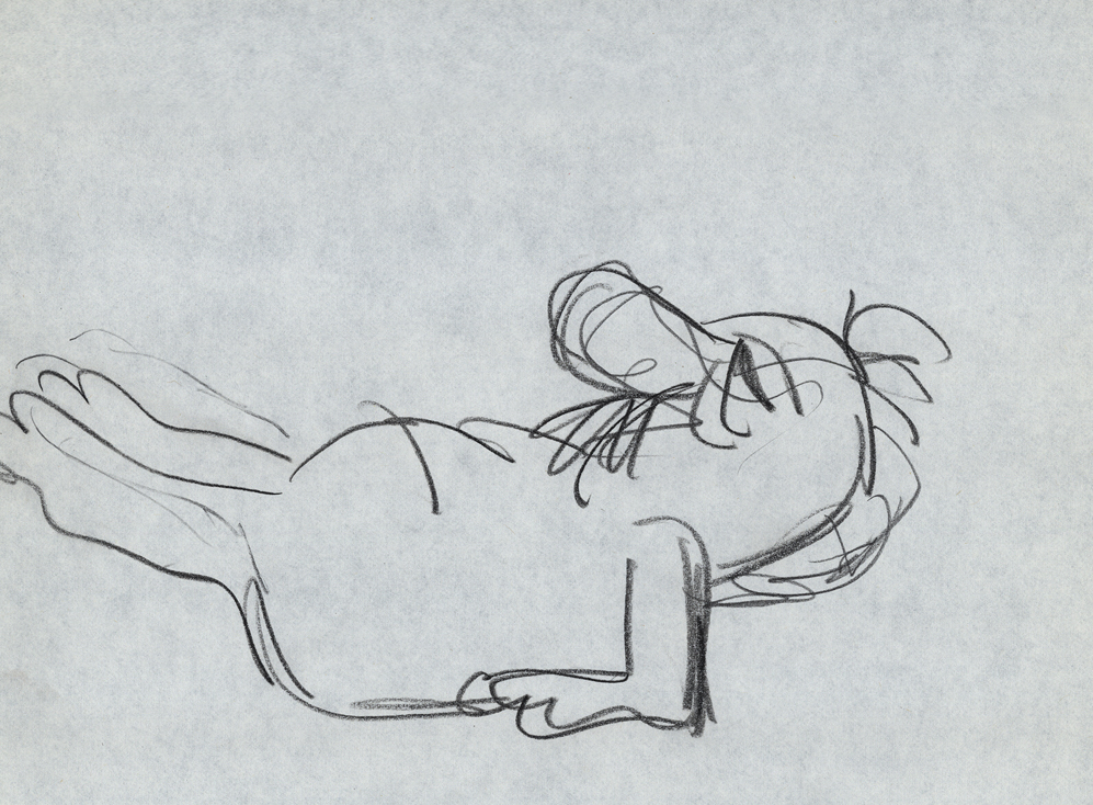
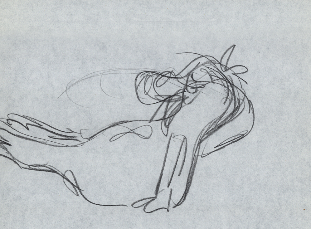
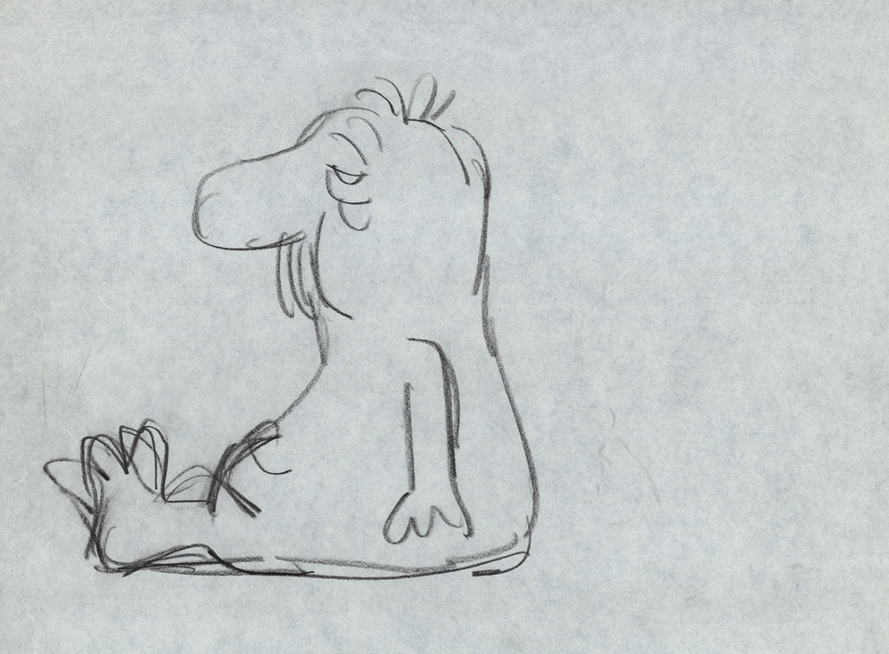
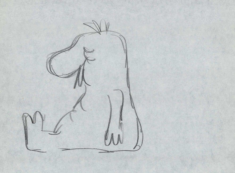
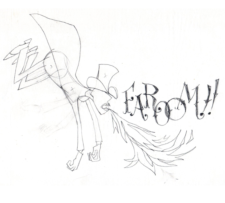
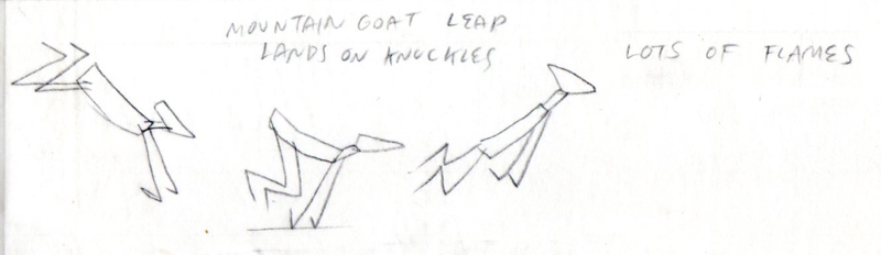
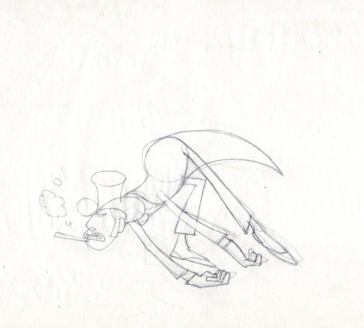
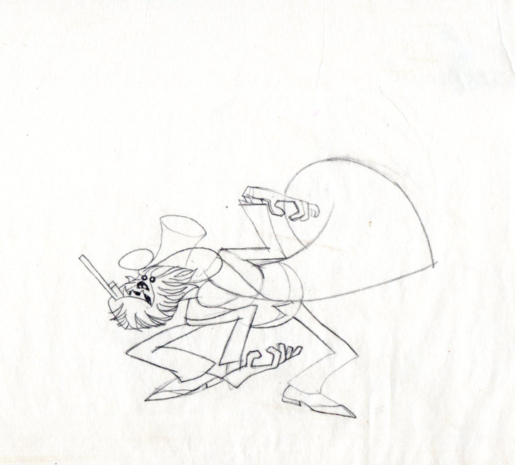
Sleeper – Vince Cafarelli collection
- Today I stumbled upon an odd spot in the collection of artwork saved by Vince Cafarelli. This is the storyboard and rough animation for a piece that Vince animated to a storyboard by Hal Silvermintz. The two worked on this when they were employed at Stars & Stripes Productions Forever, Inc.. It was something that the two were obviously doing for themselves – (an Independent film?). In any case it never seemed to have gone farther than this animation. . . at least, not in this form.
“Weekend” was a weekly news show that included a short animated piece. Perpetual Motion Studio did these weekly animation pieces for the NBC show airing on late night Saturday night. (This was before Saturday Night Live aired.) The budget was almost nil, so the material had to be not too expensive and the work had to be fun.
During the run of this series of shorts, Hal Silvermintz pulled out the storyboard, and it moved ahead in a new version. Candy Kugel animated the “Weekend” version and finished it for Ink & Pt. The final color spot aired in 1973-74.
Here’s the storyboard and a model sheet:
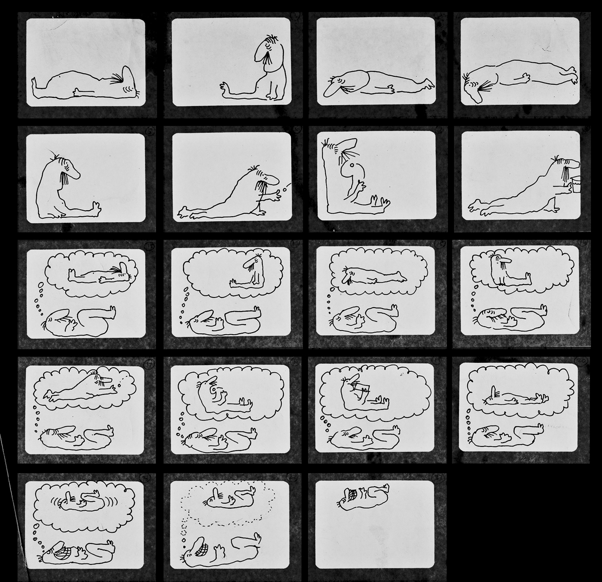
The original storyboard.
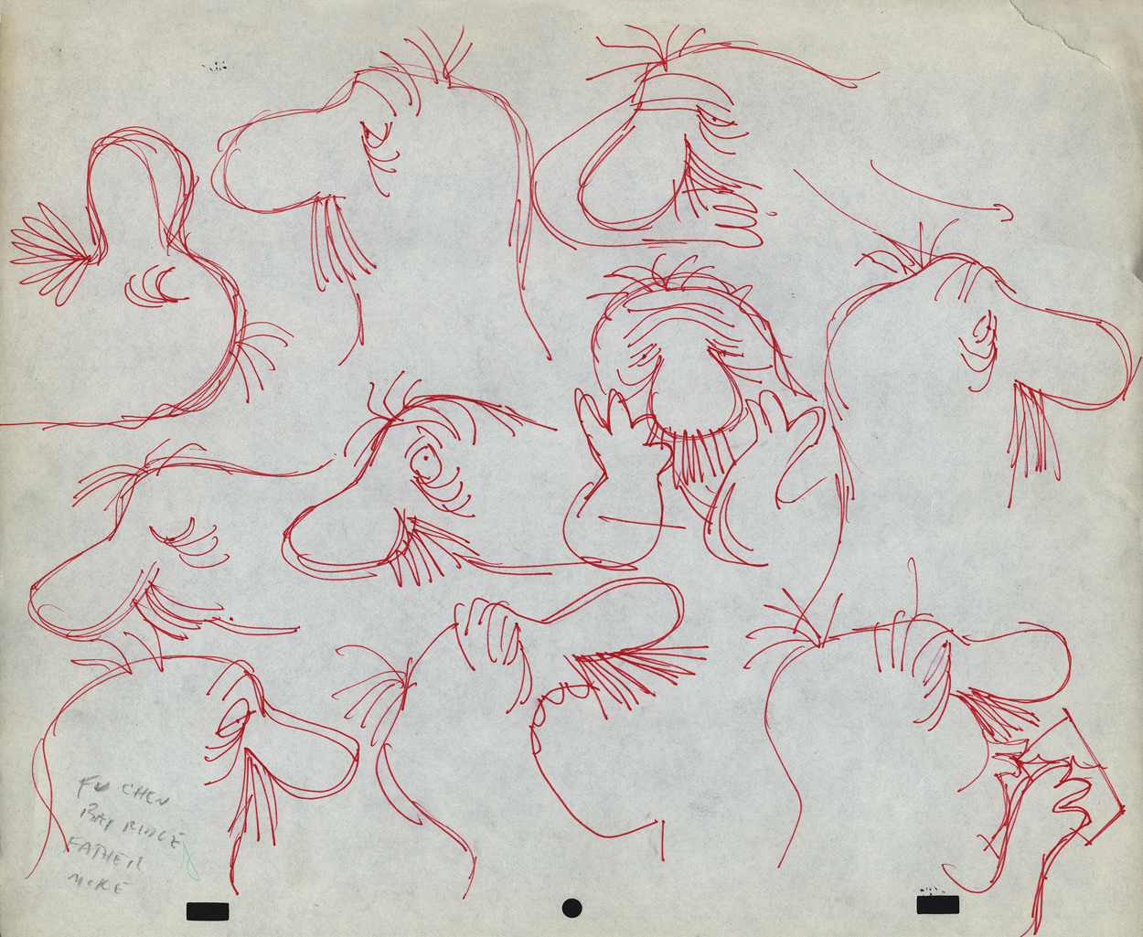
The character model chart
Here are drawings from about half of the first scene. For four key positions, I’m posting the entire page, pegs and all. For the remainder of the drawings, I just have the character for you.
 1
1
 2
2
 3
3
 4
4
 5
5
 6
6
 7
7
 8
8
 9
9
 10
10
 11
11
 12
12
 13
13
 14
14
 15
15
 16
16
 17
17
 18
18
 19
19
 23
23
 25
25
 26
26
 27
27
 28
28
 29
29
 30
30
 31
31
 33
33
 34
34
 36
36
 37
37
 39
39
 40
40
 41
41
 42
42
Here’s a QT movie of the drawings posted above.
There were no X-sheets to offer timings, so I had to
guess at the timings that might have been used.
Animation Artifacts &commercial animation &Illustration &Models 05 Sep 2012 05:40 am
Odds & Ends from the Cafarelli collection
- Going through a stack of boxes searching for genuine animation, one tends to find a number of gems that represent animation past but don’t nicely link to other pieces. The end result is that you hold a lot of odds and ends in your hands and you seek a way to post them. That’s certainly the case with Vinnie Cafarelli’s collected works.
I’ve located a lot of pieces that interest me, but I don’t necessarily know where they come from or why they were saved. So today I’m posting a number of these bits of art.
Here we have Layouts, cel setups, photos, models and more than a small share of invitations and Christ cards. Here they are:
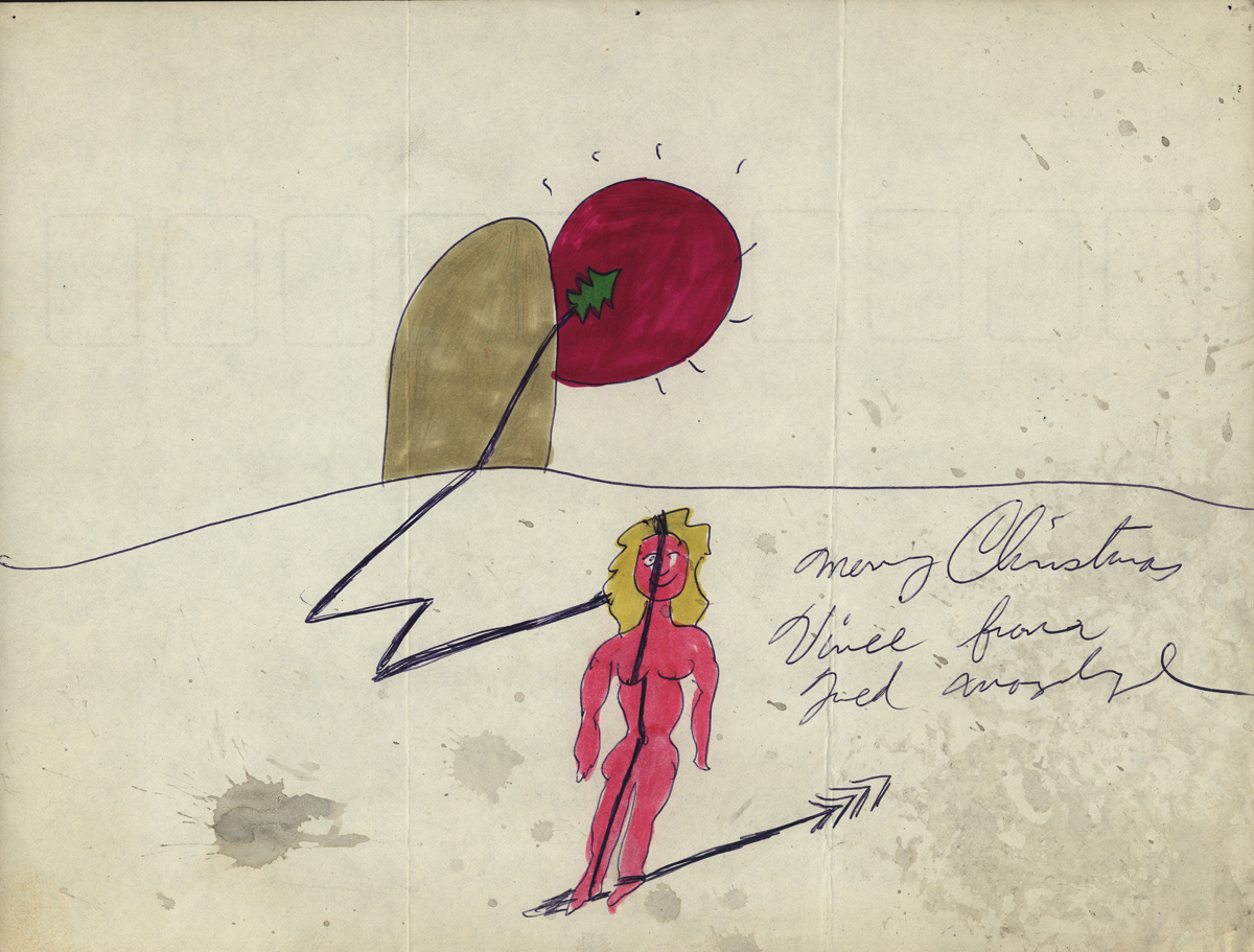
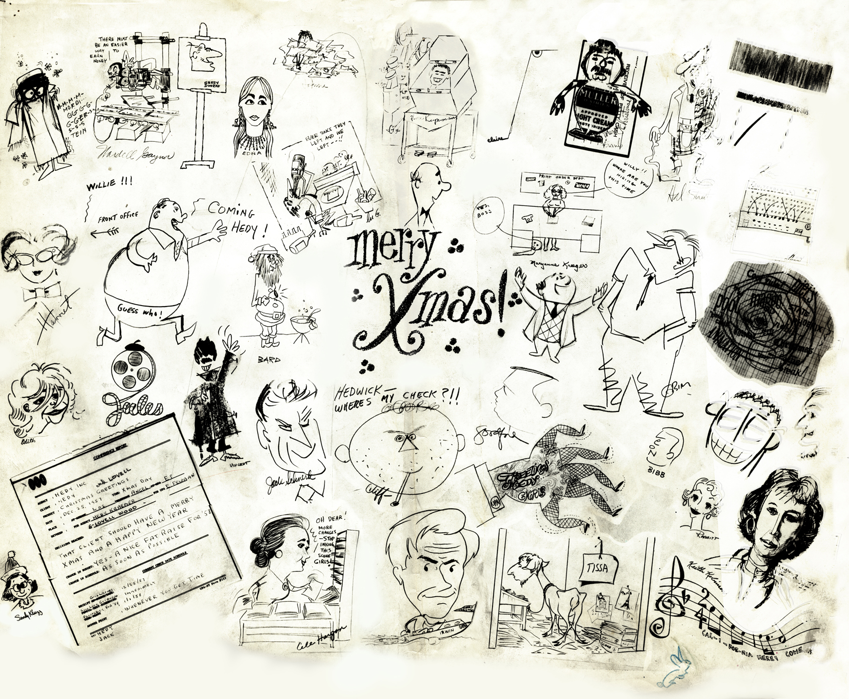 1
1A Christmas Card from the NY-UPA Studio.
Many of the employees signed it.
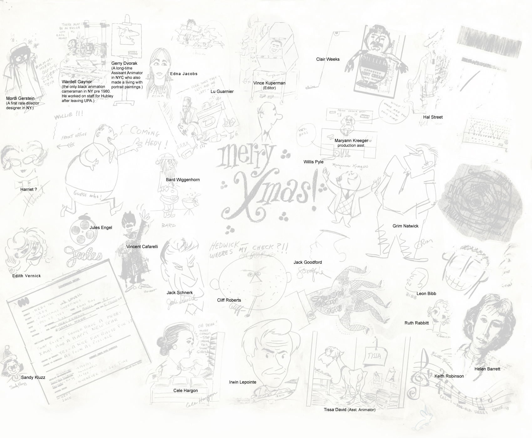 1a
1a
A guide to many of the names
of those who signed the card.
(Click to enlarge)
I had a scanning problem on the upper
right and will try to correct that.
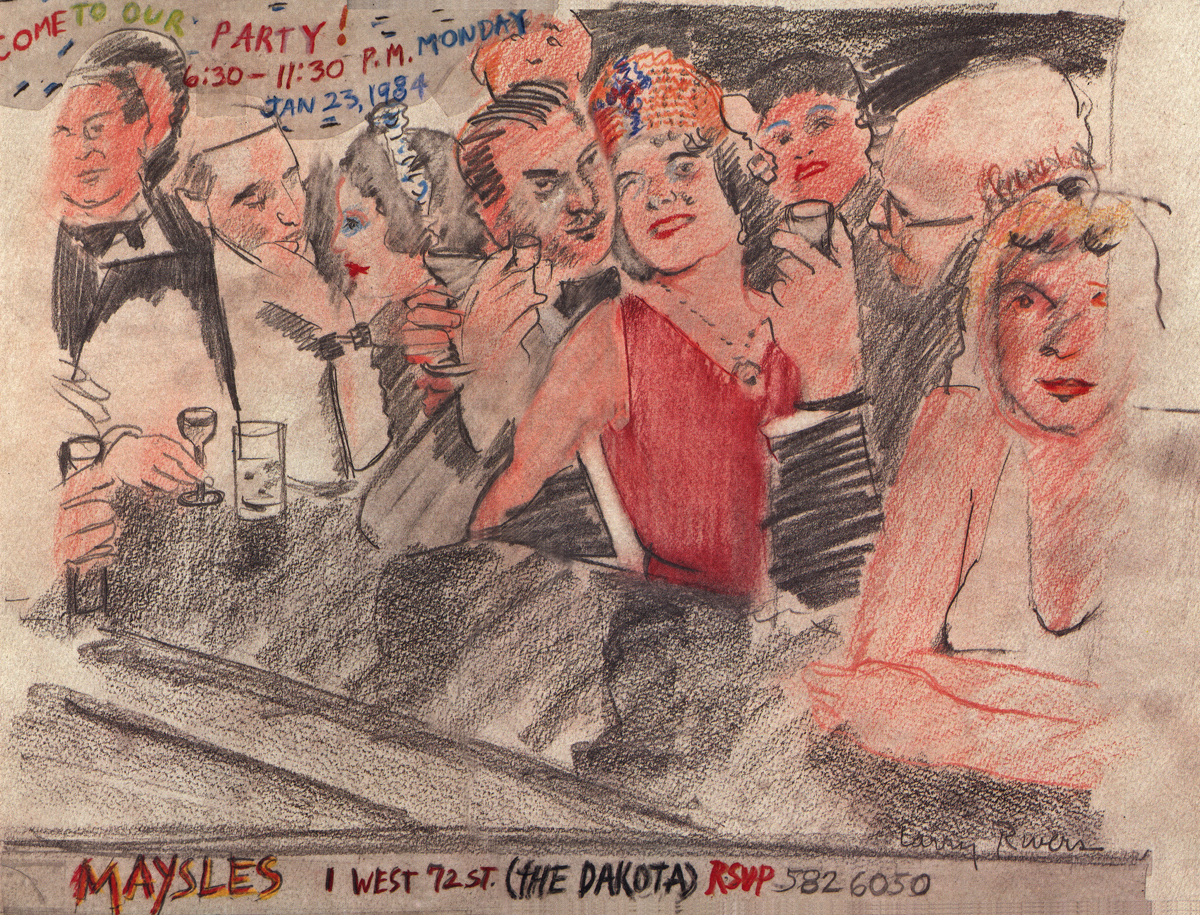
An invitation to a Christmas party at the Maysles Bros
studio. Certainly only for a member of the elite.
A Christmas Card from Fred Mogubgub.
A Christmas Card from the Goulding-Elliott-Graham Prods.
Ray Goulding and Bob Elliott, together with Ed Graham formed
this studio to do Piels commercials. (Bob Goulding & Ray Elliott were the
voices and held onto ownership of the characters. work dried up soon
since one commercial product & client couldn’t maintain the studio.)
A finished setup from a Yellow Pages commercial.
This was done at Gifford Productions.
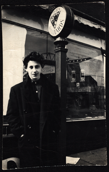
Pablo Ferro during UPA days.
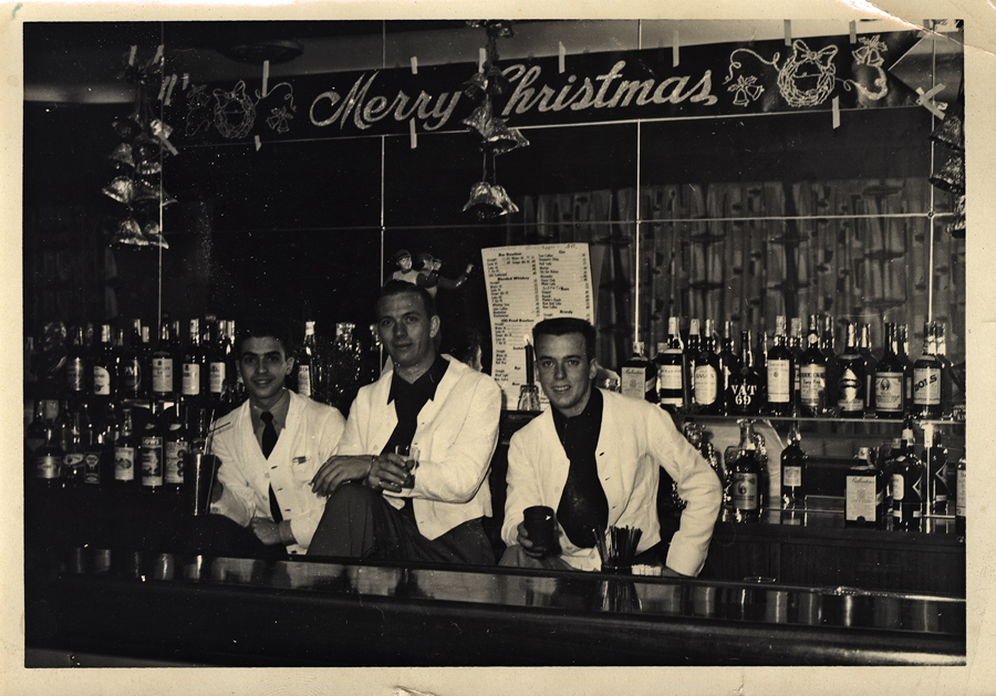
Vince Cafarelli (far left) while in the military at
Fort Benning, Ala. made extra money as a
bartender. These are the days just prior to his
workng at UPA.
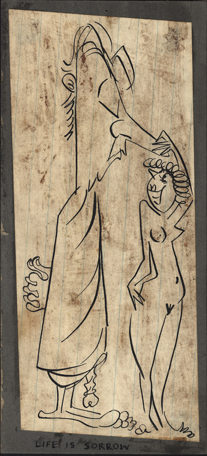
A small racy sketch among the art.
We’re not sure who drew it but guess
it might be Vince Cafarelli’s work.
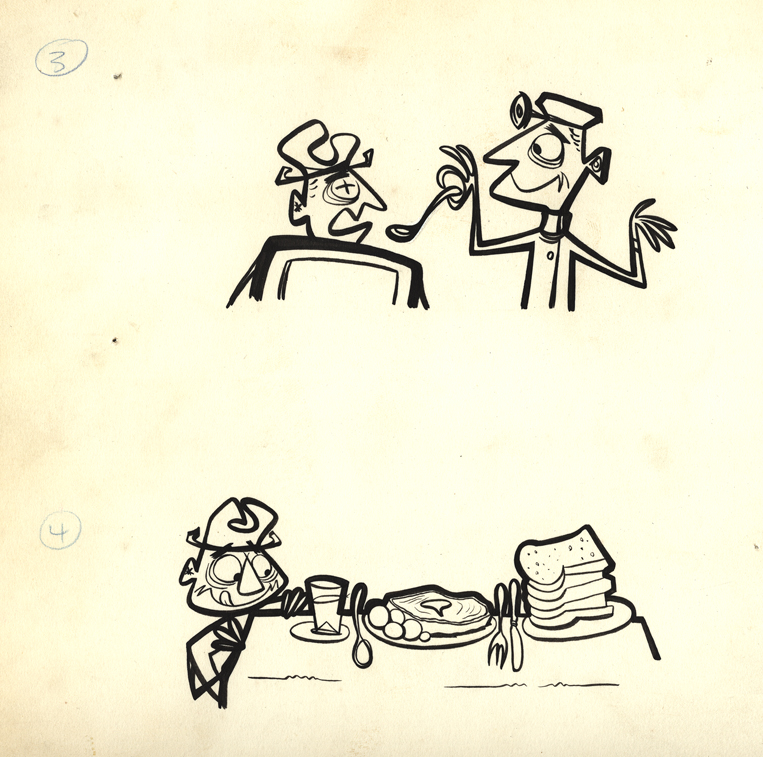
All that remains of a pitch for an antacid spot.
Obviously drawings 1 & 2 are missing, but
these two were interesting enough for me to post.
 1
1
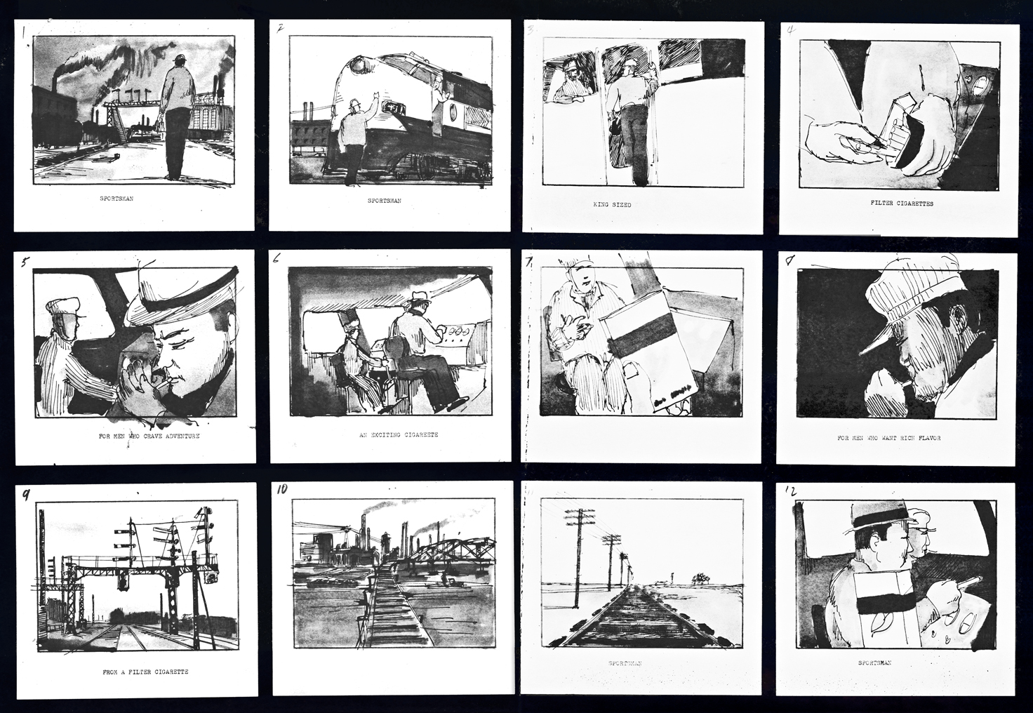
A storyboard (3 pages) for a cigarette company
(Sportsman Cigarettes?). Obviously a sample board.
Is it a live action spot? Probably for Gifford Studio
which also did live action spots.
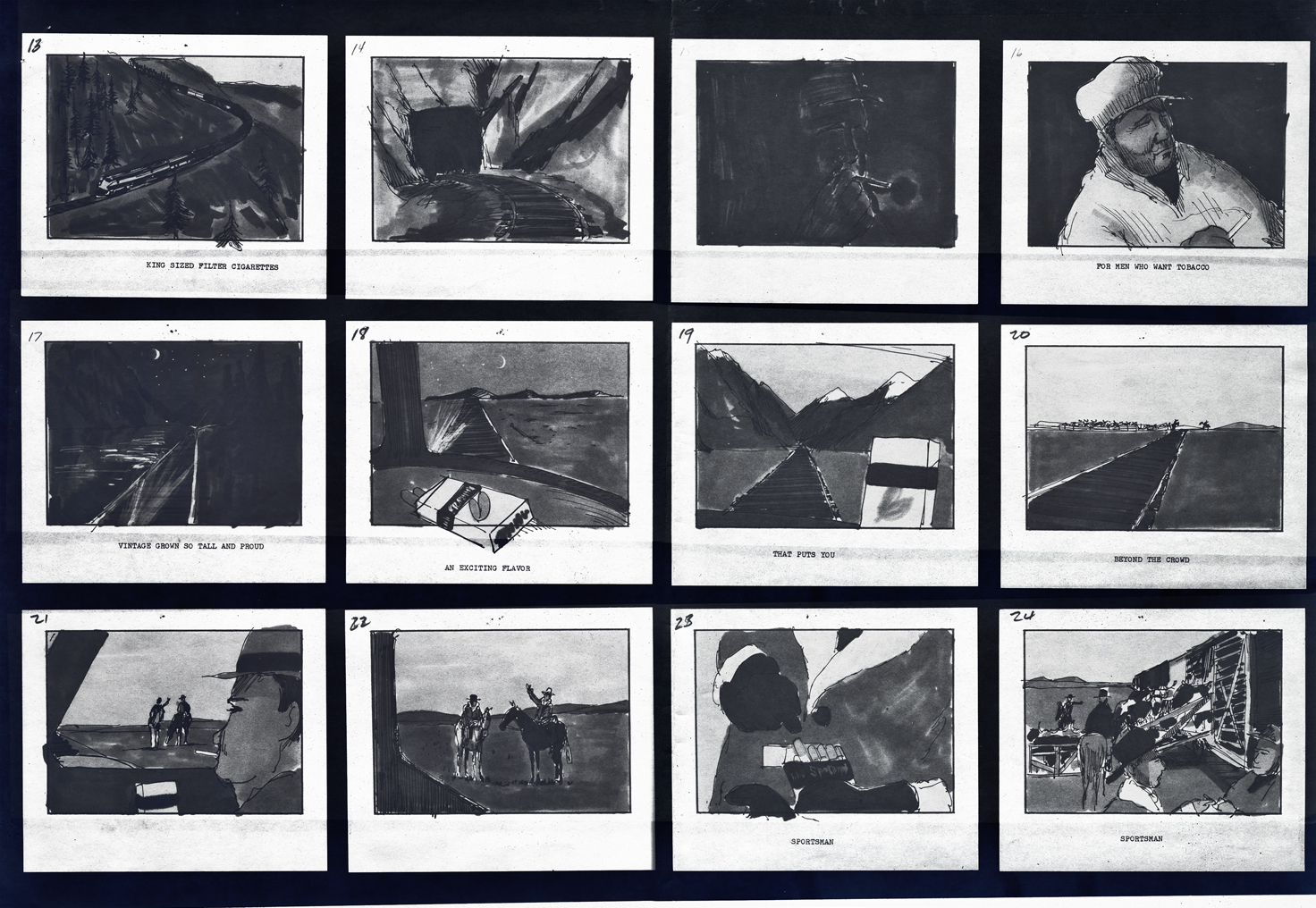 2
2
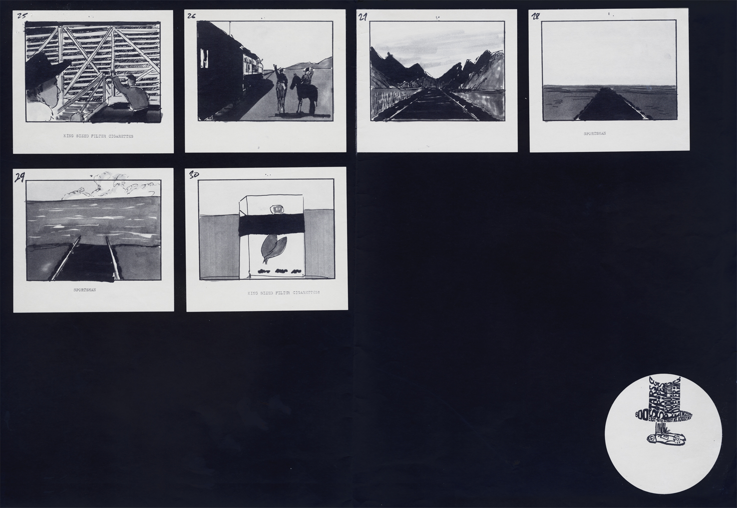 3
3
Animation &Animation Artifacts &commercial animation &Hubley &Models &repeated posts 03 Sep 2012 05:11 am
Vlasic Business at the Hubleys
 – Years ago I worked at the Hubley studio on a pair of commercials for Vlasic pickles. One of the two spots made it to the air.
This is from the spot that never made it.
Vlasic had a commercial they wanted, and because of the agency’s long time relationship with the Hubleys, they came to him to try to develop the character. (The agency was W.B. Doner, the agency that had done so well with Hubley’s Maypo commercials.)
The agency came with two already-recorded voices: one was a Groucho Marx impersonator (Pat Harrington was the Groucho impersonator ultimately used for the stork’s voice.*) The other voice was character actor, Edgar Buchanan, a man with a gruff voice who appeared in a million westerns. John Hubley wanted Edgar Buchanan – it was a much richer voice, lots of cowboy appeal.
John designed the character to look like one of those stationmasters in cowboy films. The guy who gives out tickets and does morse code when he has to. The stork had a vest and a blue, boxy, stationmaster-type cap cocked off to the side. It was a great character.
Phil Duncan was the animator. A brilliant character guy who had done everything from Thumper to George of the Jungle. I loved cleaning up and inbetweening his work. It was all fun and vibrating with life.
The rough thumbnail drawing (above) fell out of one of Phil’s packages. It was a thumbnail plan of the action. Phil would do these things which usually stretched around the edges of his final drawings. In a nutshell, you could see the scene and how he worked it out. Lovely stuff.
I felt this drawing was as beautiful as the original animation drawings.
 The agency approved the stork, Edgar Buchanan and the plan of action.
We’d already finished the first commercial which was on the air. (Represented by the two set-ups posted here.) The style was done with acrylic paints – out of a tube – on top of the cel. Ink with Sharpie on cel; paint dark colors – ON TOP of cel
- up to and over ink line; after drying we painted it again with lighter tones, and we pained it again after it dried using even lighter tones with a translucent color. Imagine kids & a gun in a spot today!)
Phil Duncan did a great job of animating it. I inbetweened, and the Agency loved it and approved it to color.
All this time, John and Faith were busy preparing the start of Everybody Rides the Carousel. It was to be three half-hour shows (Eventually CBS changed their mind and asked the shows, still in production, to be reconfigured to make a 90 min film) and was in preproduction. I did the spots on my own with John checking in. Faith wanted nothing to do with a commercial and was somewhat furious that a commercial was ongoing. She daily spoke out against this spot with many shouting matches. I never quite understood the problem. The spots didn’t hold up any other studio work; I was making it as easy as possible for John to not have to do much work on the spots, and they were getting necessary money to help finance some of the preliminary work for the Carousel. (Of course, the Hubley name was involved, but even Michelangelo did commercial work – like the Sistine Chapel to pay for the art. Not that Vlasic was the Sisine Chapel, of course.)
 Within weeks the spot was in color and two junior exec. agency guys, John and I stood around the Hubley moviola. (It was a great machine with four sound heads and a picture head that was the size of a sheet of animation paper. Pegs were actually attached to enable rotoscoping!)
The two agency guys were buttoned up with good suits and briefcases. They stood behind John and me, and I operated the moviola.
We screened the spot the first time. I turned around and these two guys had come undone. Their ties were loose and astray; they were visibly sweating. I swear this all happened within the course of 30 secs.
 John smiled and optimistically asked how they liked it. They looked at each other, and couldn’t answer. I don’t think they were able to form a decision or say what they actually thought. Eventually, they left with the spot in their briefcase and would get back. It wasn’t good.
They did get back. I was asked to pack up all the elements and ship them back to W.B. Doner. The spot was thrown out of the studio by John who refused to change it. (Hubley’s stork.)
He liked what was done, and apparently had
a rider in his contract which covered him – somehow.
The spot showed up at Jack Zander‘s studio, Zander’s Animation Parlour. They used the Groucho impersonation and slicked it up a lot. Vlasic is still using that stork, and that was John’s last commercial endeavor. The character is still showing up in a cg version, just as bad as the 2D version.
* Thanks to Mark Mayerson for this information.
Animation Artifacts &Bill Peckmann &commercial animation 31 Aug 2012 05:51 am
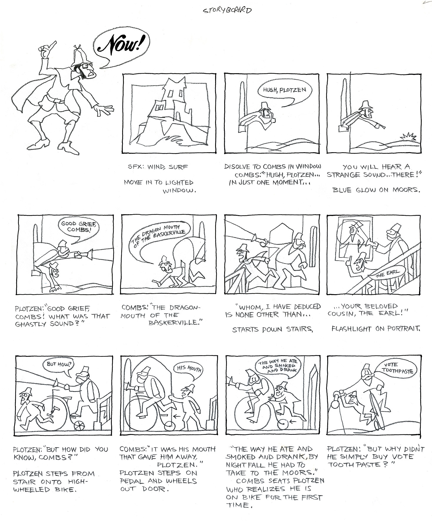
Combs and Plotzen – Part 2
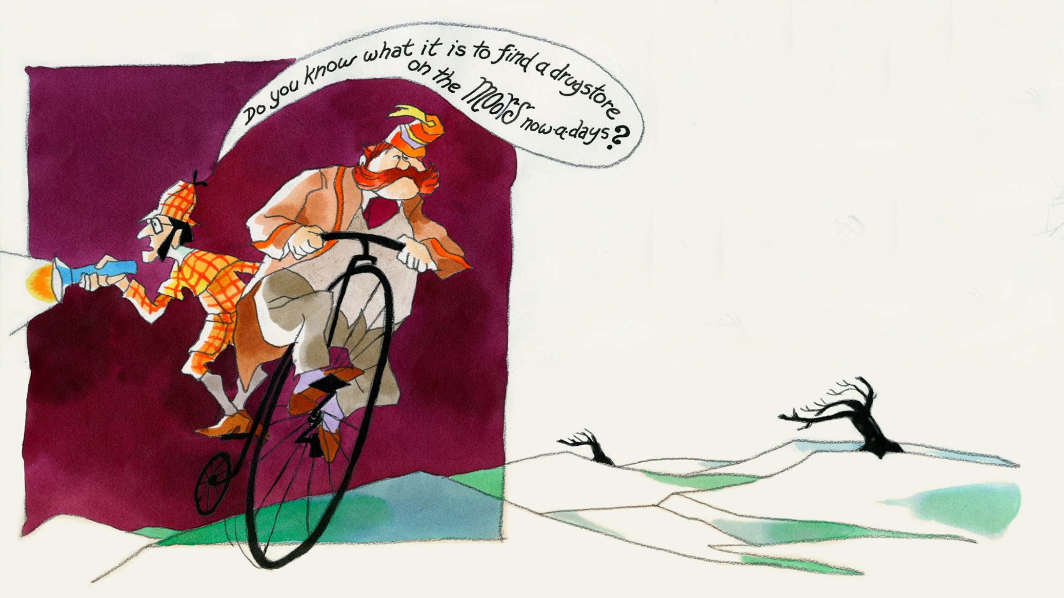
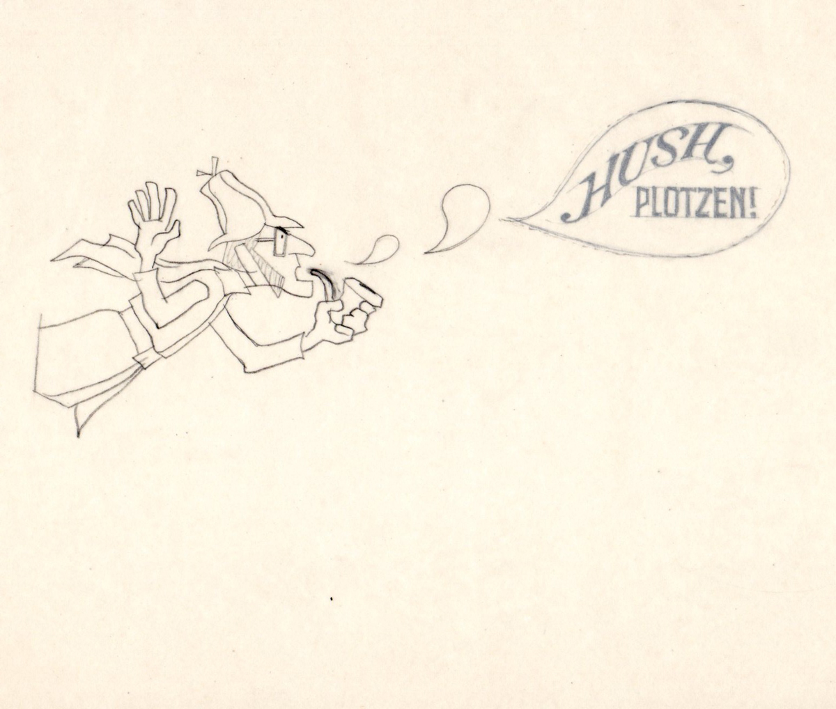
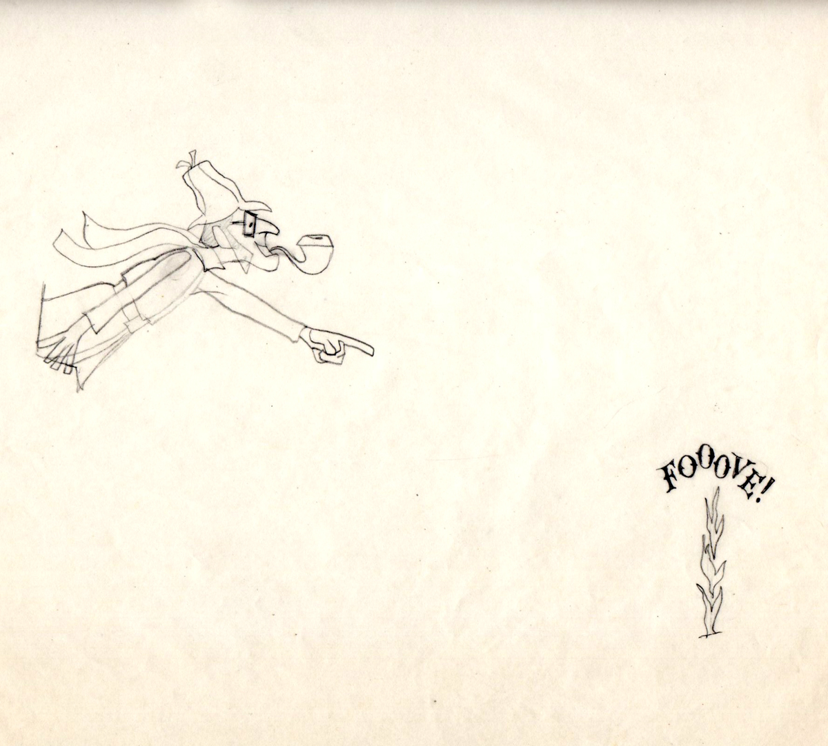
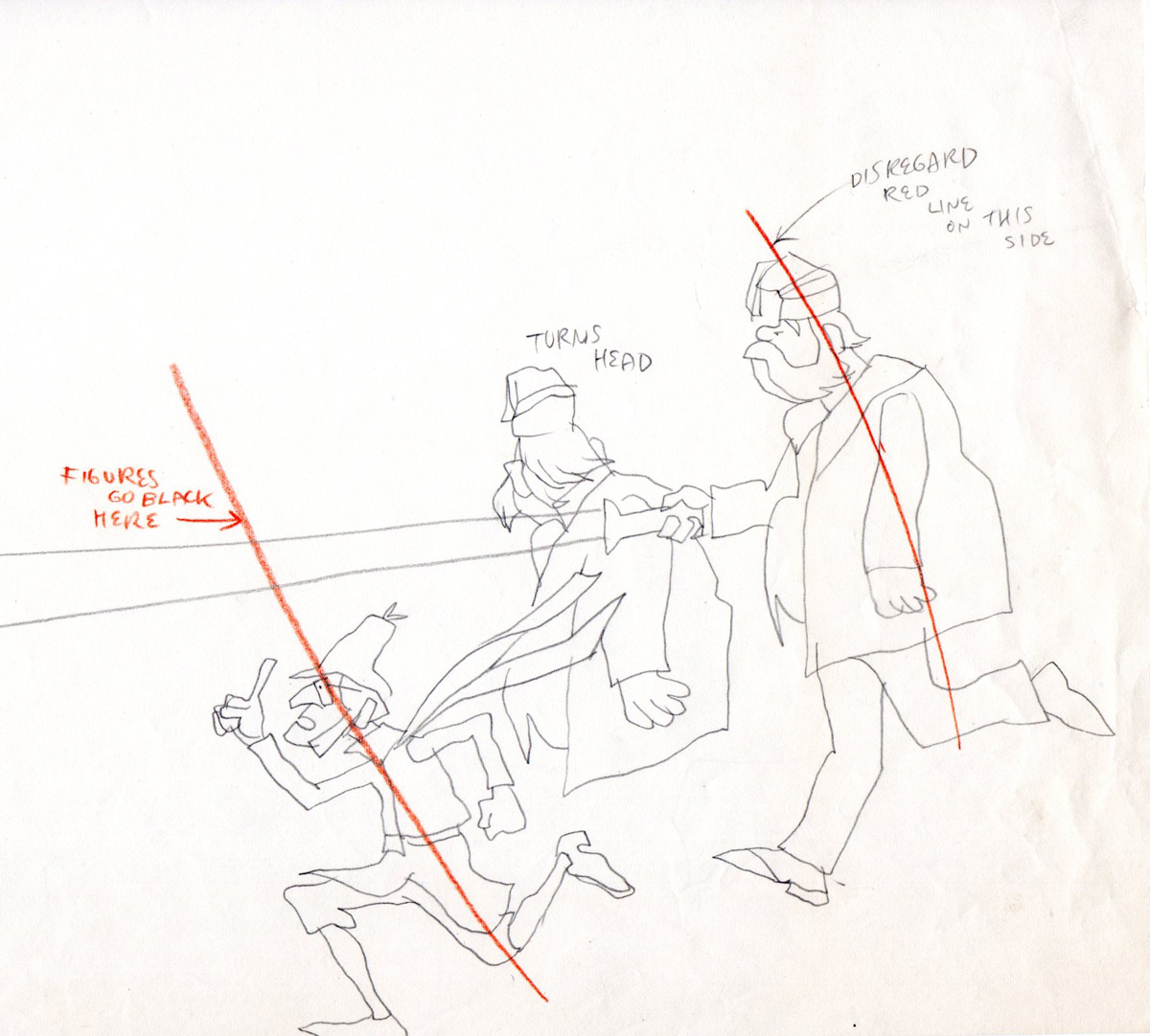
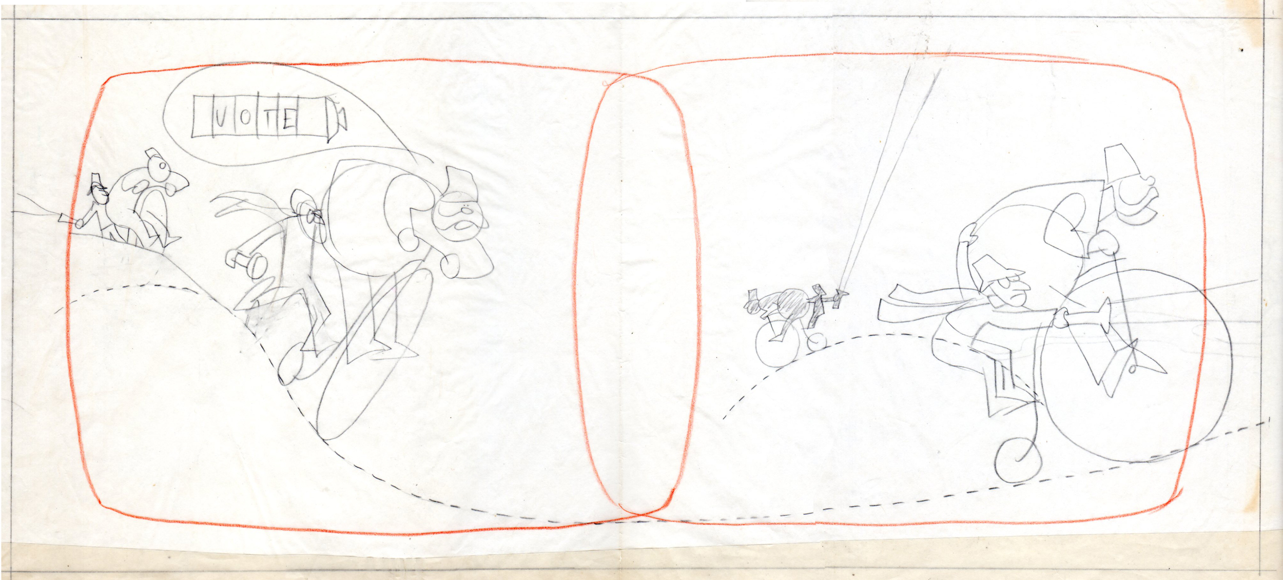
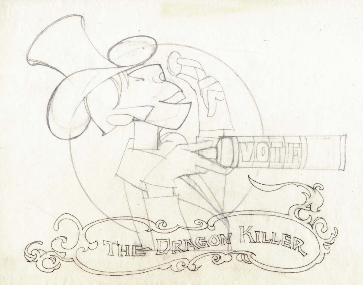
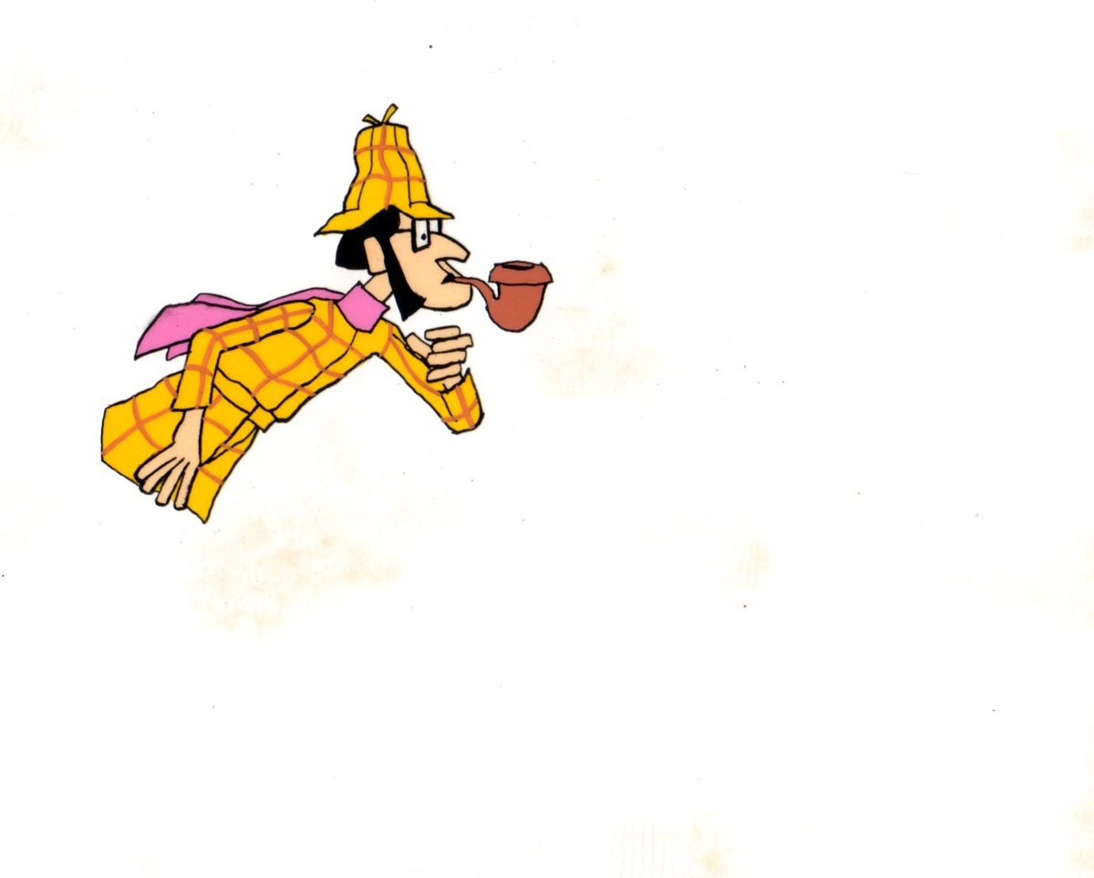
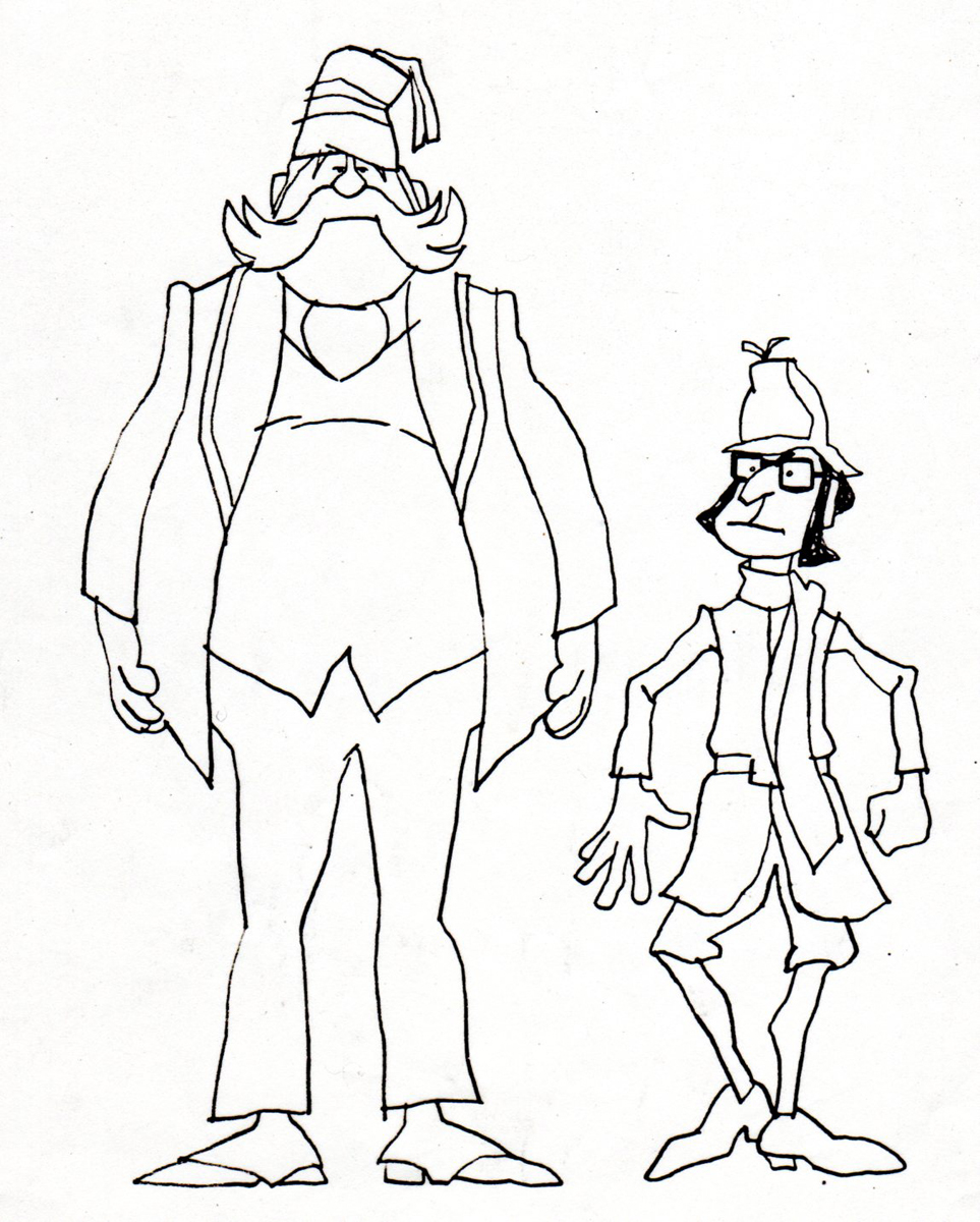
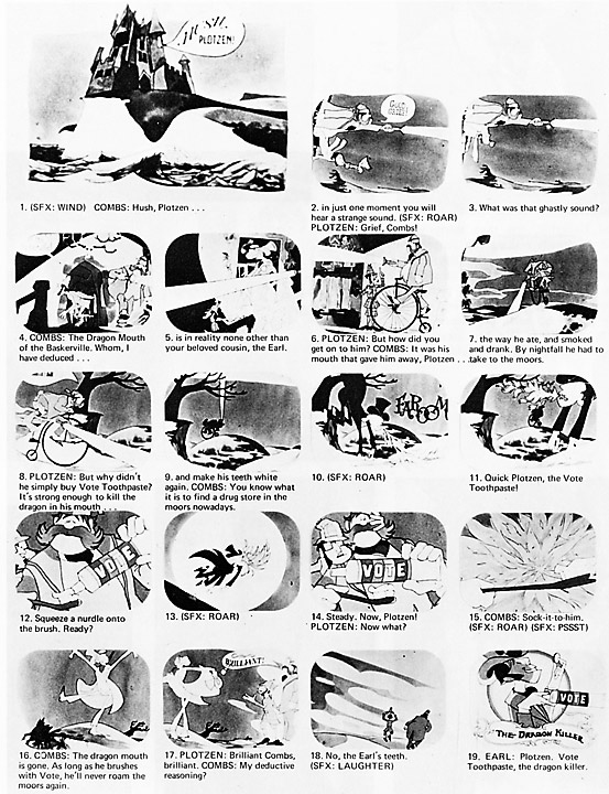
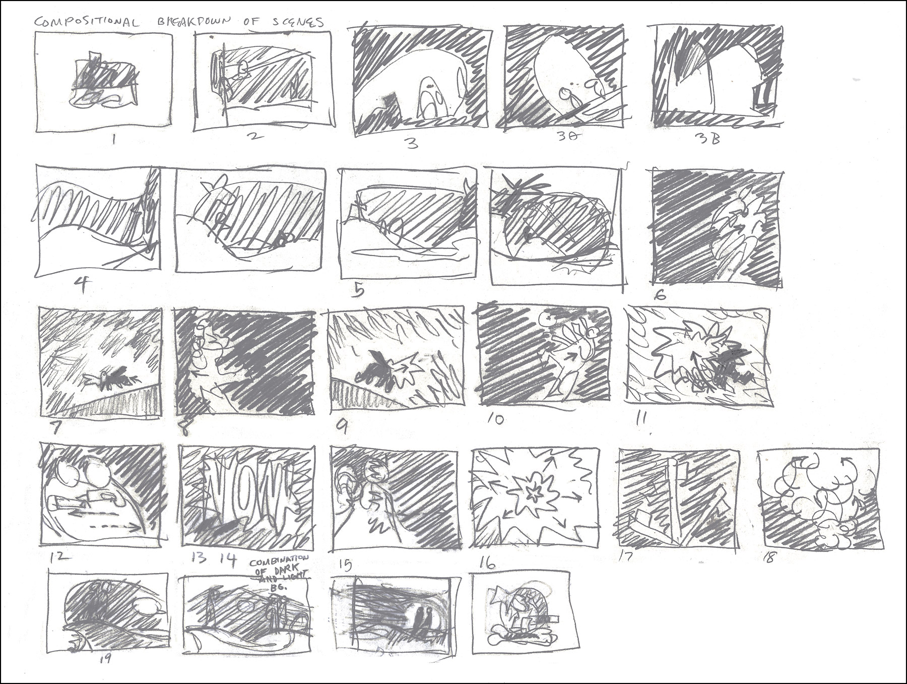
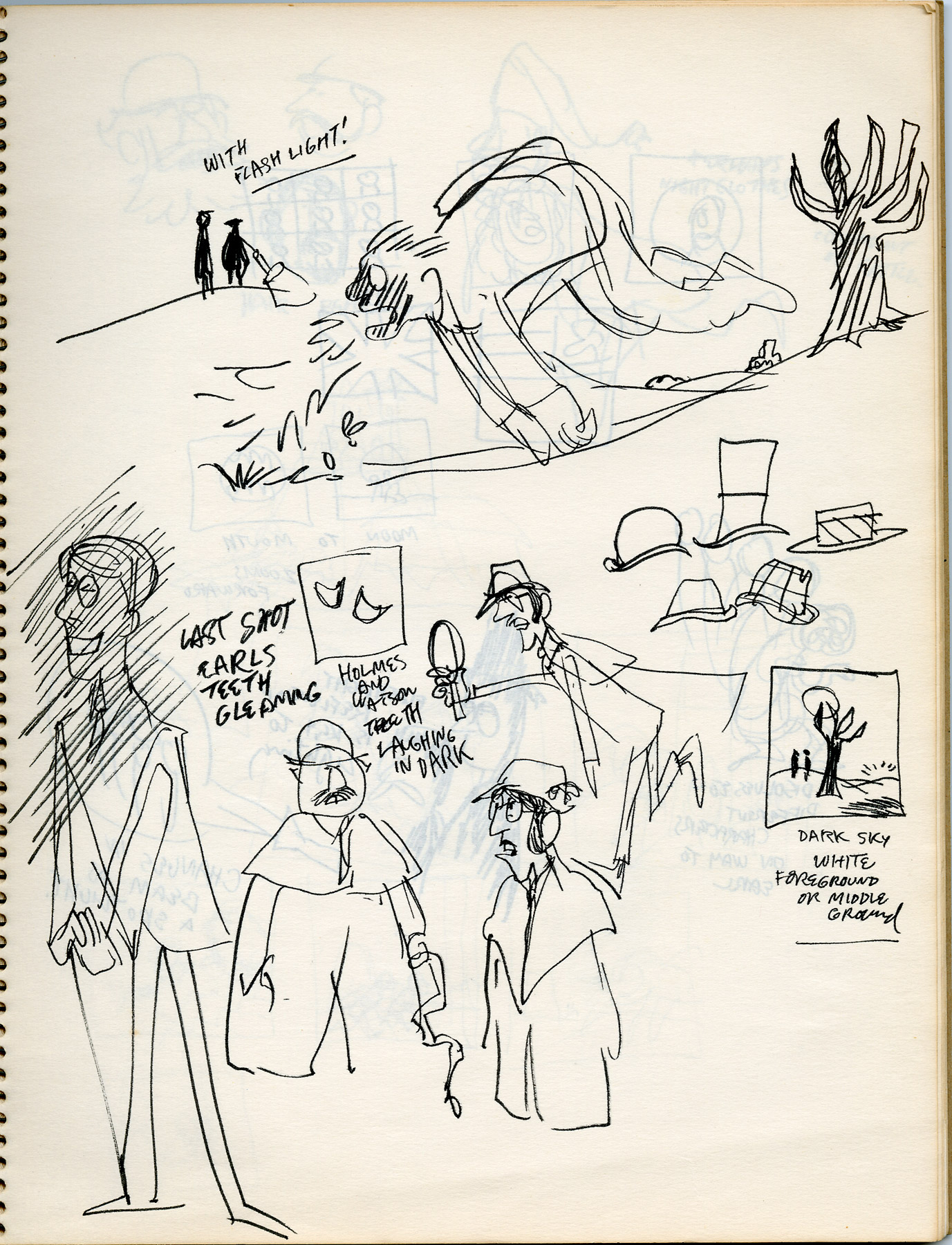
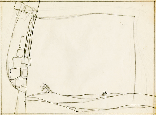
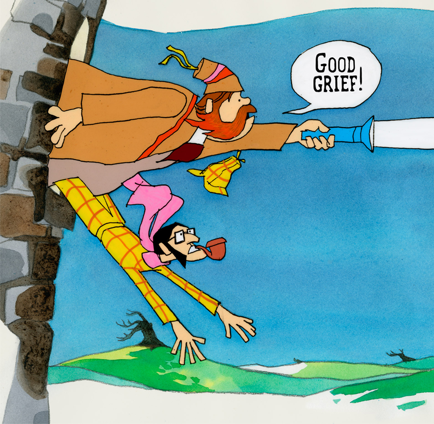
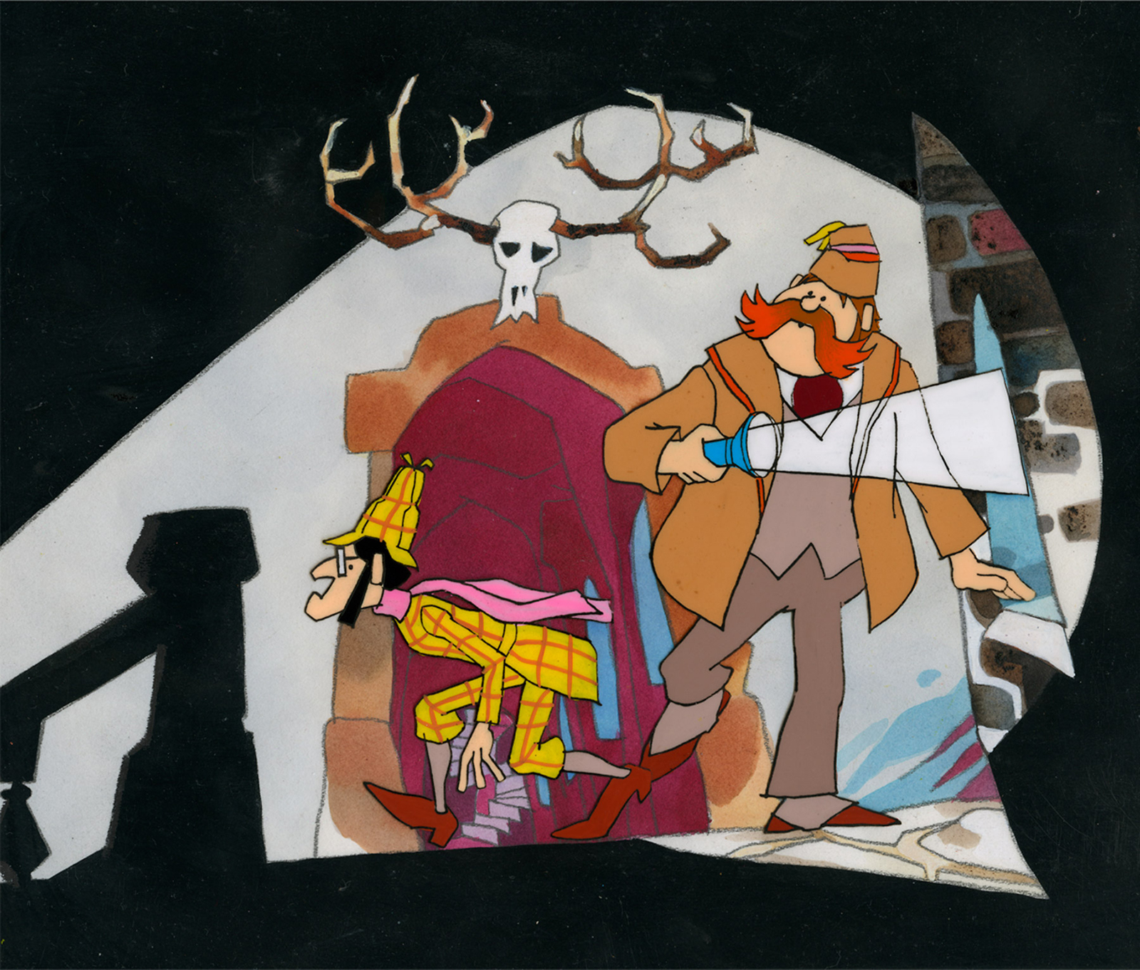
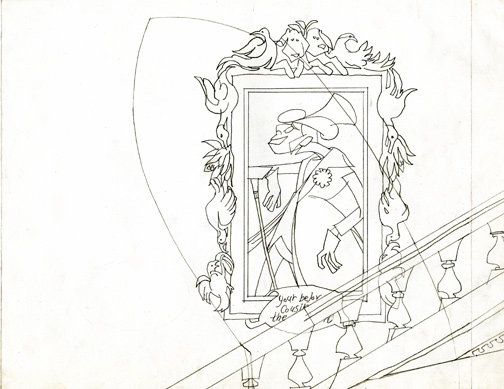
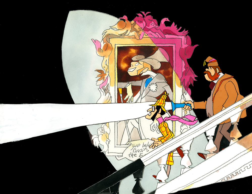
- Last week, Bill Peckmann forwarded a number of pieces of art by Rowland B. WIlson which was preliminary work for a commercial at Phil Kimmelman and Associates. The commercial, for Vote Toothpaste, was a parody of Sherlock Holmes called Combs and Plotzen. More art surfaced this week for that spot, and I thought it worthwhile to extend the post for a second part. (See Part 1 here.)
Bill Peckmann writes:
- Combs & Plotzen was the second TV commercial that print cartoonist Rowland B. Wilson designed in 1969 and his grasp of the animation production steps was truly amazing. No crash course in storyboarding, model charts, Layouts etc. was necessary. It was like he was doing it all of his life. We were in total awe.
- At that time, Rowland was always very comfortable doing his animation drawings on the paper he knew best, tracing paper. He would work up roughs on layering tracing paper panels without having the need of a light box. No pegs for him in those days.
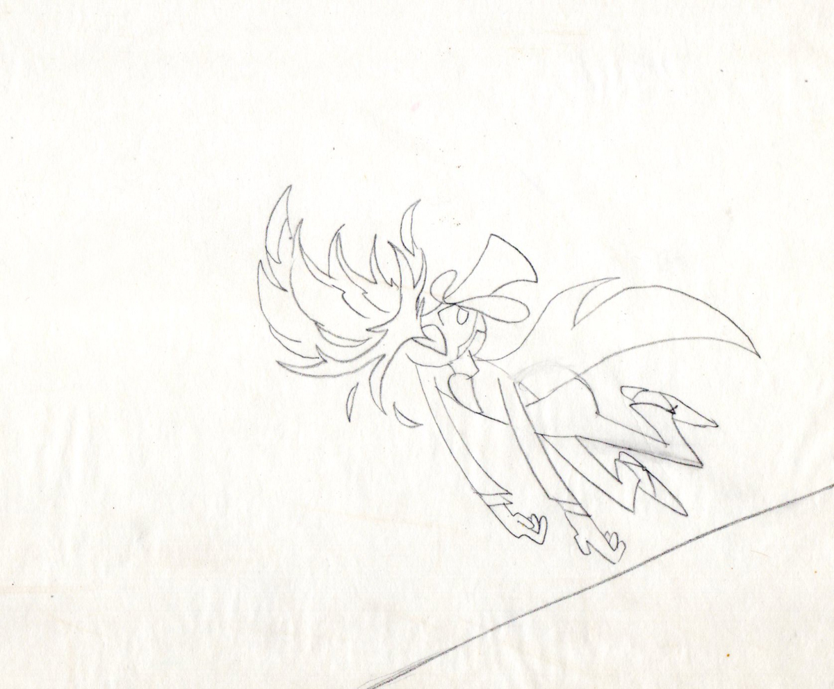
 1
1These first five drawings are Layouts by Rowland Wilson.
 2
2
 3
3
 4
4
 5
5
 6
6
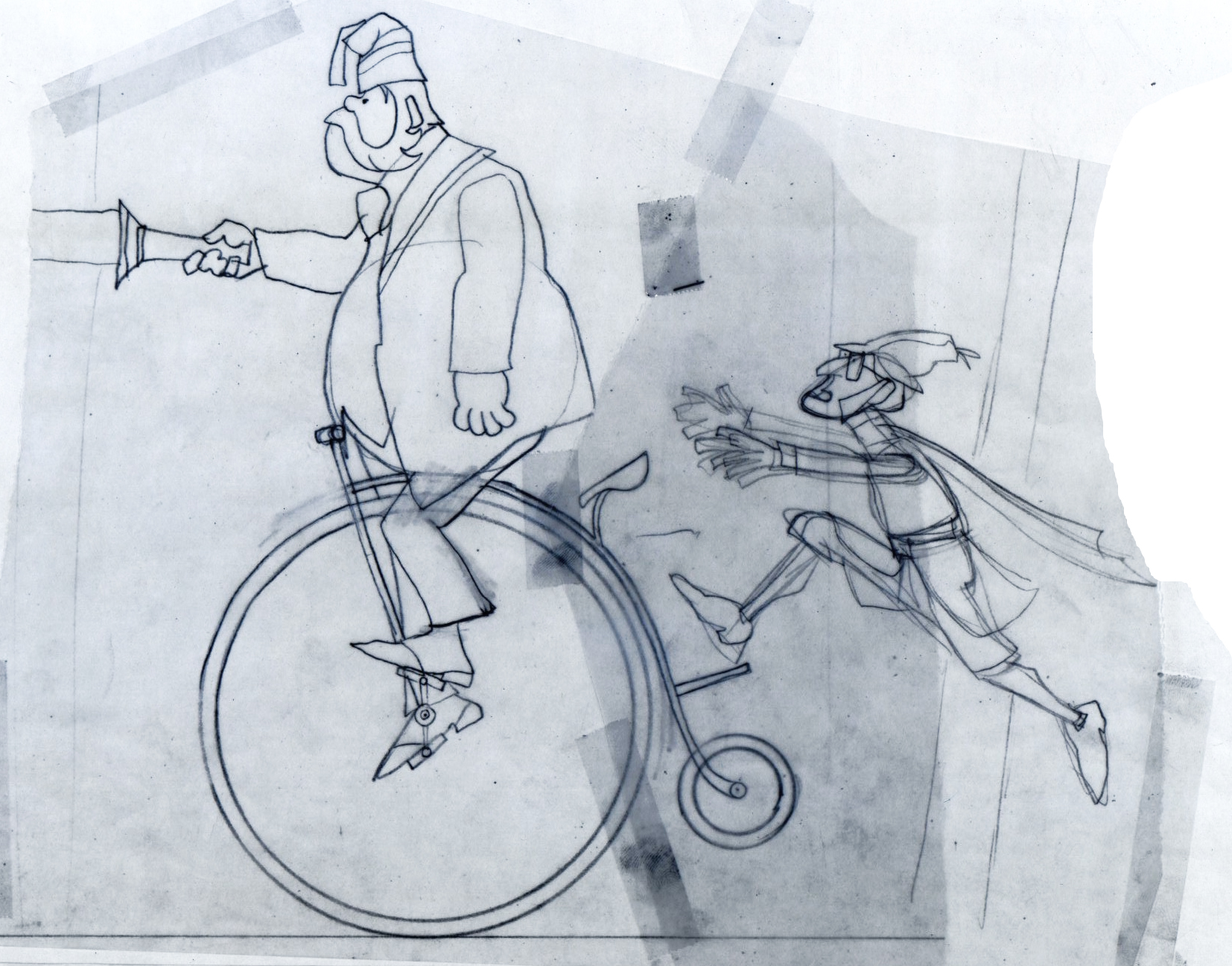
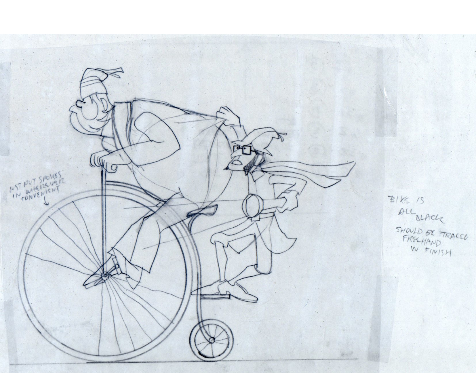
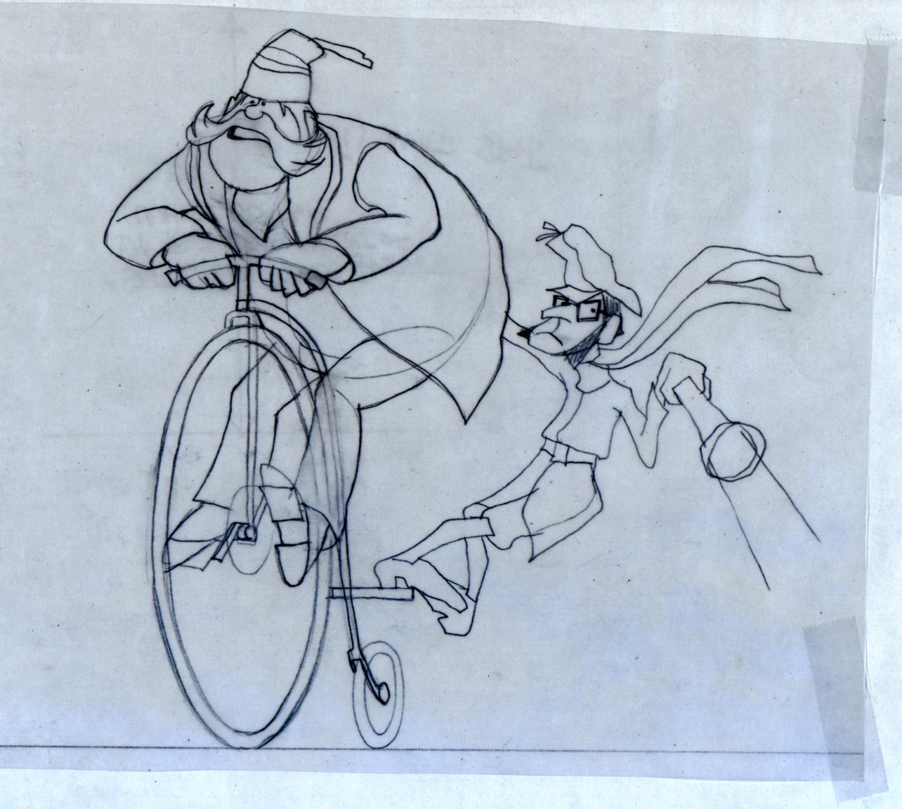
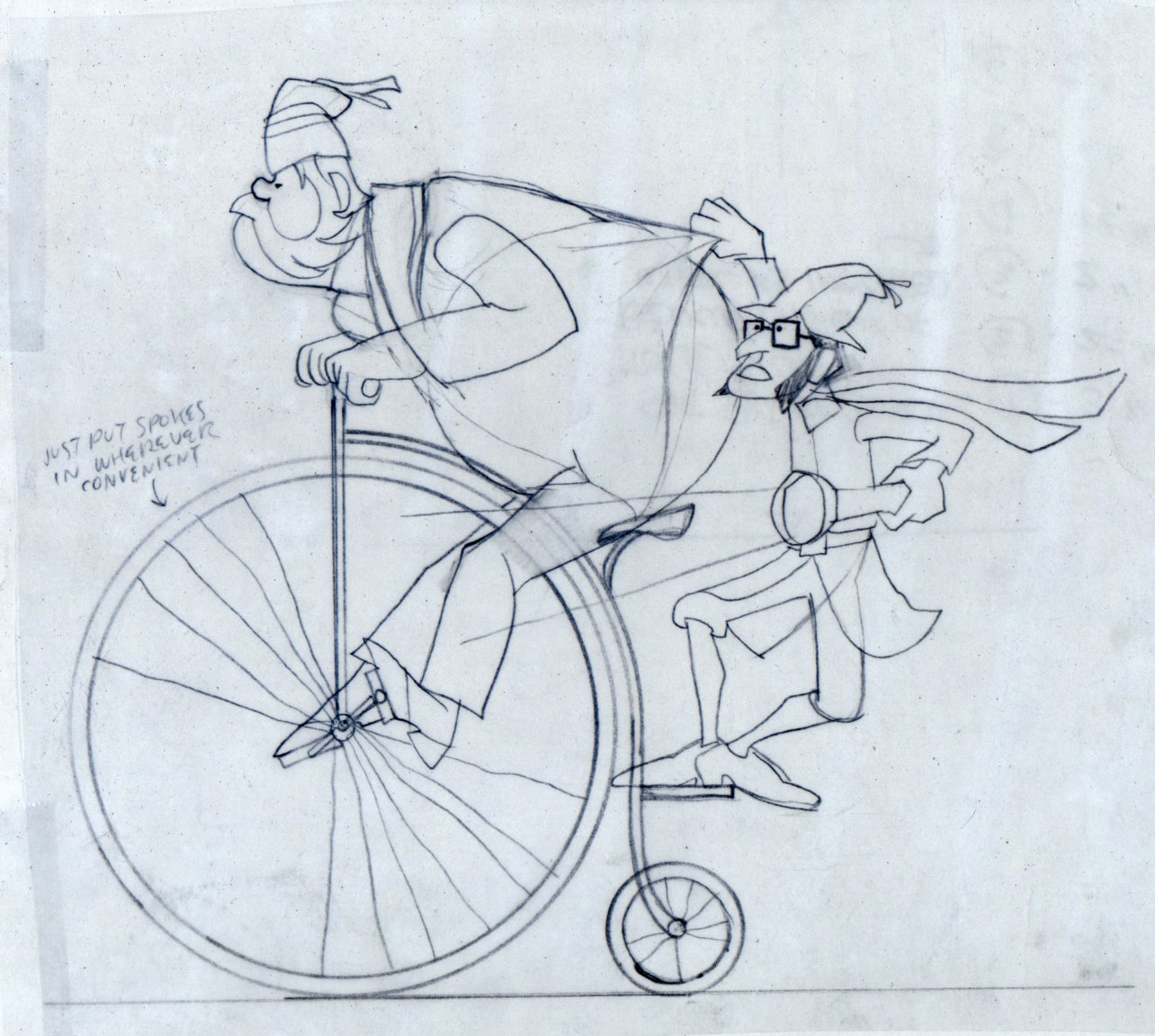
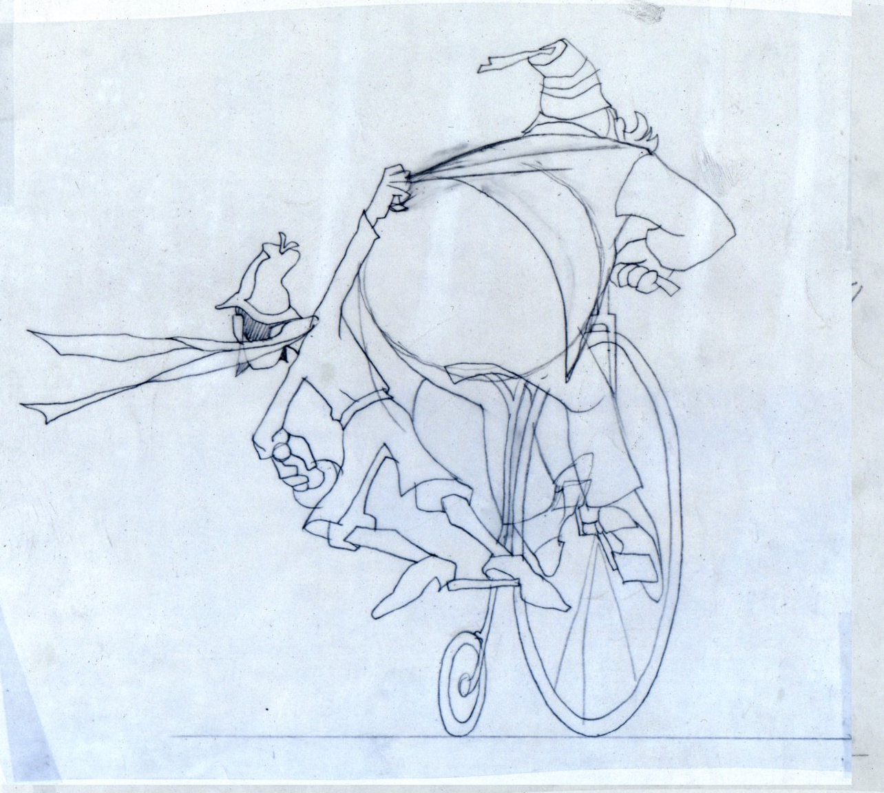
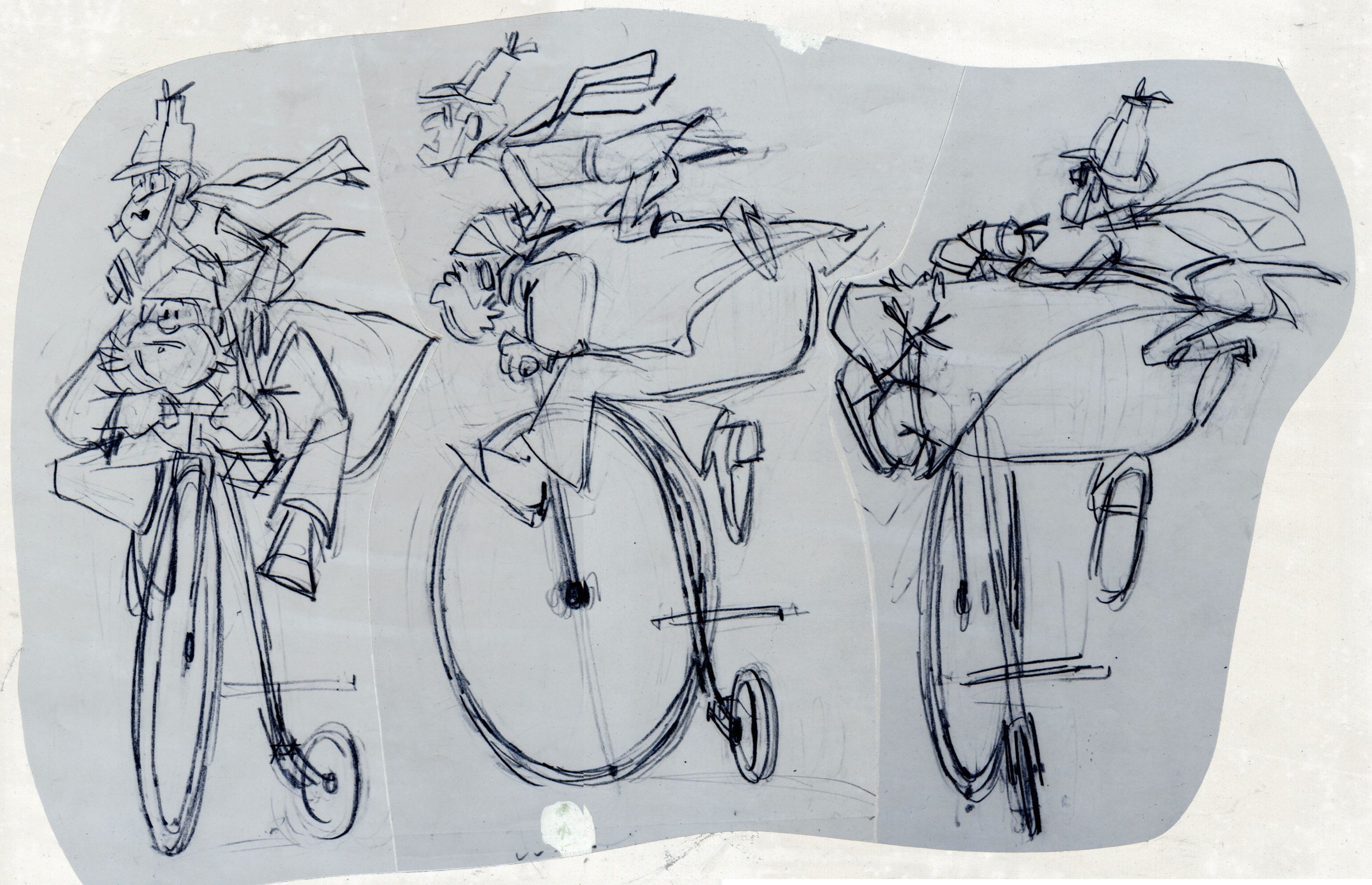
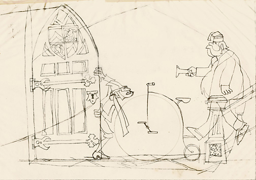
These are Jack Schnerk‘s roughs of the bicycle scene.
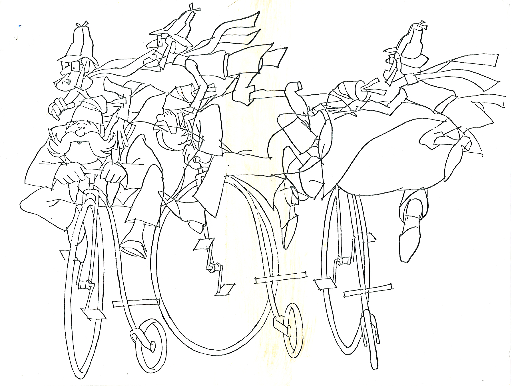
These are Bill Peckmann’s clean ups of Jack’s roughs.
 8
8
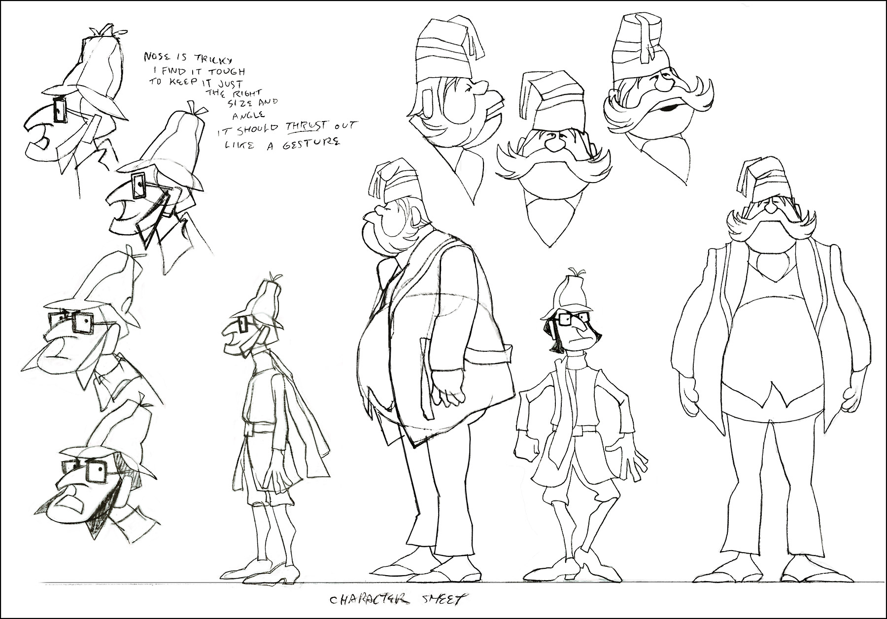
A model sheet from Rowland Wilson.
 9
9
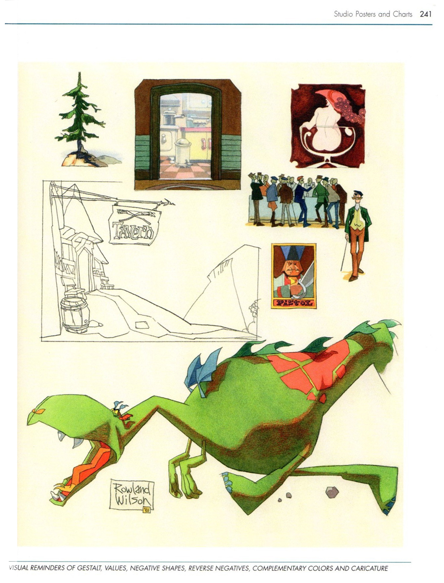
These three color sketches are in the new book,
Trade Secrets, by Rowland Wilson and Suzanne Lemieux Wilson.
 10
10
 12
12
 13
13
 14
14
Row’s rough for pan scene.
 16
16
 17
17
 18
18
A ‘Combs’ cel.
 19
19
an unpainted model cel.
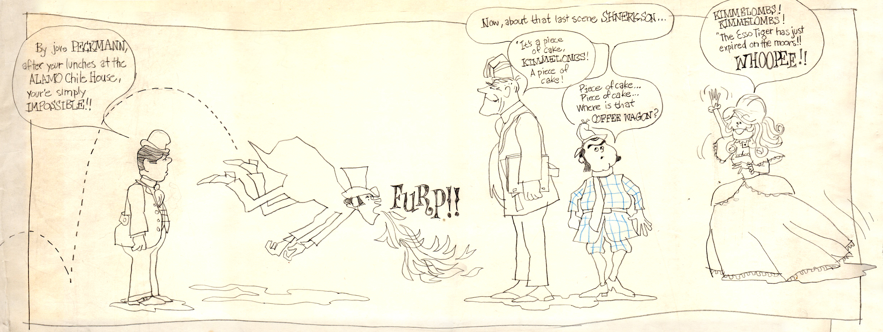
I found the original drawing I did of the crew that worked on Combs & Plotzen
way back then. It’s Vic Barbetta commenting on my lunchtime eating habits,
Jack and Phil’s anticipating the most important part of the day, the coffee wagon
bell, and Agnes hearing the good news of not having to draw anymore tiger stripes.
.
At the time that Rowland designed his Utica Club Beer ‘Mountie’ spot, he also did another U. C. Beer spot where the two adversaries were a Knight and a dragon.
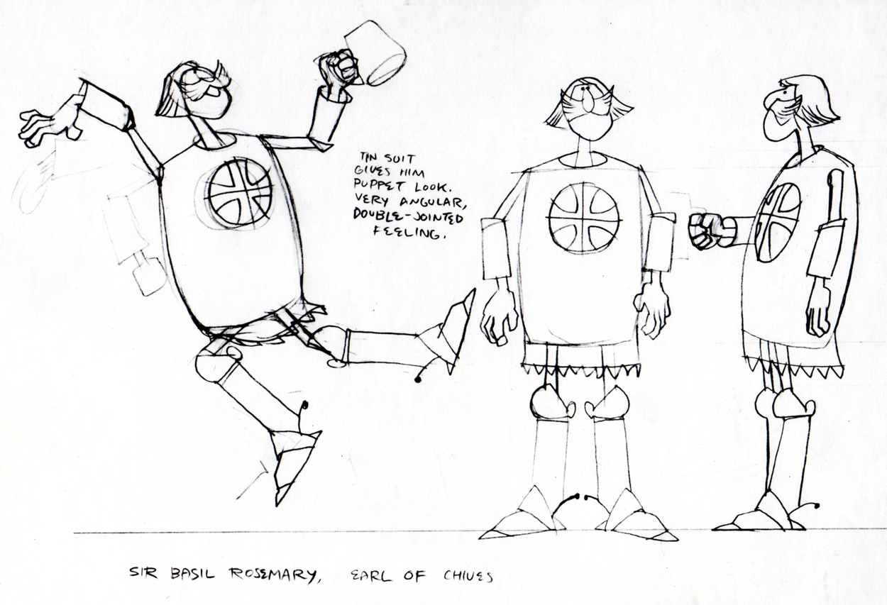
Unfortunately the only remaining piece that
I have from it is this stat of the Knight.
As for the dragon, all I can do is show you this page from
Suzanne Wilson’s ‘Trade Secrets’, where Rowland didn’t
forget his old friend from that commercial and gave him a
new coat of paint. One of his best character designs ever.
The tavern panel is a bg. from the same spot.
The Vote spot starts at 0:37 on this Jack Schnerk sample reel.
Animation Artifacts &commercial animation &Layout & Design &Models 29 Aug 2012 07:45 am
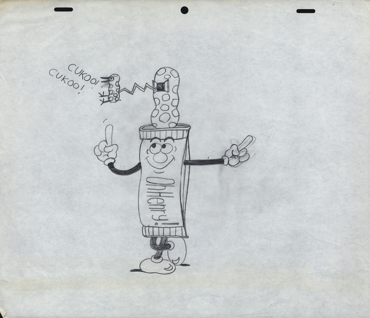
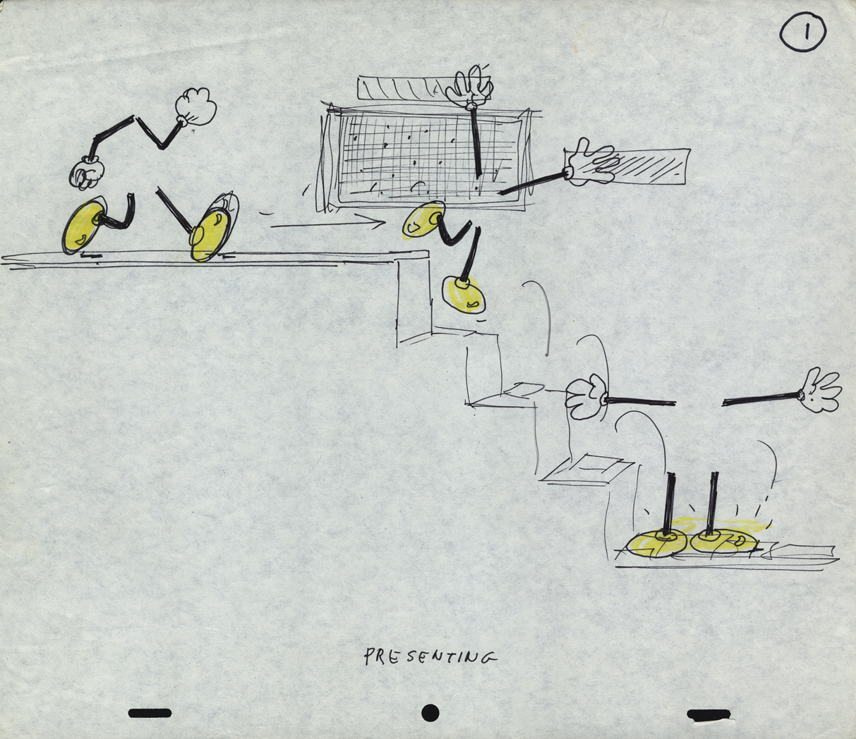
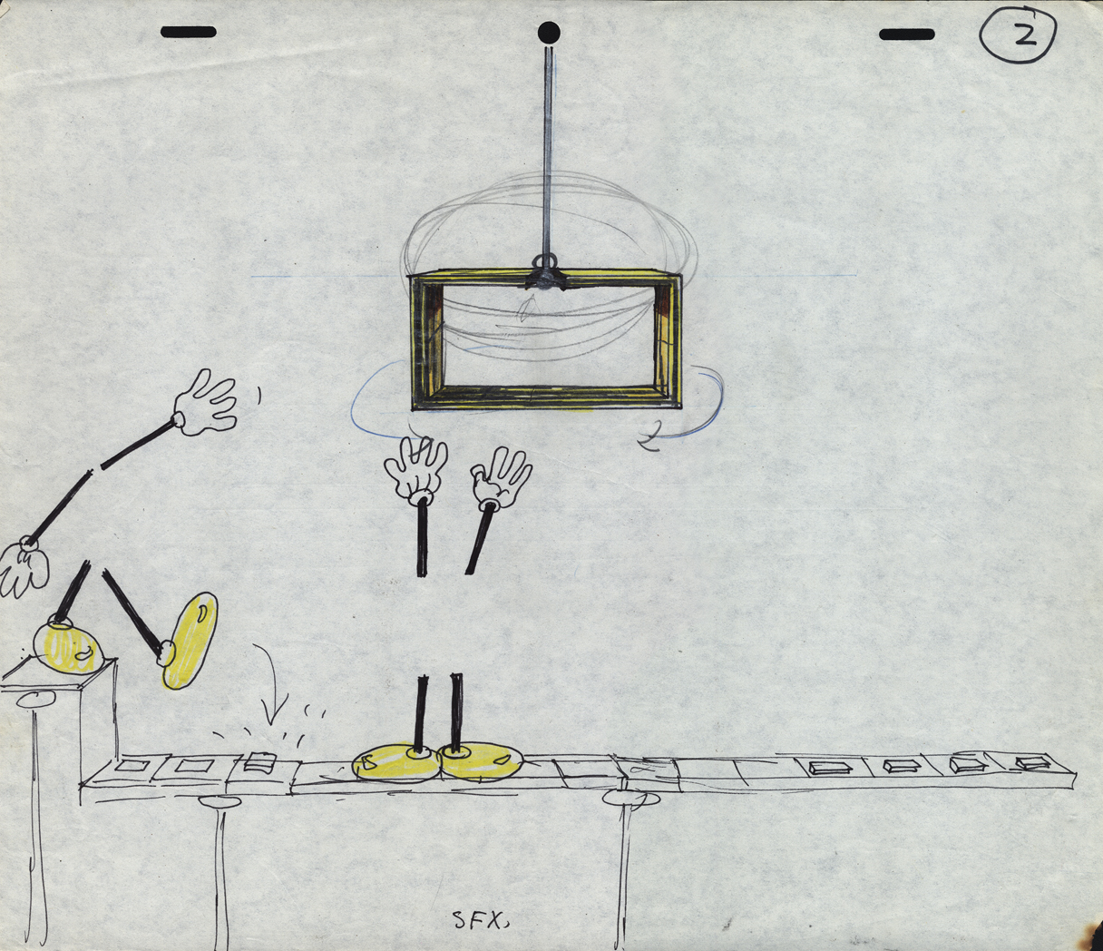
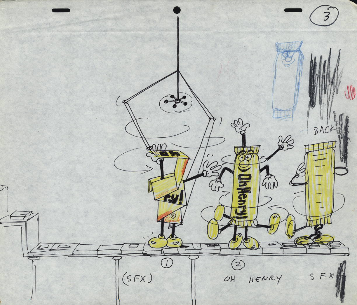
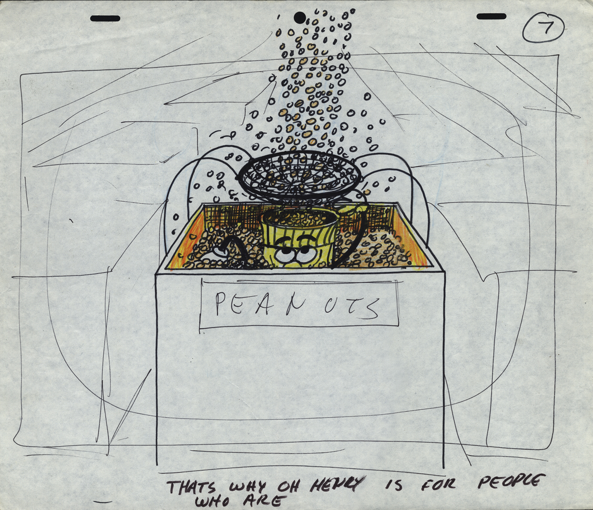
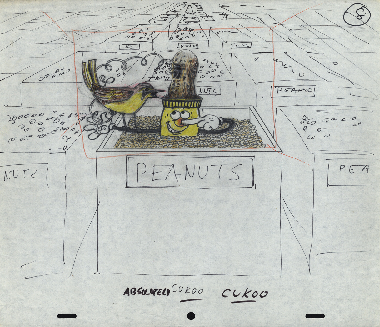
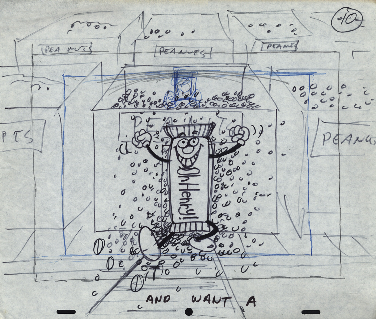
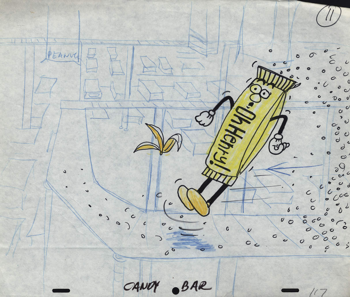
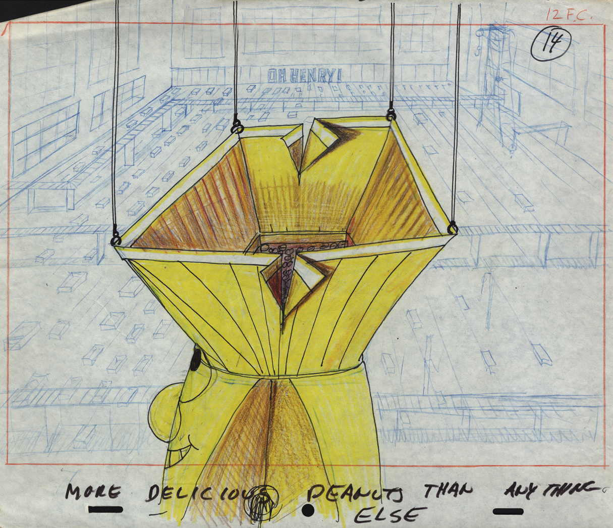
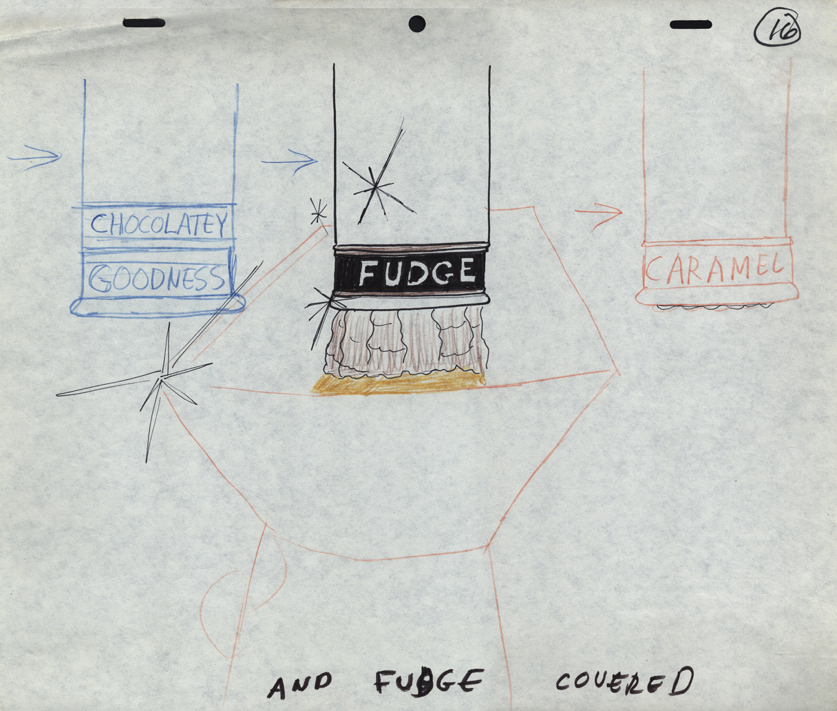
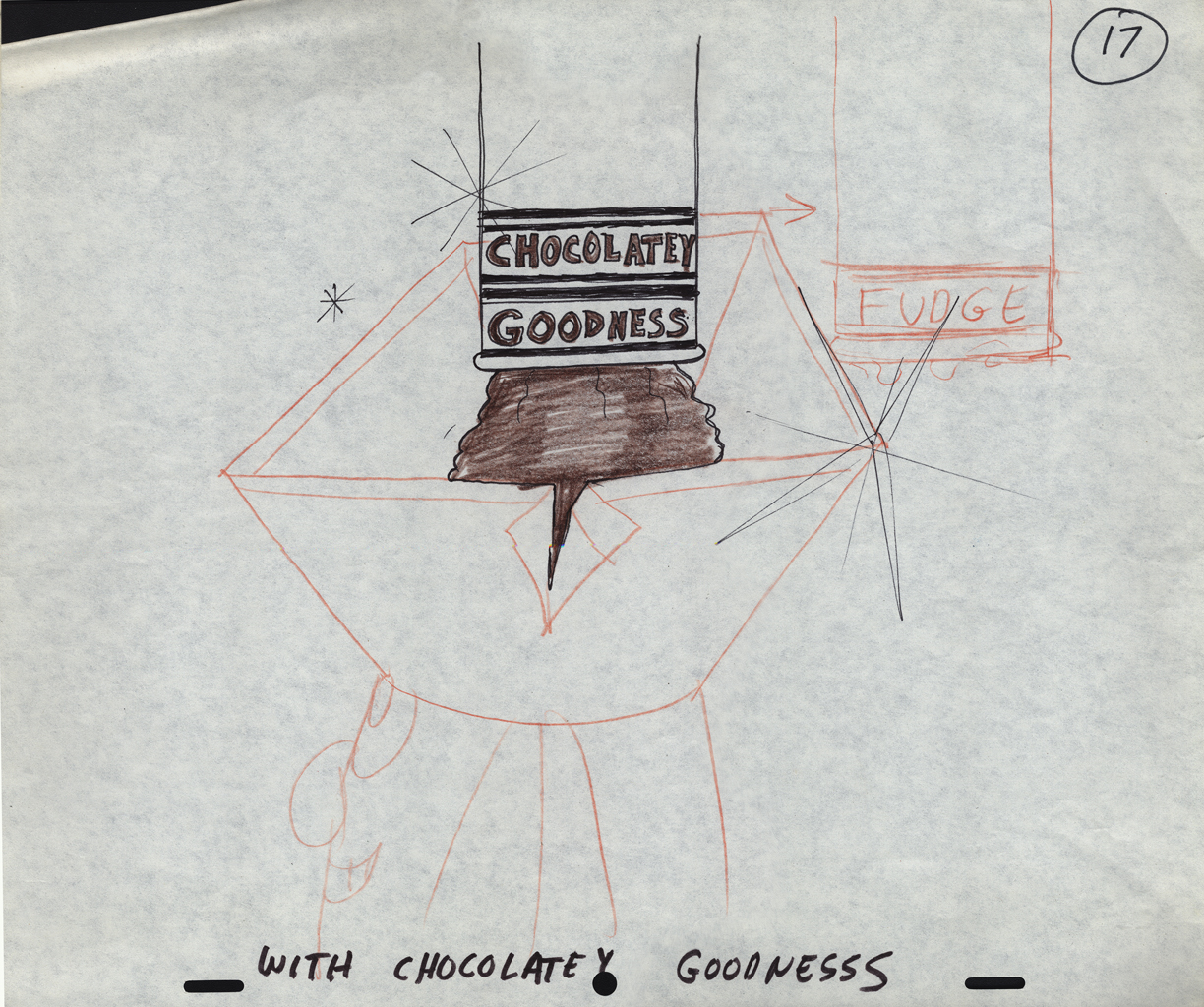
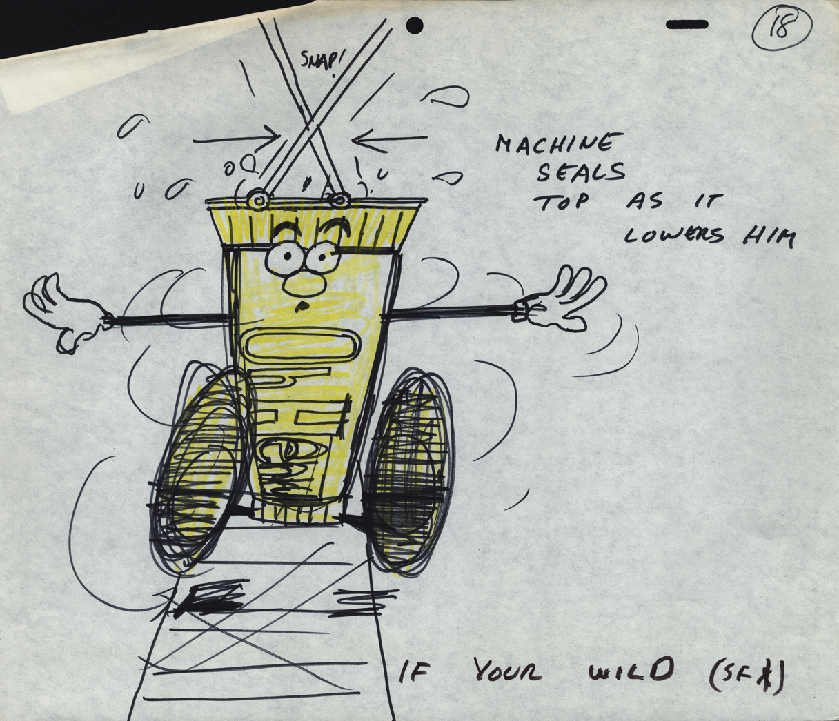
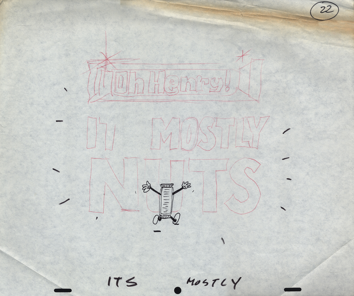
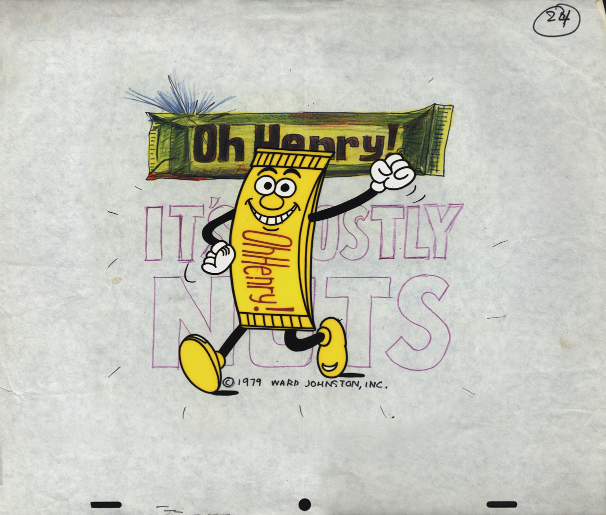
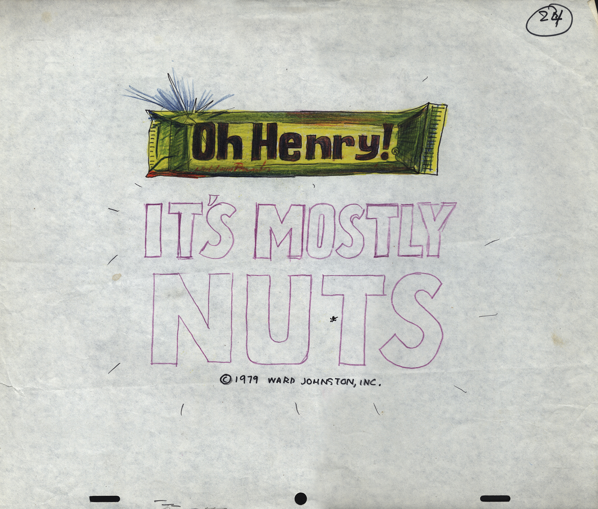
Mogubgub’s O’Henry Bar
- Sifting through the boxed archives of Vince Cafarelli‘s saved material, there are quite a few pieces of art from a number of commercials. One that stands out includes the LayOut drawings of Fred Mogubgub for an O’Henry Bar animated commercial. The spot comes from the early days of Buzzco, 1982 or 1983 when Buzz Potamkin was still the principal in the company.
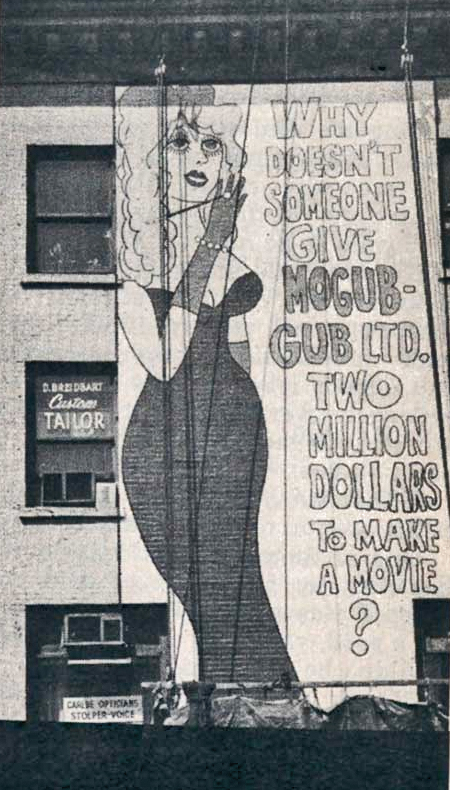 Fred Mogubgub was enough of an eccentric that I would be attracted to his artwork. (In case you’re unfamiliar with Mogubgub‘s work, here’s a four part series including his bio and some films.) I remember – as an art student in NY and desperately wanting to get into animation – the sign on 46th St and Sixth Ave: “Why Doesn’t Someone Give Mogubgub Ltd. Two Million Bucks to Make A Movie?” I asked Fred if he’d had any response. He said that ABC contacted him, and he gave them a script that was about a thousand pages big. It was about the contents of an ashtray. The characters were cigarette stubs, ashes and matches. To illustrate the script, he’d attached some used butts and matches within. They didn’t give him the money; you might have guessed.
On Blechman’s The Soldier’s Tale, there was a PT section of the animatic that Fred had done. We had to prepare this for a big screening for PBS trying to sell it for Bob. To get it into color, Fred and I would literally color the film, itself. He started at the head of the scene and I started at the end. We met in the middle. That piece of film had a life that was just too great. It couldn’t retain what we had done when it went to completion. Very exciting work and a fun afternoon coloring some footage with Fred.
Here are the Lay Outs Vinnie had saved for the past 30 or so years:
Our Lead Character – a model
 1
1
There seems to be no rhyme or reason
as to when things are top or bottom pegged.
 2
2
The pegs shift from drawing to drawing.
 3
3
 7
7
 8
8
 9
9
 10
10
 11
11
 14
14
 16
16
 17
17
 18
18
 22
22
 24
24
A cel setup.
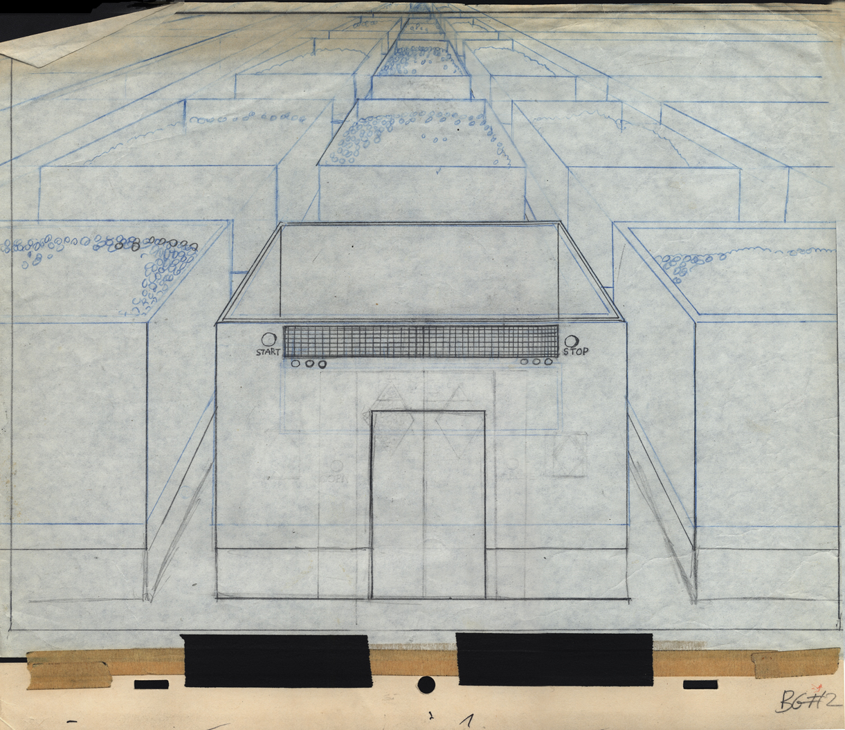
Bg LO 2
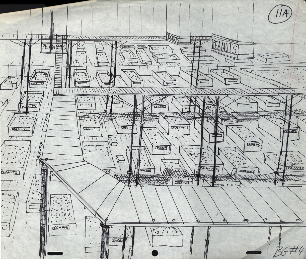
Bg LO 11
Bg LO 24
Animation Artifacts &Bill Peckmann &commercial animation &Illustration 24 Aug 2012 05:05 am
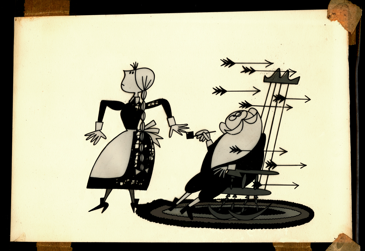
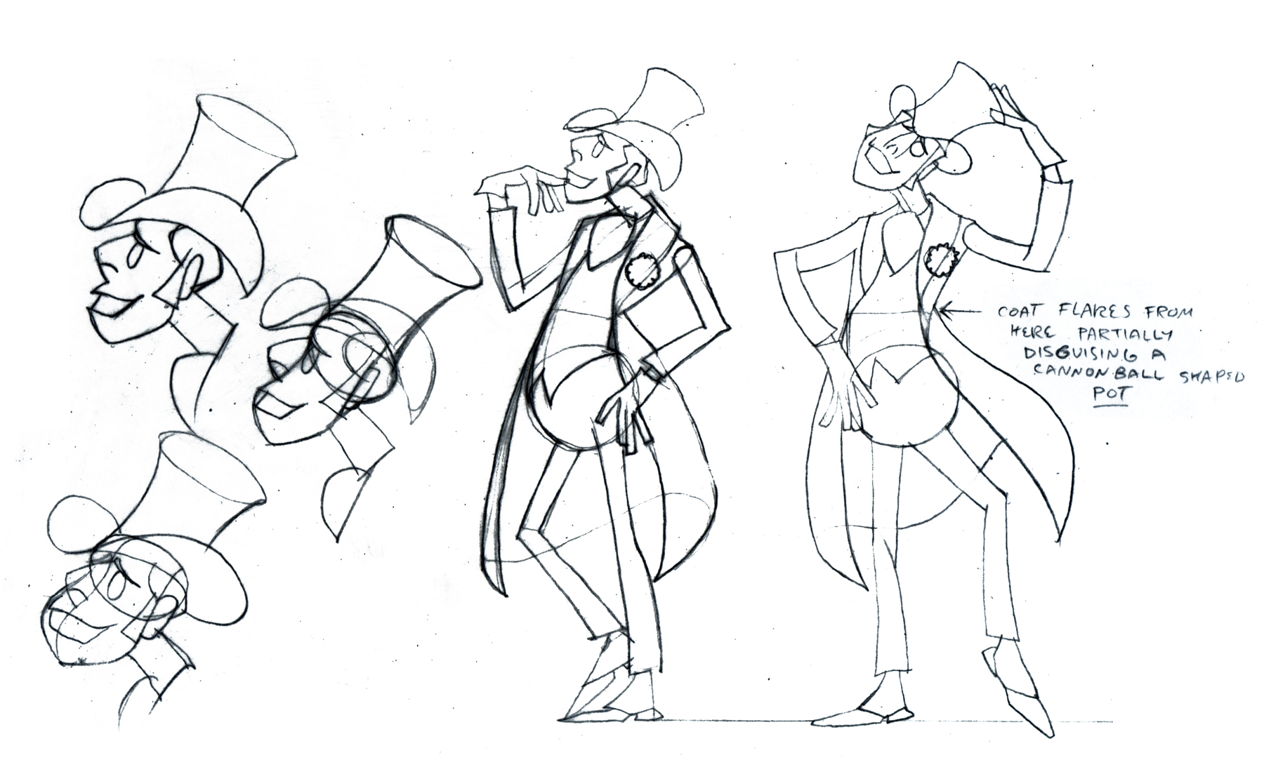
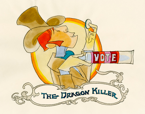
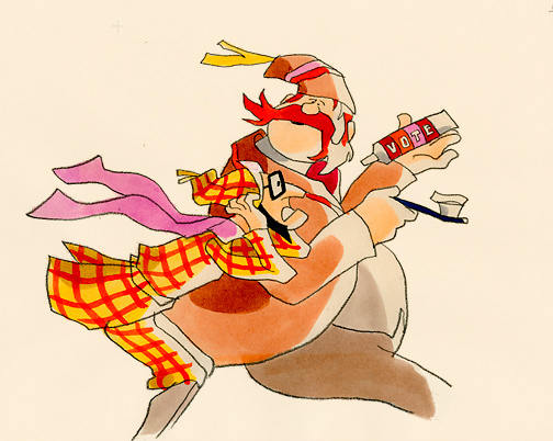
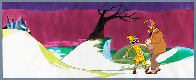
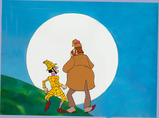
Rowland Wilson’s Vote Toothpaste
-If you’re a brilliant designer, you get there by doing the work that’s necessary. If you’re as great as Rowland B.Wilson was, you take the opportunity of a fine commercial spot, and you research it, plan it, and sketch it out. That’s just what Rowland did with this spot for Phil Kimmelman and Ass. back in the 70s. Vote toothpaste had a gem featuring “Plotzen” and “Coombs”. They just look like Sherlock and Watson.
Thanks to Suzanne Wilson, here’s the prep work Rowland did for this commercial. Many thanks to Bill Peckmann for getting it to the Splog and for additional artwork.
 1
1
 2
2
 3
3
 5
5
 6
6
 7
7
model sheet
 8
8
 9
9
The characters turn 180º in this animation model.
This was animated by Jack Schnerk and cleaned up by Bill Peckmann.
 12
12
 13
13
B&W BG Layout for the color image to follow.
 14
14
 15
15
 16
16
B&W Bg Layout for the following image.
 17
17
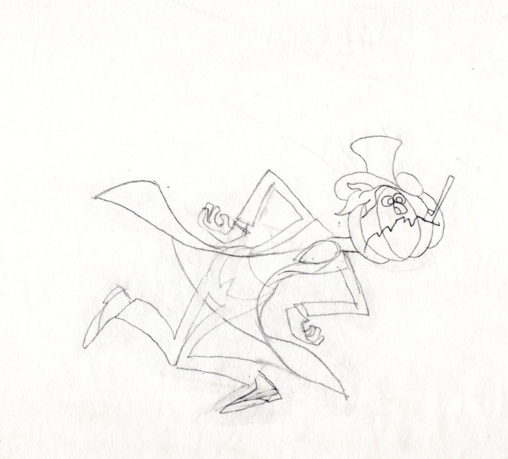
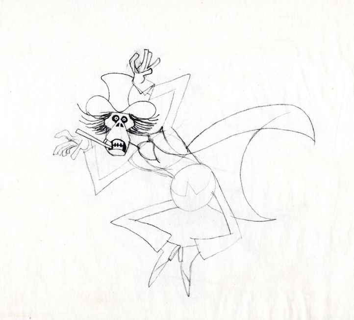
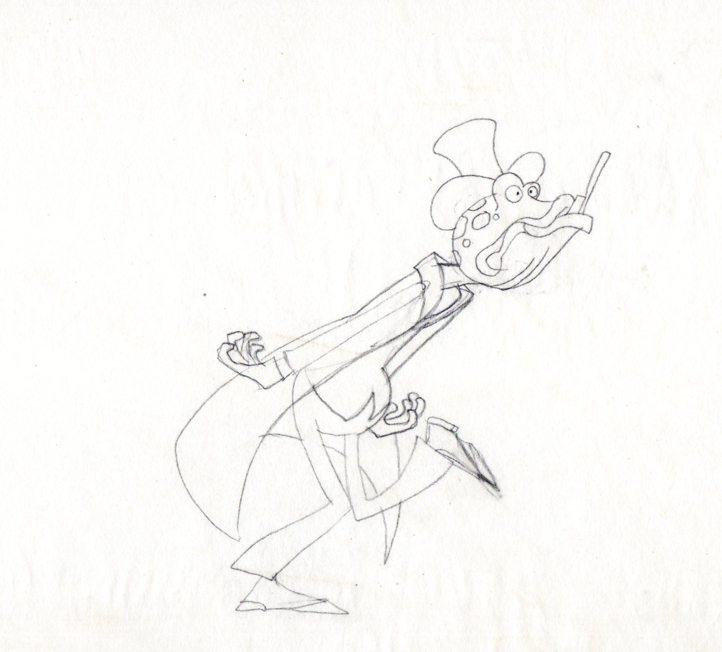
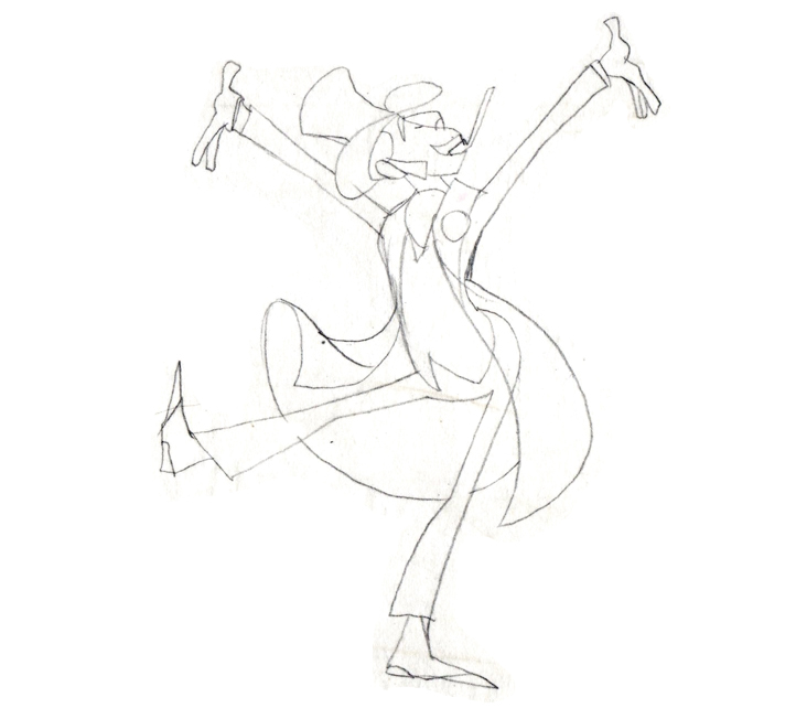
Finally, here are some rough sequential drawings that Rowland did
for a sequence where the villain transforms via Vote toothpaste.
The object in his mouth is a toothbrush with toothpaste on it.
 1
1
 3
3
 4
4
 5
5
 6
6
 7
7
 8
8
The Vote spot starts at 0:37 on this Jack Schnerk sample reel.
