Category ArchiveBill Peckmann
Bill Peckmann &Comic Art &Illustration 20 Sep 2012 05:24 am
Conan from Toth – 2
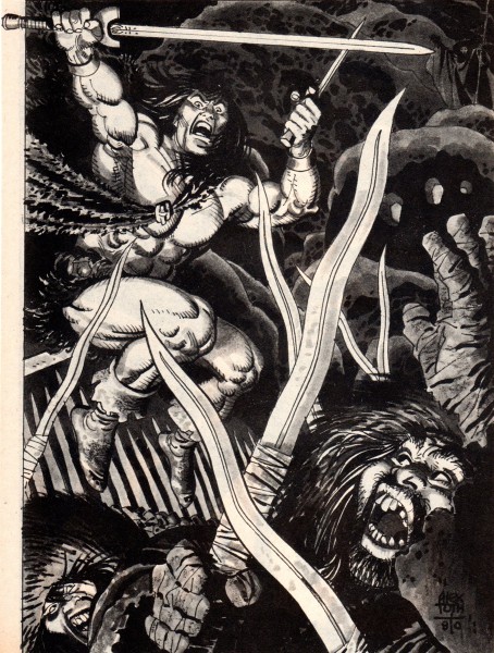
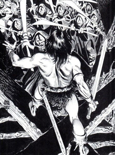
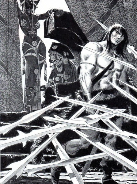
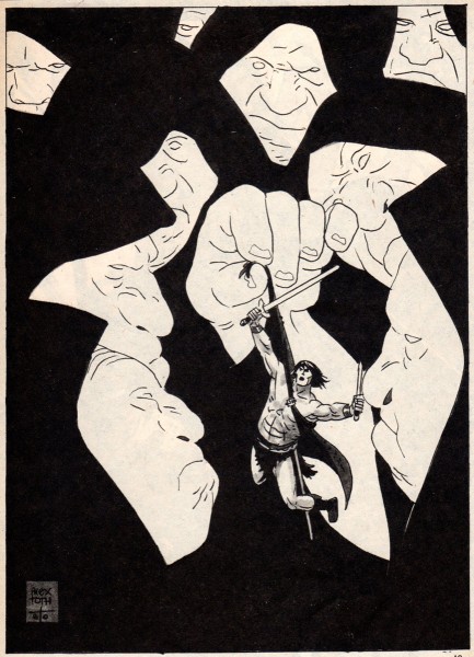
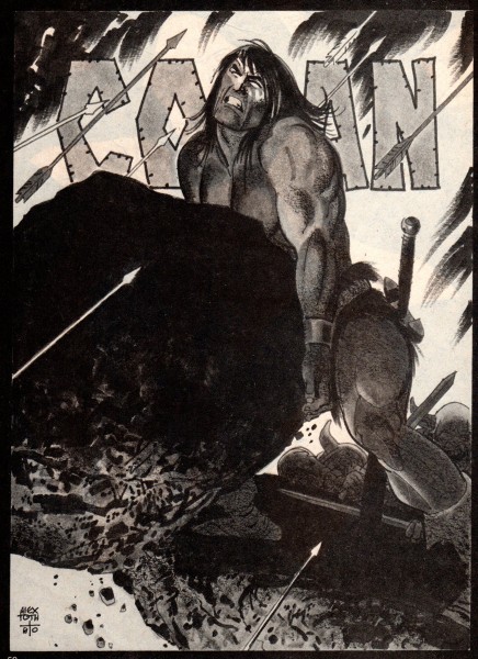
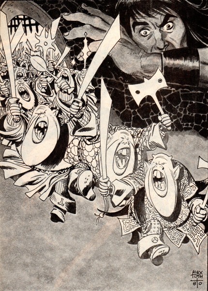
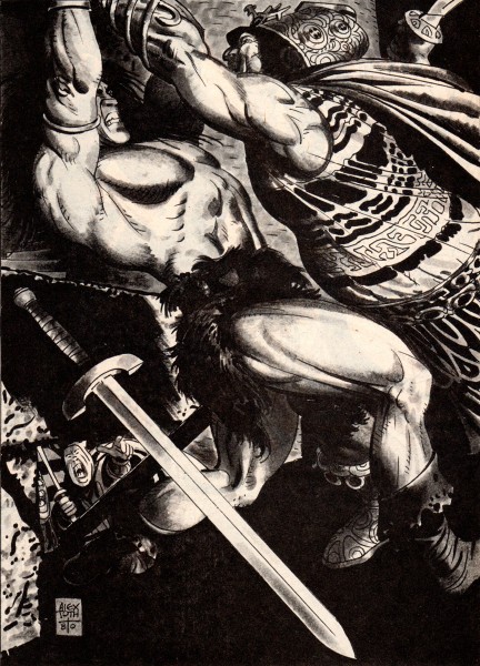
- Bill Peckmann offers a bevy of beautiful Alex Toth illustrations for Conan the Barbarian. Here are Bill’s comments for these incredibly fine illustrations:
-
I haven’t seen many of these Toth illustrations on the Net, and I thought maybe the Toth fans out there might enjoy these.
Here is Alex Toth in the early 1980′s taking a stab at the Sword and Sorcery genre and doing a ripping job of it. These are single page illustrations from Marvel’s black and white magazine, “The Savage Sword of Conan“. Alex is at the top of his game; design and drawing leave nothing to be desired. the assignment held his interest long enough so we came away the winners with these nine examples.
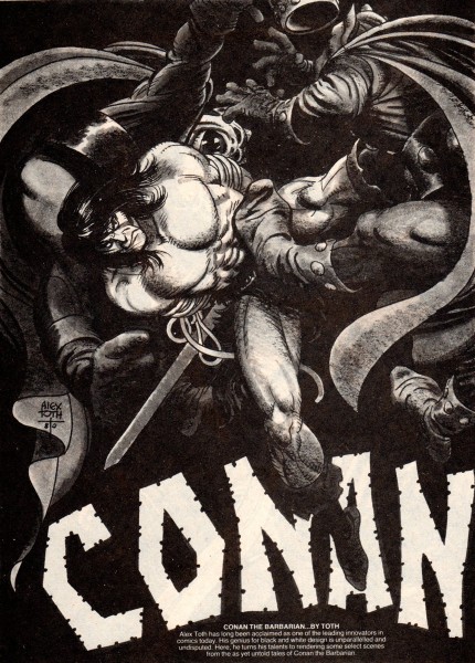 1
1
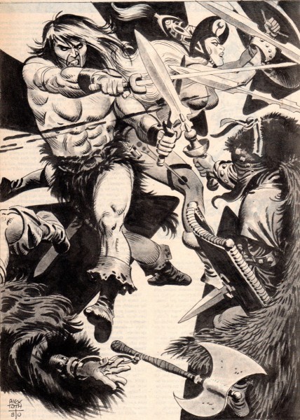 9
9
That was the last of Alex’s Conan. He did a total of
10 illustrations for Marvel’s Conan, so we have all but one.
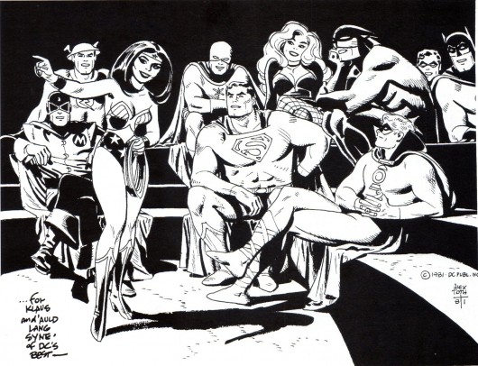
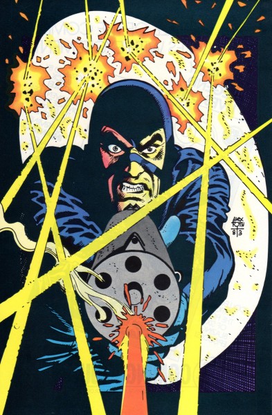
Here is a 1981 drawing of super heroes that Alex dedicated to Klaus Strzyz,
a fan, a friend and interviewer of Alex’s. The drawing was then made into a
handsome cover on Roy Thomas’ “Alter Ego’s” fanzine tribute to Toth in 2006.
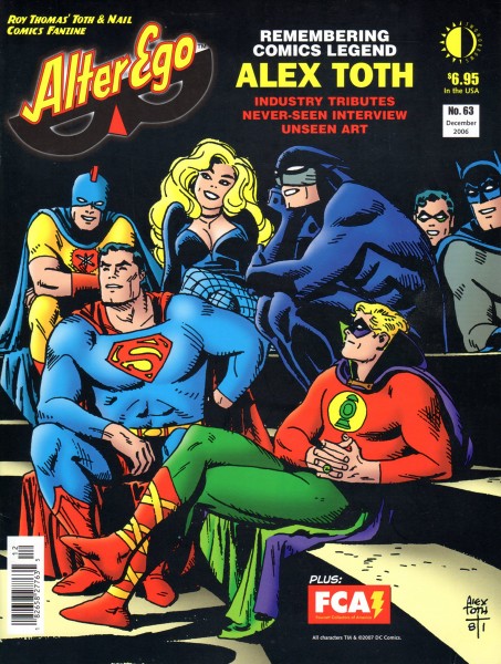
This is the final cover for Roy Thomas’ 2006 “Alter Ego’s” tribute to Toth.
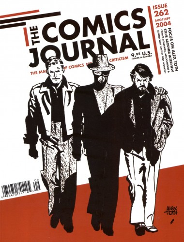
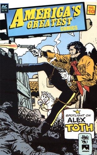
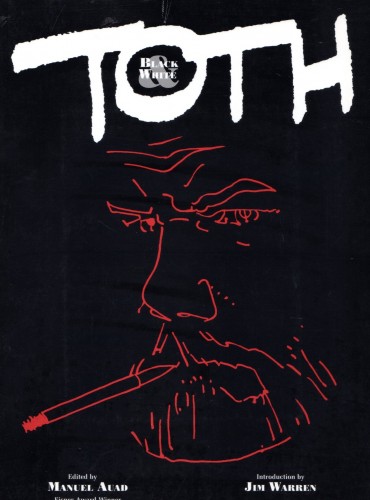
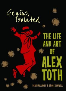
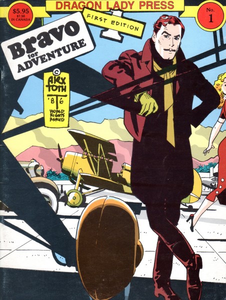
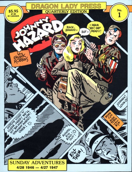
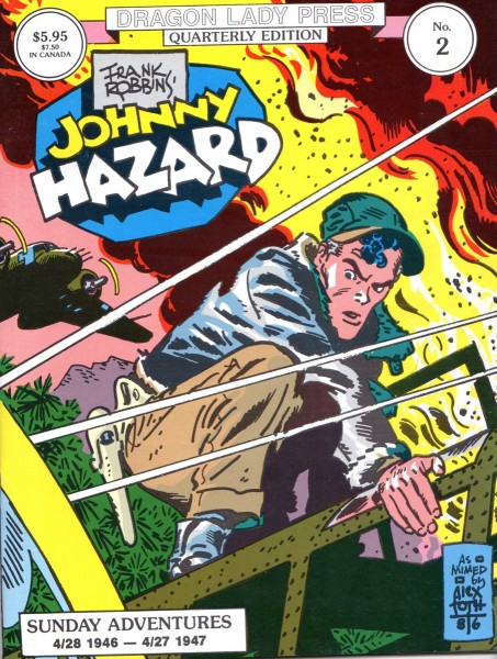
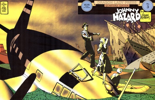
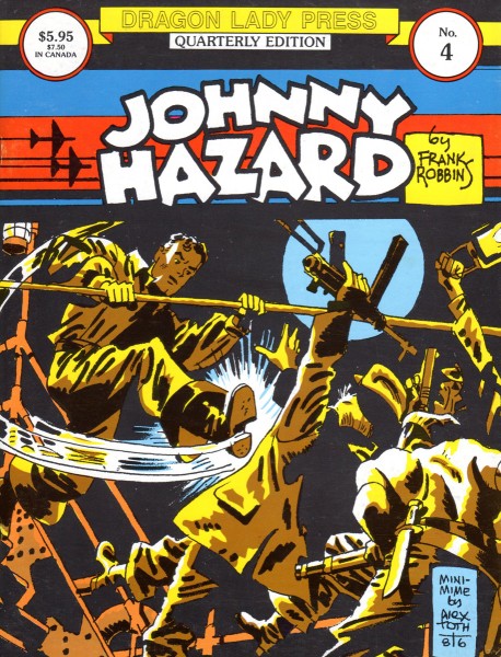
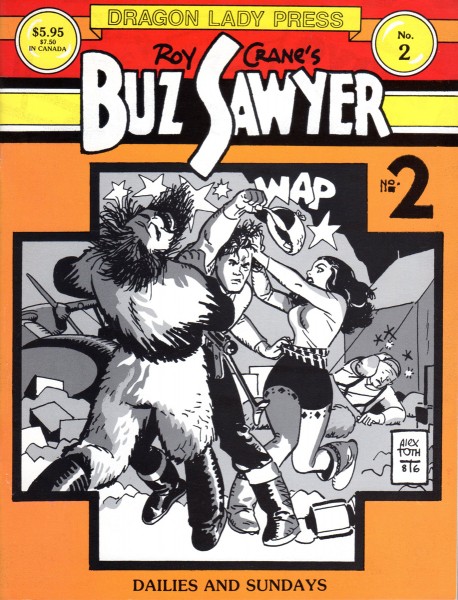
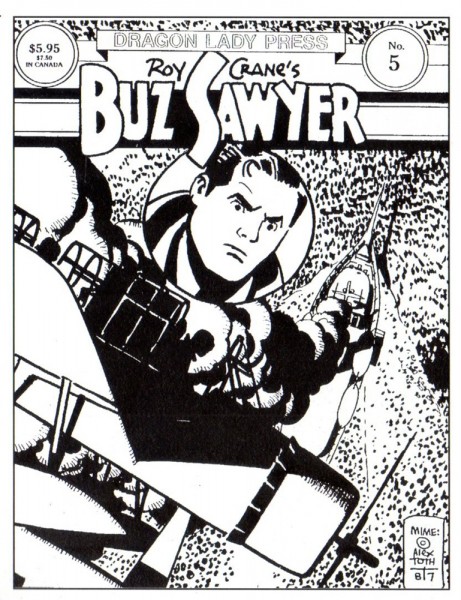
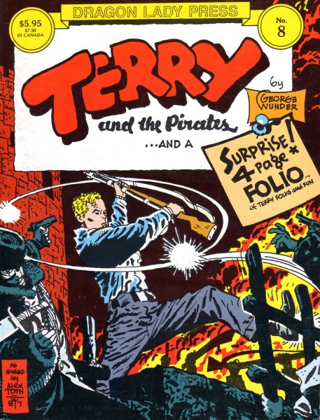
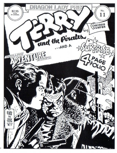
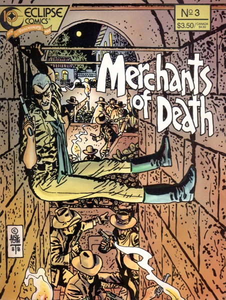
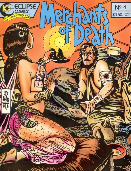
These are the covers of books and magazines that have collected the words and work of Alex. Hopefully for new fans they still might be available somewhere on the net or in used bookstores.
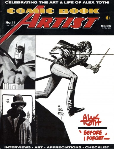 1
1
The next two excellent books were authored and published by Toth fan and friend Manuel Auad. (Manuel was also responsible for the great, recent Robert Fawcett book and the forthcoming (October) book on illustrator Albert Dorne. The illustrator who still remains Jack Davis’ biggest idol!)
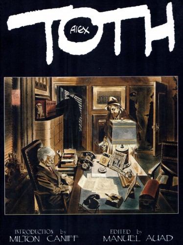 4
4
Tipped in autographs for “Alex Toth: Black & White”.
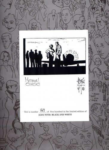 6
6
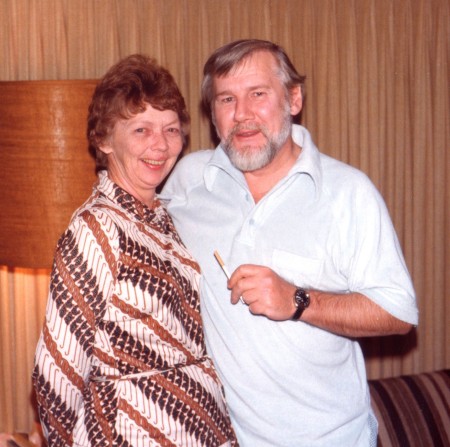
Alex and his wife/best friend Guyla in their Hollywood home in 1979.
They met at Hanna-Barbera and the rest is history.
Their marriage will be brought to life in the upcoming book “Alex Toth, Illustrated“,
second in the trilogy of Alex’s work, by Dean Mullaney and Bruce Canwell.
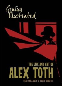
Vol 1 & 2 by Dean Mullaney and Bruce Canwell.
Now available on Amazon.
Many thanks to Bill Peckmann for all the scanning as well as the loan of the artwork.
Bill Peckmann &Comic Art &Illustration 18 Sep 2012 05:41 am
Conan from Toth – 1
- Bill Peckmann sent me a stash of nine extraordinarily fine illustrations by Alex Toth done for the magazine, The Savage Sword of Conan.
To fill up the post, Bill sent a number of magazine covers (front and back). However, I thought the Conan drawngs so excellent, that I’ve chosen to have them stand alone. So, I’m using these pieces – great as they are (they certainly stand alone as a post) – as a teaser for Thursday’s images of Conan. Trust me, come back if you’re a fan of Alex Toth’s work.
For part 1, Bill wrote:
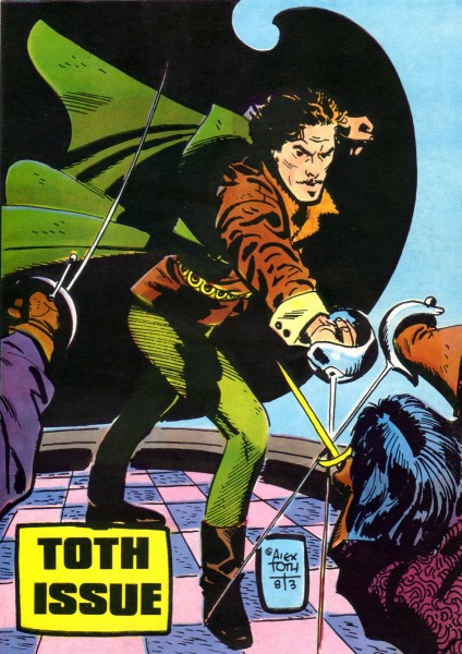
- Here’s a potpourri of front and back covers that Alex did in the 1980′s.
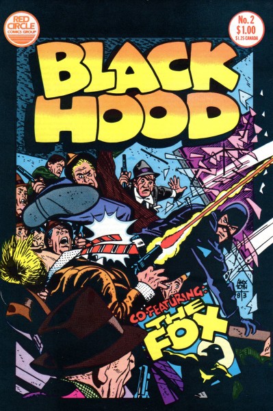 1
1
Bill Peckmann &Books &Illustration 14 Sep 2012 05:47 am
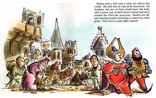
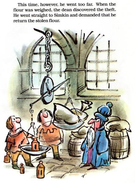
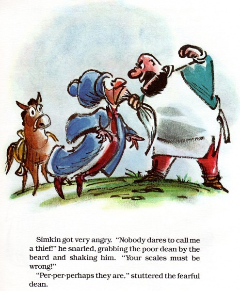
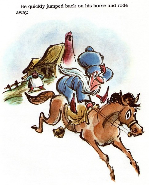
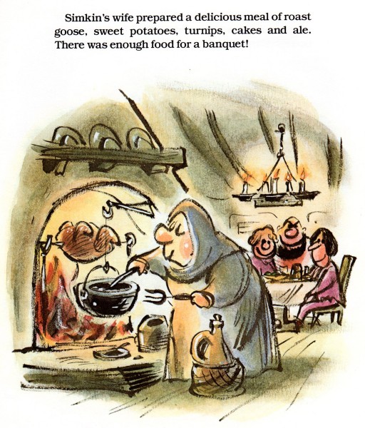
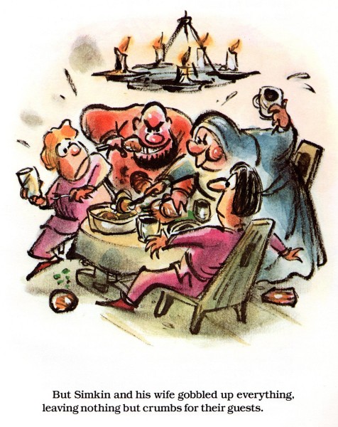
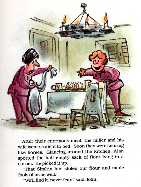
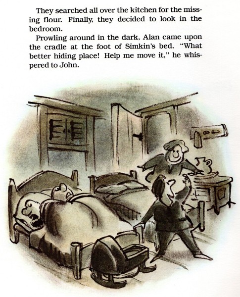
Lee Lorenz’ Scornful Simkin
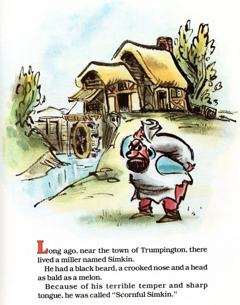
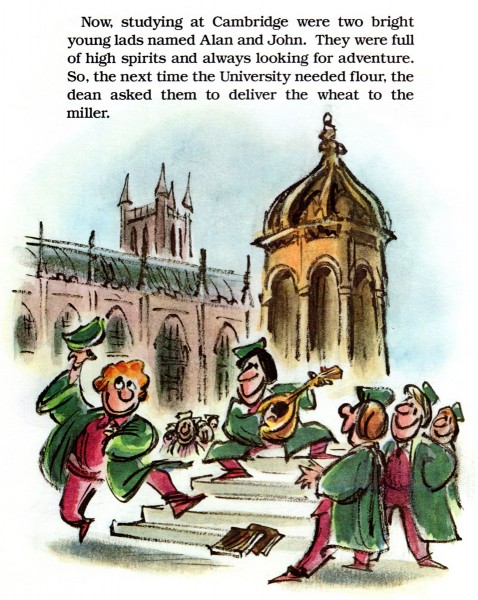
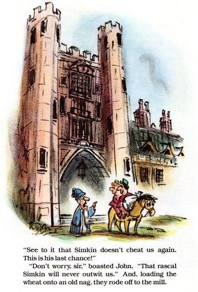
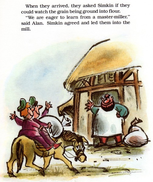
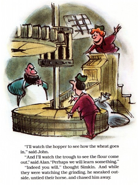
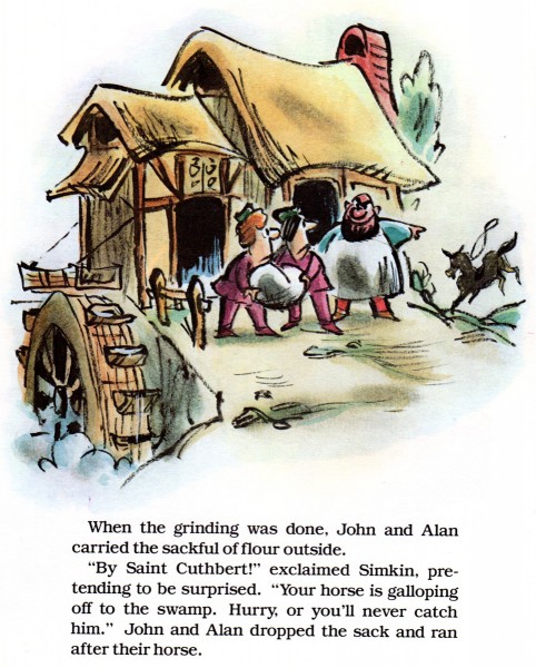
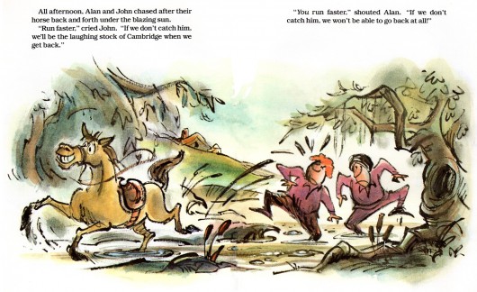
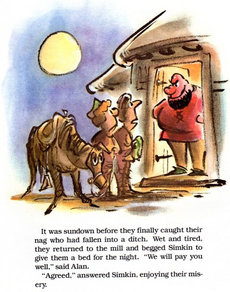
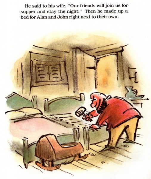
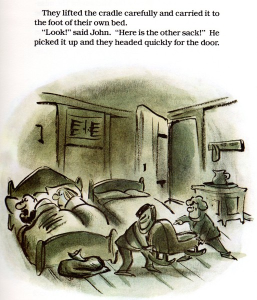
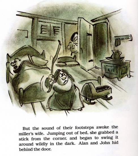
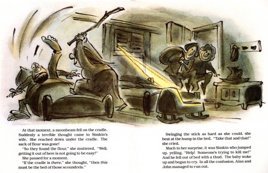
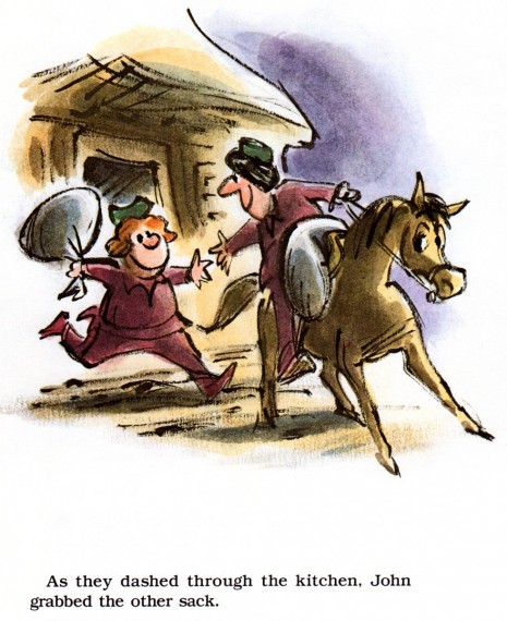
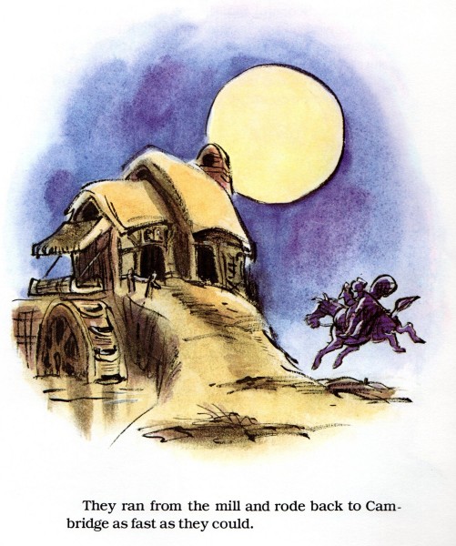
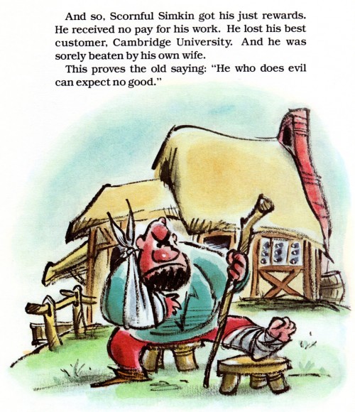
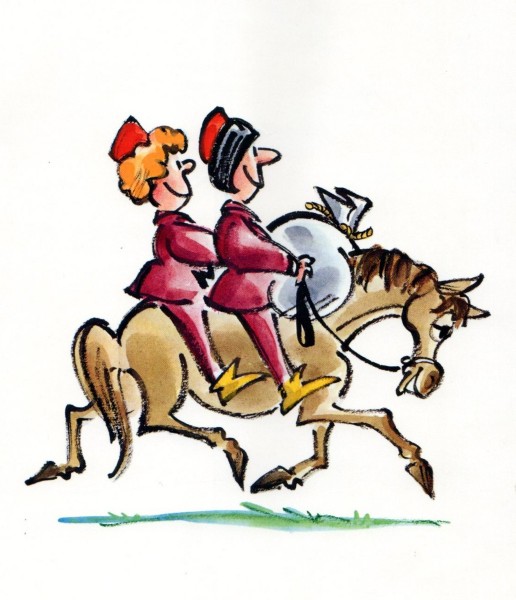
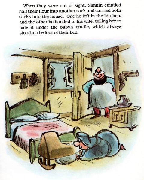
Lee Lorenz, of course, is a brilliant cartoonist. However, we don’t often see examples of his great children’s books. Bill Peckmann sent me the following scans. He wrote:
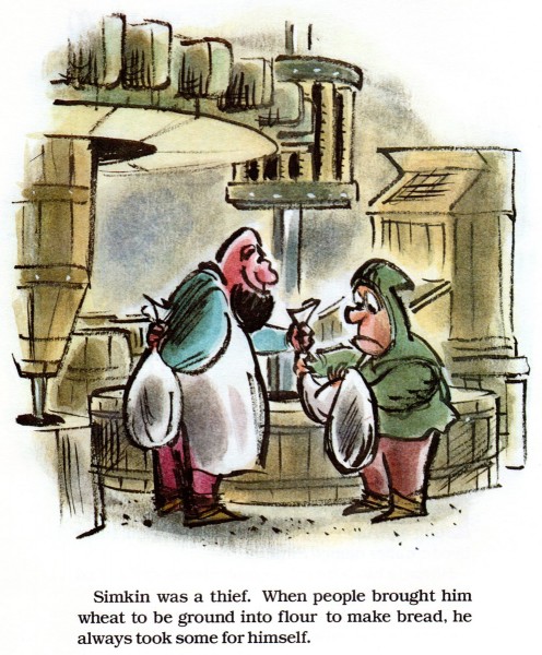
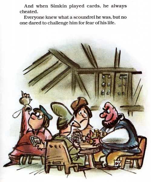
- We know good fortune is smiling down upon us when a great, noted gag cartoonist/artist gets the gig of illustrating a children’s book. So it was in 1980 when Prentice-Hall published Lee Lorenz‘s book, Scornful Simkin. It’s an illustrated retelling of Chaucer’s The Reeve’s Tale. That story is about Scornful Simkin, the terrible tempered miller who after grinding other people’s grain would always keep a little for himself.
The art in the book has the same feel and flair as storyboards from the Golden Age of Disney.
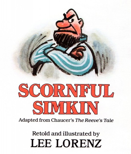 1
1
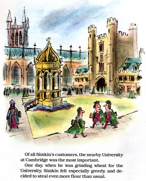 6
6
Like good wine, these pages only get better with age!
 15
15
Standing O’ for Mr. Lorenz, classic Disney meets classic Masterpiece Theater!
Bill Peckmann &Books &Illustration 11 Sep 2012 08:33 am
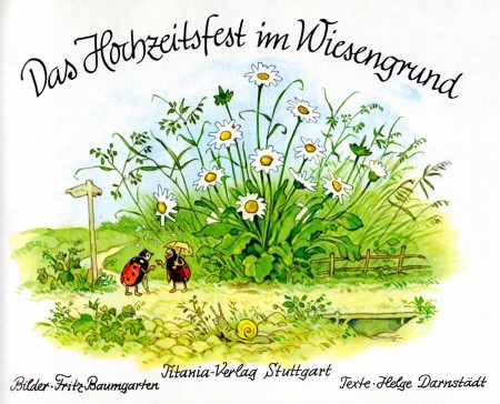
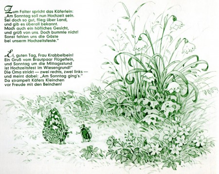
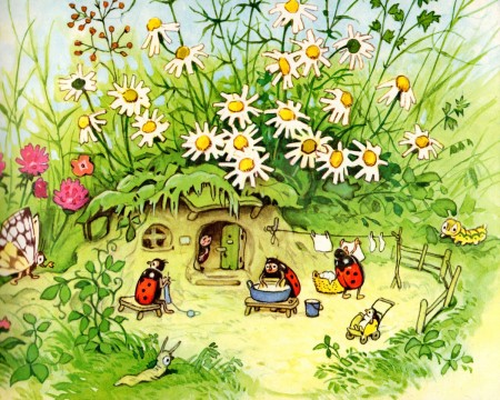
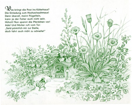
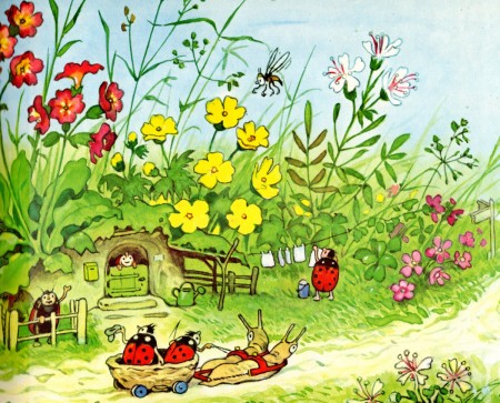
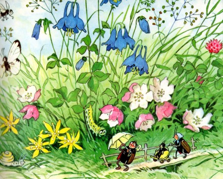
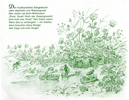
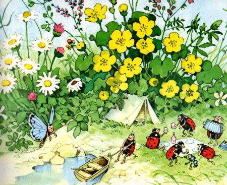
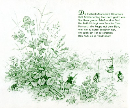
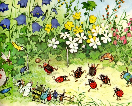
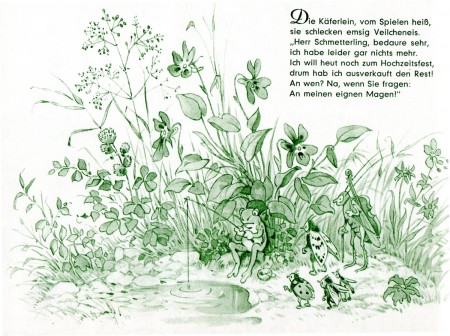
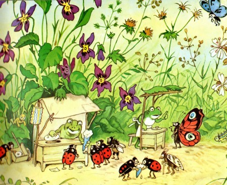
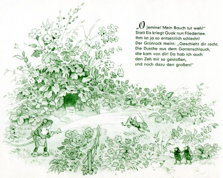
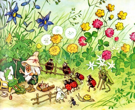
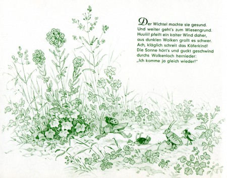
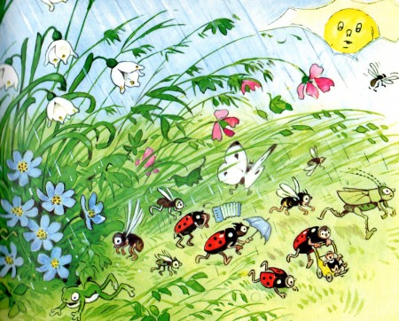
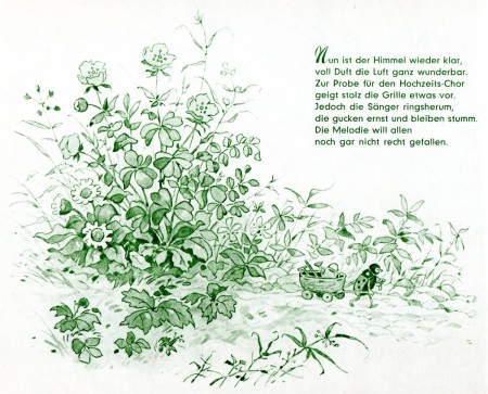
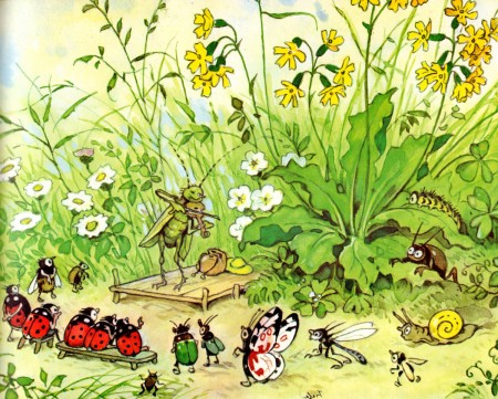
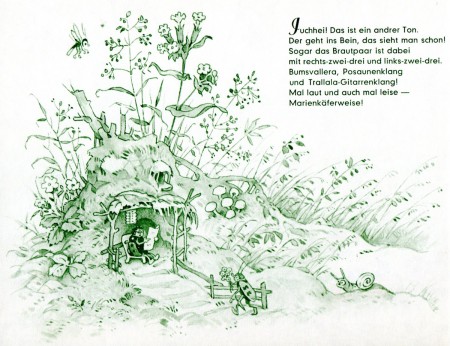
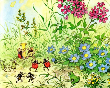
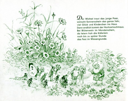
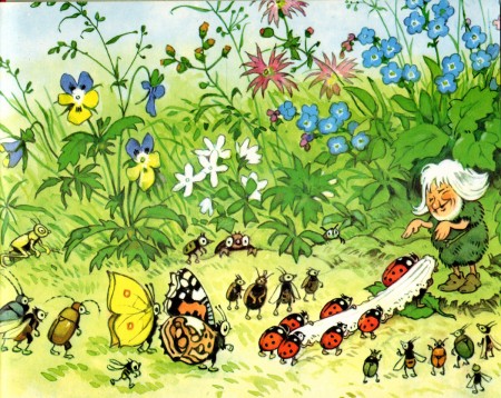
Fritz Baumgarten’s “Das Hochzeitsfest im Wiesengrund”
Hoppity comes back to town and gets maried, or in this case, at least, it’s Fritz Baumgarten. He’s a brilliant illustrator that Bill Peckmann introduced me to. He’s done a series of books in German, and Bill knows how much of a sucker I am for this ma’s illustration work. The book Bill sent me, here, is Das Hochzeitsfest im Wiesengrund or as we say in English, The Wedding in the Meadowland. I hope you enjoy it.
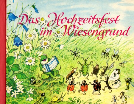
Book cover
Many thanks to Bill Peckmann for sharing this excellent book.
Bill Peckmann &Comic Art &Illustration 07 Sep 2012 05:52 am
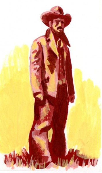
Toth Oaters
The Republican and Democratic conventions have me worked up into a political frenzy. Given the patriotic fervor running through my blood, these days, it’s appropriate to post this Alex Toth sampler. There’s nothing more American than good cowboy stories, and Bill Peckmann has sent me just that. Over to Bill:
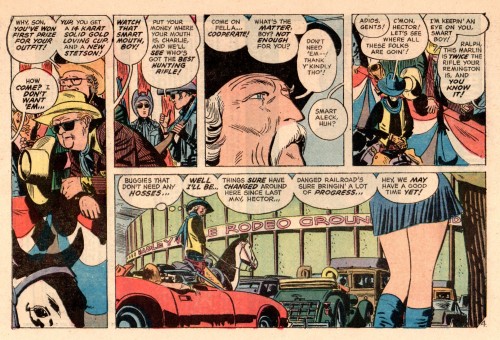
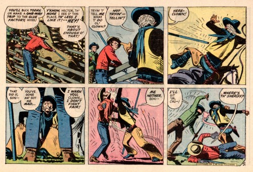
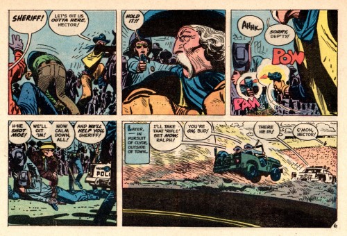
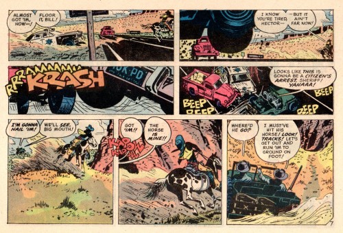
- Alex Toth spent a large portion of his life in Hollywood and not only did he live there, he breathed it! Alex loved movies and like any good film director he was able to do comic book genre stories with the same great flair that a John Ford would bring to his different films.
Here are three ‘Western’ stories by Alex with each one going down somewhat of a different ‘Trail’.
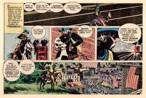
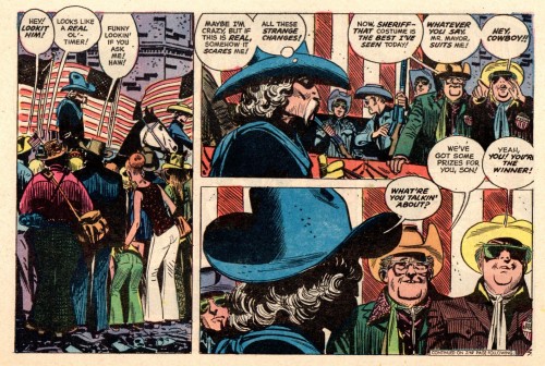
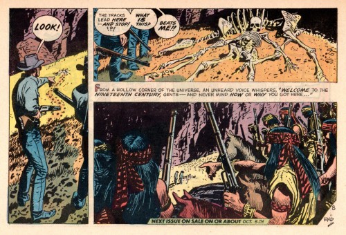
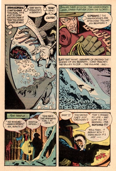
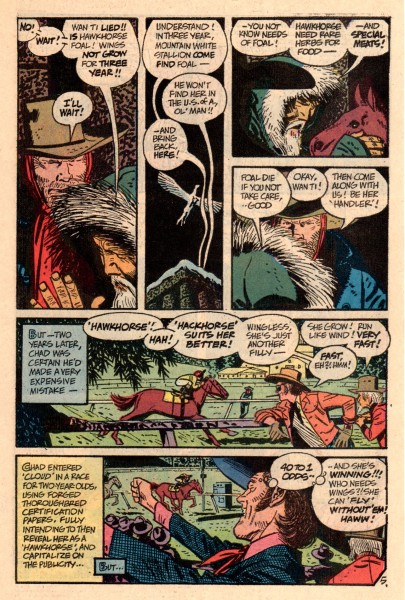
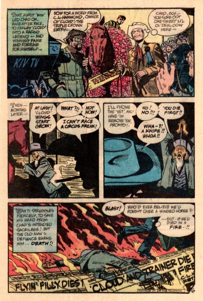
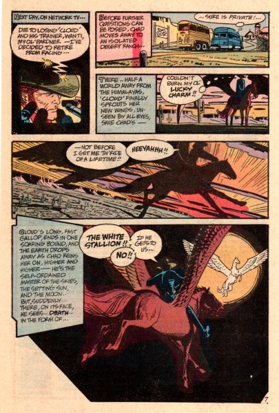
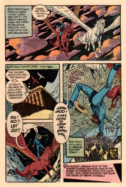
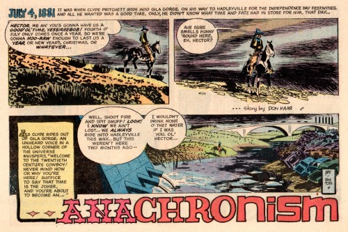
The first one, ‘Anachronism’, was published in DC’s ‘Weird Western Tales’, # 14, Nov. 1972.
 1
1Alex laid out this story horizontally, which makes for
some beautifully composed pages and panels, like a
well done Sunday funnies page of years ago. The readers
would have had to read the book sideways, I wonder how
Alex got away with that with the editors/publishers.
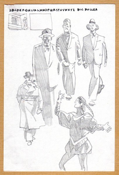
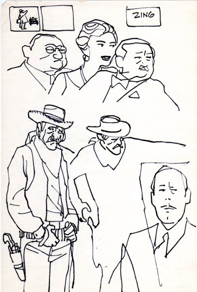
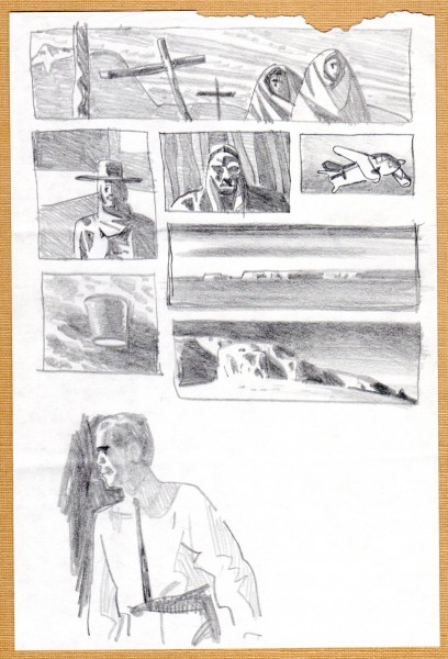
I’ll separate the stories again with some of Alex’s ‘Doodles’.
 9
9
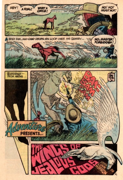
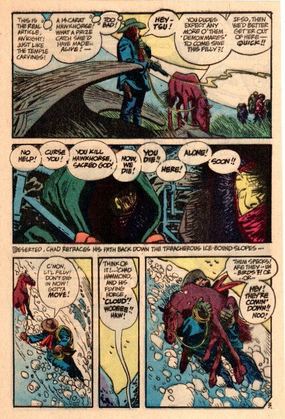
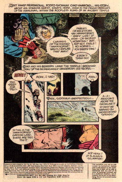
The story that follows is:
‘The Wings Of Jealous Gods’ from DC’s ‘Adventure Comics’, # 425, Jan. 1973.
 11
11
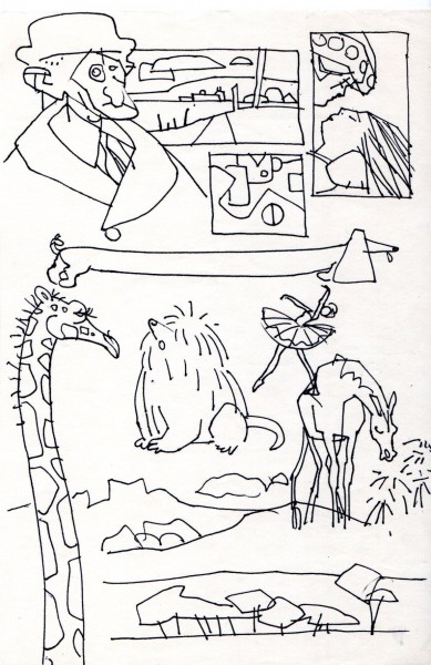
Here are more of the doodles Alex Toth did, these in pen.
 19
19
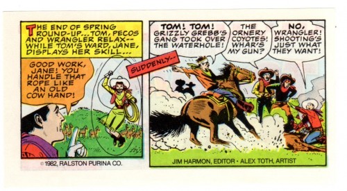
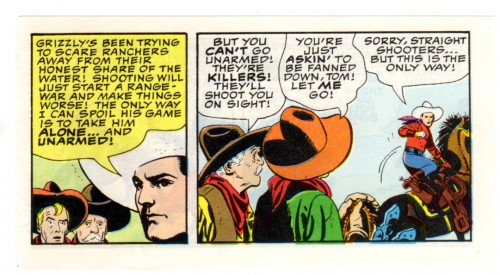
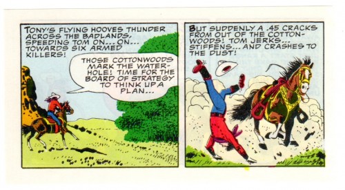
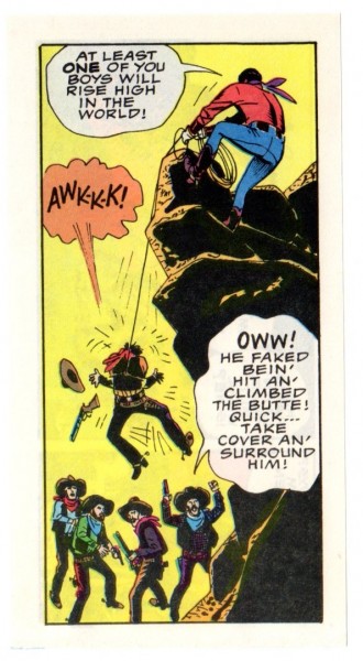
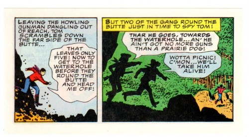
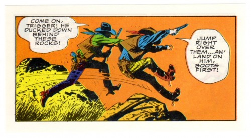
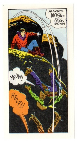
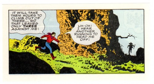
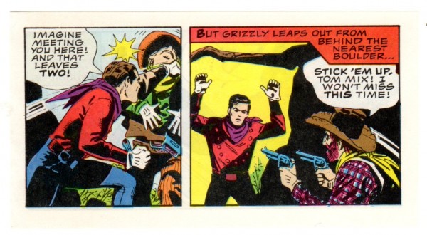
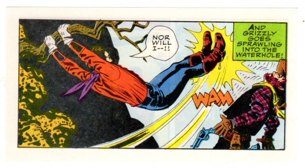
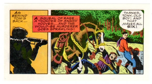
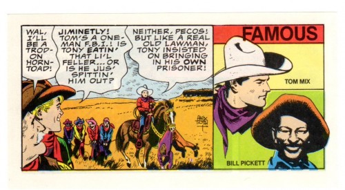
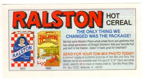
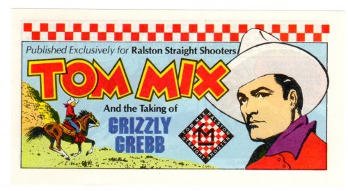
Here is the third Toth Western tale. It was a small booklet done for the Ralston-Purina Cereal Company in 1982.
It’s a story starring movie cowboy Tom Mix. (It must have taken Alex back to his childhood days of Saturday afternoon movie house matinees.)
There was hope of doing more, but as far as I know, this was the only one produced.
 21
21
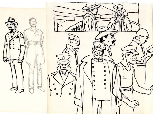
And, finally . . . A couple of more doodles.
 38
38
Animation Artifacts &Bill Peckmann &commercial animation 31 Aug 2012 05:51 am
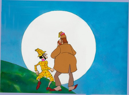
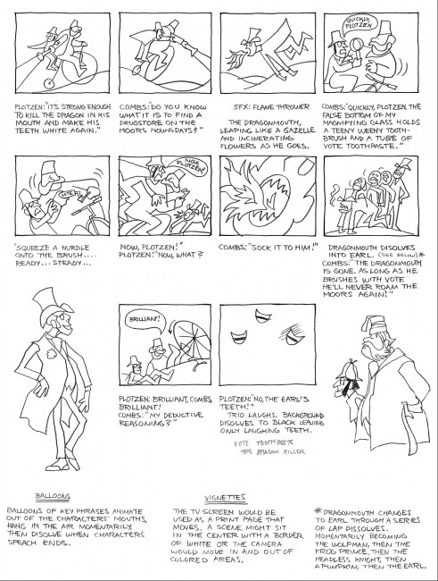
Combs and Plotzen – Part 2
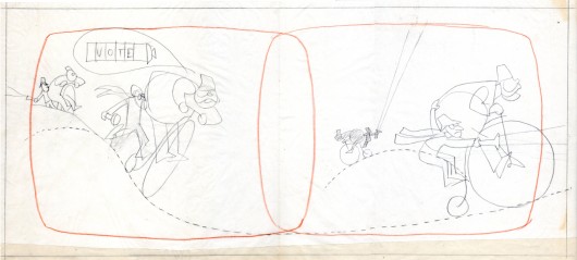
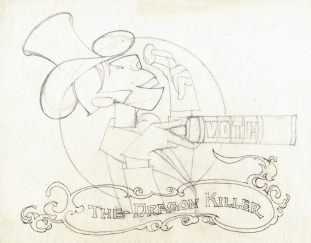
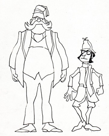
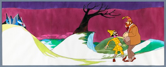
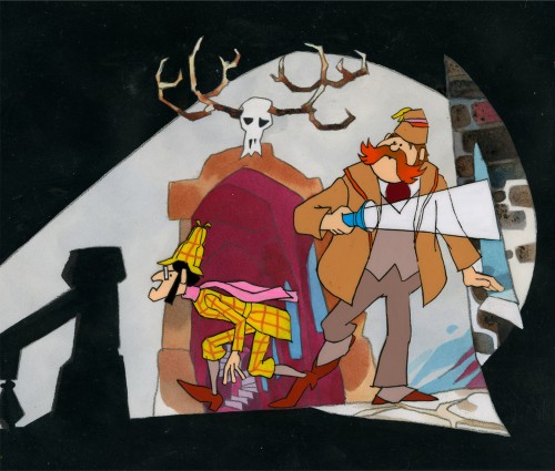
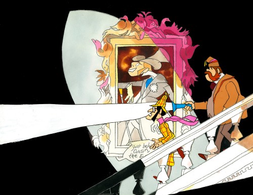
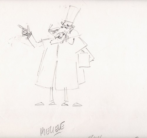
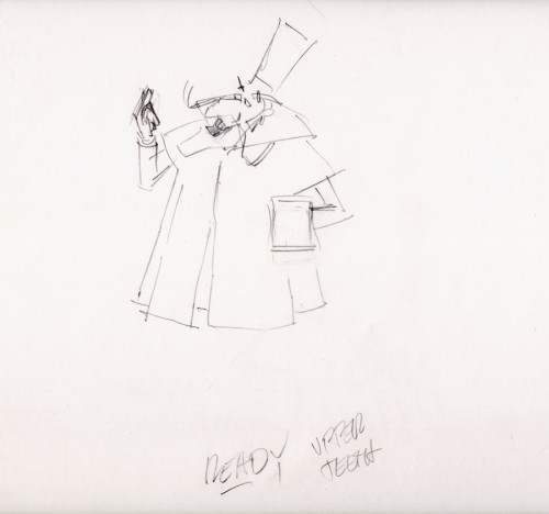
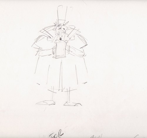
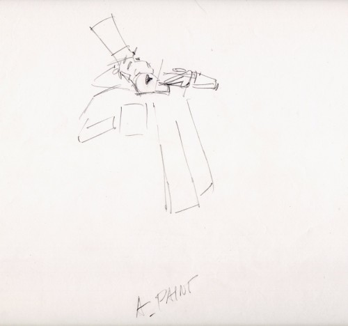
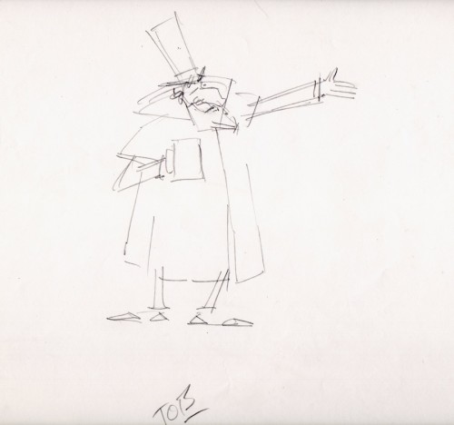
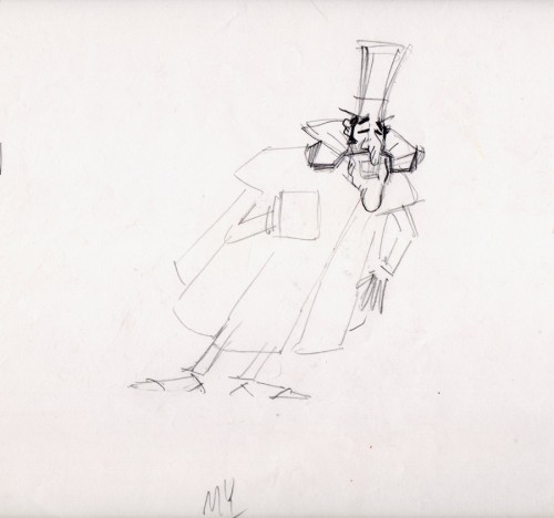
- Last week, Bill Peckmann forwarded a number of pieces of art by Rowland B. WIlson which was preliminary work for a commercial at Phil Kimmelman and Associates. The commercial, for Vote Toothpaste, was a parody of Sherlock Holmes called Combs and Plotzen. More art surfaced this week for that spot, and I thought it worthwhile to extend the post for a second part. (See Part 1 here.)
Bill Peckmann writes:
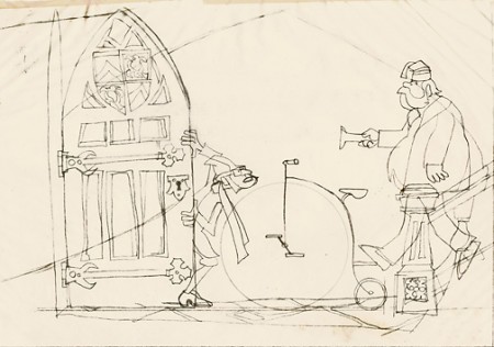
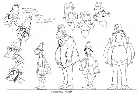
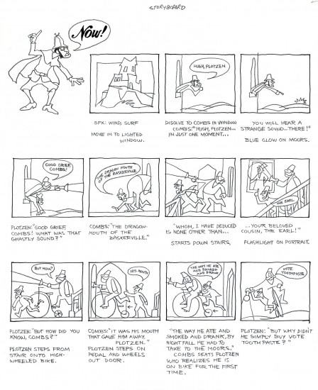
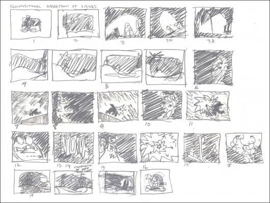
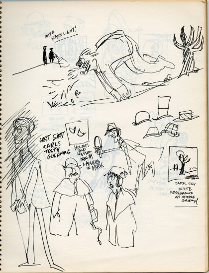
- Combs & Plotzen was the second TV commercial that print cartoonist Rowland B. Wilson designed in 1969 and his grasp of the animation production steps was truly amazing. No crash course in storyboarding, model charts, Layouts etc. was necessary. It was like he was doing it all of his life. We were in total awe.
- At that time, Rowland was always very comfortable doing his animation drawings on the paper he knew best, tracing paper. He would work up roughs on layering tracing paper panels without having the need of a light box. No pegs for him in those days.
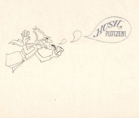
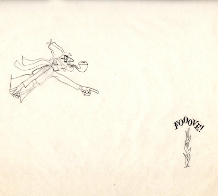
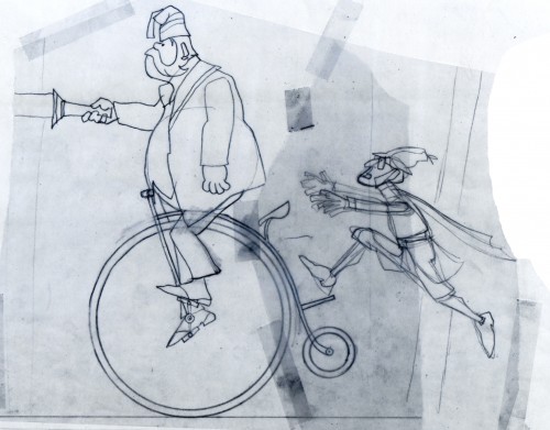 1
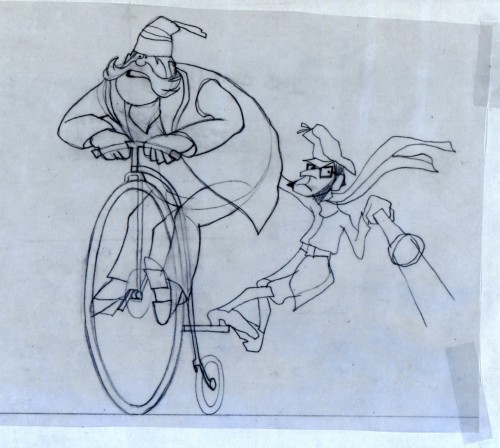
1These first five drawings are Layouts by Rowland Wilson.
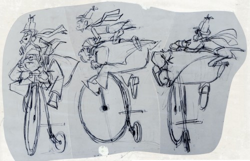 6
6
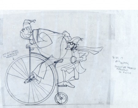
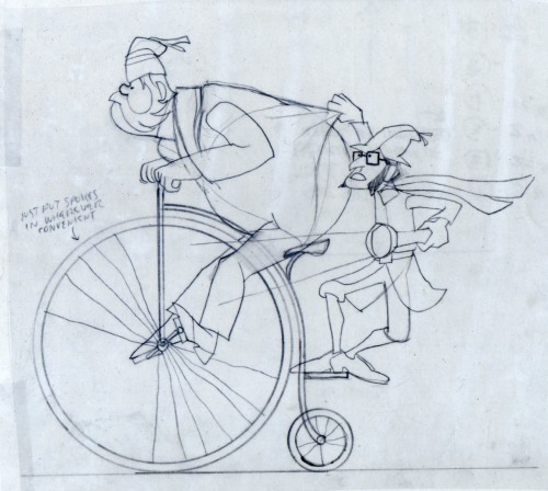
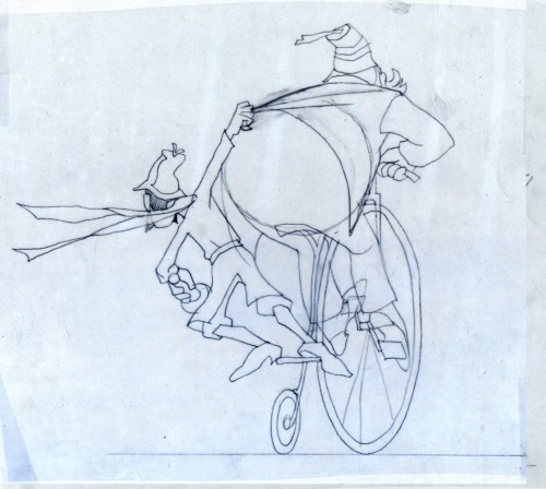
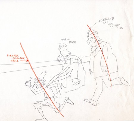
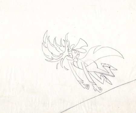
These are Jack Schnerk‘s roughs of the bicycle scene.
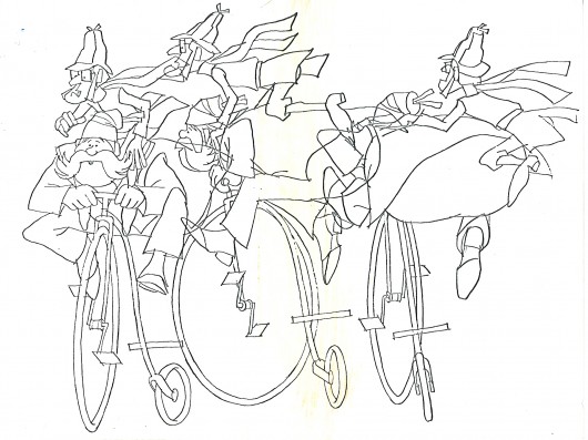
These are Bill Peckmann’s clean ups of Jack’s roughs.
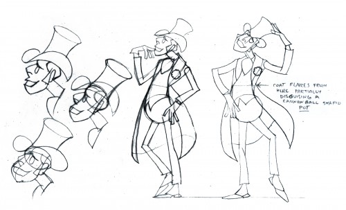 8
8
A model sheet from Rowland Wilson.
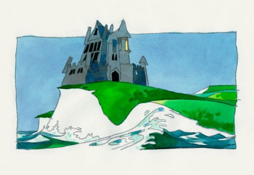 9
9
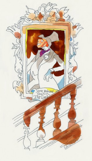
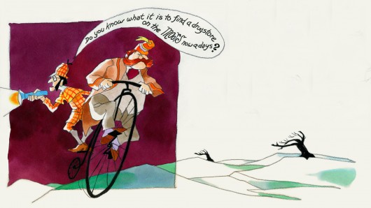
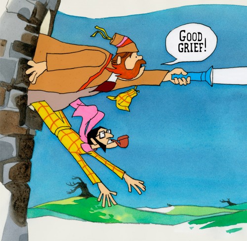
These three color sketches are in the new book,
Trade Secrets, by Rowland Wilson and Suzanne Lemieux Wilson.
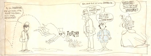
I found the original drawing I did of the crew that worked on Combs & Plotzen
way back then. It’s Vic Barbetta commenting on my lunchtime eating habits,
Jack and Phil’s anticipating the most important part of the day, the coffee wagon
bell, and Agnes hearing the good news of not having to draw anymore tiger stripes.
.
At the time that Rowland designed his Utica Club Beer ‘Mountie’ spot, he also did another U. C. Beer spot where the two adversaries were a Knight and a dragon.
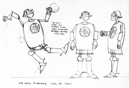
Unfortunately the only remaining piece that
I have from it is this stat of the Knight.
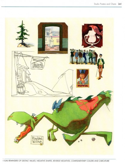
As for the dragon, all I can do is show you this page from
Suzanne Wilson’s ‘Trade Secrets’, where Rowland didn’t
forget his old friend from that commercial and gave him a
new coat of paint. One of his best character designs ever.
The tavern panel is a bg. from the same spot.
The Vote spot starts at 0:37 on this Jack Schnerk sample reel.
Bill Peckmann &Books &Illustration 28 Aug 2012 05:49 am
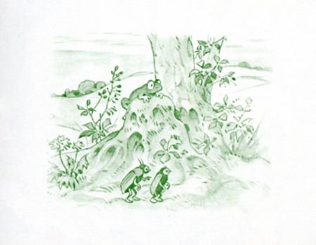
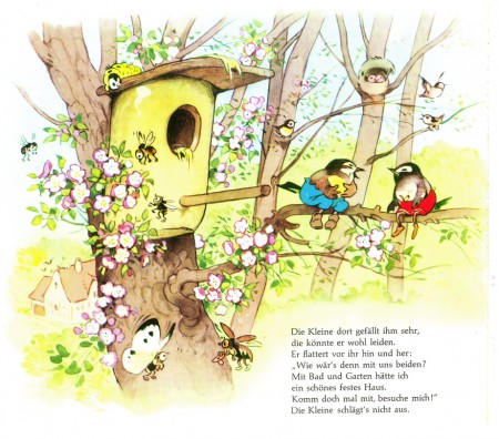
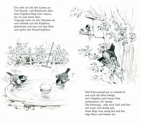
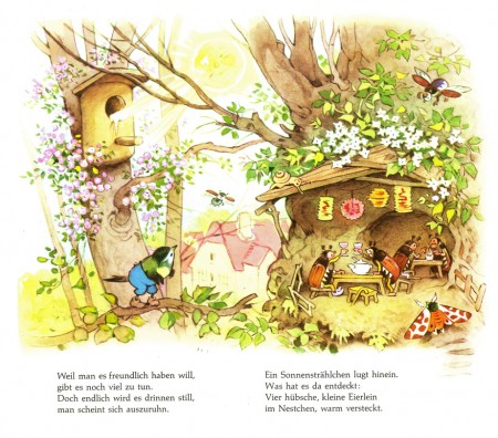
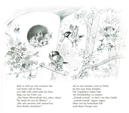
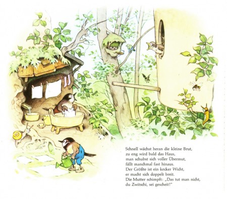
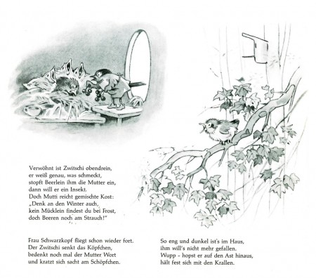
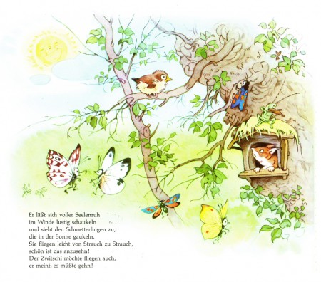
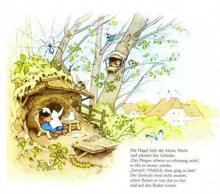
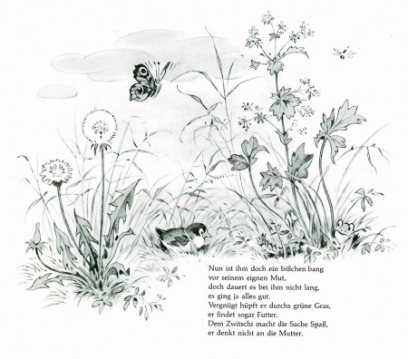
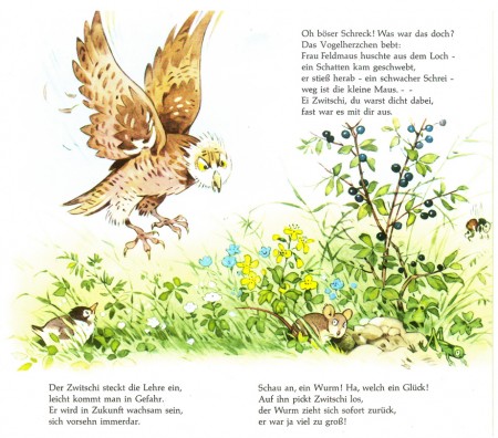
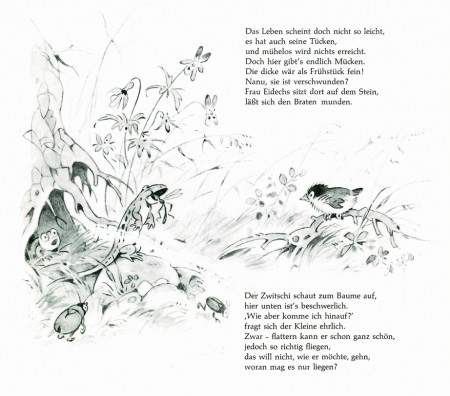
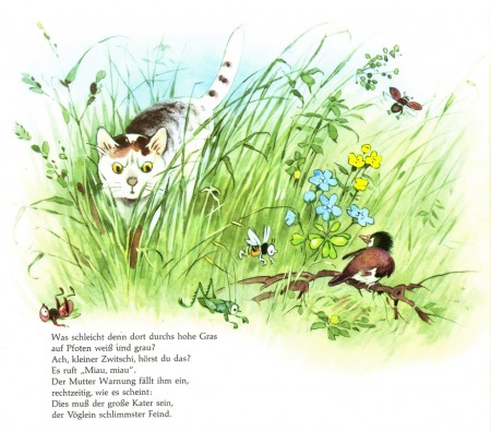
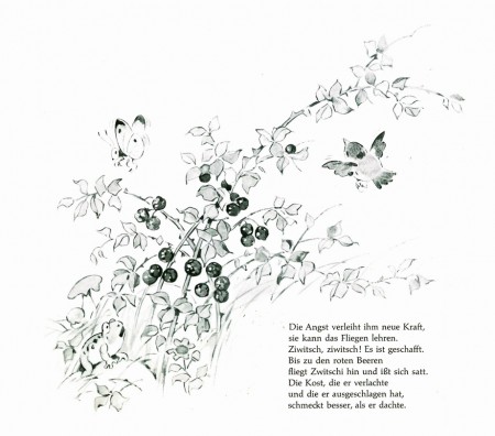
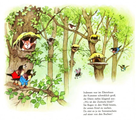
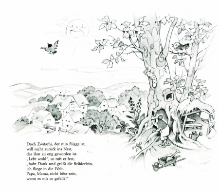
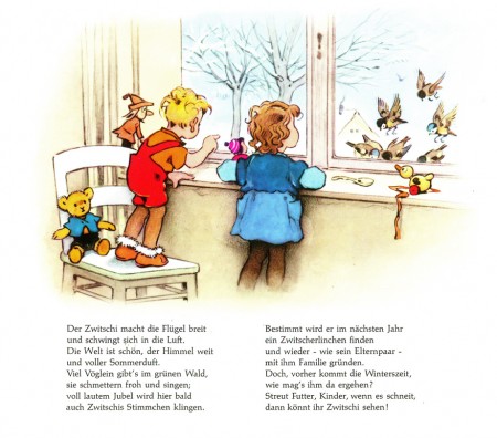
Zwitschi
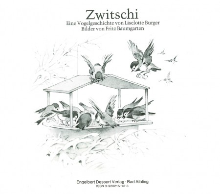
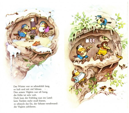
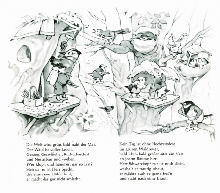
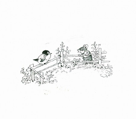
- Bill Peckmann introduced me to a fabulous German illustrator, Fritz Baumgarten, who’d created many beautiful children’s books. These books feel as though they come from an earlier generation, yet Baumgarten died in 1966. In a sense they are from an earlier generation, but they feel more like the 30s and 40s – Snow White. I think of the world of Albert Hurter.
I’d like to post this one, written by Liselotte Burger von Dessart. Zwitschi.
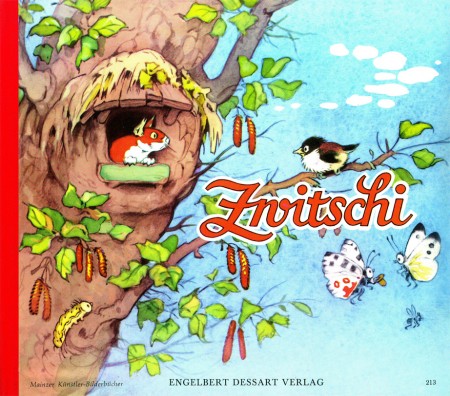
cover
(Click any image to enlarge.)
Many thanks to Bill Peckmann.
Animation Artifacts &Bill Peckmann &commercial animation &Illustration 24 Aug 2012 05:05 am
Rowland Wilson’s Vote Toothpaste
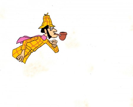
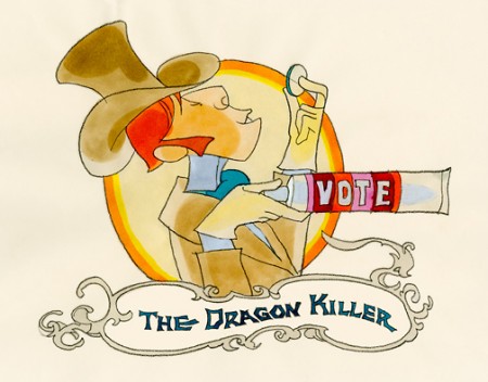
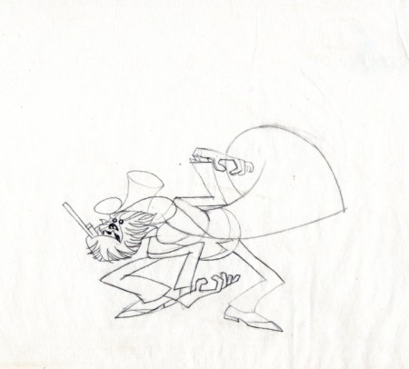
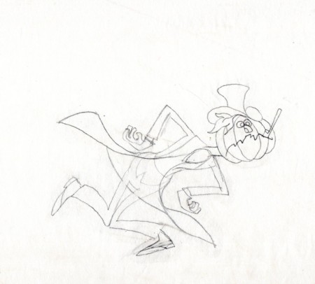
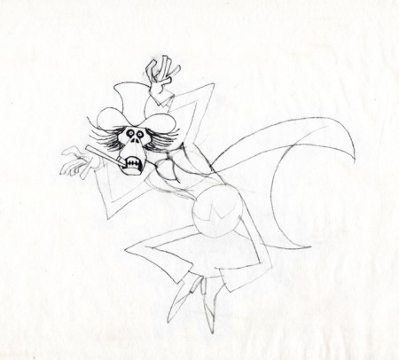
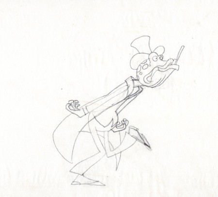
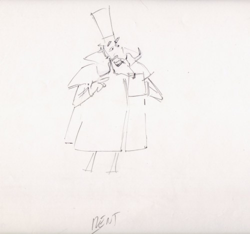
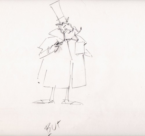
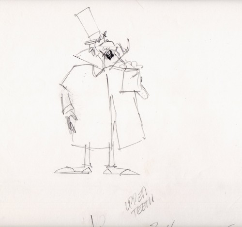
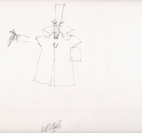
-If you’re a brilliant designer, you get there by doing the work that’s necessary. If you’re as great as Rowland B.Wilson was, you take the opportunity of a fine commercial spot, and you research it, plan it, and sketch it out. That’s just what Rowland did with this spot for Phil Kimmelman and Ass. back in the 70s. Vote toothpaste had a gem featuring “Plotzen” and “Coombs”. They just look like Sherlock and Watson.
Thanks to Suzanne Wilson, here’s the prep work Rowland did for this commercial. Many thanks to Bill Peckmann for getting it to the Splog and for additional artwork.
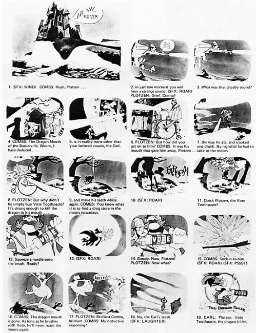 1
1

The characters turn 180º in this animation model.
This was animated by Jack Schnerk and cleaned up by Bill Peckmann.
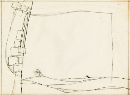 13
13
B&W BG Layout for the color image to follow.
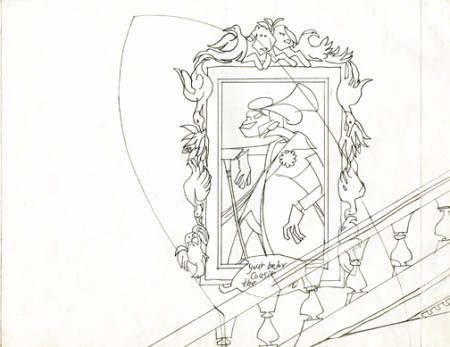 16
16
B&W Bg Layout for the following image.
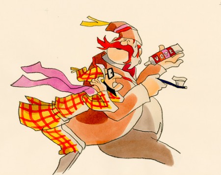
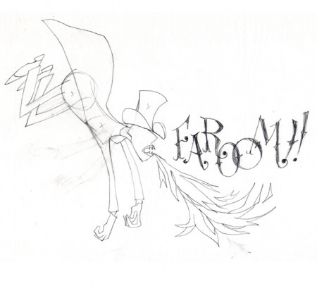
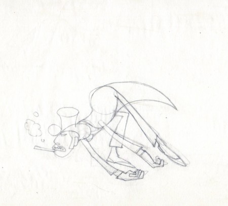
Finally, here are some rough sequential drawings that Rowland did
for a sequence where the villain transforms via Vote toothpaste.
The object in his mouth is a toothbrush with toothpaste on it.
The Vote spot starts at 0:37 on this Jack Schnerk sample reel.
Bill Peckmann &Illustration 23 Aug 2012 07:22 am
Russell Patterson
Tissa David, of course, is still very much on my mind.
I’ll write more about her on Saturday. With new photos and artwork.
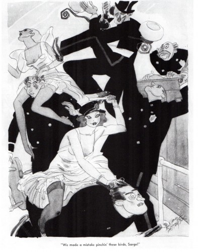
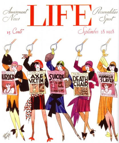
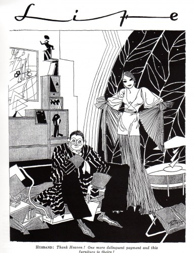
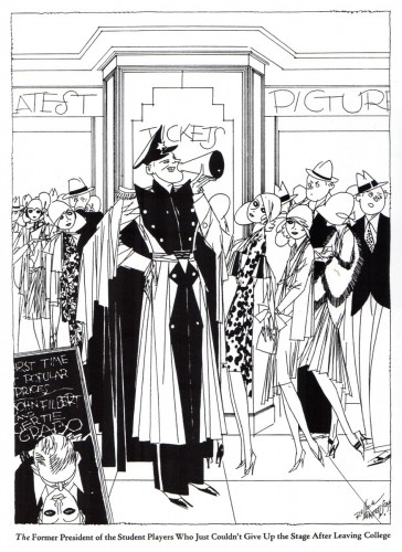
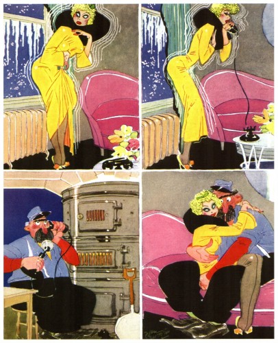
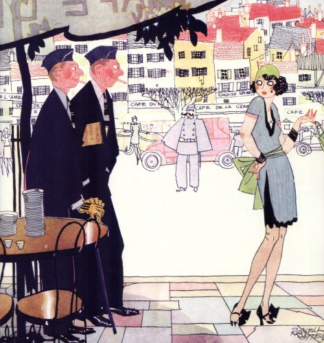
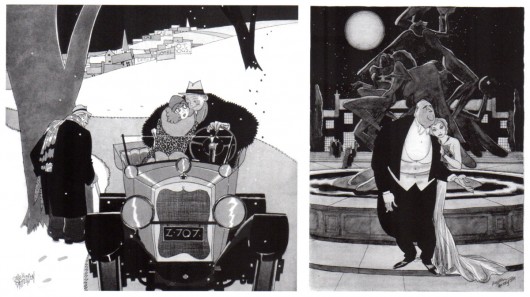
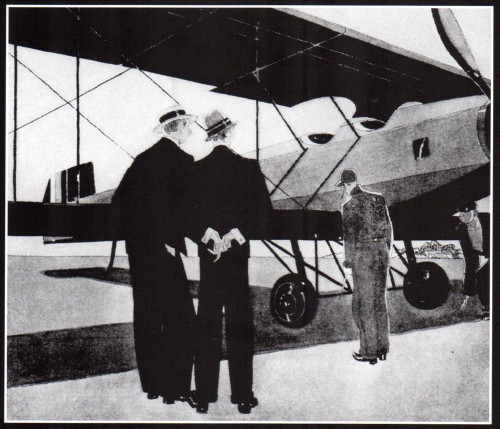
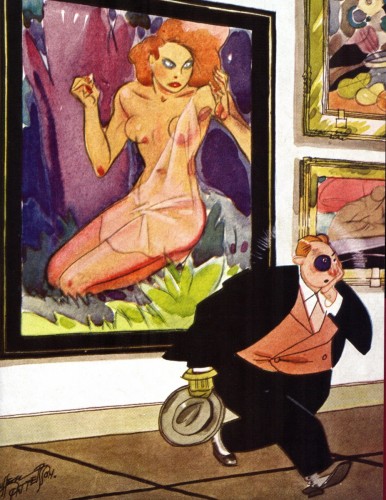
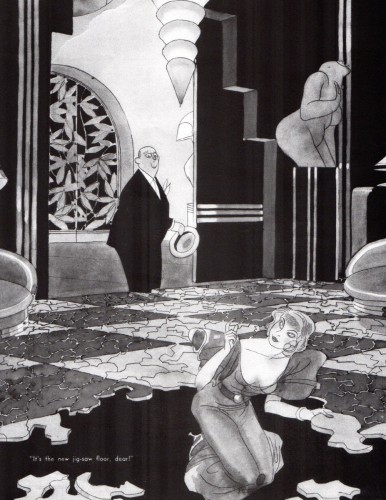
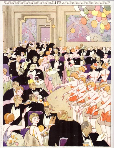
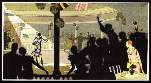
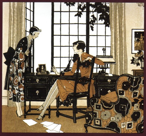
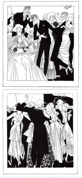
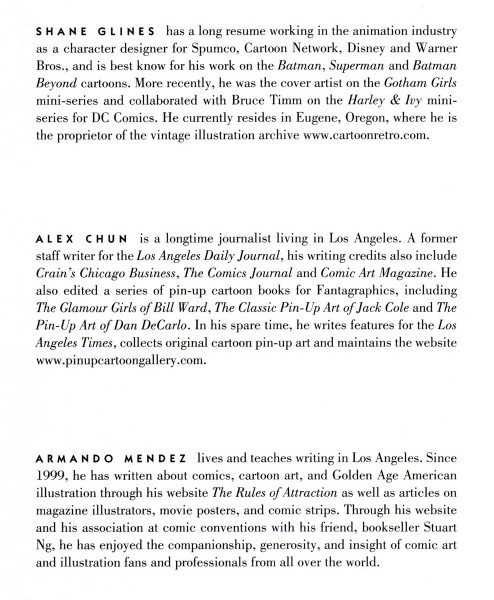
- Bill Peckman graced me with scans of a book by Shane Glines, Alex Chun and Armando Mendez. The artist, Russell Patterson has a lot of style and natural sense of composition in creating some great illustrations. He immediately pulls you to the center of his thought, then you quickly spin toward the gag. He knows in his soul how to present his information – quickly and effortlessly.
Here are selections from this book, for your appreciation and enjoyment. Many thanks to Bill Peckmann.
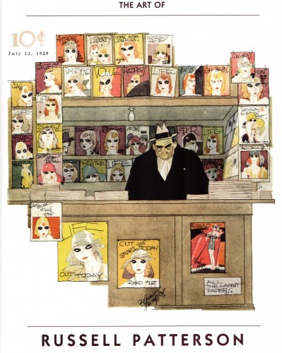 1
1
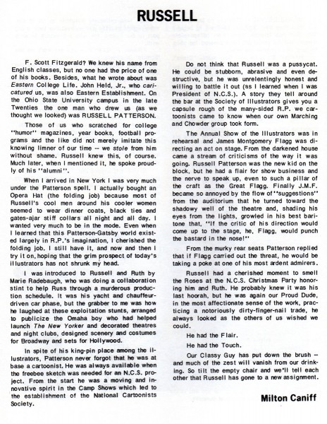
Here’s a wonderful tribute to Russell Patterson, written by Milton Caniff.
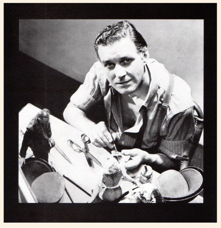
Russell Patterson
. . . and here’s the bios of the three who put the book together:
Animation &Animation Artifacts &Bill Peckmann &commercial animation &Layout & Design &Models 17 Aug 2012 06:23 am
Peckmann & Schnerk’s Utica Club
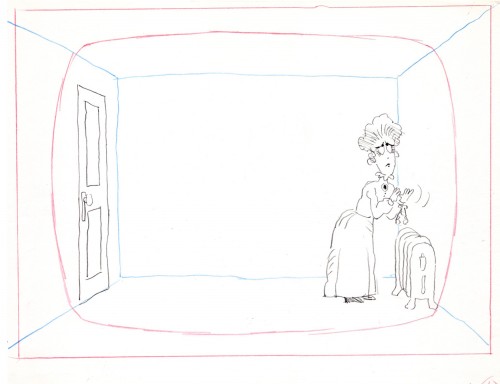
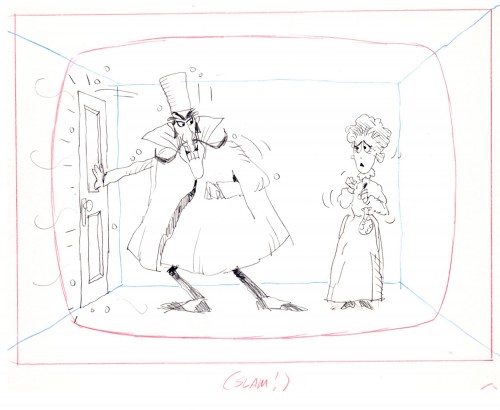
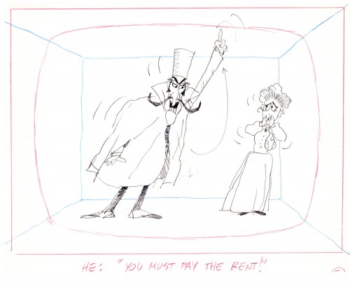
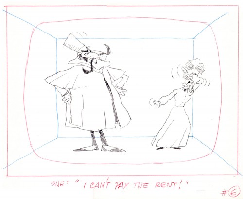
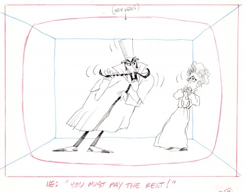
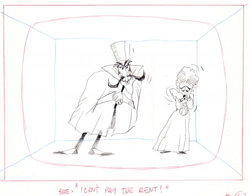
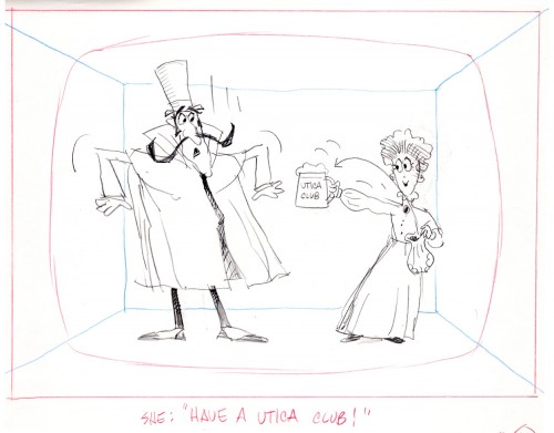
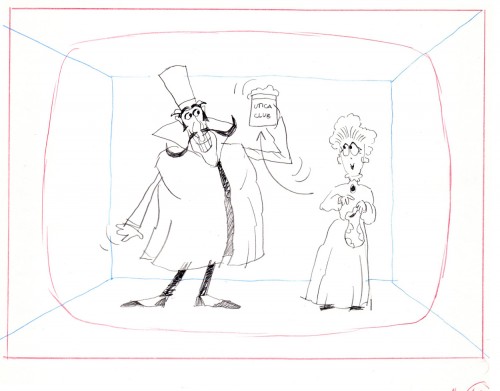
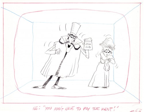
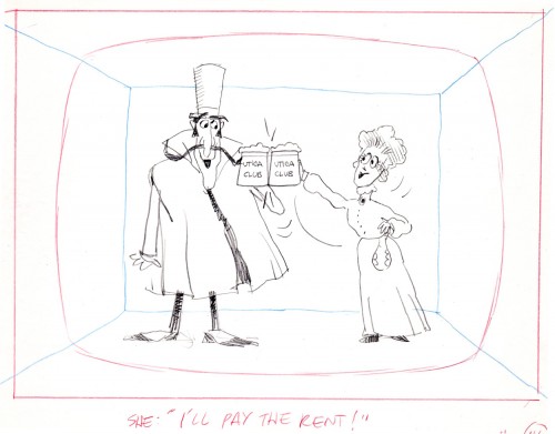
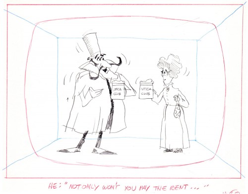
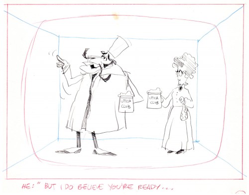
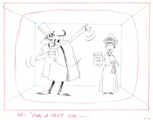
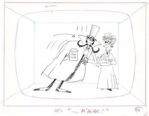
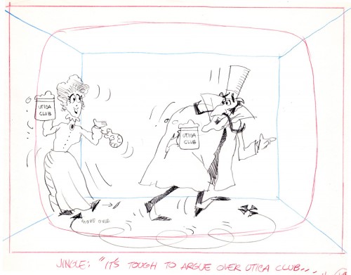
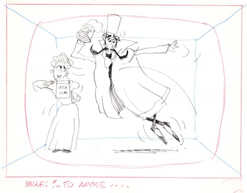
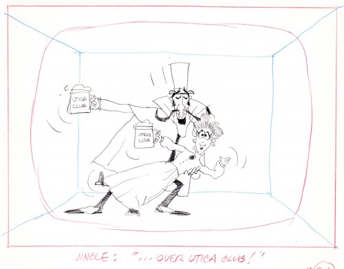
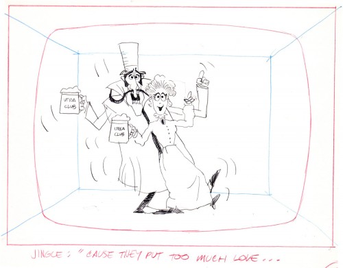
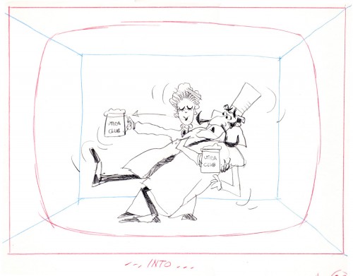
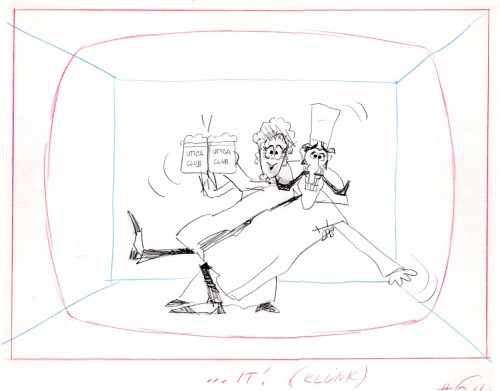
Another spot on Jack Schnerk‘s reel was Utica Club’s ‘Landlord’. Here with the little bit of art that I have from that commercial, I will try to illustrate some of the steps that went into making the film.
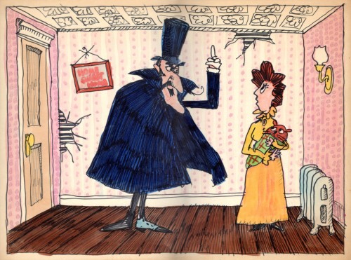
Here is the ad agency’s concept art.
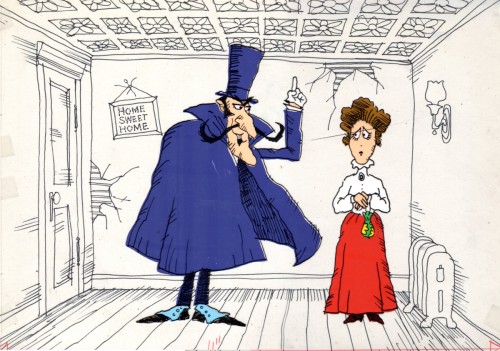
Here’s my tweaking of the agency art design.
This is a cel color model against a line version of the bg.
Next will be my first six rough layout drawings of the spot.
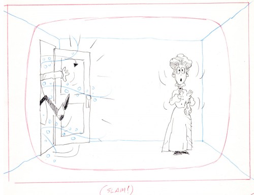
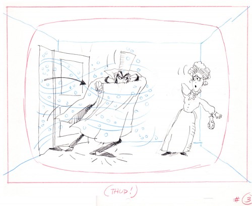
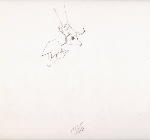
The following are animation key drawings by Jack Schnerk.
 1
1
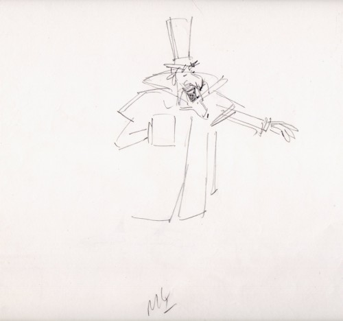
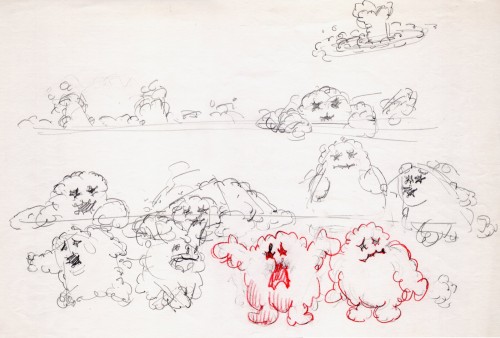
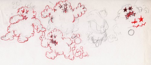
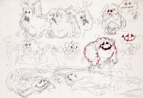
Once when we were doing designs for a soap bubble character, Jack took a break from animating to do these quick sketches. They are full of life, like all of Jack’s work.
 1
1
I hope for those who were fortunate enough to work with Jack, his drawings will bring back some good and happy memories, they do for me!
You can watch this spot on Jack Schnerk Sample Reel 2 starting at 3’01″.
